1/27
Postcard Bakery Features Bold Color and Pattern Inspired by Retro Japanese Design
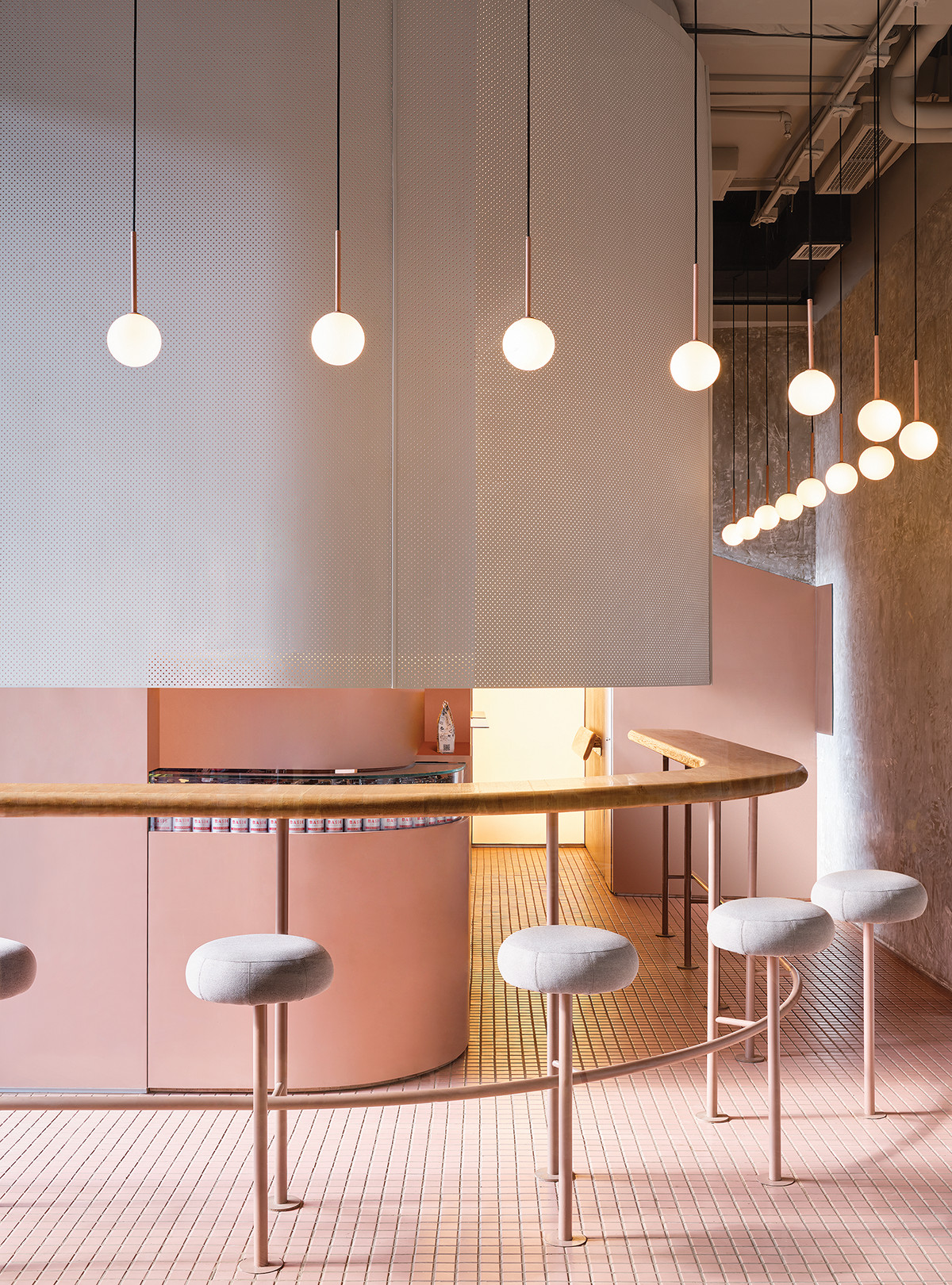
Postcard Bakery, a new establishment in New York City's West Village, presents a distinctive interior design that draws inspiration from retro Japanese aesthetics, specifically from Asian artwork. Designed by Sarah Carpenter of Sarah Carpenter Studio, the bakery's vibrant and nostalgic atmosphere stands in contrast to the minimalist style of the adjacent flagship restaurant by the Nami Nori team. Carpenter aimed to create a bold and unexpected typology for the New York commercial space, one that complements the brand while offering a fresh visual experience.
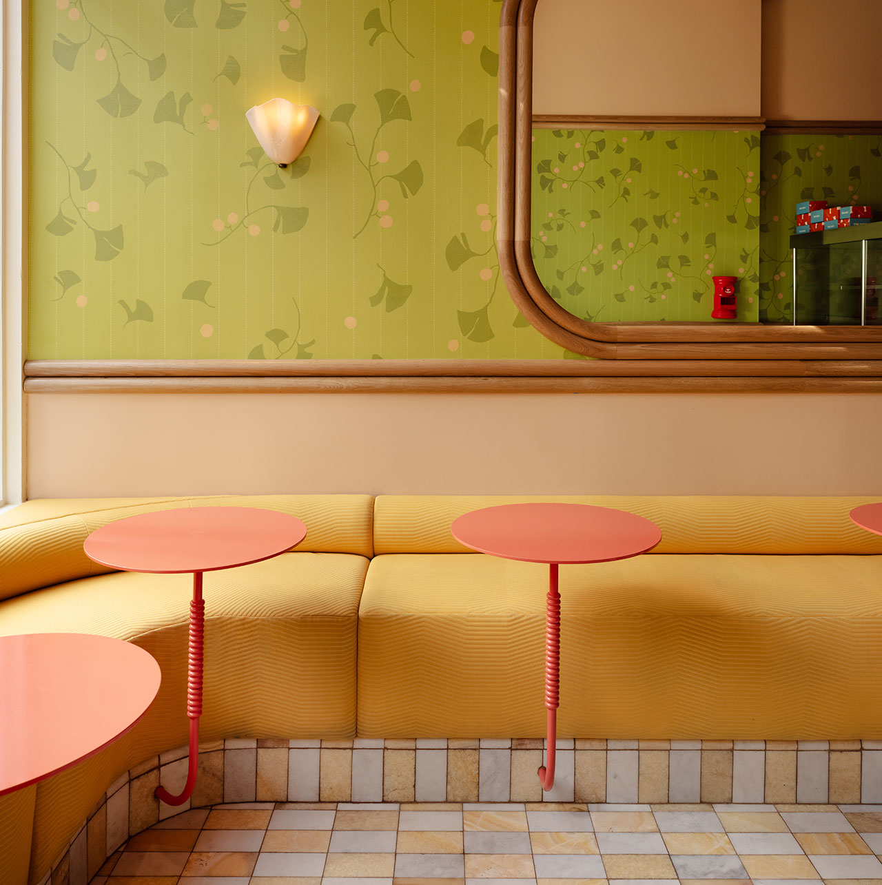
The design process involved immersing Carpenter in visuals related to baked goods, vintage postcards from various travels, and a curated Spotify playlist. This sensory approach allowed her to capture the desired emotional resonance for the bakery's customers. The compact 300-square-foot storefront is a testament to Carpenter's skill in integrating a rich palette of colors and patterns without overwhelming the space. She strategically paired pastels with richer hues to achieve this balance. The seating area at the entrance features comfortable banquettes upholstered in a textured, buttery yellow fabric, offering a welcoming spot for patrons to enjoy their bubble tea or coffee on citrus-colored bistro tables.
A custom wallcovering, developed in collaboration with LMNOP, the agency responsible for the bakery's graphics, is a central design element. Framed by oak millwork, the pattern evokes the artistic style of illustrator Yumeji Takehisa, utilizing a powdery matcha green tint instead of a conventional botanical green. This choice adds a subtle yet impactful nod to Japanese culture and aesthetics.
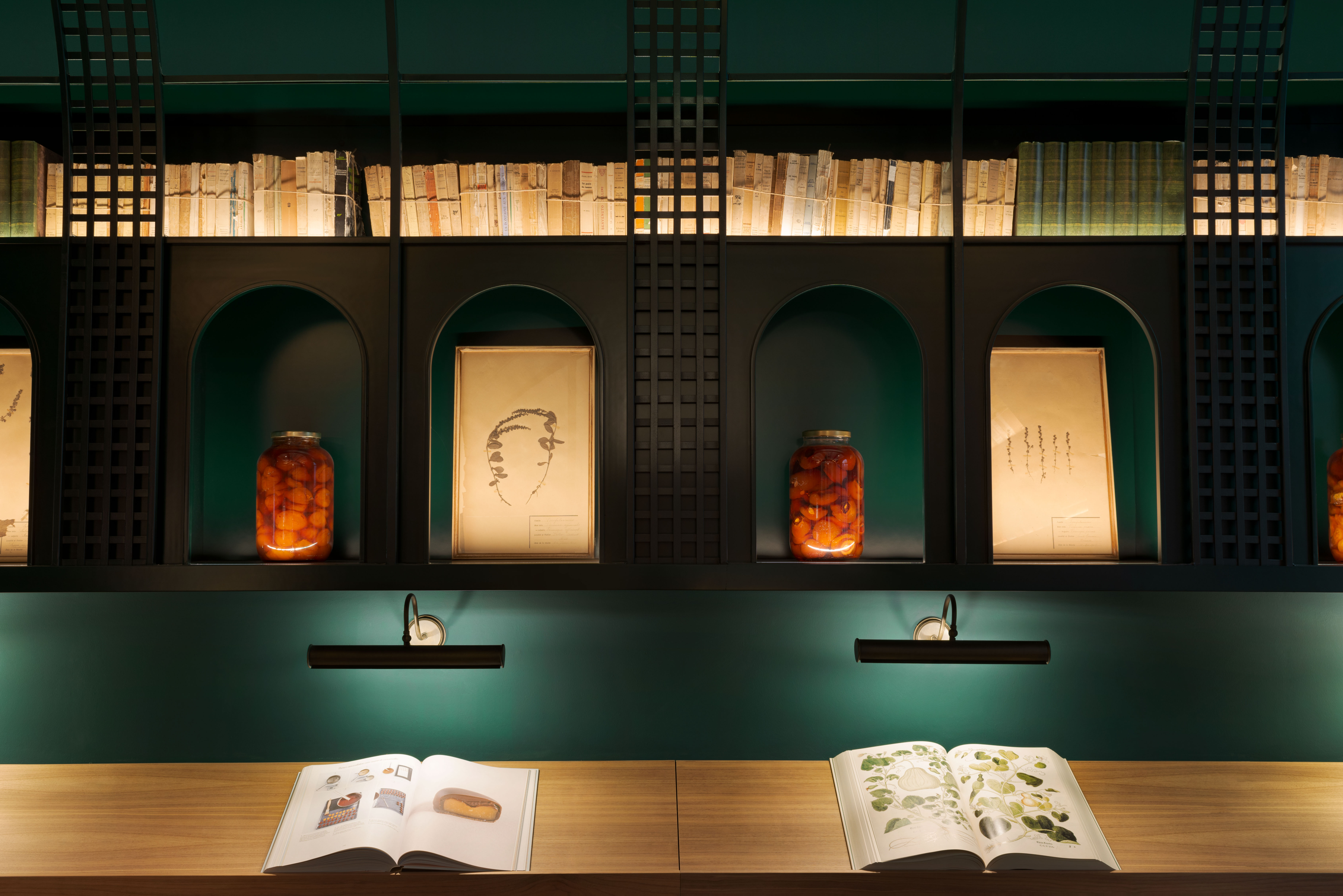
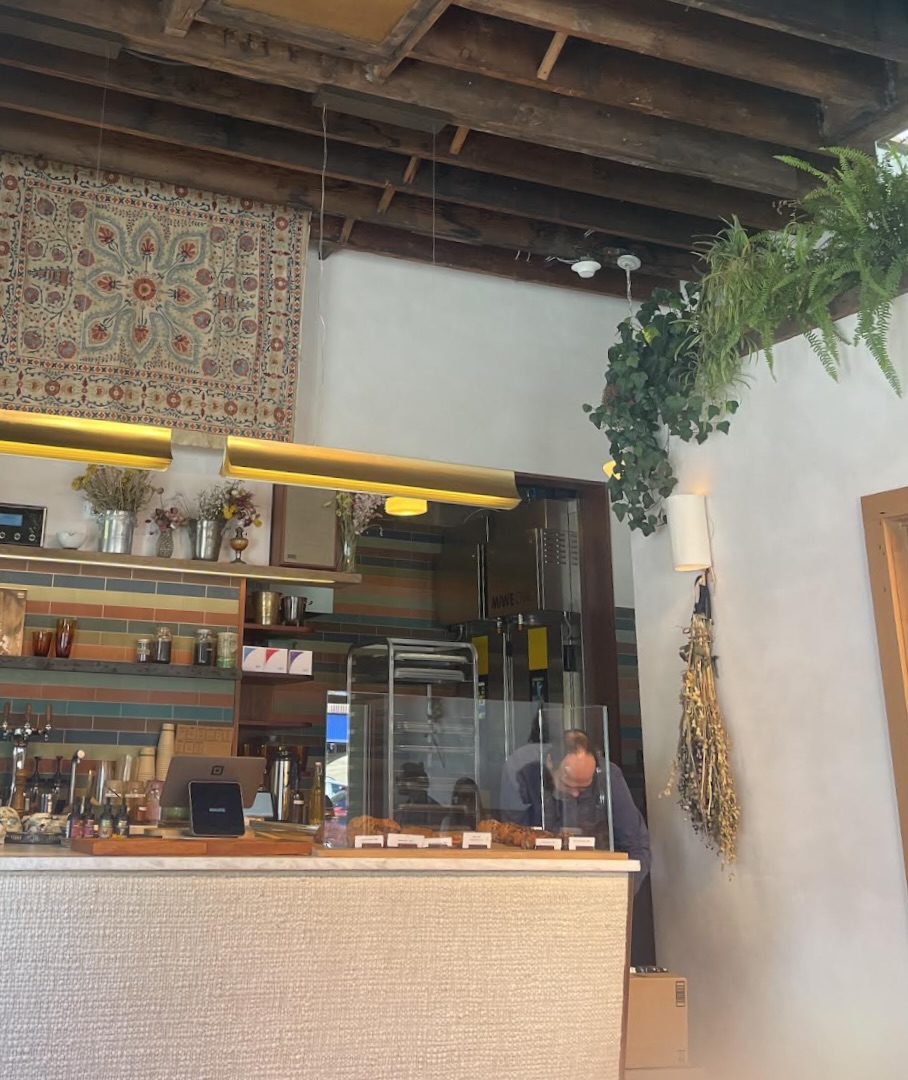
The service area behind the display case is a particular highlight, featuring a luxe vermillion red covering the ceiling, walls, and counters. Carpenter deliberately incorporated arches, constructed from flexible PVC and finished in high-gloss paint, to create a striking visual statement. This "red portal" serves as a unifying element for the entire design, showcasing Carpenter's philosophy of making significant design moves within hospitality projects, where intricate details can sometimes be overlooked.
The bakery's curved glass and stainless steel display case, while functional for showcasing pastries and sandwiches, also acts as a focal point. Carpenter paid close attention to this high-touch area, ensuring that the polished metal's reflectivity creates an engaging interplay with the surrounding matte surfaces. Even the flooring, often an afterthought, contributes significantly to the bakery's aesthetic. A pearlescent checkerboard pattern formed by honey onyx and glacier white stone tiles shimmers underfoot, adding another layer of sophisticated detail to the overall design.
#CommercialDesign #InteriorDesign #RetroJapaneseDesign #ColorPalette #PatternDesign #BakeryDesign #SarahCarpenterStudio #NewYorkDesign #HospitalityDesign #CommercialDesign #InteriorDesign #RetroJapaneseDesign #ColorPalette #PatternDesign #BakeryDesign #SarahCarpenterStudio #NewYorkDesign #HospitalityDesign
0 comment in total
You may also like
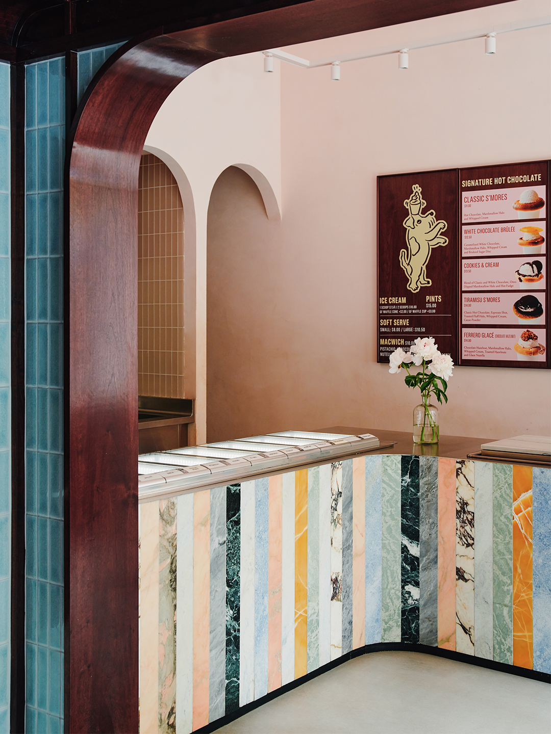
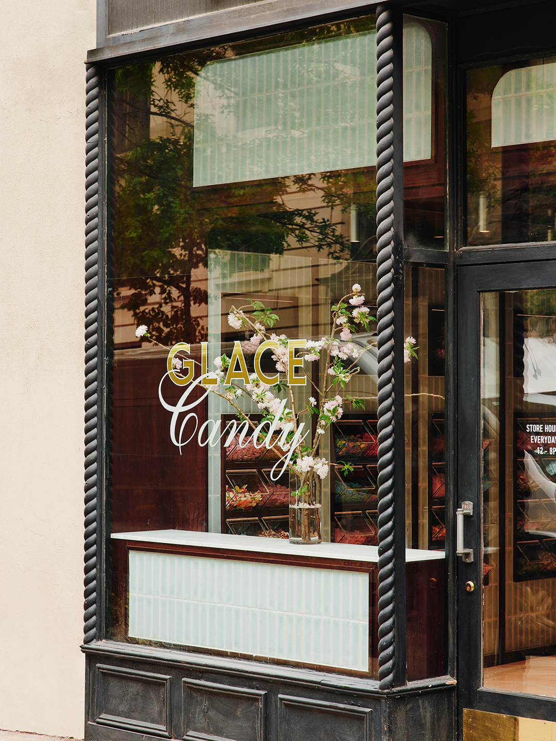
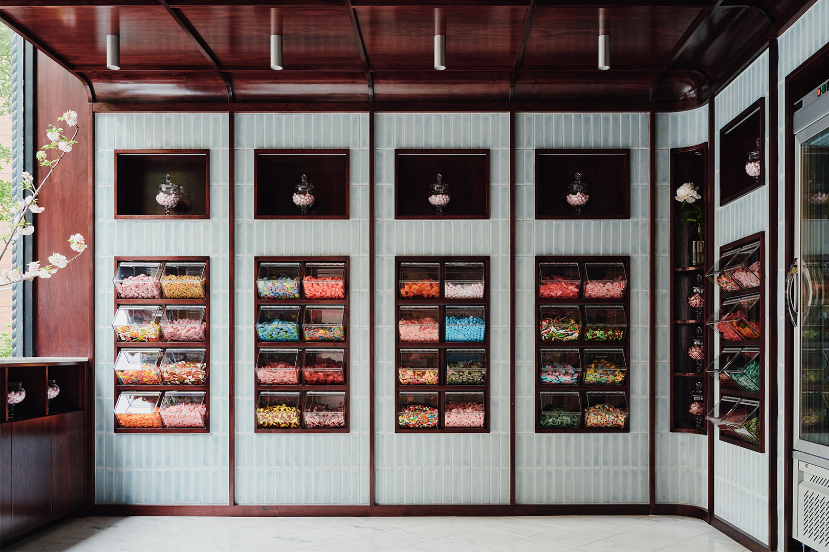
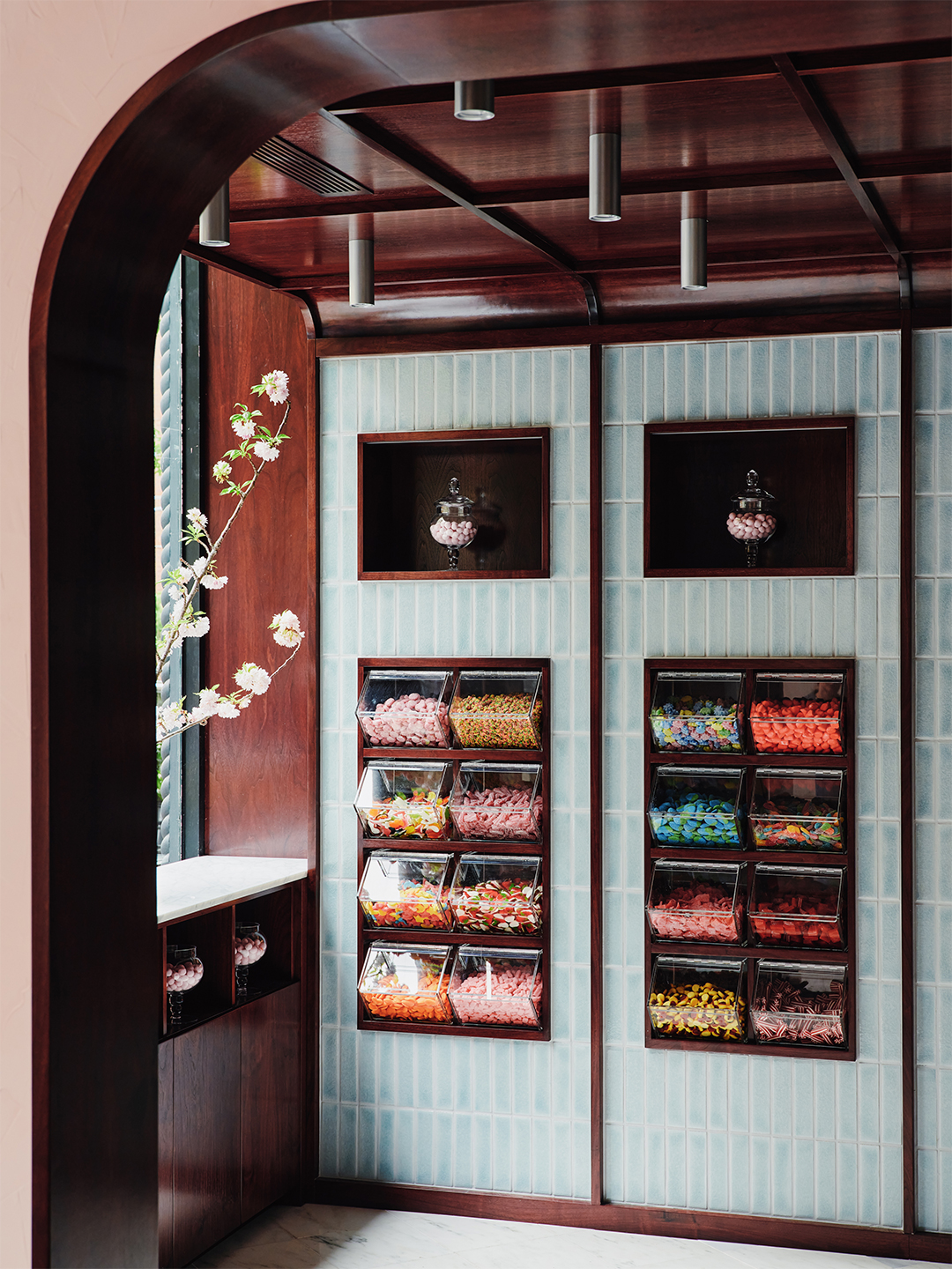
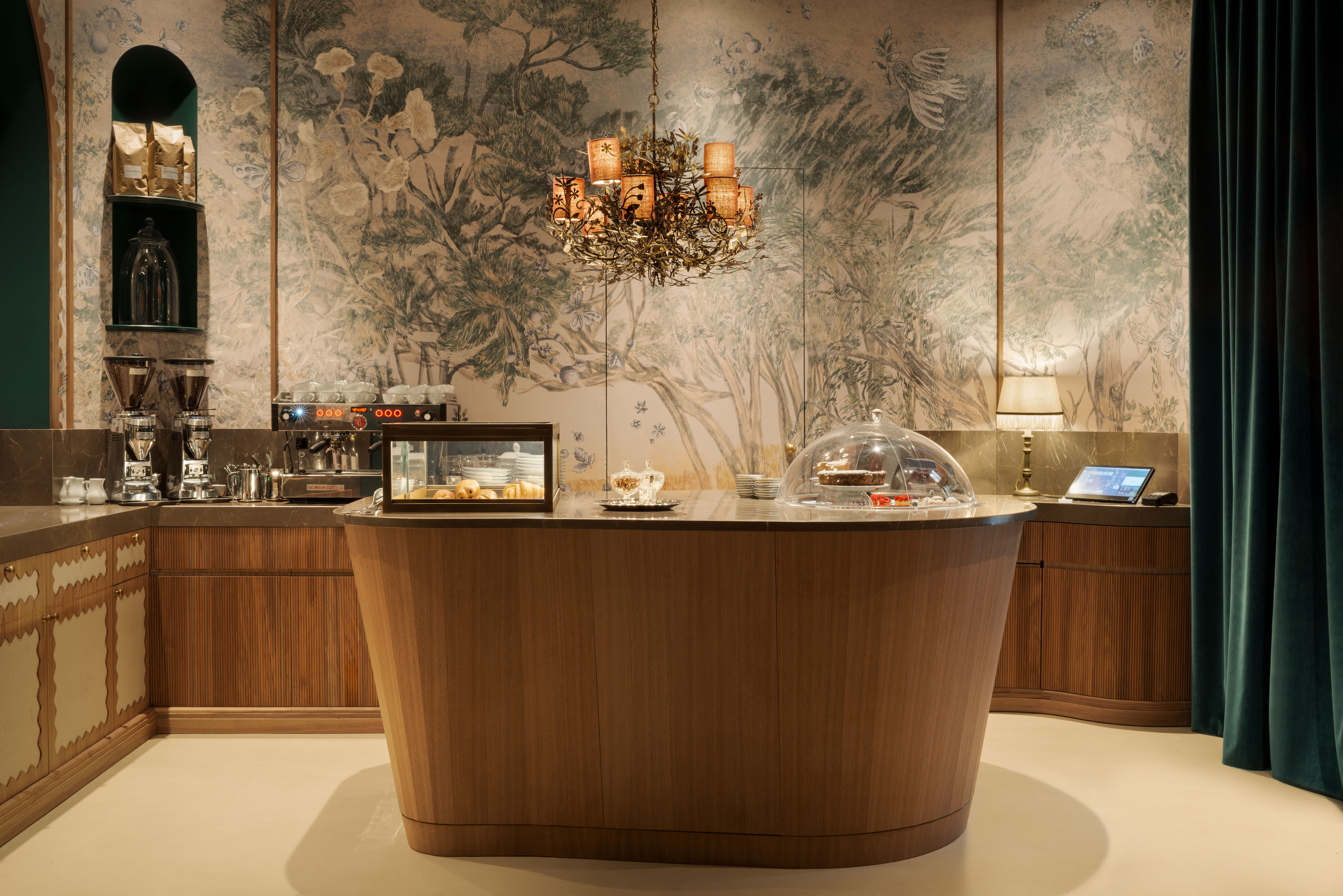
Crackled Tile, a Striped Stone Island—Our Latest Kitchen Inspiration Is This Viral Candy Shop

Style Inspiration: Congress Park’s Sweet Cooie’s


With bright color palettes, Pita and Bloom's work embraces ornament

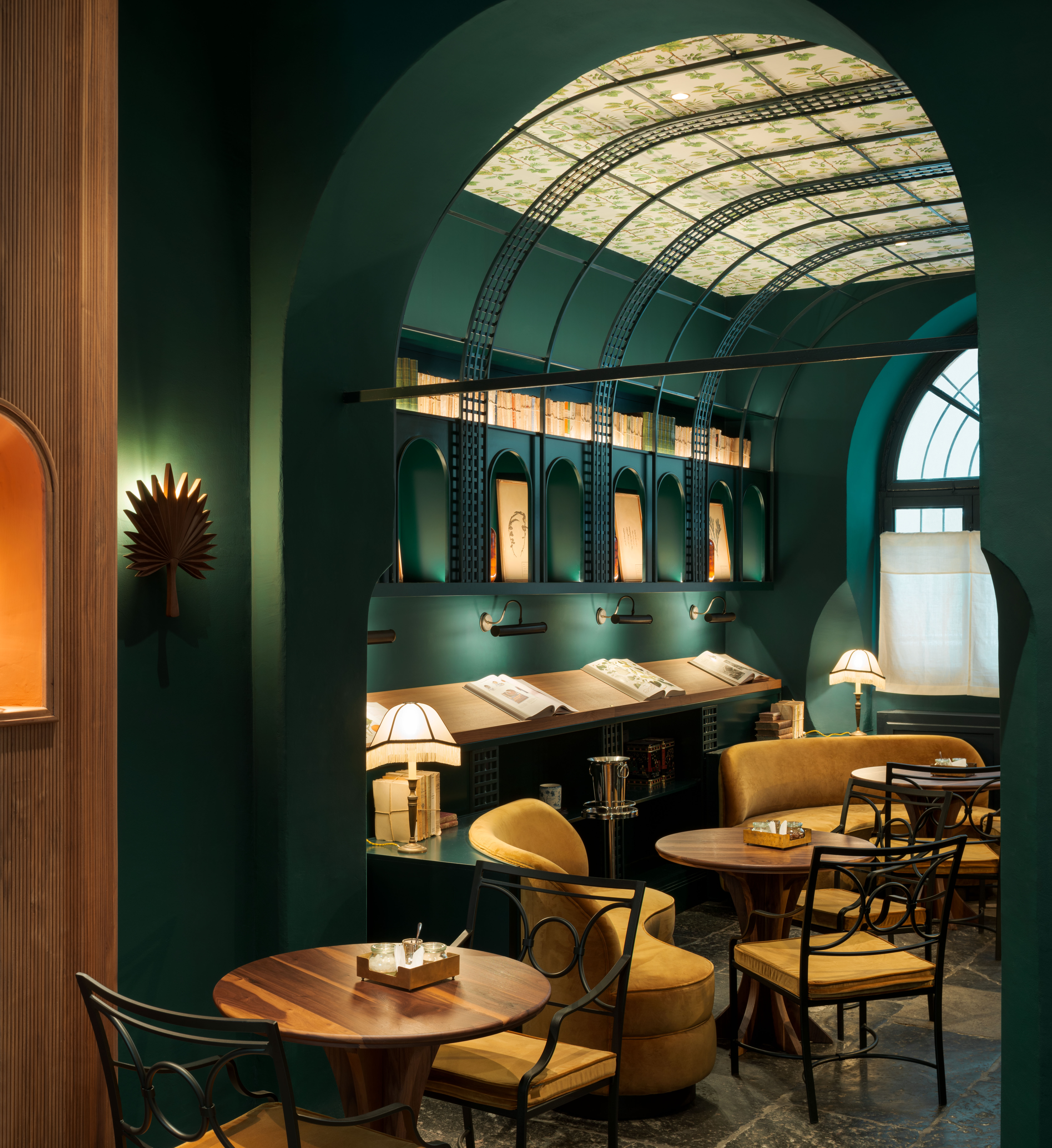
Bringing Out Luxurious Japanese Design

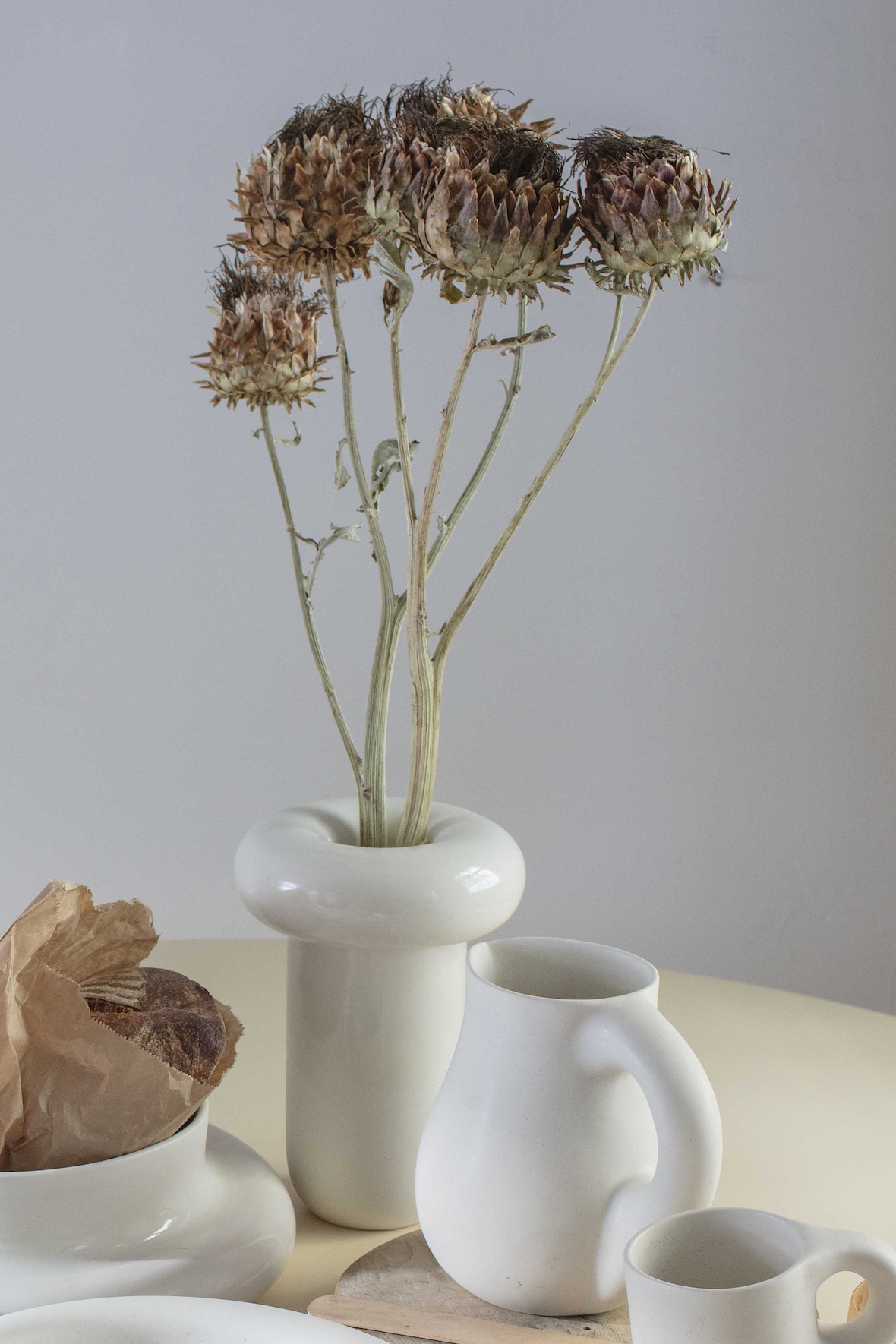
The Dough Collection Pays Homage to Baking and Pottery
Our favourite quirky buys for your kitchen

creation as DIALOGUE: modern design meets ancient nagoya crafts at maison&objet 2023
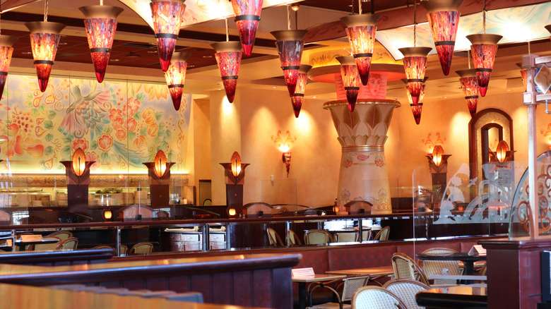
The Story Behind The Cheesecake Factory's Truly Unique Decor

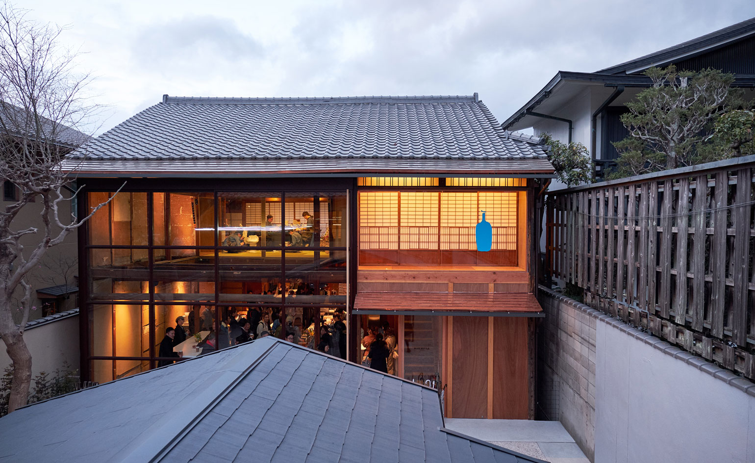
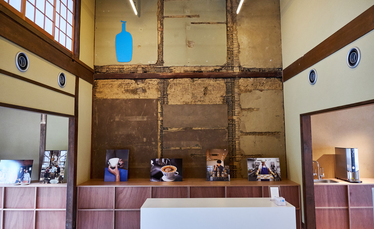
Kyoto’s first Blue Bottle Coffee shop is an architectural zen retreat

28 shades of aimai : Reinventing Japan’s traditional color wheel
Romanengo is Milan’s new sweet spot

Saana Baker’s inspired assortment of jacquard velvets, embroidered trims and stippled wallpapers

Japanese designers serve up unusual tableware
Pastel pink coffee shop is designed to be picture perfect
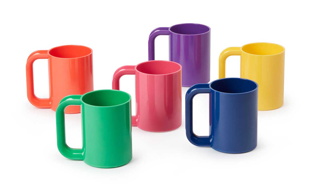
MoMA Design Store Resurrects Hellerware Rainbow Dinnerware
How Contemporary Artists Are Taking Papier-Mâché Out of the Classroom (Published 2024)

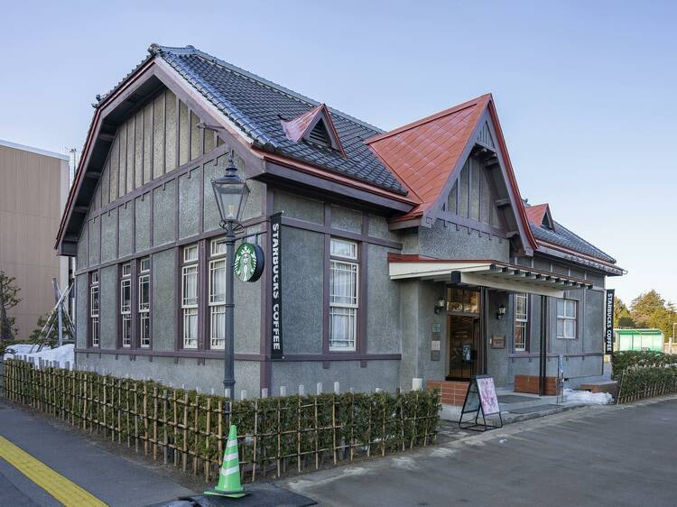
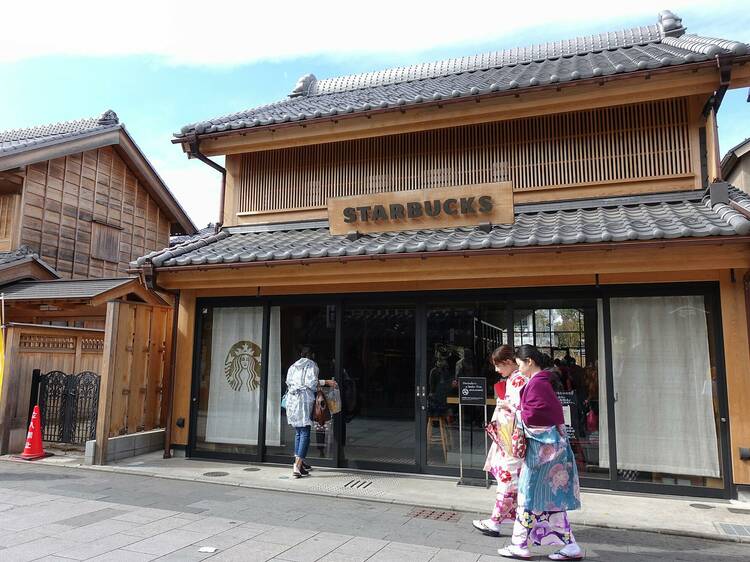
9 most beautiful Starbucks in Japan – from Tokyo to Hokkaido

Step inside Acne Studios’ pink-hued Tokyo flagship: ‘fashion is supposed to be fun’

restaurant and café design Archives
Imagine Cafe Review: Sustainability Meets Style