1/2
Bringing Out Luxurious Japanese Design
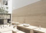
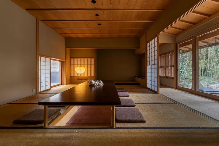
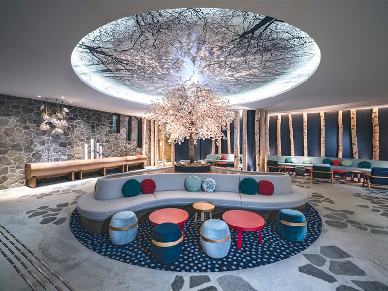
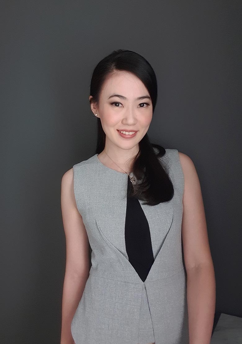
Metaphor Interior Architecture, a Jakarta-based interior design consultancy, services clients globally. This firm, composed of creative individuals, aims to provide optimal design solutions, specifically focusing on The Zora Kanade cluster. Christine, a senior associate, spearheads the design for Kanade Type 12. She reveals that her prior work on the Samasana Club House at The Zora provided a foundational understanding of the developer's design aspirations for the Kanade Cluster, which she extended to its three show unit houses.
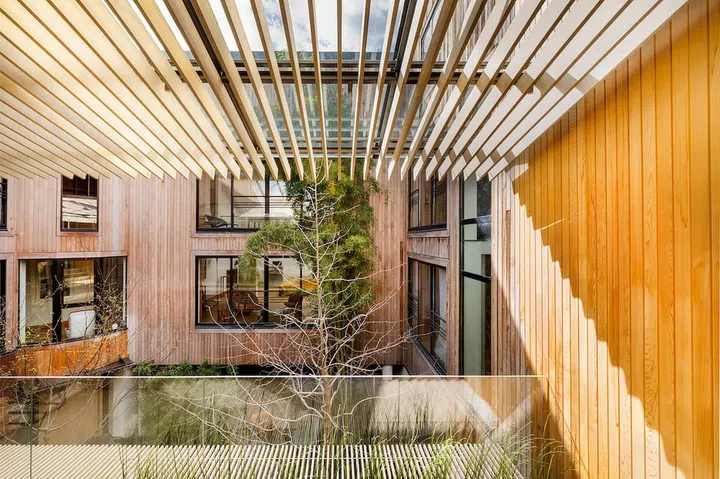
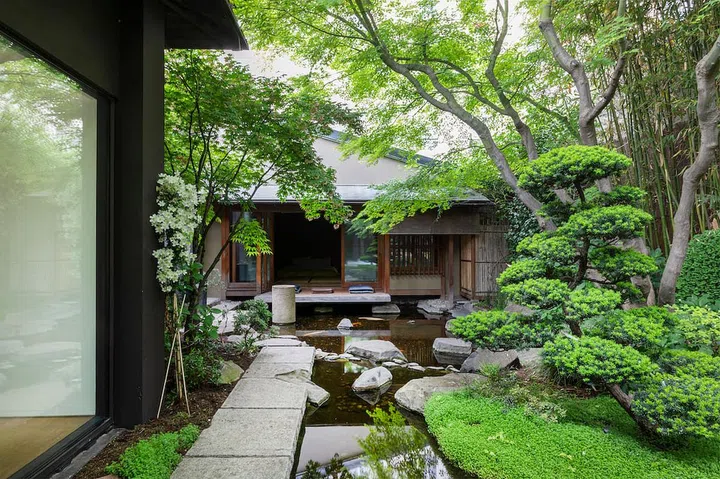
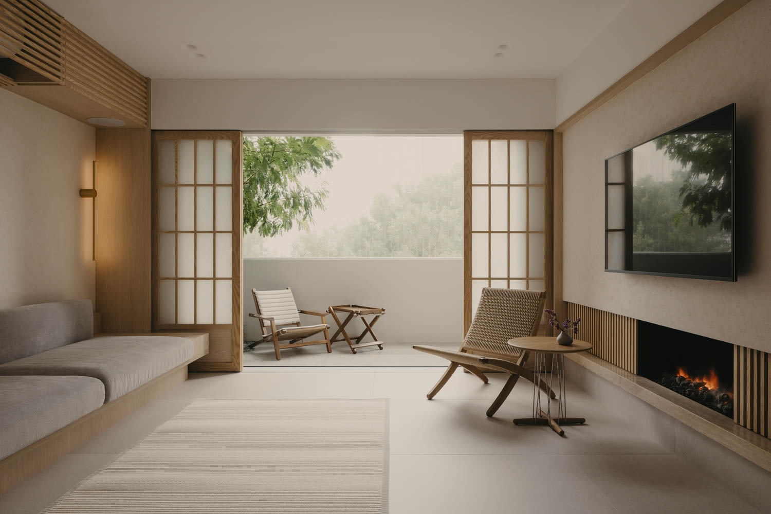
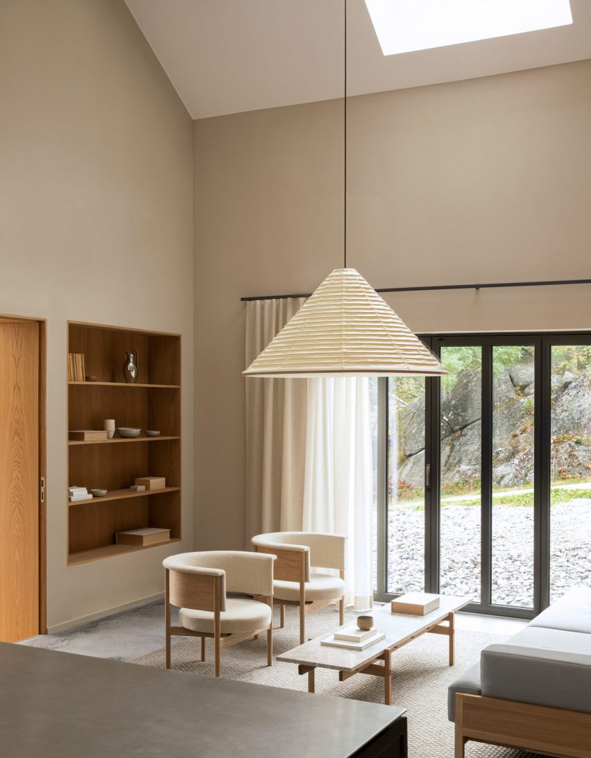
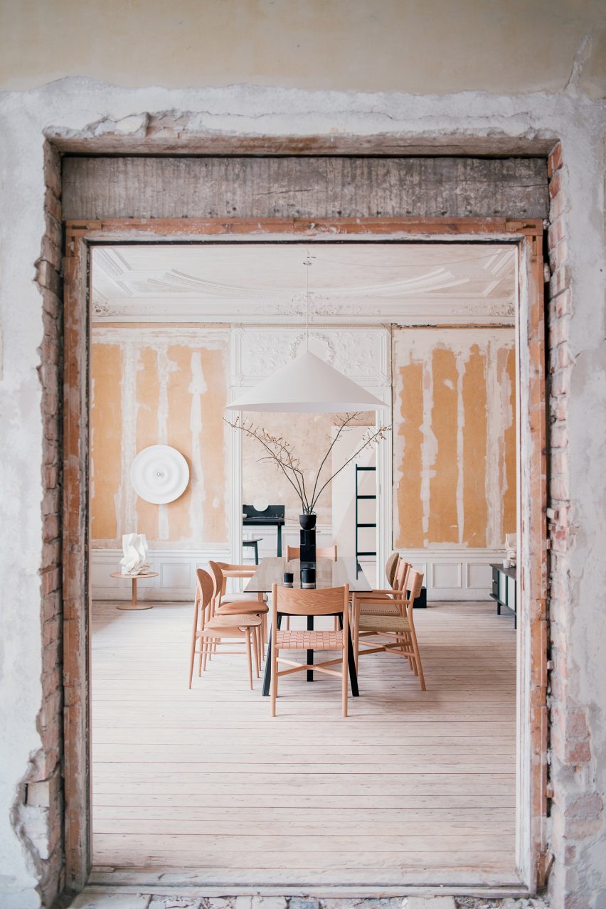
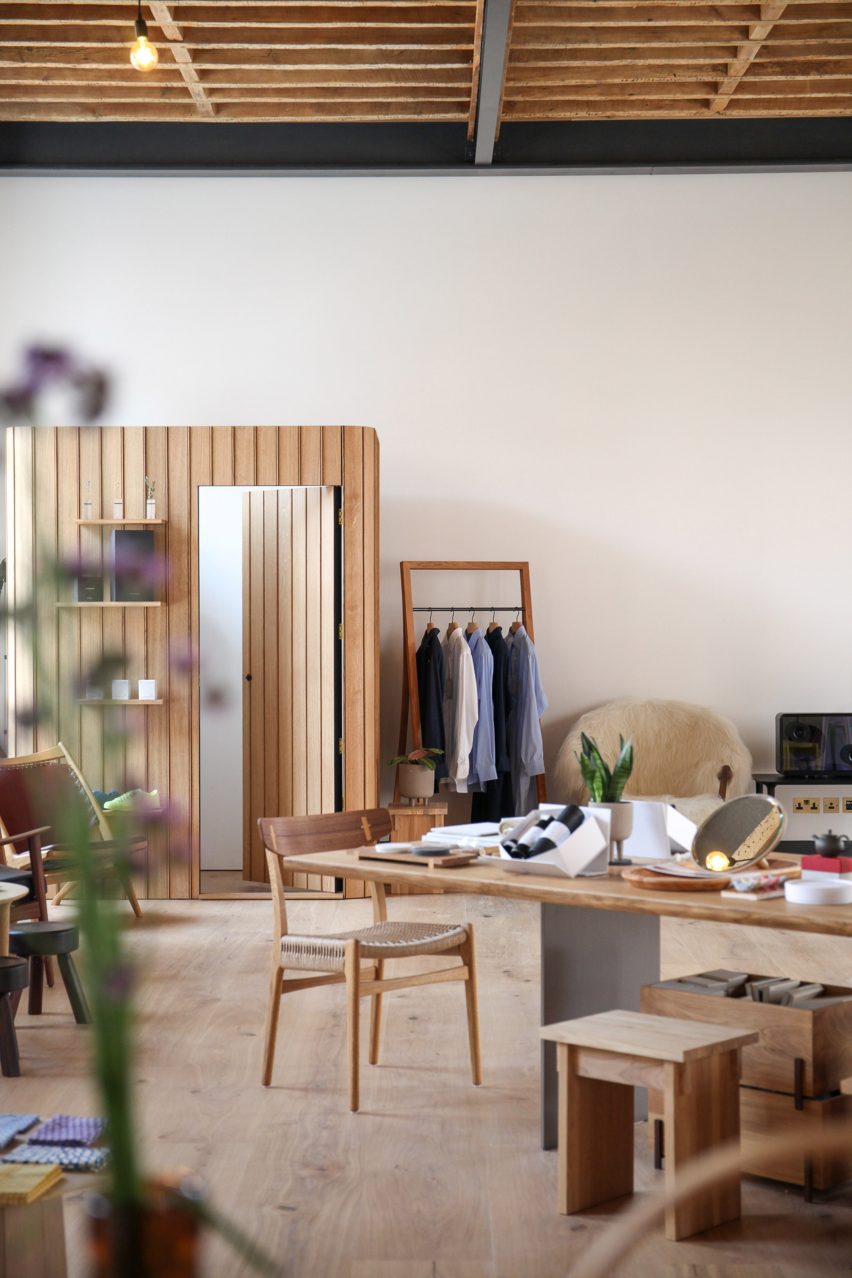
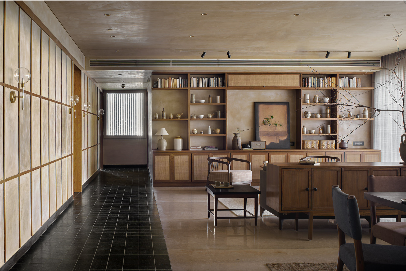
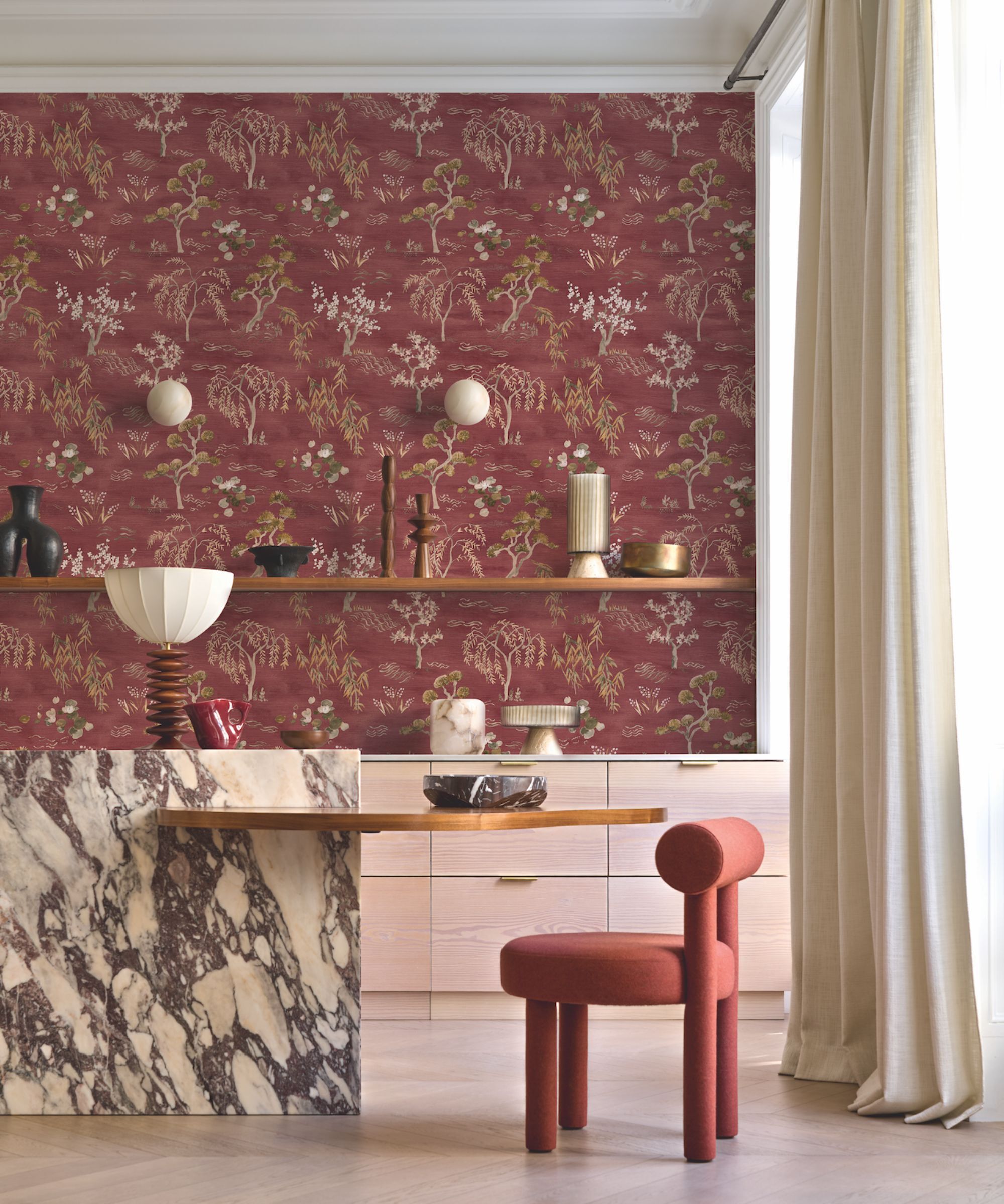
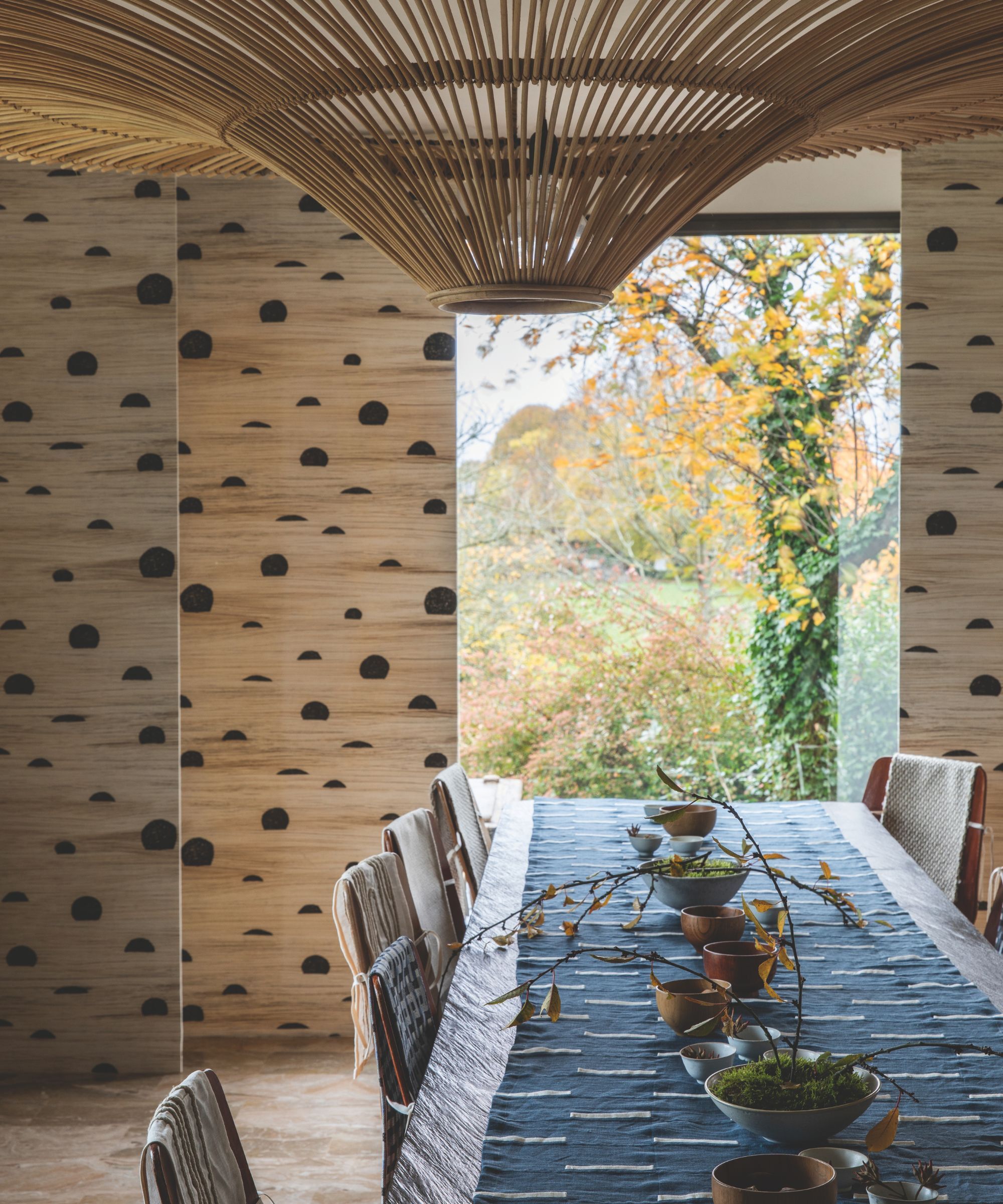
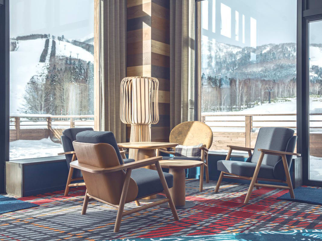
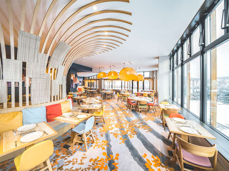
Her approach to the design brief involved analyzing the high-end target market and varied price points of the three housing units to determine appropriate interior design concepts. This led to distinct designs for each show unit, all incorporating a Japanese sensibility tailored for a modern, affluent demographic. Christine explains that the Japanese philosophy is translated not through direct imitation, but through the principle of 'balancing,' akin to Zen philosophy. This balance is evident in the harmonious use of colors, materials, and room composition, which collectively contribute to the desired ambiance.
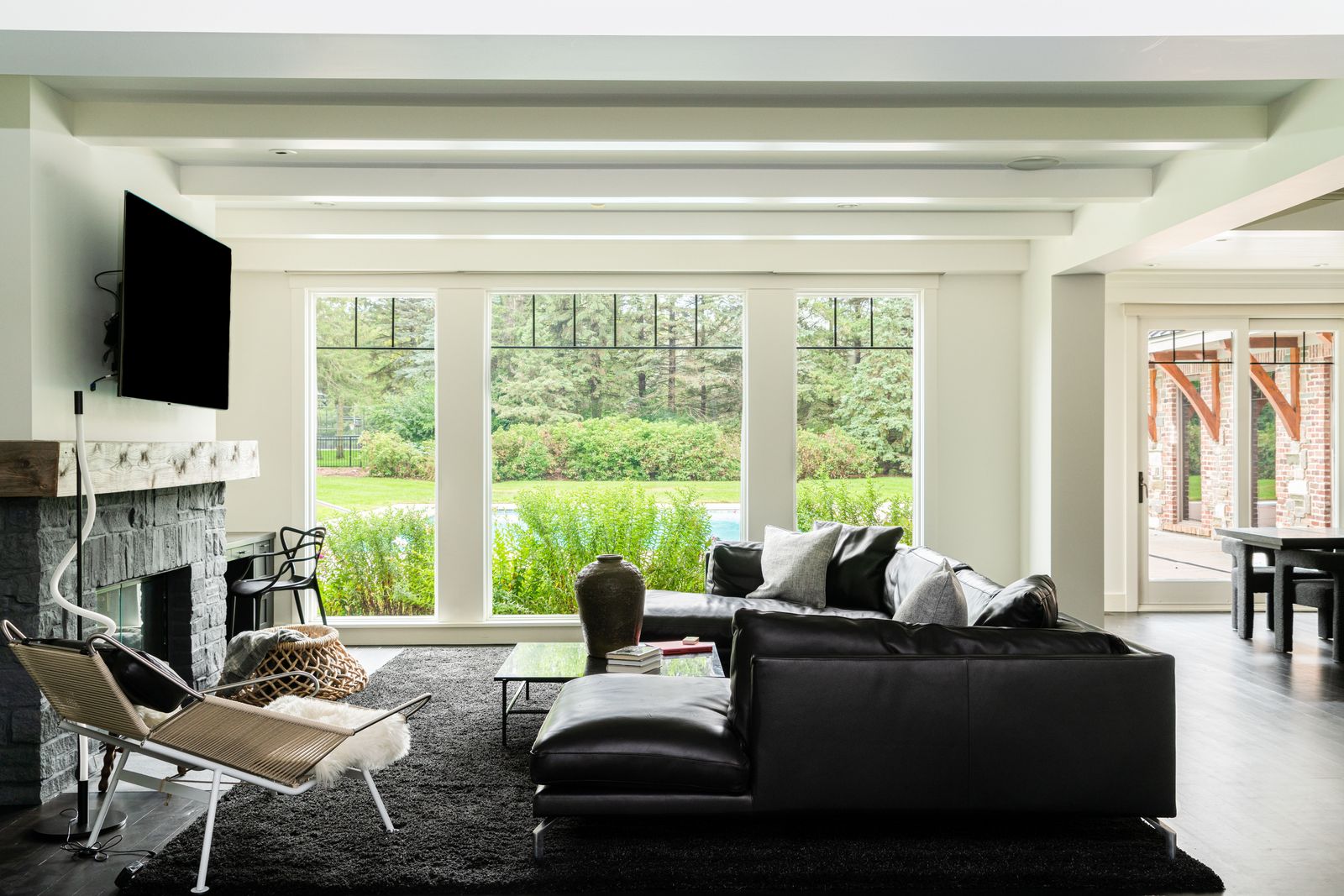
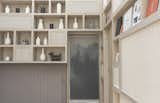
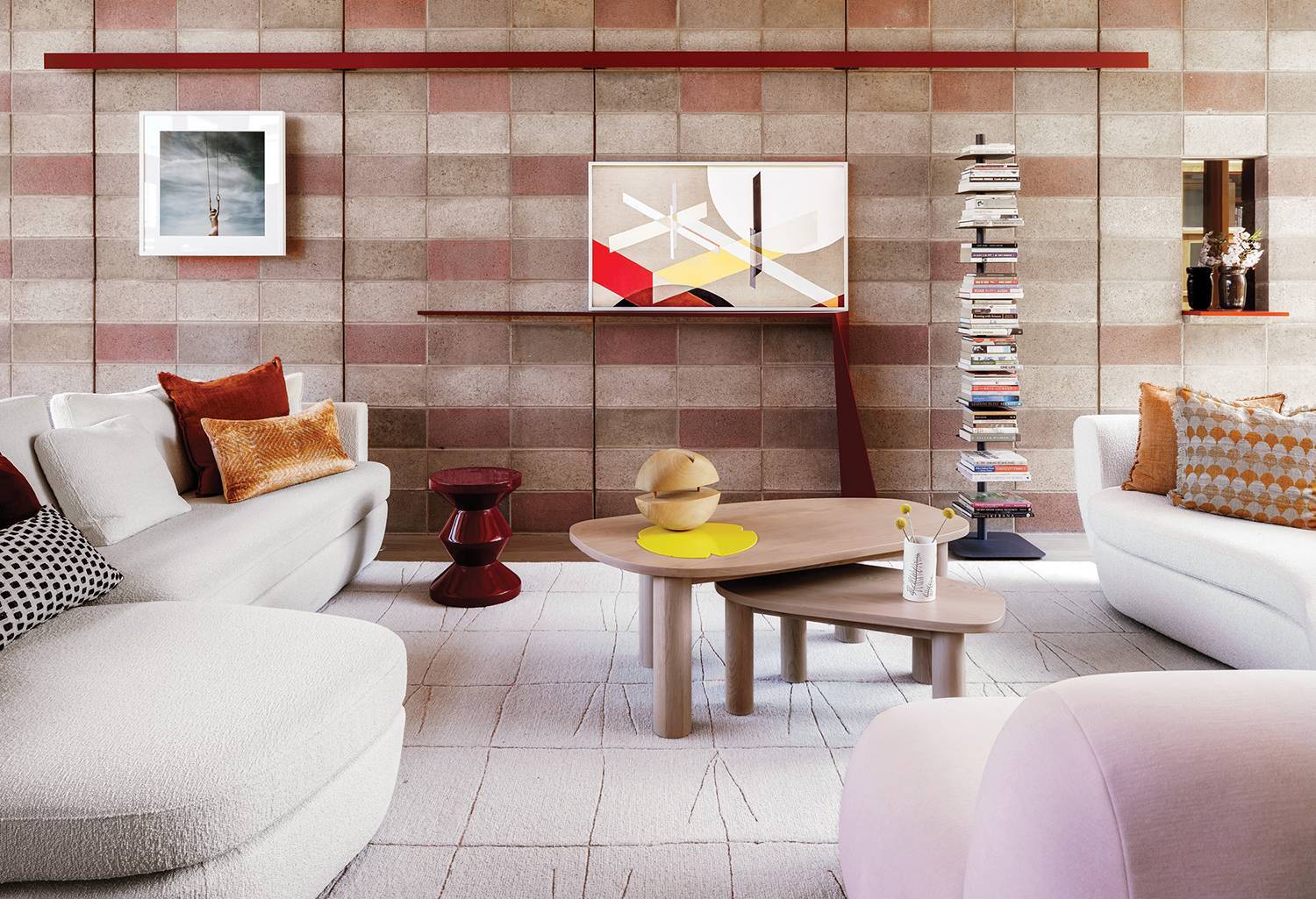
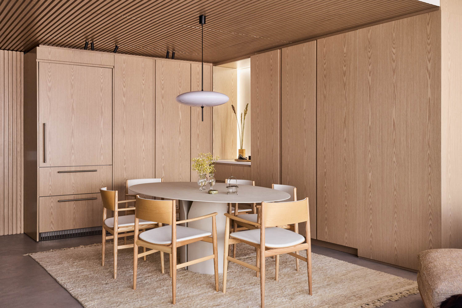
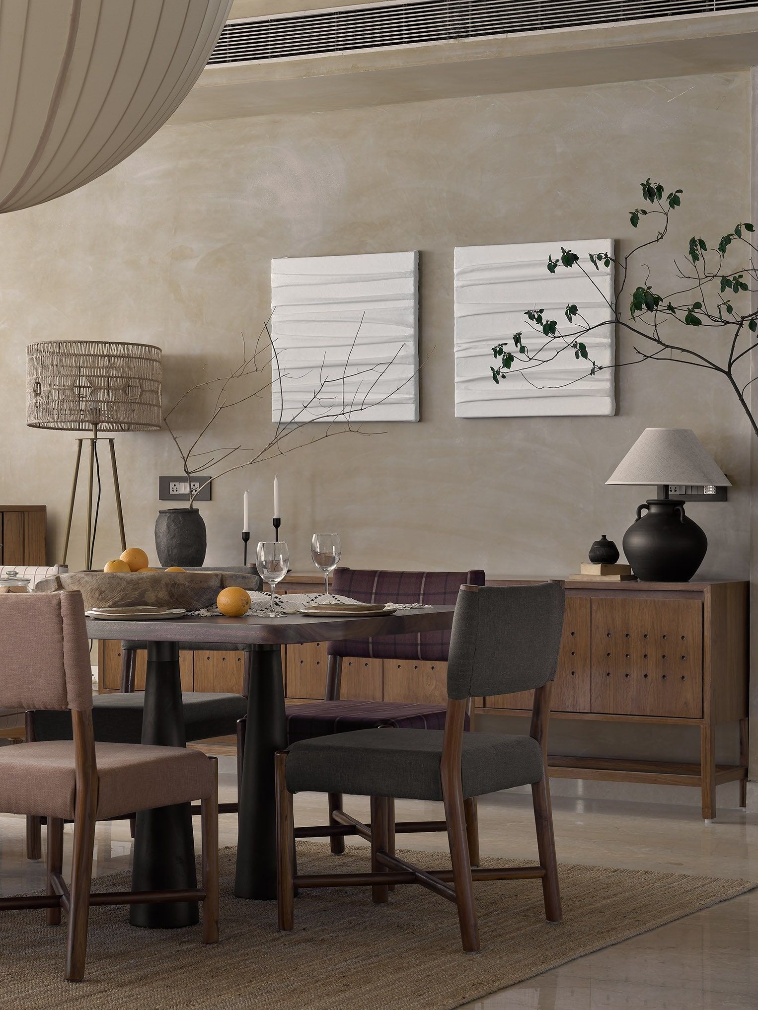
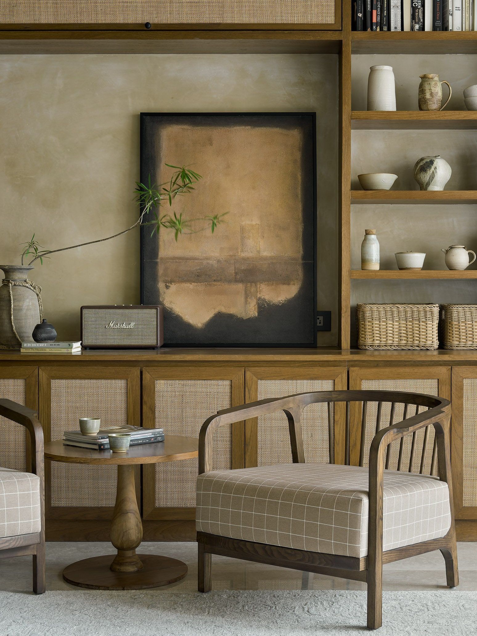
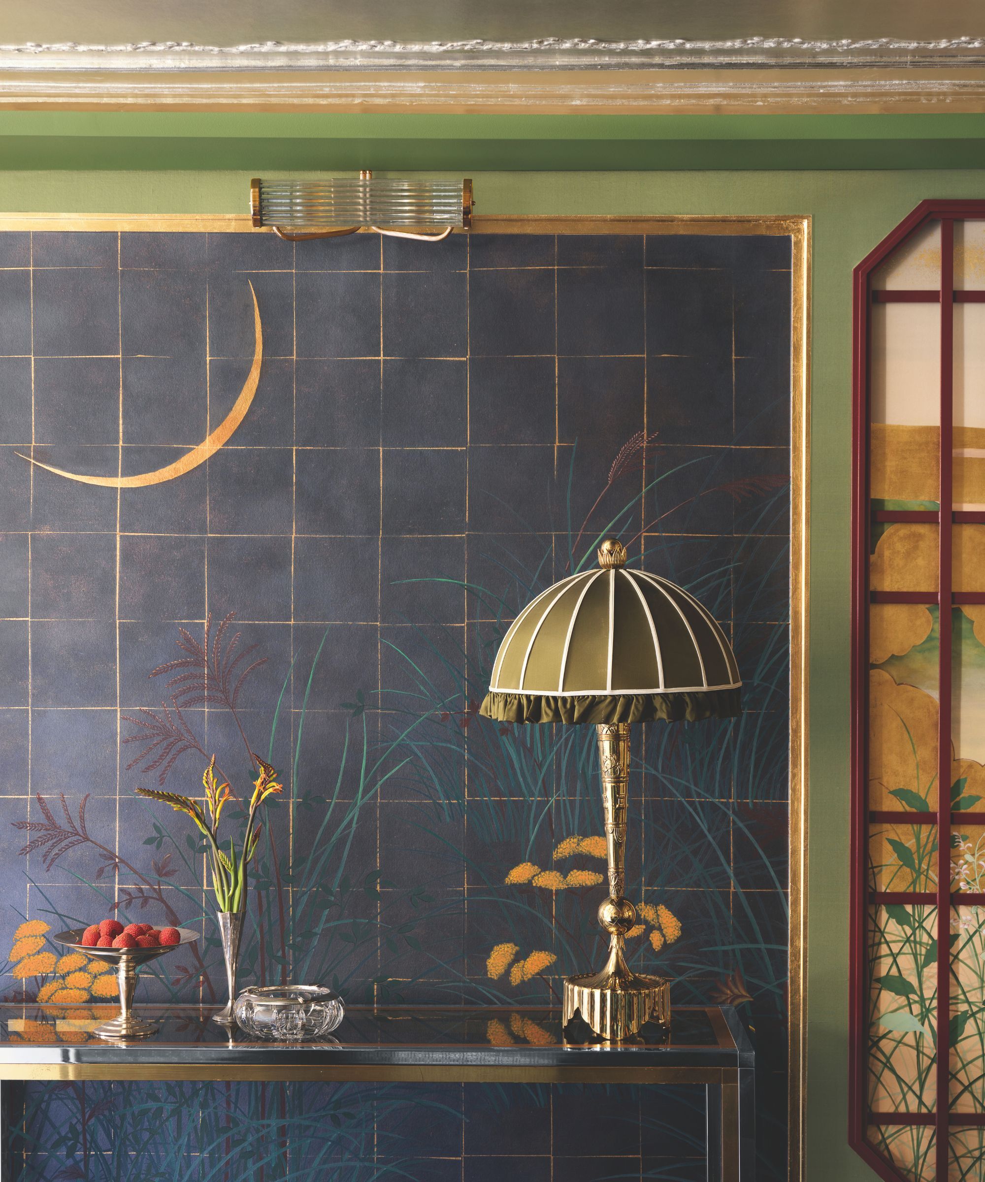
Elaborating on design balance, Christine highlights that each room's decor aligns with its function. For instance, a spacious area between the living and dining rooms demonstrates their strategy for balancing different zones within a single space. They also collaborate with Henco Home Decor to supply custom-designed furniture. Regarding color palettes, earth tones like brown or gray form the base, augmented by accent colors such as burnt orange, teal, and combinations thereof. While orange might not be traditionally Japanese, teal and olive are chosen for their natural associations, reflecting leaf colors.
These accent colors are strategically employed to infuse a modern and luxurious feel into the Japanese aesthetic. Acknowledging the Japanese preference for simplicity, Christine clarifies that the target market's demand for luxury necessitated a nuanced approach to color, resulting in a unique modern atmosphere. The three show units, contrary to having a common thread, are each designed with distinct interior concepts to cater to their specific target markets. For example, the Type 12 unit targets a mature clientele prioritizing luxury, while Type 8+ and Type 10 units are designed with younger families in mind, featuring more youthful aesthetics.
To ensure each unit resonates with potential buyers, the design process incorporates diverse consumer style preferences. These customer needs are then translated into unique designs for each unit, varying in color and overall concept. Material selection prioritizes both aesthetics and ease of maintenance, with choices like solid surface, marble, or laminate ensuring durability and practicality.
#InteriorDesign #JapaneseDesign #LuxuryHomes #MetaphorInteriorArchitecture #HomeDecoration #DesignPhilosophy #ColorPalette #MaterialSelection #InteriorDesign #JapaneseDesign #LuxuryHomes #MetaphorInteriorArchitecture #HomeDecoration #DesignPhilosophy #ColorPalette #MaterialSelection
0 comment in total
 No comments yet
You may also like
Ten furniture and lighting designs by Japanese brands and designers
This Japanese-Inspired Inn Is One of Mexico City's Best Kept Secrets

Seven "Japandi" interiors that blend Japanese and Scandinavian design
creation as DIALOGUE: modern design meets ancient nagoya crafts at maison&objet 2023
Step inside Acne Studios’ pink-hued Tokyo flagship: ‘fashion is supposed to be fun’

Late fashion designer, Kenzo Takada's personal Japanese home in the heart of Paris
How Japan influenced Nordic design aesthetics and vice versa

Japan's New Club Med Has Chic Styling & Edgy Design
John Lewis stay ahead of the Japanese trend with V&A inspired range

Interior Design Icks: Do You Regret Your Decor?
7 Modern Japanese Hotels That Will Help You Find Your Zen
A Minimalist Home Full of Clever Design Tricks Appears to Levitate Above the Earth
5 Best Japanese-Inspired Home Accessories Designed To Bring Nature & Tranquility Indoors

SHED Revives a Mid-Century House in Portland With Japanese Minimalism
5 homes that bring serene Japanese-inspired design to life

Jil Sander's dedication to Japanese denim in Milan

Tour 5 Japanese-Inspired Modern Homes That Embody Contemporary Elegance

Elevate Your Space With These Inspiring Japandi Interiors

The Rise of Japanese-Inspired Interiors: Why Calm, Craft, and Simplicity Are Redefining Modern Design

Can Middle East designers bring zen to spaces with Japanese aesthetics?