1/10
This Paint Color Will Infuse Your Space With Warmth and Positivity–Can You Guess What It Is?
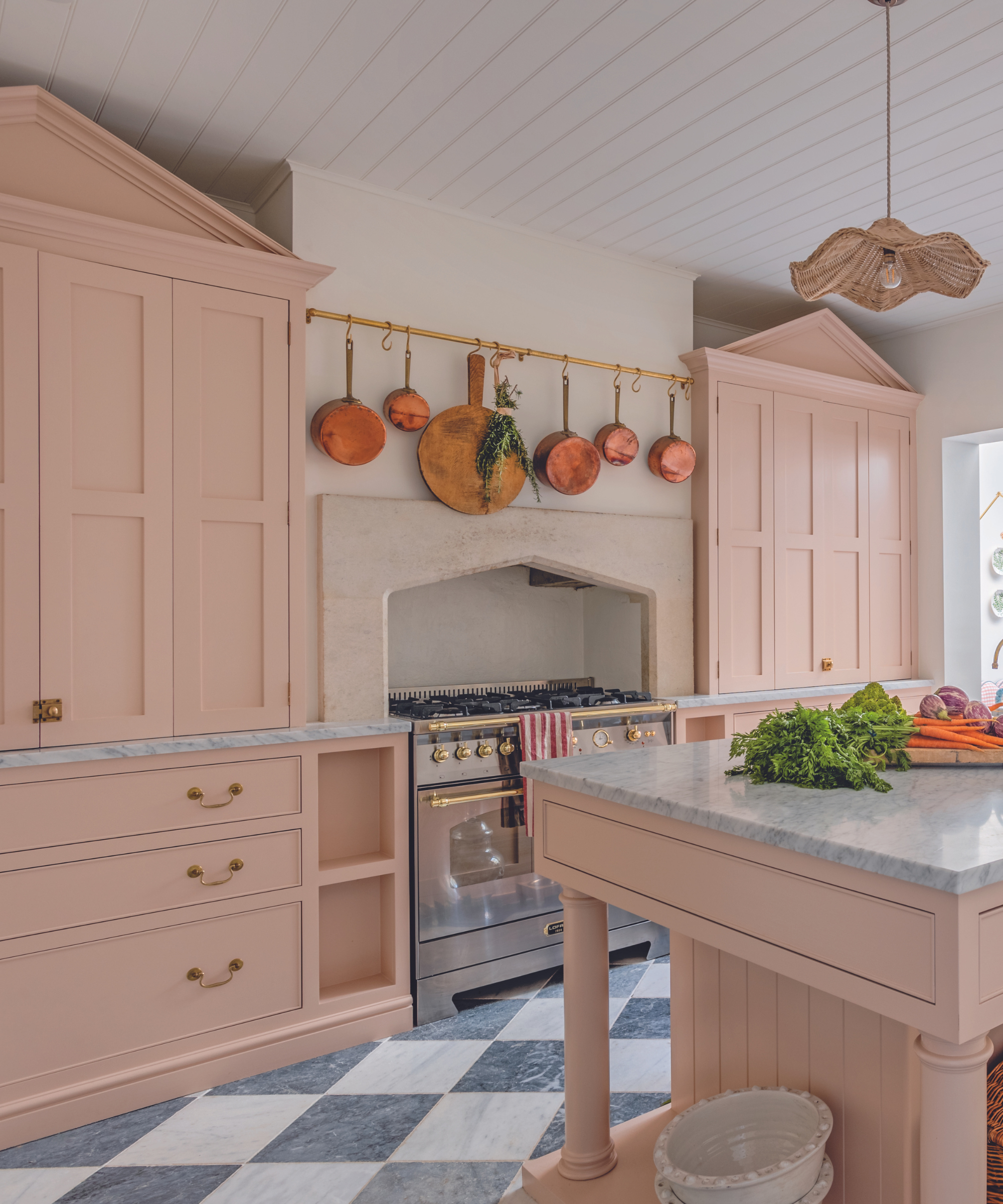
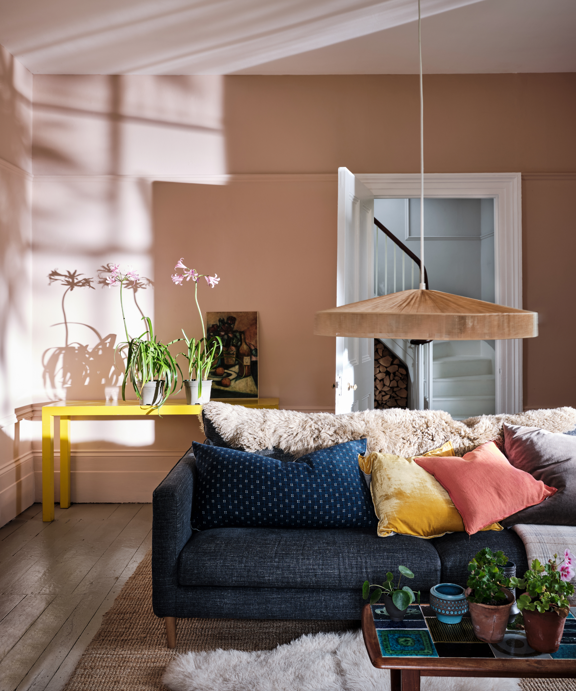
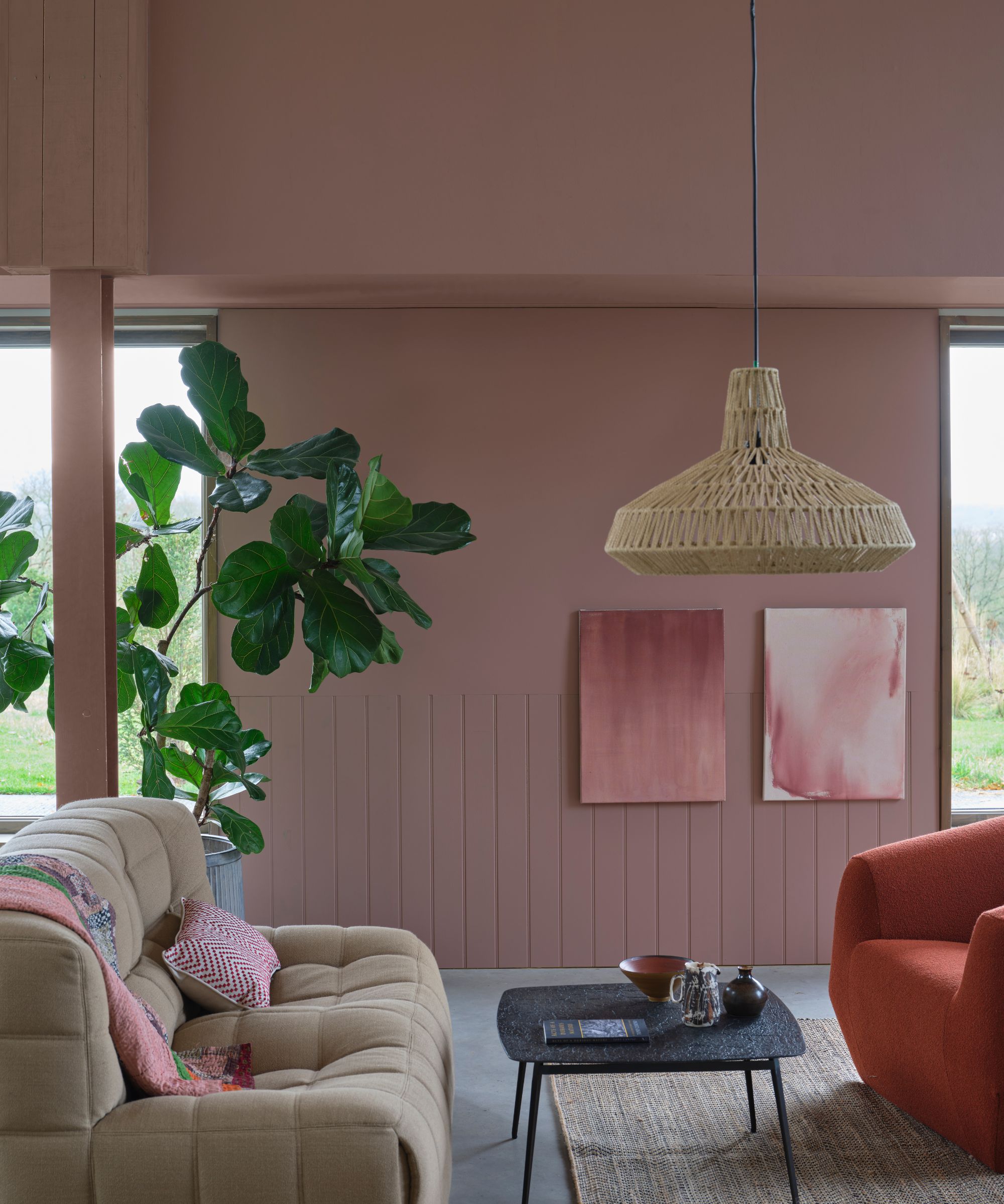
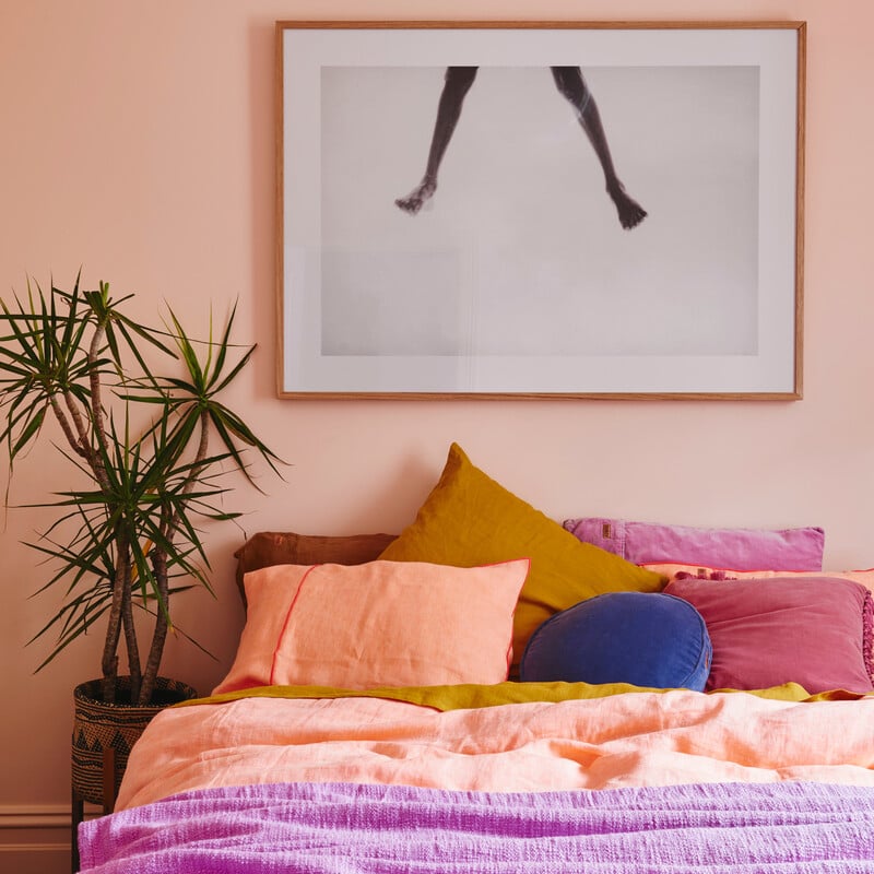
In April 2022, Architectural Digest showcased Kacey Musgraves' serene Nashville home, notable for its predominantly white and off-white palette punctuated by occasional pink hues, particularly sunset-inspired tones. This choice highlights a continuing design trend: the use of coral paint colors. Coral was designated Pantone's Color of the Year in 2019 due to its buoyant qualities and its ability to evoke connection, a sentiment that resonated particularly strongly three years later amidst a global pandemic. Interior designer Kim Lapin, who recently incorporated coral into her own Los Angeles home, notes that coral or soft peachy pink tones imbue a space with warmth, charm, and a light-hearted playfulness, making it a versatile choice for interiors, décor, fashion, and everyday life.
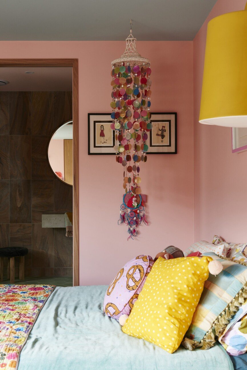
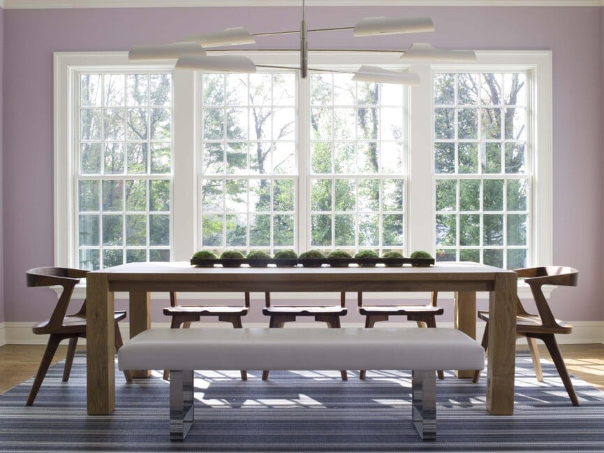
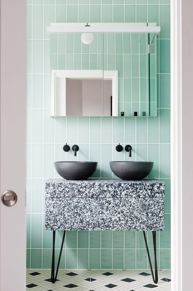
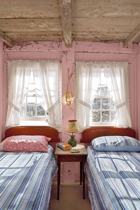
Coral paint colors are particularly well-suited for guest rooms and children's rooms. Lapin, for instance, painted her two-year-old daughter’s room a peachy pink after a year-long gut remodel, finding it to be a dreamy and cheerful option that feels modern and fresh, without being a conventional baby pink. For those seeking a more adventurous application, coral can also be effectively used in dining rooms. Lapin used a dreamy pink plaster in her dining room, noting its flattering effect on guests during dinner parties. When considering complementary colors for coral, especially a more muted version, sea-foam green or a very muted charcoal are recommended. For strong corals, pairing them with super washed-out muted colors like off-white or bone white helps to soften the room's overall aesthetic.
The enduring appeal of coral paint colors suggests that this trend is here to stay. Its universal flattering quality and capacity to make a statement with minimal effort contribute to its longevity in design. The cheery tone of coral is considered more relevant than ever, capable of instantly lifting moods and becoming a focal point of any home. Several brands offer excellent coral paint options. Sherwin Williams' "Coral Bead," a warm hue, pairs well with muted blues and grays, and was used in Lapin's daughter's room. Benjamin Moore's "Coral Gables" offers a more vibrant, tropical feel. Clare's "Pink Sky" is a zero-VOC option that leans more pink than orange, creating a soothing, sunset-like ambiance. Farrow & Ball's "Bisque" is an orange-leaning coral that complements off-white, gray, or even olive green for a more colorful mix. Lastly, Portola Paints' "Coral Reef" is praised for its rich hue, offering a breezy, beachy dream aesthetic.
#CoralPaintColors #HomeDecorTrends #InteriorDesign #PaintColorIdeas #WarmthAndPositivity #KimLapinInteriors #SherwinWilliams #BenjaminMoore #ClarePaint #FarrowAndBall #PortolaPaints #CoralPaintColors #HomeDecorTrends #InteriorDesign #PaintColorIdeas #WarmthAndPositivity #KimLapinInteriors #SherwinWilliams #BenjaminMoore #ClarePaint #FarrowAndBall #PortolaPaints
0 comment in total
 No comments yet
You may also like
The Brighter, the Better—These Vibrant Paints Will Infuse Your Home With Positivity

'Mocha mousse' to plum: The nine paint colours that can transform your home
6 'Energetic Colors' for Vitality and "Sophisticated Interiors", According To Psychologists And Design Experts

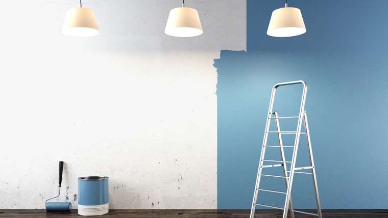
What paint colors to use to create a relaxed vibe at home

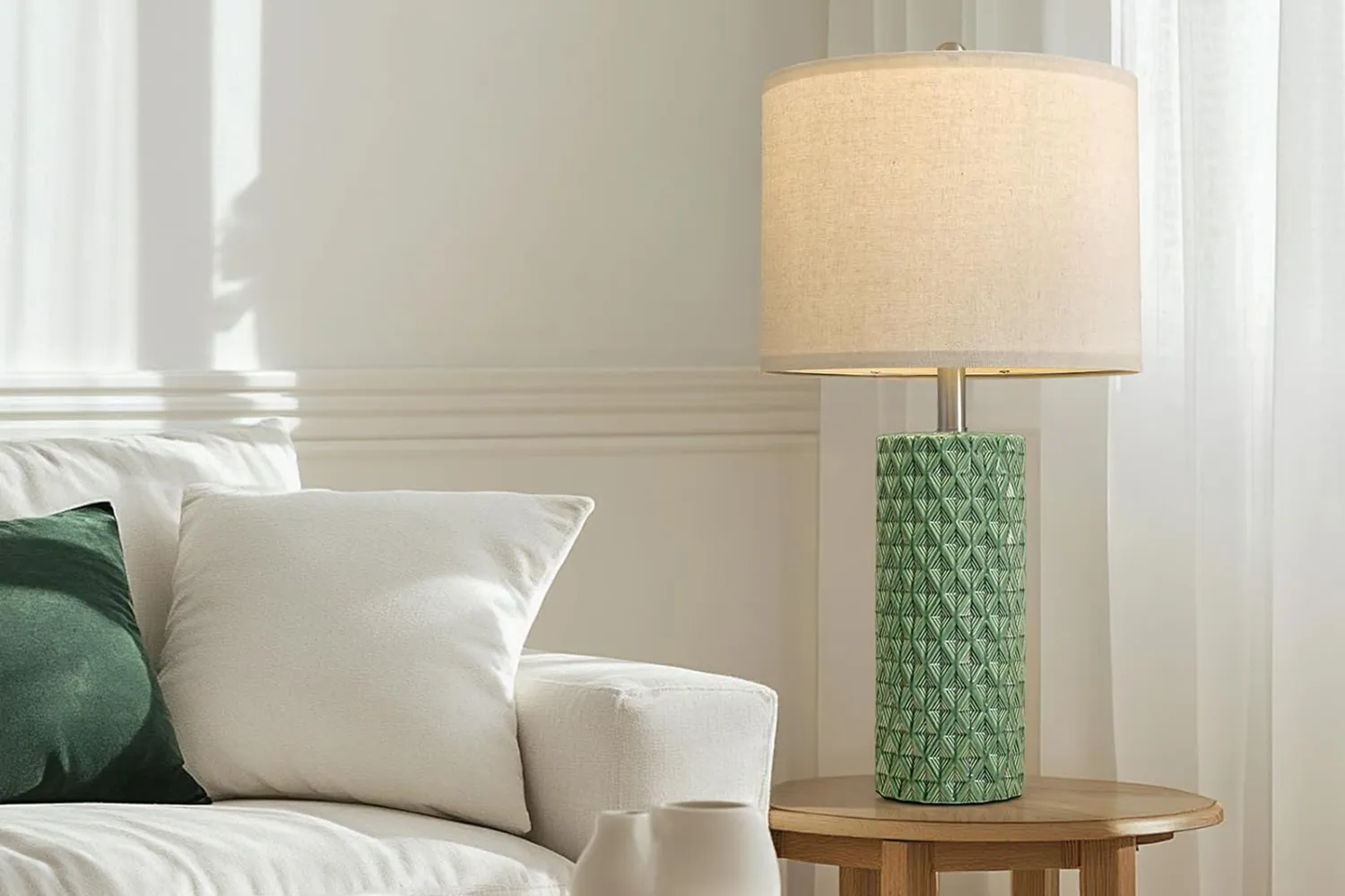
Interior Designers Say the Key to Creating a Joyful Space Is to Add in This One Color

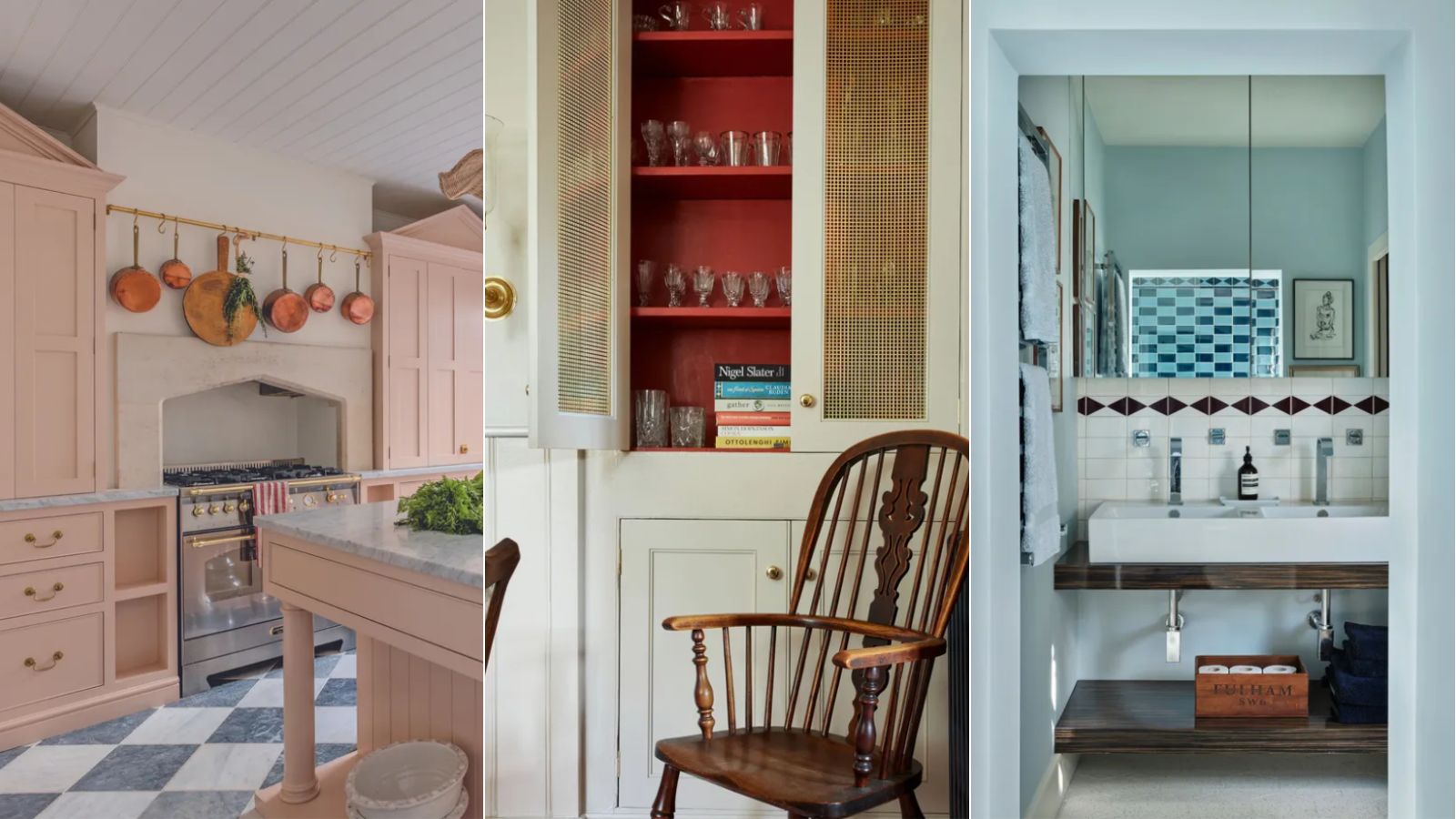
A color psychologist says these color schemes are the most likely to boost your mood

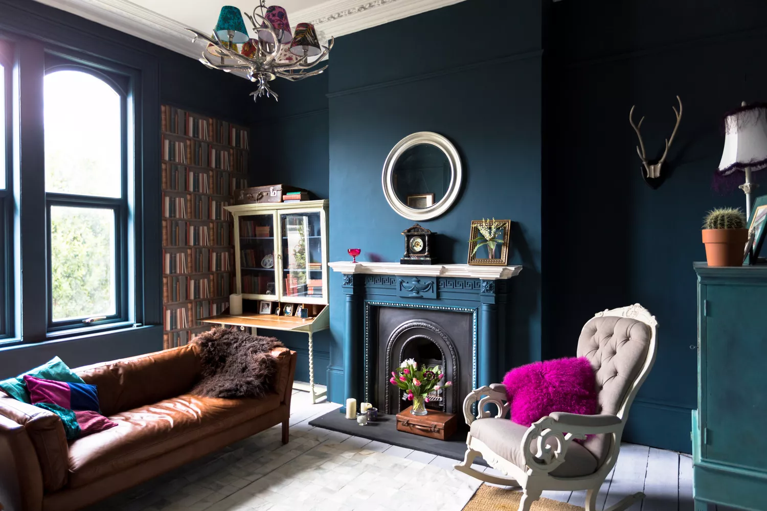
7 Paint Colors Designers Totally Regret Using (and What They Wish They’d Used Instead)

How to choose the best paint color for any room in your house
The Versatile Color That'll Cheer You and Your Home Up All Year Long


Designers Agree: These 7 Underrated Paint Colors Will Be Huge in 2026

How Your Home's Paint Colors Can Make You Happier, According to Experts

What makes a paint color flattering? Experts share their go-to shades for a universally complementary scheme
This One Color Instantly Boosts Joy in Any Room, According to Interior Designers
A Color Psychologist Says This Is the Most Relaxing Paint Color

How paint colour in your home can affect your mood
My rented apartment follows the key rules of color psychology – here's why I'd never go back to an all-white home
'It's the best way to make a home joyful' - this paint trend is the perfect idea to introduce color thoughtfully
Add These Happy Colors to Your Home and Boost Your Mood
3 'small but impactful' paint updates to try in 2024, according to a color expert
Before Choosing A Paint Color, Ask These 5 Questions