1/4
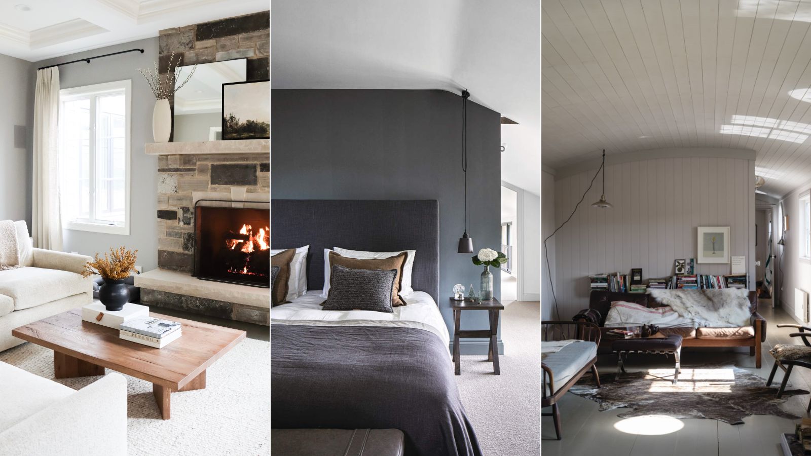
Sherwin-Williams' Agreeable Gray is one of the country's favorite gray paints – but is it the right choice for you?
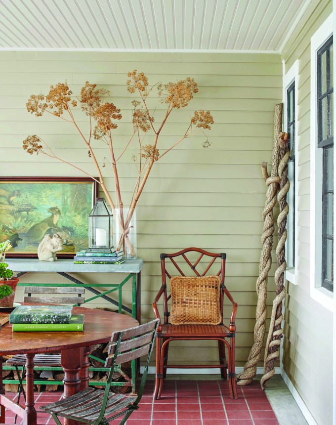
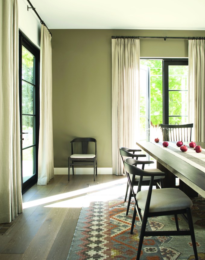
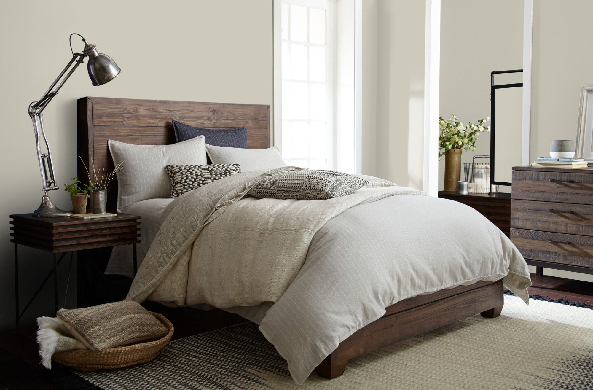
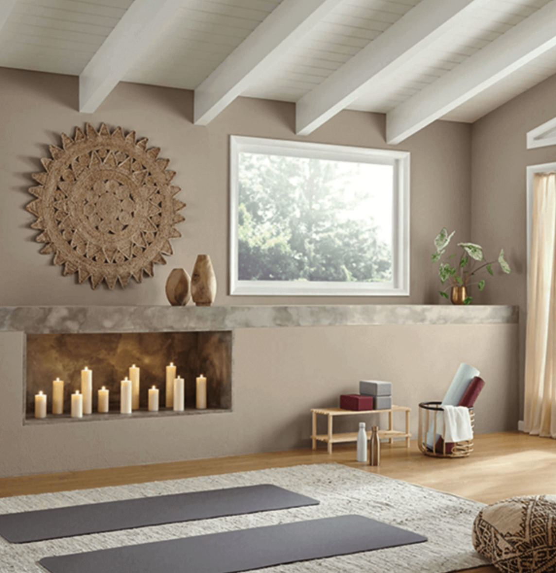
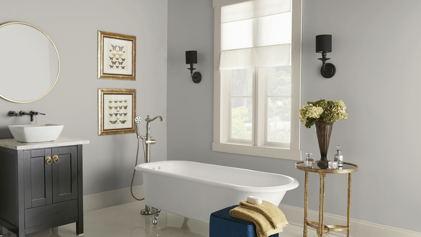
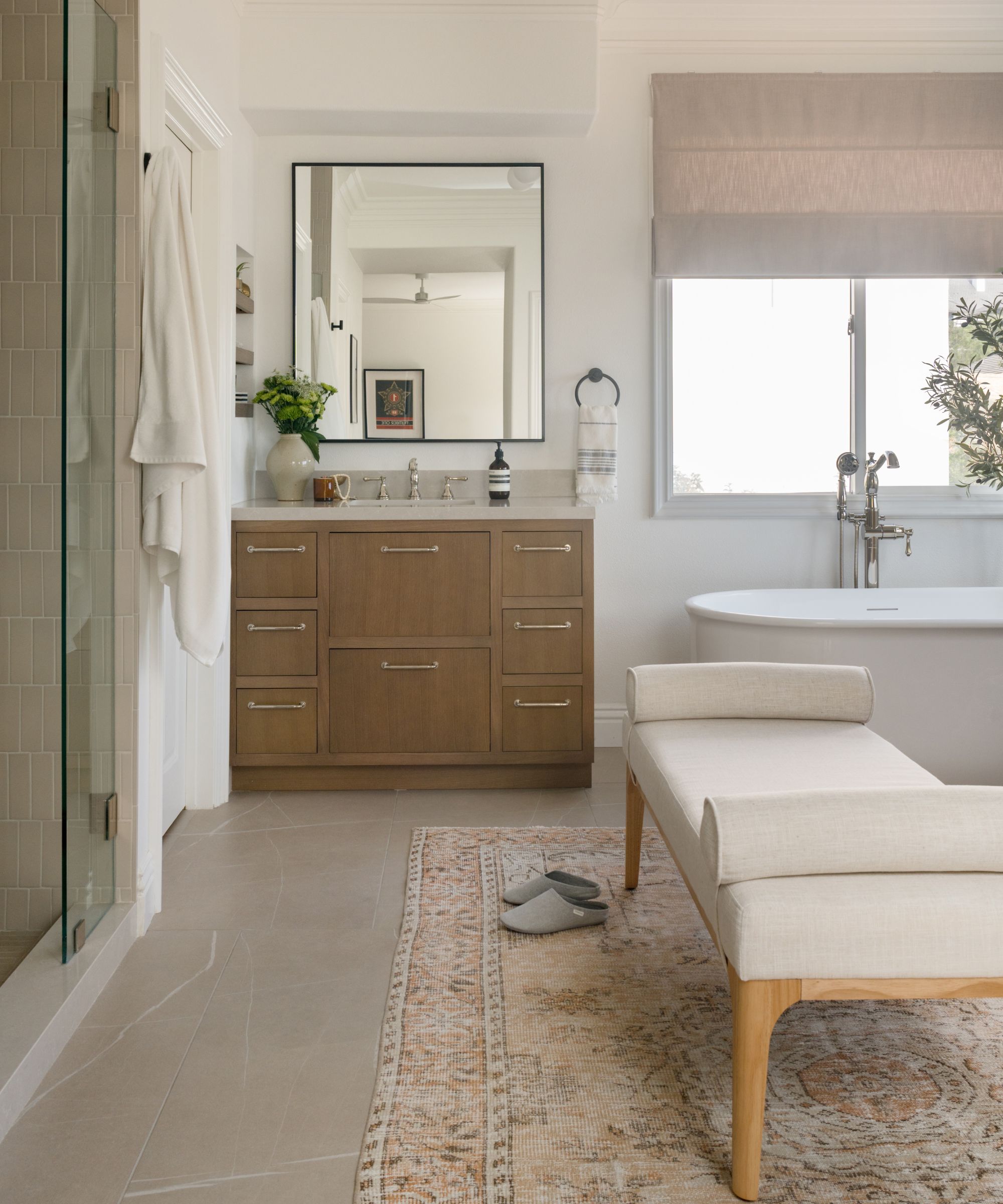
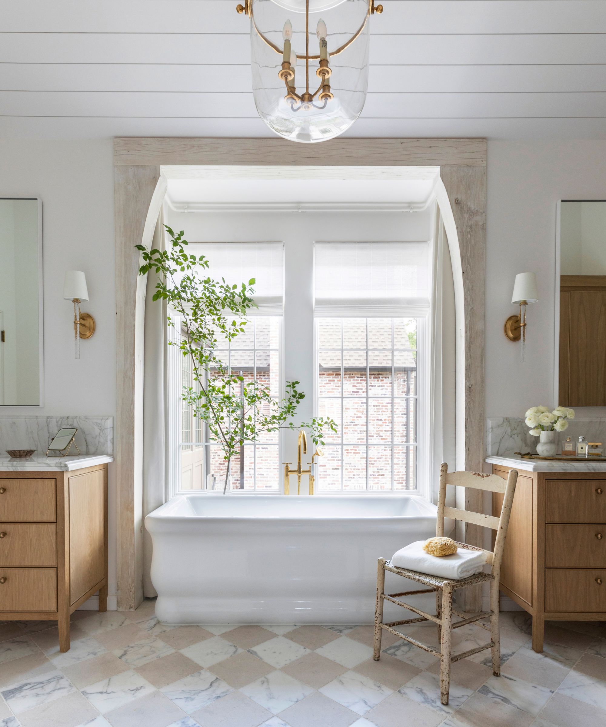
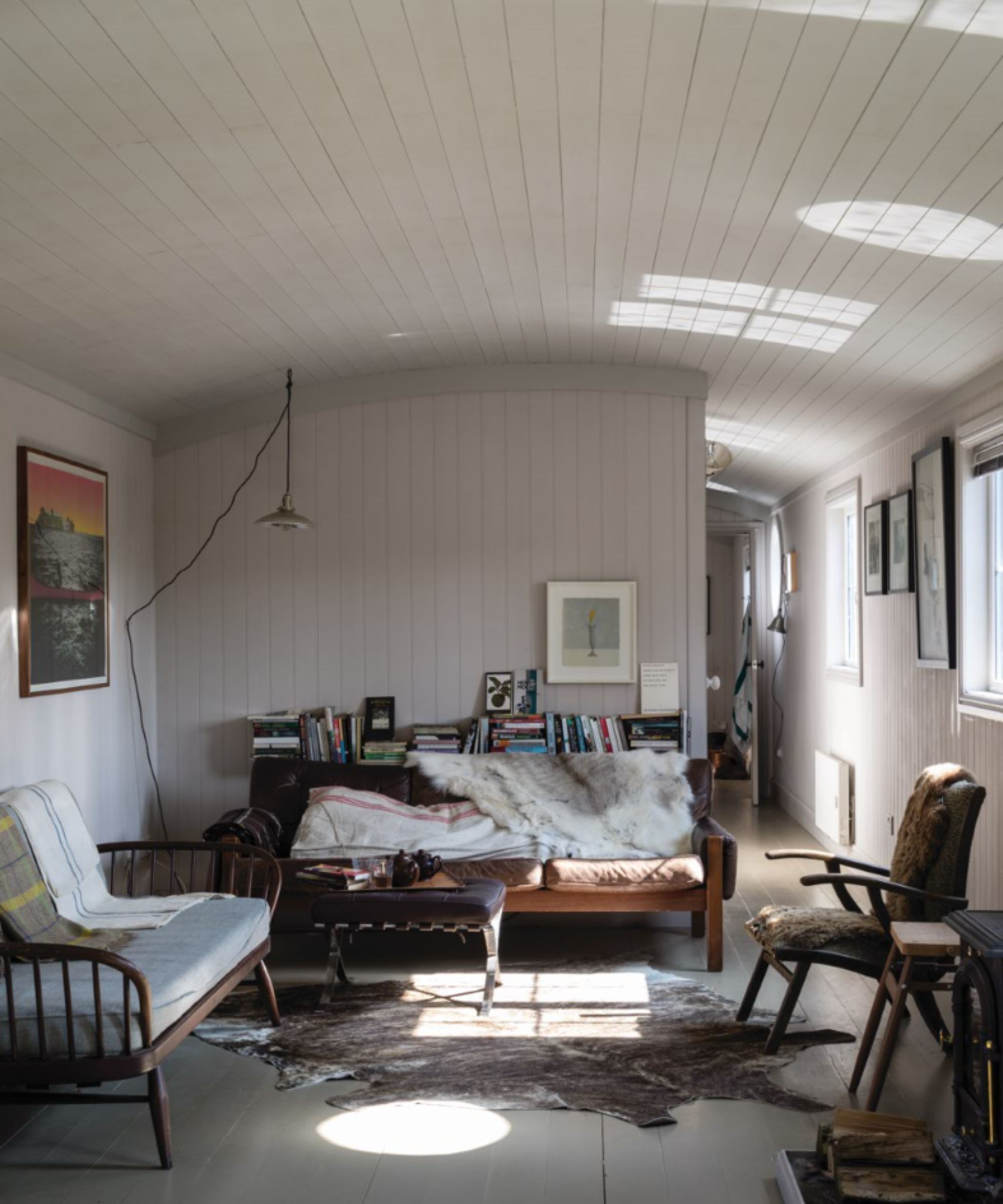
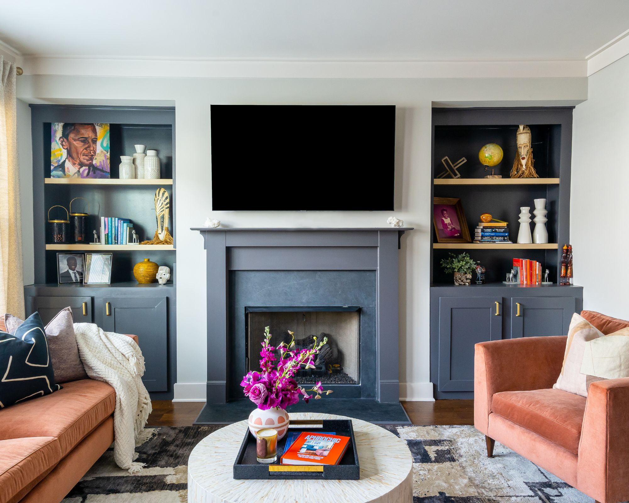
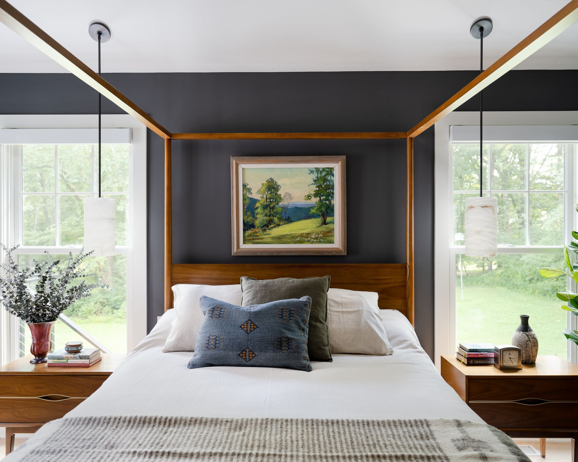
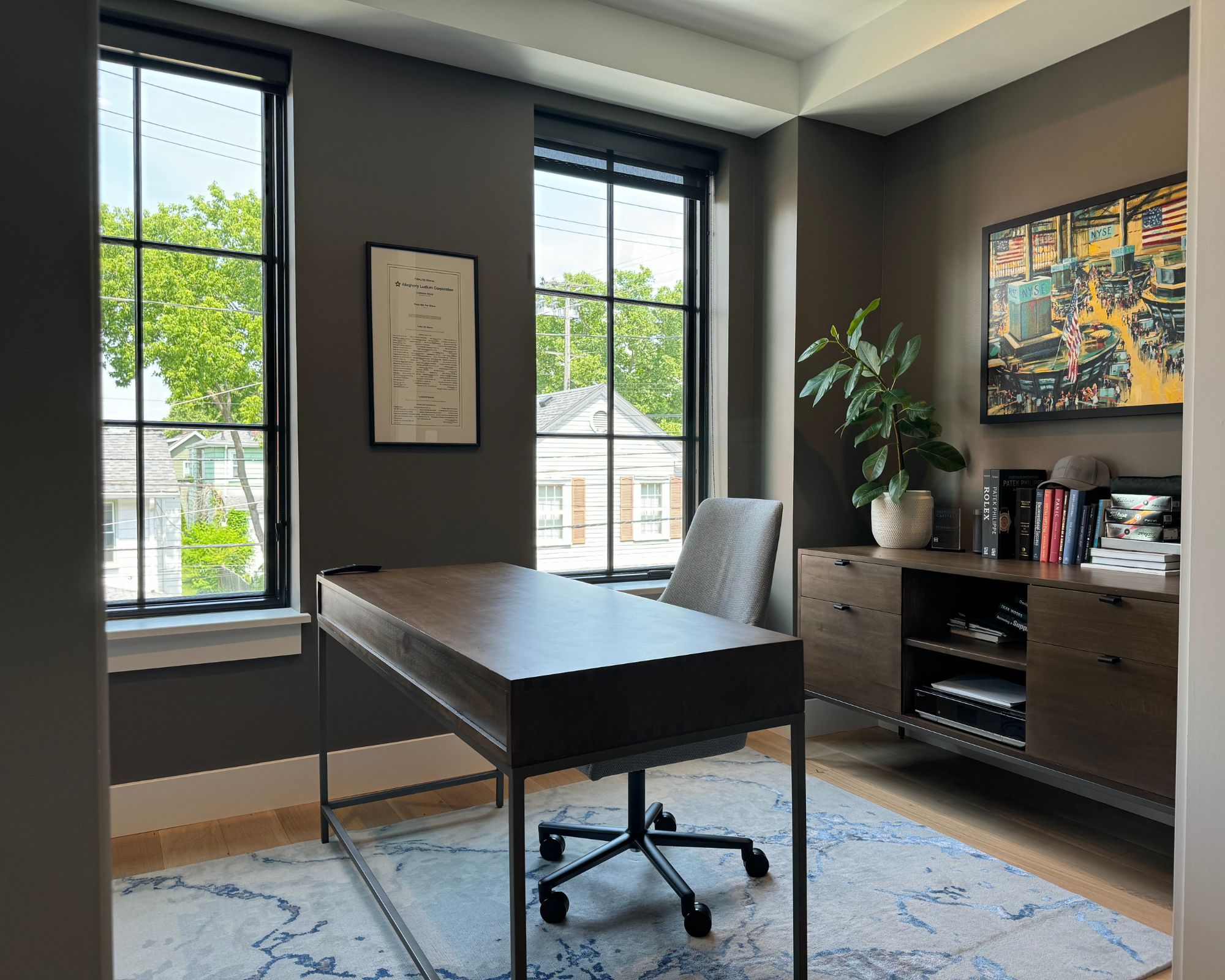
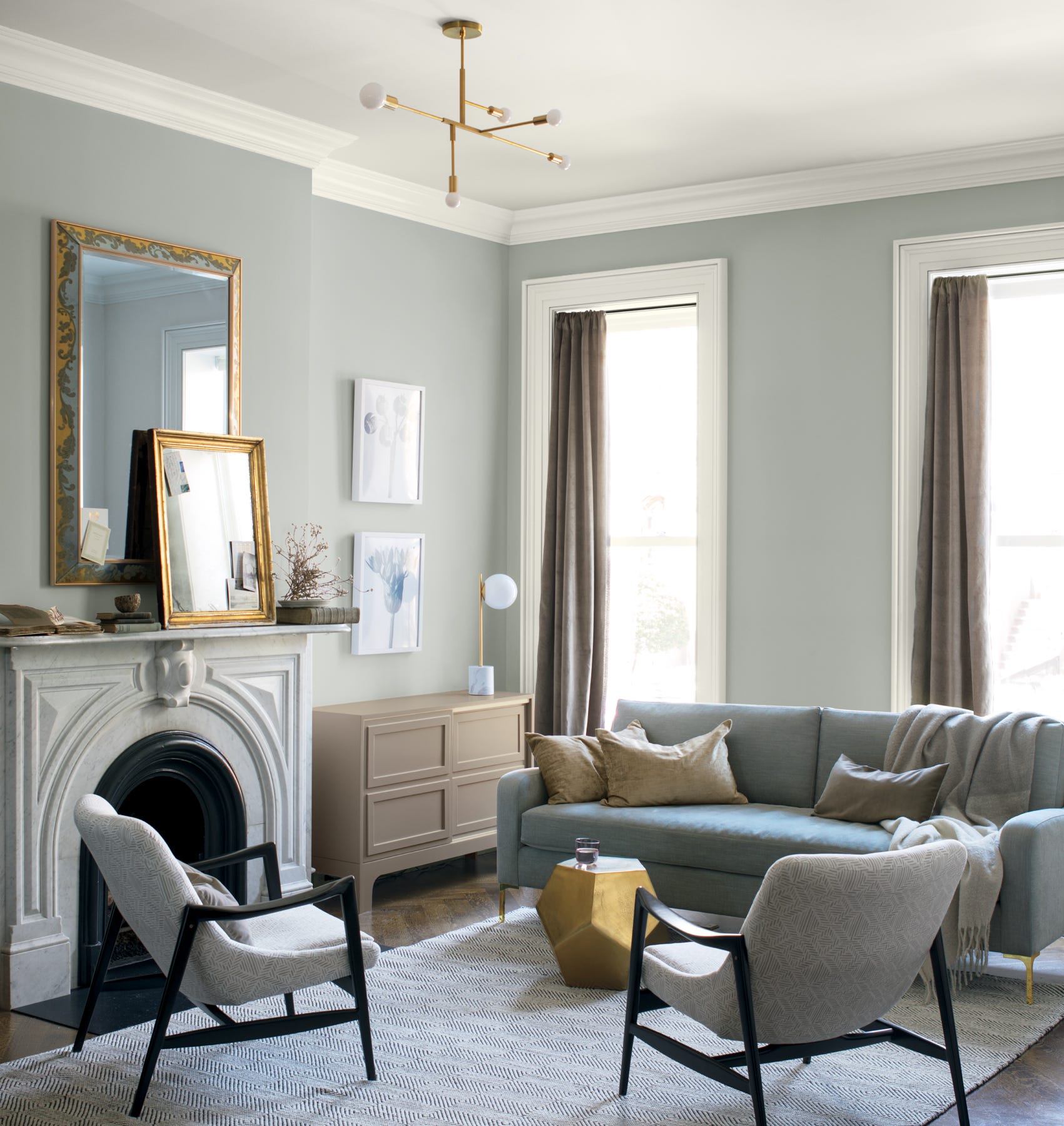
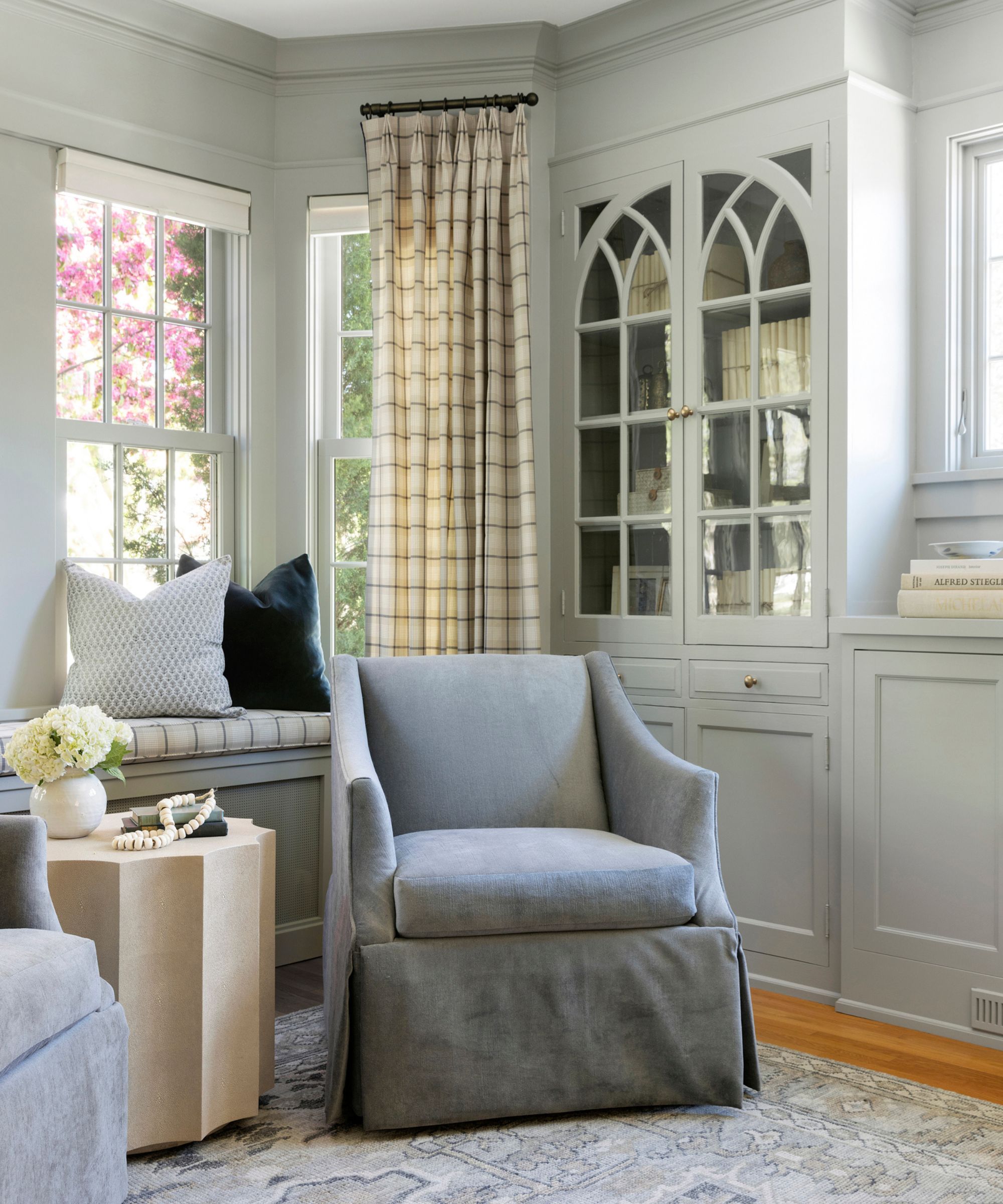
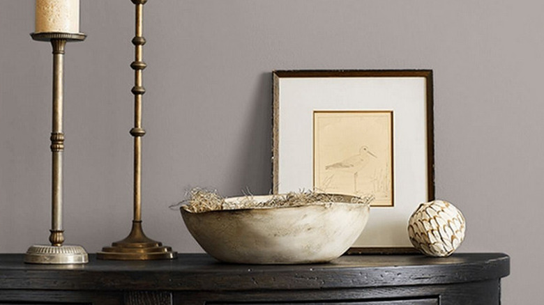
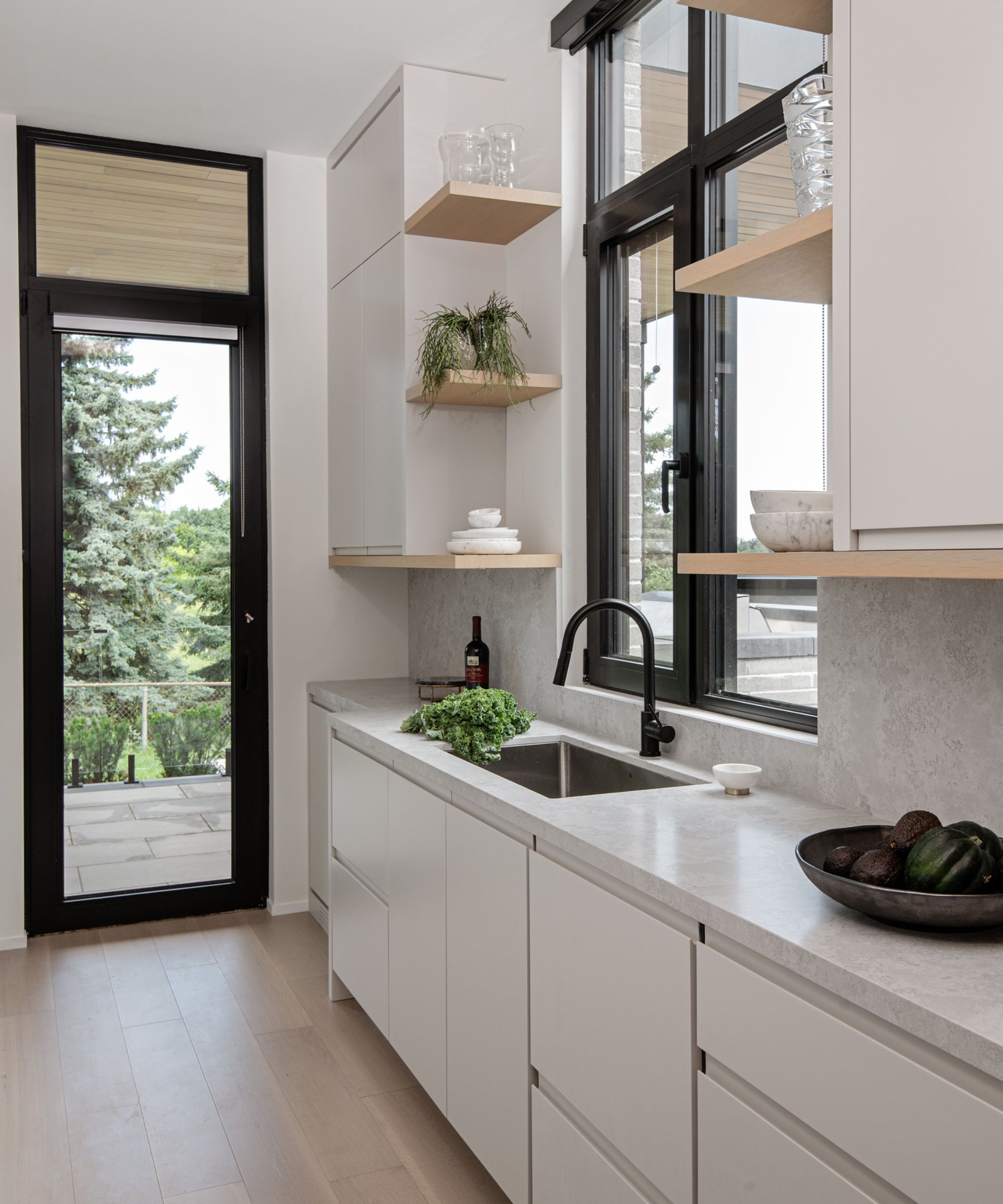
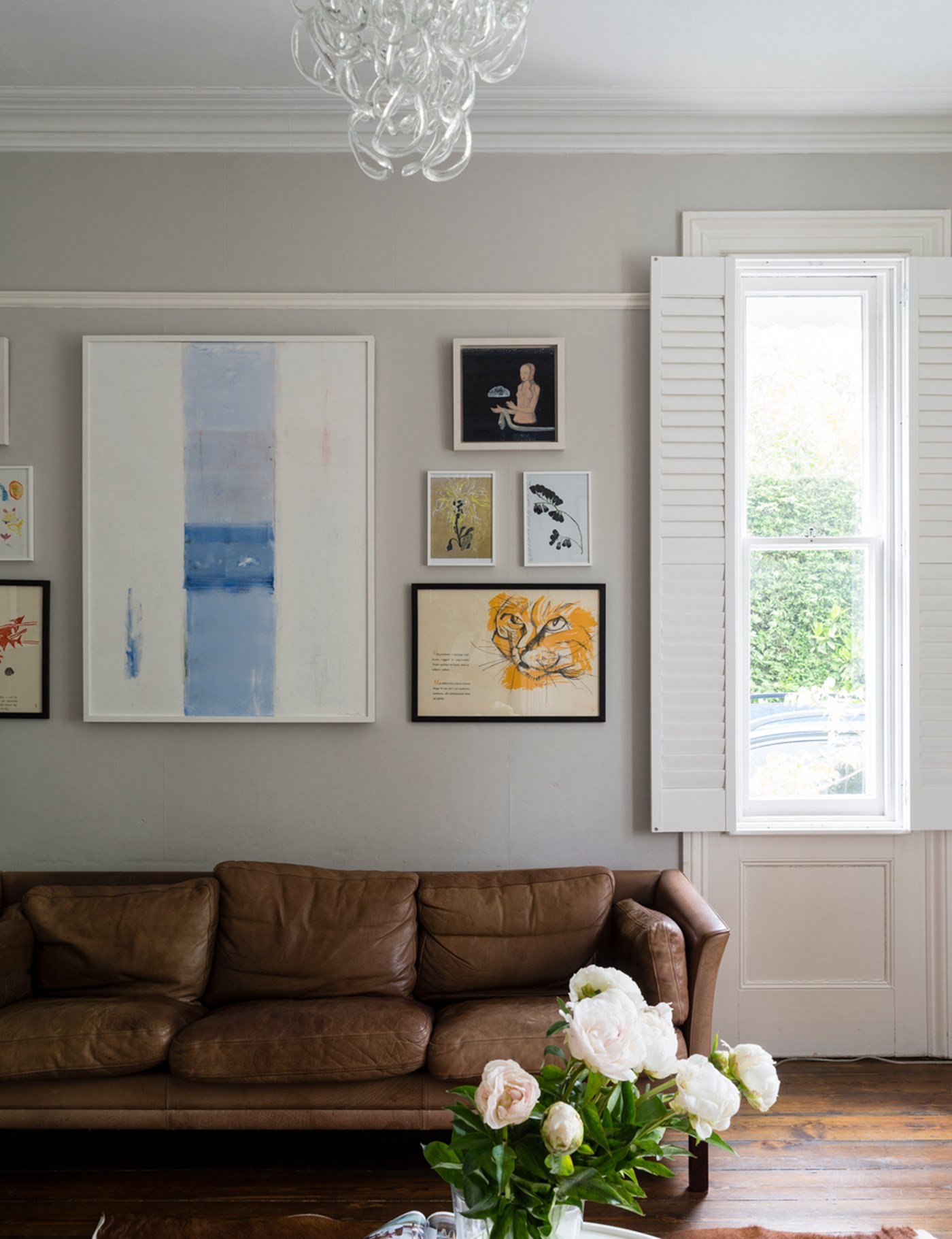
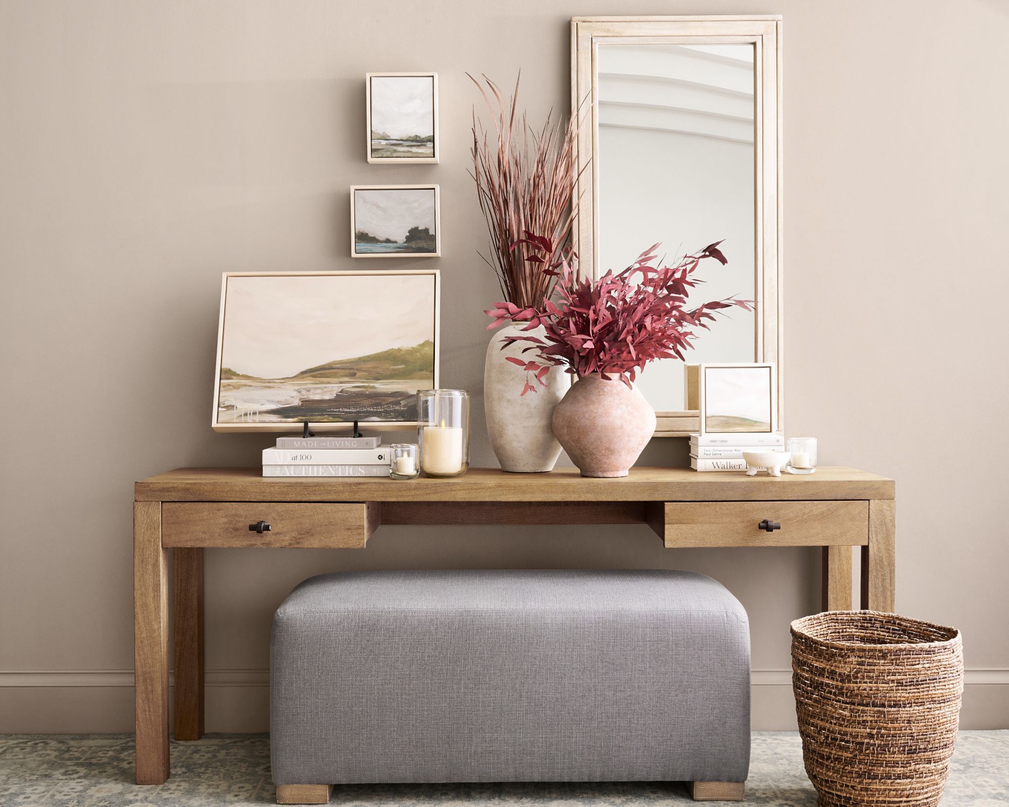
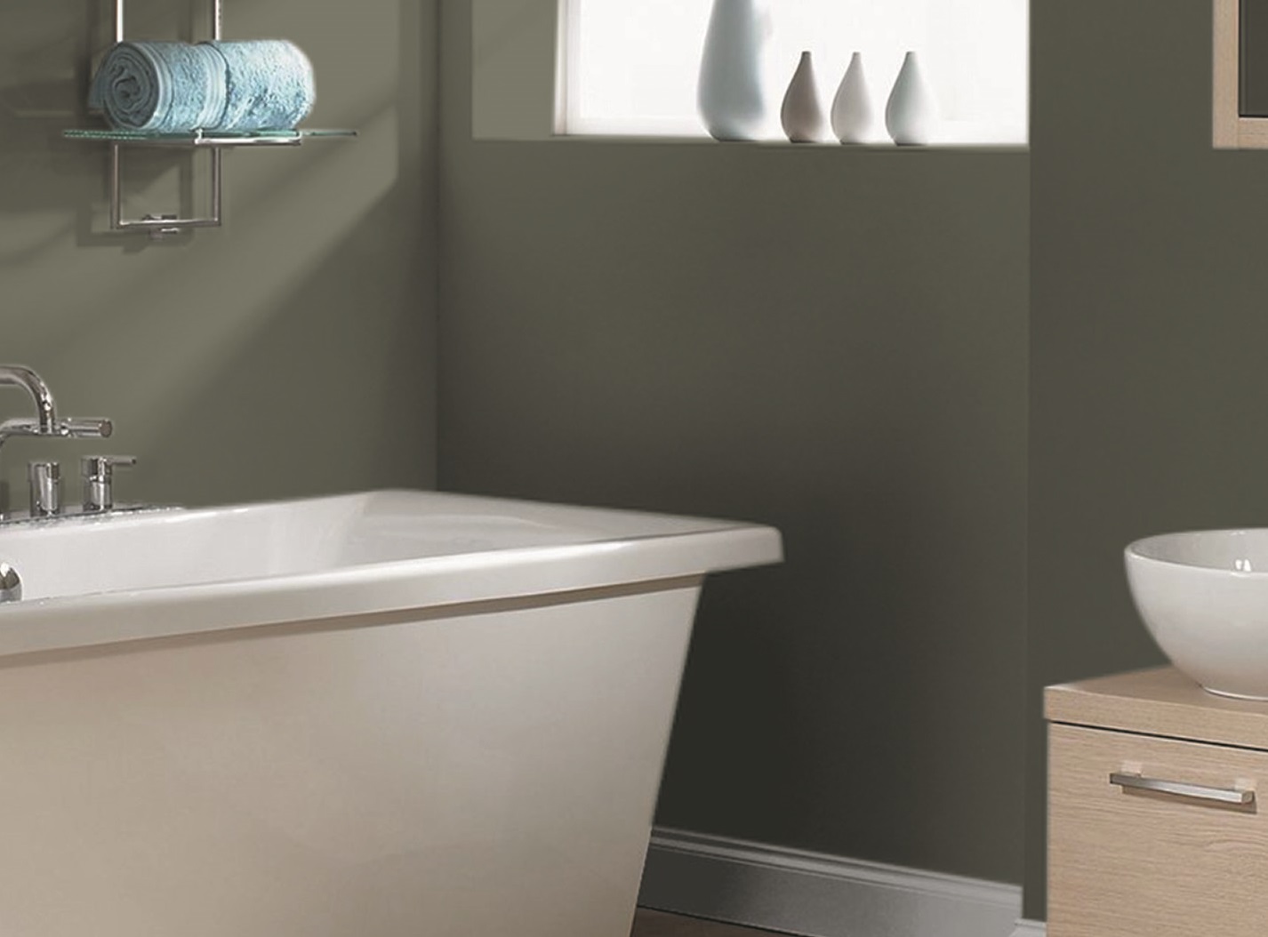
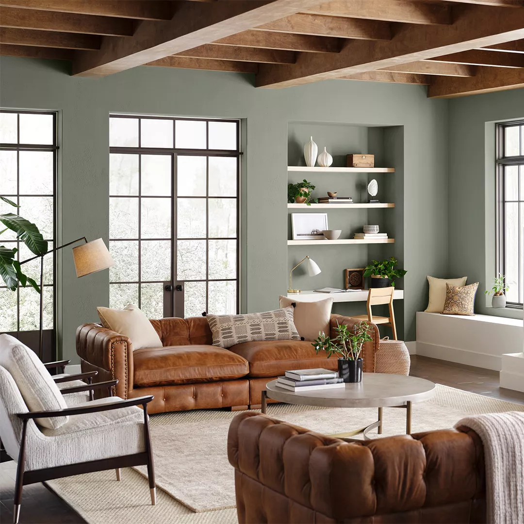
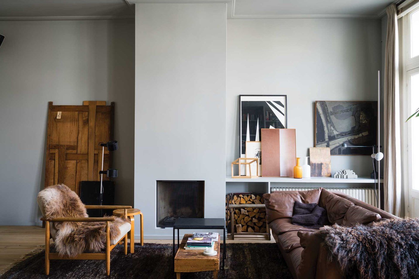
Sherwin-Williams' Agreeable Gray, a prominent choice among neutral paint colors, is analyzed for its versatility, aesthetic qualities, and optimal application. This greige hue, a blend of gray and beige, is widely favored for its adaptability and ability to complement various design elements without dominating a space. Emily Kantz, Color Marketing Manager at Sherwin-Williams, highlights that its appeal lies in its balanced warmth, distinguishing it from cooler grays and preventing it from appearing bland like some beige alternatives. This balance allows it to integrate seamlessly into diverse home styles, acting as a supportive backdrop that enhances rather than overshadows other design choices.
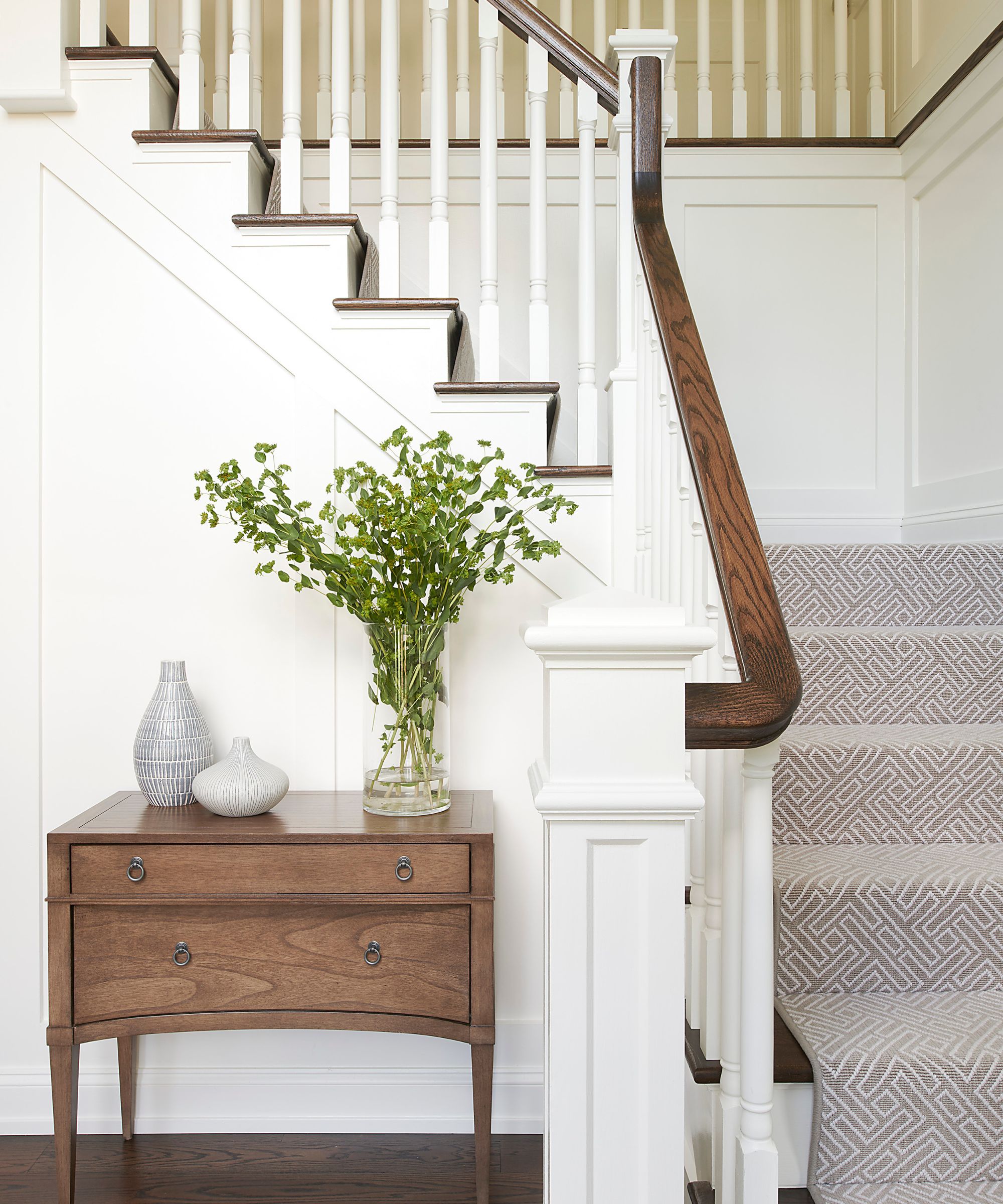
While Agreeable Gray is celebrated for its accommodating nature, it requires careful consideration for optimal use. The article contrasts it with Sherwin-Williams’ Repose Gray, noting that Agreeable Gray leans warmer with subtle beige undertones, making it suitable for traditional, transitional, or family-oriented interiors where a cozy atmosphere is desired. In contrast, Repose Gray presents a cooler, crisper aesthetic, fitting for modern and minimalist designs. This distinction is crucial for homeowners deciding between different gray shades, especially those concerned about their chosen color appearing too cold or sterile.
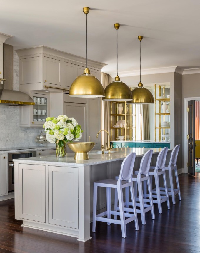
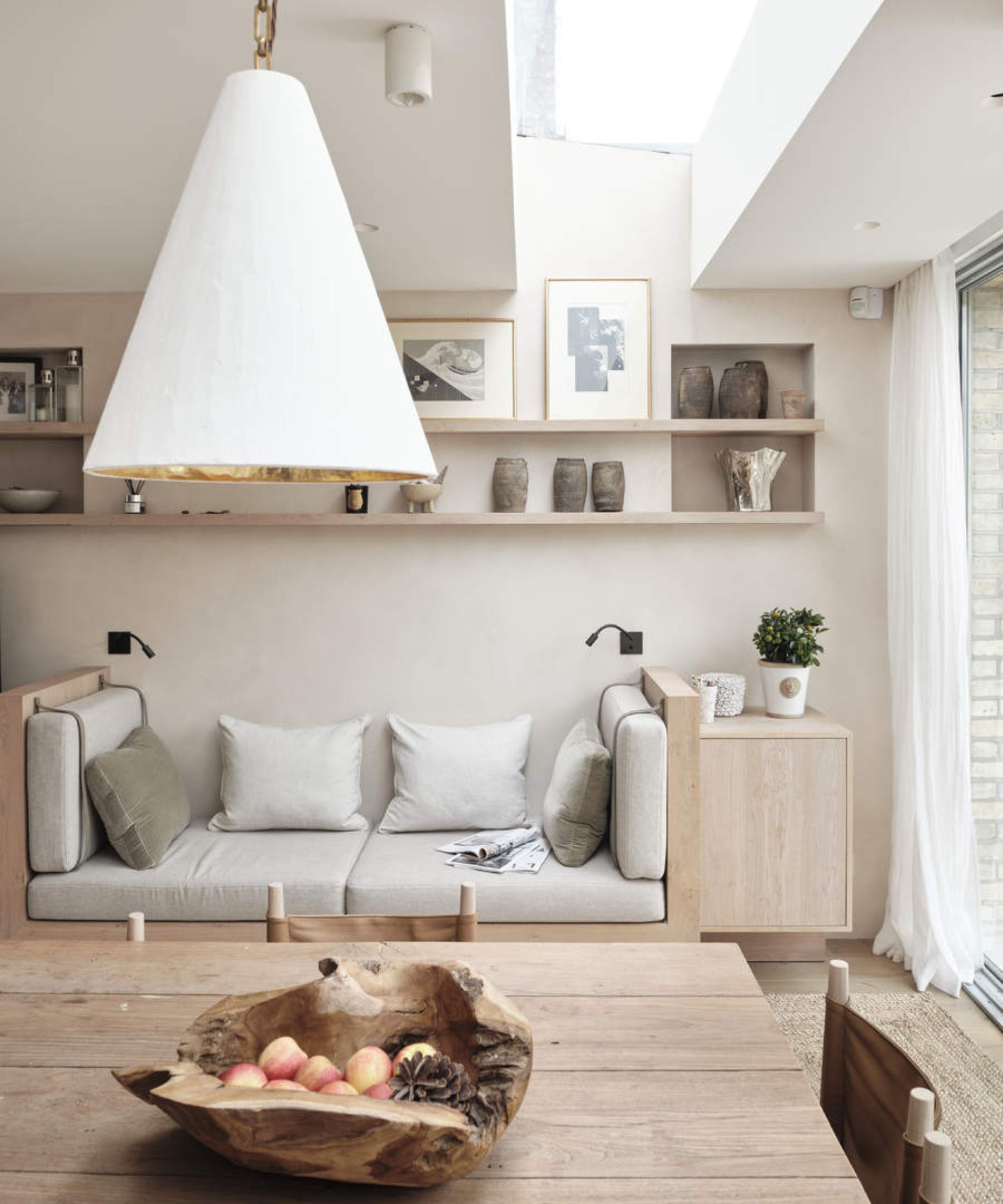
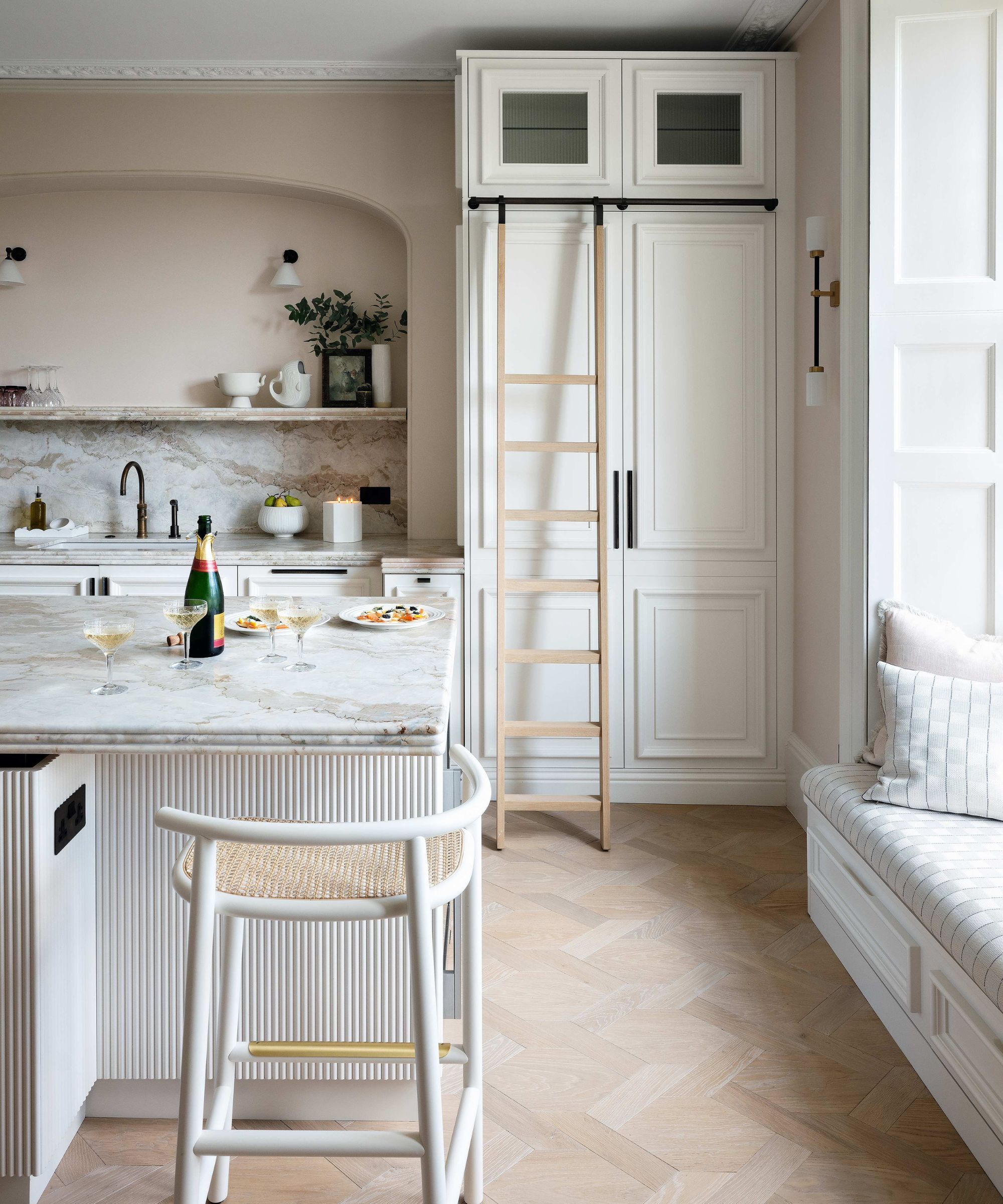
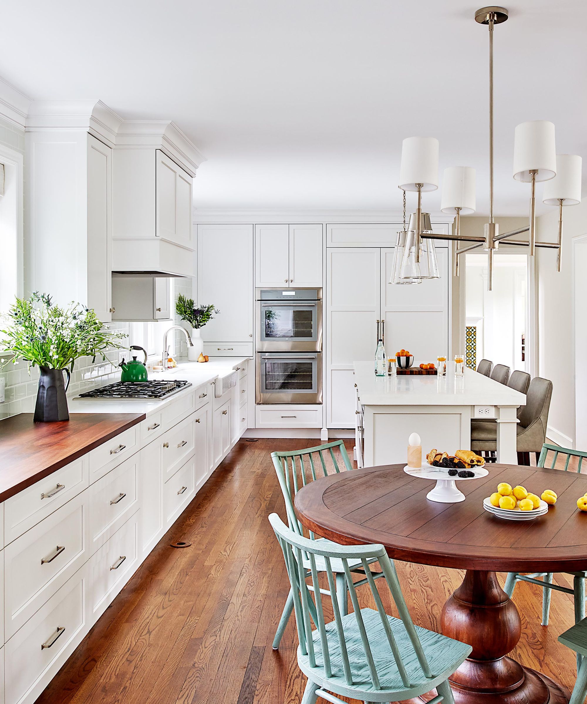
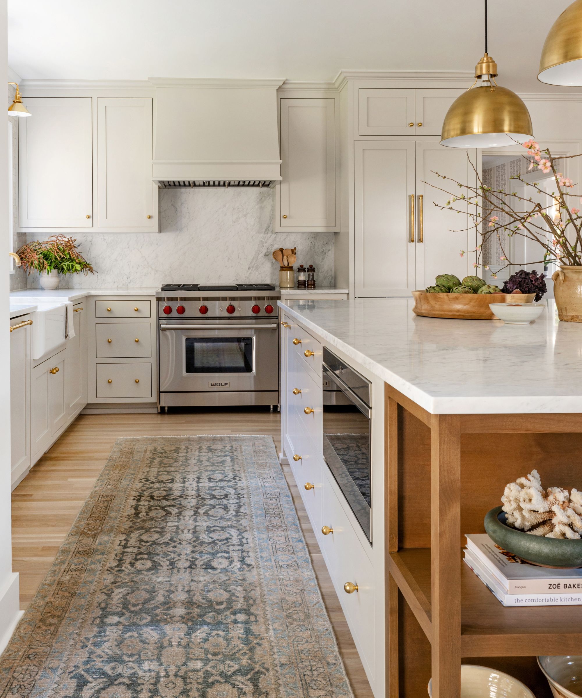
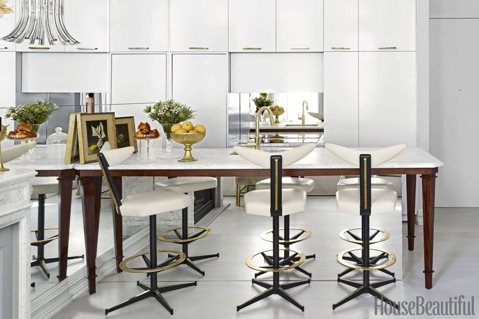
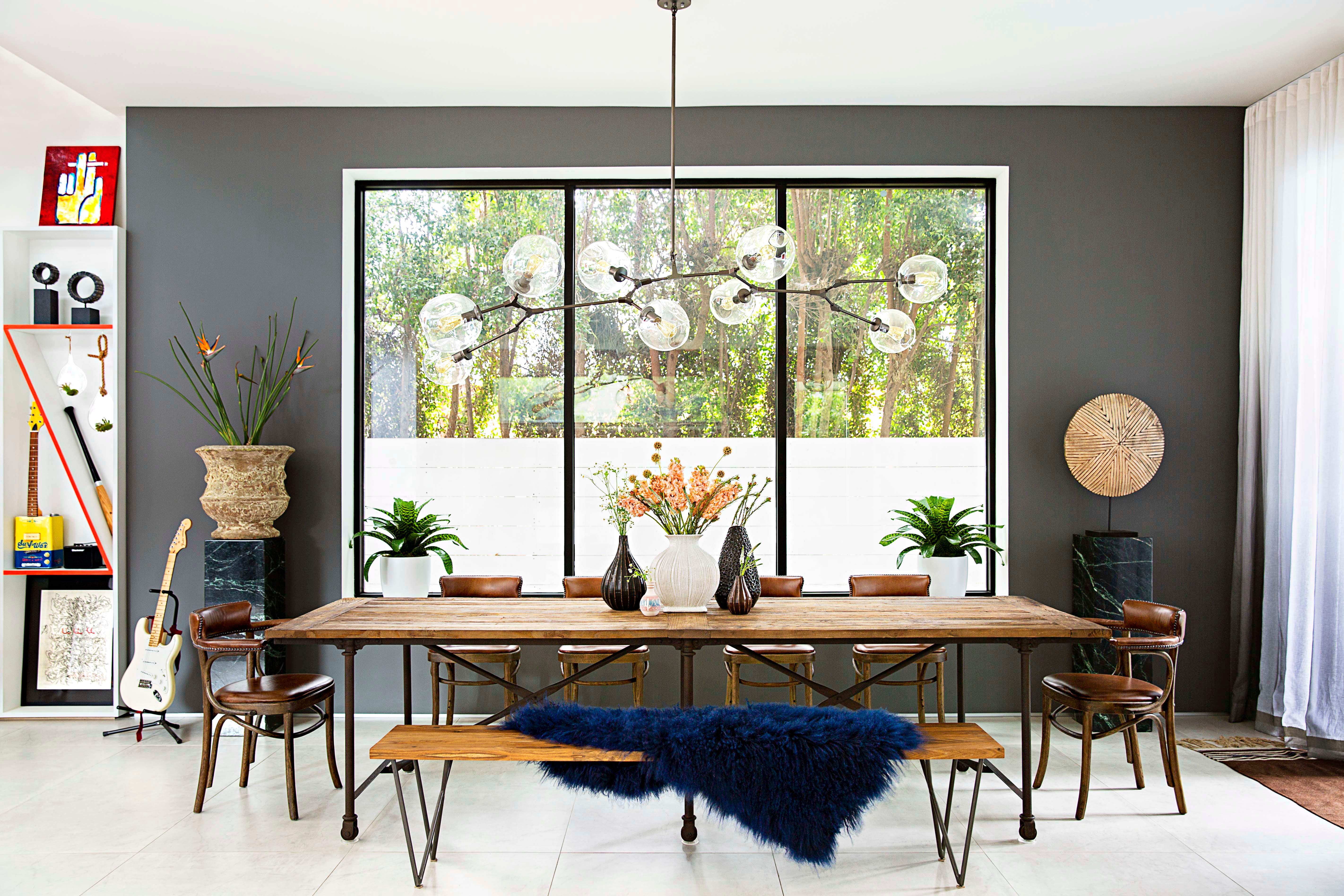
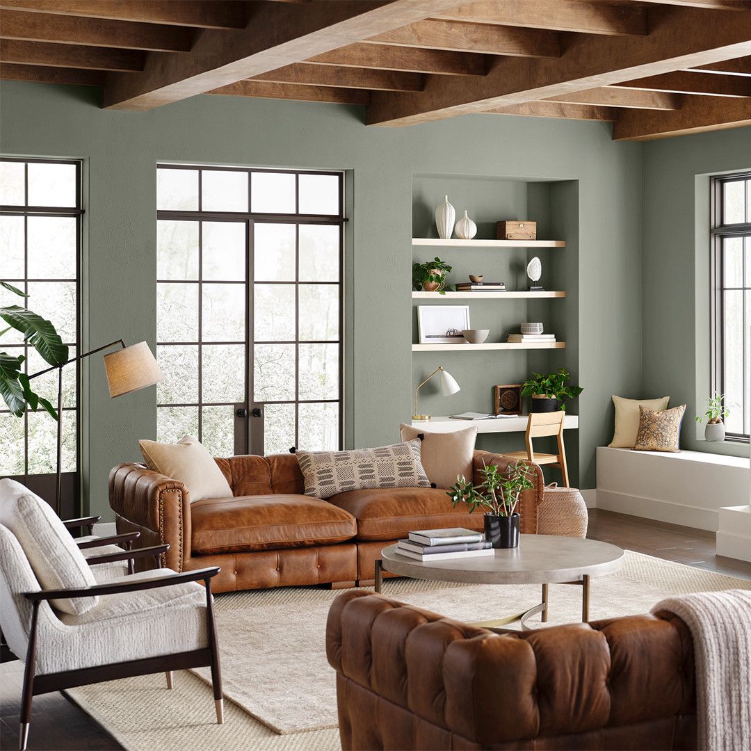
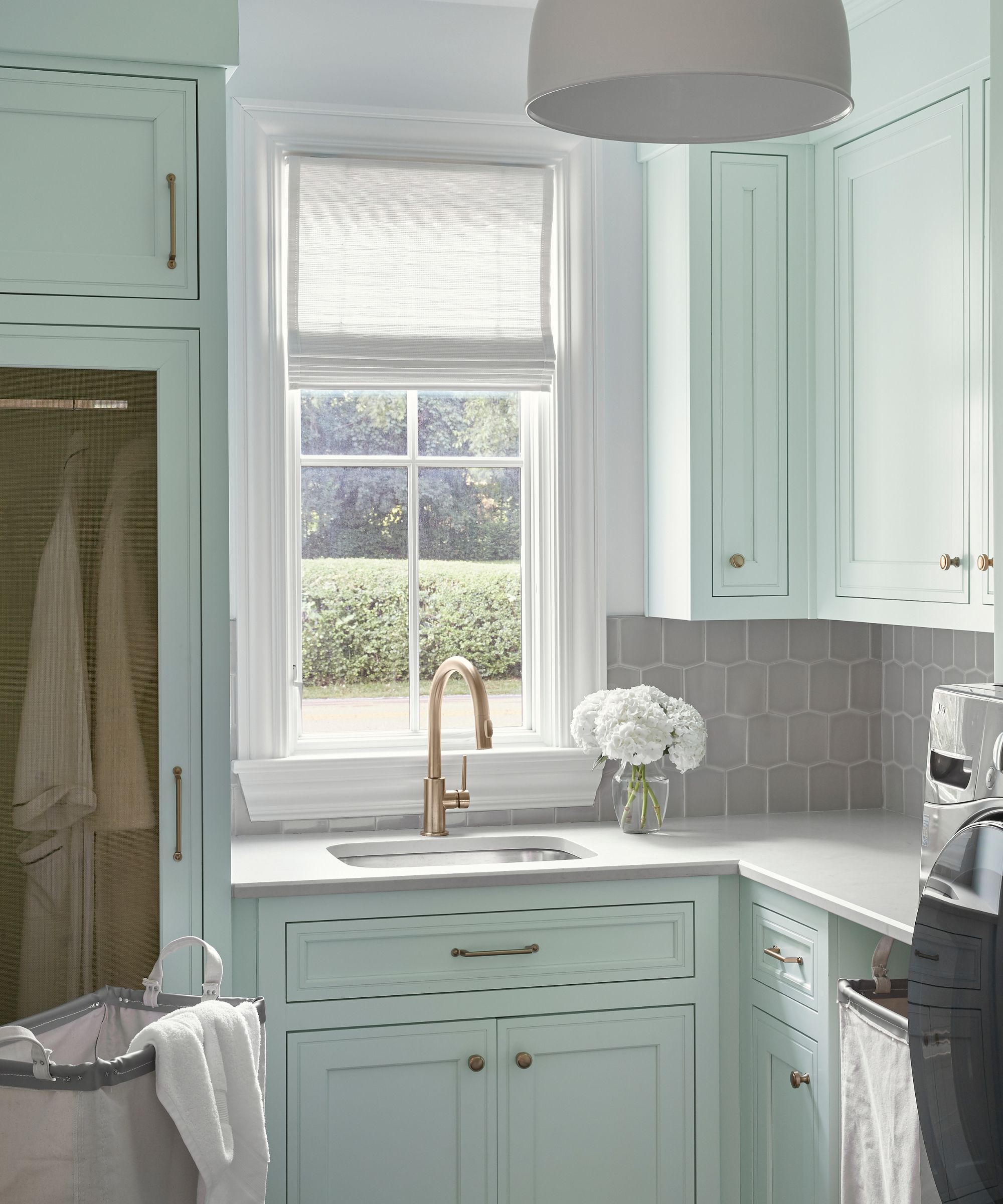
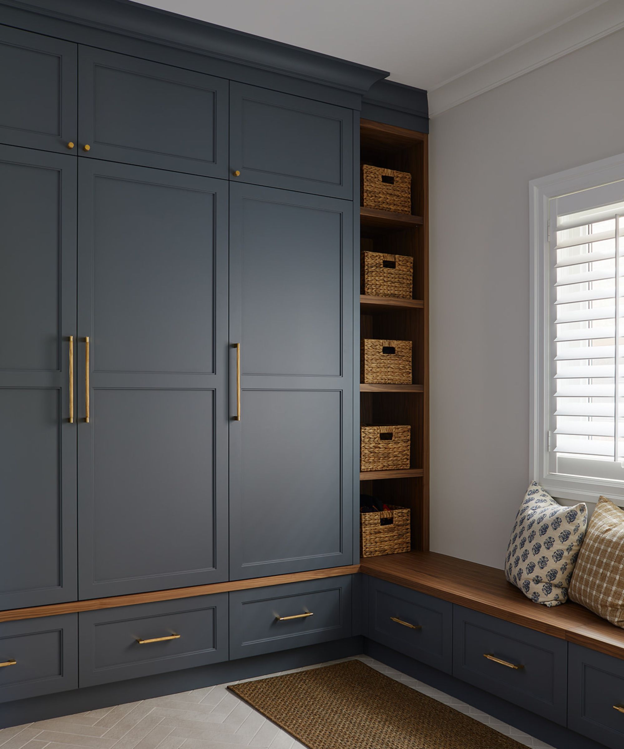
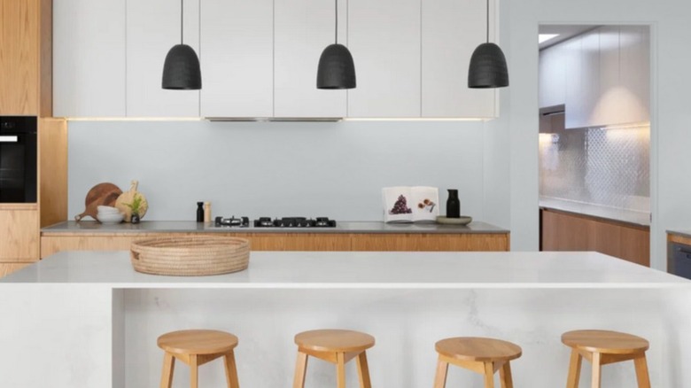
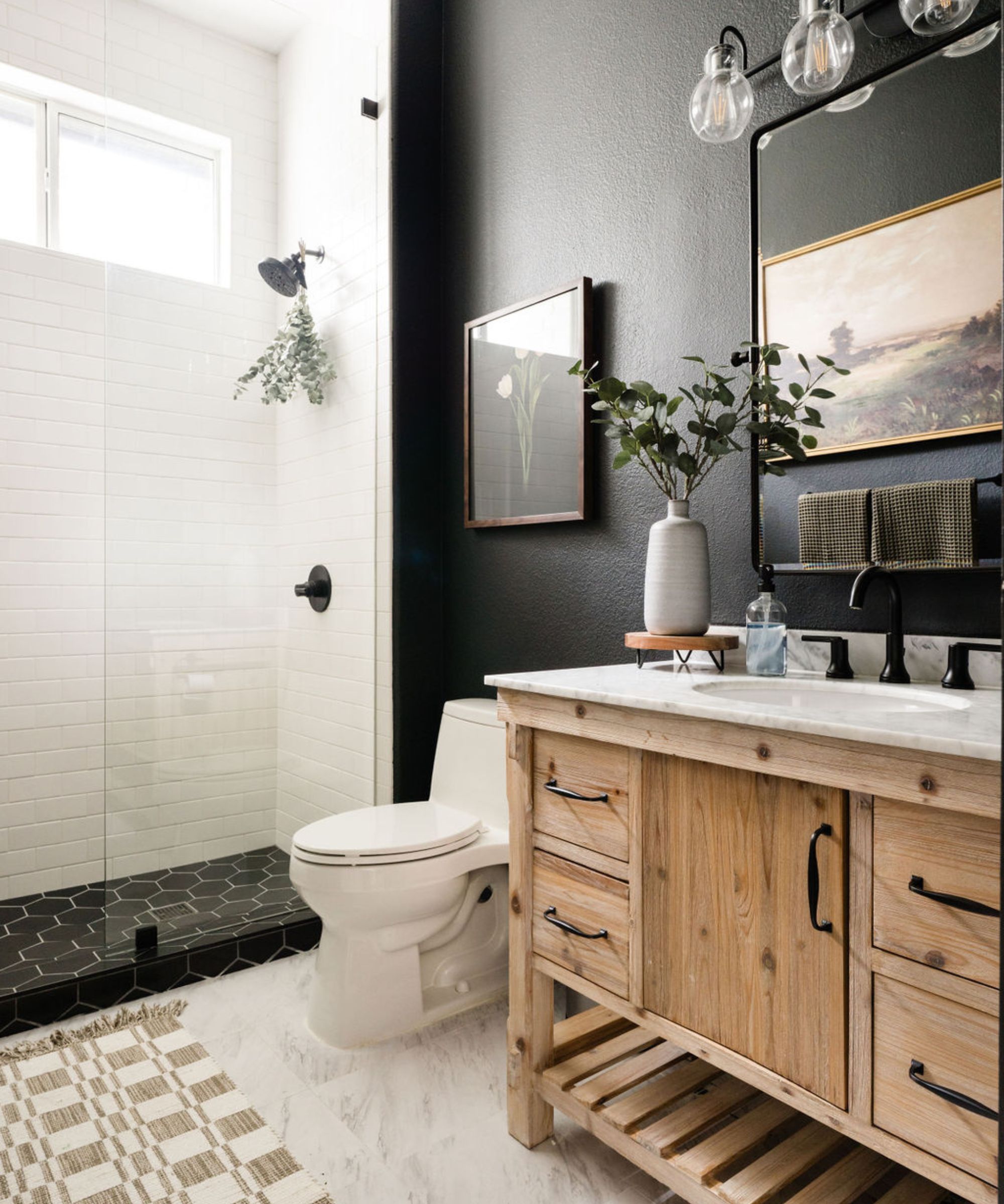
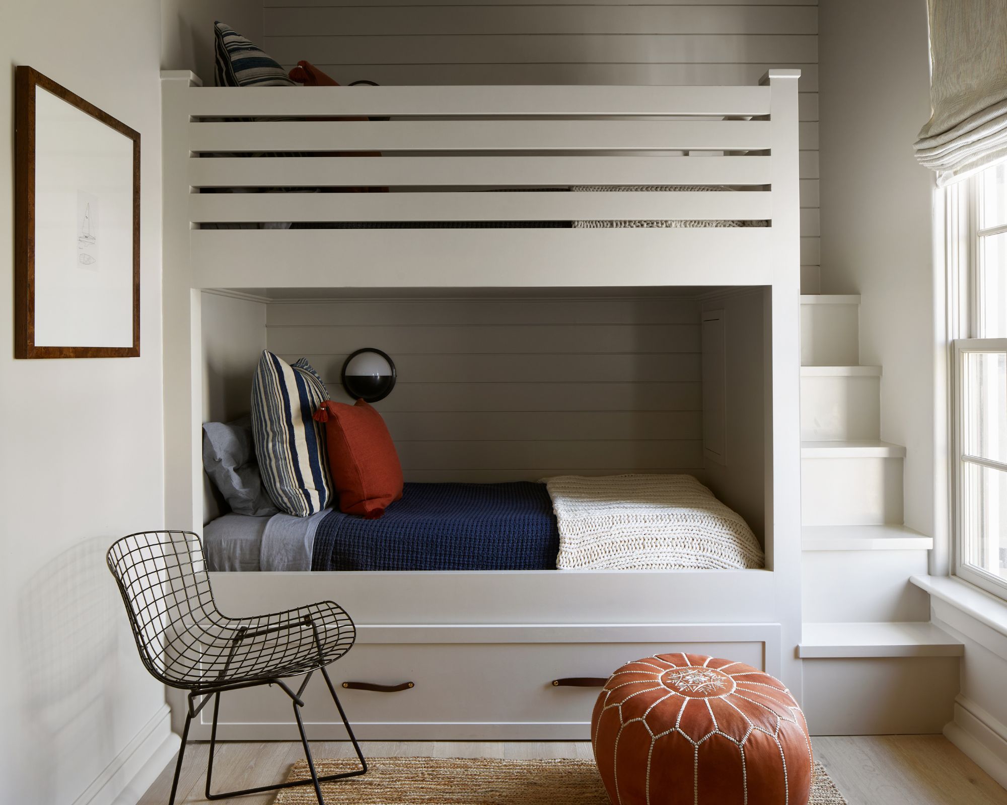
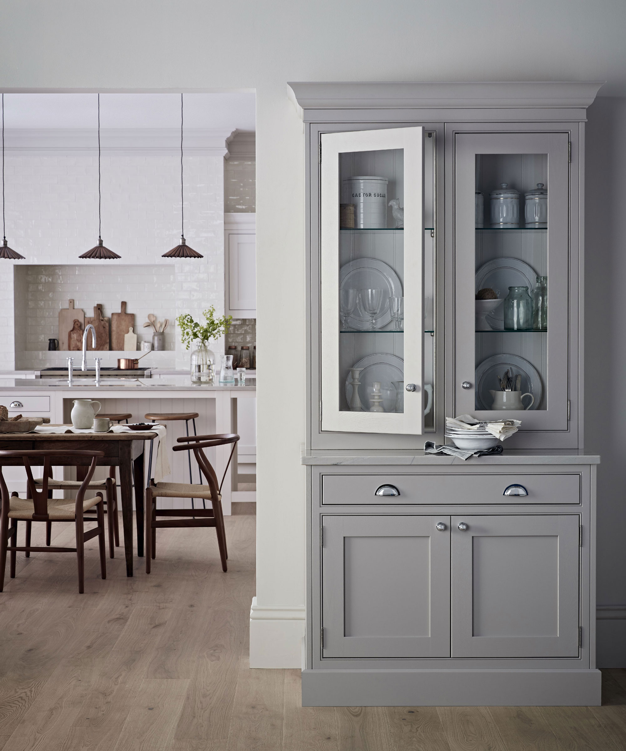
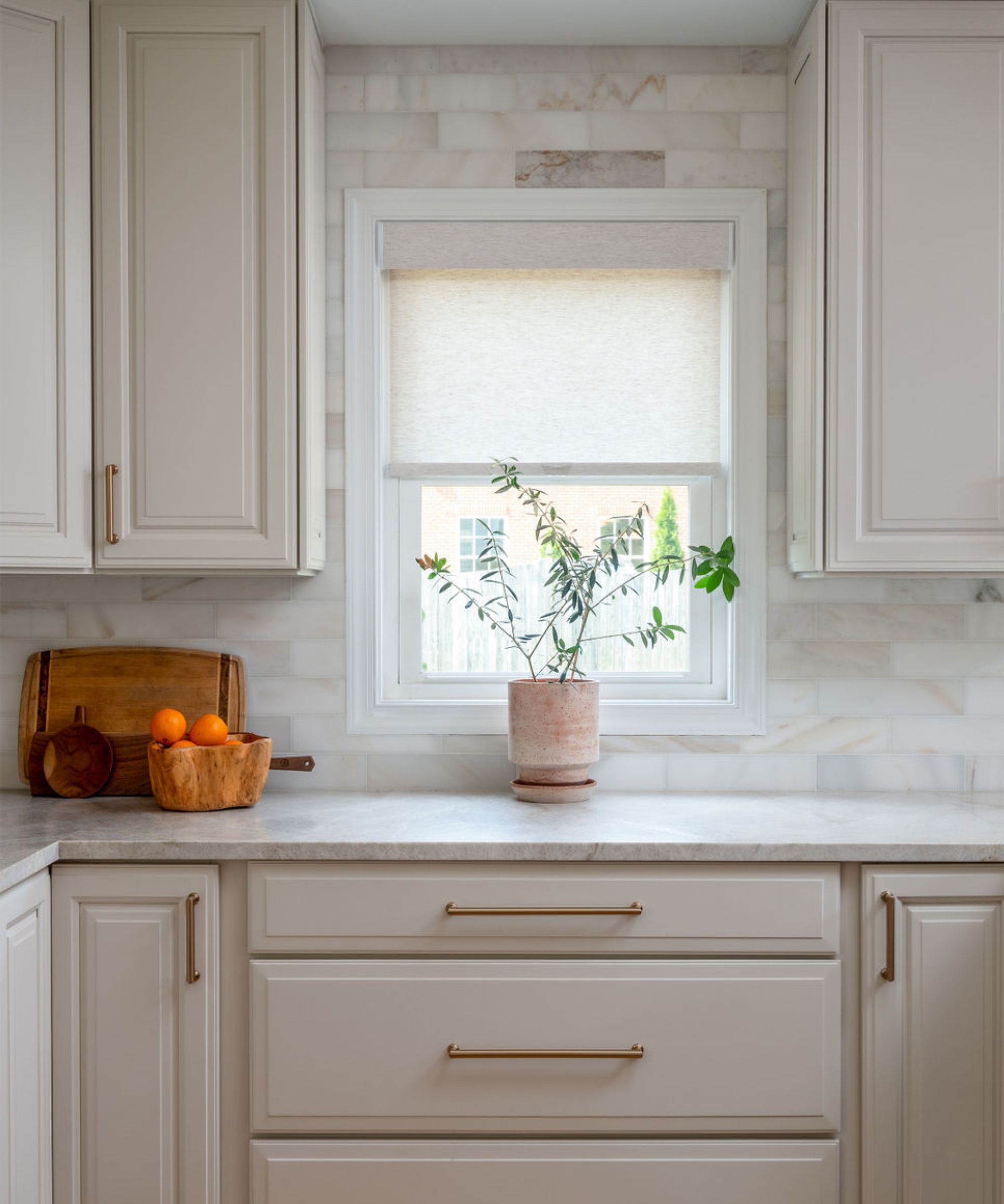
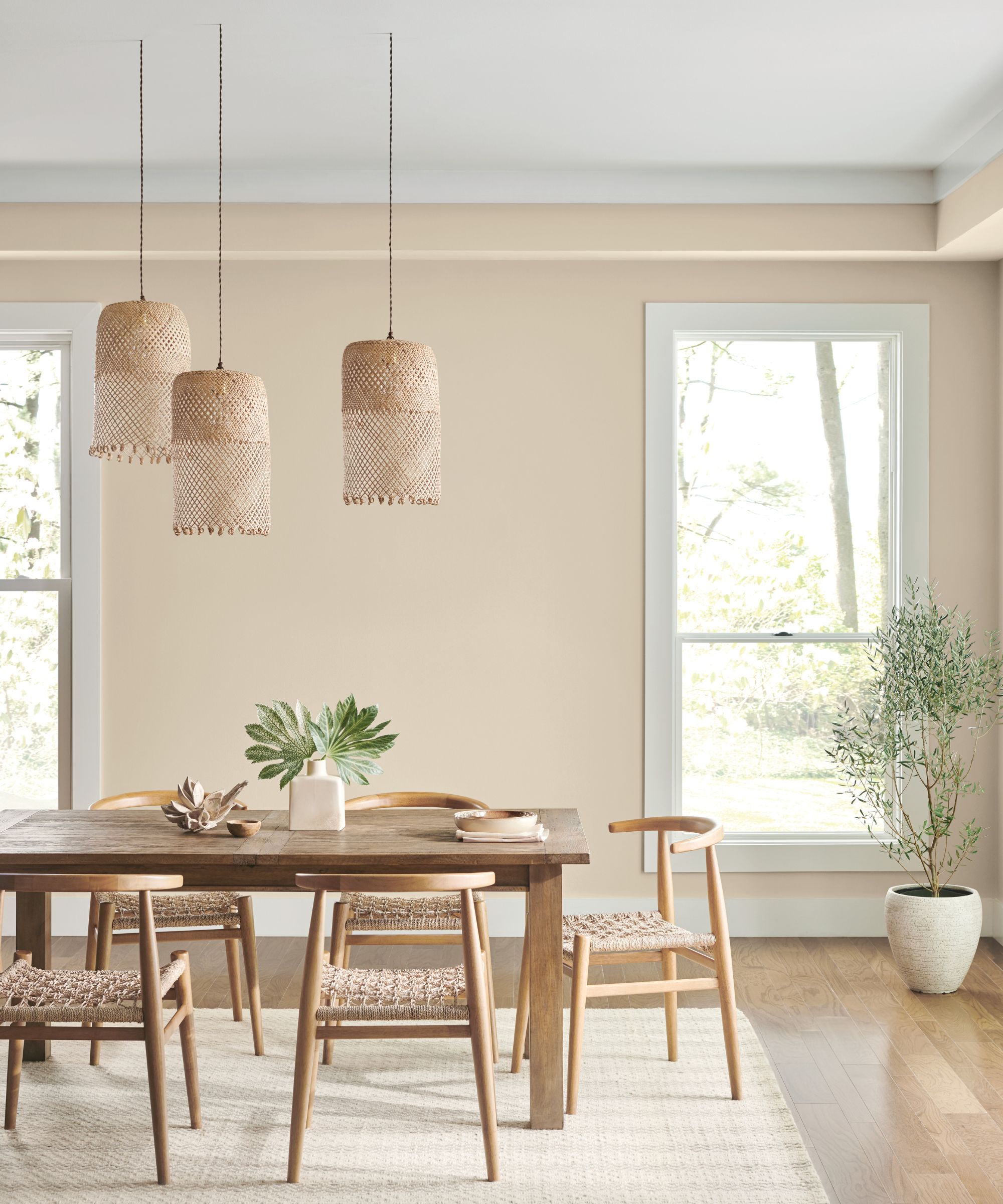
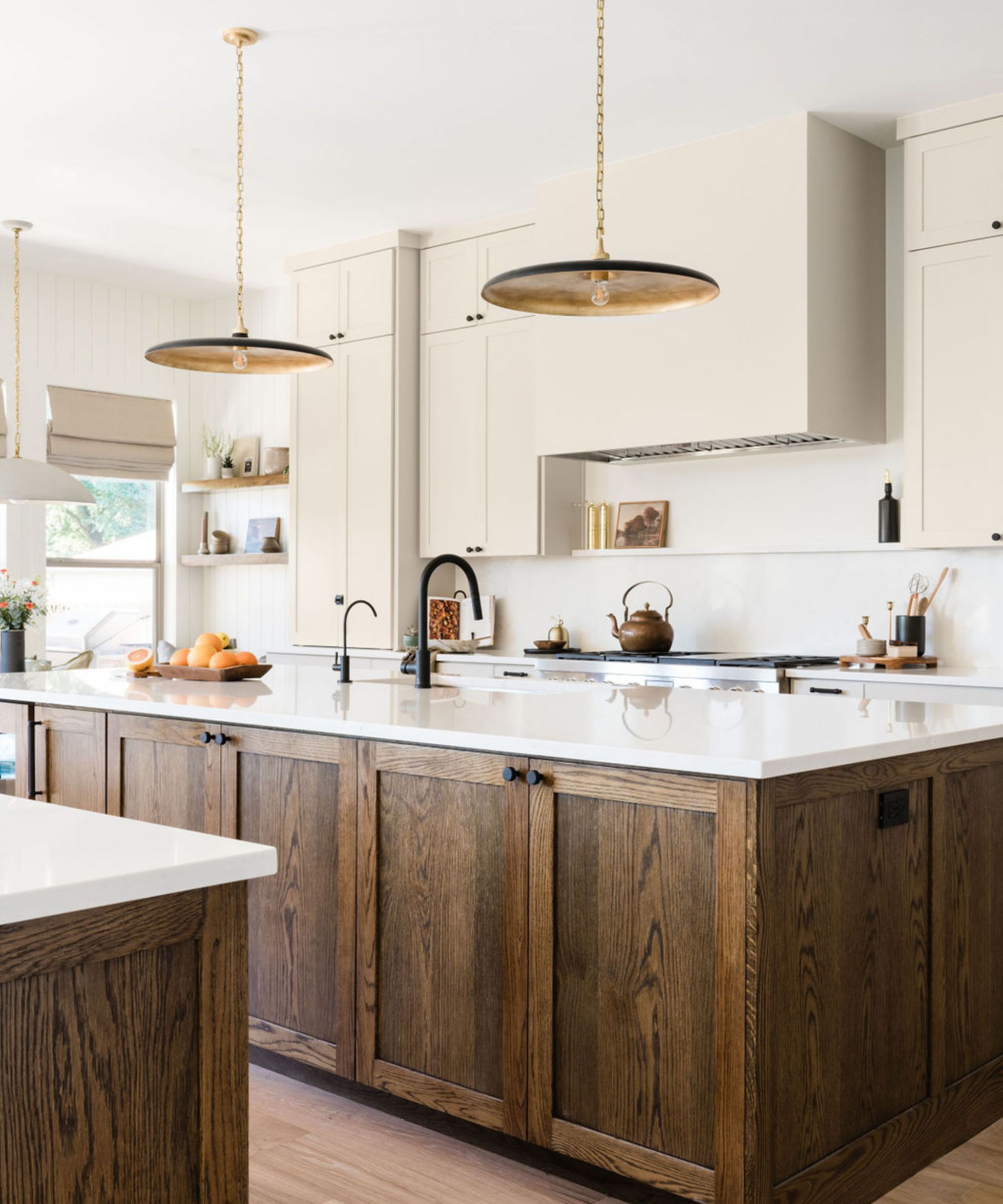
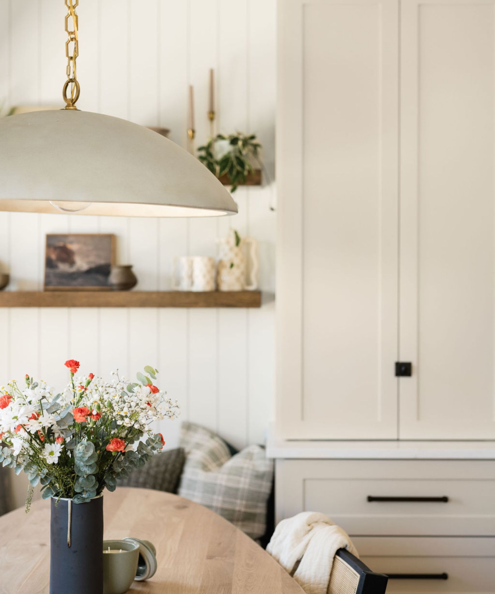
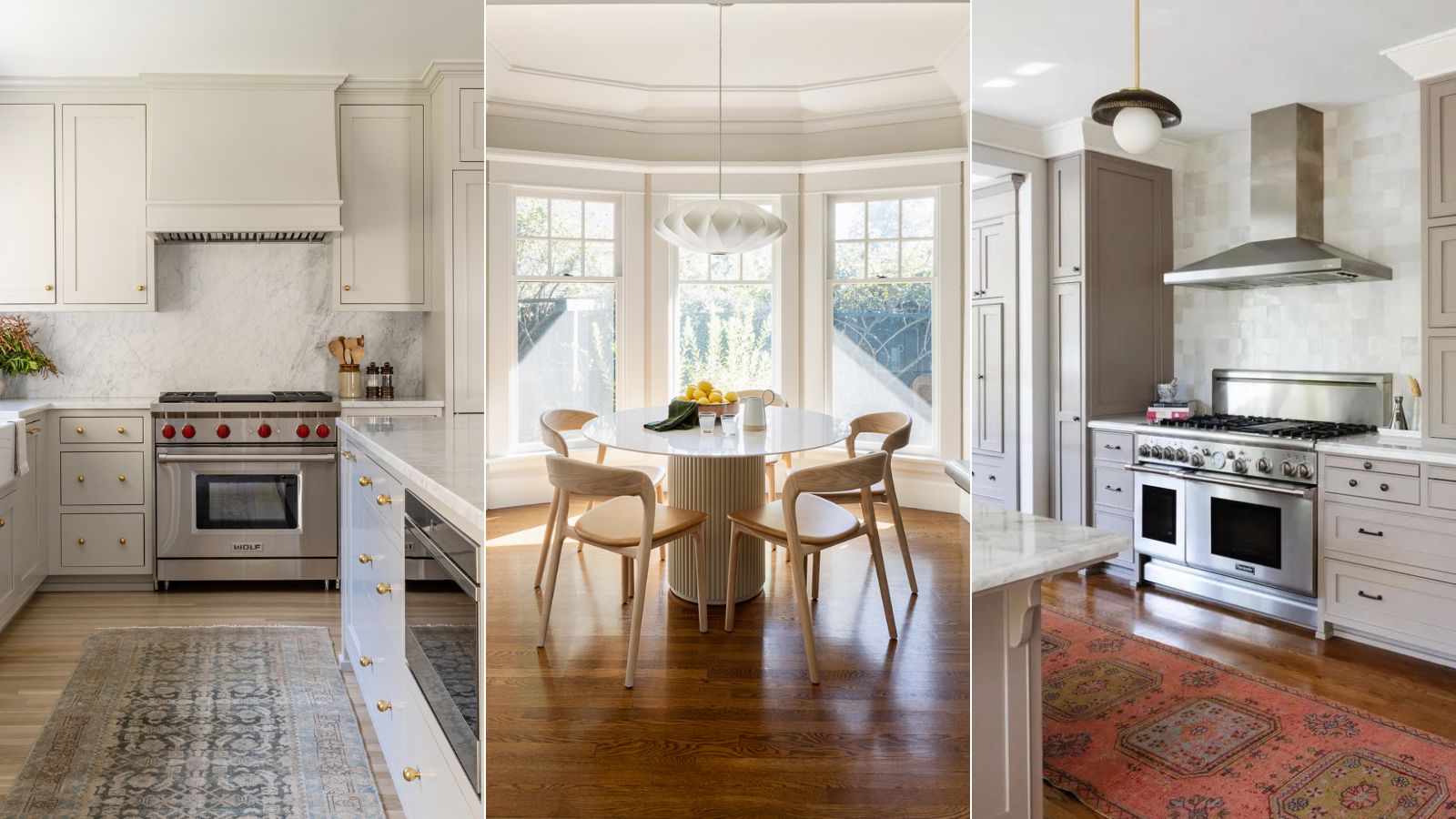
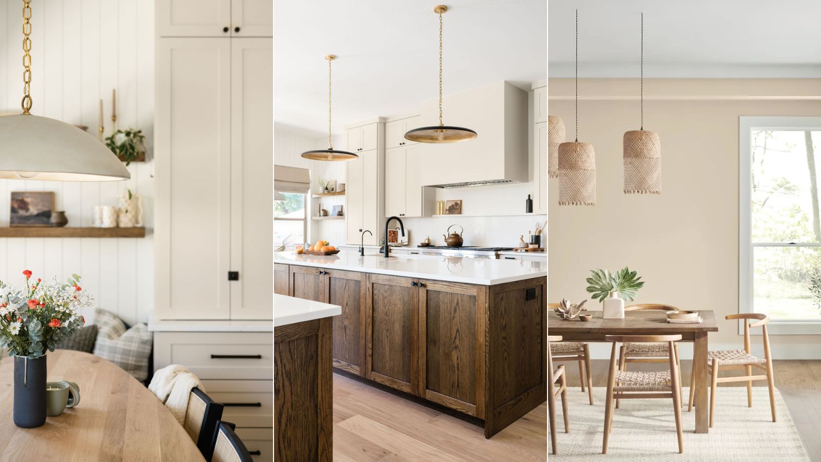
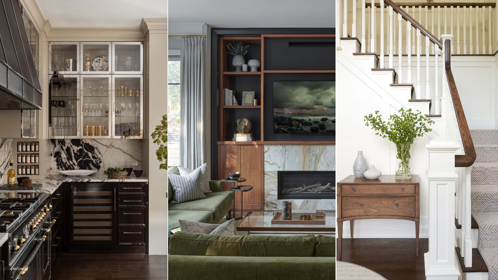
Agreeable Gray's ability to unify large, open-concept spaces without overwhelming them is a significant advantage, according to Kantz. It pairs effectively with classic white cabinetry and wood floors, particularly in dining and kitchen areas. Its compatibility extends to a broad color palette, serving as an excellent foundation for layered or tonal schemes. For a serene look, it can be combined with soft greens like Sea Salt or muted aquas such as Rainwashed, ideal for coastal or spa-like themes. For those seeking more drama, pairing it with deep brown-grays like Urbane Bronze can create a striking contrast, especially on cabinetry. A classic neutral palette can be achieved by combining it with a soft off-white like Shoji White for a cozy ambiance.
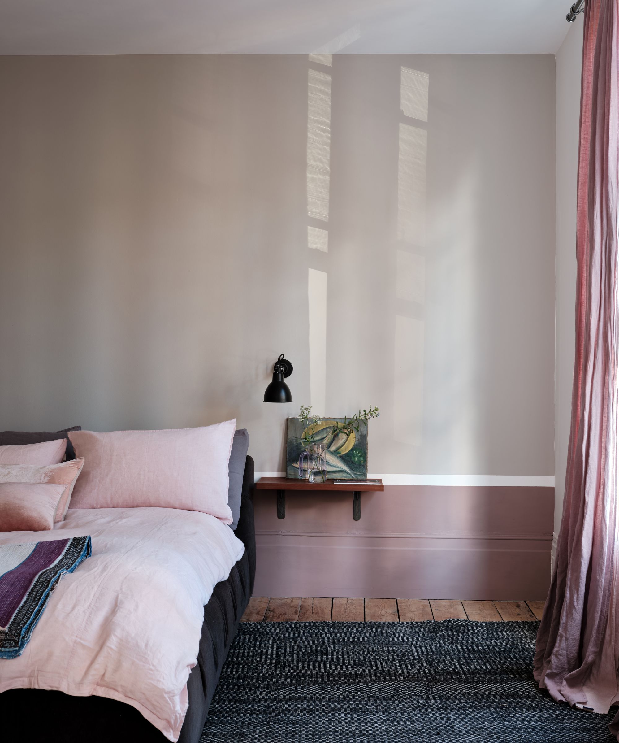
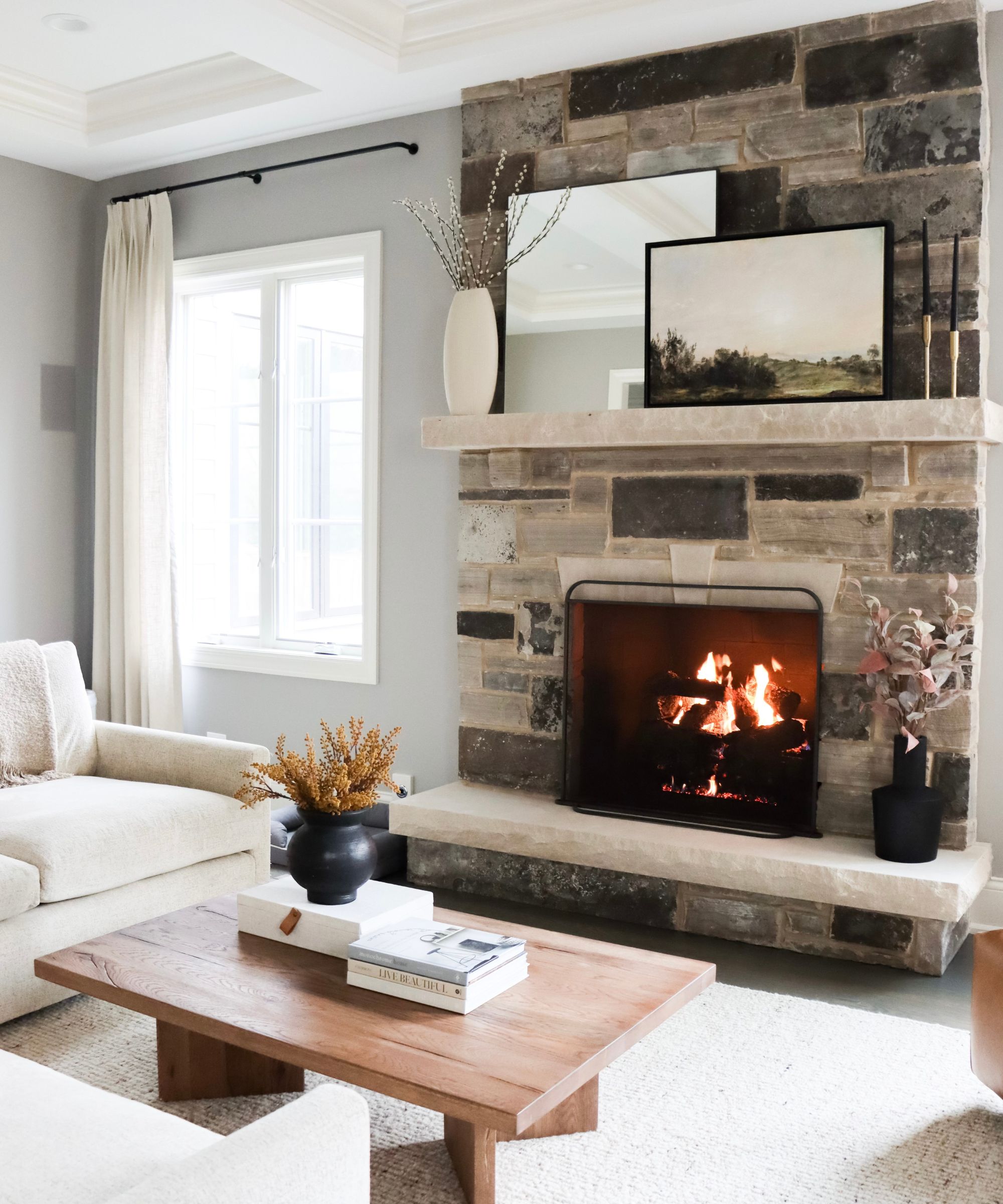
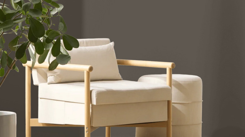
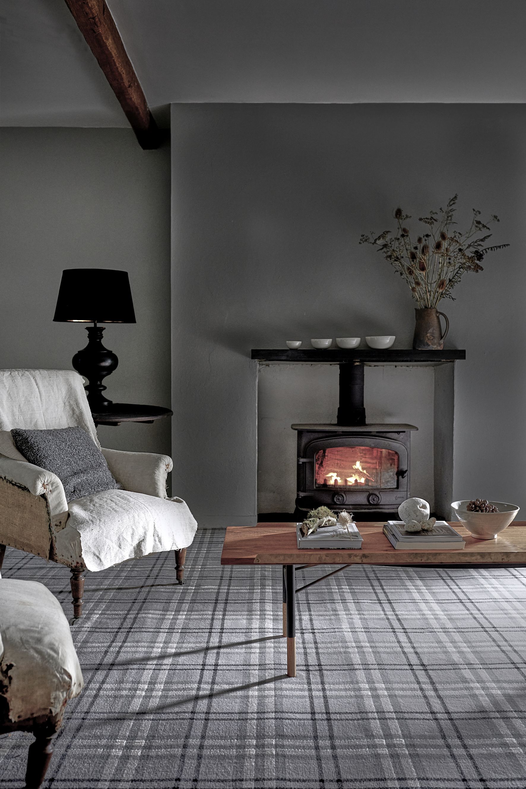
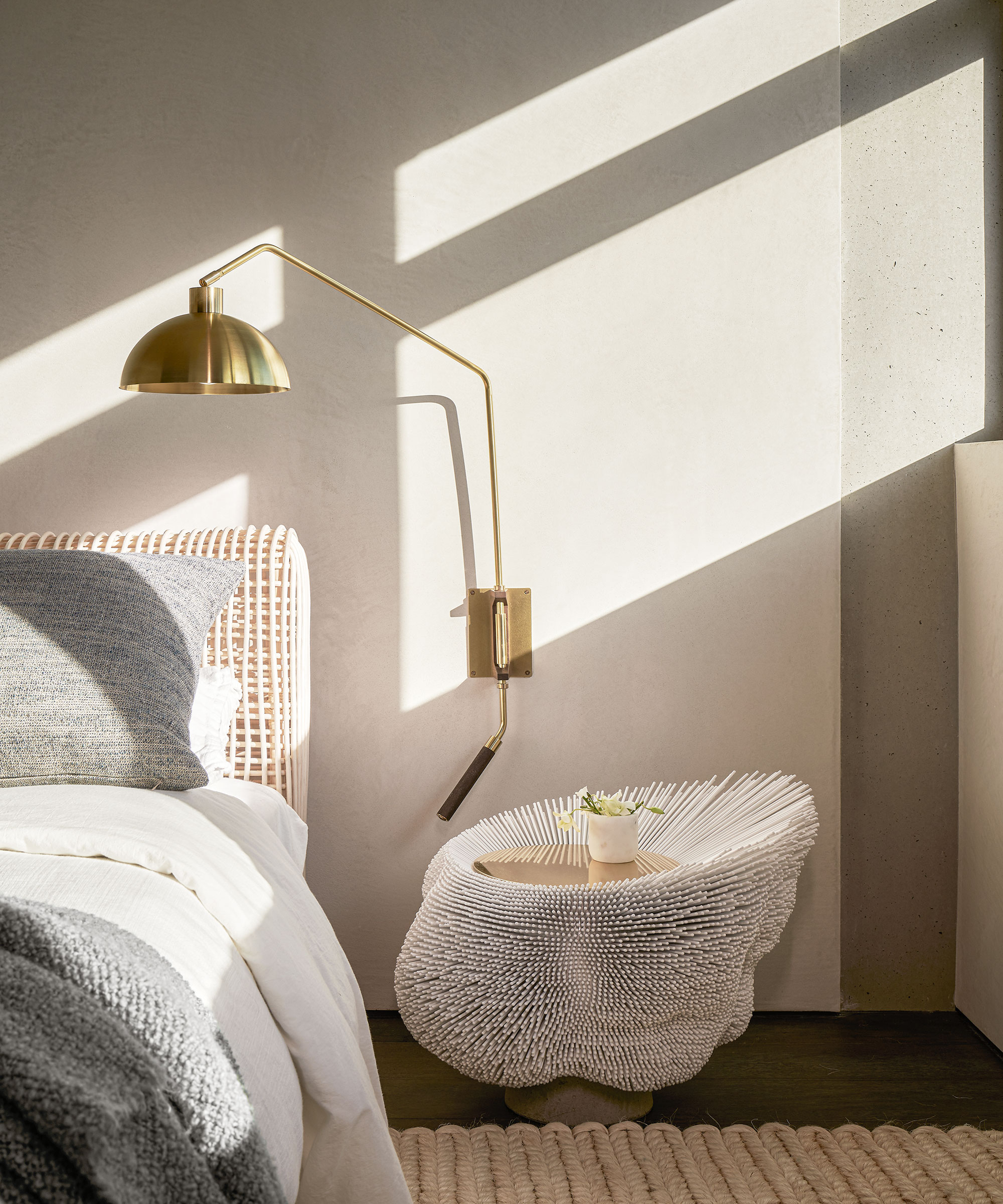
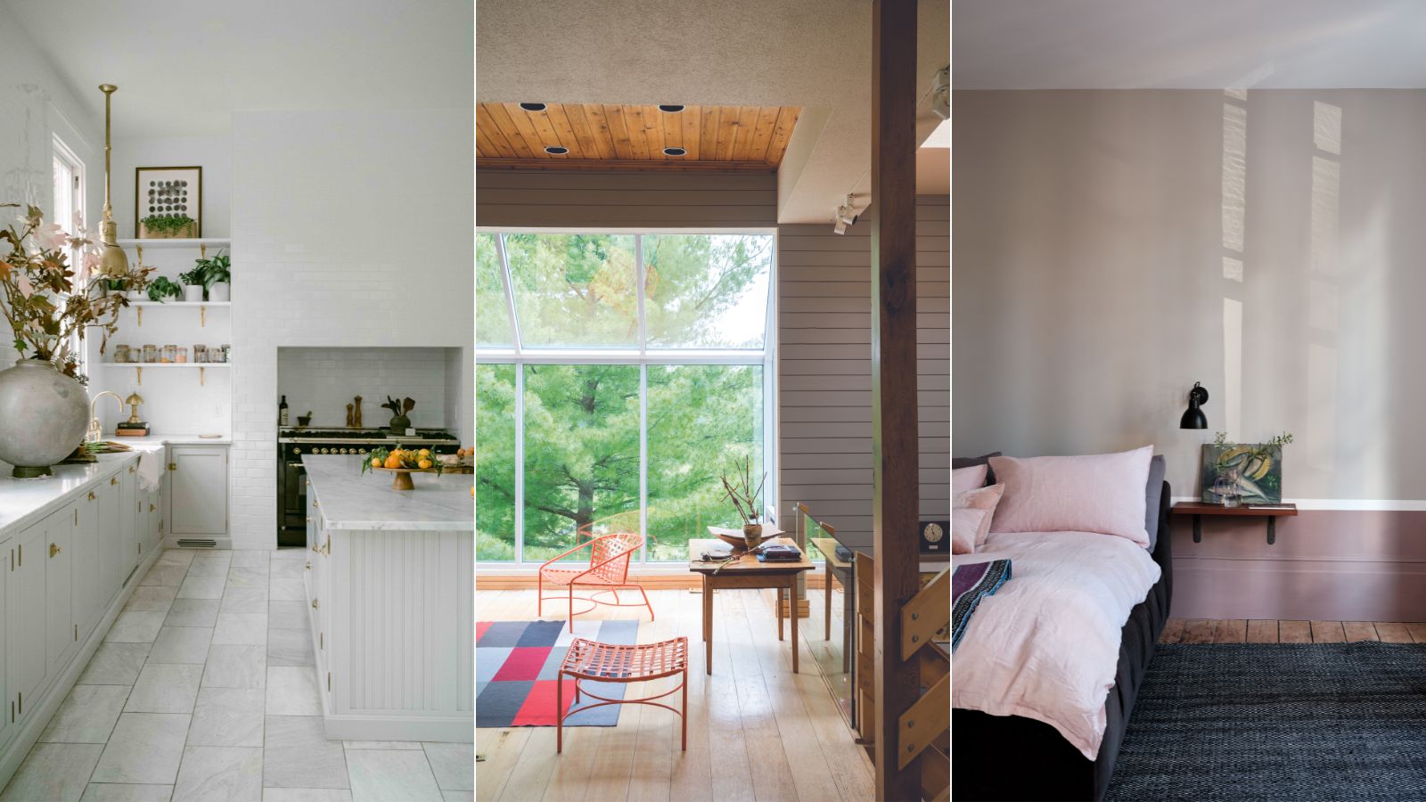
Despite its widespread appeal, Agreeable Gray is not a universal solution. It performs best in rooms with balanced or warm lighting. In north-facing rooms or spaces with predominantly cool lighting, its inherent warmth can diminish, leading to a dull or drab appearance if not adequately compensated with artificial lighting or warm accents. For such challenging lighting conditions, alternatives like Farrow & Ball's Drop Cloth, Little Greene's Slaked Lime Dark, or Sherwin-Williams’ Shiitake are suggested for their warmer, more forgiving, or earthier tones. Ultimately, selecting Agreeable Gray, or any paint, necessitates considering the specific room's lighting and desired atmosphere to maximize its potential.
#PaintColor #InteriorDesign #SherwinWilliams #AgreeableGray #GreigePaint #NeutralPalette #HomeDecor #ColorTrends #RoomLighting #PaintColor #InteriorDesign #SherwinWilliams #AgreeableGray #GreigePaint #NeutralPalette #HomeDecor #ColorTrends #RoomLighting
0 comment in total
 No comments yet
You may also like
The 13 Best Greige Paint Colors to Buy Right Now
What are Sherwin-Williams' best-selling paints? And how interior designers put them to use
Why Benjamin Moore's Classic Gray Is a Designer-Favorite Paint Color

Top 32 Expert-Recommended Gray Paint Colors, Plus How to Pick the Best Shade

The Best Greige Paint Colors for a Warm, Welcoming Home

6 Ways to Decorate with Sherwin Williams' 'Dried Thyme'

The 15 Best-Selling Sherwin-Williams Paint Colors of All Time
REVEALED: Is grey paint going out of style?

This is the most versatile shade you can bring into your home – designers share the 5 best greige paints
10 Greige Paint Colors Designers Recommend Again And Again
Sherwin-Williams paint colors in real homes – 13 designer-approved shades, from neutrals to bolds
Sherwin-Williams Realist Beige is one of the most versatile paints – experts weigh in on this 'uncomplicated' neutral
This Controversial Interior Paint Color Is My All-Time Favorite

5 of the best gray paints that interior designers love using
10 Lesser-Known Neutral Paint Shades From Sherwin Williams You Shouldn't Overlook
Sherwin-Williams' Accessible Beige is the 'perfect…

We asked 12 interior designers for their favorite Sherwin-Williams paints – these are the colors that came out on top
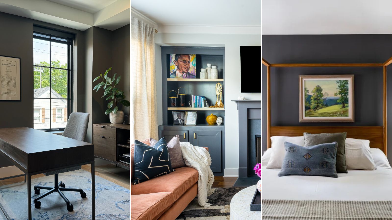
Here's how designers are using Sherwin-Williams' Peppercorn – 5 ways to decorate with this trending dark gray paint
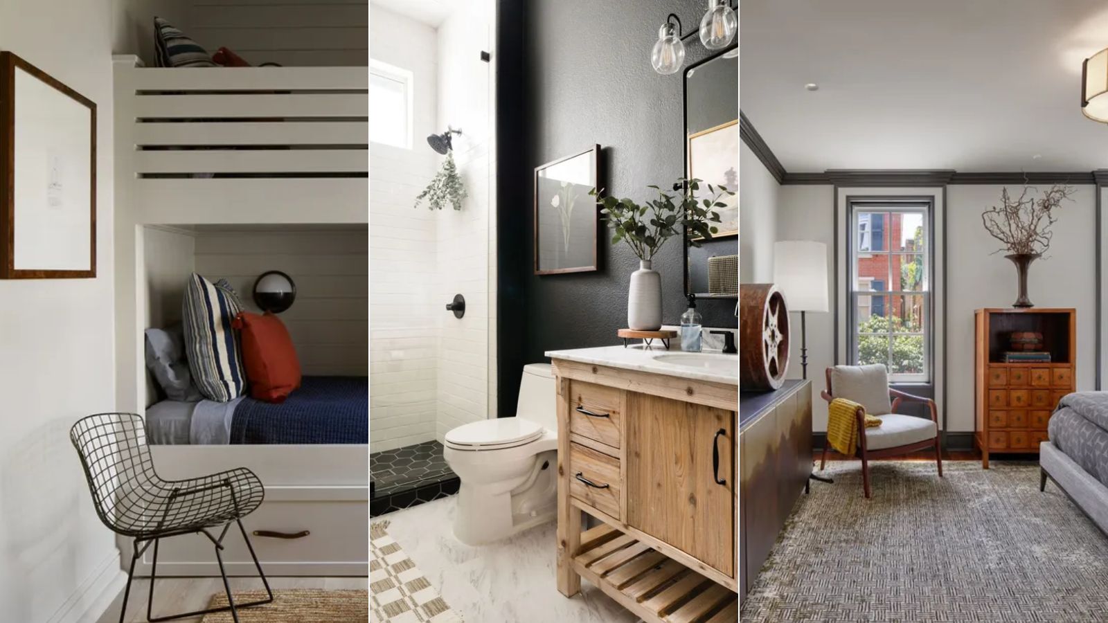
What are the best Benjamin Moore gray paints? 7 go-to shades recommended by designers
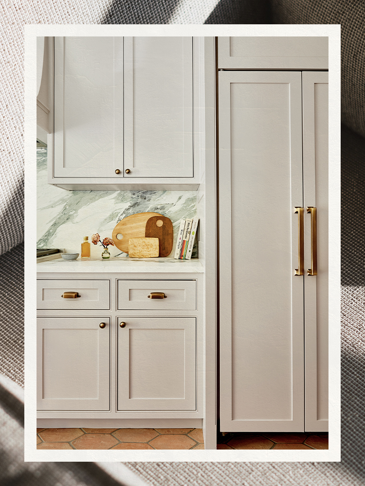
The Best Gray Paint Colors Interior Designers Swear By