Be-Jeweled: We’ve Got the Home Decor Color Forecasts for 2017
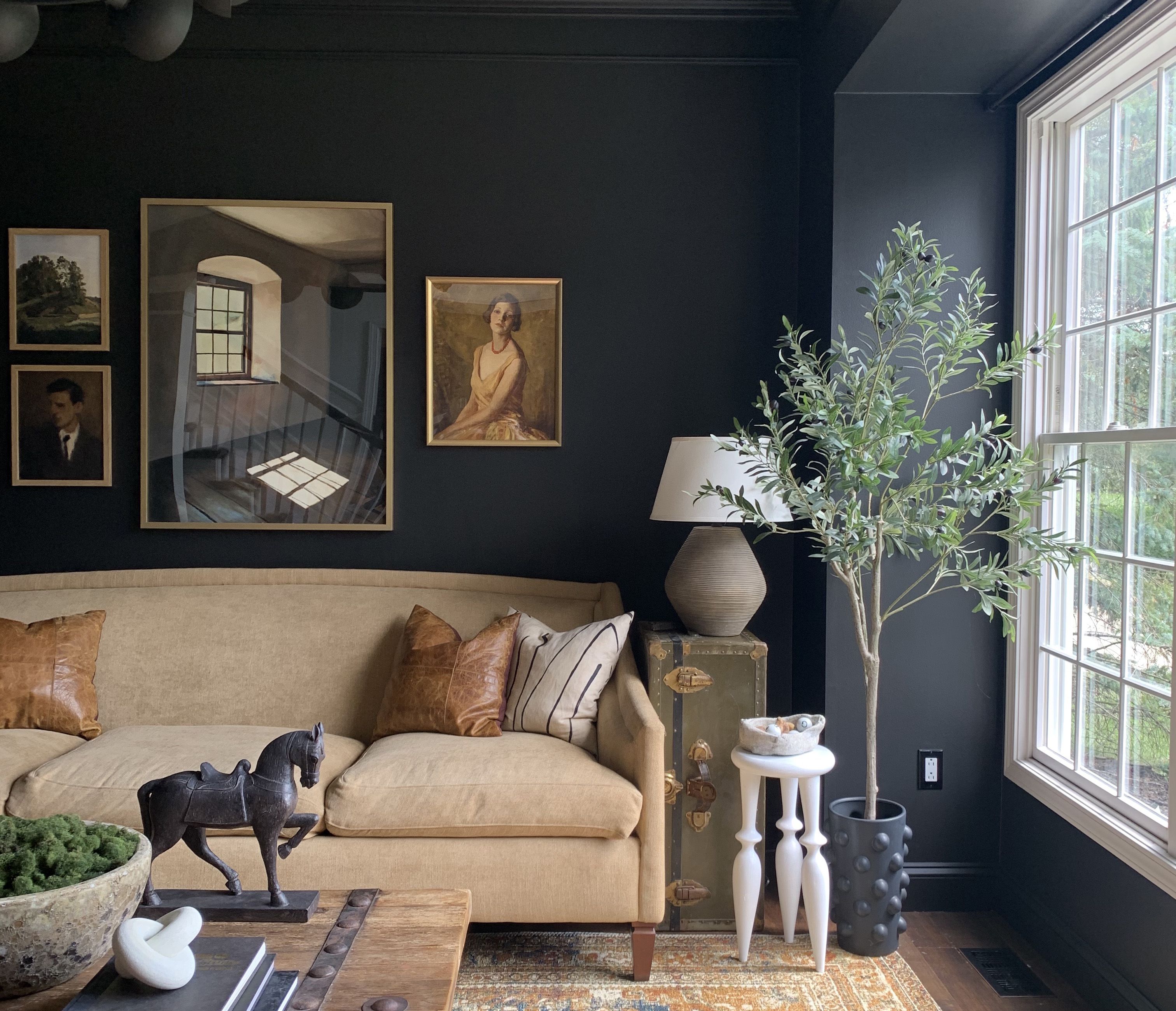
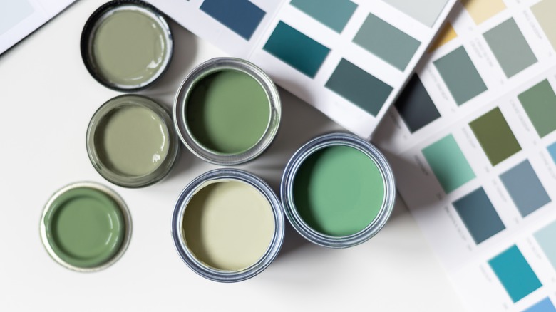
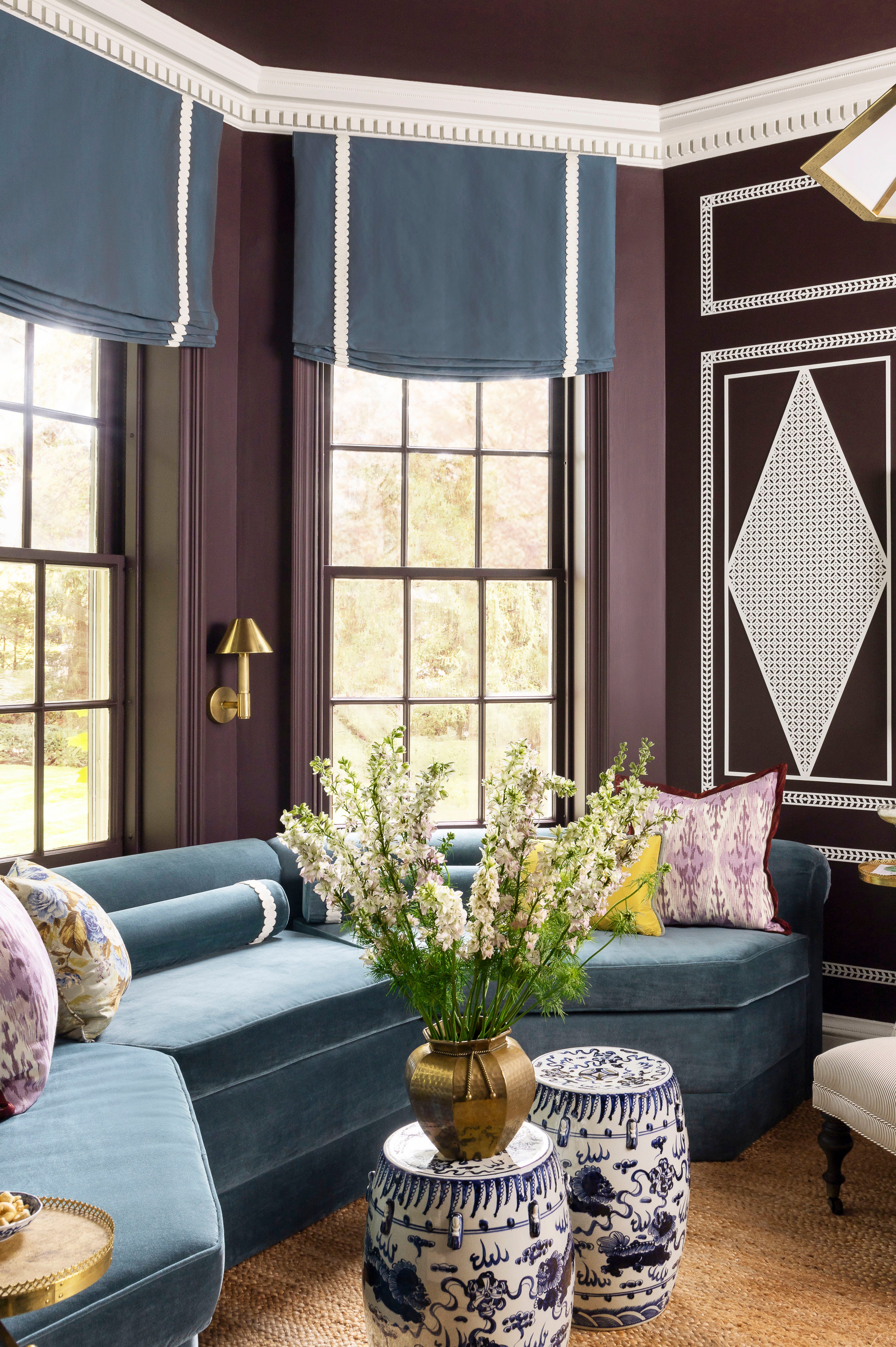
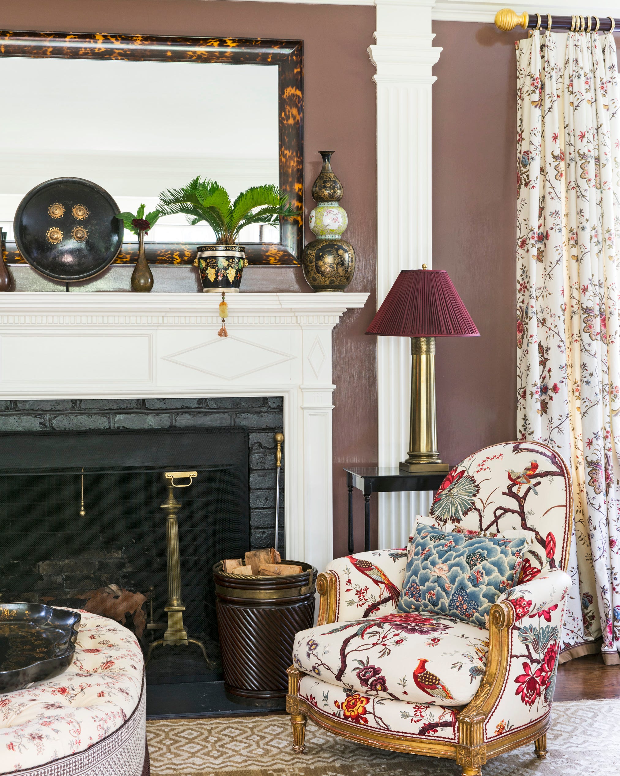
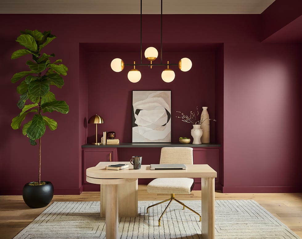
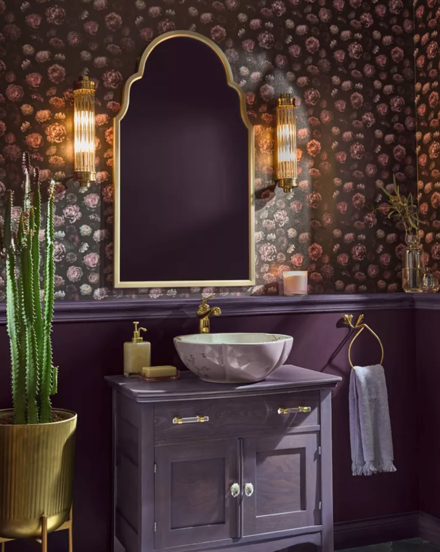
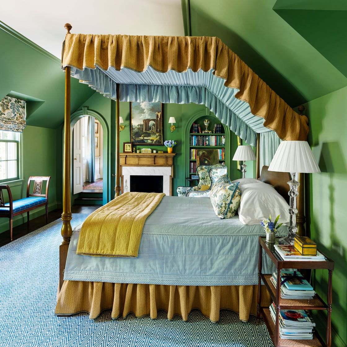
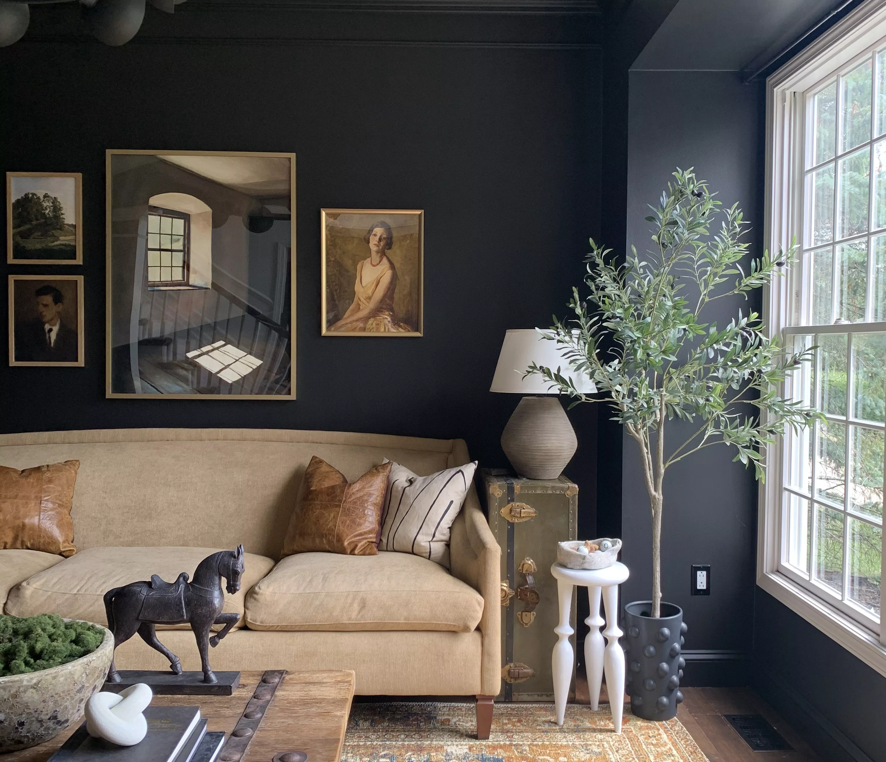
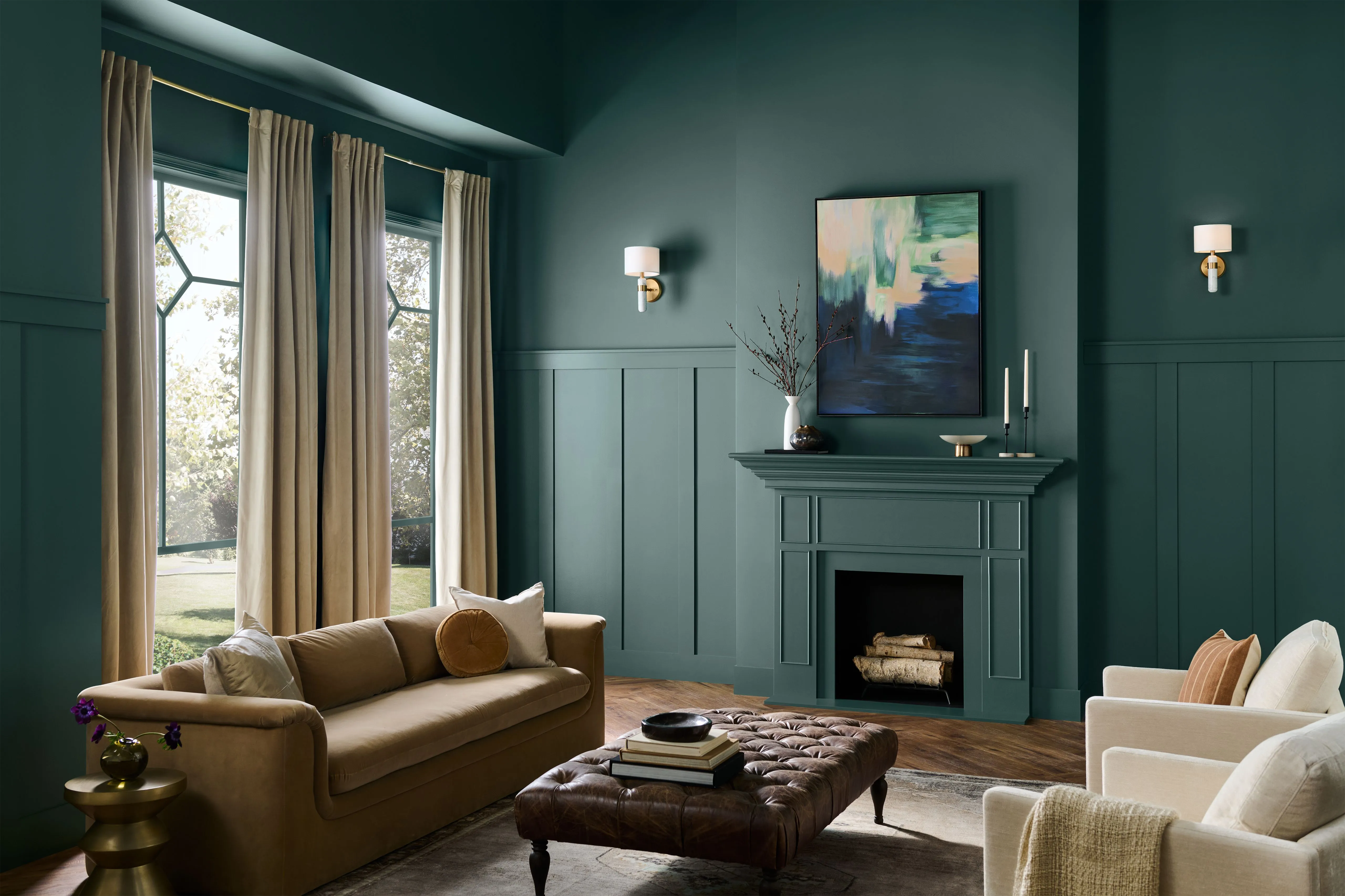
The home decor color forecasts for 2017 predict a significant shift towards deep, rich, and moody jewel tones, moving away from lighter palettes. This trend is evocative of nighttime aesthetics and draws inspiration from Dutch baroque styling. Sue Wadden, the director of color marketing at Sherwin-Williams, highlights the emergence of these profound colors not only in wall paints but also in various surfaces and materials, including fabrics, textures, and cabinetry. This signals a return to a richness in home aesthetics that has been less prevalent in recent times.
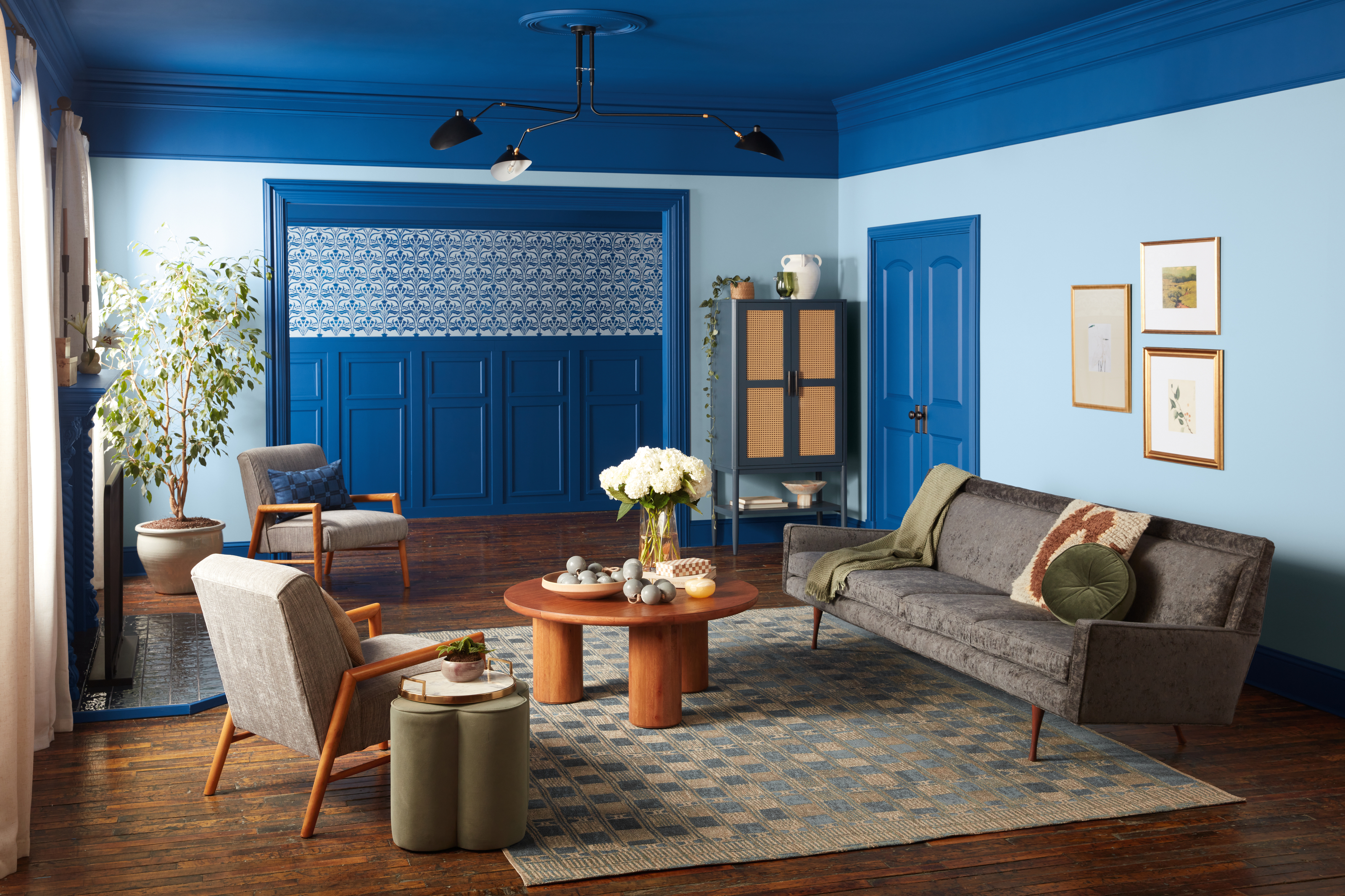
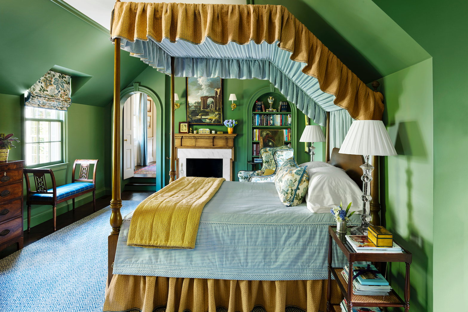
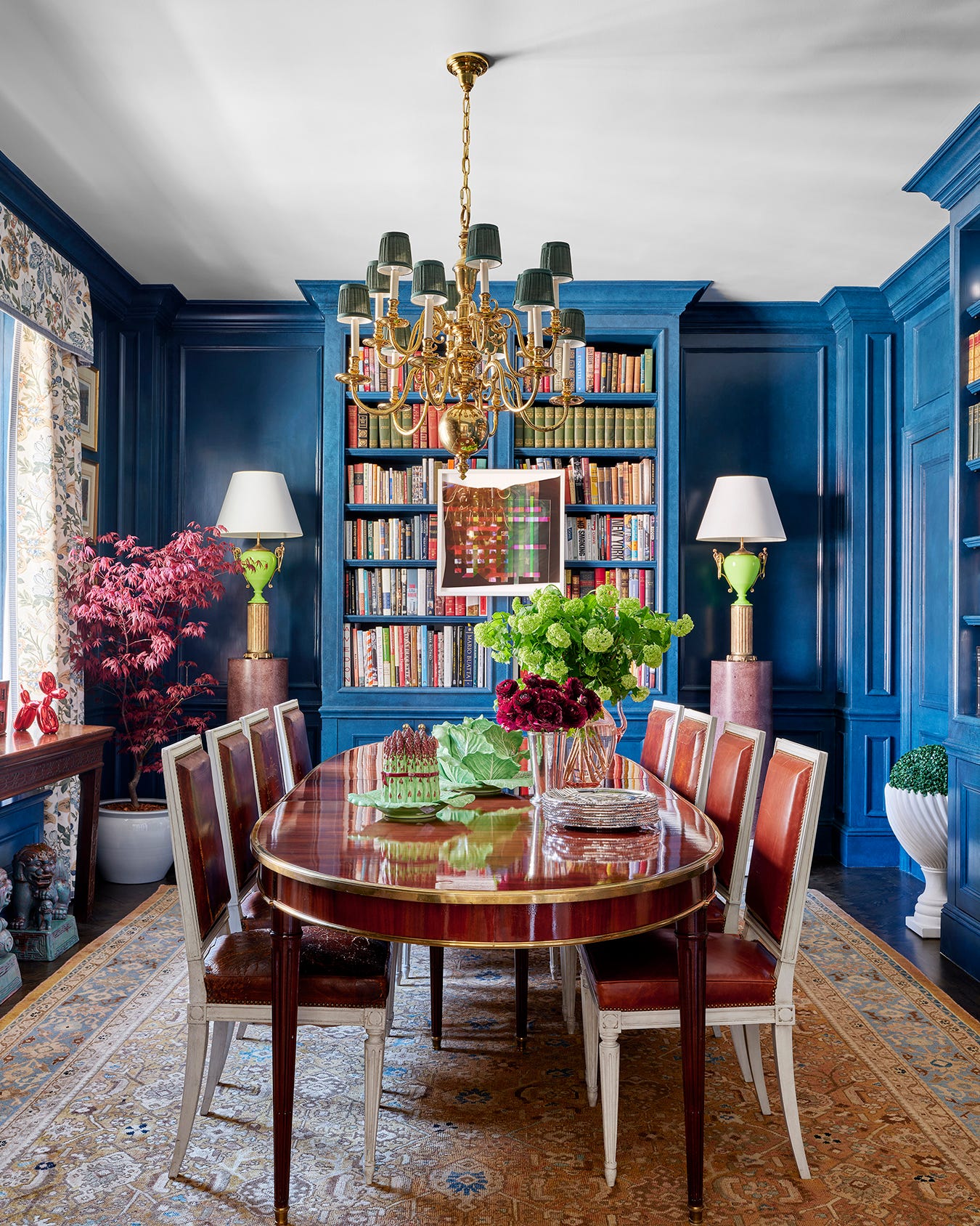
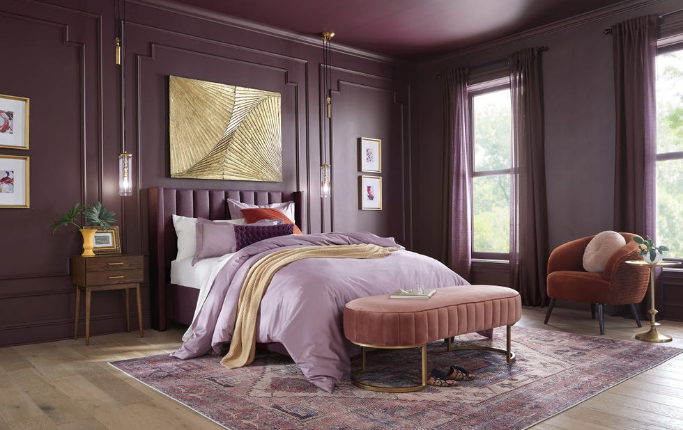
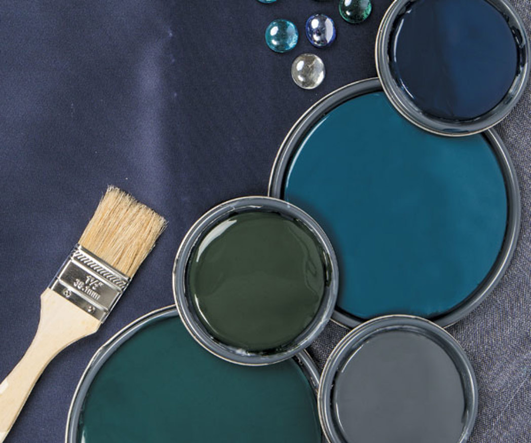
Wadden offers specific guidance on integrating these jewel-toned colors into home interiors, whether as primary wall colors or as accent elements. One prominent recommendation is the use of SW 9179 Navy, described as a versatile neutral due to its timeless appeal. This deep blue can be effectively layered in a bedroom setting with other shades of blue, such as deep indigo or French blue, to create a cohesive and sophisticated look.
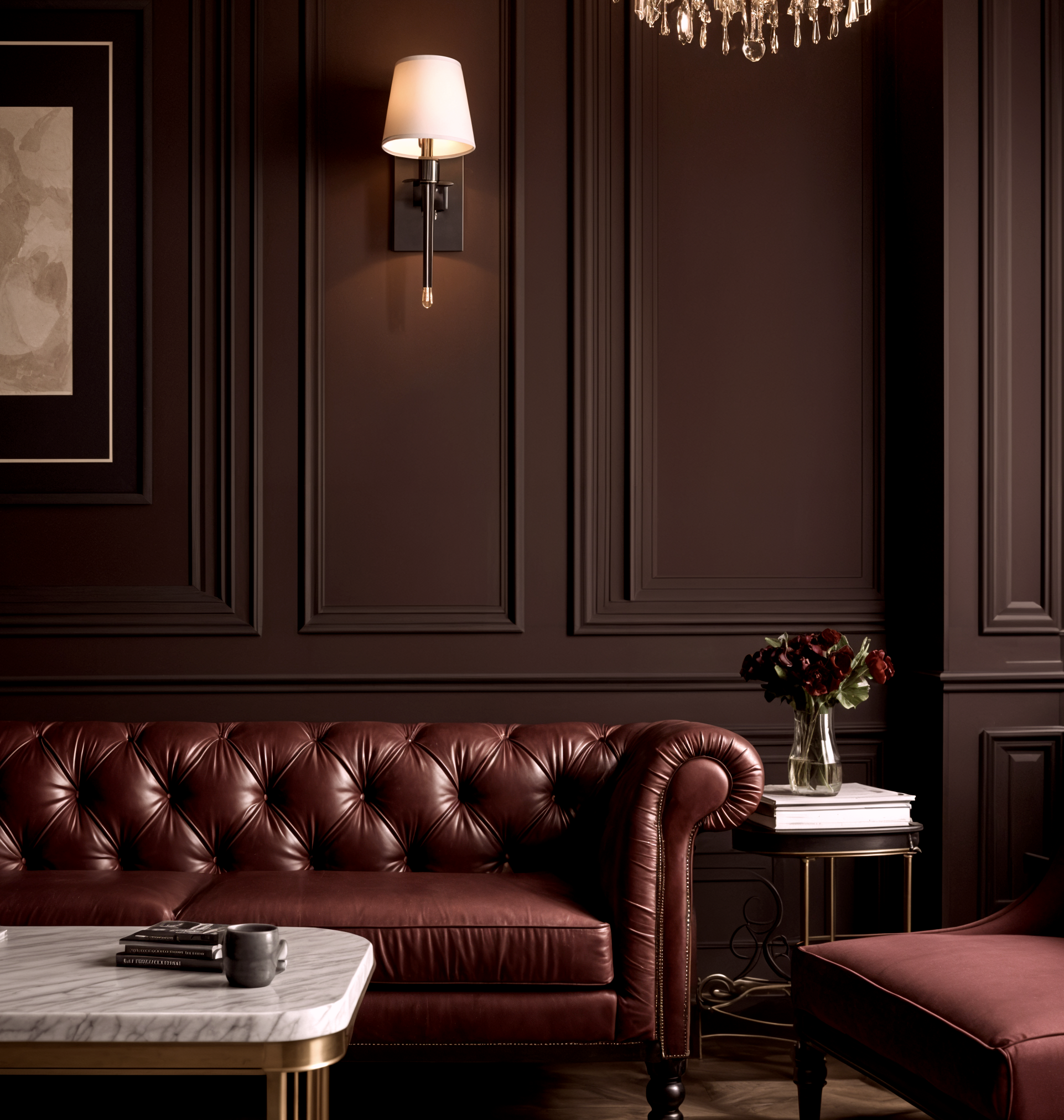
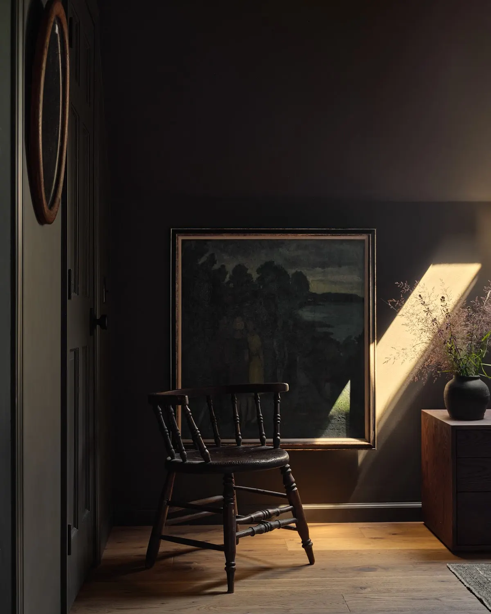
Another suggested color is SW 9142 Moscow Midnight, a deep and moody teal. This shade is ideal for creating a secluded and dark retreat, such as a reading nook, especially when contrasted with crisp white trim. Wadden notes that this color evokes the profound depths of the sea, contributing to a tranquil yet dramatic atmosphere.
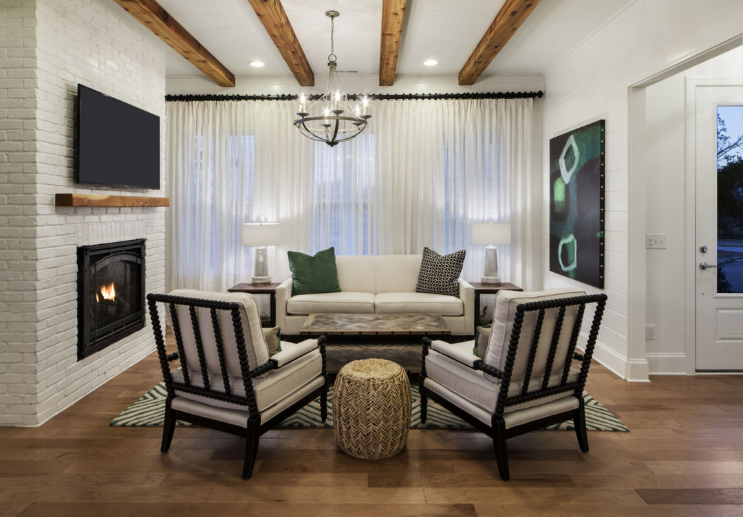
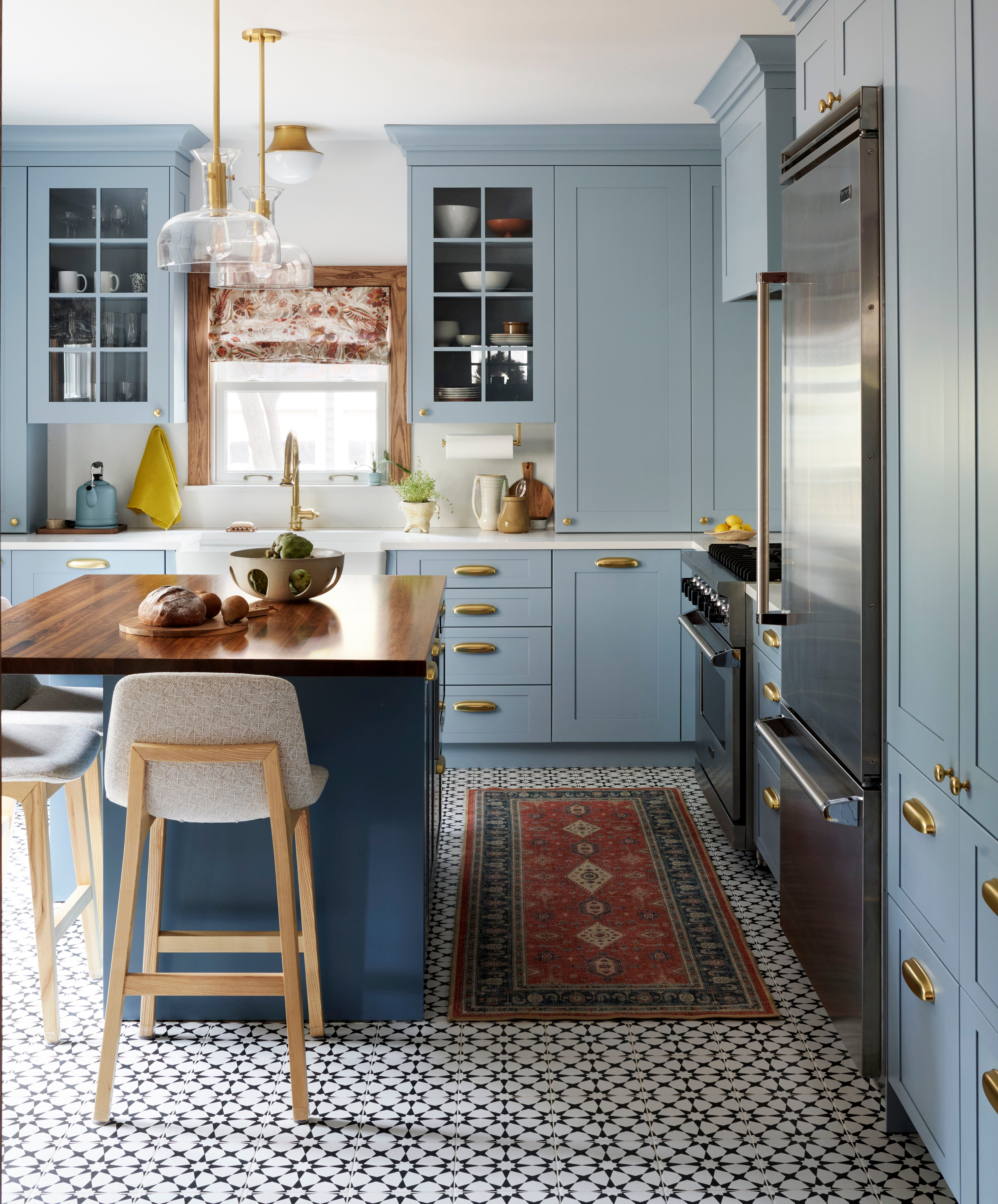
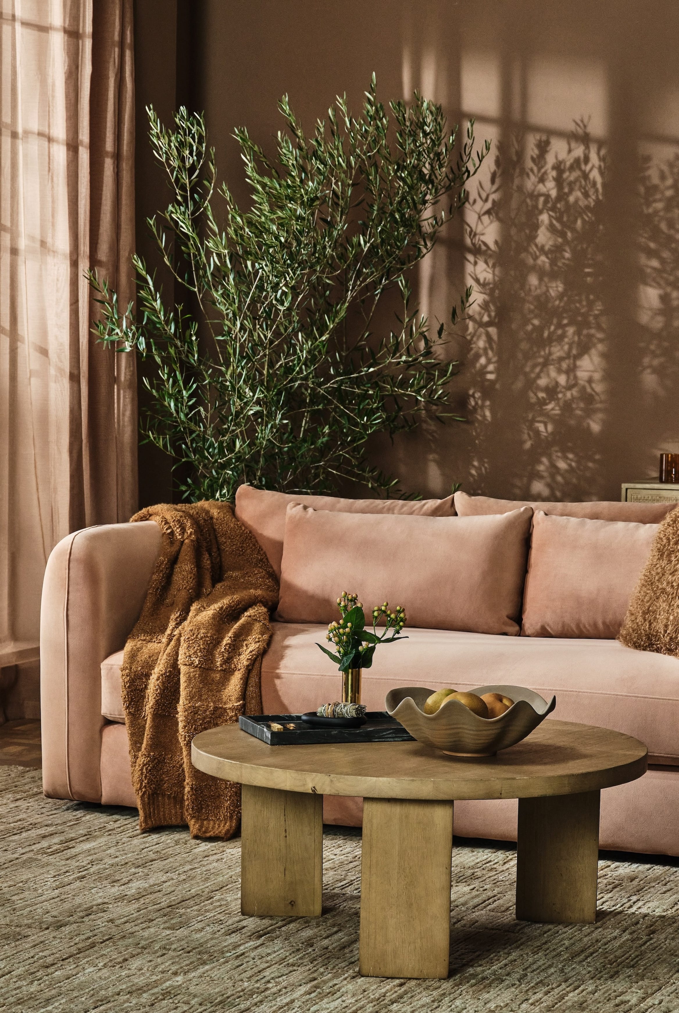
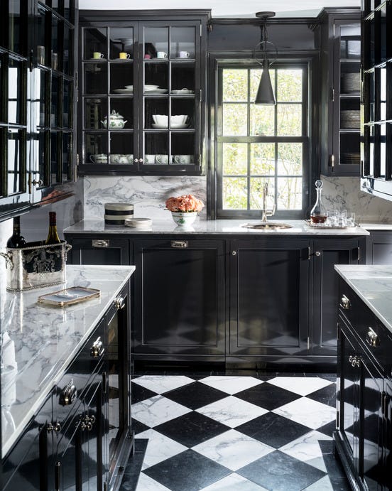
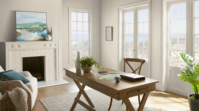
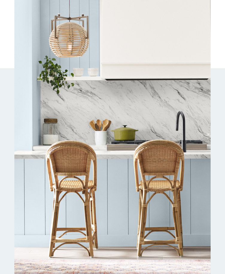
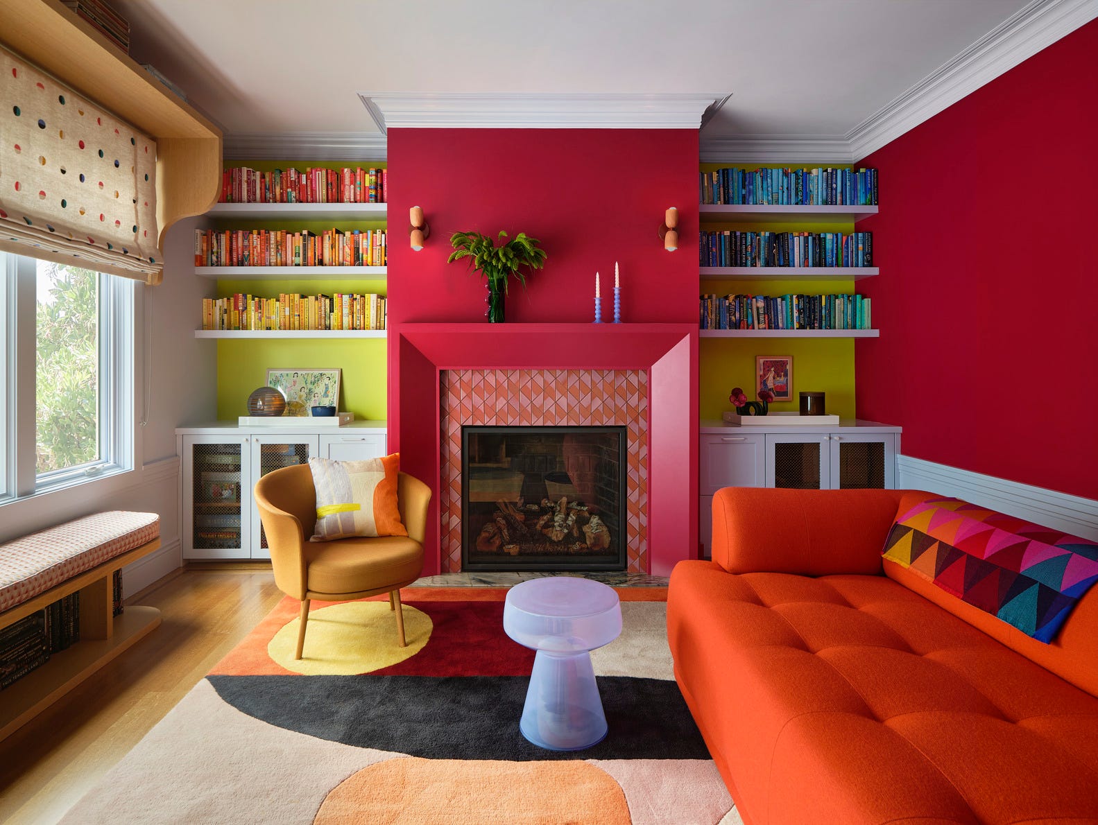
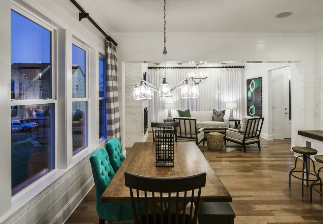
For a more organic and natural feel, SW 7623 Cascades is recommended. This sage color pairs well with browns and bone colors, fostering a woodsy aesthetic. Alternatively, it can be combined with aqua and citrus tones to achieve a vintage vibe. Wadden particularly favors this color for living spaces and suggests its application on kitchen cabinets to introduce a touch of elegance and character.
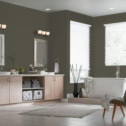
SW 6216 Jasper, a woodsy evergreen, is presented as a color that delivers an alpine forest ambiance. To make a bold statement, Wadden advises using Jasper on a kitchen island, creating a focal point with high drama. This demonstrates how deep colors can be used strategically to enhance specific architectural features within a home.
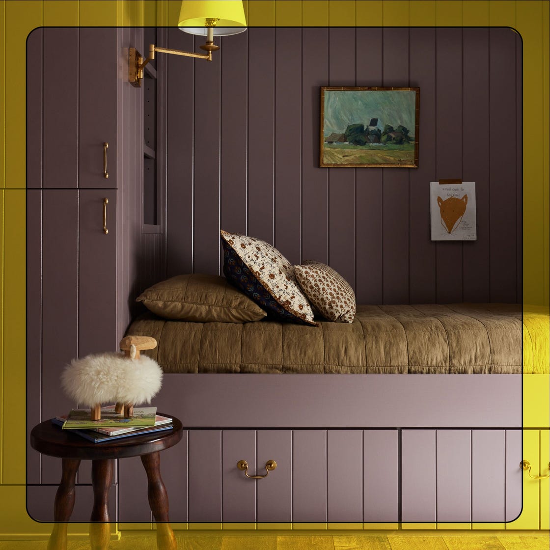
Finally, for those looking to balance lighter jewel-toned walls, SW 7076 Cyberspace, a charcoal shade, is suggested for neighboring woodwork. This technique involves painting trim and doors in dark colors while keeping walls lighter, a trend that Wadden notes results in a particularly elegant appearance. This approach allows for the incorporation of dark tones without overwhelming a space, providing contrast and sophistication. The overall forecast emphasizes a move towards depth, richness, and thoughtful integration of color to create distinctive and stylish interiors.
#HomeDecor #ColorTrends #SherwinWilliams #JewelTones #InteriorDesign #PaintColors #HomeStyle #DesignRenovations #HomeDecor #ColorTrends #SherwinWilliams #JewelTones #InteriorDesign #PaintColors #HomeStyle #DesignRenovations
0 comment in total
You may also like
What is Color Forecasting? Experts Explain How to Map Trends |

What To Expect For 2023 Paint Color Trends

These 20 Trendy Paint Colors Will Be Taking Over Walls In 2026
Ever Wonder How a Color of the Year Is Selected? Experts Spill the Secrets

Interior Design Trends for 2017
Designers Predict You'll Use AT LEAST One of These Colors in Your Home in 2025

HGTV Home by Sherwin-Williams Just Revealed Their Top Paint Color Predictions for Next Year

Jewel Tones Are Trending for Living Room Paint Colors, According to Designers

These 6 Colors Will Rule Interiors in 2026, According to Experts

5 Paint Colors That Are Out for 2025, According to Interior Designers

These Paint Colors Will Dominate Our Homes in 2022

What Paint Colors Will Rule 2026? Designers Make Their Predictions
Your 2025 Paint Color Forecast Is Here—Say Goodbye to Bold Hues and Hello to Muted Earth Tones

These 7 Colors Will Rule Interiors in 2026, According to Experts

Pick Your Favorite 2024 Color of the Year

A Guide to Every Color of the Year for 2025 (So Far)
Sherwin-Williams' 2026 Color Forecast Is Here and It’s Packed With 48 Fresh Hues
These 8 Color Trends Will Rule in 2025, According to Color Pros
Christmas colour schemes – 17 trending shades and cohesive seasonal palettes to elevate your home’s festive decor
Every 2026 Color of the Year Revealed So Far—and What They Say About the Year Ahead