1/3
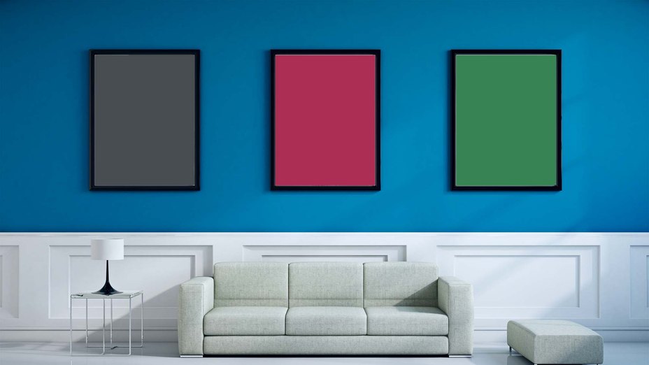
Beige, Begone: Bring Your Walls to Life With These 14 Beautifully Bold Colors
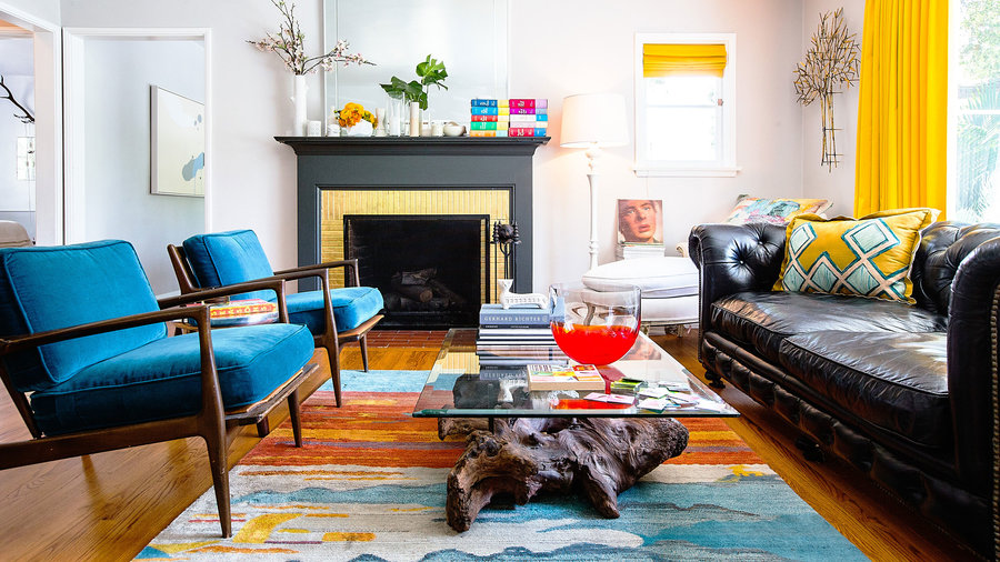
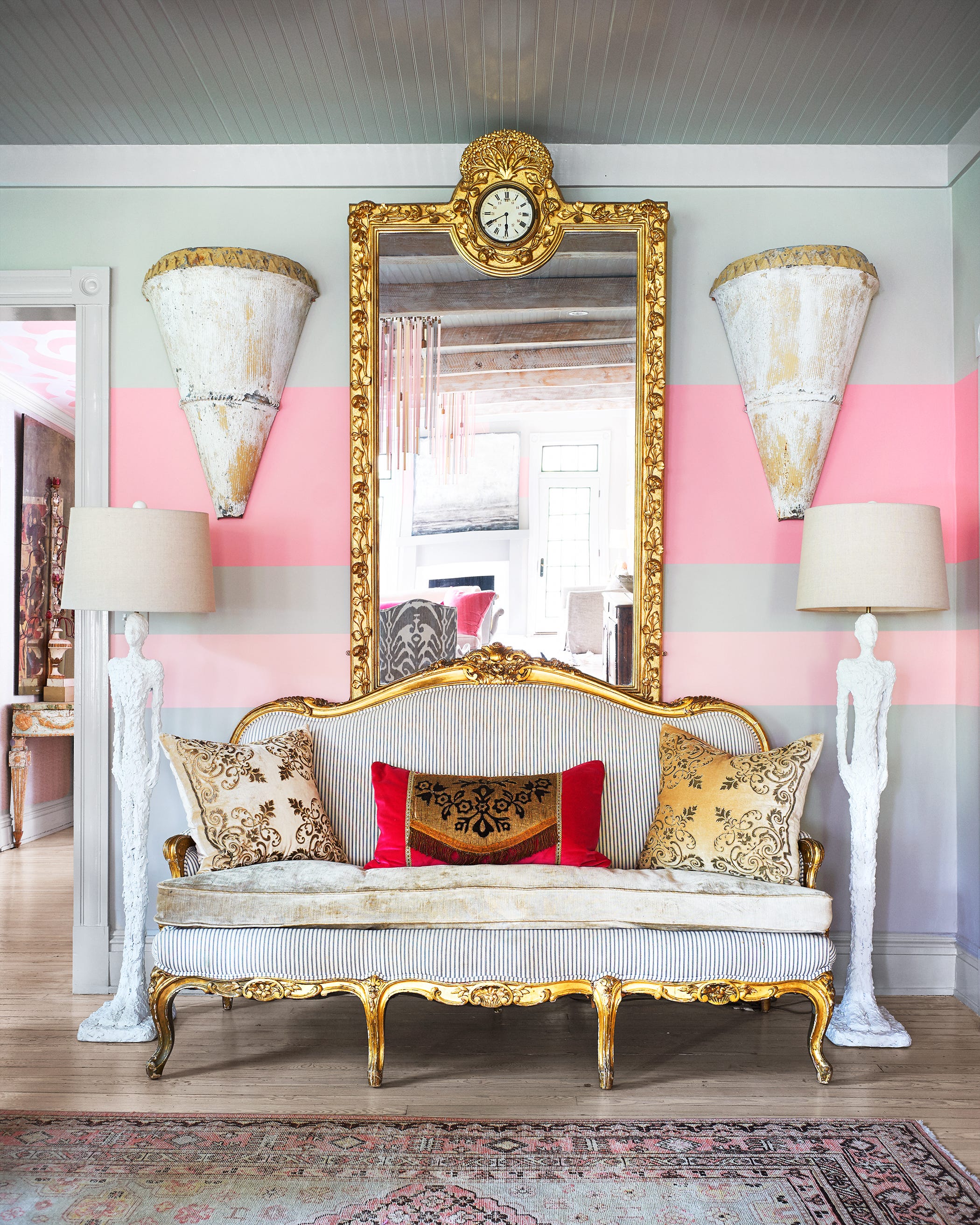
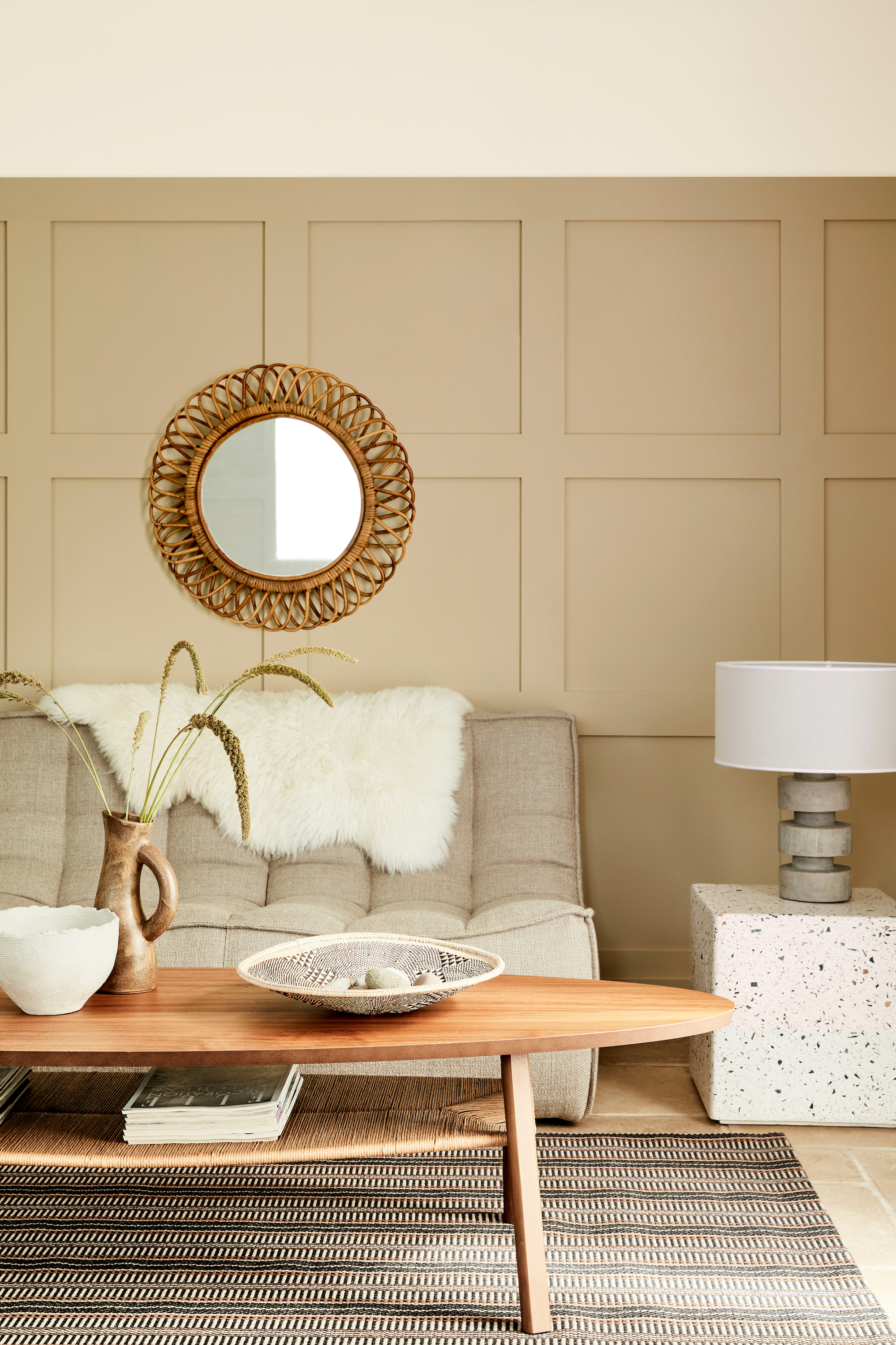
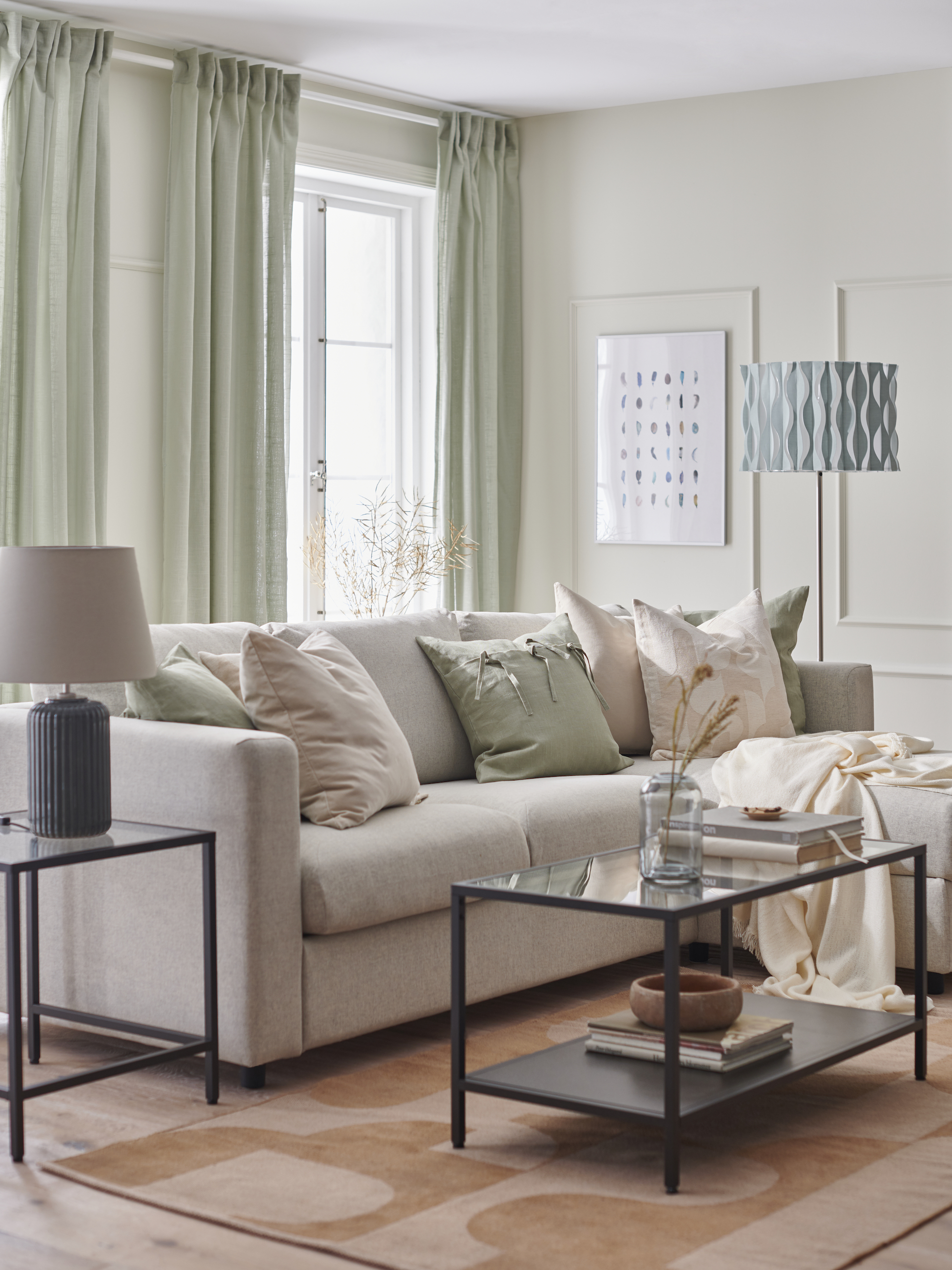
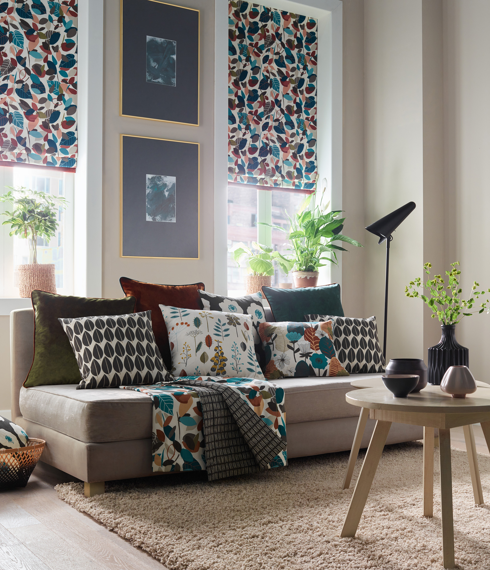
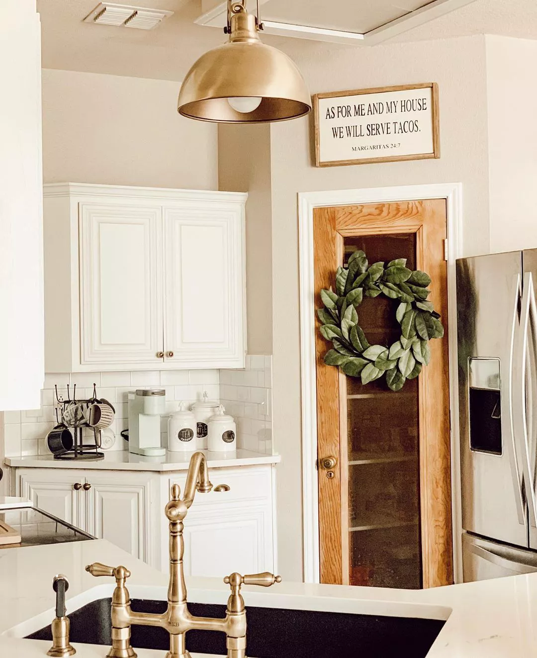
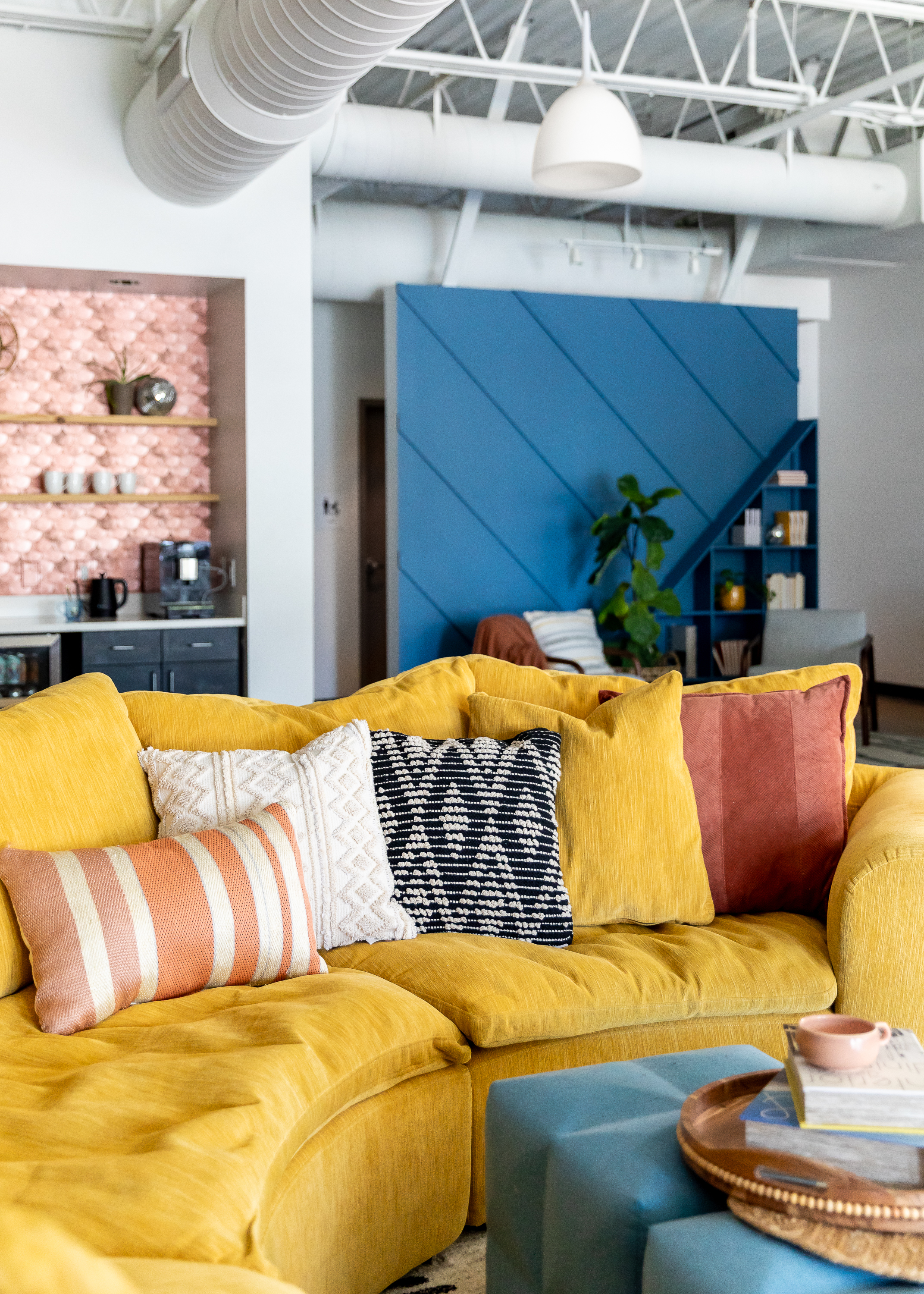
The article explores a design trend moving away from neutral, off-white wall colors towards more vibrant and bold paint choices. It aims to guide adventurous decorators in selecting impactful yet enduring shades for their homes. The piece emphasizes that incorporating bold colors can transform a space and encourages readers not to be intimidated by such choices, as paint is easily changeable.
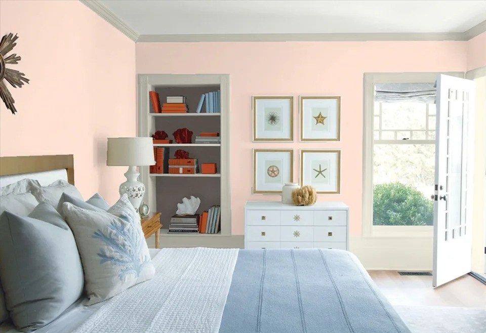
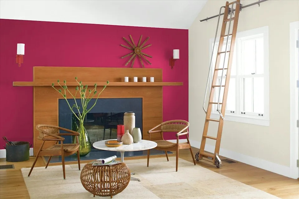
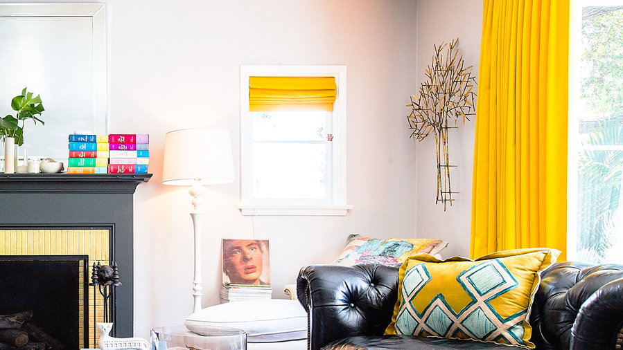
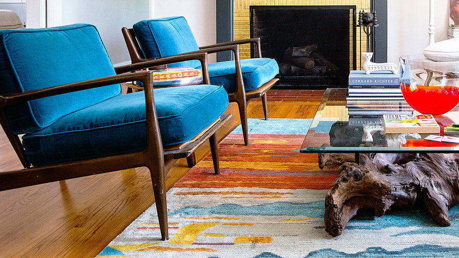
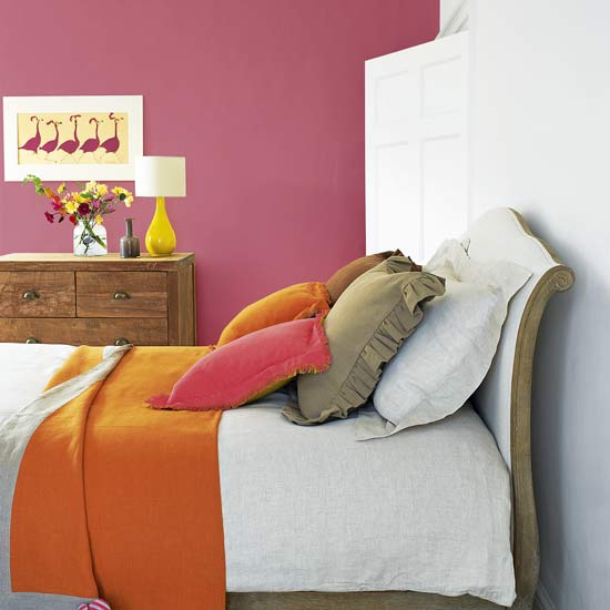
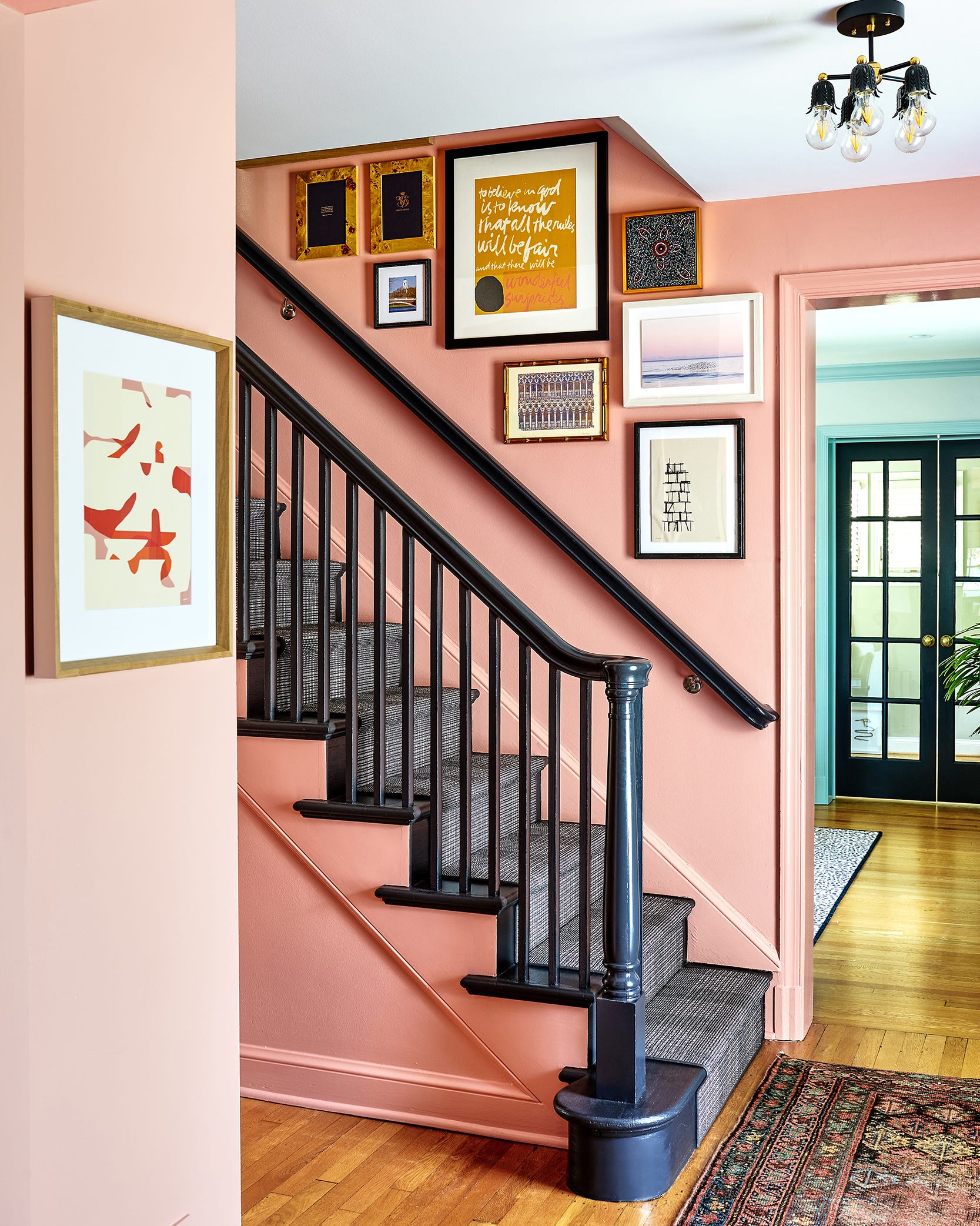
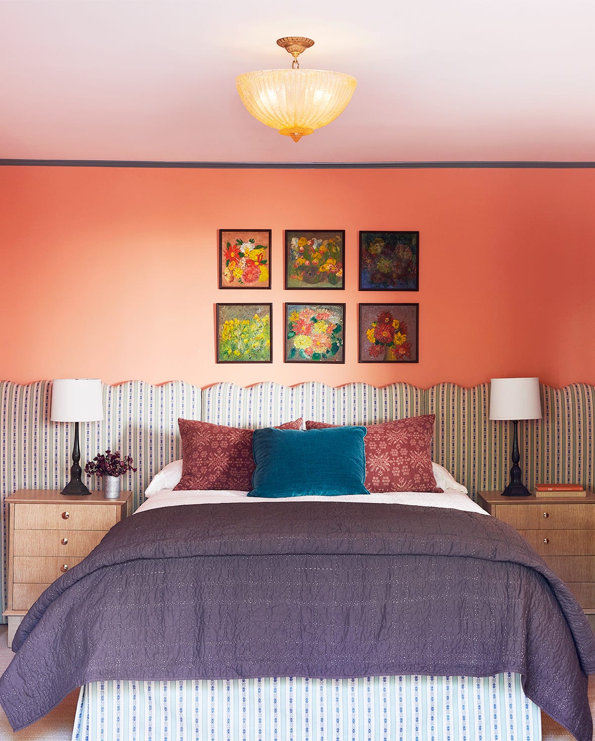
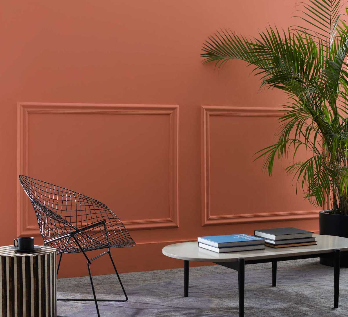
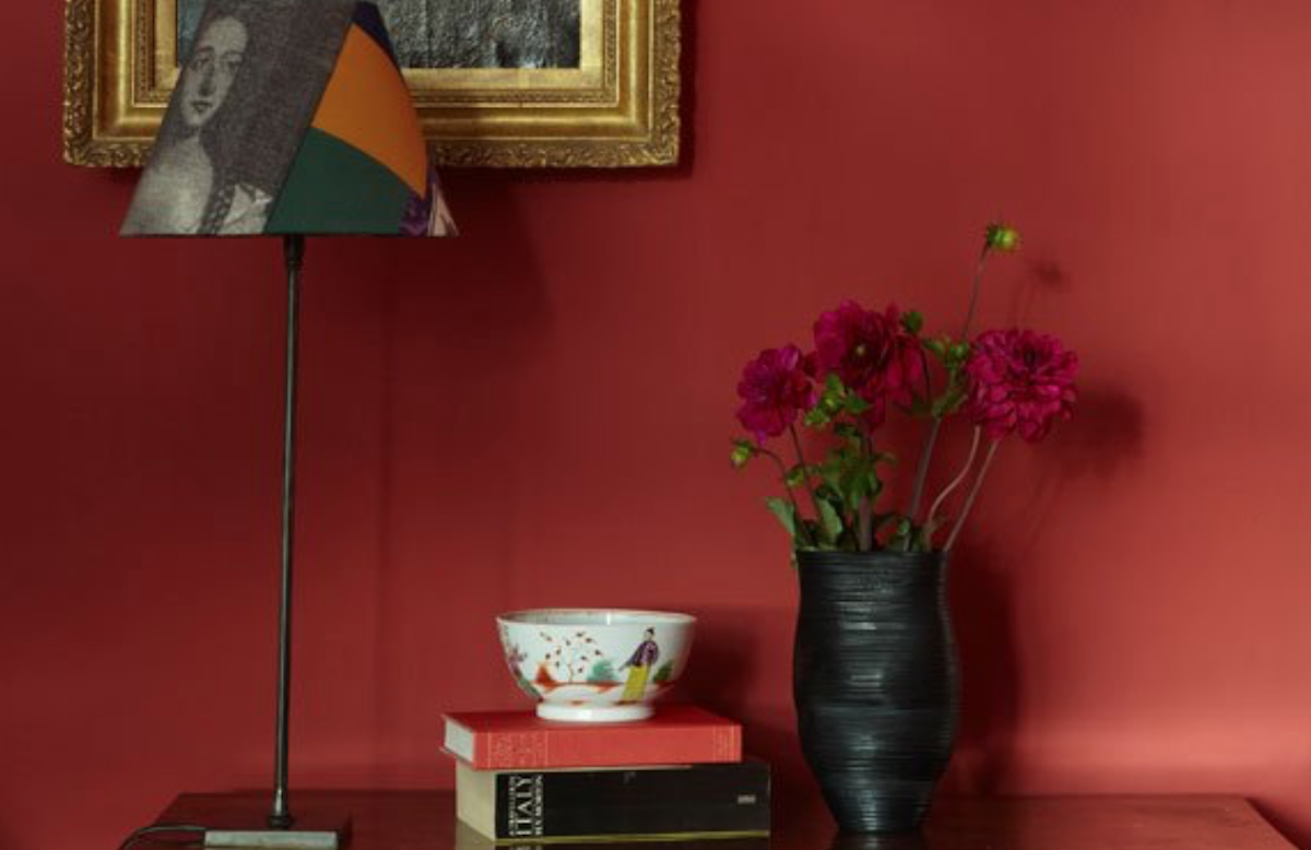
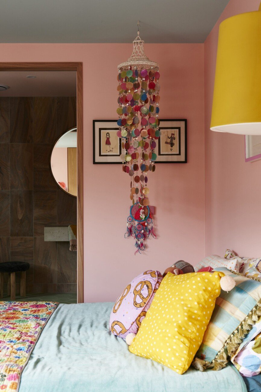
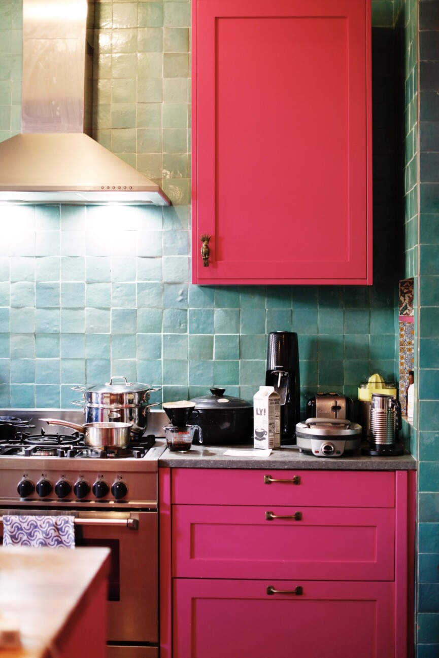
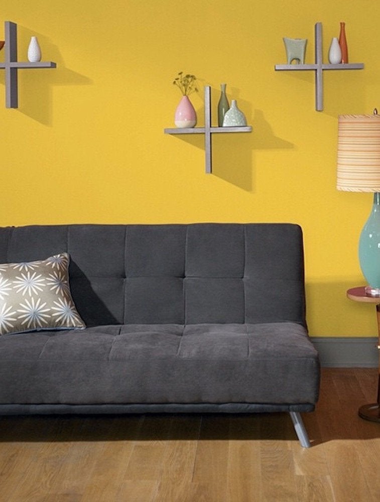
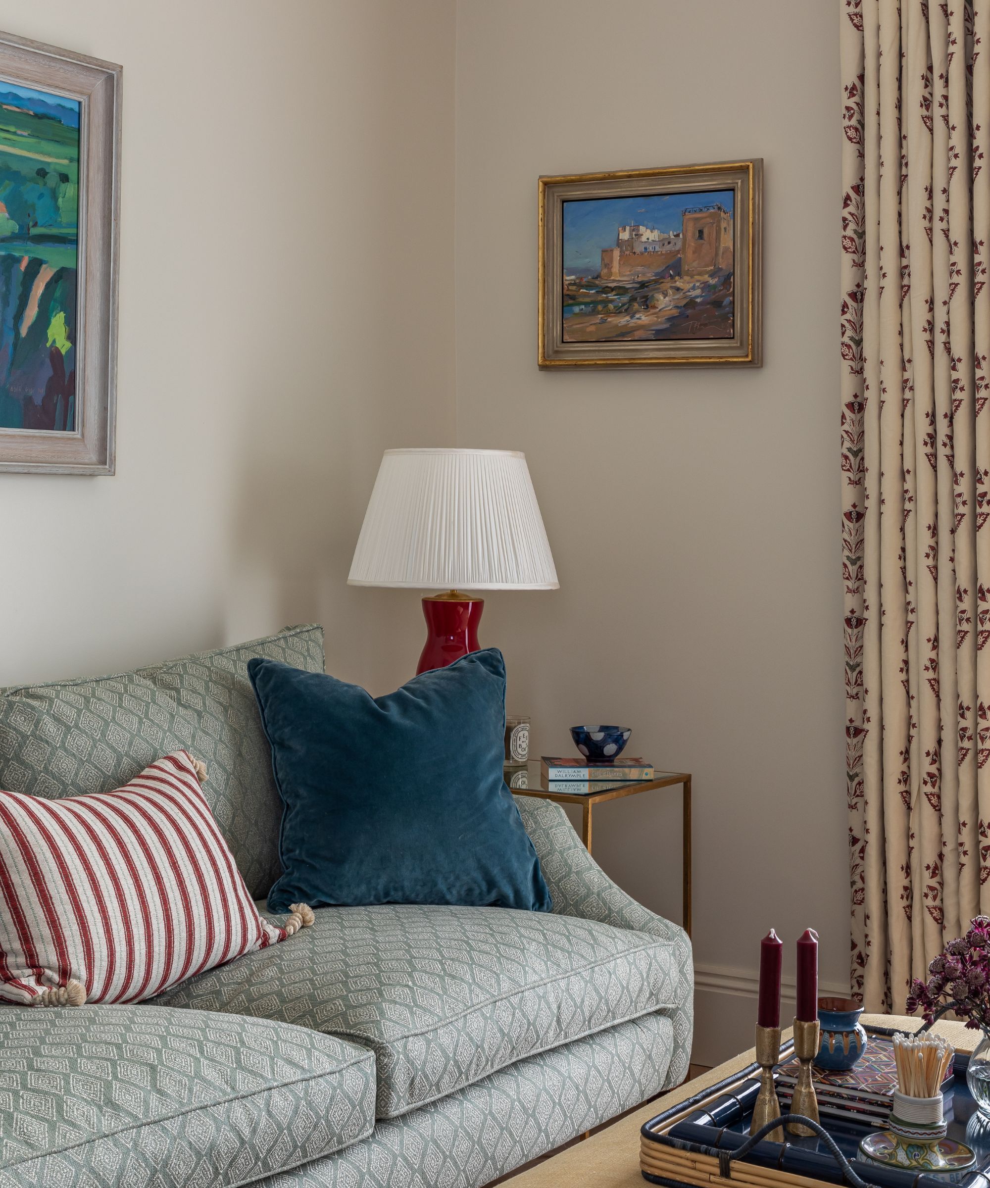
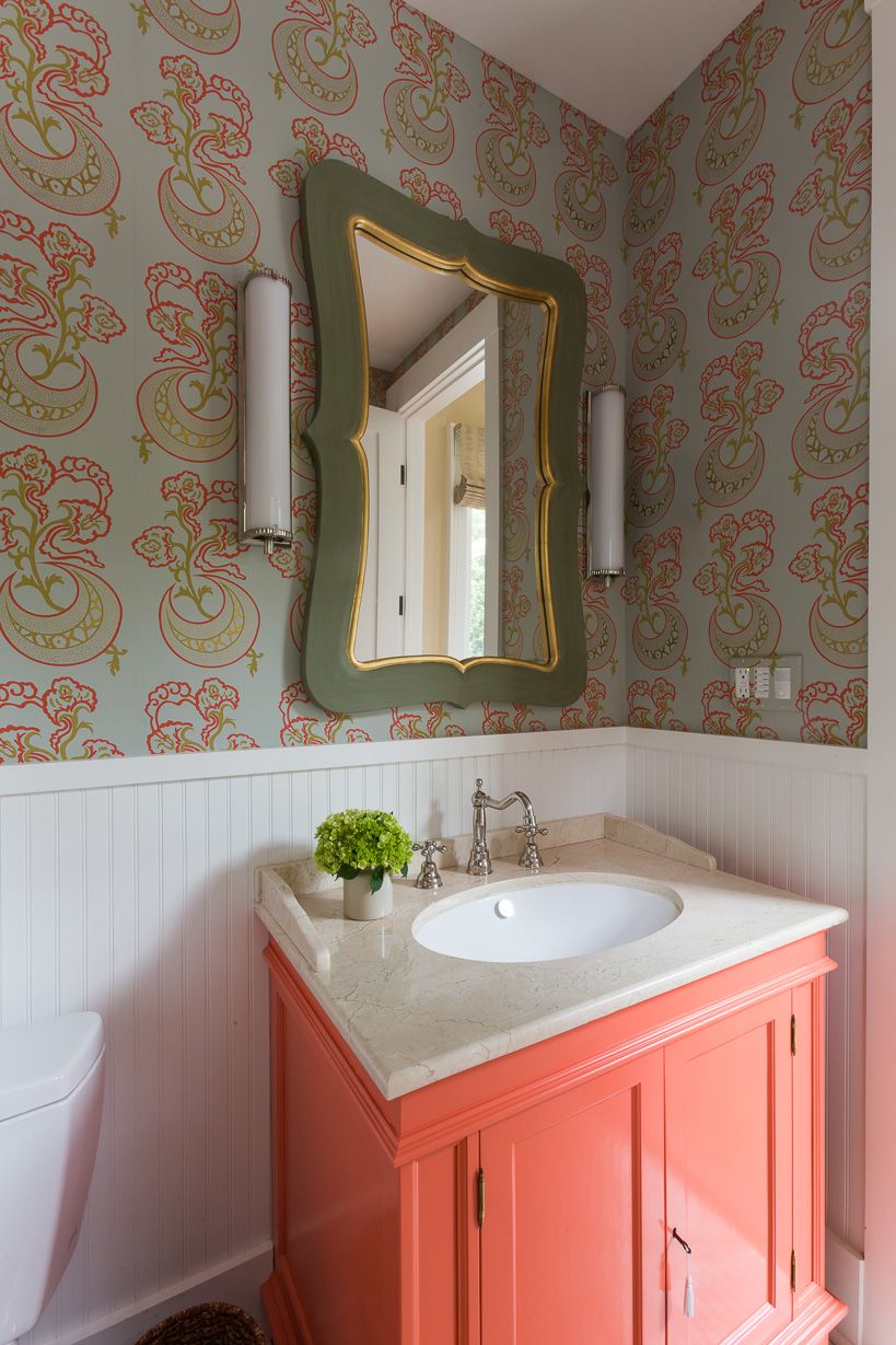
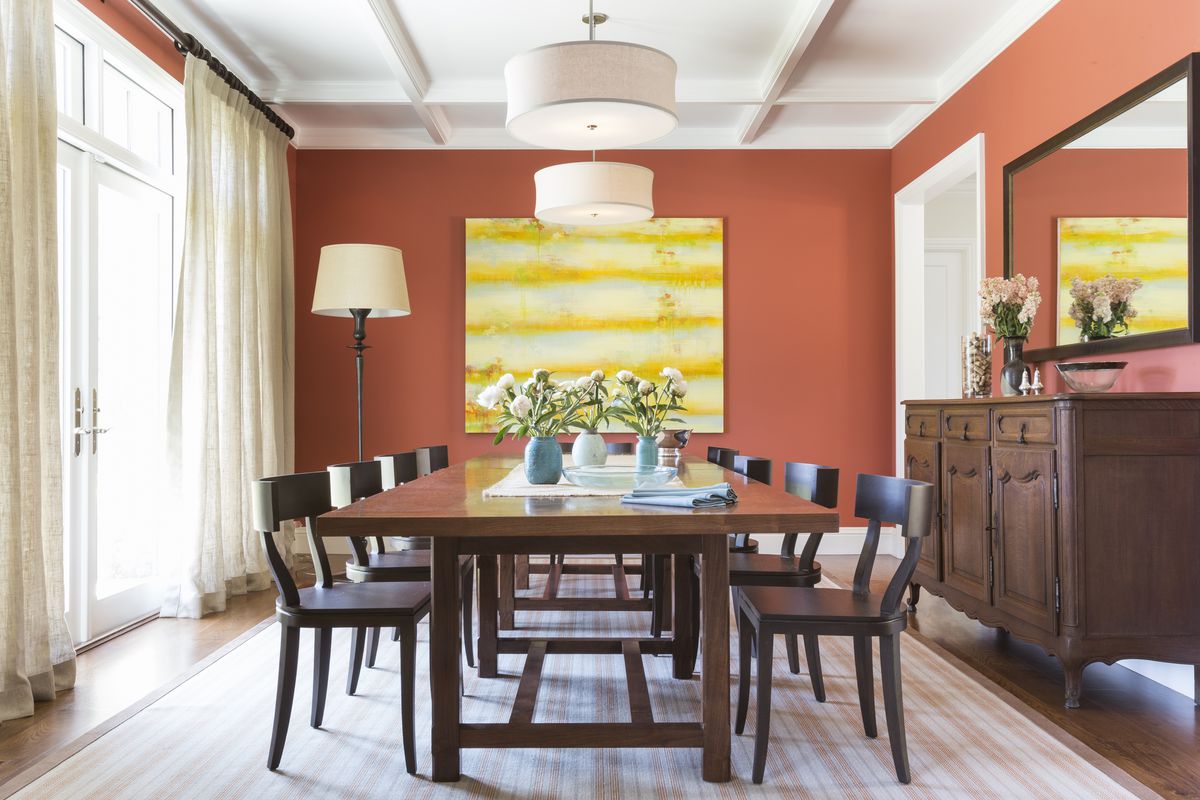
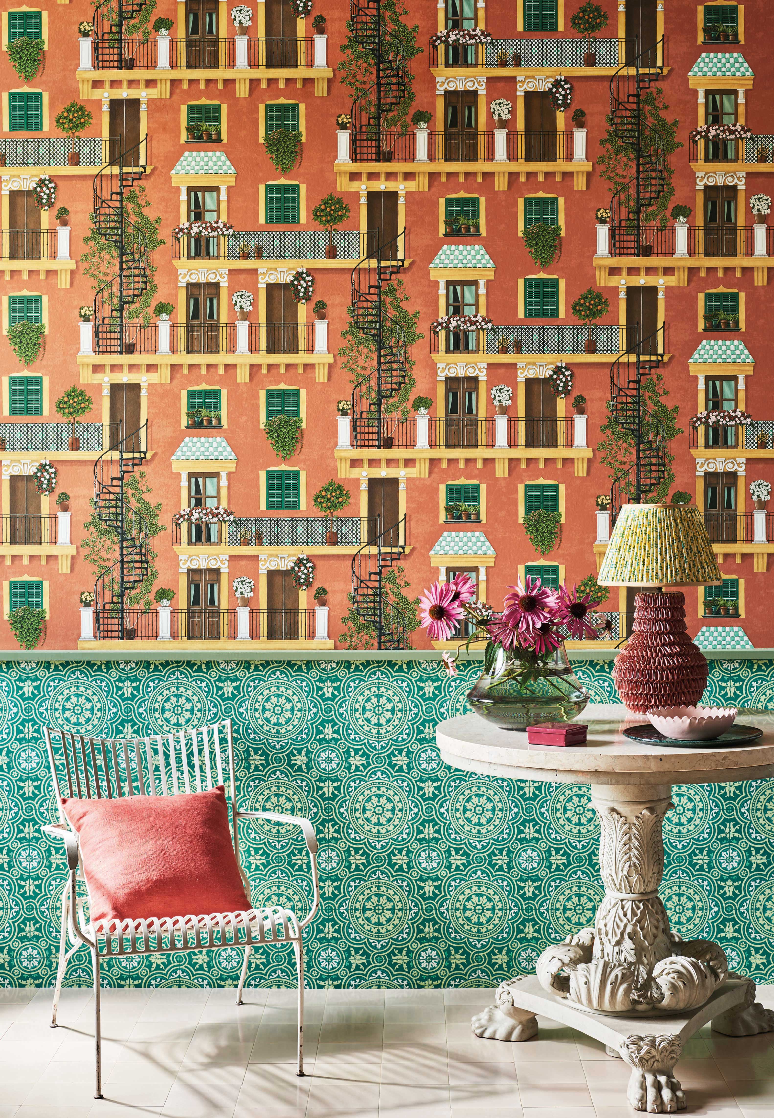
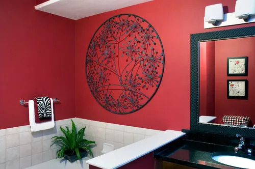
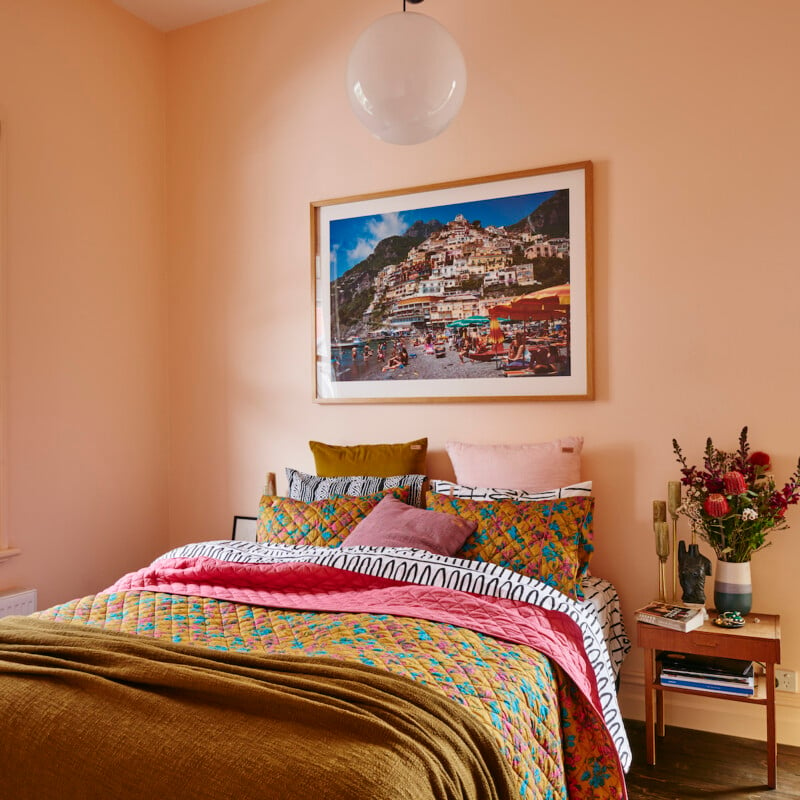
The article features 14 specific bold paint colors, categorized by hue, and provides expert recommendations from interior designers on how to best utilize each shade. For reds and oranges, 'Raspberry Truffle' by Benjamin Moore is suggested for accent walls or powder rooms, noted for its warmth and vibrancy. 'Sunlit Coral,' also by Benjamin Moore, is recommended for sunny rooms to create a 'sun-kissed' effect, offering an updated peach tone. 'Tawny Day Lily' from Benjamin Moore is highlighted as a playful and versatile red-orange that adds personality without becoming outdated or overwhelming.
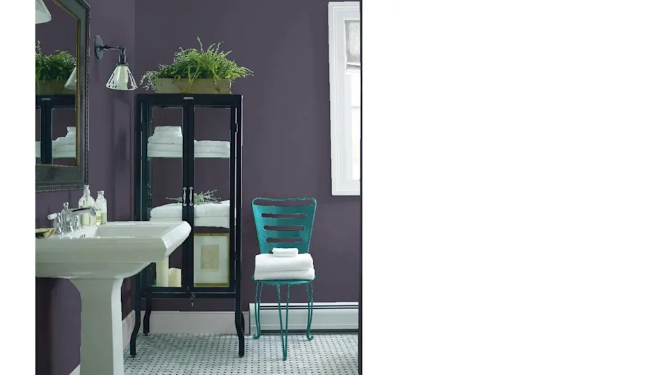
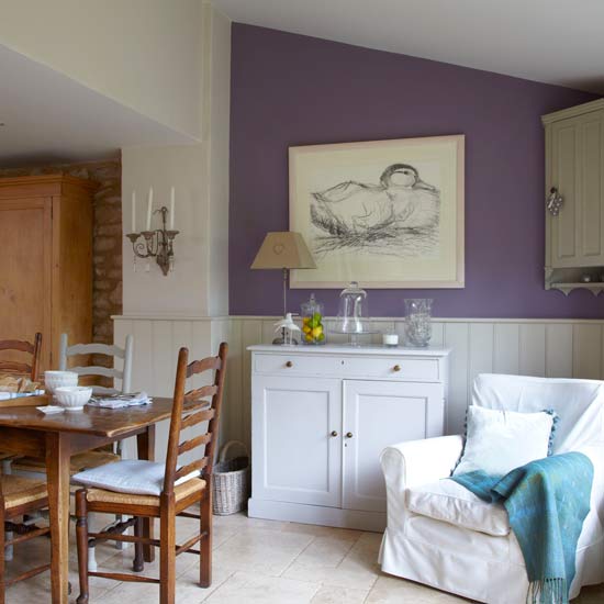
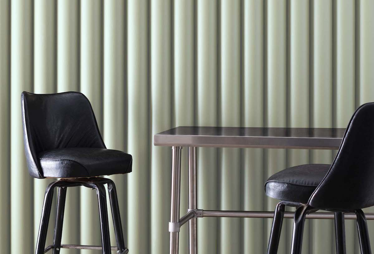
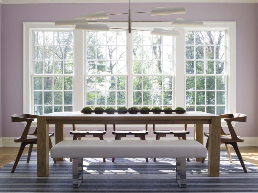
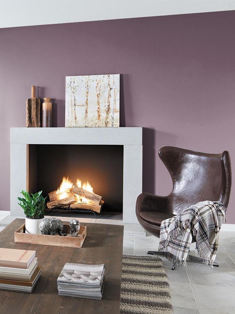
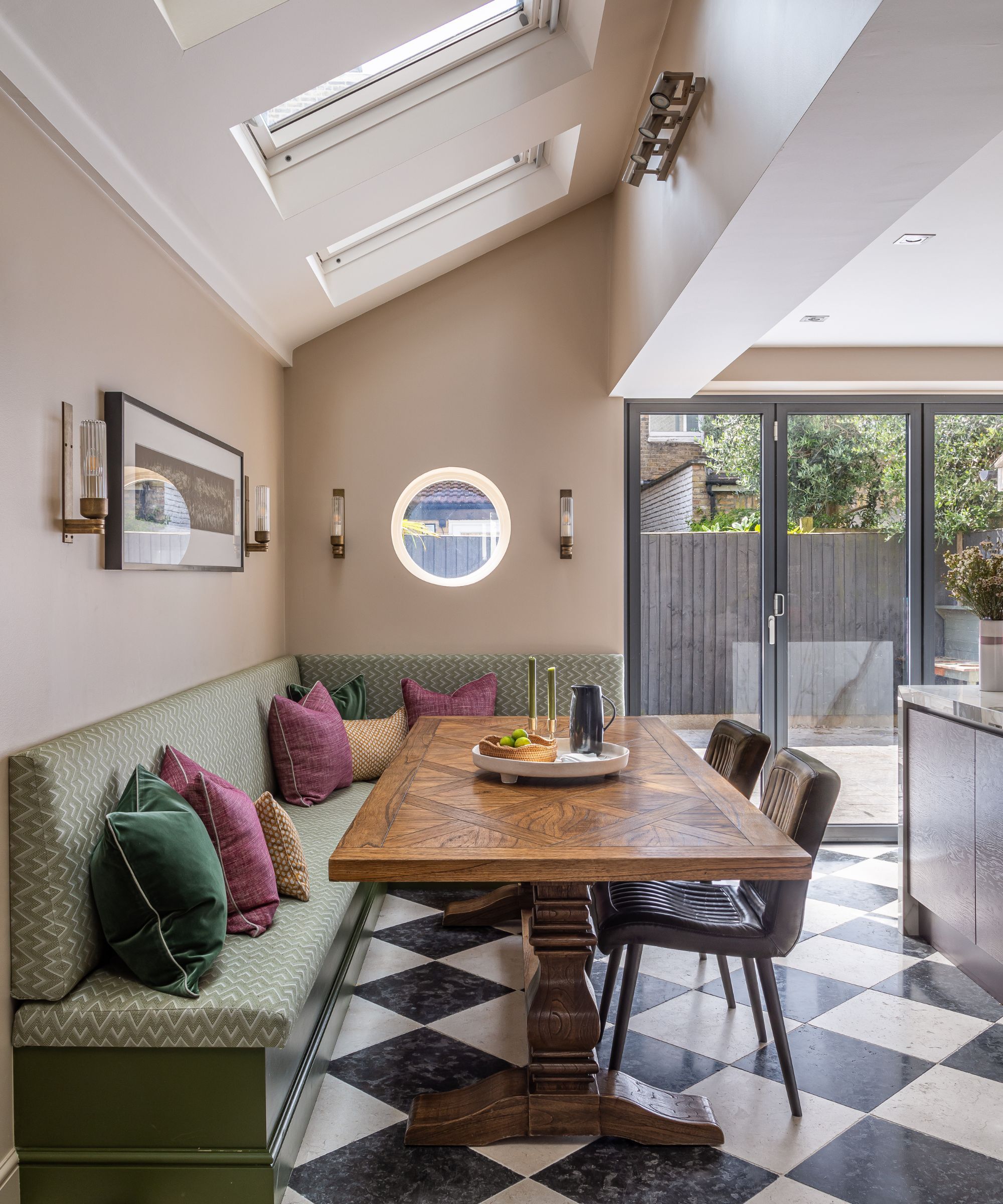
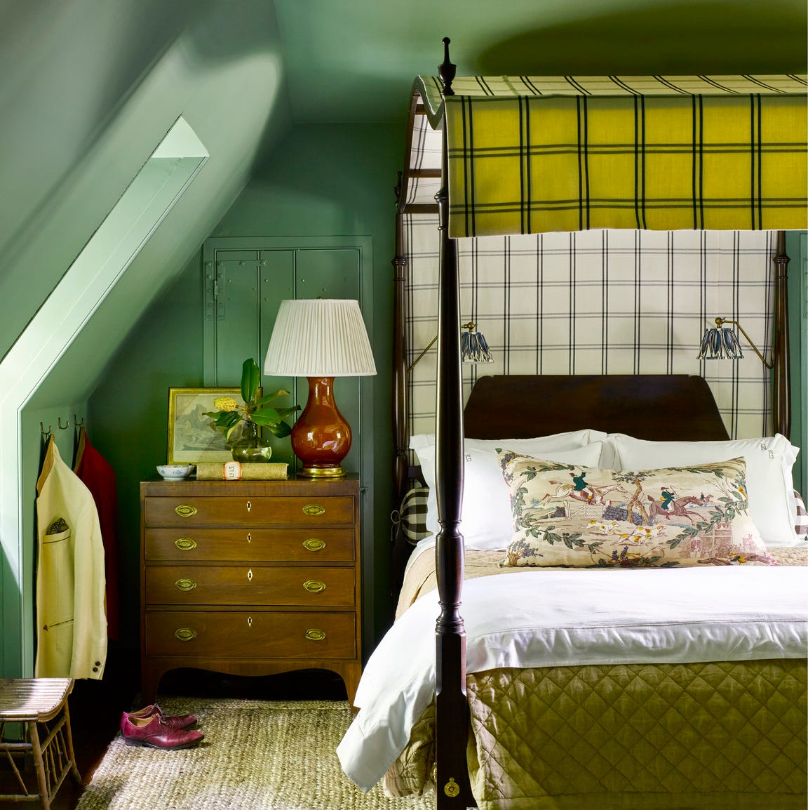
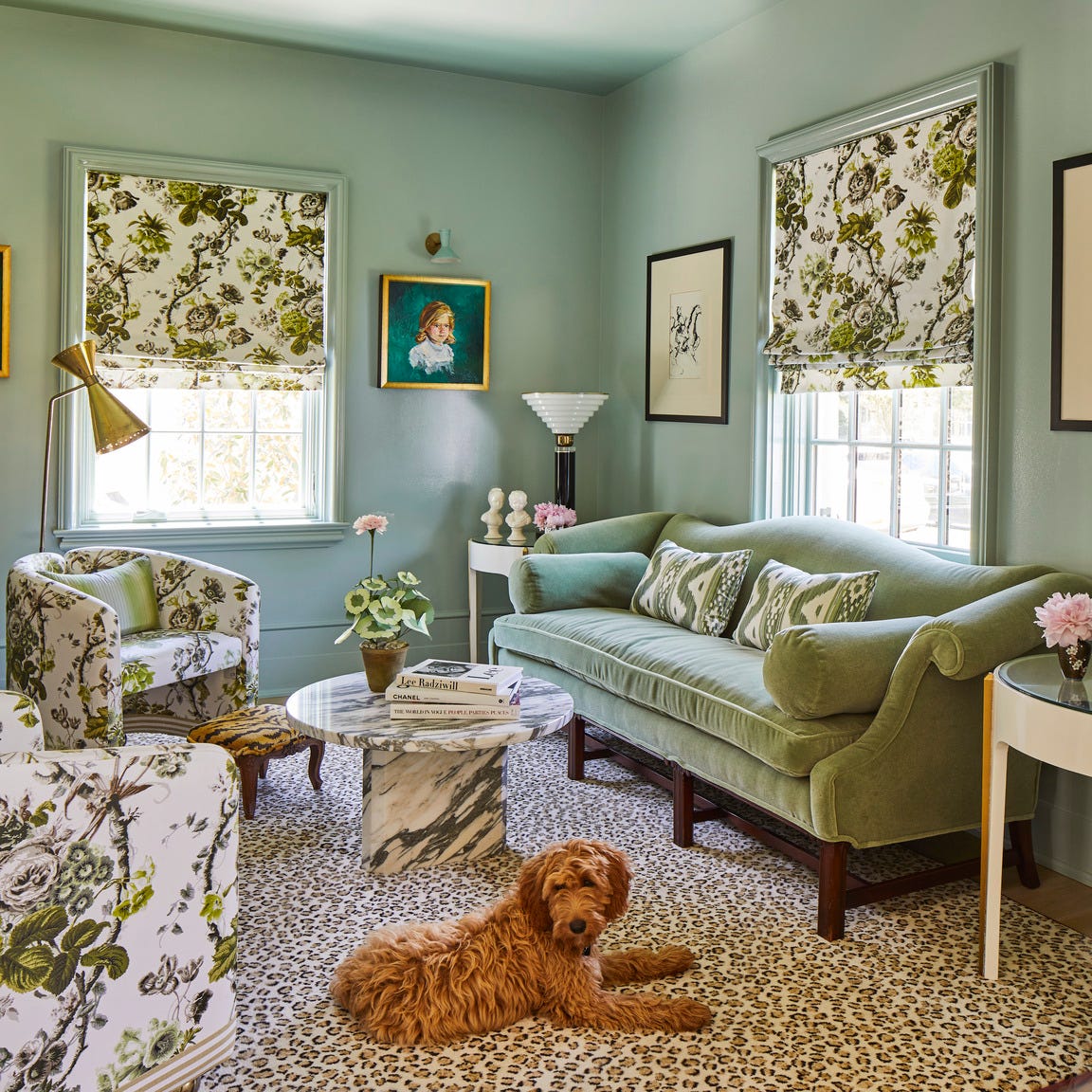
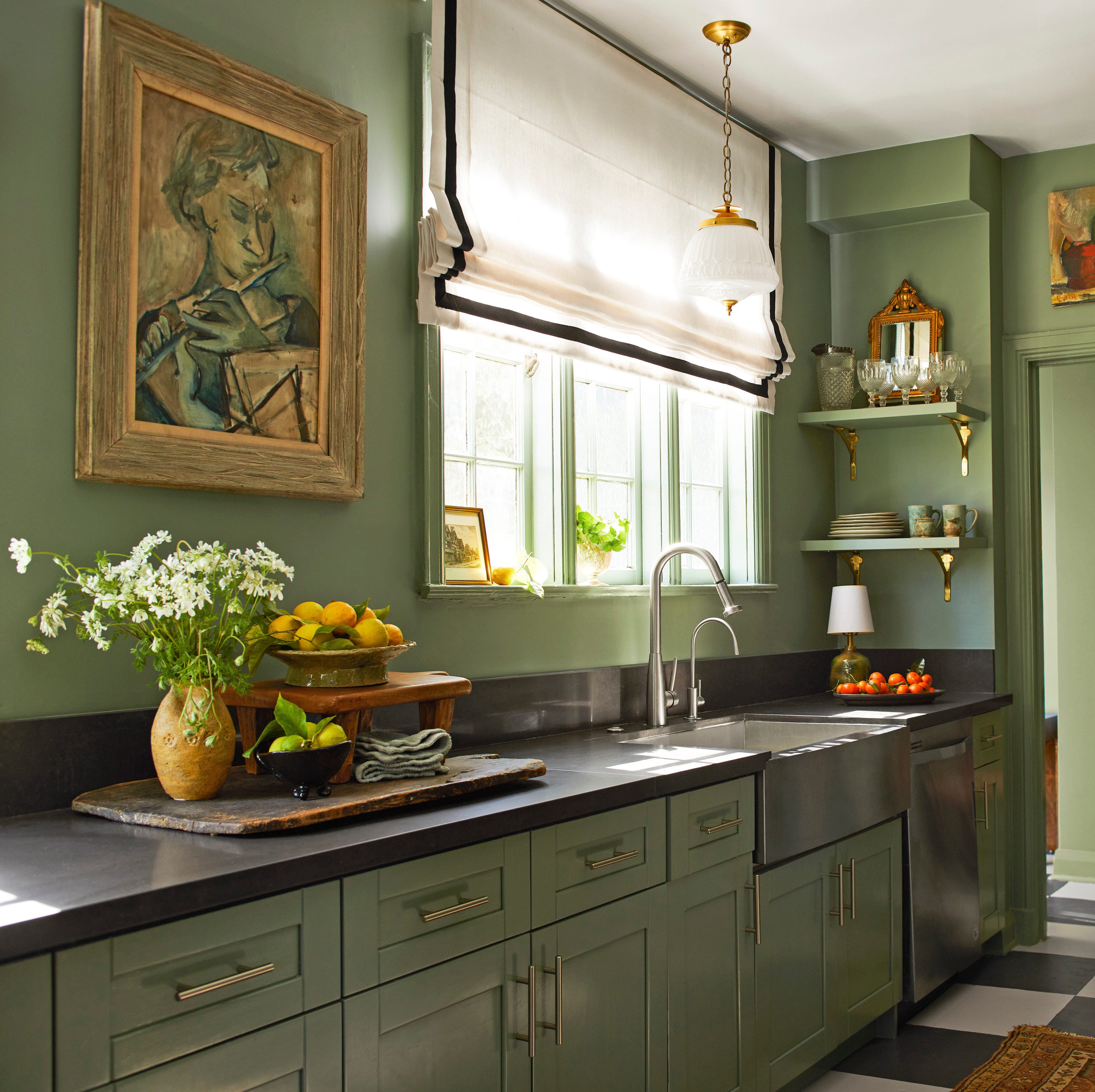
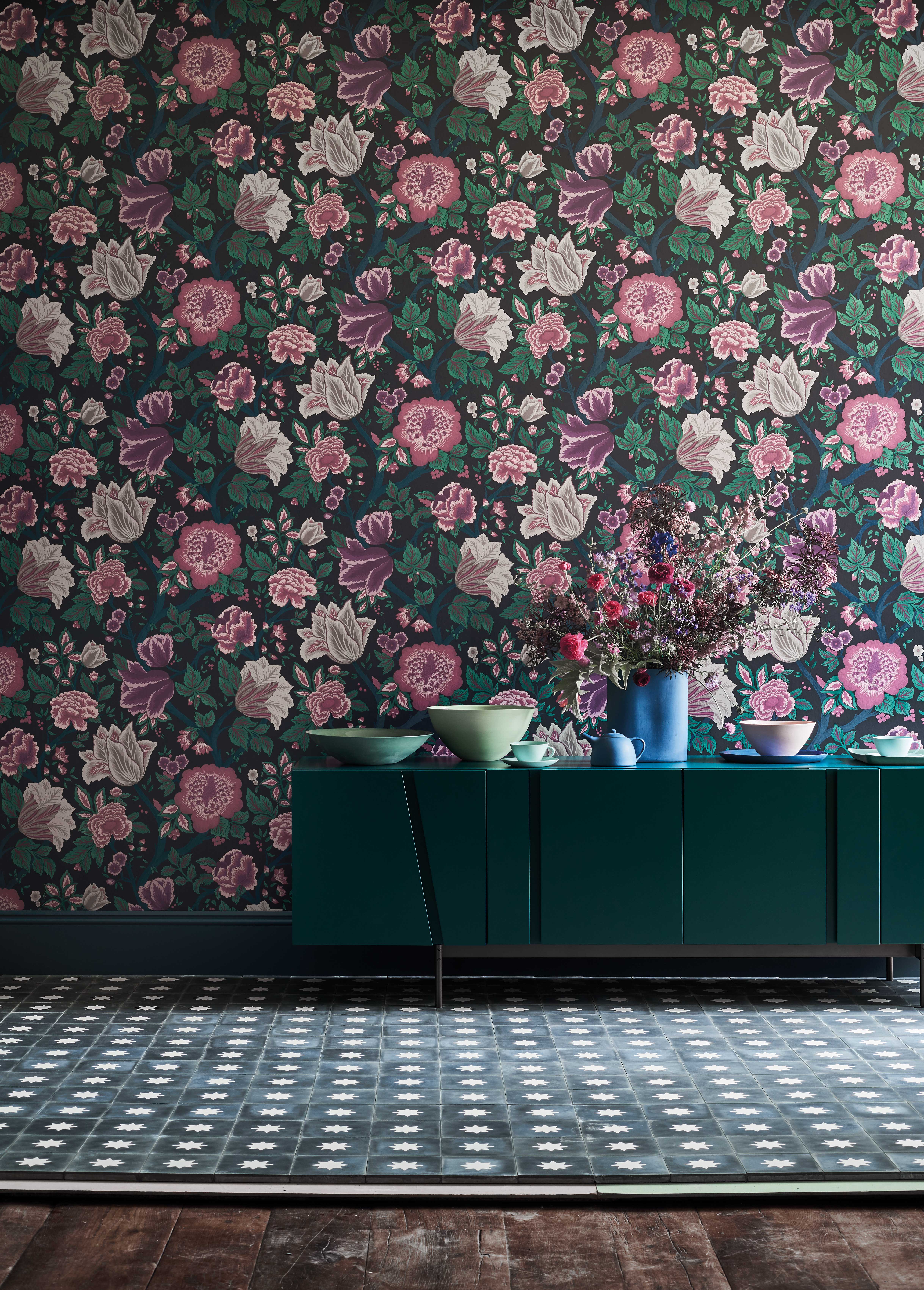
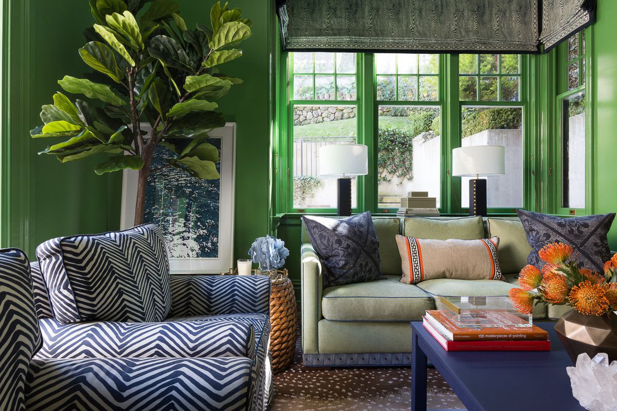
In the purple spectrum, Benjamin Moore’s 'Magenta' is presented as a saturated jewel tone that can add drama to a room in small doses. For deeper purples, 'Super Nova' from Benjamin Moore is advised for hallways or powder rooms, suggesting a regal elegance when paired with gold accessories. Moving to greens, 'Emerald Isle' by Benjamin Moore is described as a vivid, soothing natural color that complements various elements, while 'Forest Hills Green,' a more muted emerald, is recommended for those desiring a less intense green, pairing well with peach, corals, or navy blues. Sherwin-Williams' 'Lime Rickey' offers a citrus-green that evokes a fresh feeling and can be styled with black and white or hot pink and bright orange accents.
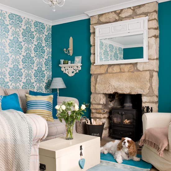
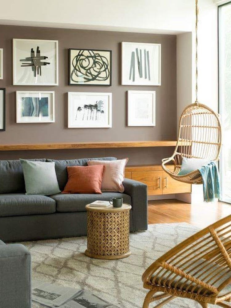
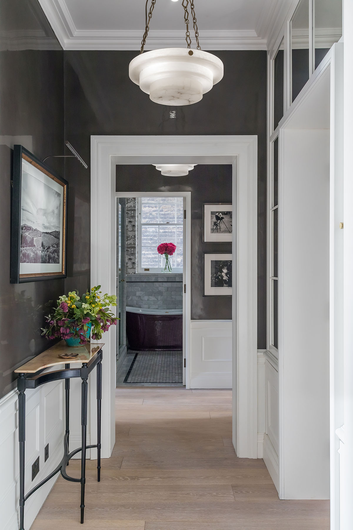
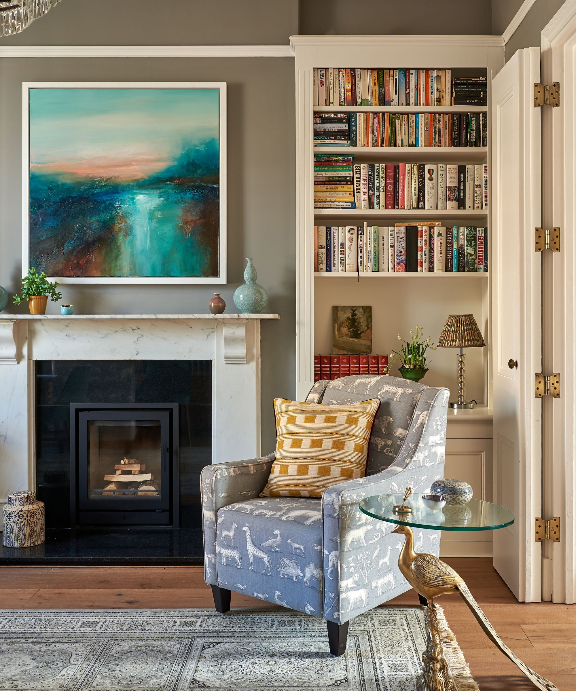
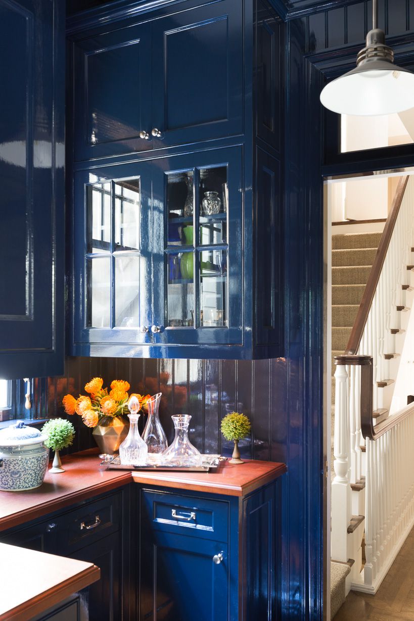
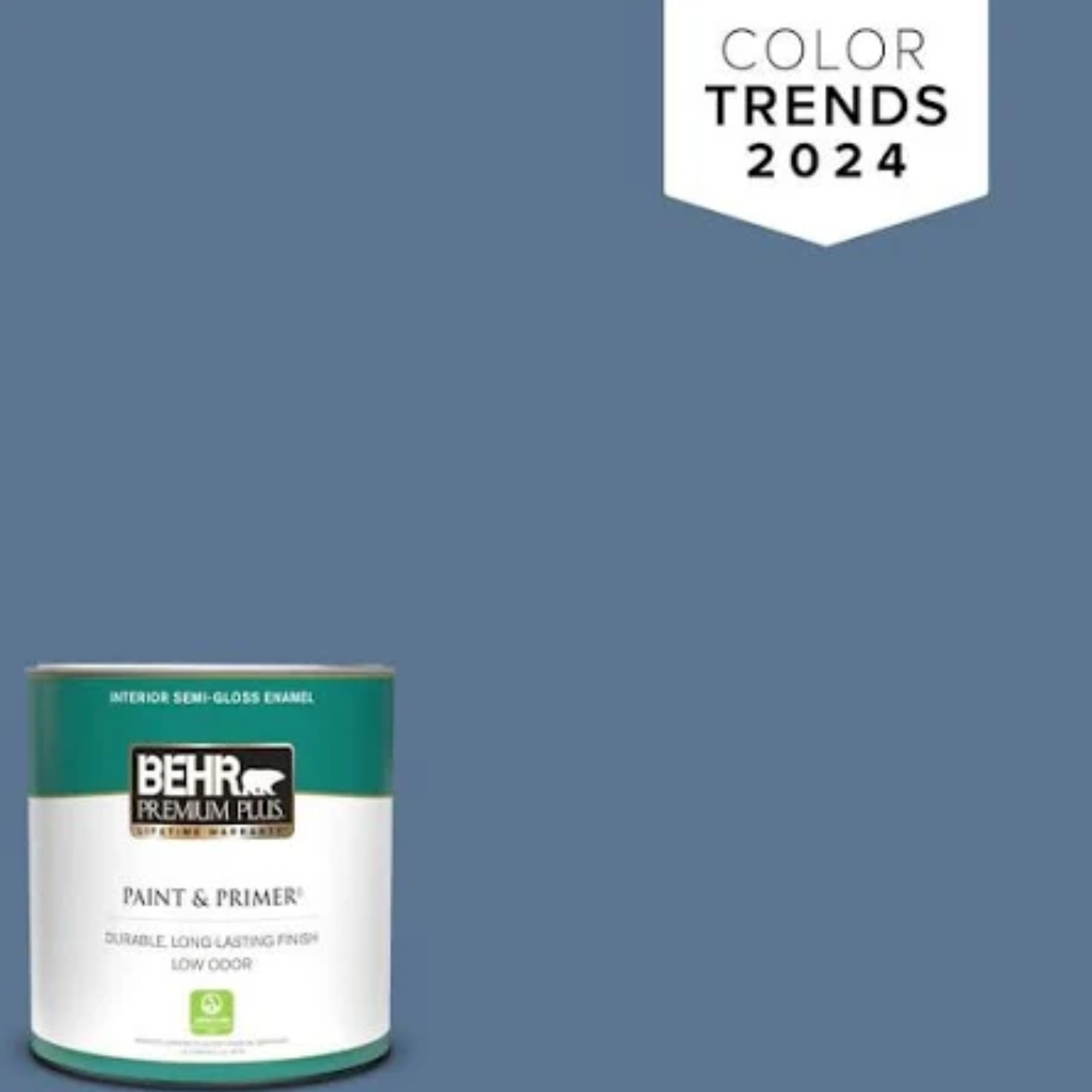
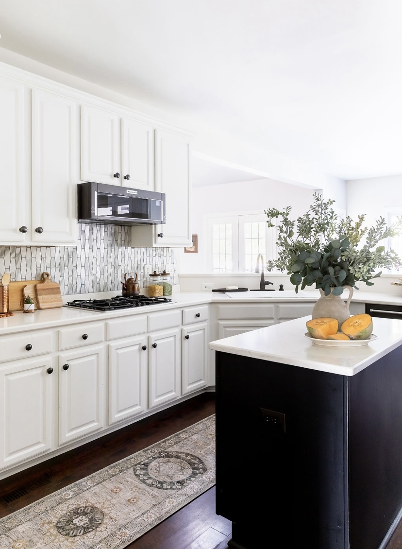
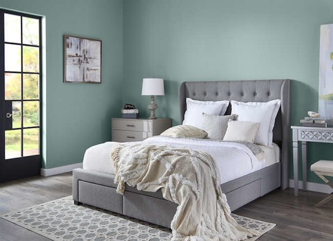
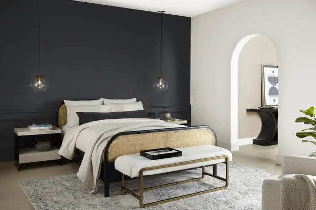
The article also includes less conventional bold options. 'Museum' by Behr Marquee is introduced as a dark neutral with modern flair, suitable for complementing gallery walls. For earthy tones, Portola Paint's 'Joshua Tree' is described as a rich orange-brown that brings an 'age of the earth' feel, ideal for a spa-like bathroom retreat when combined with specific upholstery, metals, and houseplants. For blues, Sherwin-Williams' 'Danube' is highlighted as a calming, inviting deep blue that pairs well with off-white for crisp lines. Benjamin Moore's 'Dark Harbor' is a luxurious teal that adds boldness, effective even in small spaces like powder rooms or cozy living rooms. Farrow and Ball's 'Stiffkey Blue' offers a soft navy alternative to teal, creating a cozy atmosphere, especially when dressed with rich cream fabrics. Finally, for a dramatic gray, Benjamin Moore's 'Gravel Gray' is suggested for its depth and ability to create a cozy, sea-swept effect, suitable for both antique and modern settings.
#BoldPaintColors #HomeImprovement #InteriorDesign #PaintTrends #ColorPalette #WallDecor #DecoratingTips #BenjaminMoore #SherwinWilliams #BoldPaintColors #HomeImprovement #InteriorDesign #PaintTrends #ColorPalette #WallDecor #DecoratingTips #BenjaminMoore #SherwinWilliams
0 comment in total
 No comments yet
You may also like
Beige, Begone: Bring Your Walls to Life With These 14 Beautifully Bold Colors


Let the walls talk — colours that shape your space

14 Paint Colors That Can Make a Room Feel Instantly Cozy

11 Best Beige Paint Colors for Interiors


15 Ways to Add Bold Color to Your Home
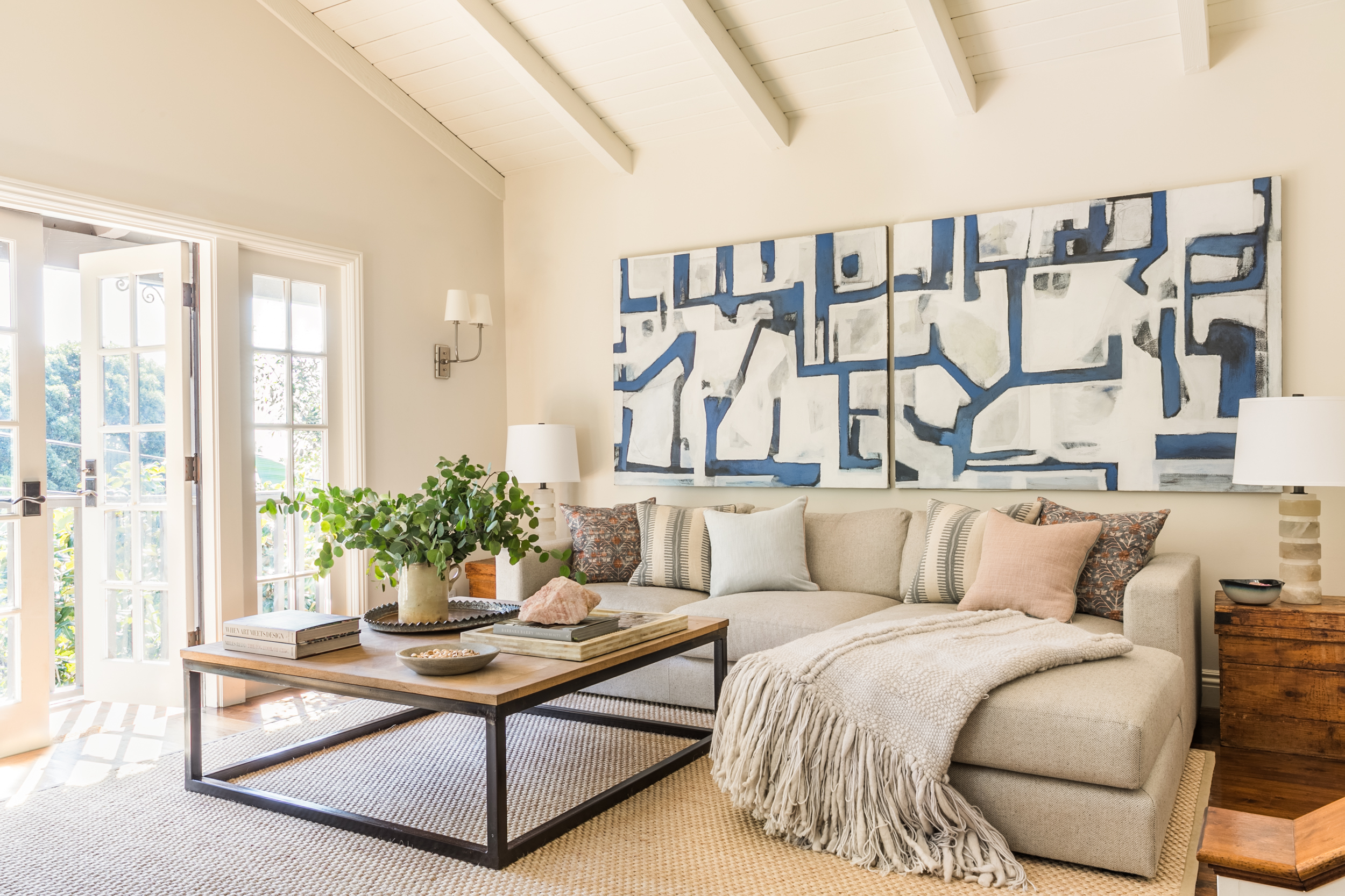
14 beige living room ideas that prove this grounding color scheme is anything but bland

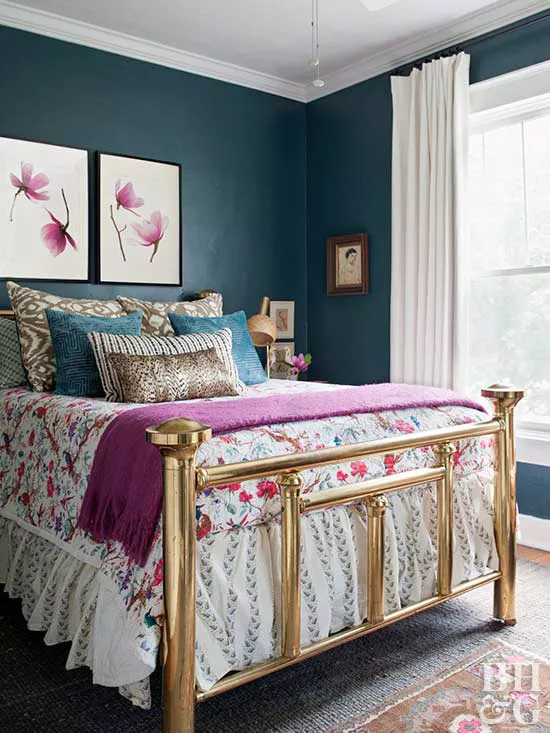
Take a Leap into Bold Color with These Decorating Ideas

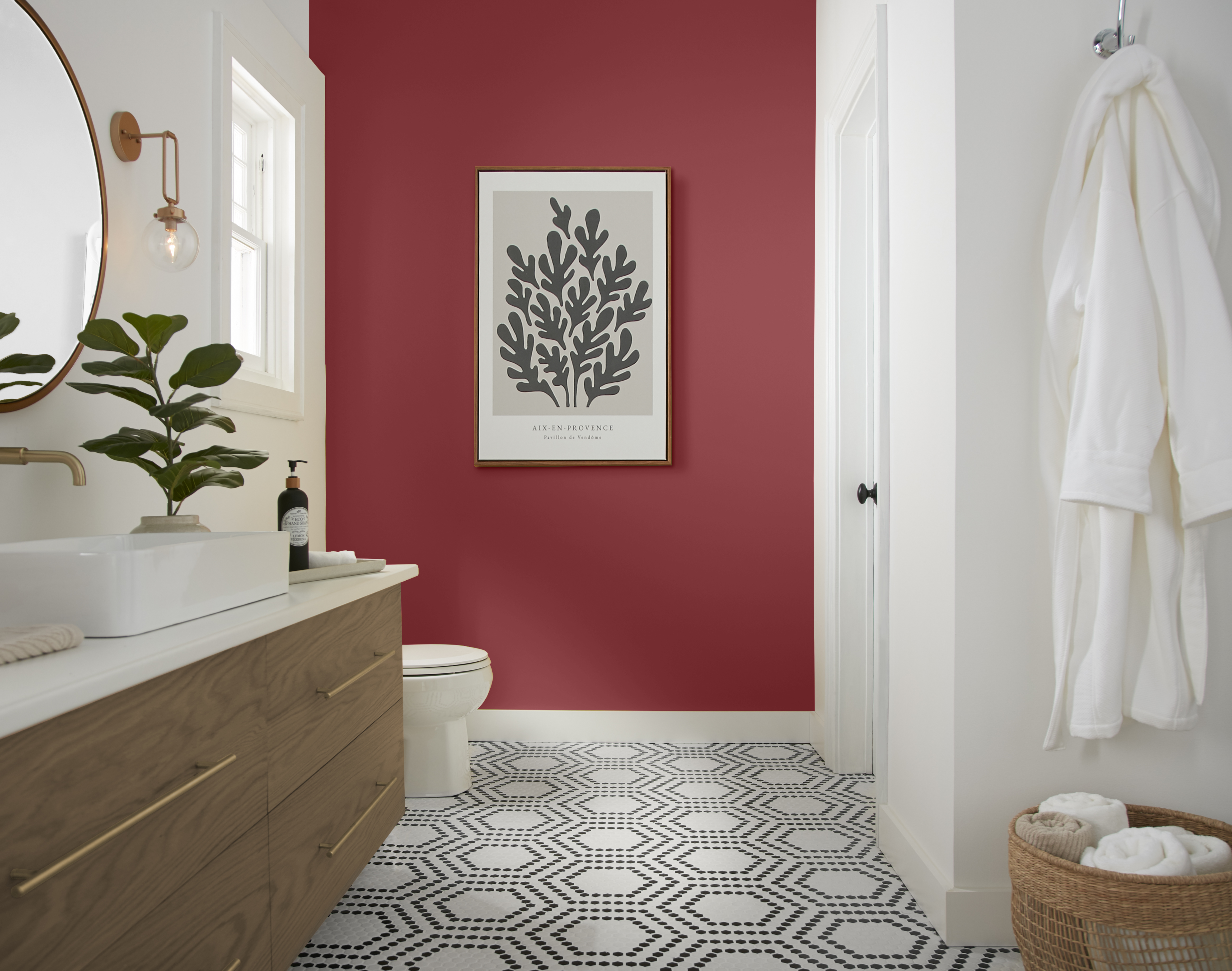
What Are the Most Popular Behr Paint Colors? These Hand-Picked Shades Promise to Bring Your Walls to Life

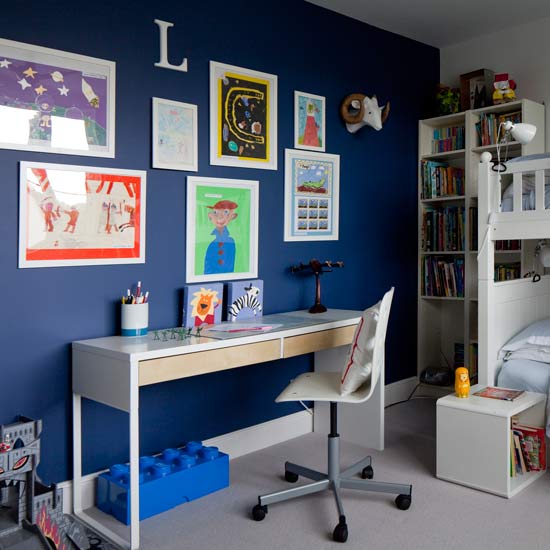
7 amazing colours for a statement wall with wow
11 Beautiful Colors That Go Well With Beige
Forget painting your walls grey, it’s time to sparkle
15 Lush Green Paint Colors to Invigorate Any Space

11 Beautiful Colors That Go With Beige
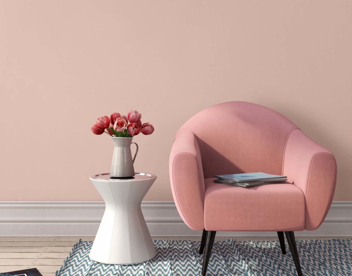
The 16 Best Accent Wall Colors

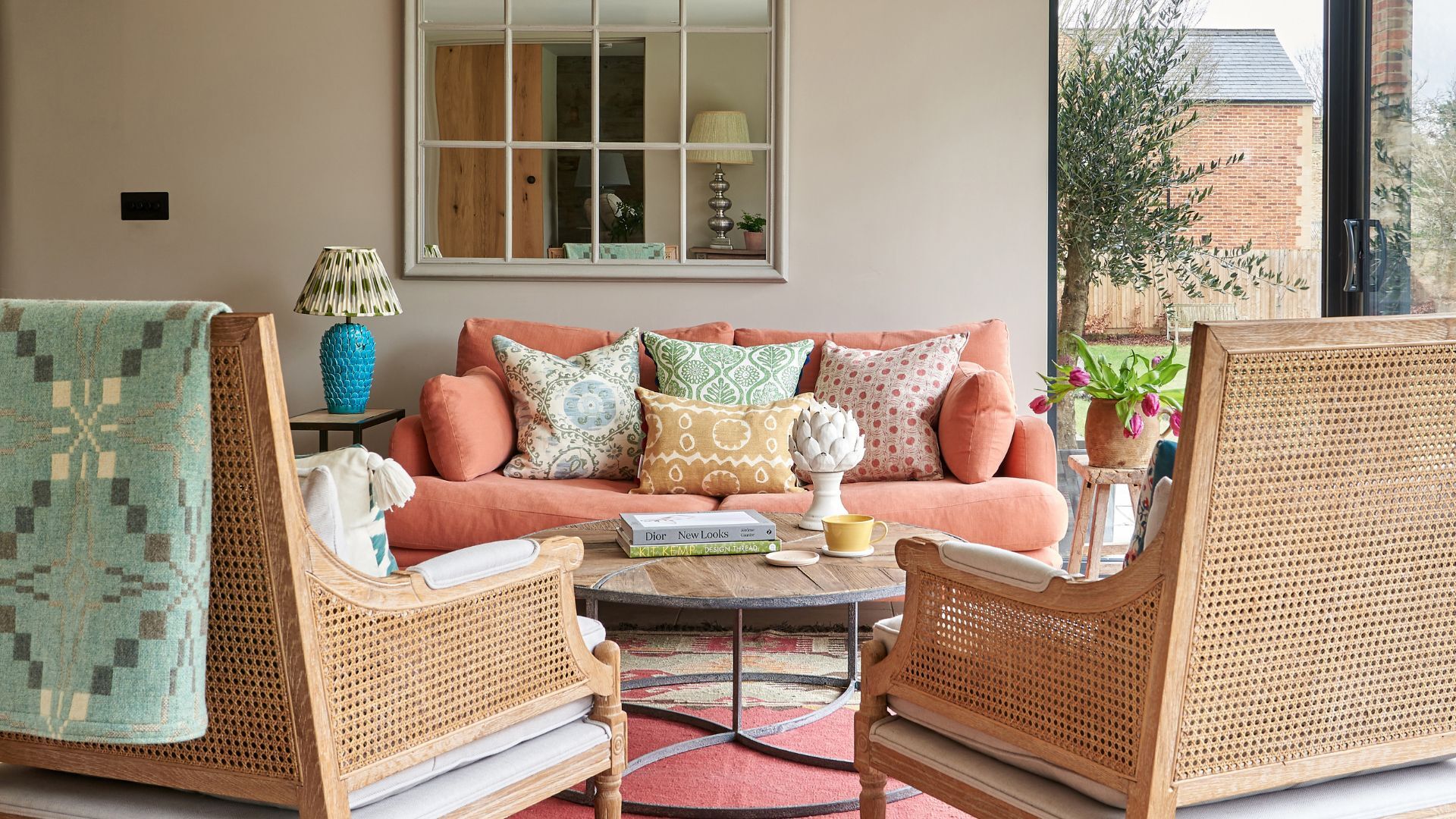
14 best beige paints, as chosen by interior designers
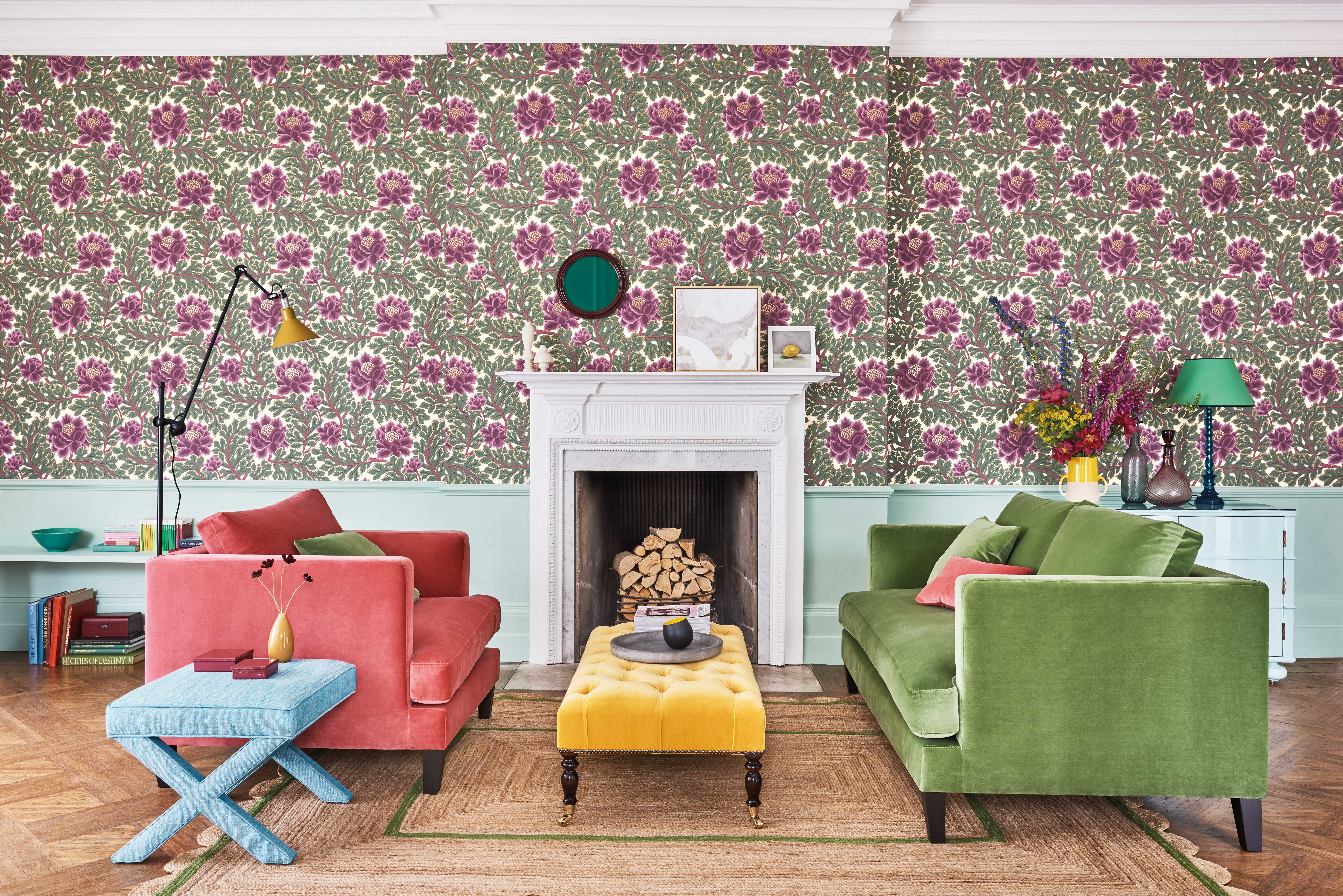
Wall patterns: 12 stunning looks to bring more colour and style to your home

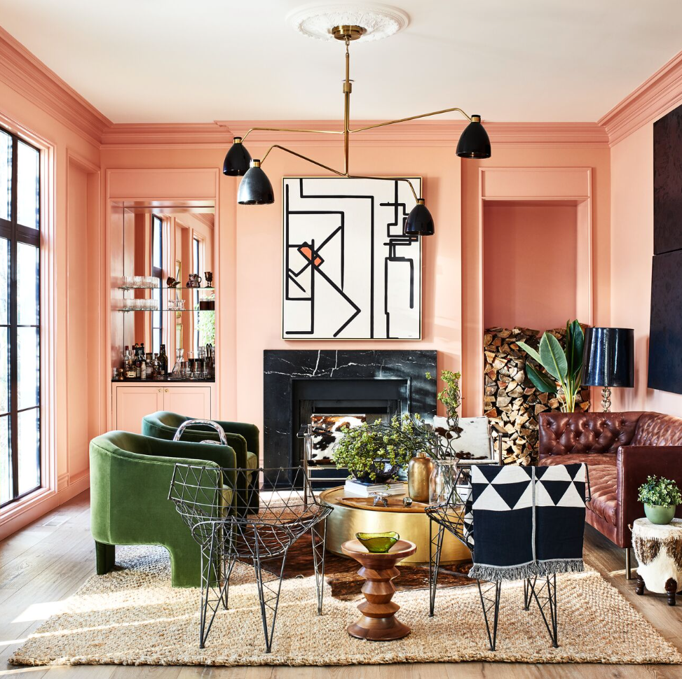
13 Coral Paint Colors to Brighten Your Walls

The Brighter, the Better—These Vibrant Paints Will Infuse Your Home With Positivity

15 high-risk high-reward paint hues
10 Gorgeous Paint Colors for Accent Walls