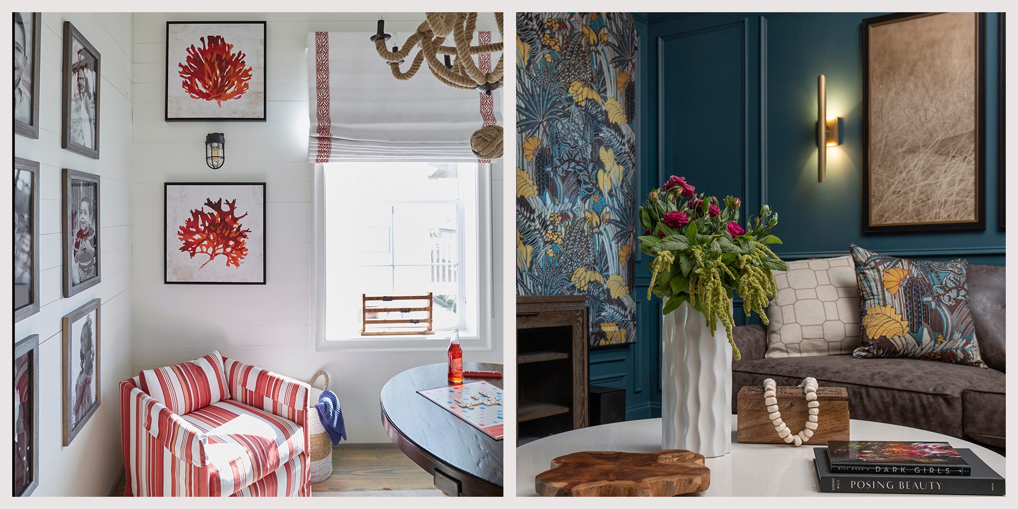
1/20
15+ Ways Top Designers Make The Most of a Tropical Color Scheme
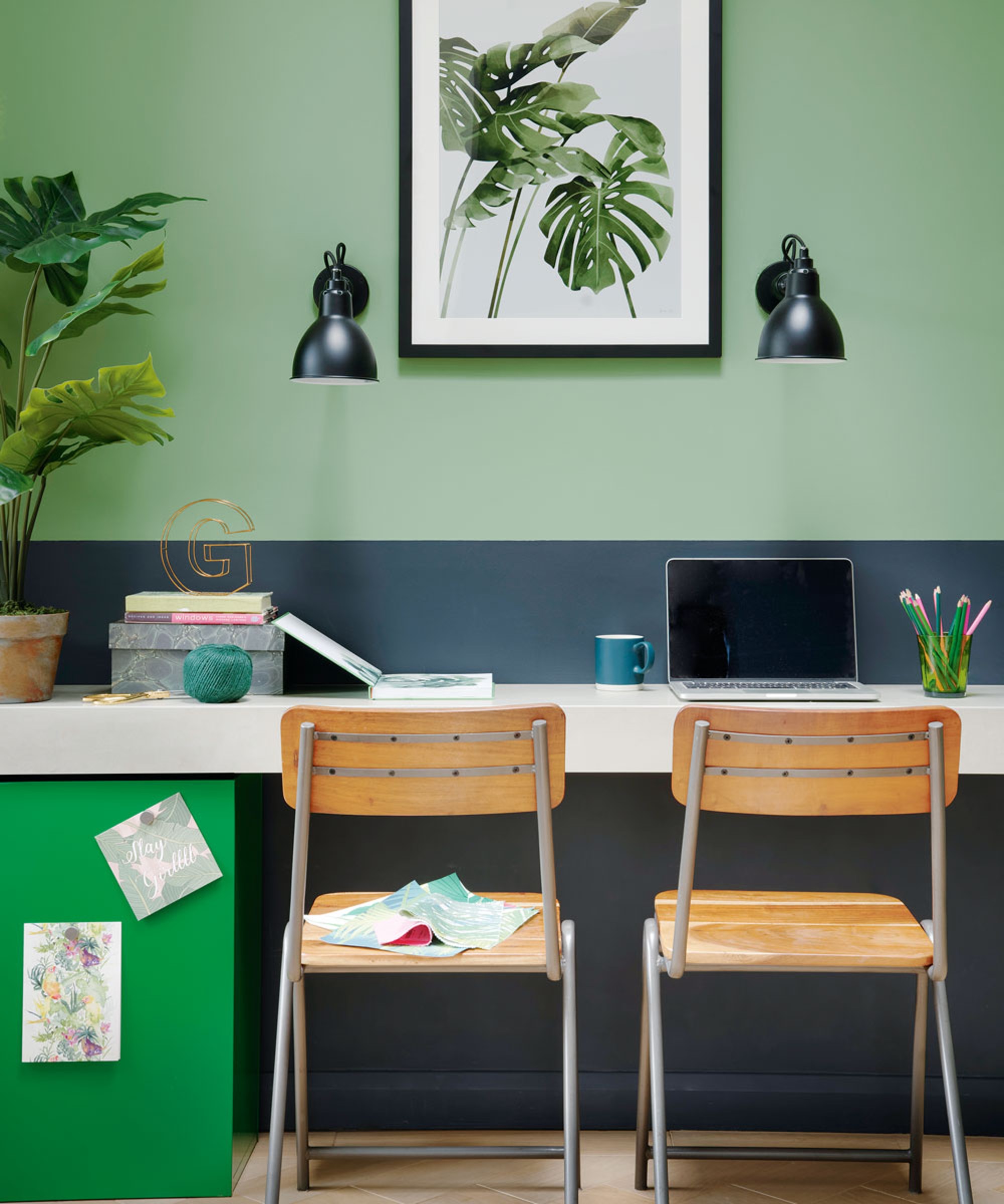
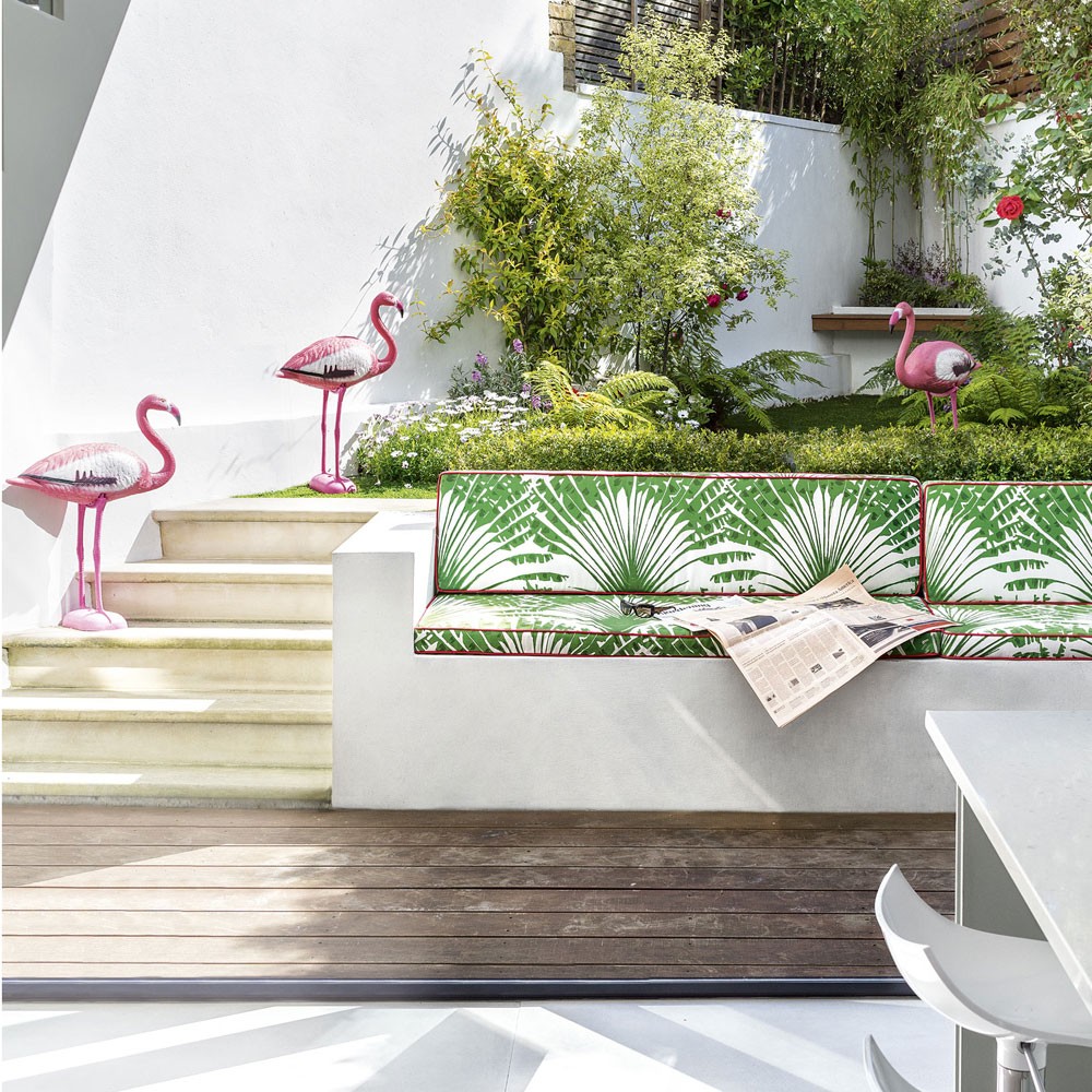
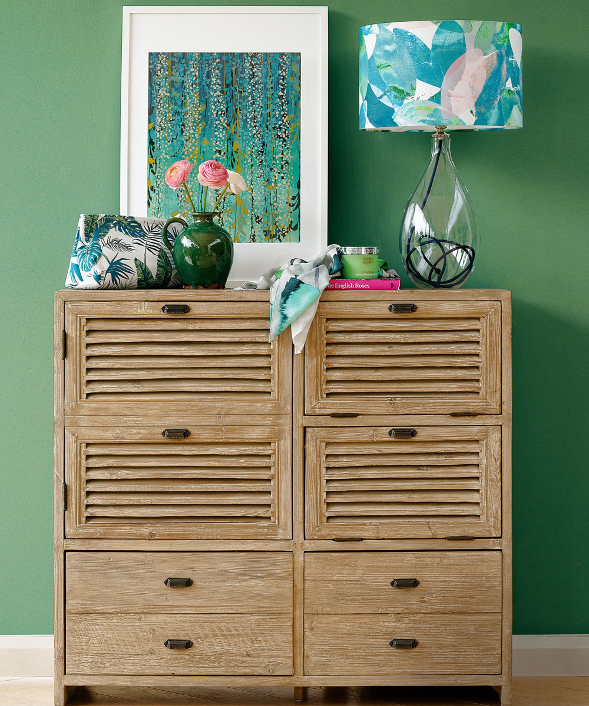
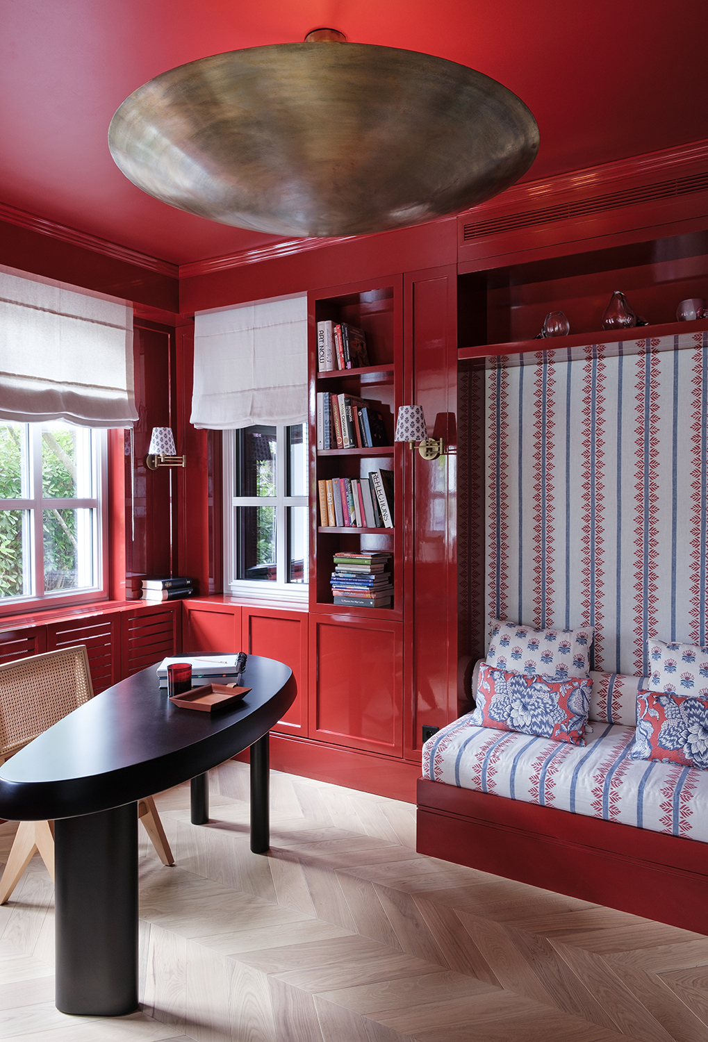
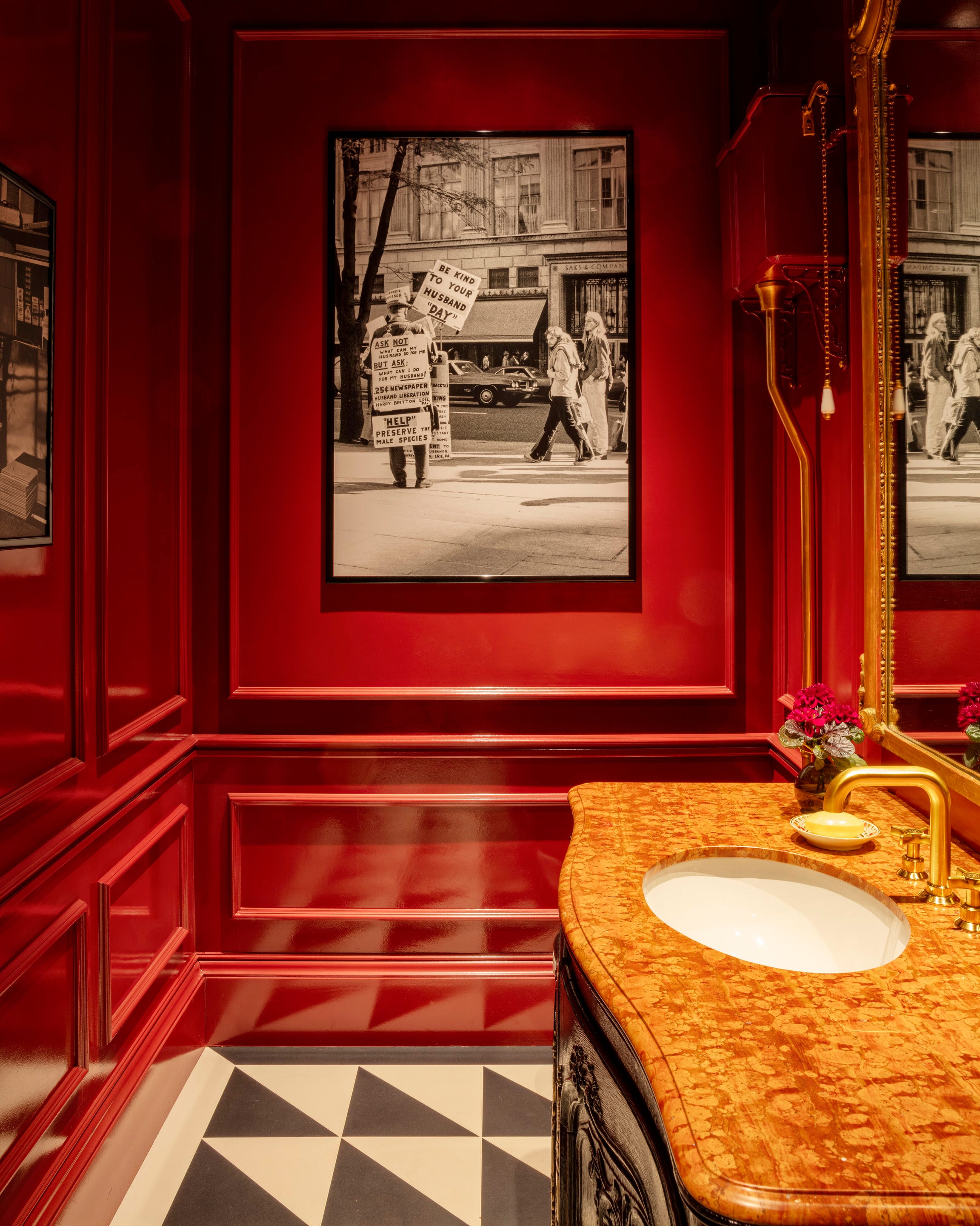
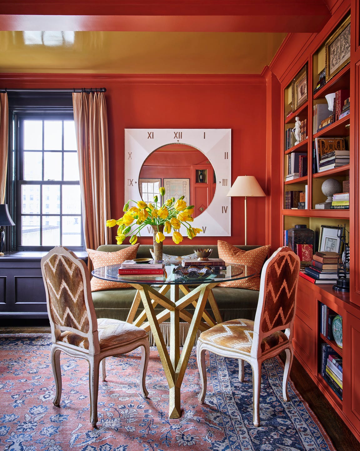
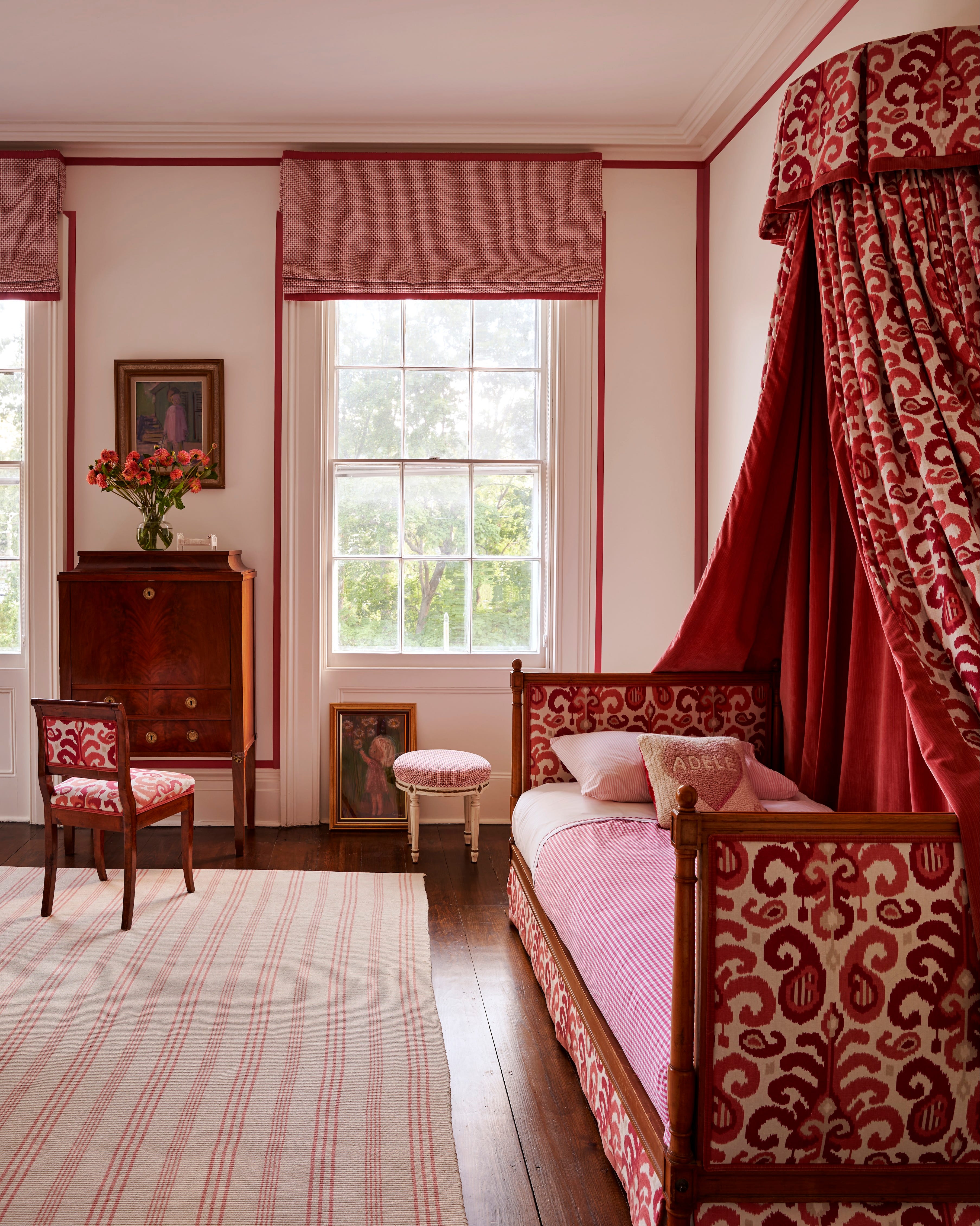
This article explores over 15 tropical color palettes and design inspirations from leading interior designers, offering various ways to infuse homes with a vacation-like atmosphere. The piece acknowledges that while summer may be over, the desire for a tropical escape can be brought indoors through strategic color choices and design elements. Each featured designer shares their unique approach to creating a tropical ambiance, whether through vibrant, bold hues or subtle, soothing tones inspired by natural landscapes. The palettes presented range from classic island mixes to more unexpected combinations, catering to diverse aesthetic preferences.
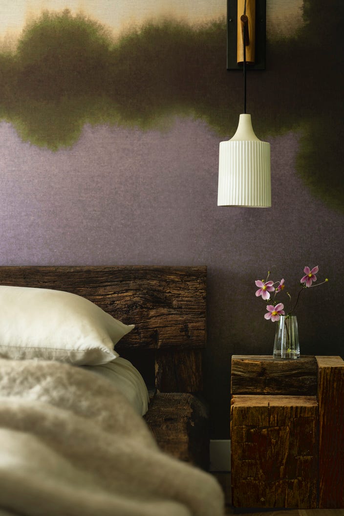
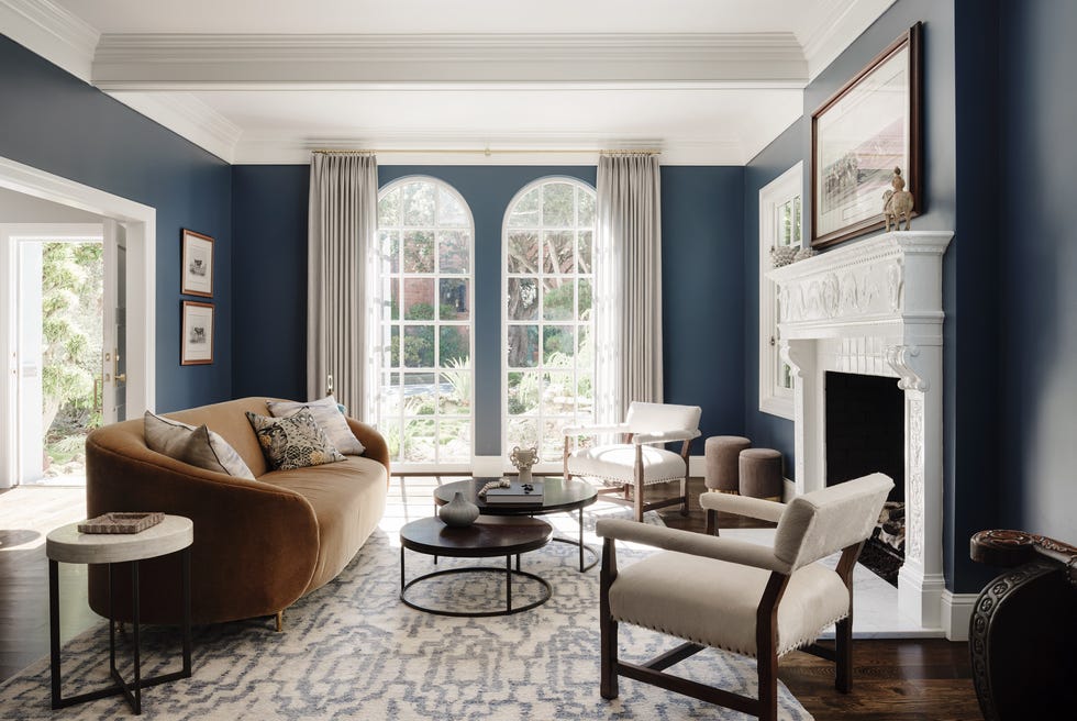
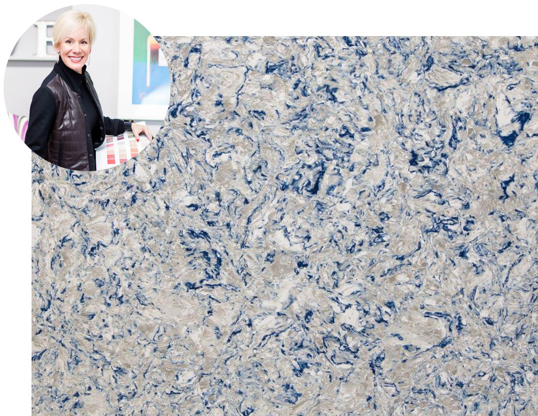
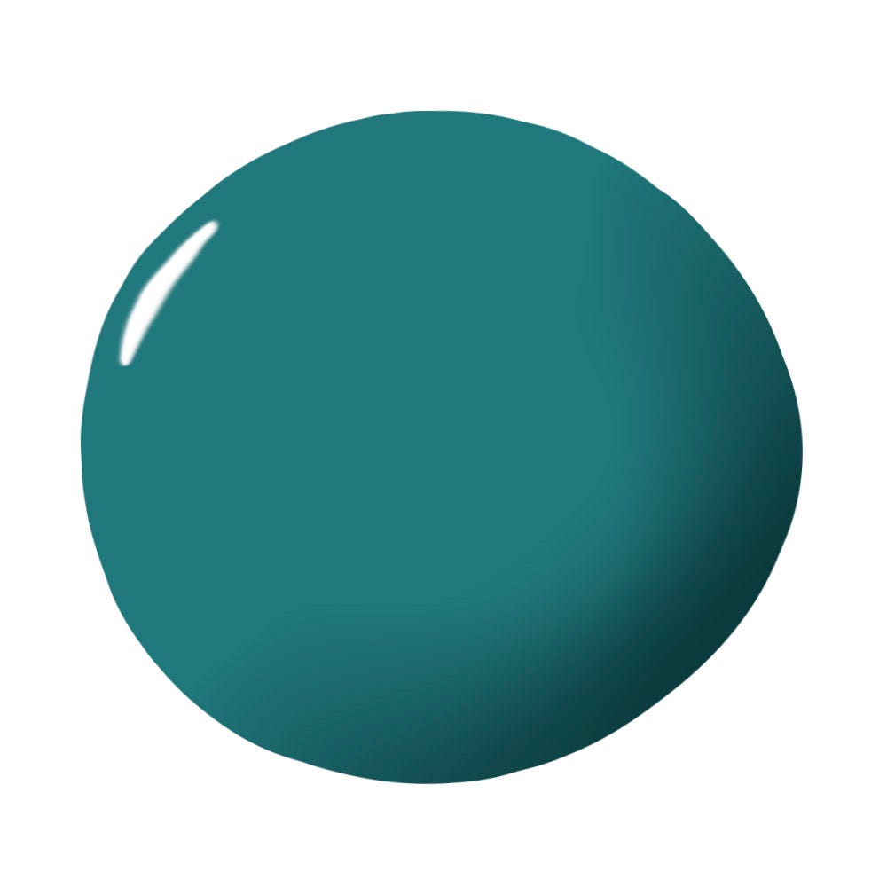
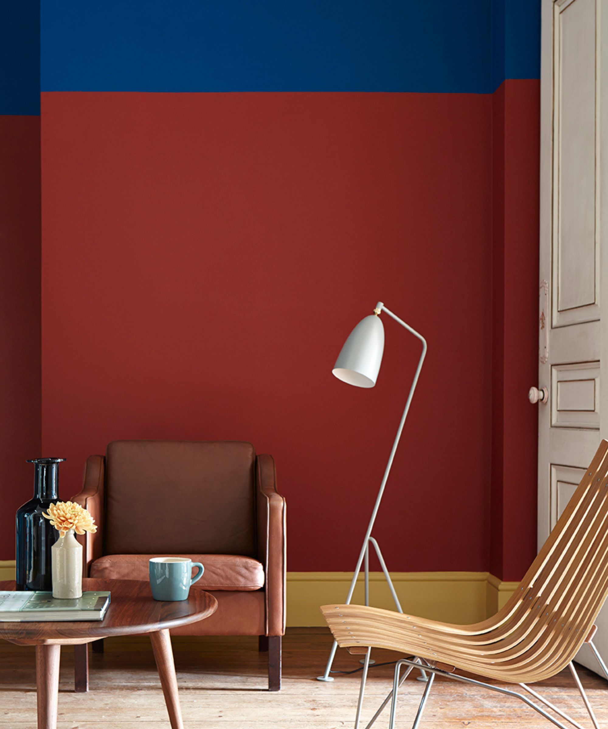
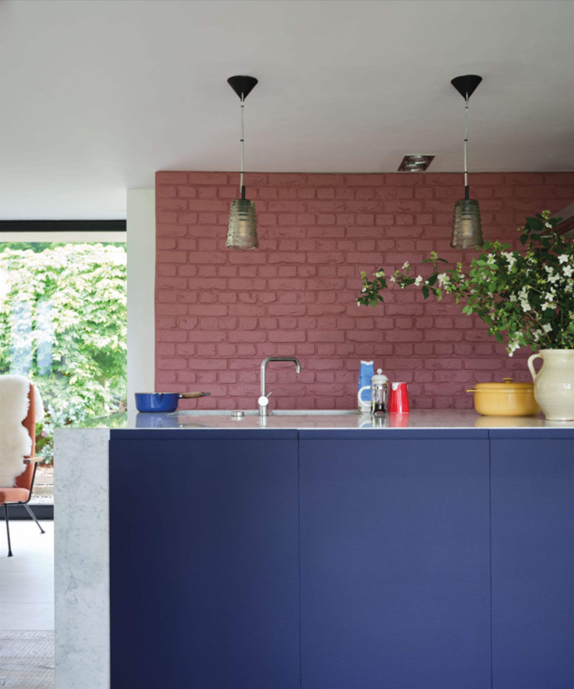
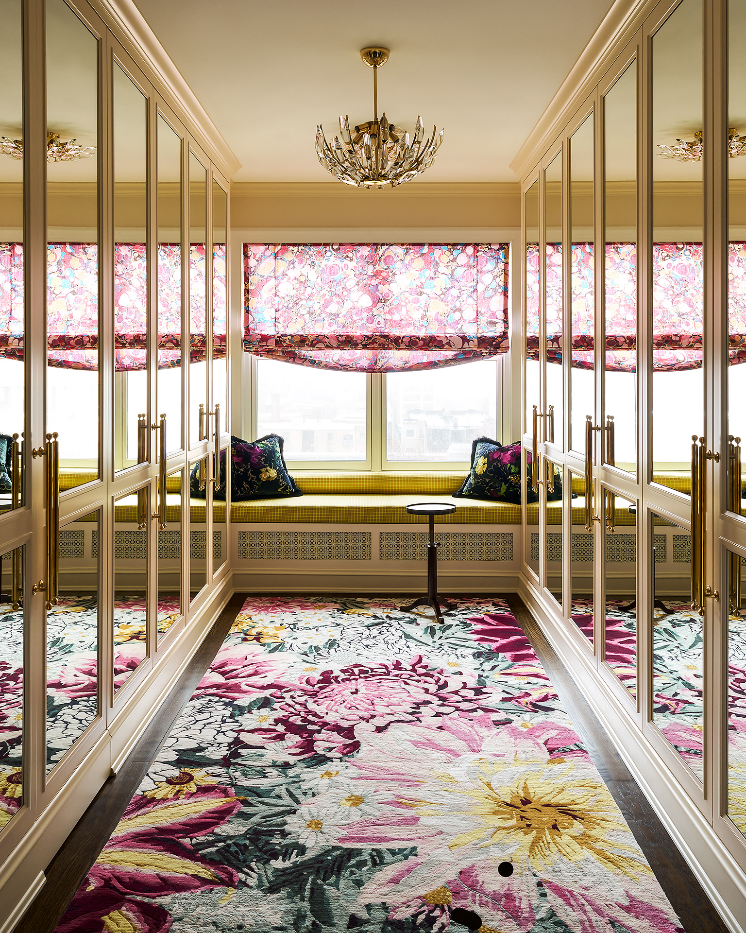
Courtnay Tartt Elias highlights the vivid blend of turquoise, aqua, and cyan, complemented by deep navy, brilliant white, and warm metal accents, to evoke a coastal living feel. Erika Ward introduces a moodier take with Aegean blue, burgundy, mustard, camel, and cream, drawing inspiration from nomadic palettes and exotic rainforests. Melanie King prefers a classic island twist, combining creamy whites with coral, sapphire, and carmine red for a playful yet timeless look. Emilie Munroe suggests pairing two to three rich jewel tones with one soft pastel to create elegant tropical prints, citing combinations like red, emerald green, and soft peach, or cobalt, emerald, and butter yellow, emphasizing the role of pastels in grounding vibrancy.
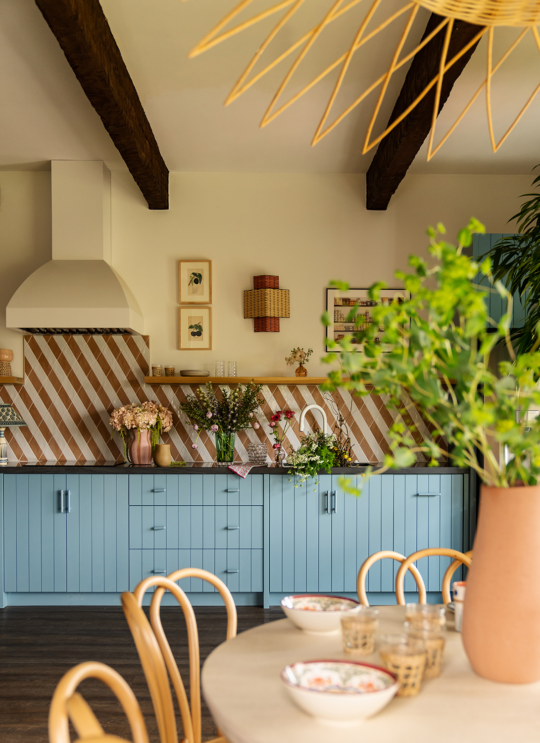
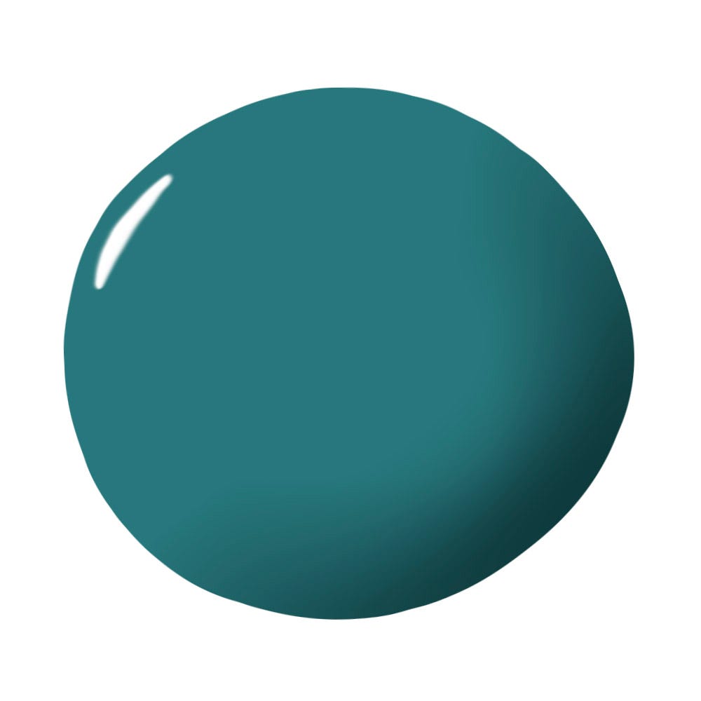
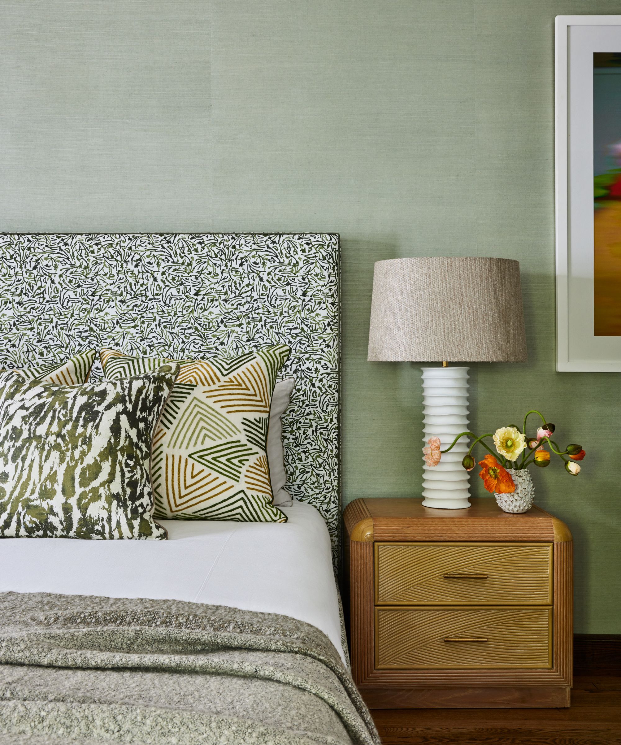
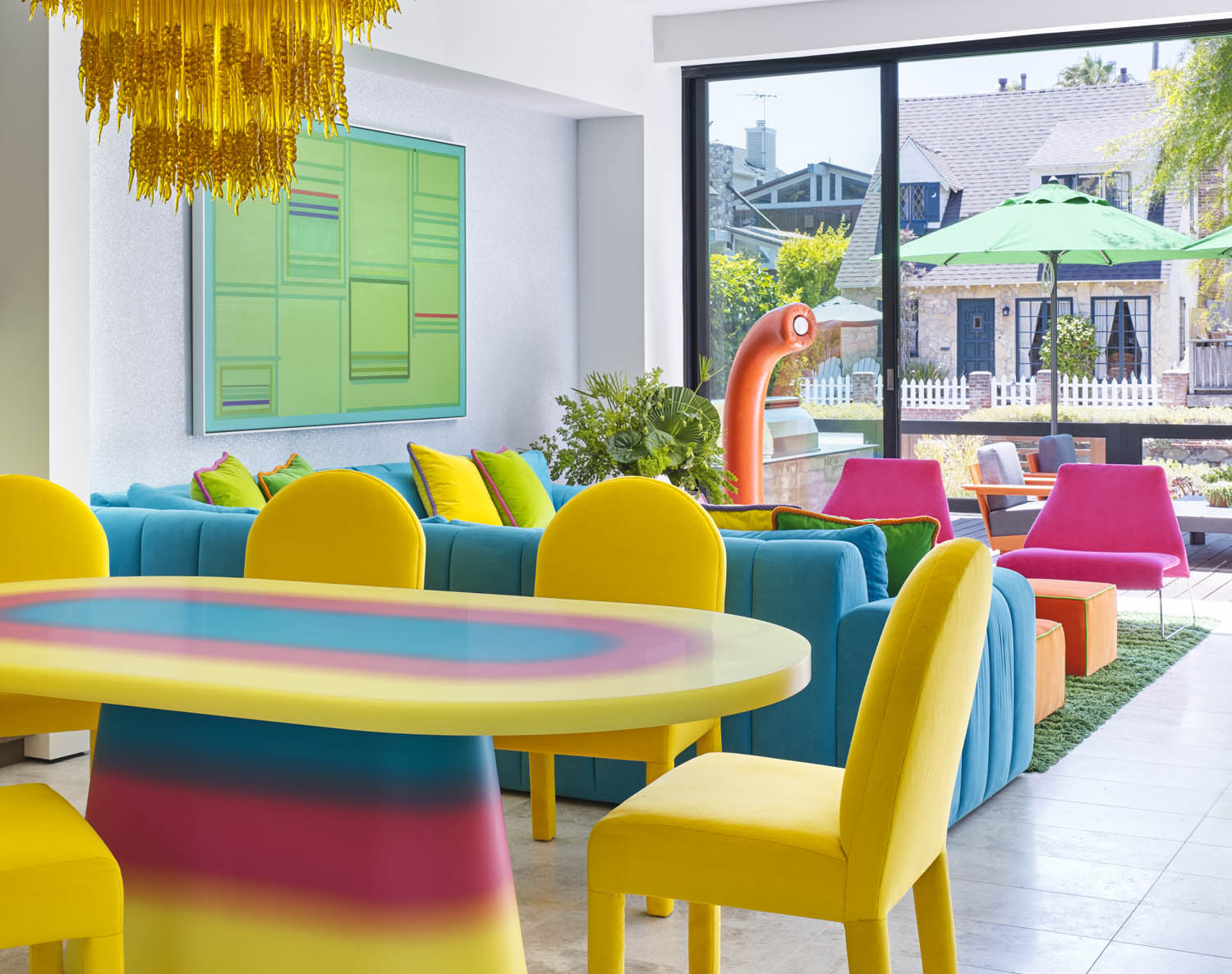
Meg Lonergan focuses on lush, sophisticated palettes for subtropical climates, using earthy greens, reedy beiges, fresh whites, and vibrant oranges to create spaces that are both cozy and cool. Rayman Boozer advocates for bold, saturated jungle-inspired color combinations like aqua, lime, and flamingo, which pair well with natural finishes such as mango wood and slate. Cathy Maready gravitates towards soothing spa colors, utilizing soft hues of greens and hints of sky blue to replicate the feeling of relaxation after a day on the beach. Breegan Jane is inspired by the ocean, pairing crisp teal waters with warm golden sunsets against a bright white backdrop to make these natural colors pop.
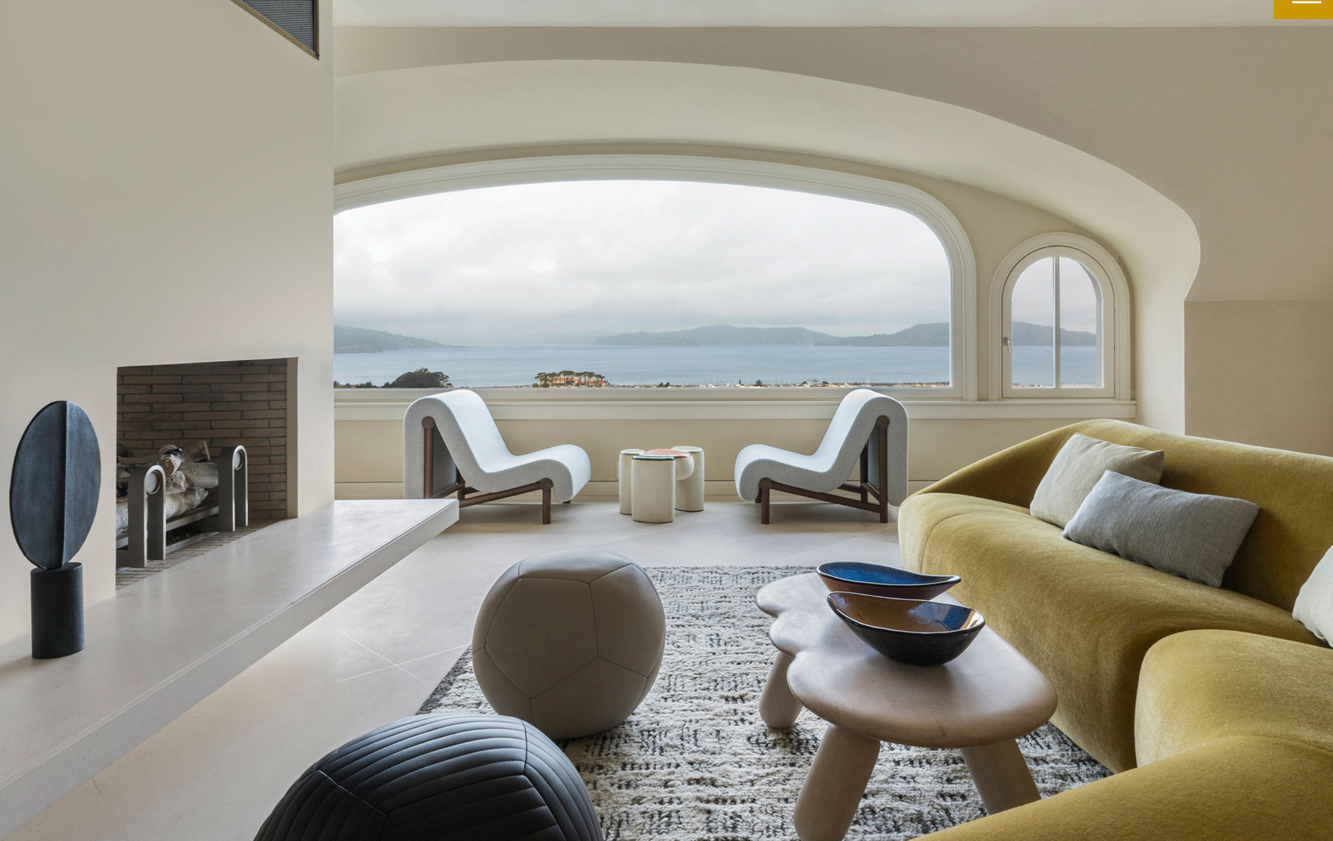
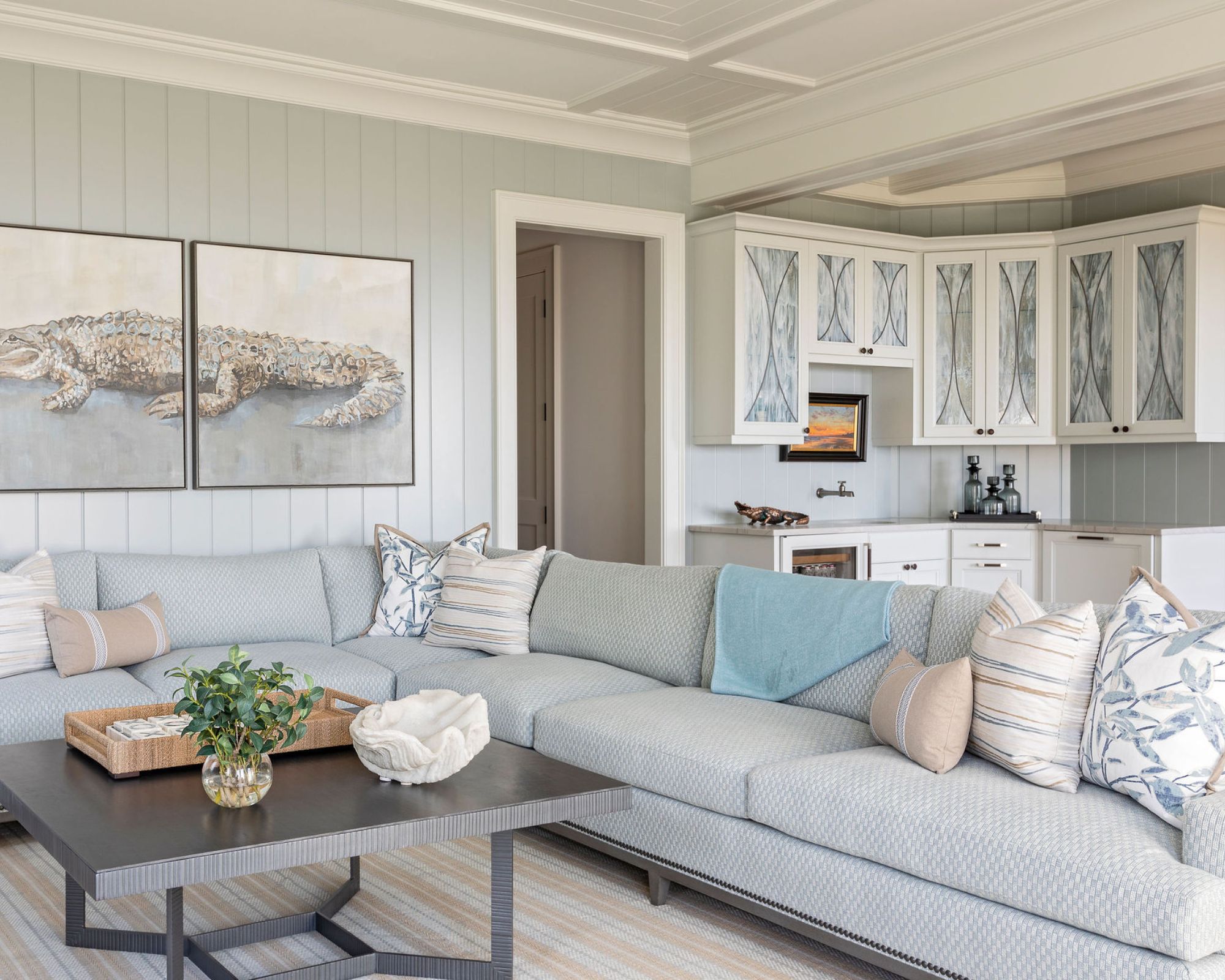
Christine Markatos Lowe finds beauty in the natural harmony of olive, chartreuse, and turquoise. Benjamin Johnston, while not in the tropics, incorporates cooler sea-inspired colors with whitewashed, warm sand tones and bright floral accents to evoke cherished vacation memories. Christine Markatos Lowe also suggests a palette of lemon, aqua, and chartreuse for a light, fruity, and beach-like feel. Another combination from Courtnay Tartt Elias features hot pink, bright white, and jade green for a distinctly island-inspired look.
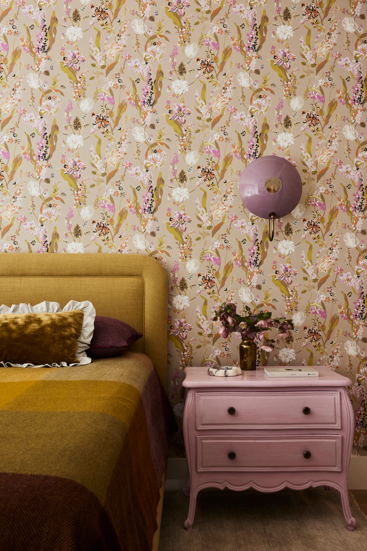
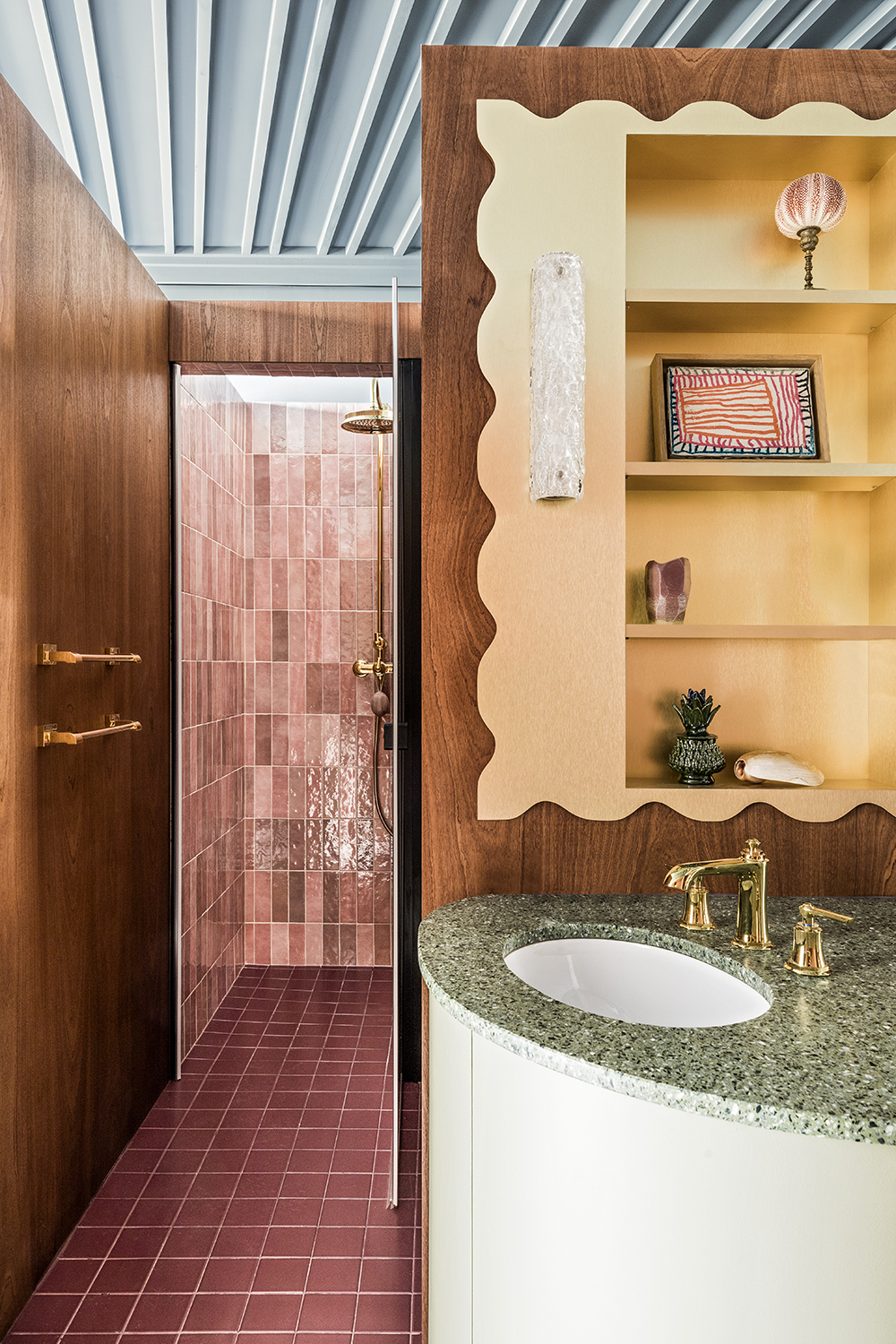
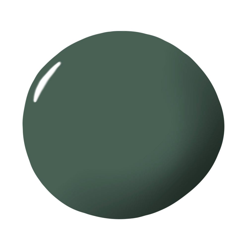
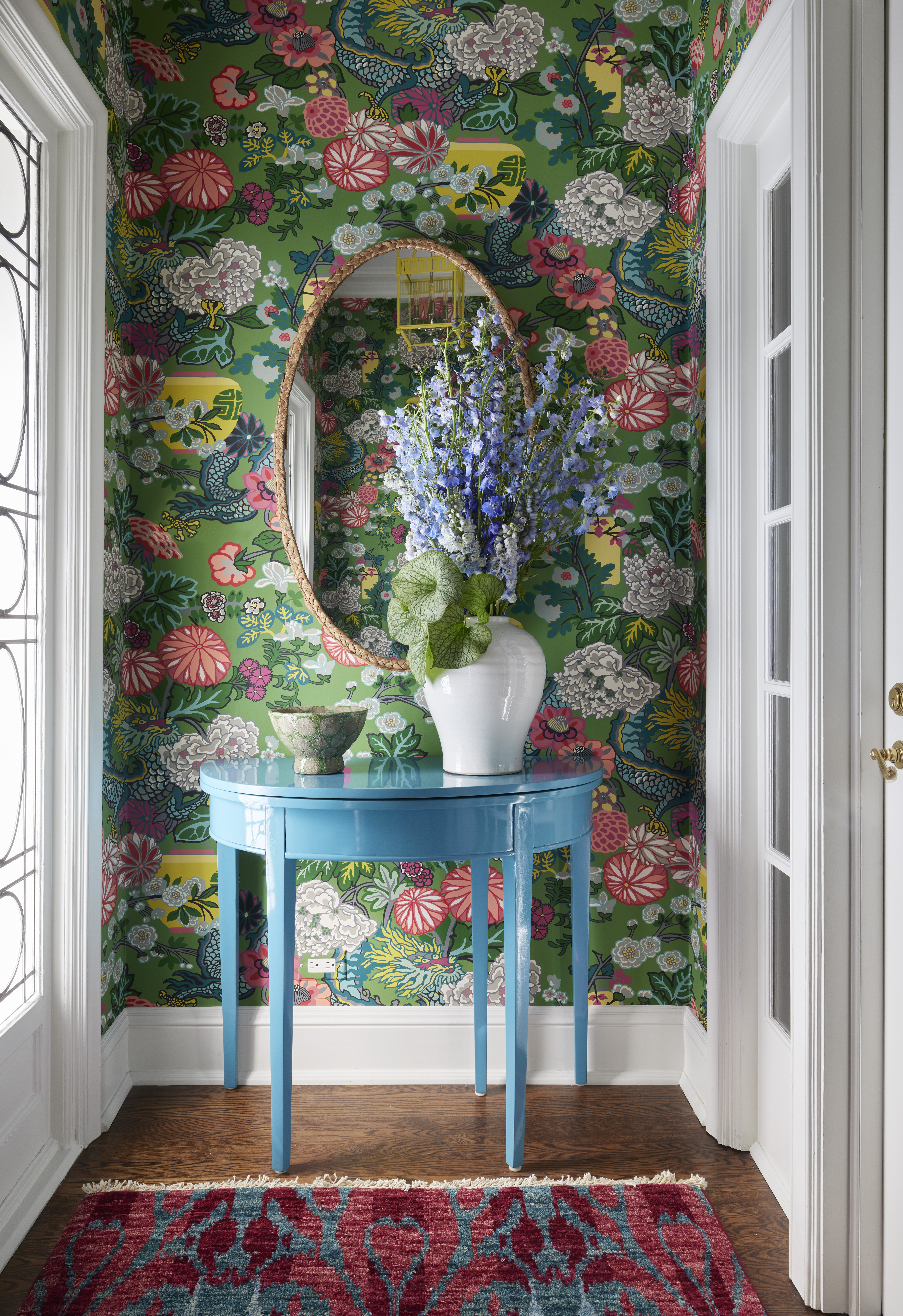
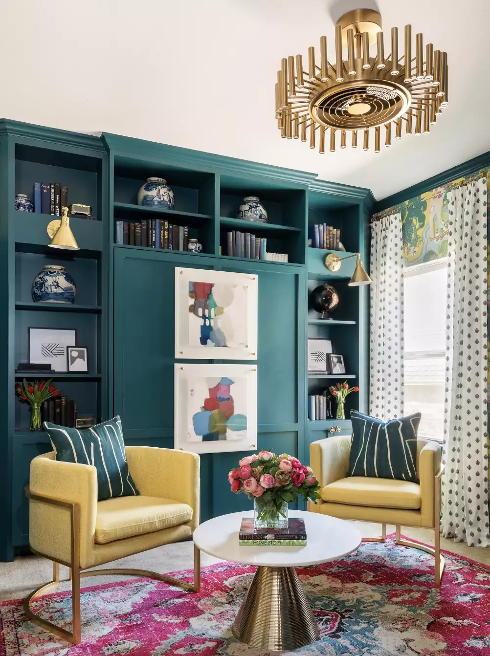
Marcus Mohon adopts a biophilic approach, inviting the surrounding landscape to influence the palette, with viridian hues complemented by admiral blue, fuchsia, and gold, reminiscent of an island dawn. Massucco Warner Miller emphasizes clear turquoise, beach glass blues, sunset oranges and pinks, and sunny lemon yellow, balanced by copious amounts of white, to create a holiday atmosphere. Crystal Sinclair considers aqua, natural wood, and cream as an "ultra tropical" and always-en-vogue palette. Marina Hanisch prefers a rich, sultry, and warm palette incorporating pinks, blues, yellows, rusts, and creams, reflecting the natural elements of the tropics. Marie Flanigan draws inspiration from jungle walks, juxtaposing woven rattan and cane with rich green and a pop of fuchsia. Finally, David Silverstein highlights lush greenery and light neutral tones punctuated by warm amber, orange, and yellow, blurring the lines between interior and exterior and bringing the outside in.
#TropicalColorScheme #InteriorDesign #HomeDecor #ColorPalettes #DesignerTips #CoastalDecor #VibrantColors #LushGreenery #IslandInspired #TropicalColorScheme #InteriorDesign #HomeDecor #ColorPalettes #DesignerTips #CoastalDecor #VibrantColors #LushGreenery #IslandInspired
0 comment in total
 No comments yet
You may also like
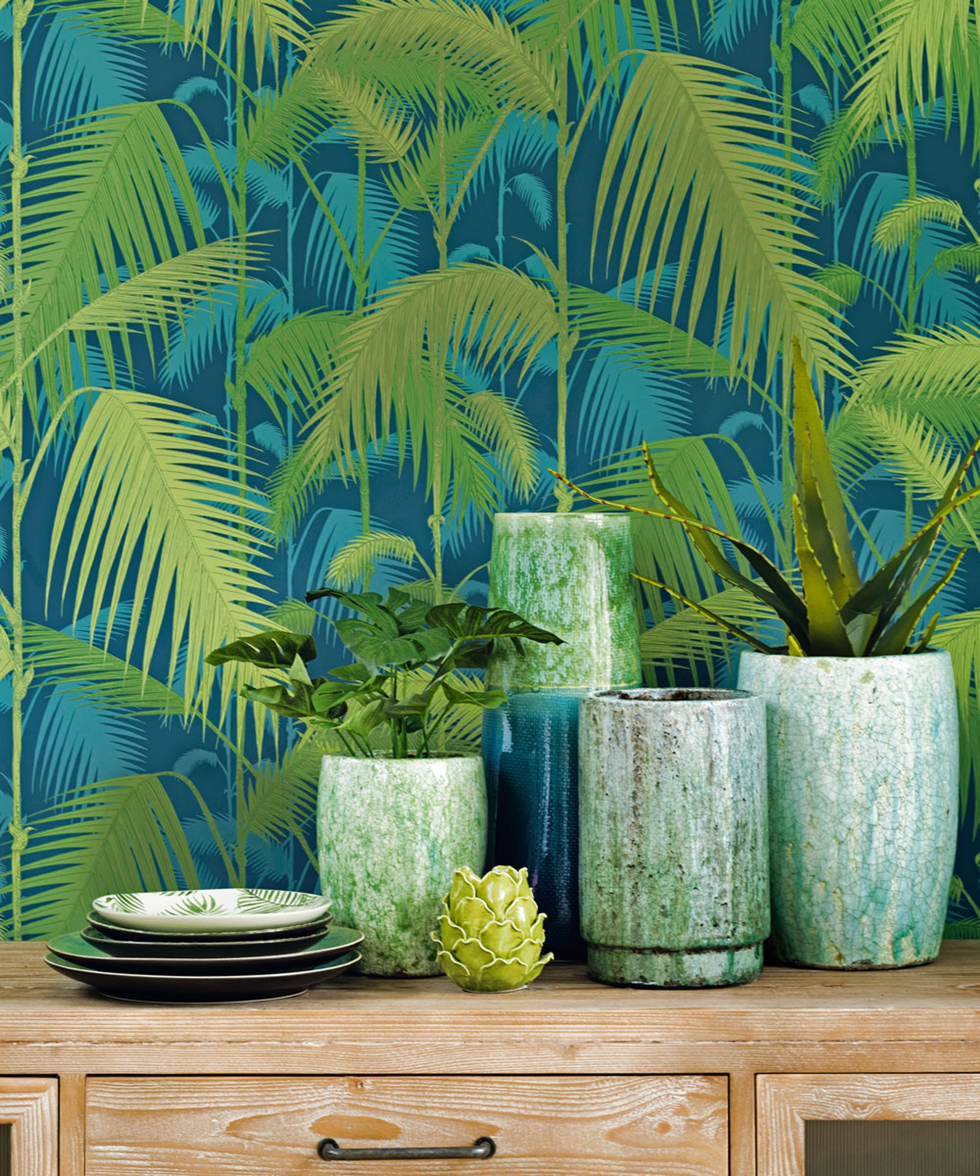
Tropical decorating ideas to bring the outside in

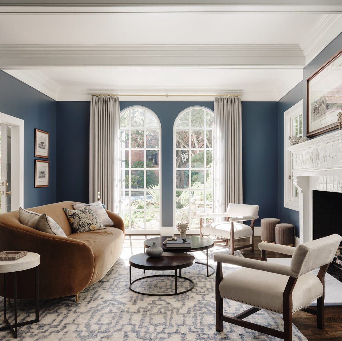
Lick Paint Will Transform the Mood in Your Home Through Color Psychology

Top Designers are Swooning Over These Teal Paint Colors
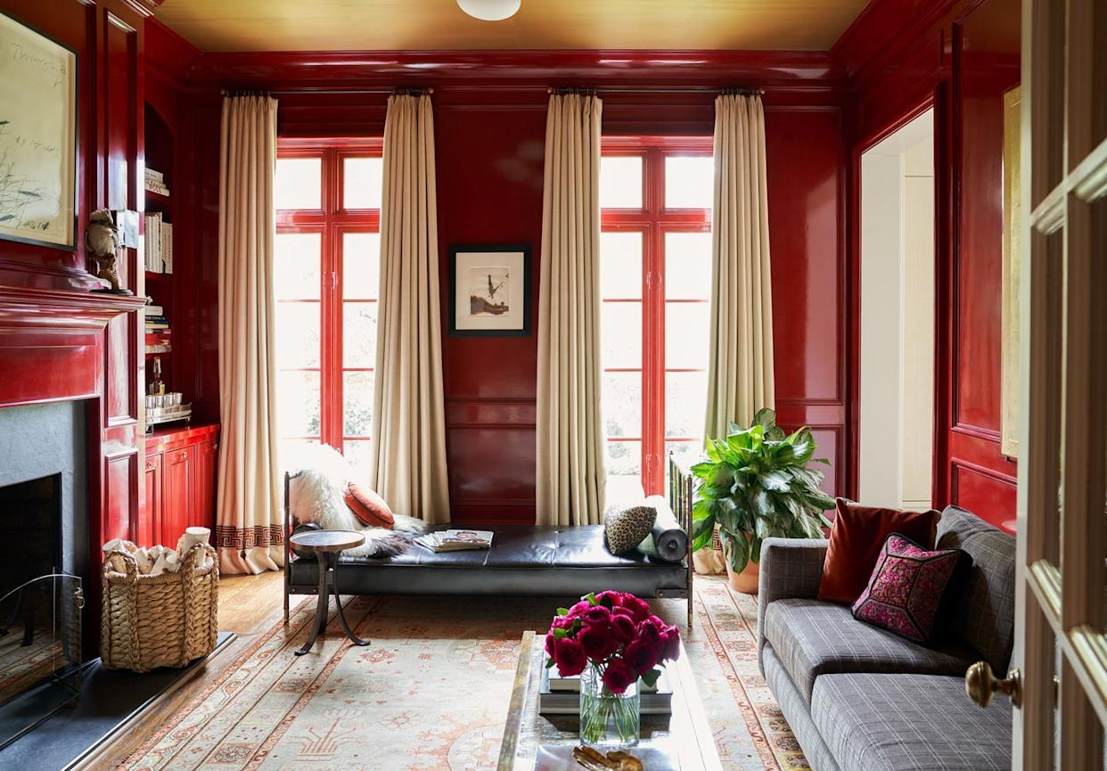
Why This Hue Is Suddenly Dominating Every Designer's Wishlist—Plus, How to Style It


An A-List Designer’s Secrets To Picking Perfect Paint Colors
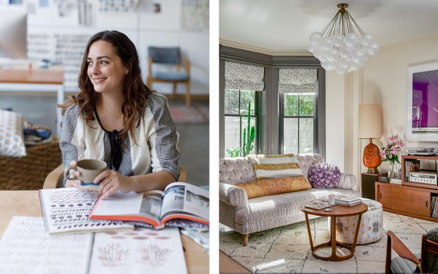
This Popular Fabric Designer Reveals the Right Way to Decorate with Color
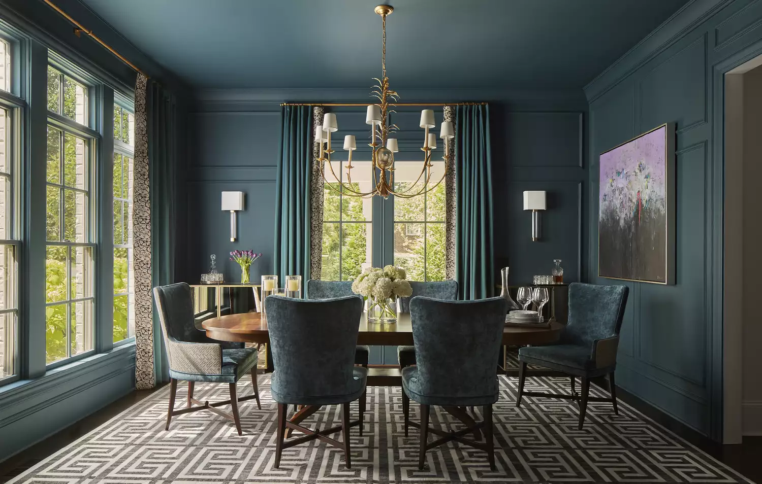
10 Color Drenching Ideas That Highlight the Beauty of This Paint Trend
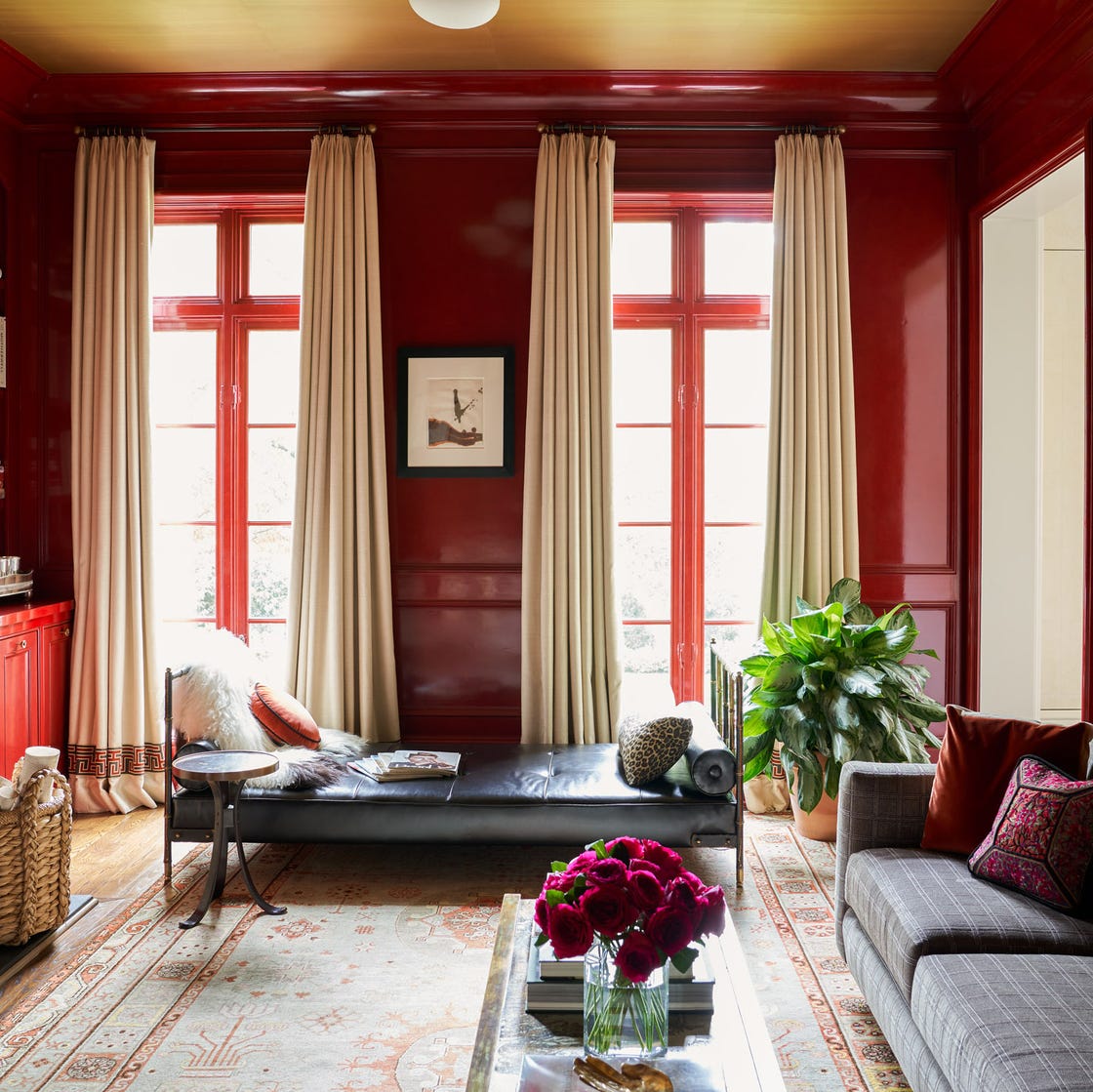
Why This Hue Is Suddenly Dominating Every Designer's Wishlist—Plus, How to Style It

Designers LOVE Pairing These Unexpected Colors With This Sophisticated Hue
7 Color Combos That ALWAYS Look Good Together, According to Designers

Designers are swapping tonal color schemes for high-contrast hues – here's how to do this daring color trend stylishly


11 Paint Colors That INSTANTLY Make Your Home Look "Expensive," According to Designers
5 Secrets To Picking Paint Colors Like A Designer

Designers LOVE Pairing These Unexpected Colors With This One Timeless Hue
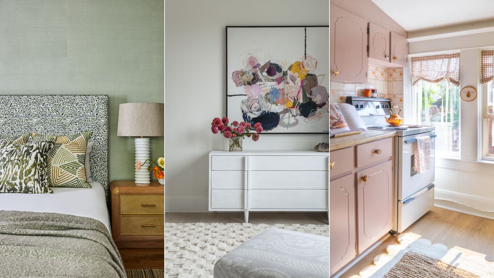
Here's how designers decorate with a soft summer color palette – 5 ideas for a toned-down take on summery hues
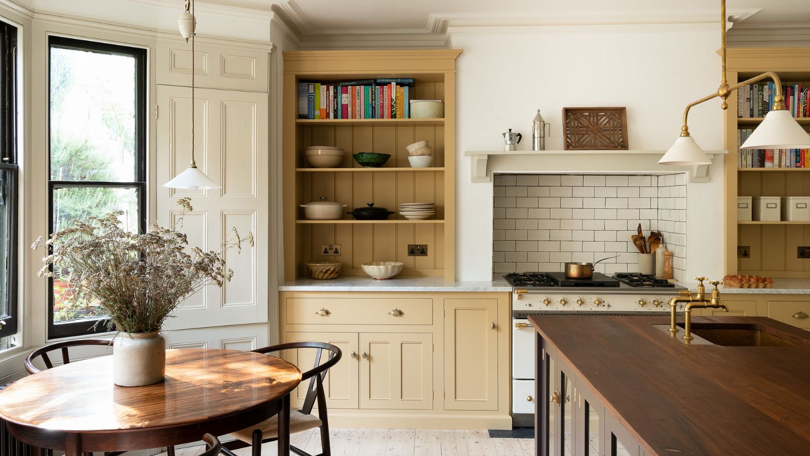
5 ways to nail the tri-color kitchen method, say designers
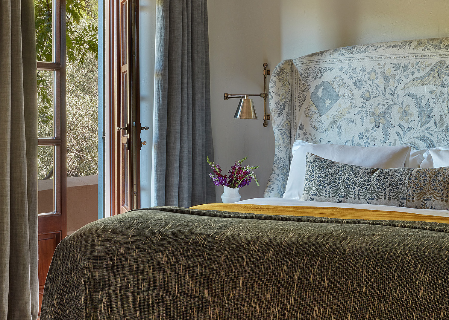
9 Contemporary Coastal Color Palettes Designers Love Which Make Rooms Feel as Relaxing as a Vacation

Kitchen Color Selection Tips from 5 Designers
5 Vibrant Color Palettes Designers Are Using to Add Energy and Excitement to Decor
15 Colors We Love That Always Go Perfectly With Turquoise