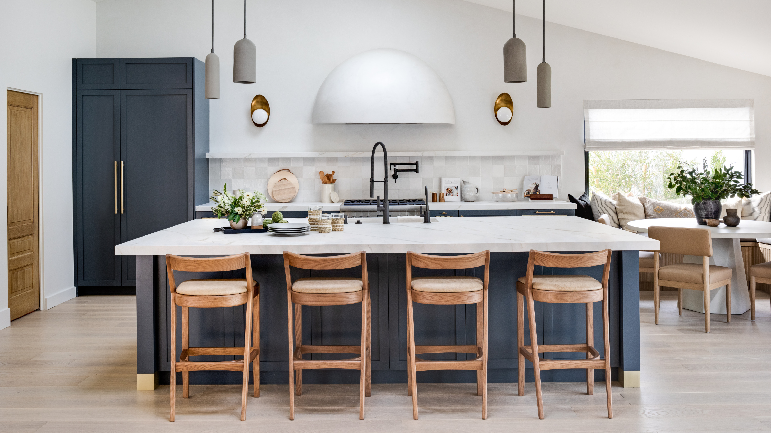
1/5
The 6 relaxing kitchen colors you should be using for calming schemes, according to designers
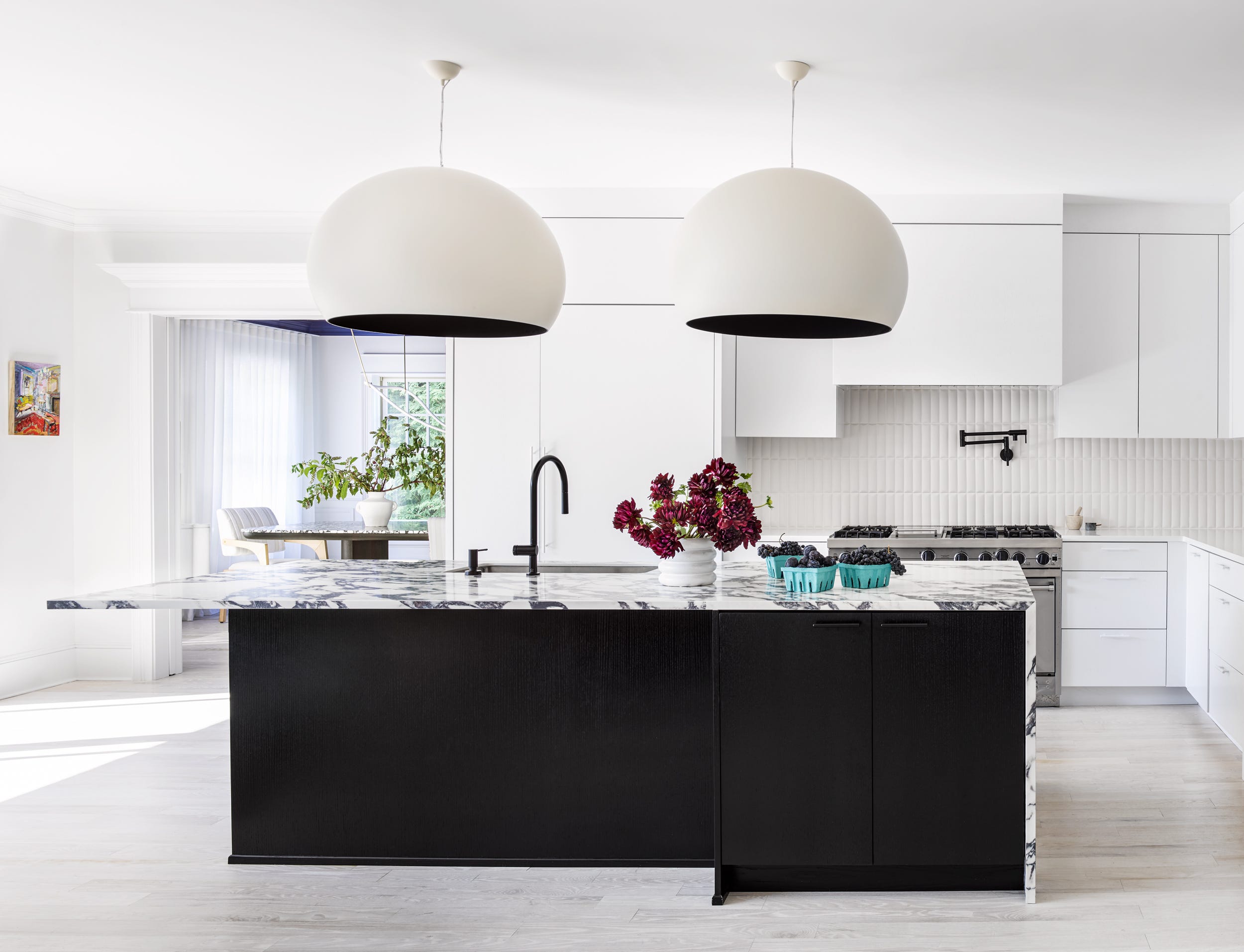
This article explores how to create a tranquil and relaxing kitchen environment through the strategic use of color, moving beyond the traditional focus on calming colors for bedrooms and bathrooms. Interior designers emphasize that the kitchen, despite its often-busy nature, can also be a space of zen with the right color choices. The core principle for achieving a restful scheme involves curating a sense of balance, such as pairing painted walls with neutral cabinet finishes, or using understated counters and backsplashes that complement the chosen paint color by picking up on subtle tones. The article highlights six specific color categories that designers recommend for promoting calmness in the kitchen.
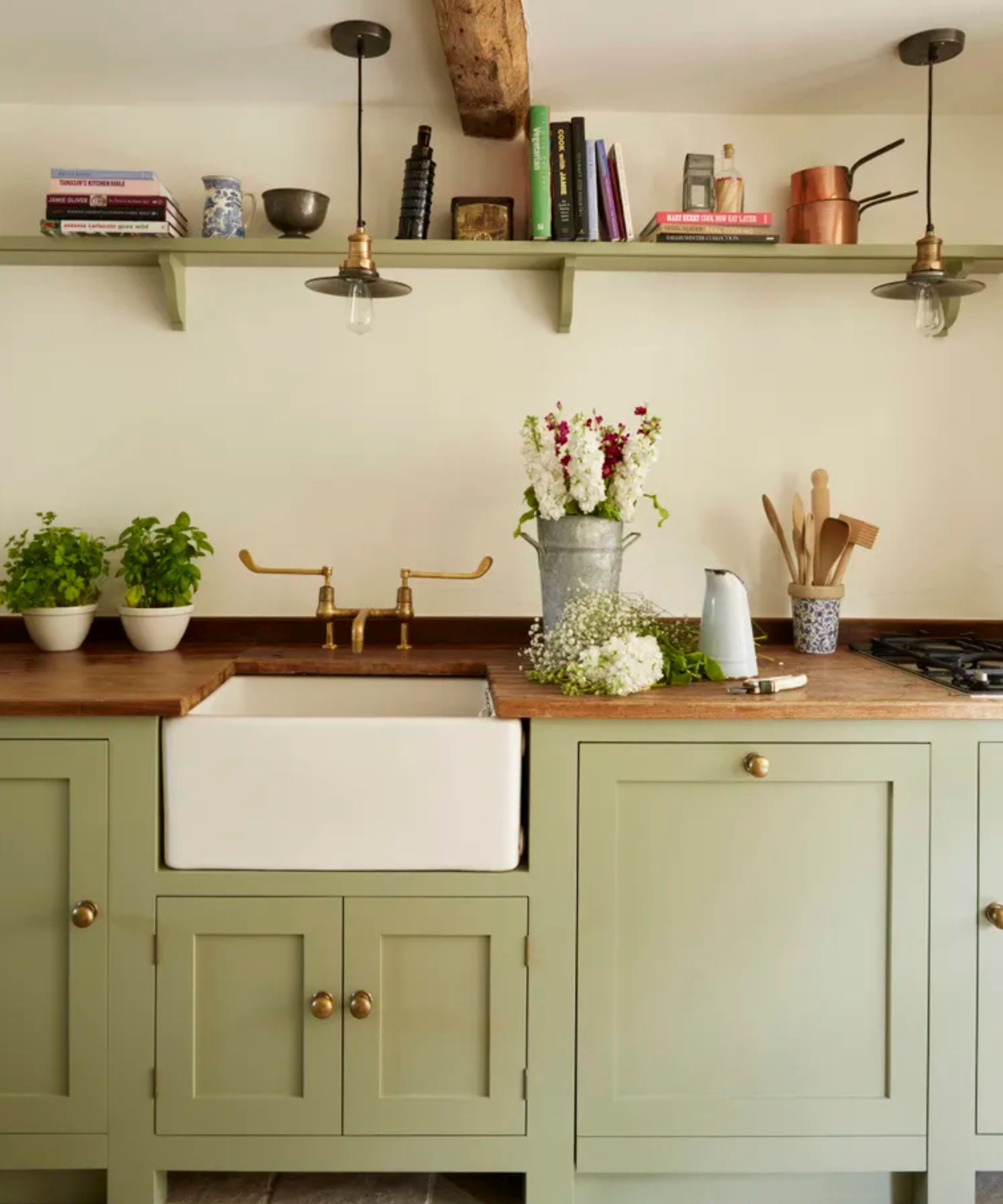
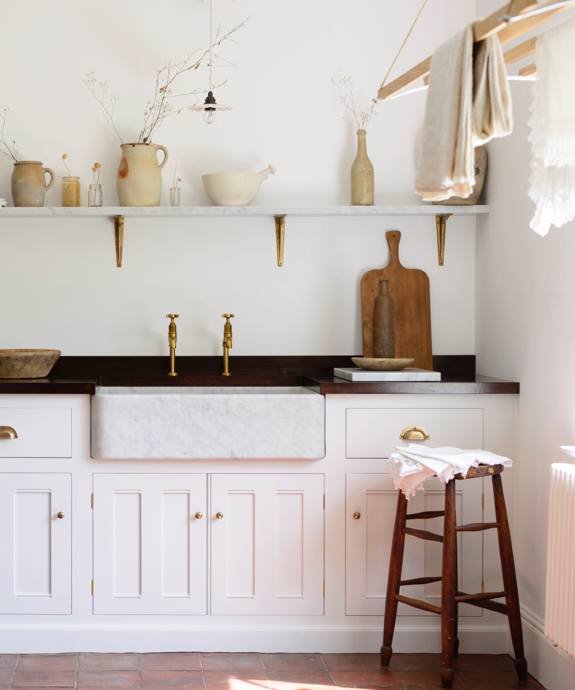
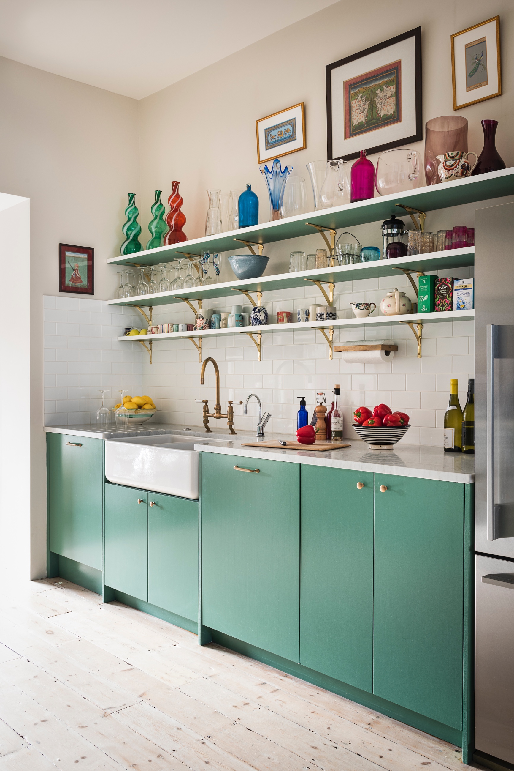
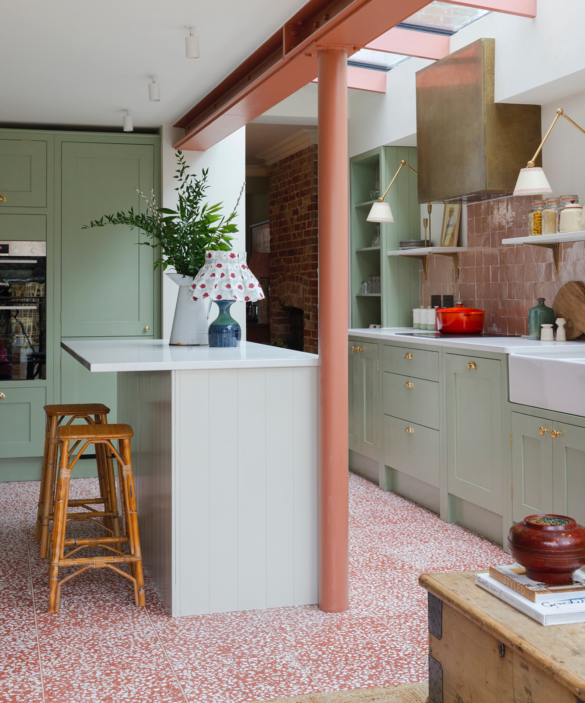
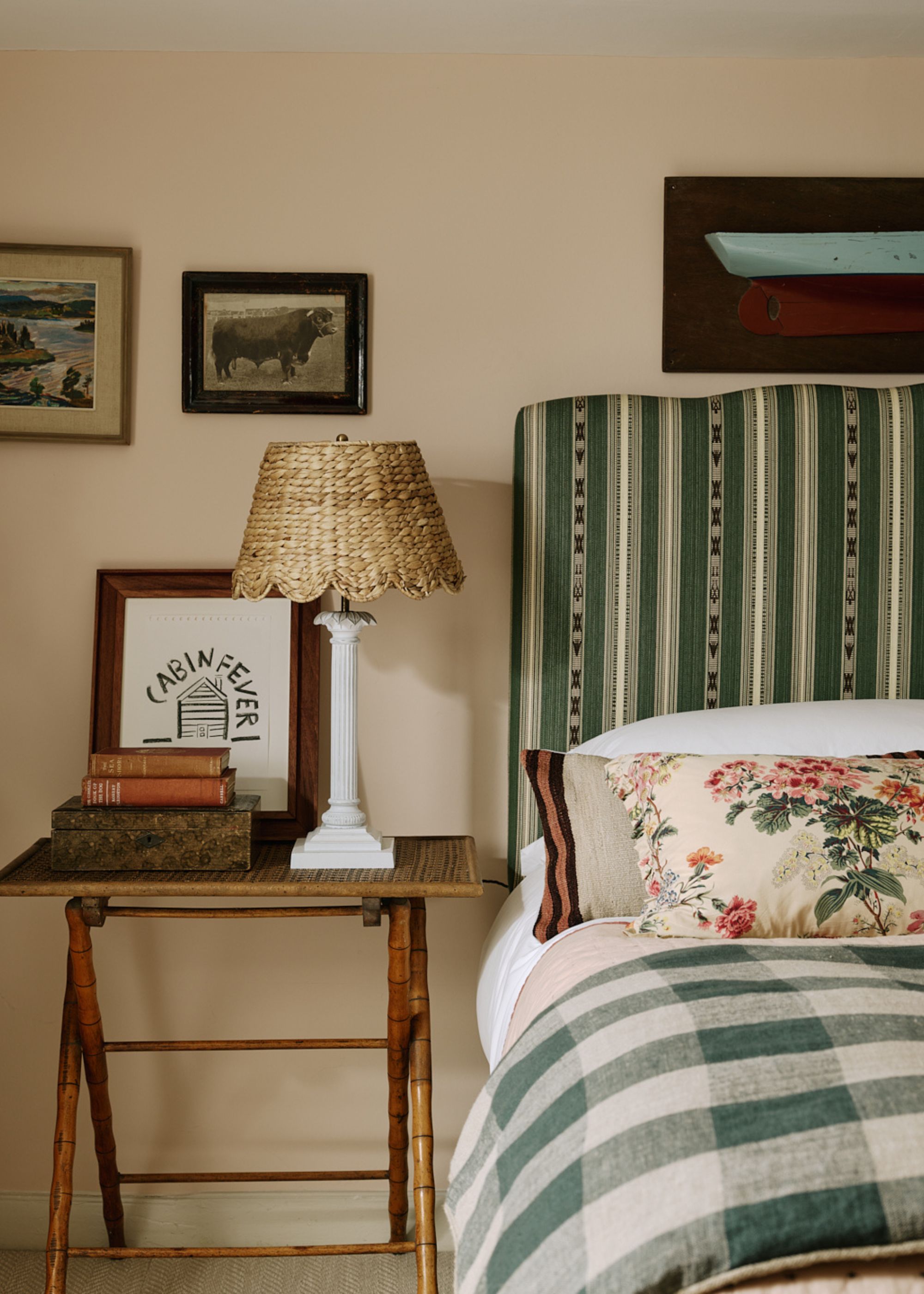
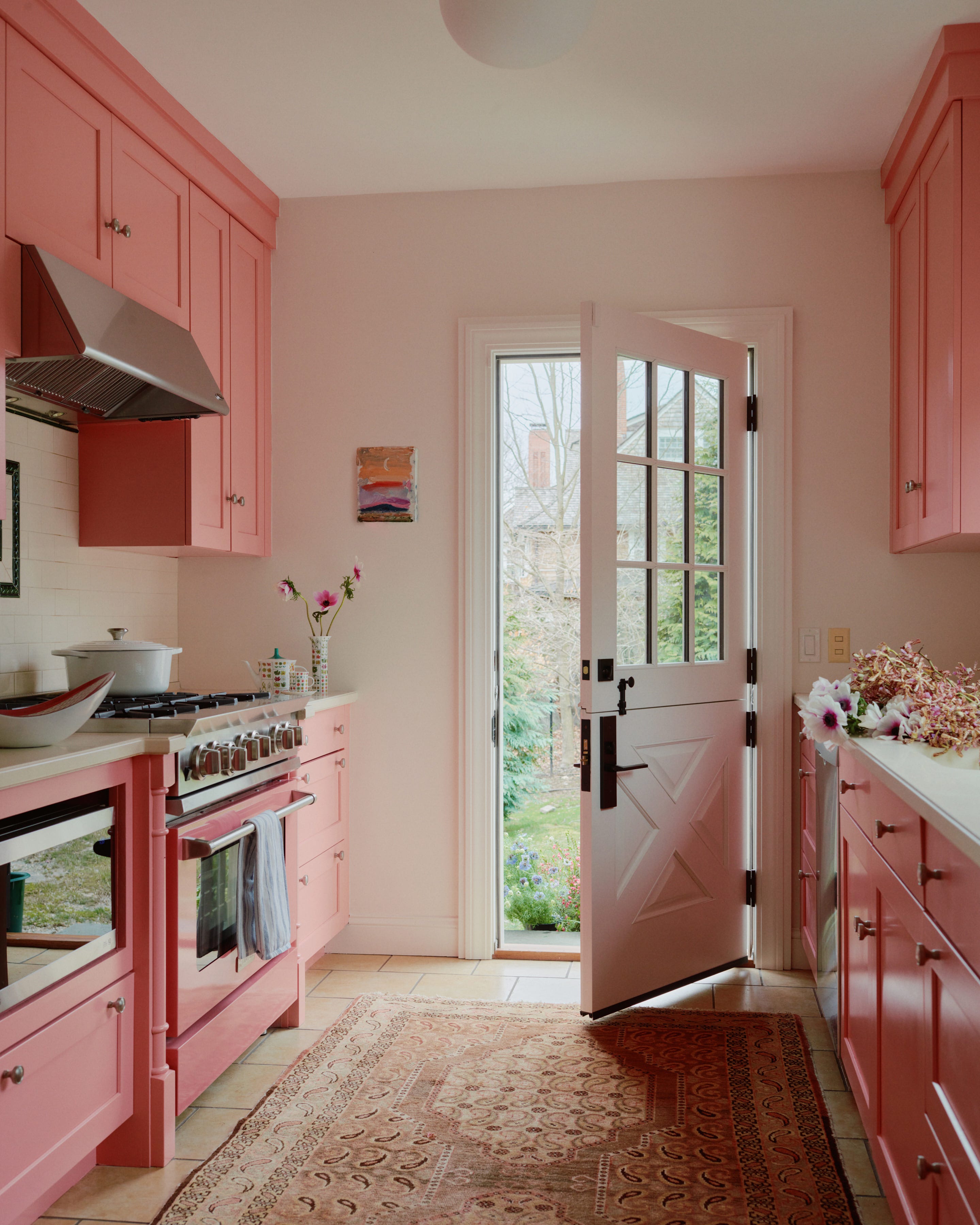
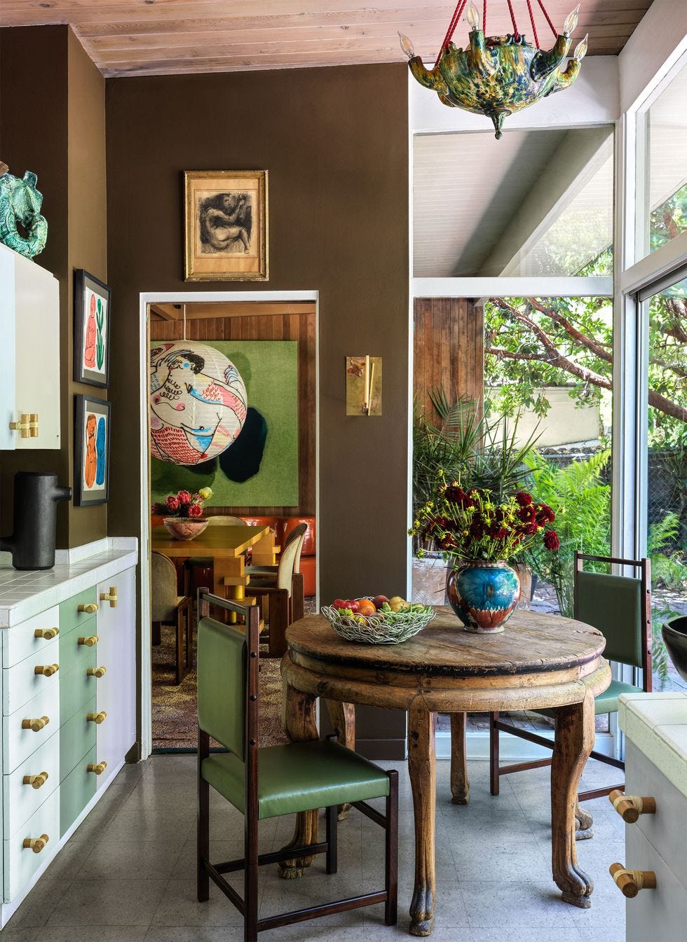
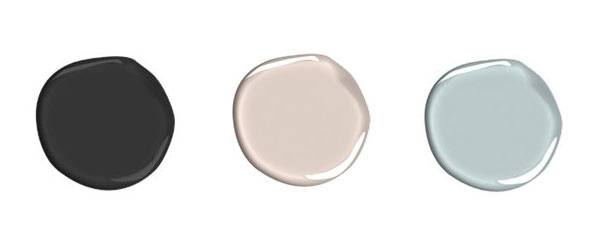
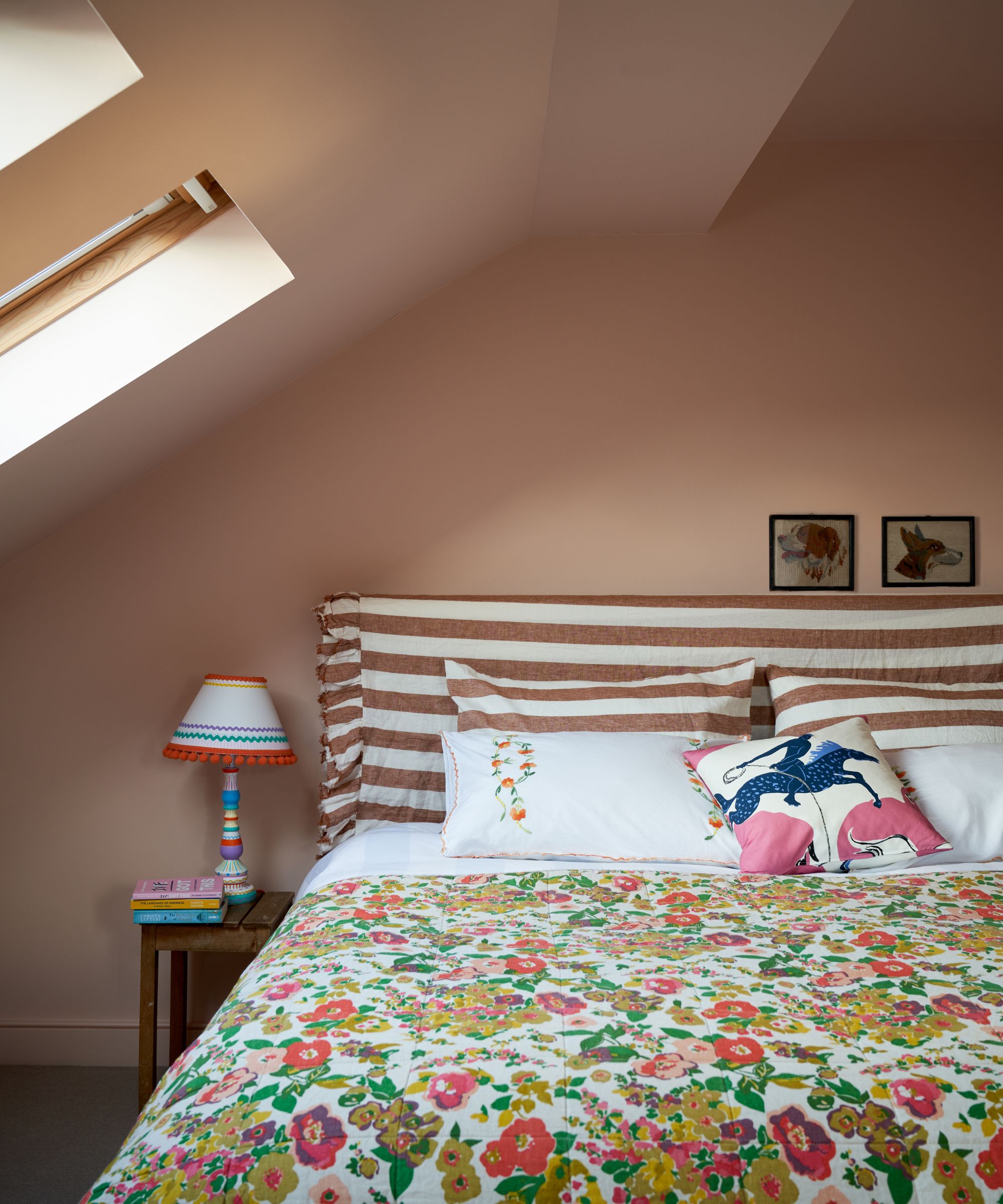

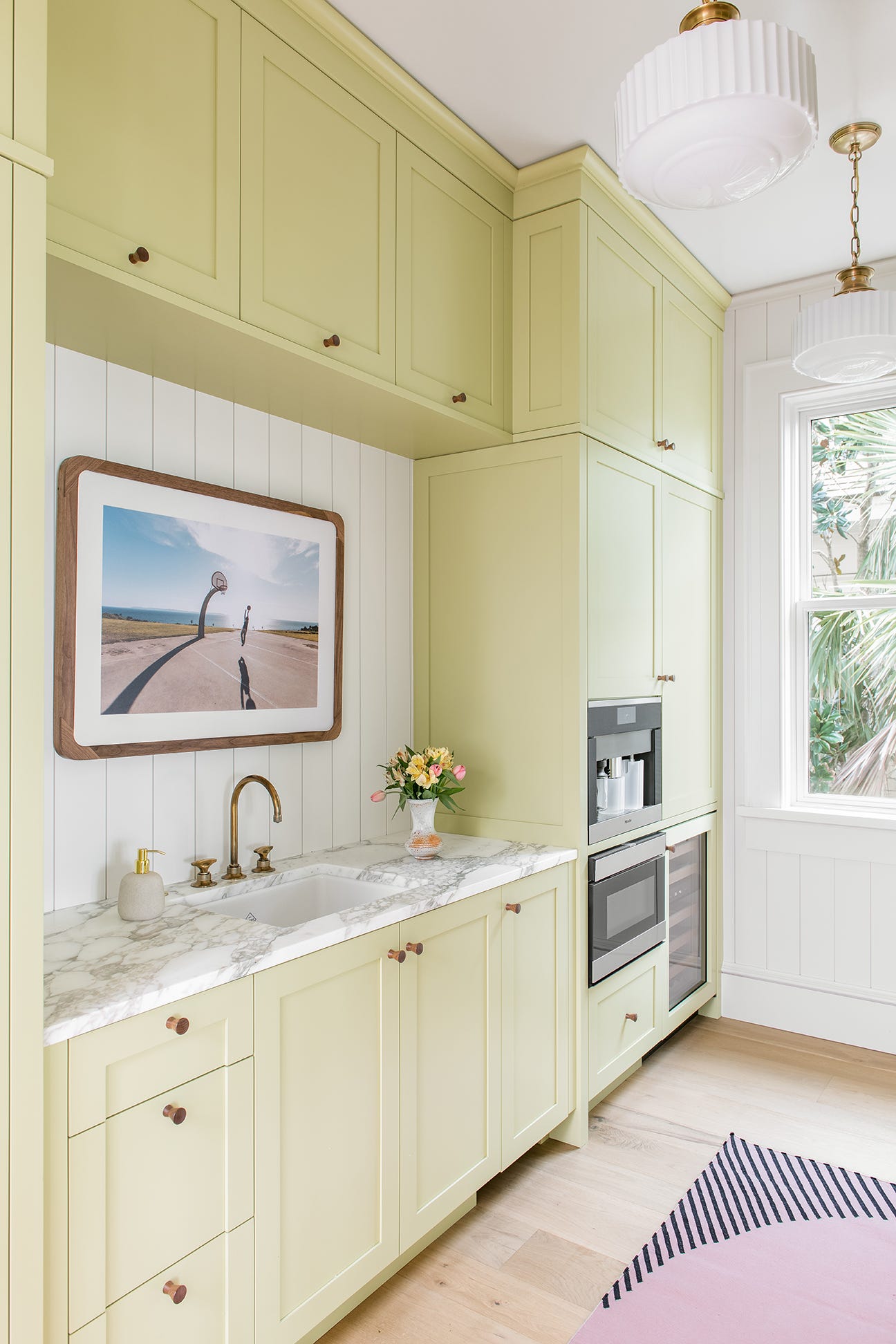
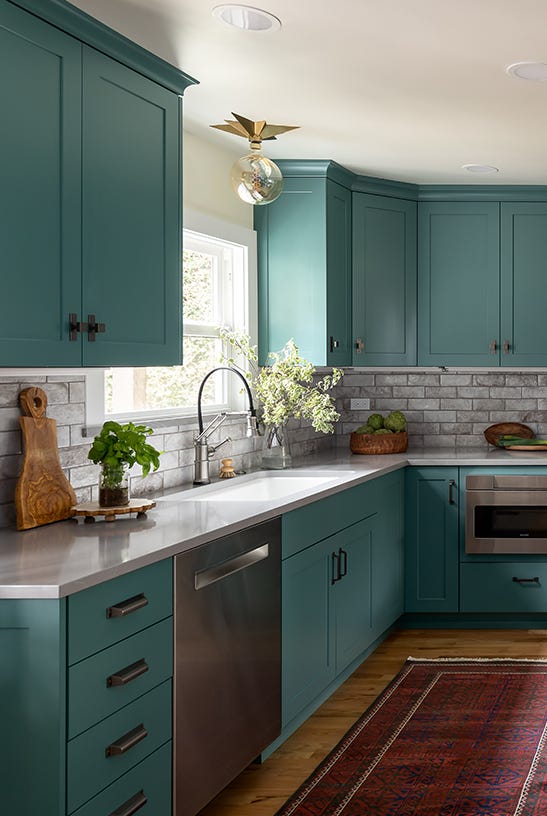
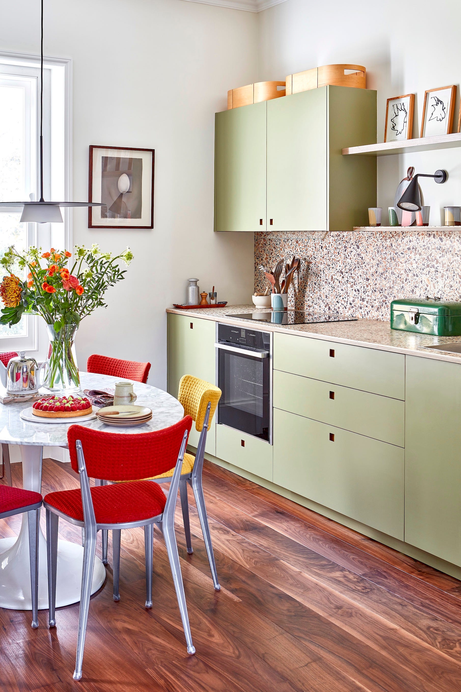
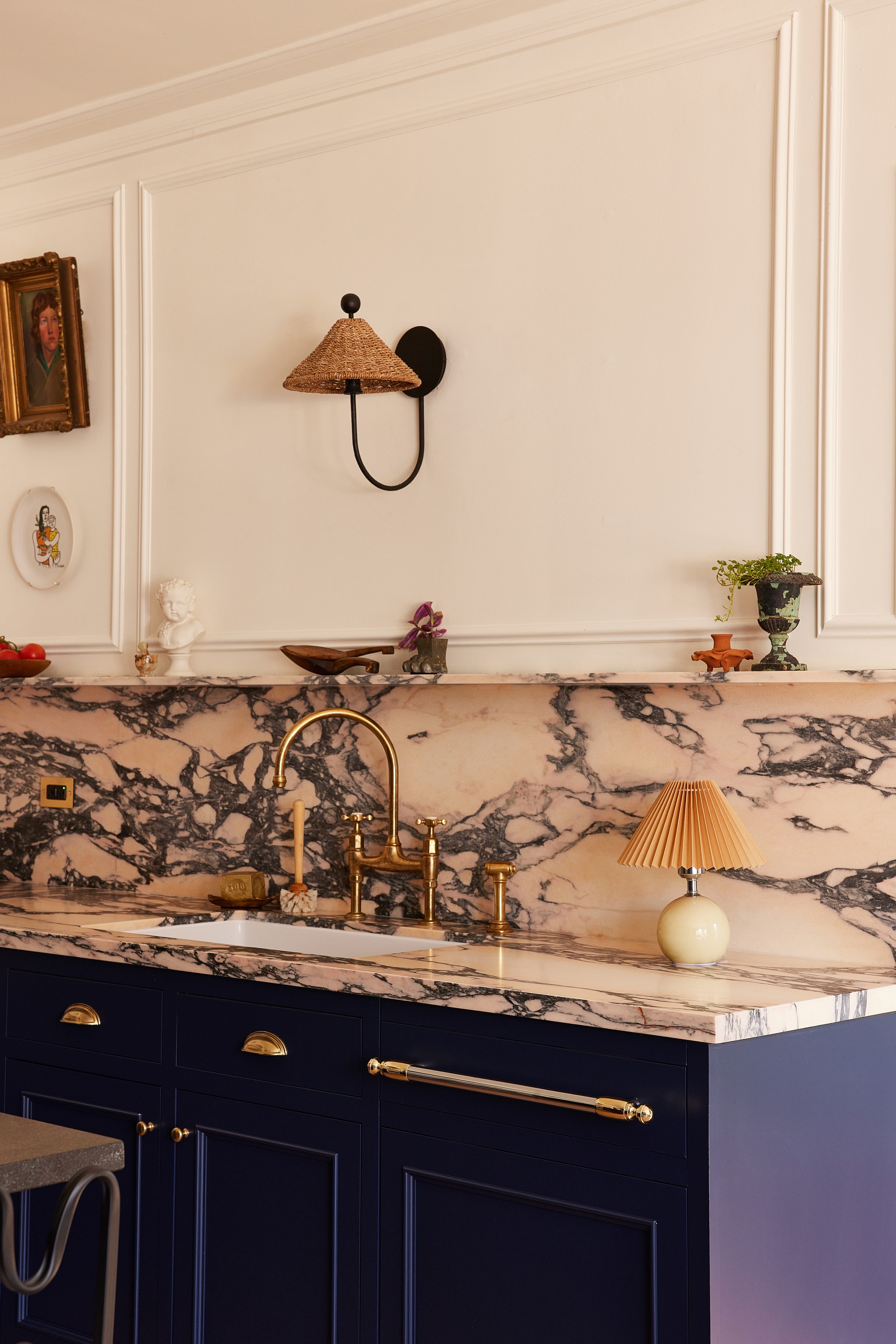
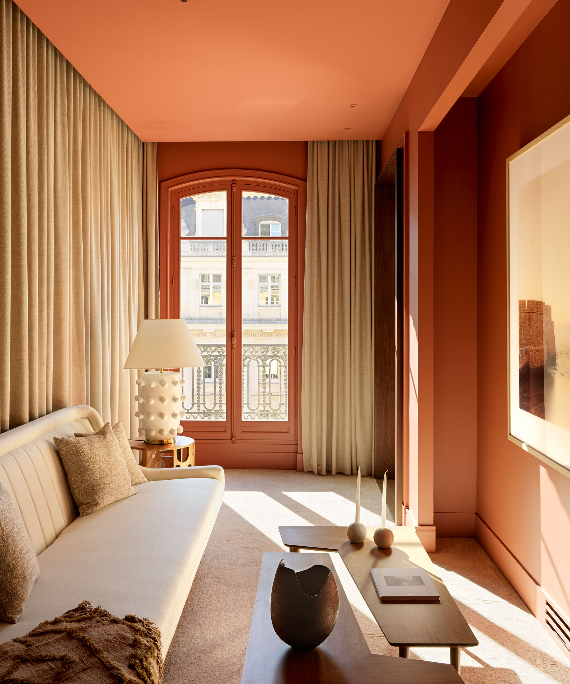
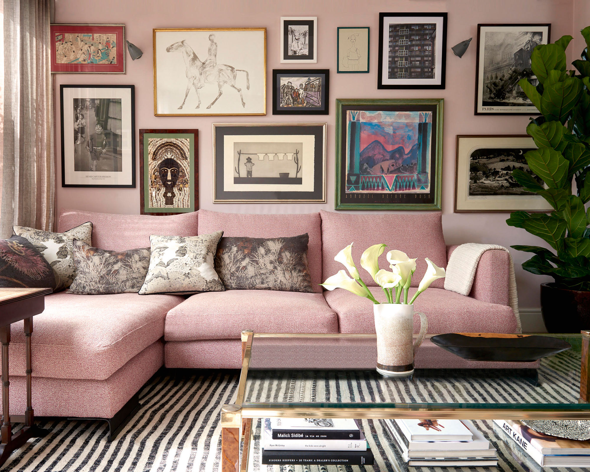
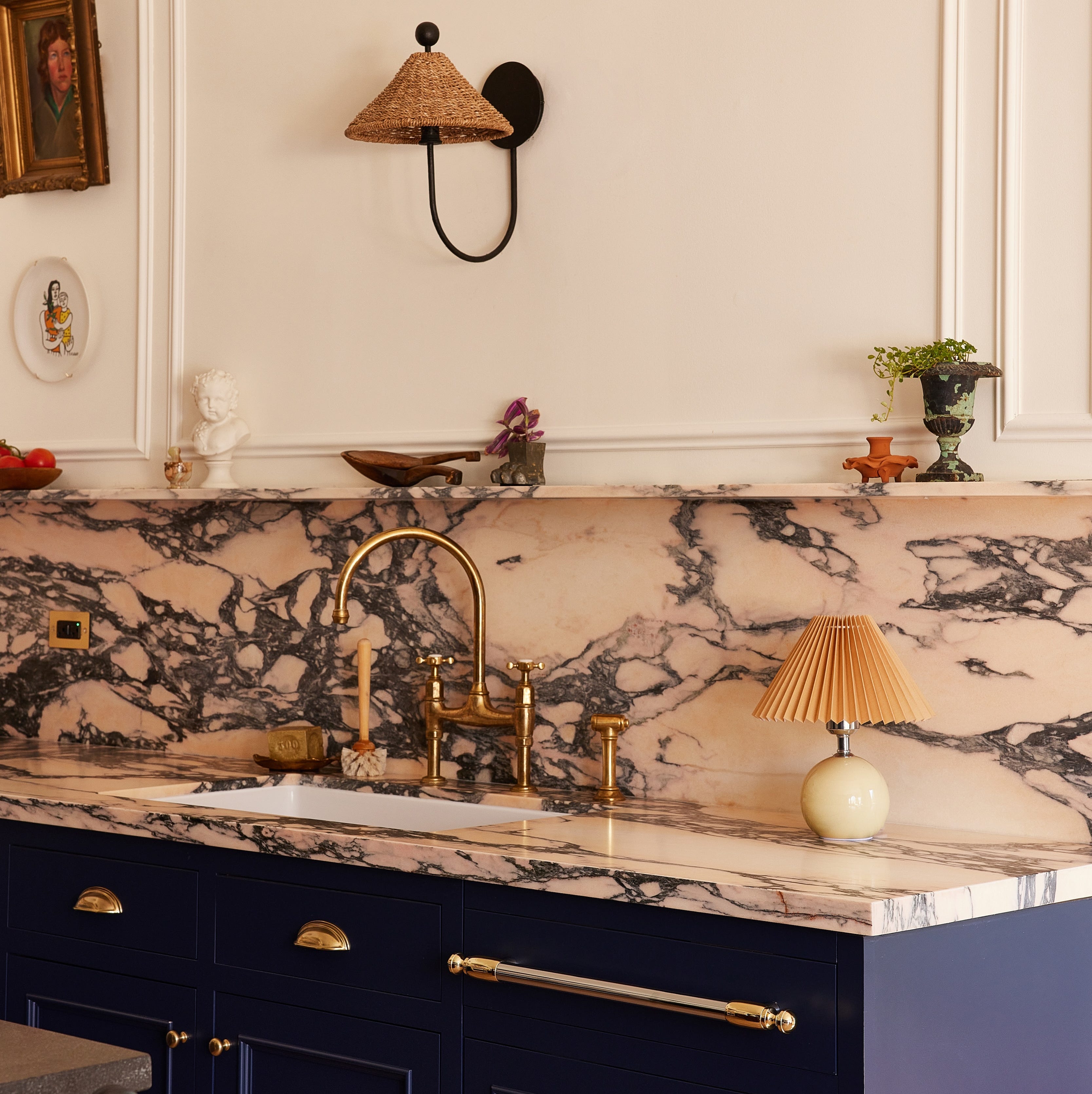
Natural greens are consistently recommended due to their association with nature, offering grounding and relaxing qualities. Shades like sage and olive green are particularly favored, with specific mentions of Sherwin Williams' Dried Thyme, and Farrow & Ball's Duck Green and Calke Green, which can be balanced with lighter shades or white for a fresh look. Pared-down pinks, specifically warm, subtle, and earthy tones like Farrow & Ball's Setting Plaster, are suggested for creating a calming and warm atmosphere, especially in north-facing kitchens. These can be paired with empathetic whites for walls and trim.
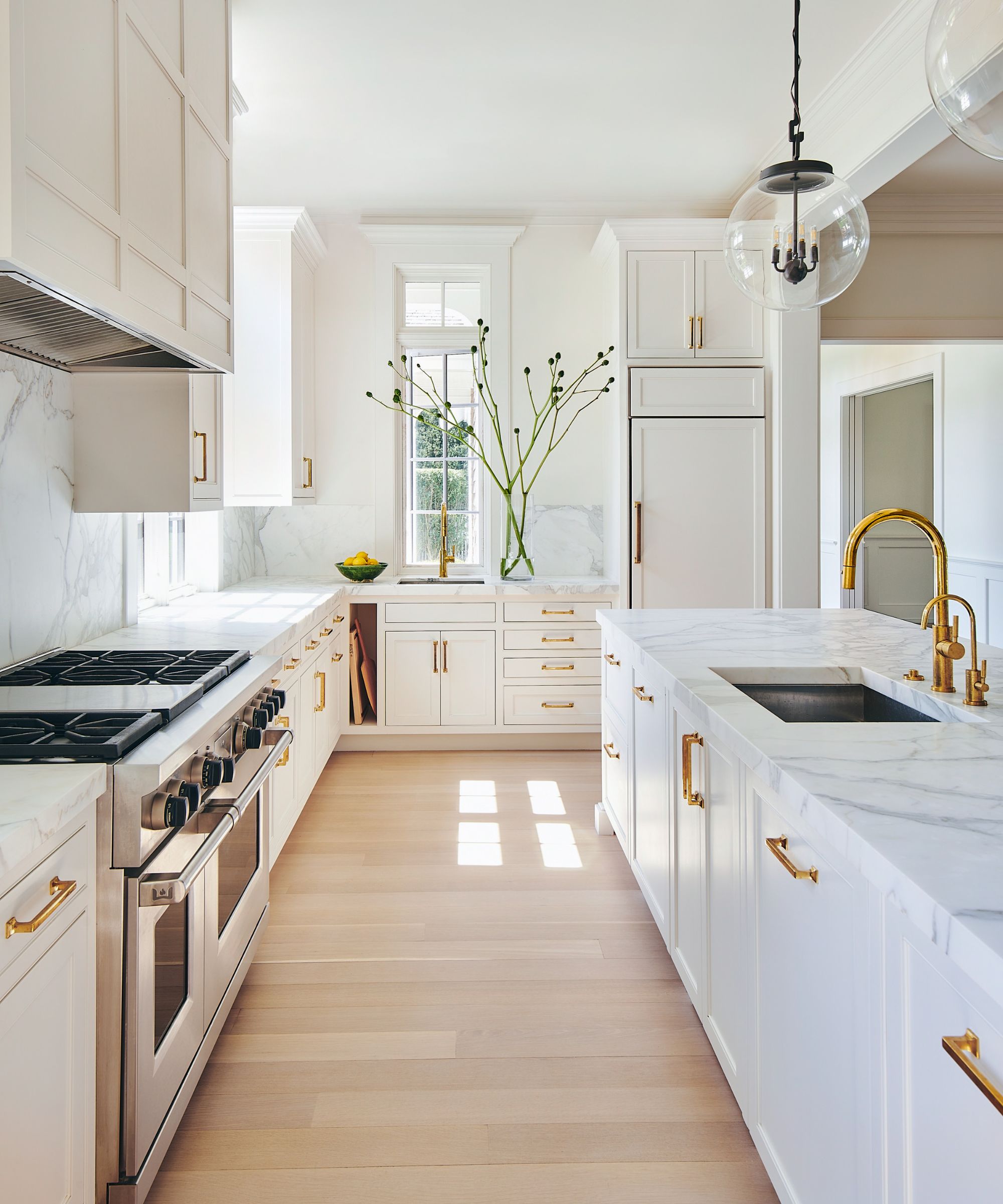
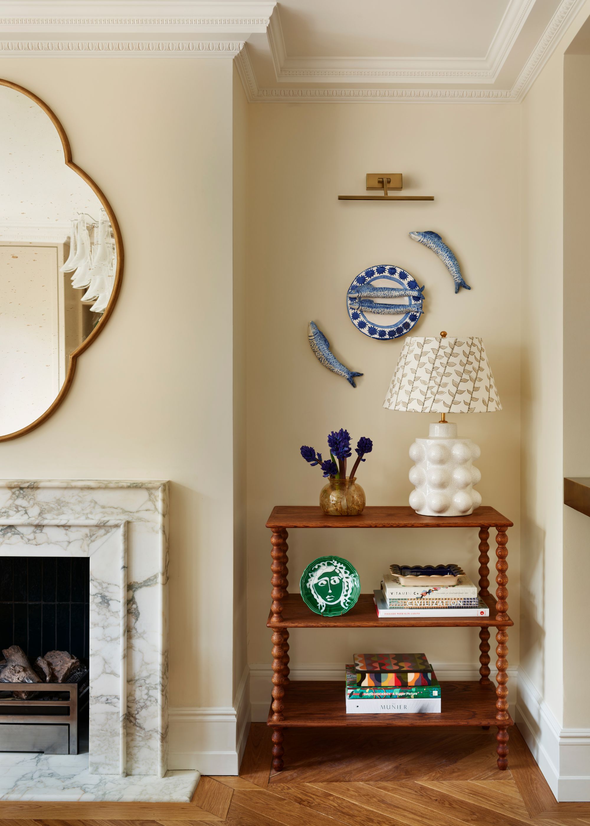
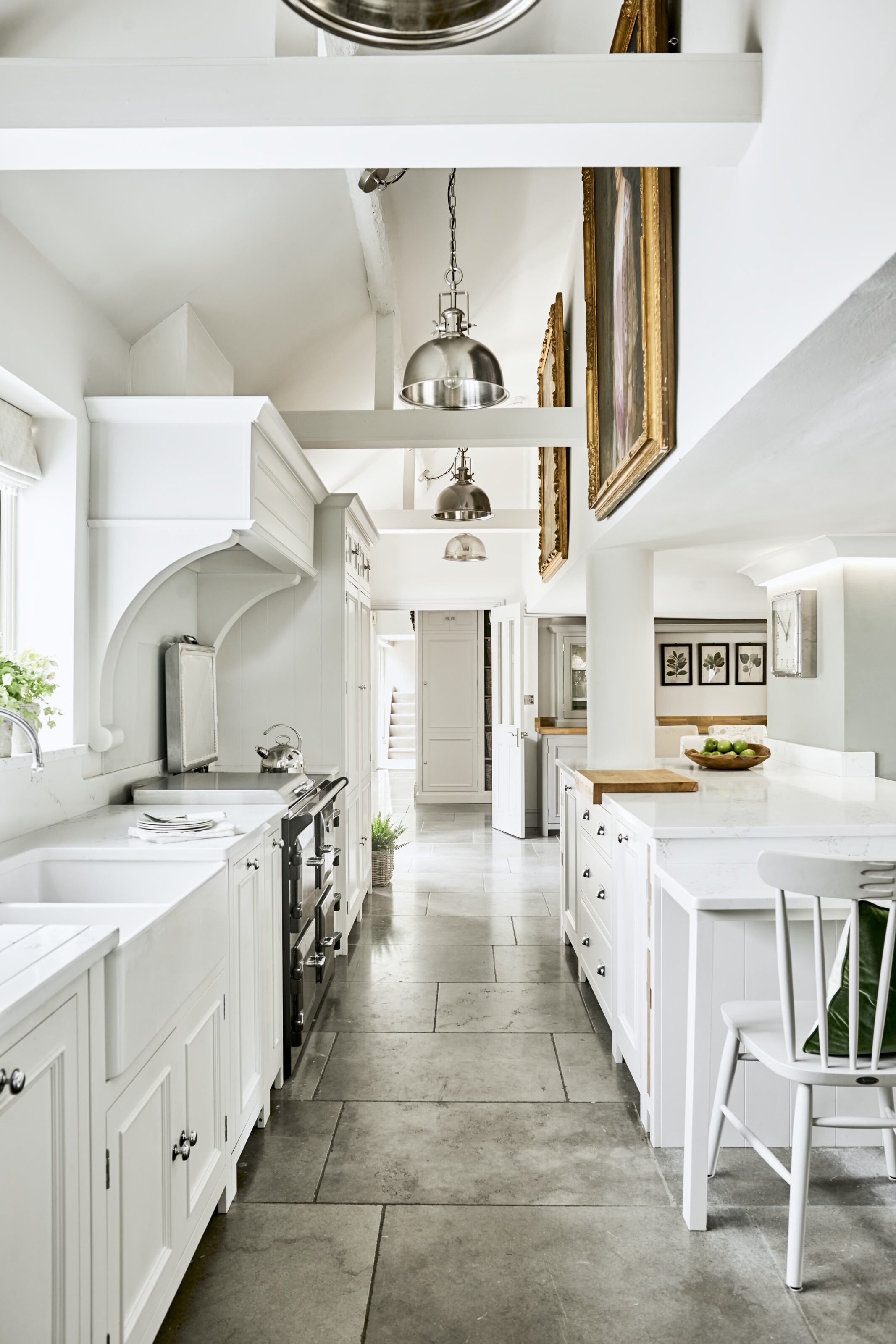
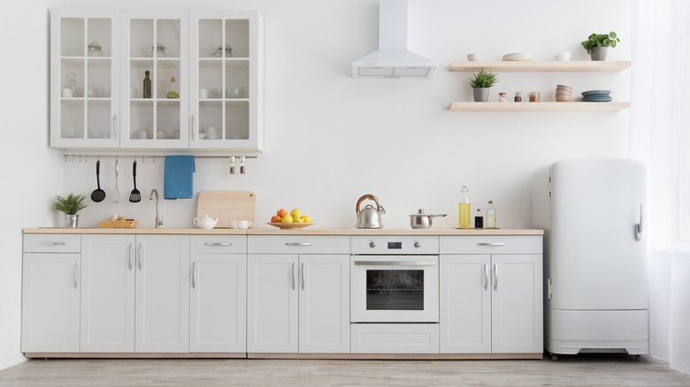
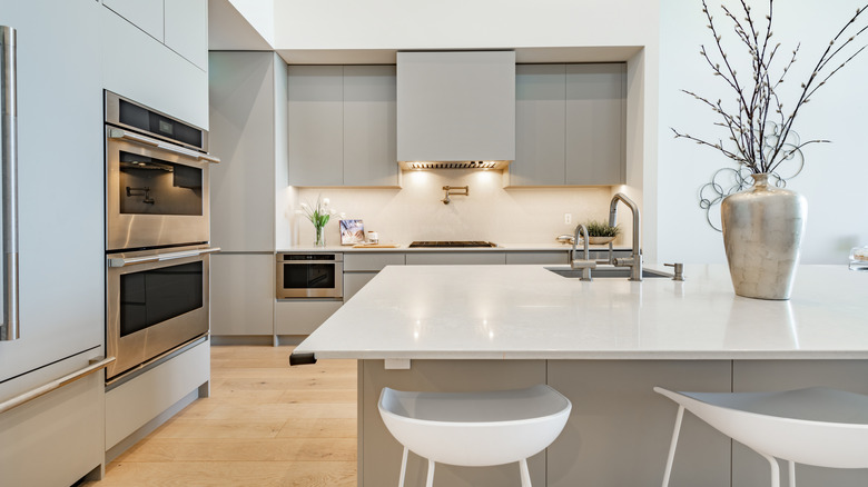
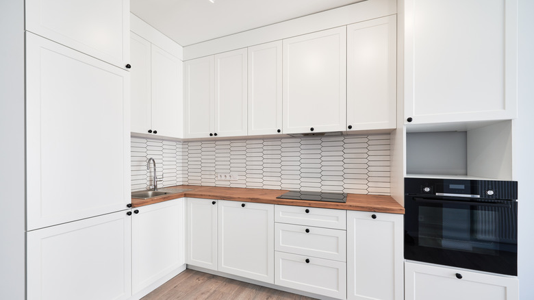
Warm whites are presented as a key to a restorative scheme, particularly when avoiding cool blue undertones that can make a space feel stark. Designers advise selecting whites with warm yellow undertones, citing Benjamin Moore's Chantilly Lace and Simply White as excellent choices. To prevent warm white kitchens from appearing bland, emphasis is placed on incorporating varied and interesting textures to create visual depth. Earthy neutrals, encompassing shades from greige to oatmeal, offer a calm similar to white but with added depth, and are rooted in nature-inspired palettes. Examples include Clare Paint's Greige and Farrow & Ball's Mizzle, which can be complemented by materials like unlacquered brass and contrasting dark soapstone.
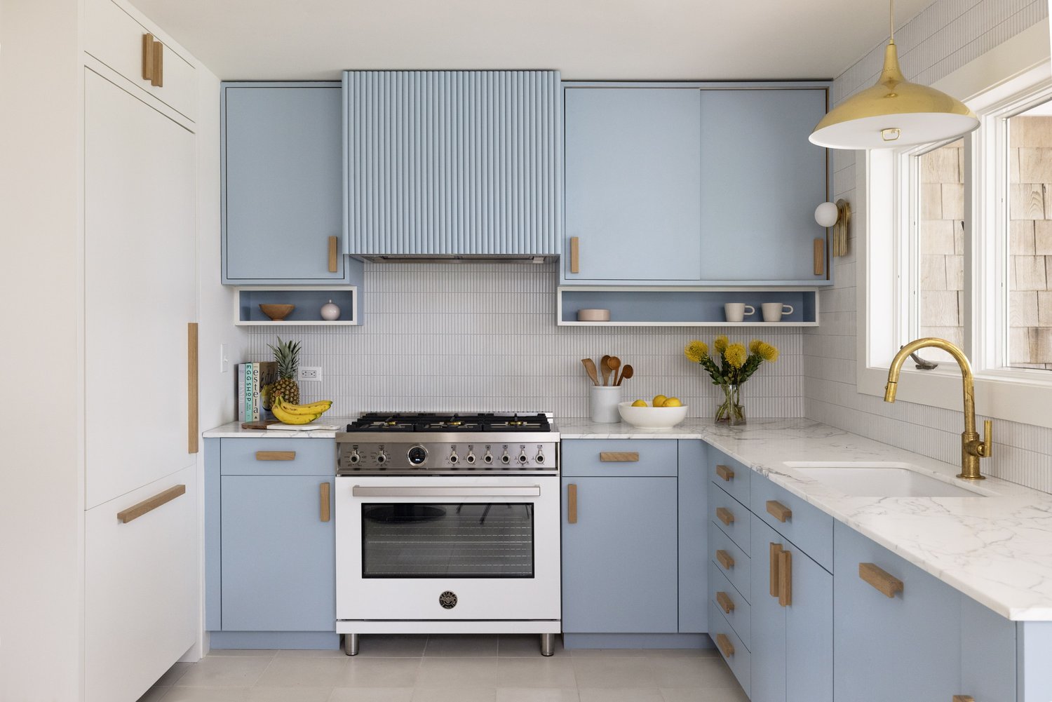
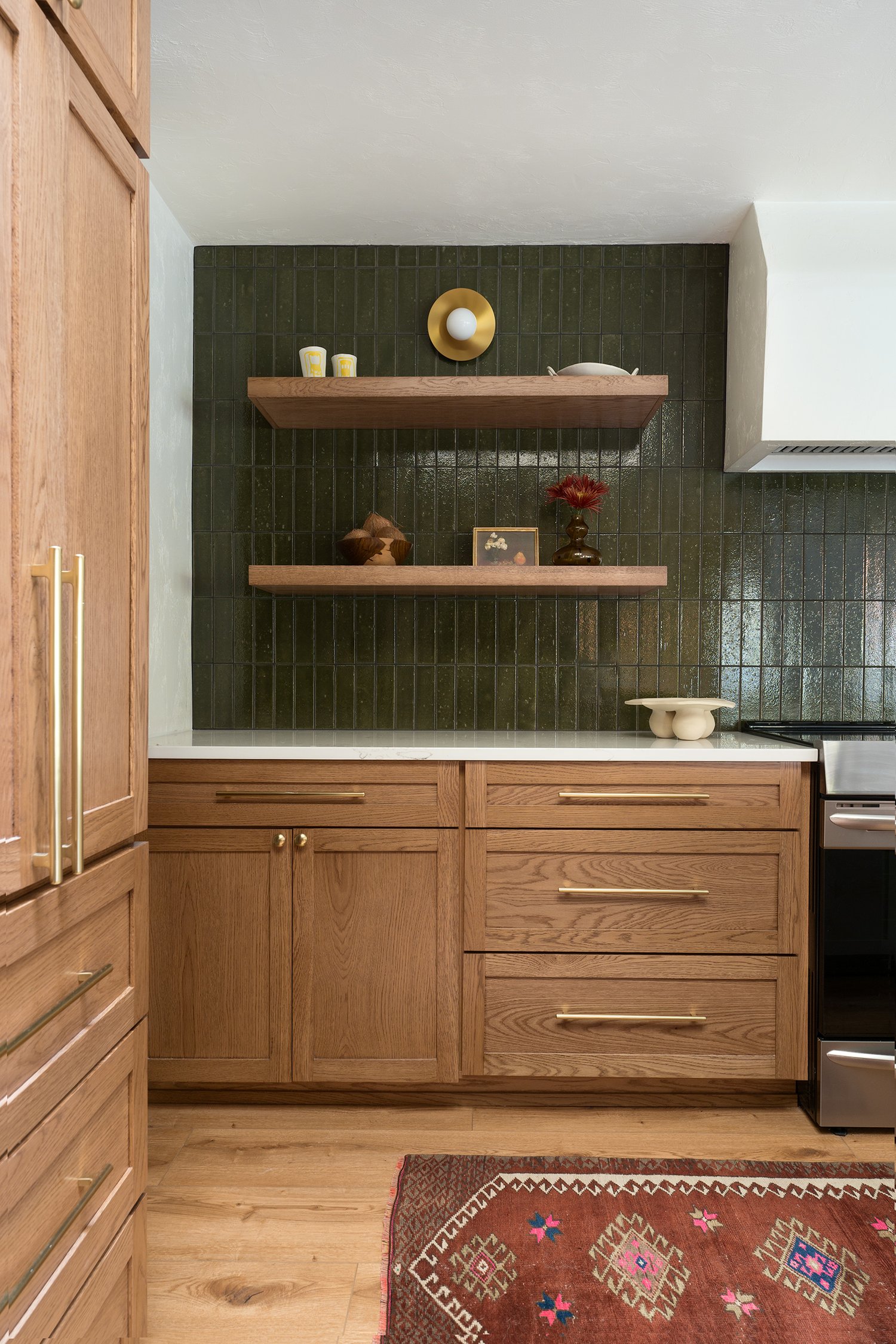
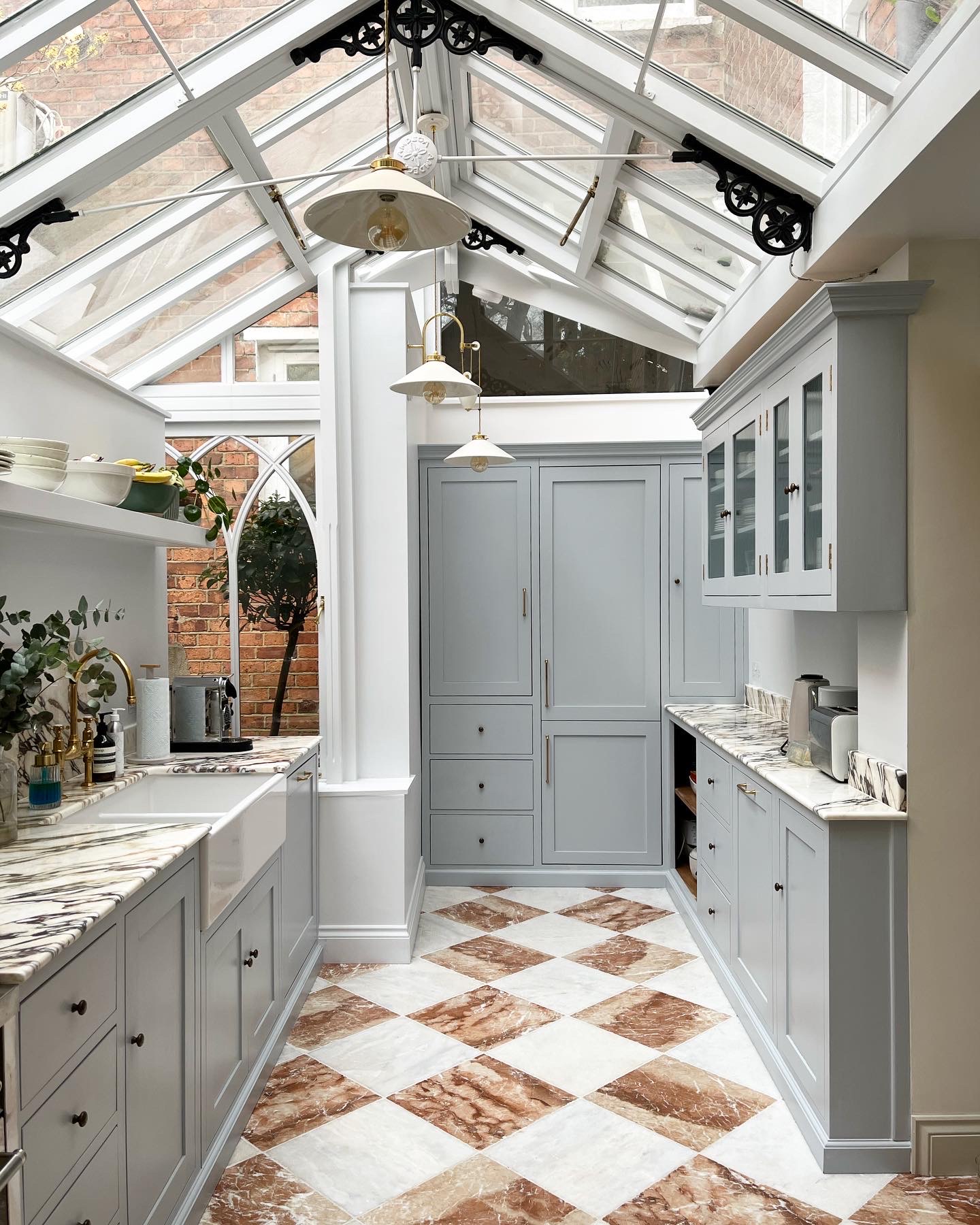
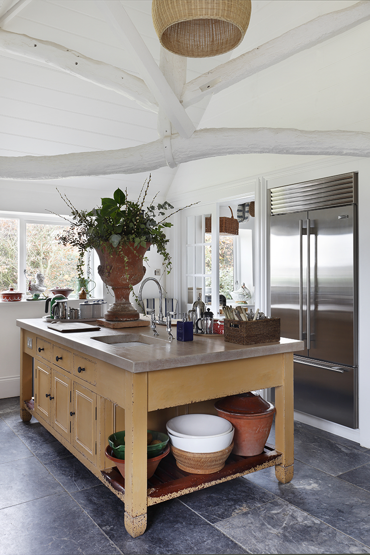
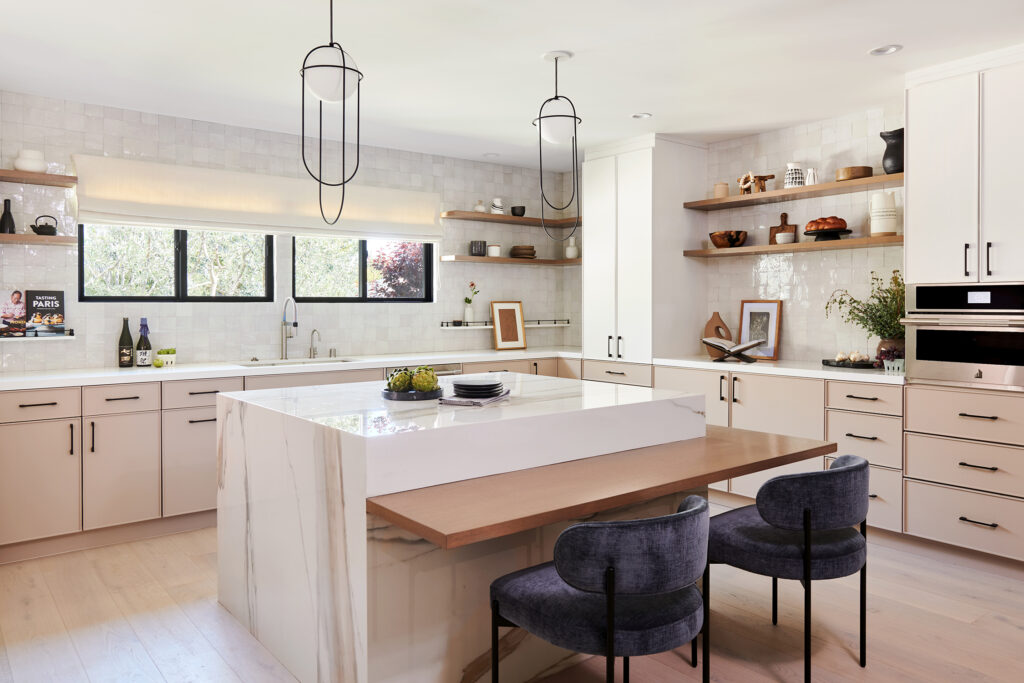
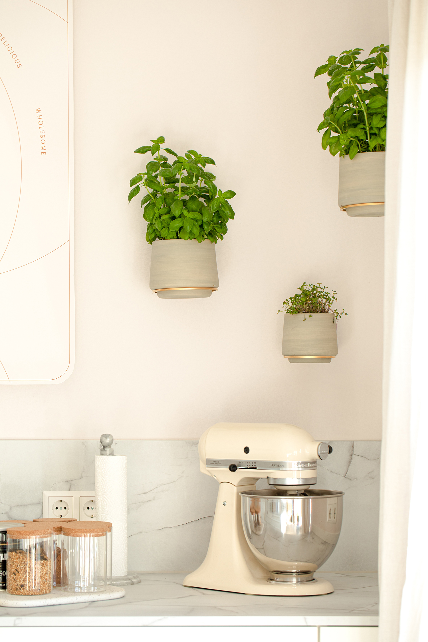
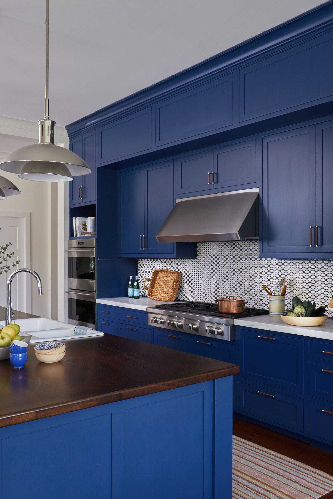
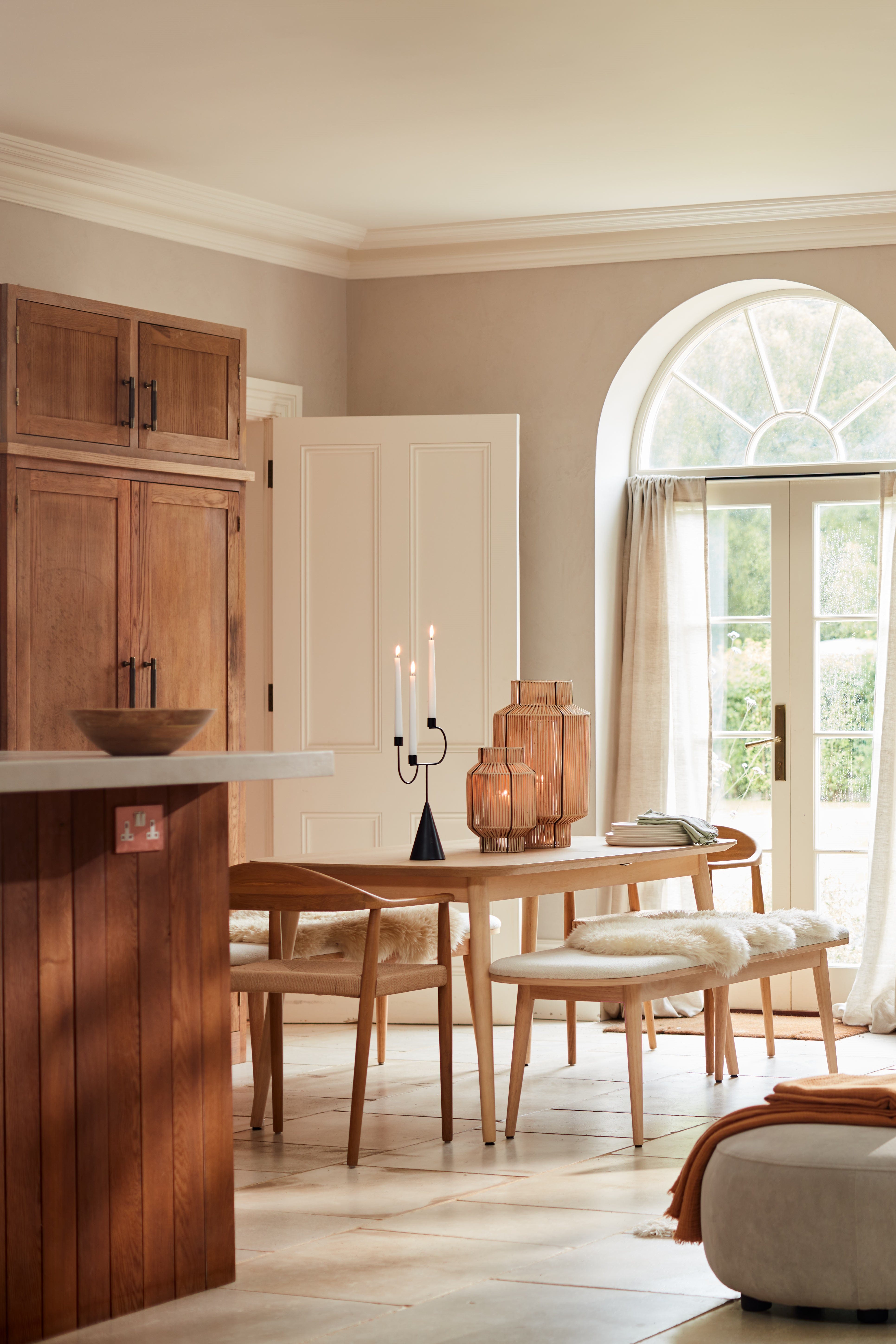
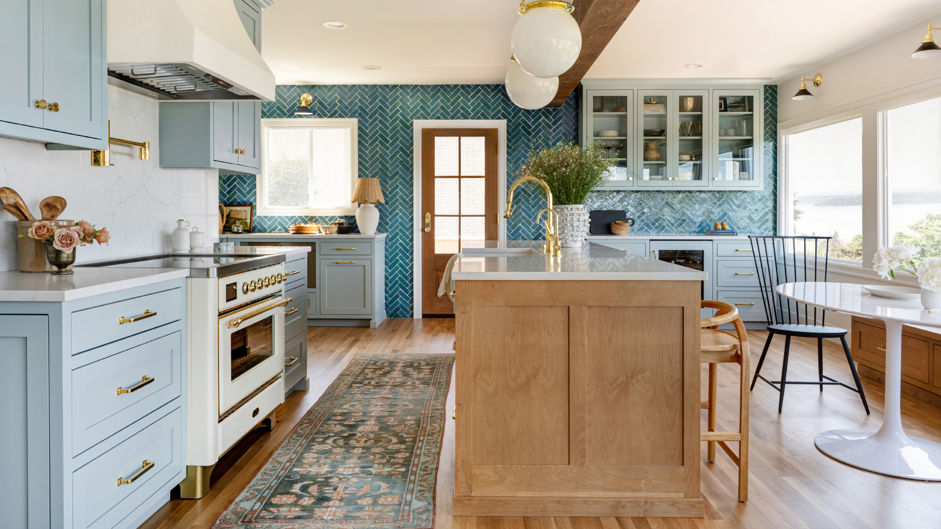
Gentle blues are recognized as timeless and calming, with the coolness of these colors inviting warm accents from natural woods and metals. While sky blue is effective for backsplashes, darker shades like Farrow & Ball's Inchyra Blue can create a moody yet relaxing contrast with bright white walls, enhancing a sense of calm in a bustling space. Finally, wood tones, though not strictly a color, are highlighted as a significant trend and a shortcut to a relaxing kitchen. The integration of natural wood, particularly white oak, softens spaces and adds textural interest, aligning with biophilic design principles to strengthen the connection with the outdoors.
The article concludes by outlining practical ways to incorporate these relaxing colors, starting with painting walls for a minimal commitment, potentially using limewash paint for added texture. Painting cabinets is suggested as a more impactful method to add character, while the backsplash offers another opportunity for a pop of color in an otherwise neutral kitchen. For rented spaces or those seeking less permanent changes, incorporating soft furnishings like draperies or curtains is recommended to elevate the kitchen beyond a purely functional workspace into a holistic, calming environment for daily activities.
#RelaxingKitchenColors #KitchenDesign #ColorSchemes #InteriorDesign #CalmingInteriors #GreenKitchens #PinkKitchens #WarmWhites #EarthyNeutrals #BlueKitchens #WoodTones #BiophilicDesign #RelaxingKitchenColors #KitchenDesign #ColorSchemes #InteriorDesign #CalmingInteriors #GreenKitchens #PinkKitchens #WarmWhites #EarthyNeutrals #BlueKitchens #WoodTones #BiophilicDesign
0 comment in total
 No comments yet
You may also like
6 calming kitchen colors that will make this hardworking space instantly more serene

16 Designer-Approved Kitchen Color Schemes You’ll Want to Steal
6 'Energetic Colors' for Vitality and "Sophisticated Interiors", According To Psychologists And Design Experts
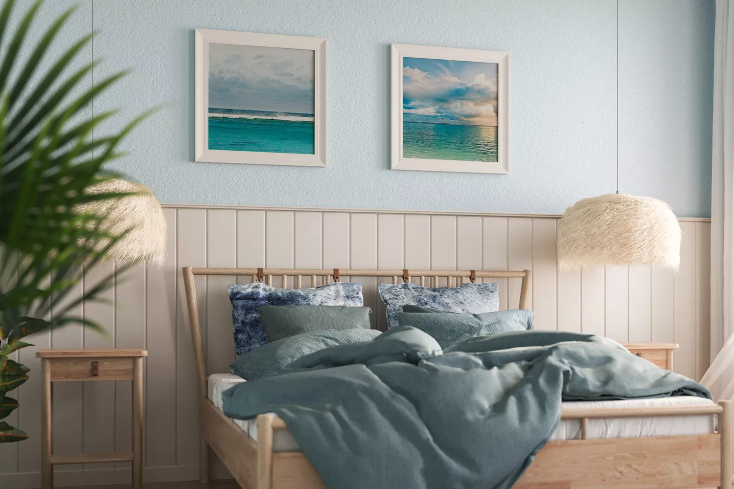
11 Calming Bedroom Paint Colors to Help You Relax and Wind Down at the End of the Day

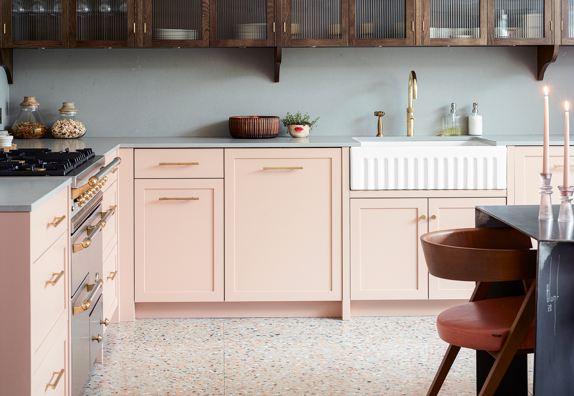
'Cook dinner feeling soothed' - the 8 most calming colors for a small kitchen
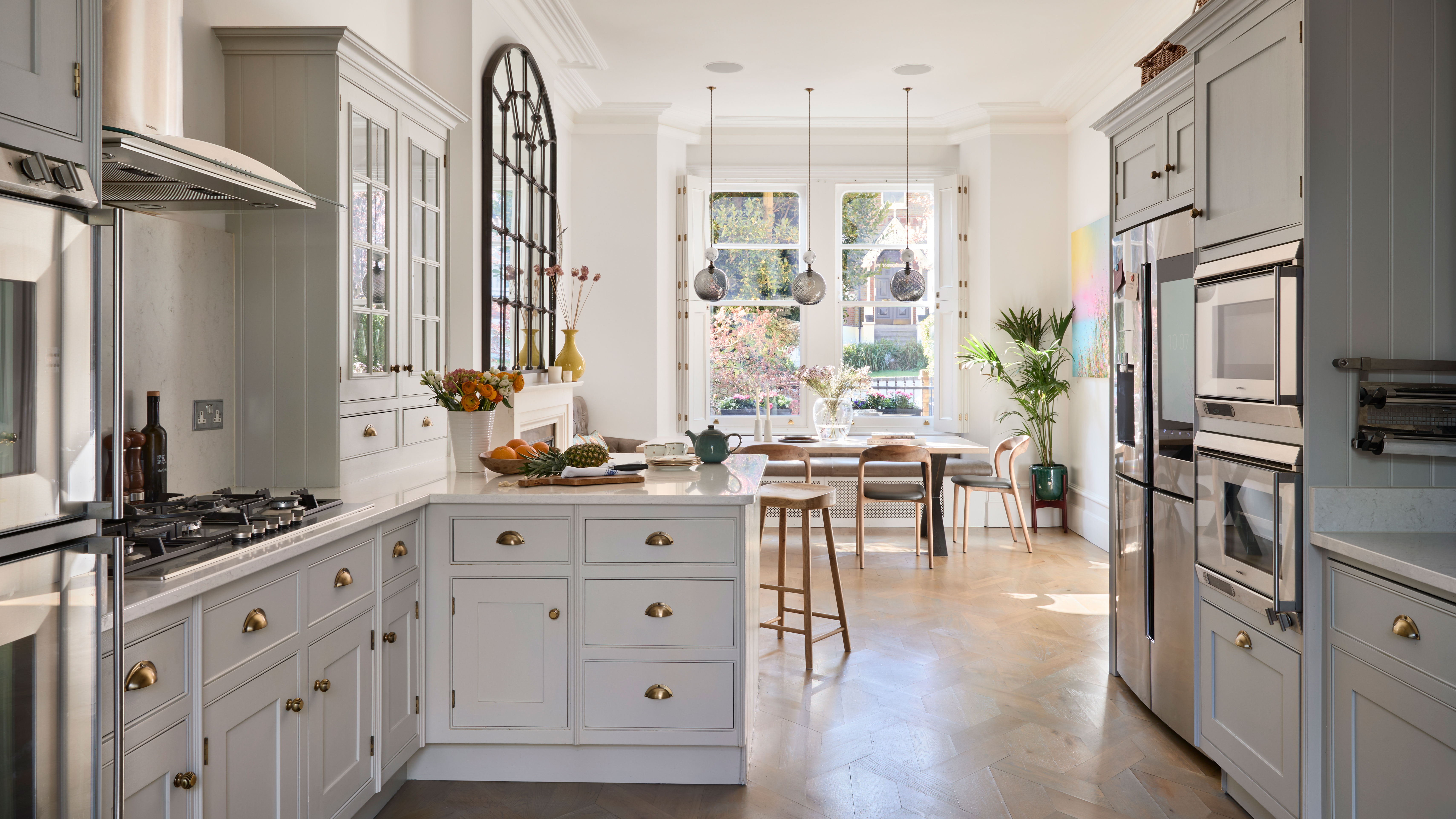
How to make a kitchen more relaxing – 12 designer tips to create a zen-like space
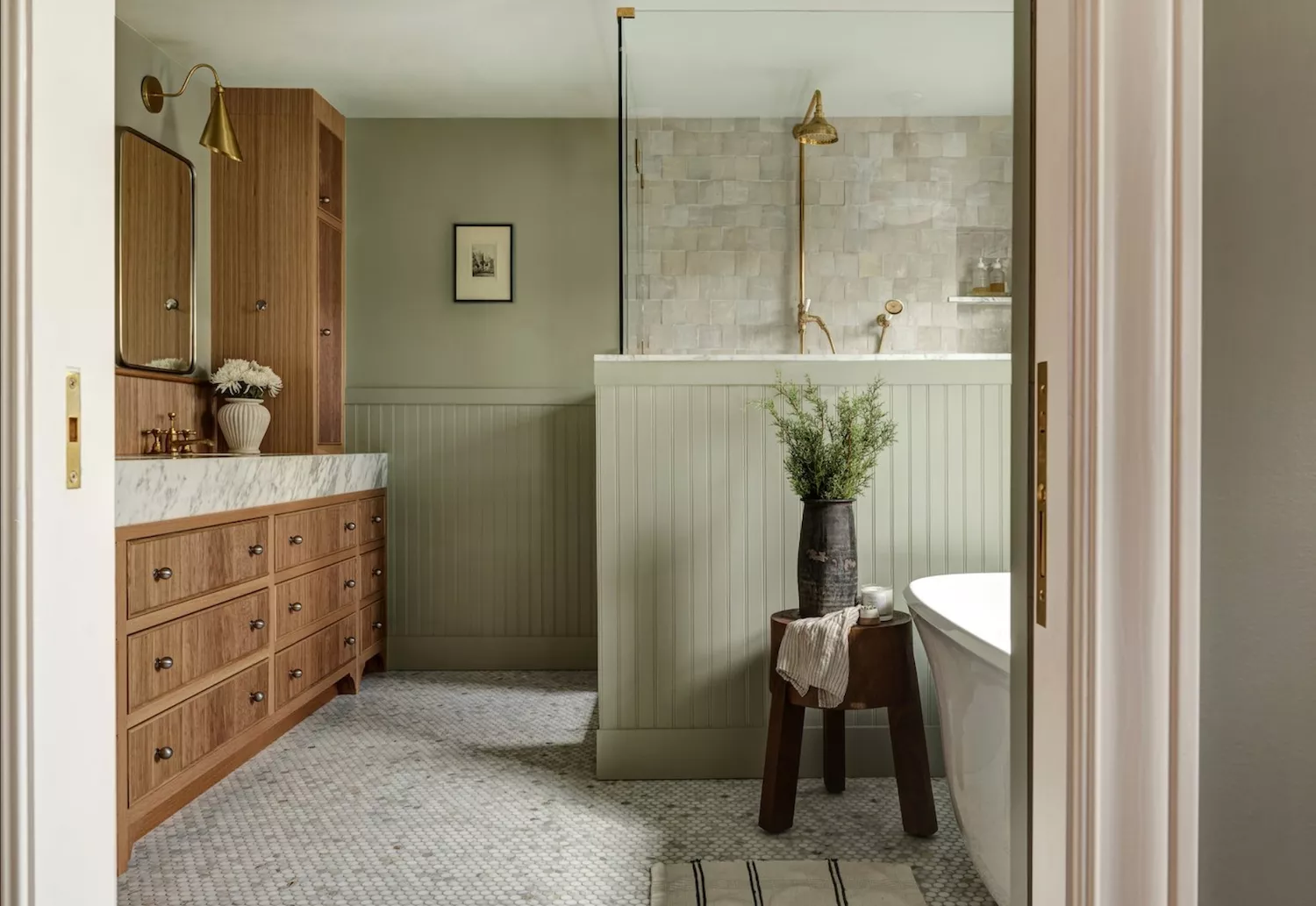
Designers Agree: These Are the Most Relaxing Paint Colors for Any Room

No-fail kitchen colour ideas: 20 pairings that just work

5 of the best feng shui kitchen colors for a relaxing space according to experts

16 Calming Paint Colors That Will Make Your Home a More Restful Place

6 Worst Colors To Paint Your Kitchen (And What To Choose Instead)
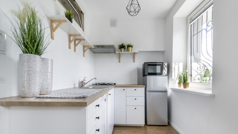
The 6 Best Cabinet Colors To Make A Small Kitchen Feel More Spacious
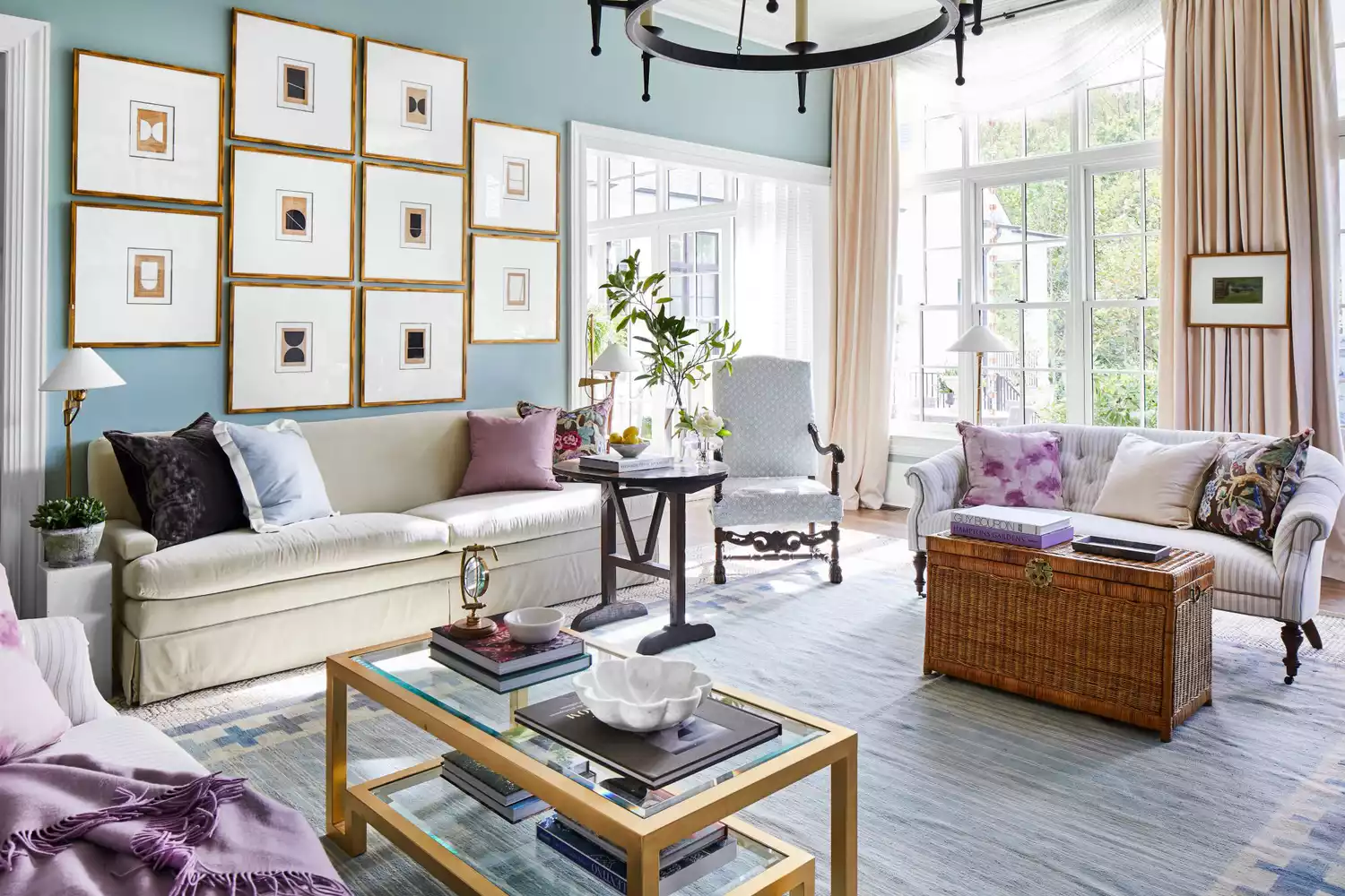
6 Calming Paint Colors Designers Swear By For A Relaxing Living Room
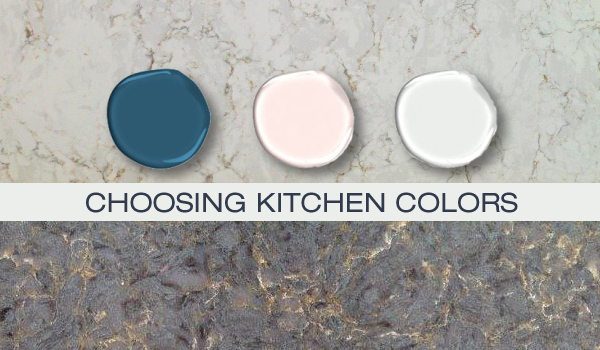
Kitchen Color Selection Tips from 5 Designers
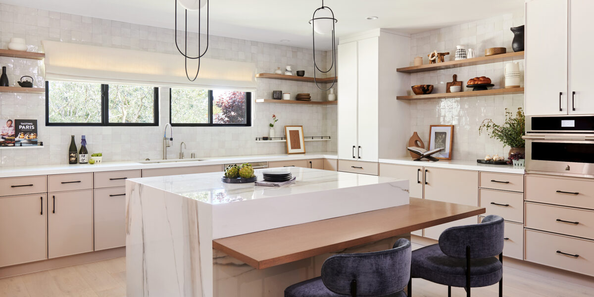
The 6 Paint Colors for Your Kitchen That Will Never Go out of Style
5 colors that will make your living room feel happier, according to interior designers
13 Calming Paint Colors Designers Use to Make Rooms Feel Soothing — And No, They're Not All Neutrals
5 colors that will make your bedroom feel calmer, according to designers
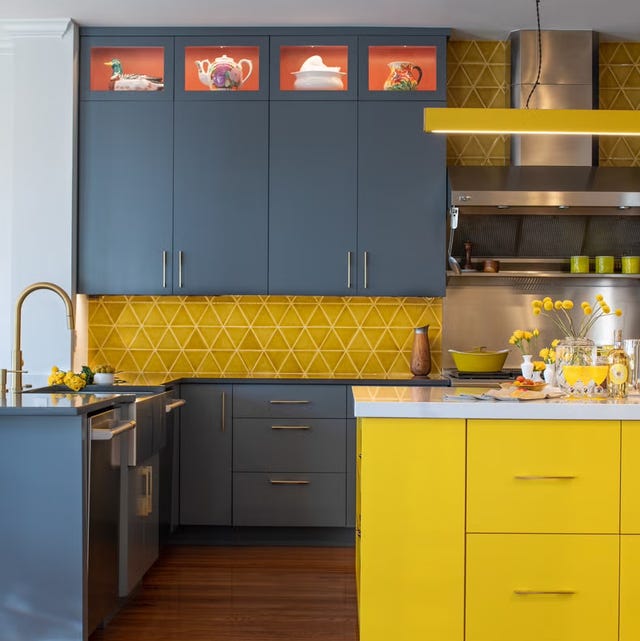
Ditch the White! Try One of These Designer-Approved Kitchen Colors

What paint colors to use to create a relaxed vibe at home