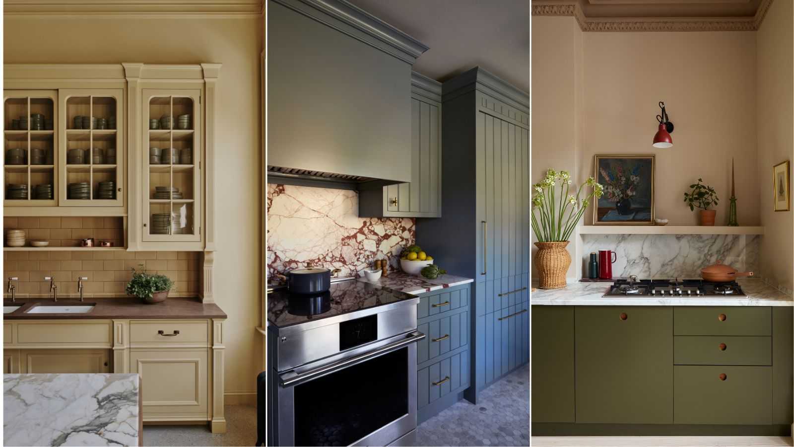
1/18
6 calming kitchen colors that will make this hardworking space instantly more serene
In an increasingly fast-paced world, the home, particularly the kitchen, is sought after as an oasis of calm. While numerous elements contribute to a serene kitchen, color plays a transformative role in setting the desired mood. The right shades, applied to walls or cabinetry, can create a soothing backdrop for this central hub of the home. Interior designers and color experts have identified several key color categories best suited for creating tranquil kitchen environments.
Anna Hill, brand director and color consultant for Fenwick & Tilbrook, emphasizes that choosing the right color is essential for establishing a calming ambiance, suggesting soft blues, greens, grays, pinks, and earthy tones. Whether undertaking a complete kitchen redesign or simply refreshing surfaces, these calming colors offer inspiration.
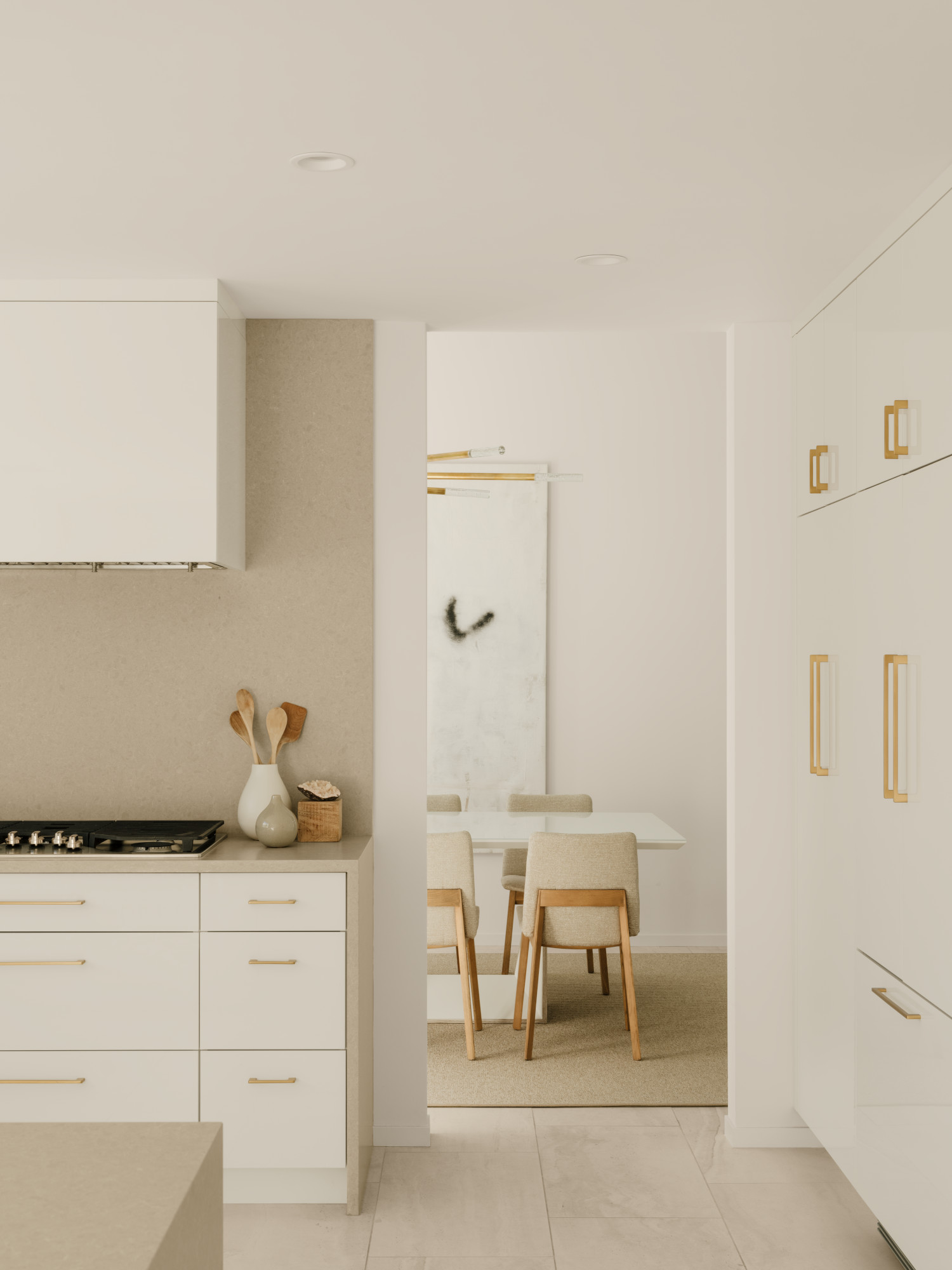
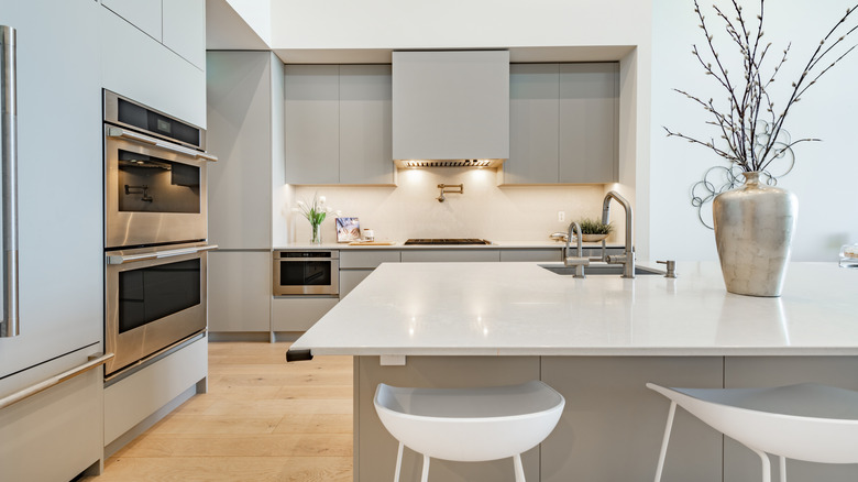
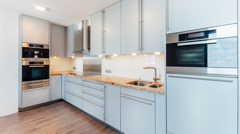
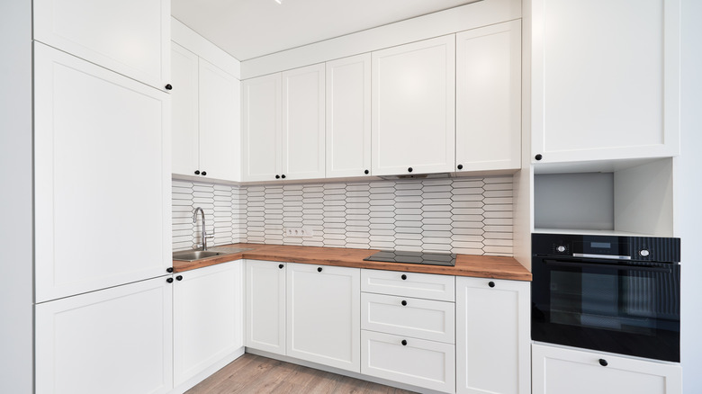
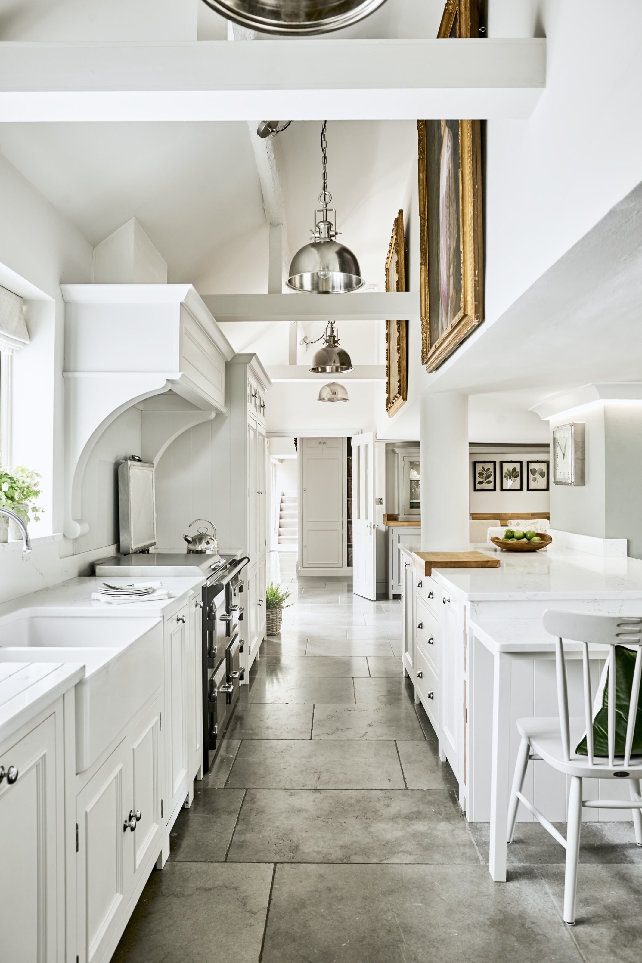
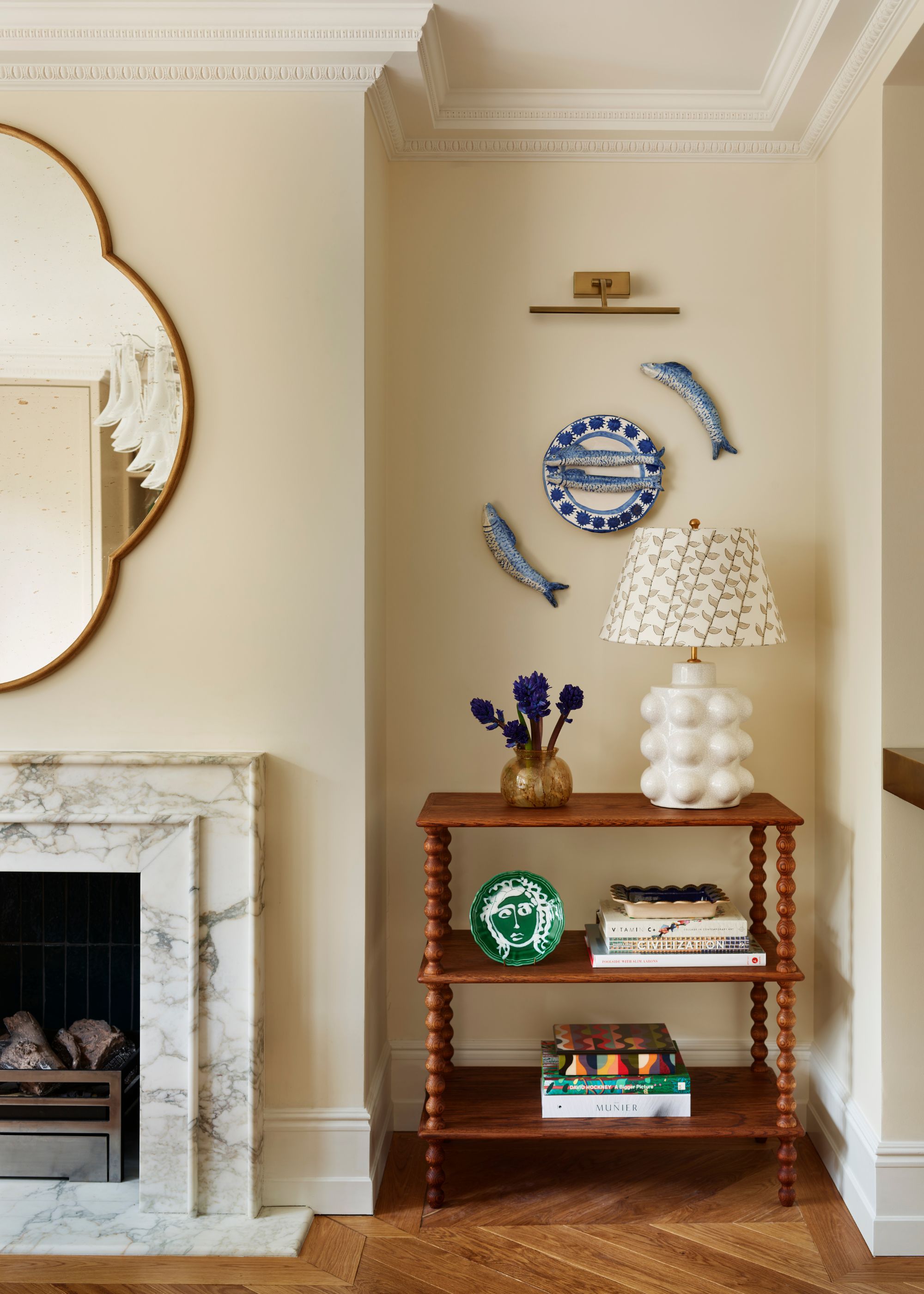
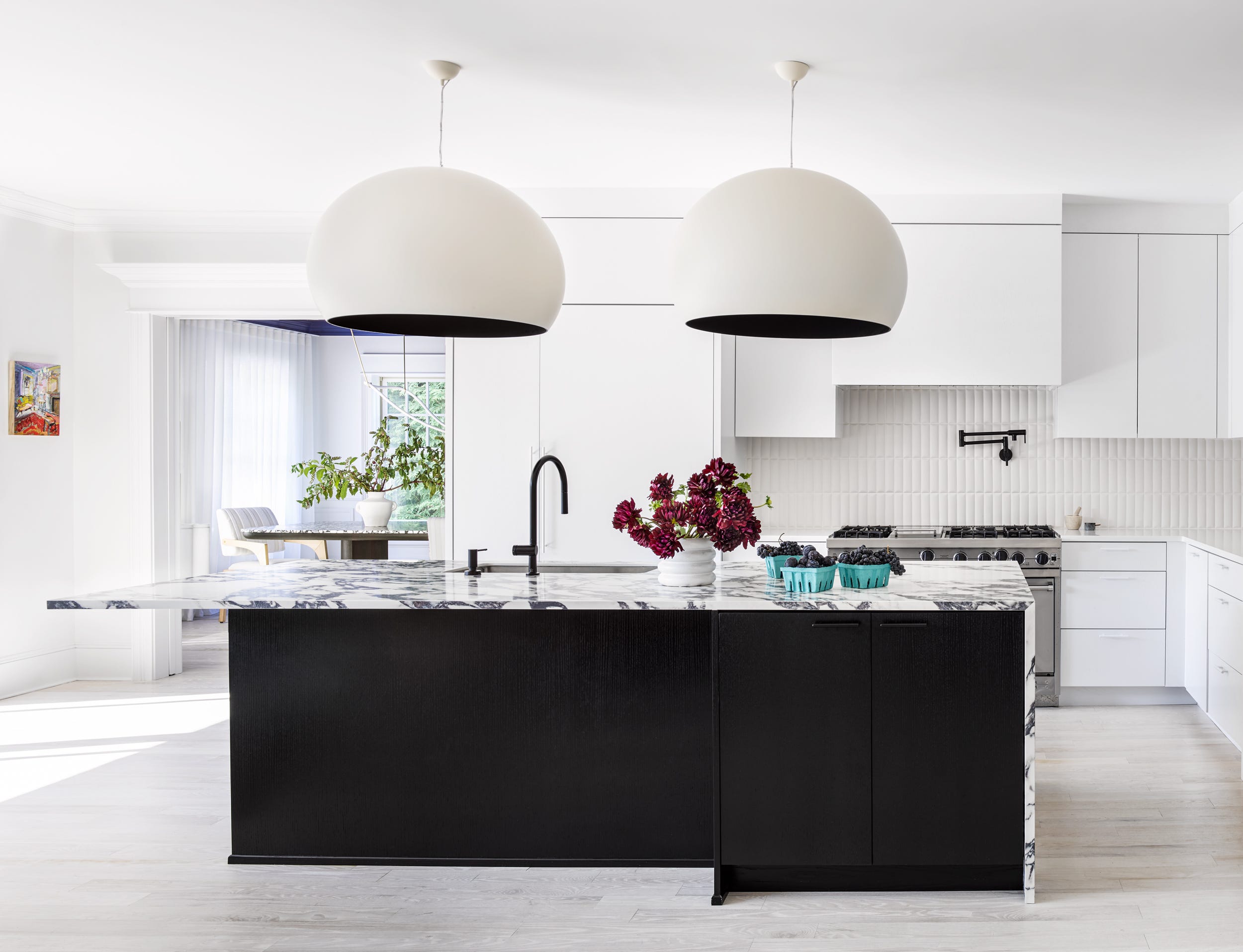
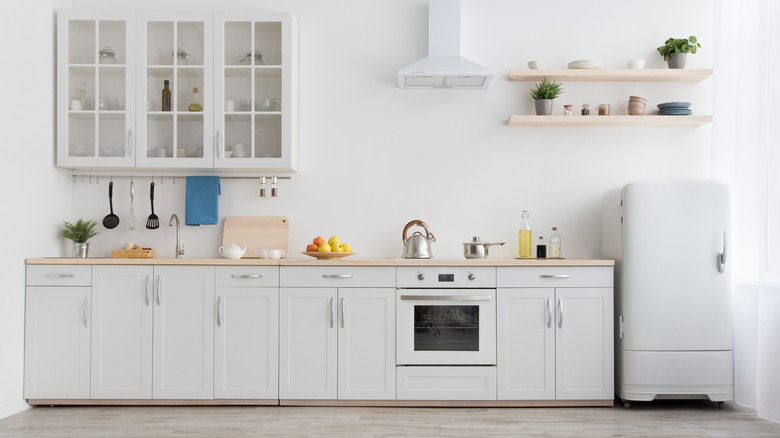
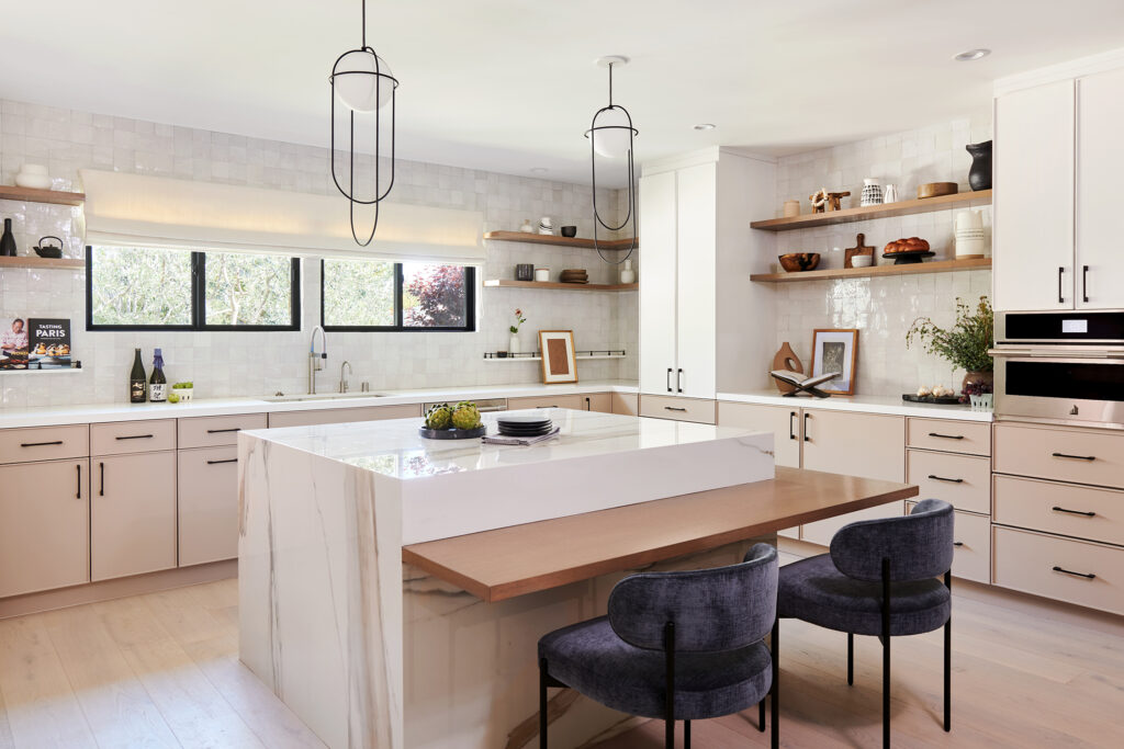
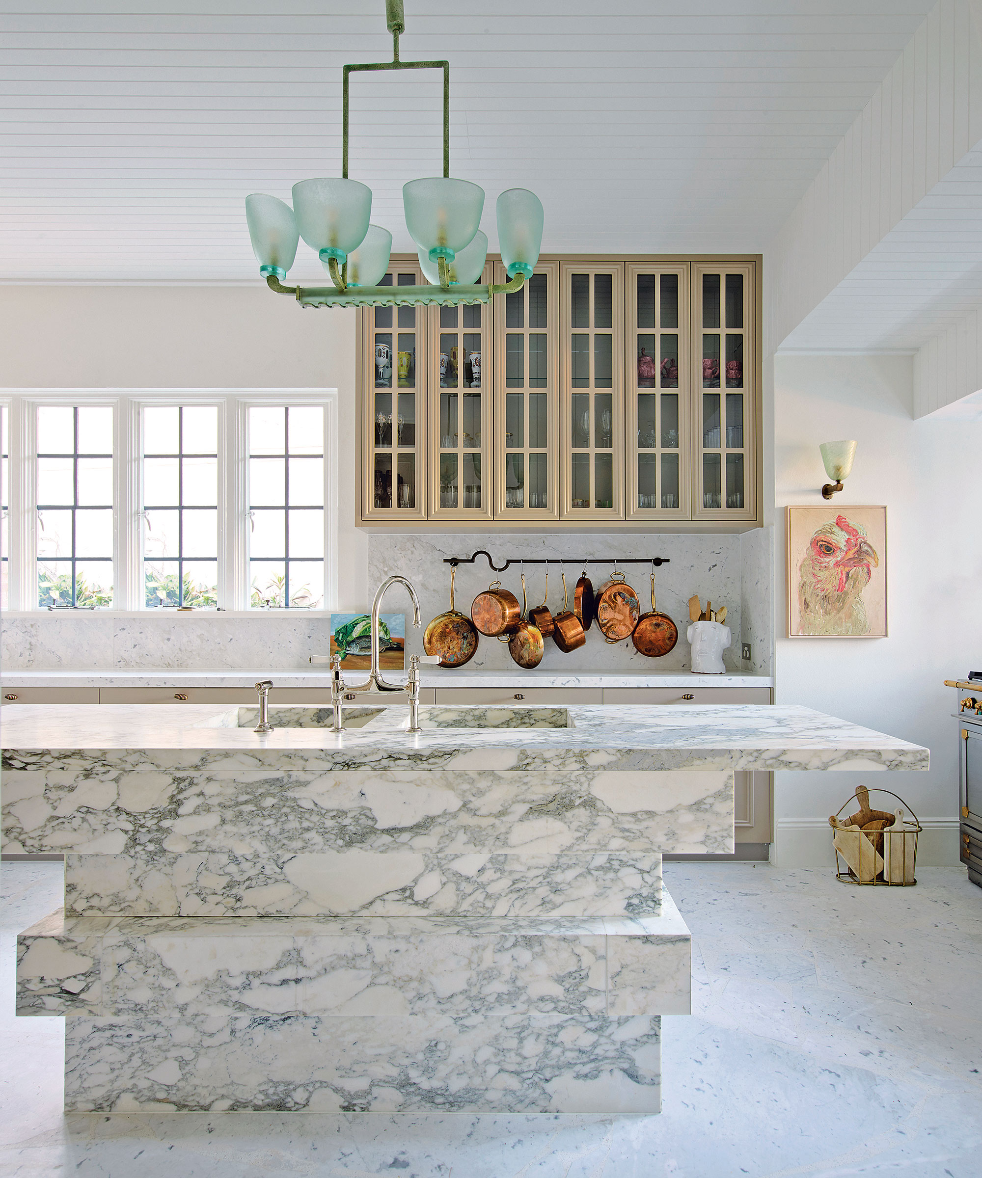
Warm off-whites and neutrals are consistently popular for their timeless quality. Designers caution that not all whites are the same, and the ideal shade depends on factors like room orientation, light levels, and other materials. Allison Babcock favors Benjamin Moore's 'Calm' for its warm gray undertone, which provides a softer, cozier feel. For south-facing rooms, a more neutral warm white like Benjamin Moore's 'Swiss Coffee' is recommended, as it avoids obvious yellow or pink undertones. Emily Kantz of Sherwin Williams highlights 'Sunbleached SW 9585' for its soothing warmth and compatibility with various design styles. Beyond whites, warm neutrals such as beige, oatmeal, and stony shades contribute to a tranquil atmosphere, acting as a strong foundation for diverse interior styles, as noted by Bailey Oates of Earthborn.
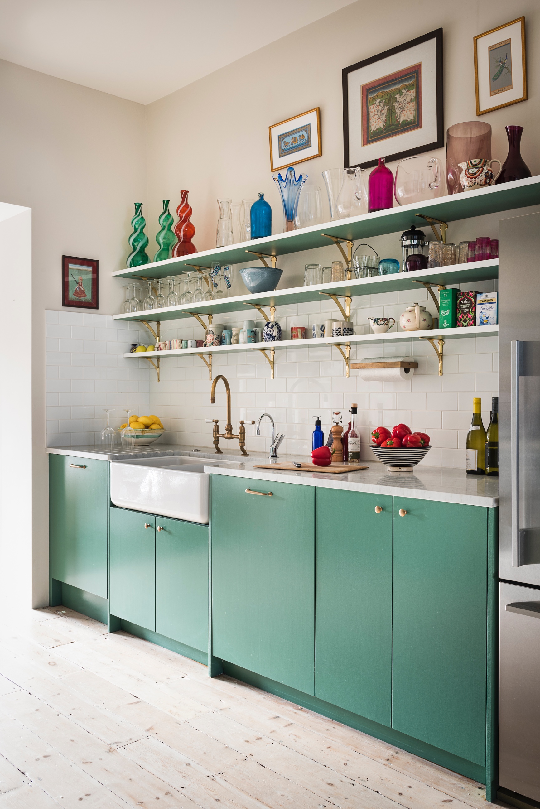
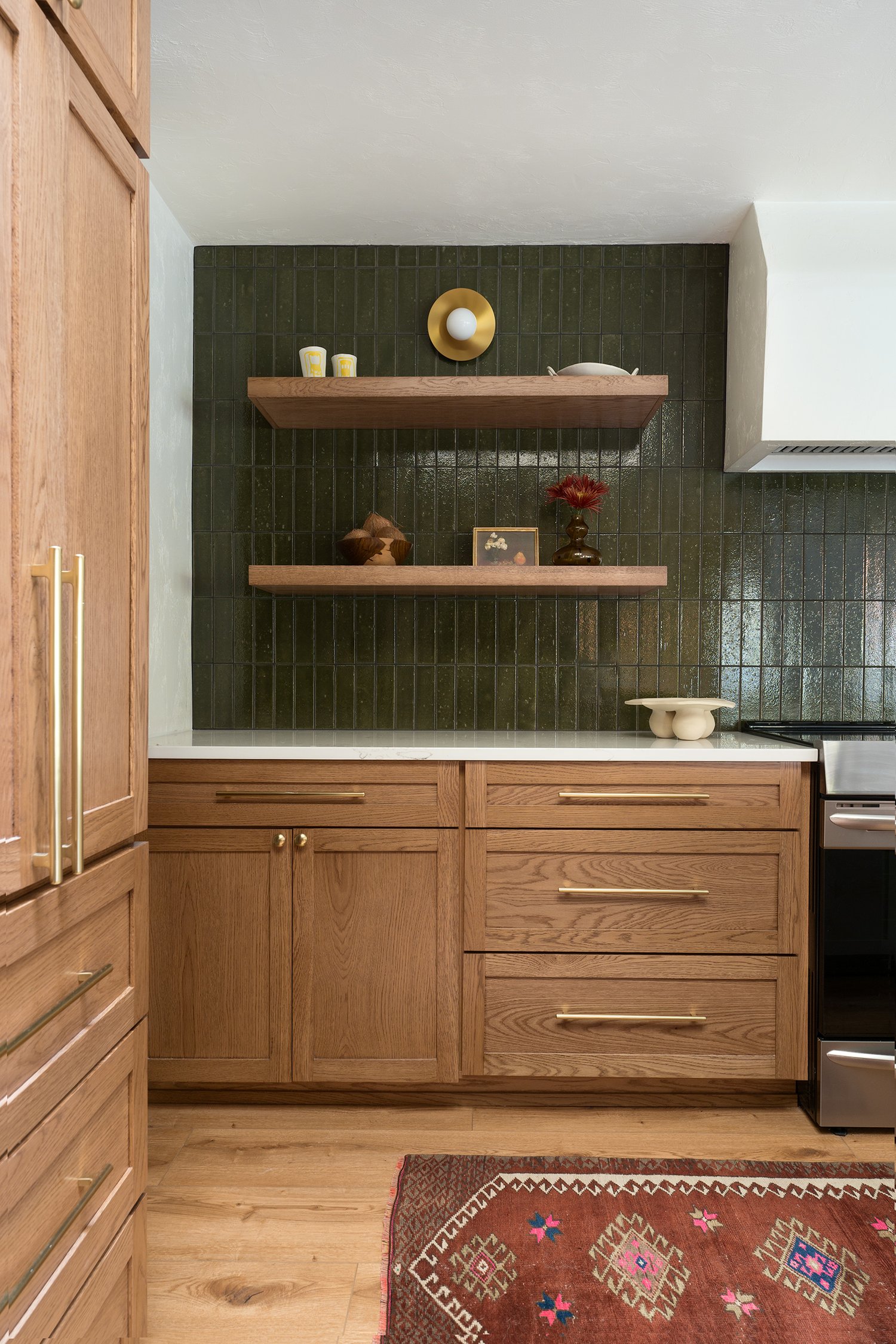
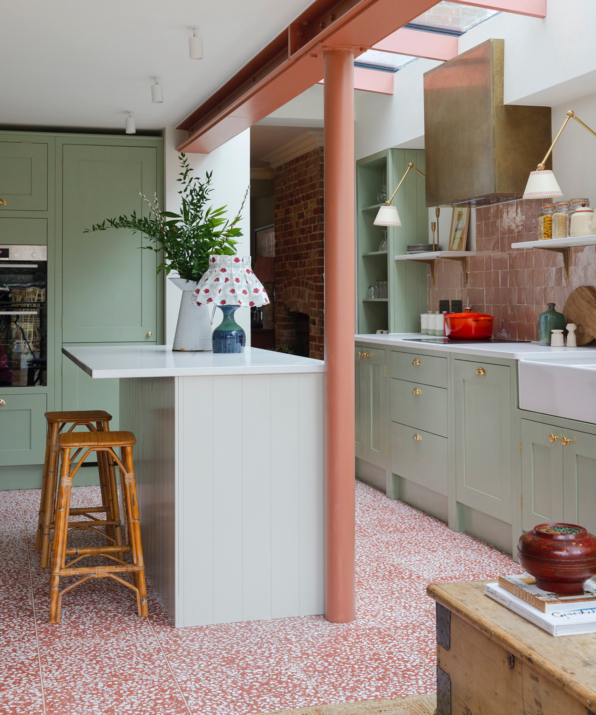
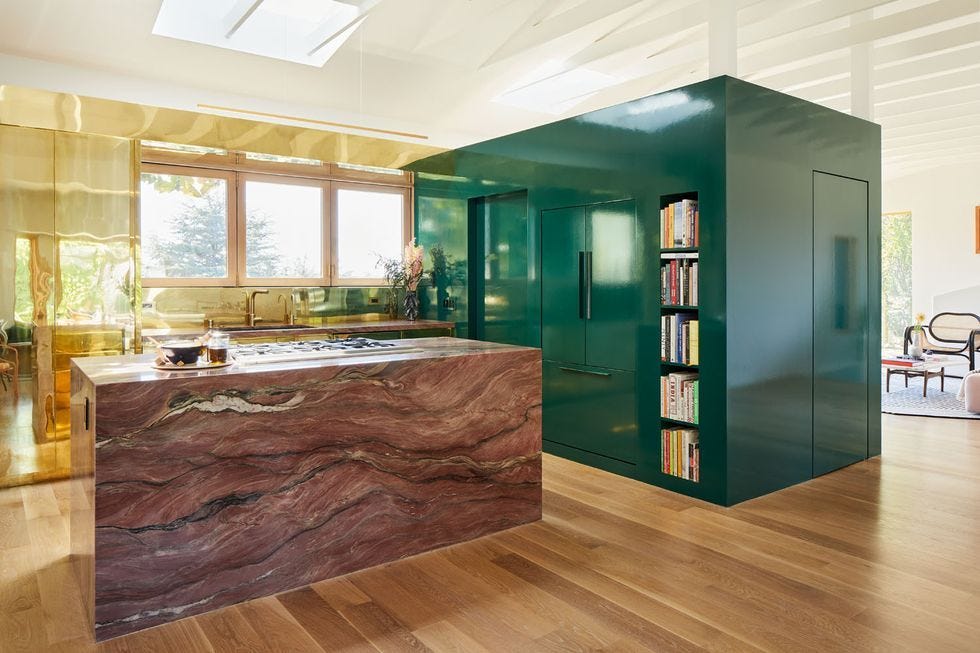
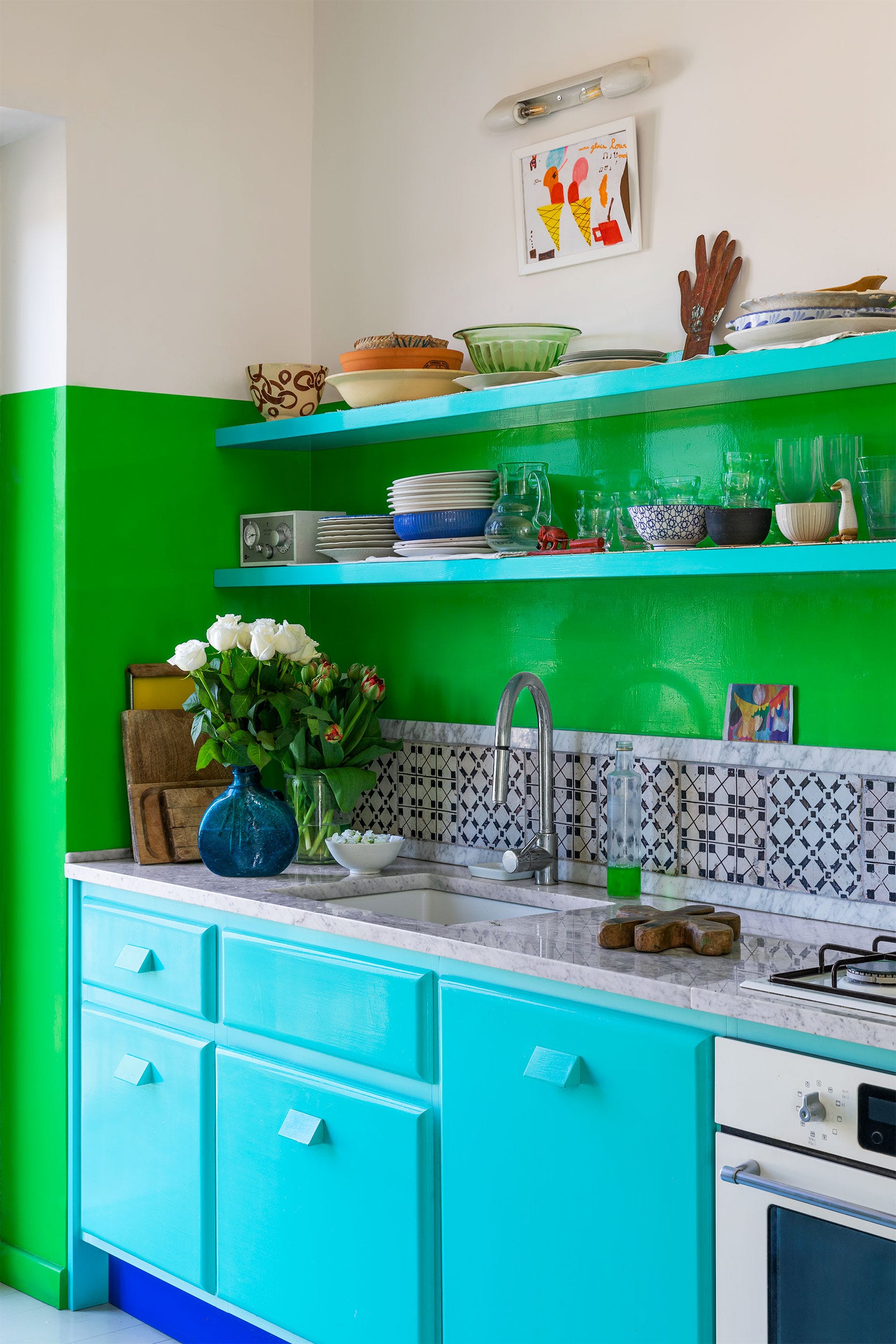
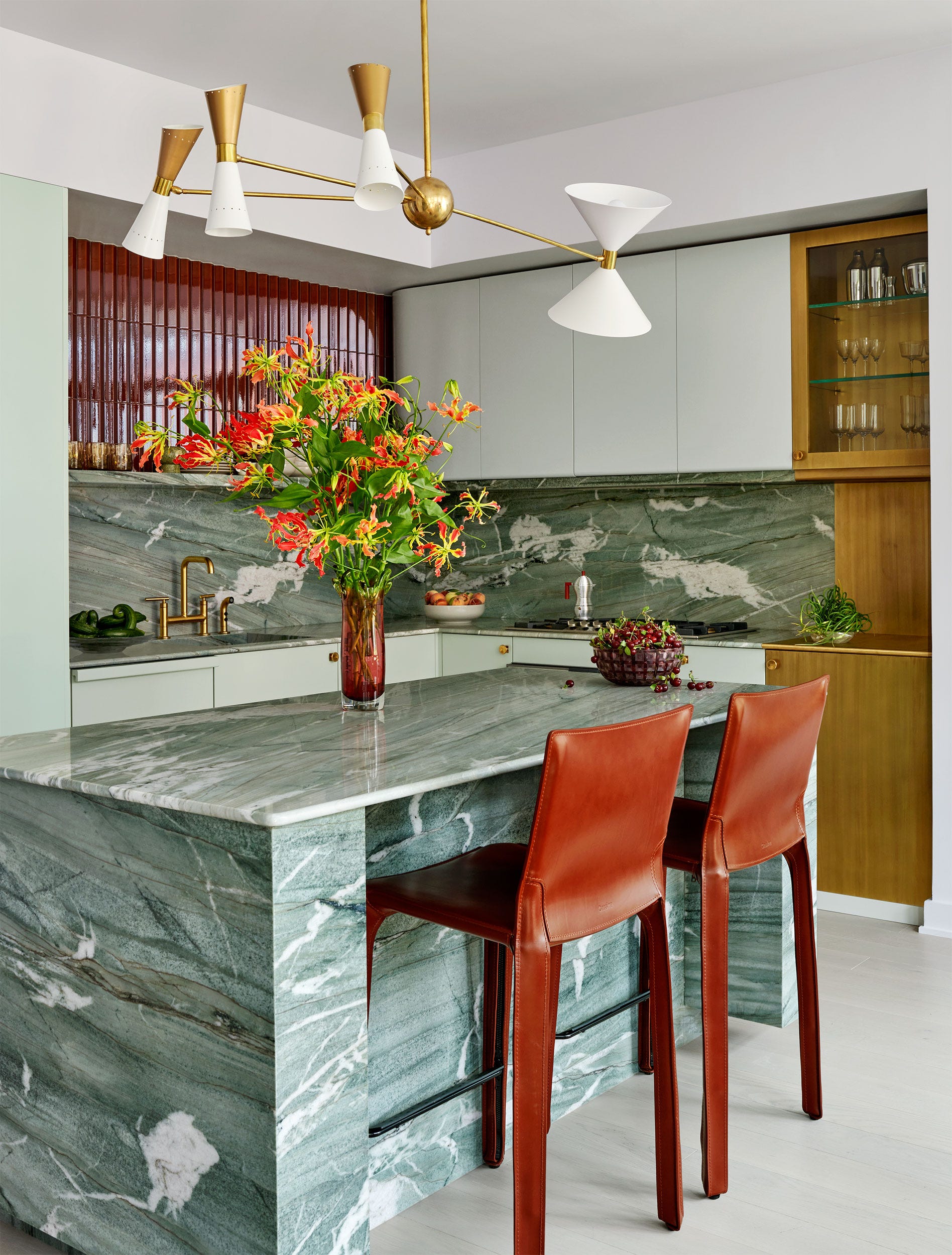
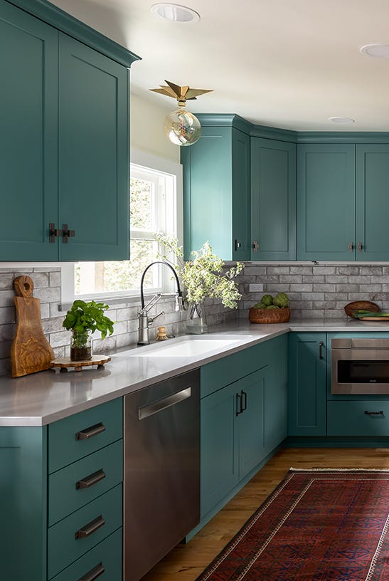

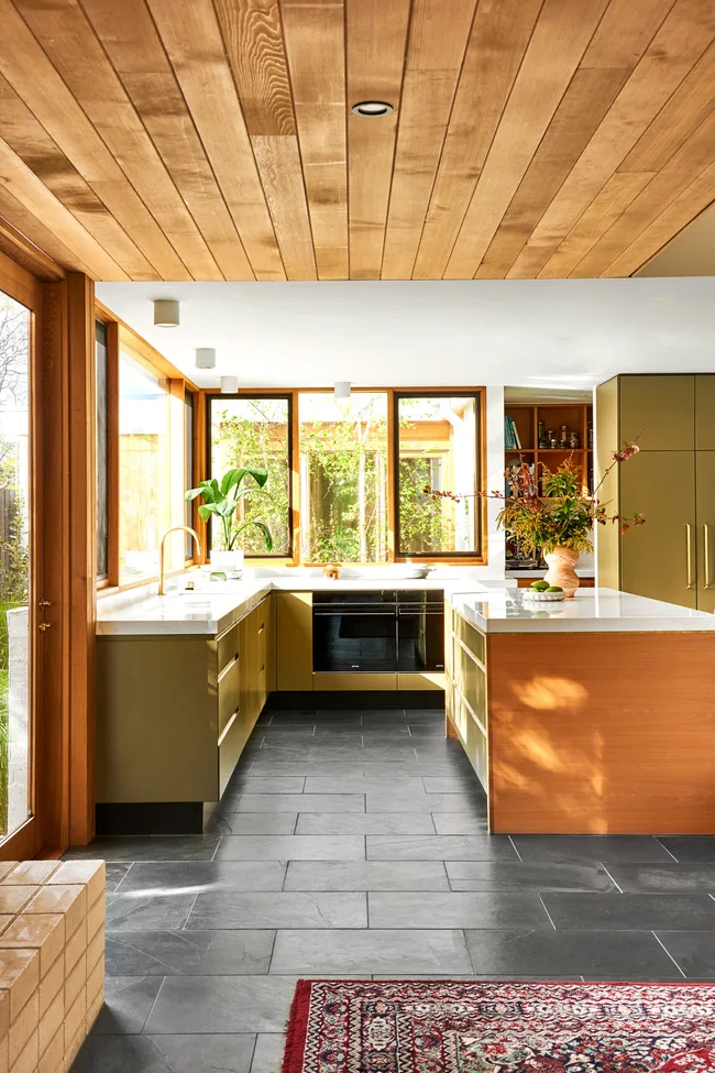
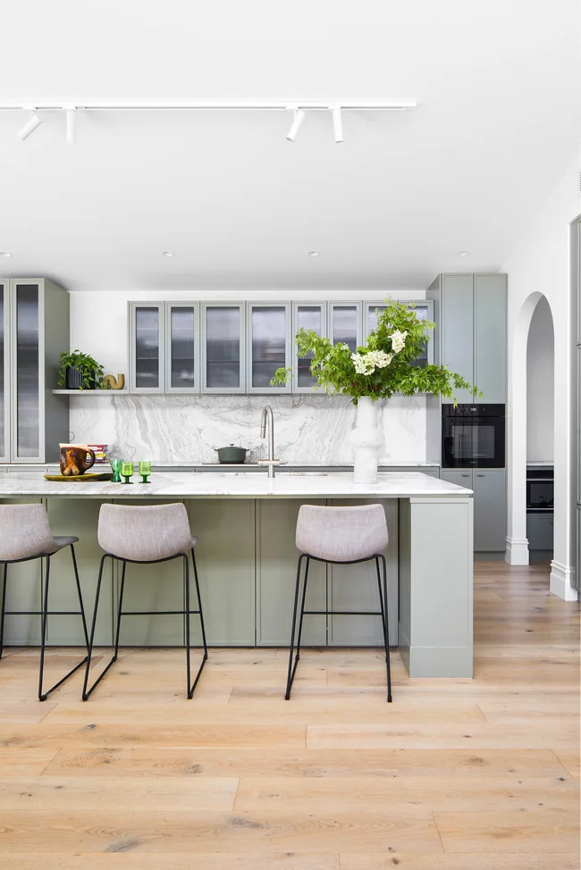
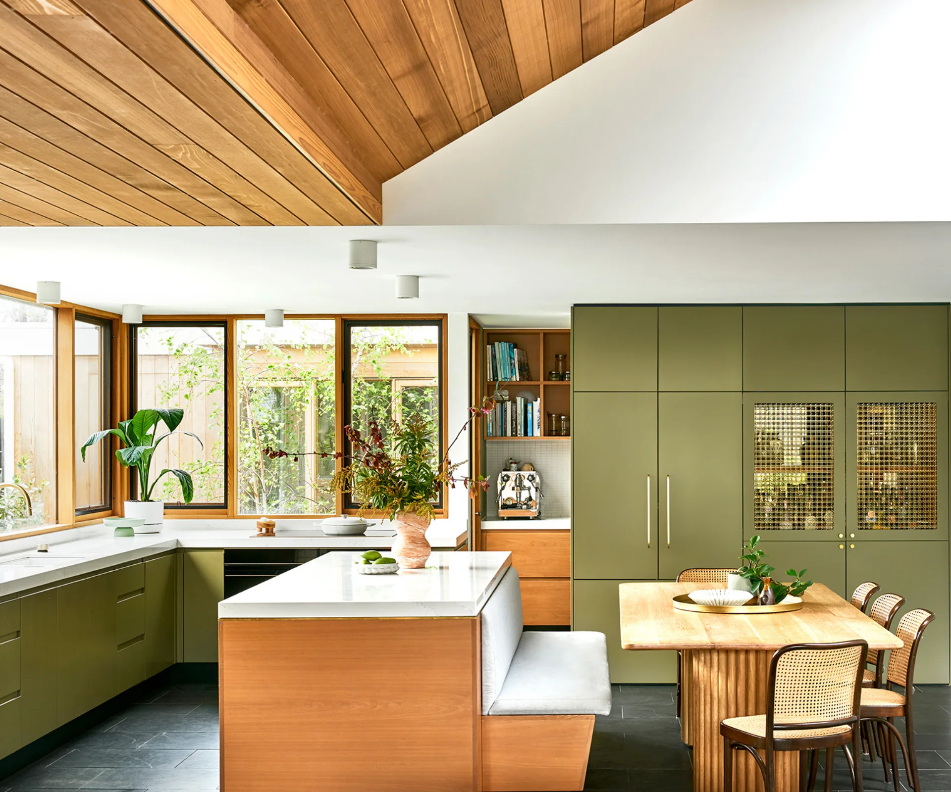
Soothing greens, reminiscent of nature, are a perennial favorite due to their calming and healing properties. Ruth Mottershead of Little Greene explains that greens are versatile, offering varied undertones and depths, making them a natural extension of the outdoors within a kitchen. Custom earthy greens, as used by Holly Vaughan of Vaughan Design & Developments, can blend seamlessly with natural landscapes when paired with organic materials like timber worktops and terracotta floors. For those cautious about bold color, a two-tone scheme with color limited to base cabinets and neutral walls or wall cabinets can introduce subtle color while maintaining calm. Kimberley Harrison Interiors exemplifies this, using soft green and warm walnut to create a serene, nature-connected atmosphere.
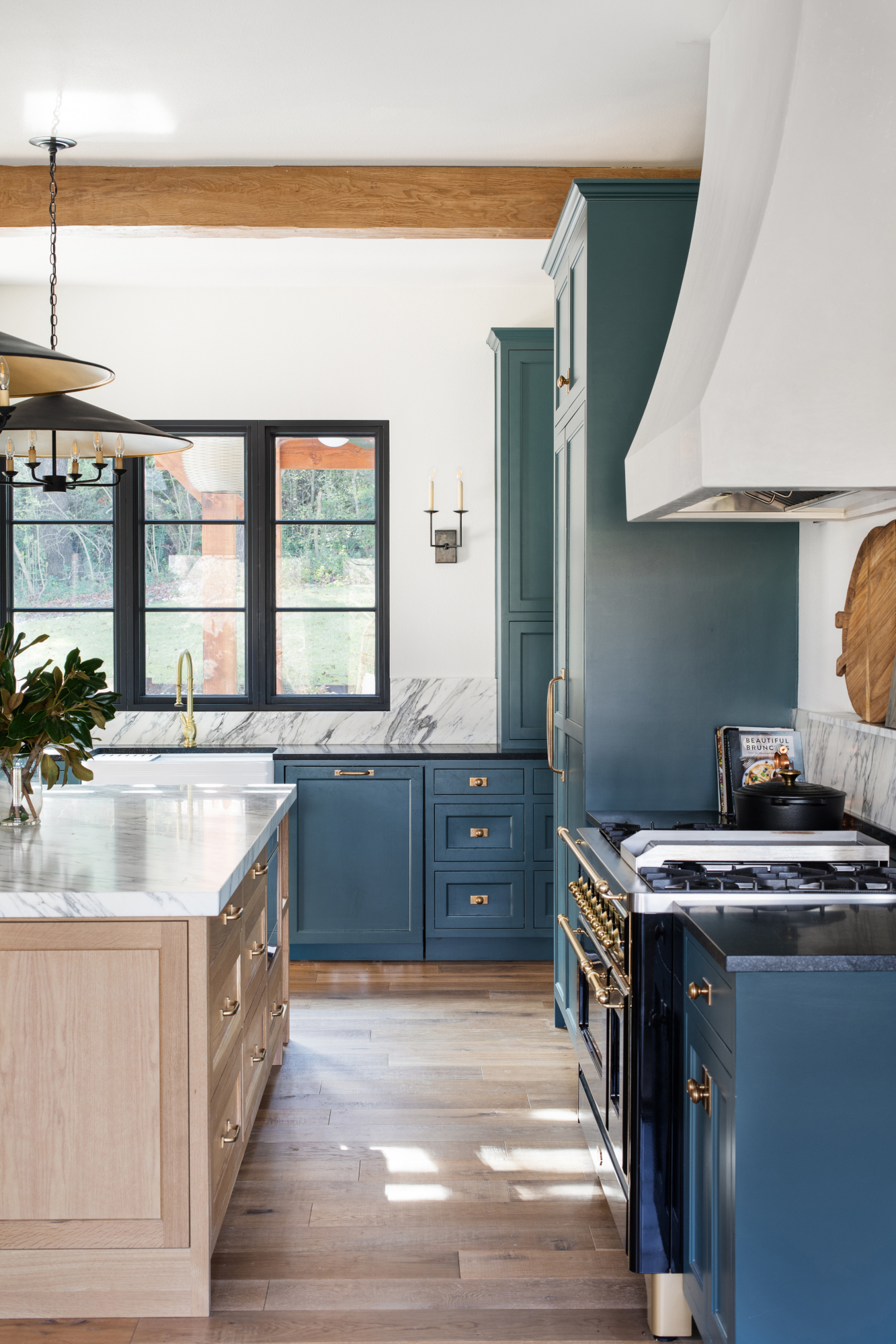
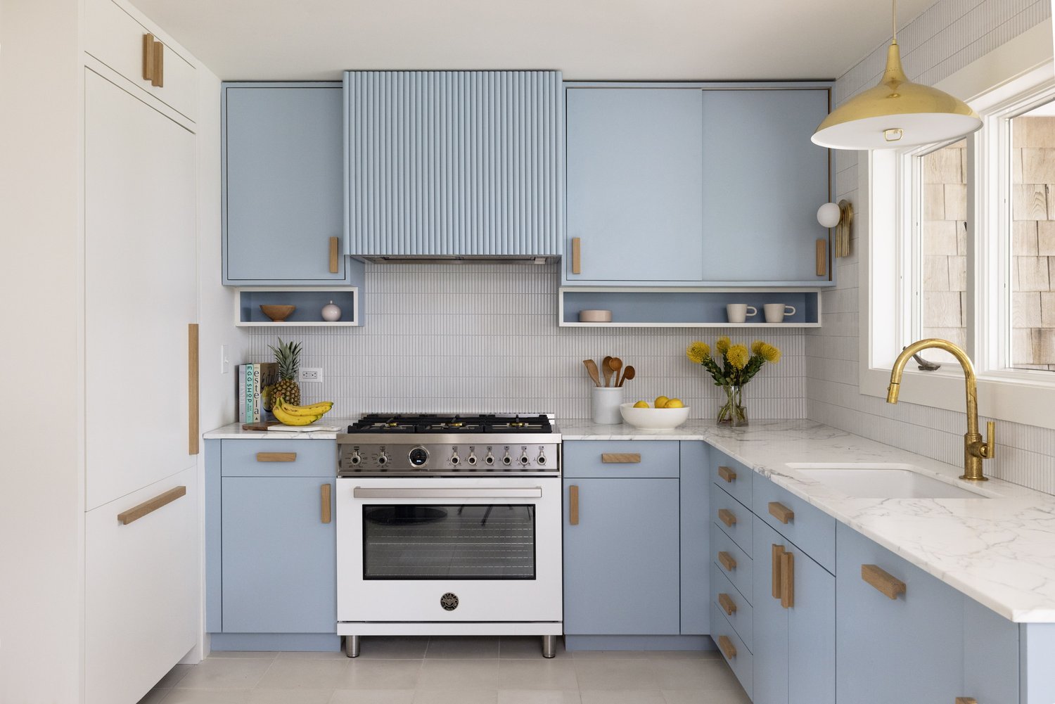
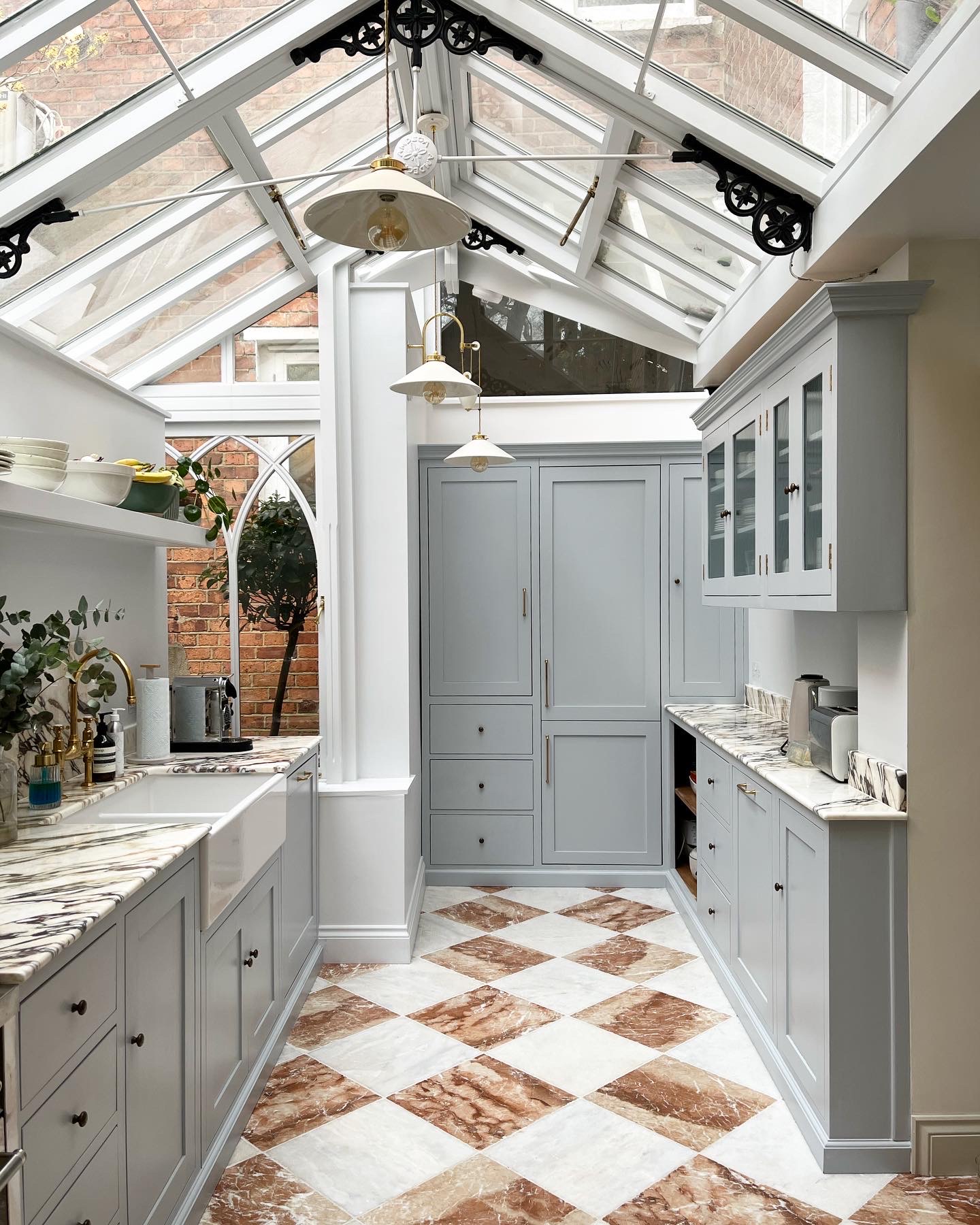
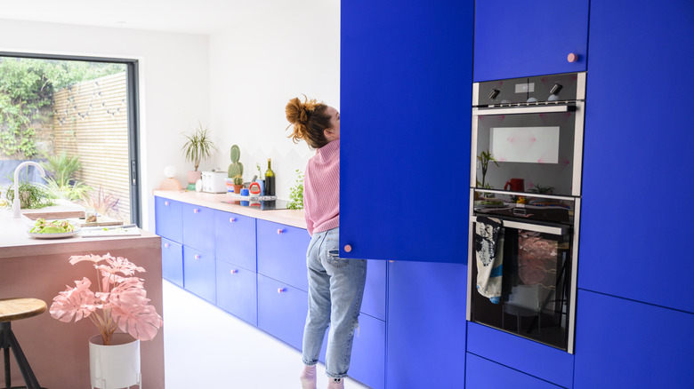
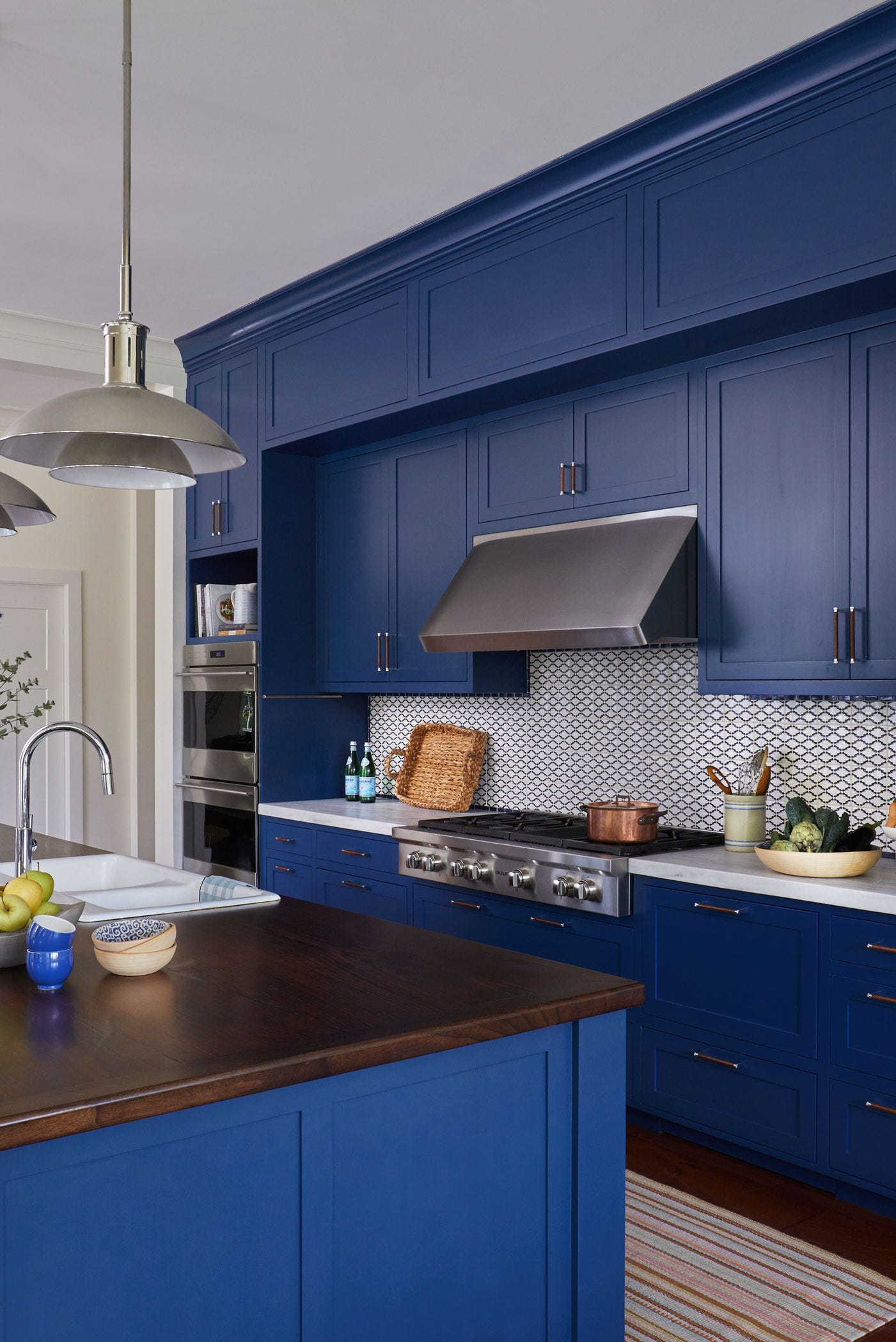
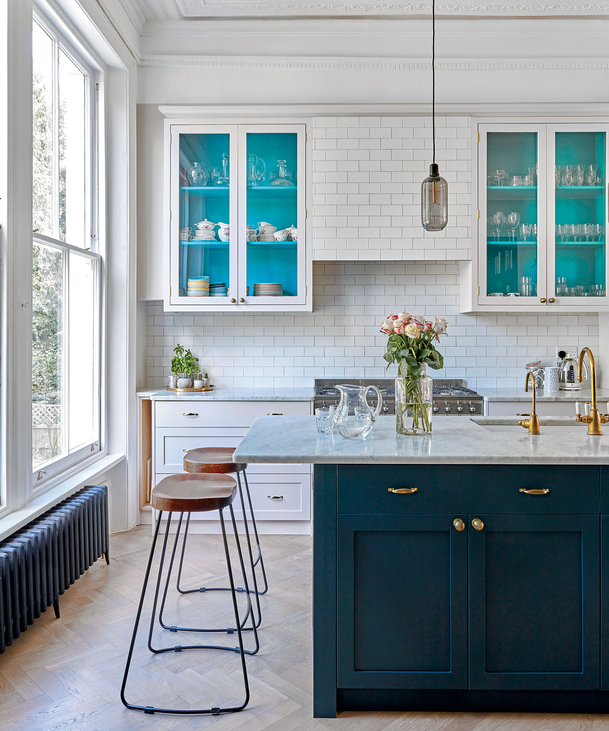
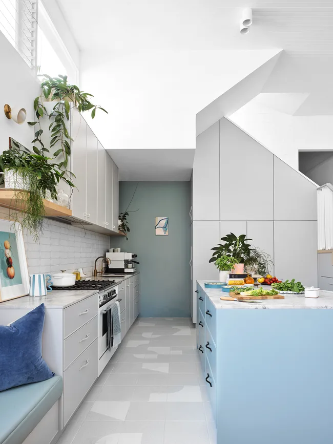
Soft blues, evoking calm sea views and clear skies, are another staple for soothing spaces. Emily Arthur of Isla Porter points to icy blue or sky blue kitchens for a relaxed luxury feel, suitable for brightening small kitchens or enhancing large ones. Darker, smoky blues, like Isla Porter's 'The Mood,' can create a sense of coziness. Anna Hill mentions pale aqua or powder blues for their peaceful and tranquil effect. Sherwin Williams' 'Upward SW 6239,' a gentle light blue, promotes a minimalist aesthetic, fostering mindfulness and simplicity when combined with other neutrals and natural materials.
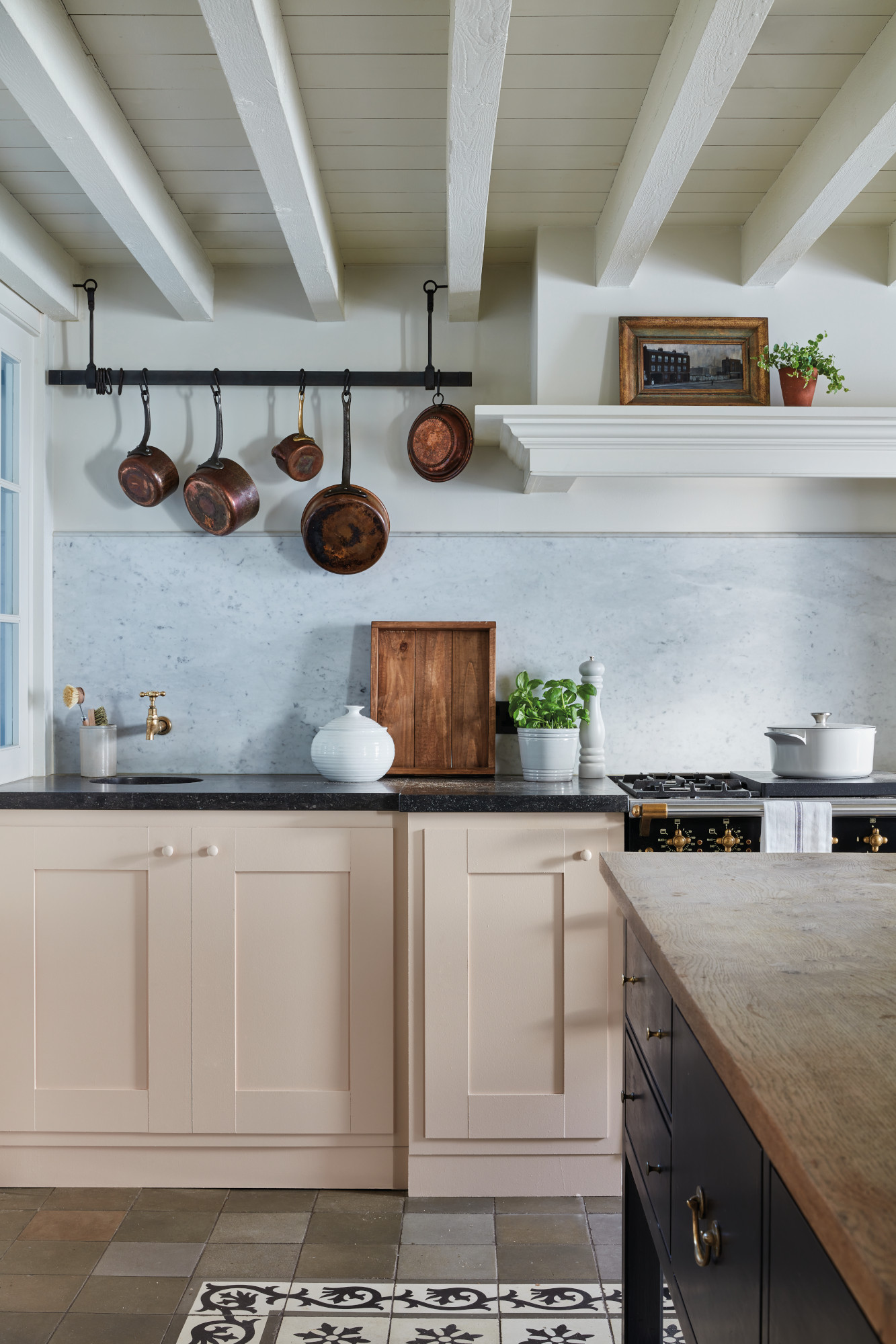
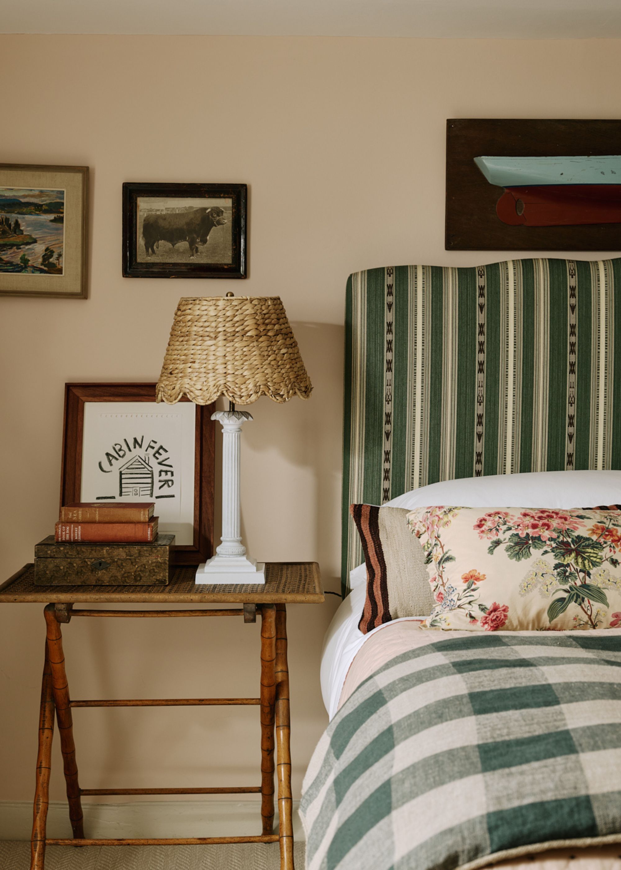
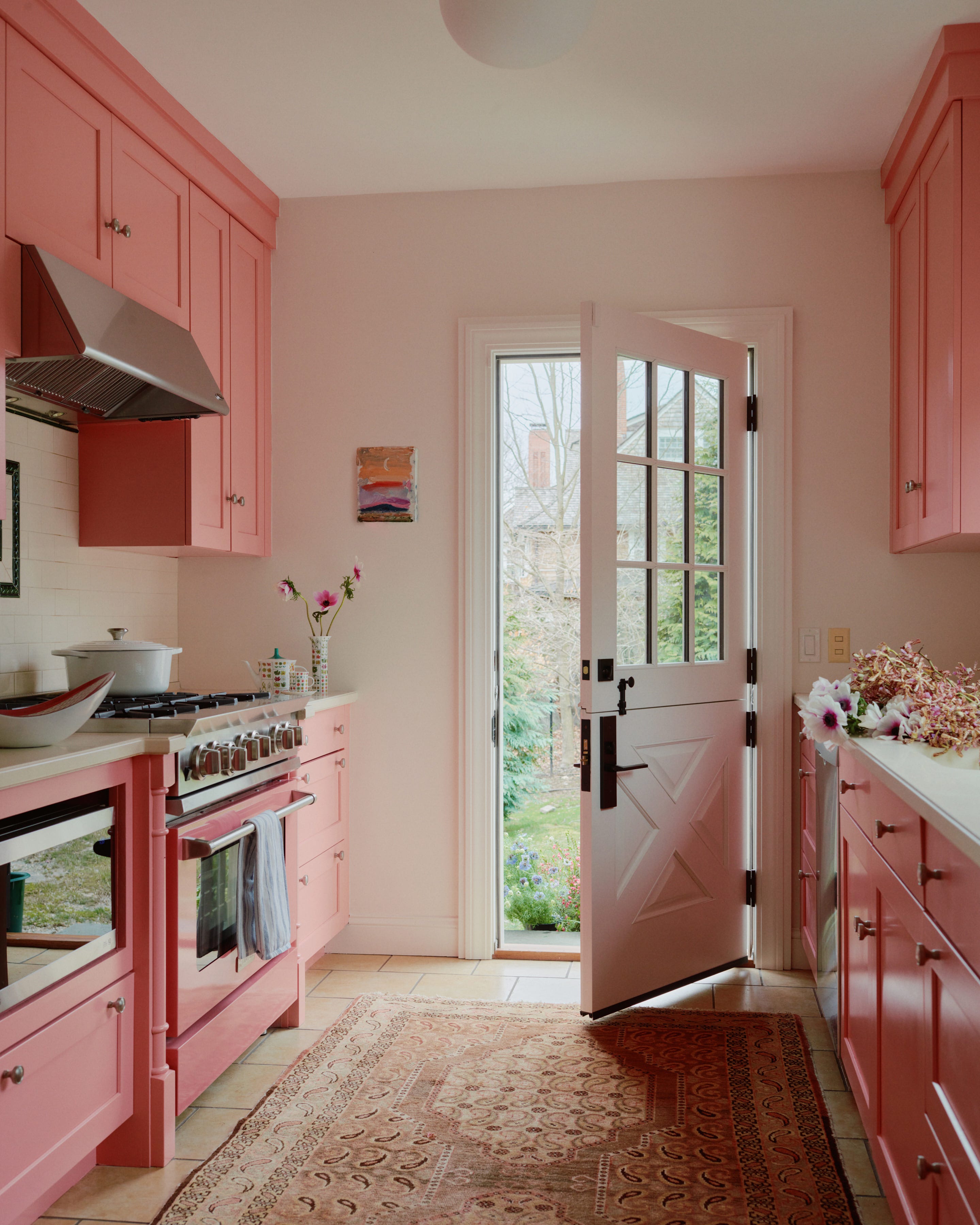
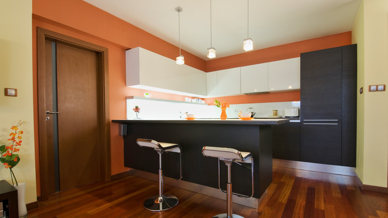
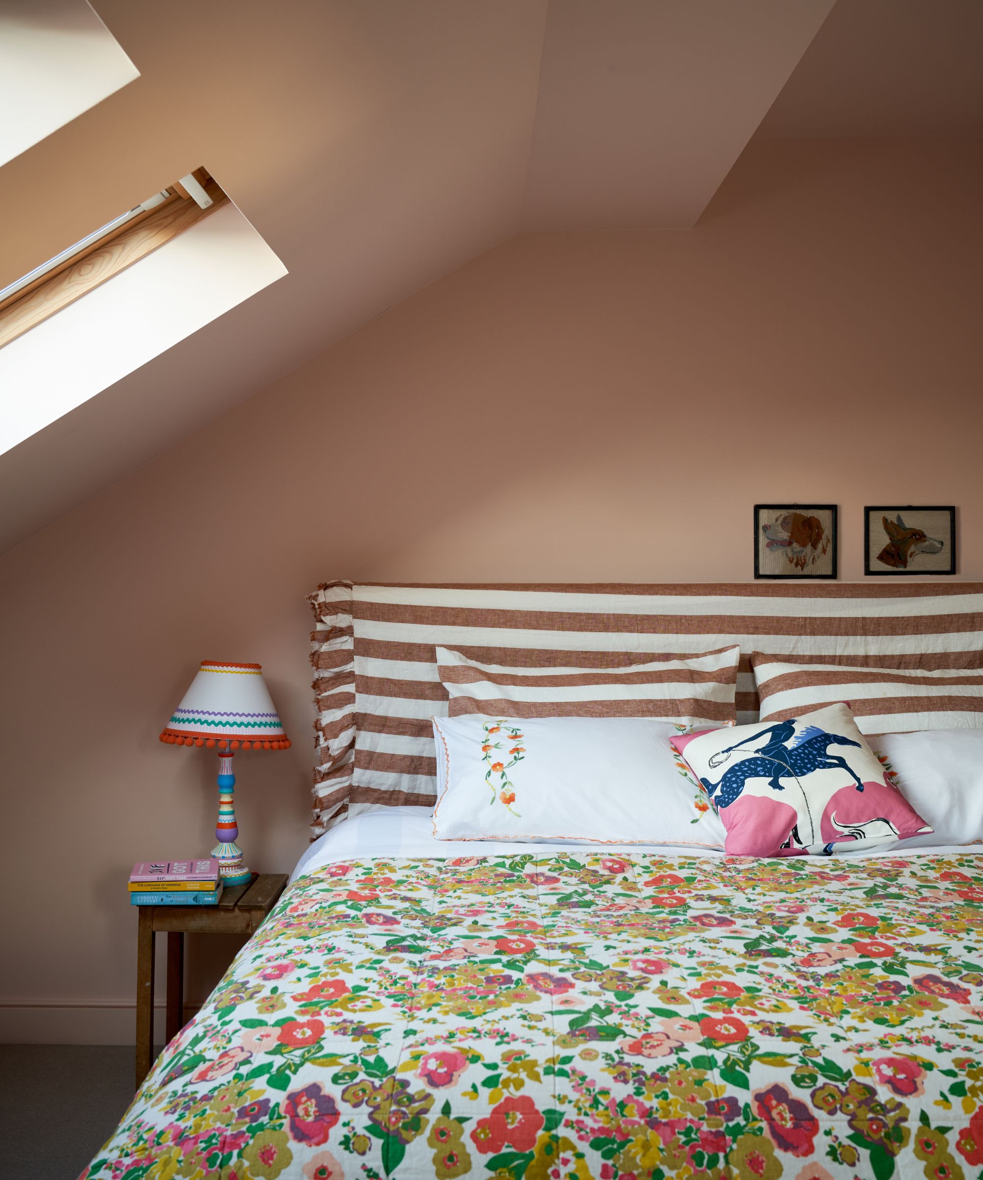
Pale pink and plaster tones have maintained their popularity, offering comforting and nostalgic vibes. These soft, chalky pinks are often treated as neutrals by designers, effectively softening hard kitchen surfaces and bringing warmth. Patrick O’Donnell of Farrow & Ball notes their versatility for any room, functioning as a flattering wall color or a calming kitchen scheme. Laura Williams' London townhouse demonstrates how a two-tone scheme with plaster pink walls and an olive green ceiling can create depth and warmth. Penrose Tilbury's kitchen featuring Edward Bulmer's 'Jonquil' pink walls and Devol cabinets in 'Mushroom' illustrates how warm pinks can provide a relaxing, rather than purely functional, kitchen space.
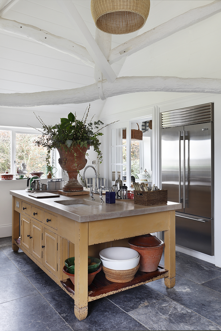
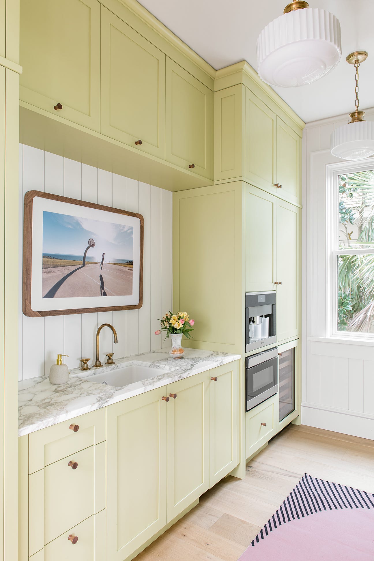
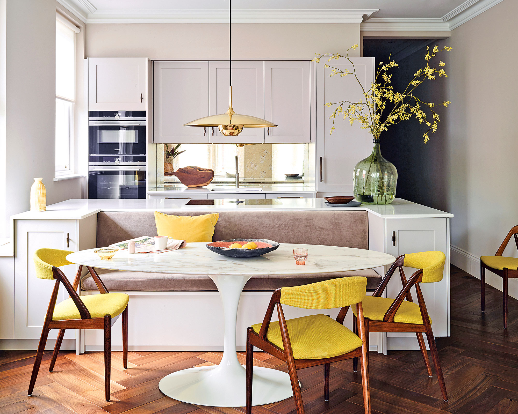
Mellow yellows have gained popularity, bringing an uplifting yet comforting presence to kitchens. Ruth Mottershead observes a desire for nurturing, easy-to-scheme colors that provide serenity. Artichoke's use of Farrow & Ball’s 'Hay' in a color-drenched kitchen exemplifies how mellow yellows can create a warm and dramatic, yet calming, environment.
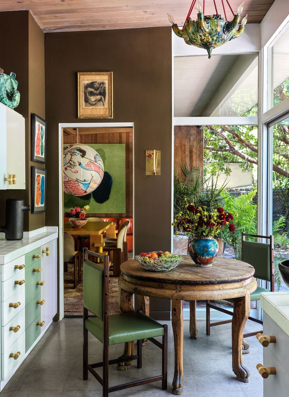
Finally, rich browns are emerging as a preferred deep color for kitchens, replacing charcoal grays. Al Bruce of Olive & Barr anticipates a shift towards atmospheric palettes, with browns adding sophistication and cocooning warmth. Emily Kantz highlights Sherwin Williams' 'Clove SW 9605' for its grounded, cozy atmosphere and connection to nature, promoting a Zen-like space. Holly Baughan emphasizes that earthy browns, like green, originate from nature and offer timeless warmth and relaxation.
Ultimately, creating a calming kitchen involves selecting nature-inspired color schemes. Soft greens, blues, warm off-whites, and deep earthy shades impart serenity through their familiarity and soothing qualities, ensuring a timeless aesthetic that will not quickly become outdated.
#CalmingKitchenColors #InteriorDesign #KitchenColorIdeas #NeutralKitchens #GreenKitchens #BlueKitchens #PinkKitchens #YellowKitchens #BrownKitchens #CalmingKitchenColors #InteriorDesign #KitchenColorIdeas #NeutralKitchens #GreenKitchens #BlueKitchens #PinkKitchens #YellowKitchens #BrownKitchens
0 comment in total
 No comments yet
You may also like
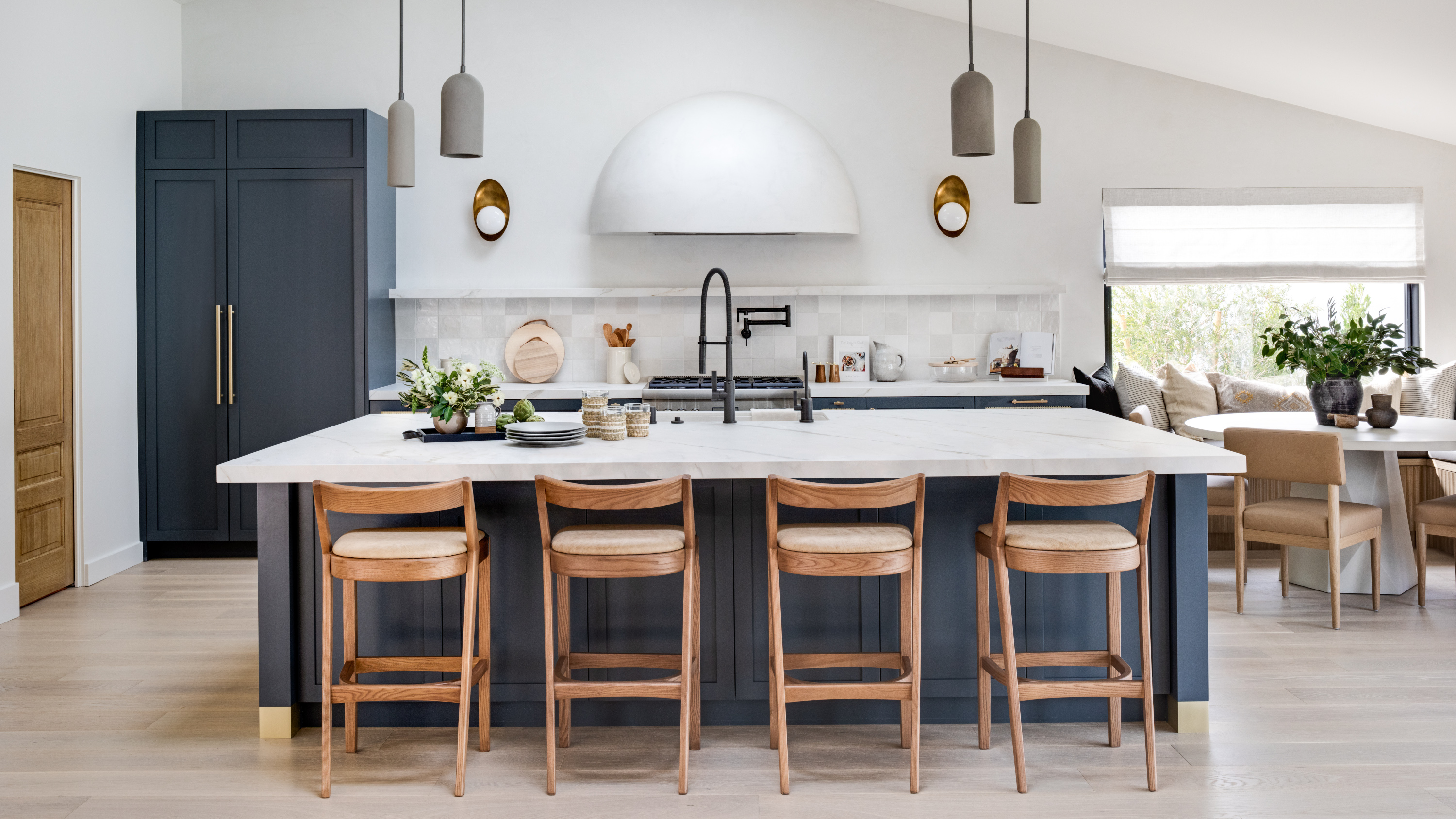
The 6 relaxing kitchen colors you should be using for calming schemes, according to designers

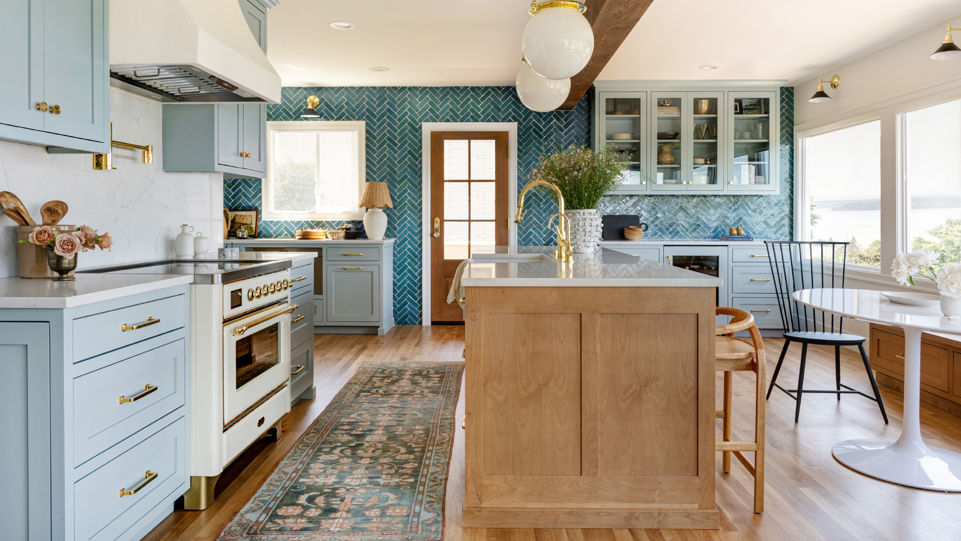
5 of the best feng shui kitchen colors for a relaxing space according to experts

6 Worst Colors To Paint Your Kitchen (And What To Choose Instead)
The Cozy Color That Instantly Makes A Kitchen Feel More Luxurious

'Cook dinner feeling soothed' - the 8 most calming colors for a small kitchen
13 Calming Paint Colors Designers Use to Make Rooms Feel Soothing — And No, They're Not All Neutrals
14 Mood-Boosting Kitchen Paint Colors That Will Instantly Brighten Your Day

5 colors that will make your bedroom feel calmer, according to designers
The 6 Best Cabinet Colors To Make A Small Kitchen Feel More Spacious
16 Calming Paint Colors That Will Make Your Home a More Restful Place

Ditch the White! Try One of These Designer-Approved Kitchen Colors

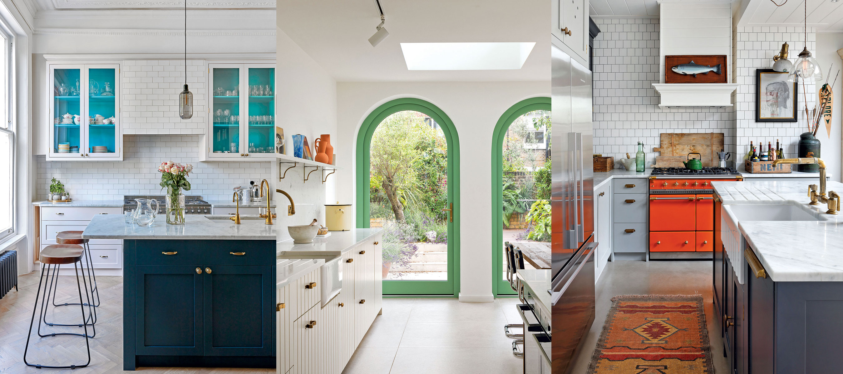
10 creative ways interior designers work color into neutral kitchens
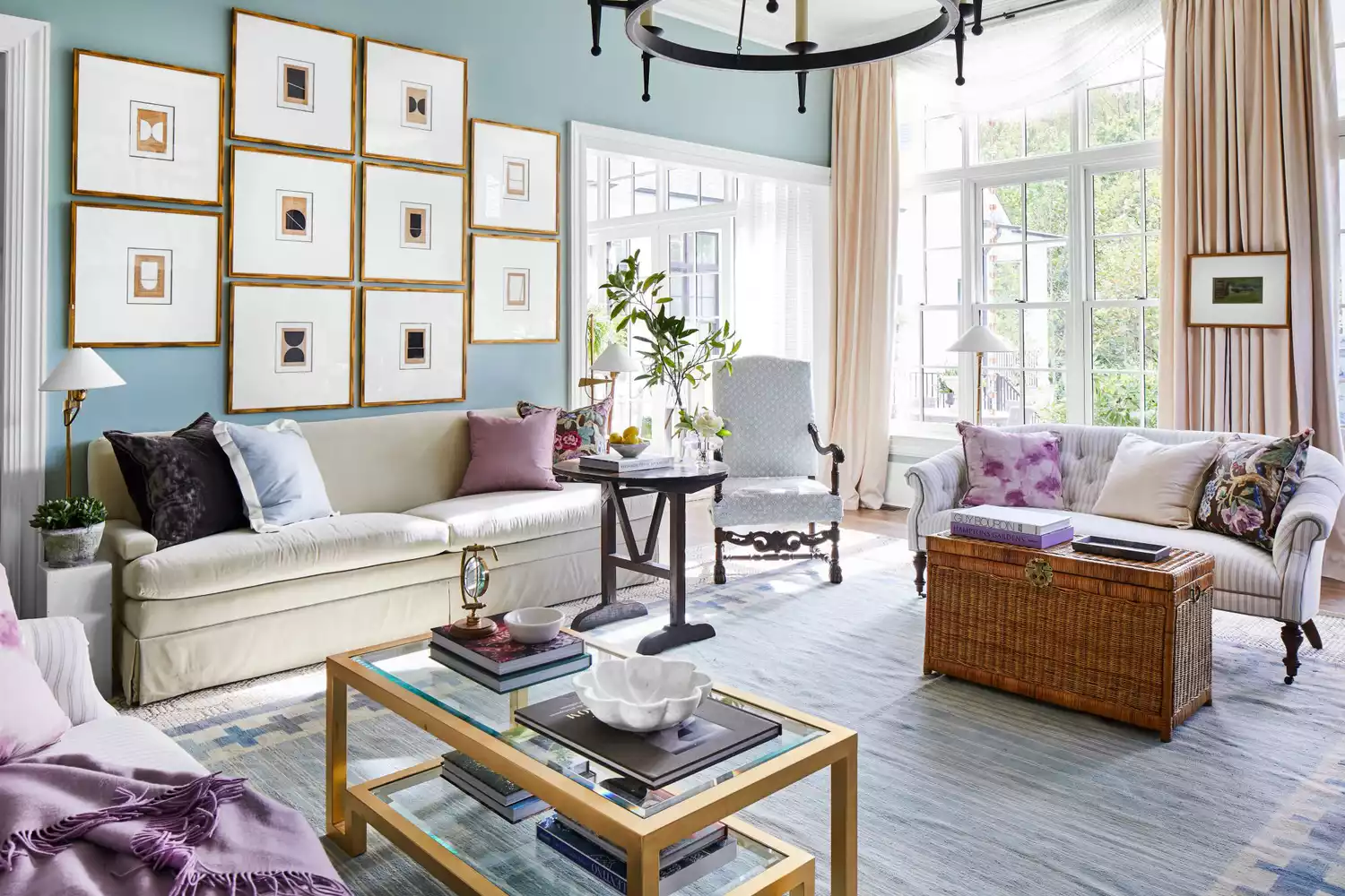
6 Calming Paint Colors Designers Swear By For A Relaxing Living Room
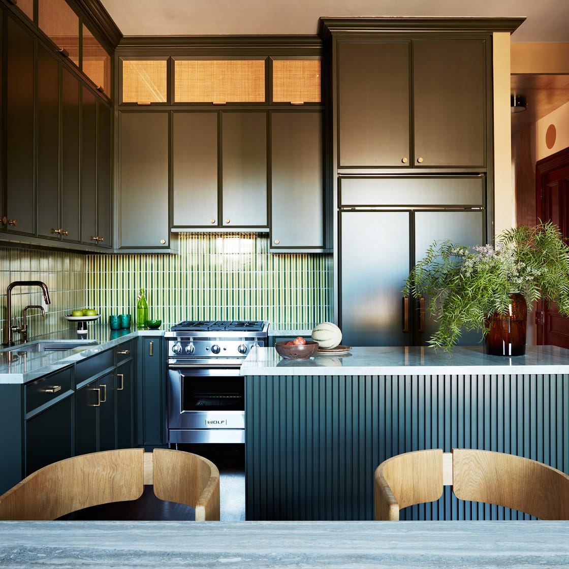
16 Designer-Approved Kitchen Color Schemes You’ll Want to Steal
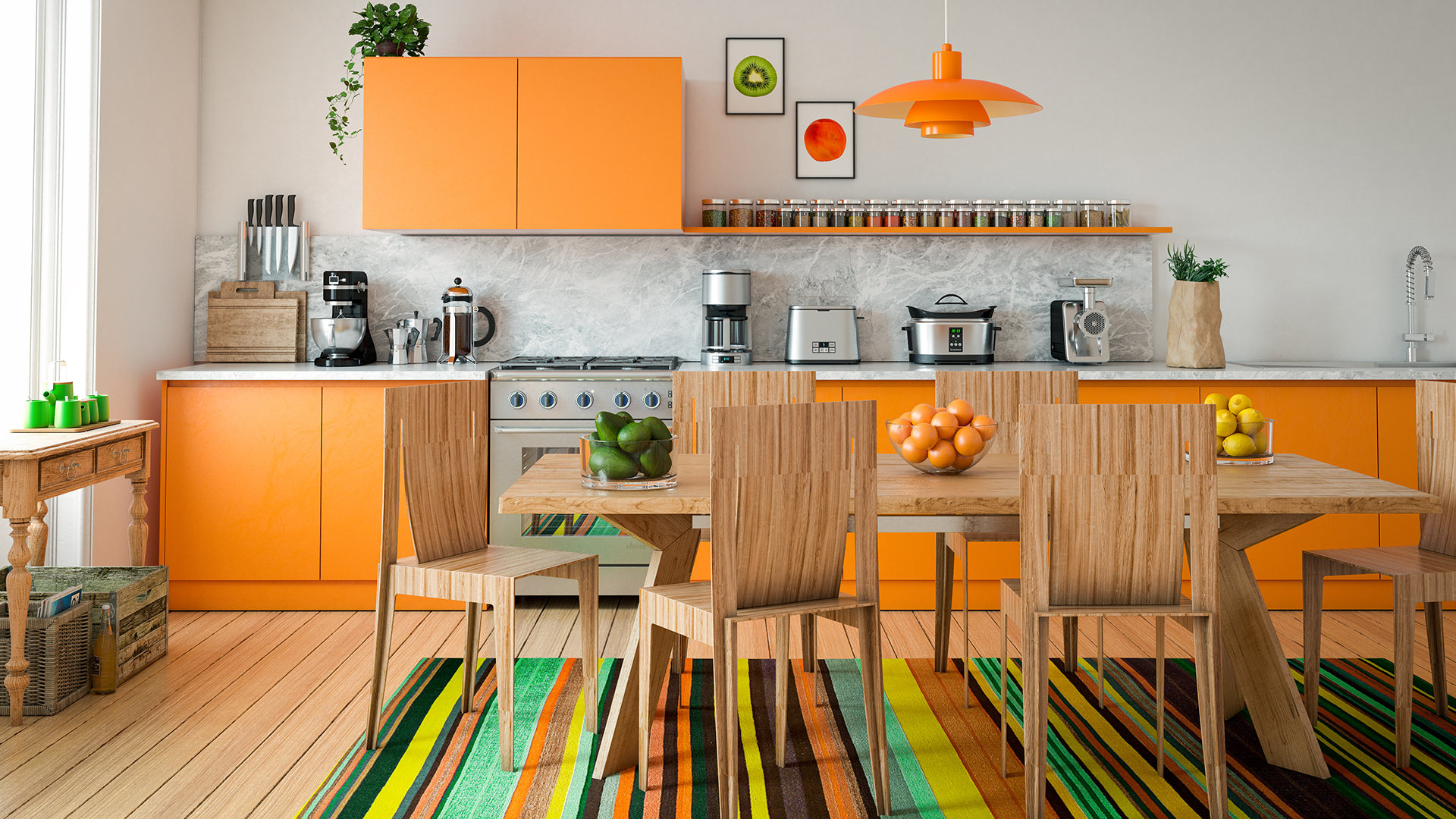
10 Colorful Kitchens That Buck The All-White Trend

17 bright kitchen cabinet colour ideas to try in your home

How to make a kitchen more relaxing – 12 designer tips to create a zen-like space
These Small Kitchen Paint Color Ideas Have Major Big Chef Energy

The 6 Paint Colors for Your Kitchen That Will Never Go out of Style
What paint colors to use to create a relaxed vibe at home