1/6
What colors work best with minimalist style? Interior designers weigh in on the best hues for a pared-back scheme
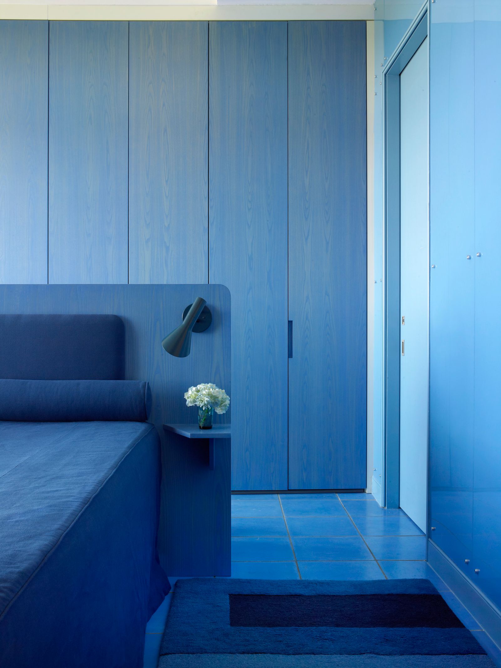
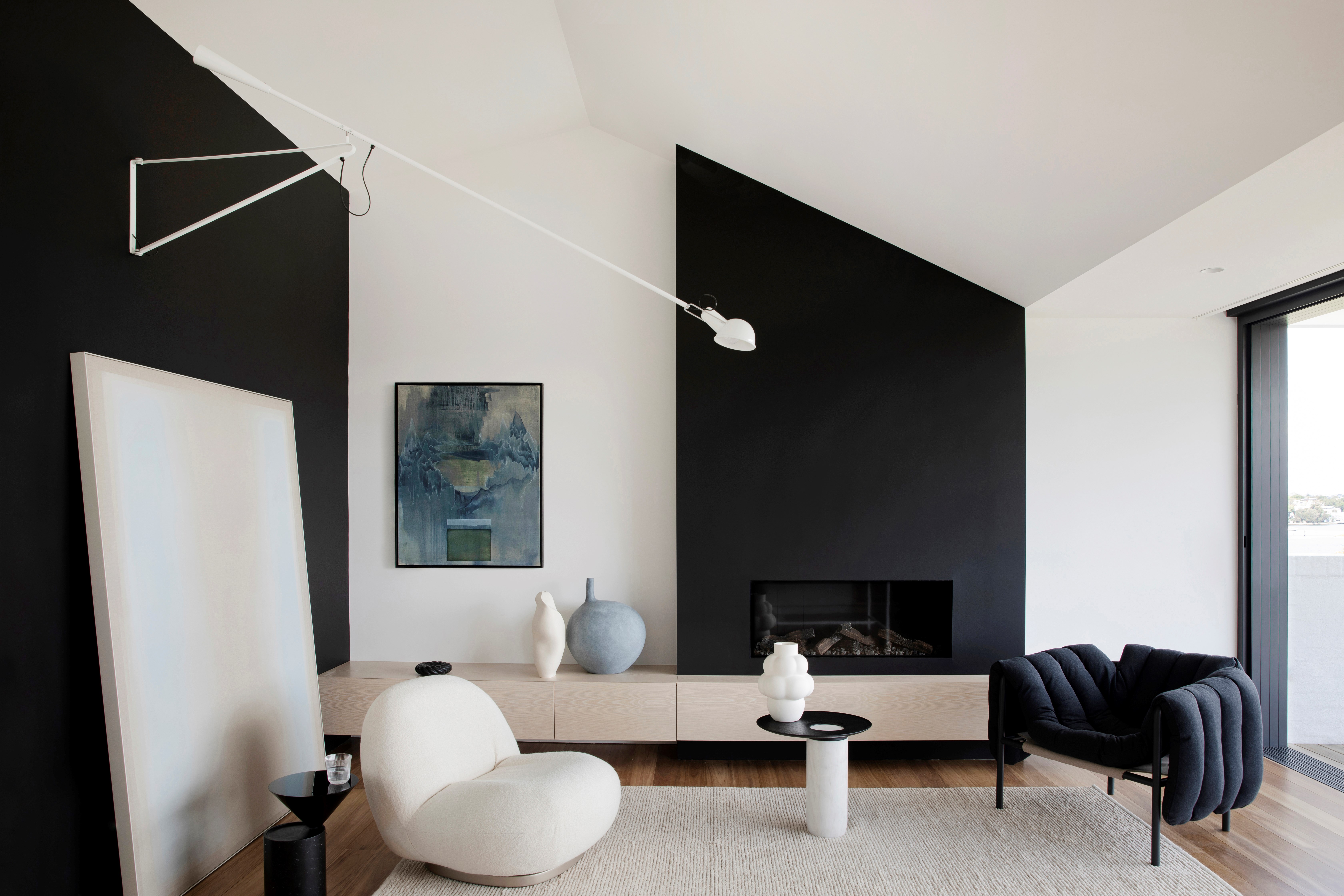
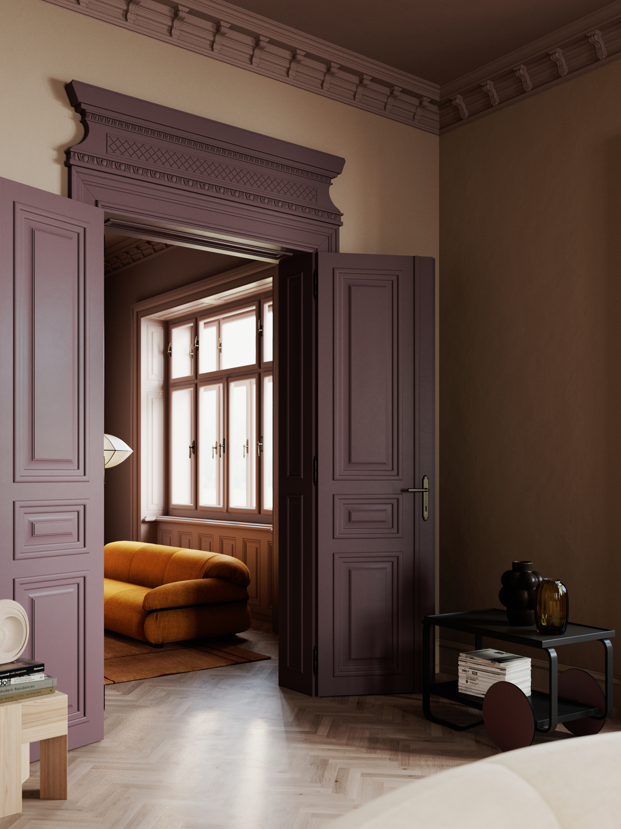
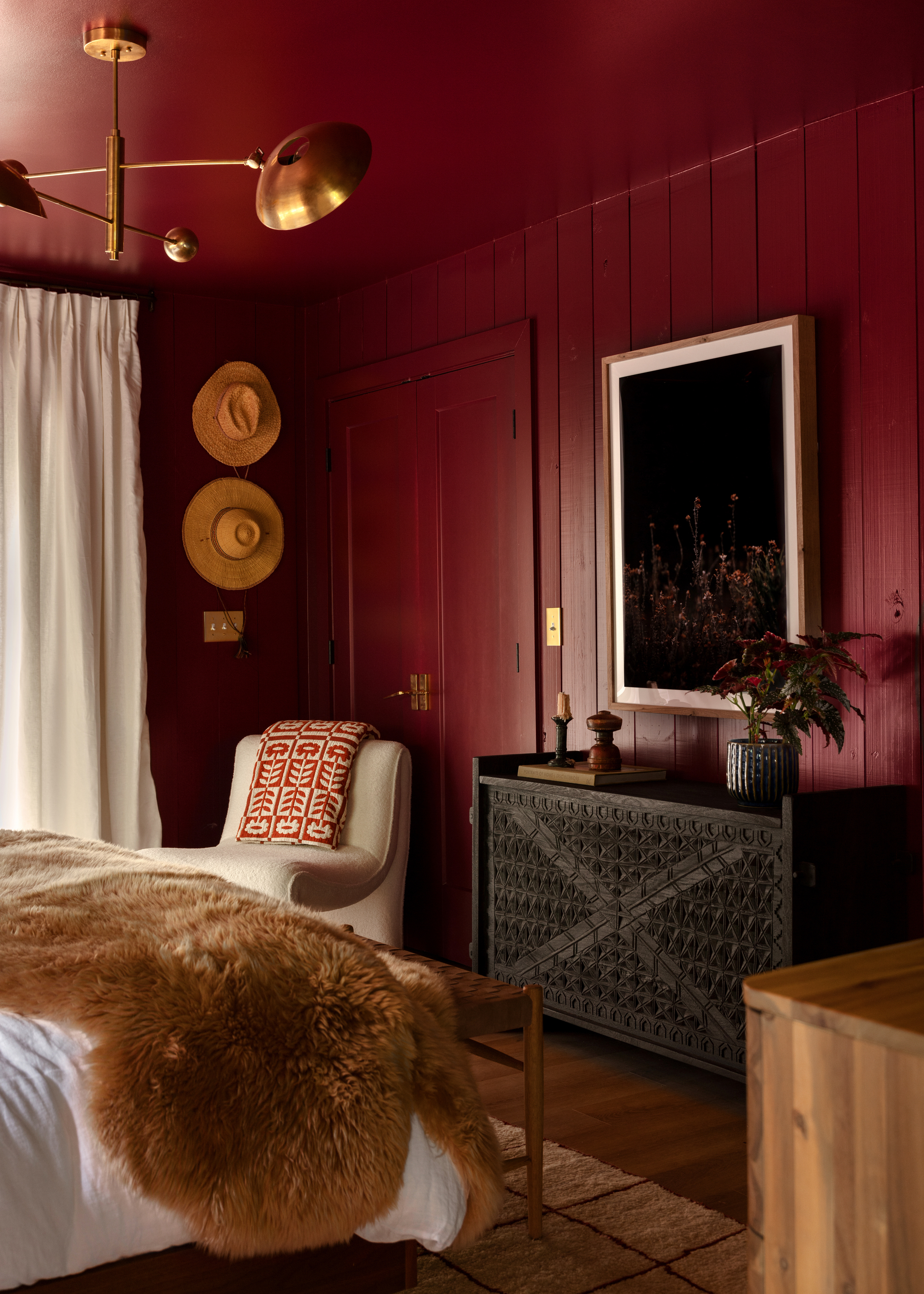
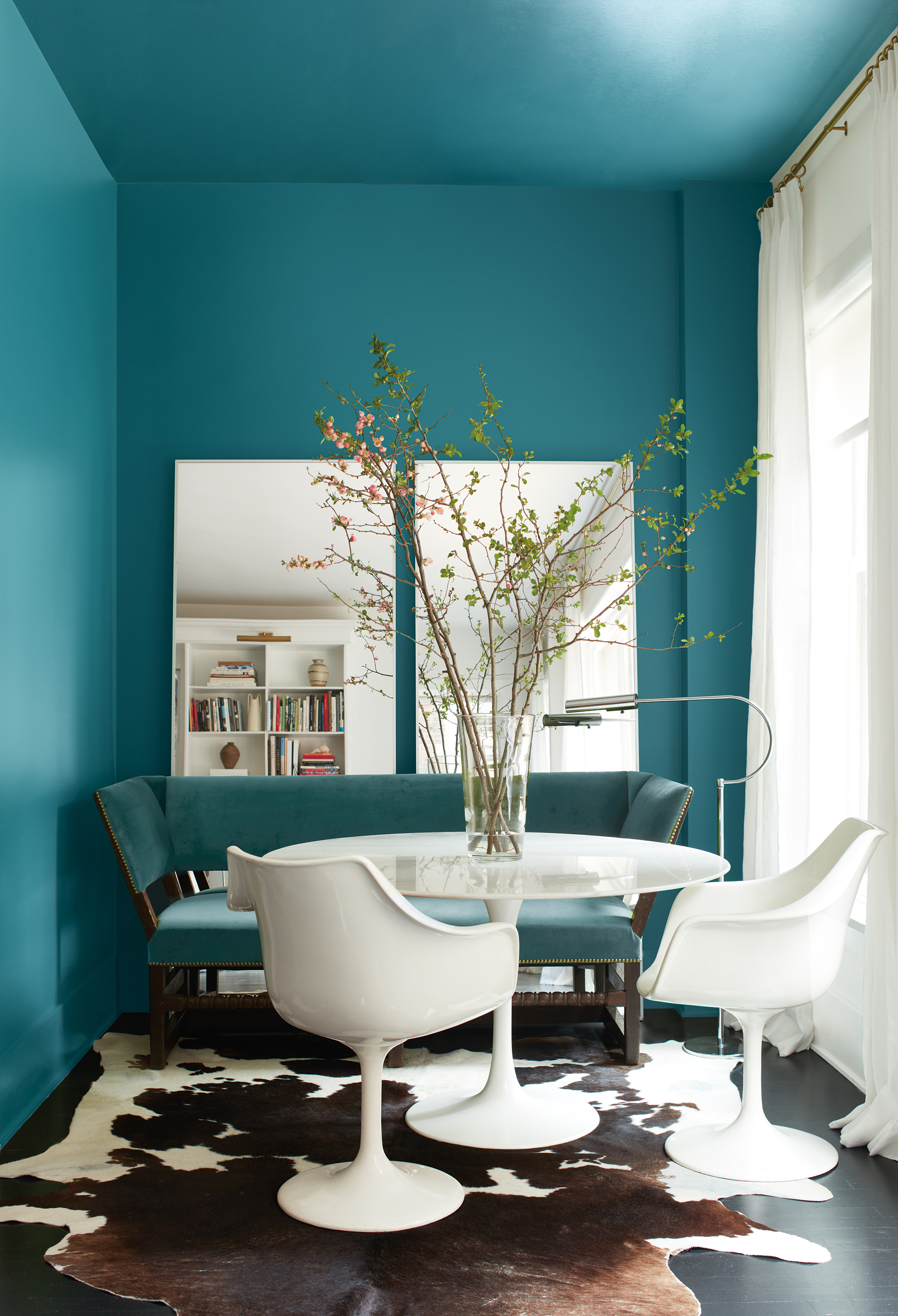
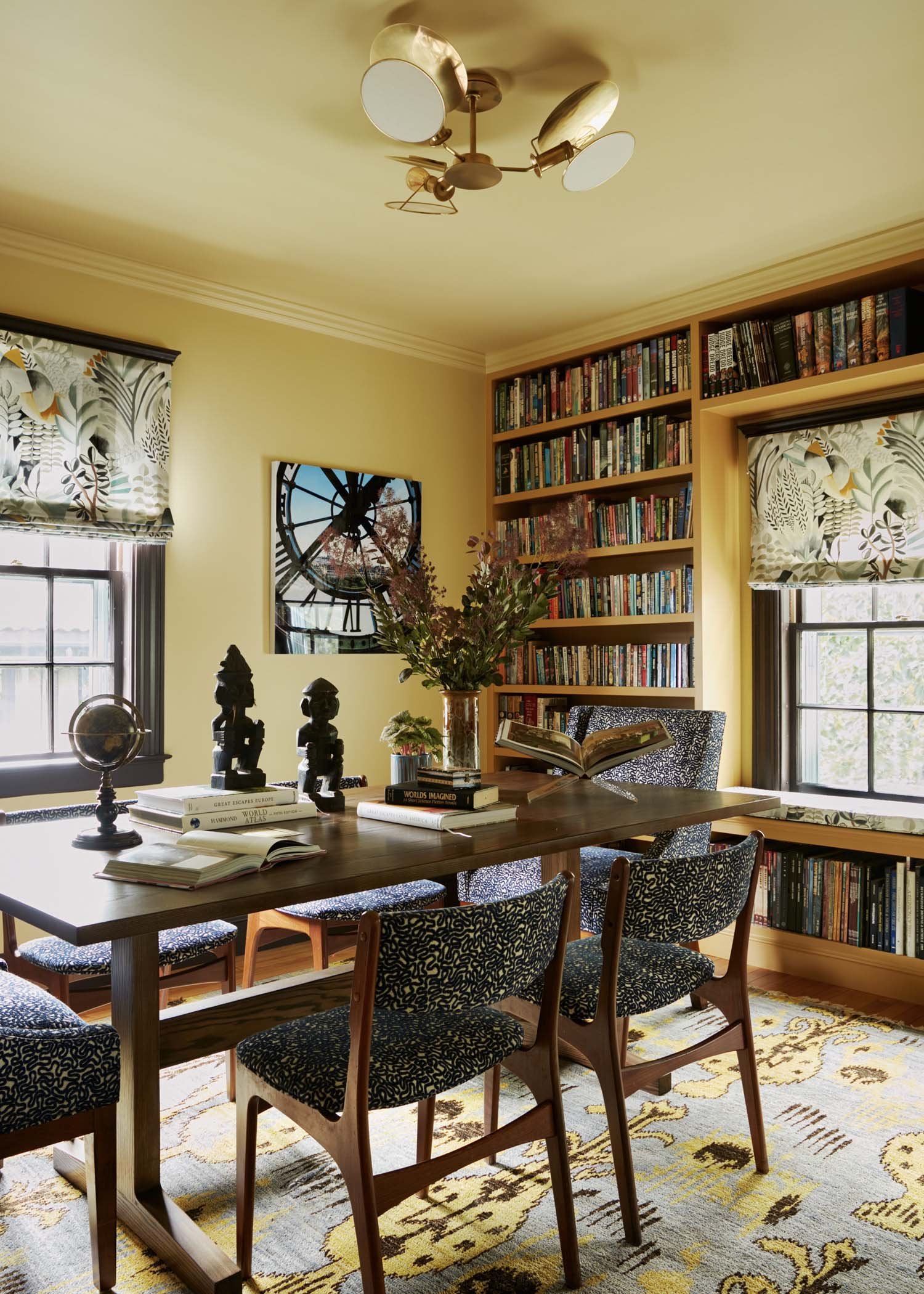
Minimalist style, while often associated with neutral colors, presents a nuanced approach to interior design that goes beyond simply embracing classic whites. The objective is to create an inviting and relaxing atmosphere, avoiding a space that feels empty or flat. The choice of colors in a minimalist scheme is crucial for establishing the desired mood, ranging from various shades of white to warmer beige tones, and even incorporating more saturated hues when executed thoughtfully.
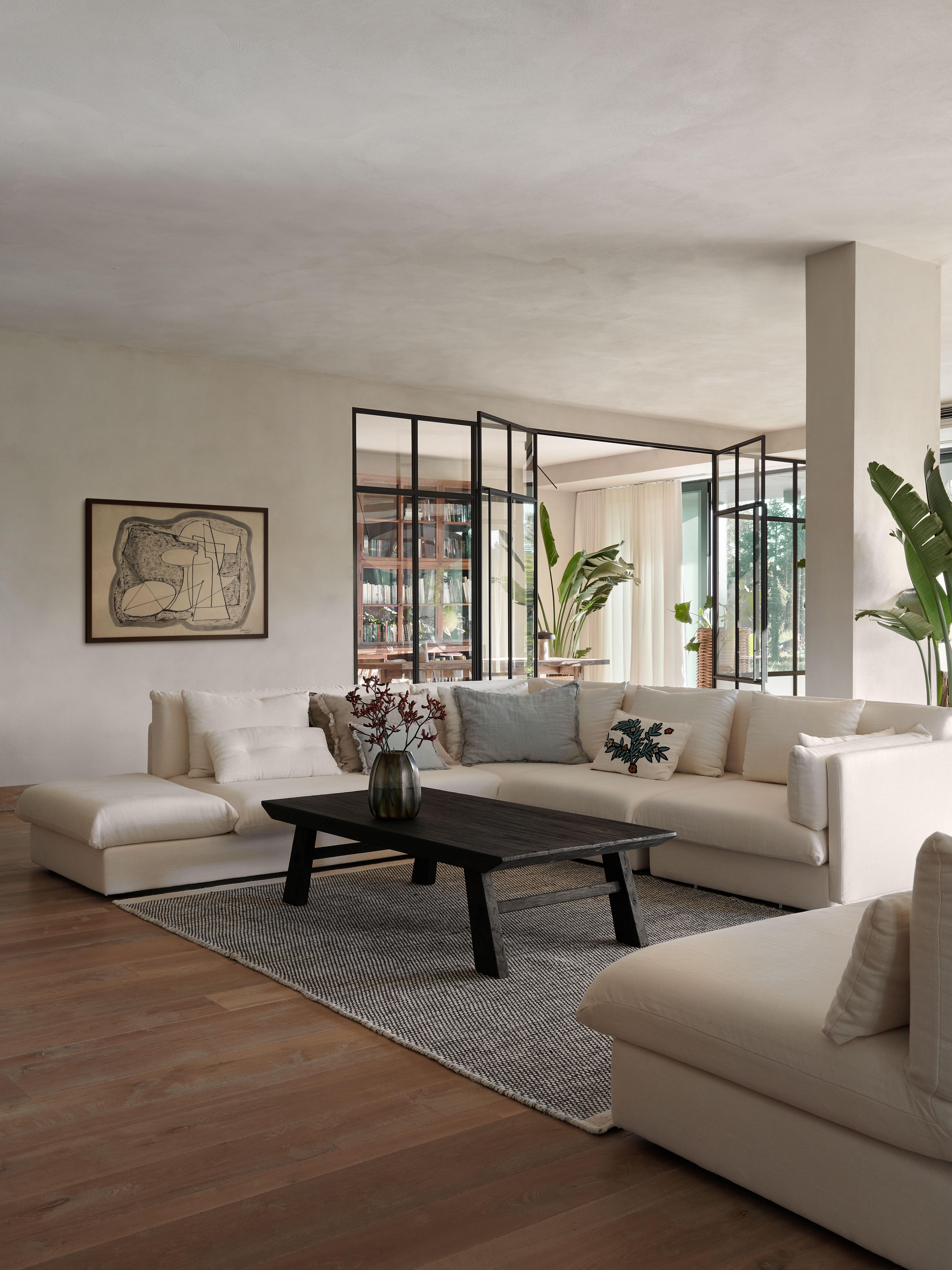
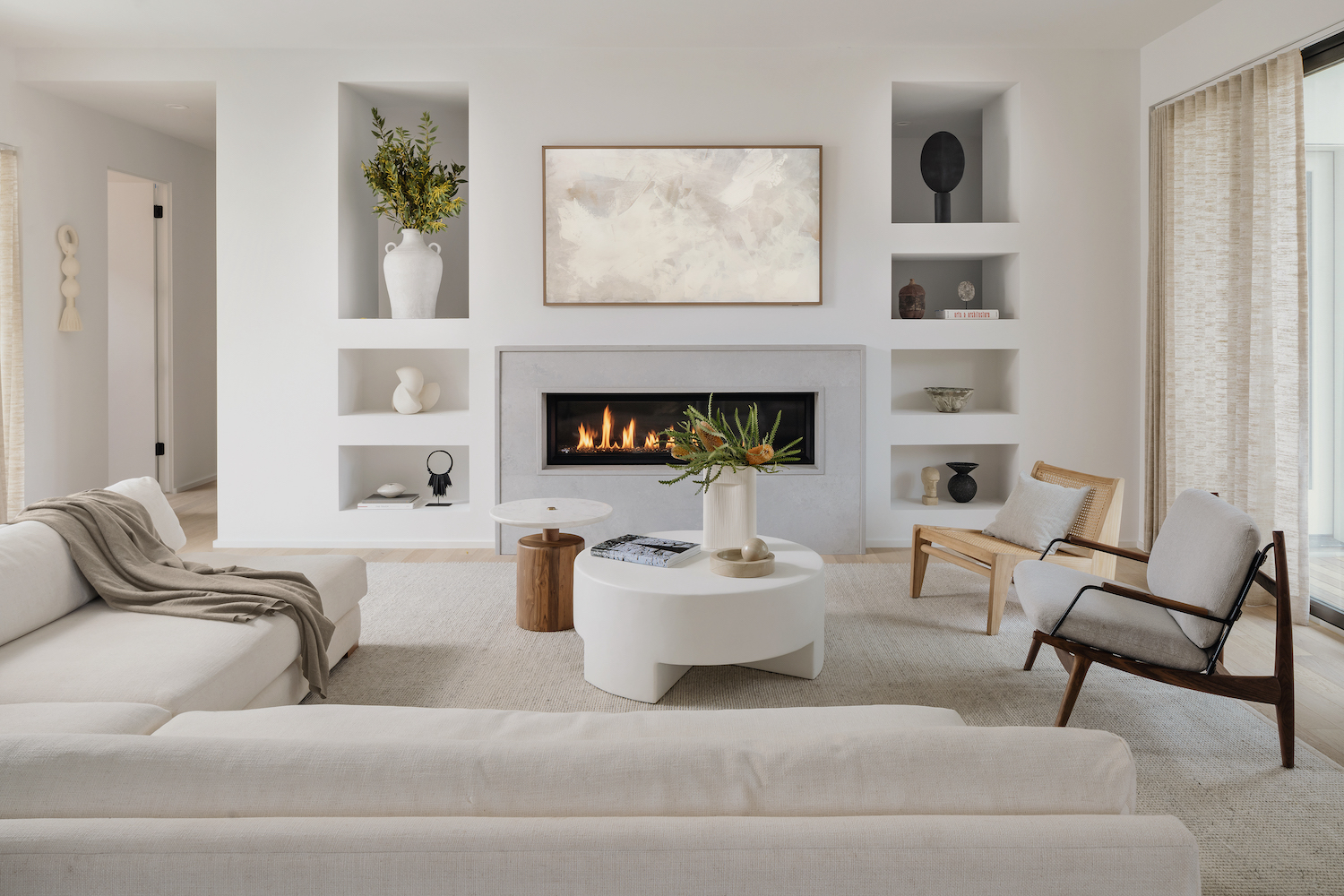
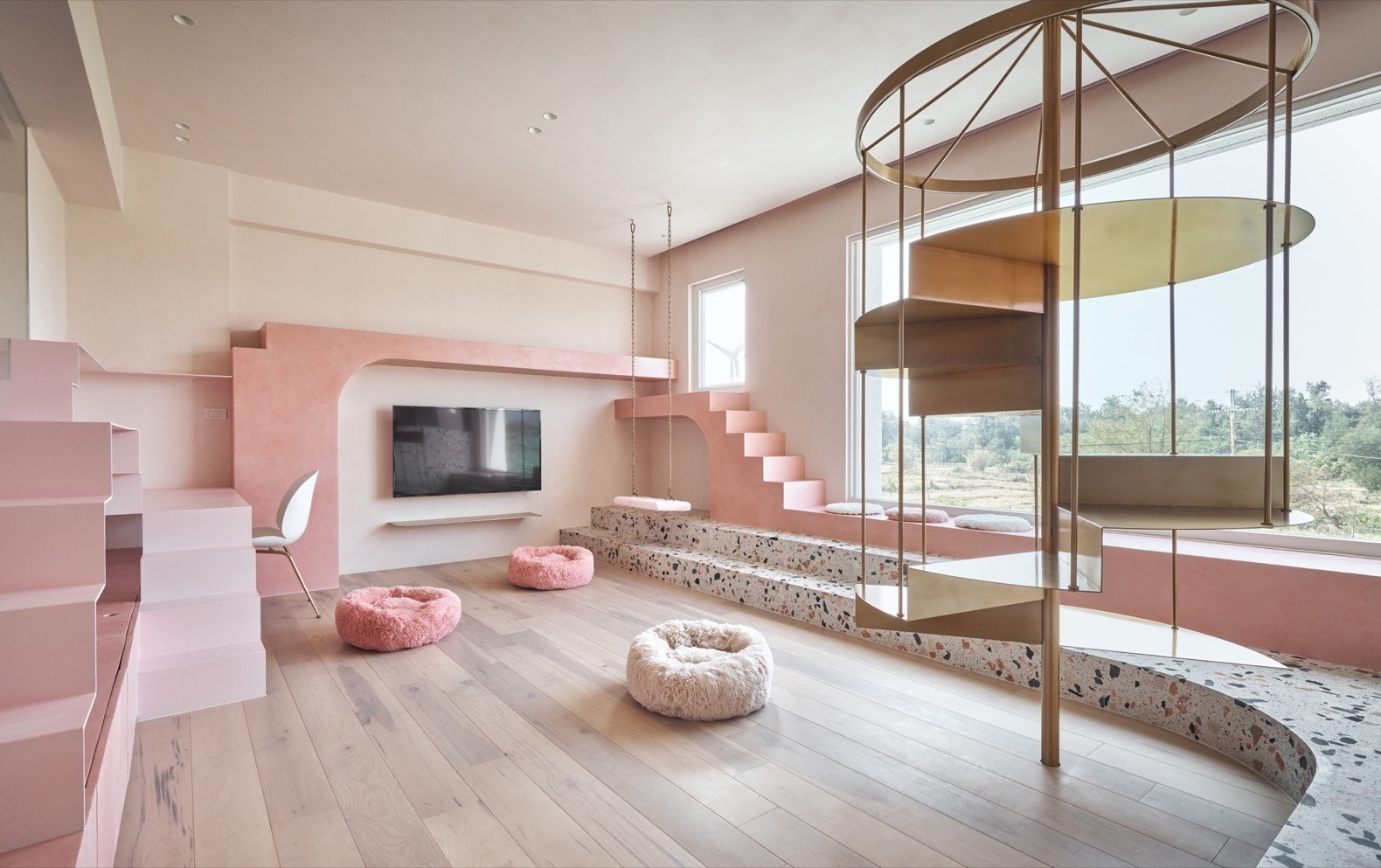
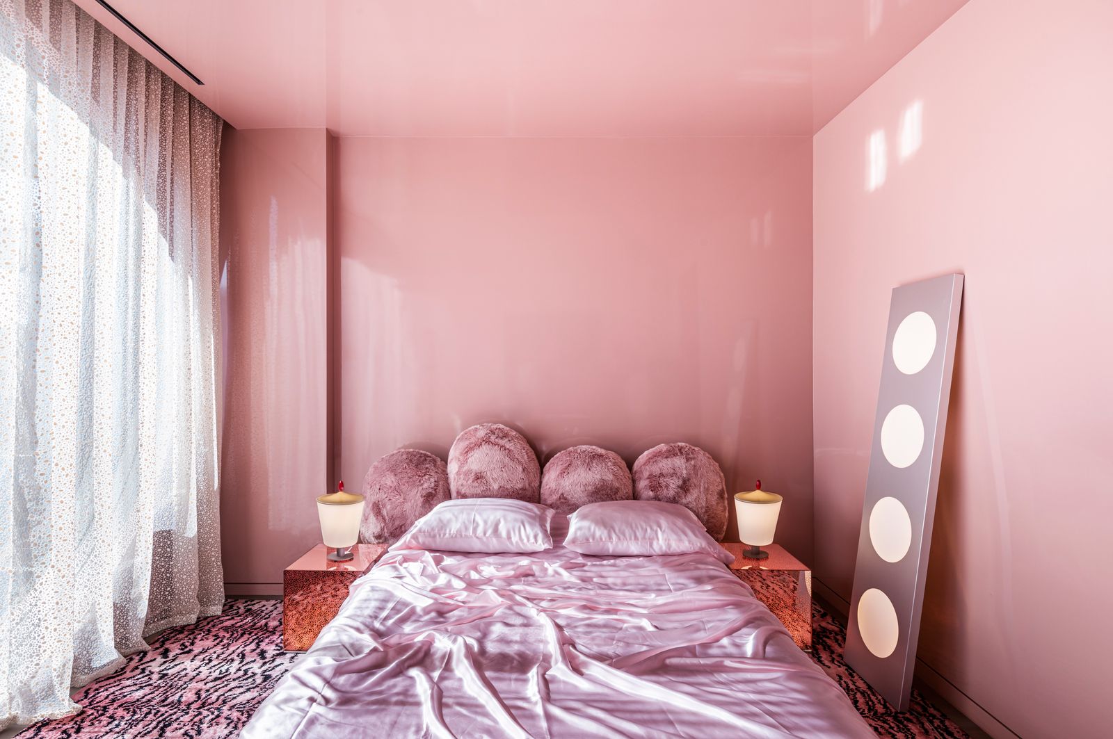
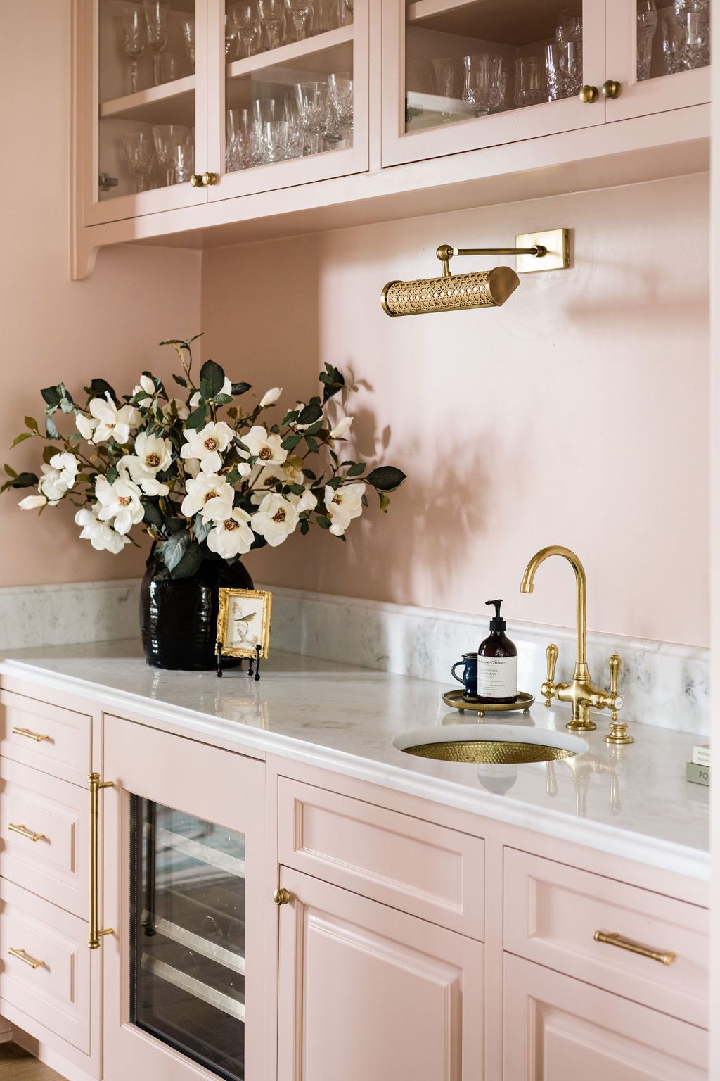
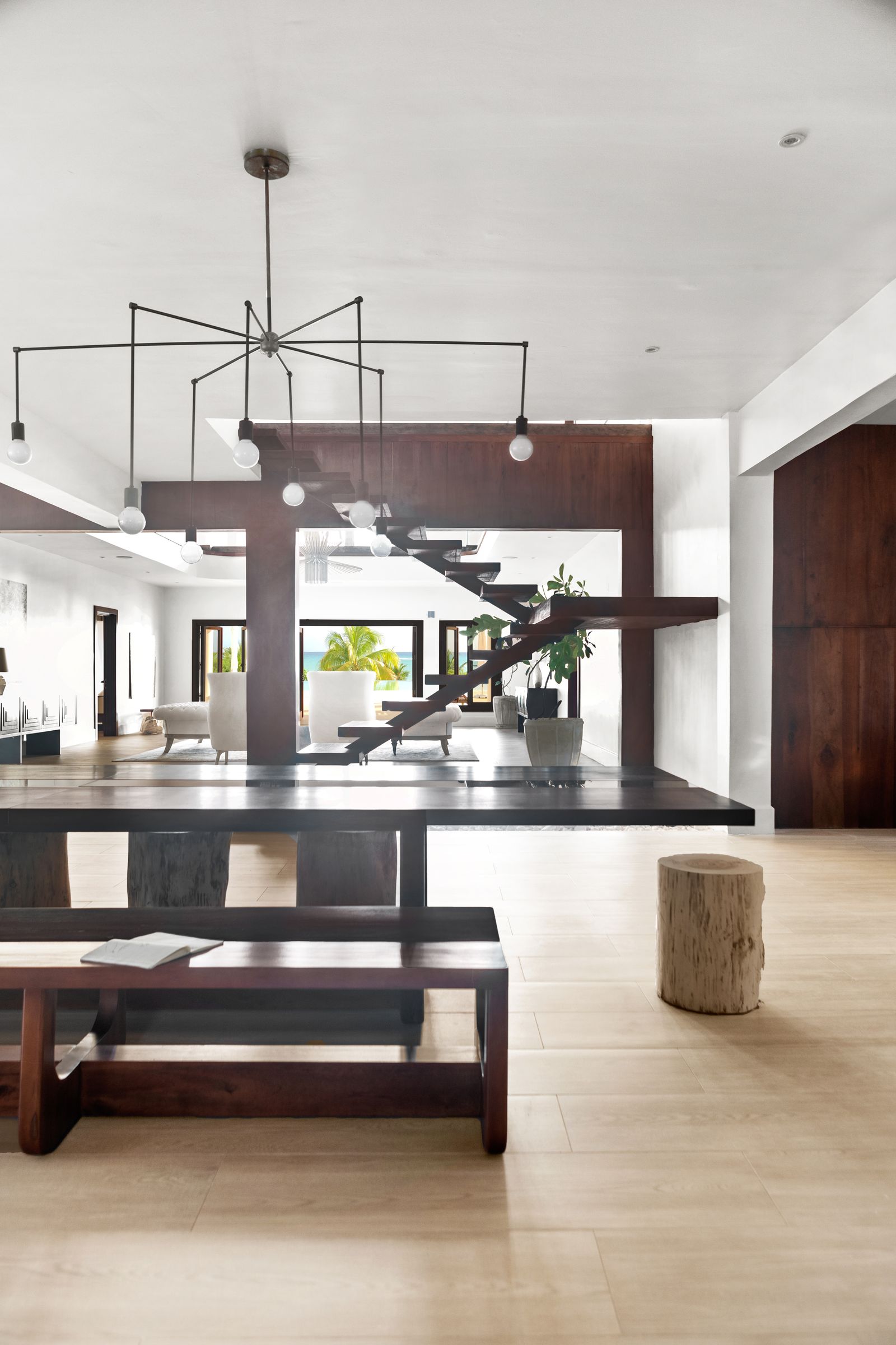
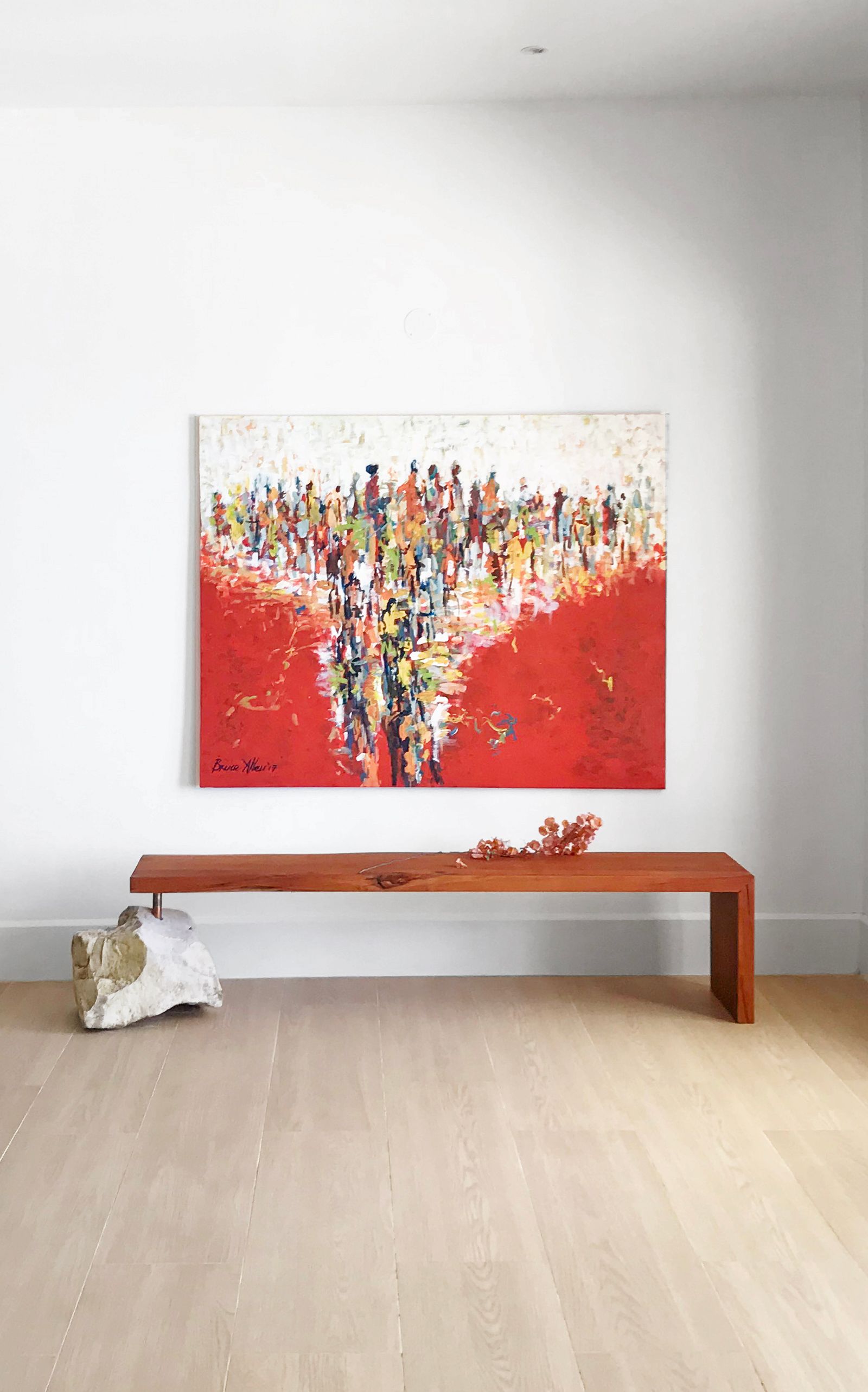
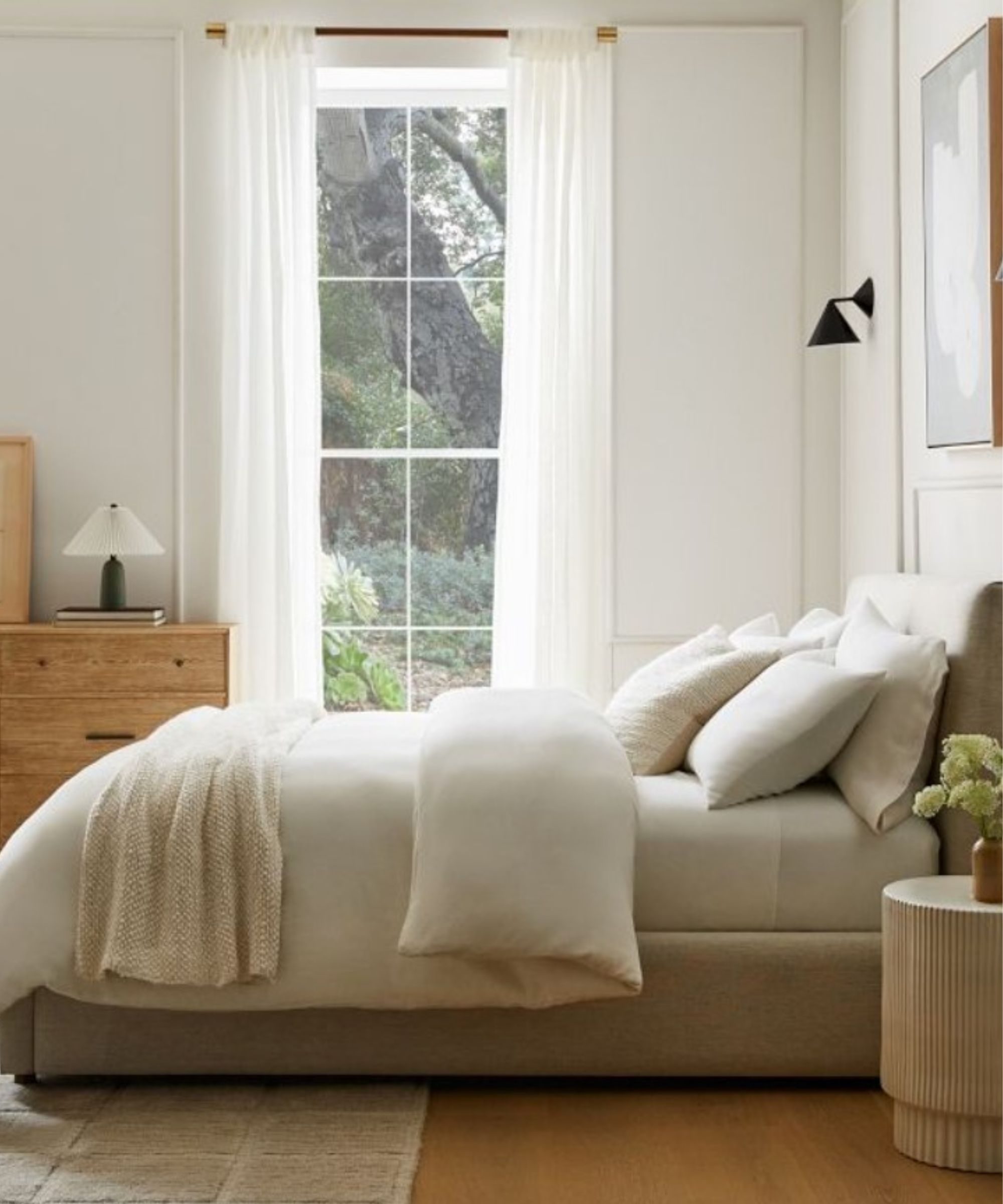
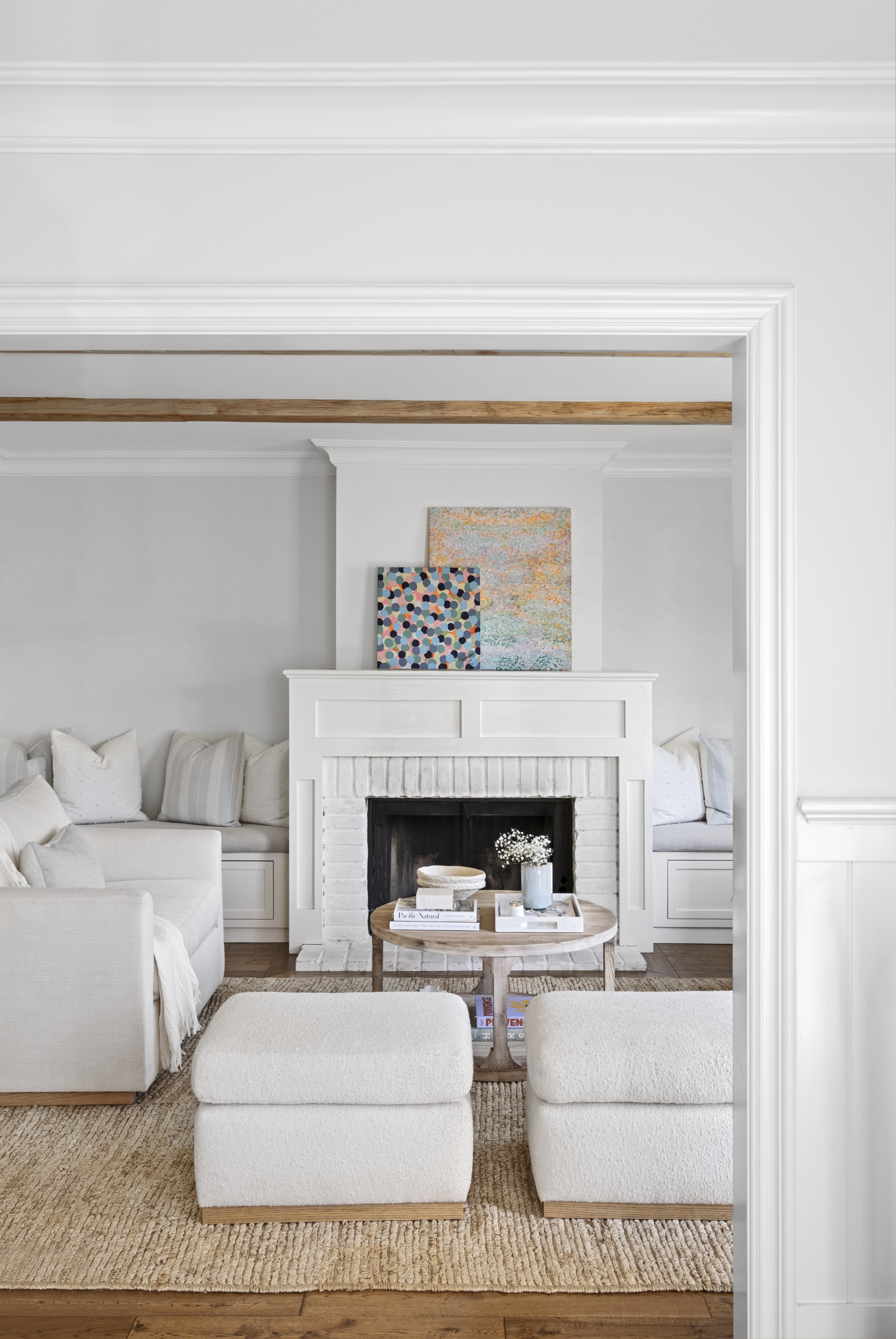
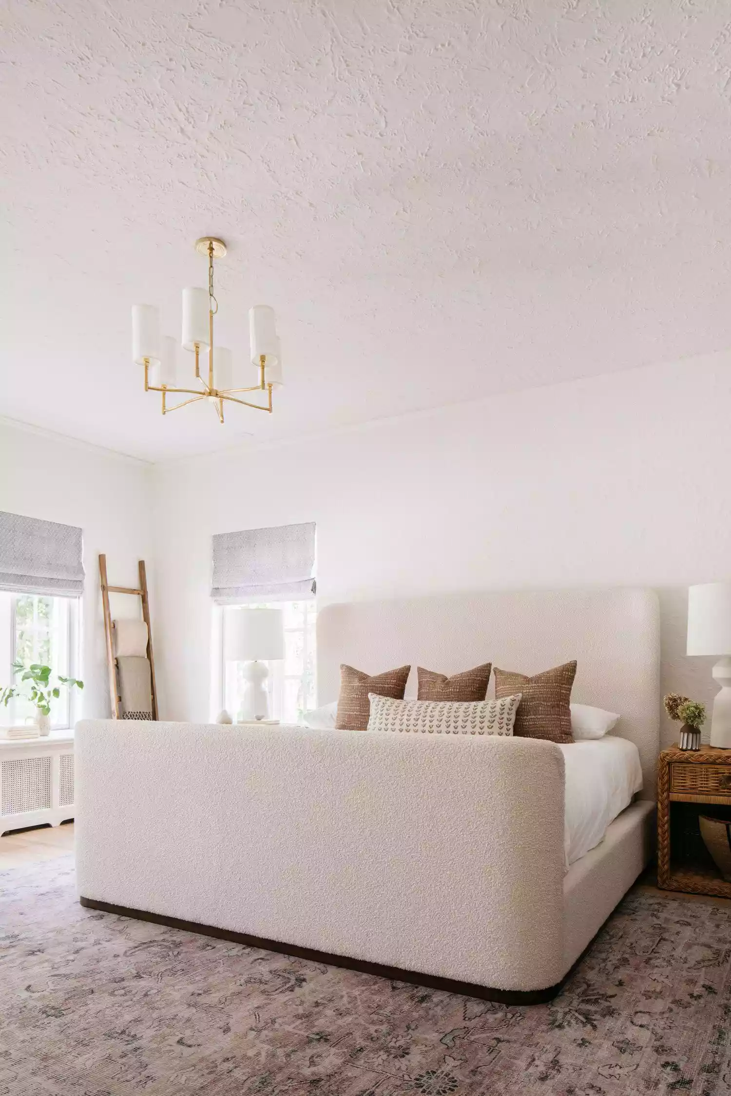
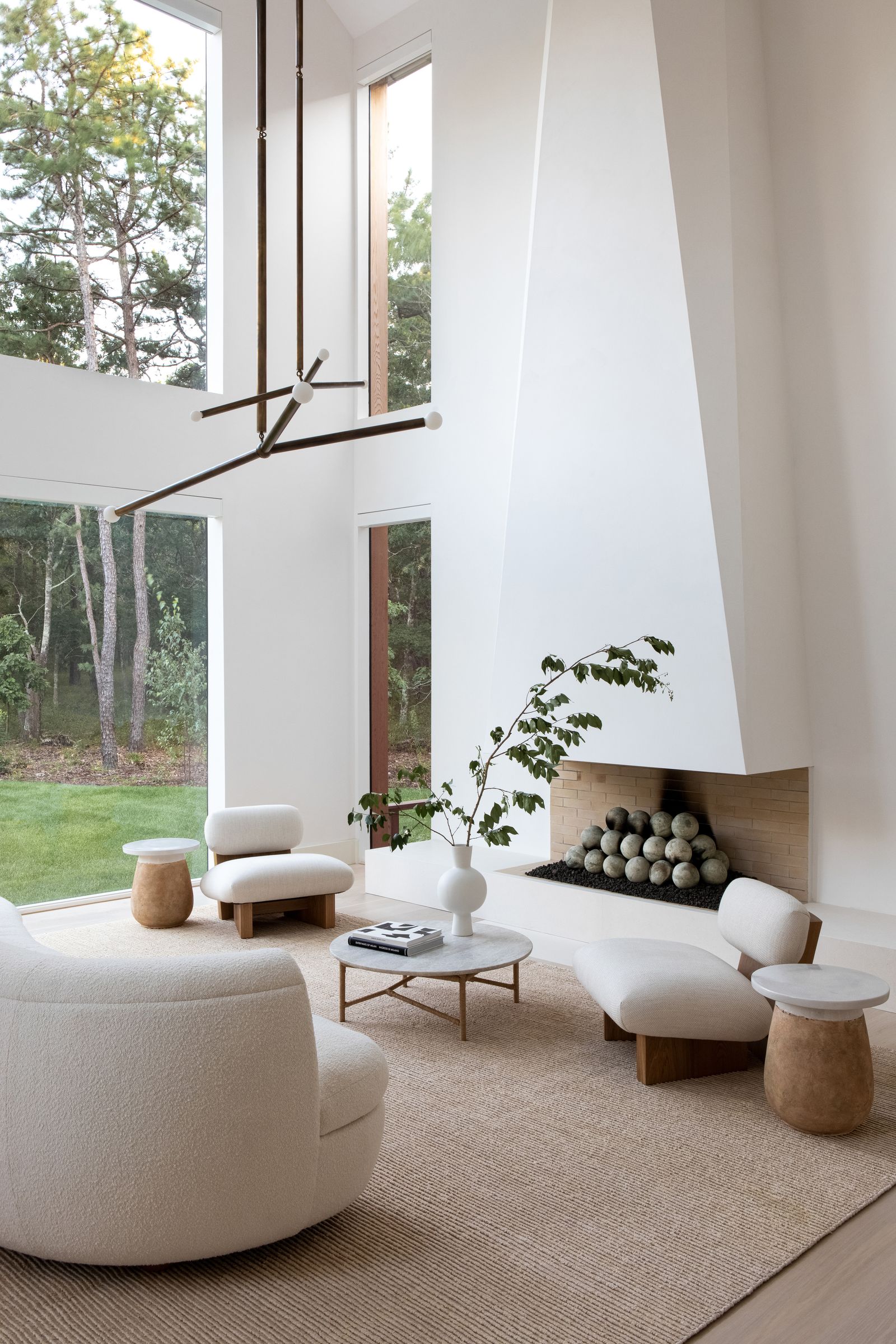
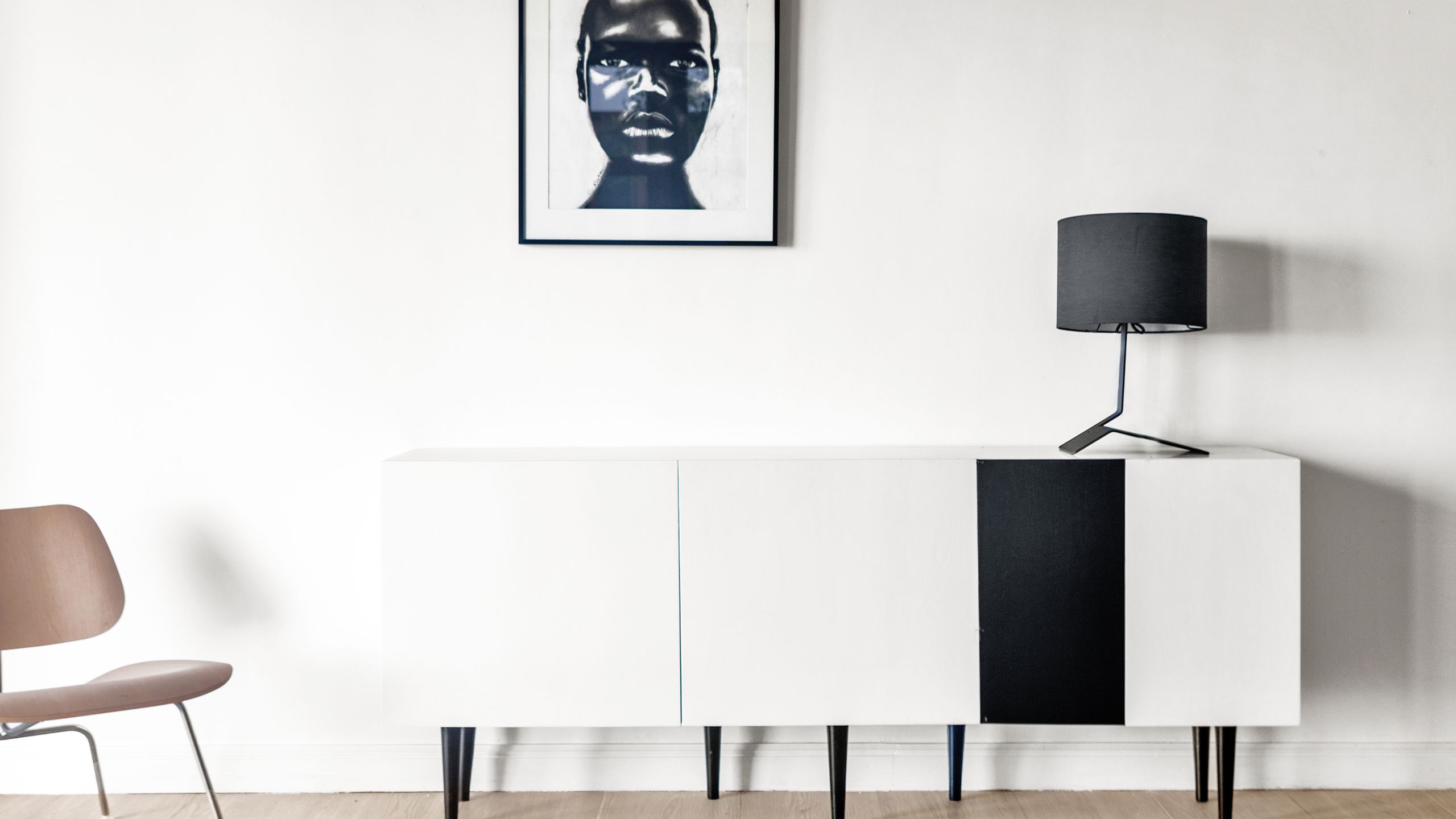
Nuanced whites are a key element, moving beyond bright, true whites to those with subtle undertones. These undertones, whether green (like James White), blue (like Dimpse), or the softest pink (like Great White), add visual appeal and depth, preventing the space from appearing sterile. The combination of warm white paint with natural materials, such as wood flooring, contributes to an inviting and calm ambiance, even in spaces with hard surfaces and textures.
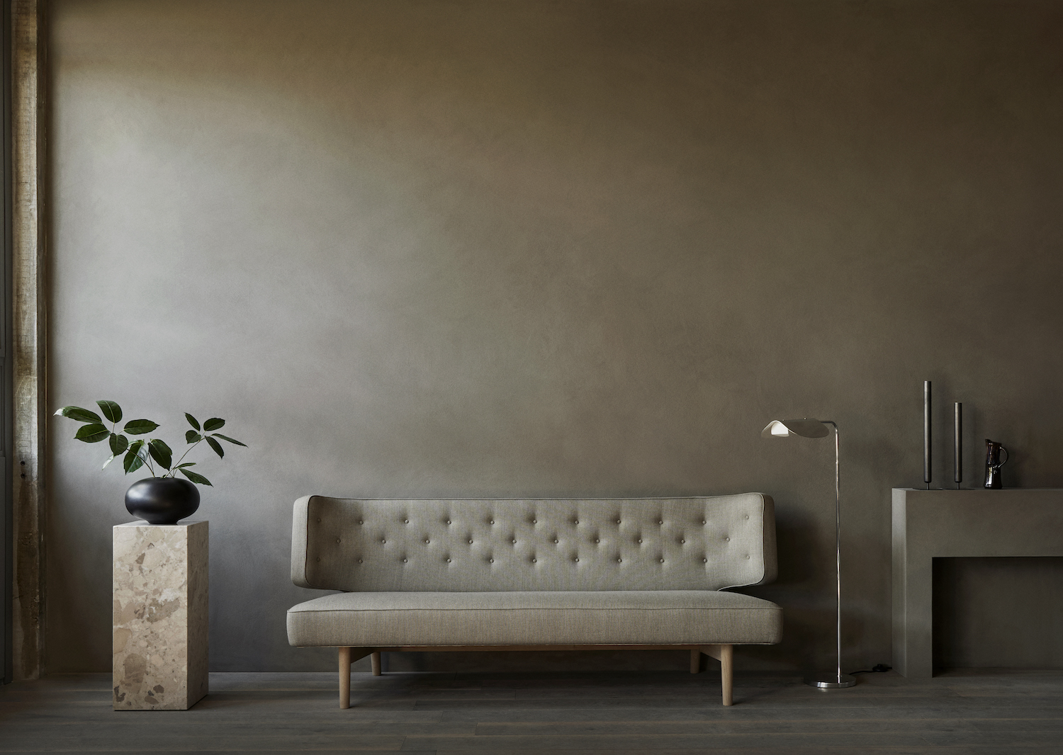
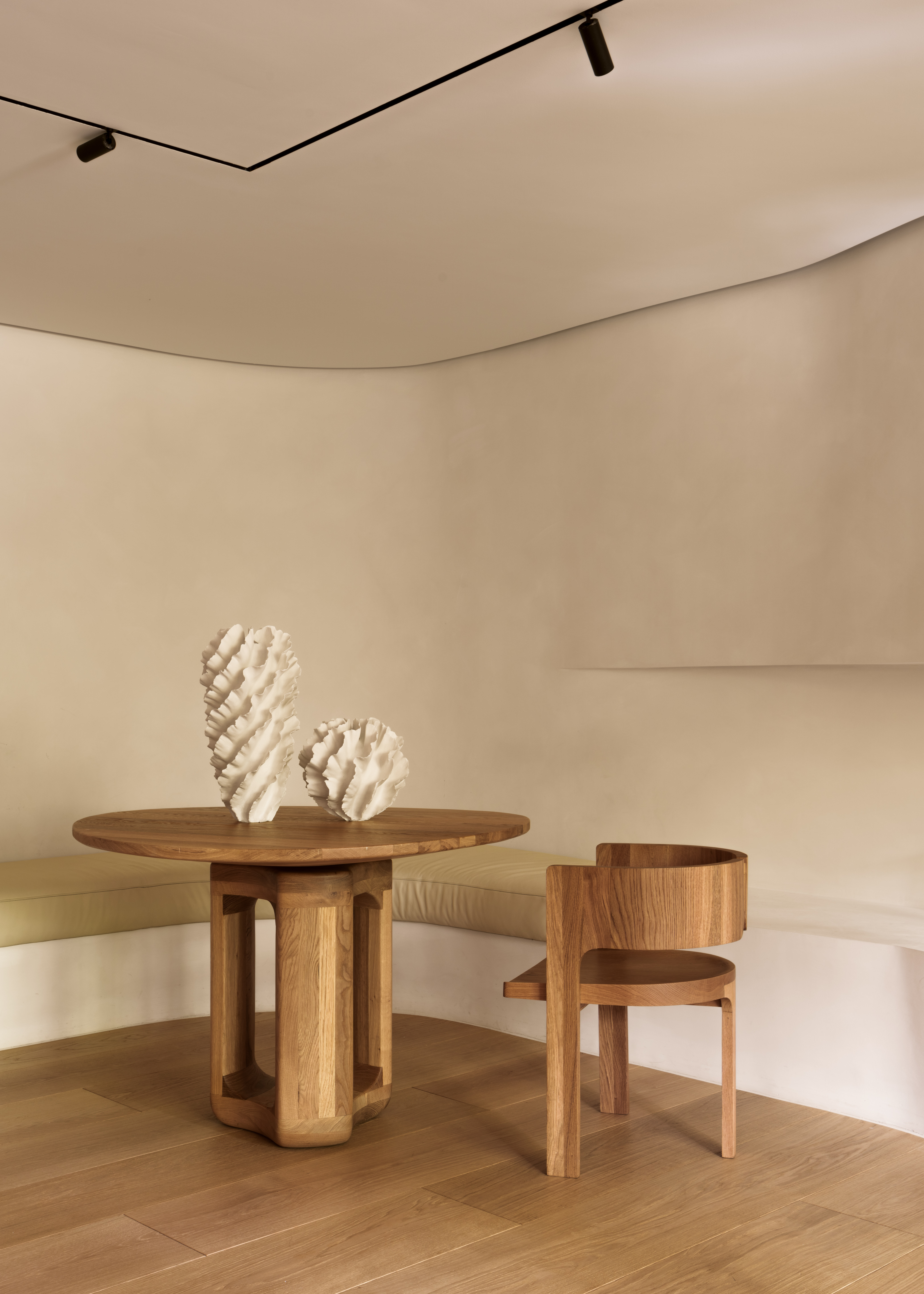
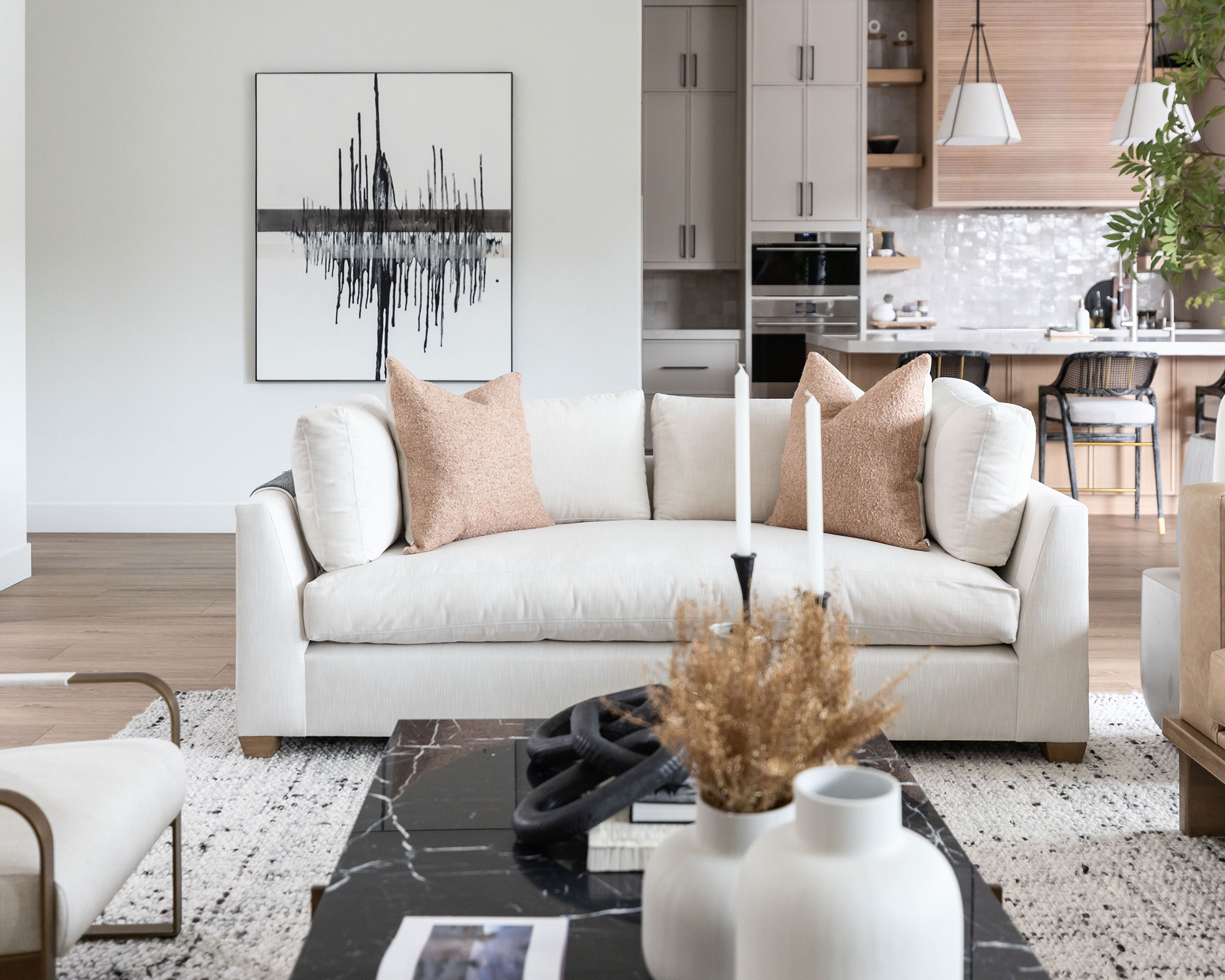
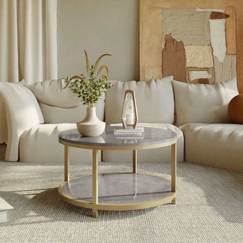
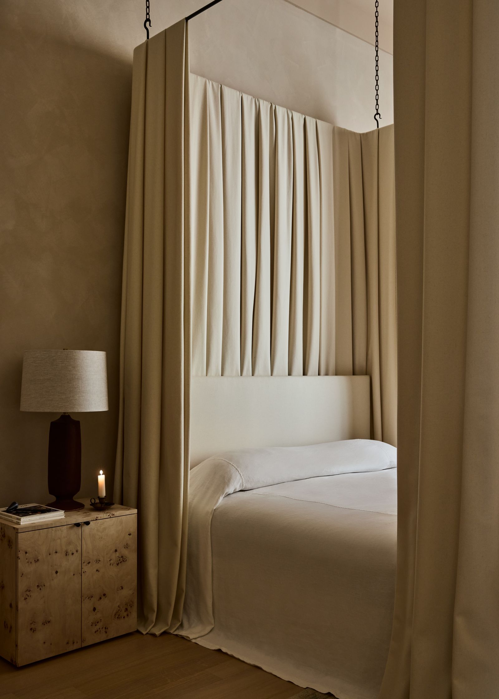
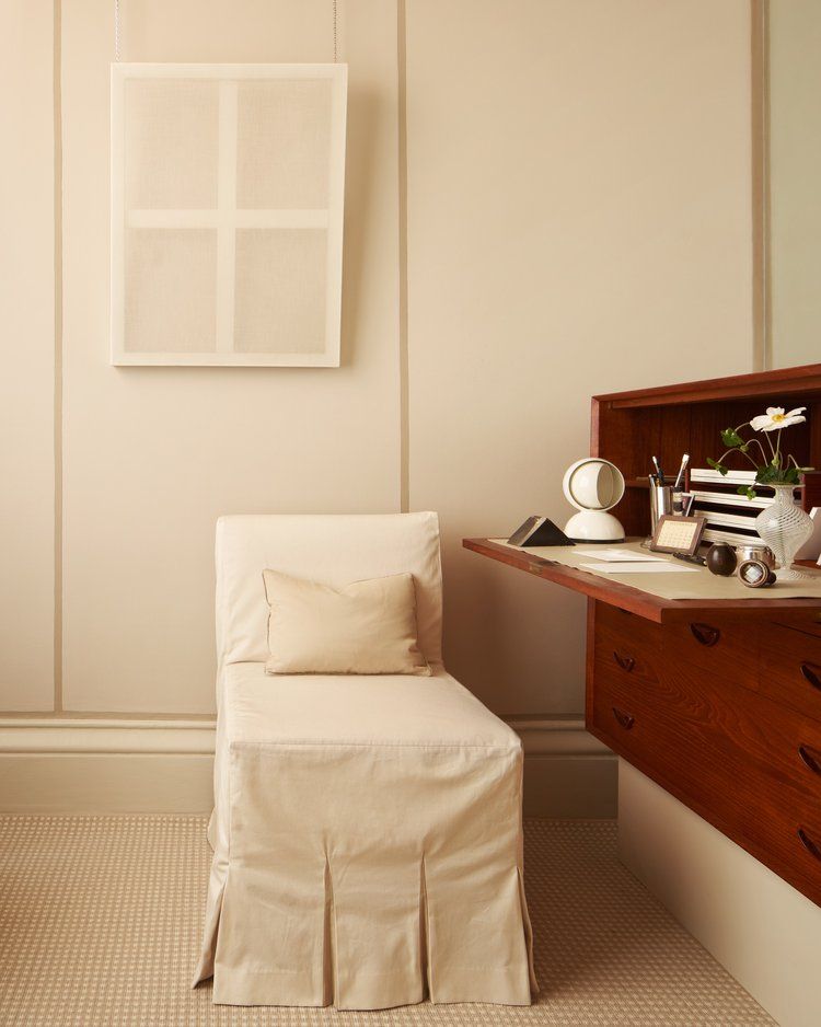
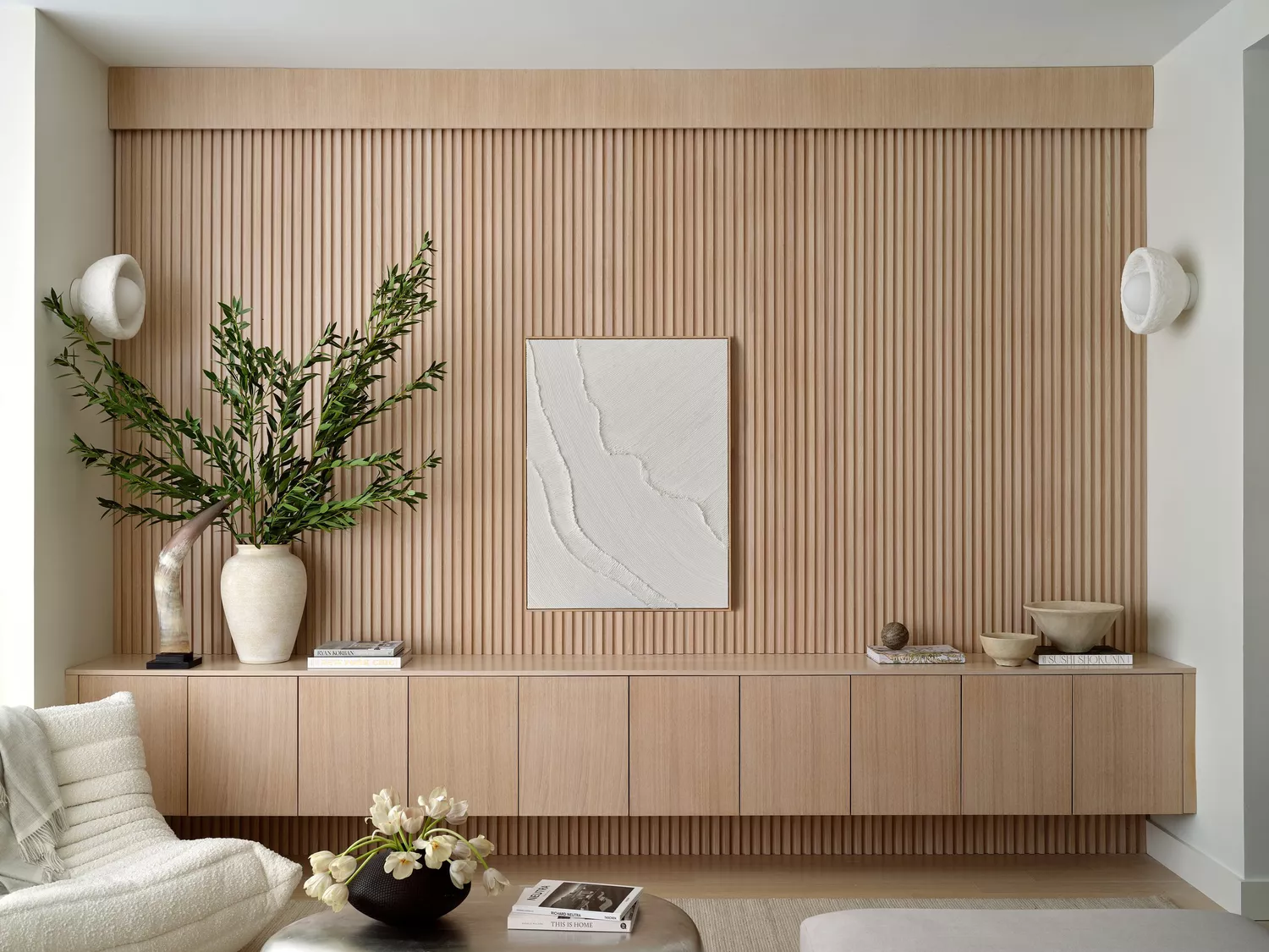
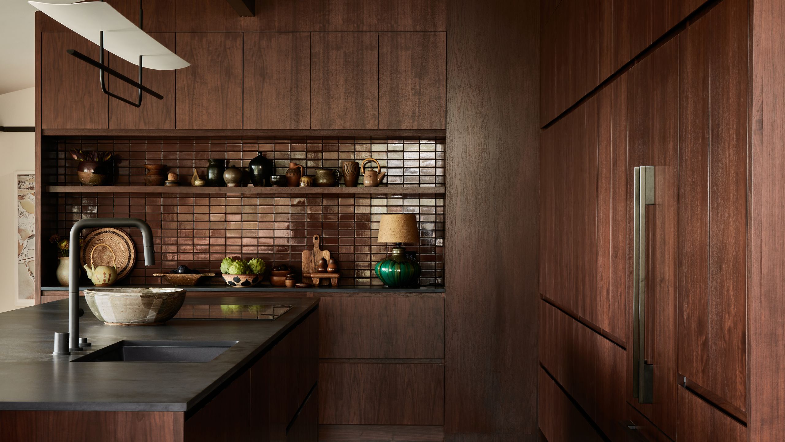
The evolution of minimalism has seen a shift towards warmer shades, departing from the cooler tones that were previously popular. This approach, known as 'warm minimalism,' focuses on creating uncluttered yet welcoming spaces where simplicity and open aesthetics are paramount without sacrificing the essential elements that define a home. When selecting paints, opting for hues with yellow or red undertones instead of grey-blue undertones is advised to inject warmth into a room. Oatmeal tones serve as an excellent middle ground between warmer beiges and classic whites, especially effective in living rooms when paired with natural woods and linen textures to introduce depth.
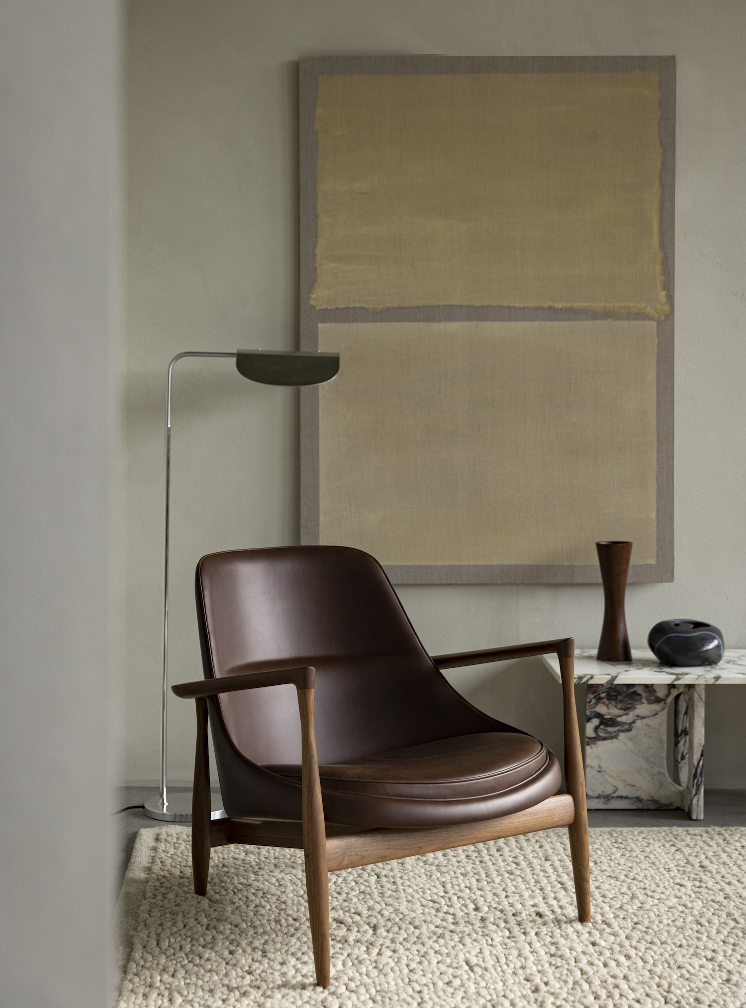
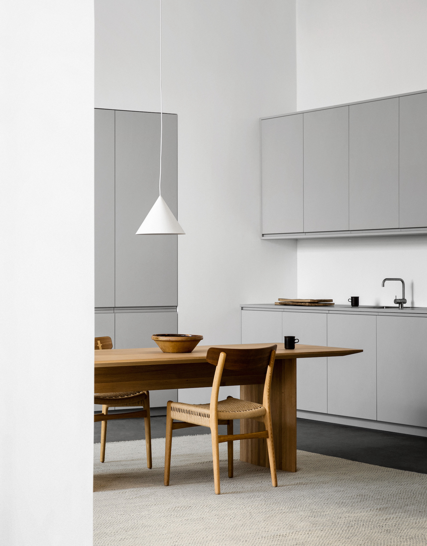
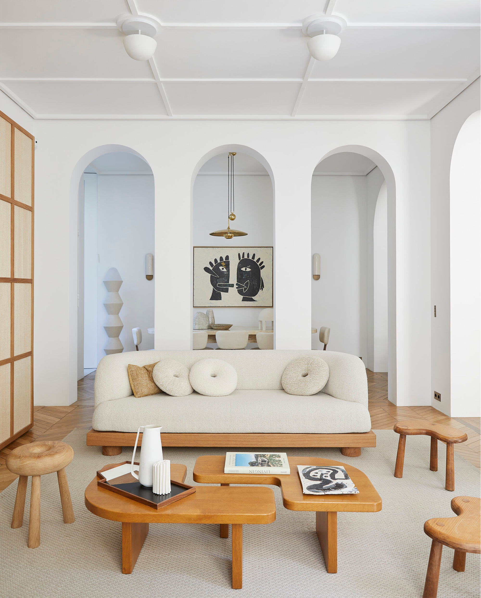
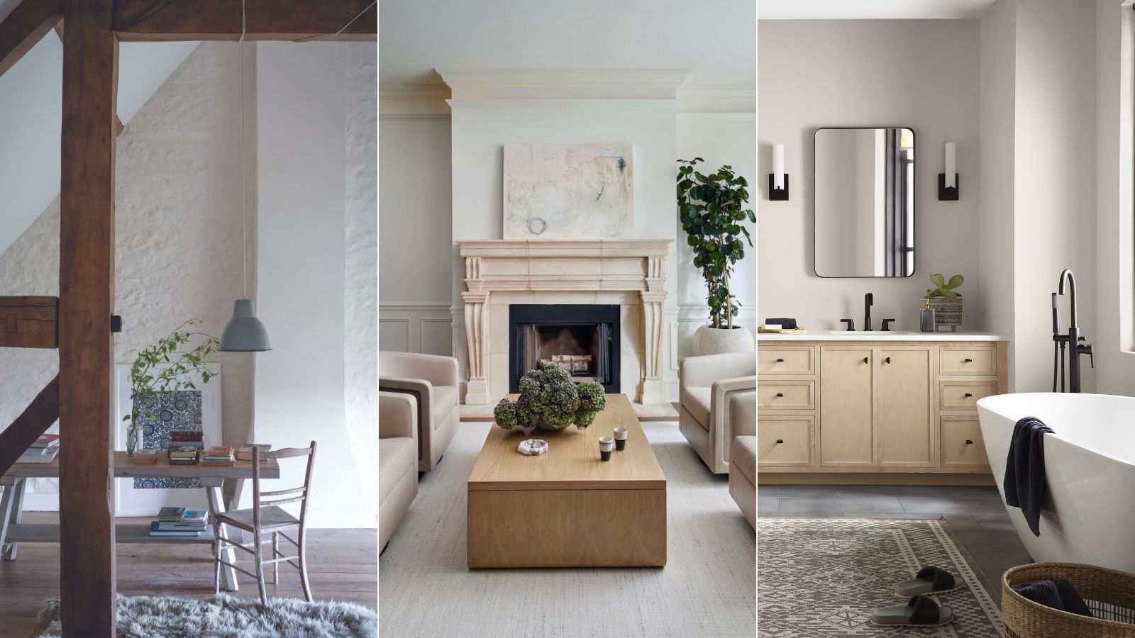
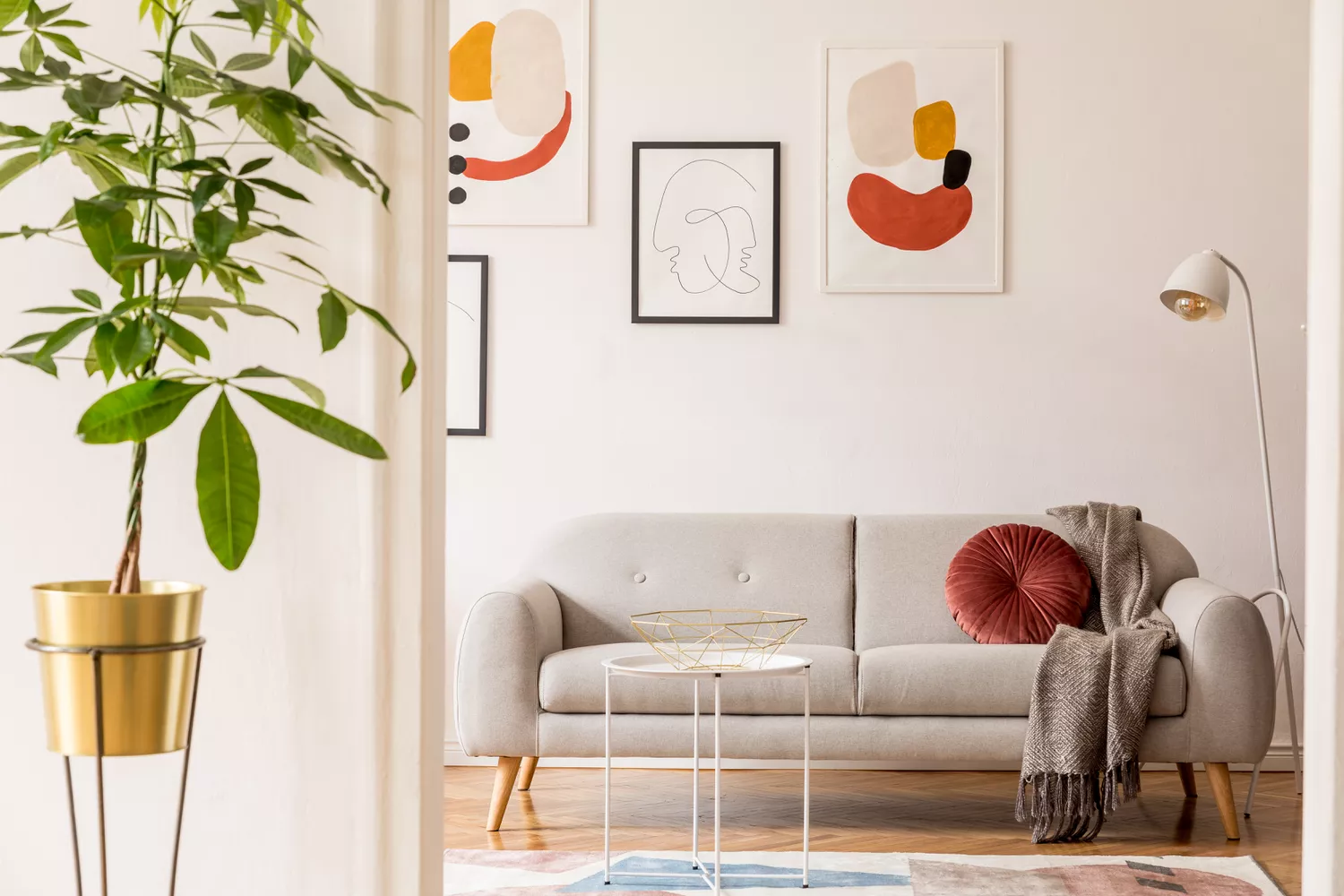
Soothing neutrals are fundamental to minimalist schemes, particularly in bedrooms, bathrooms, and living areas where a tranquil environment is desired. Colors like BEHR’s Whipped Cream, Even Better Beige, and Tranquil Gray are favored for their ability to create a clean, uncluttered look that emphasizes simplicity and functionality. These neutrals foster a calming atmosphere, allowing the space's essential elements to take precedence without visual distractions. Furthermore, they enhance natural light, making rooms feel more spacious and open.
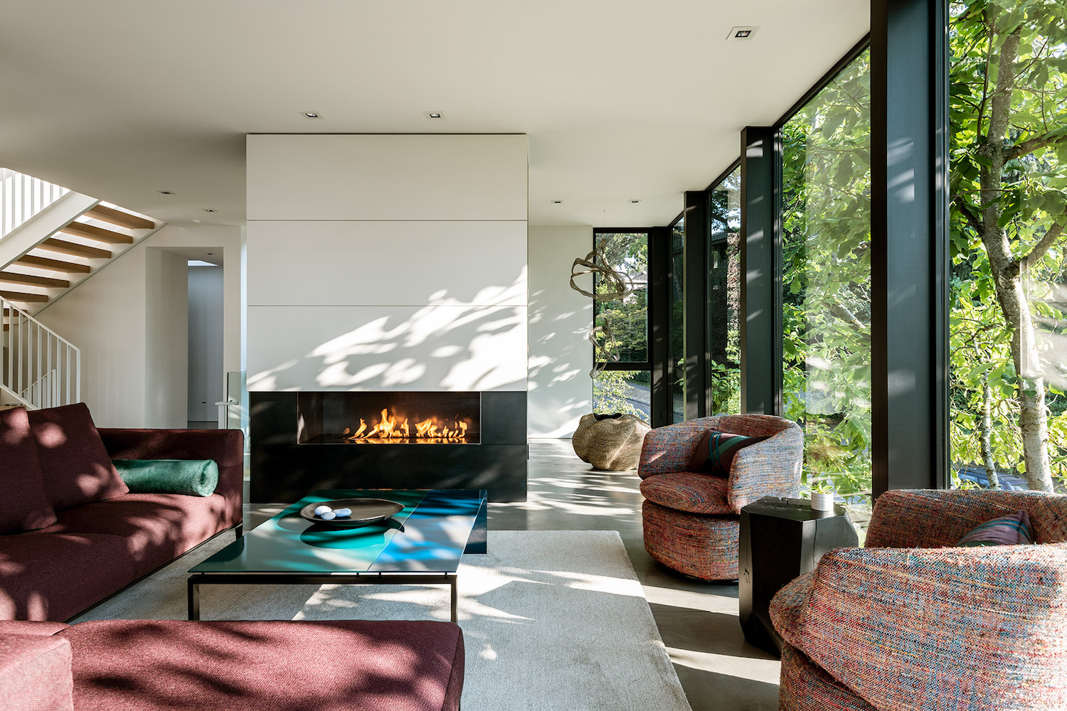
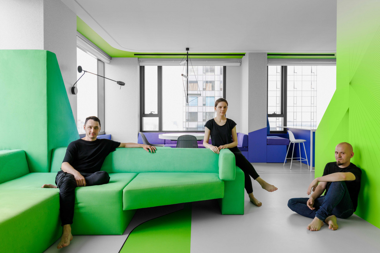
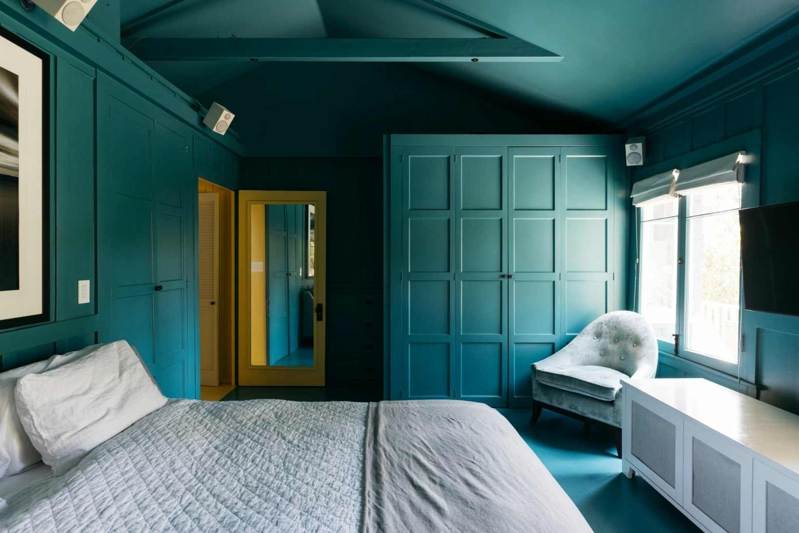
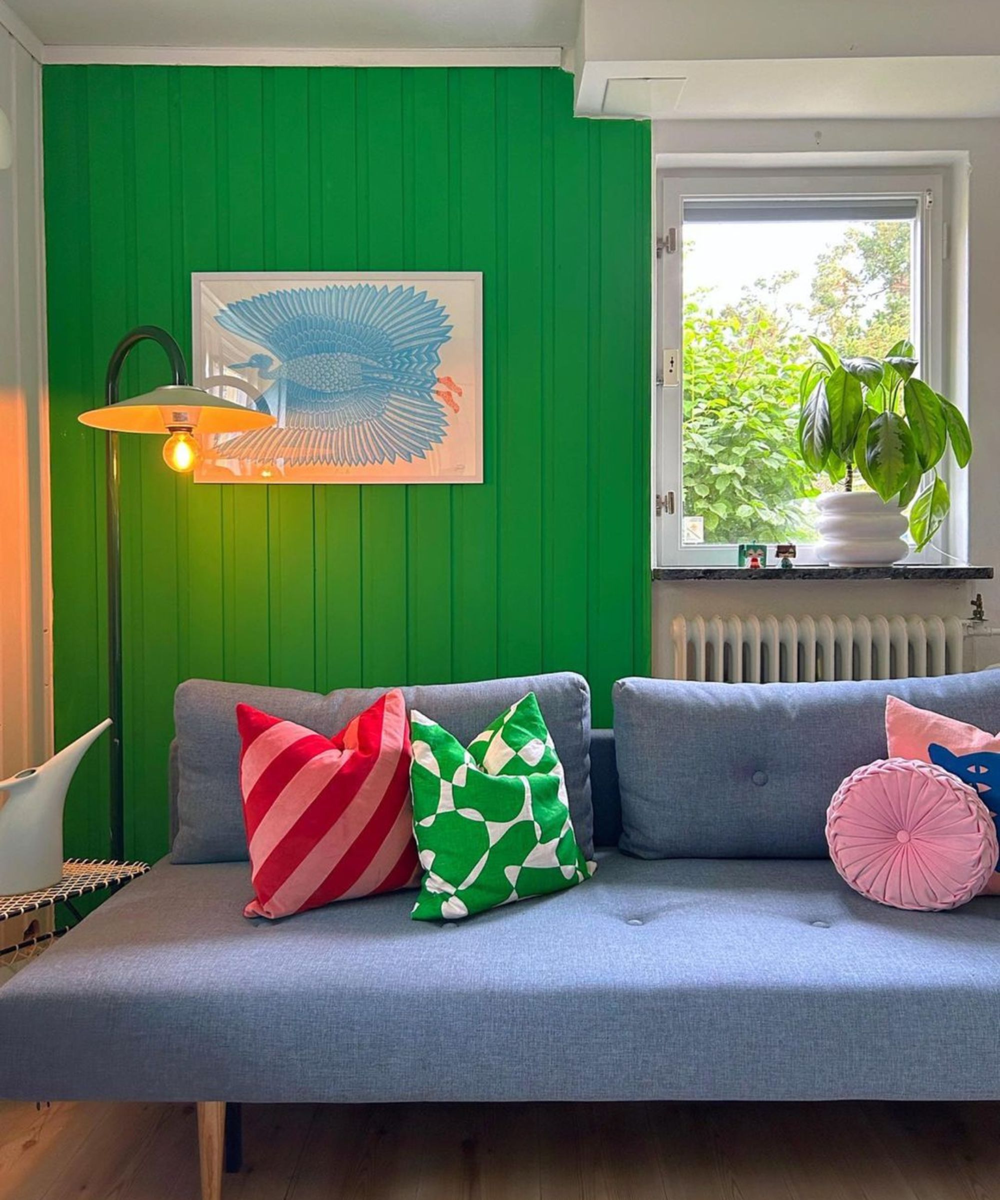
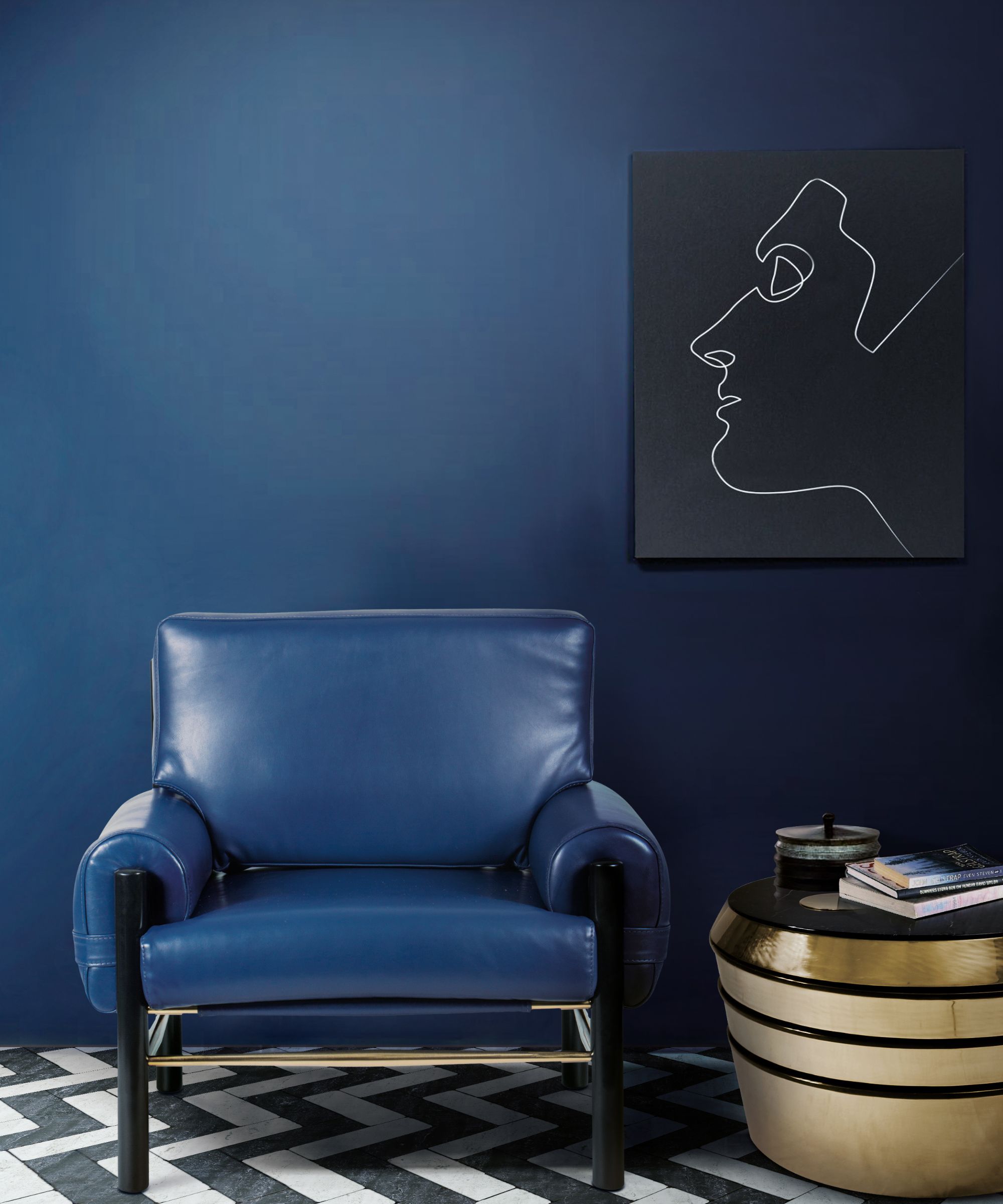
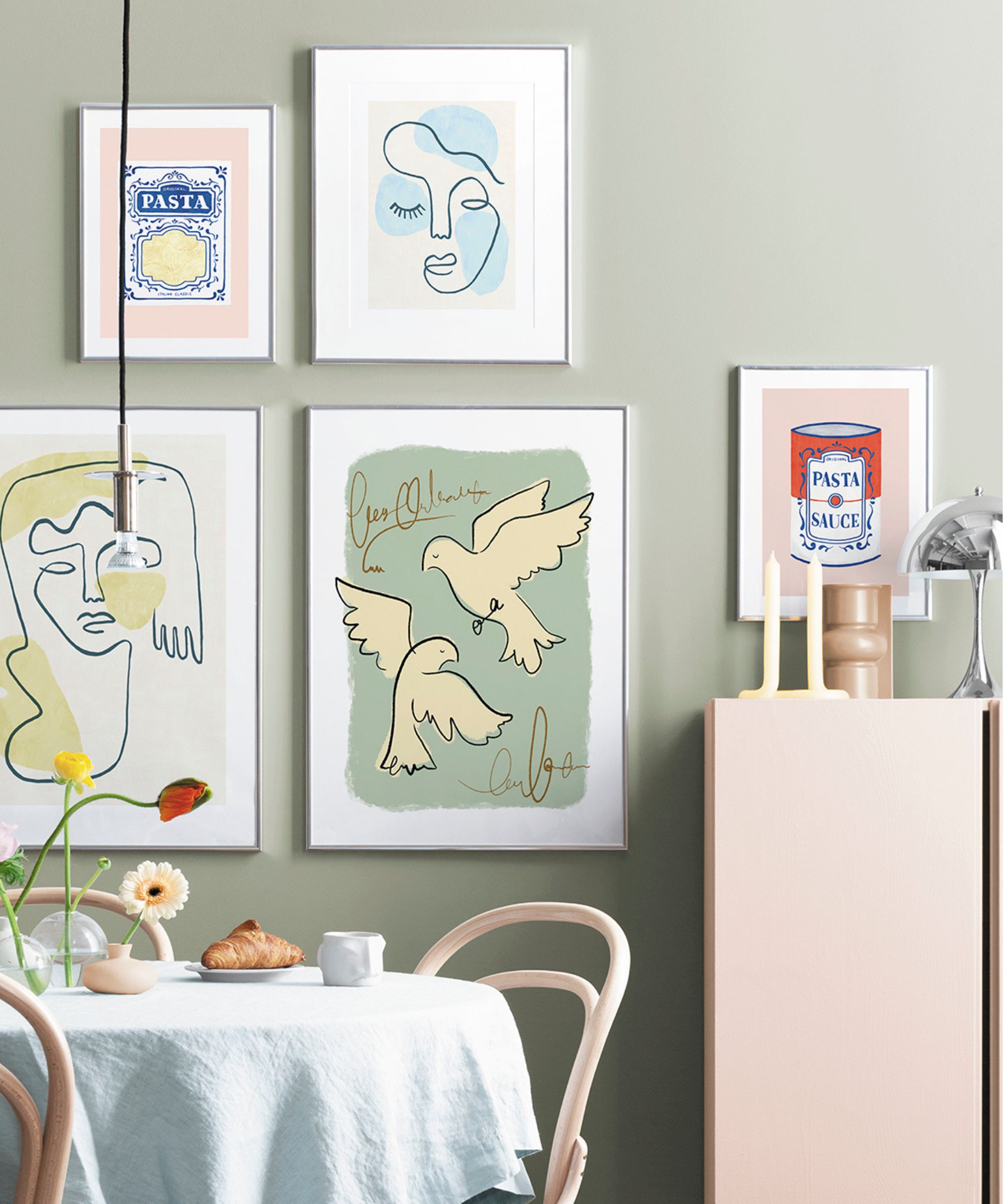
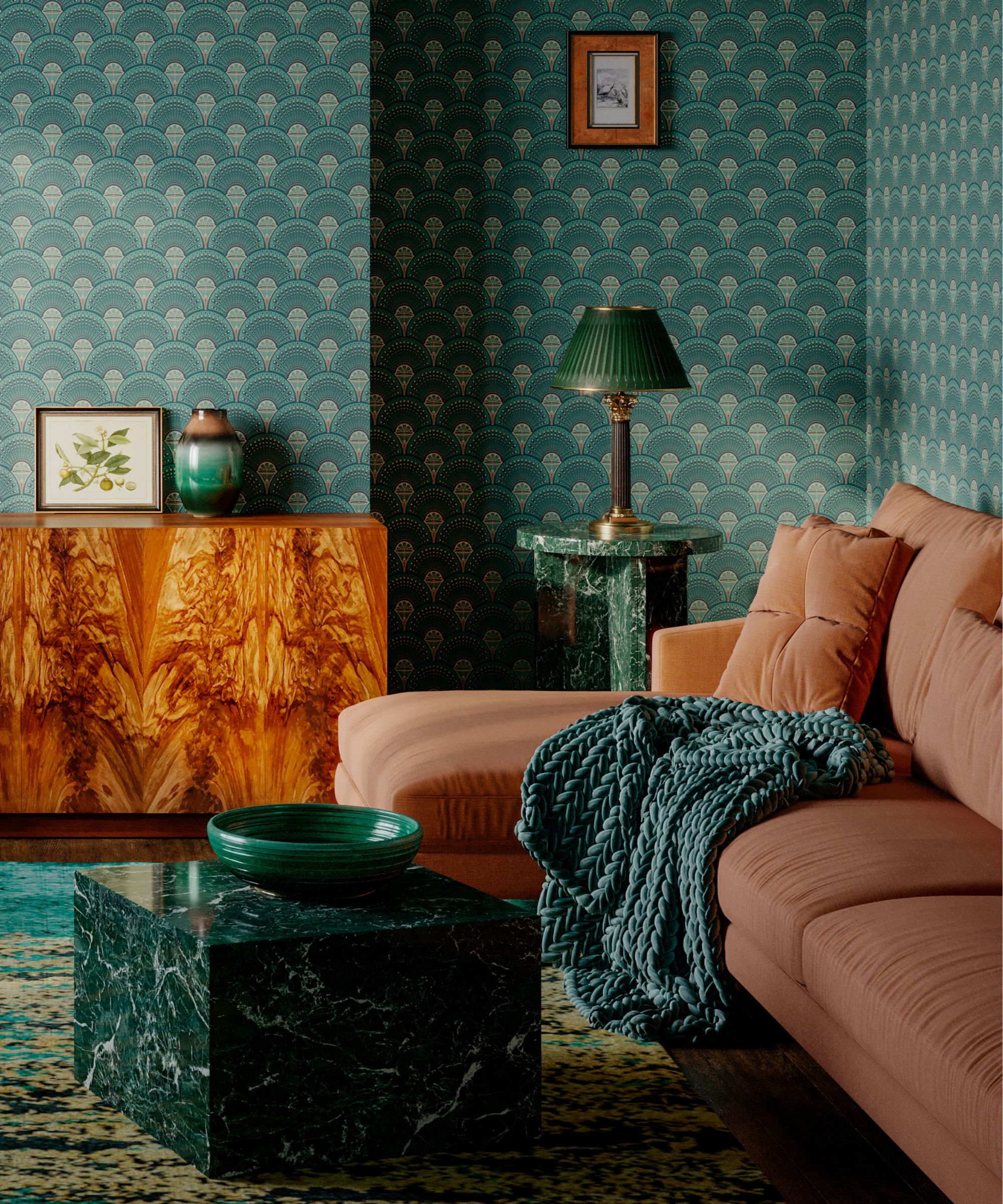
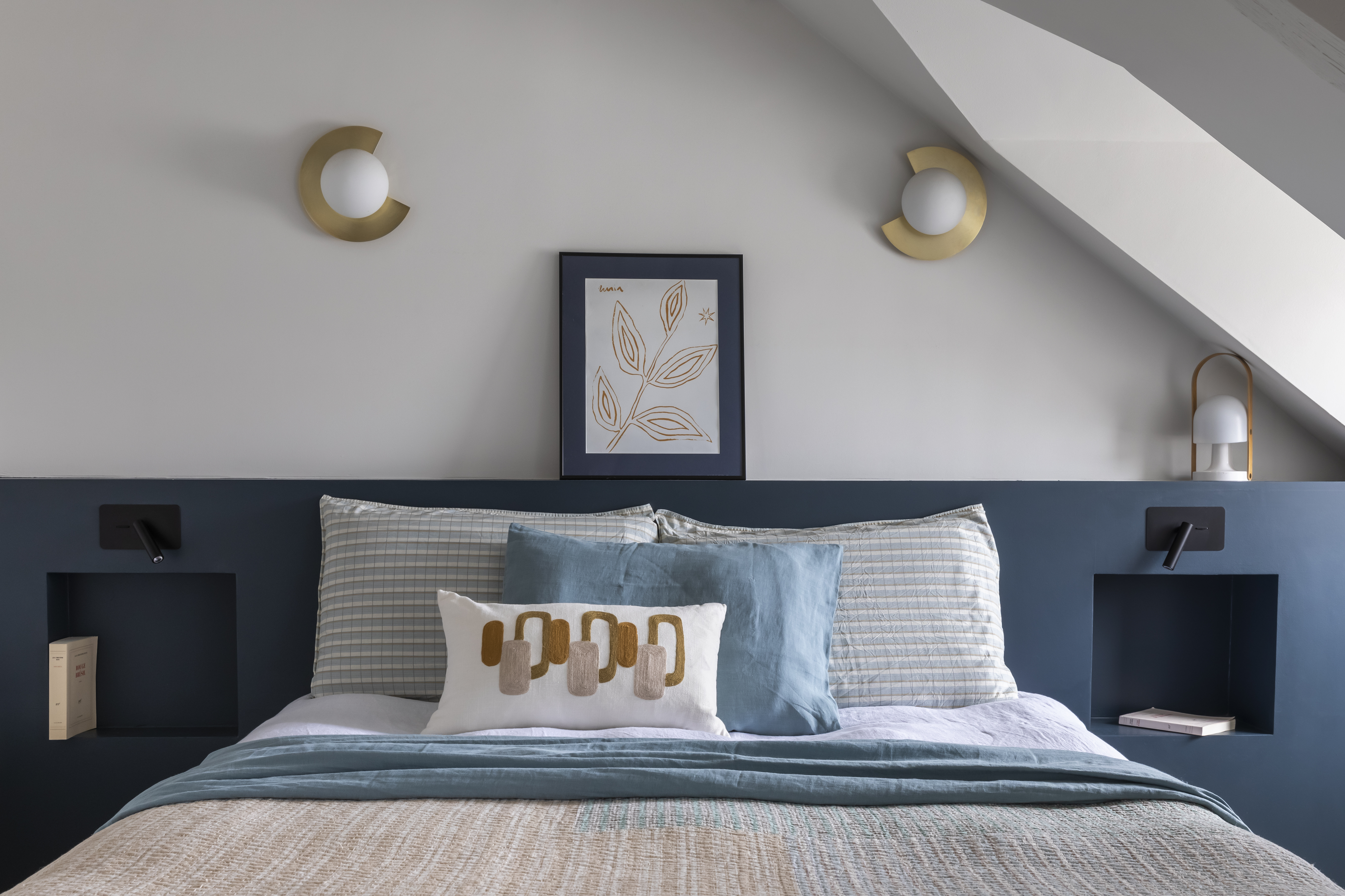
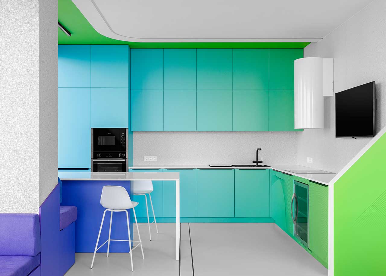
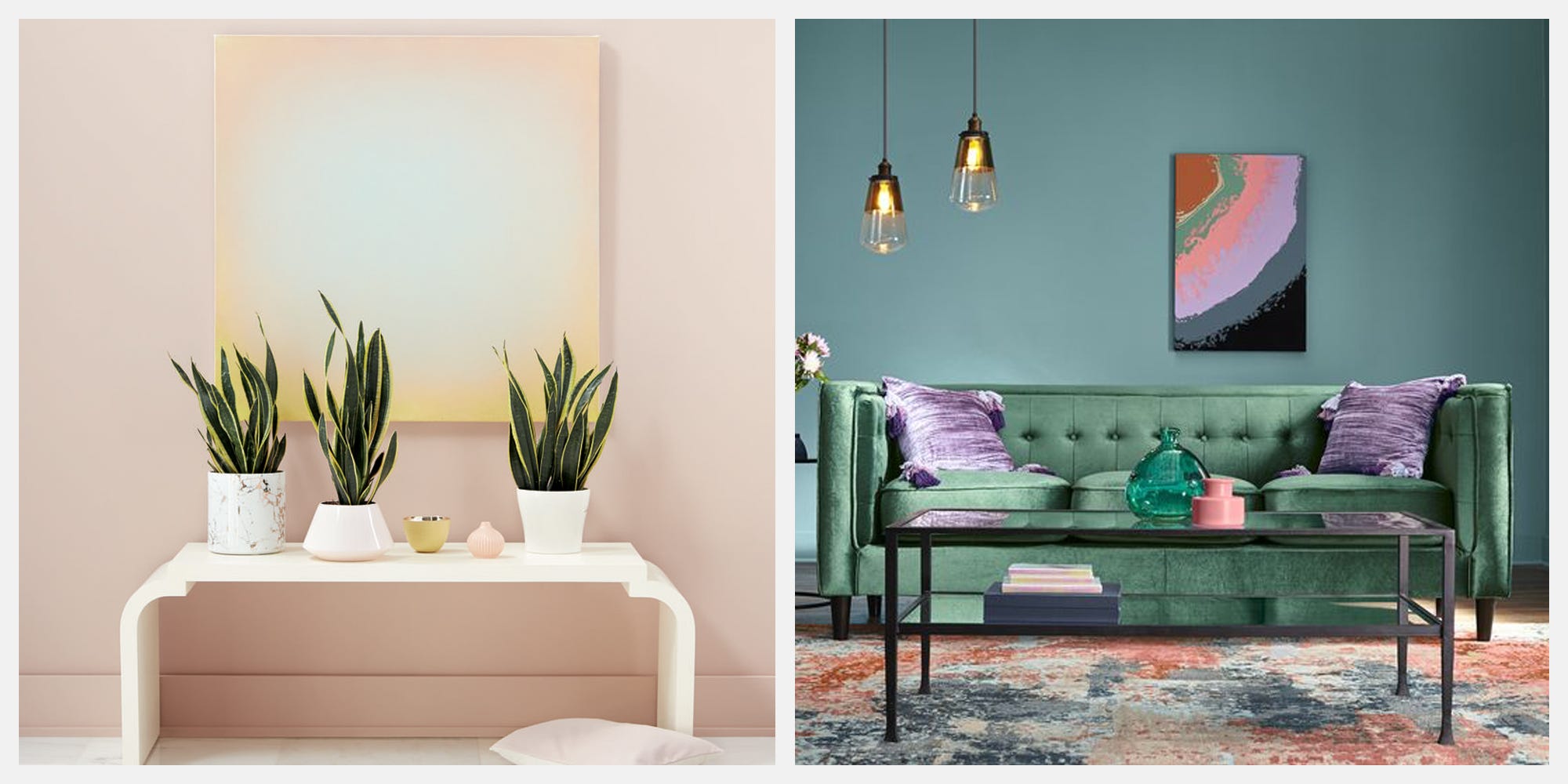
While neutrals form the core, minimalist schemes can benefit from intentional pops of calming greens. Incorporating subtle hints of saturated colors like forest green or sage green can add depth and contrast without overwhelming the pared-back aesthetic. This approach maintains a sleek and minimal feel while introducing warmth and organic color, often achieved through strategically placed plants or subtle green accents in soft furnishings.
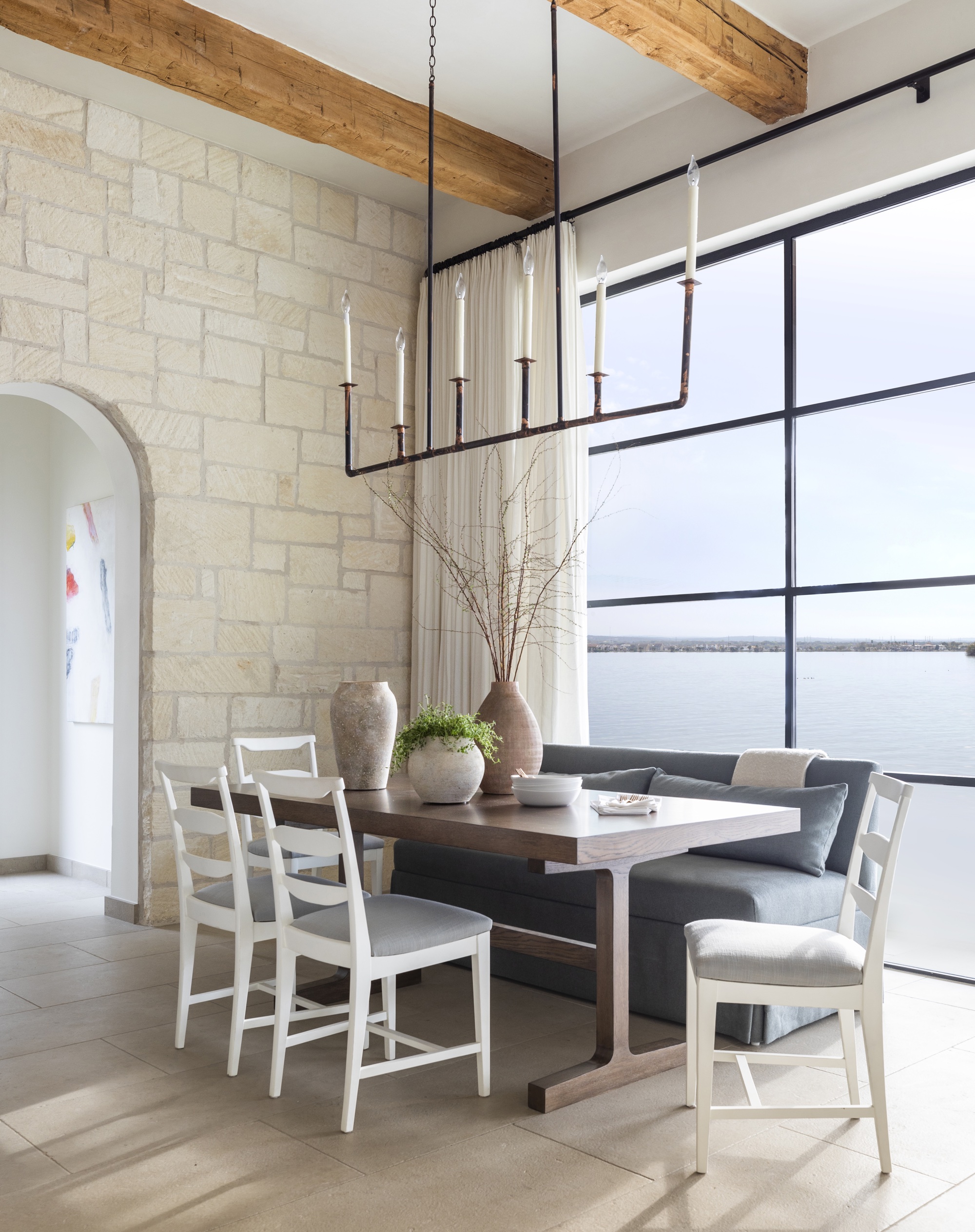
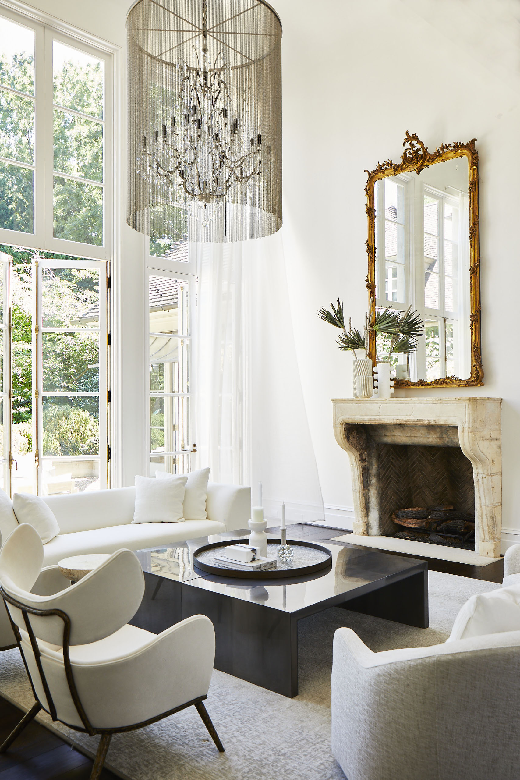
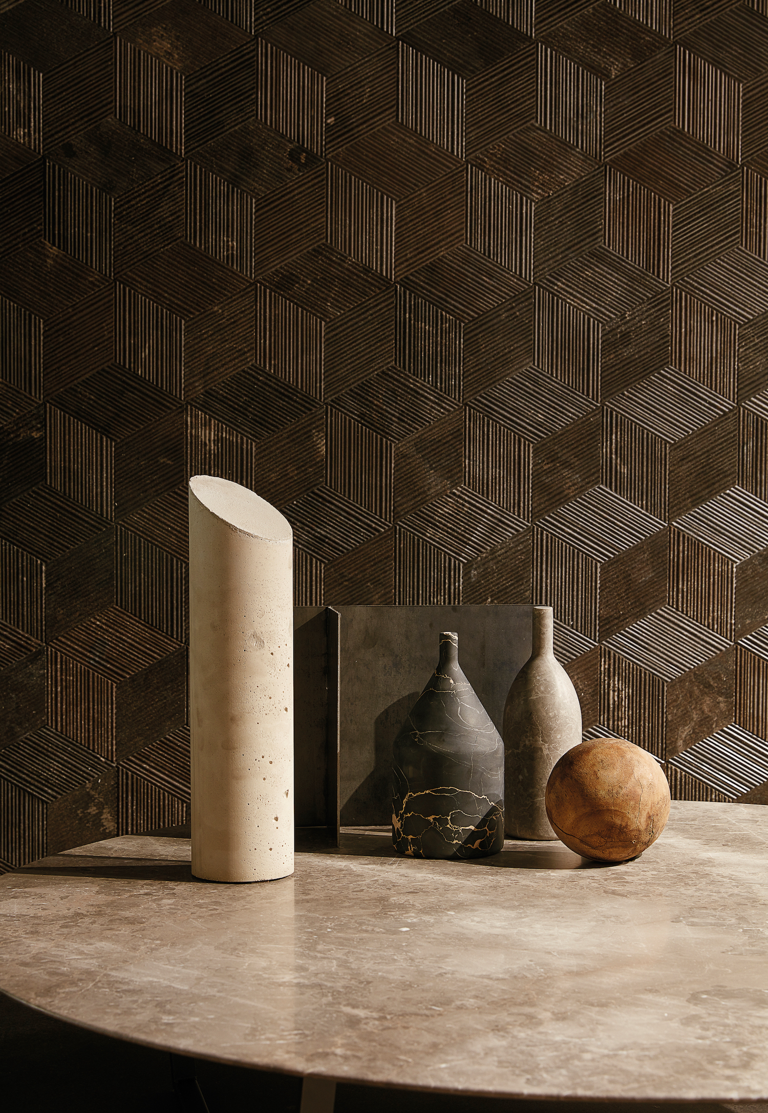
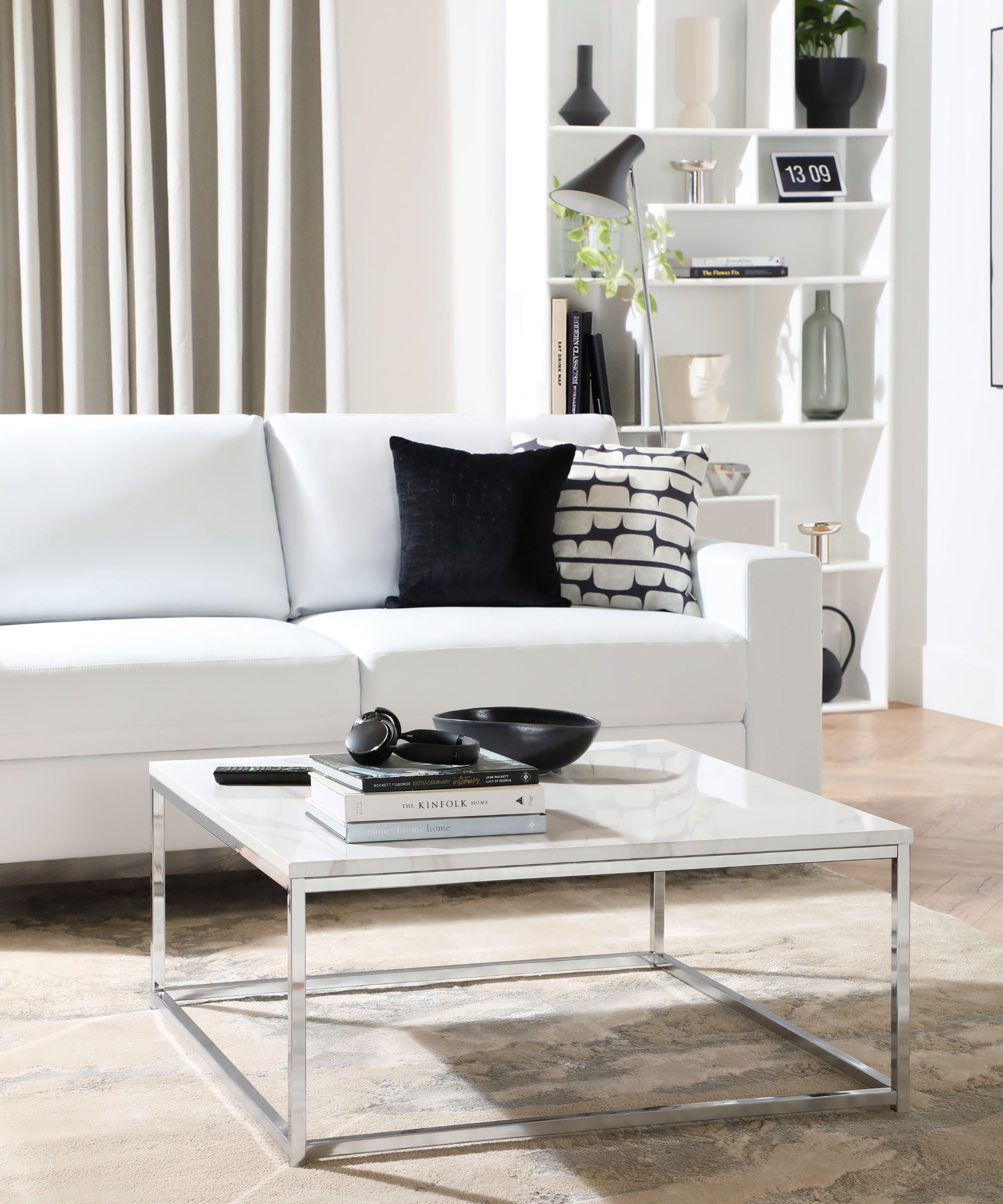
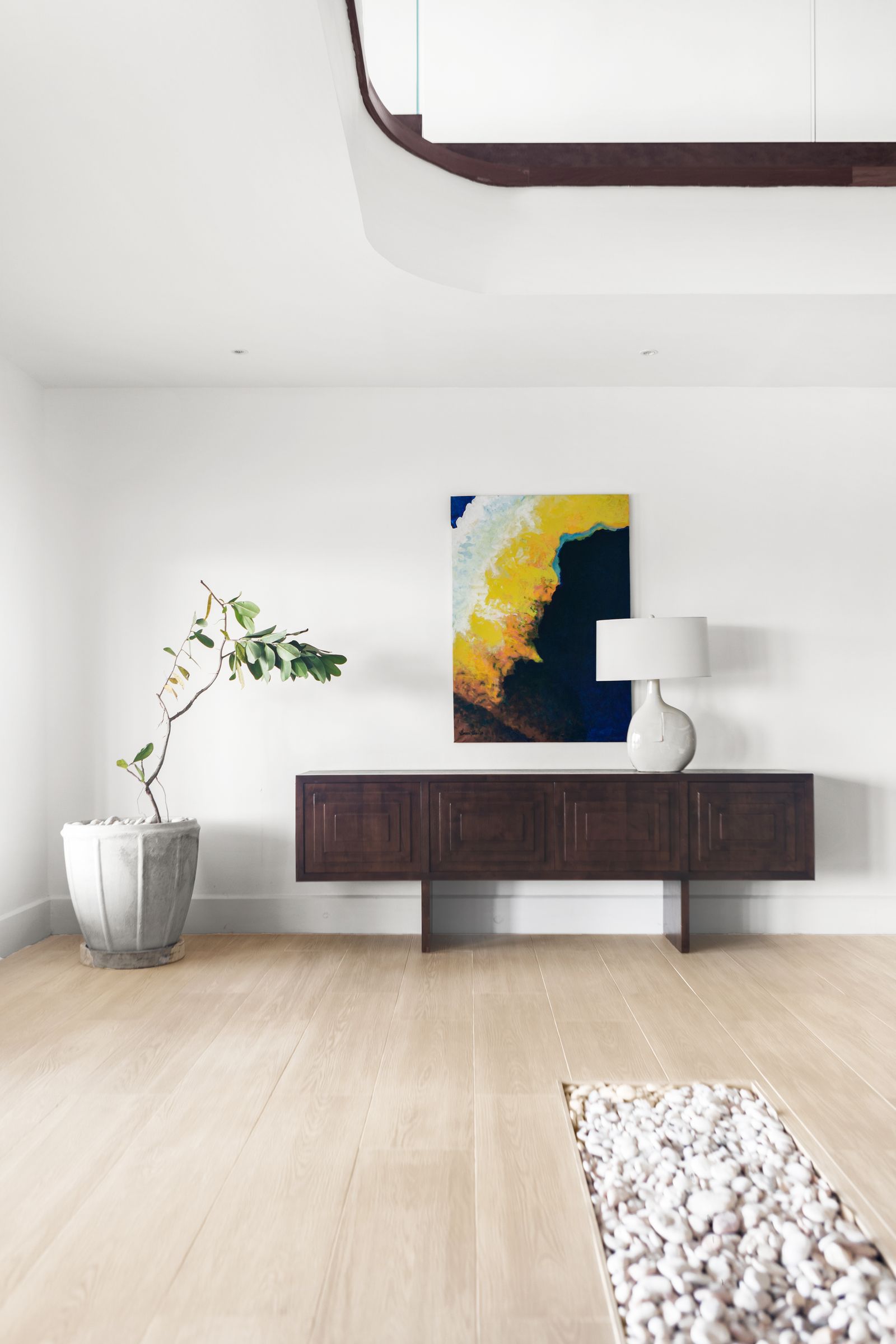
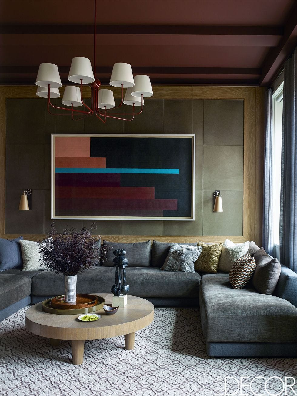
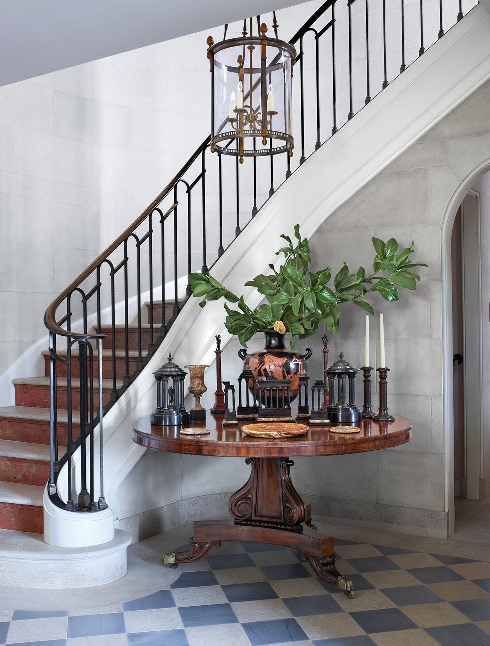
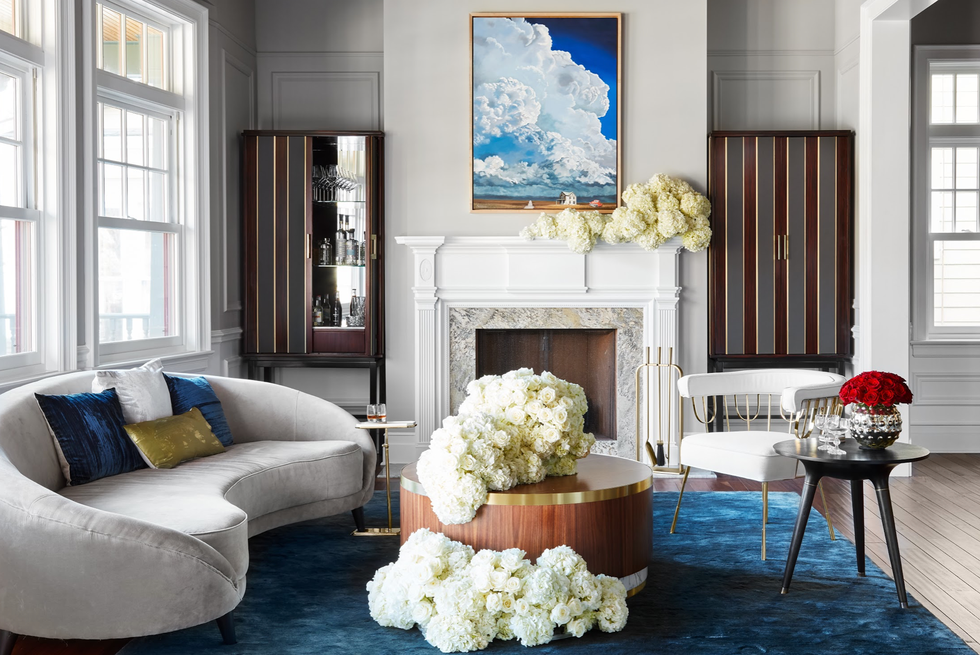
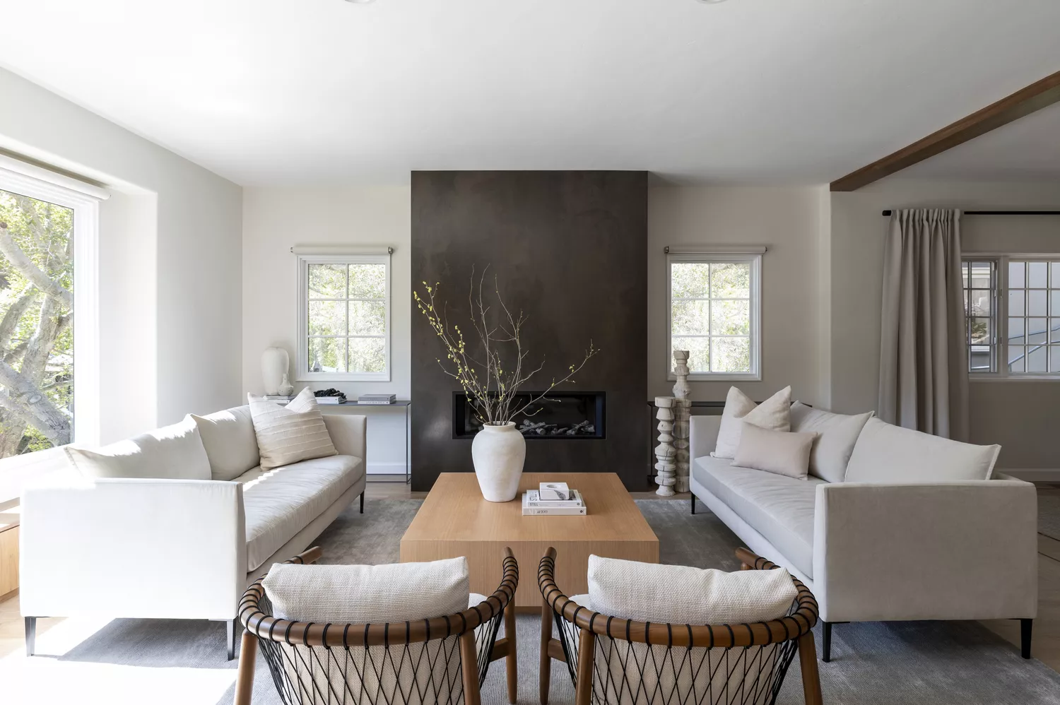
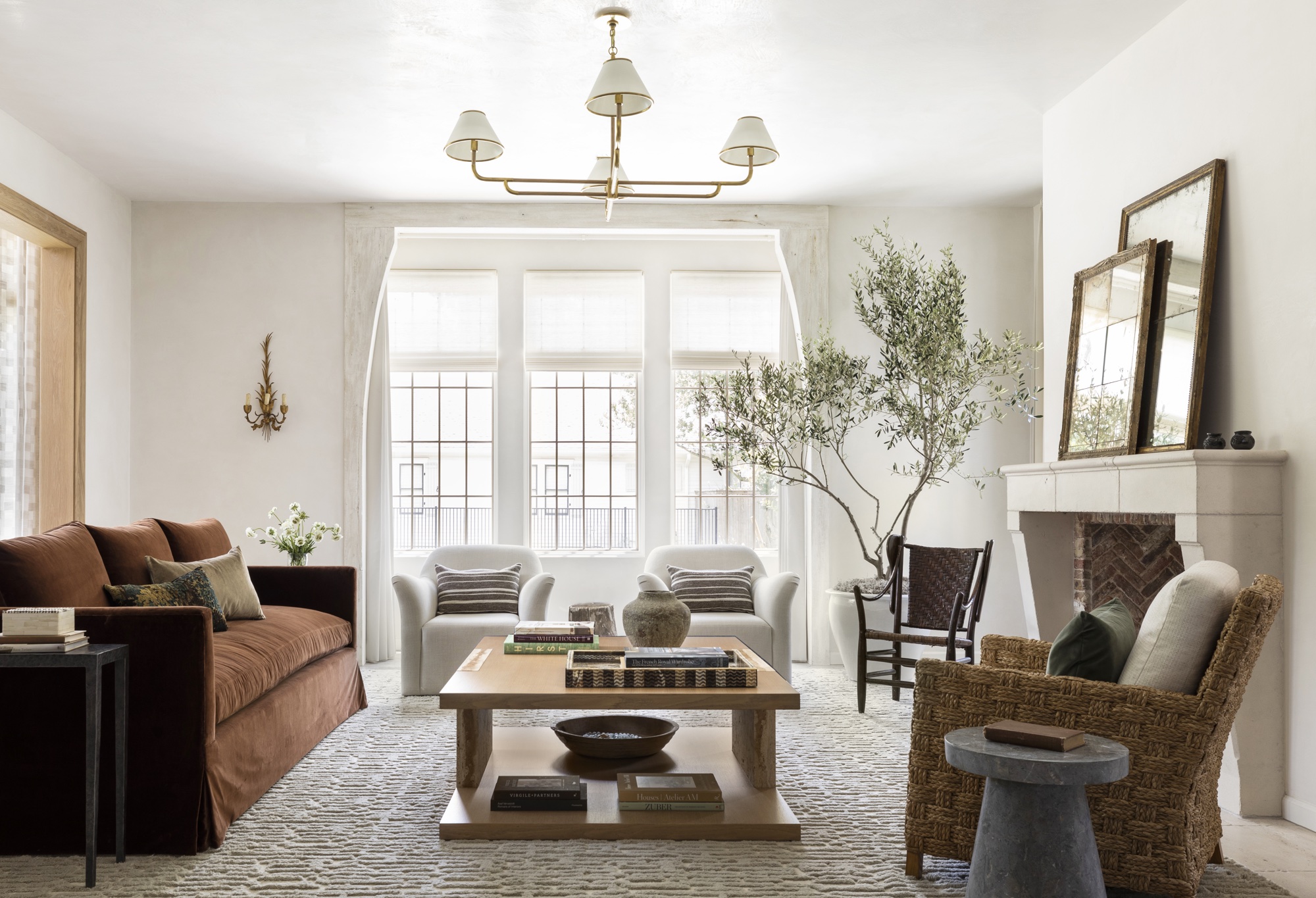
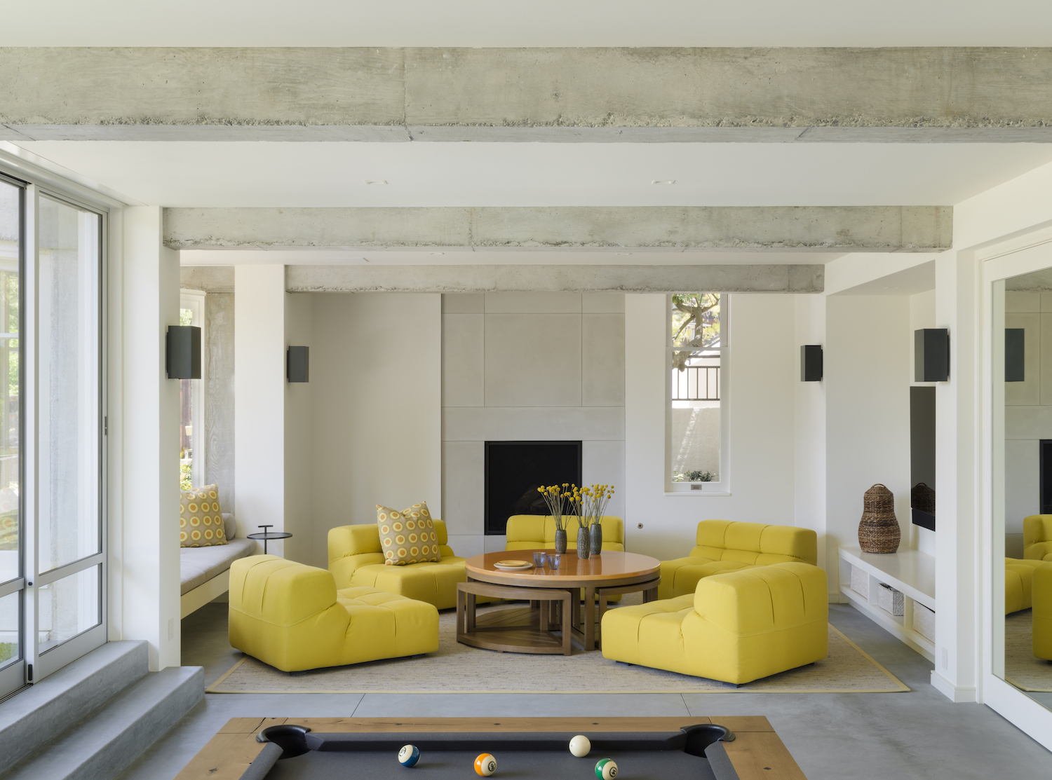
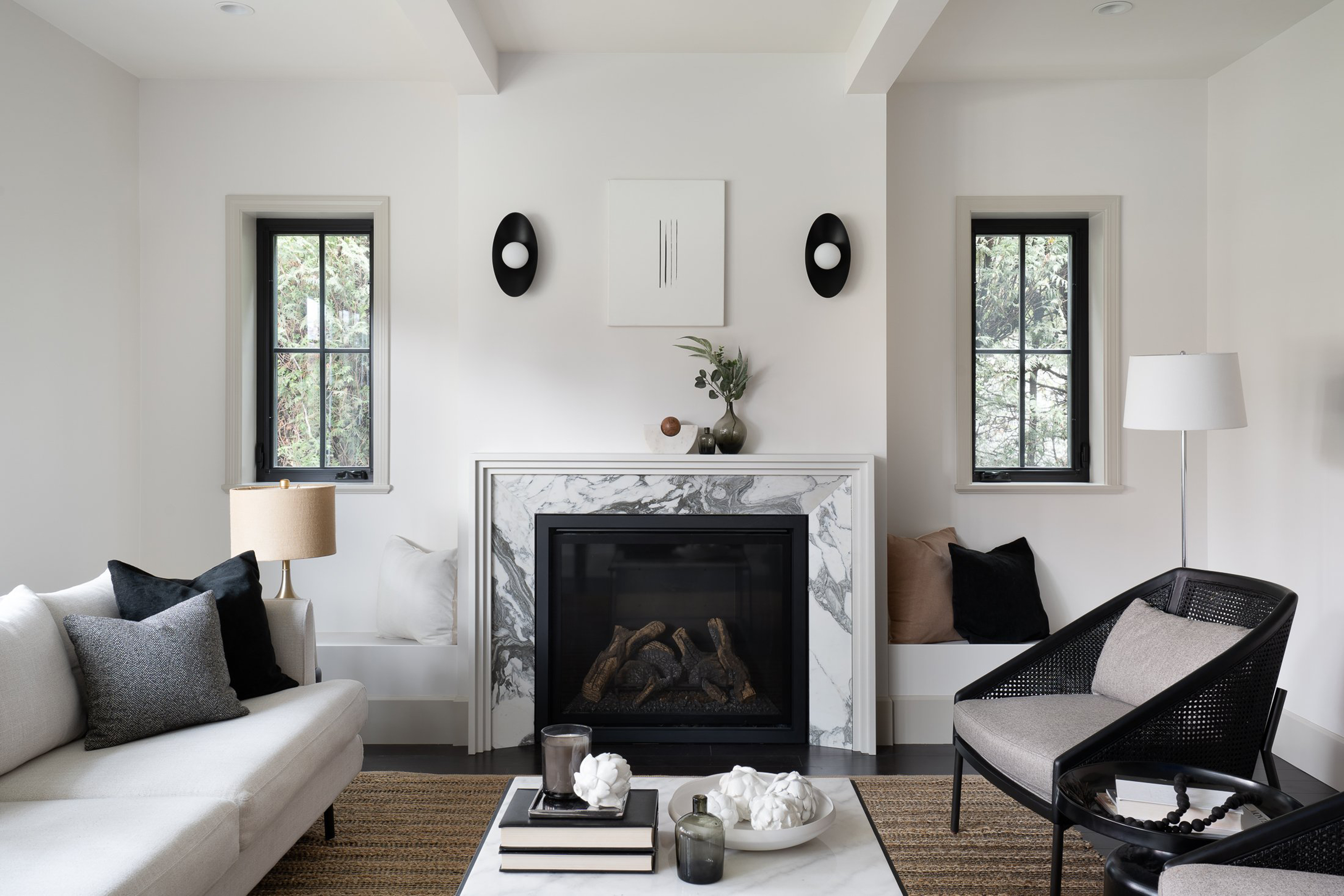
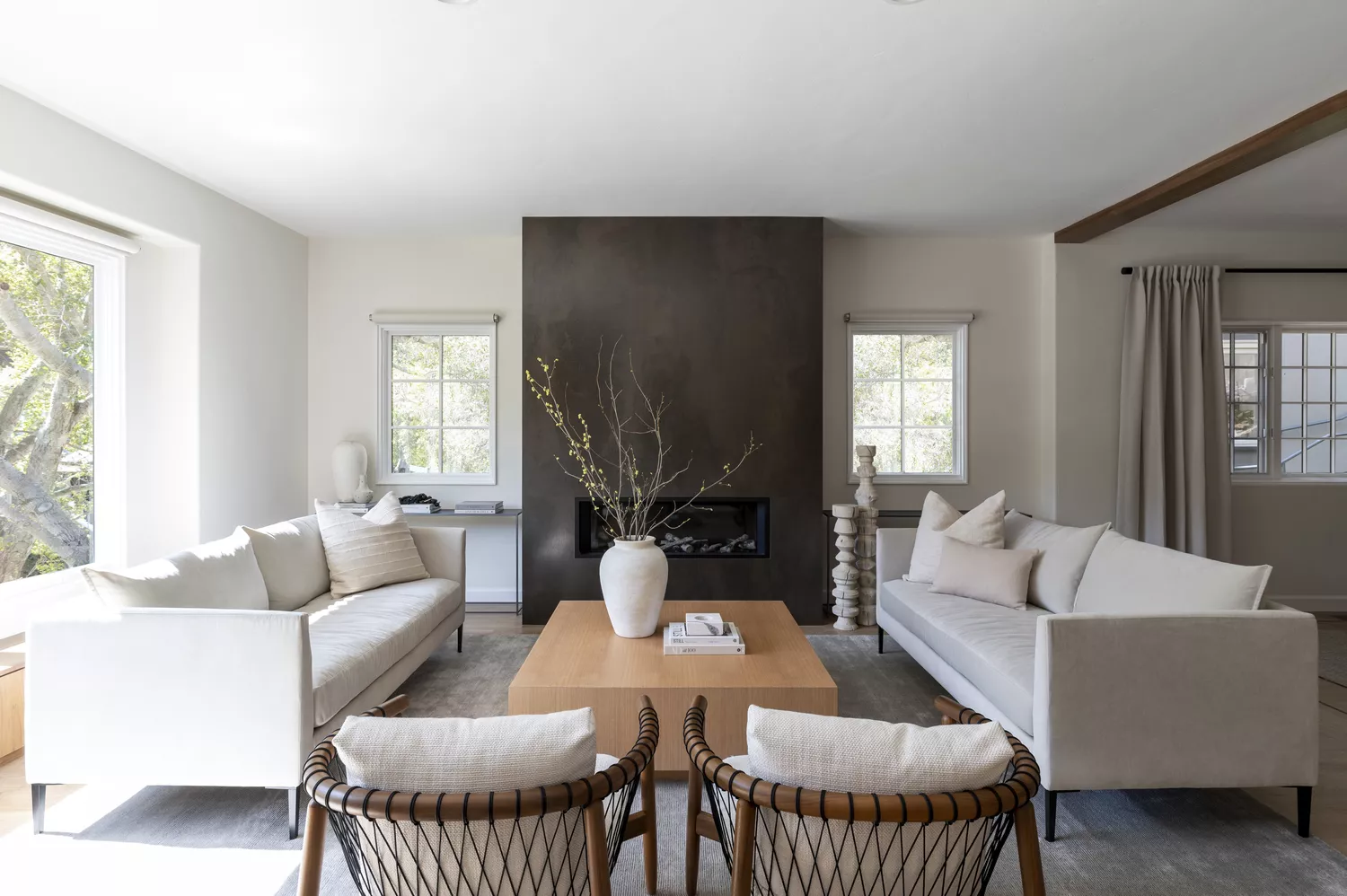
Finally, the integration of neutral hues with natural tones and textures is vital. Character and visual interest in a minimalist home aren't solely derived from paint and furniture; natural materials play a significant role. When pursuing a neutral scheme, contrasting elements such as wood or stone accents can prevent the space from appearing dull or bland. Utilizing different shades of neutrals and combining various textures—like stone, wood, and fabrics—adds depth, visual intrigue, and sophistication. For instance, a stone fireplace or a wooden coffee table can introduce warmer hues and textural interest, ensuring the room feels inviting and avoids a flat aesthetic while still adhering to minimalist principles.
#MinimalistStyle #InteriorDesign #ColorSchemes #NeutralColors #WarmMinimalism #HomeDecor #ParedBackDesign #NaturalMaterials #DecoratingTips #MinimalistStyle #InteriorDesign #ColorSchemes #NeutralColors #WarmMinimalism #HomeDecor #ParedBackDesign #NaturalMaterials #DecoratingTips
0 comment in total
 No comments yet
You may also like
Designers agree on the perfect minimalist color palette - 'beautiful, pared-back, very curated'

If Your Monochromic Room Feels Flat, Here’s How to Fix It

The small space color trends that design experts say will be huge in 2024

25 Minimalist Decor Ideas to Try At Home

9 color palettes for minimalist living rooms - calming schemes which elevate neutral decor
Monochromatic Colors: 9 Ways to Pull Off the Trend Like a Pro

5 Minimalist Decorating Mistakes Designers Always Notice
Should an entire house be painted the same color? Interior designers give their verdict
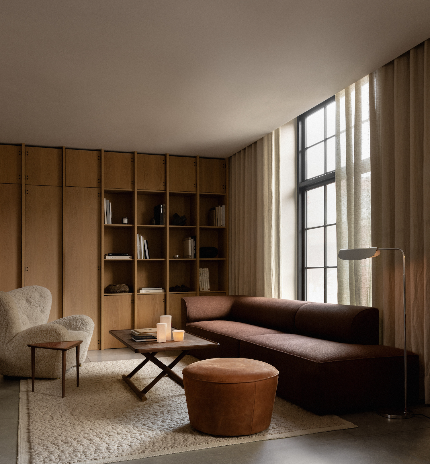
8 tricks to create a minimalist color palette that doesn't feel one-dimensional - elevated and enriching schemes
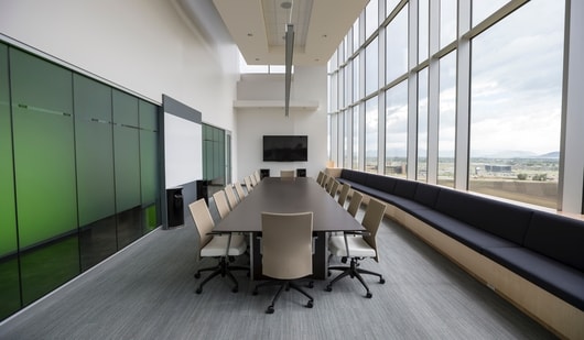
Minimalist office decor: Embracing neutral colour palettes for modern workspace | Hindustan Times

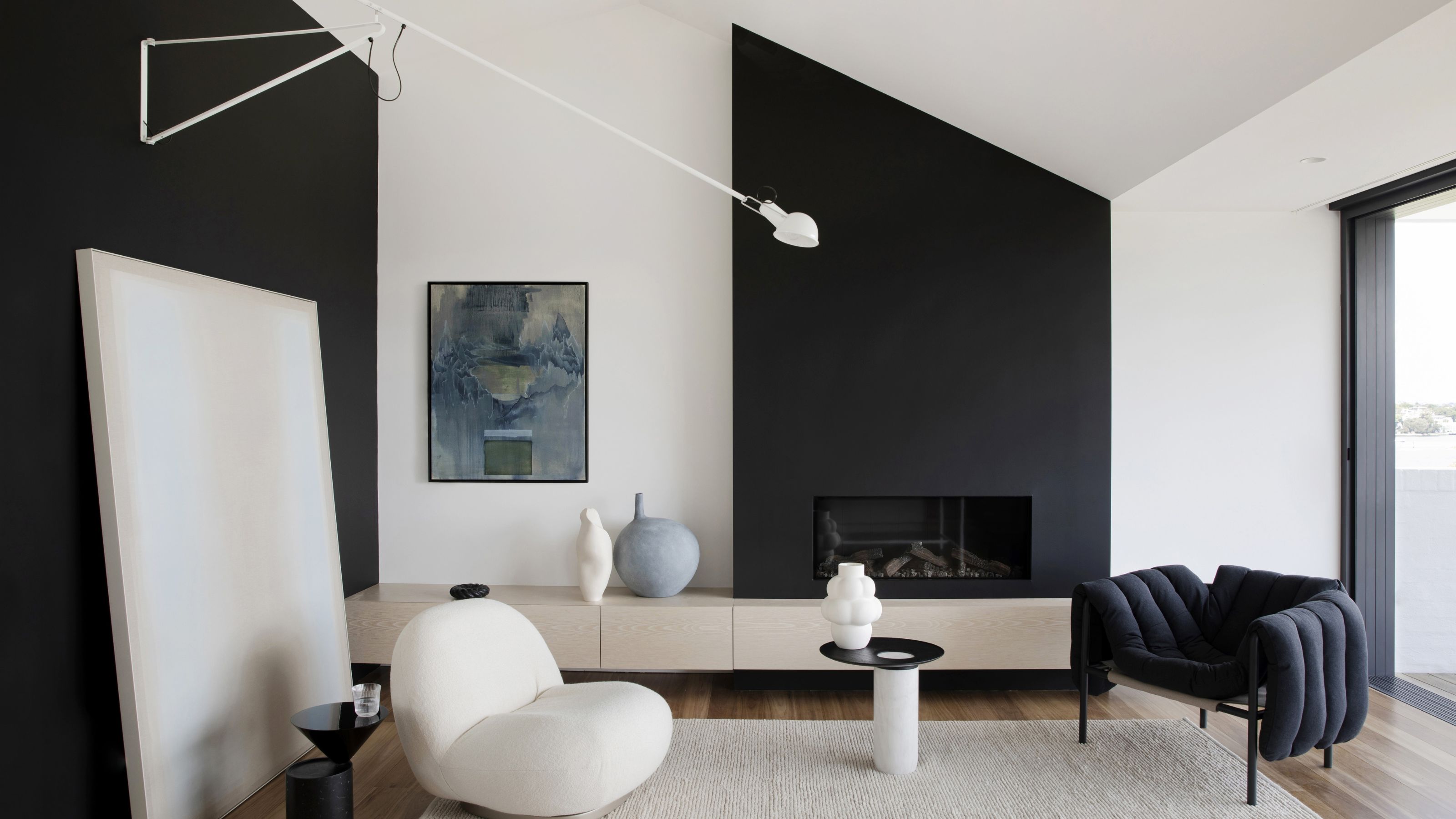
8 Minimalist Paint Ideas That Add Interest to Pared-Back Spaces, But Never Feel Fussy
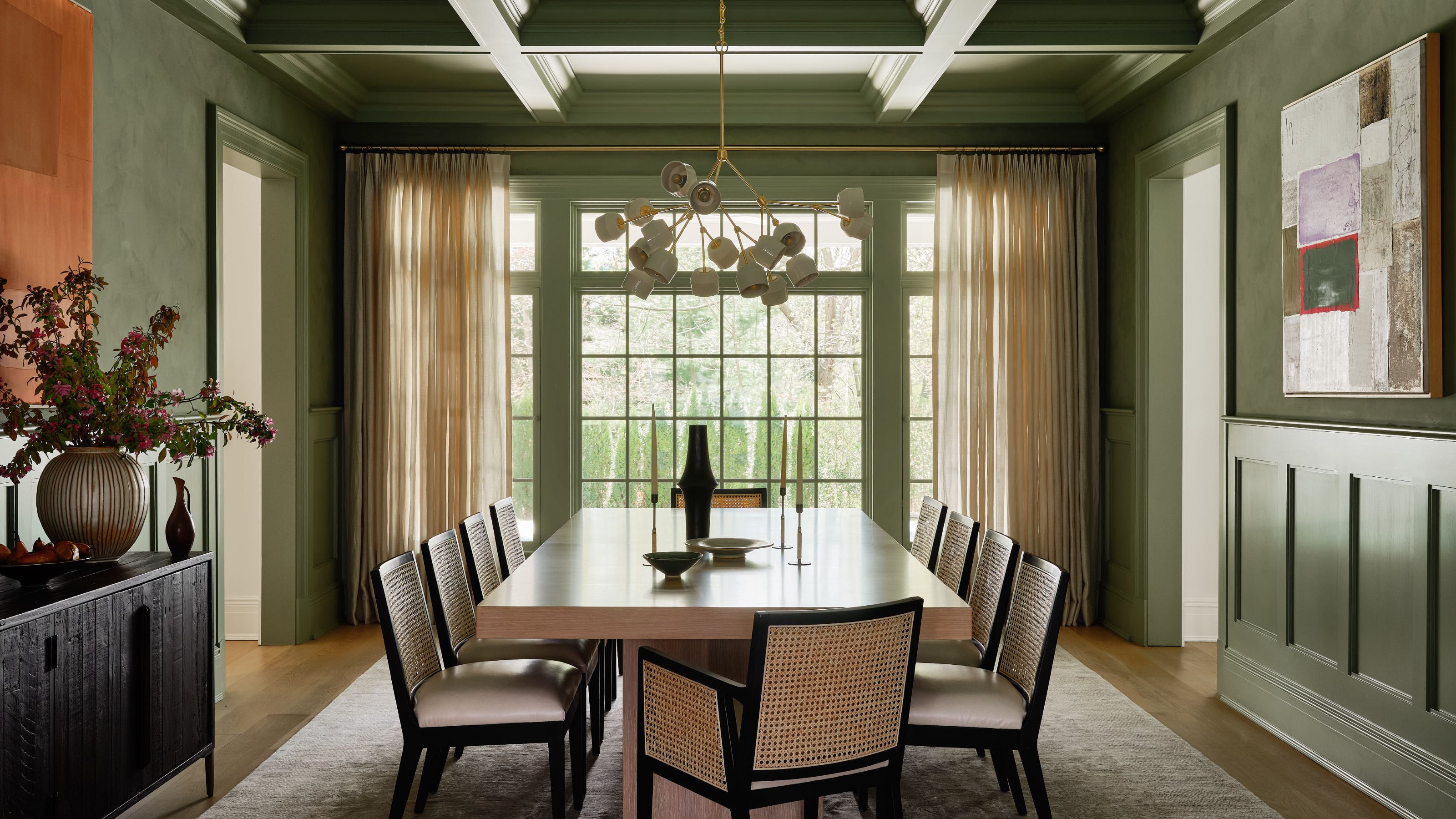
A Complete Guide to Color Drenching a Room — The Tone-On-Tone Paint Style Taking Over Our Homes
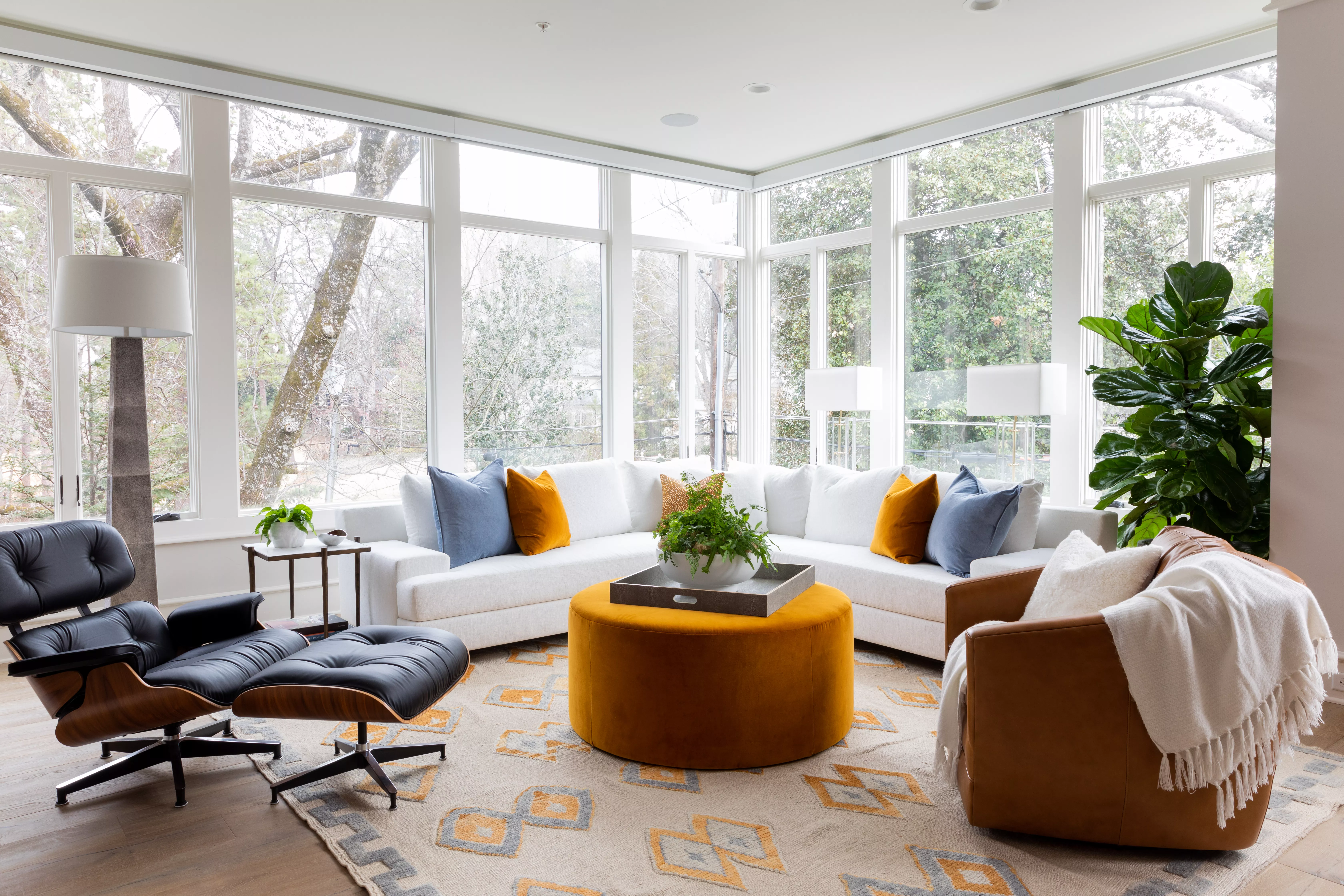
The Colorful Minimalism Trend Will Give You the Best of Both Worlds

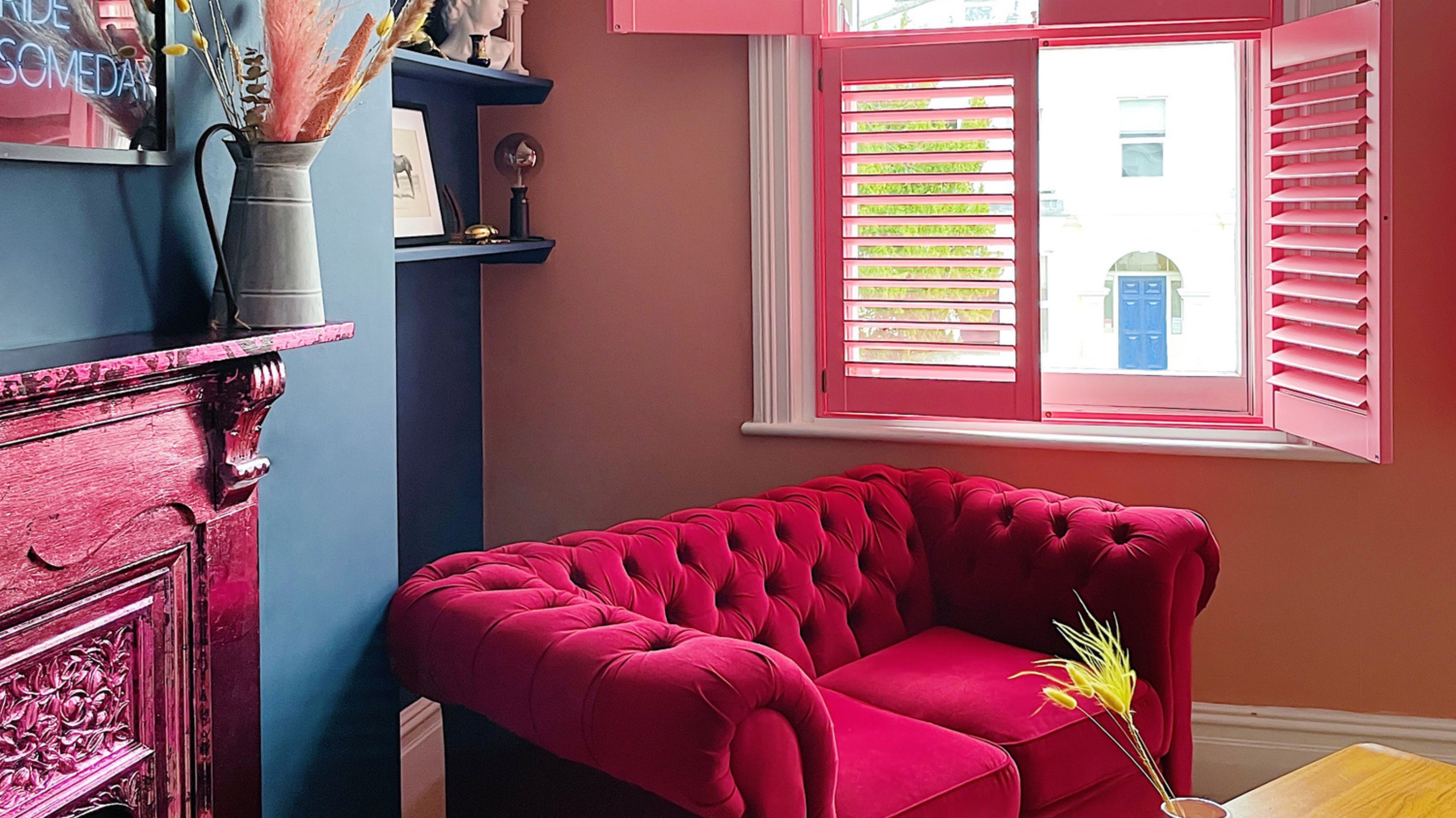
The best paint colors for small living rooms, according to design experts

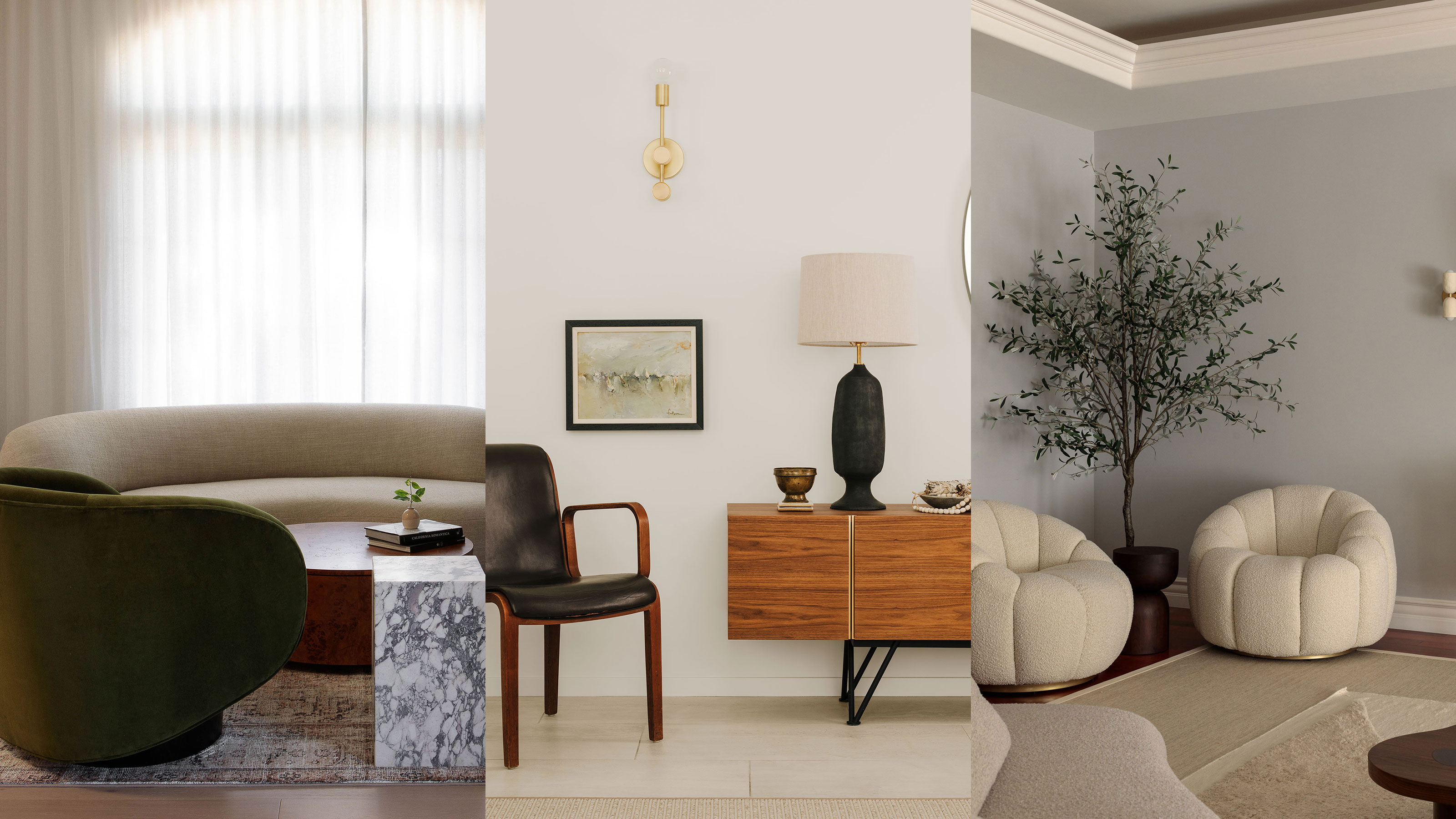
7 gorgeous minimalist small living room ideas — say bye-bye to bland

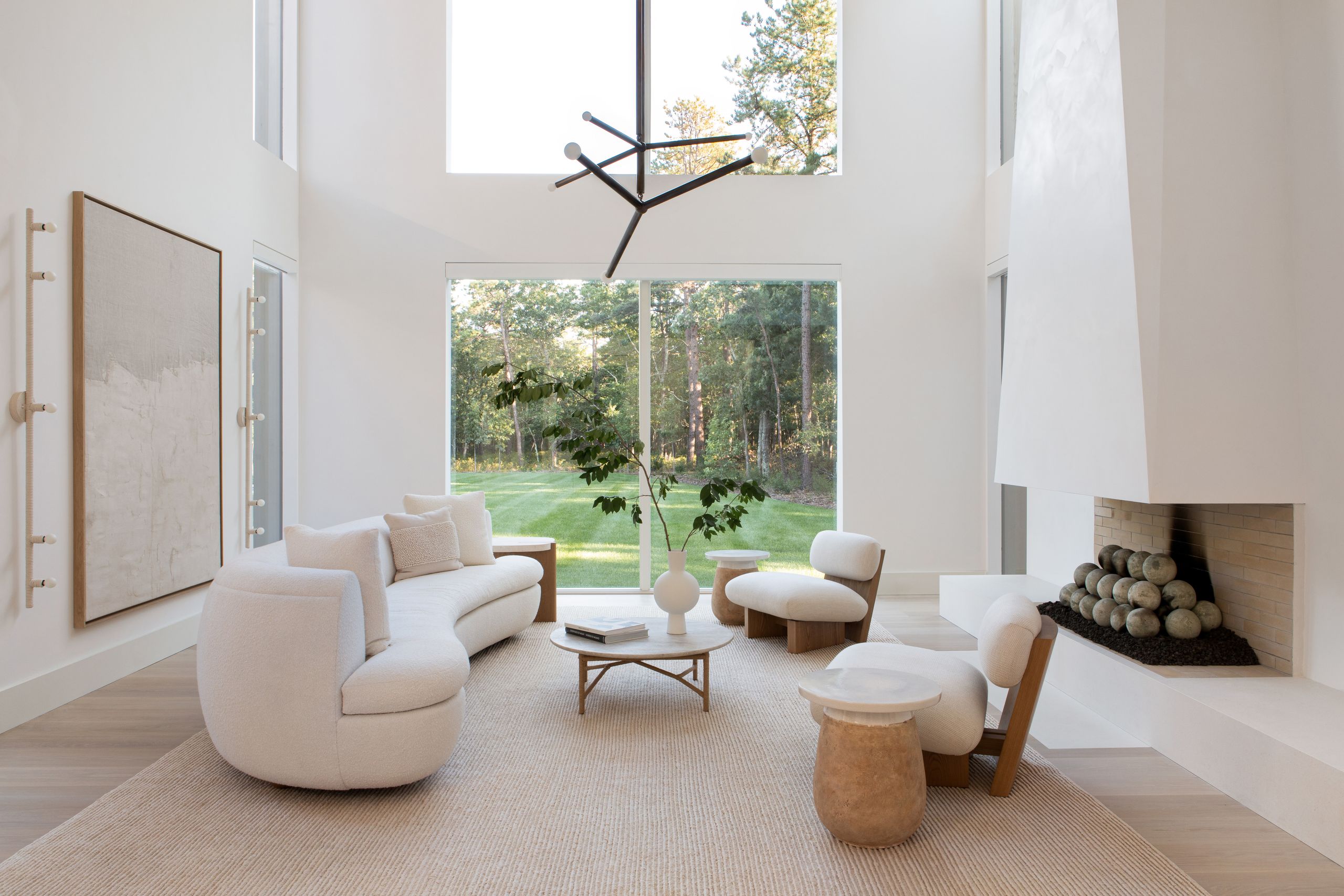
The Best Minimal Decor Ideas for a Streamlined Home
A Minimalist Apartment With a Bright Color Gradient Ranging From Green to Purple
Minimalist Interior Design: Everything You Need to Know About This Intentional and Pared-Down Style
Give Your Home A Modern Refresh With 2019's Top Color Trends

12 Minimalist Home Ideas That Prove Serene and Organized Doesn’t Mean Boring