1/6
The Best Paint Colors for North-Facing Rooms To Create a Cozy Space That Embraces The Limited Natural Light
North-facing rooms present a unique decorating challenge due to their limited and cooler natural light. Unlike south-facing rooms that receive abundant warm sunlight, north-facing spaces can often feel flat, grayed out, or cold. However, this characteristic also offers an opportunity to create a cozy and welcoming atmosphere through strategic paint choices.
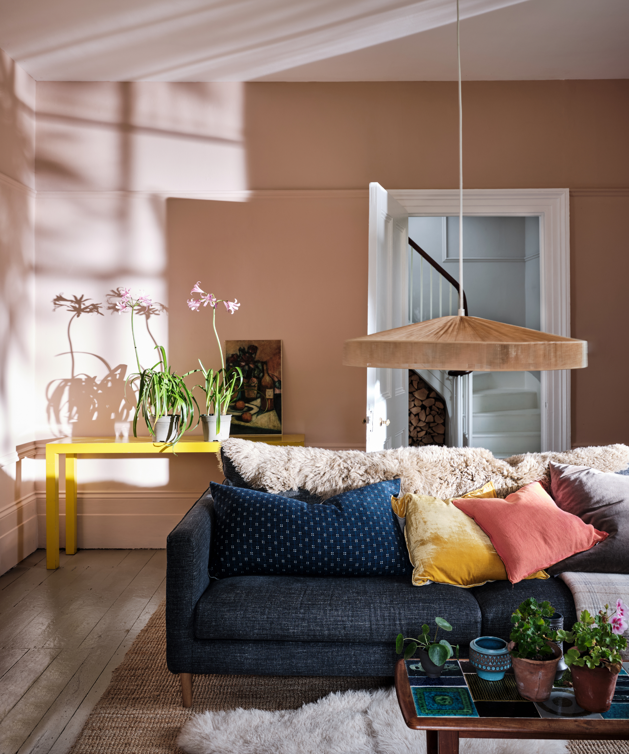
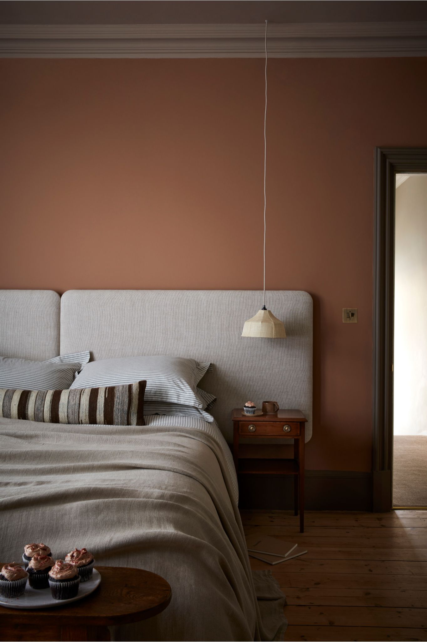
When selecting paint colors for north-facing rooms, the primary goal is to introduce warmth and depth. Interior design experts emphasize the importance of understanding how the room's natural light interacts with different shades. There are two main approaches: either counteracting the cool light with warm-toned paints or embracing the limited light with darker, moodier hues.
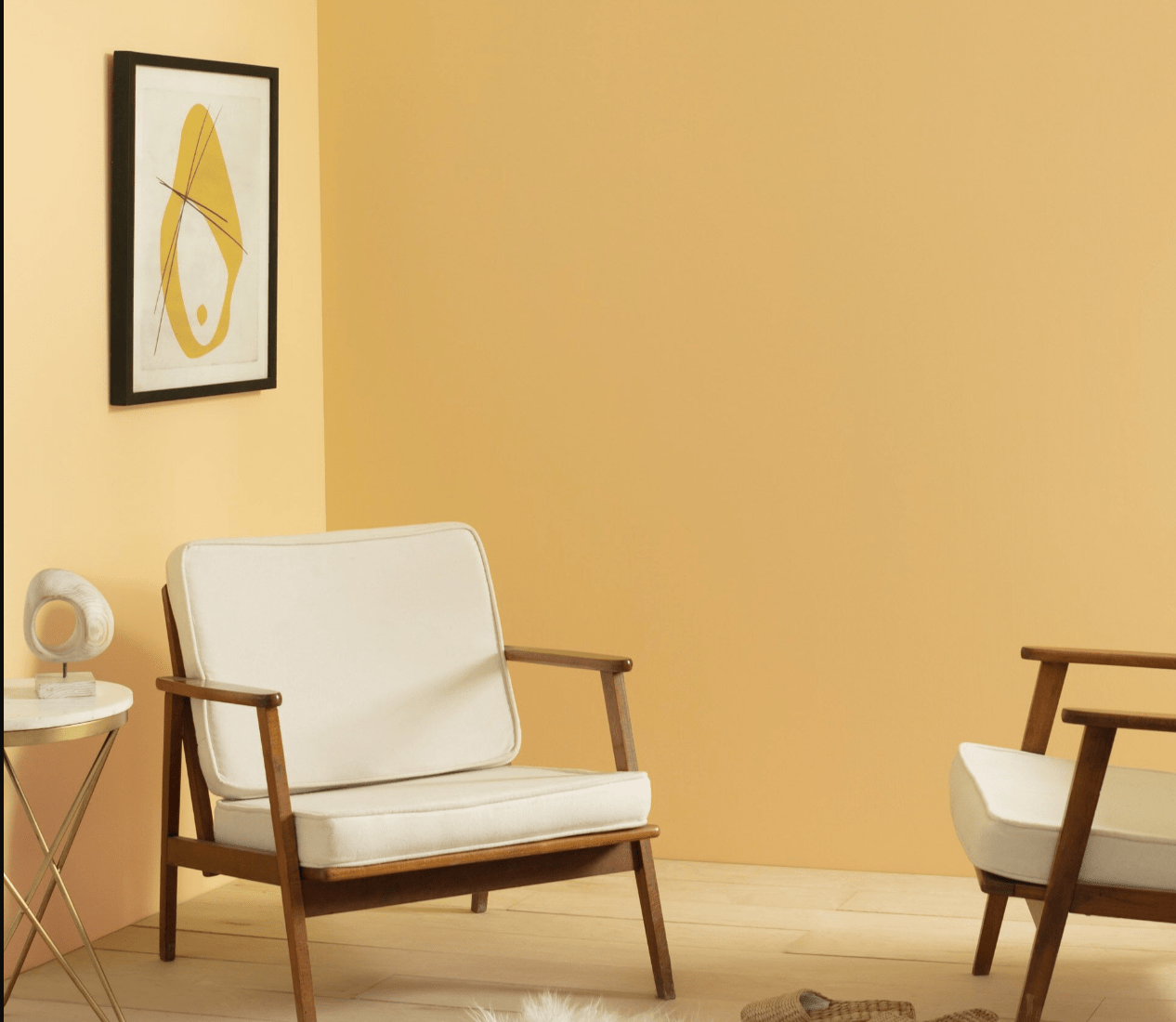
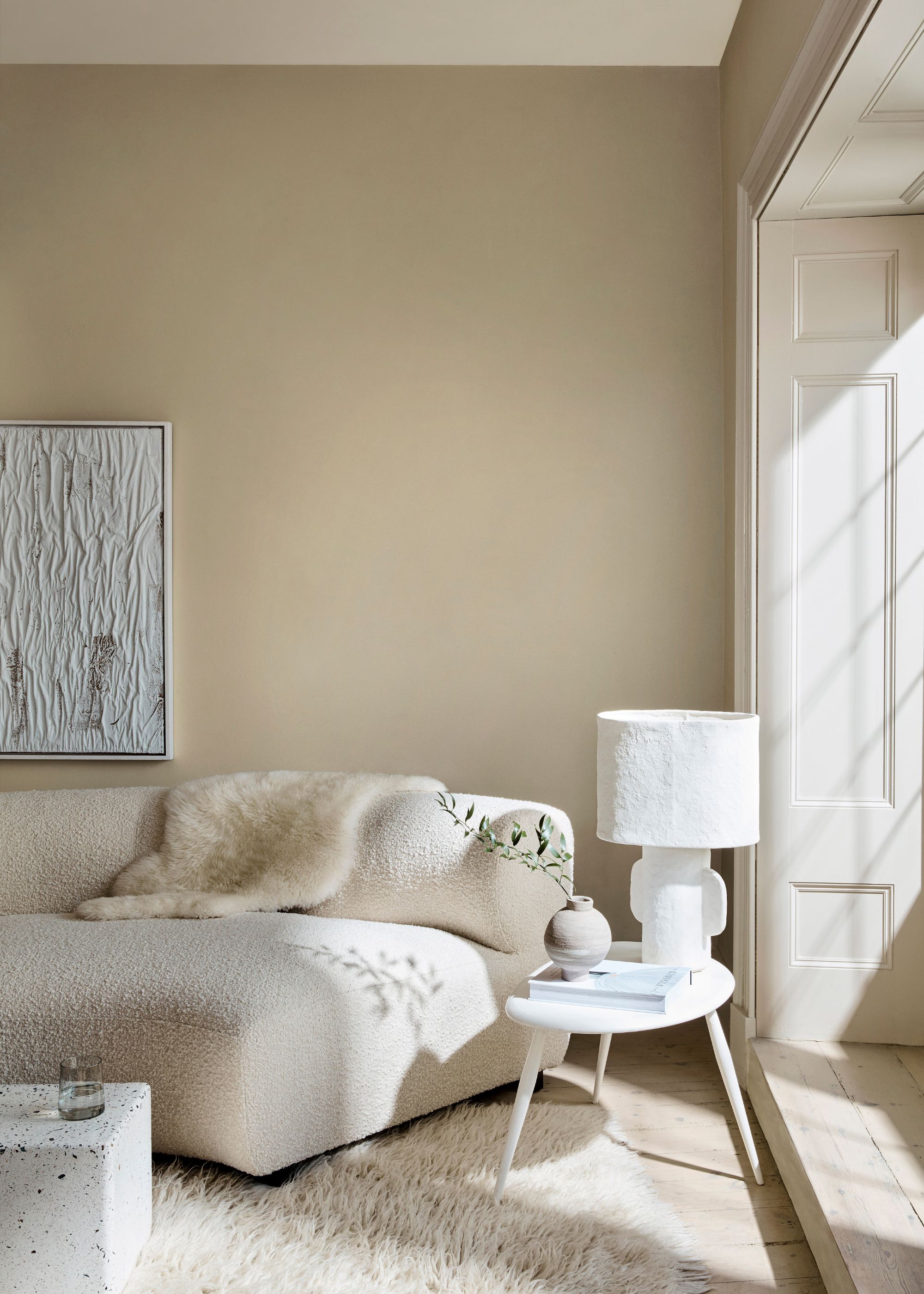
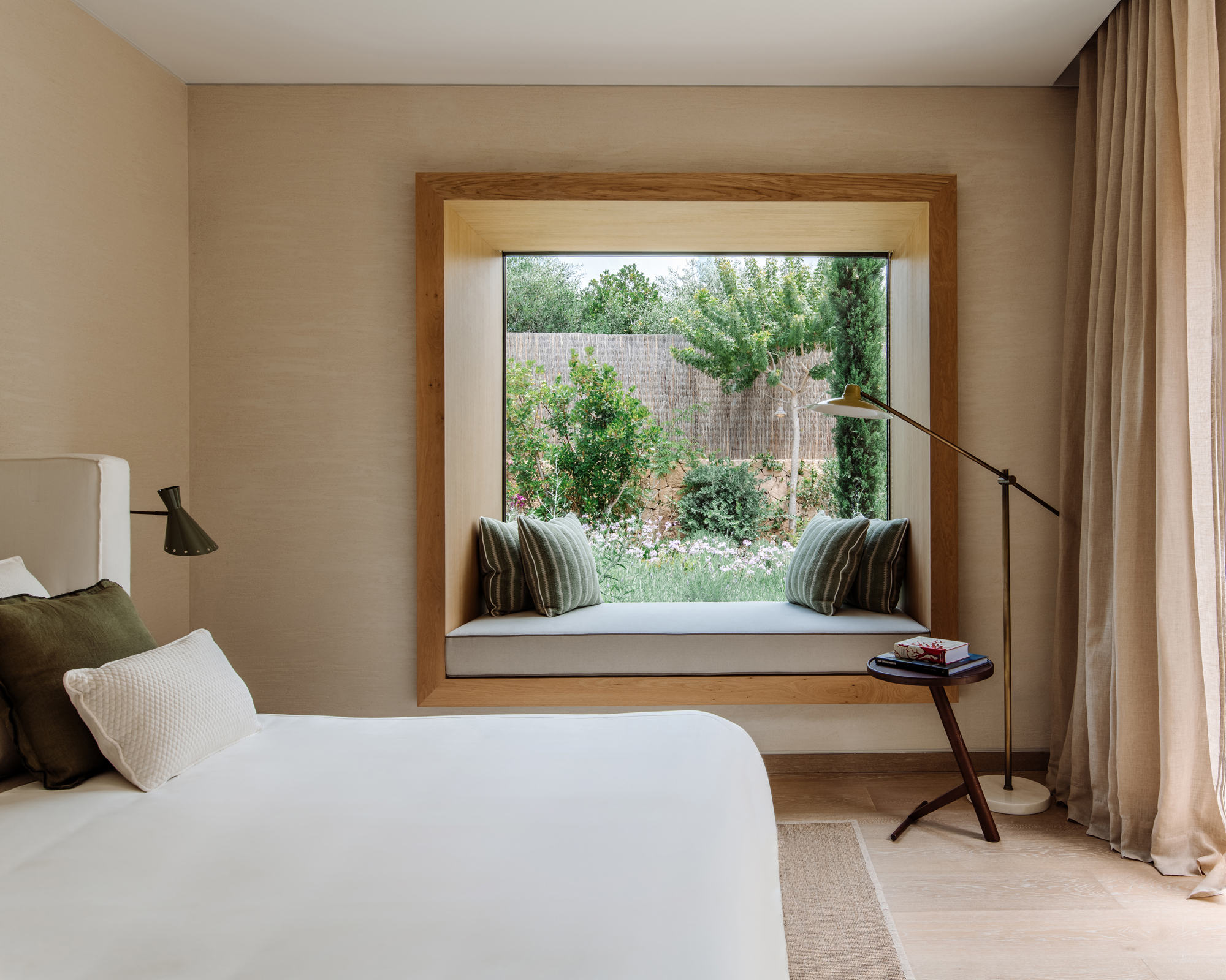
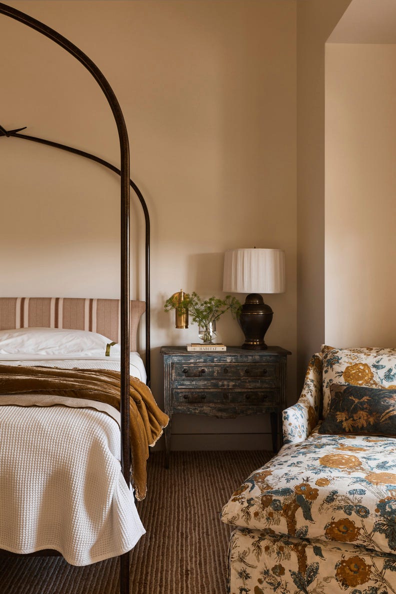
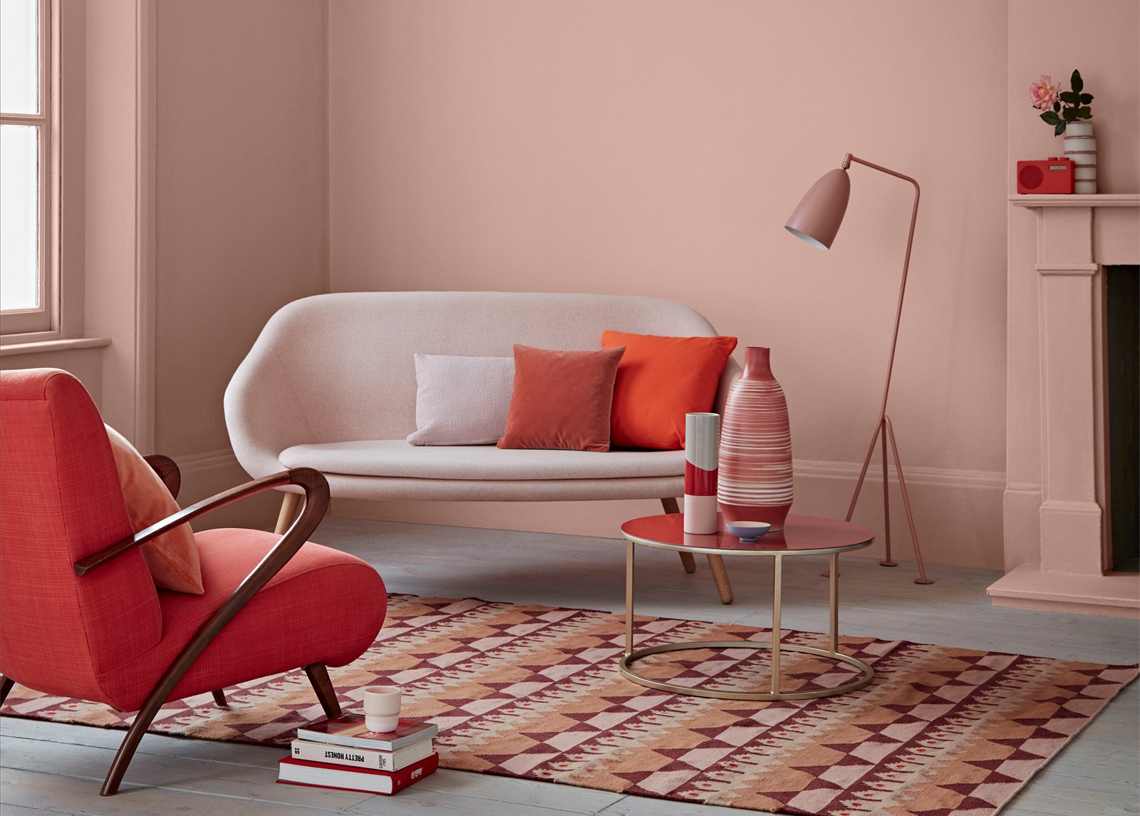
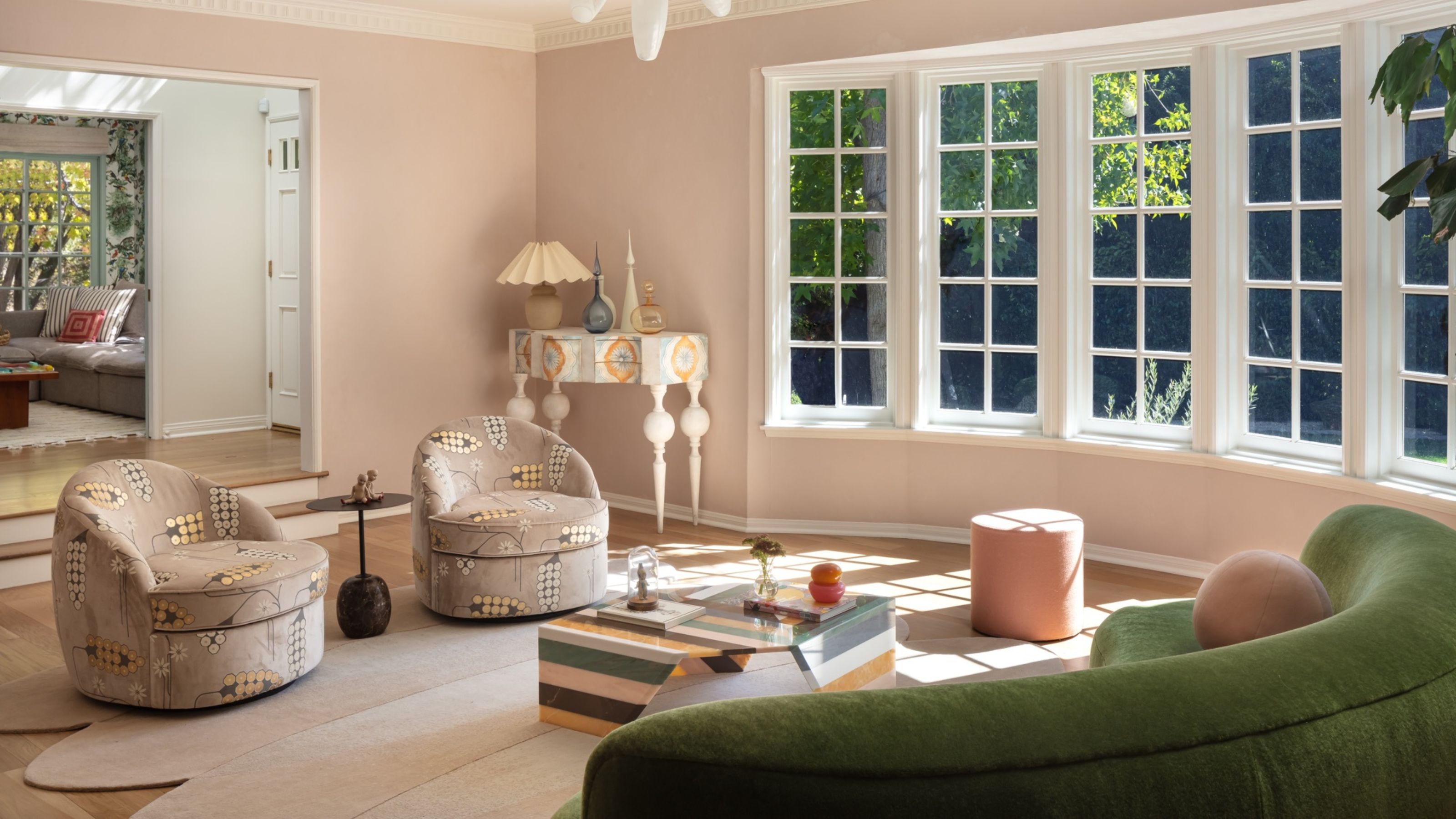
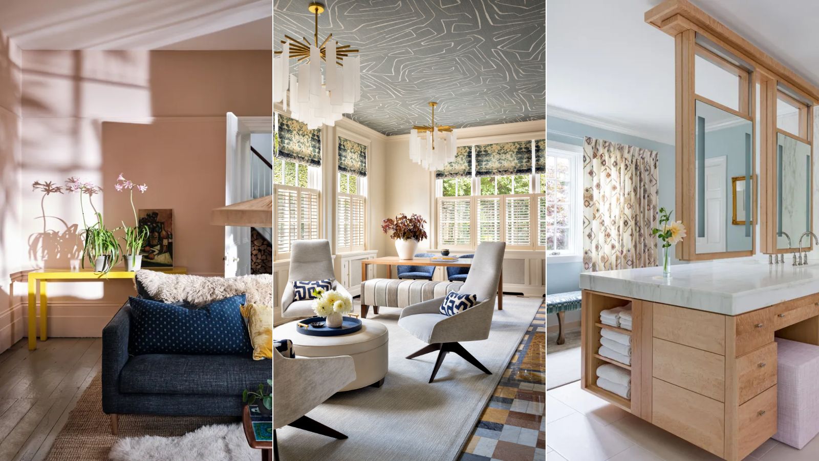
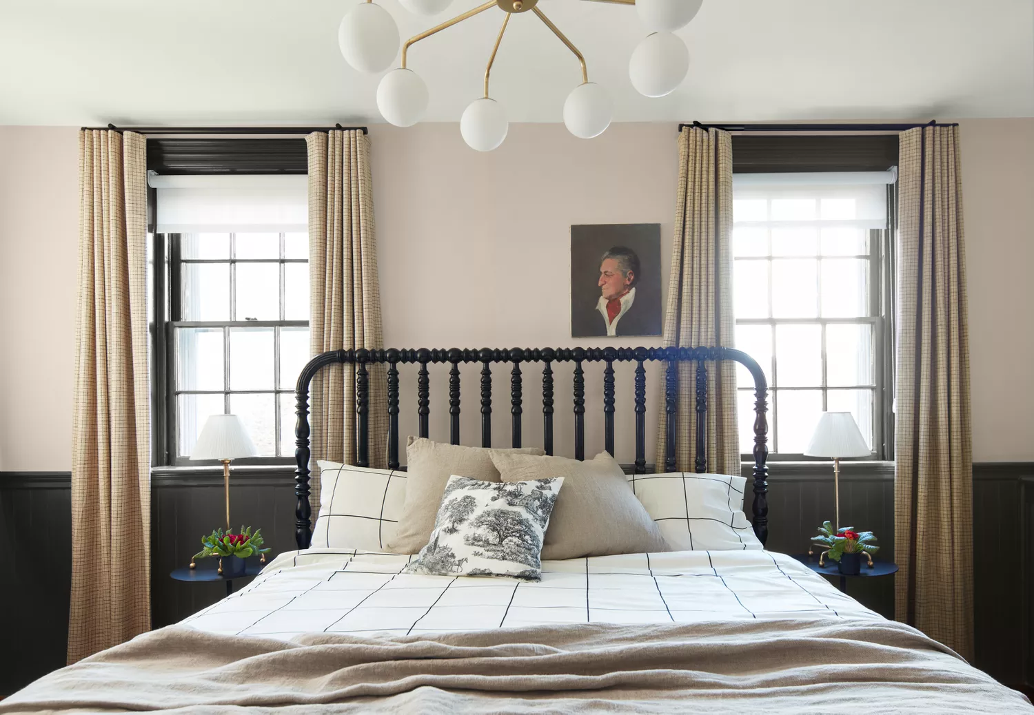
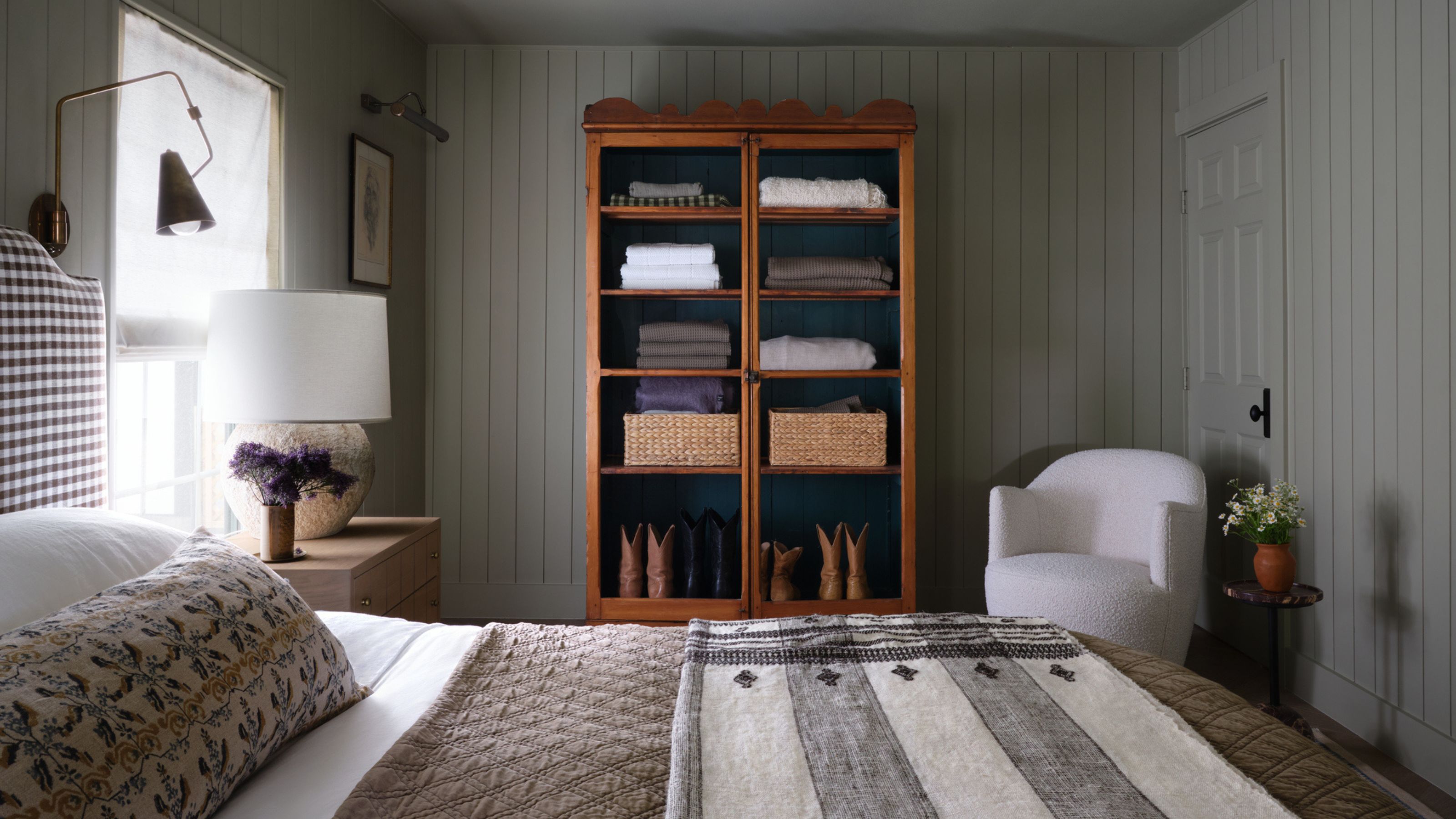
For those who prefer a lighter aesthetic, warm neutrals are highly recommended. Specifically, choosing beige paints with warm undertones can effectively add coziness. Ruth Mottershead, Creative Director at Little Greene, suggests using harmonious light neutrals with a warm base tone, citing Little Greene's 'Travertine' as an example. Tash Bradley, Director of Interior Design at Lick, echoes this, advising taupe and soft browns to create a 'cocooning, cozy feel,' while cautioning against shades with too much gray.
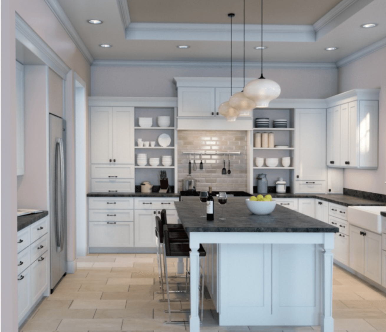
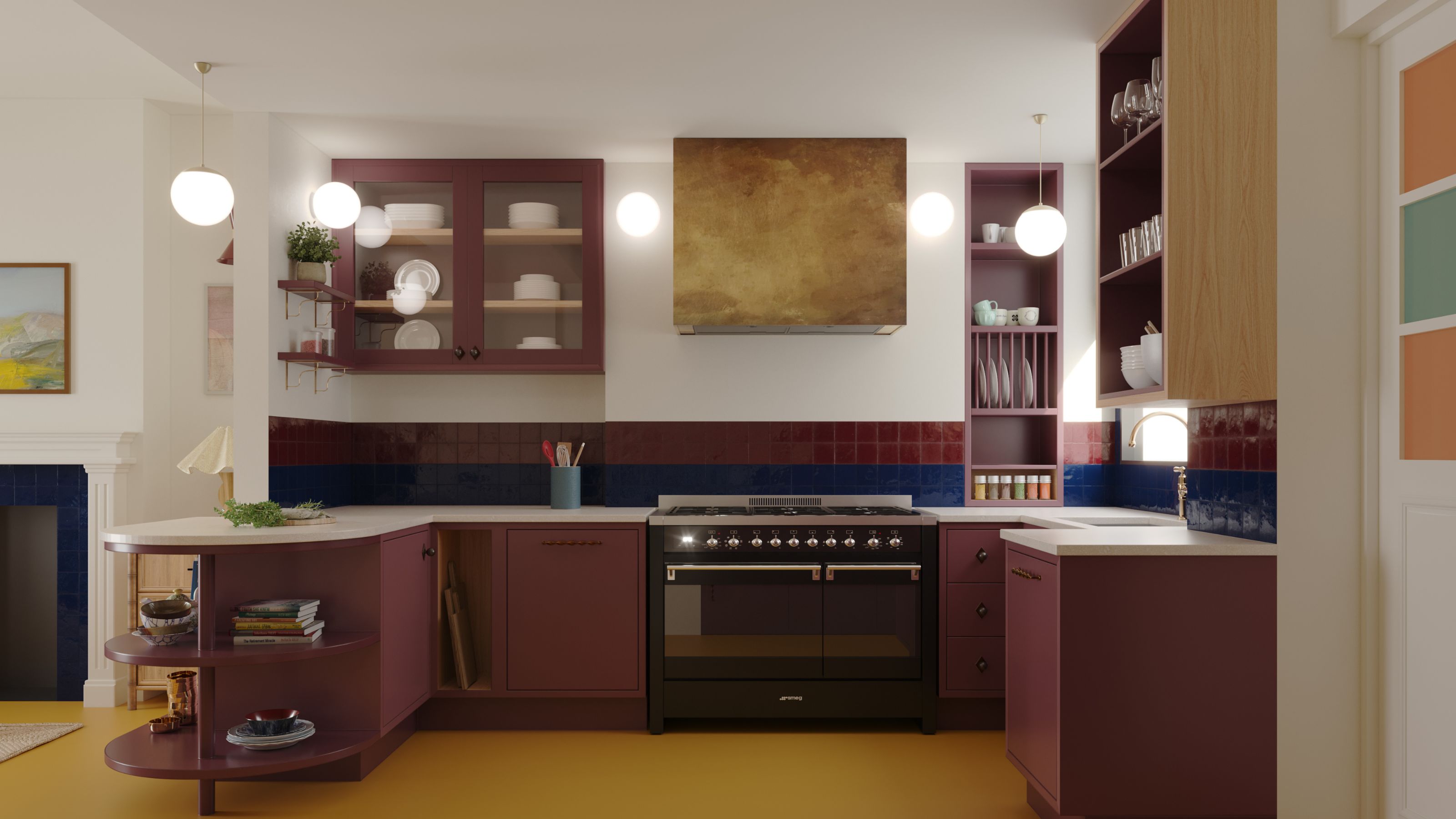
Warm-toned whites are another excellent option for brightening north-facing rooms, particularly in social areas like kitchens. Helen Shaw, Color Expert at Benjamin Moore, advises looking for whites with yellow or red undertones to lift the space and impart warmth, emphasizing the need to avoid cool whites which would only exacerbate the coldness. Tash Bradley also recommends creamy whites like Lick's 'White 03,' 'White 05,' and 'White 06,' which reflect light beautifully without making the room feel cold.
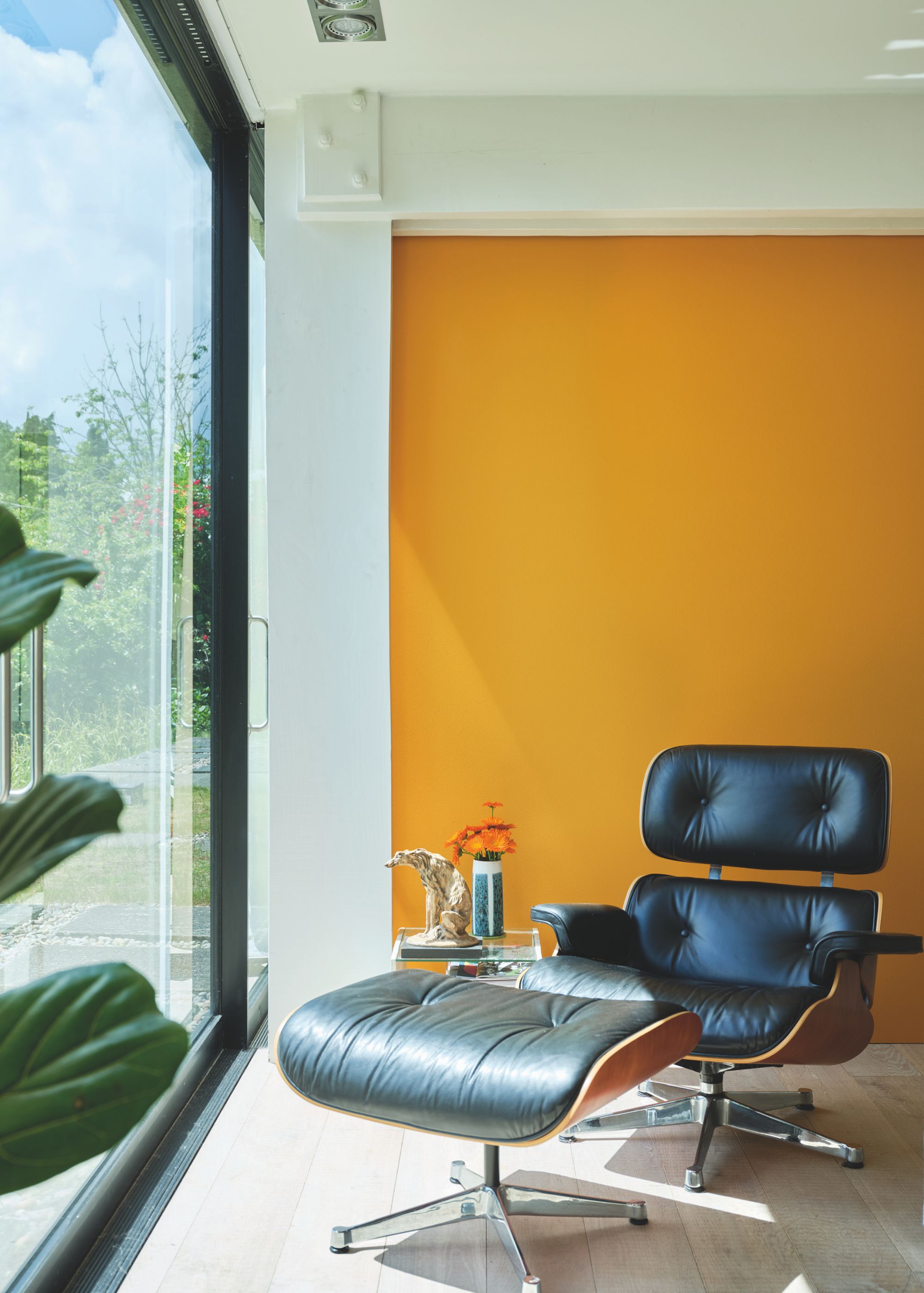
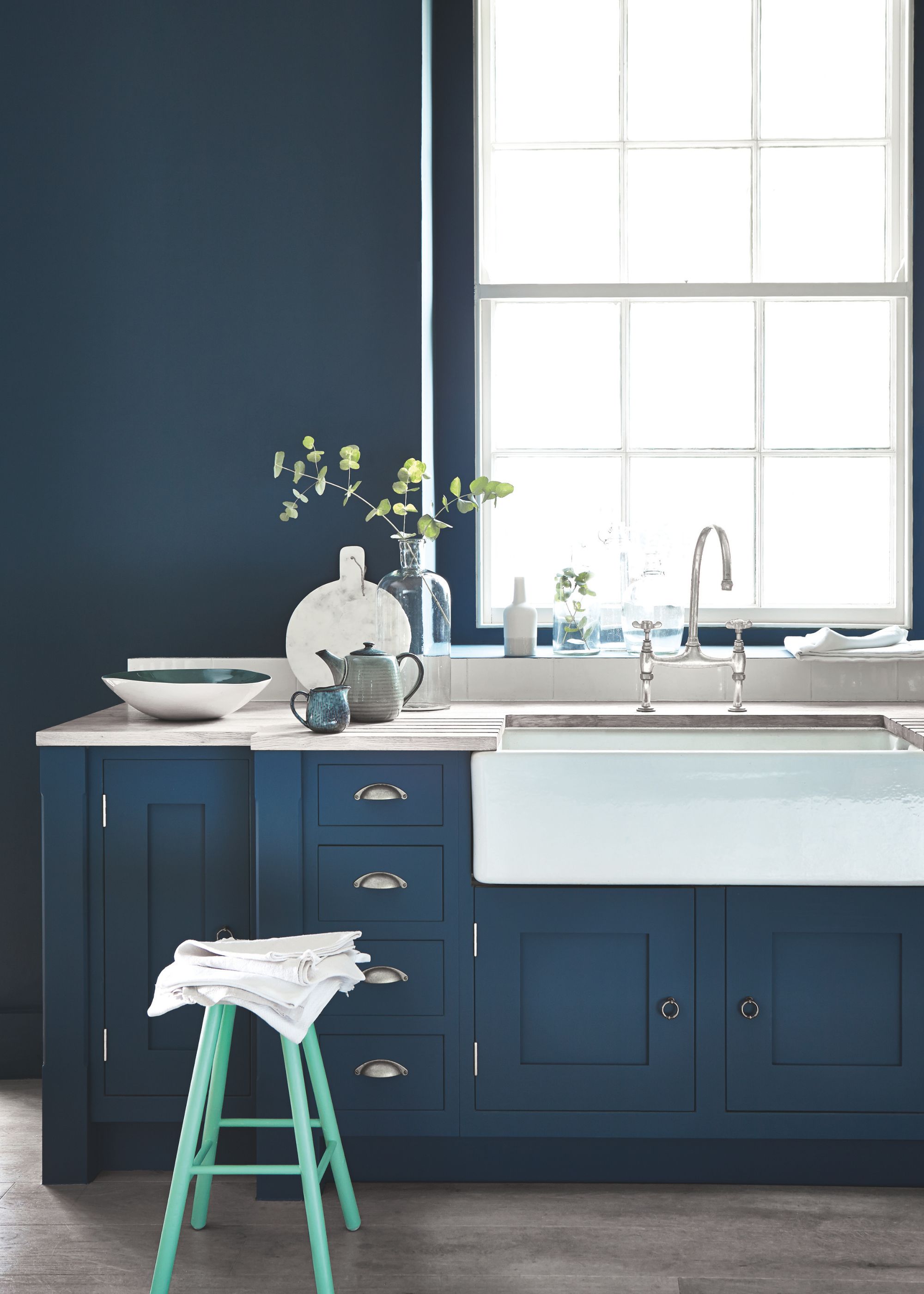
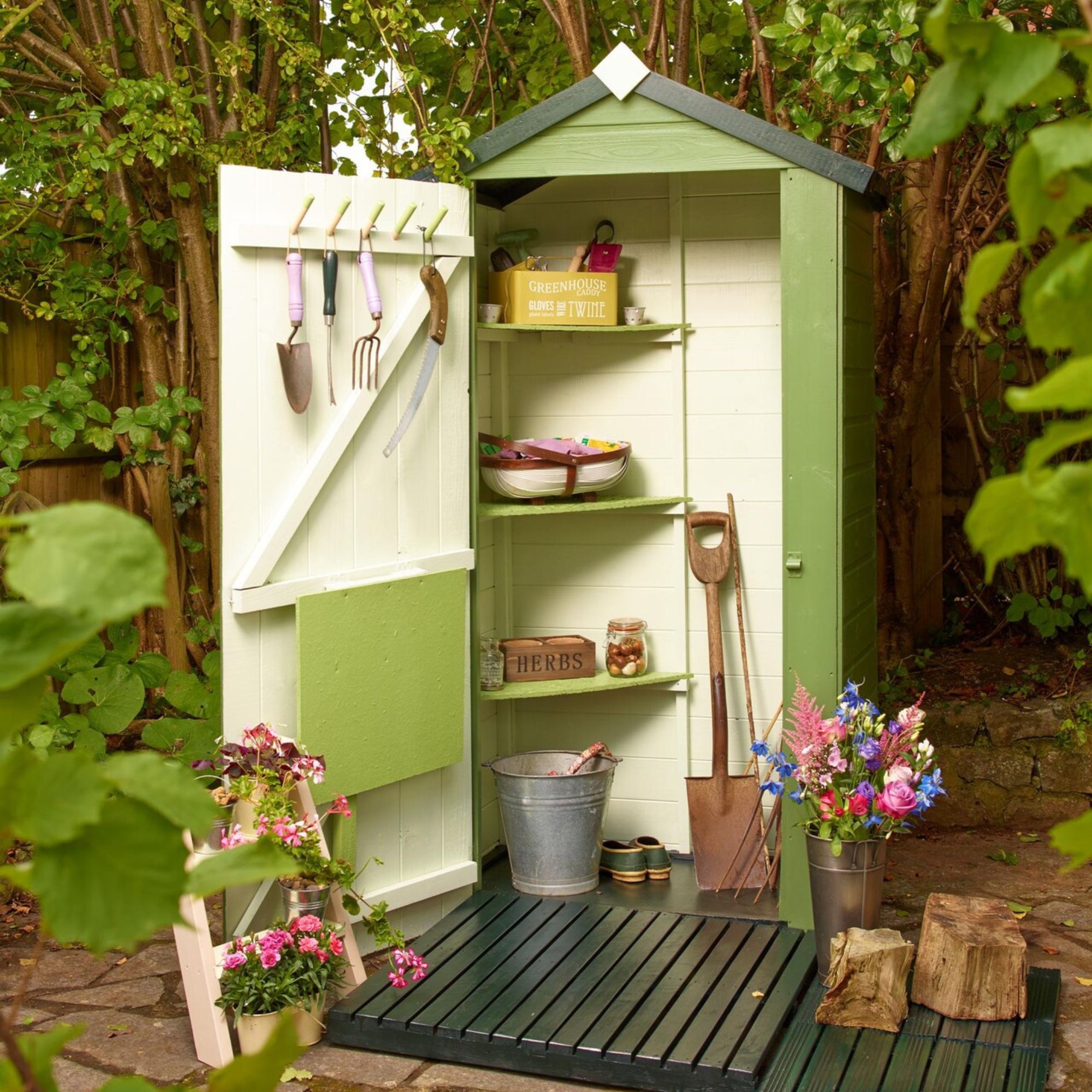
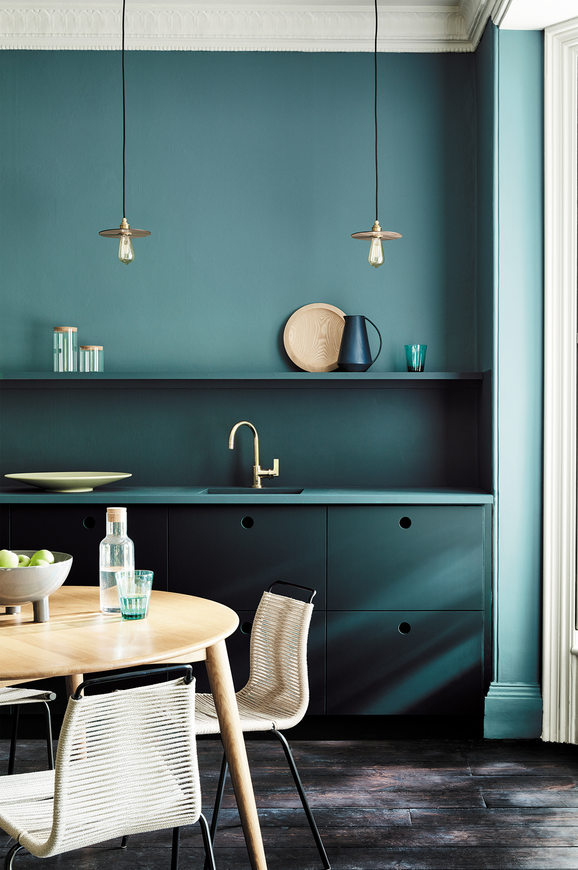
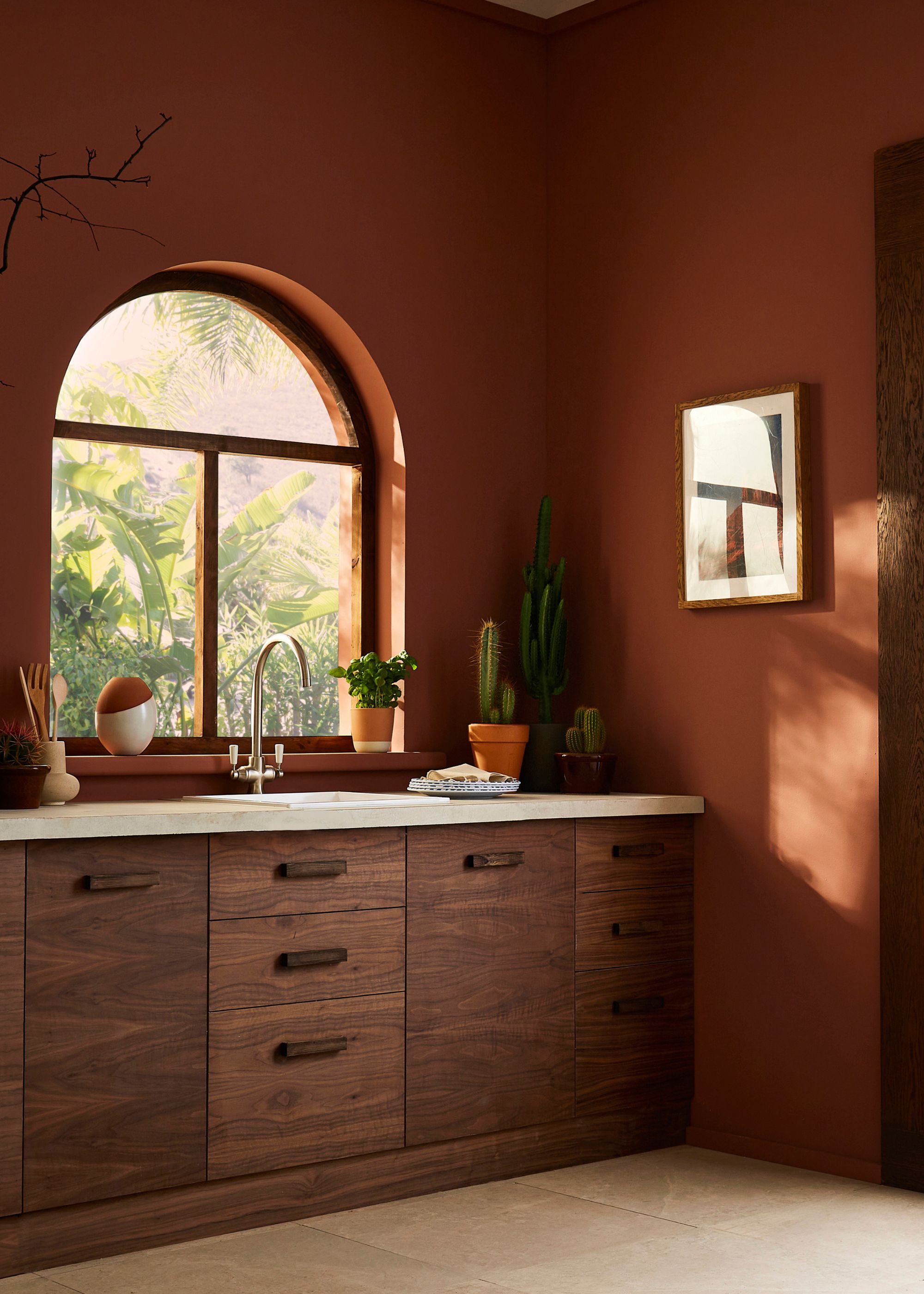
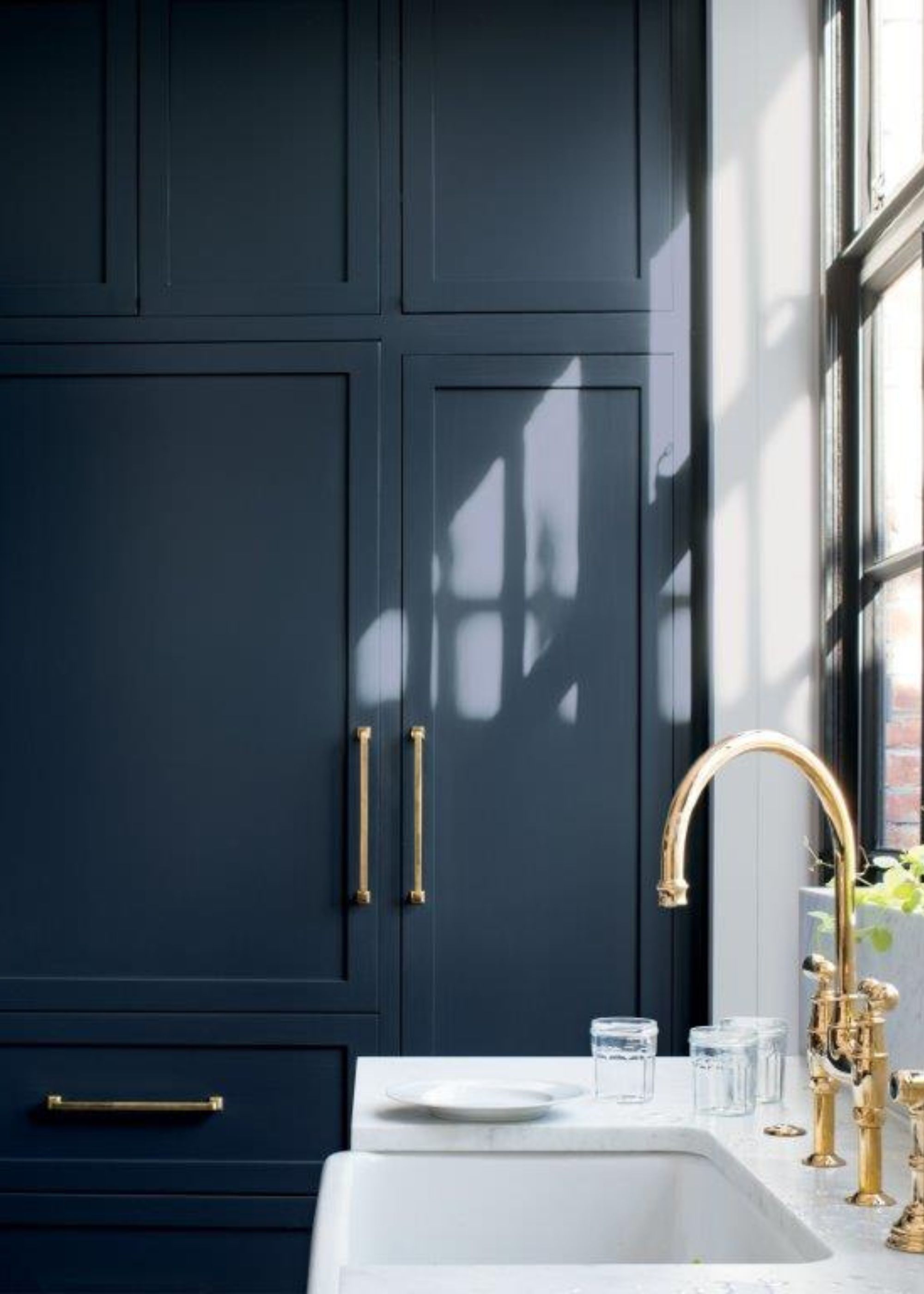
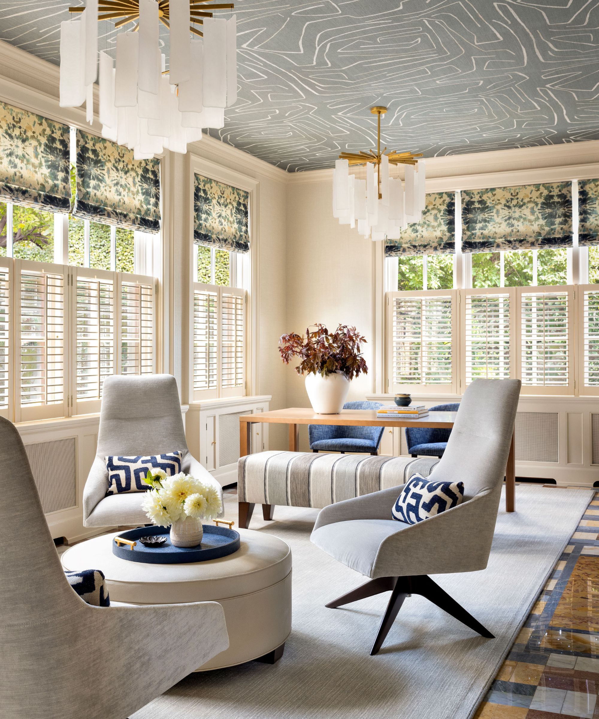
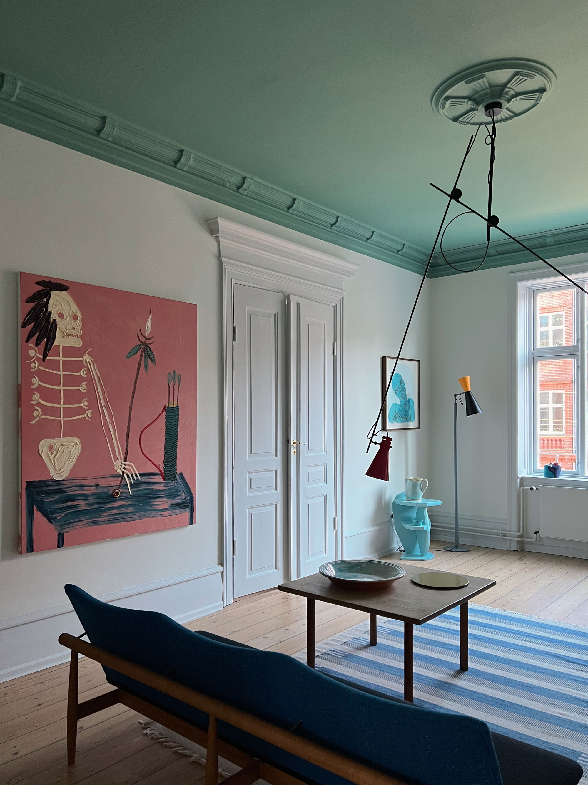
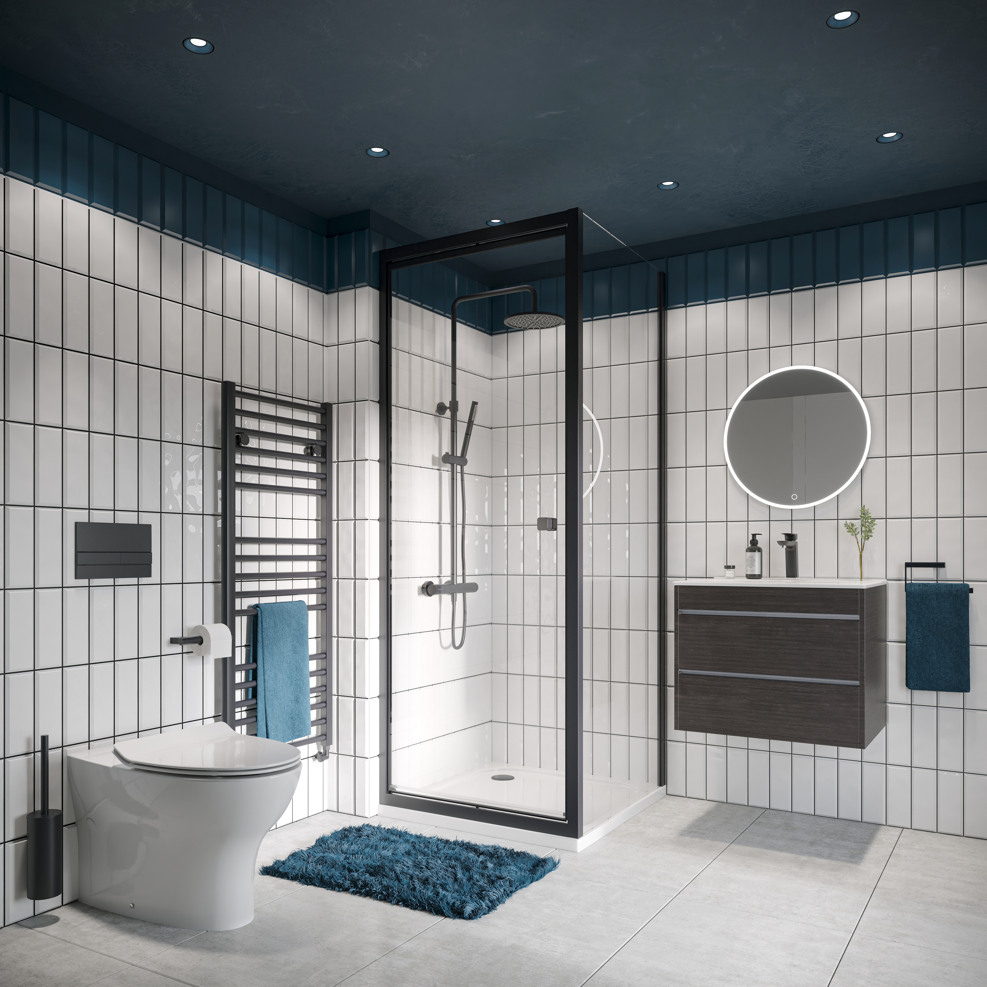
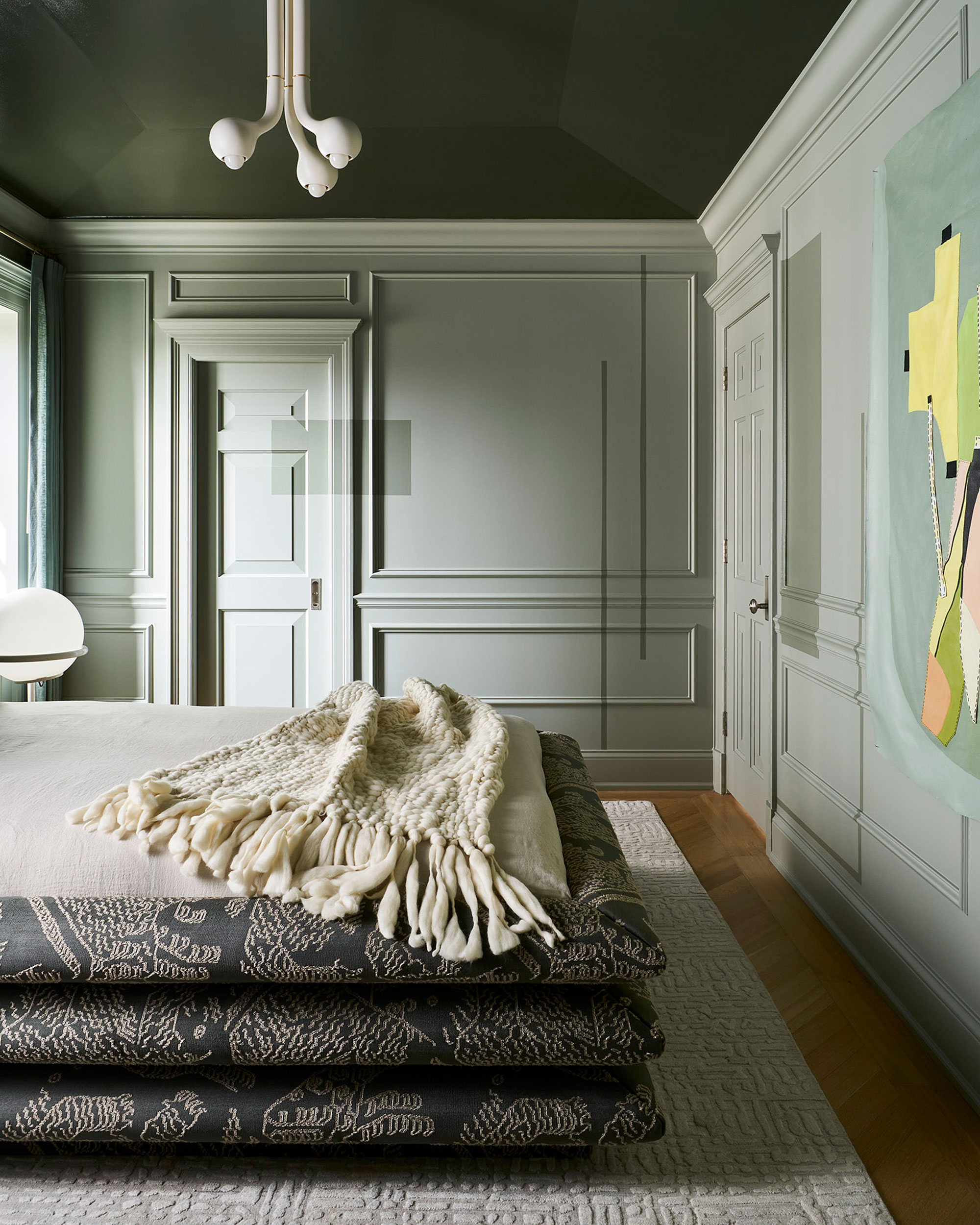
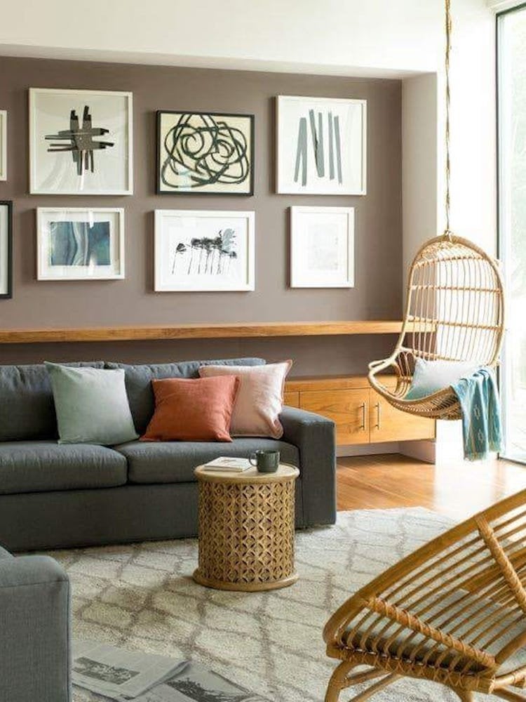
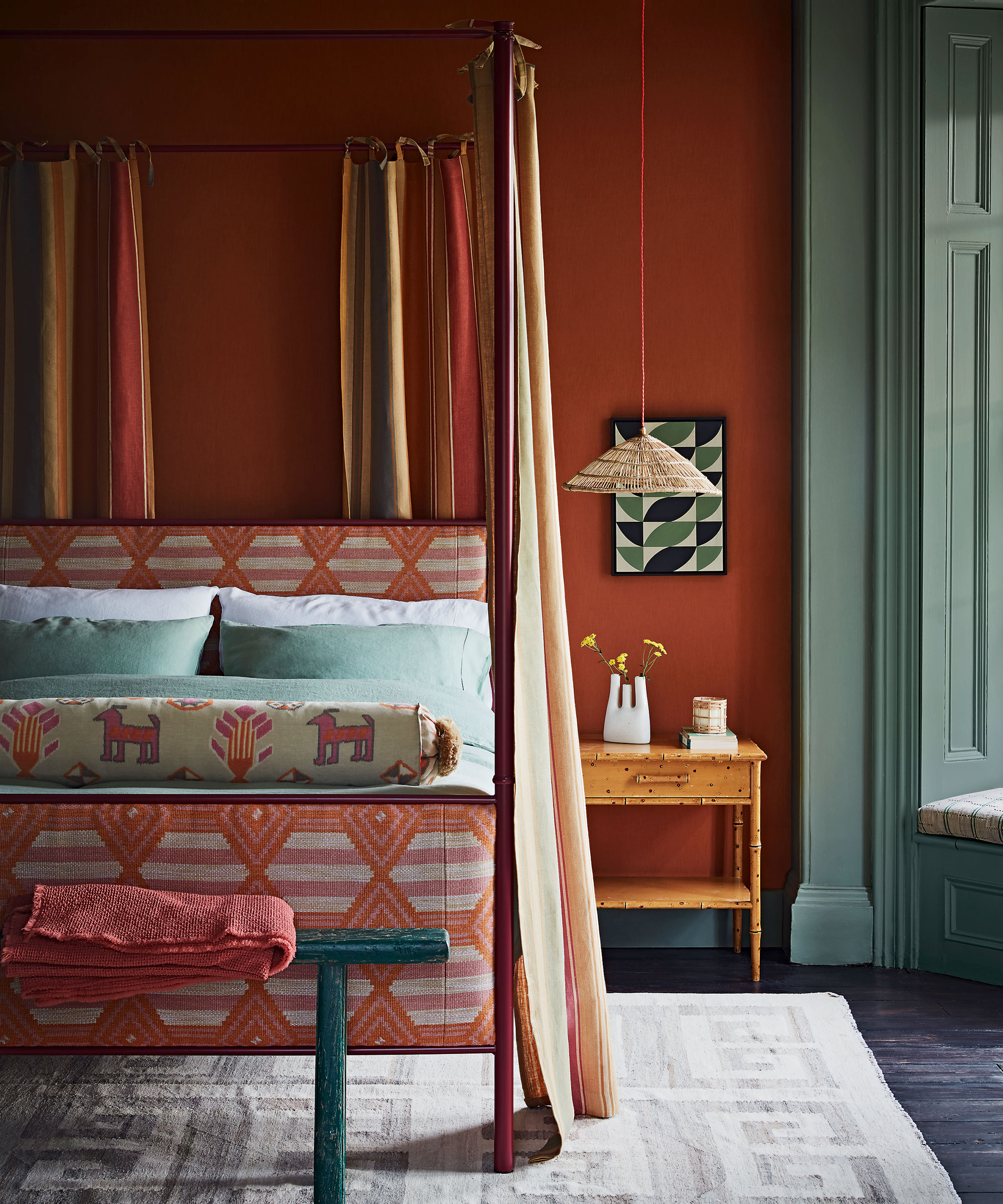
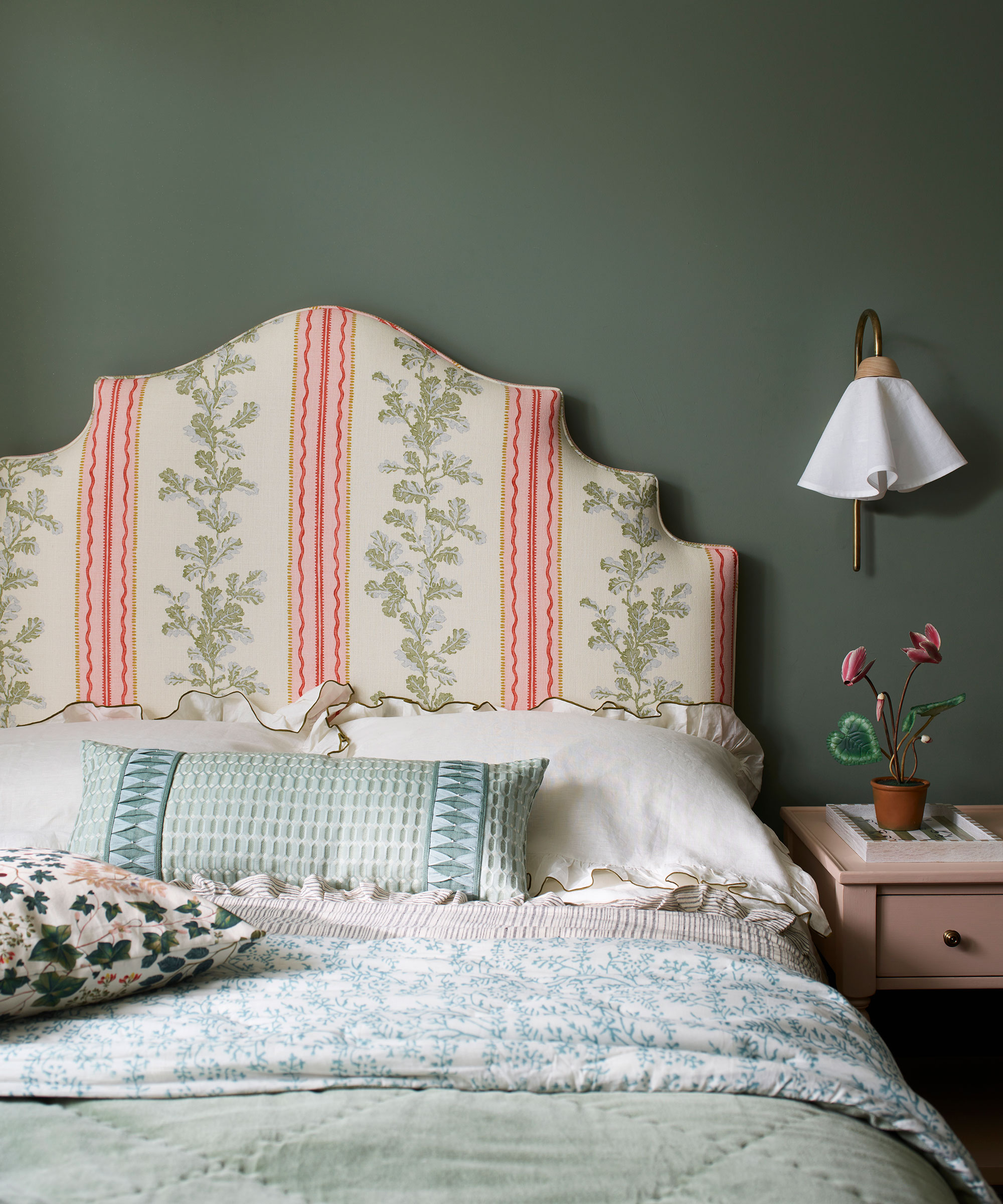
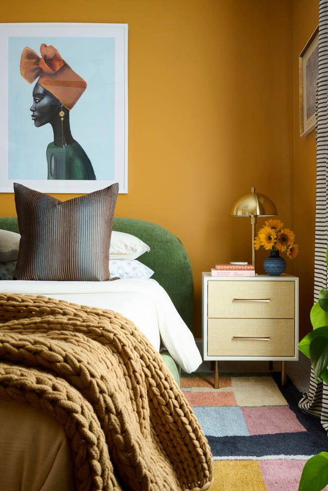
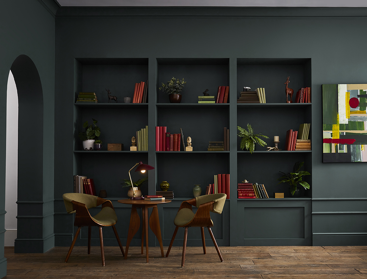
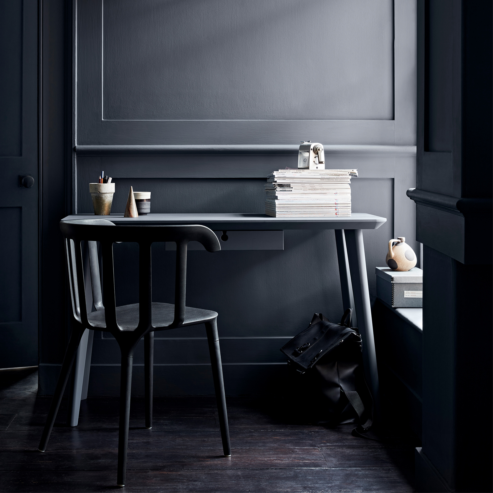
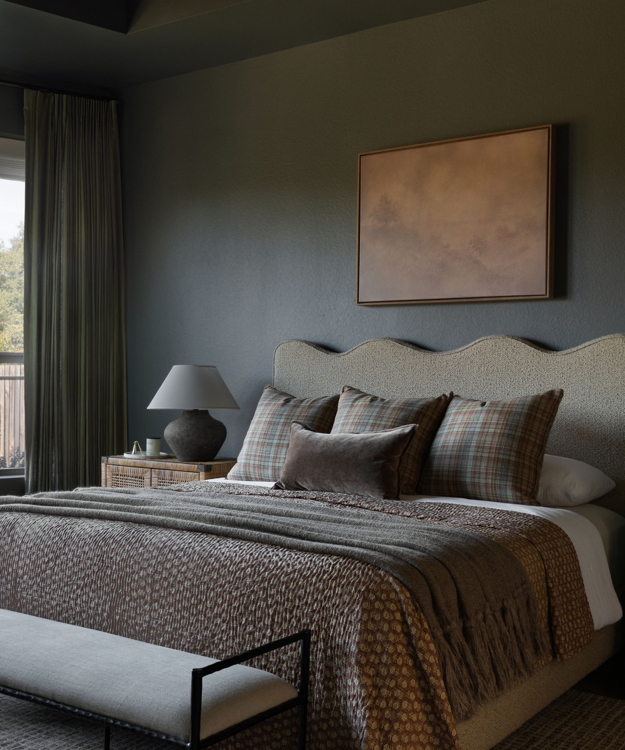
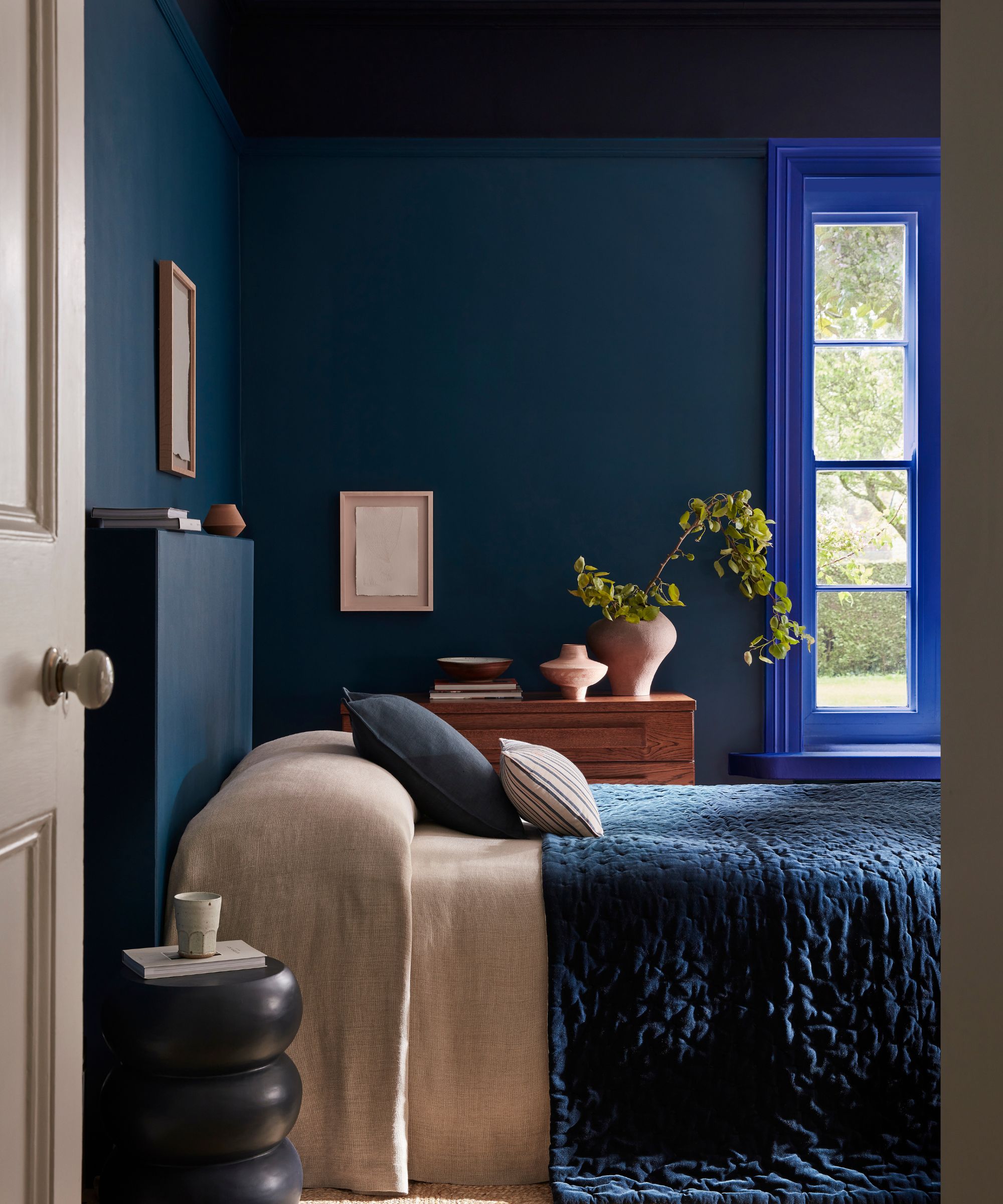
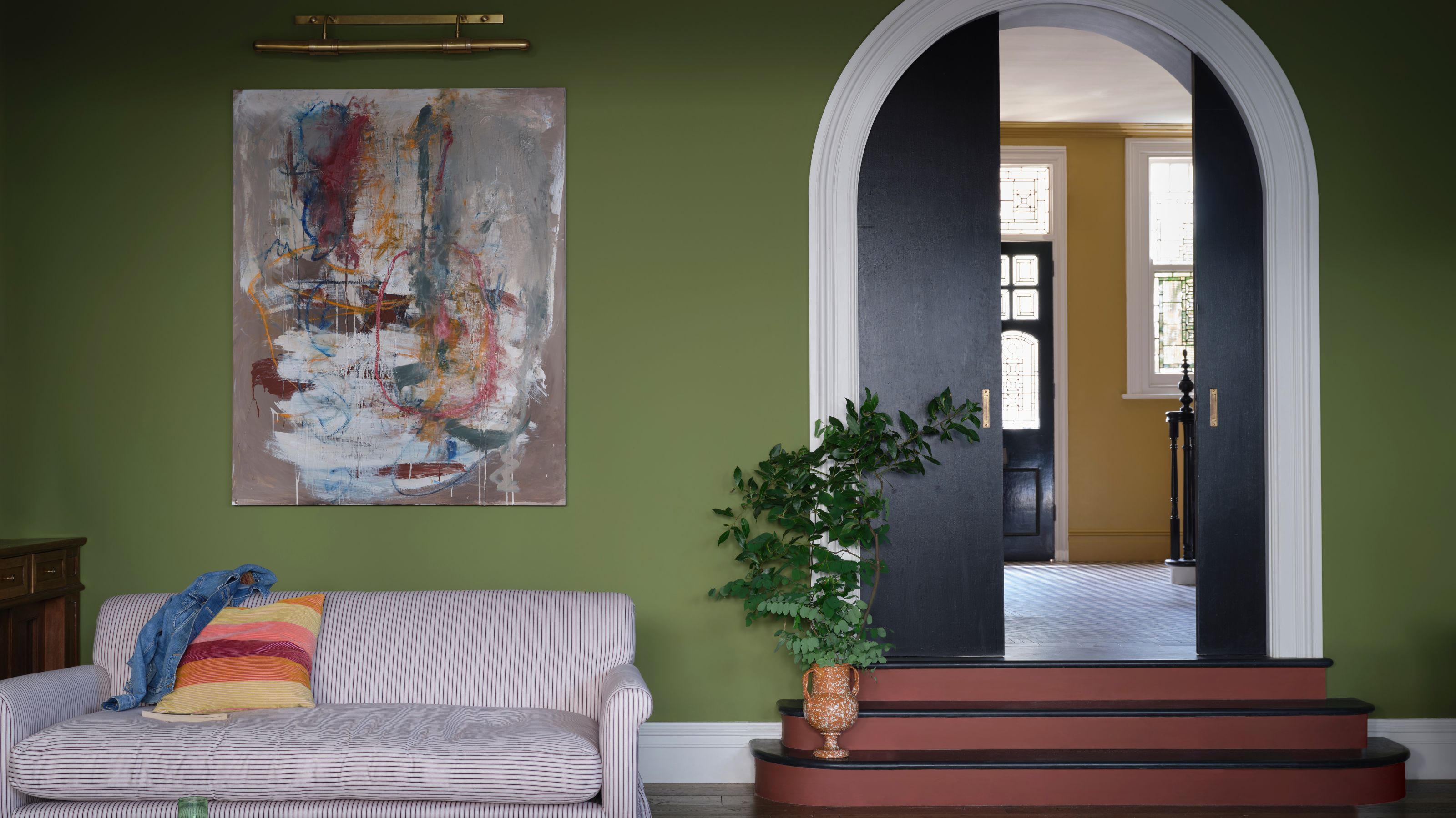
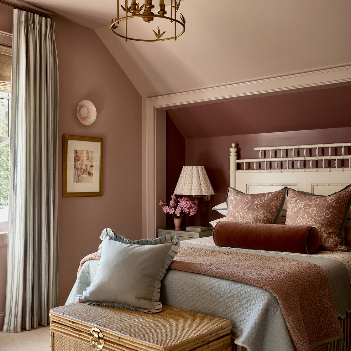
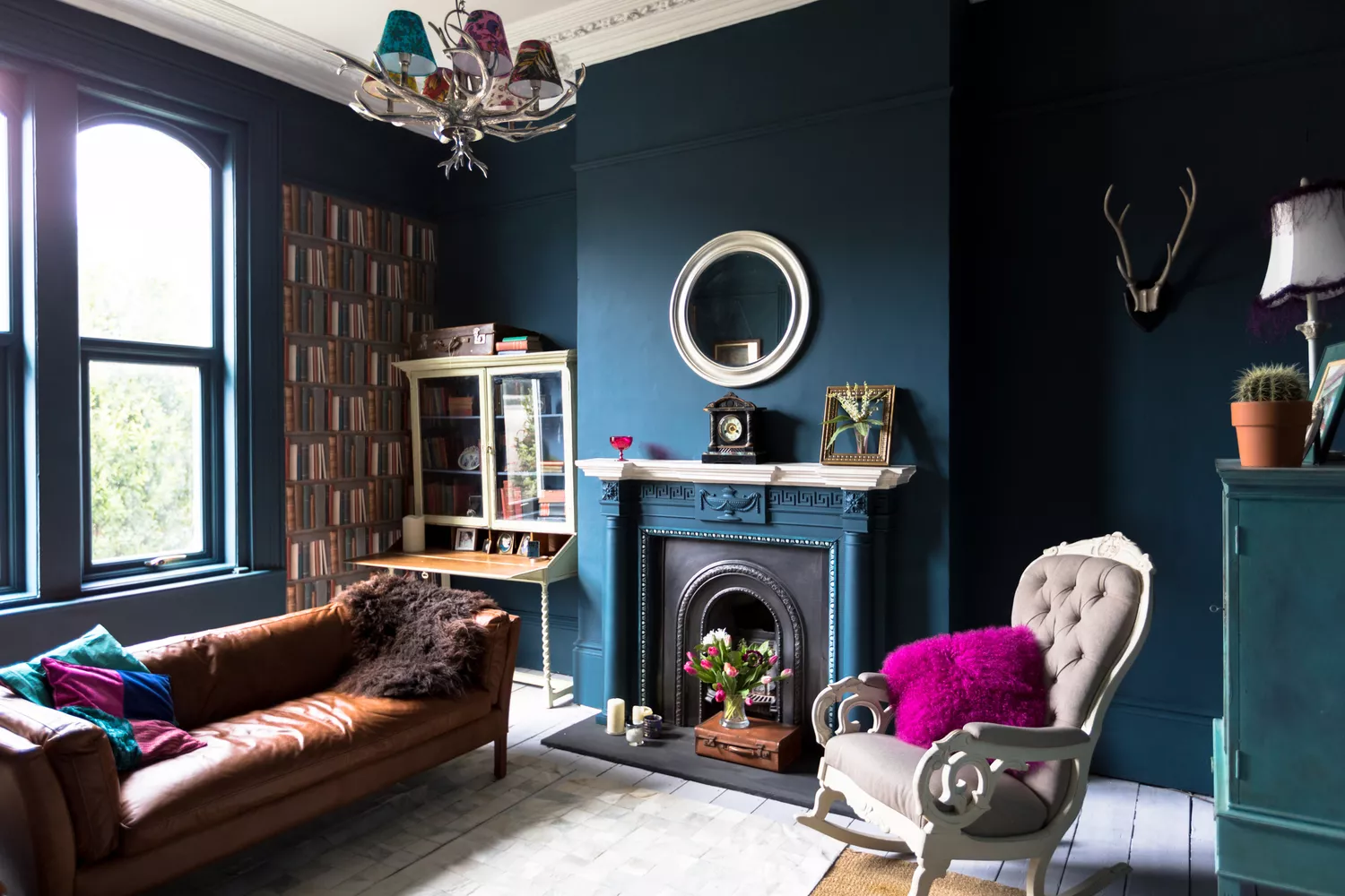
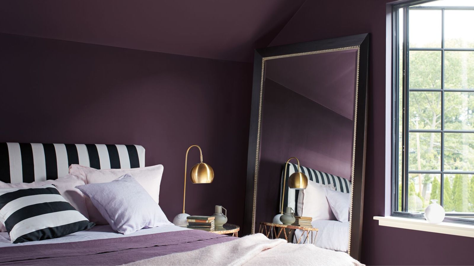
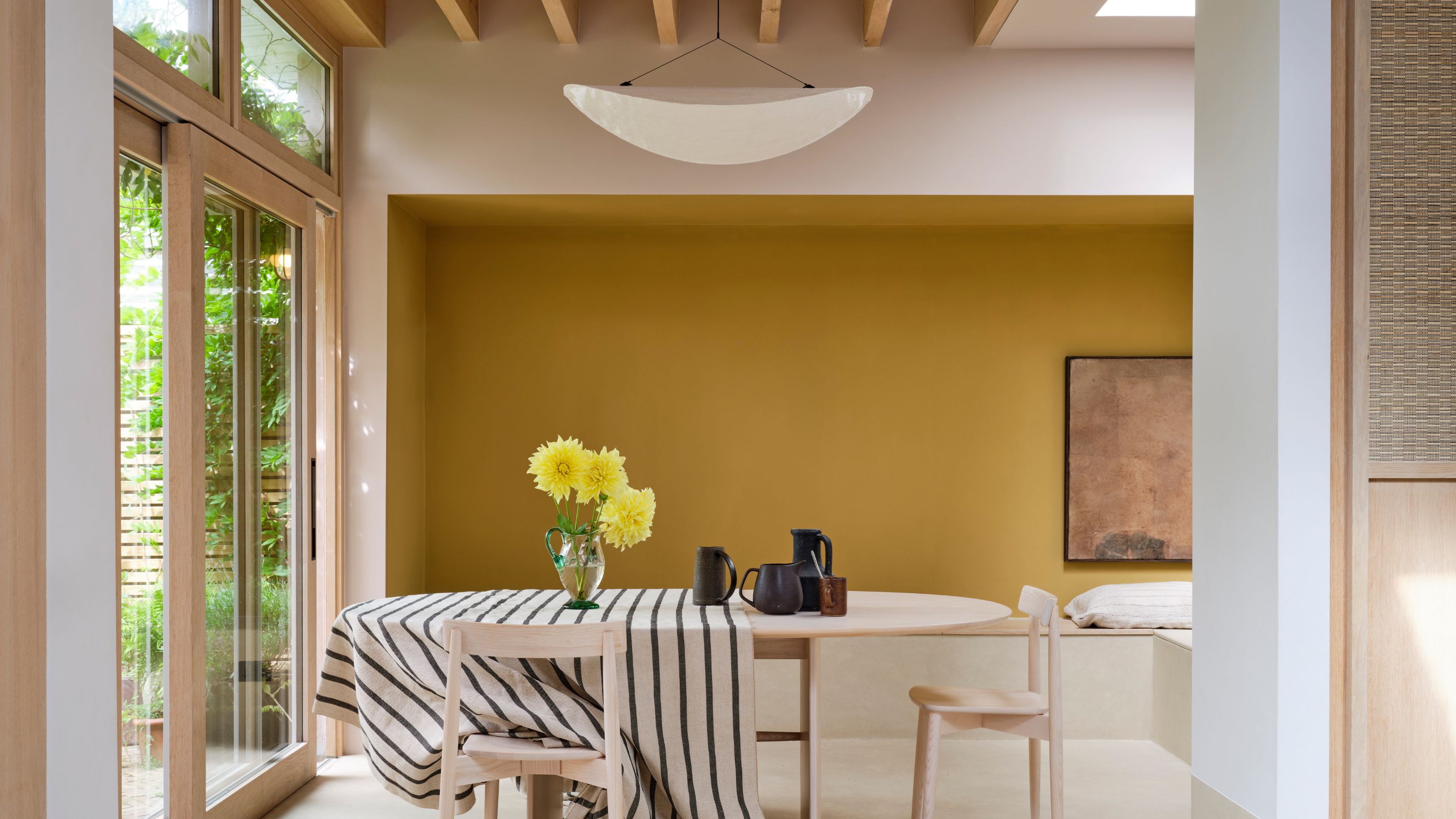
Alternatively, designers suggest embracing the subdued nature of north-facing rooms by opting for dark and moody shades. This approach can create a rich and inviting ambiance, particularly in spaces like snugs or cloakrooms. Helen Shaw highlights that cooler light enhances rich hues, recommending 'color-drenching' for a cohesive finish. Patrick O'Donnell of Farrow & Ball points to deep blues like 'Hague Blue' or 'Railings,' while Ruth Mottershead suggests dark browns such as Little Greene's 'Chocolate Colour' or deep reds like 'Baked Cherry.'
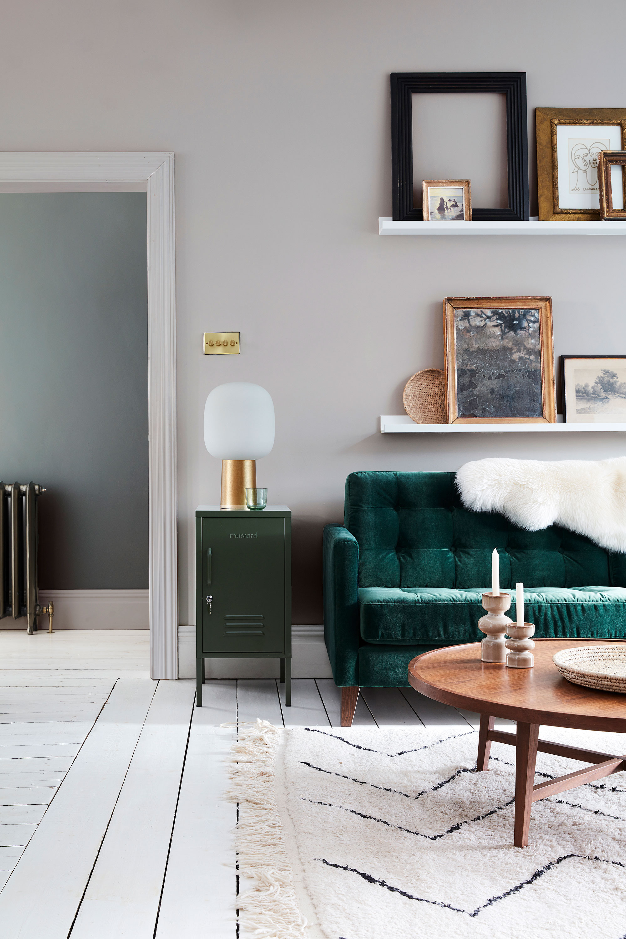
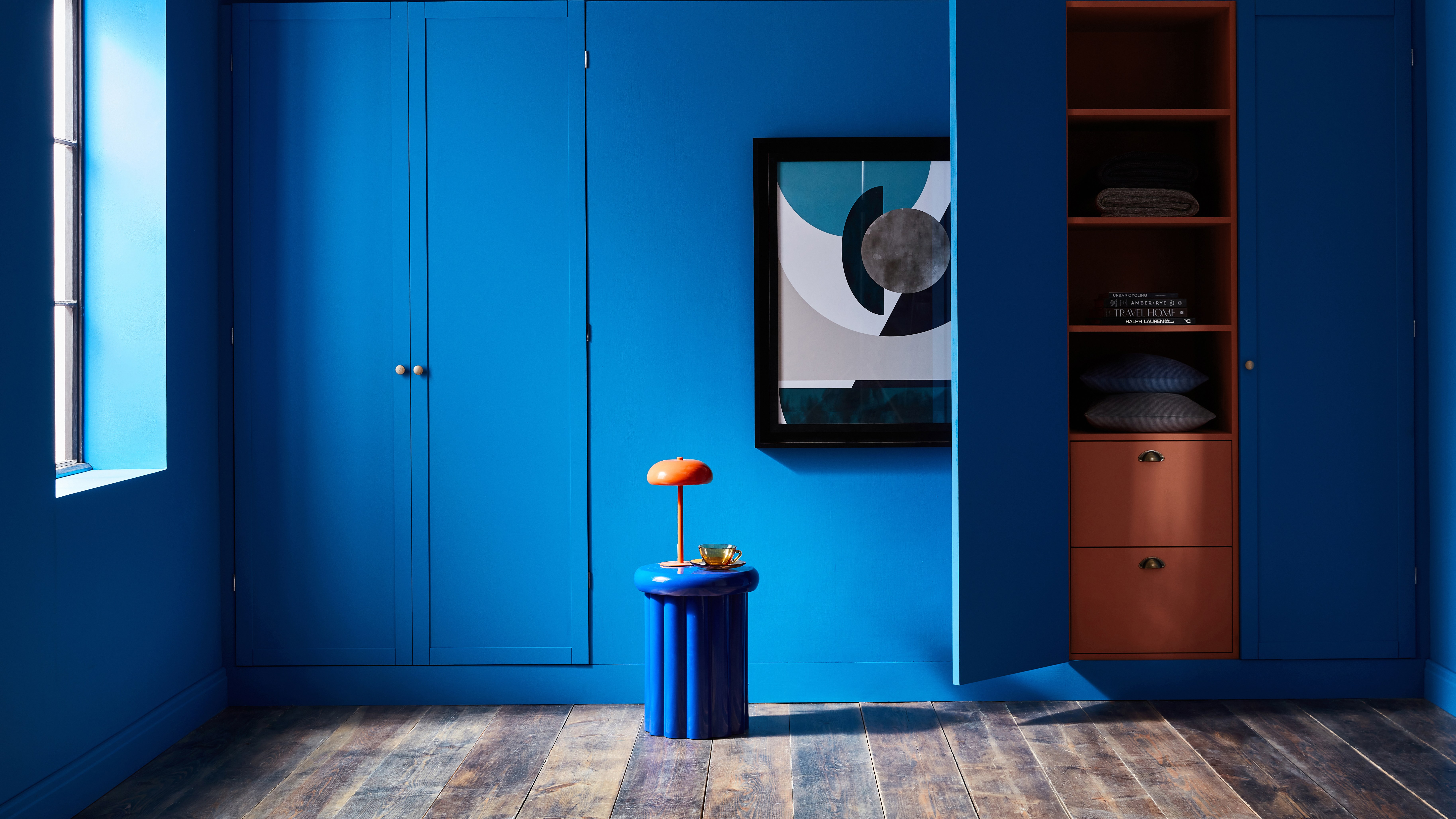
For those desiring a more colorful scheme, saturated greens with warm undertones can be effective. Tash Bradley advises selecting greens with a strong yellow base, avoiding sage or blue-based greens that might appear flat. Rich, saturated greens like Farrow & Ball's 'Sap Green' or Lick's 'Green 05' are noted for thriving in this type of light. Similarly, warm shades of teal, such as Lick's 'Teal 01,' can add character and warmth, though cool-undertoned teals should be avoided. Warm-toned blue paints, like Lick's 'Blue 15' or 'Blue 03,' are also suitable, as are rich navies like 'Blue 07' for a sophisticated, cocooning effect.
Regarding paint finishes, the choice depends on the desired mood. Gloss or semi-gloss finishes can help reflect light and brighten rooms painted in soft neutrals. For dark, moody schemes, a matte finish is preferable, offering greater color depth and a chalky appearance. Ultimately, sampling colors in the actual room throughout the day is crucial, as surrounding elements like floors, furniture, and outdoor views will influence how the chosen paint color appears.
#NorthFacingRooms #PaintColors #InteriorDesign #HomeDecor #ColorPsychology #WarmNeutrals #DarkHues #Lighting #PaintFinishes #NorthFacingRooms #PaintColors #InteriorDesign #HomeDecor #ColorPsychology #WarmNeutrals #DarkHues #Lighting #PaintFinishes
0 comment in total
You may also like
The Best Colors for South-Facing Rooms, According to Experts
The 13 Best Paint Colors for Low-Light Rooms

What makes a paint color flattering? Experts share their go-to shades for a universally complementary scheme

8 Ways to Make a Dark, Gloomy Room Feel Instantly Brighter

7 best paint colours to brighten up a gloomy north-facing garden, according to experts

The Best Colors for West-Facing Rooms That Will Help You Make the Most of That Warm Evening Light

10 Ways to Brighten a Dark Room, According to Interior Designers

You Can Wake Up HAPPIER Just by Painting Your Bedroom—Here Are the Colors Designers Love

This Is the Best Paint for Dark Rooms — 6 Shades Interior Designers Swear By for Light-Limited Spaces
7 Paint Colors Designers Totally Regret Using (and What They Wish They’d Used Instead)

Should you paint dark ceilings with light walls? Experts weigh in on the pros and cons
How to transform your rooms with colour drenching
18 Warm Paint Colors for a Cozy and Inviting Space
Paint color ideas for every room – experts explain the best choices for different spaces
14 Paint Colors That Can Make a Room Feel Instantly Cozy

5 rooms that prove color drenching your bedroom is a good idea
The Best Colors for East-Facing Rooms, According to Experts
5 Cozy Paint Colors Interior Designers Use to Warm Up Cool Rooms and Create "Snug" Spaces

6 bedroom paint colors going out of style for 2024 – and the colors to use instead
We Asked Designers Which Paint Colors Are Best for Brightening a Dark Room—6 Top Picks