1/11
How colour experts decorate with neutrals – 10 gorgeous ways to use this muted colour palette
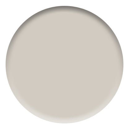
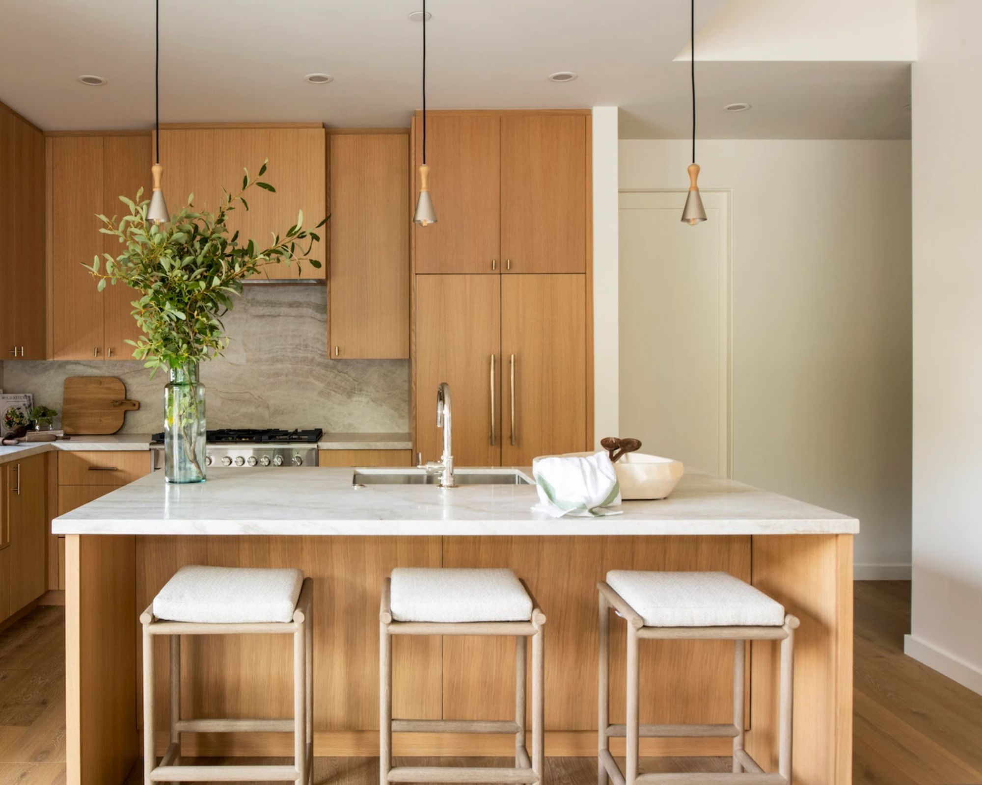
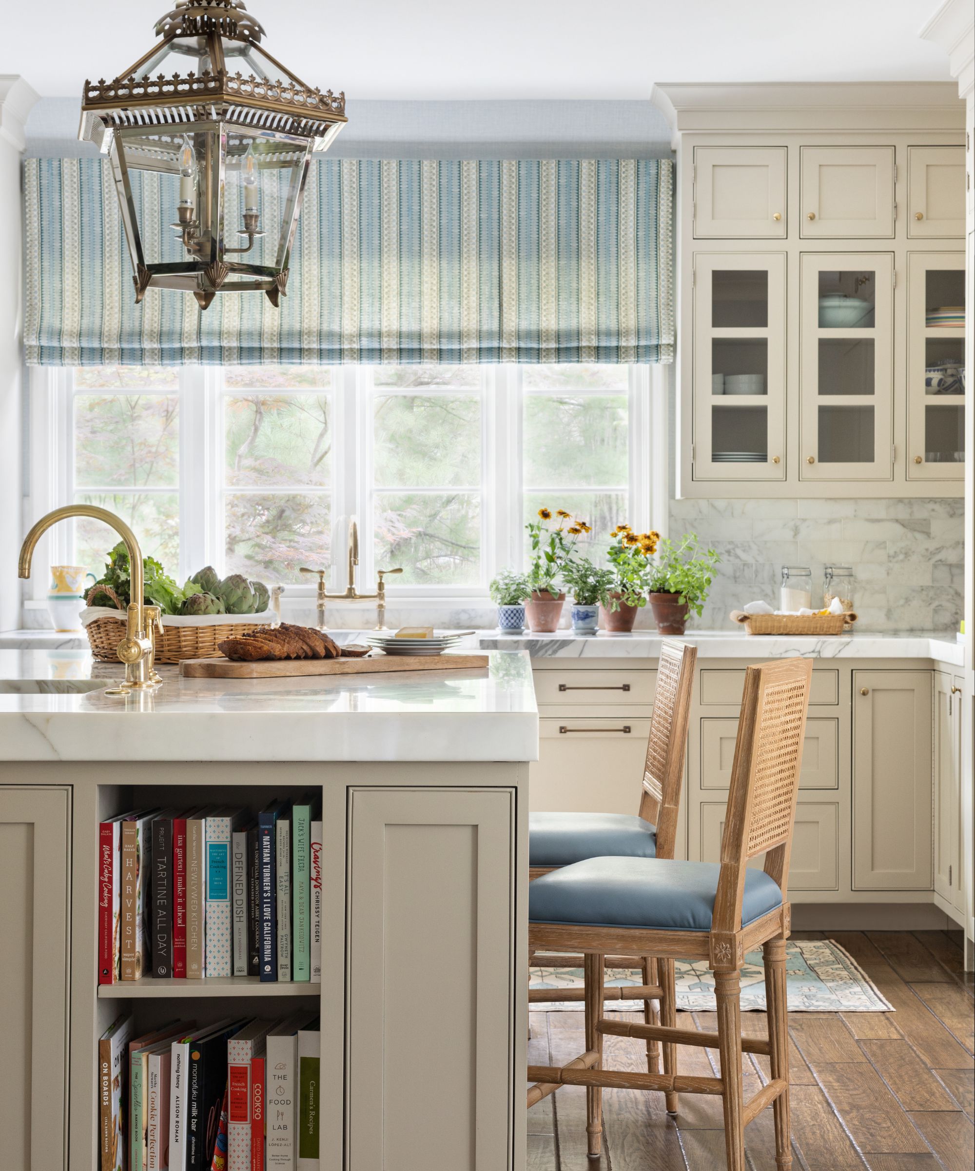
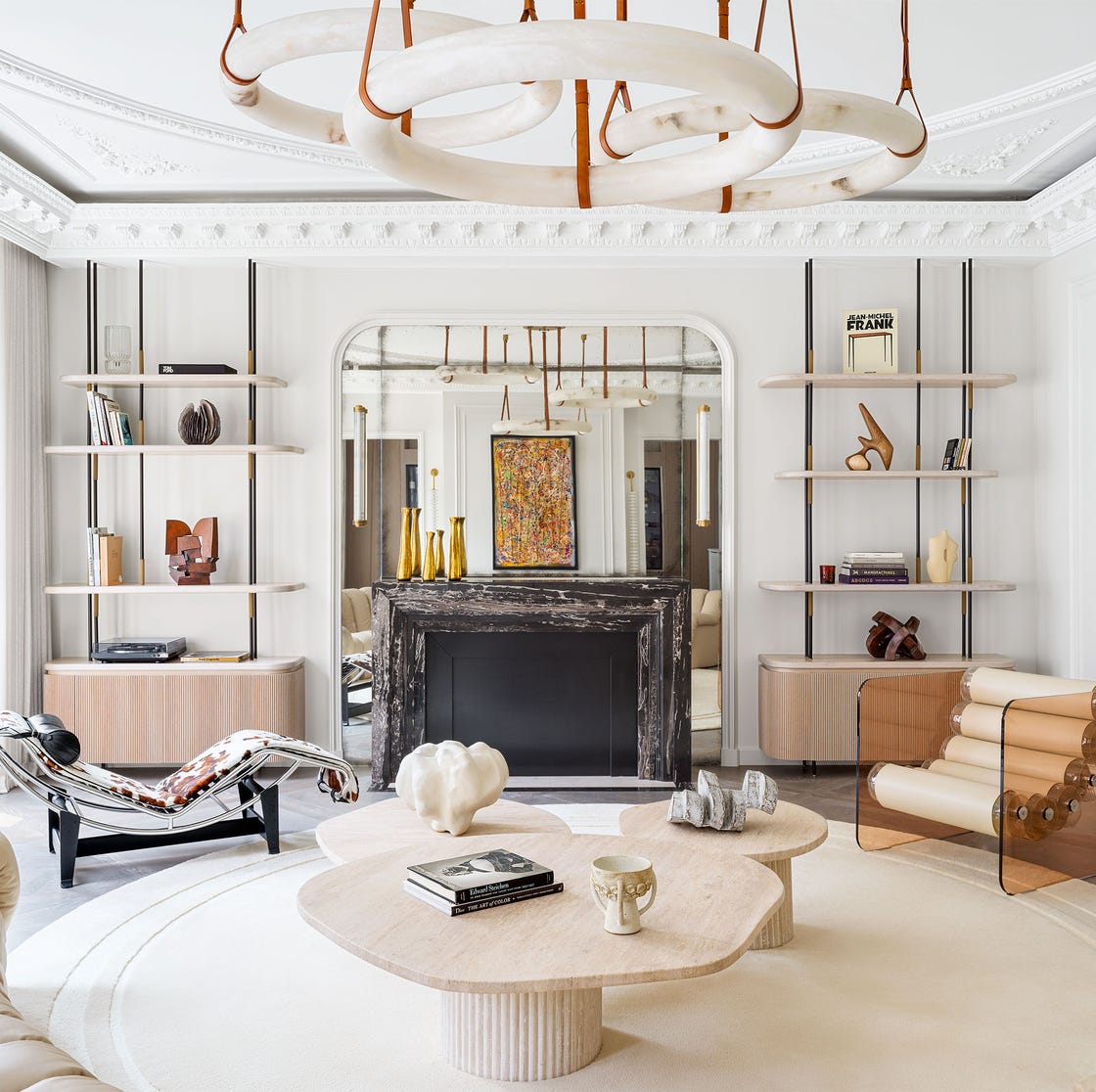
Decorating with neutrals can be challenging, despite their calming and comforting appeal. Interior design professionals emphasize that while neutrals are often perceived as easy to implement, they can quickly lead to bland or boring spaces if not executed correctly. Caroline Milns, head of interior design at Zulufish, highlights this difficulty, stating that there is no room to hide mistakes with neutrals, and schemes can easily become dull. Poonam Shah, another interior designer, suggests varying the tones within a neutral palette to create depth and engagement, such as combining warm taupes with cool greys and soft beiges or earthy tones to achieve a timeless and versatile aesthetic.
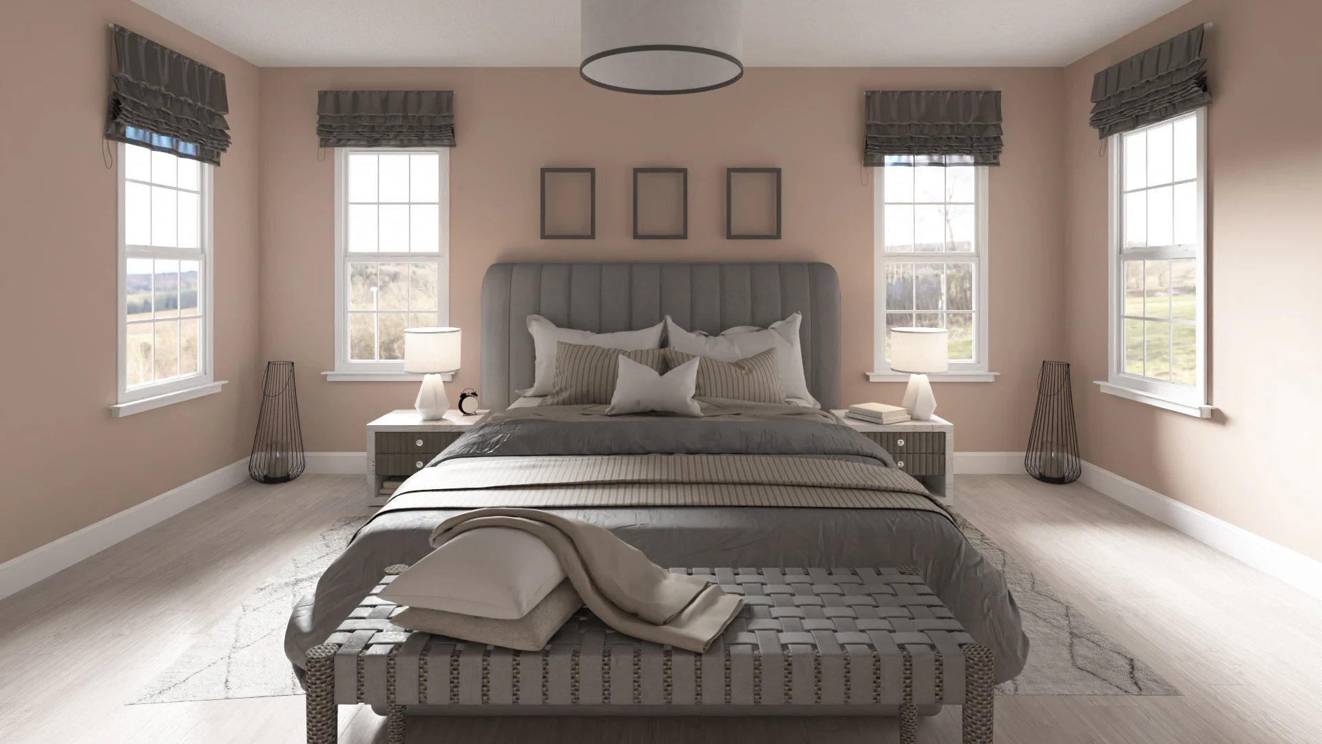
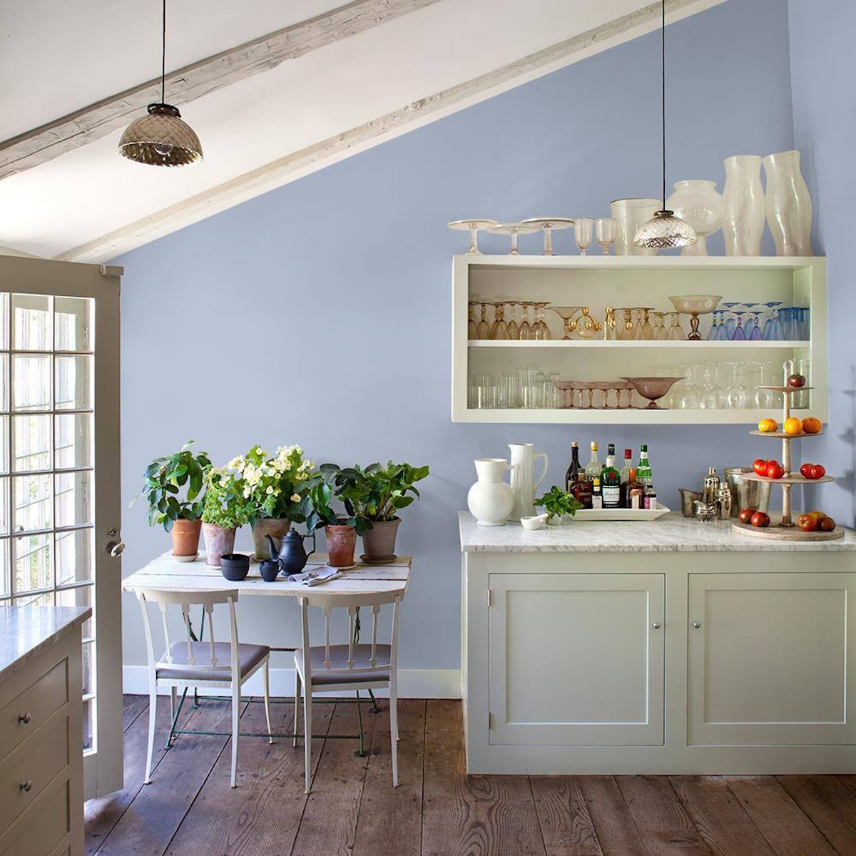
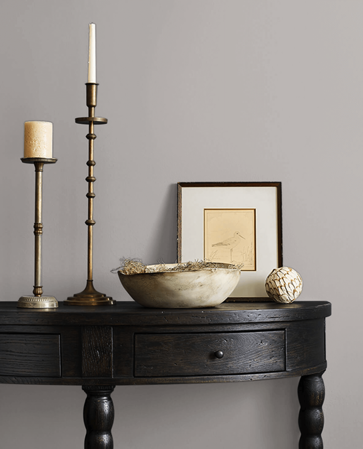
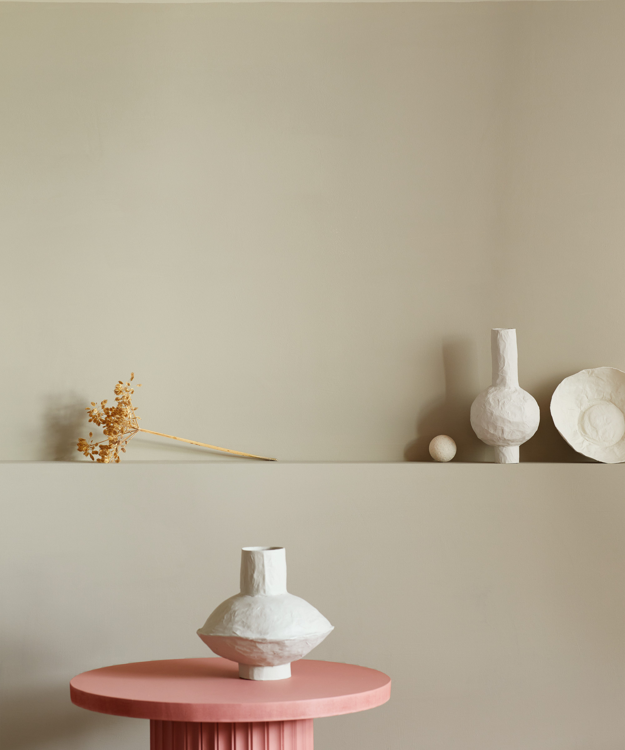
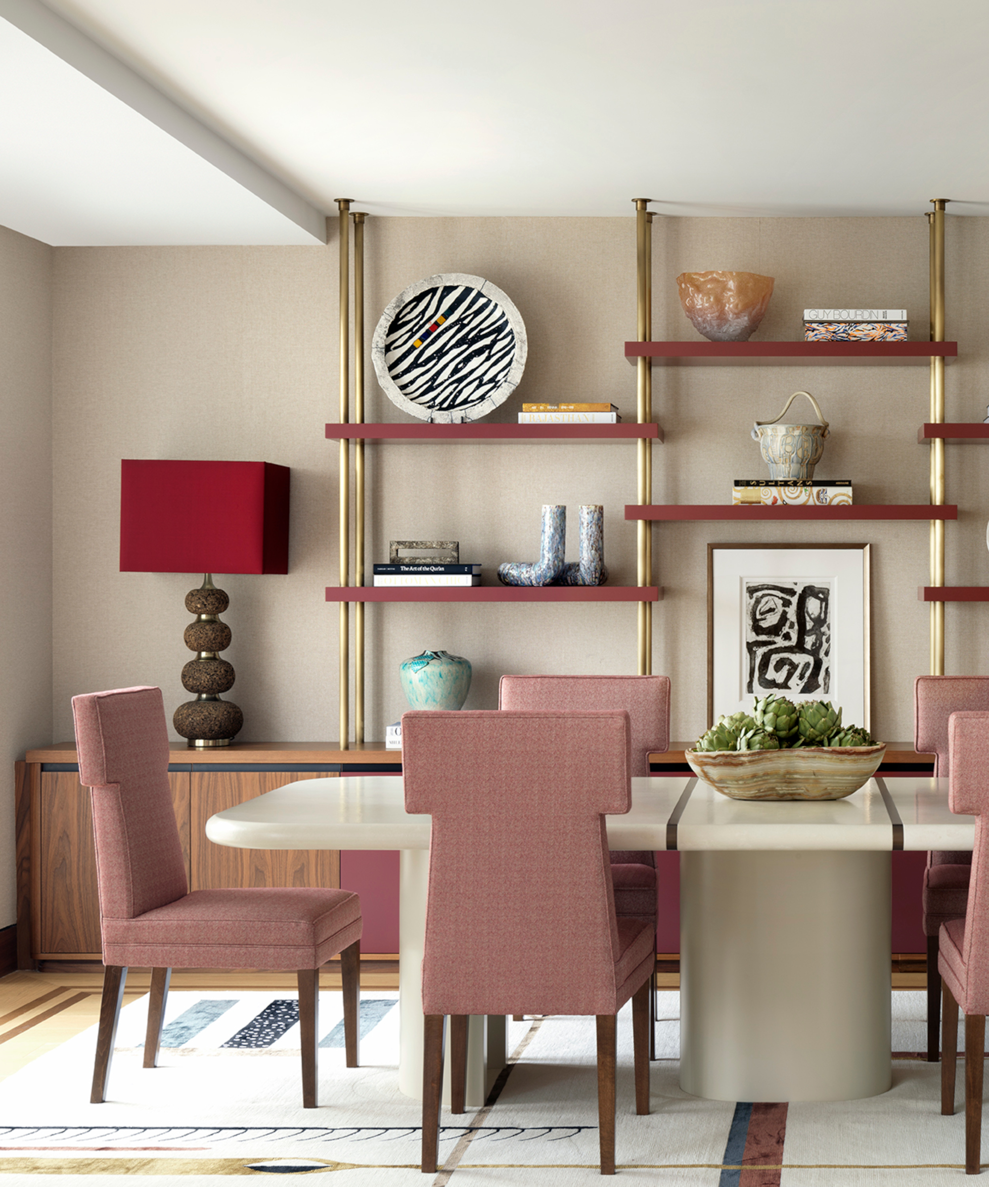
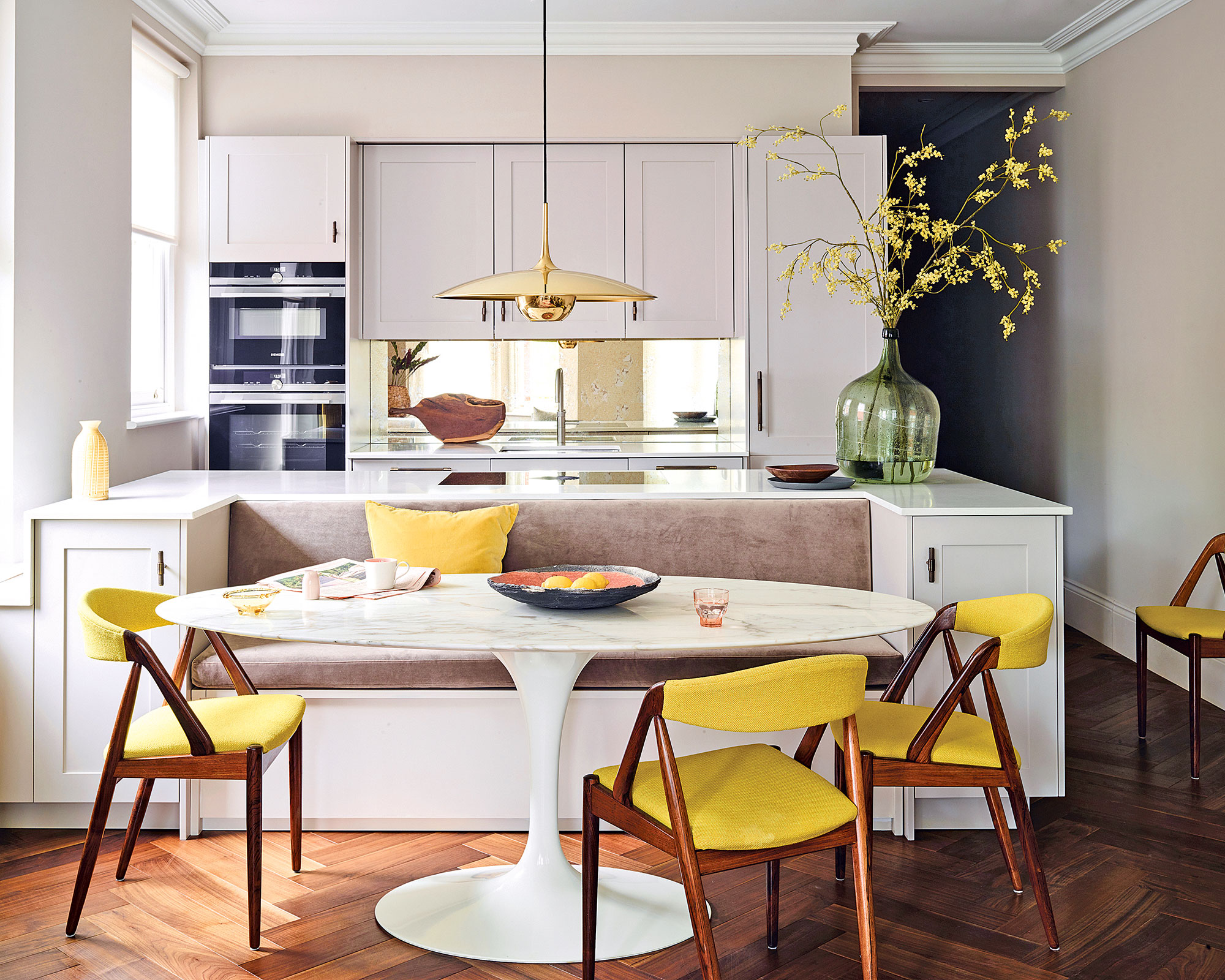
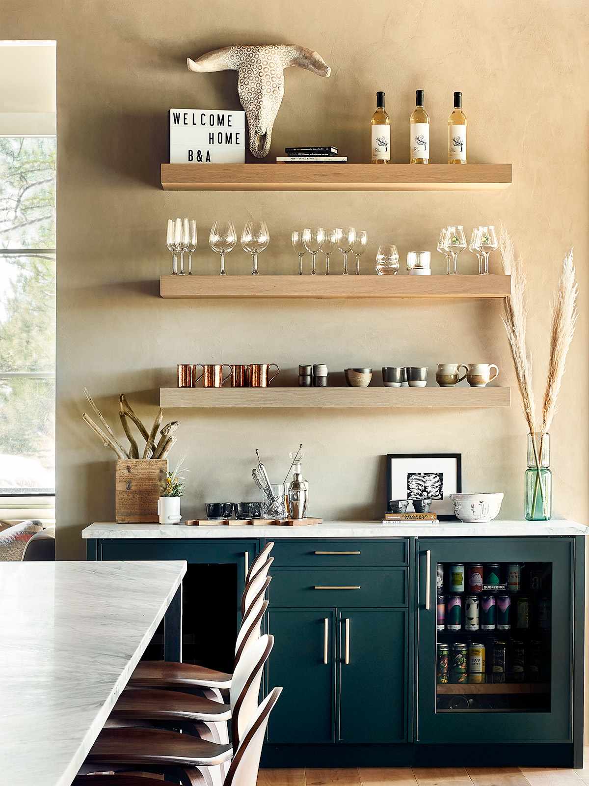
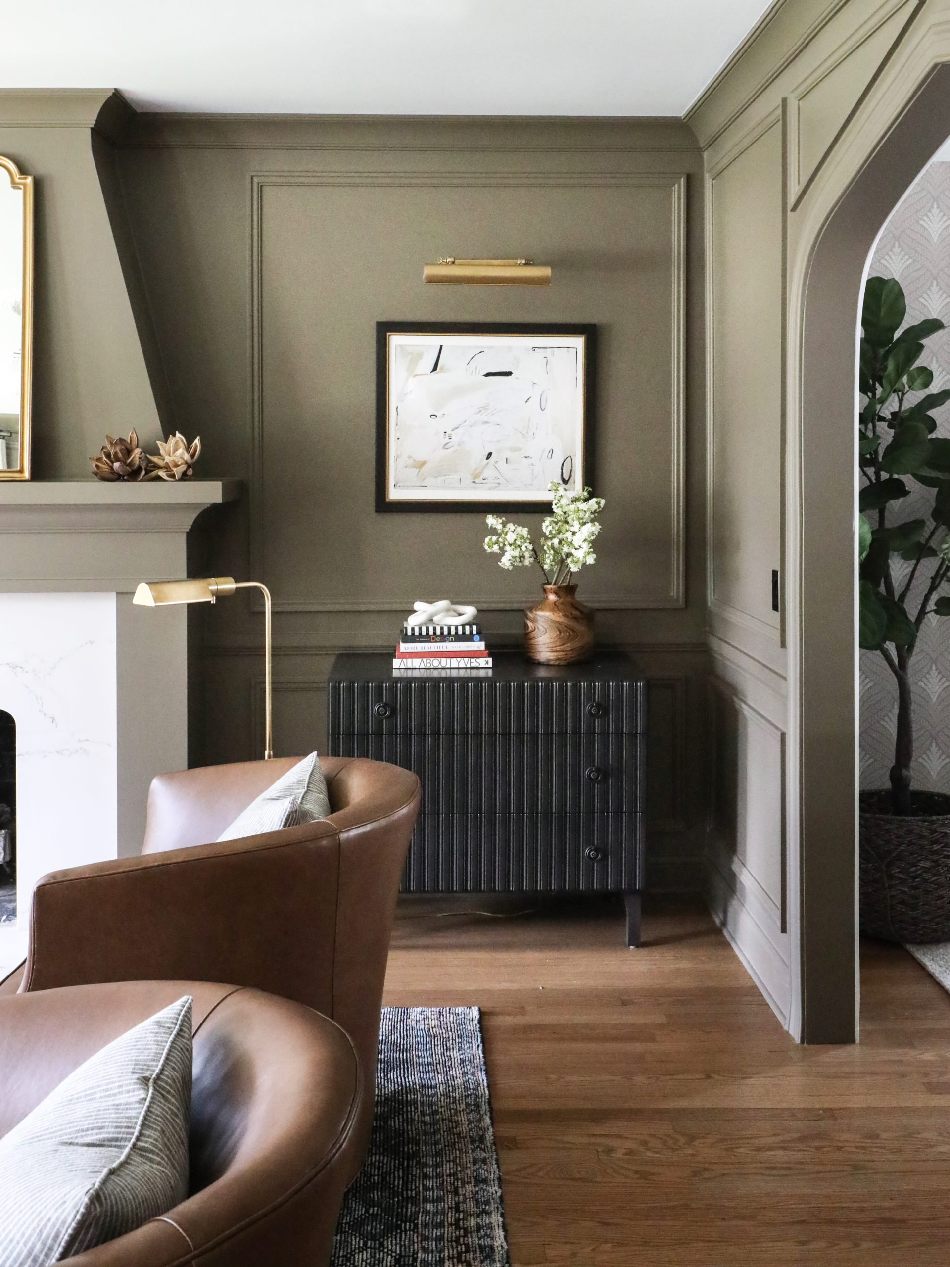
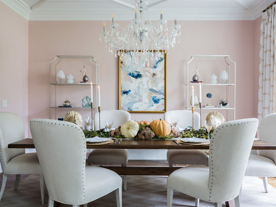
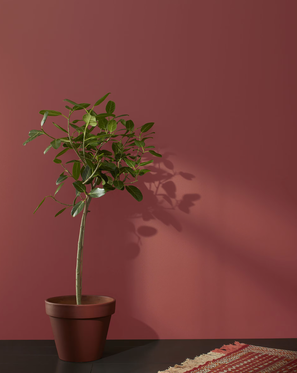
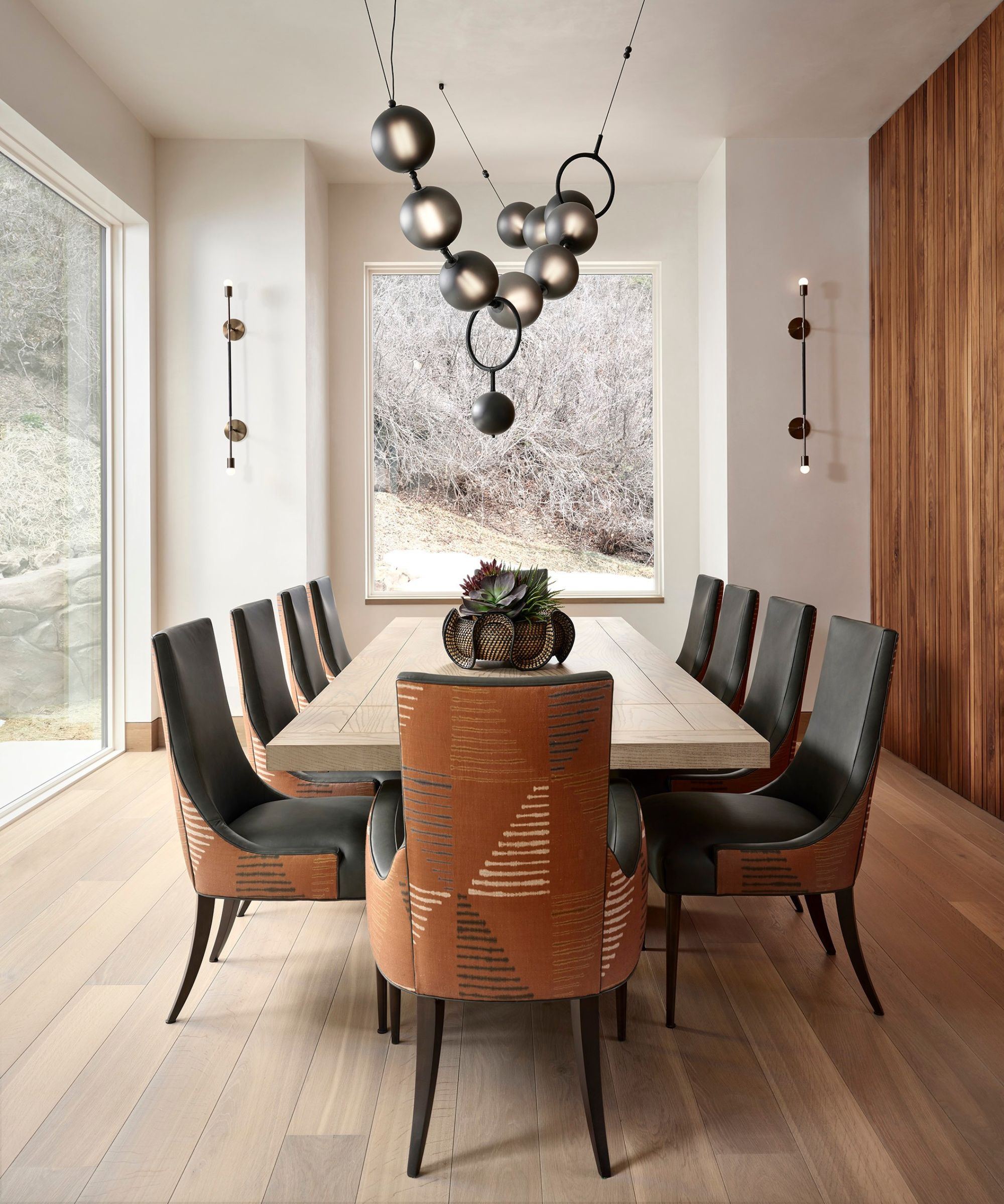
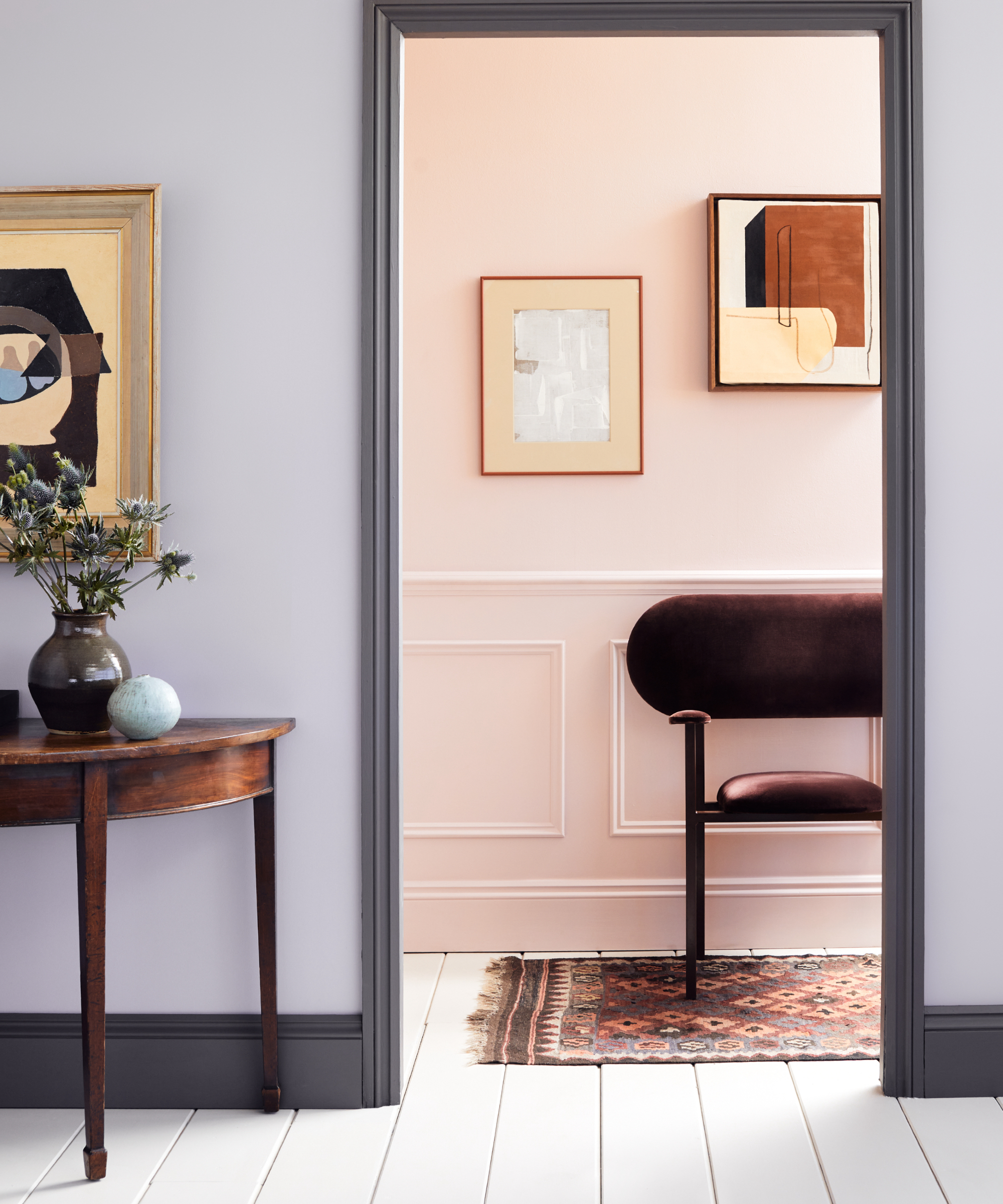
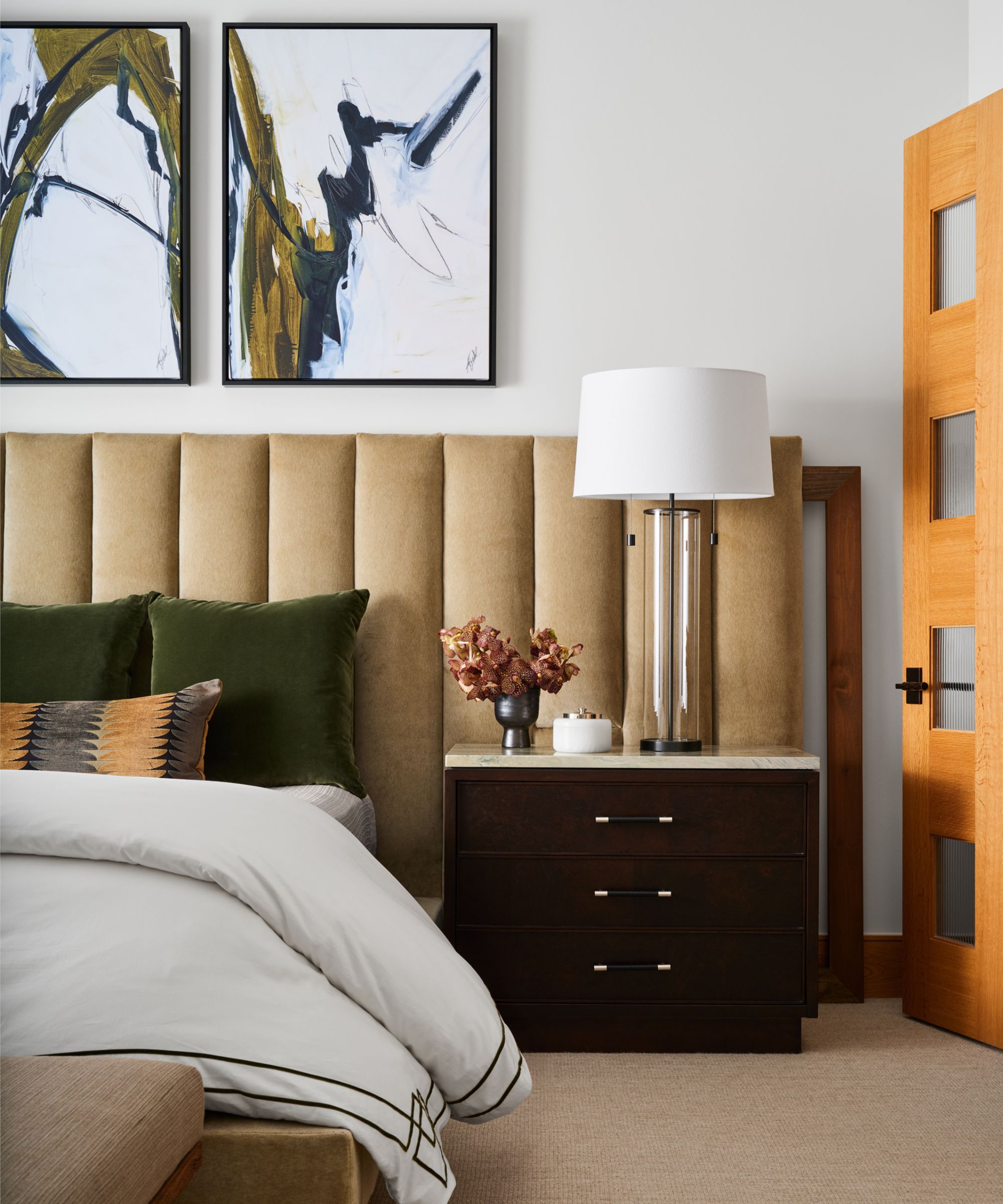
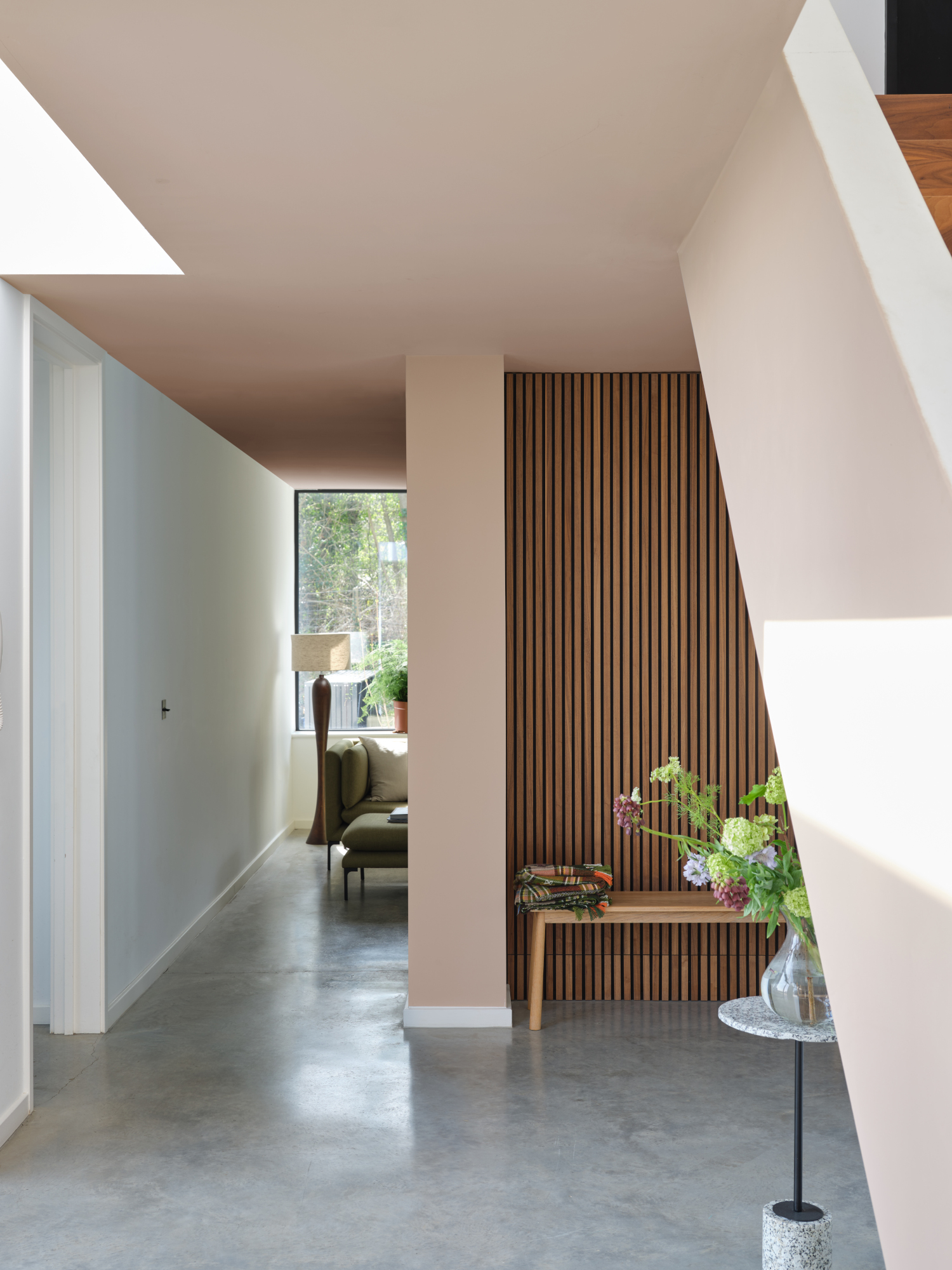
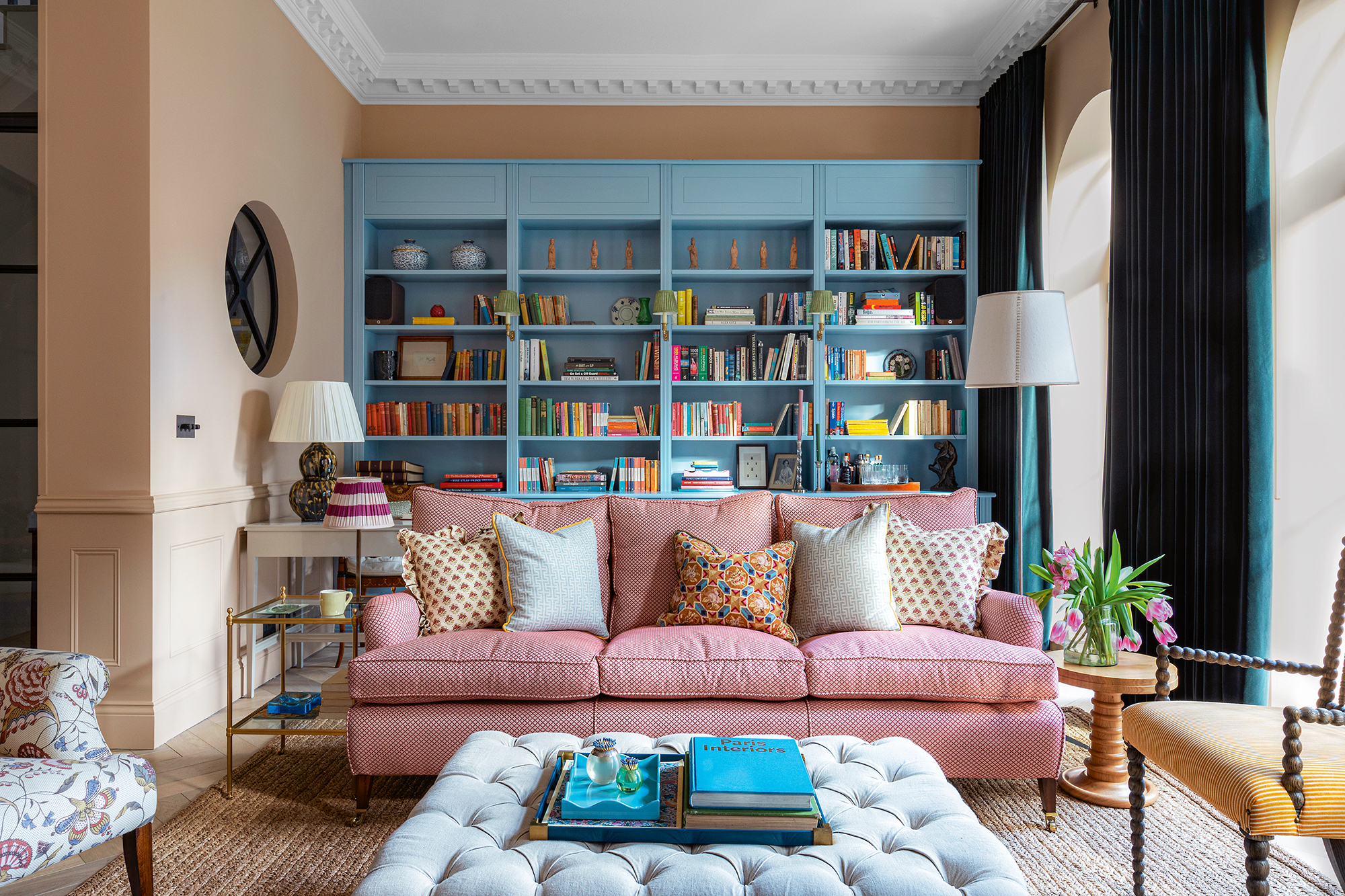
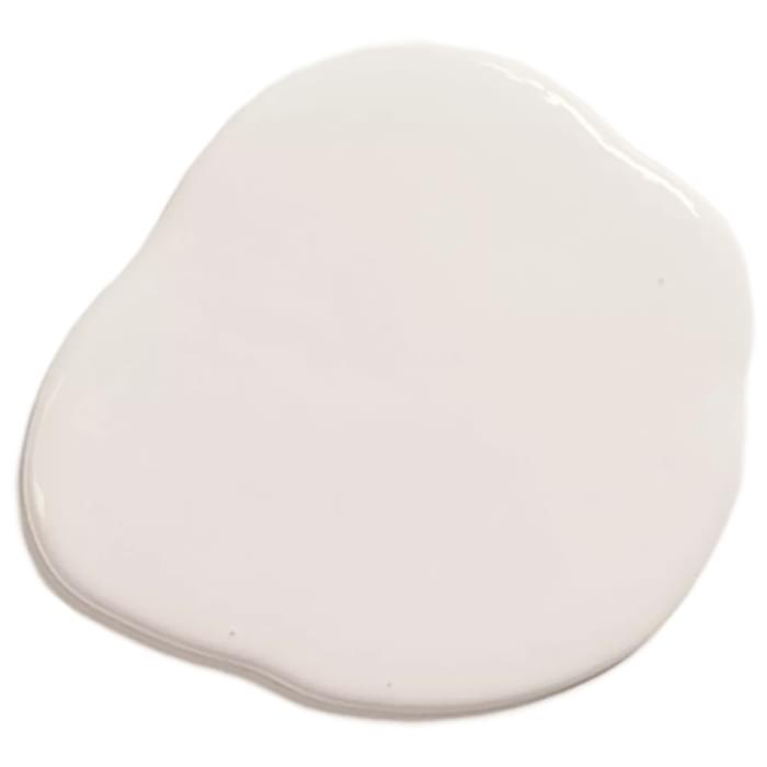
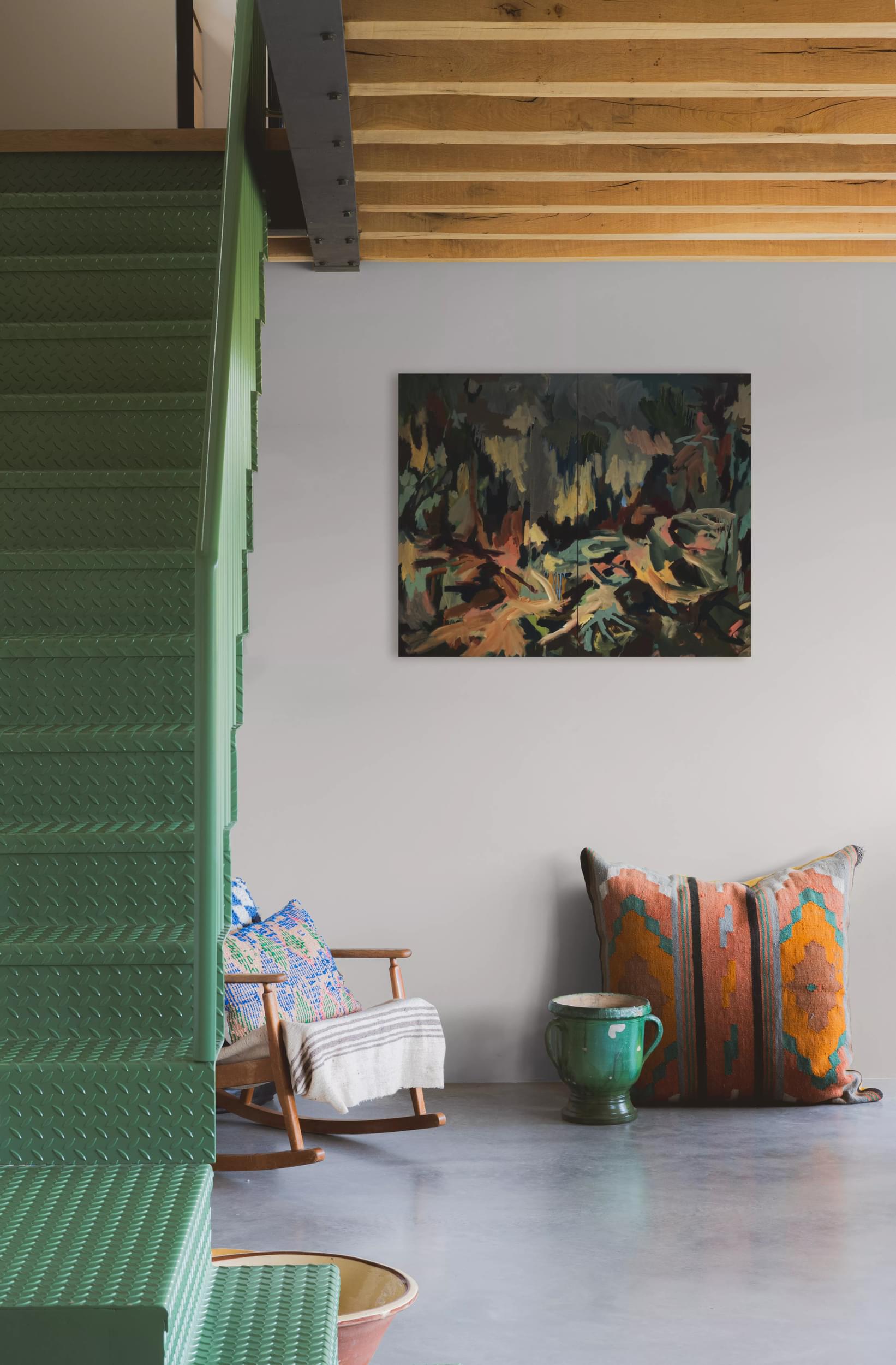
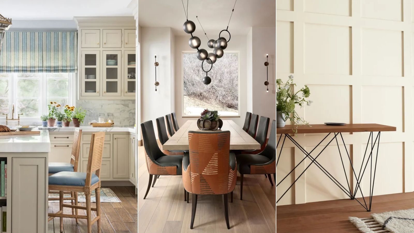
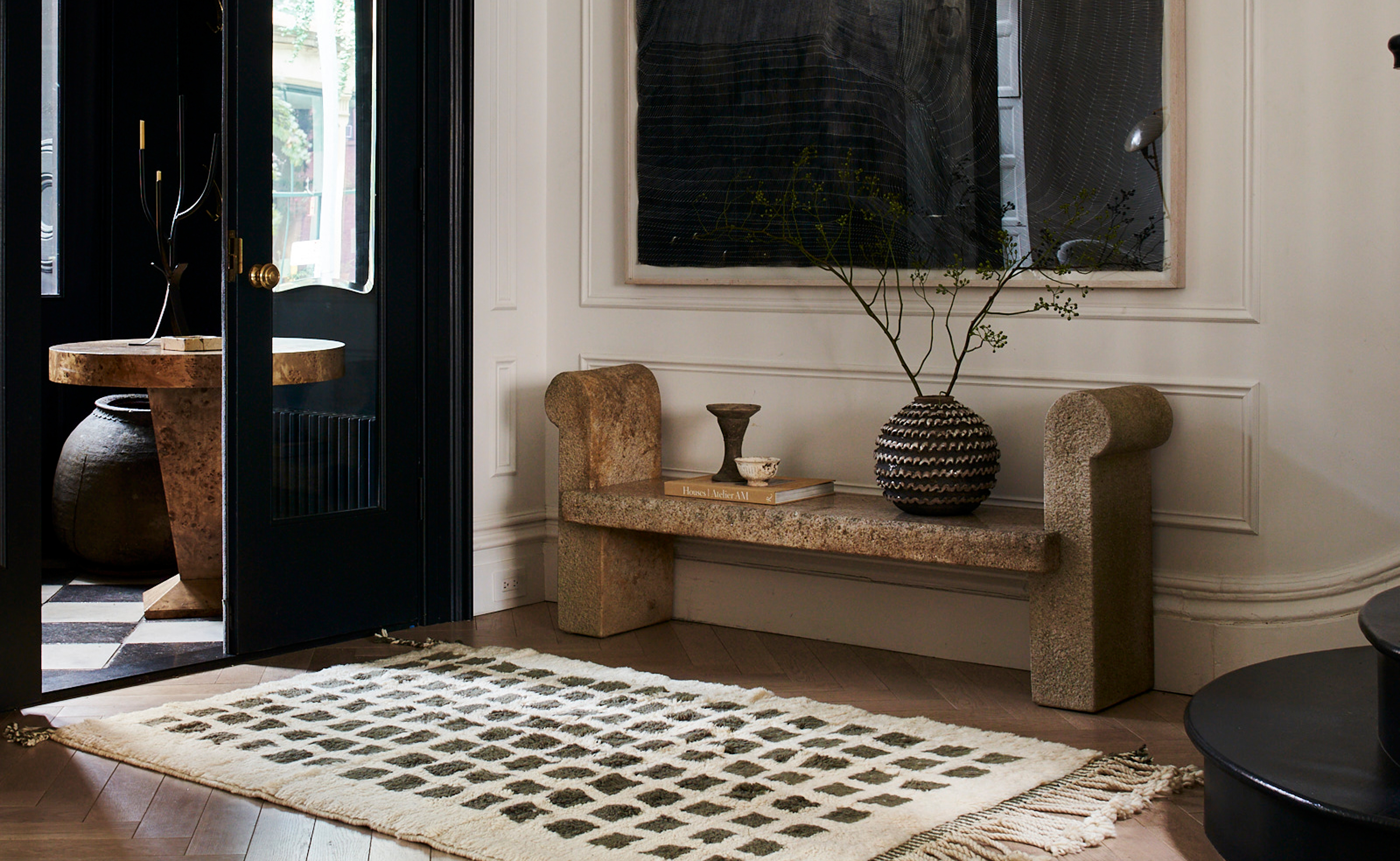
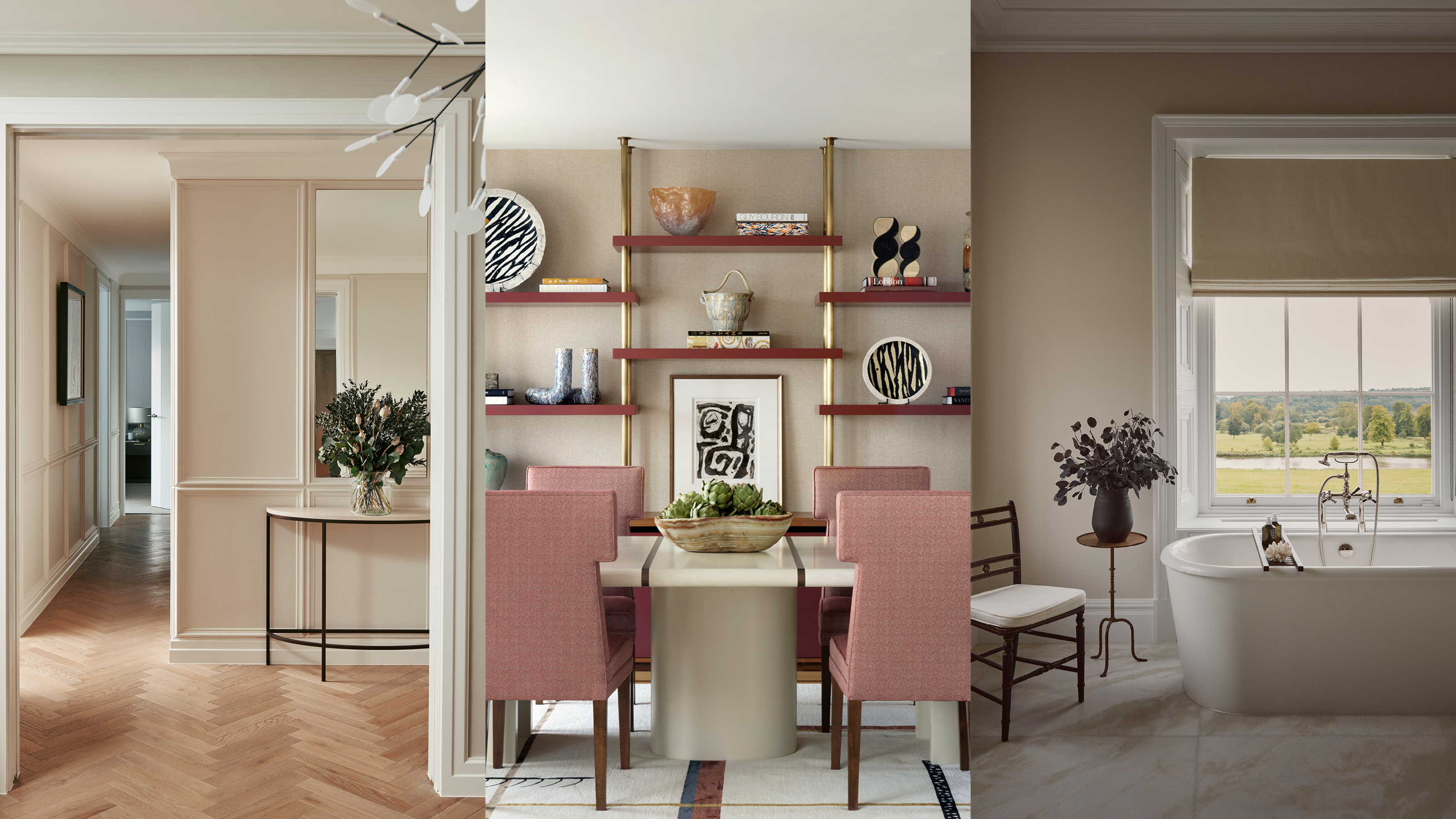
Experts offer ten strategies to keep neutral schemes modern and visually appealing. One approach involves adding drama with dark brown. Interiors stylist Sara Bird explains that darker neutrals provide a rich base for soulful rooms, adding character to contemporary designs and new builds. They also enhance atmosphere, which can be manipulated with lighting and shadow for cozy or intimate settings. Danielle Le Vaillant of Cox & Cox adds that dark wood furniture, like a sideboard, can introduce a sophisticated, 'inherited' look while adding warmth and drama. Another tip is to use earthy pinks as a neutral. Patrick O’Donnell from Farrow & Ball suggests shades like 'Setting Plaster' or 'Templeton Pink' as flexible alternatives to traditional neutrals, providing warmth to north-facing rooms and acting as gentle neutrals in sun-drenched spaces, also suitable for kitchen cabinetry.
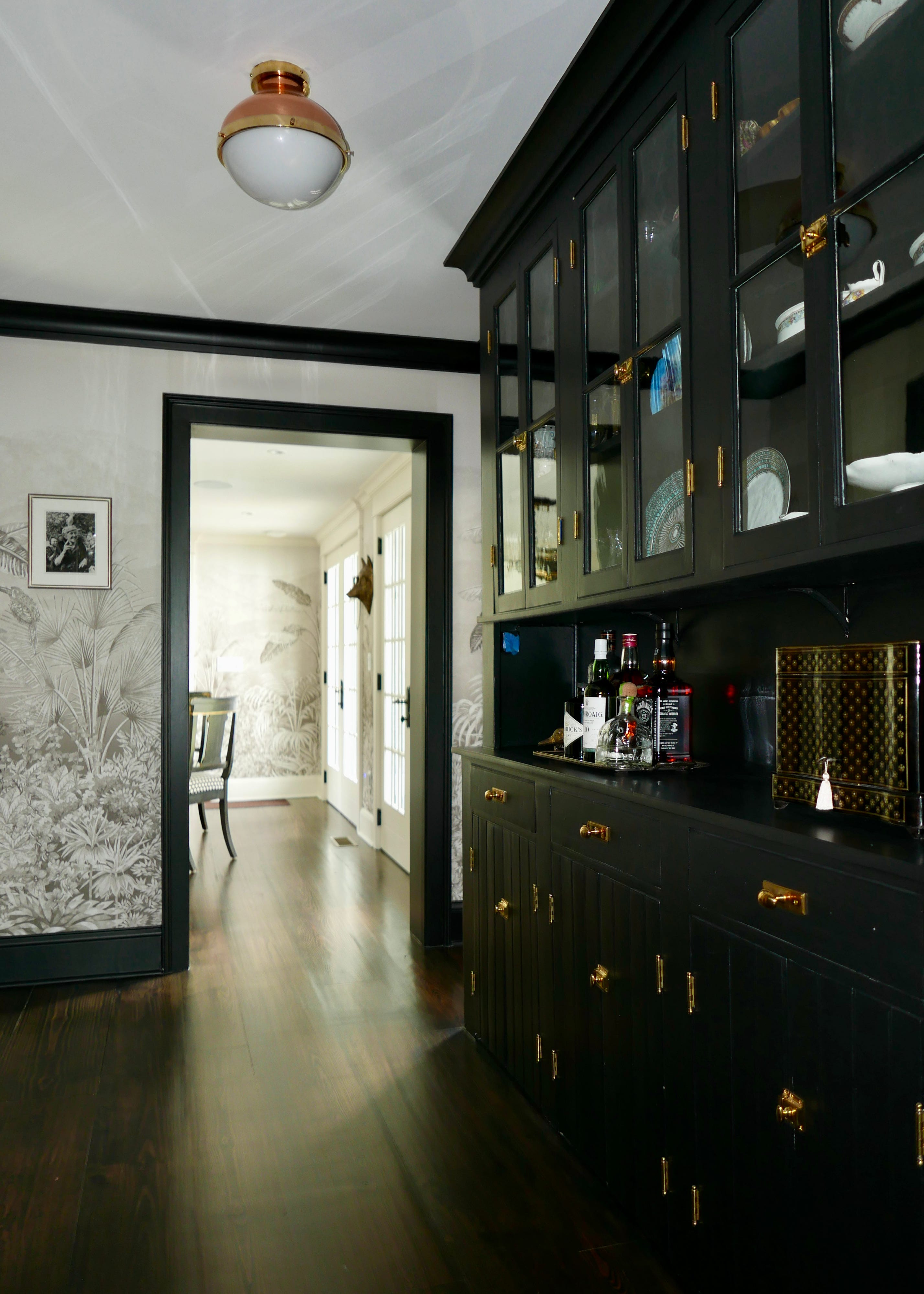
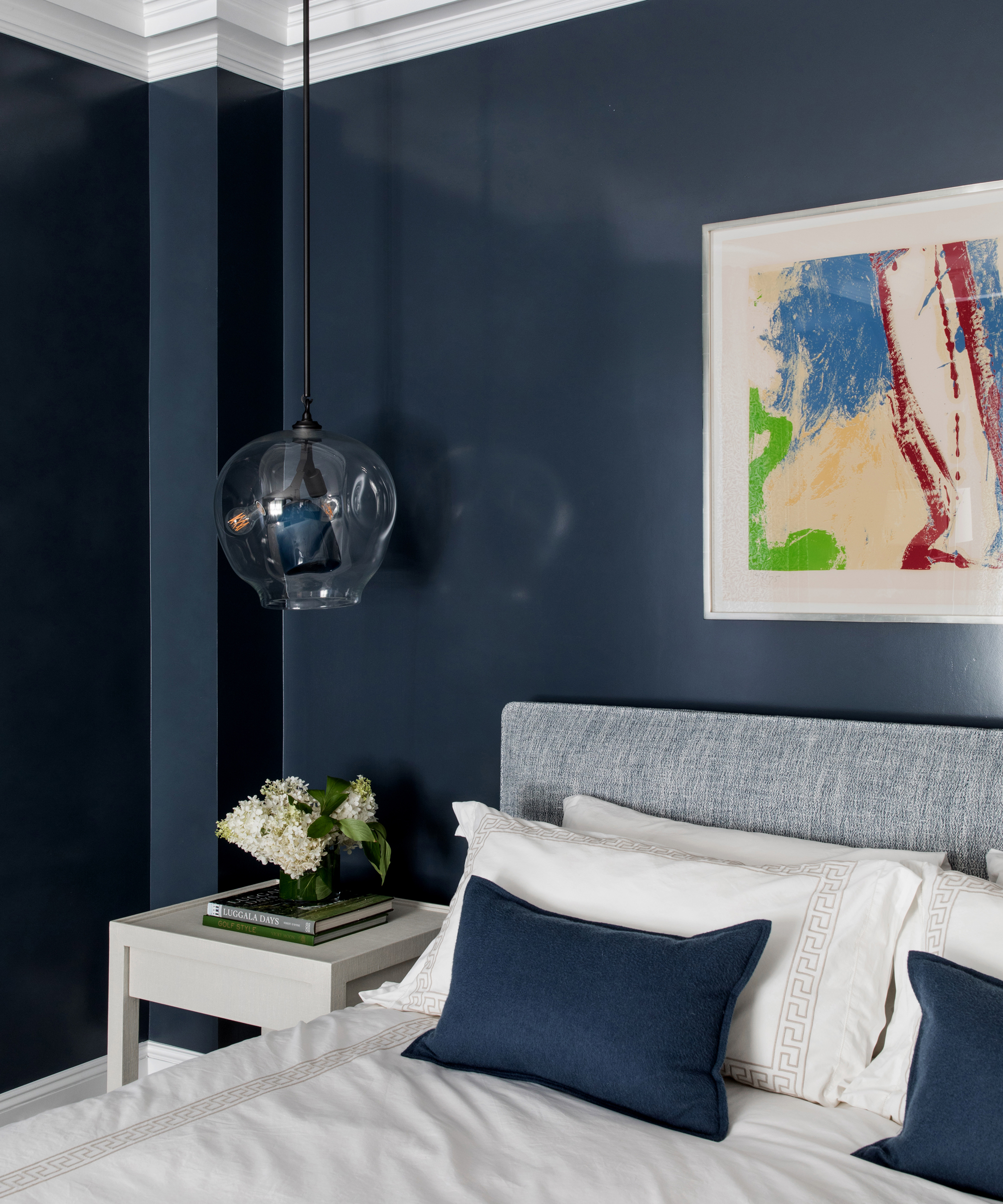
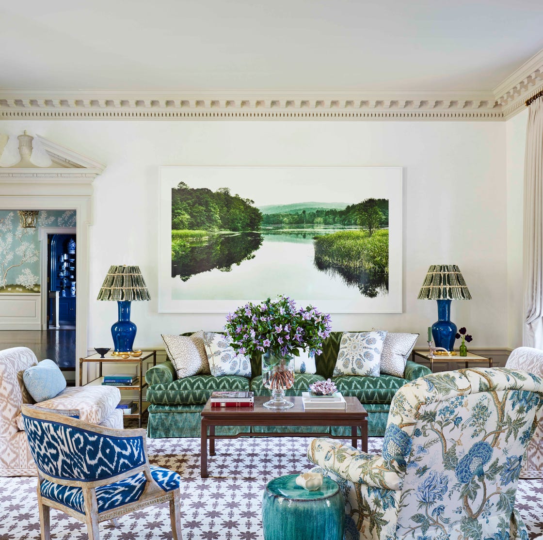
Integrating black accents can provide structure without overwhelming a neutral scheme, especially useful in small spaces needing to appear larger. Laurie Davidson, an interiors stylist, recommends subtle touches of black, such as framed artwork, cushion stripes, or table lamps. In hallways, painting trim in black can highlight architectural features, and black and white kitchens maintain a sharp, simple look. Starting with gentle patterns is another effective technique. James Greenwood of Graham & Brown advises using tonal patterns to add depth, interest, and texture without disturbing the serenity of a neutral space. He suggests repeating colors from the pattern throughout the room to ensure harmony and balancing patterned elements with solid neutral surfaces. For example, a patterned sofa should be paired with plain walls and flooring.
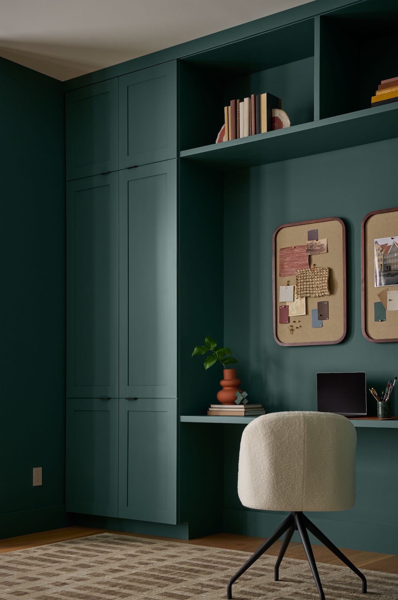
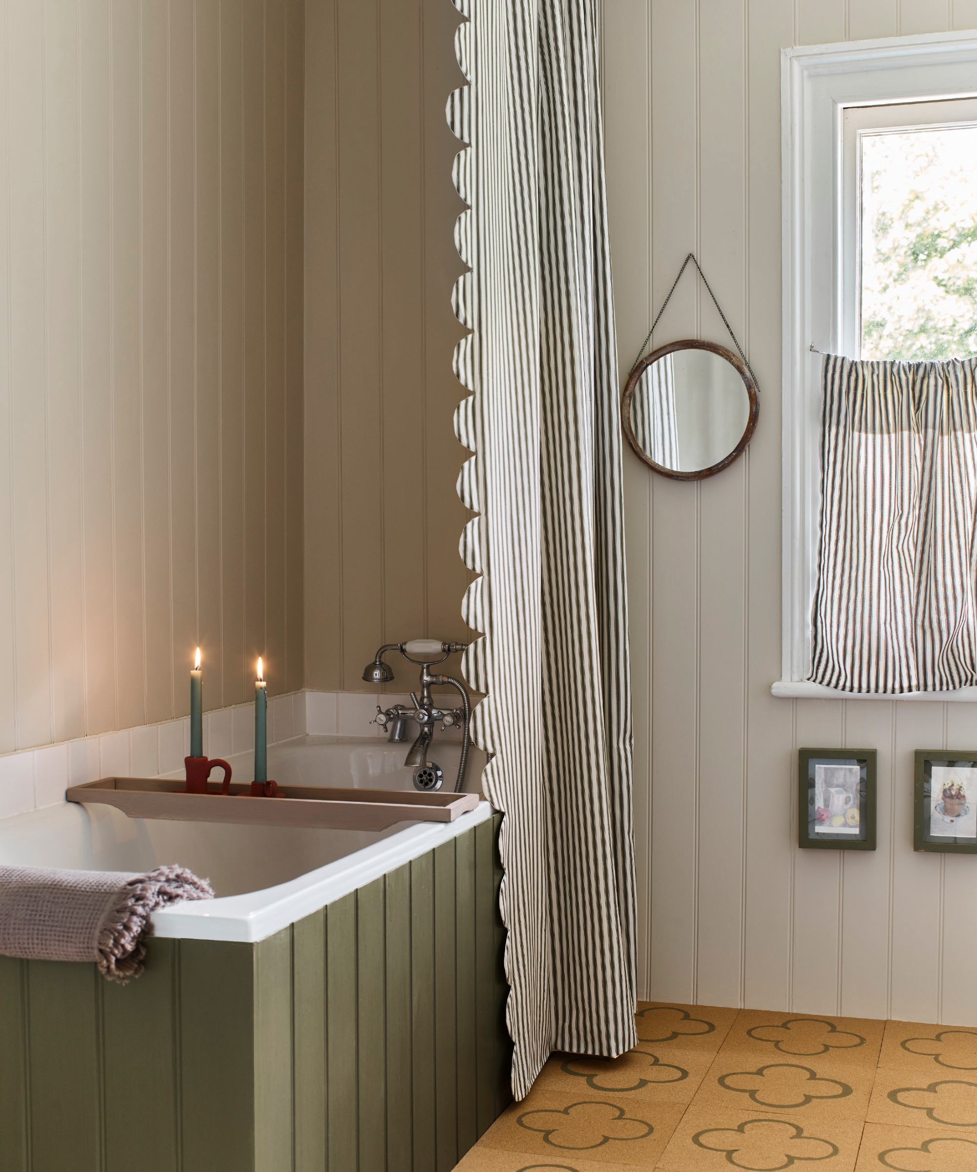
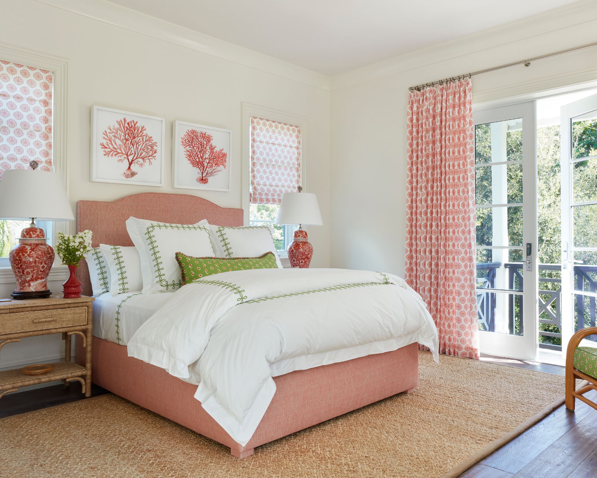
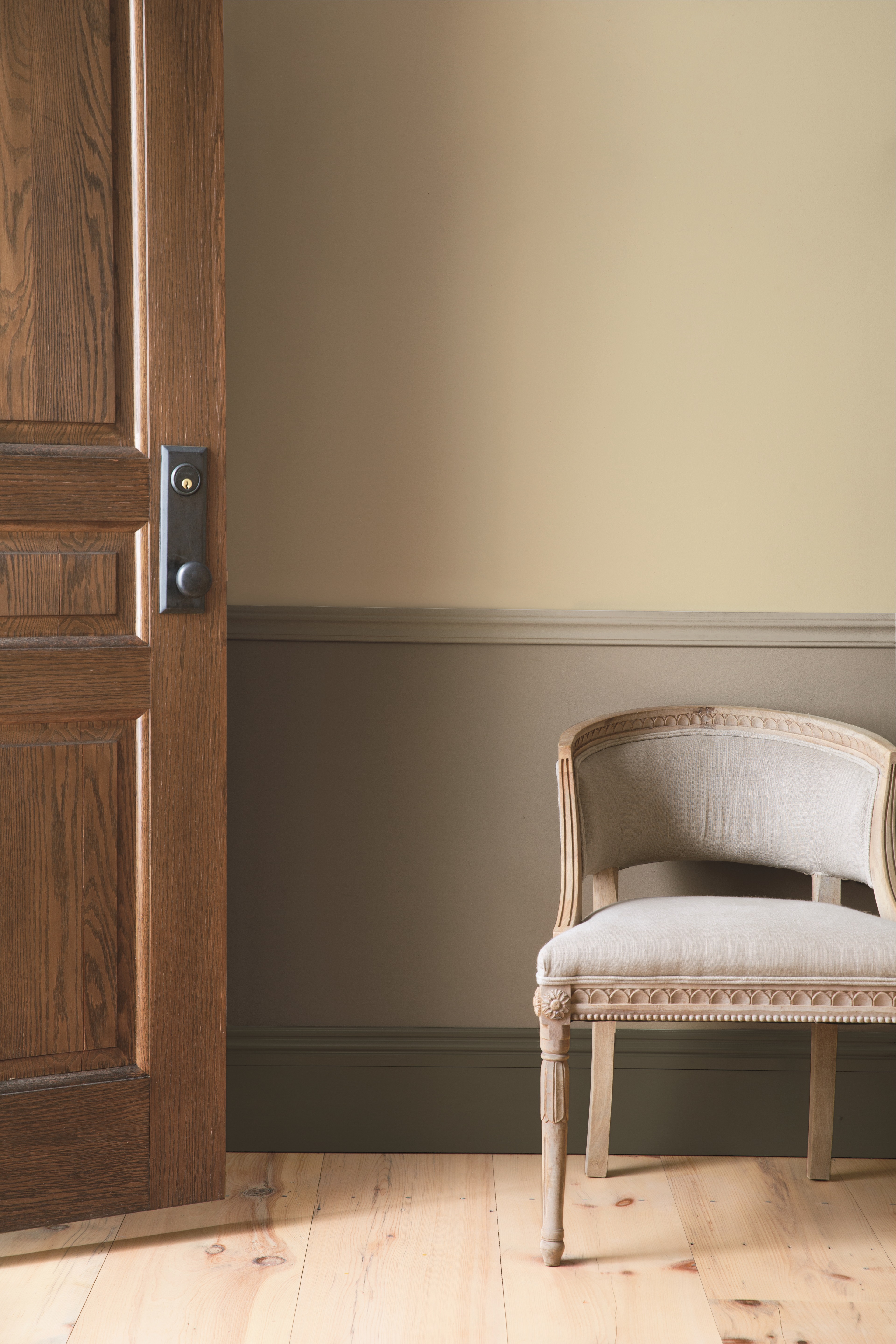
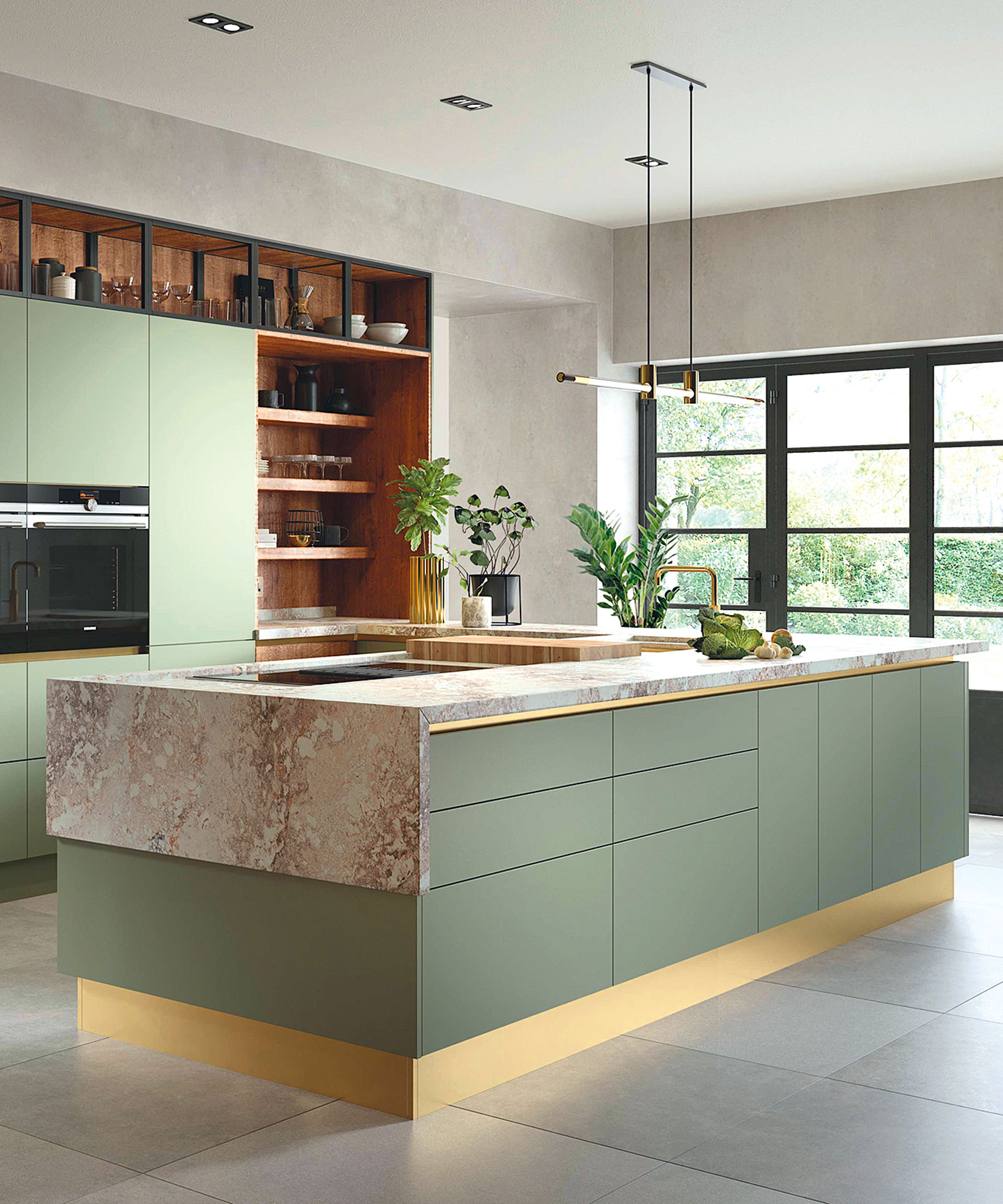
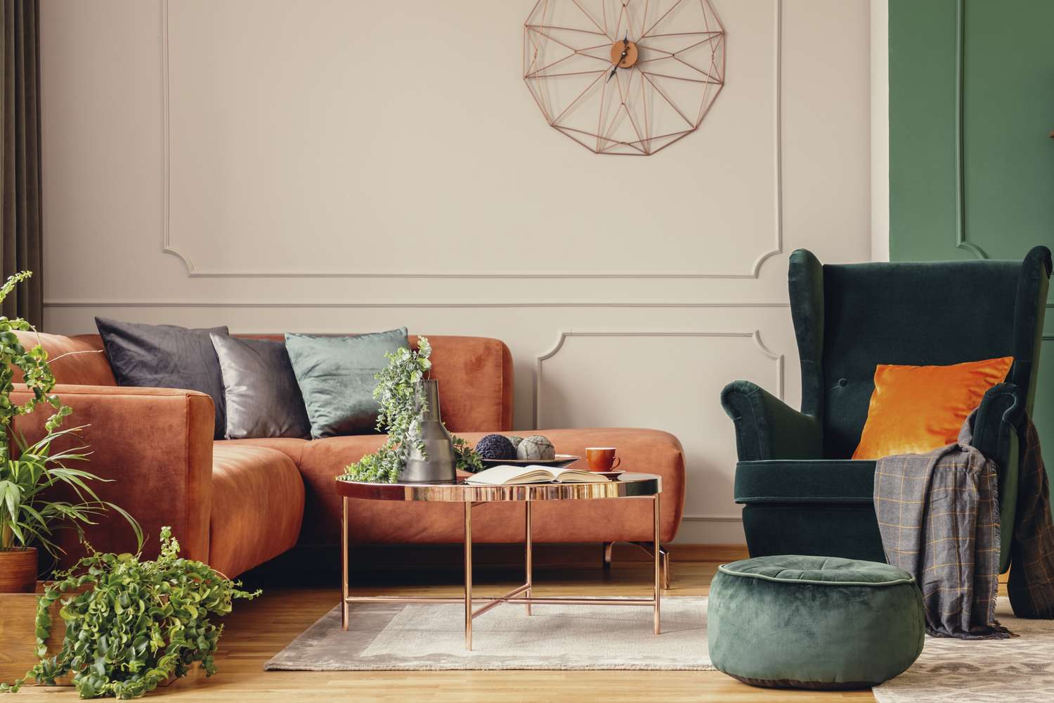
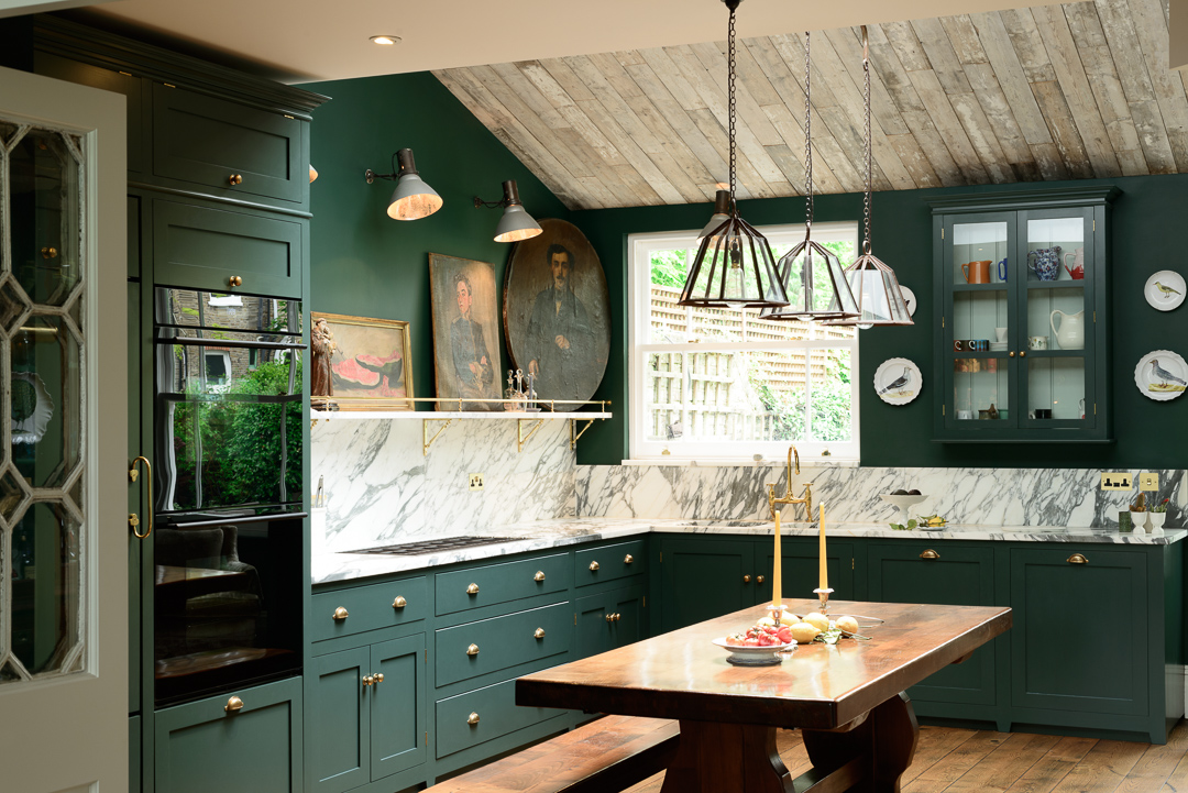
Layering tones of one color is a sophisticated method. Interior designer Kelly Collins notes the trend of using various shades of a single neutral within a room, like taupe walls with warm brown woodwork, to create a relaxing and luxurious feel without overstimulation. Sophie Clemson of The Living House uses different depths of one neutral across walls, woodwork, and ceilings, citing Little Greene's 'Slaked Lime' range and Paint & Paper Library's color families as examples. Mixing an earthy palette, inspired by desert colors like sunset pinks, browns, terracottas, and rusts, can enliven neutral interiors. Laurie Davidson highlights this trend for its ability to bring warmth and a connection to nature, suitable for relaxing spaces like living rooms and bedrooms. Patrick O’Donnell also recommends these shades for kitchens, while Flora Hogg of Craig & Rose suggests combining 'Lucienne Olive' with a burst of 'Jarosite' yellow to mimic dappled light.
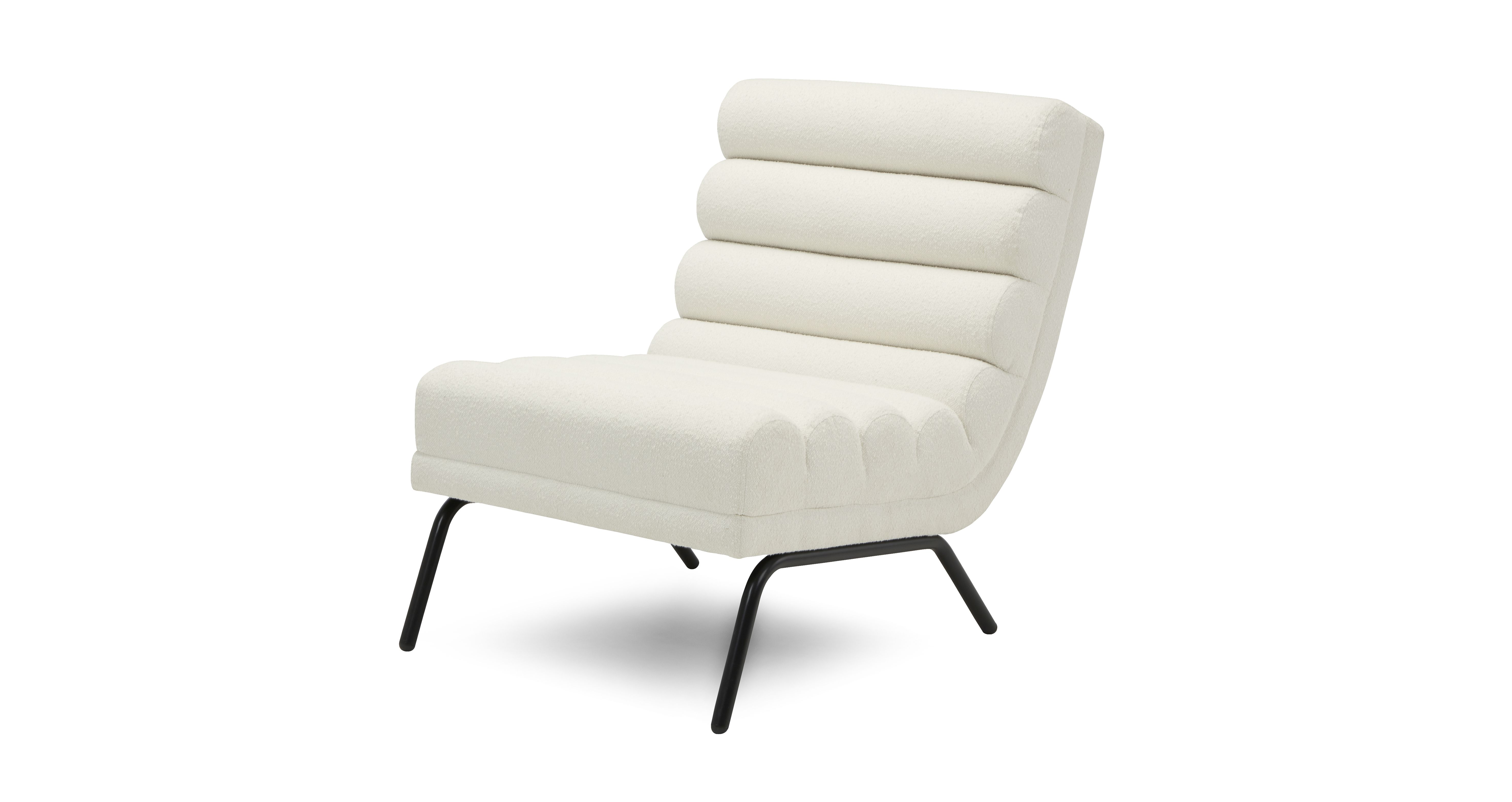
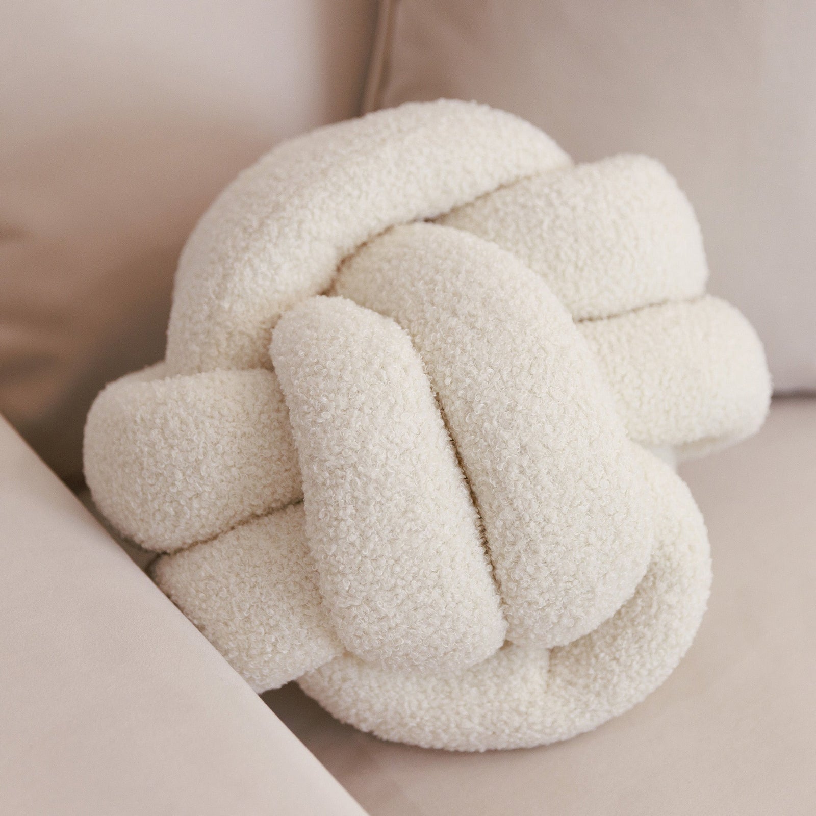
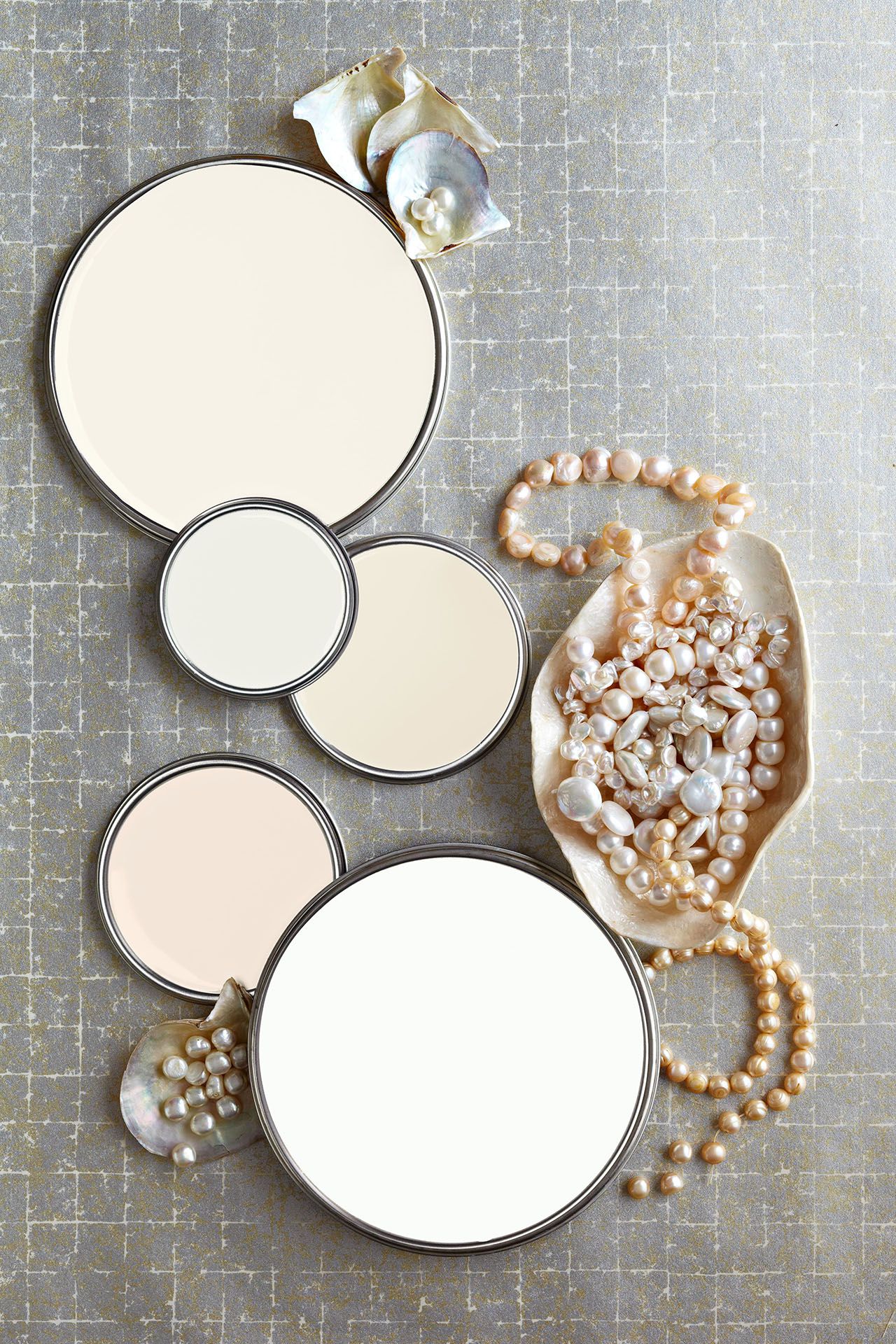
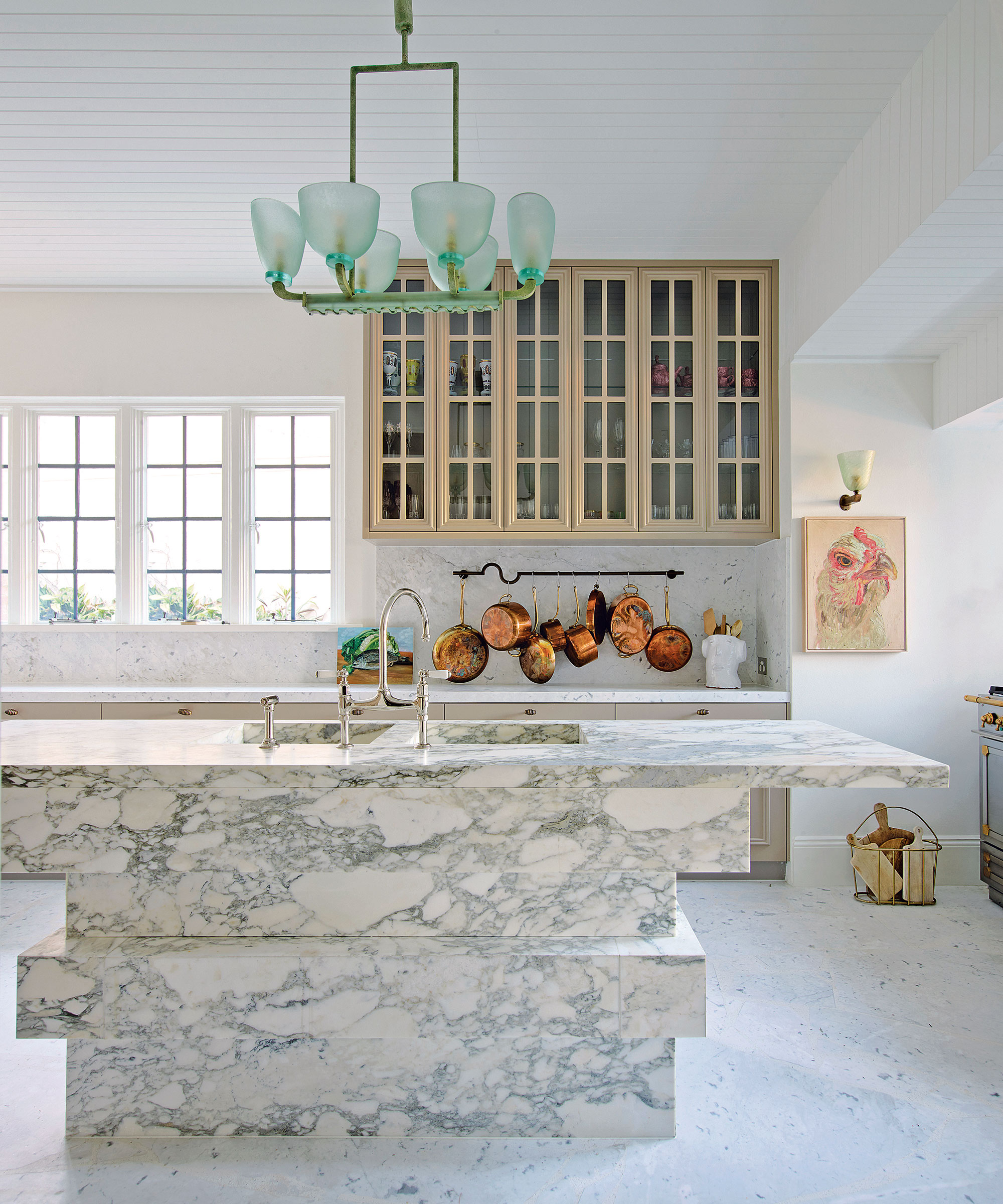
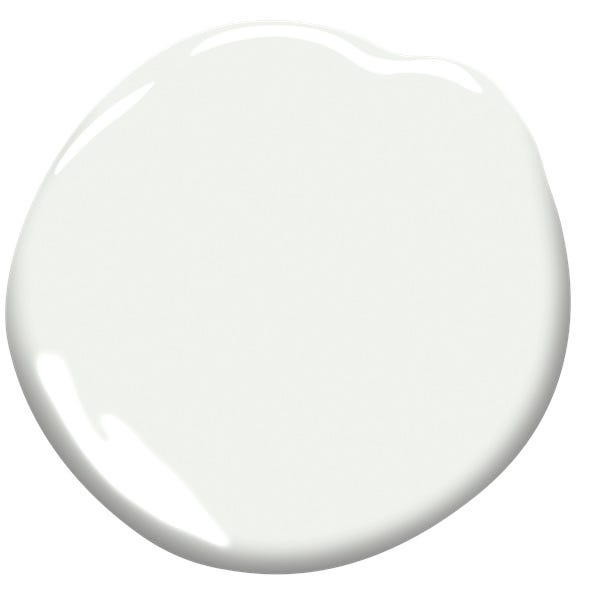
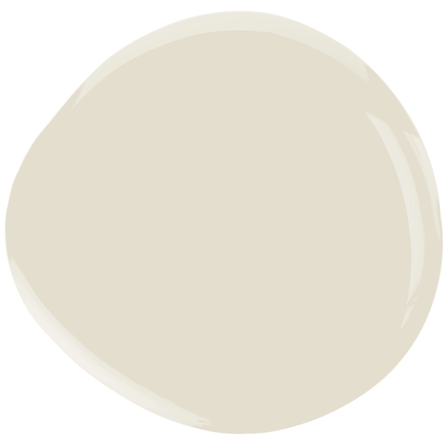
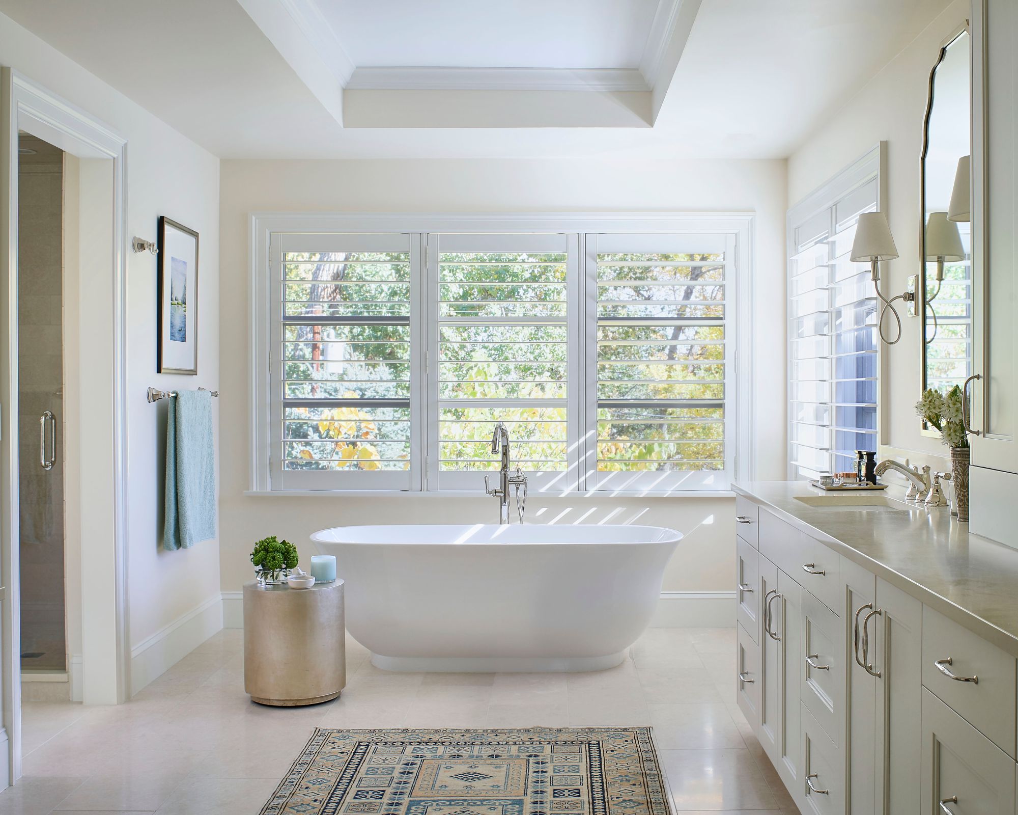
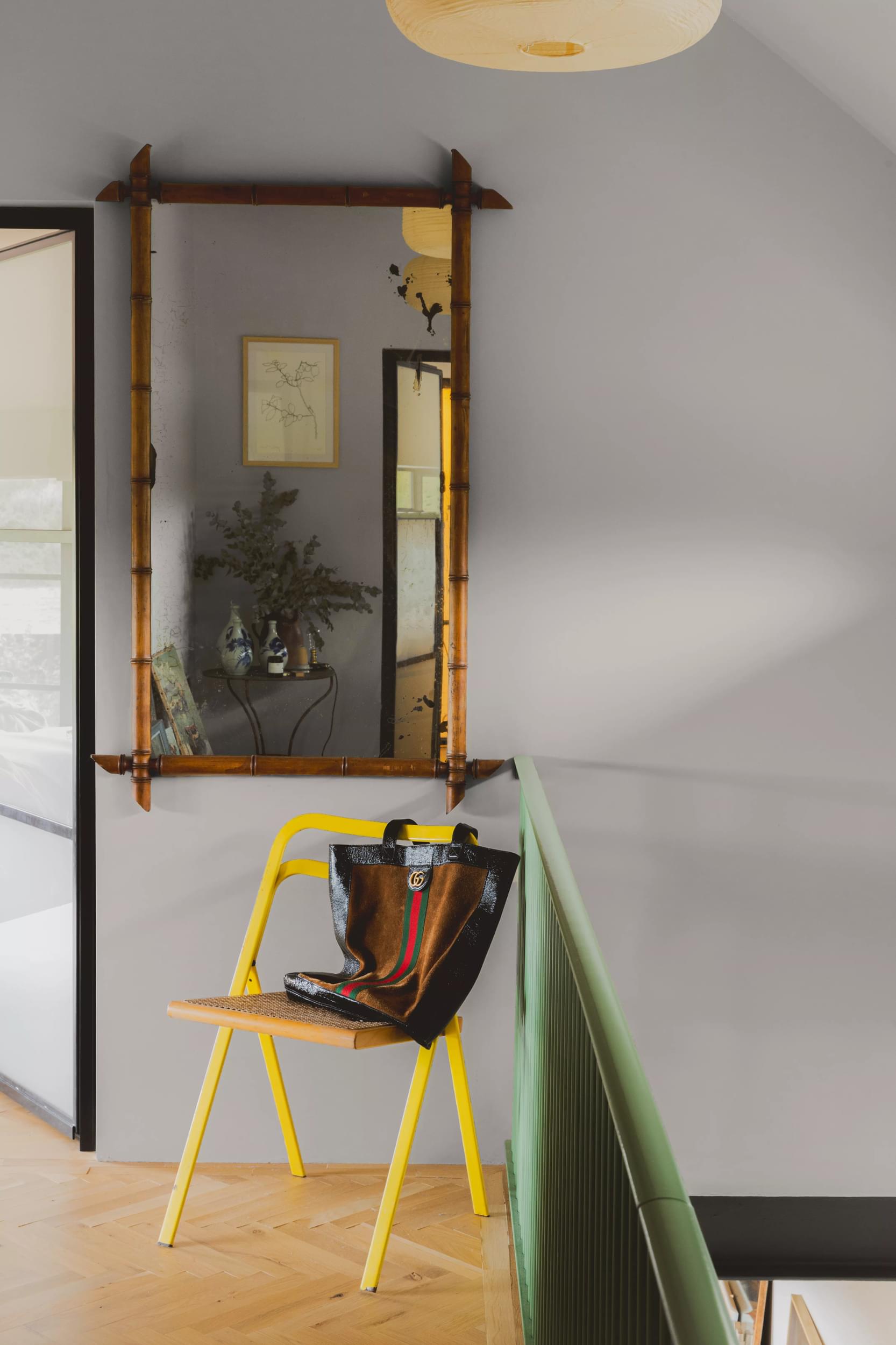
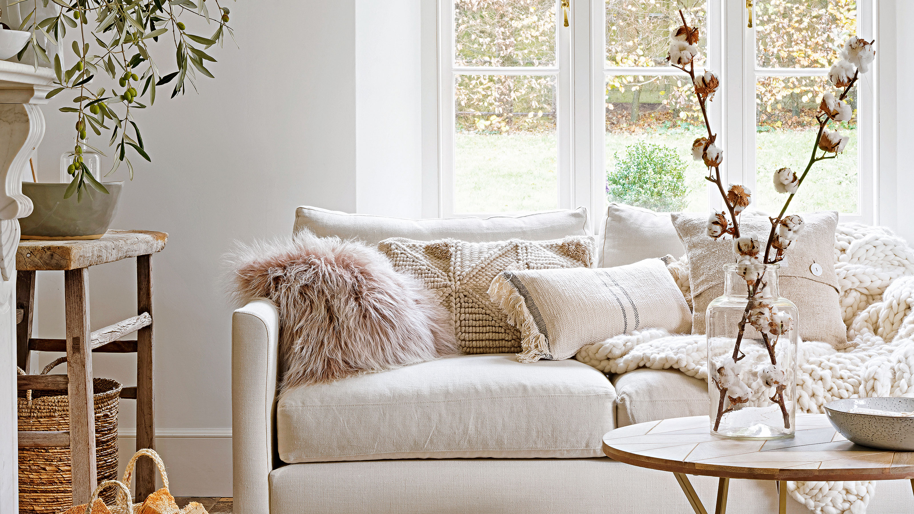
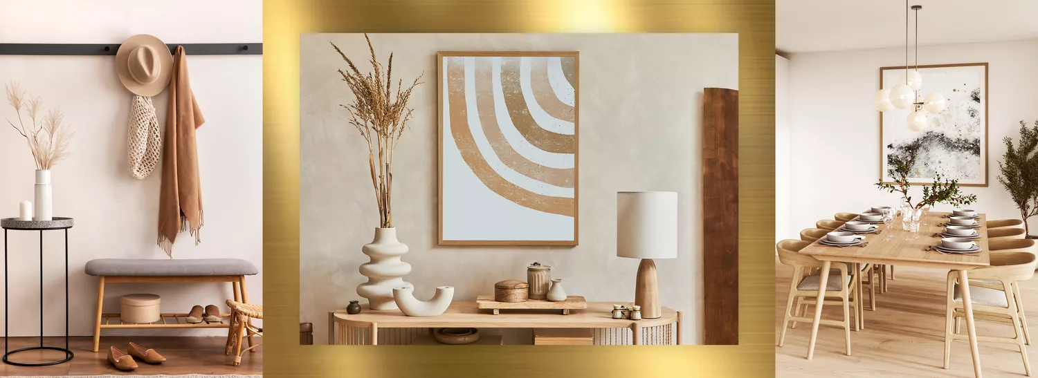
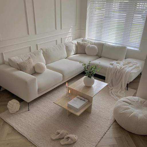
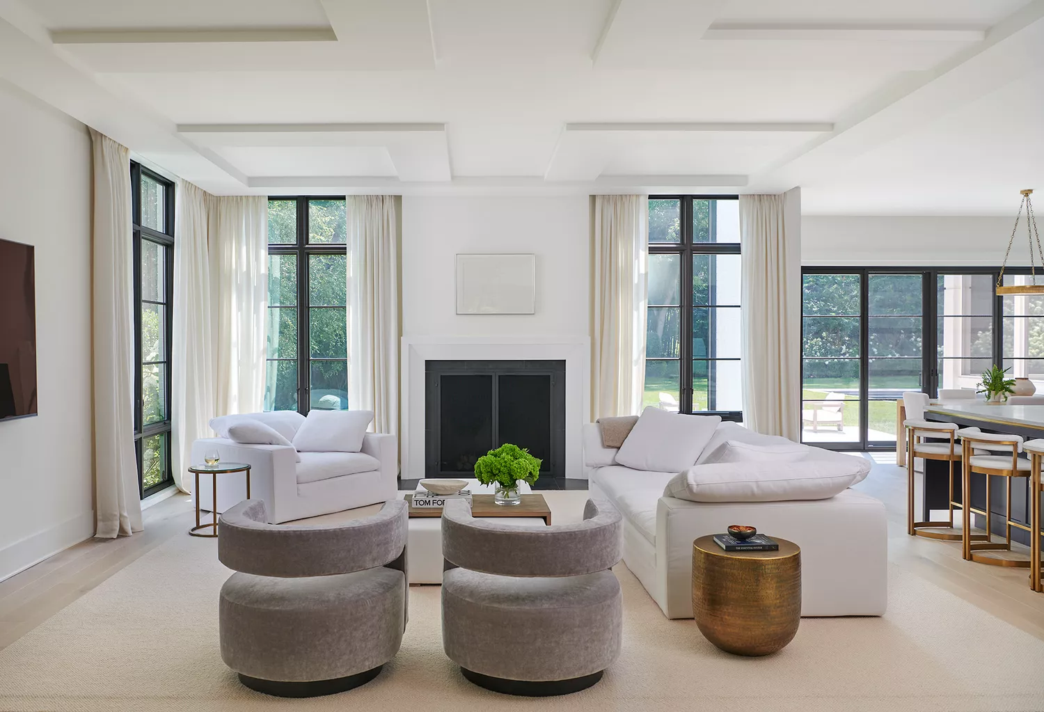
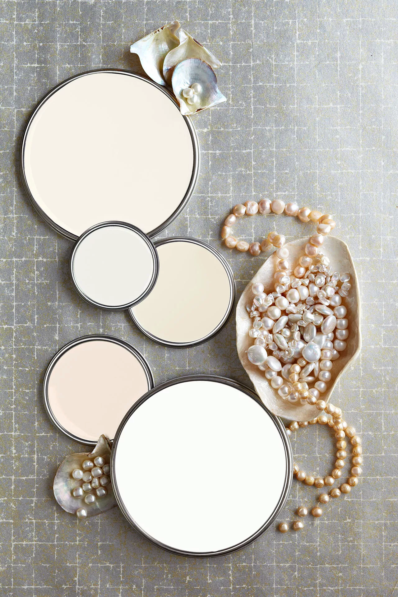
Swapping flat color for metallics can elevate a room, particularly in small spaces. James Watkins of Divine Savages recommends metallic wallpapers, like their 'Faunacation' in Savannah Gold, for a sophisticated and magical effect as daylight changes. Creating a sensory experience through layered textures is crucial to prevent neutral schemes from feeling flat. Louise Bradley emphasizes that texture adds a harmonious and calming element. Danielle Le Vaillant suggests raised textures and natural fabrics like cotton, wool, and sheepskin for a premium look, while Poonam Shah highlights the organic beauty of wood, stone, and greenery. Finally, updating cool greys with warmer shades by choosing pale tones with brown, yellow, or khaki tints, and swapping out Pure Brilliant White for whites that complement the room's light, are essential for creating inviting and balanced neutral spaces. Patrick O'Donnell notes that Pure Brilliant White can appear cold or tinted depending on the light, recommending warmer whites like Farrow & Ball's 'Pointing' or 'Joa’s White' and ensuring trim colors match wall undertones for a softer contrast.
#HomeDecoration #NeutralPalette #InteriorDesign #ColorSchemes #HomeStyling #EarthyTones #TexturalElements #AccentColors #ModernNeutrals #HomeDecoration #NeutralPalette #InteriorDesign #ColorSchemes #HomeStyling #EarthyTones #TexturalElements #AccentColors #ModernNeutrals
0 comment in total
 No comments yet
You may also like
The 20 Best Neutral Paint Colors for Your Home in 2025

How to Pick the Best Paint Colors for Every Space in Your Home

10 best warm neutral paints as recommended by interior designers – from beige to muted pink
Why I'll Never Give Up My Neutral Color Scheme

5 reasons to embrace a neutral palette

35 Neutral Paint Colors Interior Designers Can't Get Enough Of

5 Timeless Paint Colors That Go With Absolutely Everything, According to Color Experts

The 3 Best Neutral Entryway Paint Colors to Set the Right Tone for a Sophisticated Home

Beige-grey – the timeless paint color perfect for a barely-there backdrop

12 Neutral Paint Colors That Will Look Beautiful in Every Room
These Are the Neutral Paint Colors Interior Designers ACTUALLY Use

Real estate agents reveal which room colors sell a house the fastest – for the highest price
27 Neutral Paint Colors and Tips from Experts On How to Use Them

Designers Say These 12 Paint Colors Will Be Everywhere in 2026


7 of the most versatile and easy to use paint colors according to designers
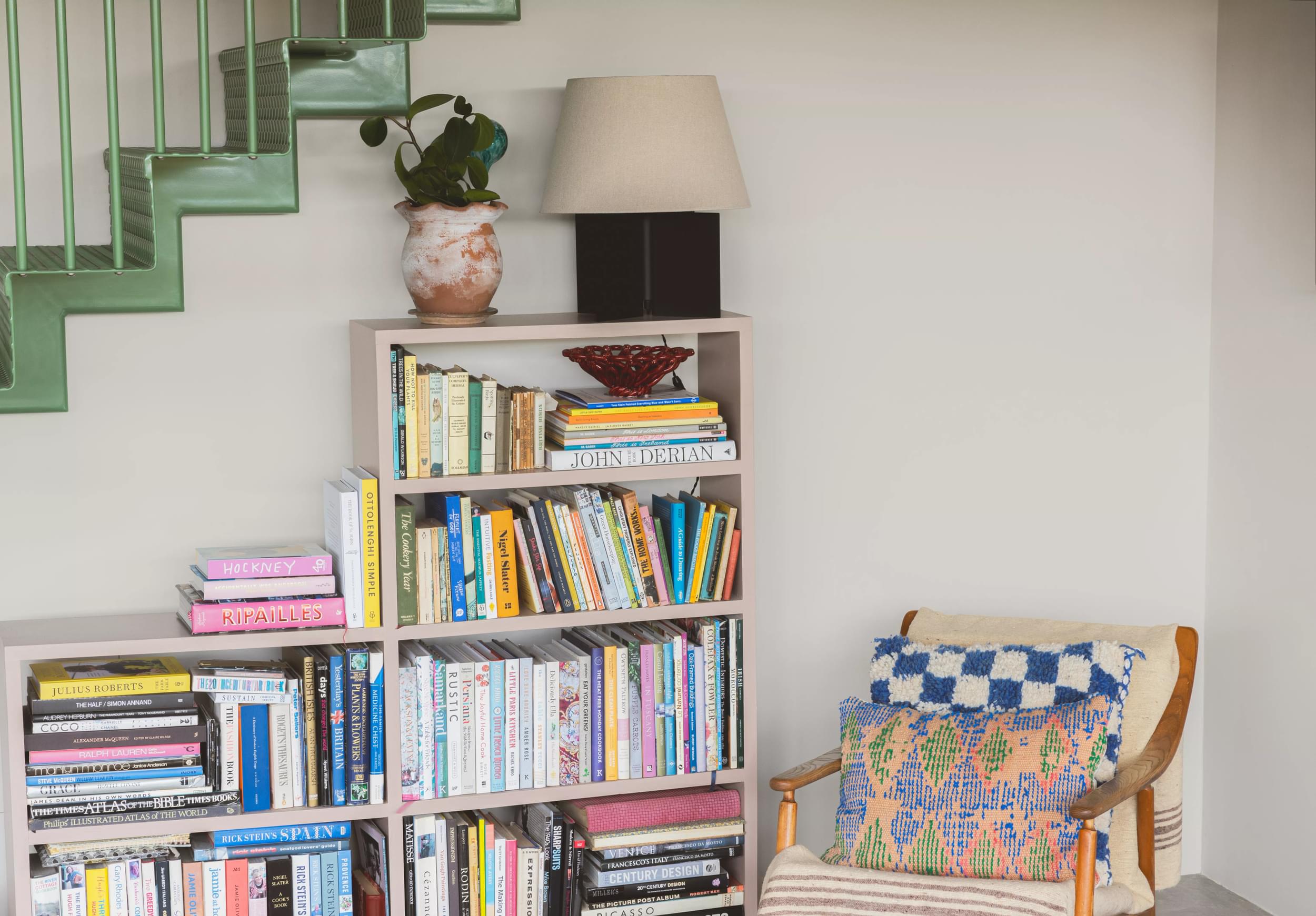
Find your perfect neutral with COAT Paints' new Polite Palette
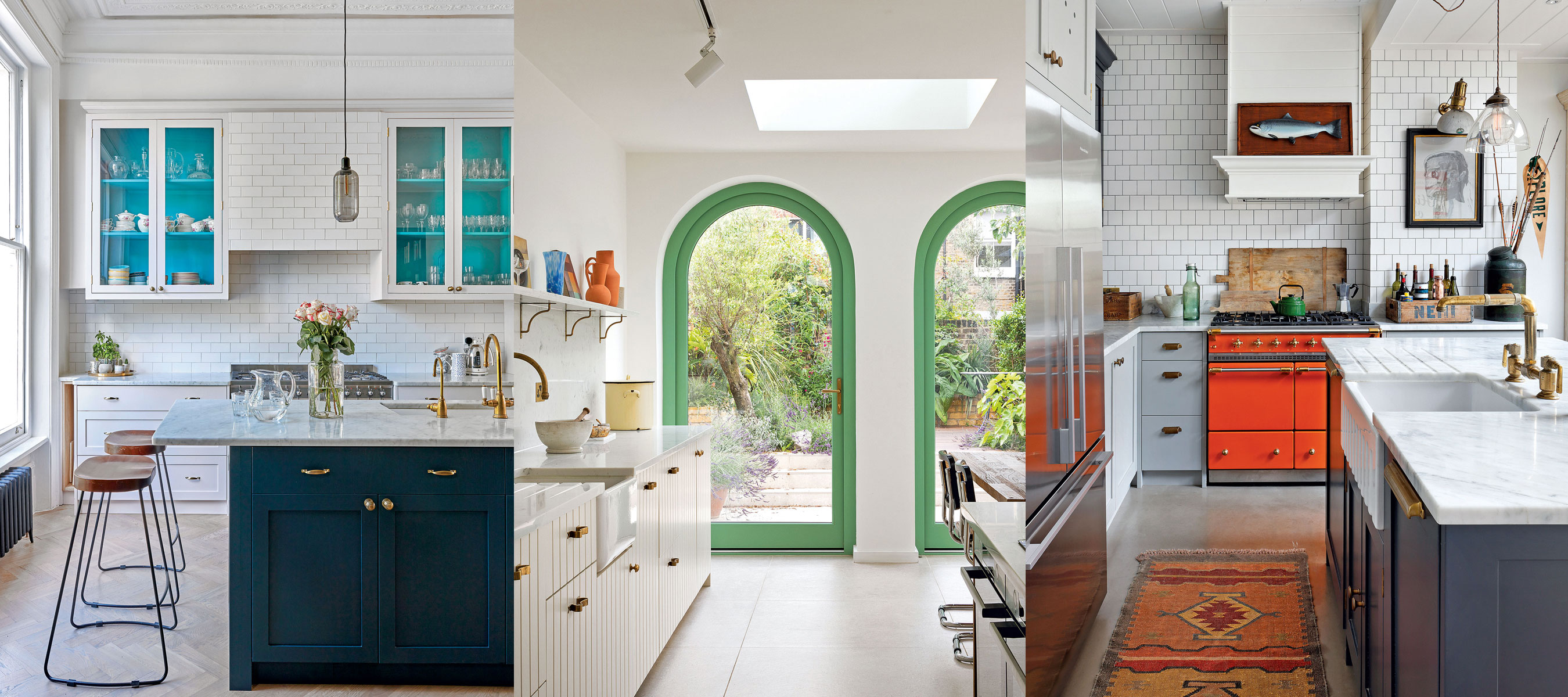
10 creative ways interior designers work color into neutral kitchens

8 Paint Color Trends You'll ACTUALLY Want to Live With in 2026, According to Designers
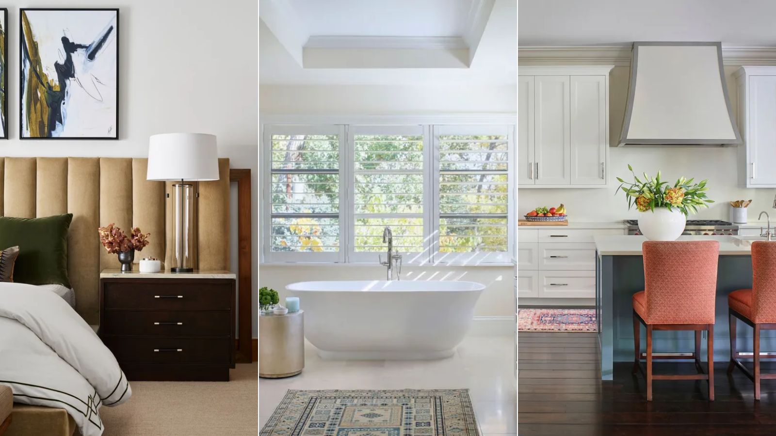
White vs Cream: designers weigh in on these enduring neutrals
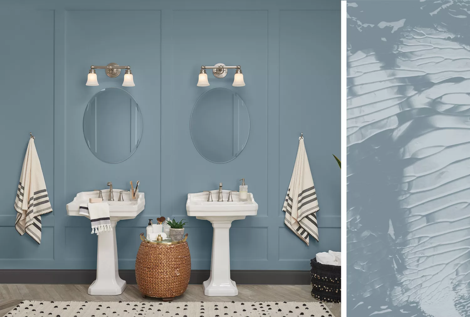
20 Interior Paint Colors Decorating Experts Love