1/21
Give Your Home A Modern Refresh With 2019's Top Color Trends
The article outlines the top color trends for home interiors in 2019, emphasizing a mindful, lifestyle-based approach to new shades. Unlike 2018, which focused on edgier palettes like vibrant reds and metallics, 2019's trends are inspired by consumers' lives and the spaces they inhabit. Major paint brands, including Benjamin Moore, PPG Paints, Sherwin Williams, and Pantone, released their colors of the year, featuring shades from powerful aquas to soft terracottas, deep greens, and energizing corals.
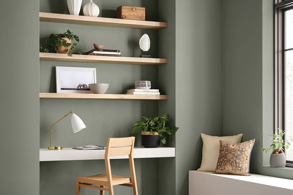
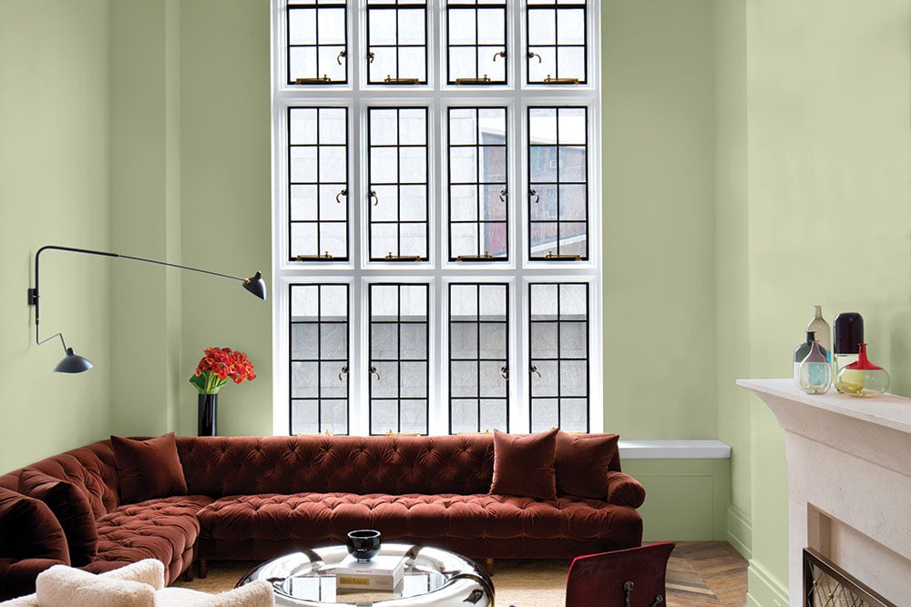
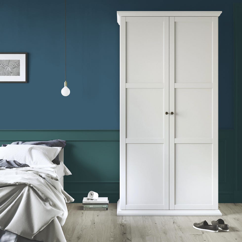
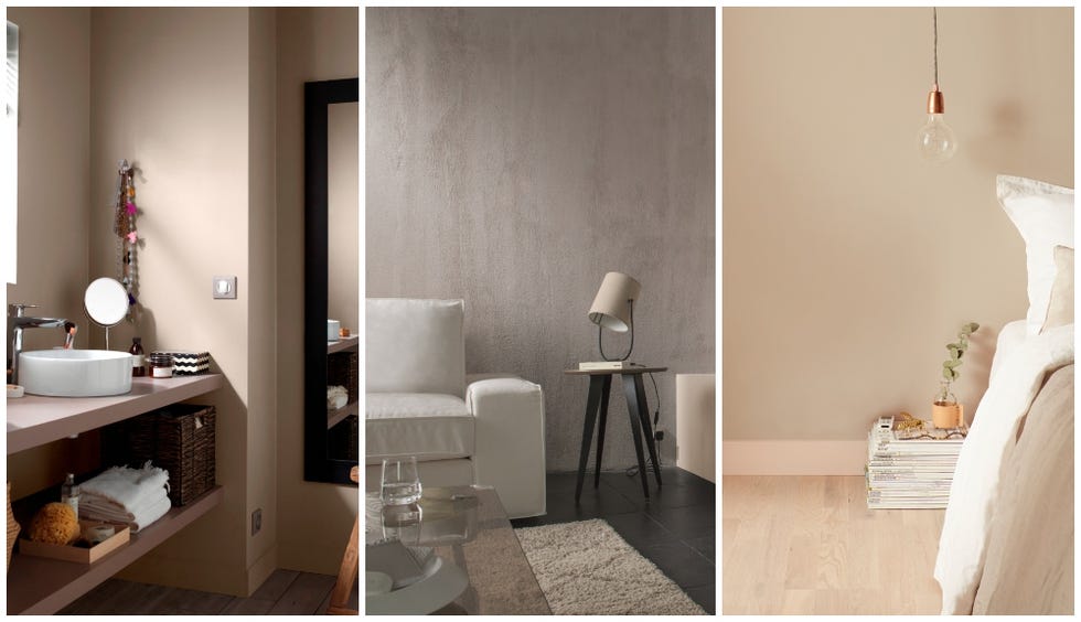
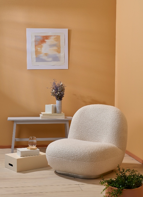
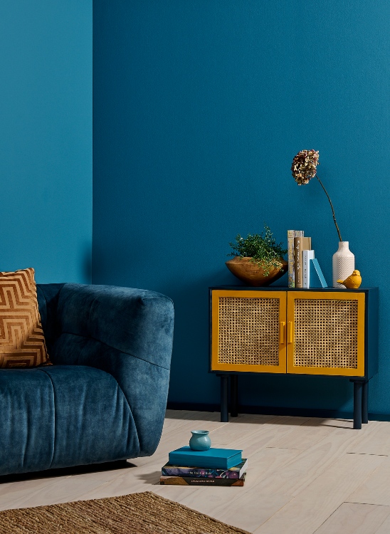
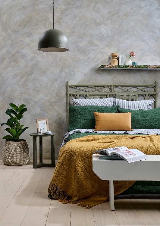
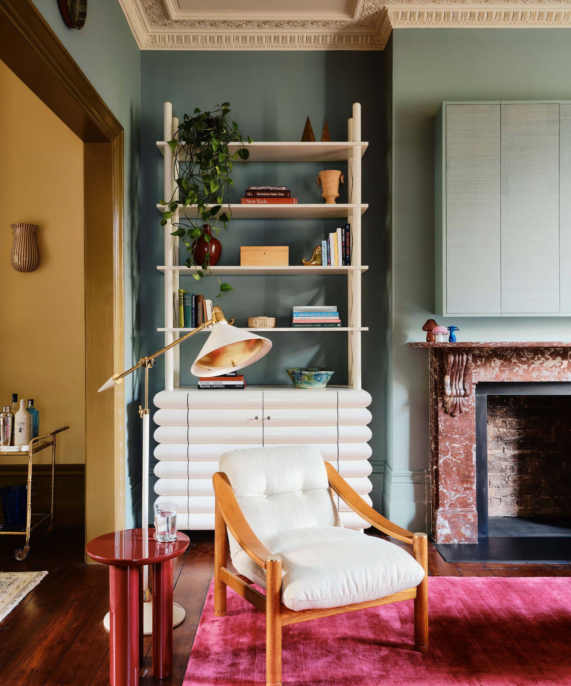
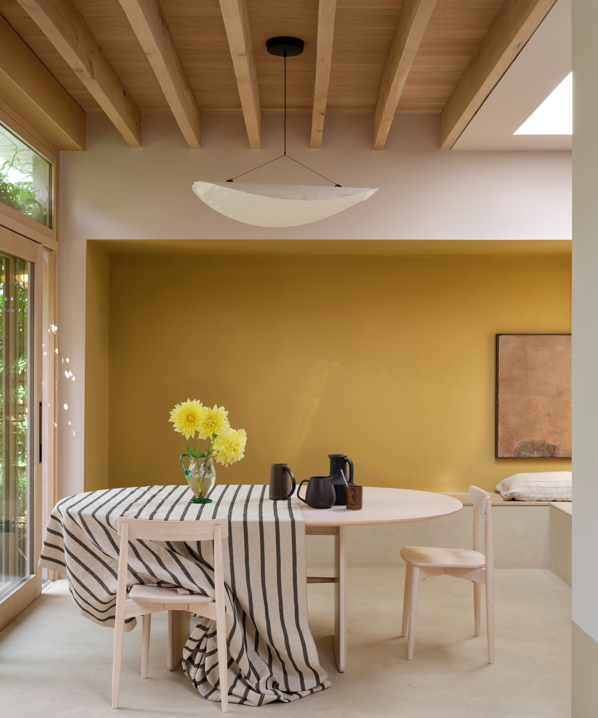
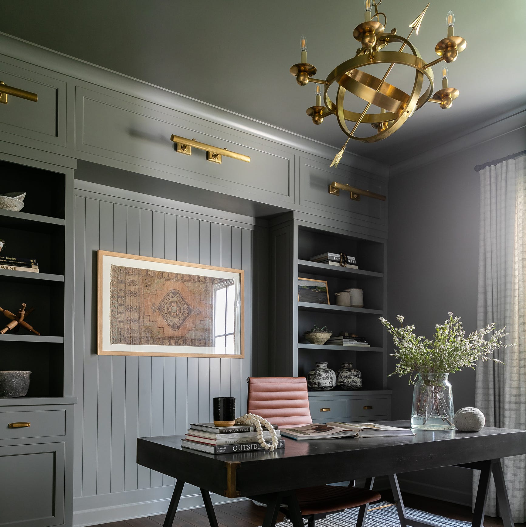
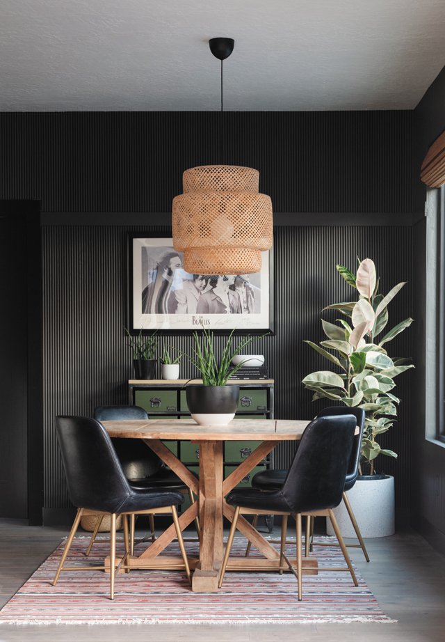
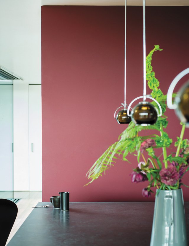
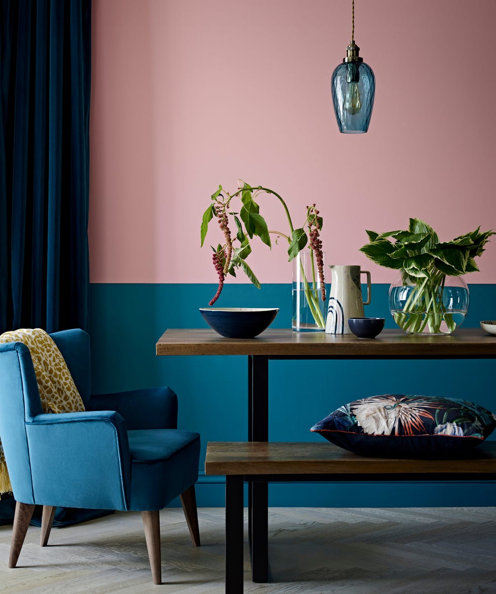
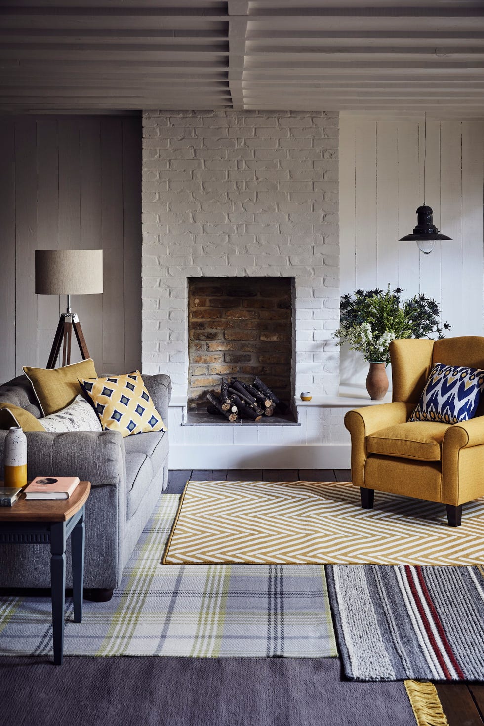
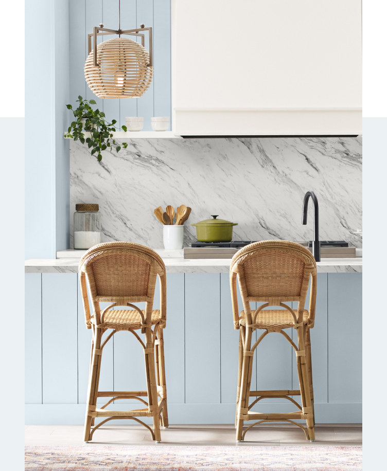
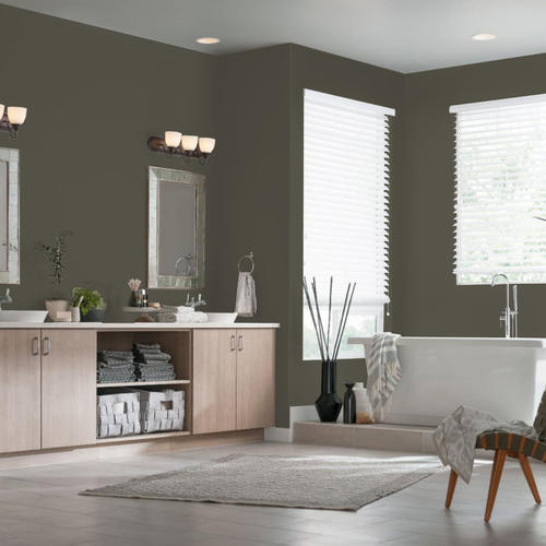
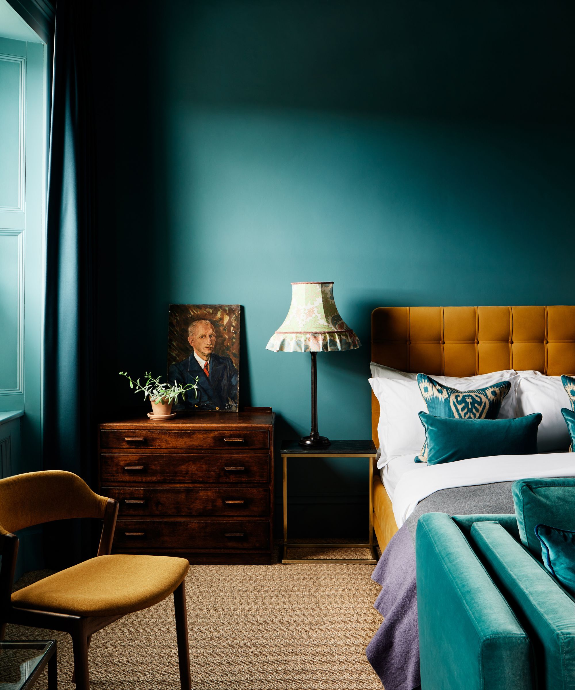
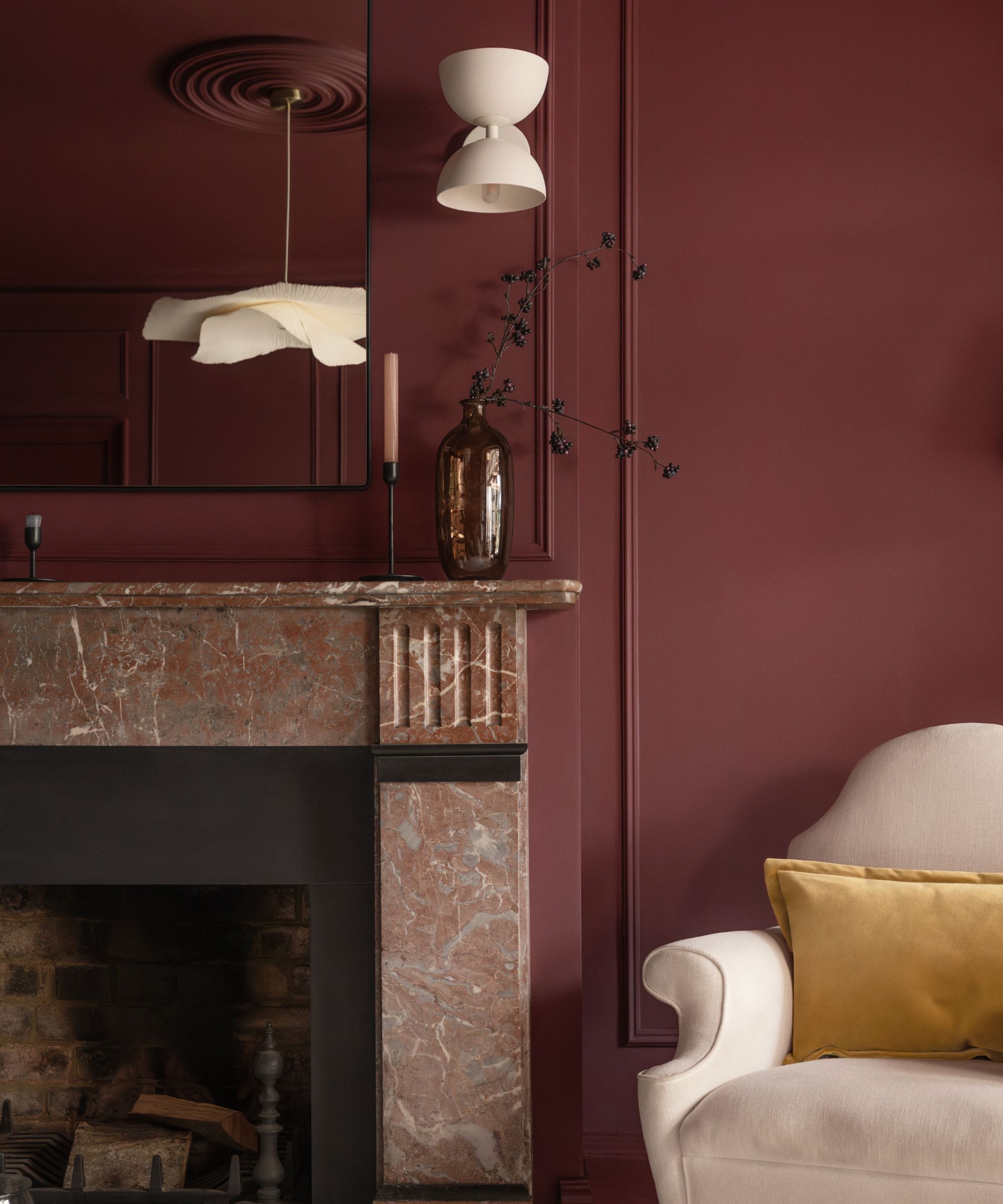
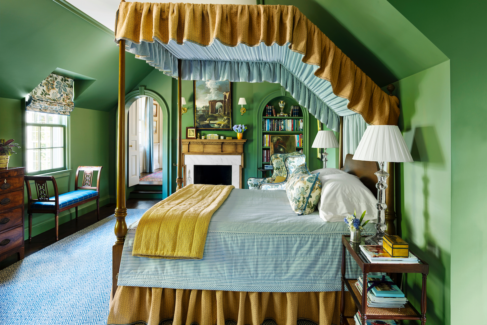
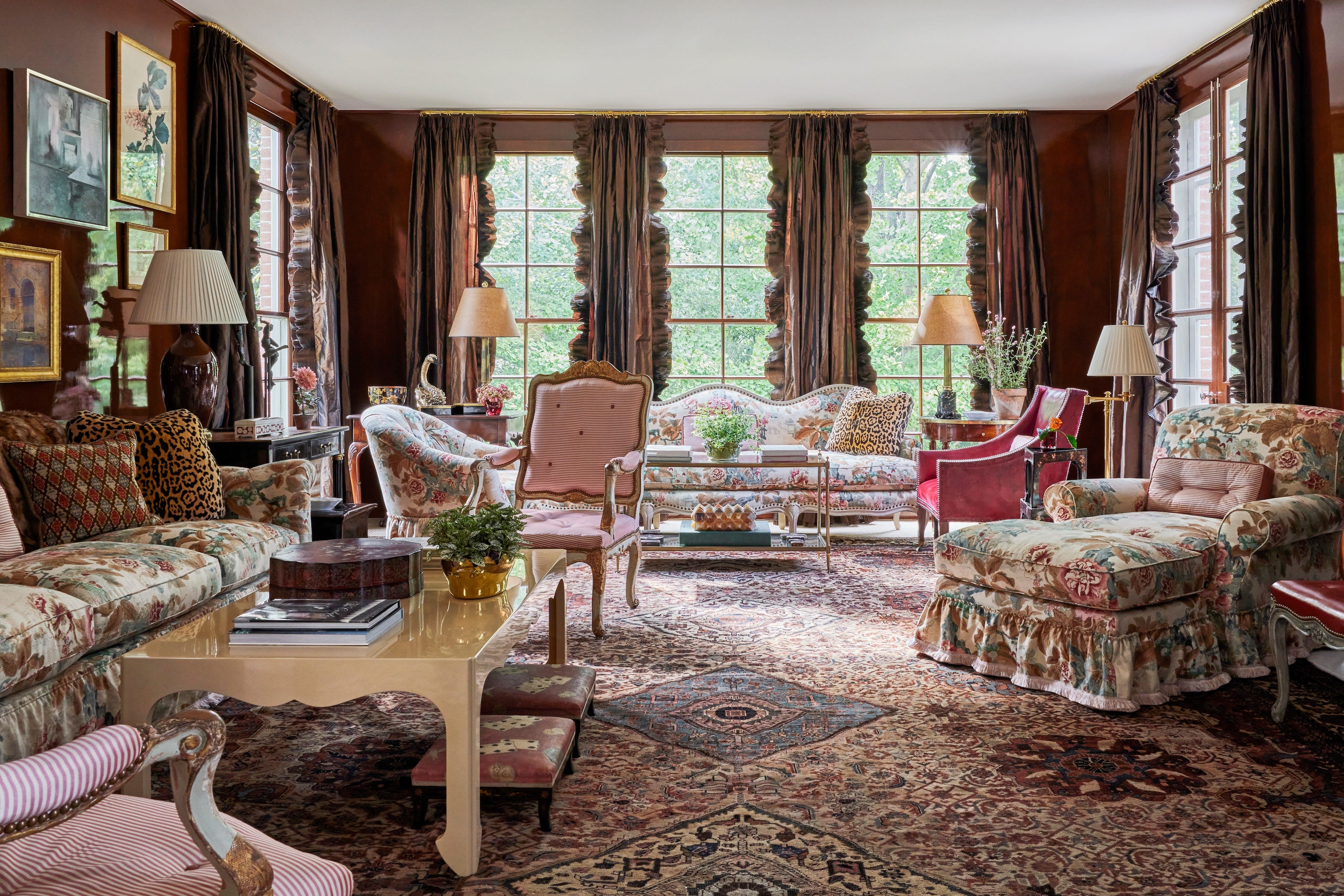
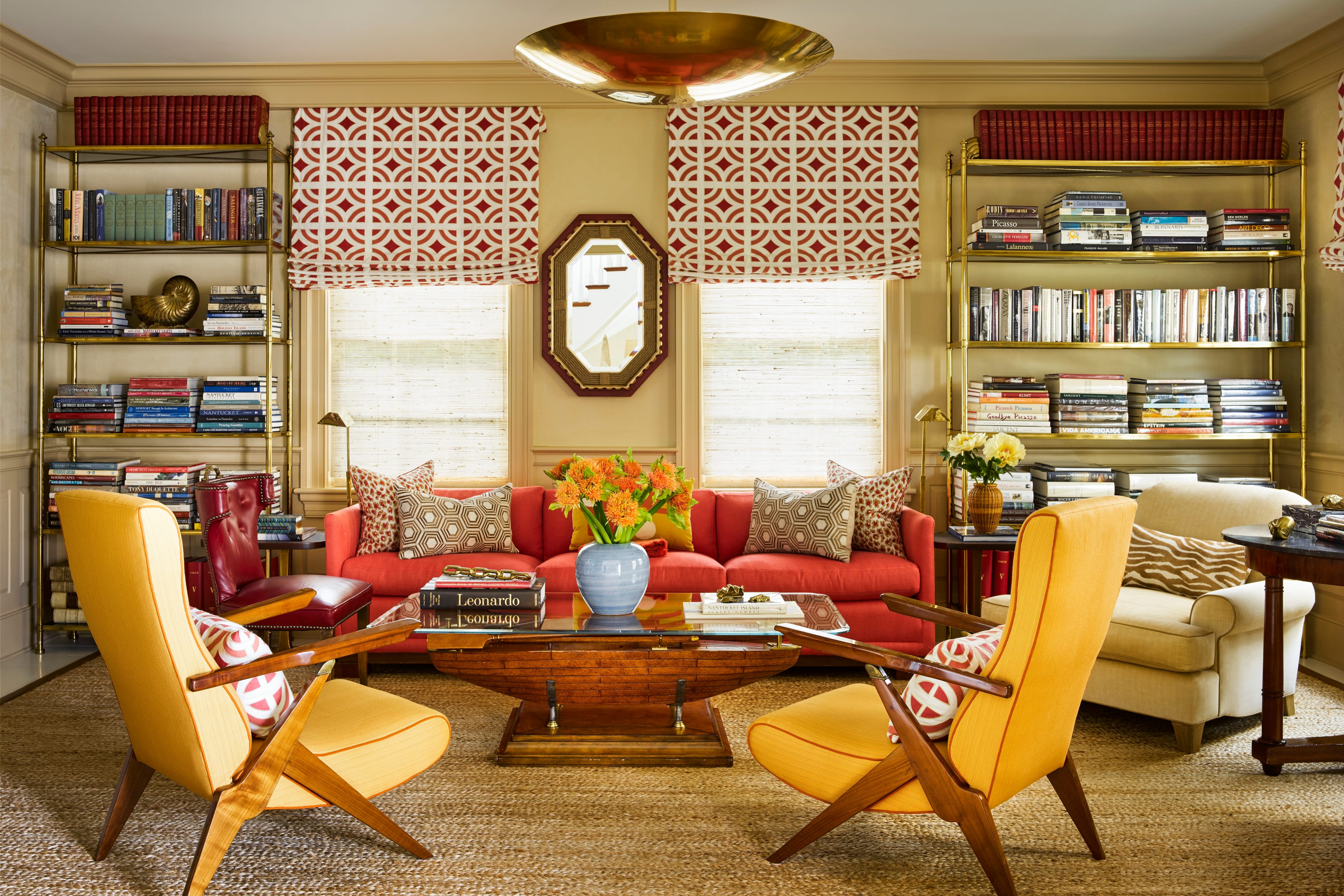
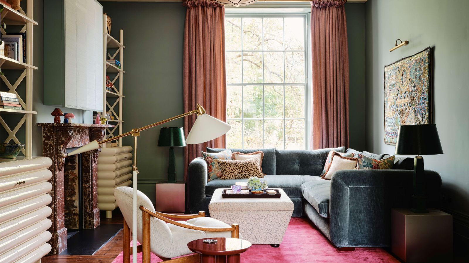
The article details several key color trends. Olive Greens are highlighted as a versatile, timeless, peaceful, and rich shade that can be integrated with neutrals or bright saturated colors. Rich Bronzes are noted for their modern and industrial feel, adding drama and warmth. Neutrals with Pops of Blue are presented as an accent for color-averse individuals, using cool blues with grays, taupes, and off-whites to enhance furnishings and textures. The '70s Mod Squad trend brings back sunset oranges, yellows, homey browns, and comfortable denim for an alluring and thriving aesthetic. Jewel Toned Accents offer a balance to neutral palettes, with suggestions for using blues and greens in bookcases or kitchen islands.
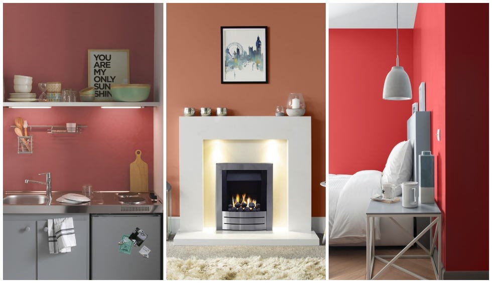
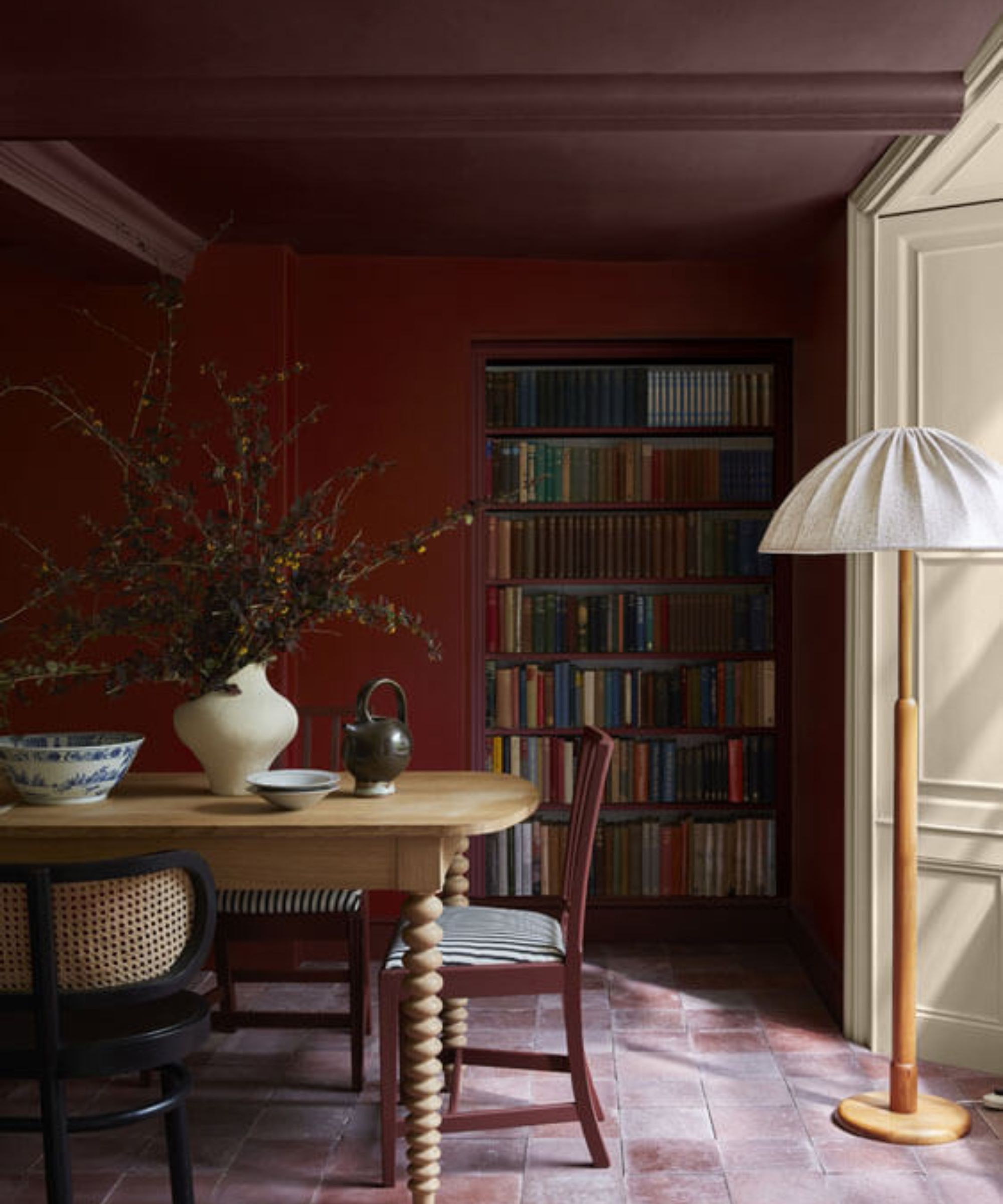
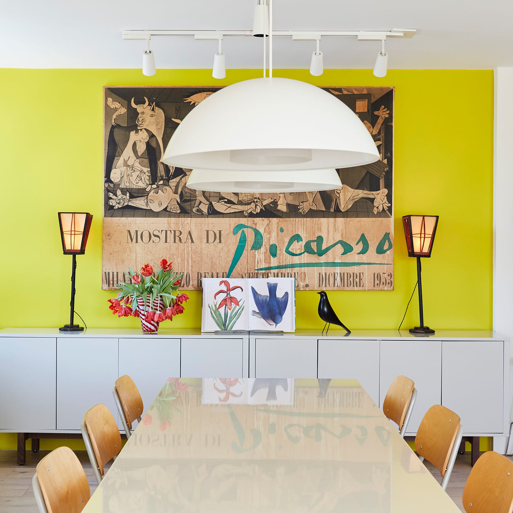
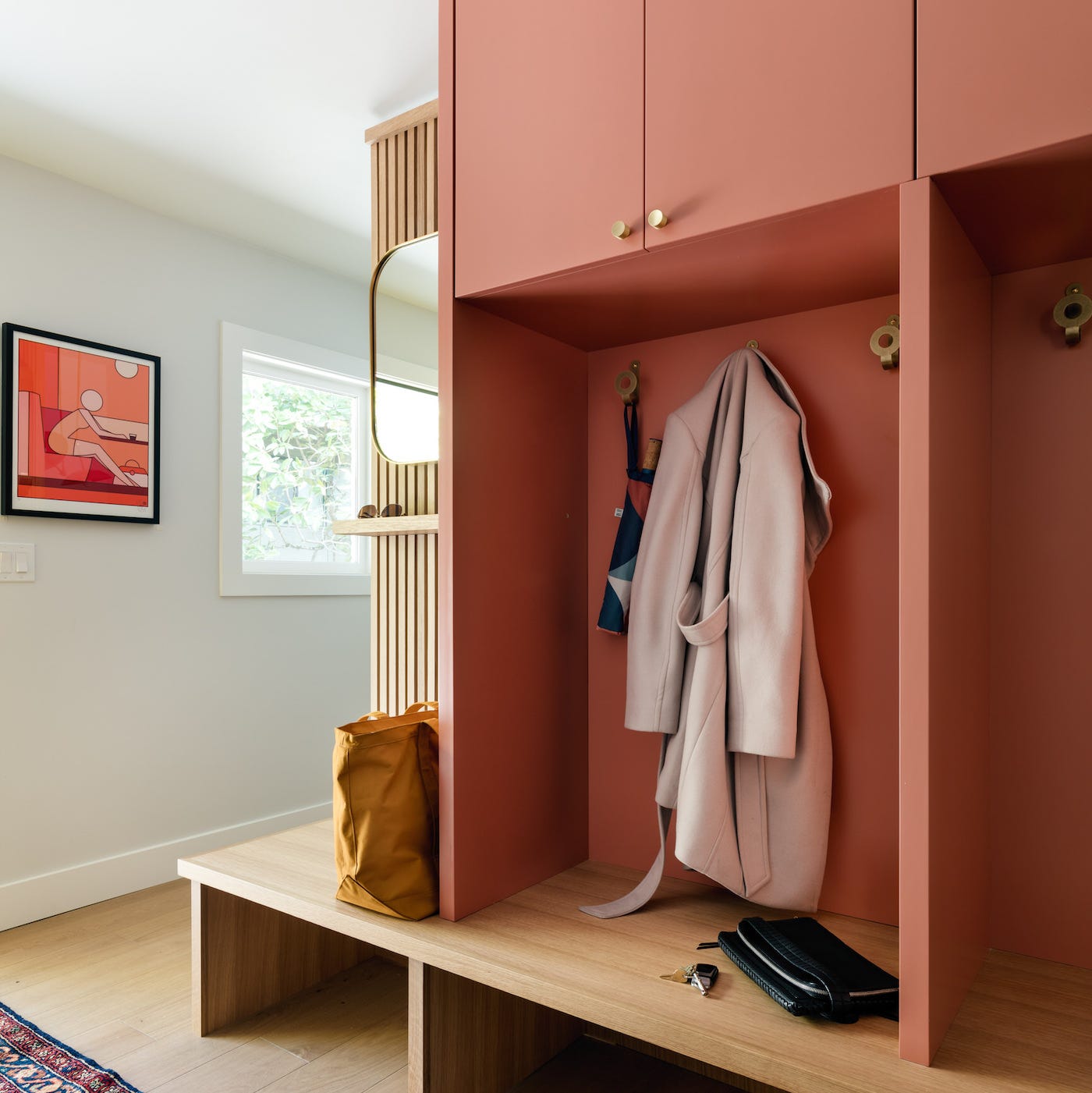
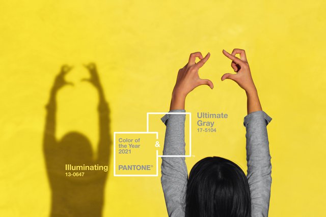
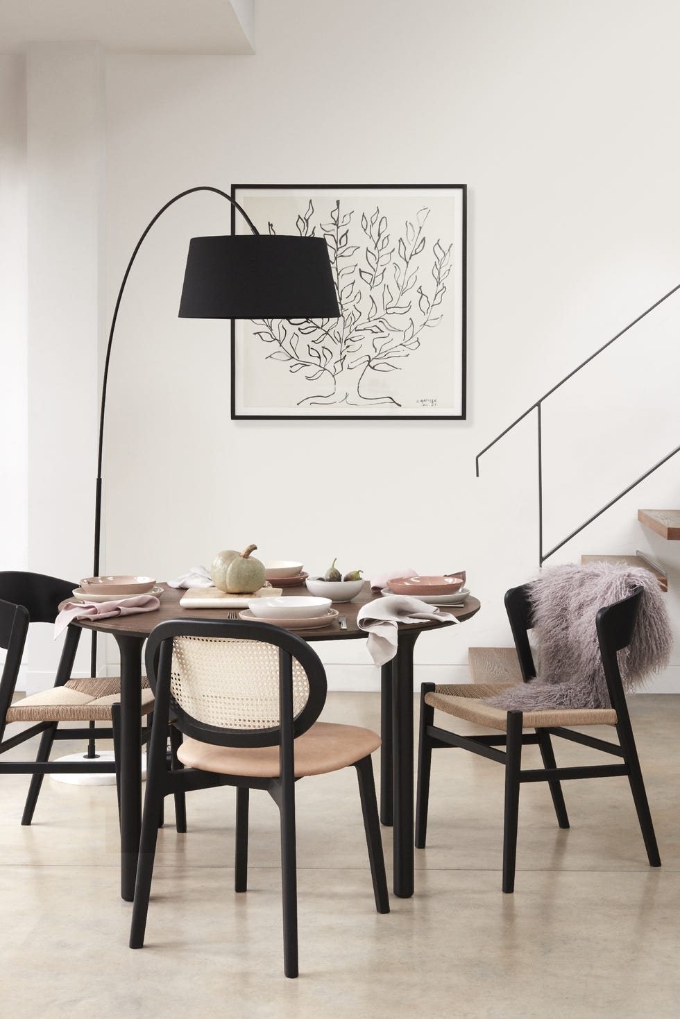
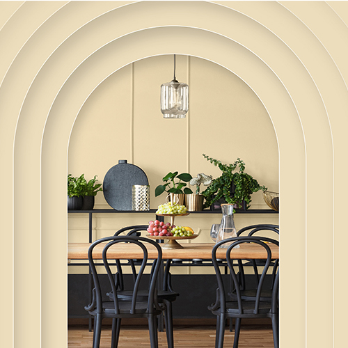
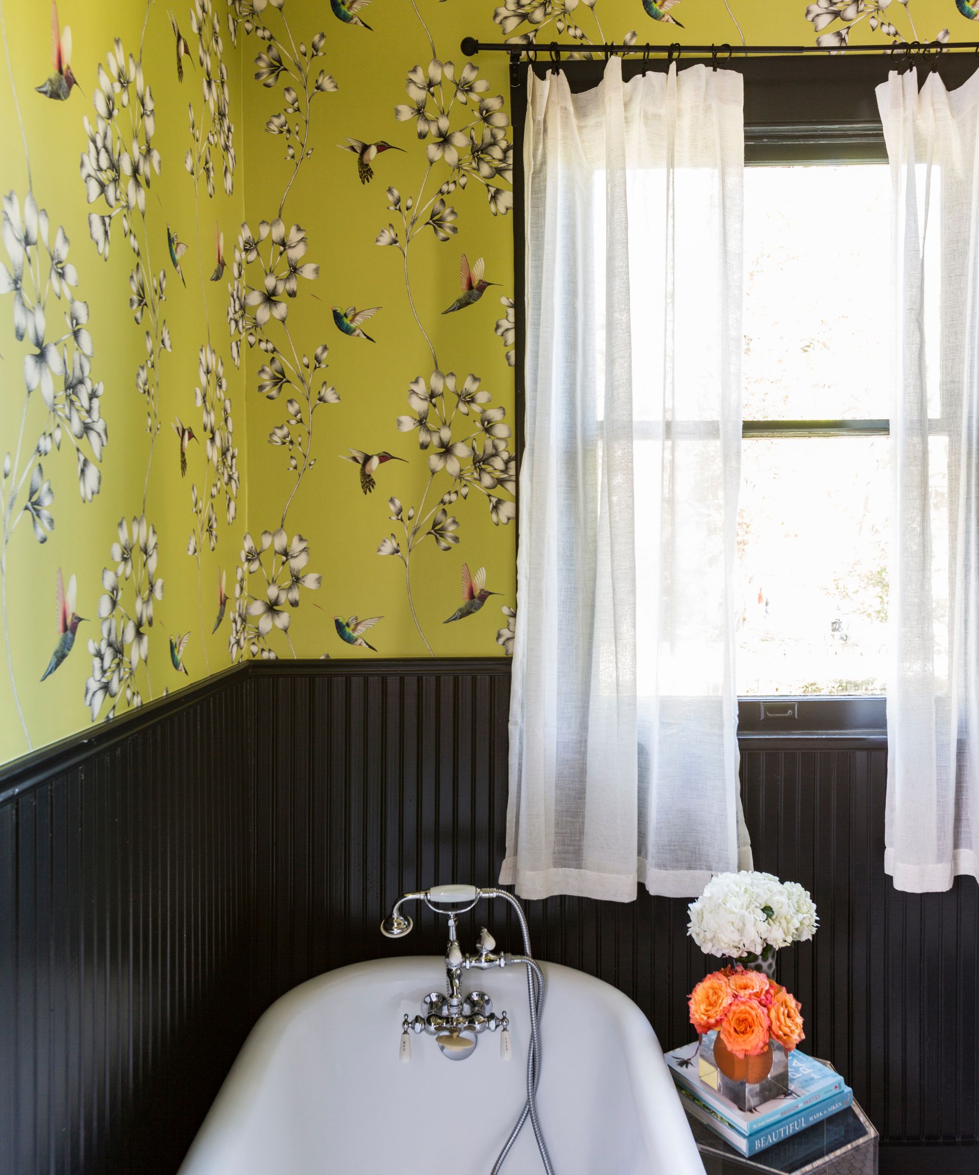
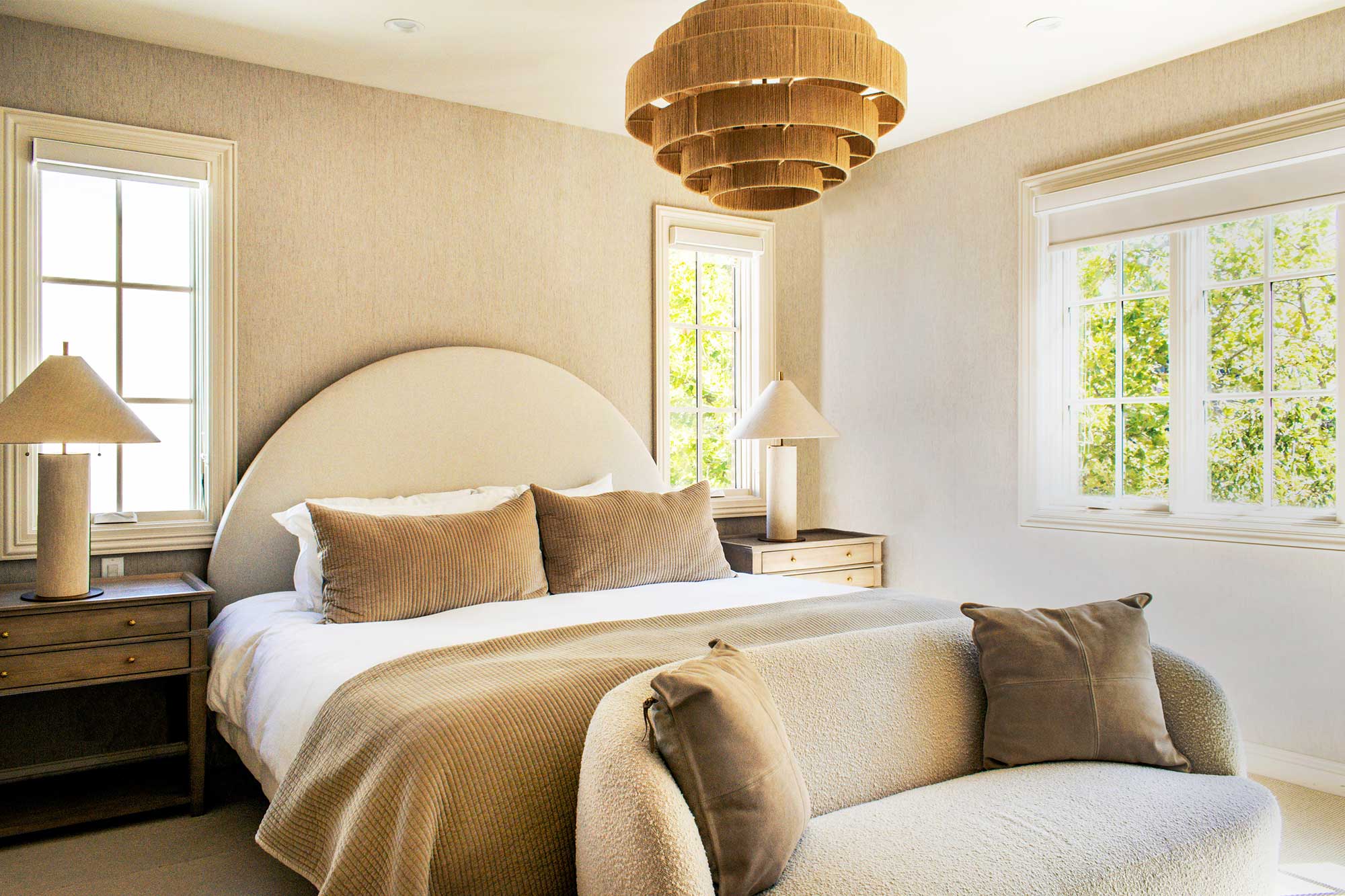
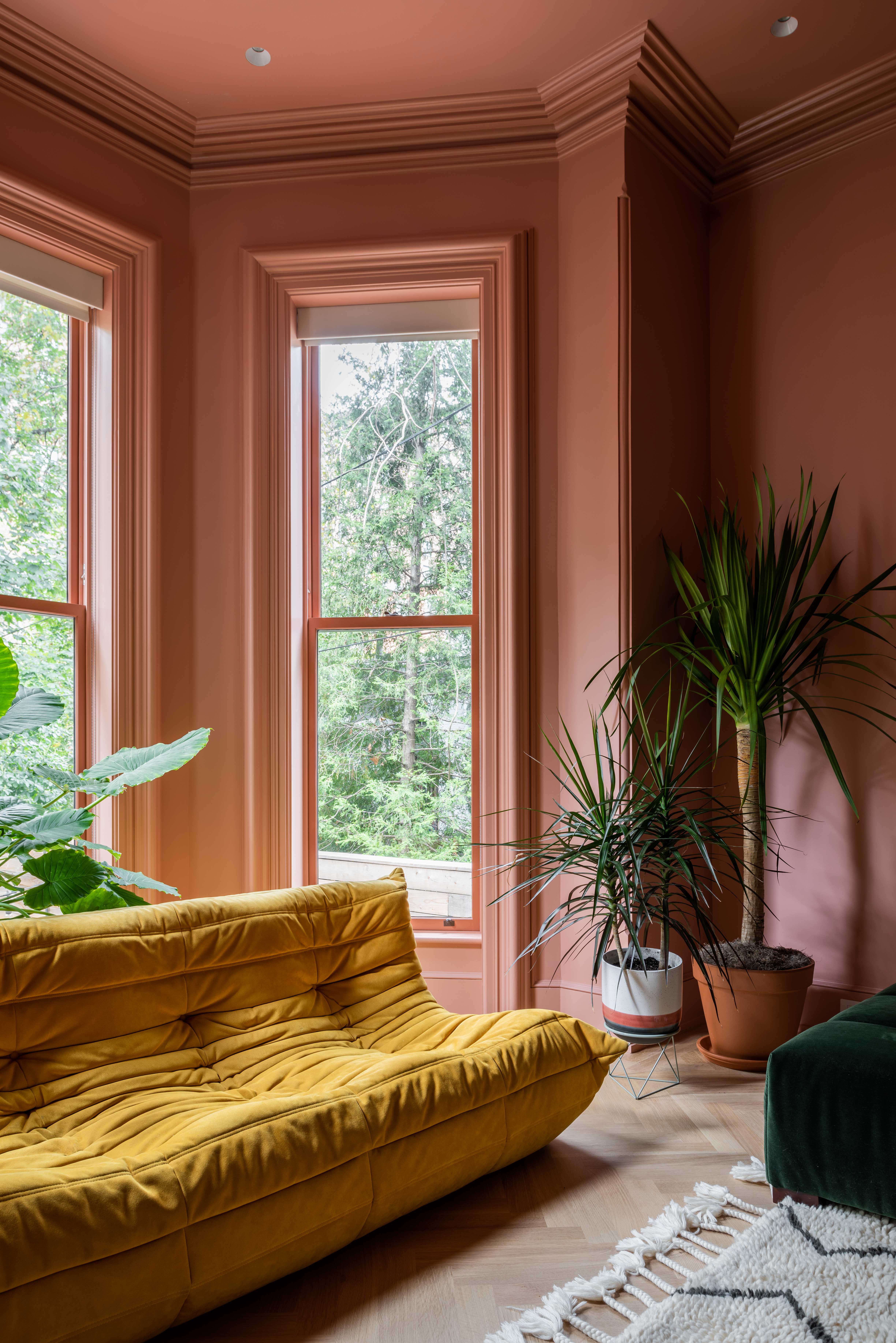
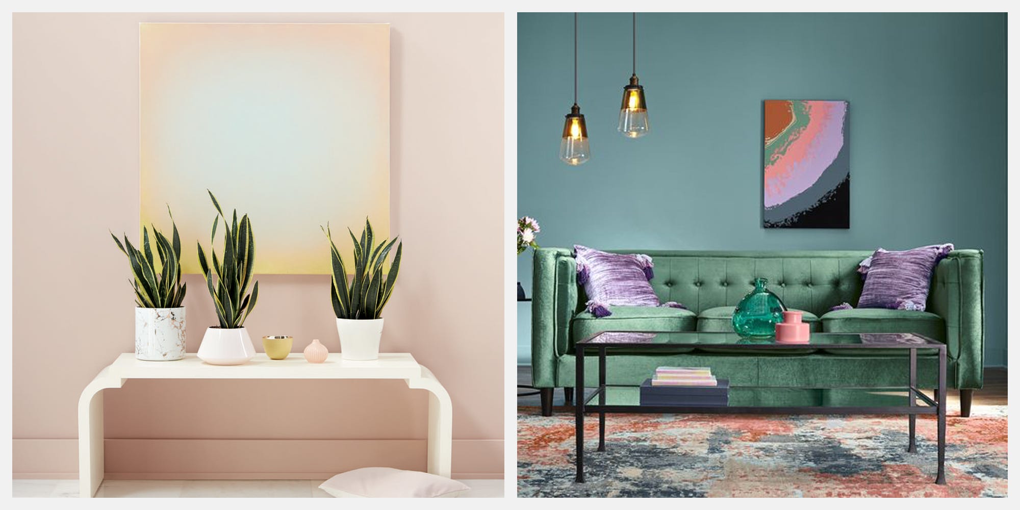
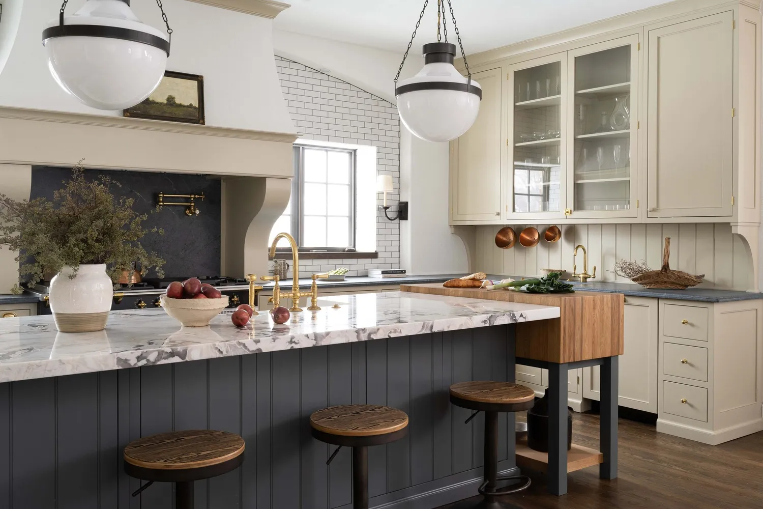
Woodland Shades shift focus from oversized botanicals to mushroom grays and fern-inspired colors, embracing an old-world, naturalist feel. Energizing Coral, Pantone's color of the year, is explored for its hopeful and optimistic qualities, suggesting its orange and pink components can uplift a space. Saturated Moody Hues like Beau Green, Kendall Charcoal, Hale Navy, and Hunter Green are recommended for custom built-ins and kitchen cabinetry in rooms with ample natural light. Pale Pink Colorways are seen as timeless, neutral shades compatible with white or lemon yellow. Digitally Inspired colors feature higher intensity shades that mimic artificial light, driven by smart home technology. Hunter Greens are praised for their sultry, worldly, and gender-neutral qualities, transitioning seamlessly across millwork, walls, furniture, and accessories. A Contemporary Twist on Forest Greens brings healing properties of nature indoors without being overly literal, exemplified by PPG's 'Night Watch.' Misty Blues, with calming gray undertones, promote a serene energy. Optimistic Yellows and oranges reflect optimism, pairing well with cool blues, beiges, and pinks. Off-Cream shades, like Benjamin Moore's 'Balboa Mist,' align with minimalist living, offering subtle nuances that adapt to lighting. Soft Terracottas, such as Sherwin Williams' 'Cavern Clay,' provide a nature-inspired, contemporary hue. Electric Citrus tones, like lime green, citrus orange, and bright yellow, express a playful, change-making attitude. Dusty Blush offers rosy neutrals and muted blushes, providing a more timeless alternative to millennial pink. Raw Wood tones, like ash, maple, or pine, serve as neutral alternatives to traditional beiges and tans. Finally, Almost White shades offer subtle nuances that adapt to various lighting and decor, providing a dynamic minimalist palette.
#ColorTrends #InteriorDesign #HomeDecor #PaintColors #LifestyleDesign #ModernPalettes #AccentColors #MinimalistDesign #ColorTrends #InteriorDesign #HomeDecor #PaintColors #LifestyleDesign #ModernPalettes #AccentColors #MinimalistDesign
0 comment in total
 No comments yet
You may also like
How To Incorporate The Latest Color Trends in Your Home

Design Pros Have Spoken: Here Are the Only Paint Color Trends That Matter in 2023

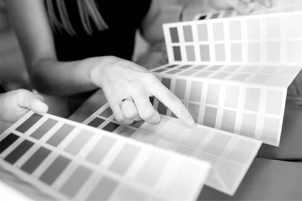
Pick Your Favorite 2024 Color of the Year

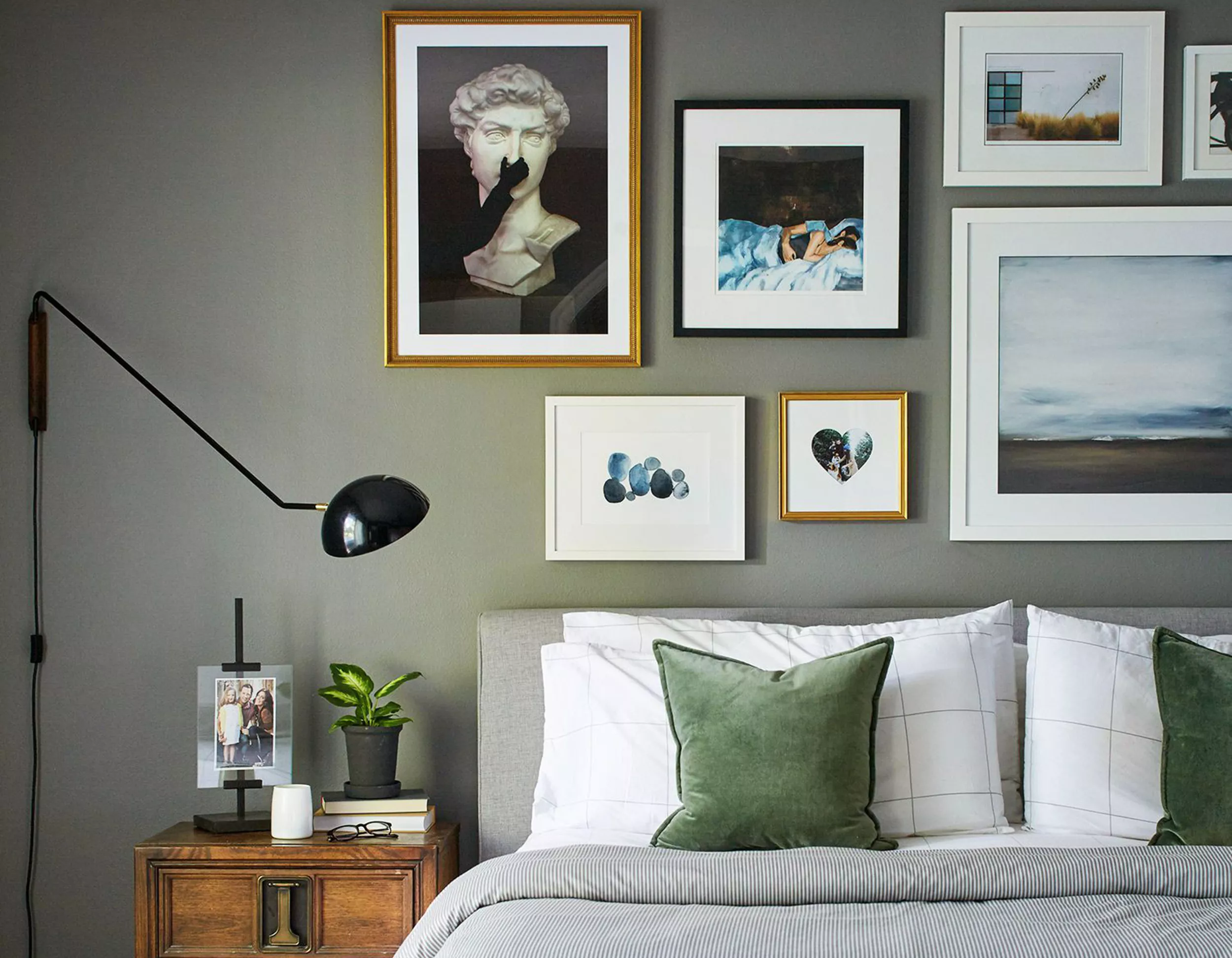
Is Millennial Gray Out? Here's What Color Experts Suggest Replacing It With

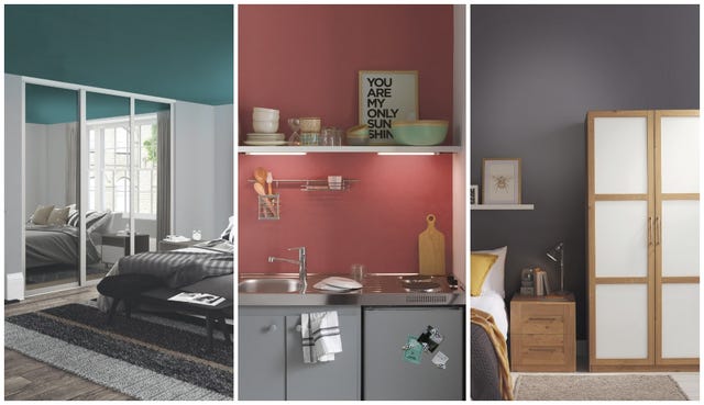
B&Q is launching a new range of paint from just £8
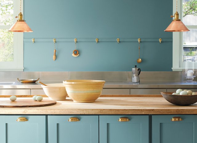
2021’s Palette of Possibilities
Ever Wonder How a Color of the Year Is Selected? Experts Spill the Secrets

These 6 Colors Will Rule Interiors in 2026, According to Experts

Interior Design Trendwatch: Colour is coming home
Every 2026 Color of the Year Revealed So Far—and What They Say About the Year Ahead

6 key colors to decorate with in May 2025, according to interior design and color experts in the know

These 7 Colors Will Rule Interiors in 2026, According to Experts

6 Gorgeous Home Color Trends That Aren't Just Neutrals

10 key interior trends for autumn winter 2019
These Are the Biggest Color Trends That You'll See Everywhere in Interiors Next Year, From Tranquil Teal to Rich Plum
5 outdated color trends interior designers are glad to see the back of – and what they're choosing for 2024 instead

According to Designers, These Are The Outdated Color Trends for 2026

4 Outdated Colors Designers say you Should Steer Clear of When Decorating a Living Room

These Colors Will Be Everywhere in Interiors in 2025
7 Trendy Paint Colors for Every Room in 2026, According to Designers