We're Calling It: Blues And Greens Are The New Neutrals For 2025
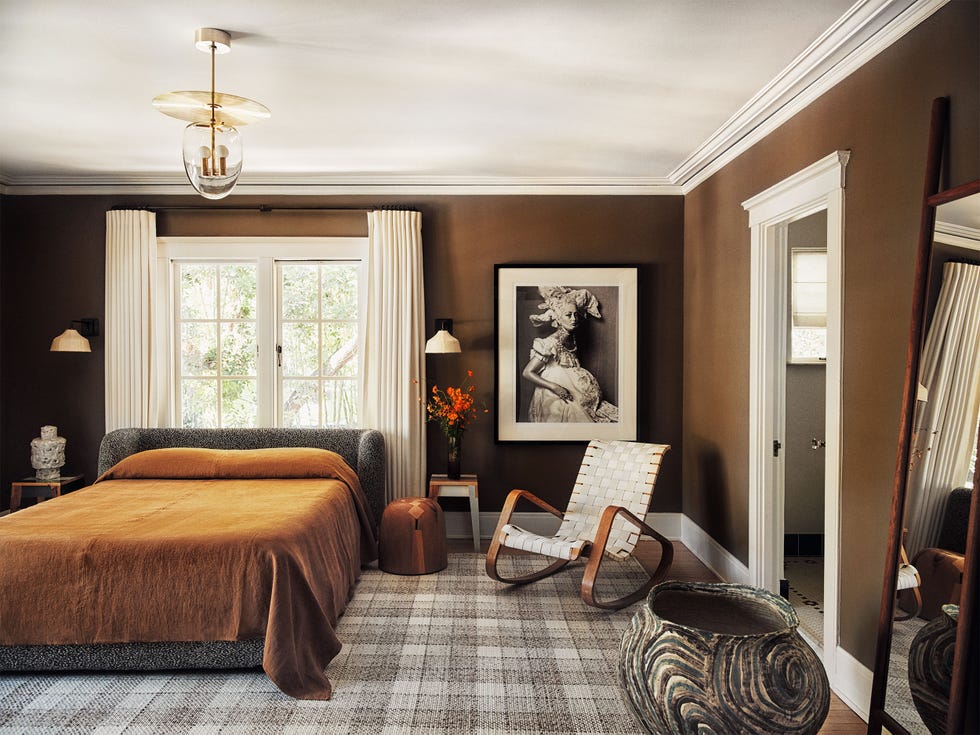
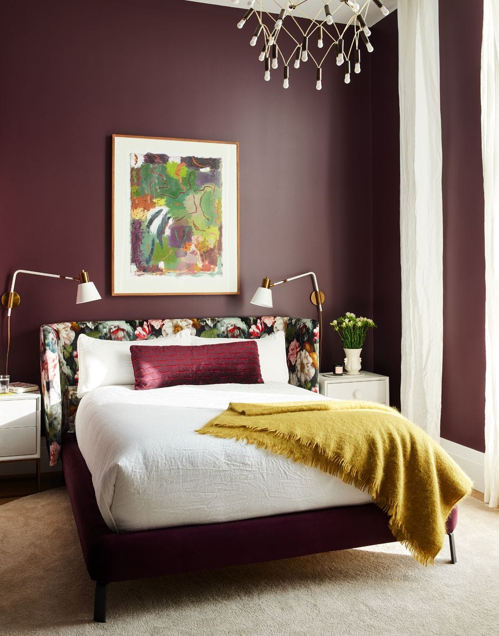
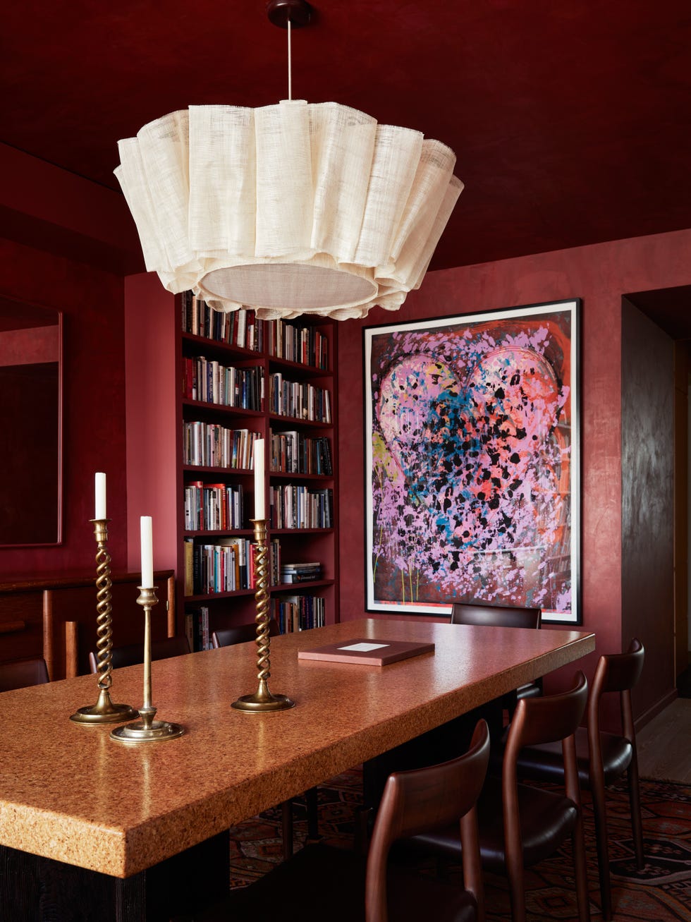
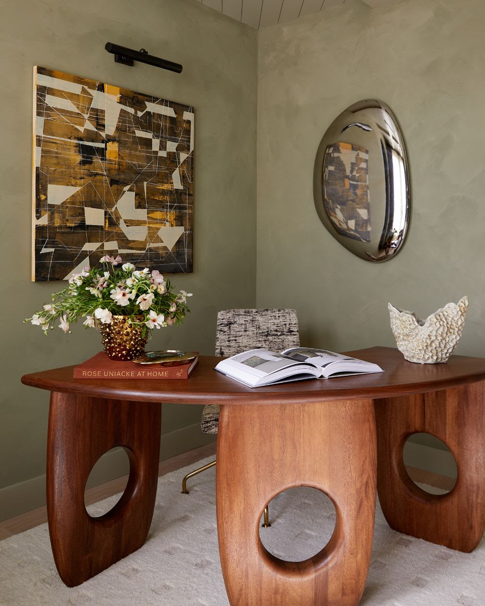
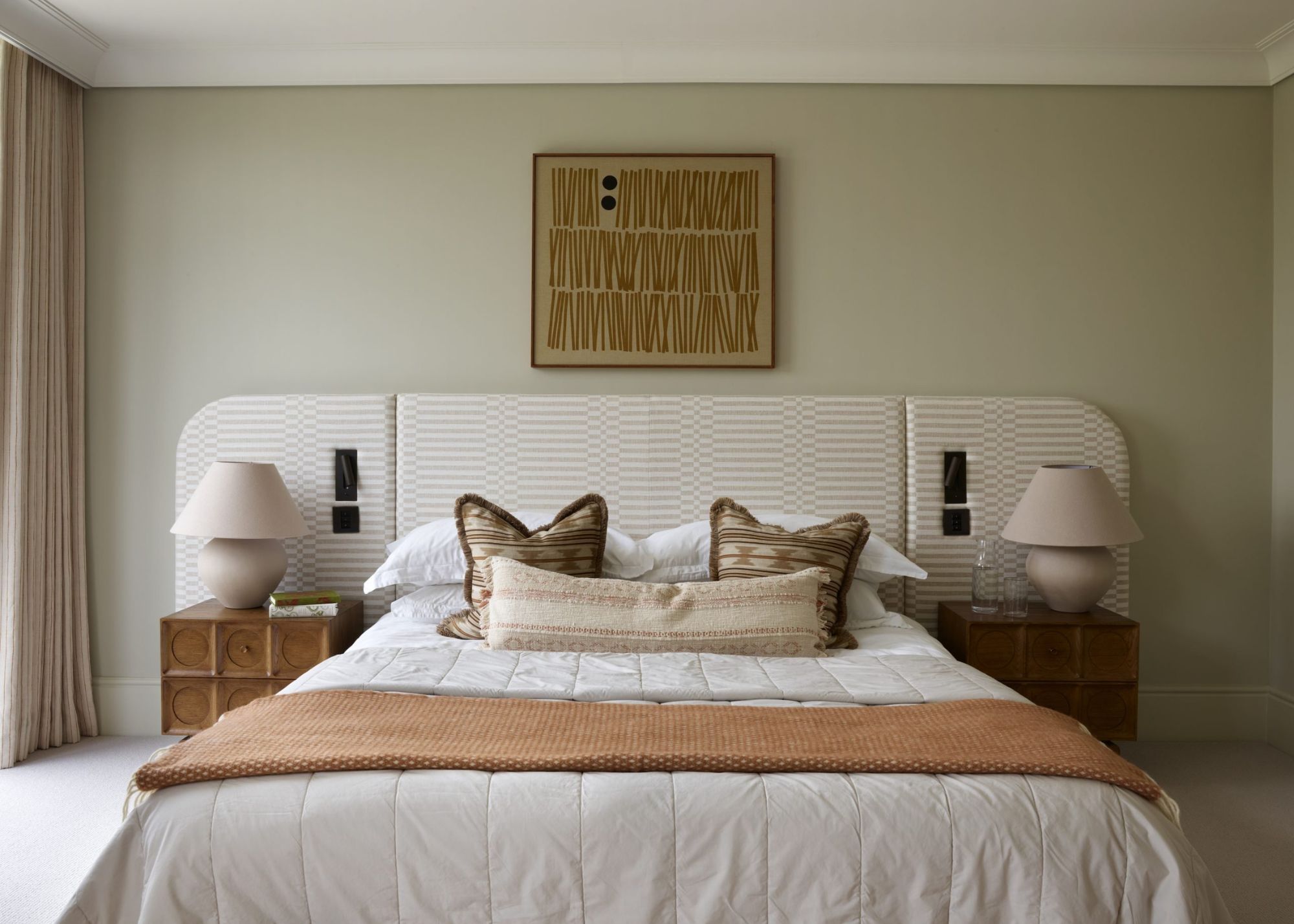
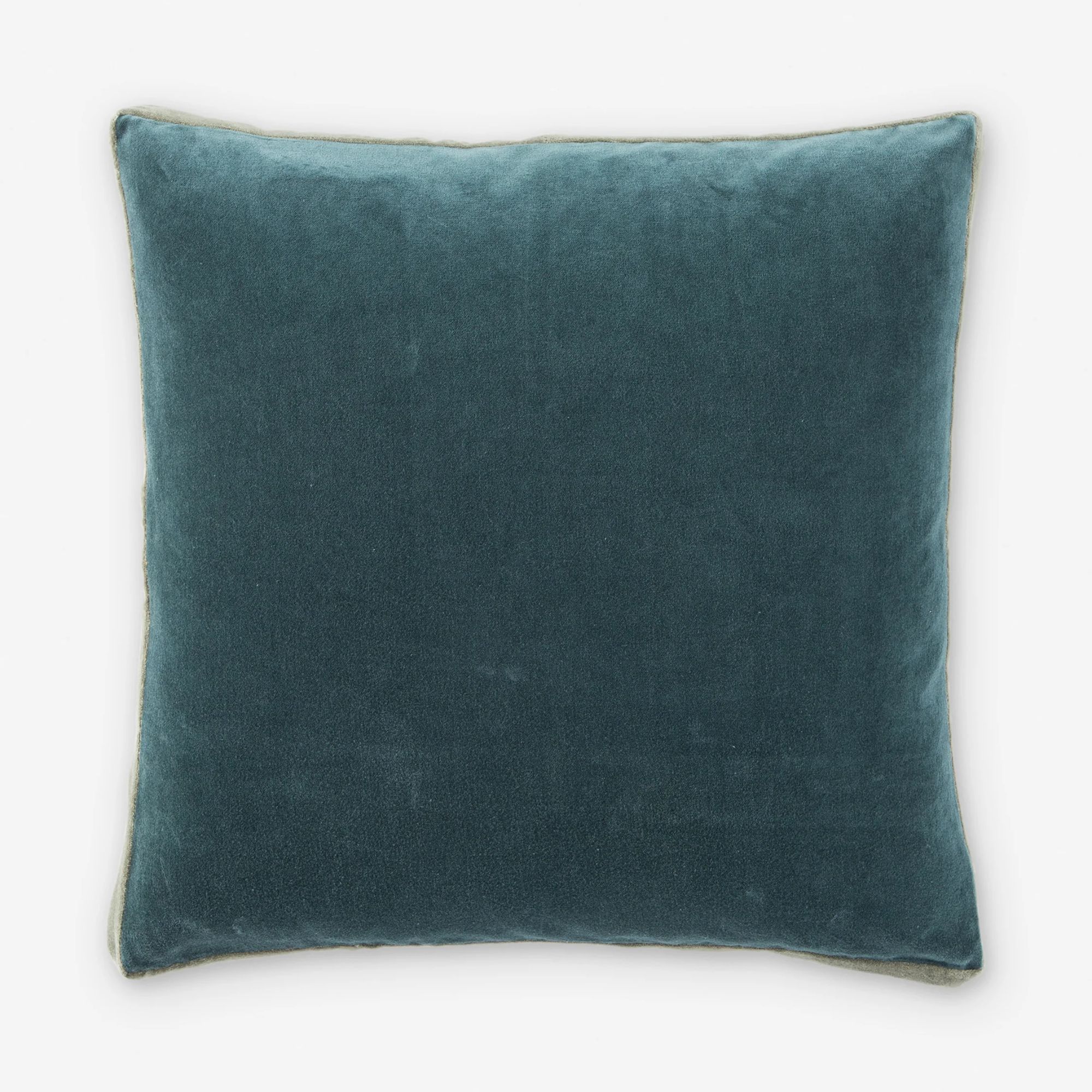
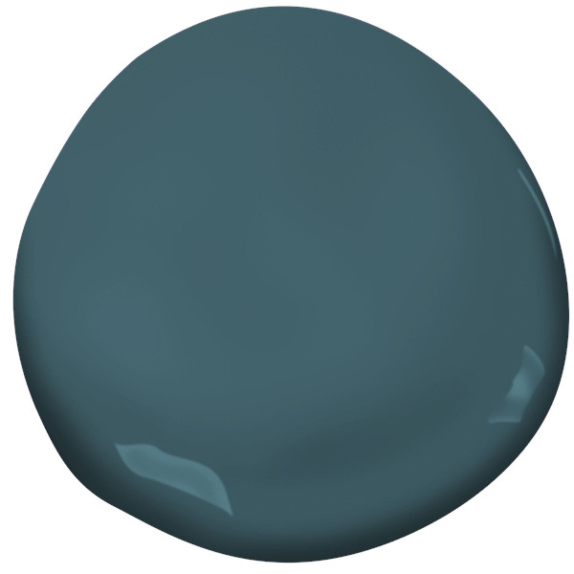
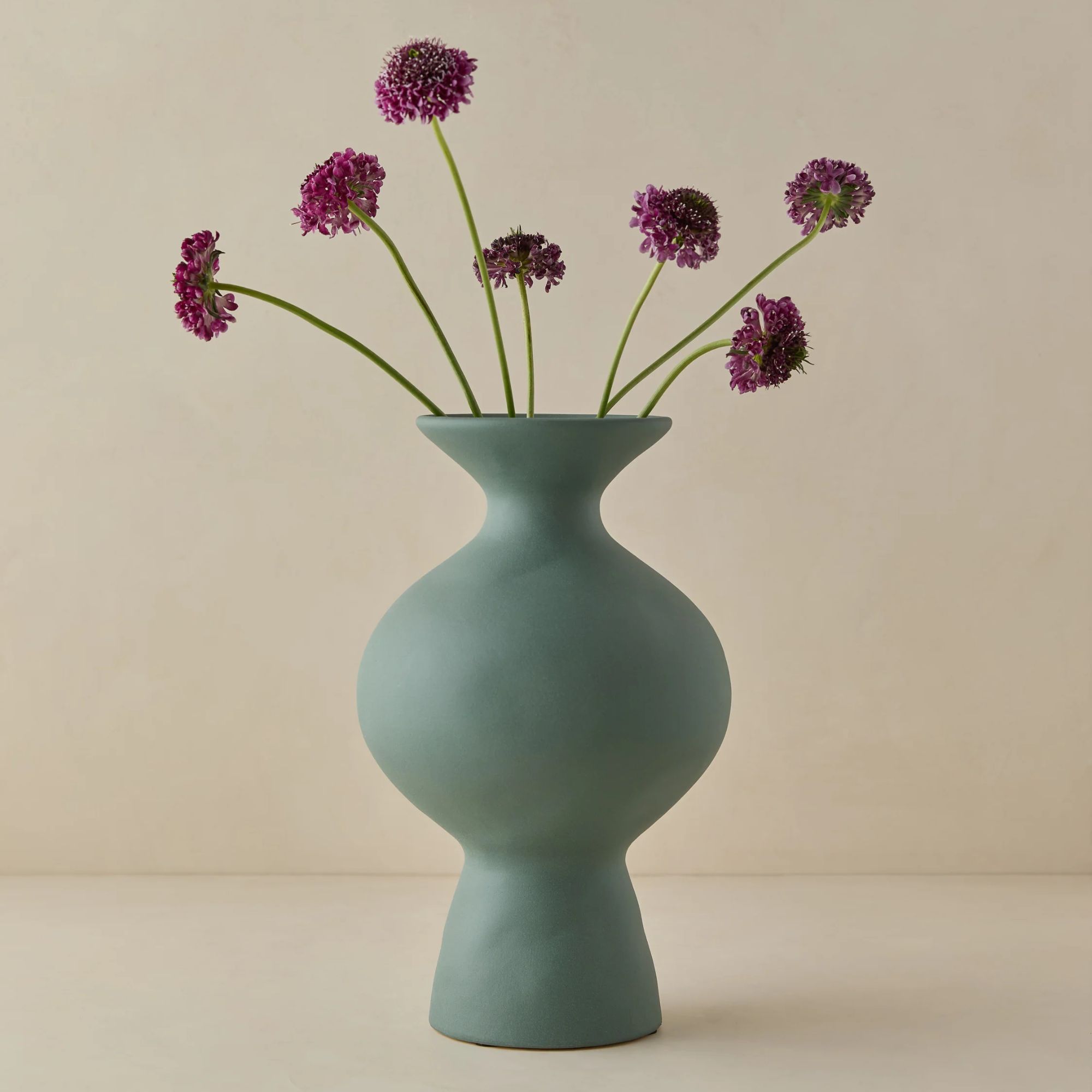
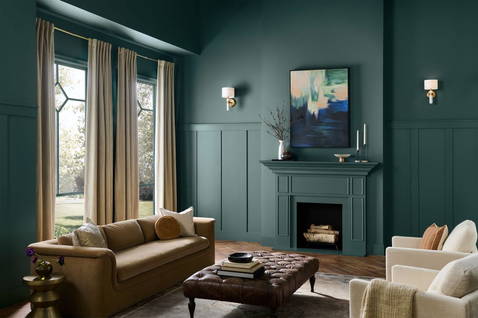
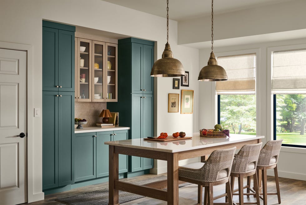
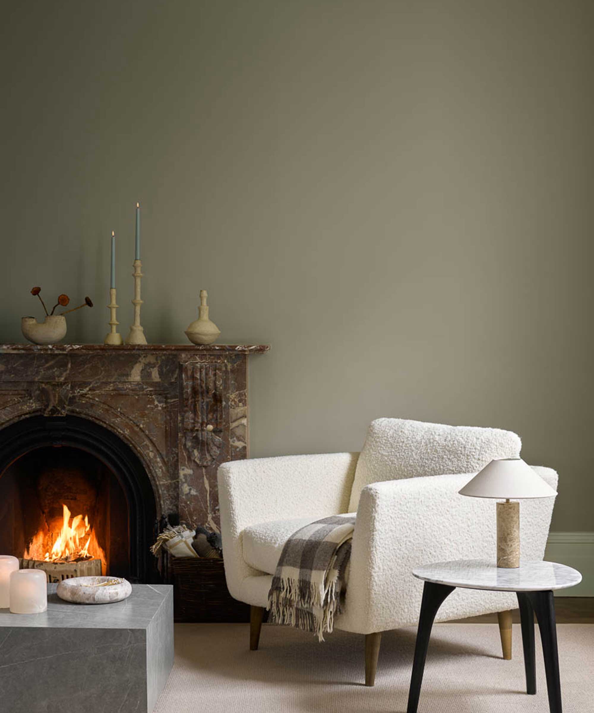
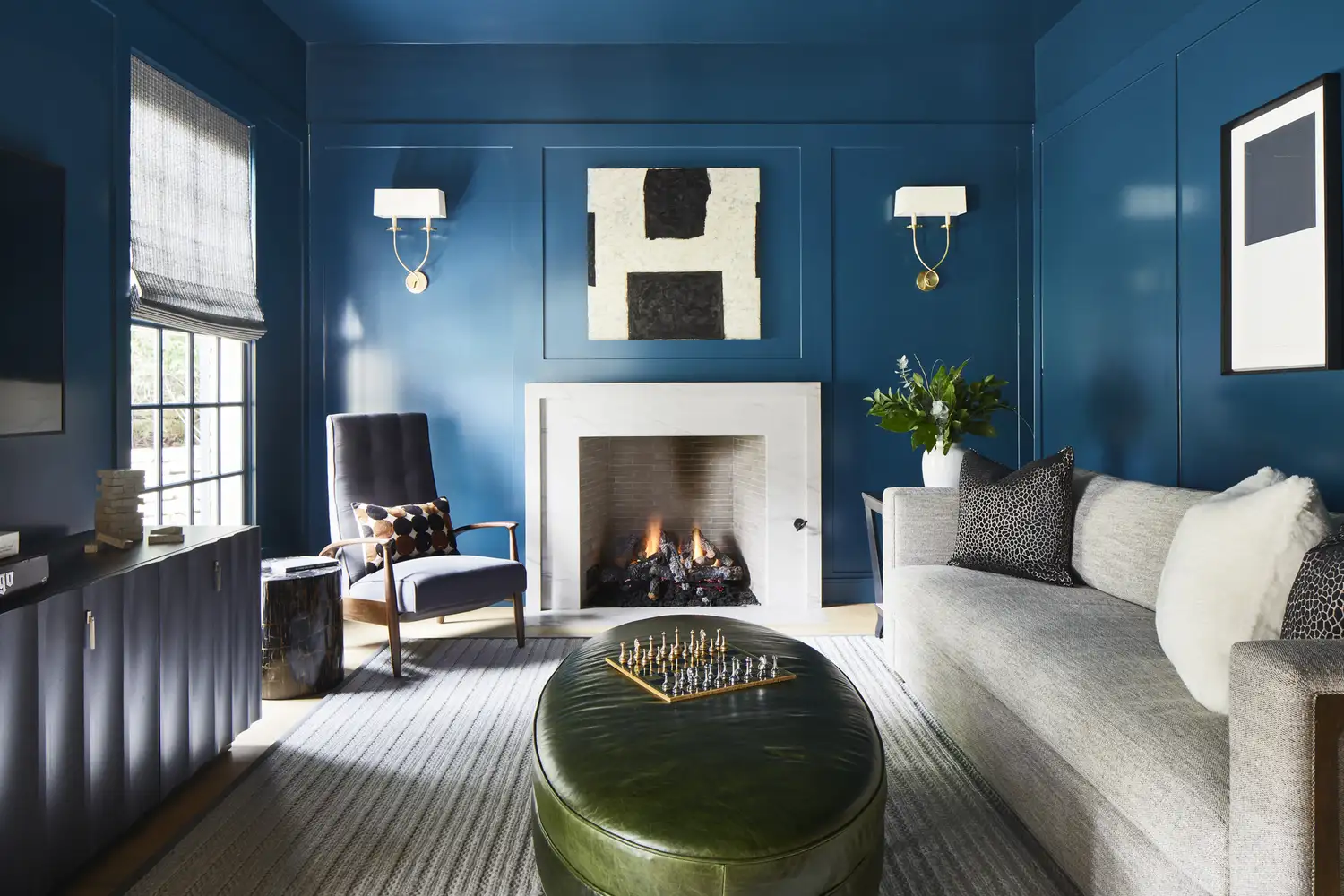
The article explores the emerging trend of using blue and green hues as neutrals in home decor, moving away from traditional shades like creams, grays, tans, and browns. Southern designers advocate for these nature-inspired colors, highlighting their versatility and ability to anchor a room while adding personality. The first rule for incorporating blues and greens is to 'Drench in Color,' as suggested by Anna Still of Still Johnson. She advises using a wall color and then varying its intensity across furnishings, with darker shades for larger pieces and lighter versions for accessories. Still emphasizes that blue and green function as neutrals because they harmonize with virtually any other color, providing a comforting and natural feel within a home environment. Marguerite Johnson, co-owner of Still Johnson, reinforces this by noting the strong presence of these colors in nature, which makes them inherently soothing for indoor spaces.
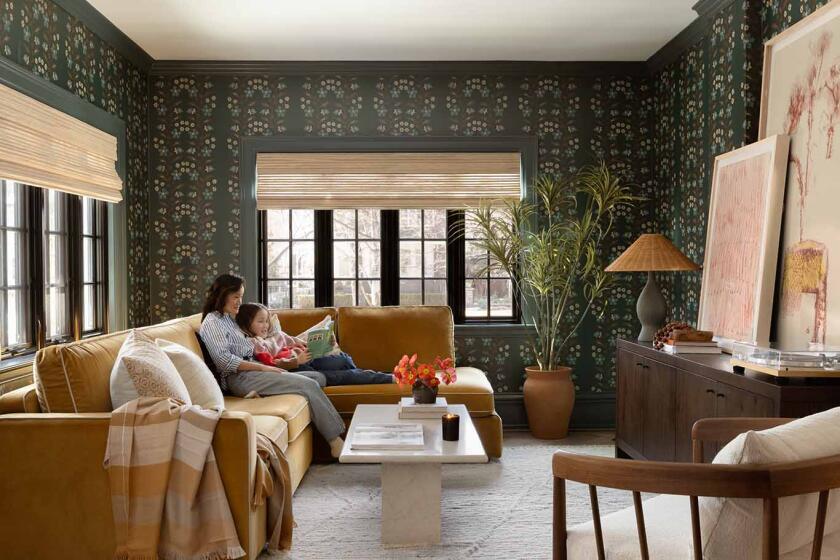
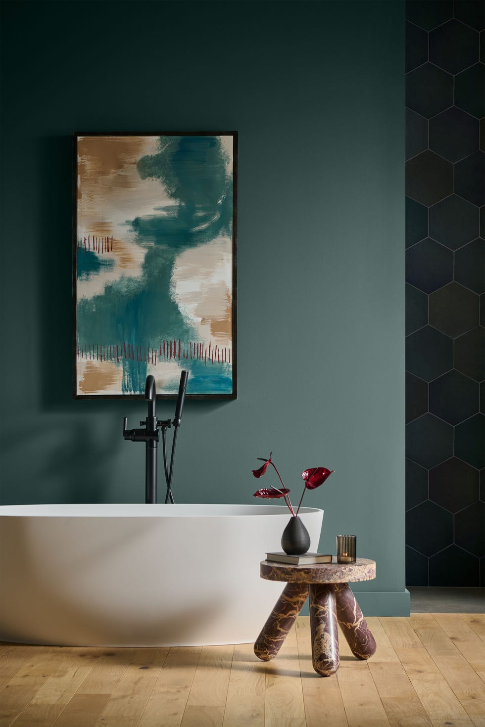
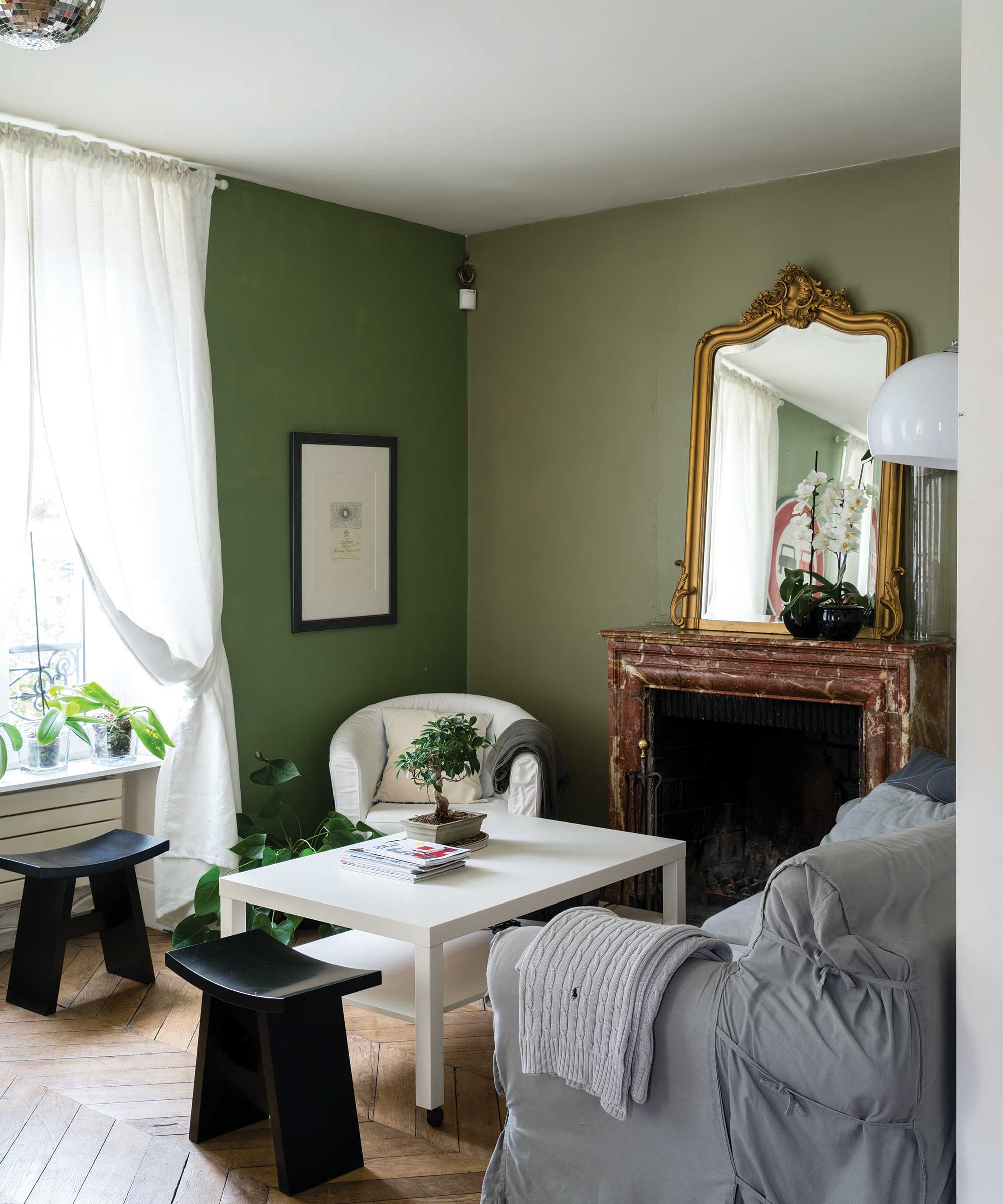
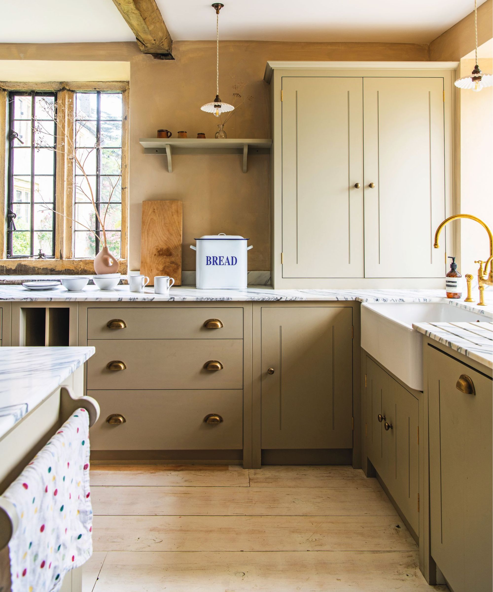
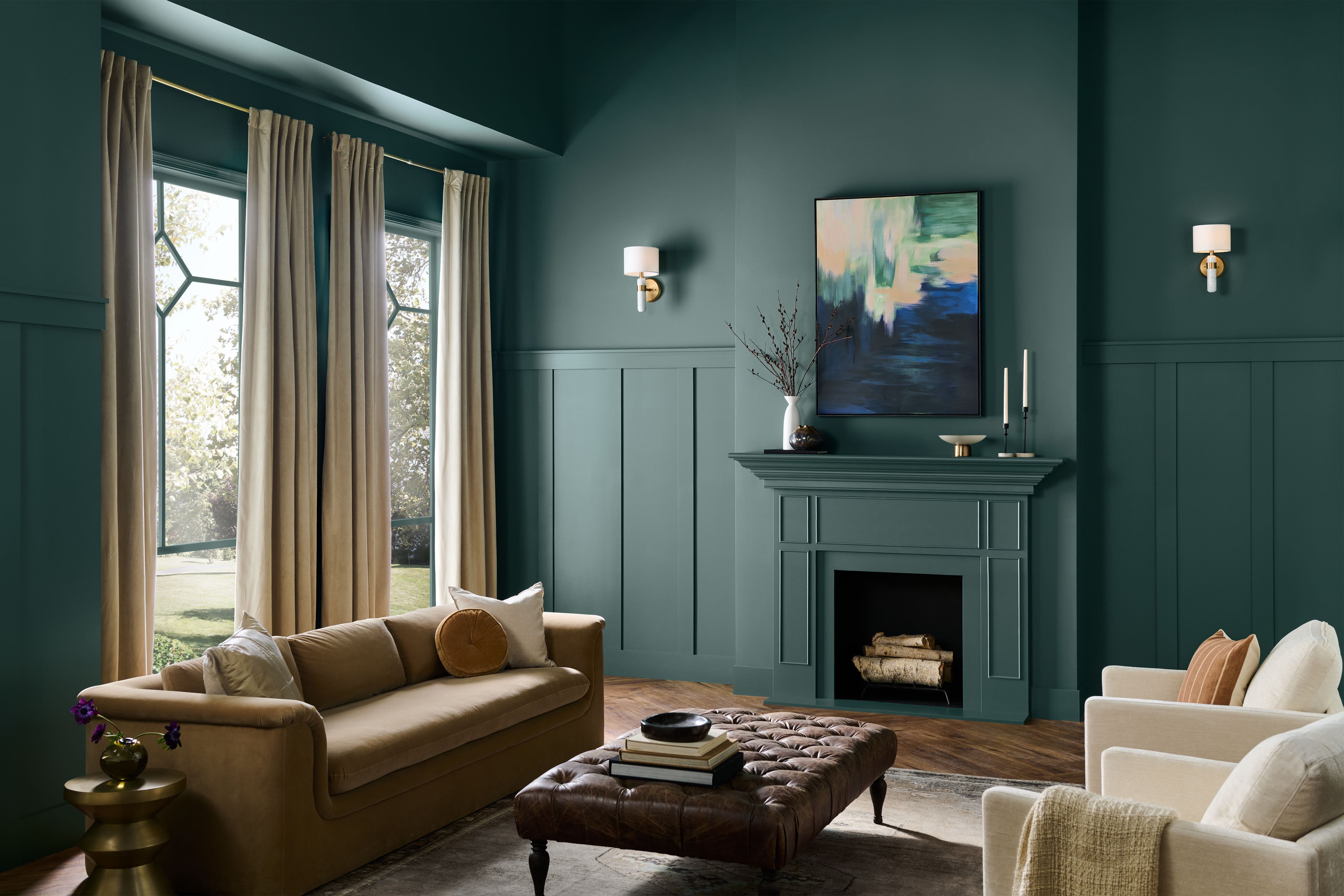
DuVäl Reynolds of DuVäl Design supports the shift, stating that blue and green offer a fresh approach to decor, allowing for more individuality without sacrificing a universally appealing aesthetic. His second rule, 'Trim It Out,' suggests using these colors to accentuate architectural details without overpowering the room. He provides an example of applying a deep olive green, such as Sherwin-Williams’ Rosemary (SW 6187), to both trim and ceiling in a dining room to create a balance of warmth and sophistication. Barrie Benson, a designer from Charlotte, North Carolina, introduces the third rule: 'Go Big on Impact.' She favors using green as a neutral to layer colors harmoniously, particularly by painting entire rooms, including walls and trim, in shades like Farrow & Ball’s Calke Green (No. 34). This technique connects the interior space with the outdoors and allows for the introduction of brighter accent colors. Her sunroom design, blending seamlessly with surrounding foliage, serves as a prime illustration of this concept, where red-hued furnishings provide a striking contrast.
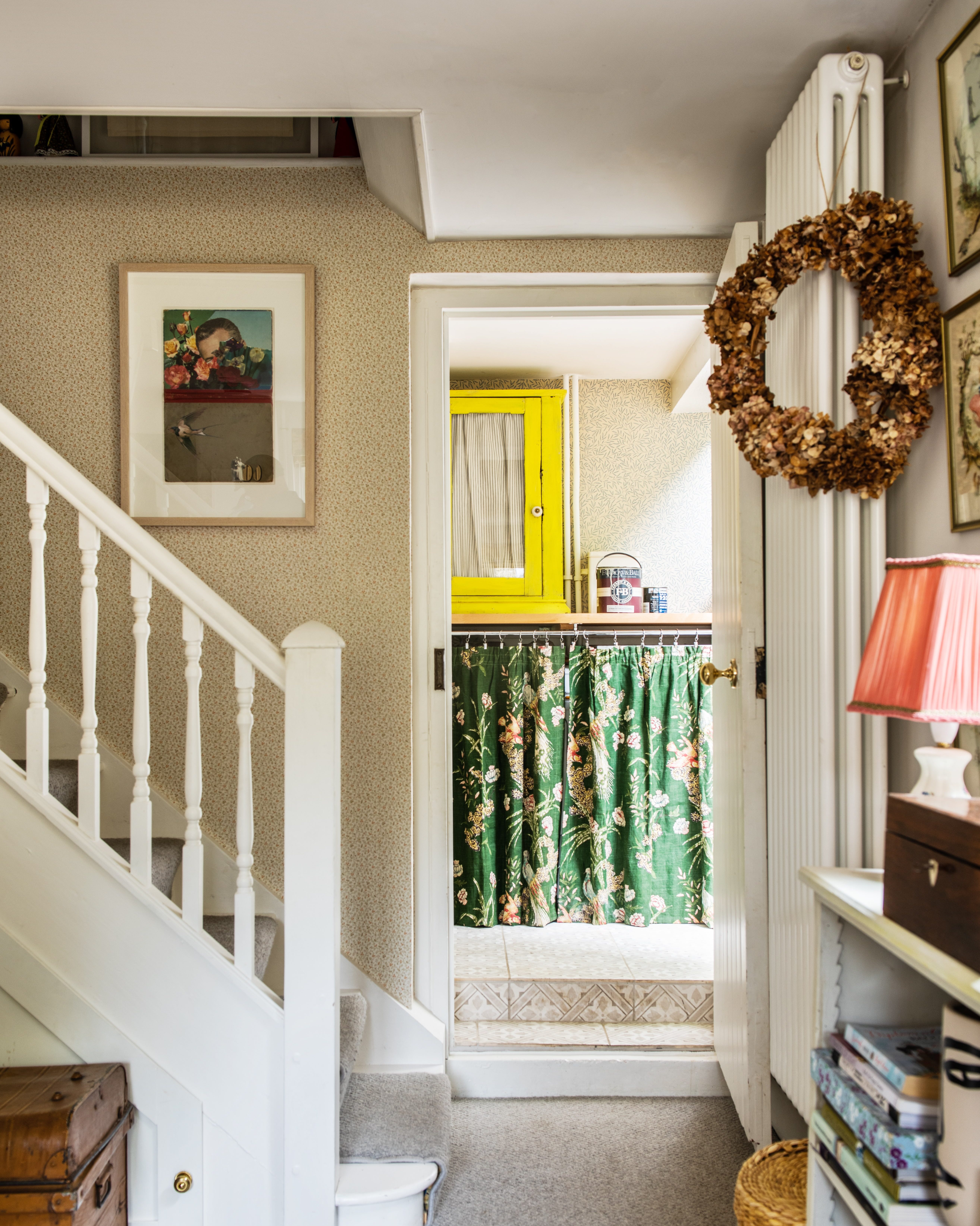
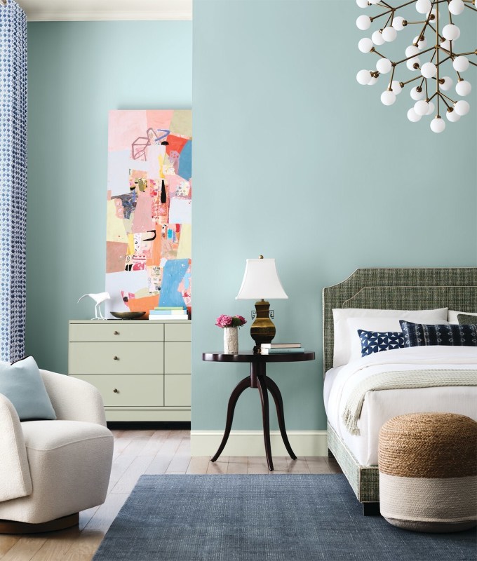
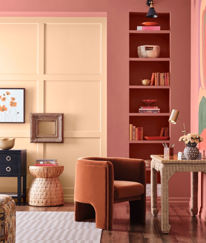
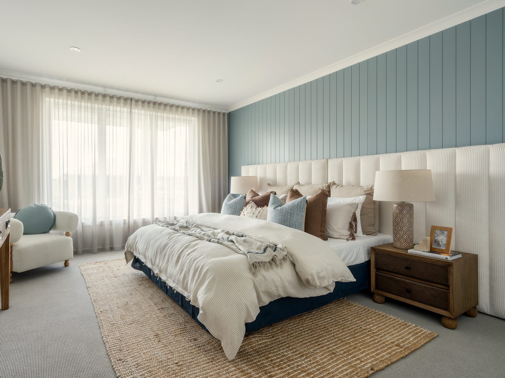
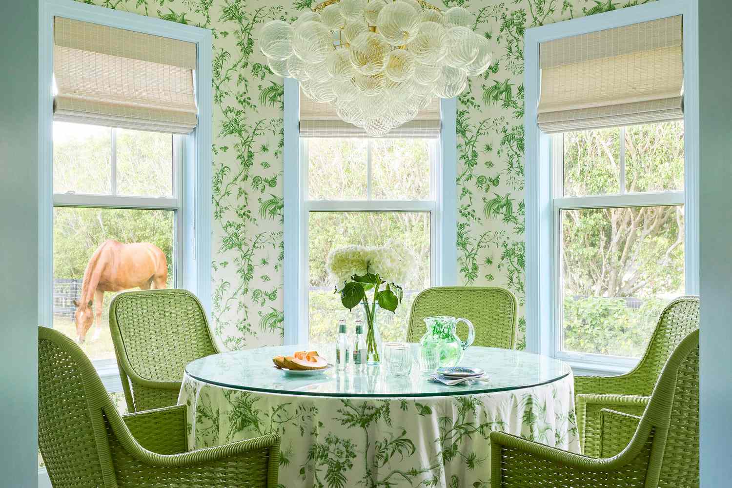
The fourth rule, 'Play with Contrast (And Textiles!),' is exemplified by Lori Deeds of Kemble Interiors. Her Old Florida-style farmhouse design incorporates an earthy palette with a playful twist: painting the trim a contrasting color. She combined Benjamin Moore’s Under the Big Top (1675) with a Schumacher wallpaper and a matching table skirt in a breakfast nook, demonstrating how a classic look can be updated with a contemporary spin. The final rule, 'Make It Subtle,' comes from Maryland designer Laura Hodges, who views blues and greens as a means to bring the essence of the outdoors inside. While maintaining a neutral palette as her foundation, she incorporates toned-down sky blues, like Benjamin Moore’s Silvery Blue (1647), on living room walls. She then complements these cool tones with warmer red and coral accents. Hodges highlights that this approach creates a calming and timeless atmosphere, allowing artwork, decor, and the room’s occupants to be the focal point. The consensus among these designers is that blues and greens are becoming essential elements in contemporary home design, offering both aesthetic appeal and a sense of natural tranquility.
#HomeDecor #InteriorDesign #ColorTrends #NeutralColors #BlueGreenPalette #PaintColors #DecoratingTips #NatureInspiredDesign #HomeDecor #InteriorDesign #ColorTrends #NeutralColors #BlueGreenPalette #PaintColors #DecoratingTips #NatureInspiredDesign
0 comment in total
 No comments yet
You may also like
We’re Calling It: These Are the Official Color Trends of 2025

The 'New Neutrals' Designers Are Choosing for Their 2026 Schemes

Behr's 2026 Color of the Year Is Here—And It’s Moody
Graham & Brown's 2025 Color of the Year, 'Elderton', Proves Neutrals Are Still In
Which Neutral Is Replacing White in 2025? Experts Reveal

2026 Color of the Year Announcements Have This In Common
The ‘New Neutral’ Paint Color Everyone Is Adding To Their Homes In 2025, According To Designers
The Biggest Colour Trends Taking Off in 2025
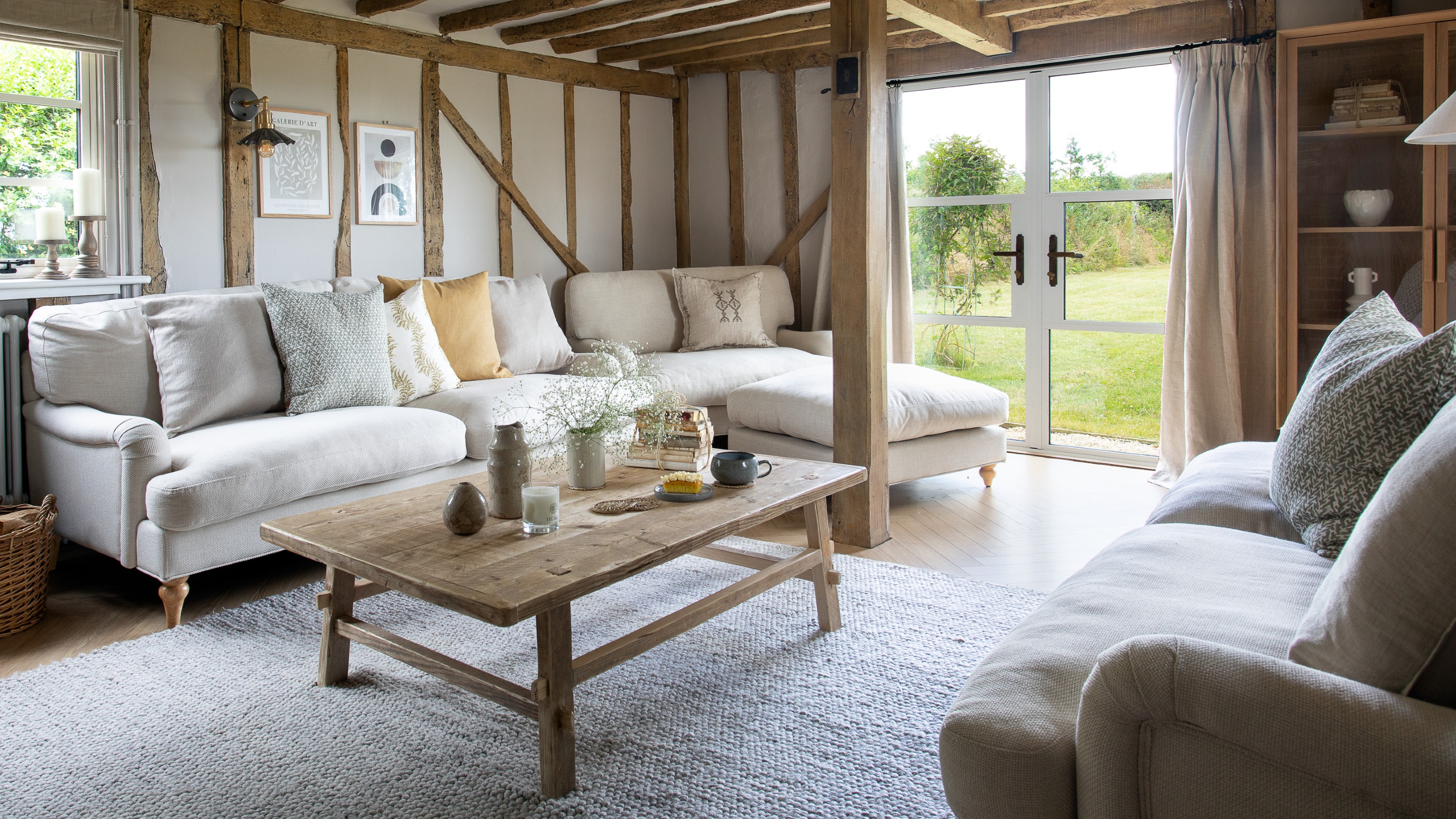
What’s replacing beige in 2025? Last year's go-to neutral is taking a back seat in favour of these two new earthy colours
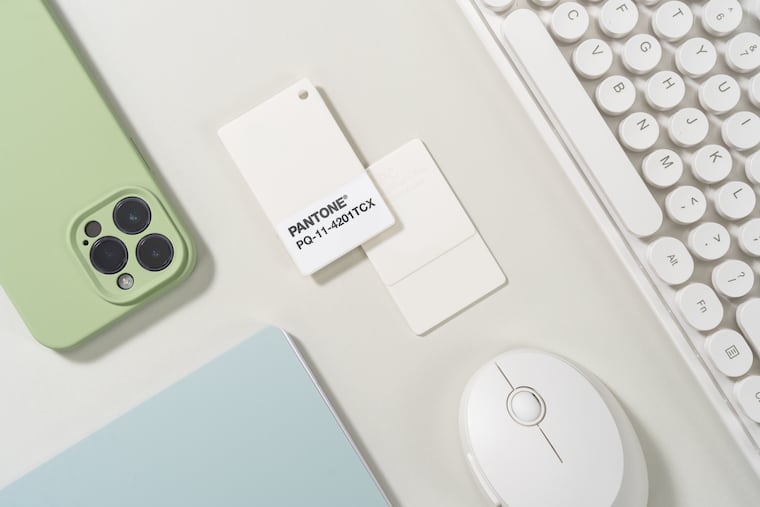
White is the 2026 Pantone Color of the Year. They say the choice isn’t political.
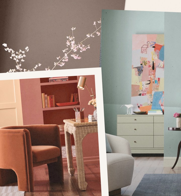
Bye-Bye True Blue: These Are the New Coastal Colors for 2026
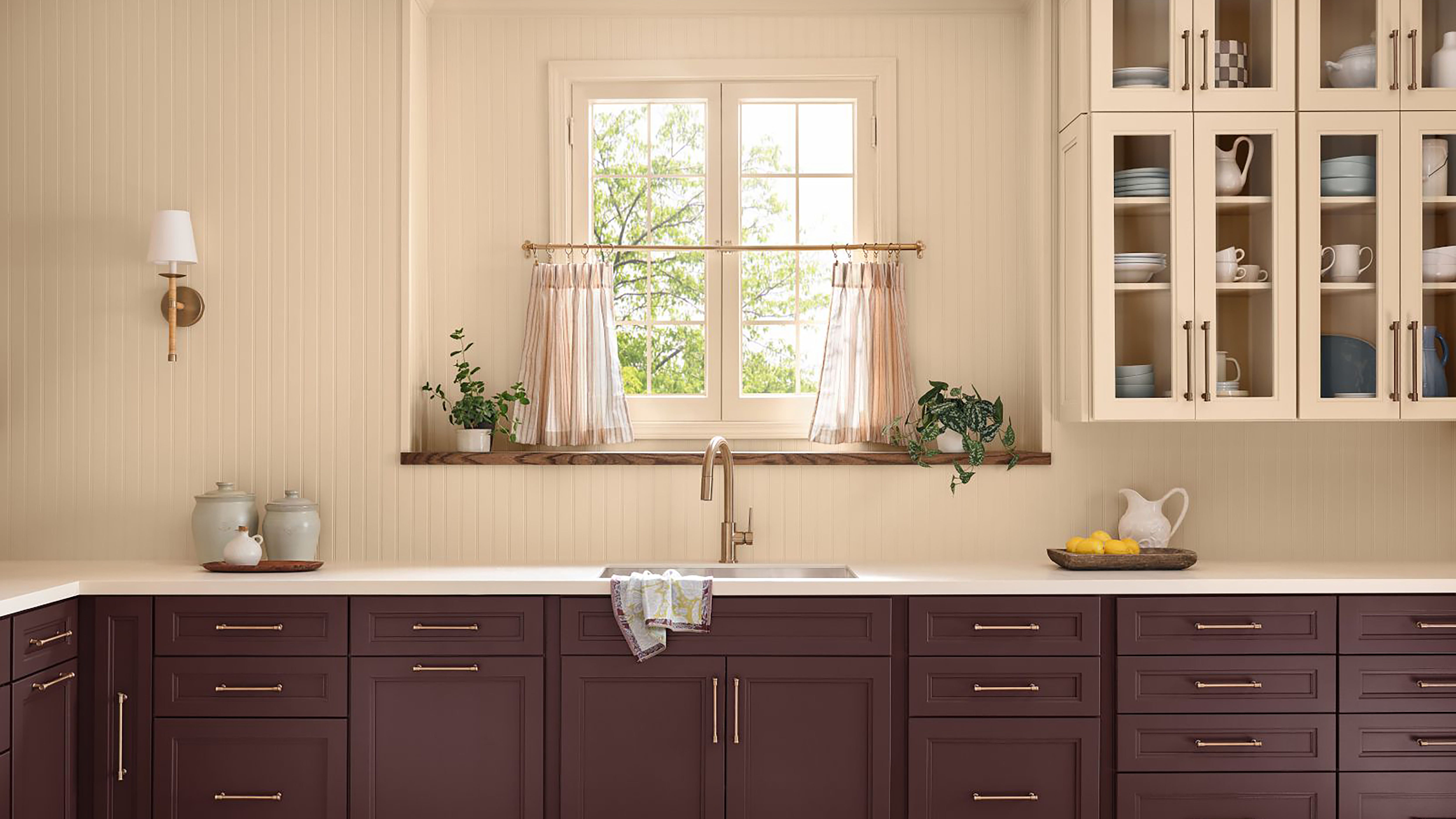
Every 2026 Color of the Year That Has Been Announced So Far

Move Over, Beige—This Unexpected Neutral Is Taking Over in 2026


2026's new neutral? We're pretty sure we just spotted the next must-have tone on Stanley Tucci's living room walls
Is Green the New Neutral? Interior Designers Argue We Should All Be Using This Soothing Shade as Our Base Color

The #1 Paint Color Trend of 2025, According to Designers

Looks Like Bold Stripes Will Have Their Moment in 2026

‘Unexpected Yellow Theory’: The Bold New Interior Trend Replacing Red in 2025
Is gray or beige more on trend for 2025? Designers share all on these popular neutrals
Say Goodbye to Neutrals: Color-Drenching Will Define 2026 Interiors