1/5
What Neutral Wall Color Should I Pick in 2024? These are the Big Neutral Color Trends, Say Designers
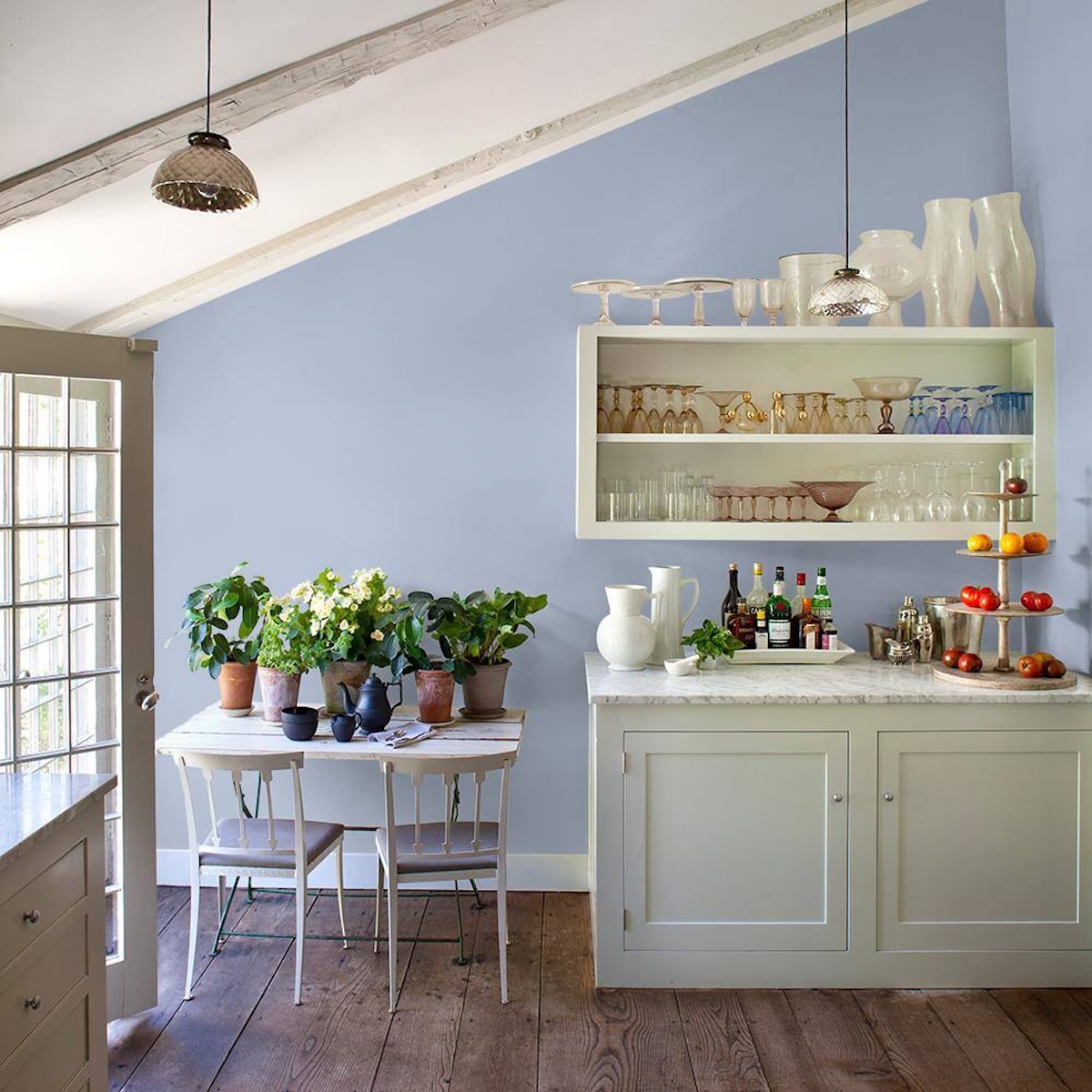
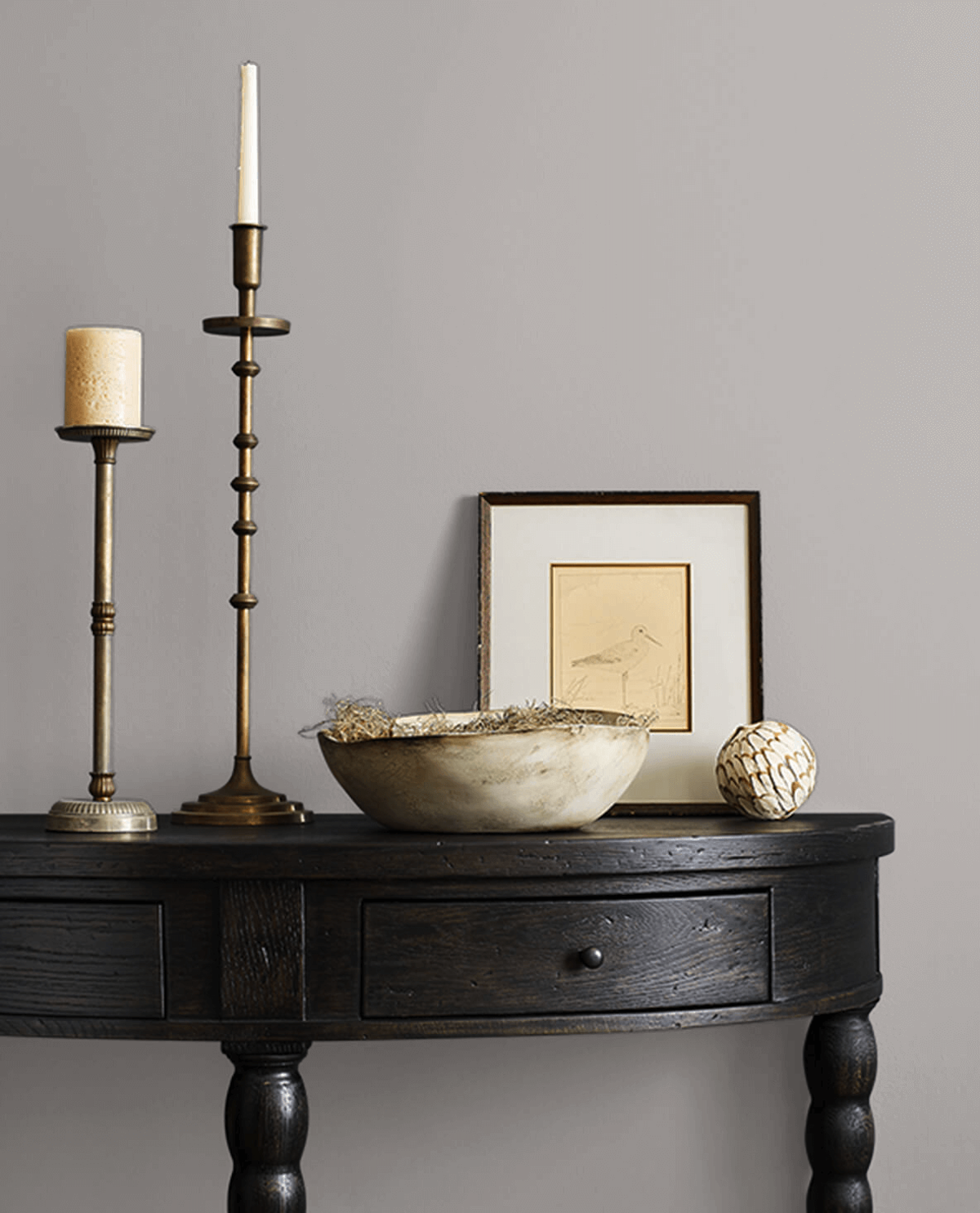
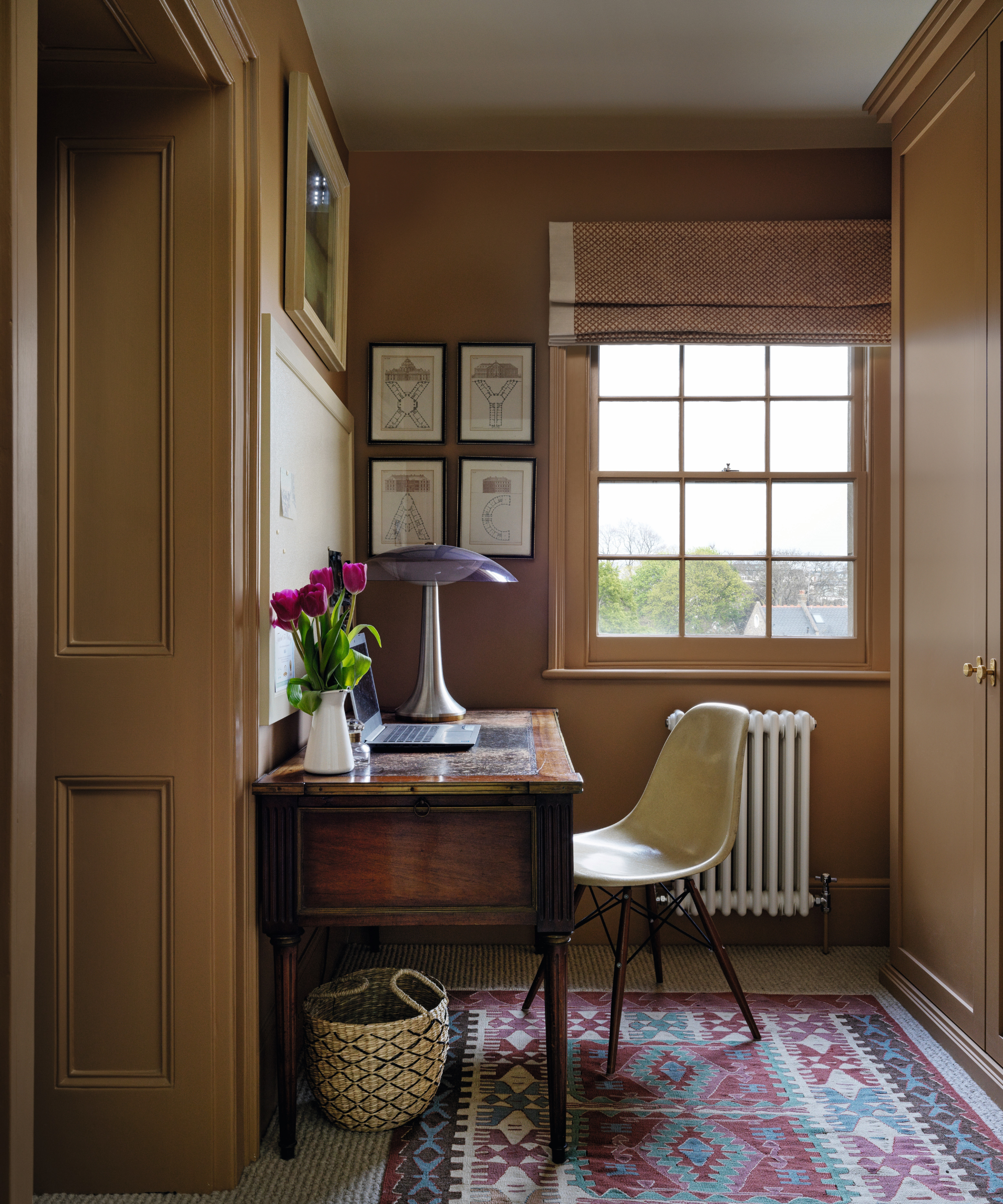
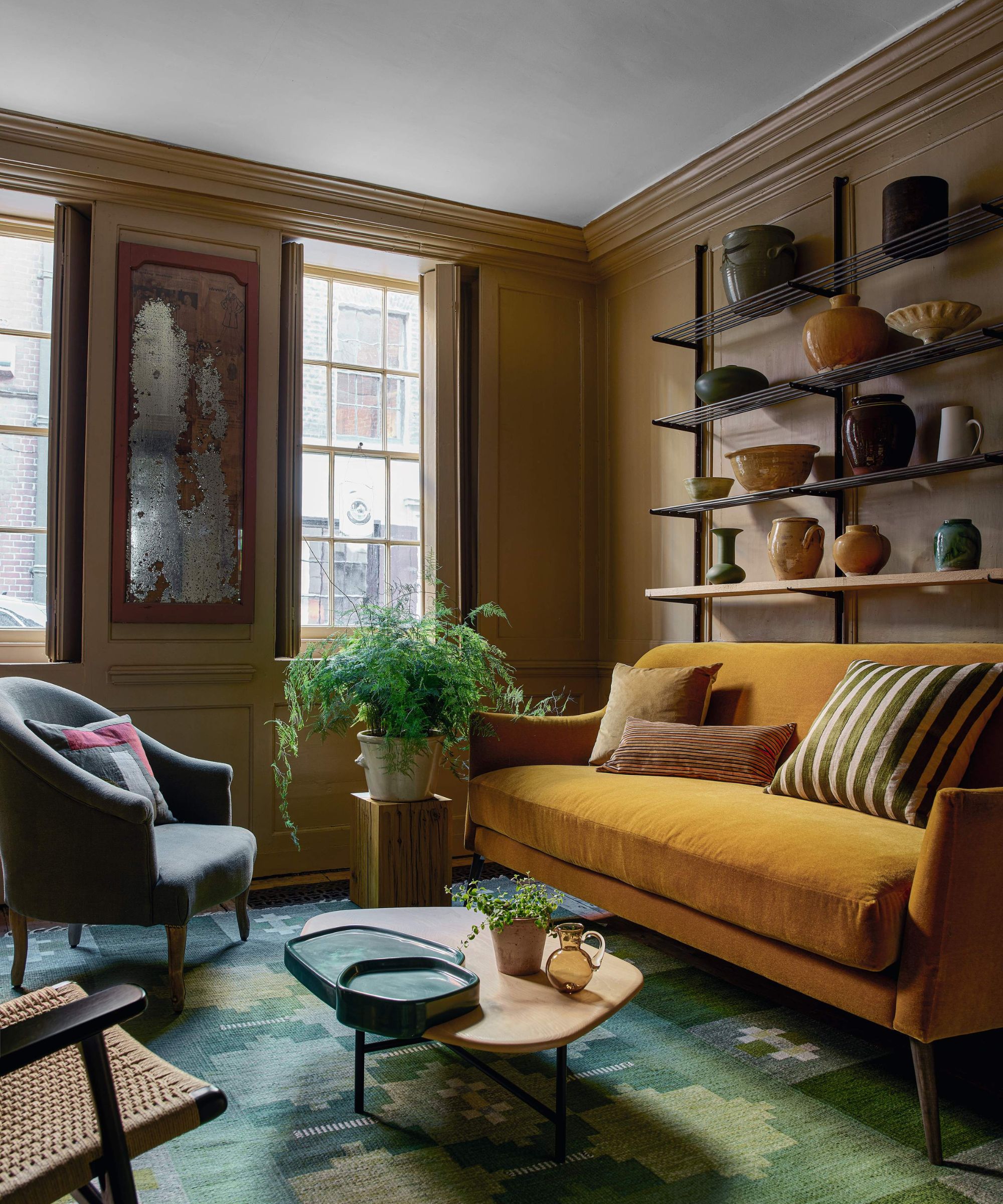
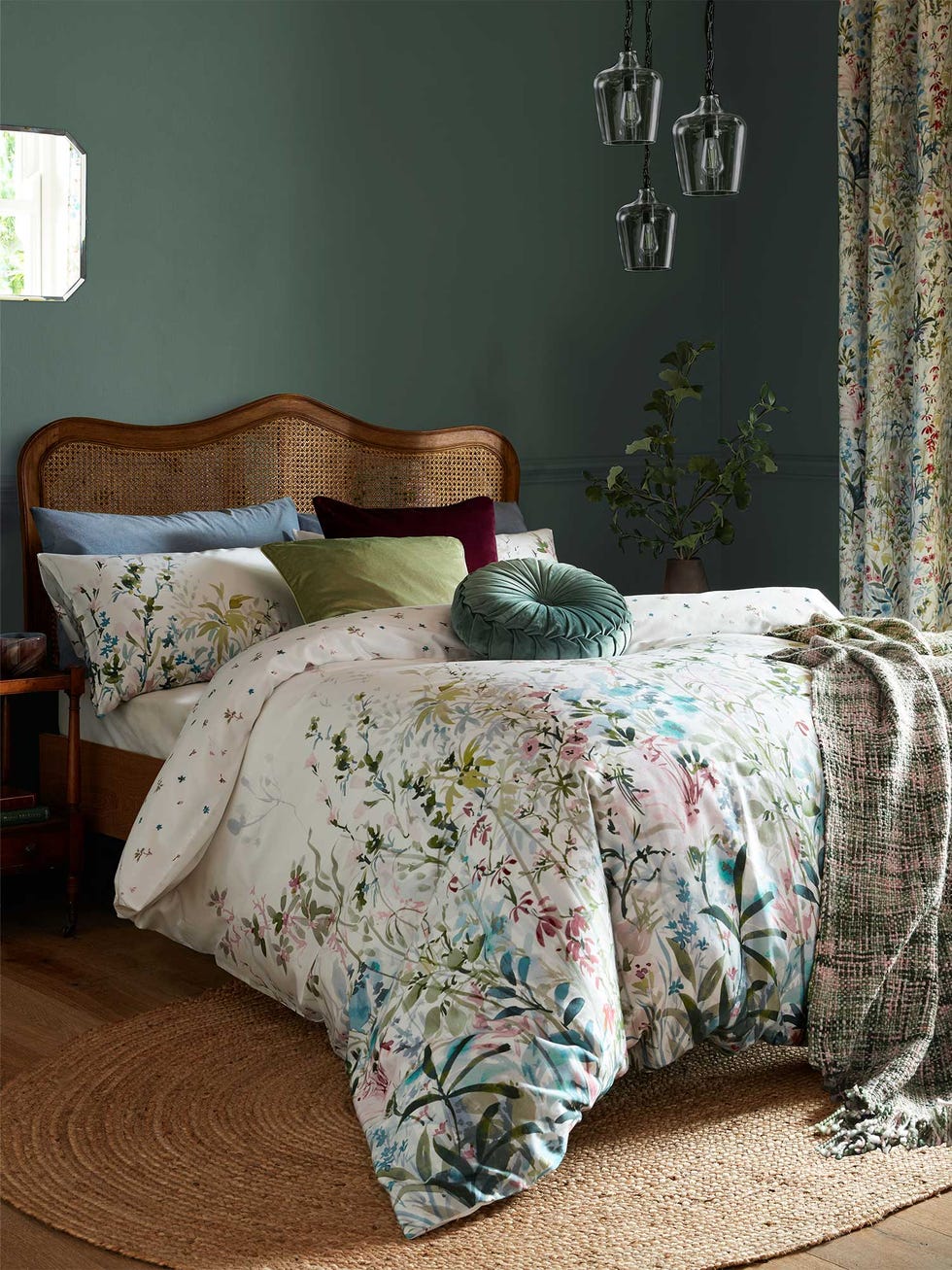
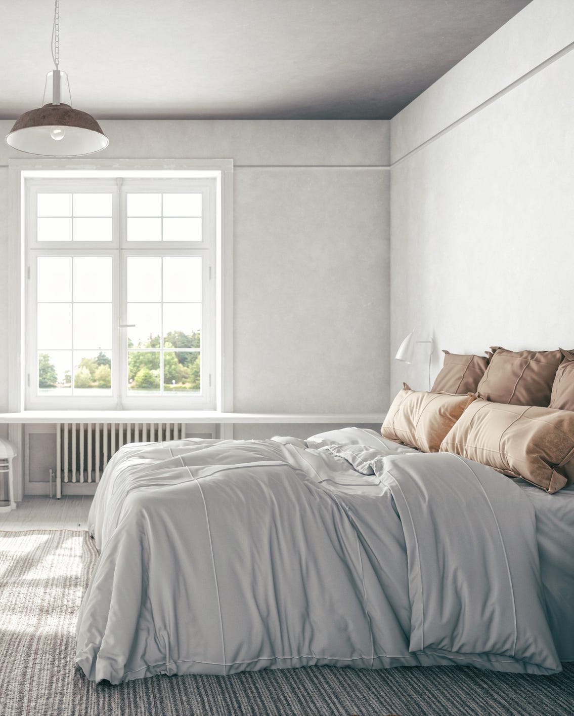
Neutral interior design remains a timeless approach, yet the specific tones and shades within the neutral palette evolve with trends. When selecting a neutral color for a home, it is crucial to consider the characteristics of the space, particularly the amount and direction of natural light. Rooms that receive abundant natural light, such as south-facing rooms with large windows, can accommodate darker and cooler-toned neutrals. Conversely, naturally darker rooms benefit from lighter and warmer shades to enhance brightness and counteract gloom. The article consults experts to identify the leading neutral wall color trends for 2024, emphasizing three key directions: earthy neutrals, a relaxed neutral color palette, and the preference for taupe over traditional gray.
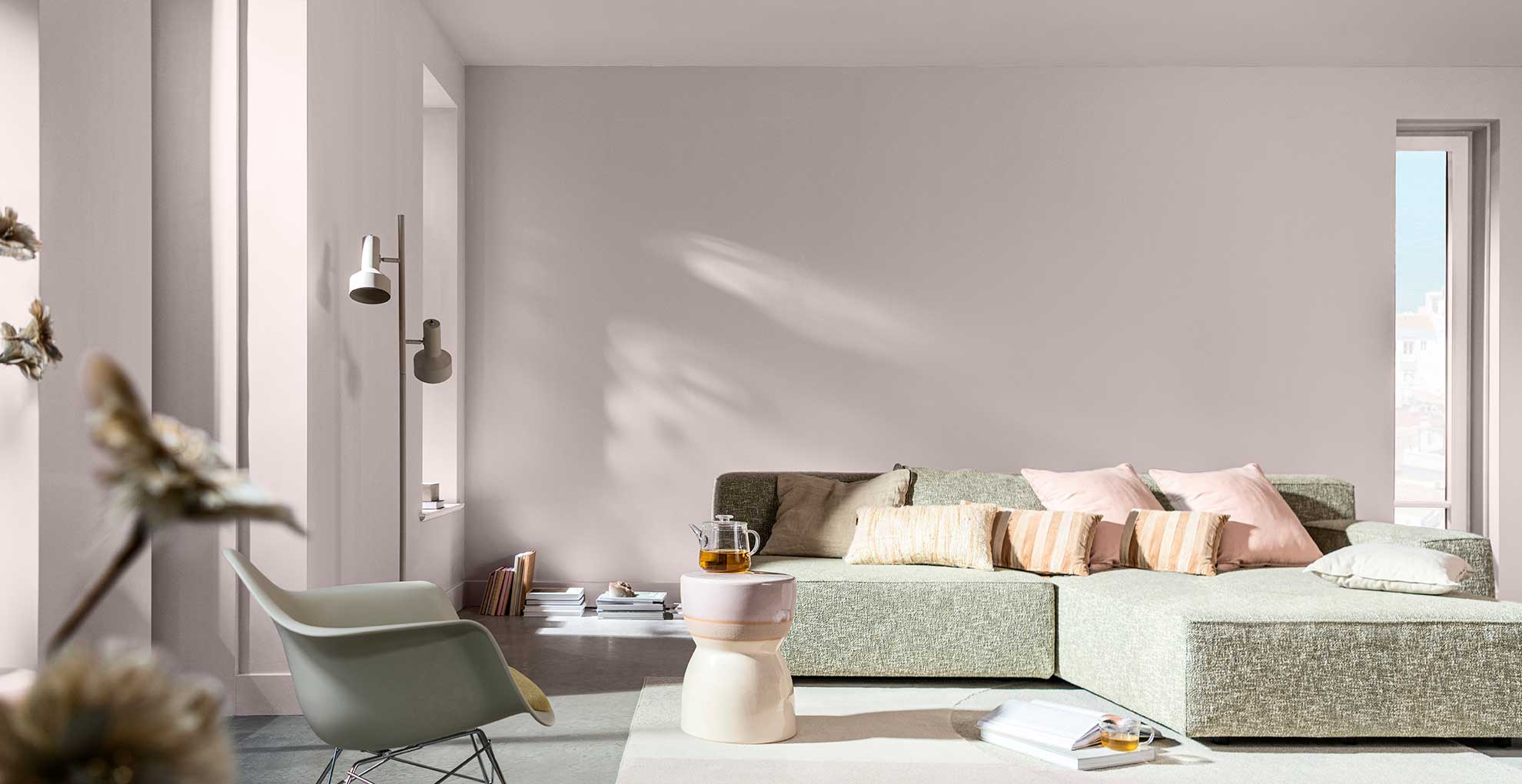
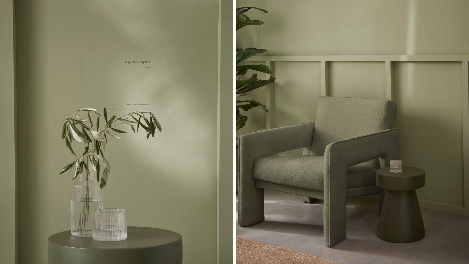
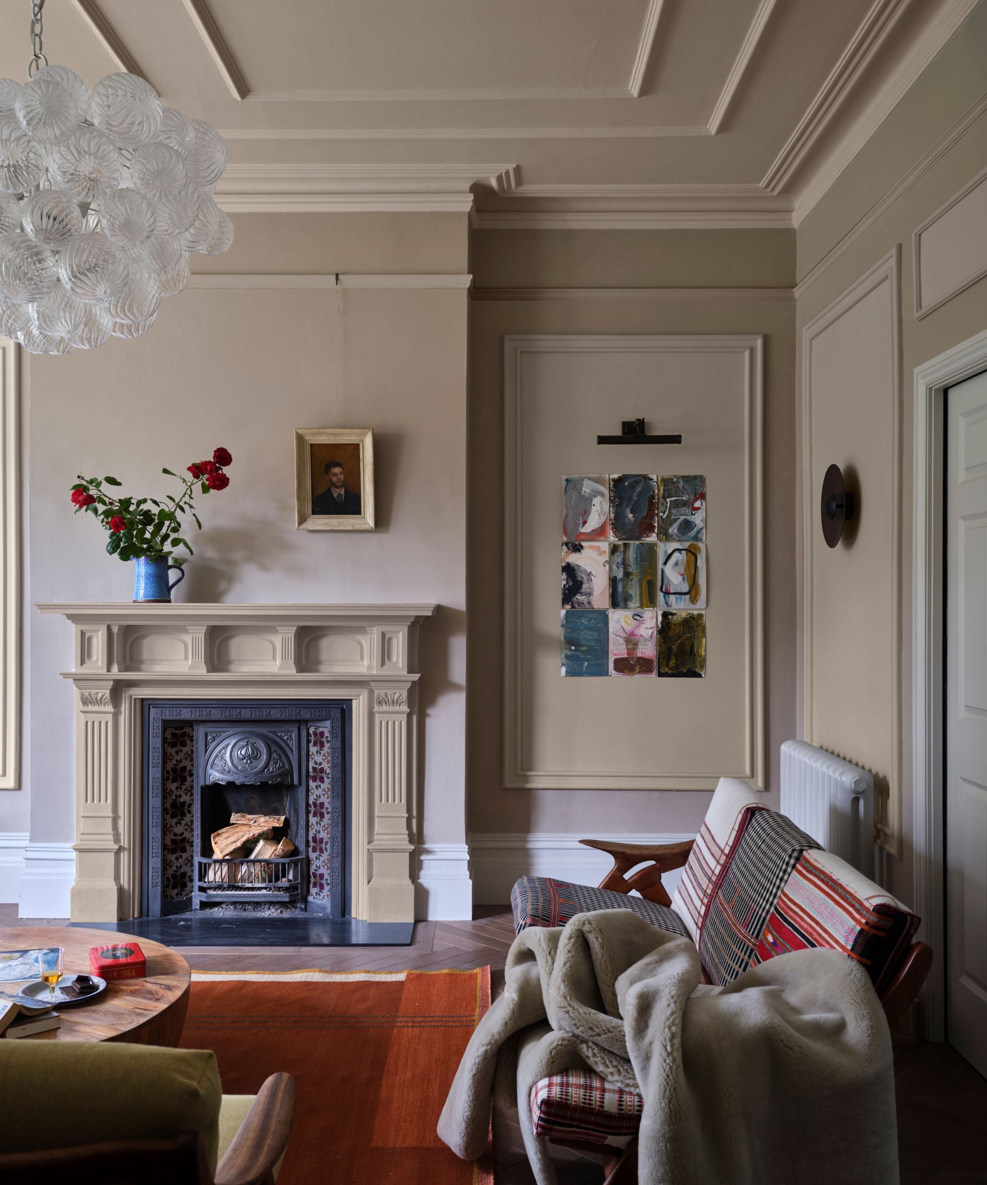
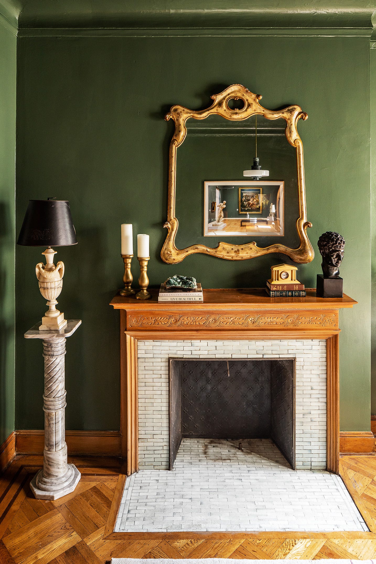
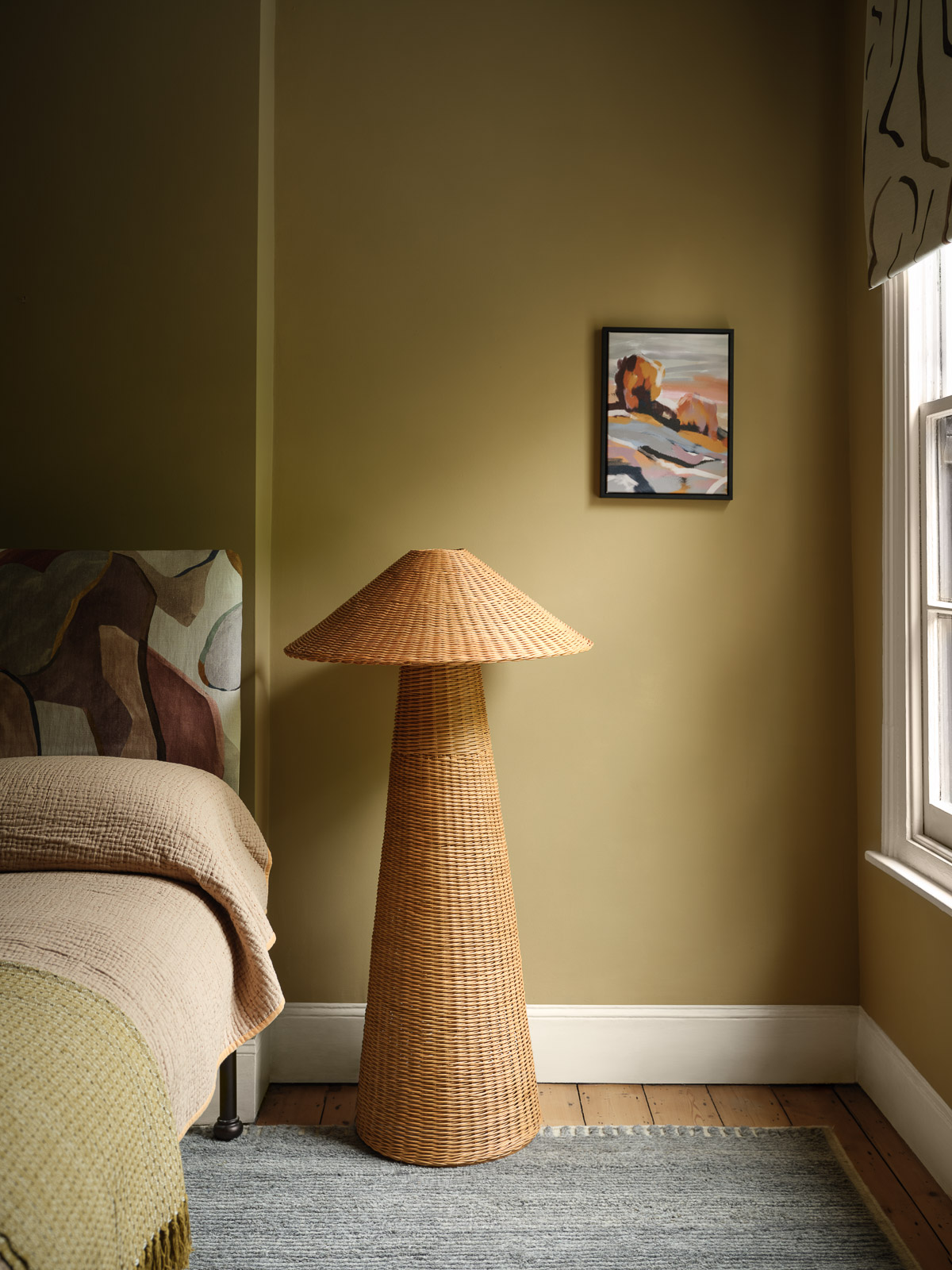
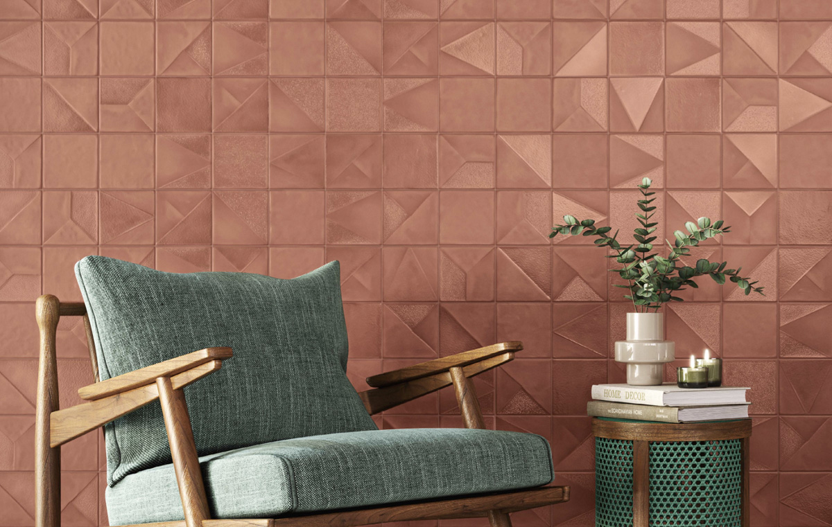
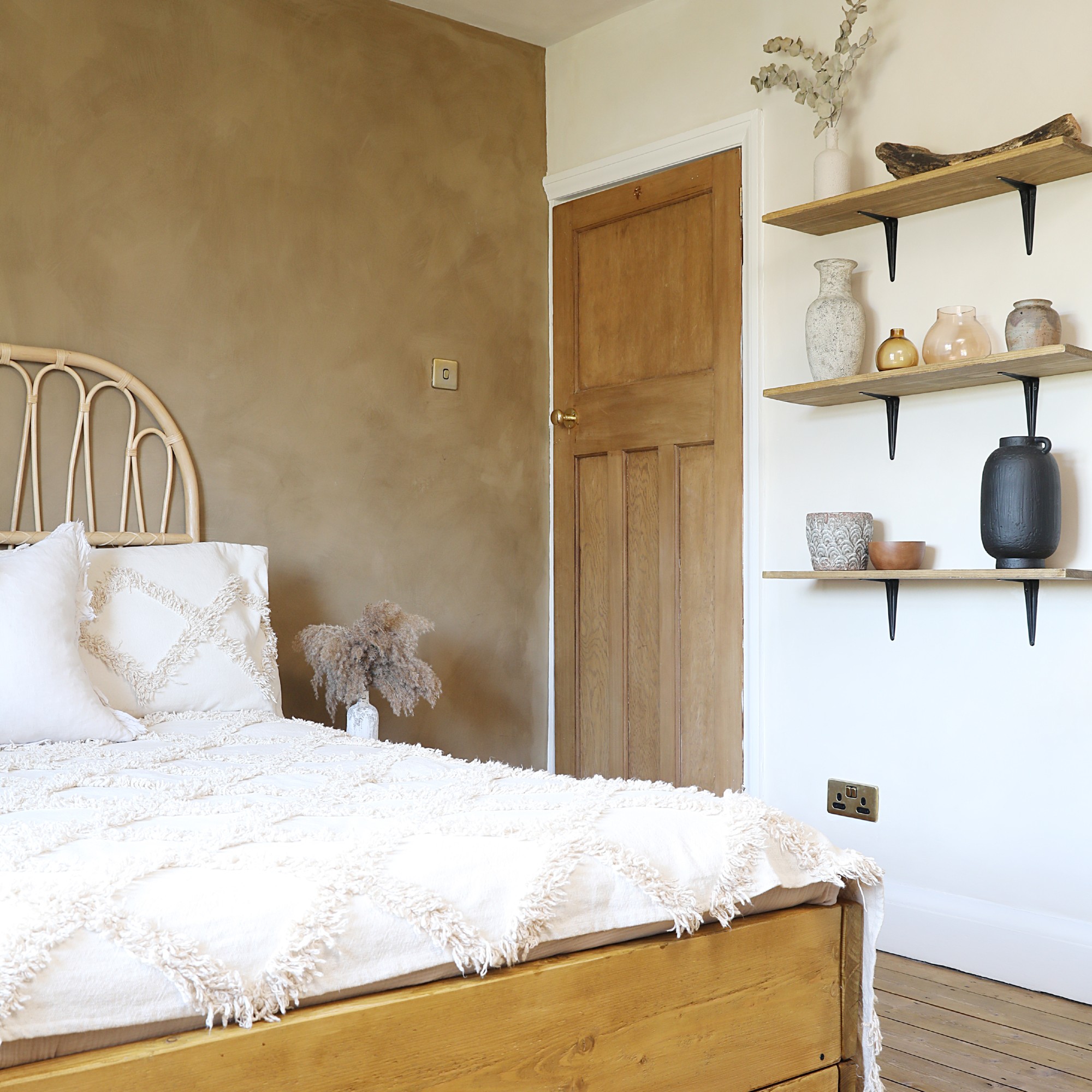
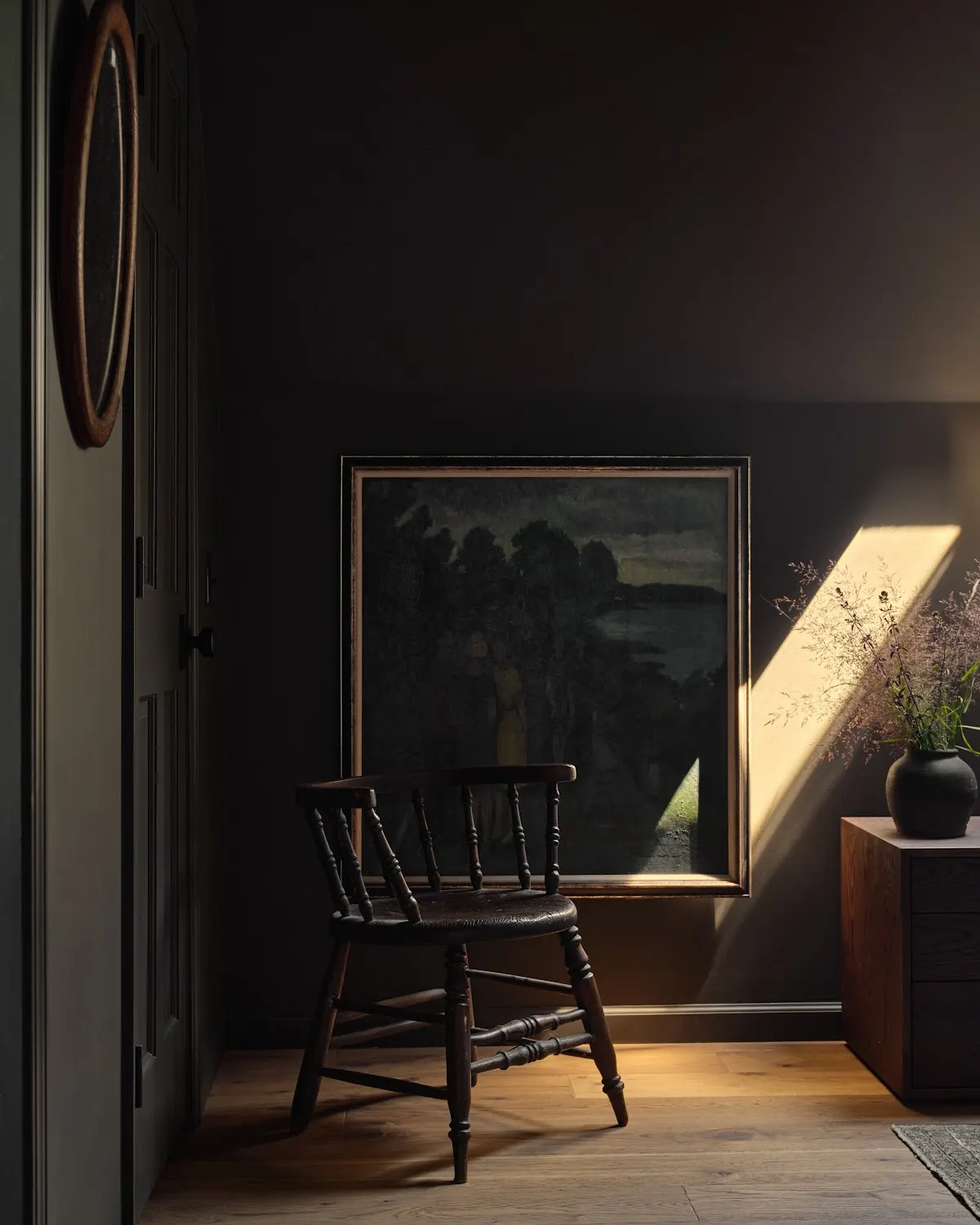
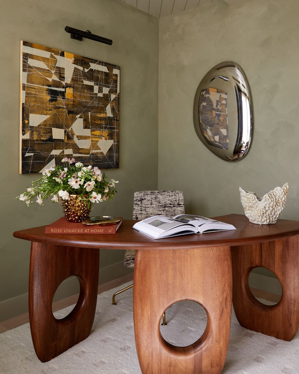
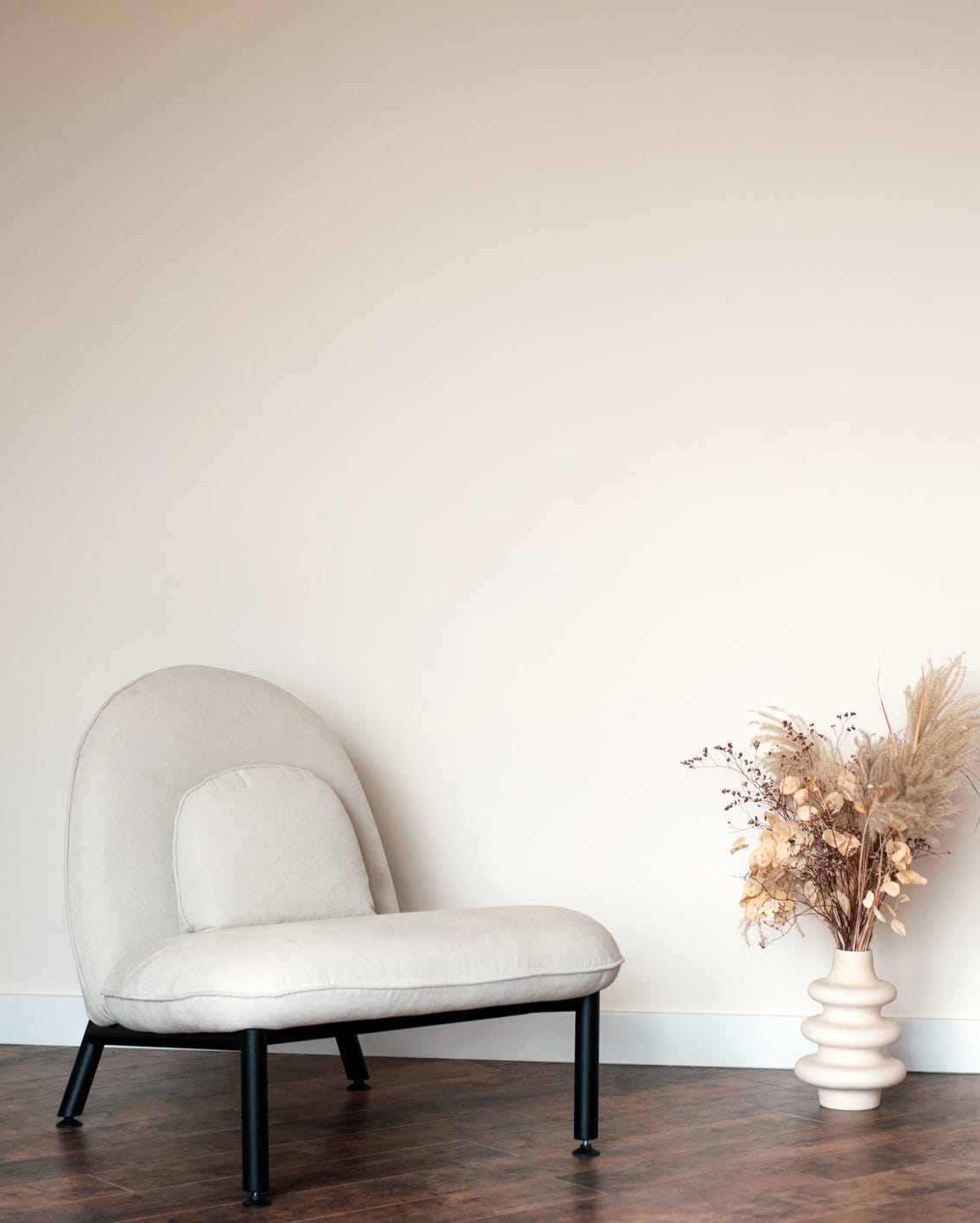
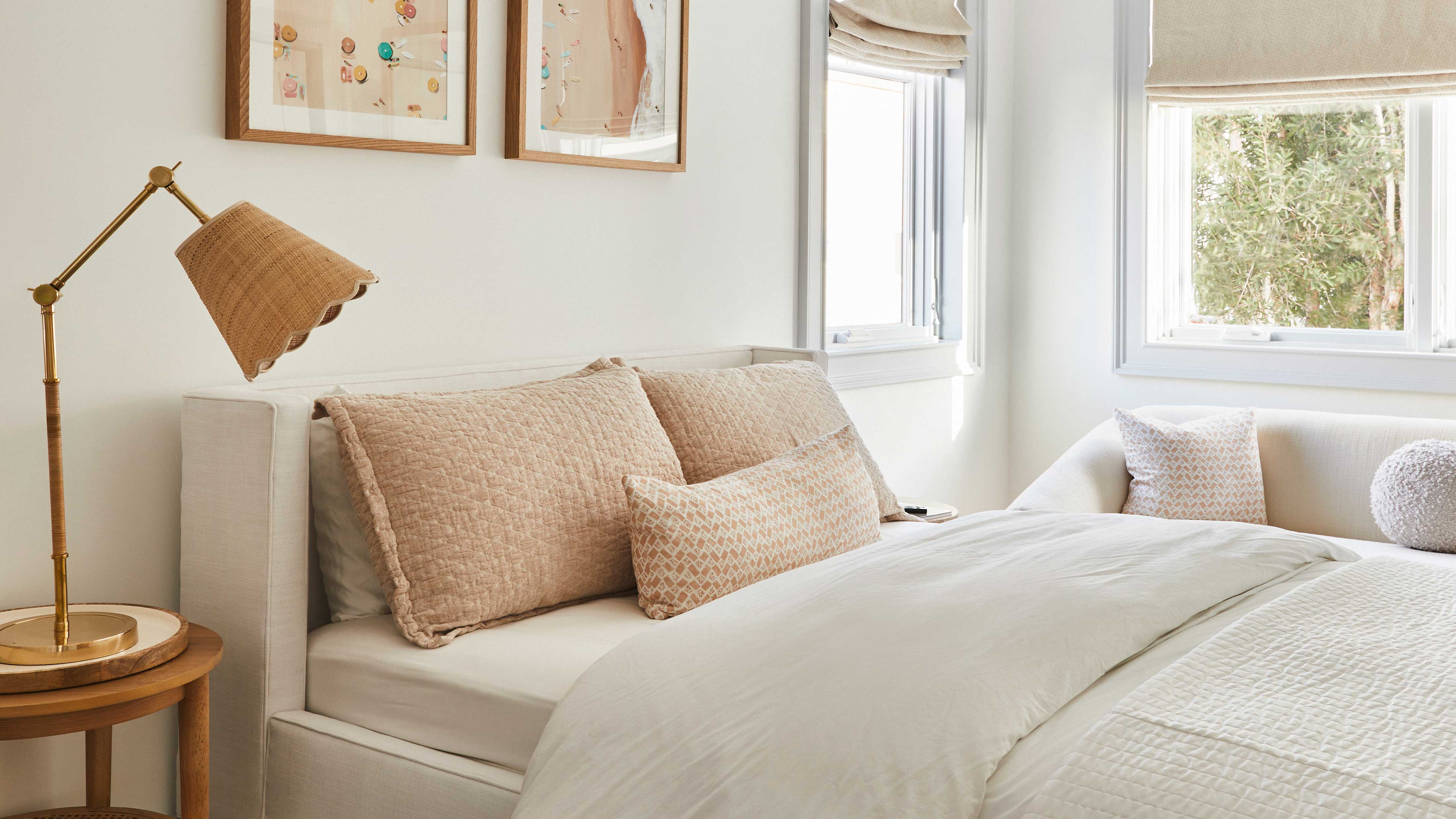
Earthy neutrals are a significant trend for 2024, reflecting a growing desire for a connection to nature within home environments. This trend moves beyond simple whites and creams, embracing a spectrum of natural hues. Interior designer Kerry Vasquez highlights the popularity of earth-toned textured wall options, such as Portola Paint's Roman Clay, specifically referencing a custom color application in a living room. This inclination towards earthy tones can manifest subtly, with options like pale khaki green or warm-toned greige serving as sophisticated alternatives to basic cream colors, providing depth and a sense of grounding.
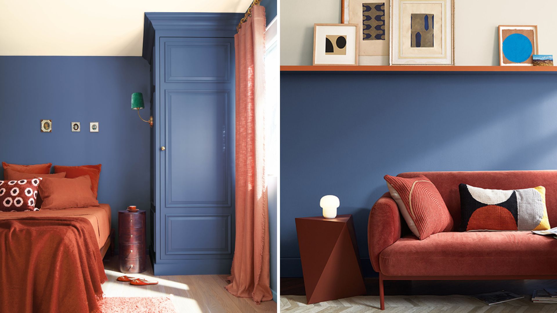
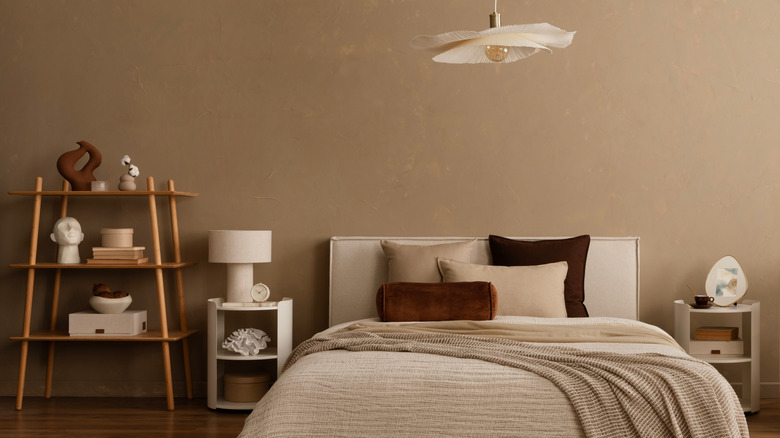
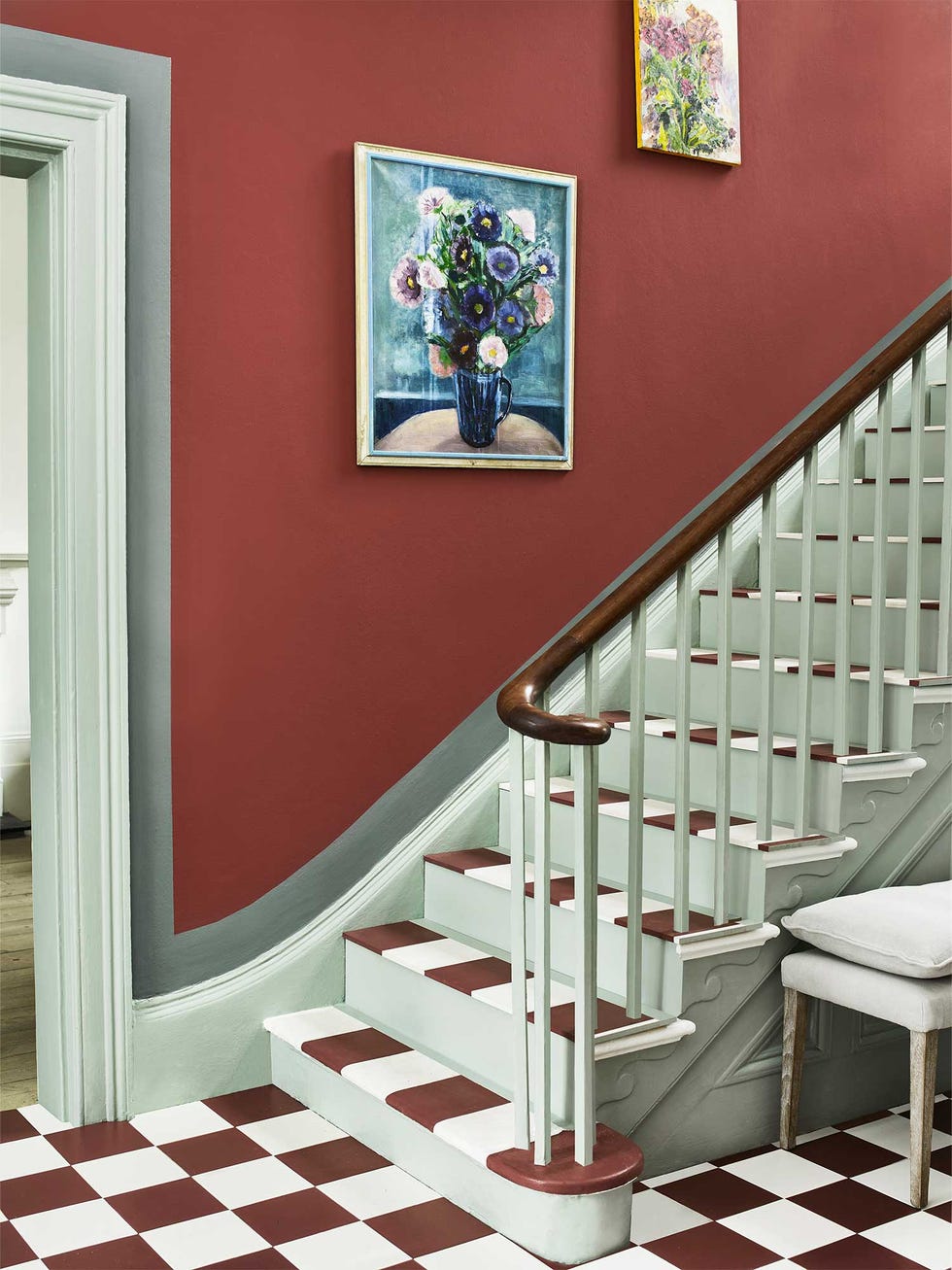
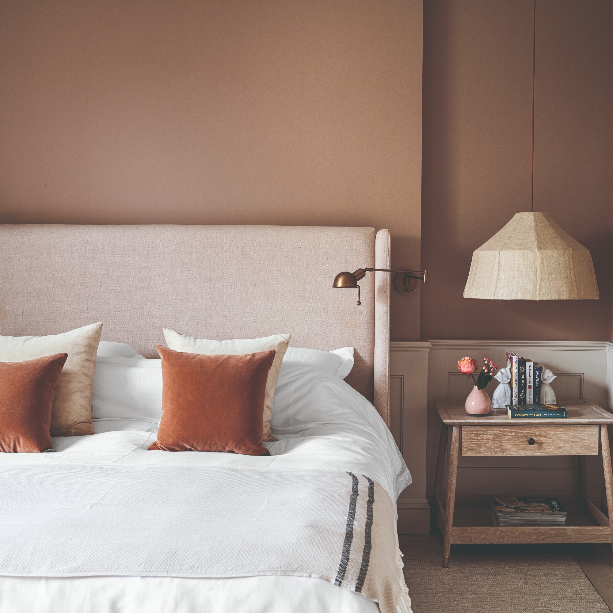
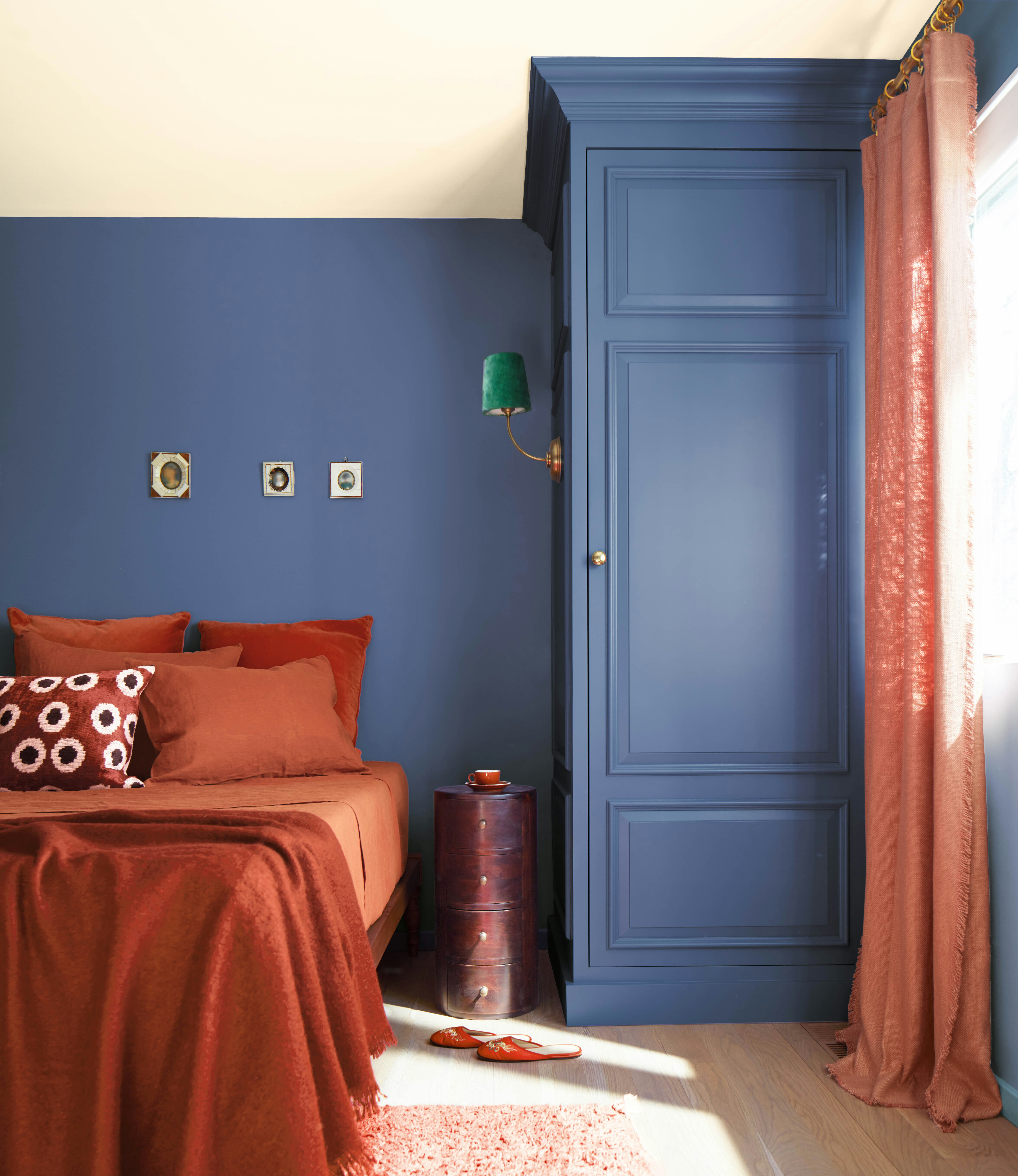
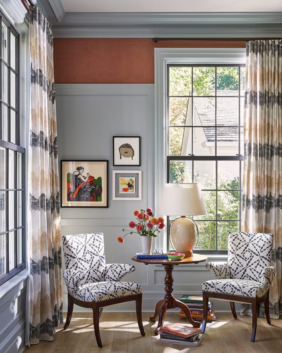
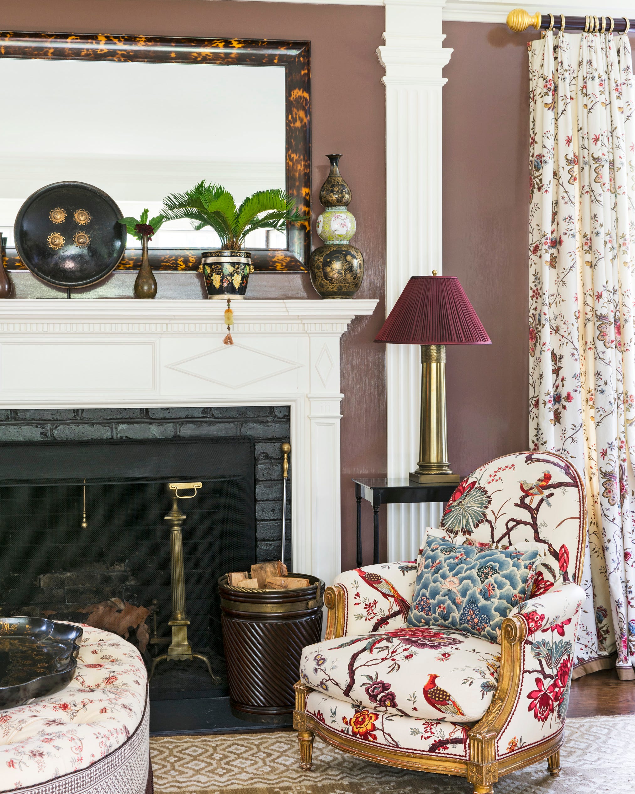
Another prominent trend is the adoption of a more relaxed neutral color palette. Christine Vroom, founder of Christine Vroom Interiors, notes that the design industry's efforts to integrate comfortable neutrals have been widely accepted and are expected to continue influencing interior design throughout the coming year. This relaxed approach broadens the definition of neutral beyond just white and cream, incorporating mellow colors such as light rust, olive, warm coral, and rich browns. This flexibility encourages homeowners to create their own unique color schemes, moving away from rigid color rules. The article suggests curating a personal mood board with three favored colors to develop a complementary array of tones, textures, and fabrics, allowing for a more fluid and personalized design.
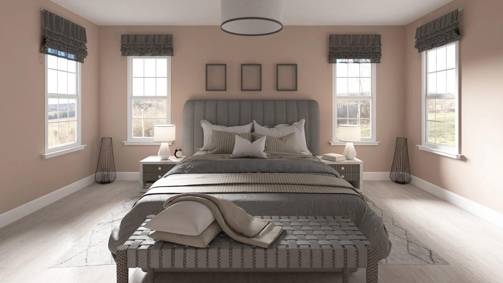
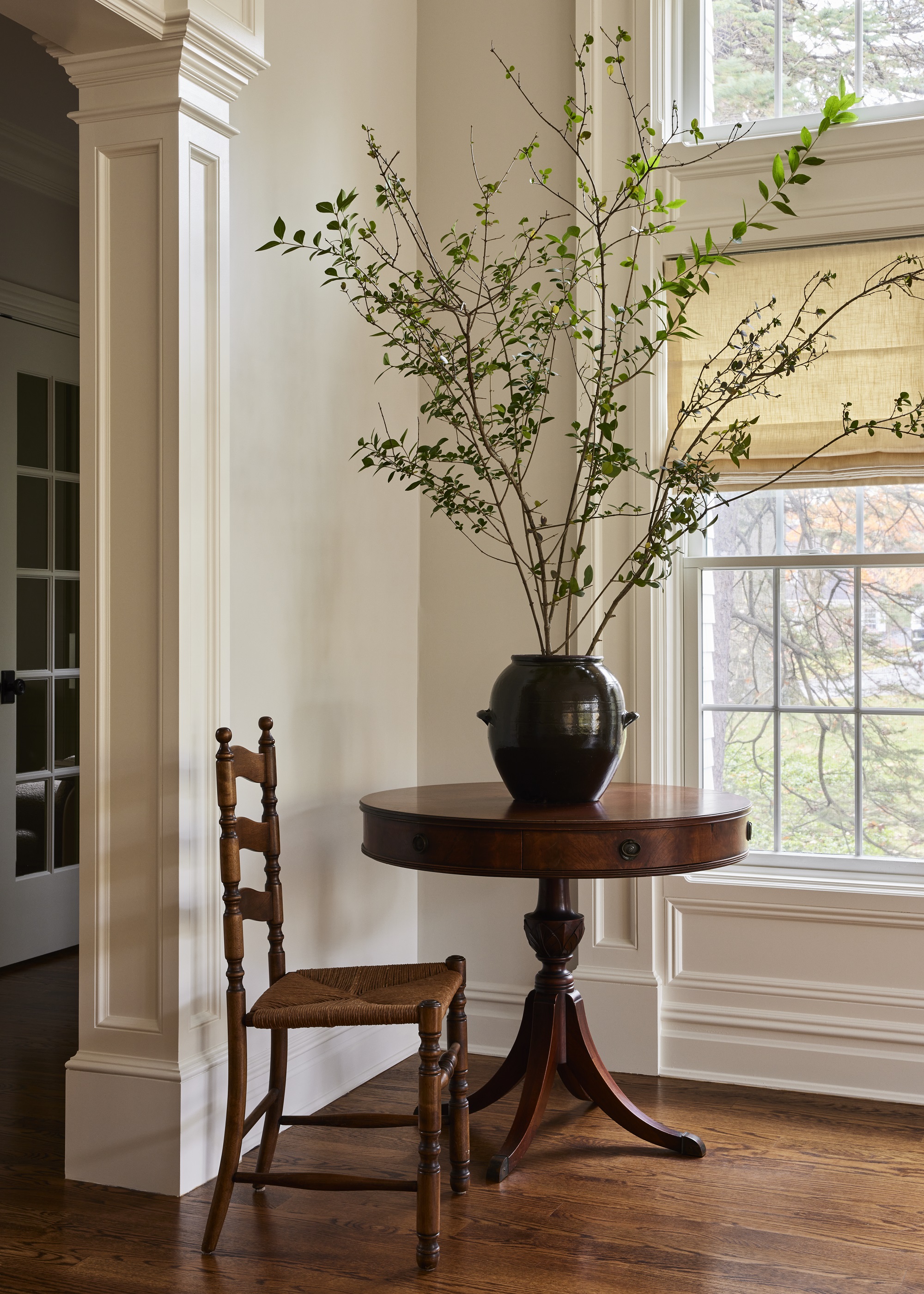
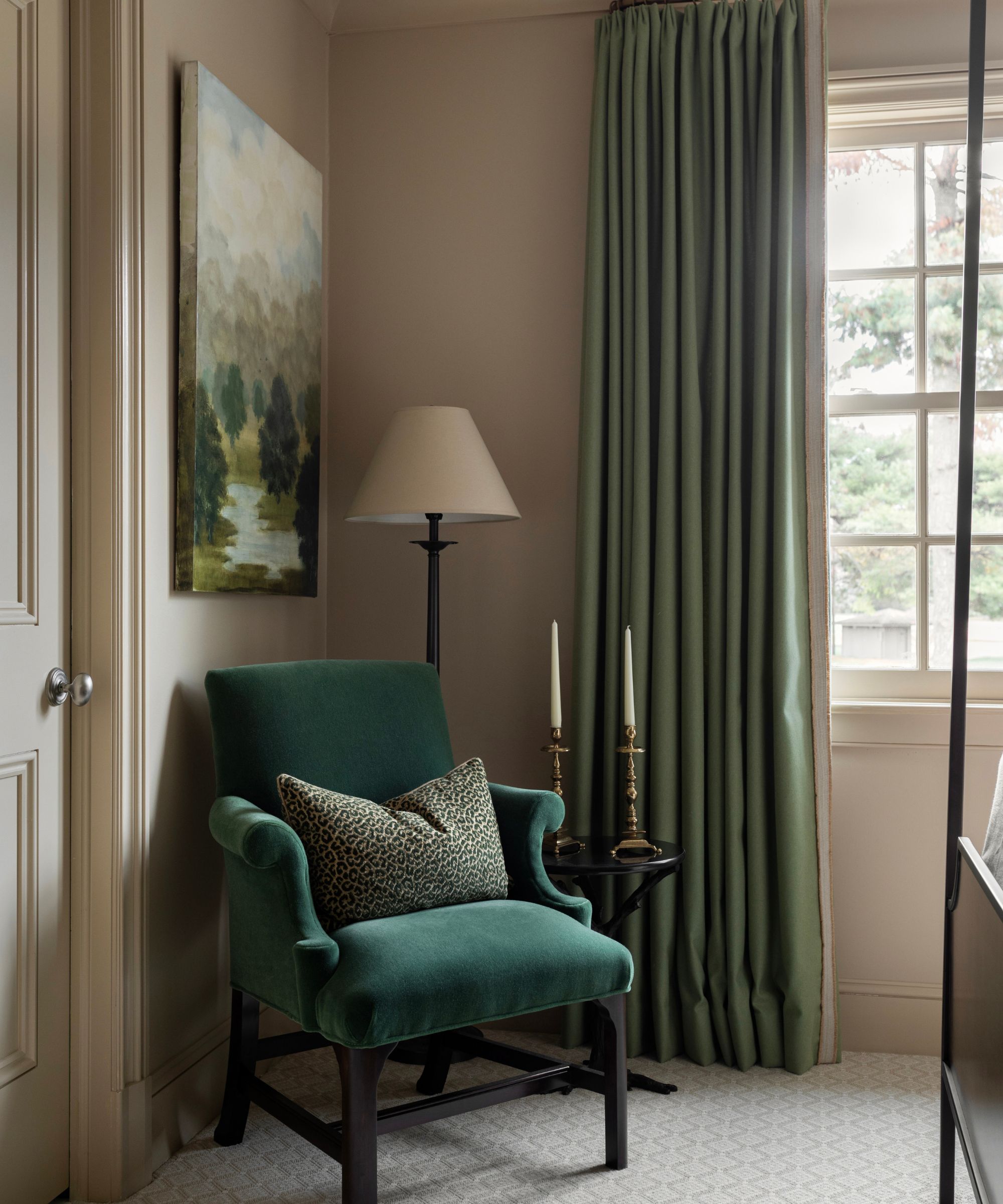
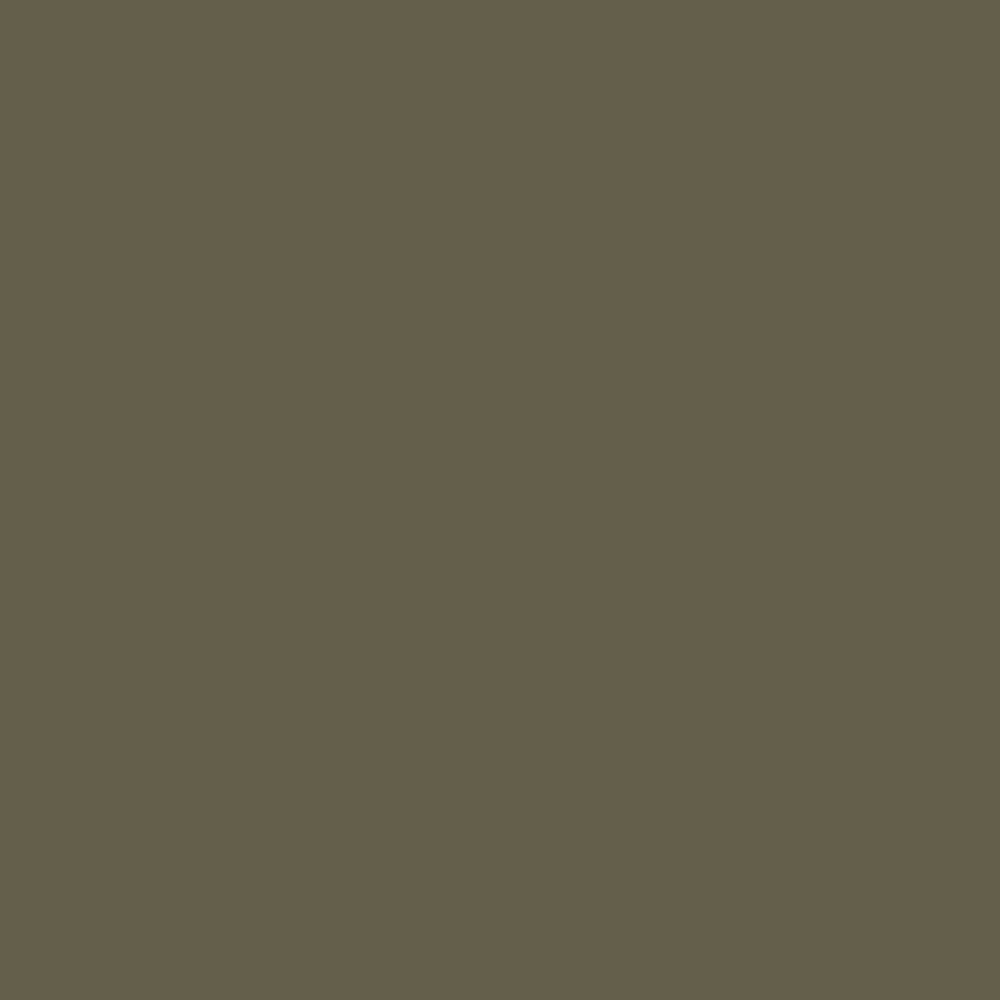
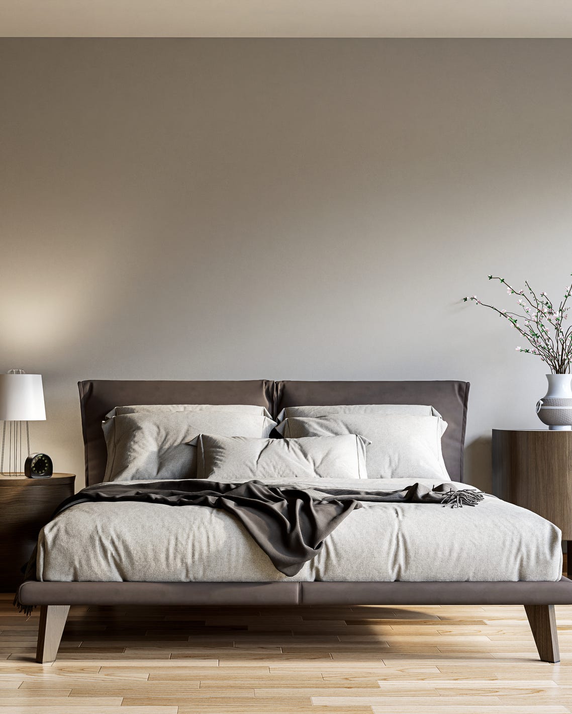
Furthermore, the article identifies a shift from cool-toned grays to taupe. Historically, cool-toned grays, often labeled as ‘millennial gray,’ have been a subject of debate due to their potential to make spaces feel cold and unwelcoming. Monica Breese, founder of The Designed Domicilio, declares that “Taupe is the new grey,” emphasizing its earthy variation of browns and grays. Taupe offers a warmer and more versatile neutral option that is suitable for a wider range of homes and design styles. Pairing taupe with other earthy neutral tones, as part of a relaxed color palette, can contribute to a richer and more inviting atmosphere.
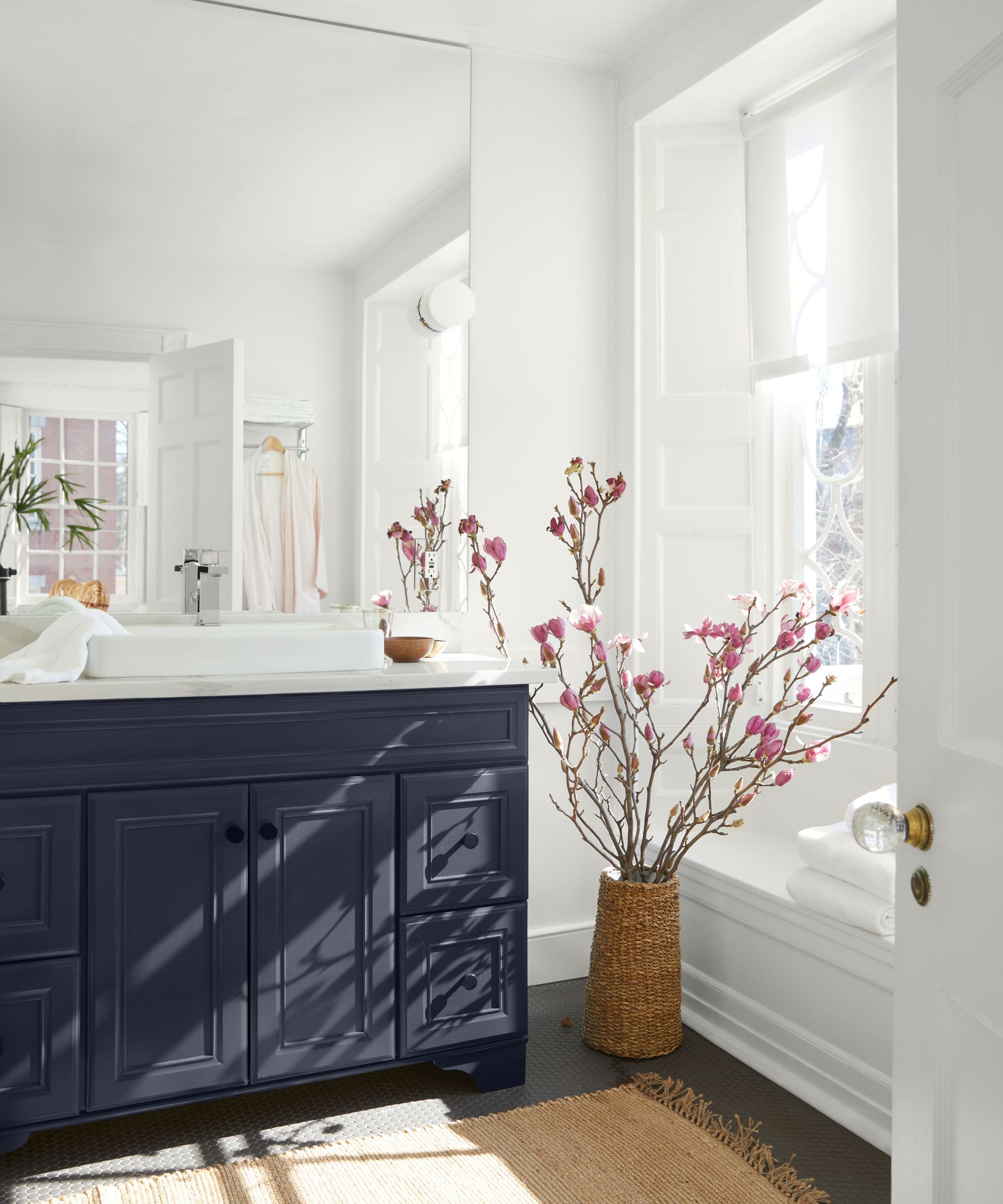
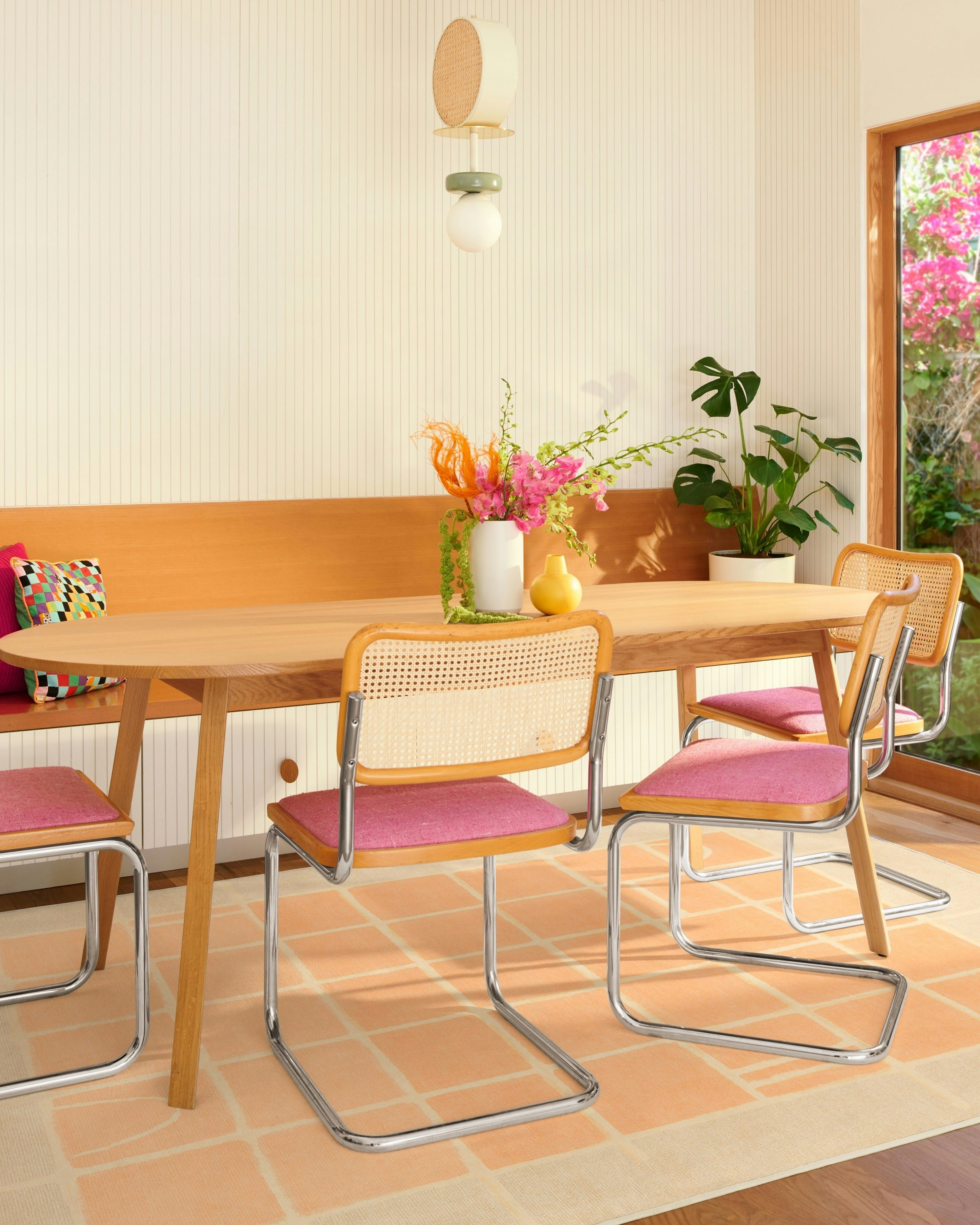
The article also addresses the enduring relevance of white walls. White remains a fundamental choice for creating a clean and bright foundation in a home. To prevent white rooms from appearing sterile or clinical, the recommendation is to integrate earthy neutrals as complementary elements. Mixing different tones of white and beige, alongside grounded earthy tones, can create a harmonious and sophisticated scheme. For instance, a fresh white backdrop can be dramatically contrasted with black statement features, as illustrated by a living room design by Ali Budd, demonstrating how to achieve balance and visual interest within a predominantly neutral space.
#NeutralColors #InteriorDesignTrends #WallPaint #EarthyNeutrals #ColorPalette #Taupe #HomeDecor #DesignTips #NeutralColors #InteriorDesignTrends #WallPaint #EarthyNeutrals #ColorPalette #Taupe #HomeDecor #DesignTips
0 تعليق إجمالاً
 لا توجد تعليقات بعد
قد تعجبك أيضًا
Interior Paint Colour Trends 2024: 14 influential shades to inspire our homes

These 5 Paint Color Trends Will Be Everywhere in 2024, According to Interior Designers
Paint colors going out of style in 2025

These Were Our Editors' Favorite Paint Colors and Trends of 2024

The 20 Best Neutral Paint Colors for Your Home in 2025

5 Paint Colors Going Out of Style in 2025 — And What You Should Replace Them With Before Then
The 8 Best-Selling Paint Colors of 2024: Greens, Whites, and Neutrals
Which Neutral Is Replacing White in 2025? Experts Reveal
What color is replacing white? Interior designers prefer this neutral for 2024
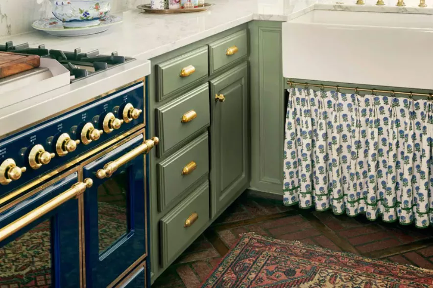
The ‘New Neutral’ Paint Color Everyone Is Adding To Their Homes In 2025, According To Designers
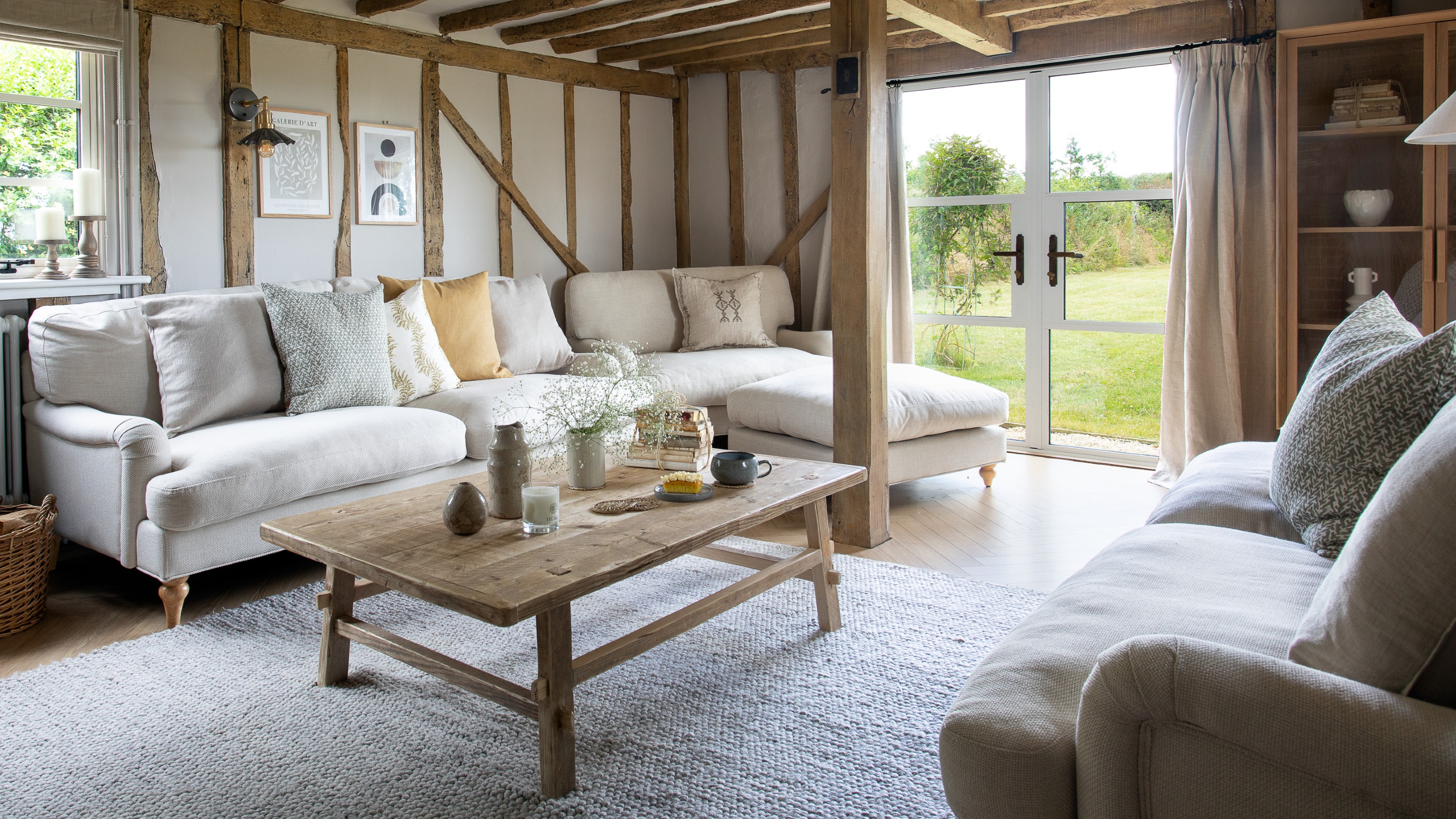
What’s replacing beige in 2025? Last year's go-to neutral is taking a back seat in favour of these two new earthy colours
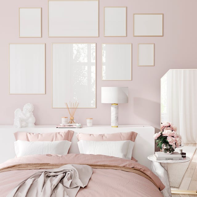
Here Are the Most Popular Bedroom Paint Colors for 2024

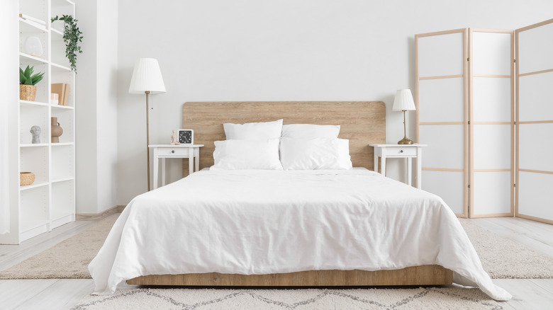
Say Goodbye To White Bedrooms — These Neutrals Will Dominate 2026 Design Trends
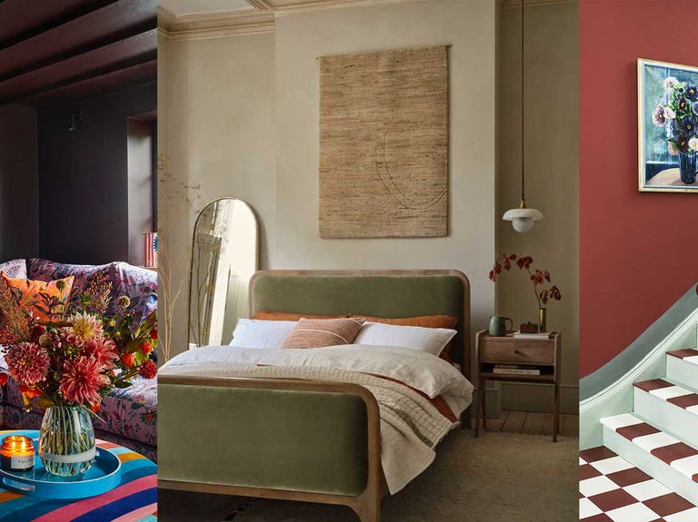
Colour experts share their top paint trends for 2024


Ready for a Fresh Coat of Paint? Check Out the Top Colors of 2024

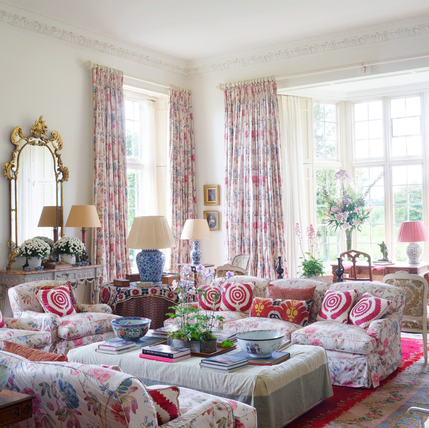
These 8 Color Trends Will Rule in 2025, According to Color Pros

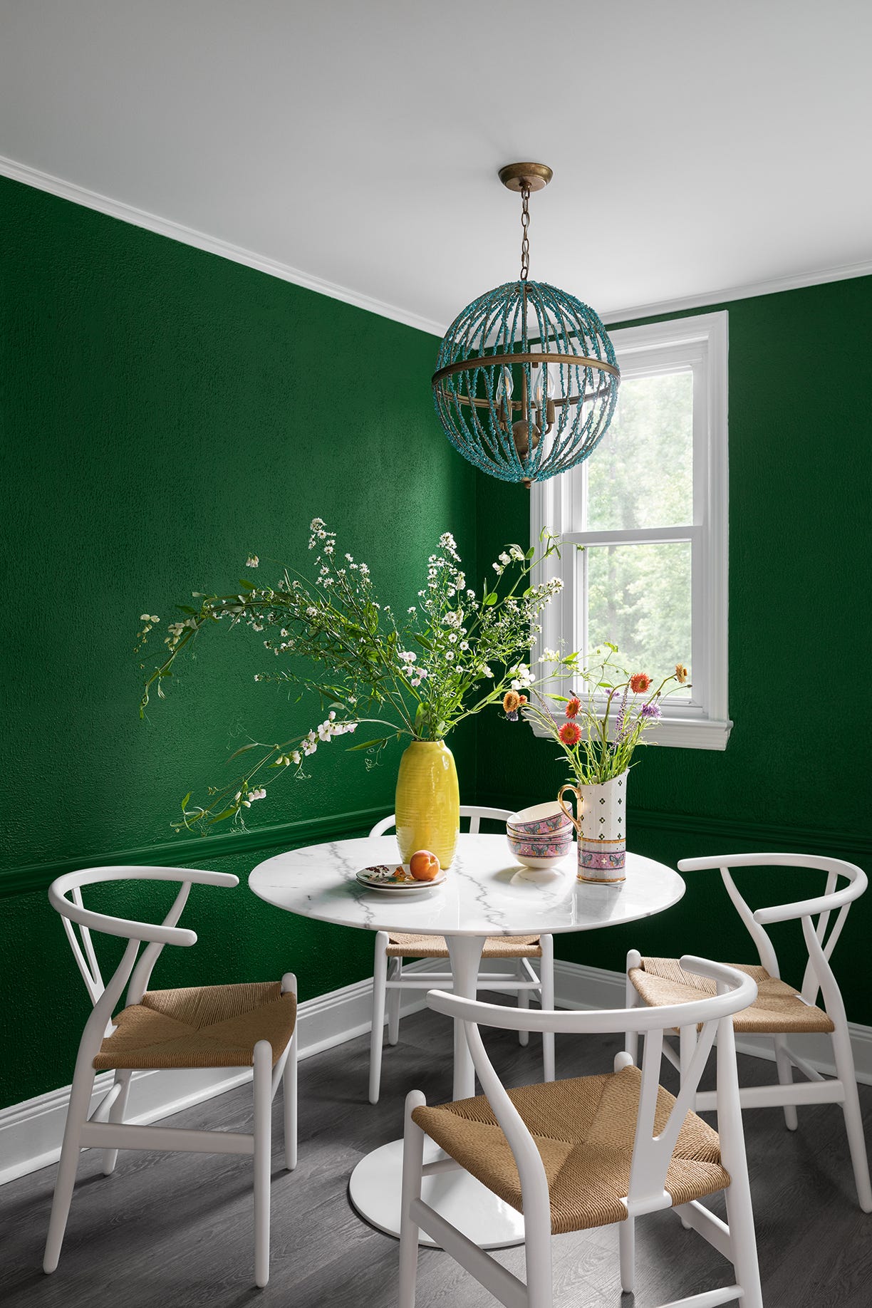
12 Trending Paint Colors for 2024, According to Design Experts

Color Explosion: 2025 Color Trends

You Should Always Paint Your Home Beige

6 Outdated Paint Colors Designers Don't Want to See in Homes Anymore in 2026