These Were Our Editors' Favorite Paint Colors and Trends of 2024
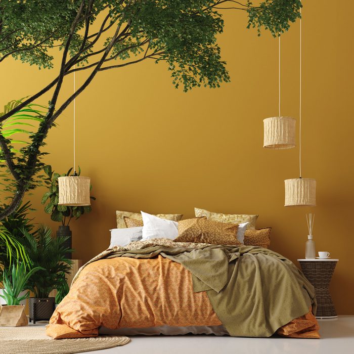
The year 2024 saw a resurgence of bold colors and patterns in home decor and fashion, with trends such as pops of red and pink, leopard print, and graphic wallpaper gaining prominence. Editors at Better Homes & Gardens embraced this shift towards color, while also acknowledging the enduring appeal of calming neutrals. Their favorite paint colors and trends for the year encompassed a range of hues, from deep, moody tones to light and airy neutrals.
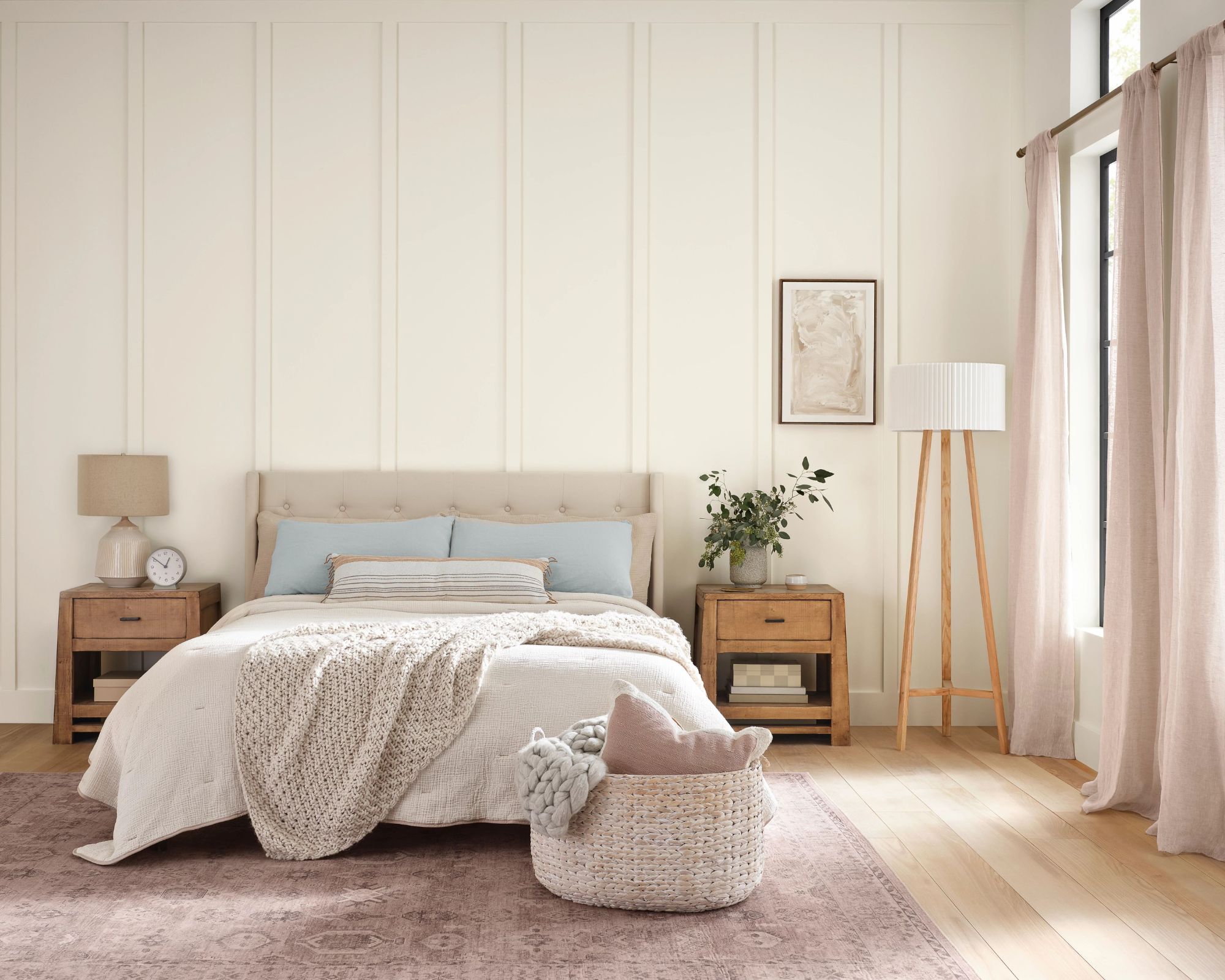
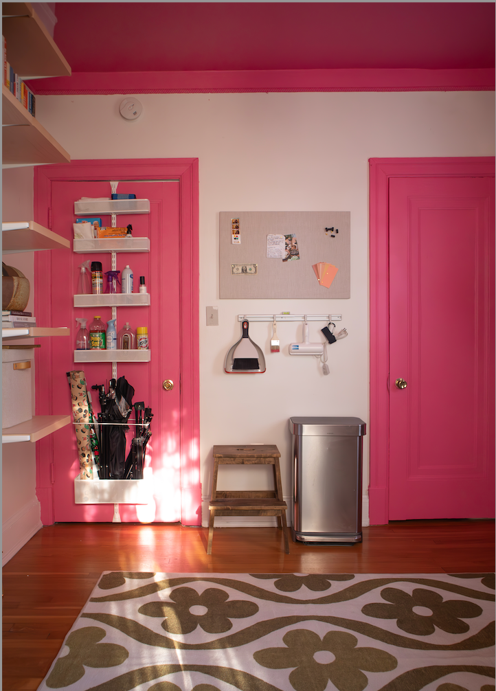
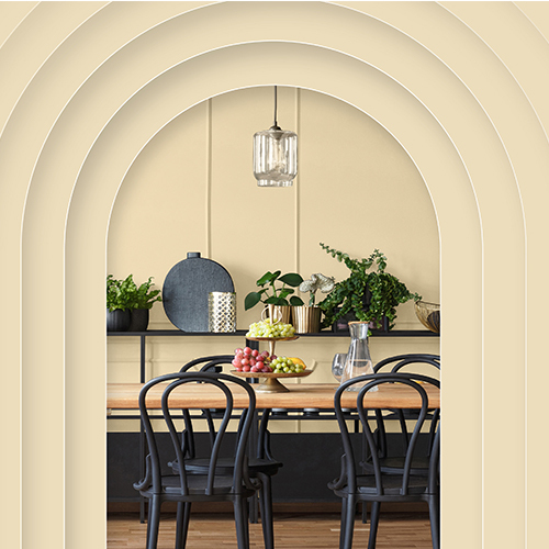
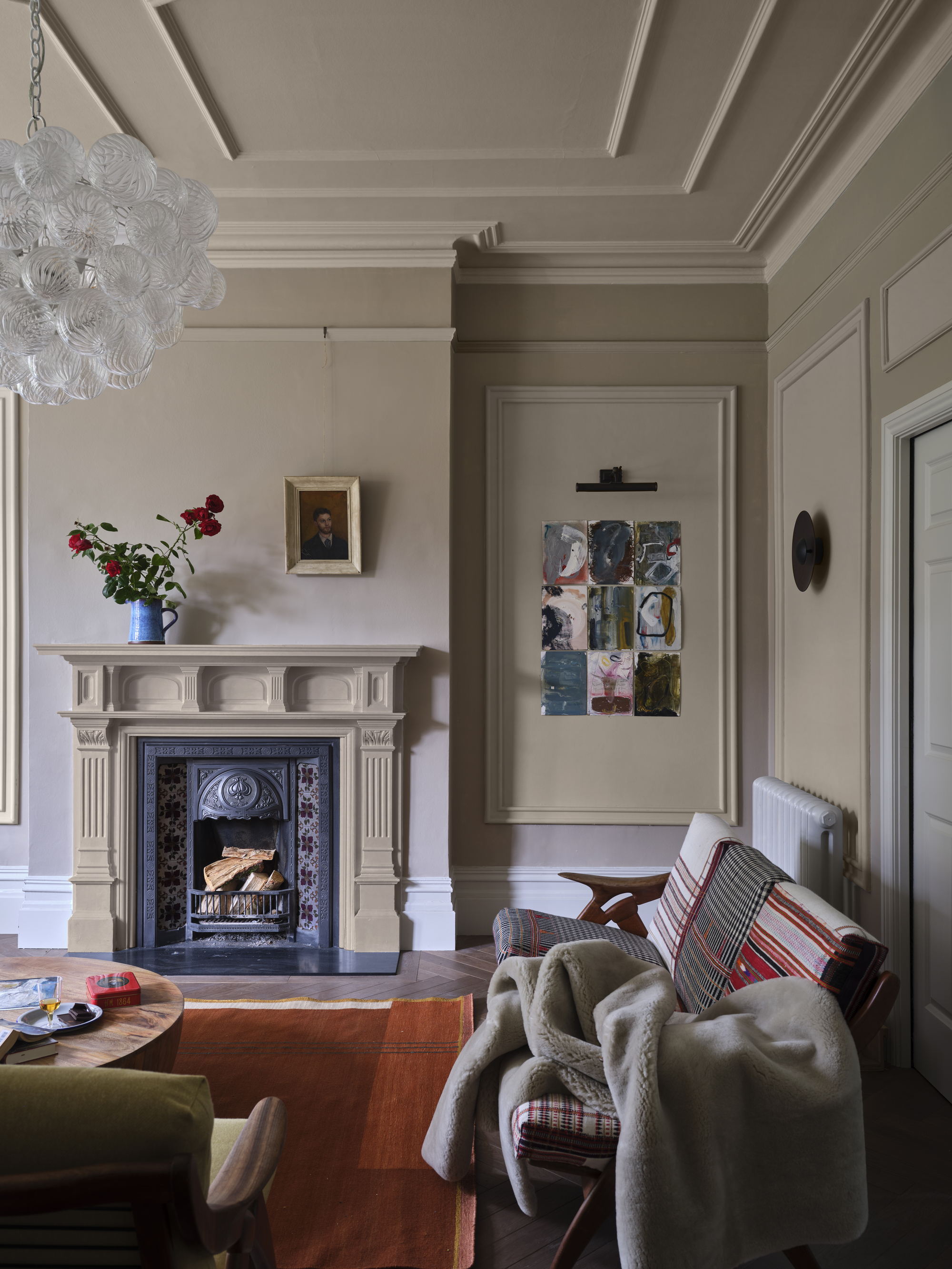
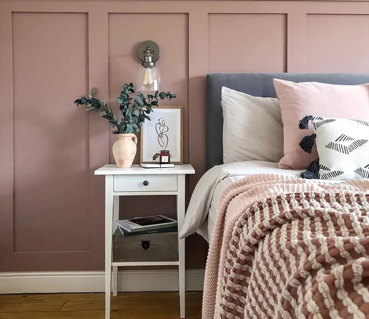
One editor highlighted Magnolia Home's 'Soft Linen' as a top pick, seeking to introduce warmth into a historically white-walled 1922 home without sacrificing brightness. This color was primarily used for trim, effectively accentuating architectural details while maintaining an open and airy feel in the main living area. Another favored shade was Farrow & Ball's 'Sulking Room Pink,' praised for its muted quality that allows it to function as an elevated neutral. This particular pink was noted for its versatility, appearing neither overtly bright nor excessively dark, making it suitable for various spaces, including as an accent wall in an office setting.
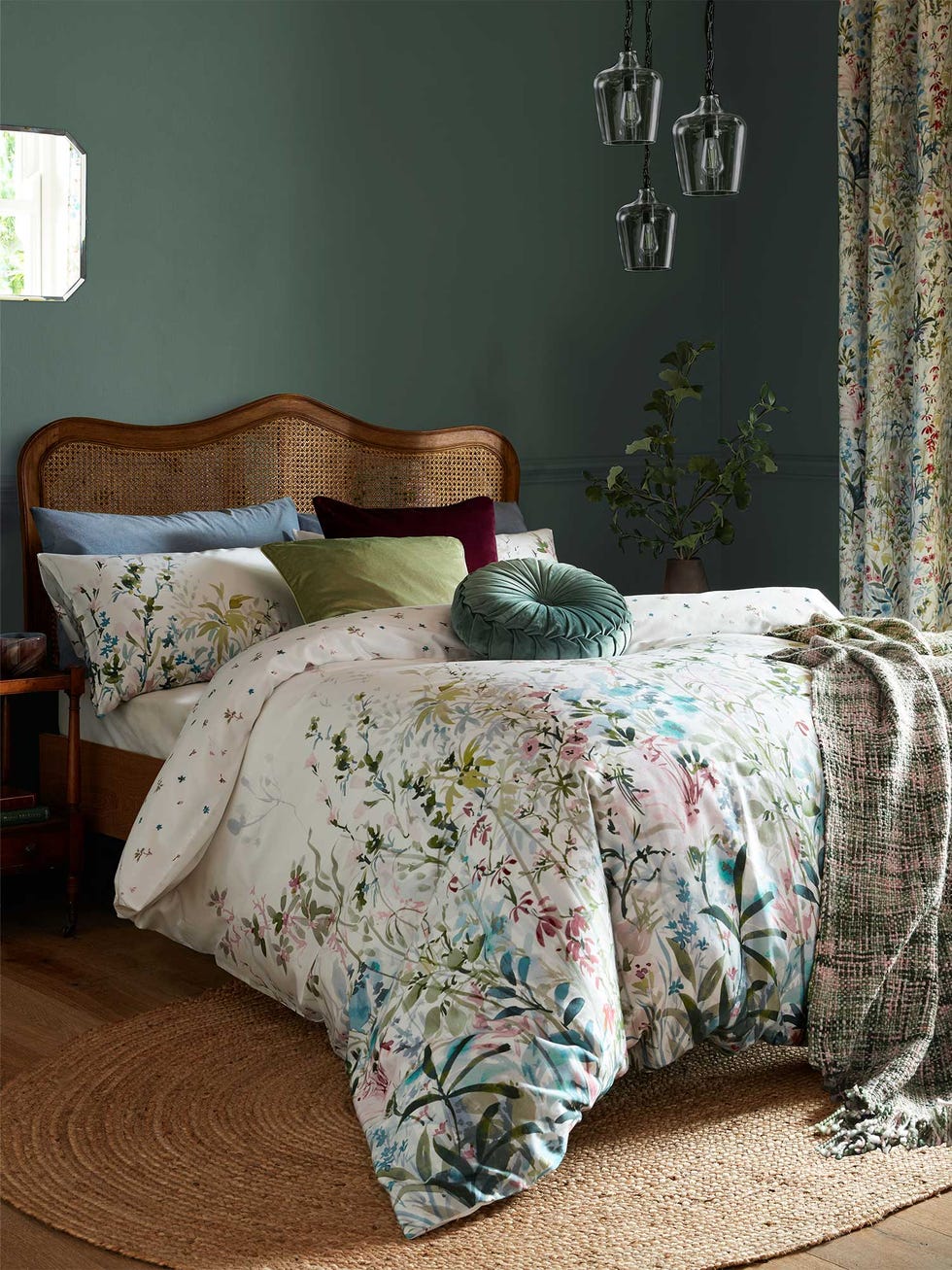
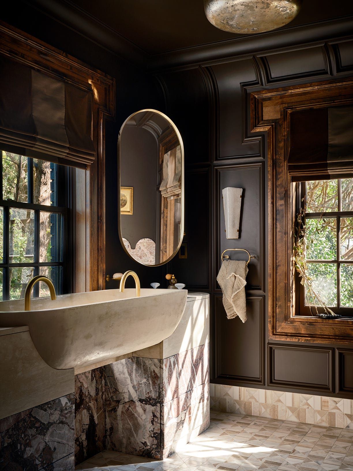
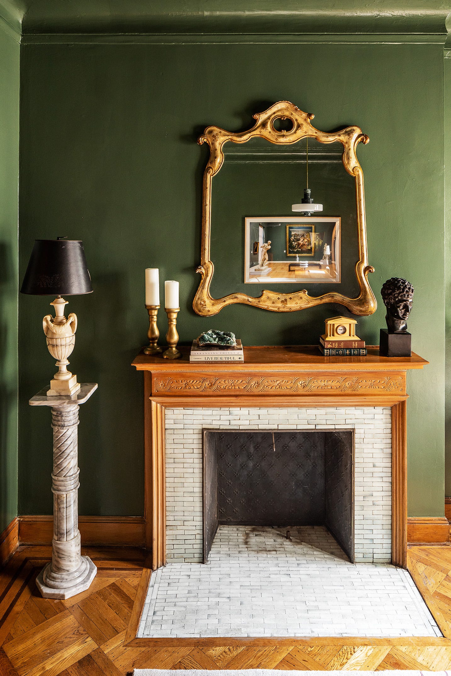
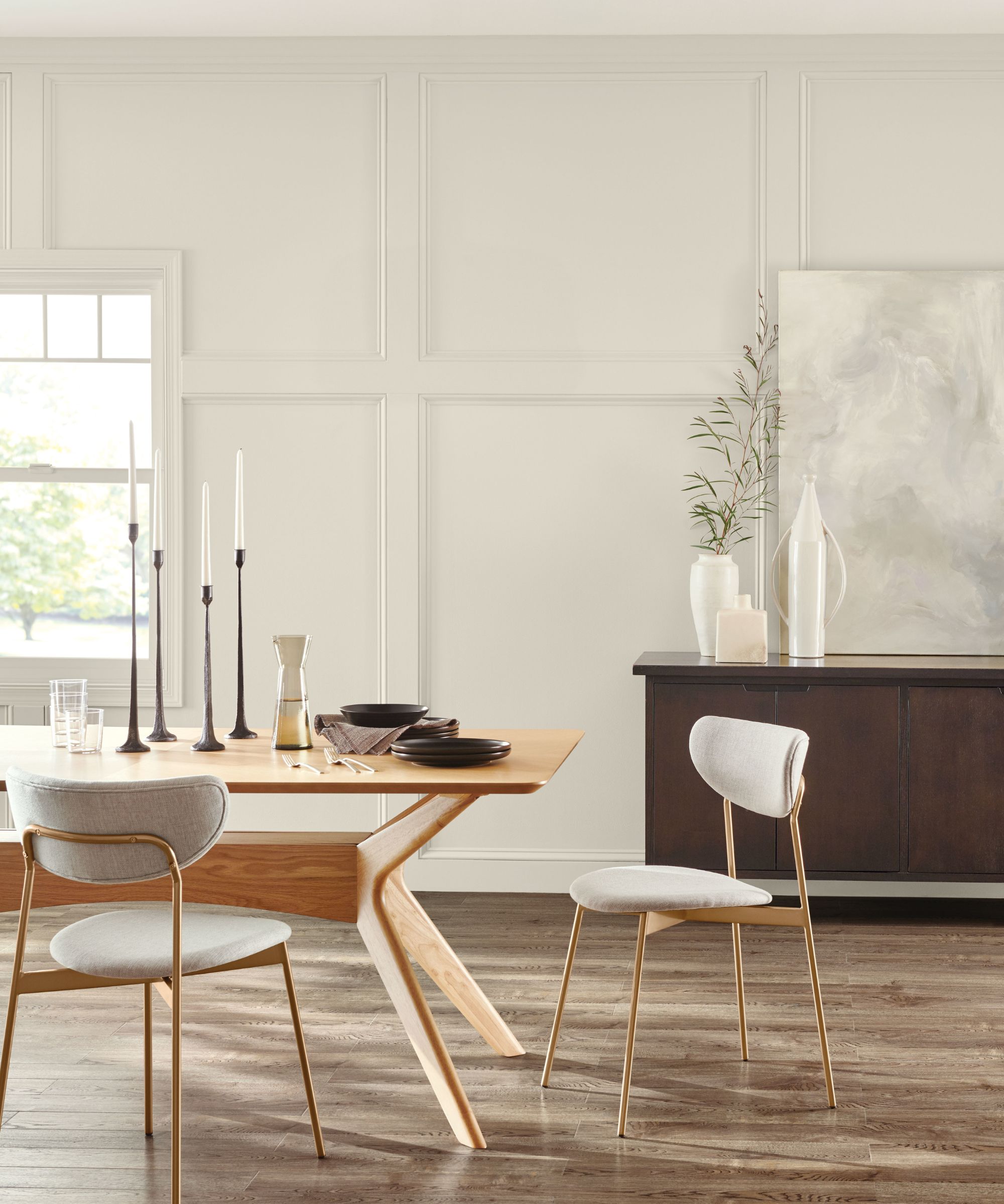
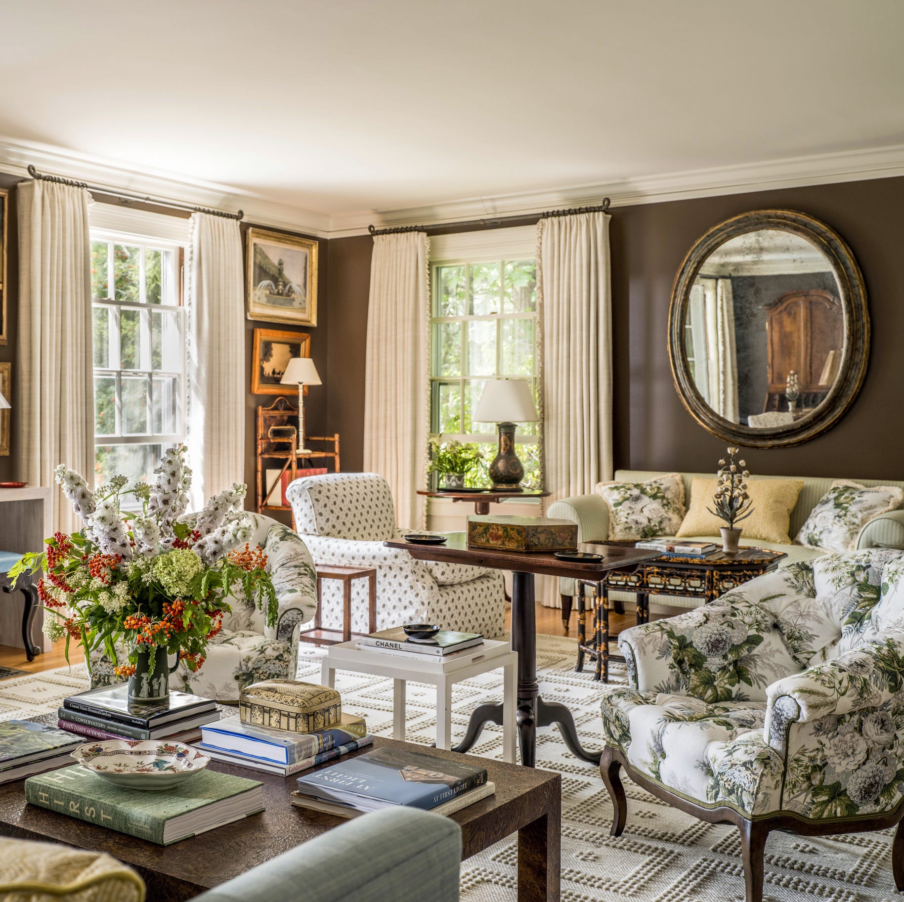
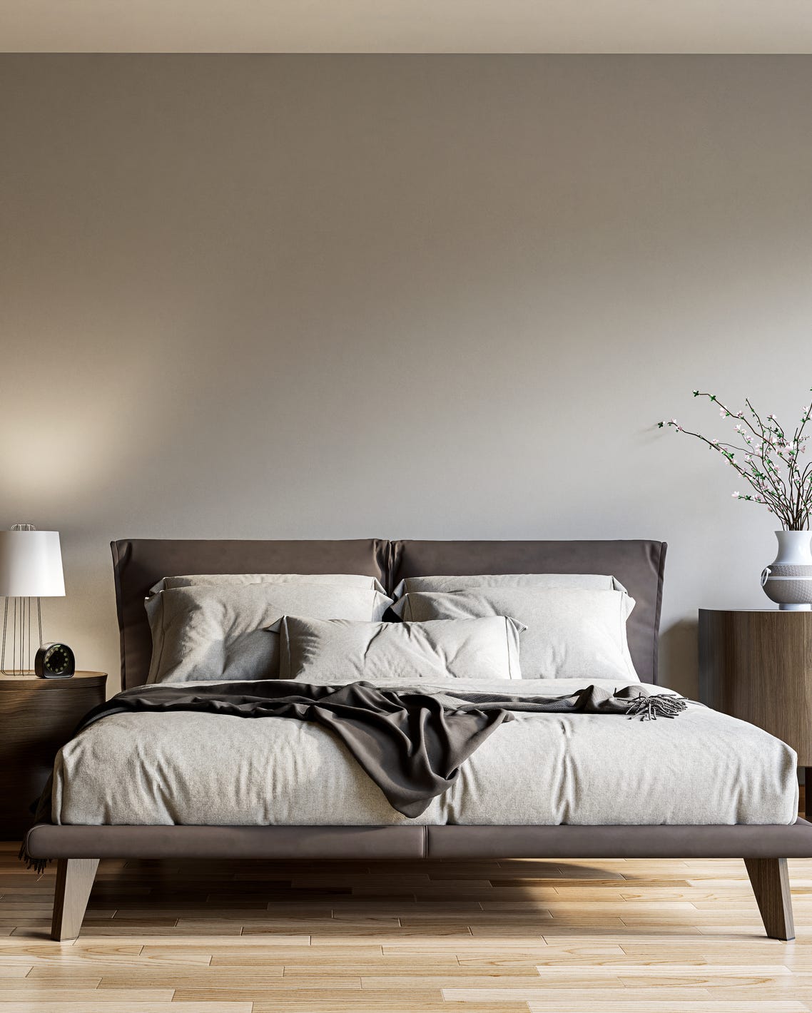
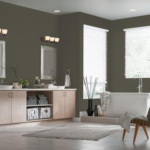

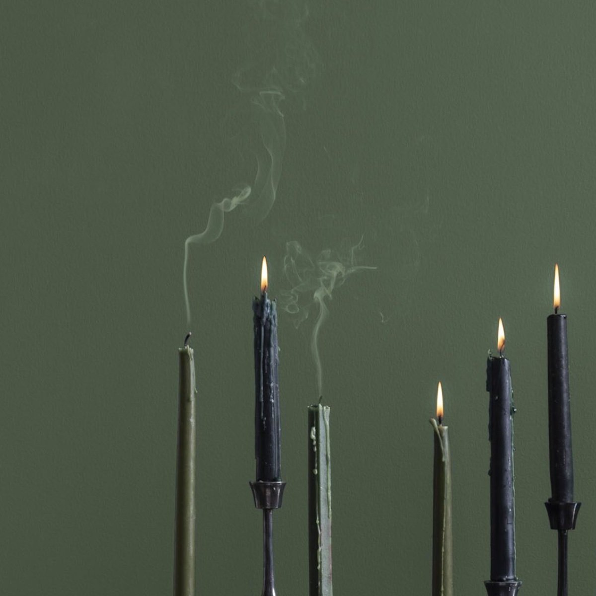
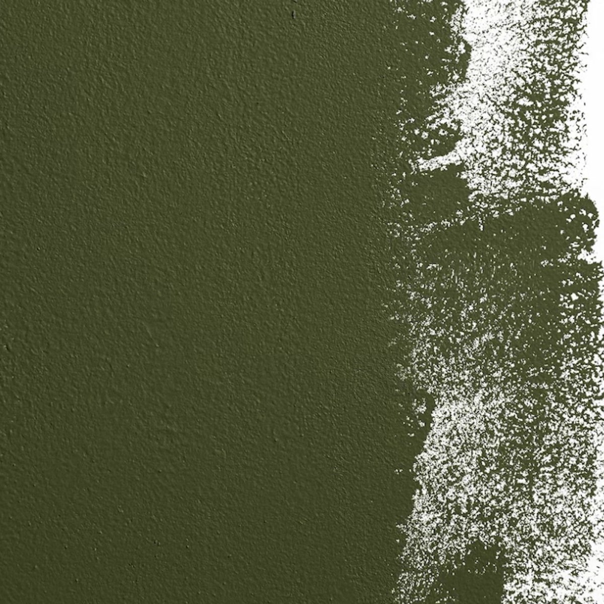
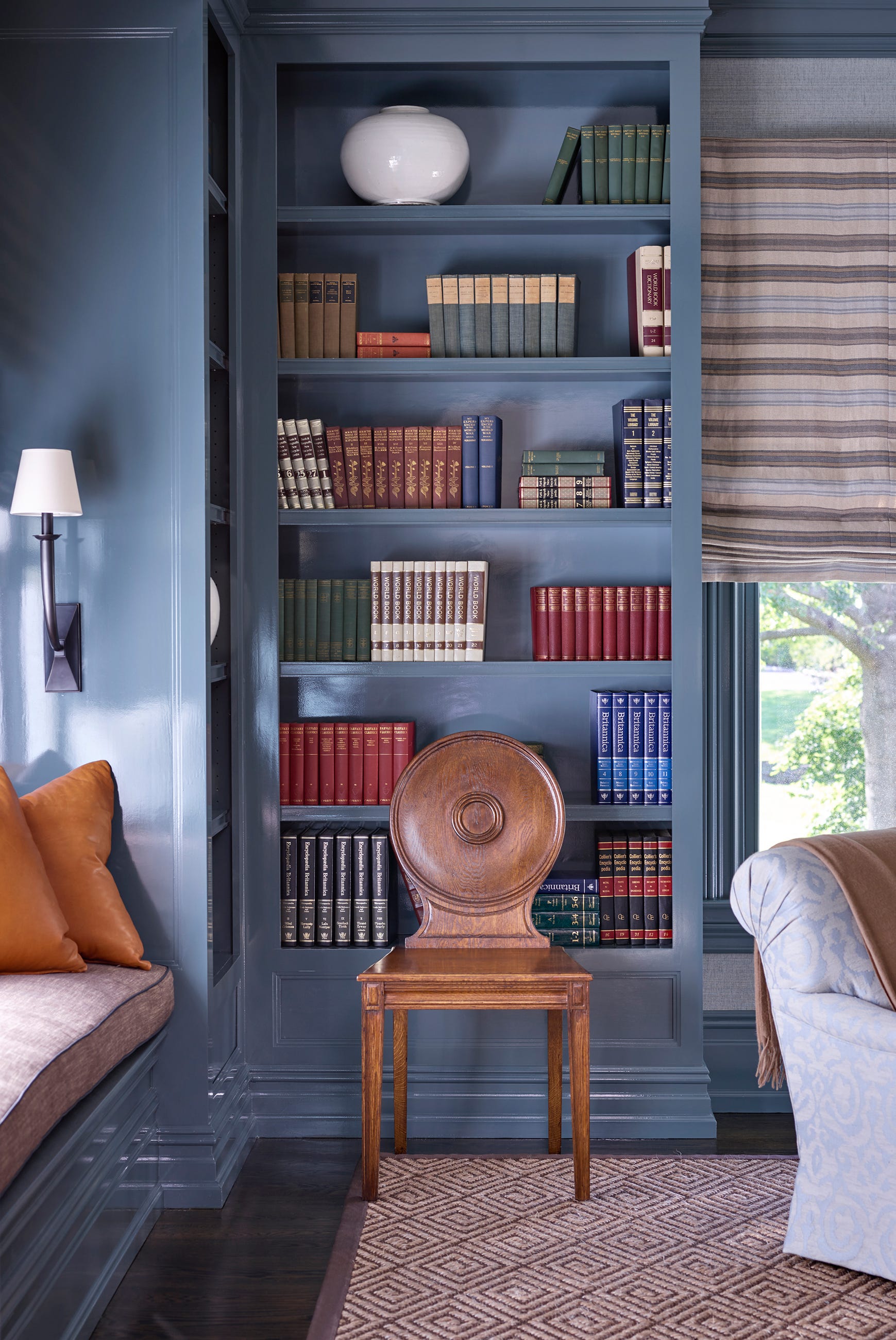

Moody paint colors also featured prominently among editor favorites. One editor, transitioning from an all-gray decor scheme, found sophistication in deep, moody shades. Specific mentions included Dutch Boy Paints' 'Ironside' for a dark green bedroom accent wall and HGTV Home by Sherwin-Williams' 'Wall Street HGSW7665' for a dusty blue bathroom, aiming to create a jewel-box effect. Complementing the warmer neutrals, Farrow & Ball's 'Slipper Satin' was chosen for its ability to provide a warm white that is neither too crisp nor too yellow, offering a rich and enveloping tone suitable for public areas in a home.
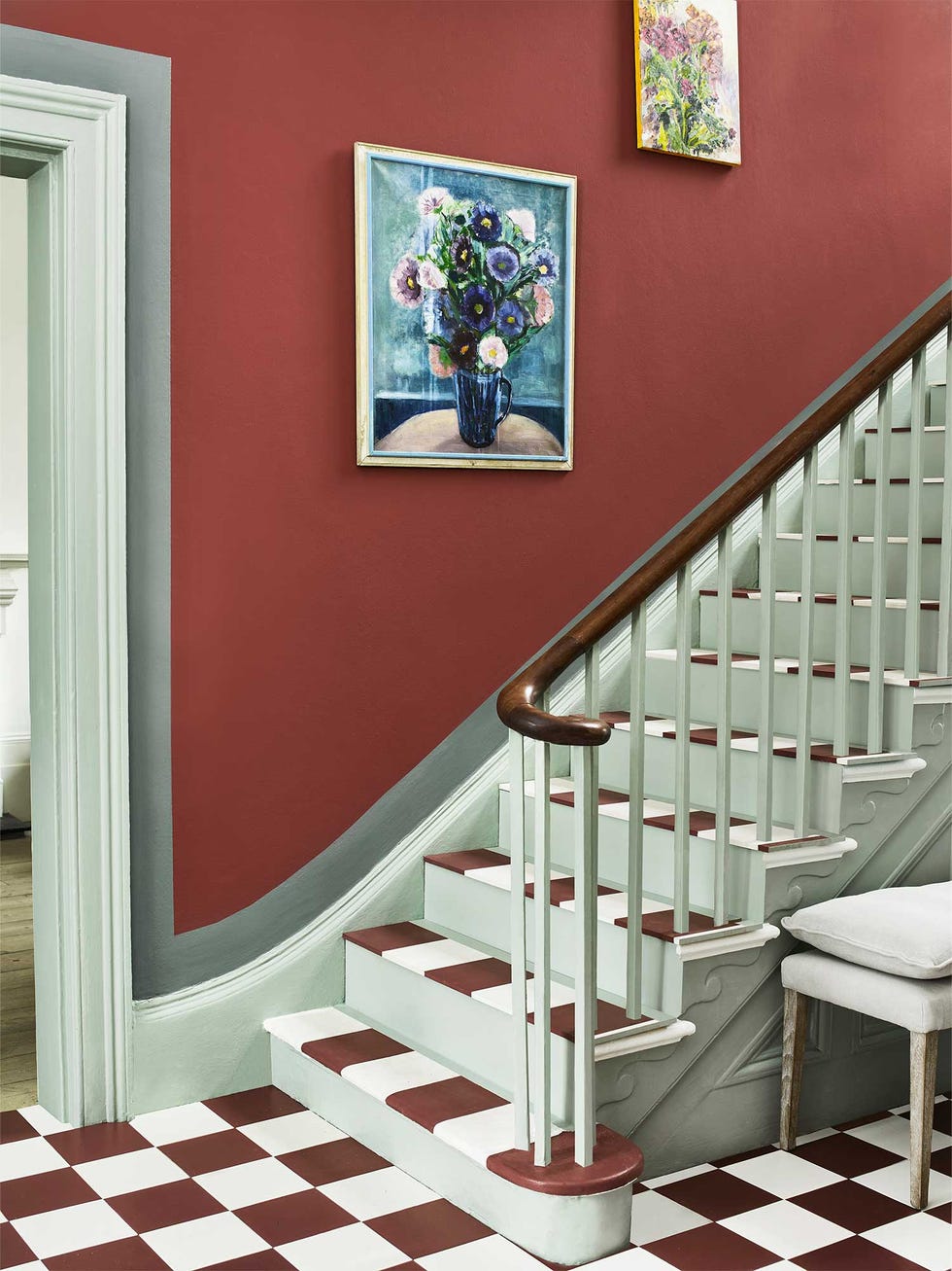
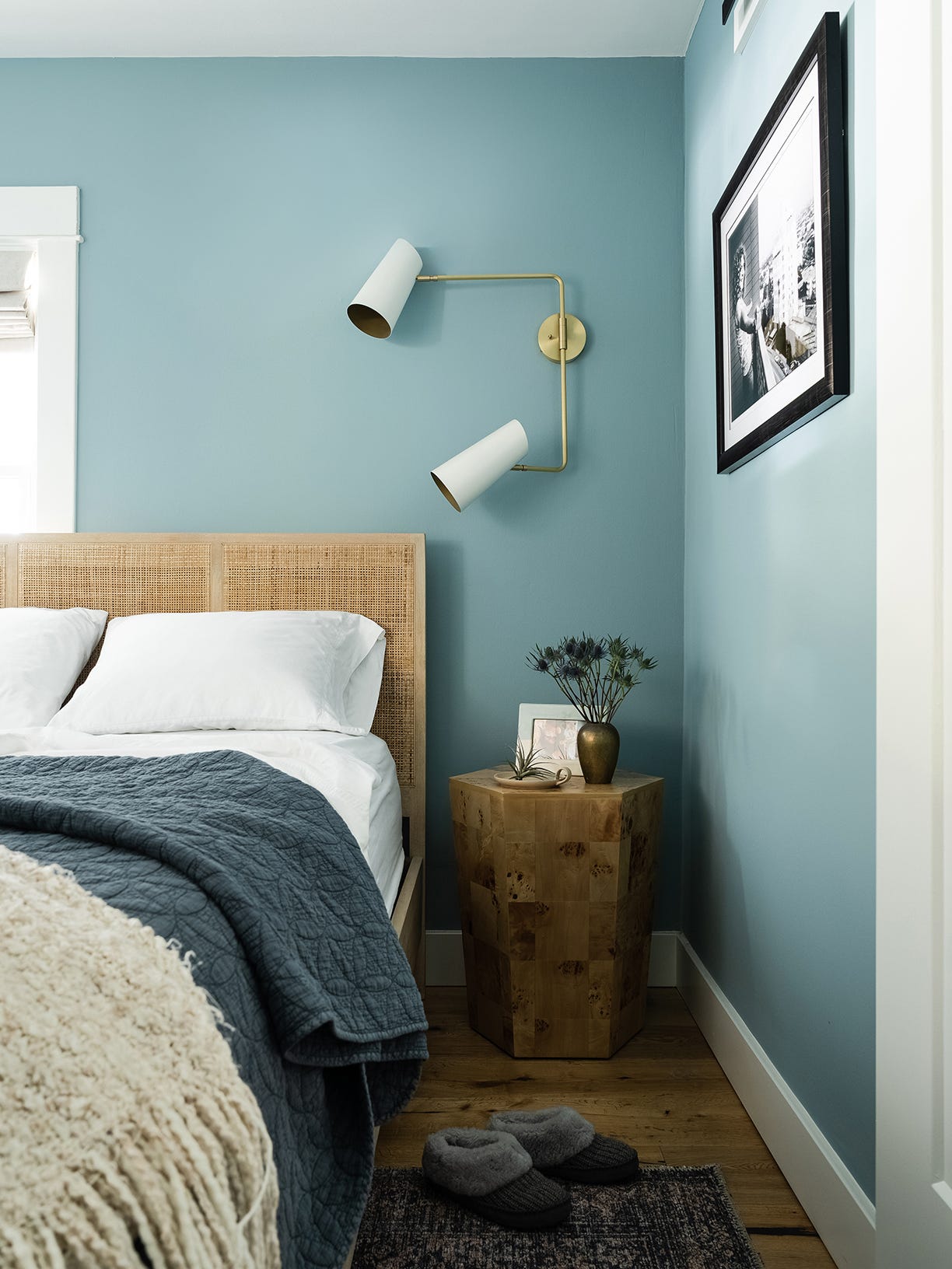
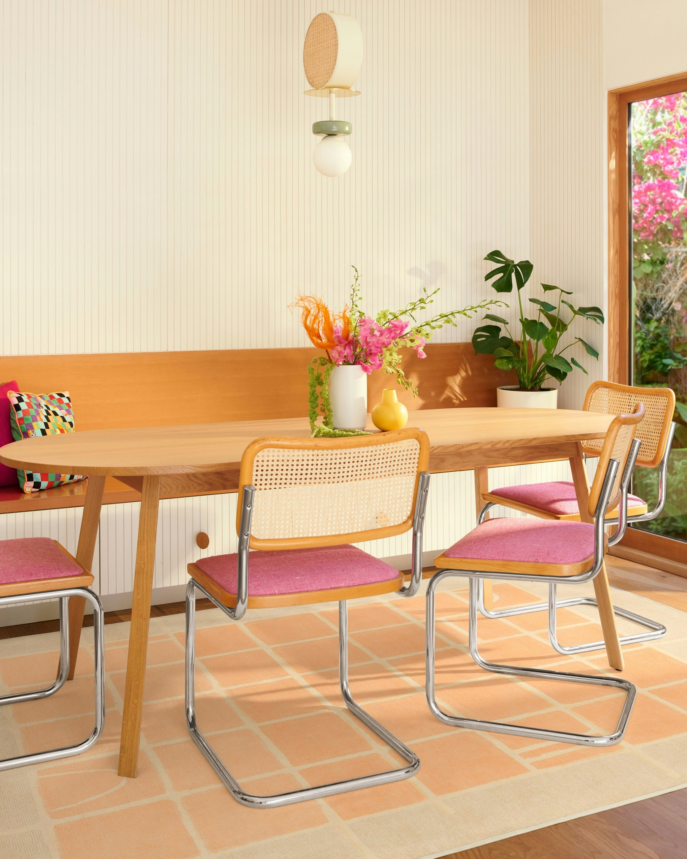
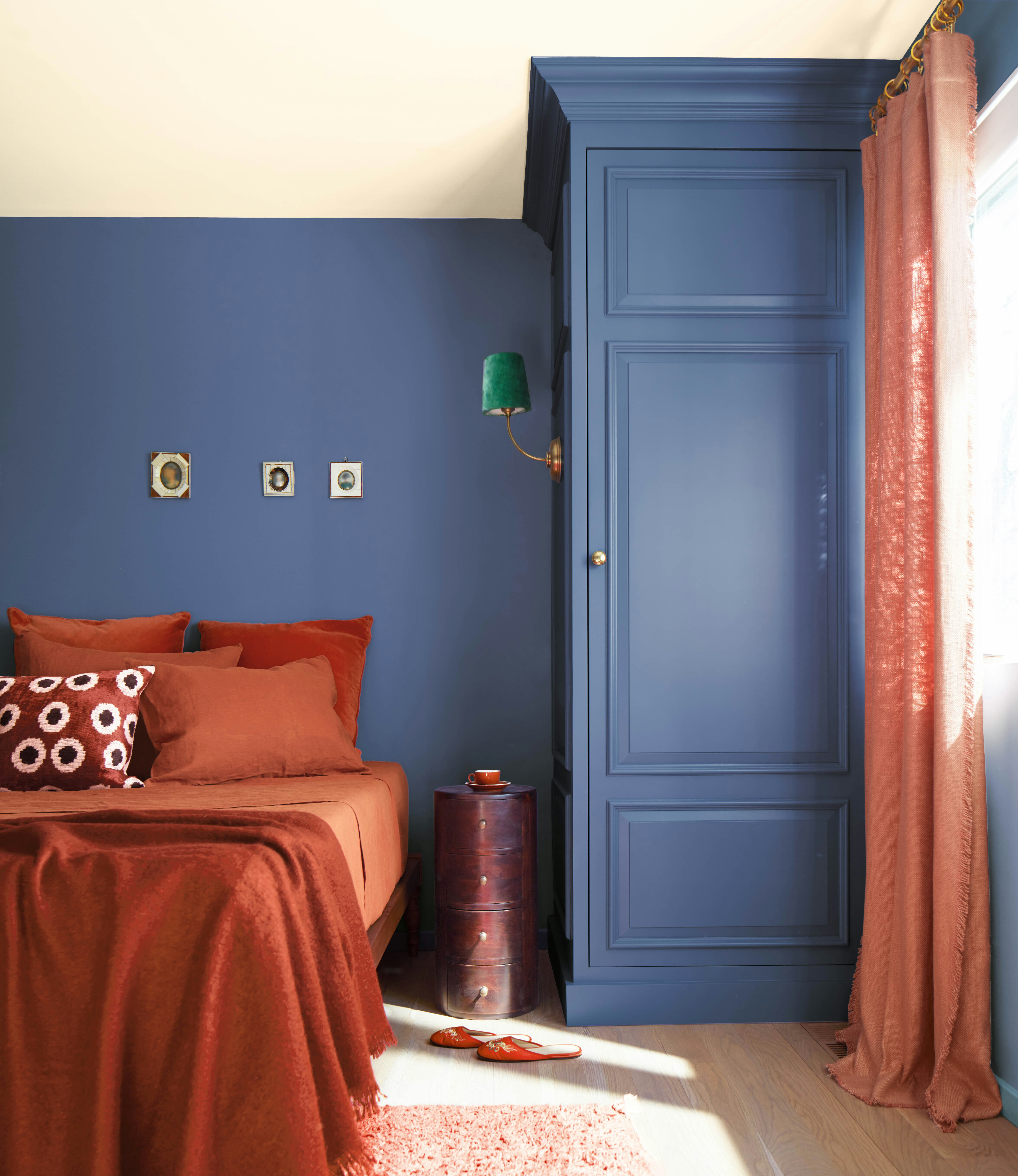
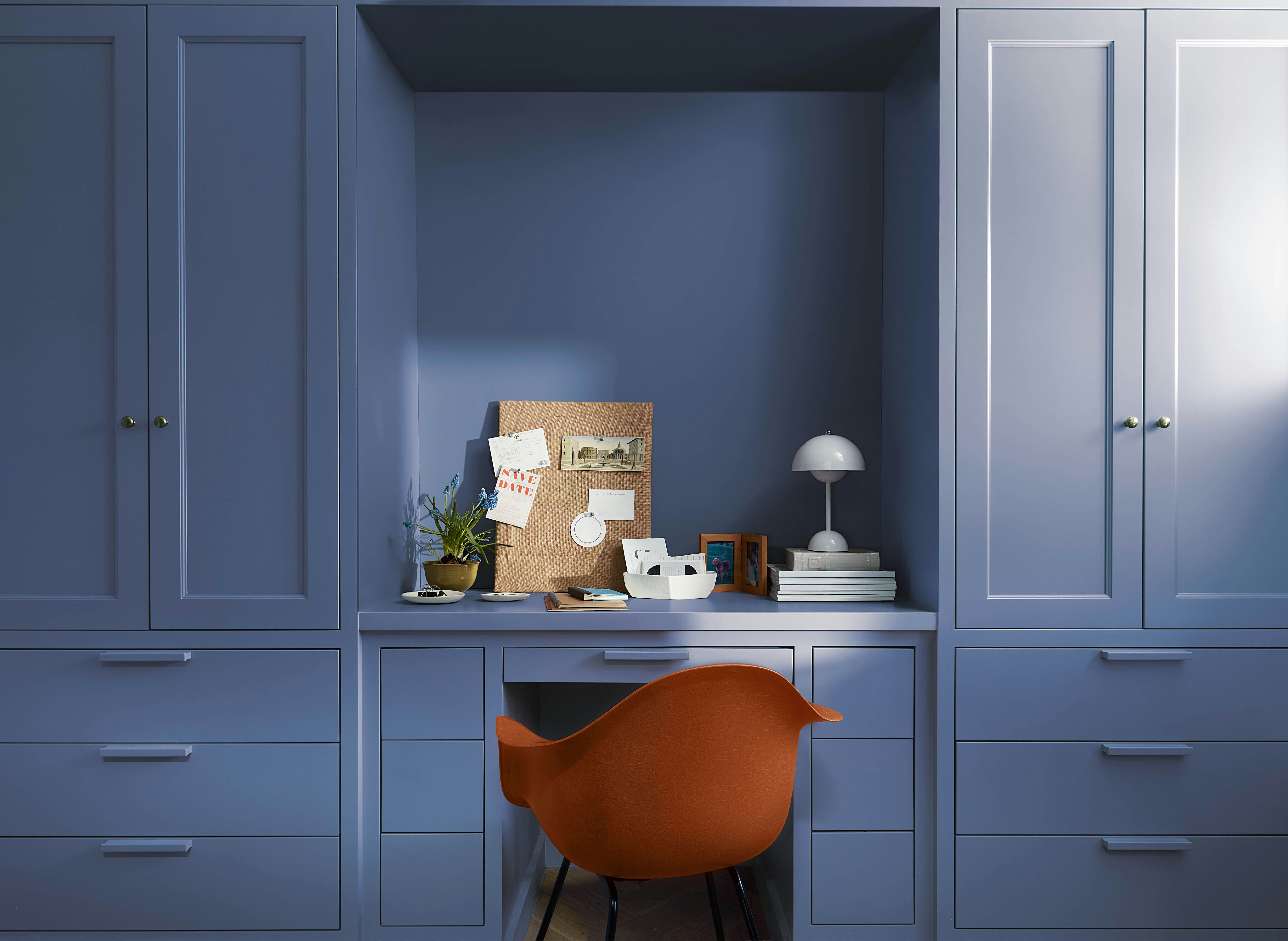
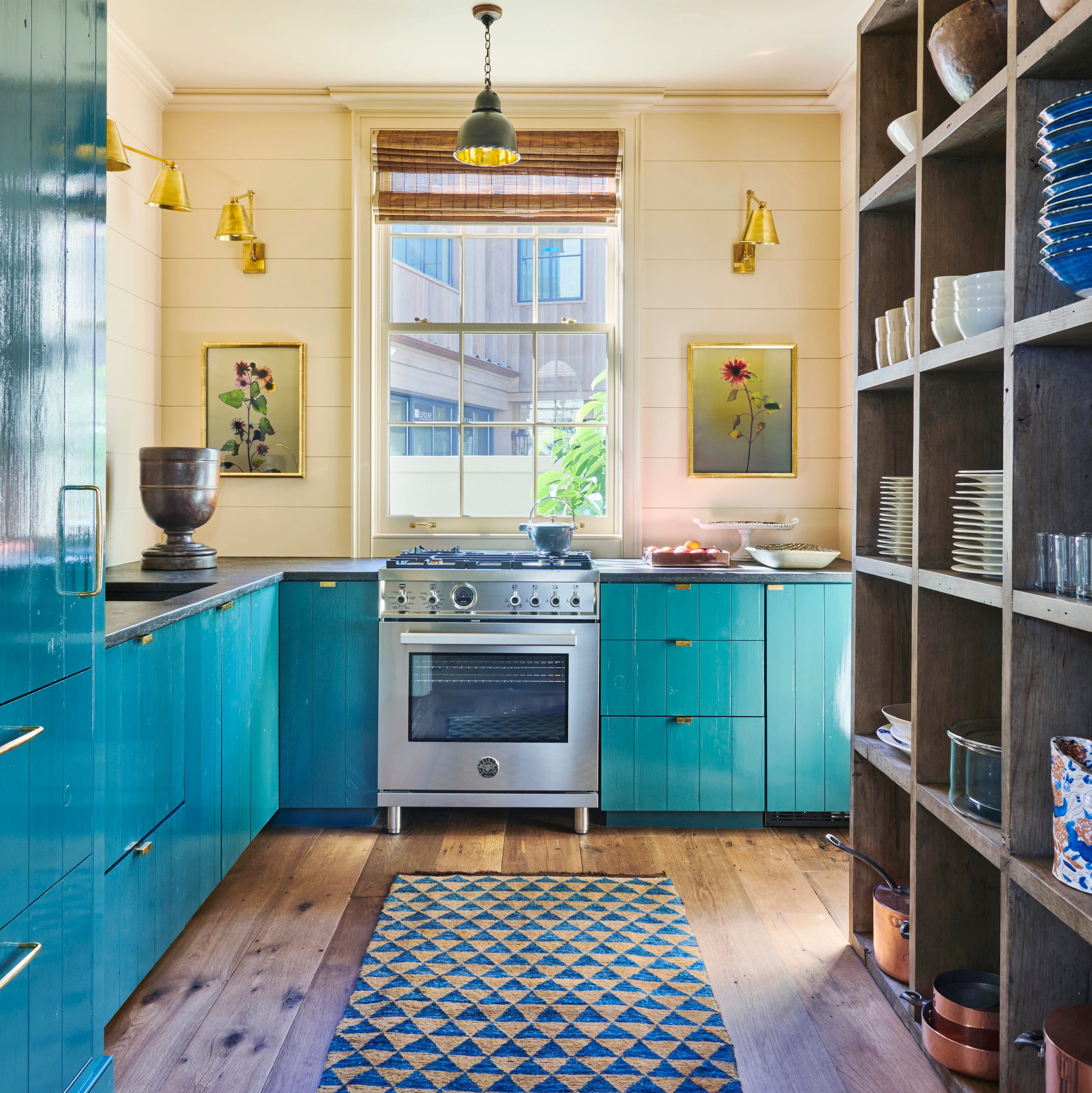
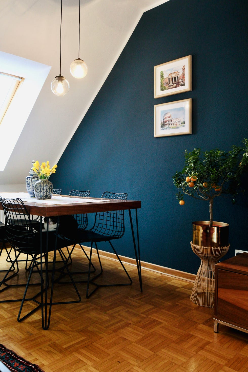
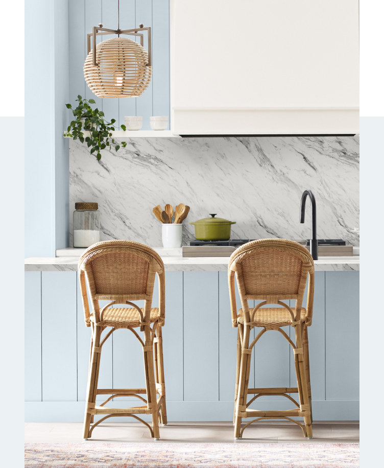
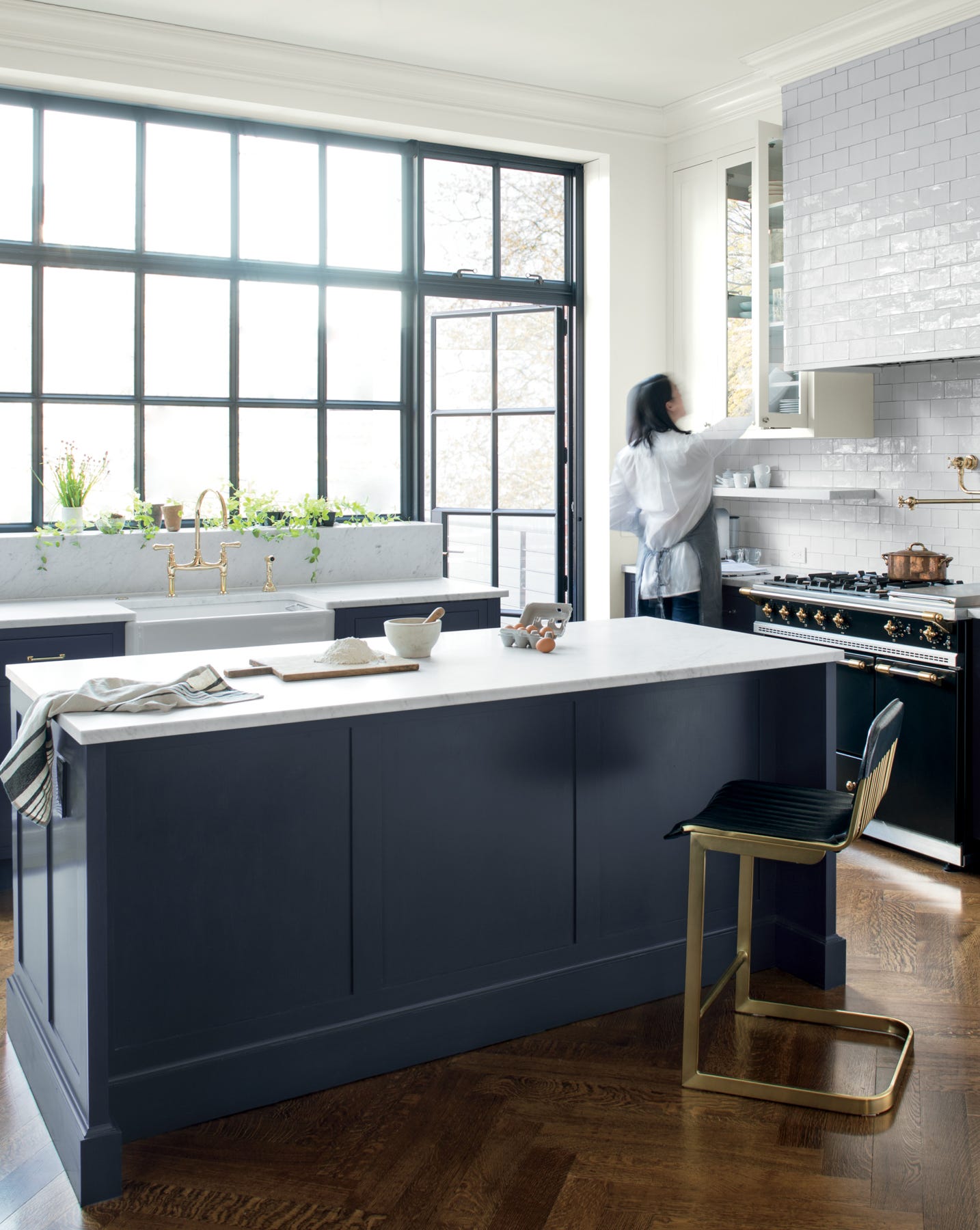
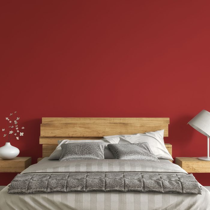
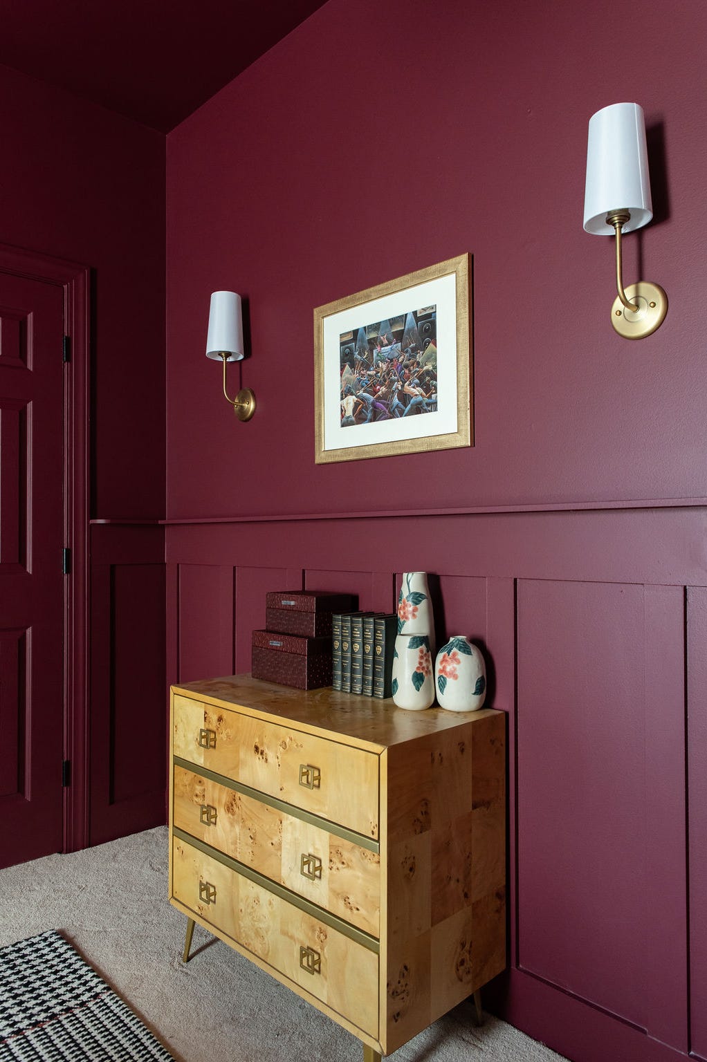
In the realm of blues, Benjamin Moore's 'Santorini Blue' was recognized for striking the right balance in a gray-blue, avoiding overly baby blue or sterile appearances, and successfully imparting a calm yet warm ambiance in a bedroom. The trend of classic red accents also made an appearance, with editors appreciating small touches of crimson on items such as dining chairs, bar backsplashes, or in entryways. Recommended red shades included Farrow & Ball's 'Incardine,' Backdrop's 'Self-Portrait,' and Clare's 'Sriracha.'
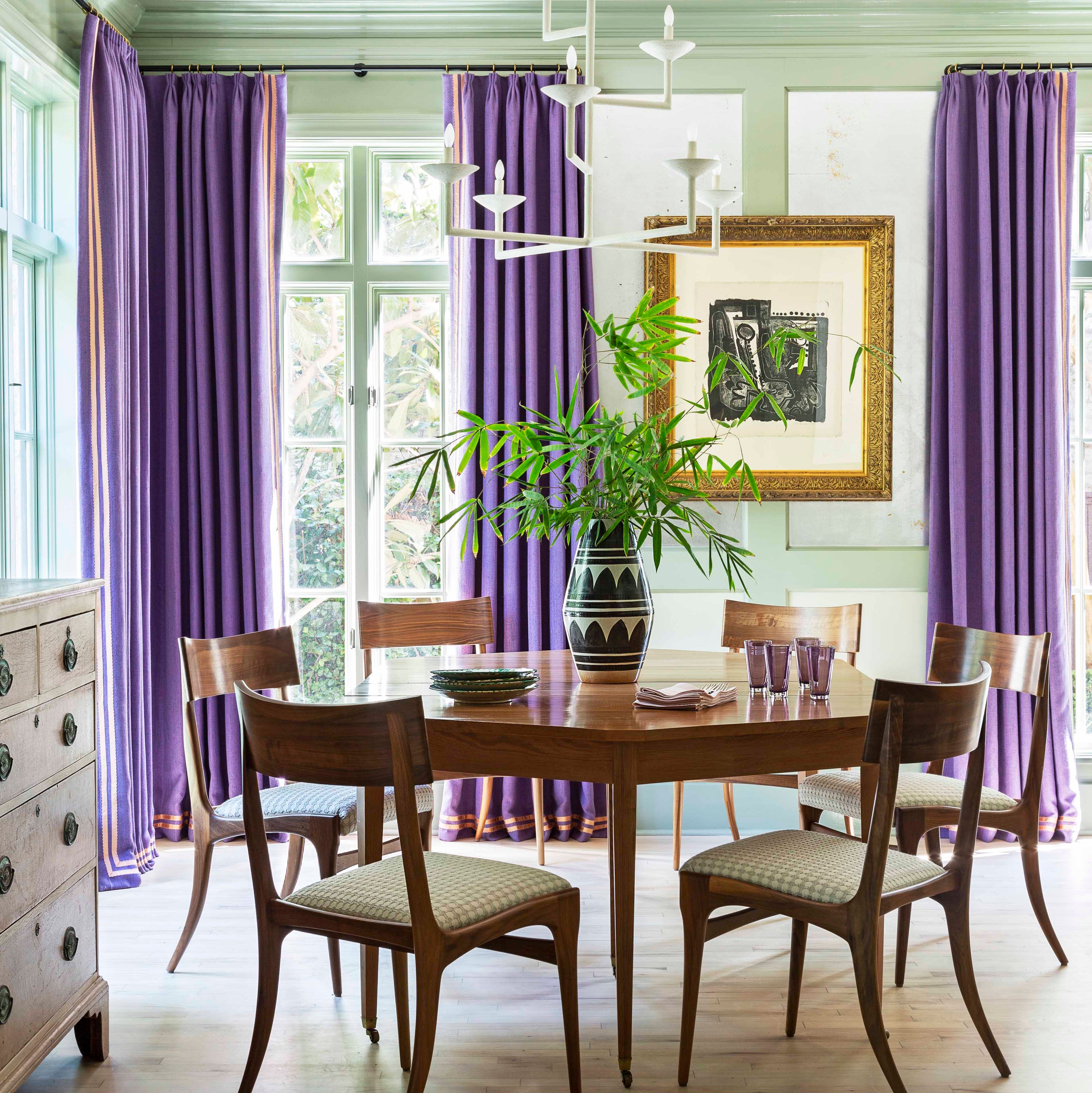
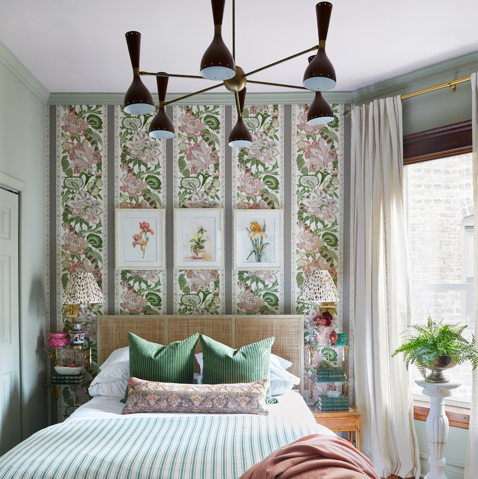
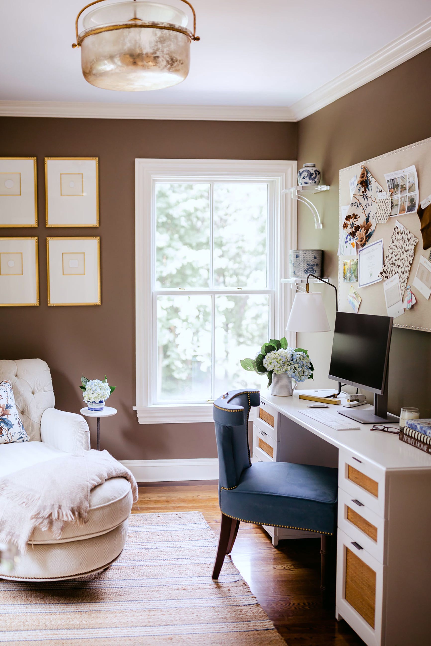
Another editor combined wallpaper with a moody paint color, using BEHR's 'Cypress Vine' for beadboard in a bathroom. This choice was specifically made to match the grayish-green base of a dramatic floral wallpaper, ensuring the paint had enough gray tones to prevent the space from feeling overwhelmed while still providing a luxurious and cozy green hue. Finally, 'Grounded' by Sherwin-Williams, a warm shade of brown, resonated with an editor who typically favors earth tones. This inviting color, influenced by anticipated 2025 color trends, was integrated into a rental space through decor accents and smaller furniture pieces, with an aspiration to eventually 'color drench' a room in it, potentially paired with 'Windy Blue.'
#PaintColorTrends #HomeDecor #InteriorDesign #NeutralColors #BoldColors #MoodyHues #AccentWalls #ColorPalettes #PaintColorTrends #HomeDecor #InteriorDesign #NeutralColors #BoldColors #MoodyHues #AccentWalls #ColorPalettes
0 comment in total
 No comments yet
You may also like
Colour experts share their top paint trends for 2024

7 Color Trends That Will Be Huge in 2024, According to Color Experts

The Best Kitchen Paint Colors for 2024, According to Experts

The 4 Most Popular Front Door Colors of 2024, According to Paint Experts

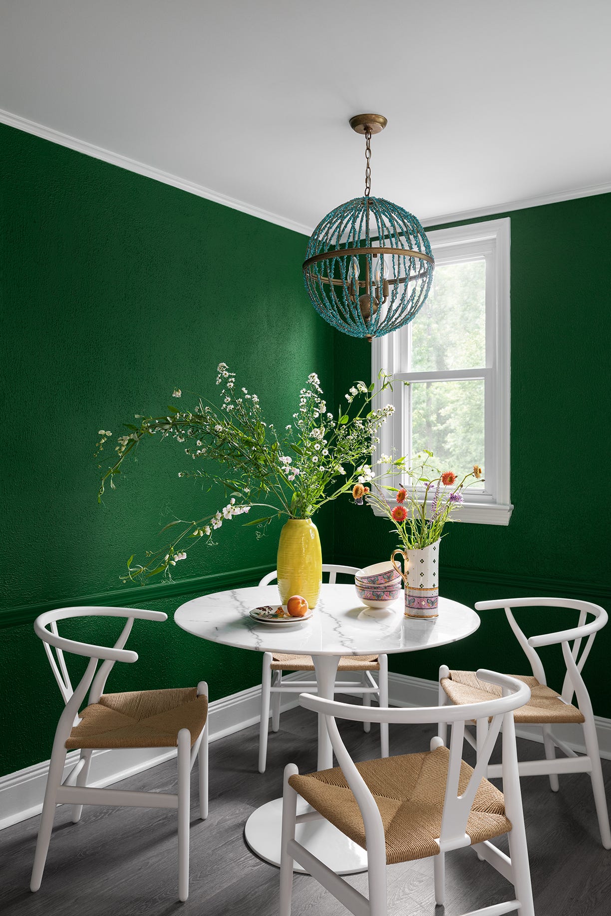
12 Trending Paint Colors for 2024, According to Design Experts

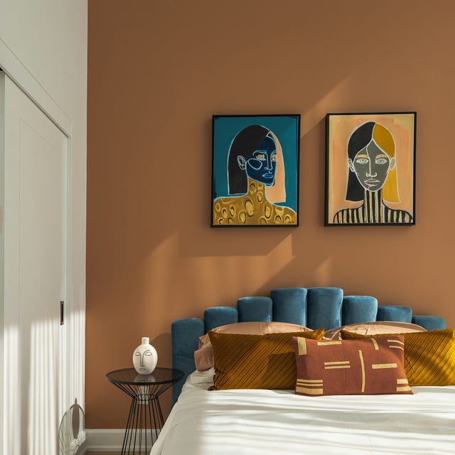
These 5 Paint Color Trends Will Be Everywhere in 2024, According to Interior Designers
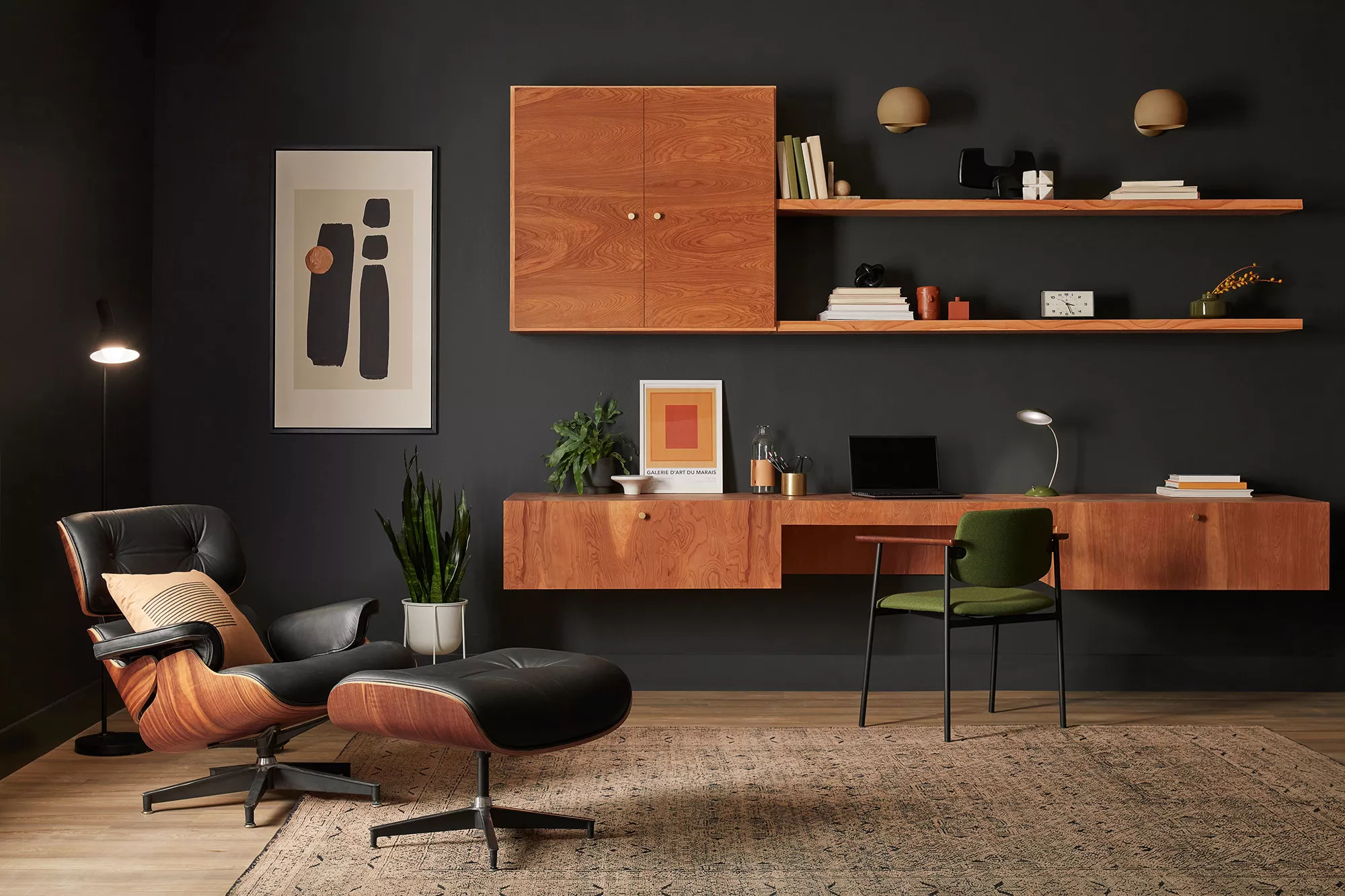
The 15 Best Moody Paint Colors of 2024
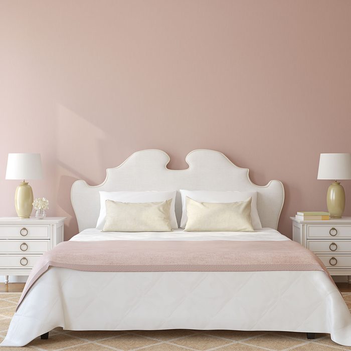
These Are the Top Bedroom Colors of 2024

Ready for a Fresh Coat of Paint? Check Out the Top Colors of 2024

The 8 Best-Selling Paint Colors of 2024: Greens, Whites, and Neutrals
The Paint Color Trends of 2023 Are in—And They’re Gorgeous
The Interior Paint Colors You'll Be Seeing Everywhere in 2024
These Are The Top Kitchen Paint Colors For 2024

Here Are the Most Popular Bedroom Paint Colors for 2024

These are the 'fail-safe' paint color combinations to embrace in 2024, according to Lick's color psychologist

'It can soothe your soul' - 5 earthy paint colors designers say are big trends for 2024

We asked paint brands what their most popular shades of 2024 were – these were the 13 favorites
Pick Your Favorite 2024 Color of the Year


The #1 Paint Color Trend of 2025, According to Designers
Here's Every 2024 Color of the Year We Know So Far