1/4
Oh, so It's This Nature-Inspired Color Rule That's the Reason Your Home's Scheme Doesn't Feel Like It's Working
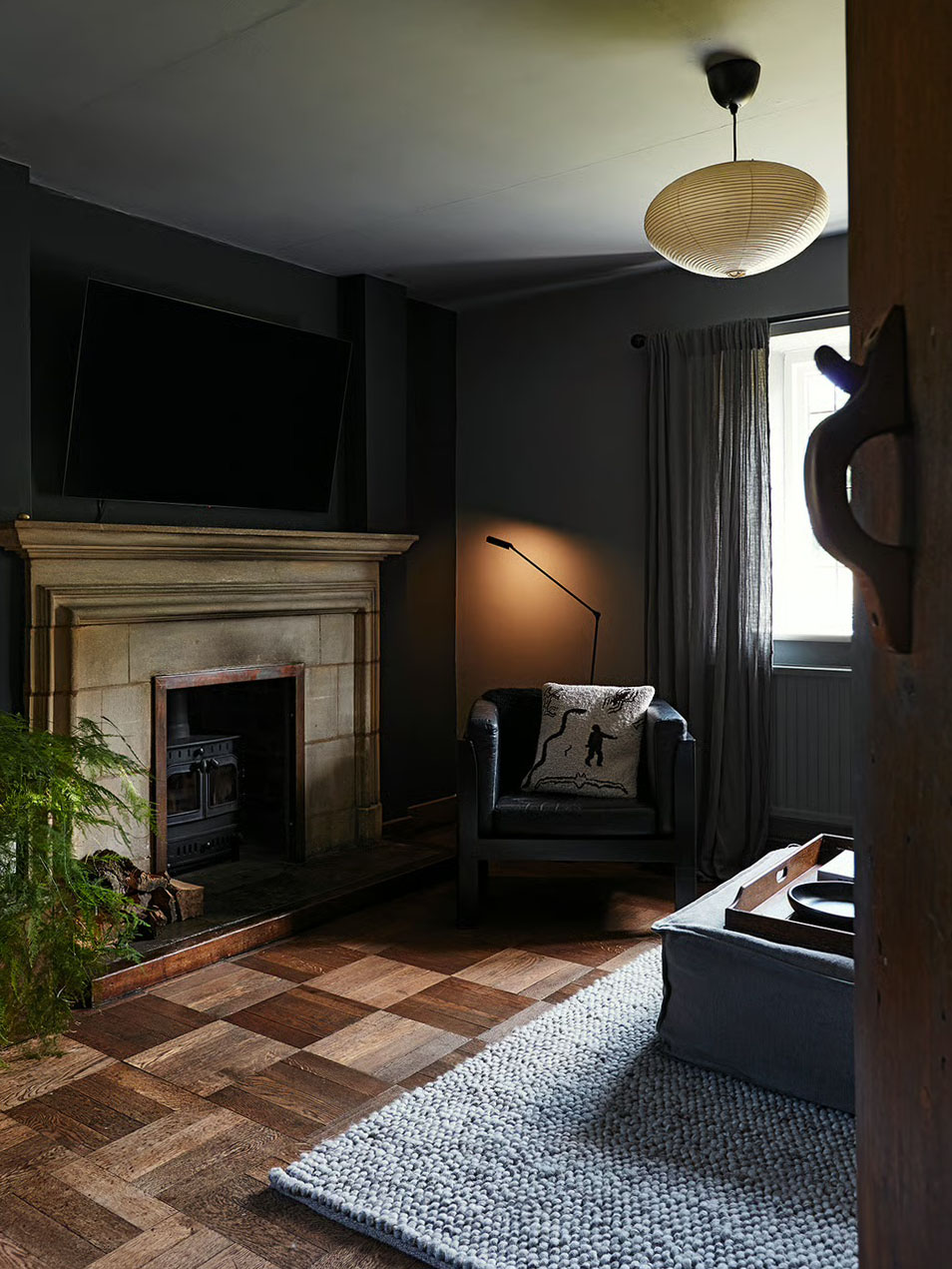
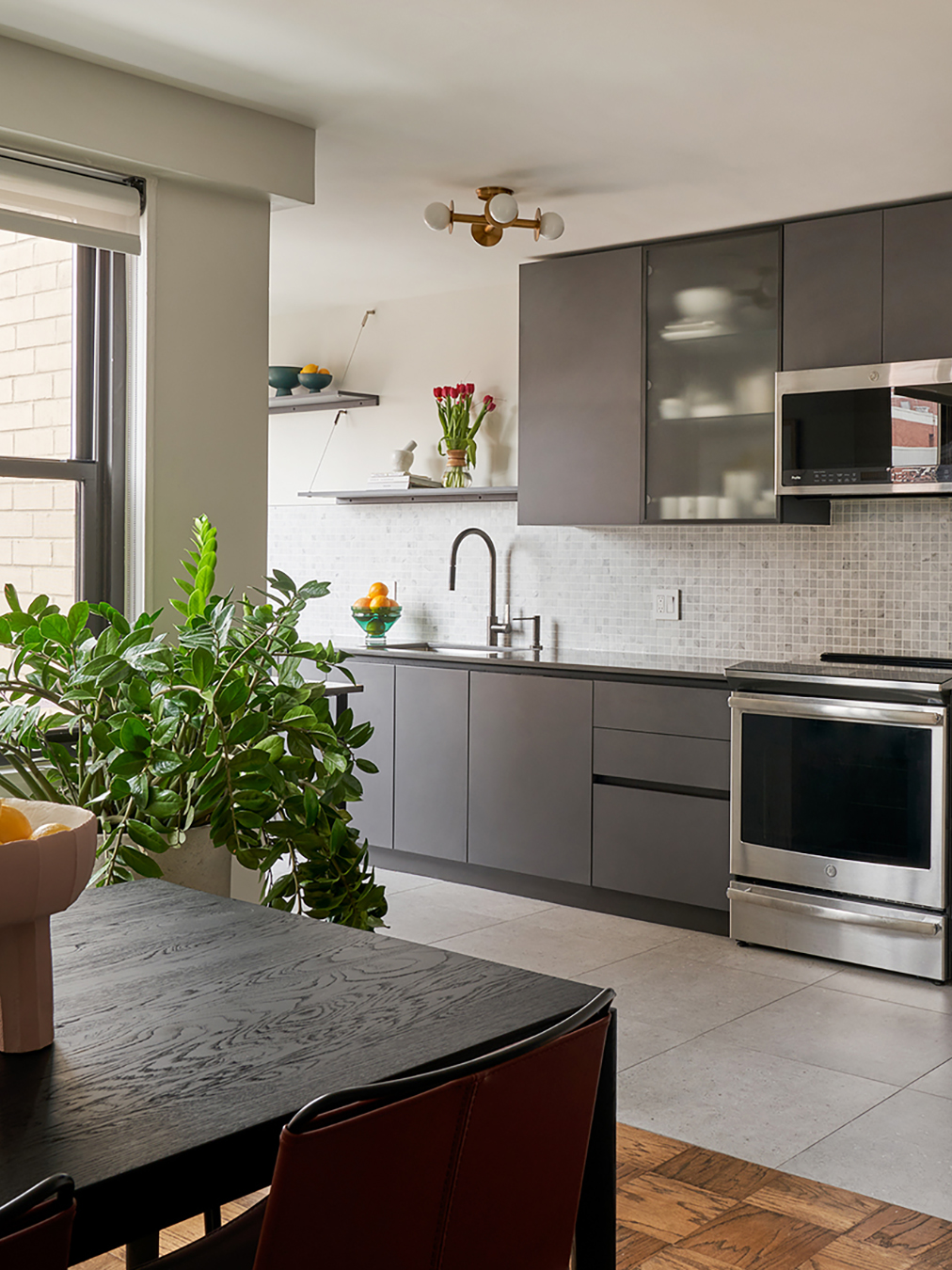
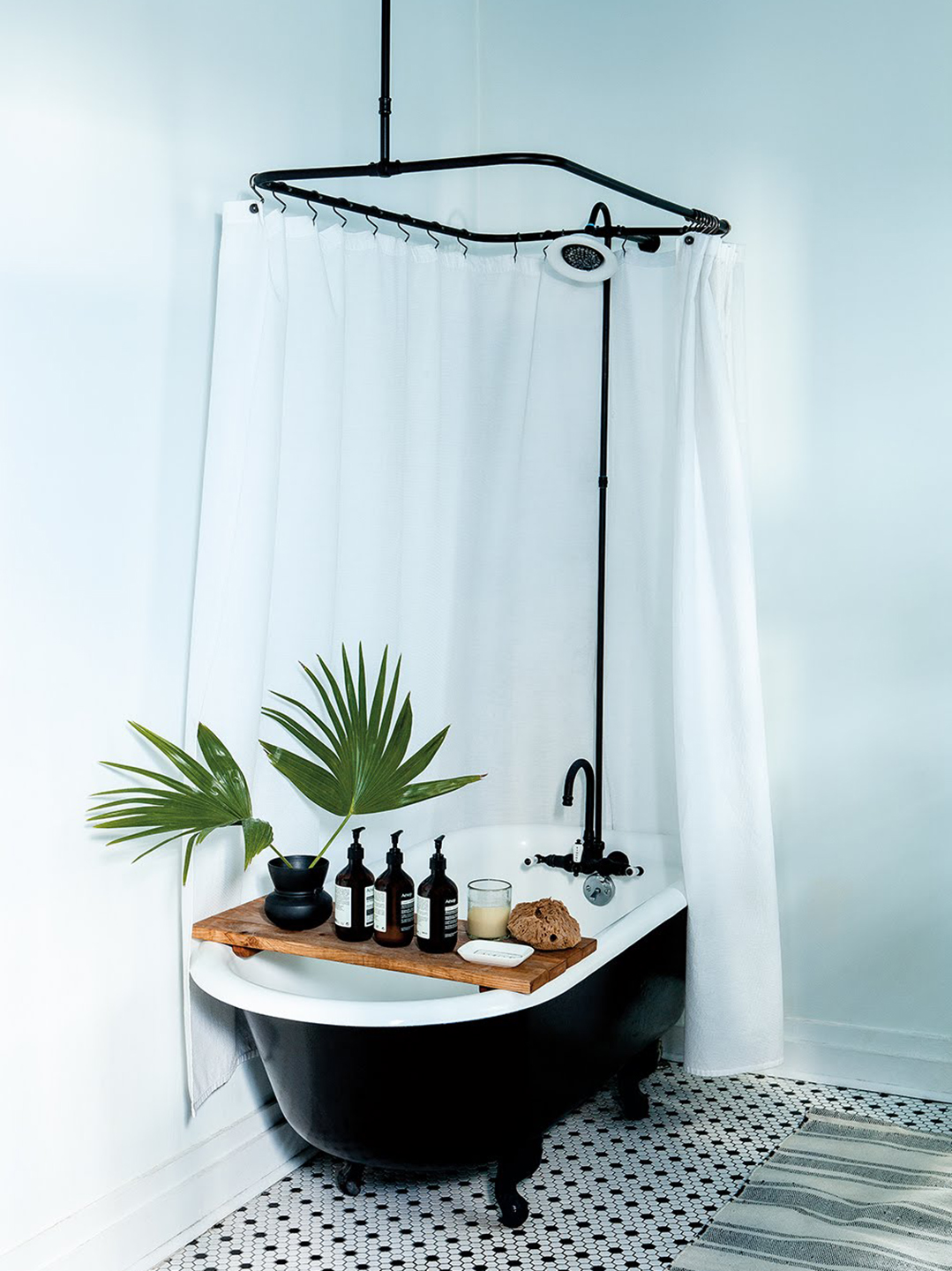
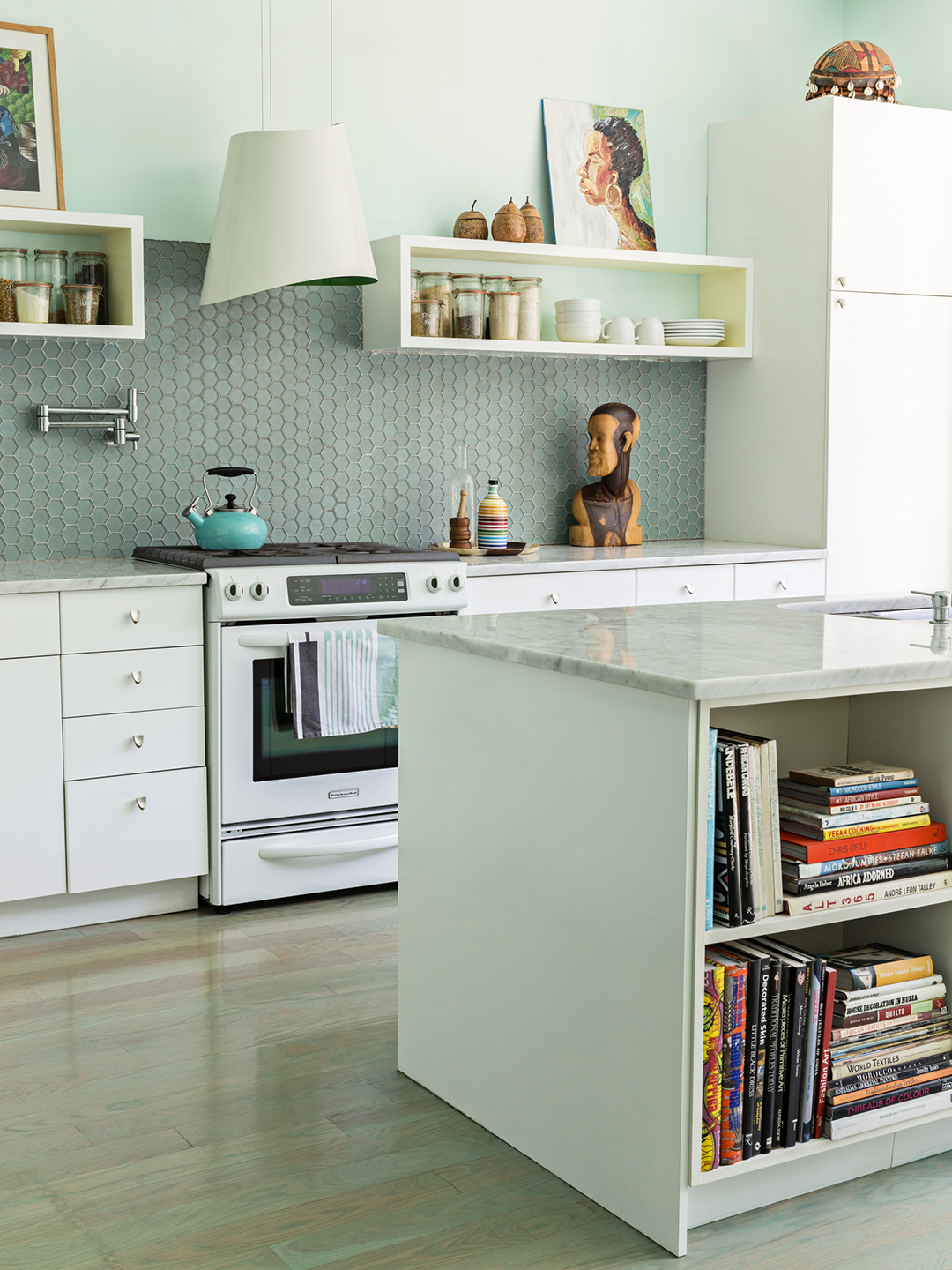
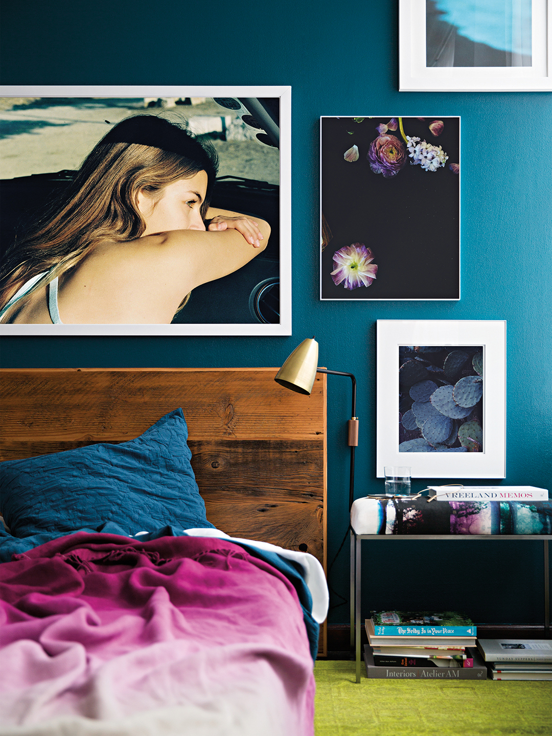
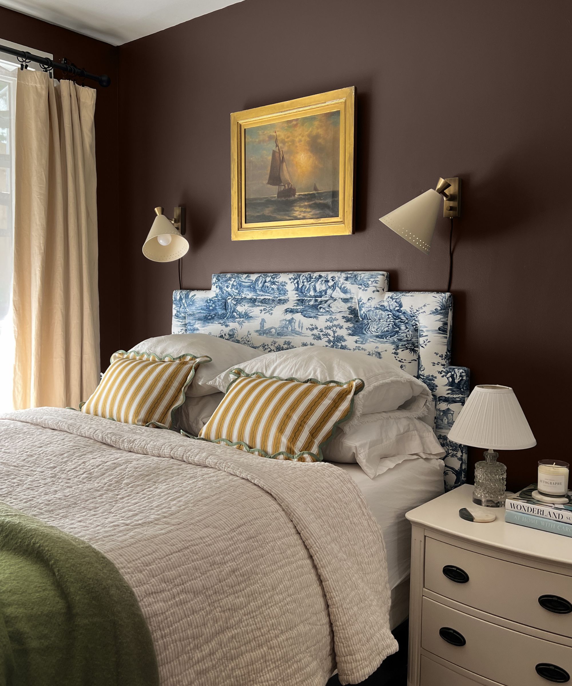
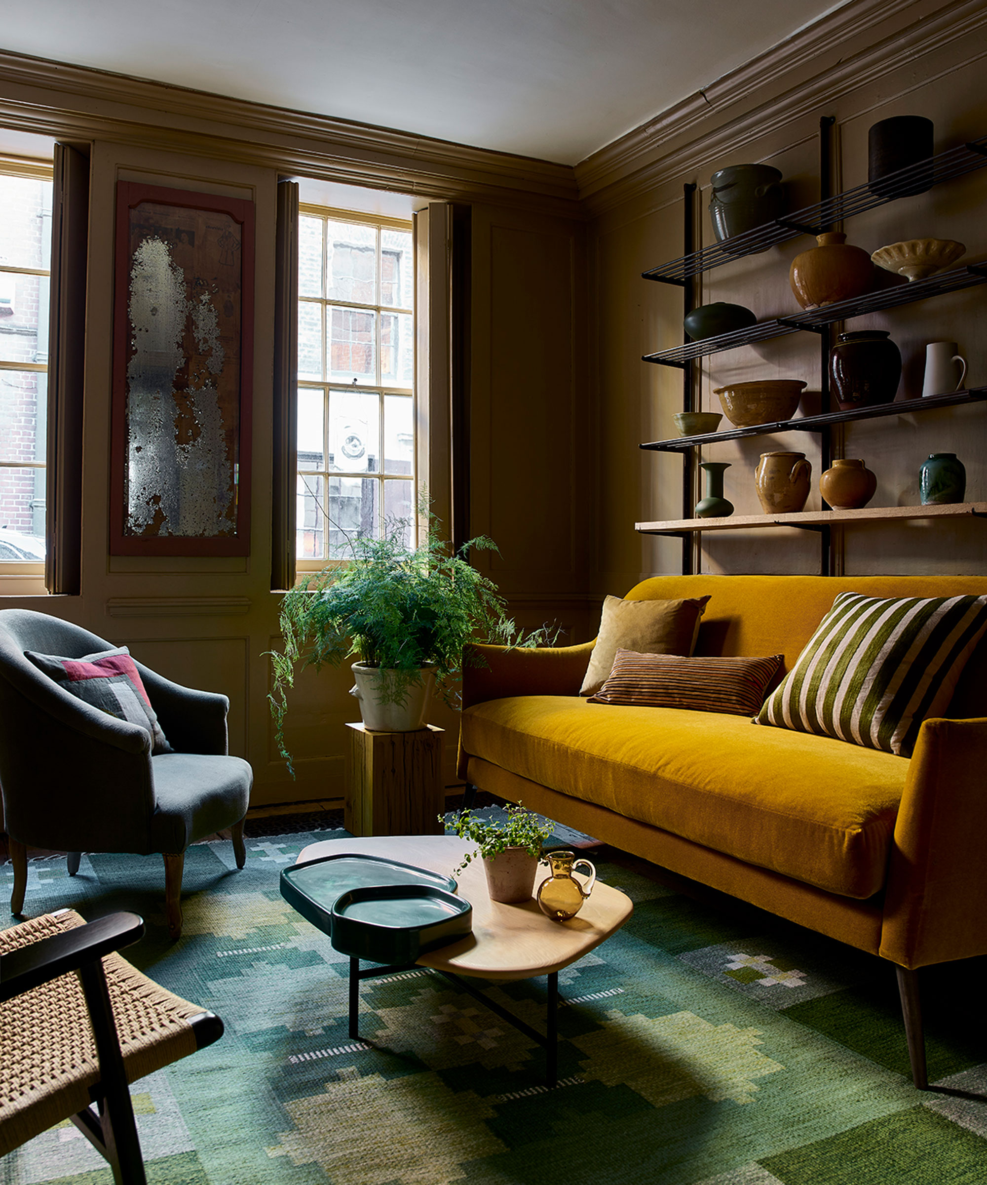
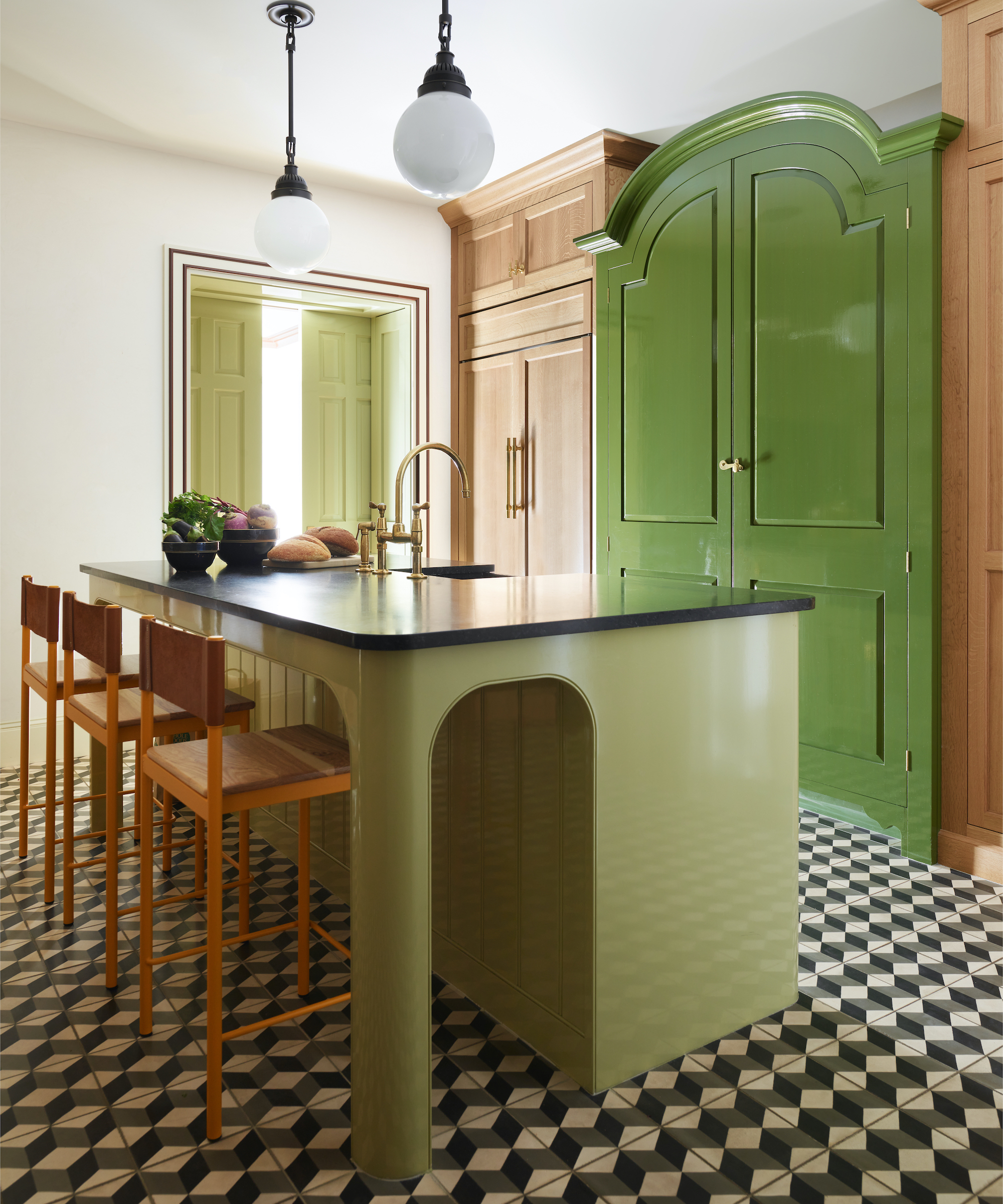
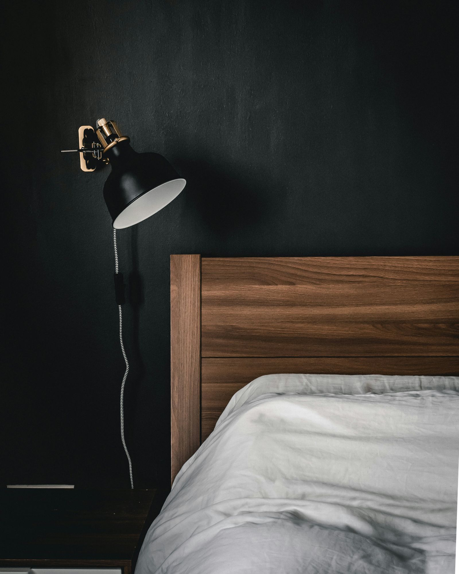
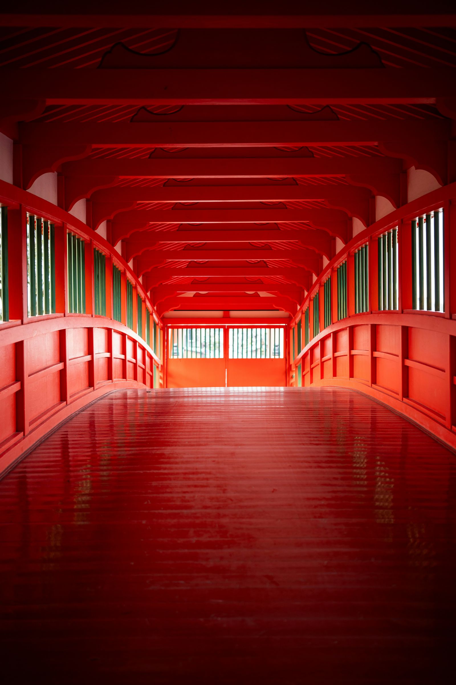
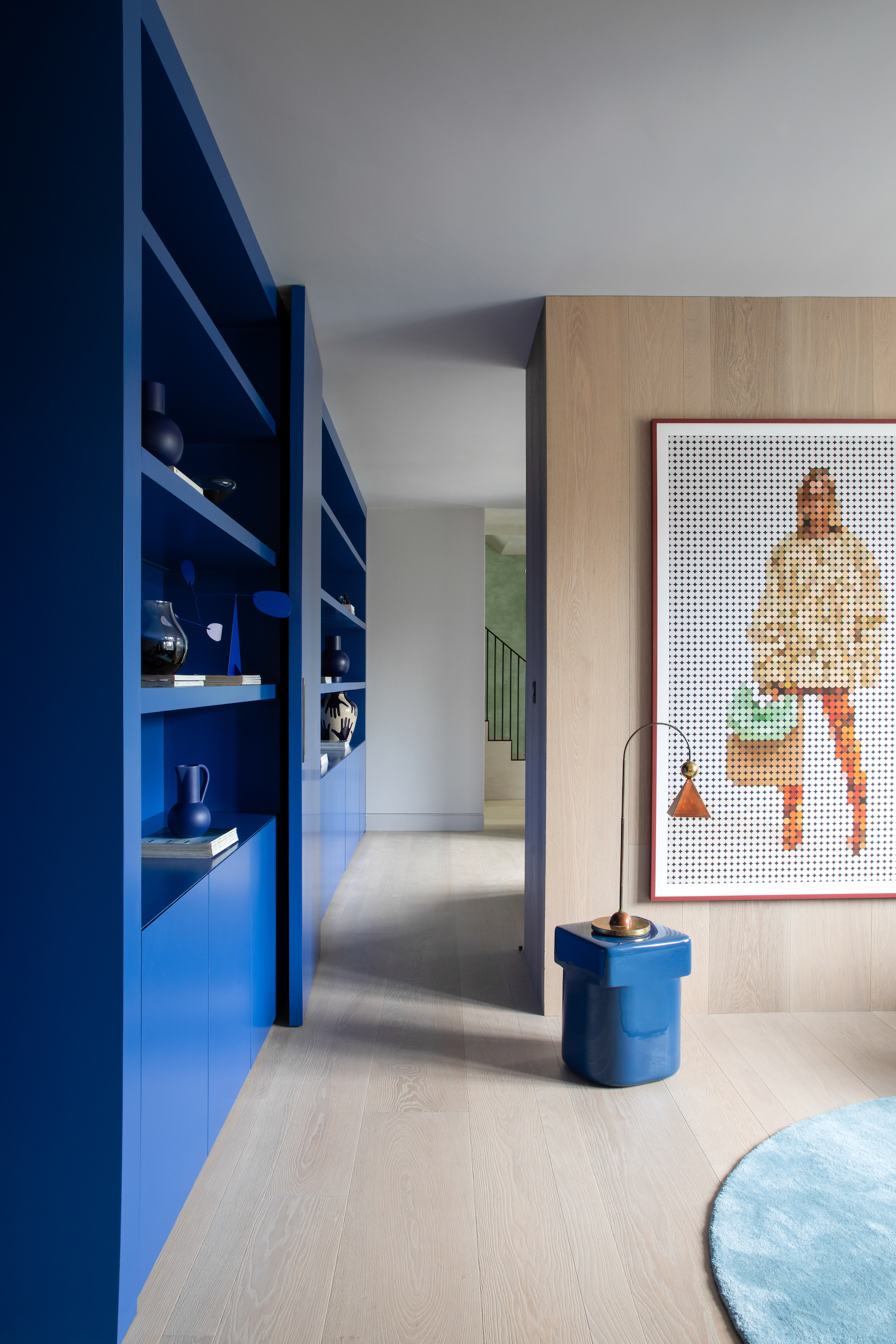
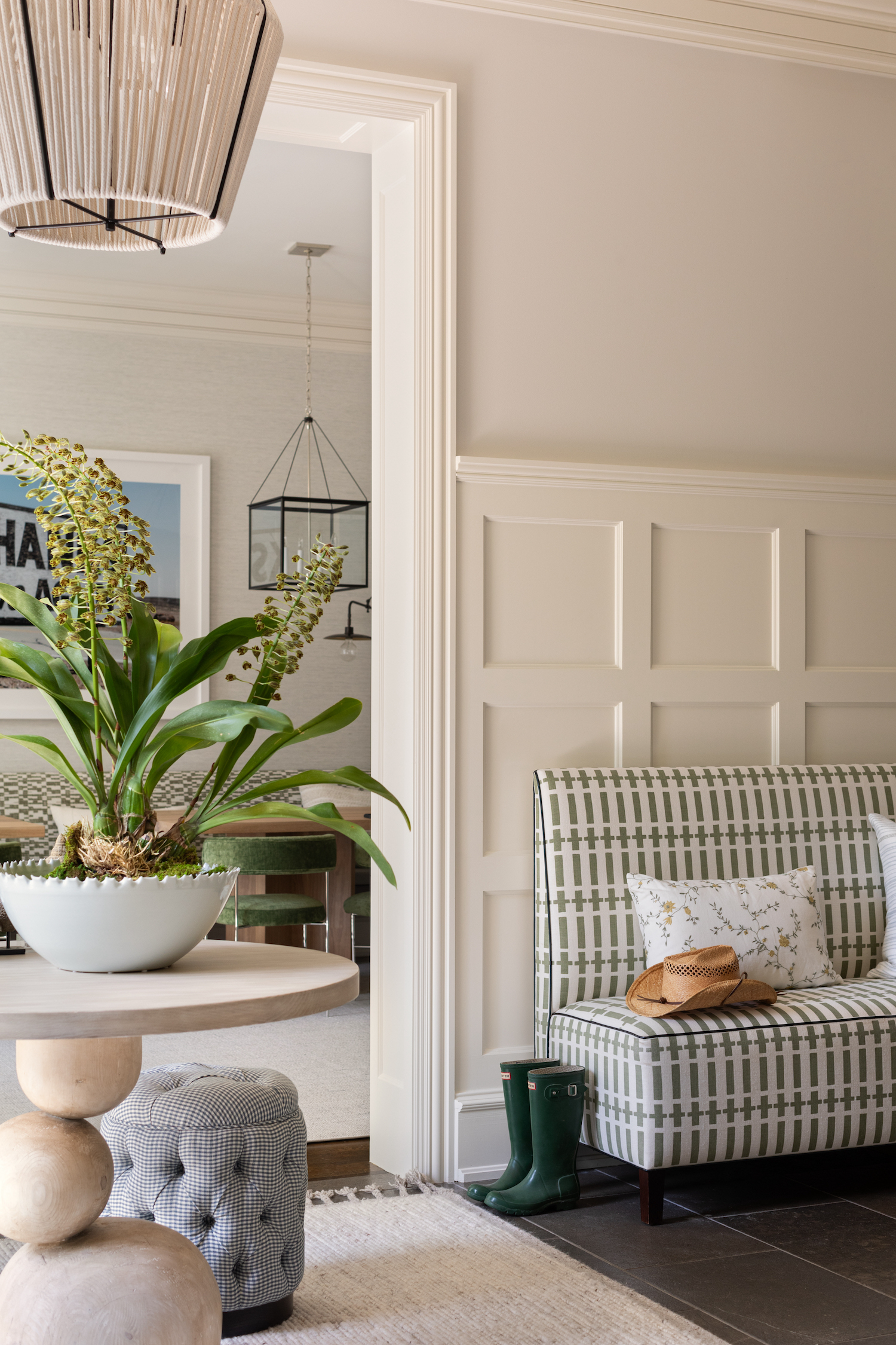
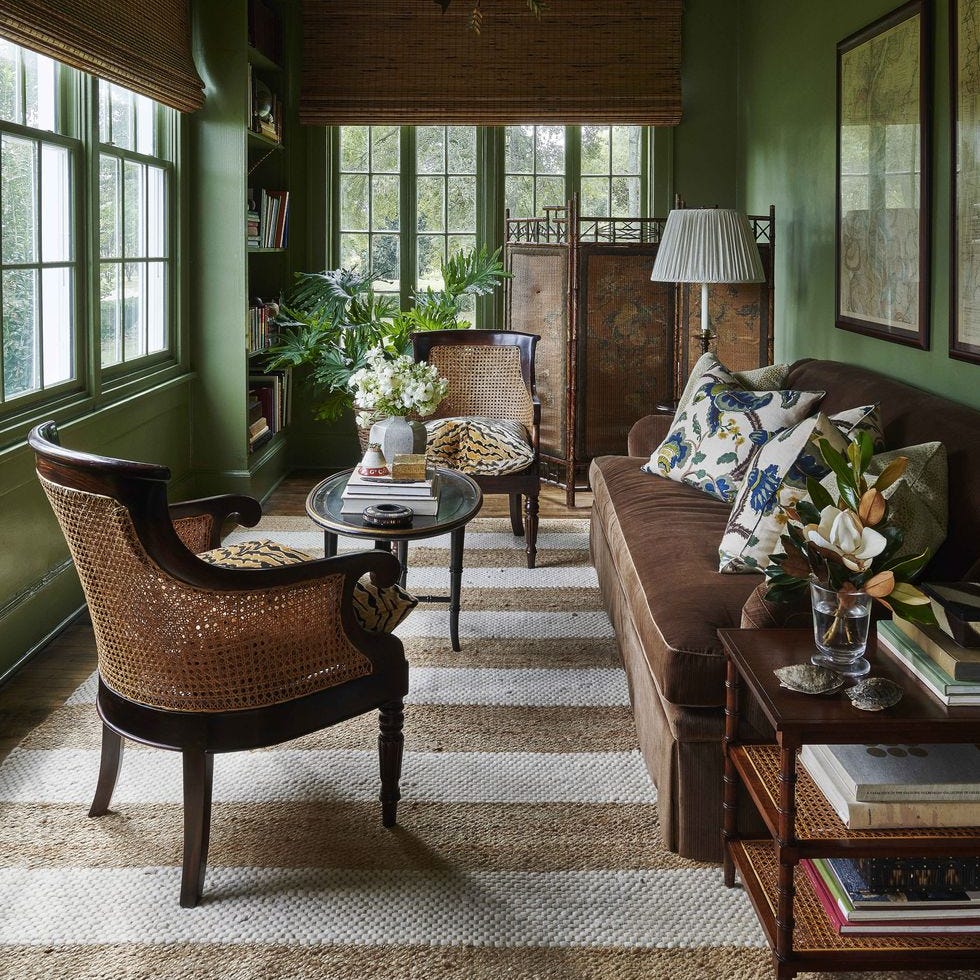
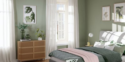
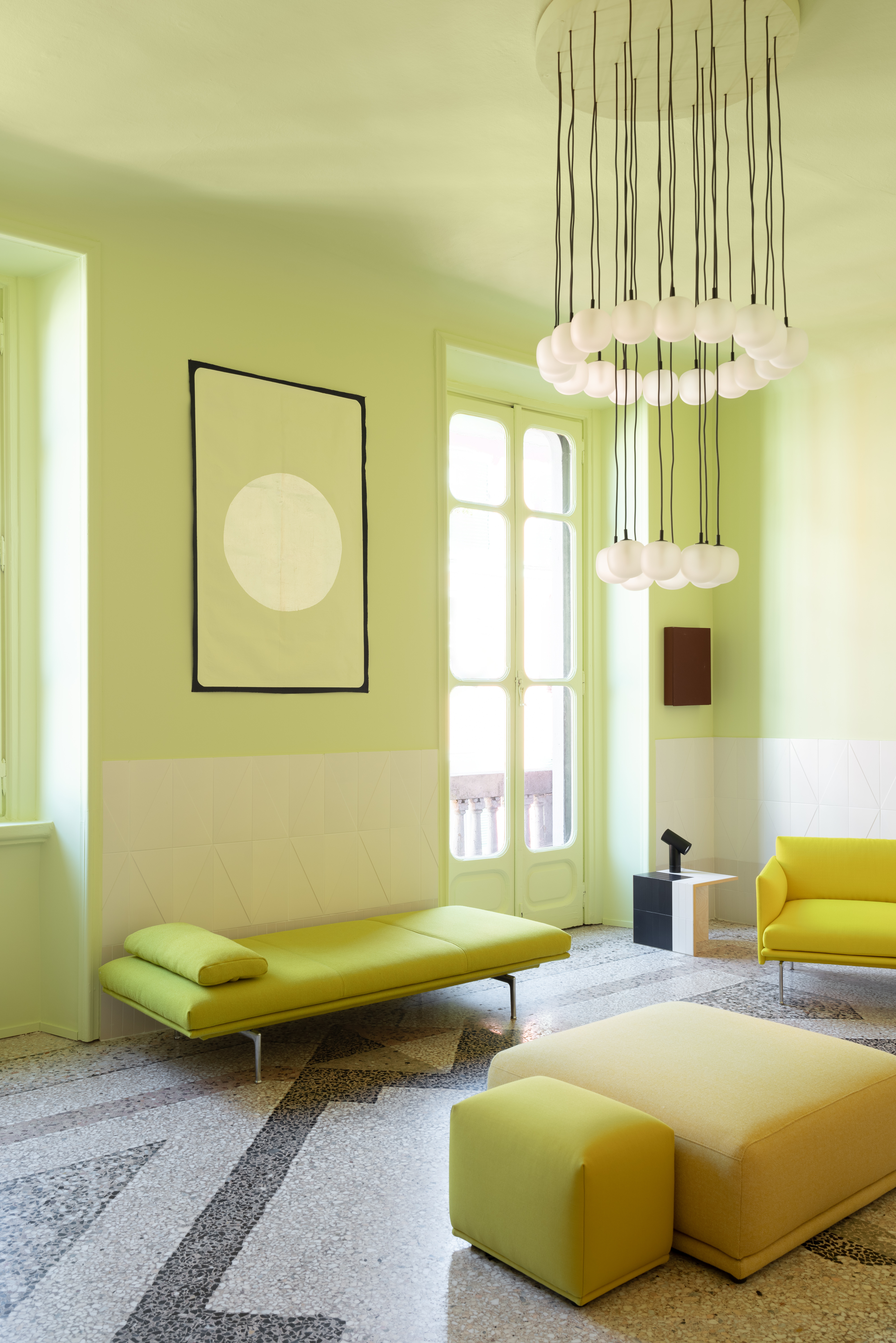
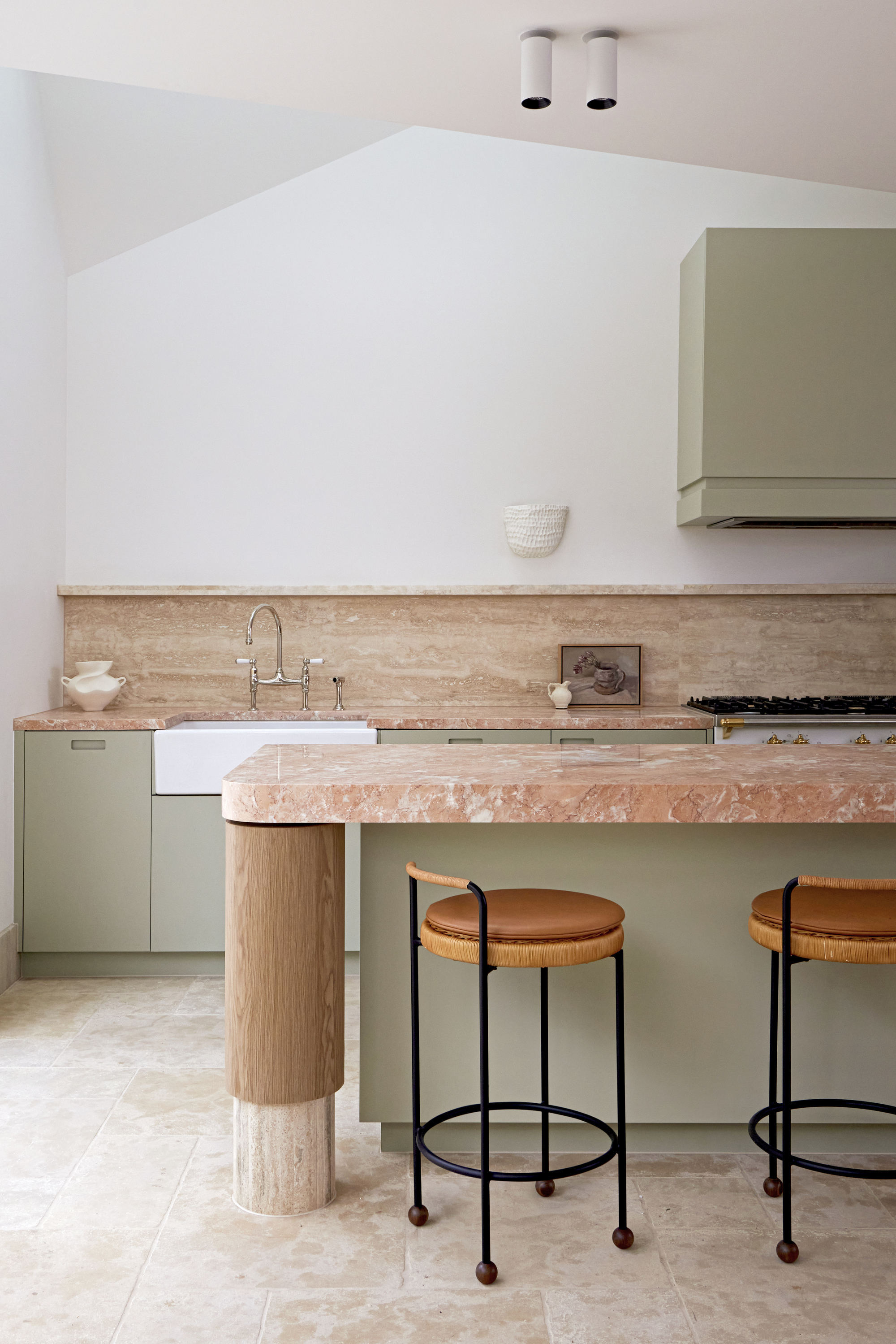
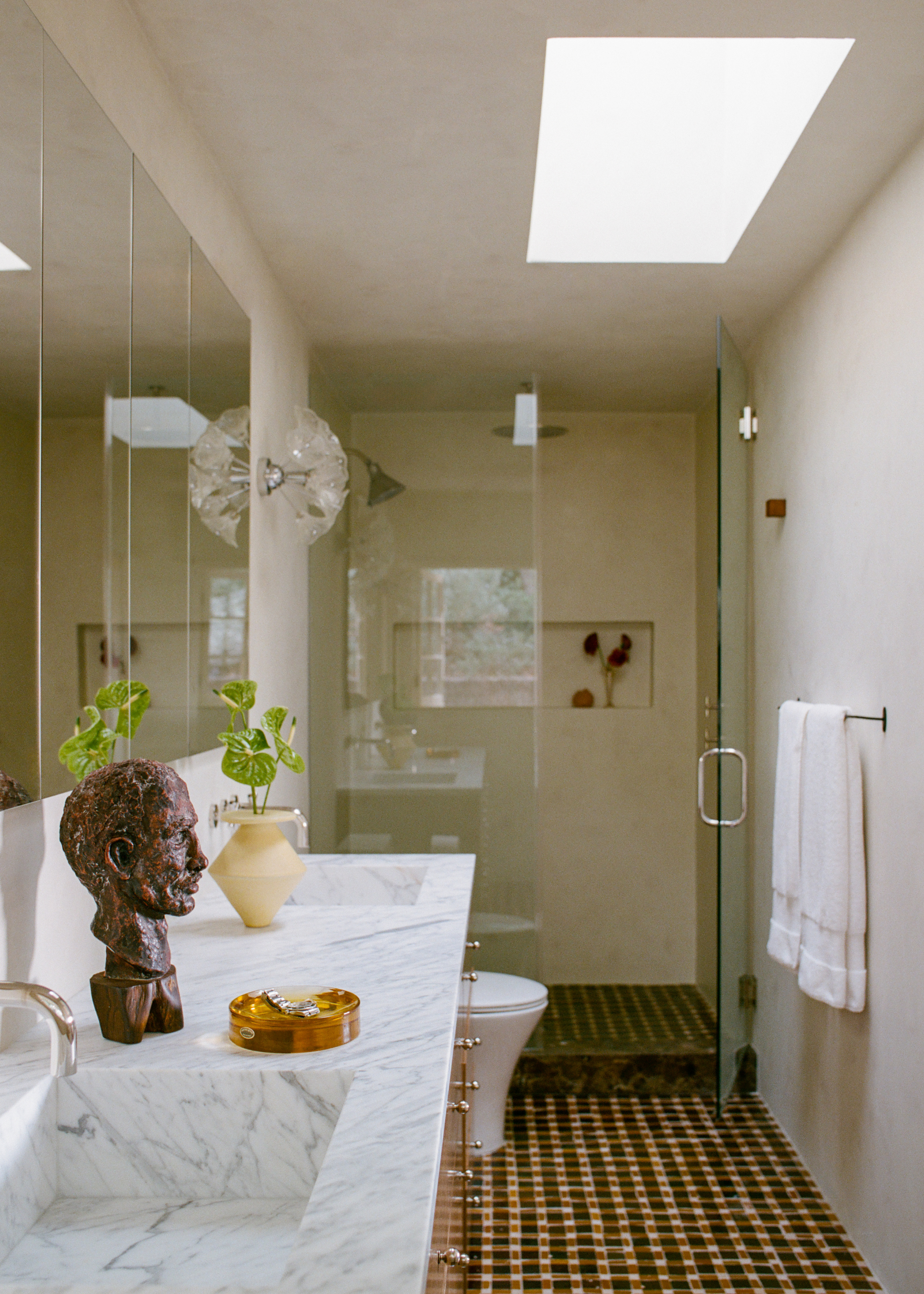
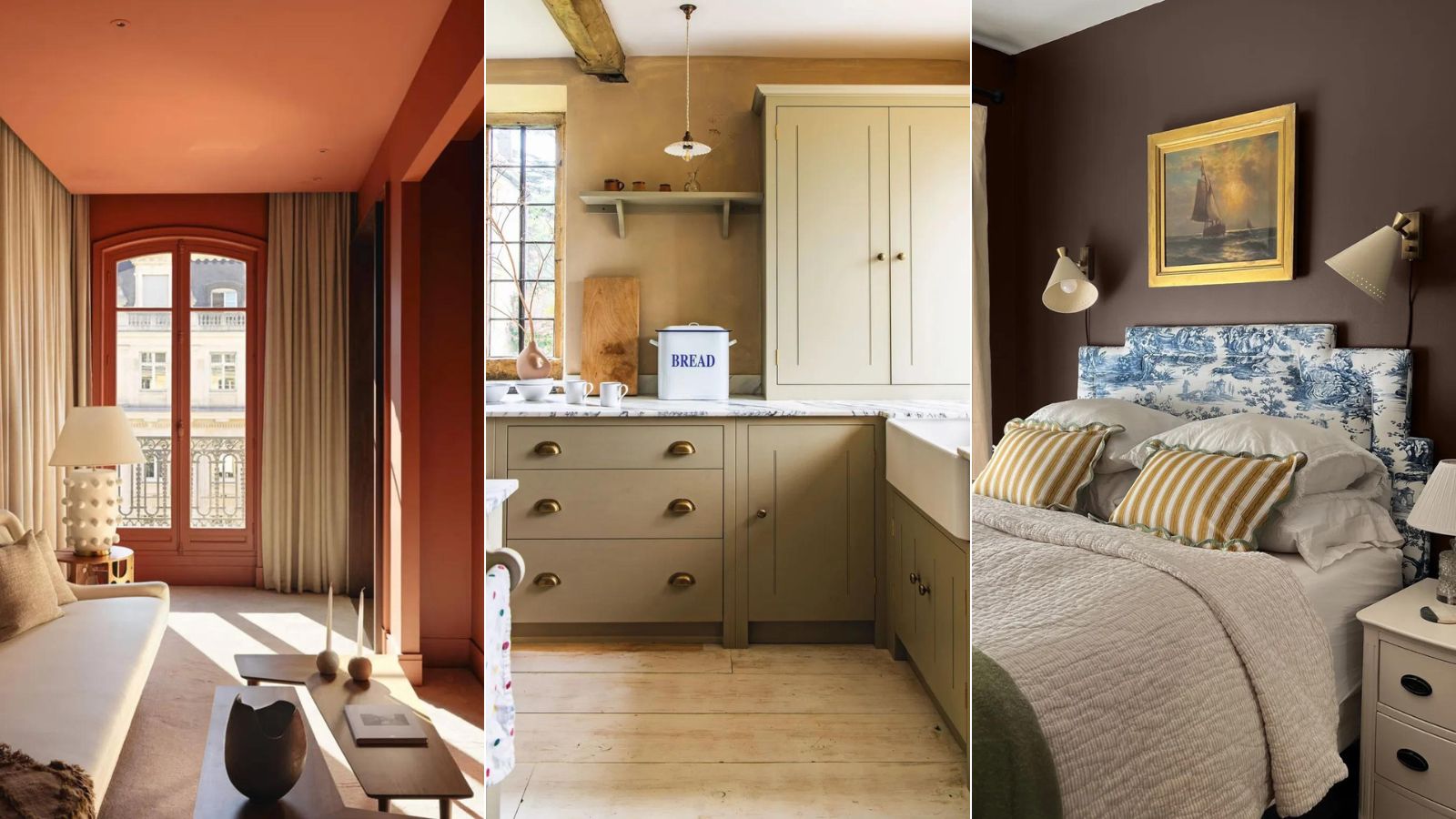
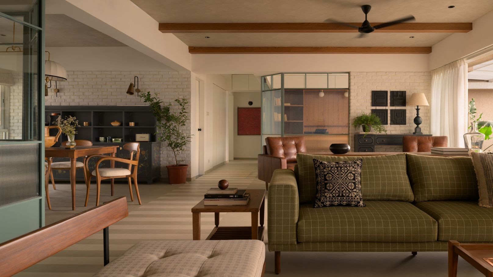
The article explores the '3/3 vertical color rule' in interior design, a concept that draws inspiration from natural landscapes, specifically the forest. This rule suggests dividing a room into three vertical layers, with darker colors at the base, mid-tones in the middle, and the lightest hues at the top. The underlying principle is to mimic the natural progression of colors observed in a forest, from the dark soil to the mid-level foliage and finally to the light of the sky above. This approach creates a sense of grounding and harmony within a space.
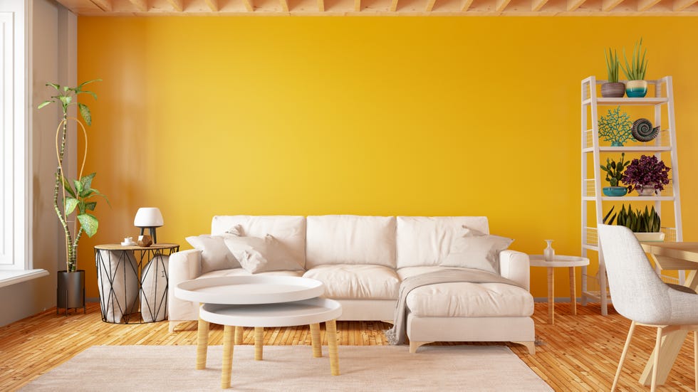
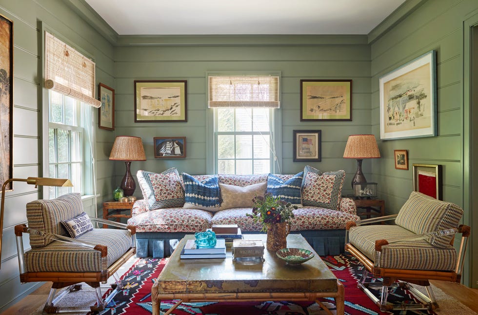
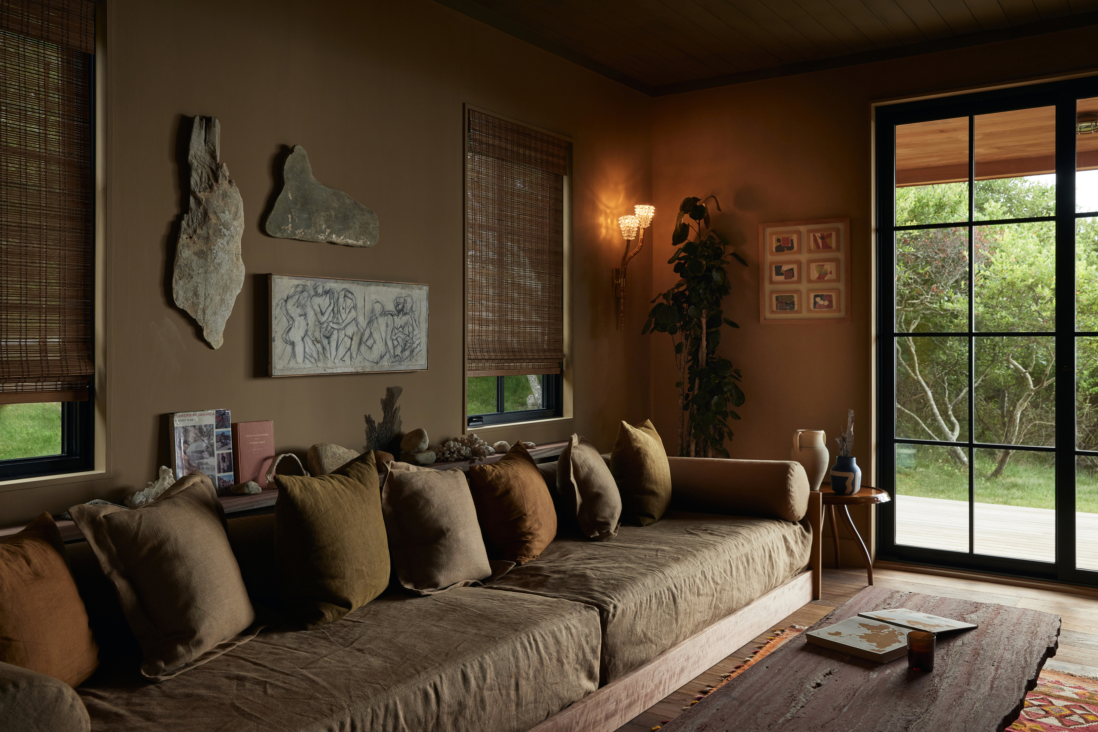
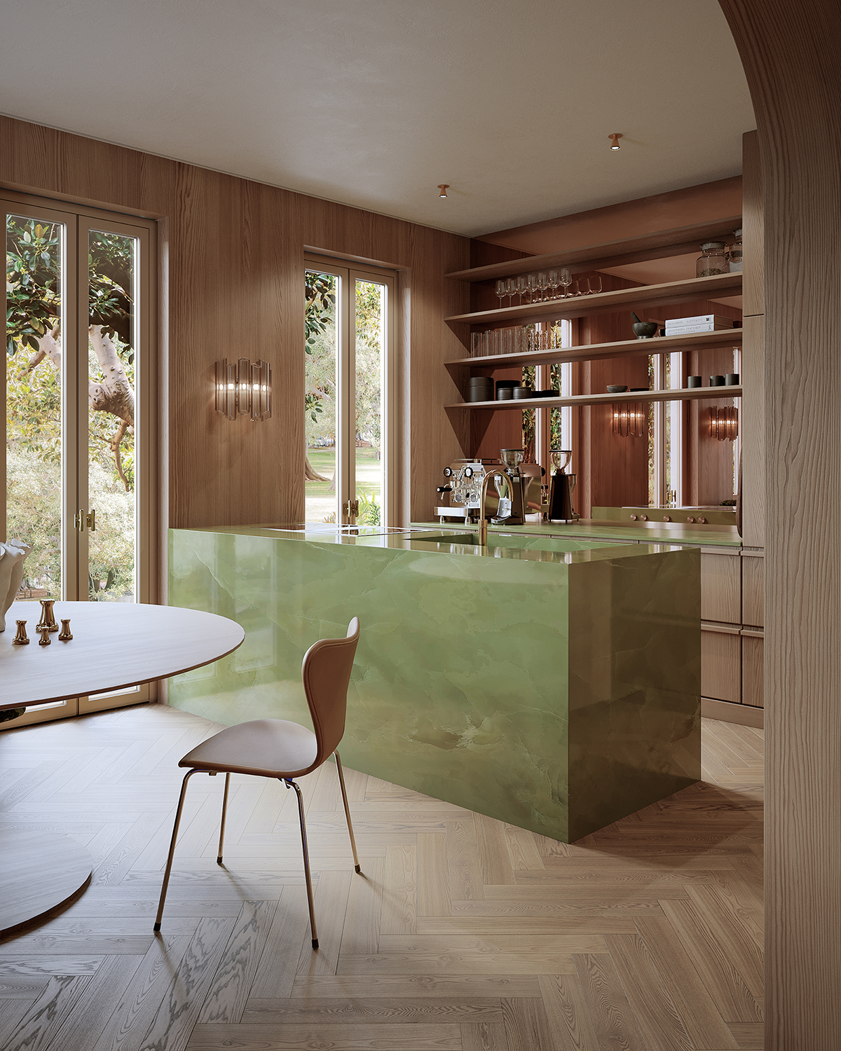
Interior designers emphasize that this color rule contributes to a naturally balanced and serene environment, tapping into an innate human response to this familiar order. Olga Doykhen, an interior designer, explains that the base is anchored by a darker color, transitioning to mid-level colors at eye height, and culminating in the lightest tones above. Livingetc's color expert, Amy Moorea Wong, further elaborates on the 'forest floor principle,' where the bottom layer represents the dark, shadowy floor of the forest, the middle layer balances the palette with mid-tones found in tree trunks and low plants, and the top layer features the palest hues, such as ceilings and high shelving, to create an open and airy feel.
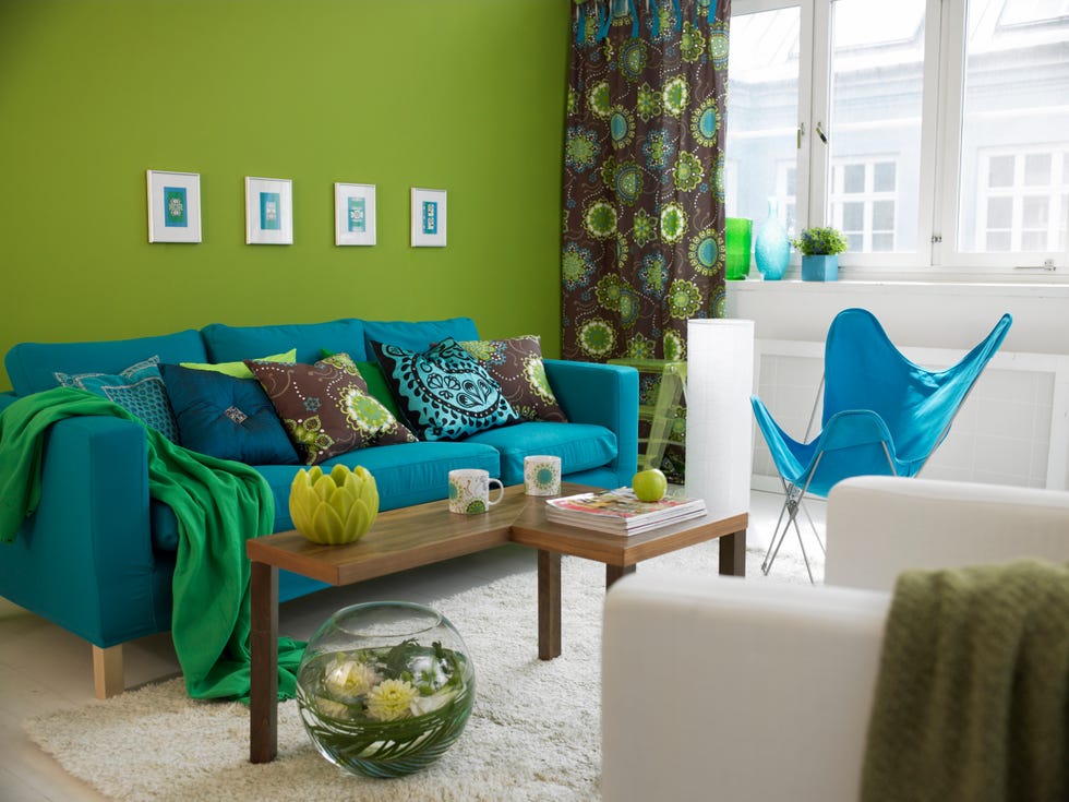
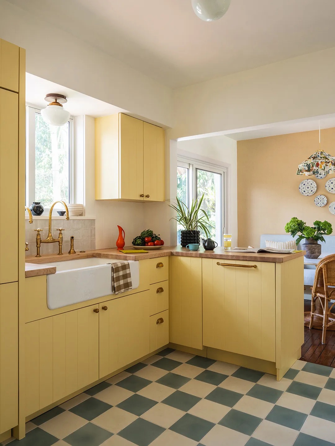
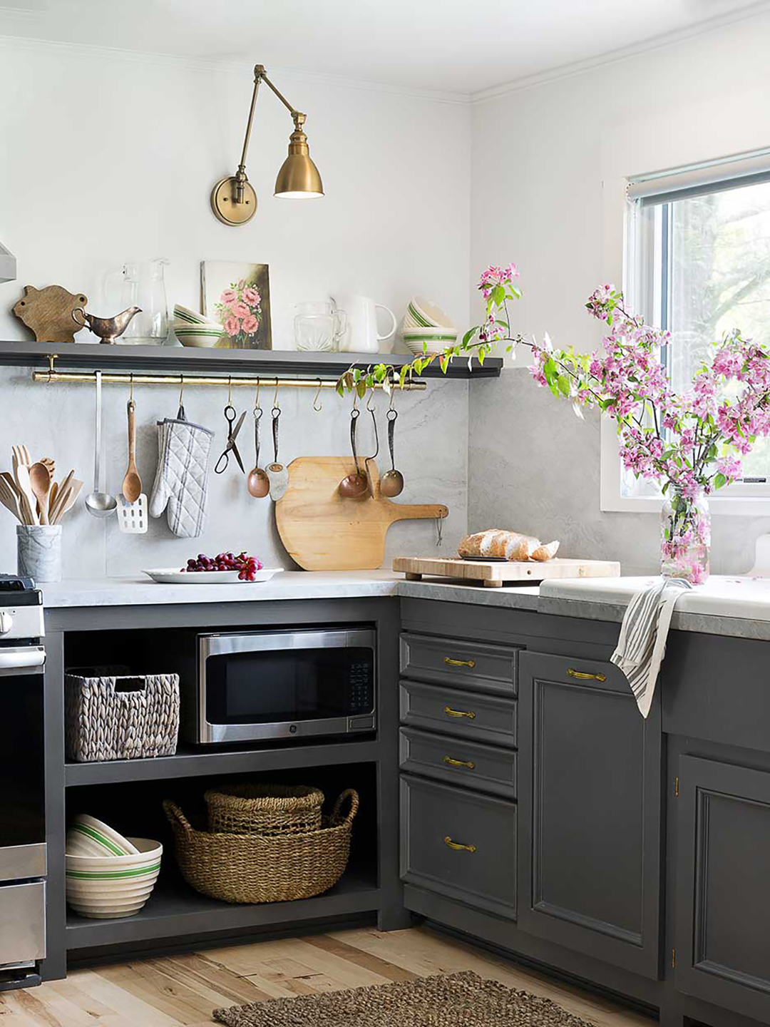
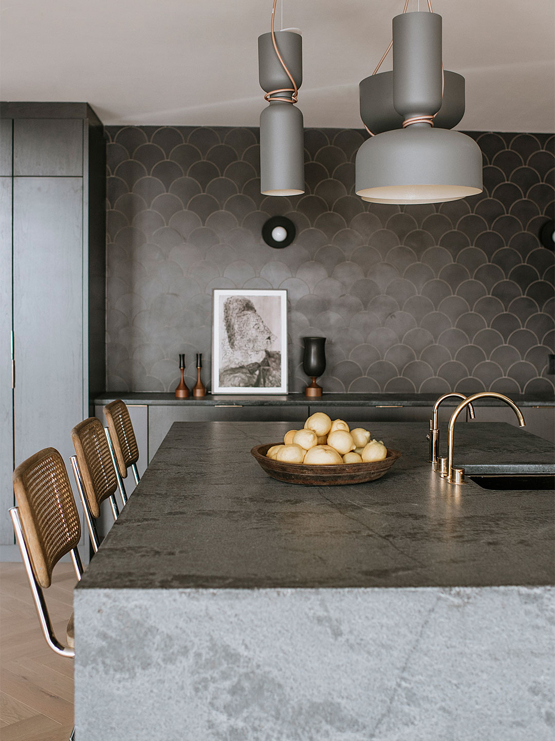
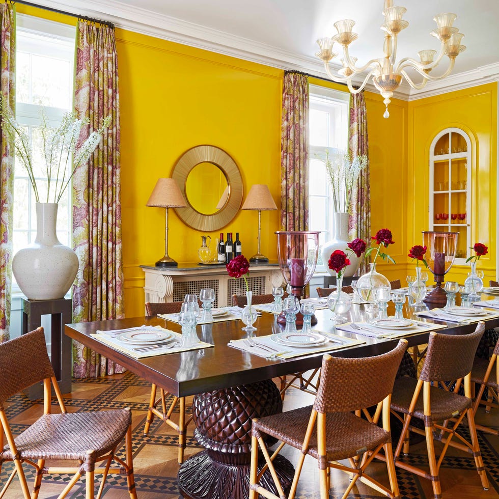
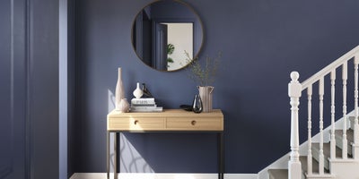
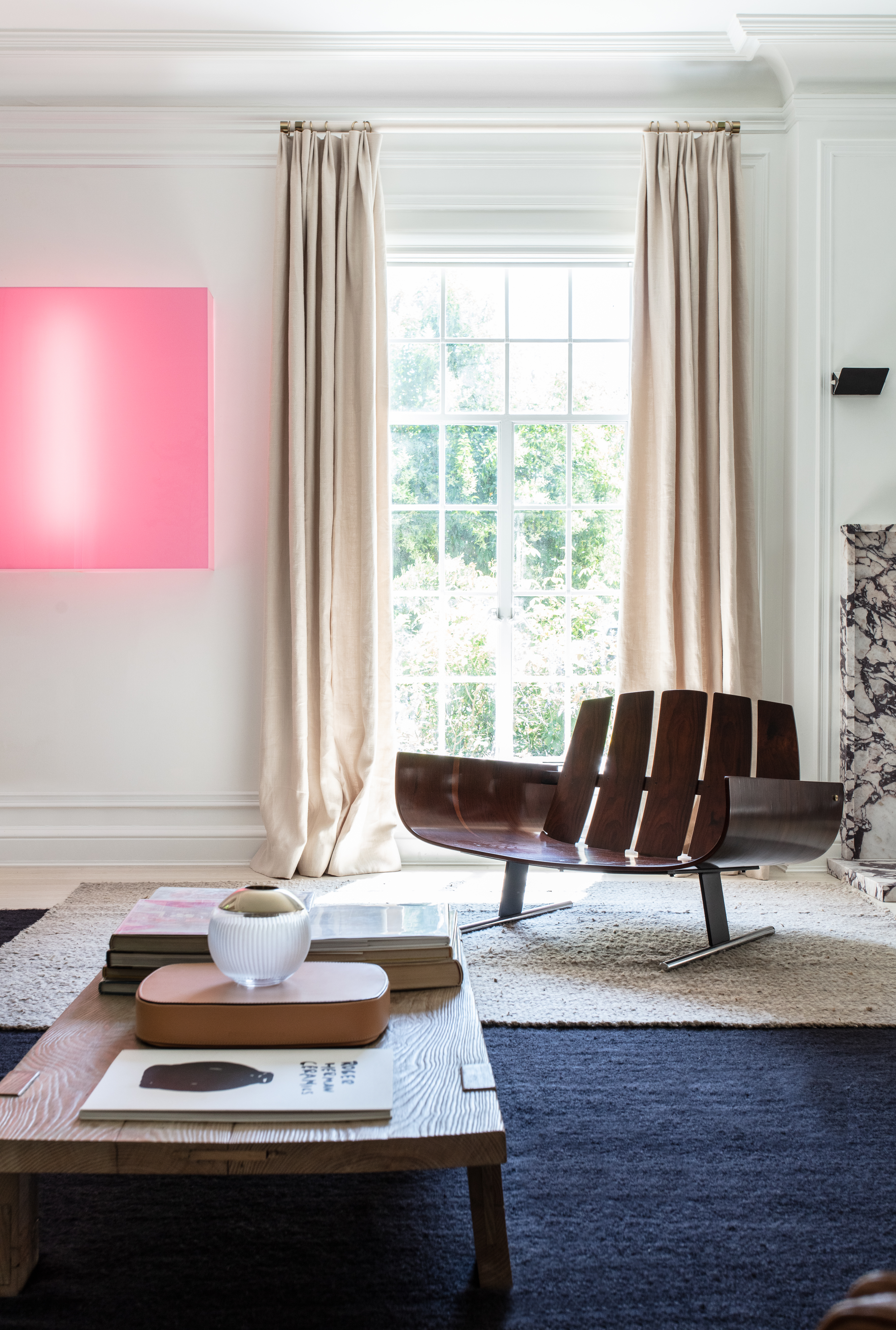
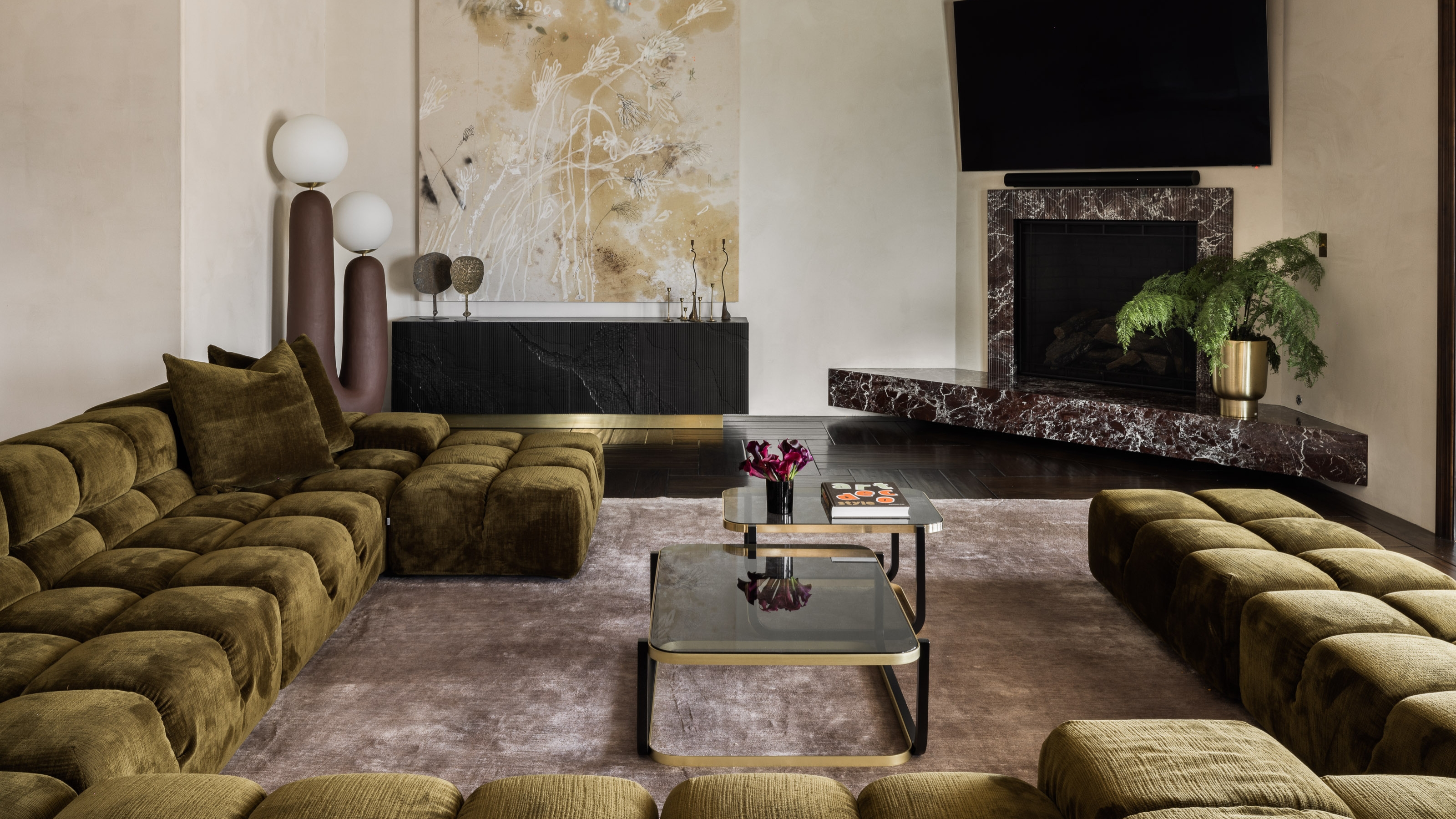
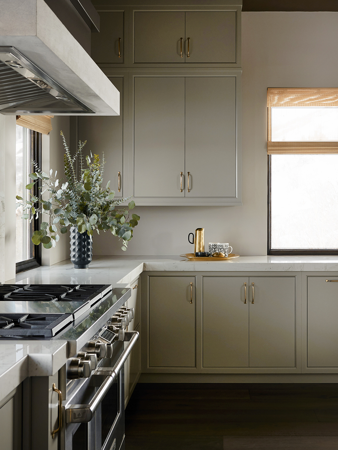
The application of the 3/3 vertical color rule is not limited to specific color schemes like green or earthy tones; its universality lies in the progression from dark to medium to light, regardless of the chosen hues. For instance, in a 'neutral luxury' palette, deep stone or espresso grounds the base, soft mushroom or greige fills the mid-level, and airy linen or chalk white adorns the top. For an 'earthy minimalism' approach, deep charcoal anchors the base, rich clay or warm ochre occupies the mid-level, and pale ivory or plaster defines the top. A 'classic monochrome' scheme would involve black or near-black at the base, mid-gray in the center, and soft white above.
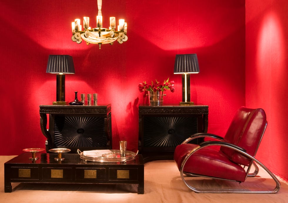
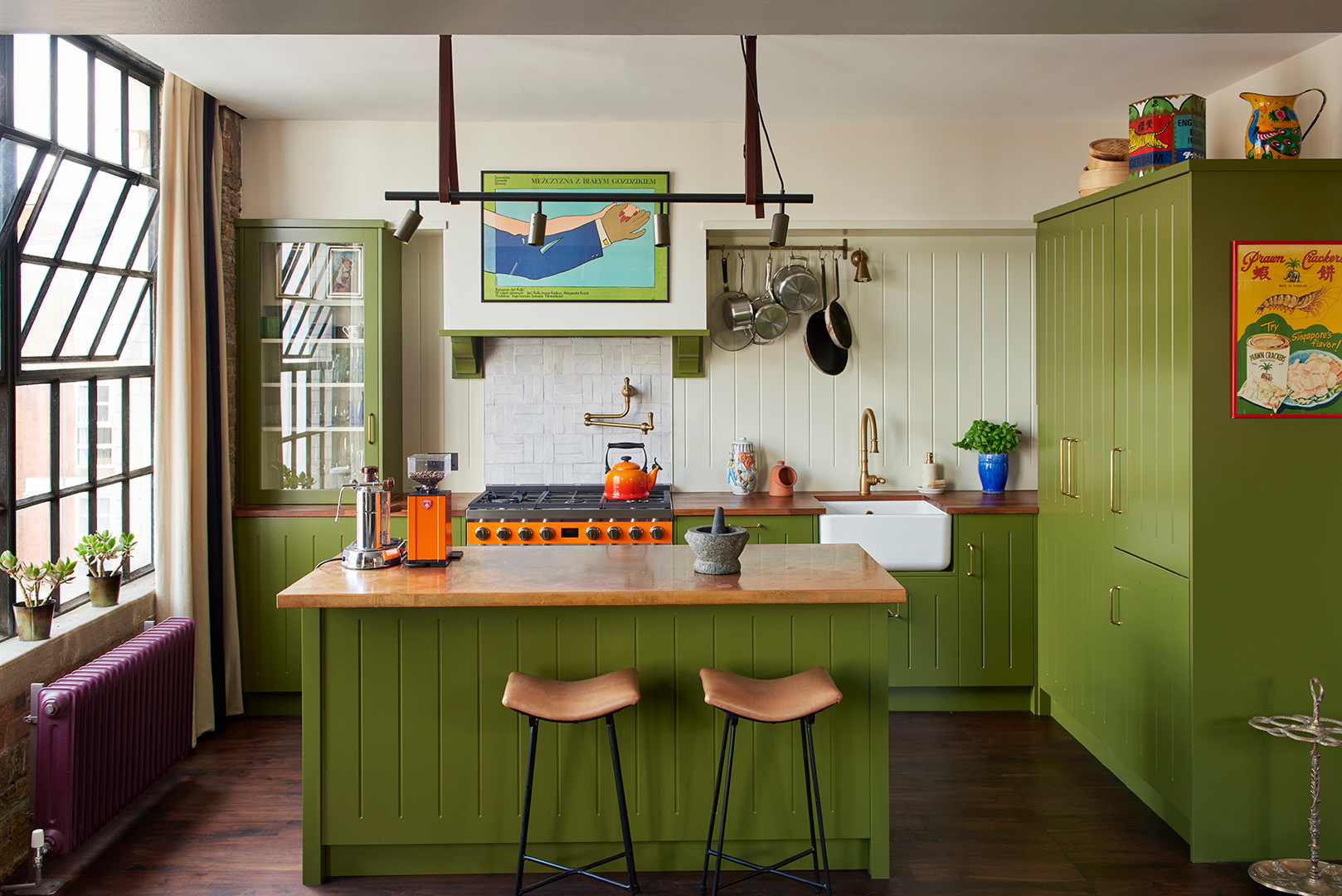
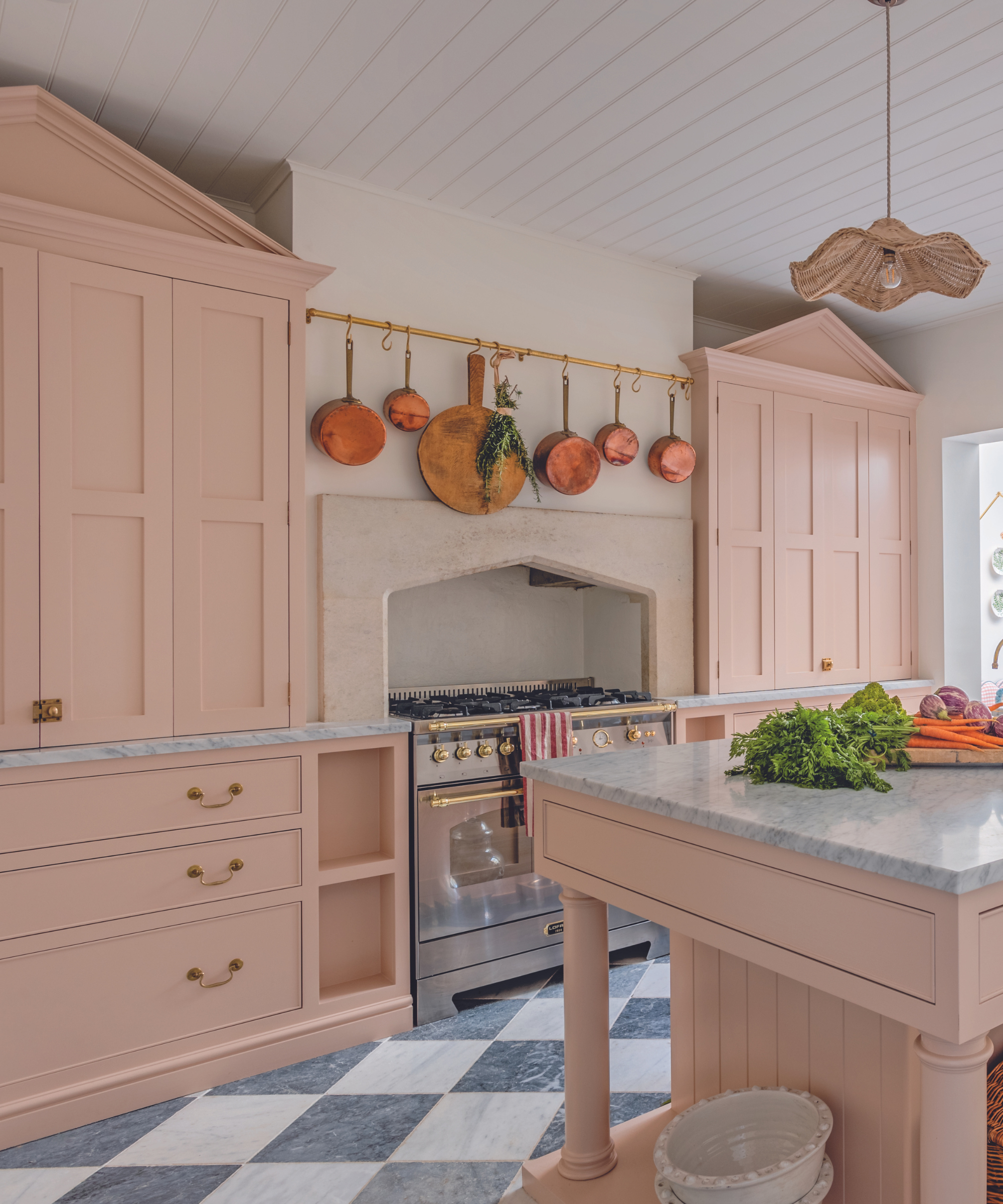
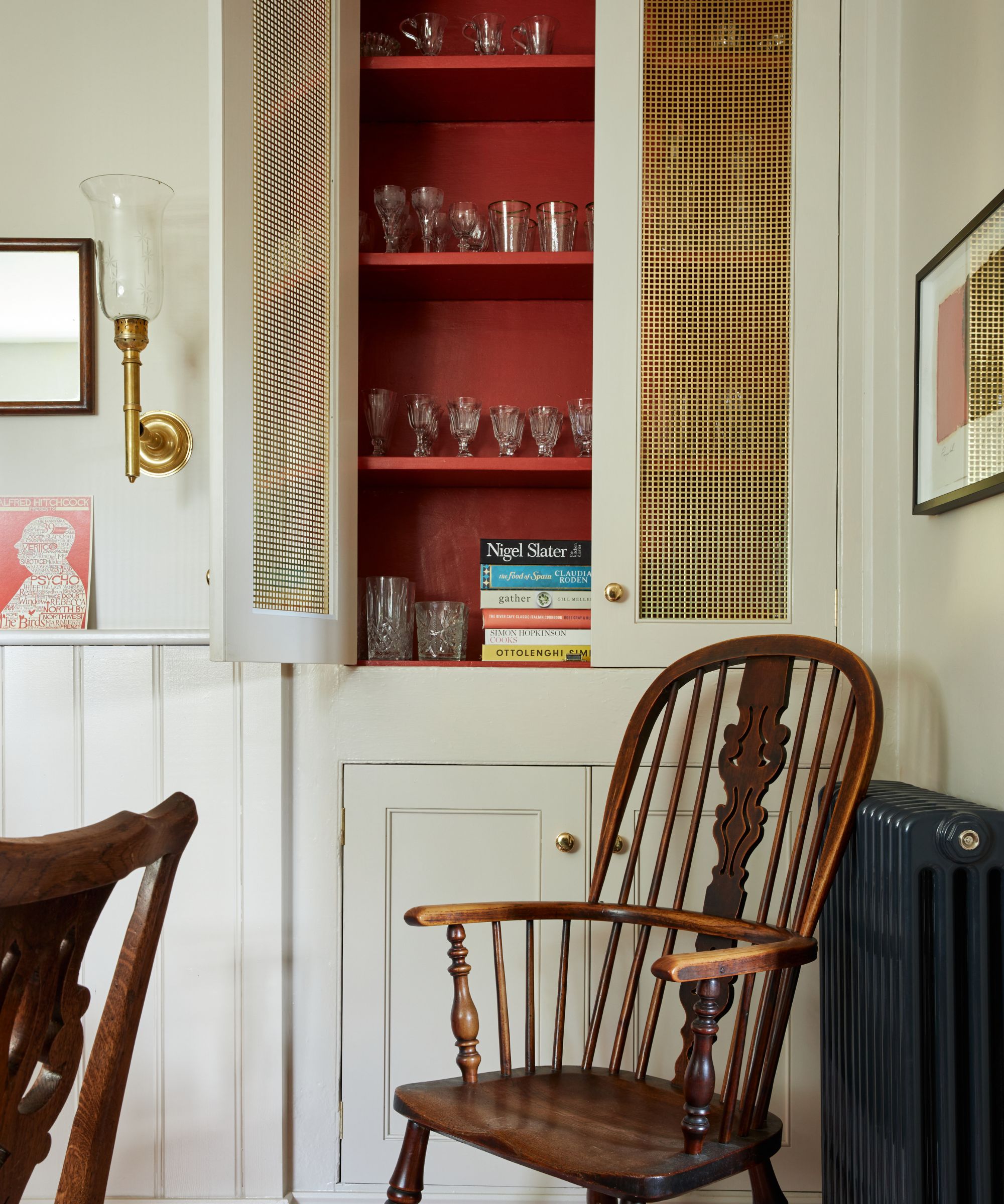
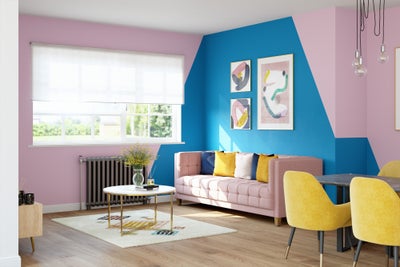
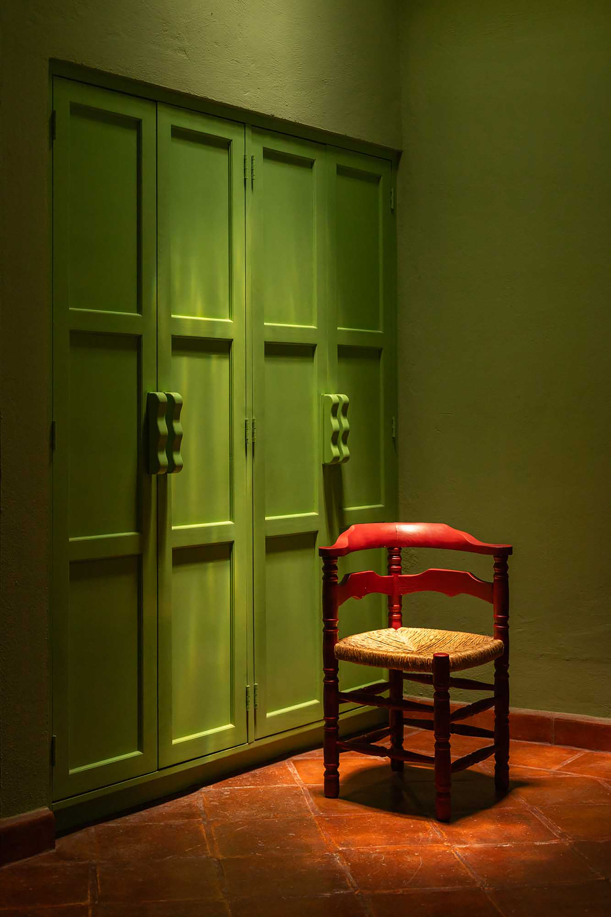
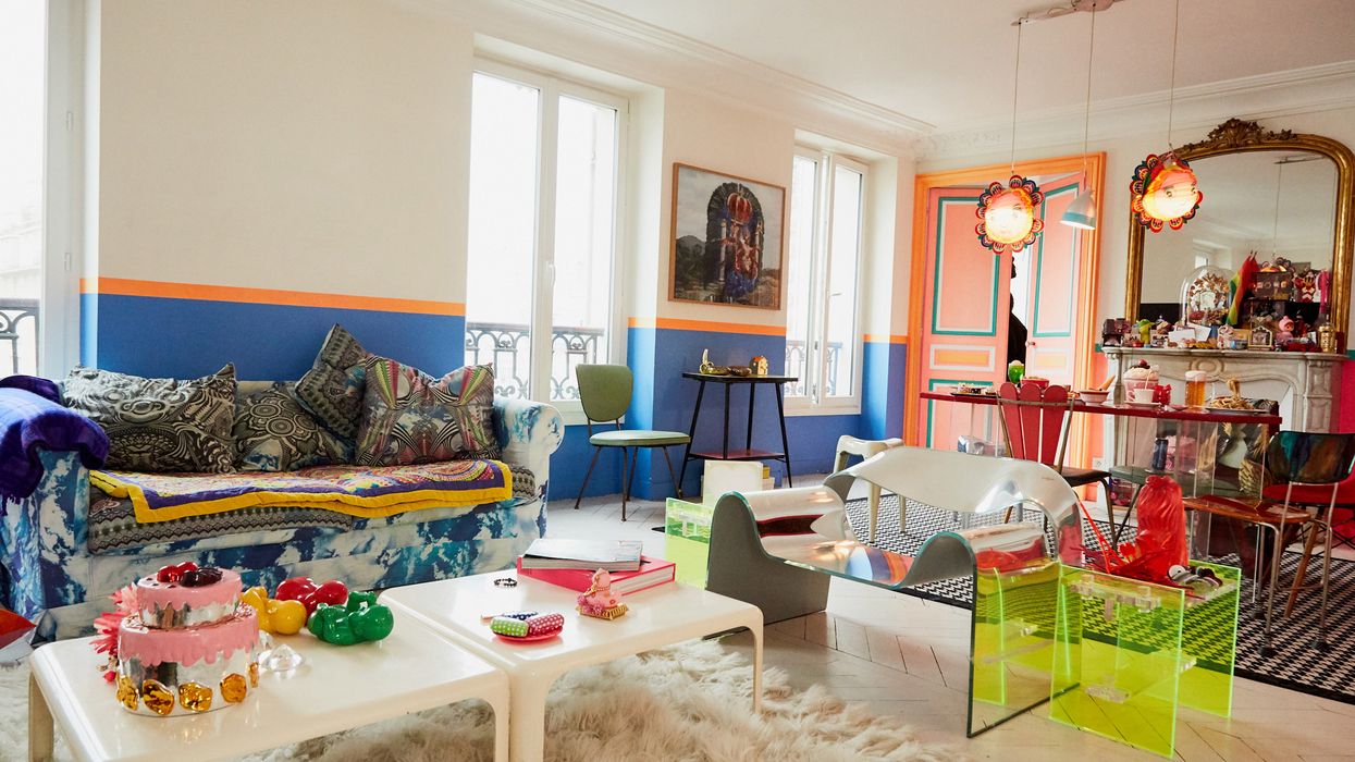
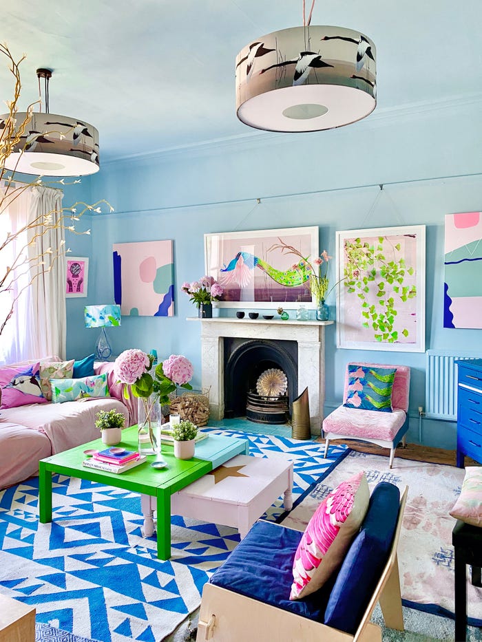
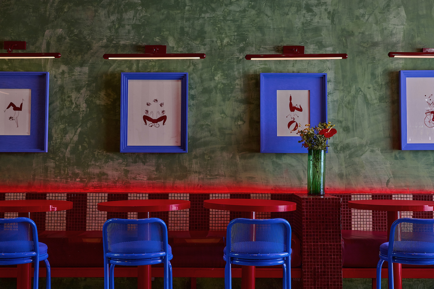
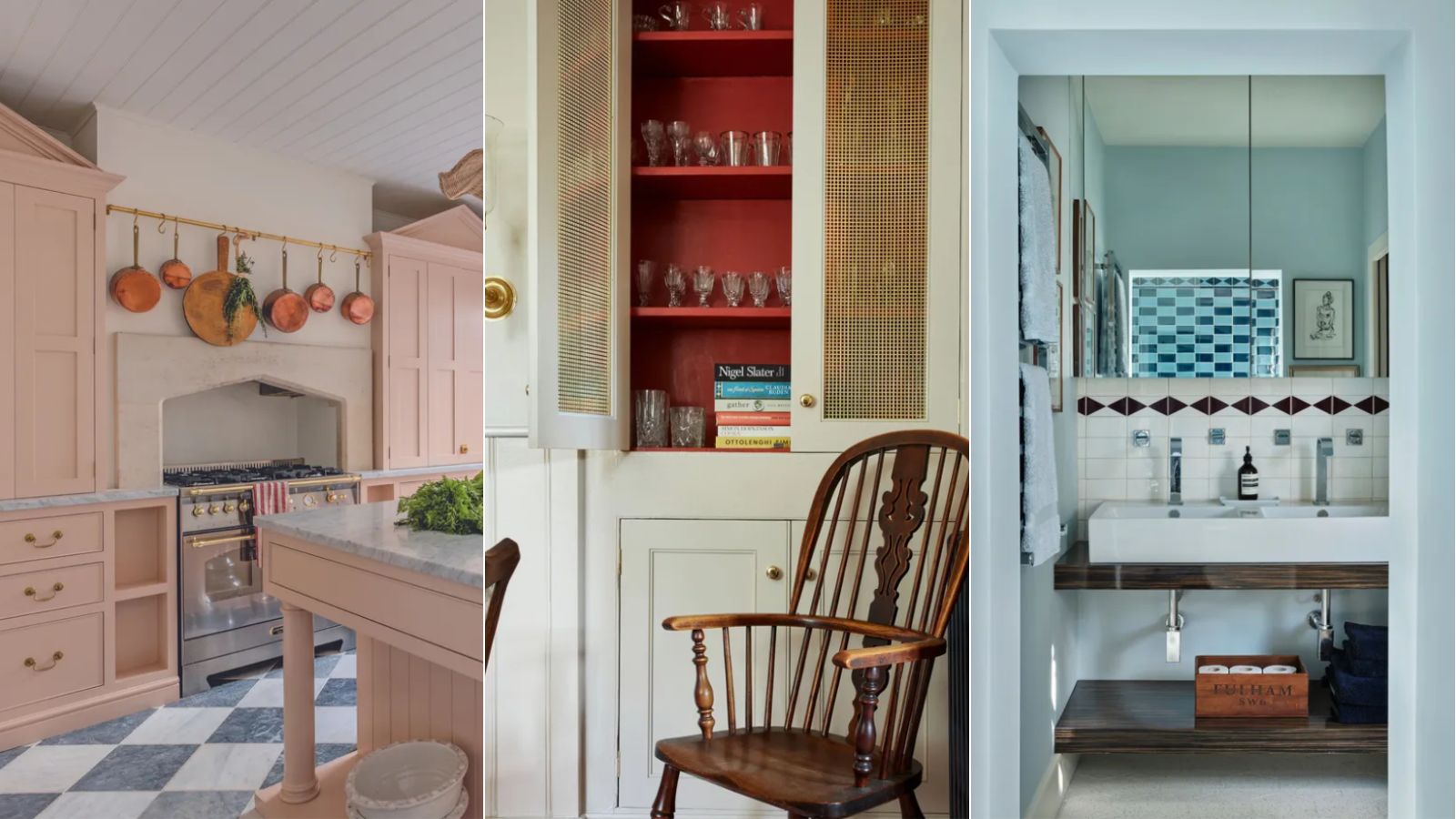
Even with bolder or more joyful colors, the rule maintains its effectiveness by ensuring a consistent gradation from darker at the base to lighter at the top. For example, deep burgundy can ground the base, with muted terracotta and ochres in the middle, and a dusty blush or pale cream above. This technique can be applied not only to paint but also to furnishings, demonstrating its versatility in creating cohesive and intentional design. The article concludes by highlighting that this nature-inspired color rule offers a timeless approach to interior design, providing a decorative alternative that draws the eye upwards and evokes the joy of the outdoors.
#InteriorDesign #ColorTheory #HomeDecor #NatureInspiredDesign #VerticalColorRule #CalmColorPalettes #DesignBalance #DecoratingWithColor #PaintColors #InteriorDesign #ColorTheory #HomeDecor #NatureInspiredDesign #VerticalColorRule #CalmColorPalettes #DesignBalance #DecoratingWithColor #PaintColors
0 تعليق إجمالاً
 لا توجد تعليقات بعد
قد تعجبك أيضًا
These Paint Colors Bring Hostility to Your Home, According to Experts

5 'ugly colors' that I'll be decorating with in 2024 – these undesirable colors will trend this year

How Your Home's Paint Colors Can Make You Happier, According to Experts

20 Nature-Inspired Paint Colors That Bring the Outside In

This Cheery Kitchen Color Could Hurt Your Home Value

Are these 7 unlucky colours messing with your home's Vastu?

Tips for Bringing More Color Into Your Home, Straight from Interior Designers

15 ways to add color to your home, according to interior designers
This Popular Kitchen Color Can Actually Hurt a Home’s Sale Price

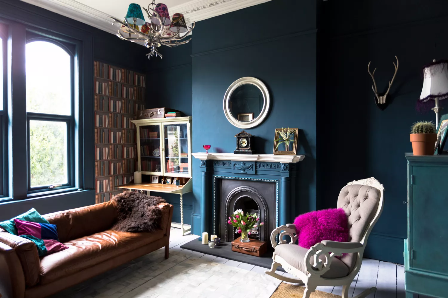
7 Paint Colors Designers Wish They Never Used (and What You Should Use Instead)

Decorating with paint

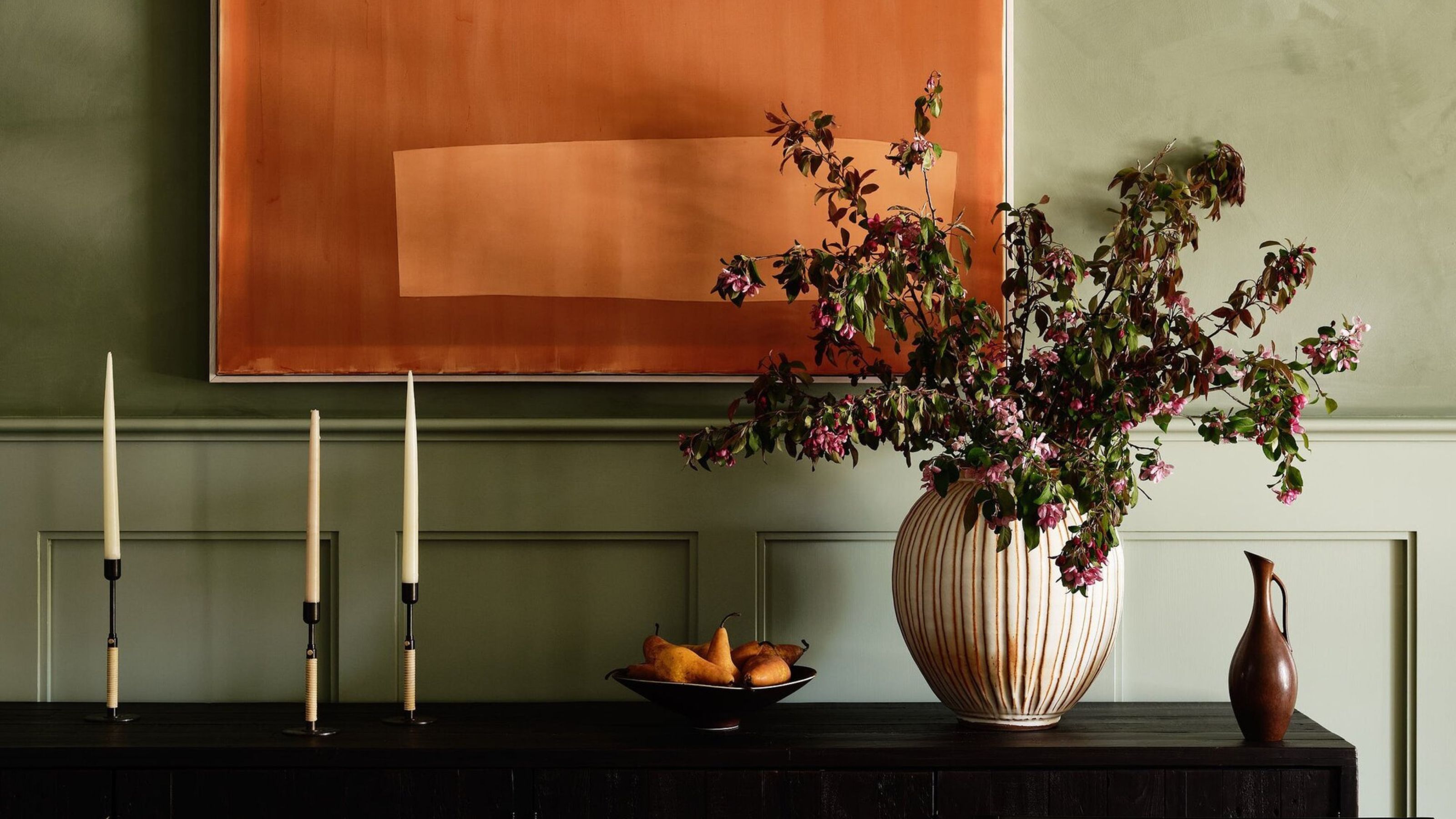
How to Make Orange and Green Work Together — It Can Be "Dynamic and Joyful", but Only If You Get It Right
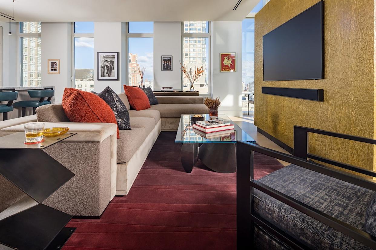
Designers Say You Might Be Mixing Textures in Your Home All Wrong

7 'Unhappy' Colors That Color Psychology Experts Would Never Paint Their Walls
Incorporate Color Drenching Into Your Home Design

The 10 Secrets Behind 'Biophilic Colors' That Bring Nature's Power Into Your Home — And It's Not All Just About Green
This Kitchen Color Might Be Trending, But It Could Hurt Your Resale Value
A color psychologist says these color schemes are the most likely to boost your mood
"Strategic Neon" is the Unexpected Color Your Home is Missing
The No. 1 Paint Color to Avoid Pairing with Wood, According to a Designer