1/7
5 ways to decorate with Beacon Gray – Benjamin Moore's 'luminous' and versatile blue-gray paint
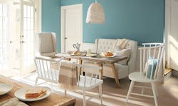
Gray has seen a shift in its popularity within interior design. While it was once a staple for minimalist aesthetics, the current trend favors more layered and eclectic styles, often incorporating warmer tones. However, gray remains relevant through new variations that align with contemporary interior trends. Benjamin Moore's Beacon Gray is highlighted as a prime example of a reinvented gray, offering a blend of gray and blue that avoids the dullness often associated with neutral grays.
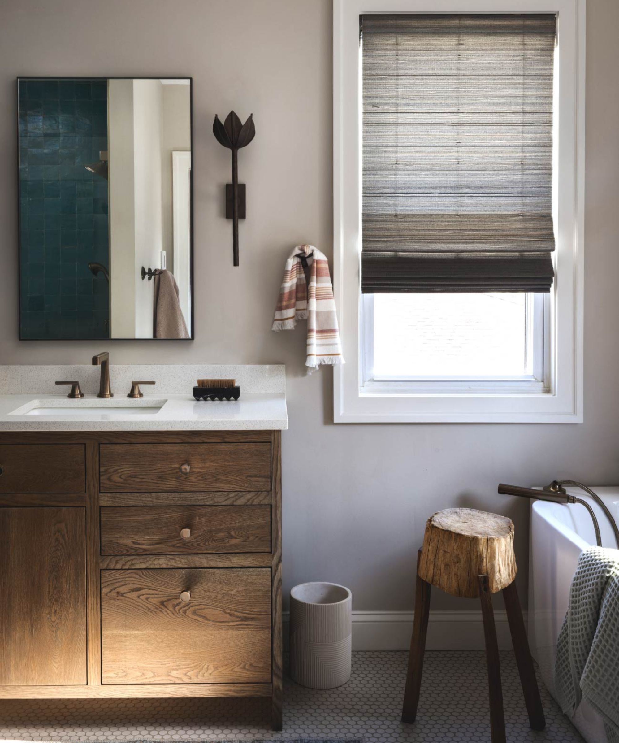
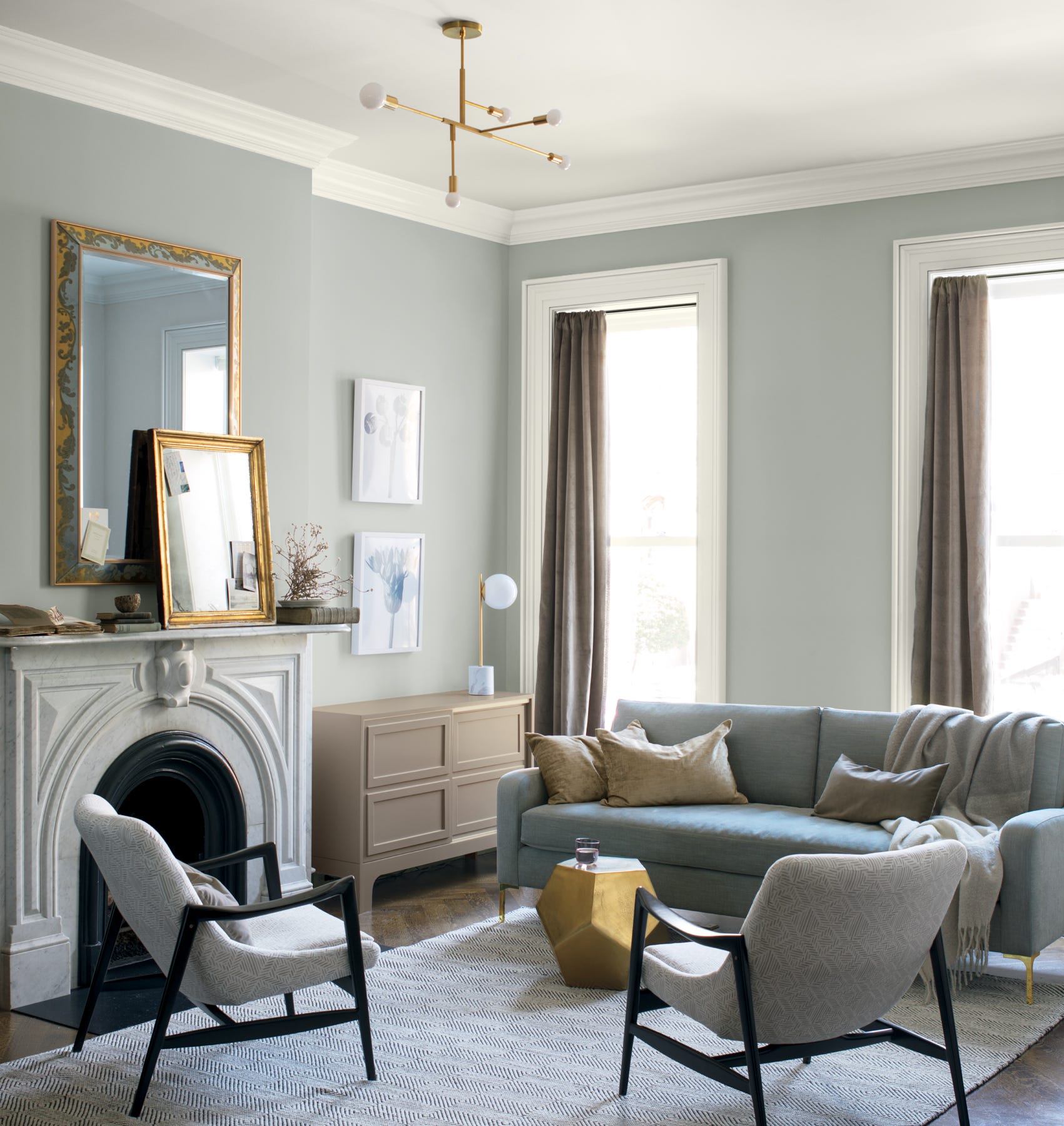
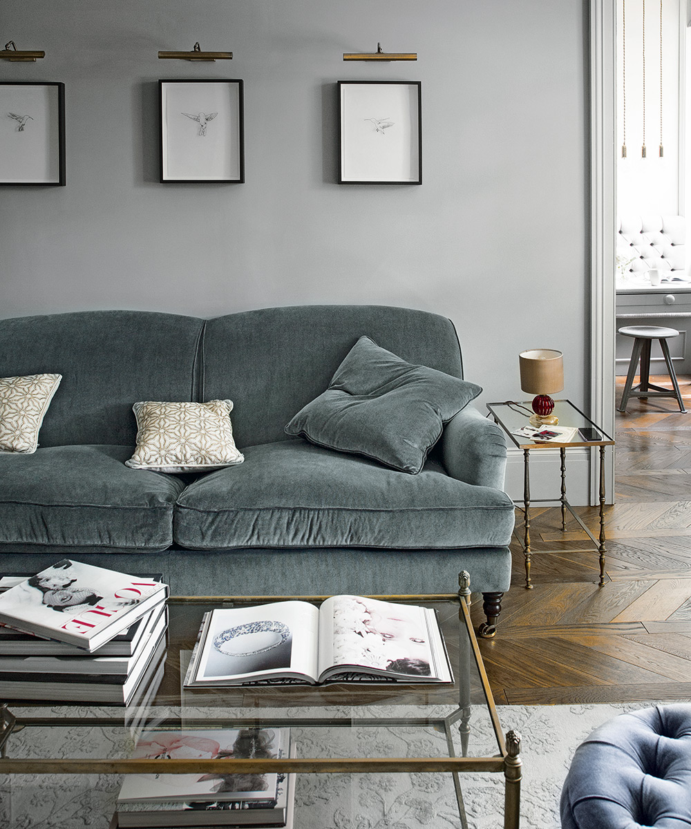
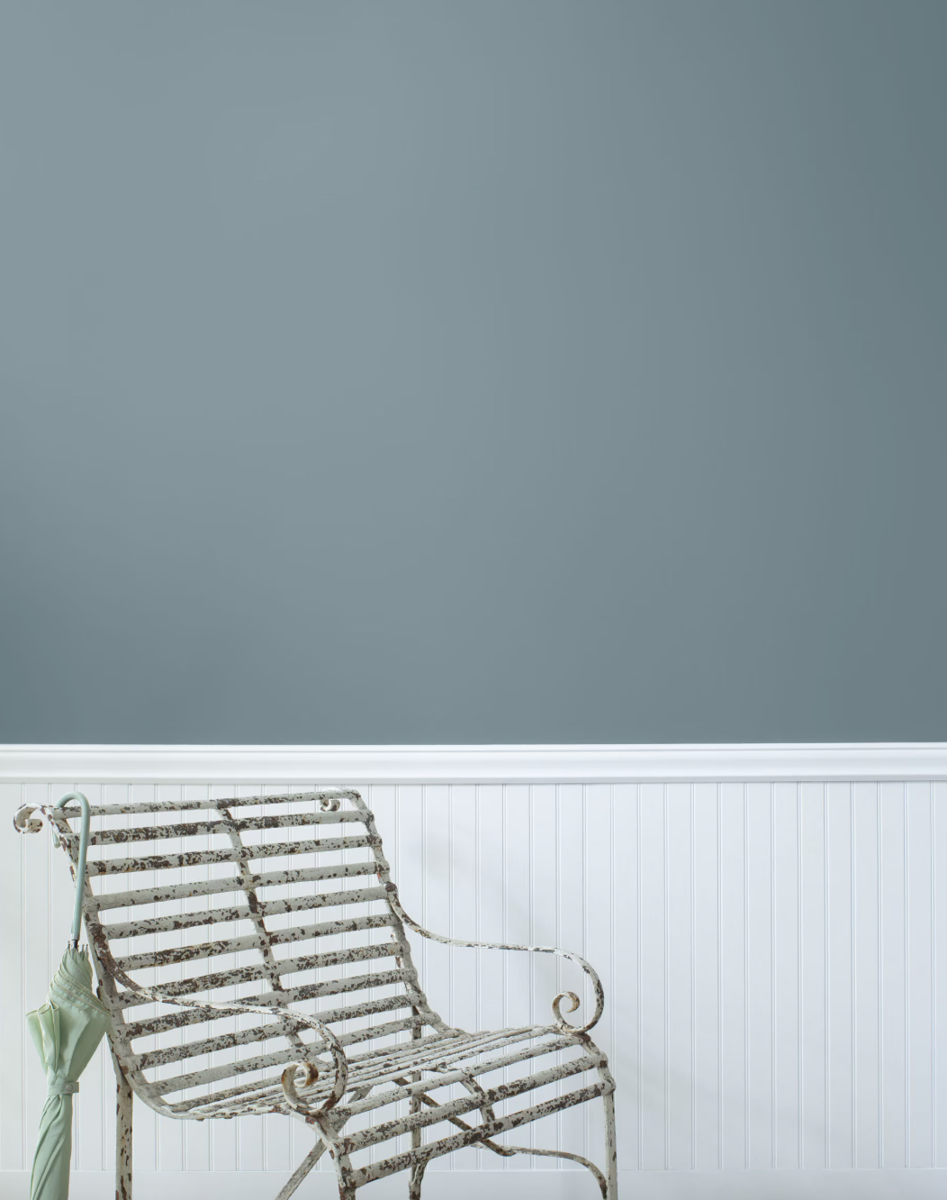
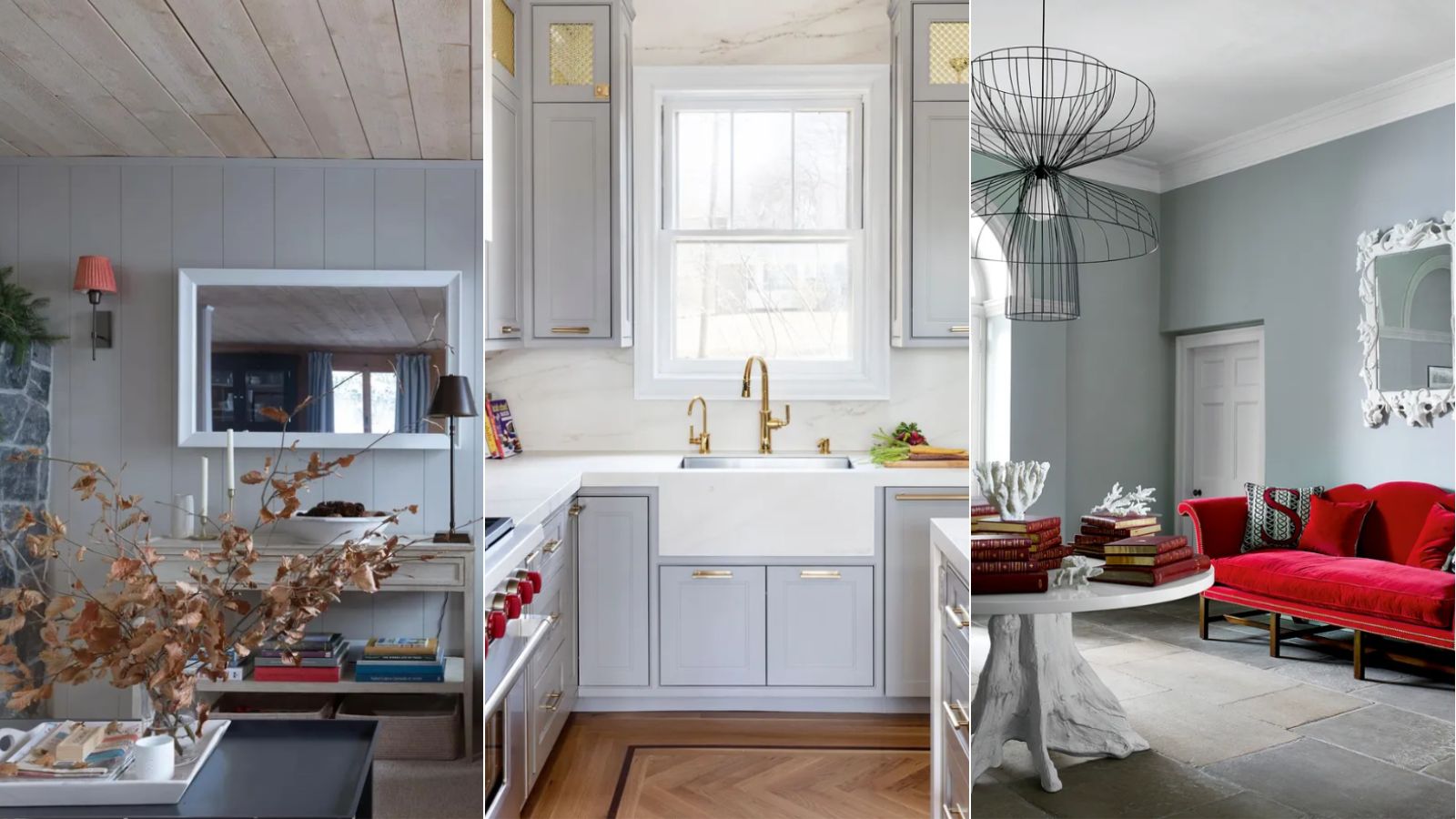
Helen Shaw, Director of Color Marketing at Benjamin Moore, explains that popular grays are not simply black and white gradients but include other pigments for complexity. Beacon Gray, for instance, has a slight blue undertone, creating a cooler, luminous hue that provides an illusion of extra light and space, making it suitable for smaller rooms. This light blue-gray offers the versatility of a neutral while injecting a colorful feel into a home. It's described as a light paint that strikes a balance between gray and blue, retaining neutral qualities without appearing dull.
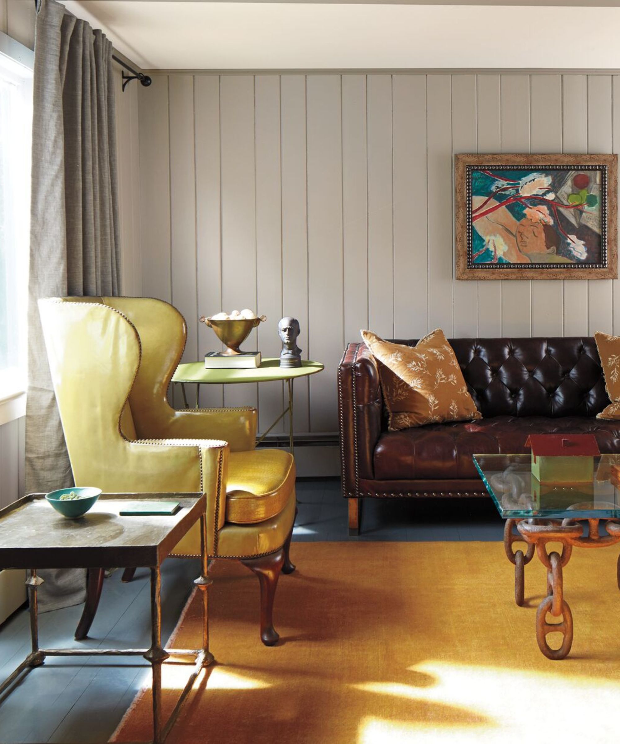
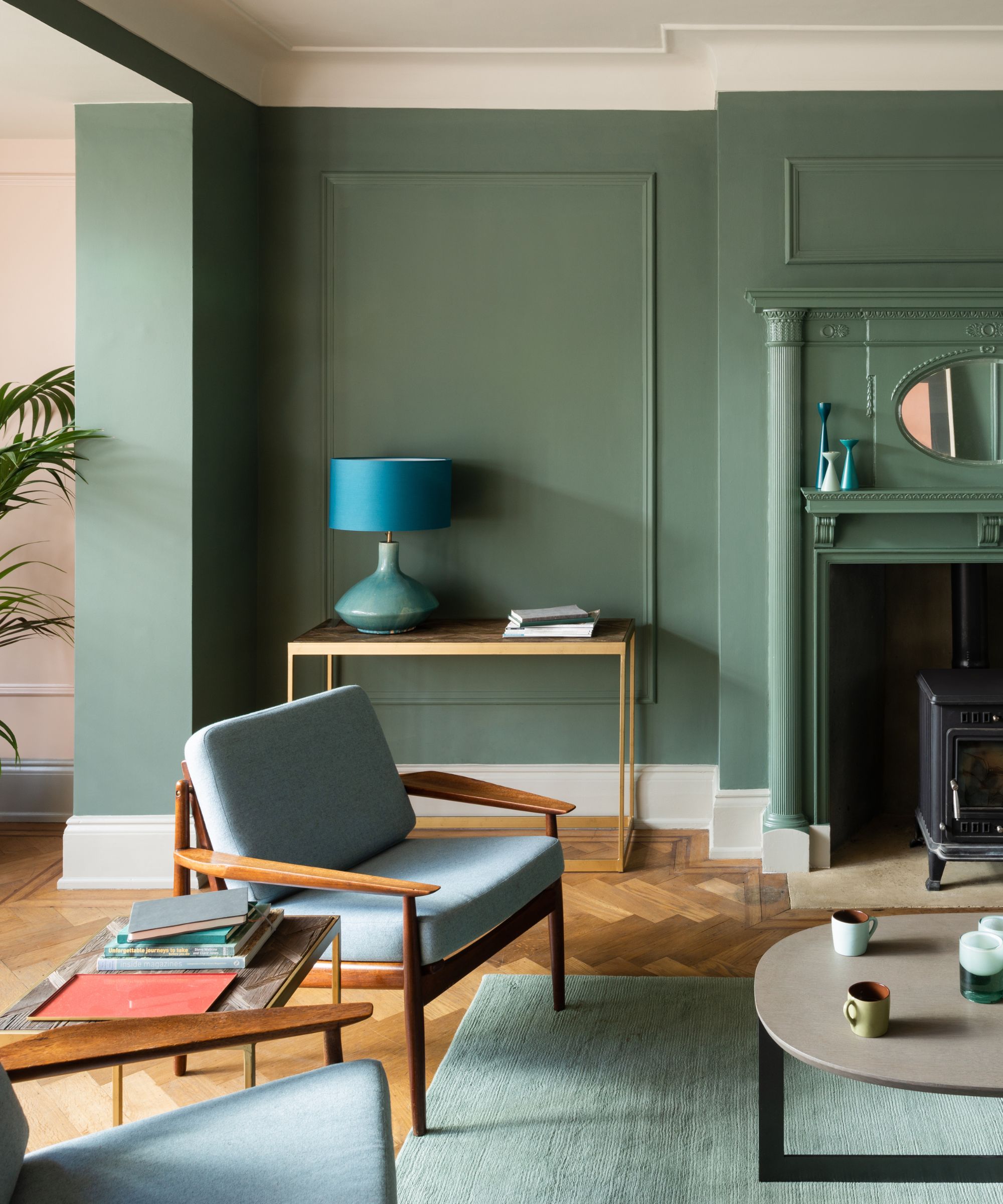
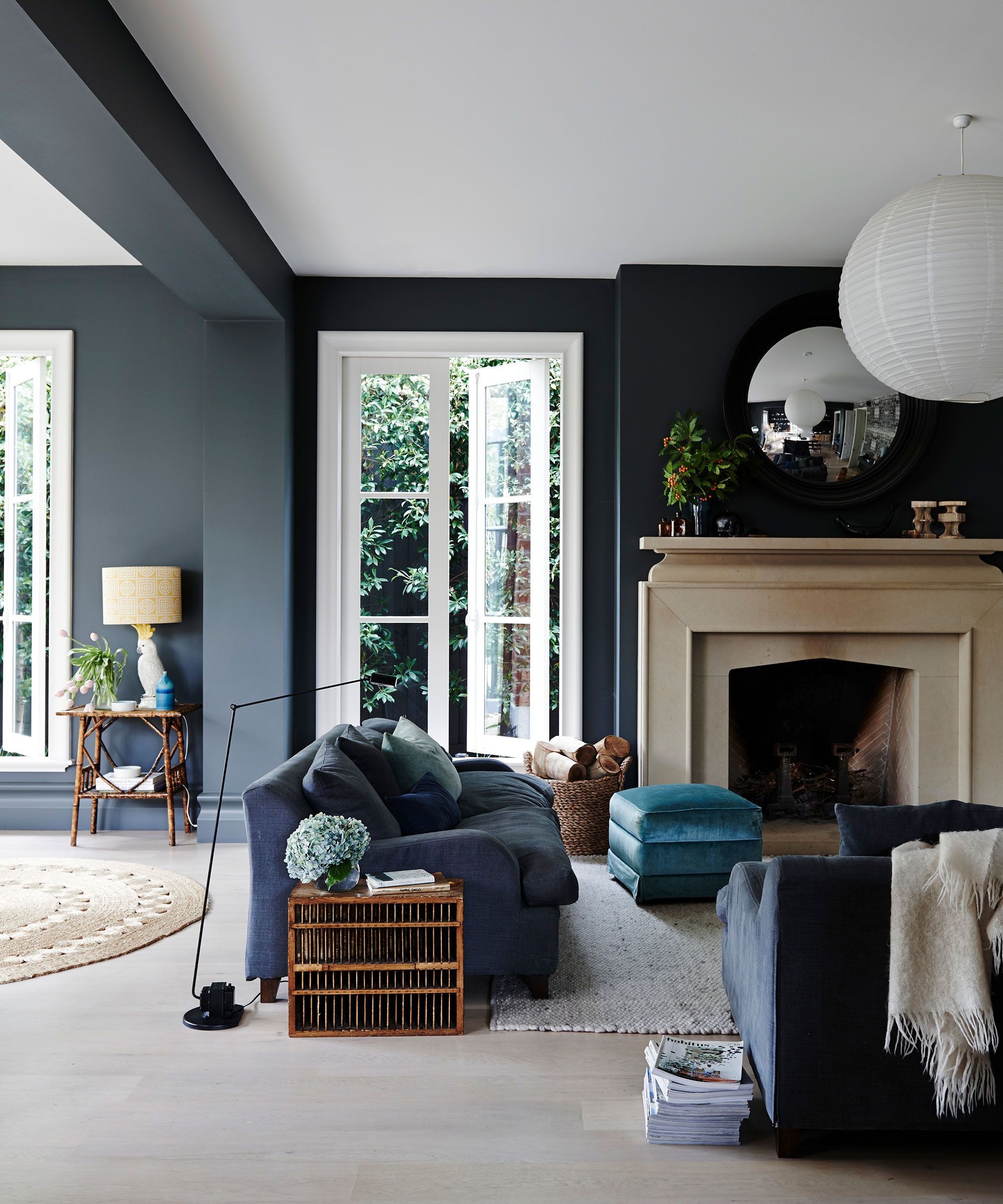
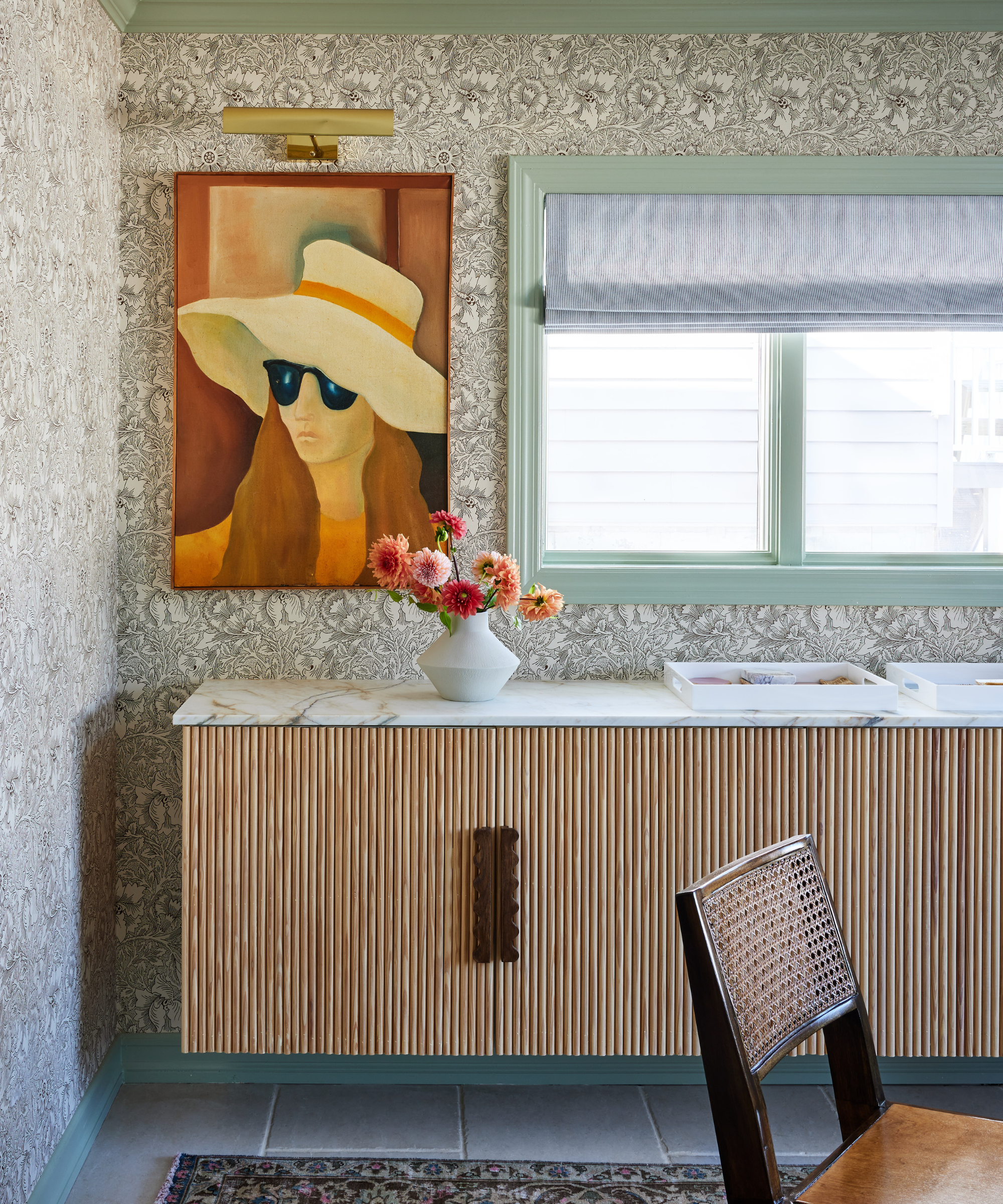
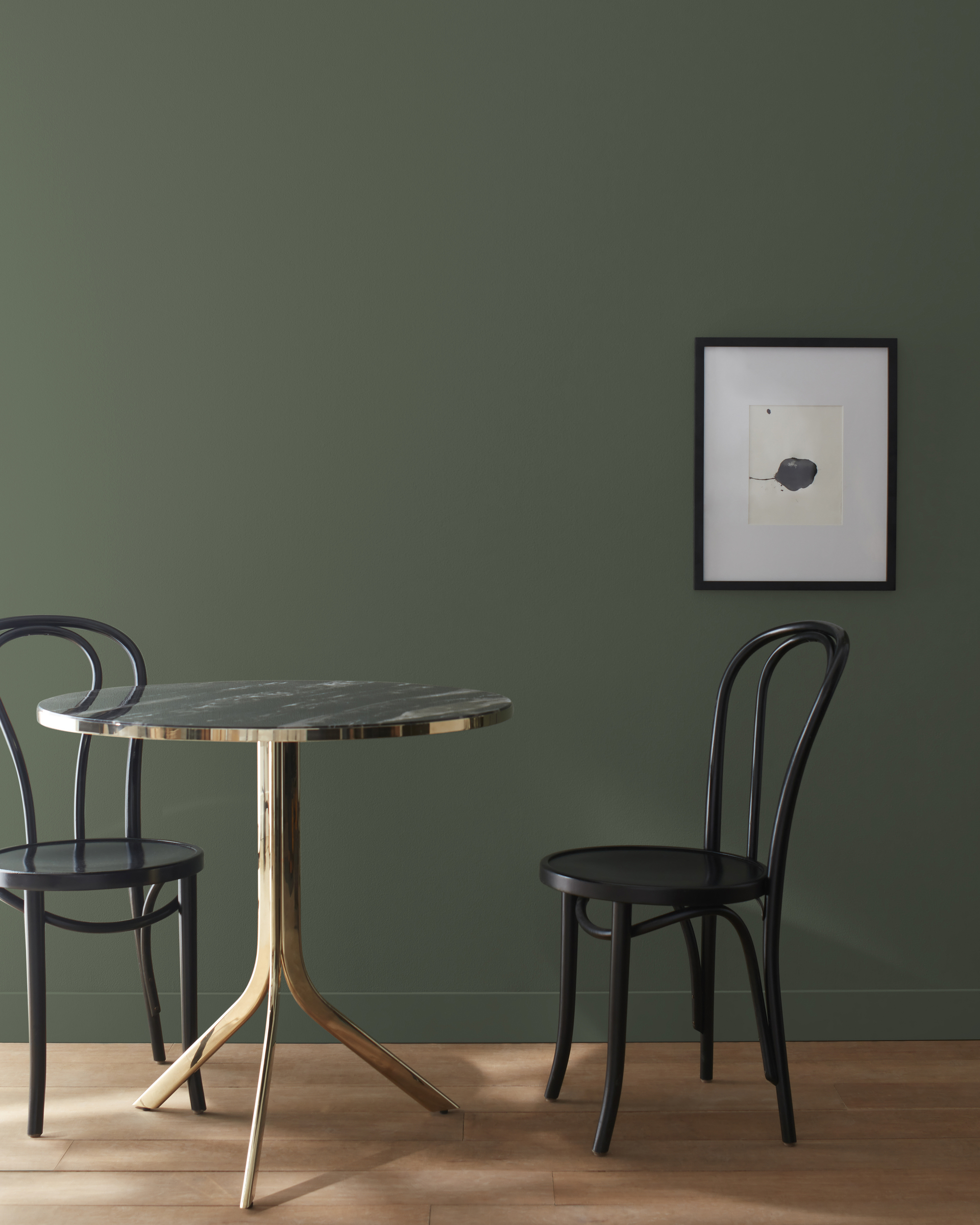
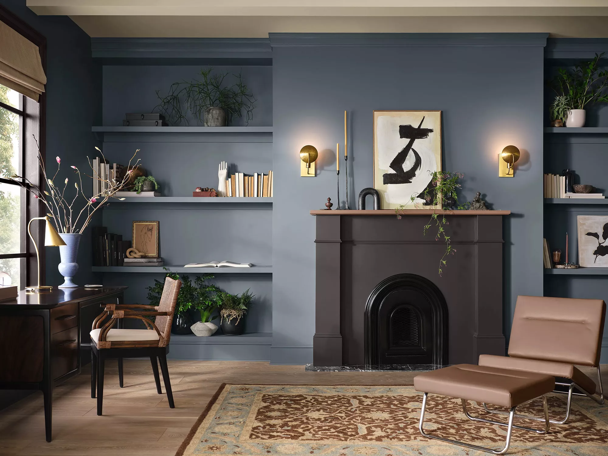
Five distinct ways to incorporate Beacon Gray into interior schemes are presented. First, color drenching, an on-trend technique where a single color is applied to walls, ceilings, trim, and even furniture, creates a cohesive and design-led look. Kara Piepmeyer of Studio Kosma suggests Beacon Gray is ideal for color drenching due to its medium intensity and dusty quality. For added interest, Helen Shaw recommends introducing a darker accent color with similar undertones, such as Benjamin Moore's Flint, to create a contrasting yet harmonious scheme.
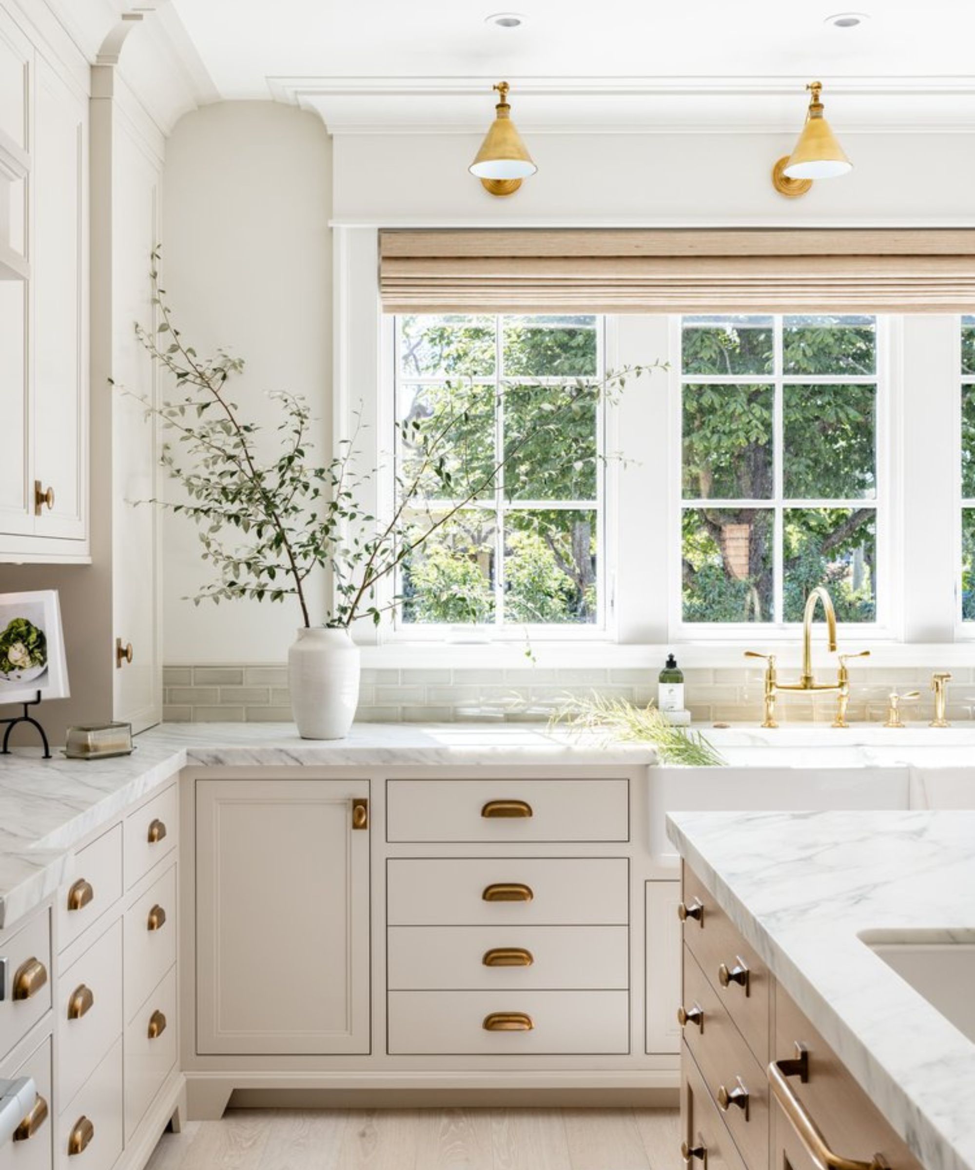
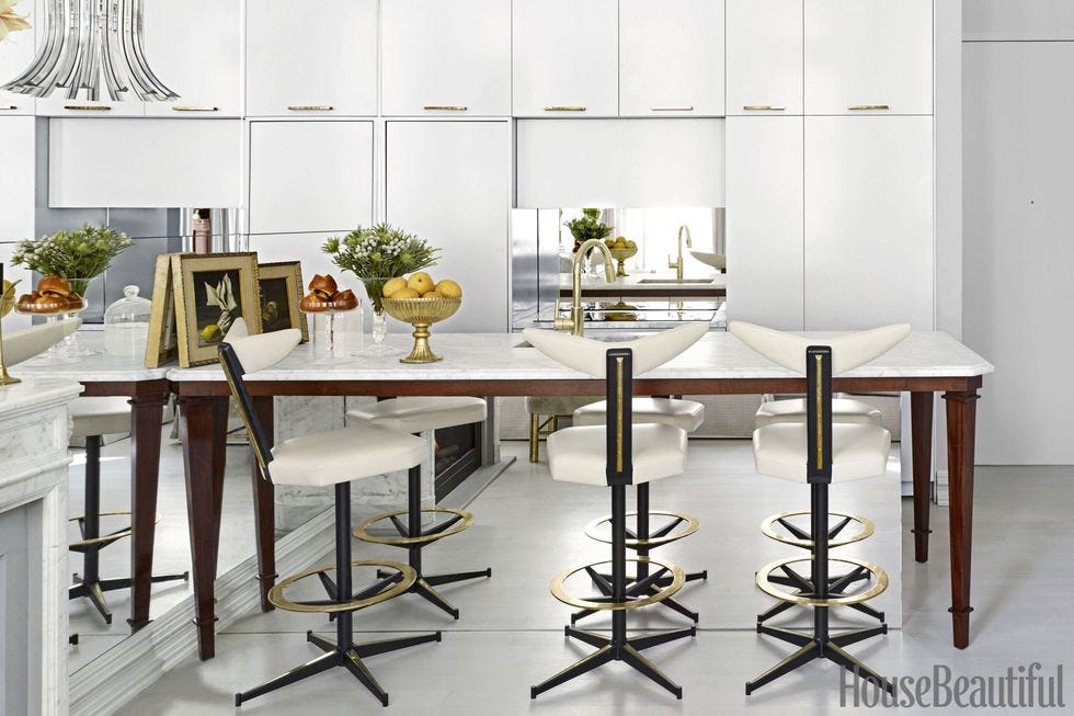
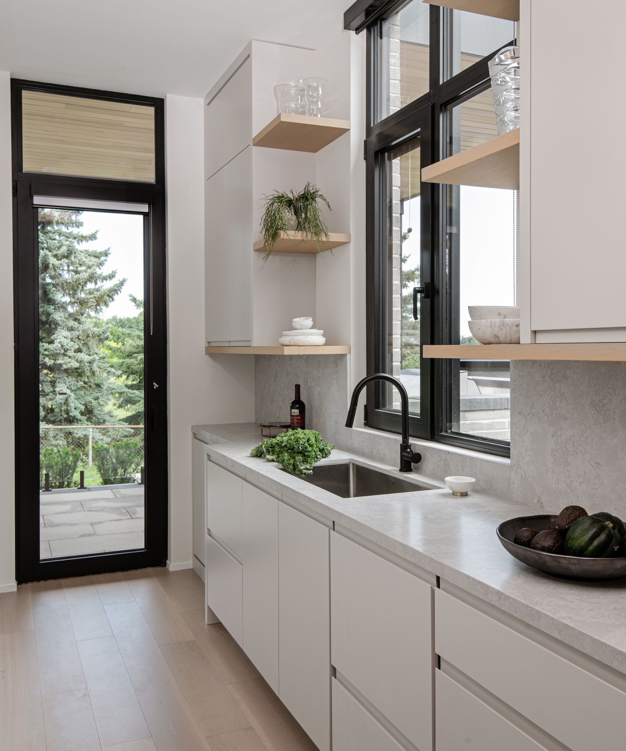
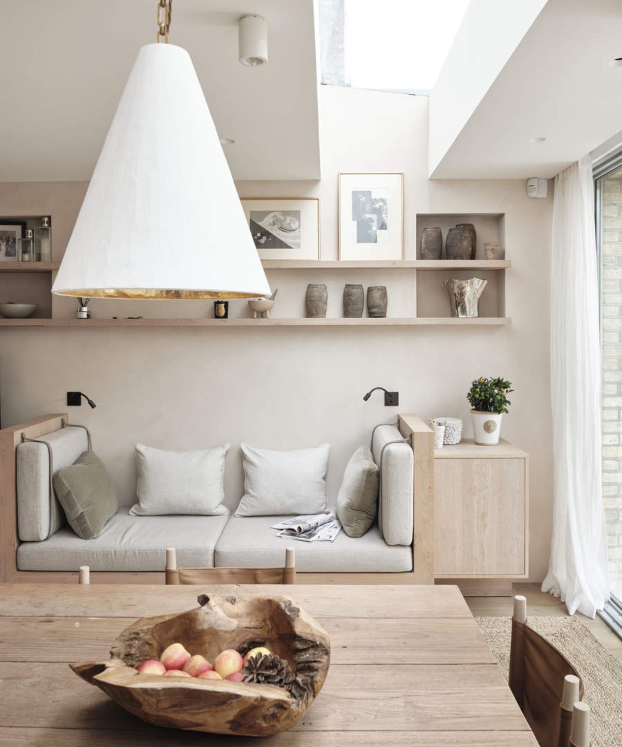
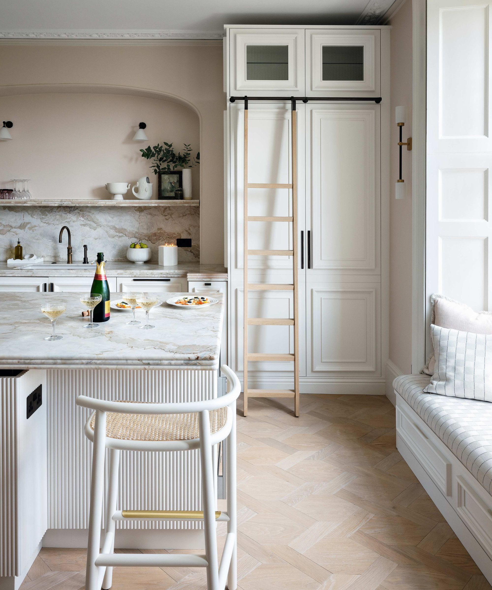
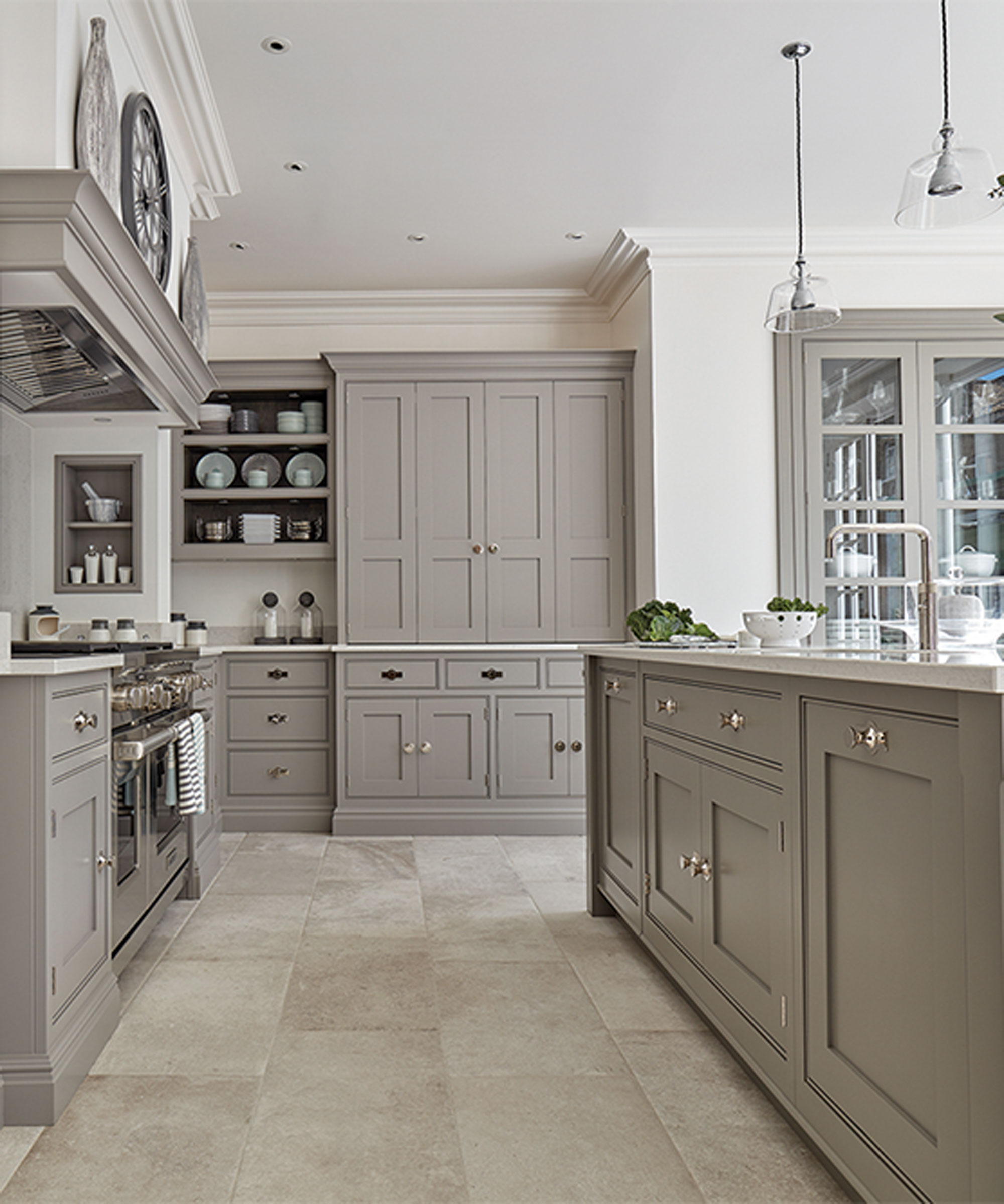
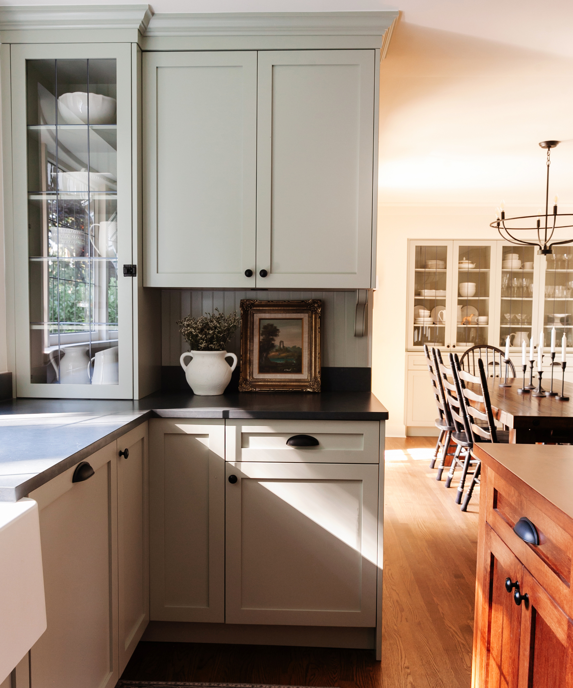
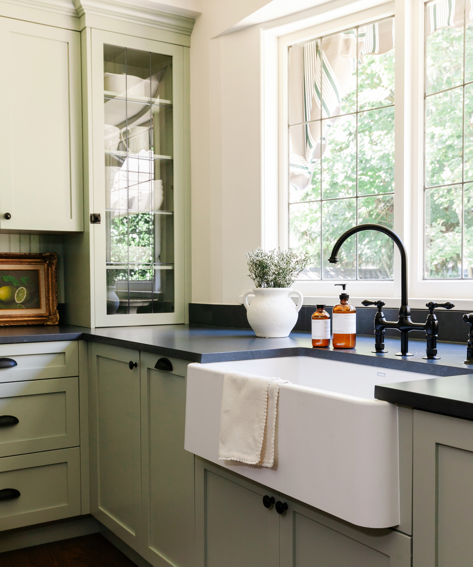
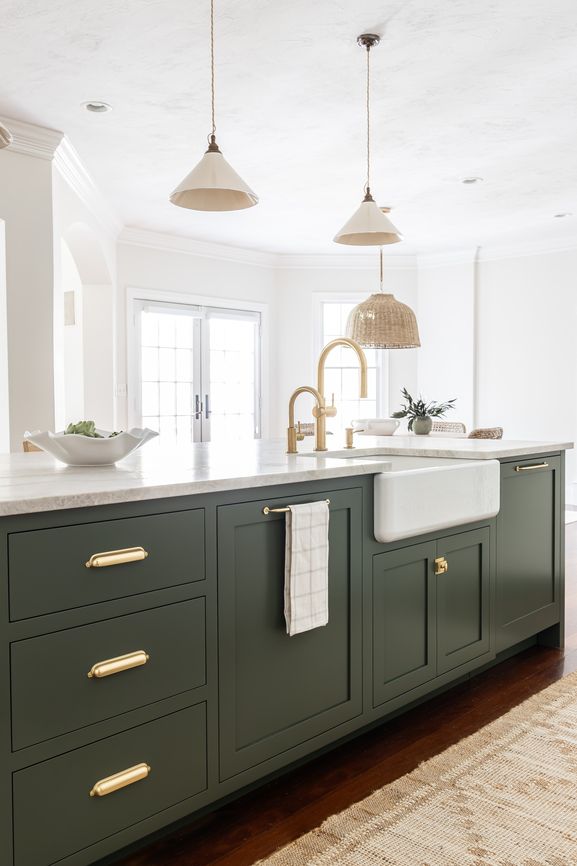
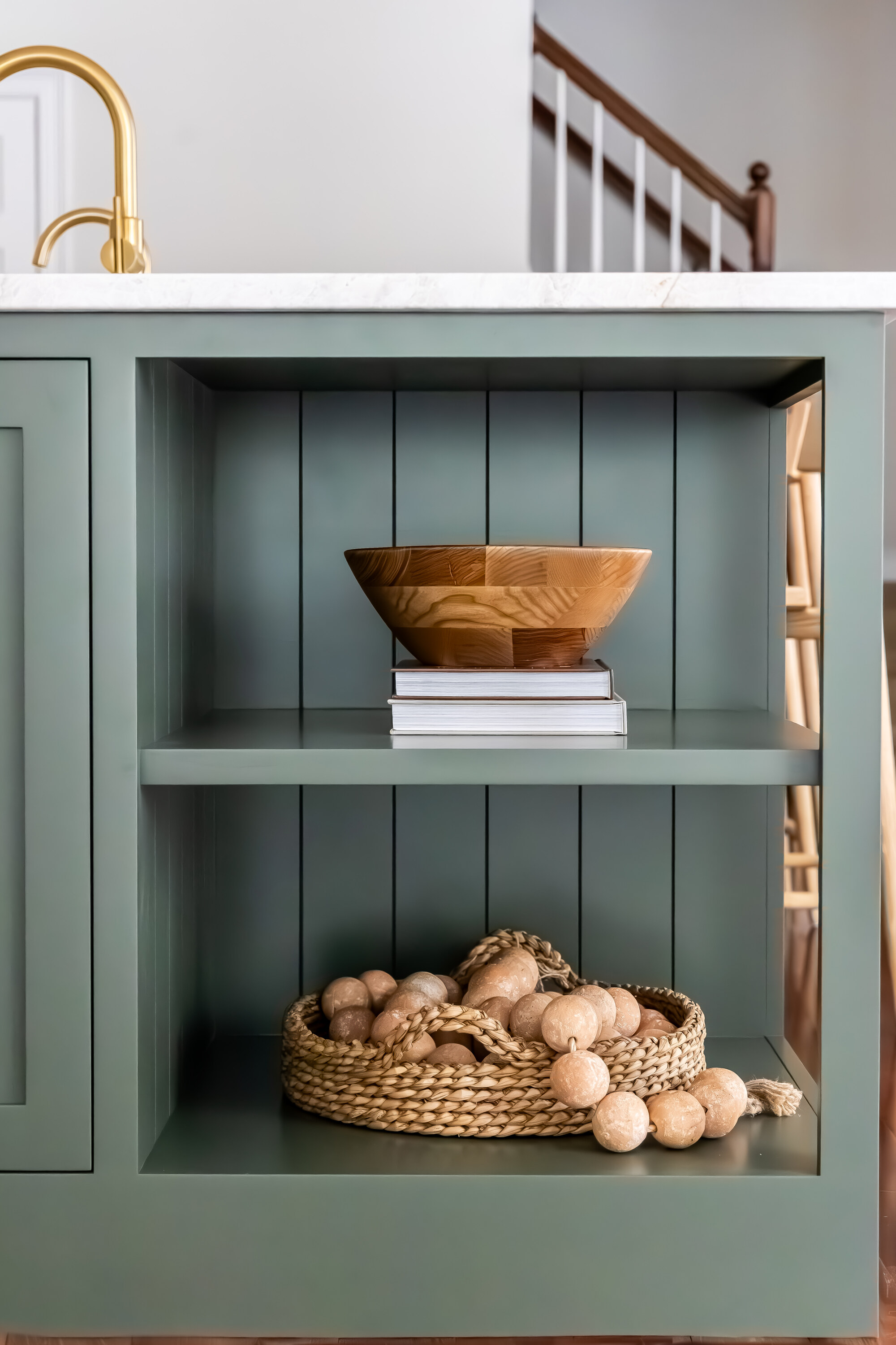
Second, pairing Beacon Gray with classic white is effective. Its soft nature makes it suitable for creating a modern, fresh, and bright aesthetic, particularly in kitchens when combined with warm natural wood tones. Tyson Ness of Studio Ness advises that Beacon Gray complements cooler neutrals and whites, and warm woods, but should not be paired with warmer ivories or sandy neutrals. Helen Shaw suggests using a crisp, slightly cool white like Frostine to enhance the combination.
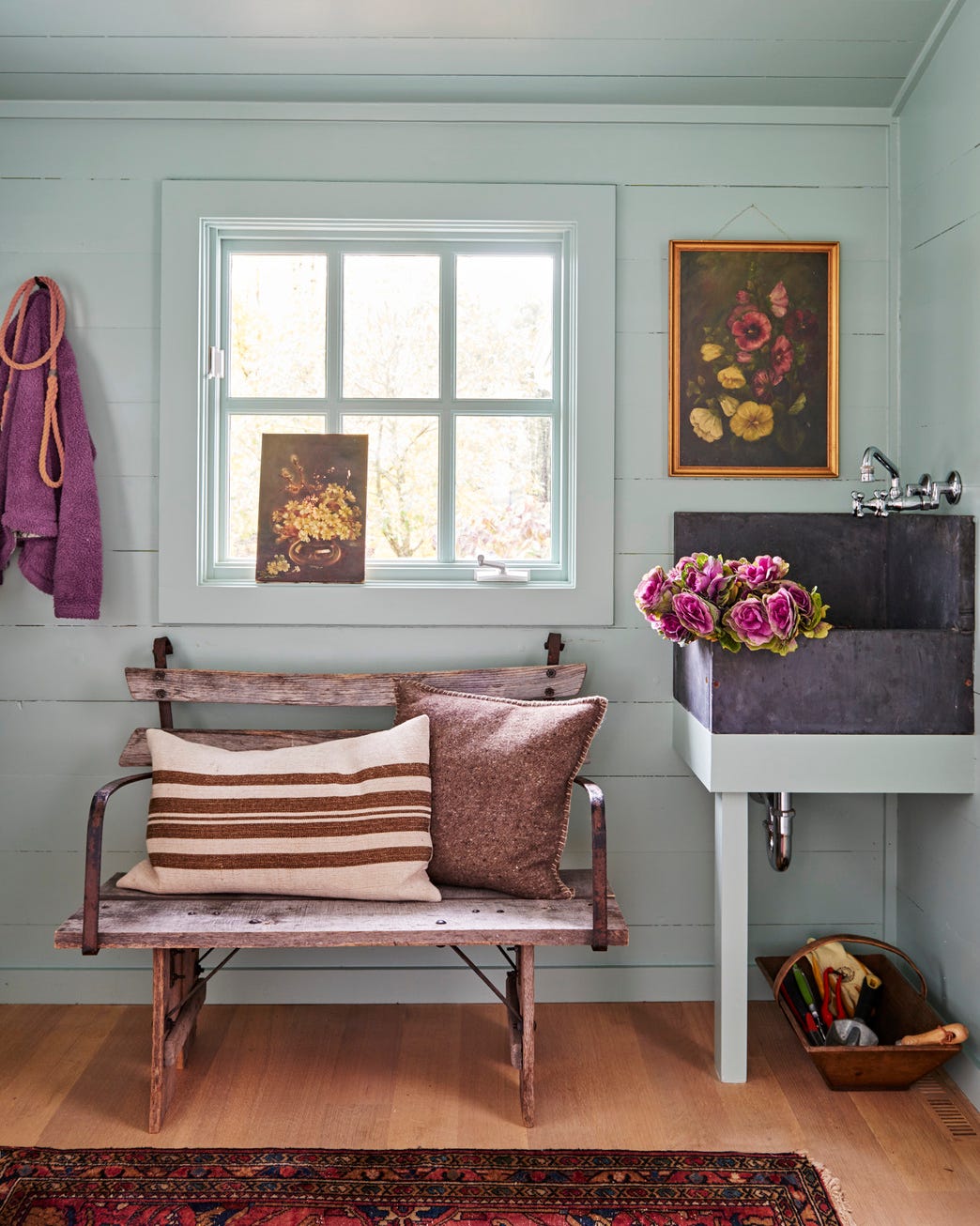
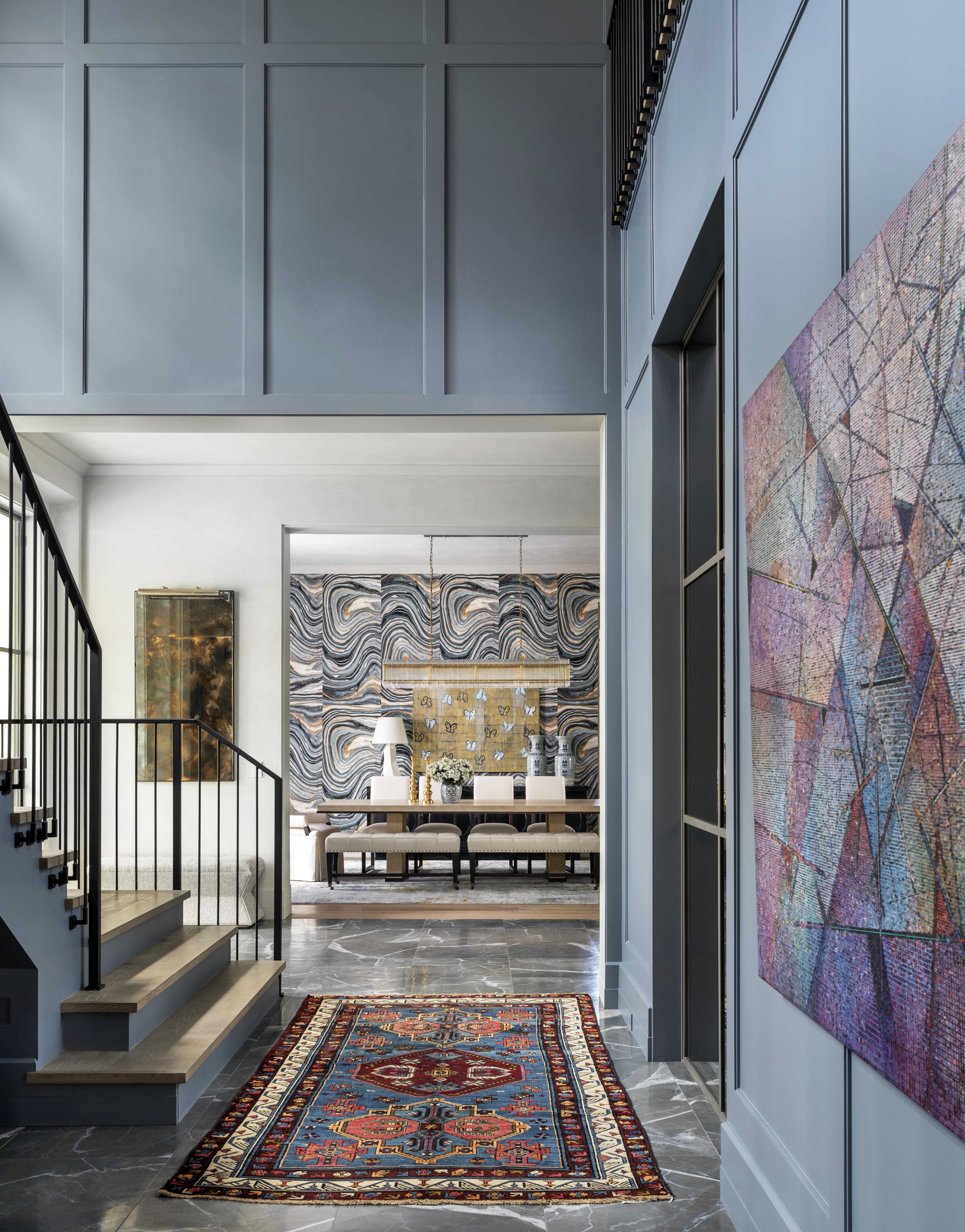
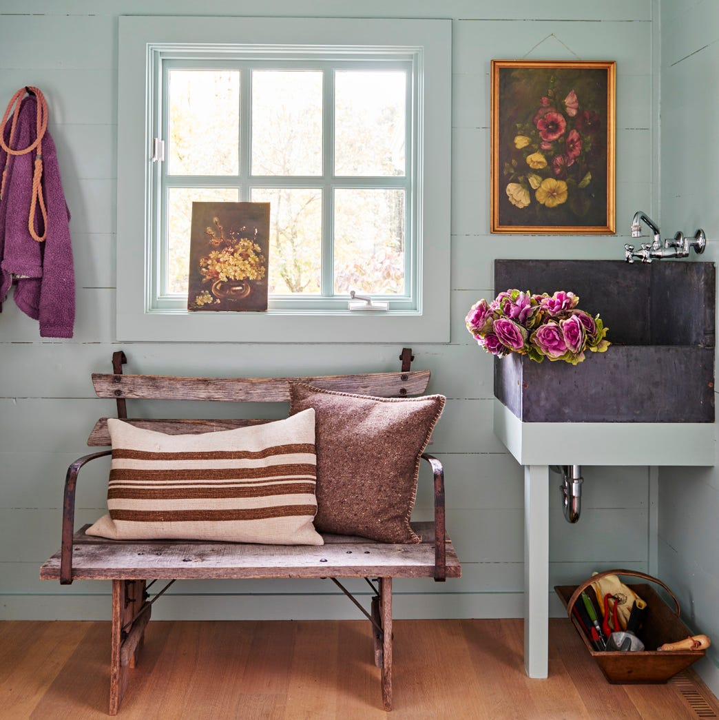
Third, Beacon Gray is an excellent choice for entryways and hallways. For those preferring a pared-back look over dramatic statements, this shade offers a classic neutral appearance with an added edge due to its blue tones, avoiding the blandness of typical beige or off-whites. In traditional, spacious entryways with classic furniture, Beacon Gray fosters sophistication, and its luminous quality also brightens small entryways.
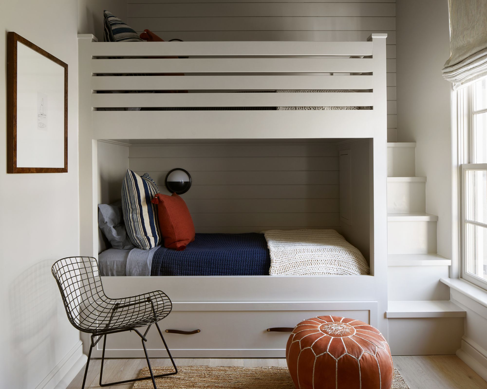
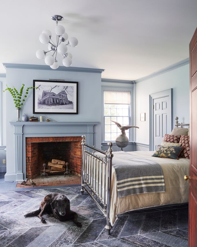
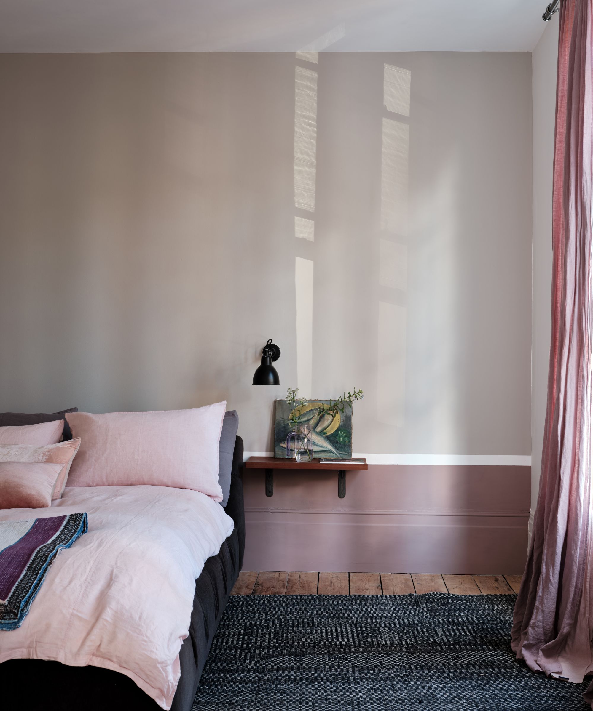
Fourth, Beacon Gray is ideal for creating a relaxing bedroom environment. Blue is renowned for its calming properties, making a blue-toned gray like Beacon Gray a suitable choice for bedrooms. Tyson Ness recommends pairing it with crisp white linens and shades of green, blue, and gray for a serene atmosphere. For a more colorful scheme, it can also be combined with contrasting furnishings like bright pink.
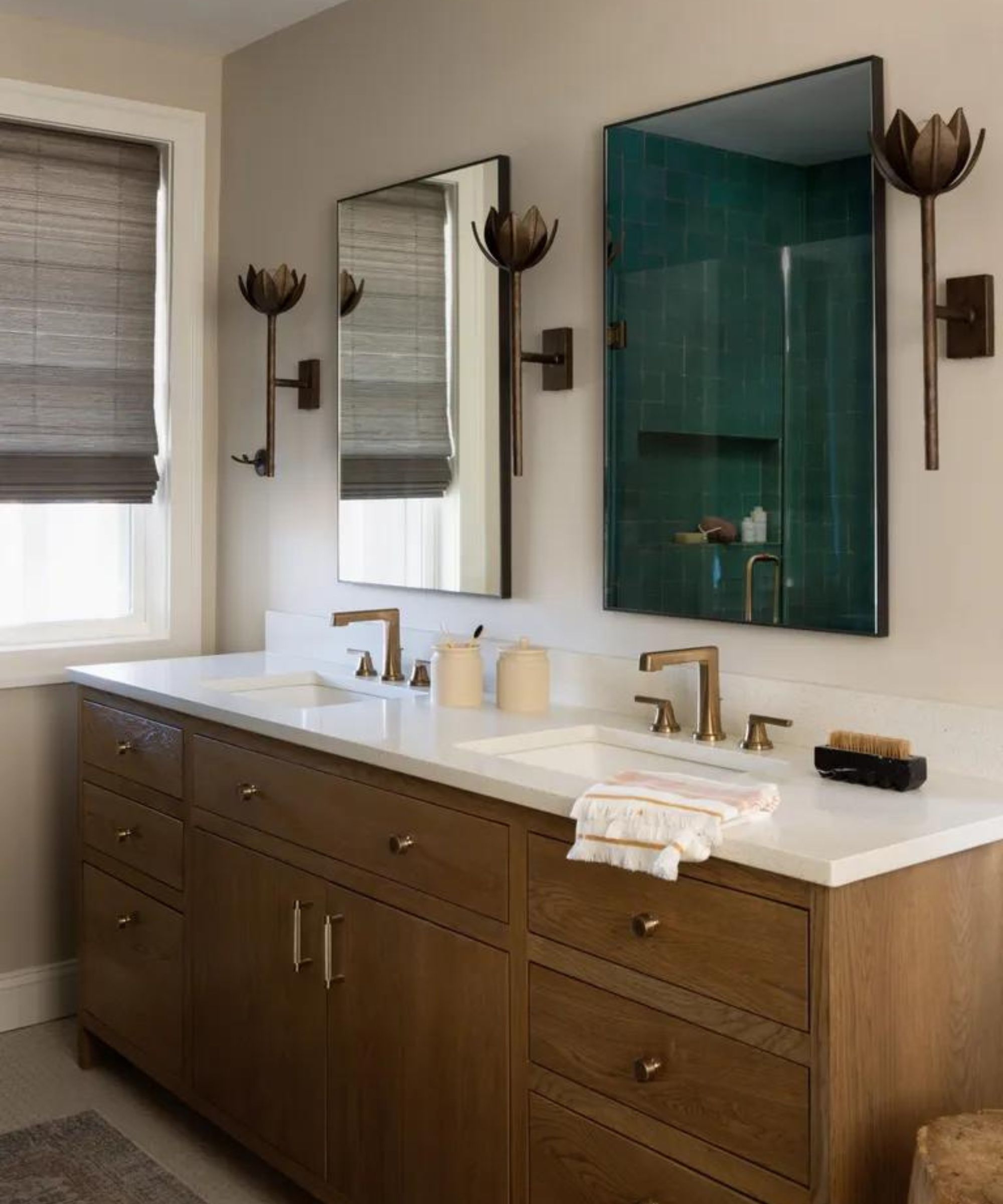
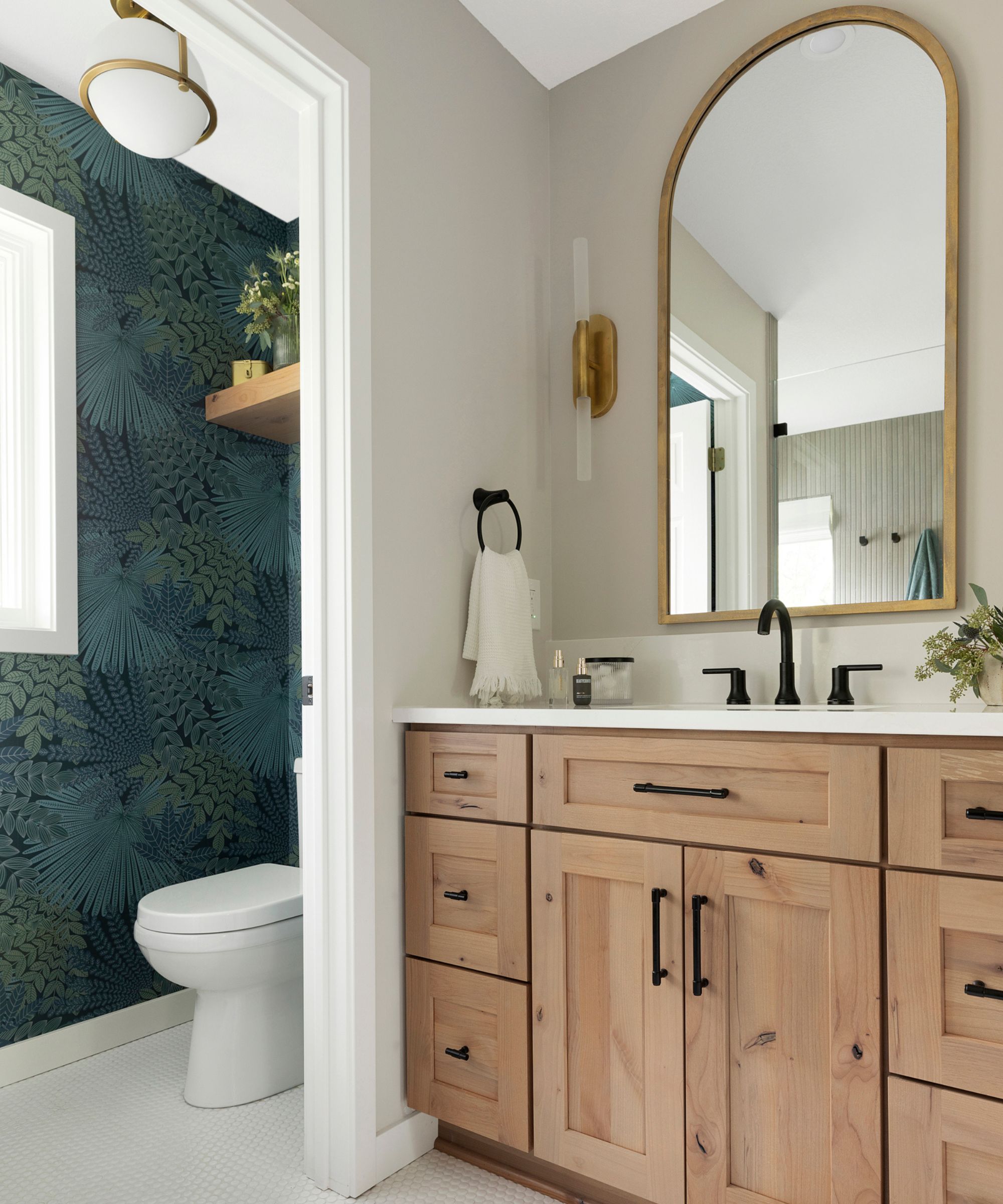
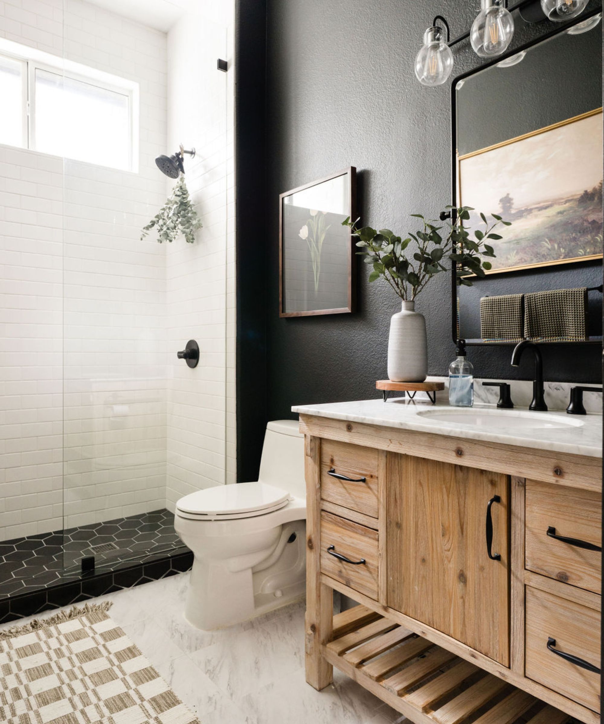
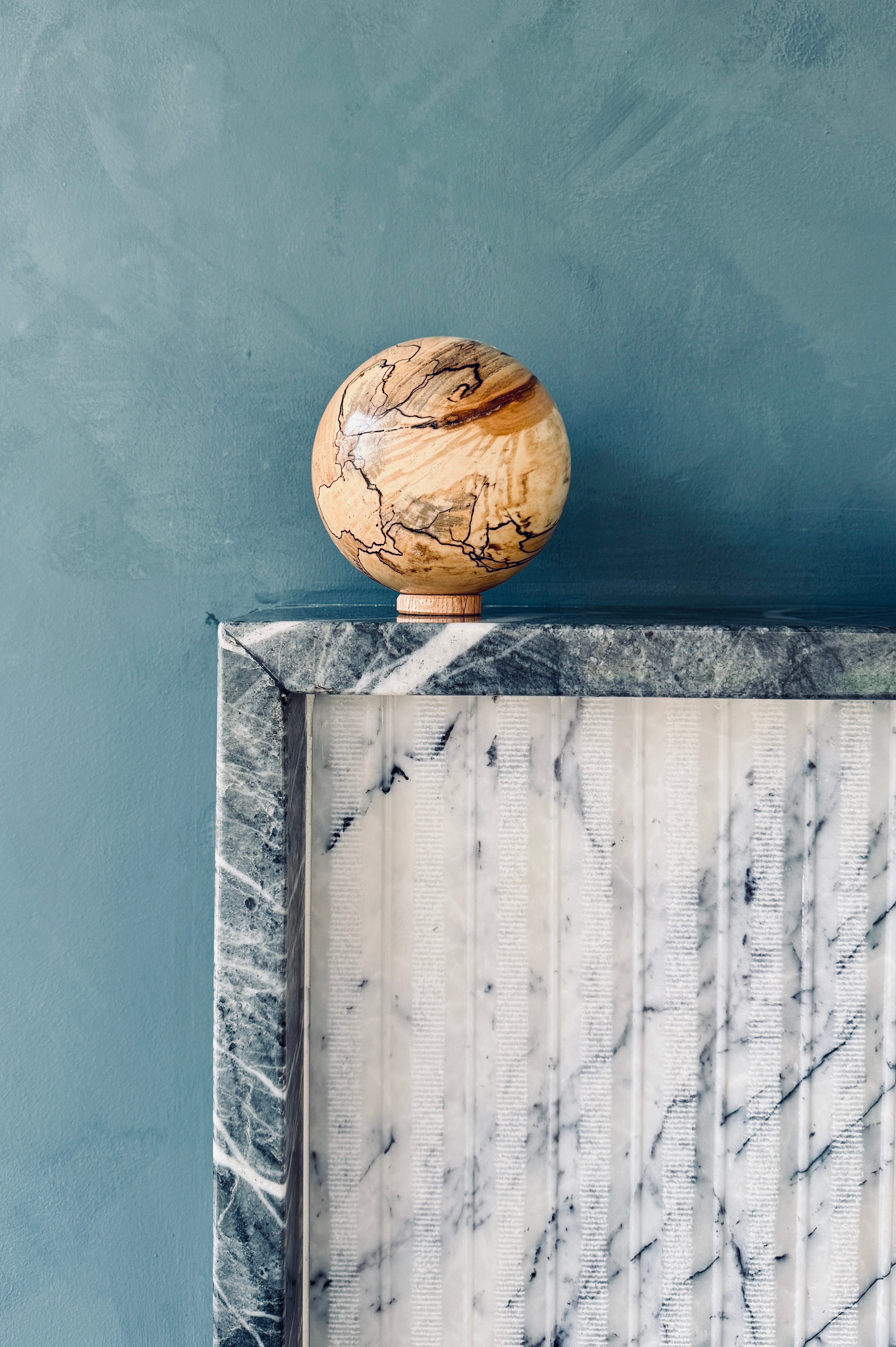
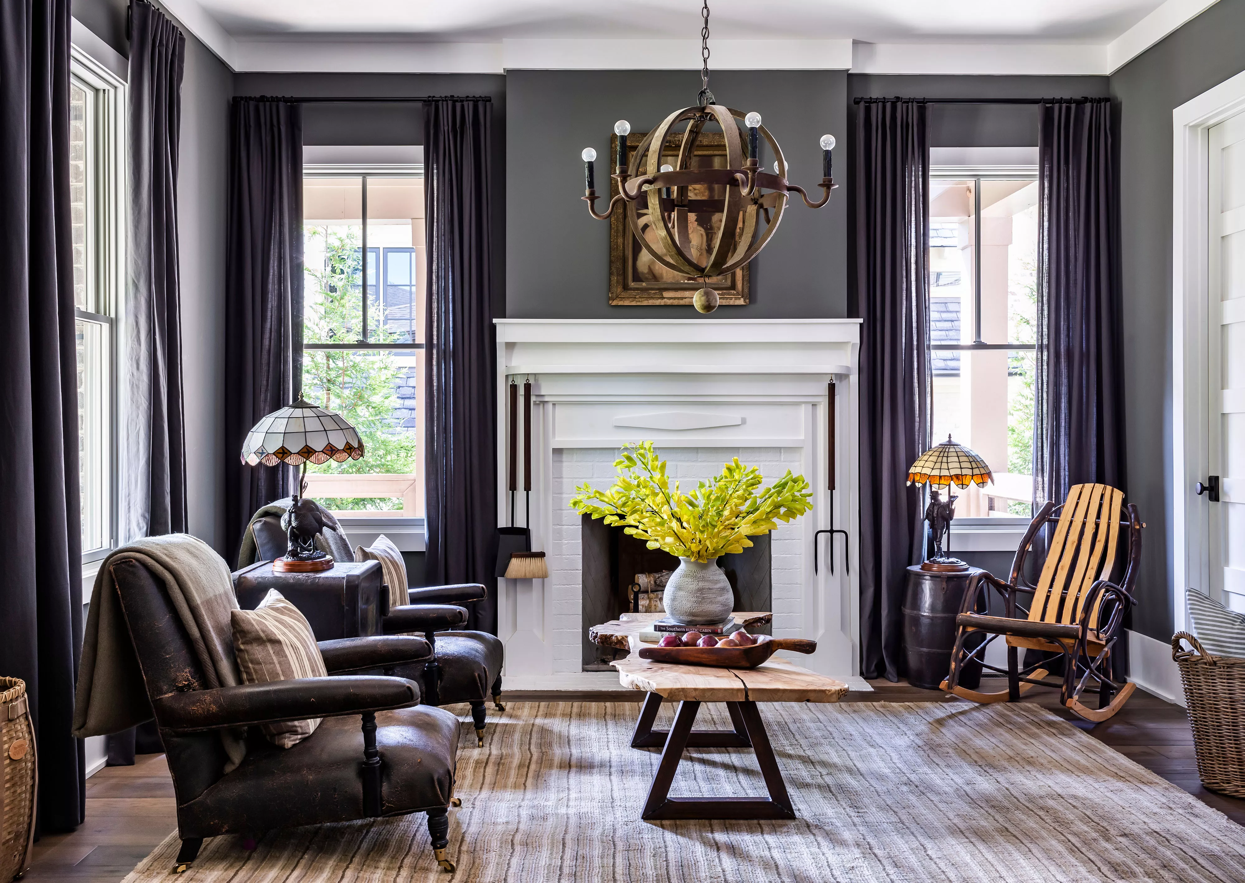
Finally, while Beacon Gray is understated, it can be used to create a dramatic interior. Incorporating rich, colorful hues and luxurious materials can result in an energizing and uplifting statement look. Kara suggests that its softness allows it to pair well with bright, intense colors. Its cool undertones also balance beautifully with materials like Carrara marble, making it suitable for powder rooms or guest bathrooms. The article concludes by emphasizing the versatility of Beacon Gray, whether aiming for a calming, pared-back look or a vibrant, contrasting statement, while reiterating the advice to avoid pairing it with warm neutrals such as beige or ivory.
#BenjaminMoore #BeaconGray #InteriorDesign #ColorDrenching #GrayPaint #HomeDecor #BedroomDesign #EntrywayDesign #KitchenDesign #BenjaminMoore #BeaconGray #InteriorDesign #ColorDrenching #GrayPaint #HomeDecor #BedroomDesign #EntrywayDesign #KitchenDesign
0 تعليق إجمالاً
 لا توجد تعليقات بعد
قد تعجبك أيضًا
5 ways to decorate with Edgecomb Gray, Benjamin Moore's softest gray paint
5 Ways to Use the Benjamin Moore Color of the Year

This is the most versatile shade you can bring into your home – designers share the 5 best greige paints
22 Sophisticated Ways to Decorate with Brown

6 ways to decorate with Revere Pewter, Benjamin Moore's best-selling gray paint
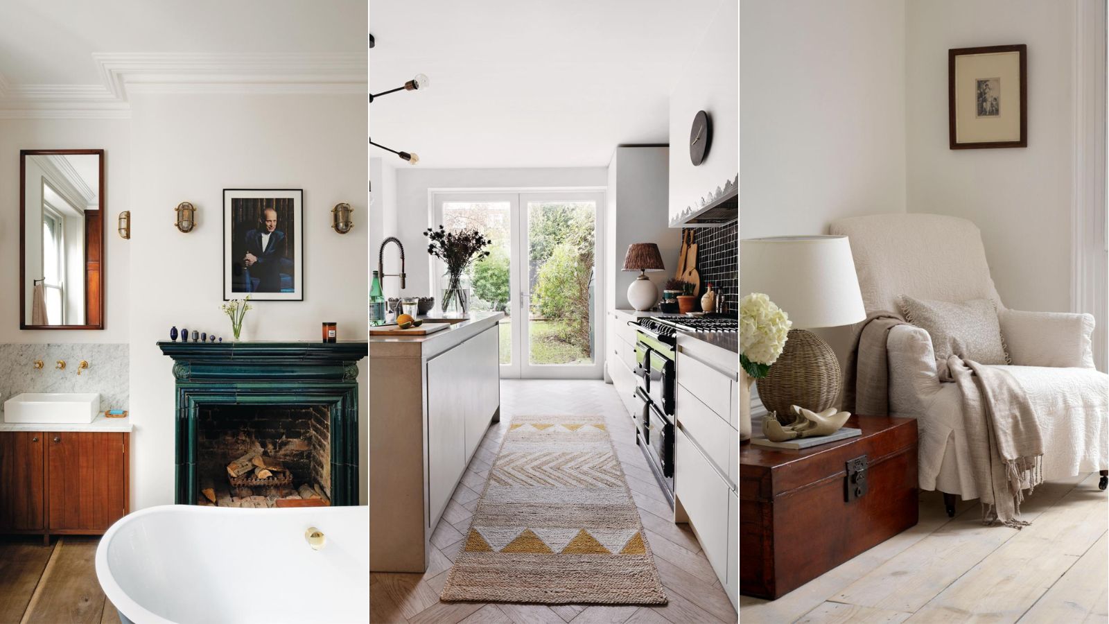
5 ways to decorate with Pale Oak, Benjamin Moore's best-selling versatile greige
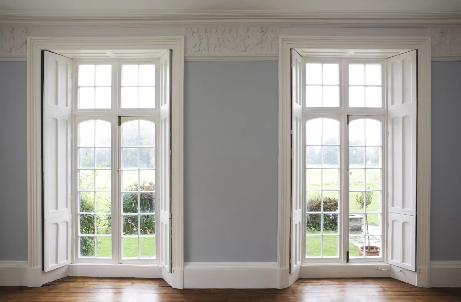
18 Blue-Gray Paint Colors That Are Versatile, but Never Boring

These Paint Colors Will Dominate Our Homes in 2022

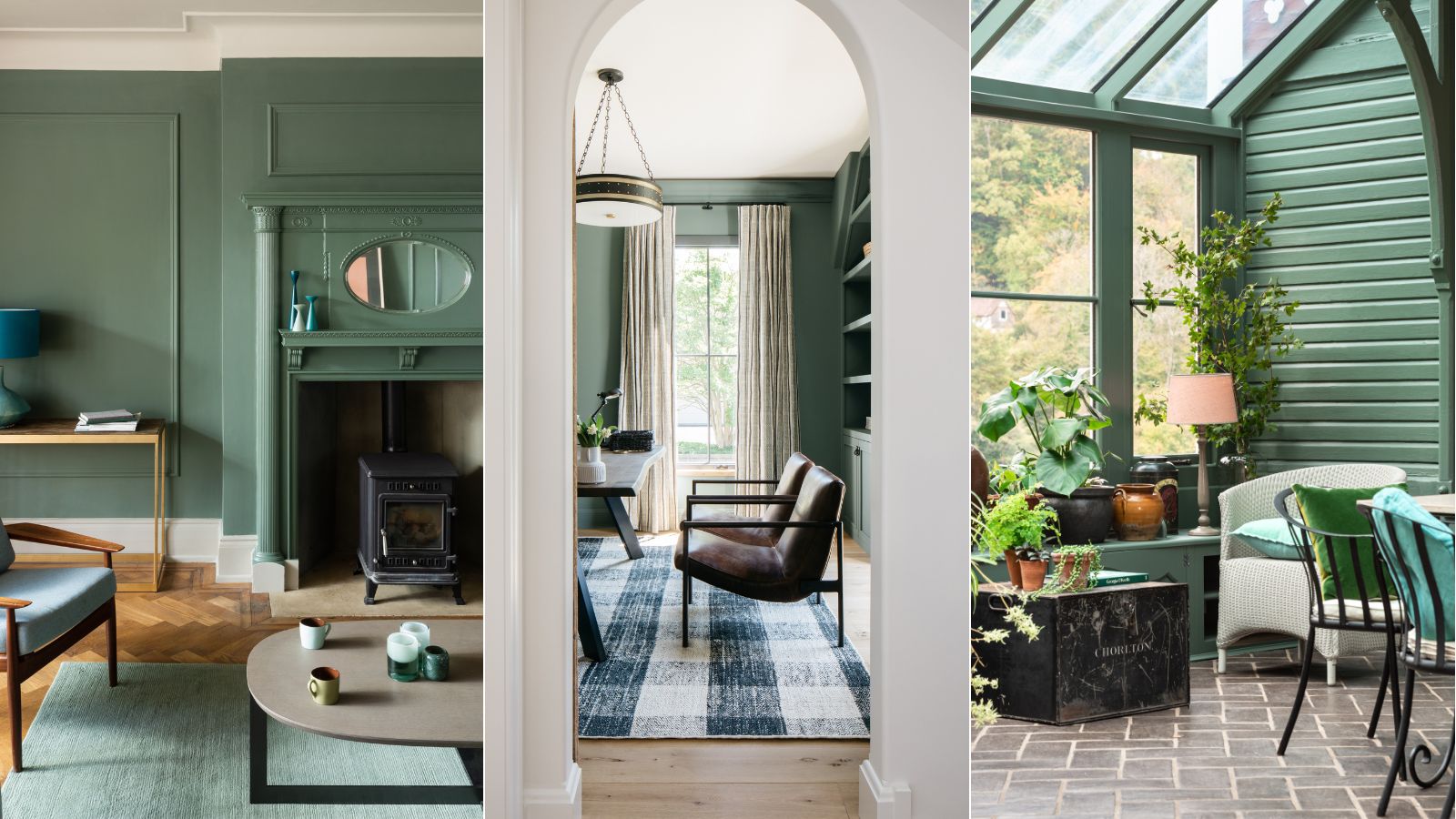
5 ways to decorate with Farrow & Ball's Green Smoke – an endlessly versatile paint color
24 Blue-Gray Paint Colors the Experts Swear By
Grey room ideas – 12 ways to use this versatile shade
I Think I May Have Just Discovered the Most Timeless Green Paint Color

The Best Gray Paint Colors Interior Designers Swear By

What are the best Benjamin Moore gray paints? 7 go-to shades recommended by designers
15 Designer-Approved Blue-Gray Paint Colors That Will Never Go Out of Style
Designers Predict This Will Be The Biggest Paint Trend Of 2026

Why Benjamin Moore's Classic Gray Is a Designer-Favorite Paint Color
25 Dreamiest Blue-Gray Paint Colors for Any Room in the House
'It's one of those colors that just works' – why Benjamin Moore's Saybrook Sage could be the perfect calming green gray paint for your home
15 Blue-Green Paint Colors the Experts Recommend