We Asked Designers to Pick the Most Timeless Living Room Paint Color—and They Agreed
This article offers guidance on selecting timeless paint colors for living rooms, emphasizing durability and adaptability to evolving styles. It highlights the importance of choosing colors that serve as a refined backdrop, complementing natural and artificial light and various textures, to create an intentional and inviting space. The article suggests that while trends may come and go, the goal for many homeowners is to design a living room with lasting appeal, making the paint color a foundational element in achieving this objective.
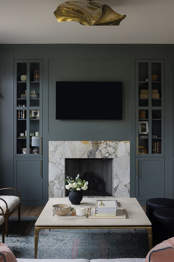
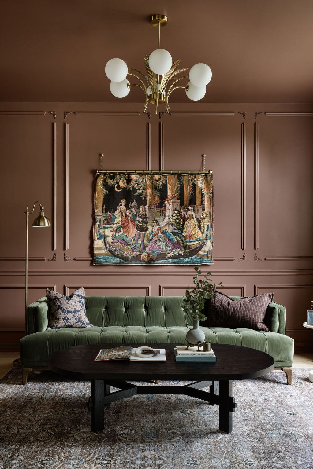
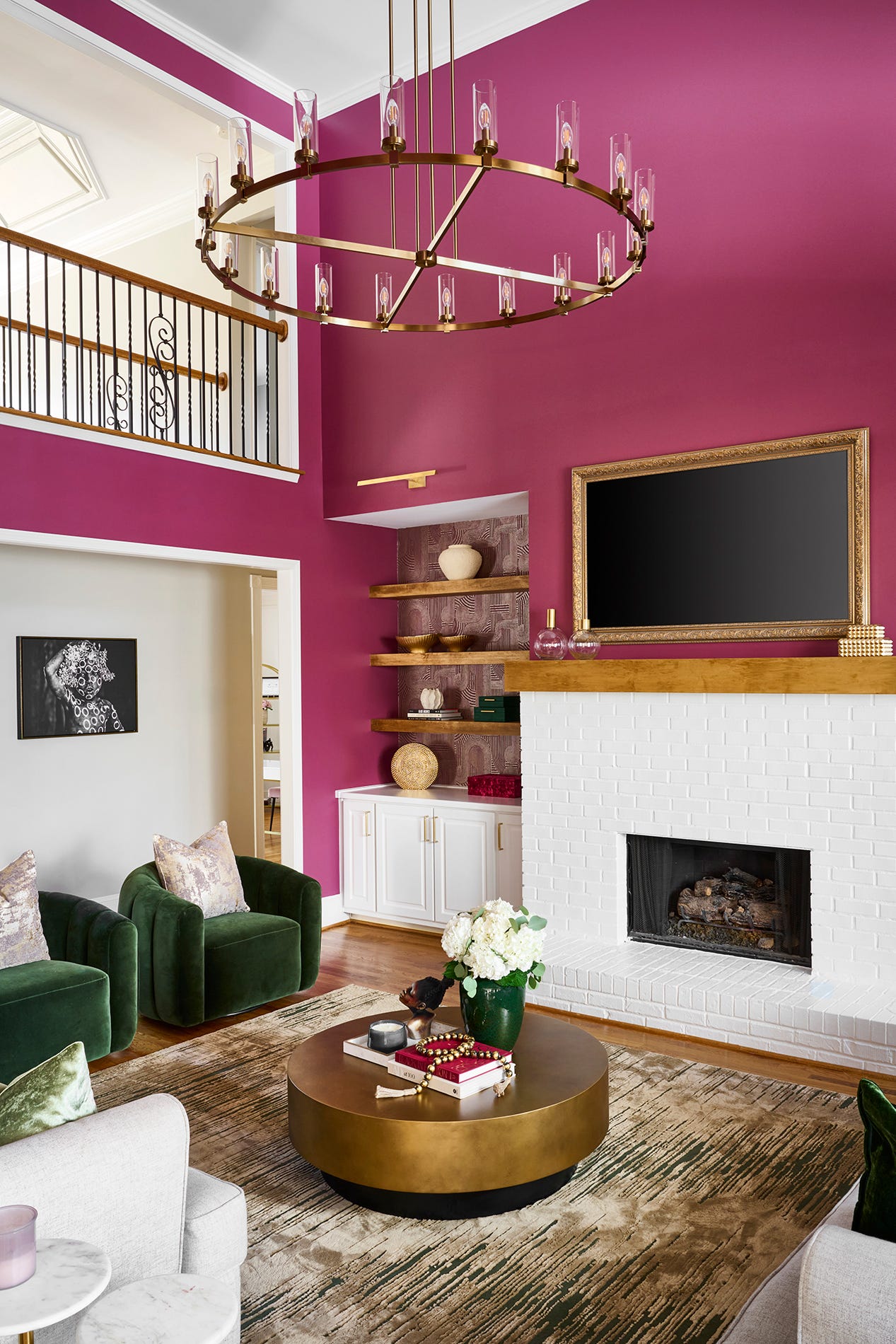
The selection process for the “right” paint color is acknowledged as subjective, but professional advice is provided to aid in making an informed decision. A key consideration is the amount of natural light a room receives. Designers recommend observing how sunlight affects different paint swatches throughout the day, noting that a darker color might be suitable for a brightly lit room to avoid a washed-out appearance, while a shaded space could benefit from colors that enhance a moody atmosphere. Despite these considerations, the article reassures readers that paint is a low-commitment design choice, and repainting is always an option, encouraging individuals to select colors that resonate with their personal preferences.
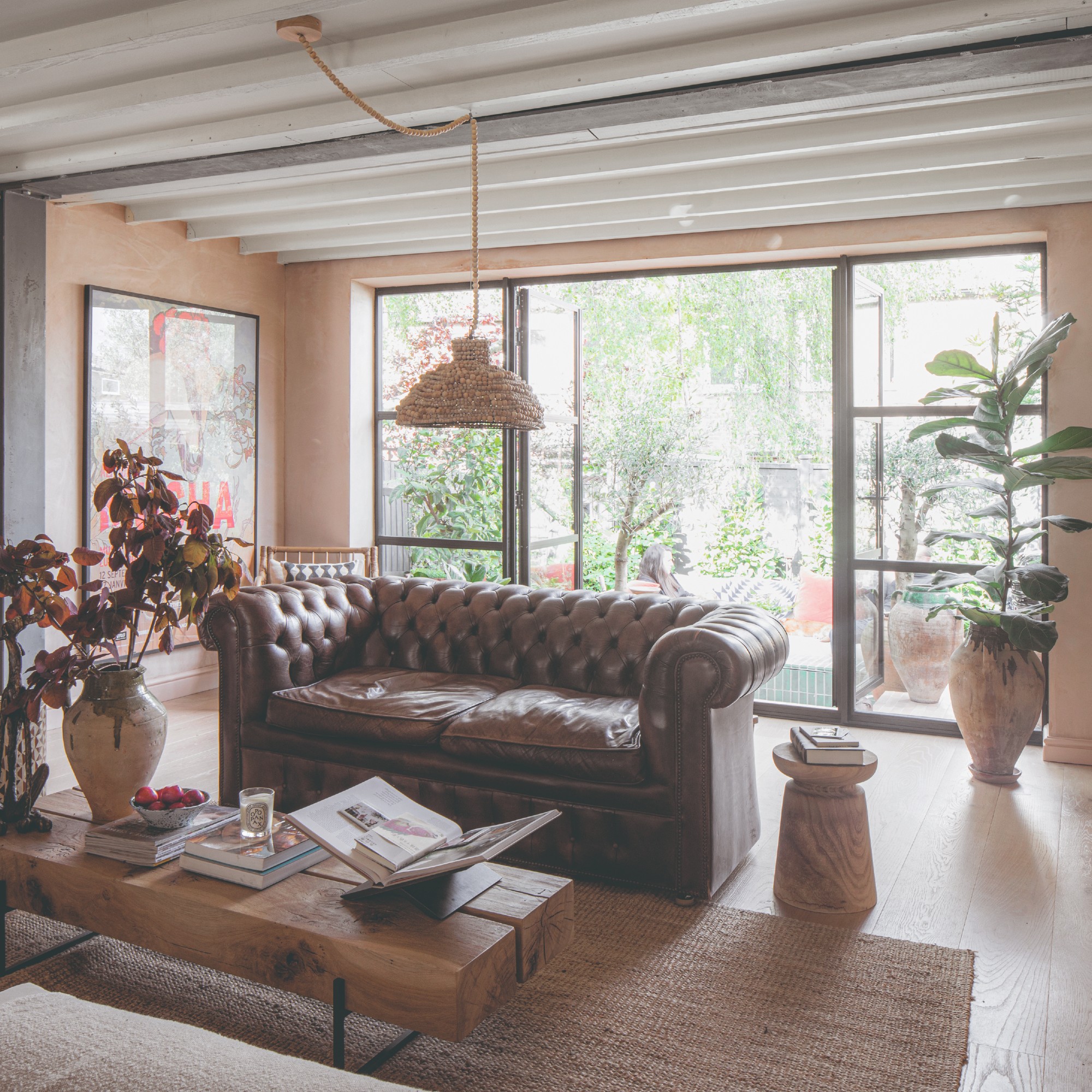
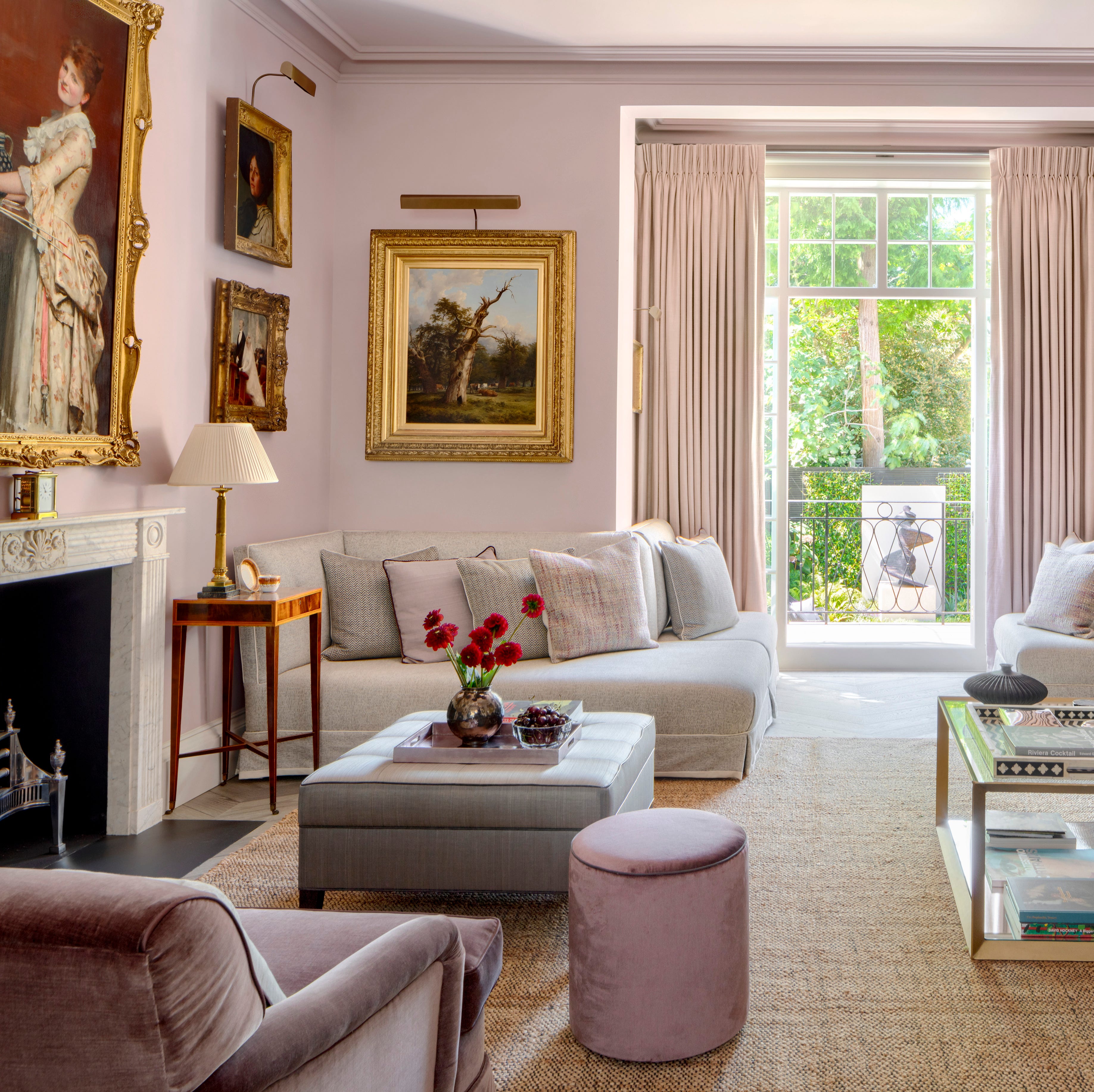
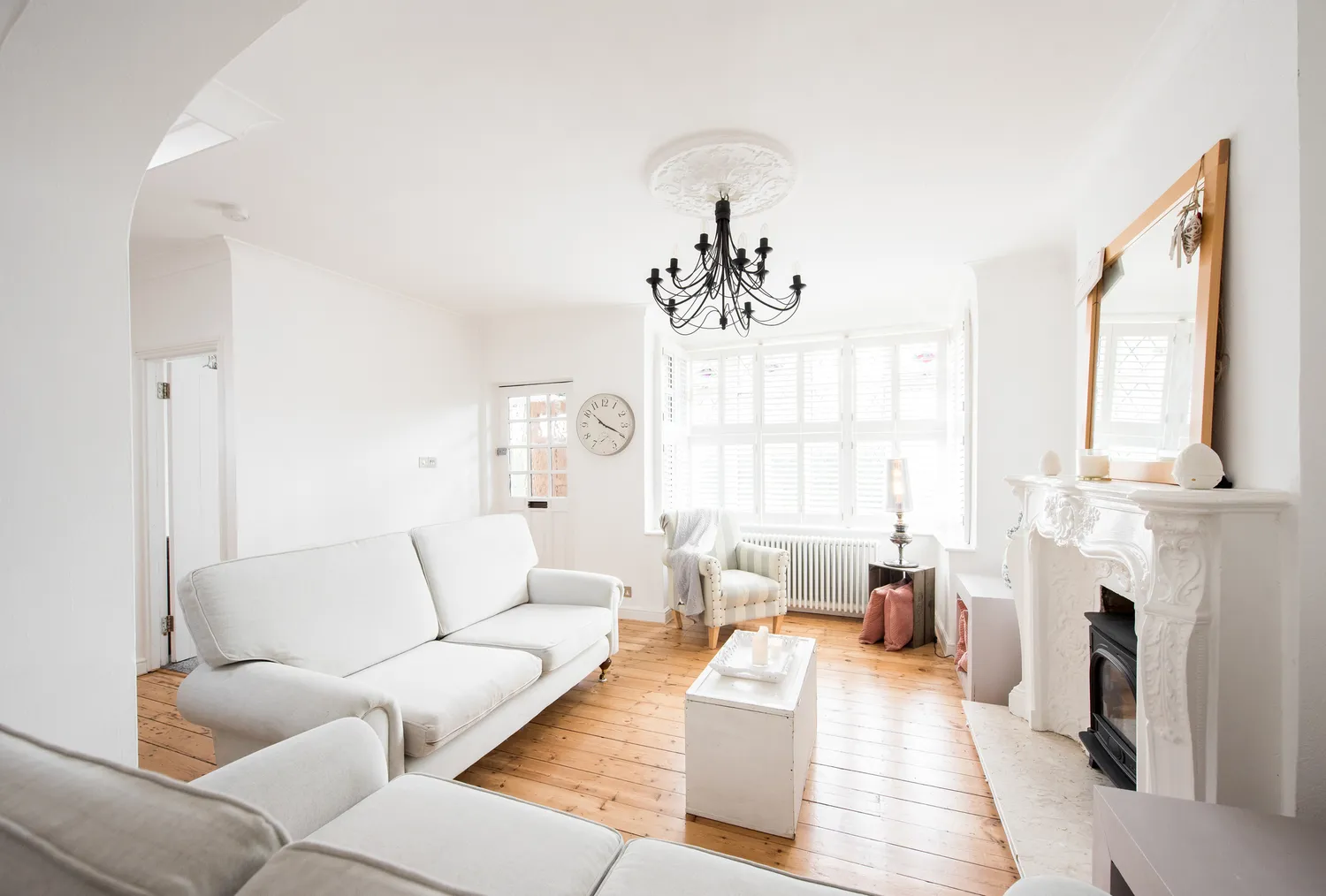
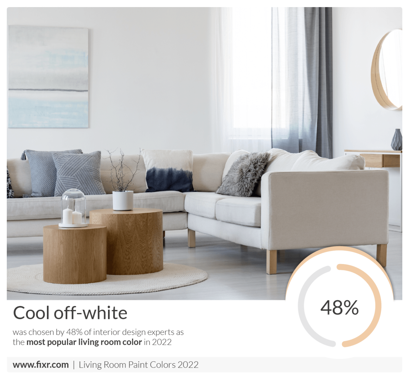
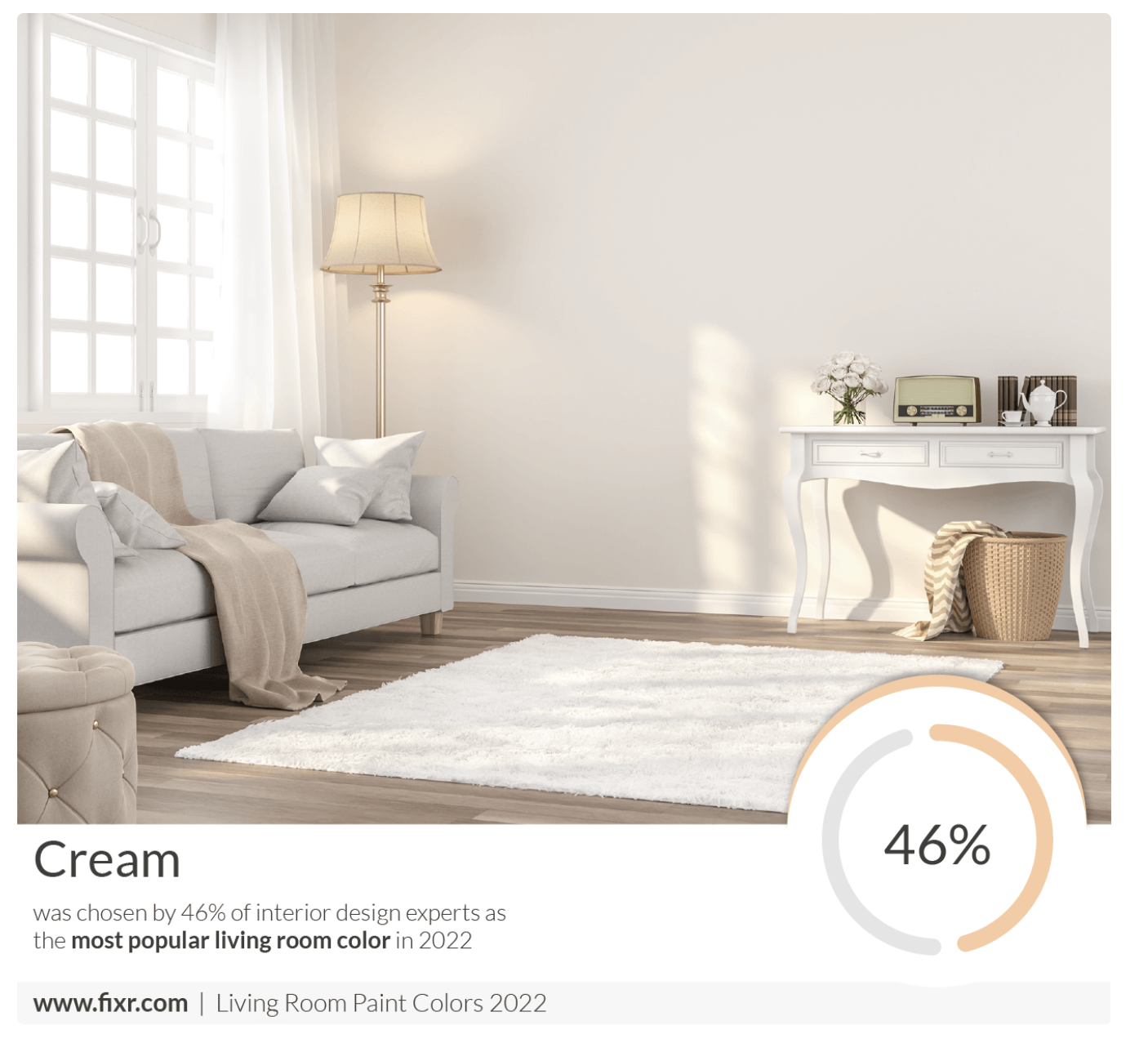
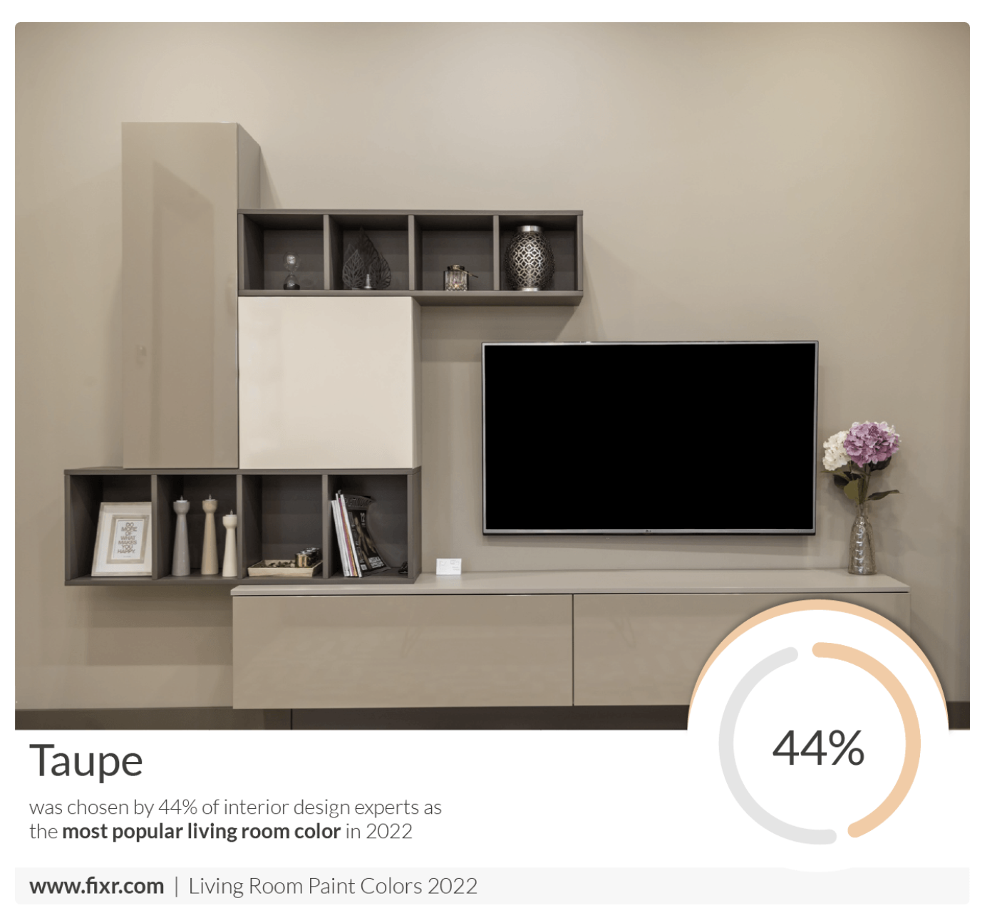
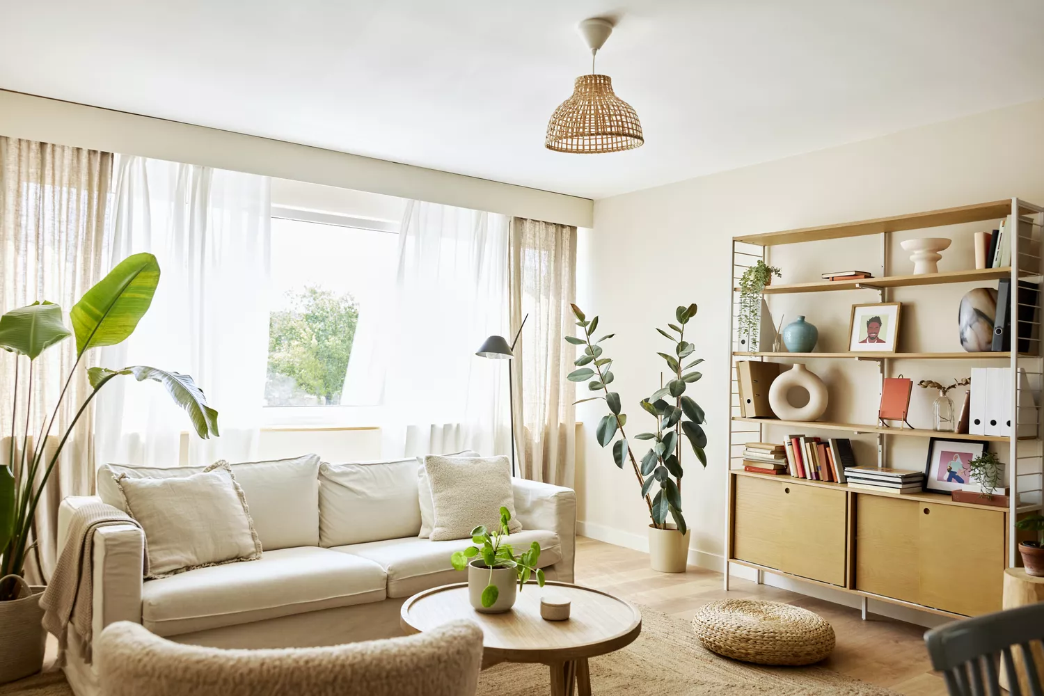
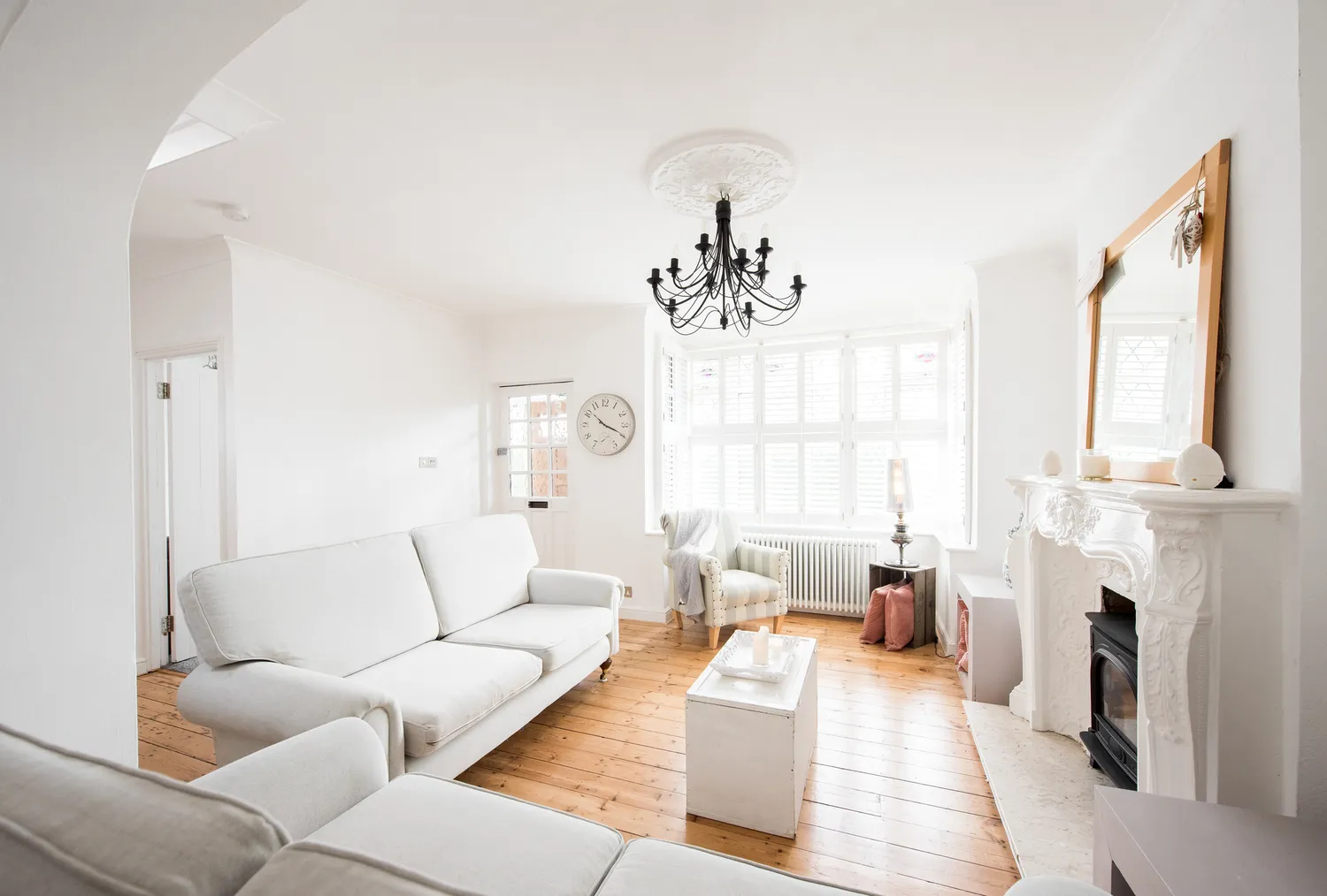
All three featured designers advocate for neutral tones to achieve a timeless aesthetic. Specifically, they recommend creamy shades of white or very light taupe colors. These neutrals provide a clean canvas that can be enhanced with natural wood elements, earthy stone accents, meaningful art, and layered patterns to add personality and warmth. The designers explain that while white may seem like a simple choice, its appearance can vary significantly depending on the room's lighting conditions.
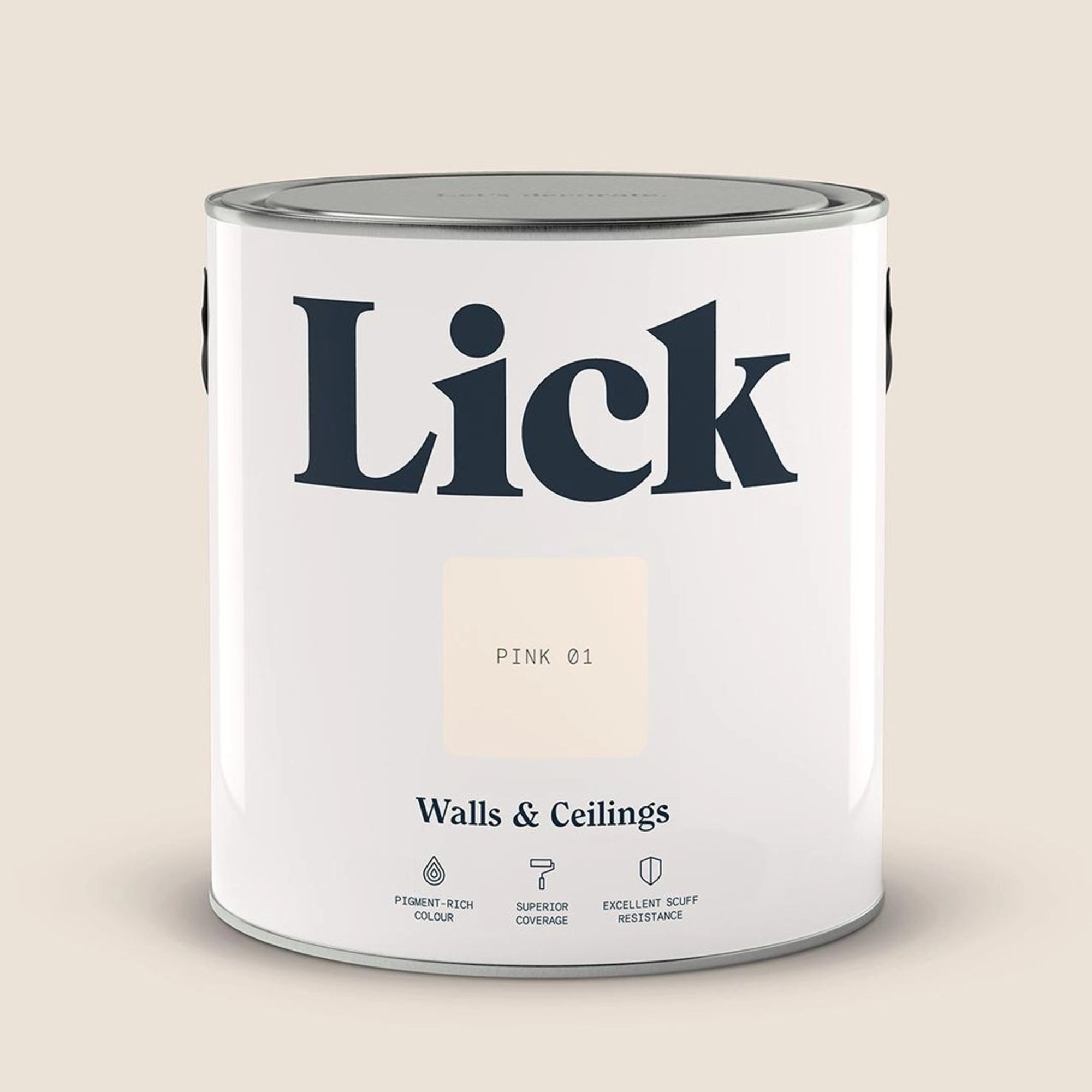
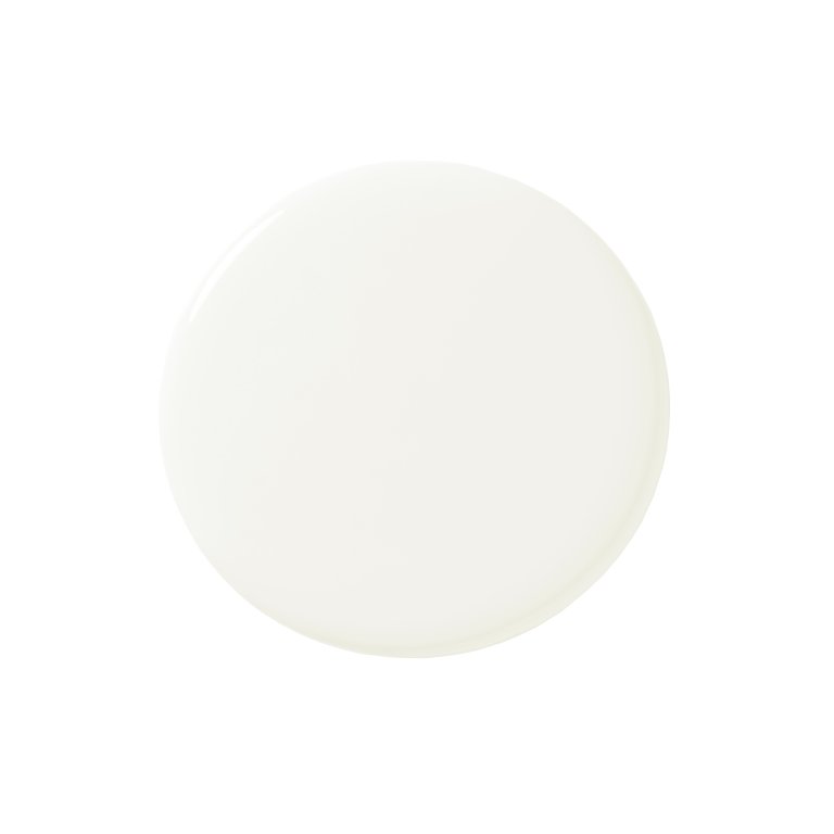
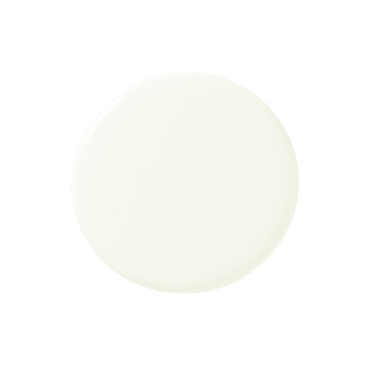
The article highlights Benjamin Moore’s Swiss Coffee (OC-45) as a top recommendation from designers Ali Milch and Sasha Basso. This off-white shade, characterized by its warm undertones, is described as reminiscent of milk in coffee. However, the designers stress the importance of sampling paint colors directly in the living space to assess how they interact with the specific lighting of the room, as colors can appear differently than expected. Additional recommended timeless paint colors include Color Atelier’s Limewash in White Clay or Chèvre, Farrow and Ball’s All White or Pointing, Benjamin Moore’s Cloud White (OC-130), and Farrow and Ball’s Strong White. These suggestions aim to provide a soft, warm, and elegant foundation that can adapt to diverse aesthetic preferences and design elements, ensuring a living room remains stylish and welcoming for years.
#LivingRoomDesign #PaintColors #InteriorDesign #TimelessDecor #HomeImprovement #NeutralPalette #DesignTips #HomeDecorating #LivingRoomDesign #PaintColors #InteriorDesign #TimelessDecor #HomeImprovement #NeutralPalette #DesignTips #HomeDecorating
共0条评论
 暂无评论
暂无评论你可能还喜欢

10 Timeless Living Room Paint Colors Designers Swear By

11 Paint Colors That INSTANTLY Make Your Home Look "Expensive," According to Designers


Experts reveal the best living room paint colours to transform every space

We Asked Designers Which Living Room Paint Colors People Always Regret—These 6 Came Up the Most


4 Interior Designers Share the Biggest Paint Color Trends Right Now (and What’s Out!)

‘When your sofa and wall colours are in sync, the space feels intentional’ – experts reveal the 4 best paint and sofa colour combinations
We Asked Designers Which Living Room Paint Colors People Regret Most—And We're All Guilty

We Asked 6 Interior Designers for the One Antique They Use in Every Home
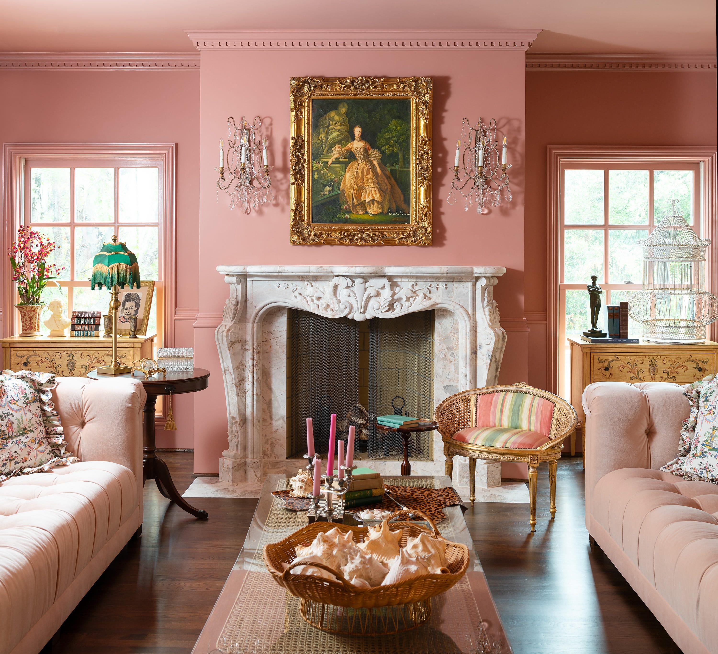
Jewel Tones Are Trending for Living Room Paint Colors, According to Designers
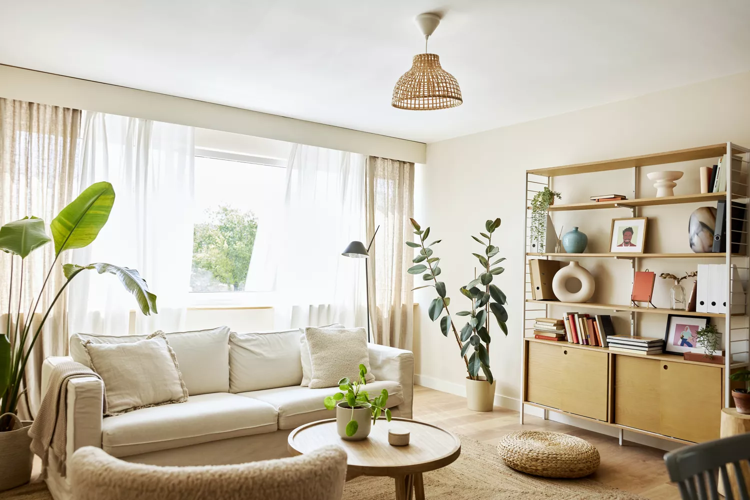
Designers Agree: This Classic Living Room Paint Color Never Goes Out of Style
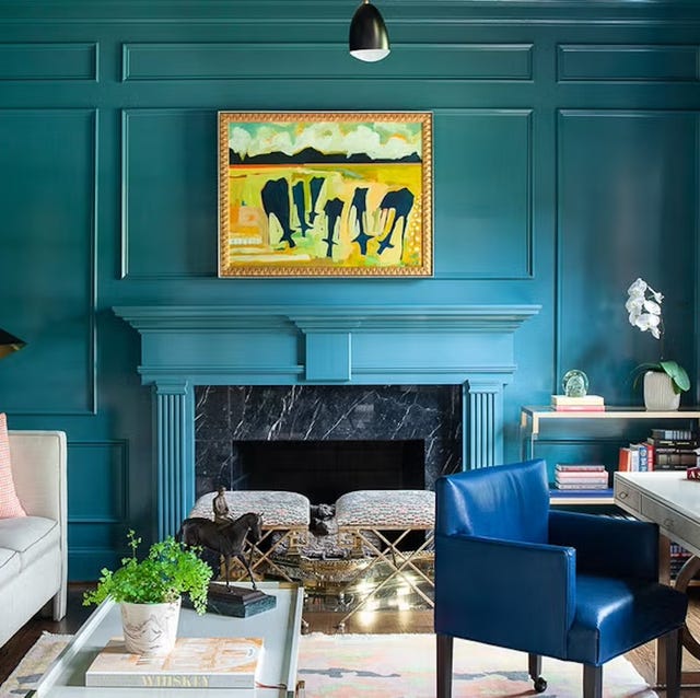
The 60 Most Popular Living Room Paint Colors Right Now

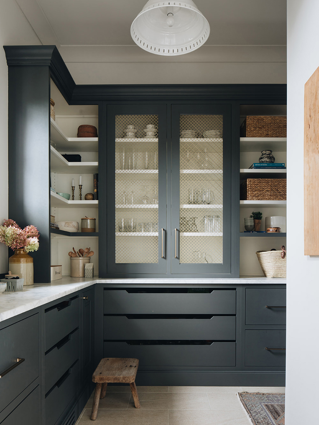
The Paint Color That All This Designer's Followers Ask About | domino

We Asked Designers to Pick the Most Timeless Bedroom Paint Colors—Here's What They Said

The most timeless paint colors according to designers

5 living room paint colors going out of style in 2025
12 Color Schemes That Are Popping Off Right Now, According to Designers
We Asked 20 Designers for Their Favorite Paint Colors for Windows

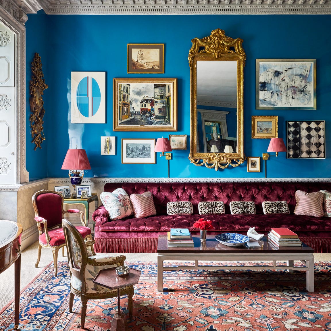
Designers Swear By These 65 Living Room Paint Colors

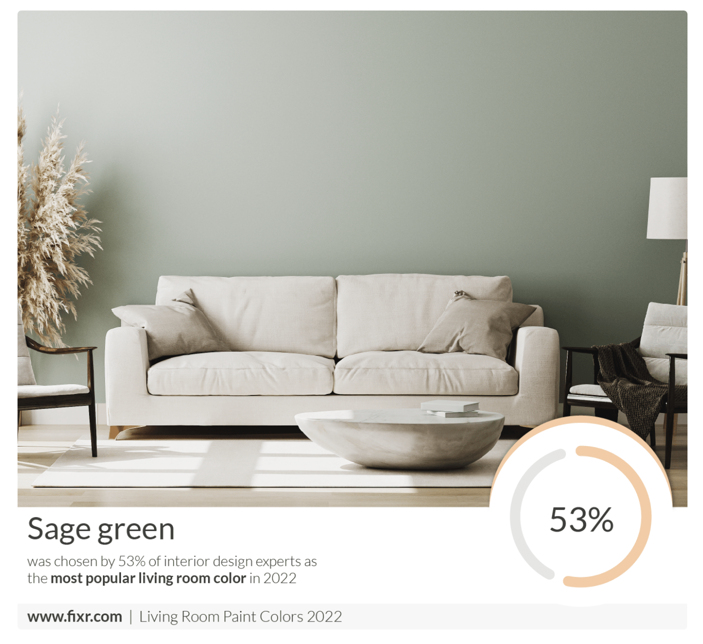
7 Popular Paint Colors for the Living Room
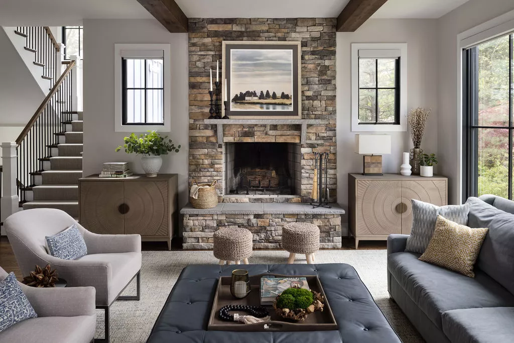
The Best Living Room Paint Colors, According To Designers