1/14
Sherwin-Williams paint colors in real homes – 13 designer-approved shades, from neutrals to bolds
Sherwin-Williams paint colors are widely used by interior designers in various decorating projects due to their vast range of shades, catering to diverse interior design styles and room types. This article showcases a selection of 13 Sherwin-Williams paint colors as used in real homes, offering inspiration for different rooms and aesthetic preferences.
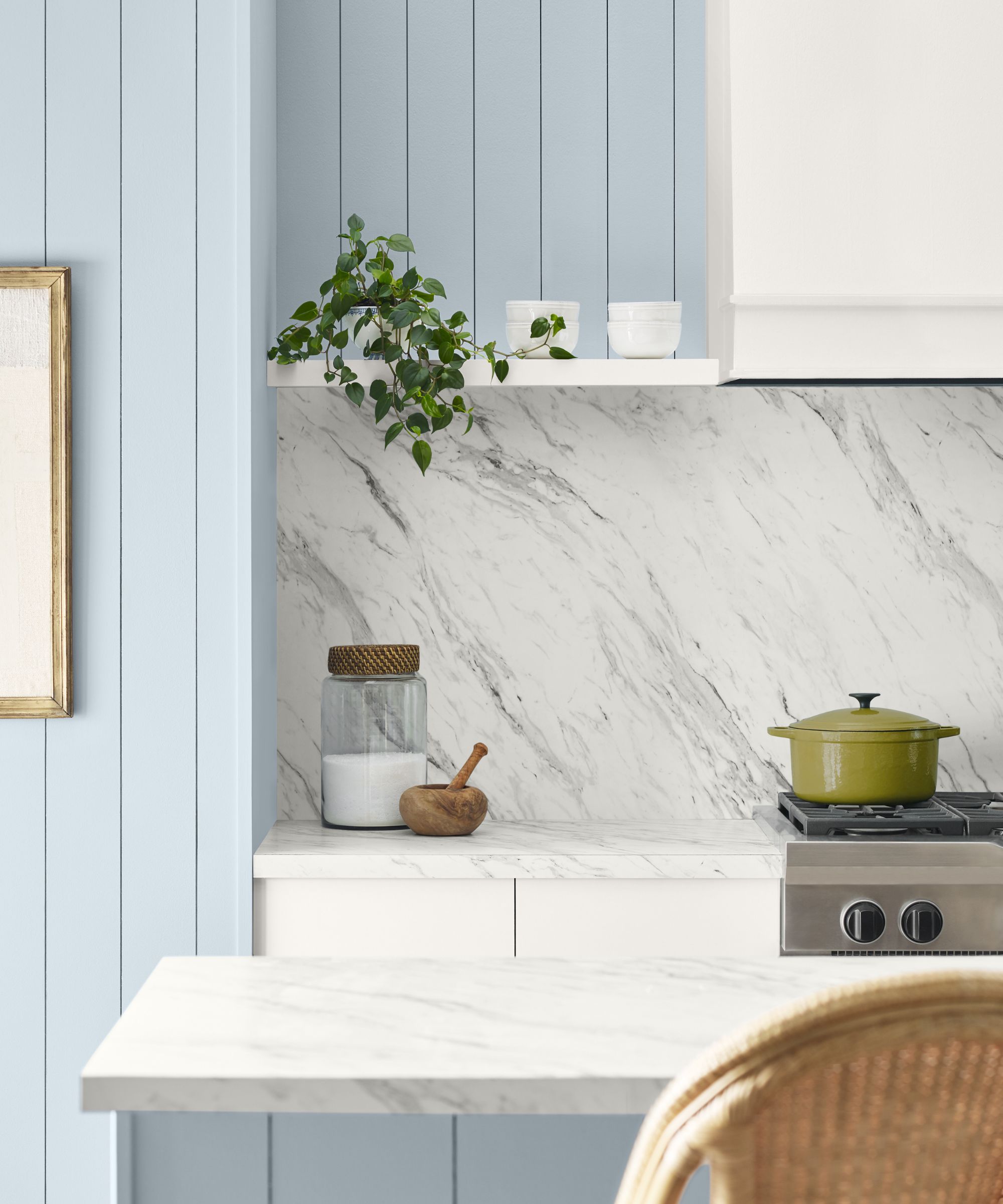
"Green Trance" (SW6462) is presented as a soft and cheerful pale green with blue undertones, ideal for laundry rooms, adding an uplifting feel without being overly bold or bright. Brad Ramsey of Brad Ramsey Interiors highlights its versatility and ability to complement various fixtures and brass accents. "Grays Harbor" (SW6236), a cool blue-gray, is featured in a mudroom, chosen for its elegant depth and its ability to bridge gray stone floors with walnut accents, as explained by Lindsay Thornton of Cornerstone Design & Build.
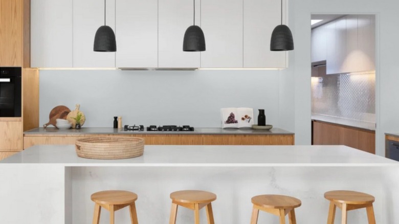
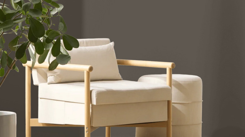
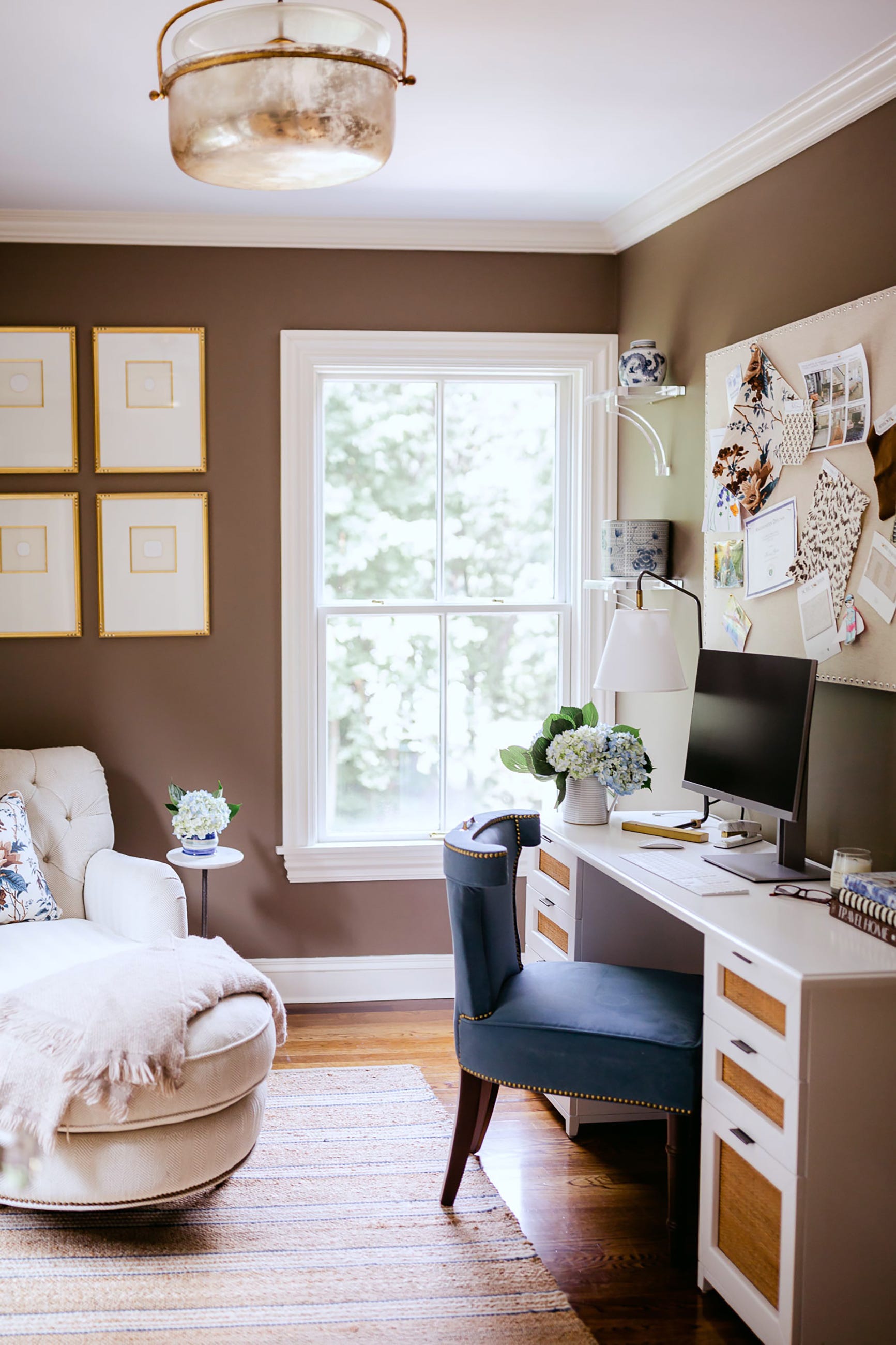
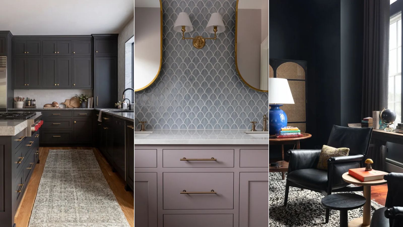
"Chelsea Gray" (SW2850) is used in a sitting room, providing a balanced moody yet airy atmosphere due to its specific Light Reflectance Value, according to Jennifer Davis of Davis Interiors. For a bold statement, "Energetic Orange" (SW6880) transforms a modern kitchen, with designer Matthew Boland of MMB Studio noting its ability to capture attention and guide the eye through the space. "Iron Ore" (SW7069), a dark charcoal gray with subtle blue undertones, offers a sophisticated and timeless alternative to black or navy in a kitchen, as selected by Emily Ruff of Cohesively Curated Interiors.
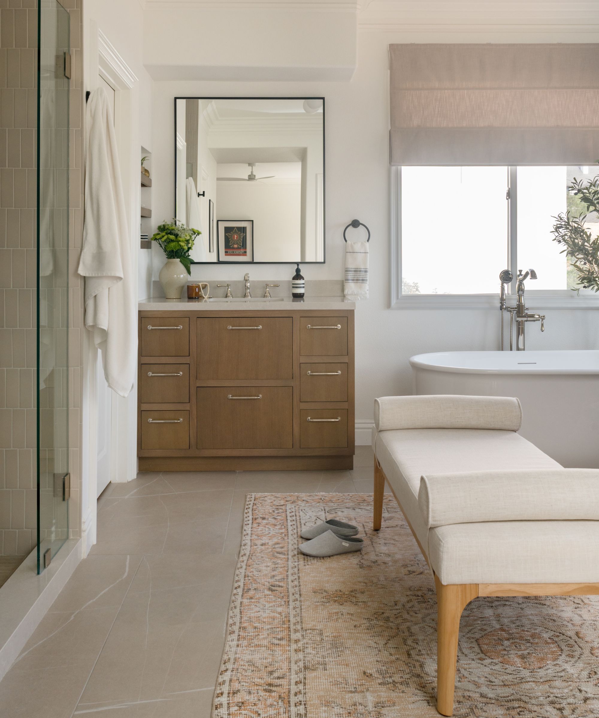
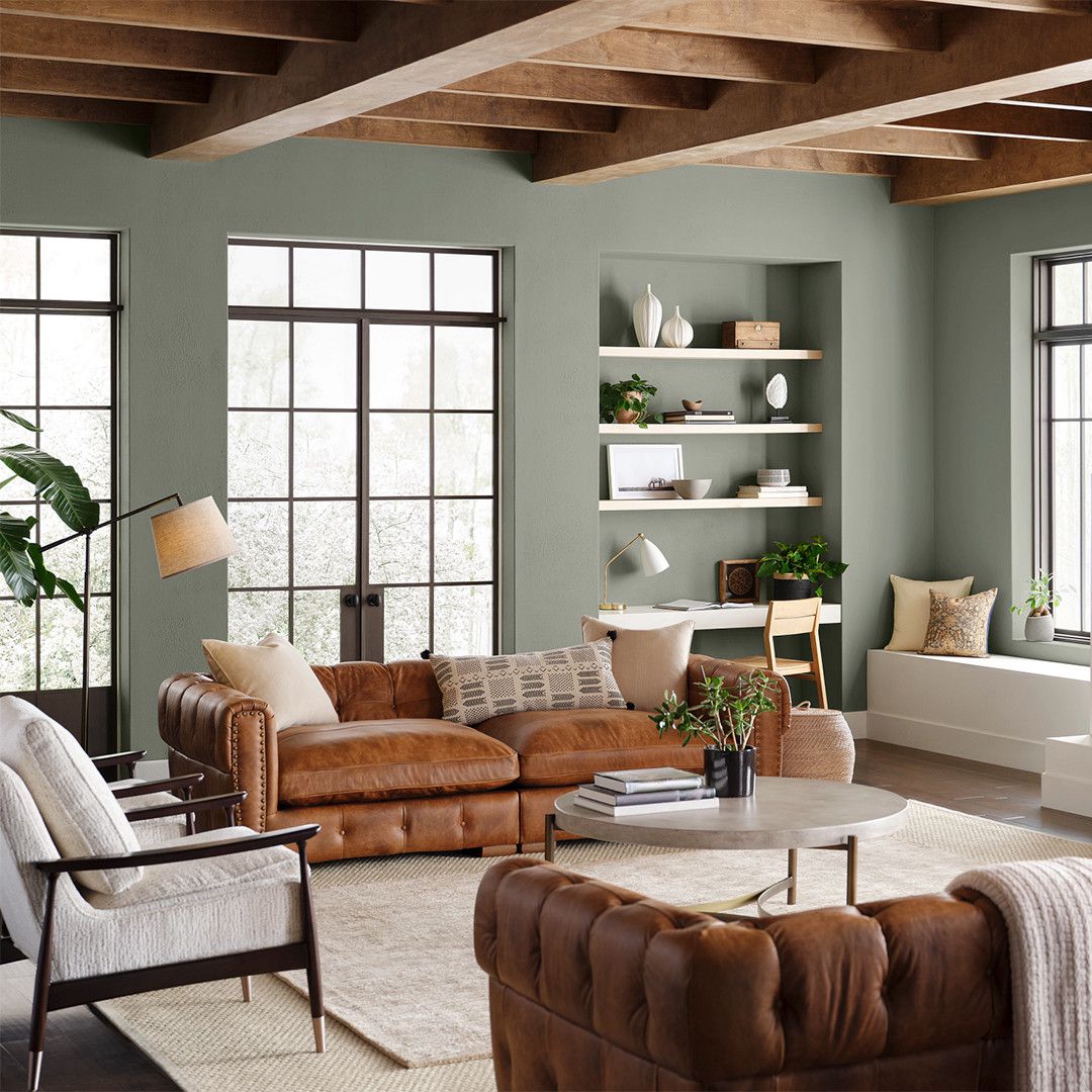
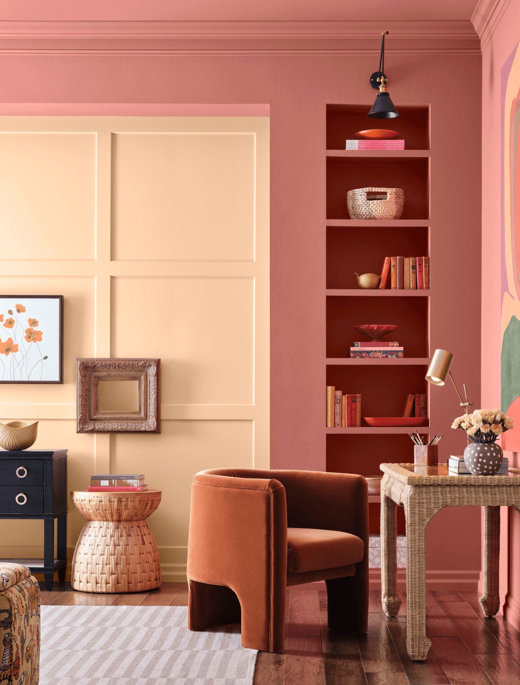
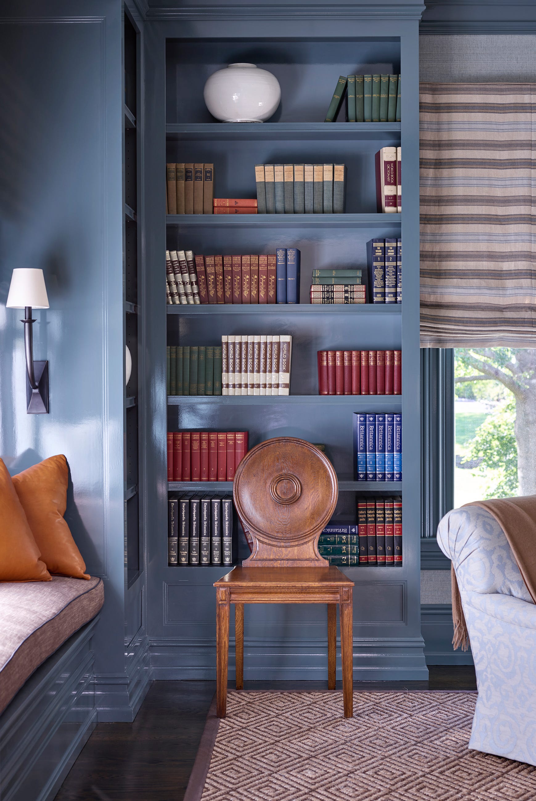
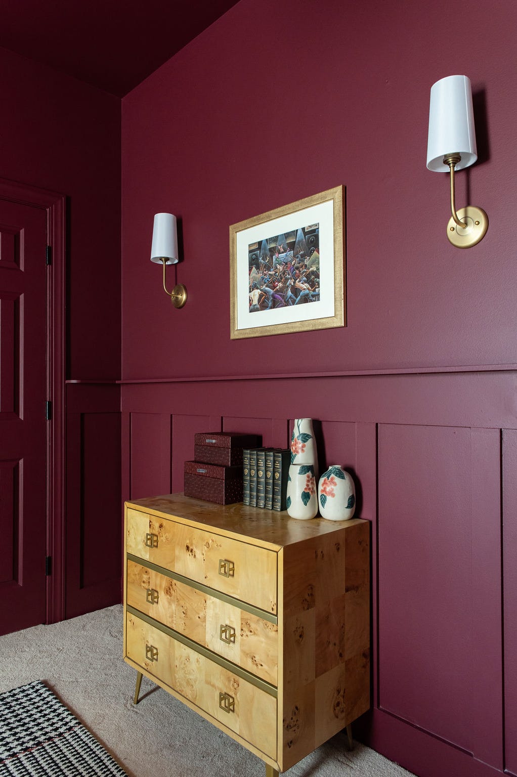
"High Reflective White" (SW7757) is chosen for a primary bathroom to provide an inviting, bright white without feeling sterile, paired with "Peppercorn" (SW7674) on the vanity for added depth, as detailed by Ethan Greenfeld of Ethan Charles Design. "Outerspace" (SW6251), a dark blue-gray, creates a cozy and cocooning effect in a living space, demonstrating the effectiveness of dark color palettes. "Sconce Gold" (SW6398) is employed on wine pantry trim, alongside "Canyon Clay" (SW6054) on shelving, to create striking visual interest, drawing parallels to rich wines, described by Susan Jamieson of Bridget Beari Designs.
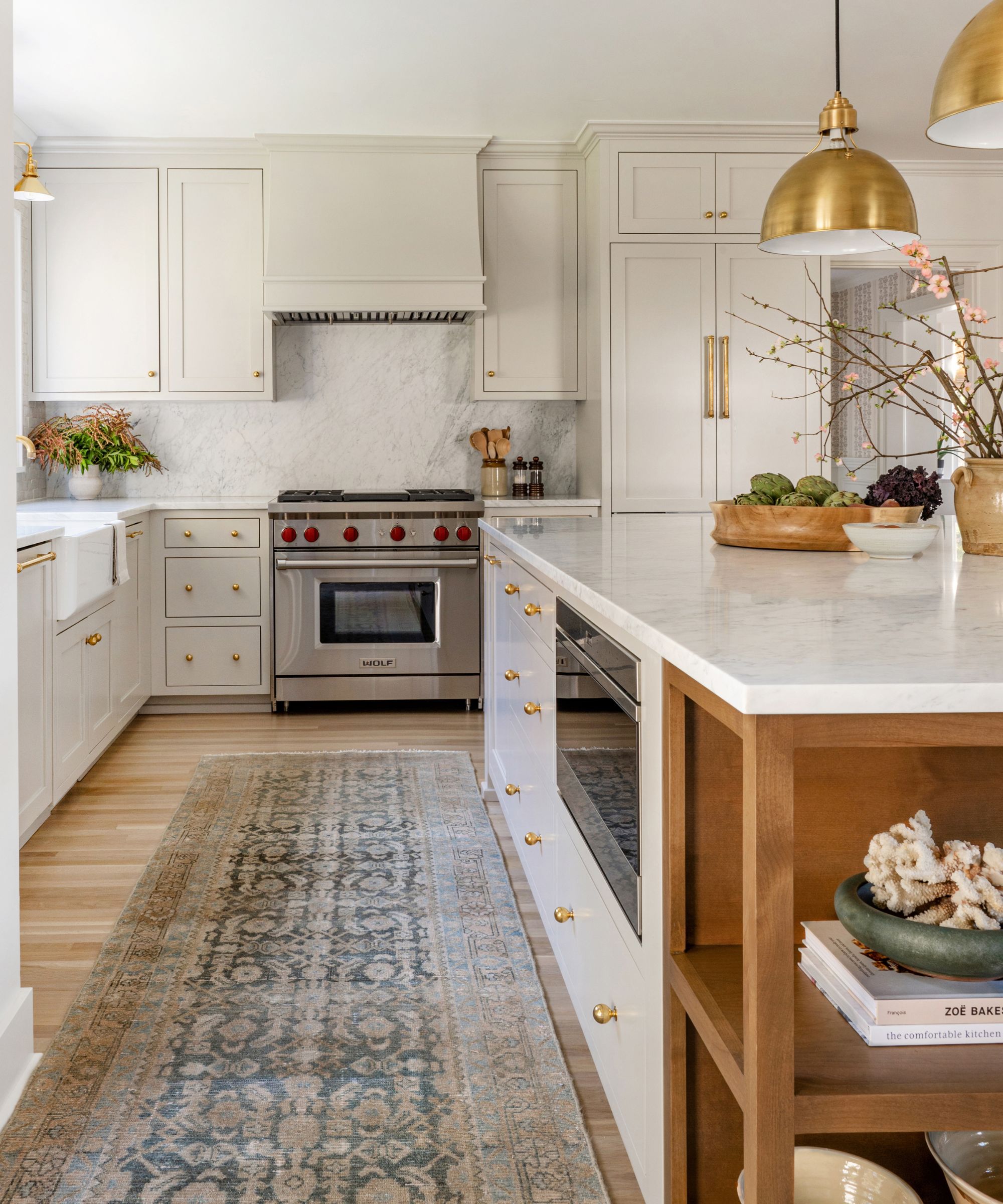
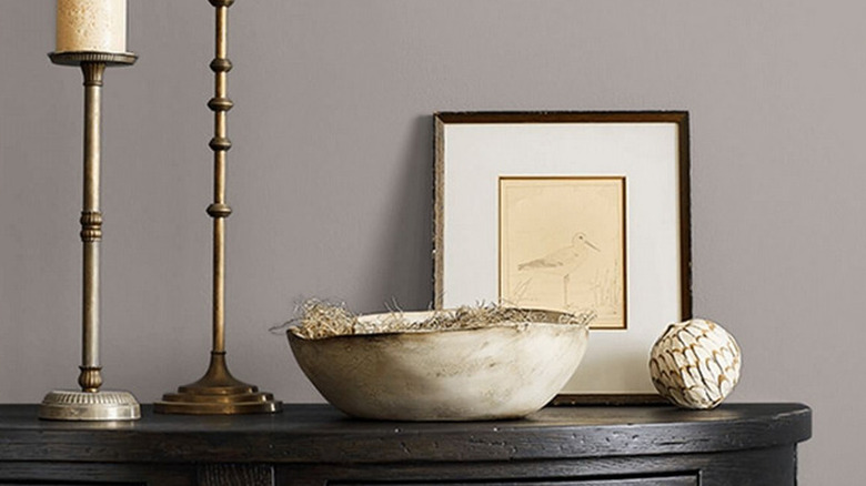
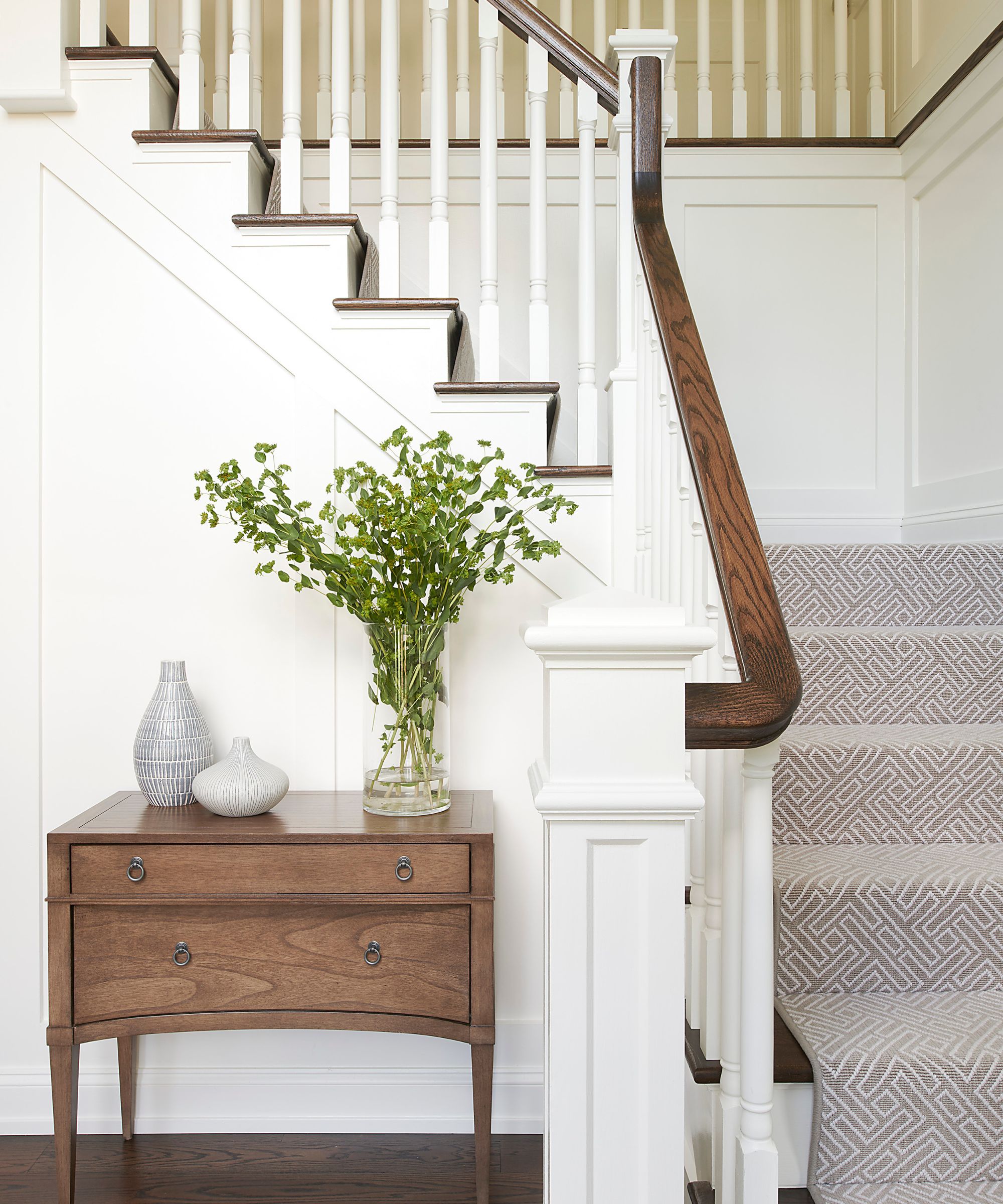
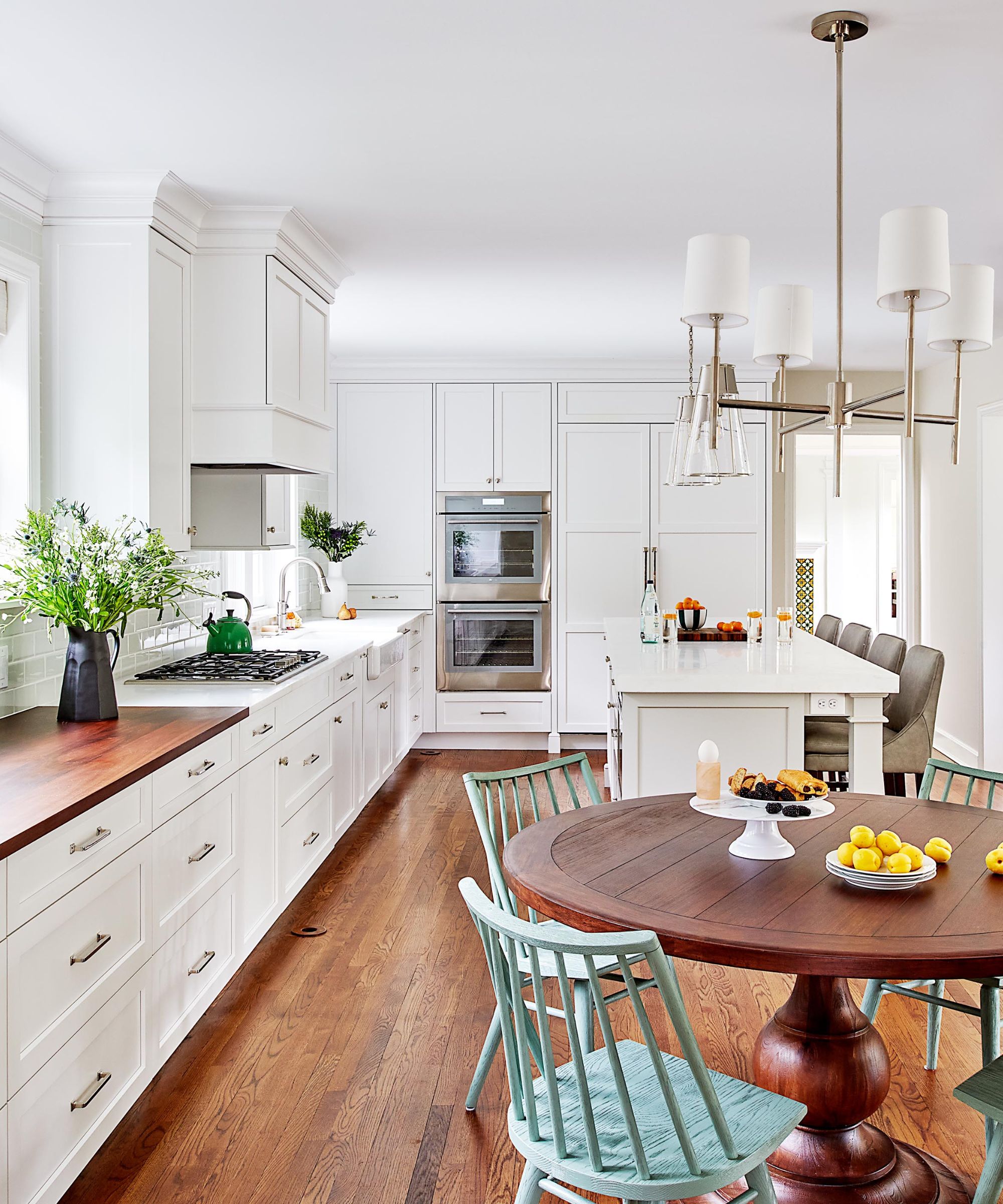
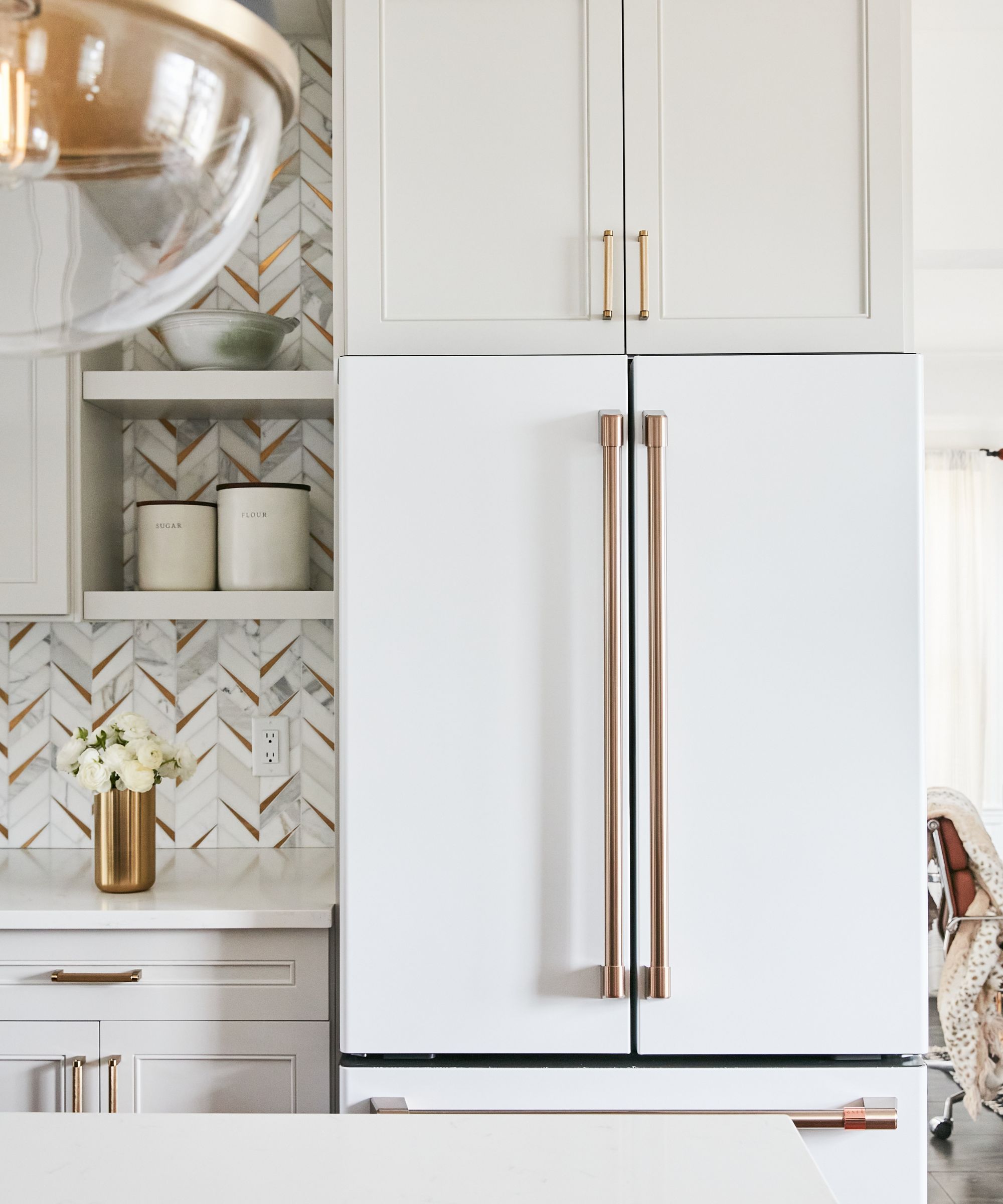
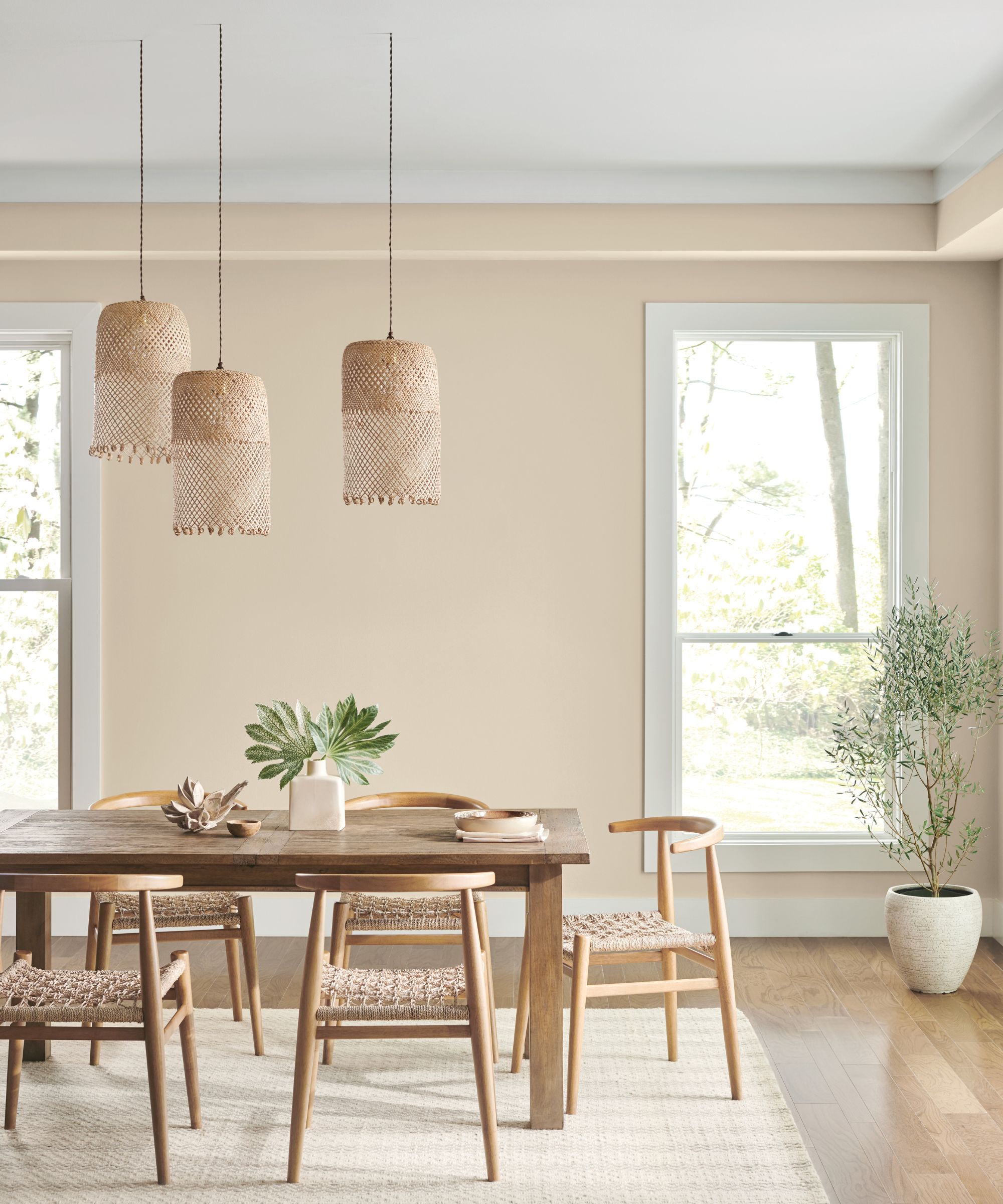
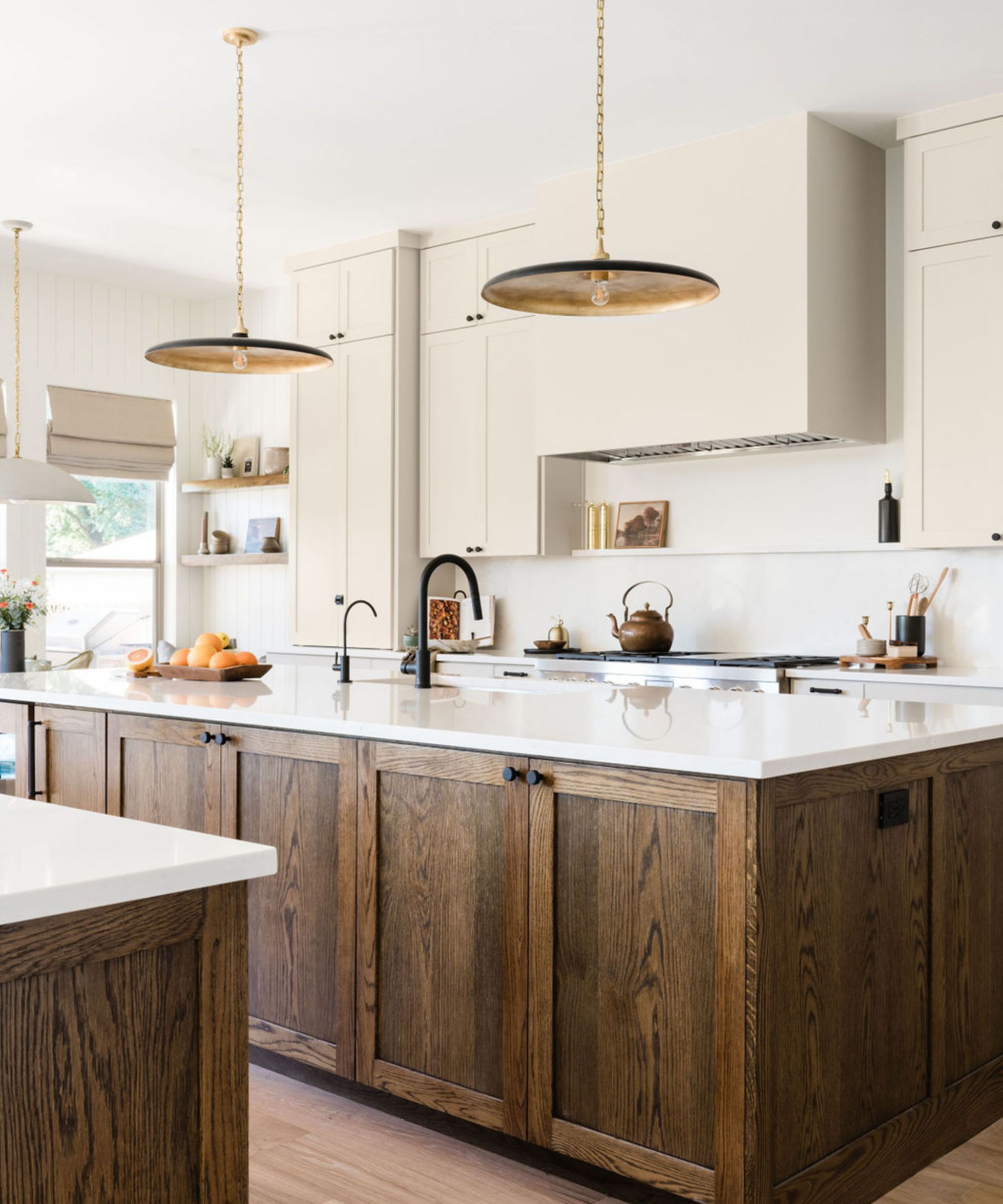
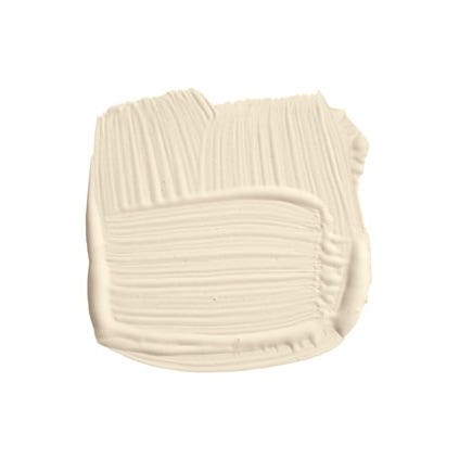
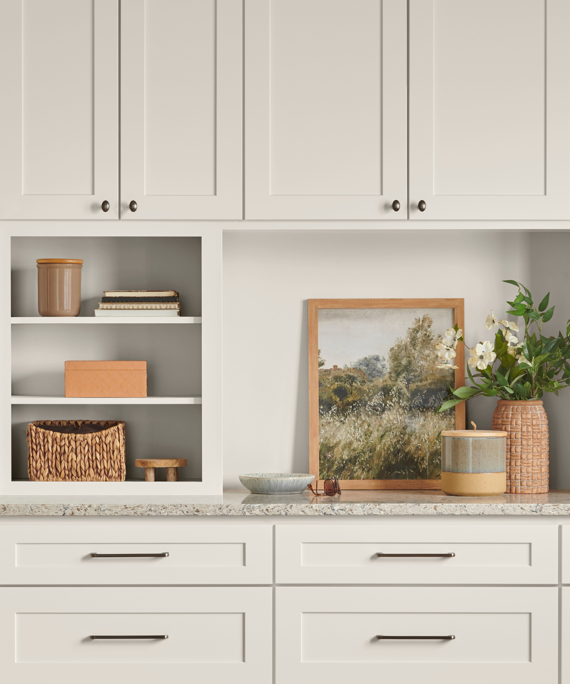
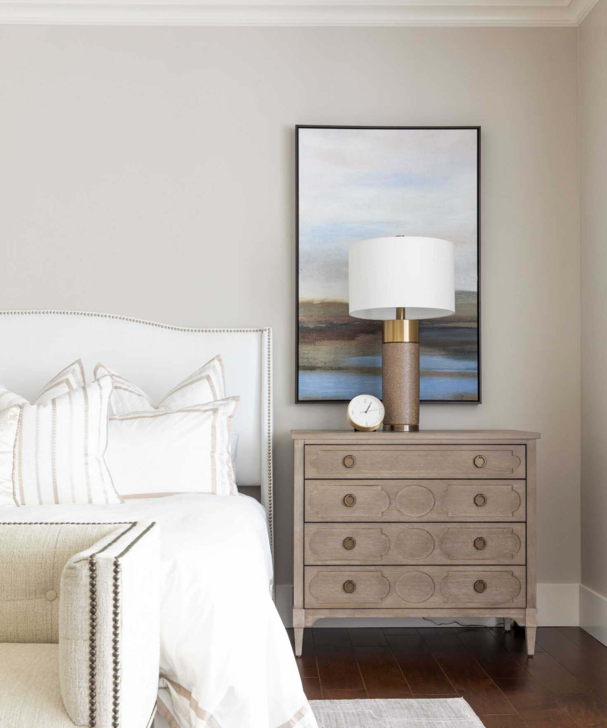
"Alabaster" (SW7008) is highlighted as a popular warm white, frequently used for its light and airy feel without leaning too yellow, making it a perfect choice for a neutral kitchen, as seen in a design by Sabah Mansoor Design. "Grizzle Gray" (SW7068) is a go-to gray for cabinets and millwork, praised by Stephanie Hunt of The Flair Hunter for its warm mocha undertones and versatility in balancing cool colors and anchoring spaces. "Sea Mariner" (SW9640), a dark blue, is presented as a sophisticated indigo-like shade for bedrooms, suitable for various applications from bunk rooms to kitchen cabinets, again by Stephanie Hunt.
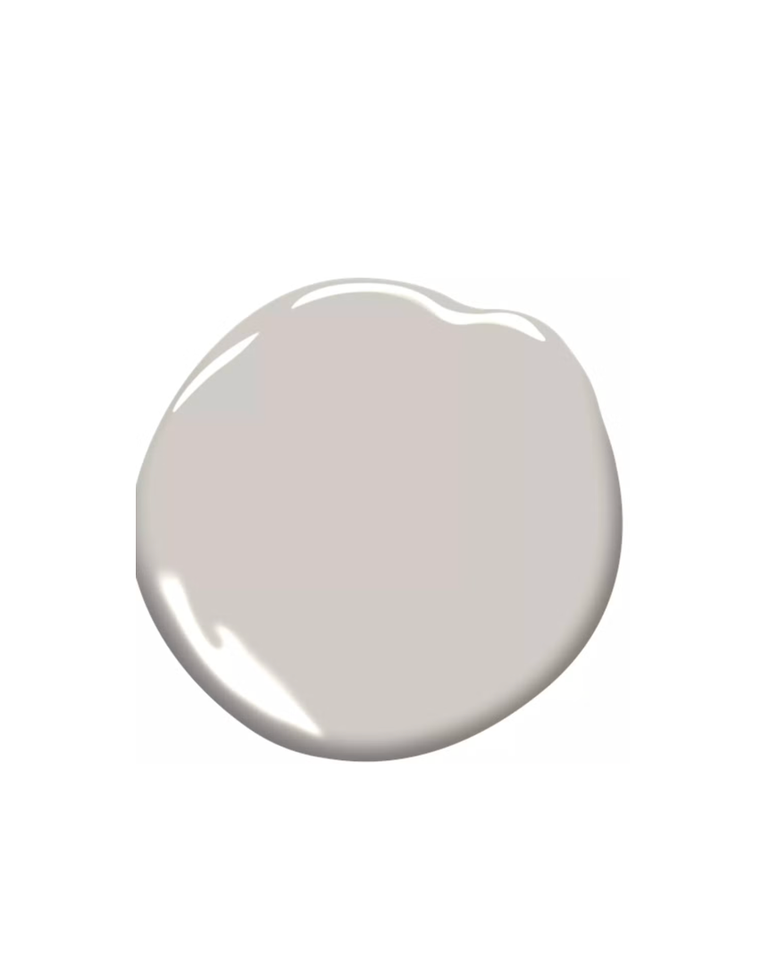
"After The Storm" (SW9685), an inky blue-black, is used in a pantry to accentuate brass hardware, offering a moody yet less harsh alternative to pure black, as explained by Kelsey Haywood of Haywoodmade Interiors. Finally, "Truly Taupe" (SW6038) provides a feminine touch to bathroom cabinets, complementing a quartzite countertop and blue fan tile, also designed by Haywoodmade Interiors. The article concludes by emphasizing the importance of testing paint swatches in various lighting conditions before making a final decision.
#SherwinWilliams #PaintColors #InteriorDesign #HomeDecor #RoomColorIdeas #NeutralPaint #BoldHues #DesignInspiration #ColorPsychology #SherwinWilliams #PaintColors #InteriorDesign #HomeDecor #RoomColorIdeas #NeutralPaint #BoldHues #DesignInspiration #ColorPsychology
共0条评论
 暂无评论
暂无评论你可能还喜欢
What are Sherwin-Williams' best-selling paints? And how interior designers put them to use
35 Neutral Paint Colors Interior Designers Can't Get Enough Of

We asked paint brands what their most popular shades of 2024 were – these were the 13 favorites
7 Paint Colors Realtors Say Increase Your Home's Value
10 Lesser-Known Neutral Paint Shades From Sherwin Williams You Shouldn't Overlook
9 Neutral Paint Colors Designers Constantly Reach For — "It's My Tried-and-True"

If You Can't Find Your New Paint Color in Sherwin-Williams' 2026 Palettes, We'll Be Shocked

5 of the Most Calming Paint Colors From Sherwin-Williams
We asked 12 interior designers for their favorite Sherwin-Williams paints – these are the colors that came out on top
Sherwin-Williams Predicts These 4 Color Palettes Will Dominate Homes in 2026—and One May Surprise You


The most timeless paint colors according to designers
The Interior Paint Colors You'll Be Seeing Everywhere in 2024

The 15 Best-Selling Sherwin-Williams Paint Colors of All Time
Sherwin-Williams' 2026 Color Forecast Is Here and It’s Packed With 48 Fresh Hues

These Are the Neutral Paint Colors Interior Designers ACTUALLY Use
'It's one of those rare neutrals that feels both effortless and elevated' – how designers use Sherwin-Williams soothing shade Sunbleached
These Are the Colors You'll Be Obsessed With Next Year, Based on Your Personality
Sherwin-Williams' Accessible Beige is the 'perfect…

What are the best Sherwin-Williams white paints? 6 favorite shades amongst interior designers
The Neutral Sherwin Williams Paint Shade That's Gaining Popularity In 2025