1/9
5 rug colors to avoid – the hues designers think you should veer away from on floors, plus how to make them work
When selecting a rug, it is important to consider its color to ensure it complements the overall room design and mood. While there are no strict rules, certain rug colors can negatively impact a space by appearing too visually heavy, impractical, or overstimulating. Understanding these considerations helps in creating a well-balanced and aesthetically pleasing interior.
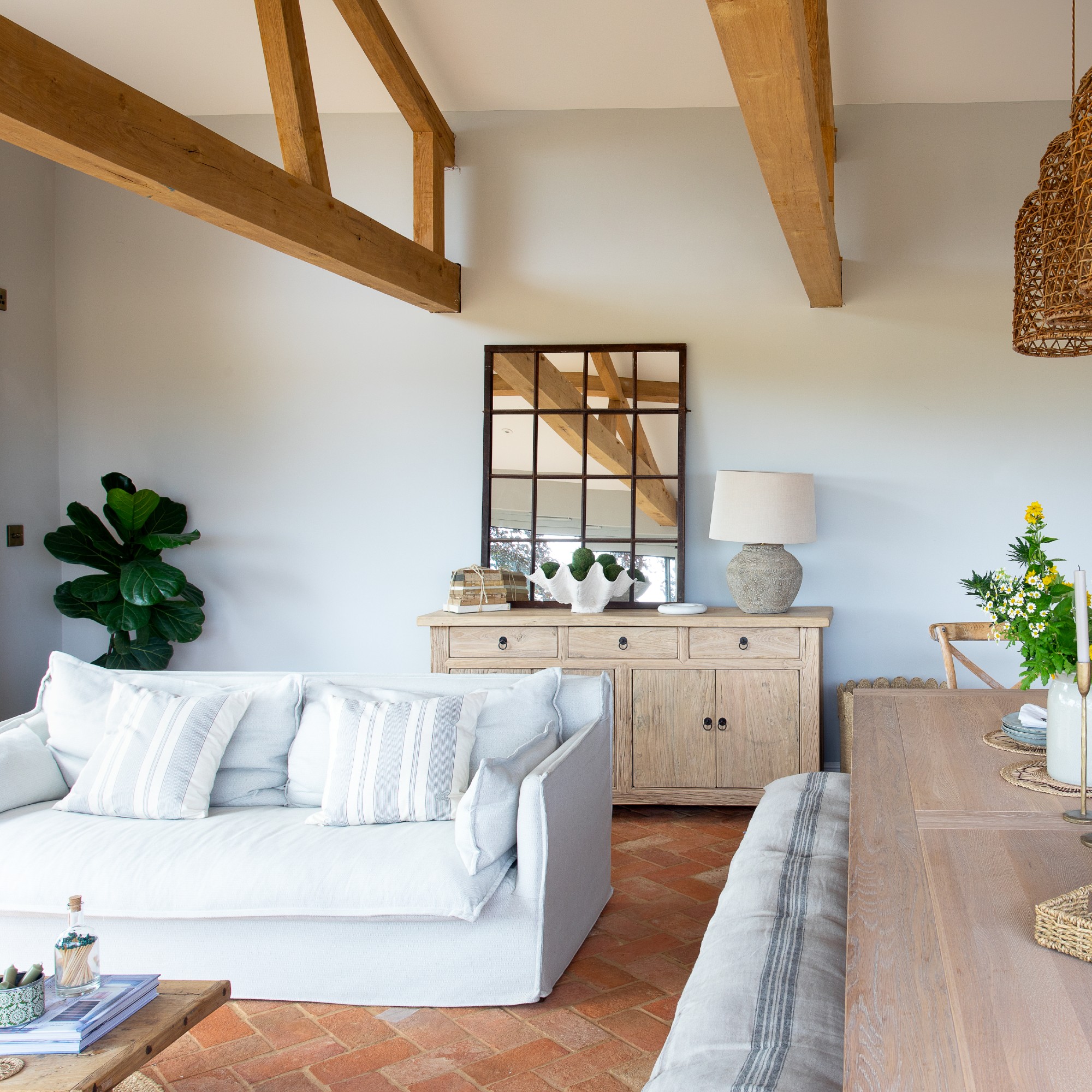
White or cream rugs, though appealing, often prove impractical for most rooms, especially those with high foot traffic like living rooms or kitchens. They are prone to showing dirt and stains easily. For households with pets or young children, darker or patterned alternatives are more forgiving. If a neutral look is desired, options such as soft vintage prints, stripes, or jute rugs can offer style while effectively concealing dirt. Should a white or cream rug be preferred, placing it in a low-traffic area, such as a formal dining room primarily used for entertaining, can be a suitable compromise.
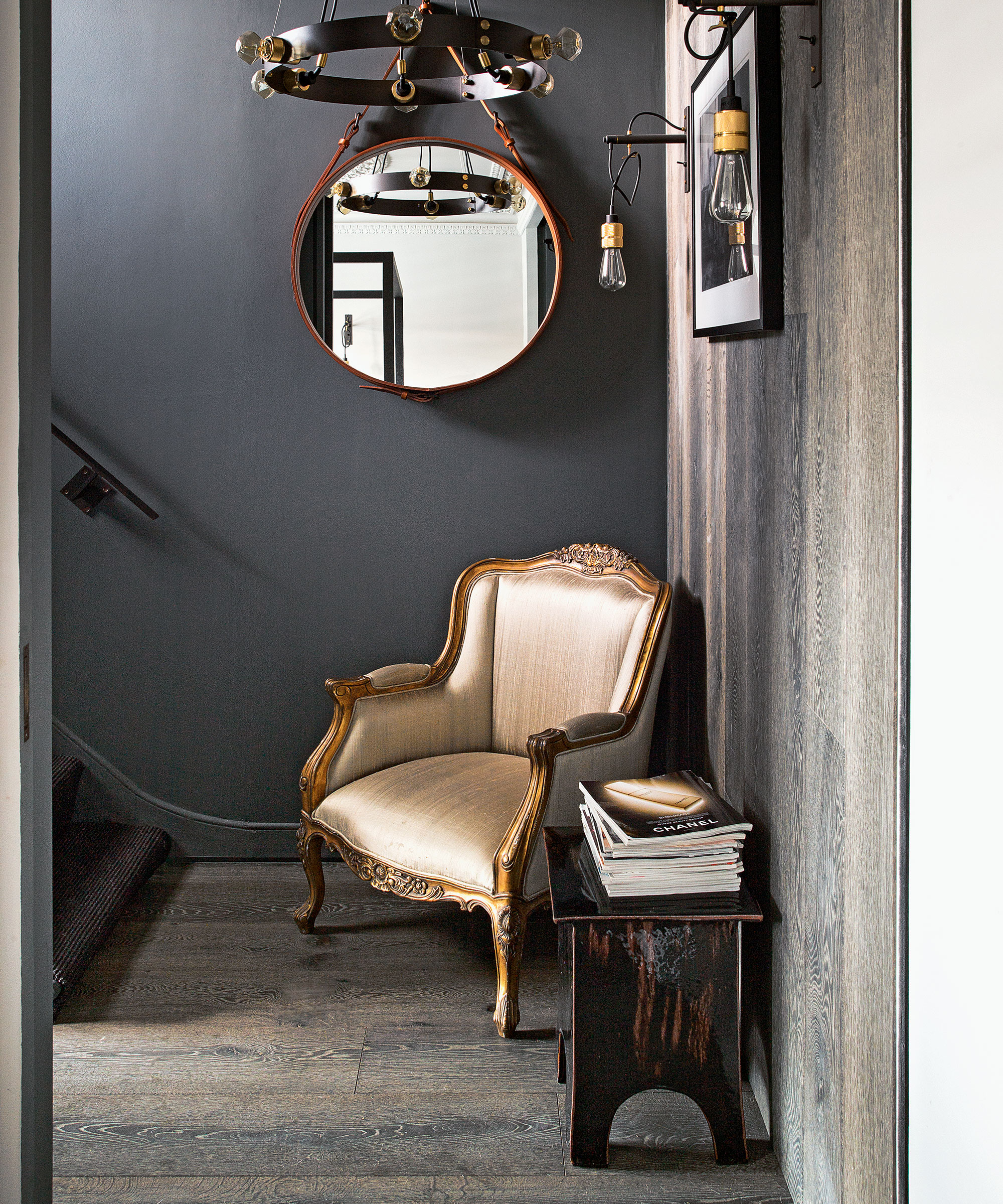
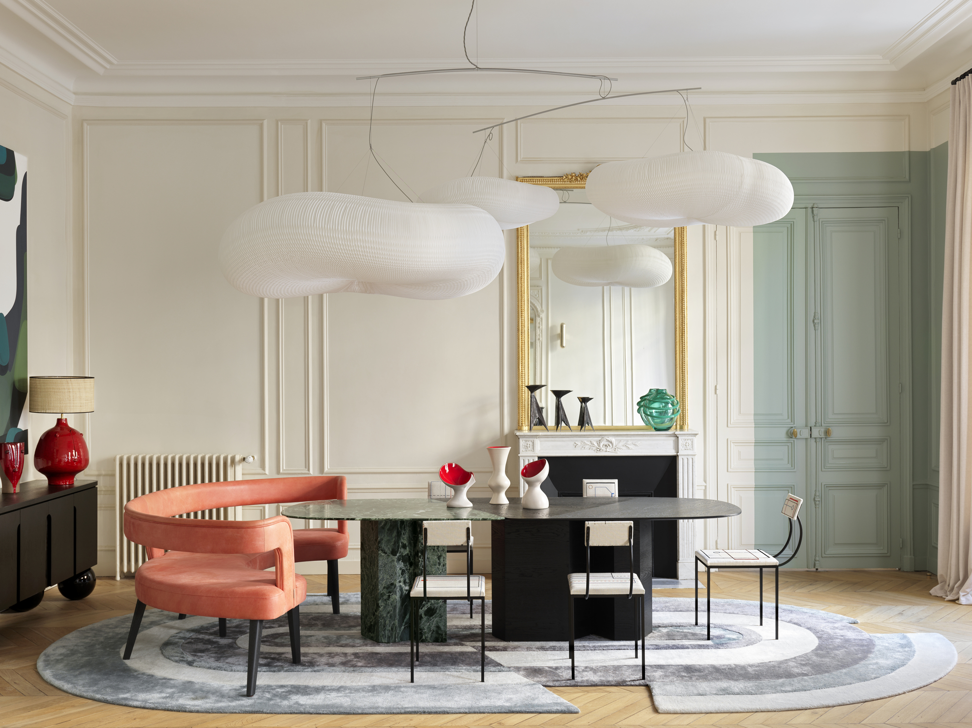
Black rugs, when used in a solid block of color, can make a space feel visually heavy and detract from other design elements. Instead of a uniform black, incorporating rugs with black threading or patterns can provide depth without overwhelming the room. Textural elements like Barber Pole yarn or woven designs in black rugs can also help mask everyday wear, such as pet hair.
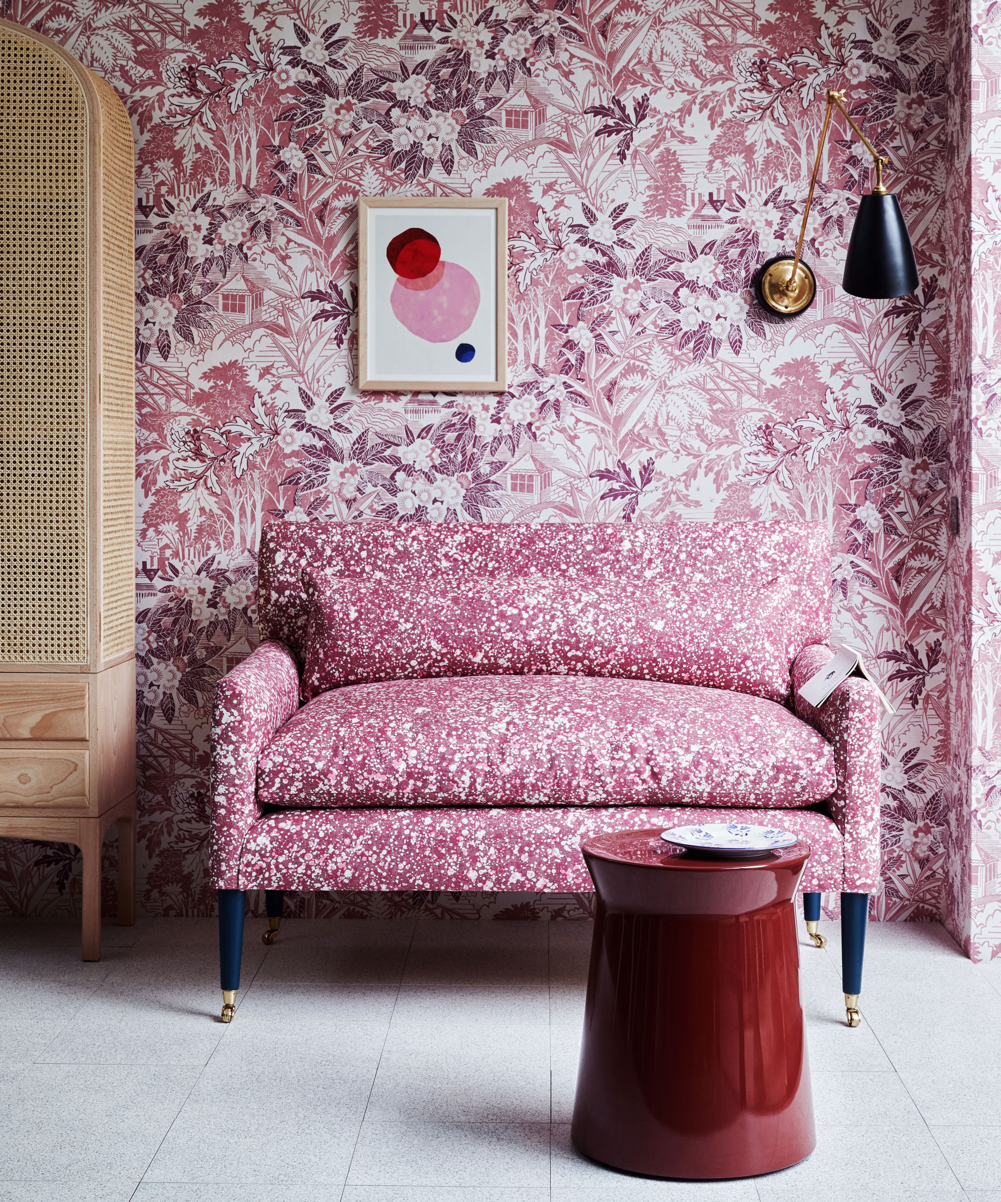
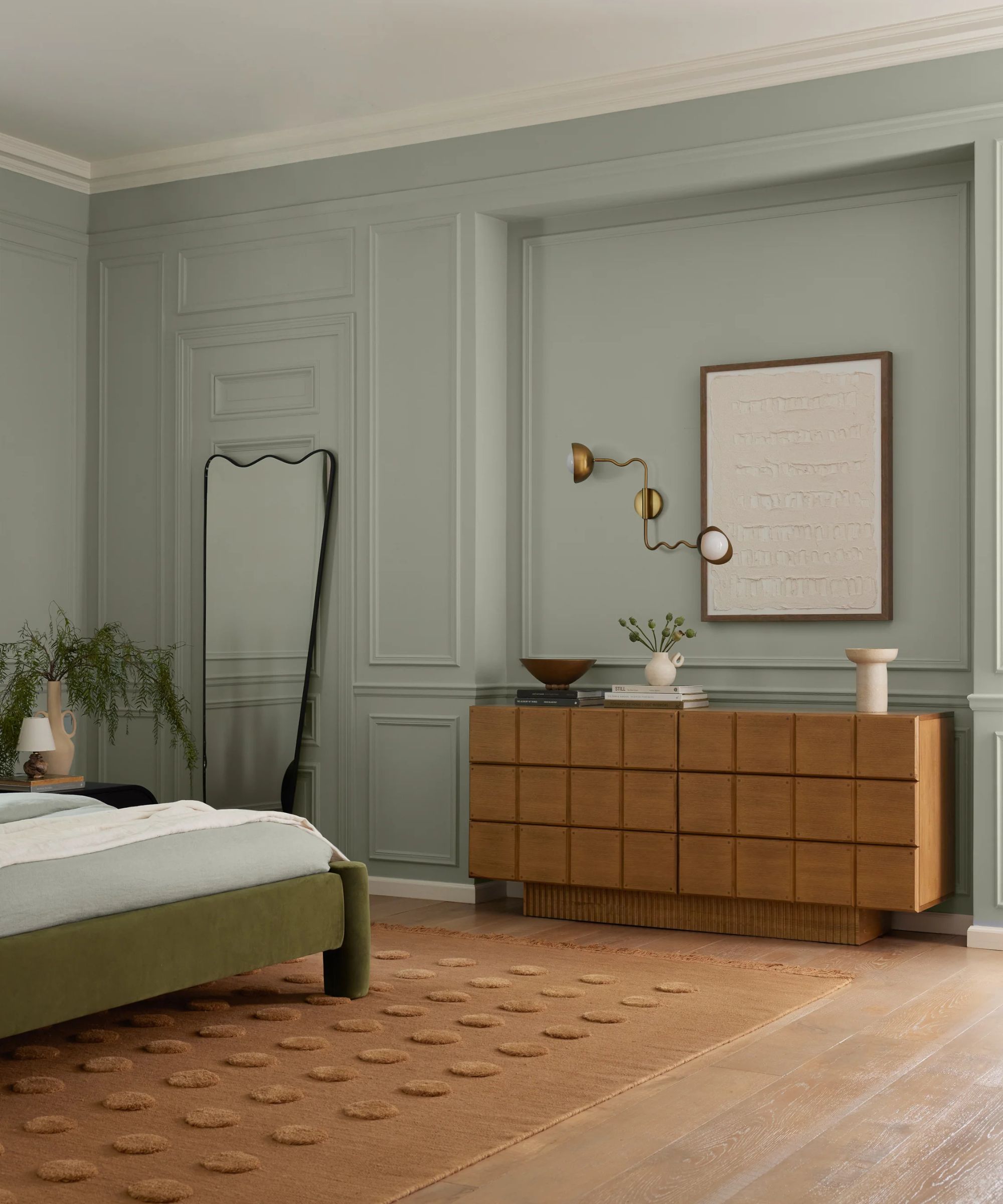
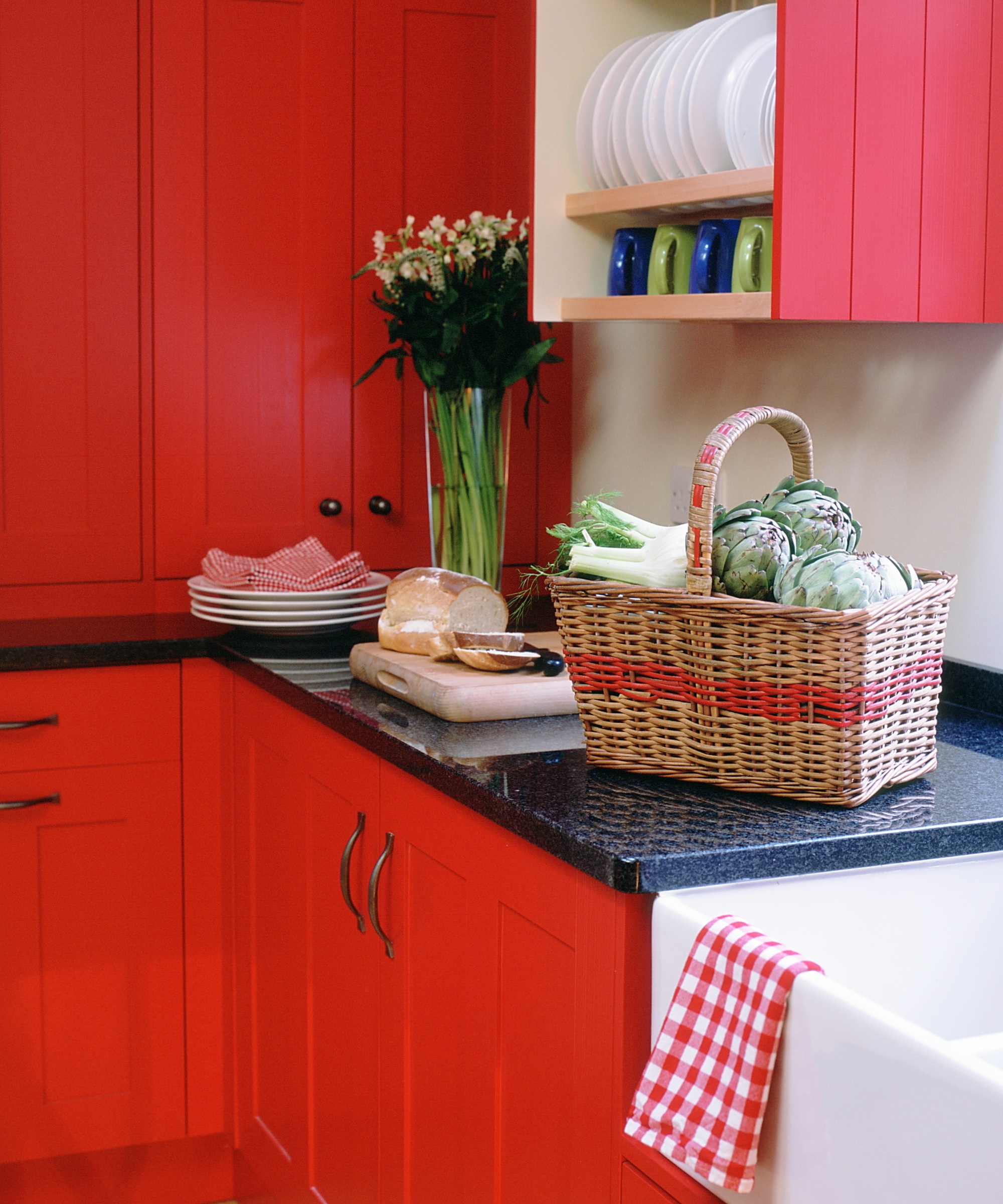
Red, known for its stimulating properties, is a color that should be used judiciously, particularly in large expanses like rugs. In interior design, red can be over-energizing and may hinder the creation of a relaxing sanctuary, especially in bedrooms where it could disrupt sleep patterns. If a warm color is desired, vintage-style rugs with earthy russet tones can offer warmth while maintaining a calming and inviting atmosphere. It is advisable to consider the emotional impact of colors; for a serene environment, softer blues or natural earth tones are often more appropriate than vibrant reds.
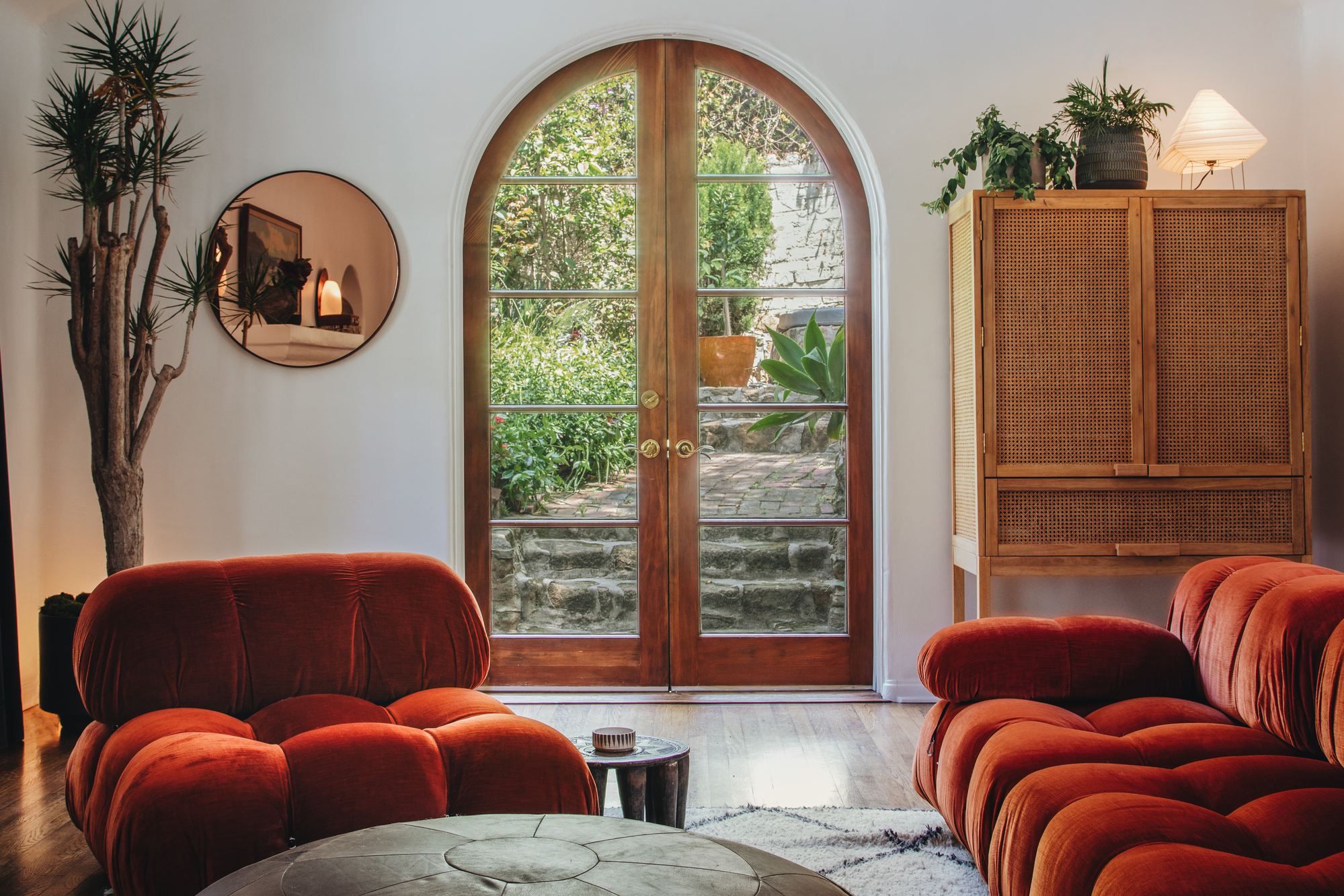
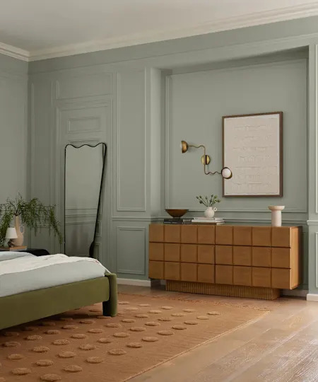
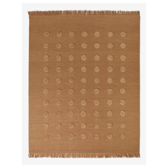
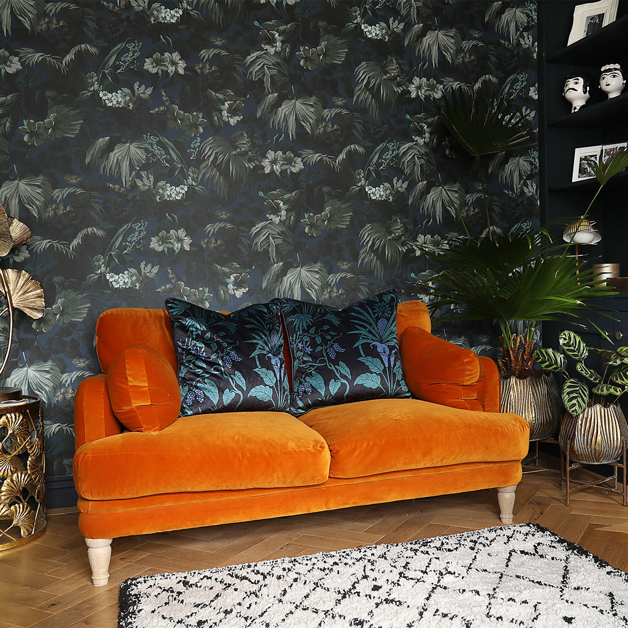
Bright orange, similar to red, carries a strong 'fire energy' according to Feng Shui principles, which can be overstimulating. While some fire colors are beneficial for motivation, an excessive presence, particularly in a large rug, can lead to heightened energy, arguments, and even burnout. Designers recommend avoiding large, heavily saturated blocks of orange. If orange is a favored color, it can be introduced through vintage or patterned rugs, or in softer shades, ensuring it is harmoniously integrated with other elements in the room through complementary artwork or cushions. The context of the room's style, such as a 1970s-inspired scheme, can also influence how orange hues are perceived and integrated.
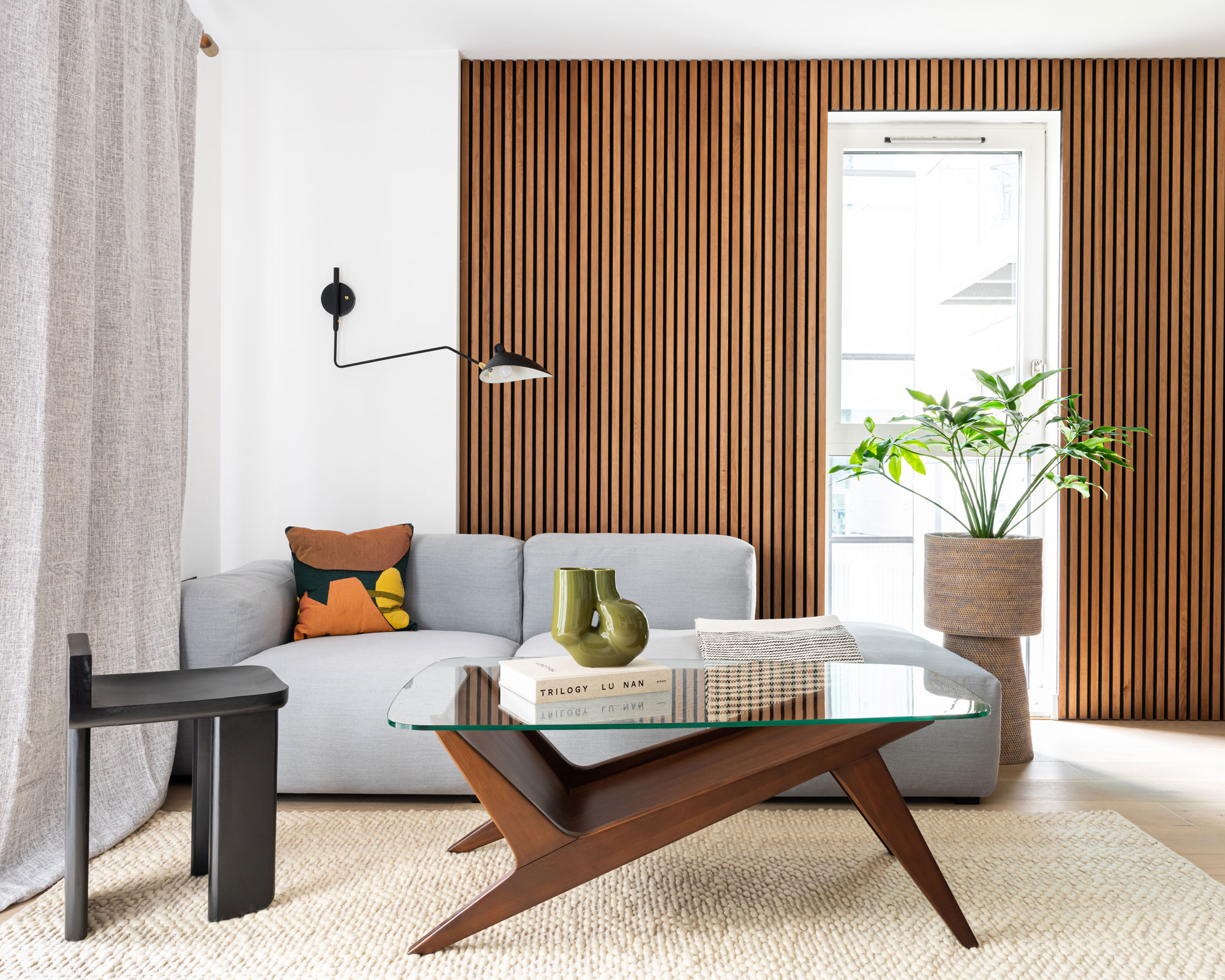
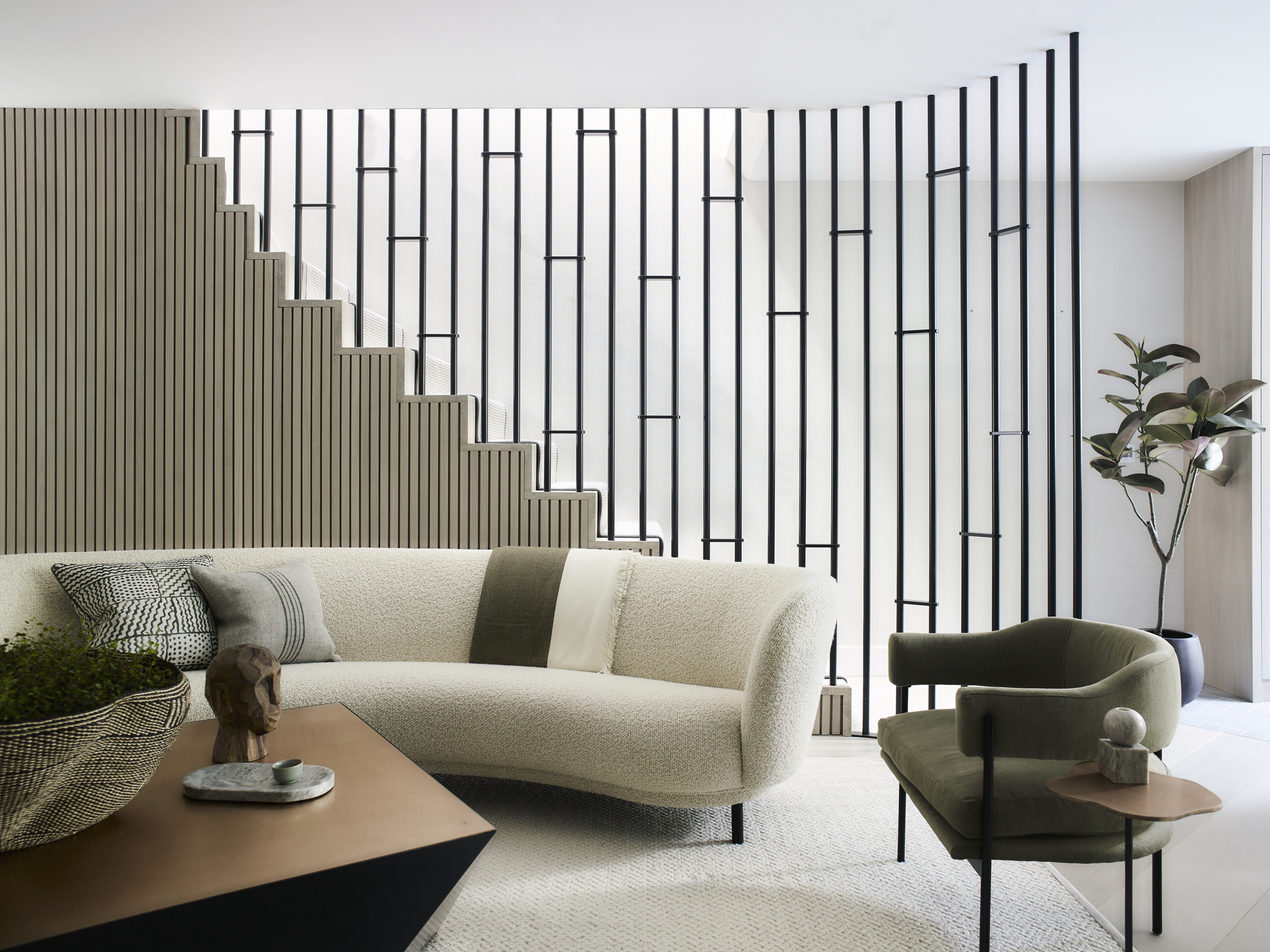
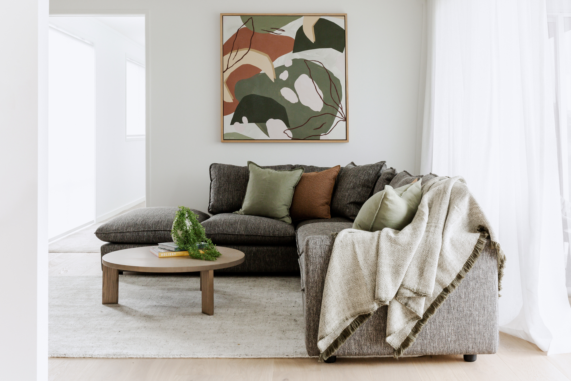
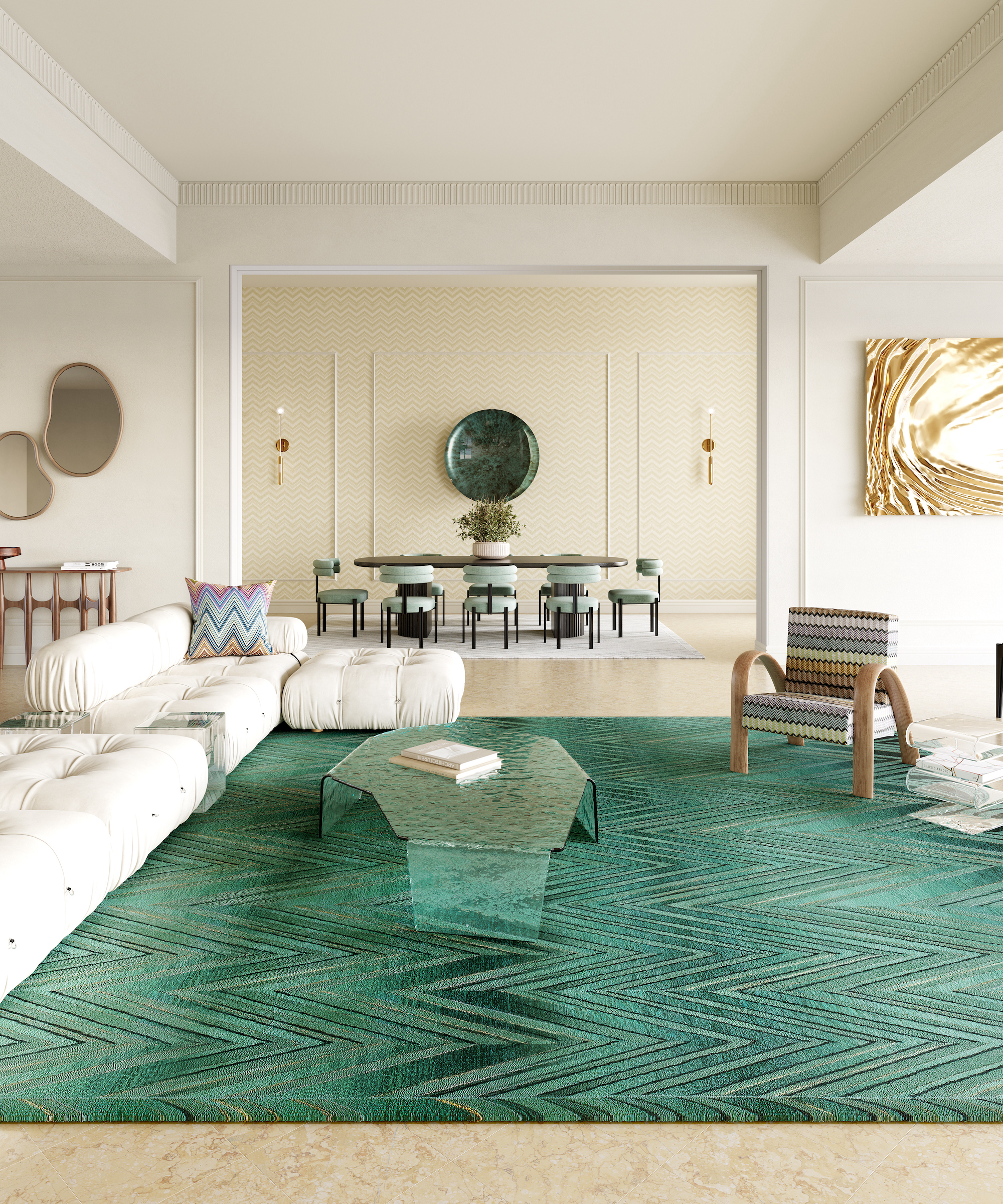
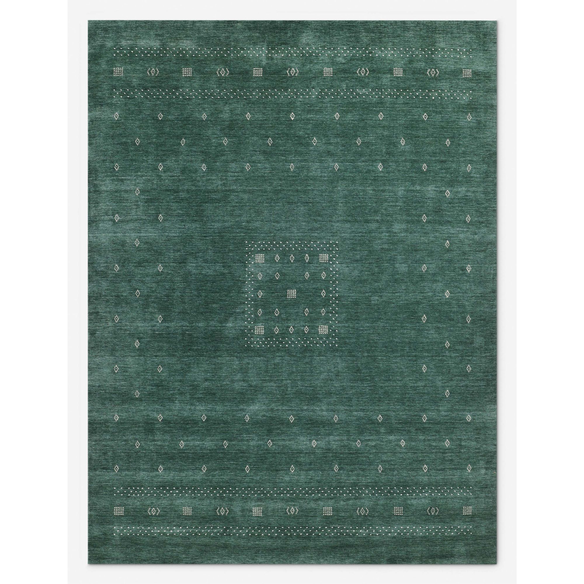
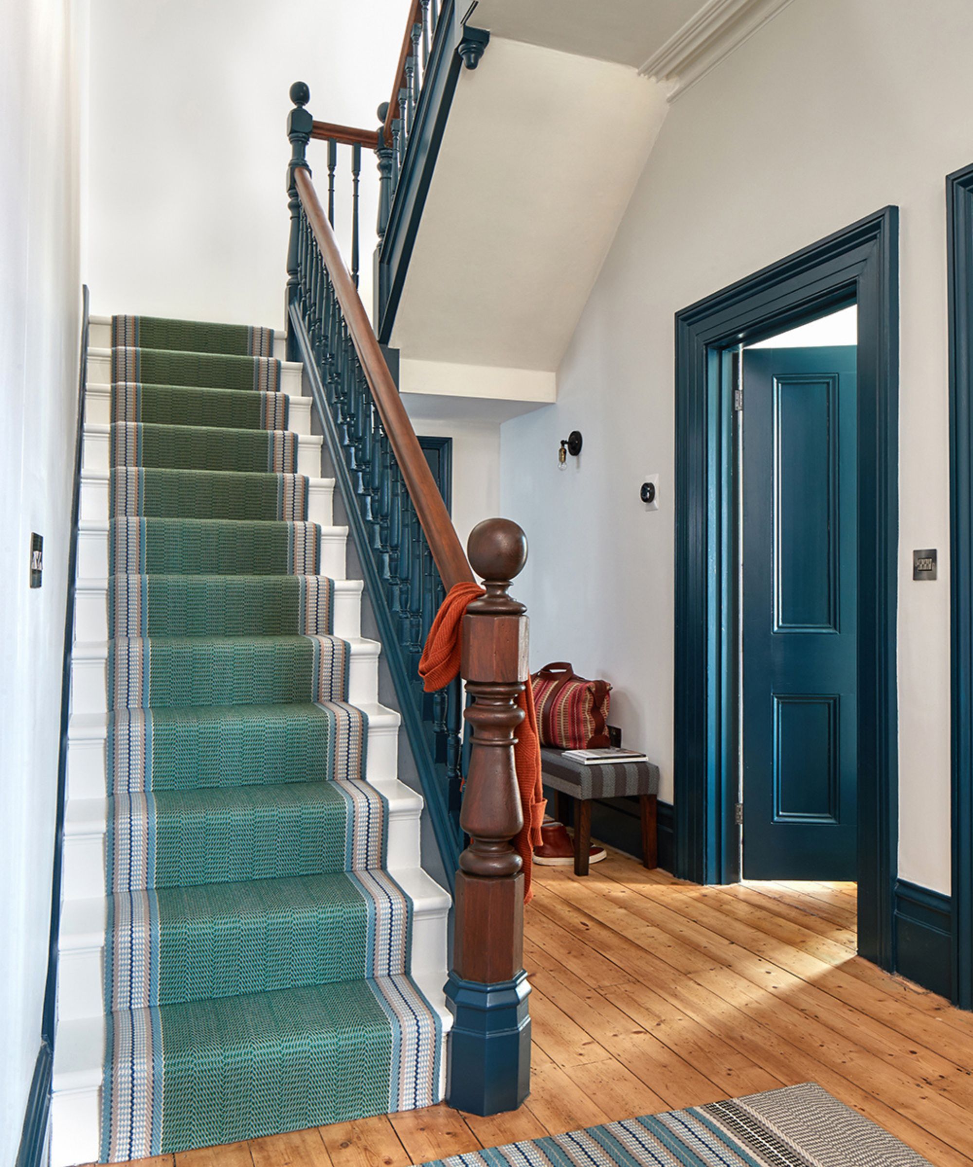
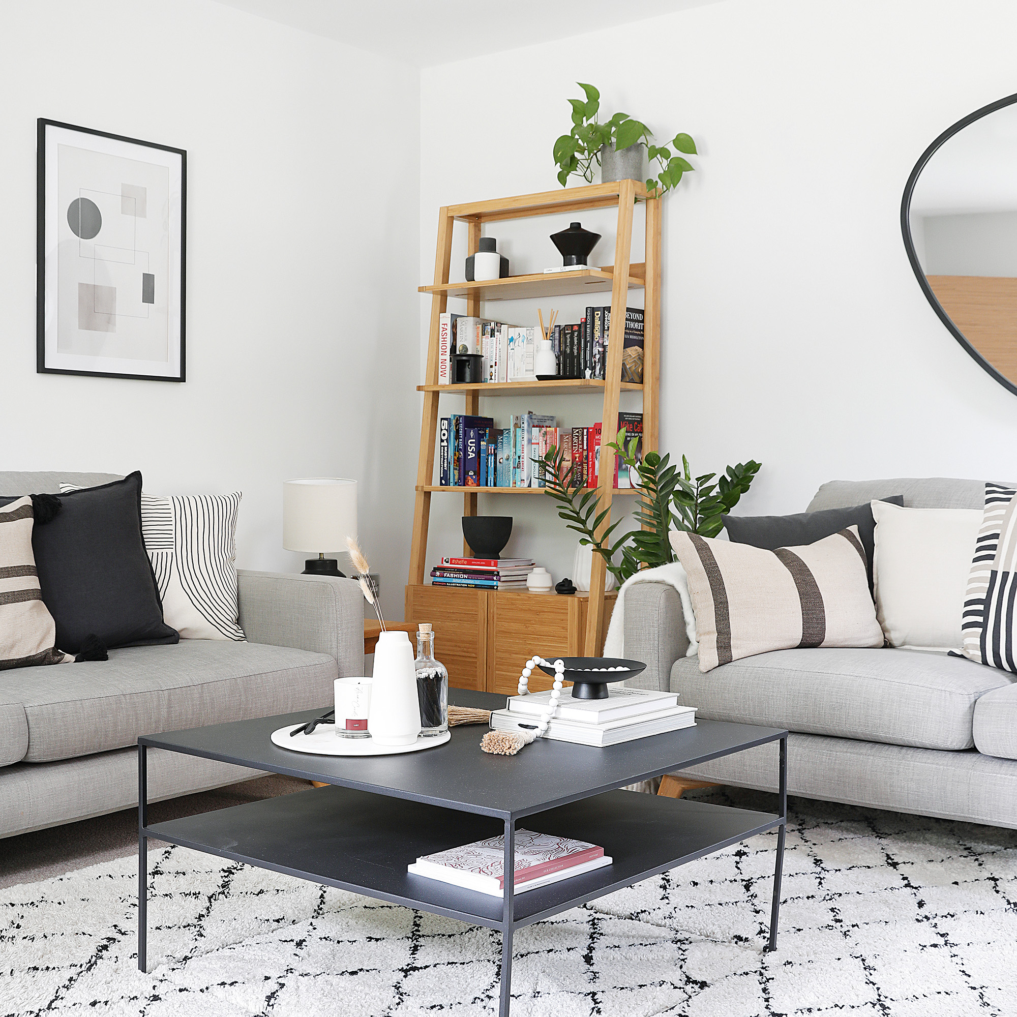
Cool greys, while popular, can lead to a bleak and unyielding atmosphere if used excessively, especially according to Feng Shui. Metal energy, which grey represents, has been prevalent in home design, but an overabundance can deplete emotional and physical energy, resulting in feelings of dullness or fatigue. If a home primarily featuring grey and white evokes a less desirable mood, it may indicate a need for revitalization. Introducing grey through patterns or varied textures can soften its effect. Layering rugs with different textures or patterns can also provide contrast and added comfort, maintaining a chic and stylish look without the potential pitfalls of a monochromatic grey scheme. As design trends evolve, there is a noted shift away from dominant grey schemes towards colors associated with wood energy, such as greens, suggesting a broader movement towards more vibrant and natural palettes in interior design.
#RugColorSelection #InteriorDesignTips #HomeDecor #ColorPsychology #FengShui #DesignTrends #LivingRoomDesign #RugMaintenance #RugColorSelection #InteriorDesignTips #HomeDecor #ColorPsychology #FengShui #DesignTrends #LivingRoomDesign #RugMaintenance
Toplam 0 yorum
 Henüz yorum yok
Bu da beğenebilirsiniz
5 colors to avoid in a bathroom – according to designers

5 colors to avoid painting a landing – and the secret to choosing the right shades
Colors not to paint a mudroom – 5 hues to avoid in this high-traffic space
4 Paint Colors Designers Say You Should Never Use In A Hallway
Couch colors to avoid – and what designers are recommending instead
5 couch colors to avoid – stay clear of these shades for a sofa that stands the test of time

5 Carpet Colors That Are So Outdated, According to an Interior Designer

6 colors to avoid in an entryway – and the ones designers know make a better first impression

4 Outdated Colors Designers say you Should Steer Clear of When Decorating a Living Room
5 Paint Colors to Never Use in Your Living Room, According to Interior Designers
5 best colors for an entryway carpet, according to interior designers
'They're not for every room' – designers say they'll never use a round rug in these 5 spaces, and neither should you
5 Colors You Should Never Paint Your Hallway, According to Designers

These 5 rug colors are going out of style for 2025, according to interior designers
Experts say these are the 3 sofa colours to avoid


5 colors you should never paint a pantry – designers share the shades they swerve

5 colors you should never paint a small room – designers warn us to steer clear of these hues, and what to pick instead
These 5 rug colors are going out of style for 2025, according to interior designers


5 colors you should never paint your entryway – according to interior experts
5 Paint Colors You Should Never Use In A Bedroom, According to Designers