1/4
7 Paint Mistakes That Make Designers Instantly Cringe When They Walk Into Someone's Home
Designers consistently highlight several common painting errors that can undermine the aesthetic appeal of a home. A critical first step to avoid these pitfalls is thorough color testing. It is important to test generously sized paint samples in the actual space, on multiple walls, and at different times of the day. This comprehensive testing accounts for variations in natural light, shadows, and existing room finishes, which can significantly alter how a color appears. Additionally, paint samples should be tested under the home's actual lighting conditions, particularly with the specific light bulbs intended for use, as different bulbs can drastically change a color's perceived hue.
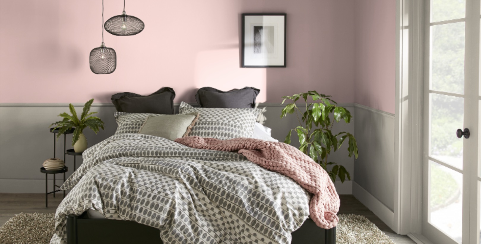
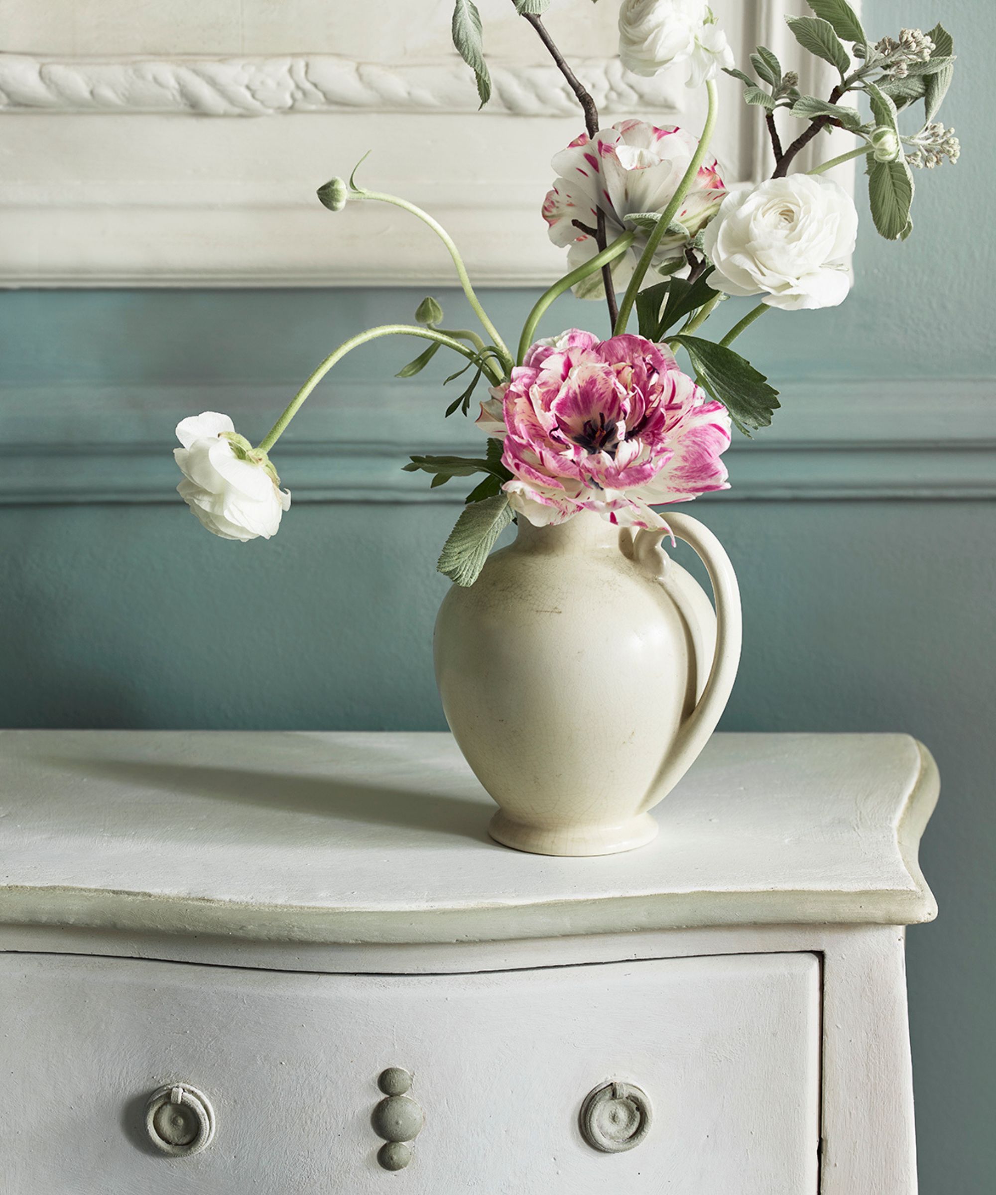
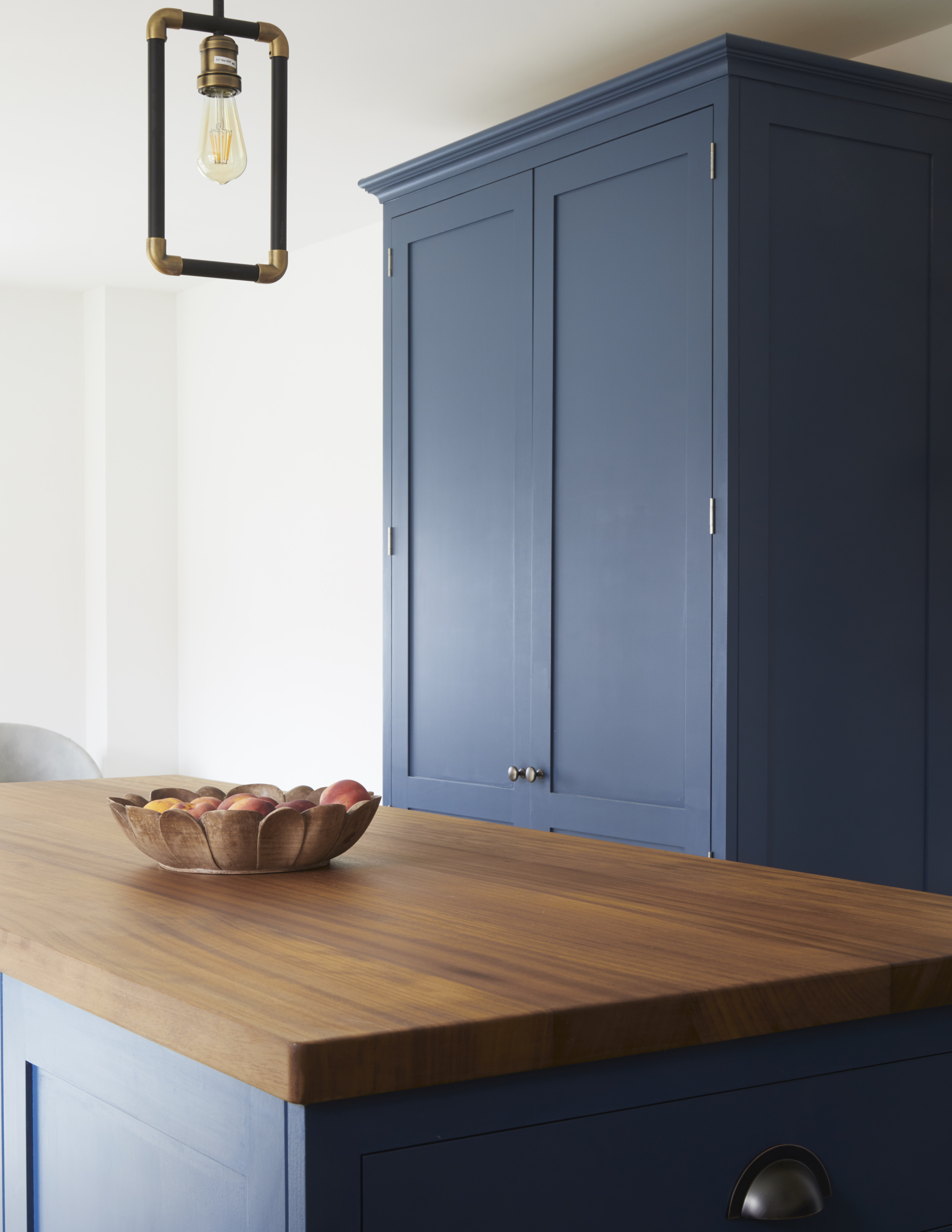
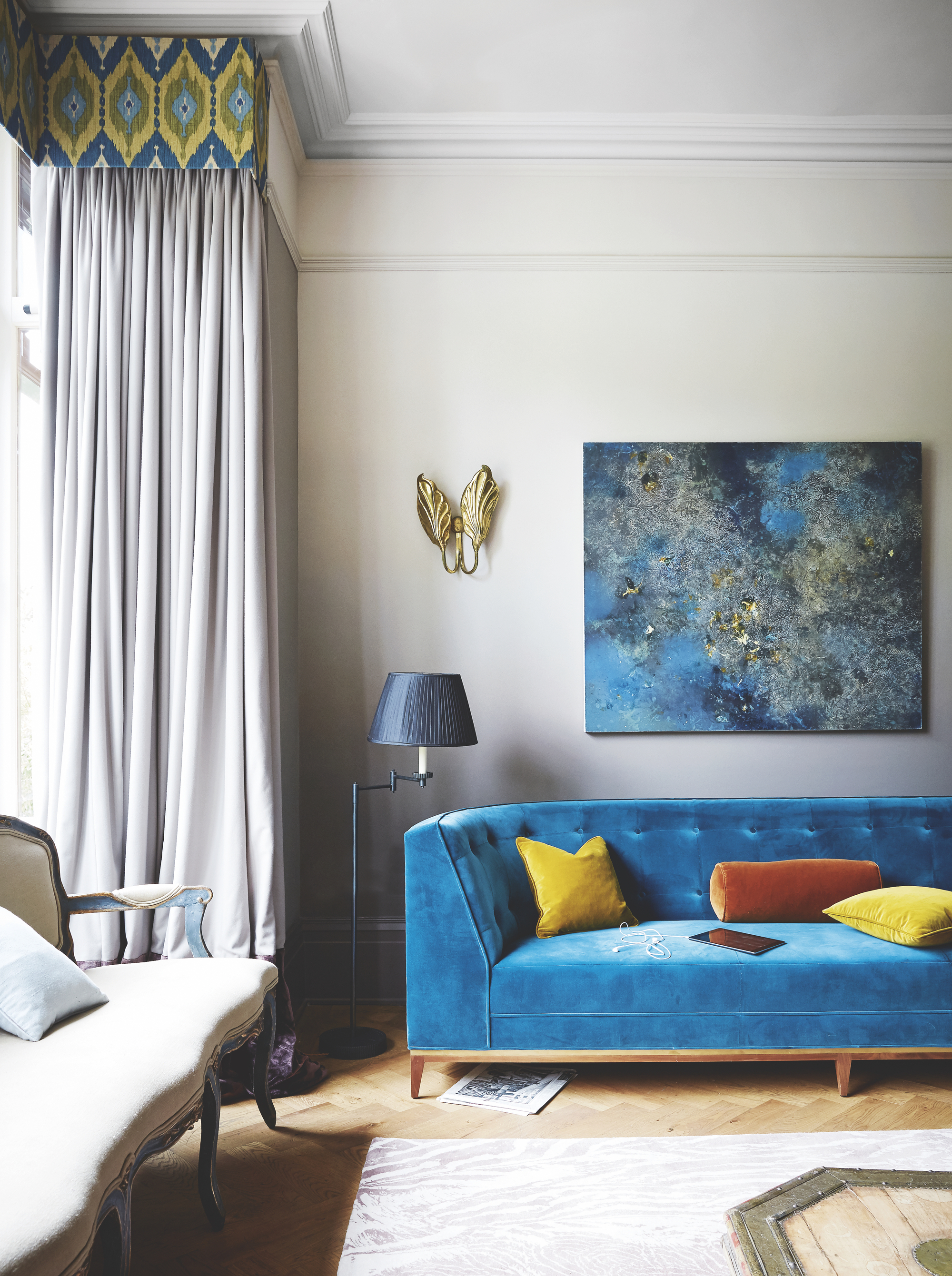
Another frequent mistake is selecting overly “clean” or pure colors. Designers prefer hues that are more complex and muted, often described as “dirty” with subtle gray or brown undertones. These nuanced colors, such as Farrow & Ball Pigeon, are considered more sophisticated because their dynamic undertones allow them to shift and interact with changing light throughout the day, providing a more refined and less juvenile appearance than true, vivid tones. When faced with a choice between two similar shades, the recommendation is to opt for the murkier one.
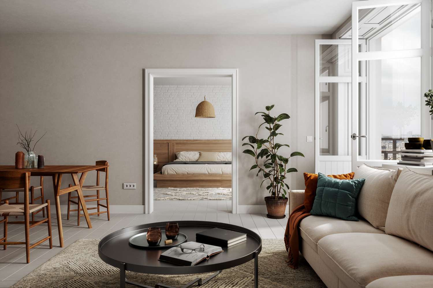
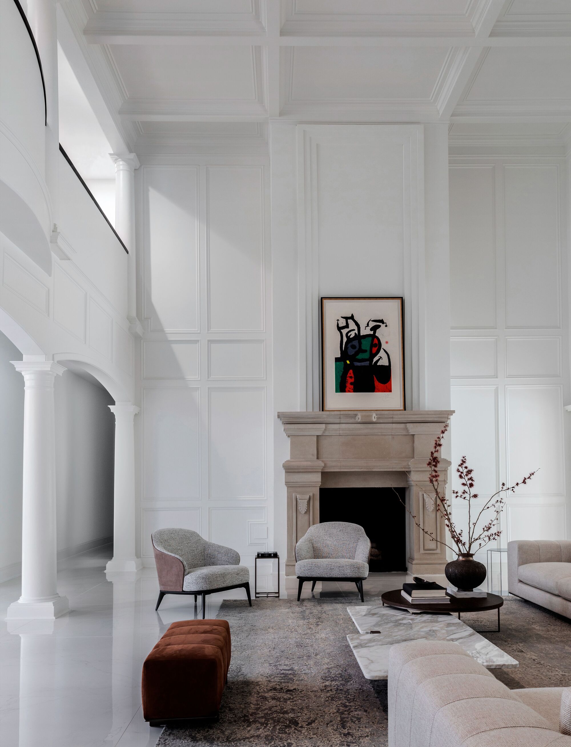
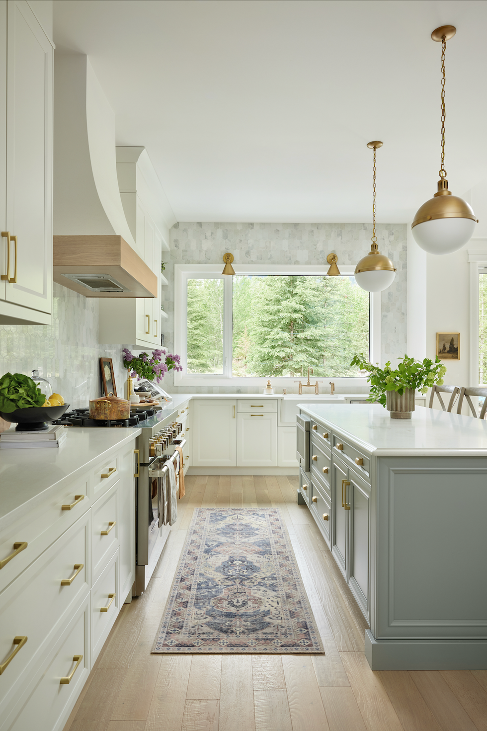
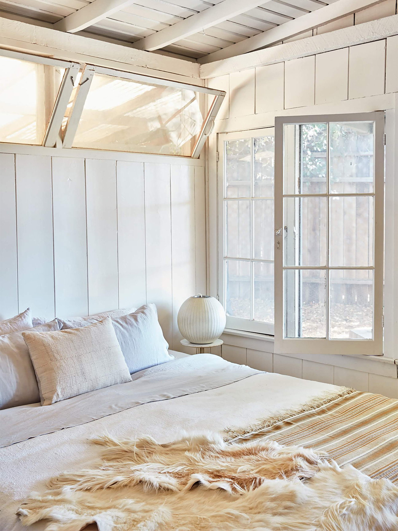
Choosing a too-bright white is also a common misstep. While a crisp white might seem like a fresh choice, without the appropriate undertones, it can make a space feel cold, sterile, or jarring. Bright whites only work effectively in rooms with abundant warm natural light and when paired with carefully selected textures and materials that soften the contrast. A better approach is to select nuanced whites, soft creams, warm ivories, or whites with subtle blush or gray undertones, which introduce dimension and warmth, making a space feel more inviting and thoughtfully designed.
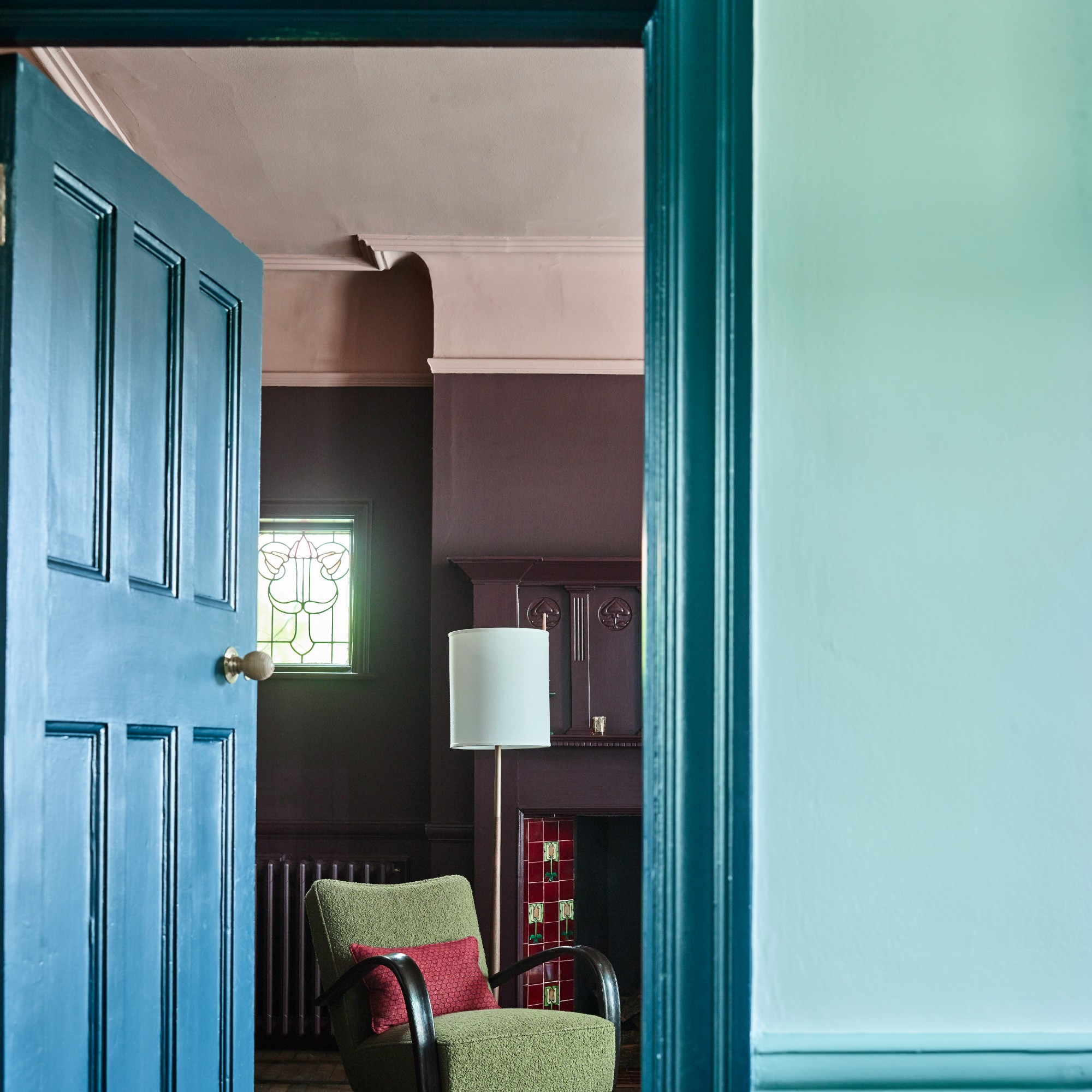
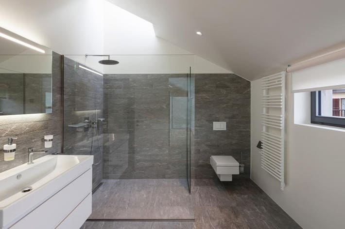
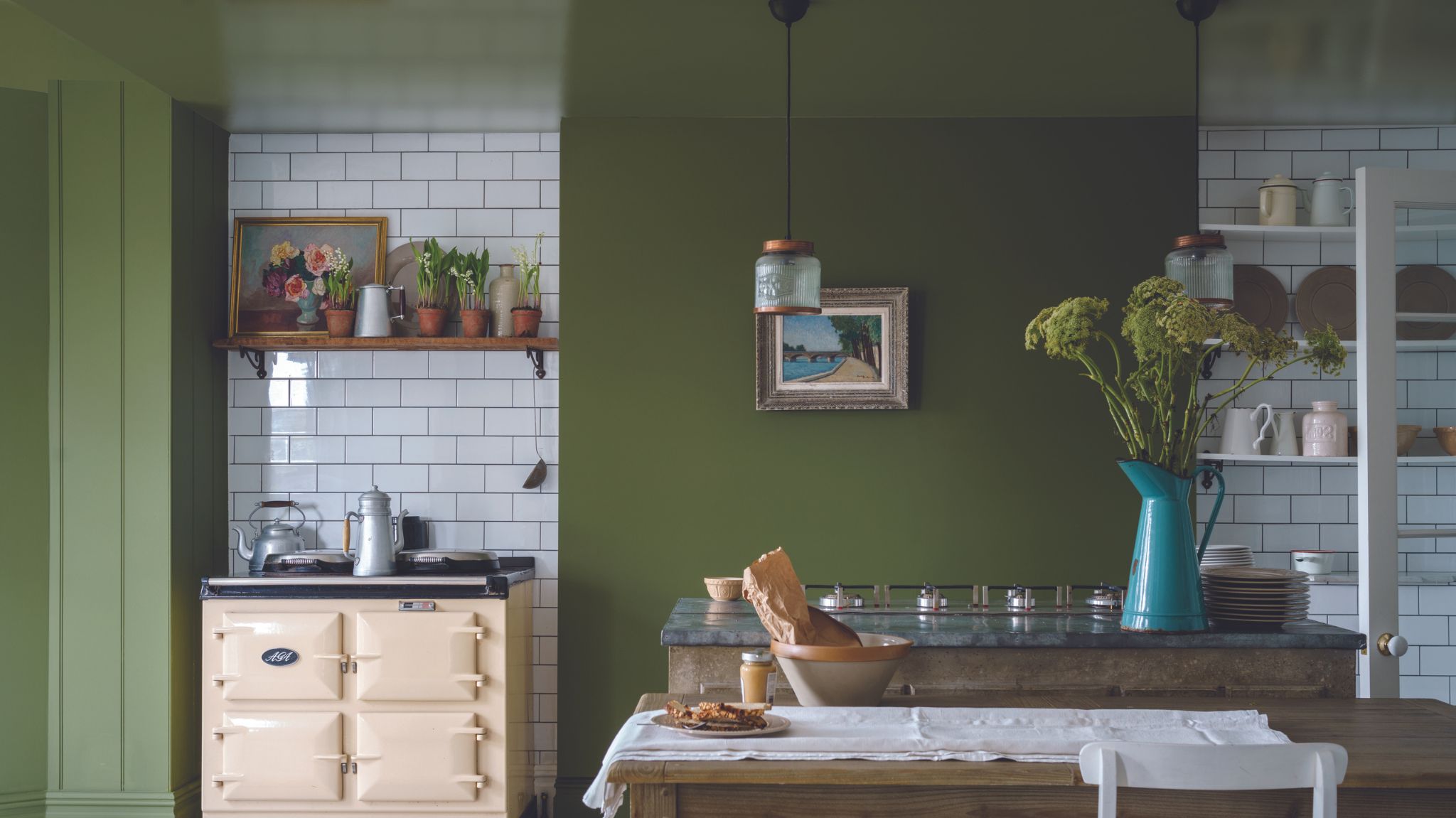
Ceilings are often neglected in the painting process, typically receiving a basic flat white coat. This oversight is particularly problematic with sloped ceilings, where a stark white cutoff line can disrupt the room's balance, making it feel cramped and disjointed. Designers advise extending the wall color up to the ceiling to create a more cohesive and balanced look.
The incorrect choice of paint finish is another error. While glossy sheens can be elegant, they demand perfectly prepped walls, as any imperfections will be highlighted. Conversely, matte finishes are forgiving and offer a soft look but are impractical in high-traffic areas due to their susceptibility to scuffs and difficulty in cleaning. A recommended formula for most homes includes eggshell for walls, satin for trim, and flat for ceilings, offering a balance of durability, contrast, and timeless appeal. Some designers even suggest varying the color percentage and finish on different surfaces within a room, for example, using 25% of the wall color in a flat finish on the ceiling and 100% of the color in a high gloss on moldings and casements, to elevate the room's design.
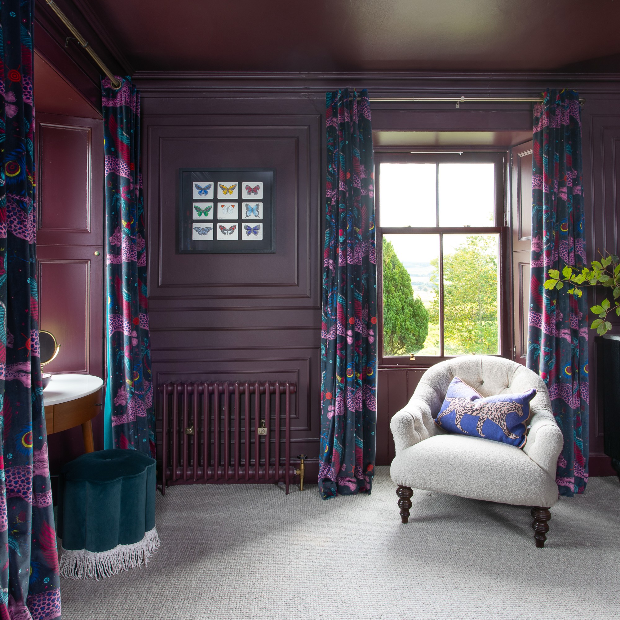
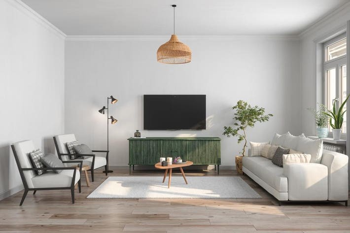
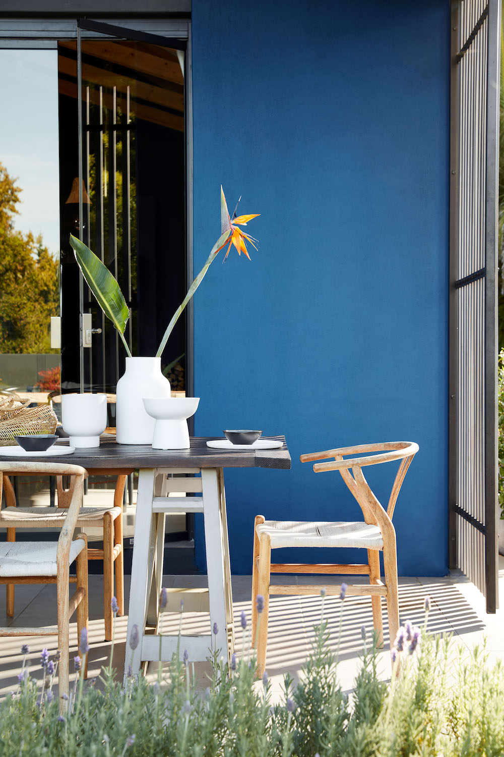
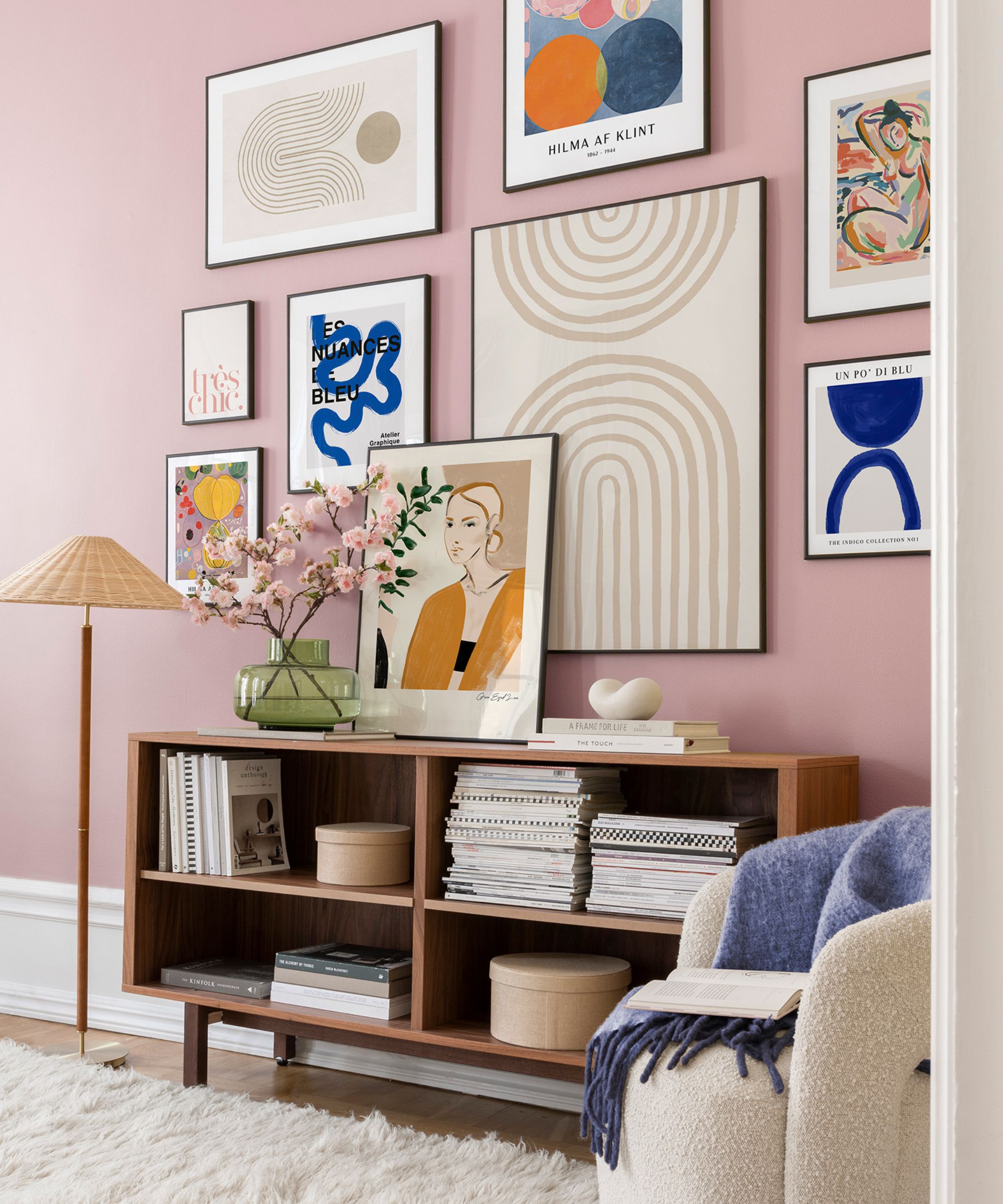
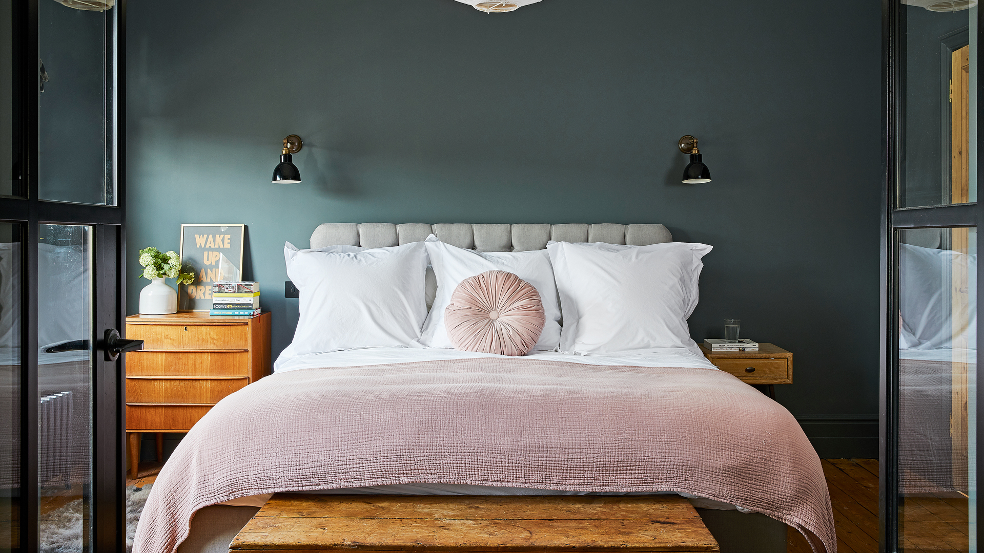
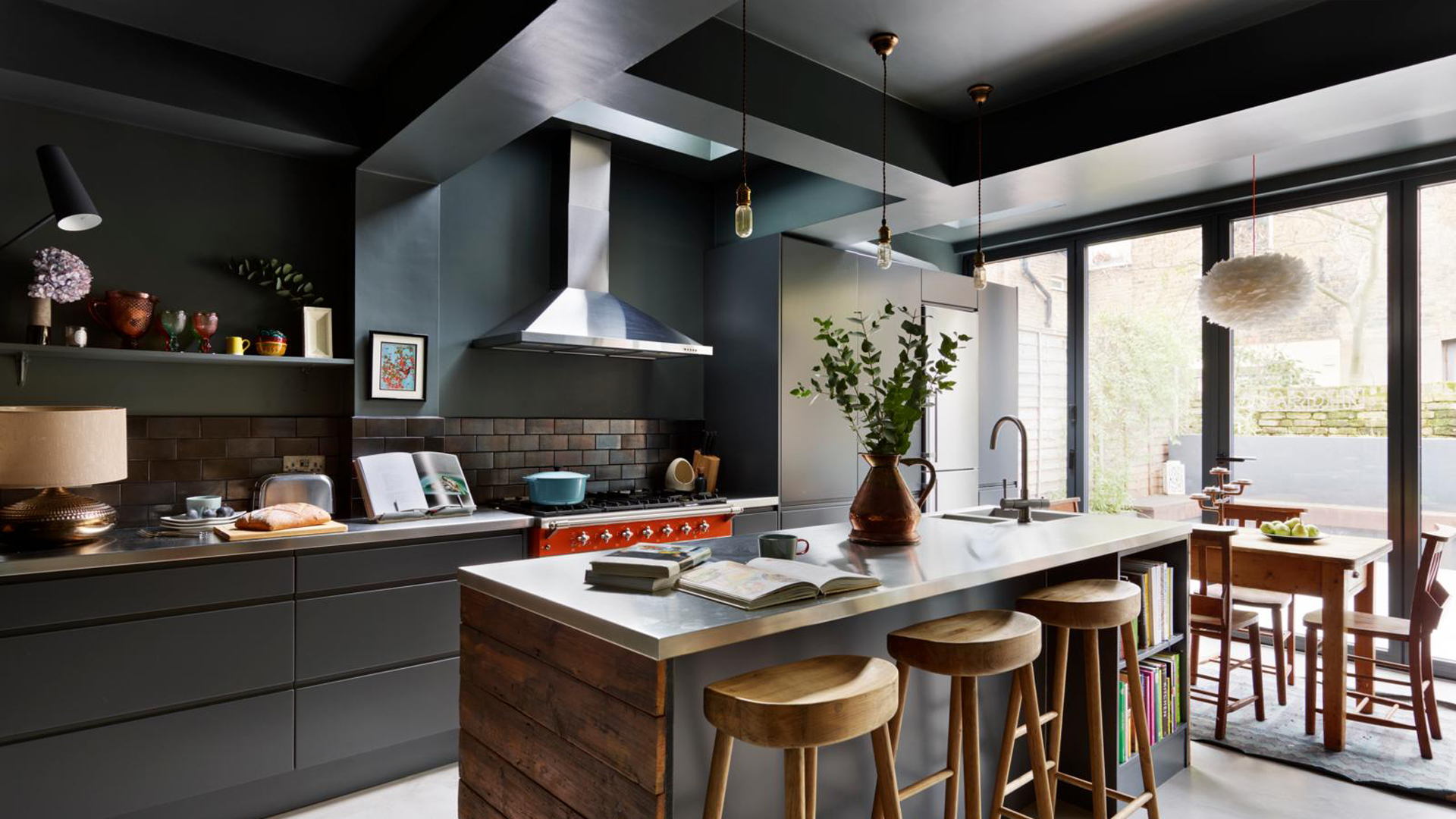
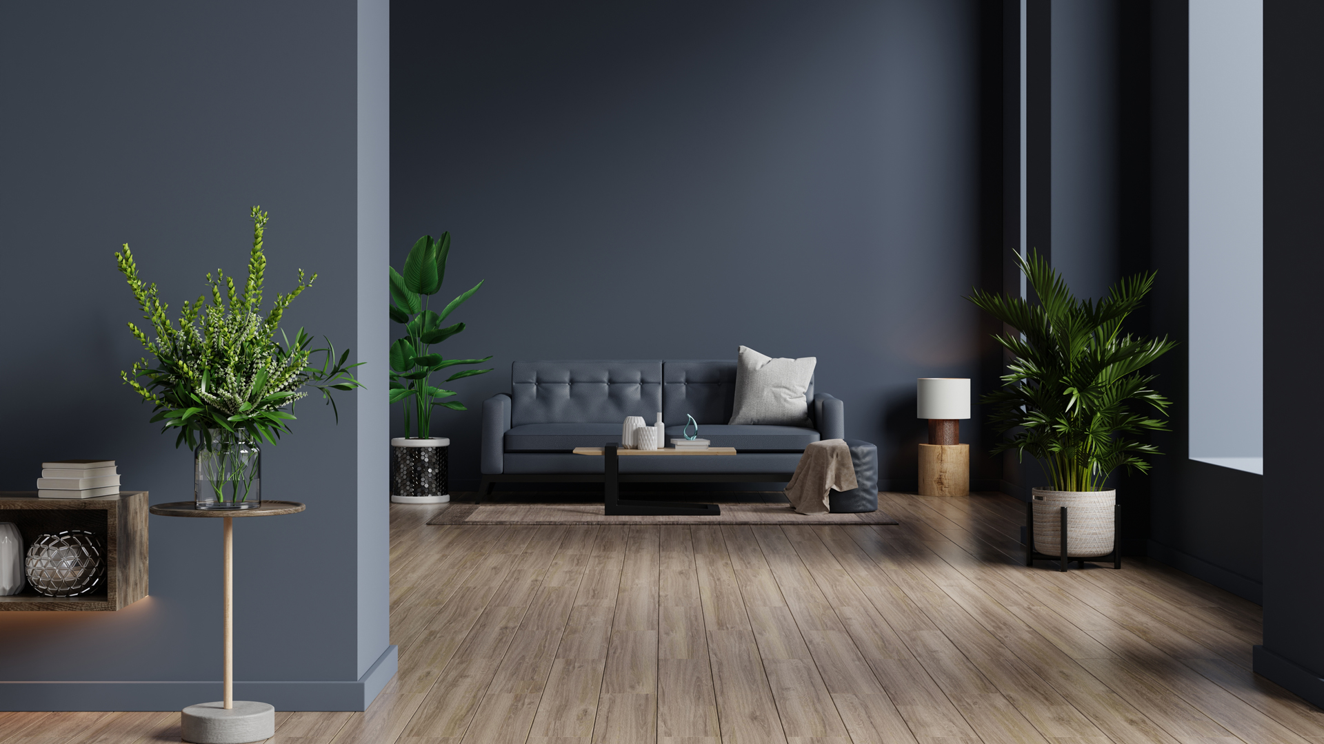
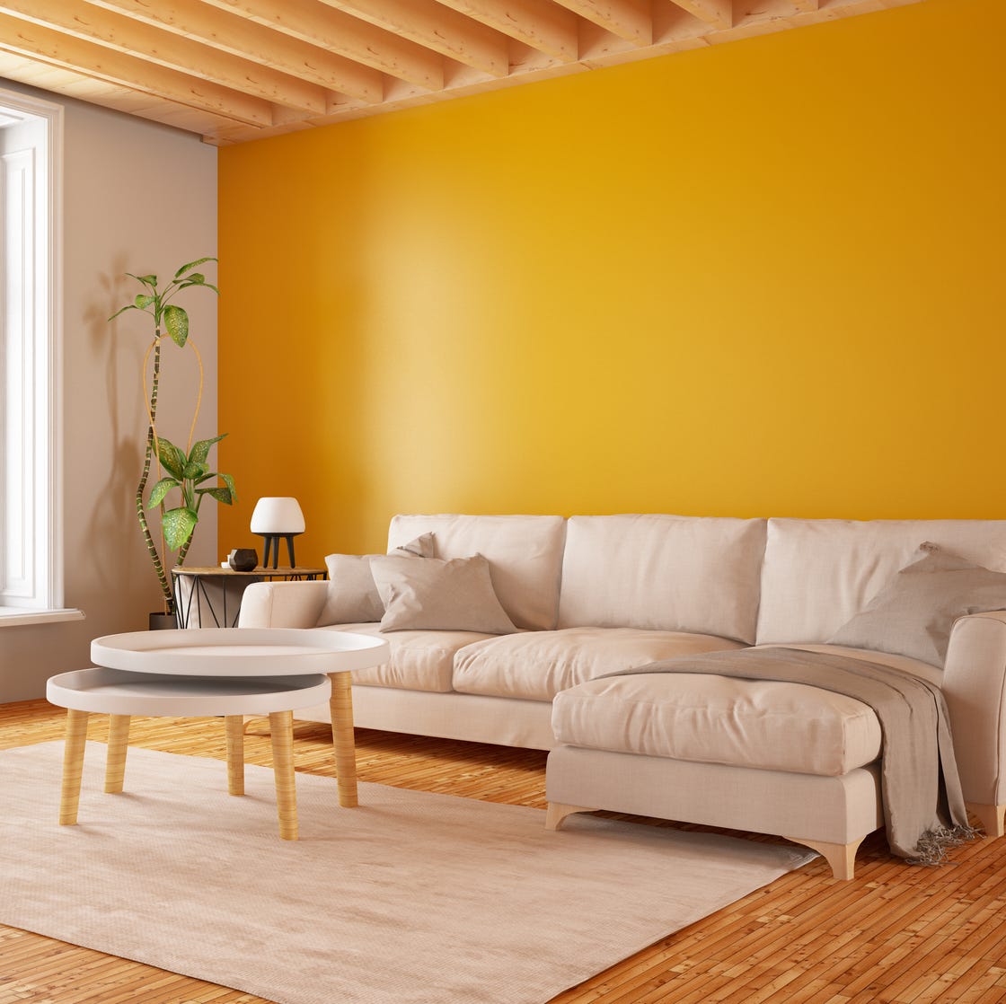
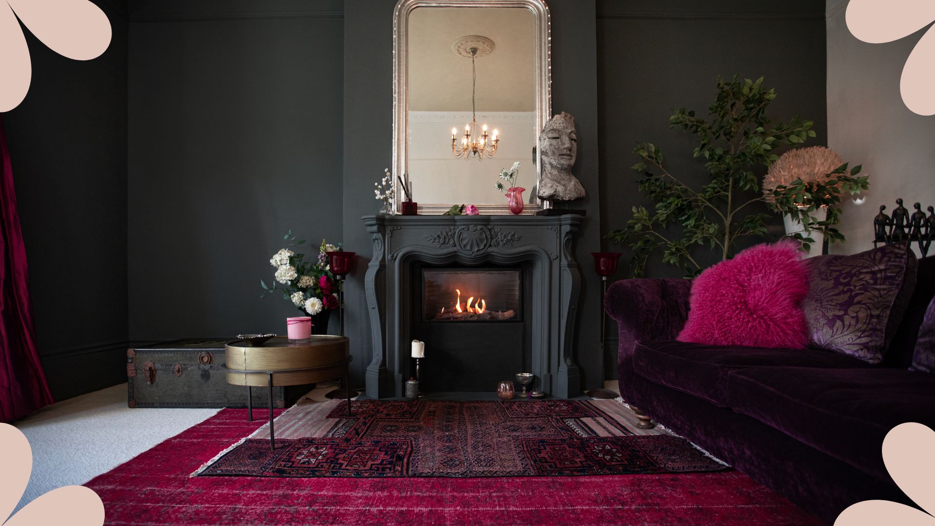
Accent walls are generally discouraged by designers, who advocate for enveloping a space entirely in color. If a particular hue is desired, it is suggested to incorporate it through upholstery or other decor elements rather than confining it to a single wall. When color transitions are necessary, they should ideally occur on an inside corner to ensure a clean, seamless line. Overlooking small room details is also a mistake. Painters should be instructed to match air vents and electric baseboard heaters to the wall color, using the appropriate finish (often satin for heaters), to ensure a truly “finished” and integrated look. This practice, known as color drenching, is considered a timeless and effective design strategy for achieving a polished interior.
#PaintColors #InteriorDesign #HomeDecor #DesignMistakes #PaintingTips #ColorTesting #CeilingPaint #PaintFinish #AccentWalls #PaintColors #InteriorDesign #HomeDecor #DesignMistakes #PaintingTips #ColorTesting #CeilingPaint #PaintFinish #AccentWalls
0 ความคิดเห็นรวม
 ยังไม่มีความคิดเห็น
คุณอาจจะชอบอีกด้วย
10 Mistakes Designers IMMEDIATELY Notice When They Walk Into Your Home

7 places in your home you’re probably forgetting to paint – but design experts say you really shouldn’t
The 5 small entryway color mistakes design experts say are big bloopers

6 Home Décor Mistakes Interior Designers Notice Right Away—and How to Fix Them
7 Design Mistakes Interior Designers Always Notice

10 Interior Design Mistakes Experts Avoid In Their Own Homes
5 Painting Mistakes That Are Actually Ruining Your Projects, According to Reno Pros

6 painting mistakes that are making your walls look 'dirtier' – and what you should be doing instead

8 Paint Mistakes That Make Your House Look Dingy (and How to Fix Them)

7 Entryway Mistakes Designers Instantly Notice When They Walk Into Your Home
21 Home Design Fails That Are As Upsetting As They Are Impractical

7 things people regret most about their kitchen design
7 Decorating Mistakes That Always Make Interior Designers Cringe
5 Exterior Paint Mistakes to Avoid If You Don't Want Your House to Become the Worst-Looking on the Street
Stop! Step Away From the Paintbrush — Here's 4 Things Interior Designers Would Never, Ever Paint Around the Home
5 Kitchen Renovation Moves That Make Designers CRINGE
7 cheap and tacky interior design errors rich people never make — ban these aesthetic atrocities from your home
6 mistakes design experts instantly notice in your home – and how to fix them
An interior designer reveals the 5 mistakes to avoid when painting with dark colours

9 Paint Colors You’ll Never Find in an Interior Designer’s Home