1/2
27 Neutral Paint Colors and Tips from Experts On How to Use Them
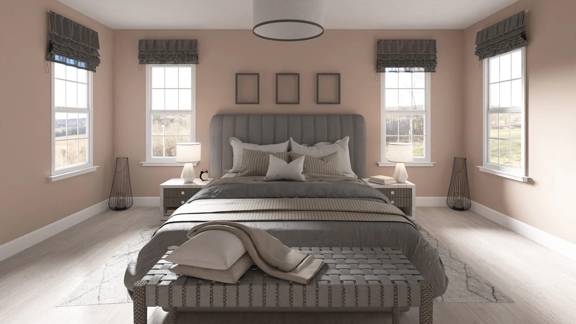
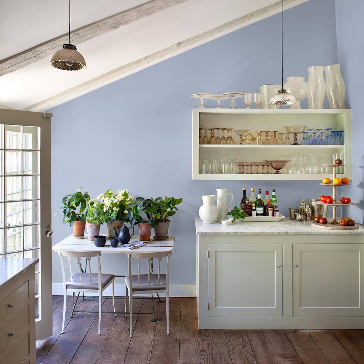
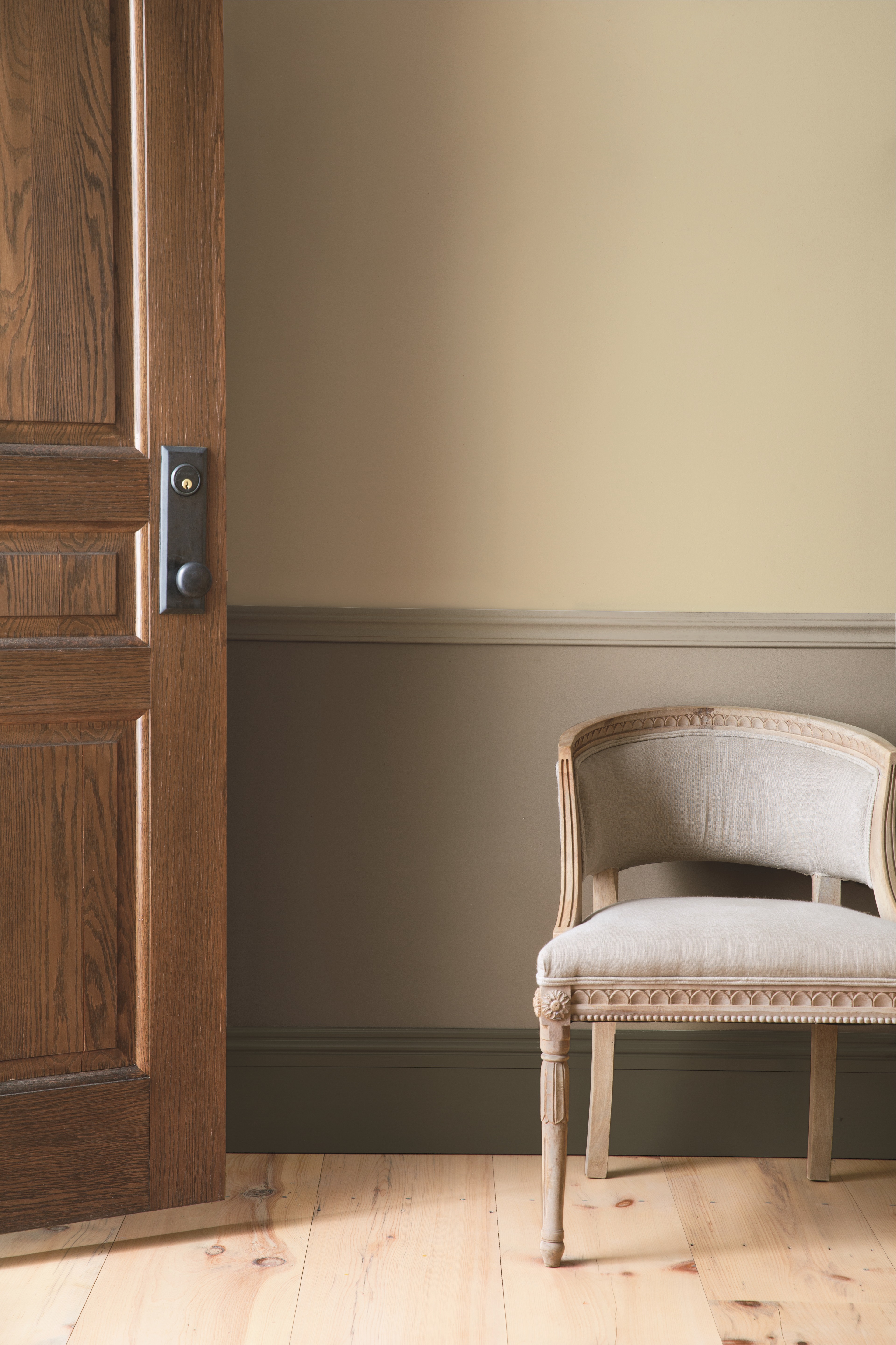
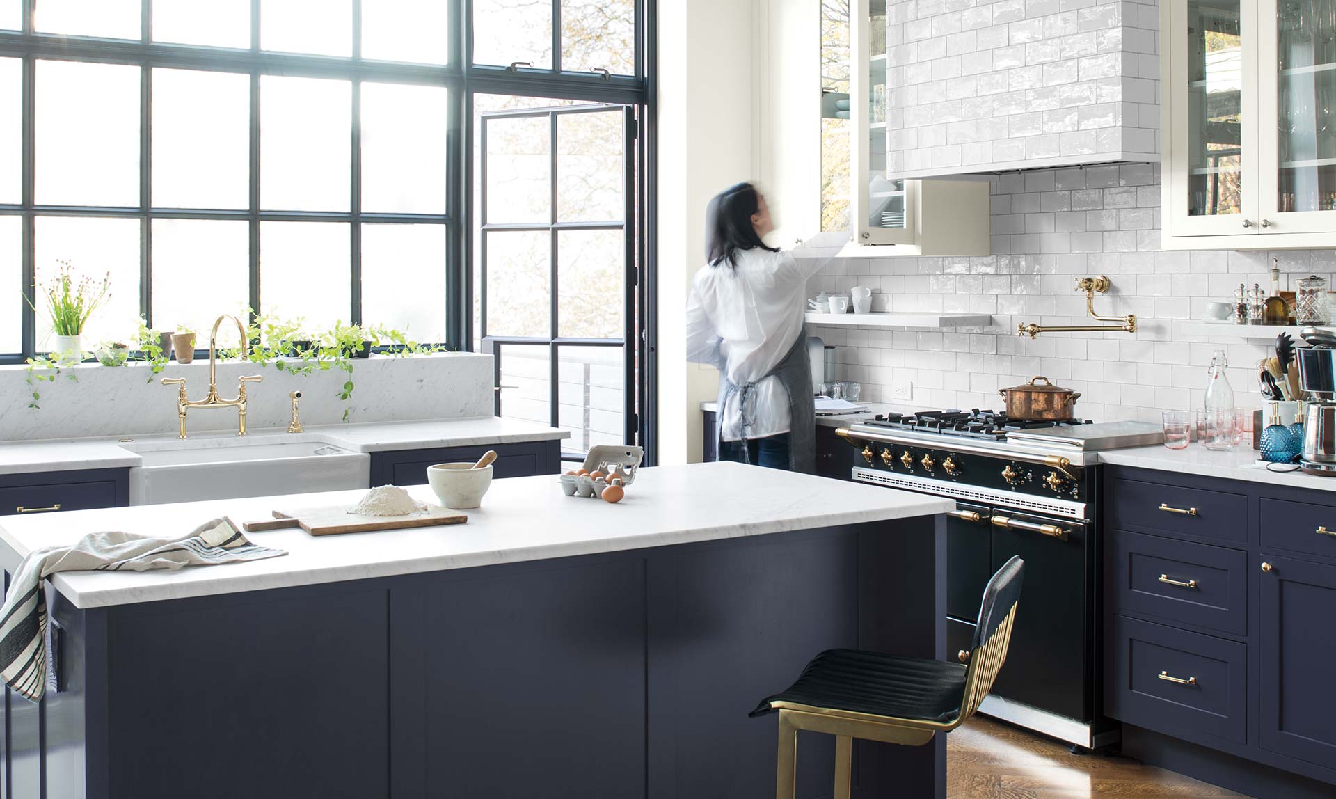
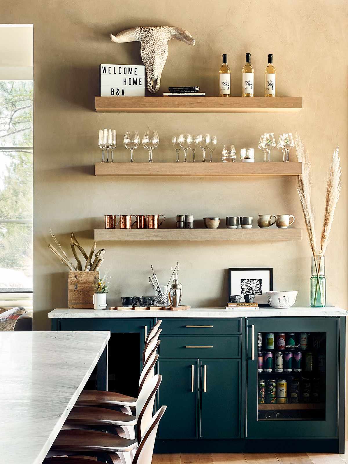
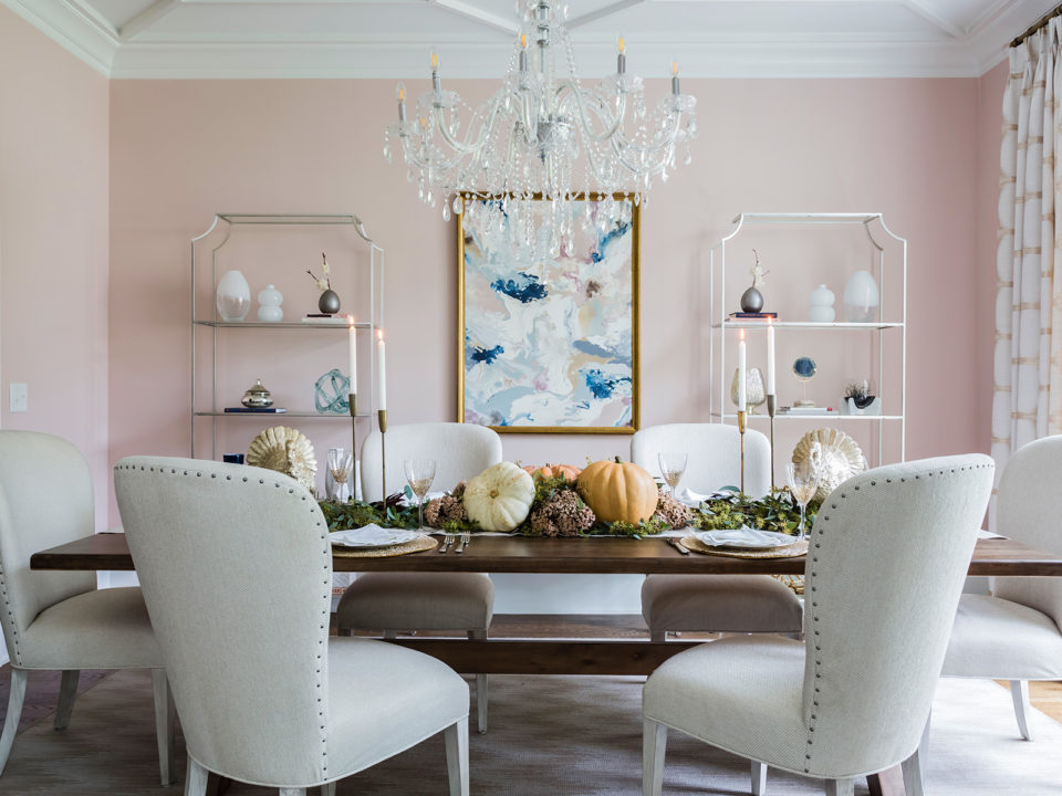
This article explores the versatility and application of neutral paint colors in home decorating, providing insights from designers and color experts. Neutral colors, ranging from cool grays to warm terra-cottas, can significantly transform a space, offering a foundation for various design aesthetics. The article categorizes these neutrals and provides specific advice on how to integrate them effectively into different rooms and with diverse decor styles. It emphasizes that neutrals are not limited to just whites, browns, and grays but can also include subtle shades with a hint of color, such as sage green or chalky yellow, when paired appropriately with other traditional neutrals.
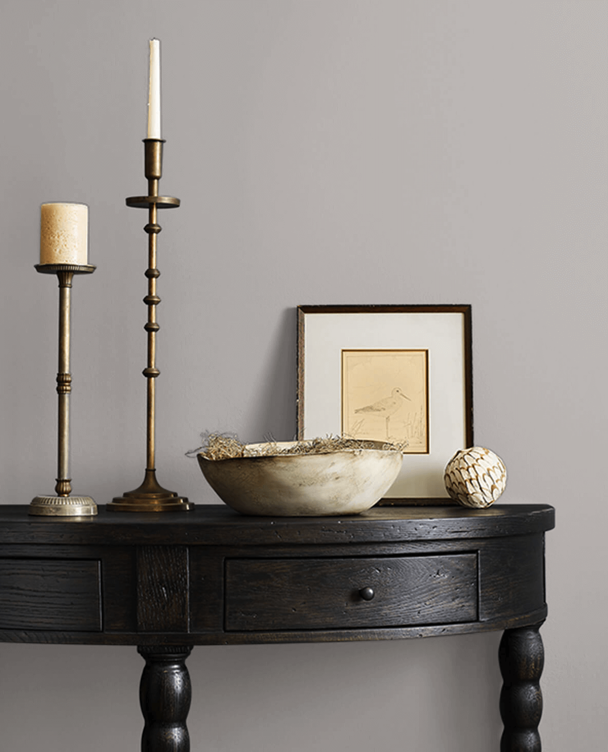
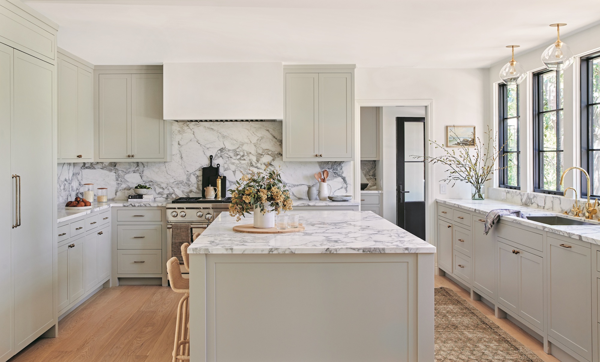
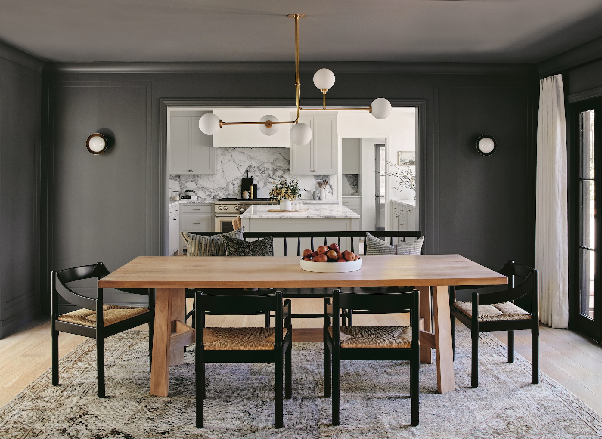
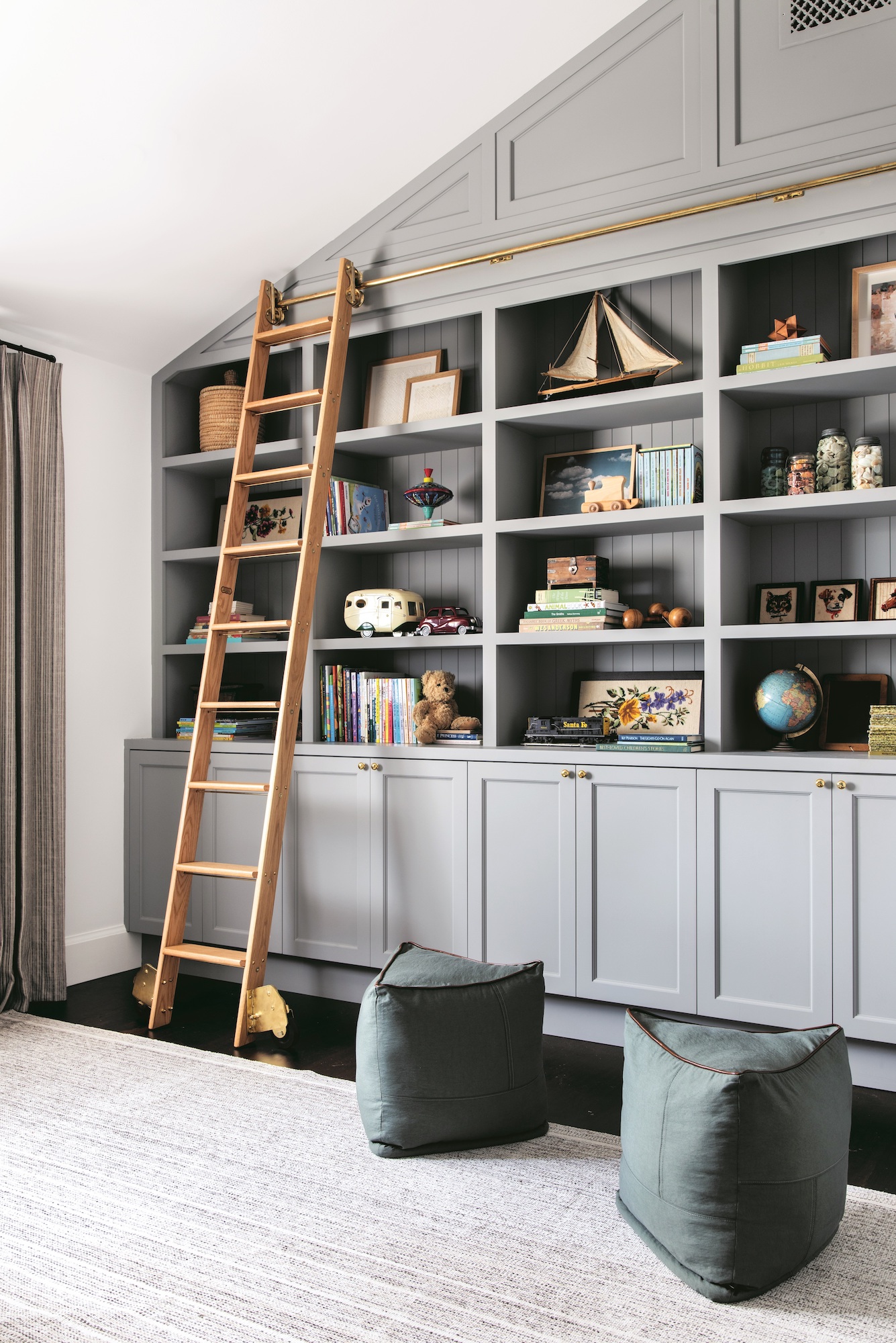
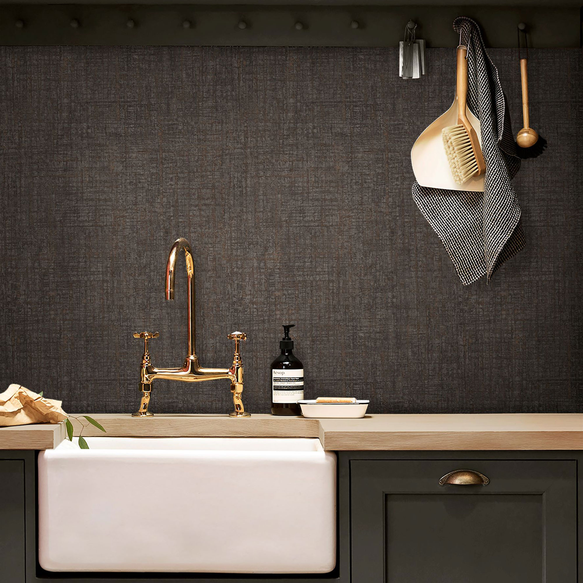
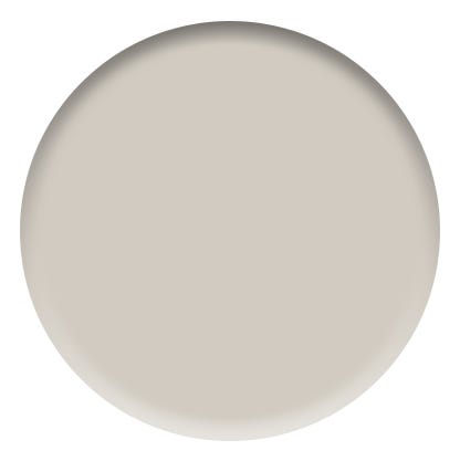
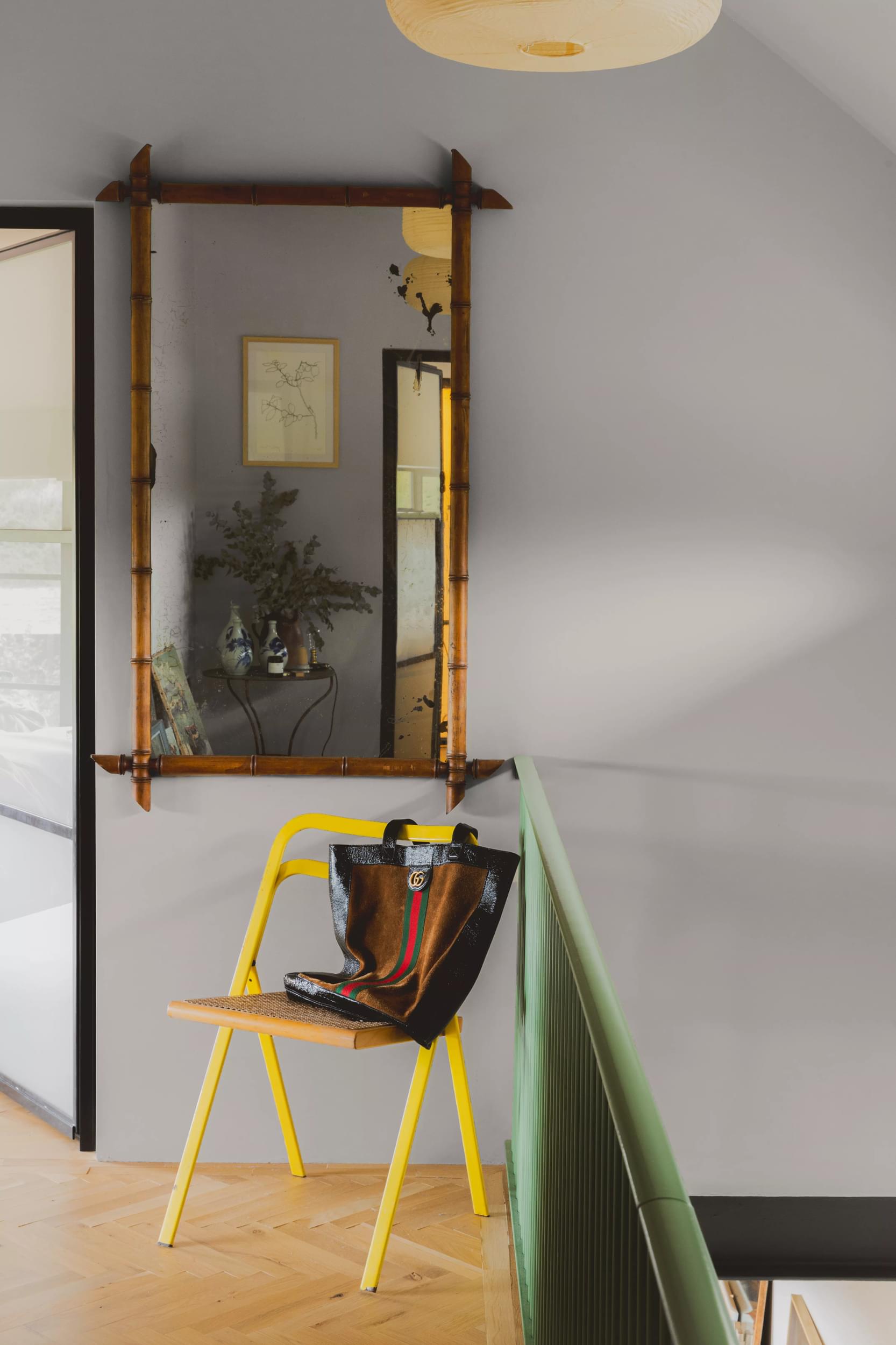
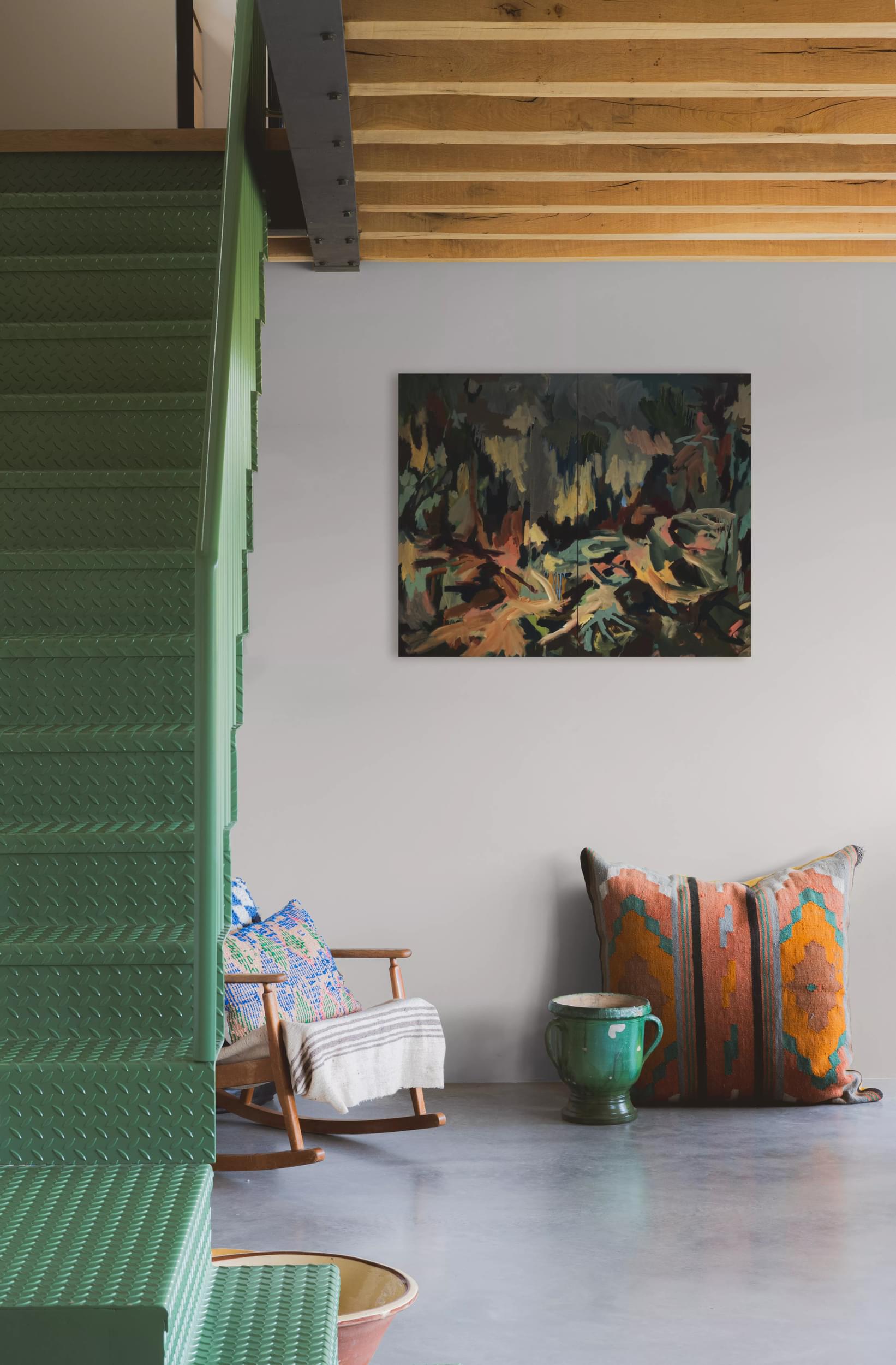
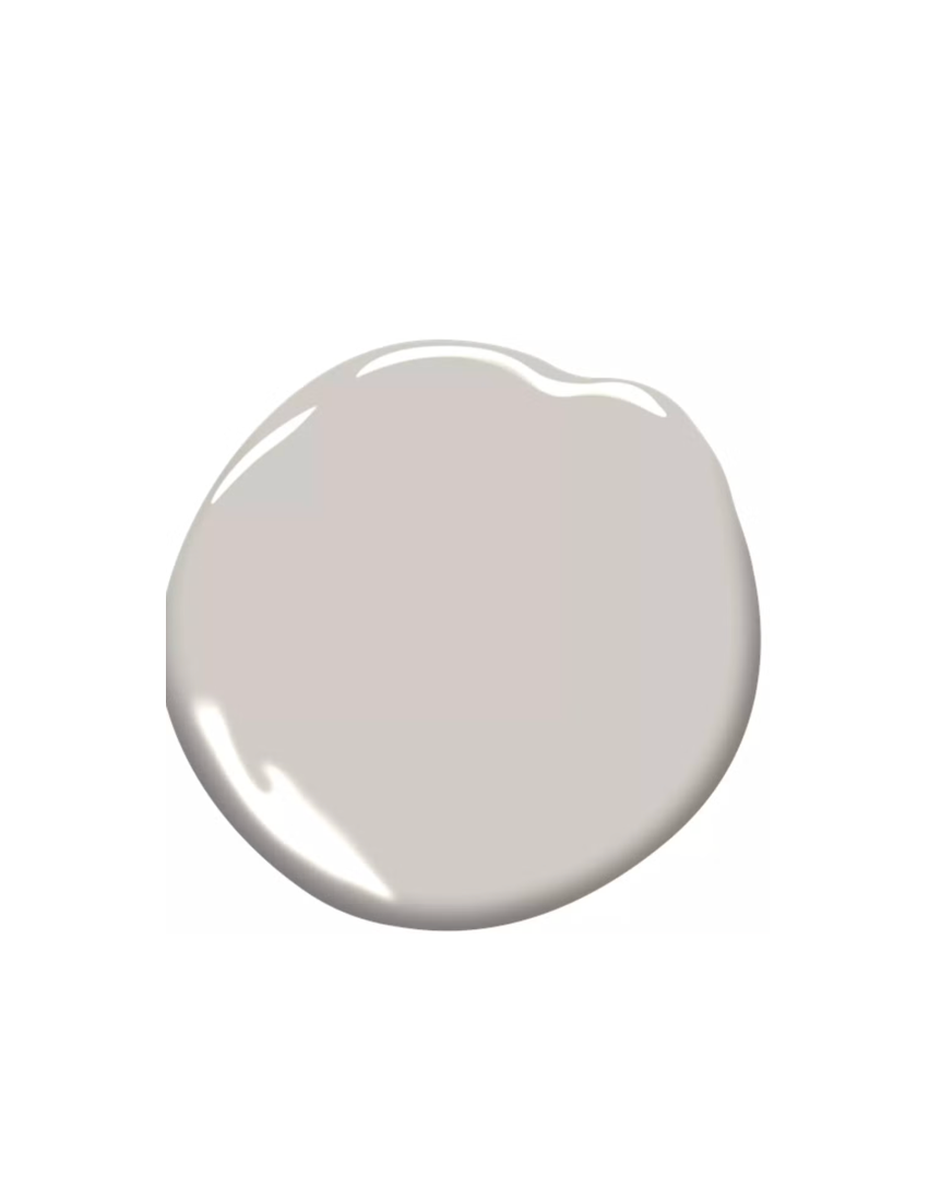
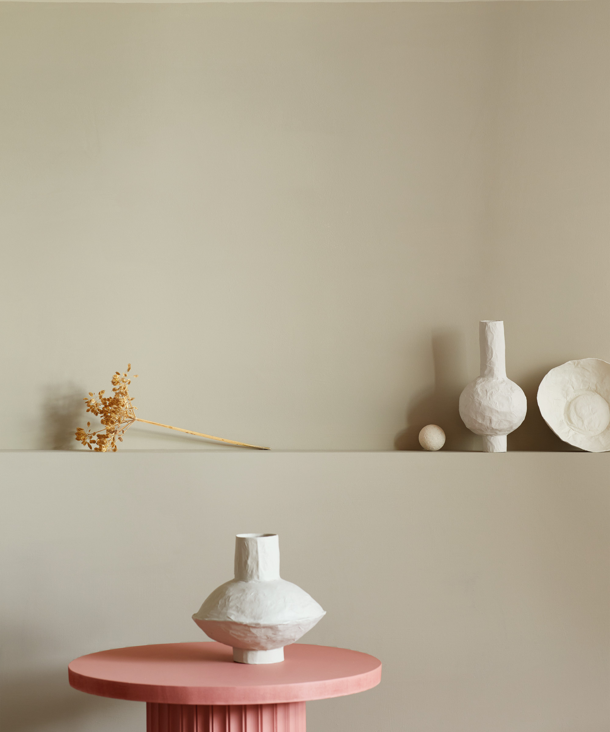
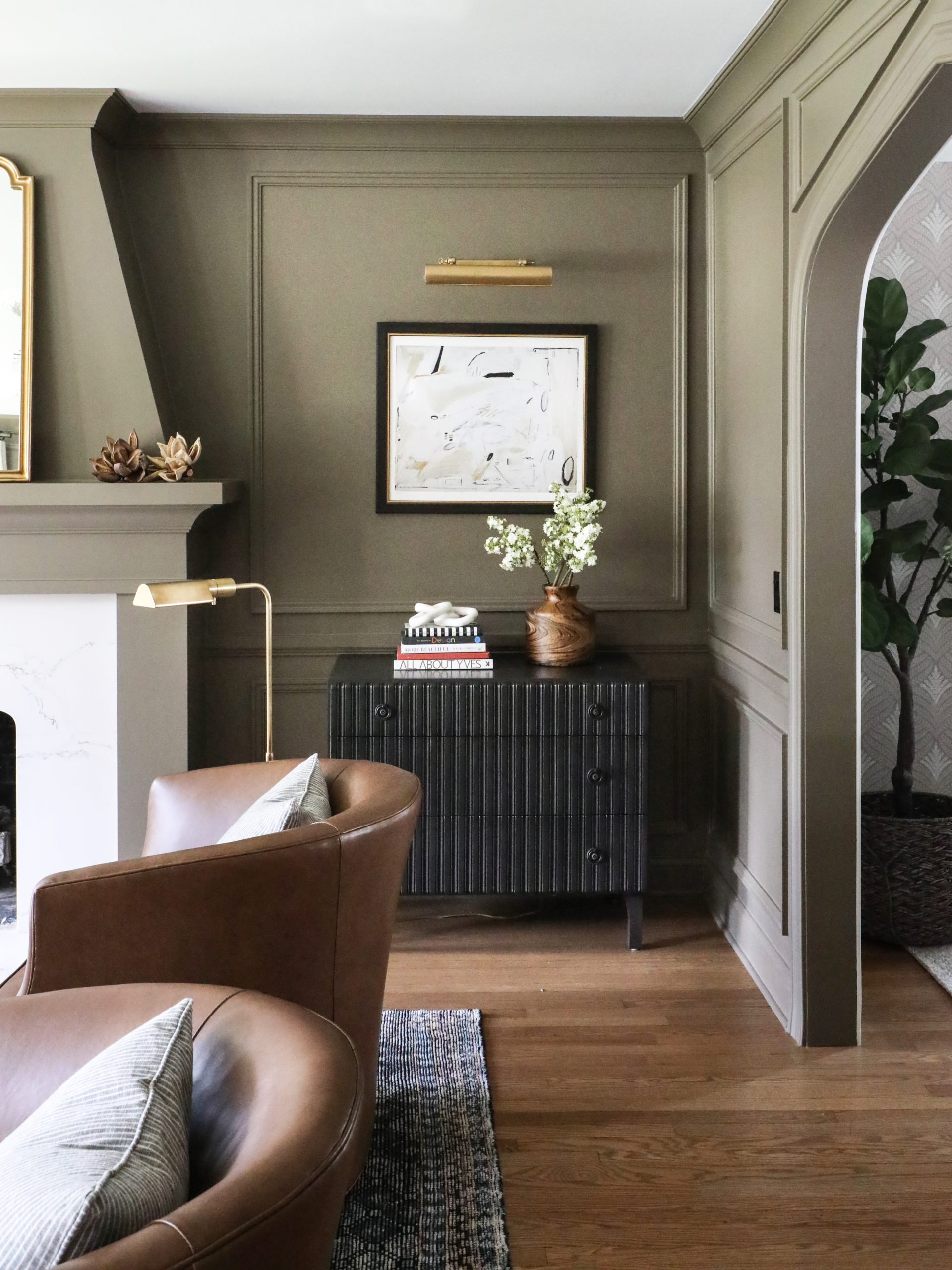
The discussion begins with various shades of gray, highlighting that no two grays are alike, each possessing unique intensities and nuances. Designers suggest selecting a gray based on the desired emotion for the space, whether airy, earthbound, or dramatic. Warm grays, with their inviting undertones, are presented as a versatile alternative to white, grounding color palettes for a cozy feel. Conversely, cool grays can be combined with natural elements to prevent a gloomy atmosphere. The article also touches upon the use of high-contrast black and white schemes for a bold, impactful design, suitable for bathrooms or hallways, and integrating darker neutrals like rich pewter gray to add sophistication and temper other colors.
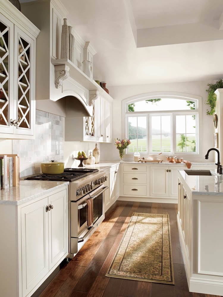
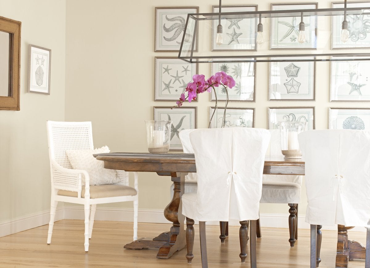
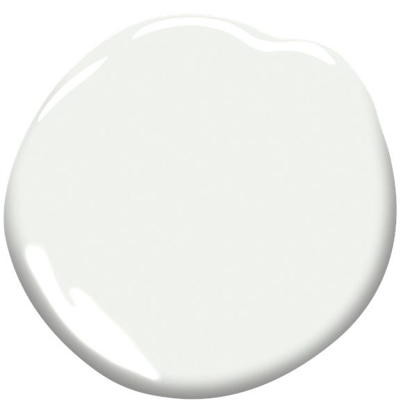
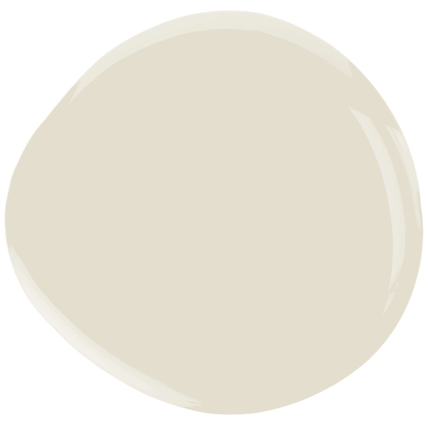
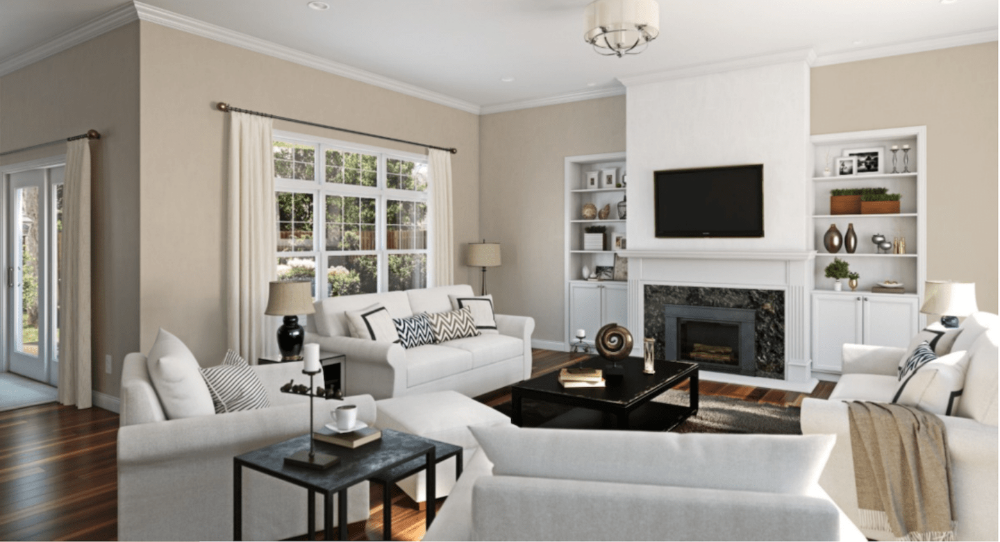
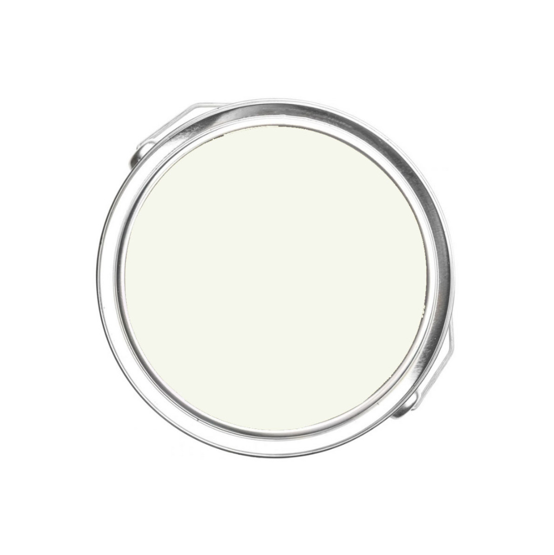
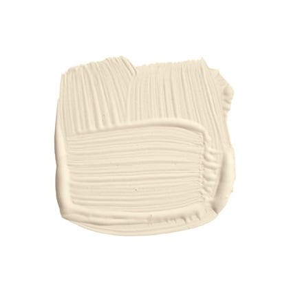
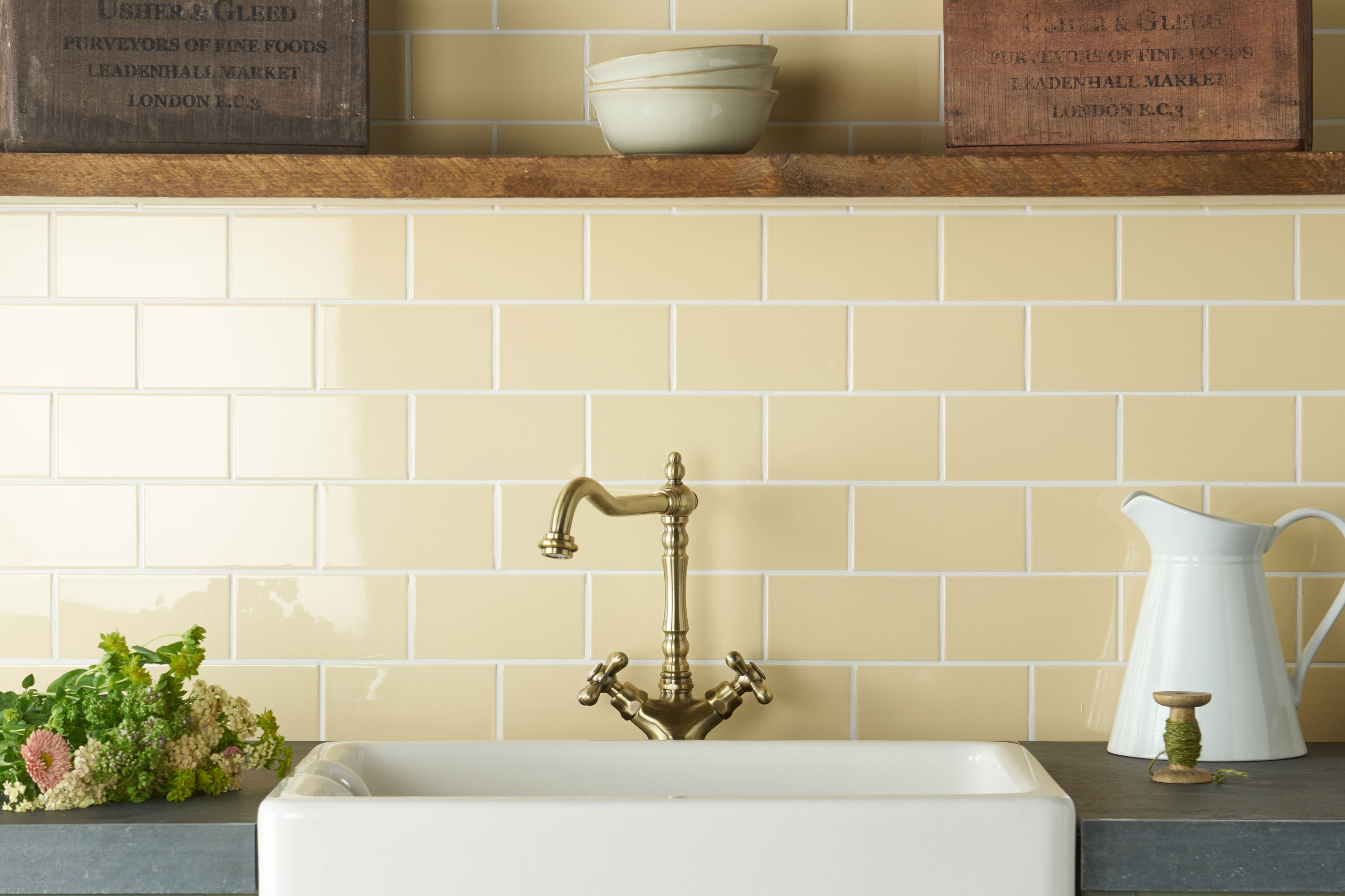
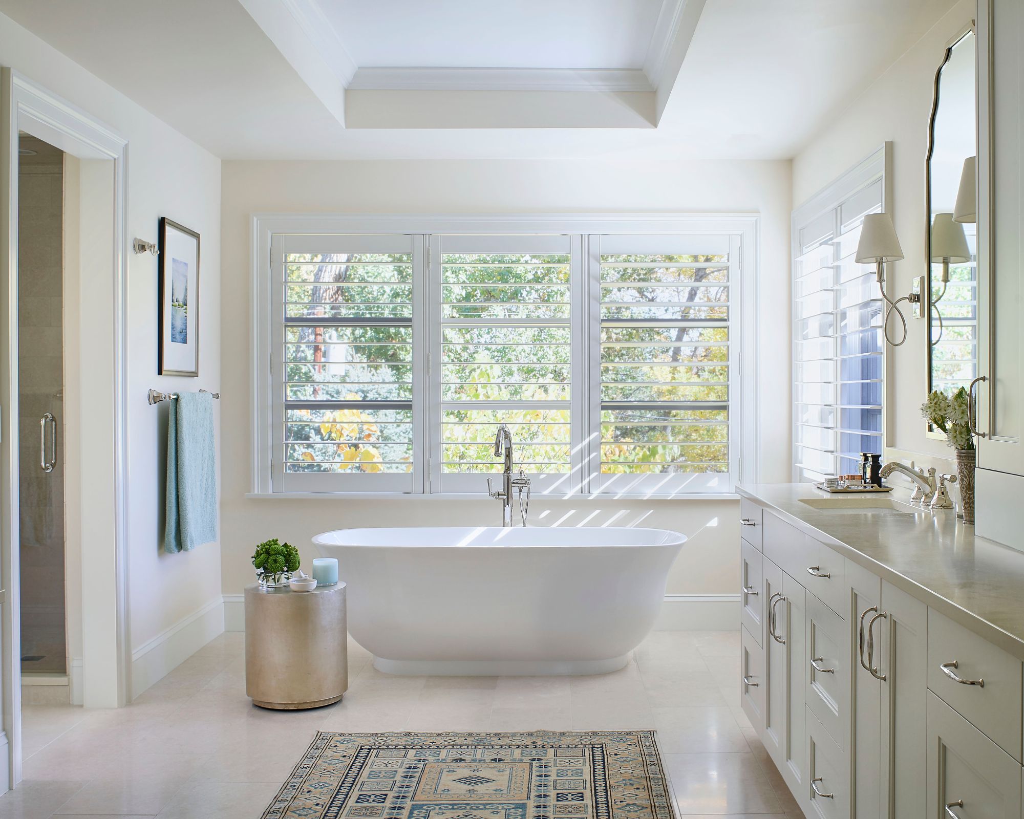
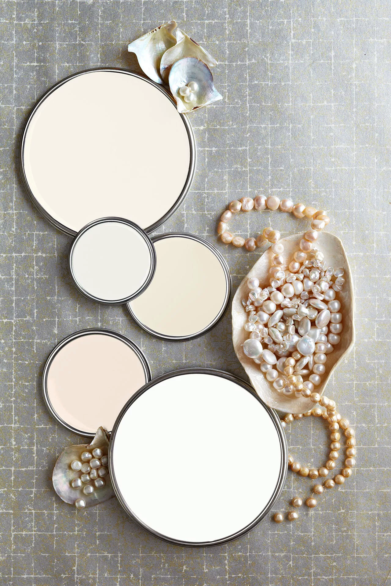
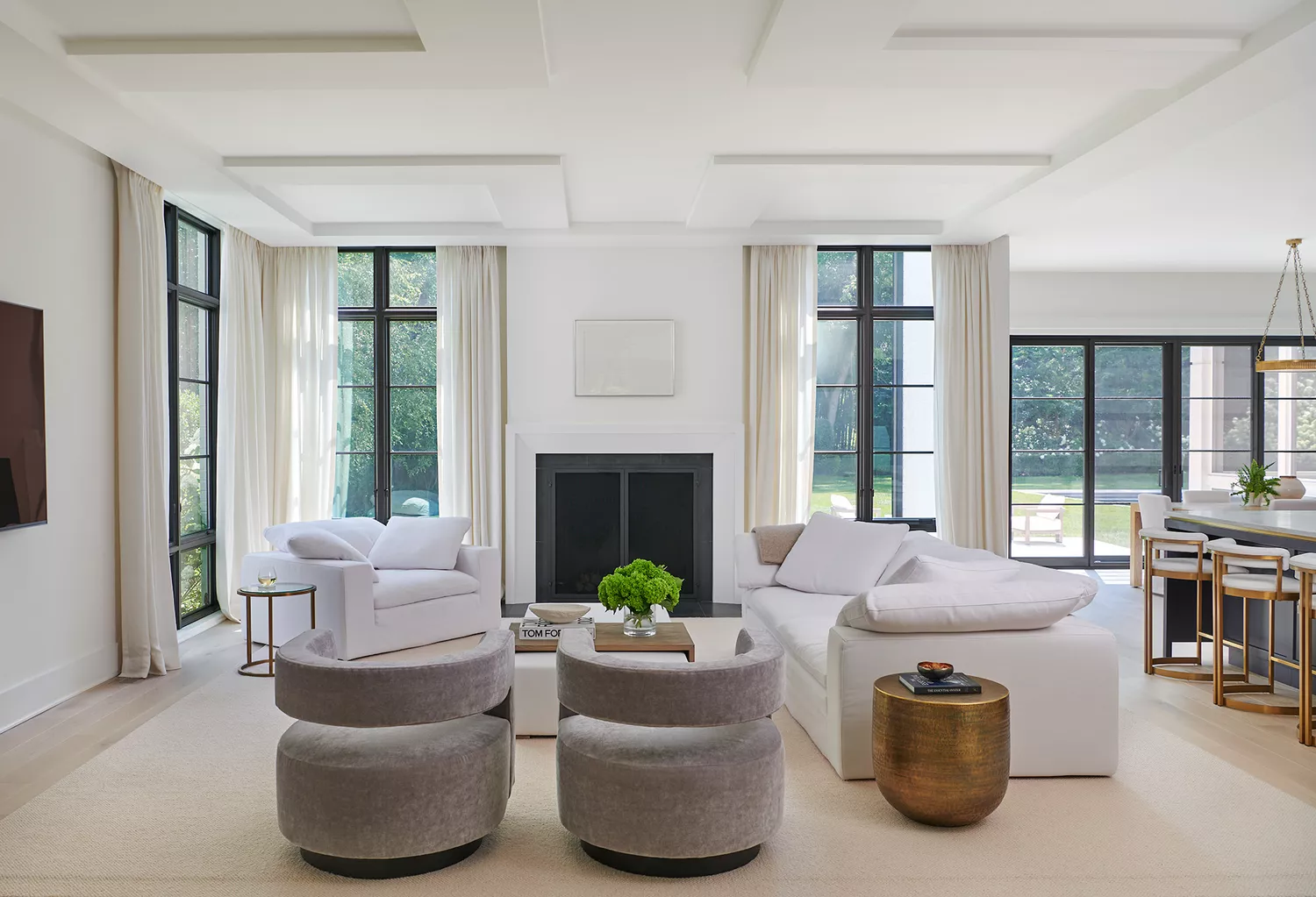
White paint colors are also thoroughly examined, noting their wide variety beyond just 'pure white.' Whites with golden undertones create a warm and relaxed ambiance, while those with subtle gray or cream tints are recommended over stark whites for a more nuanced look. The importance of layering different whites and incorporating varied textures is stressed to prevent a monotonous outcome. Creamy latte shades, a mix of specific Benjamin Moore colors, are suggested for large gathering spaces, offering a comforting yet energizing feel.
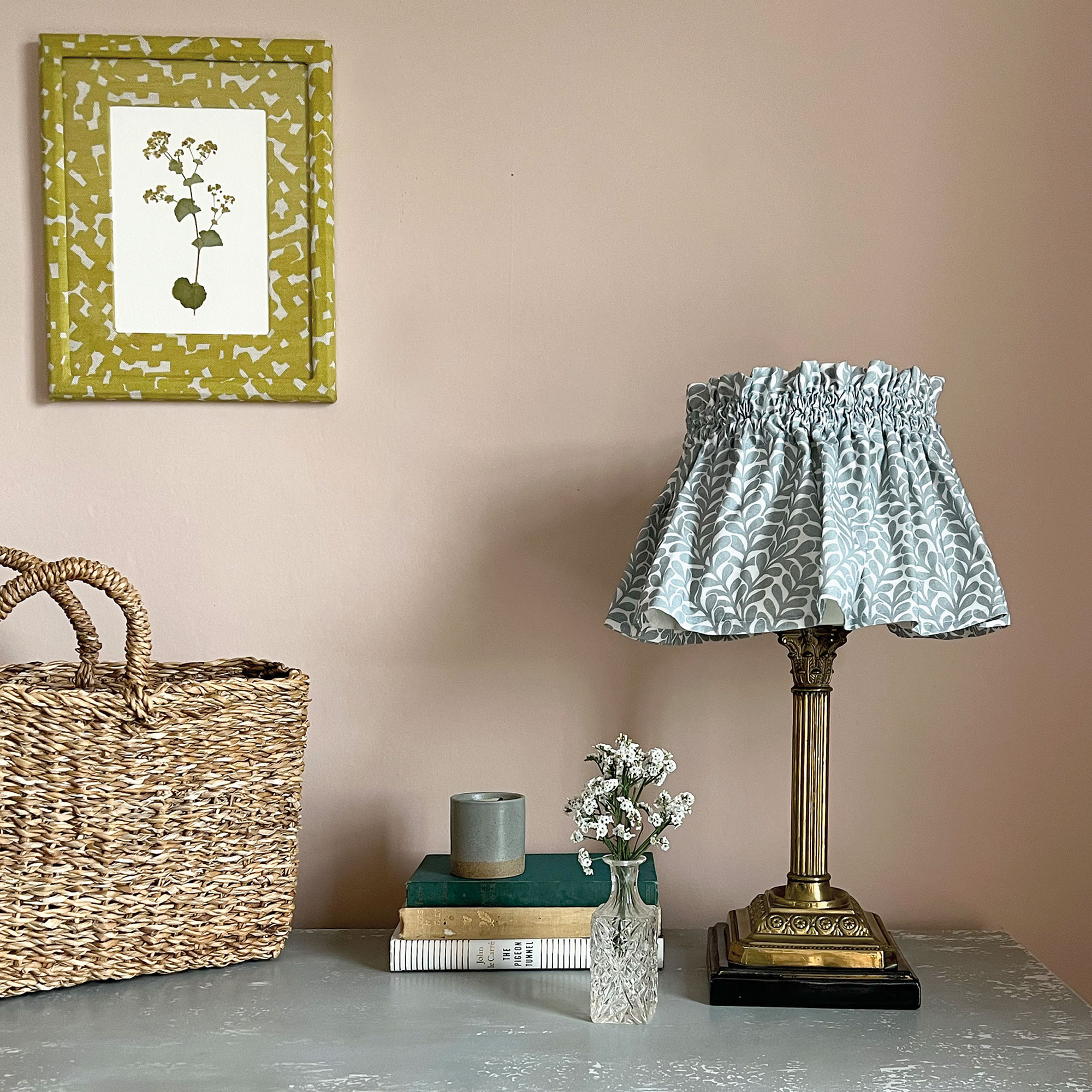
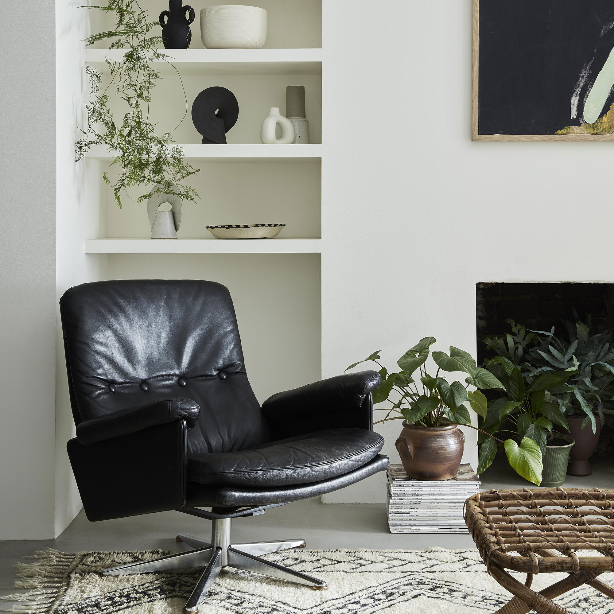
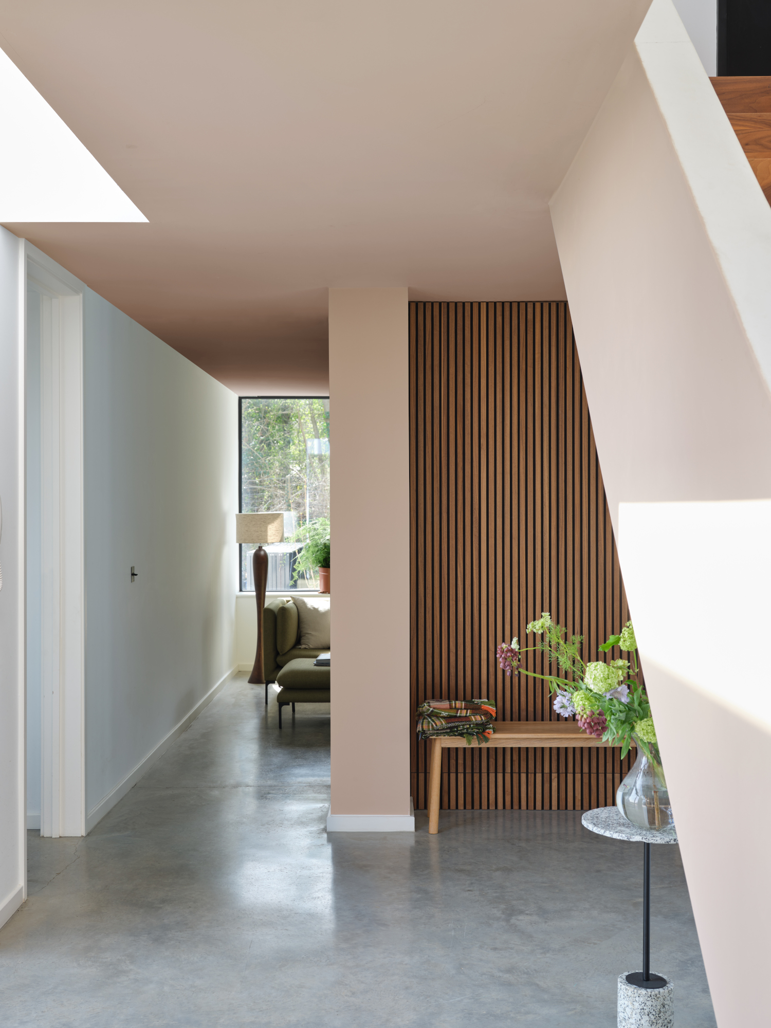
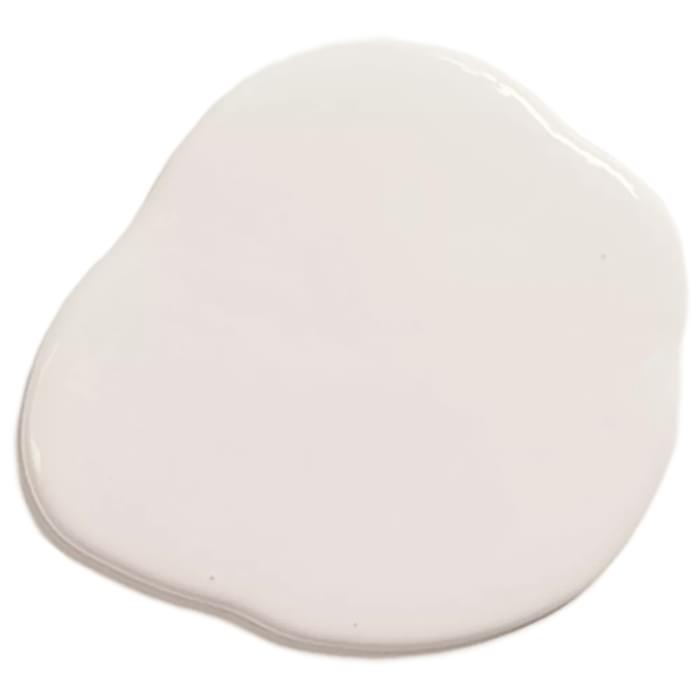
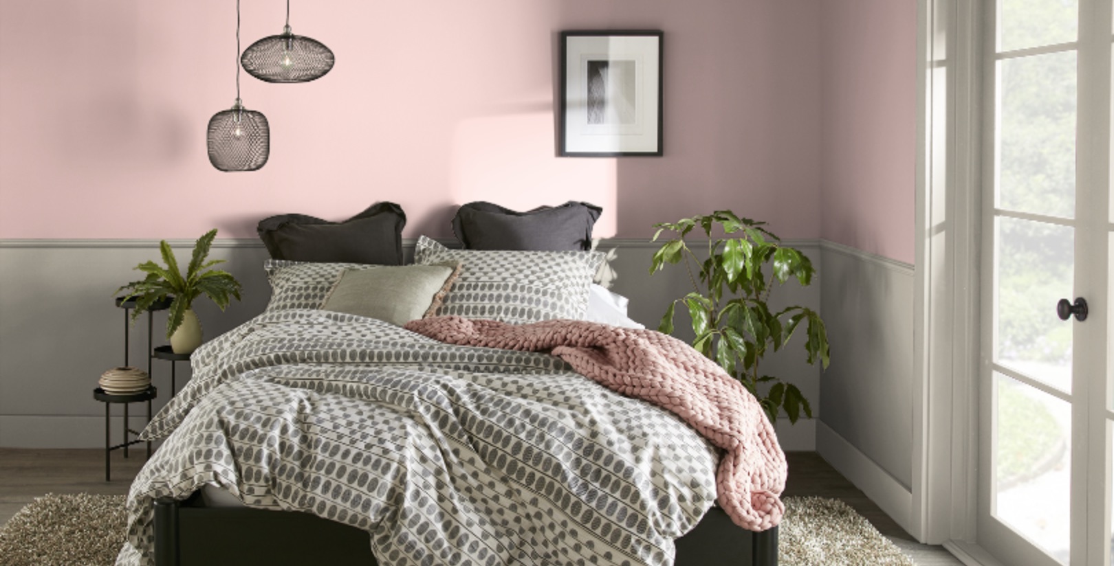
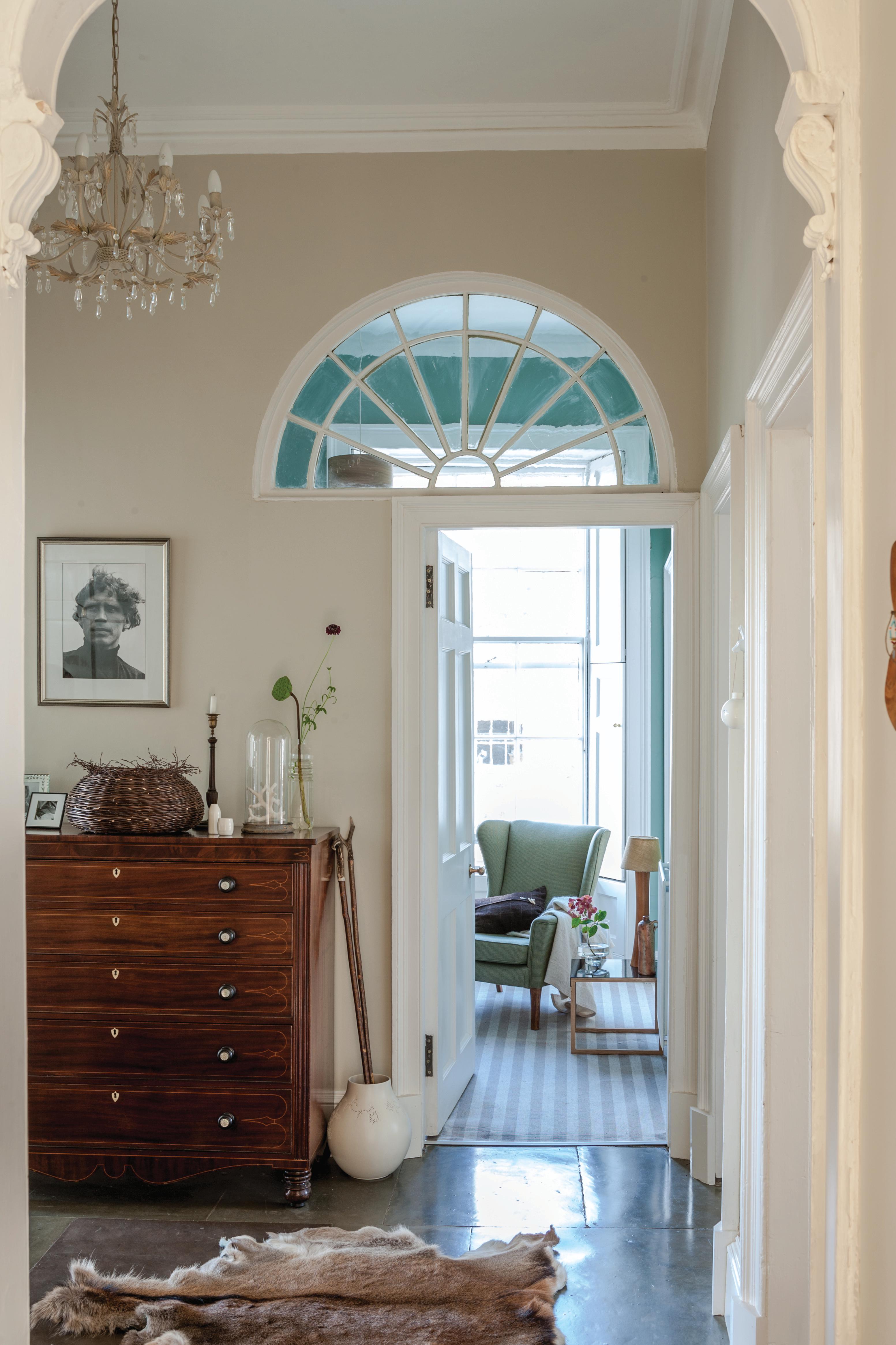
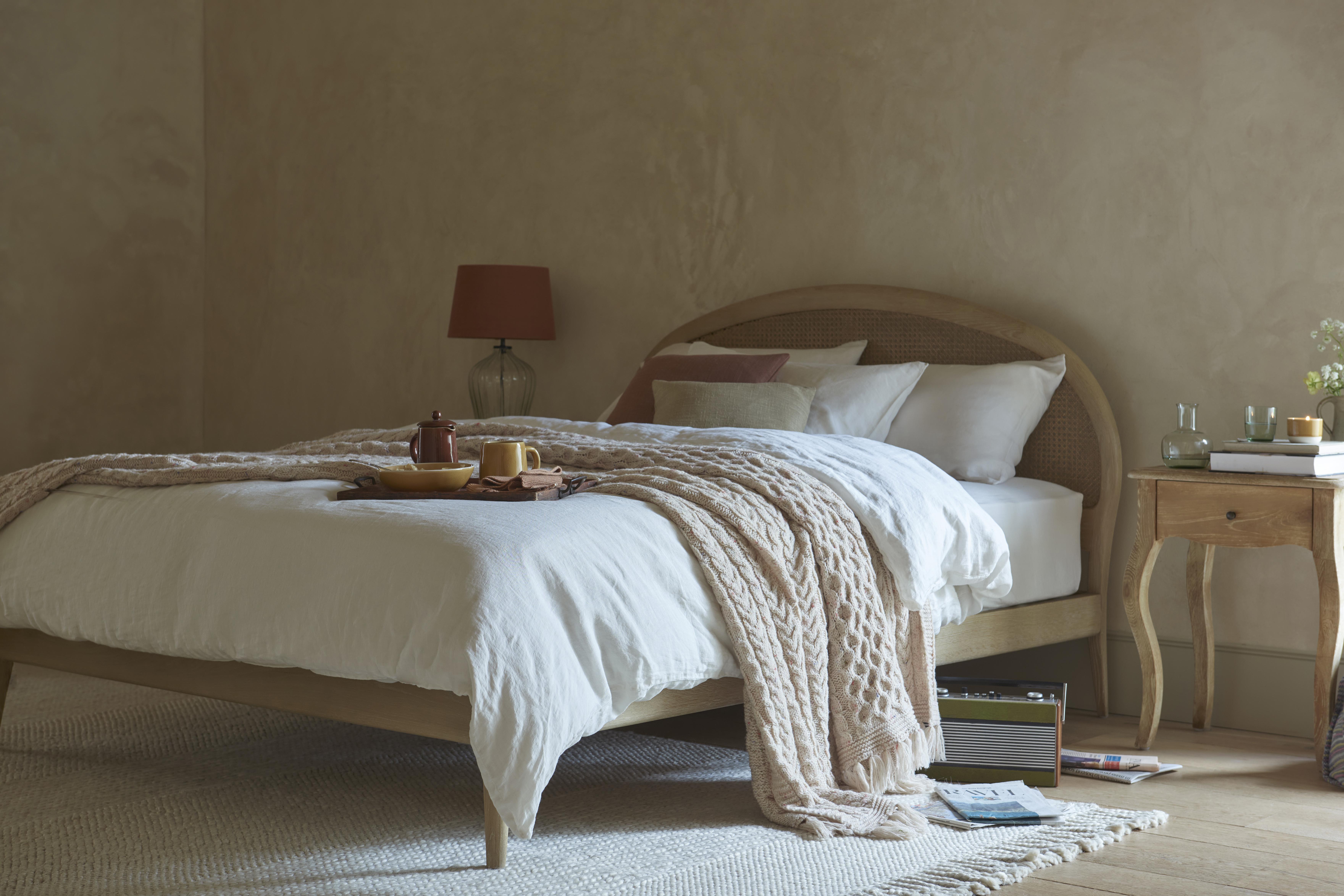
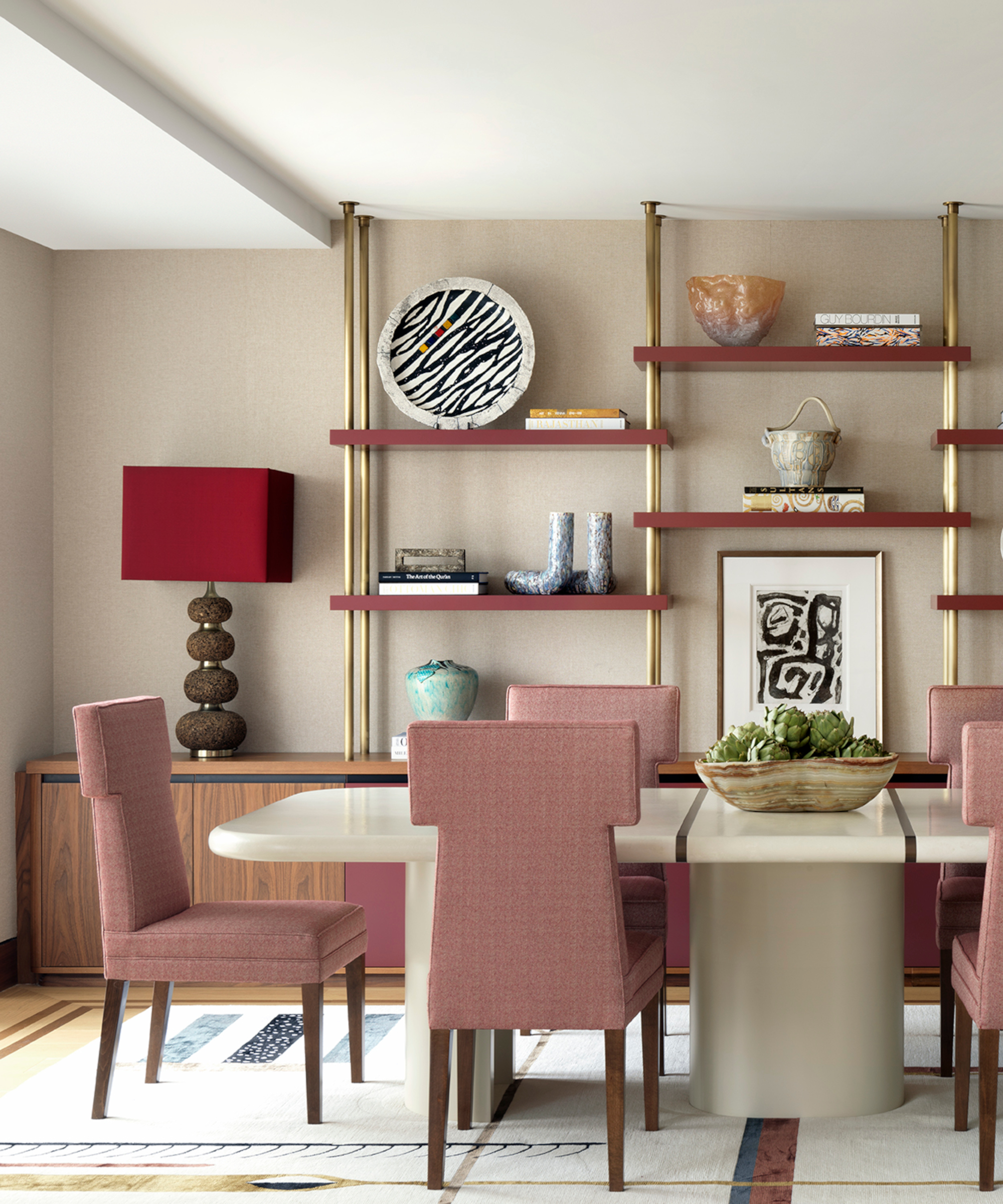
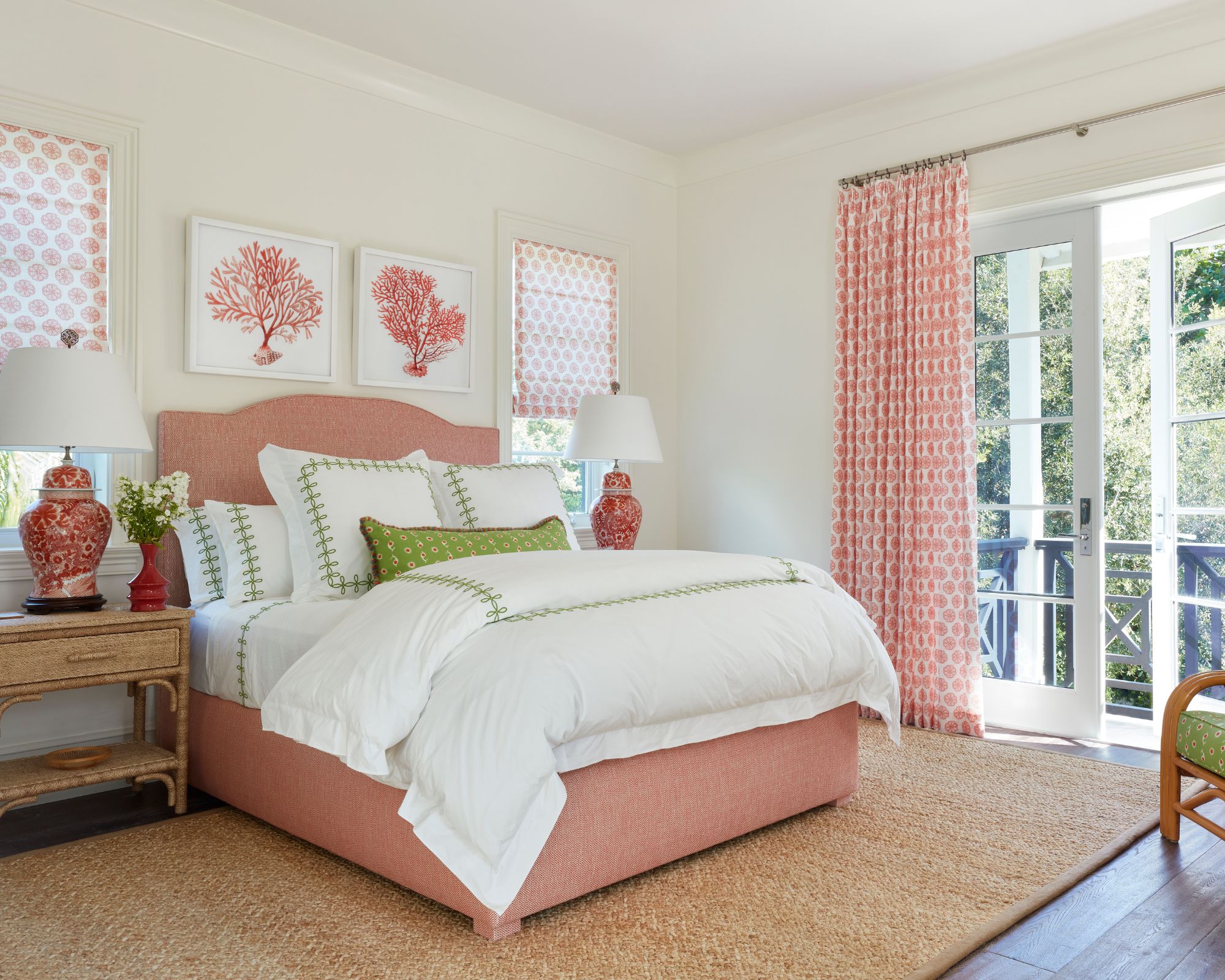
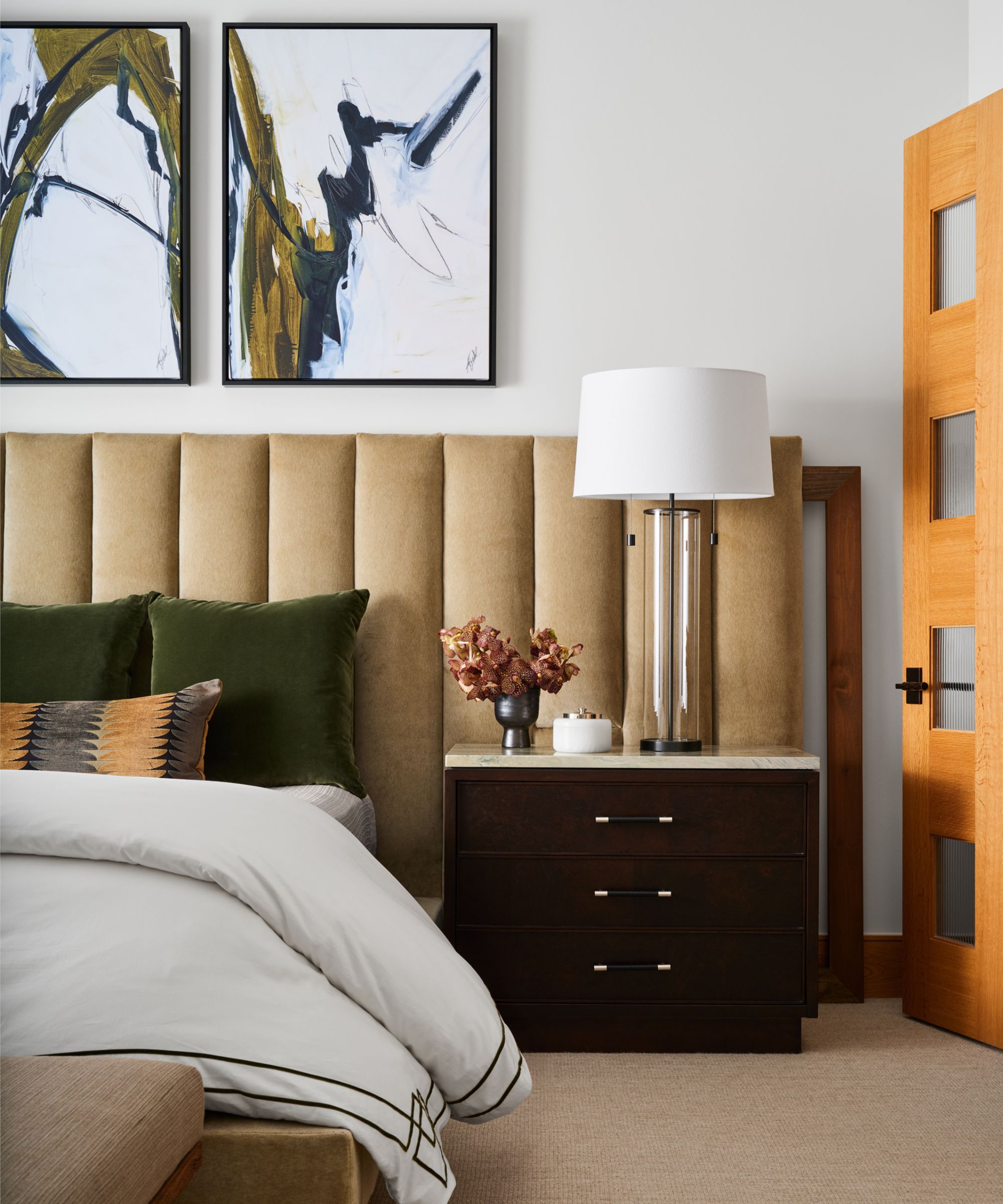
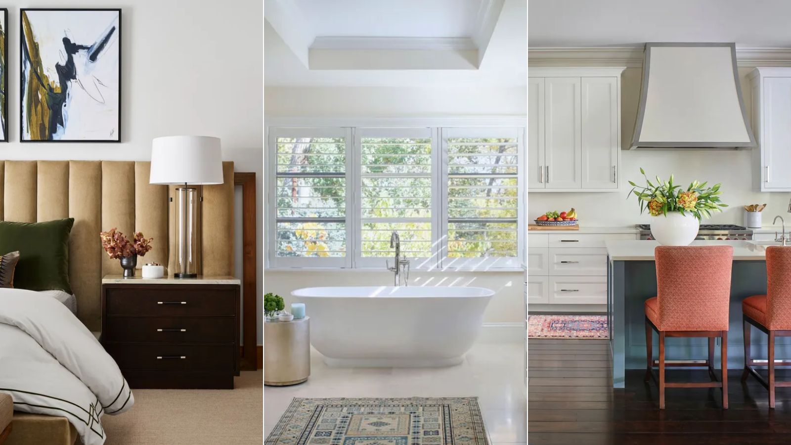
Beyond just paint, the article extends to using neutrals in furniture, rugs, and home accents to create cohesive and sophisticated spaces. It advises employing different finishes and textures, such as upholstered headboards, wood, leather, and metal, to add richness and depth to neutral-colored rooms. The role of undertones in neutral paints is also highlighted, with tips on how to identify them by comparing swatches against true white. For instance, a rich cream with a brown base can be discerned by examining its undertones. Incorporating small doses of accent colors, like misty mauve, gold, or teal, can also enhance a neutral scheme without overpowering it.
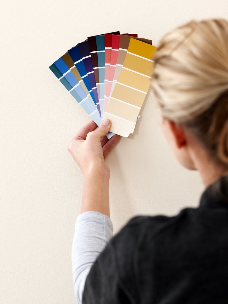
The article also provides practical advice for selecting and testing paint colors. It recommends getting samples of various shades, including lighter, darker, and more saturated options, to observe how they appear throughout the day under different lighting conditions. This is crucial as natural light can significantly alter a color's perception. For a cohesive home, repeating neutral hues through painted trim, fabrics, and furniture finishes across different rooms is suggested. Finally, the importance of considering the room's natural light exposure is emphasized: darker whites or ivory for naturally well-lit rooms and brighter, lighter whites for spaces lacking sunlight to achieve the desired mood and avoid a 'cave-like' effect with darker colors. Overall, the article serves as a comprehensive guide to understanding and effectively utilizing neutral paint colors in interior design.
#NeutralPaintColors #HomeDecor #InteriorDesign #ColorSchemes #DecoratingTips #PaintSelection #DesignTrends #Grays #Whites #NeutralPaintColors #HomeDecor #InteriorDesign #ColorSchemes #DecoratingTips #PaintSelection #DesignTrends #Grays #Whites
0 ความคิดเห็นรวม
 ยังไม่มีความคิดเห็น
คุณอาจจะชอบอีกด้วย
The 20 Best Neutral Paint Colors for Your Home in 2025

35 Neutral Paint Colors Interior Designers Can't Get Enough Of

8 Paint Mistakes That Make Your House Look Dingy (and How to Fix Them)

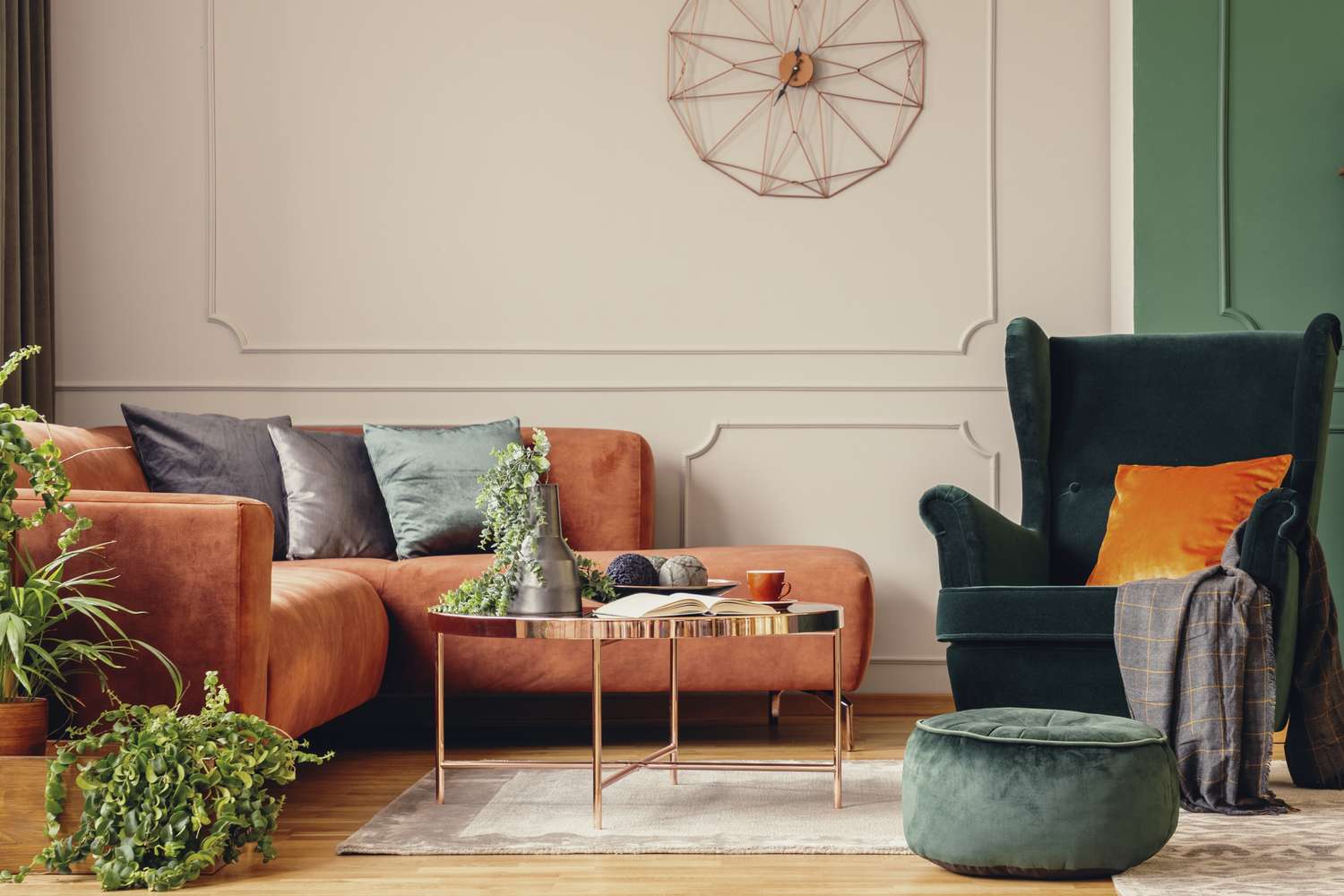
5 Timeless Paint Colors That Go With Absolutely Everything, According to Color Experts

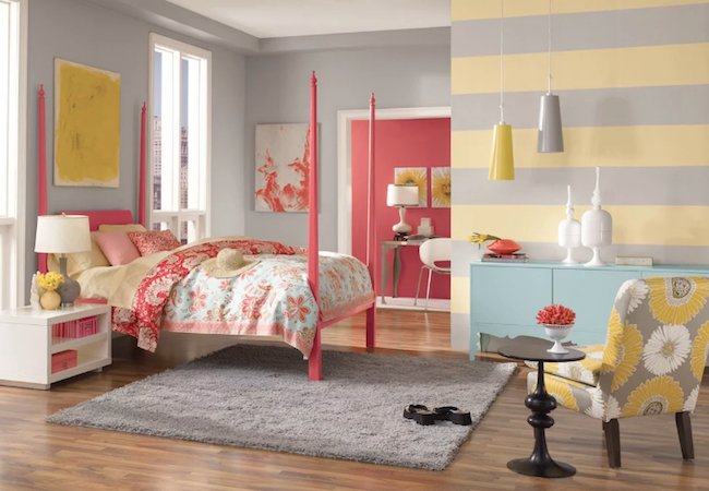
The Most Popular Paint Colors in America
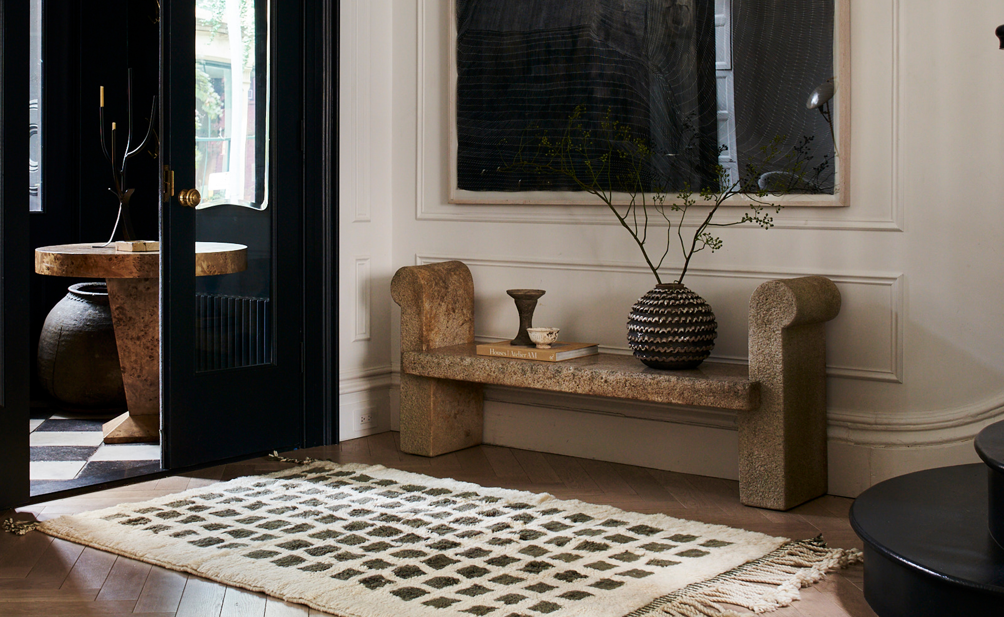
The 3 Best Neutral Entryway Paint Colors to Set the Right Tone for a Sophisticated Home

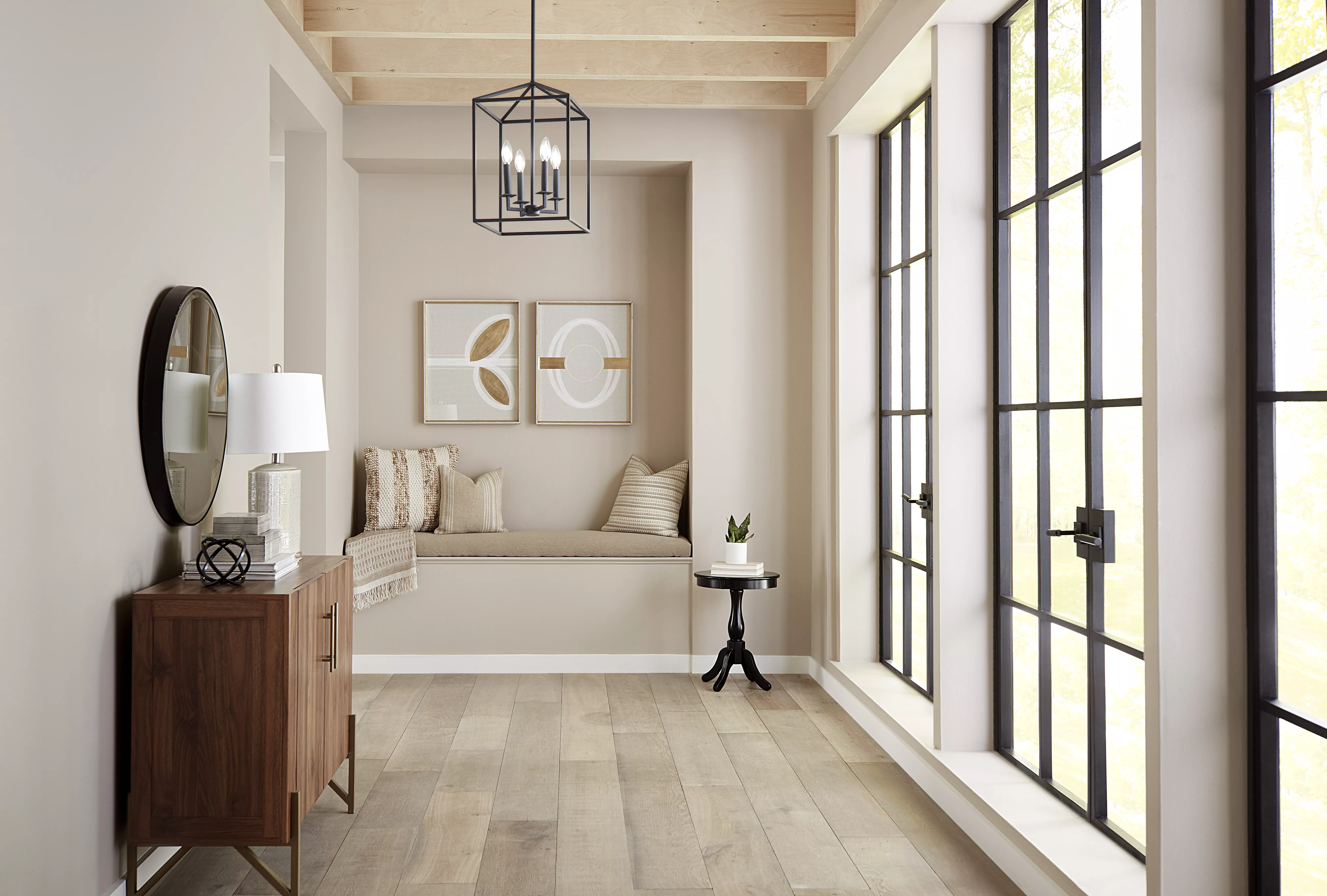
10 Best-Selling Behr Paint Colors of All Time
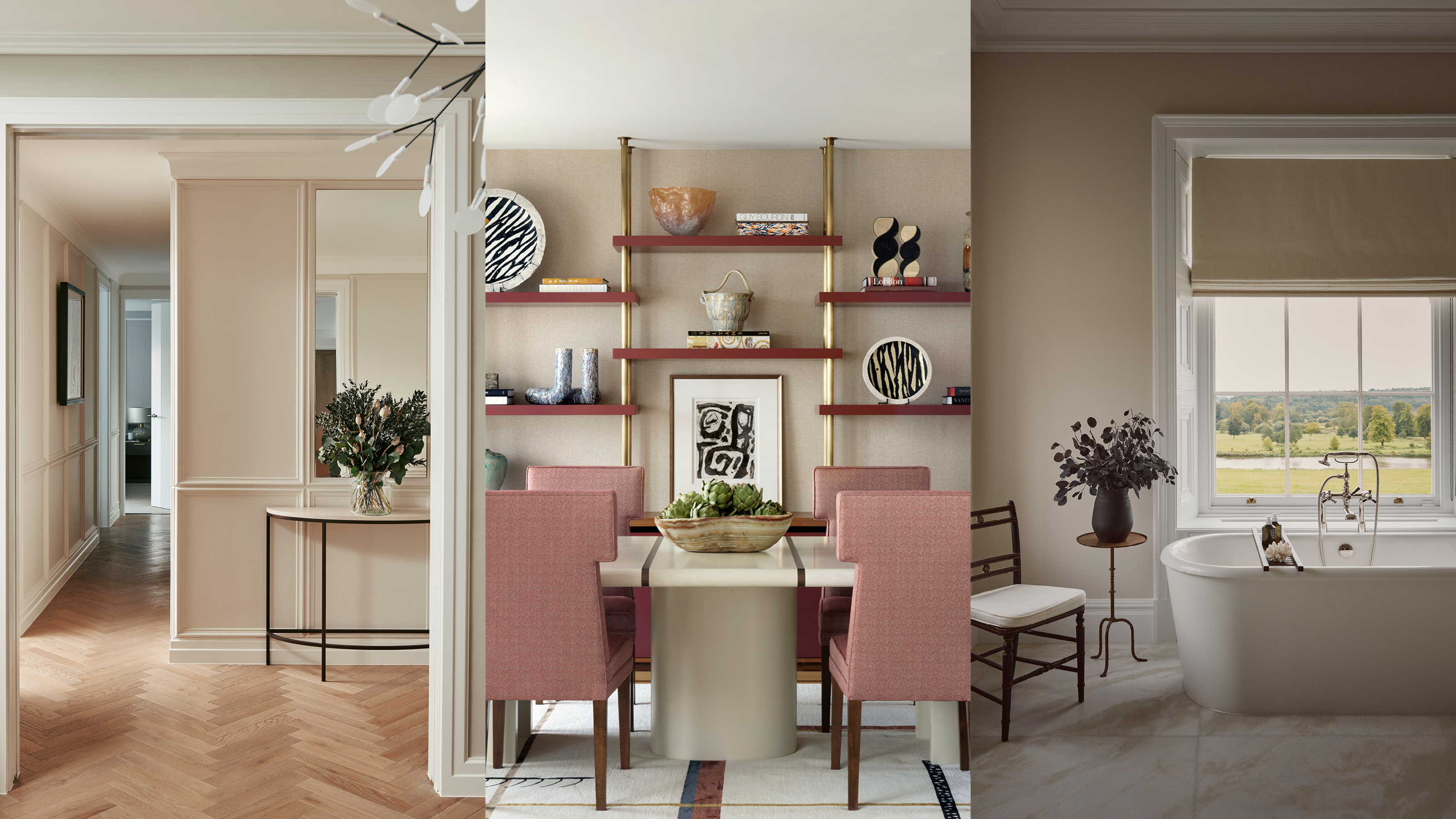
Beige-grey – the timeless paint color perfect for a barely-there backdrop

Amber Lewis Shares the Best Neutral Paint Colors for Every Room
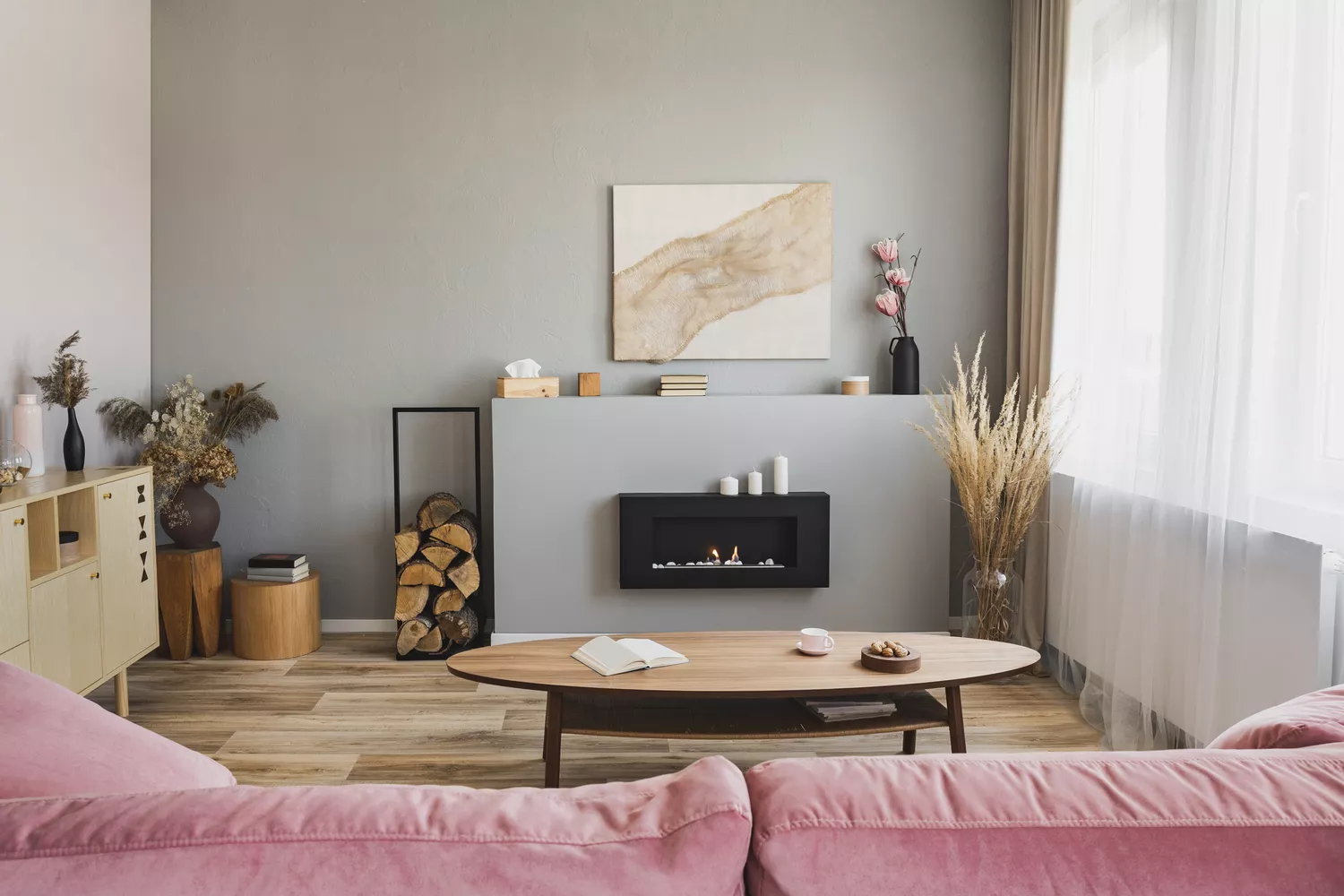
Bored With White Walls? Try One of These Designer-Recommended Neutral Paints Instead

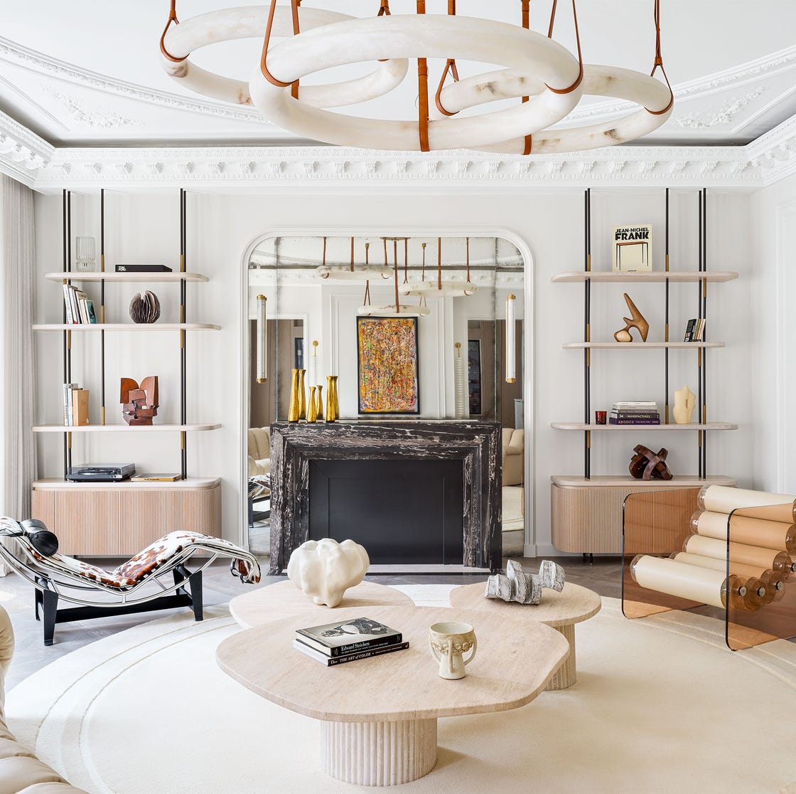
These Are the Neutral Paint Colors Interior Designers ACTUALLY Use

White vs Cream: designers weigh in on these enduring neutrals
12 Neutral Paint Colors That Will Look Beautiful in Every Room
Find your perfect neutral with COAT Paints' new Polite Palette


8 Paint Color Trends You'll ACTUALLY Want to Live With in 2026, According to Designers
How to Pick the Best Paint Colors for Every Space in Your Home

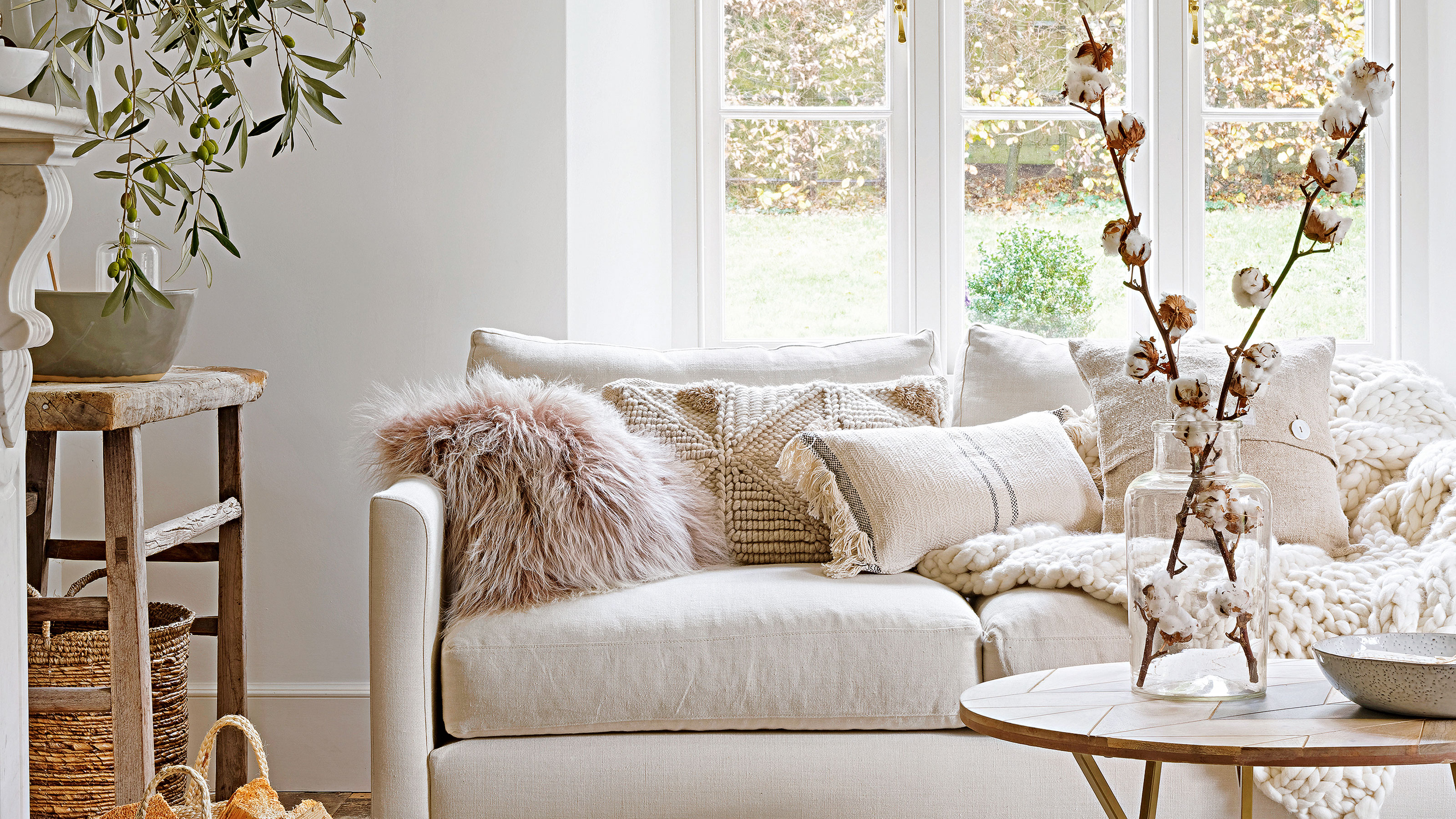
How colour experts decorate with neutrals – 10 gorgeous ways to use this muted colour palette
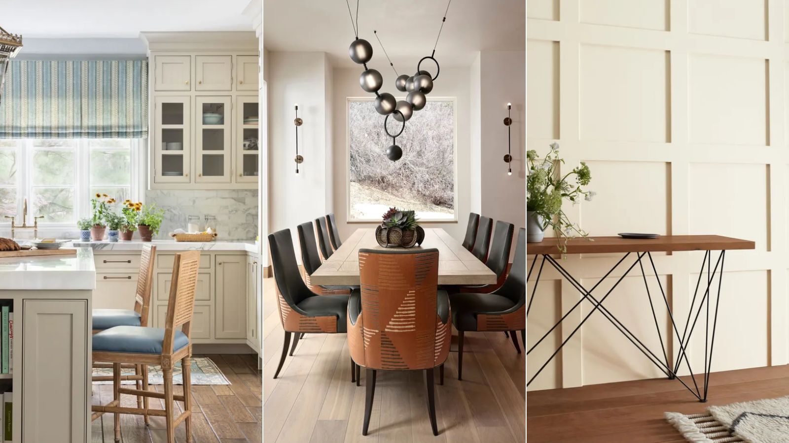
10 best warm neutral paints as recommended by interior designers – from beige to muted pink
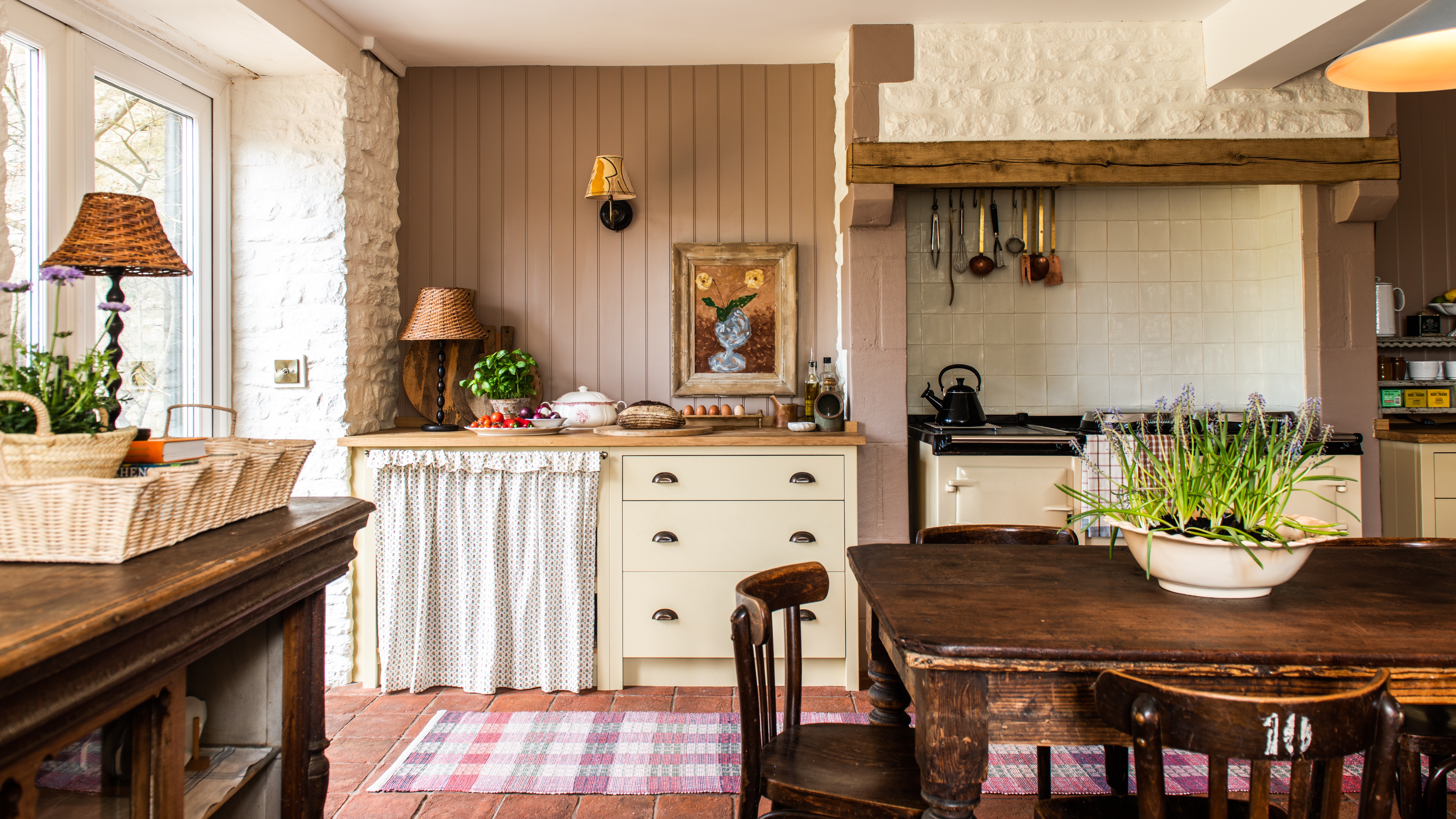
Creamy neutral paint colours are back — just don’t call it magnolia
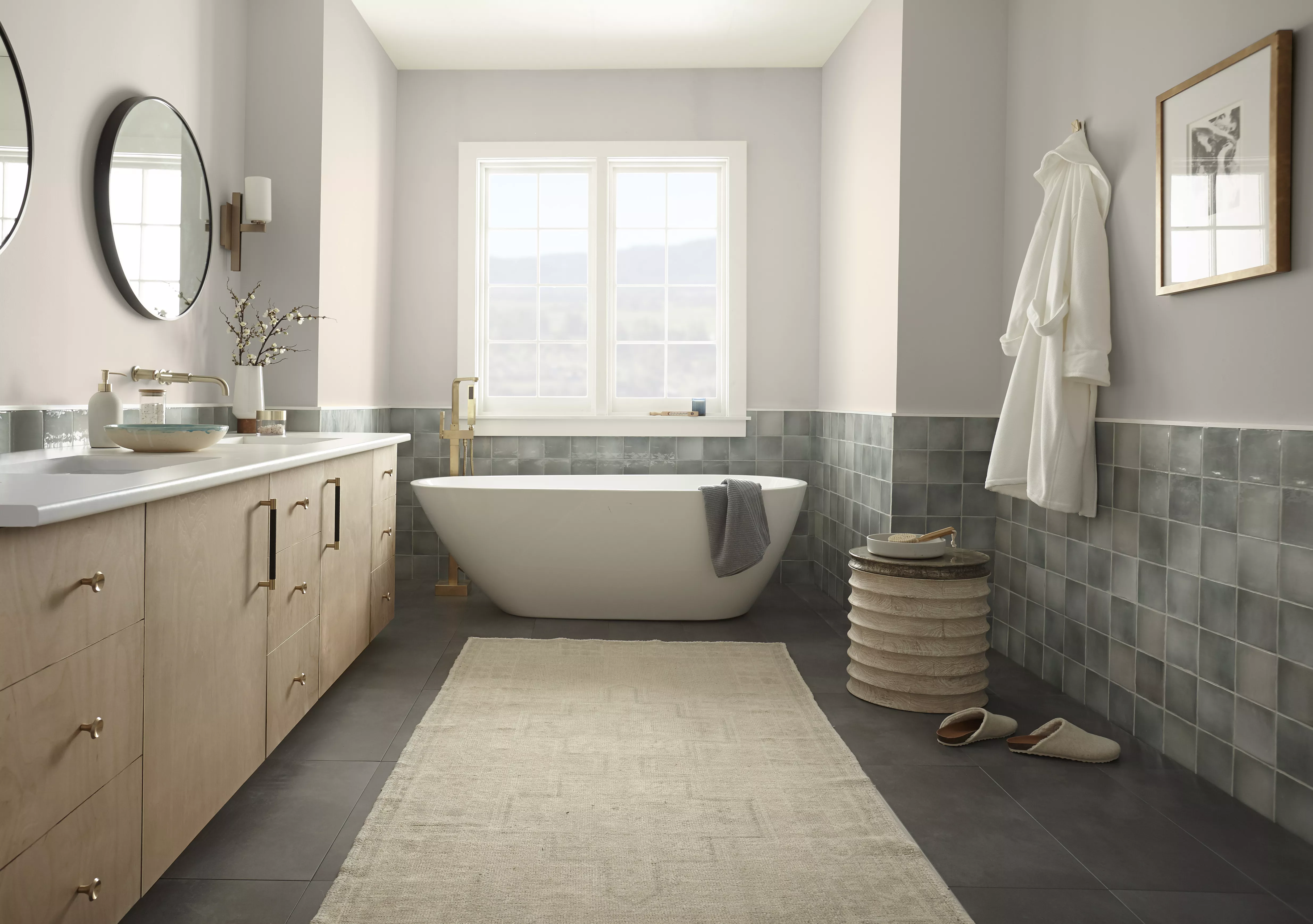
10 Neutral Bathroom Paint Colors Industry Experts Swear By