If You Can't Find Your New Paint Color in Sherwin-Williams' 2026 Palettes, We'll Be Shocked
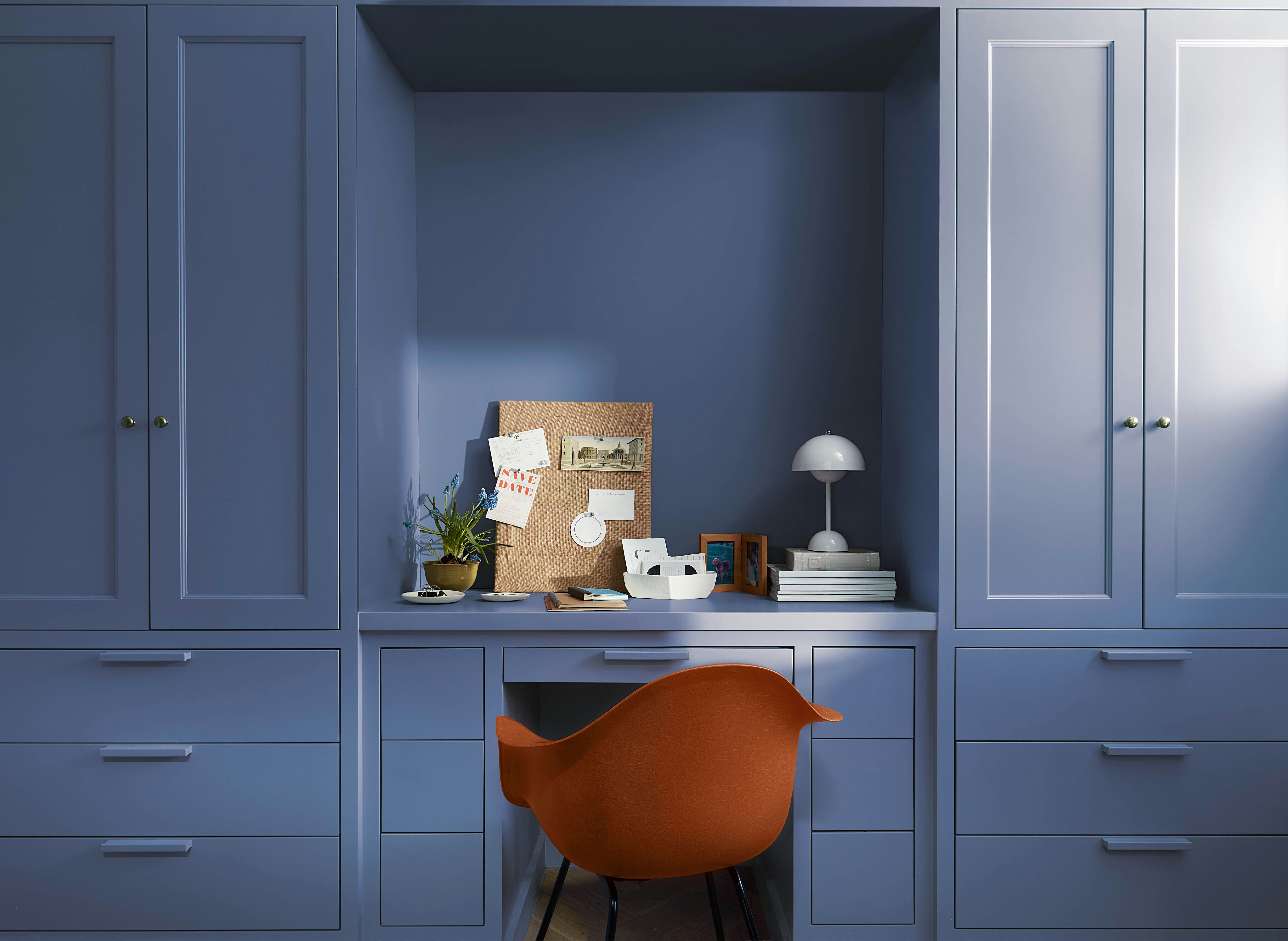
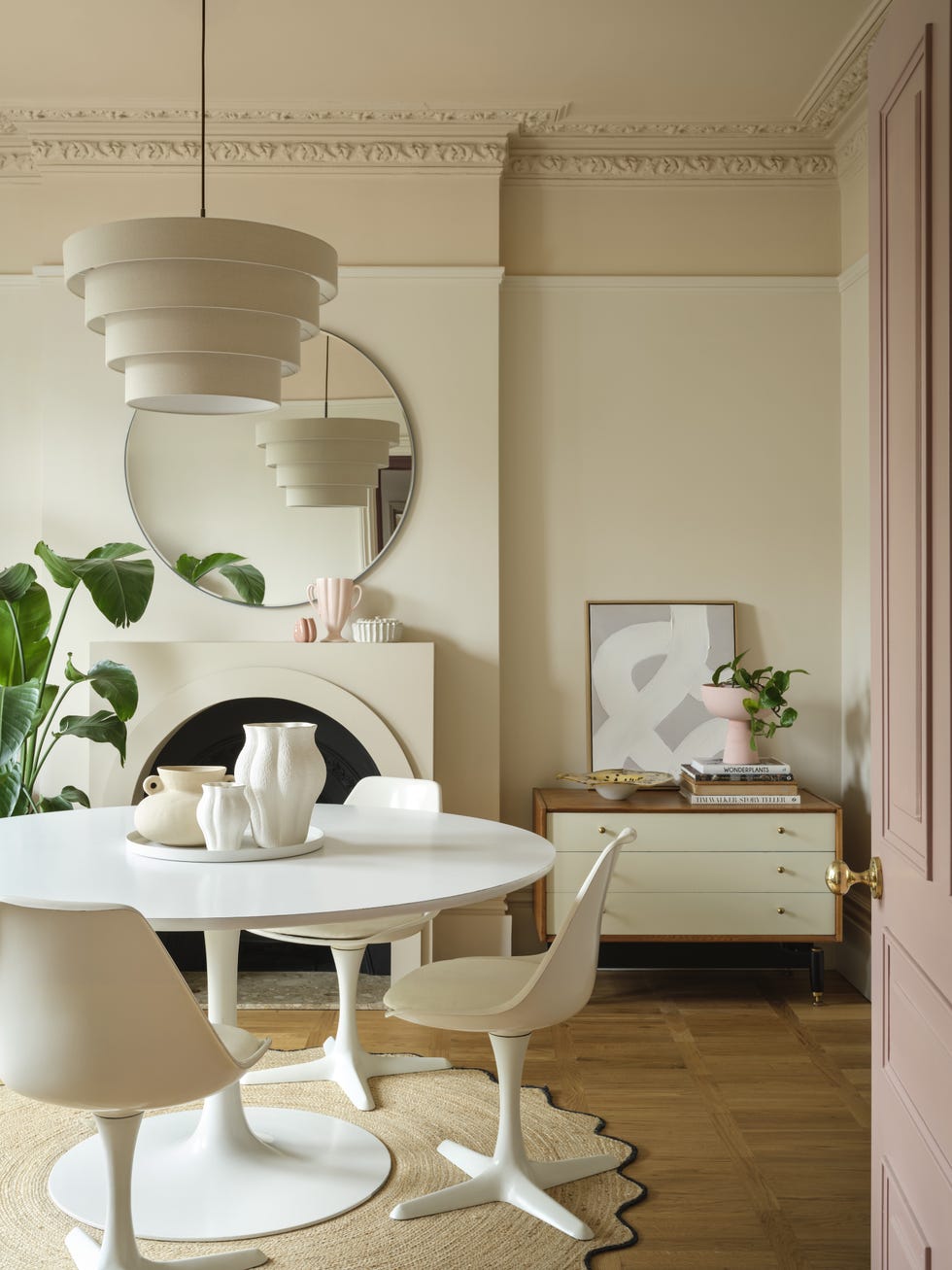
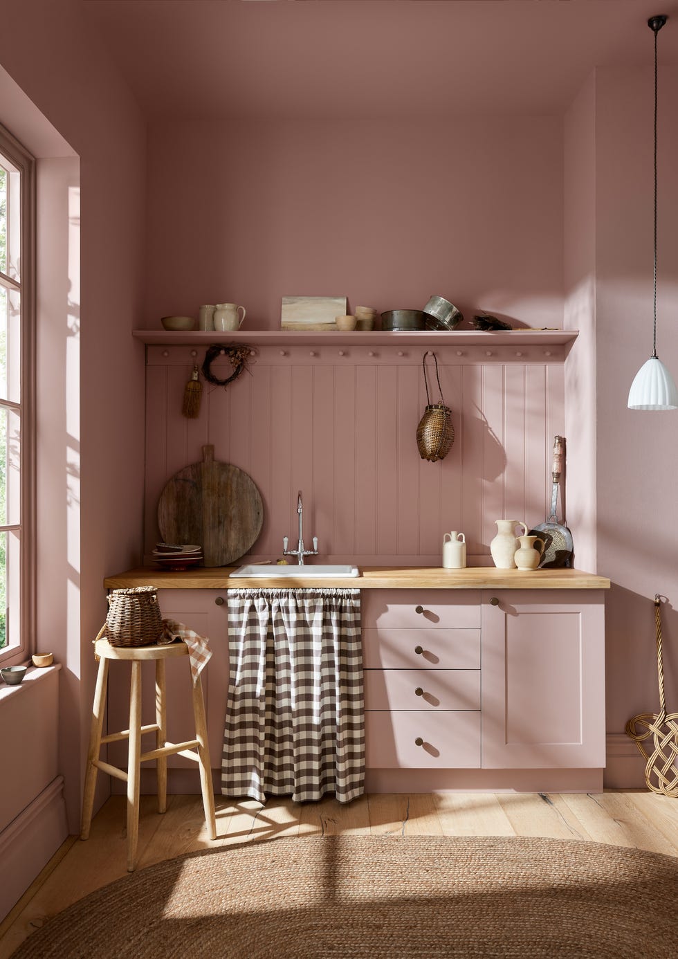
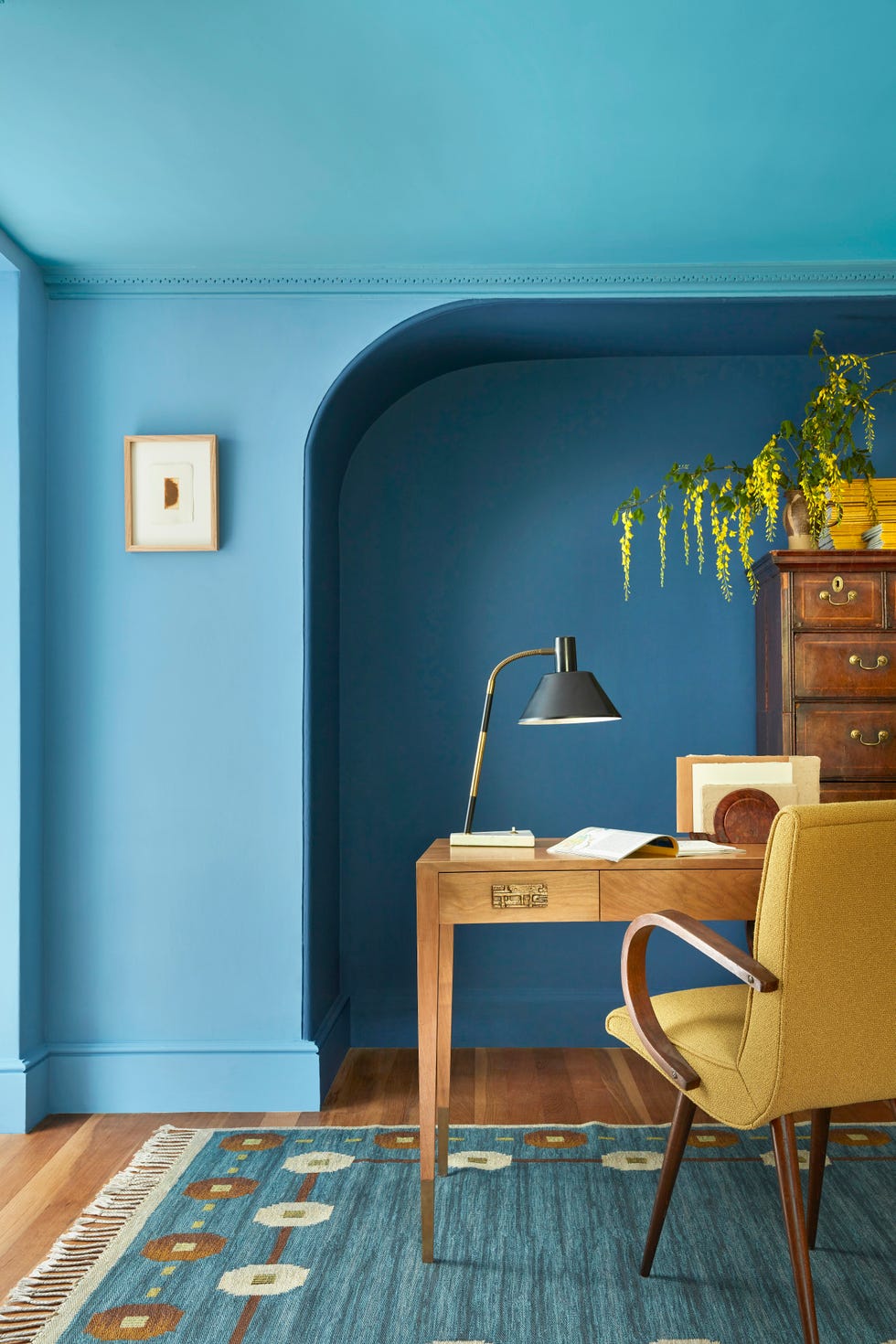
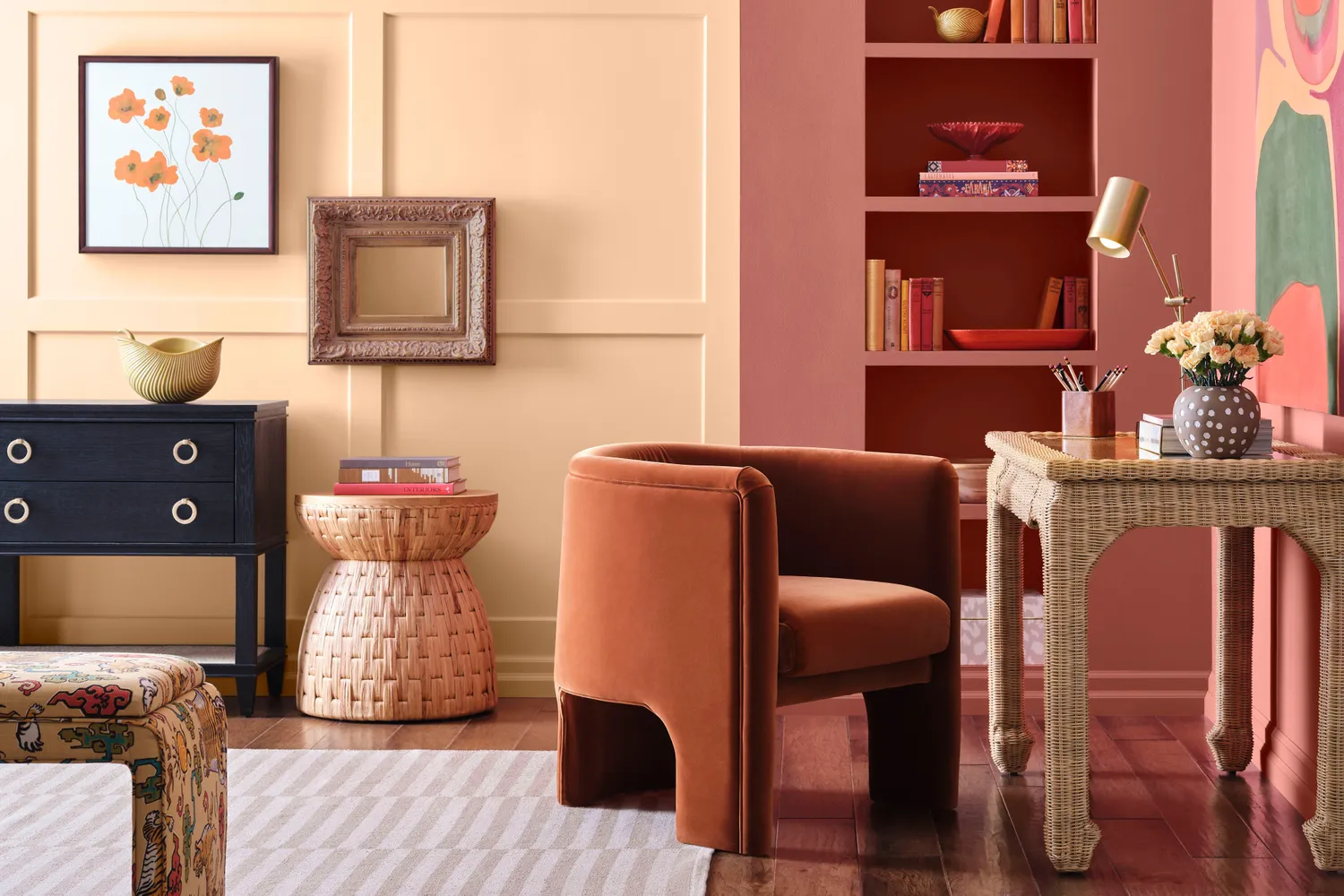
Sherwin-Williams has unveiled its 2026 Colormix Trend Forecast Anthology, aiming to simplify paint color selection for designers and homeowners. This second installment features 48 hand-selected hues organized into four distinct palettes, all designed to be mixed and matched. Emily Kantz, Sherwin-Williams' color marketing manager, notes a growing desire for more color in home design, and these palettes offer both inspiration and guidance for long-lasting color choices.
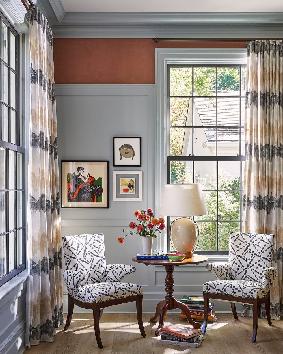
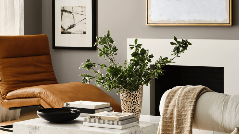
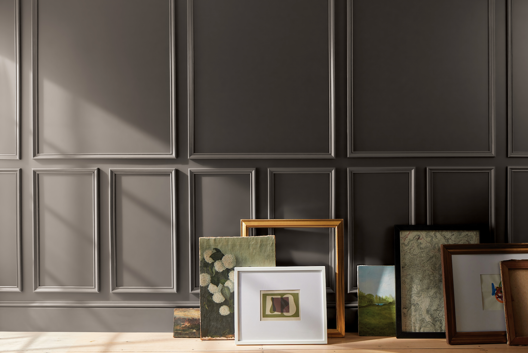
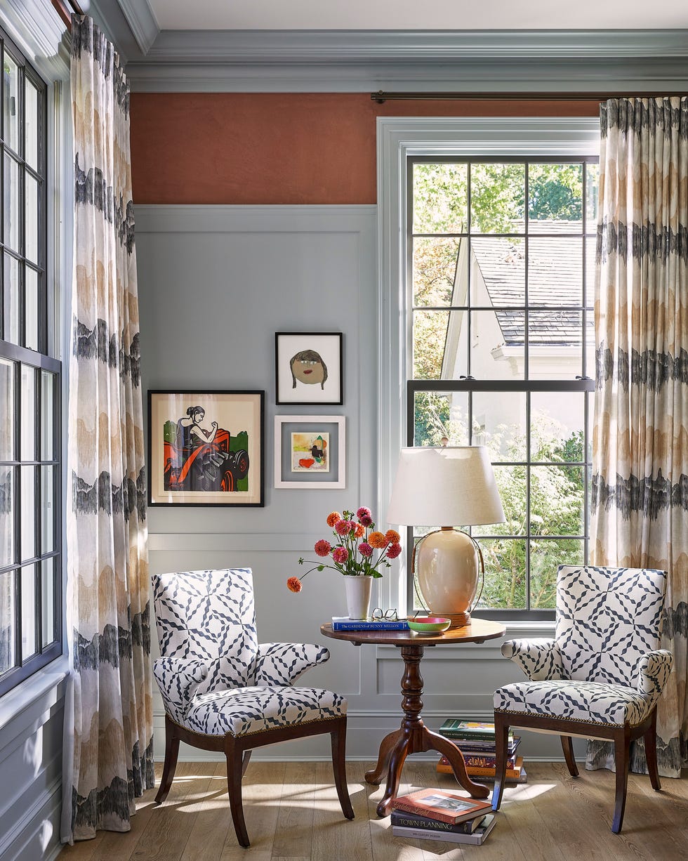
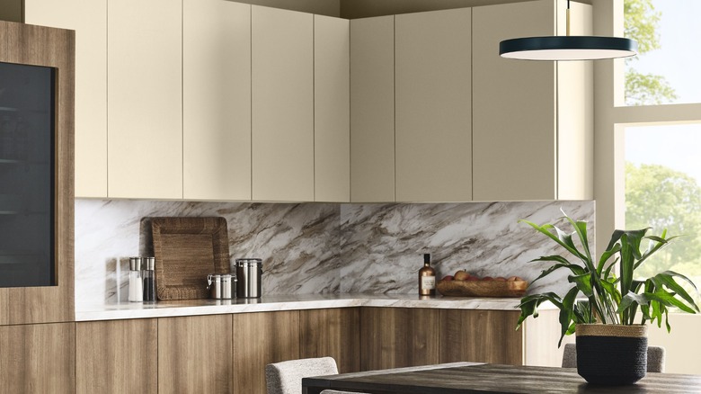
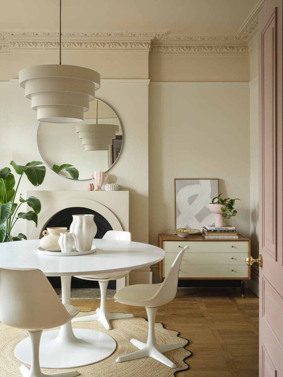
The first palette, Foundational Neutrals, reinterprets traditional neutrals with a fresh, warm feel. While classic grays and creamy whites are present, the overall tone leans towards nature-inspired hues. Kantz explains that these neutrals are not entirely passive; for instance, 'Passive' incorporates a silvery-blue undertone, and 'Rare Gray' has a green undertone, subtly introducing color in a muted manner. This year's neutral collection also includes darker options like 'Inkwell' and 'Armory,' providing a broader spectrum for homeowners and designers who rely on neutrals as the base of their home's design.
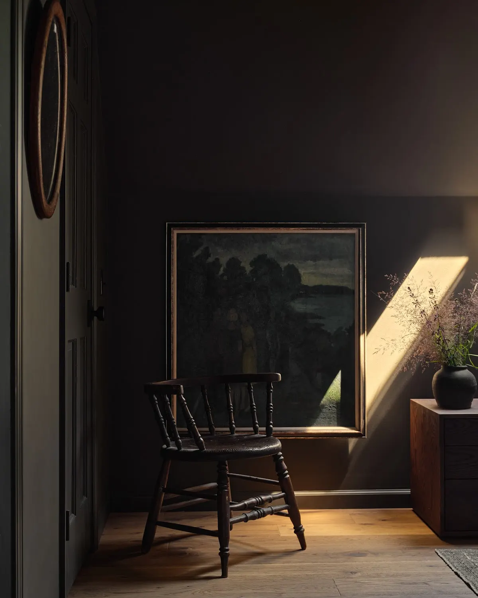
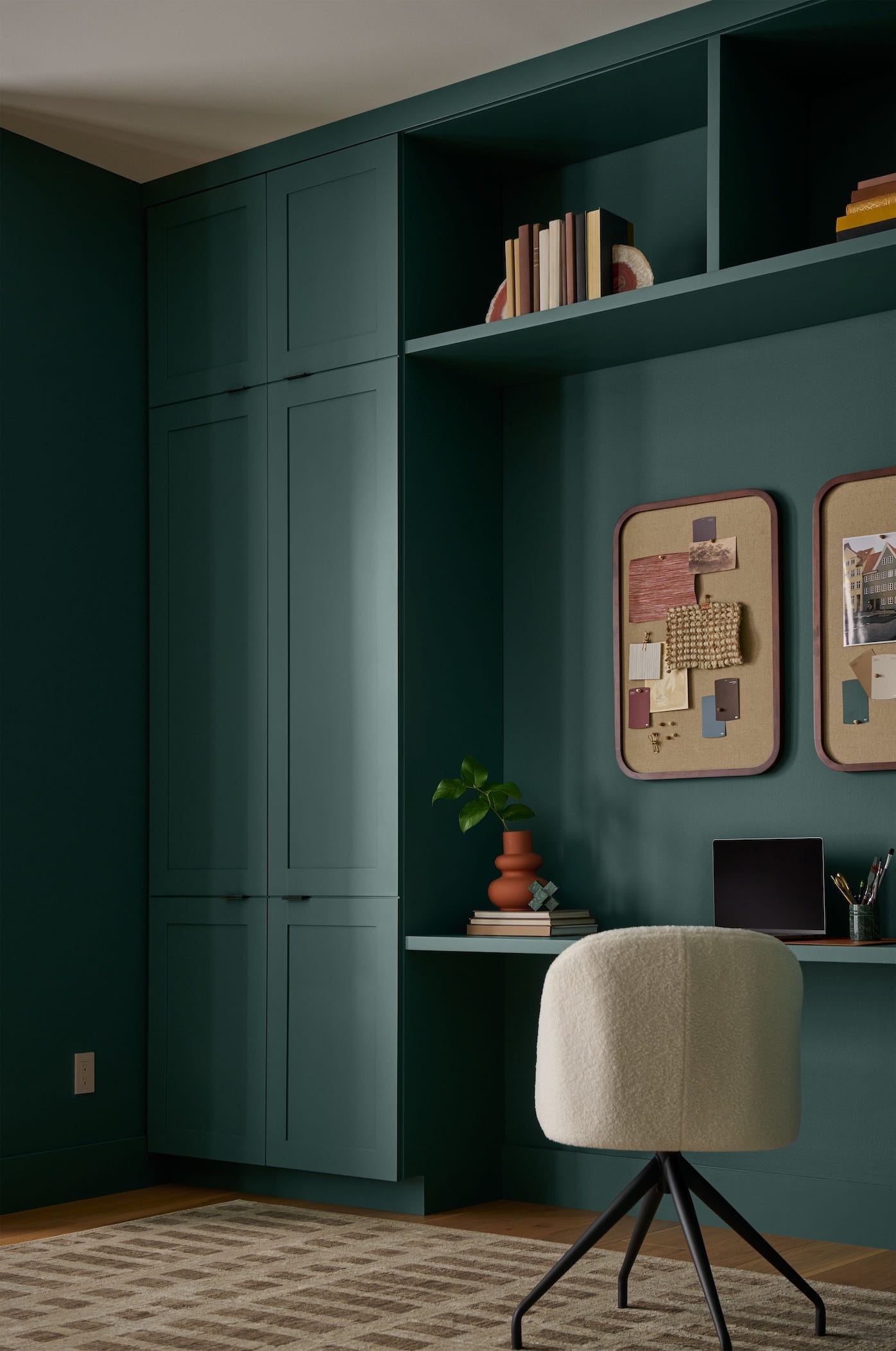
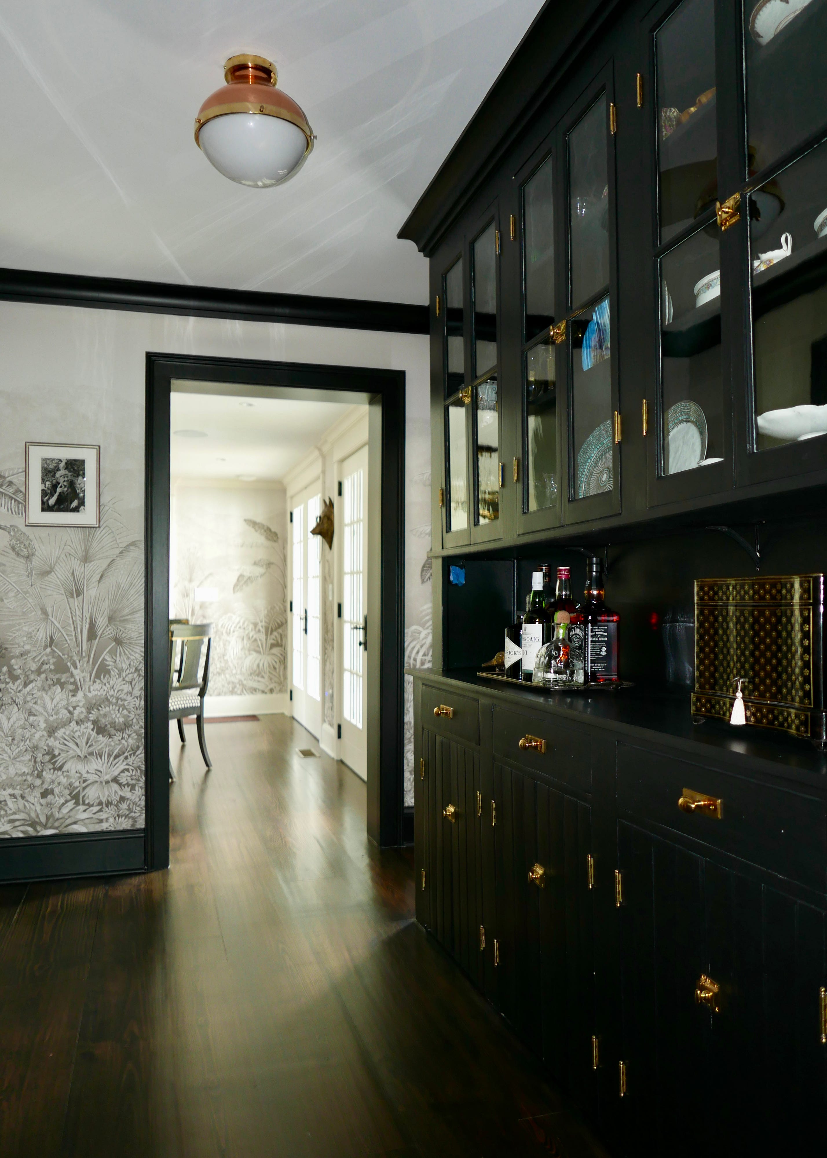
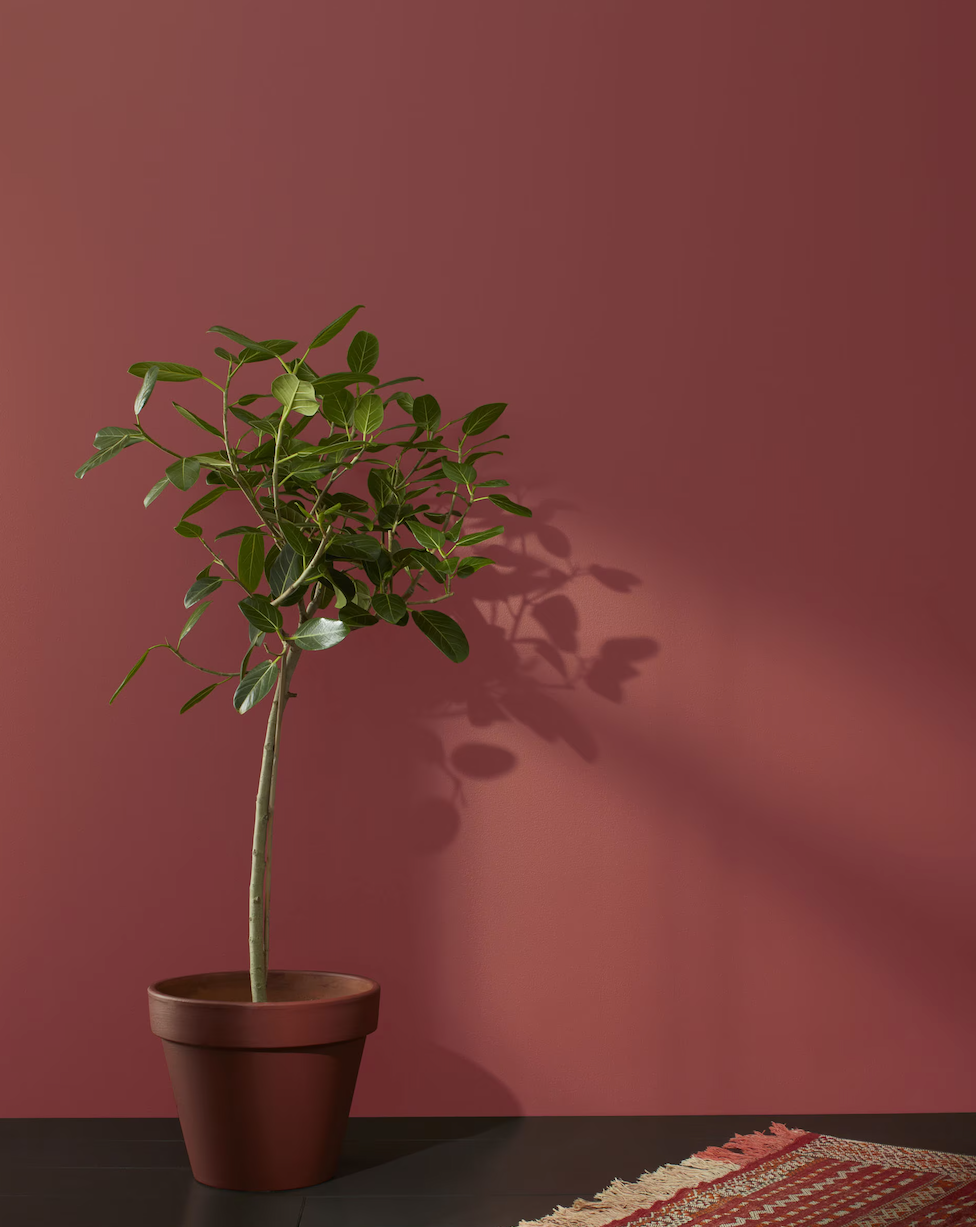
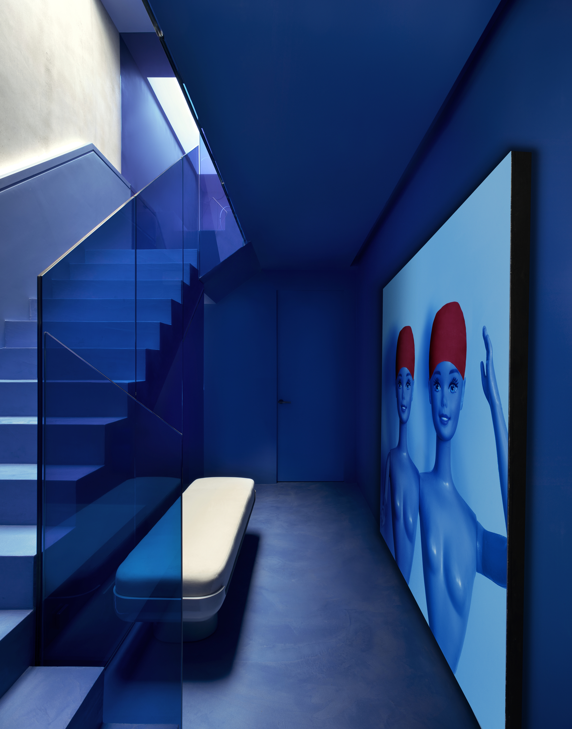
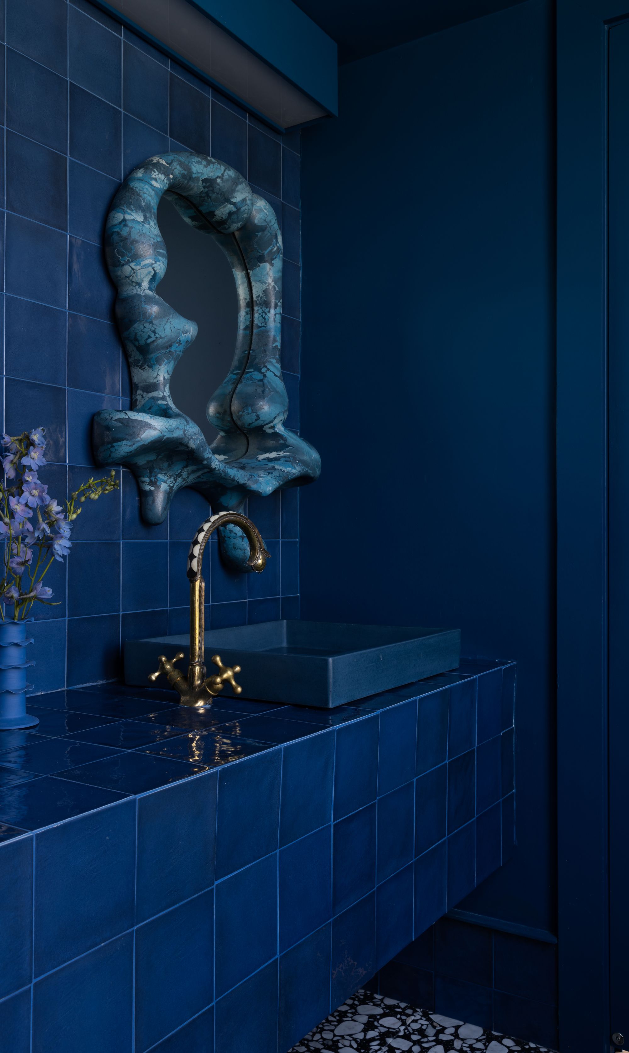
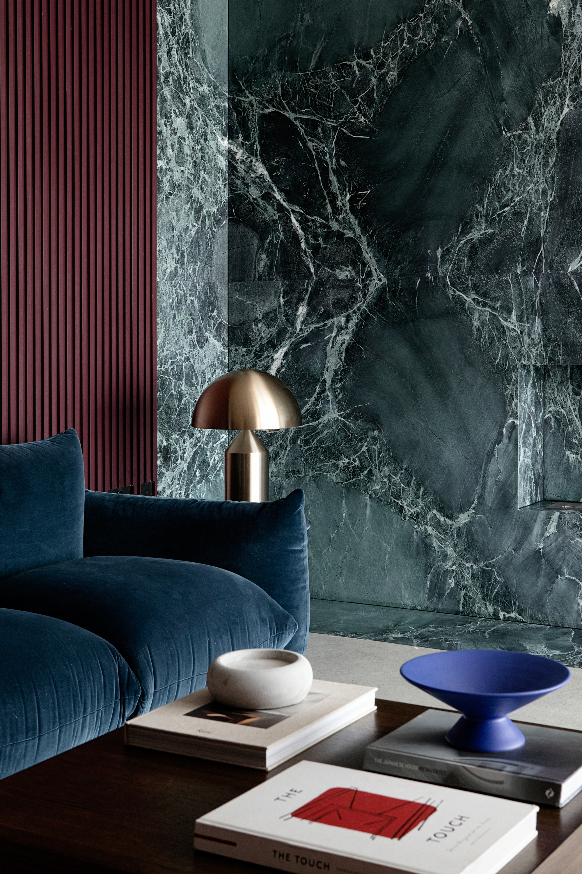
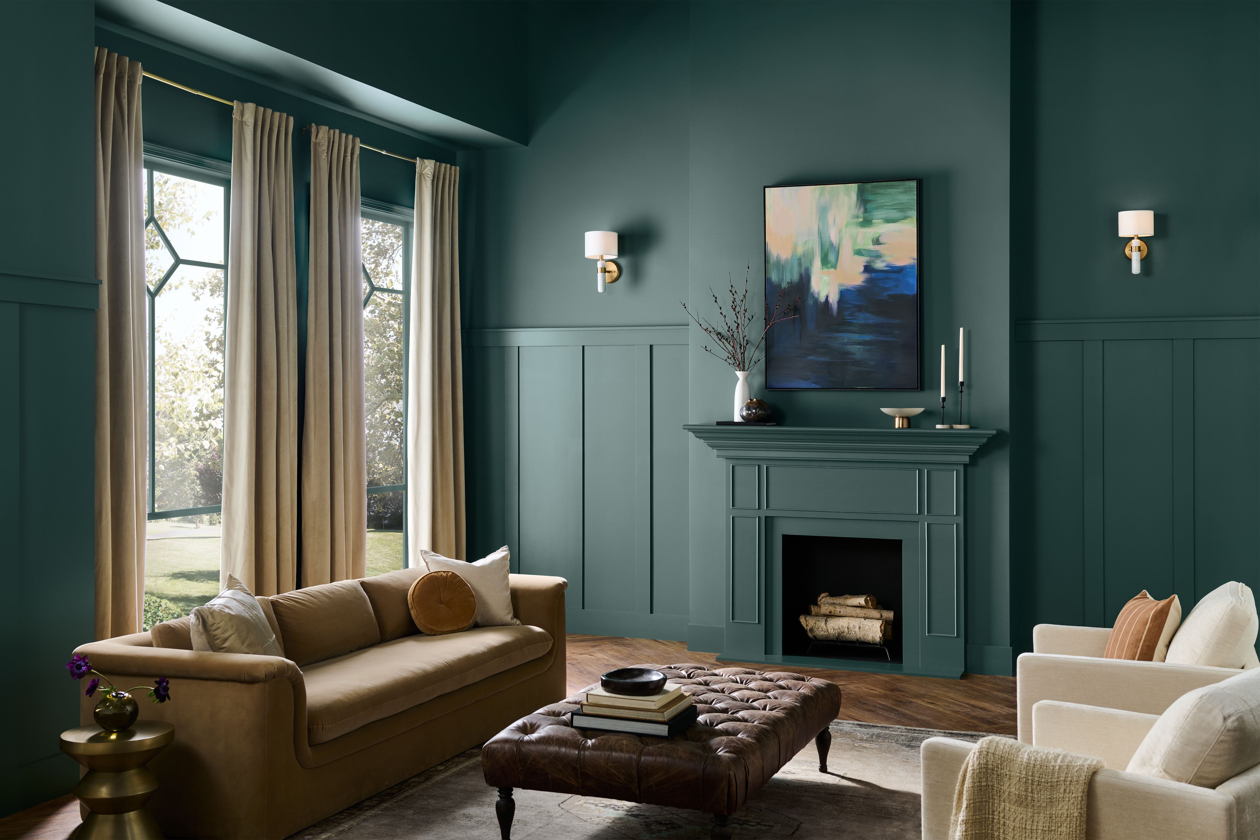
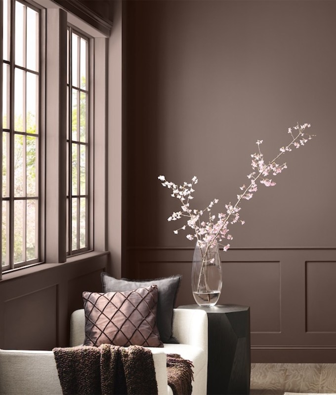
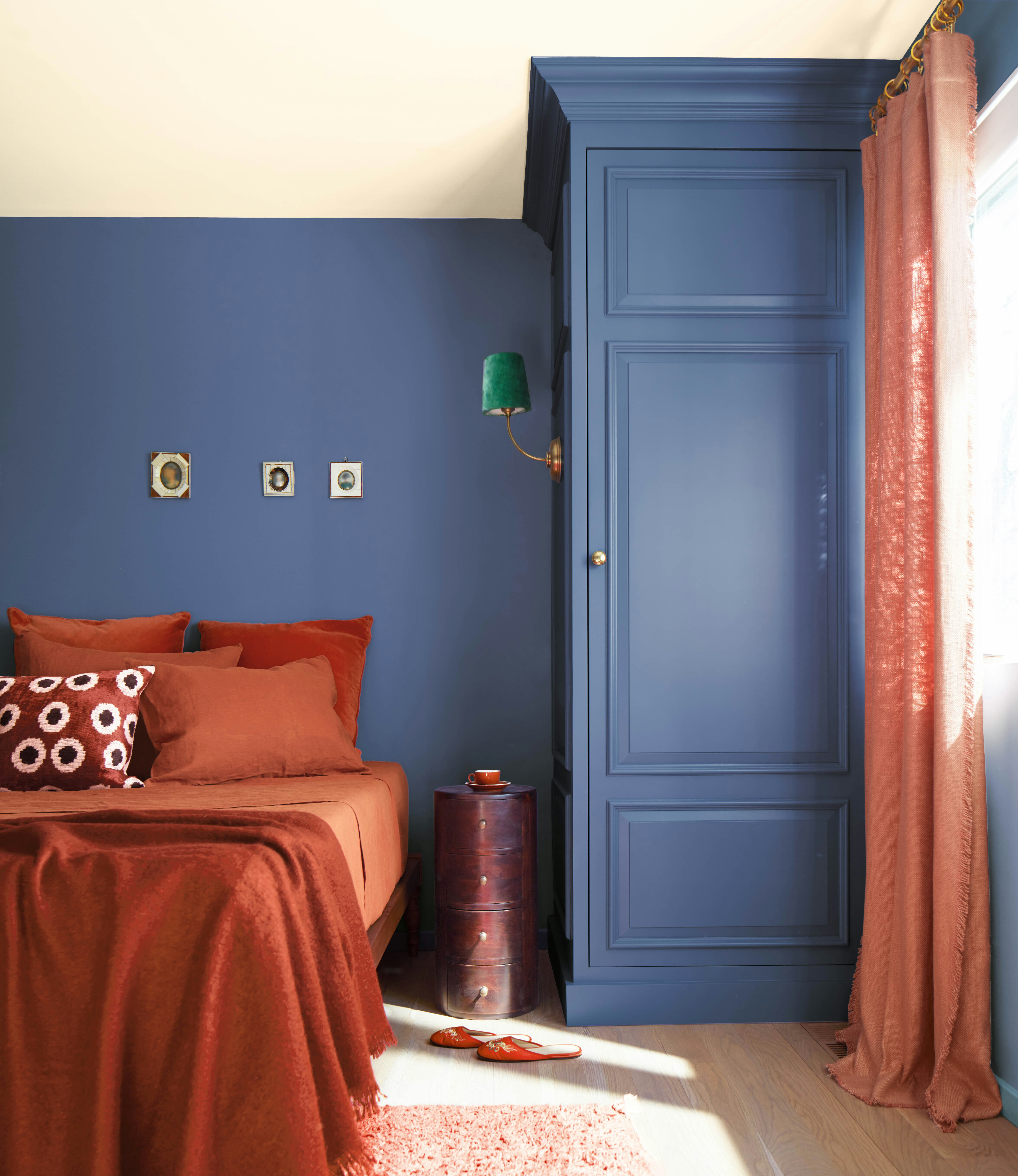
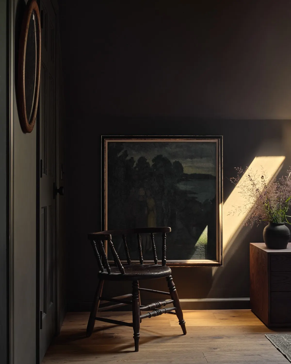
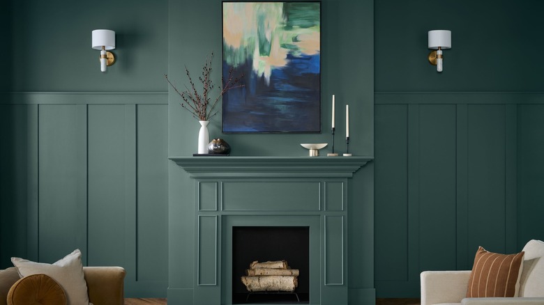
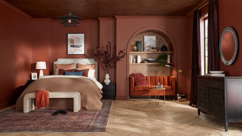
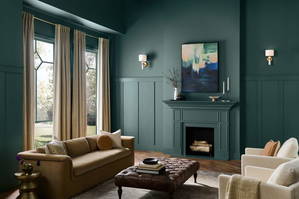
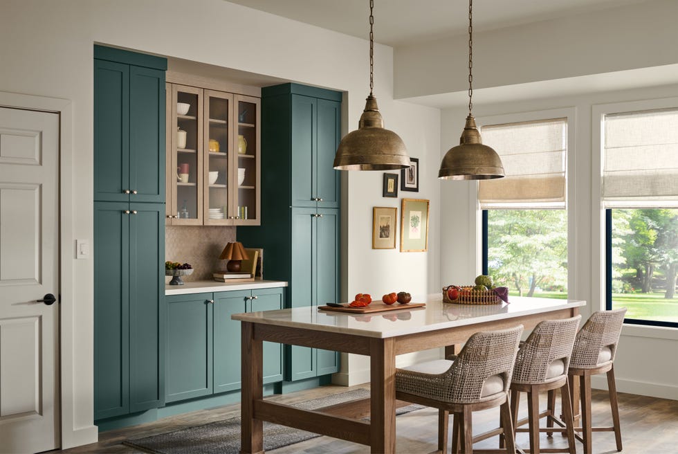
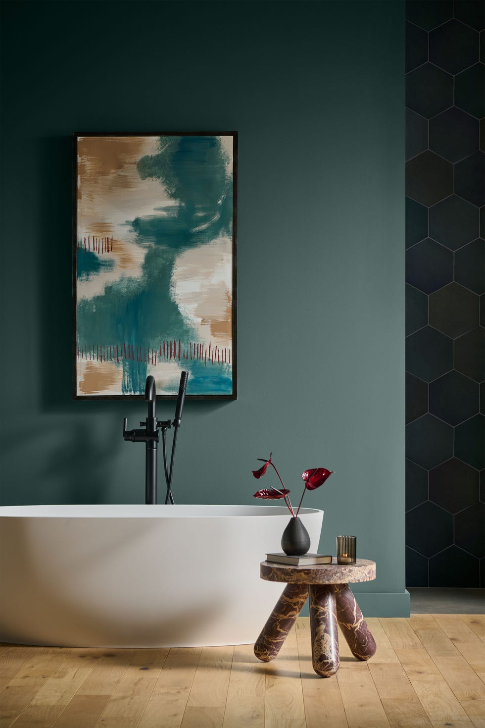
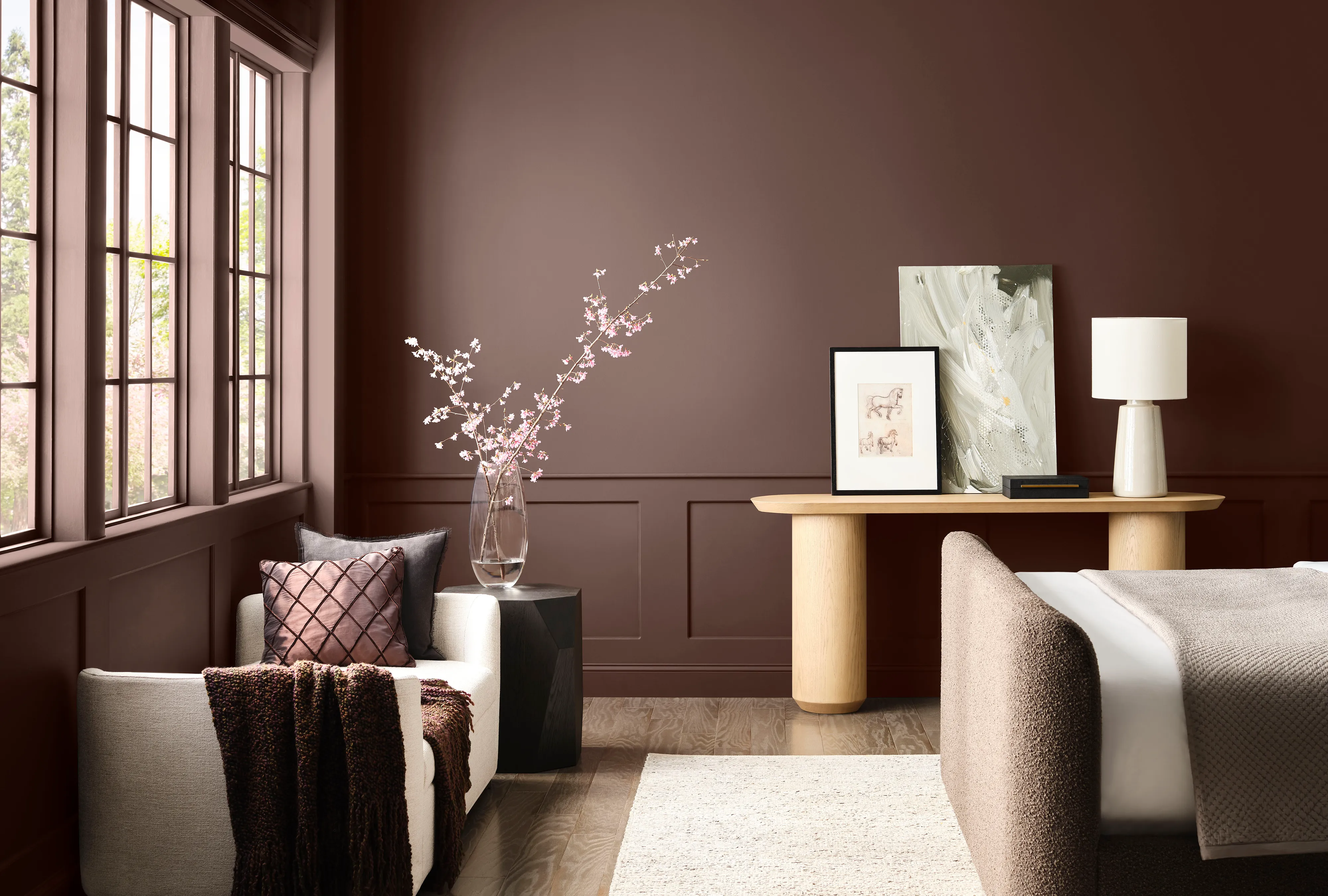
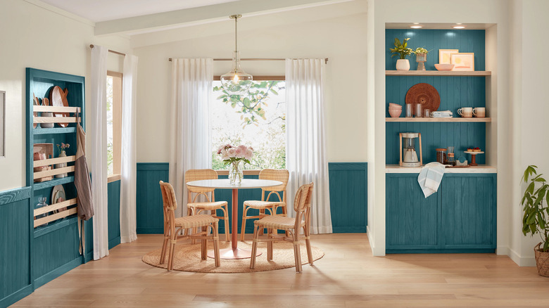
In contrast, the Restorative Darks palette offers a collection of deep, rich tones, including coppery red, bronze, and teal. This palette is designed to create a sophisticated, stylish, and cozy atmosphere, making it particularly suitable for spaces like bedrooms. Kantz observes a trend where people are increasingly embracing these saturated, darker shades for their cocooning effect, building upon the darker options introduced in Anthology Volume I with even greater depth.
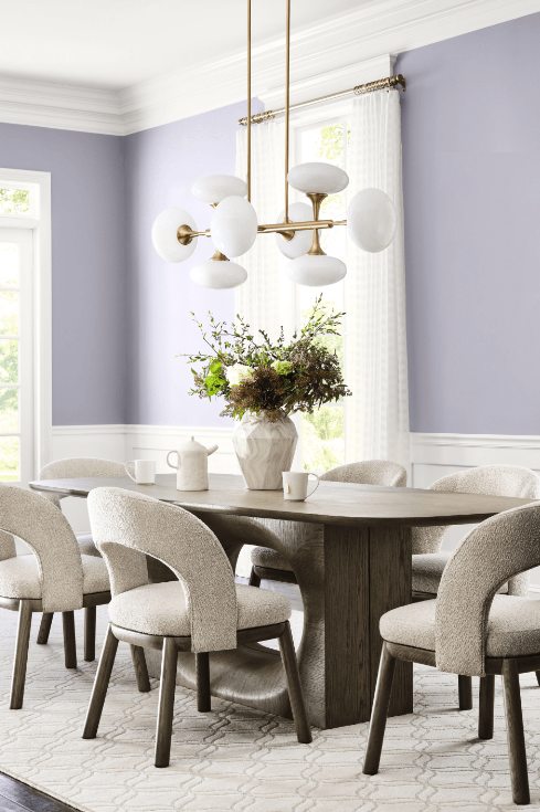
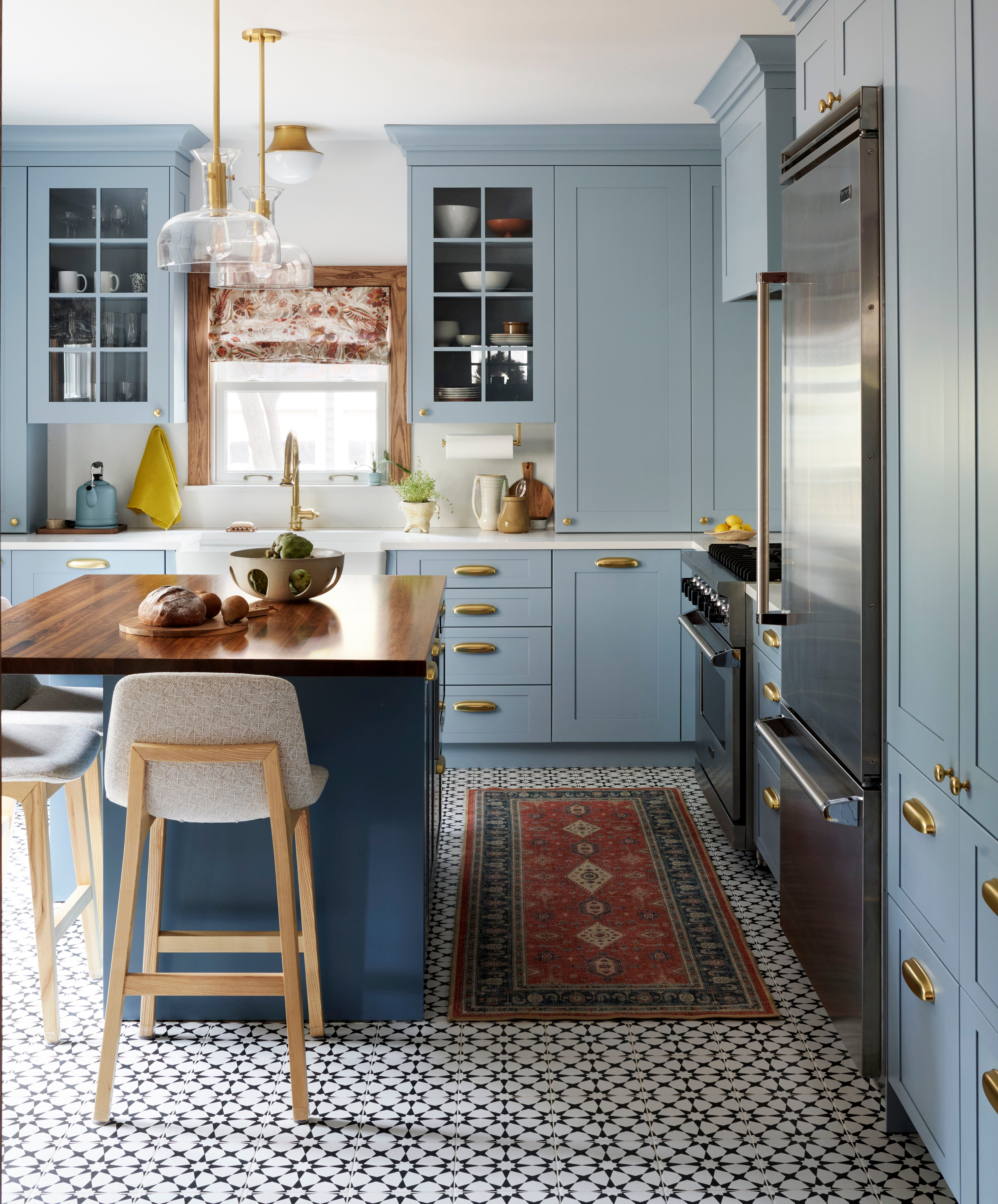
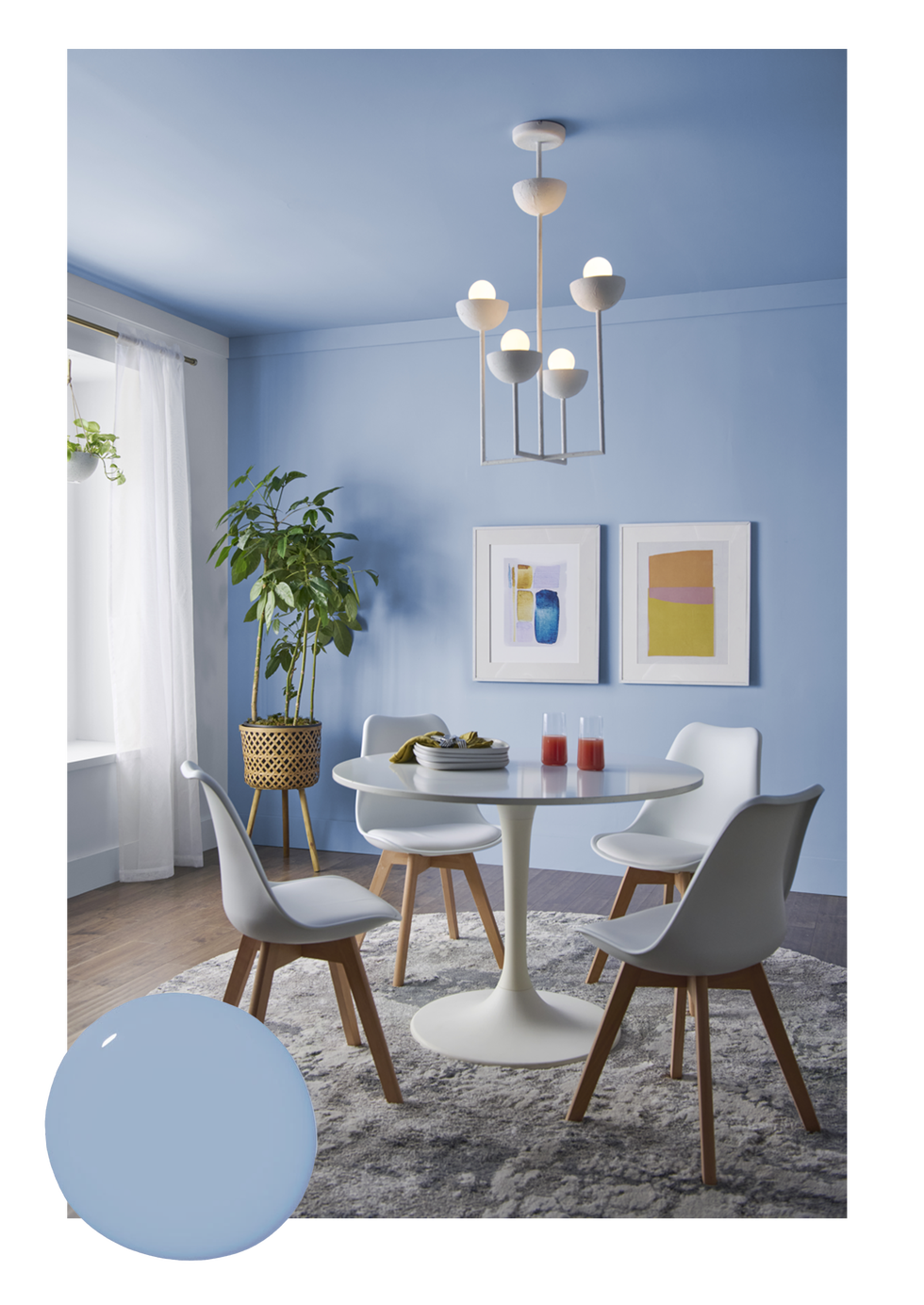
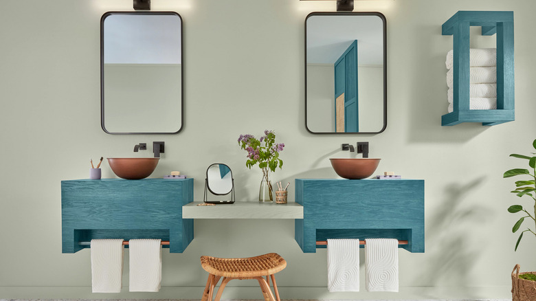
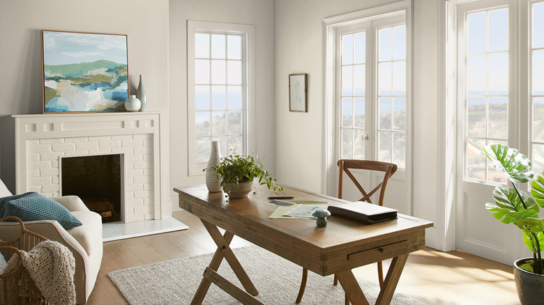
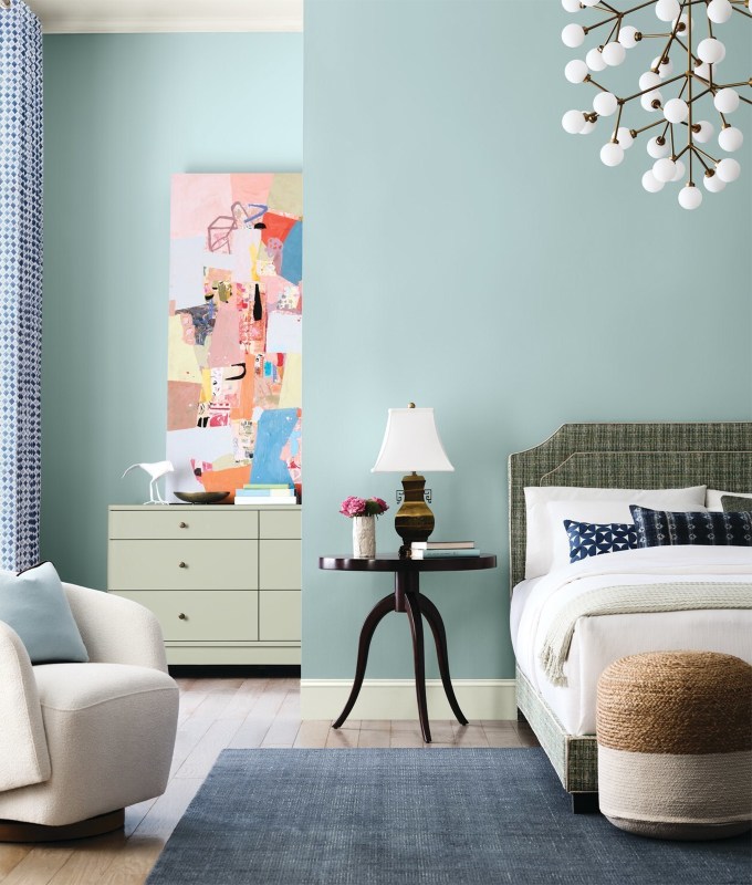
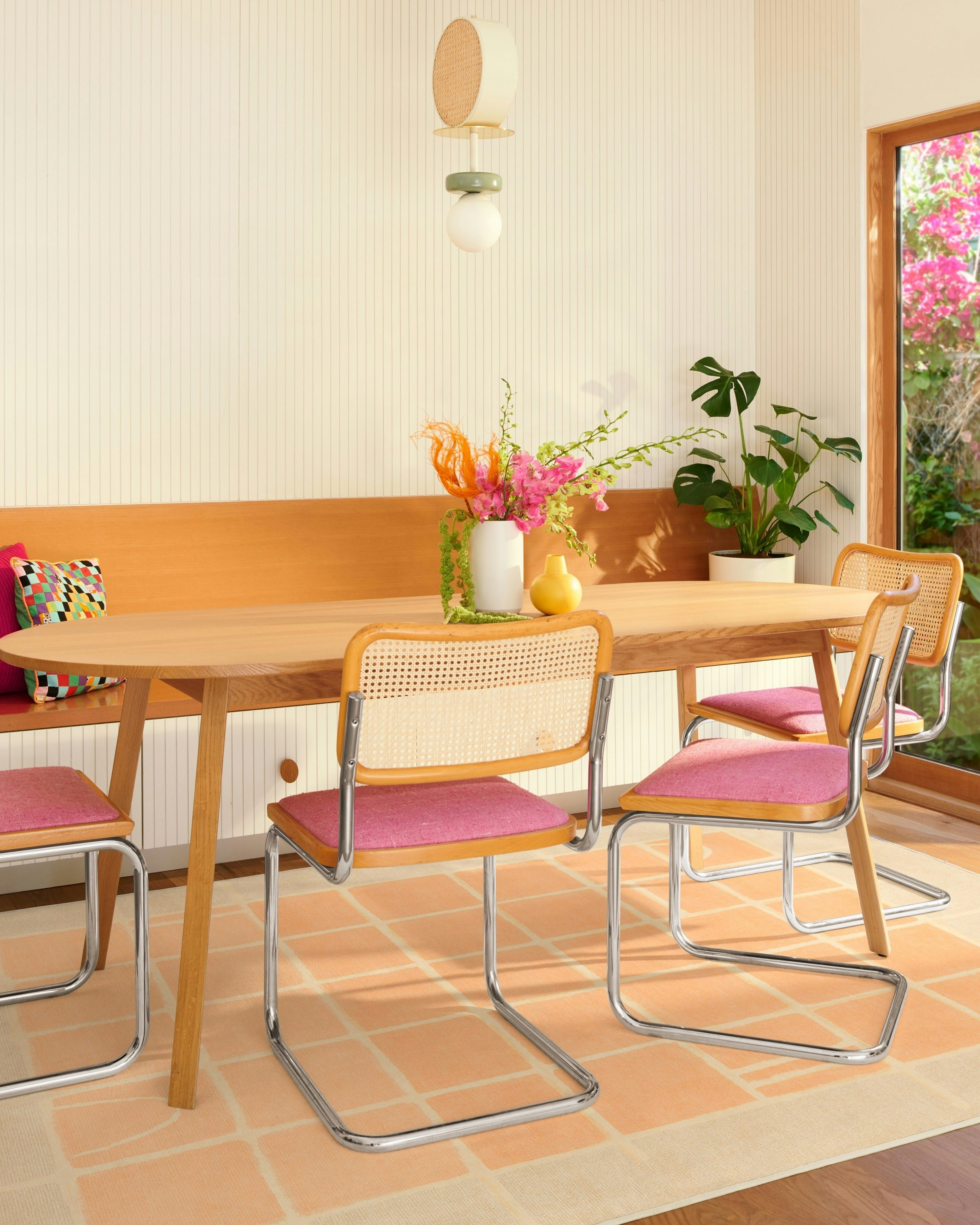
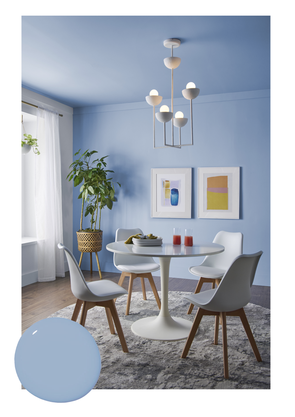
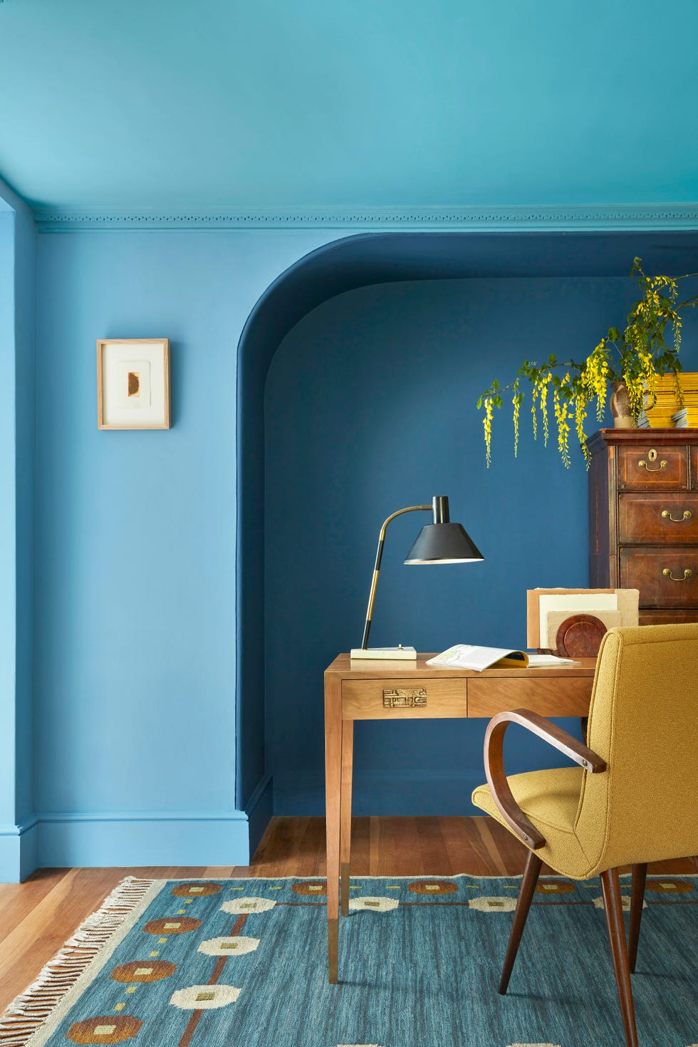
For those who appreciate color but prefer a more subtle approach, the Frosted Tints palette presents a range of pastels, encompassing greens, blues, and yellows. Kantz highlights this as an effective way to introduce color without being overwhelming, creating a soft yet noticeable statement. Despite an initial coastal impression, the versatility of this palette allows it to be adapted to various design styles.
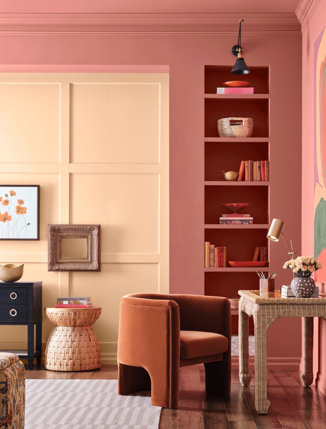
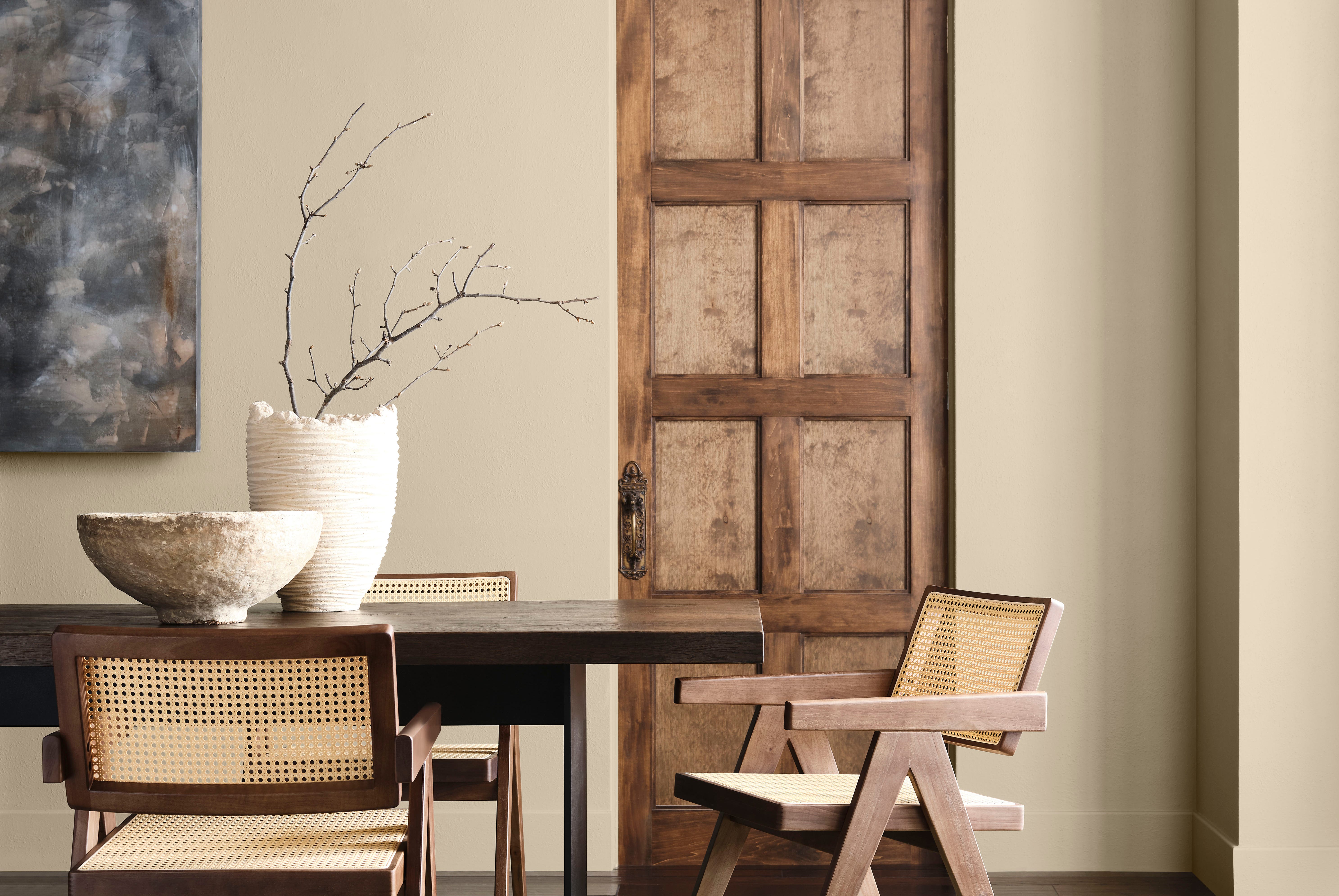
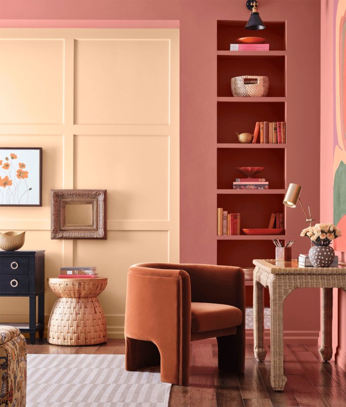
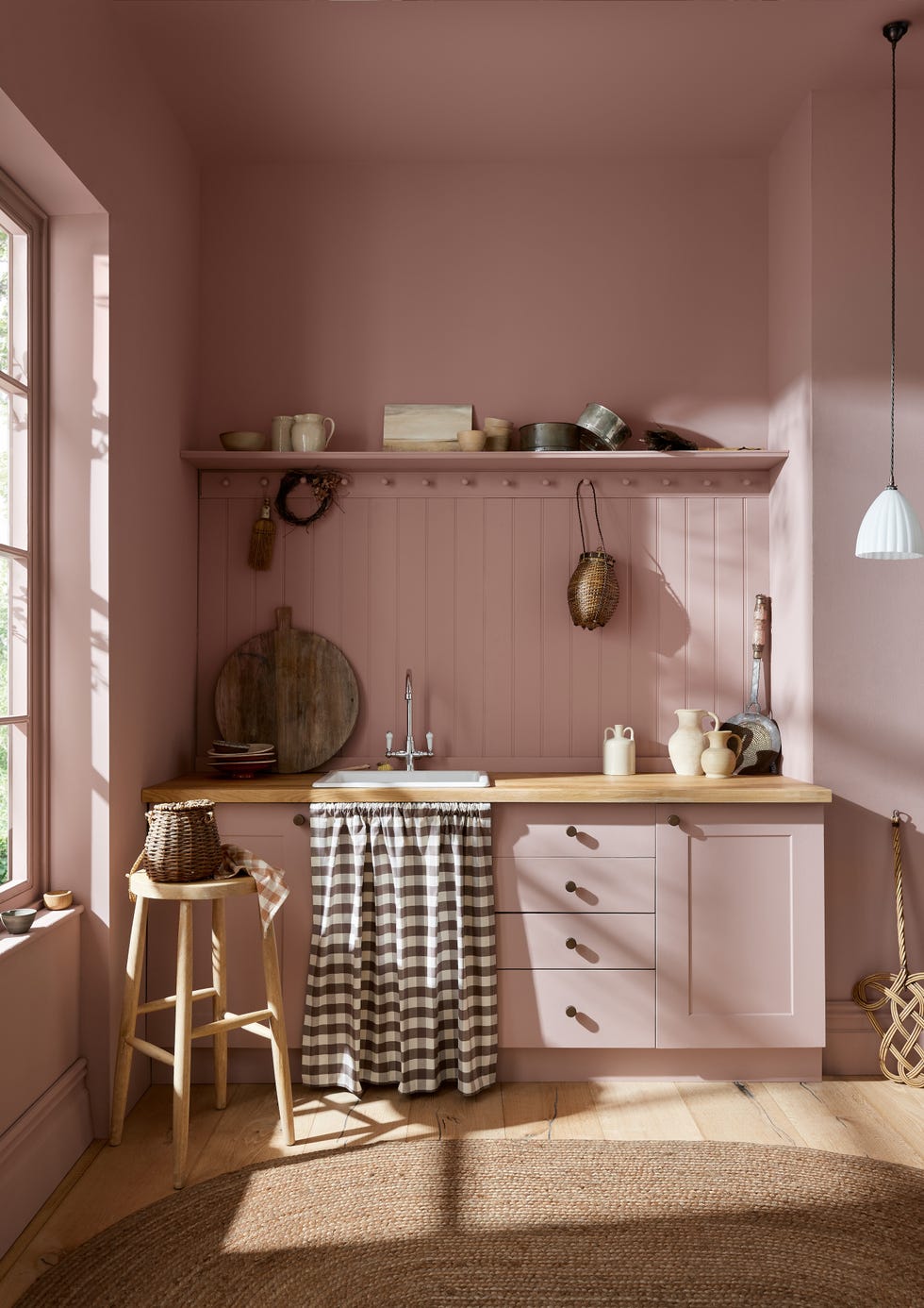
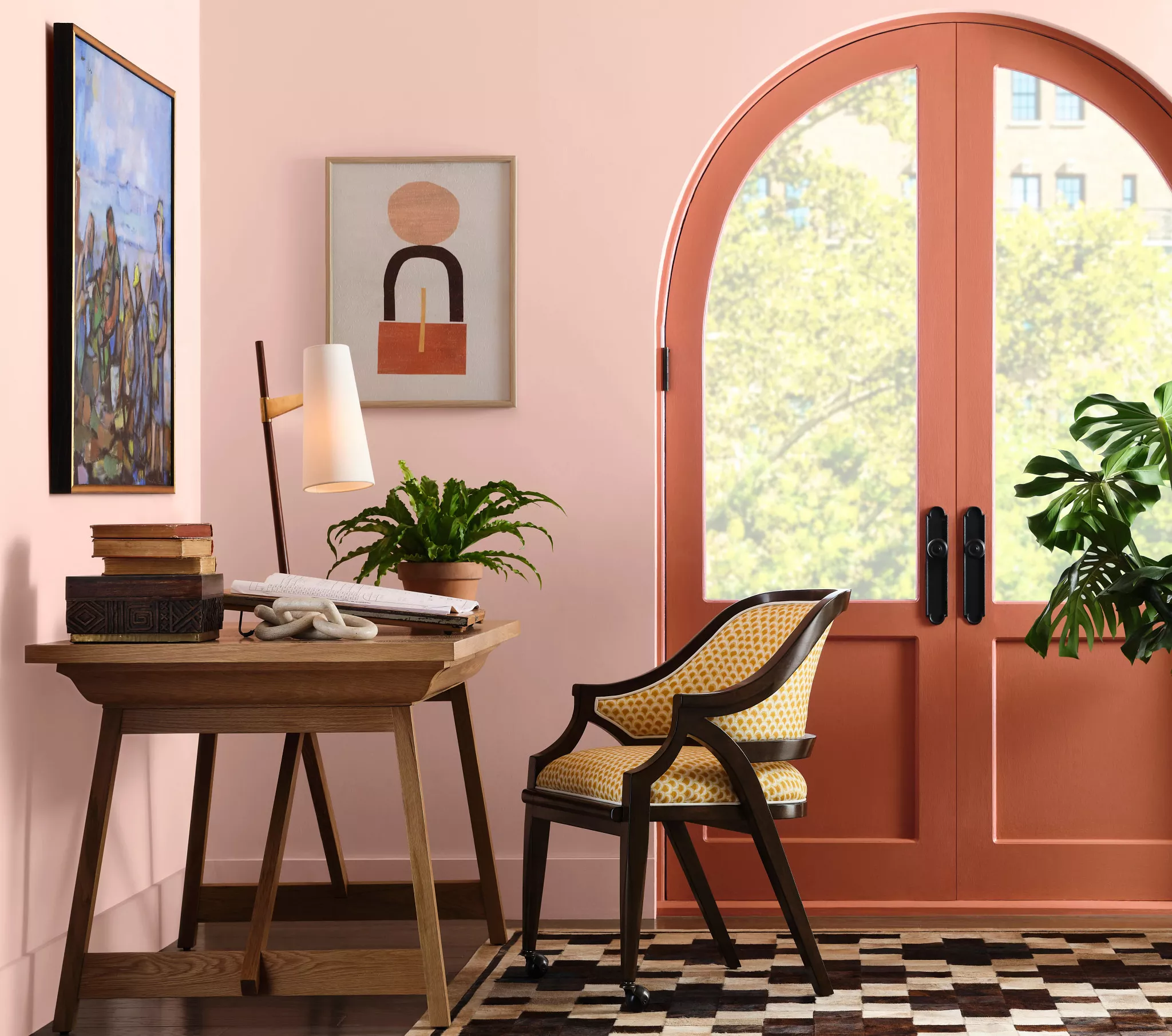
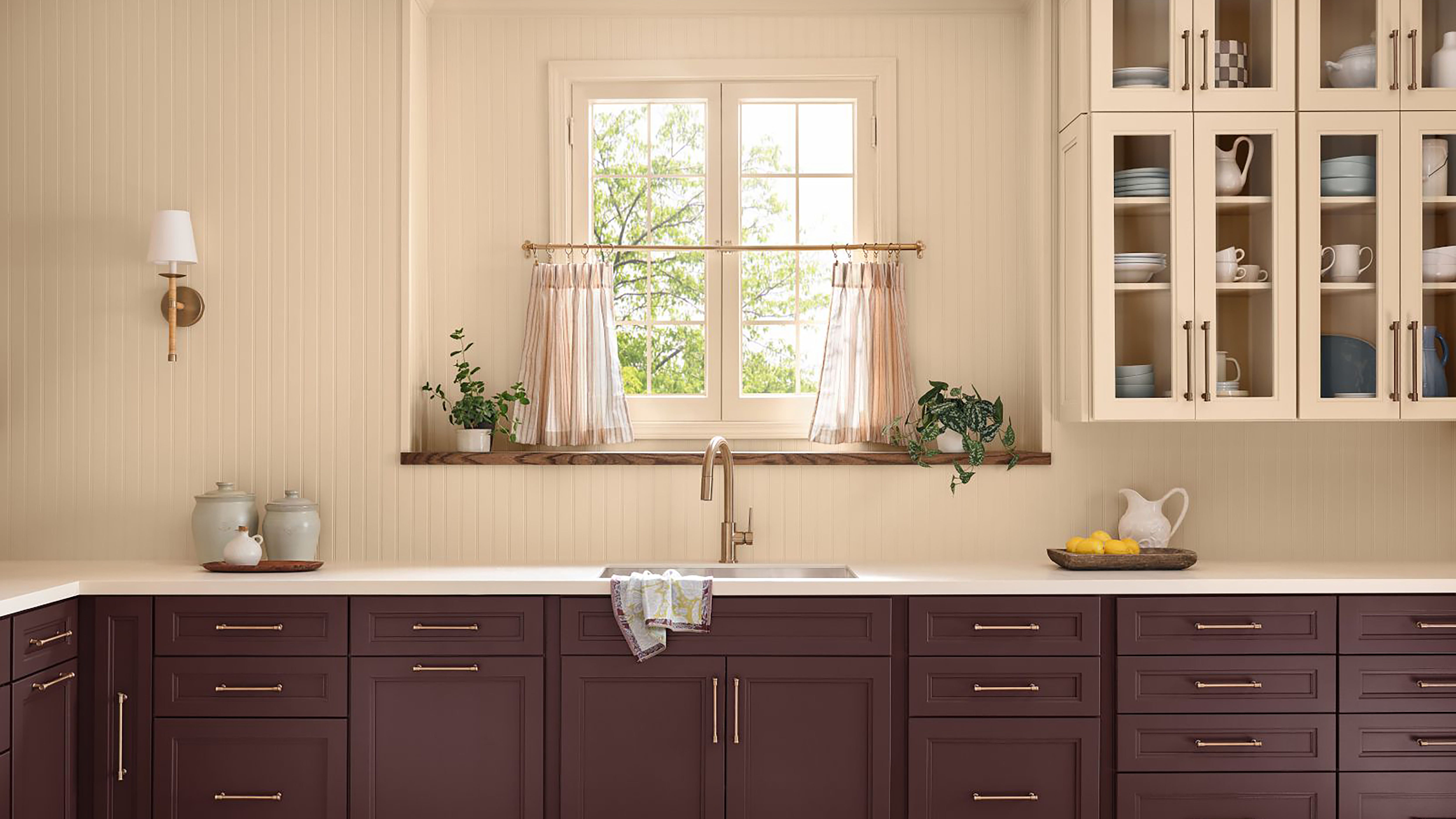
Finally, the Sunbaked Hues palette captures the warmth of sunsets and sunrises, featuring colors from corals and light yellows to bolder reds. This playful palette is influenced by the rising popularity of trends like butter yellow, which has transitioned from fashion into home decor. Kantz suggests that Sunbaked Hues is an excellent choice for individuals seeking a retro-inspired aesthetic in their homes. These four palettes together offer a comprehensive and versatile range of options to cater to diverse preferences and design goals for the upcoming year.
#SherwinWilliams #PaintColors #ColorTrends #HomeDecor #InteriorDesign #NeutralPalette #DarkHues #PastelColors #RetroDesign #SherwinWilliams #PaintColors #ColorTrends #HomeDecor #InteriorDesign #NeutralPalette #DarkHues #PastelColors #RetroDesign
0 ความคิดเห็นรวม
 ยังไม่มีความคิดเห็น
คุณอาจจะชอบอีกด้วย
Sherwin-Williams' 2026 Color Forecast Is Here and It’s Packed With 48 Fresh Hues

These 20 Trendy Paint Colors Will Be Taking Over Walls In 2026
Bye-Bye True Blue: These Are the New Coastal Colors for 2026
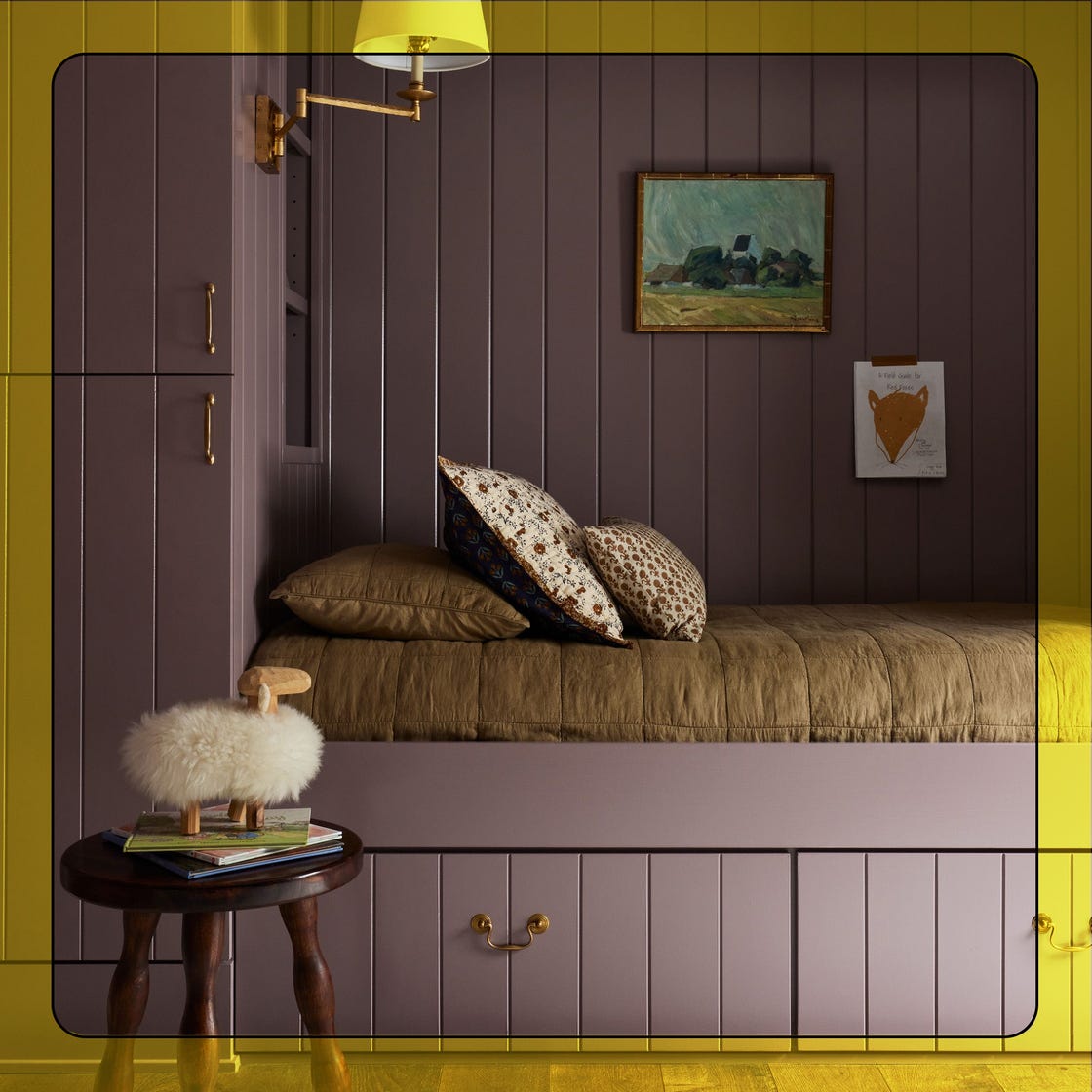
The New Sherwin-Williams 2025 Color Trends Are Bursting with Energetic Hues

Sherwin-Williams Just Announced the Color of the Year

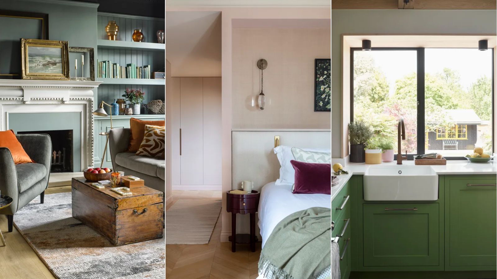
These are the 'fail-safe' paint color combinations to embrace in 2024, according to Lick's color psychologist

Sherwin-Williams Predicts These 4 Color Palettes Will Dominate Homes in 2026—and One May Surprise You
11 Trendy Kitchen Paint Colors To Try In 2026

Designers Say These 12 Paint Colors Will Be Everywhere in 2026


Sherwin-Williams Just Named Its Loneliest Color of 2025—and Everyone Should Be Using It
Ready for a Fresh Coat of Paint? Check Out the Top Colors of 2024

Behr's 2026 Color of the Year Is Here—And It’s Moody
Sherwin Williams Announces Its Wood Stain Color Of 2024

Every 2026 Color of the Year That Has Been Announced So Far
Designers Predict This Will Be The Biggest Paint Trend Of 2026
Interiors experts predict this will be the biggest paint trend of 2026

We Already Know the Color That's Going to Have 2027 in a Chokehold — Now's Your Chance to Beat the Trend


Experts Say These 5 Paint Colours Will Be Everywhere In 2026
What Paint Colors Will Rule 2026? Designers Make Their Predictions
The 2026 paint Colors of the Year Have Been Announced