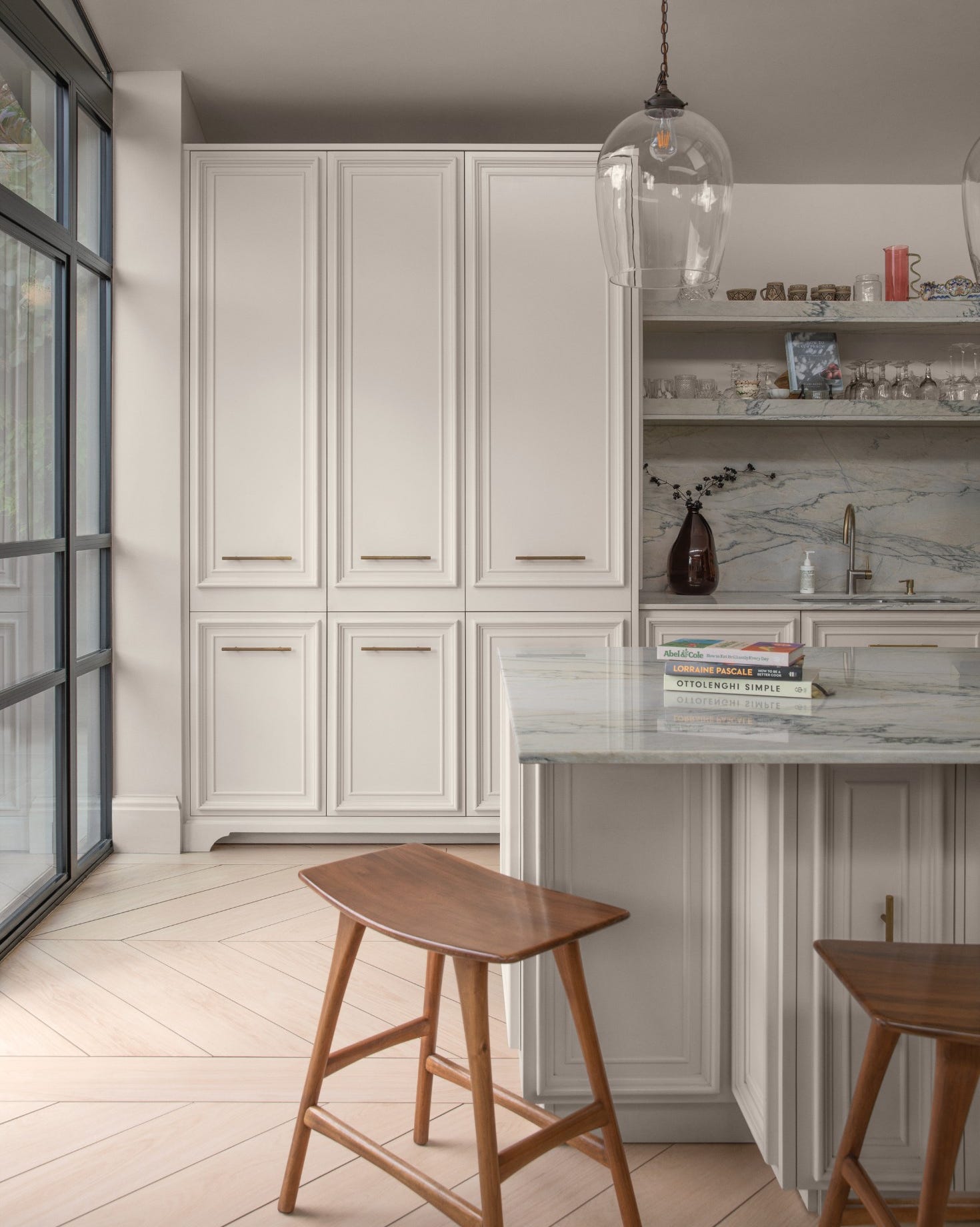
This Kitchen Paint Color Never Goes Out Of Style, According To Hilary Farr
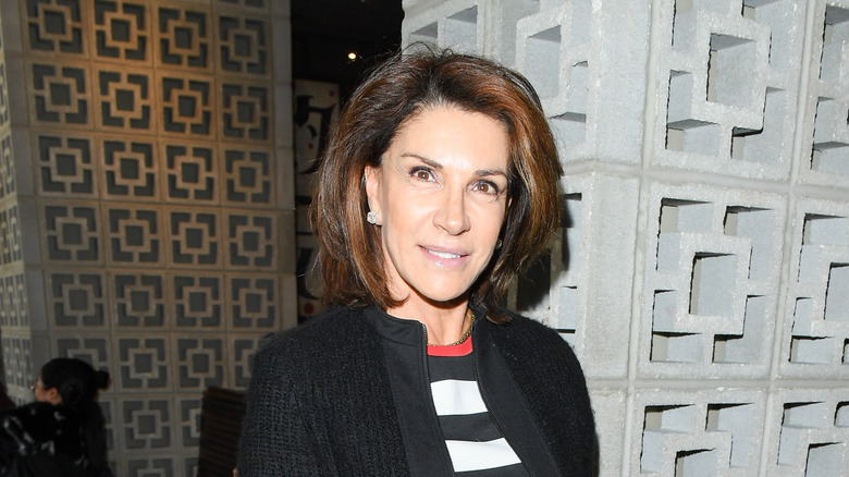
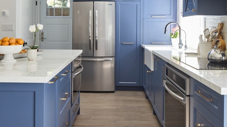
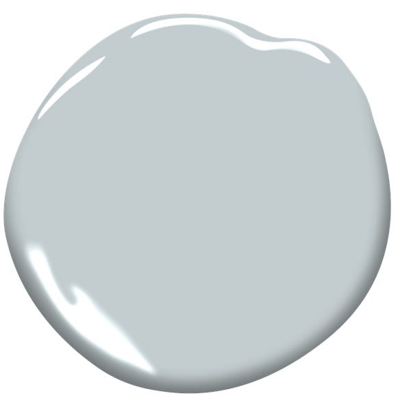
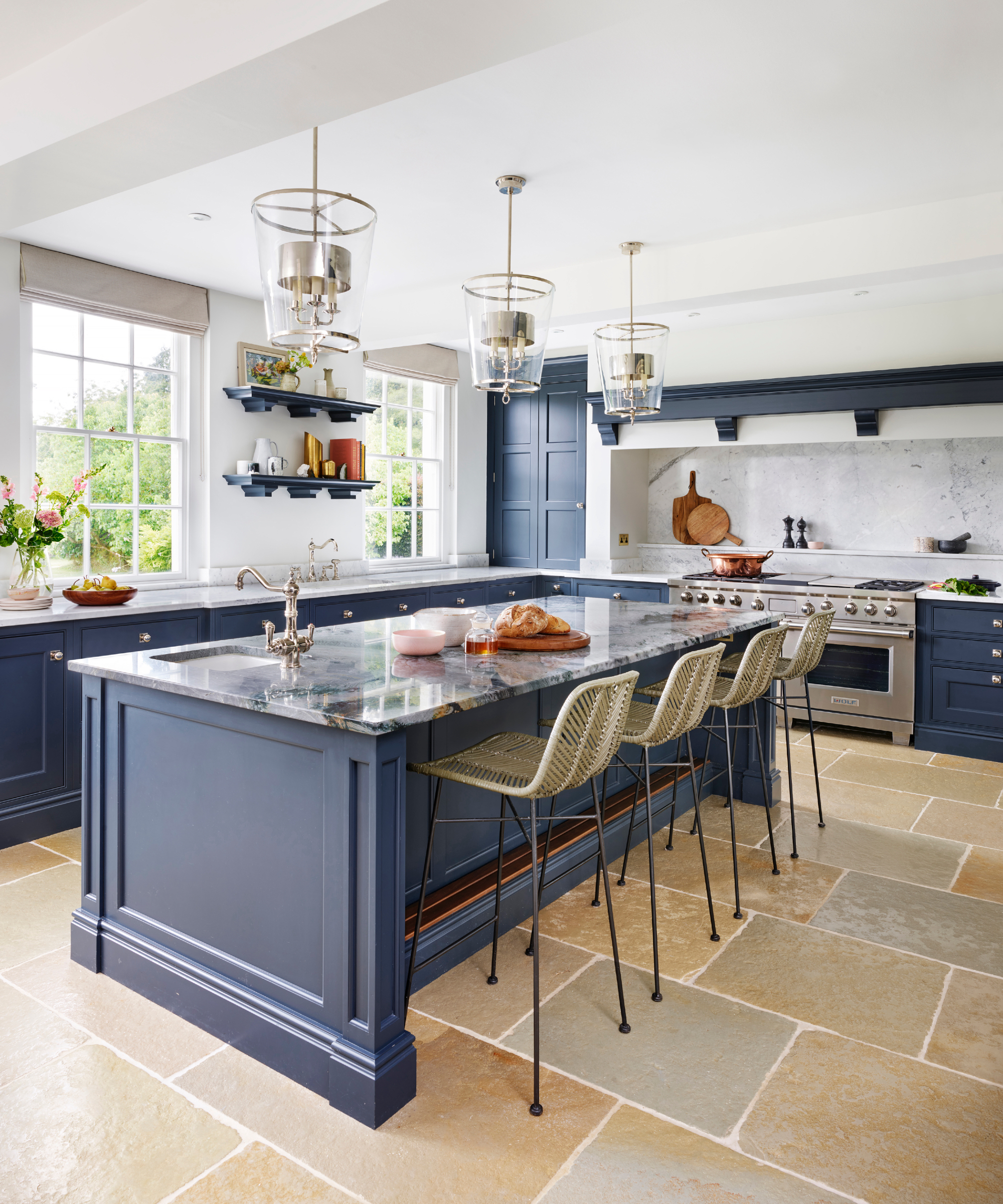
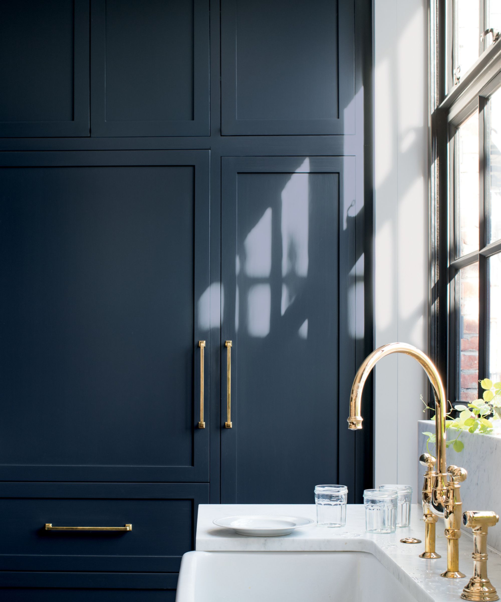
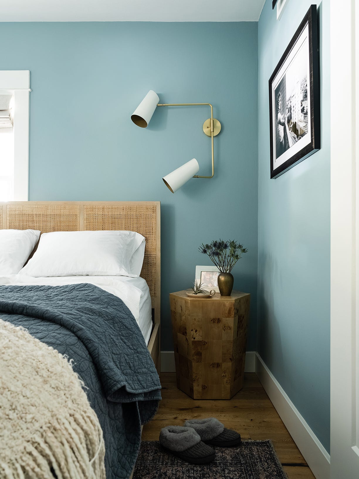
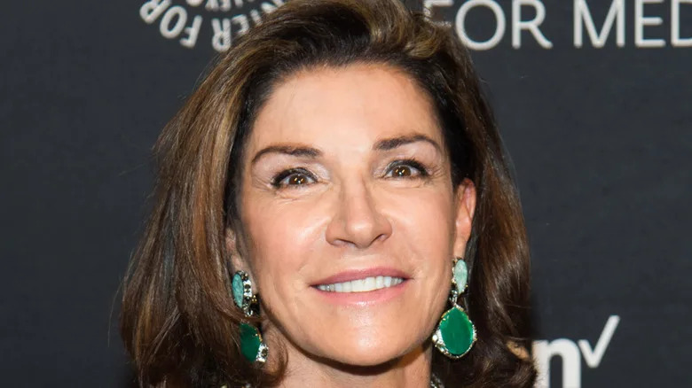
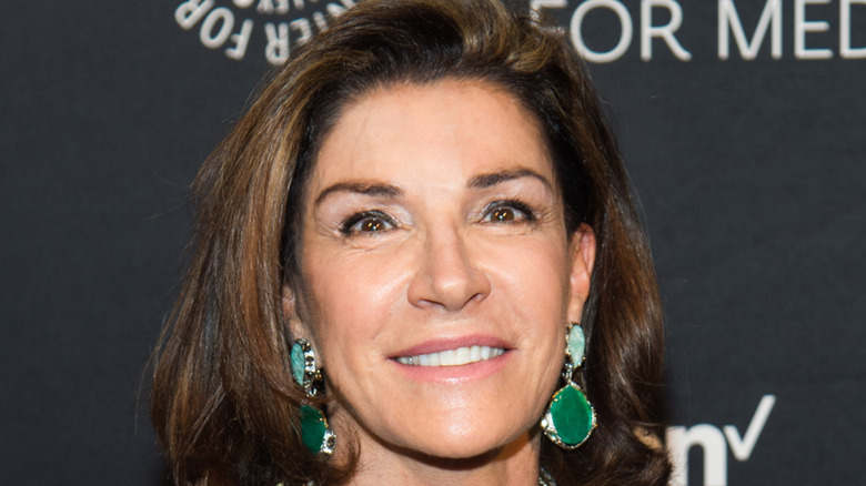
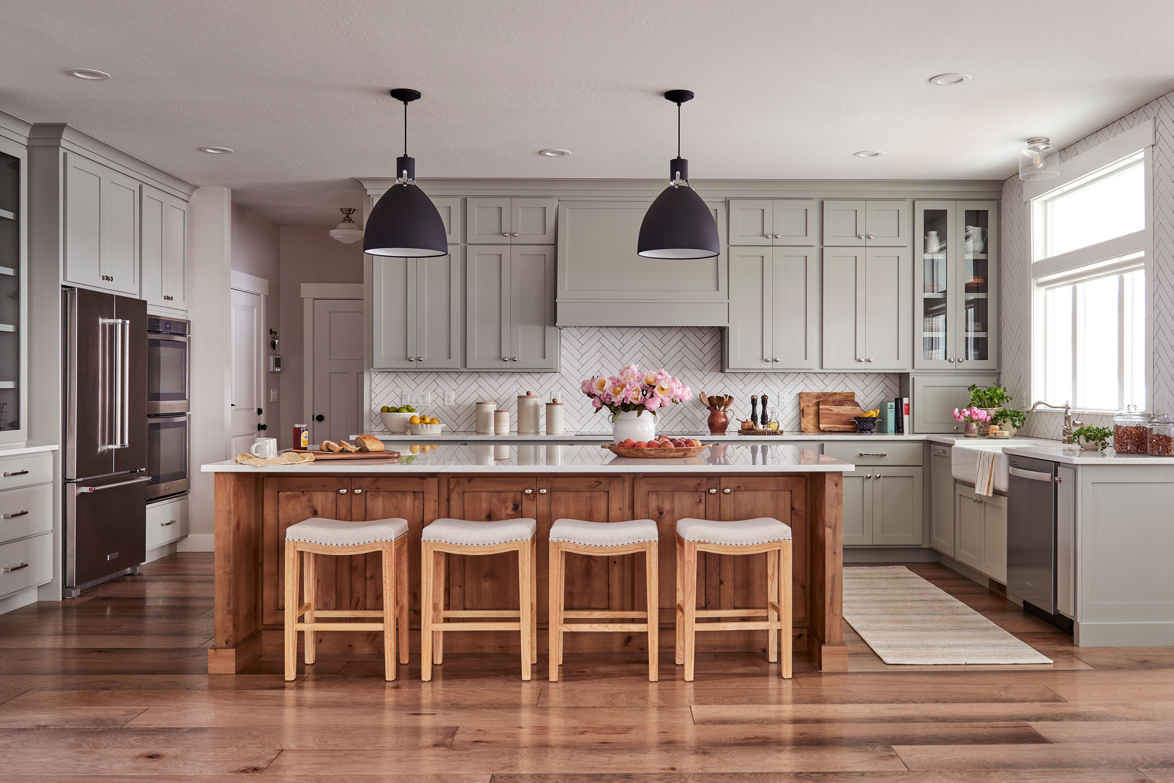
The renowned HGTV designer, Hilary Farr, a prominent figure known for her work on shows like "Love It or List It" and "Tough Love With Hilary Farr," advocates for the use of blue paint in kitchens due to its timeless appeal and calming effects. Farr's long-standing preference for blue in various home settings, including kitchens, predates her current shows, indicating a consistent belief in its enduring style. Blue, often associated with tranquility and peace, is a versatile color that can be adapted to many design aesthetics, making it a reliable choice for homeowners seeking a kitchen that remains fashionable over time. This color has been identified by Farr as a staple in her design philosophy, suggesting that its use extends beyond momentary trends and into classic design principles.
Farr's recommendation stems from her extensive experience in home renovation and design, where she has consistently observed the positive impact of blue on kitchen spaces. She emphasizes that certain shades of blue contribute to a serene and inviting atmosphere, which is highly desirable in a functional and communal area like the kitchen. While trends in interior design can be fleeting, Farr believes that blue possesses an intrinsic quality that prevents it from becoming outdated. This perspective challenges the notion that kitchen colors must constantly evolve with the latest fads, instead promoting a more sustainable and enduring approach to home aesthetics. Farr's design choices often reflect a blend of practicality and elegance, and her endorsement of blue in kitchens aligns with this philosophy.
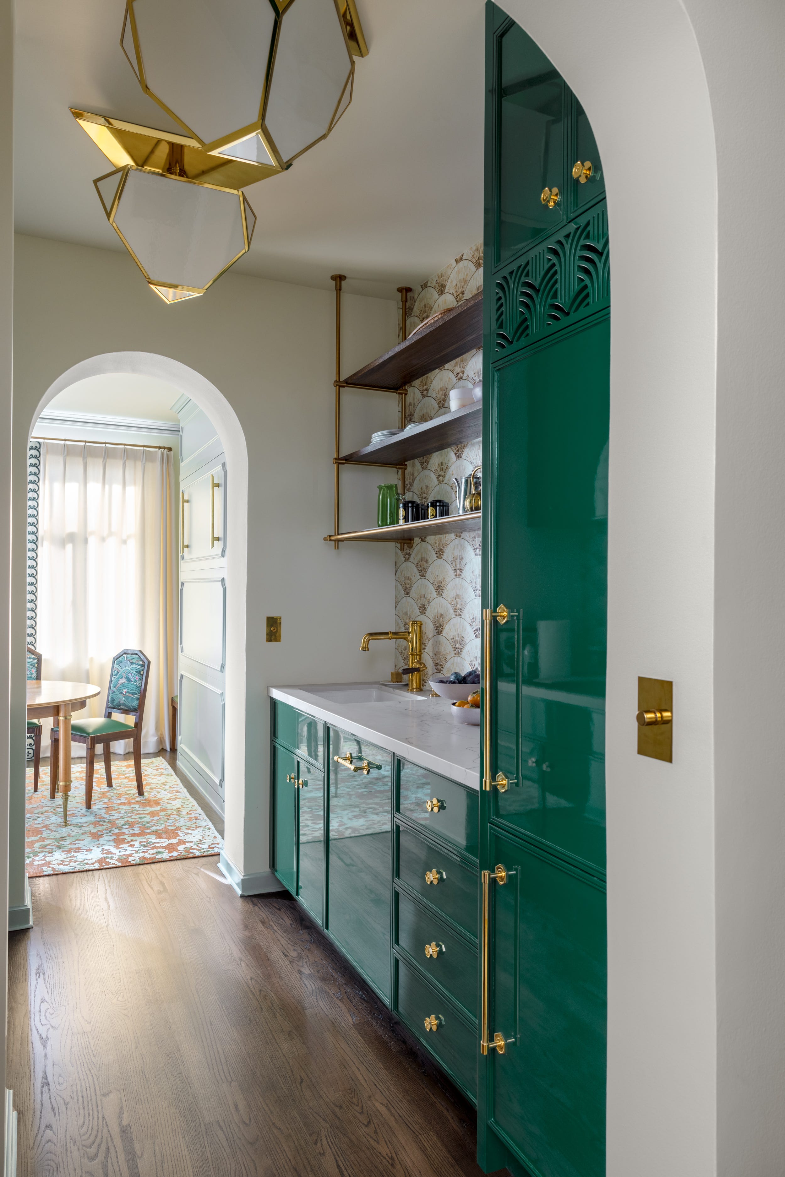
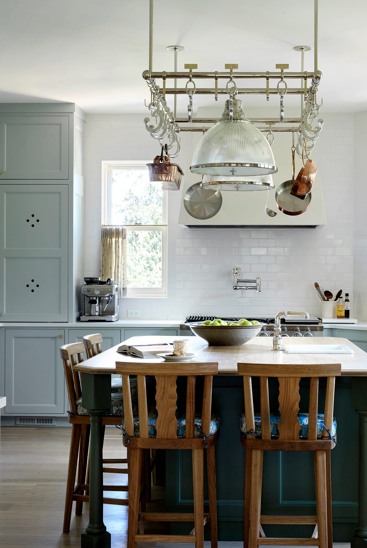
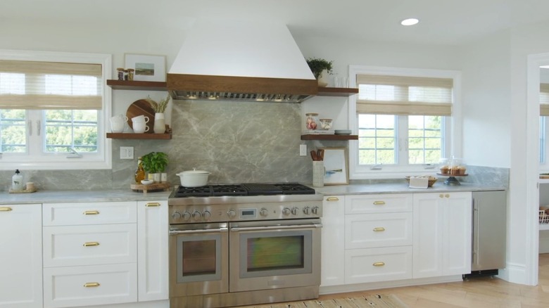
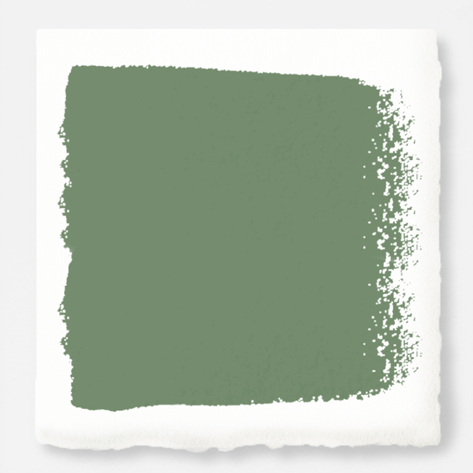
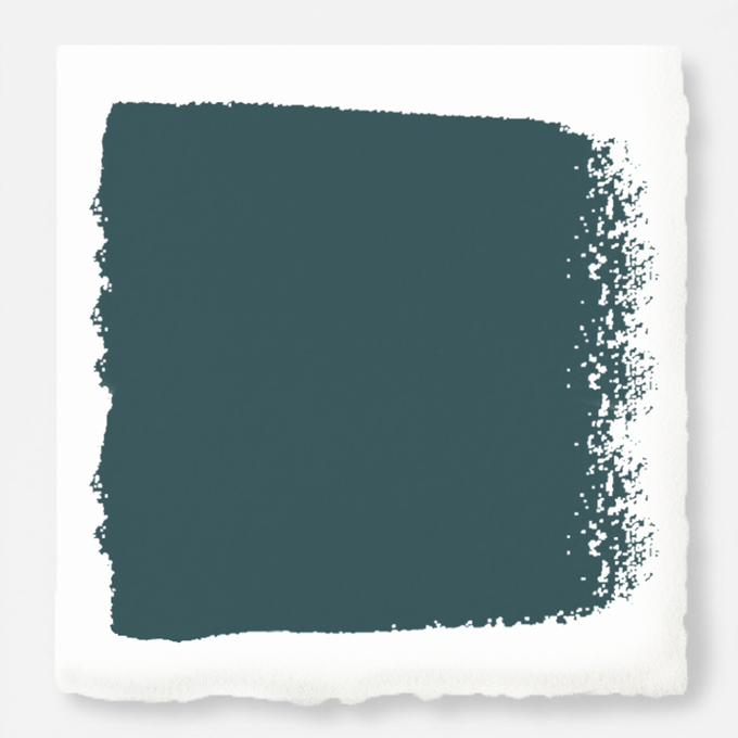

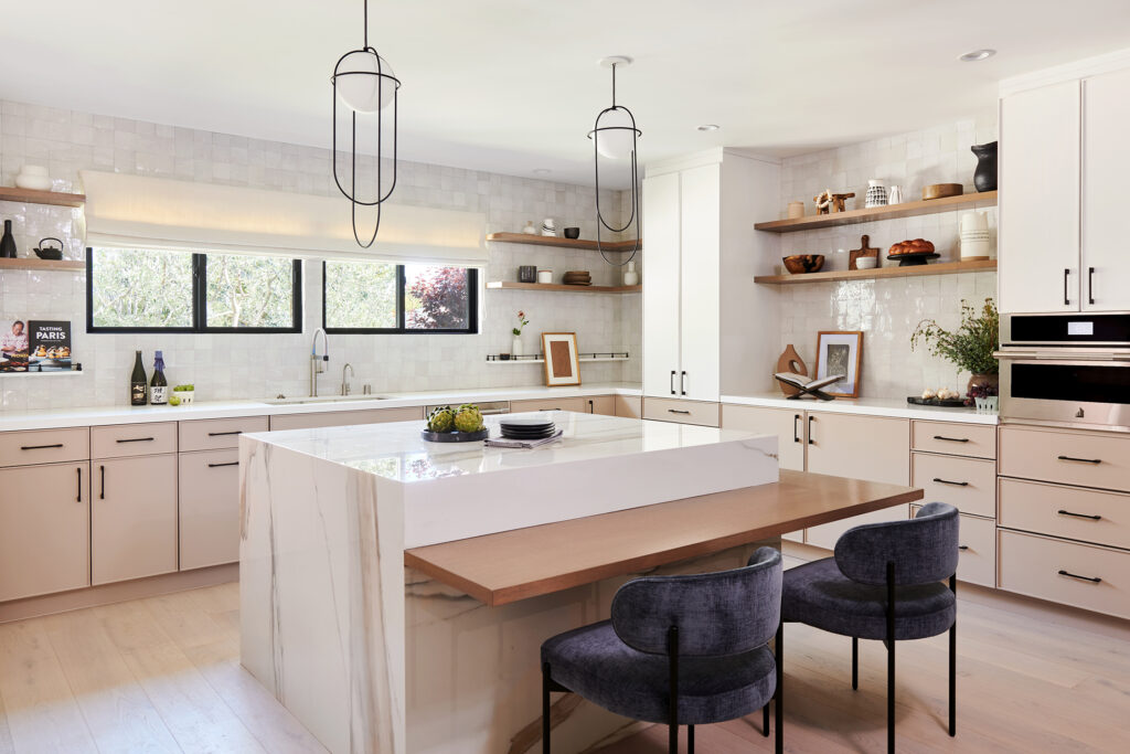
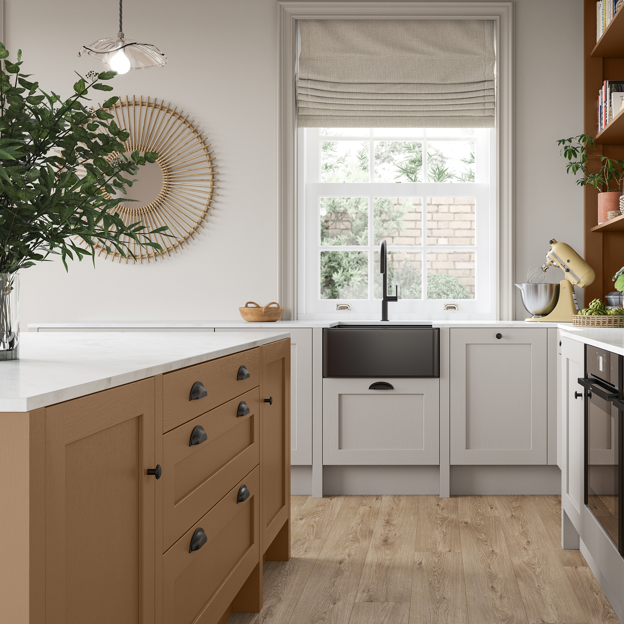
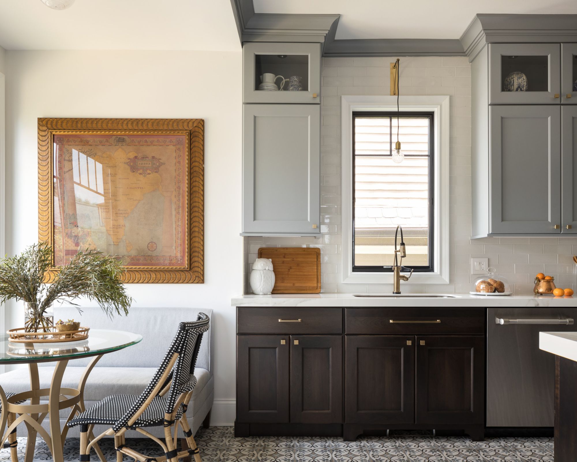
The popularity of blue in kitchen design is further supported by its ability to complement a wide range of materials and finishes. Whether paired with classic white cabinetry, warm wooden tones, or modern metallic accents, blue can create a cohesive and sophisticated look. Farr's approach to incorporating blue is not limited to a single shade; rather, she suggests exploring various hues to find the perfect match for a homeowner's personal taste and the overall architectural style of the house. From soft, muted blues that evoke a sense of calm to richer, deeper blues that add a touch of drama, the versatility of the color allows for diverse interpretations while maintaining its timeless essence. This adaptability makes blue a safe yet stylish choice for those looking to invest in a kitchen design that will withstand the test of time.
Moreover, the psychological impact of color plays a significant role in Farr's advocacy for blue. Blue is frequently linked to feelings of stability, harmony, and reliability, qualities that are beneficial in a high-traffic area like the kitchen. A calming kitchen environment can reduce stress and enhance the overall experience of cooking and dining. Farr's design decisions often prioritize creating spaces that are not only visually appealing but also conducive to well-being. By choosing a color that promotes a sense of peace, homeowners can cultivate a more enjoyable and functional kitchen space. This emphasis on both aesthetic and emotional benefits underscores why Farr considers blue to be an evergreen choice for kitchen interiors. Her expert opinion provides valuable guidance for individuals aiming to create a kitchen that is both beautiful and perennially chic, transcending temporary design trends.
#HilaryFarr #KitchenDesign #PaintColors #InteriorDesign #HomeRenovation #TimelessStyle #ColorPsychology #HilaryFarr #KitchenDesign #PaintColors #InteriorDesign #HomeRenovation #TimelessStyle #ColorPsychology
0 комментариев всего
 Комментариев пока нет
Вам также может понравиться
The Kitchen Colors Designers Call “Forever Favorites”

The 6 Paint Colors for Your Kitchen That Will Never Go out of Style
Kitchen colour experts are calling this the 'it' colour of 2024 that will go down as a future classic
Designers Agree: This Classic Living Room Paint Color Never Goes Out of Style


5 Timeless Paint Colors That Will NEVER Go Out of Style, According to Designers
These 20 Paint Colors Will Never Go Out of Style, According to Designers

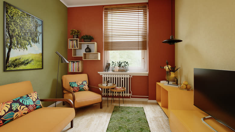
The Vintage Paint Color That Will Never Go Out Of Style
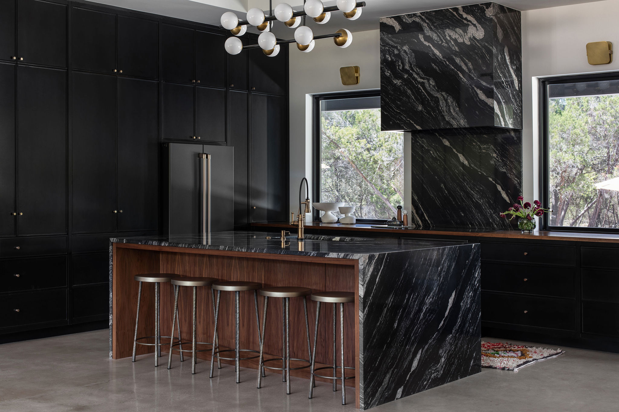
Kitchen Cabinet Colors That Will Never Go Out of Style — 10 Tones That Are a Timeless Choice

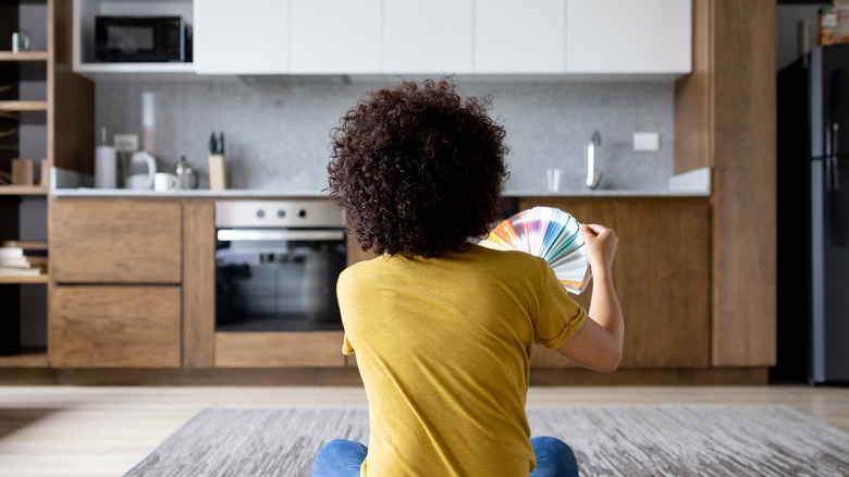
Timeless Paint Colors HGTV Stars Love Using In Kitchens
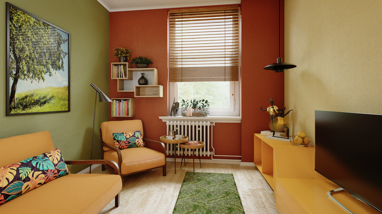
The Vintage Paint Color That Will Never Go Out Of Style


The most timeless paint colors according to designers

Lick’s 2026 Colour Edit Just Dropped – 4 Colour Trends You’ll Want In Your Home
This Kitchen Paint Color Never Goes Out Of Style, According To Hilary Farr
Which kitchen color is timeless? Our experts give us their take

12 Trending Paint Colors for 2024, According to Design Experts
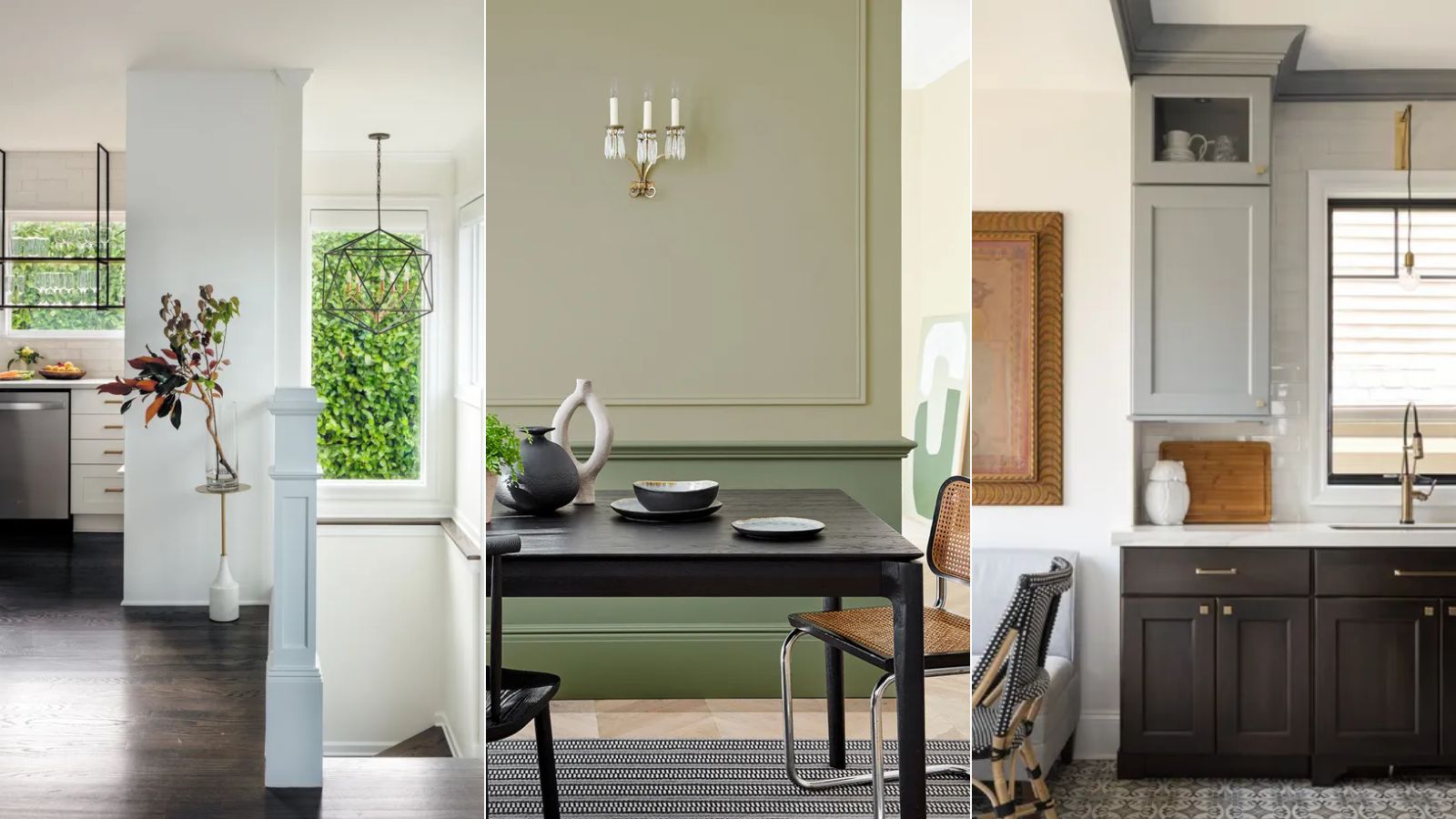
5 enduring colors designers always return to when they have trend fatigue
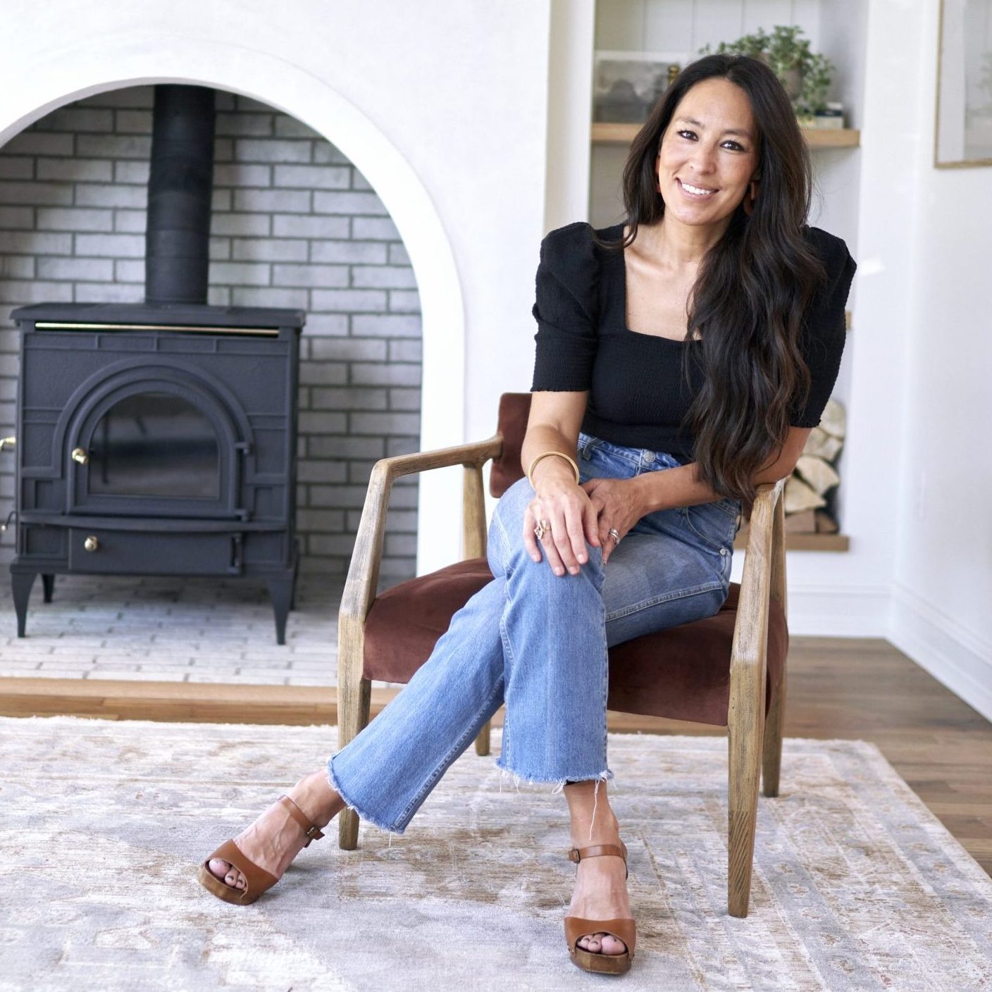
3 Paint Colors That Will Never Go Out of Style, According to Joanna Gaines

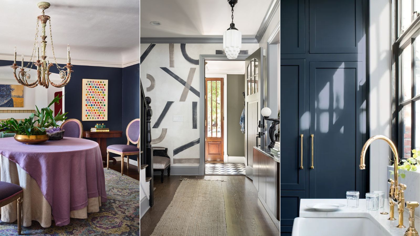
Designers who never follow trends swear by this color family to make their homes look timeless
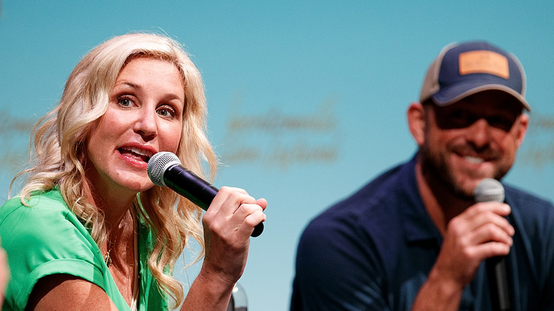
Timeless Paint Colors The Stars Of Fixer To Fabulous Love Seeing In Homes
3 Kitchen Paint Colors Experts Promise Will Never Go Out of Style