1/8
7 of the most versatile and easy to use paint colors according to designers
Color is a powerful tool in interior design, capable of transforming a space into a harmonious and stylish haven. While color trends fluctuate, certain shades remain timeless due to their inherent versatility and ability to elevate any room. This exploration delves into seven such paint colors, endorsed by design experts for their enduring appeal and ease of use.
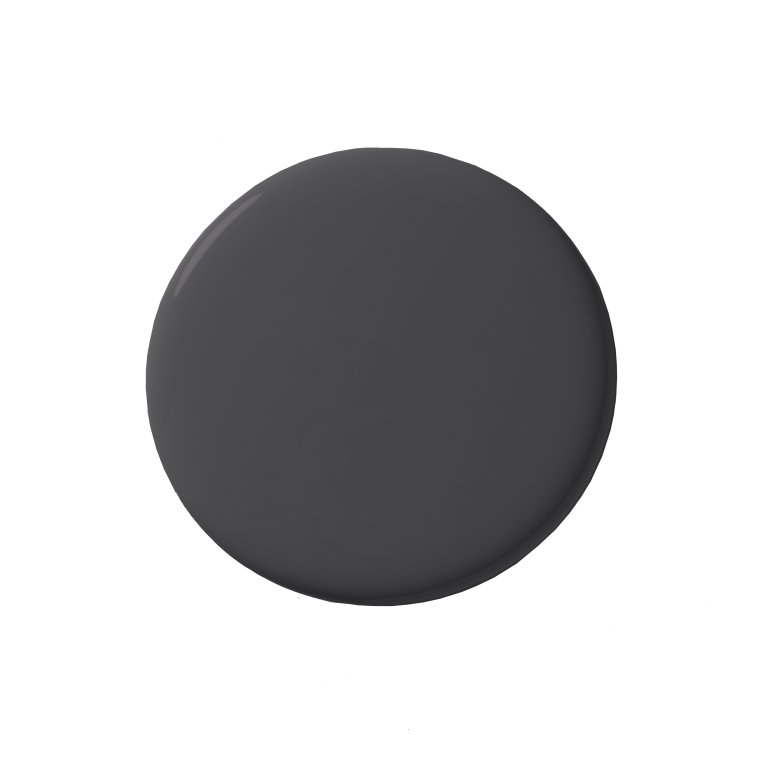
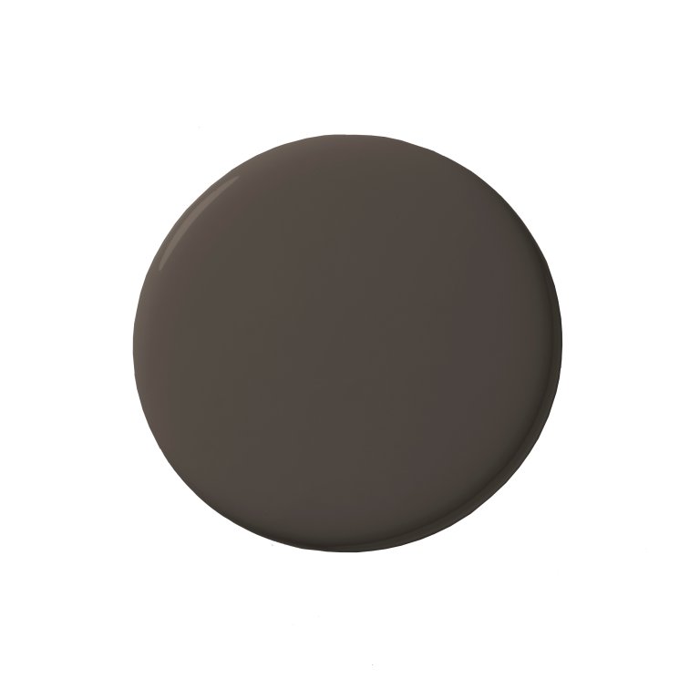
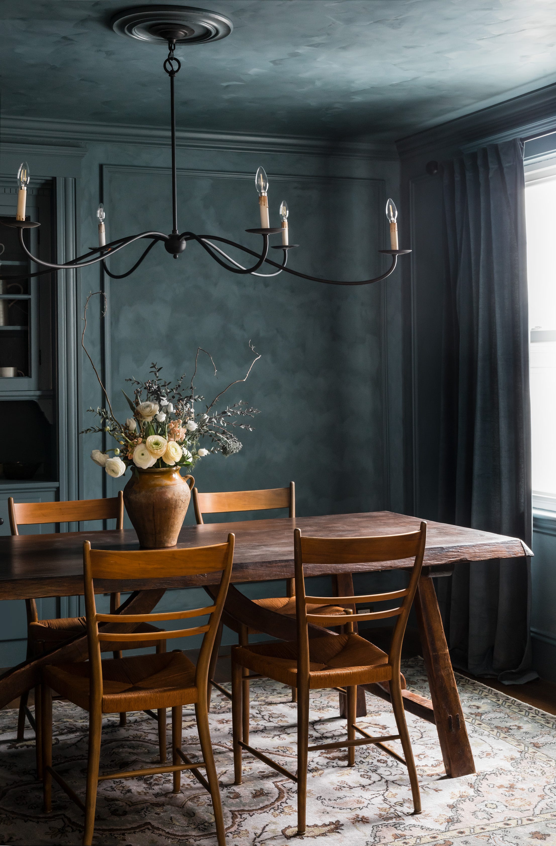
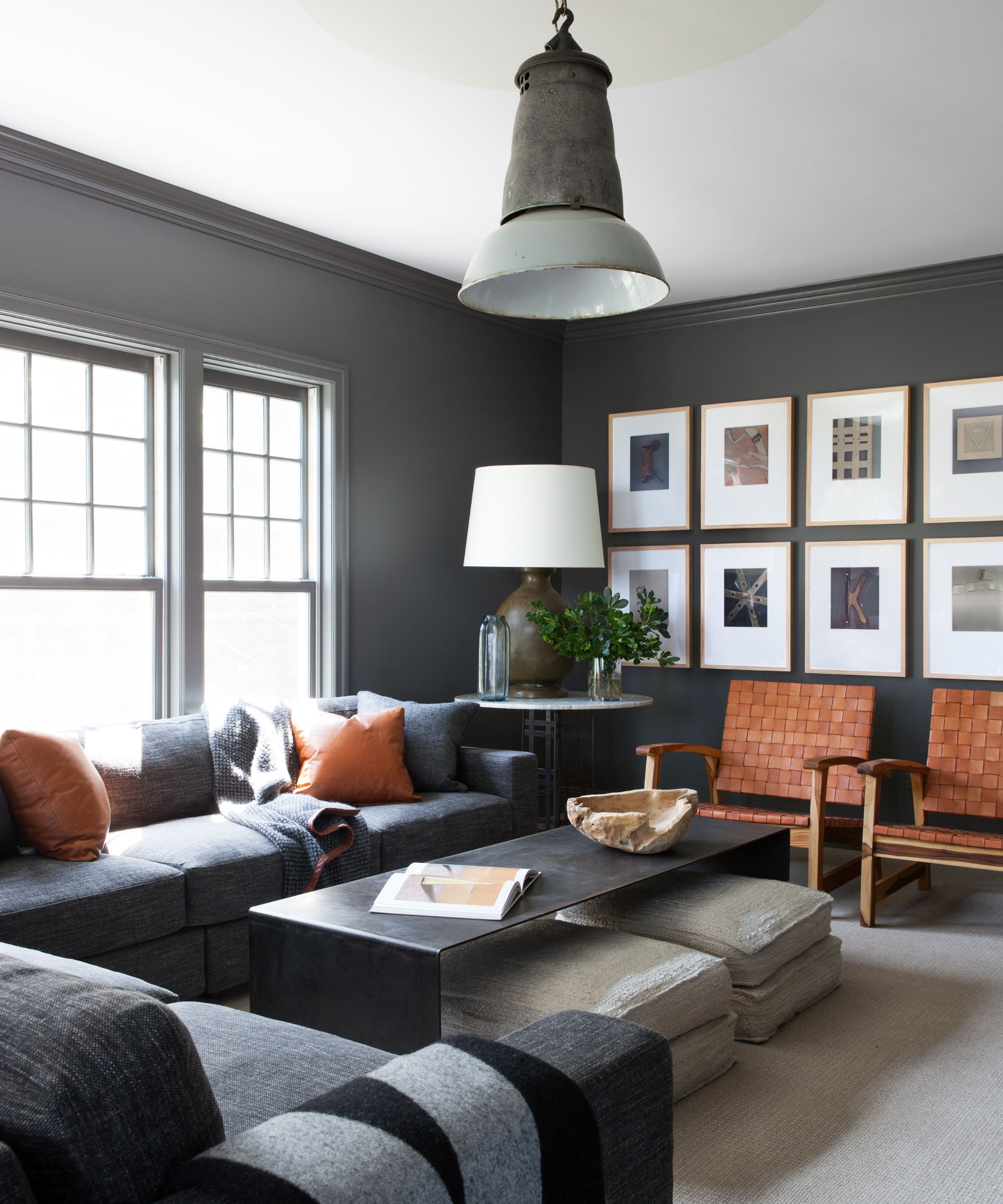
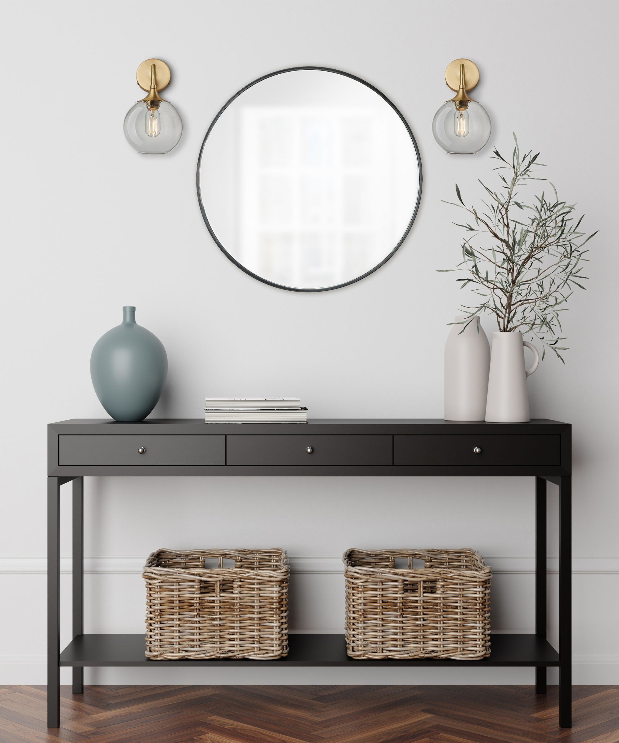
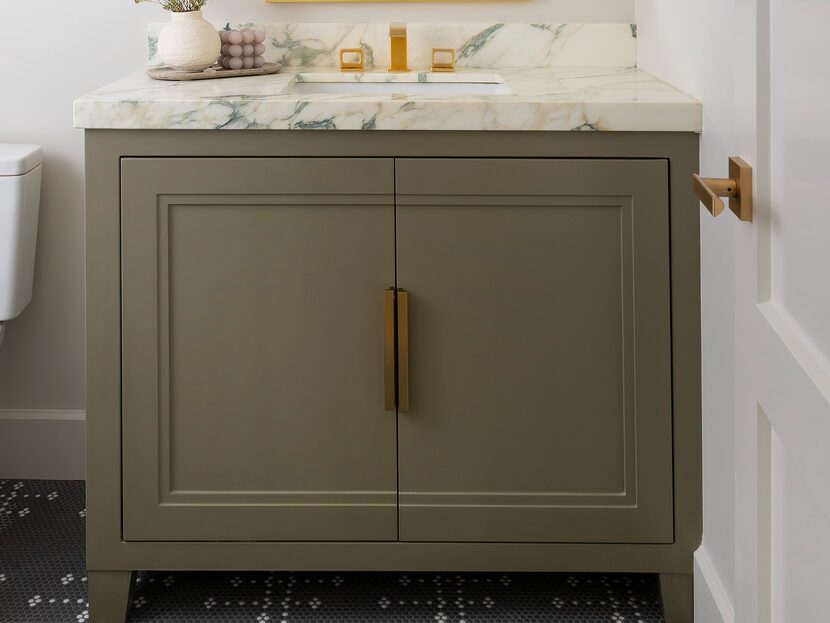
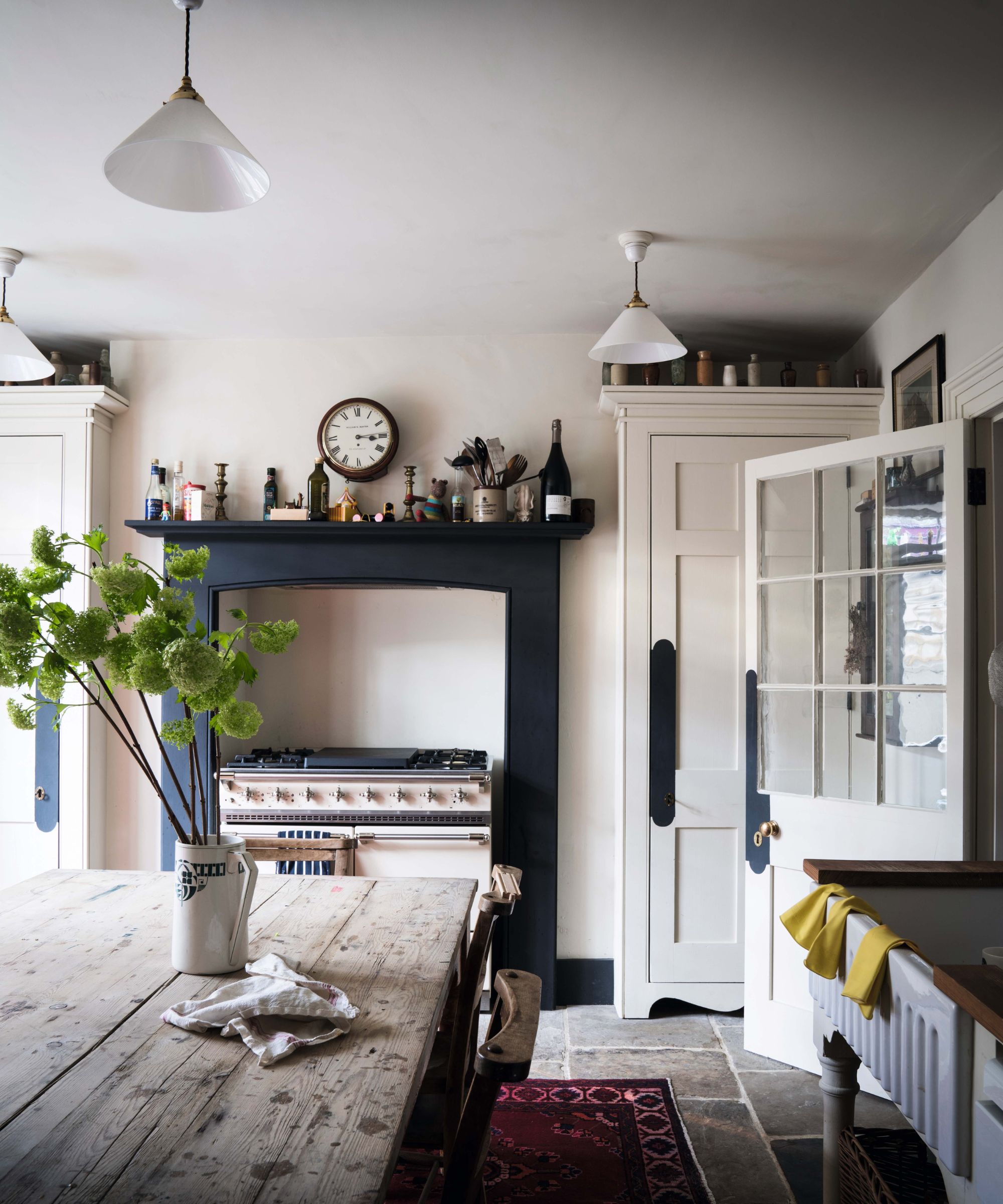
Dark gray, often perceived as a dramatic choice, has become a classic statement color. Its deep tone contrasts beautifully with white and complements blonde wood flooring, introducing a gentle warmth. Farrow & Ball's 'Down Pipe' is highlighted as a particularly versatile dark gray, pairing well with muted pinks, ochre yellows, and neutrals with green undertones. It seamlessly integrates into both modern and traditional settings, offering a sophisticated and timeless aesthetic, especially when combined with 'Bone' on woodwork and 'Slipper Satin' on ceilings, and accented with warm elements like tobacco and caramel shades or burnished brass sconces.
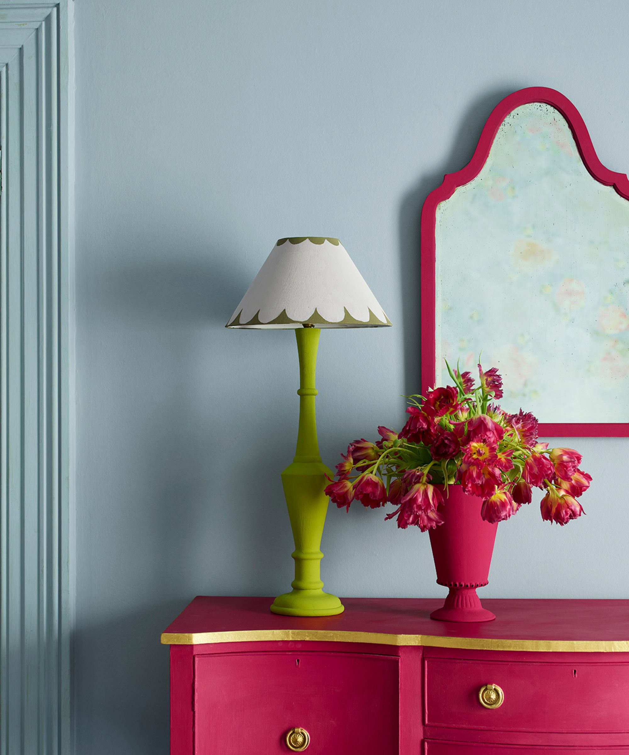
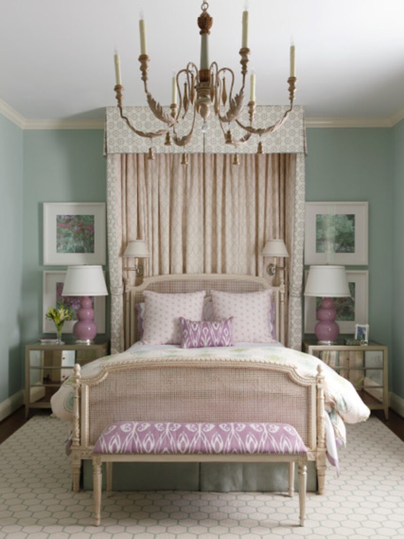
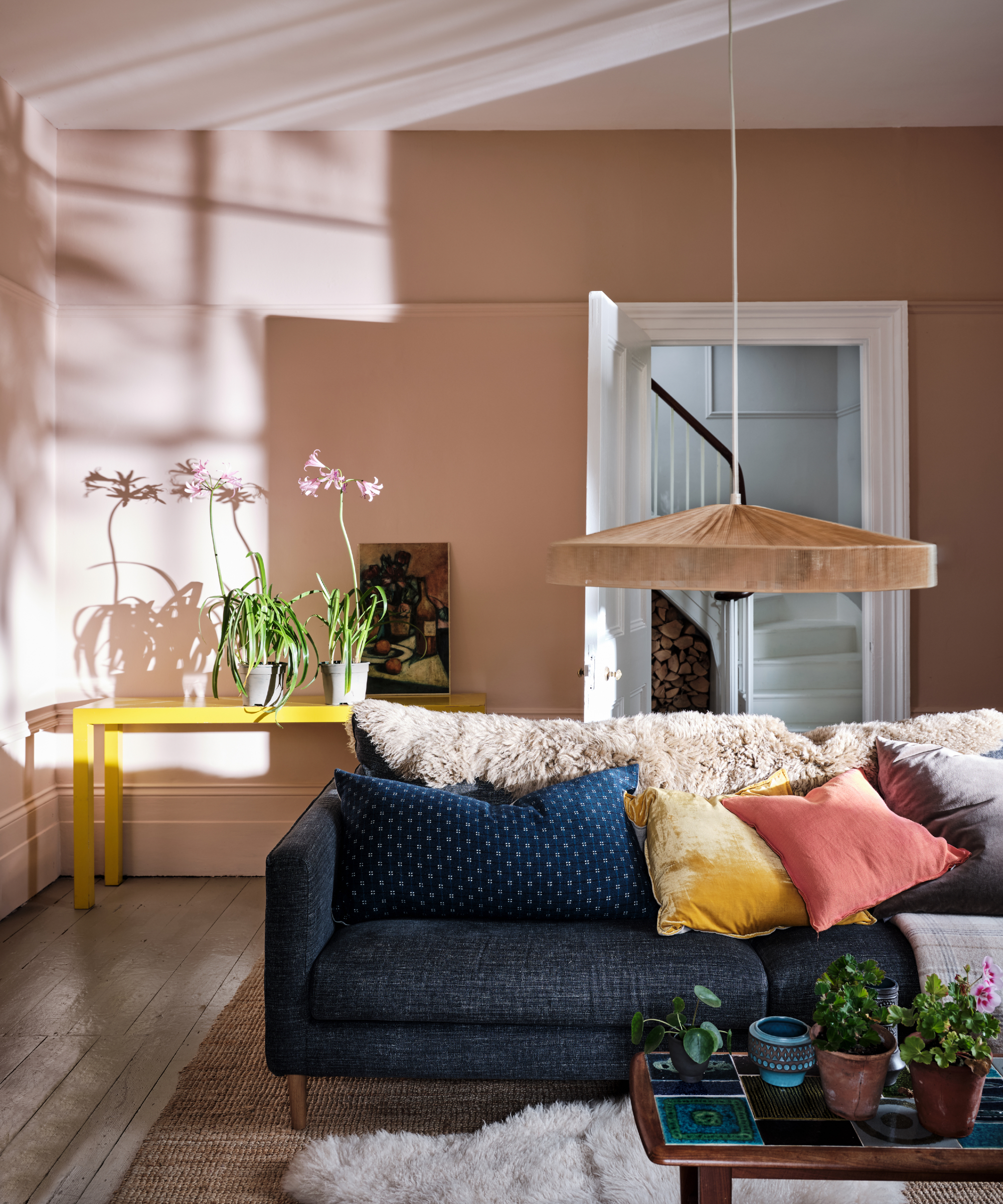
Lavender, an often-underused shade, offers surprising versatility. It brightens dark areas and harmonizes effectively with various other colors. Mylands' CEO, Dominic Myland, notes its calming and relaxing qualities, making it ideal for creating serene living spaces. Lavender's pastel nature allows it to function as a contemporary neutral, expanding the traditional definition of neutrals beyond creams and taupes to include subtle, barely-there color tones.
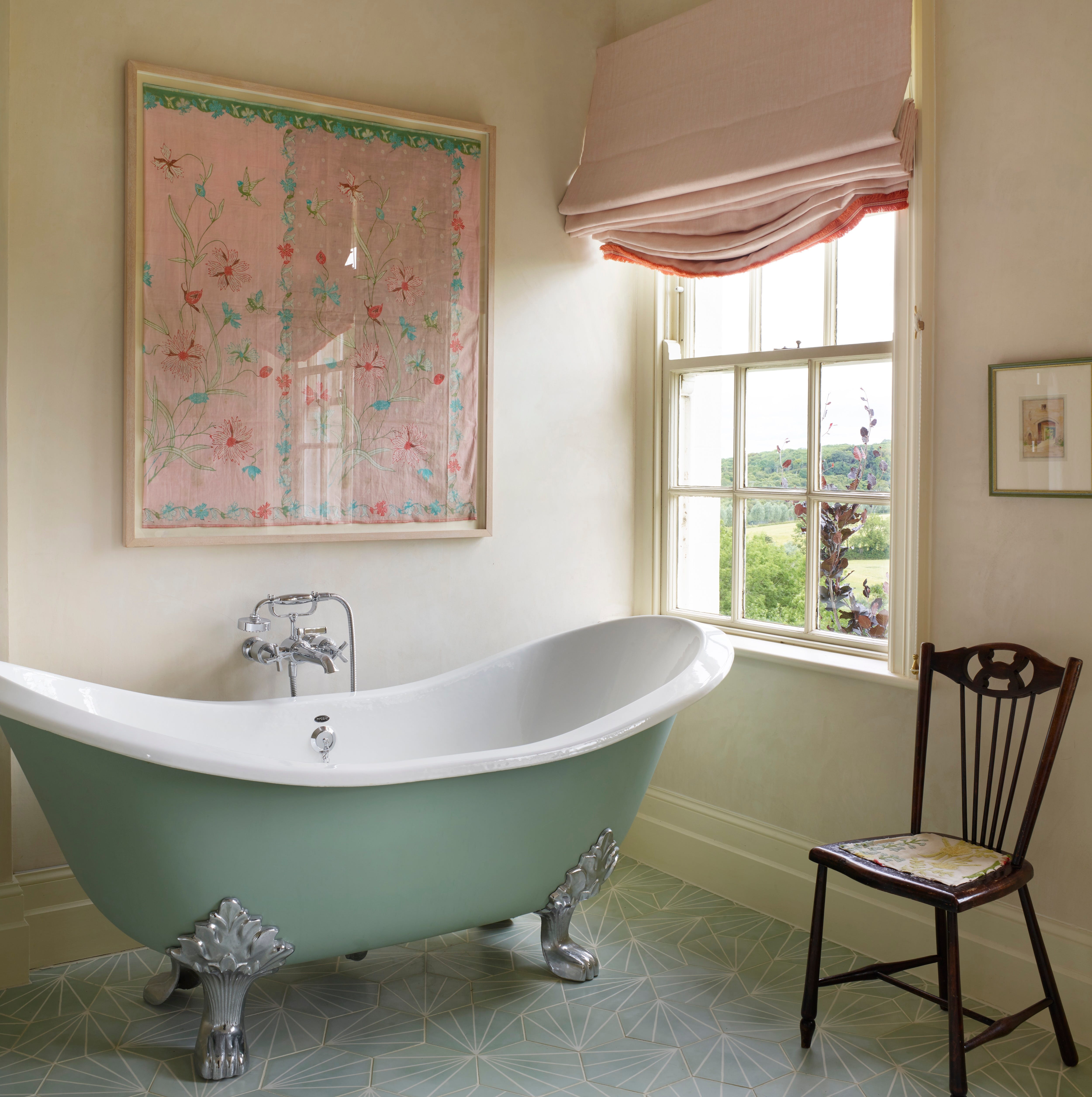
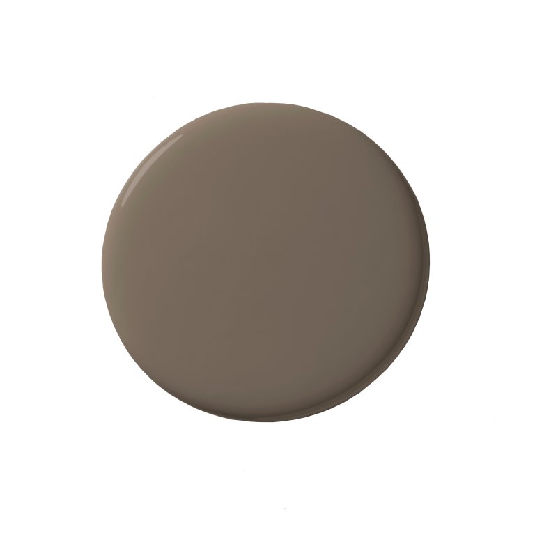
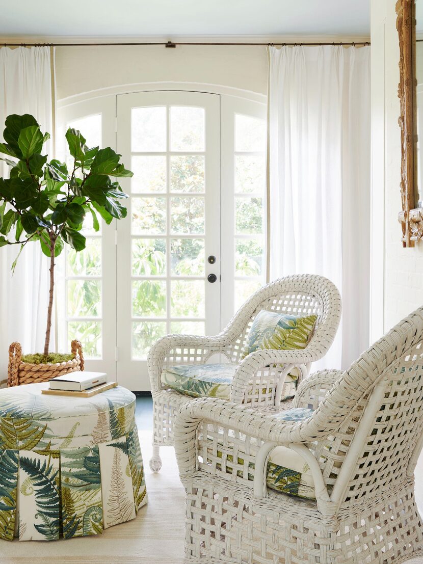
Stone represents a reliably warming neutral, capable of instantly making a cool, north-facing room feel cozier and adding a grounding element. Annie Sloan CBE emphasizes that neutrals, by their nature, are easy to work with. Her 'Canvas' shade, a warm neutral beige-white, provides an excellent backdrop for additional color accents, as demonstrated in a charming bathroom setting where it pairs with an olive-painted tub.
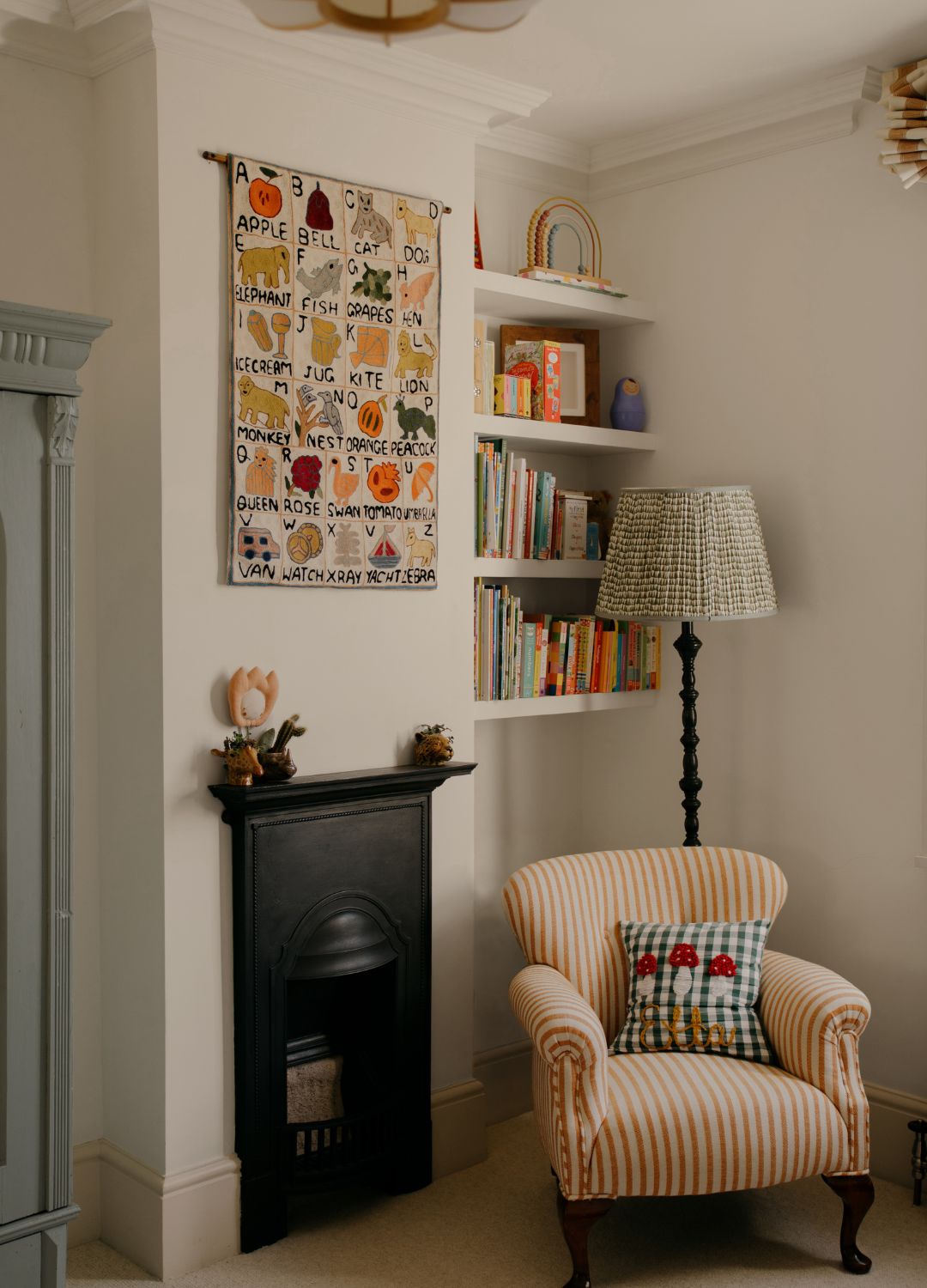
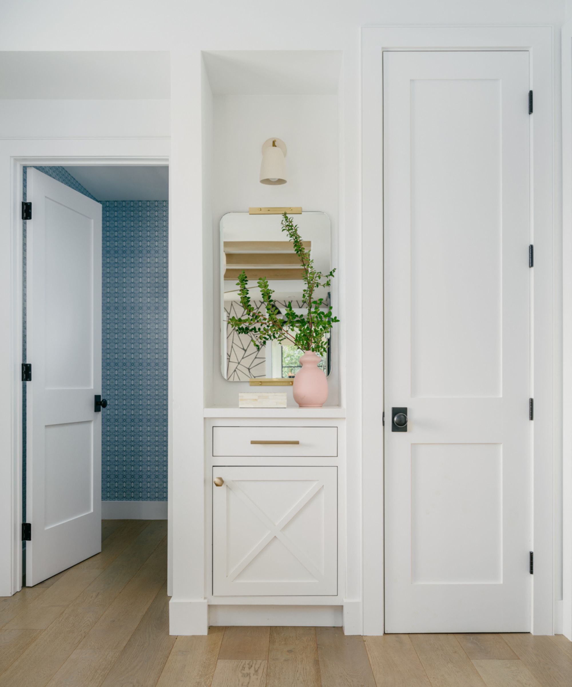
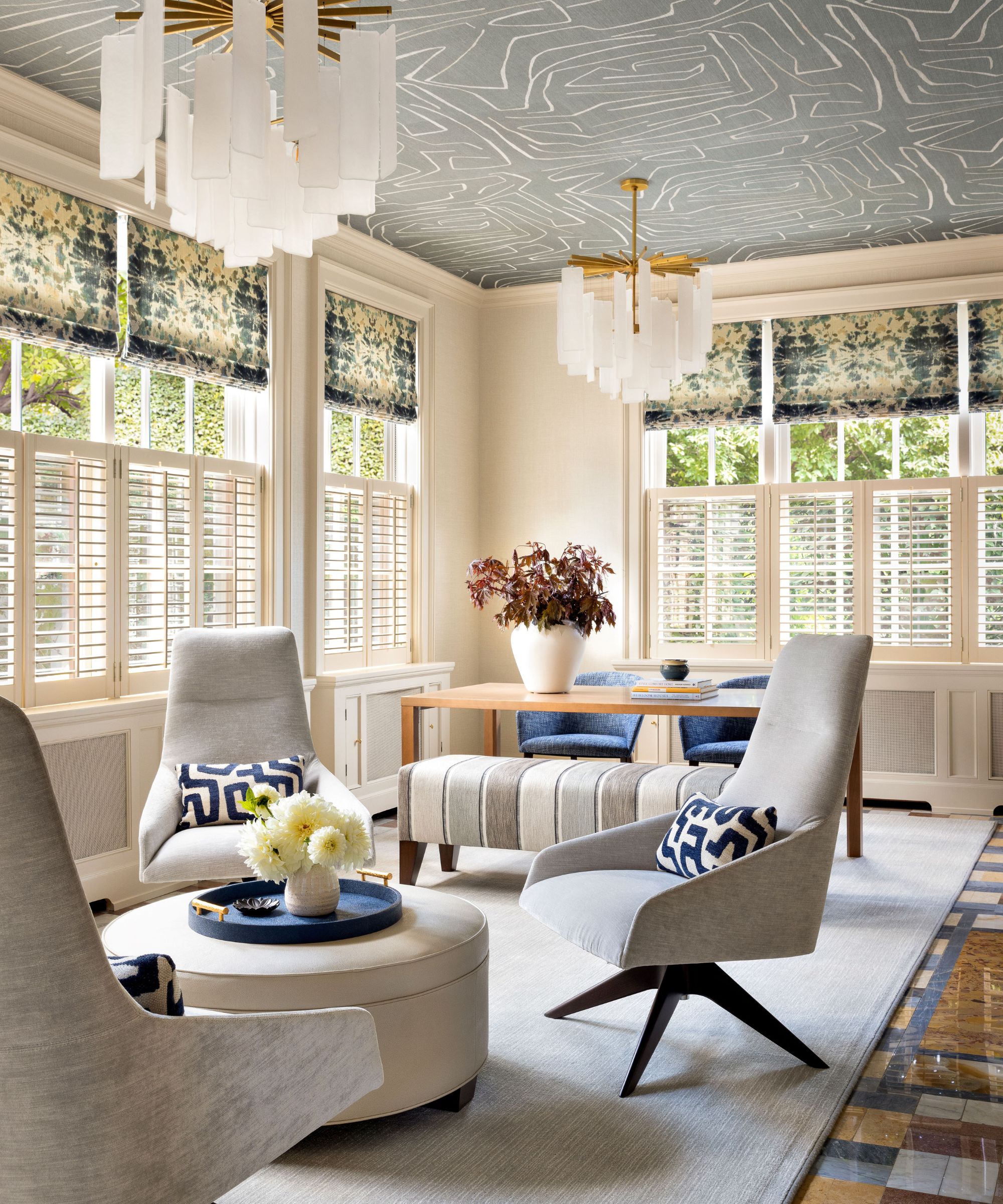
When stark white feels too clinical, off-white, cream, or a subtle gray offers a softer alternative. Jenny Weiss of Hill House Interiors advises against bright white for ceilings and architraves to maintain a harmonious palette. She recommends Little Greene's 'Slaked Lime' collection for its range of neutral tones, suggesting a blend of its lightest shade for ceilings, the second tone for architraves and skirting, and richer tones for walls to achieve a seamless and sophisticated color scheme.
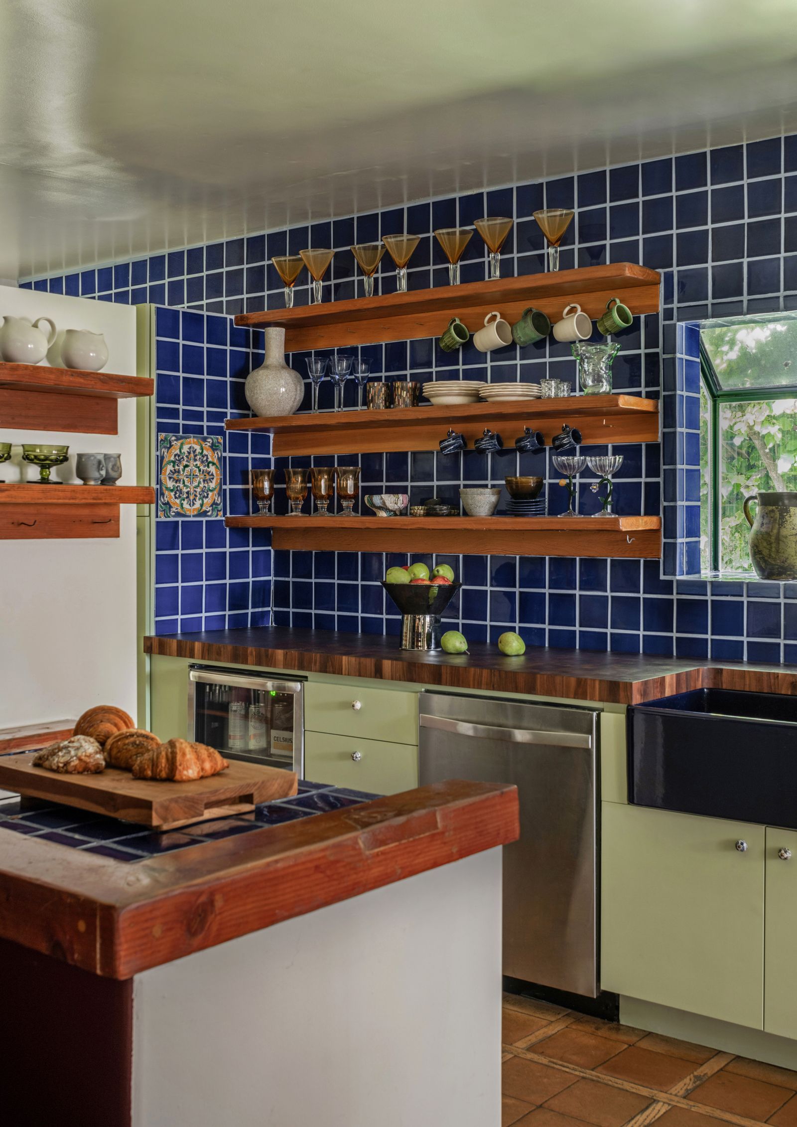
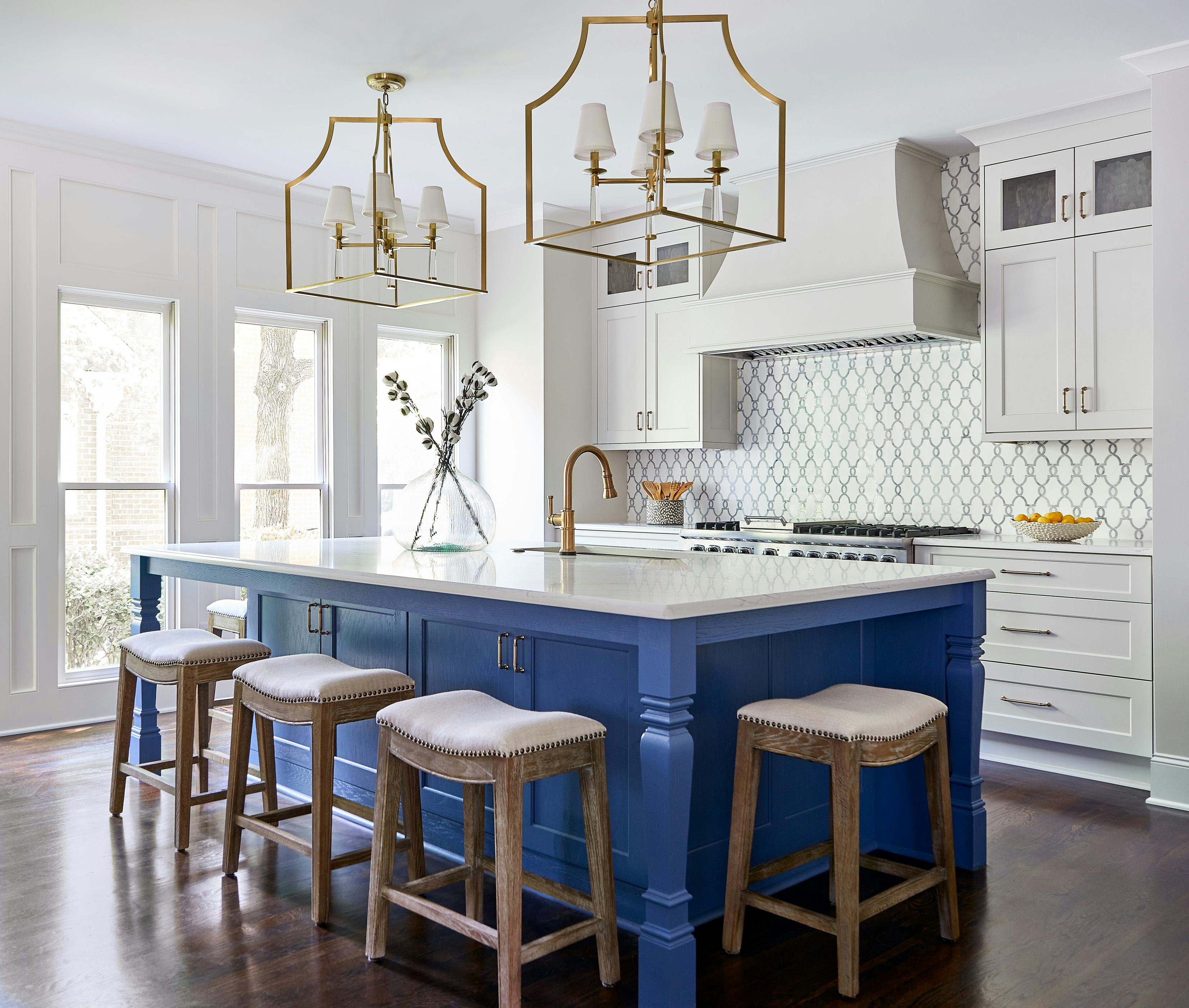
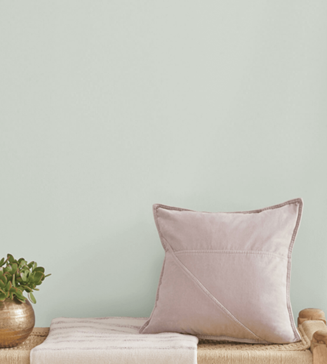
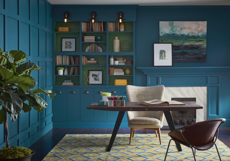
Sky blue brings an uplifting and cheerful ambiance, particularly effective in kitchens where it reflects light beautifully. Christina Bull of Sims Hilditch advocates for a soft neutral base palette, with sky blue being a strong contender due to its ability to create an 'all-round' option. Inspired by natural surroundings, sky blue can be paired with greens, blush pinks, and burnt oranges to evoke a sense of the British countryside, with Benjamin Moore's 'Serenata AF-535' offering a comparable elegant shade.
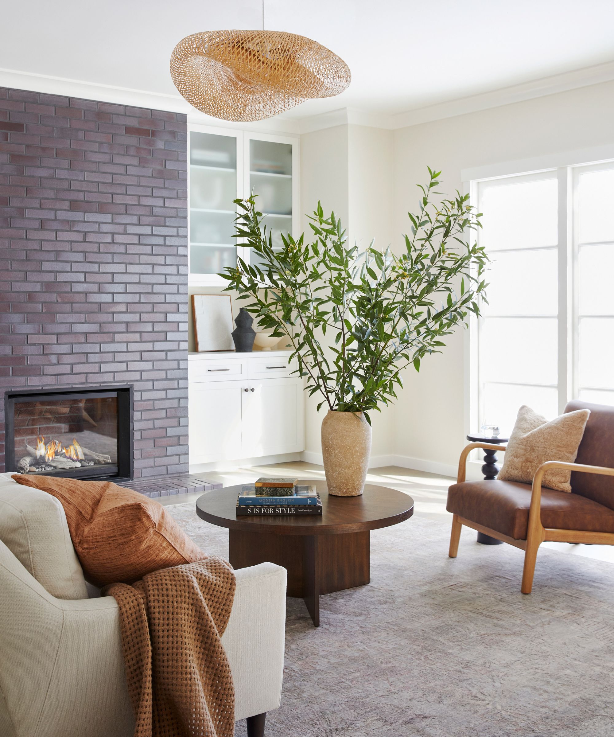
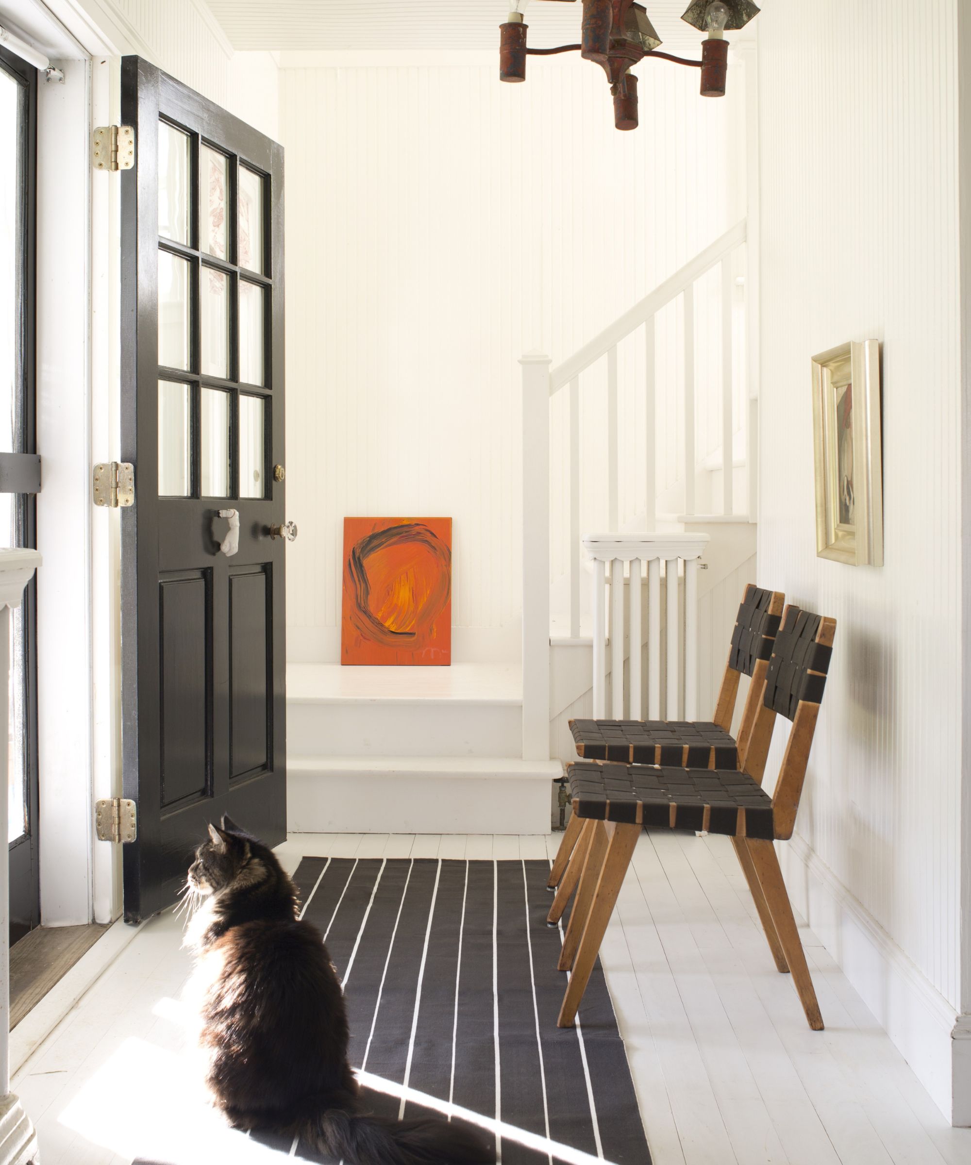
White maintains its status as a versatile and easy-to-use paint color due to its numerous benefits. It allows other colors and design elements to shine, acting as a perfect backdrop. Elle Cantrell of Elle Du Monde suggests using the same white for both walls and trim to let paneling recede, focusing attention on furnishings and textures. Her choice, Sherwin Williams' 'Zurich White SW 7626', is a bright white with a subtle violet undertone.
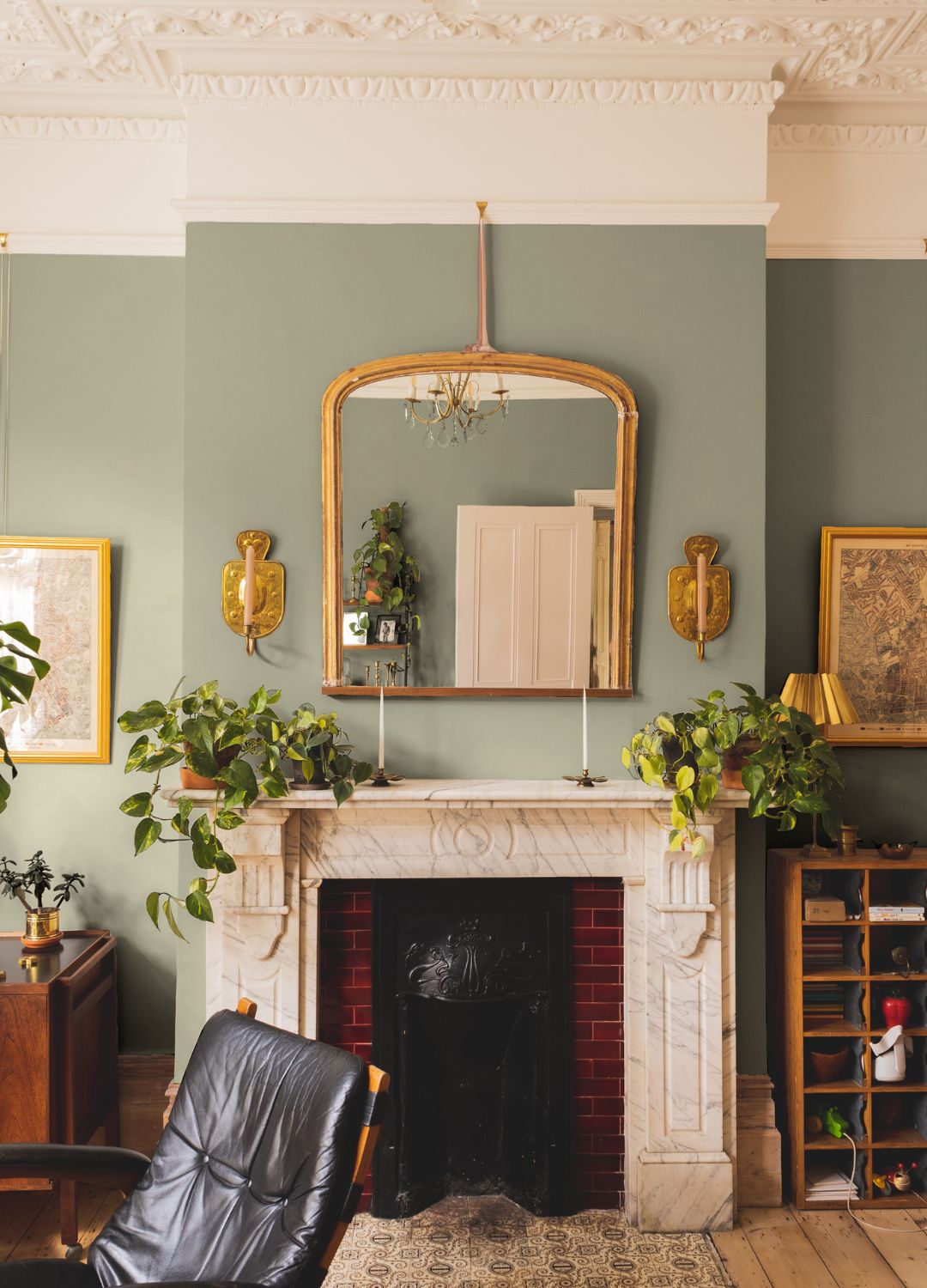
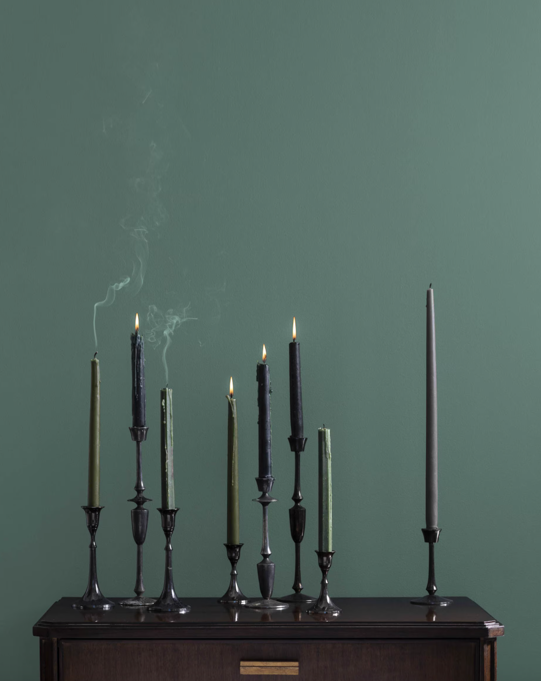
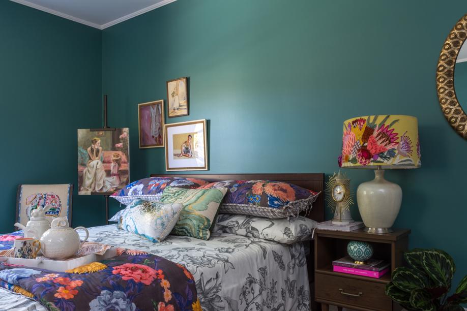
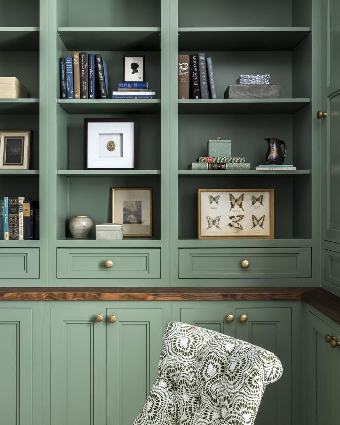
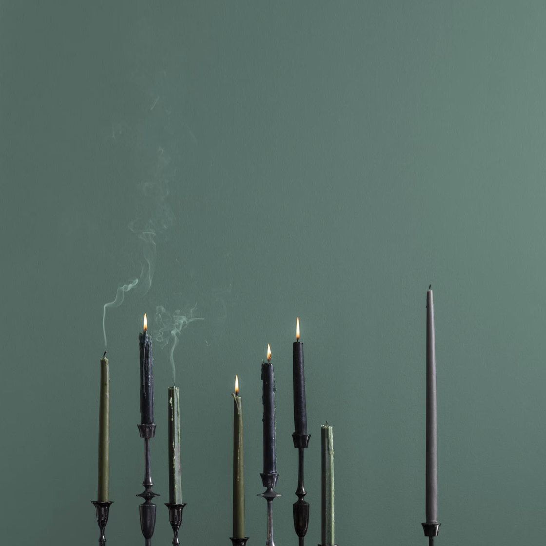
Green, a naturally easy-going color, is universally adaptable across various rooms, from hallways to bedrooms. Ruth Mottershead of Little Greene highlights green's balance of warm and cool tones, making it suitable for different lighting conditions. It pairs effectively with earthy tones, creams, stones, and even richer colors like browns and blacks. The choice of green shade depends on the desired atmosphere, with vivid greens for energetic spaces and earthy shades like 'Sage Green' for serene environments.
#PaintColors #InteriorDesign #ColorVersatility #HomeDecoration #DesignerTips #NeutralPalettes #ColorTrends #PaintColors #InteriorDesign #ColorVersatility #HomeDecoration #DesignerTips #NeutralPalettes #ColorTrends
Há 0 comentários no total
 Ainda não há comentários
Você também pode gostar

The most timeless paint colors according to designers
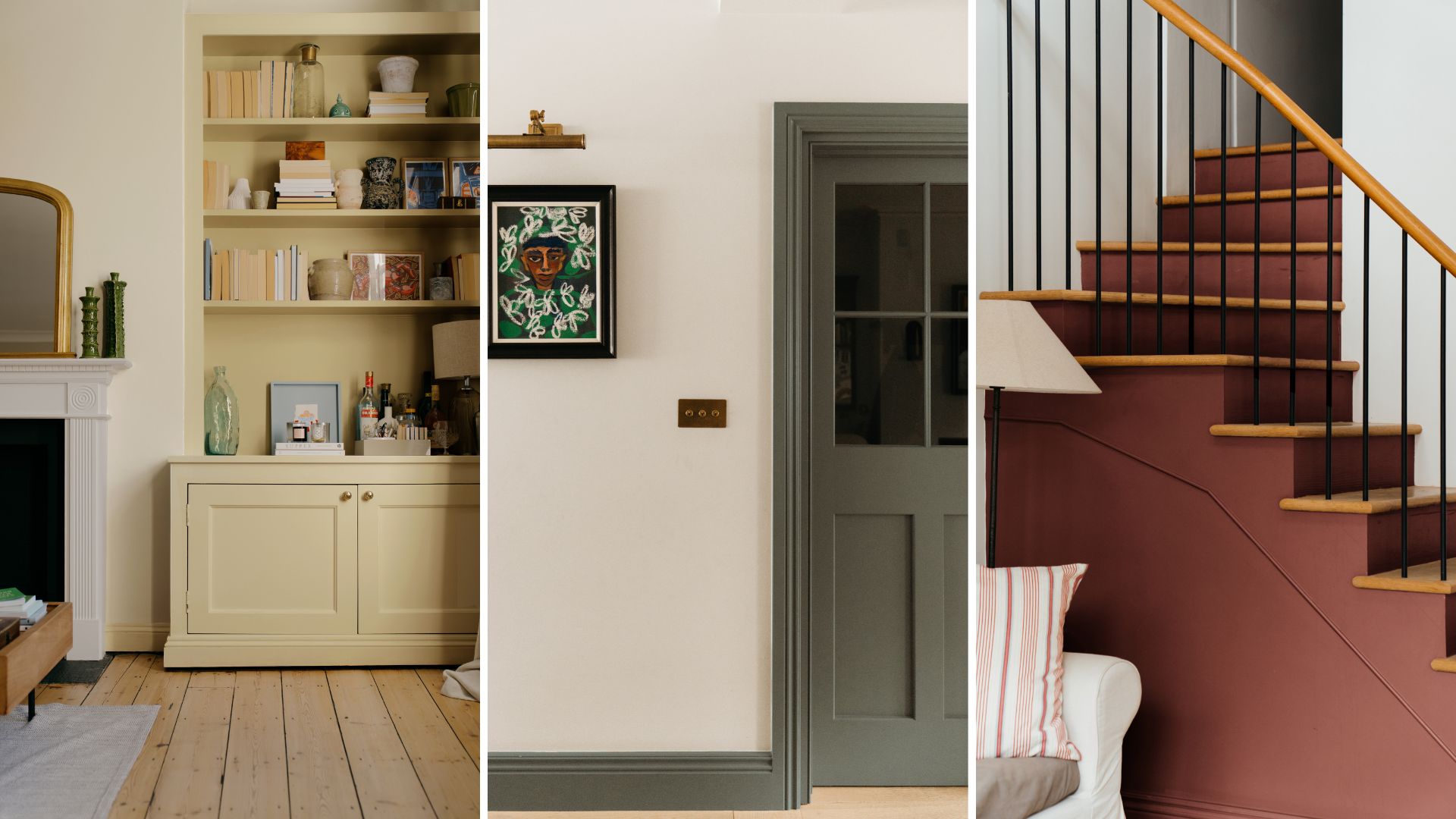
Make choosing paint easy with new 'natural light' colours

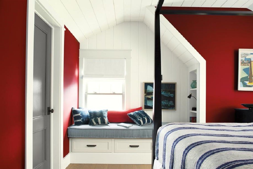
Tips for adding the hottest paint colors to your decor

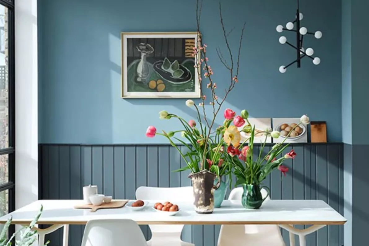
7 Bold Paint Colors Interior Designers Are Longing to Use on Their Next Projects

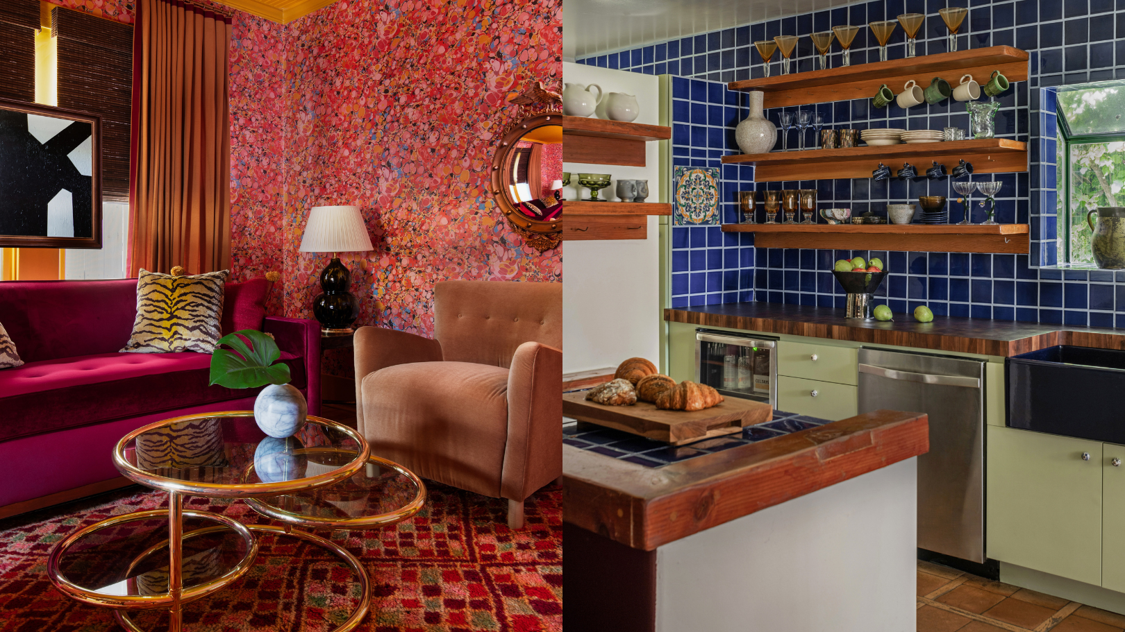
9 'good weird' paint colours approved by designers


7 Most Underrated Paint Colours, According To Colour Experts

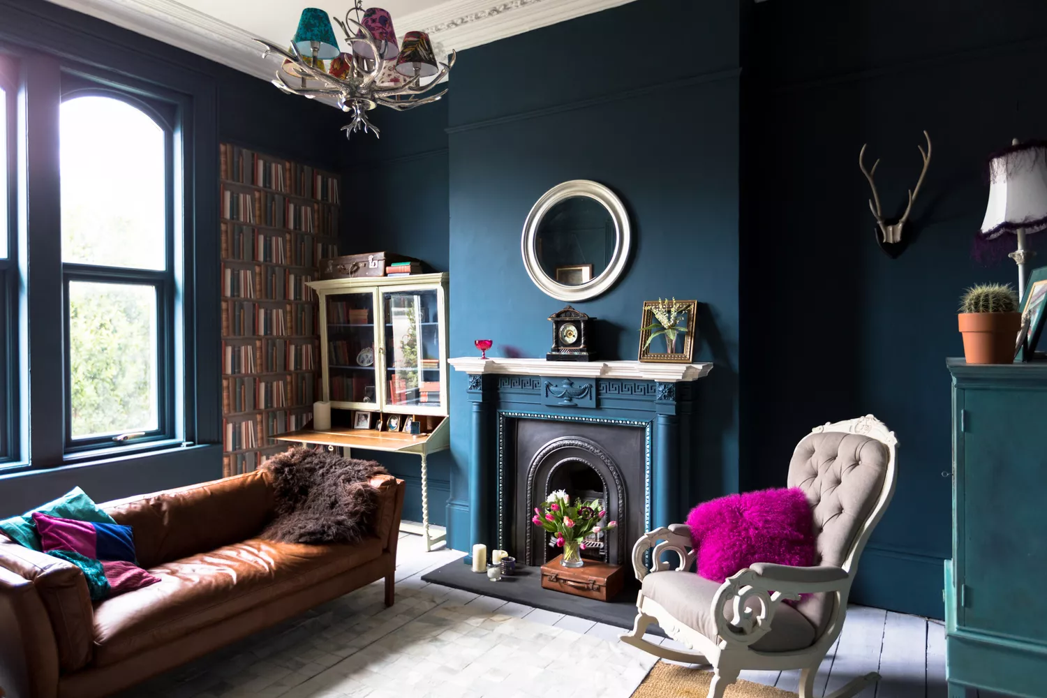
7 Paint Colors Designers Totally Regret Using (and What They Wish They’d Used Instead)


5 Timeless Paint Colors That Will NEVER Go Out of Style, According to Designers

These Unusual Paint Colors May Not Be An Obvious Choice, But Designers Can’t Get Enough
Designers Reveal 7 Exterior Paint Colors They Always Use for Their Projects

Interior designers share their favorite Benjamin Moore paint colors – and there's something for every style
19 go-to paint colors that Dallas designers love
The 5 Most Overused Paint Colors and What to Try Instead, According to Designers
The Best Exterior Paint Colors Designers Have Ever Used

The best paint colors for small entryways — 7 shades design experts love

What makes a paint color flattering? Experts share their go-to shades for a universally complementary scheme

An A-List Designer’s Secrets To Picking Perfect Paint Colors
The 10 Best Blue-Green Paint Colors Designers Can't Stop Using
10 Paint Color Apps Every DIYer Should Know About

5 Underrated Paint Colors Designers Always Use in Their Projects (and You Should Too)