5 Paint Colors You Should Never Use In A Bedroom, According to Designers
Choosing the right paint color for a bedroom is crucial, as it serves as a personal sanctuary. While individual tastes vary, some colors are generally considered unsuitable for promoting a restful environment. This guide, drawing on insights from interior designers, highlights five specific paint colors to avoid in bedrooms and suggests alternative applications for them within the home.
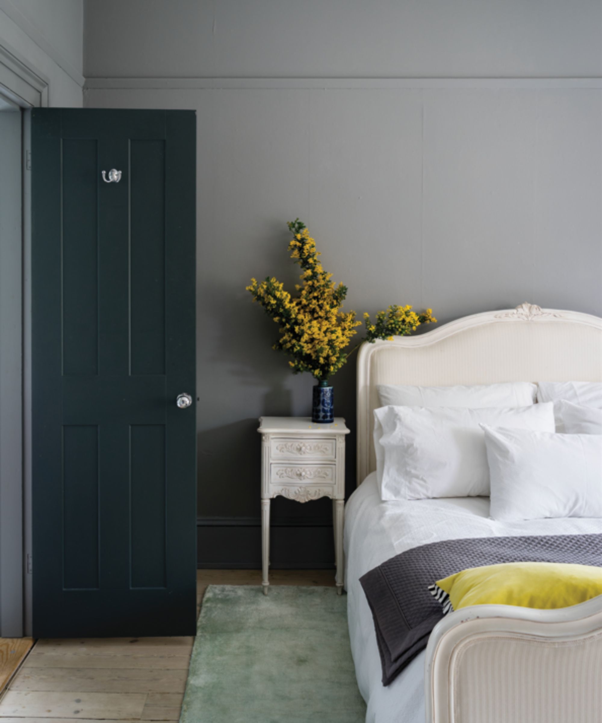
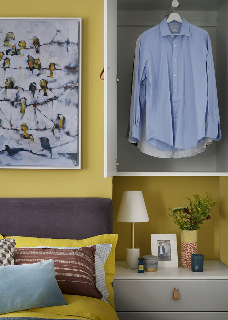
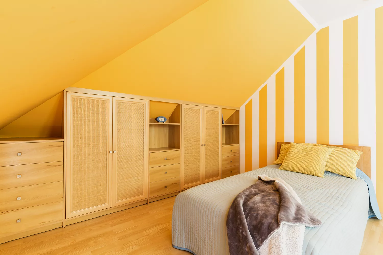
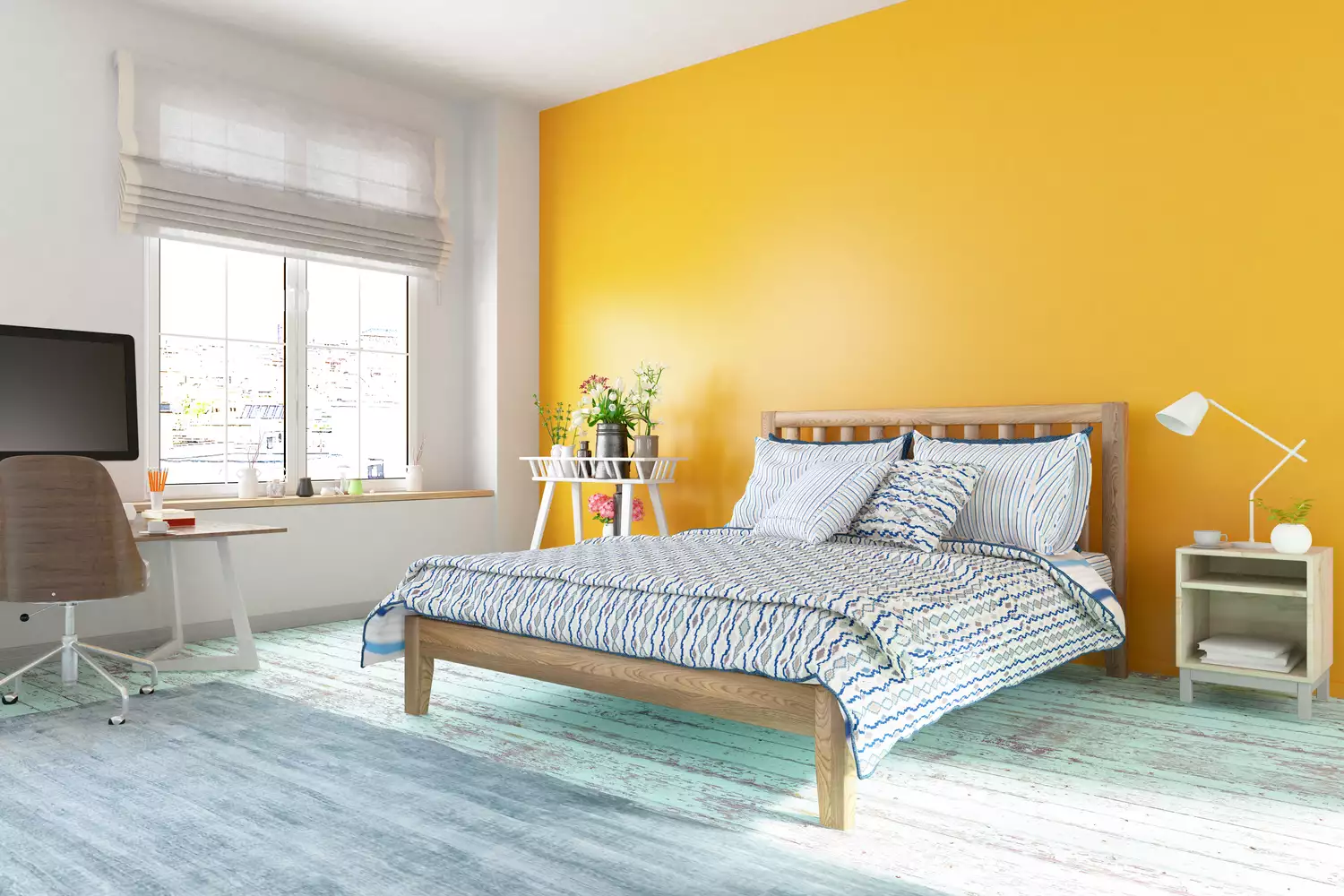
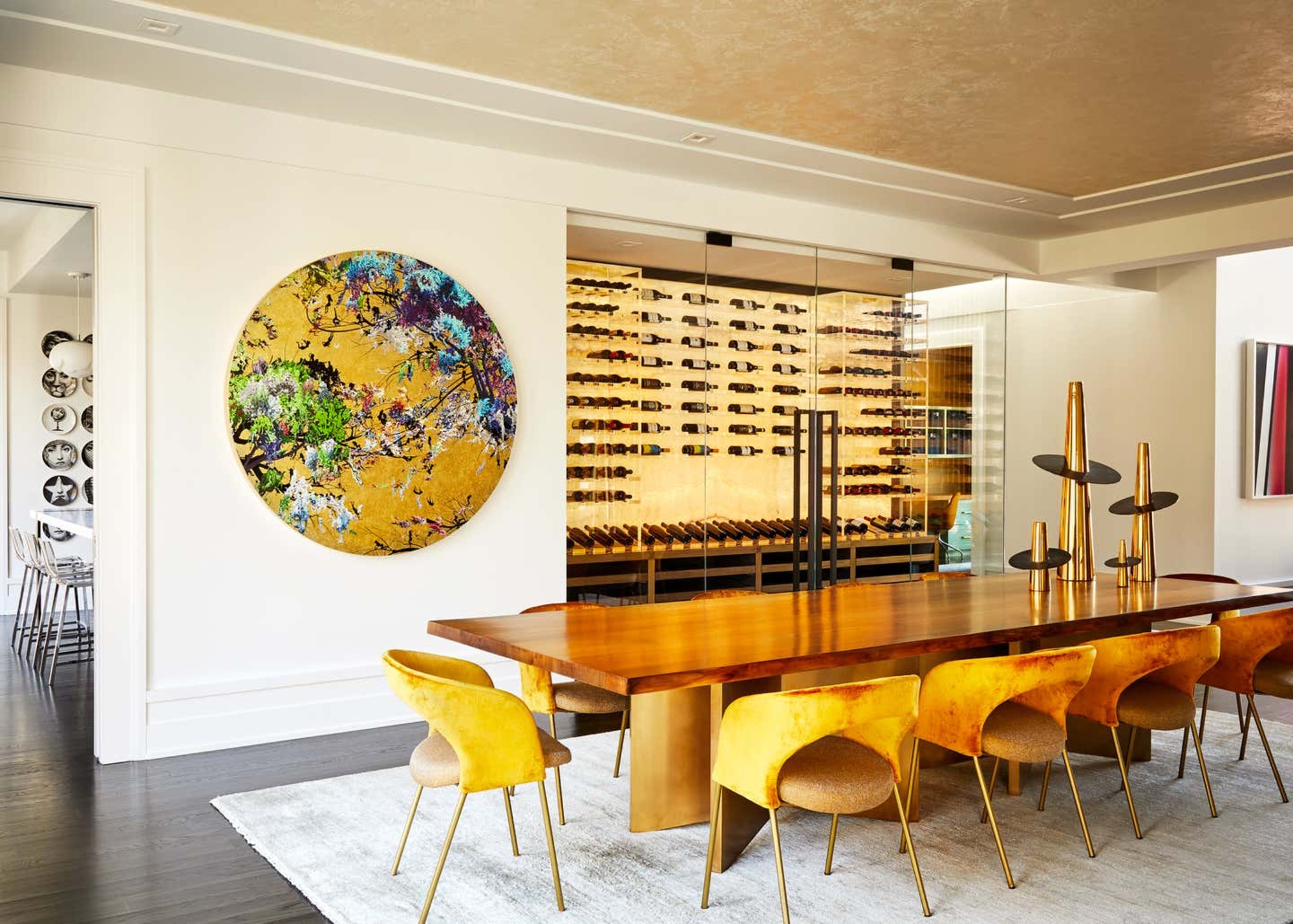
Bright yellow is identified as a color to steer clear of in bedrooms. According to interior designer Emma Beryl, bright yellow mimics the sun, tricking the brain into believing it's daytime, which can disrupt sleep patterns. Instead of bedrooms, Beryl recommends using bright yellow in spaces like bathrooms, sunrooms, or dining rooms, where its vibrant energy can be appreciated and purposefully incorporated into the design.
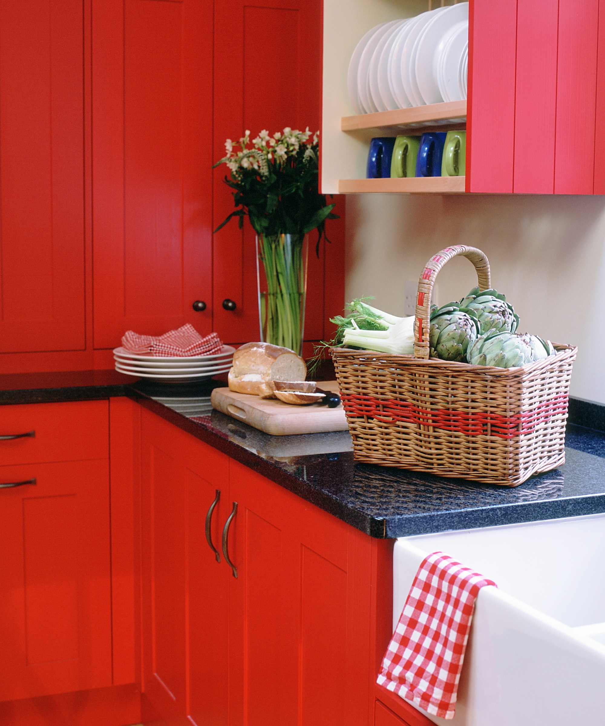
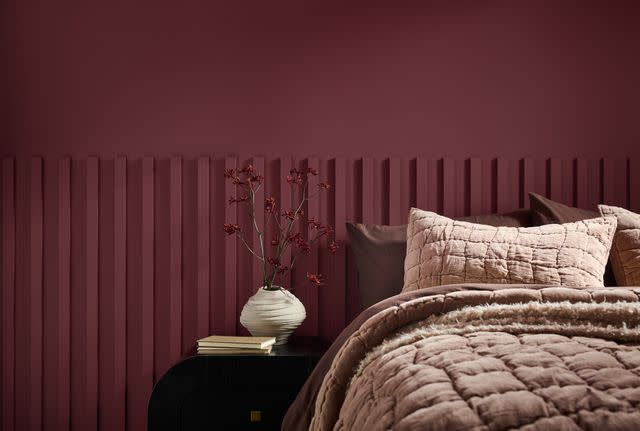
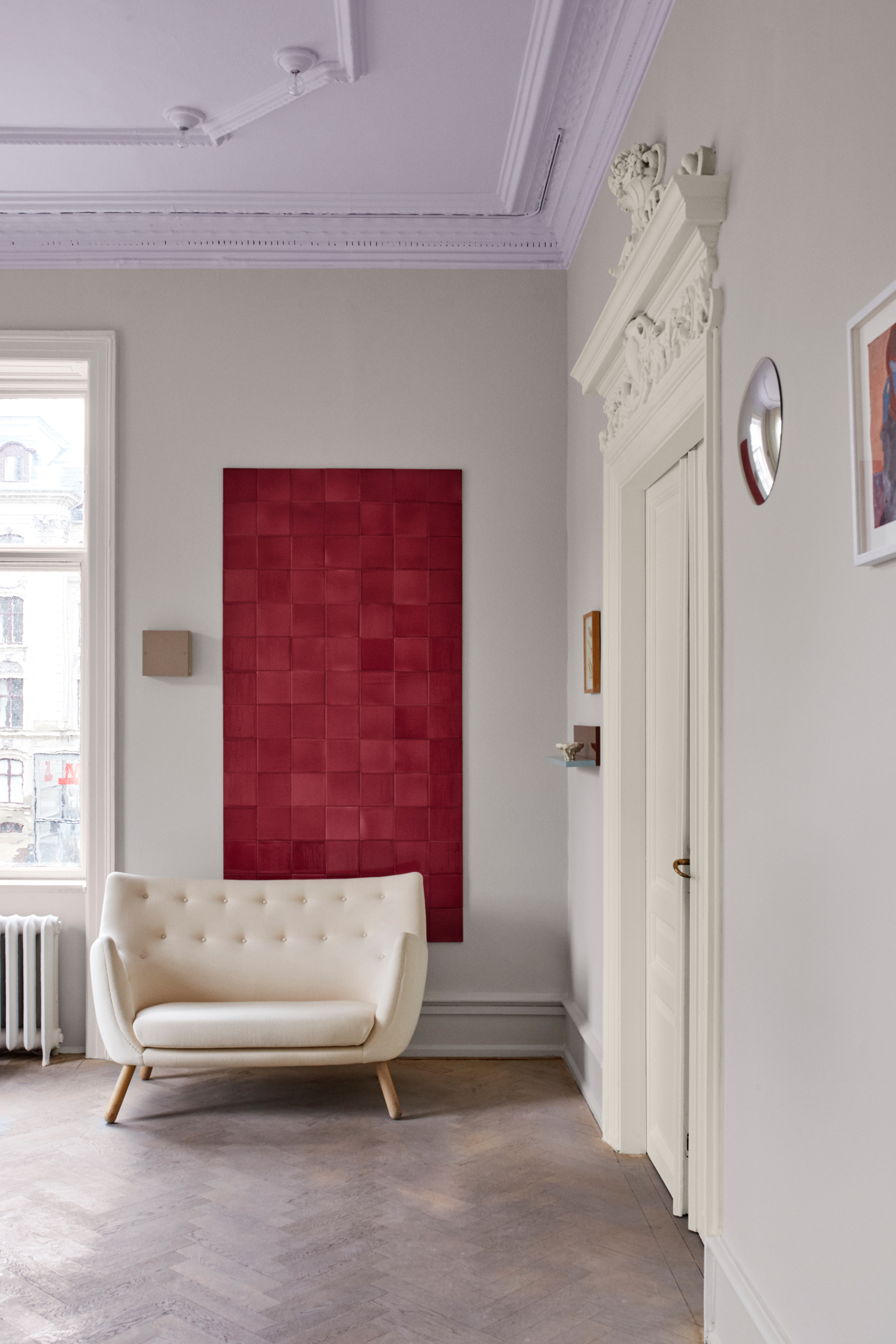
Red and orange, categorized as bold, warm colors, are also deemed inappropriate for bedrooms. Interior designer Annie Delaporte emphasizes the importance of creating soothing, calm, and serene bedroom environments, qualities that red and orange do not embody. HGTV star and interior designer Shay Holland suggests that these energetic hues are better suited for areas where productivity is desired, such as home offices, kitchens, or laundry rooms. Holland notes that while red is associated with passion, powerful shades can stimulate appetite and increase stress levels, making them counterproductive for a relaxing bedroom.
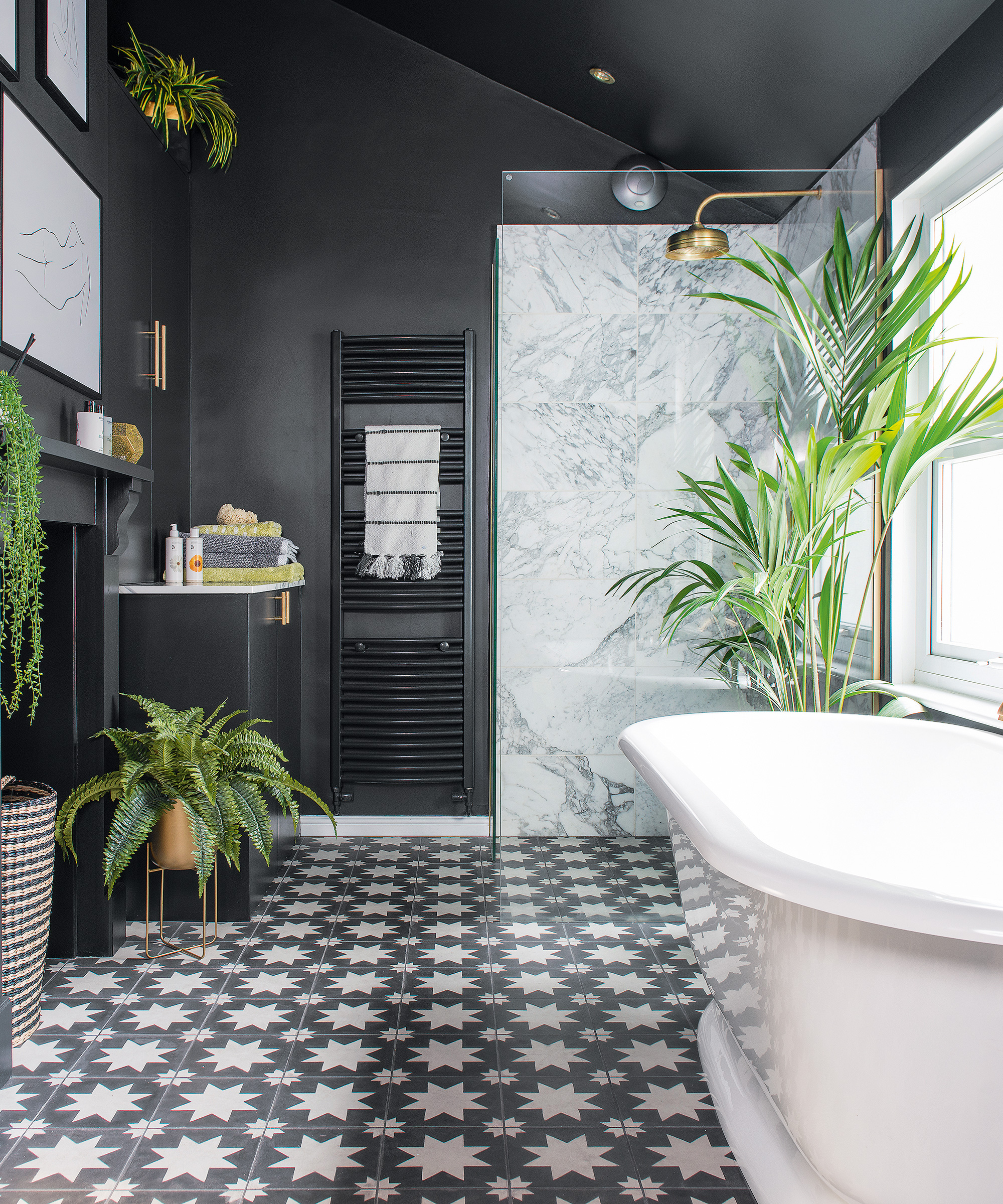
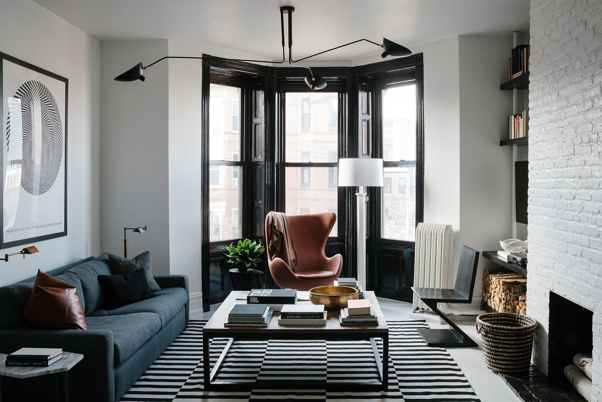
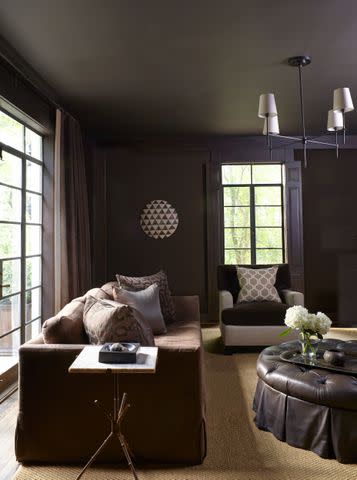
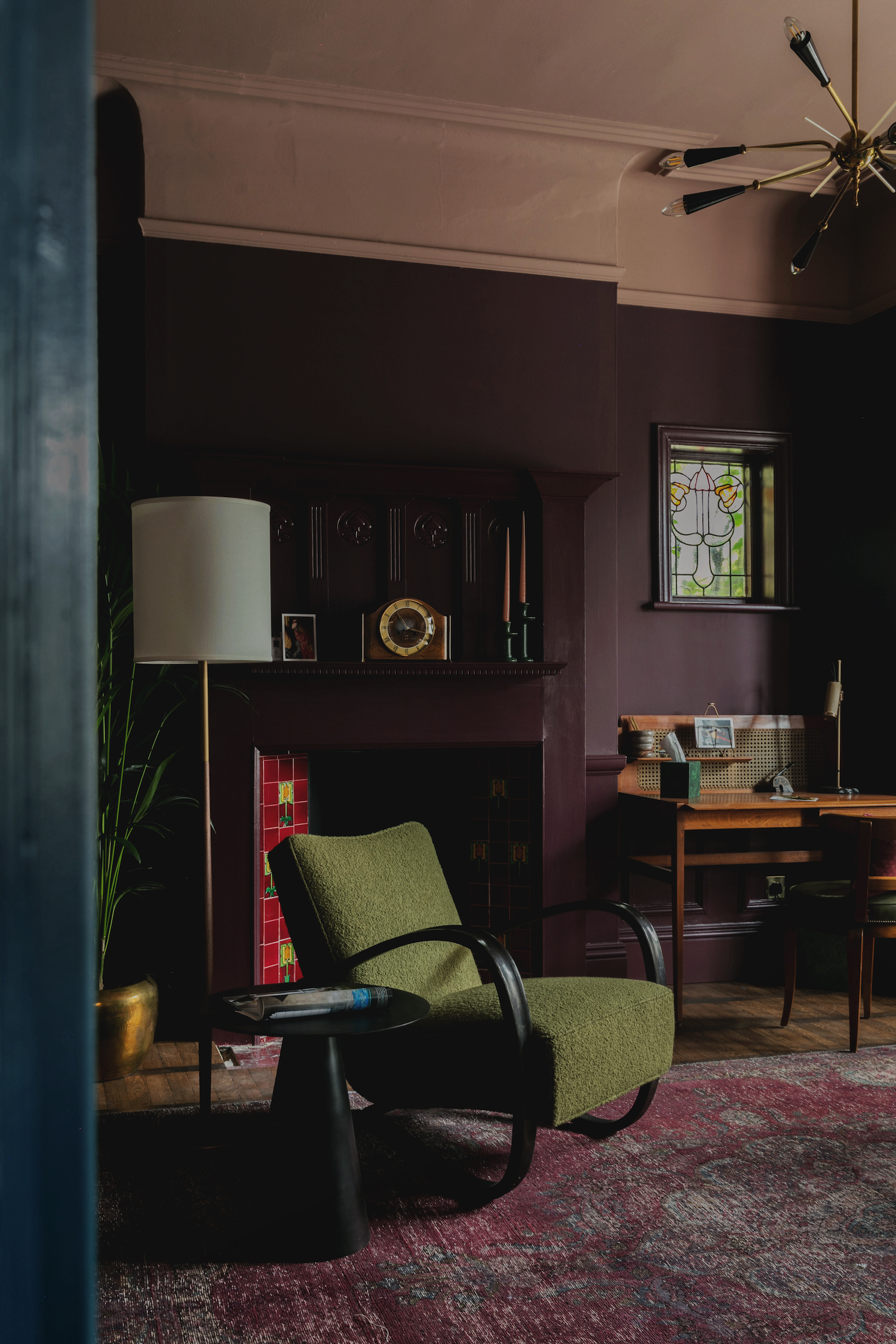
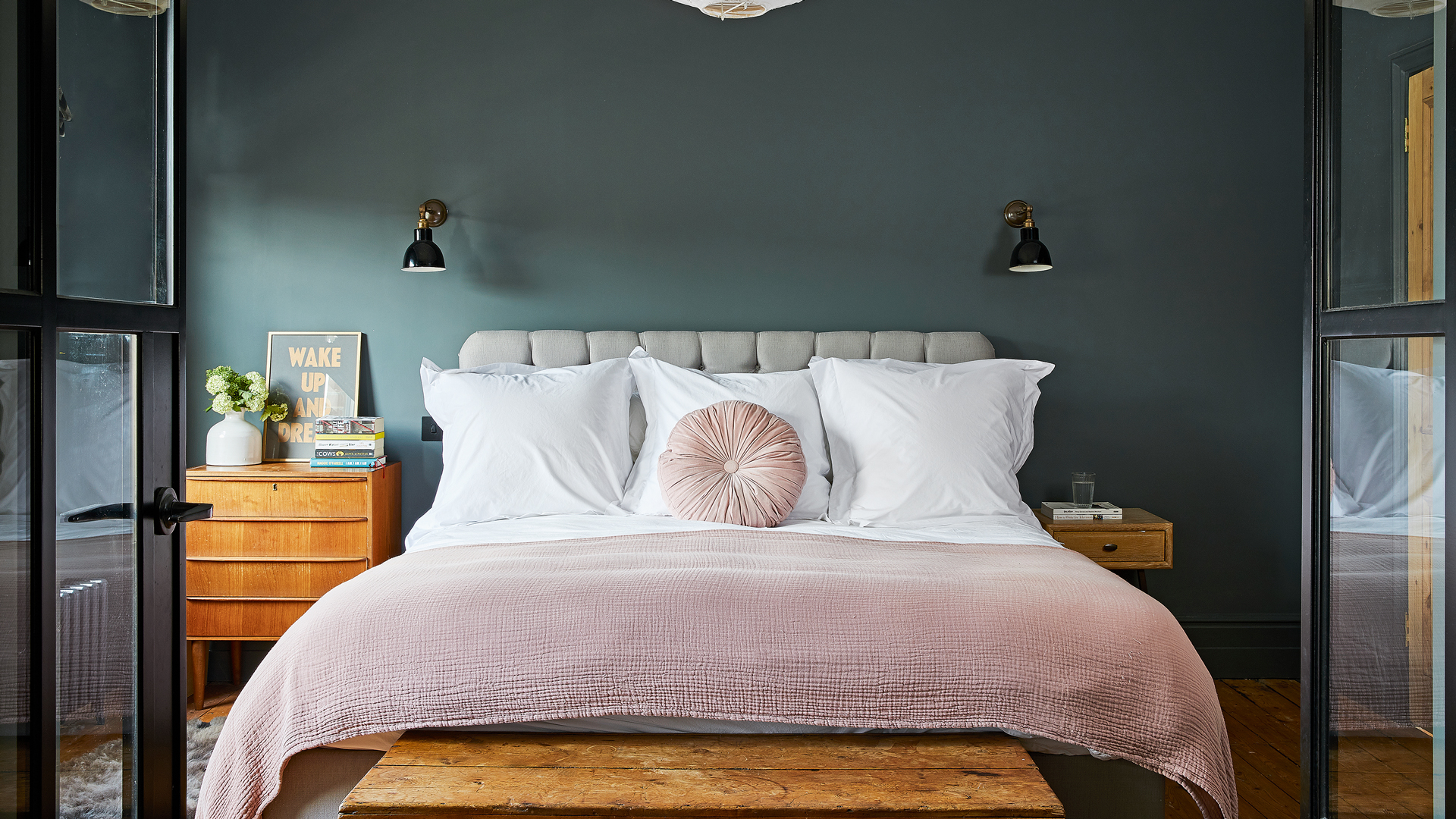
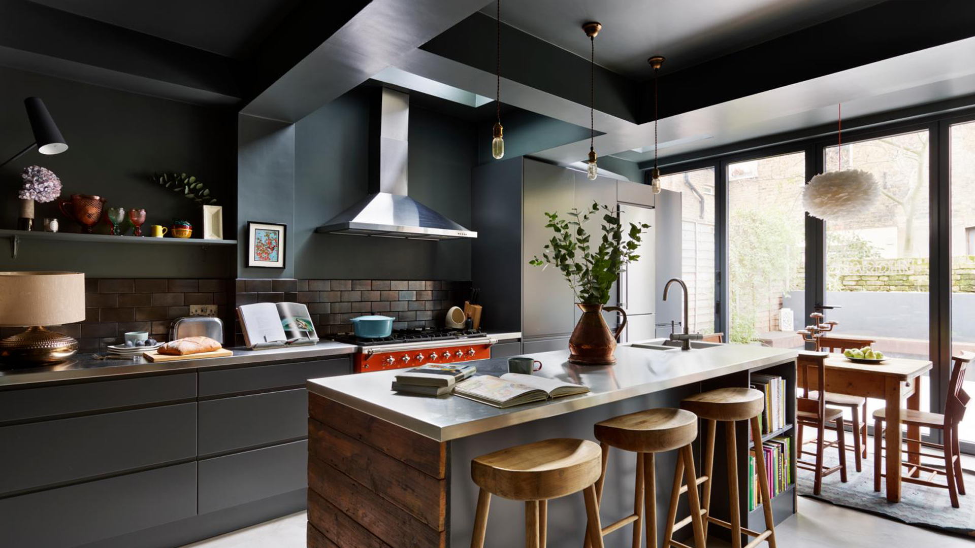
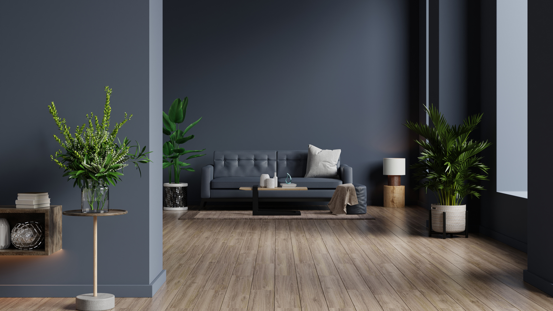
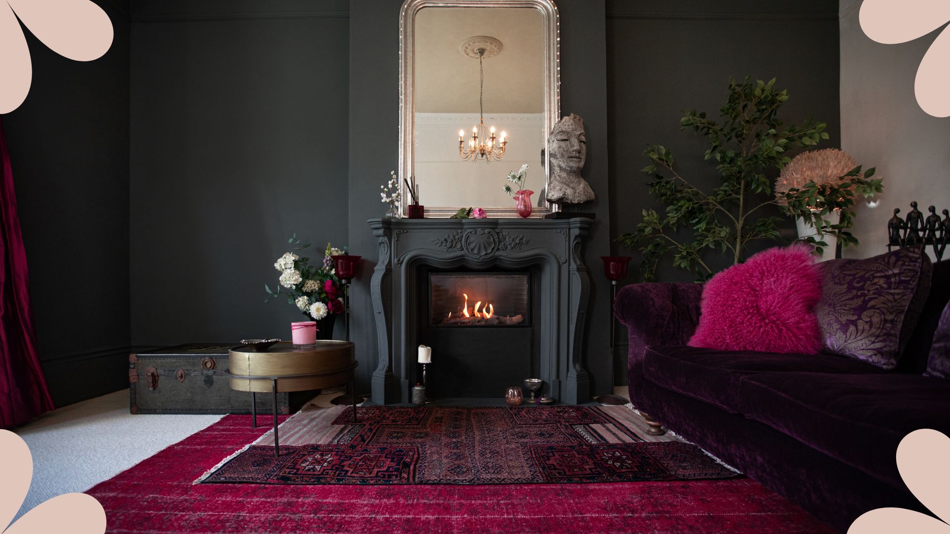
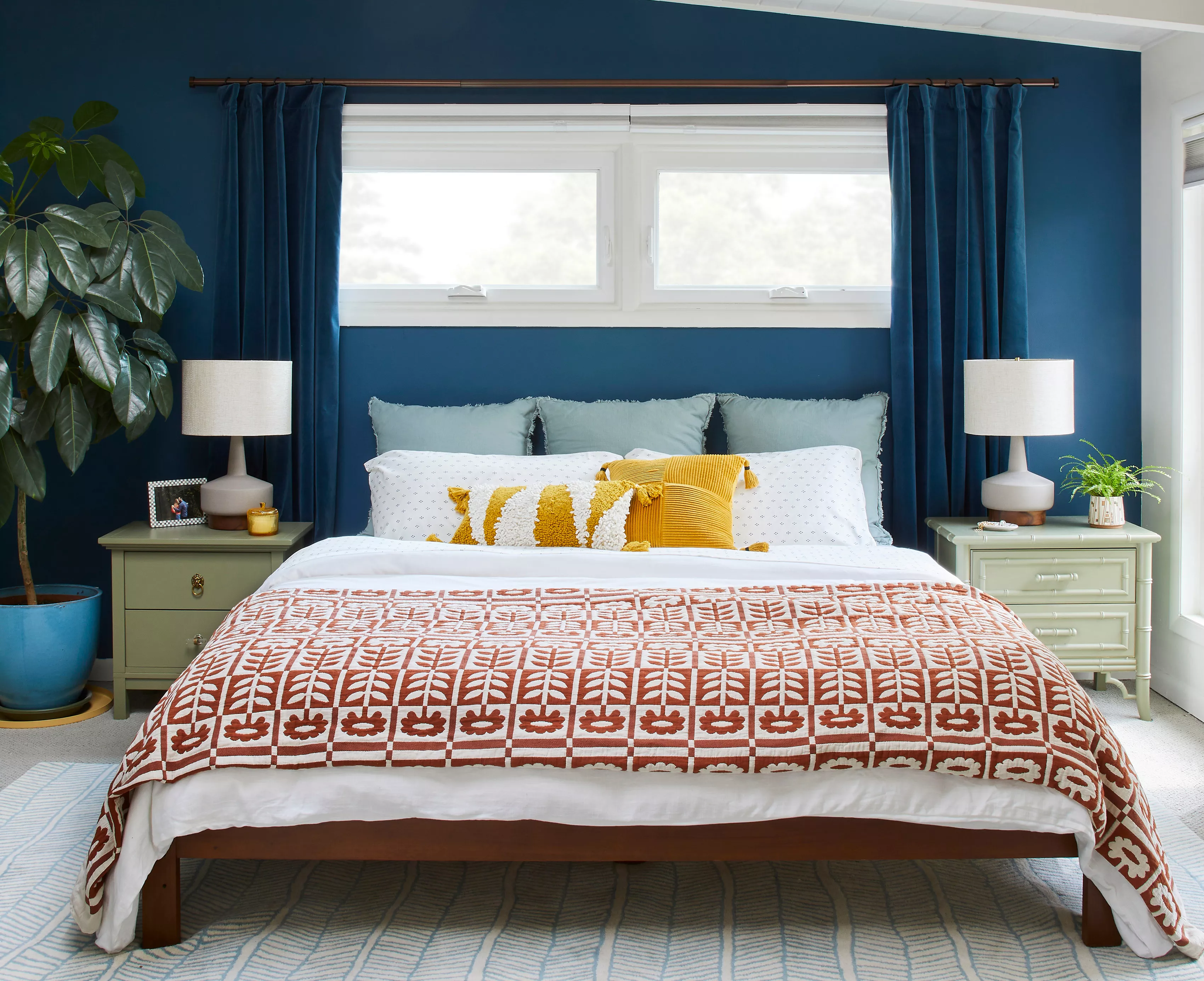
The trend of all-black bedrooms is another design choice that designers advise against. While a dark, cave-like aesthetic might seem appealing for an "escapist" feel, Shay Holland points out that it often fails to provide the sense of well-being and stress relief that clients typically seek in their bedrooms. For those who desire black elements, a more balanced approach involves painting walls a soft white and using black for moldings to create deep contrast, or painting furniture like dressers and nightstands black. If a dark wall is still preferred, navy blue is presented as a better alternative, offering a deep hue without the negative associations of black.
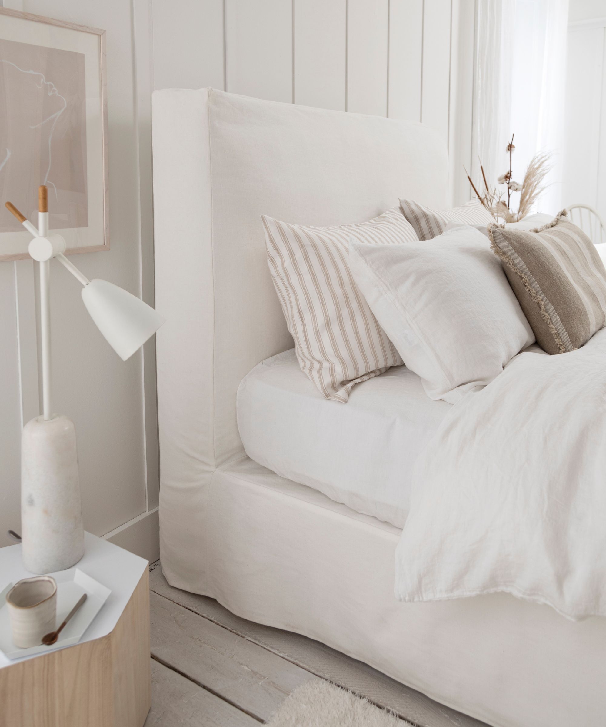
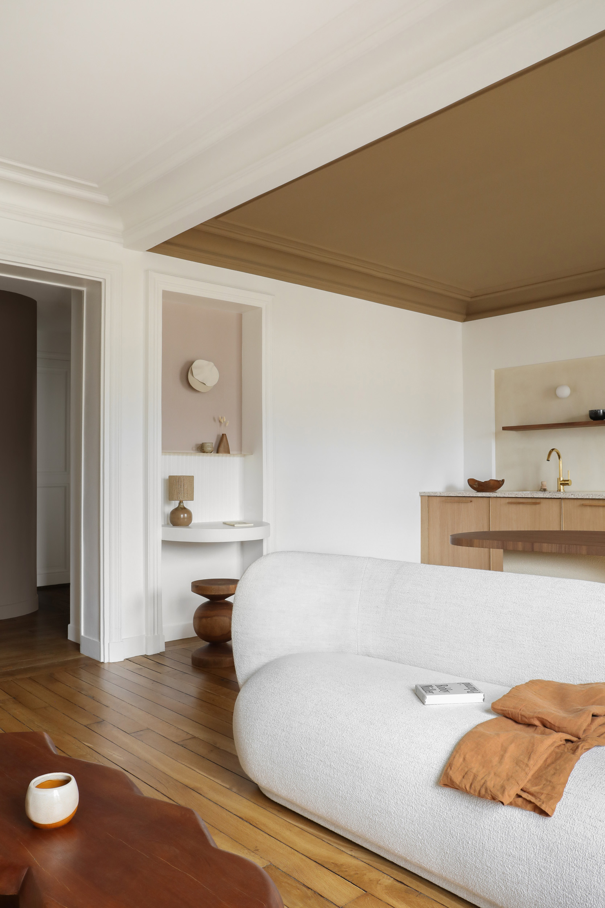
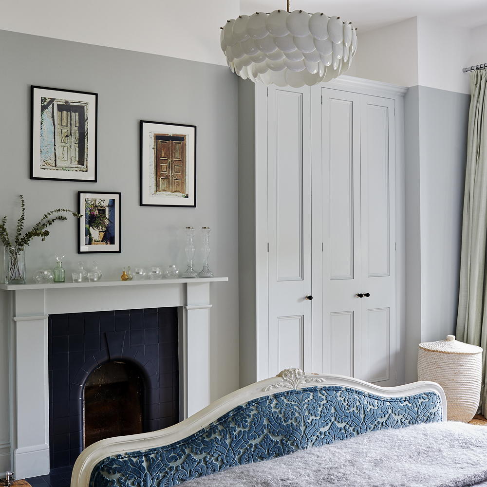
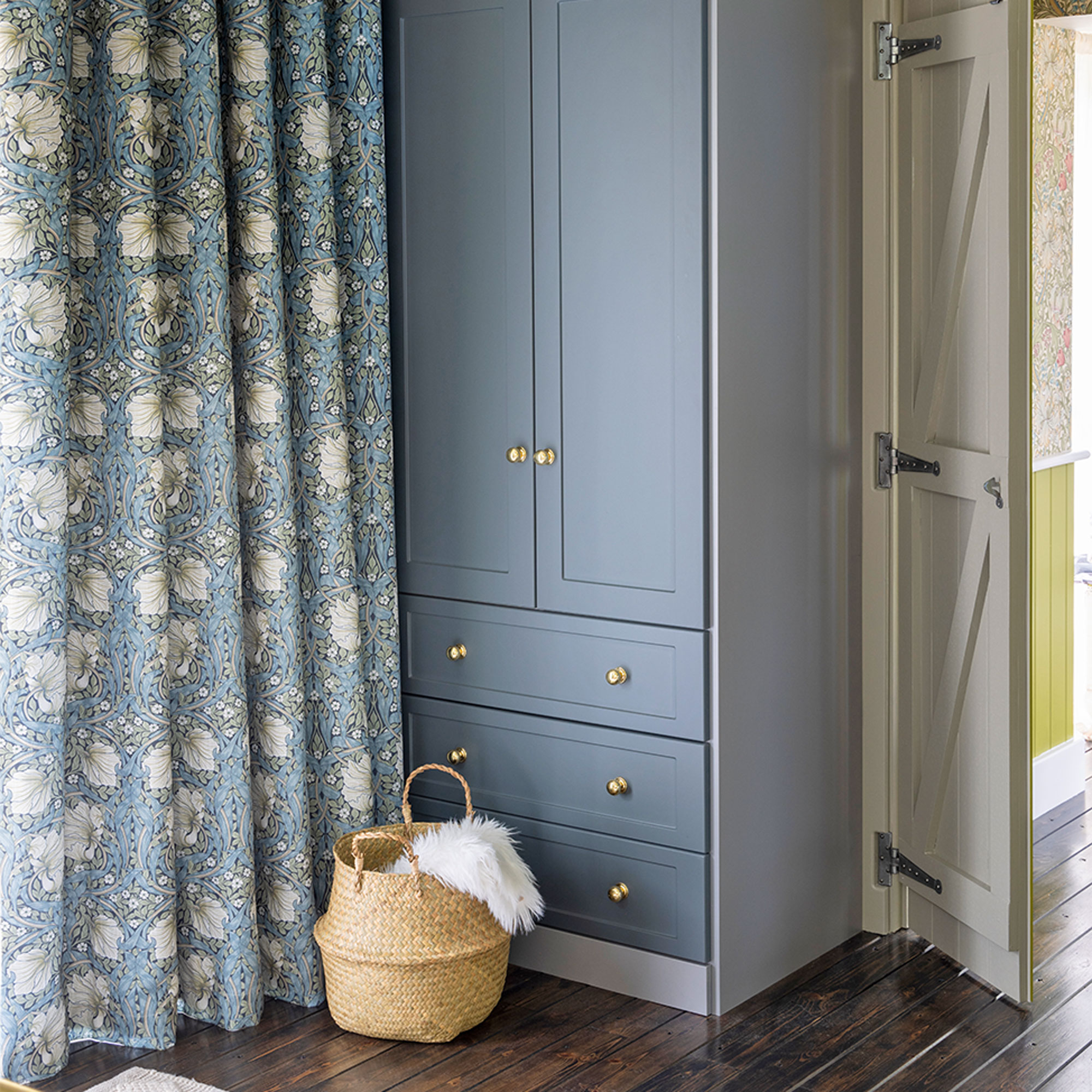
Finally, the article cautions against choosing super trendy colors solely because they are popular. A bedroom should reflect personal taste and provide a lasting sense of comfort. While colors of the year can be inspiring, selecting a shade just for its current popularity risks quick fatigue and the need for frequent repainting. Interior designer Linette Dai advocates for classic choices like soft white paint or muted versions of one's favorite colors, emphasizing that the intensity and vibrancy of a shade are more critical than the color itself in achieving a desired atmosphere. Ultimately, the goal is to create a bedroom that genuinely resonates with the occupant's design aesthetic and promotes a tranquil living space.
#BedroomDesign #PaintColors #InteriorDesign #HomeDecor #ColorPsychology #SleepEnvironment #DesignTips #HomeImprovement #BedroomDesign #PaintColors #InteriorDesign #HomeDecor #ColorPsychology #SleepEnvironment #DesignTips #HomeImprovement
Há 0 comentários no total
 Ainda não há comentários
Você também pode gostar

5 colors you should never paint a small room – designers warn us to steer clear of these hues, and what to pick instead


5 colors you should never paint a pantry – designers share the shades they swerve
8 colors you should never paint kitchen cabinets according to the experts

5 Colors You Should Never Paint Your Hallway, According to Designers

5 colors to avoid in a bathroom – according to designers
Colors not to paint a mudroom – 5 hues to avoid in this high-traffic space
5 Paint Colors to Never Use in Your Living Room, According to Interior Designers
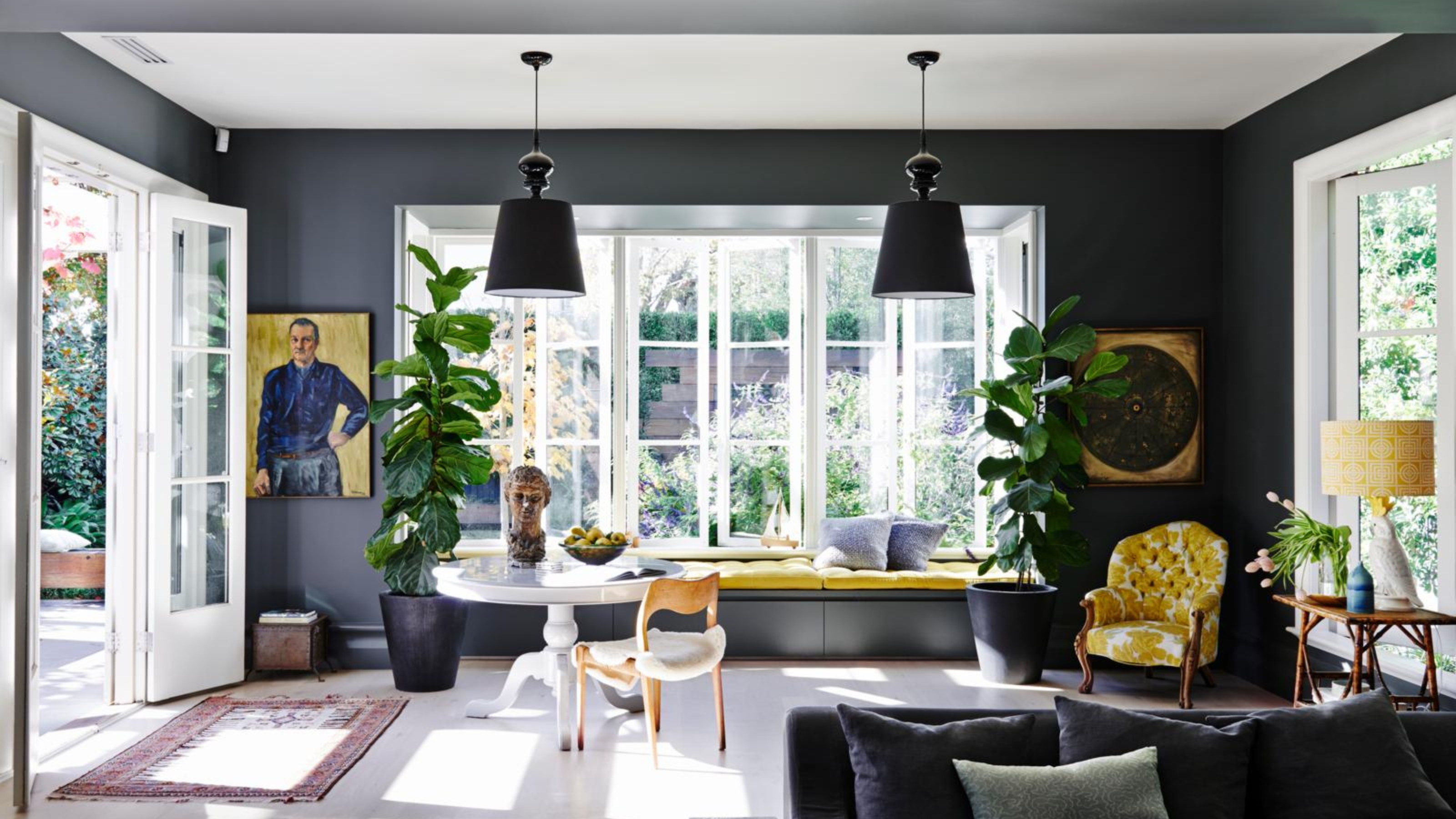
4 Times Designers Say You Definitely Shouldn't Paint Your Walls and Ceiling in the Same Color


What are the worst colors to paint a room? The shades experts say you should never use
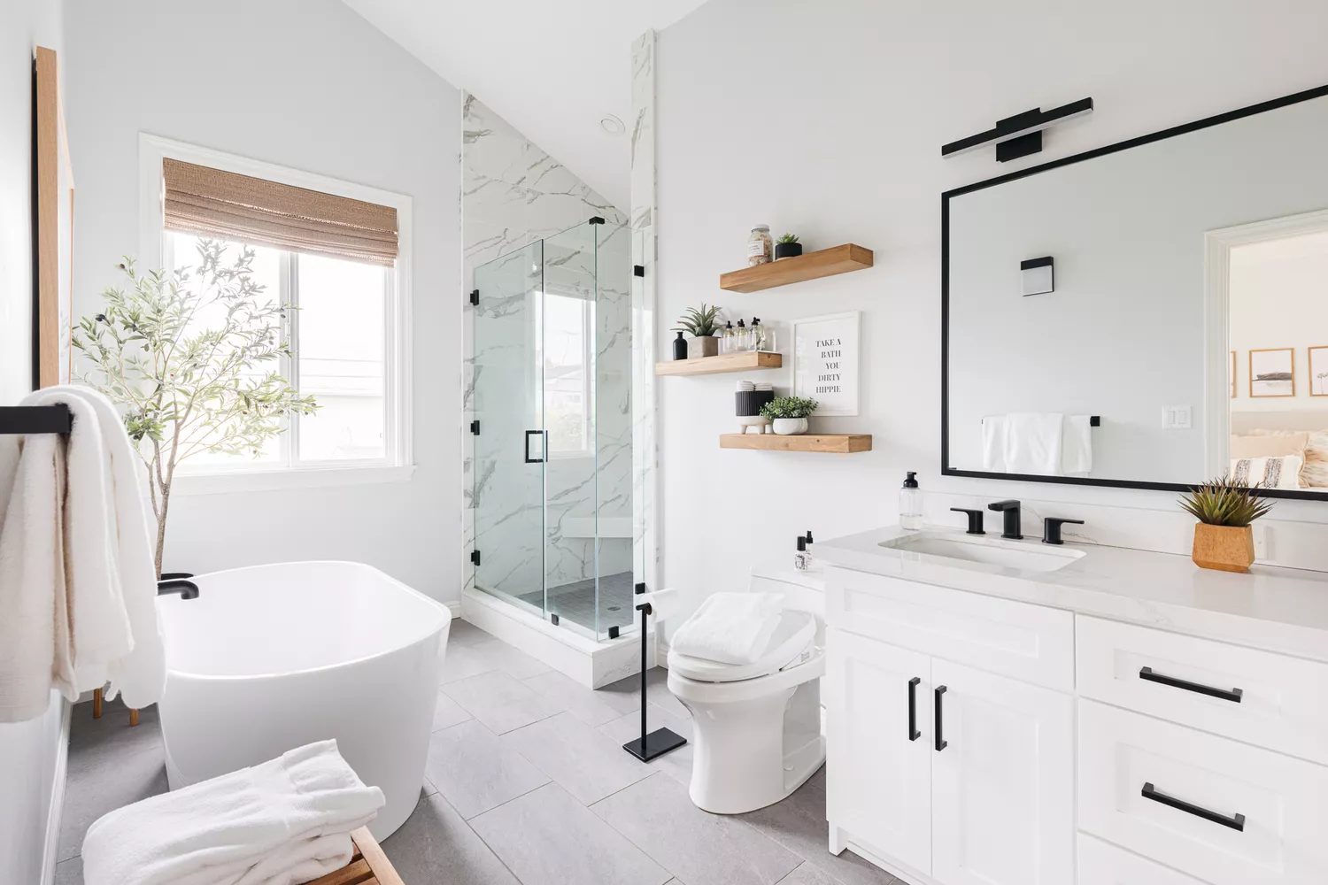
5 Paint Colors You Should Never Use in a Bathroom, Designers Warn

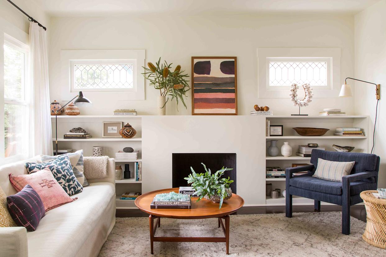
5 Paint Colors That Experts Say You Shouldn't Use in 2025

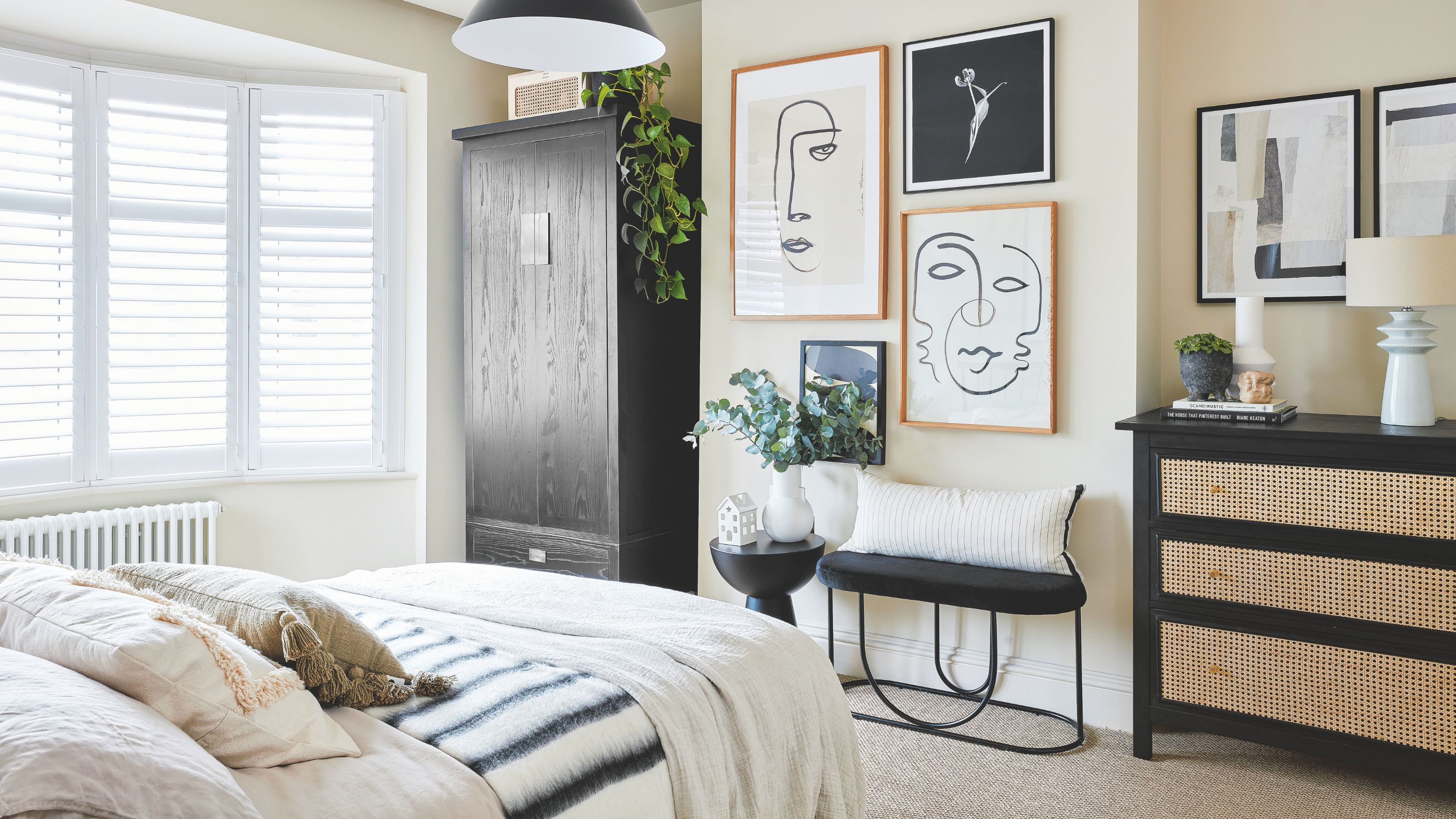
5 places to never put a wardrobe in a bedroom, according to feng shui and interior designers
6 Paint Colors You Should Never Use in Your Bedroom, According to Interior Designers
5 rug colors to avoid – the hues designers think you should veer away from on floors, plus how to make them work

4 Outdated Colors Designers say you Should Steer Clear of When Decorating a Living Room
An interior designer reveals the 5 mistakes to avoid when painting with dark colours


5 colors you should never paint your entryway – according to interior experts
5 bedroom colors going out of style in 2025 – and what designers are using instead for a stylish sleep space

Interior design experts reveal the colour rules you should be breaking
5 Bedroom Paint Colors That Could Be Ruining Your Sleep