1/13
Ready for a Fresh Coat of Paint? Check Out the Top Colors of 2024
The article explores the predicted top paint colors for 2024, highlighting selections from leading brands and offering insights into their intended moods and applications in home design. Paint is presented as an accessible and impactful method for updating a space, capable of altering its perceived size, brightness, and overall atmosphere.
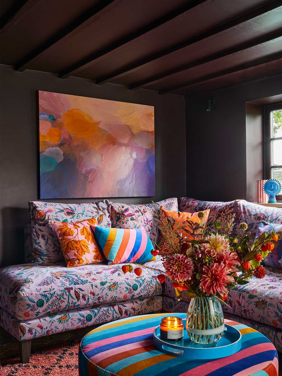
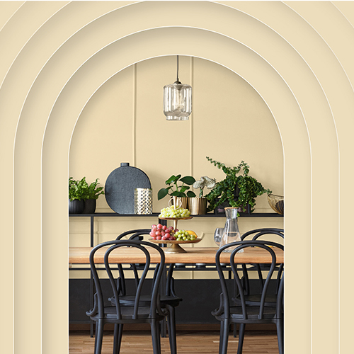
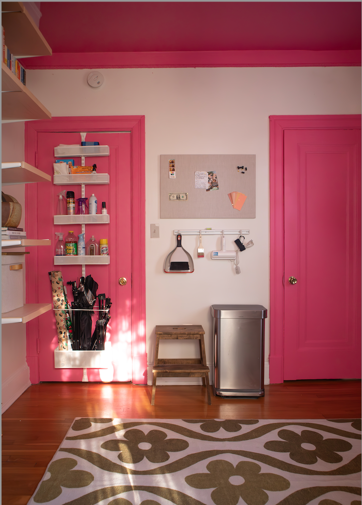
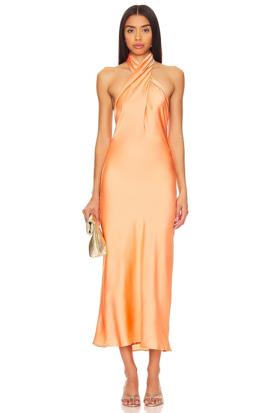
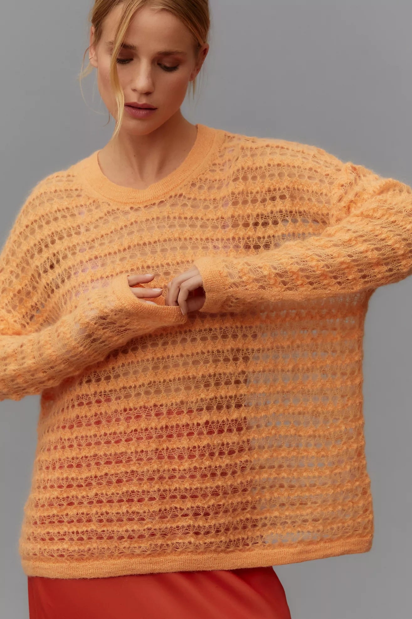
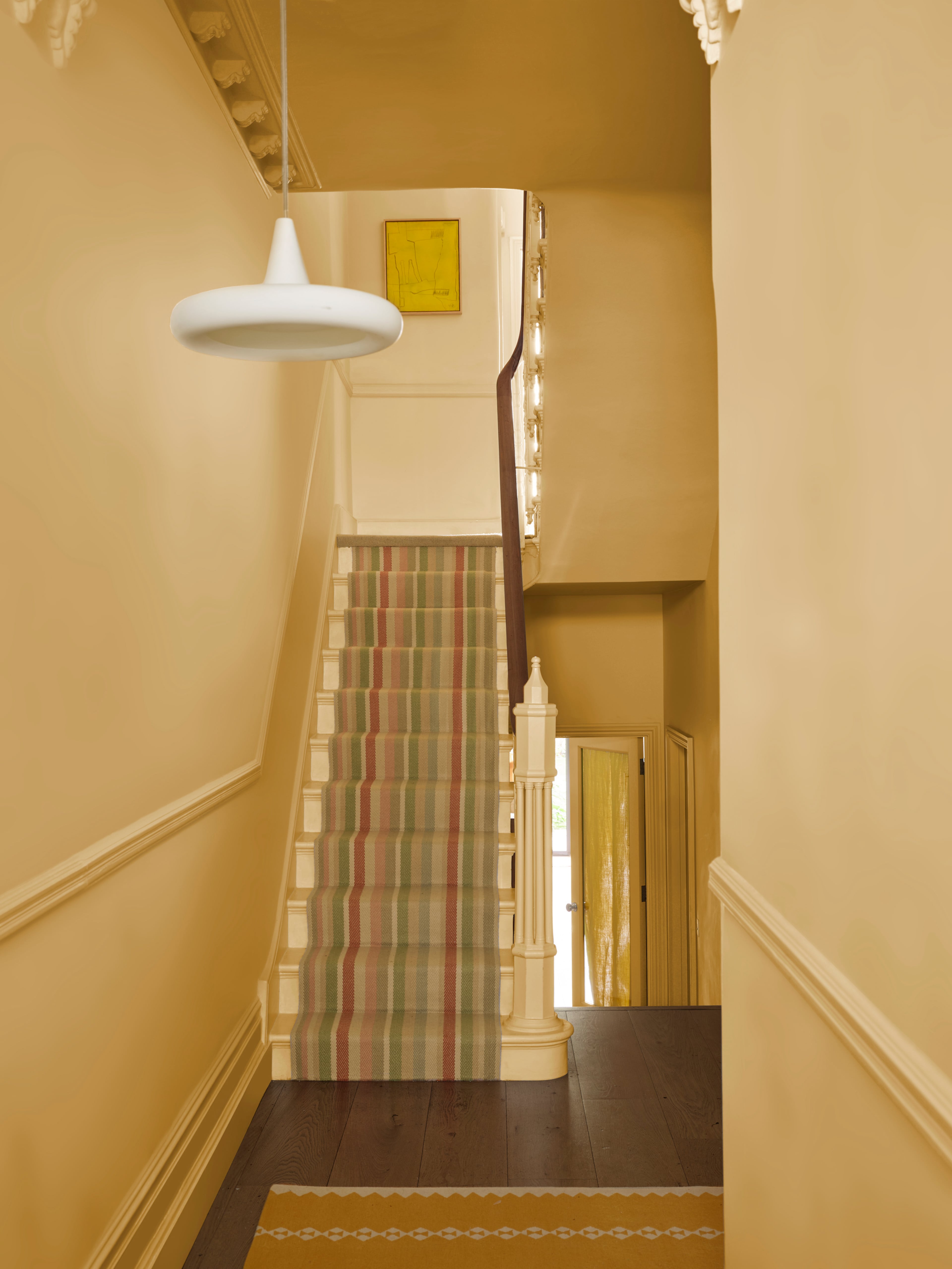
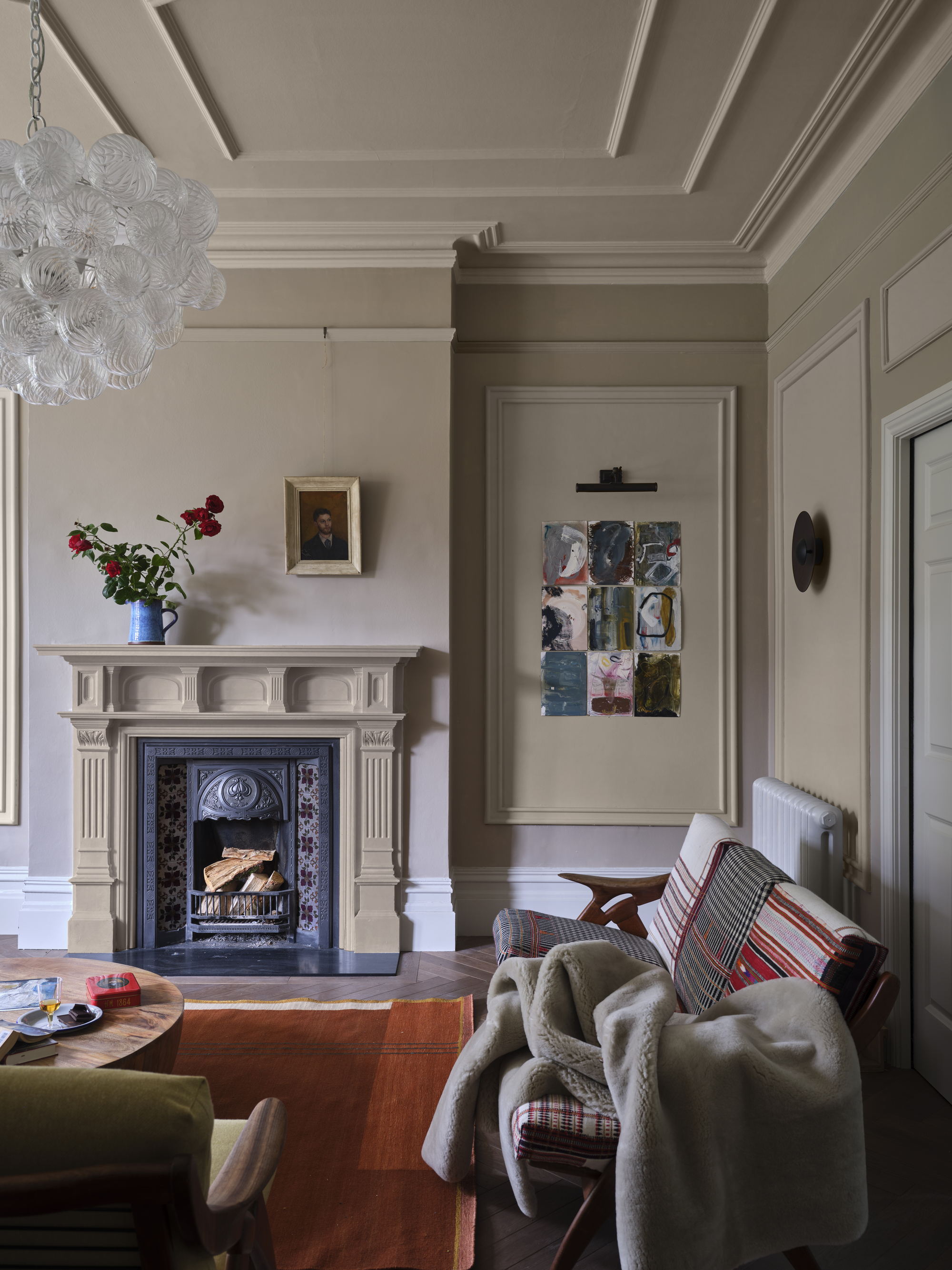

Pantone's 2024 Color of the Year is "Peach Fuzz," an orangey-pink hue chosen to evoke feelings of ease and provide a sense of respite amid contemporary turmoil. Laurie Pressman, Vice President at Pantone, explains that the color aims to convey compassion and empathy, promoting a sanctuary-like environment. The shade, described as a poppy orange-pink, is recommended for welcoming entryways or bathrooms, with its versatility allowing integration into various palettes, from bright to subdued, to encourage comfort and warmth.
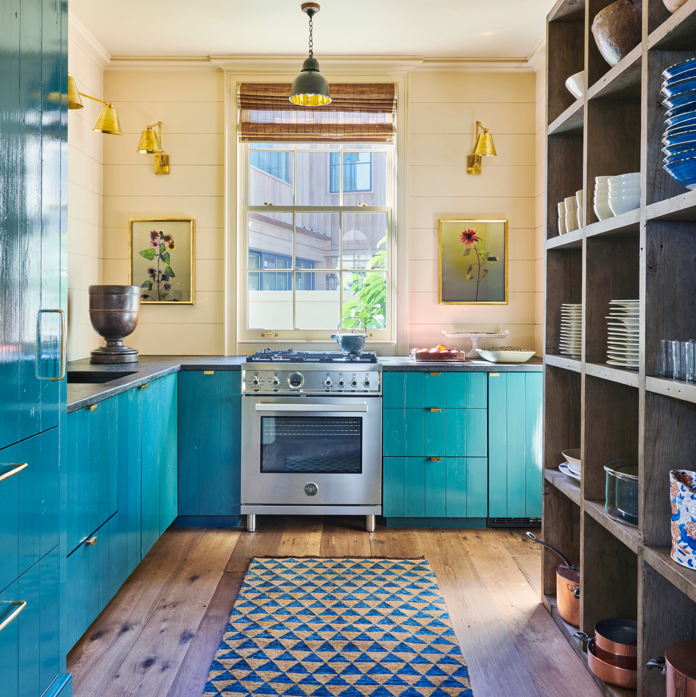
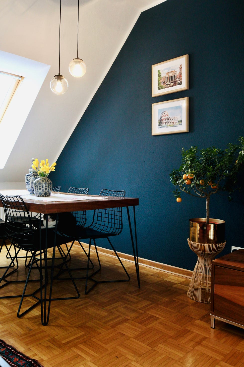
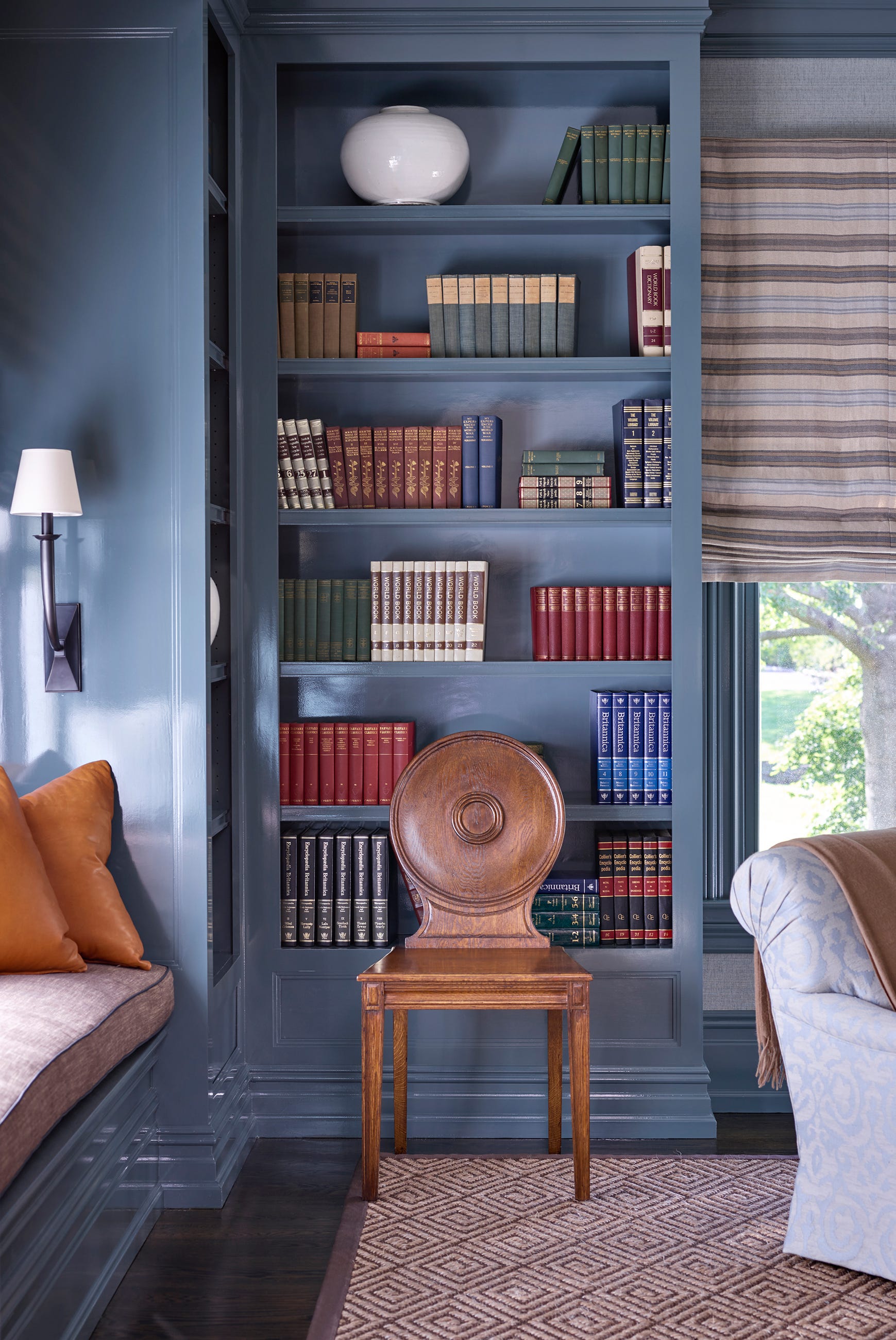
Benjamin Moore selected "Blue Nova" as its 2024 color, inspired by the broadening perspectives gained through travel. Hannah Yeo, the company’s color marketing and development manager, describes Blue Nova as a mid-tone shade with a red undertone, making it a flexible choice for diverse rooms such as studies, home offices, bedrooms, living rooms, or kitchen cabinetry. It is suggested for color drenching or accenting with complementary colors like topaz, aiming to infuse a sense of adventure while maintaining a welcoming feel within the home.
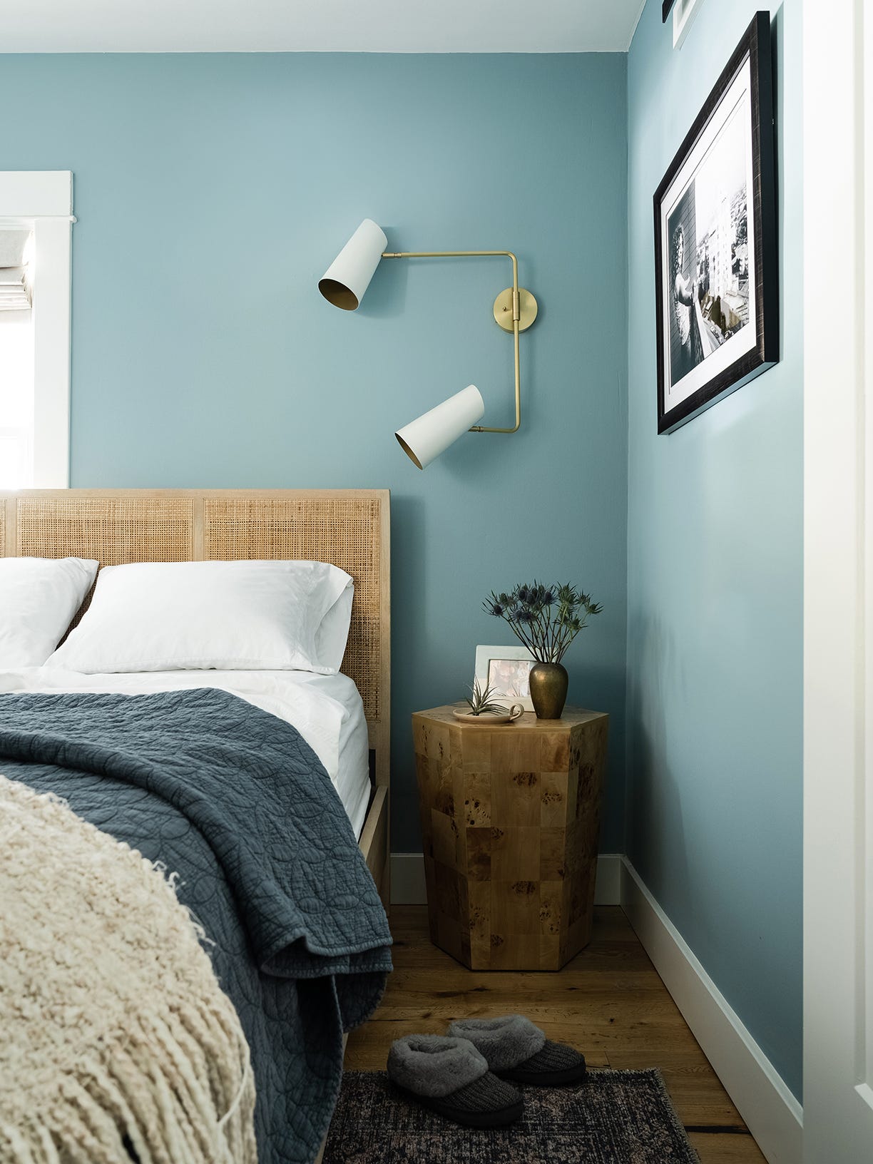
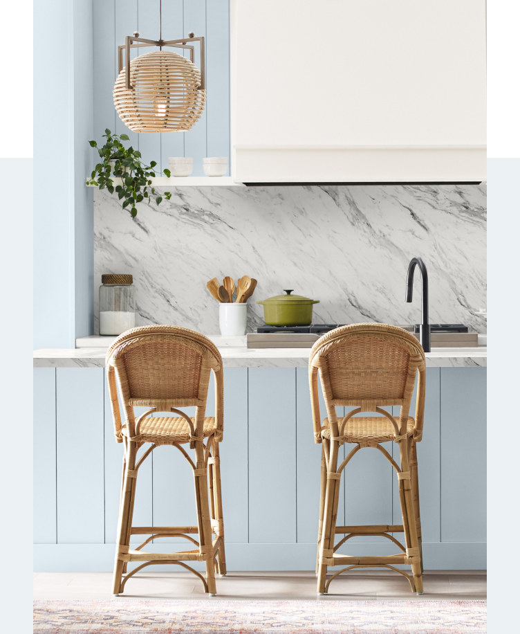
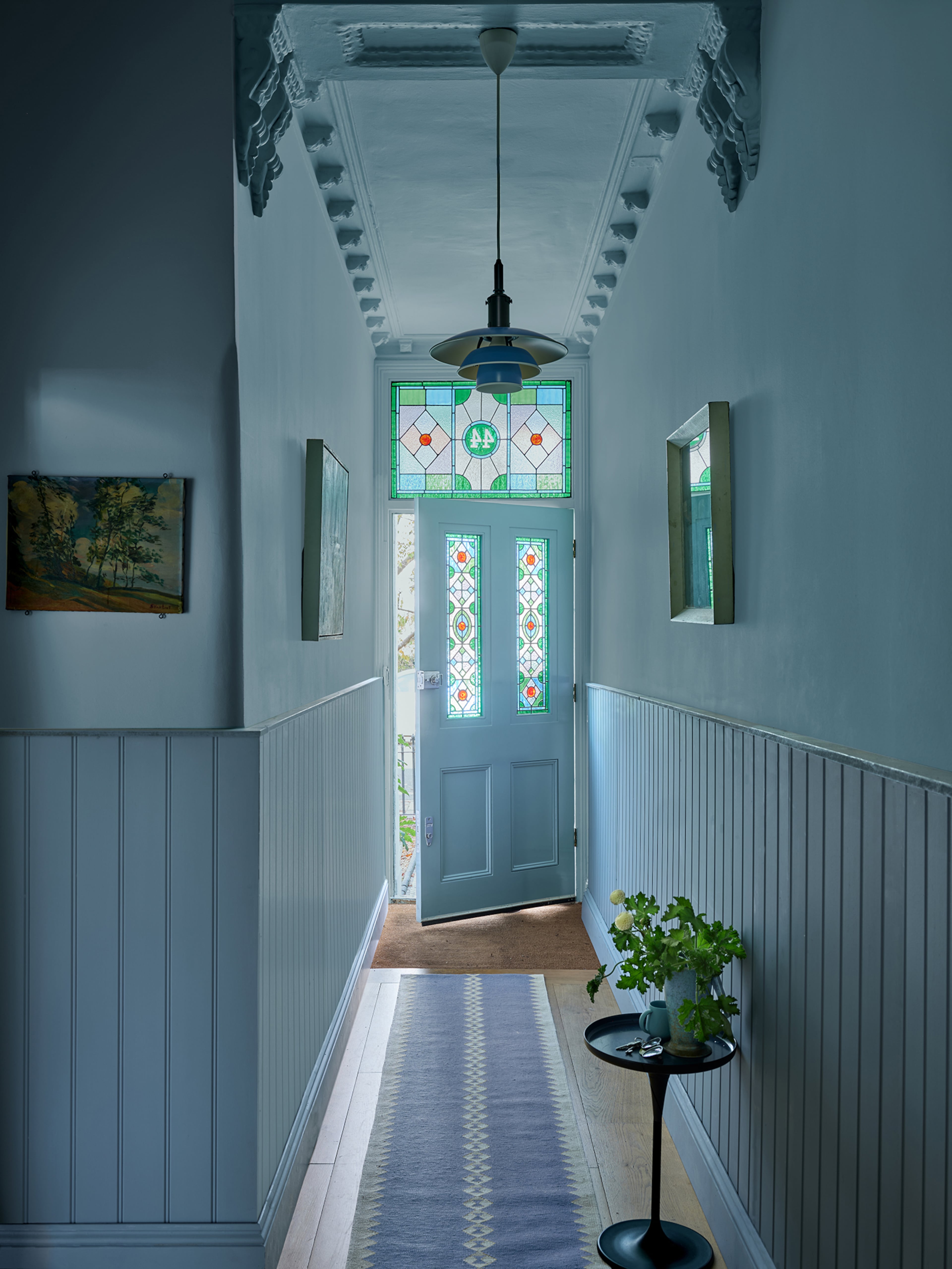
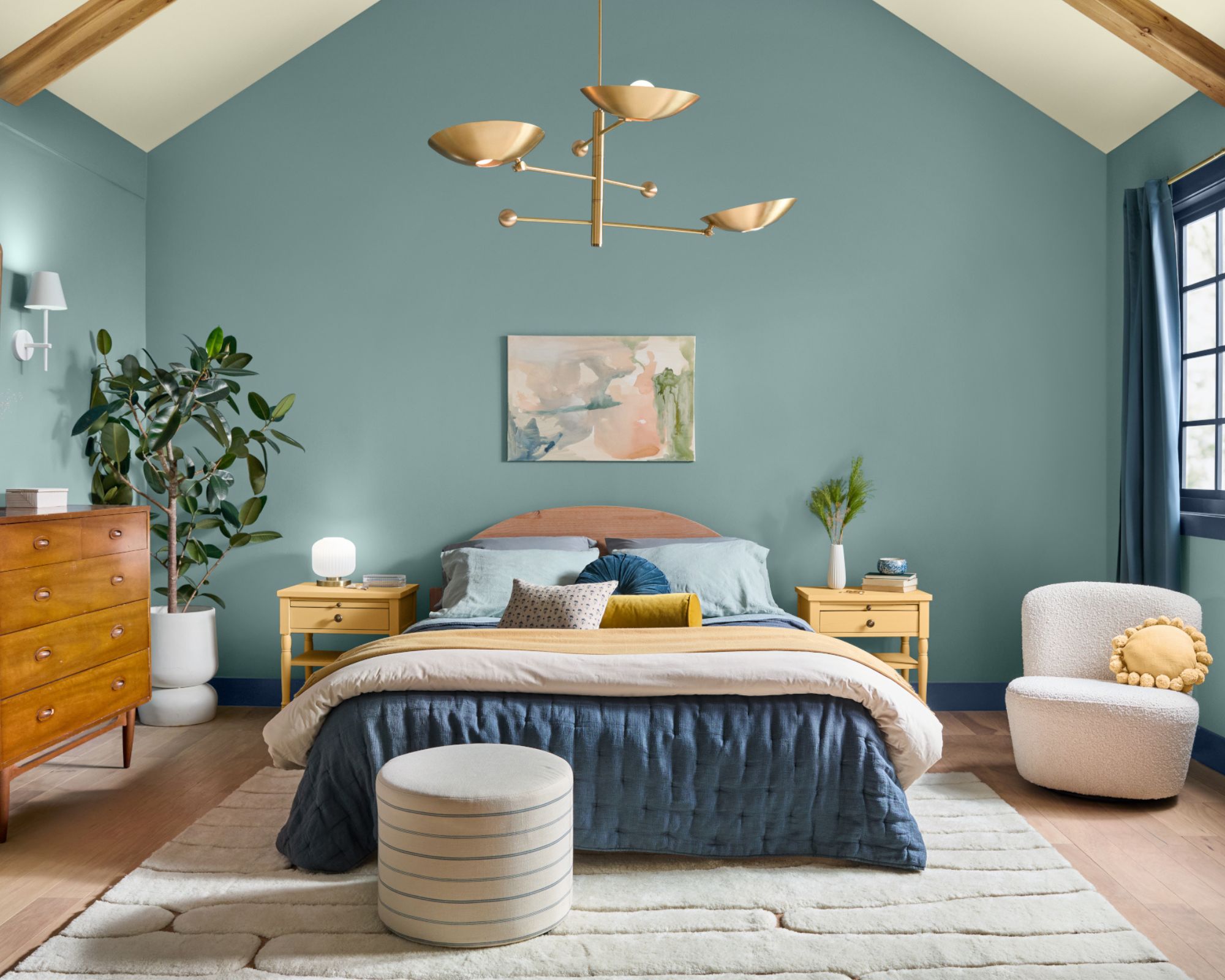
Dunn Edwards' pick for 2024 is "Skipping Stones," a serene and steely blue from its nature-inspired "New Dawn" palette. DeMing Carpenter, the brand's color expert, states that this shade reflects a desire for tranquility and a connection to the outdoors, offering a calming yet energizing presence with green and gray undertones. Skipping Stones is recommended for covering entire rooms, including ceilings, or for creating monochrome looks with similar blues, and can be used on kitchen cabinets for a modern update.
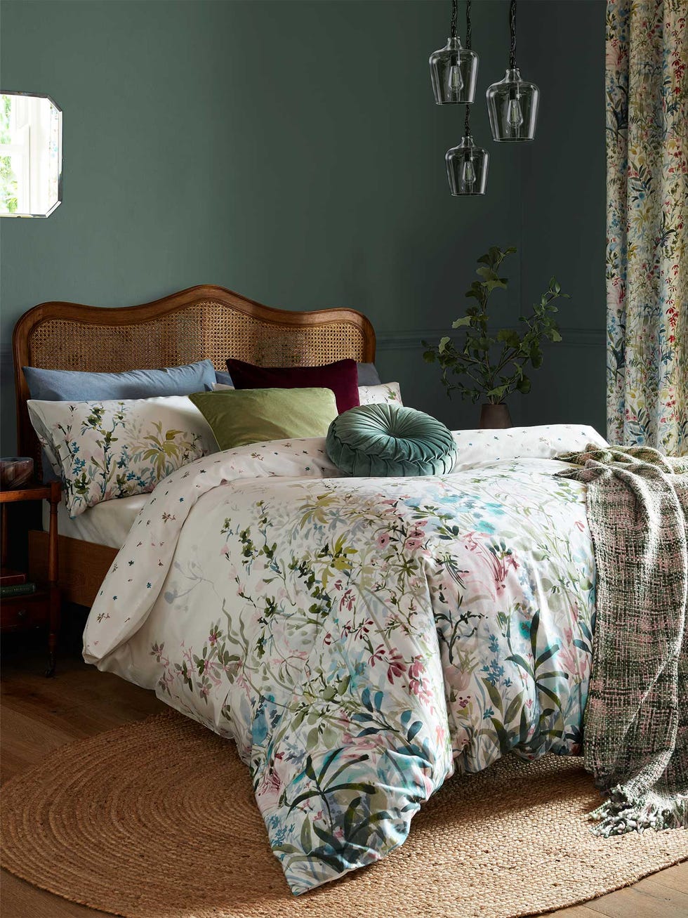
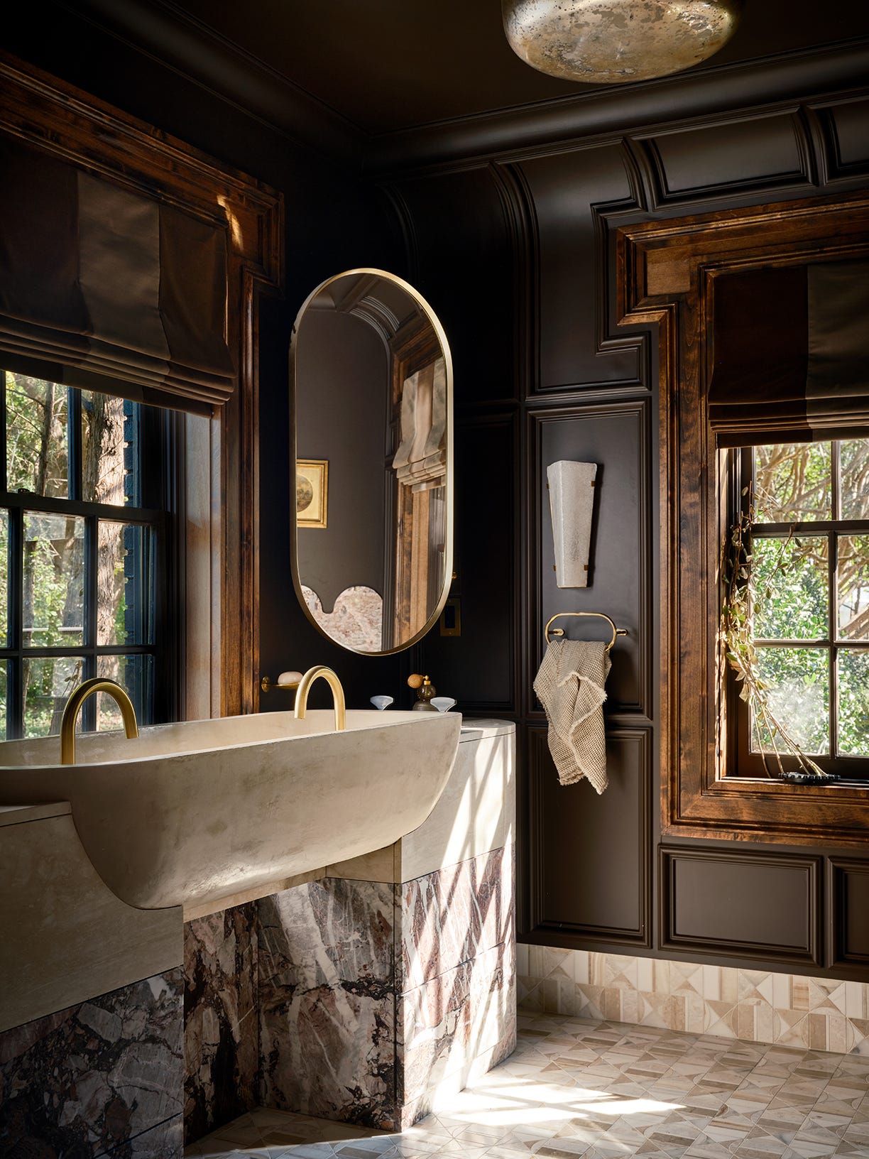
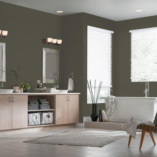
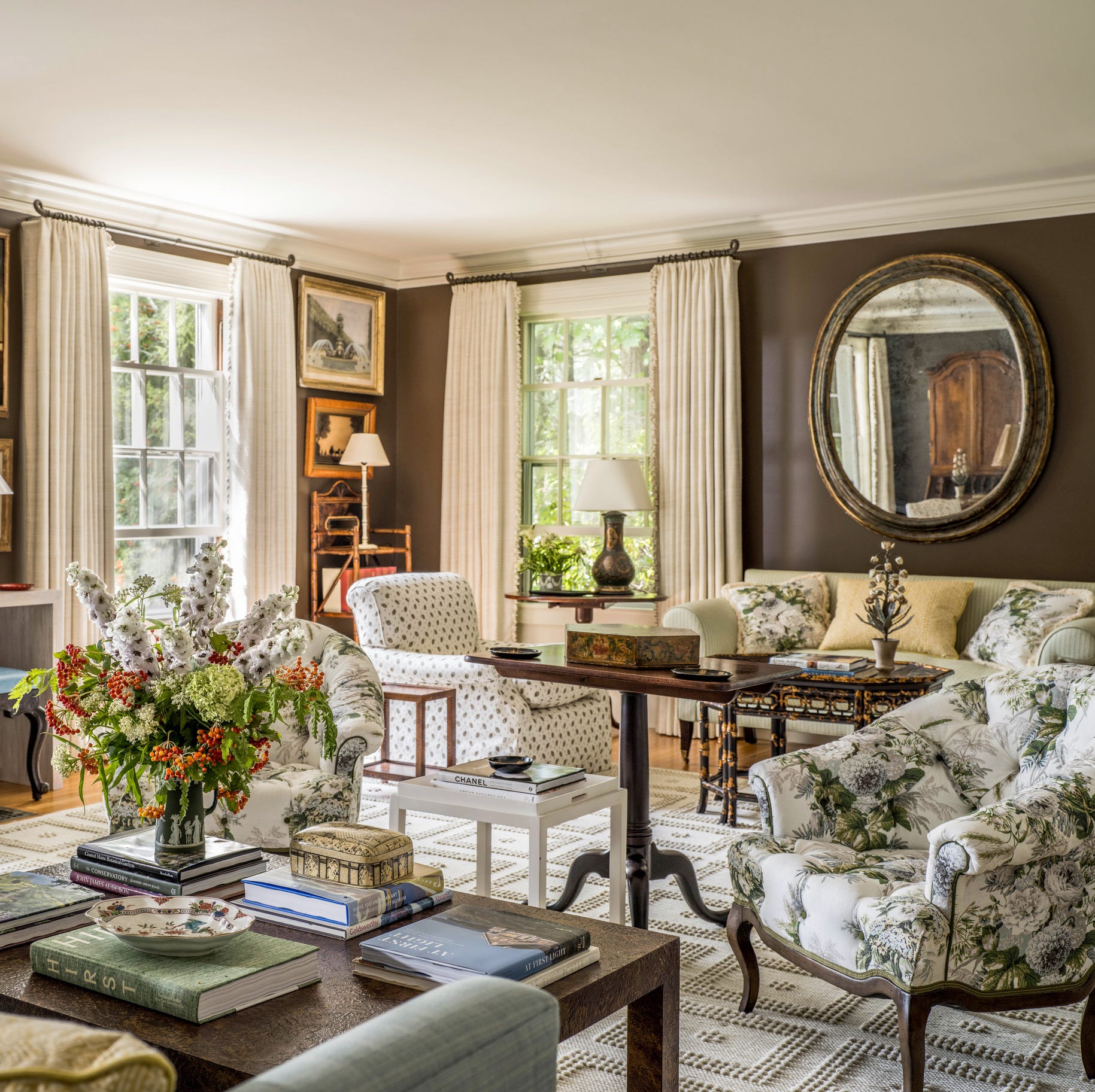
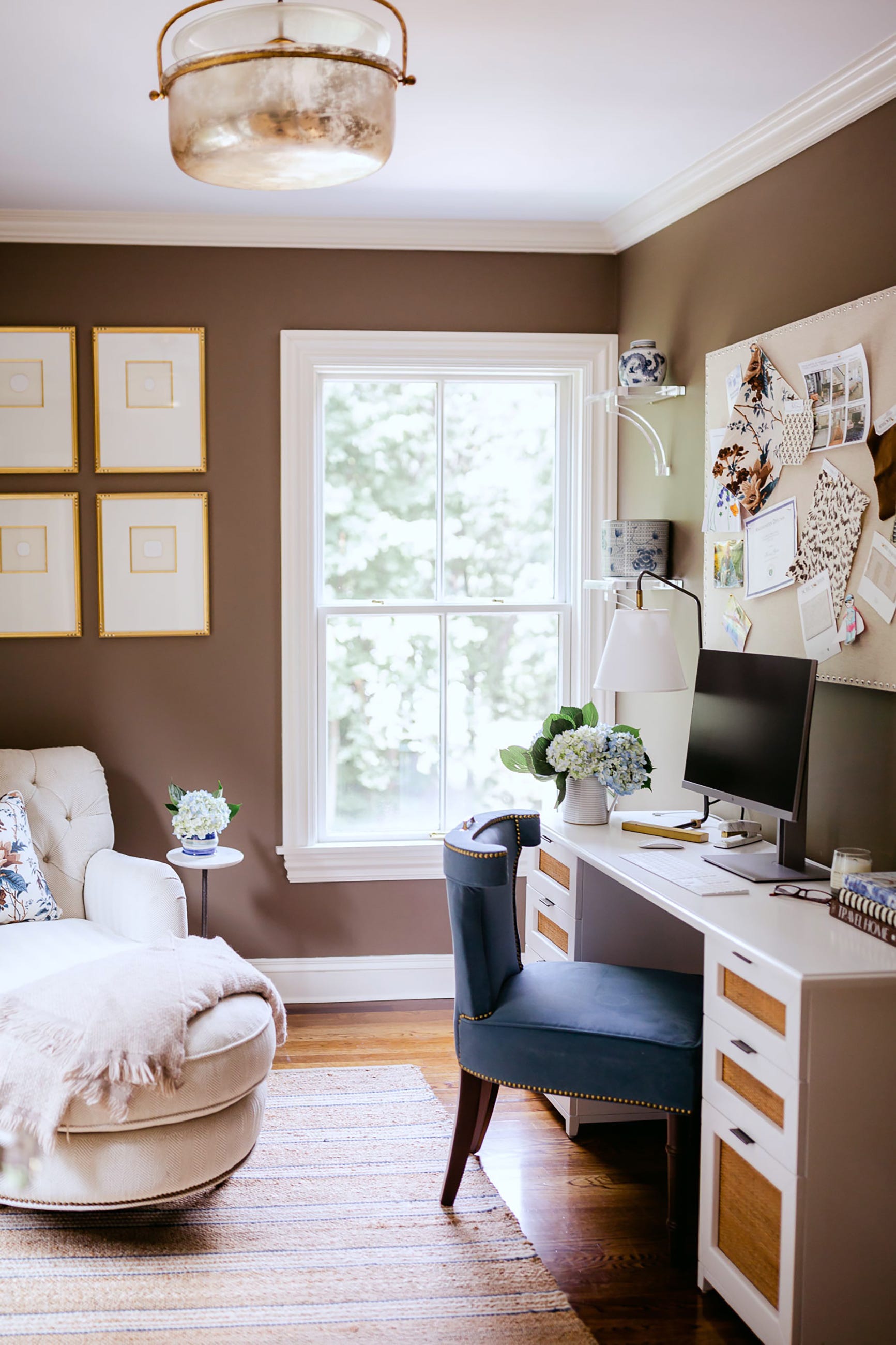
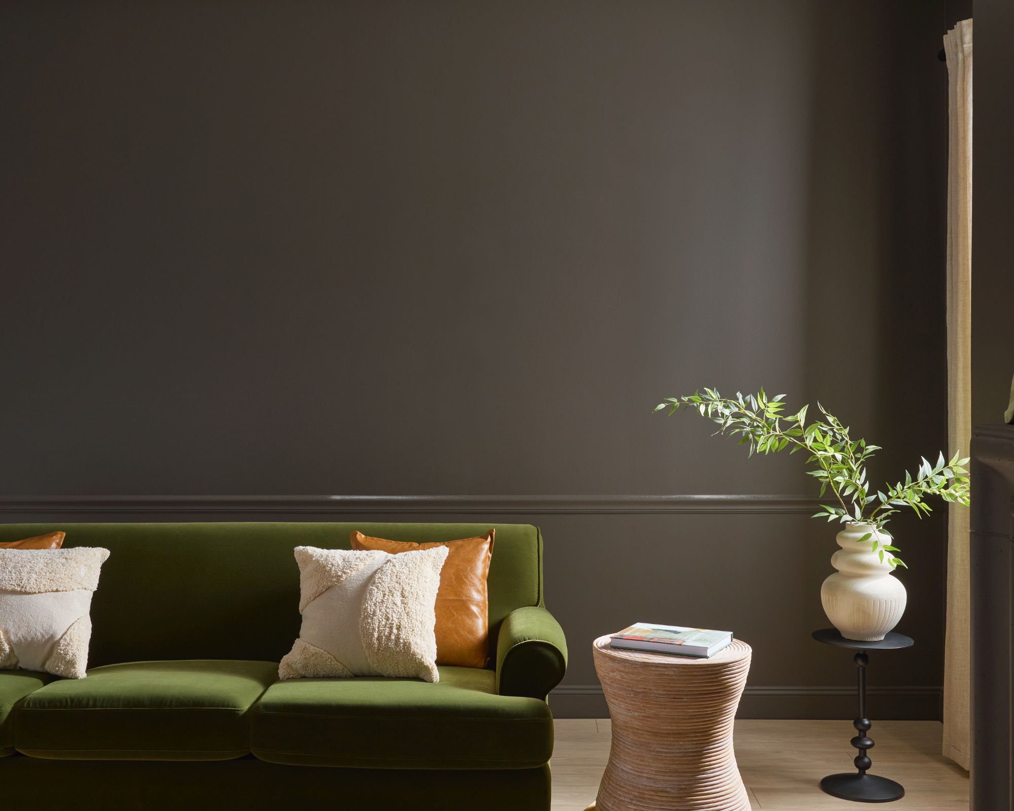
Behr’s 2024 color is "Cracked Pepper," a soft black that represents a significant shift from the previous year's creamy white. Jodi Allen, Global Chief Marketing Officer at Behr, notes that this versatile shade can appear lighter or darker based on its surroundings and is suitable for various applications, from kitchen cabinets to exterior surfaces. Erika Woelfel, Vice President of Color and Creative Services at Behr, emphasizes that Cracked Pepper fosters confidence and individuality, aligning with a desire for comfort and belonging while allowing senses to come alive. It is exclusively available at Home Depot.
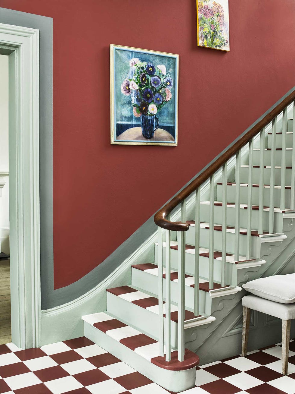
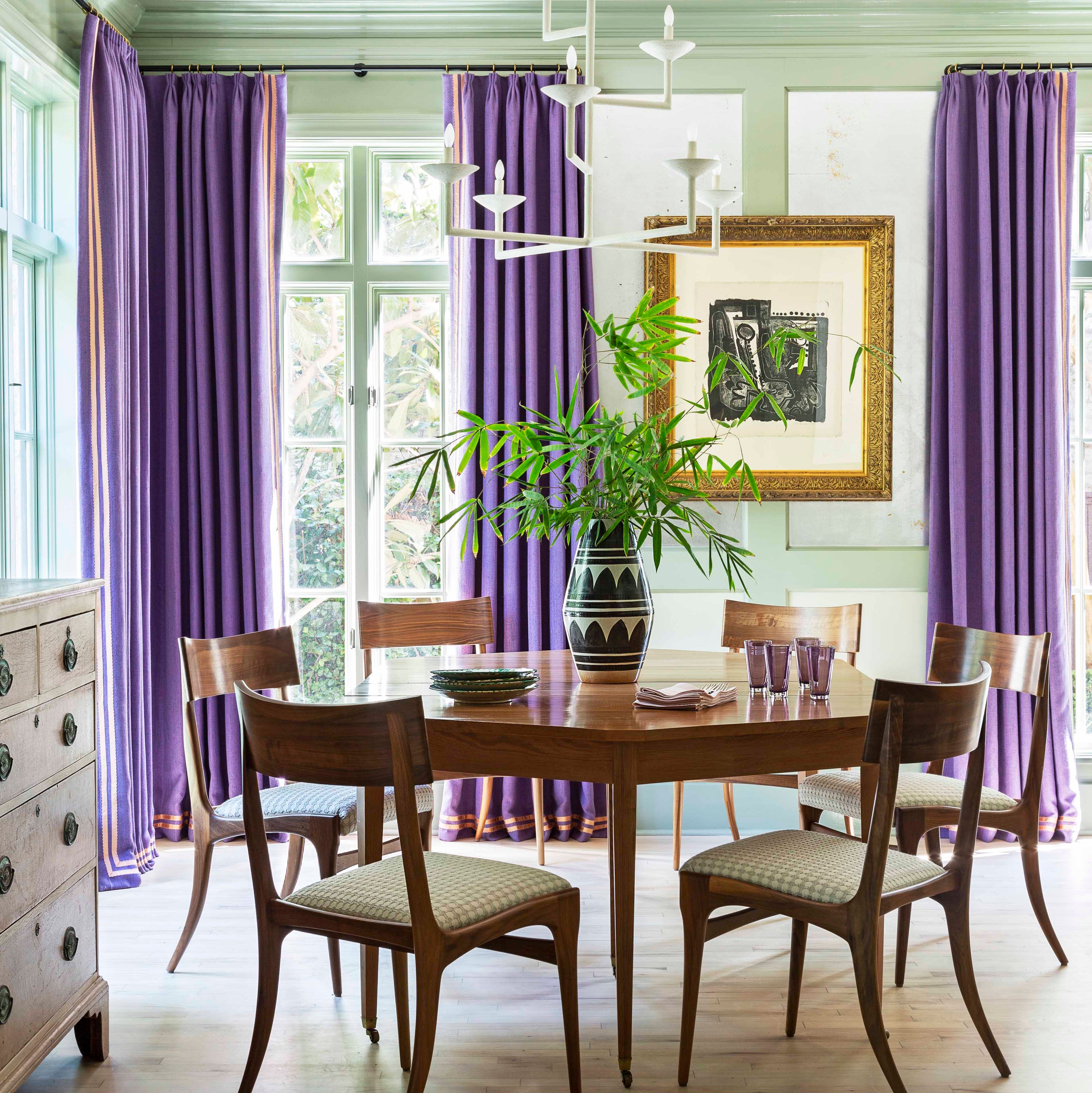
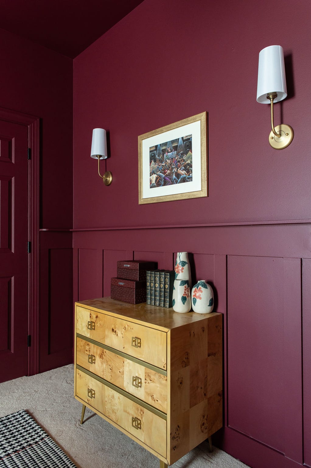
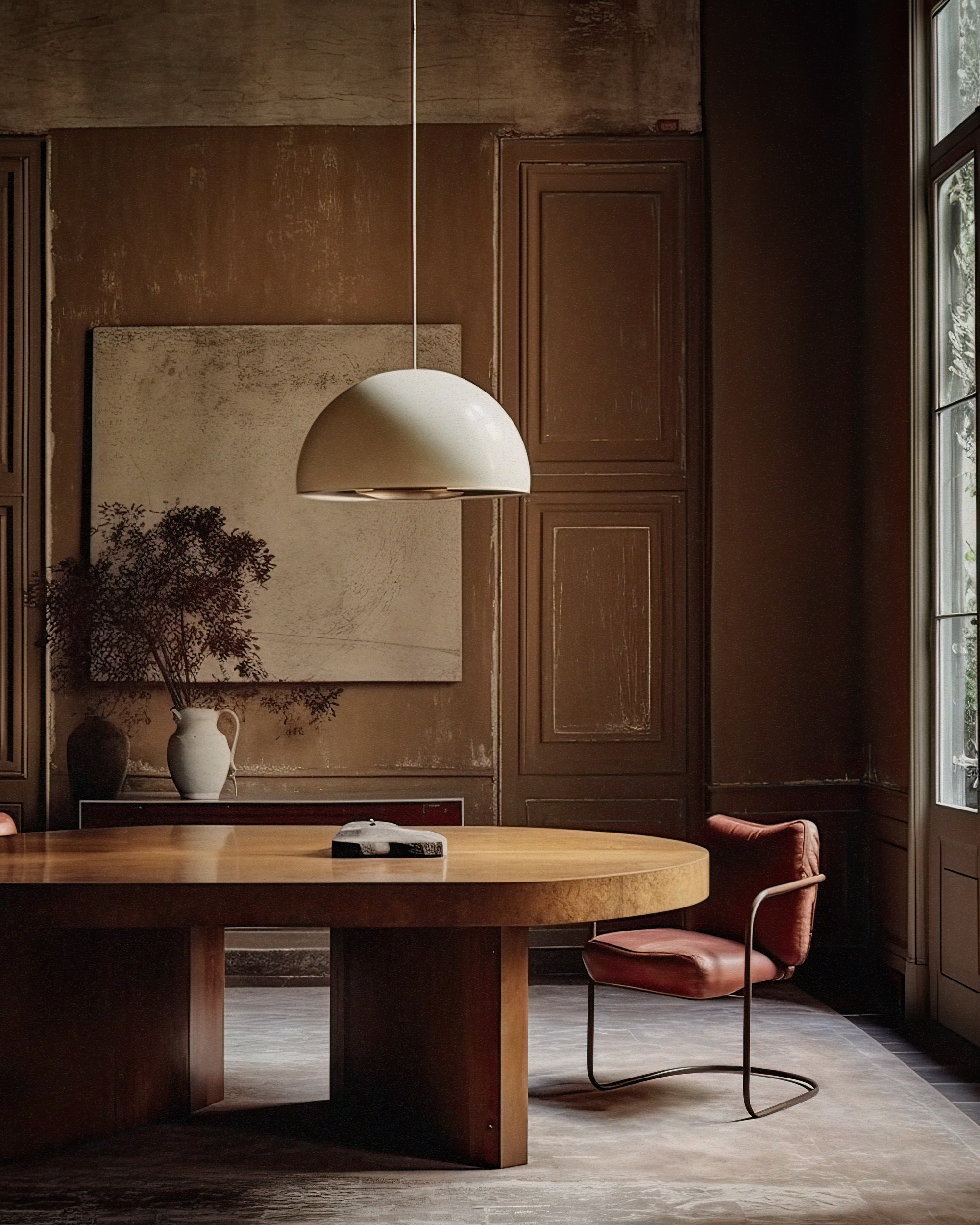
HGTV Home by Sherwin Williams chose "Persimmon," a peach-meets-terra-cotta hue that offers flexibility in its application, capable of feeling grounded or glamorous. Ashley Banbury, color marketing manager, explains that Persimmon allows for personal expression and comfort, being part of the "Renewed Comfort Color Collection." This collection features shades like Dark Auburn, Oakmoss, and Friendly Yellow, alongside neutrals. Persimmon can be used as a main hue balanced with neutrals or as an accent, for example, on a front door or an entire bedroom, or on a kitchen island when paired with white walls, promoting risk-taking in design.
#paintColors #homeDesignTrends #interiorDesign #colorOfTheYear #PantonePeachFuzz #BenjaminMooreBlueNova #DunnEdwardsSkippingStones #BehrCrackedPepper #HGTVHomePersimmon #paintColors #homeDesignTrends #interiorDesign #colorOfTheYear #PantonePeachFuzz #BenjaminMooreBlueNova #DunnEdwardsSkippingStones #BehrCrackedPepper #HGTVHomePersimmon
0 opmerkingen in totaal
 Nog geen opmerkingen
Dit vindt u mogelijk ook leuk
Colour experts share their top paint trends for 2024

These 5 Paint Color Trends Will Be Everywhere in 2024, According to Interior Designers
The Paint Color Trends of 2023 Are in—And They’re Gorgeous
The 15 Best Moody Paint Colors of 2024

12 Trending Paint Colors for 2024, According to Design Experts


2024 Fashion Colour Trends To Brighten Up Your Wardrobe

These Are The Top Kitchen Paint Colors For 2024

These are the 'fail-safe' paint color combinations to embrace in 2024, according to Lick's color psychologist

Pick Your Favorite 2024 Color of the Year

Here's Every 2024 Color of the Year We Know So Far
Here Are the Most Popular Bedroom Paint Colors for 2024

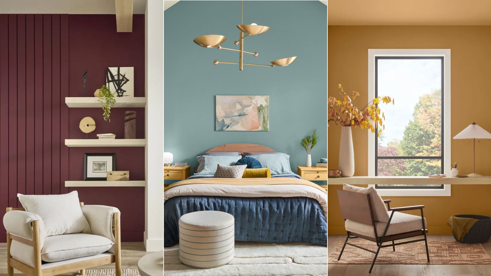
Colors of The Year – get to know every shade revealed by leading paint brands for 2025
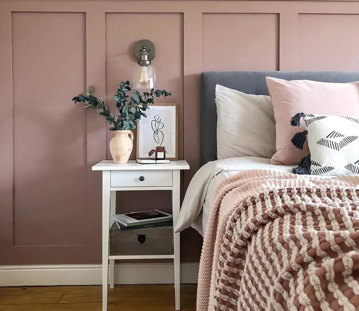
These Were Our Editors' Favorite Paint Colors and Trends of 2024
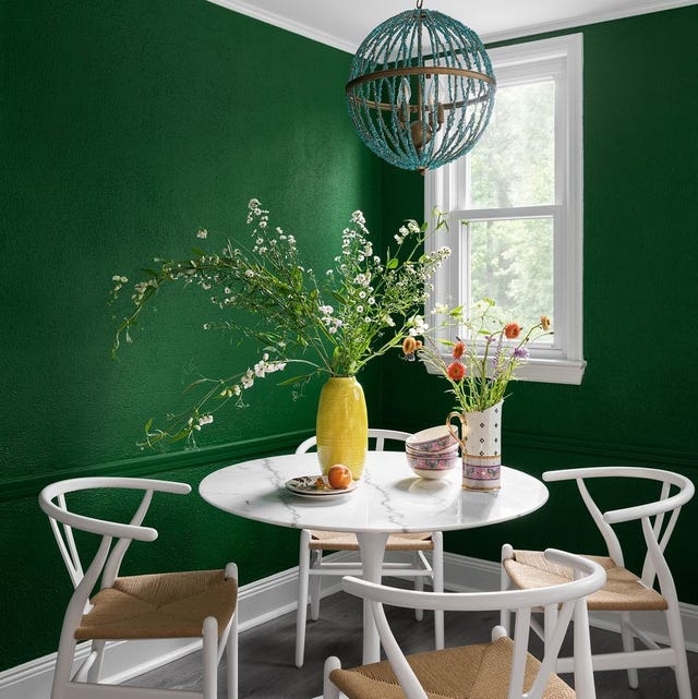
The Interior Paint Colors You'll Be Seeing Everywhere in 2024
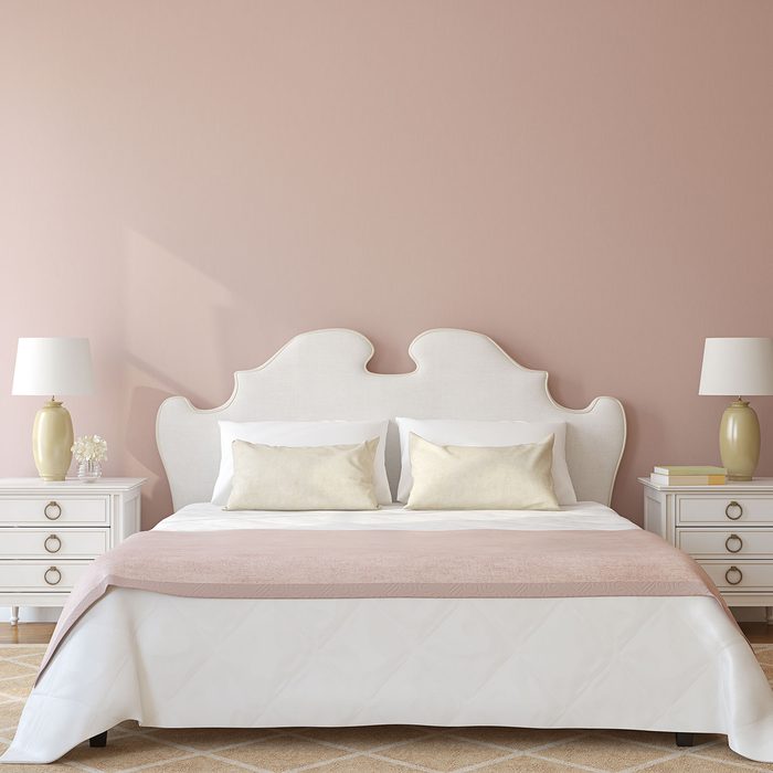
These Are the Top Bedroom Colors of 2024

'It can soothe your soul' - 5 earthy paint colors designers say are big trends for 2024

7 Color Trends That Will Be Huge in 2024, According to Color Experts

Bold, edgy color drenching is going to be big in 2024
We asked paint brands what their most popular shades of 2024 were – these were the 13 favorites
The 8 Best-Selling Paint Colors of 2024: Greens, Whites, and Neutrals