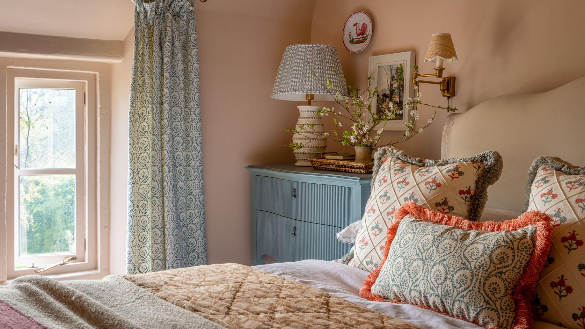
1/7
These are the 6 must-have colors to decorate with in April 2025
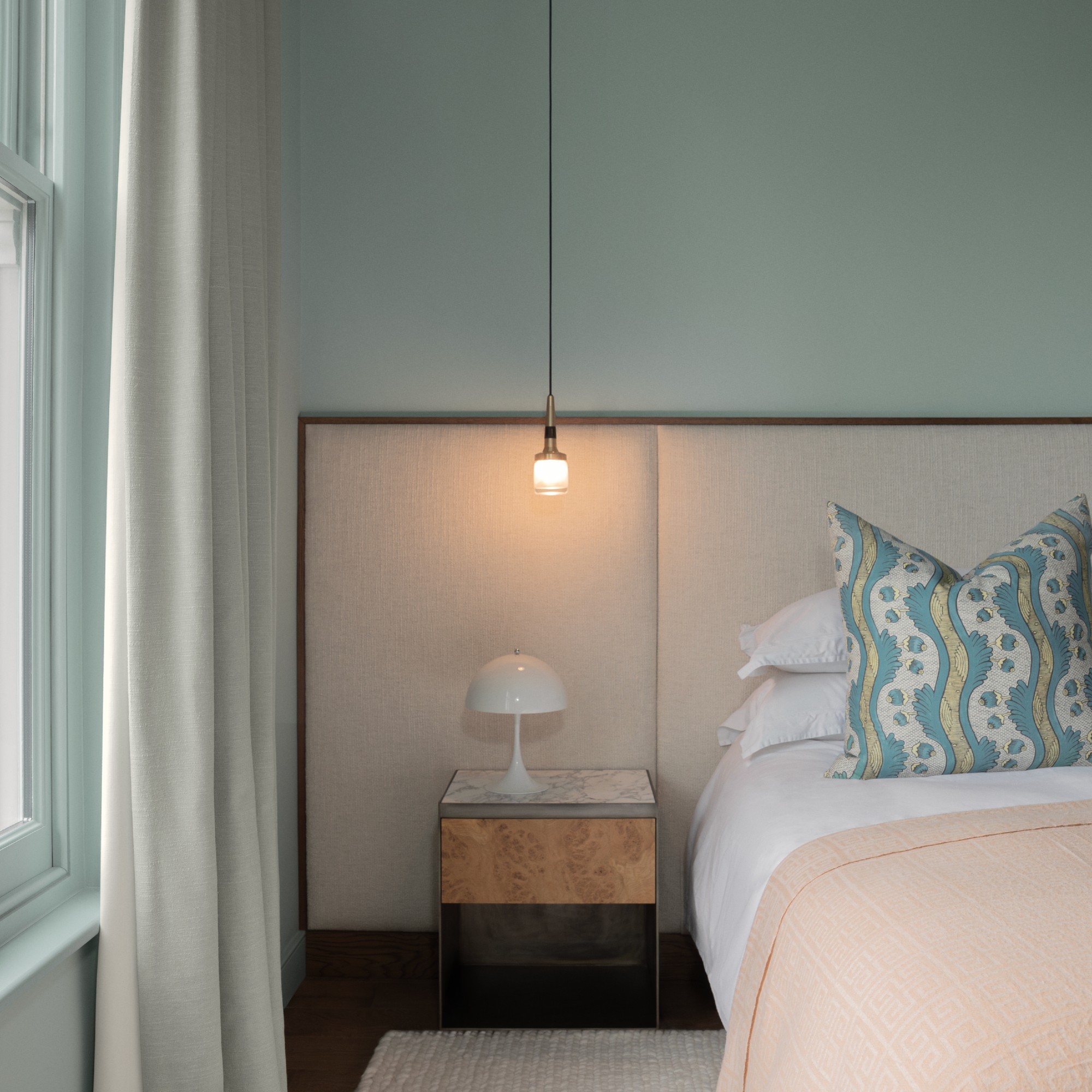
This article highlights six essential colors to incorporate into home decor for April 2025, drawing inspiration from the freshness and potential of springtime. Interior designers note that April is an ideal time to refresh homes with new color palettes, moving beyond winter's dormancy. The selected colors range from subtle to vibrant, each offering unique qualities to enhance living spaces.
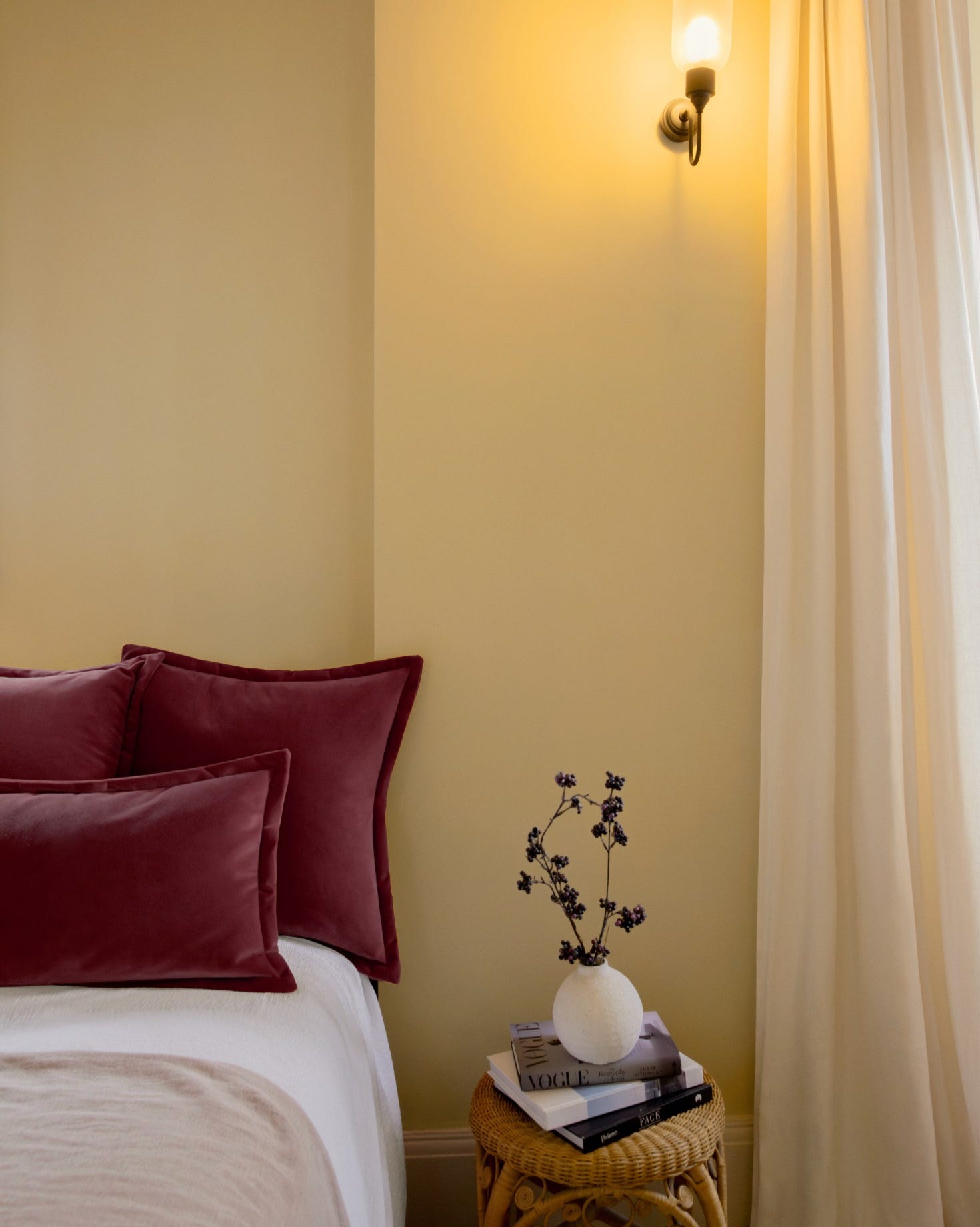
Butter yellow is introduced as a comfortable and less flamboyant alternative to brighter yellows, working well in various rooms such as bedrooms, dining rooms, sitting rooms, and kitchens. It evokes a warming, comforting atmosphere and, when paired with fresh greens and complementary blues, creates a harmonious balance of freshness and groundedness, reminiscent of primroses.
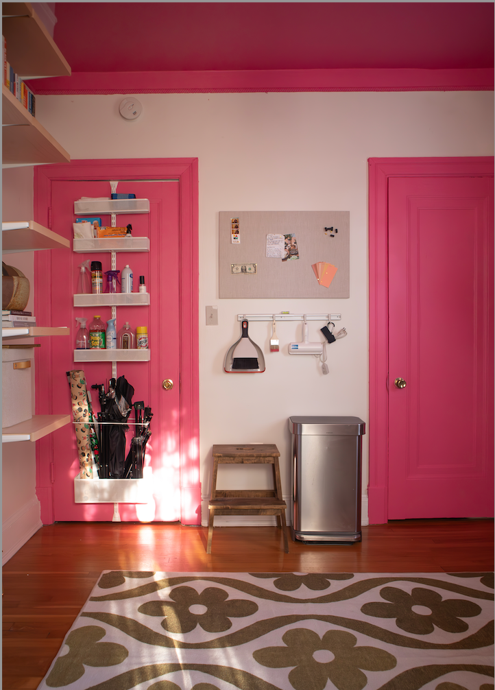
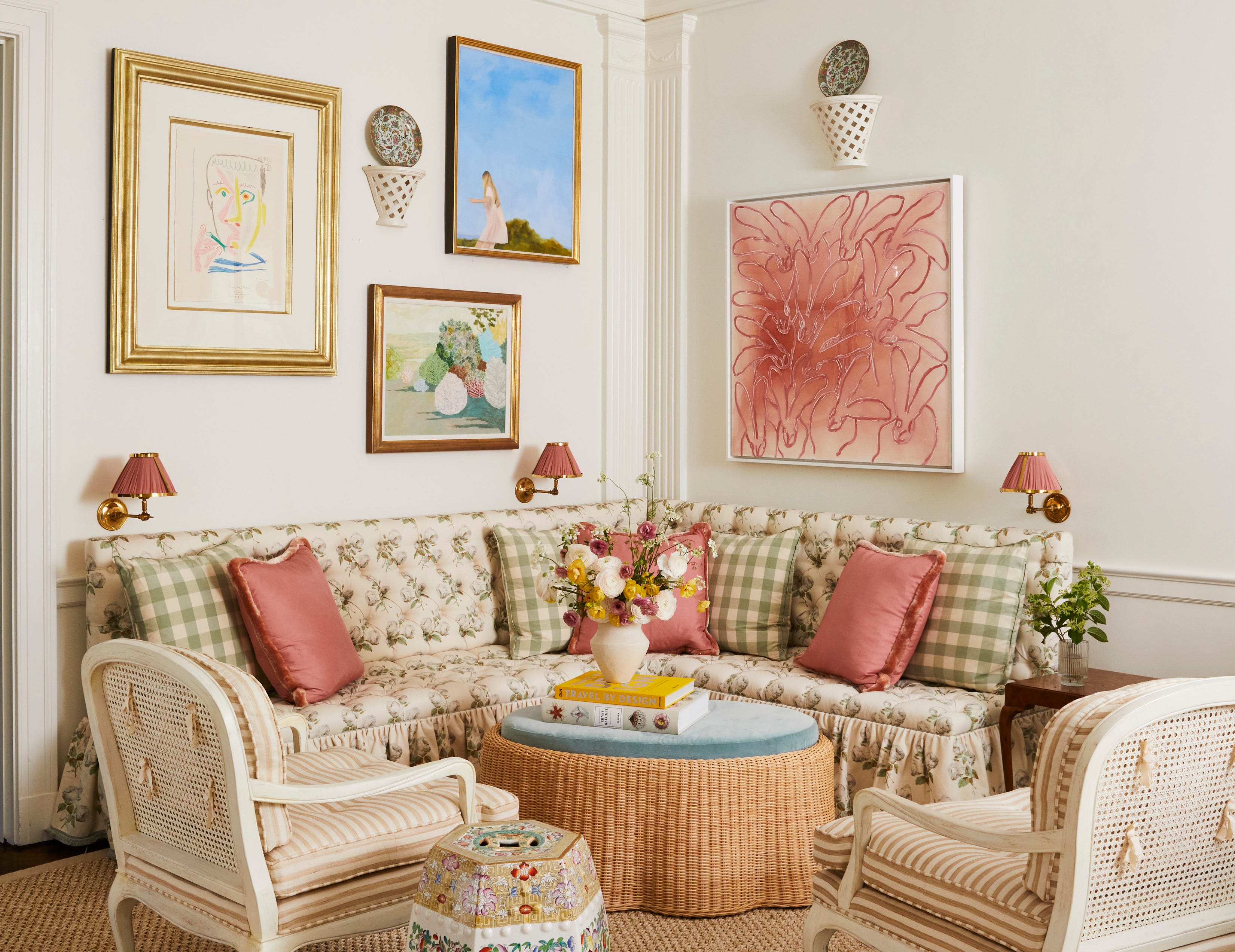
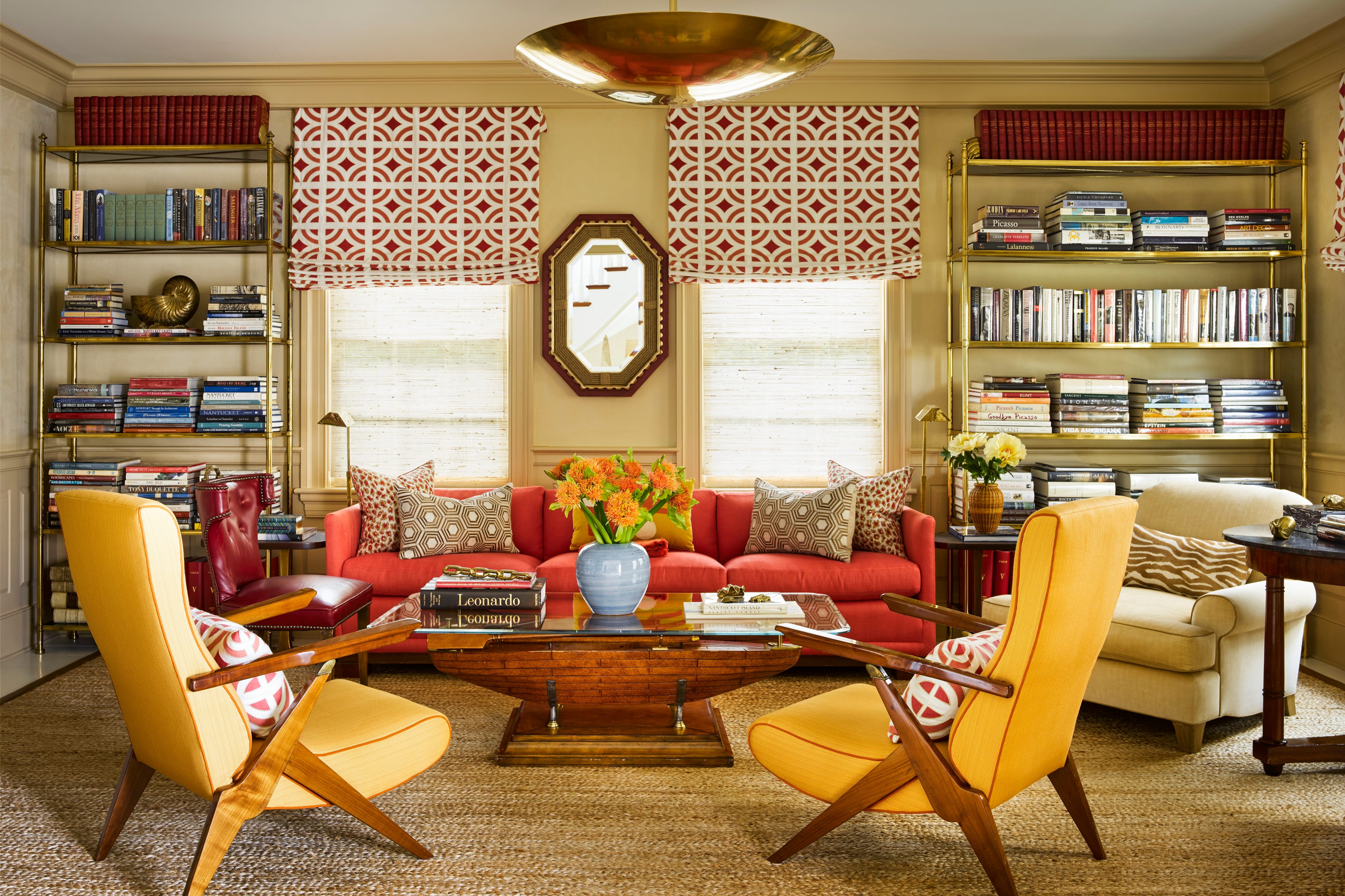
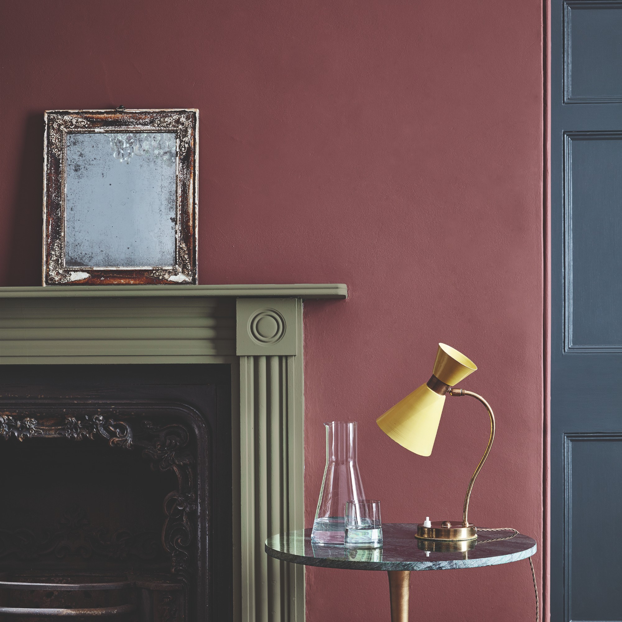
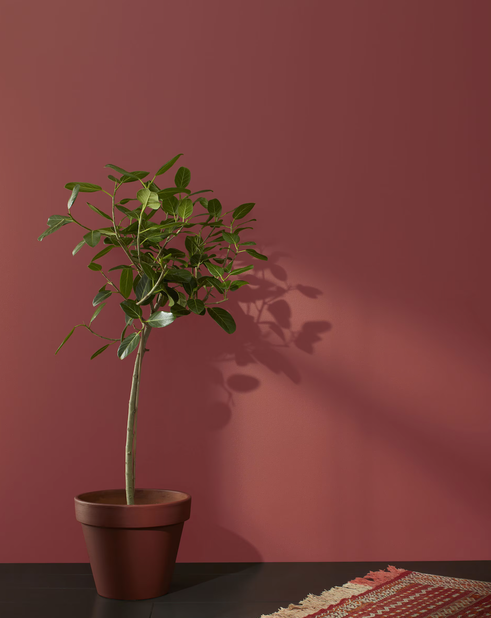
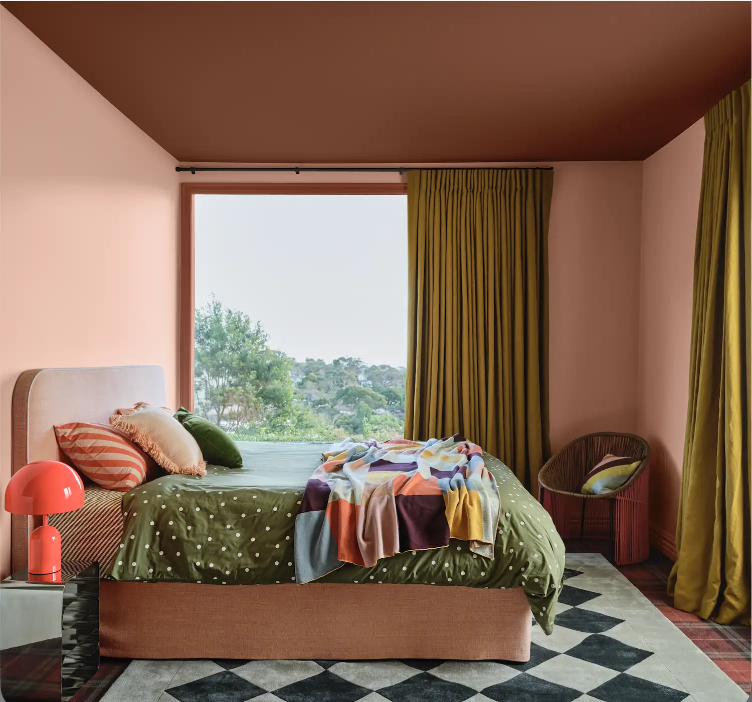
Coral is presented as a joyous color that injects energy and optimism without being overly intense. The key to successful coral application lies in selecting the right undertone, with options like Farrow & Ball's Red Earth offering an earthy, warm red undertone for a more subdued feel, while Charlotte's Locks has an orange undertone for a sprightly, effervescent effect. Coral pairs well with creamy warm-toned off-white paints, such as Farrow & Ball Scallop, creating a beautiful contrast.
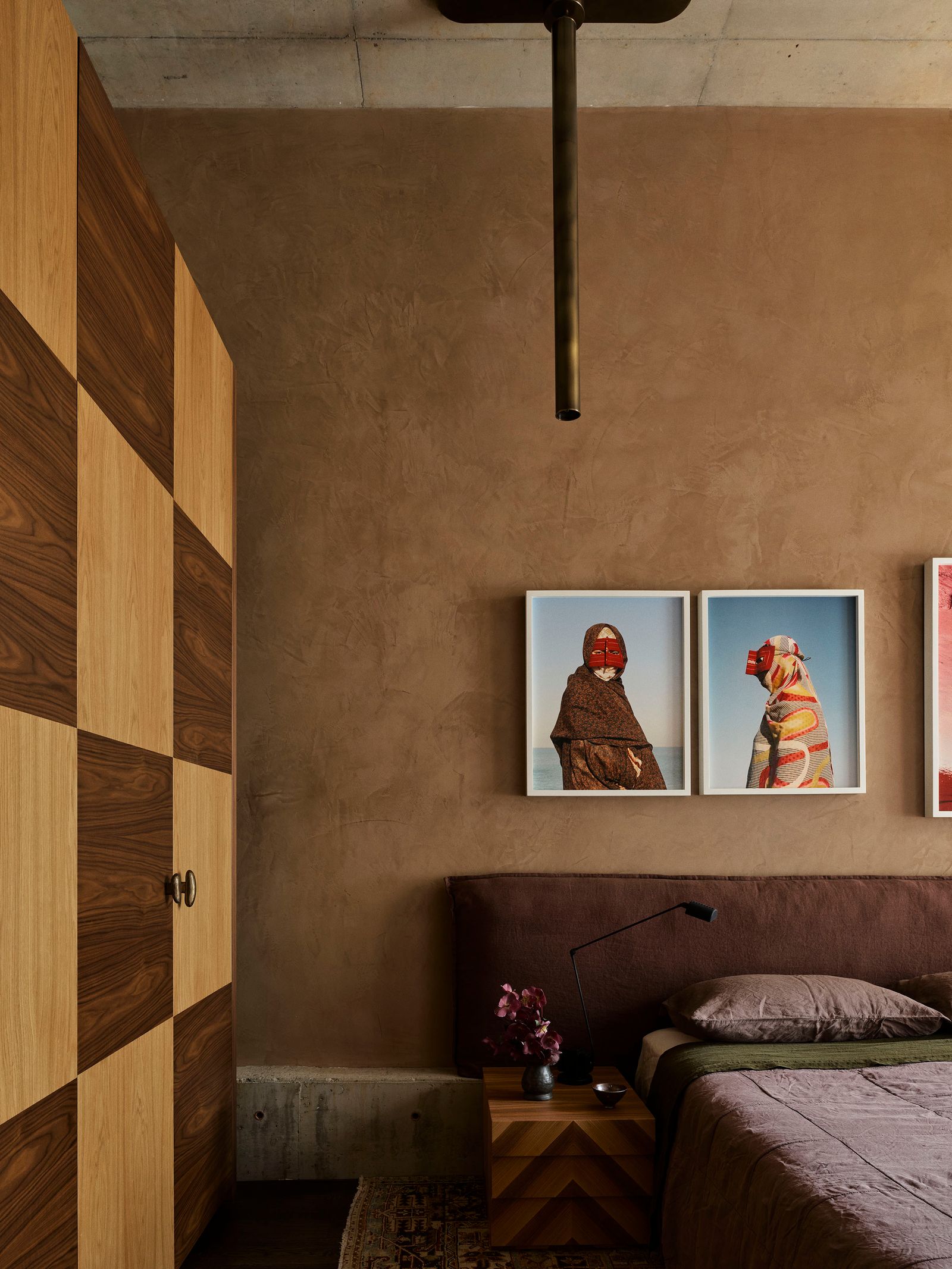
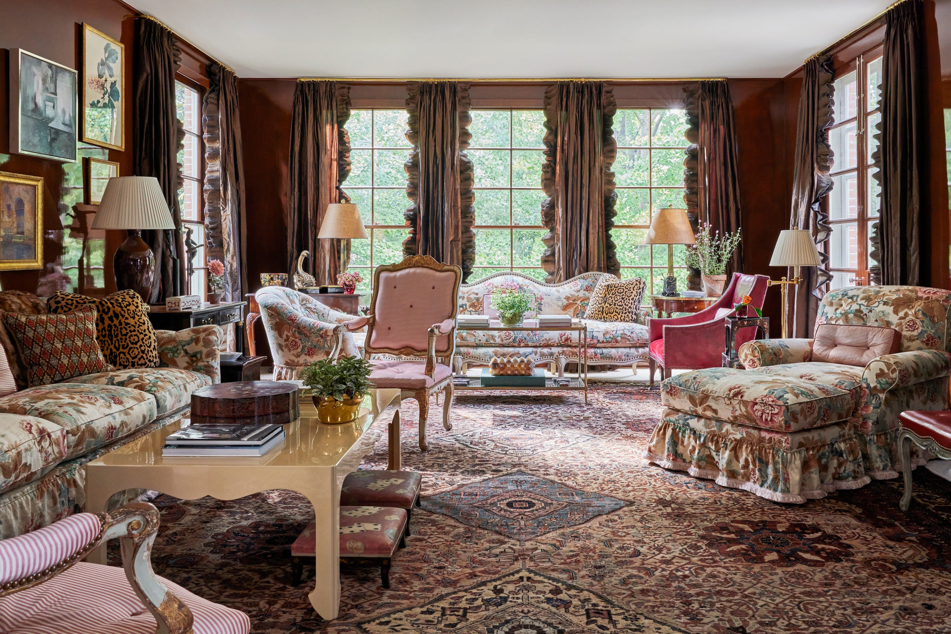
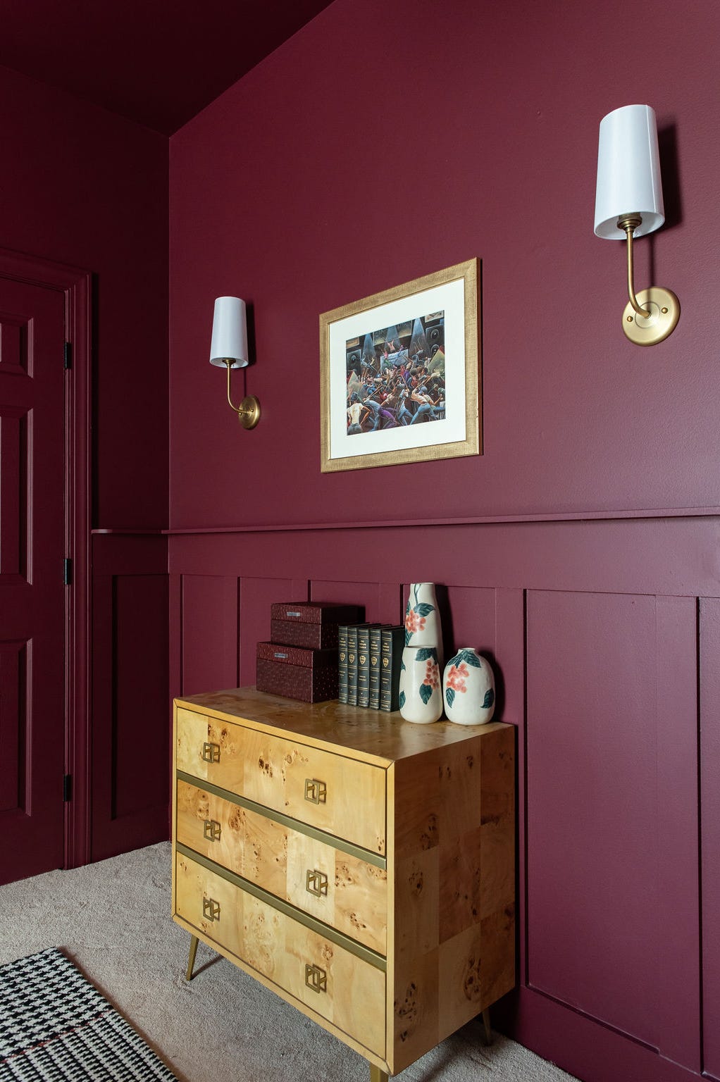
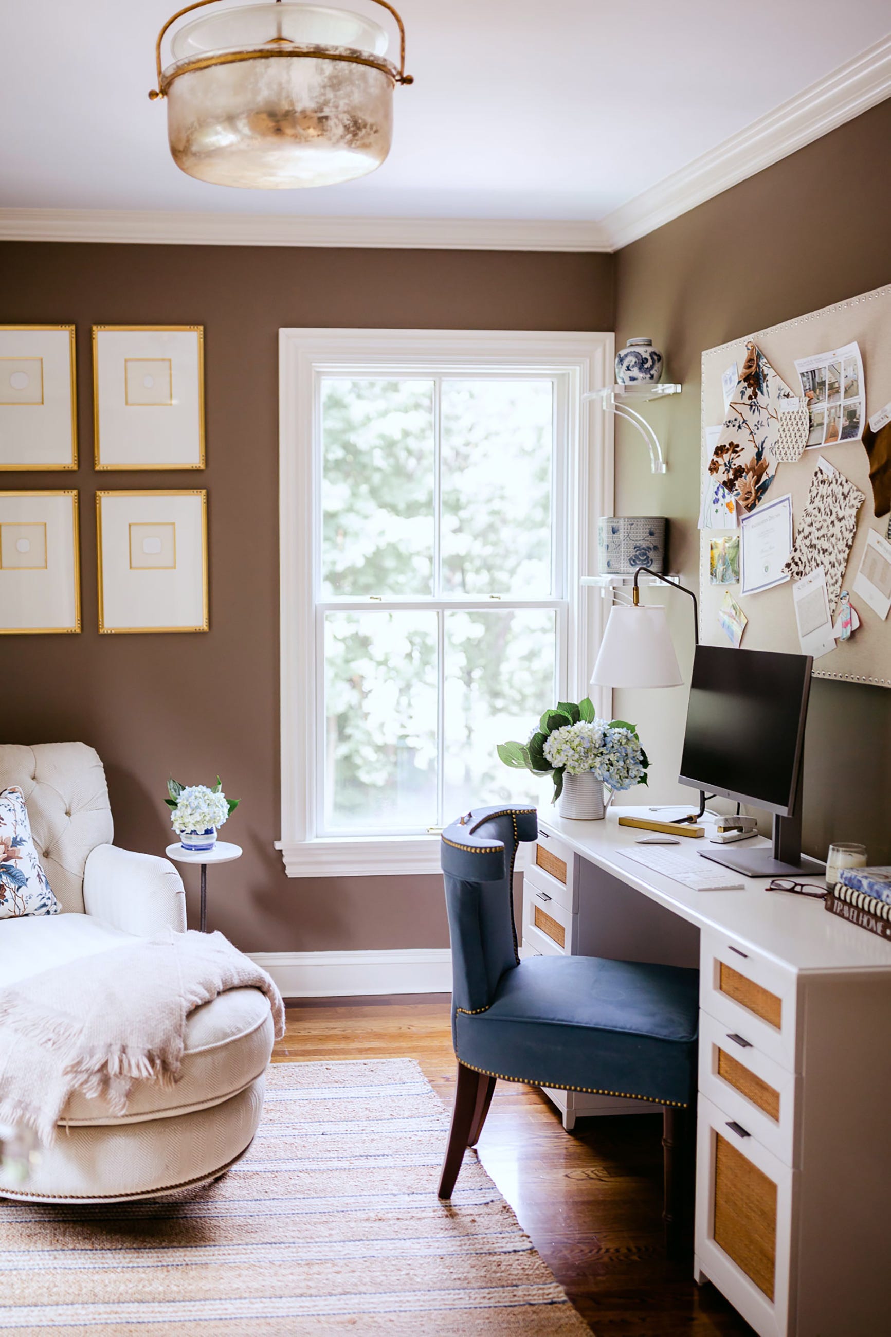
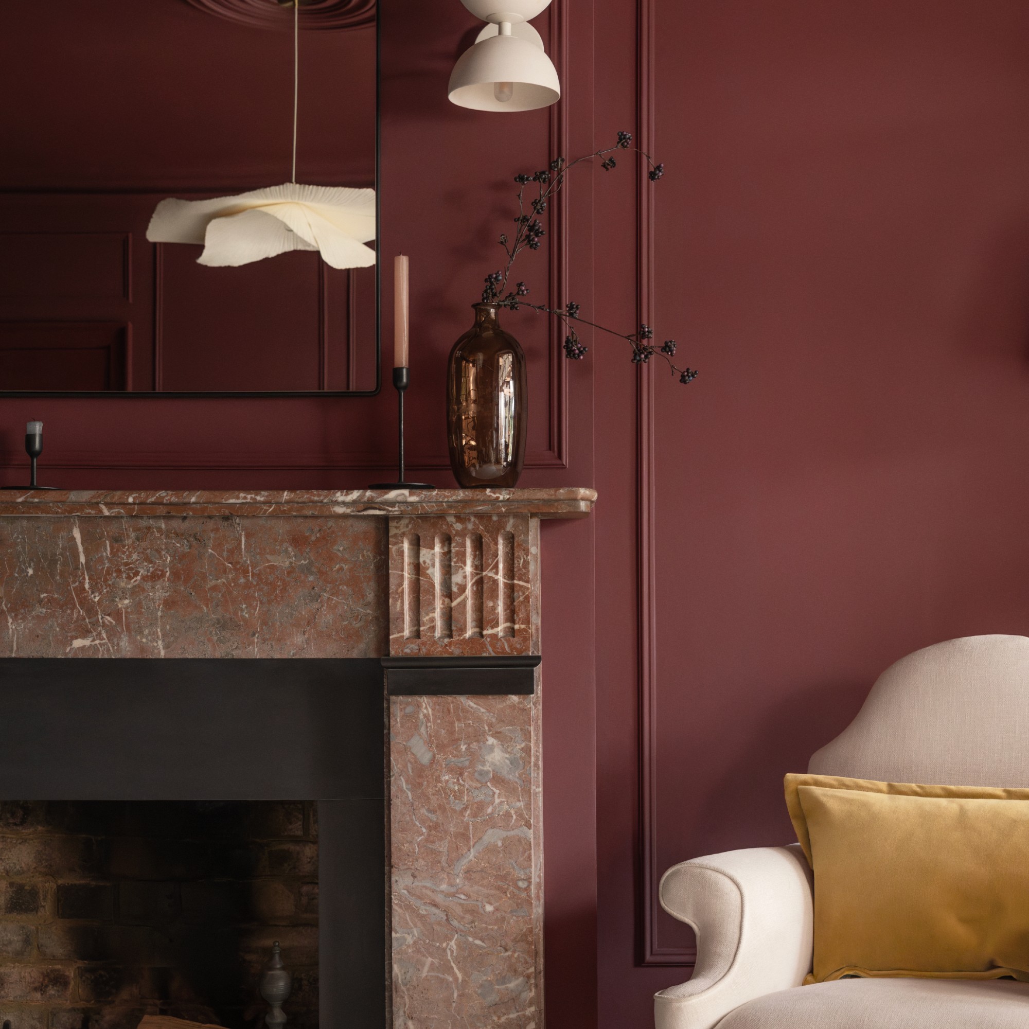
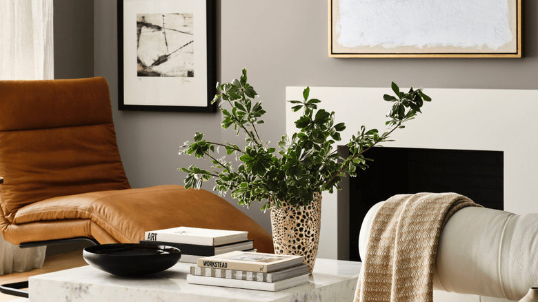
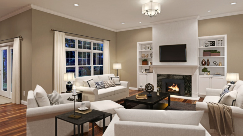
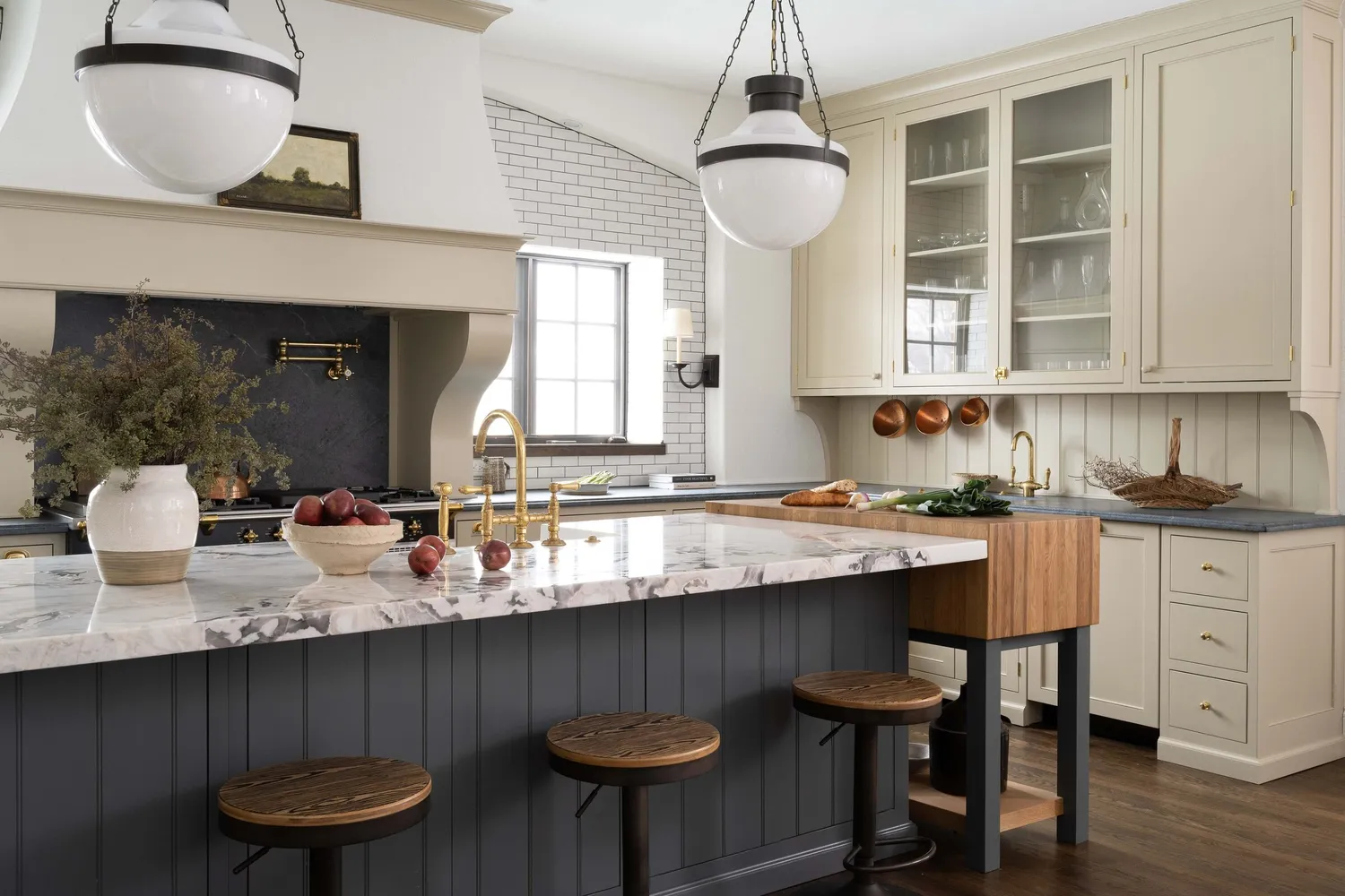
Moleskin browns are recommended as a sophisticated neutral, particularly for those seeking an alternative to greige. These fawn-colored hues are described as wonderfully pigmented, full of traditional character, and effective in enhancing the intimacy of small spaces without making them feel claustrophobic. They blend seamlessly with both contemporary and period interiors, complementing rich dark reds, greens, and muted pinks and browns.
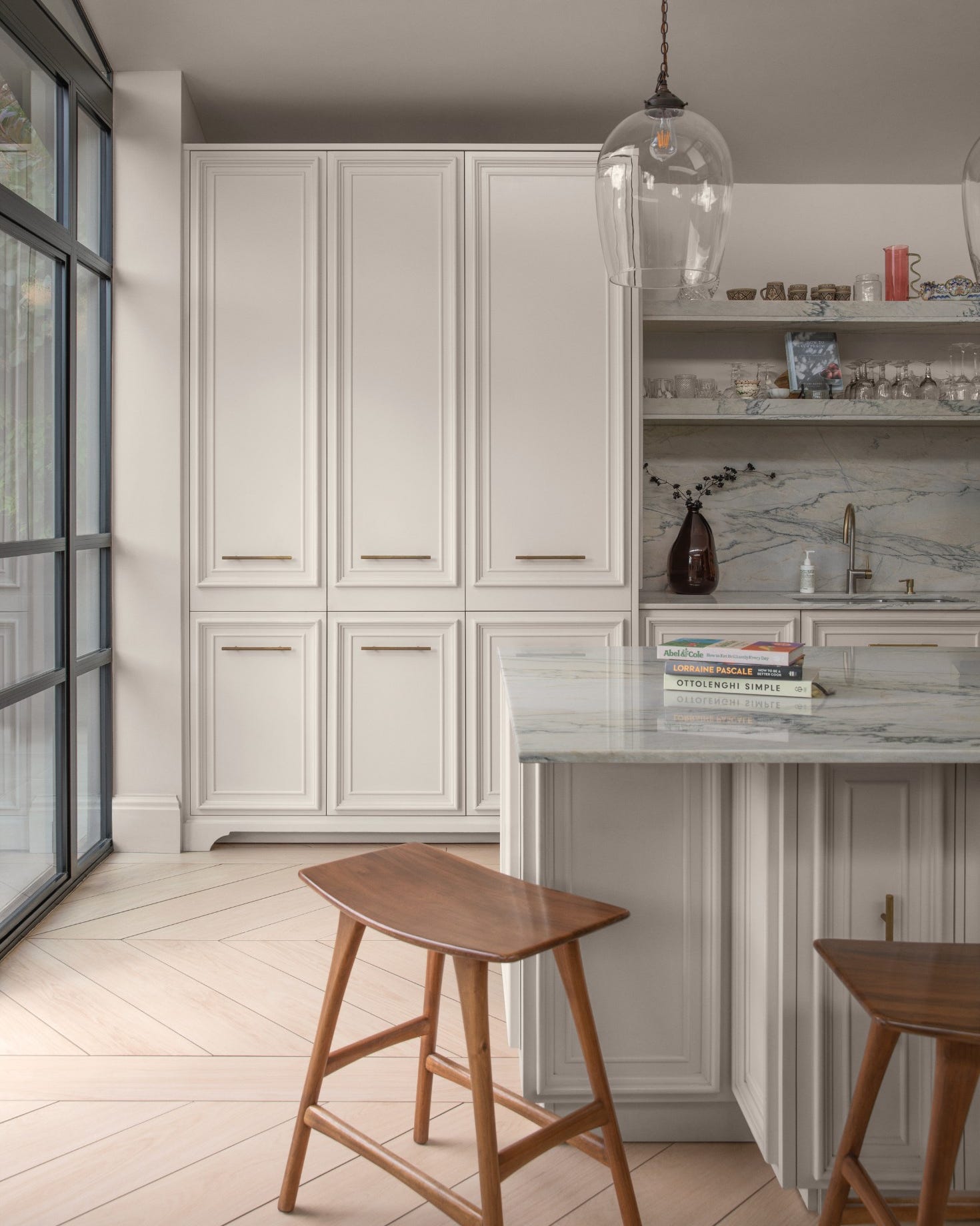
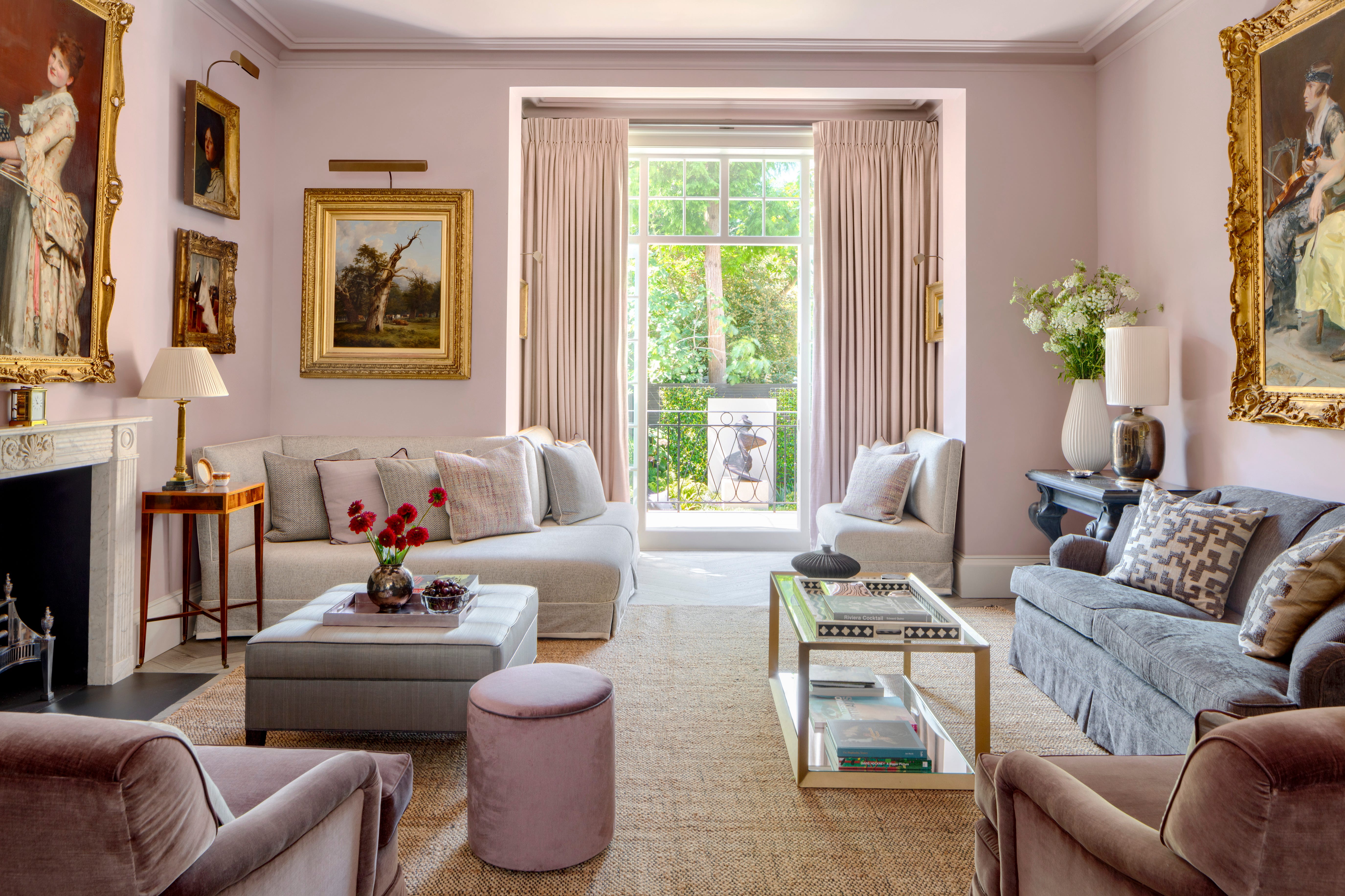
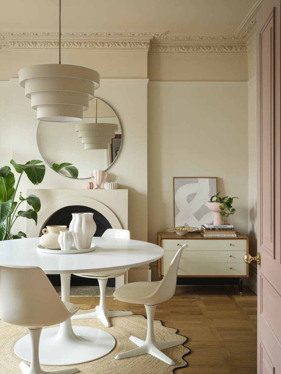
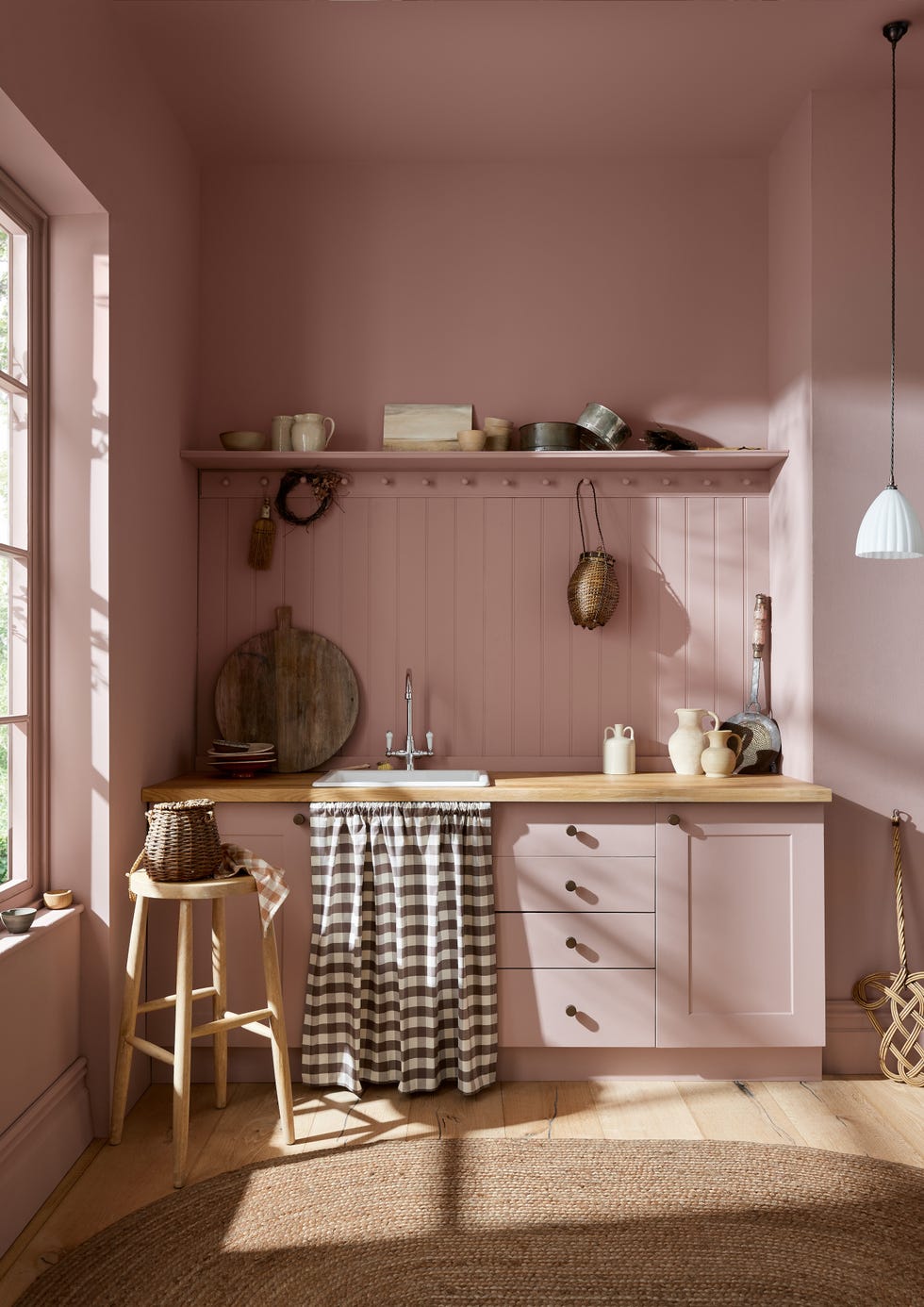
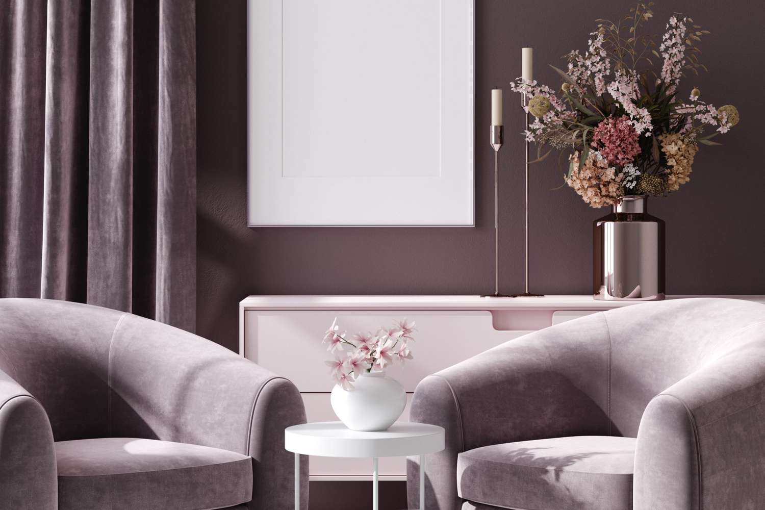
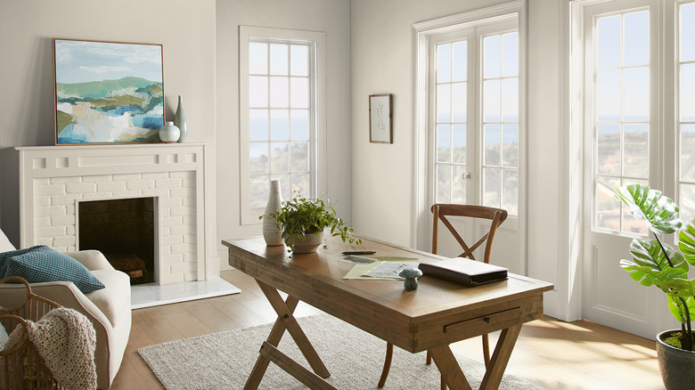
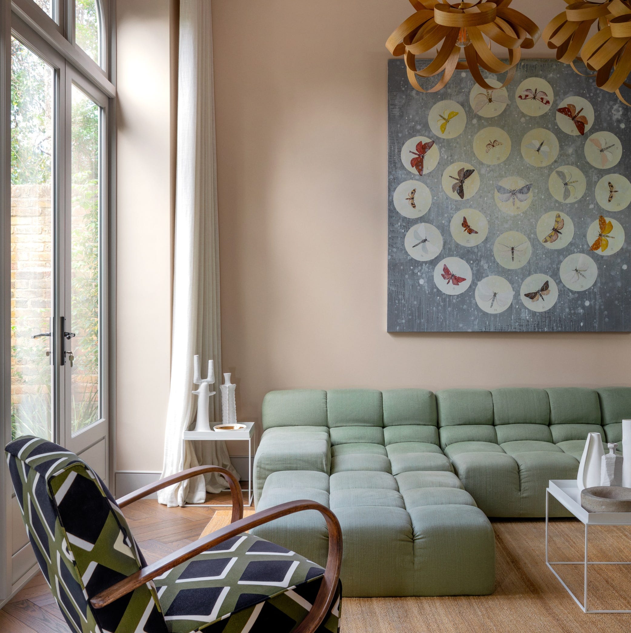
Barely-there pink is highlighted as a new failsafe neutral, especially for creating nurturing, soft spaces that retain neutrality and light-reflecting properties. Examples include Farrow & Ball Scallop, Tailor Tack, Little Greene's Julie's Dream, and Mylands' Clerkenwell, all of which offer a delicate pink that avoids being saccharine or overly feminine, drawing parallels to blooming magnolias and cherry trees.
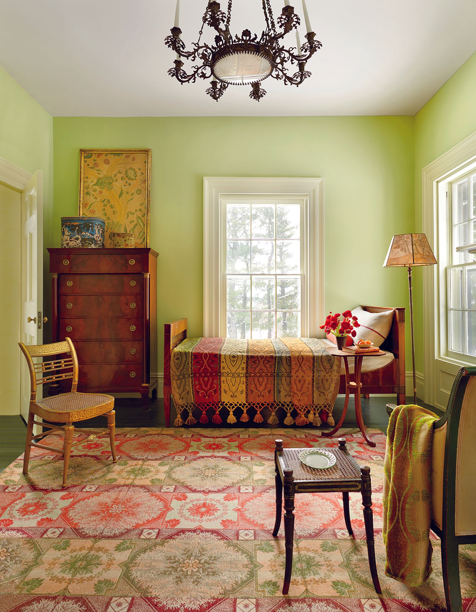
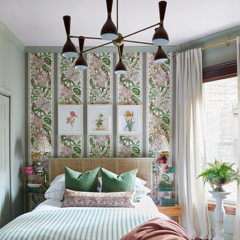
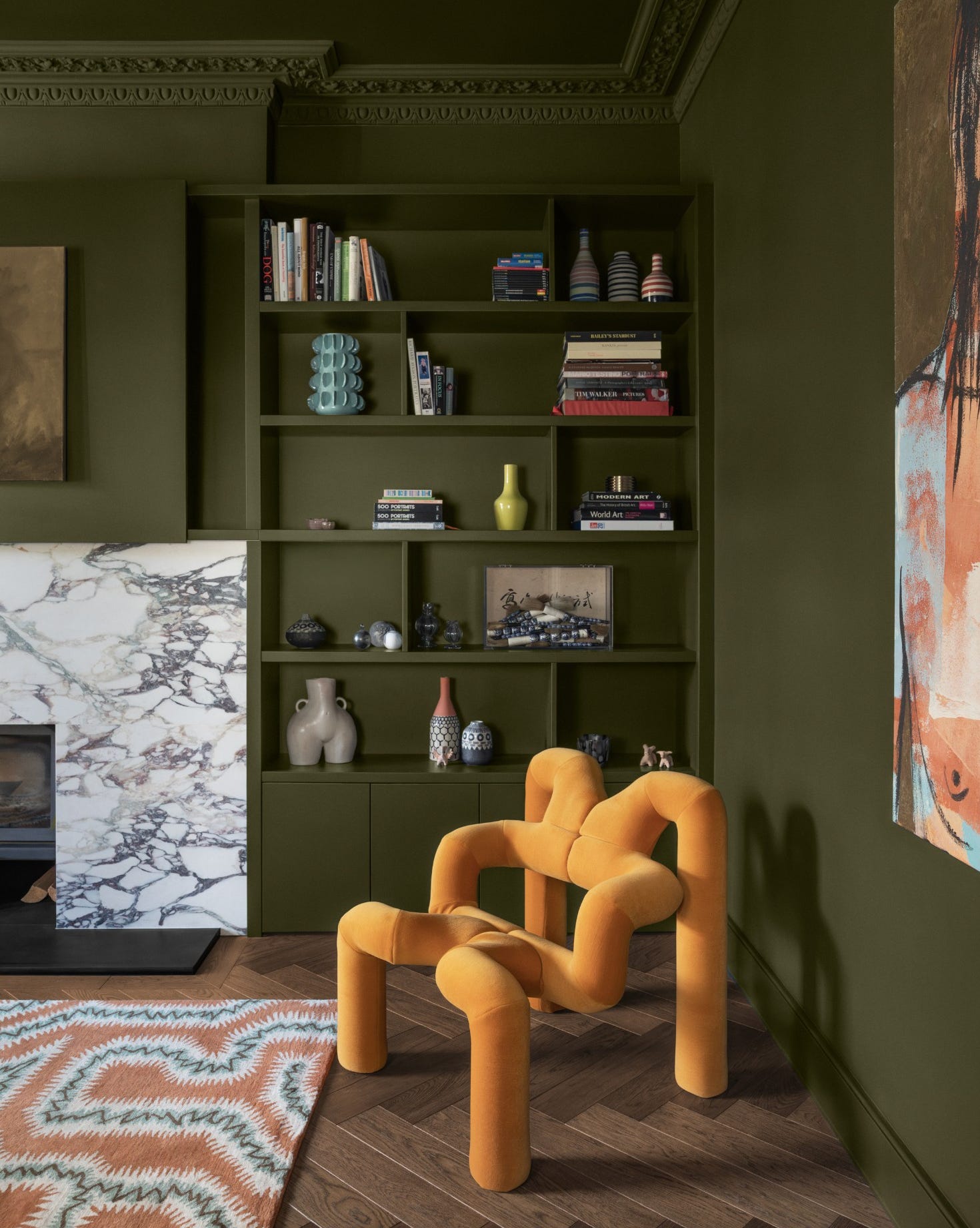
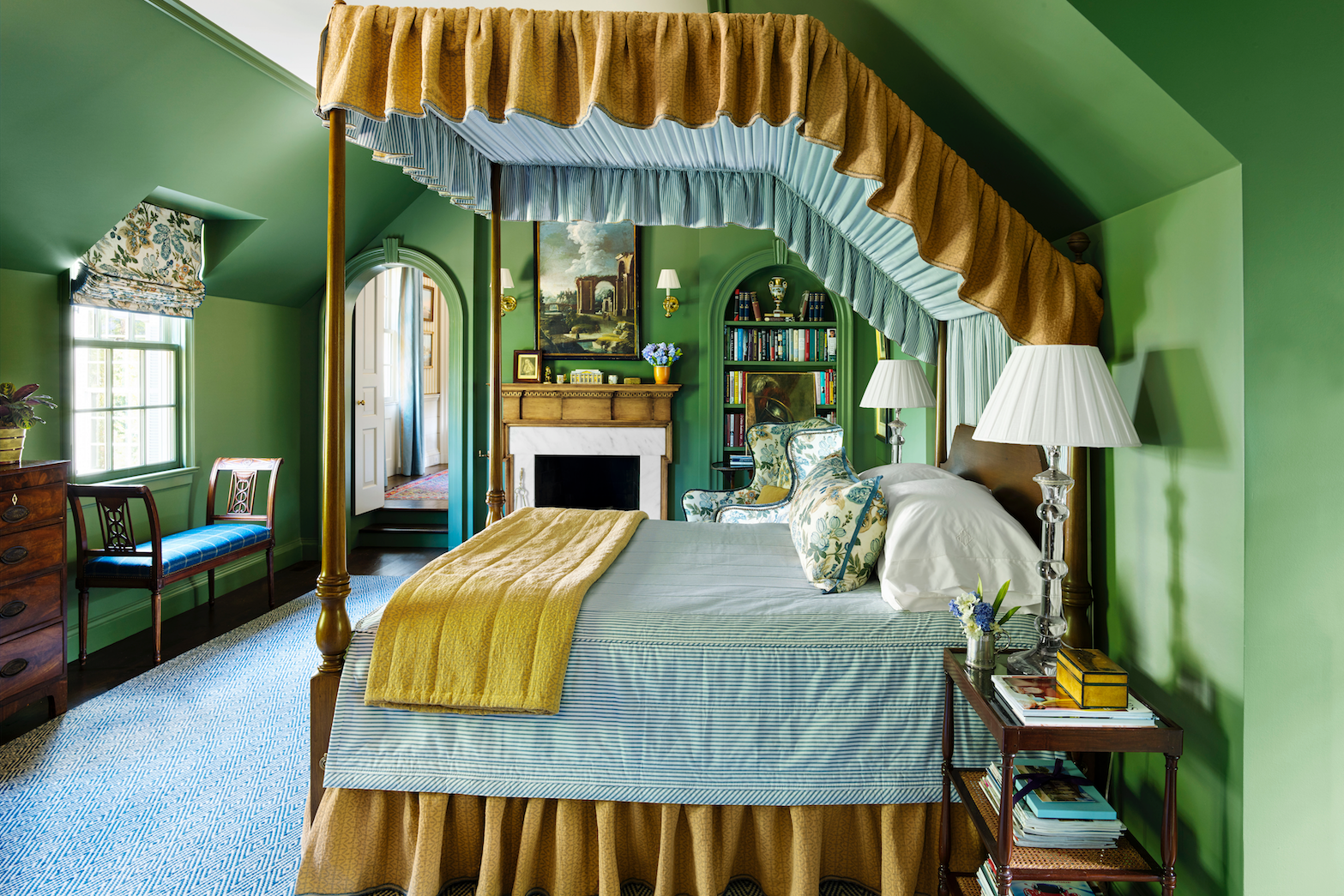
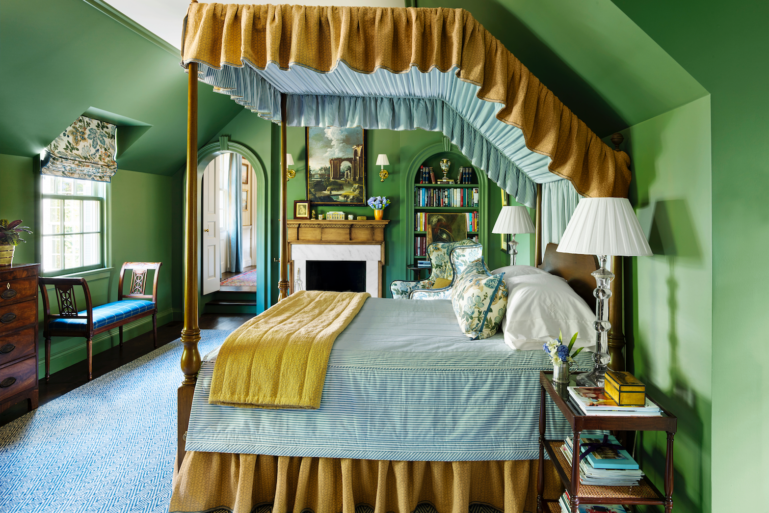
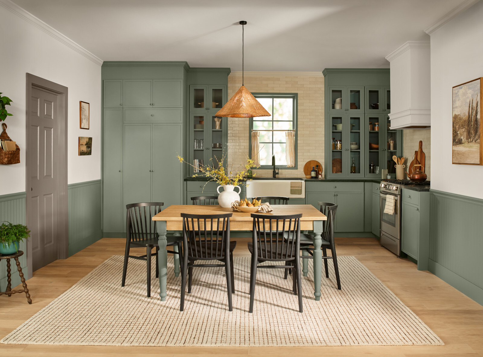
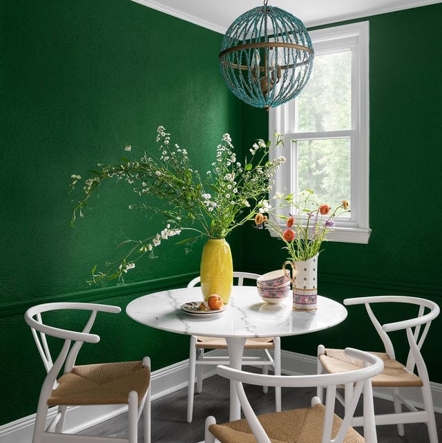
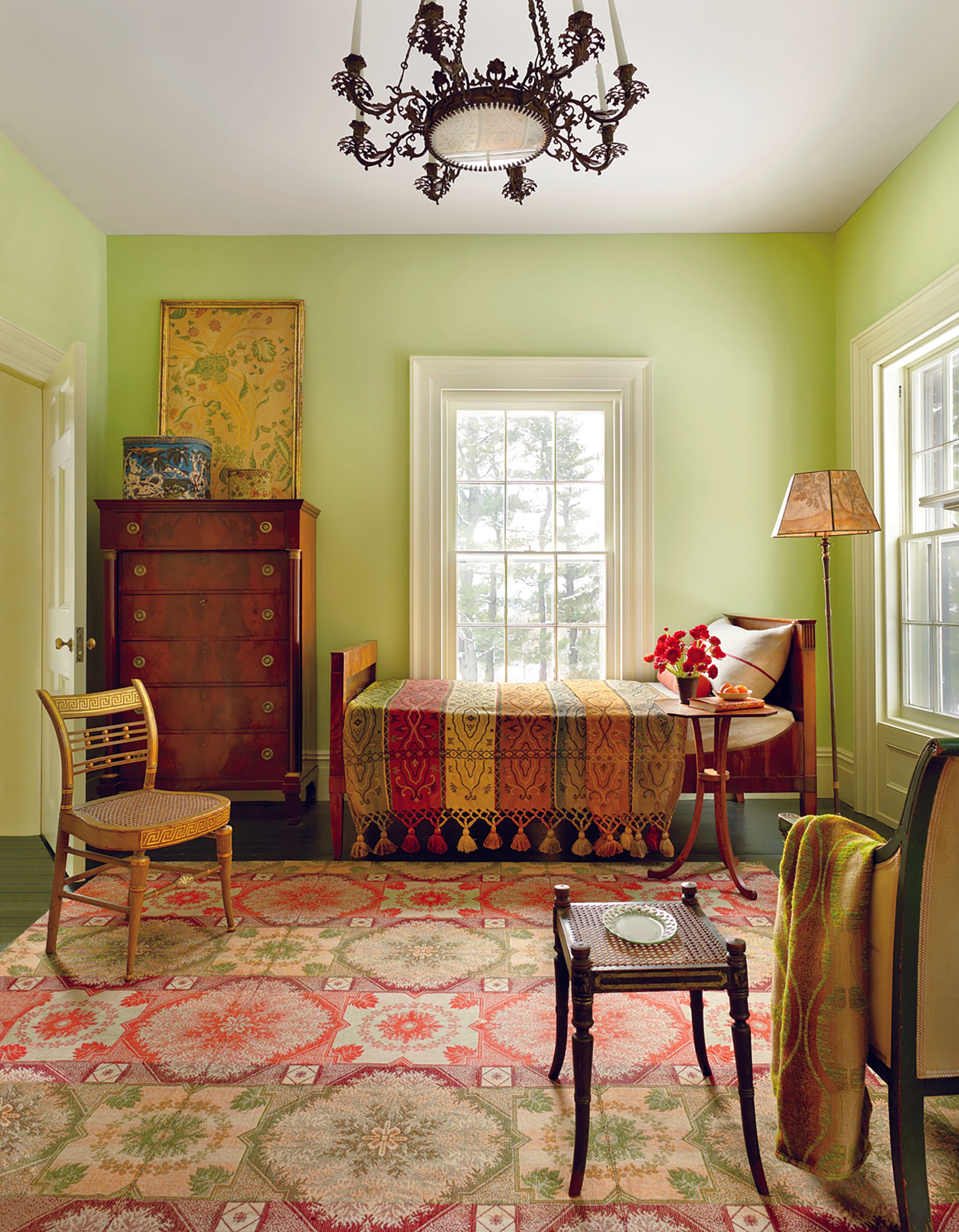
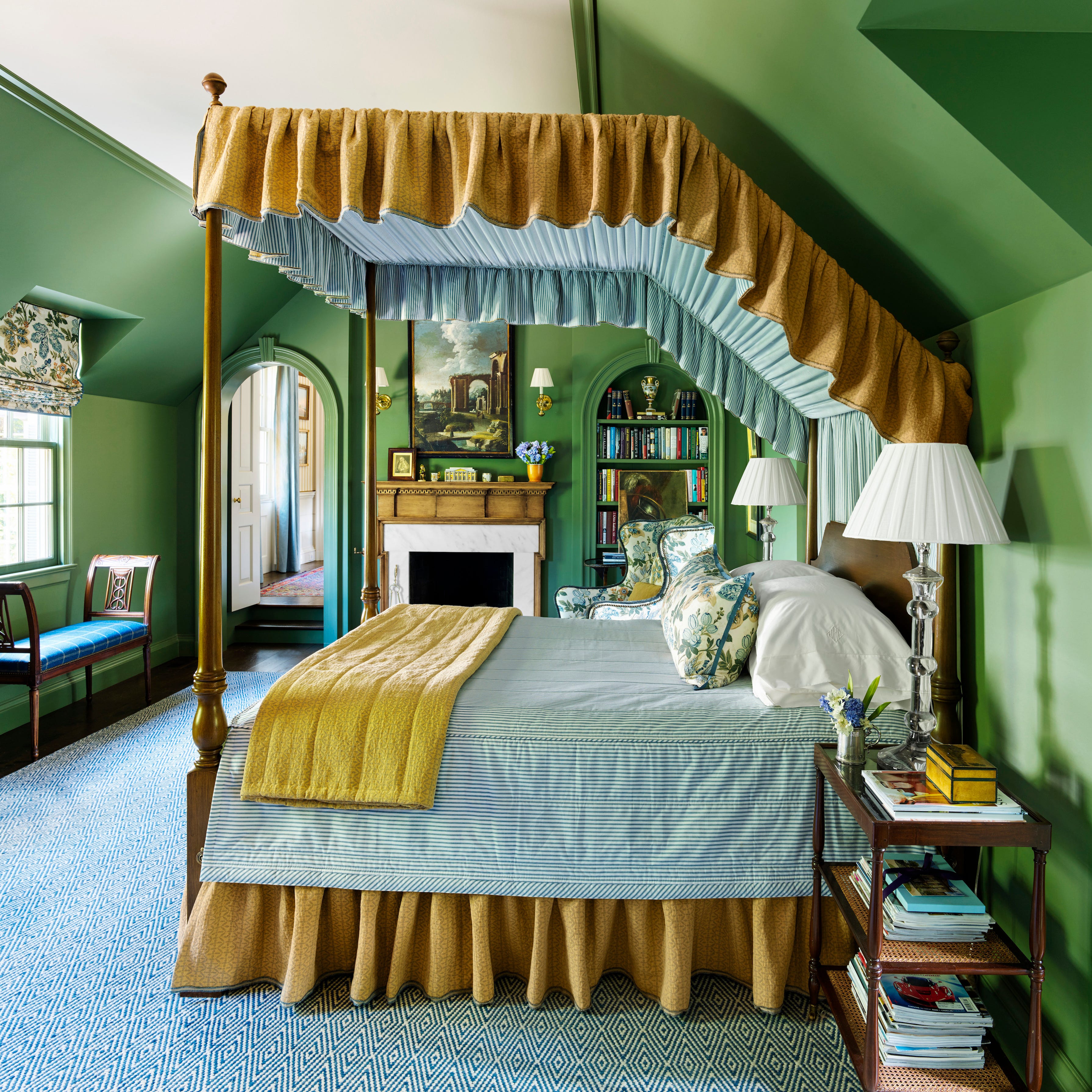
Fresh greens are advocated for those desiring an elevated, design-led interior that transcends fleeting trends. These ebullient greens provide a vibrant alternative to safer sage or minty pastels, breathing energy and elegance into a space while maintaining a sense of calm. PETUNIA by House of Hackney is cited as an example, evoking the lushness of an English garden and serving as a backdrop for eclectic art and patterned textiles.
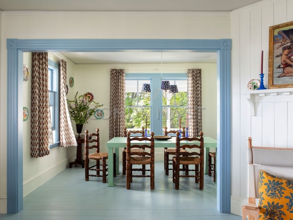
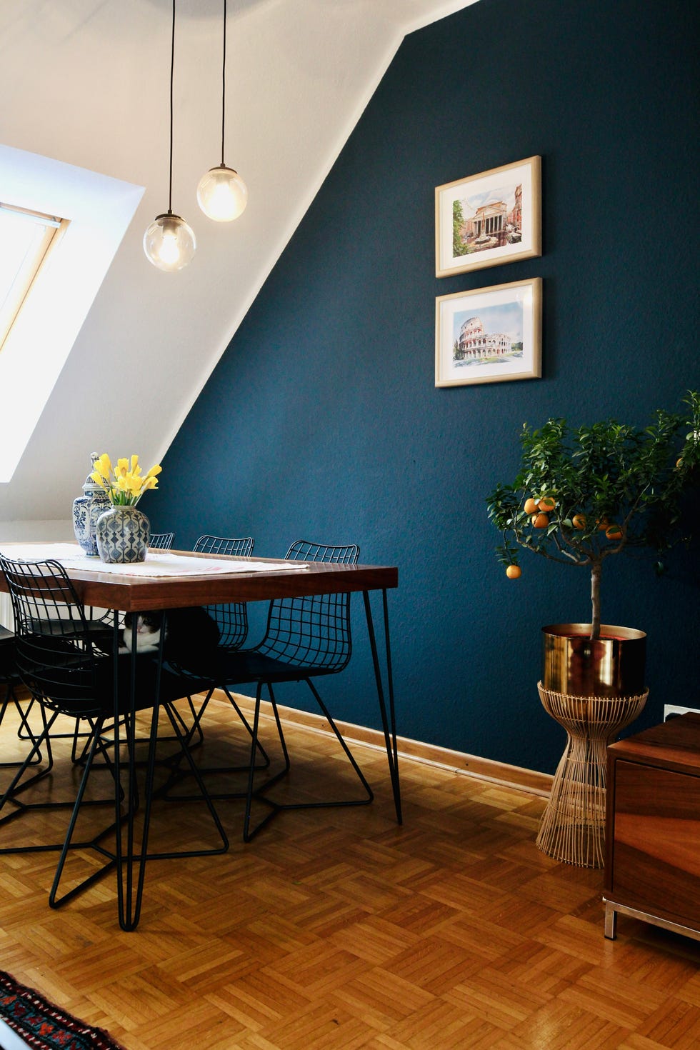
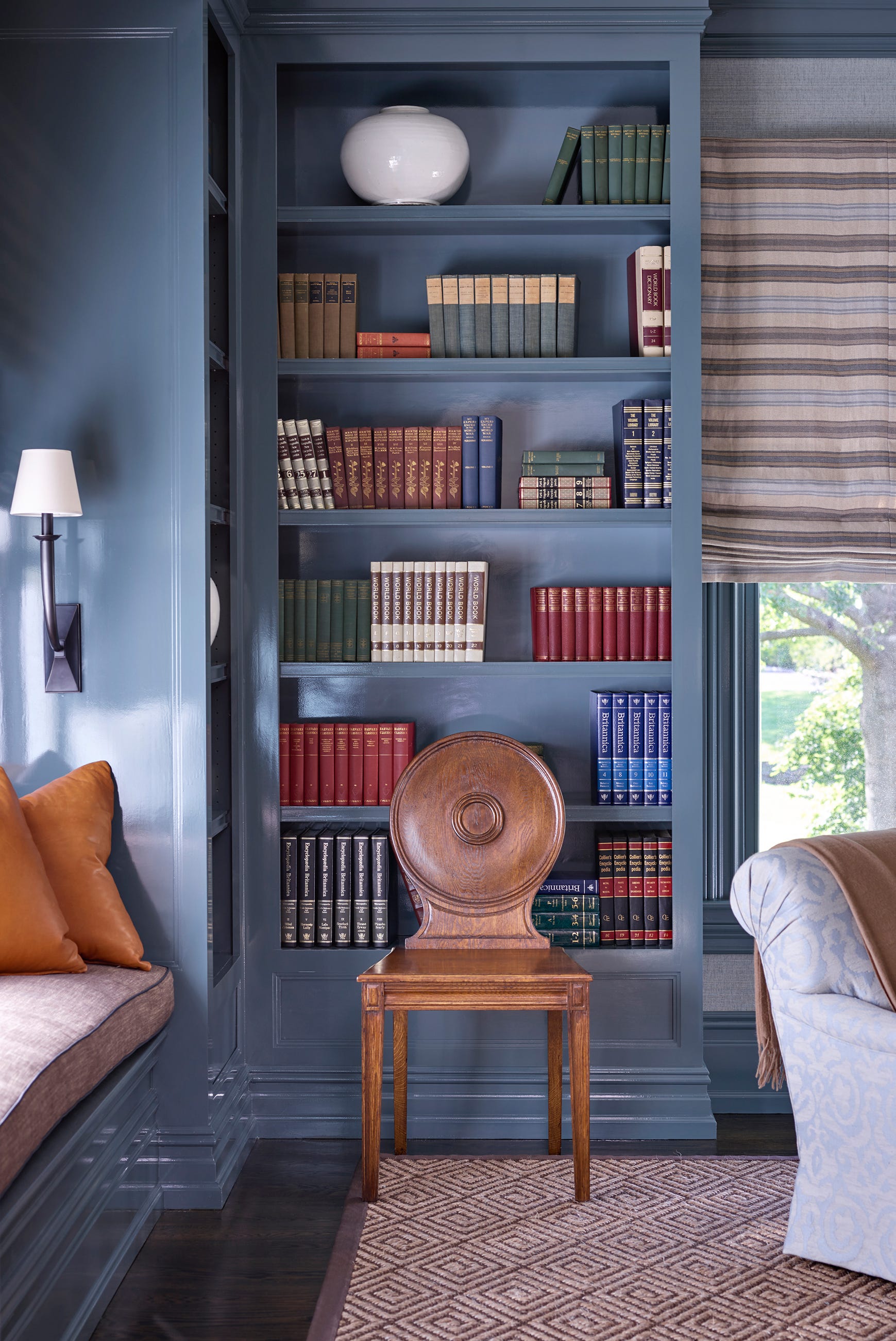
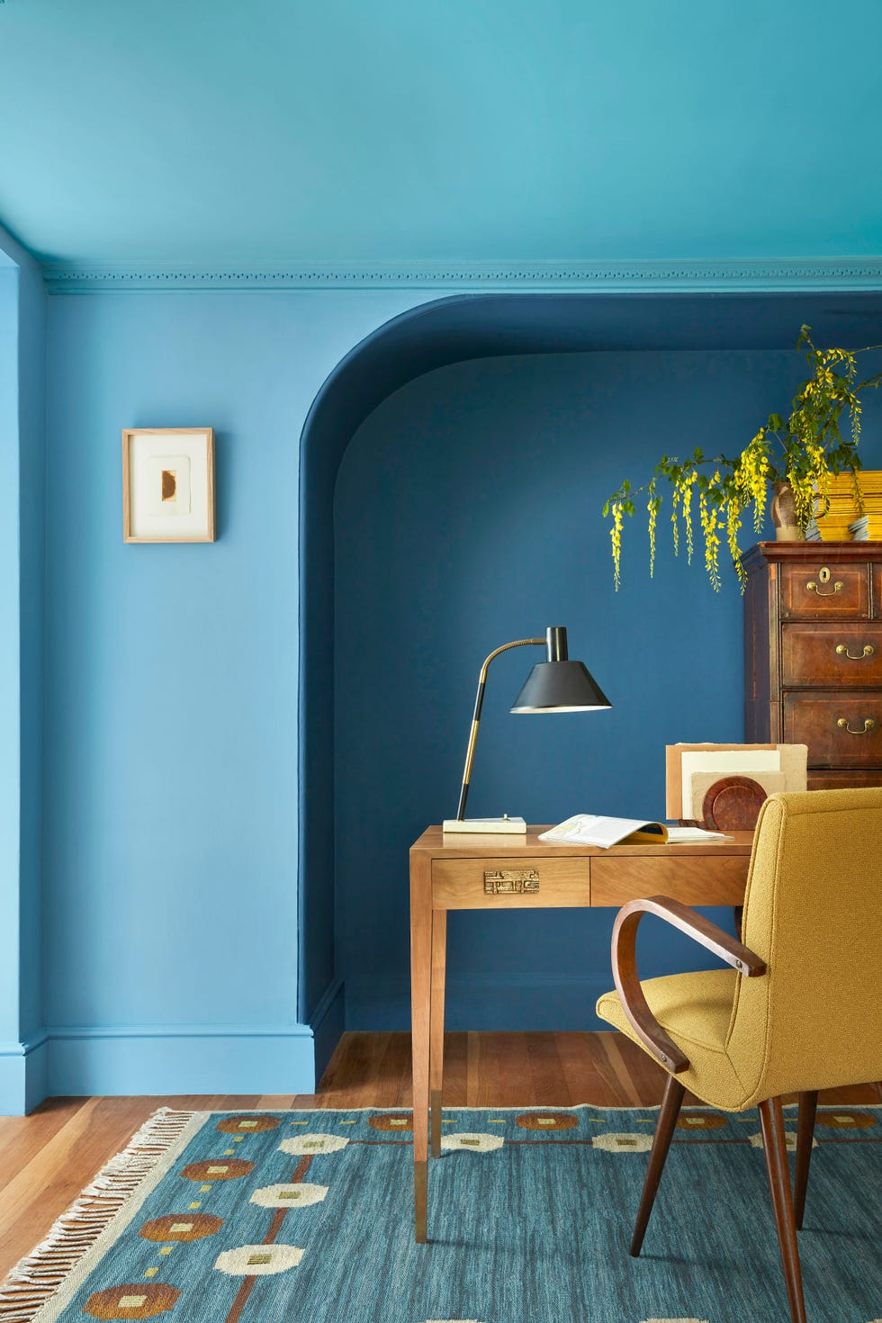
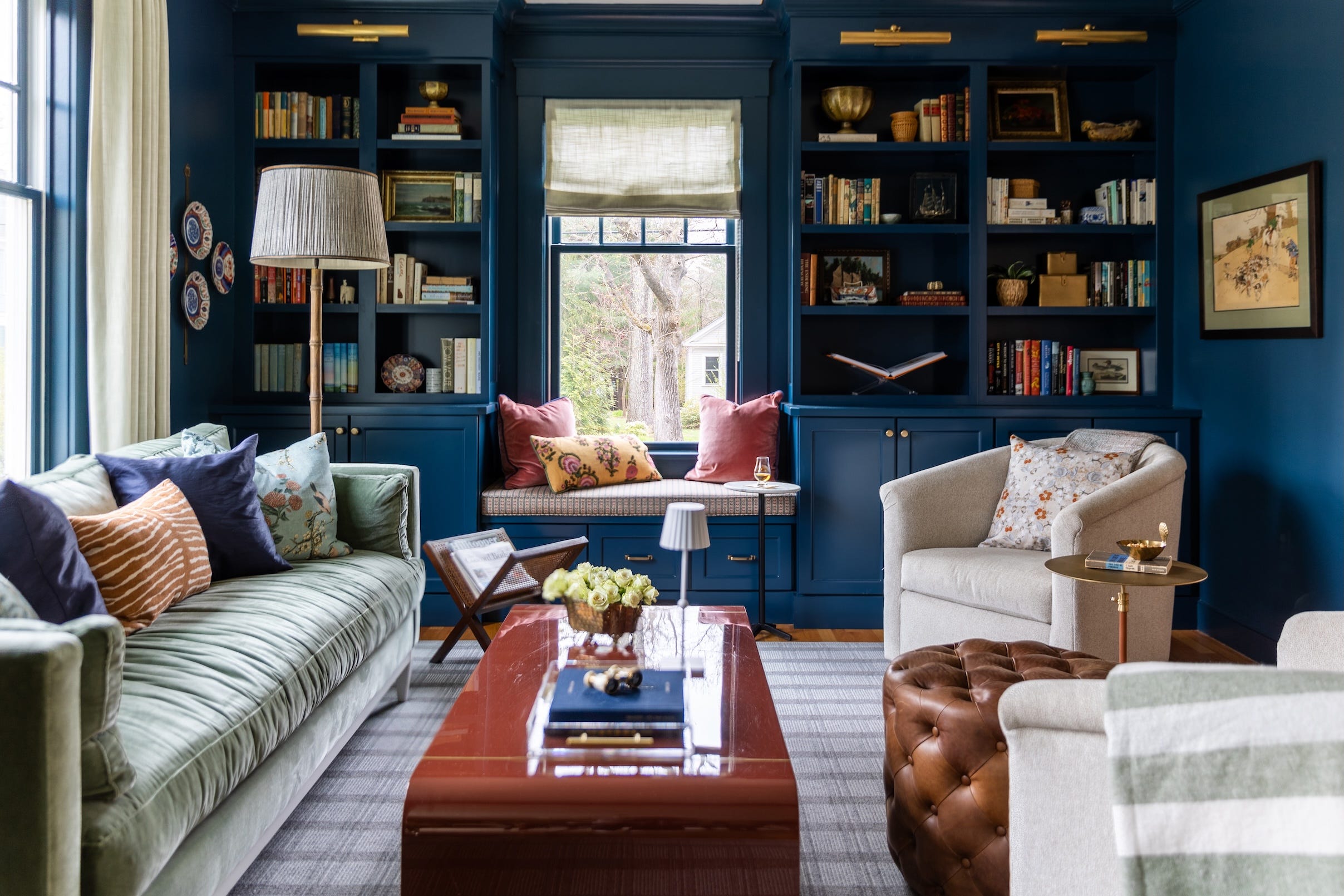
Lastly, cobalt blue, often perceived as aggressive, is reframed as a versatile and bold color suitable for sophisticated interiors. It is particularly lively in south-facing rooms and can energize social rooms, party spaces, or dynamic workspaces. Its use on woodwork, such as internal or external doors and trims, adds visual interest and can even deter flies in outdoor eating areas. The article concludes by encouraging readers to draw inspiration from nature's abundance in April to refresh their home interiors, suggesting the incorporation of fresh flowers and updating soft furnishings.
#ColorTrends #InteriorDesign #HomeDecor #PaintColors #SpringDecor #ButterYellow #CoralPaint #MoleskinBrowns #BarelyTherePink #FreshGreens #CobaltBlue #ColorTrends #InteriorDesign #HomeDecor #PaintColors #SpringDecor #ButterYellow #CoralPaint #MoleskinBrowns #BarelyTherePink #FreshGreens #CobaltBlue
0개의 댓글이 총 표시됩니다.
 아직 댓글이 없습니다
추가로 마음에 드릴 만한 콘텐츠

6 key colors to decorate with in May 2025, according to interior design and color experts in the know

These Colors Will Be Everywhere in Interiors in 2025
These 7 Colors Will Rule Interiors in 2026, According to Experts

5 Paint Colors That Are Out for 2025, According to Interior Designers


Experts Say These 5 Paint Colours Will Be Everywhere In 2026
These 5 Paint Color Trends Will Be Everywhere in 2024, According to Interior Designers
7 Trendy Paint Colors for Every Room in 2026, According to Designers

The colour trends 2026 that will define our homes next year


These 6 Colors Will Rule Interiors in 2026, According to Experts

8 Spring Color Schemes the Paint Pros Are Raving About for 2025


8 Paint Color Trends You'll ACTUALLY Want to Live With in 2026, According to Designers

These 20 Trendy Paint Colors Will Be Taking Over Walls In 2026
Move Over, Color Drenching— Color Capping Will Dominate 2026 Interiors

Lick’s 2026 Colour Edit Just Dropped – 4 Colour Trends You’ll Want In Your Home
The Interior Paint Colors You'll Be Seeing Everywhere in 2024

Designers Say These 12 Paint Colors Will Be Everywhere in 2026
These Colors Will Be Everywhere in Interior Design in 2026
These 8 Colors Will Rule Interiors in 2026, According to Experts

Interiors experts predict this will be the biggest paint trend of 2026

These Will Be the Most Popular Paint Colors in 2026