1/3
The Paint Color That Bothers Joanna Gaines (& How To Better Use It)
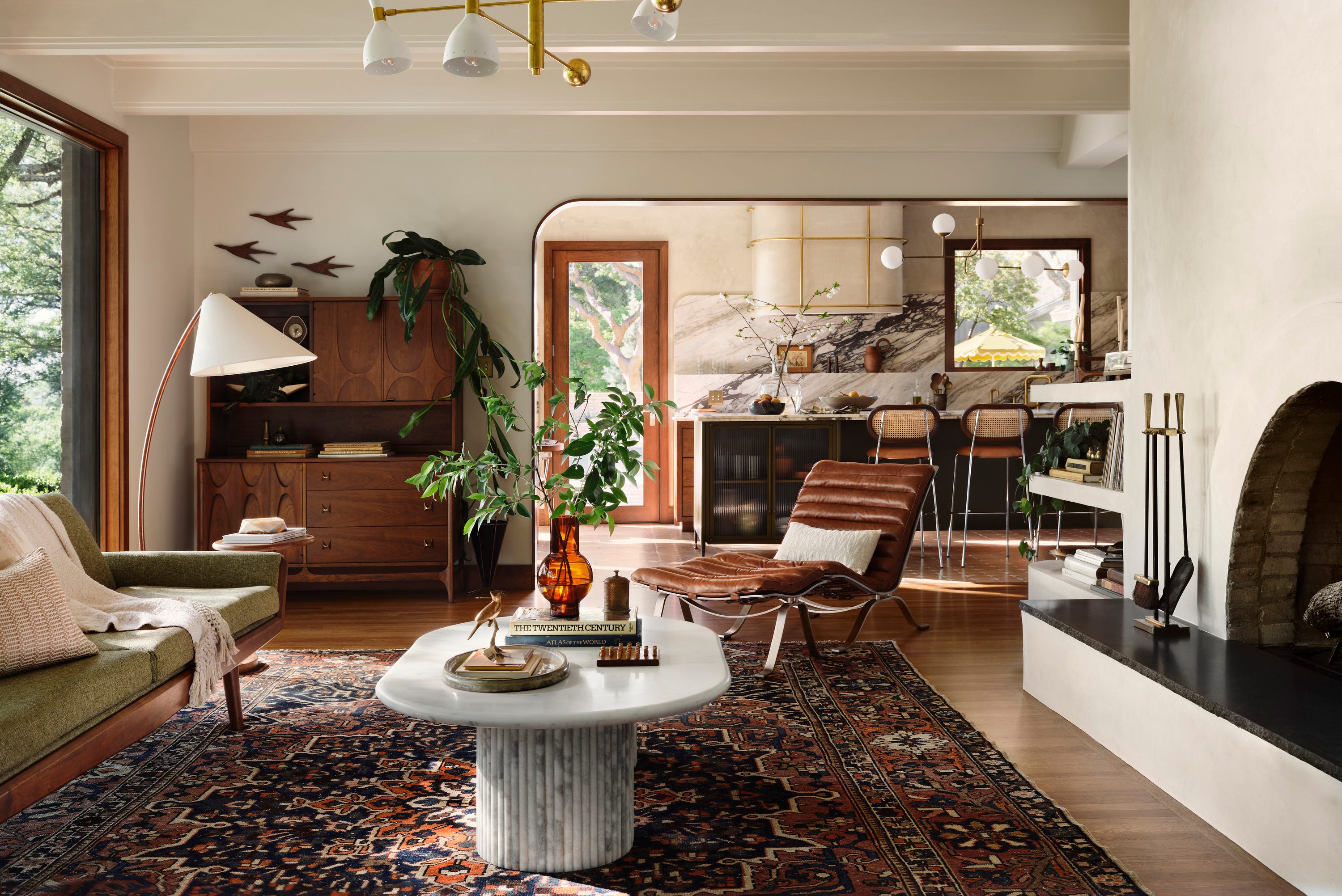
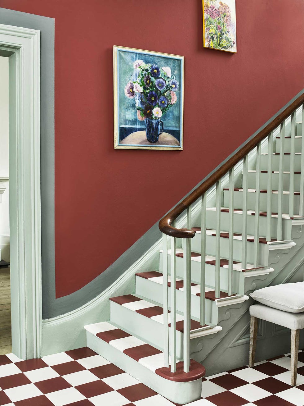
The color red is known for eliciting strong reactions, a sentiment shared by designer Joanna Gaines, who reportedly finds the color anxious. Interior design expert Erika Dale confirms that red, especially saturated tones, is an intense and energizing color that can be polarizing. However, Dale notes that if the energetic power of red resonates positively with an individual, it should be incorporated into their home decor. The key to successfully using red in interior design lies in achieving balance.
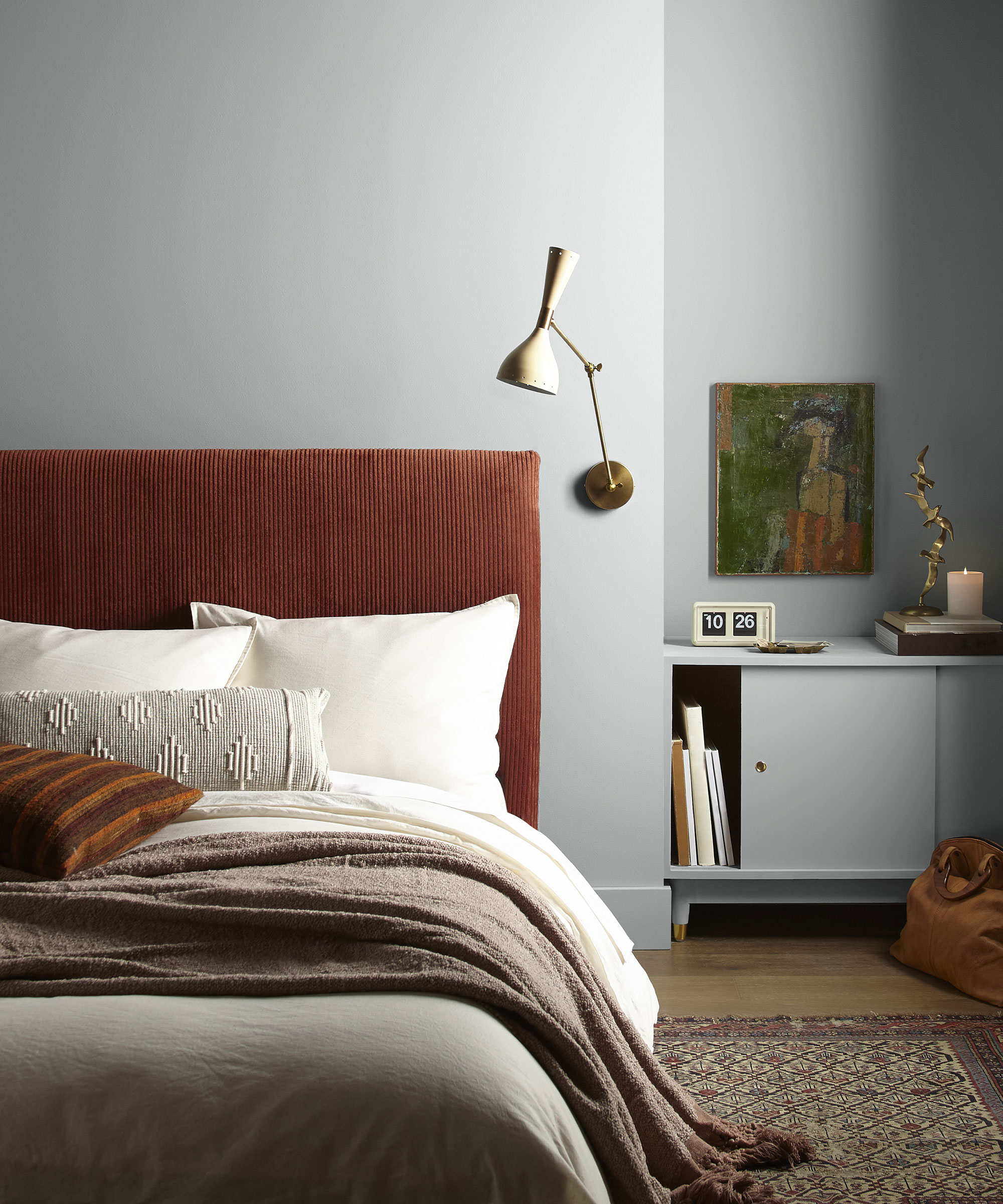
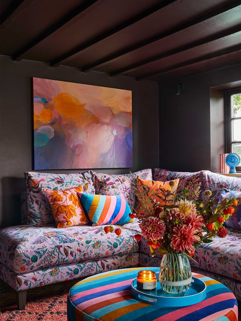
Dale advises that when integrating red, it's crucial to maintain a balanced color palette. This can be achieved either by limiting saturated red tones to small accent pieces or by employing more muted red hues for larger applications, such as wall paint. For those who are intrigued by red but hesitant about its boldness, Dale suggests a cautious approach. She recommends starting small, avoiding immediate commitment to a large-scale application like painting an entire wall. Instead, individuals can explore inspiration images online or introduce minor red accents, such as a piece of art, a decorative object, a picture frame, or a pillow, to gauge their comfort level with the color. These smaller items are easily replaceable if the color doesn't ultimately appeal to them. This method allows homeowners to observe how red impacts their perception of the space, helping them determine if the color is stimulating in a positive or overwhelming way.
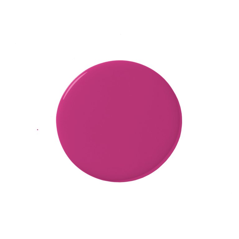
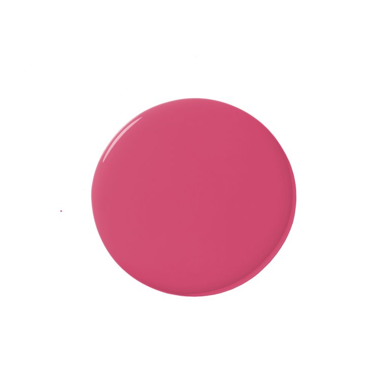
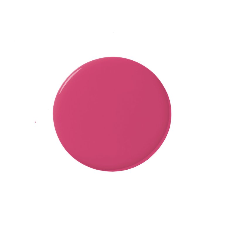
Should the initial small-scale trials prove favorable, the next step could involve painting a single accent wall in one of the many available red shades. The spectrum of red paint ranges from vibrant, bold reds to softer, dusty rose tones, ensuring a suitable option for various preferences. Dale emphasizes that red inherently draws attention and makes a statement, which is why it can be controversial. While some prefer serene, monochromatic rooms, red accents deliberately stand out. This characteristic isn't necessarily negative; it's the foundation of the "unexpected red theory." This popular design concept suggests that adding an unexpected touch of red to any room, even if it seems out of place, can enhance its overall aesthetic.
Dale describes red as invigorating, powerful, and visually impactful. Despite Joanna Gaines' personal aversion to the color, its strong appeal to many is understandable due to these qualities. For rooms that feel bland or in need of an affordable and simple update, even a subtle incorporation of red can significantly enliven the space. The article concludes by encouraging readers to consider red for their homes, highlighting its potential to transform an environment with its dynamic presence.
#PaintColor #InteriorDesign #HomeDecor #JoannaGaines #ColorPsychology #RedAccents #DesignTips #UnexpectedRedTheory #HomeImprovement #PaintColor #InteriorDesign #HomeDecor #JoannaGaines #ColorPsychology #RedAccents #DesignTips #UnexpectedRedTheory #HomeImprovement
0개의 댓글이 총 표시됩니다.
 아직 댓글이 없습니다
추가로 마음에 드릴 만한 콘텐츠
Joanna Gaines Swears By These 12 Stunning Paint Colors
Why Joanna Gaines says grout color deserves more attention

Dark Paint Colors HGTV Stars Love Using In Homes

The Joanna Gaines-Favored Paint Color That's Perfect For A Timeless Kitchen


Fixer Upper's Joanna Gaines Shares The Perfect Paint Colors For Every Area Of Your House
My 5 favorite Joanna Gaines paint colors prove that retro '70s palettes are back and better than ever
27 Best Joanna Gaines Paint Colors From Magnolia Home

After This Design Trend Took Off, These Paint Colors Became 40% More Popular

Joanna Gaines Says She Never Uses These Four Paint Colors—Here's Why


The Rich Paint Shade Joanna Gaines Swears By To Transform An Uninteresting Room

7 'Unhappy' Colors That Color Psychology Experts Would Never Paint Their Walls


Experts reveal the best living room paint colours to transform every space

Joanna Gaines' Top Tip For Embracing Bold Paint Colors

The Kitchen Color Combinations That Joanna Gaines Can't Get Enough Of

An A-List Designer’s Secrets To Picking Perfect Paint Colors

What are the best Benjamin Moore gray paints? 7 go-to shades recommended by designers
3 Paint Colors That Will Never Go Out of Style, According to Joanna Gaines

Colour experts share their top paint trends for 2024

7 Paint Mistakes That Make Designers Instantly Cringe When They Walk Into Someone's Home

Joanna Gaines' Favorite Dining Room Paint Color Is Cozy and Welcoming