1/10
Best off-white paints according to designers
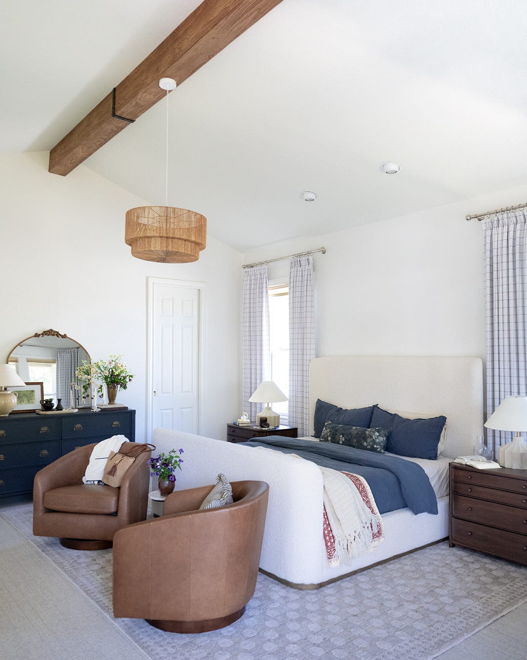
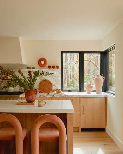
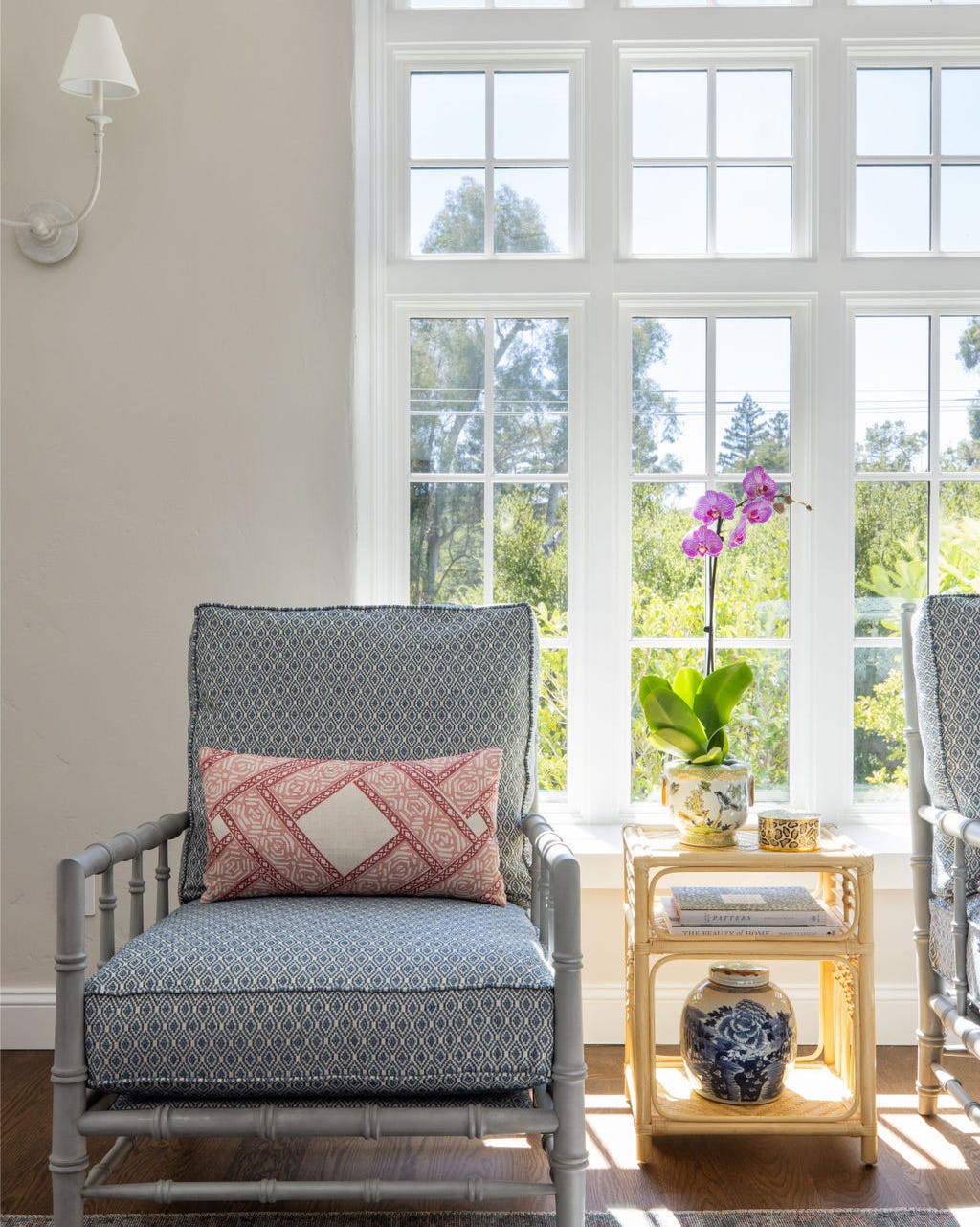
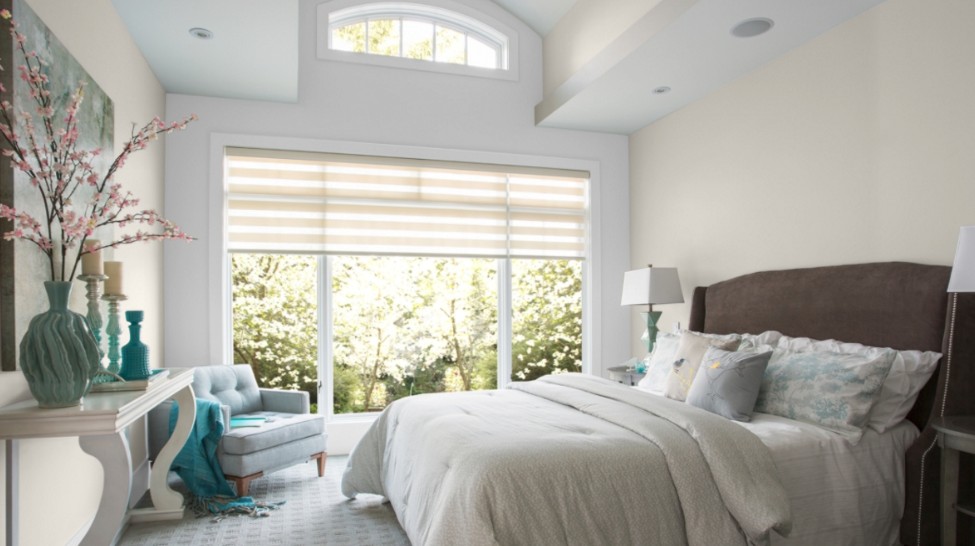
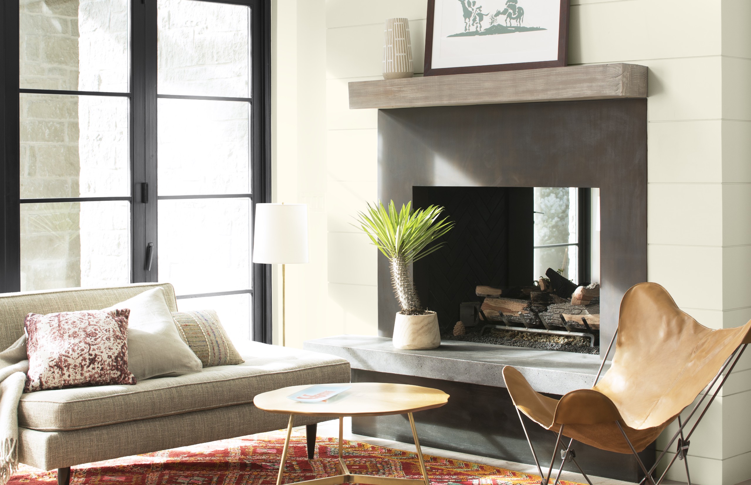
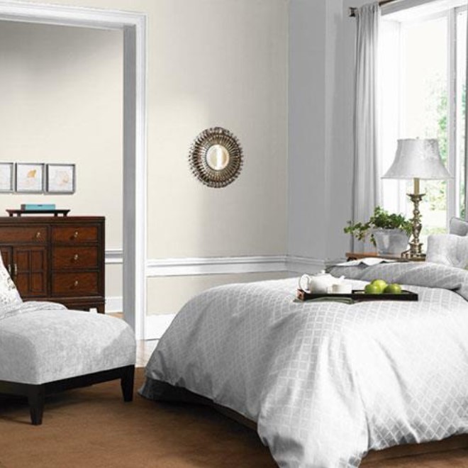
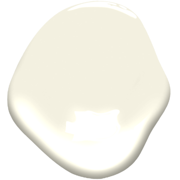
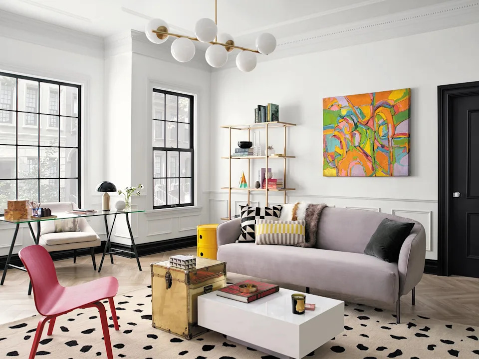
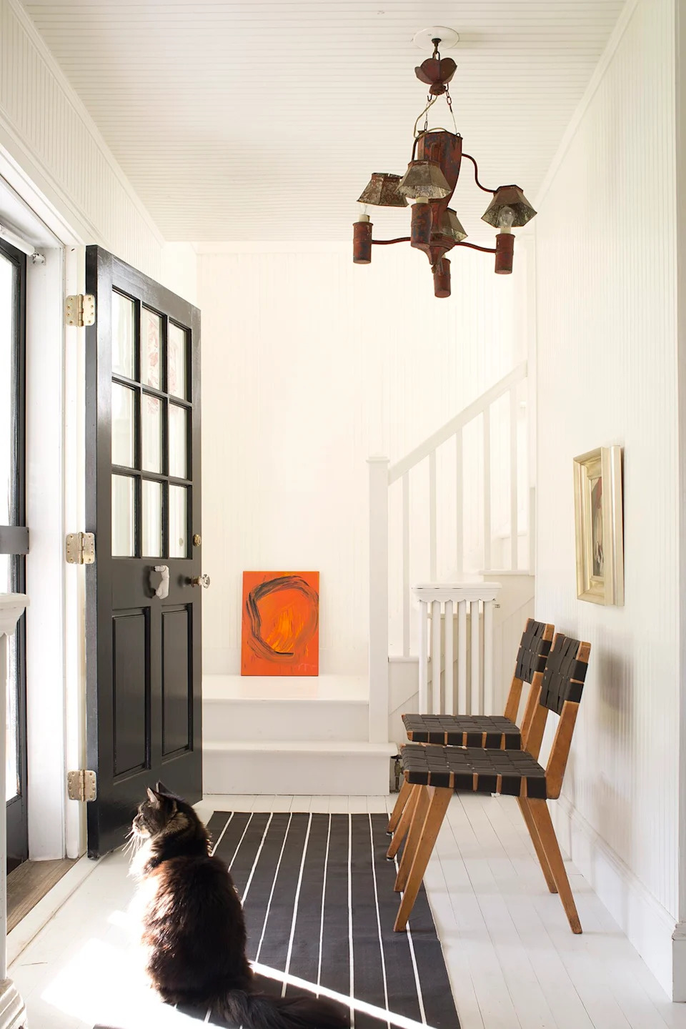
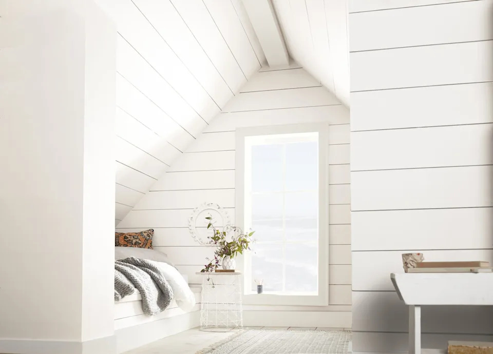
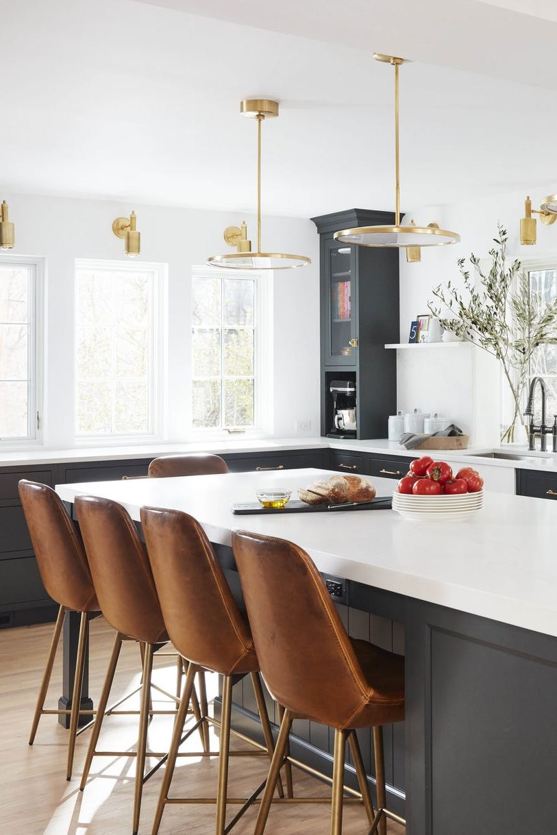
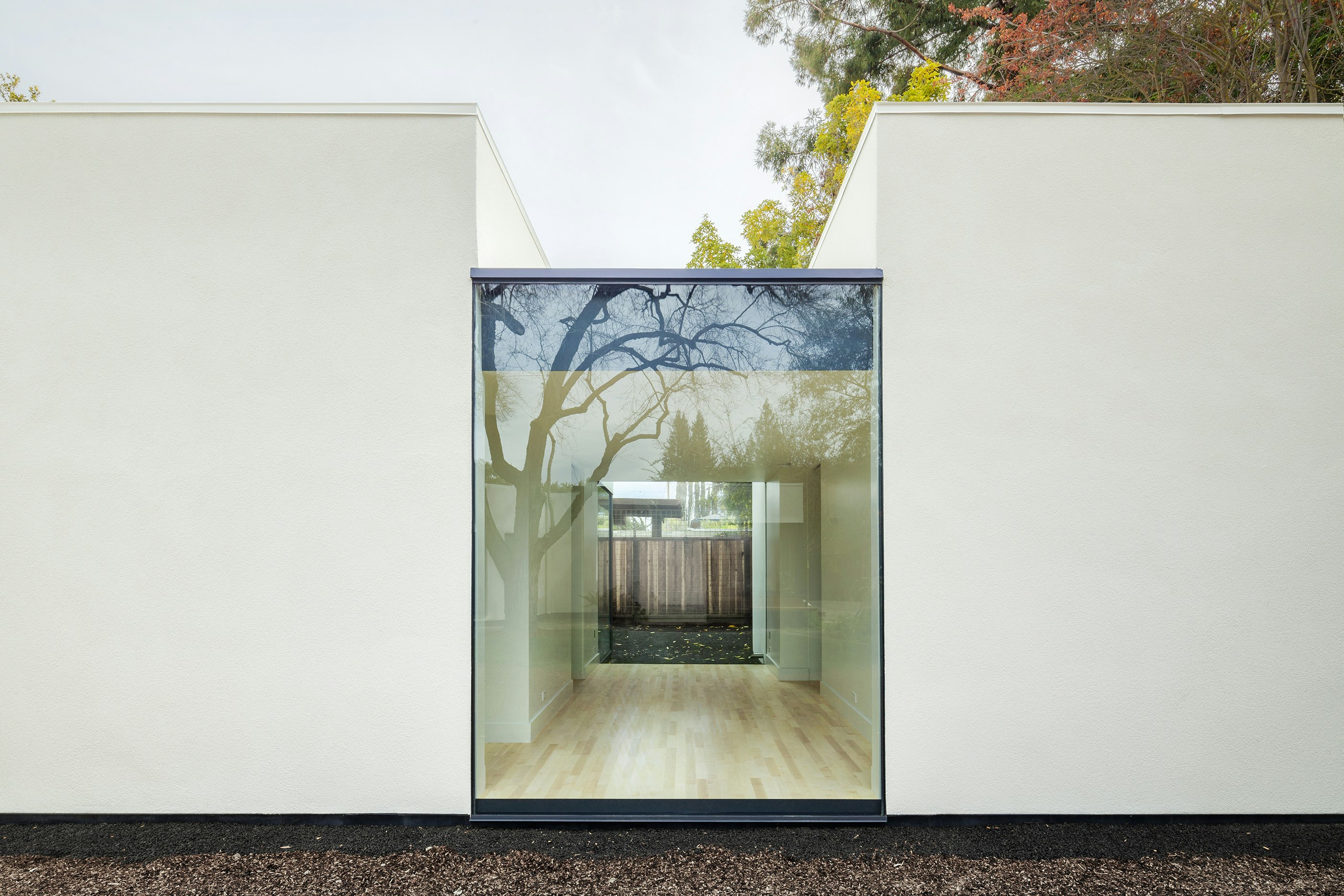
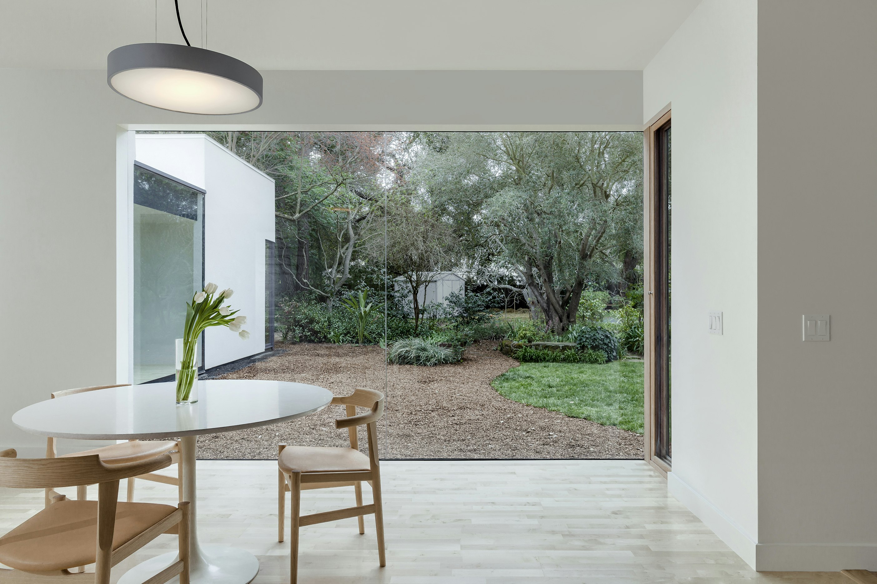
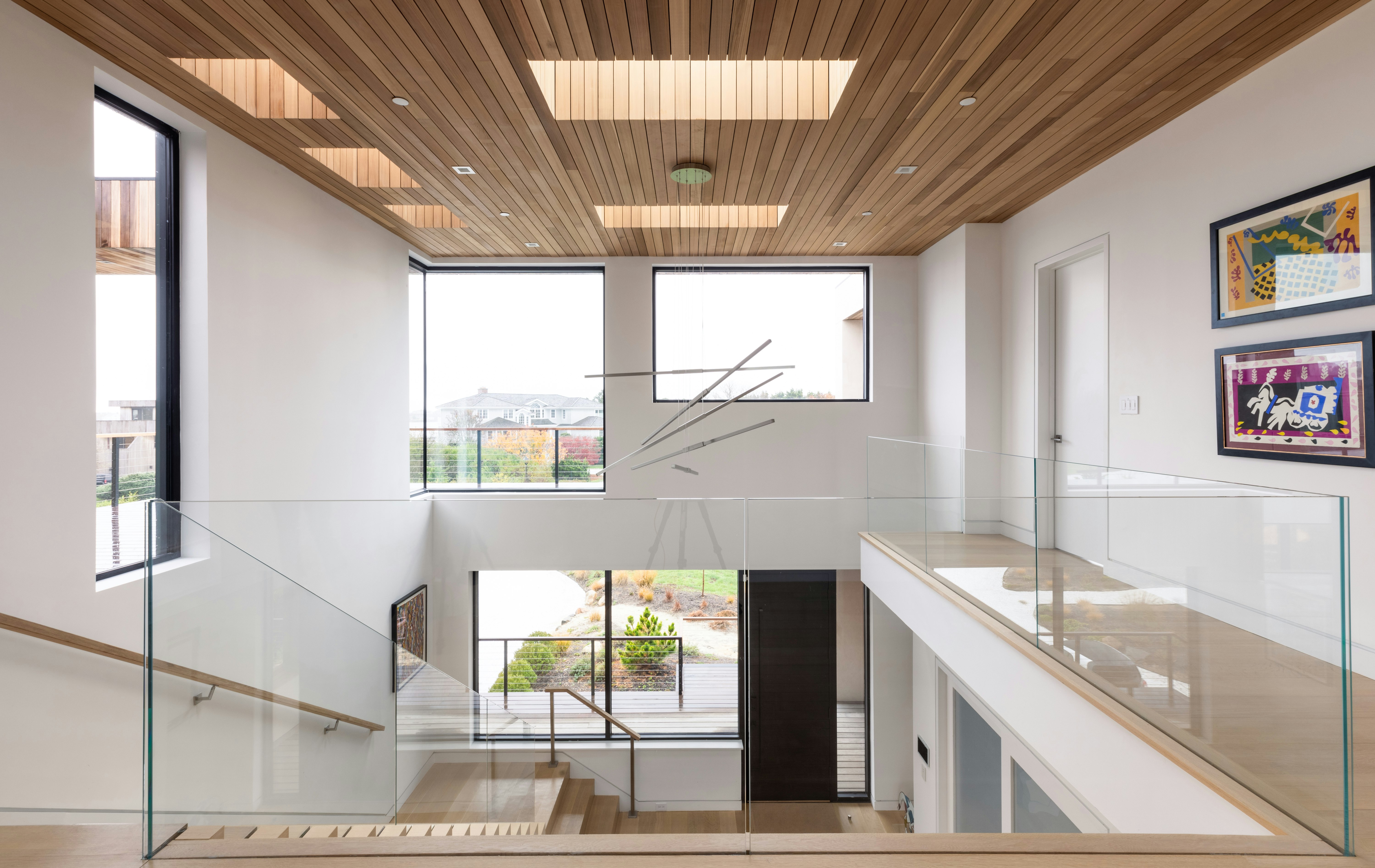
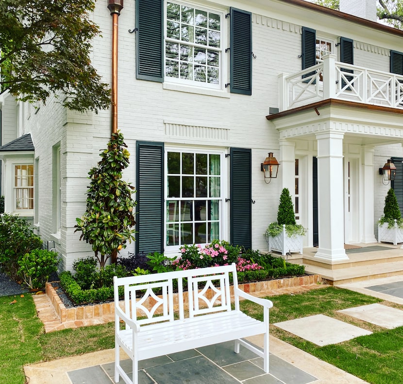
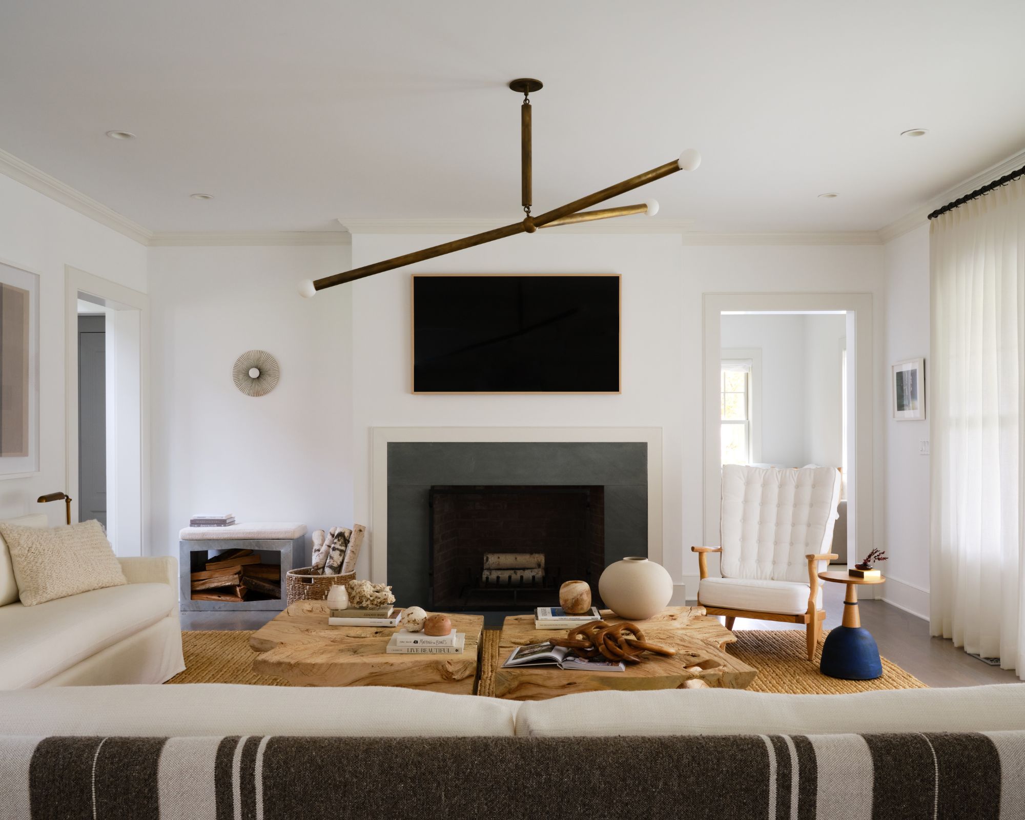
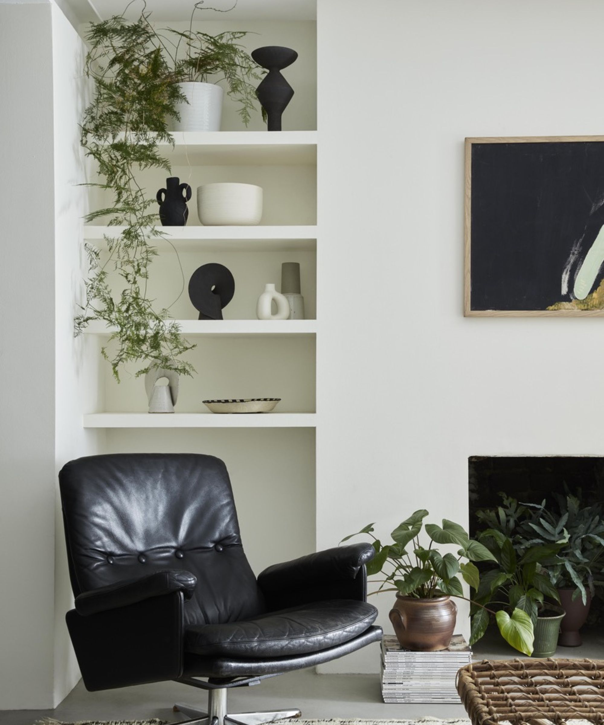
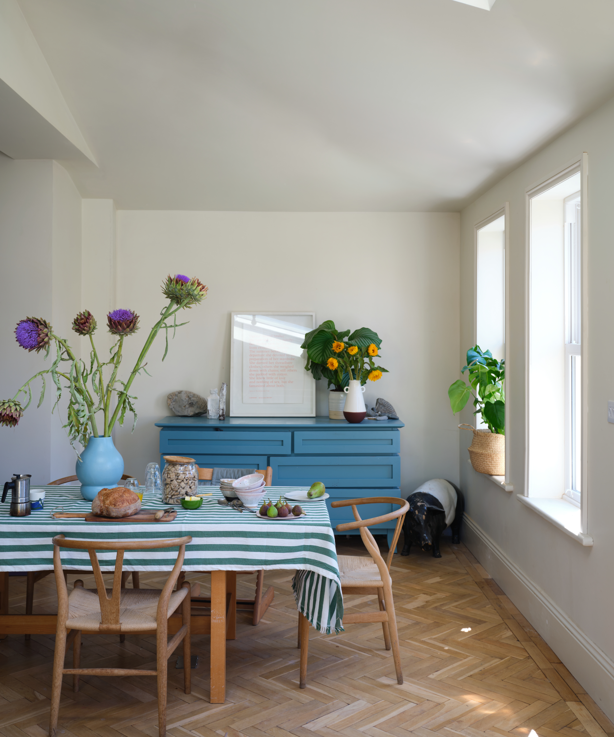
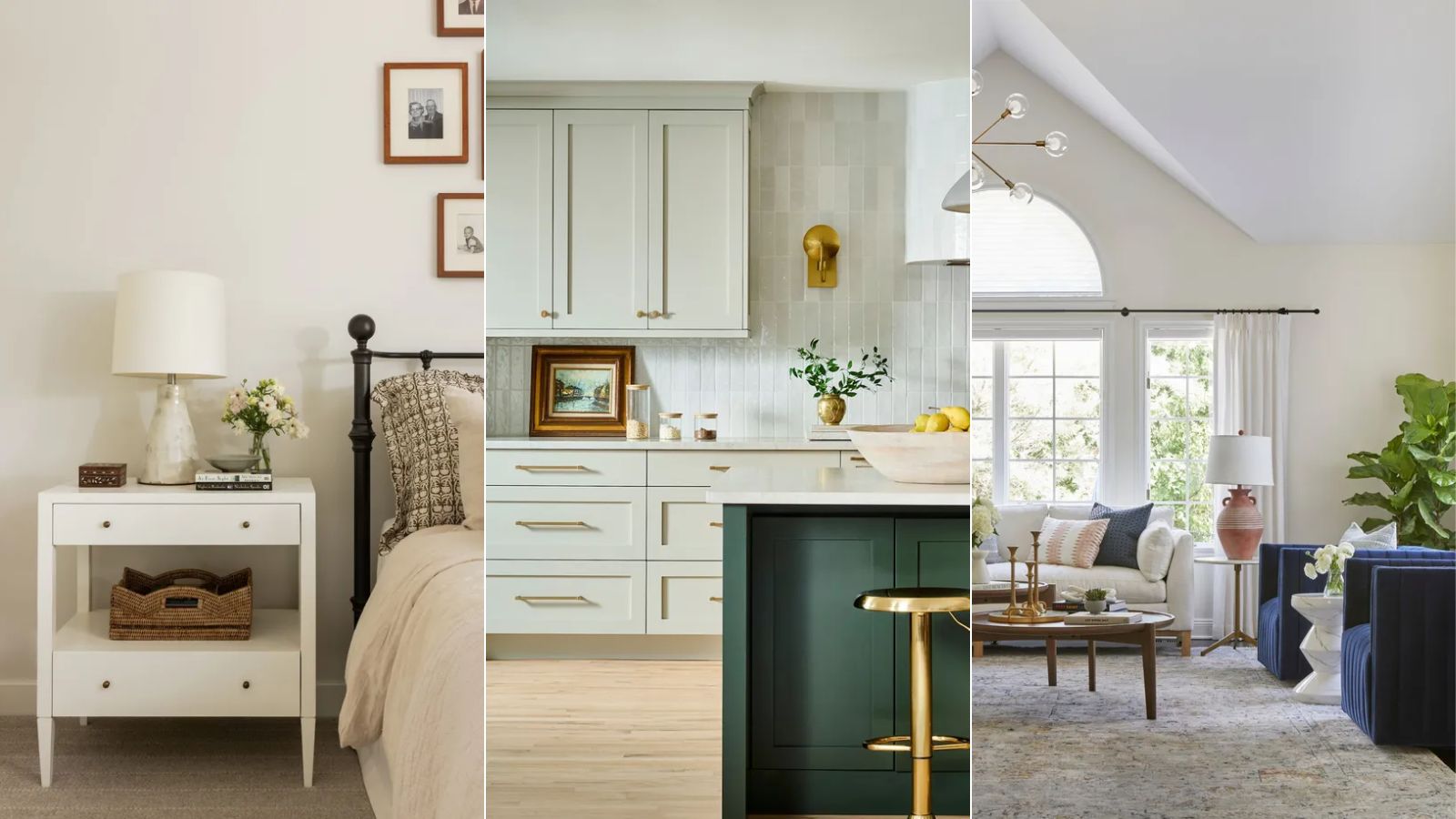
The task of selecting the appropriate off-white paint for a home can be intricate due to the extensive range of options, each possessing distinct undertones and varying intensities. While stark white paints, devoid of warmth, have diminished in popularity, off-white paints offer a light and airy aesthetic while retaining sufficient depth to foster an inviting ambiance. This article explores the top 10 off-white paint selections, as recommended by interior design experts.
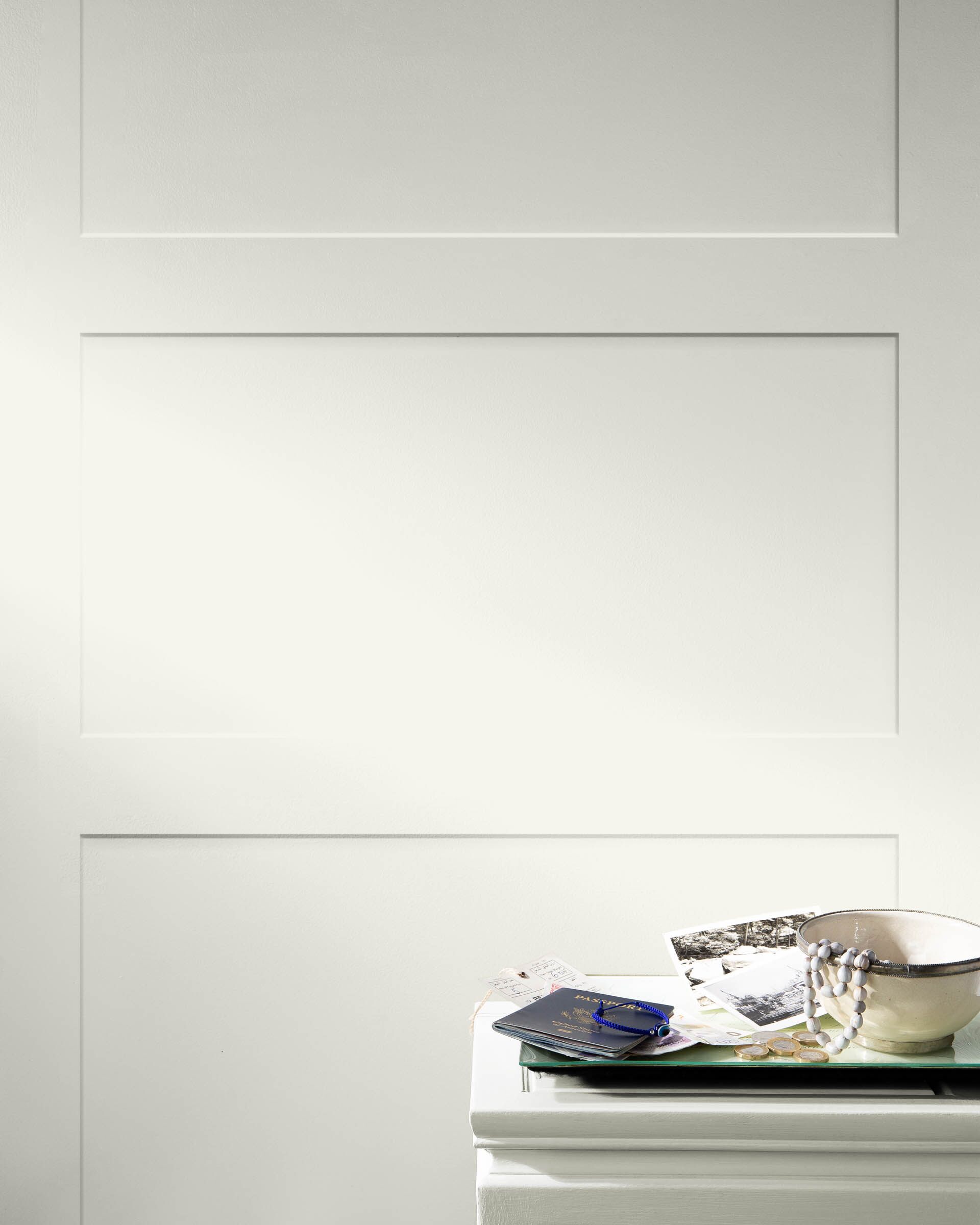
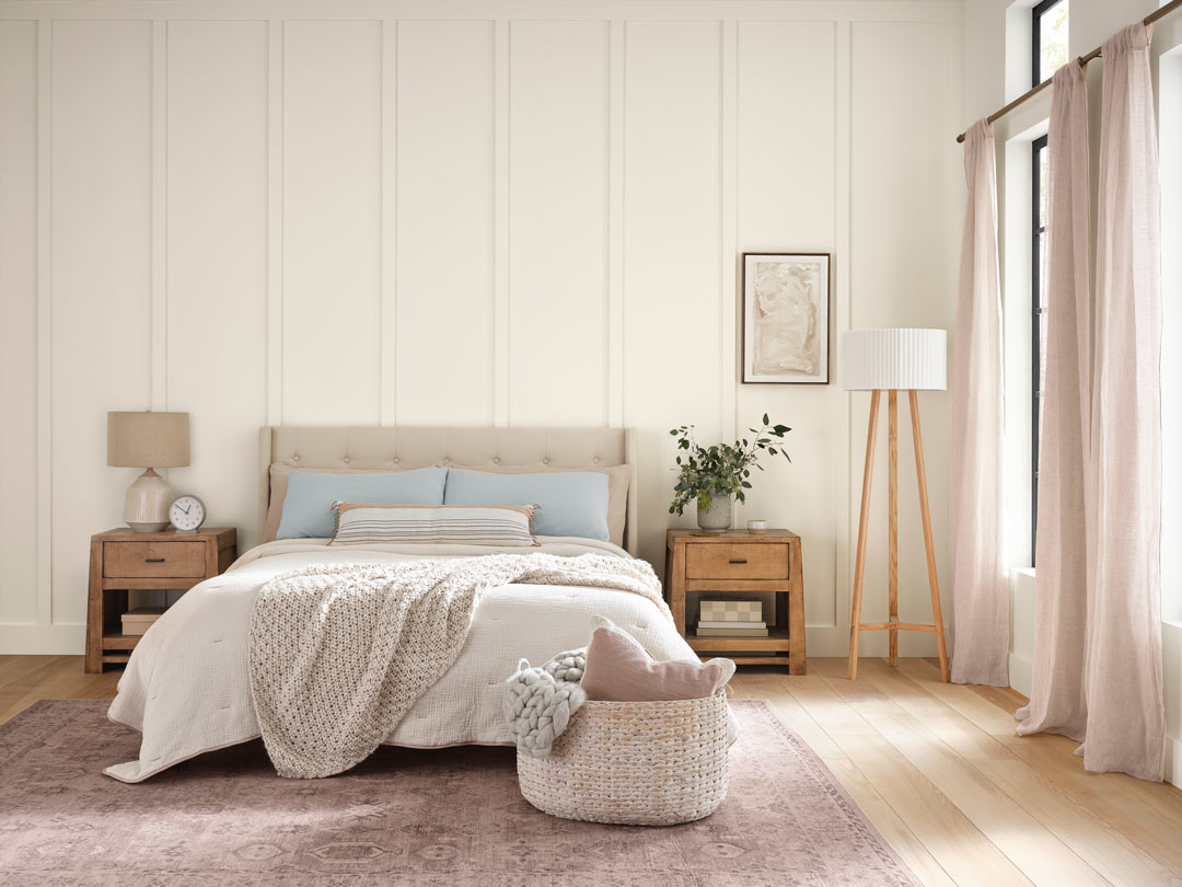
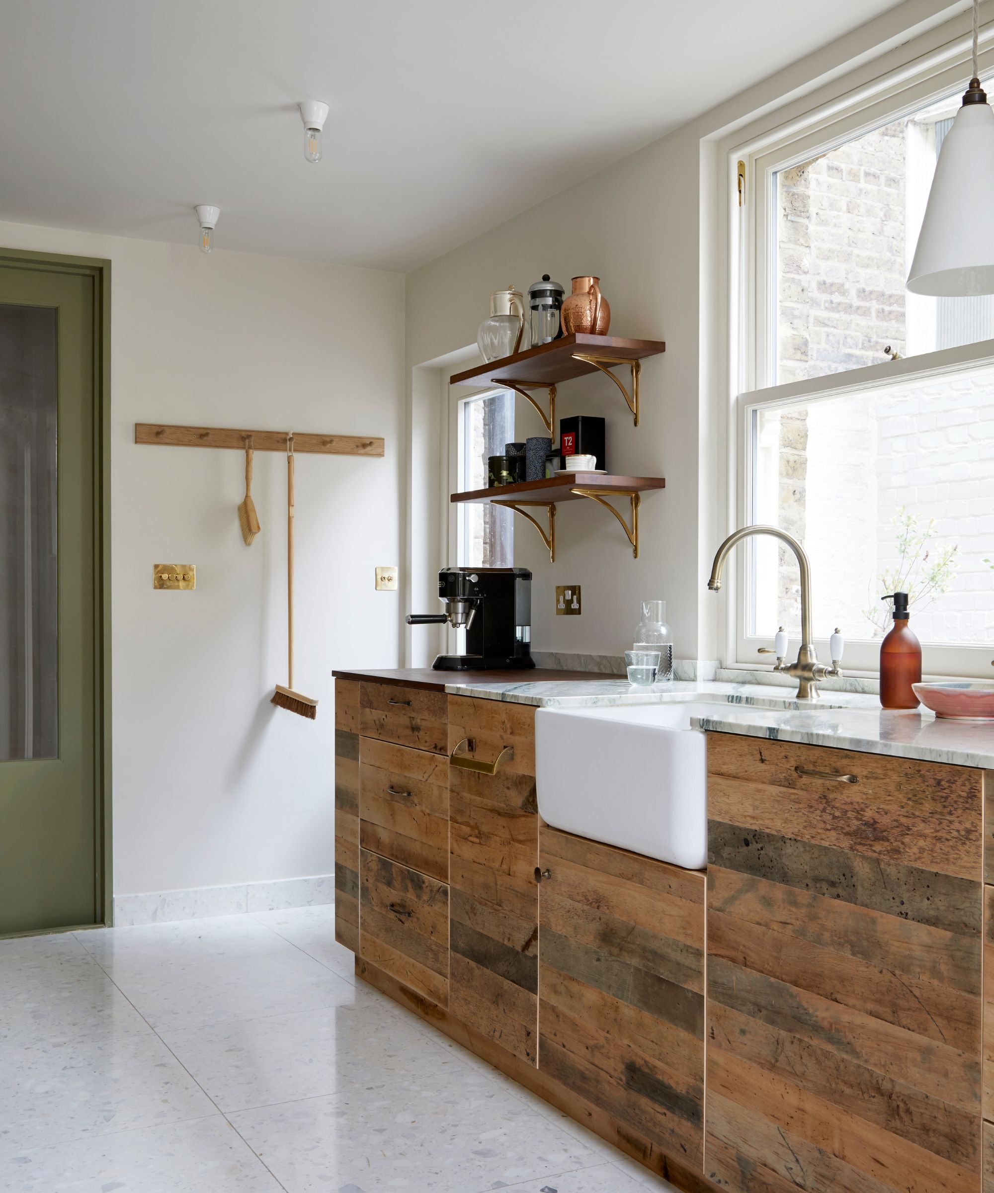
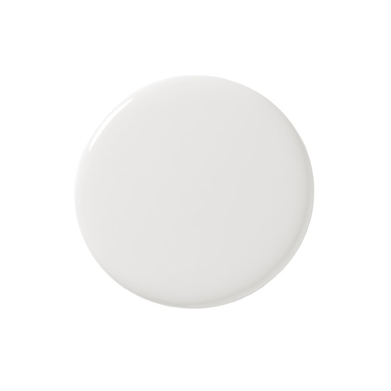
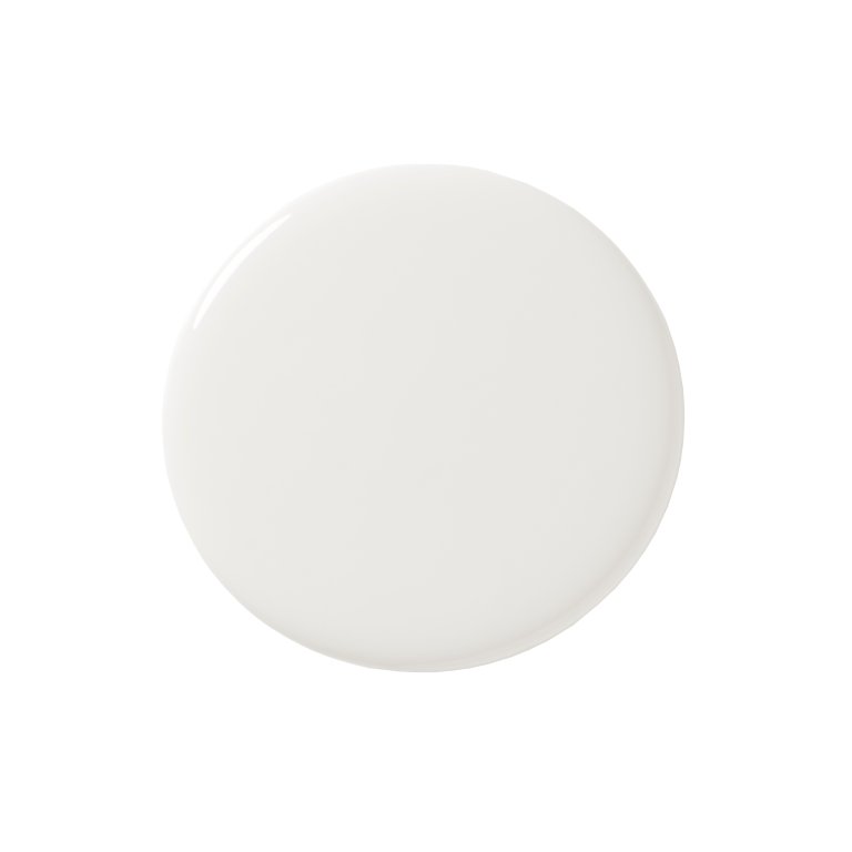
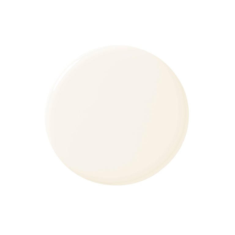
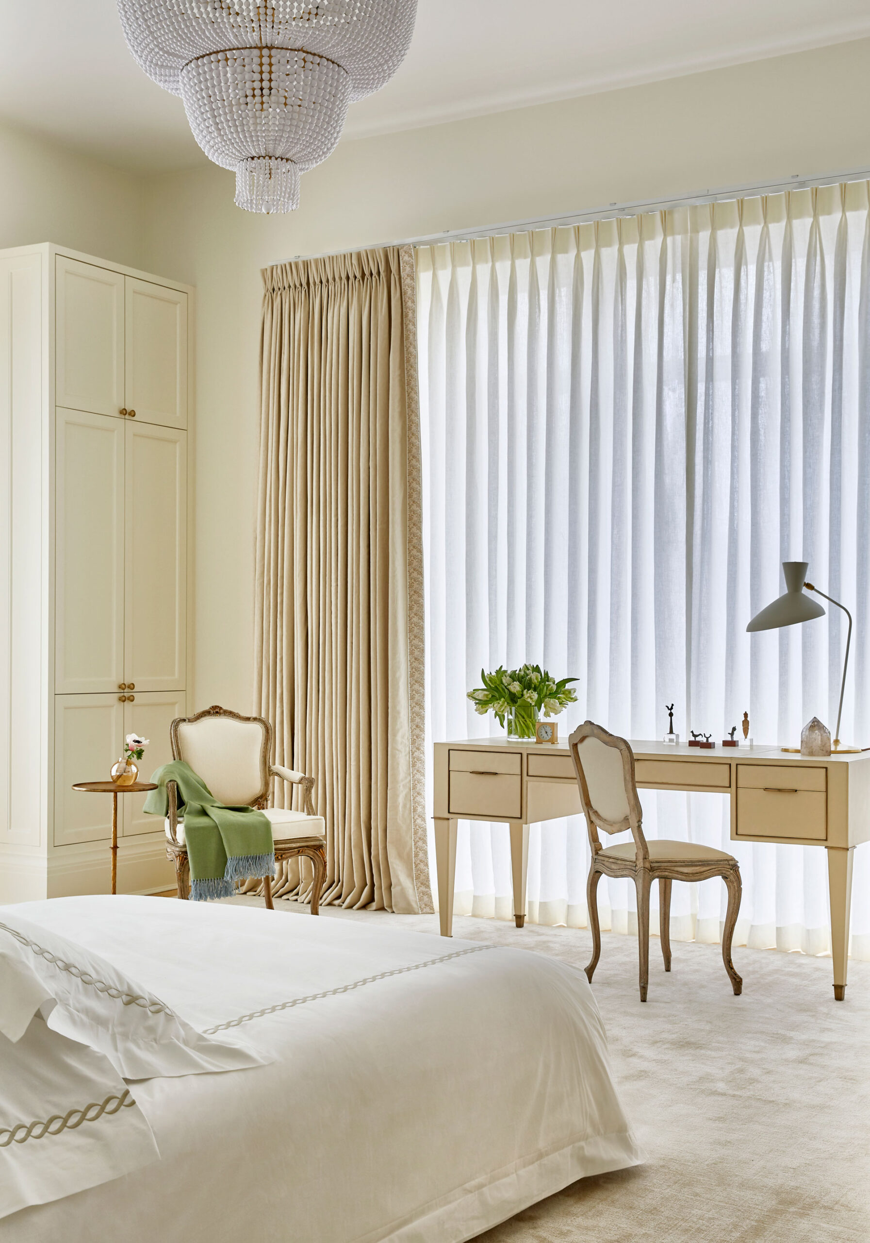
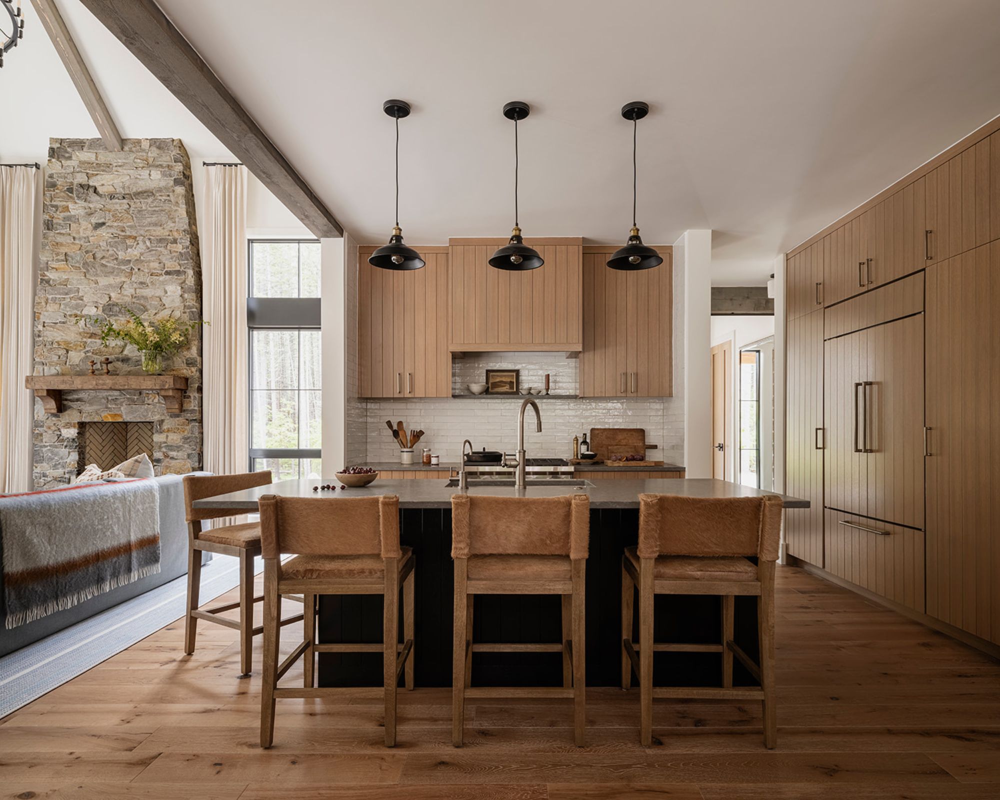
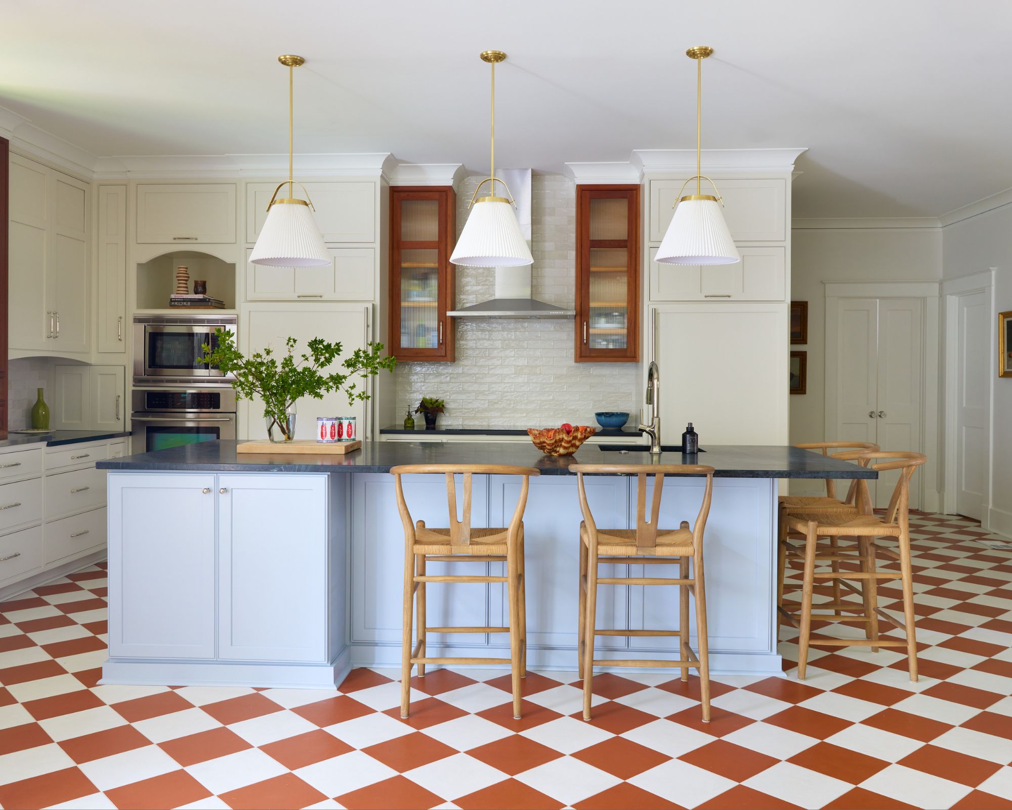
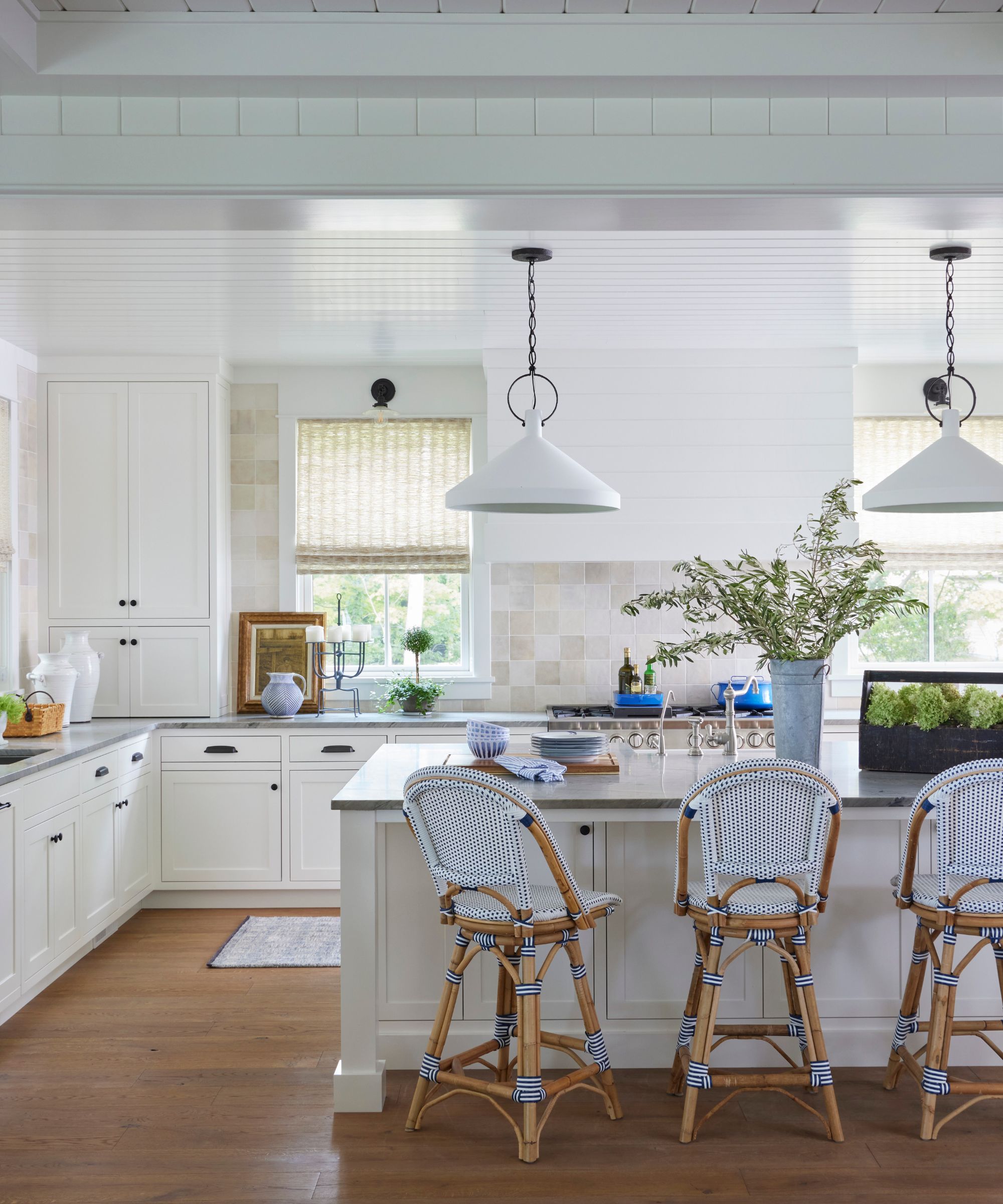
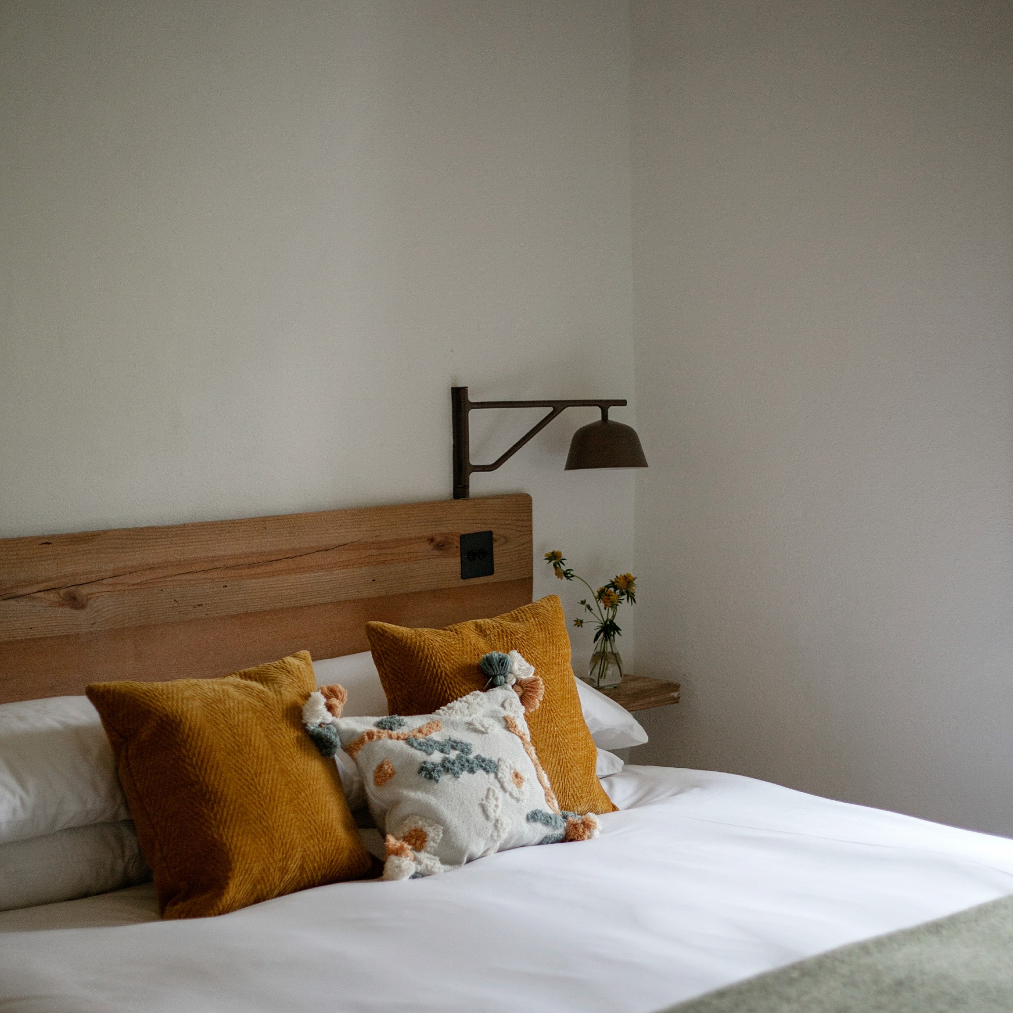
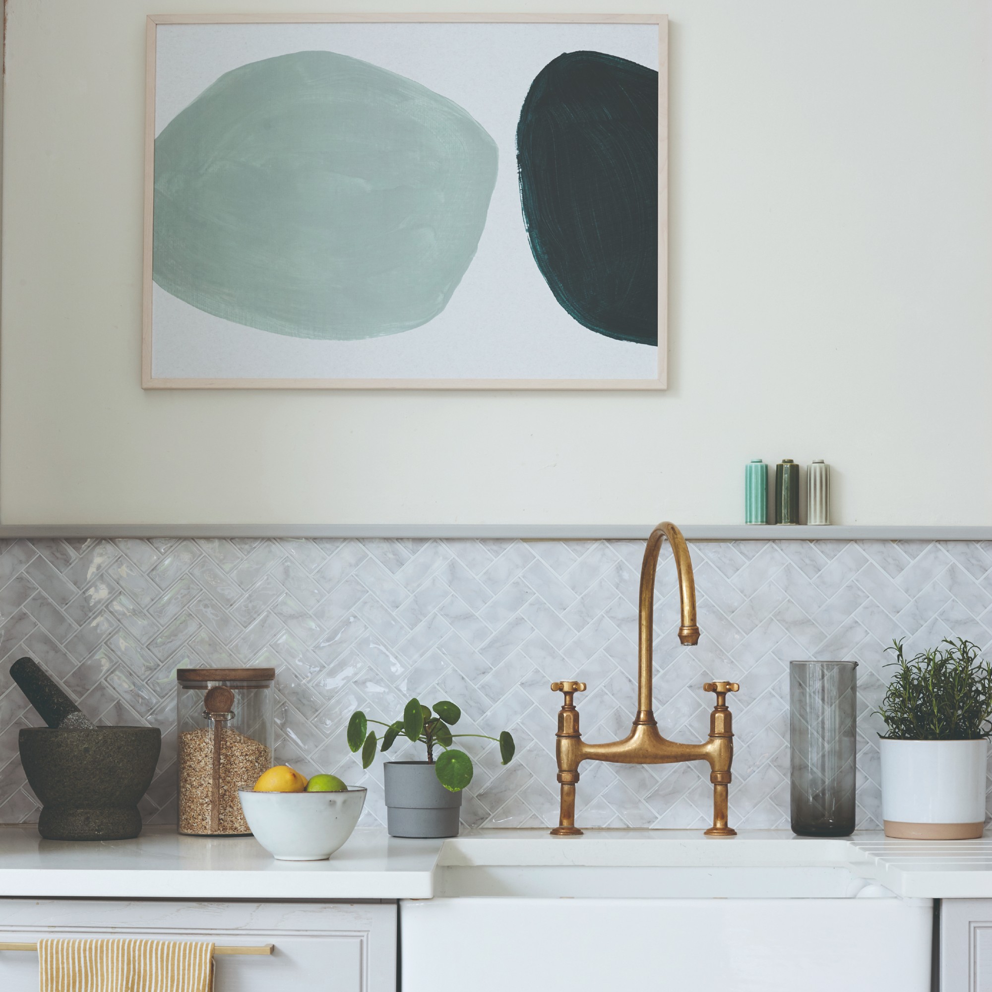
Melissa Read, Creative Director at Studio Burntwood, highlights Little Greene’s Linen Wash, noting its taupe undertone that provides a lived-in rather than pristine feel. This shade is particularly effective in bedrooms and sitting rooms, creating a refined atmosphere when paired with natural linen, wood, and antique brass. For finishes, Intelligent Matt is recommended for walls, and eggshell for woodwork, ensuring a seamless look. Gabriela Eisenhart, founder and principal designer at Silo Studios, favors Farrow & Ball's Shaded White. This soft off-white is versatile for kitchen and bathroom cabinets, as it balances well with crisp white walls. It also serves as an excellent wall color, providing a muted canvas for layering. Janna McCalley of Janna McCalley Interiors suggests Benjamin Moore’s China White for those seeking a cooler off-white. This shade offers a fresh white with a subtle grey hint, allowing for layering with other white tones on trim, furniture, and accents. Another recommendation from Janna McCalley is Benjamin Moore’s Cloud Cover, which features delicate grey undertones. This soft white is noted for its minimal undertone, making it suitable for spaces with abundant natural light and interior rooms lacking natural light.
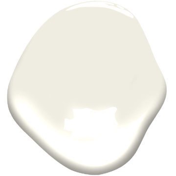
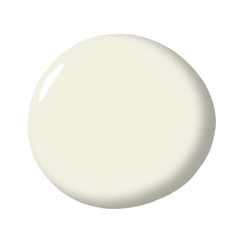
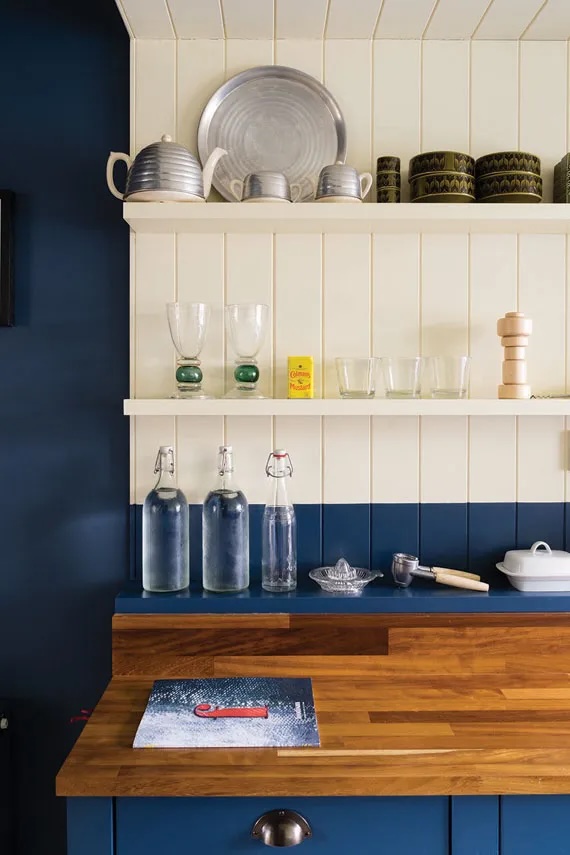
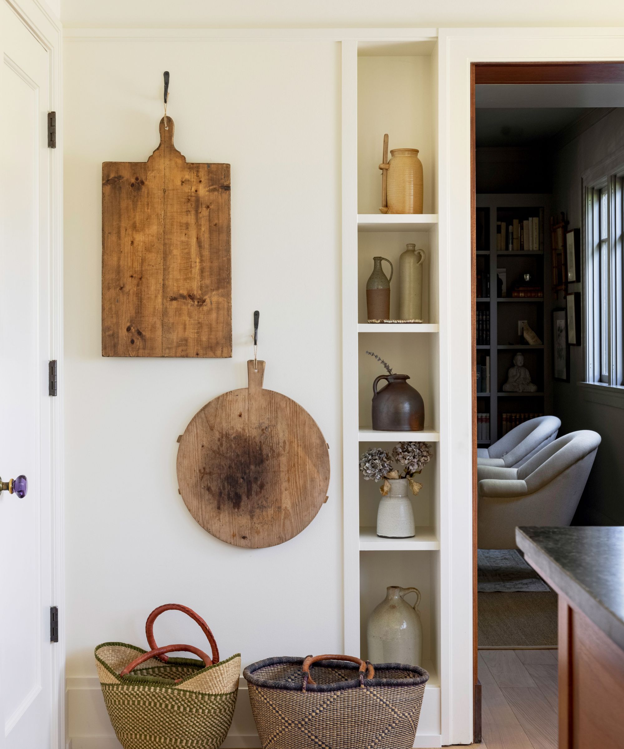
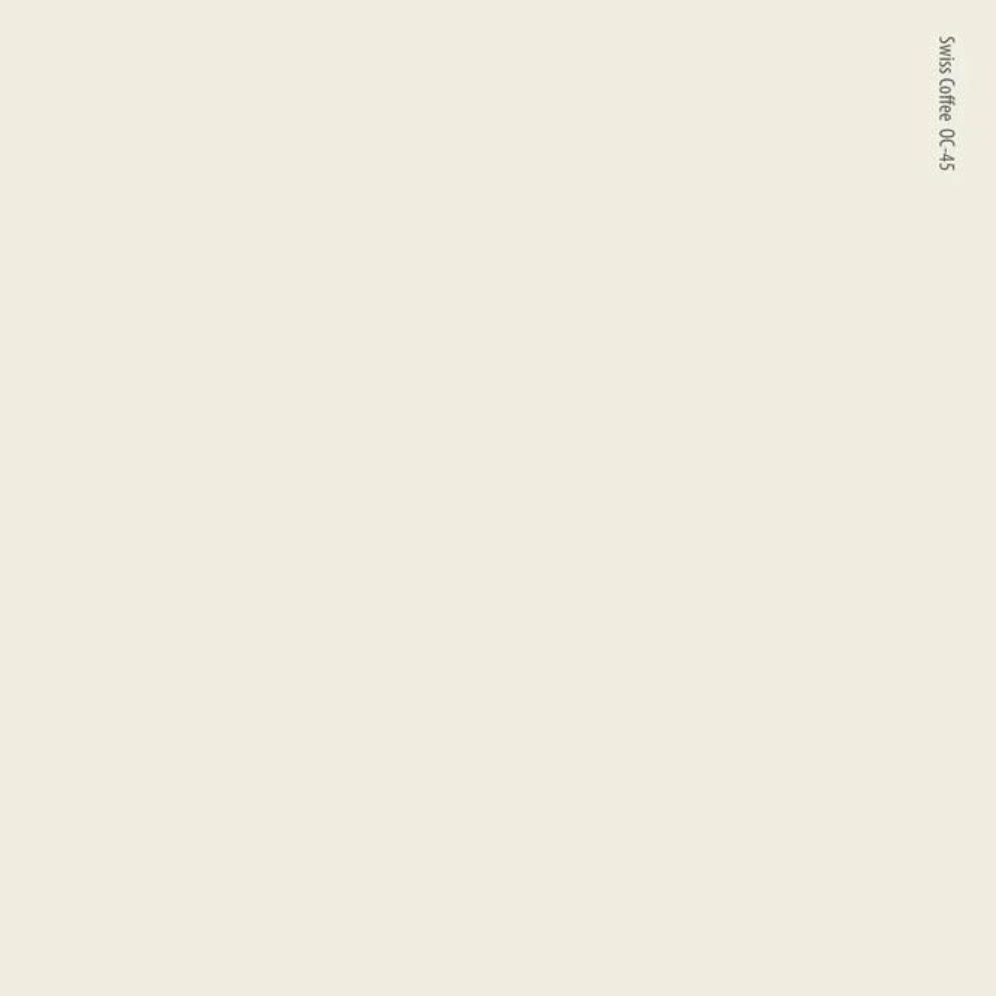
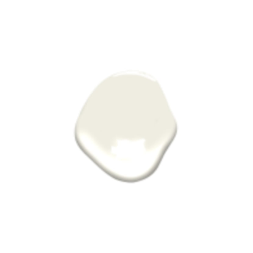
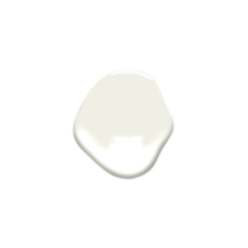
Benjamin Moore’s Simply White, recognized as one of their premier white paints, offers a crisp appearance with subtle warm tones. Janna McCalley notes its warmth, which helps it maintain a clean and crisp feel, especially when paired with wallpaper. It is also suitable for trim work or in bathrooms with cooler marble tiles and porcelain fixtures. Nureed Saeed, an interior designer, prefers Farrow & Ball’s School House White, a delicate white that gently warms spaces without appearing too yellow or outdated. Sherwin-Williams’ Alabaster is a soft white with a subtle warmth, favored by Linda Burnside of LGB Interiors and Amber Guyton of Blessed Little Bungalow. Guyton describes it as a “warm hug,” avoiding excessive yellow or cold tones, making it an ideal choice for cabinetry when clients desire white cabinets that are not stark. Benjamin Moore’s Mountain Peak White, a lesser-known off-white, is praised by Andrea Goldman of Andrea Goldman Design. This fresh white offers sufficient warmth without leaning too yellow or green, suitable for both walls and trim, creating a cohesive and inviting look. Lina Galvao of Curated Nest Interiors recommends Benjamin Moore’s White Dove and Swiss Coffee. Both are described as warm, creamy whites suitable for various spaces, particularly those with ample natural light. White Dove is noted for its effectiveness on cabinetry, providing a creamy tone that harmonizes with painted or stained islands. Lastly, Melissa Read also recommends Paint & Paper Library’s Slate I. This near-neutral shade offers a slight warmth, preventing it from appearing stark or clinical. It performs well in north-facing rooms, providing a soft touch suitable for both contemporary and period settings.
#OffWhitePaint #InteriorDesign #PaintColors #HomeDecor #BenjaminMoore #FarrowAndBall #SherwinWilliams #LittleGreene #PaintAndPaperLibrary #OffWhitePaint #InteriorDesign #PaintColors #HomeDecor #BenjaminMoore #FarrowAndBall #SherwinWilliams #LittleGreene #PaintAndPaperLibrary
0 commenti in totale
 Nessun commento ancora
Potresti anche gradire
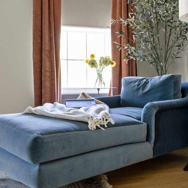
13 Best Off-White Paint Colors, According to Interior Designers

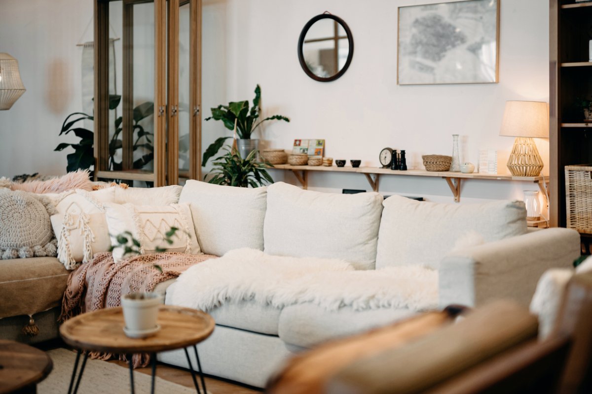
The 11 Best Warm White Paint Colors, According to Designers

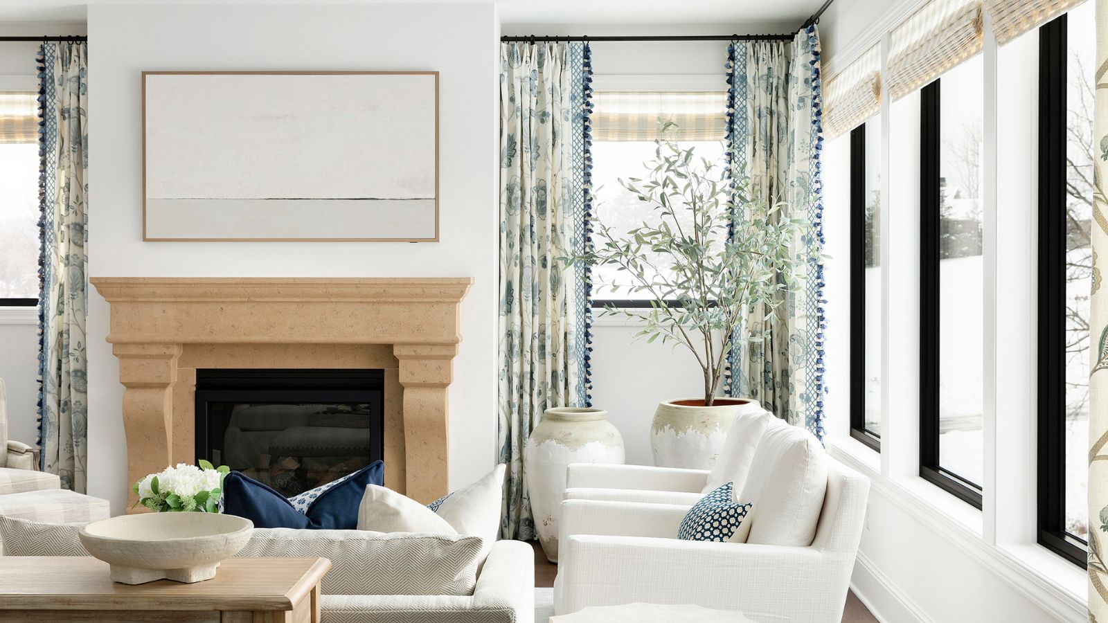
5 best warm white paints, as chosen by interior designers
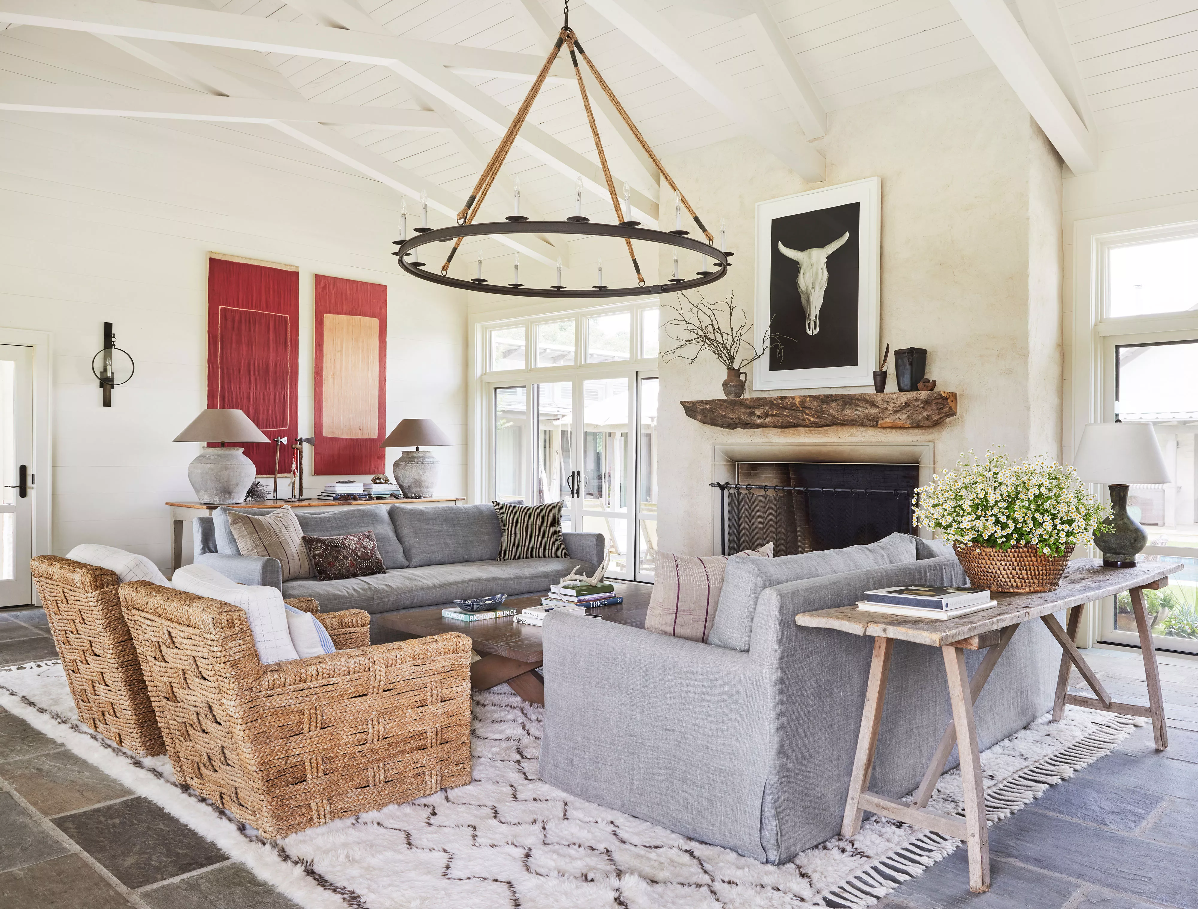
13 Off-White Paint Colors That Make Any Room Feel Bigger and Brighter

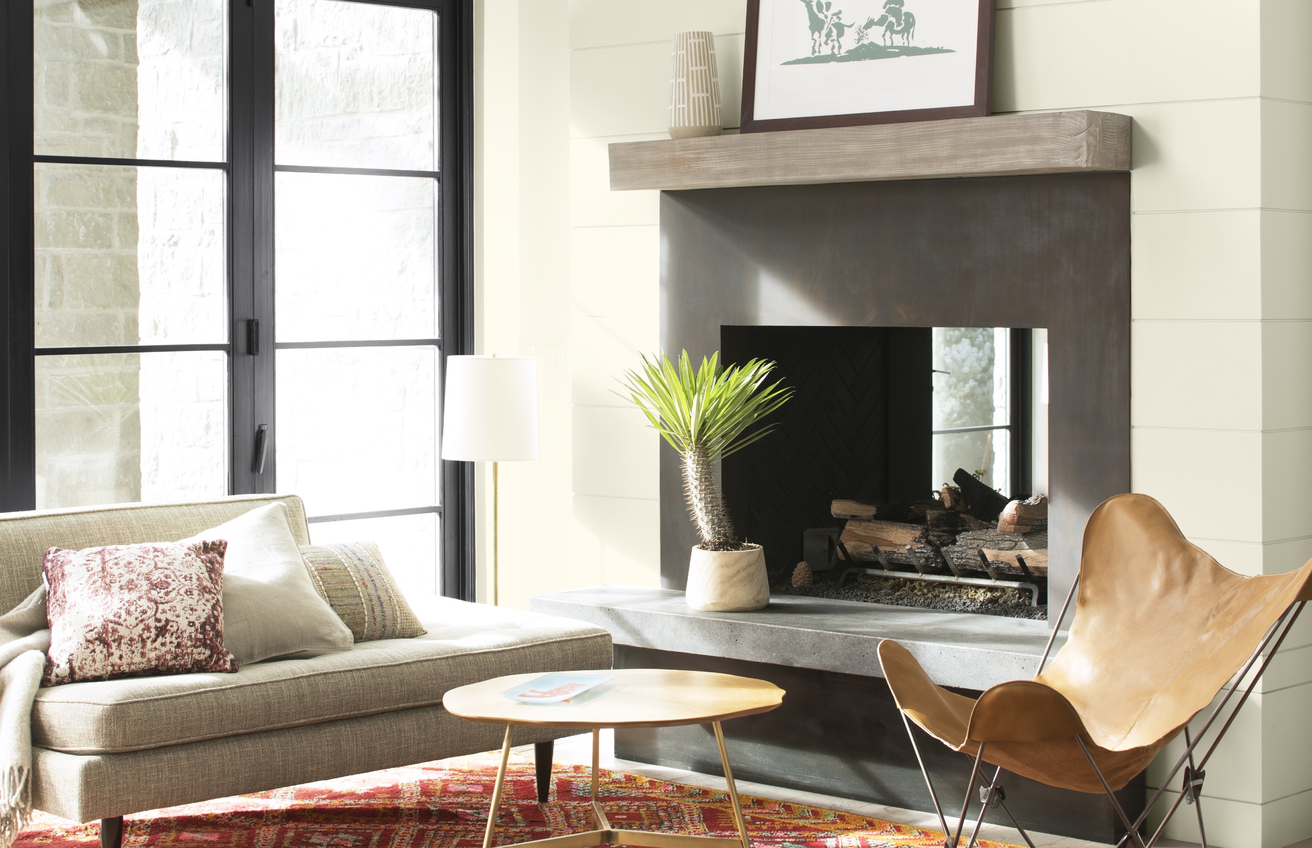
Best white paint colors: Expert share the top options

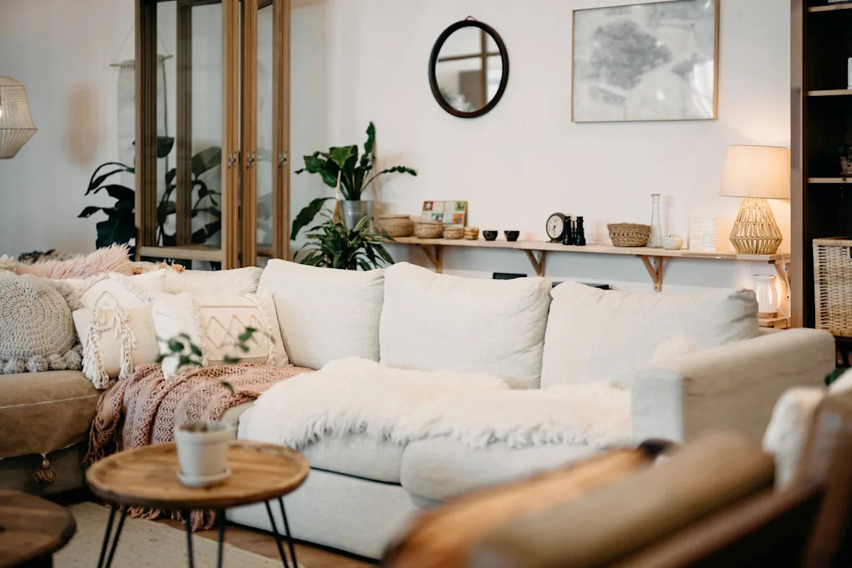
The 11 Best Warm White Paint Colors, According to Designers
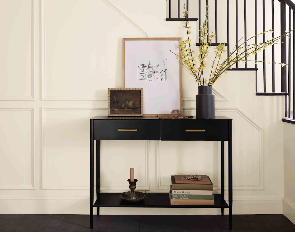
13 Off-White Paint Colors the Experts Recommend for Any Space

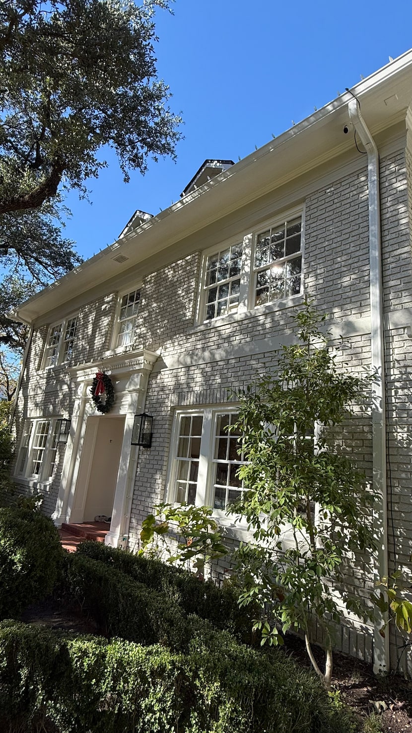
Shades of white: Paint color pros reveal their favorite neutral combinations for exteriors
The 40 Best White Paint Colors, According to Designers
13 Off-White Paint Colors the Experts Recommend for Any Space
Designers’ Favorite White Paints Are Always Changing—We Asked 3 for Their Latest Pick

Is white actually out of style? Interior designers weigh in on this classic color for 2025 decorating
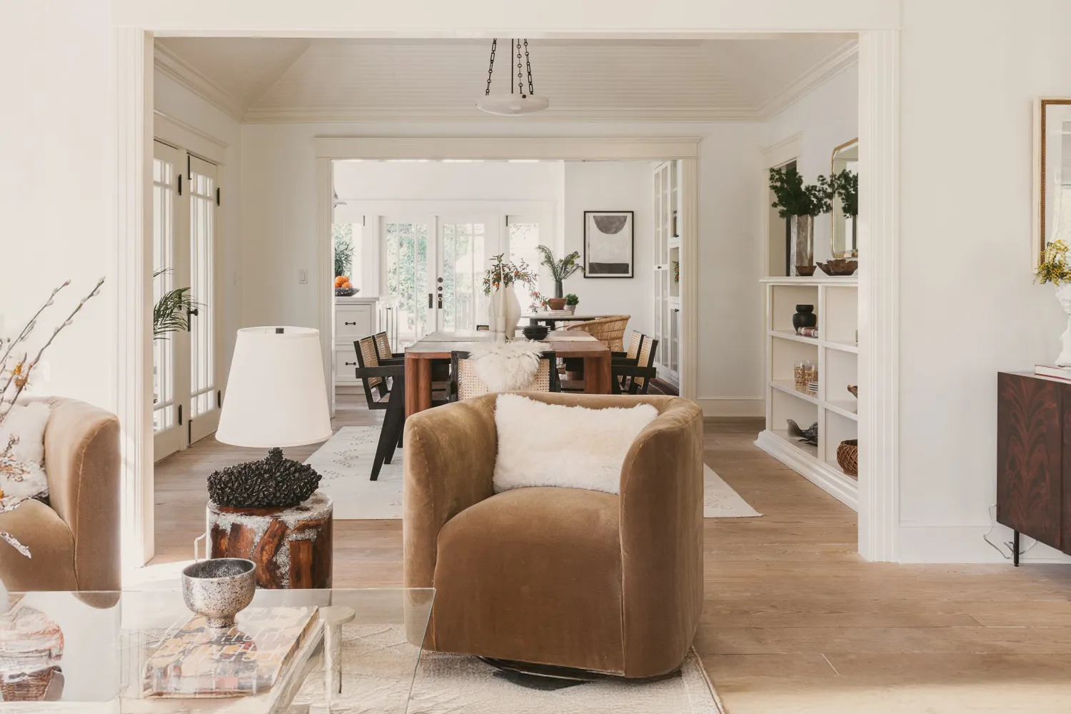
Designers Swear By These 8 Off-White Paint Colors For Every Project

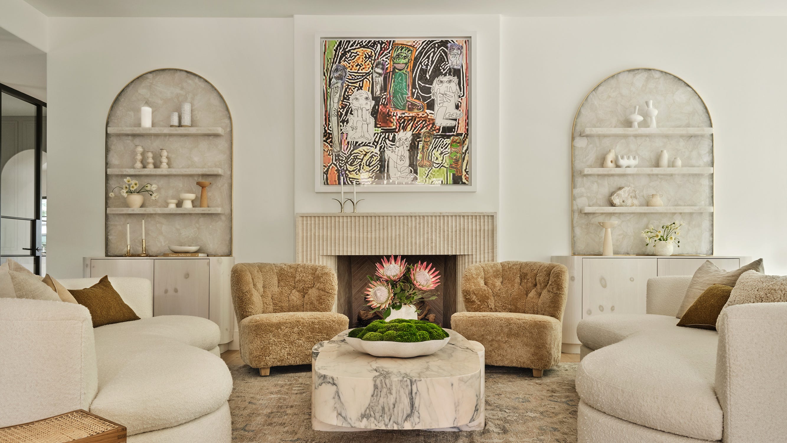
The 13 Best White Paint Colors That Interior Designers Swear By

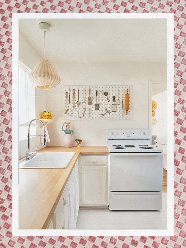
The Best Warm White Paint Colors, as Seen in 8 Designers’ Favorite Spaces
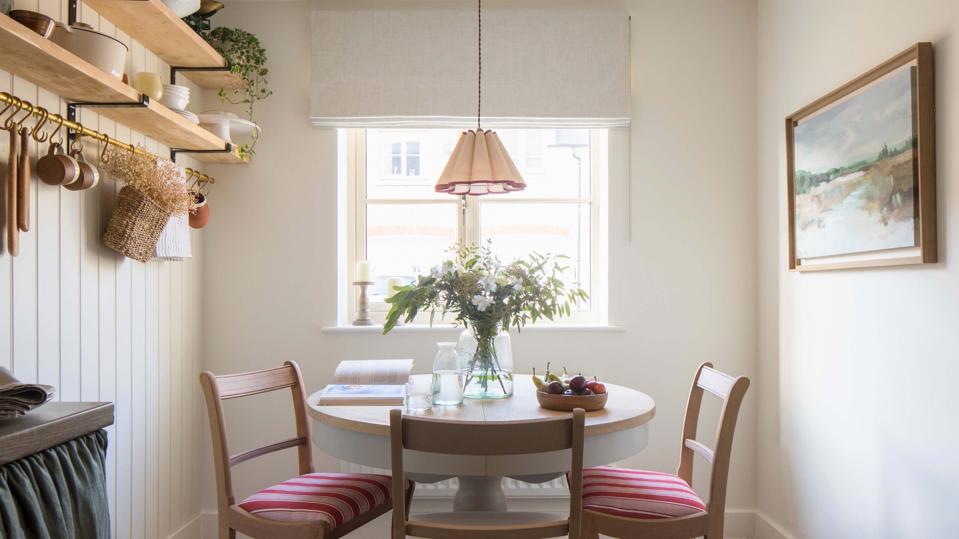
Which white paint is the best? Experts reveal the perfect shade of white for every room and feature
The Best White Paint Colors Experts Turn to Again and Again

13 Tried-and-True White Paint Colors Recommended by Pros

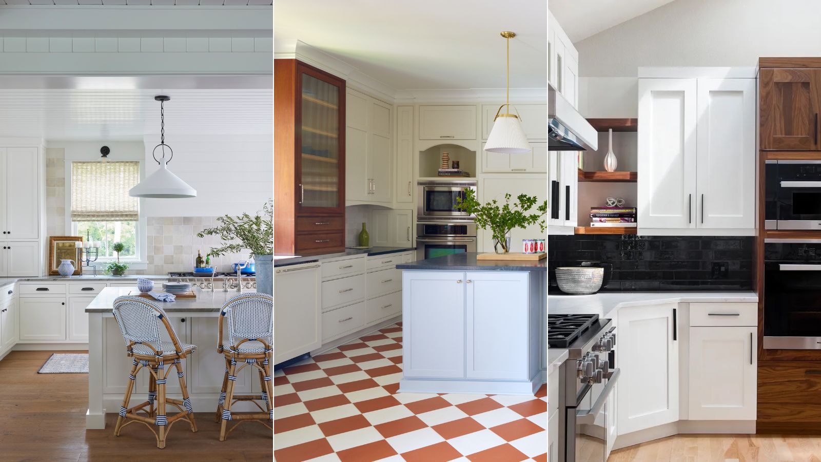
What are the best white paints for kitchens? 6 light and airy picks from interior designers
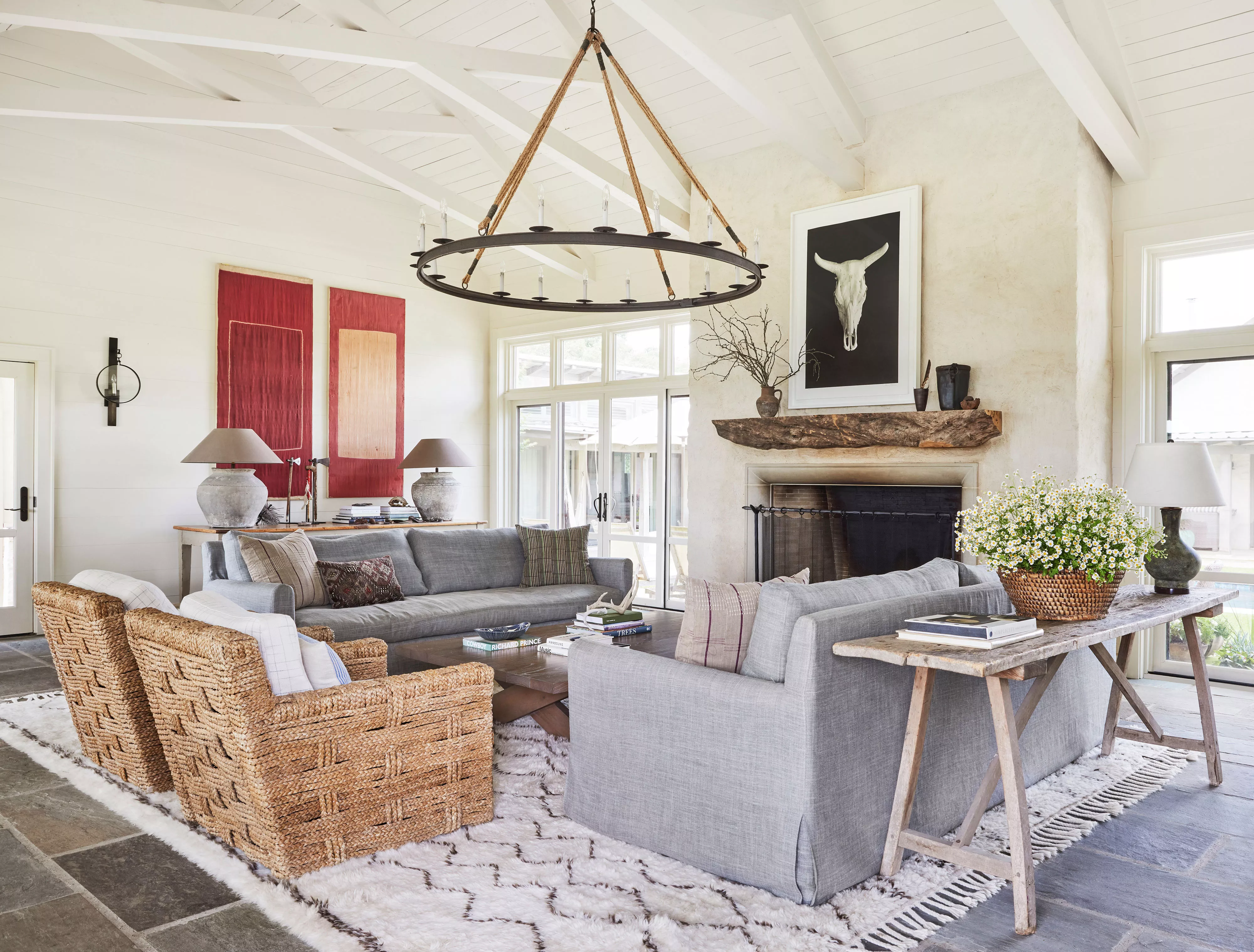
13 Off-White Paint Colors That Experts Always Recommend to Make Rooms Feel Bigger and Brighter