1/12
11 spring color ideas for bedrooms – to make your home look lighter, brighter, and bigger
This article explores various spring color ideas for bedrooms, focusing on how different palettes can make a space feel lighter, brighter, and larger while also promoting serenity and joy. It highlights expert advice from interior designers on selecting and combining colors inspired by the natural world.
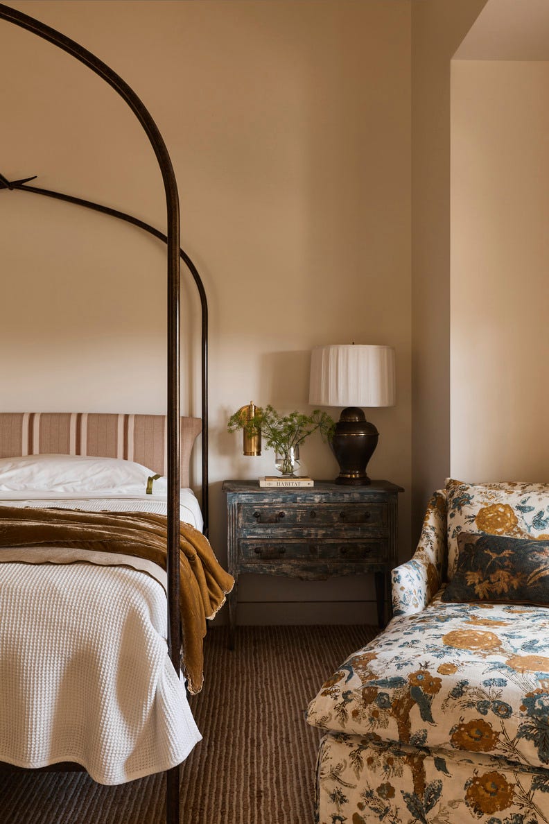
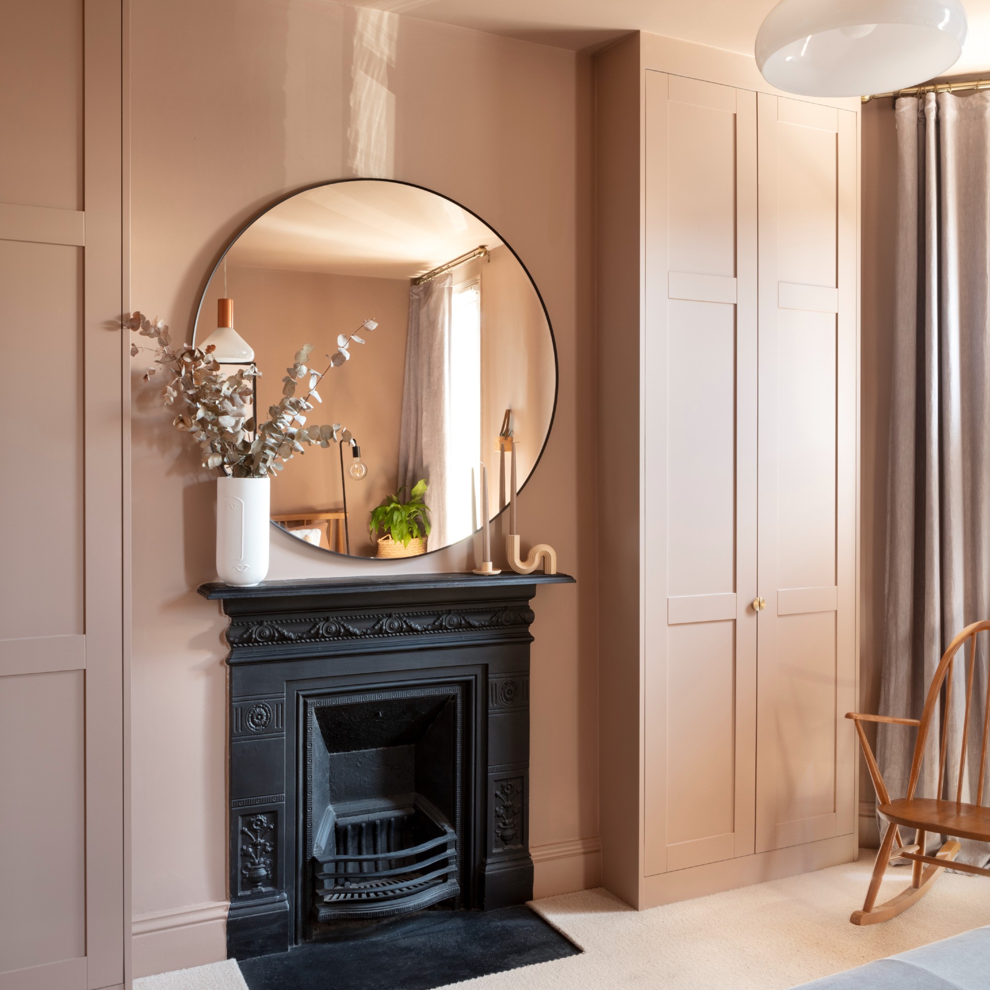
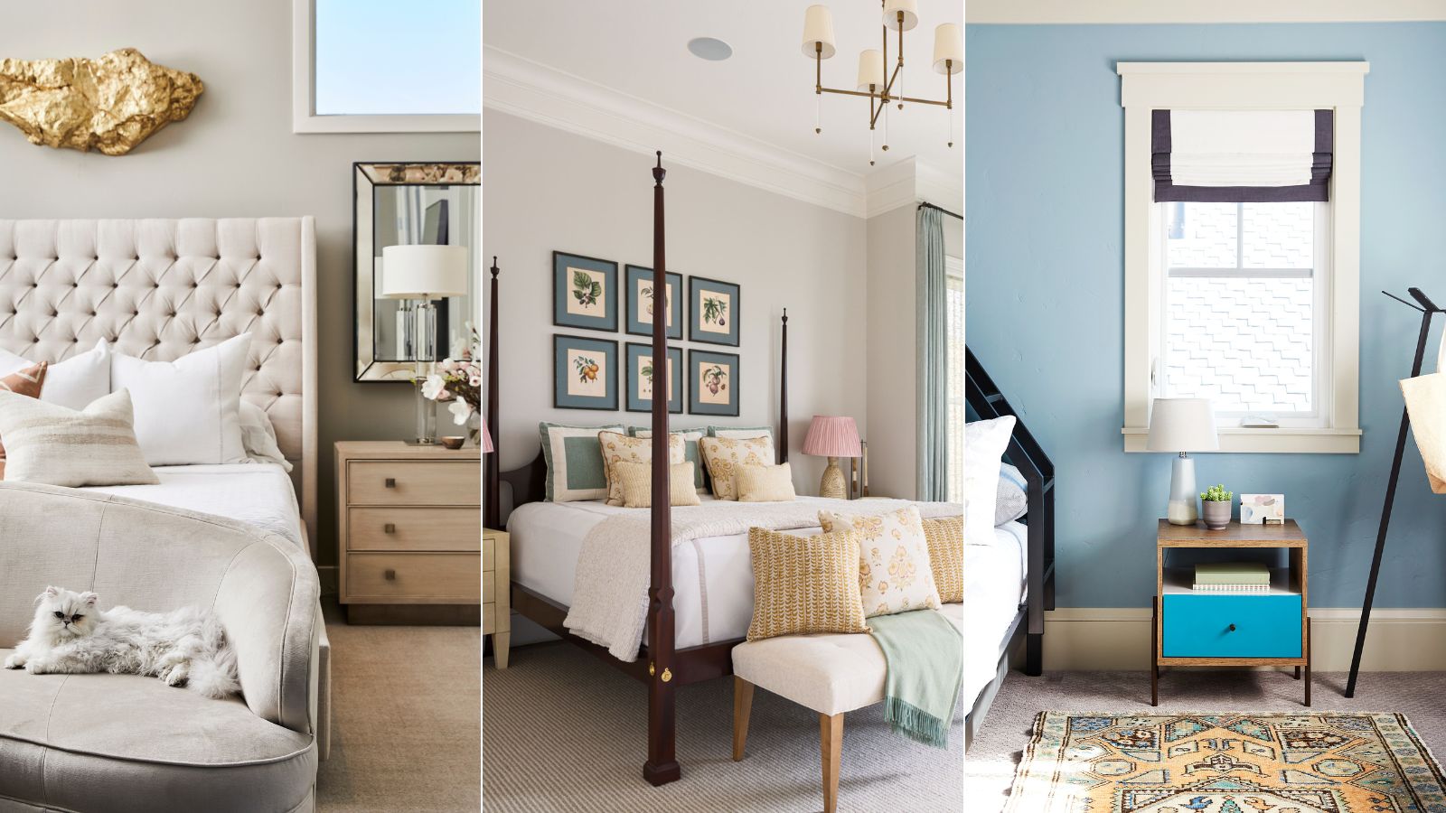
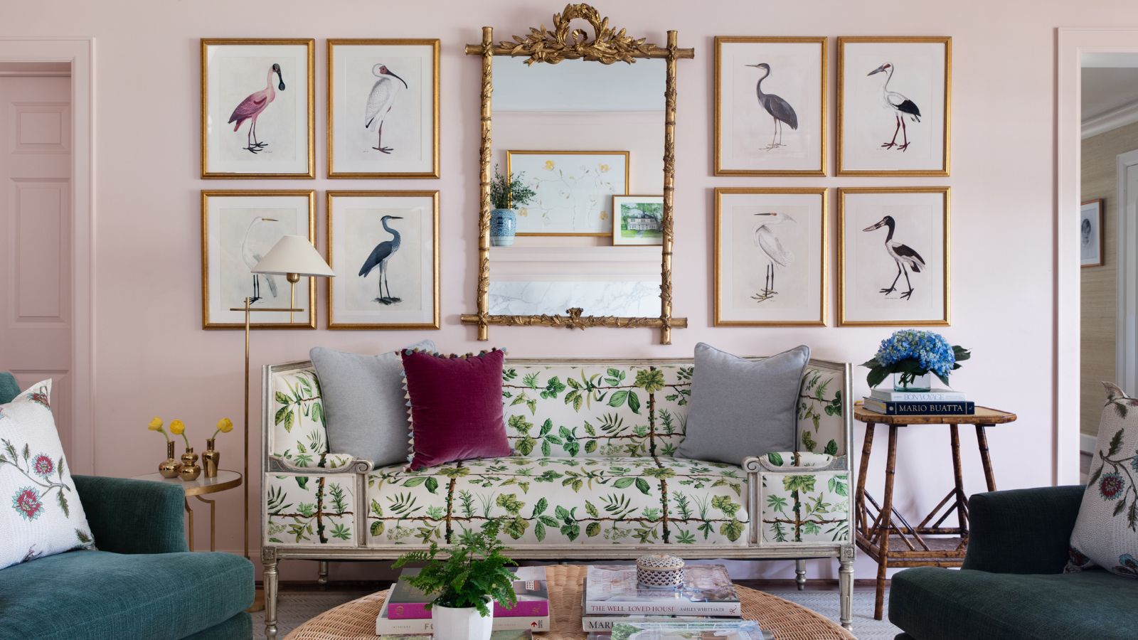
The article begins by advocating for neutral shades, specifically taupe, to create a serene and sophisticated bedroom environment. Jessica Bennett of Alice Lane Interiors suggests that neutrals provide a versatile foundation for accent colors and contribute to a brighter, more open feel. Nicky Mudie of Violet & George emphasizes using neutral undertones to ensure a cohesive and calm scheme.
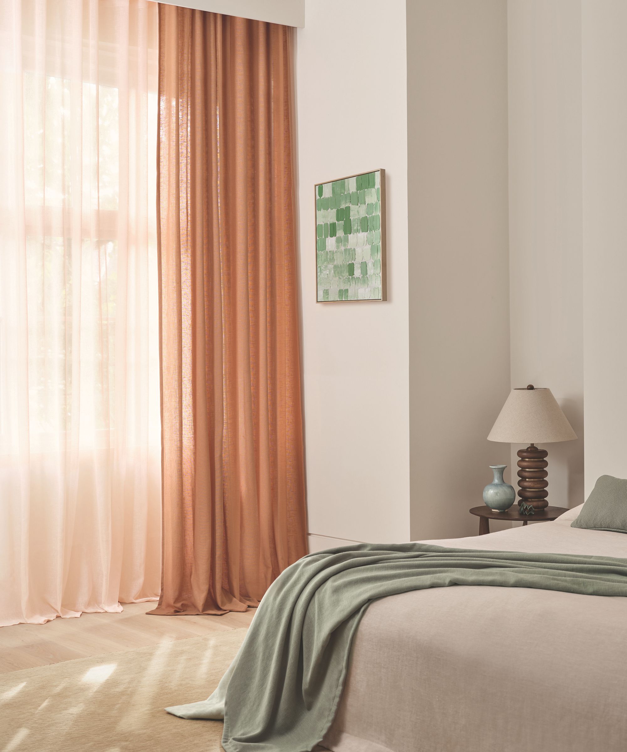
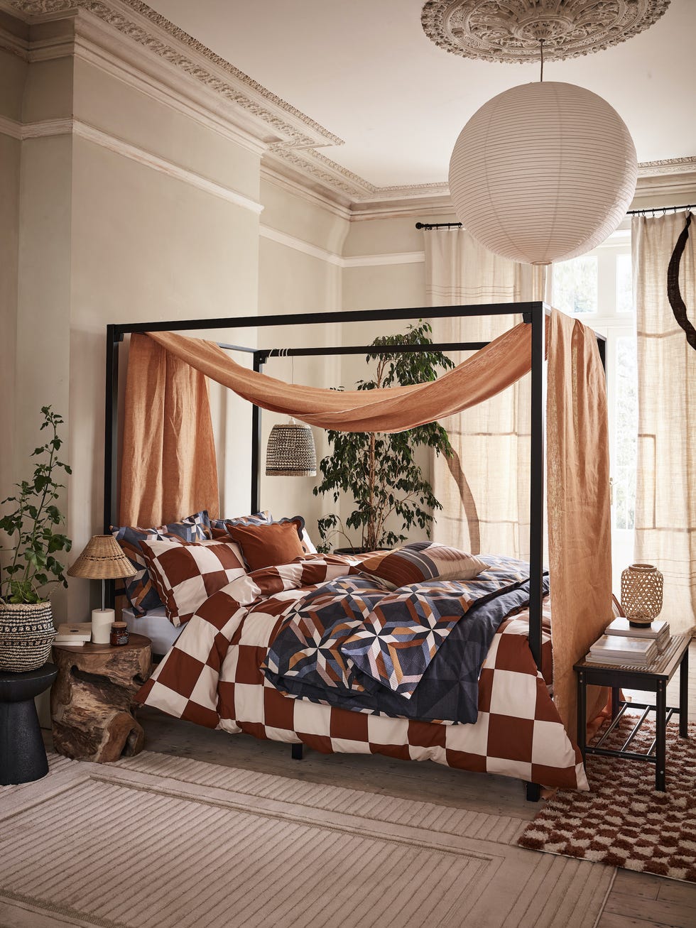
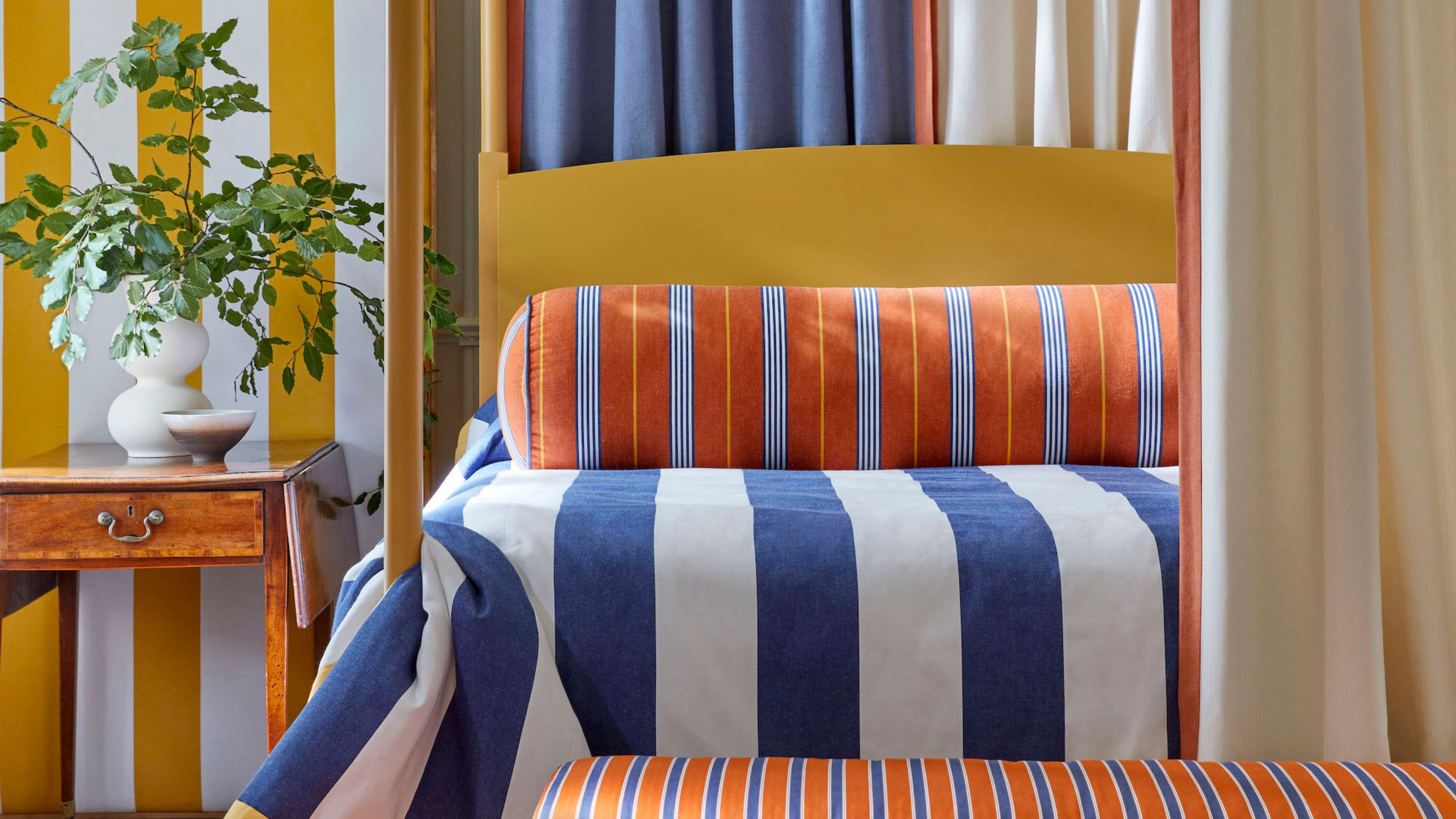
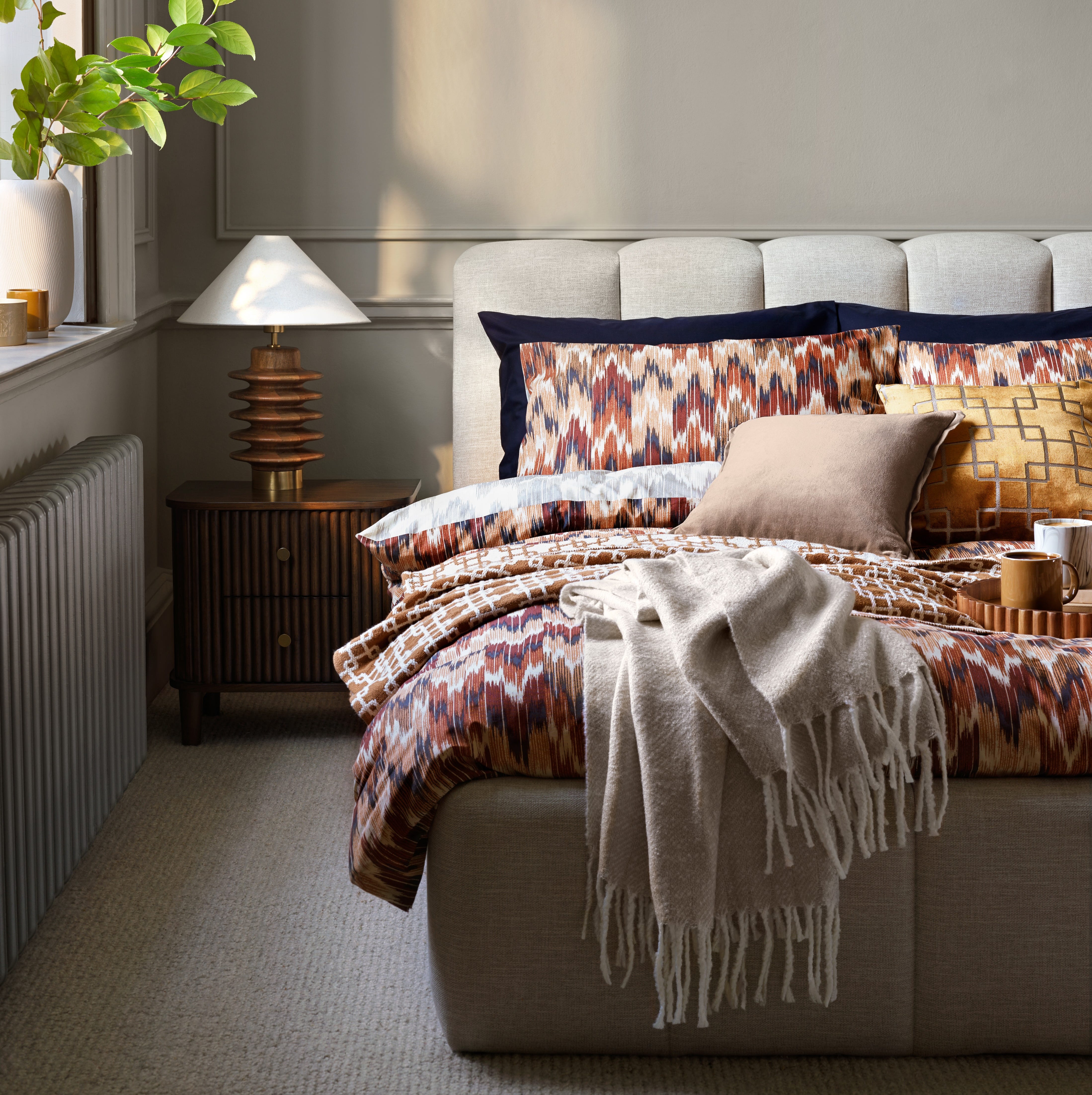
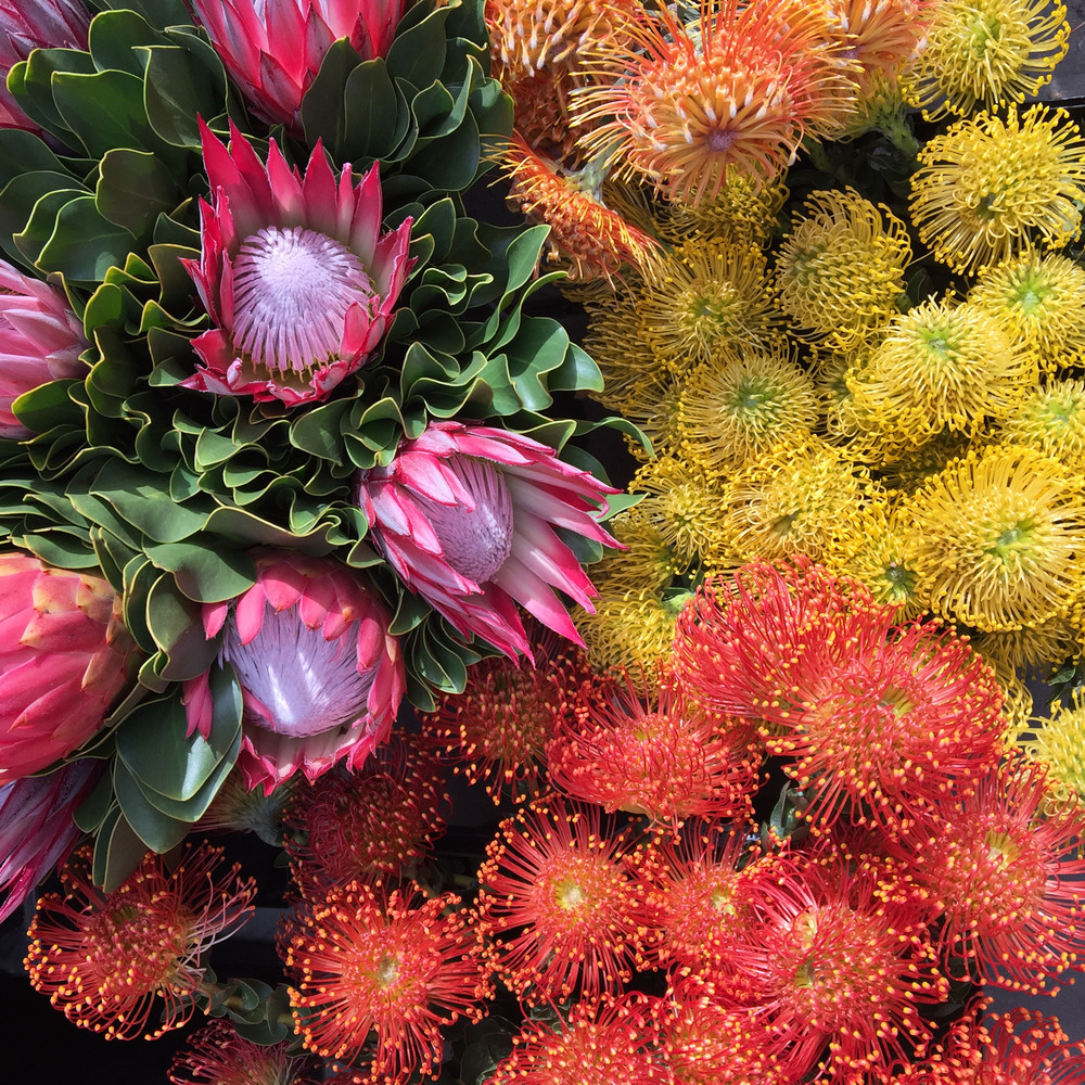
Next, the discussion shifts to bolder choices like fiery orange and red, presented as a way to uplift the mood and visually expand a room. Mary Jo Fiorella of Fiorella Design explains how these vibrant colors can complement neutral backgrounds and take inspiration from the color wheel. The article also recommends extending wall color to the ceiling for a more expansive effect.
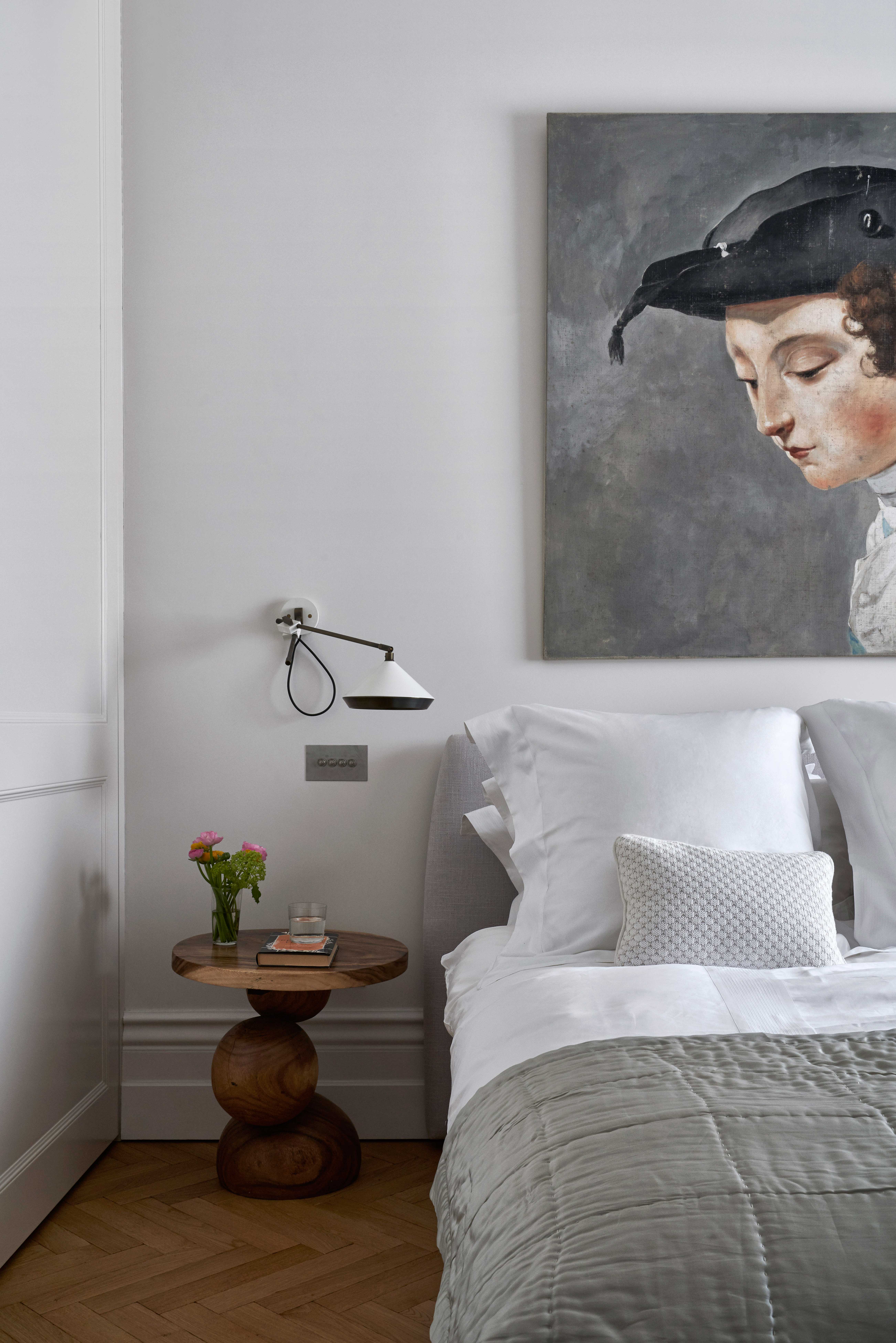
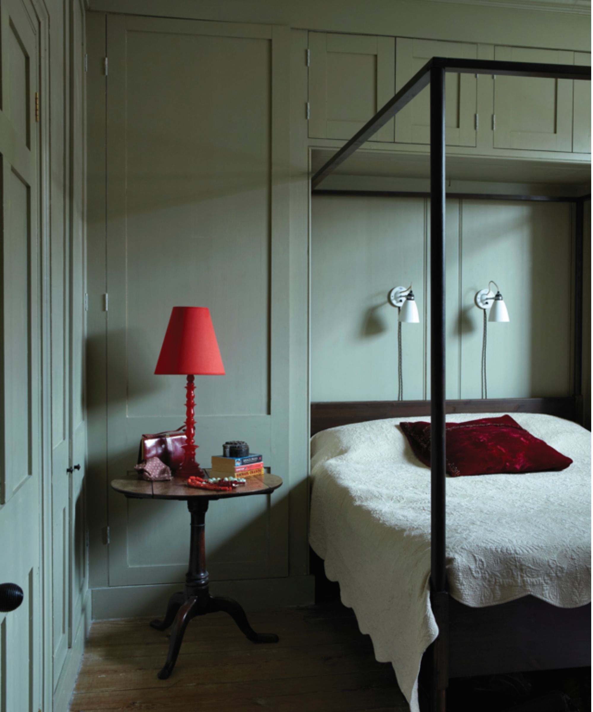
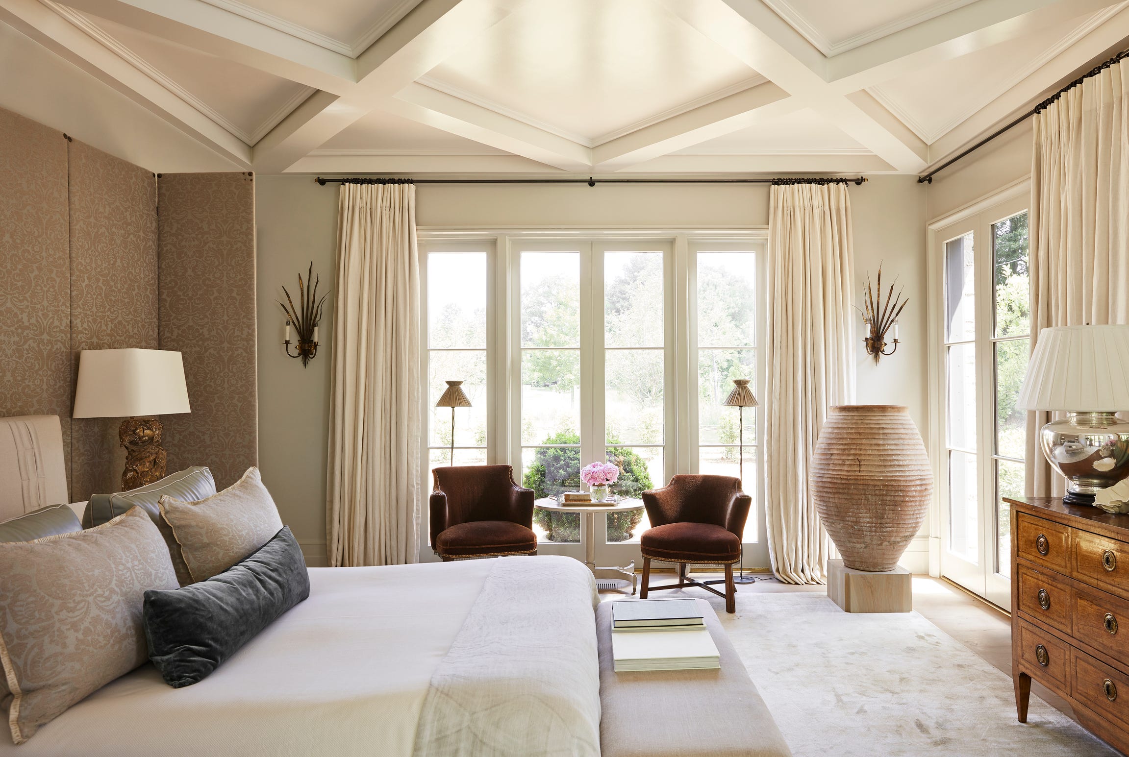
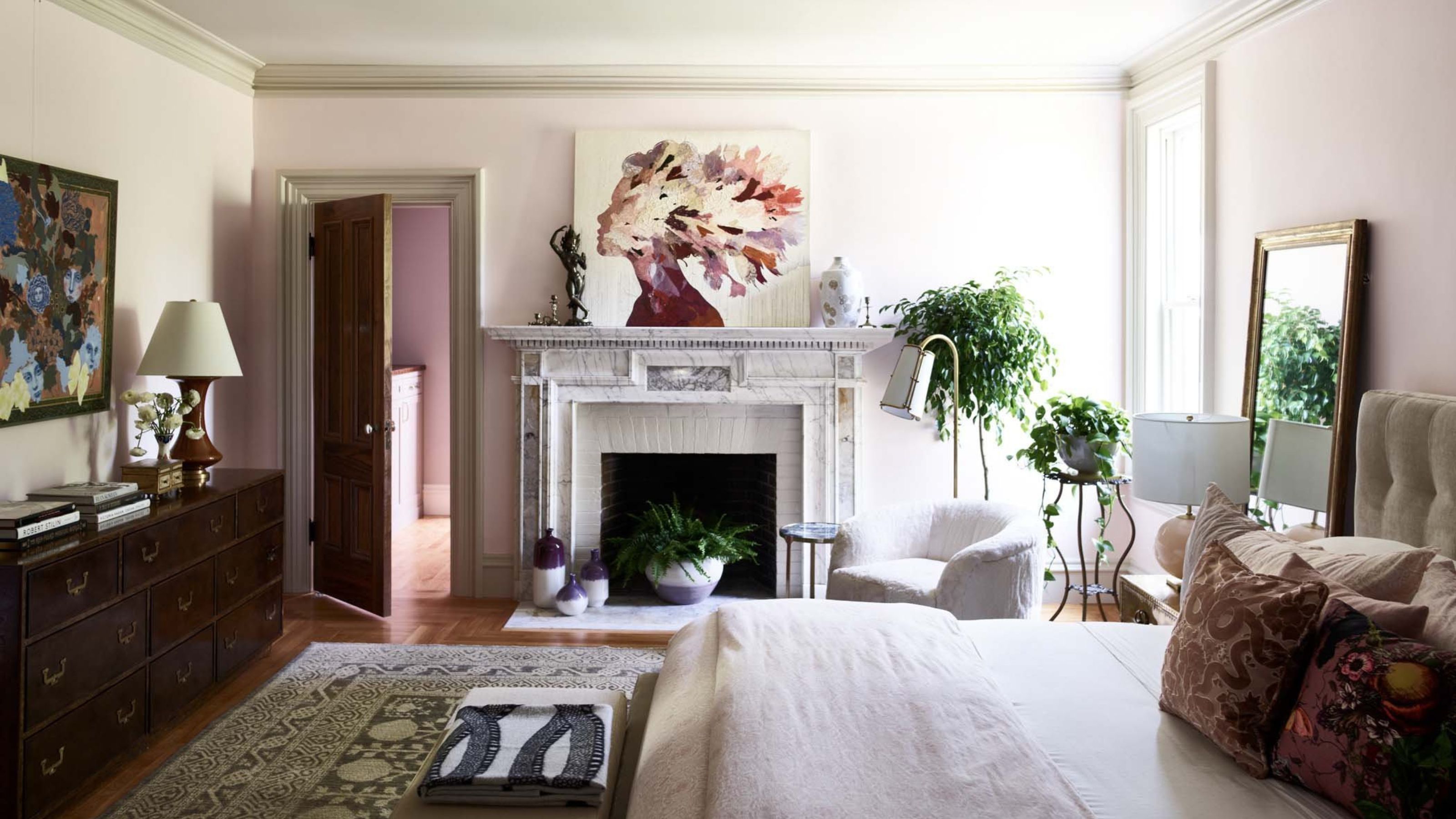
The piece then delves into the calming properties of pale grey, acknowledging its controversial reputation but asserting its ability to add gravitas and visual space when used correctly. Margaret Ash of Margaret Ash Design and Charu Gandhi of Elicyon both support the use of grey, particularly deeper tones, to create a warm and enveloping atmosphere without making the room feel smaller.
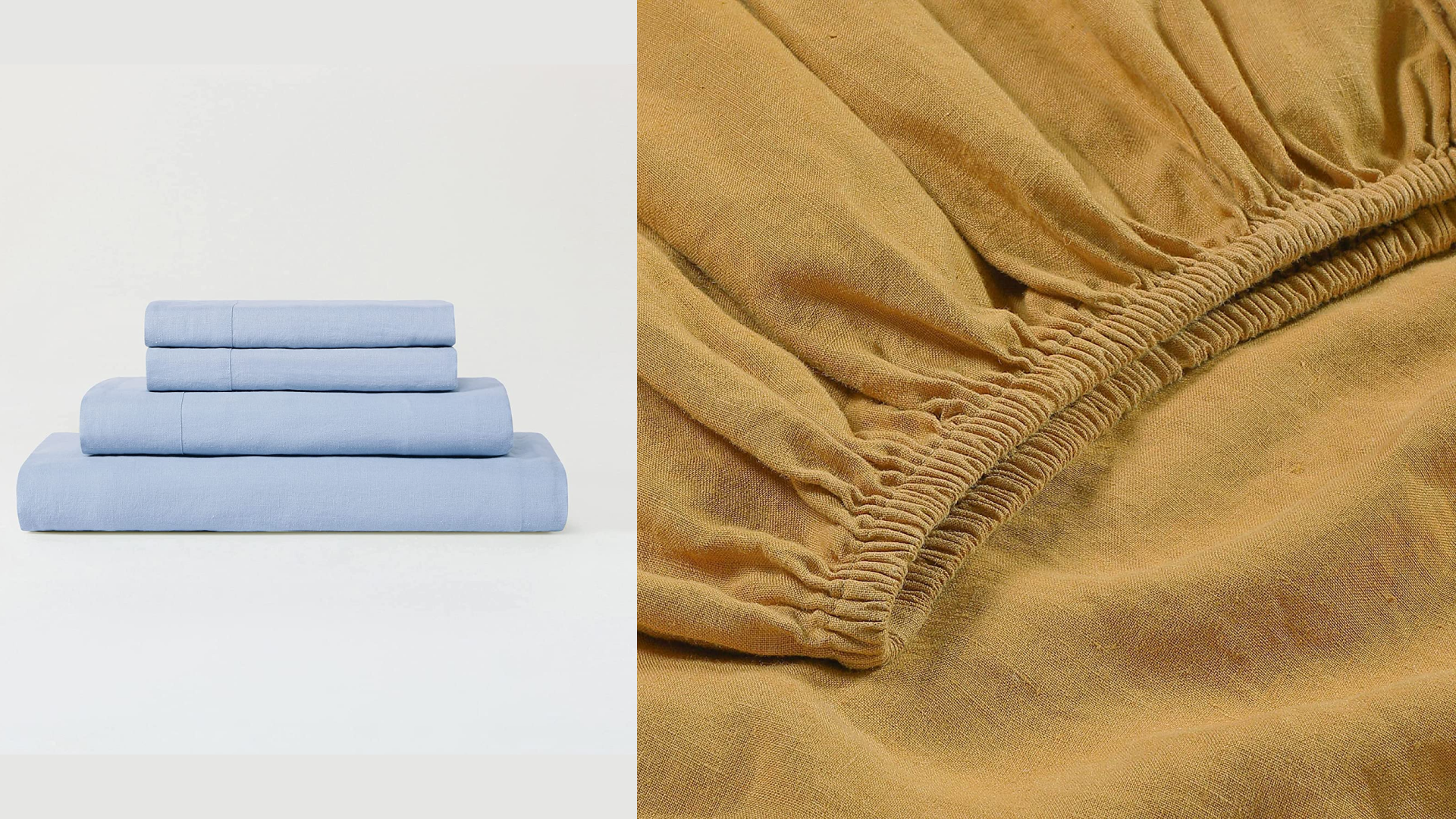
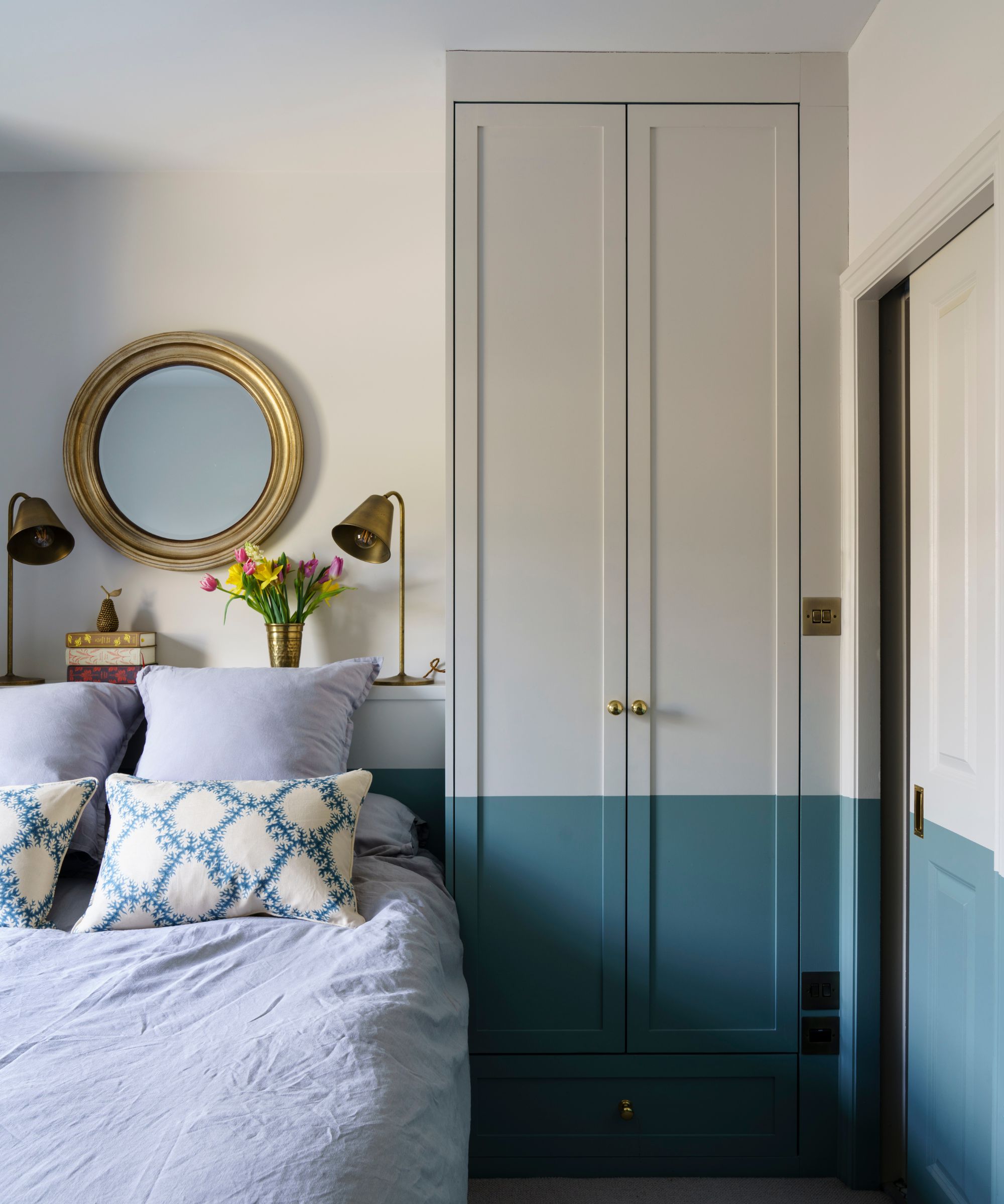
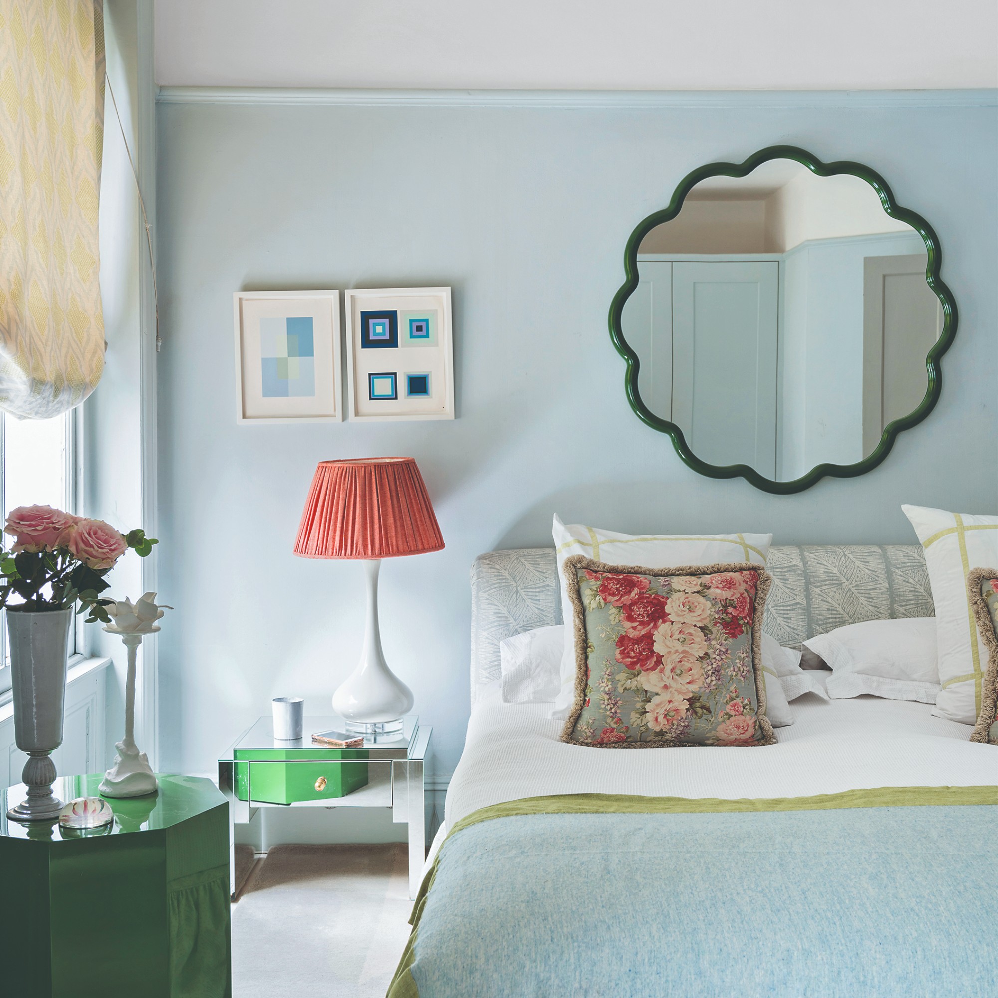
Blue is presented as a fresh spring color that evokes clear skies and makes small bedrooms appear larger and brighter. Kathryn MacDonald of KJM Interiors advises pairing pale blue with neutrals or other blue variations to enhance its effect. Patrick O'Donnell of Farrow & Ball notes blue's suitability for coastal living and its interaction with natural light.
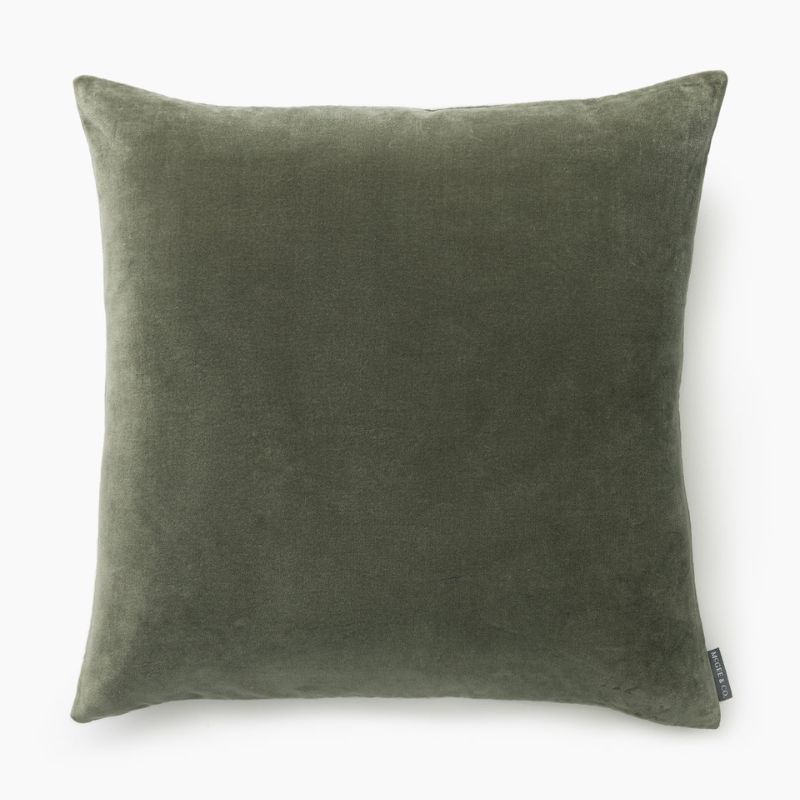
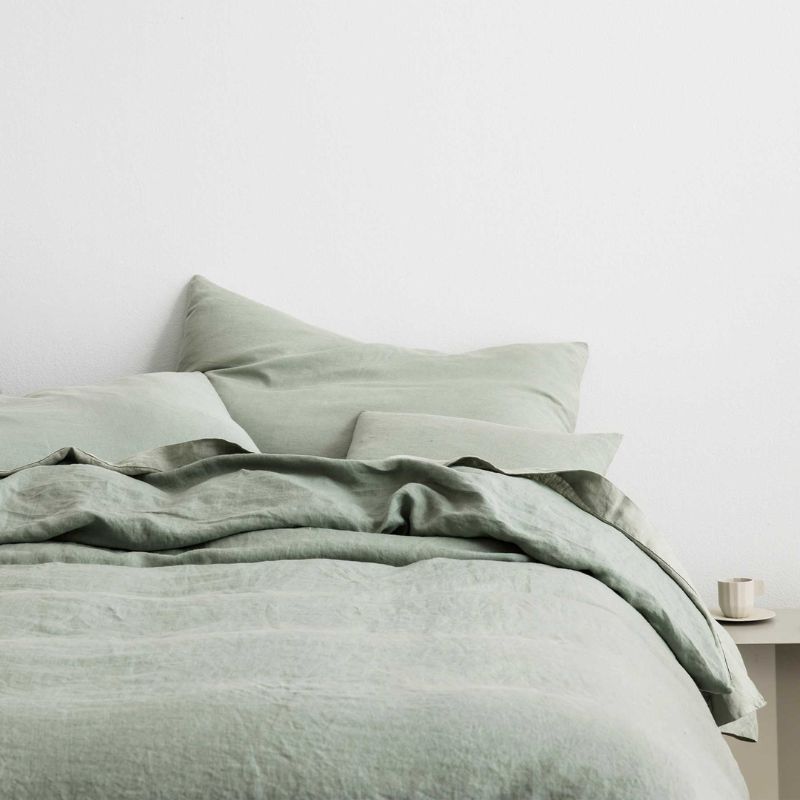
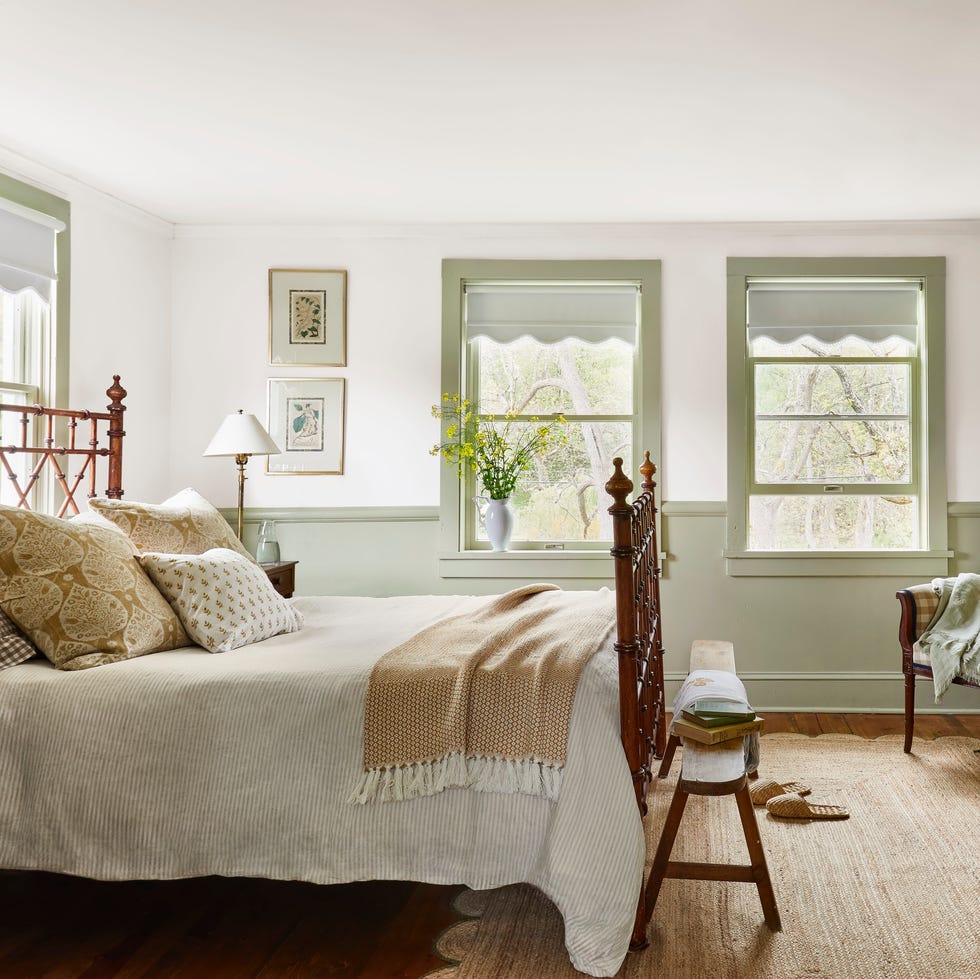
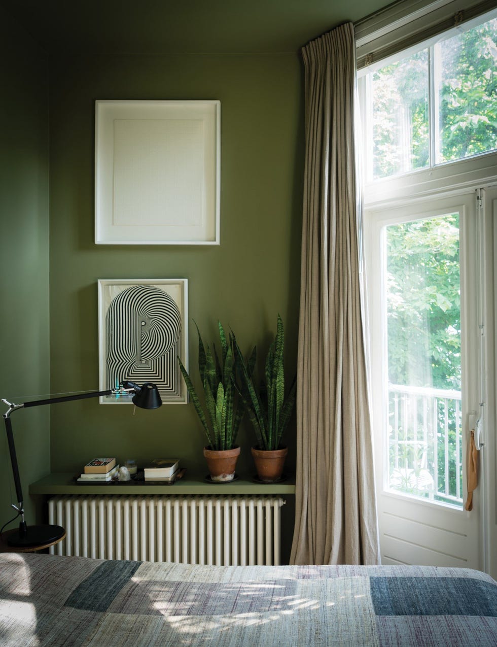
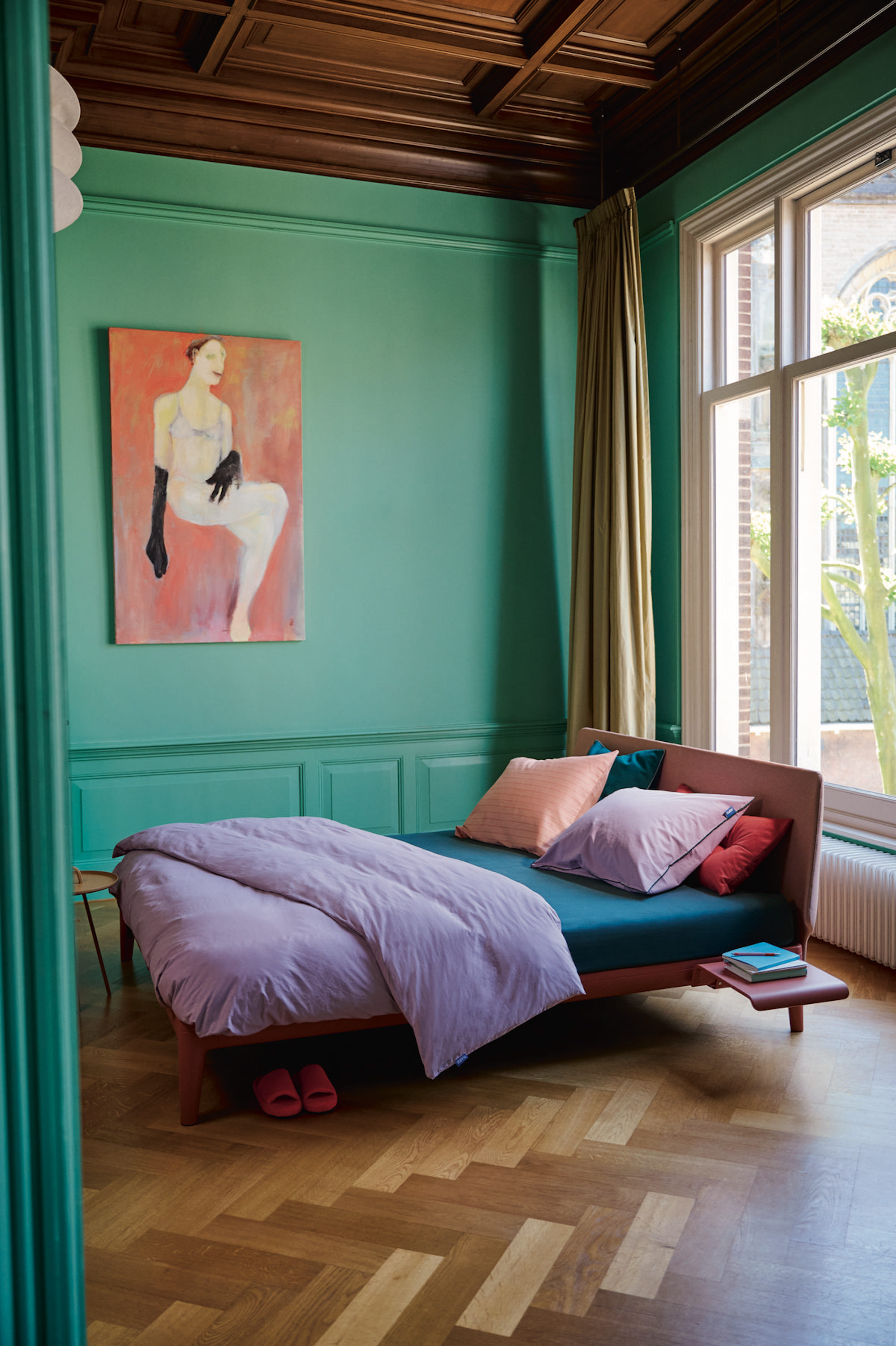
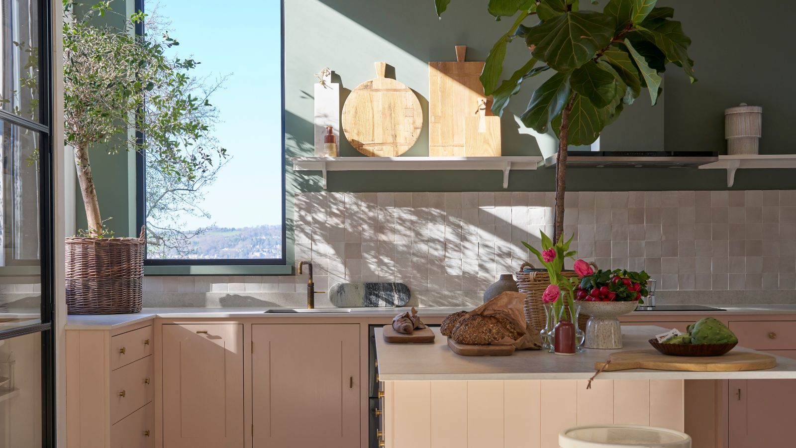
Nature-inspired green is highlighted for its uplifting and tranquil qualities, making it ideal for restful room schemes. Cathy Hong of Cathy Hong Interiors uses horizontal color scheming to expand minimalist bedrooms, emphasizing green's ability to connect indoor spaces with the outdoors.
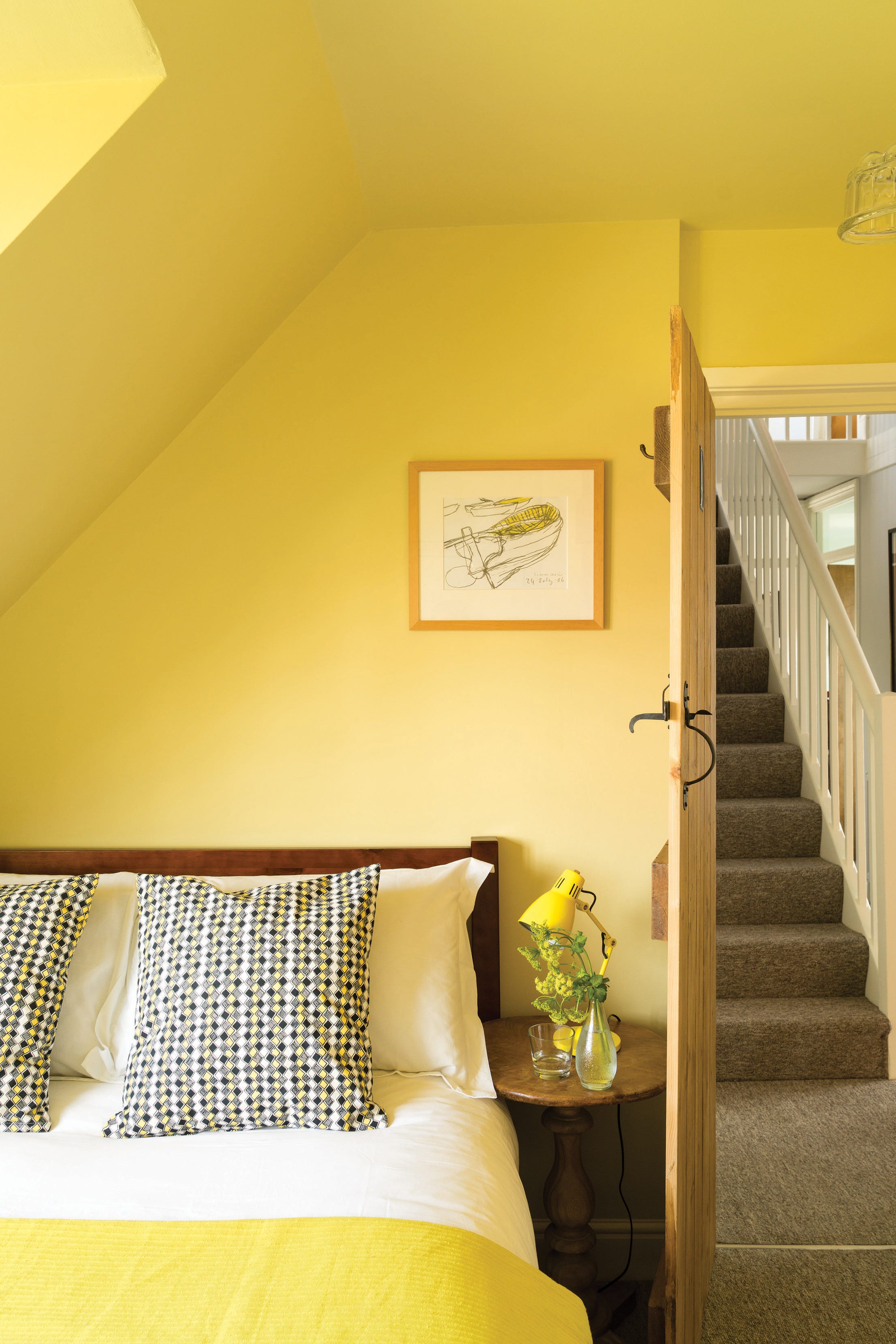
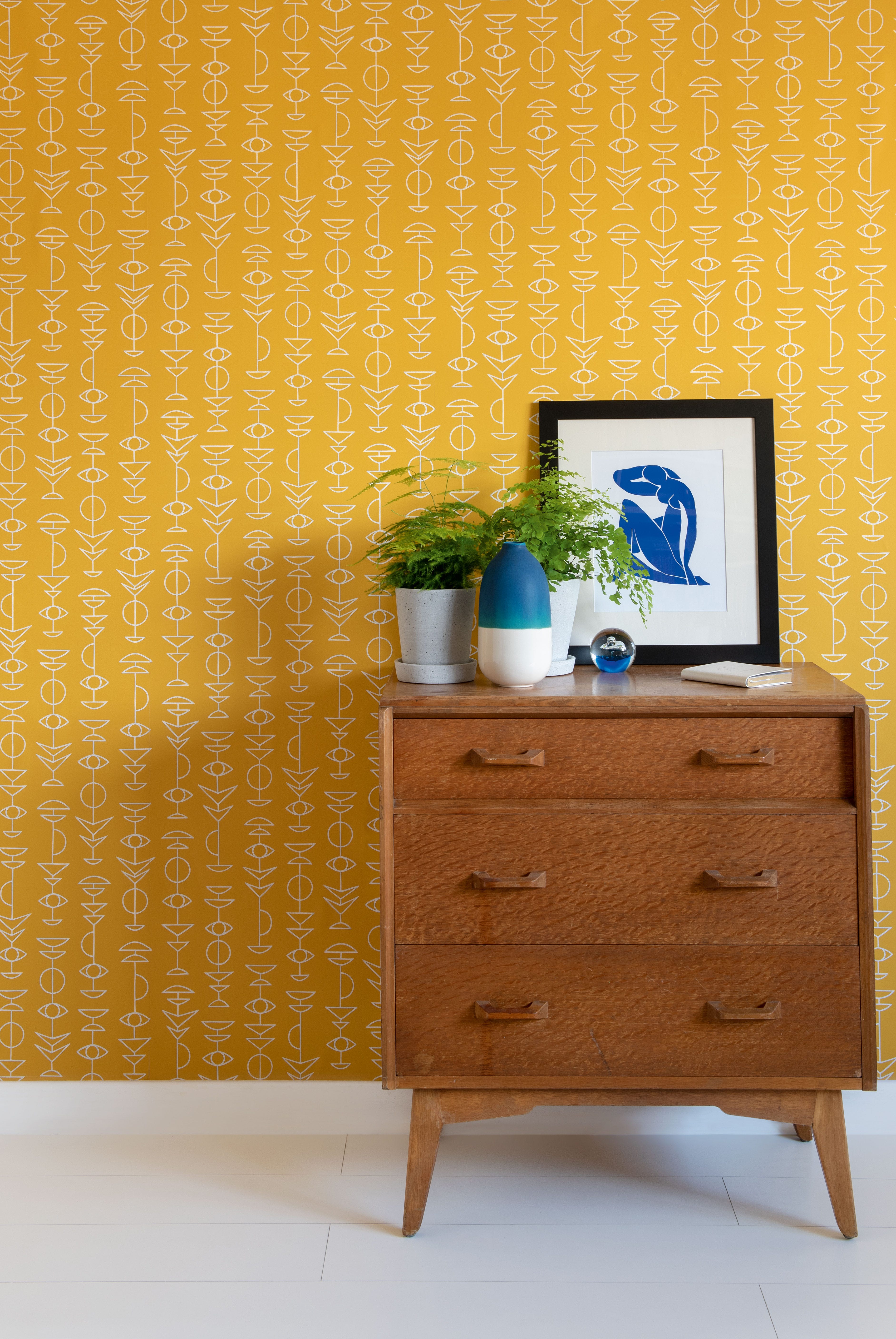
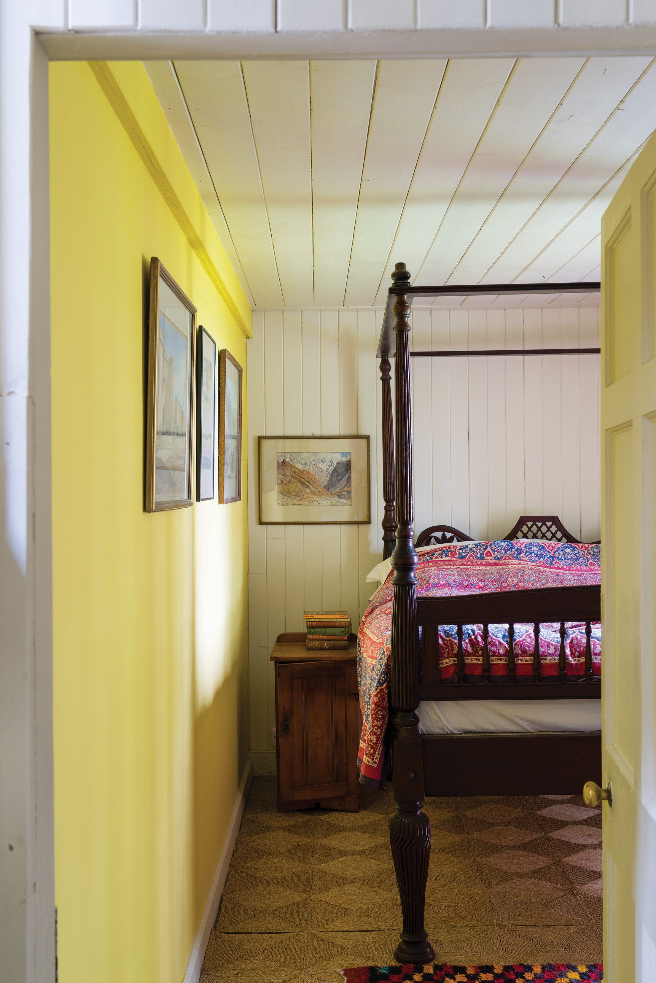
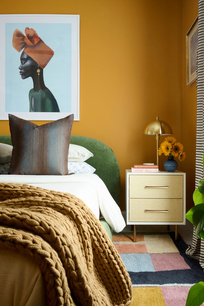
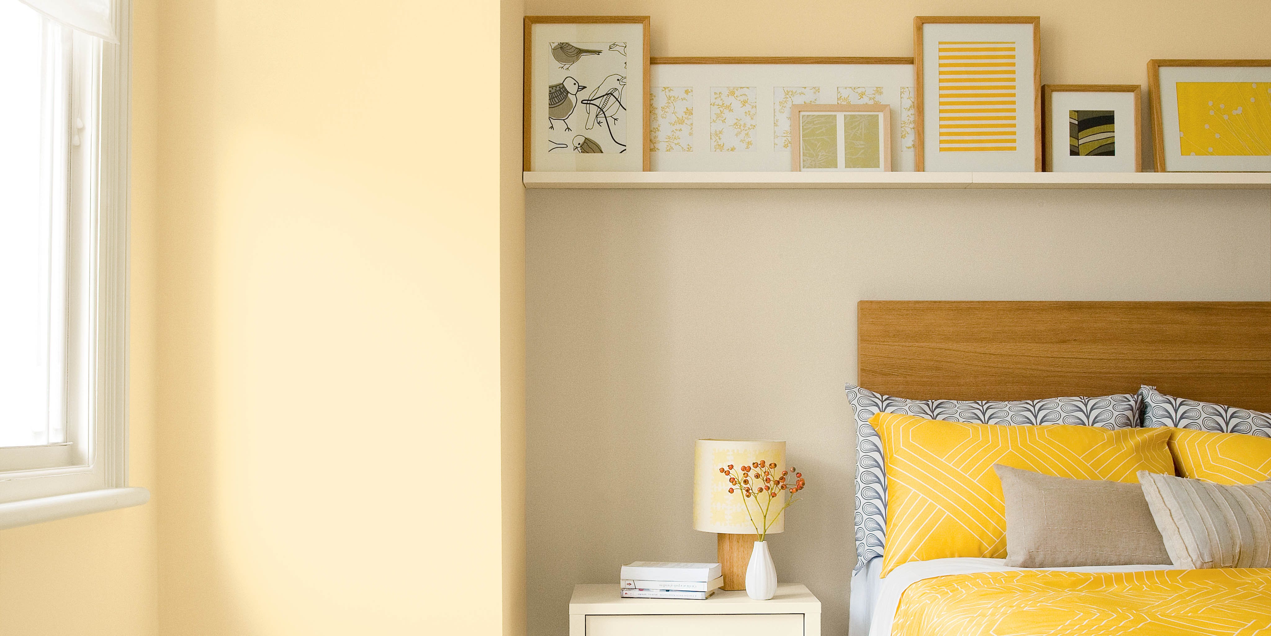
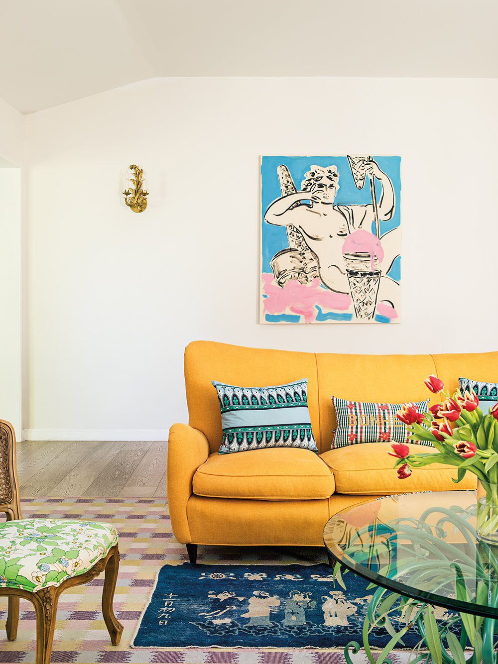
For a joyful and optimistic space, yellow is recommended. Helen Shaw of Benjamin Moore provides guidance on selecting the right shade of yellow based on the room's orientation, suggesting darker shades for north-facing rooms and pastels for south-facing ones. She also proposes using yellow as an accent to create focal points.
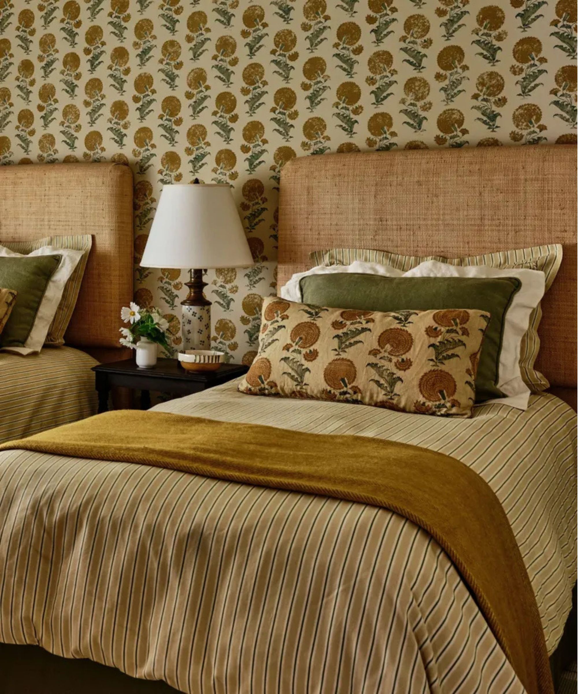
The article then suggests using paler greens in smaller spaces, noting its close association with nature. Molly Mahon, a textile designer, discusses how green, especially when combined with delicate pinks, can create welcoming and calming guest bedrooms. She also mentions the appealing combination of blue and pink.
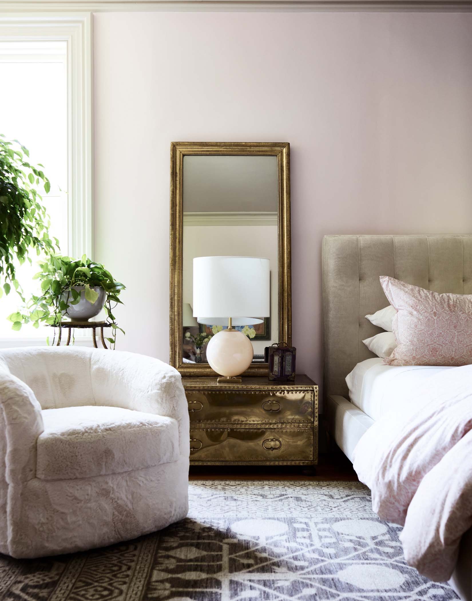
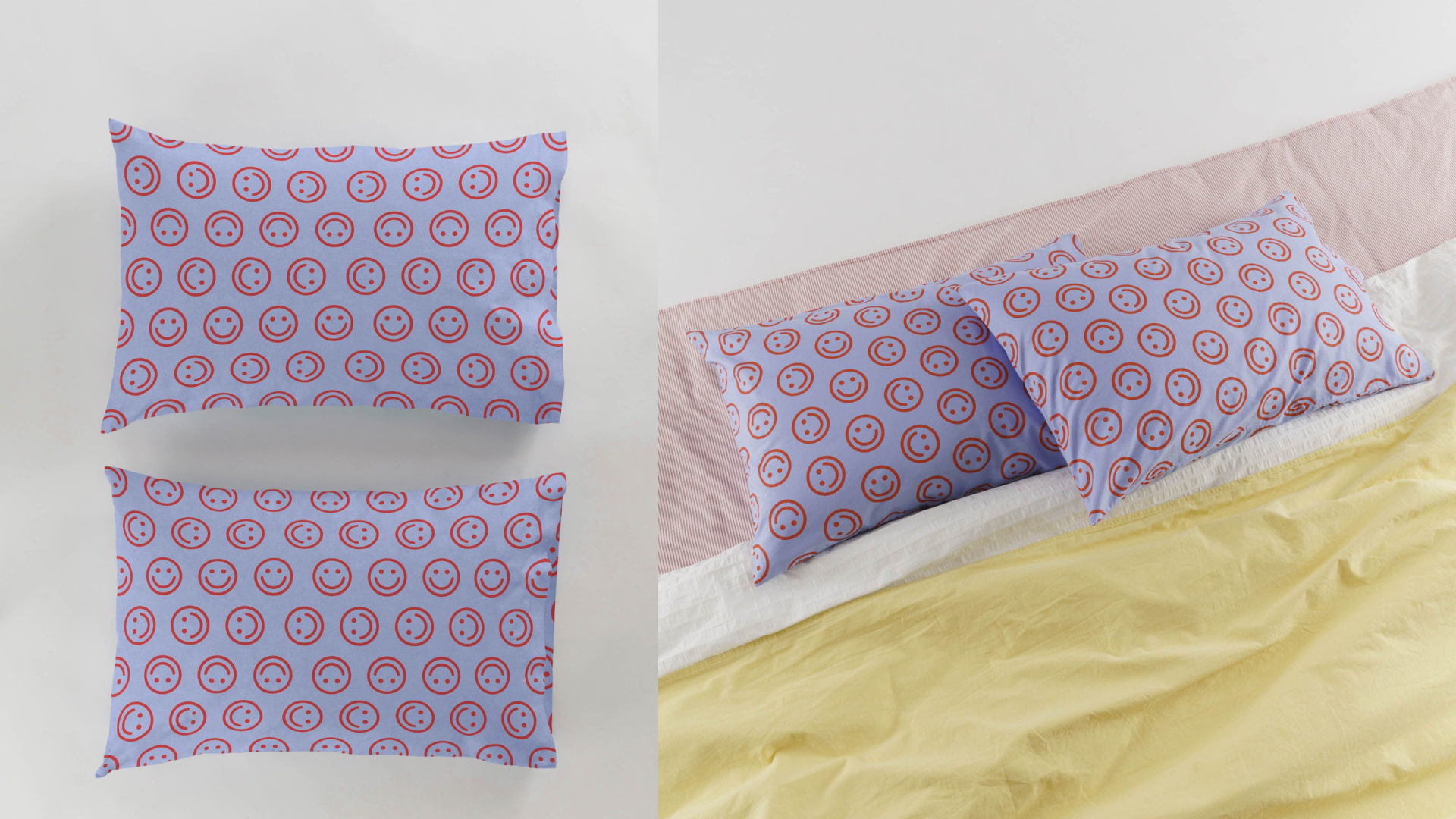
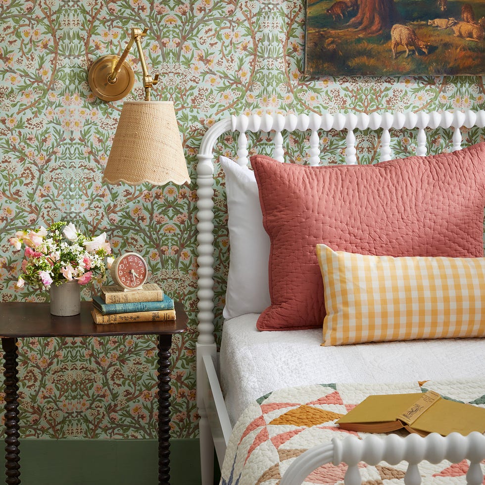
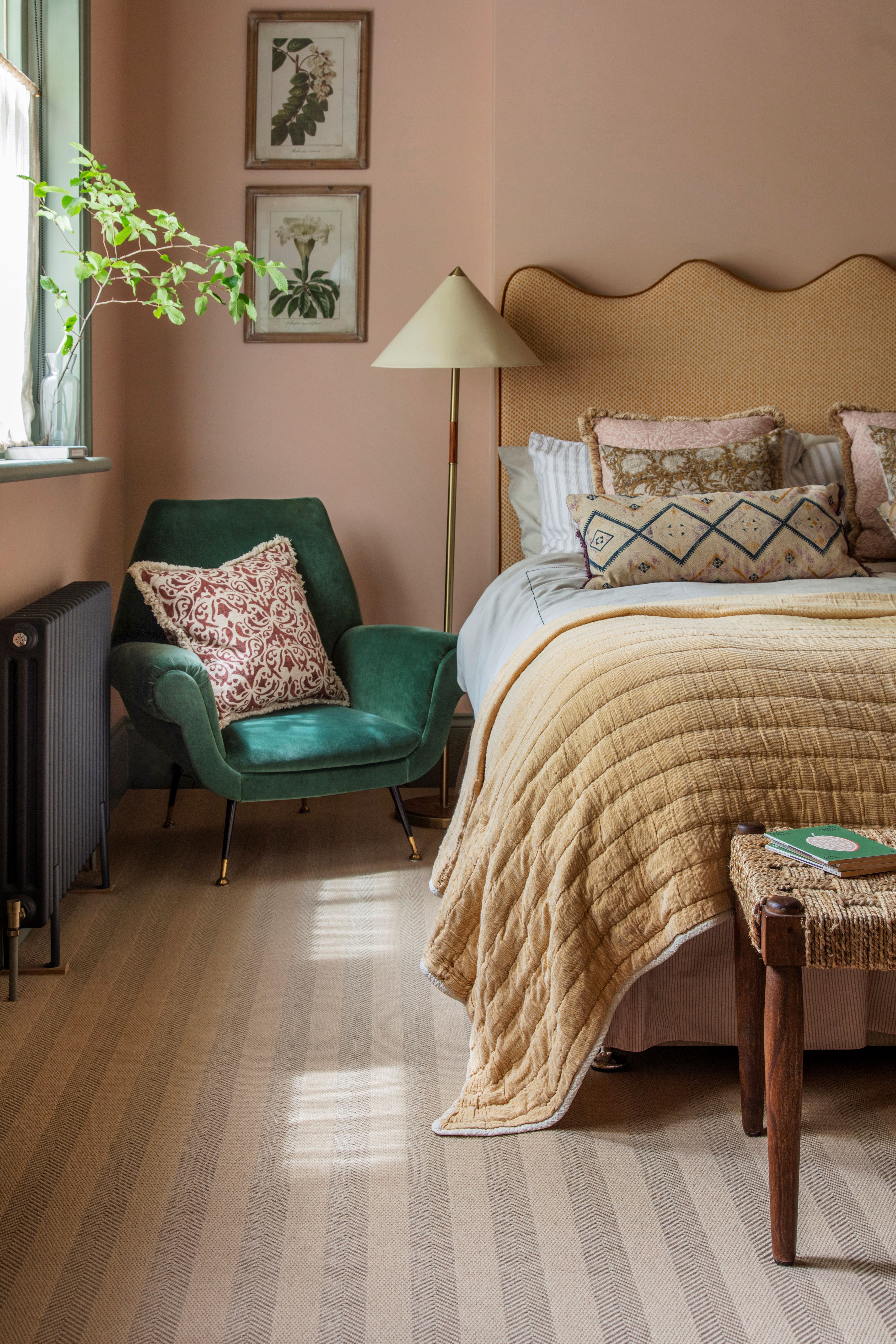
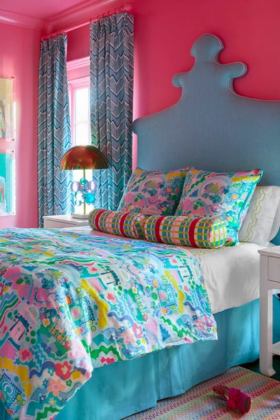
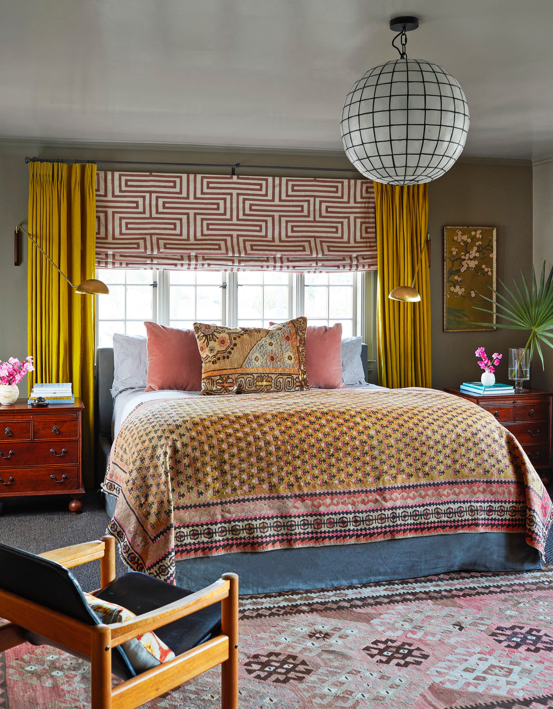
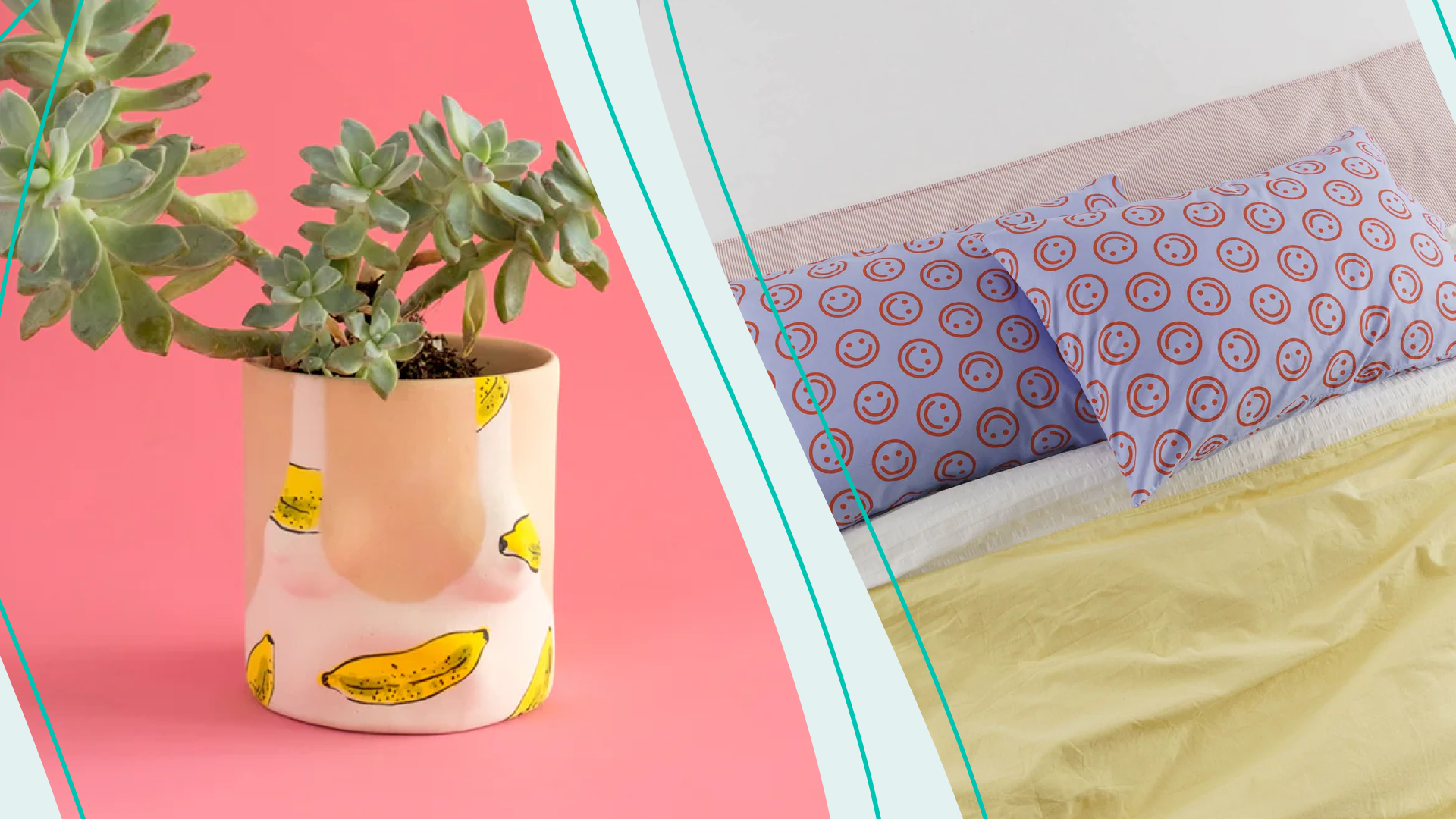
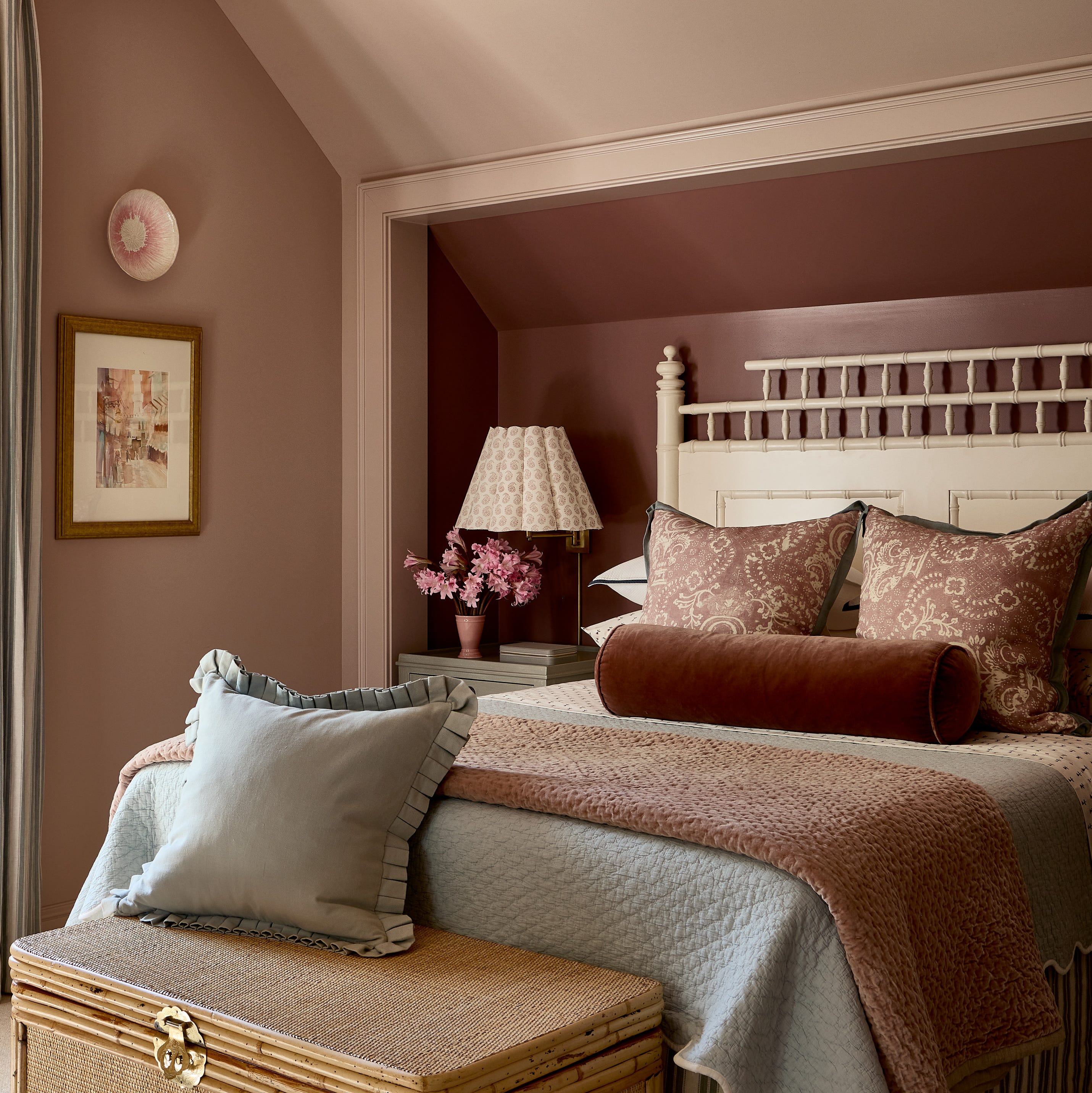
Pastel pink palettes are explored as an ideal choice for transitional months, bringing fun pops of color and energy. Emma Deterding of Kelling Designs encourages integrating these shades with existing decor or using contrasting patterns for a maximalist look. She also emphasizes the impact of changing smaller accessories like pillows and blankets to lighter fabrics for a rejuvenated feel.
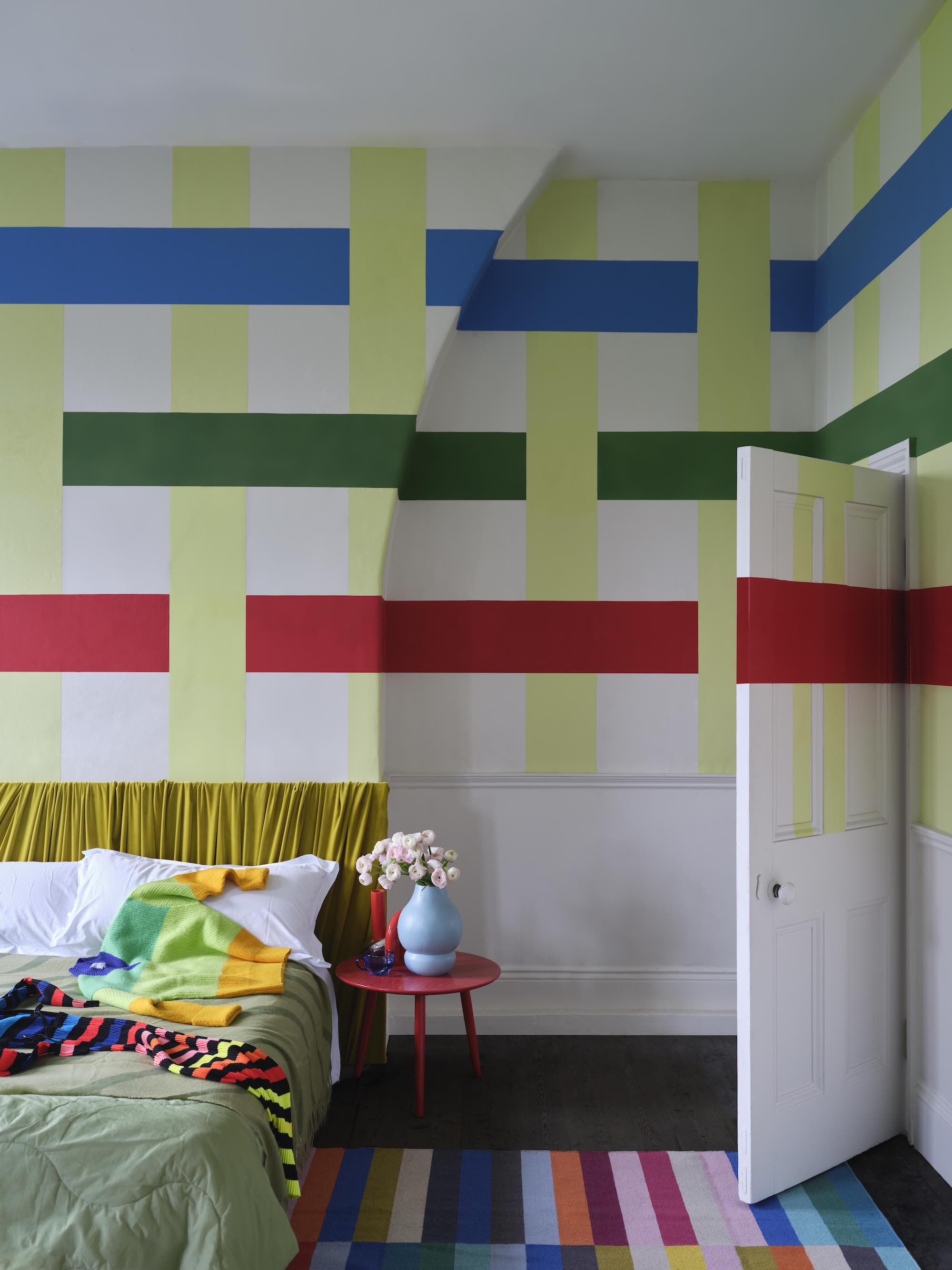
Introducing multiple subtle colors through patterns, rather than bright solid shades, is presented as an alternative for those who prefer muted palettes. Richard Madeaux of Madeaux highlights floral prints for their timeless spring-like quality, suggesting they can elongate a room and evoke the splendor of nature.
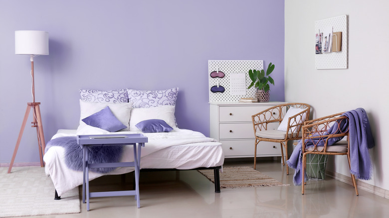
Dramatic purple and lilac are recommended for their fresh, uplifting, and natural qualities. Francesca Wezel of Francesca’s Paints describes how these colors can create an inviting and relaxed ambiance, especially when paired with complementary colors like teal for a contemporary touch.
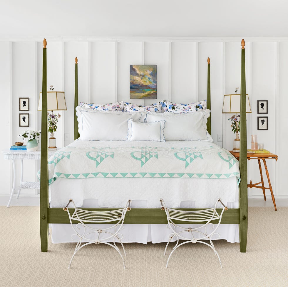
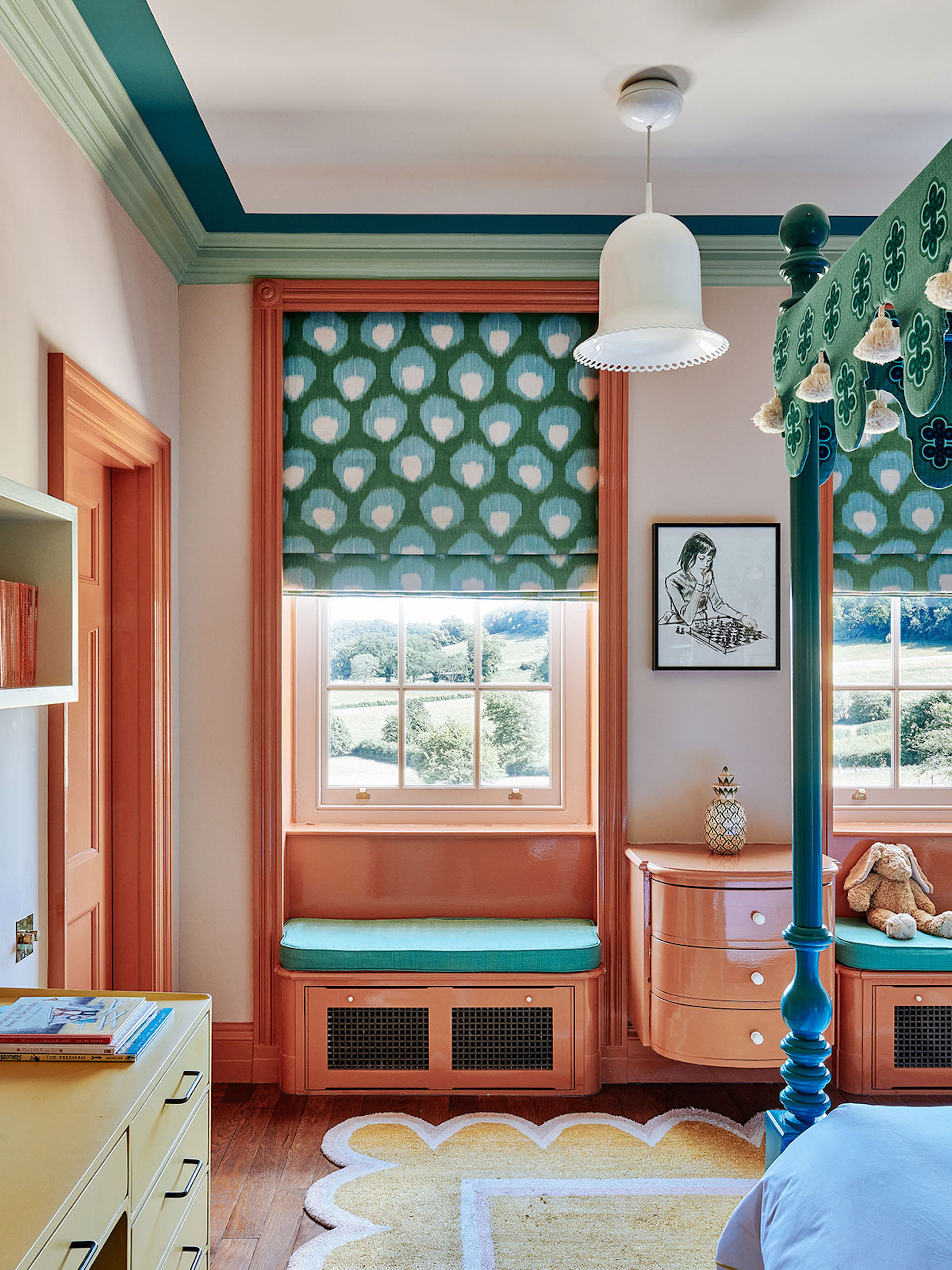
Finally, the article advocates for the brave combination of blue with green, drawing inspiration from nature. Kit Kemp of Firmdale Hotels explains that while colors don't need to match, they must work together. She notes that sharp accents of green and cobalt blue can make a room memorable and uplifting, with white bedding balancing the scheme for a bright and airy feel. Nicola Harding concludes by mentioning that contrasting colors can alter a space's atmosphere, with less contrast leading to a calmer environment.
#BedroomDesign #SpringDecor #ColorPalette #InteriorDesign #HomeDecor #ColorPsychology #DecoratingIdeas #SeasonalDecor #RoomTransformation #BedroomDesign #SpringDecor #ColorPalette #InteriorDesign #HomeDecor #ColorPsychology #DecoratingIdeas #SeasonalDecor #RoomTransformation
0 commenti in totale
Potresti anche gradire
9 Easy Switch-Ups to Make Your Bedroom Feel Like Spring — For Light, Bright, and Optimistic Spaces

How To Decorate the Home for Spring: 19 Full-Colour, Floral-Inspired Ideas
7 Yellow Bedroom Ideas To Brighten Your Space Just In Time For Spring


8 Spring-Inspired Decor Ideas For Your Small Bedroom

Simple Bedroom Decorating Ideas Perfect For Spring

Say goodbye to winter blues with these 8 spring living room ideas that will feel like a breath of fresh air for your space
21 Designers Share Their Color-Trend Predictions for Spring

I've Bored of My Bedroom, So I'm Choosing One of These Colorful Ideas Instead
7 Best Colors Designers Say You Should Use to Make Your Home Feel Fresh, Light and Spring-Ready


The Spring Color Trend That'll Make Your Home Feel Refreshed

16 beautiful bedroom colour ideas and how to use them
18 dreamy bedroom colour ideas to create a rest-promoting, stylish space
20 Spring Color Combos That will Brighten Your Home No Matter the Season

7 Easy Ways to Get Your Bedroom Ready for Spring
16 Spring Decorating Ideas to Give Your Home the Refresh It Deserves

These Beautiful Paint Colors Will Make You Want to Switch Up Your Bedroom Right Now

Spring bedroom ideas – 10 ways to refresh and reinvent your sleep space
The Color Palettes Currently Inspiring Domino Editors
Designer-Approved Bedroom Paint Colors That'll Help You Wake Up Happier
7 Spring Paint Colors to Freshen Up Your Space, According to Designers