1/14
Top 13 kitchen colours for 2025
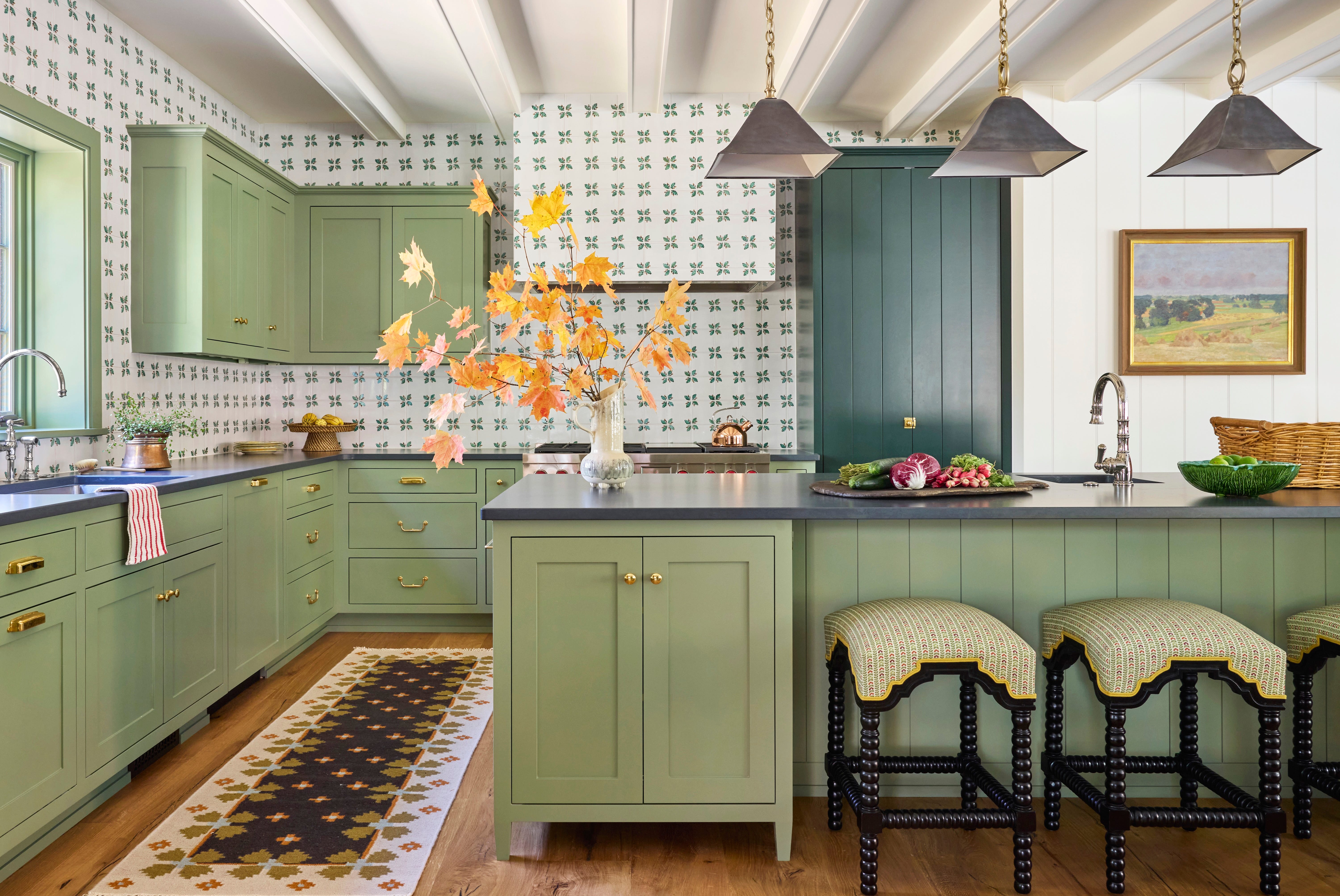
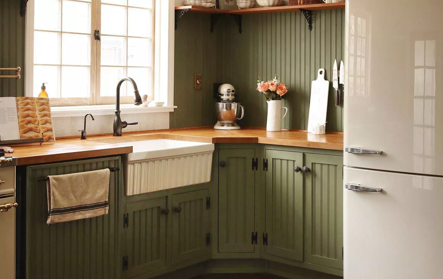
The selection of a kitchen color is a crucial decision that significantly influences the overall design of the space, impacting elements such as flooring, cabinets, and countertops. There has been a notable increase in Google searches for 'what color to paint my kitchen,' indicating a strong interest in kitchen renovations. Analysis of search data predicts the most popular kitchen colors for 2025, revealing a mix of enduring favorites and unexpected choices. For the third consecutive year, green maintains its top position due to its versatility.
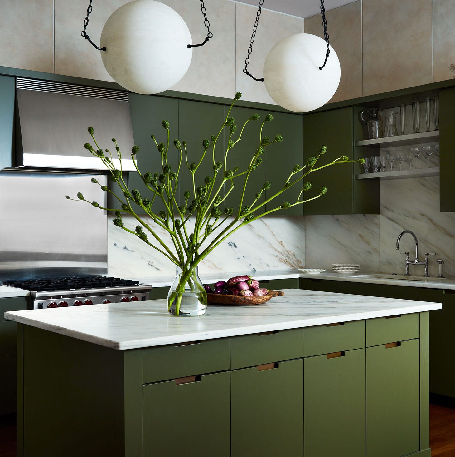
Alex Main, Director of The Main Company, notes that green remains a leading choice, with a trend towards darker, moodier shades. He anticipates this preference to continue, observing a recent shift towards less common hues like bolder olive tones, jewel-based teals, and emeralds. Further down the list, more adventurous colors such as pink and yellow are making their presence felt within the top ten.
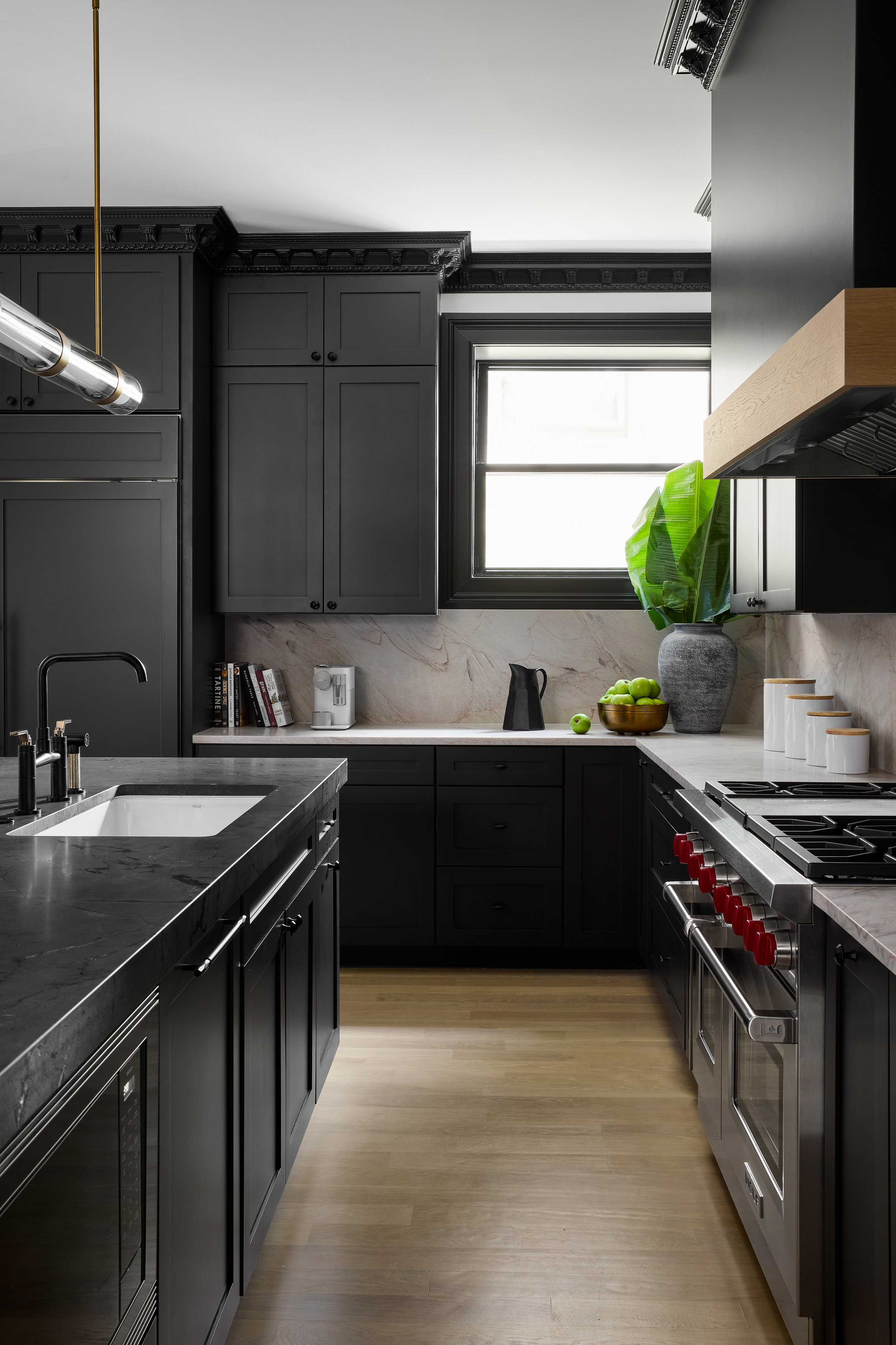
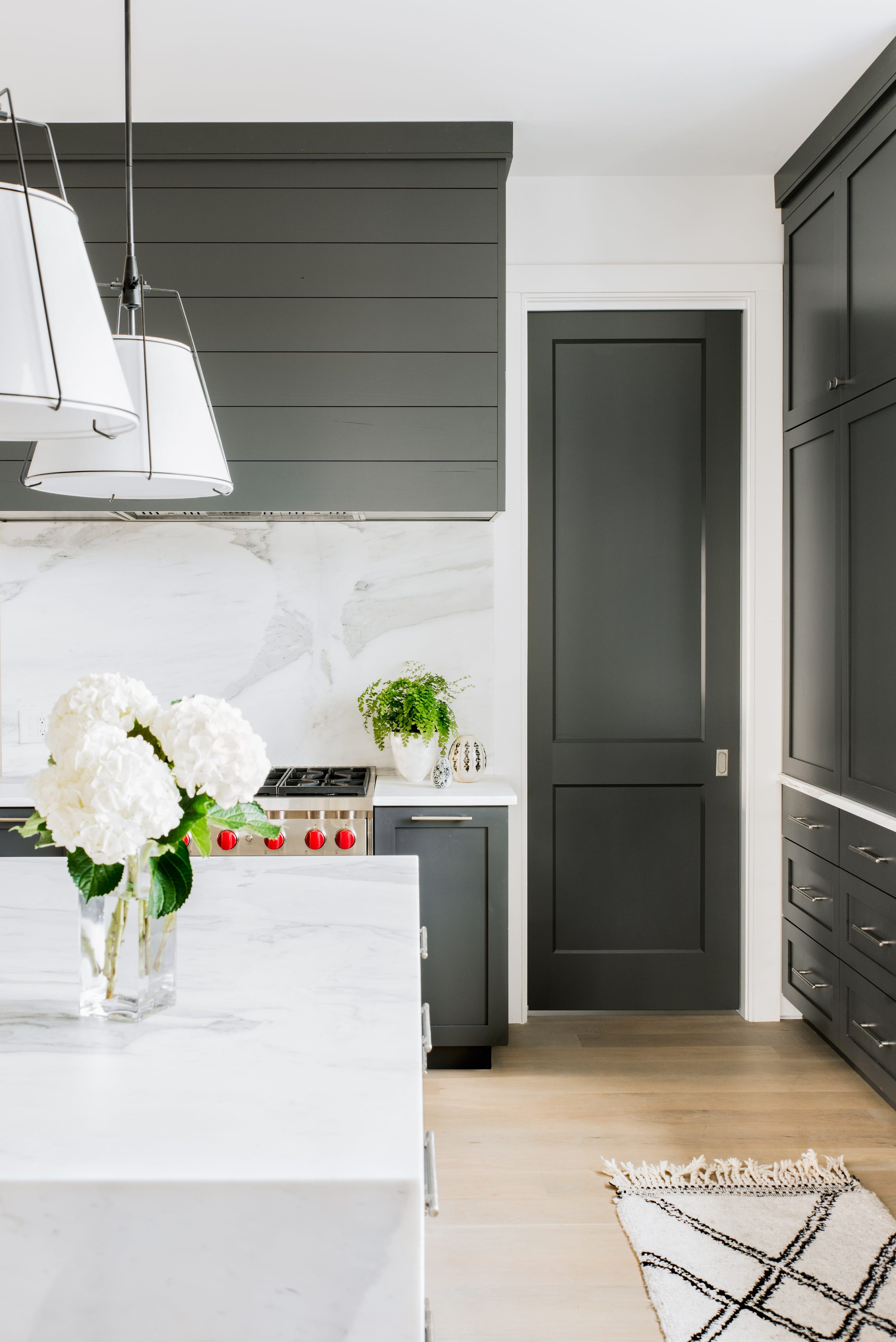
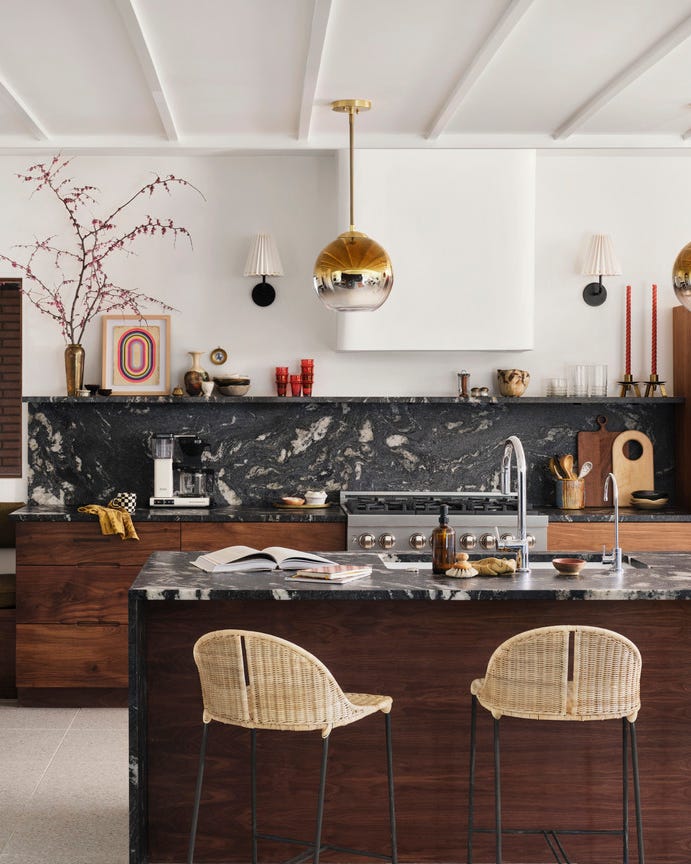
Surprisingly, black kitchens have surpassed grey kitchens in popularity for the first time. Tom Howley, Design Director of his eponymous kitchen company, explains that dark and dramatic black paint finishes impart ambience and sophistication. An entirely black kitchen can create a powerful impact, but black can also be used in more subtle ways to alter the space's feel. Applying black to the main run of base and wall cabinetry can achieve a luxurious and majestic look with timeless appeal. For those less daring, a statement black island counter or black accessories like taps and handles offer alternative options.
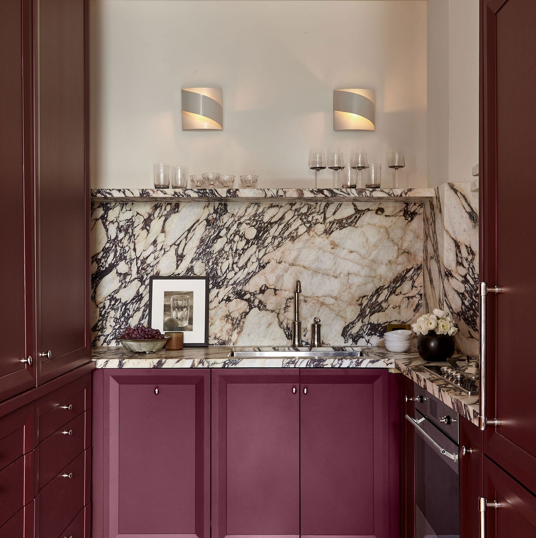
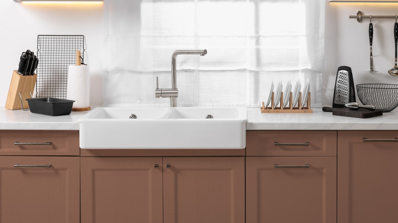
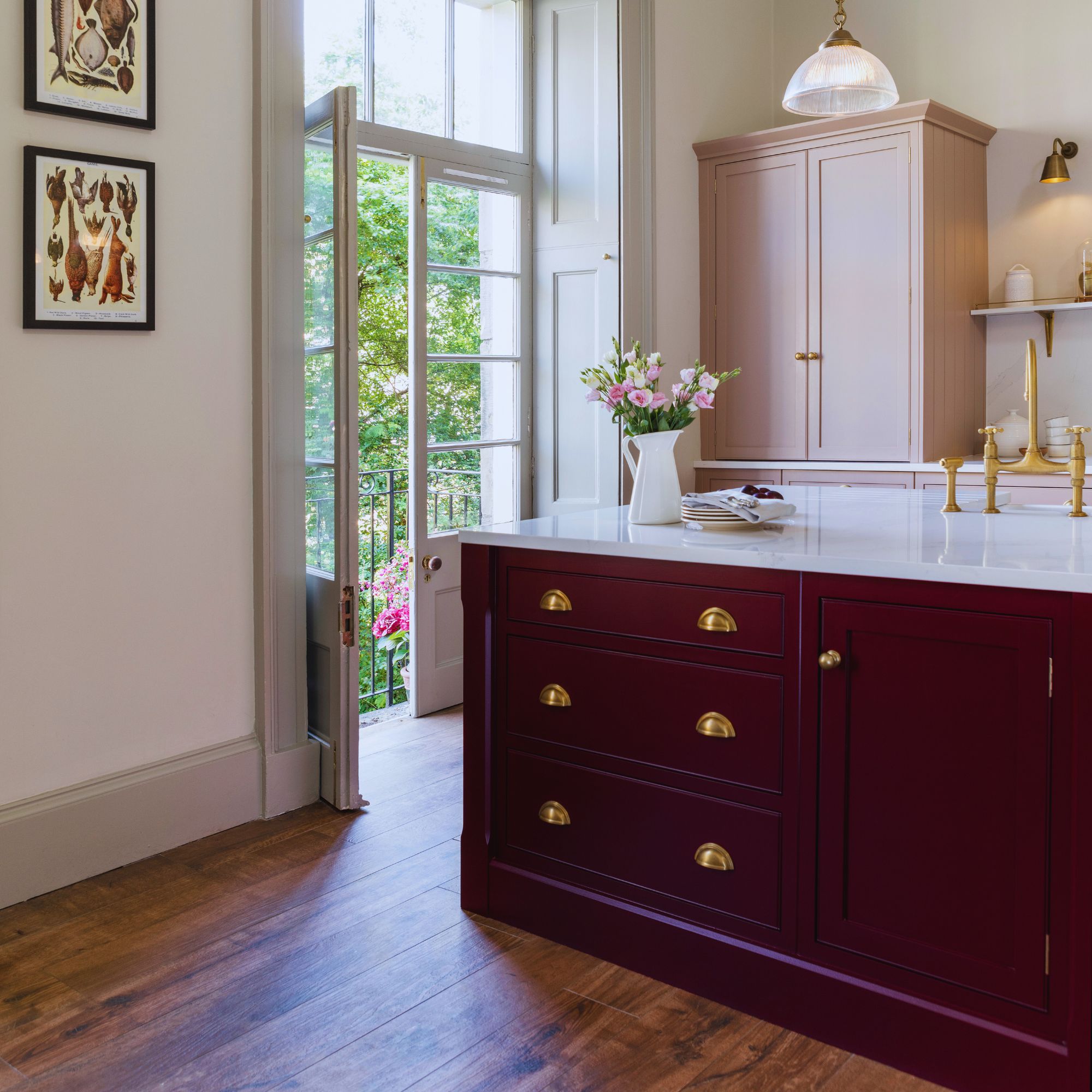
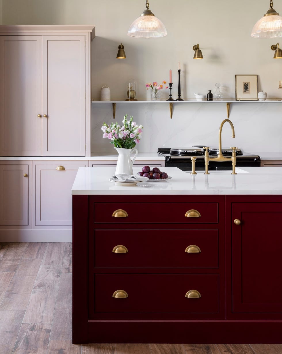
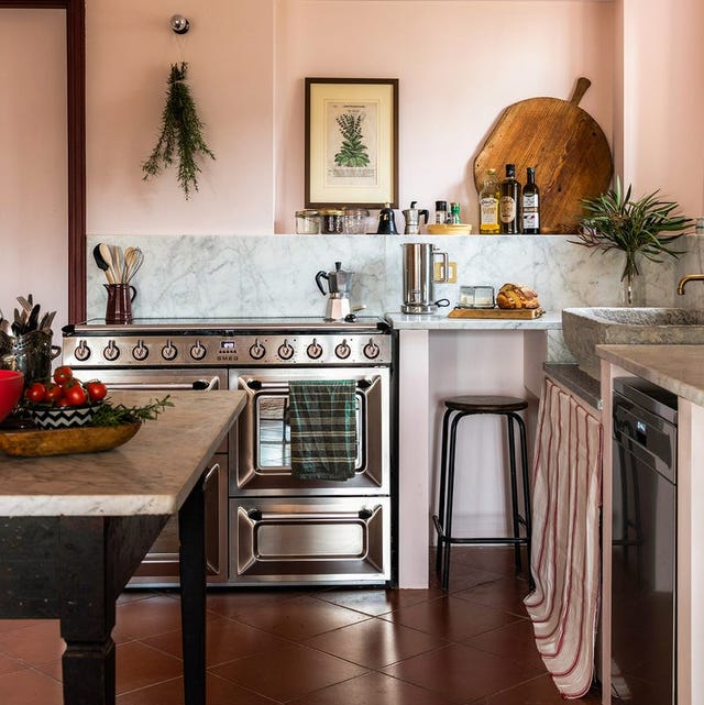
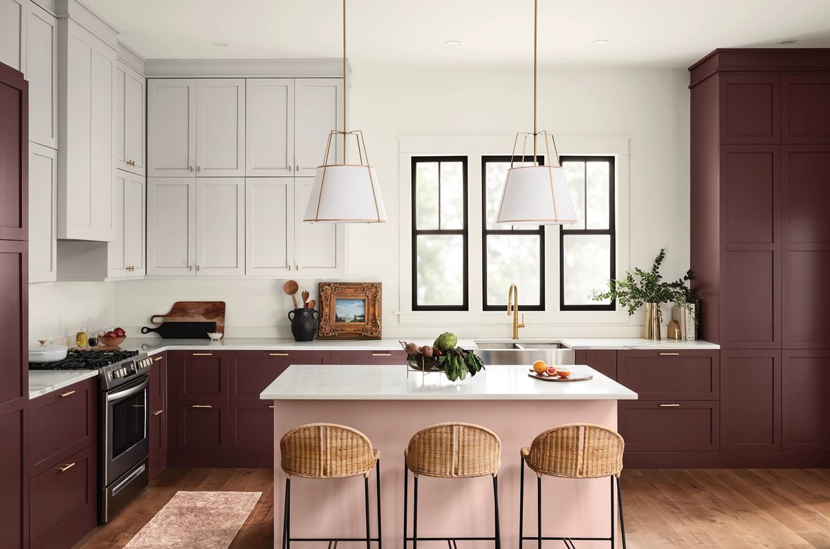
Pink kitchens, an emerging trend, have risen from seventh to sixth place over the past year. Tom Howley describes pink as an elegant and playful alternative to grey, generating warmth and allure in a kitchen. Despite varying opinions, this versatile shade has experienced a boom in popularity in recent years. The article further explores each of the top kitchen paint colors for 2025.
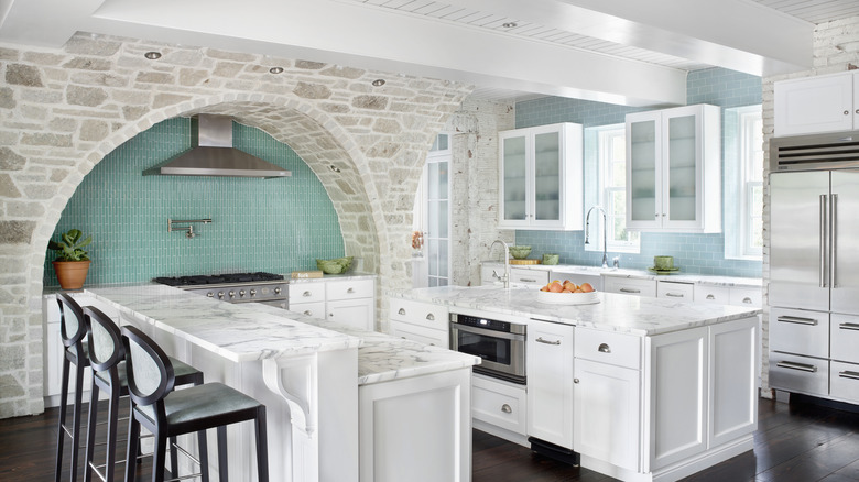
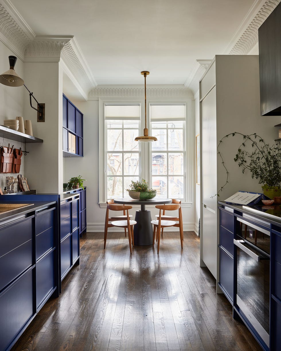
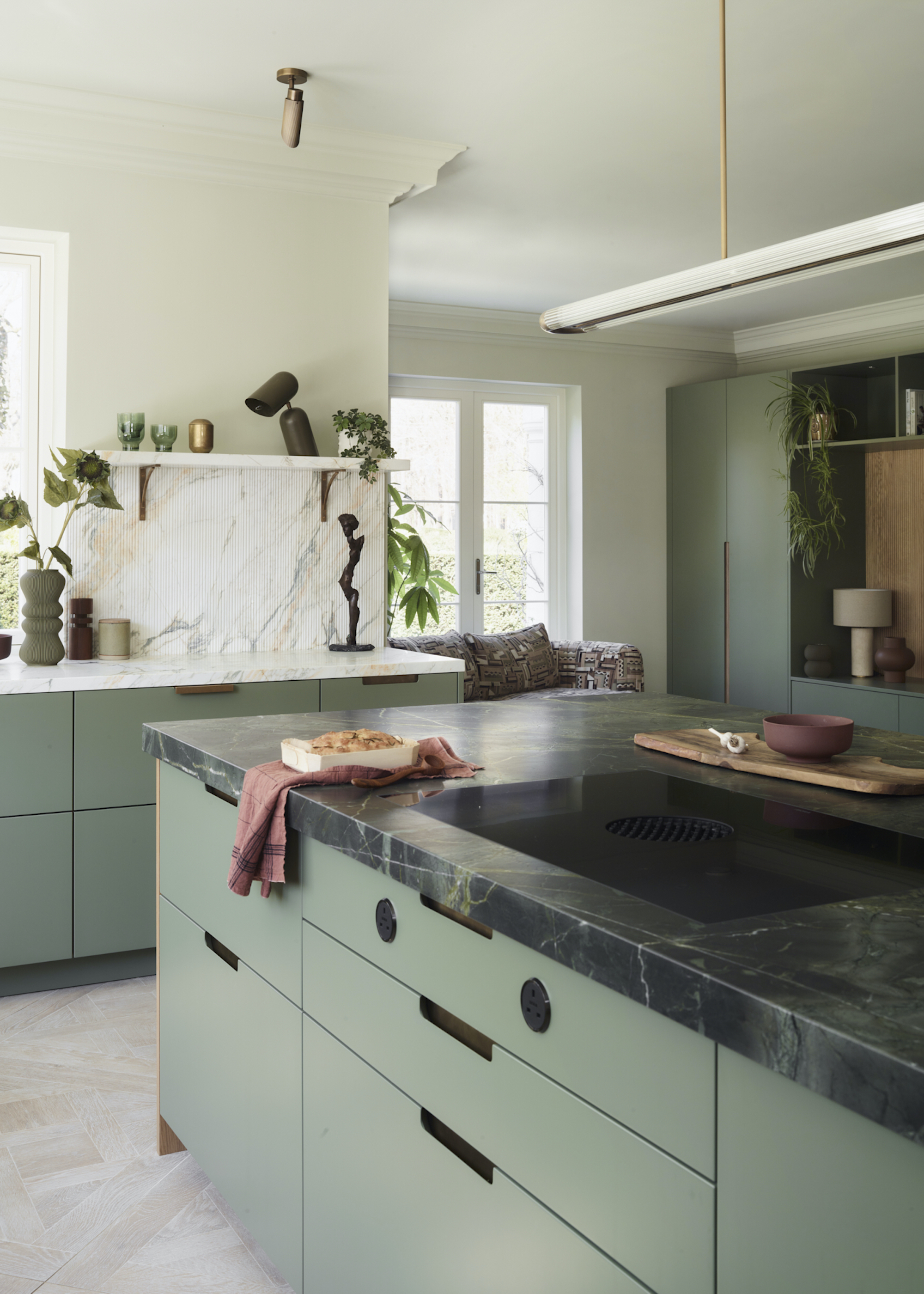
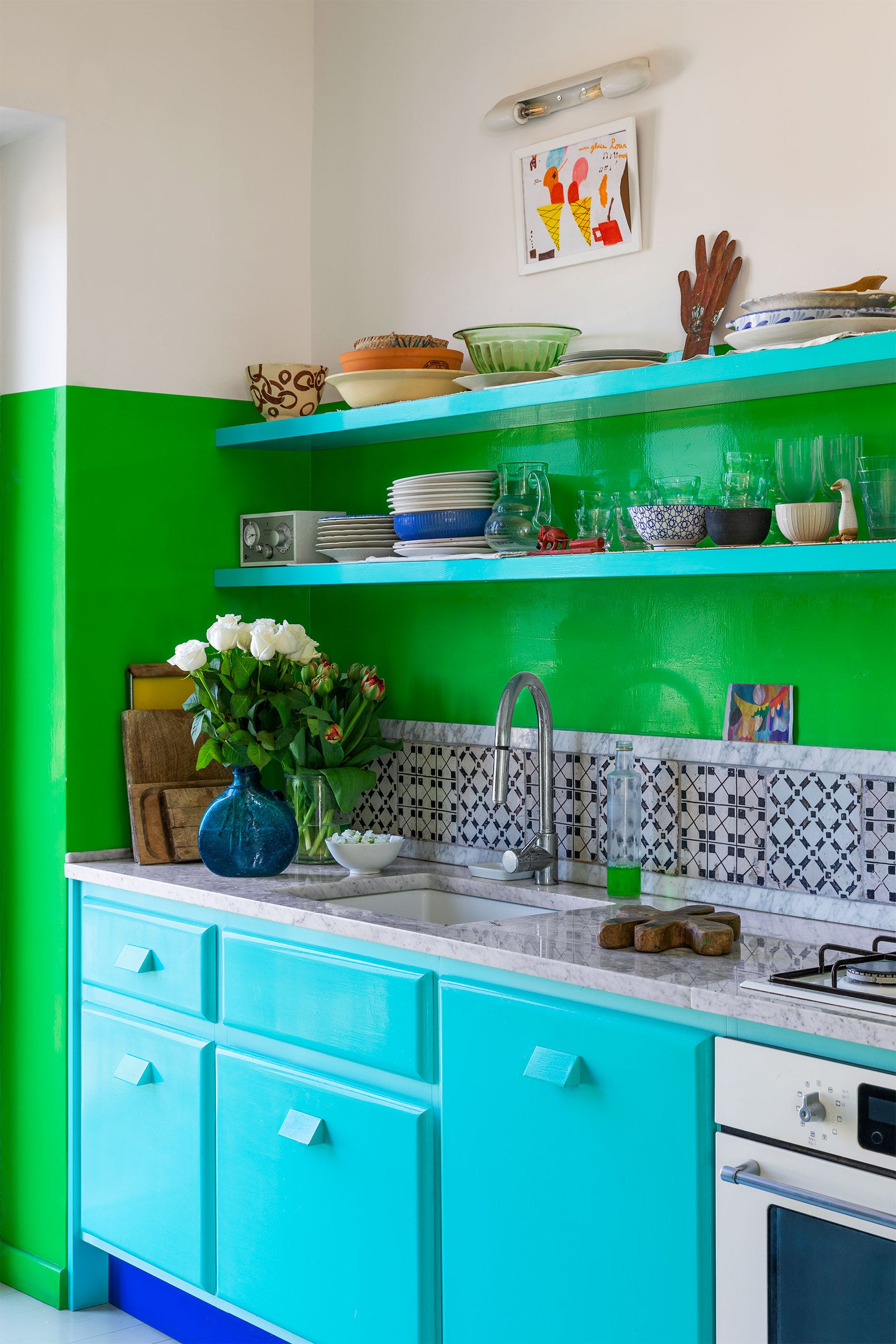
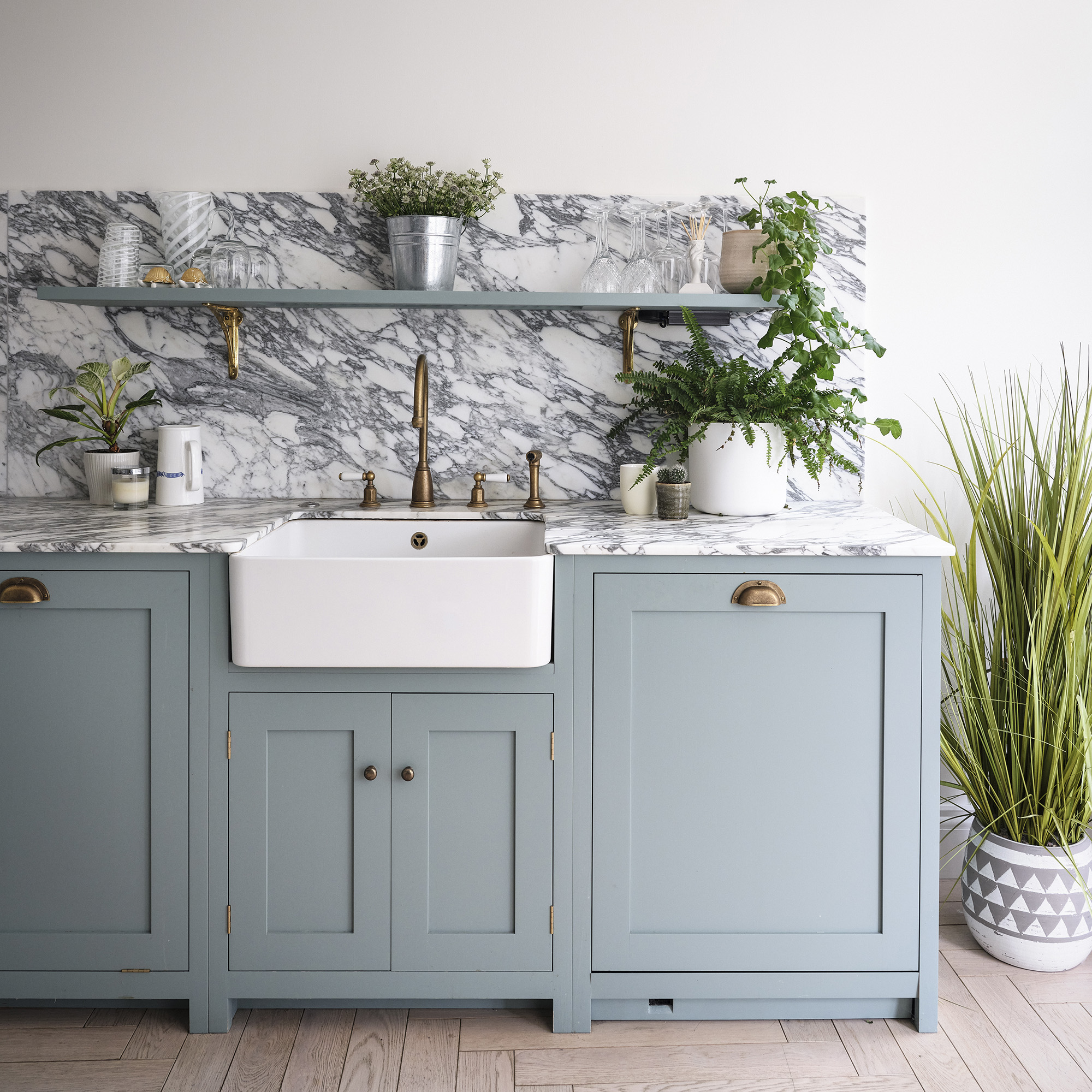
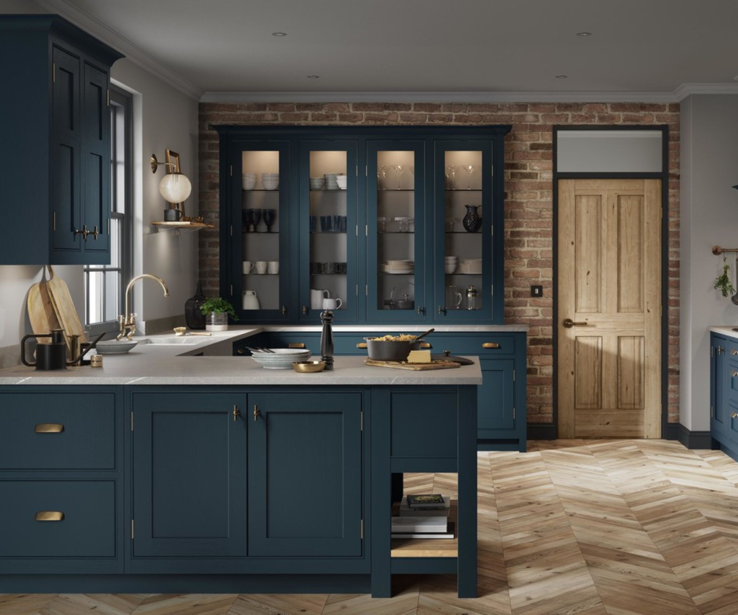
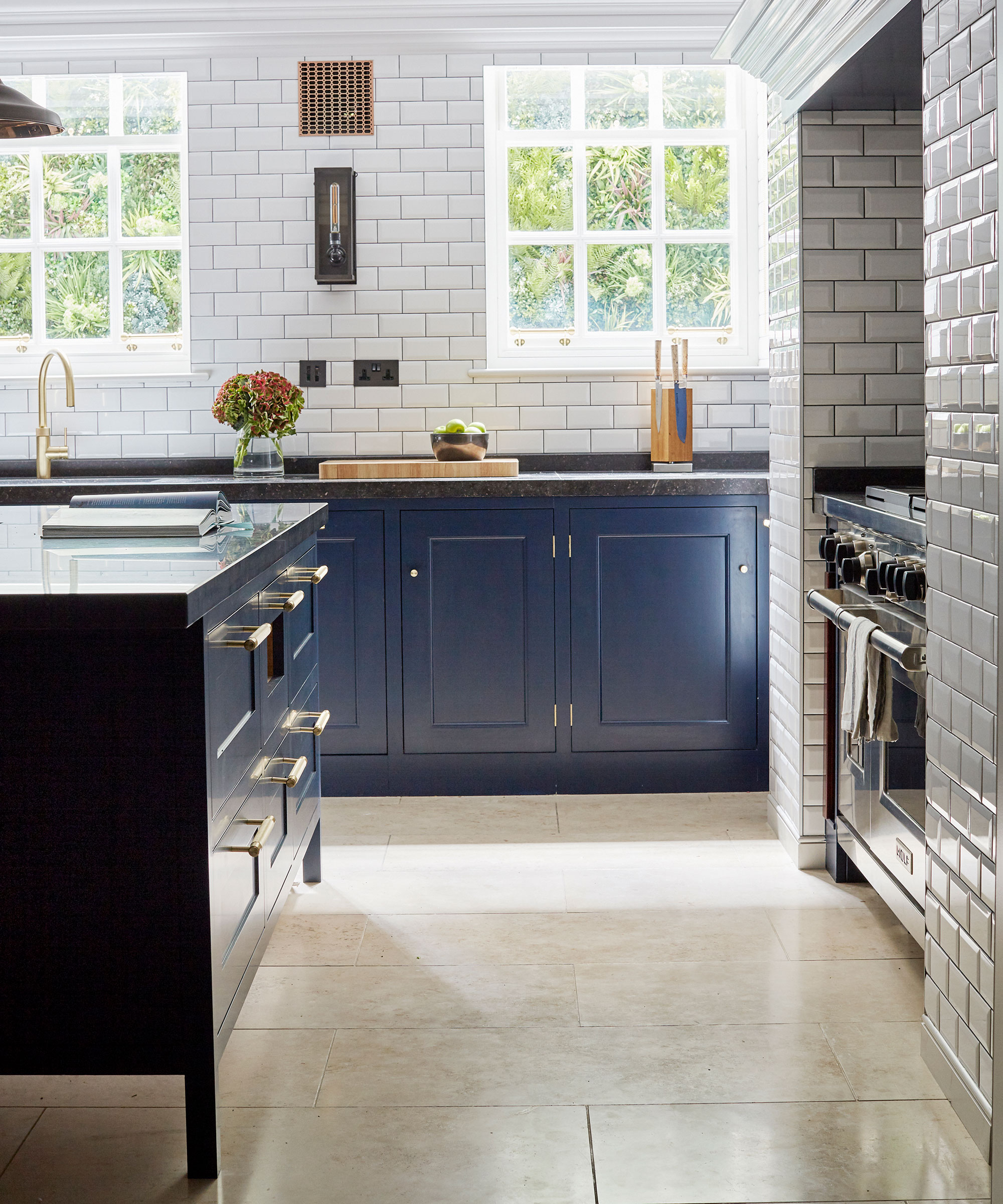
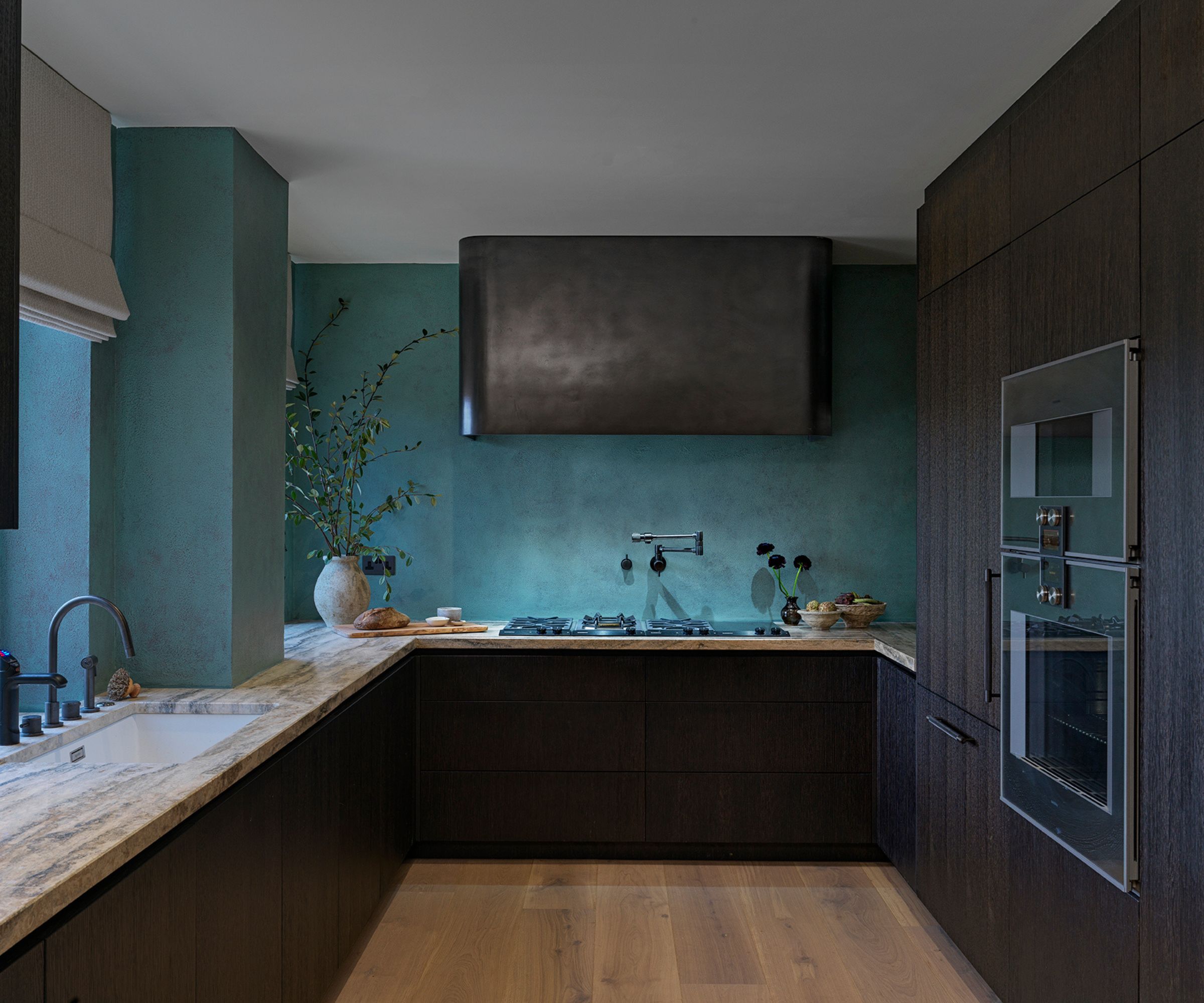
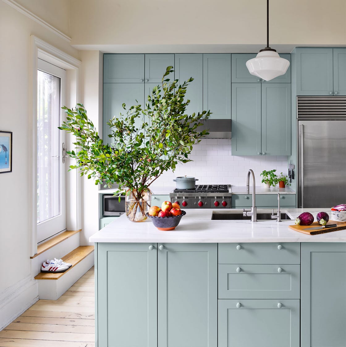
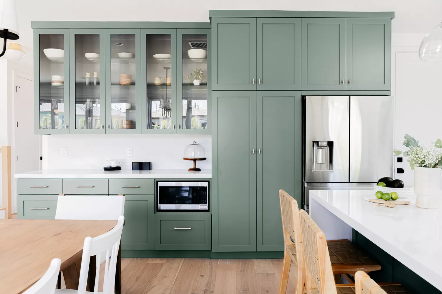
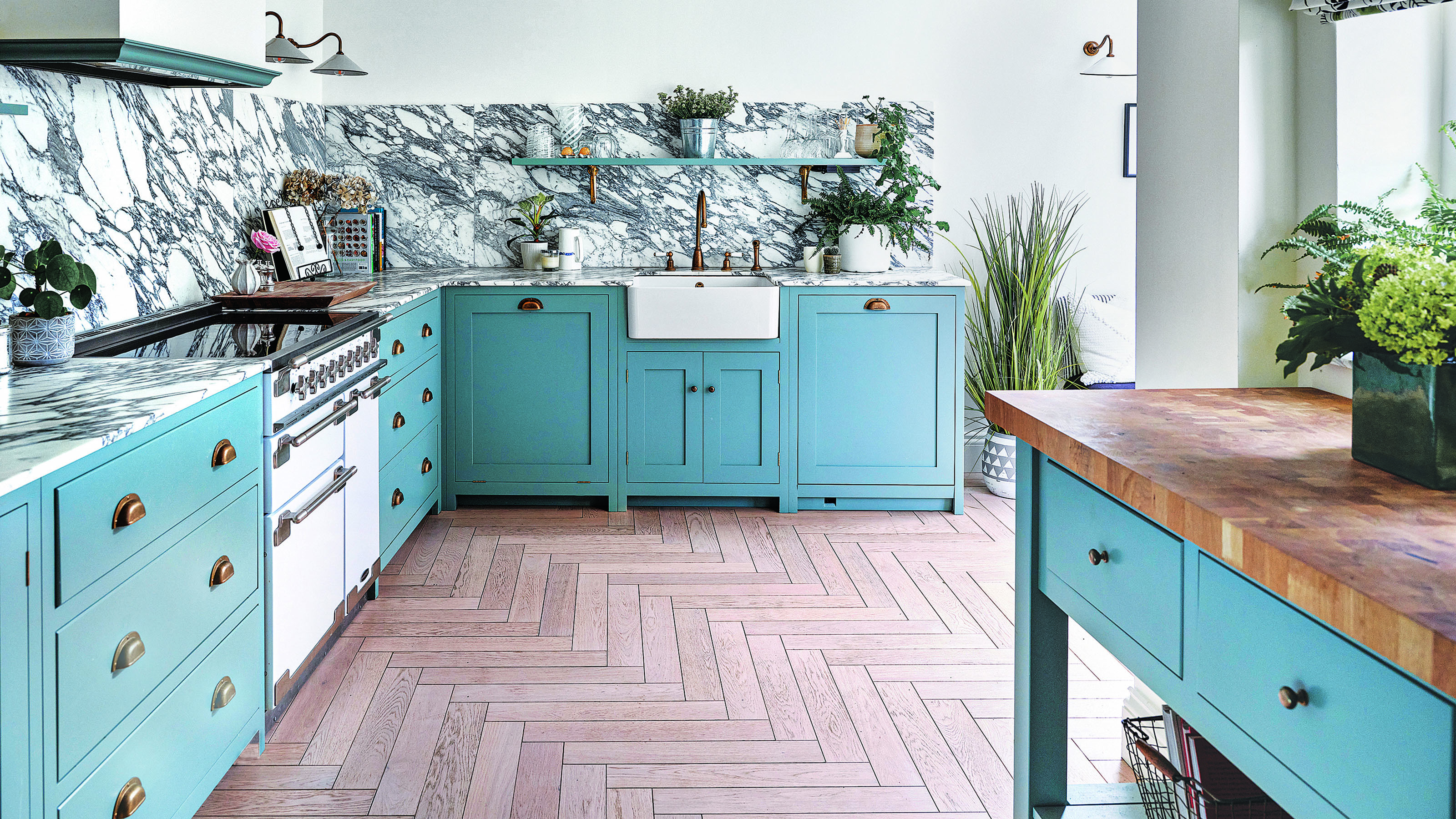
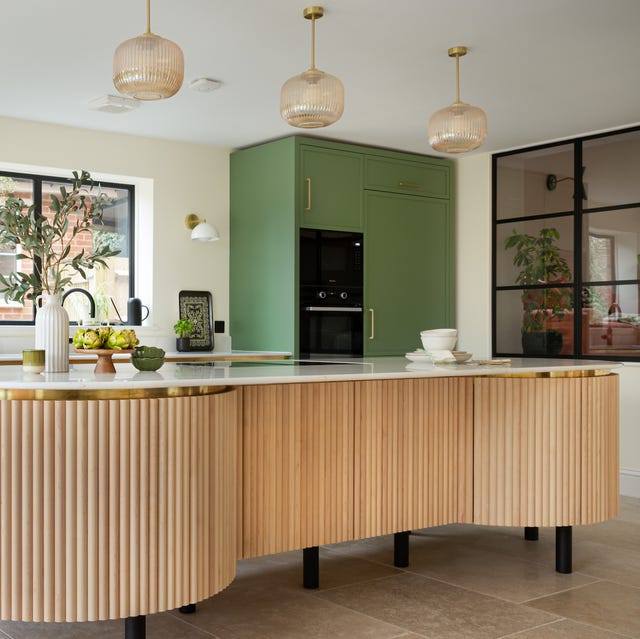
Green, as highlighted by Jen Nash, Senior Design Lead at Magnet, is valued for its versatility, ranging from deep forest and olive shades to subtle eucalyptus and sage. Its association with nature, balance, growth, renewal, and harmony makes it a refreshing choice, capable of making the kitchen feel both invigorated and calm. Blue, a more lenient shade than black, complements light woods and creamy countertops effectively, accommodating both warm and cold accents such as brass or silver hardware. Lena Gierasinska, Head of Product & Displays at Barker and Stonehouse, states that mid-blue strikes a balance between being softer than royal blue and more vivid than pastel, offering both rejuvenating and comforting qualities.
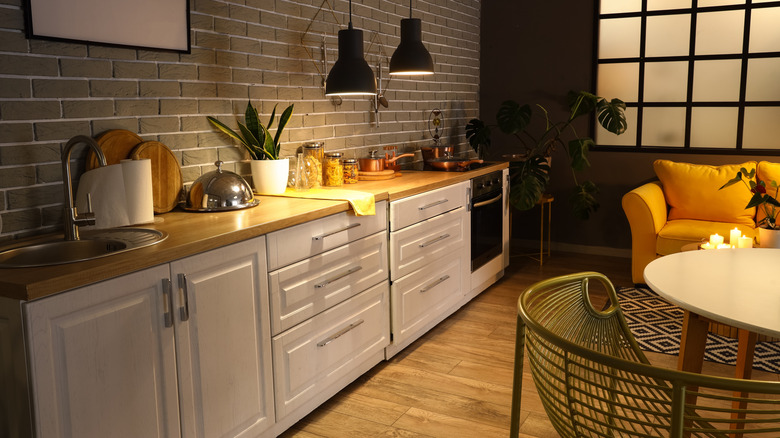
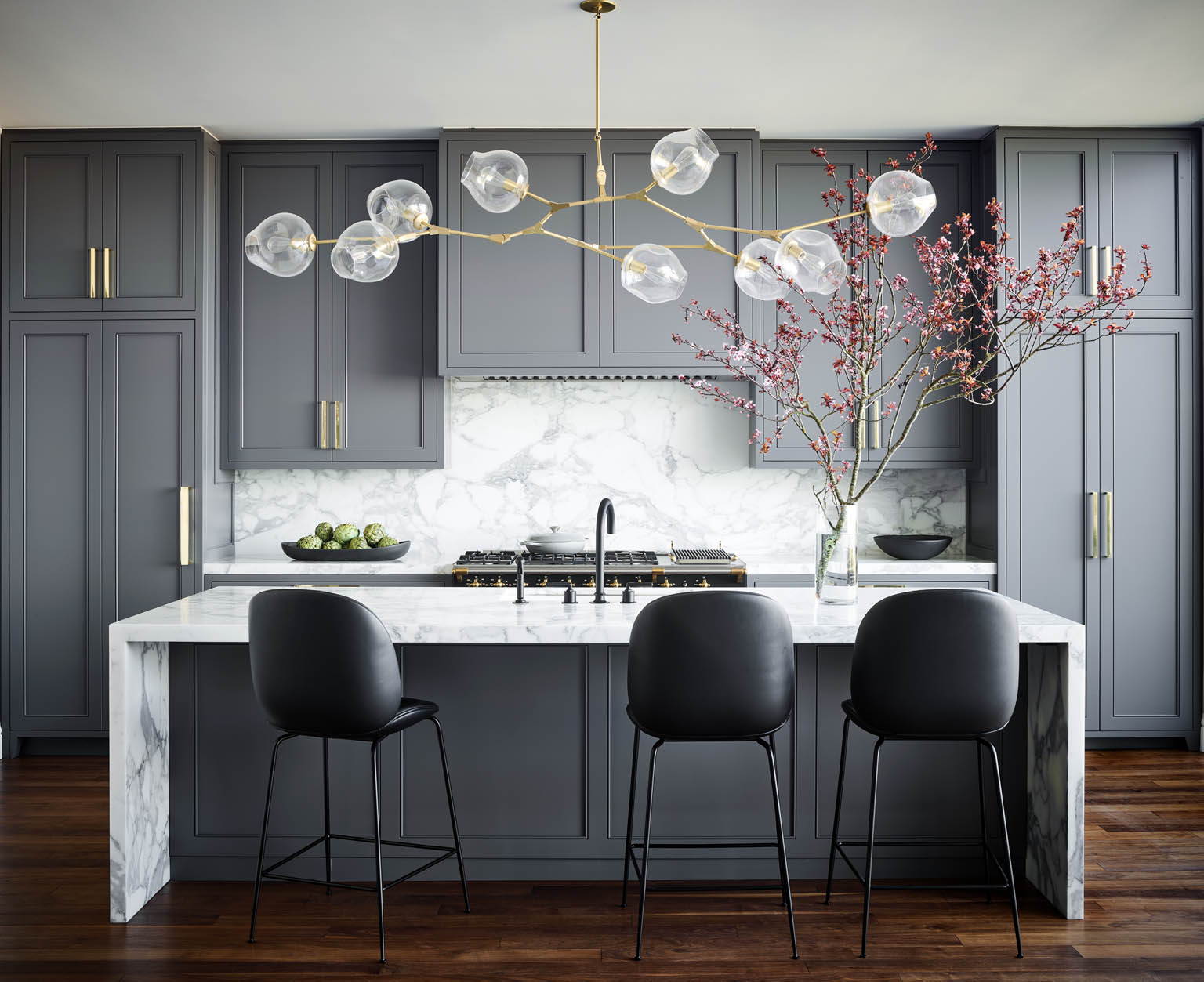
A well-executed black kitchen is characterized by its clean and fuss-free aesthetic, providing numerous opportunities for complementary color combinations and feature metalwork. Its bold and moody expression is most impactful when ample natural light is available to illuminate darker cabinetry. Grey stands out as a sophisticated shade suitable for both traditional kitchens with matt charcoal cabinetry and warm wooden surfaces, as well as modern industrial styles with clean lines and slick metalwork. It also serves as an excellent foundation for a variety of colors, from pale blue to rich burgundy.
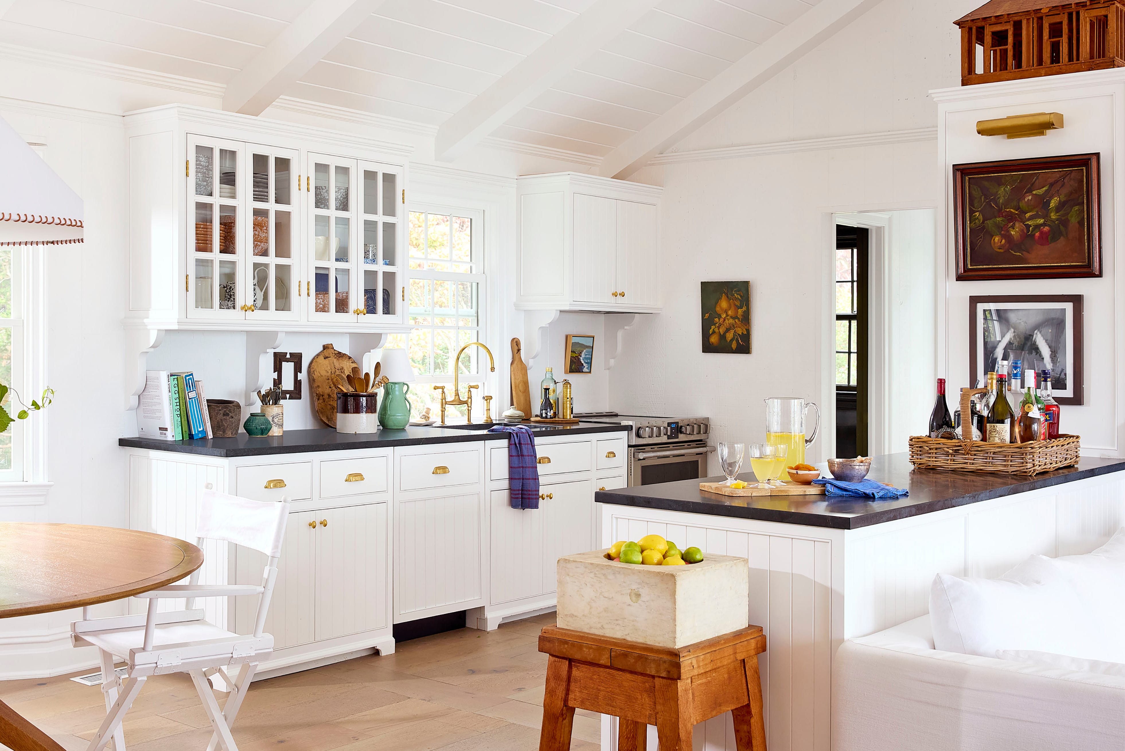
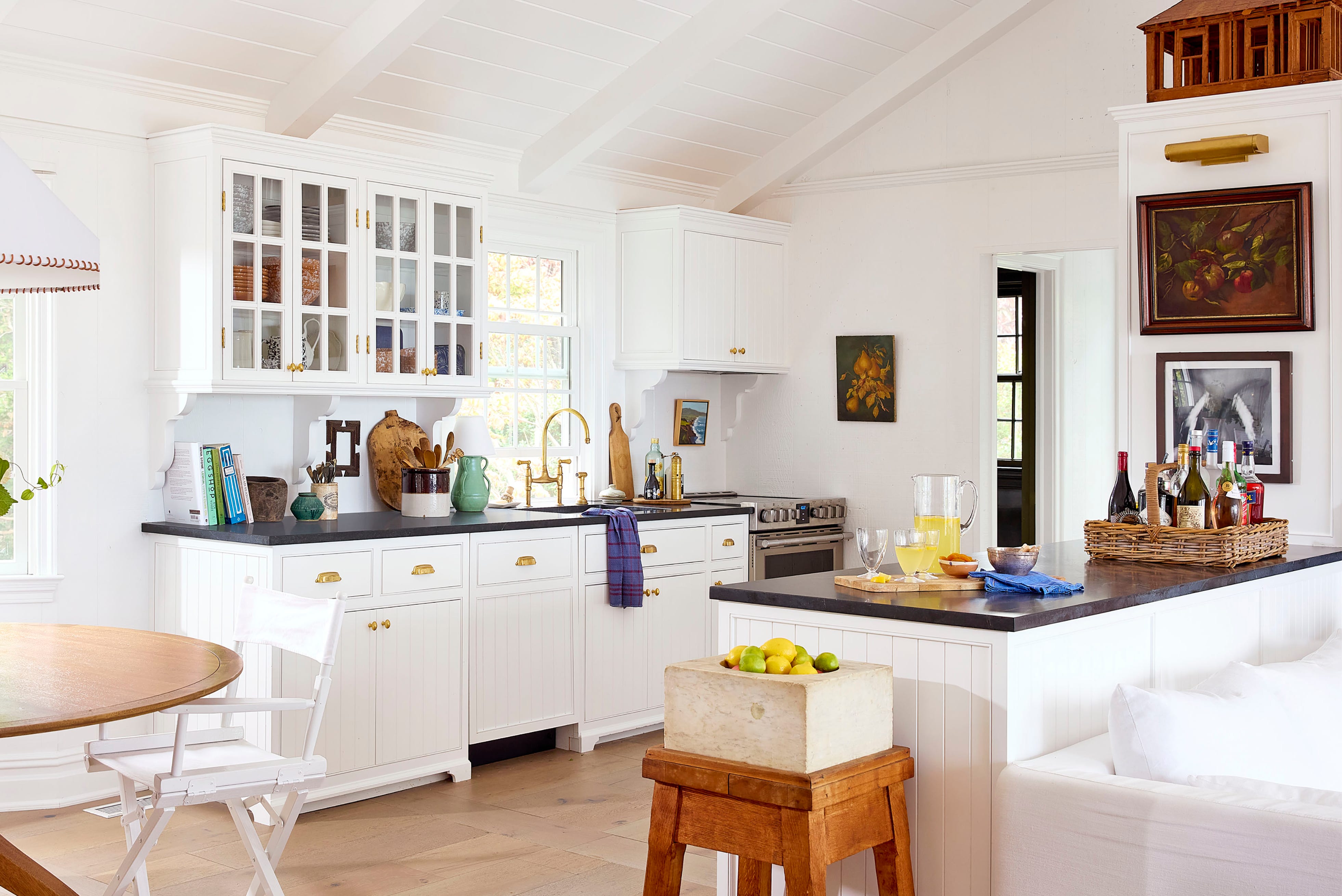
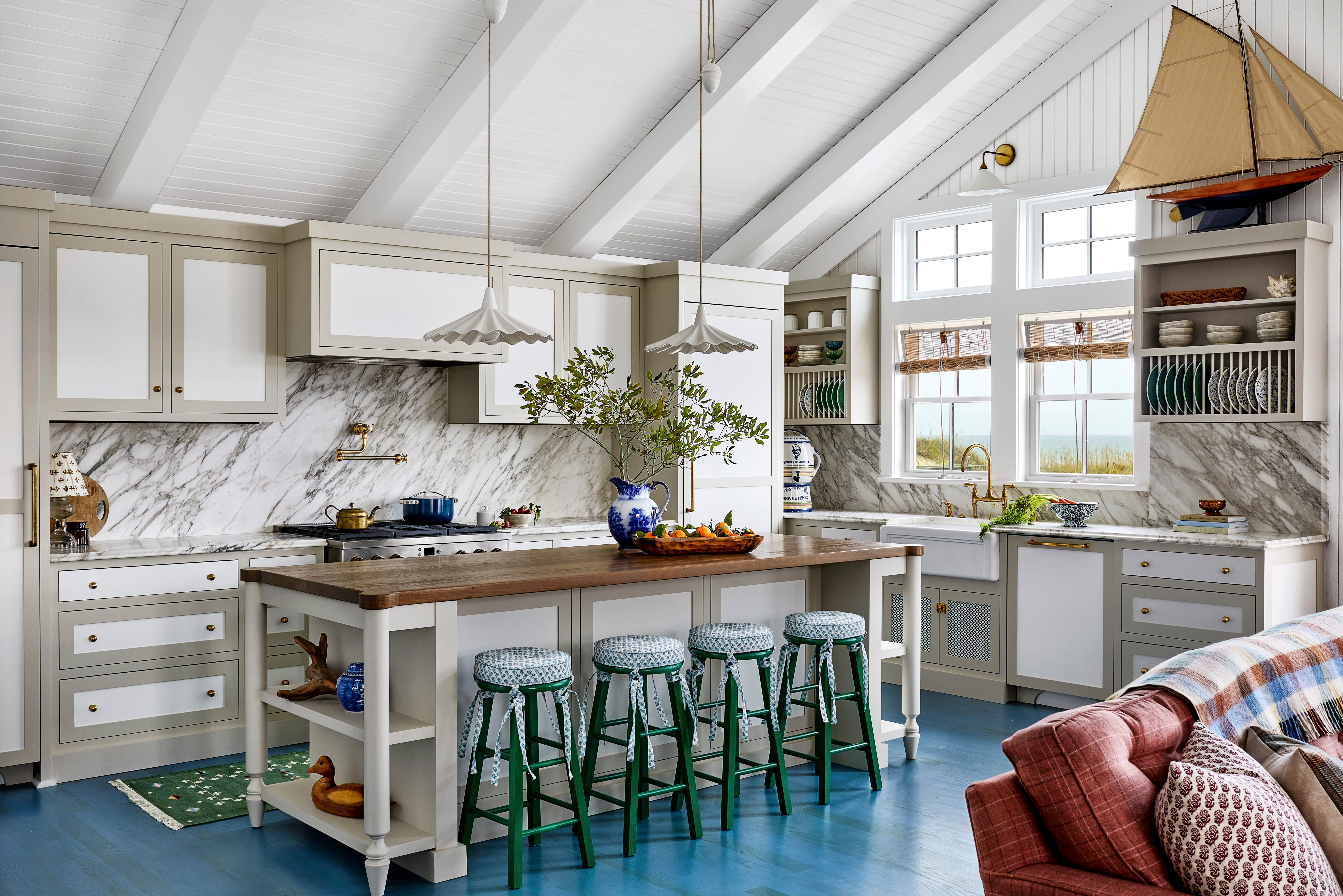
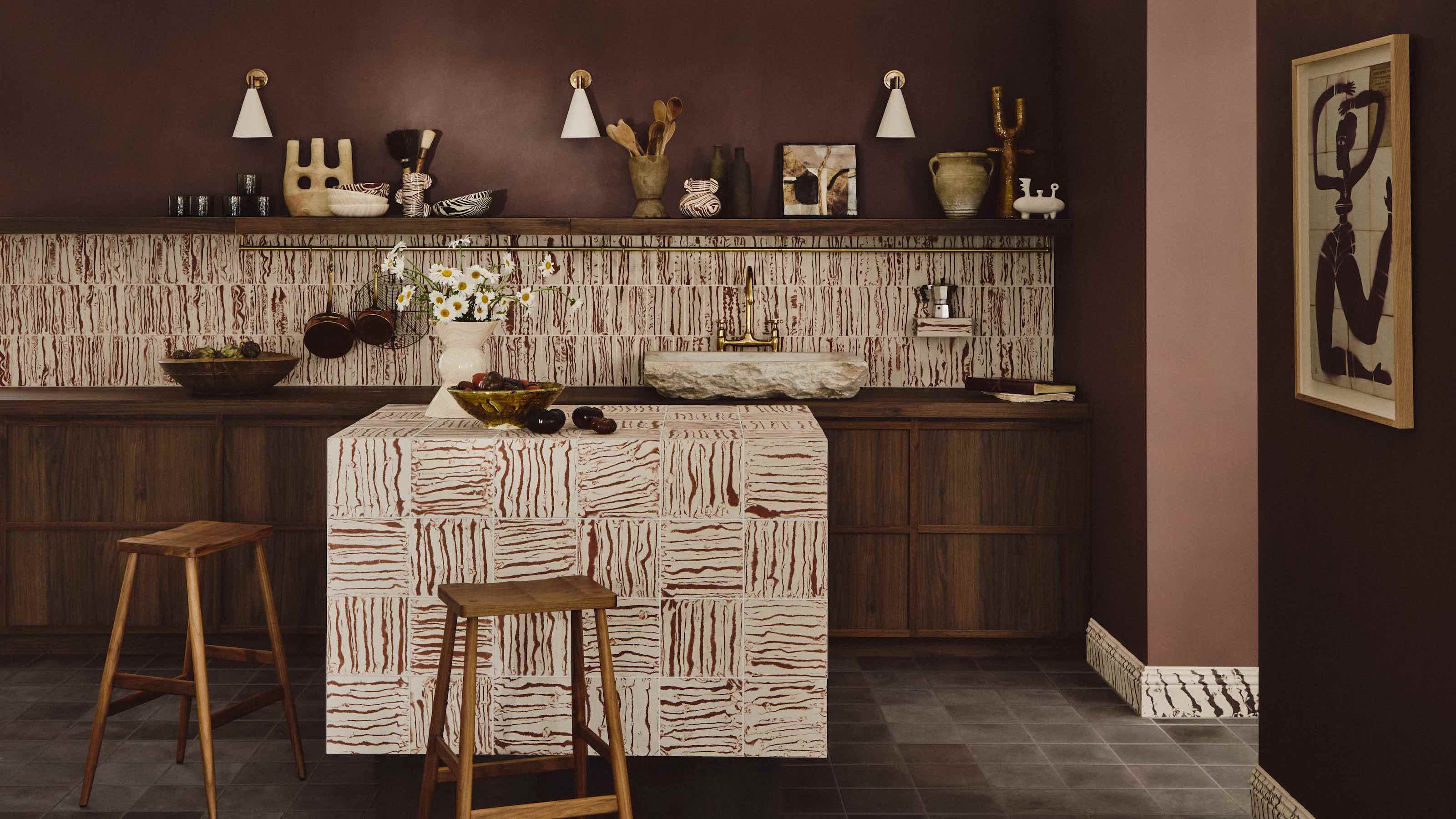
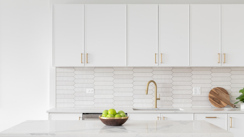
A pristine white kitchen can evoke the appearance of a glossy magazine. Its light and airy nature encourages a simple design with clean lines and sleek cabinetry, while warmer off-white tones can be enhanced with rustic natural woods and terracotta flooring. Glossy finishes or glazed tiles can invigorate plain white walls. Pink kitchens, moving beyond traditional pastel perceptions, can feature rich, chalky pinks that are warm, earthy, and evoke Mediterranean influences, particularly when choosing subtle dusk shades to create a perpetually sunlit room.
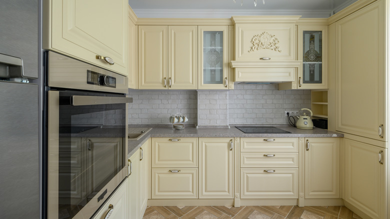
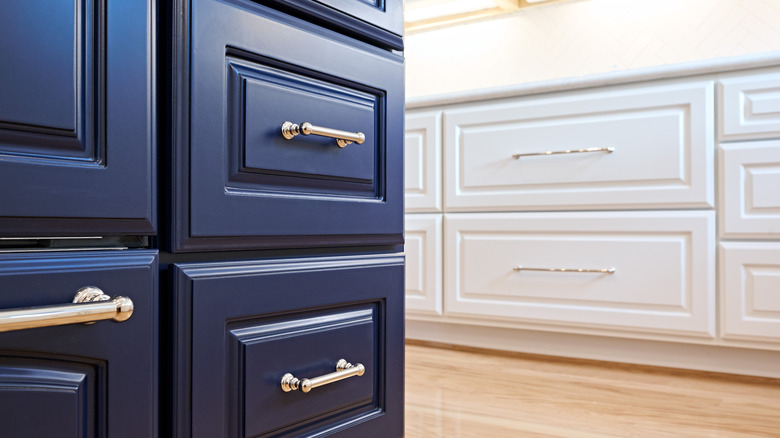
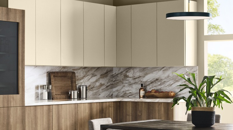
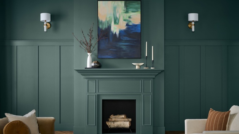
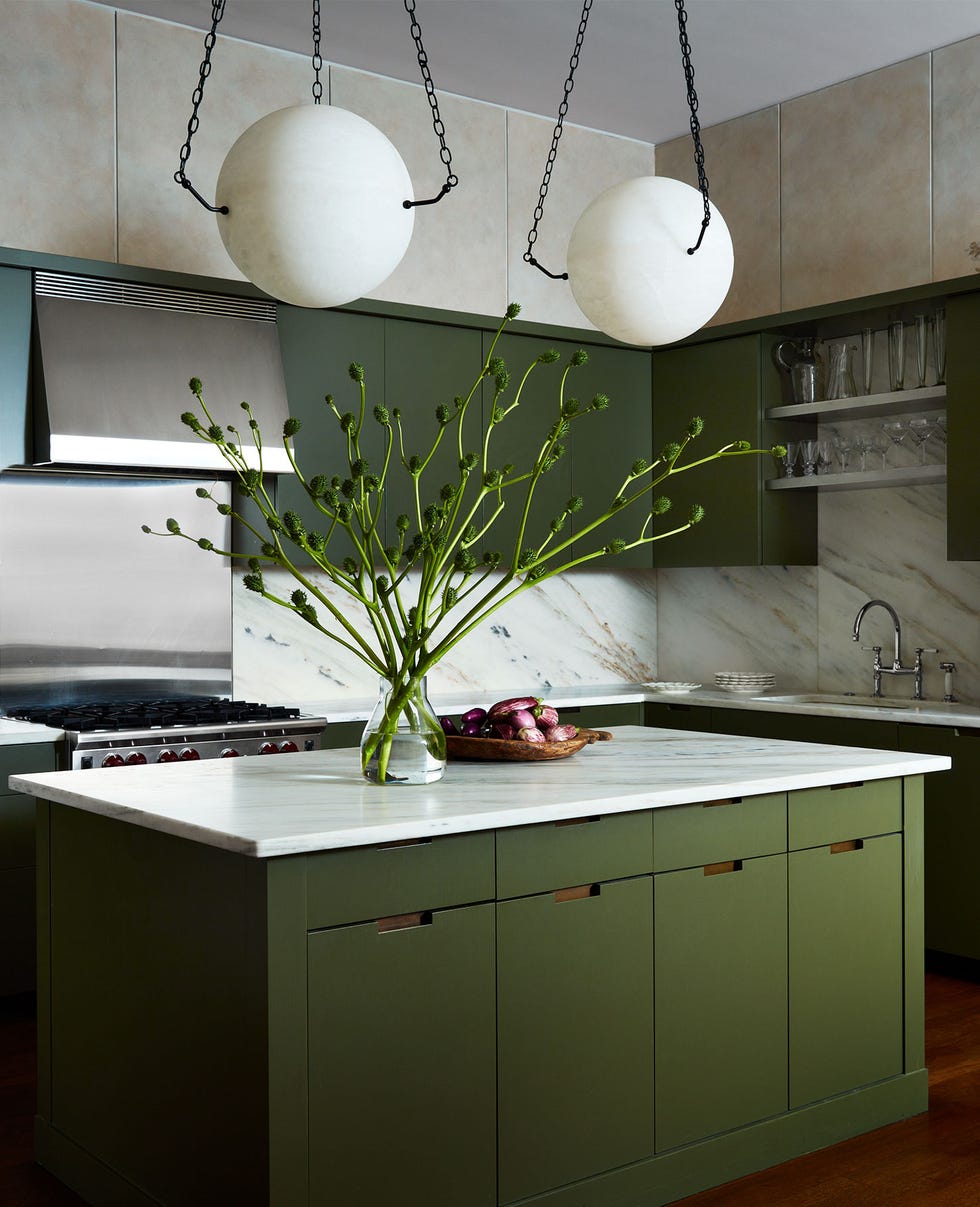
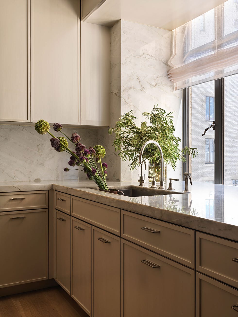
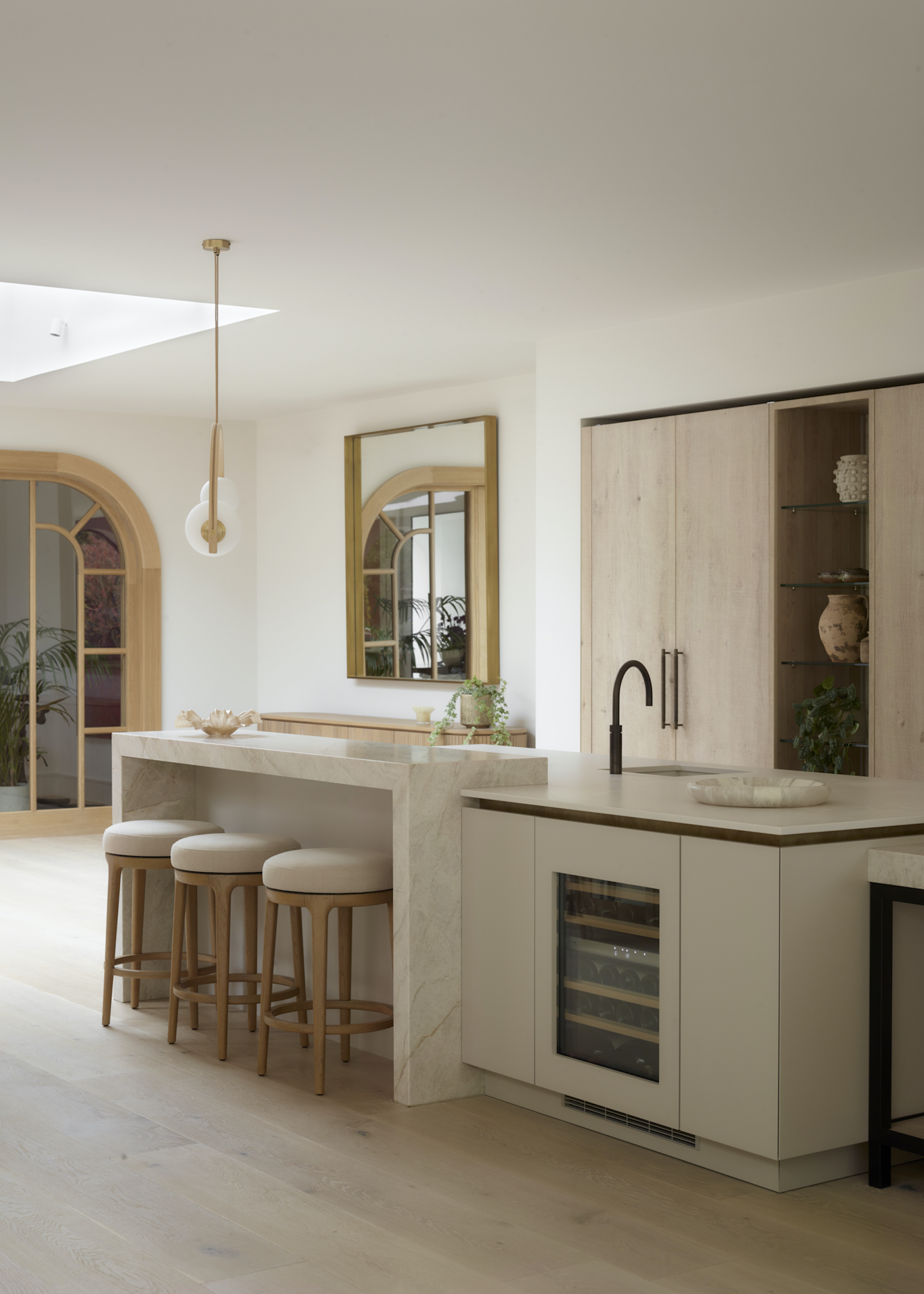
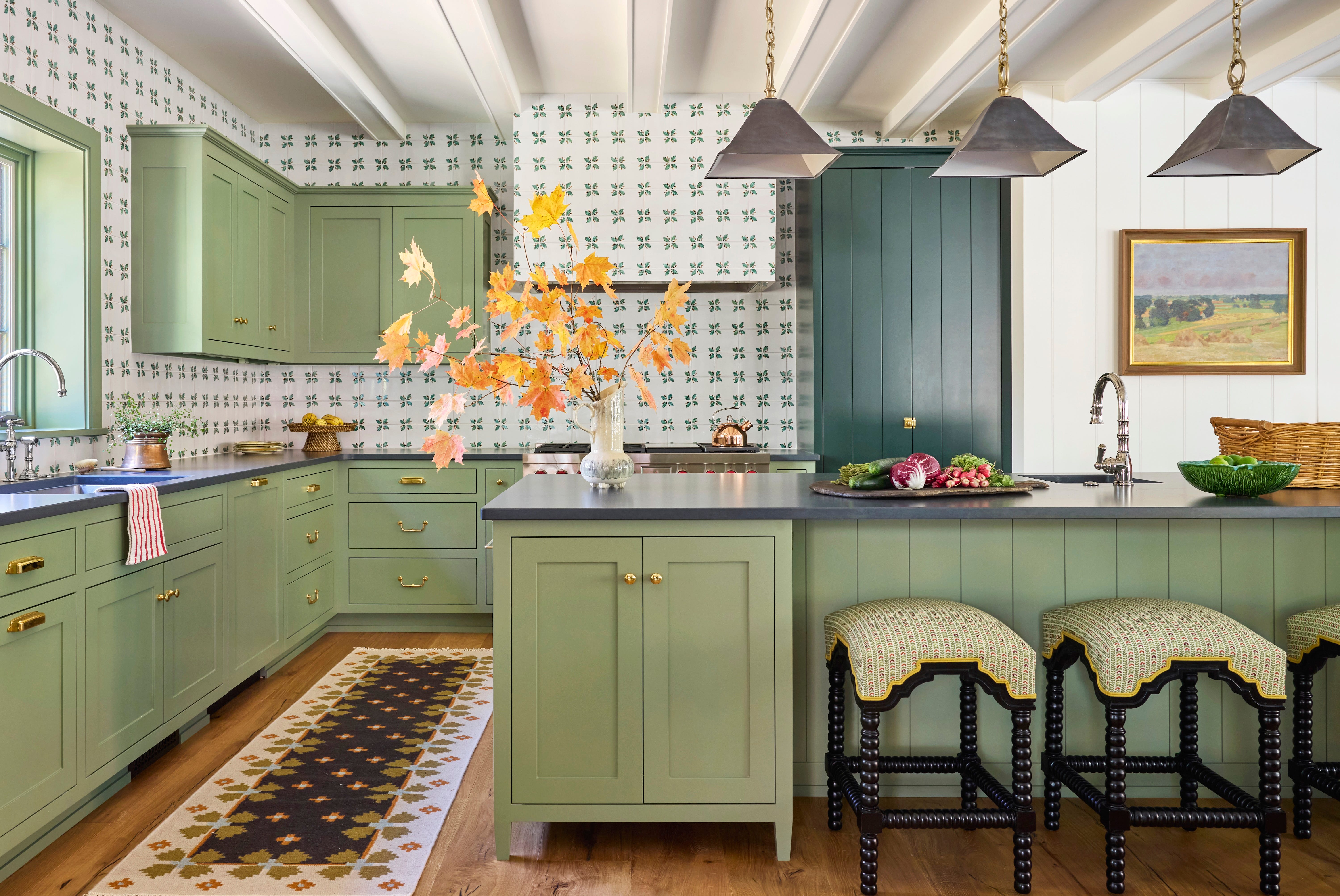
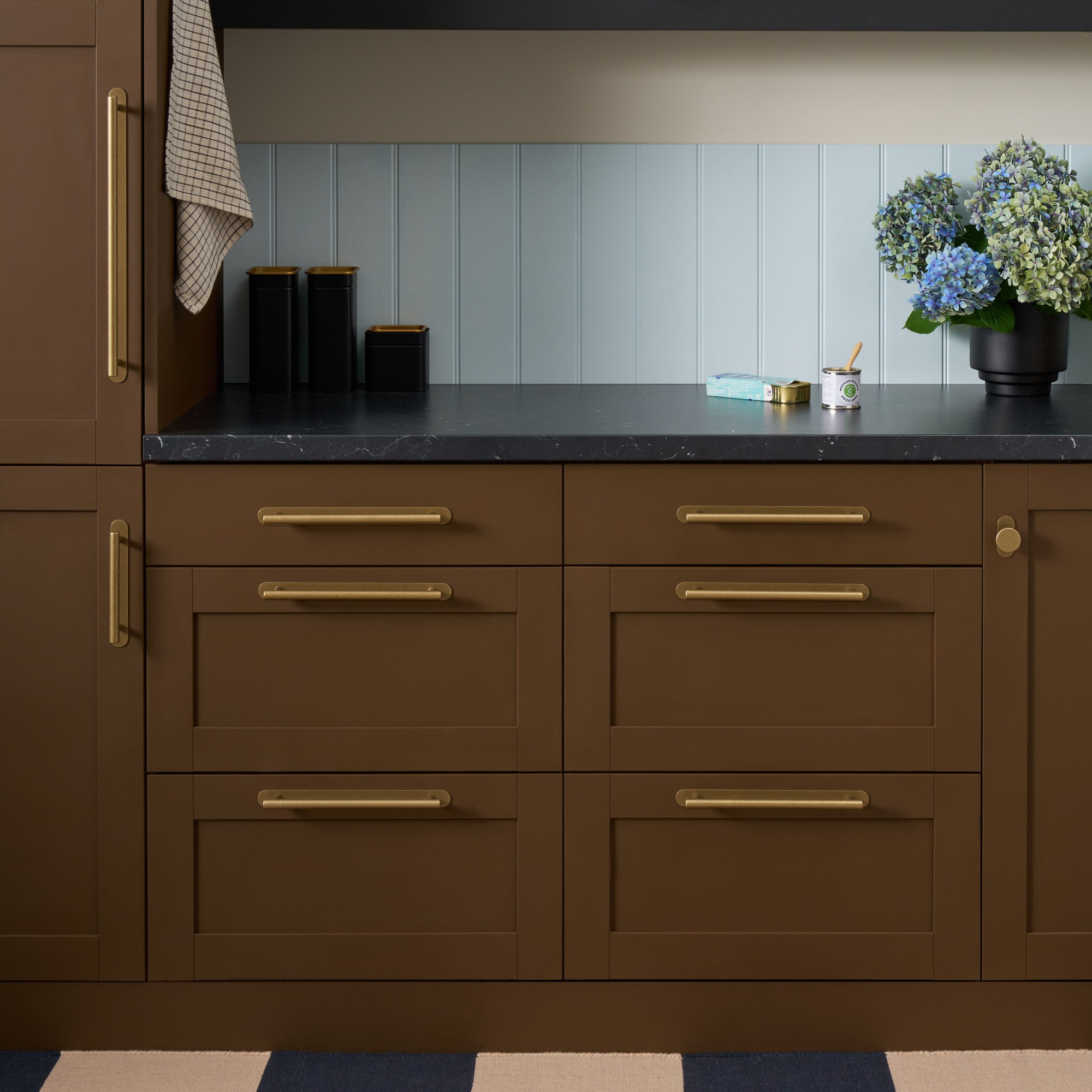
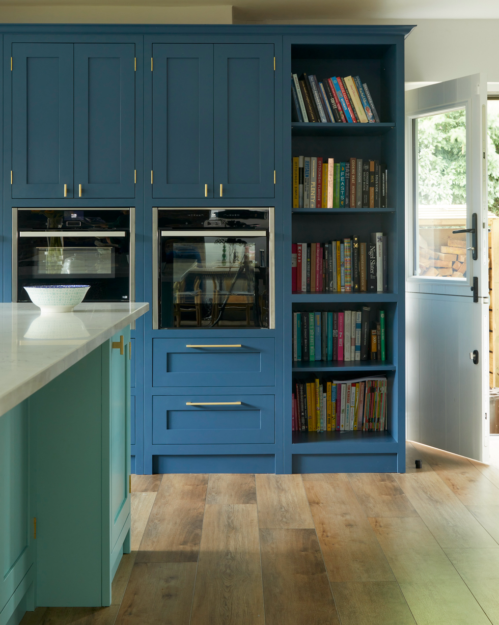
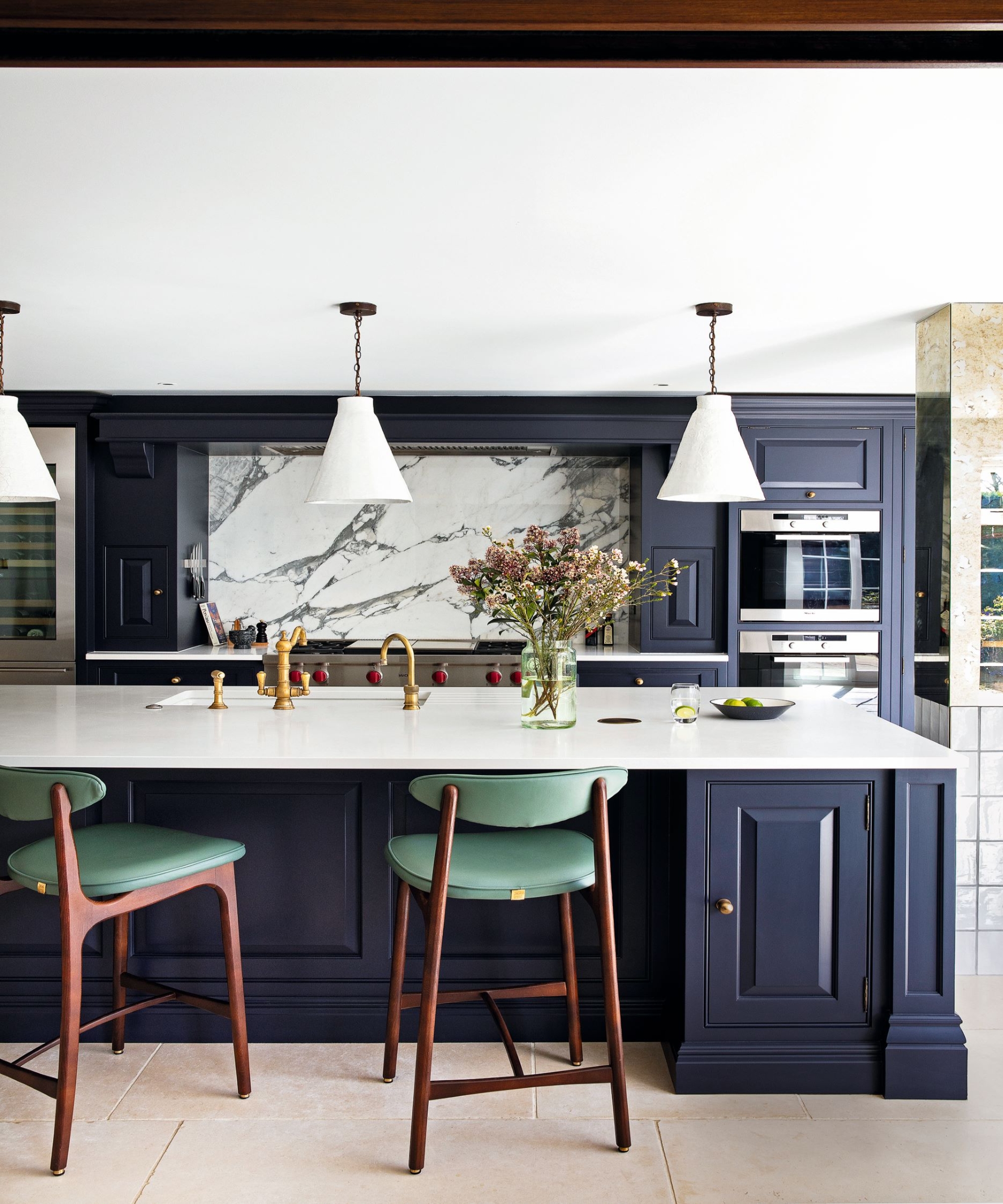
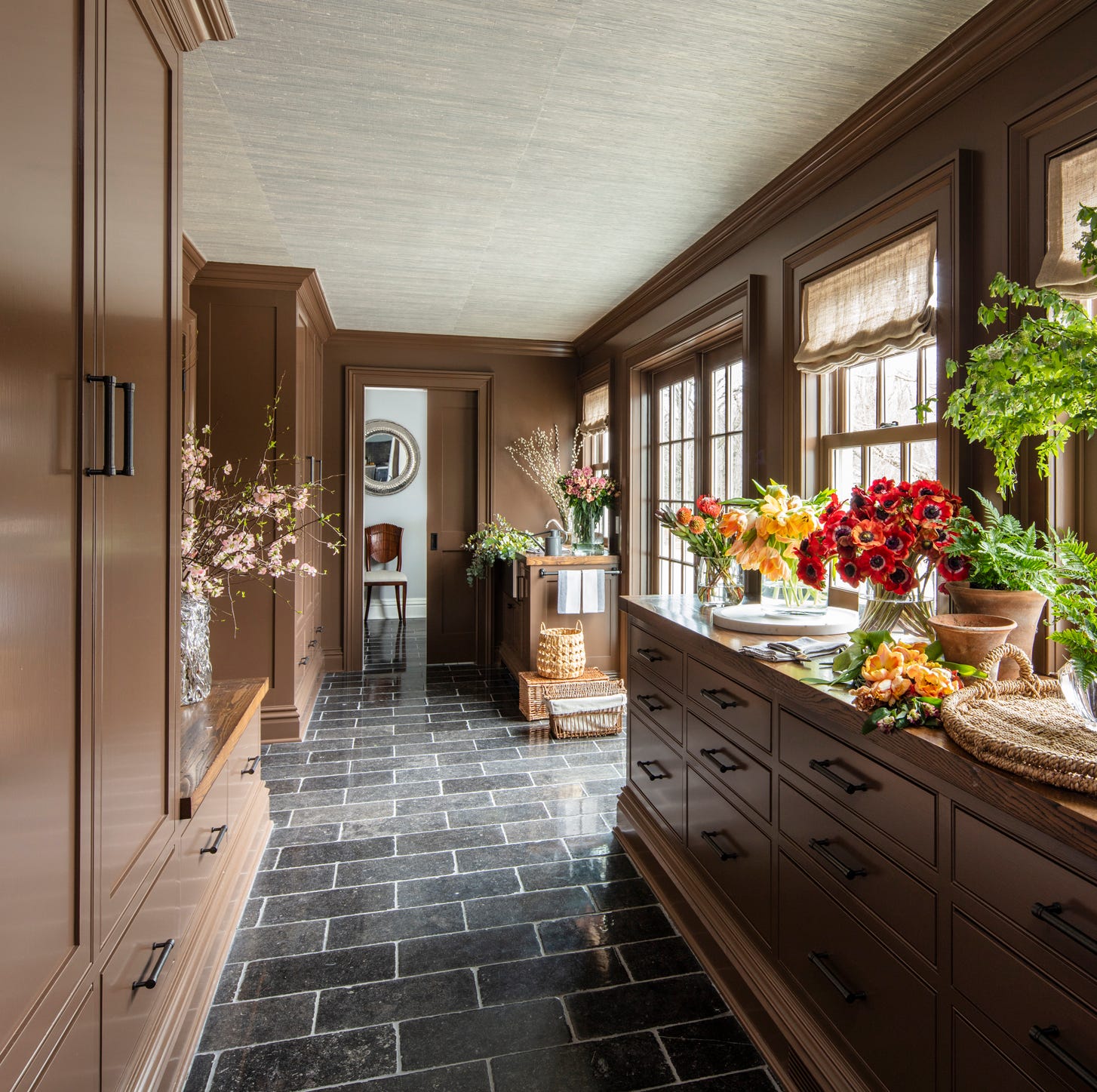
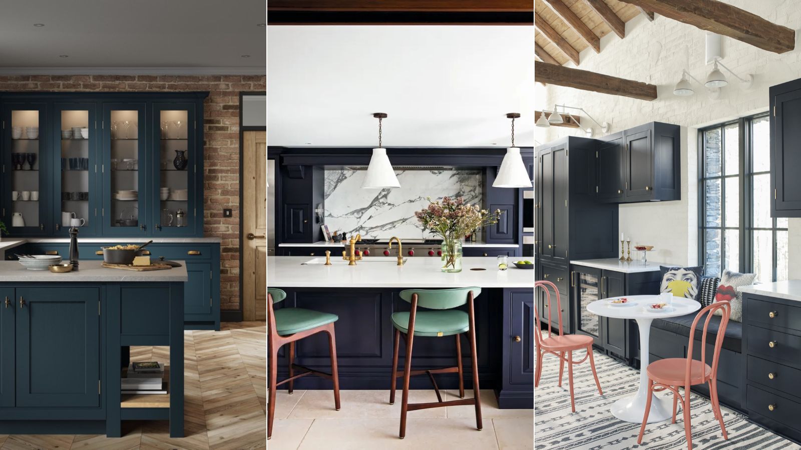
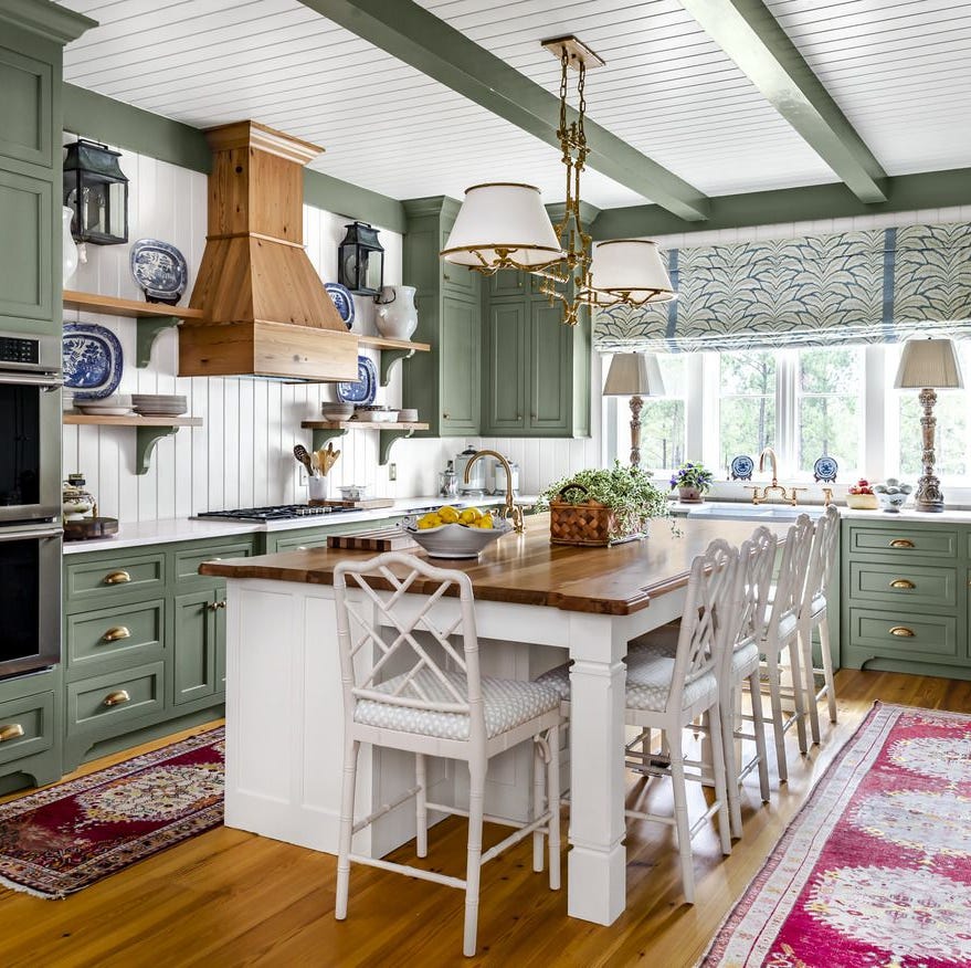
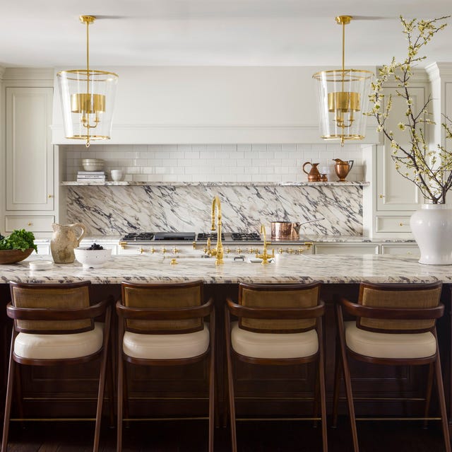
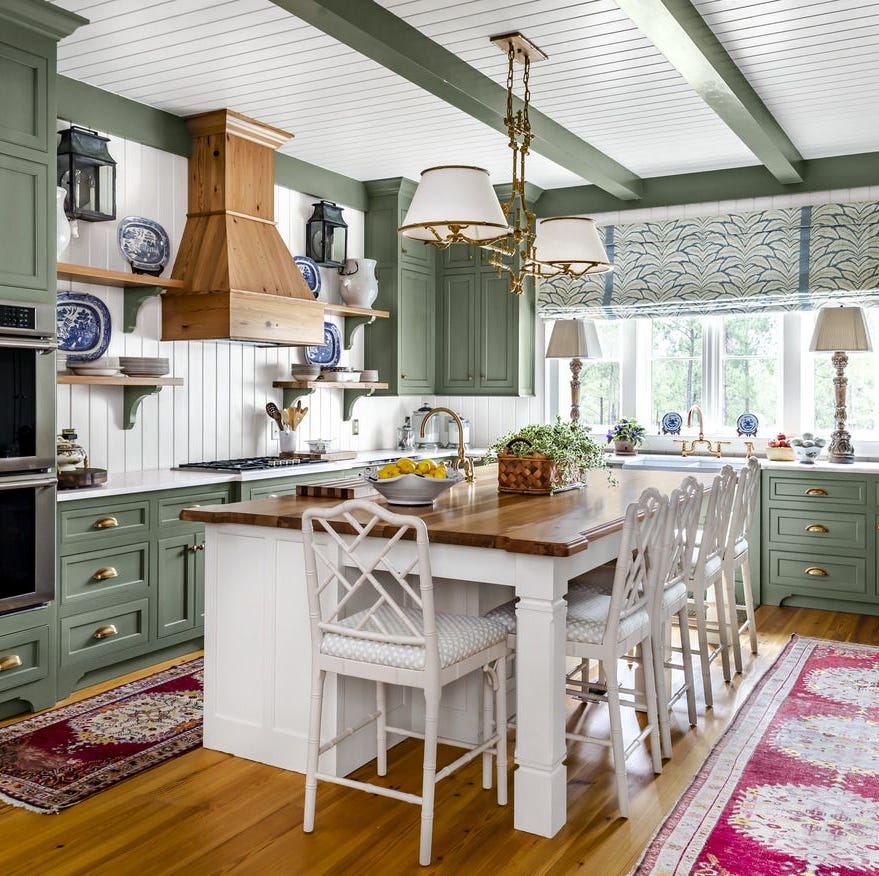
Dark green, specifically regal forest greens, offer a sense of stately country homes, providing sufficient color without the intensity of bolder brights. Natural elements such as stone greys, terracottas, and earthy browns complement this shade, which is particularly well-suited for brass accents. Navy is presented as a handsome color, especially effective on shaker cabinets where recessed panels allow for brightening highlights and shadows. Pairing navy with marble creates a reliable combination for country kitchens. Classic cream, while highly versatile, has warmer undertones than pure white, making it suitable for rich metallics and red or yellow woods. Tom Howley emphasizes that the key to a neutral kitchen is pairing cabinetry with contrasting walls and textural elements to add an edge and visual interest.
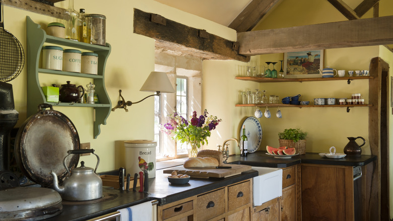
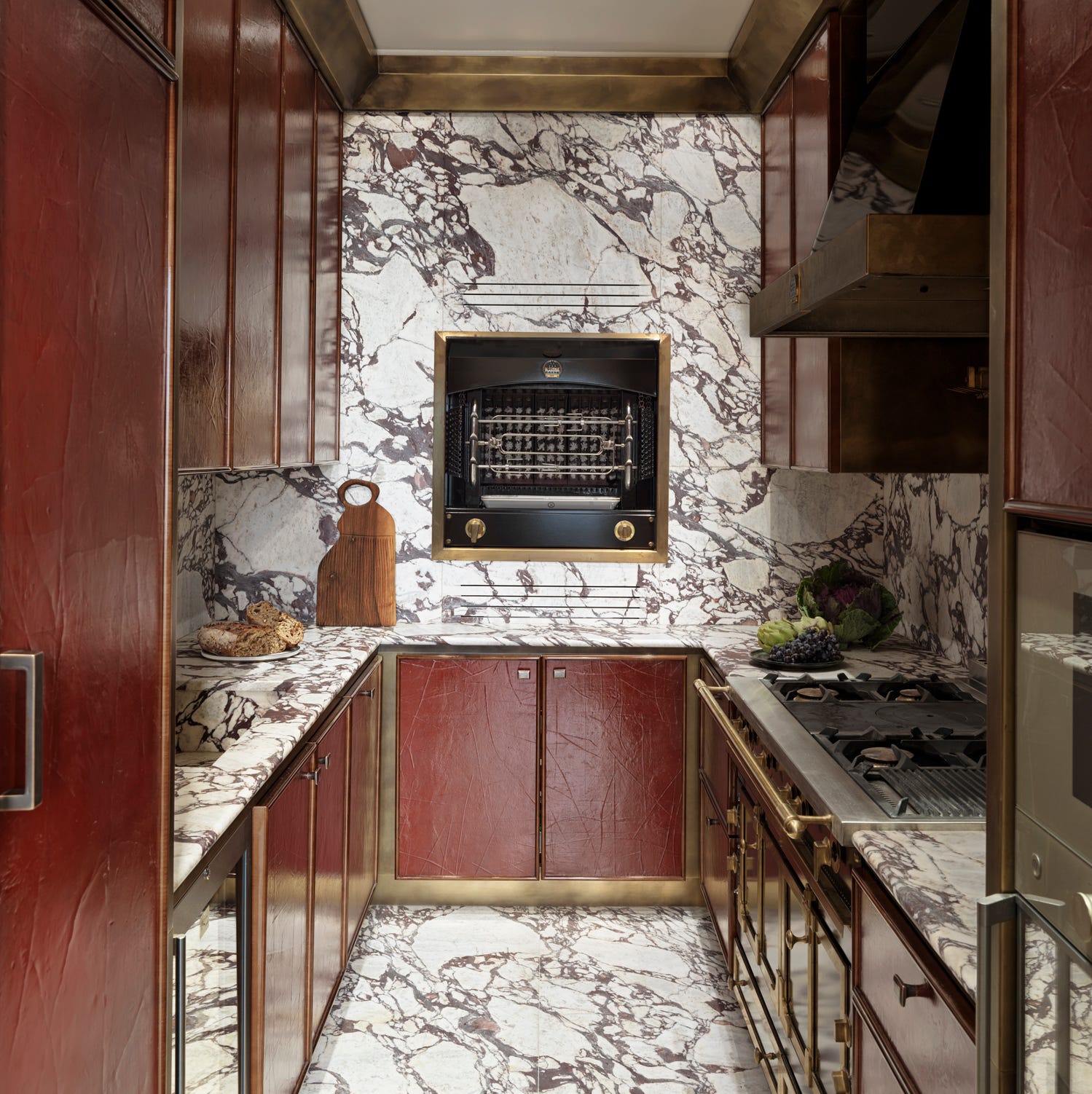
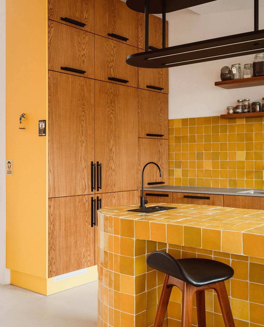
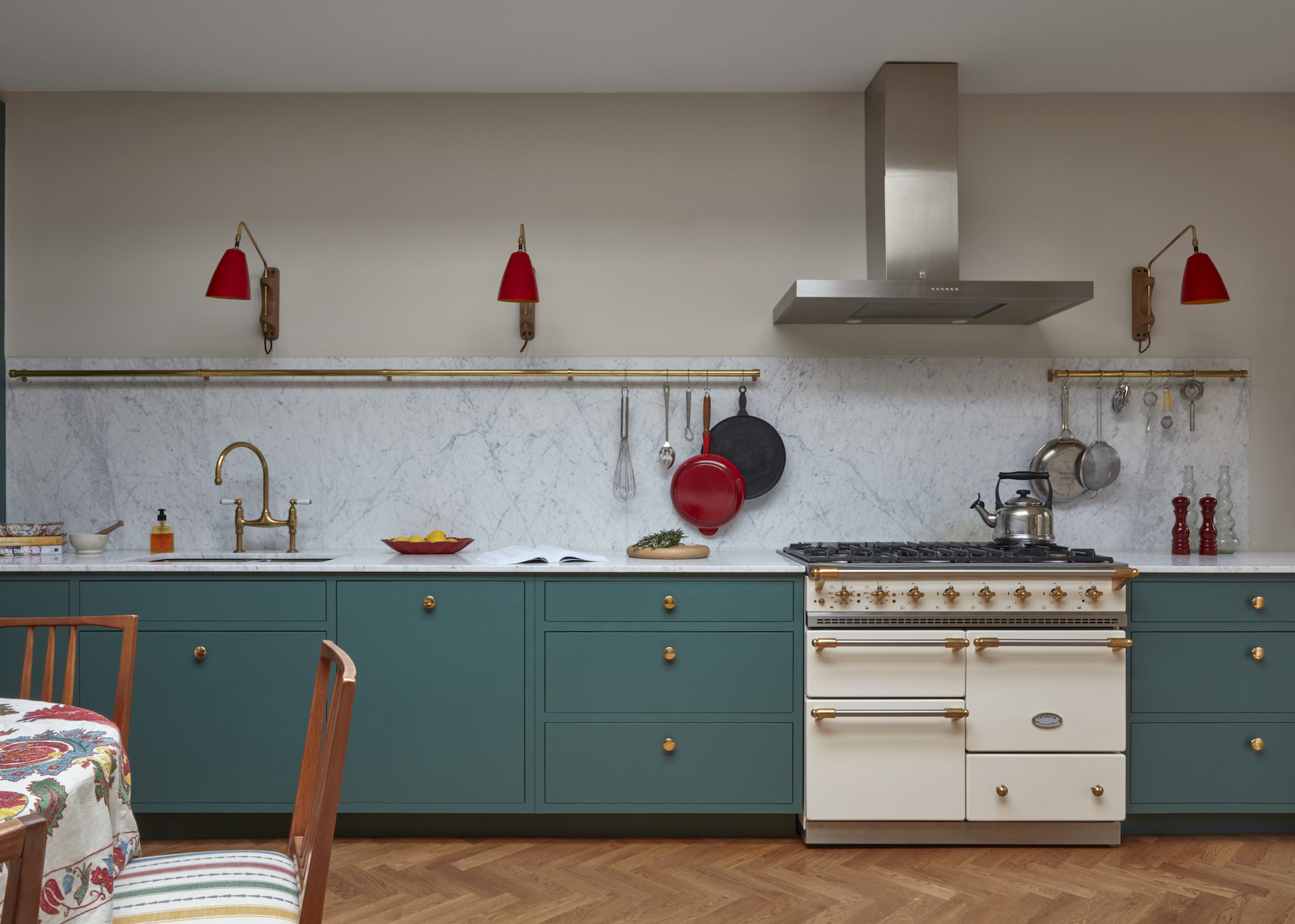
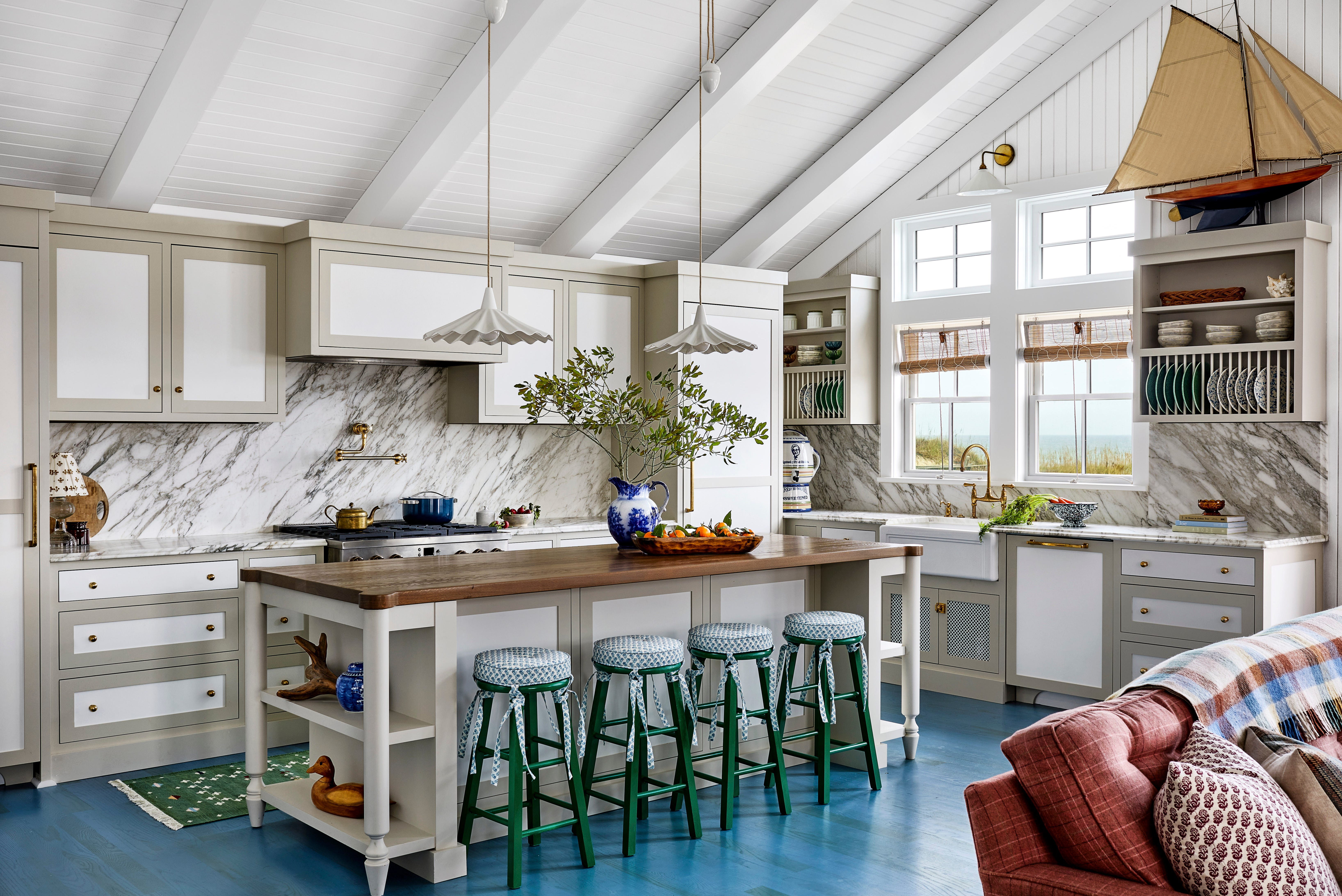
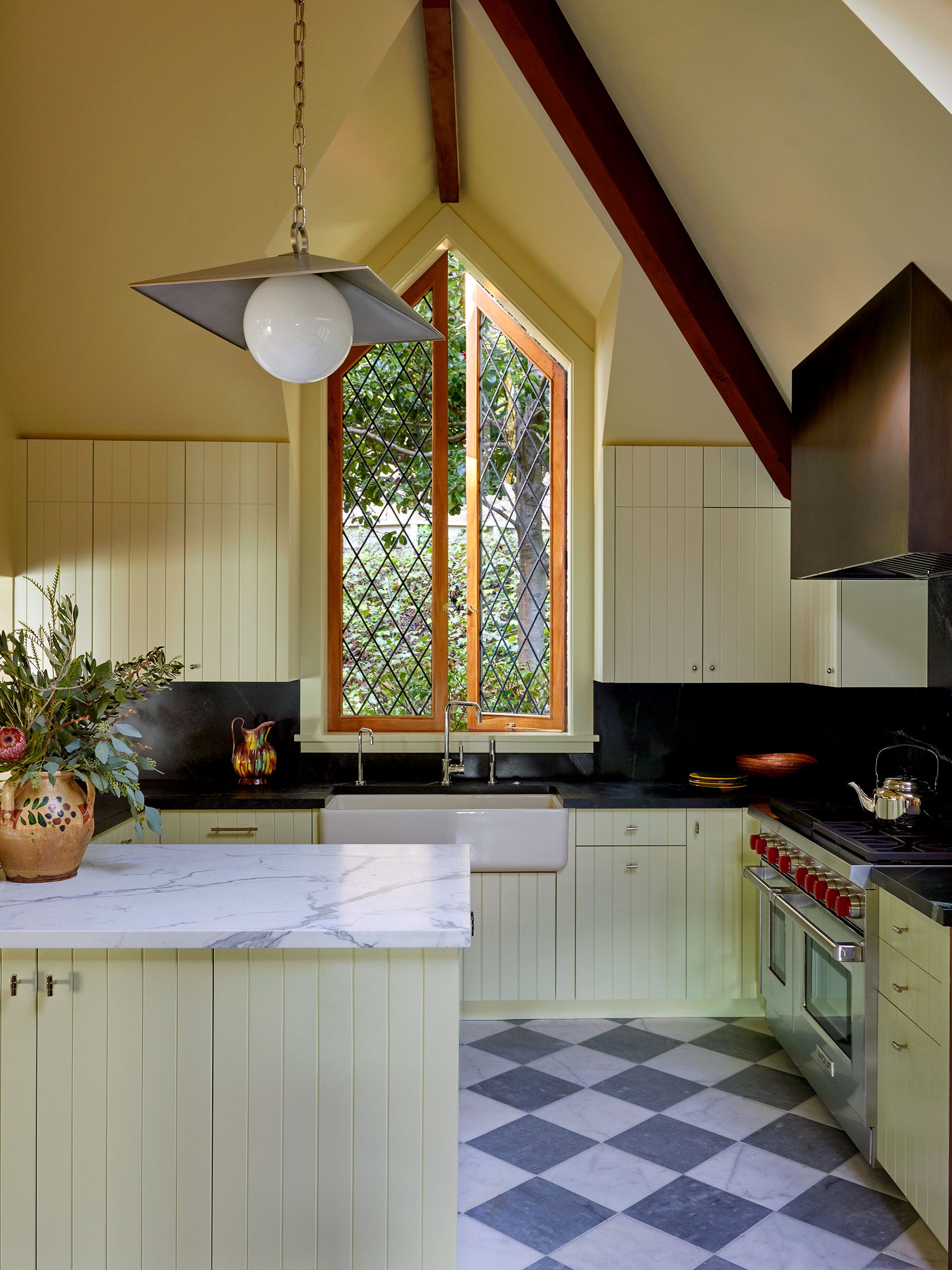
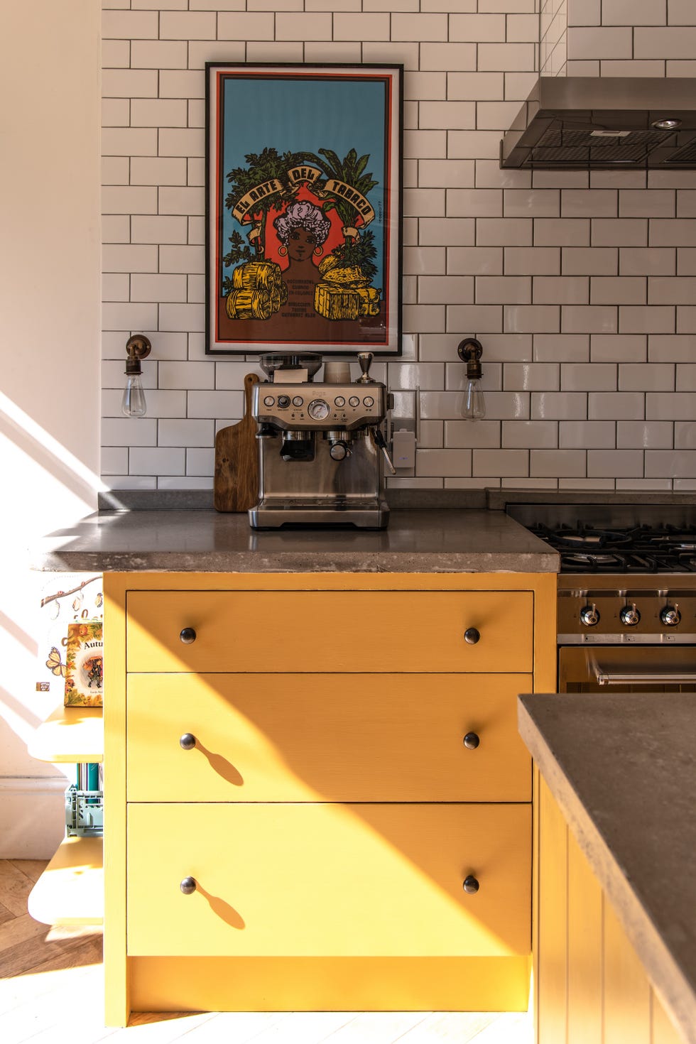
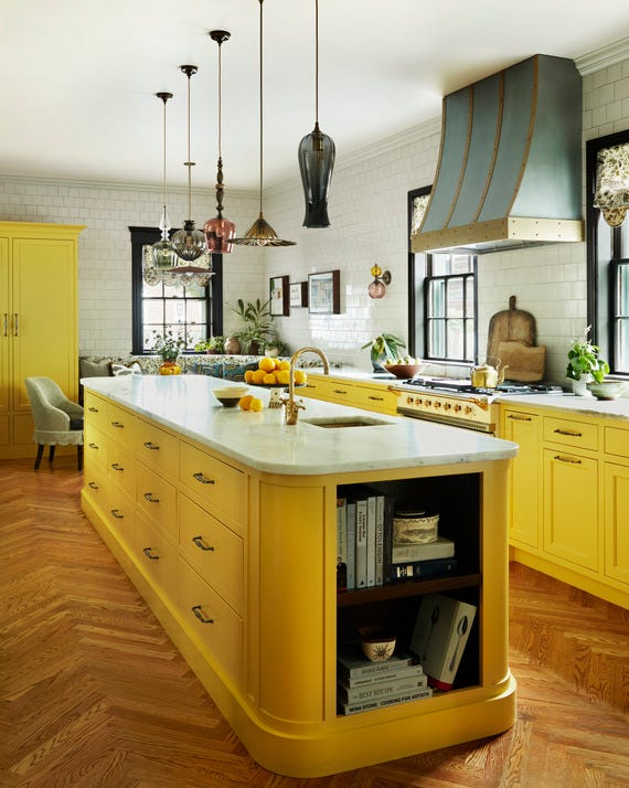
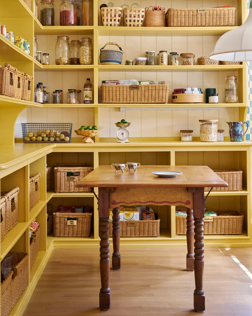
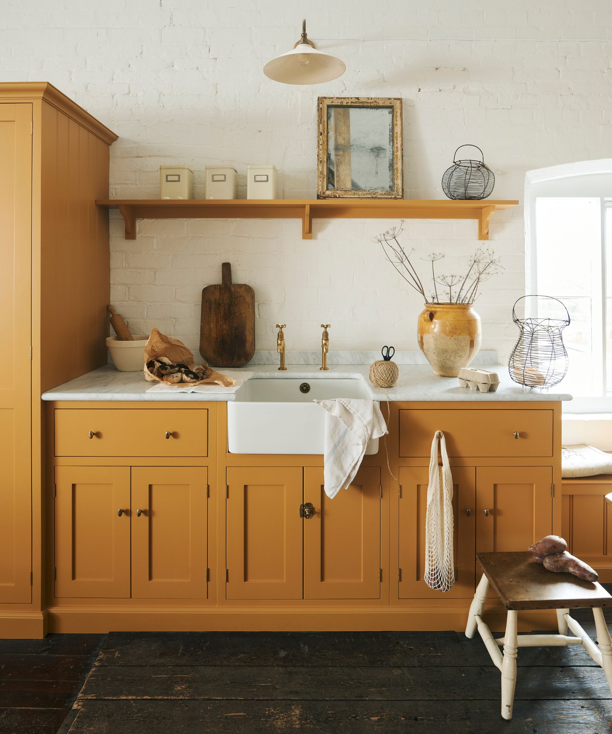
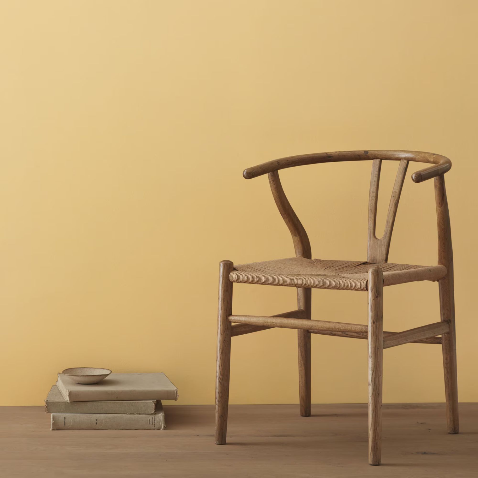
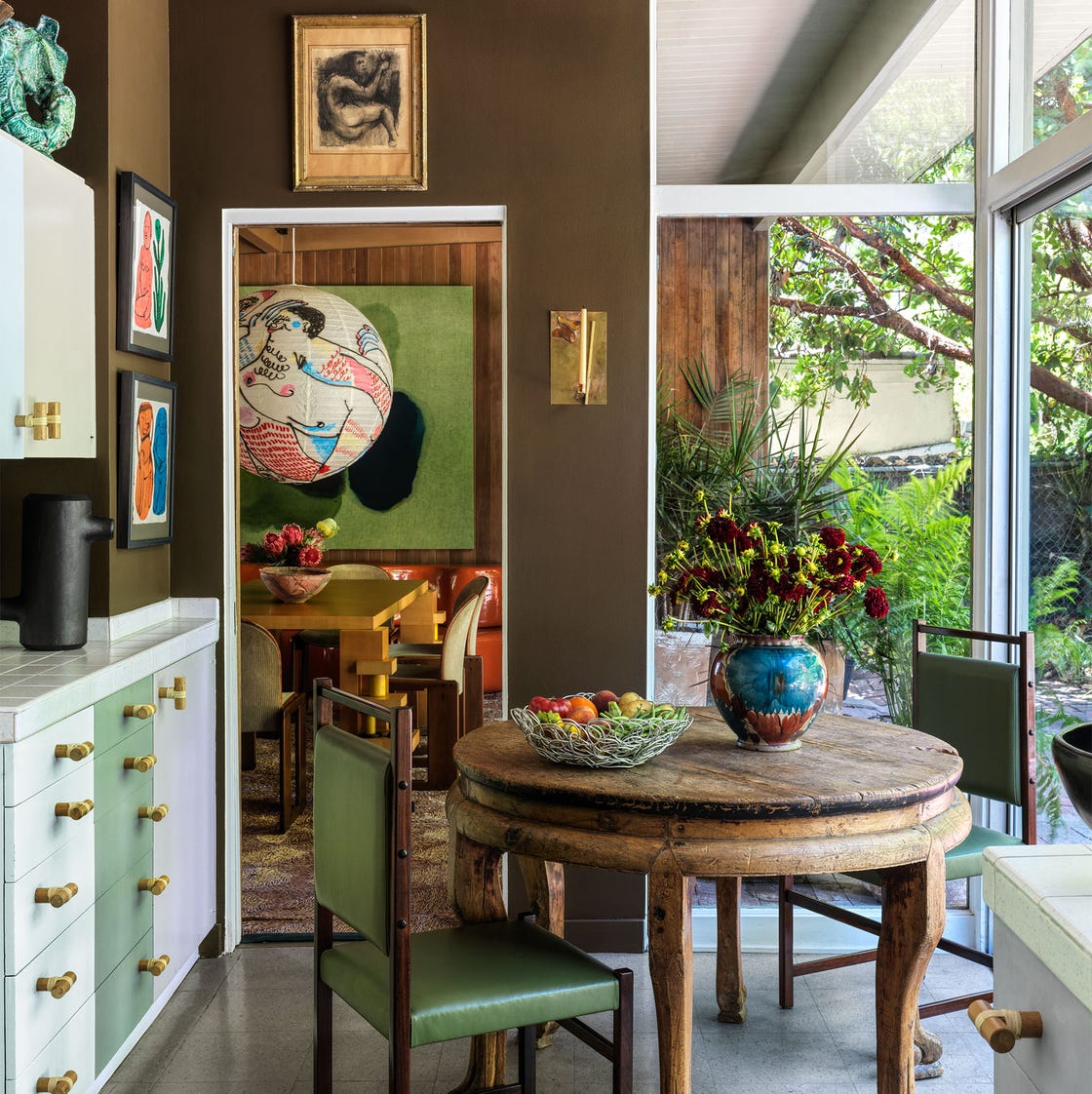
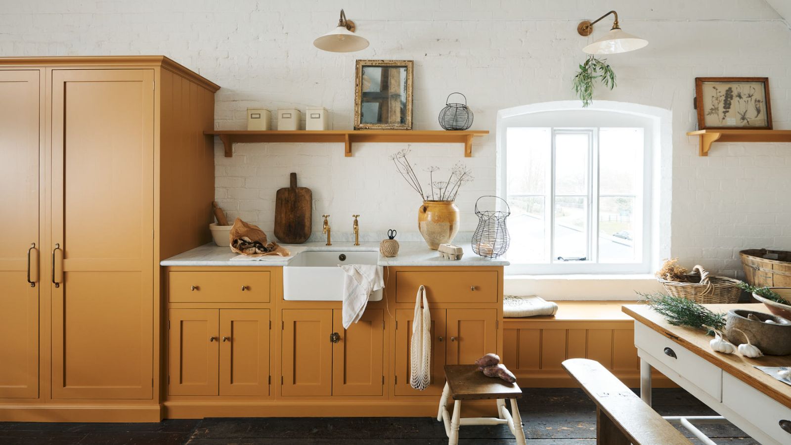
Yellow, a joyful addition to the top 10, is described by Jen Nash as a soft and sunny yolky shade that brightens rooms and offers a versatile base for primary blue, rich aubergine, sky blue, and burnt orange. It can transform a property and uplift a home even during darker winter months. Light grey, adaptable to both sleek contemporary and traditional spaces, works well with shaker cabinetry. Beige-toned greys blend warm and cool elements, accommodating both brass and silver hardware. Olive green, as highlighted by Tom Howley, is gaining popularity as a grounding shade that reconnects individuals with nature, fostering calm and positivity. Finally, red is recommended for uplifting darker rooms lacking natural light. Combining red cabinetry or walls with raw materials like natural woods and stone can prevent the color from appearing overly bright or garish.
#KitchenDesign #InteriorDesign #ColorTrends #HomeRenovation #KitchenCabinets #PaintColors #ModernKitchens #CountryLiving #HomeDecor #KitchenDesign #InteriorDesign #ColorTrends #HomeRenovation #KitchenCabinets #PaintColors #ModernKitchens #CountryLiving #HomeDecor
कुल 0 टिप्पणियाँ
 कोई टिप्पणी नहीं
आपको यह भी पसंद आ सकता है
13 Unique Kitchen Color Combinations To Try Out In 2025
What Kitchen Color Should I Choose? 12 Ideas That Feel Right for Schemes in 2025

20 Kitchen Paint Colors to Try in 2024

These Are The Top Kitchen Paint Colors For 2024

These 2025 Kitchen Color Trends Are Unexpectedly Chic
5 Kitchen Paint Color Trends to Watch in 2024
8 Kitchen Color Trends You'll See in Every Home in 2025, According to Designers

Is indigo the new navy? Designers say this is the shade of blue you should be painting your kitchen in 2025

10 Trendy Kitchen Cabinet Colors You Should Try In 2025
9 Top Kitchen Color Trends Experts Predict for 2025

The Kitchen of Your Dreams Is Just a Paintbrush Away
These Kitchen Paint Colors Will Be Everywhere in 2025


Top 10 Trendy Kitchen Colour Combinations in 2025

7 Kitchen Color Trends That Are Set to Take Over 2026

Kitchen colour trends – interior designers reveal the 7 inviting new shades to embrace in 2025
3 overlooked colors you never thought could work in your kitchen – but interior designers swear by them
11 Trendy Kitchen Paint Colors To Try In 2026

The Best Kitchen Cabinet Colors to Try in 2025, According to Designers
These kitchen paint colours will be everywhere in 2025 – and there's even one for neutral lovers
5 Kitchen Paint Color Trends for 2025 That Will Transform the Heart of Your Home