11 Soothing Bedroom Paint Colors Designers Say Can Help You Sleep
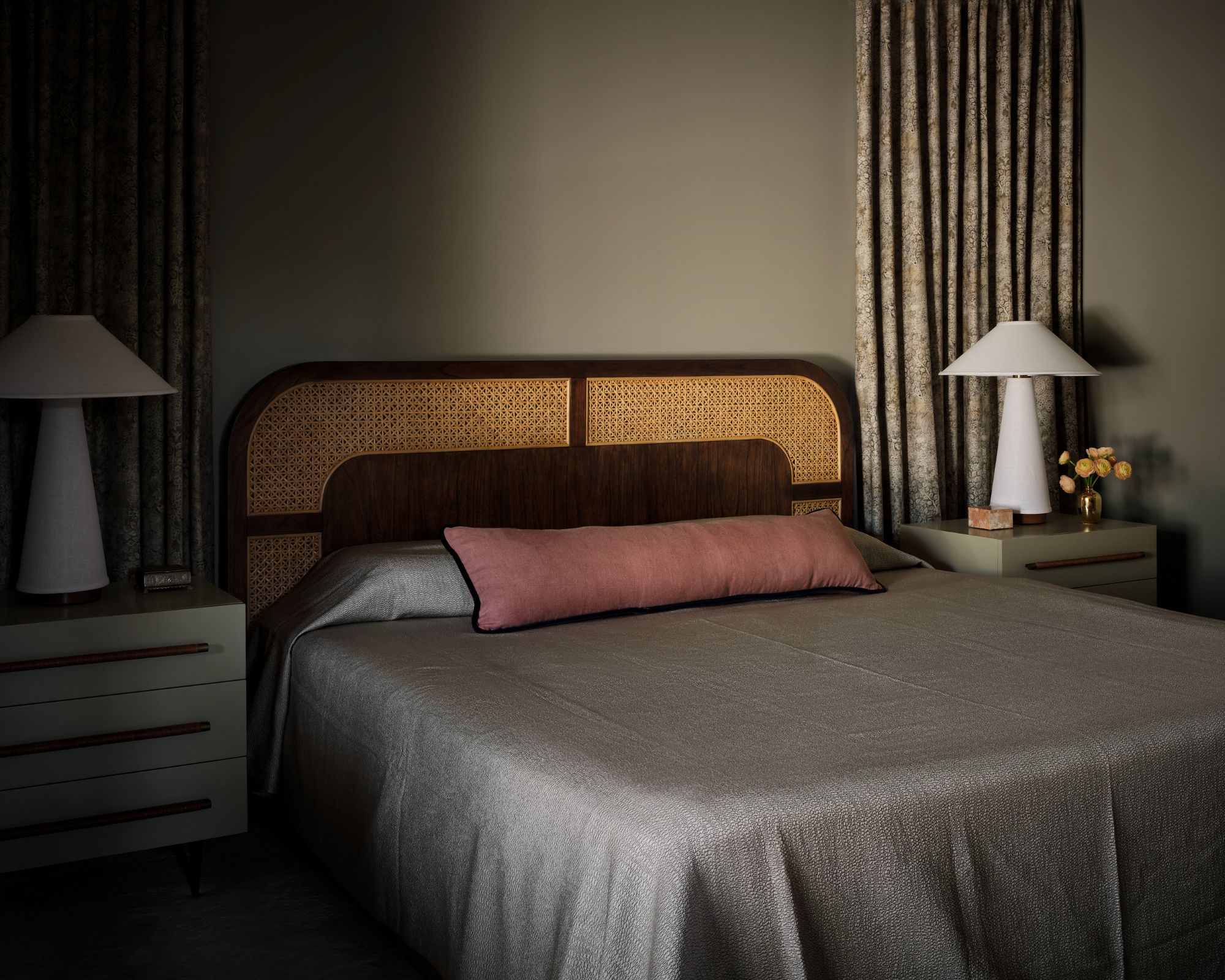
The bedroom is a crucial space for relaxation and rest, and its design significantly impacts sleep quality. One of the most influential design elements is paint color. Interior designers often recommend specific hues to create a calming environment conducive to better sleep.
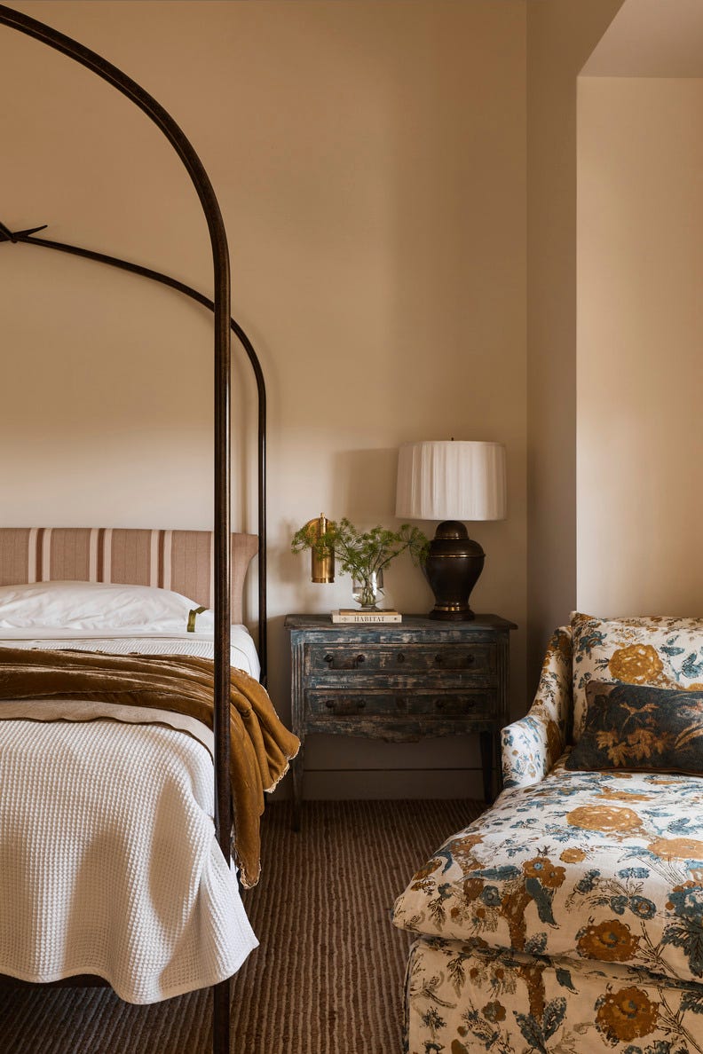
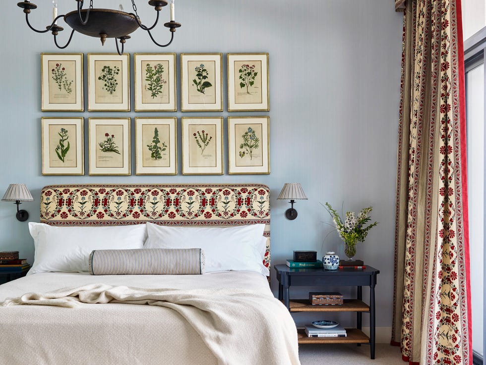
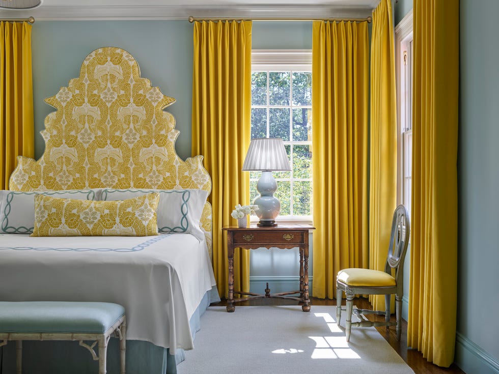
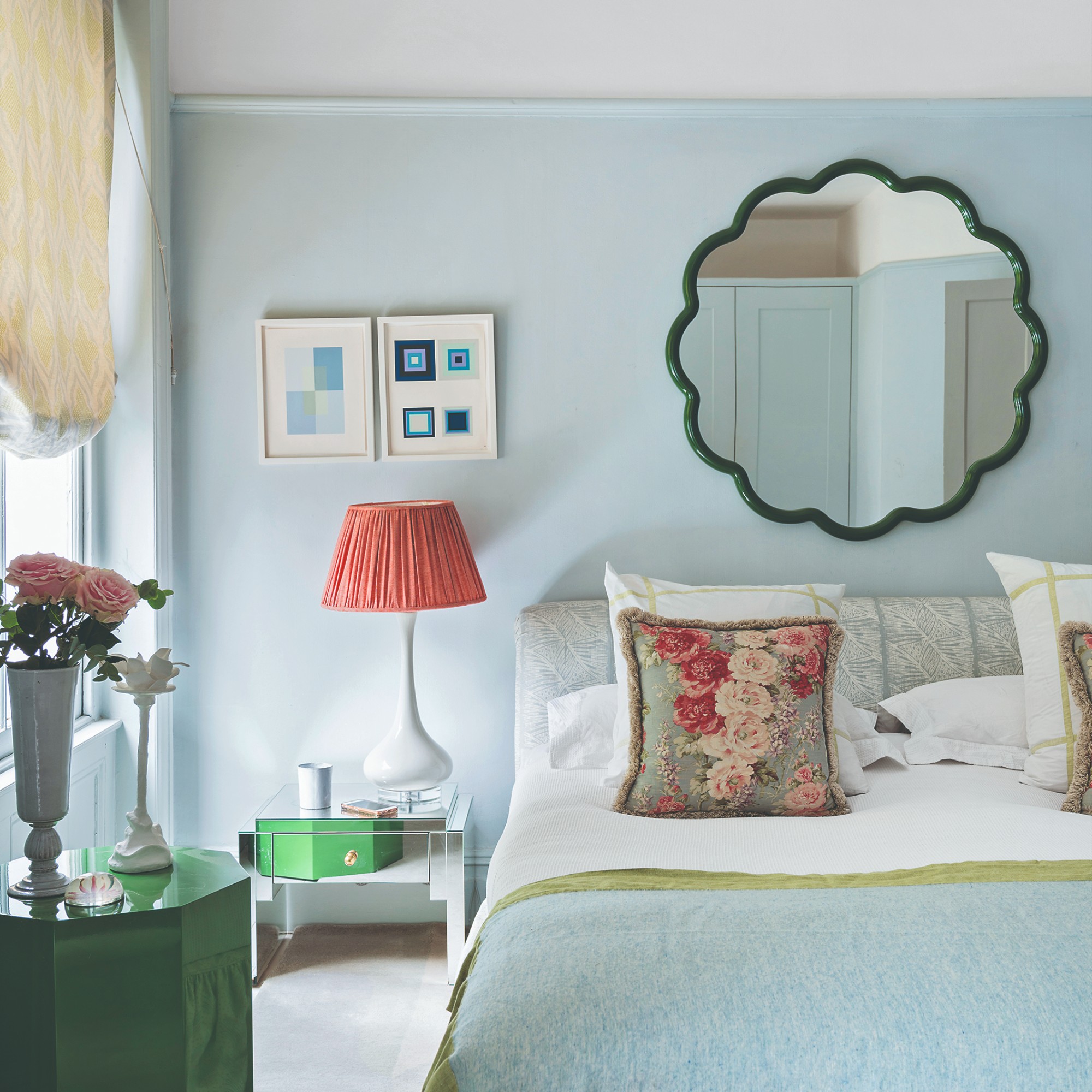
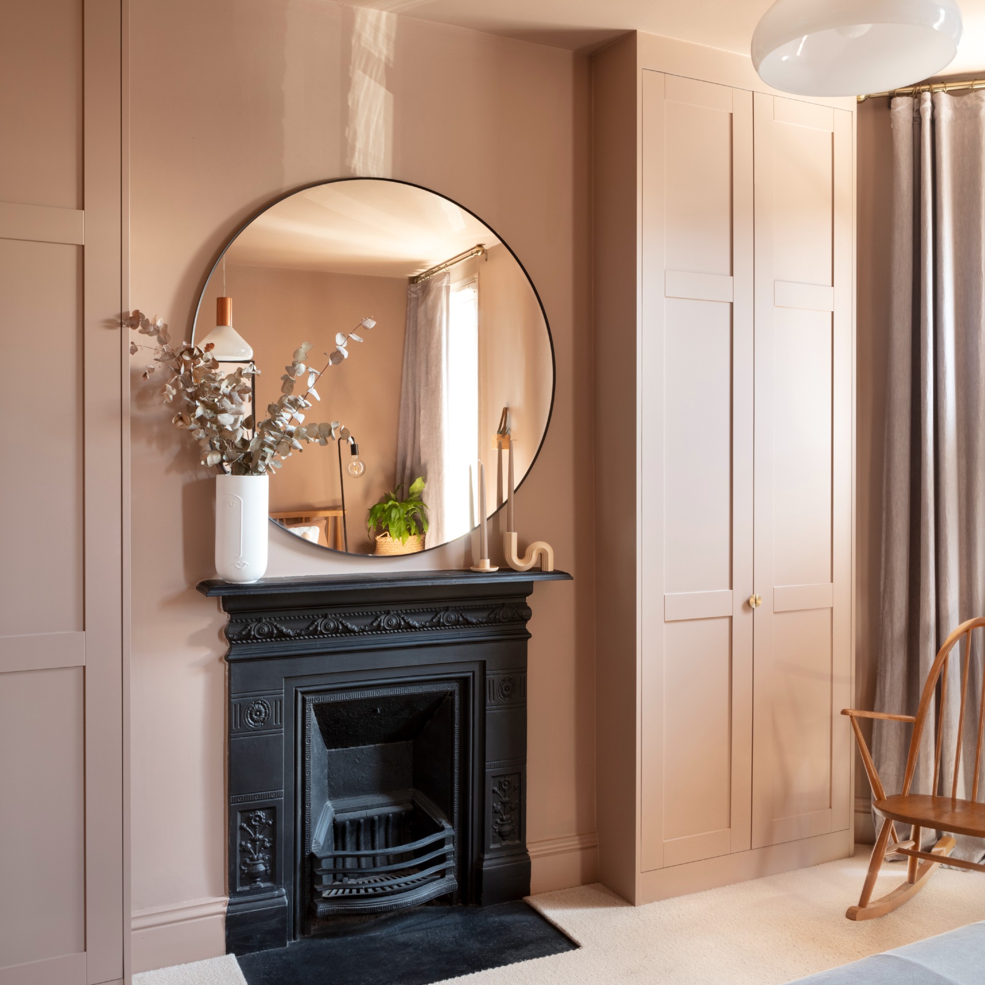
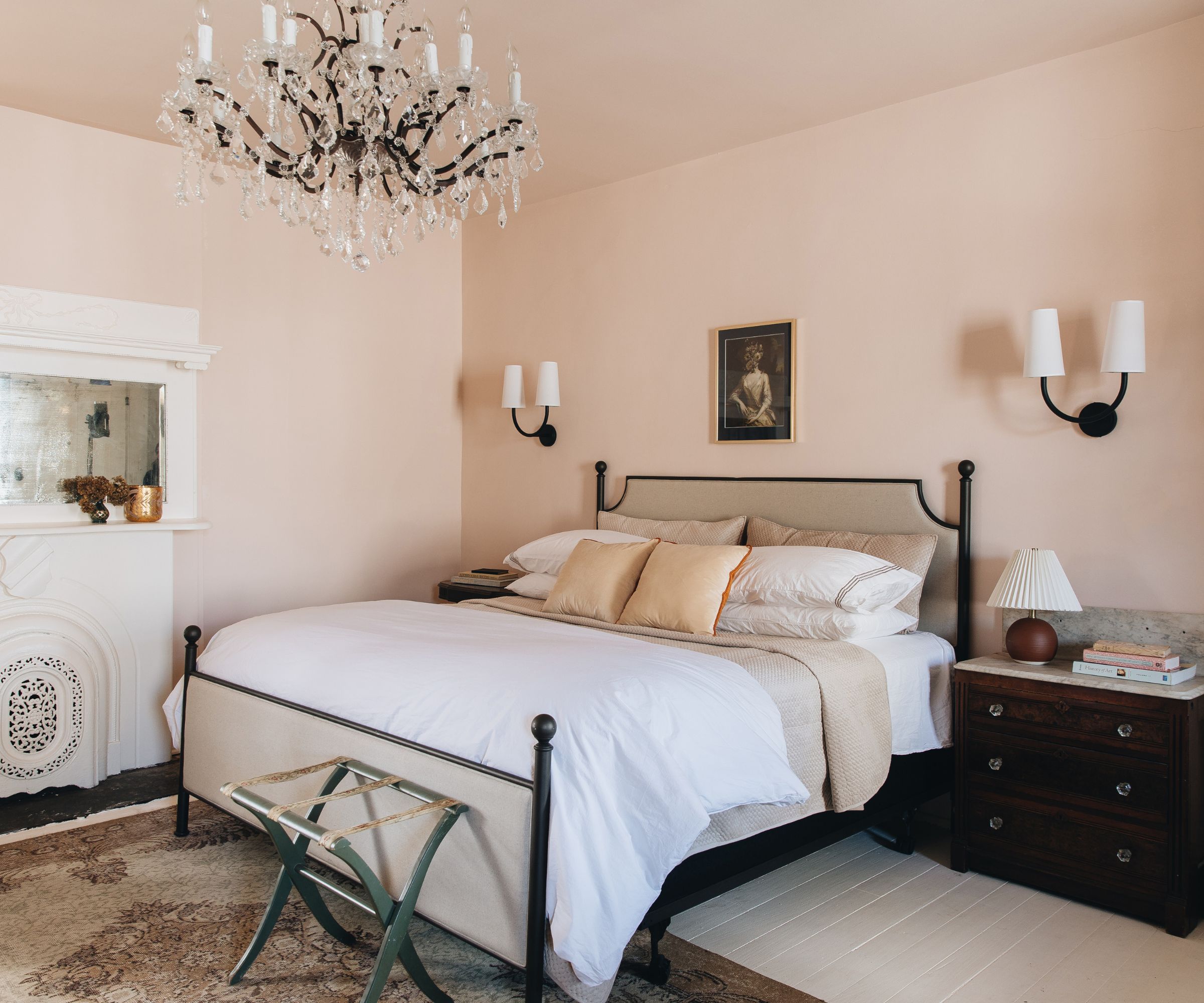
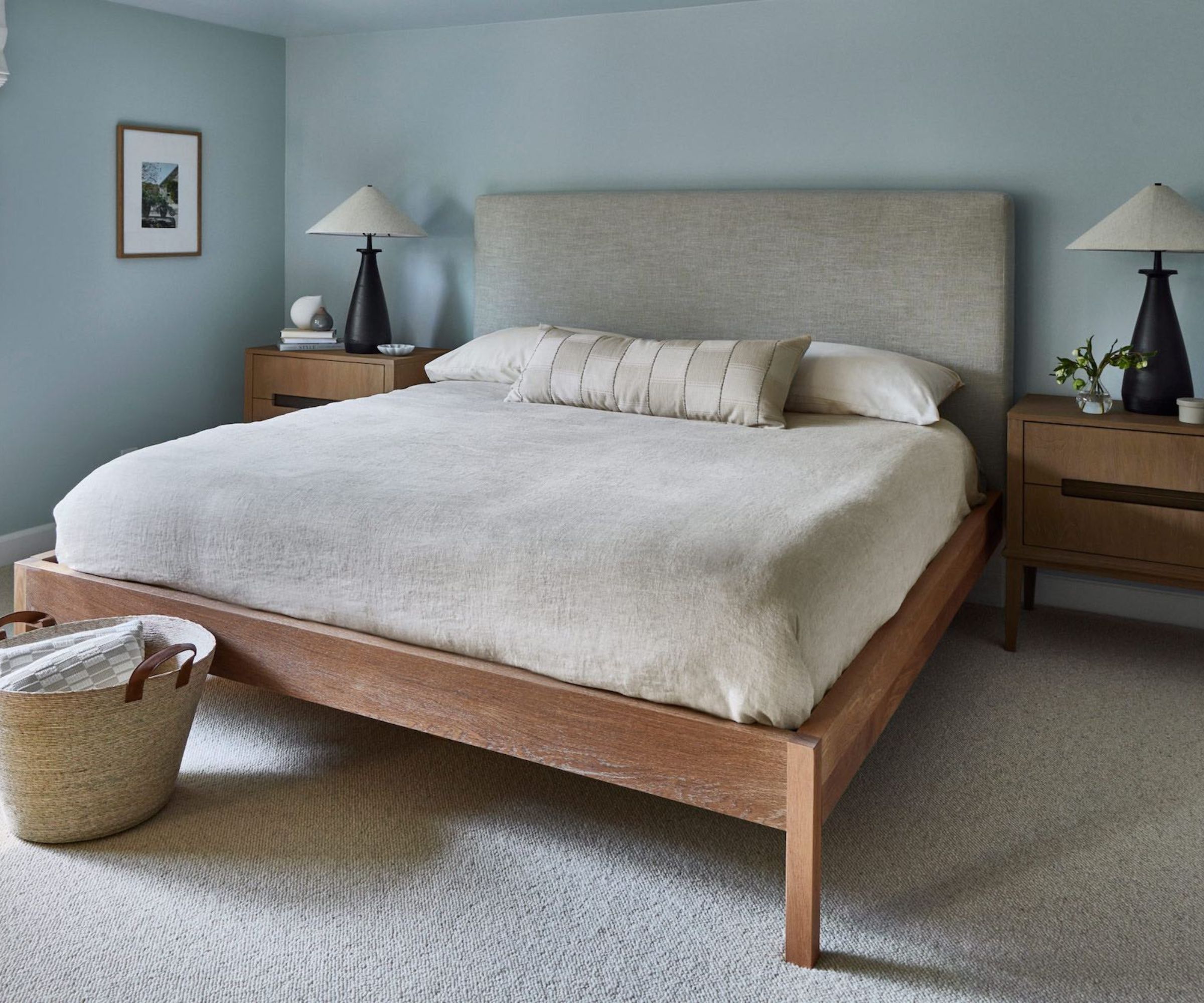
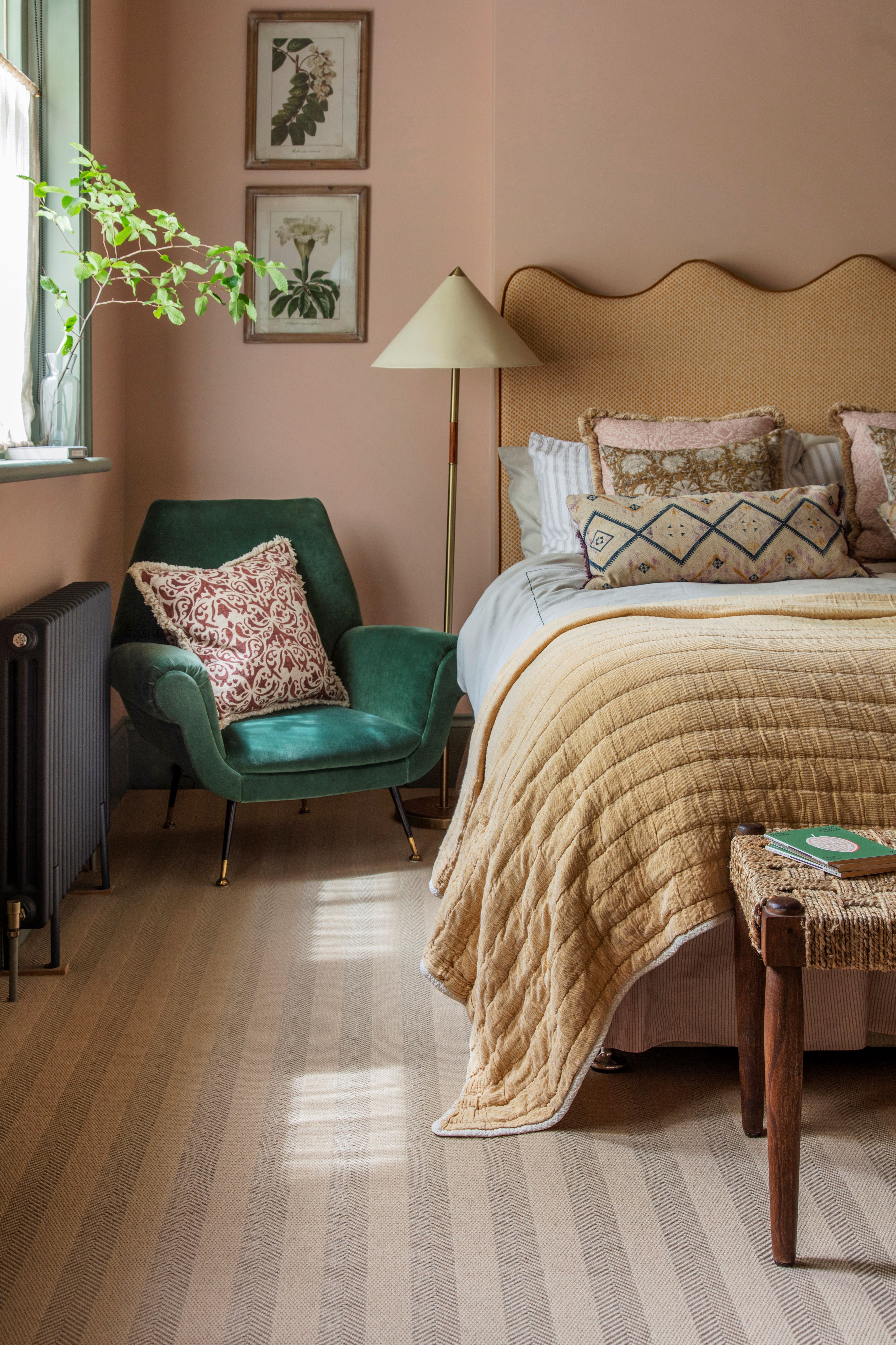
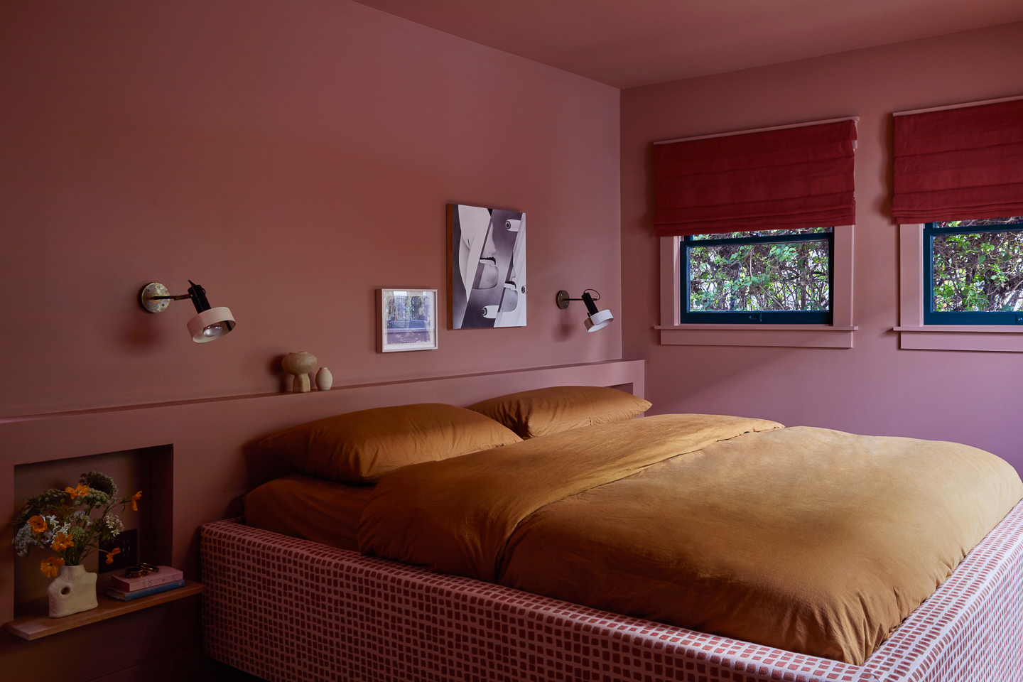
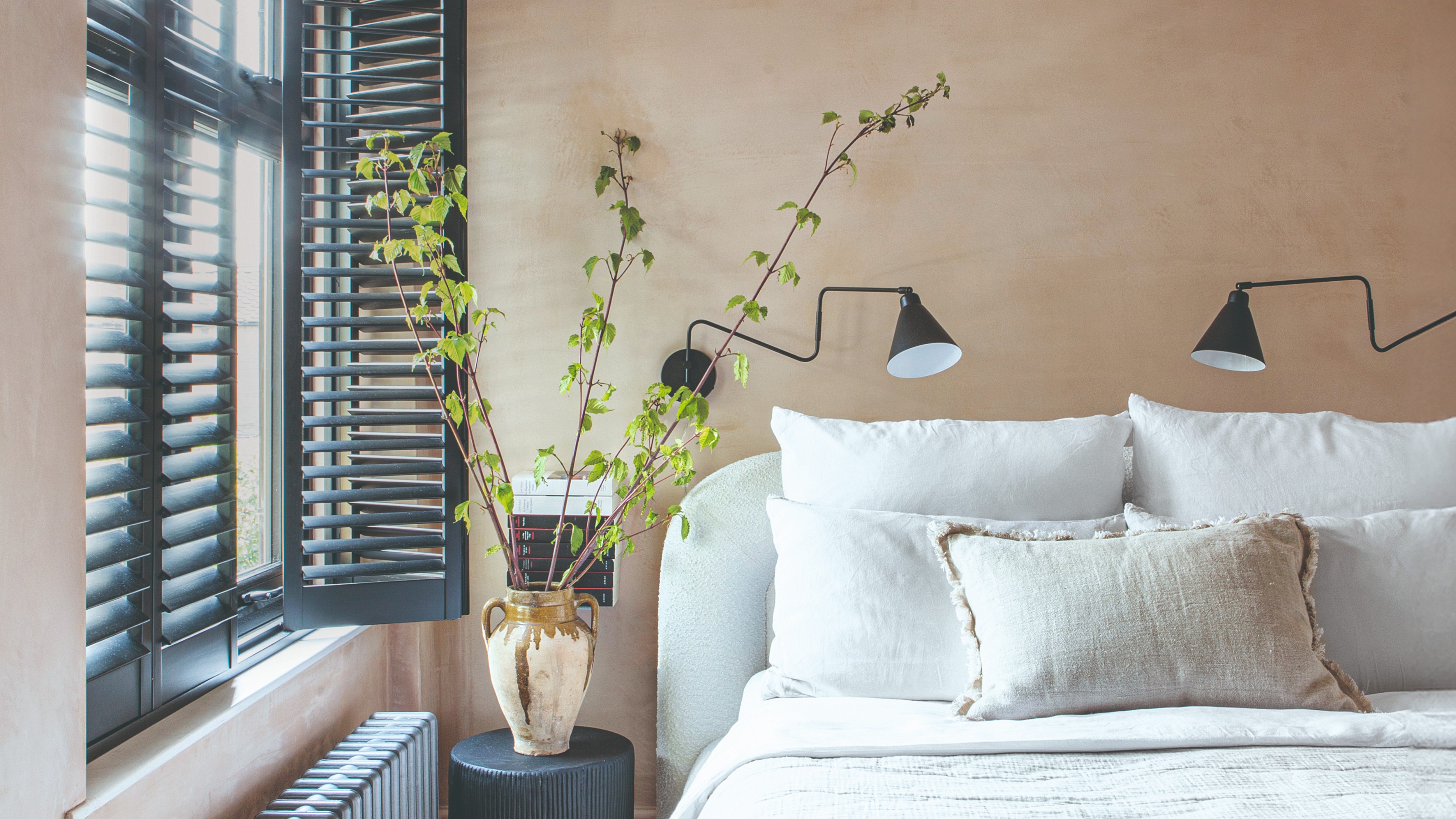
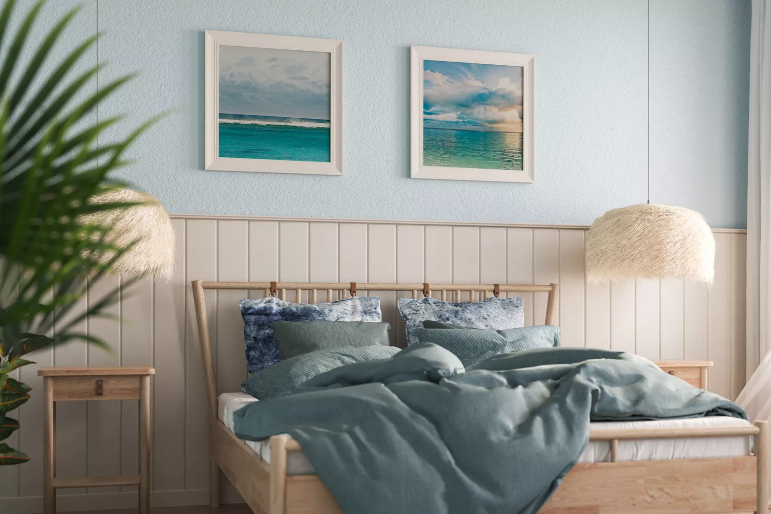
Benjamin Moore's "Quiet Moments" is a popular choice, blending soft blue undertones with subtle gray nuances. This cool color is known to reduce stress and prepare the brain for rest, offering a modern look that adapts to various décor styles. Farrow & Ball's "Setting Plaster" provides a rose-tinted warmth with earthy undertones, reminiscent of golden hour, creating a natural and poetic feel. Sherwin Williams' "Dew Drop," a light blue, is airy and dreamy, ideal for naturally lit rooms, with cool undertones that evoke a crisp, fresh spring day.
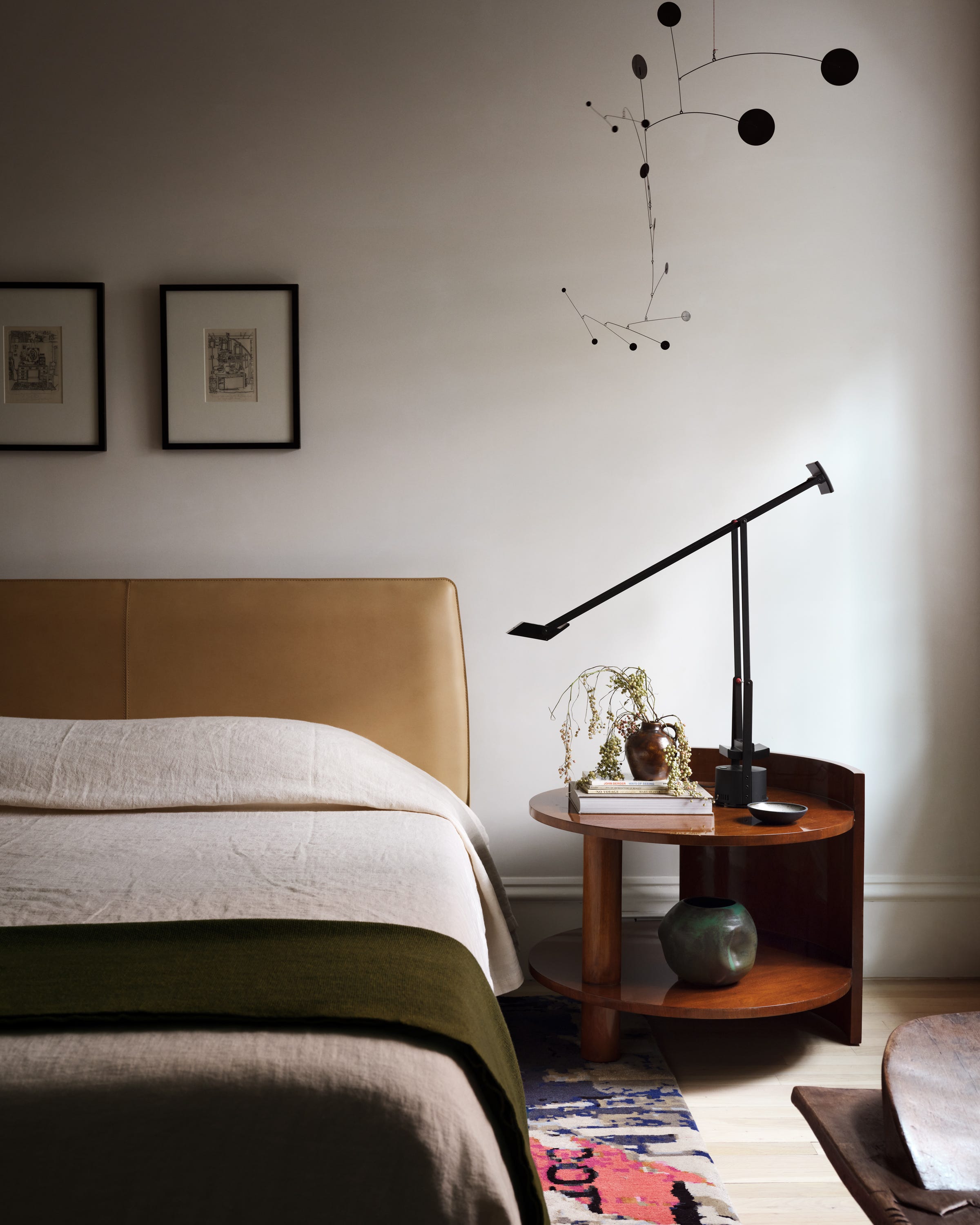
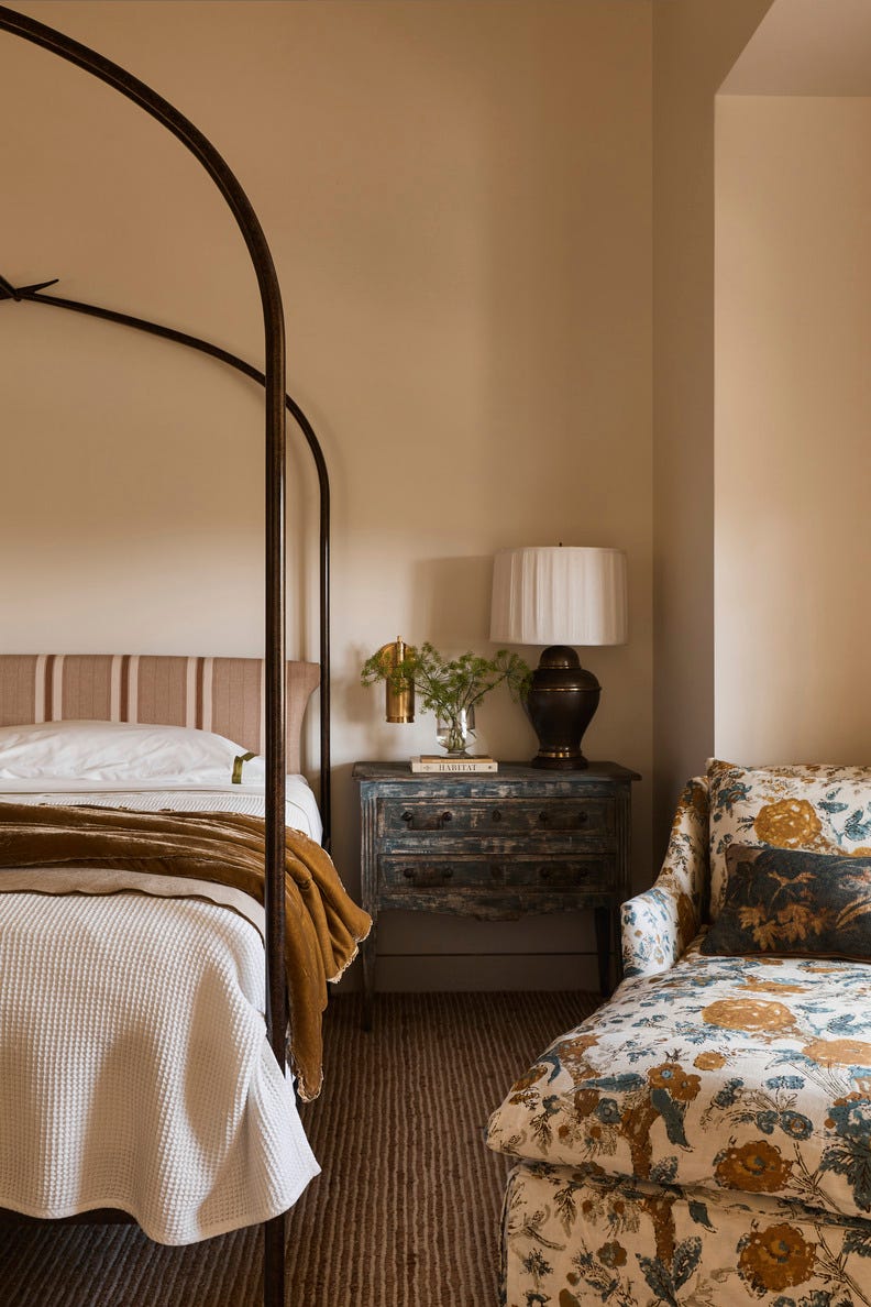
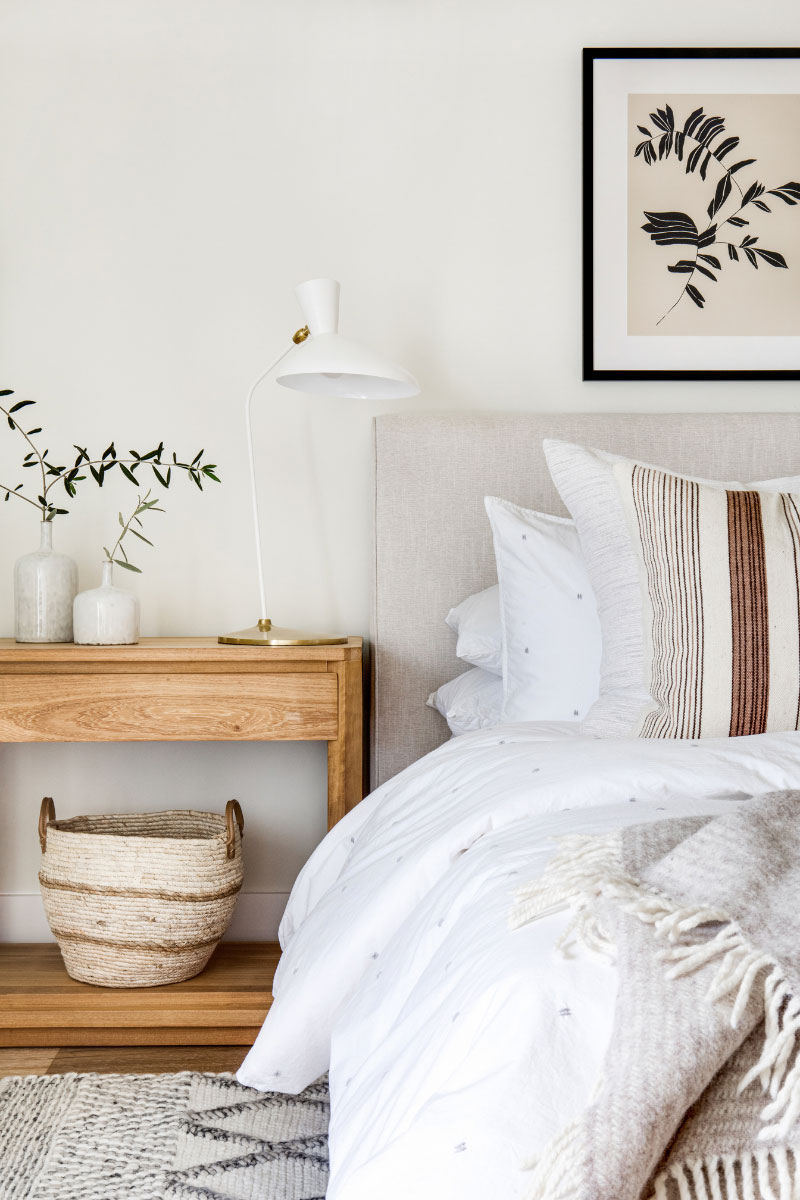
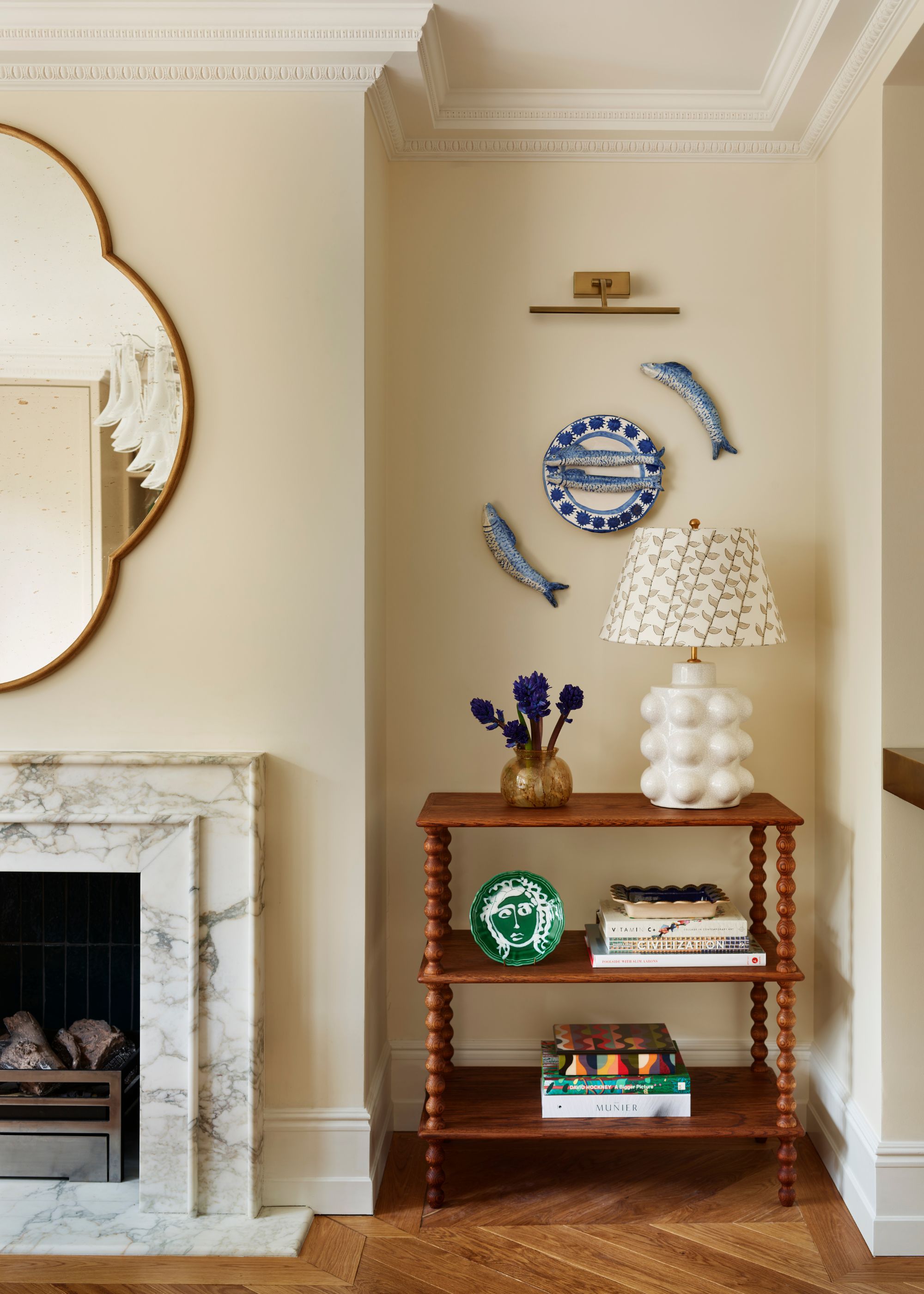
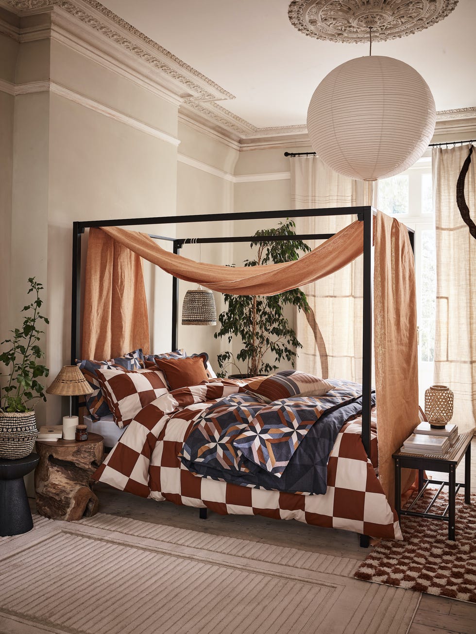
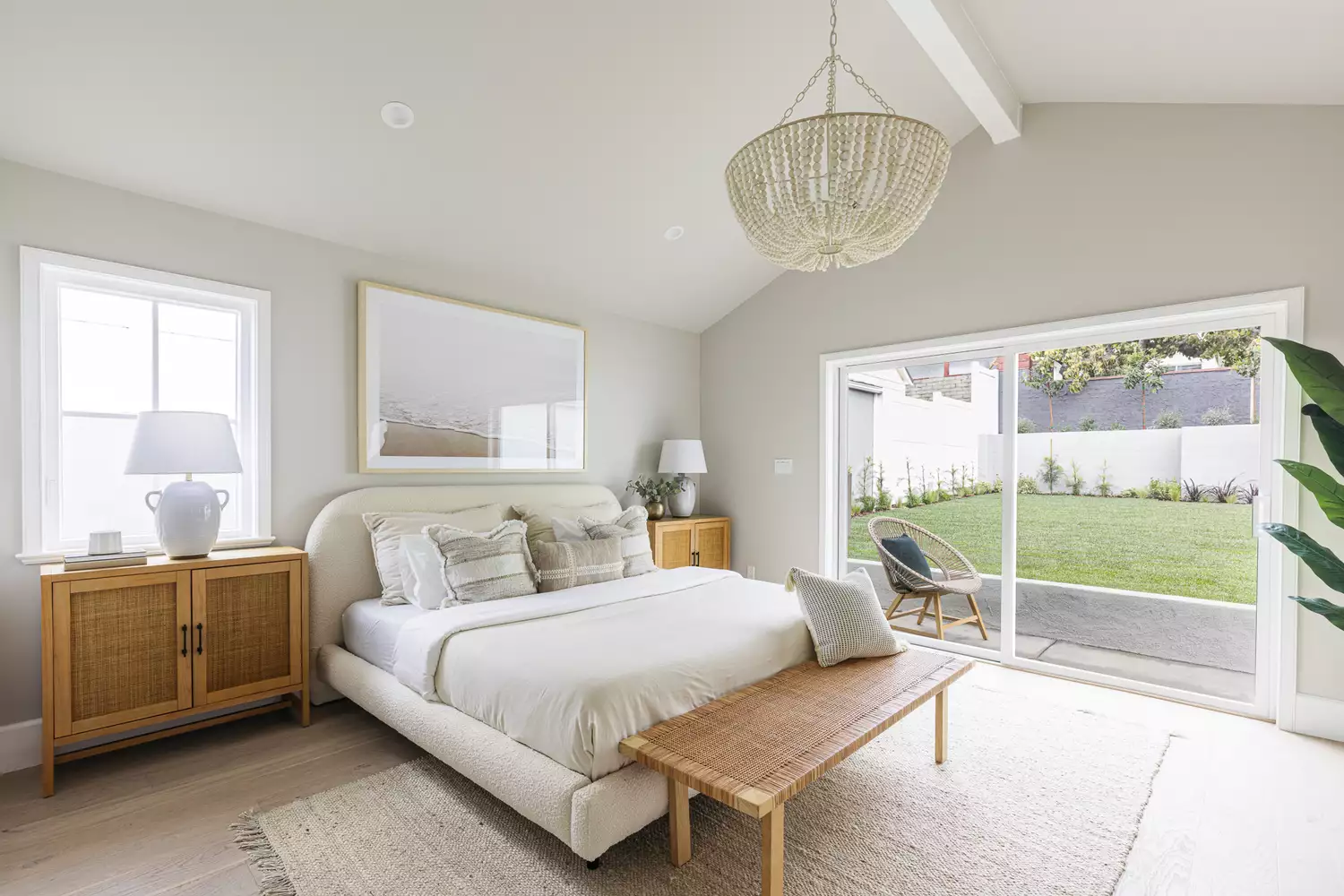
For those preferring light and airy neutrals, Sherwin Williams' "Sunbleached" is a creamy option that adds color without being overwhelming. It blends seamlessly with woven fabrics and light wood tones, providing a cozy, sophisticated, and nomadic feeling. Benjamin Moore's "Oyster" offers a versatile neutral that delicately balances gray, beige, and white. Its enveloping quality feels grounding, like early morning fog, and it pairs well with both cool and warm accents, ensuring longevity as tastes evolve.
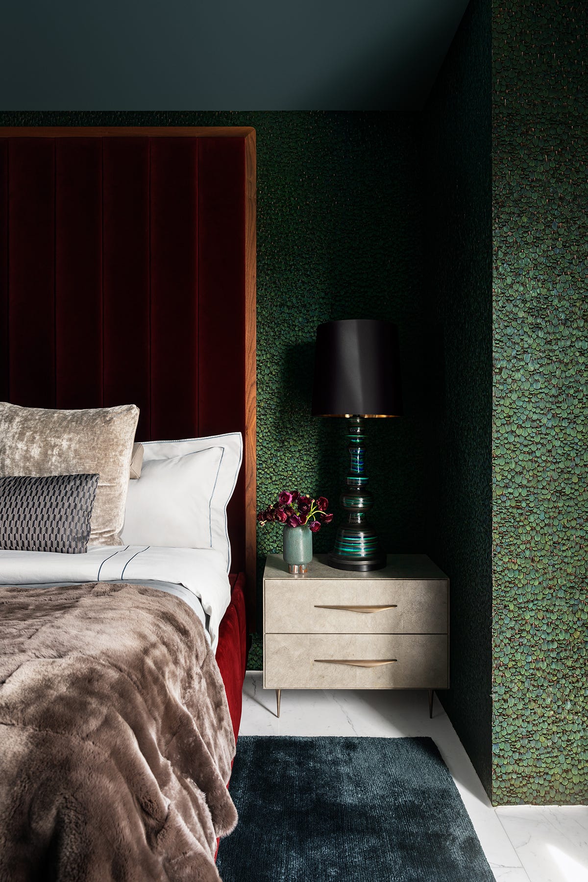
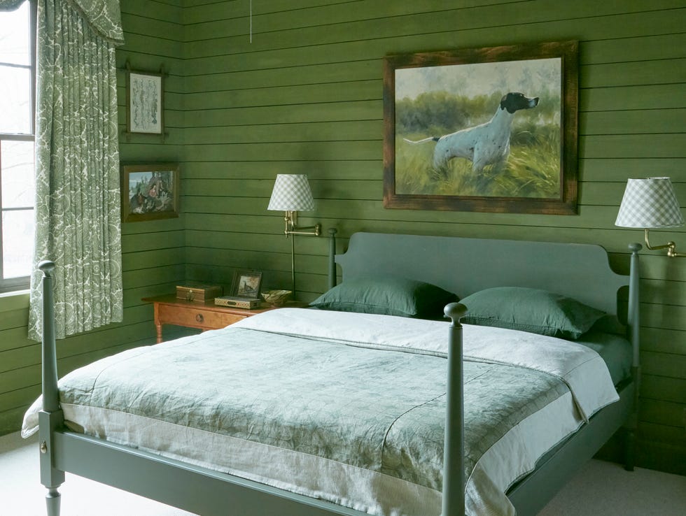
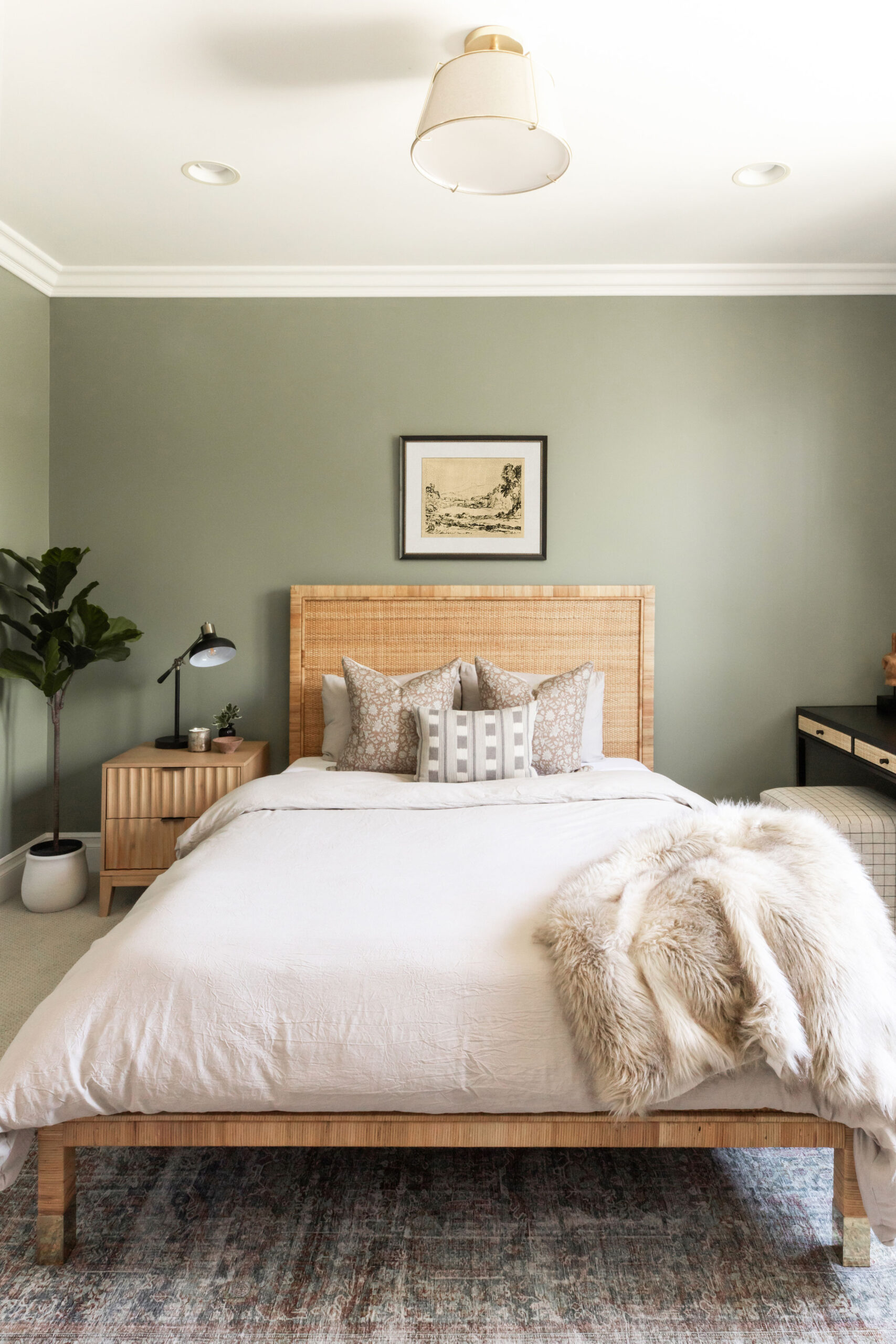
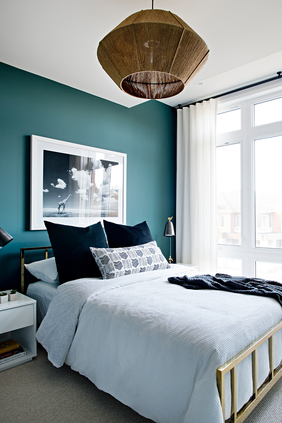
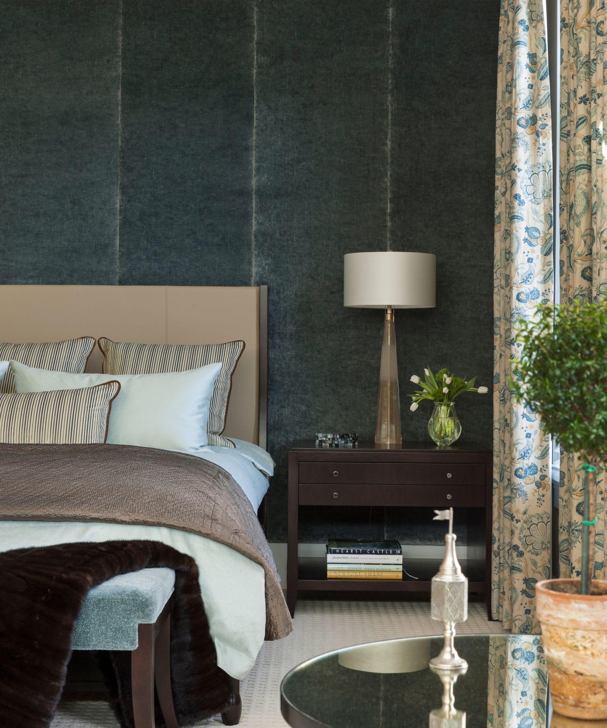
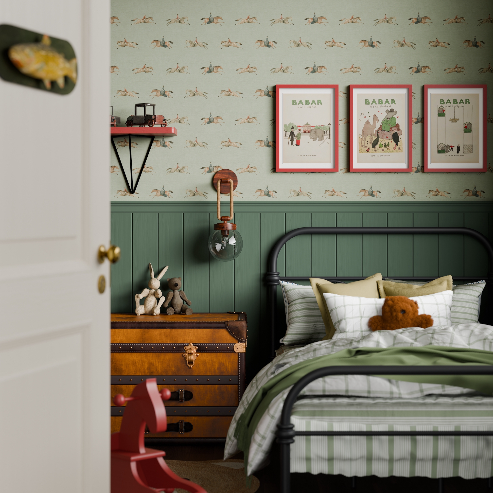
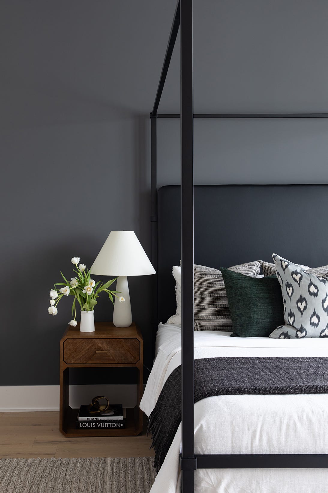
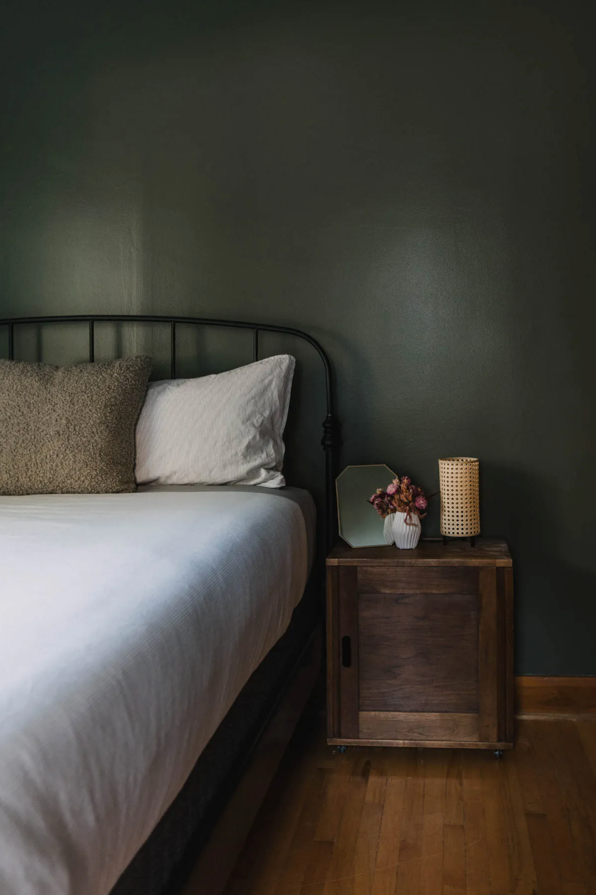
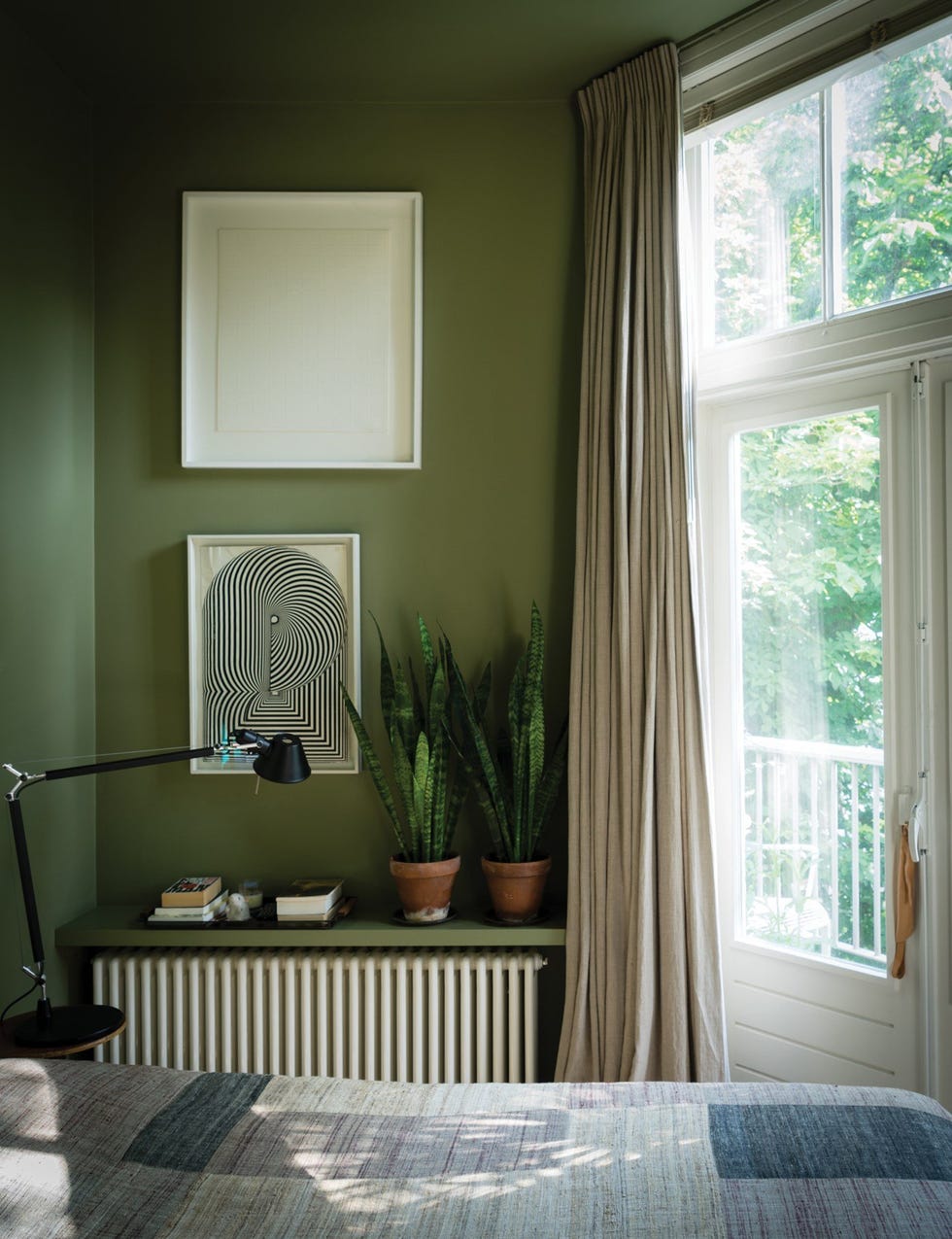
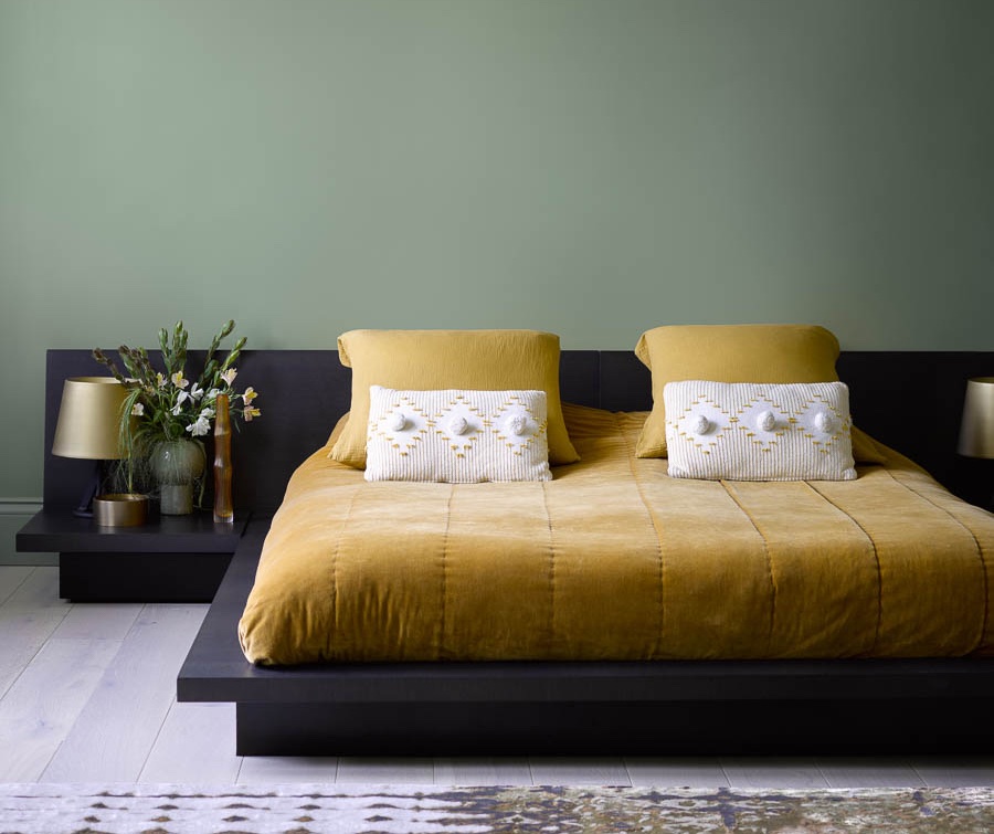
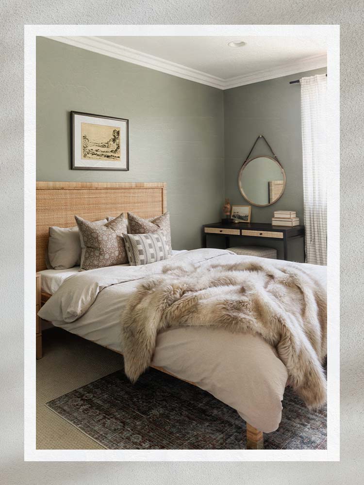
Green, a naturally calming hue, is another excellent choice for bedrooms. Farrow & Ball’s "Sage Green" is a subtle, muted tone that brings a touch of nature indoors, promoting a calm and relaxing atmosphere. For a richer, saturated option, Benjamin Moore’s "Evening Dove" combines navy and charcoal, exuding a relaxing vibe ideal for those with darker floors or carpeting. Sherwin Williams' "Sea Salt" masterfully balances green and blue, creating an organic and calming environment that helps reduce daily stresses and facilitates relaxation, as observed in guest feedback from projects utilizing this color.
Benjamin Moore's "Cloud White," despite its name, is a buttery, yellow-leaning hue that imparts a sun-soaked feel and a sense of calmness and softness, making one feel as though they've entered the clouds for a peaceful night's sleep. For a non-traditional yet effective option, Benjamin Moore’s "Purple Cream" offers a muted lilac tone that blends cool tranquility with warmth, providing a calming element distinct from standard blues and greens. Lastly, Benjamin Moore's "Gray Owl" is a light gray with warm undertones, offering a refreshing yet soothing atmosphere. This neutral color is versatile for both dark and light, north or south-facing rooms, and harmonizes well with various color combinations in the bedroom.
#BedroomPaintColors #InteriorDesign #SleepEnvironment #CalmingHues #HomeDecor #PaintSelection #ColorPsychology #DesignTips #BedroomPaintColors #InteriorDesign #SleepEnvironment #CalmingHues #HomeDecor #PaintSelection #ColorPsychology #DesignTips
कुल 0 टिप्पणियाँ
 कोई टिप्पणी नहीं
आपको यह भी पसंद आ सकता है
5 Paint Colors That Will Help You Sleep Better if You Use Them in Your Bedroom

The Best Bedroom Colors to Help You Sleep (And Wake Up Happy)

18 dreamy bedroom colour ideas to create a rest-promoting, stylish space
5 Bedroom Paint Colors That Could Be Ruining Your Sleep

5 colors that will make your bedroom feel calmer, according to designers
These Designer-Approved Bedroom Paint Colors Are the Key to the Best Sleep of Your Life

20 Bedroom Color Schemes for a Cozy and Calm Sleep Sanctuary, All Picked by Designers

A Dark Bedroom Color Palette Might Be the Key to a Good Night's Rest

Best Bedroom Colors for Sleep

14 Best Bedroom Paint Colors for a Relaxing Space
13 Calming Paint Colors Designers Use to Make Rooms Feel Soothing — And No, They're Not All Neutrals
16 beautiful bedroom colour ideas and how to use them

11 Calming Bedroom Paint Colors to Help You Relax and Wind Down at the End of the Day

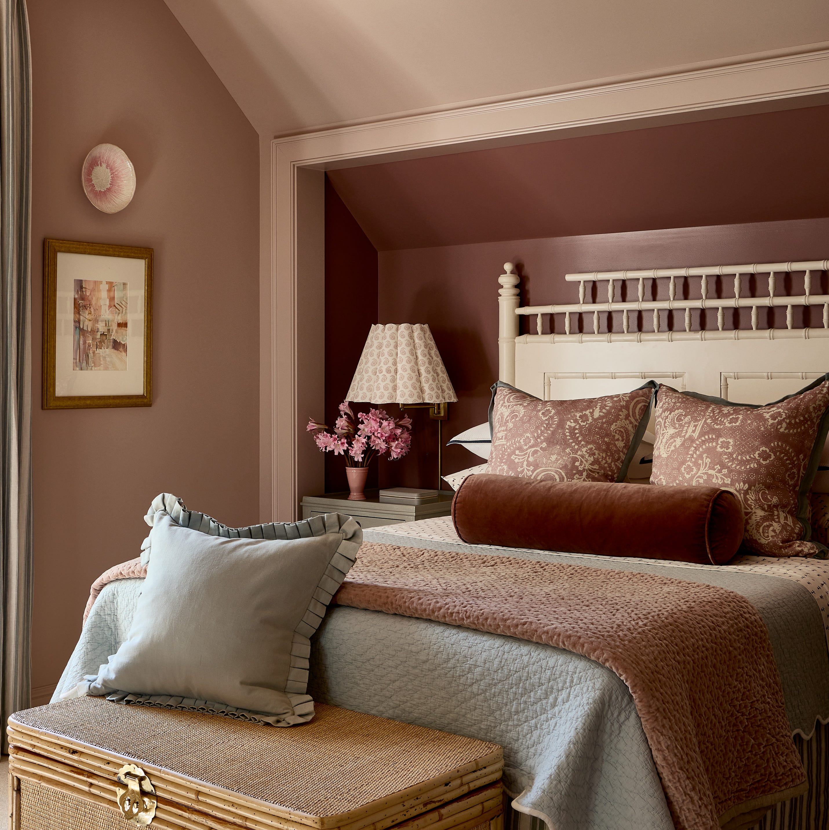
Designer-Approved Bedroom Paint Colors That'll Help You Wake Up Happier
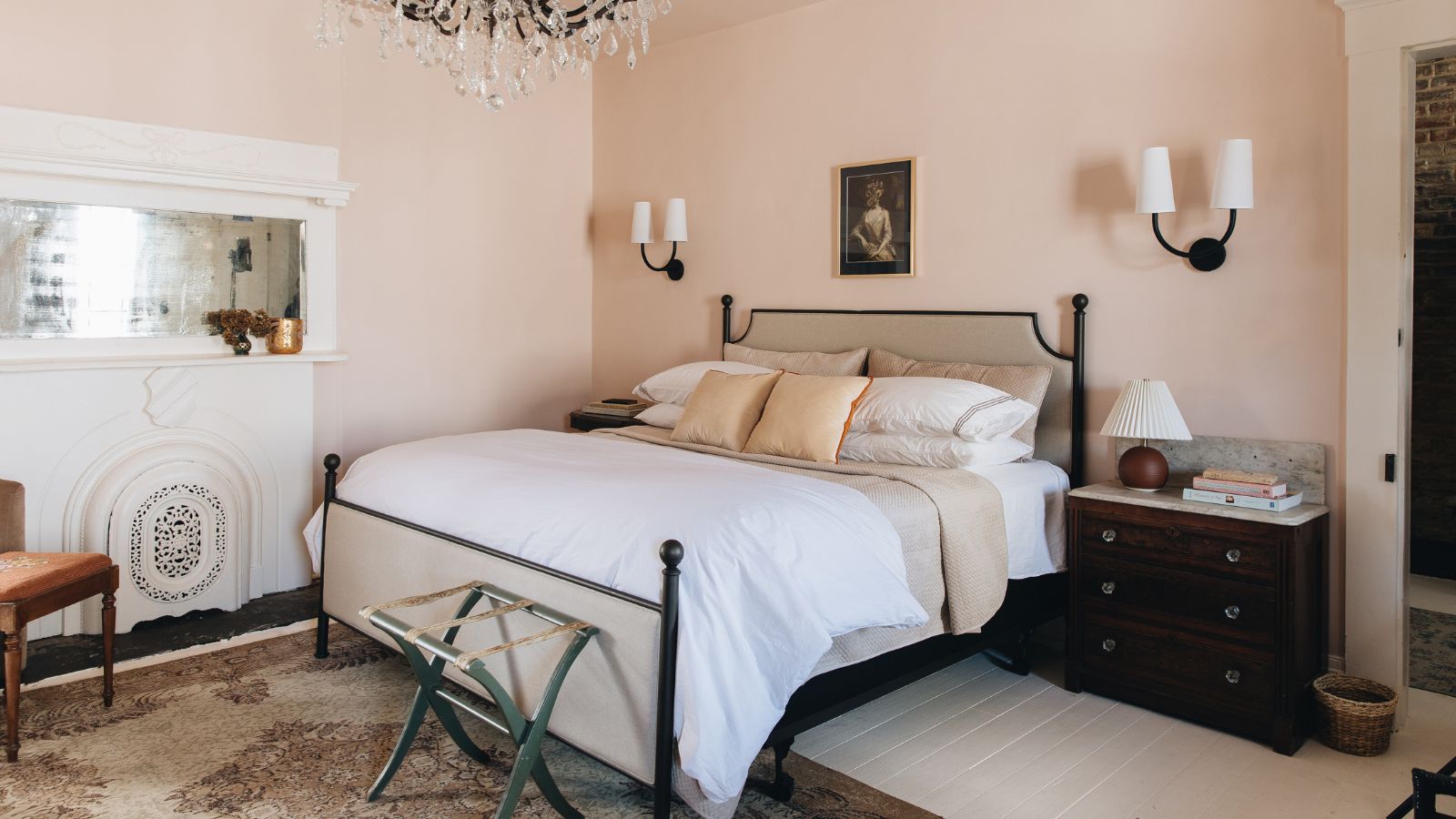
10 designers on the bedroom colors they always recommend
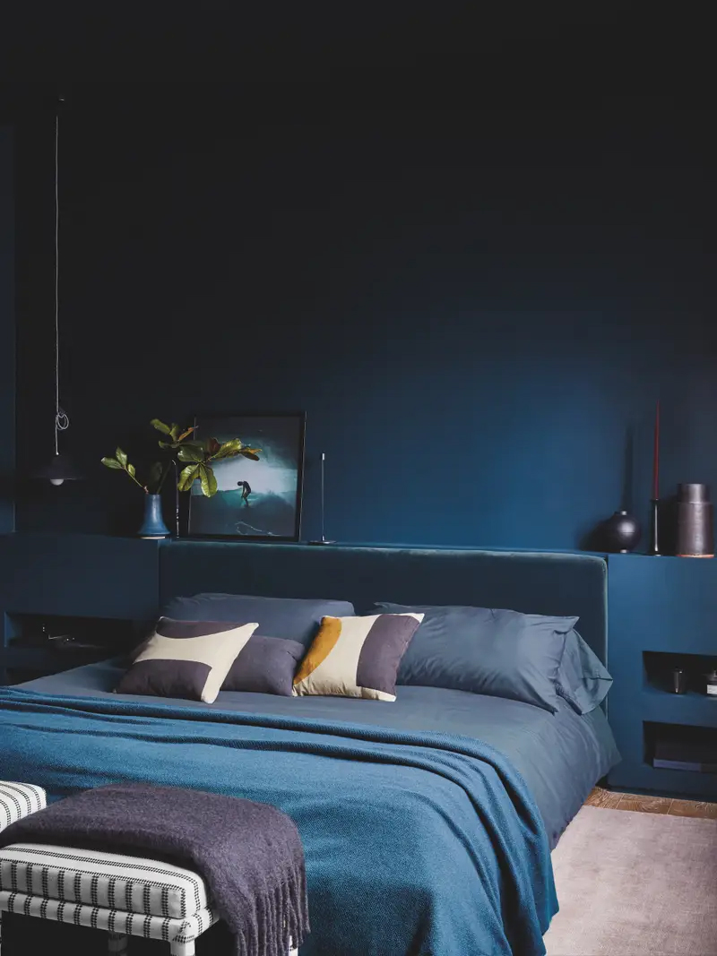
The Paint Trend That’s Arguably Helping Us Sleep Better

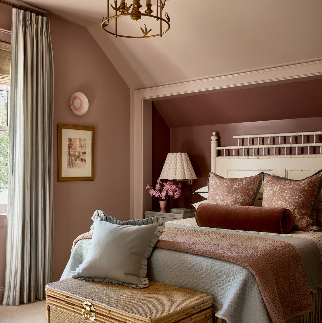
You Can Wake Up HAPPIER Just by Painting Your Bedroom—Here Are the Colors Designers Love
The Best Bedroom Paint Colors for Unwinding at Night

The best calming colours for kids' bedrooms to create a soothing and stylish scheme for little ones

6 Paint Colors You Should Never Use in Your Bedroom, According to Interior Designers