1/14
Your Interior Doors Don’t Need to Be Stark White—Designers Love These 11 Rich Hues
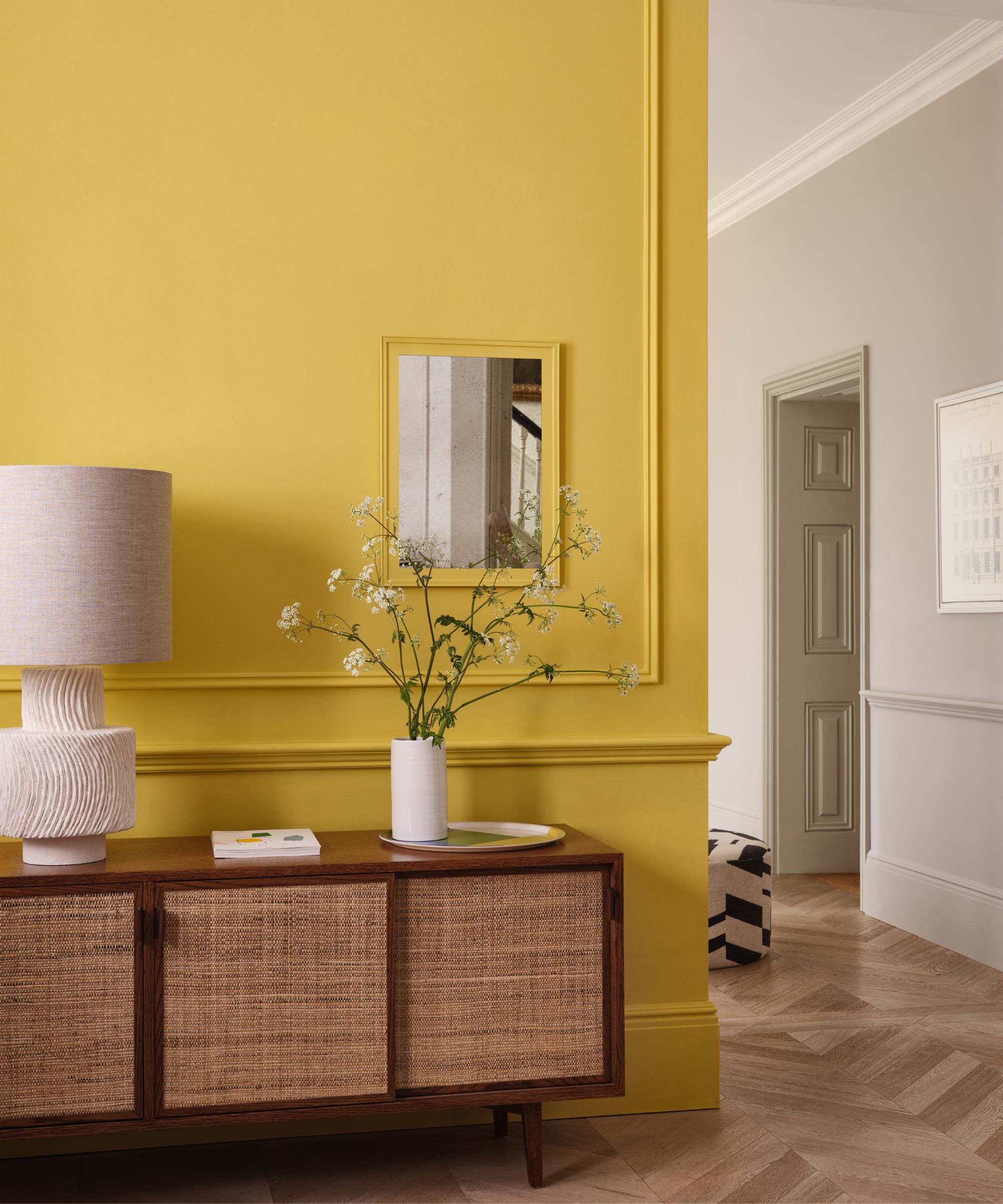
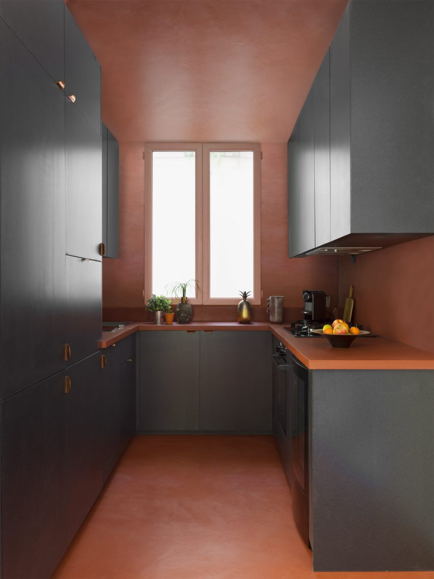
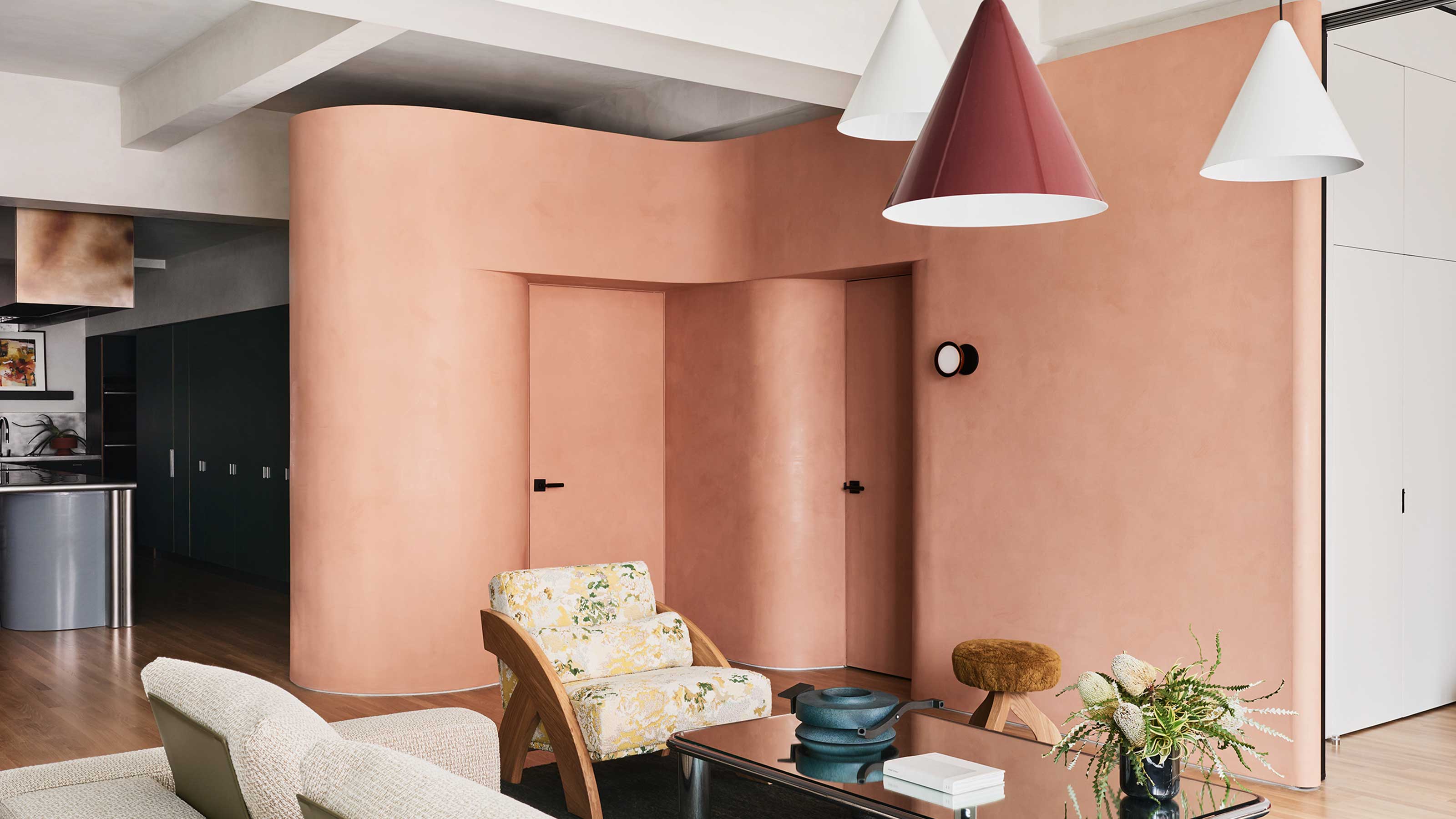
Interior doors, traditionally painted stark white, are increasingly being recognized by designers as an opportunity to add character and personality to a space. Instead of white, experts are opting for a range of dynamic neutrals, including warm beiges, rich green-grays, and subtle browns, to create a more intentional and cohesive aesthetic within a home. These alternative hues can significantly impact a room's atmosphere, providing depth and a sense of sophistication without overpowering the overall design.
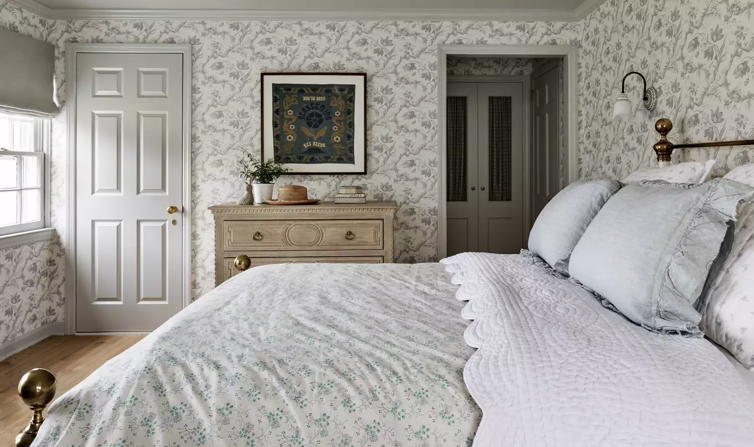
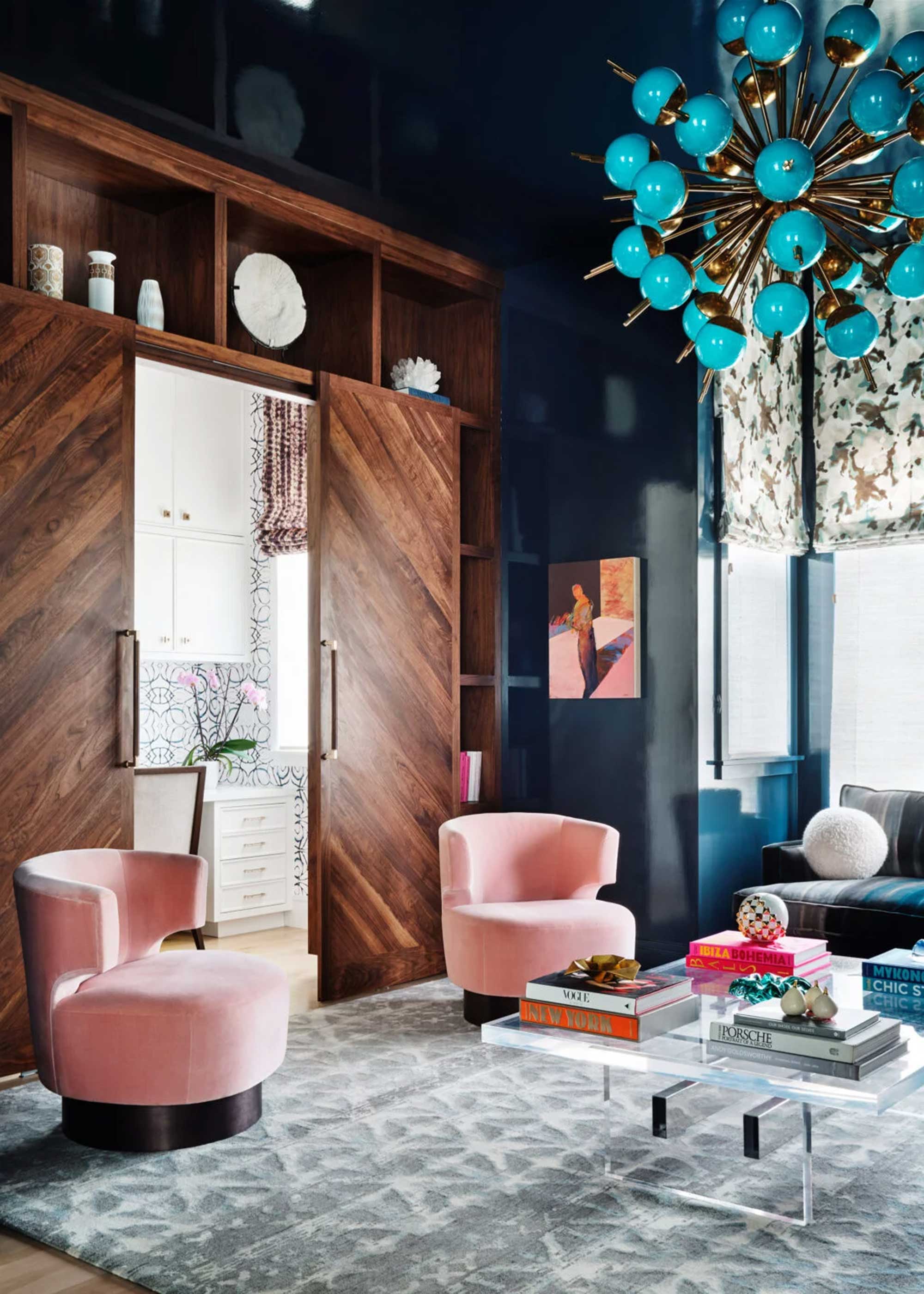
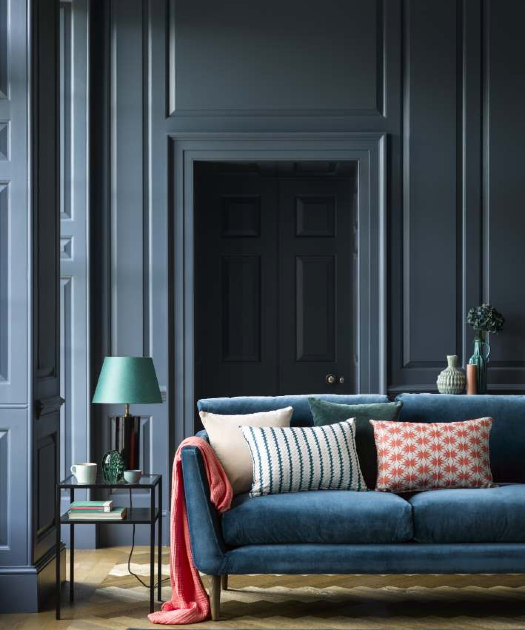
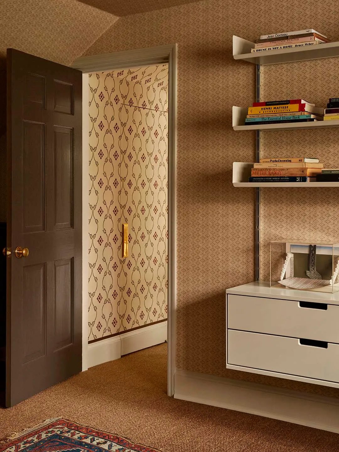
Michelle Ficker, cofounder of Studio Dorion, highlights the transformative effect of moving away from white, noting how a rich color like Benjamin Moore’s Branchport Brown can elevate a historic home. Designers suggest various applications for these colors, from painting only the door to matching it with walls and trim for a color-drenched effect, which Amr Samaha explains helps reduce visual clutter and makes a space feel more expansive. This trend is also practical, as painting interior doors is considered a DIY-friendly update. Iona Graham from Graham & Brown offers straightforward advice for the painting process, including preparing the door by cleaning, drying, sanding, and wiping it before applying paint, and recommending specific tools for different door types.
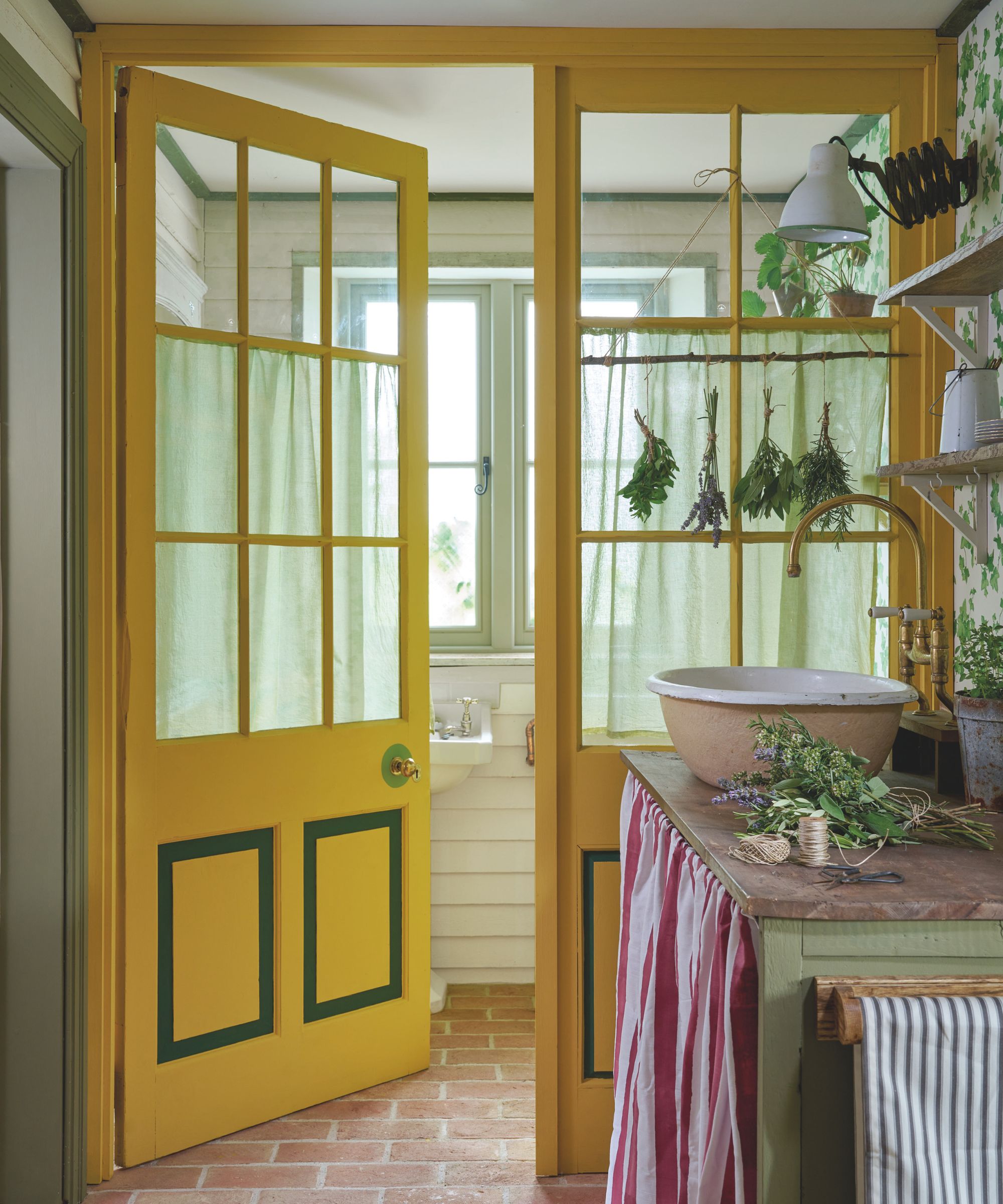
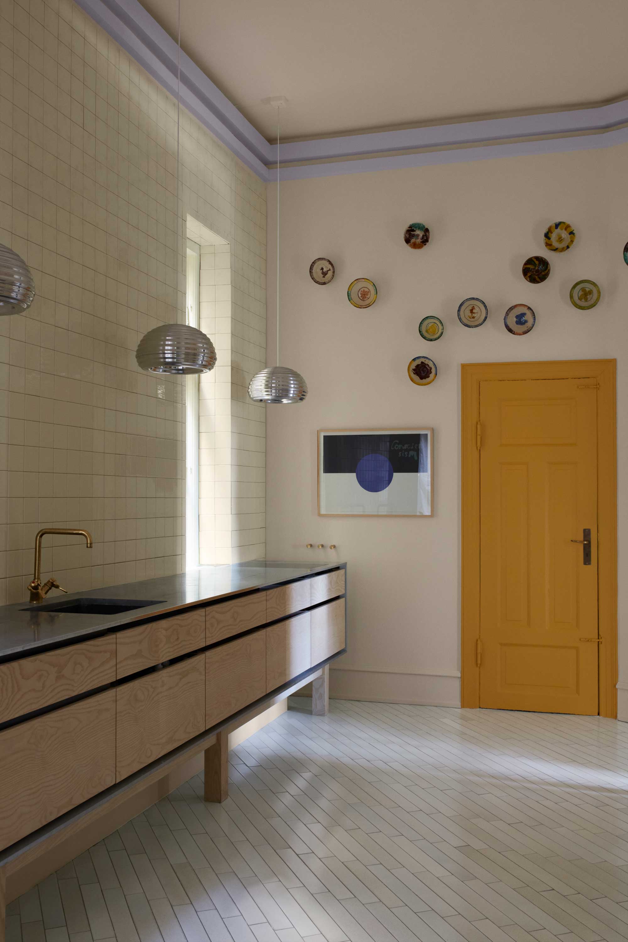
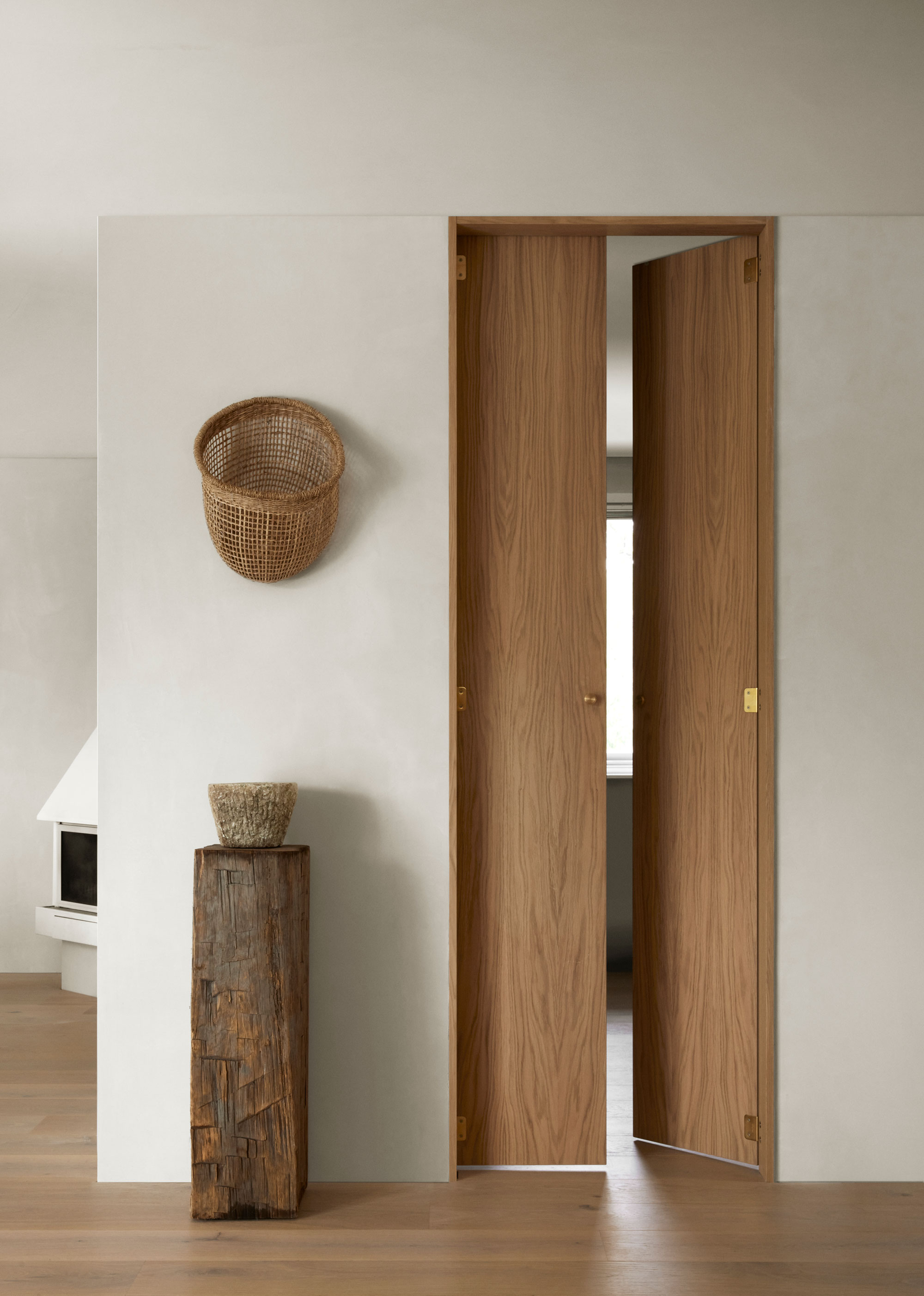
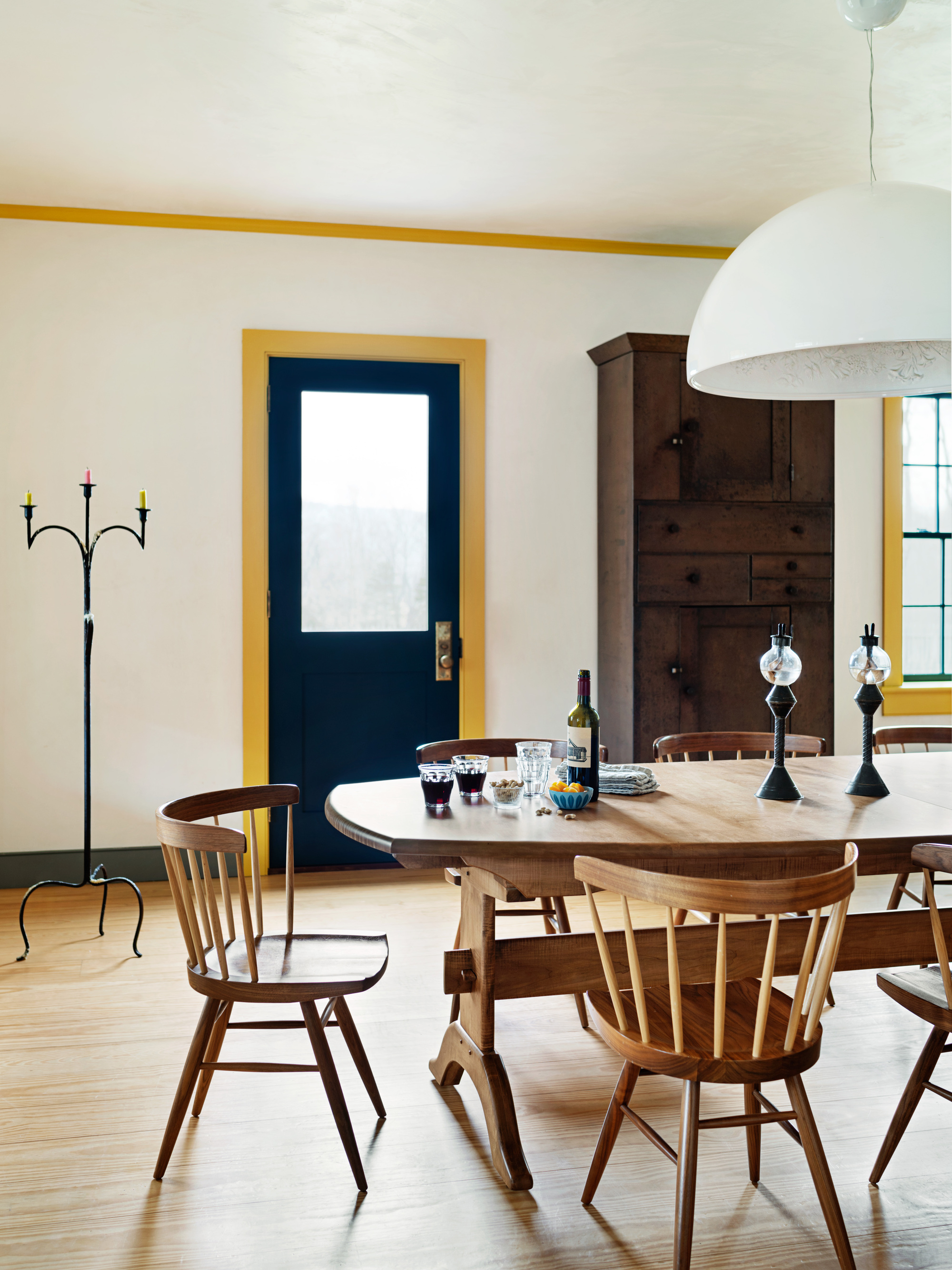
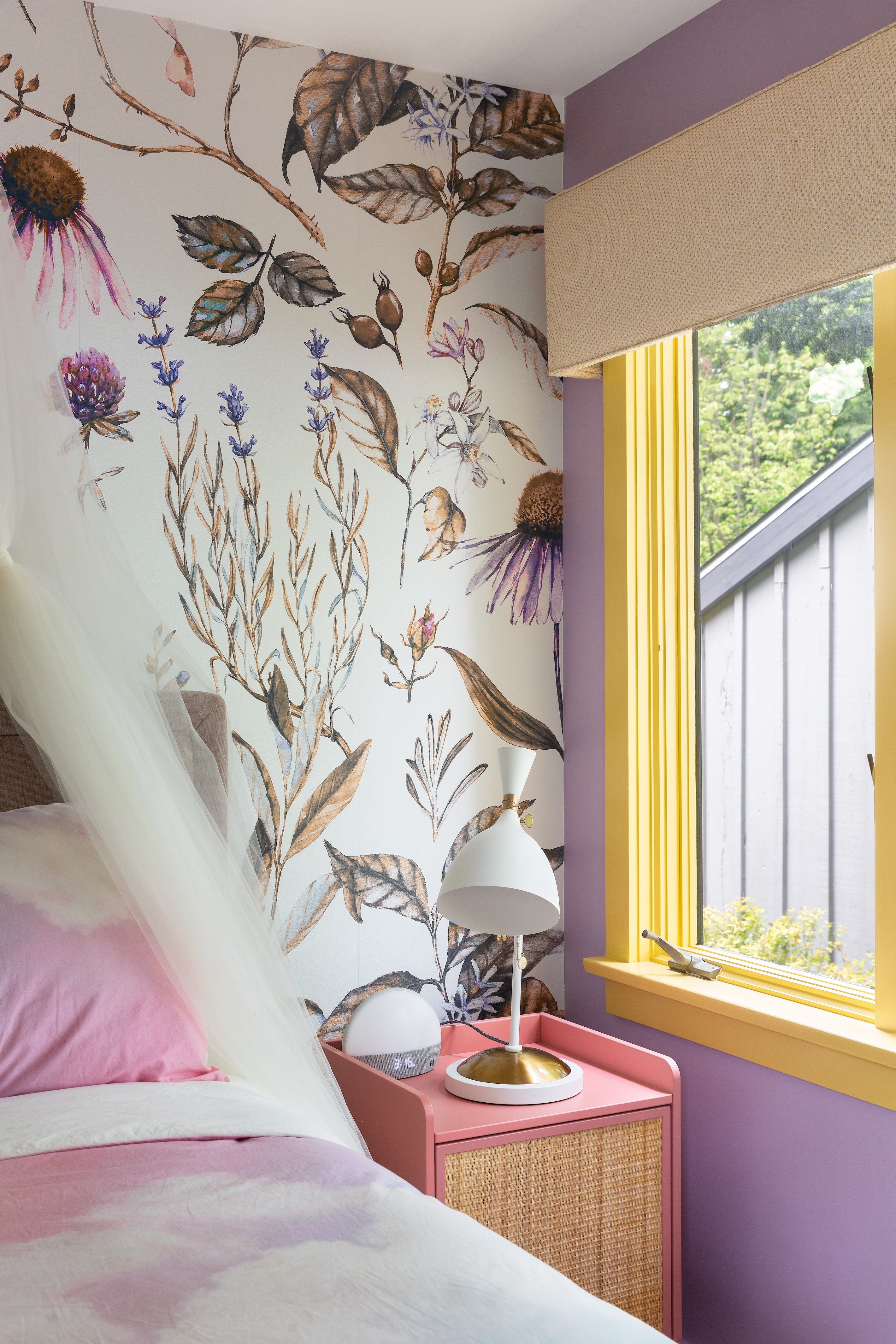
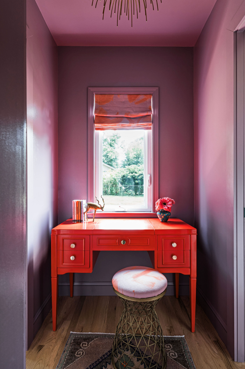
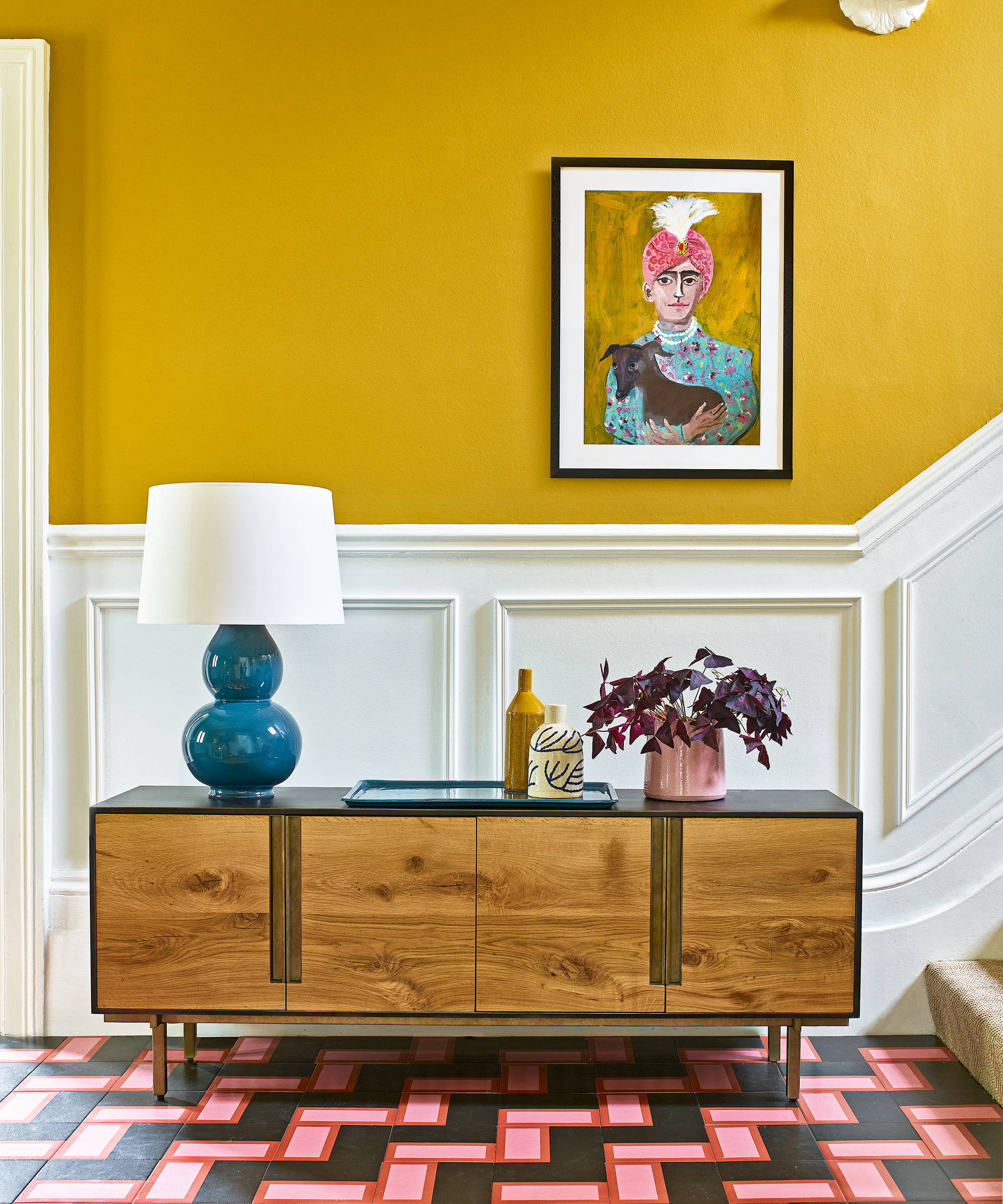
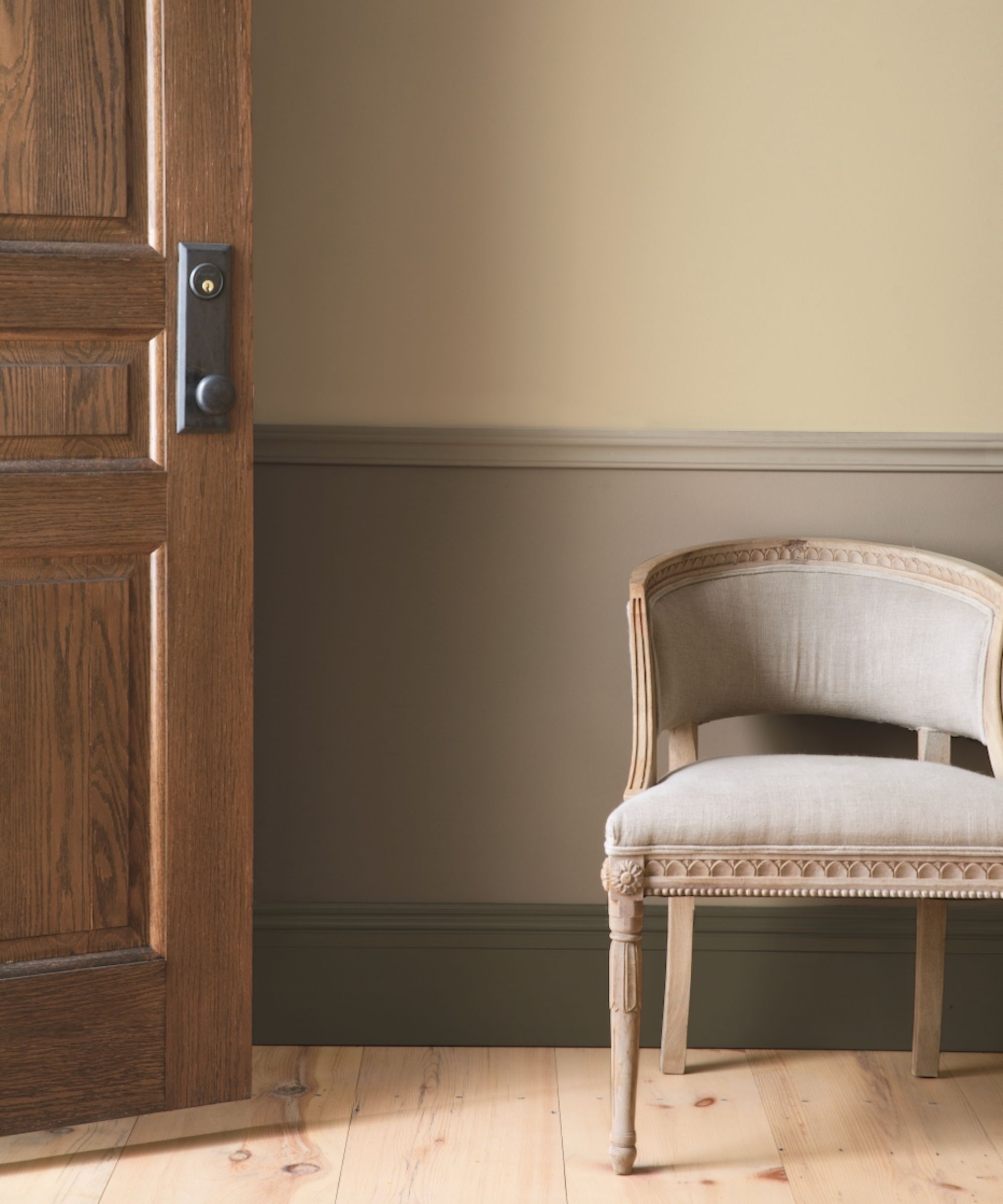
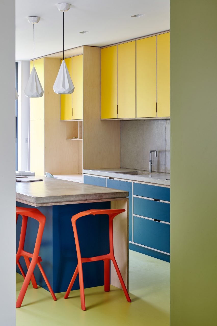
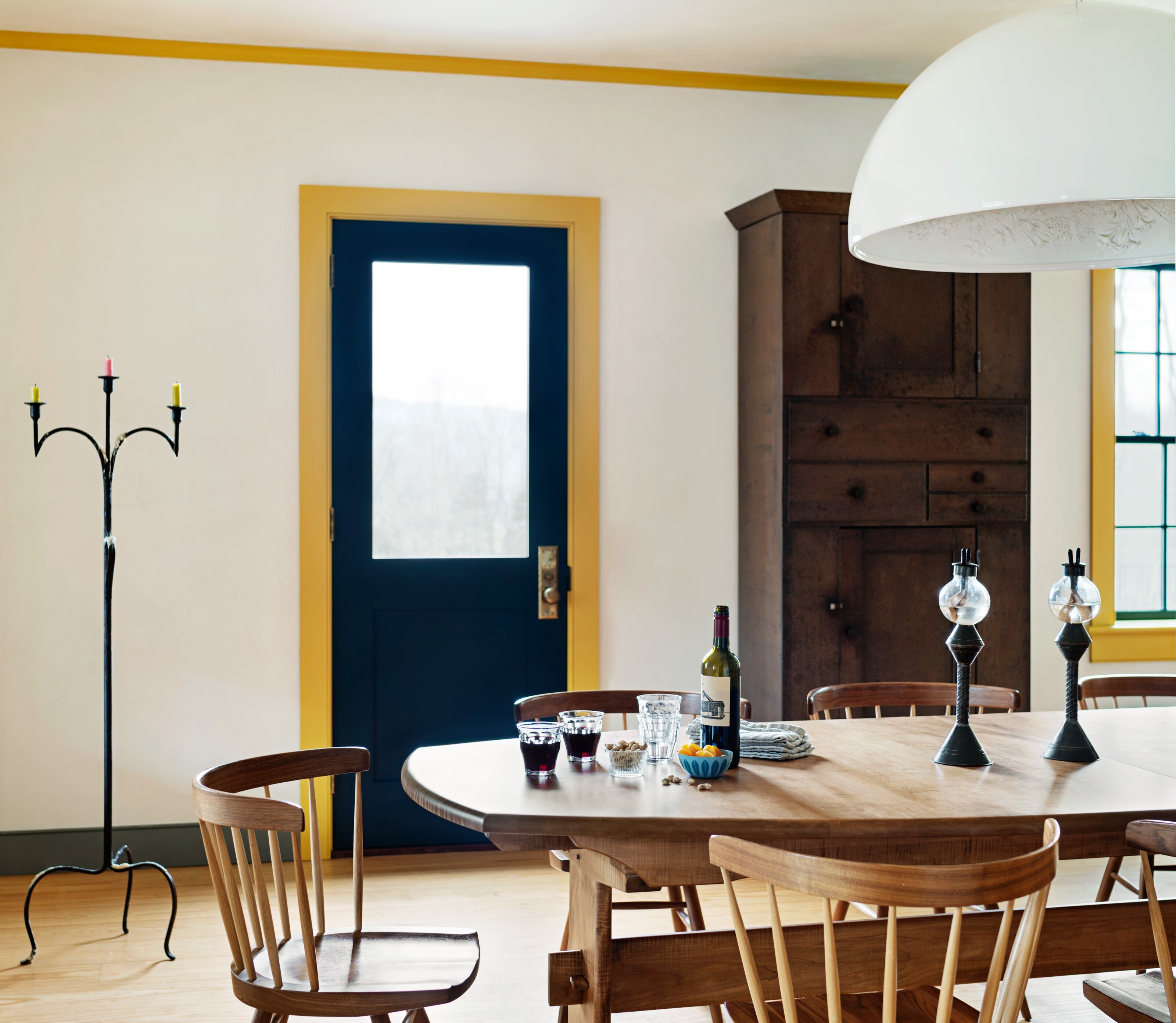
Eleven professional designers share their preferred non-white paint colors for interior doors, offering a diverse palette of suggestions. Annie Downing recommends Farrow & Ball’s Brinjal, a warm aubergine, for its surprising element when paired with contrasting colors like bright yellow. Jackie Kosnett uses Benjamin Moore’s Tapestry Beige to match plaster in rooms, emphasizing its understated depth. Amanda Leigh from House of Rolison favors Benjamin Moore’s Carob, a rich, warm brown that provides depth without being too dark, often used in tonal palettes for a seamless look.
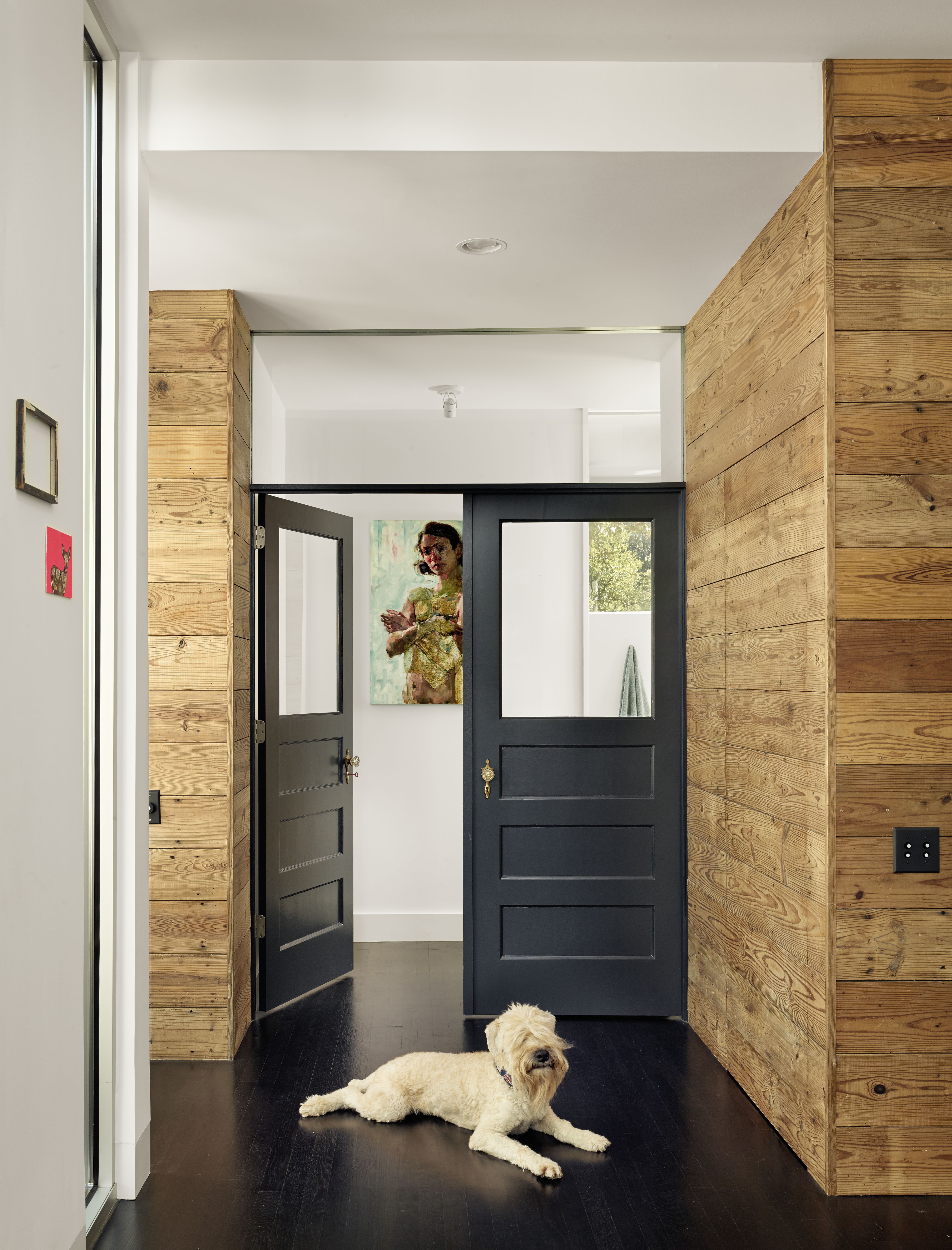
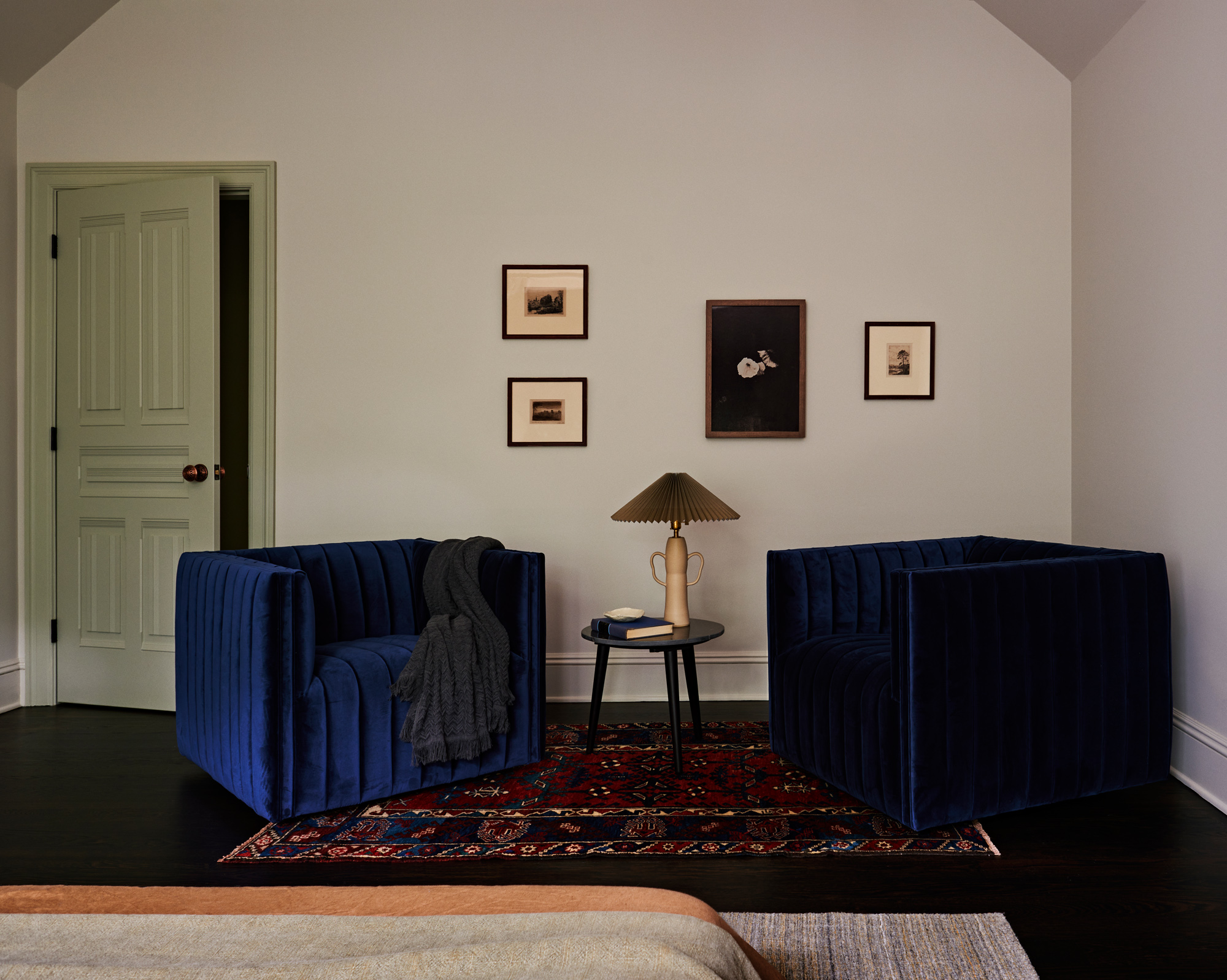
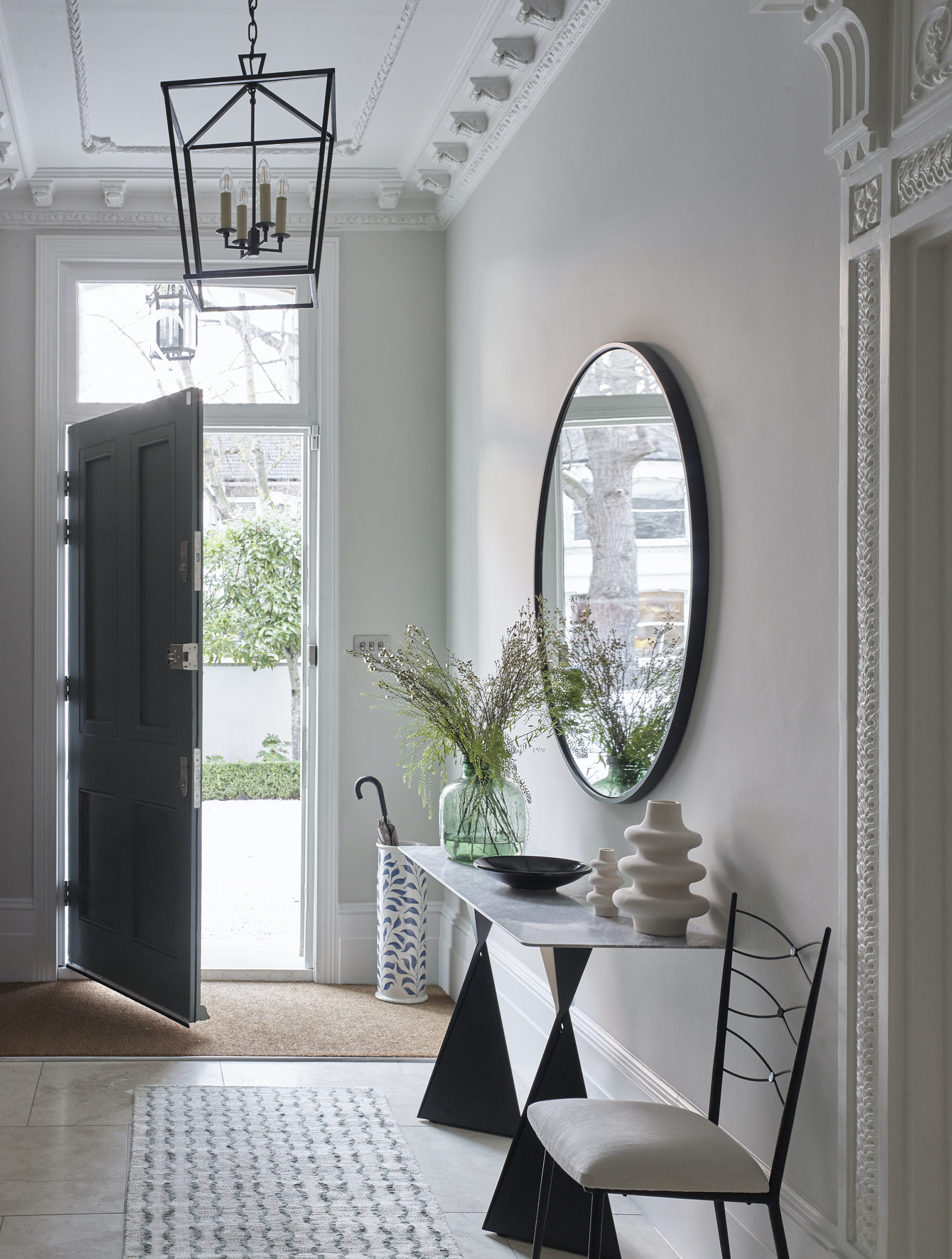

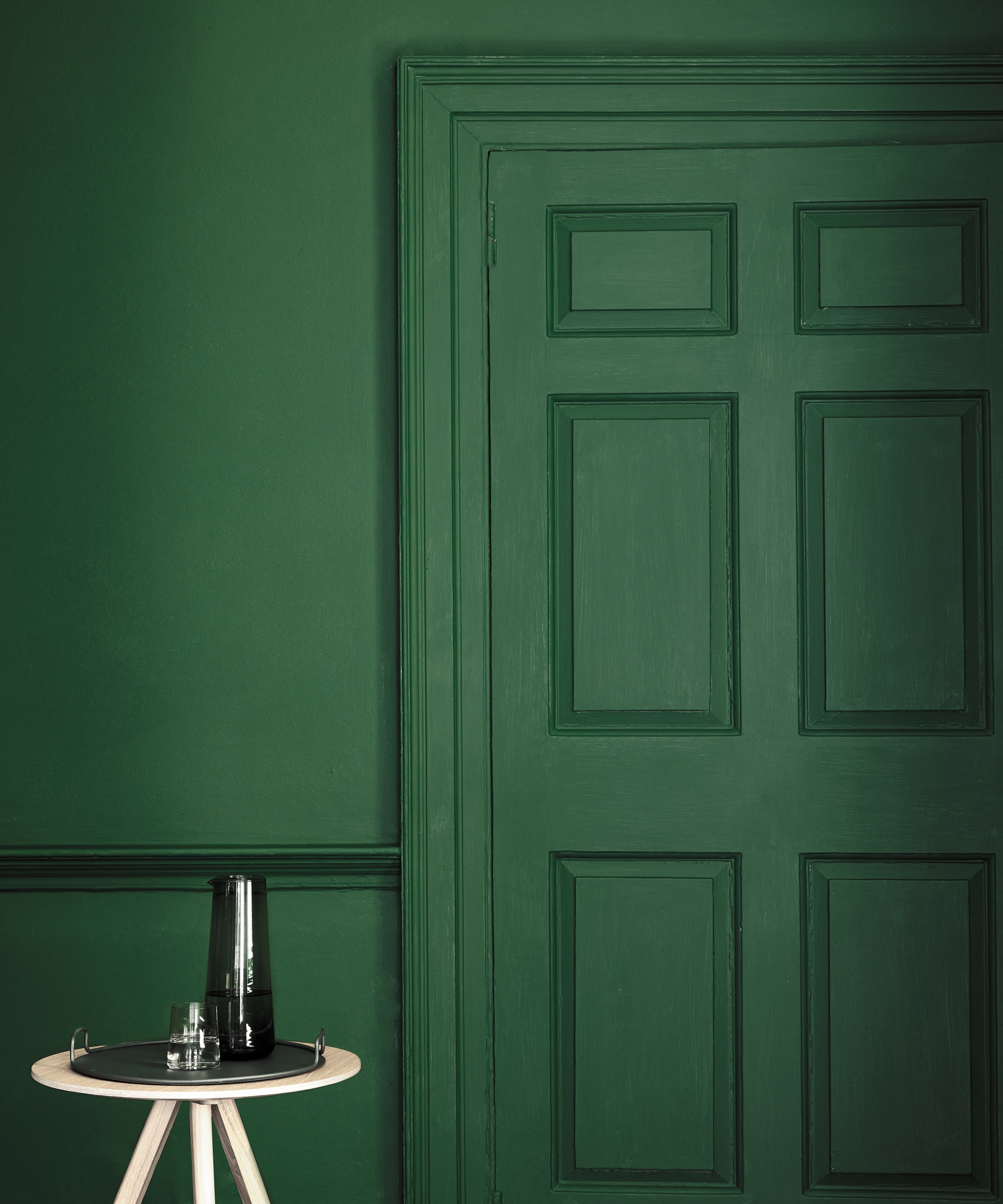
Tami Ramsay of Ramsay Nye suggests Farrow & Ball’s Down Pipe, a grounding dark gray that complements whites and neutrals. Natalie Myers, founder of Veneer Designs, often opts for Sherwin-Williams Grecian-Ivory when wood doors are not feasible, matching it with baseboards or cabinetry for consistency. Liz Hoekzema from KLH Custom Homes recommends Benjamin Moore’s Pewter for its nuanced neutrality and subtle contrast, sometimes extending it to door casings for greater impact.
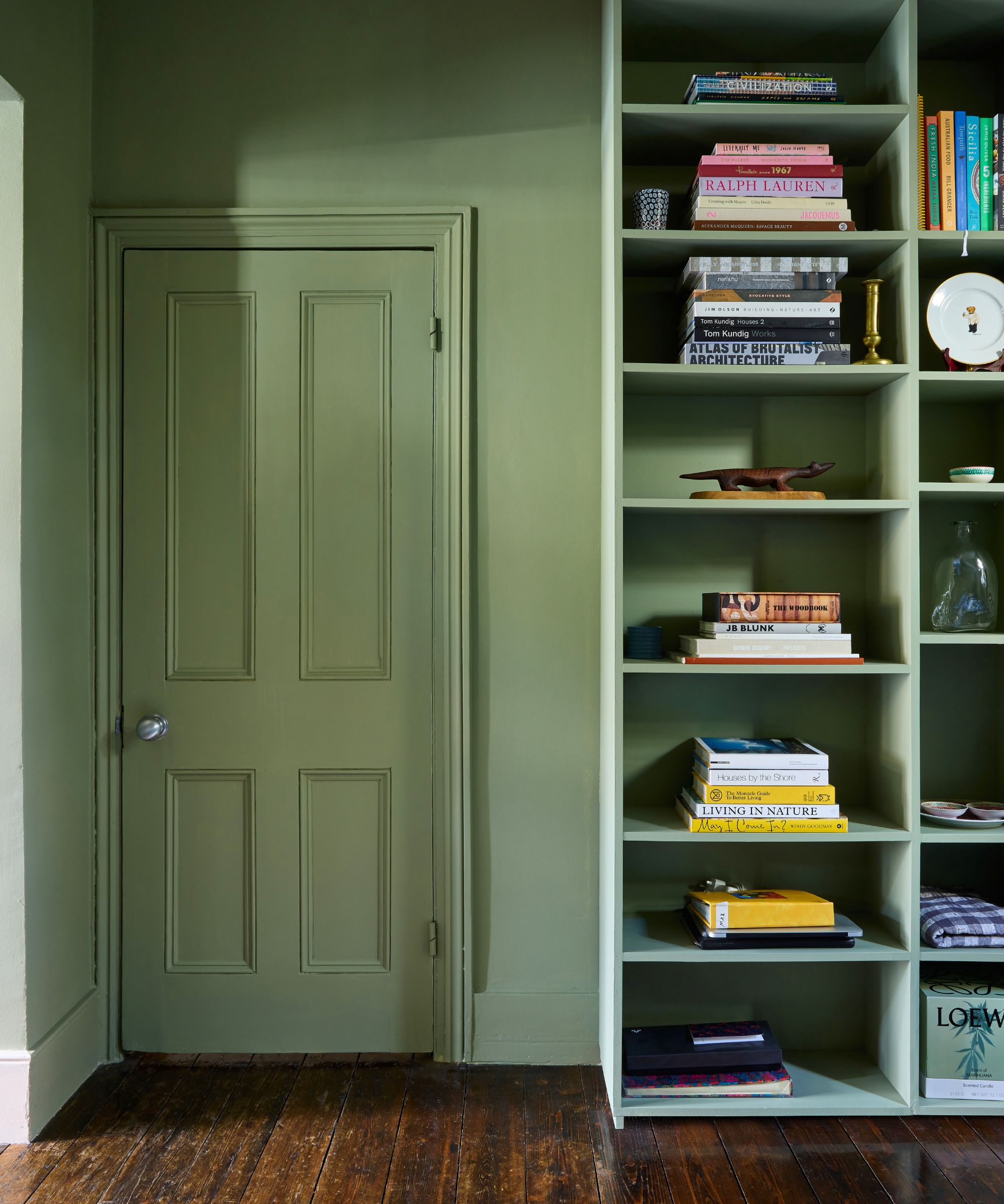
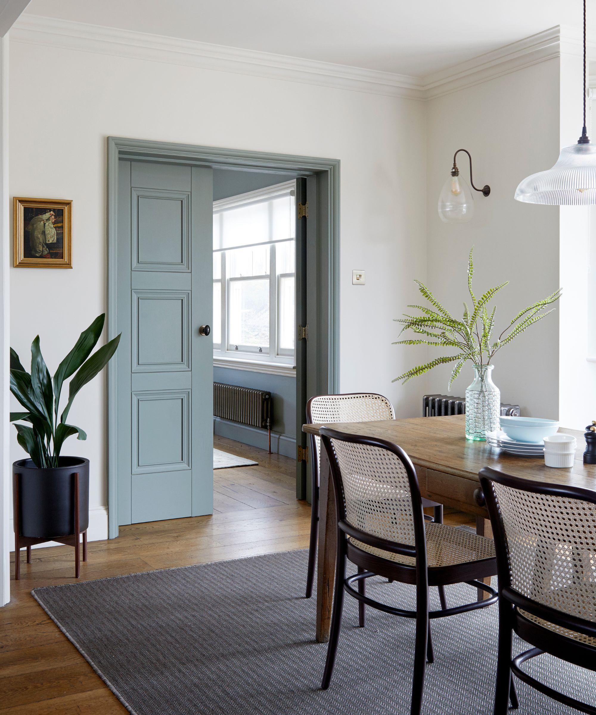
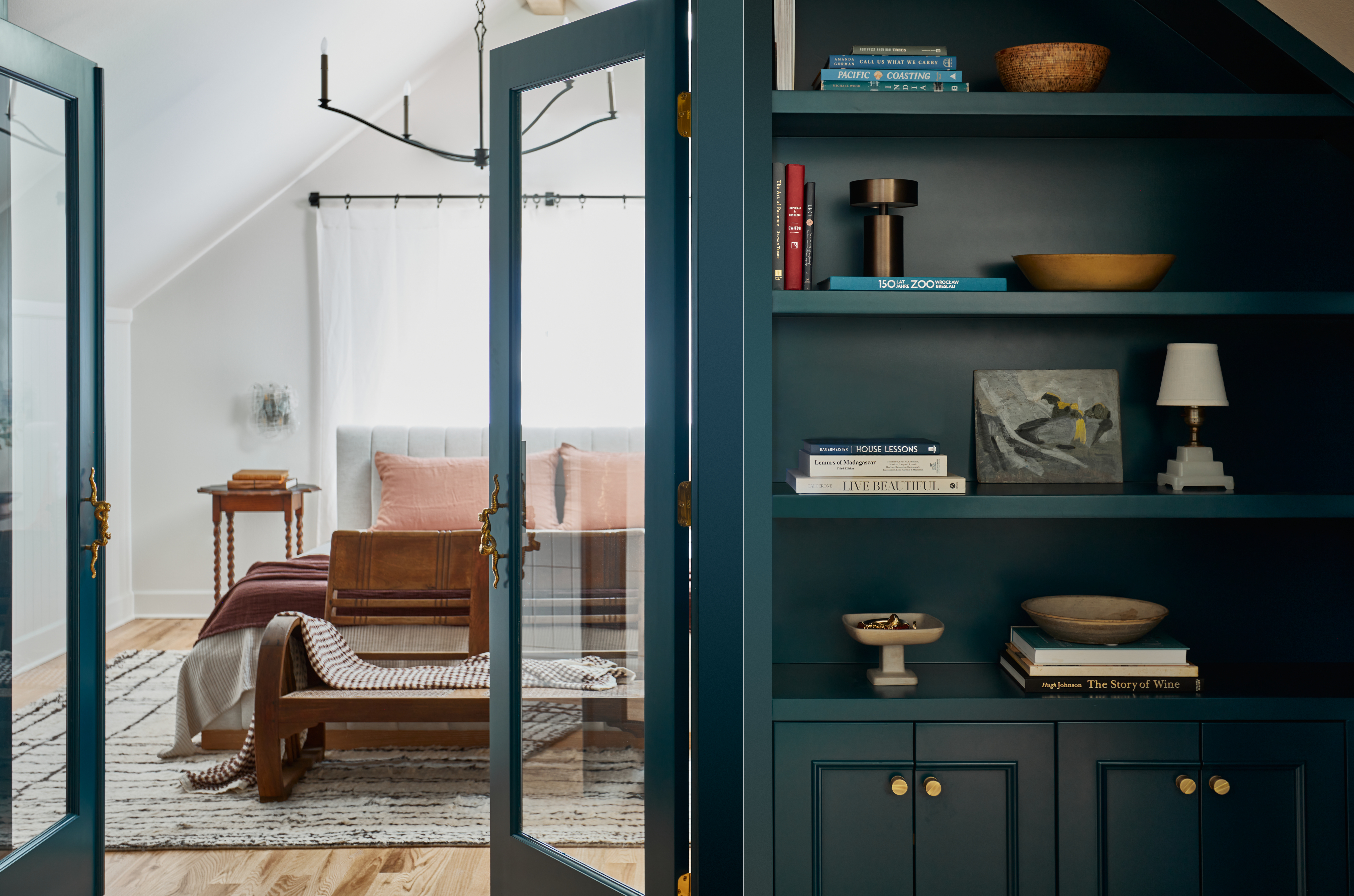
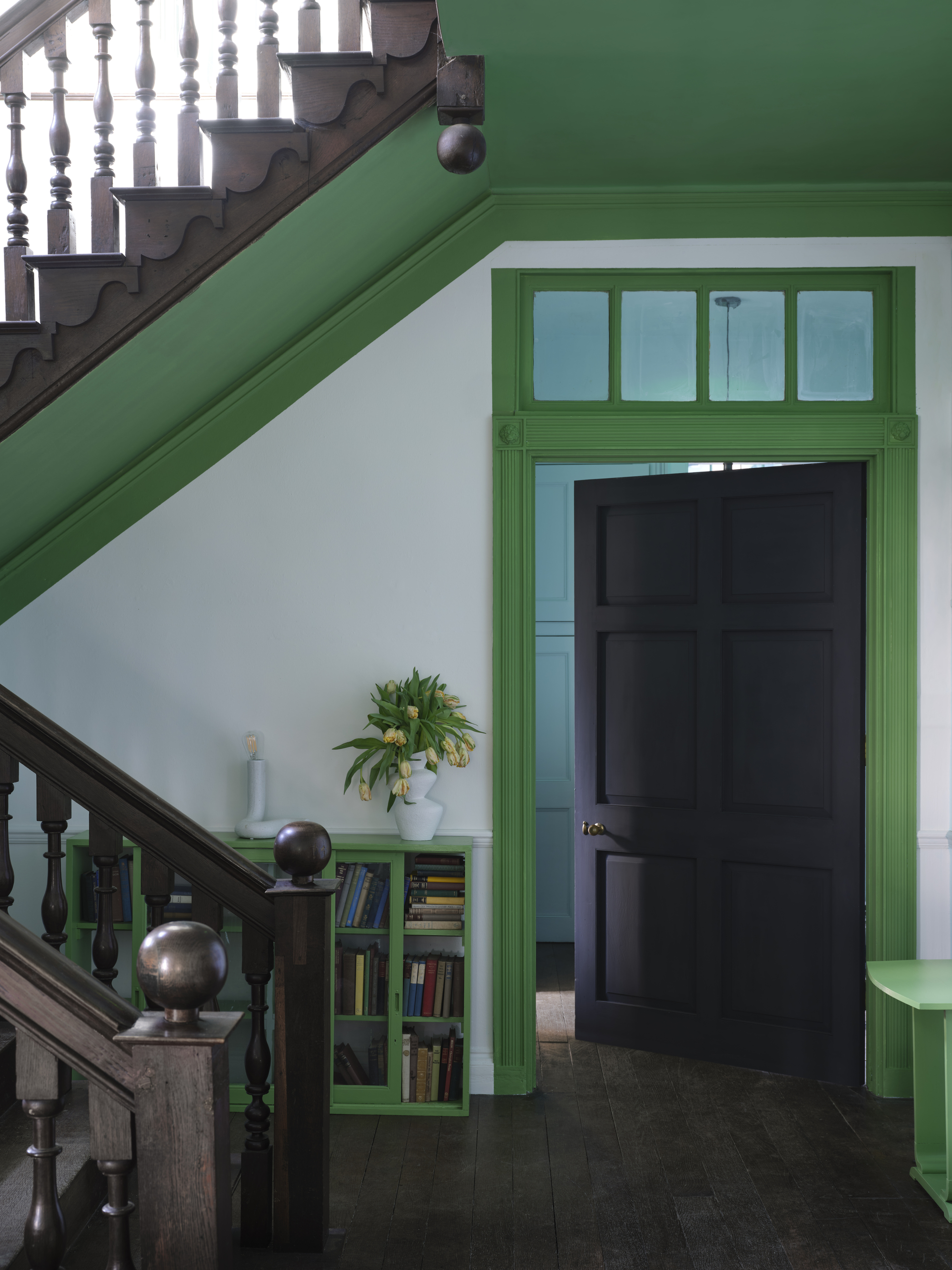
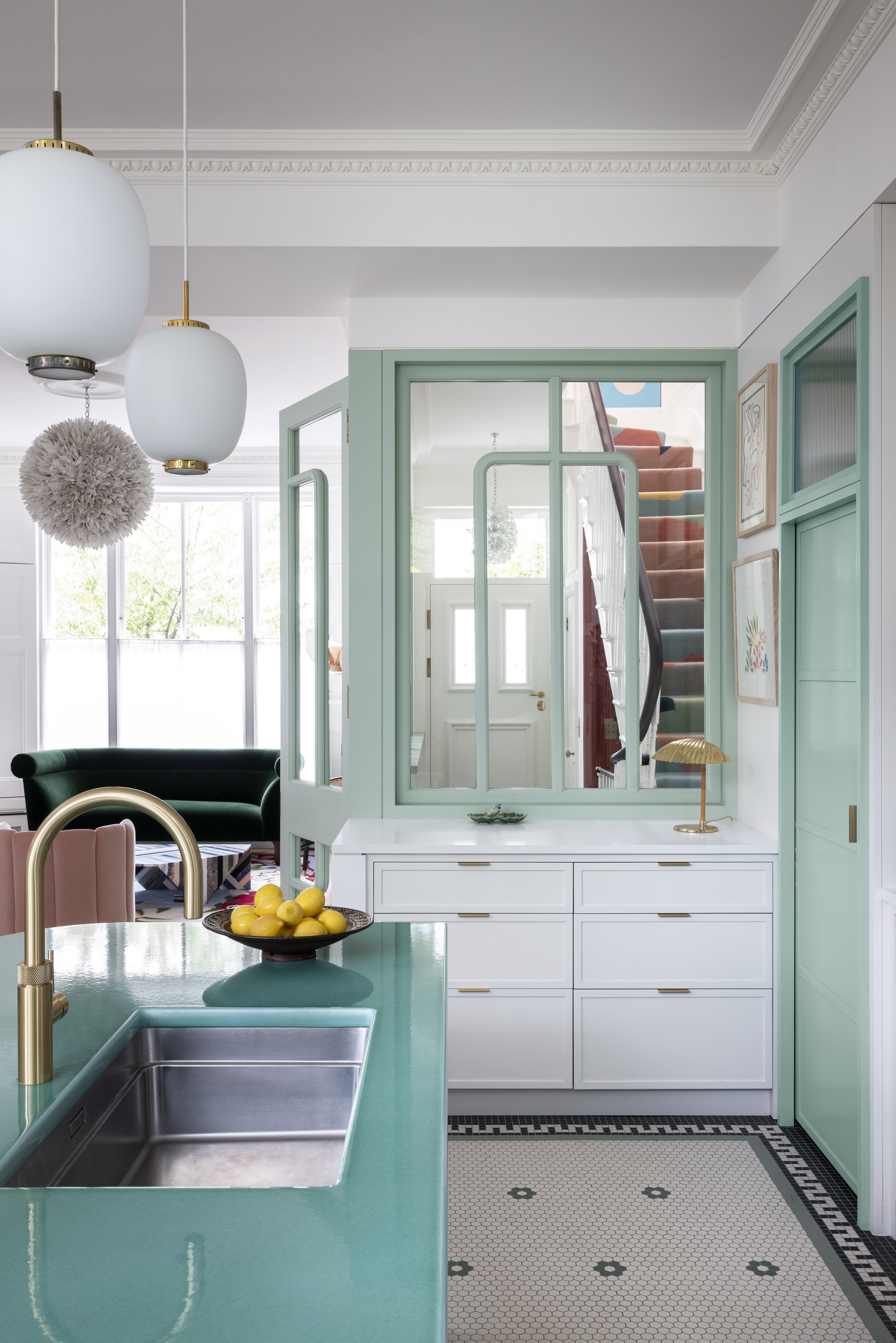
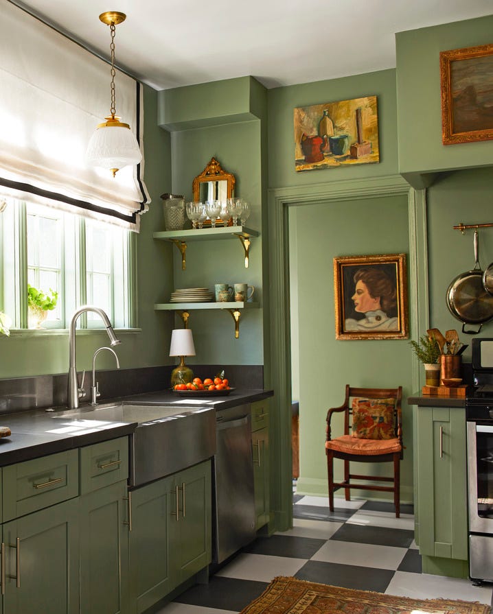
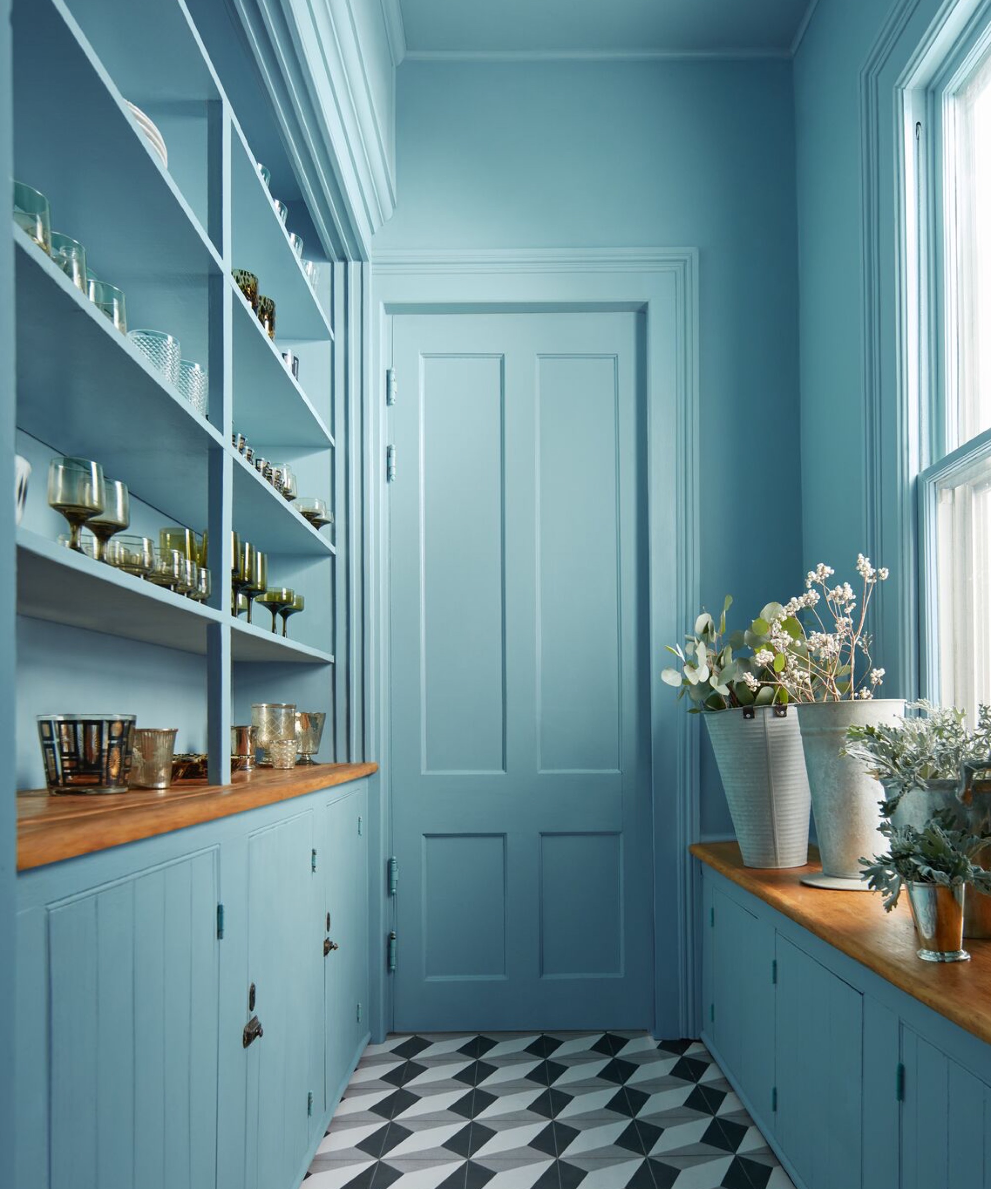
Angelica Squire of Studio Squire highlights Farrow & Ball’s Ball Green, encouraging homeowners to tie door colors to other room shades and consider painting each side of a door a different color. Steven Rodel, creative director for Guy Goodfellow Interiors & Architectural Design, praises Farrow & Ball’s French Gray for its timeless warmth and versatility, particularly in kitchens. Lindsey Colhoun of Lindsey Colhoun Design favors Benjamin Moore’s Sea Salt for its soft, muted, earthy tone that adds quiet sophistication.
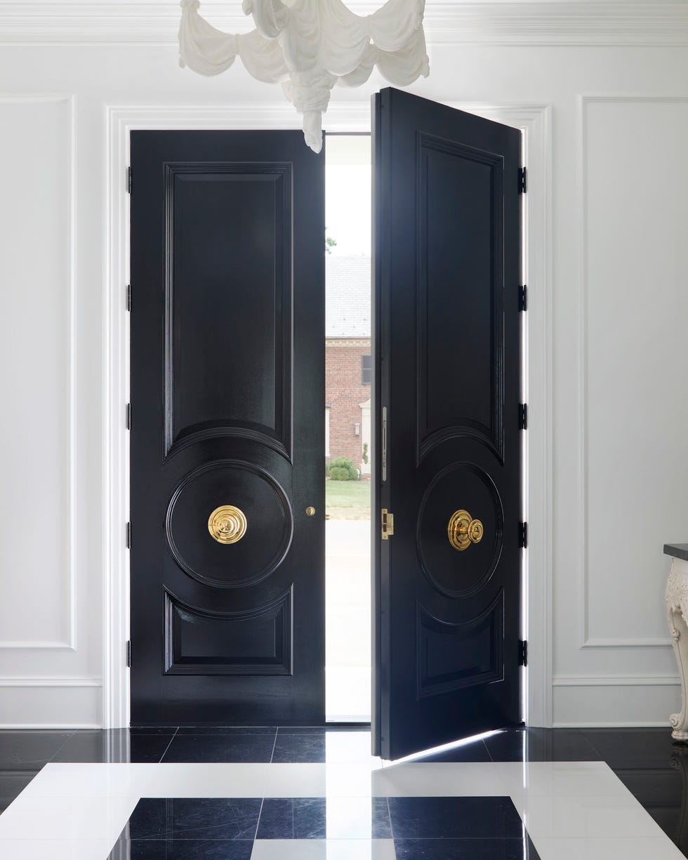
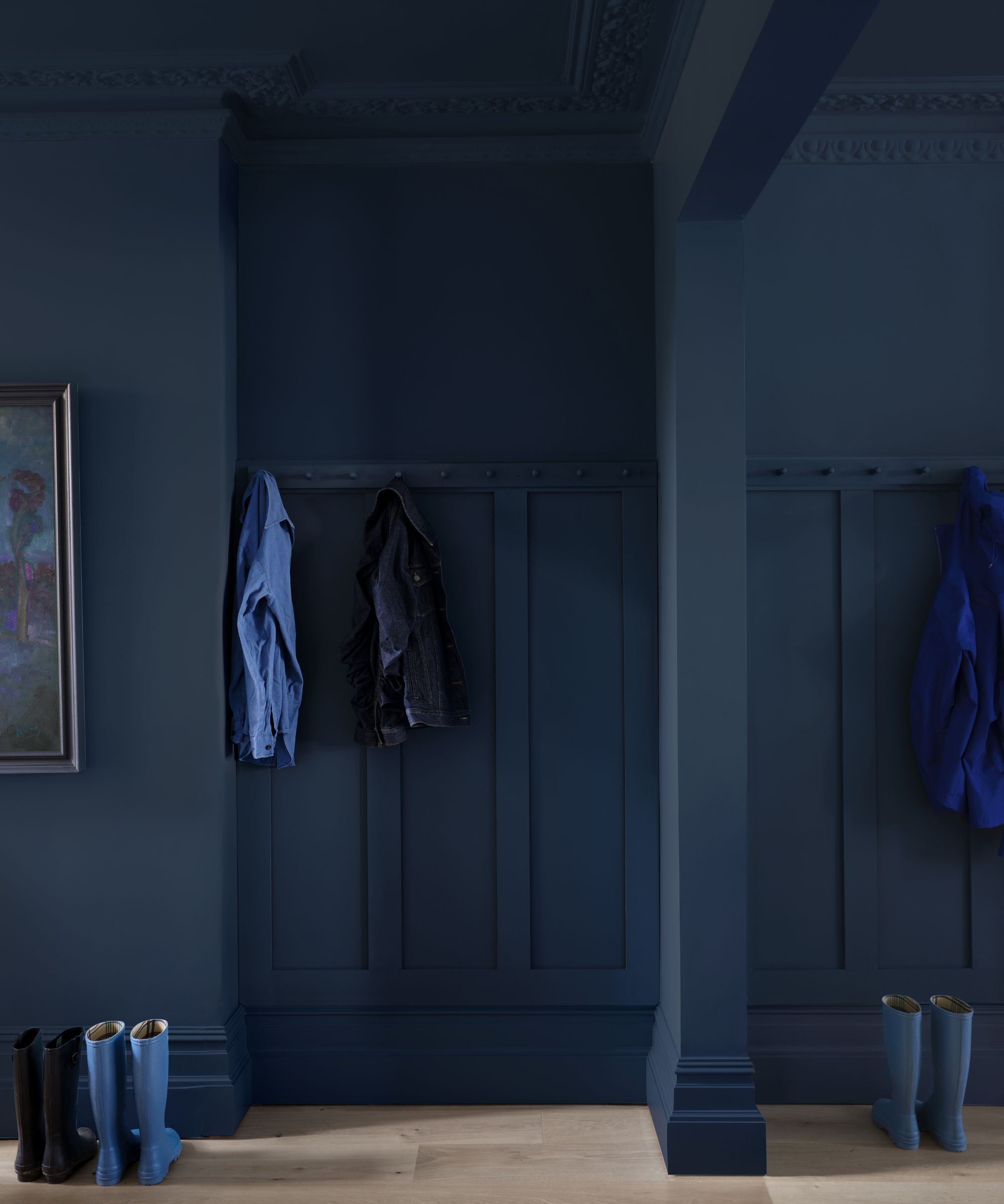
Zoë Feldman of Zoë Feldman Design recommends Farrow & Ball’s Railings, a blue-black that offers a classic look and can conceal imperfections on older or builder-grade doors. Finally, Keren Richter from White Arrow suggests Fine Paints of Europe’s Delft Blue for a playful and saturated look, especially in historic homes, alongside Farrow & Ball’s Inchyra Blue or Fine Paints of Europe’s BS18E58 Blue for a more coordinated approach. These recommendations collectively demonstrate the wide array of possibilities for transforming interior doors from simple functional elements into key design features.
#InteriorDesign #DoorPaintColors #HomeRenovation #ColorPalette #DIYHomeImprovement #DesignInspiration #PaintTrends #HomeDecor #ArchitecturalDetails #InteriorDesign #DoorPaintColors #HomeRenovation #ColorPalette #DIYHomeImprovement #DesignInspiration #PaintTrends #HomeDecor #ArchitecturalDetails
0 commentaire au total
 Aucun commentaire pour le moment
Vous aimerez aussi
The chicest interior door colors you’ll want in your home in 2025 – because white isn't the only option

Interior Doors Shouldn’t Be an Afterthought — 11 Ideas That Will Actually Elevate Your Home's Design

Designers Say These Unusual Paint Color Combos Will Transform Your Home

Interior doors can add light, personality
What color should you paint interior doors? The ideas to try, and what they say about your design personality
'It's the best way to make a home joyful' - this paint trend is the perfect idea to introduce color thoughtfully
9 Classic Paint Colors For Interior Doors That Designers Can't Get Enough Of
These 6 paint tips will make your entryway feel welcoming, according to the color experts
Should Doors and Trim be the Same Color? In 2025, Here's What Designers Are Doing
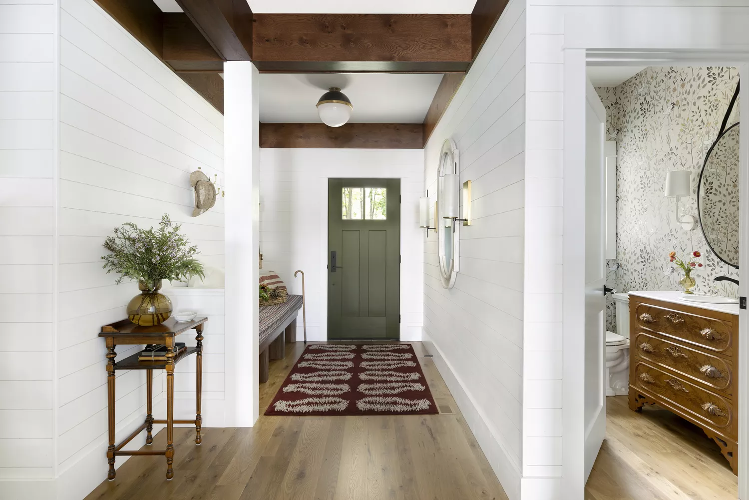
9 Classic Paint Colors Designers Love For Interior Doors
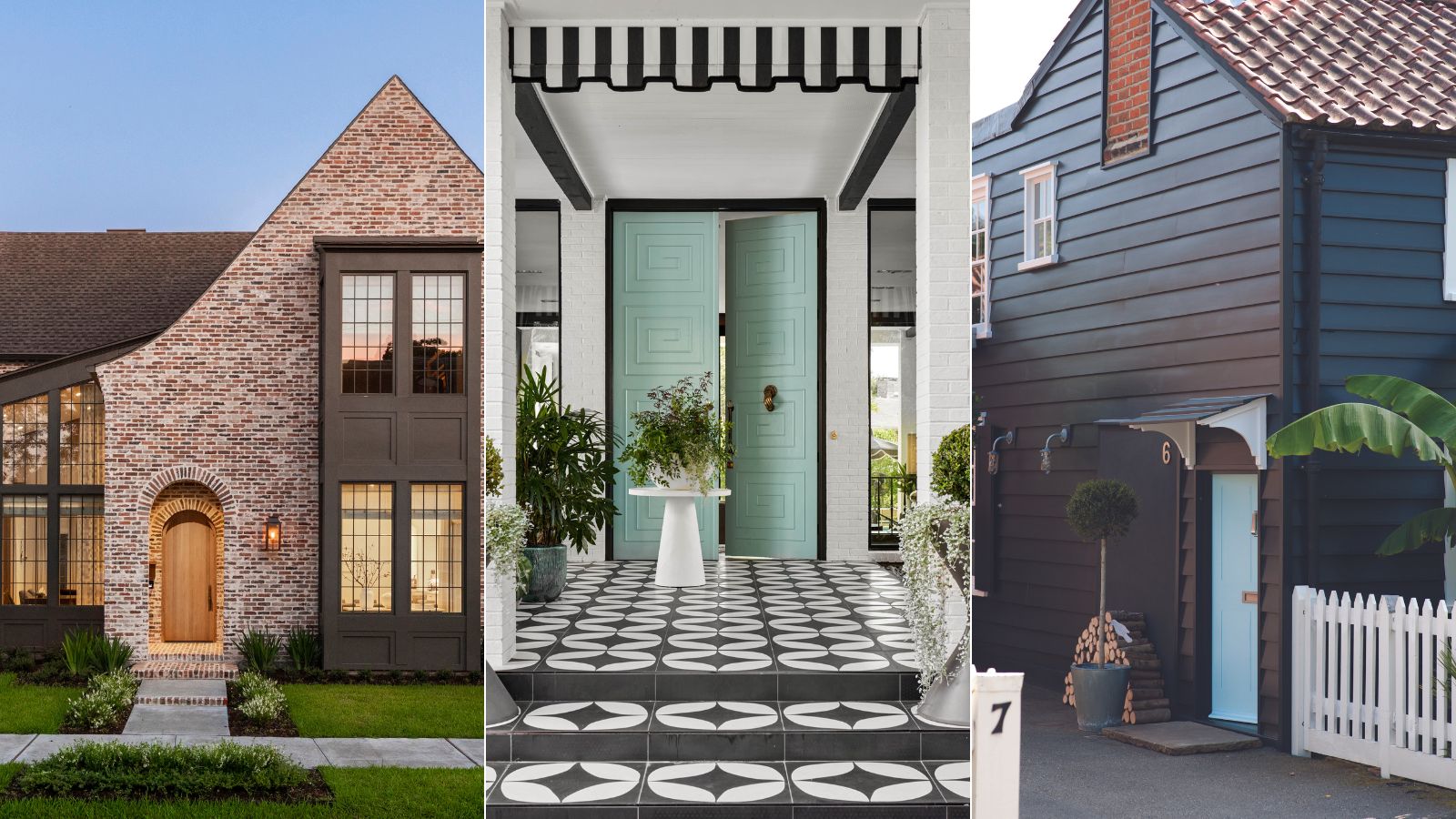
19 front door color ideas that are sure to boost your home's curb appeal
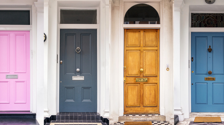
The 5 Best Front Door Colors For A White House (And 5 To Avoid)
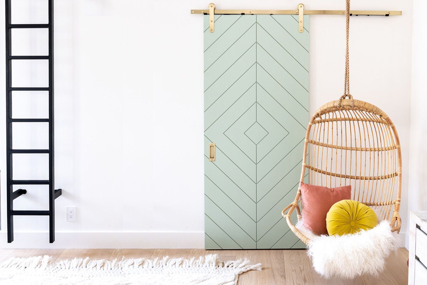
Interior Doors Don't Have to Be Boring—These Designer-Approved Colors Prove It

The best colors for small entryways for airy, bright spaces, according to interior designers

The 5 Best Interior Door Colors to Use in 2025, According to Designers

Ten bright and bold interiors that make use of colour theory
White Internal Doors

What colors brighten up an entryway? 5 shades that will bring light and life to your space
Should doors be painted the same color as walls? Yes, and here are 5 expert-approved reasons why
12 Entryway Paint Colors the Experts Swear Will Make Your Home Feel More Welcoming