1/3
One Designer Shares How to Recover From Picking the Wrong Paint Color
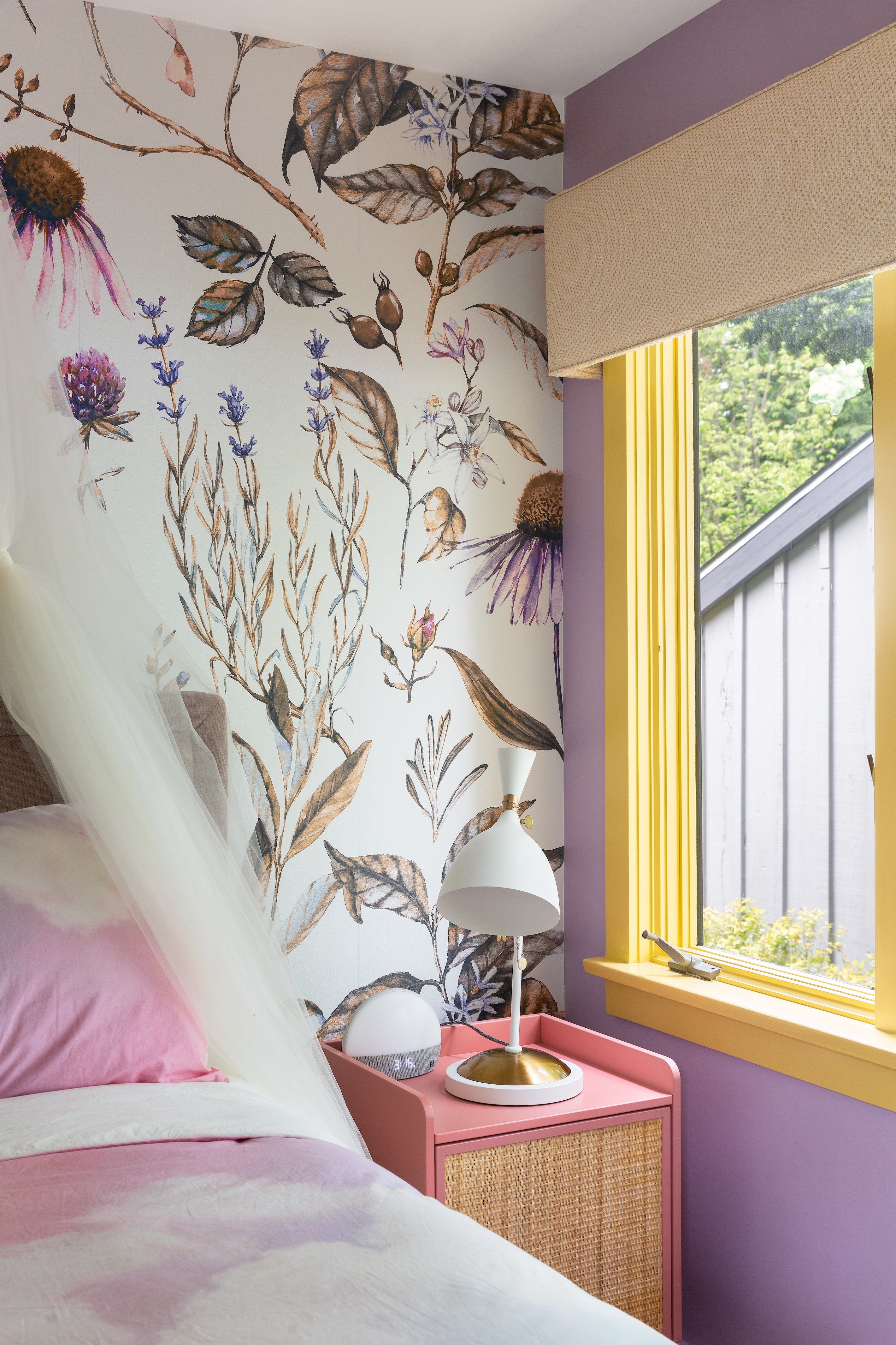
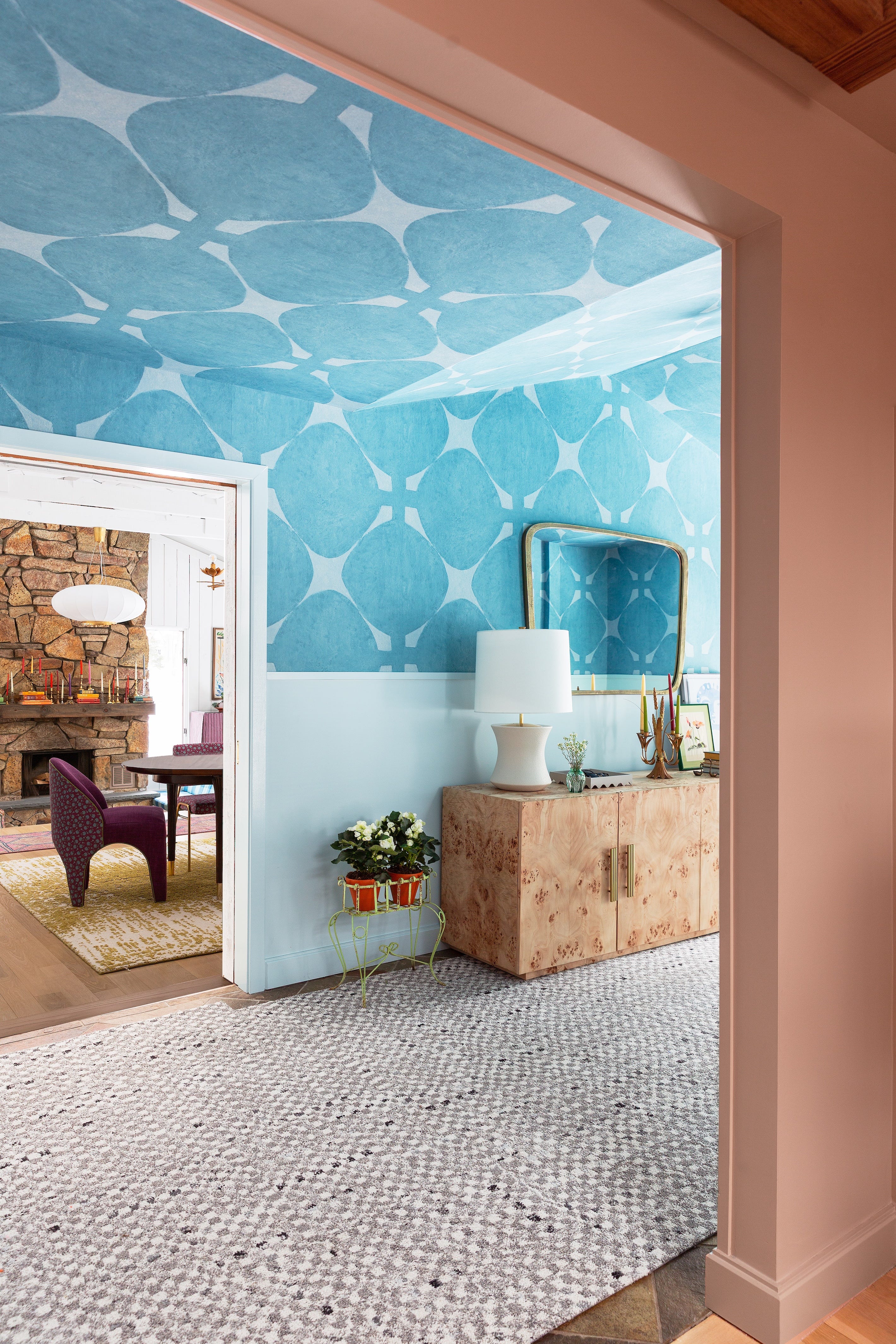
The process of selecting the right paint color for a room can be daunting due to the vast array of subtle variations and the challenge of visualizing how a color will appear on a wall. Even with the emergence of new paint brands designed to simplify this choice, mistakes are common, not just in color selection but also in application. Drew Michael Scott of Lone Fox Home, a designer and paint professional, offers insights into common paint-related errors and provides practical solutions and best practices derived from his own experiences.
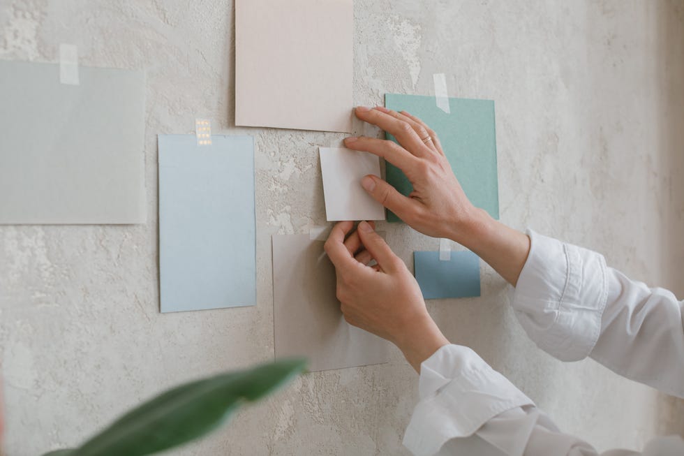
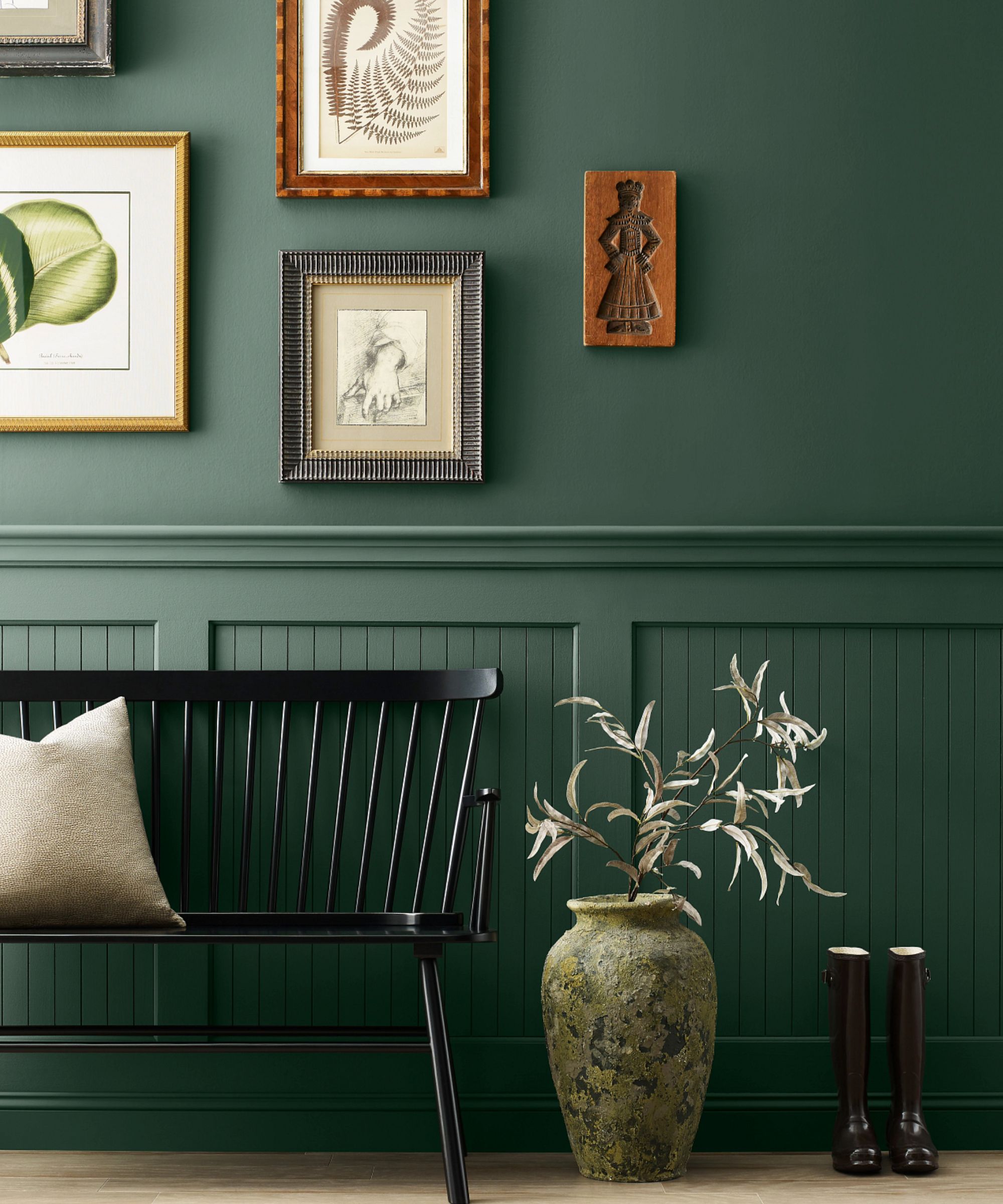
Scott's current paint selection method involves several steps to mitigate errors. He begins by purchasing tester paint pots and swatching a large area of the wall to accurately gauge the color's appearance. After selecting a shade, he buys a single gallon for the first coat, even if more is ultimately needed. This initial coat serves as a crucial test. If the color is not satisfactory after the first coat, he advises against proceeding with a second coat of the same color. Instead, he suggests that if the desired color change is within the same general hue, such as shifting from one green tone to another, it's often possible to apply the new color directly as the second coat. This technique creates a custom shade and, importantly, eliminates the need for an additional priming step, saving both time and labor.
Peel-and-stick paint samples are a convenient tool for simplifying the painting process, reducing mess and stress. However, Scott emphasizes that their utility extends beyond merely being placed on walls. He recommends using these samples on more challenging-to-paint surfaces like molding, doors, furniture, and grooved cabinets. This allows for a more comprehensive understanding of how the paint will appear on surfaces with varying textures and depths before committing to painting. This foresight helps confirm satisfaction with the color prior to undertaking the detailed work of painting intricate areas.
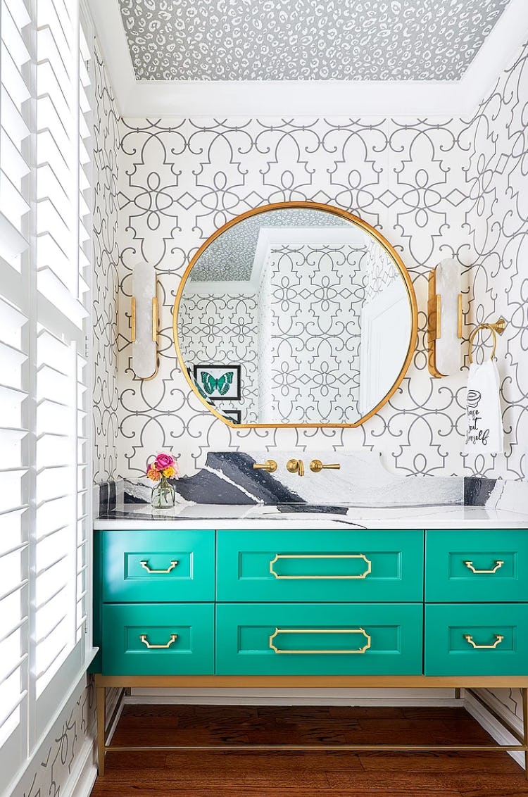
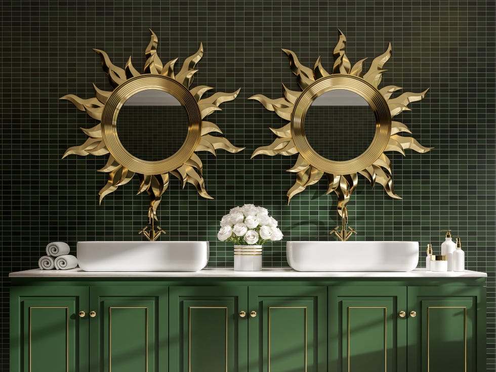
A common mistake highlighted by Scott is committing to a paint color without proper testing. He recounts observing individuals select colors under the deceptive lighting of hardware stores, a practice he acknowledges he has also been guilty of, albeit in a more 'design-forward' context. For instance, he once chose a Farrow & Ball shade called Sardine for a bathroom vanity based solely on its appeal and name, without swatching it. The color proved unsuitable, leading him to switch to a more moody alternative, Aurora Brown, which dramatically improved the bathroom's aesthetic. This experience underscores the importance of testing colors in the actual space to avoid misjudgments influenced by external factors or superficial appeal.
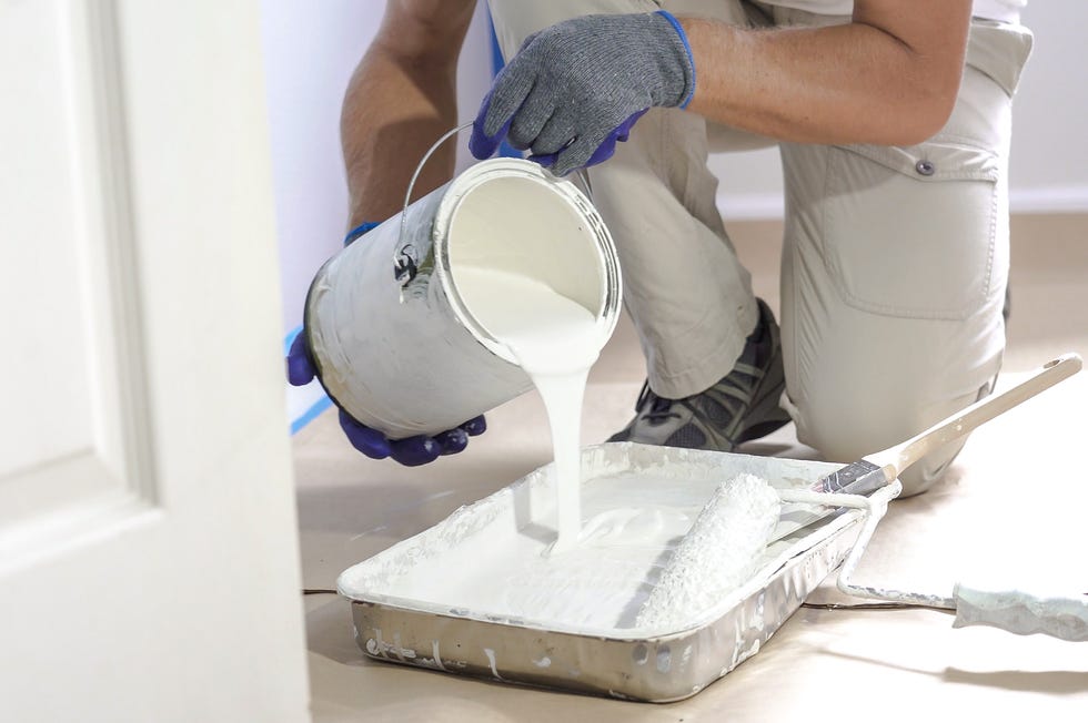
Proper preparation of the painting area is another critical step often overlooked. Scott stresses the necessity of using drop cloths, regardless of confidence in painting skills, to protect floors and other surfaces from paint drips and spills. He shares a personal anecdote where a special supergrip primer left tiny flecks on newly refinished flooring. His attempt to remove the primer using lemon juice and alcohol inadvertently damaged the floor's finish and melted the primer into it. The solution involved strategically placing a credenza over the damaged area. This incident serves as a cautionary tale, emphasizing that neglecting proper prep can lead to significant, unforeseen complications.
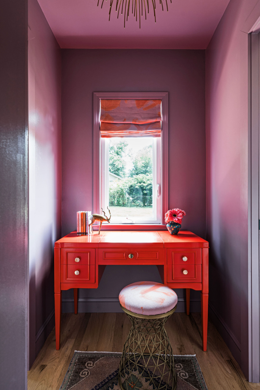
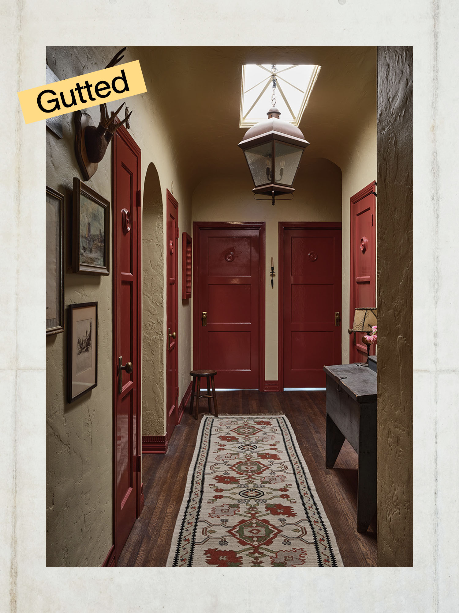
When using painter's tape, especially for creating stripes, Scott offers two tips for achieving crisp, clean lines. First, after applying the tape, thoroughly massage it onto the wall with a dry washcloth. This firm pressure ensures the tape adheres securely to account for wall imperfections and prevent paint seepage. Second, apply a quick, light coat of the existing wall color over the taped edges before layering the new stripe color. The initial coat will seal any potential bleeding under the tape, allowing the subsequent coat of the new color to sit cleanly on top. Finally, Scott encourages taking risks with bold colors in less frequently used areas of the home, such as a laundry room or hallway. This approach allows homeowners to experiment and build confidence in their color choices without the pressure of it being in a primary living space. He shares his own example of using high-gloss red paint on his hallway trim and doors, transforming a transitional space often overlooked.
#PaintColorSelection #InteriorPainting #DIYPaintingTips #HomeRenovationMistakes #PaintPreparation #PeelAndStickSamples #DesignerTips #LoneFoxHome #PaintColorSelection #InteriorPainting #DIYPaintingTips #HomeRenovationMistakes #PaintPreparation #PeelAndStickSamples #DesignerTips #LoneFoxHome
0 commentaire au total
 Aucun commentaire pour le moment
Vous aimerez aussi

An A-List Designer’s Secrets To Picking Perfect Paint Colors

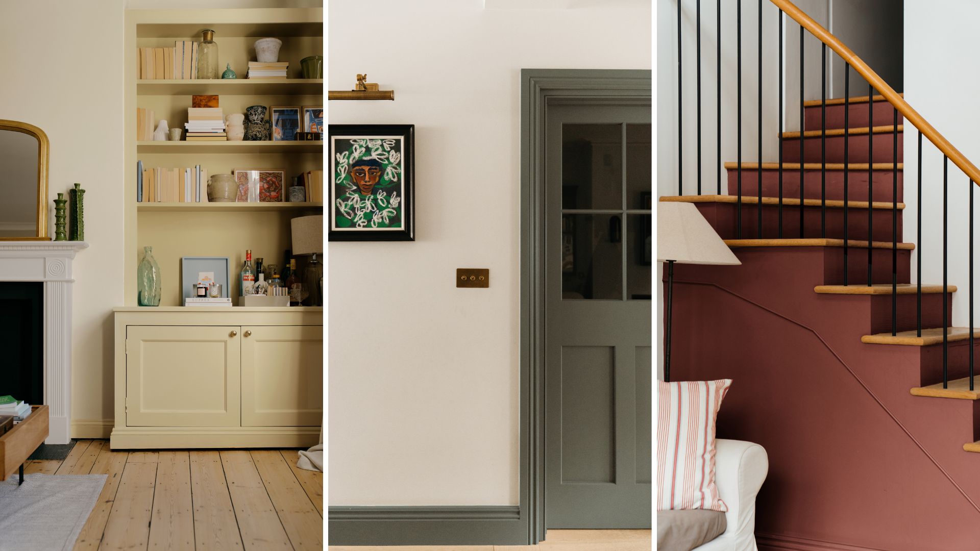
Make choosing paint easy with new 'natural light' colours

When Your Client Cares About Paint as Much as Furniture, You Go Big With Opposing Colors

6 Paint Color Mistakes To Stop Making, According To Designers
These Master Tips Will Help You Avoid Choosing The Wrong Type Of Paint
7 Paint Mistakes That Make Designers Instantly Cringe When They Walk Into Someone's Home

6 Paint Color Mistakes To Stop Making, According To Designers

8 Surprising Colors That Will Decrease Your Home's Value, According to Experts

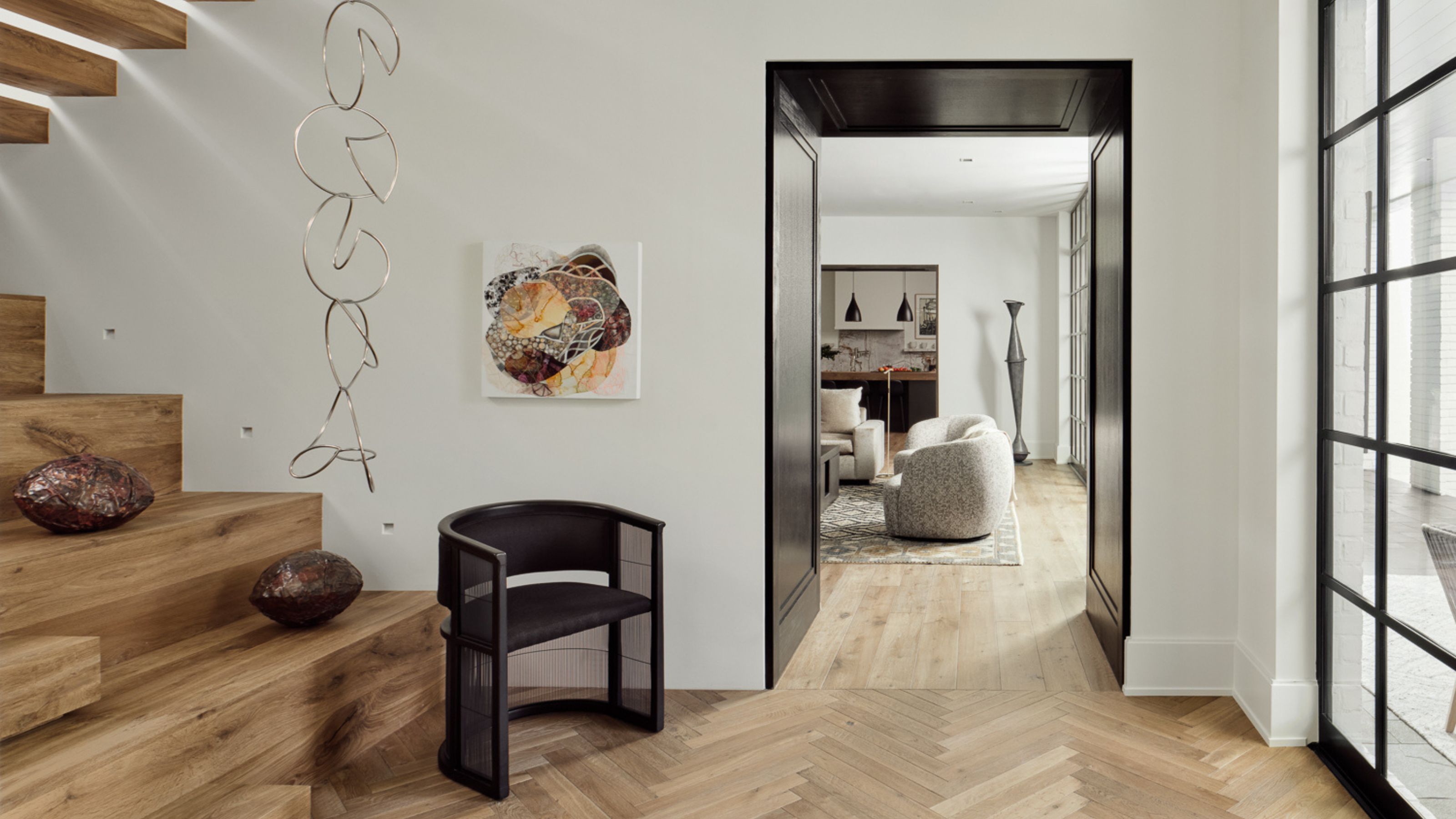
9 Neutral Paint Colors Designers Constantly Reach For — "It's My Tried-and-True"

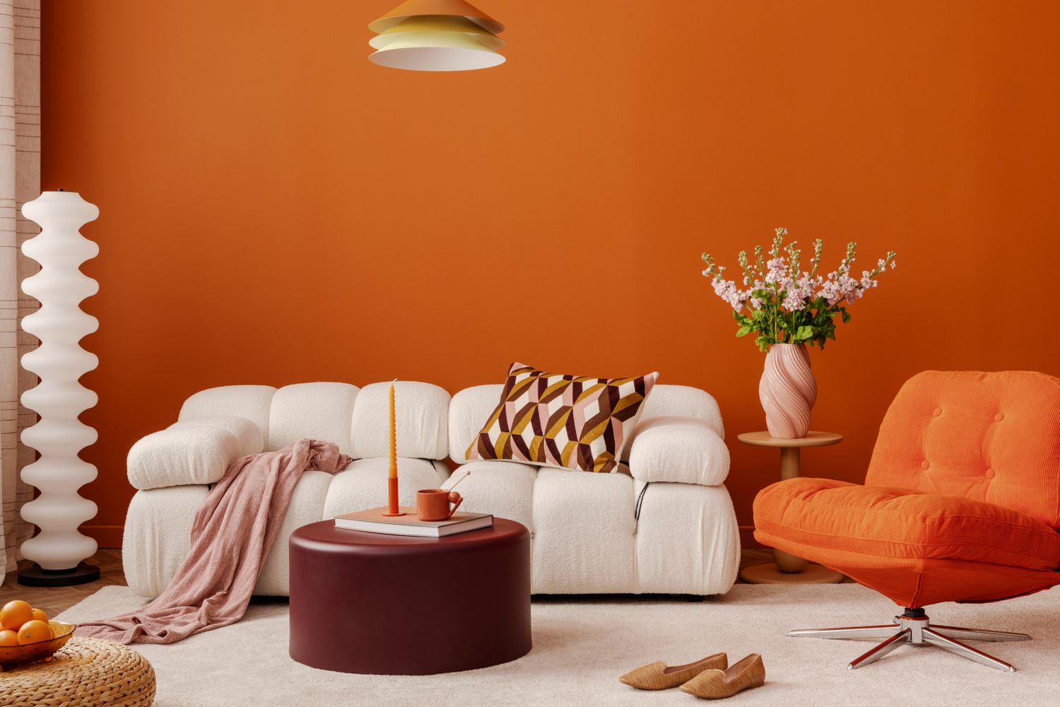
Never Regret a Paint Color Again—Avoid These 6 Common Mistakes


What are the worst colors to paint a room? The shades experts say you should never use

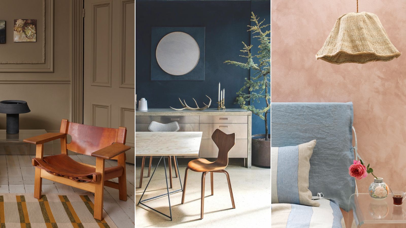
Professional painters reveal the secret to color matching a paint shade from an image alone
to choose paint colors.
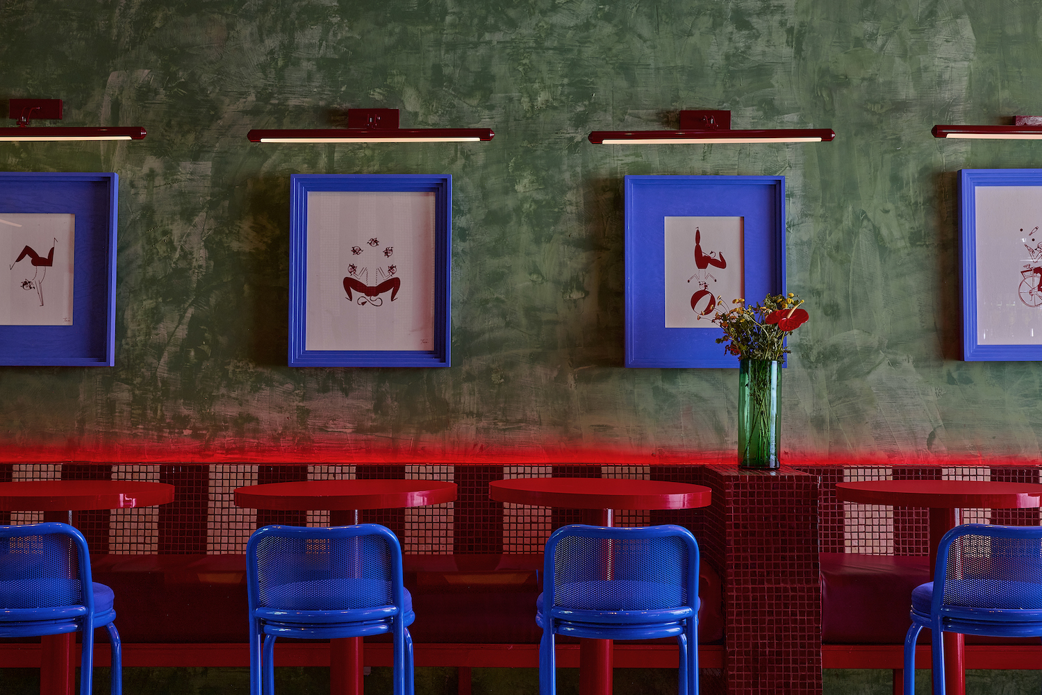
7 'Unhappy' Colors That Color Psychology Experts Would Never Paint Their Walls
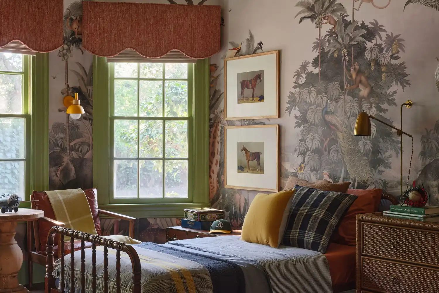
6 Paint Color Duos Designers Can't Get Enough of This Fall

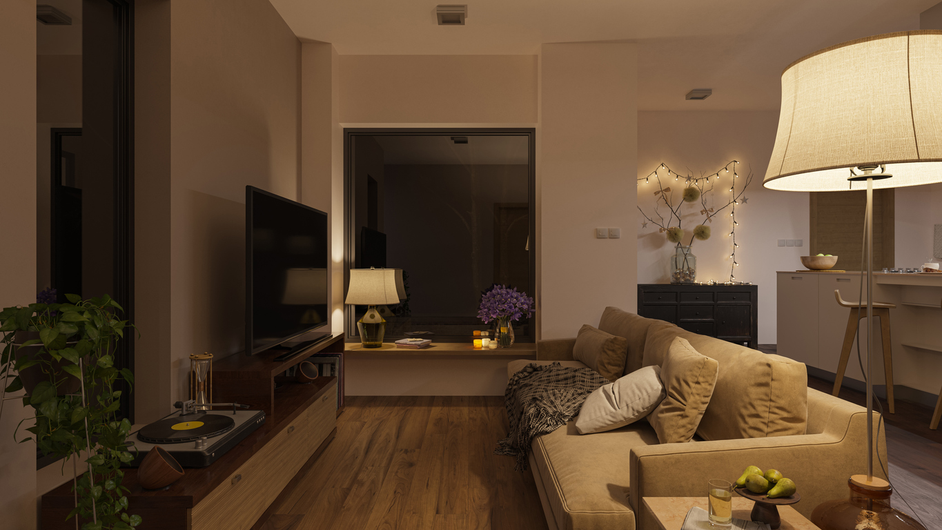
The 13 Best Paint Colors for Low-Light Rooms

These Unusual Paint Colors May Not Be An Obvious Choice, But Designers Can’t Get Enough
Primary colours are having a moment - but the secret to styling them is through 'unexpected' touches
Designers Say These Unusual Paint Color Combos Will Transform Your Home

7 Paint Colors Designers Wish They Never Used (and What You Should Use Instead)