8 Calming Colors to Paint Your Living Room—and Make the Space More Relaxing
The article explores the significance of paint colors in creating a peaceful and relaxing home environment, drawing on insights from interior designers. It emphasizes that home decor choices, particularly wall colors, significantly impact a person's ability to relax and de-stress. While stress can have various consequences, the article focuses on how a home's internal environment can either alleviate or exacerbate it. The central theme revolves around selecting calming colors known for their soothing effects, as recommended by design professionals.
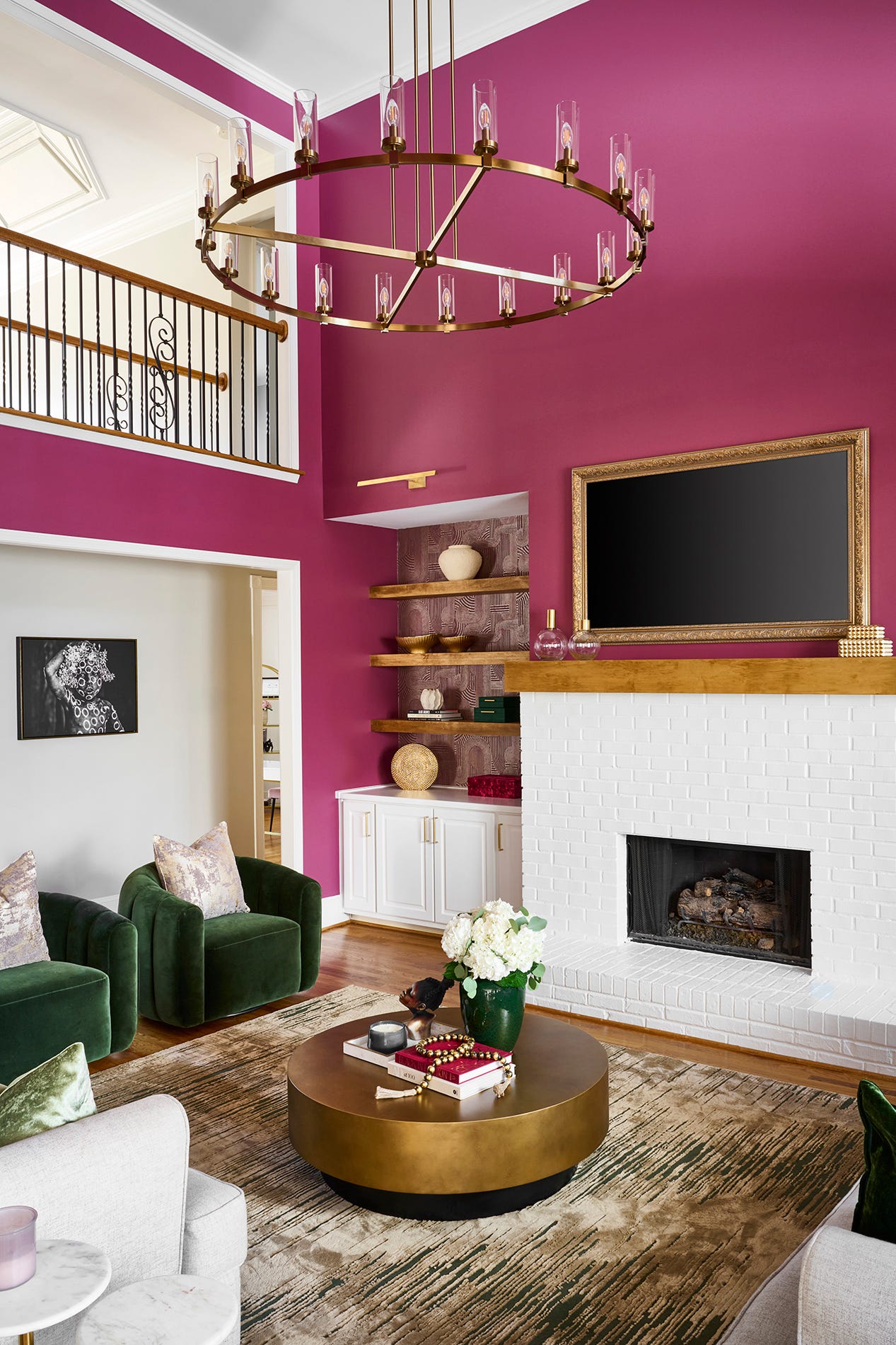
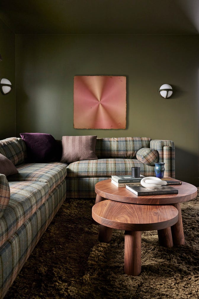
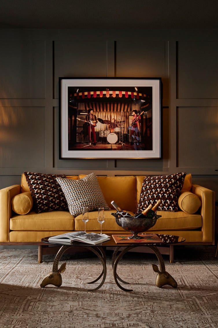
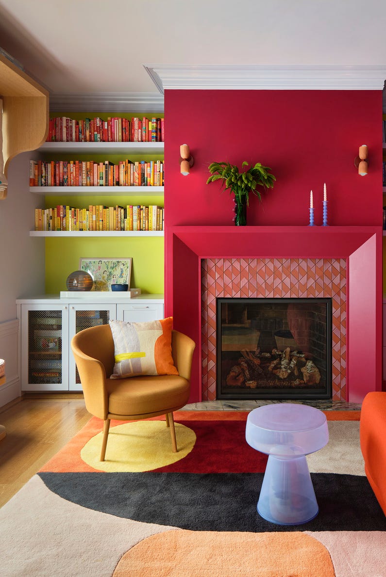
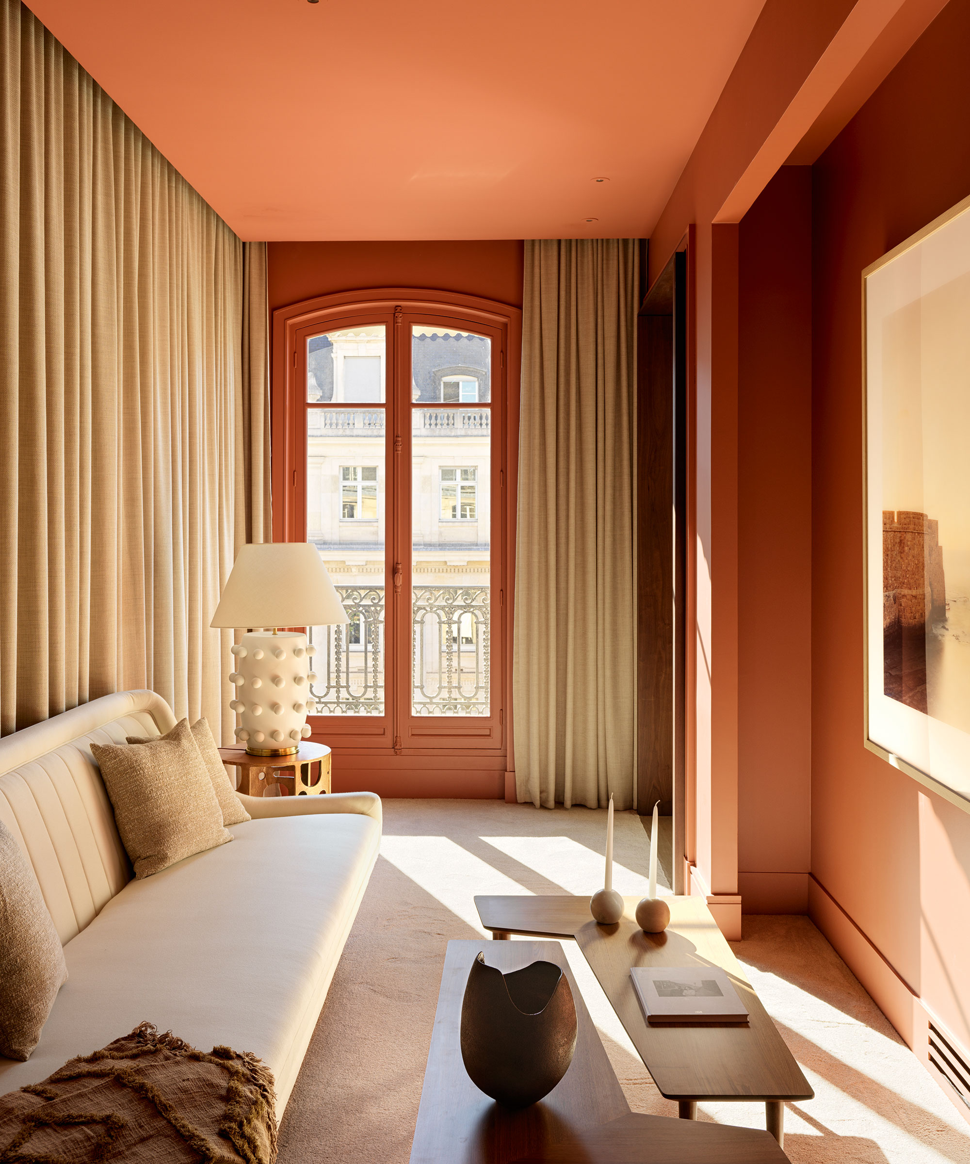
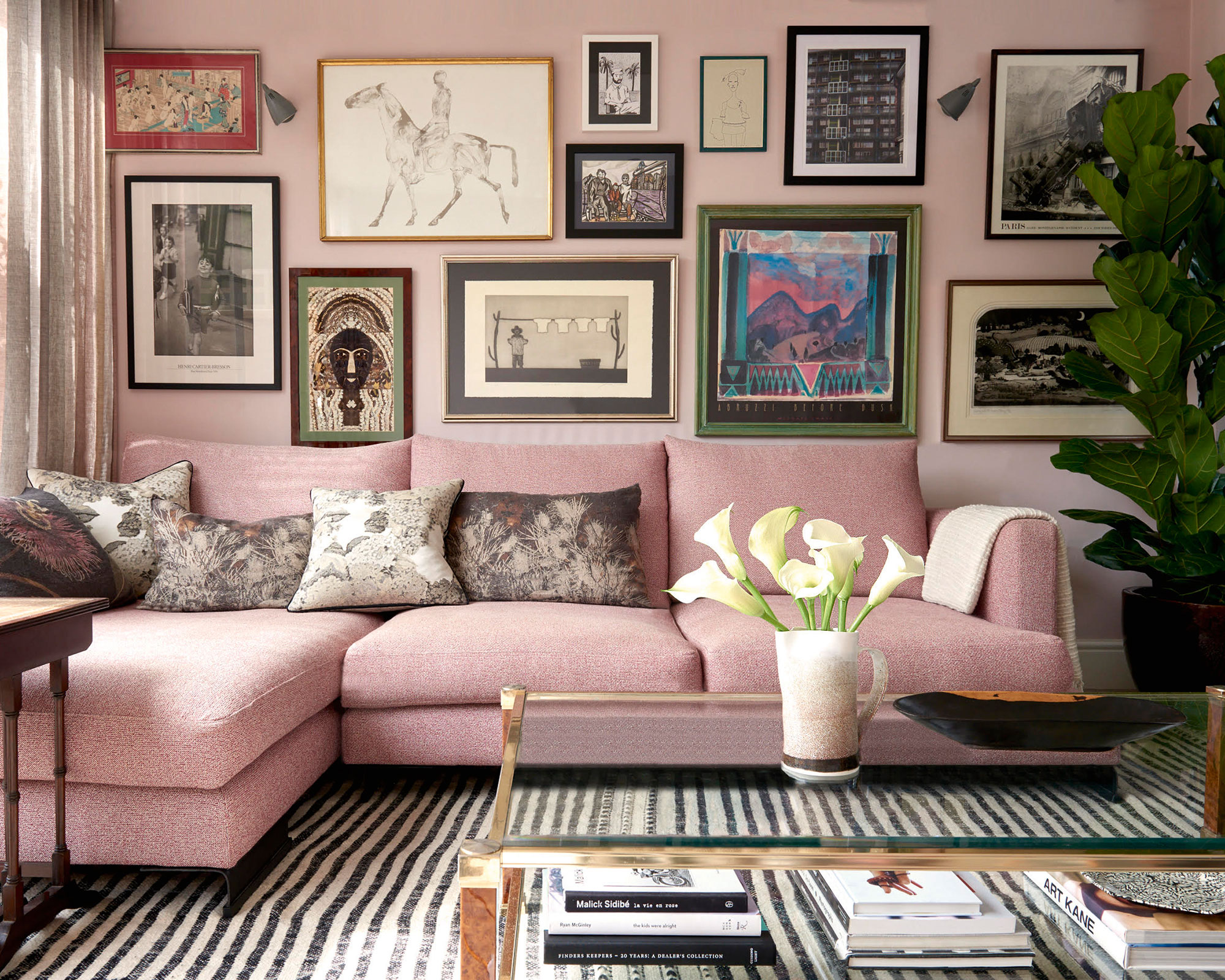
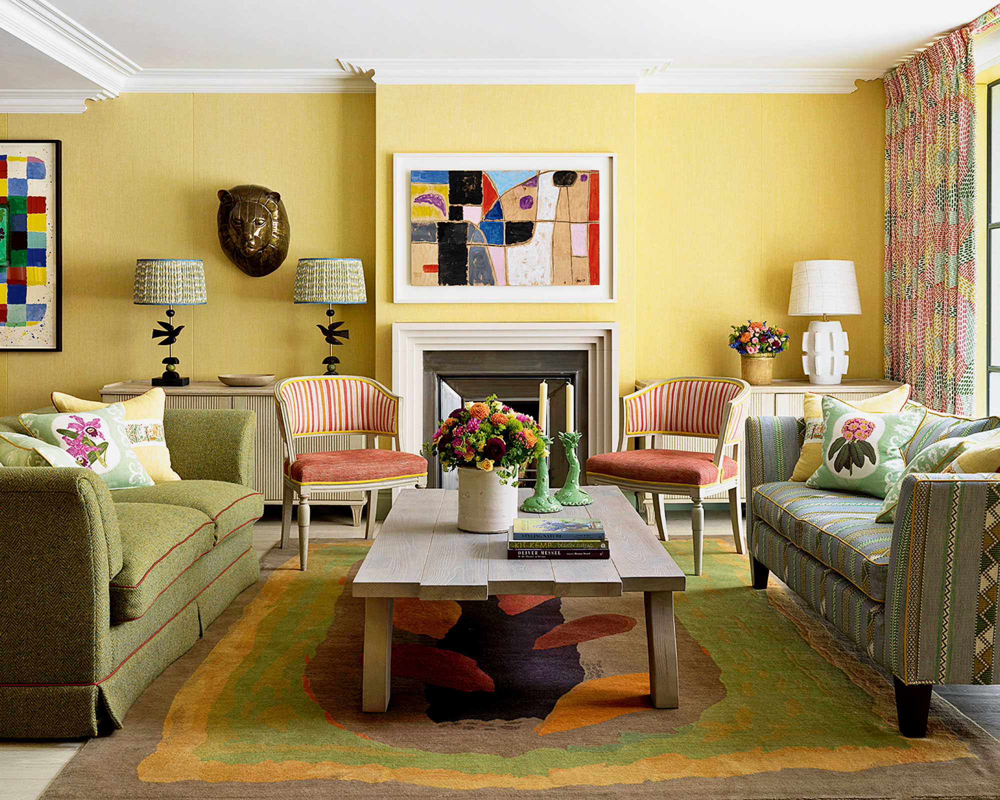
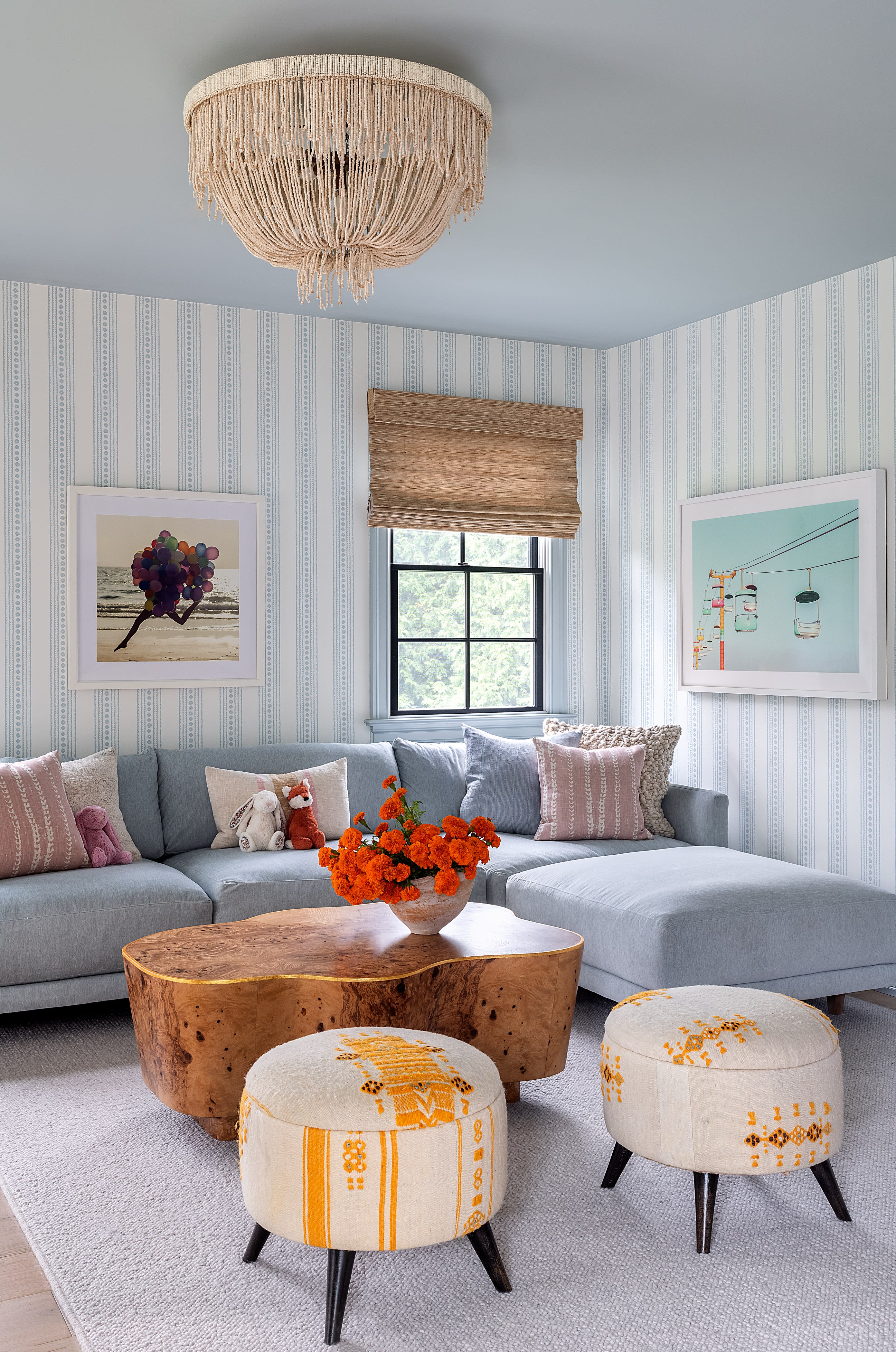
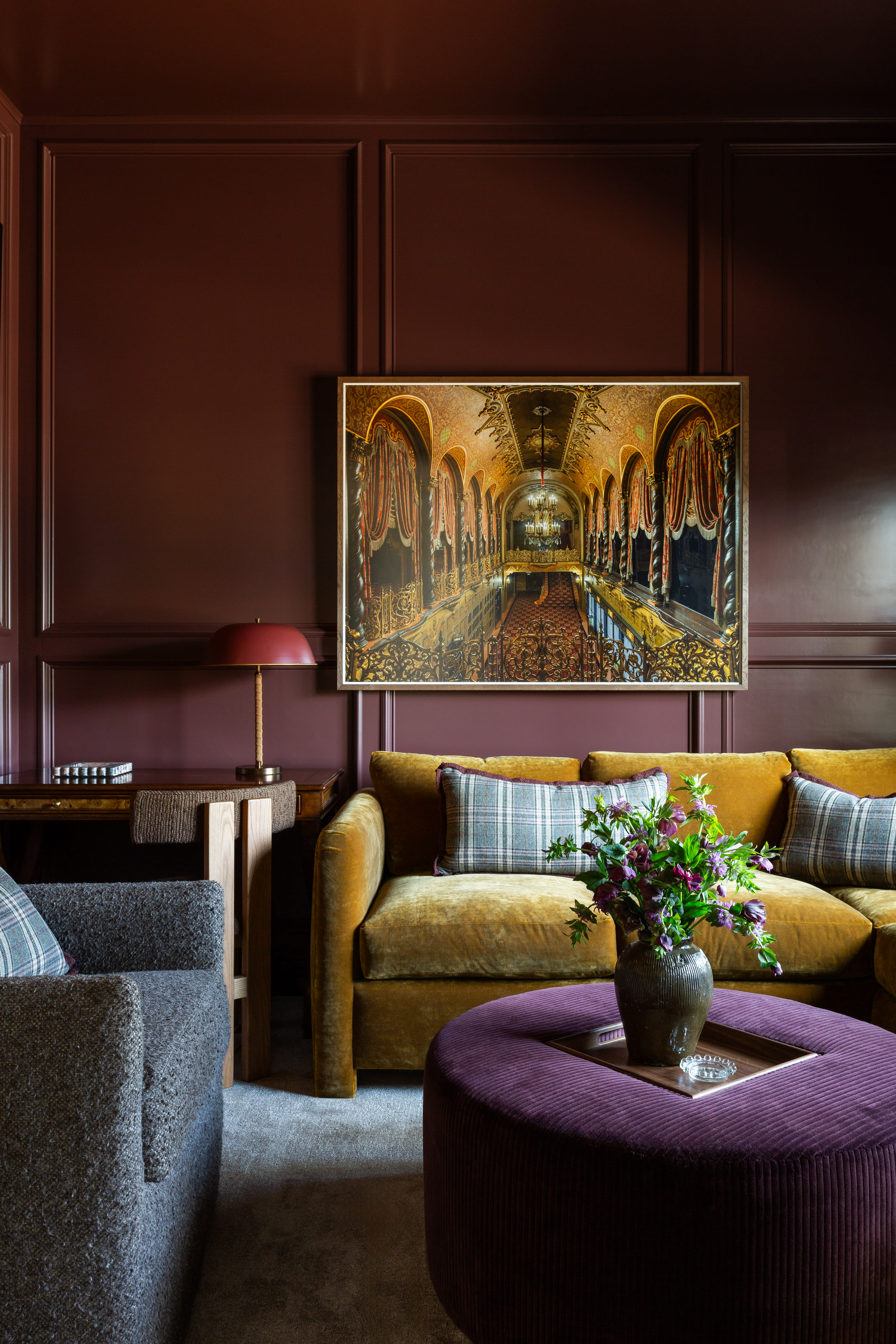
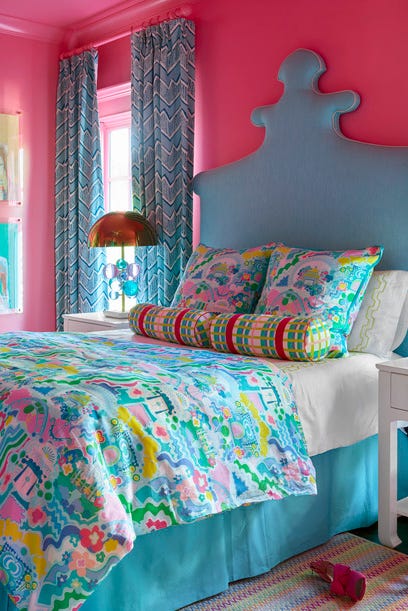
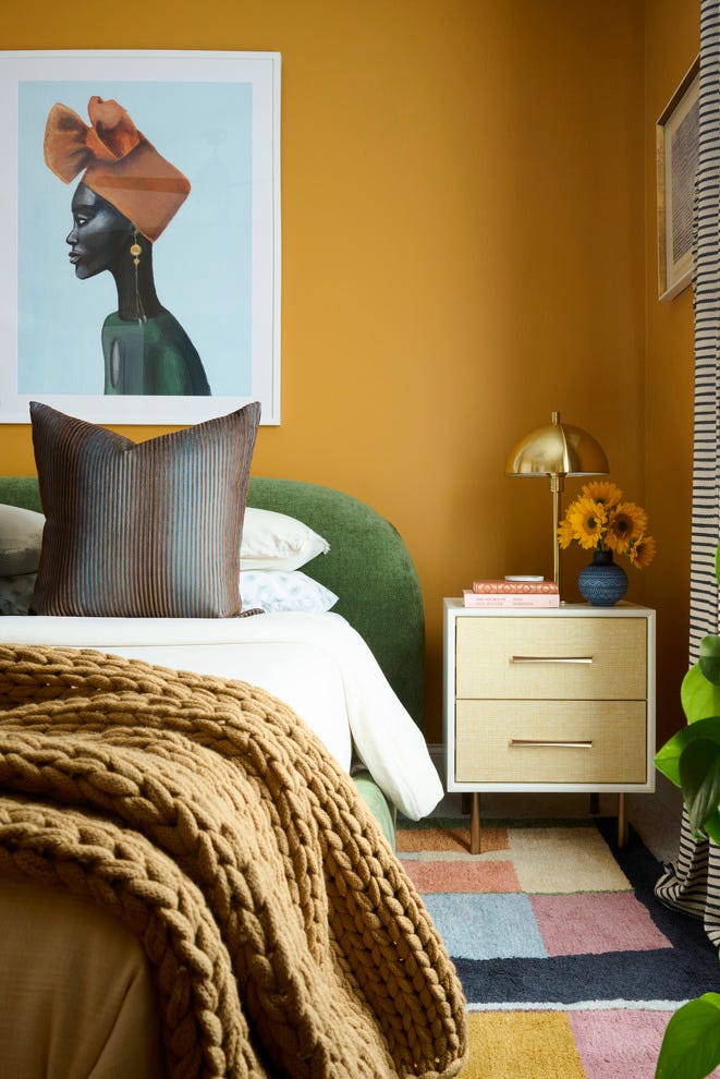
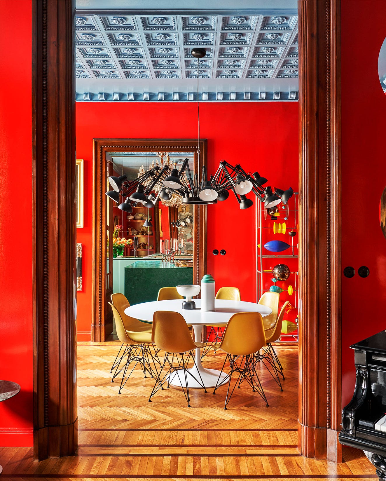
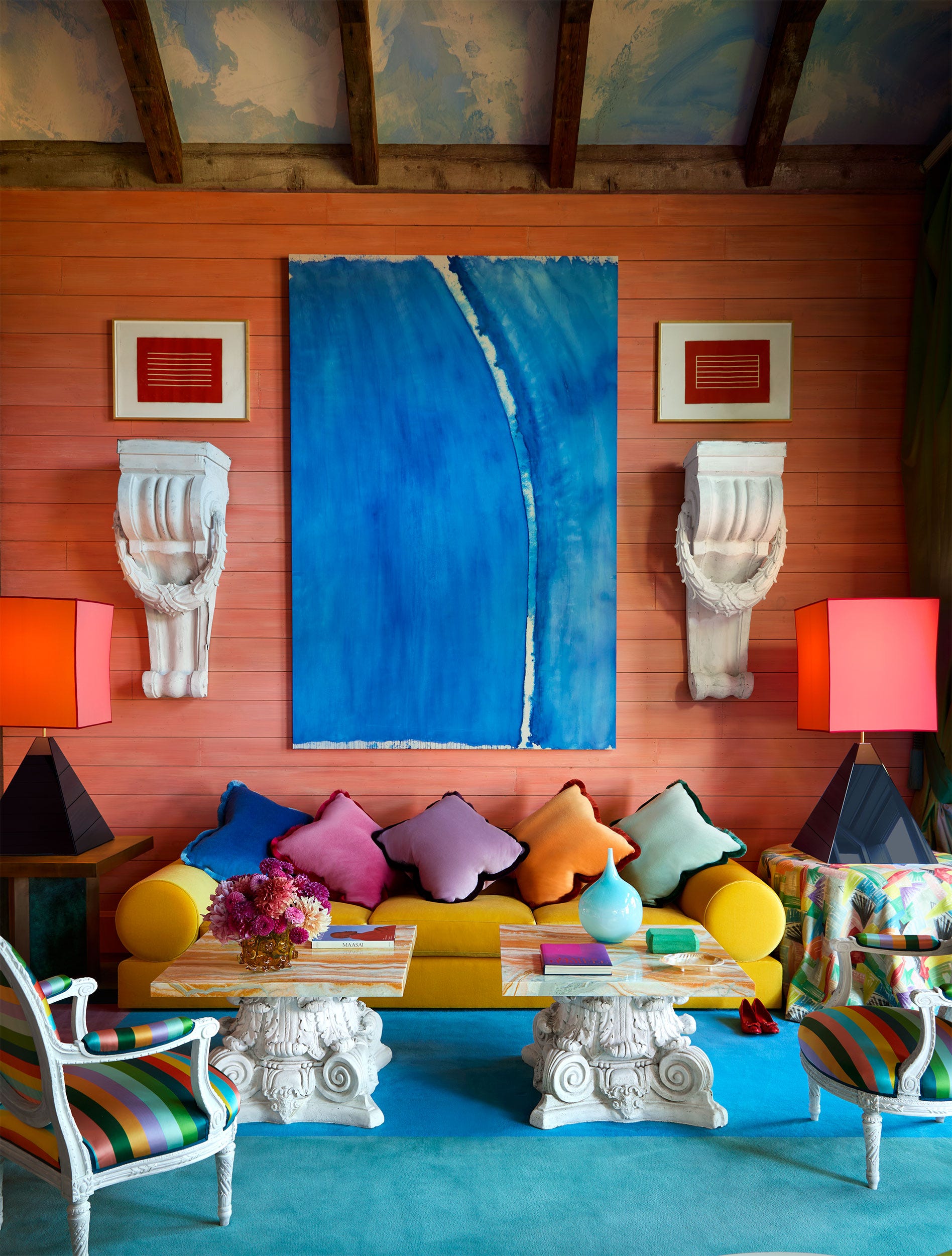
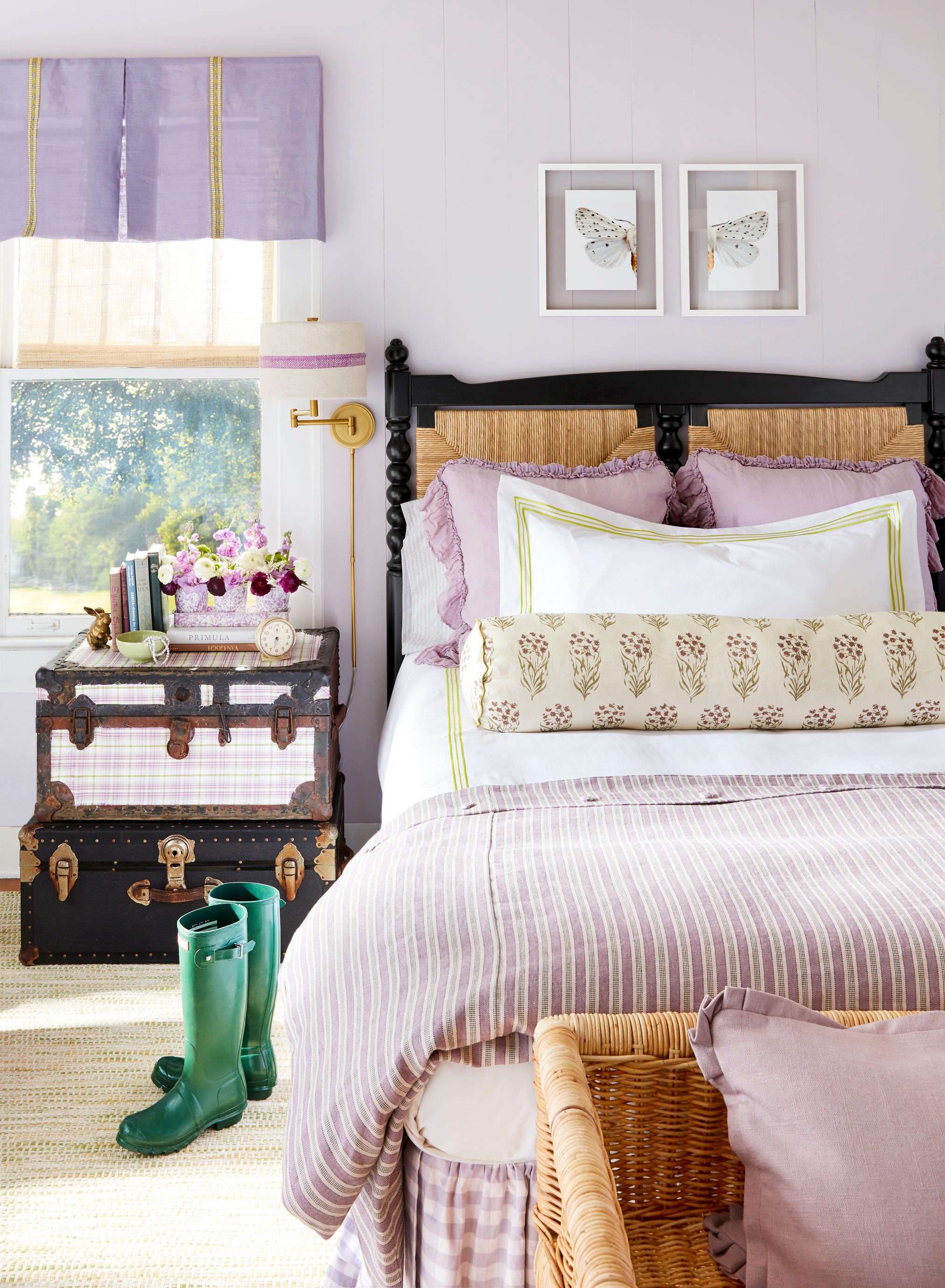
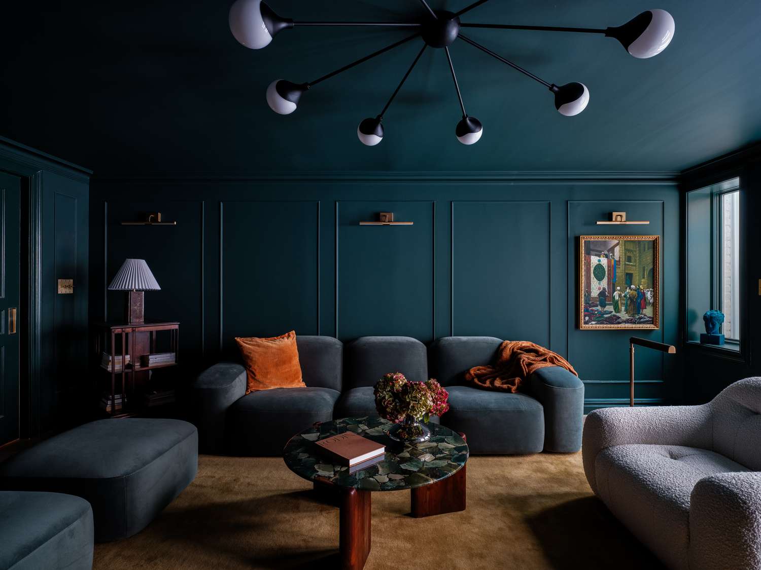
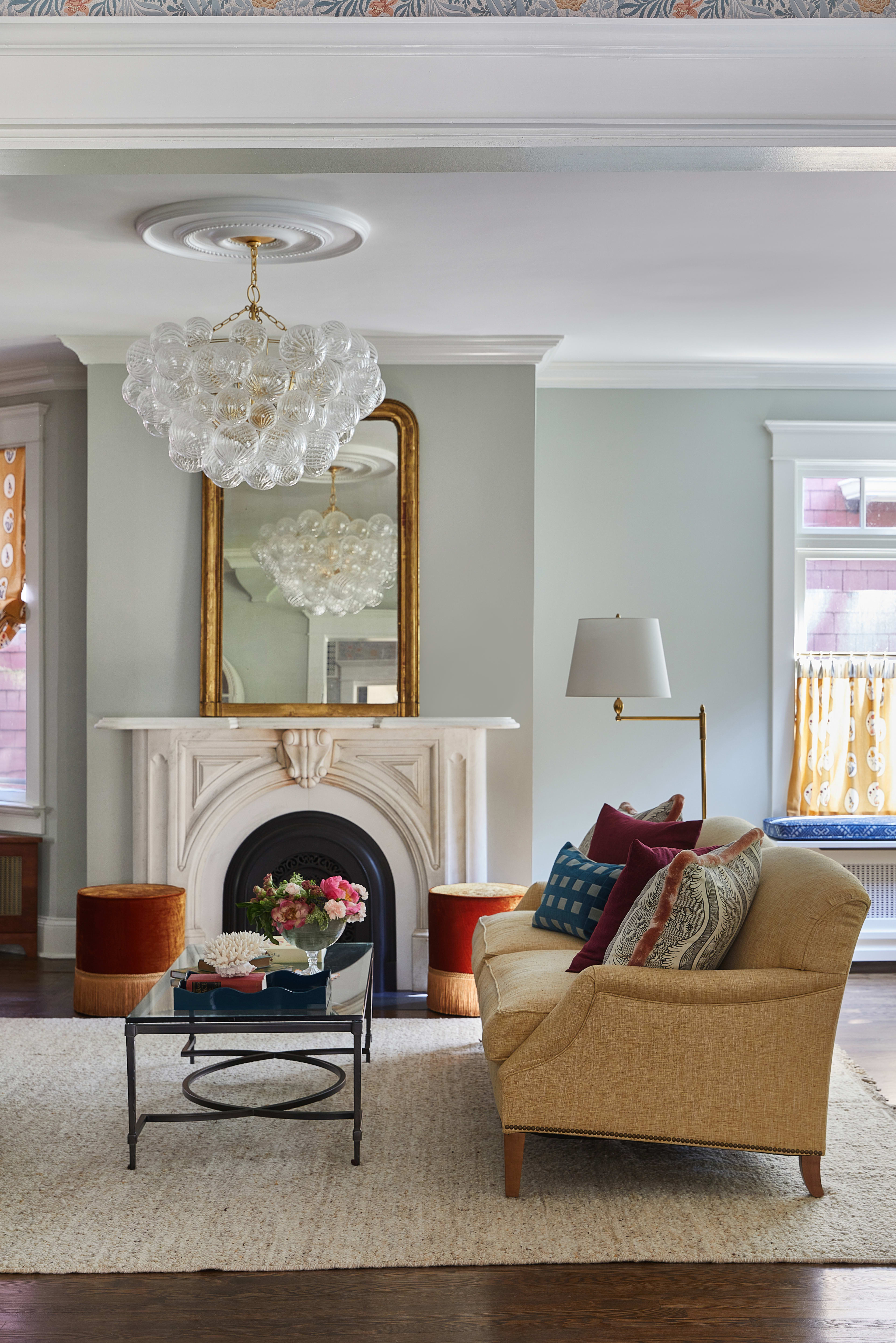
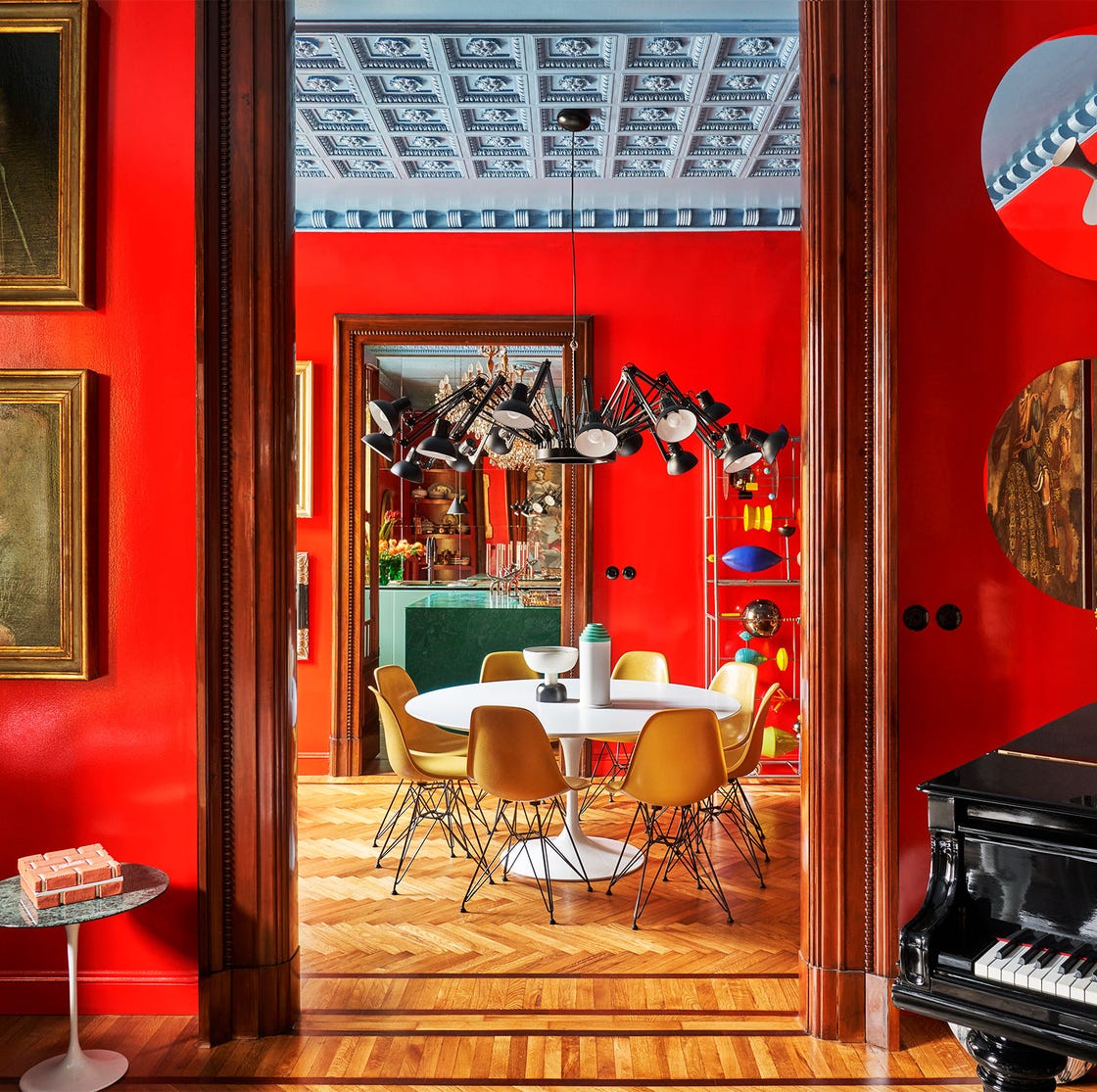
The concept of what constitutes a 'calming color' is discussed, with a general consensus pointing towards cool and neutral tones such as blue, green, white, gray, and beige. These colors are believed to promote calmness, serenity, and tranquility. However, the article also highlights the subjective nature of color perception, noting that individual preferences, personal experiences, and cultural backgrounds play a crucial role in how a color is perceived as calming. Designers Barry Bordelon and Jordan Slocum from The Brownstone Boys suggest that while soft, natural hues are broadly soothing, the specific shade that resonates with an individual might be unique to them. They also challenge the notion that calming colors must be light, asserting that darker, moodier shades can also create a relaxing and luxurious atmosphere.
The article identifies specific areas within a home that benefit most from calming colors. Meagan Macievic of Meagan Rae Interiors recommends using these hues in potentially chaotic spaces like mudrooms and laundry rooms, as well as in teen bedrooms, acknowledging the inherent stress teenagers often face. Amber Guyton of Blessed Little Bungalow extends this recommendation to all bedrooms, emphasizing their role in promoting restful sleep and refreshed awakenings. She also advocates for integrating calming colors into home offices to mitigate stress and anxiety while maintaining alertness and productivity.
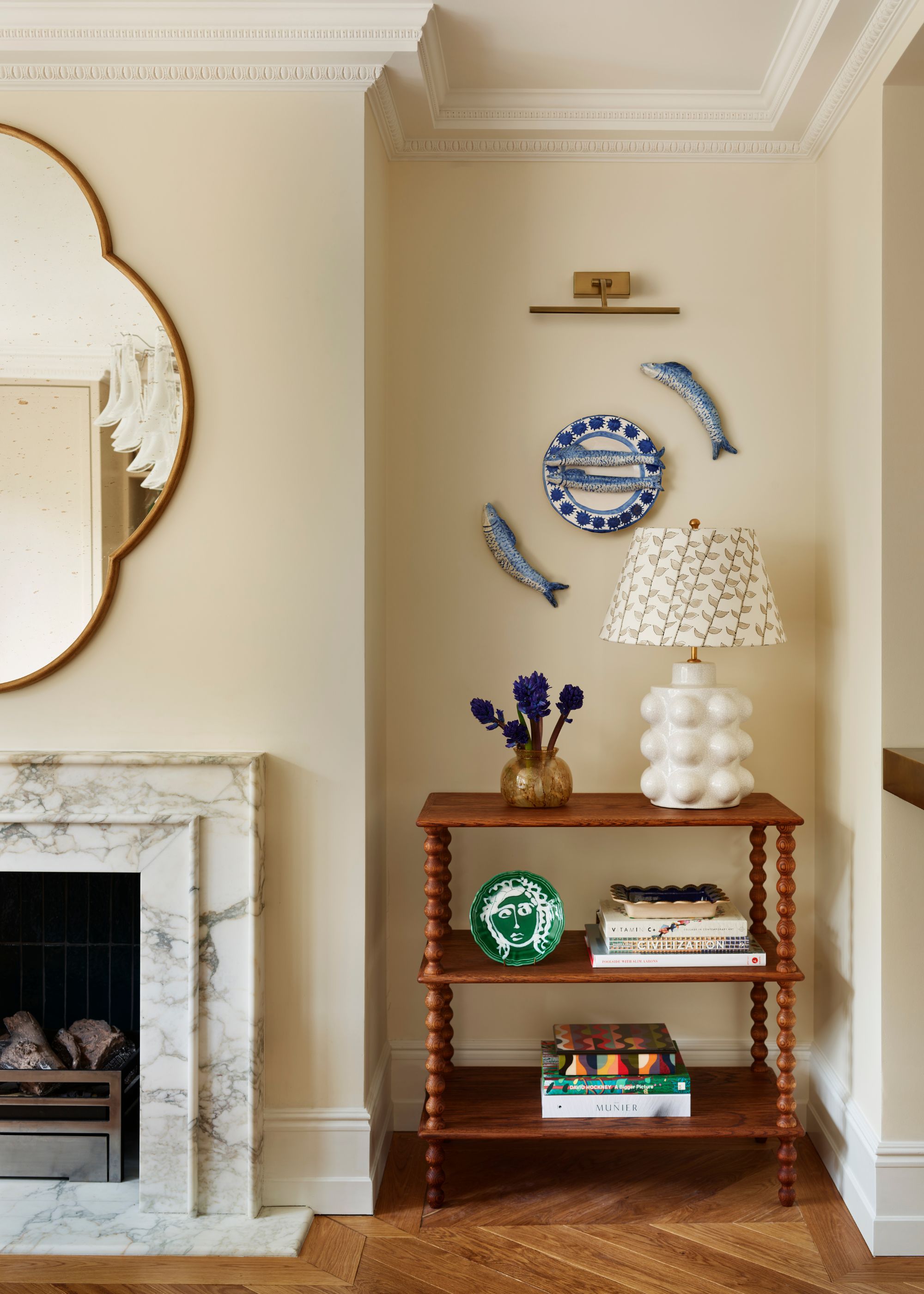
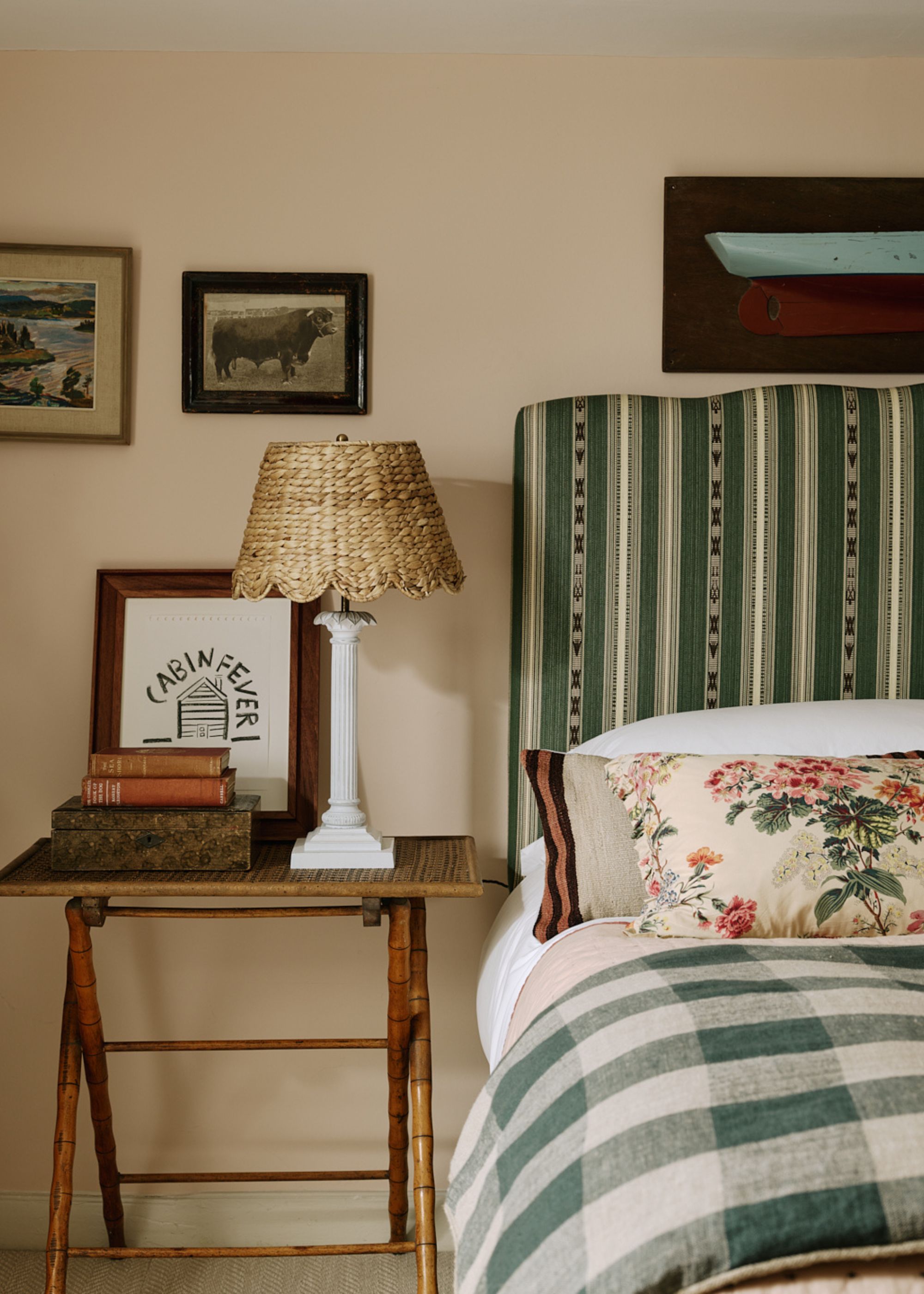
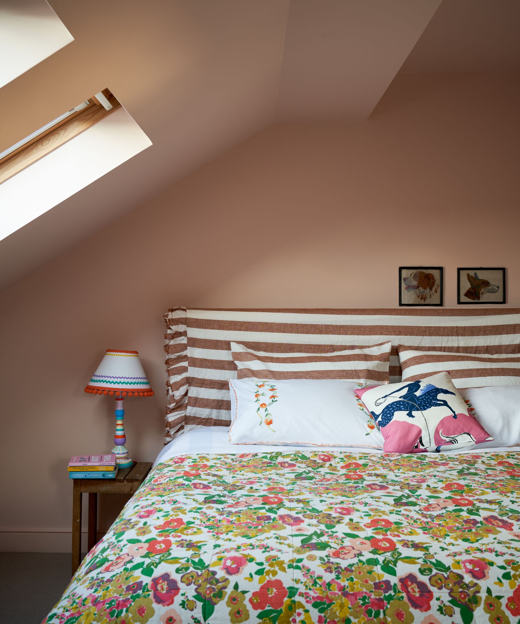
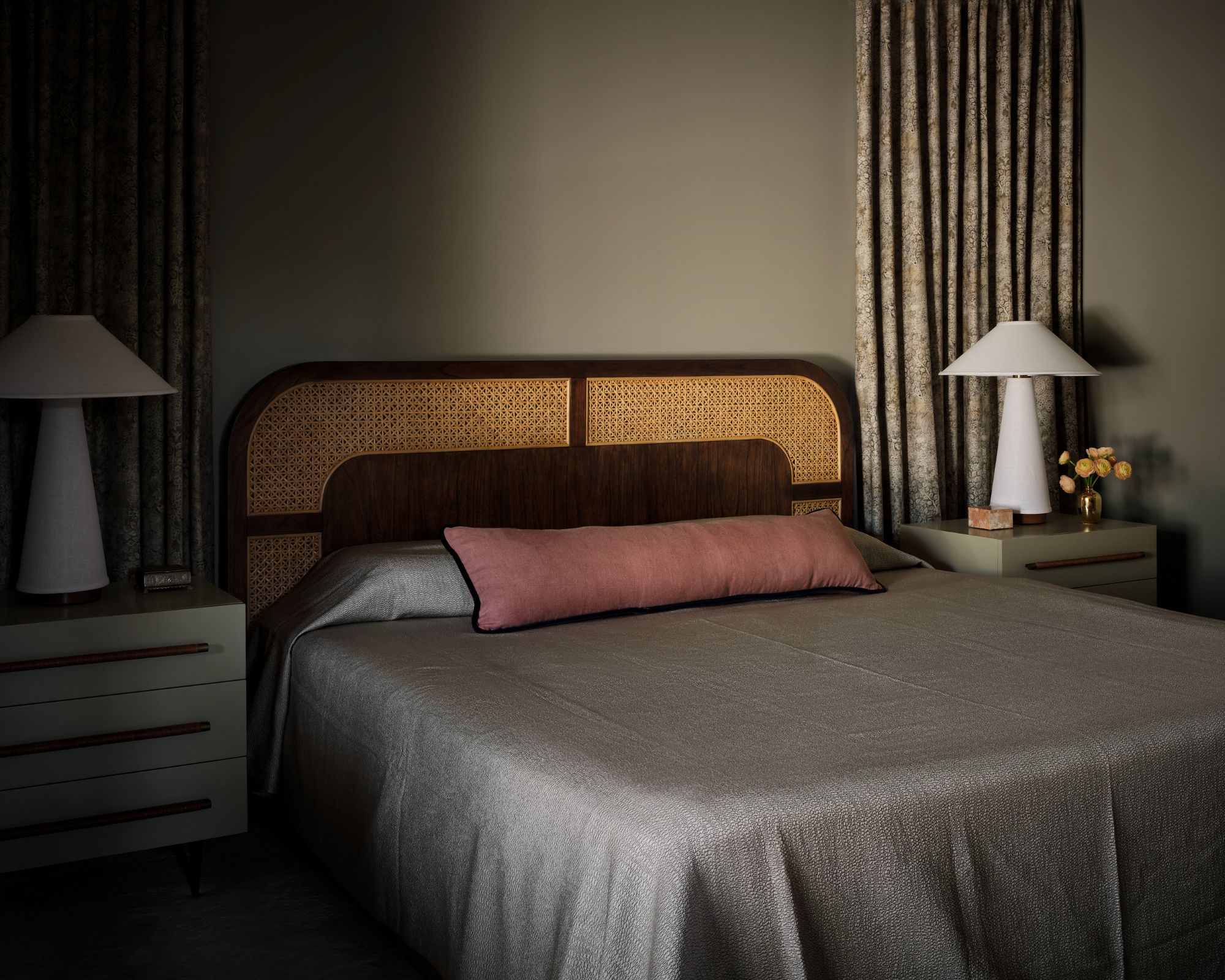
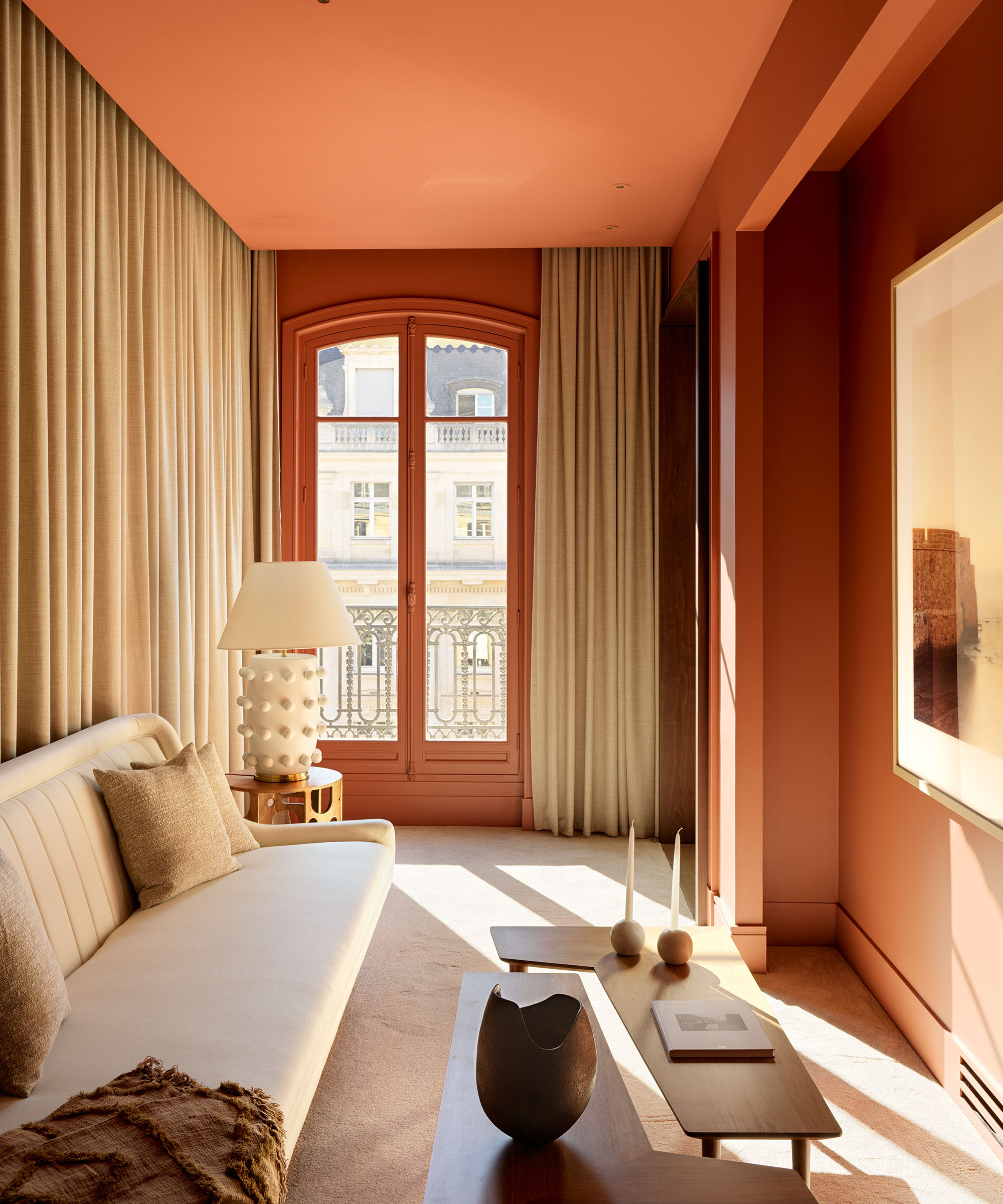
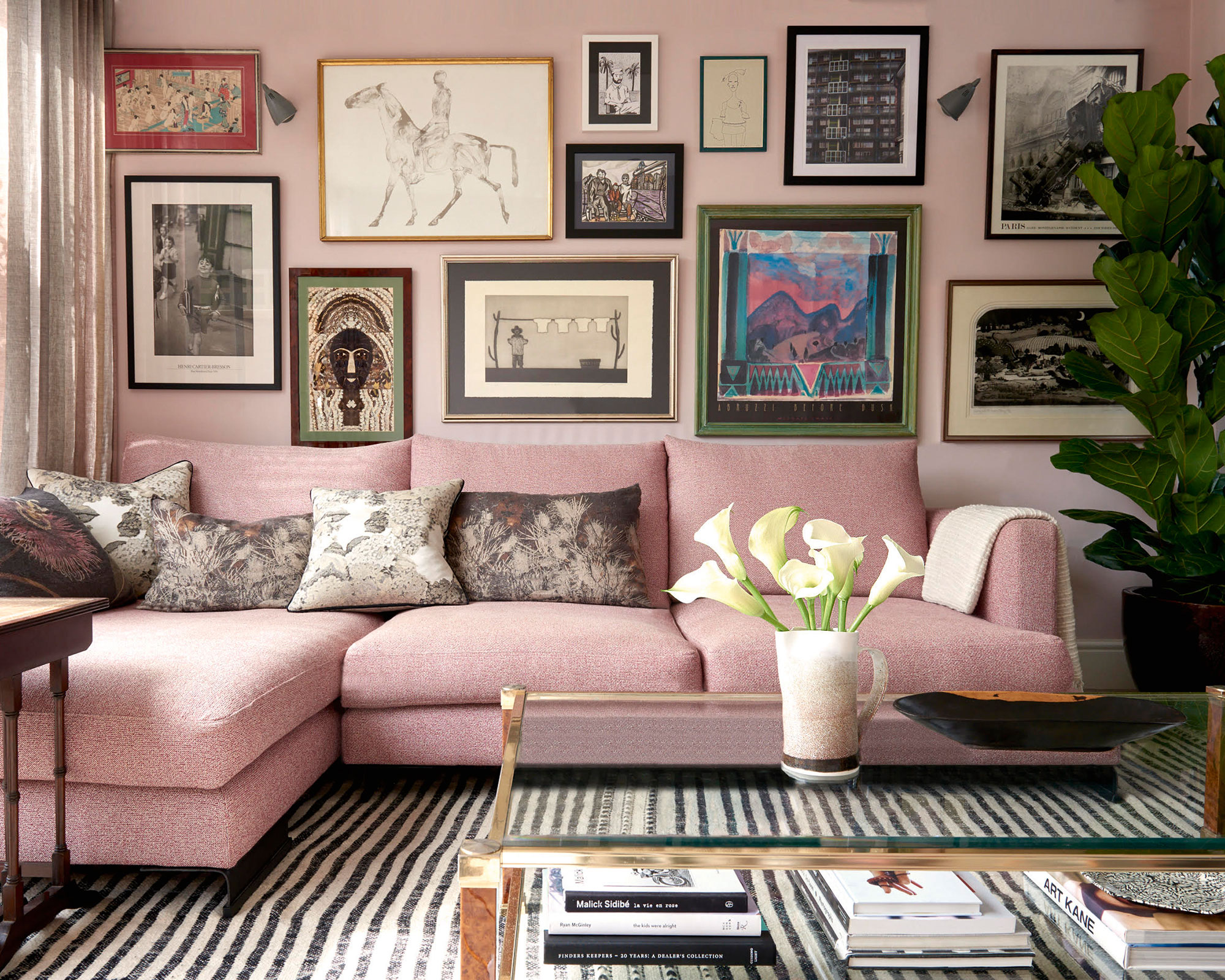
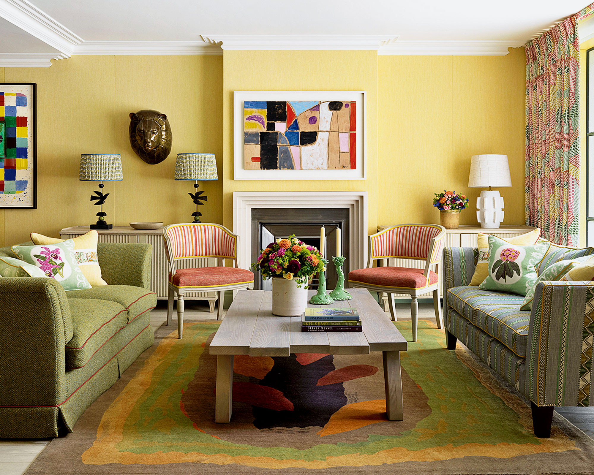
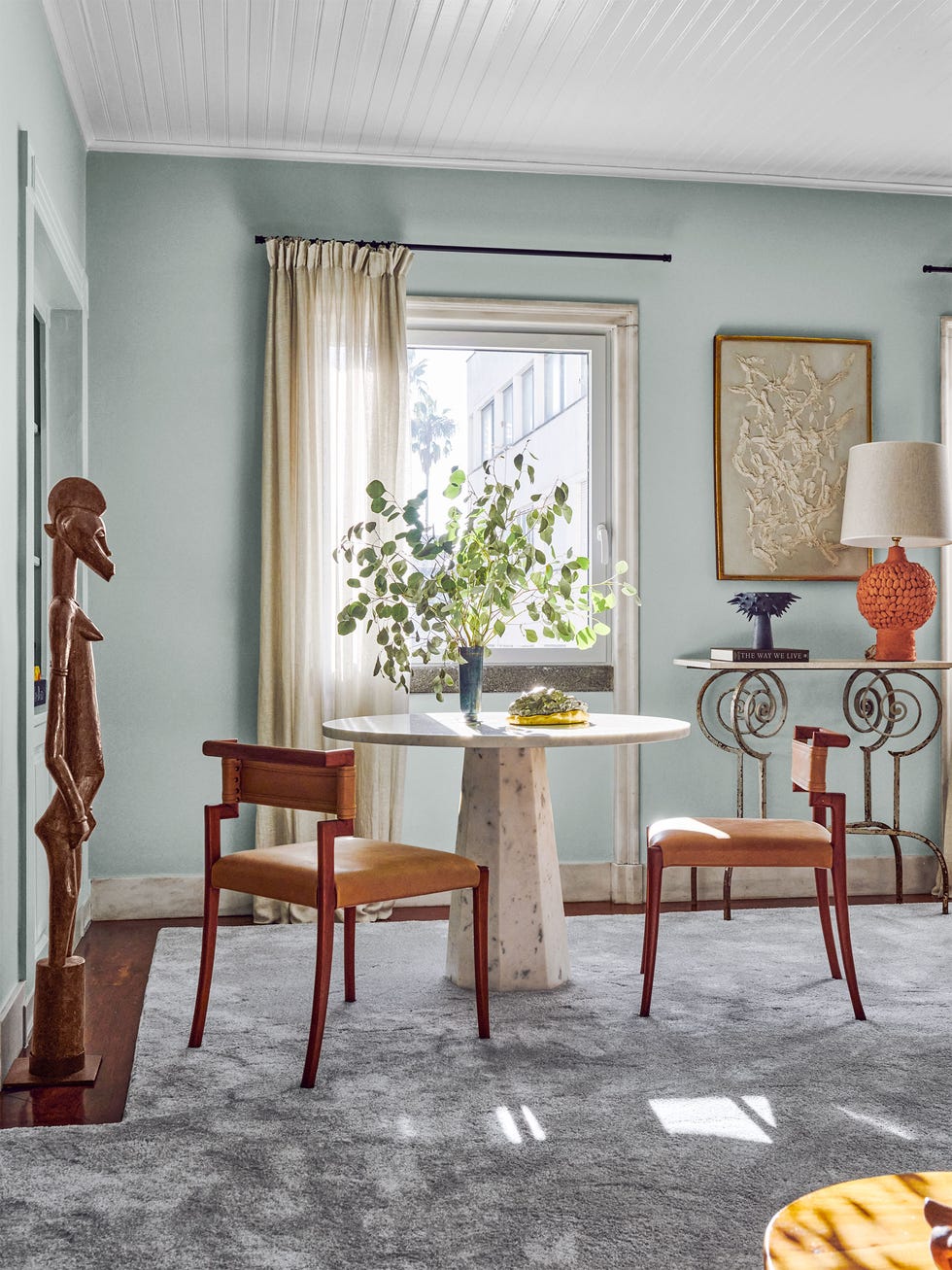
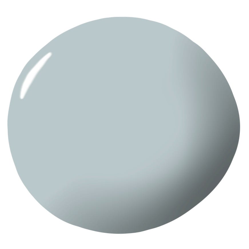
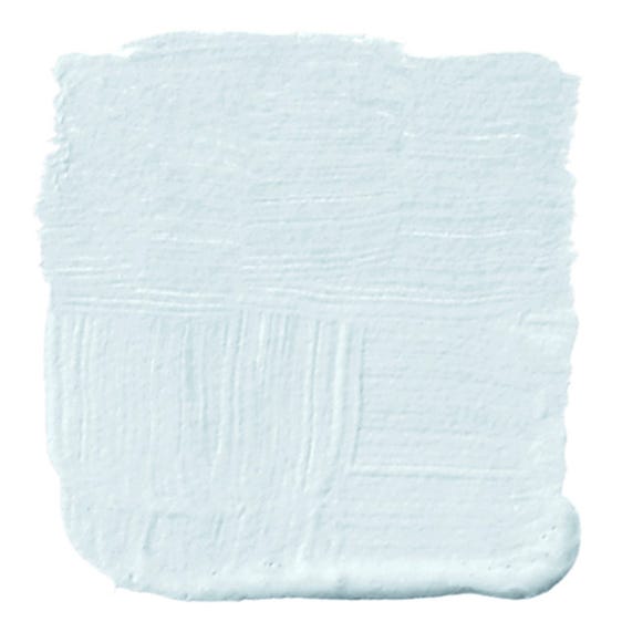
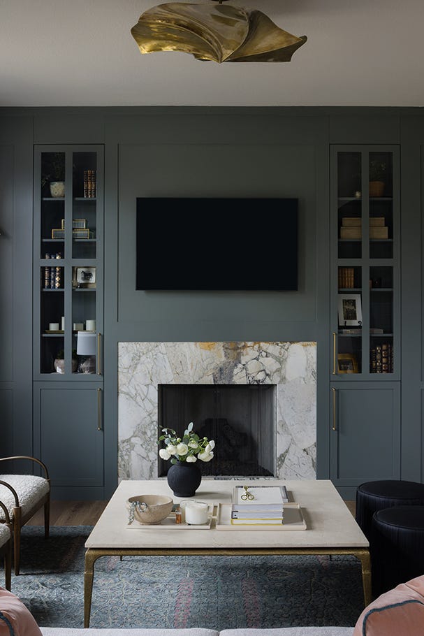
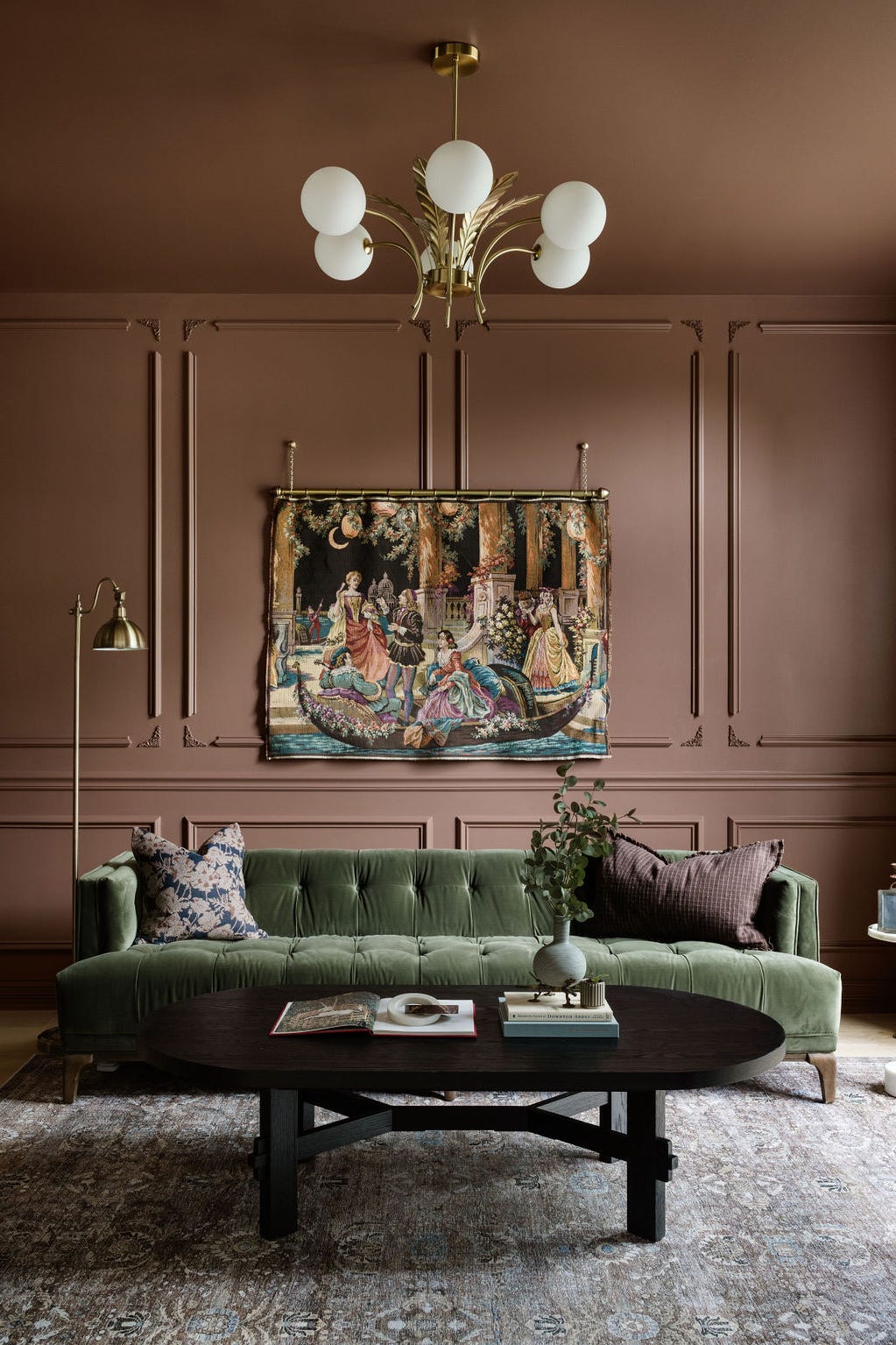
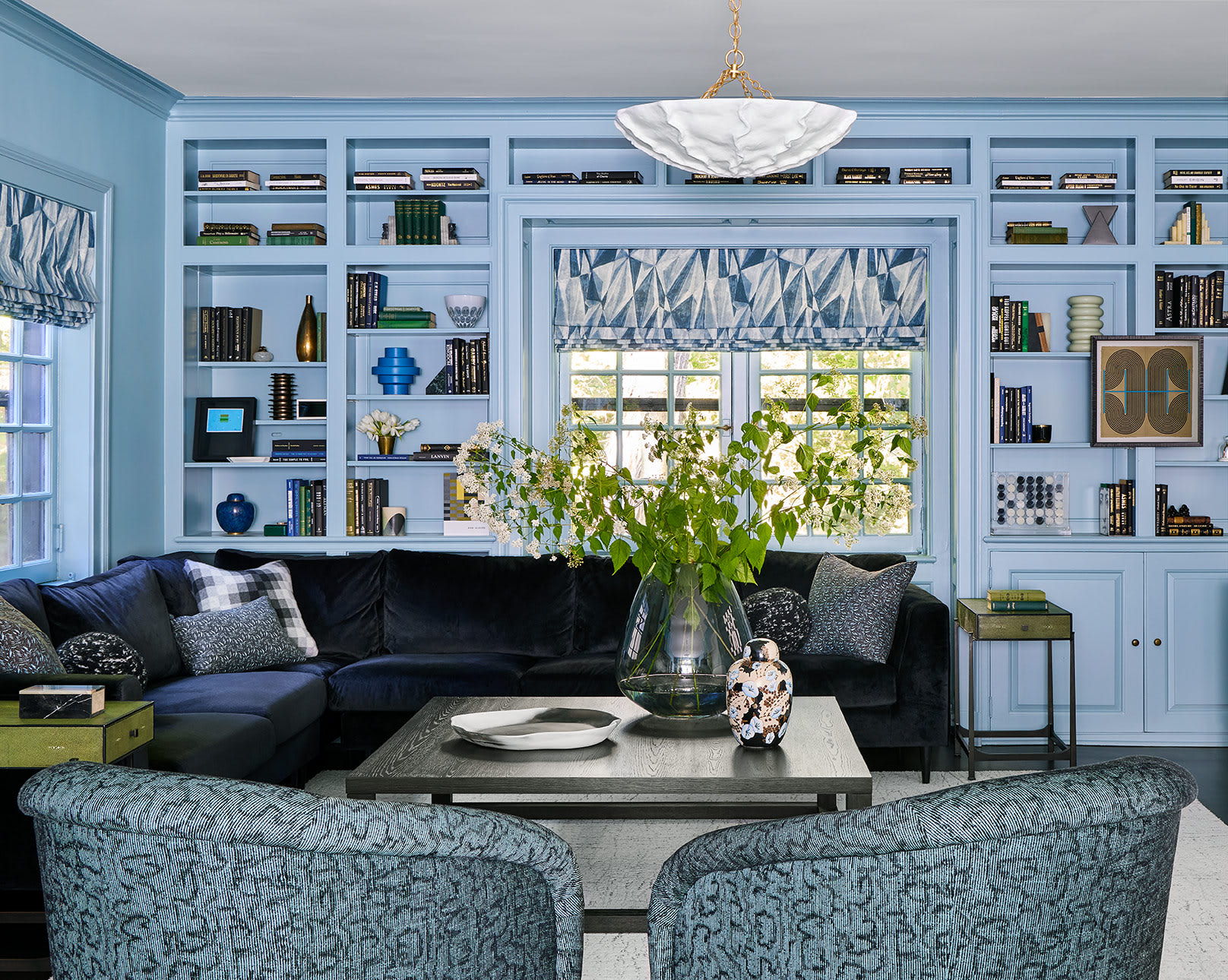
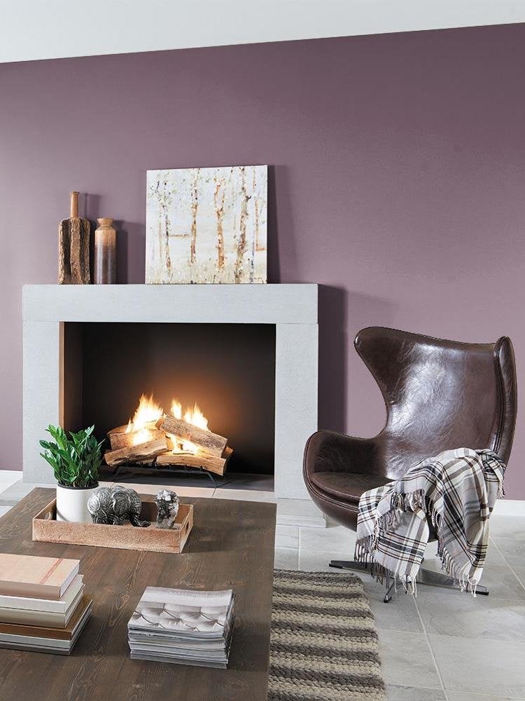
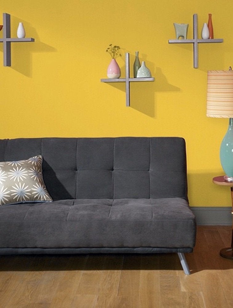
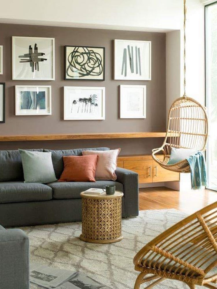
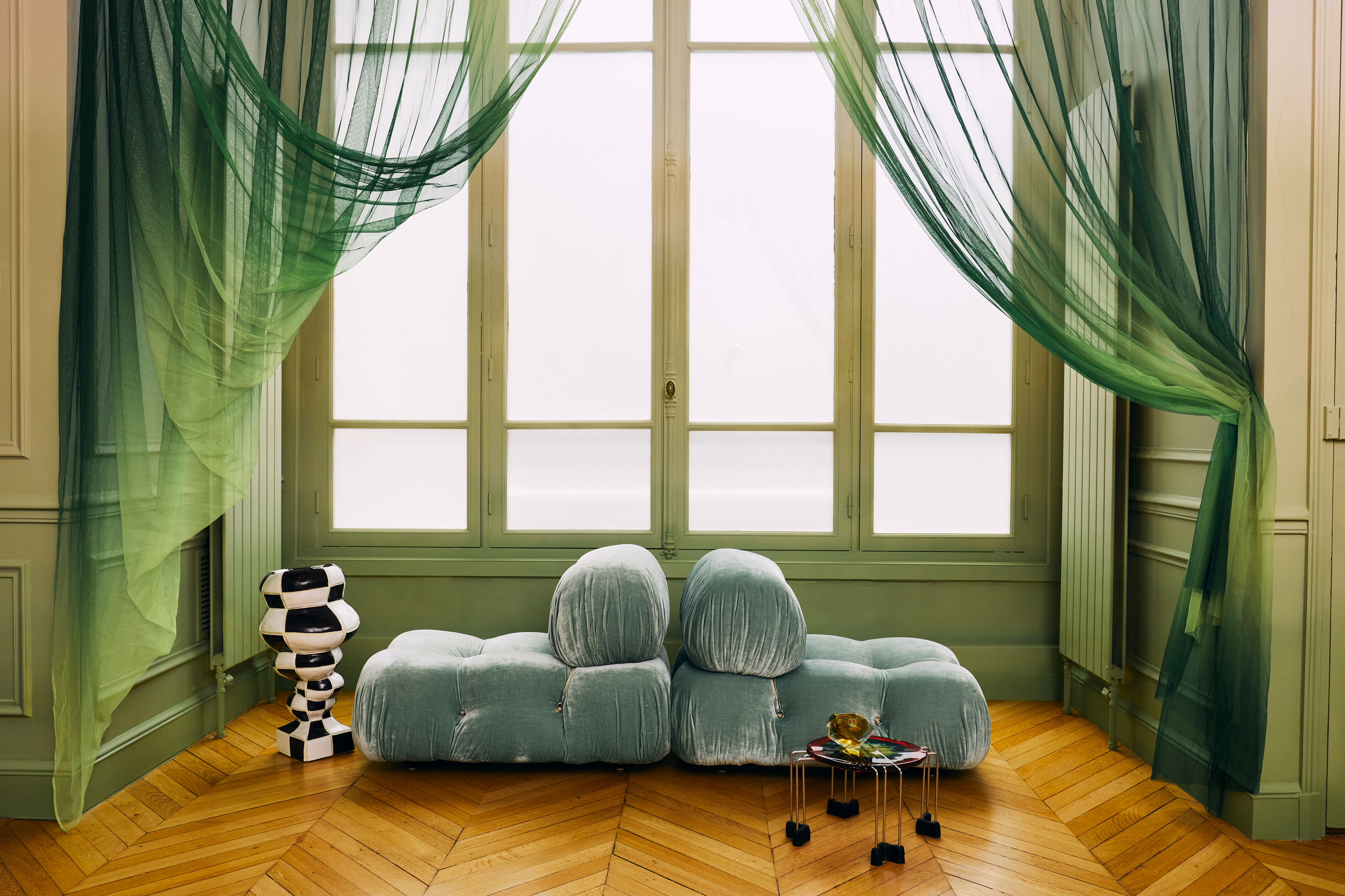
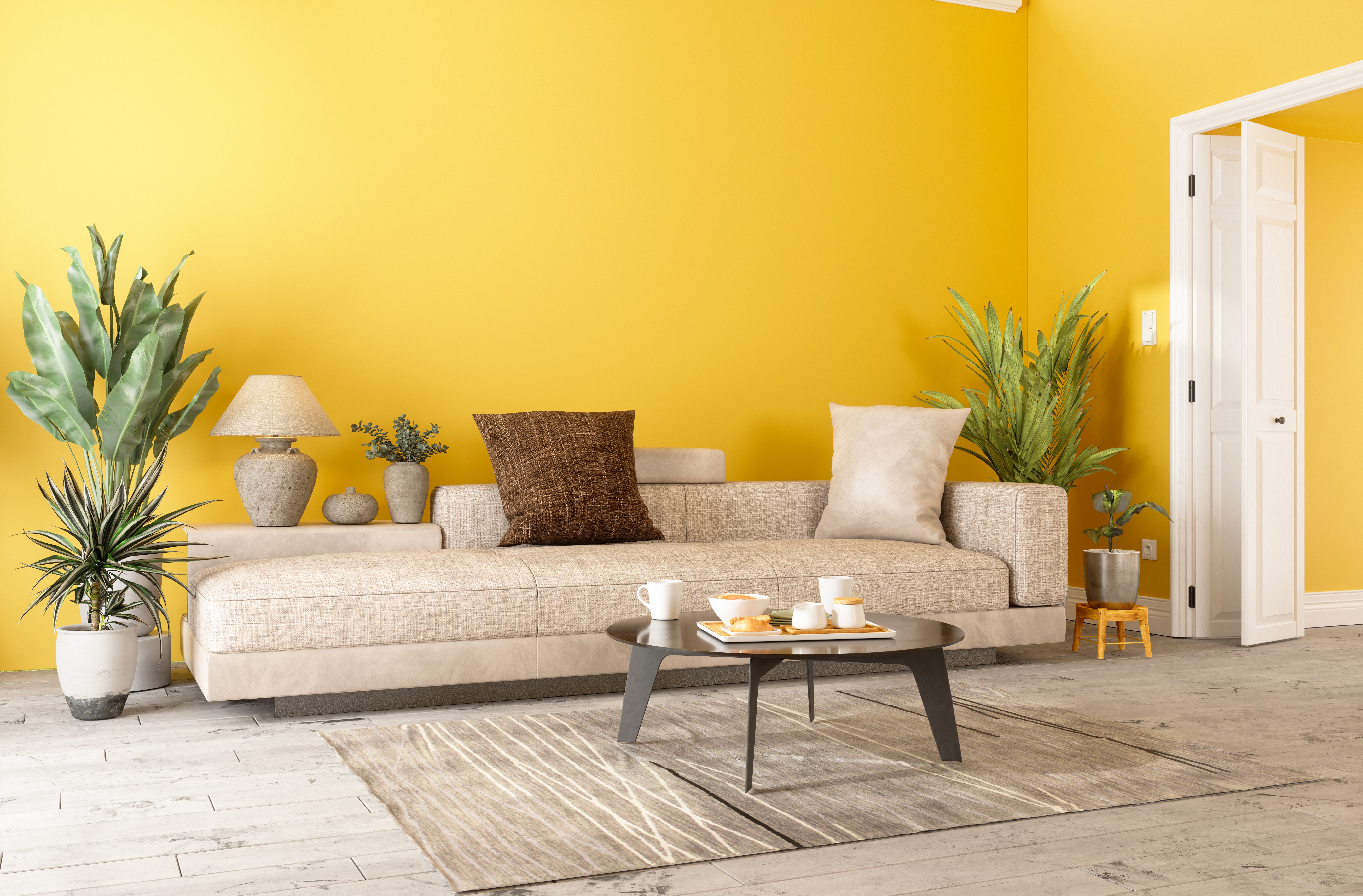
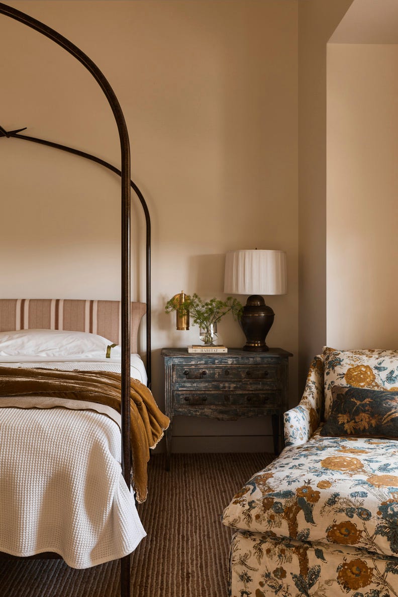
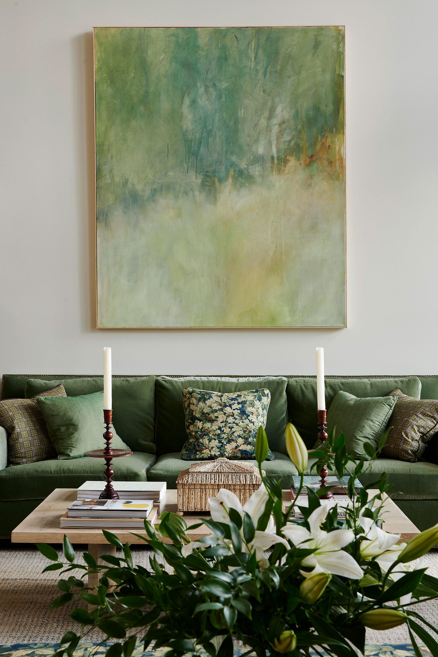
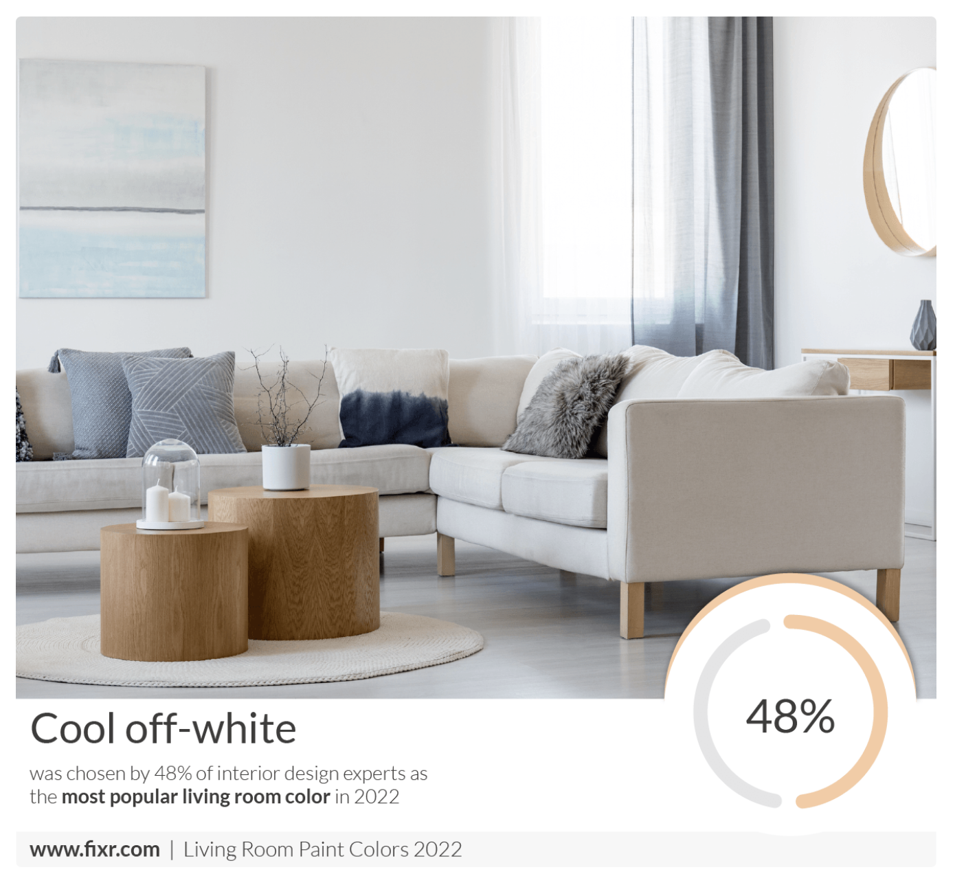
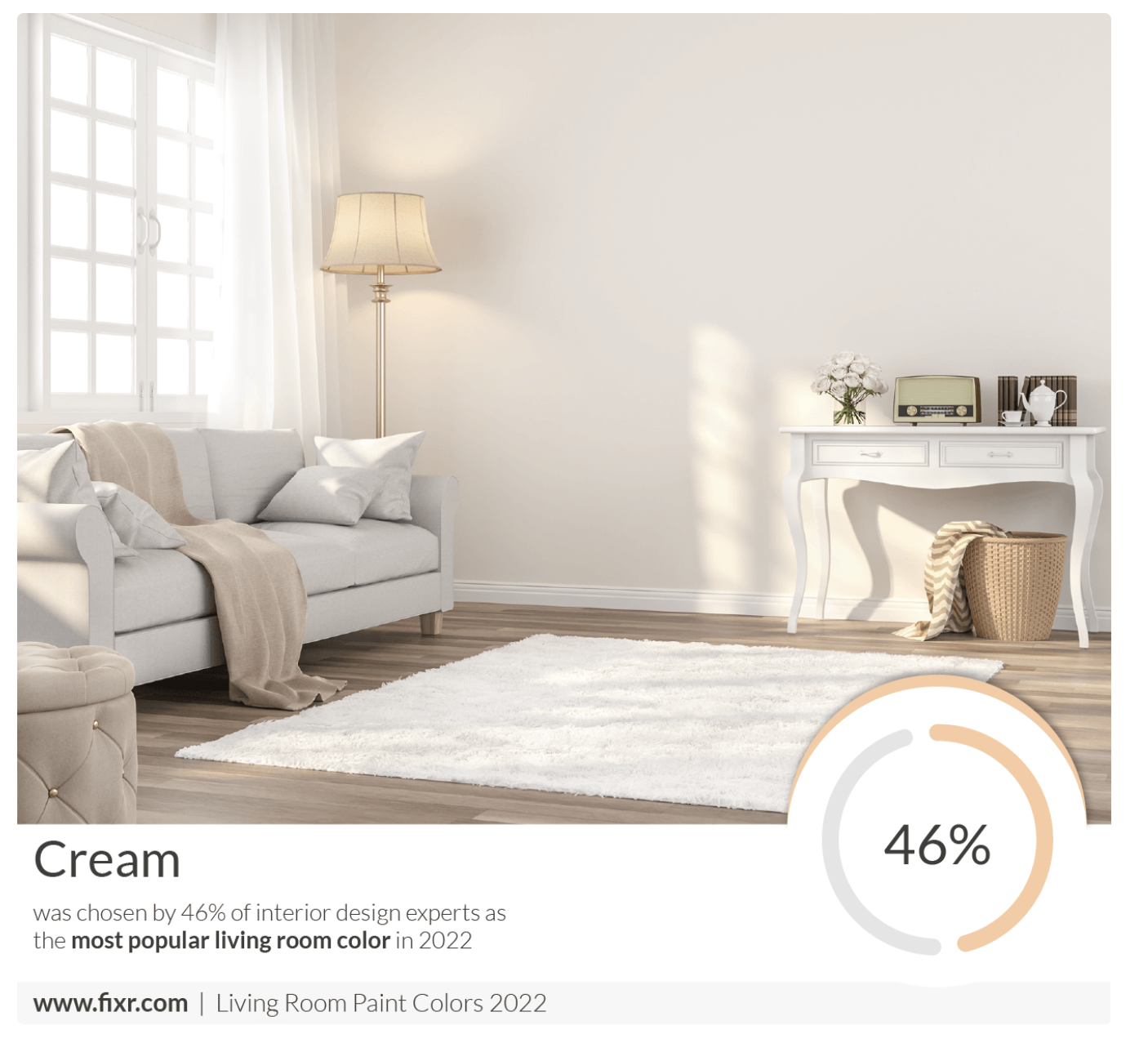
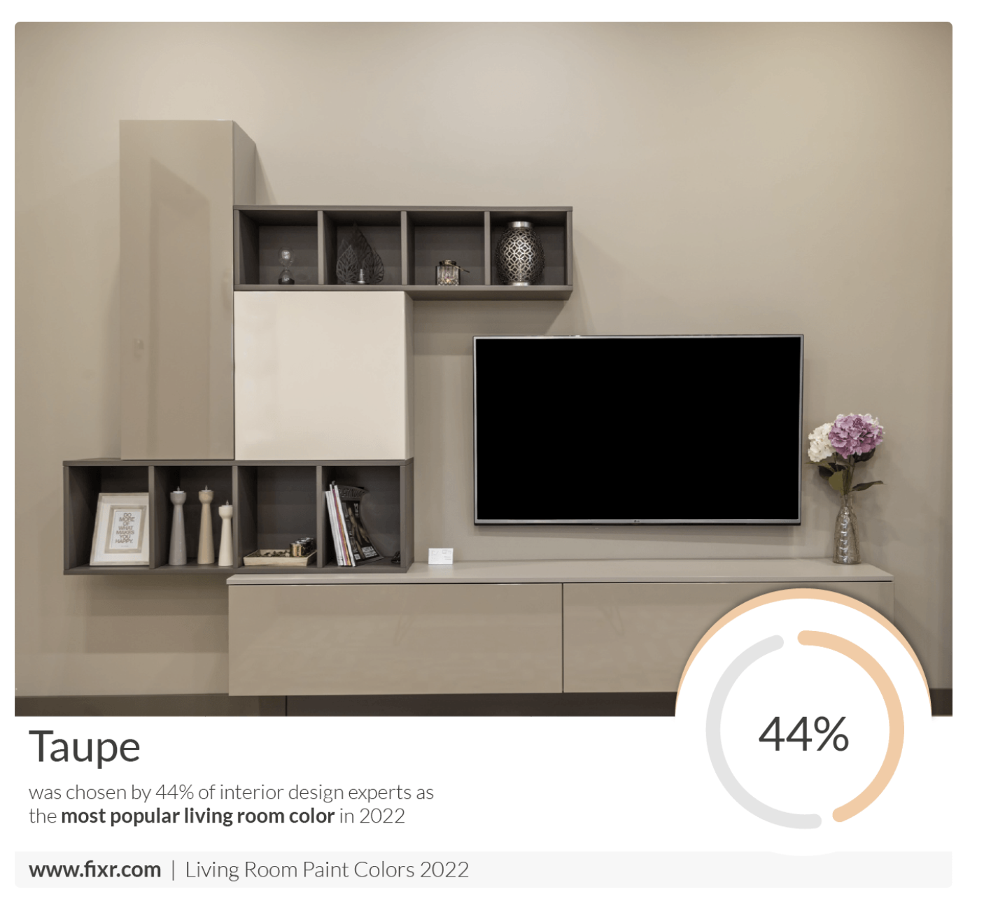
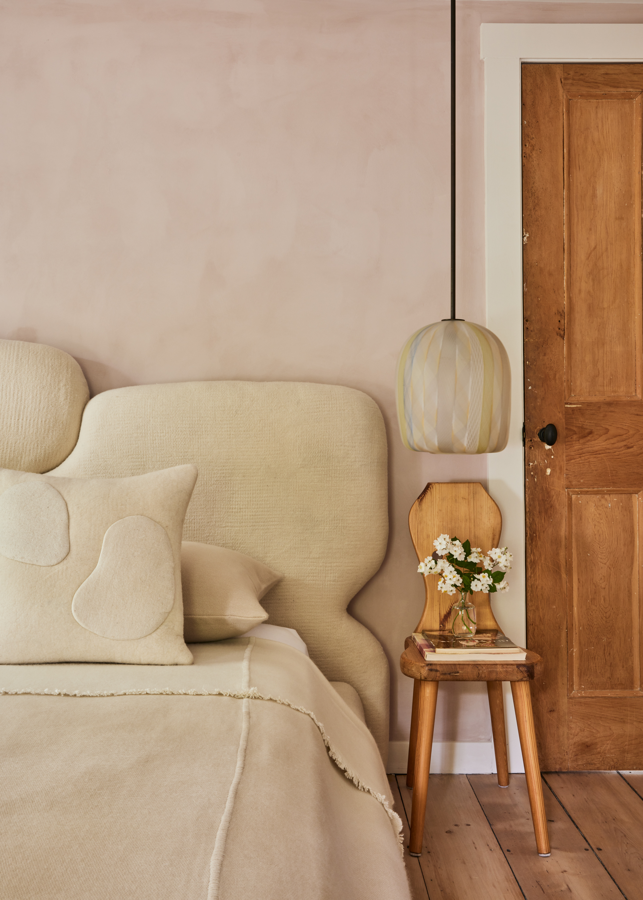
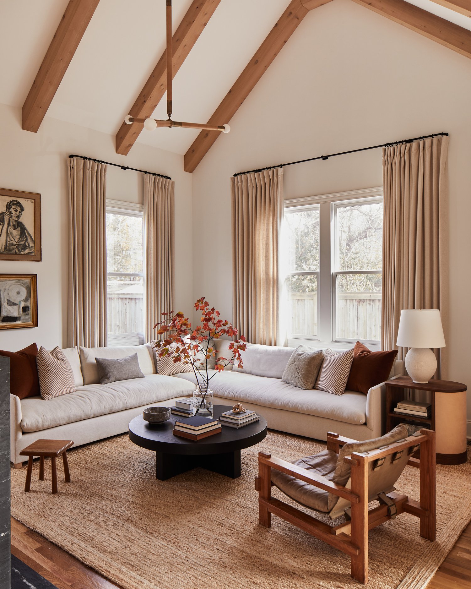
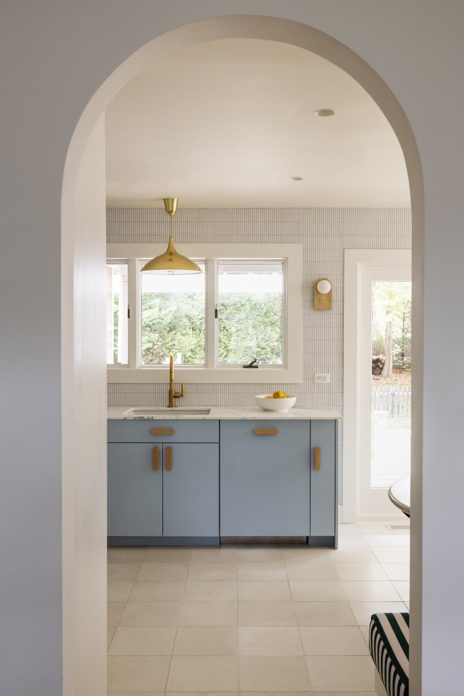
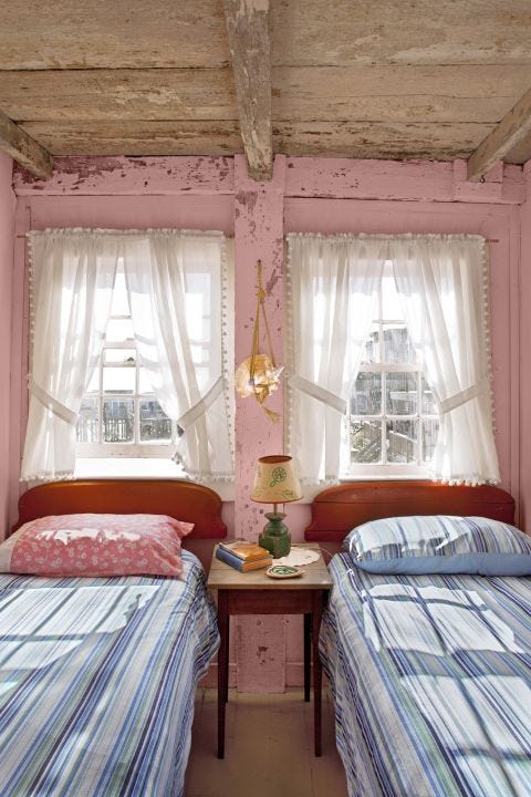
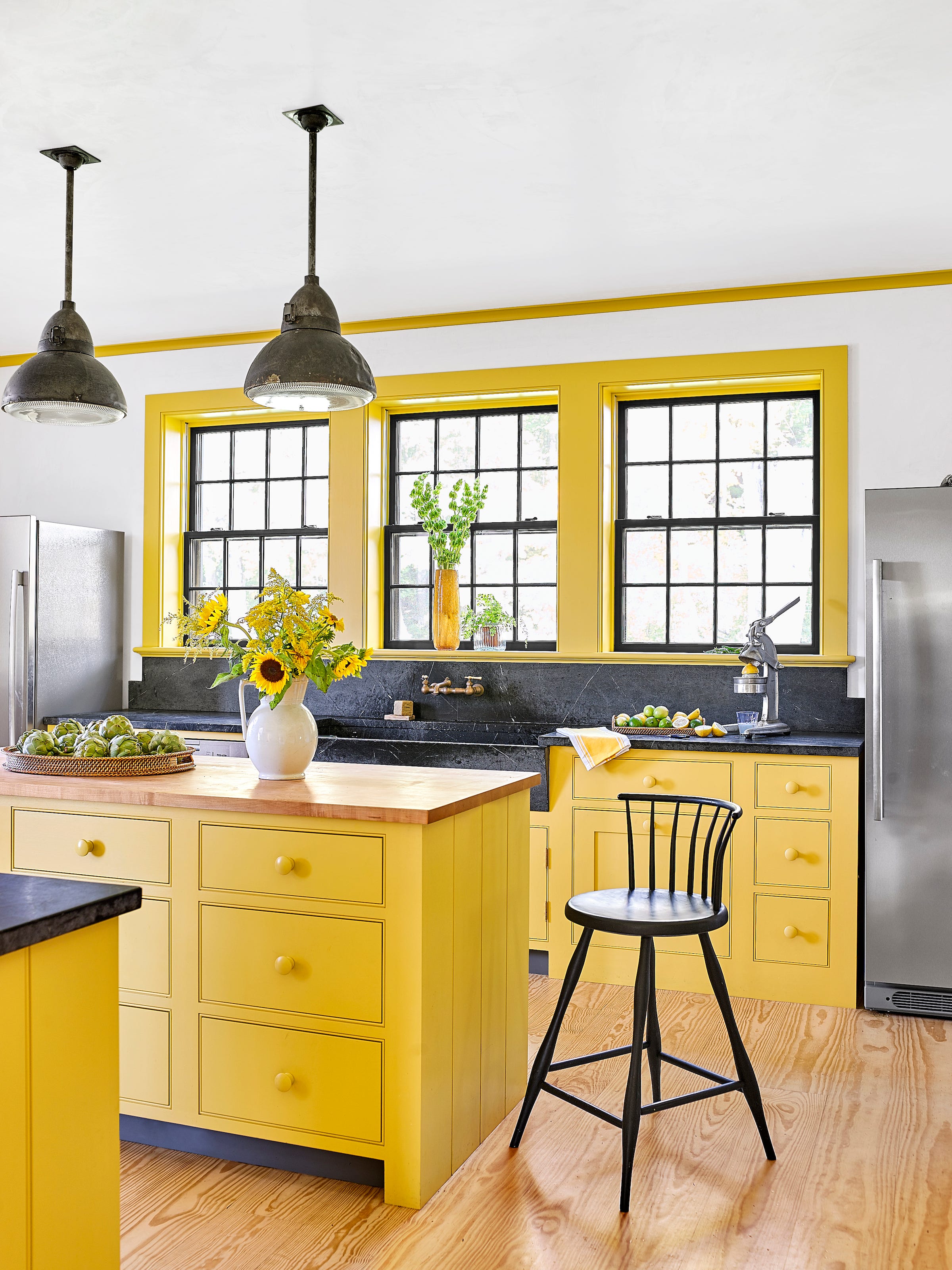
Twelve specific paint color recommendations are provided, each accompanied by a brief description and the endorsing designer(s). These include 'Grove Green' by Farrow & Ball, a deep green that brings timeless appeal to modern spaces; 'City Loft' by Sherwin-Williams, a hazy neutral with red and beige undertones, suitable for minimalistic bedrooms; and 'Light Blue' by Farrow & Ball, a soft, silvery blue reminiscent of nature. Other suggestions include 'Swiss Coffee' by Benjamin Moore, a warm off-white neutral; 'Ashwood' by Benjamin Moore, a warm gray with a hint of green; and 'Collingwood' by Benjamin Moore, a buttery white that pairs well with medium to deep browns. For those seeking a 'color color,' 'Salty Dog' by Sherwin-Williams, a navy blue, is recommended for its gender-neutral and outdoor-reflecting qualities. 'Budding Green' by Benjamin Moore and 'Halo' by Benjamin Moore, another beige option, are also featured. 'School House White' by Farrow & Ball is praised for its chic, timeless, and versatile nature. Finally, 'Black Jack' and 'Cedar Path' by Benjamin Moore are highlighted, demonstrating that deep, moody shades and energetic greens, respectively, can also contribute to a calming environment, with their perceived calmness shifting with natural light and personal association.
#CalmingColors #InteriorDesign #HomeDecor #PaintColors #StressReduction #ColorPsychology #BedroomColors #NeutralTones #FarrowAndBall #SherwinWilliams #BenjaminMoore #CalmingColors #InteriorDesign #HomeDecor #PaintColors #StressReduction #ColorPsychology #BedroomColors #NeutralTones #FarrowAndBall #SherwinWilliams #BenjaminMoore
0 commentaire au total
 Aucun commentaire pour le moment
Vous aimerez aussi
13 Calming Paint Colors Designers Use to Make Rooms Feel Soothing — And No, They're Not All Neutrals

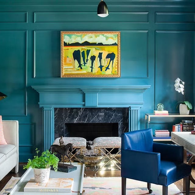
Listen Up: These Are the Best Paint Colors for Your Living Room

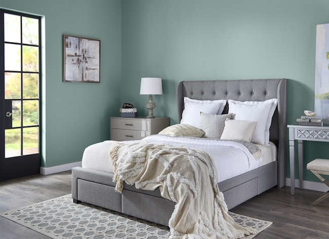
14 Paint Colors That Can Make a Room Feel Instantly Cozy

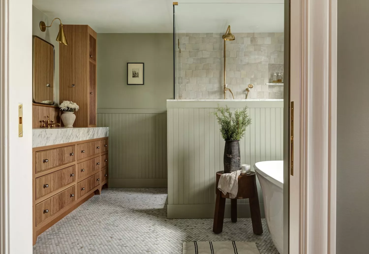
Designers Agree: These Are the Most Relaxing Paint Colors for Any Room

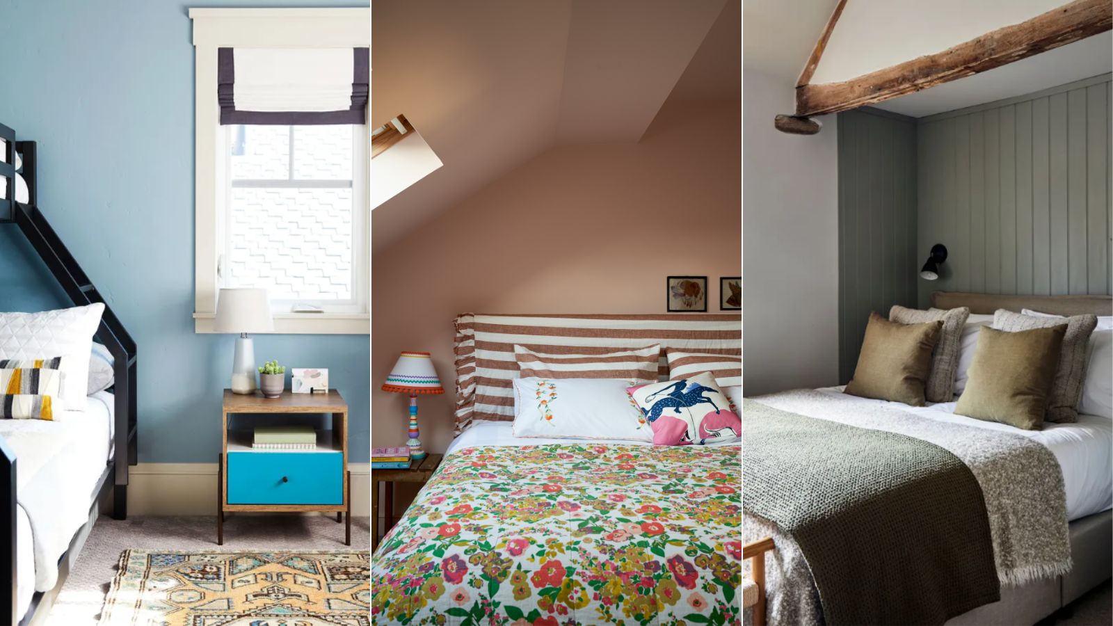
5 colors that will make your bedroom feel calmer, according to designers
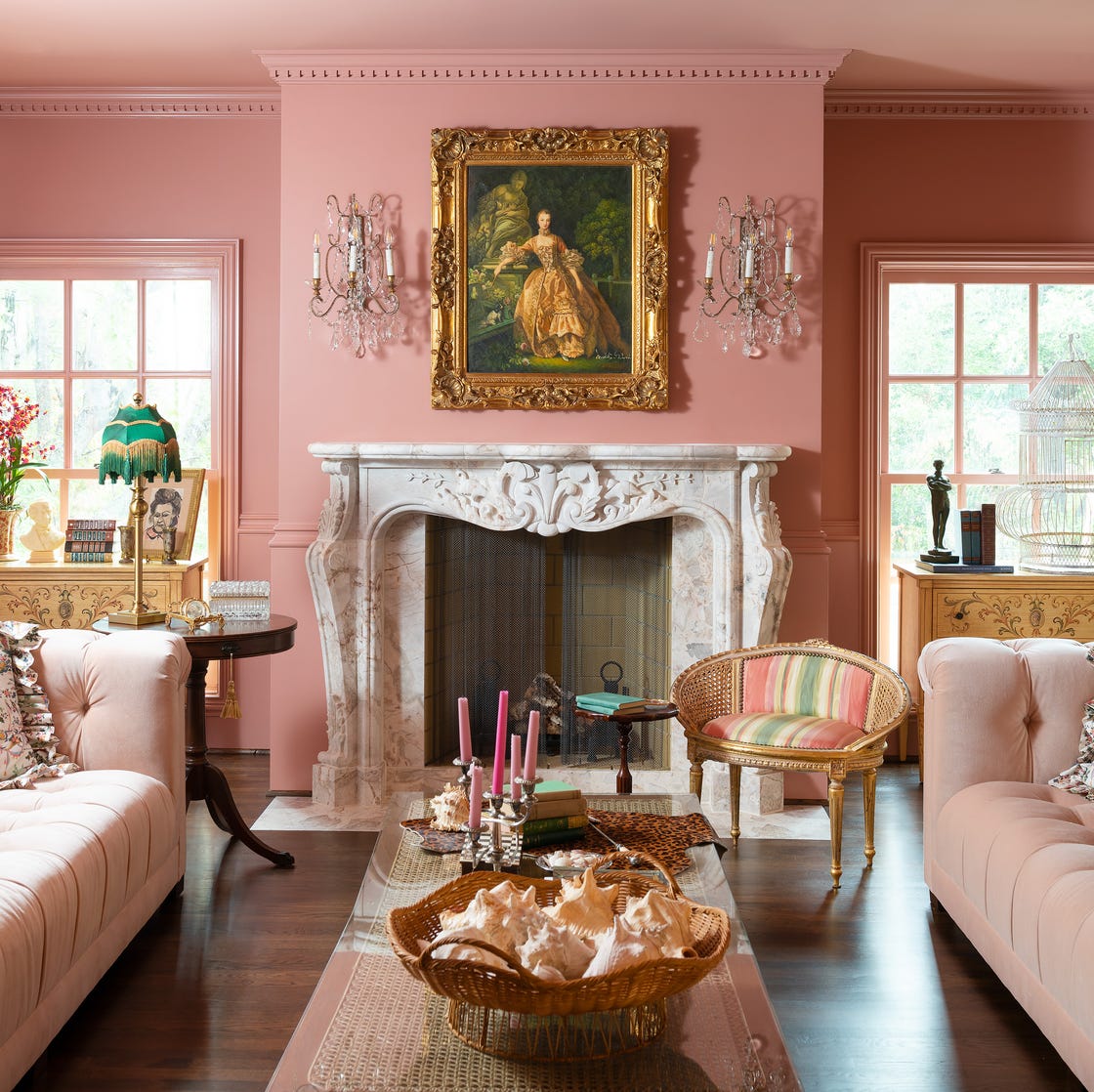
Designer-Approved Living Room Colors That'll Make You Feel Happier

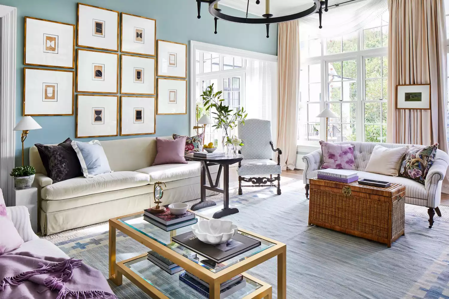
6 Calming Paint Colors Designers Swear By For A Relaxing Living Room
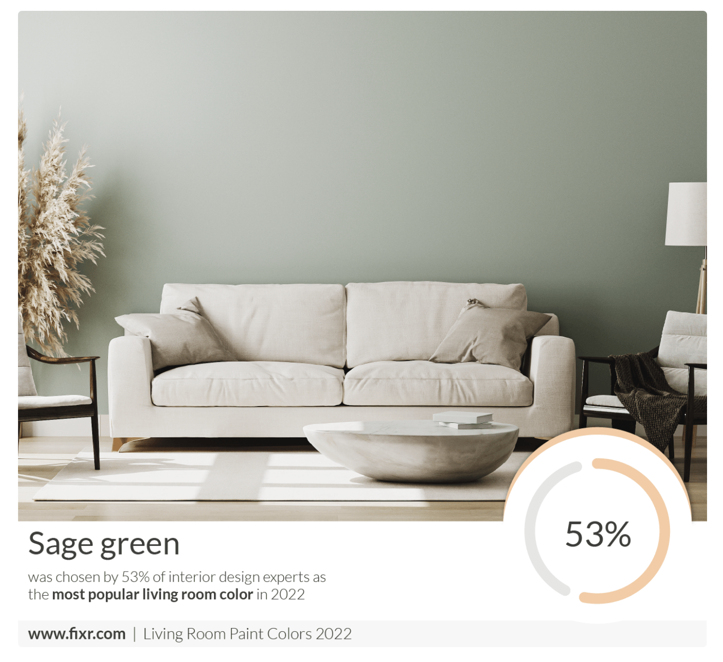
7 Popular Paint Colors for the Living Room
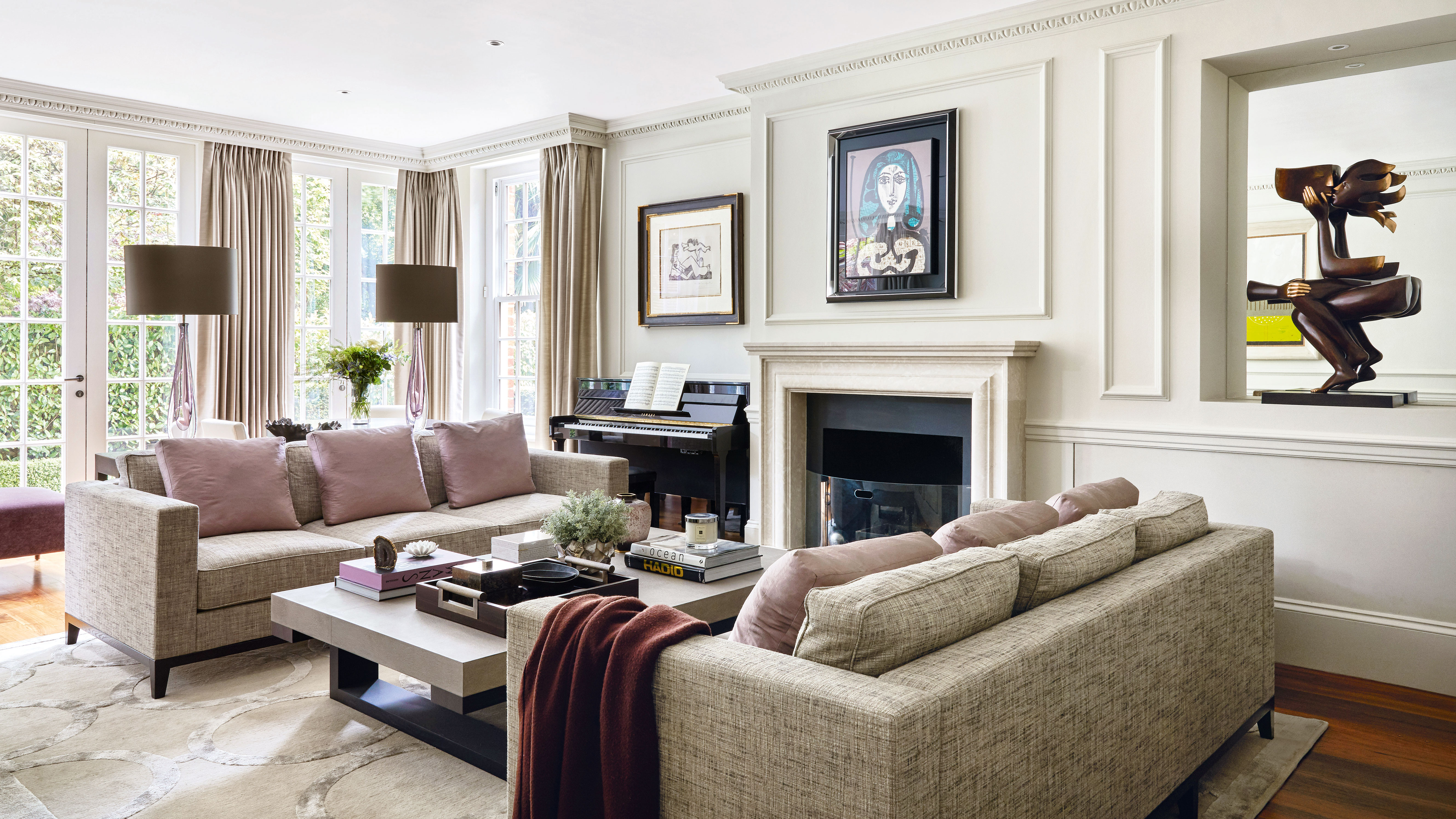
5 colors that will make your living room feel happier, according to interior designers
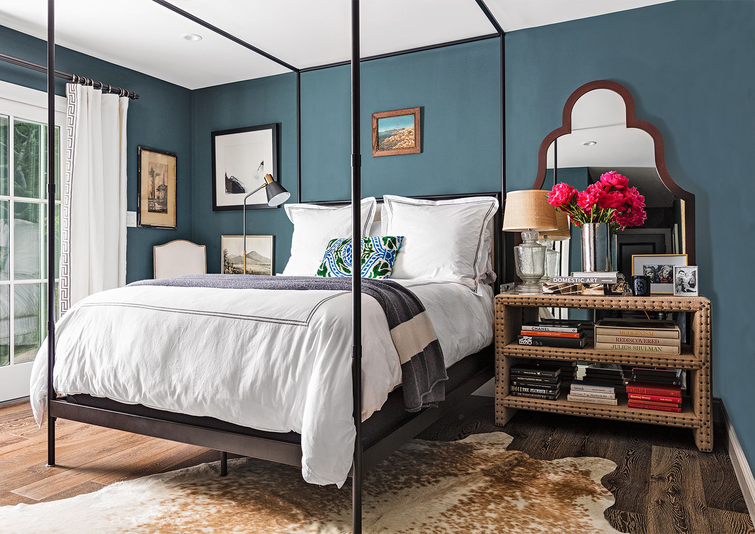
16 Calming Paint Colors That Will Make Your Home a More Restful Place

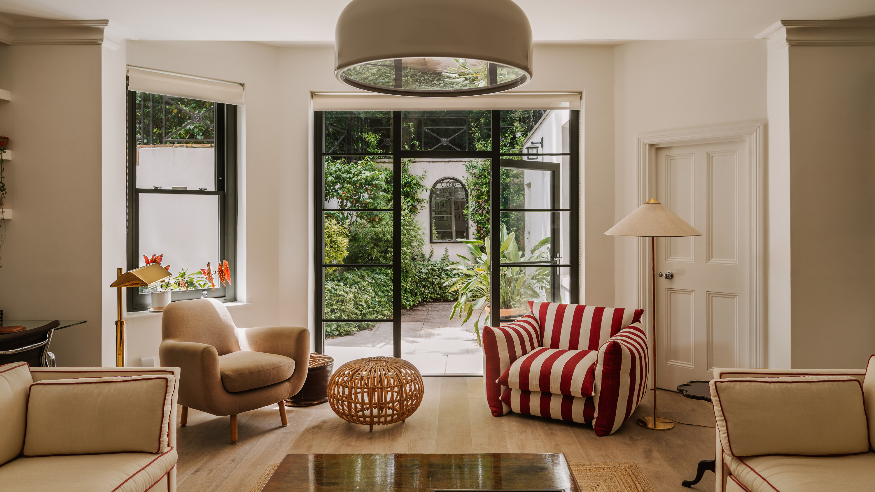
Feng Shui Living Room Colors — Find Your Inner Peace By Bringing These Shades Into Your Home
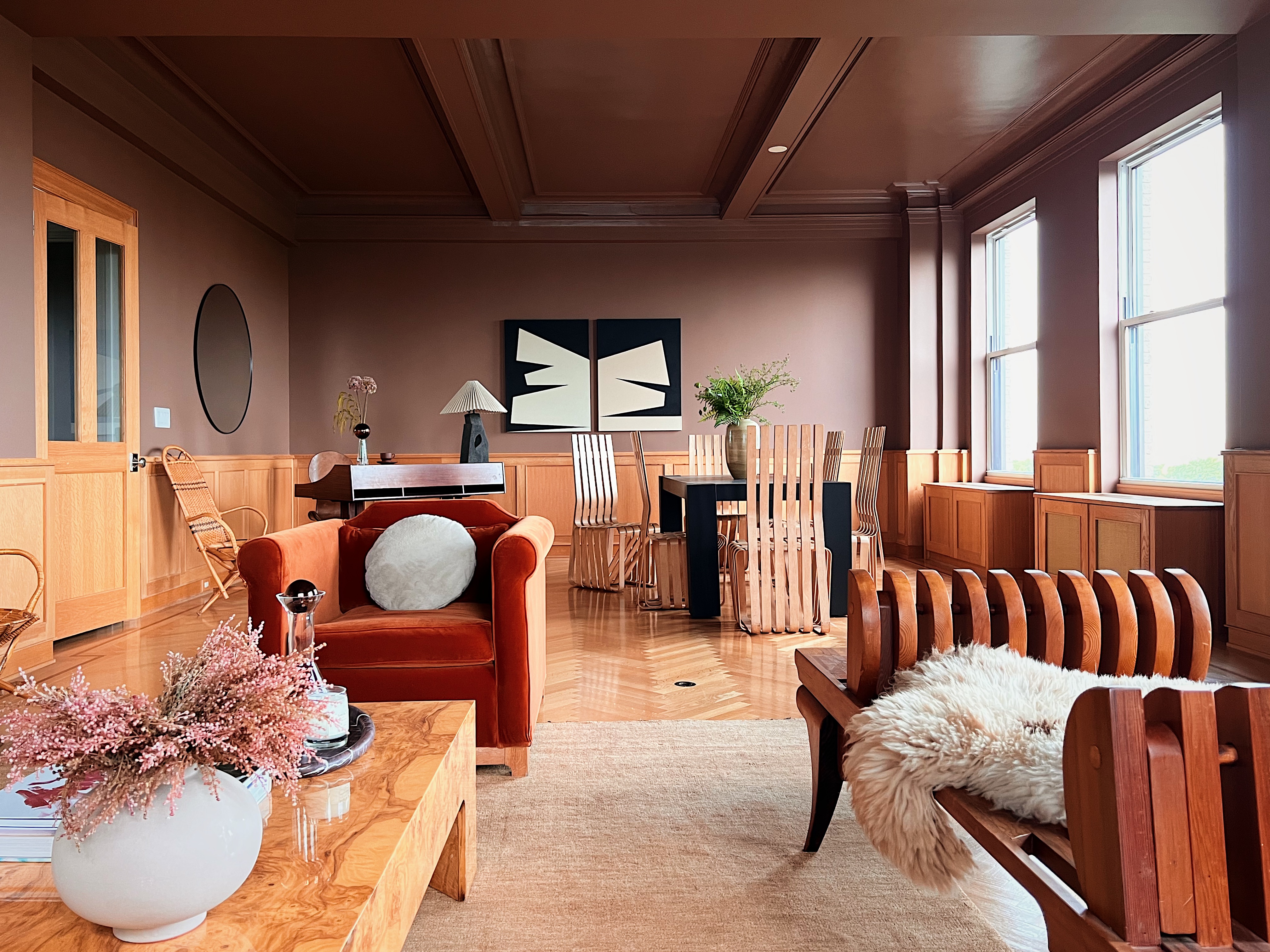
How to Create a Calm Color Palette Without Skimping on Character — 8 Interior Designers Share Their Tips
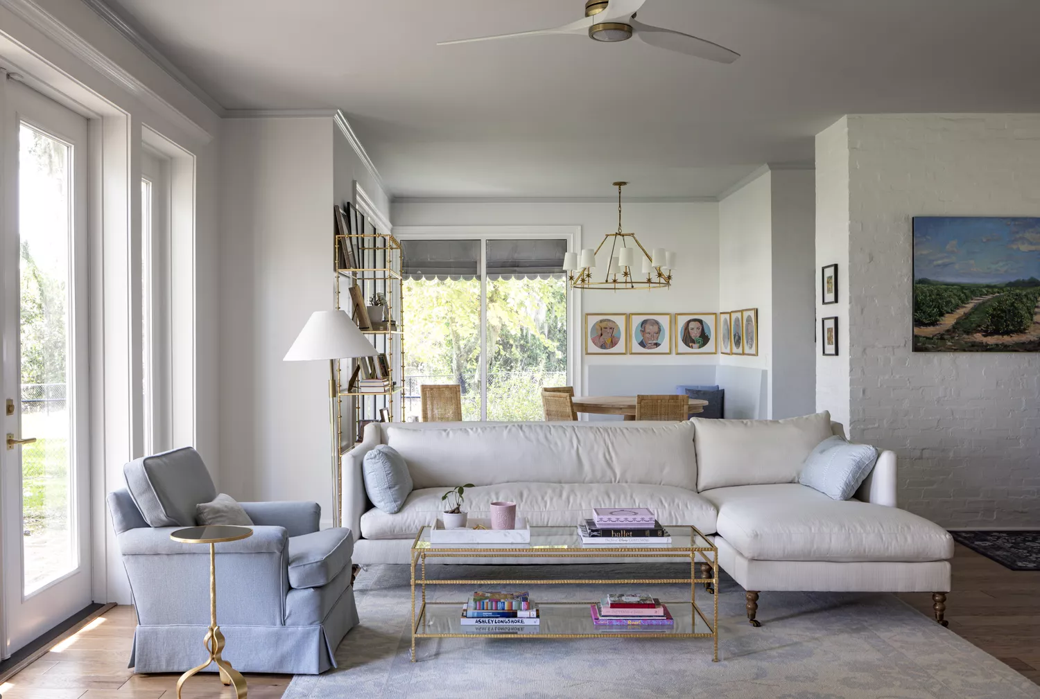
8 Calming Paint Colors Designers Use to Create a Warm, Welcoming Living Room
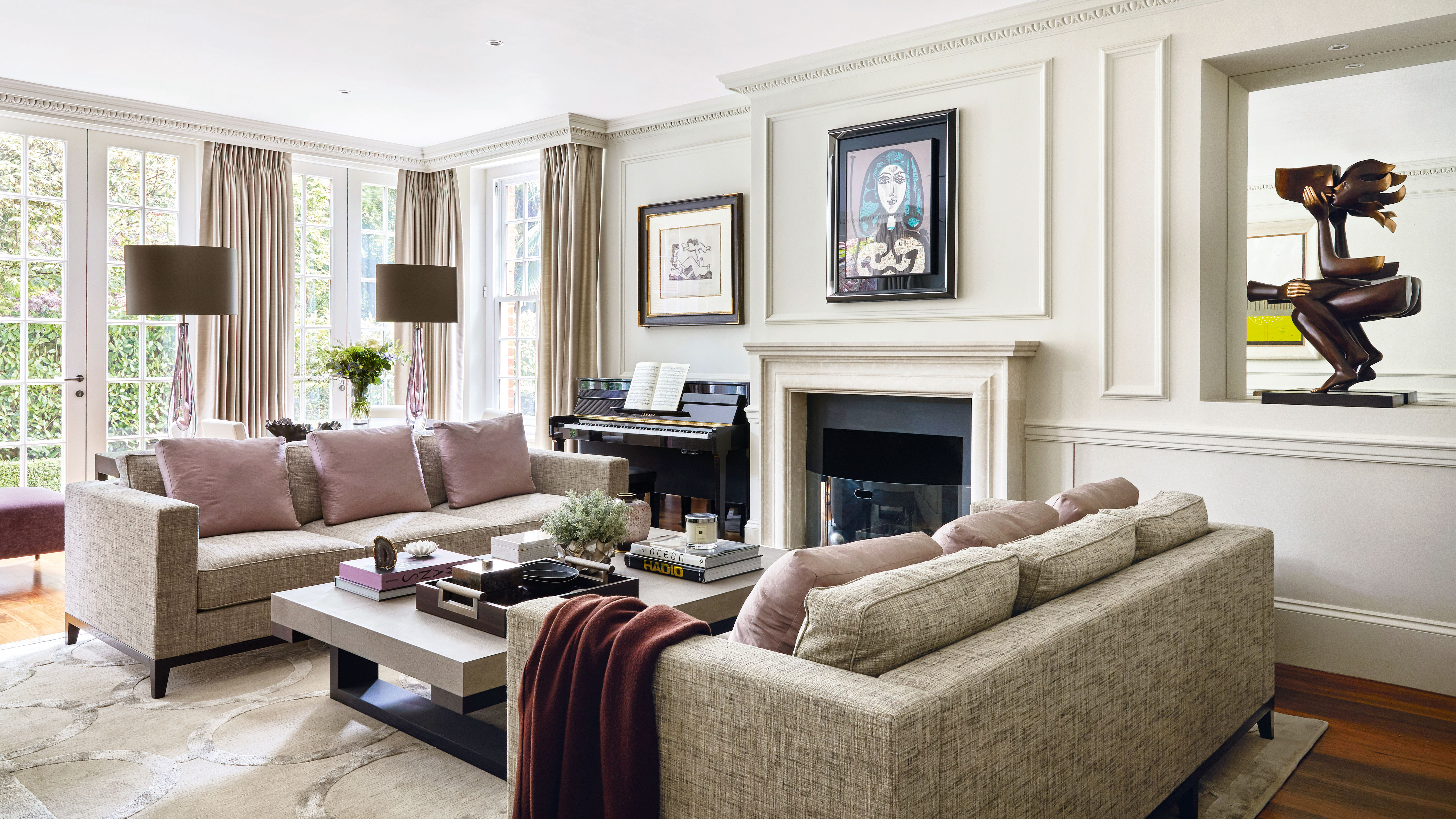
5 best happy living room colors for an uplifting space

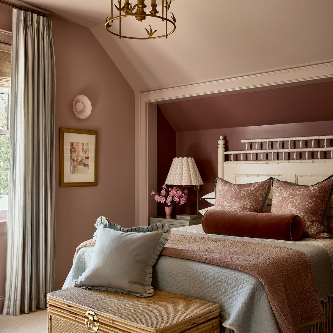
You Can Wake Up HAPPIER Just by Painting Your Bedroom—Here Are the Colors Designers Love
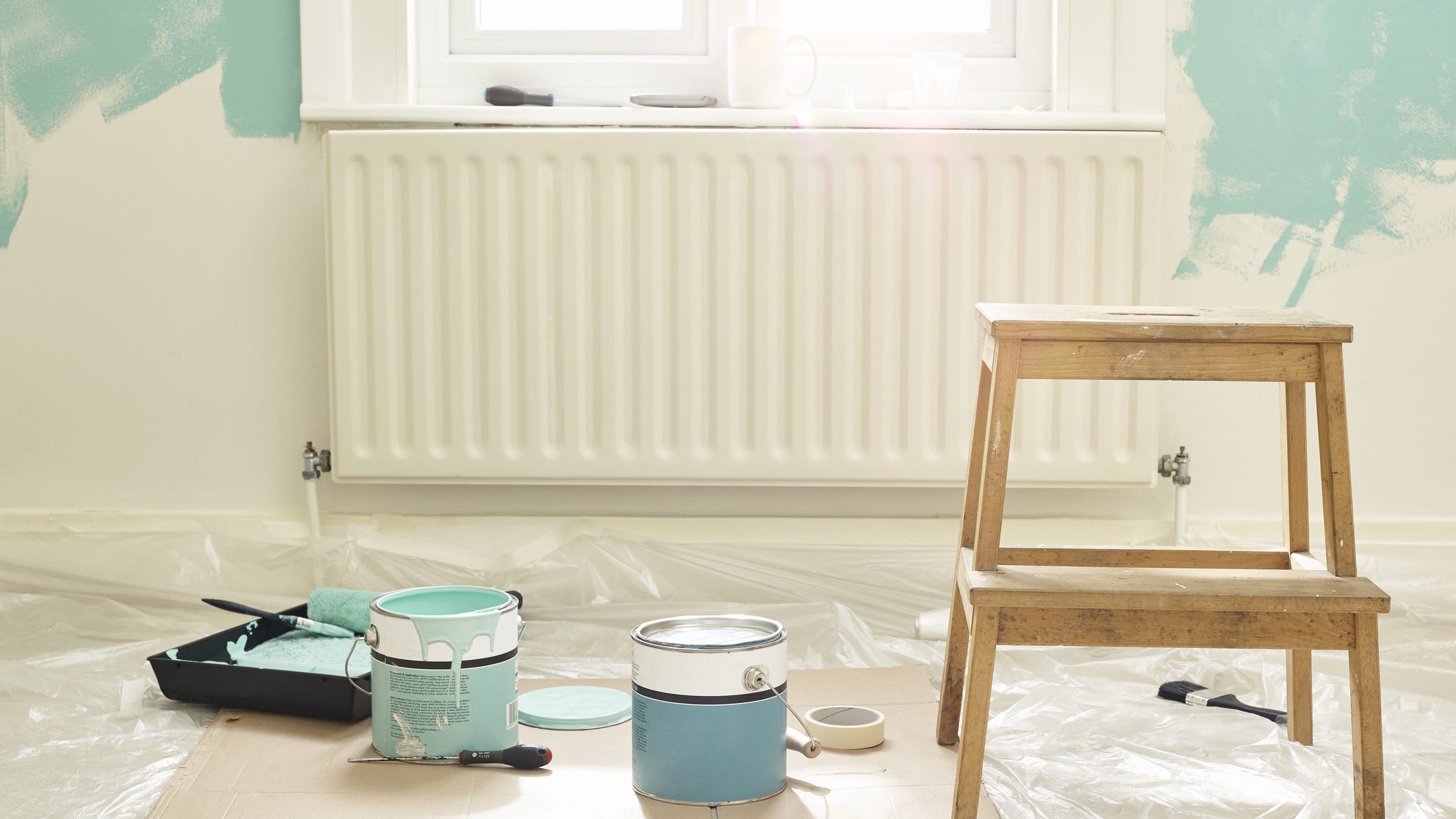
Add These Happy Colors to Your Home and Boost Your Mood
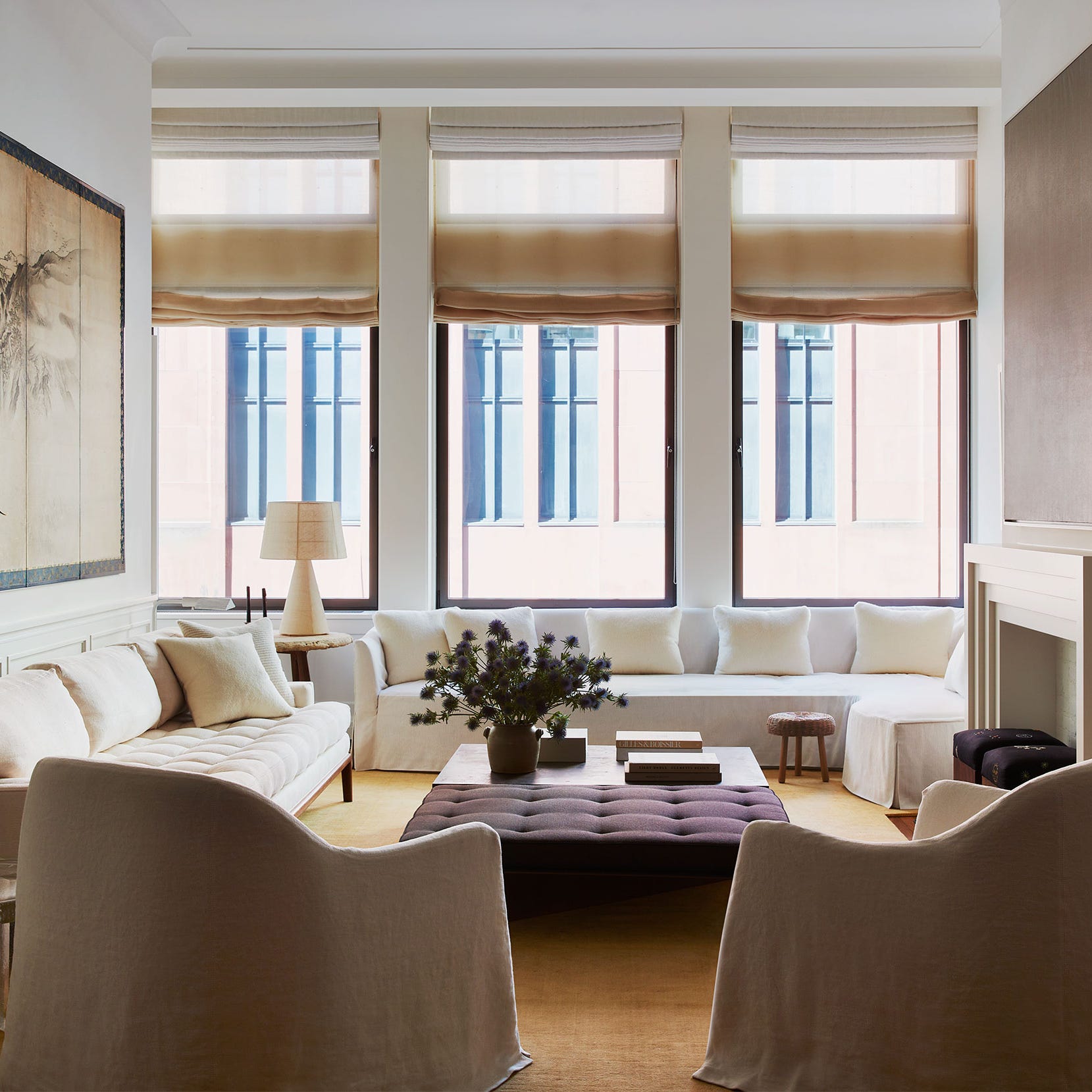
20 Calming Paint Colors That Will Change the Way You Live

18 Living Room Color Ideas That are Oh-So Inviting
55 Living Room Color Ideas That Will Take Your Space from Drab to Fab
What paint colors to use to create a relaxed vibe at home