12 Calming Colors to Paint Your Walls, According to Interior Designers
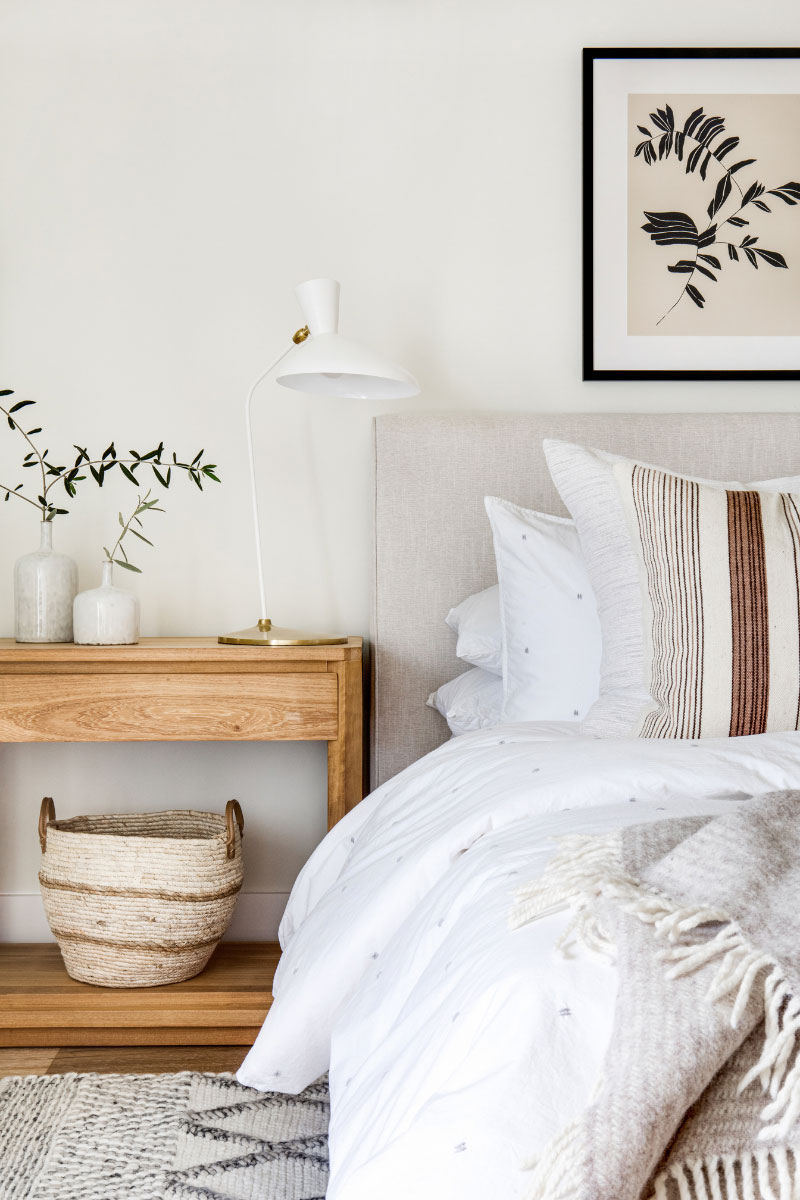
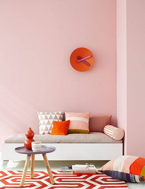
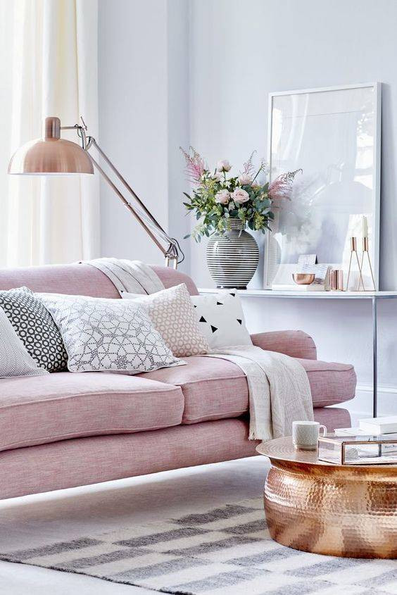
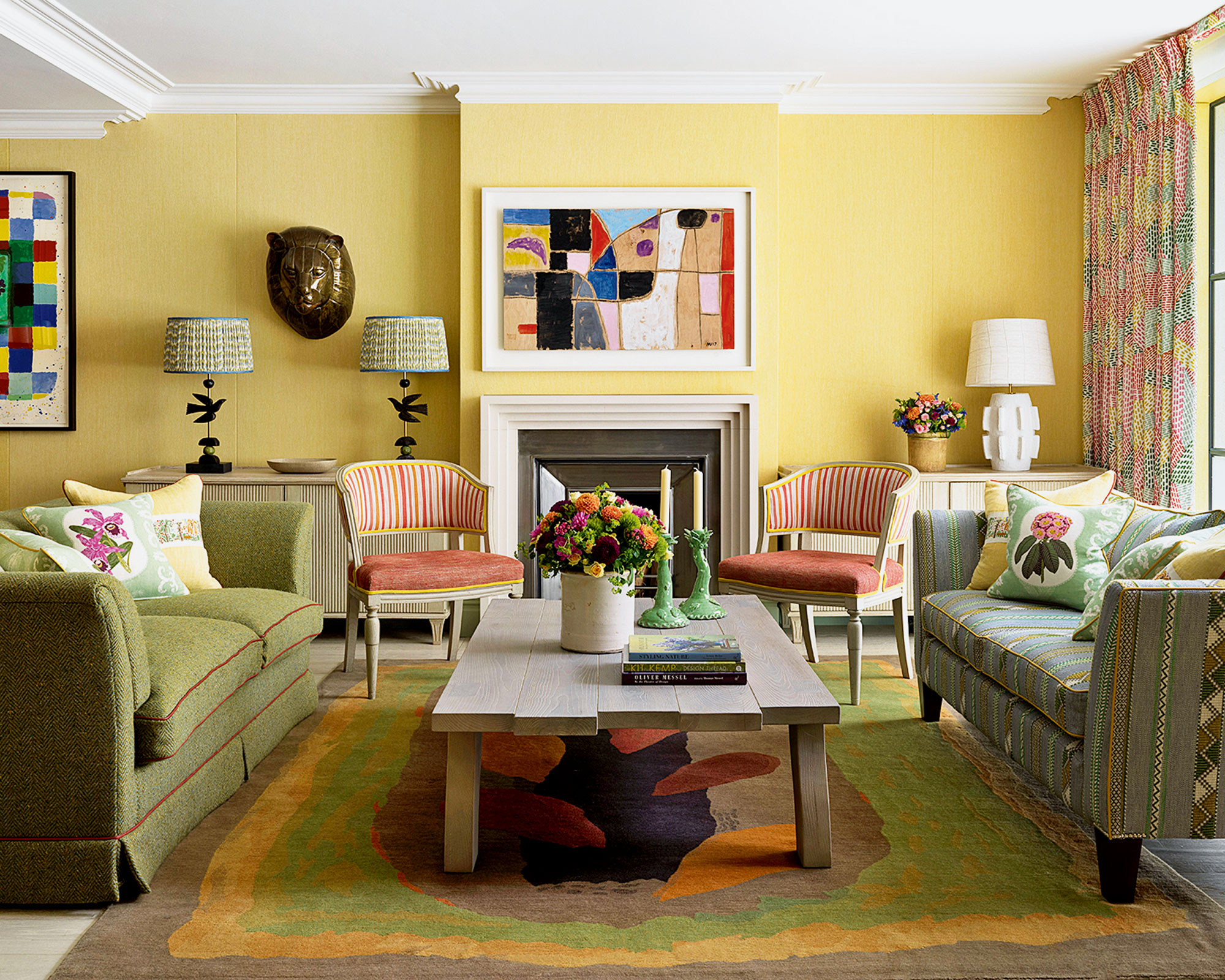
The color of a home's walls significantly impacts the atmosphere and can influence stress levels and relaxation. Interior designers recommend selecting calming colors known for their soothing effects to create a peaceful environment. These colors are often cool and neutral tones, such as blues, greens, whites, grays, and beiges, which are believed to evoke serenity and tranquility. While color psychology research is still evolving, there's a general consensus that certain hues have a more calming impact. However, individual preferences and cultural backgrounds also play a crucial role in how someone perceives and reacts to a particular color, meaning a specific shade might be uniquely calming to an individual.
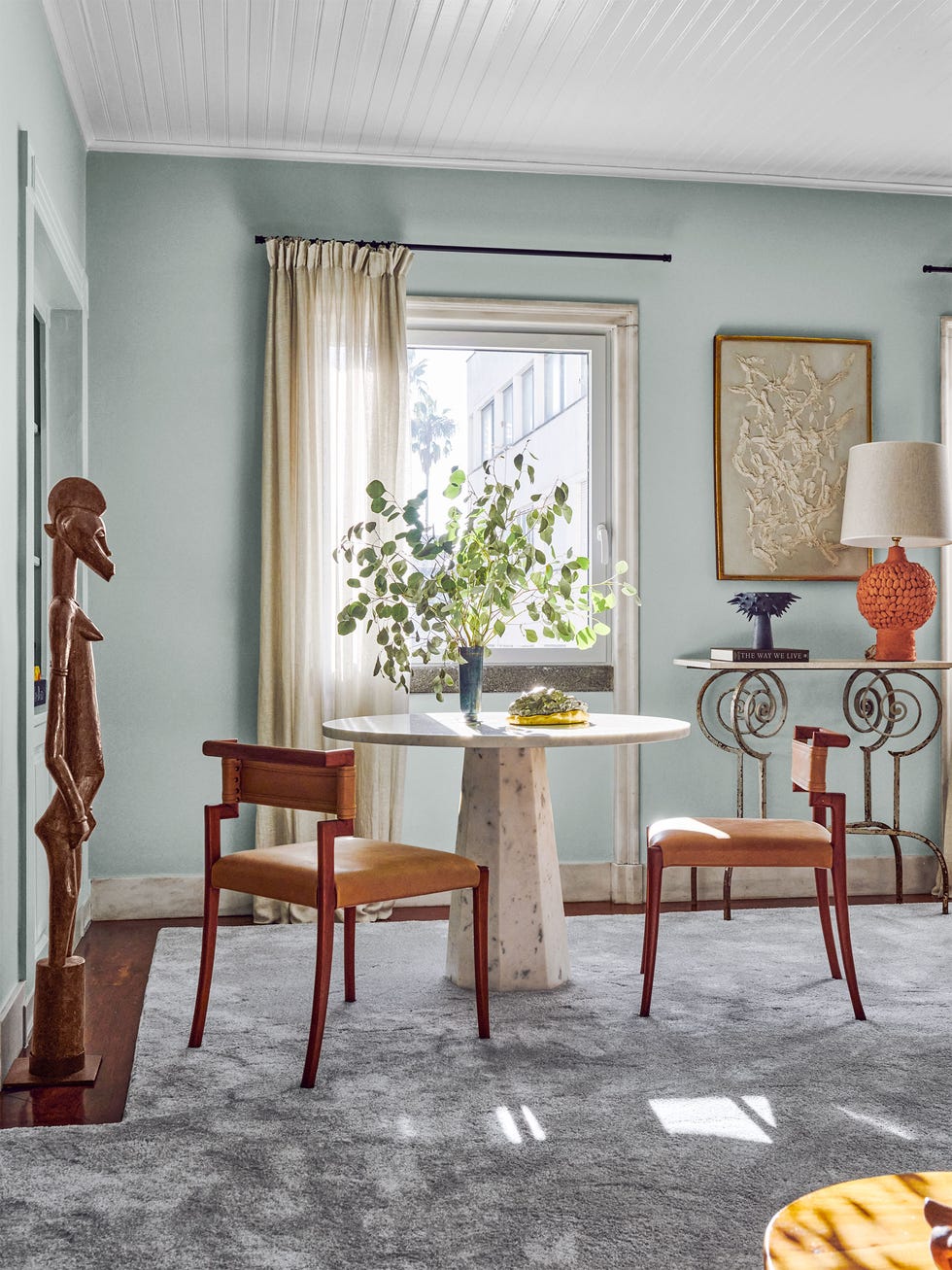
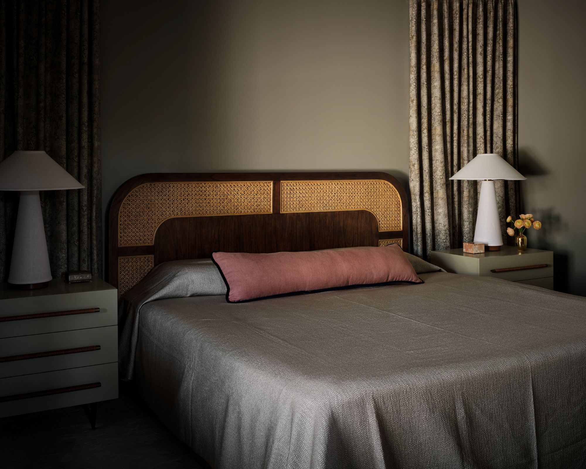
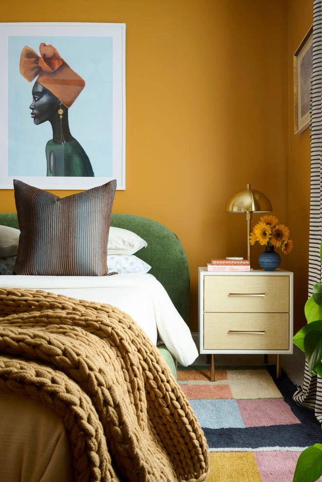
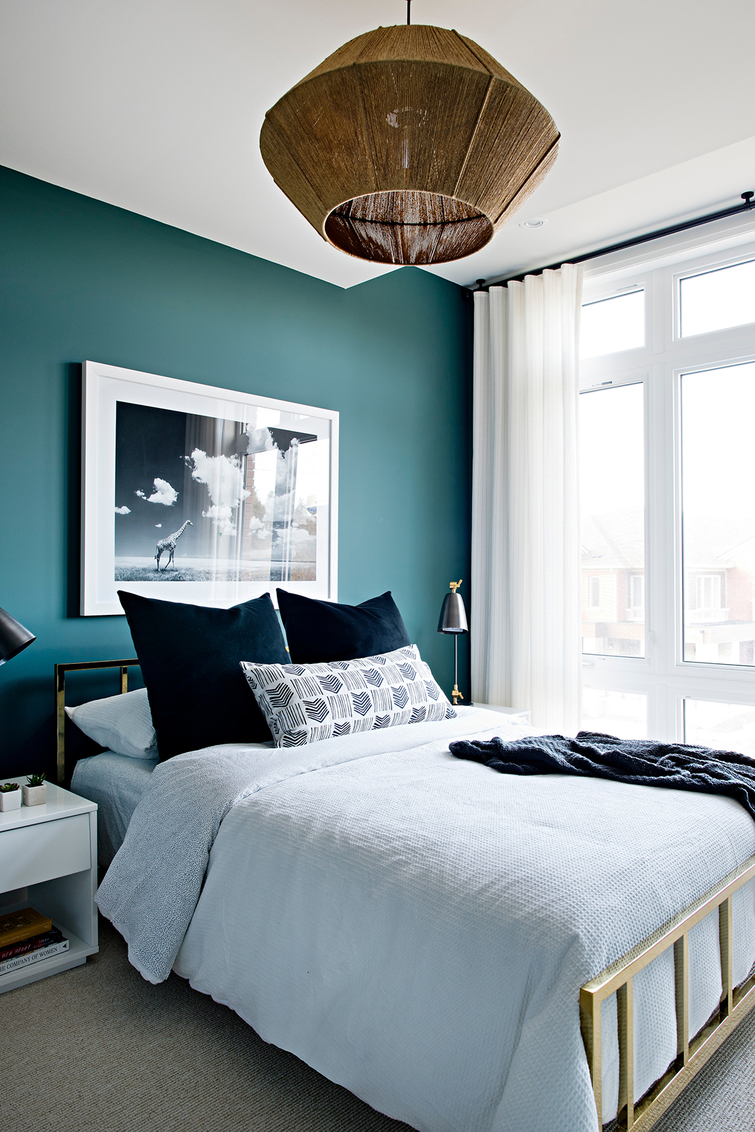
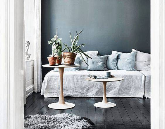
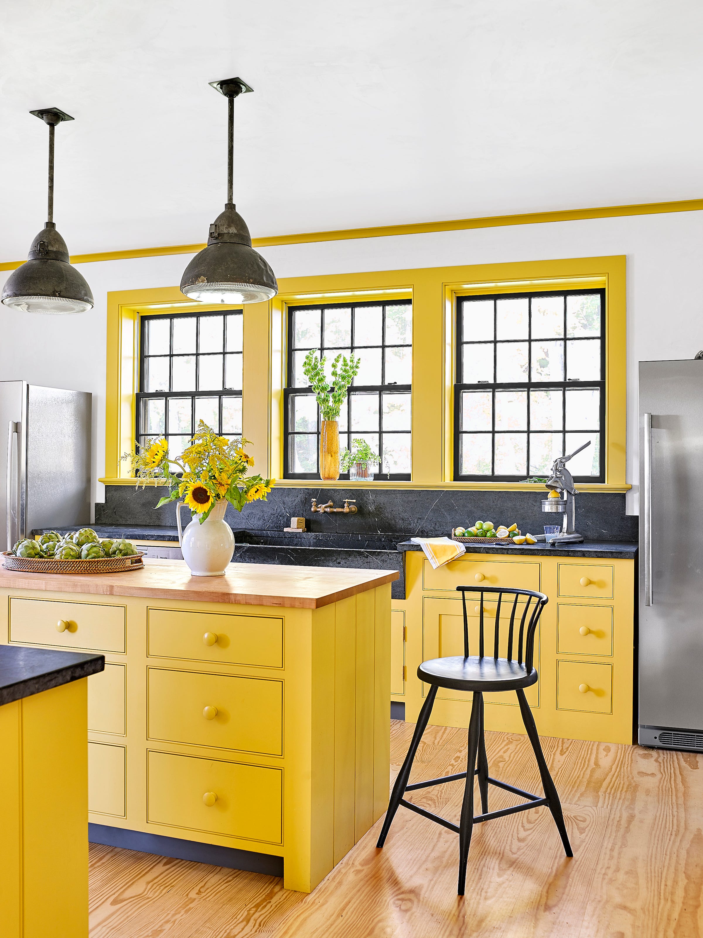
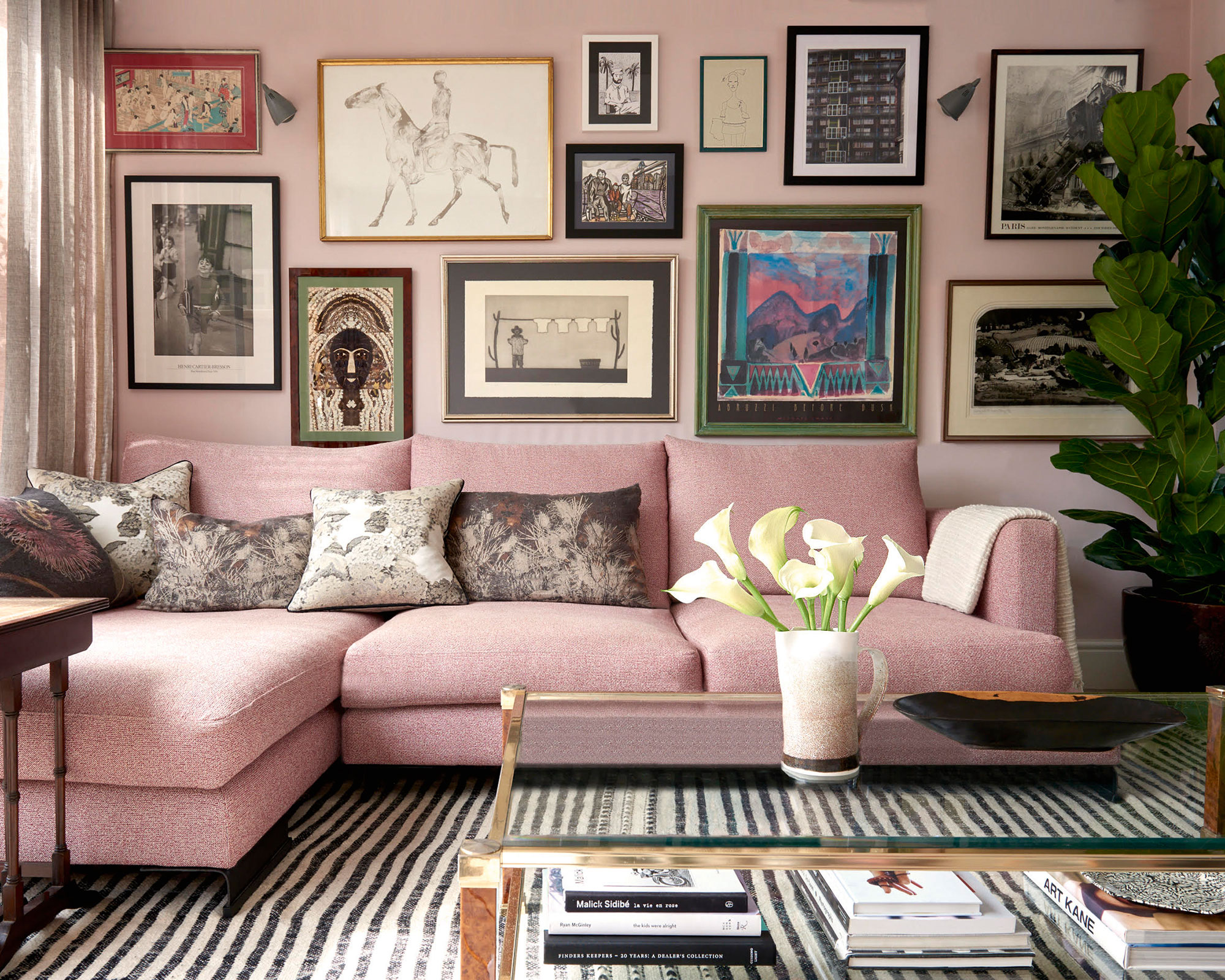
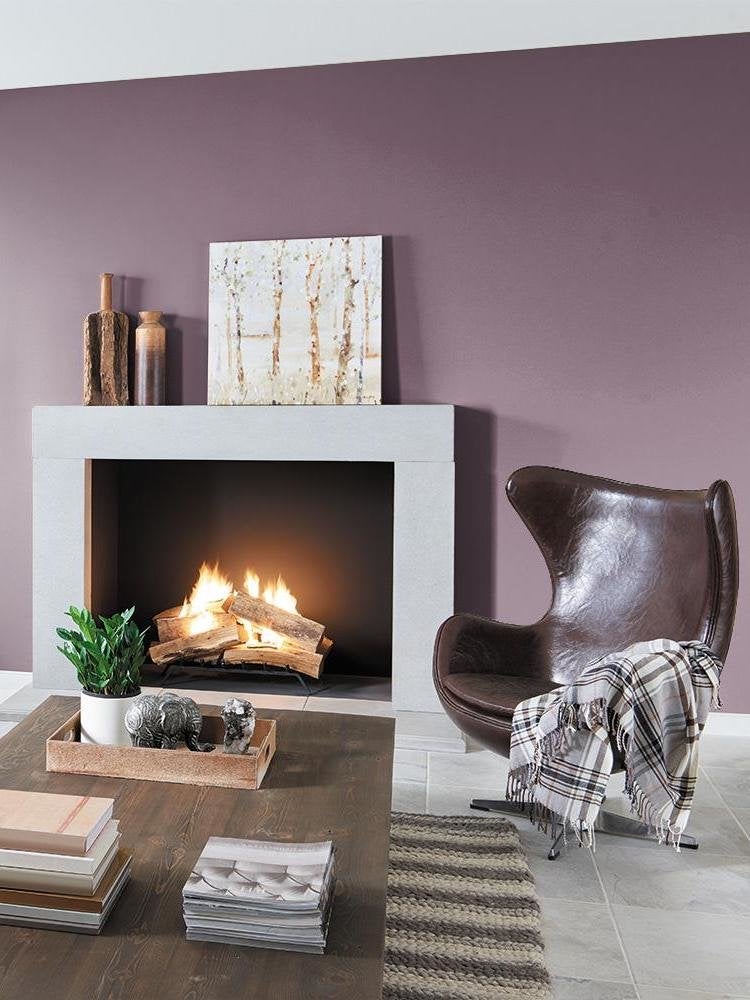
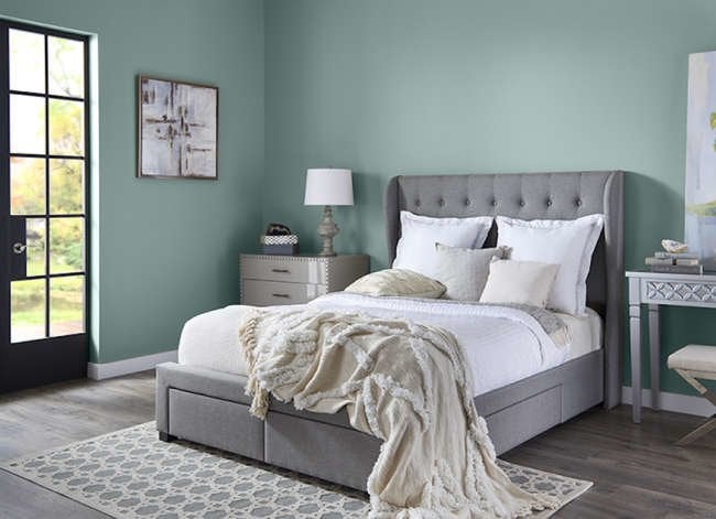
According to experts like Amber Guyton, founder of Blessed Little Bungalow, cool and neutral tones like blue, green, white, gray, and beige are ideal for creating a peaceful home environment. These colors provide a sense of calmness and tranquility. Barry Bordelon of The Brownstone Boys emphasizes that while soft, natural hues are broadly soothing, personal experiences and cultural backgrounds mean that the perfect calming shade can be unique to each person. Both Bordelon and Jordan Slocum, also of The Brownstone Boys, suggest that even darker, moodier colors can achieve a relaxing and luxurious feel, challenging the notion that only light colors are calming.
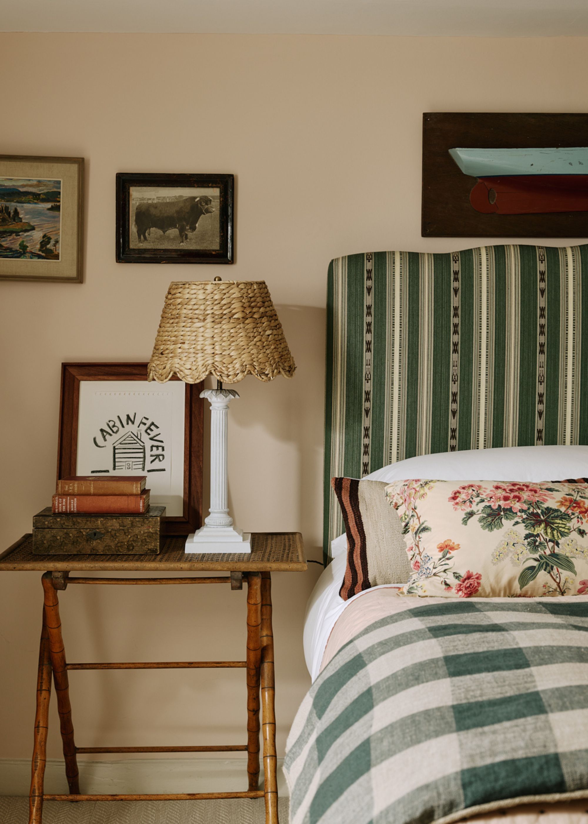
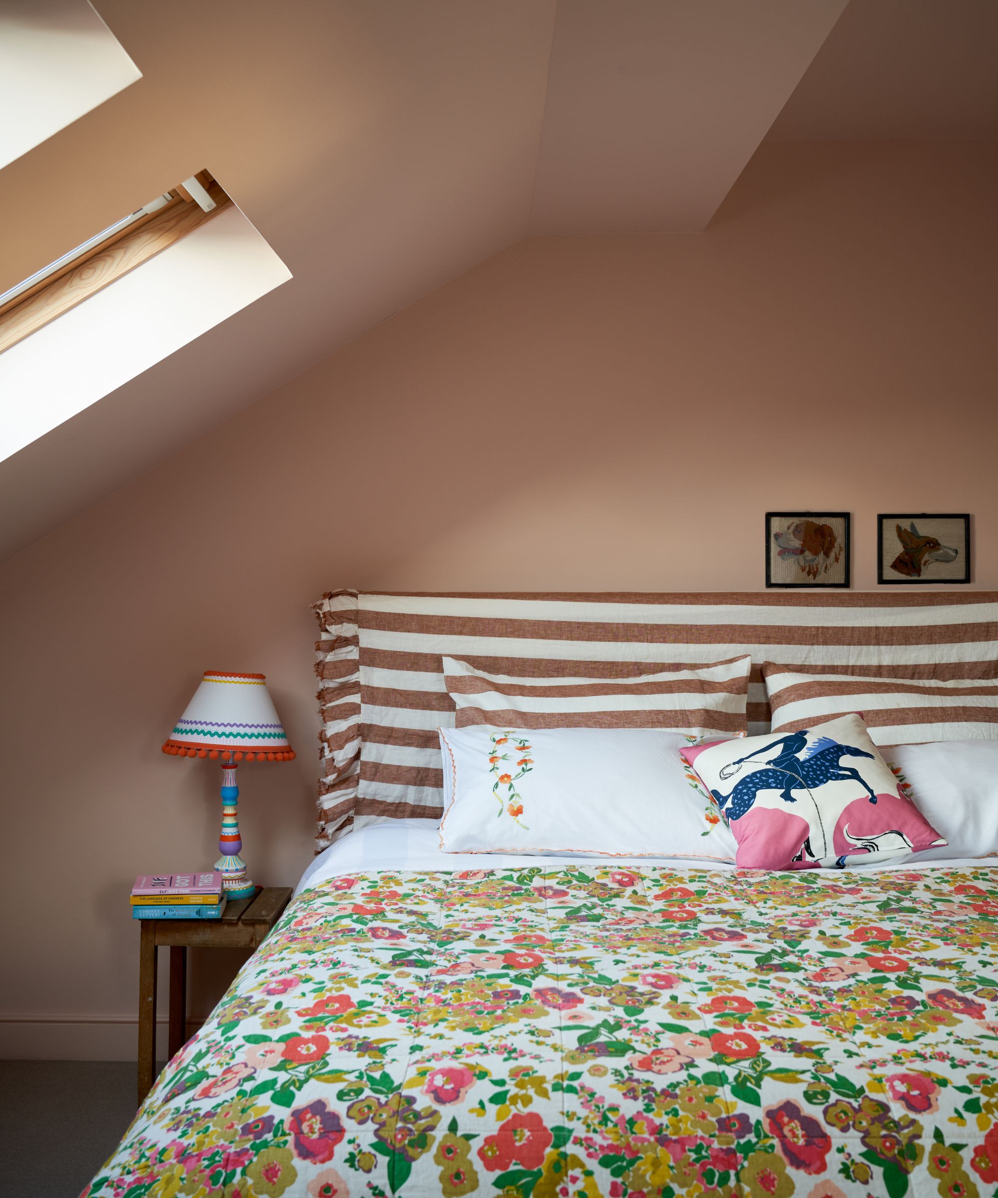
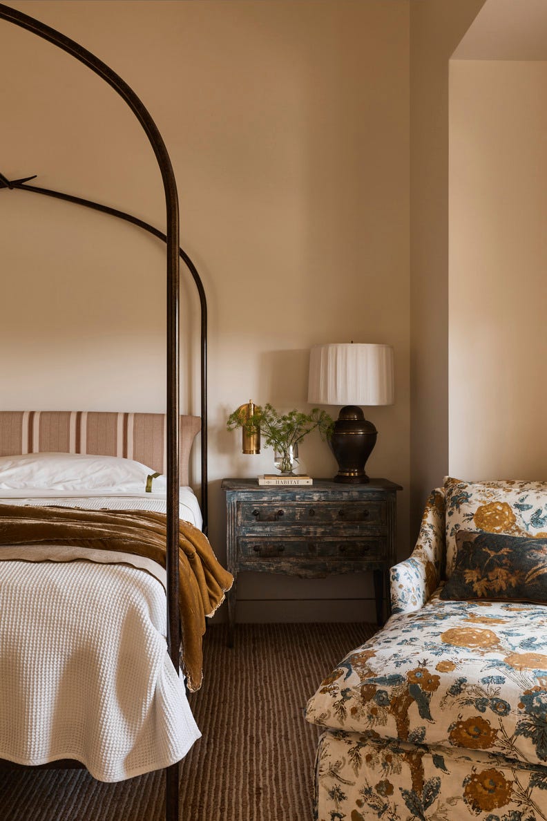
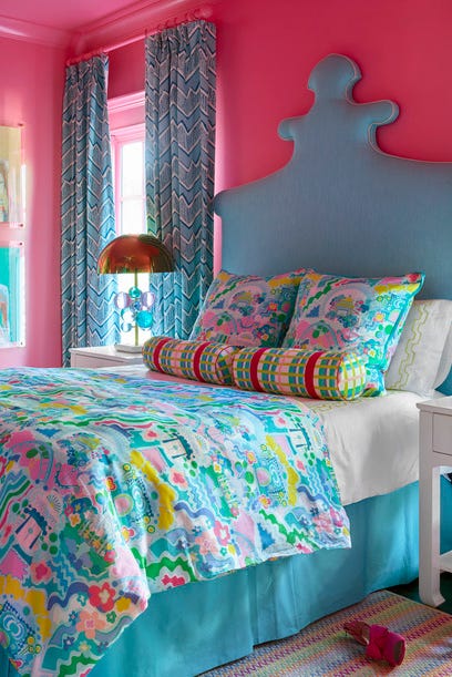
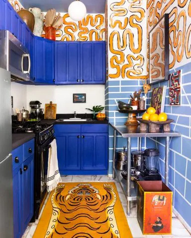
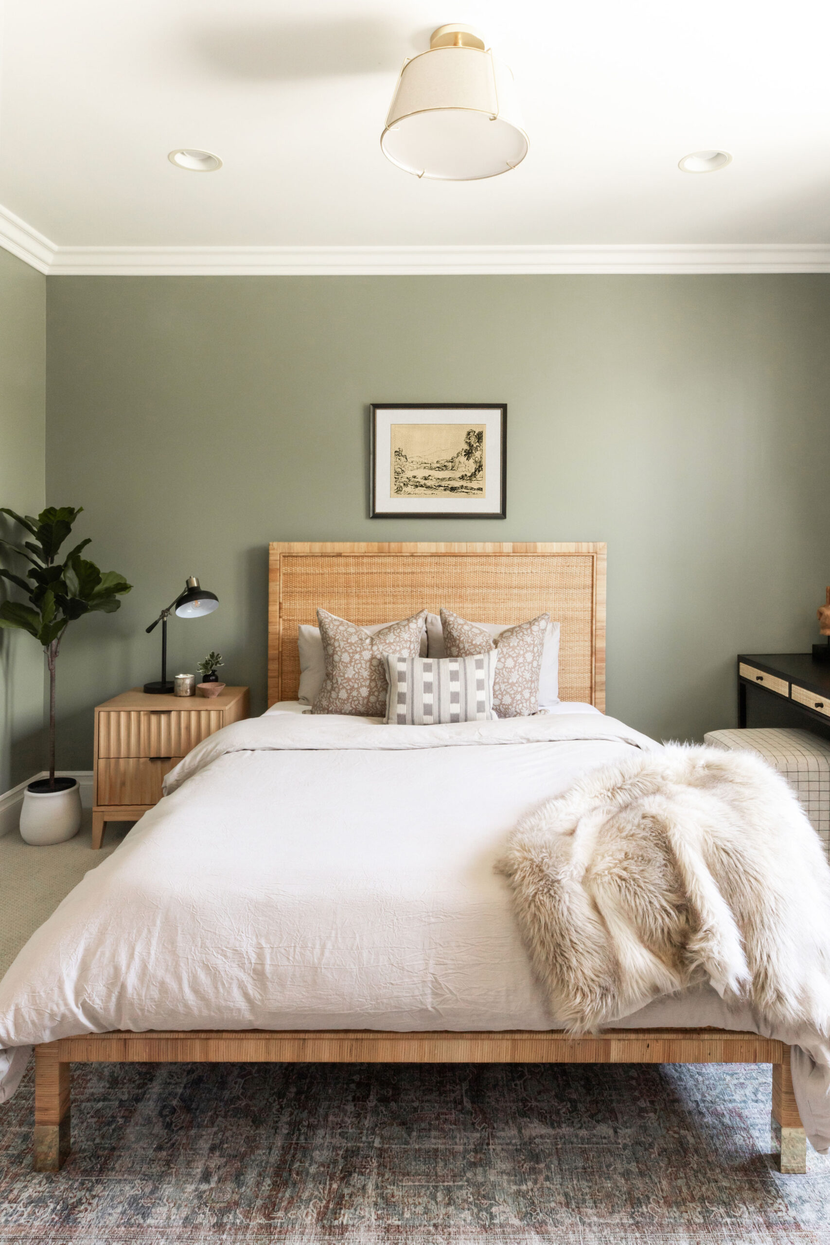
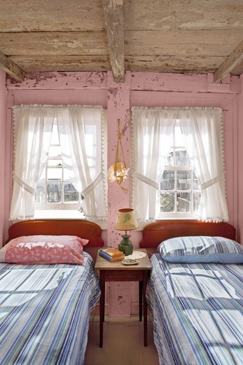
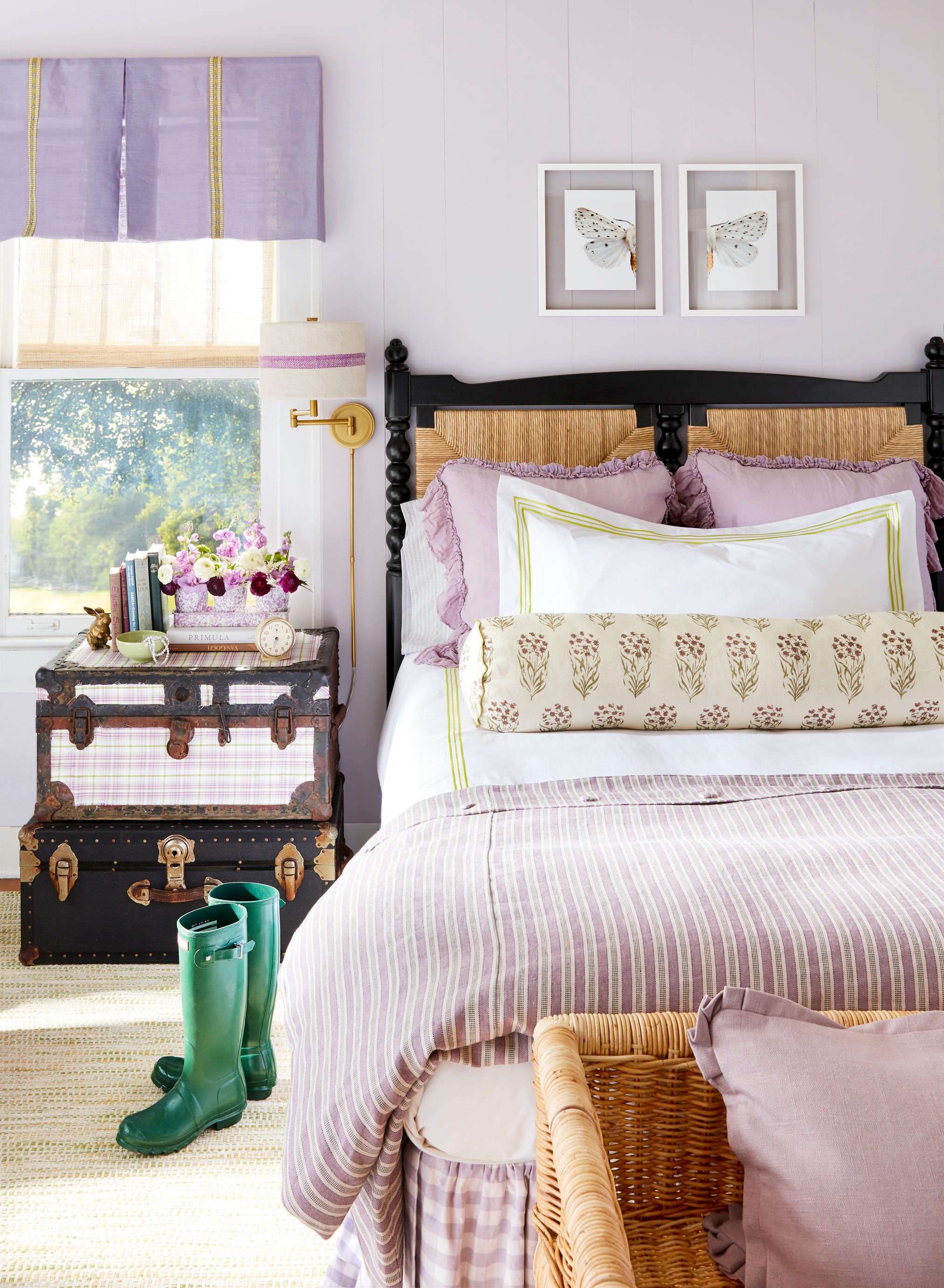
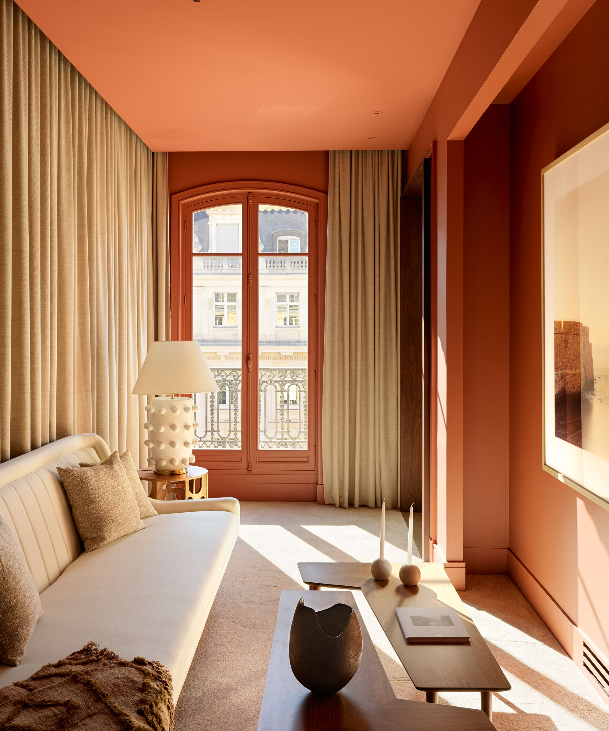
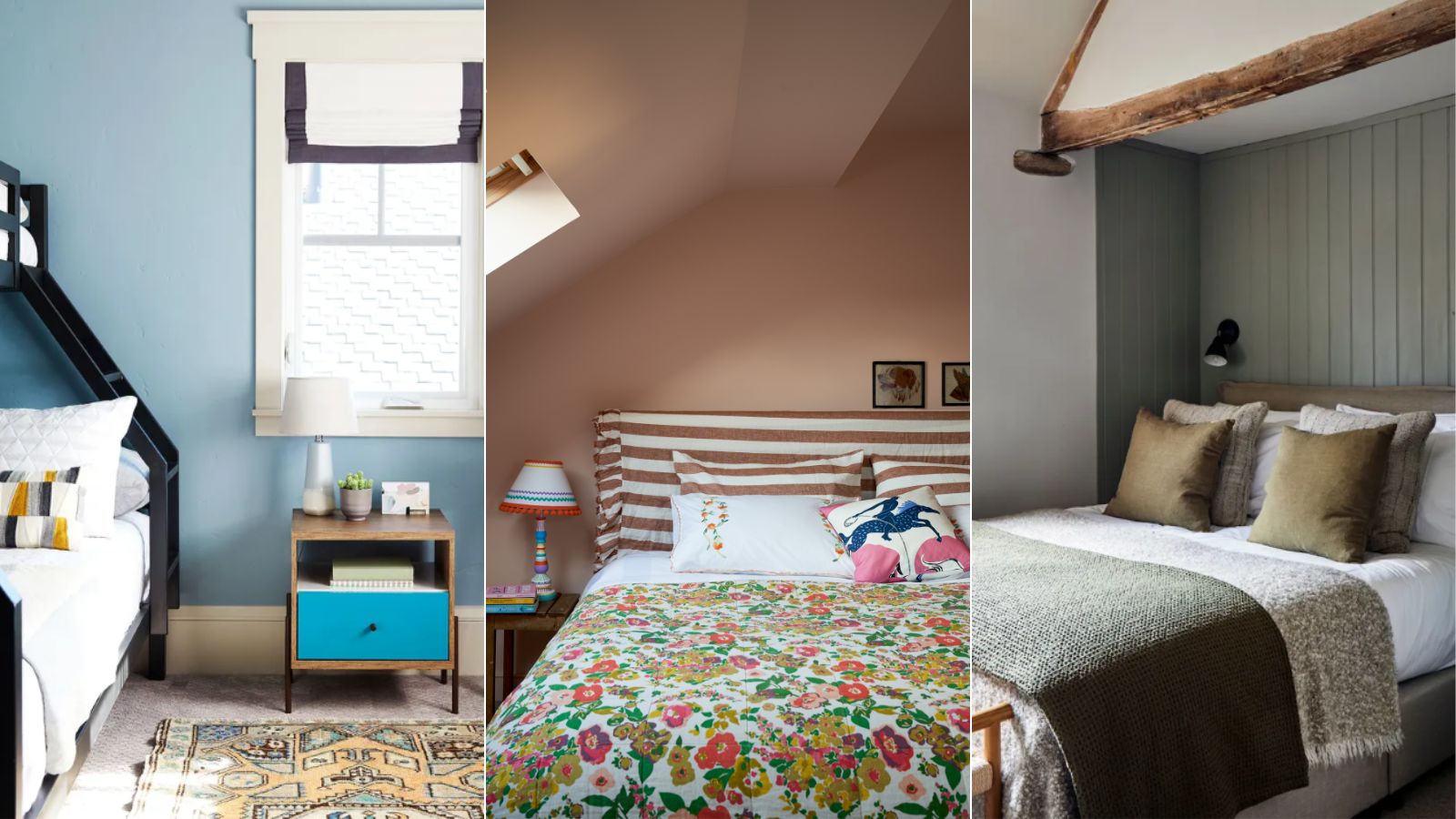
Certain areas of the home benefit more from calming colors. Meagan Macievic of Meagan Rae Interiors points out that chaotic spaces like mudrooms and laundry rooms can be transformed with soothing shades. She also highlights the importance of calming colors in bedrooms, including teen bedrooms, to help occupants relax and feel safe. Guyton concurs, stating that all bedrooms, not just those for teenagers, can benefit from calming colors to promote rest and refreshed mornings. Additionally, a peaceful environment in a home office can reduce stress and anxiety, fostering alertness and productivity.
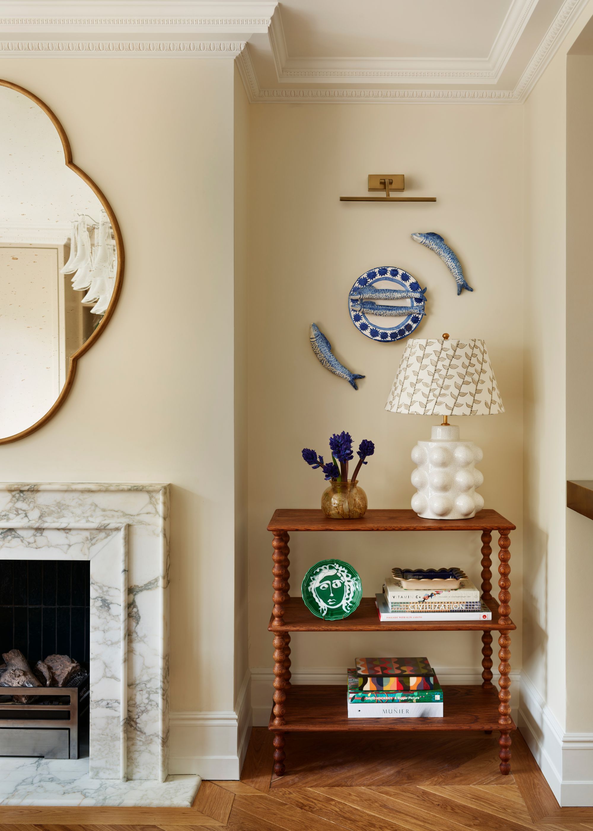
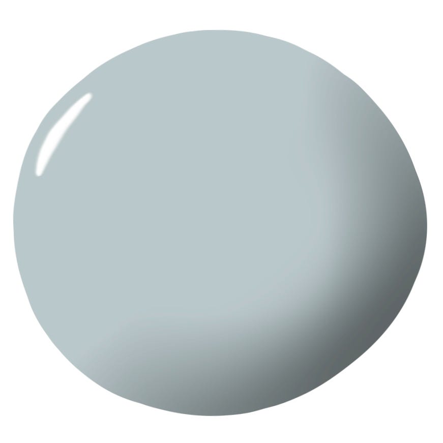
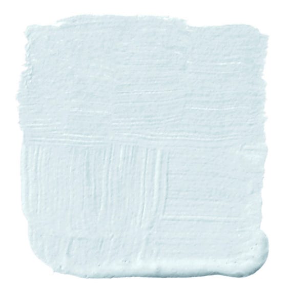
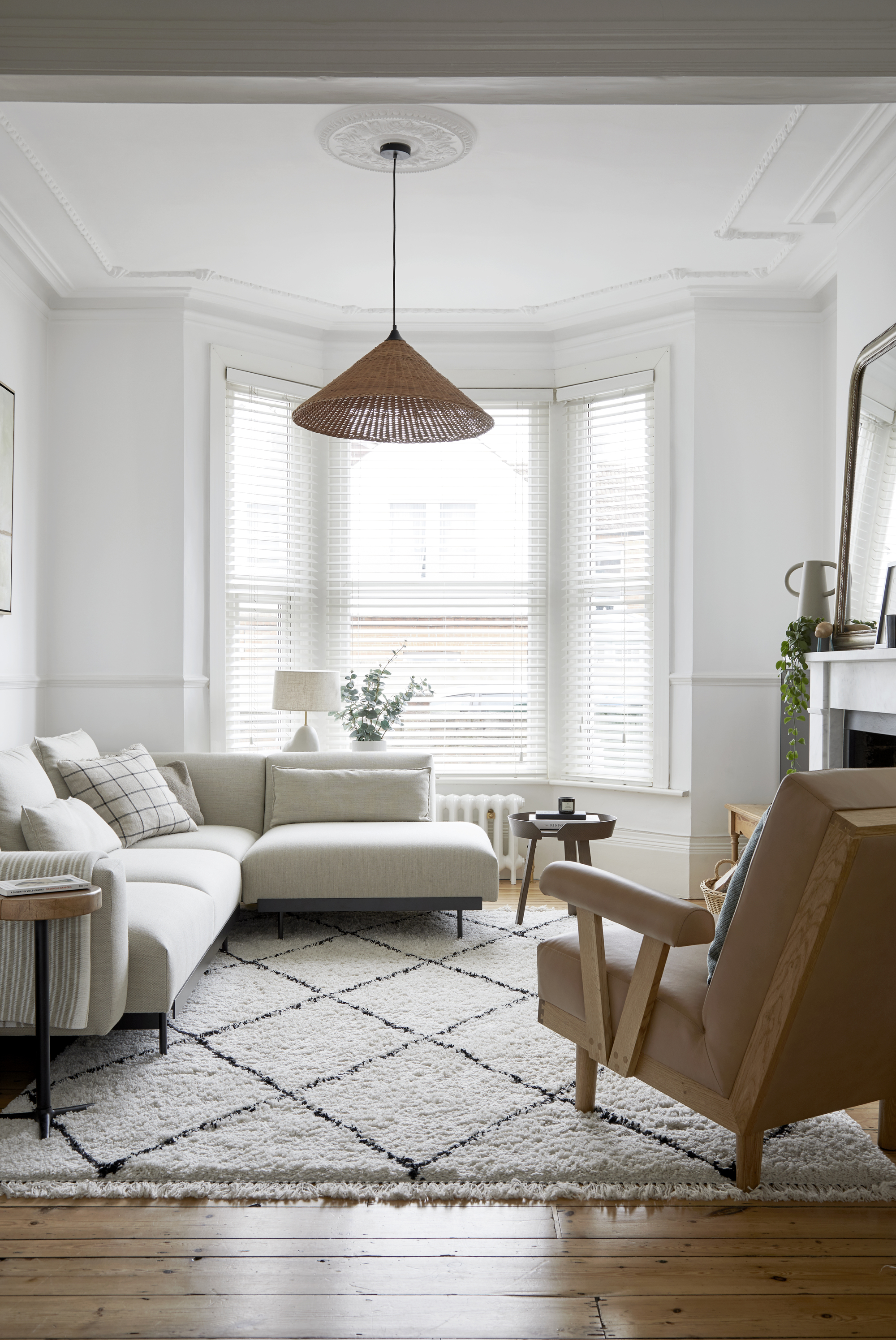
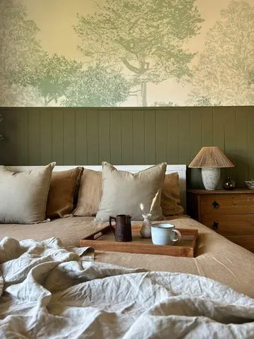
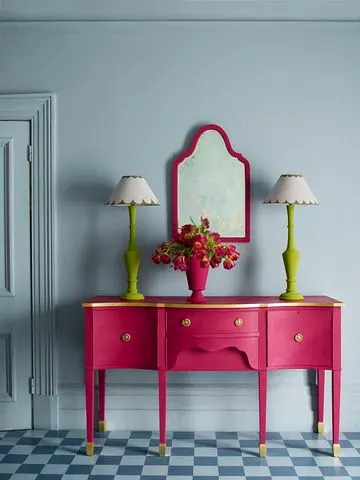
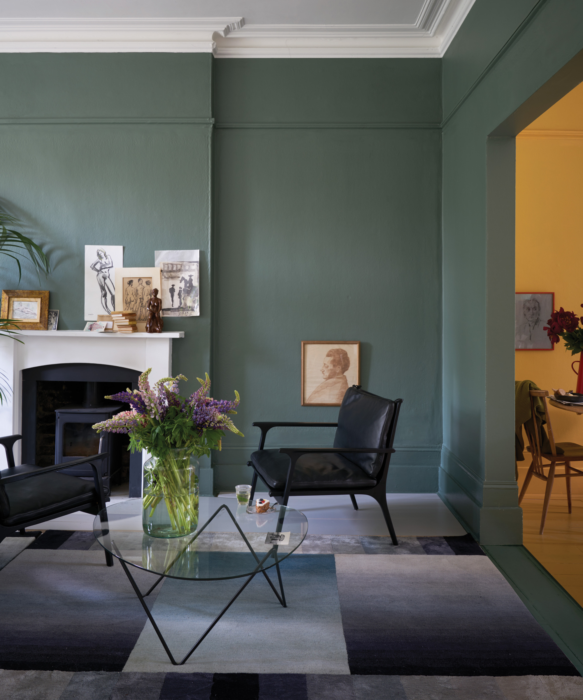
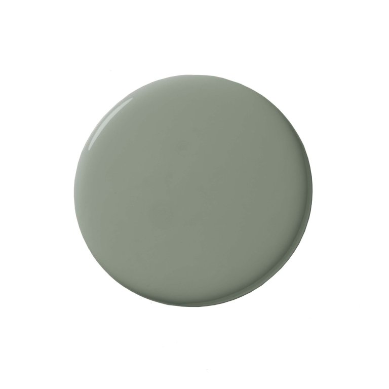
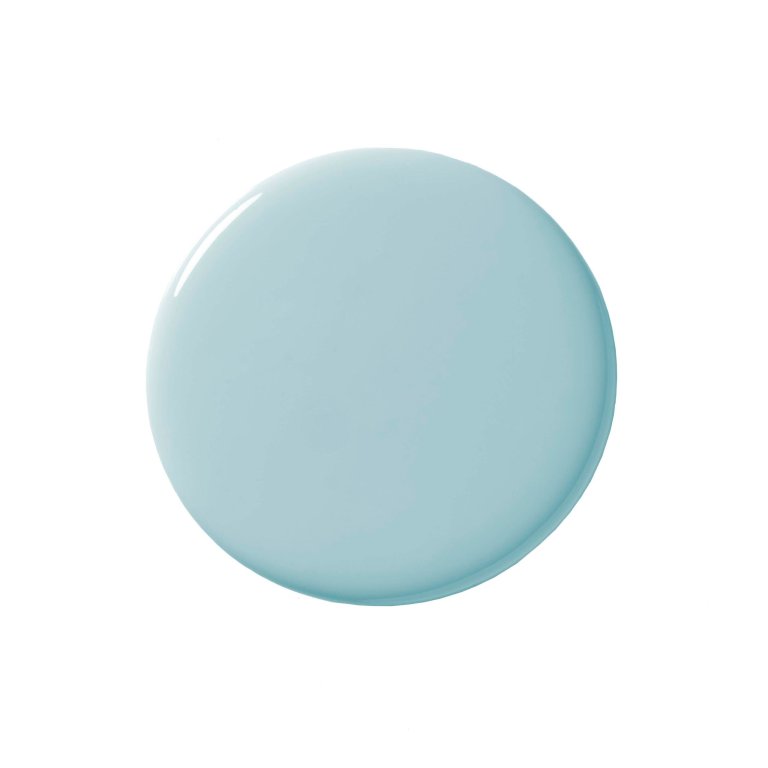
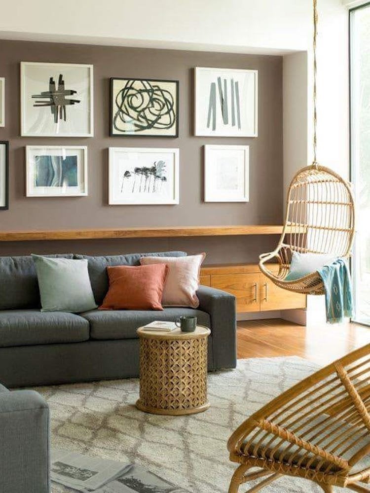
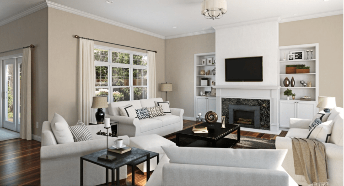
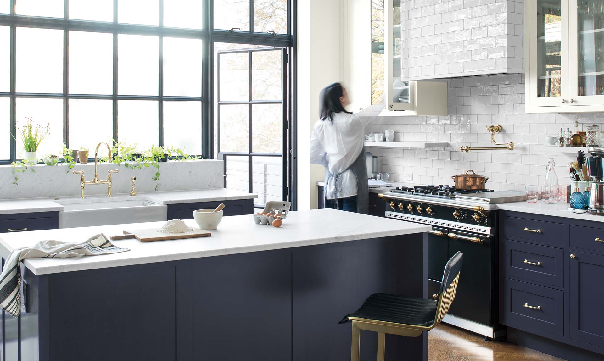
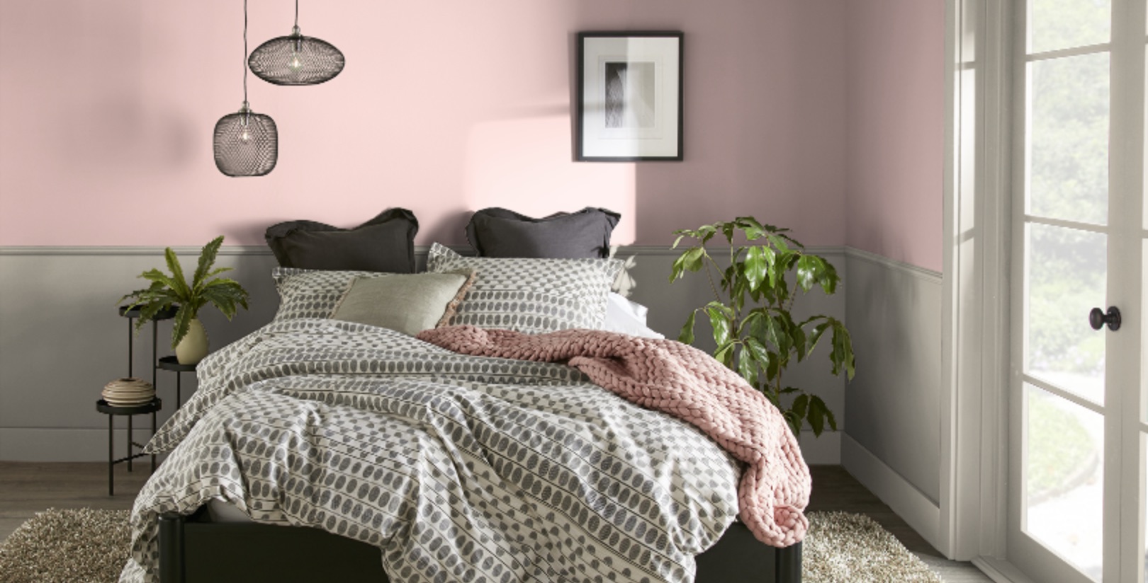
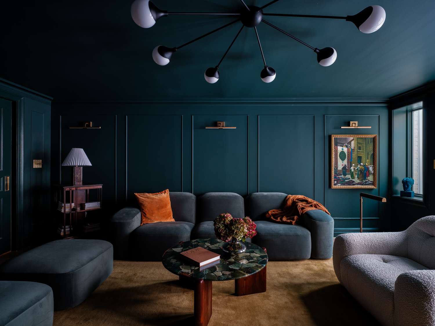
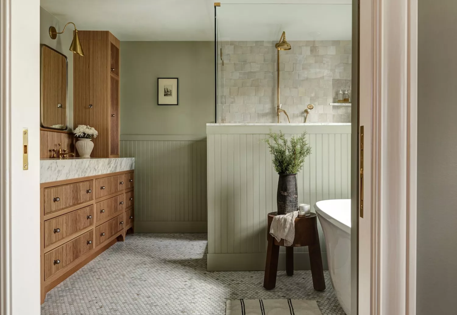
The article provides specific paint color recommendations from interior designers. Grove Green by Farrow & Ball is a deep green shade that creates an inviting and timeless appeal, demonstrating that dark colors can be serene. City Loft by Sherwin-Williams is a hazy neutral with red and beige undertones, recommended for its versatility in neutral, minimalistic bedrooms. Light Blue by Farrow & Ball is a soft, silvery blue that evokes nature's serenity, reminiscent of clear skies. Swiss Coffee by Benjamin Moore, an off-white neutral with warm undertones, pairs well with dark woods and white trims.
Further recommendations include Ashwood by Benjamin Moore, a warm gray with a hint of green, and Collingwood by Benjamin Moore, a buttery white that complements medium to deep browns. For those preferring bolder options, Salty Dog by Sherwin-Williams, a navy blue, is recommended for its gender-neutral appeal and reflection of nature. Budding Green by Benjamin Moore, inspired by spring shoots, and Halo by Benjamin Moore, another soft beige, are suggested for creating serene ambiances. School House White by Farrow & Ball is highlighted for its chic, timeless, and versatile qualities. Finally, Black Jack by Benjamin Moore, a soft dusty black, and Cedar Path by Benjamin Moore, an energetic green that changes with natural light, are presented as effective options for creating calming and mood-enhancing spaces, proving that a wide range of colors can contribute to a tranquil home environment when chosen thoughtfully.
#CalmingColors #InteriorDesign #PaintColors #HomeDecor #ColorPsychology #NeutralTones #BedroomColors #HomeOfficeDesign #FarrowAndBall #SherwinWilliams #BenjaminMoore #CalmingColors #InteriorDesign #PaintColors #HomeDecor #ColorPsychology #NeutralTones #BedroomColors #HomeOfficeDesign #FarrowAndBall #SherwinWilliams #BenjaminMoore
0 commentaire au total
 Aucun commentaire pour le moment
Vous aimerez aussi
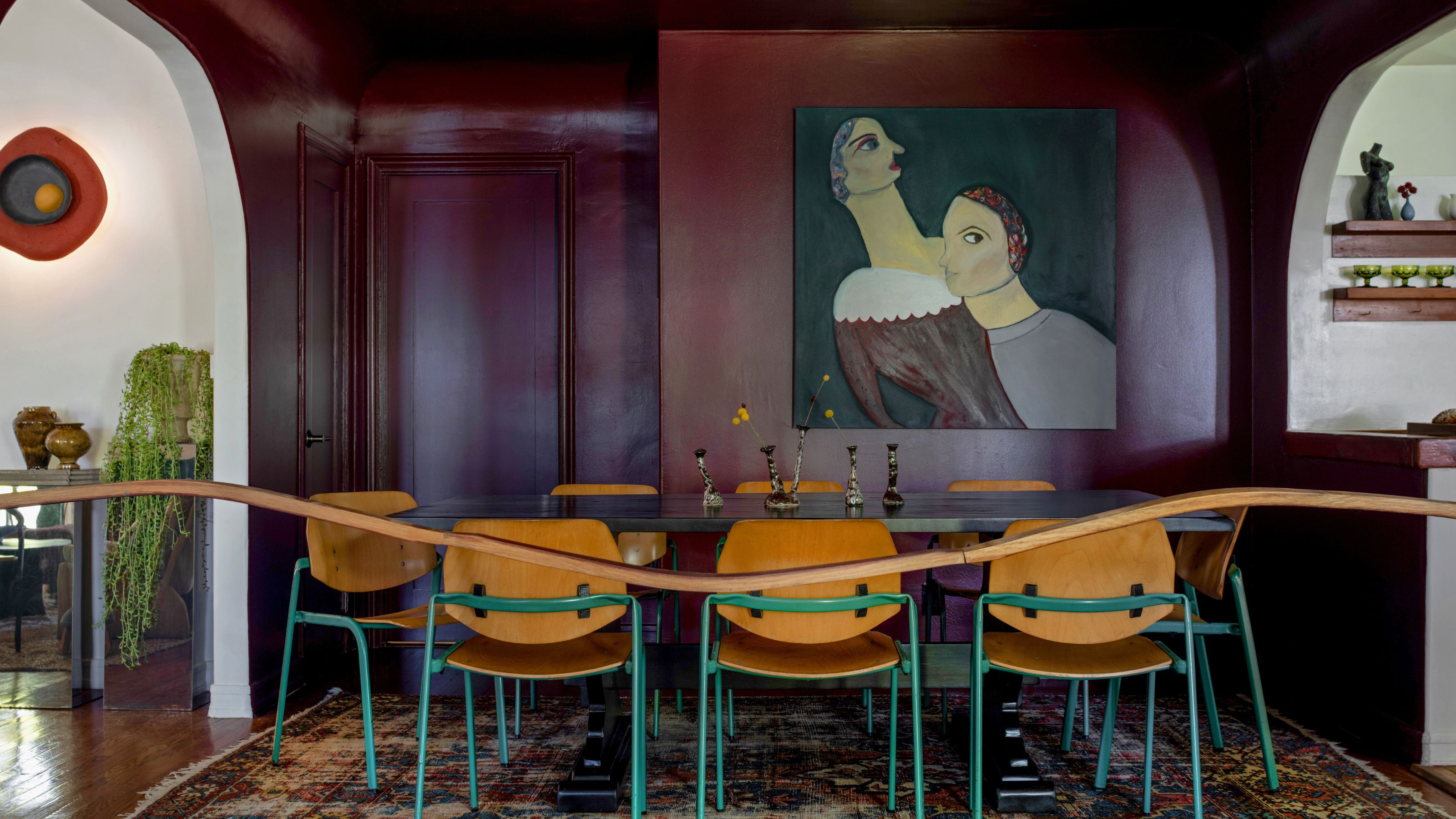
13 Calming Paint Colors Designers Use to Make Rooms Feel Soothing — And No, They're Not All Neutrals

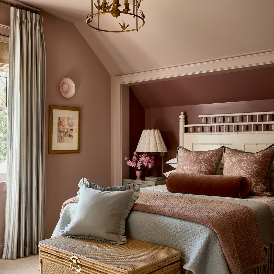
You Can Wake Up HAPPIER Just by Painting Your Bedroom—Here Are the Colors Designers Love

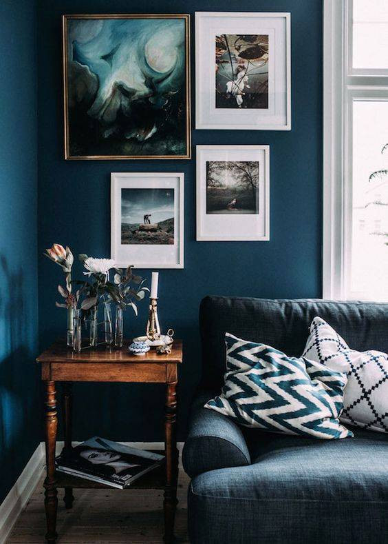
colorful living rooms (no beige allowed)!
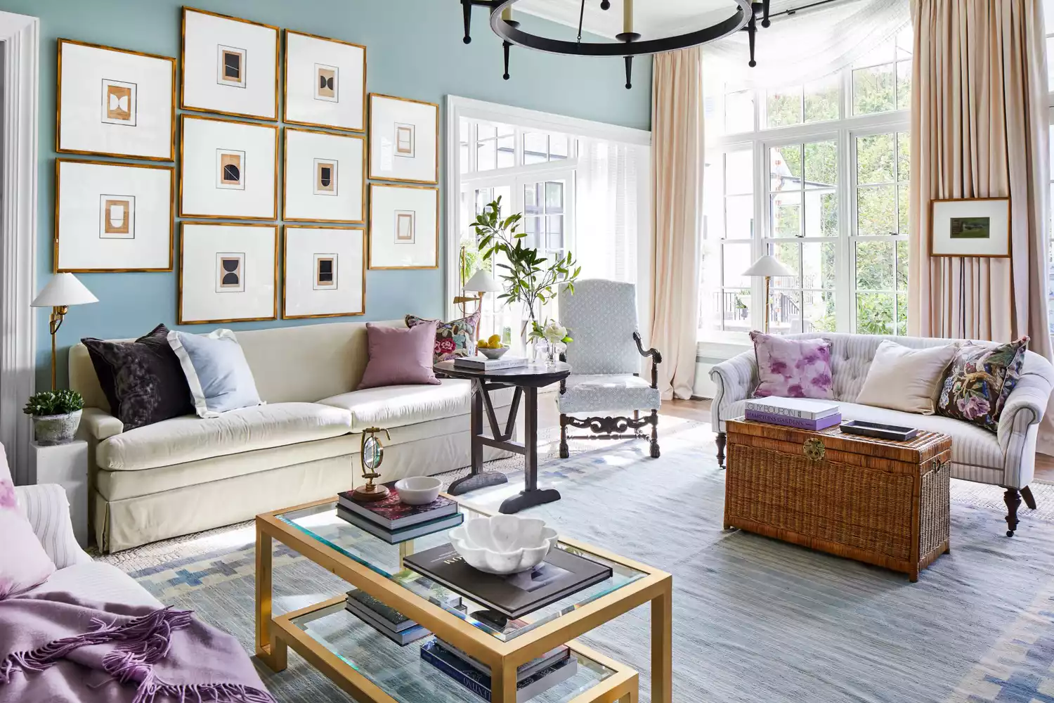
6 Calming Paint Colors Designers Swear By For A Relaxing Living Room
20 Calming Paint Colors That Will Change the Way You Live

12 Chalk Paint Colors That Will Transform Your Furniture, Walls, and More

11 Calming Bedroom Paint Colors to Help You Relax and Wind Down at the End of the Day

5 colors that will make your living room feel happier, according to interior designers
5 colors that will make your bedroom feel calmer, according to designers
Designers Agree: These Are the Most Relaxing Paint Colors for Any Room

Add These Happy Colors to Your Home and Boost Your Mood
14 Paint Colors That Can Make a Room Feel Instantly Cozy

16 Calming Paint Colors That Will Make Your Home a More Restful Place

5 Cozy Paint Colors Interior Designers Use to Warm Up Cool Rooms and Create "Snug" Spaces

5 Paint Colors That Will Help You Sleep Better if You Use Them in Your Bedroom
8 Paint Mistakes That Make Your House Look Dingy (and How to Fix Them)

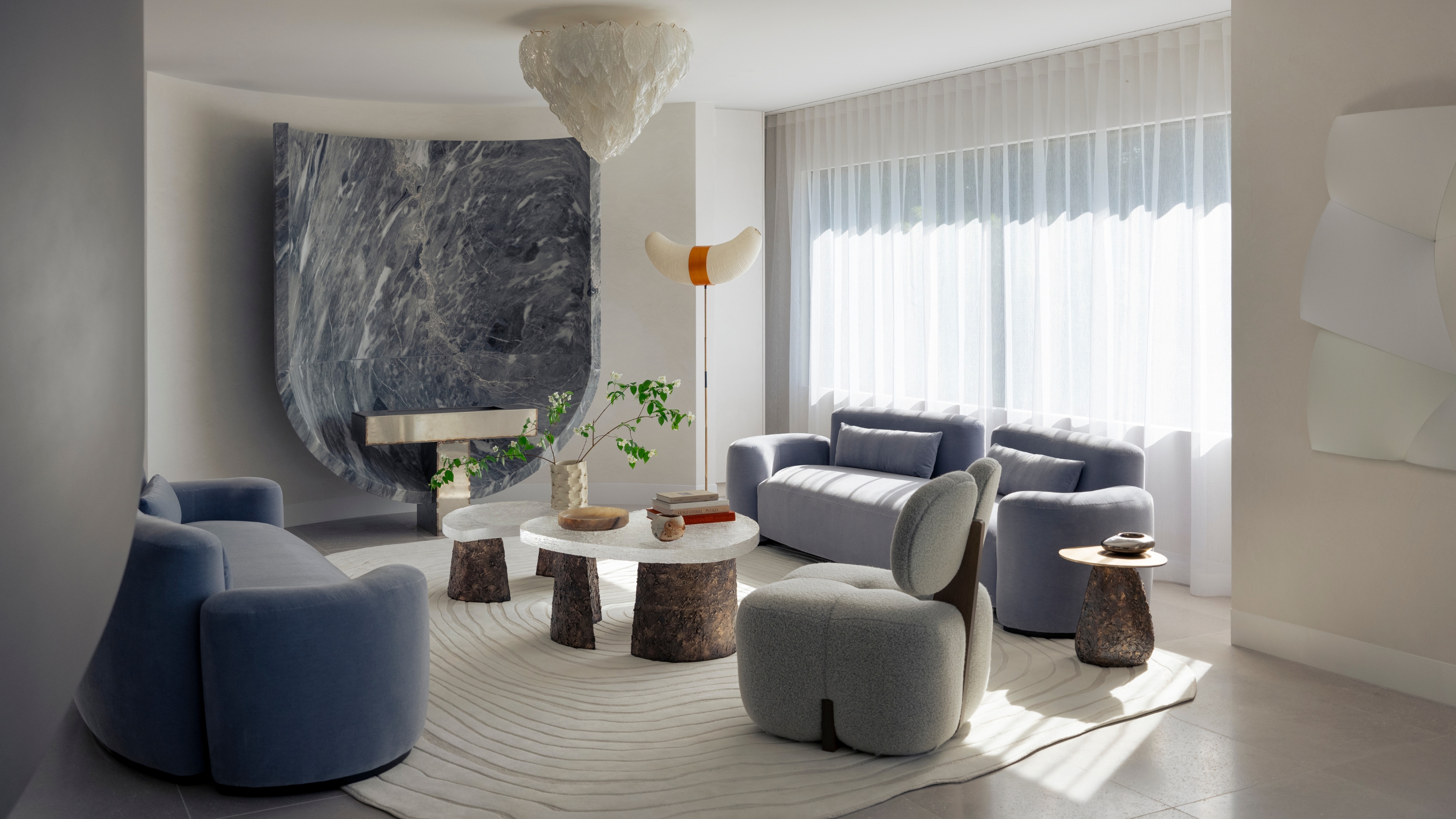
"Help, My White Walls Look Blue" — Here's Why It's Happening, and How to Fix This Common Problem
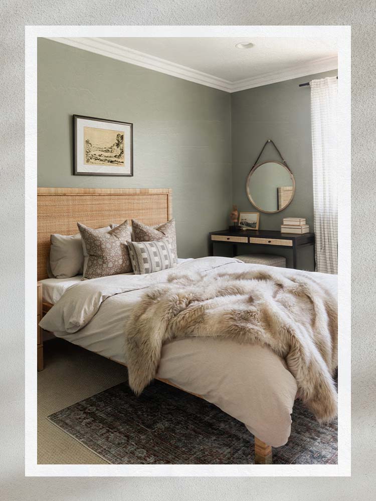
The Best Bedroom Paint Colors for Unwinding at Night

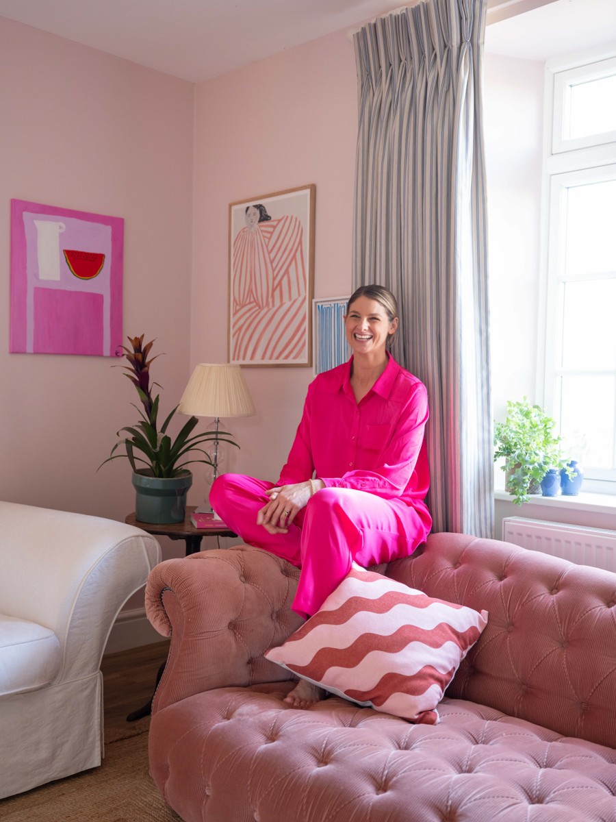
A Color Psychologist Says This Is the Most Relaxing Paint Color

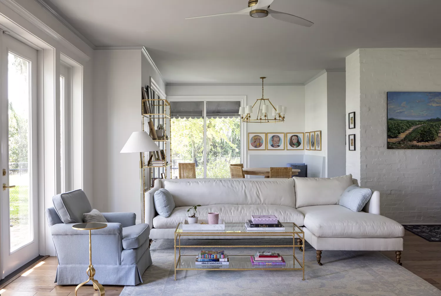
8 Calming Paint Colors Designers Use to Create a Warm, Welcoming Living Room