1/3
The new neutrals pushing out gray and how to actually decorate with them
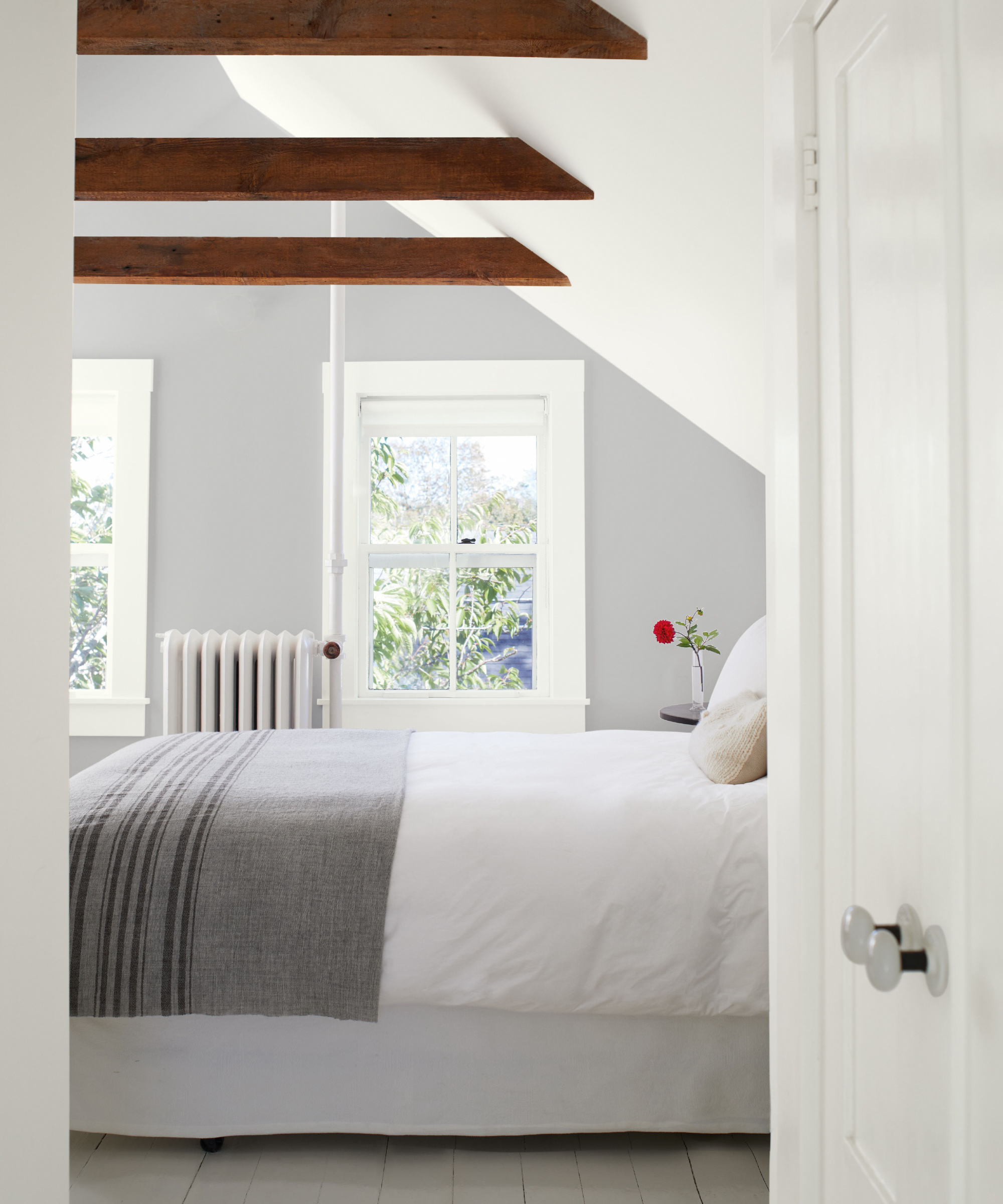
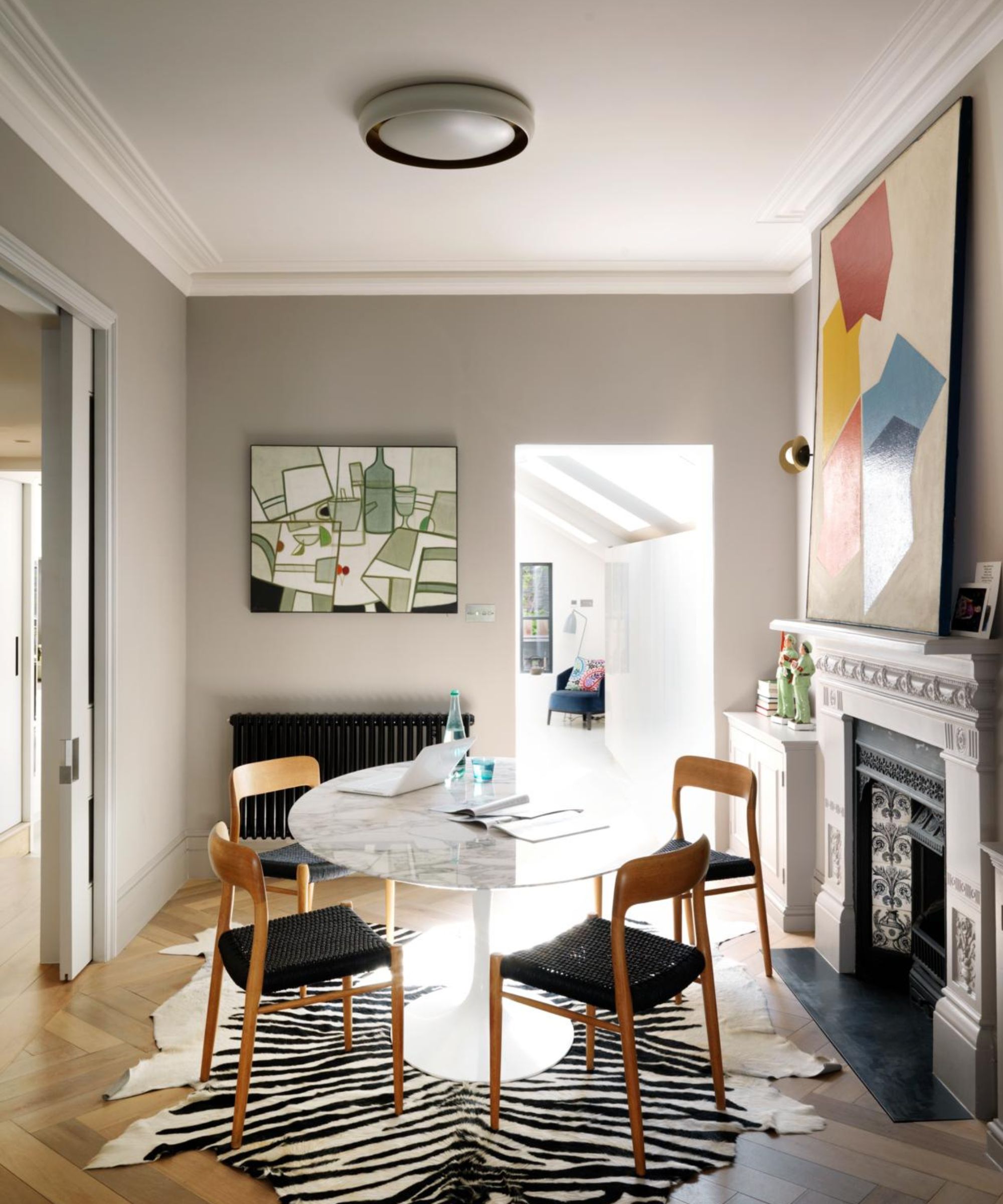
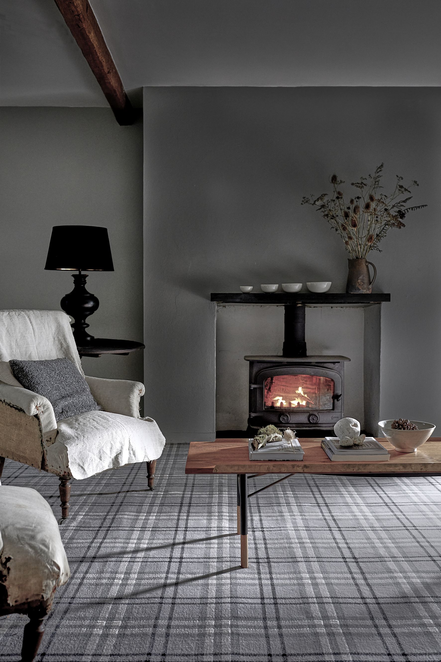
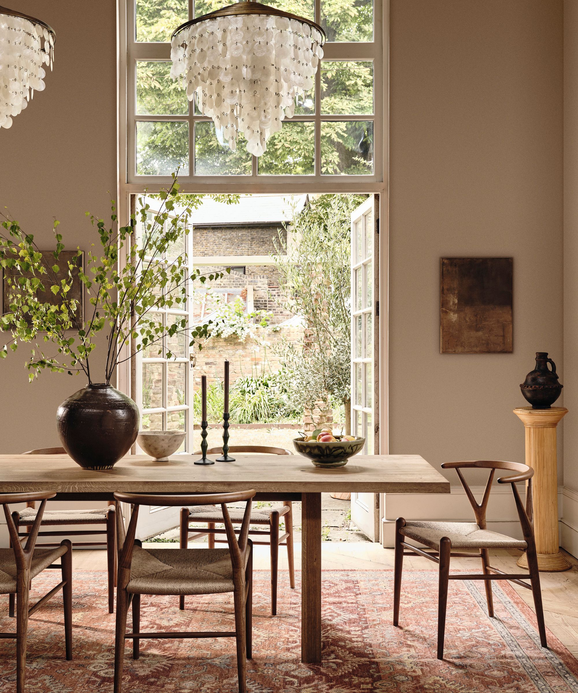
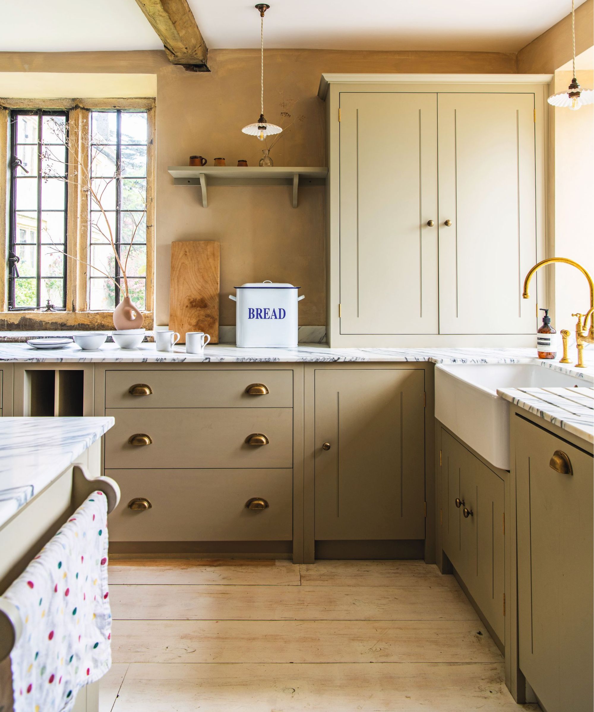
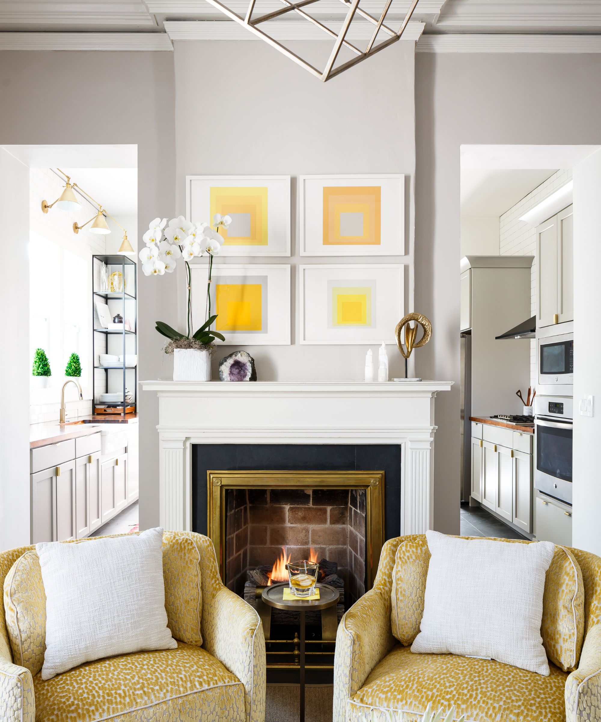
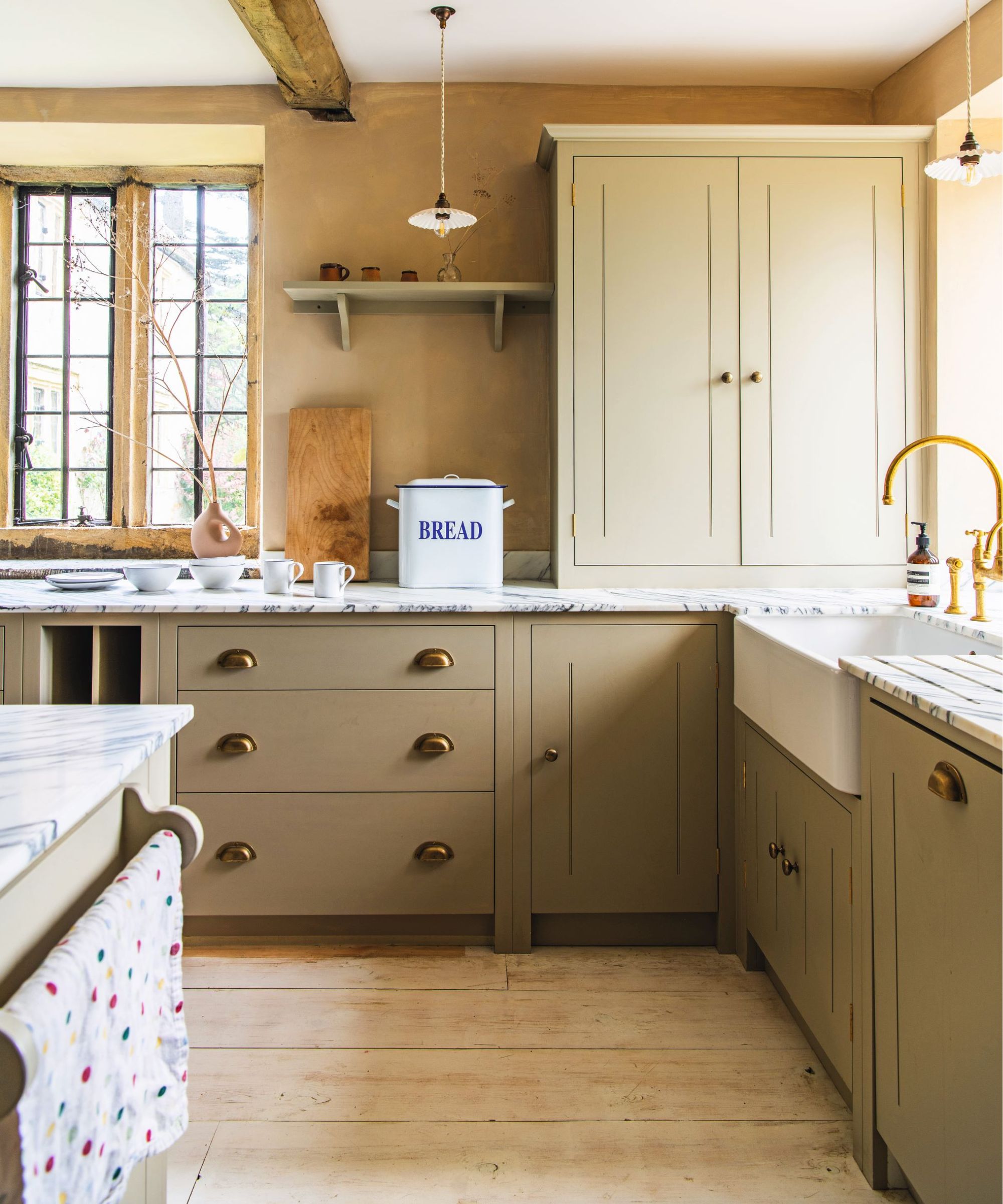
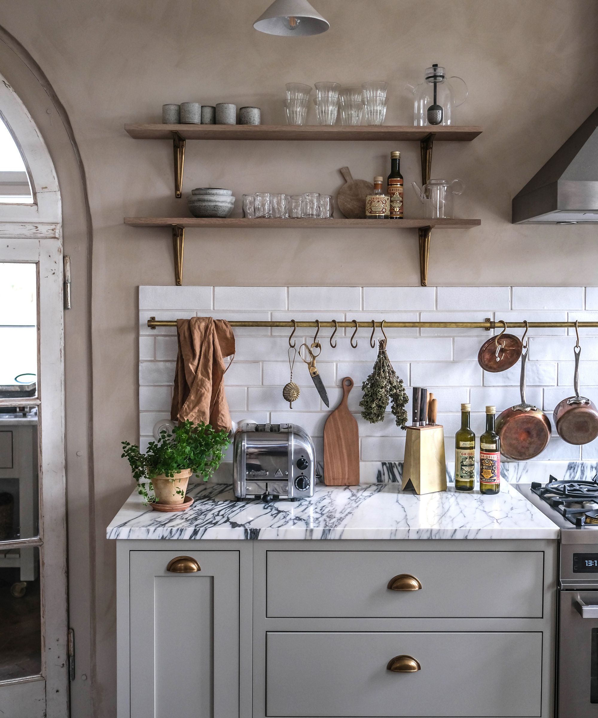
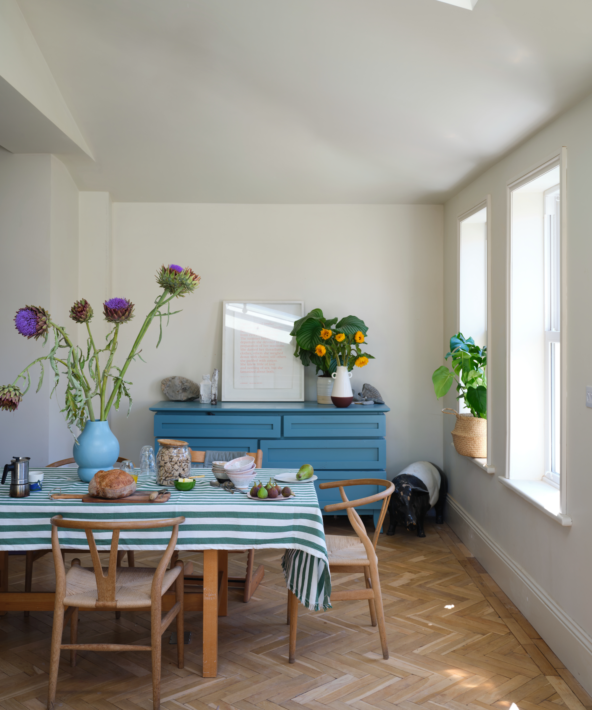
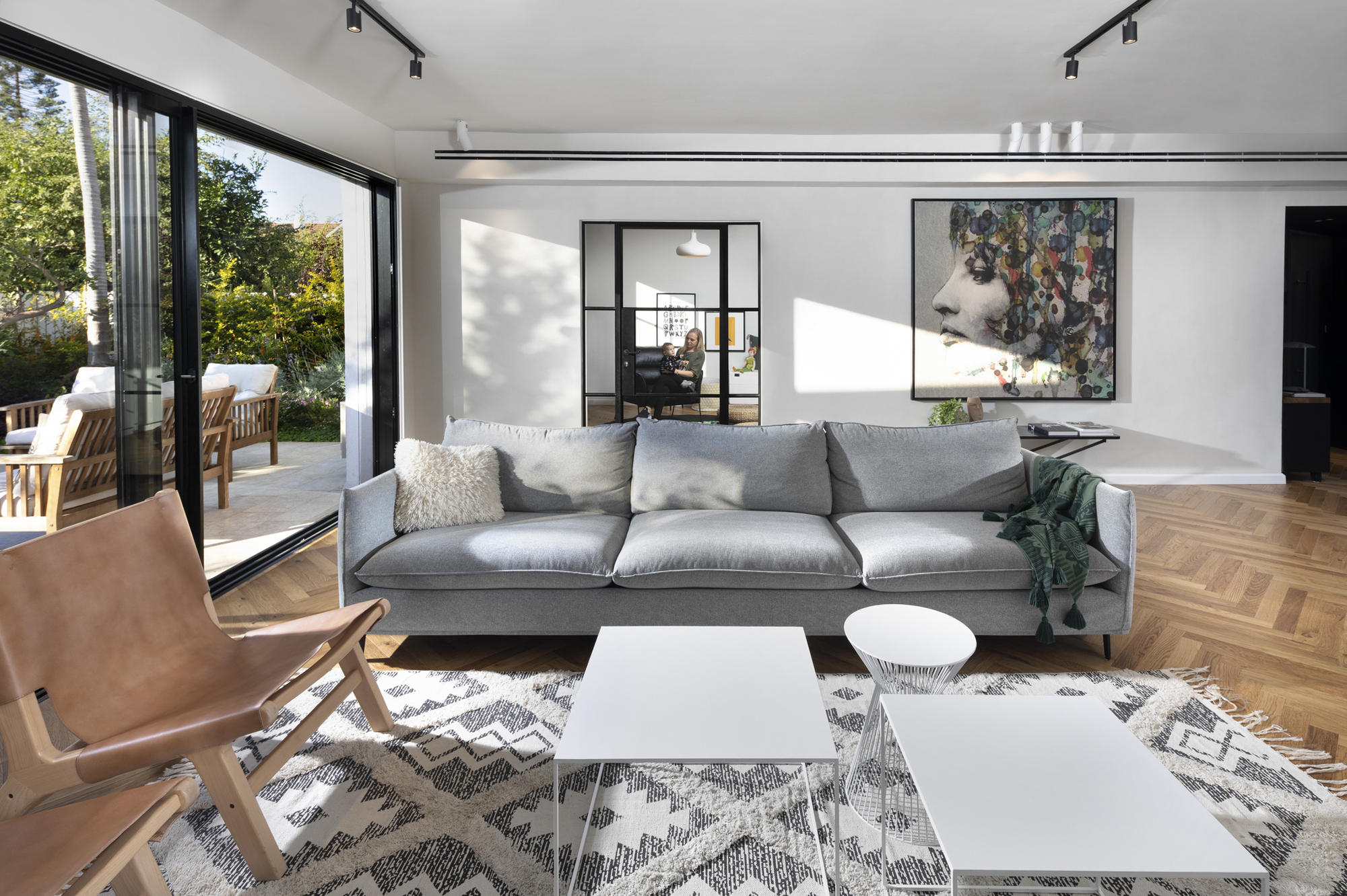
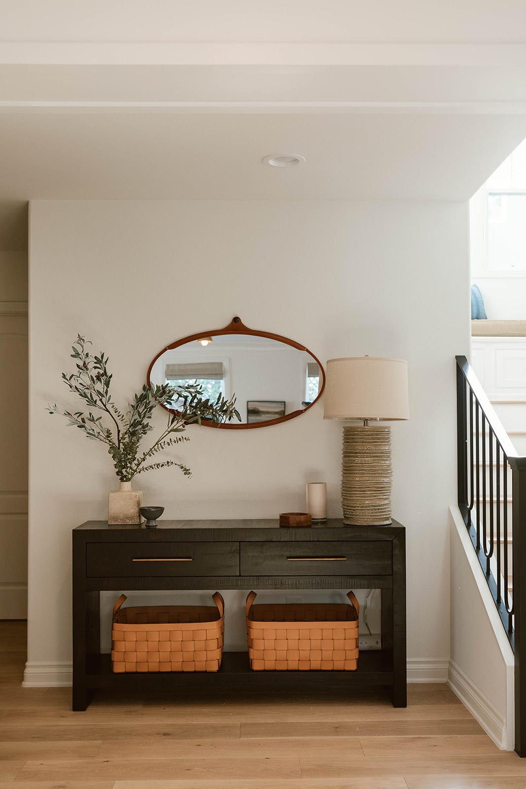
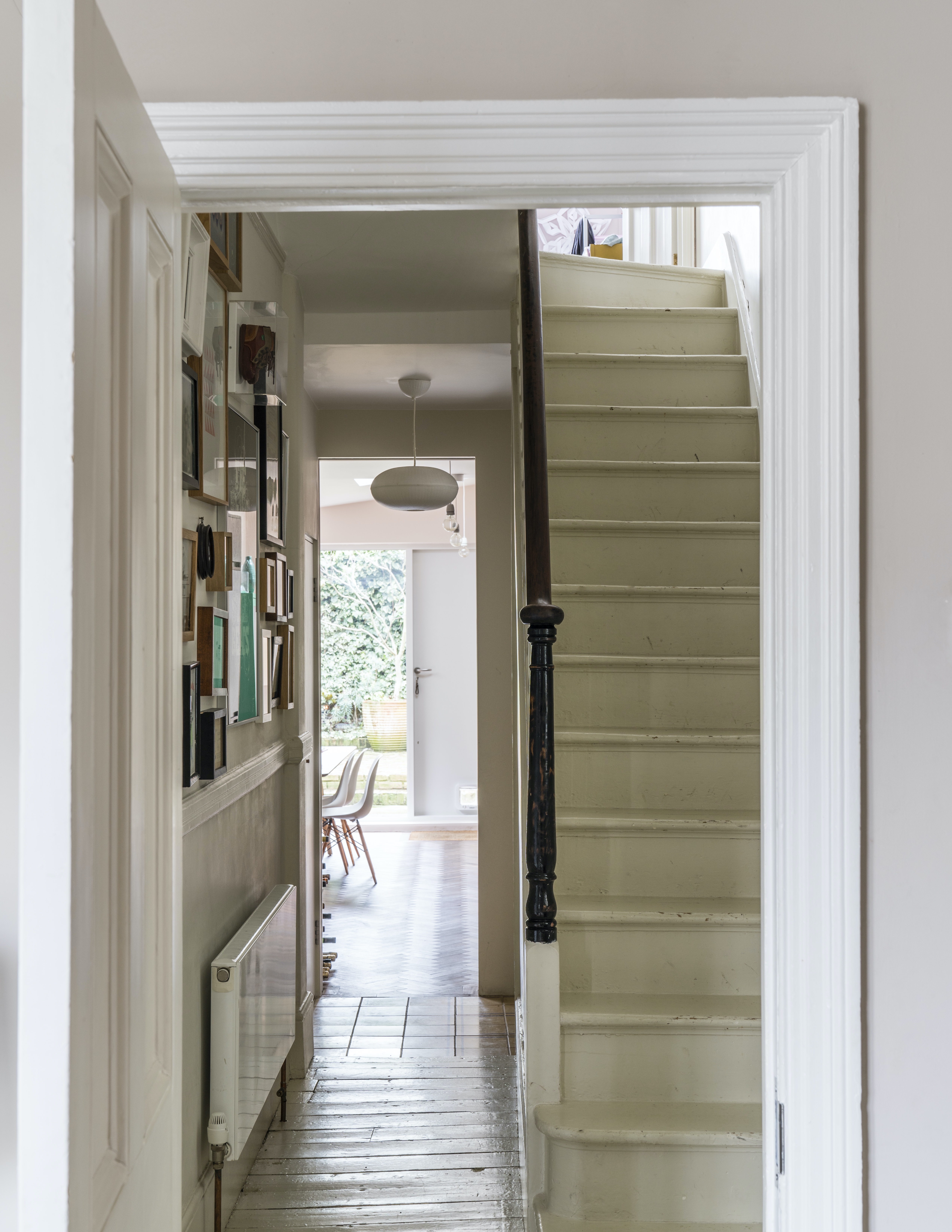

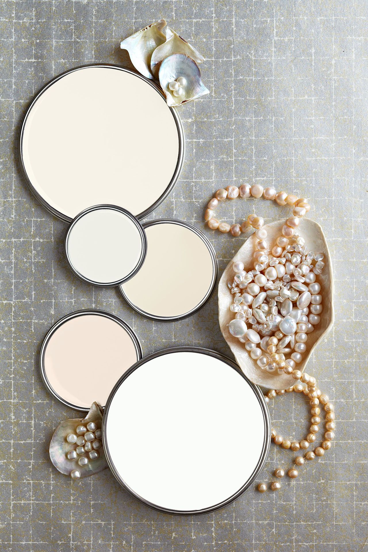
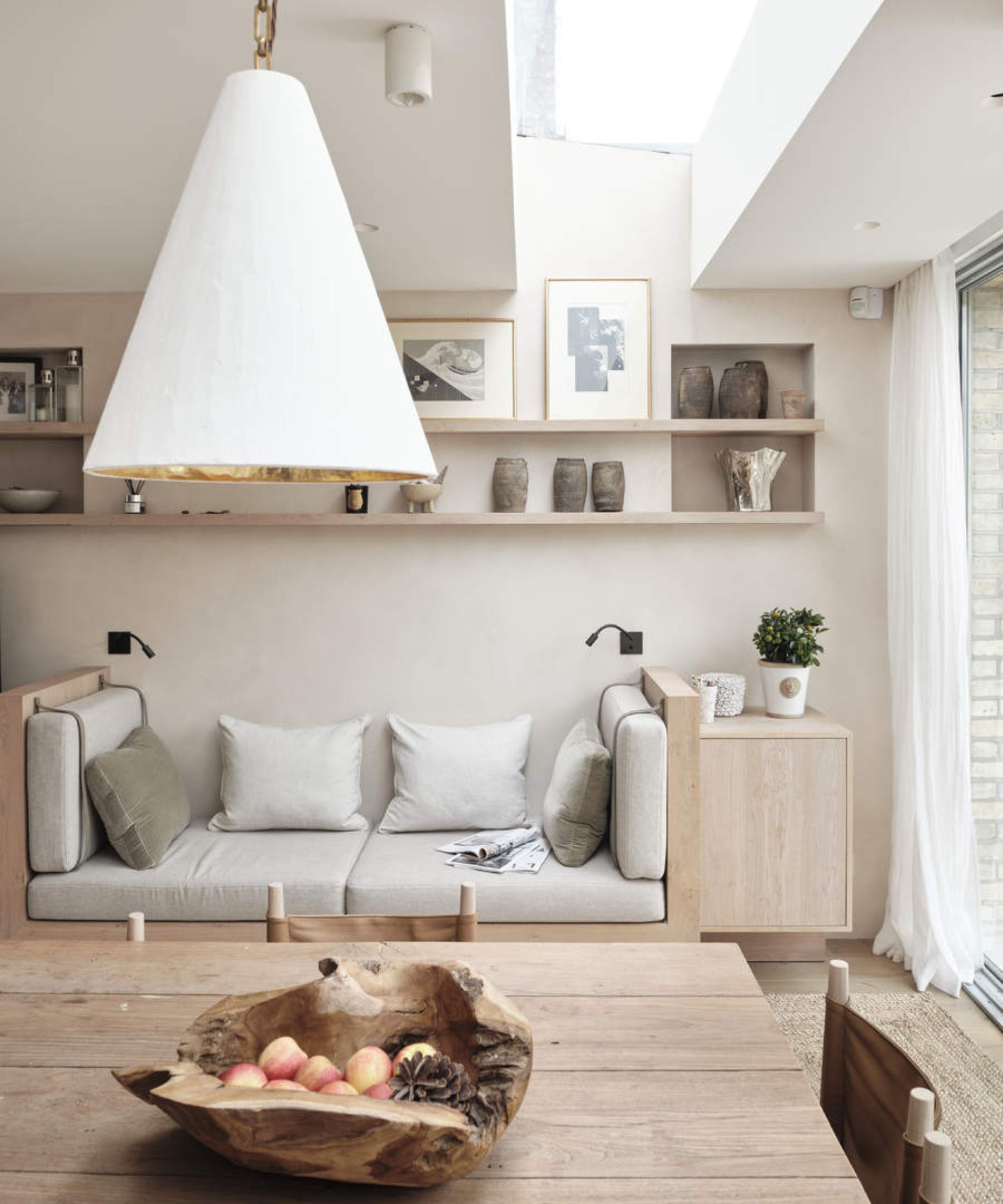
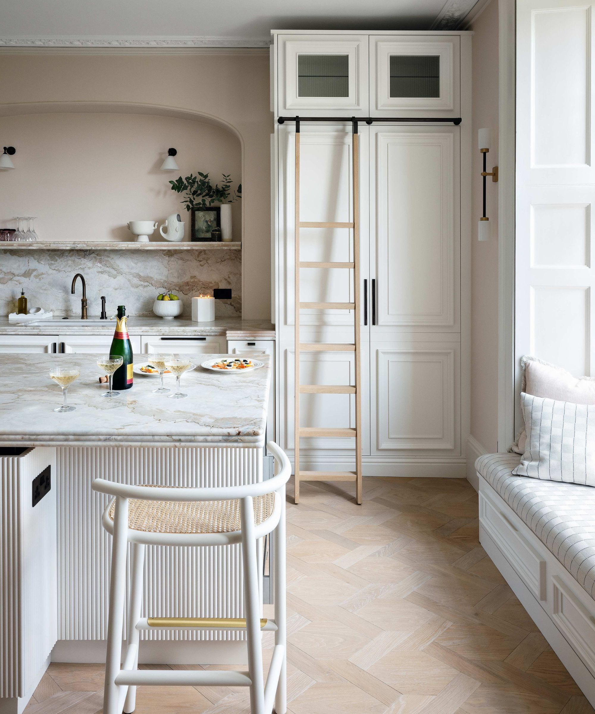
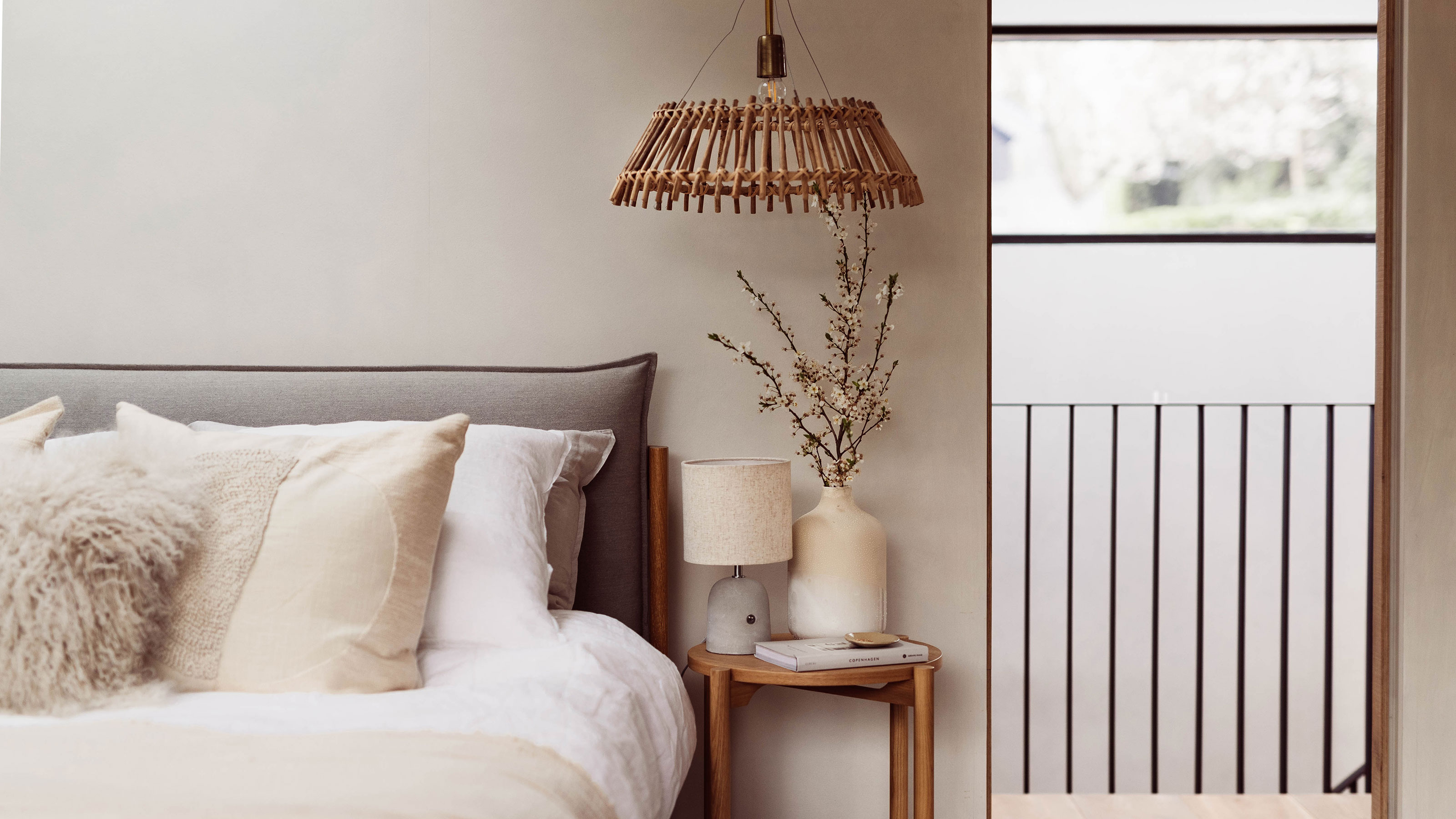
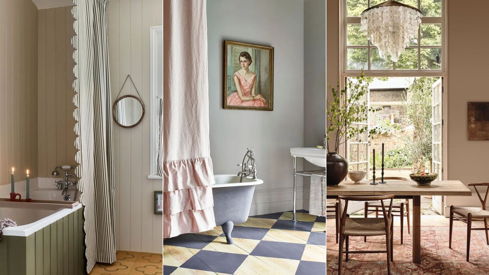
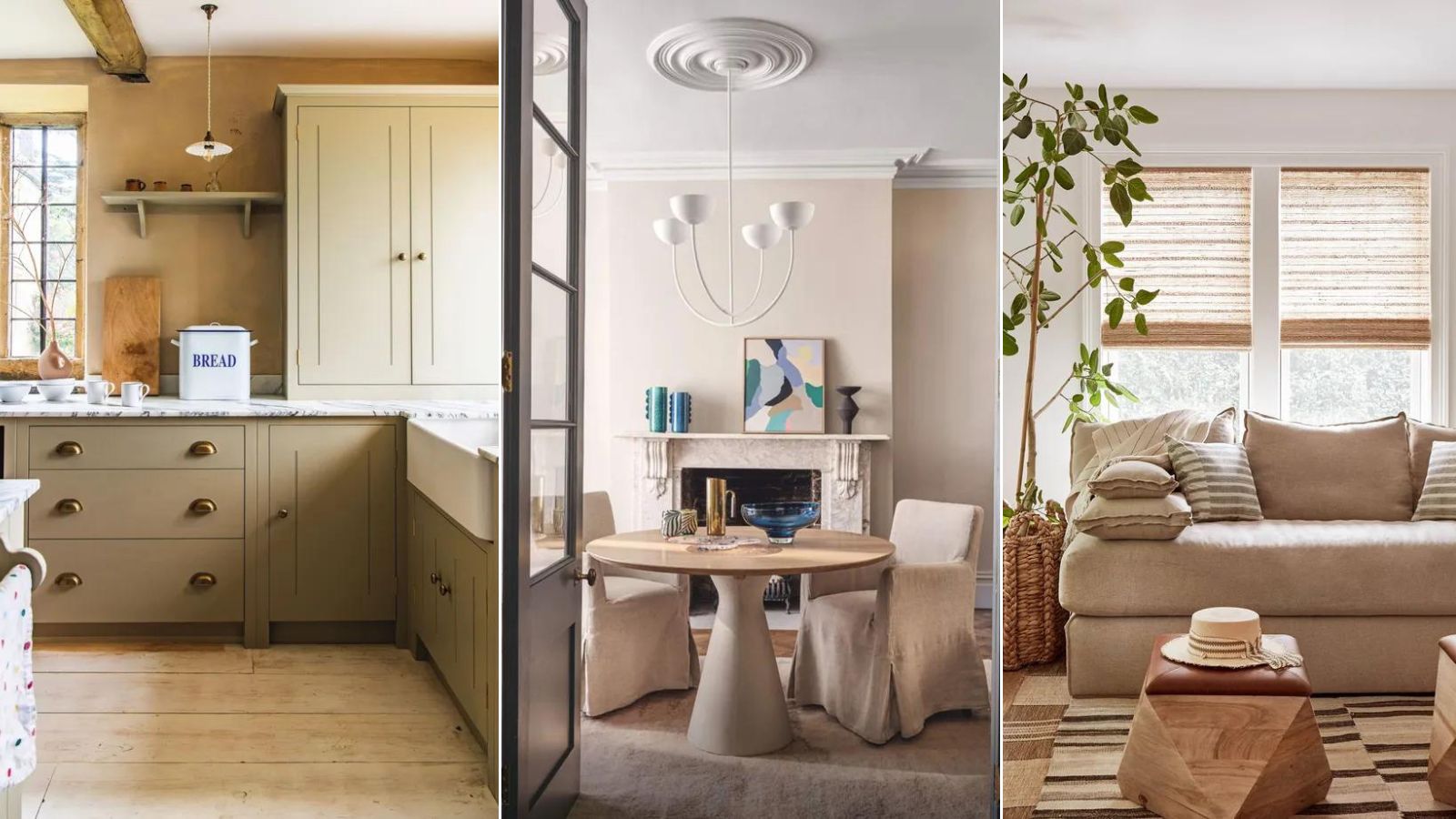
The article discusses the growing trend of warm, food-inspired neutral colors in home decor, such as "salted caramel" and "toasted oatmeal," as a replacement for the previously dominant gray. It highlights that these new neutrals are gaining popularity due to their positive psychological connections and ability to create a cozy and calming atmosphere. The shift away from gray is attributed to its lack of positive psychological impact, while warmer tones like caramel, beiges, and sandy colors are associated with grounding and calming spaces.
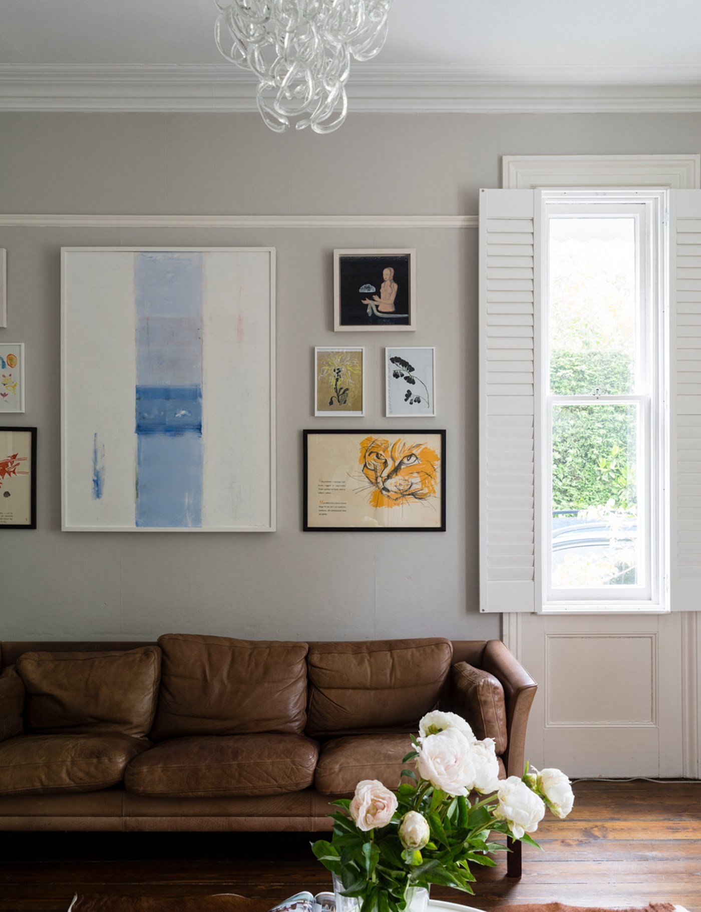
Interior design experts emphasize that these "salted caramel" and calming neutral tones are here to stay, with a noticeable increase in people's willingness to incorporate earthy, soothing colors into their homes. This trend is closely linked to concepts of mindful living and conscious design, as these tones are intrinsically connected with nature.
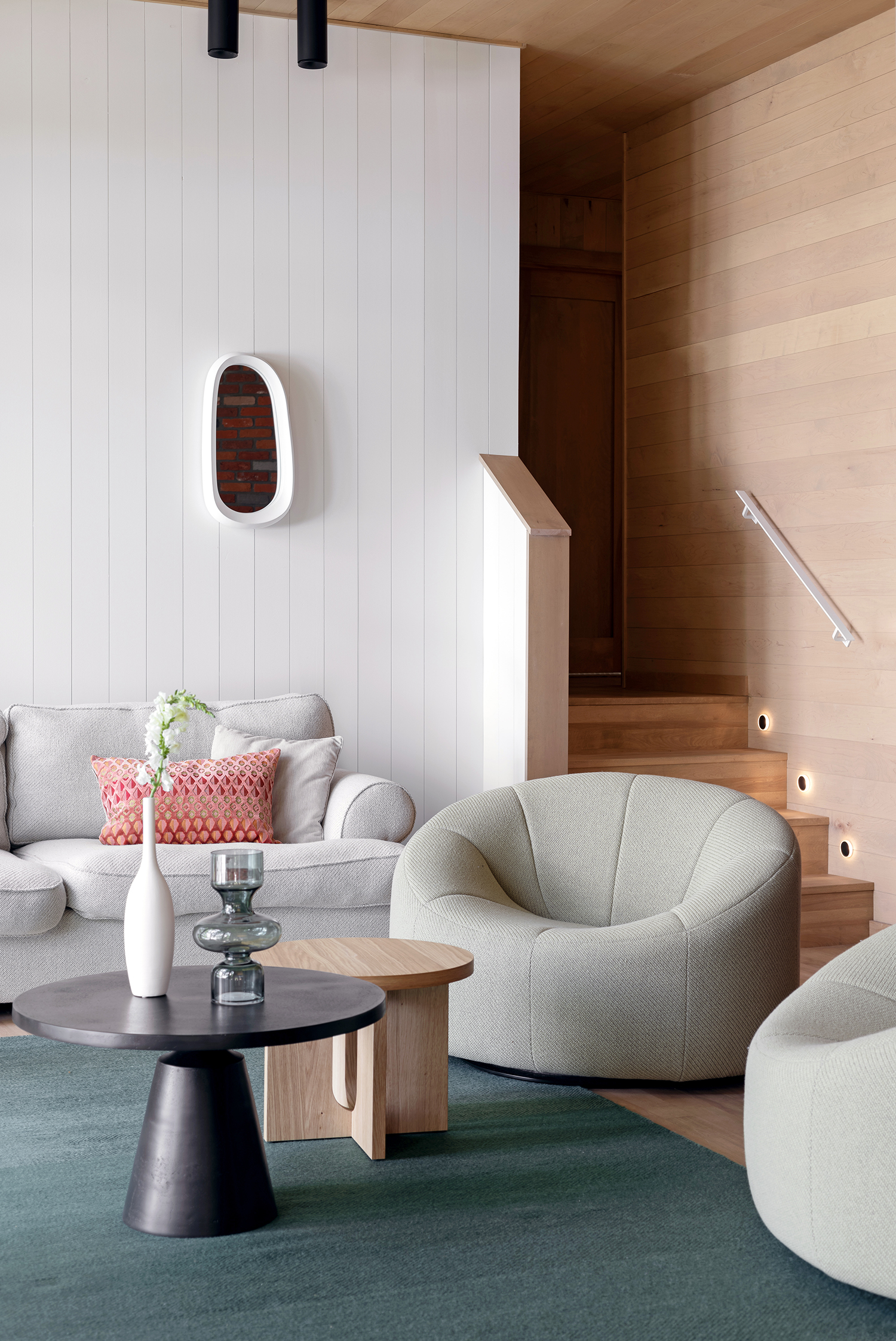
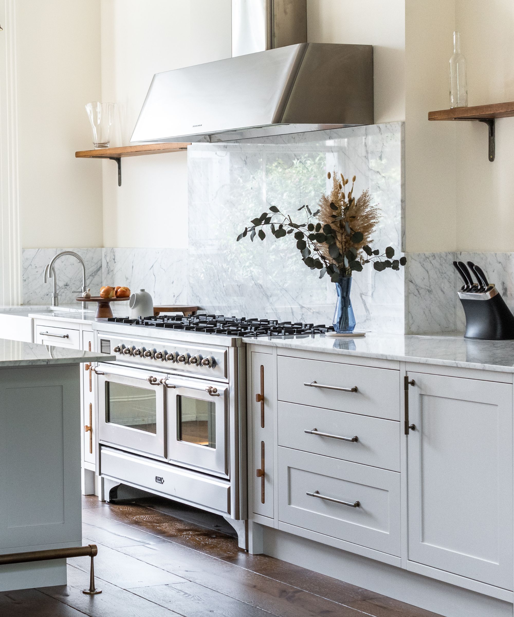
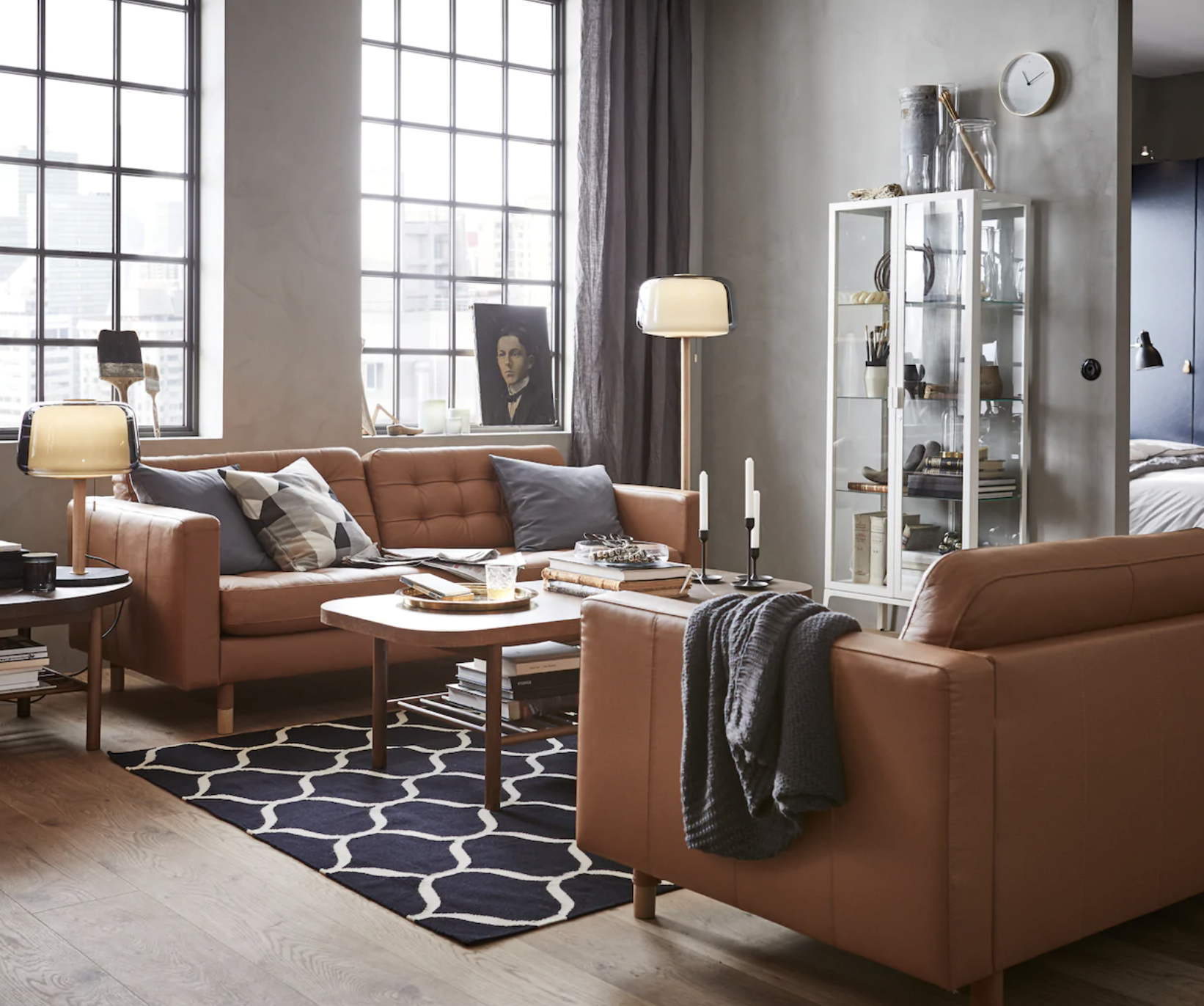
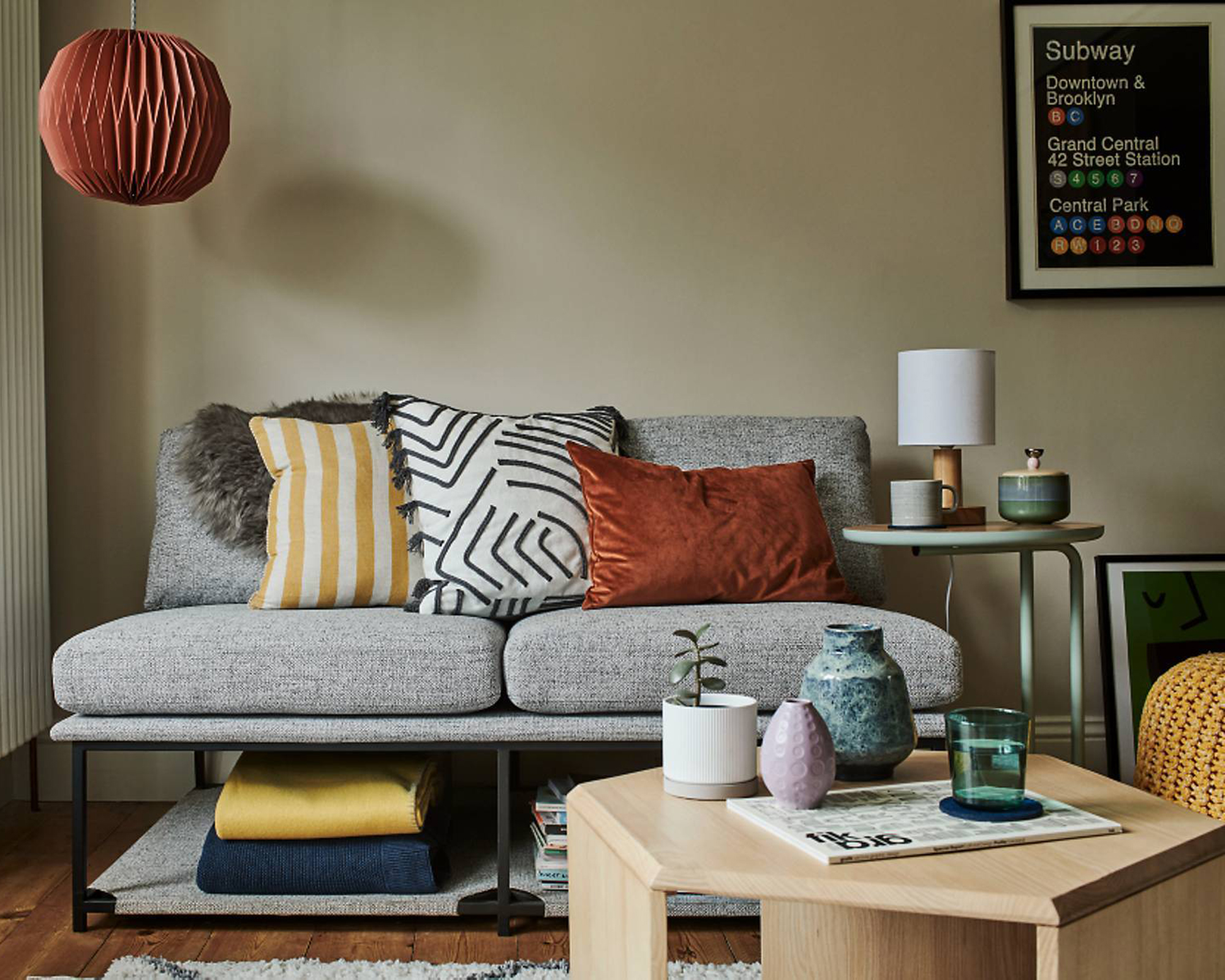
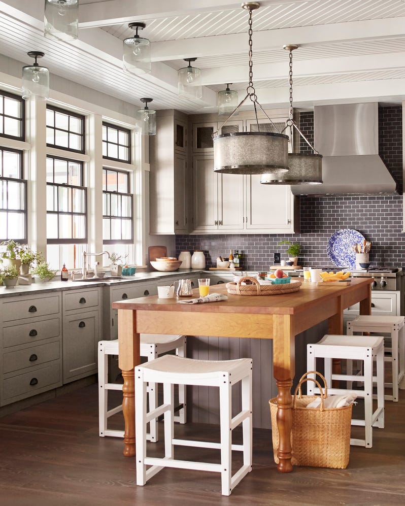
For those looking to incorporate these new neutrals, warm neutral walls are presented as a primary method. However, the article also provides alternative approaches for renters or individuals who cannot paint their walls. These include integrating natural, undyed linens, wicker, and rattan. The rising influence of the '70s interior aesthetic further supports the sustained use of caramel and earthy tones, along with natural textures and materials.
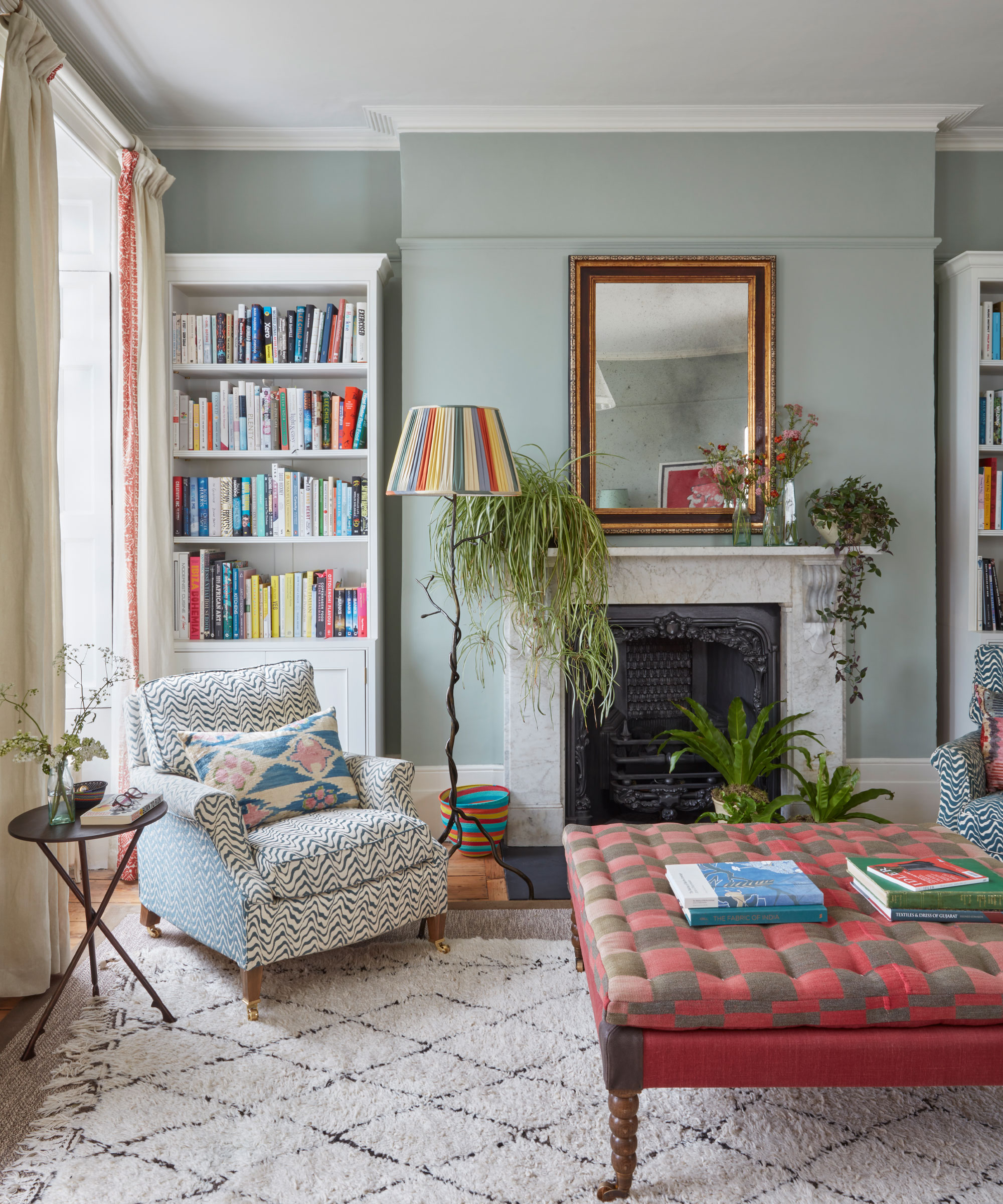
The overall aesthetic conveyed by these new neutrals is described as soothing and is recommended to be brought to life with complementary colors like warming terracotta, deeper browns, and other rich earth tones. The article also includes a shopping edit of various home decor items in these warm neutral shades, such as waffle throw blankets, textured throw pillows, area rugs, mushroom lamps, stoneware vases, and water hyacinth storage baskets.
Opinions from co-editor Amelia Smith, deputy editor Camille Dubuis-Welch, e-commerce editor Christina Chrysostomou, and editor-in-chief Melissa Epifano are shared. Smith appreciates the calm and serene nature of the look but suggests adding pops of color and pattern for vibrancy. Dubuis-Welch views "salted caramel" as a rich and soft addition that complements other neutrals and can be balanced with bright accents. Chrysostomou emphasizes the versatility of salted caramel as a foundational color, allowing for easy transitions between different decor trends like Scandi chic and rustic chic by simply changing soft furnishings and accessories. Epifano, who previously favored neutrals and now enjoys brighter colors, still supports these warmer tones, finding them more friendly and welcoming than gray or greige, and understands their increasing popularity.
#InteriorDesignTrends #NeutralColors #HomeDecor #ColorPsychology #EarthyTones #MindfulLiving #DesignTips #WarmNeutrals #DecoratingIdeas #InteriorDesignTrends #NeutralColors #HomeDecor #ColorPsychology #EarthyTones #MindfulLiving #DesignTips #WarmNeutrals #DecoratingIdeas
Hay 0 comentarios en total
 Aún no hay comentarios
También te puede gustar
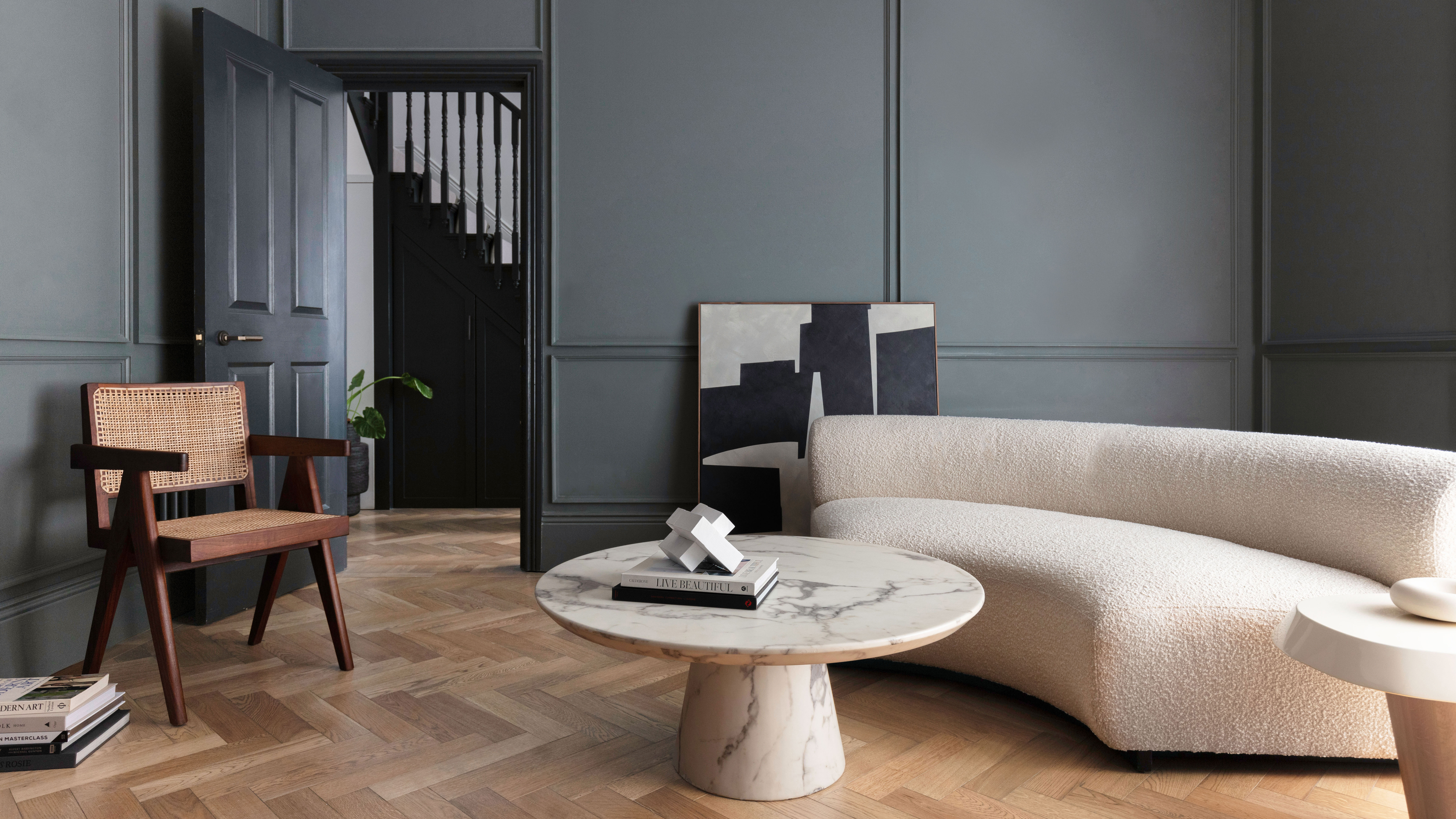
What Colors Go With Gray? 19 Arresting Combinations With This Time-Tested Neutral

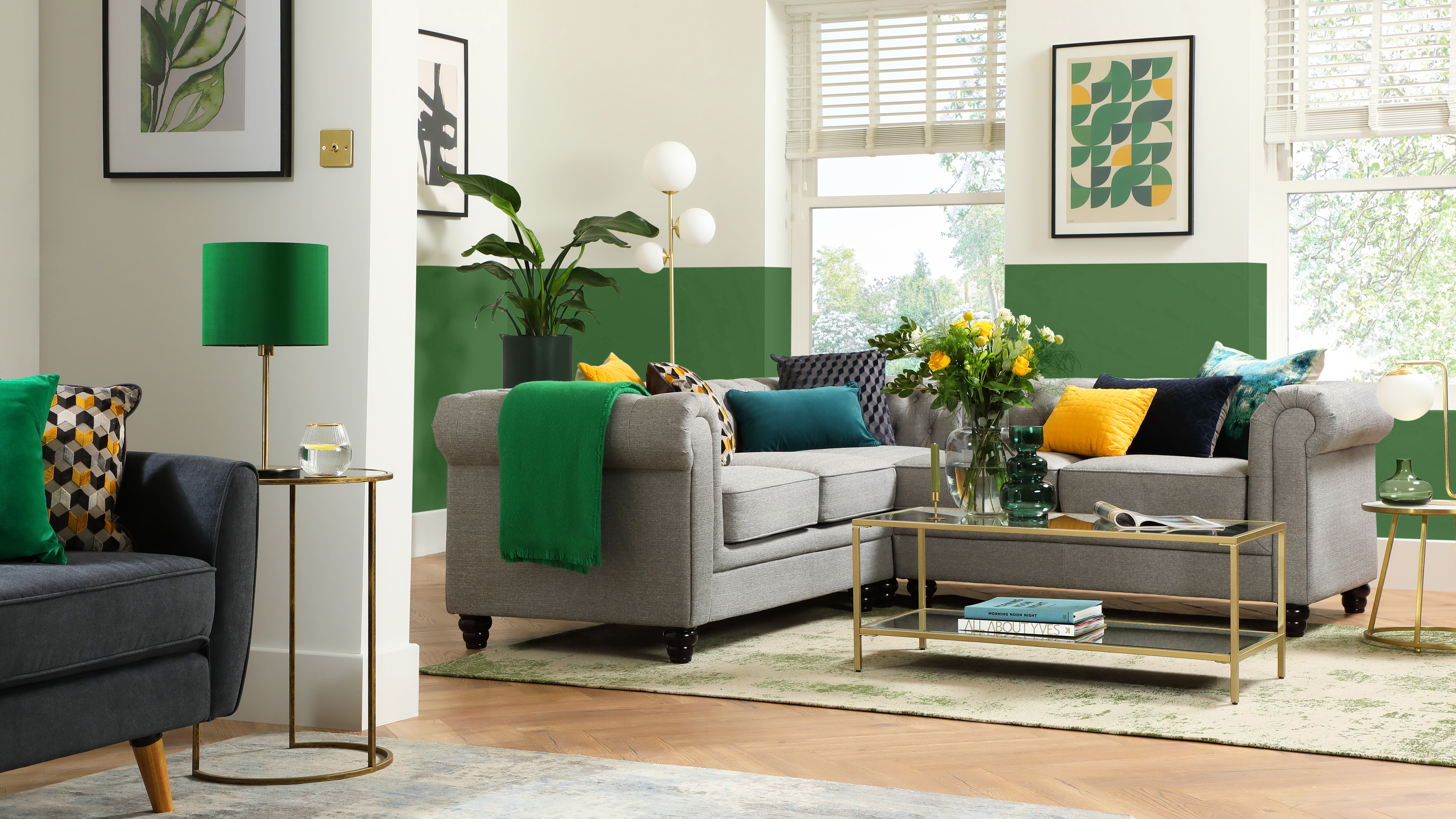
What colors go with grey? 13 palette pairings according to interior designers
Is gray or beige more on trend for 2025? Designers share all on these popular neutrals
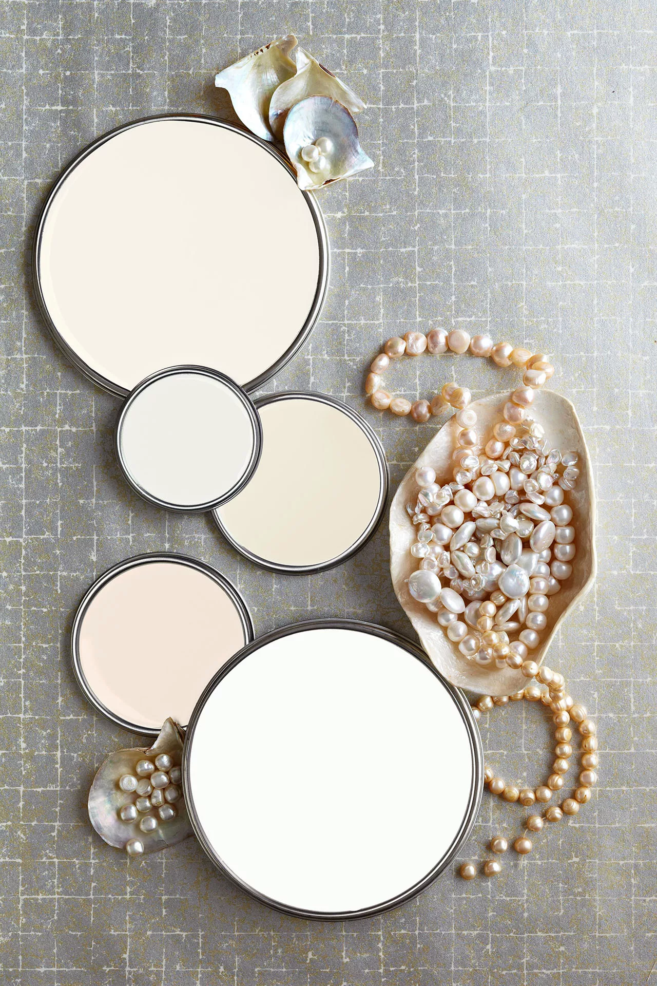
27 Neutral Paint Colors and Tips from Experts On How to Use Them

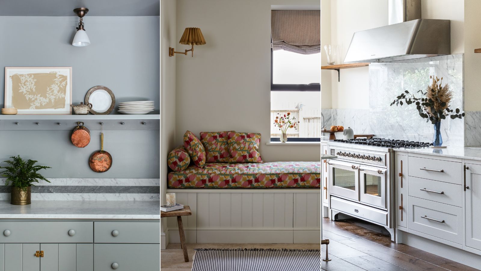
Are gray interiors really out of style? Interior designers weigh in on how to use this cool shade

23 Colors, Patterns, & Textures To Pair With Gray
Top 32 Expert-Recommended Gray Paint Colors, Plus How to Pick the Best Shade
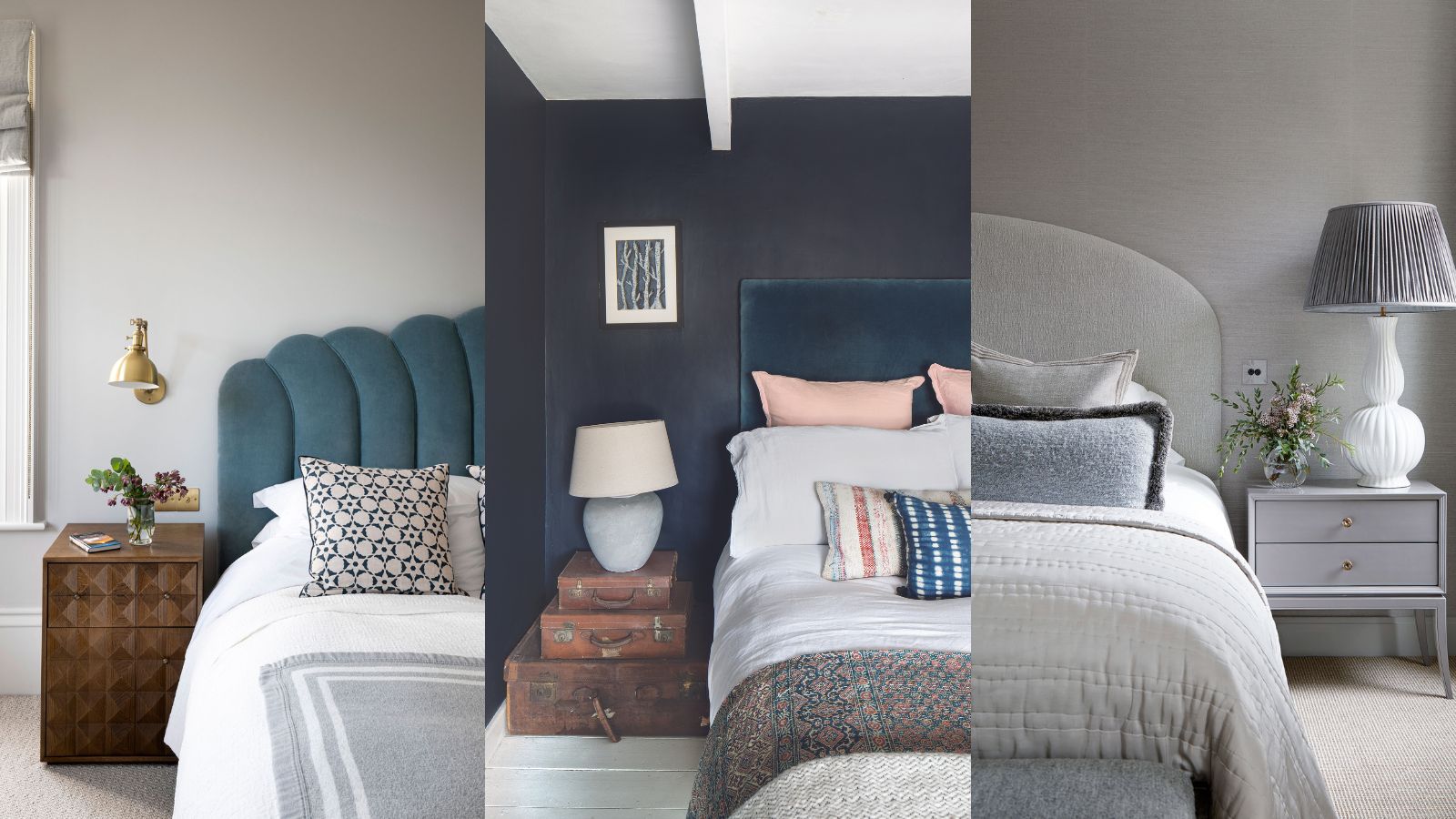
Grey bedroom ideas – 15 ways to instantly brings gravitas to this neutral space
Is gray still on trend? Designers explain how to use this cool-toned hue in a world of warm color schemes
15 Best Greige Paint Colors for Every Decorating Taste

What color is replacing gray? This is the shade designers say is becoming the perennial favorite
23 colours that go with grey, as revealed by interior stylists

A versatile neutral, gray goes with anything
REVEALED: Is grey paint going out of style?
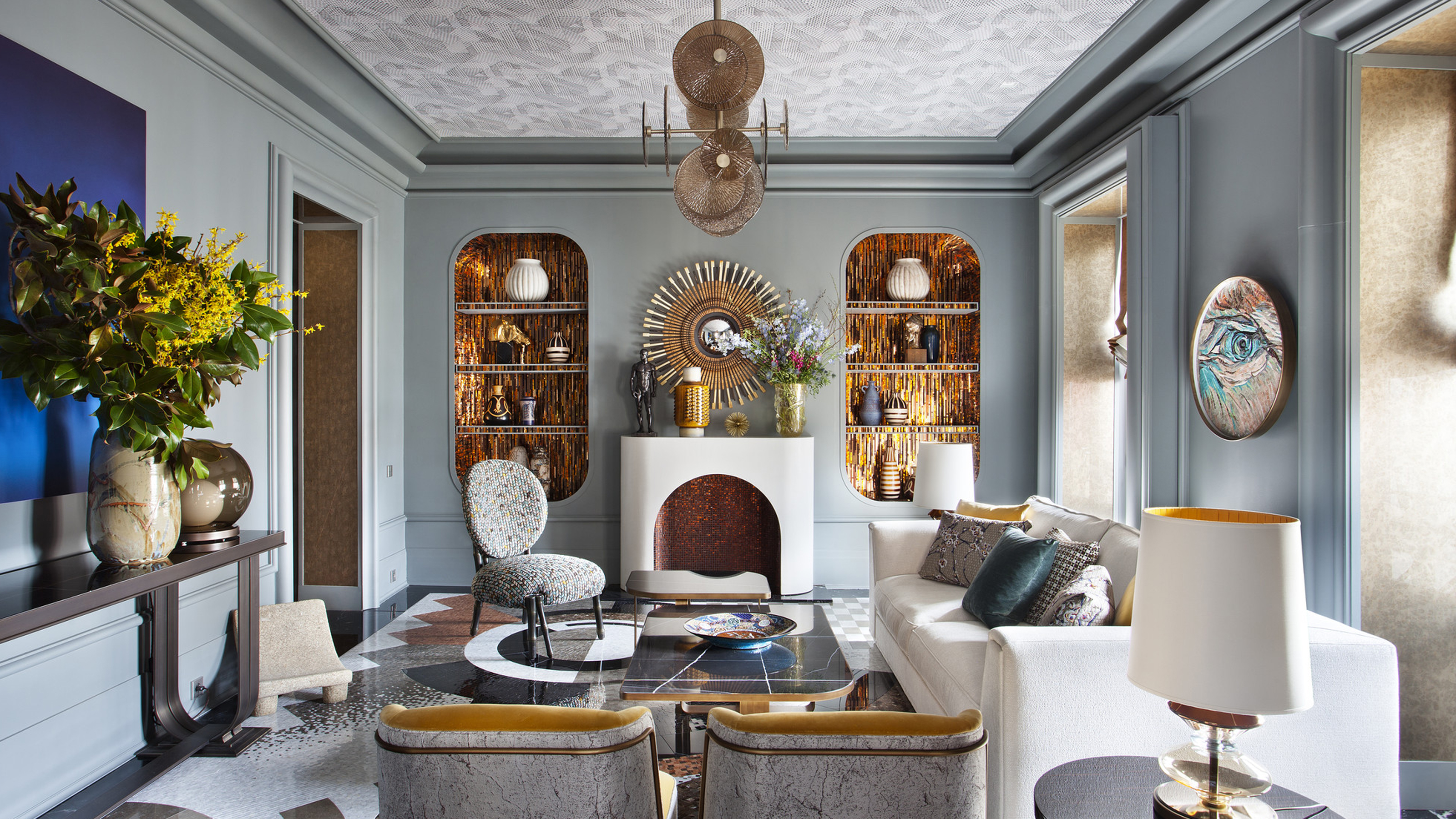
Grey living room ideas – 30+ ways to use this popular shade in a stylish way
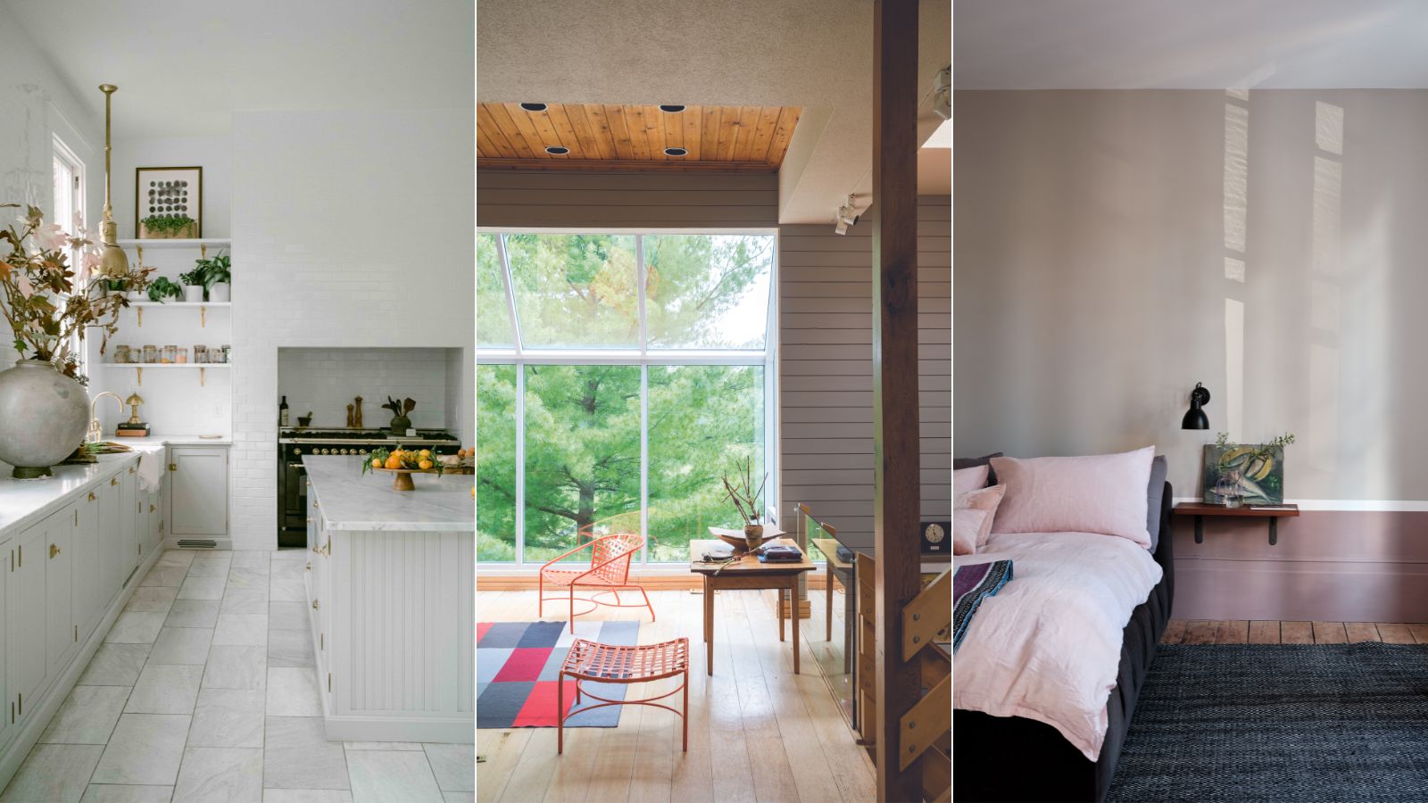
This is the most versatile shade you can bring into your home – designers share the 5 best greige paints
Decorating with this year’s neutral
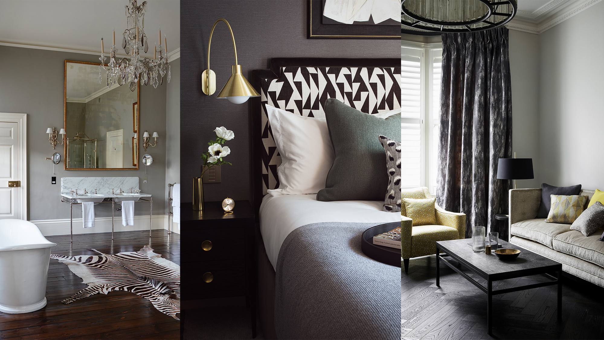
Grey room ideas – 12 ways to use this versatile shade

6 colors to avoid in an entryway – and the ones designers know make a better first impression
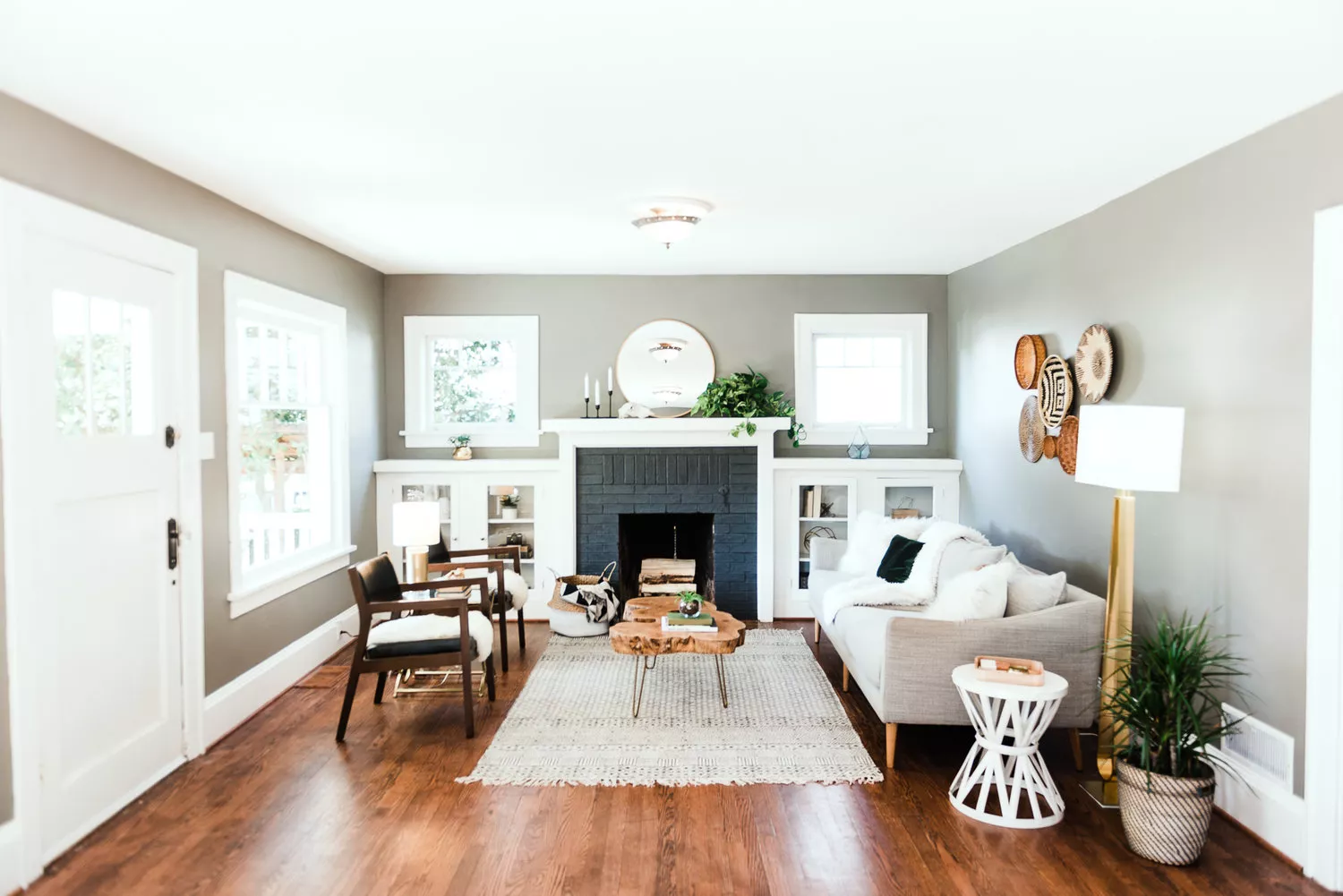
Is Gray On Its Way Out? Designers Tell Us Their Opinions