1/8
Experts explain the 'colour drenching' trend – sharing 7 thoughtful ways to try it in your home
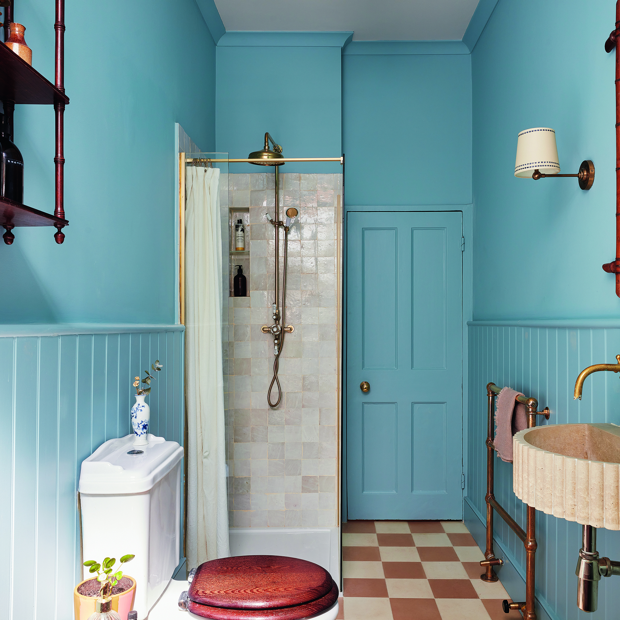
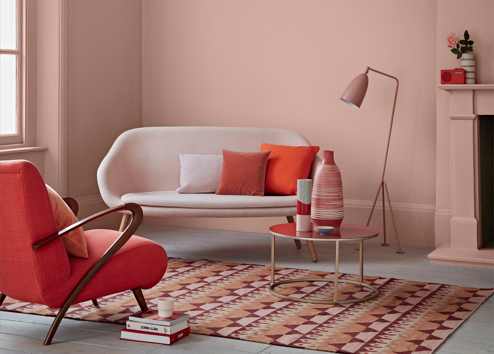
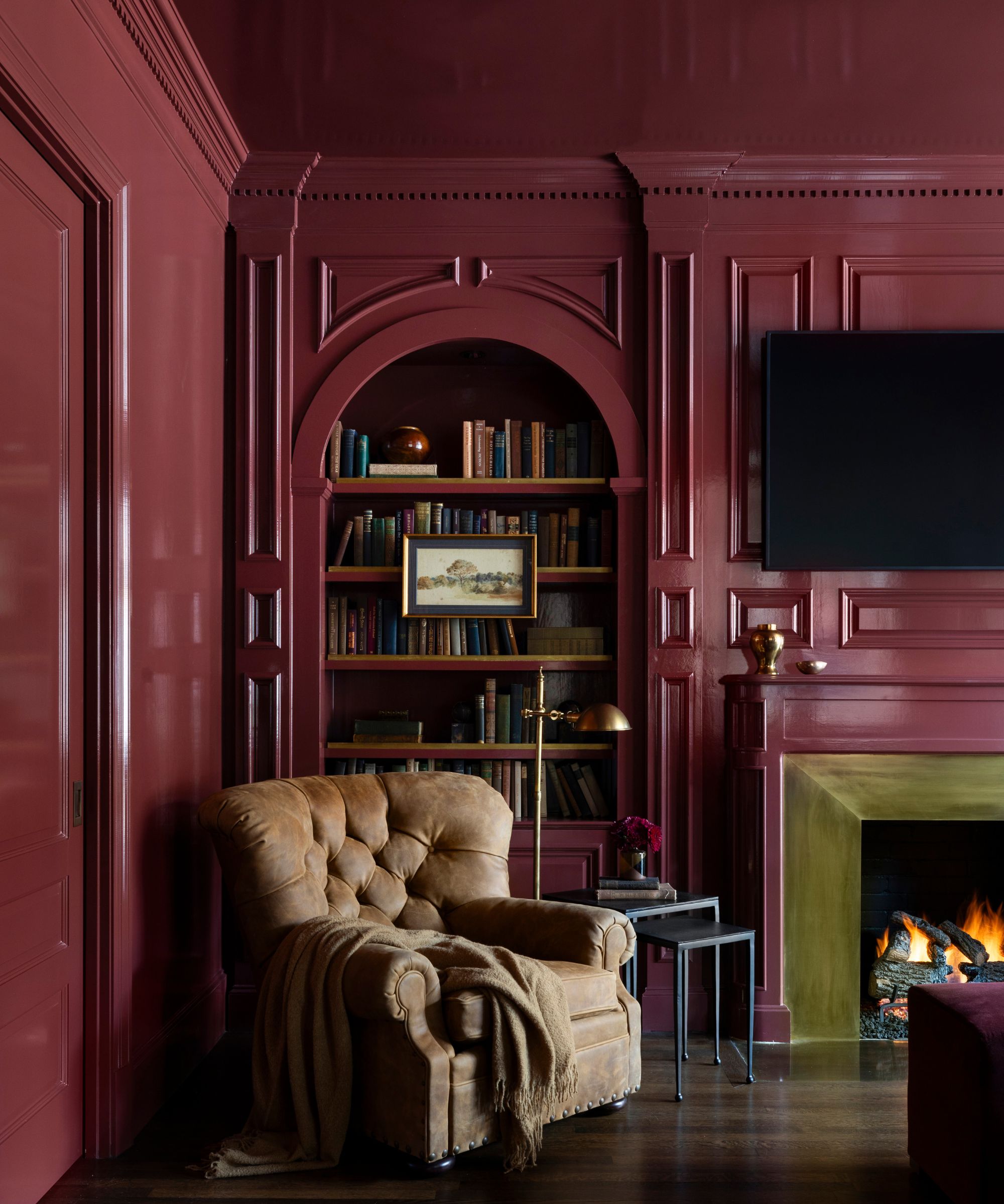
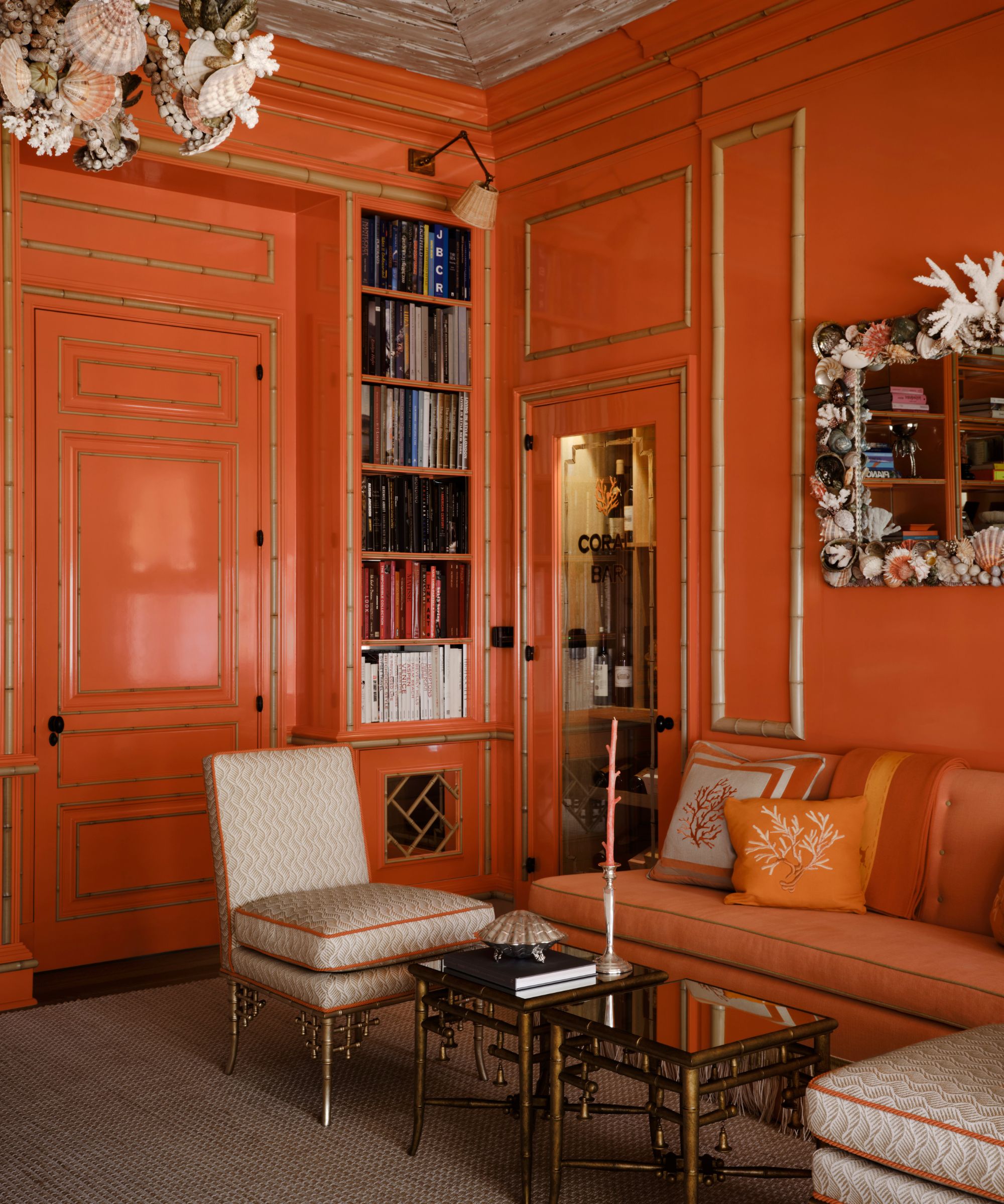
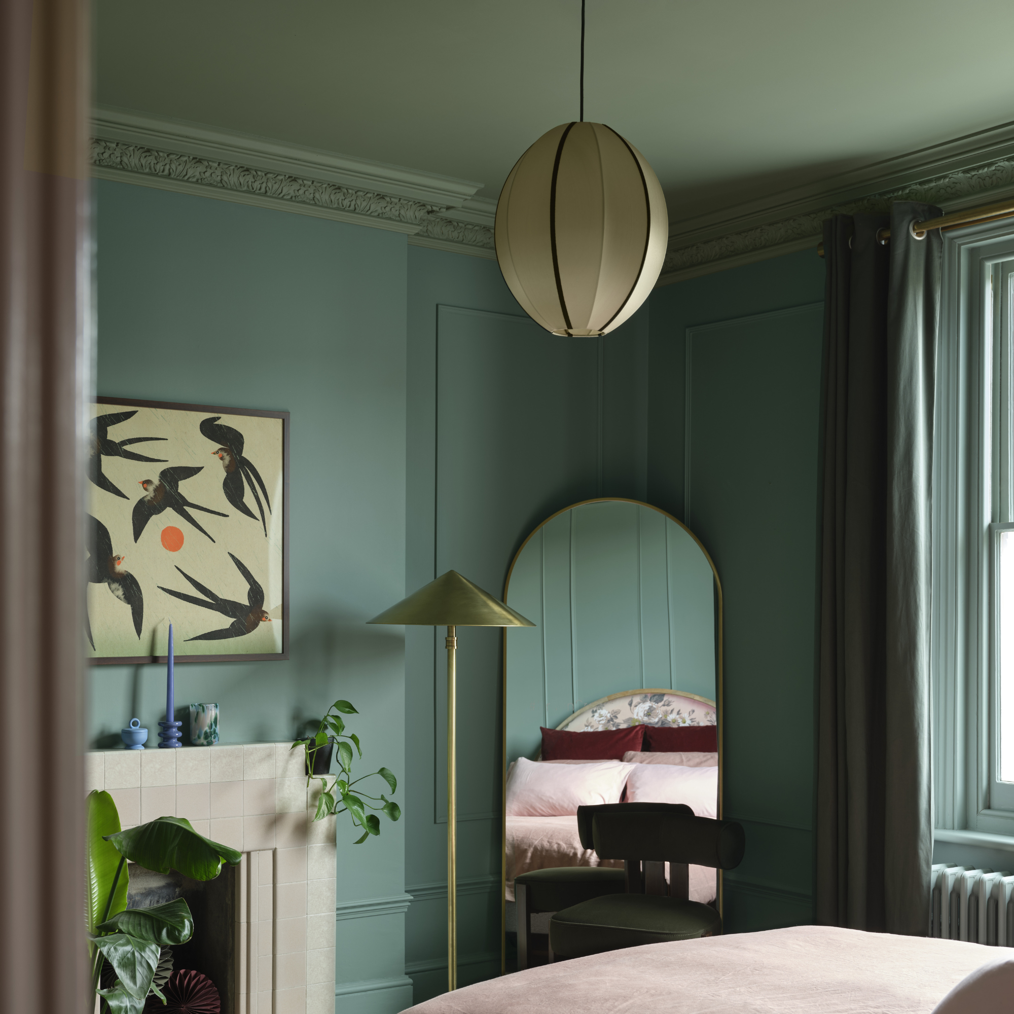
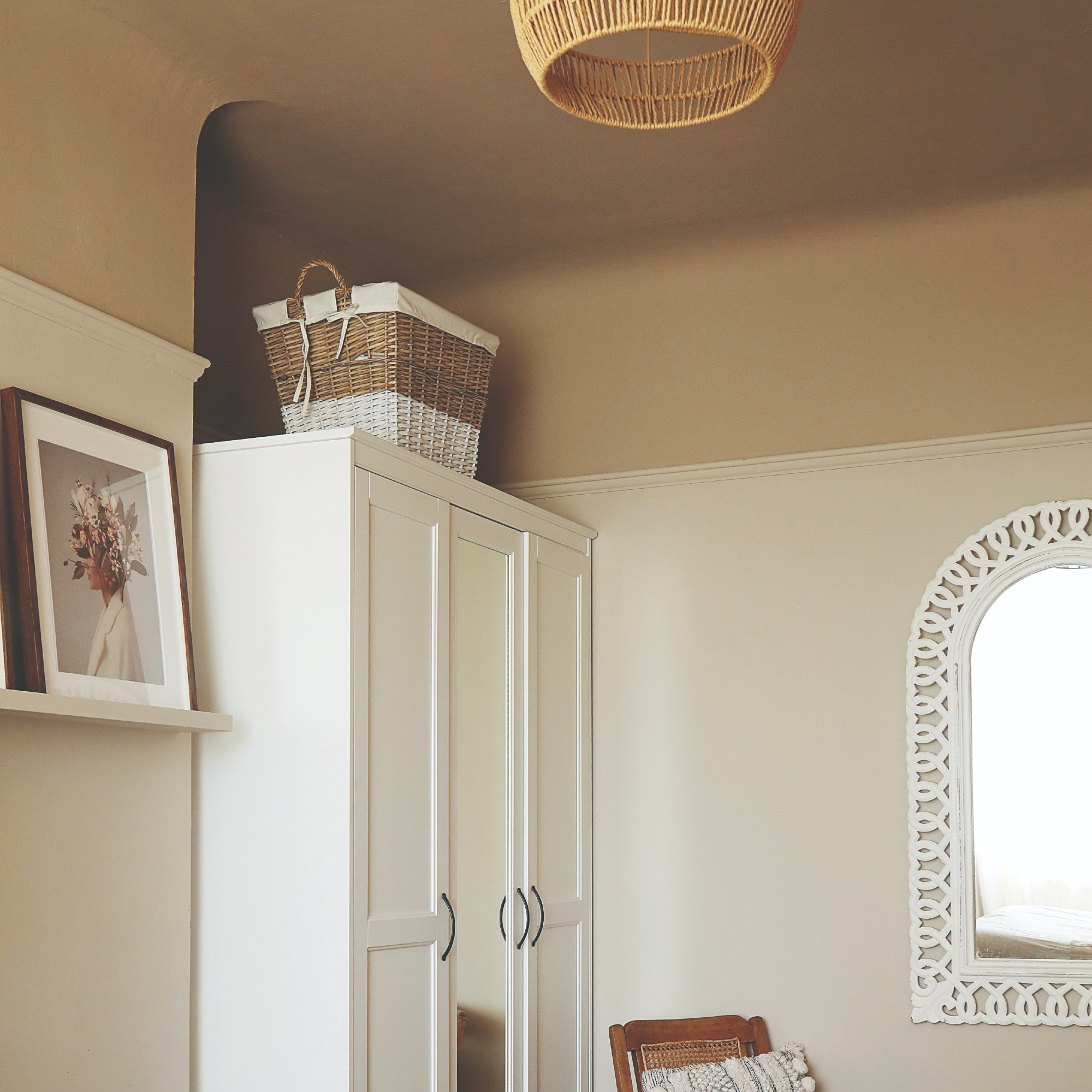
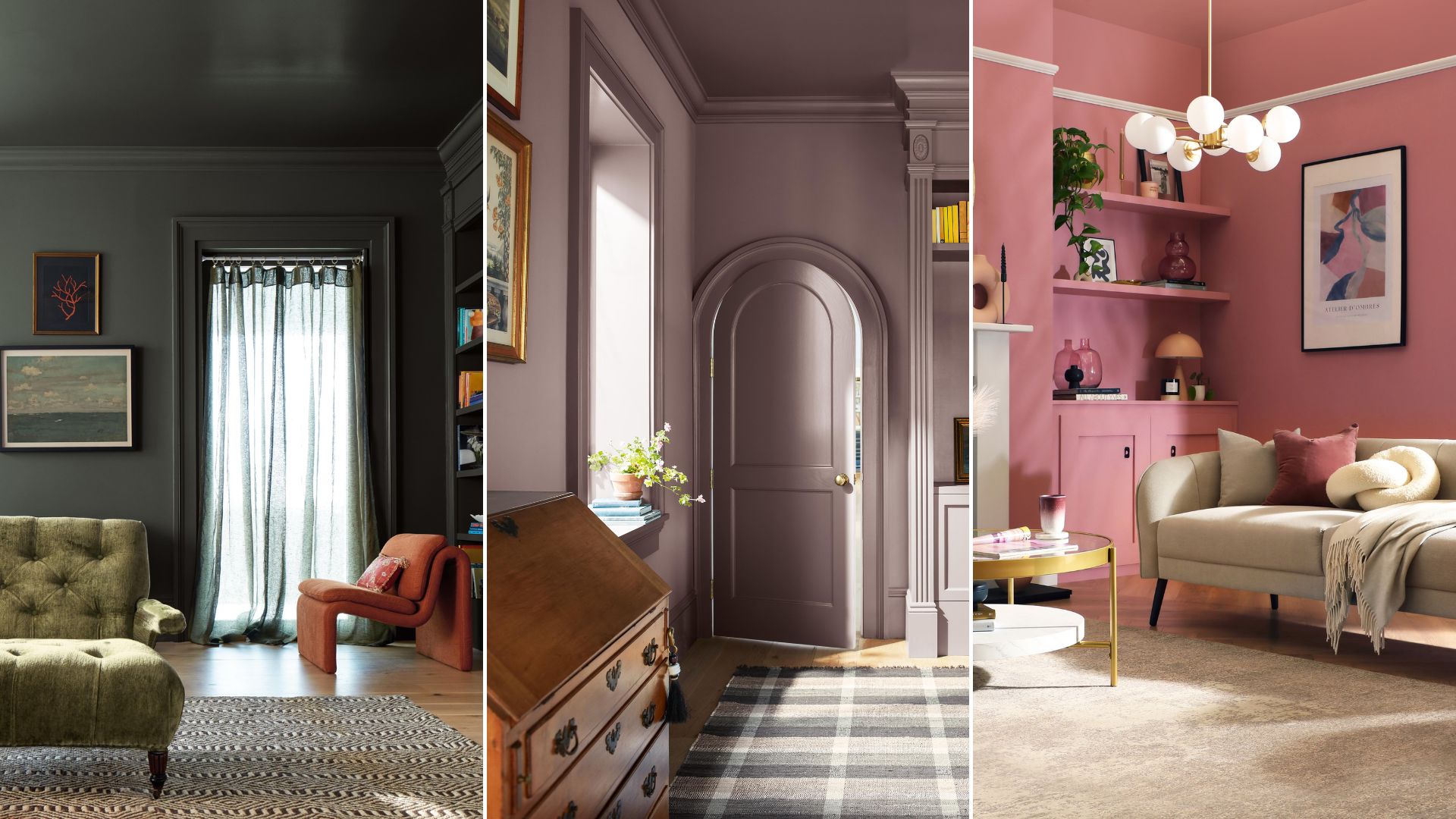
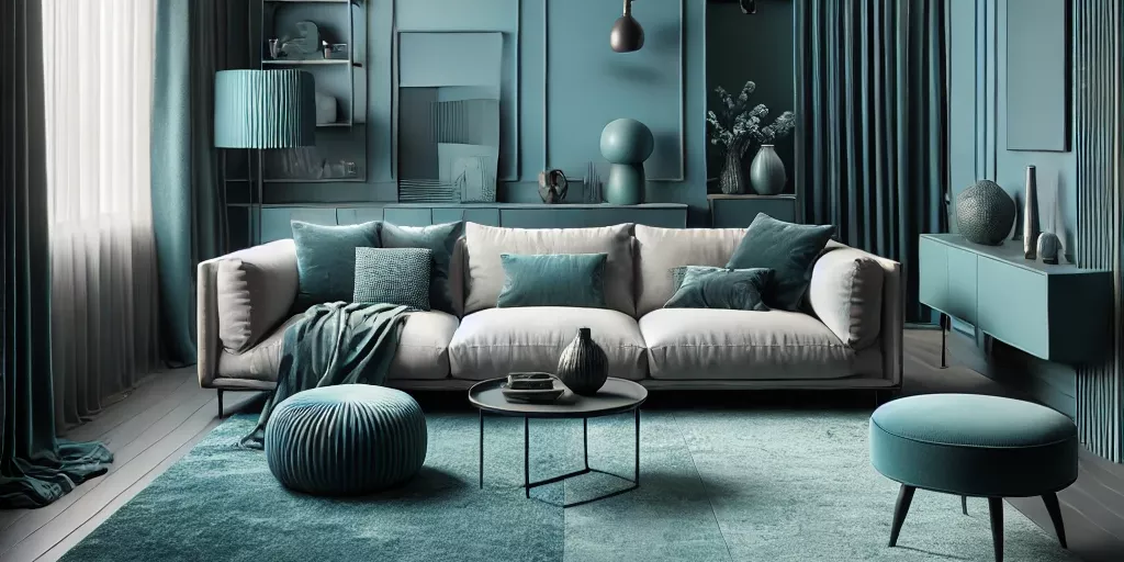
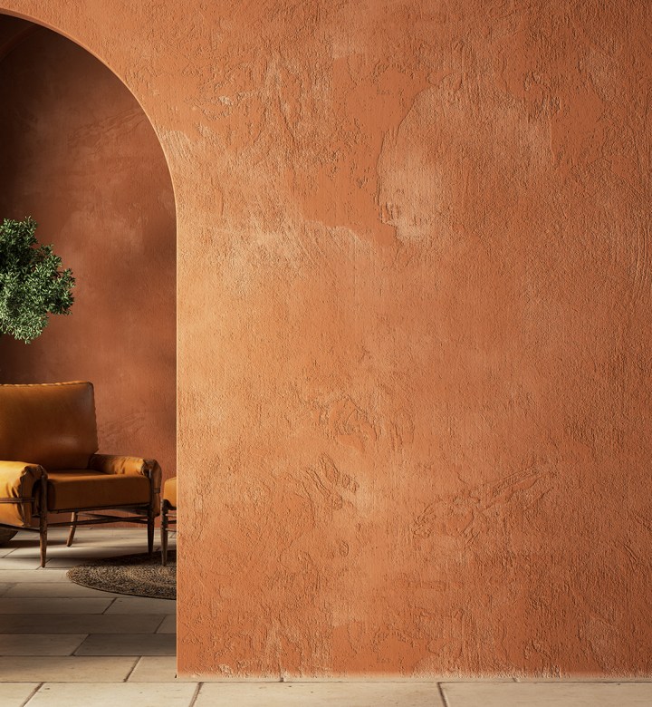
Colour drenching, an interior design technique that involves painting walls, ceilings, trim, and sometimes even furniture and accessories in a single hue, is currently a significant trend. While it draws from earlier design styles, its recent surge in popularity, particularly in the early 2020s, has been amplified by social media and a growing desire for bold, immersive home interiors that reflect personal style. Despite its seemingly complex appearance, colour drenching is straightforward to implement and can profoundly impact a room's aesthetic and ambiance.
Flora Hogg, an interior designer and colour consultant at Craig & Rose, highlights that colour drenching can effectively define specific areas, activities, and moods within a space. The use of vibrant colours, she notes, enhances the immersive quality of an environment, contributing to the overall atmosphere. When selecting a colour, Hogg advises testing samples in various lighting conditions and at different times of the day to ensure the chosen shade performs consistently. She suggests painting samples on lining paper to easily move them around the room for assessment.

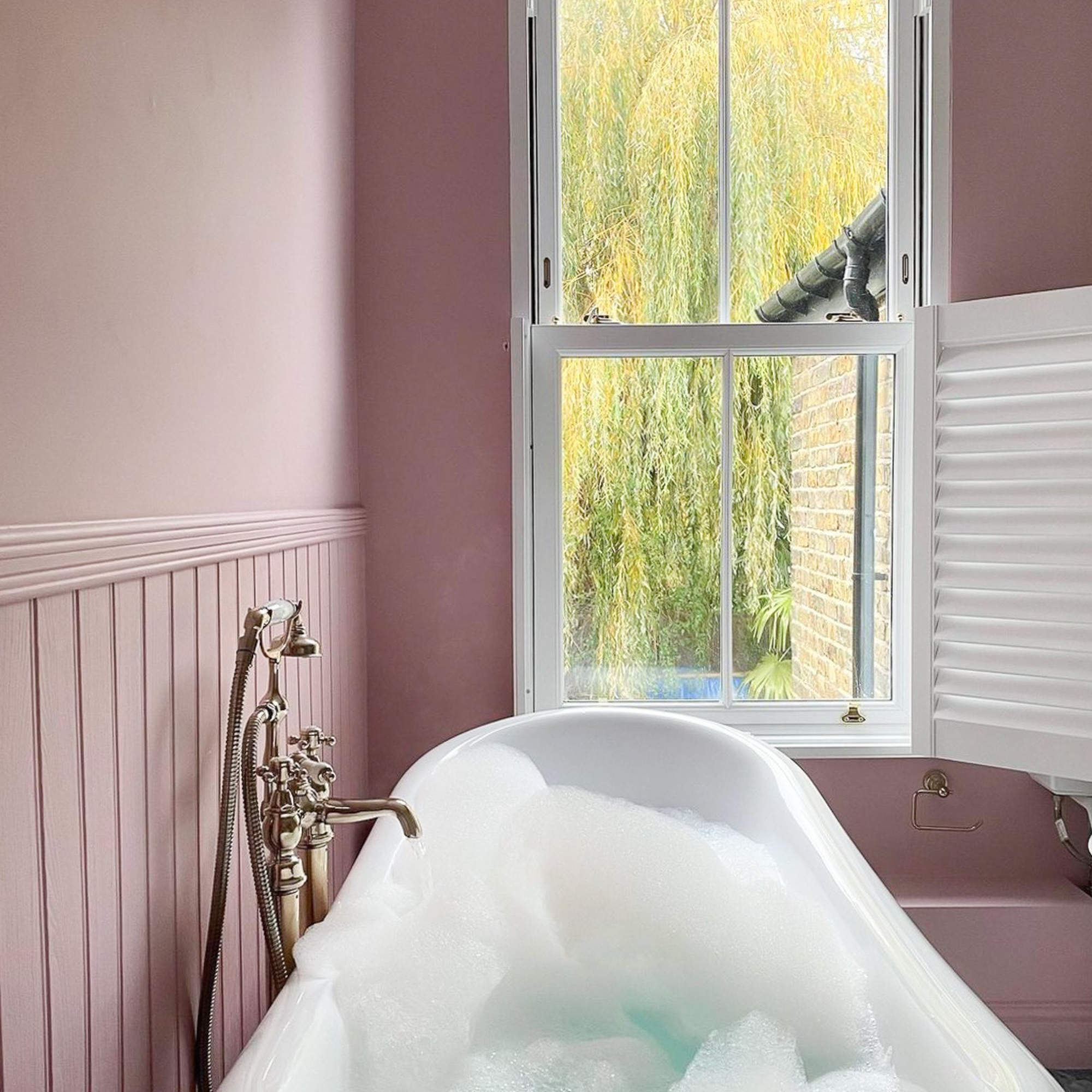
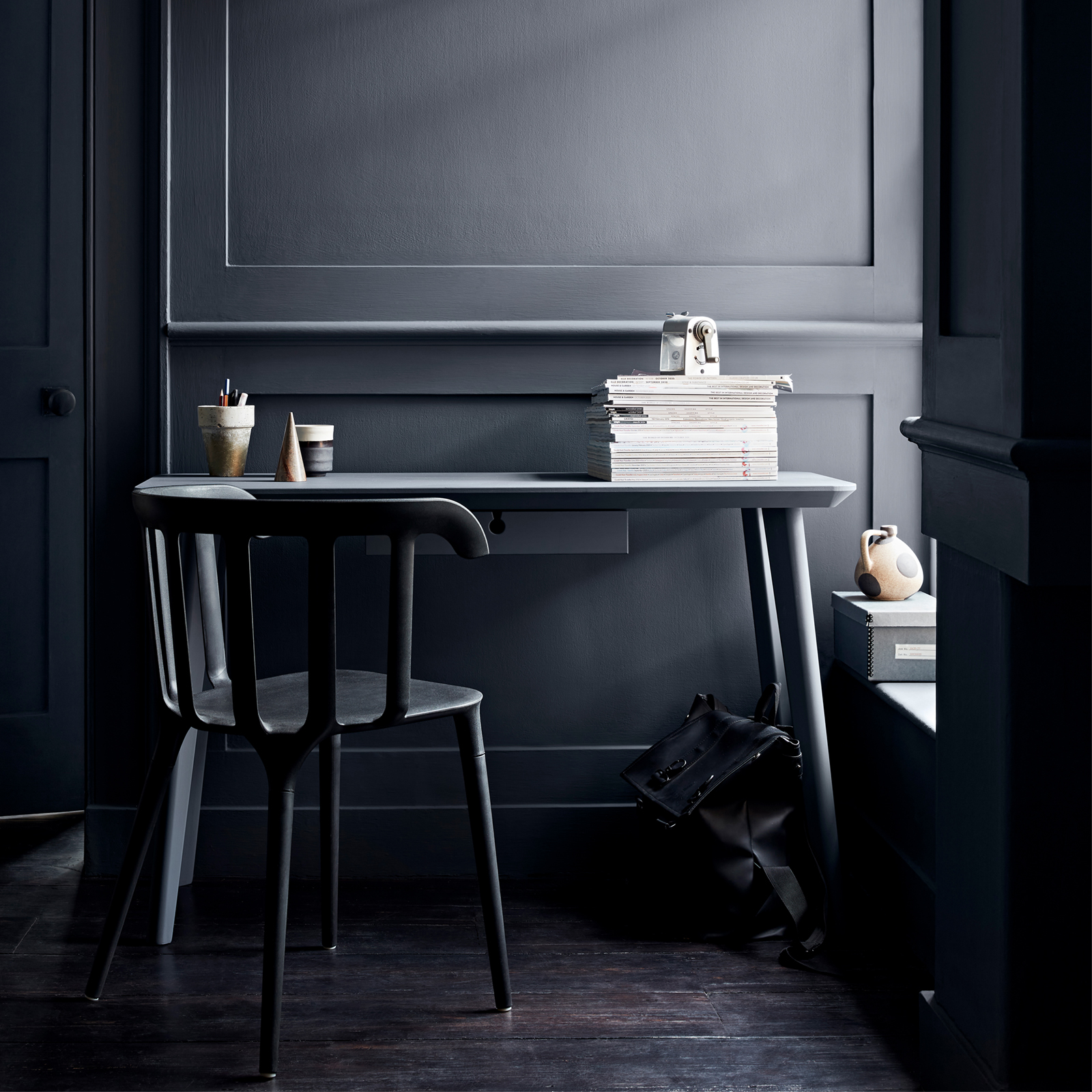
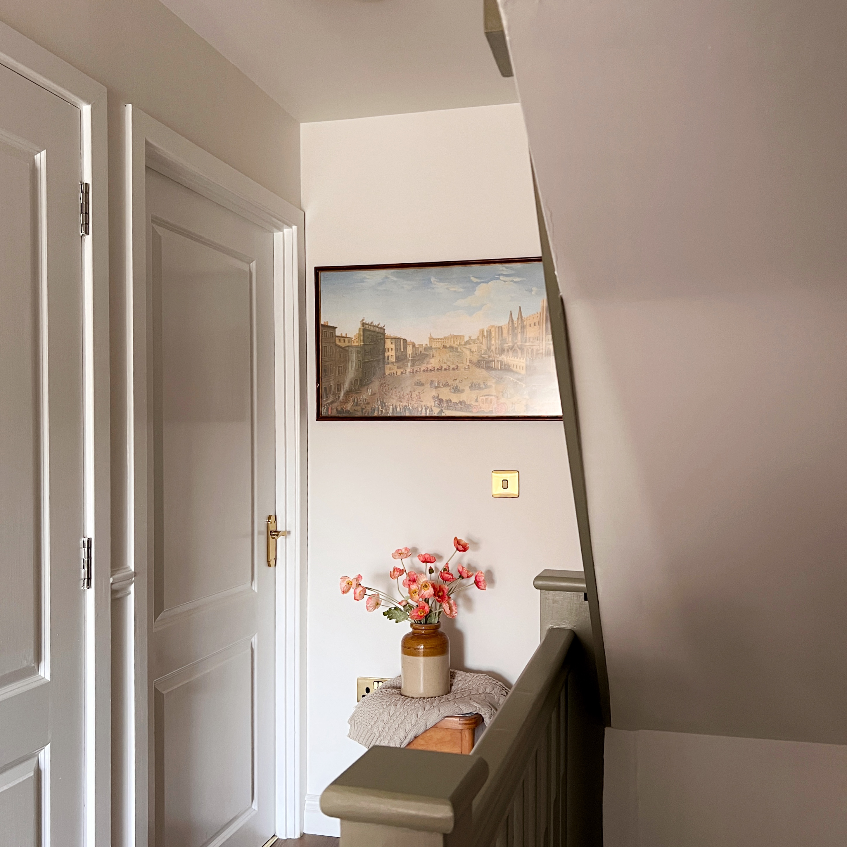
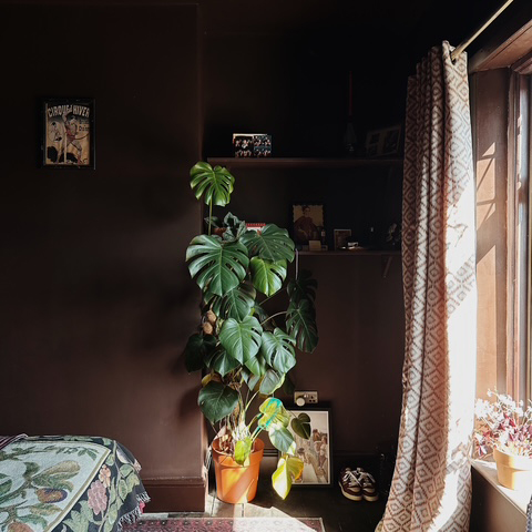
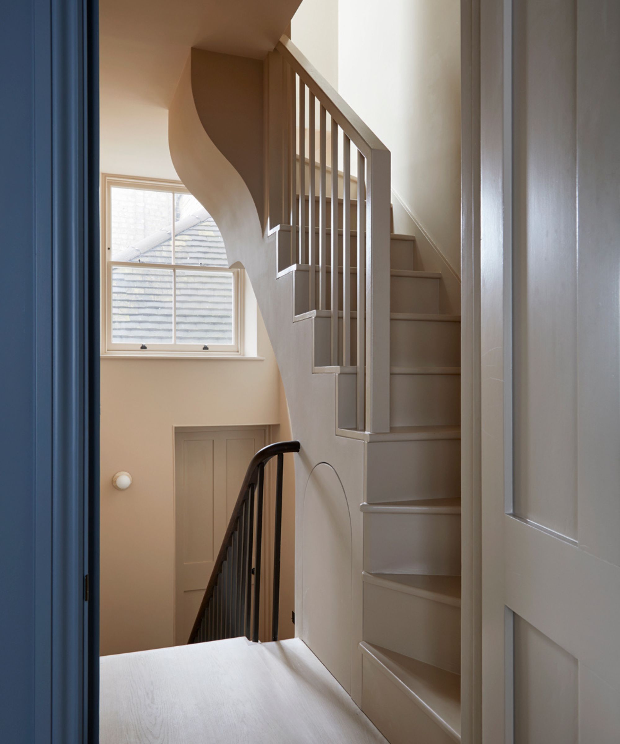
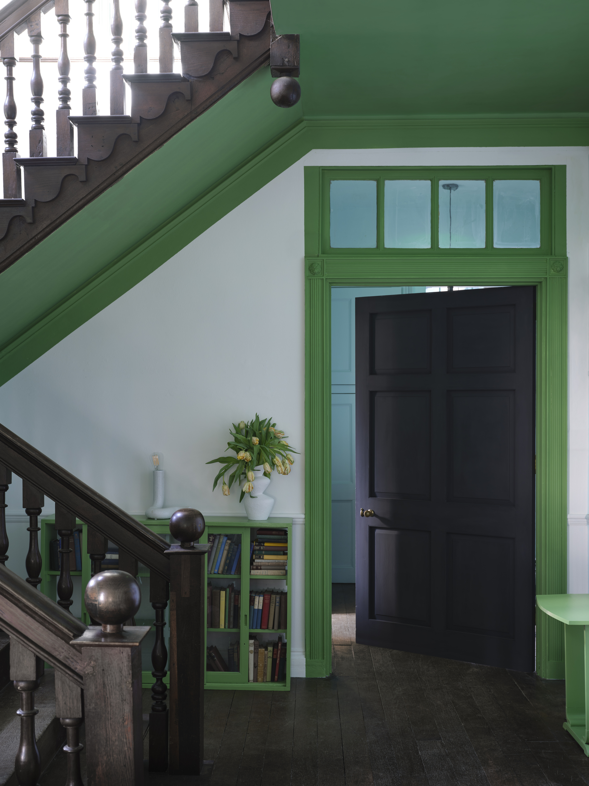
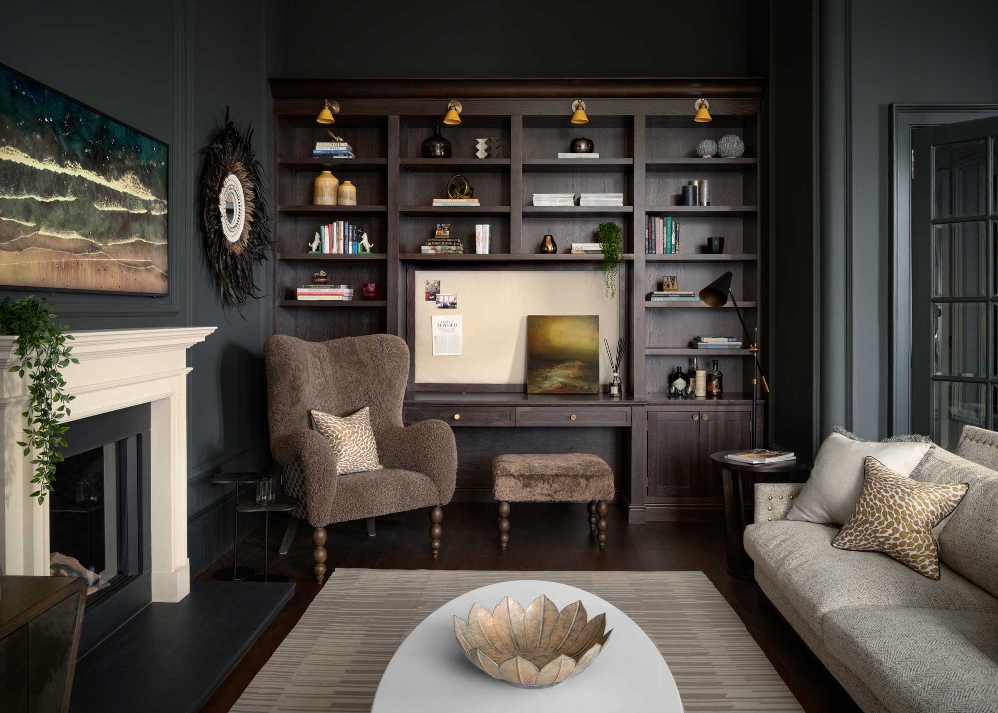
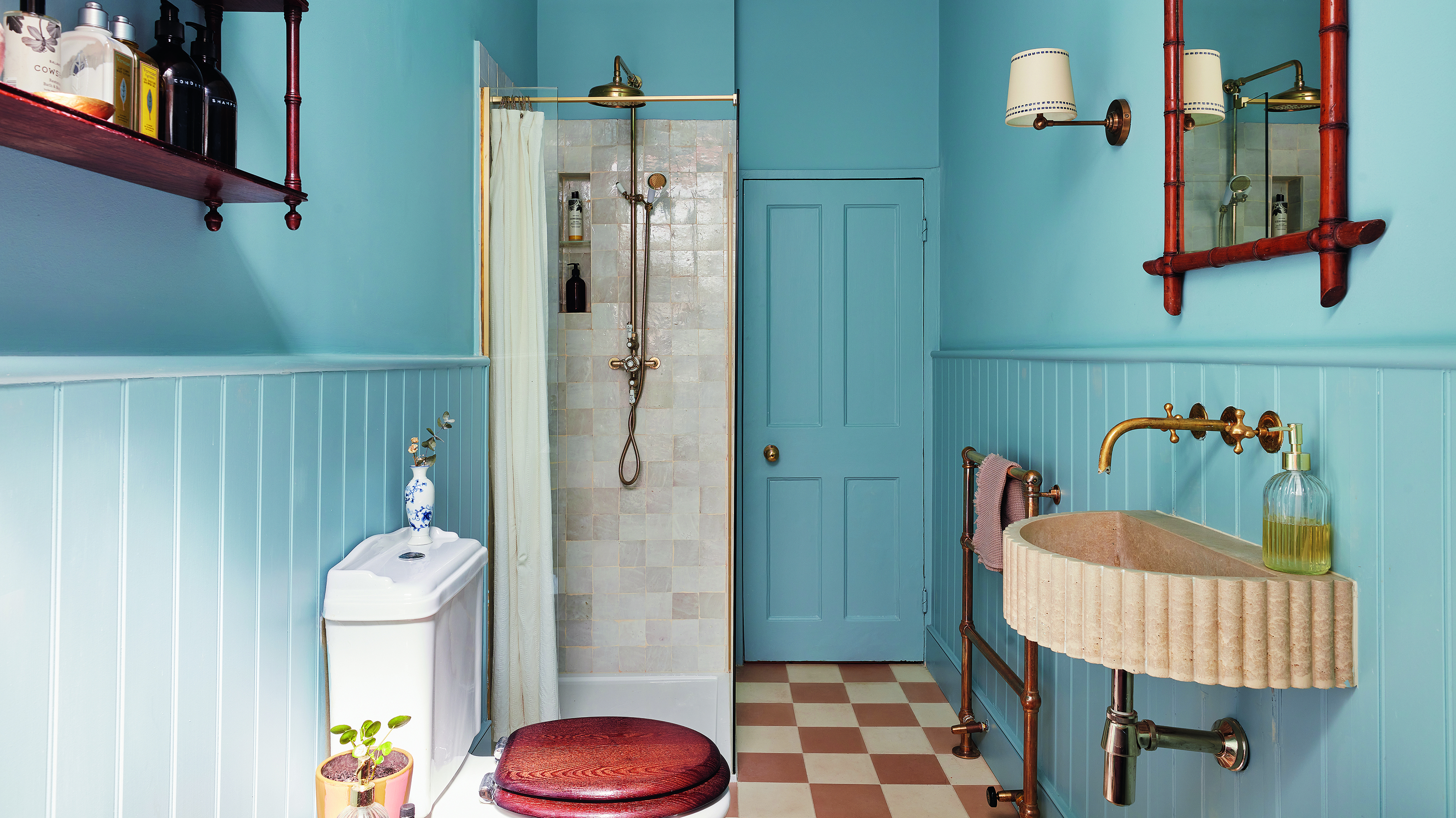
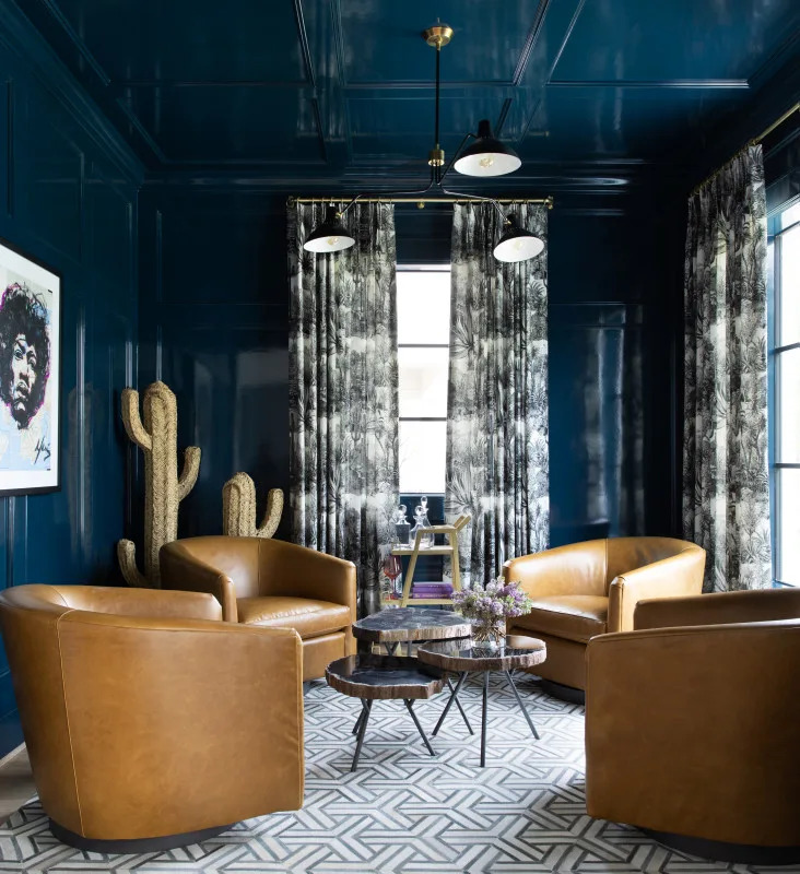
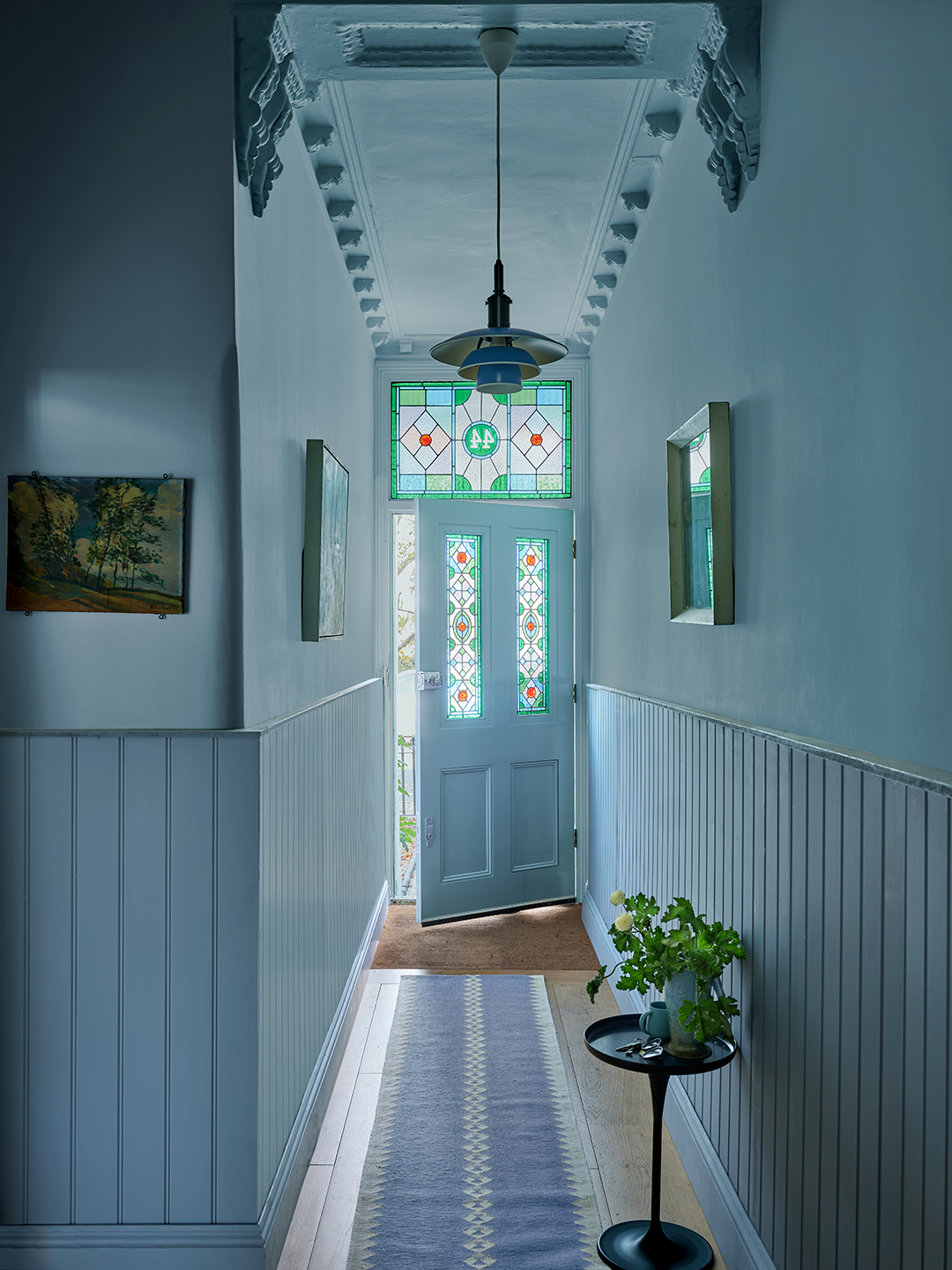
There are several practical ways to incorporate colour drenching into a home. Starting with smaller rooms, such as a toilet, small bathroom, hallway, or home office, is recommended for those new to the technique. These smaller spaces require less commitment but still allow for a dramatic, enveloped feel. Bailey Williams, a colour expert at Earthborn, suggests using colour drenching to make small areas like hallways feel more expansive or to create cozy, dramatic nooks with dark, moody colours. These deep tones can add depth and character, providing a visually stunning experience.
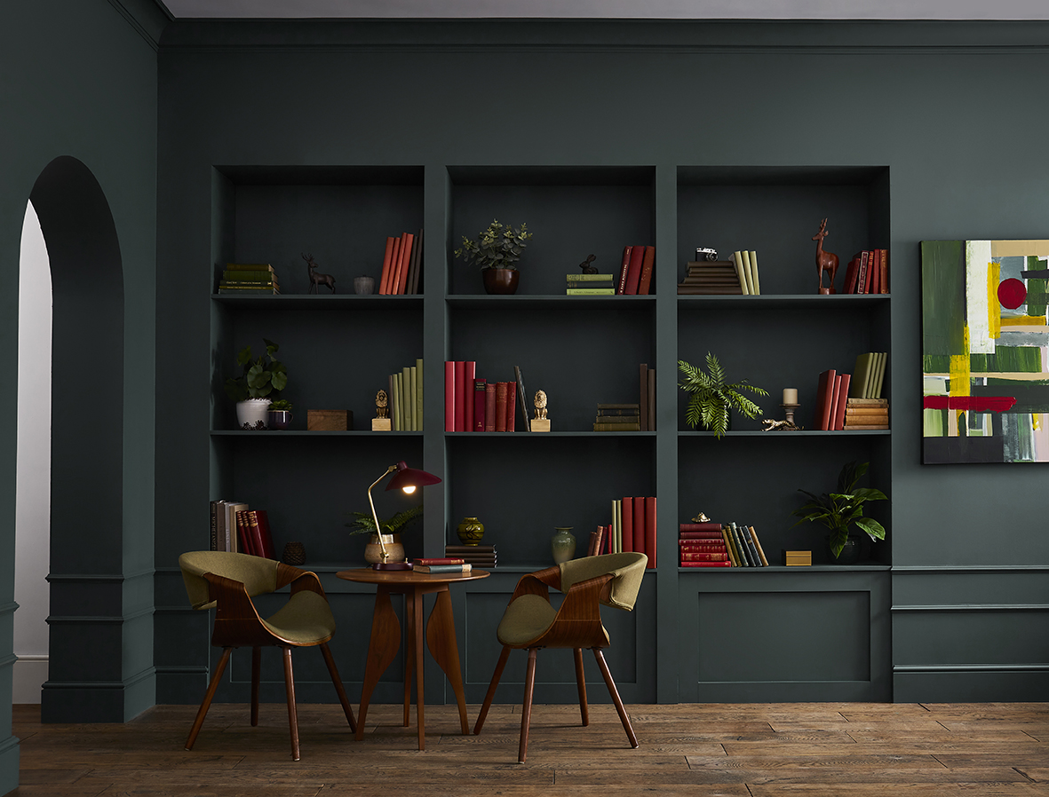
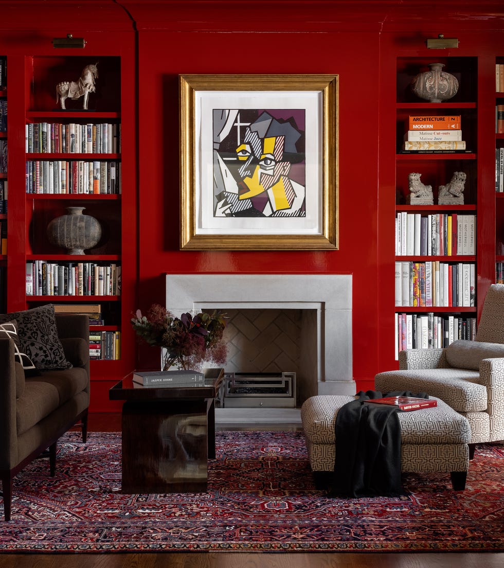
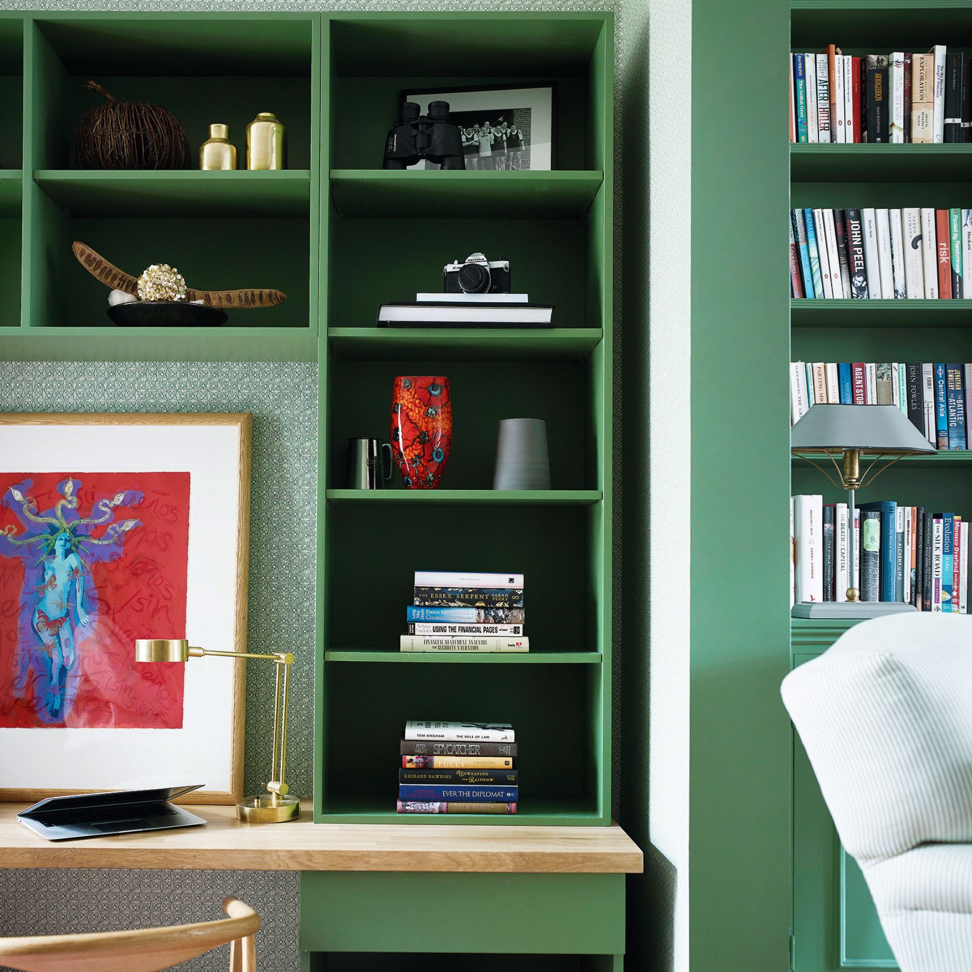
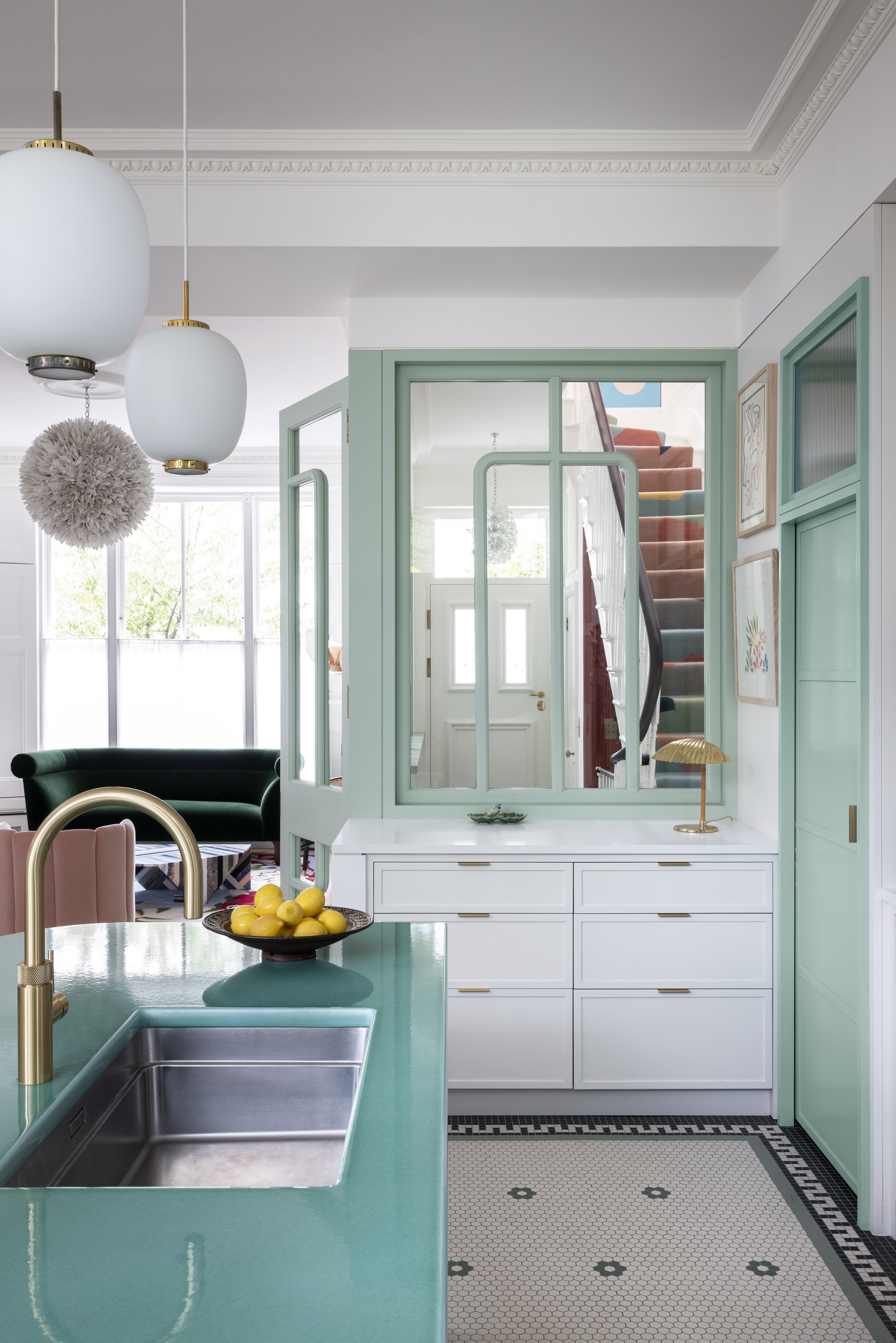
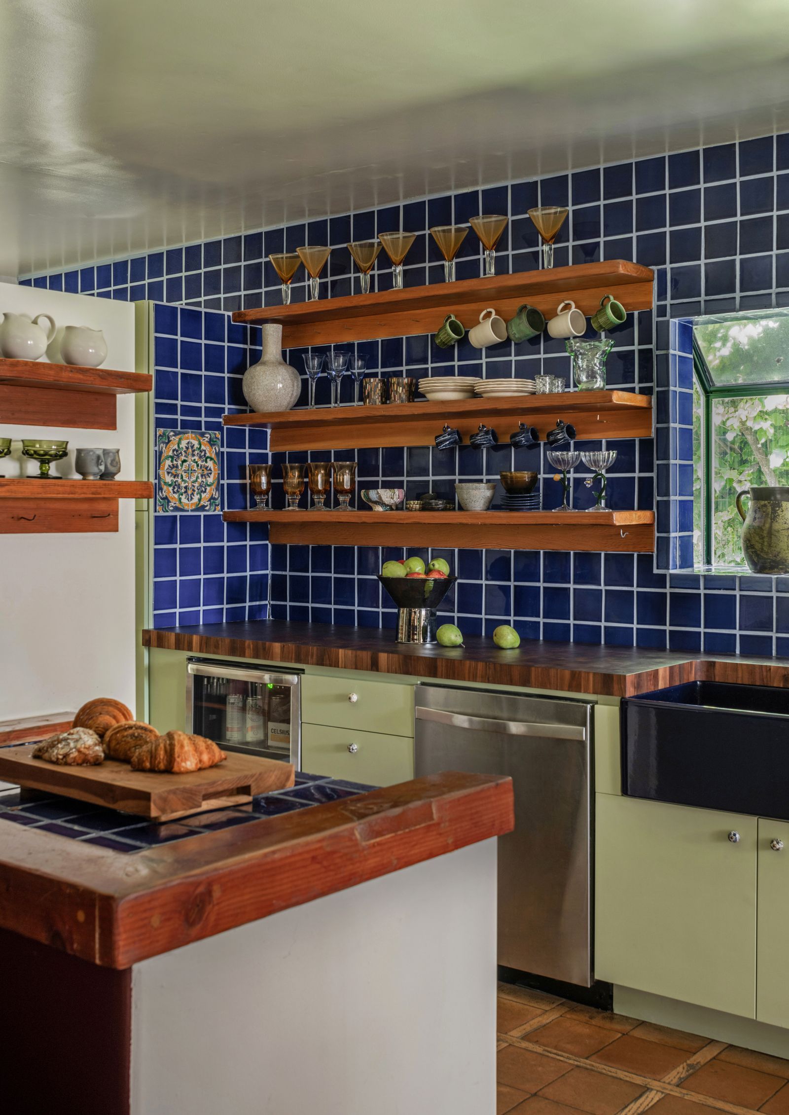
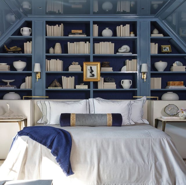
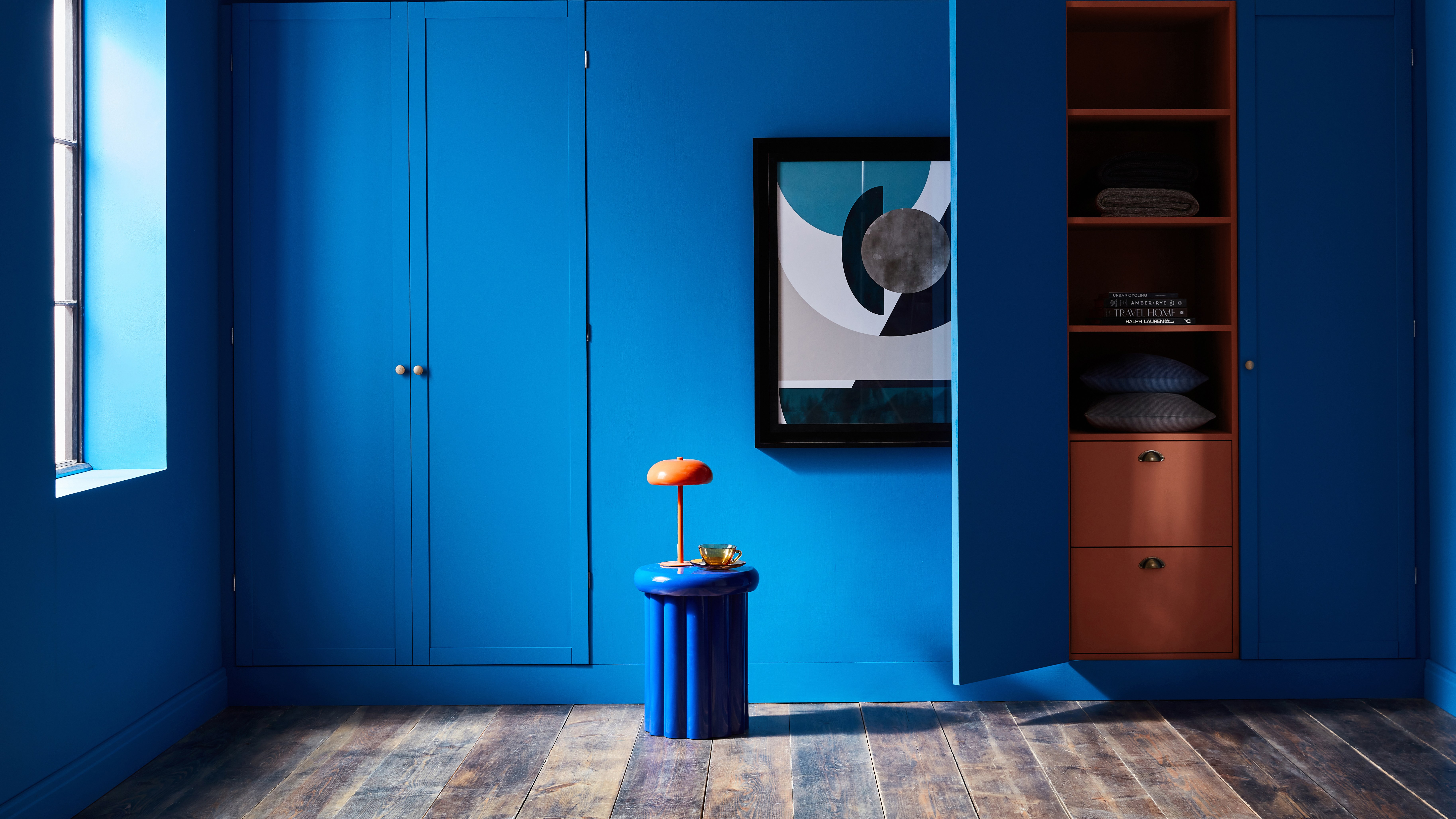
Extending the colour to built-in elements like shelving and cabinets creates a truly immersive effect, transforming them into intentional design features. For instance, colour-drenching kitchen cabinets along with the walls can unify the space and make it appear more spacious, especially when using a timeless kitchen colour. Michael Rolland, managing director at The Paint Shed, emphasizes the transformative yet budget-friendly nature of this approach, stating that it offers a fresh take on a room without needing multiple colours or costly renovations.

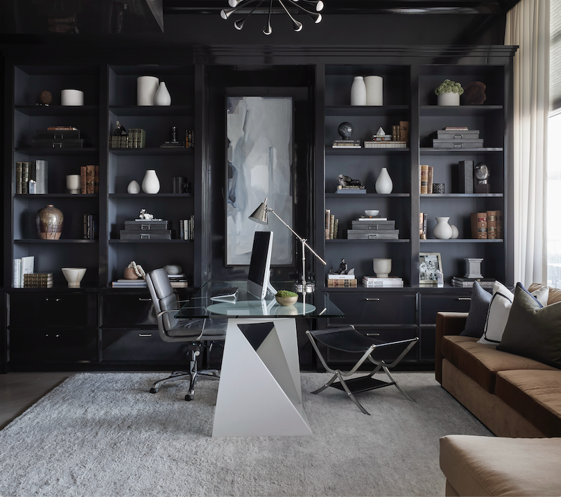
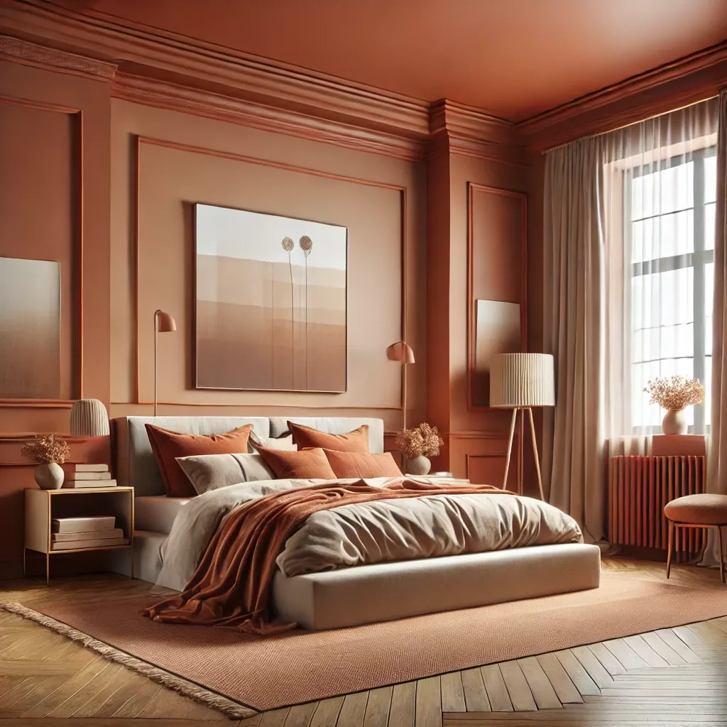
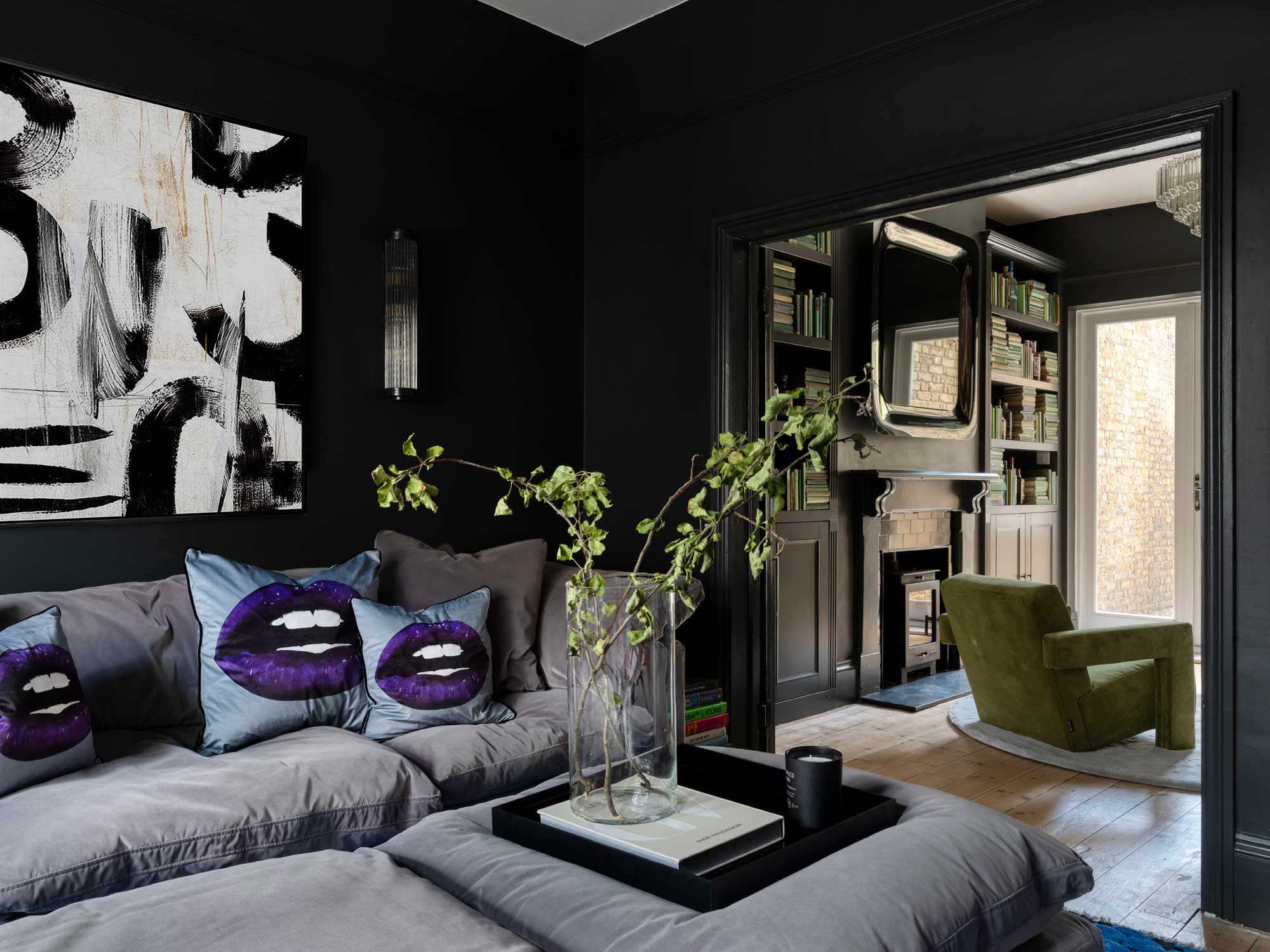
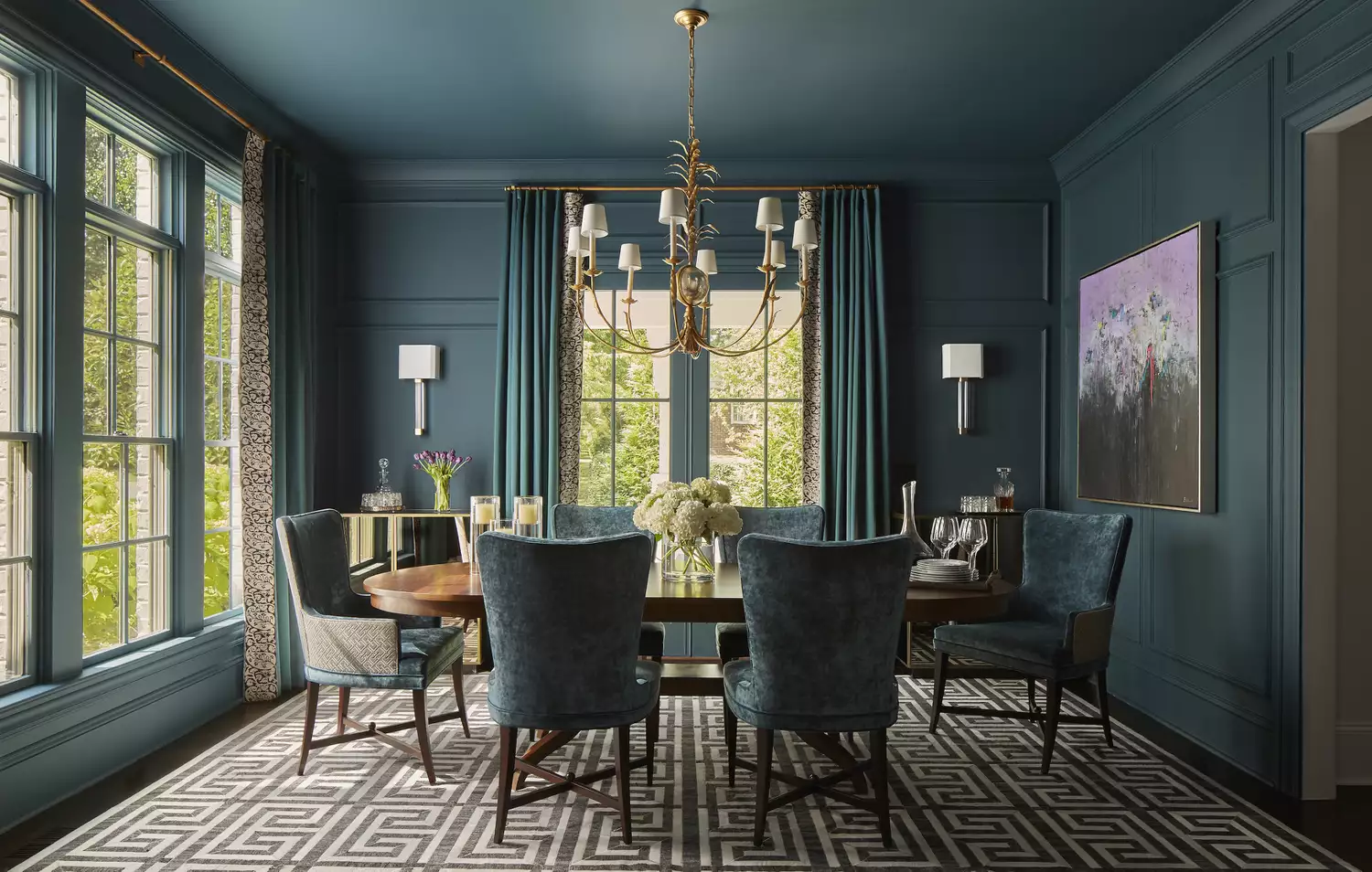
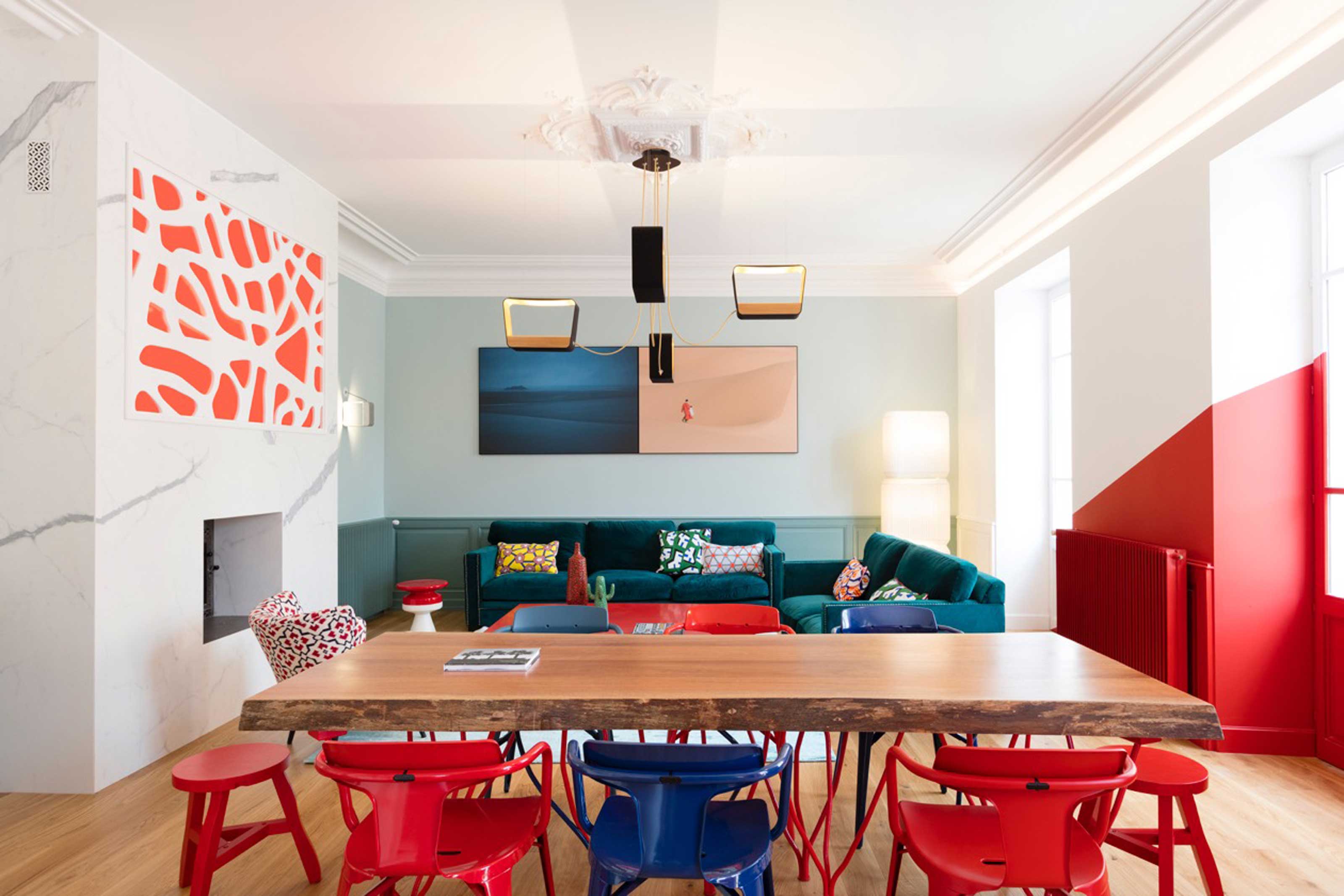
For larger communal spaces like living rooms or dining rooms, Helen Shaw, director of marketing at Benjamin Moore, suggests opting for bold, saturated shades. Dark colours such as black, forest green, or brown can create a grand, luxurious, and intimate atmosphere, ideal for evening entertaining. Painting radiators the same colour as the walls is another detail that can enhance the colour-drenched look. While paint formulated for radiators is essential for durability, buying pre-coloured radiators offers a professional finish, though it limits future colour changes.
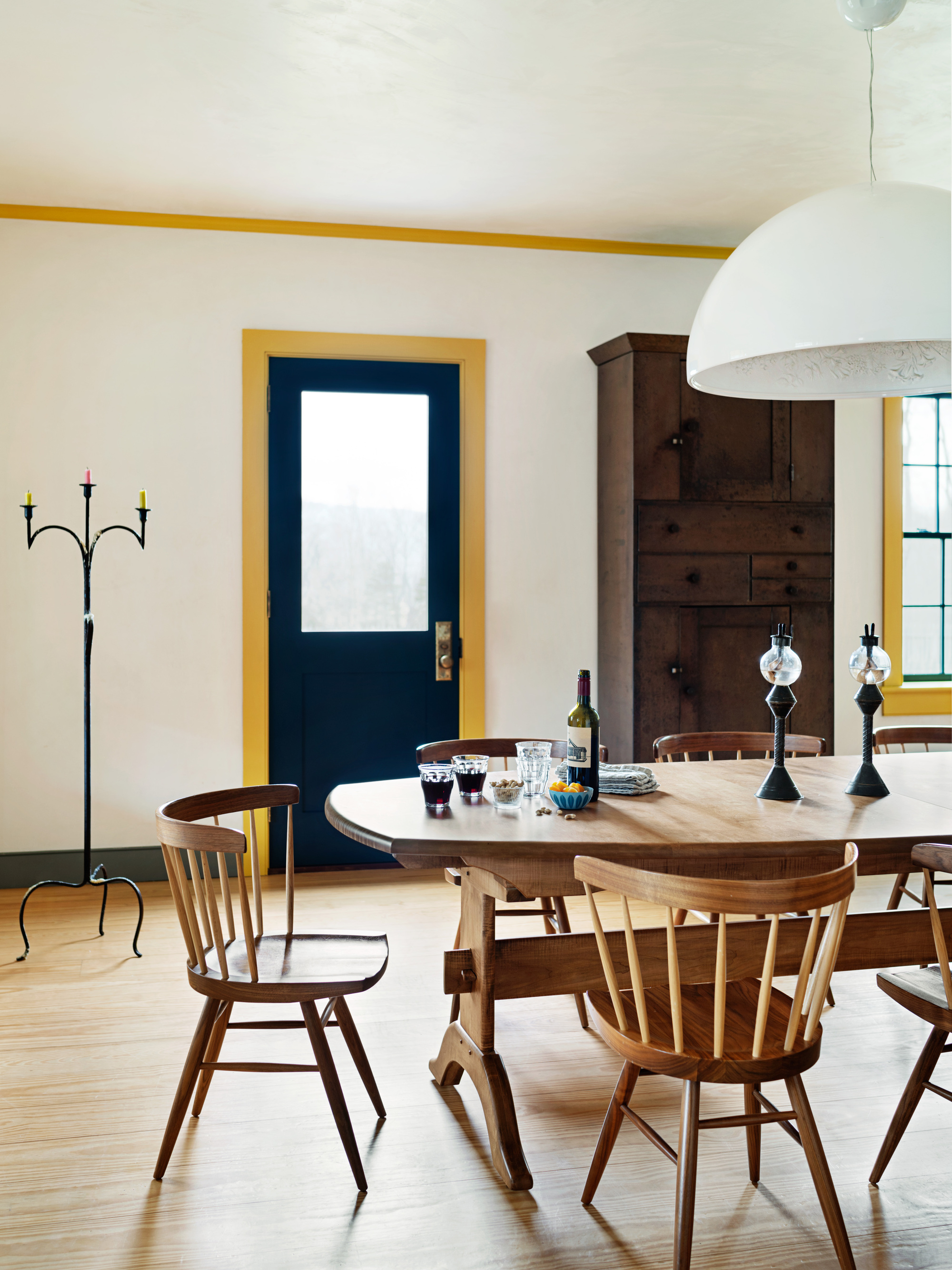
To add depth and visual interest to a monochromatic scheme, layering different finishes of the same hue is effective. Using matte walls with a glossy trim, for example, introduces subtle texture and intrigue, demonstrating that monochrome can be dynamic. Shaw suggests a touch of gloss, especially on woodwork in smaller spaces, to create a luxurious look and reflect light, making the room appear larger. However, Williams cautions that different finishes can cause slight variations in perceived colour due to light reflection, suggesting lighter shades for a more uniform appearance.

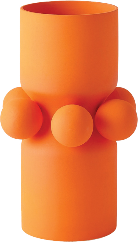
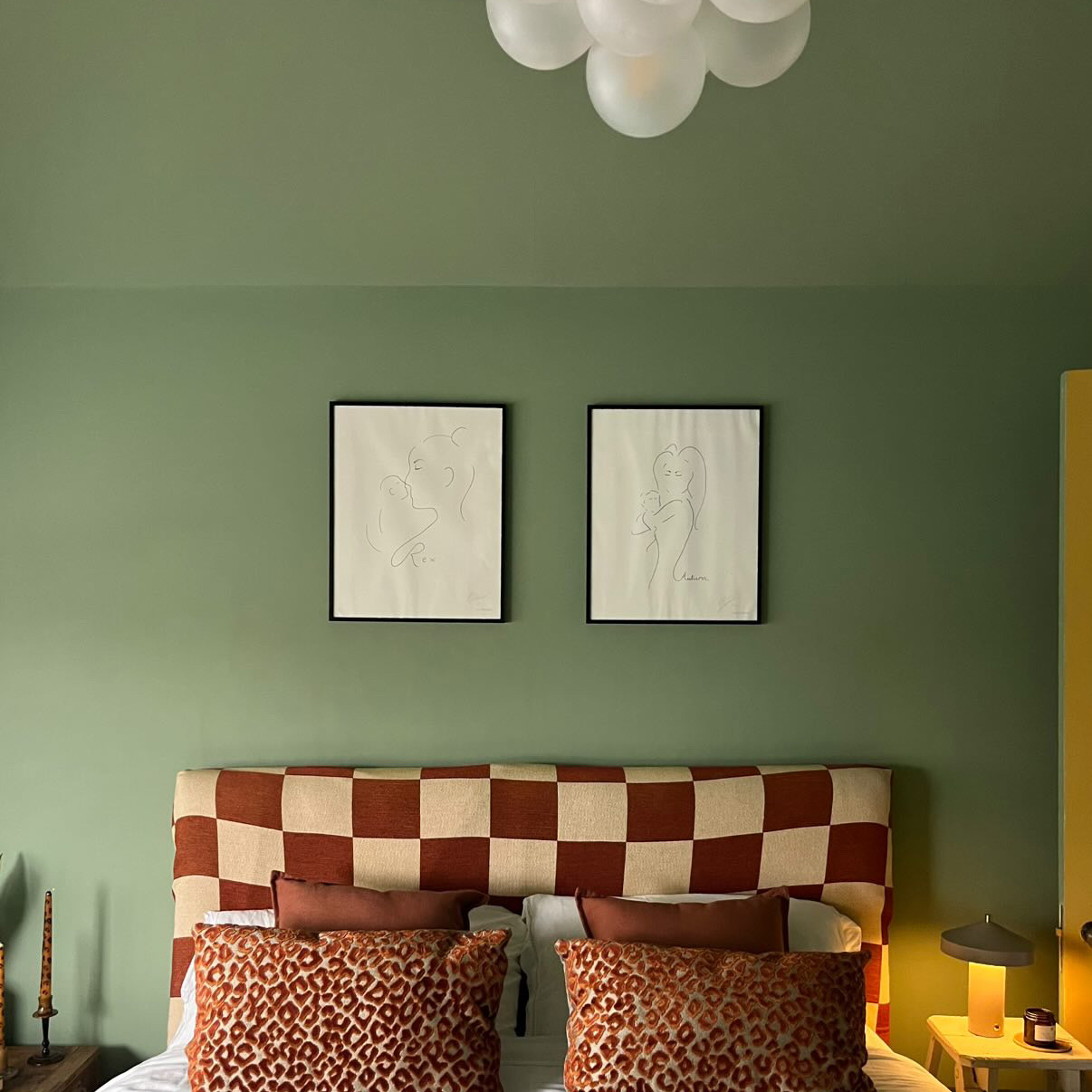
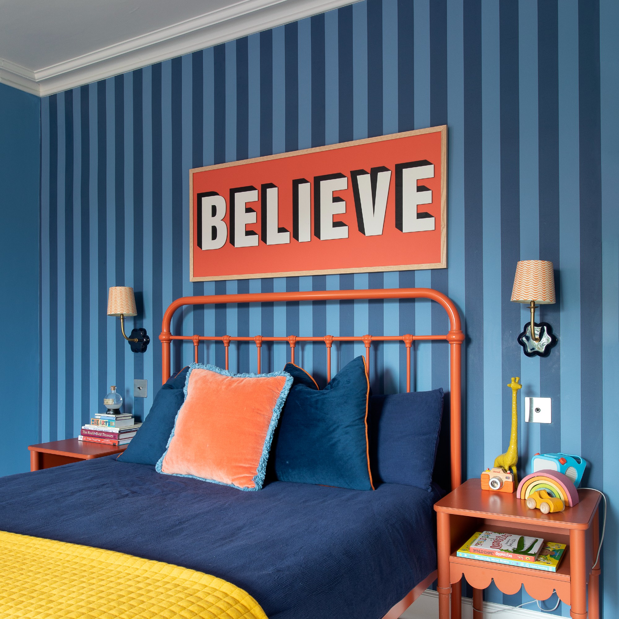
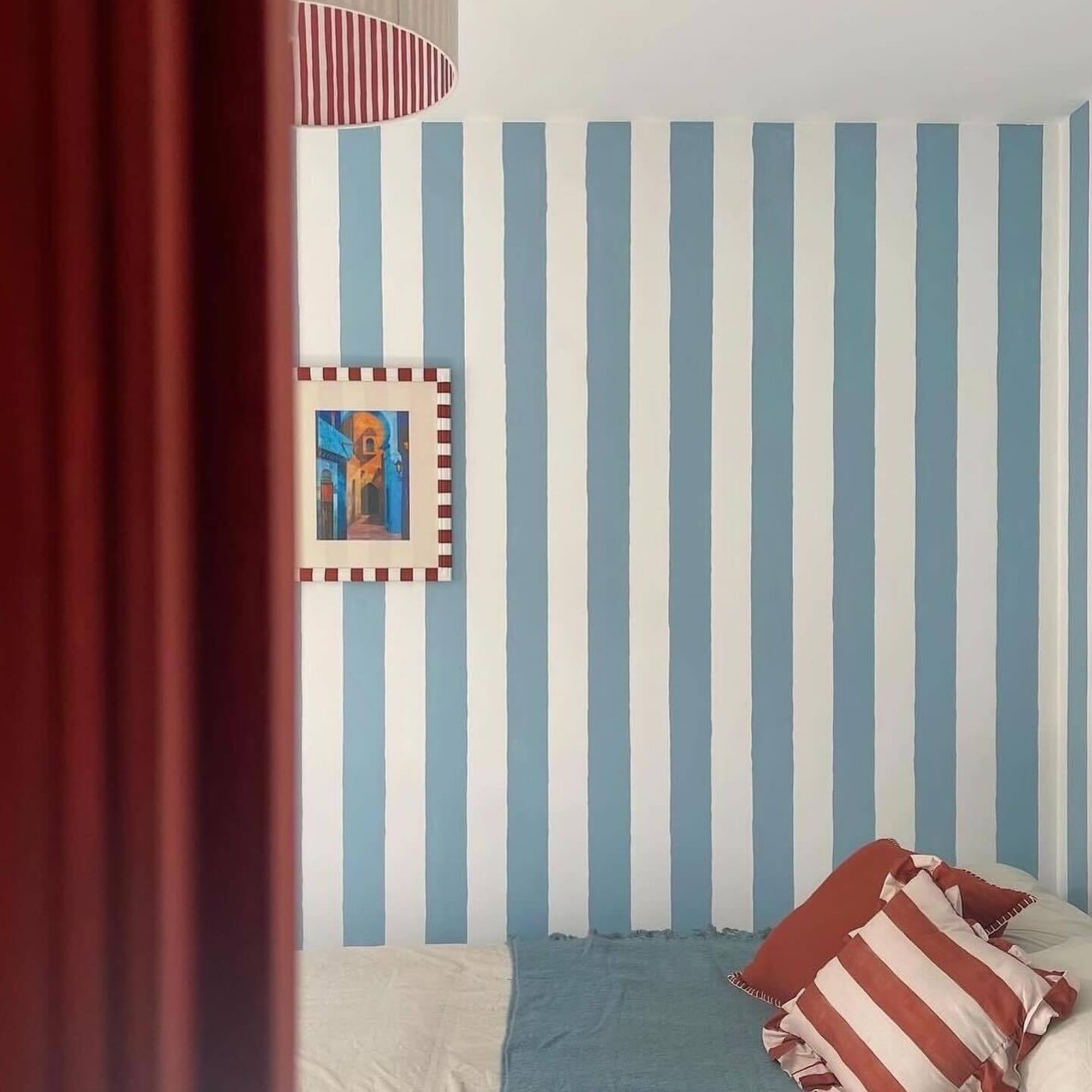
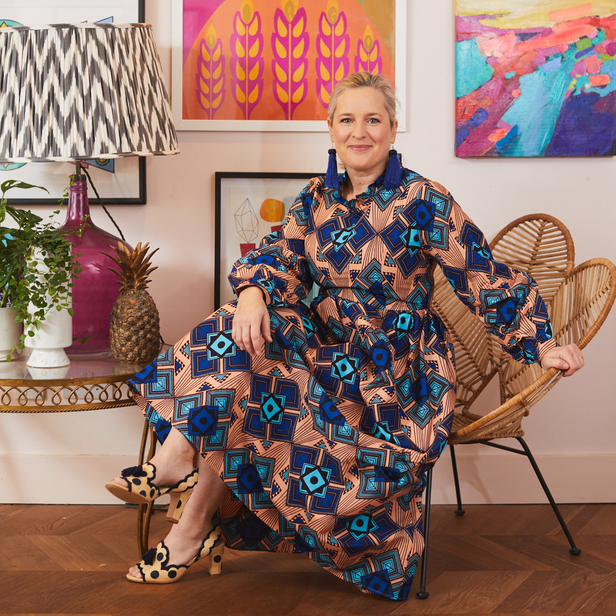
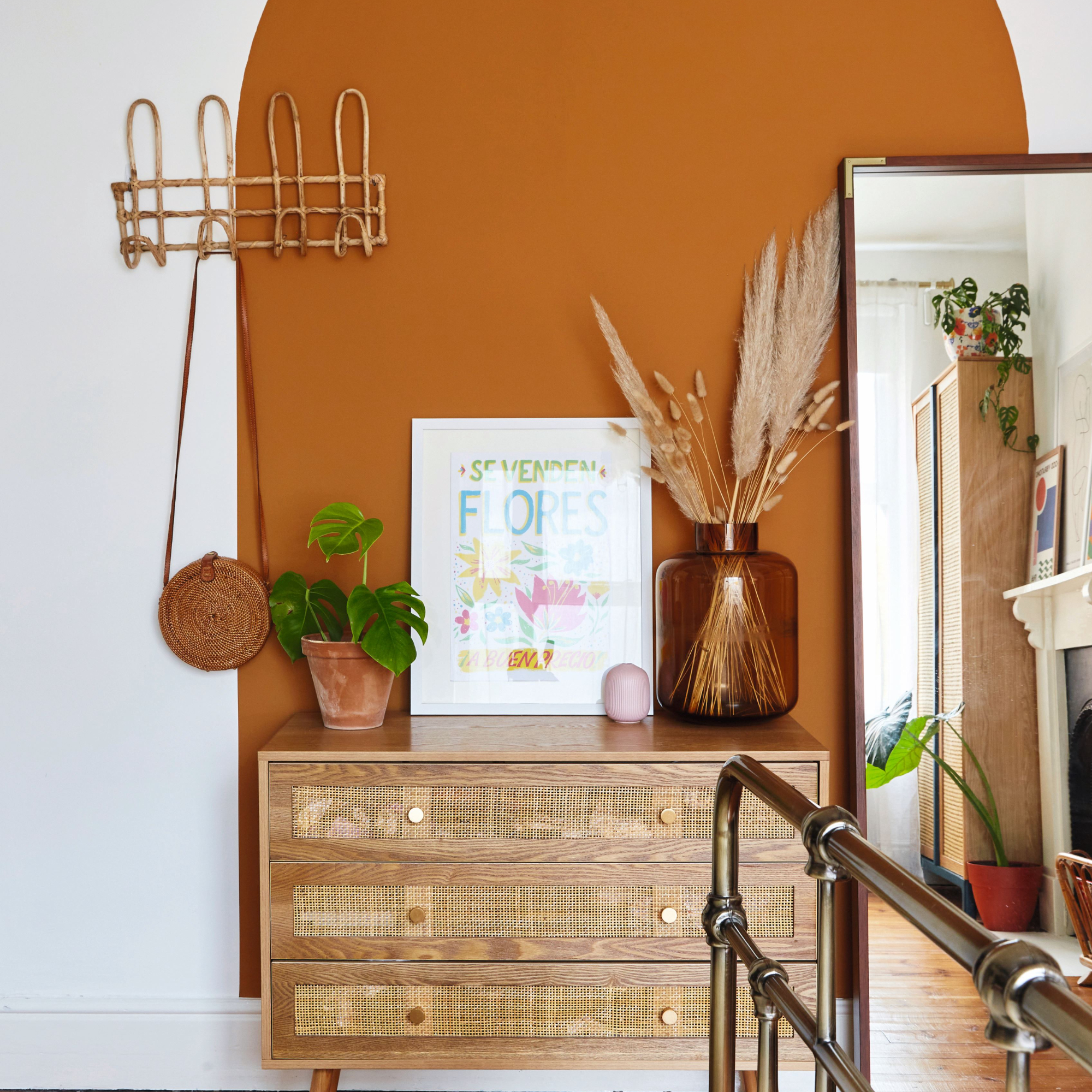
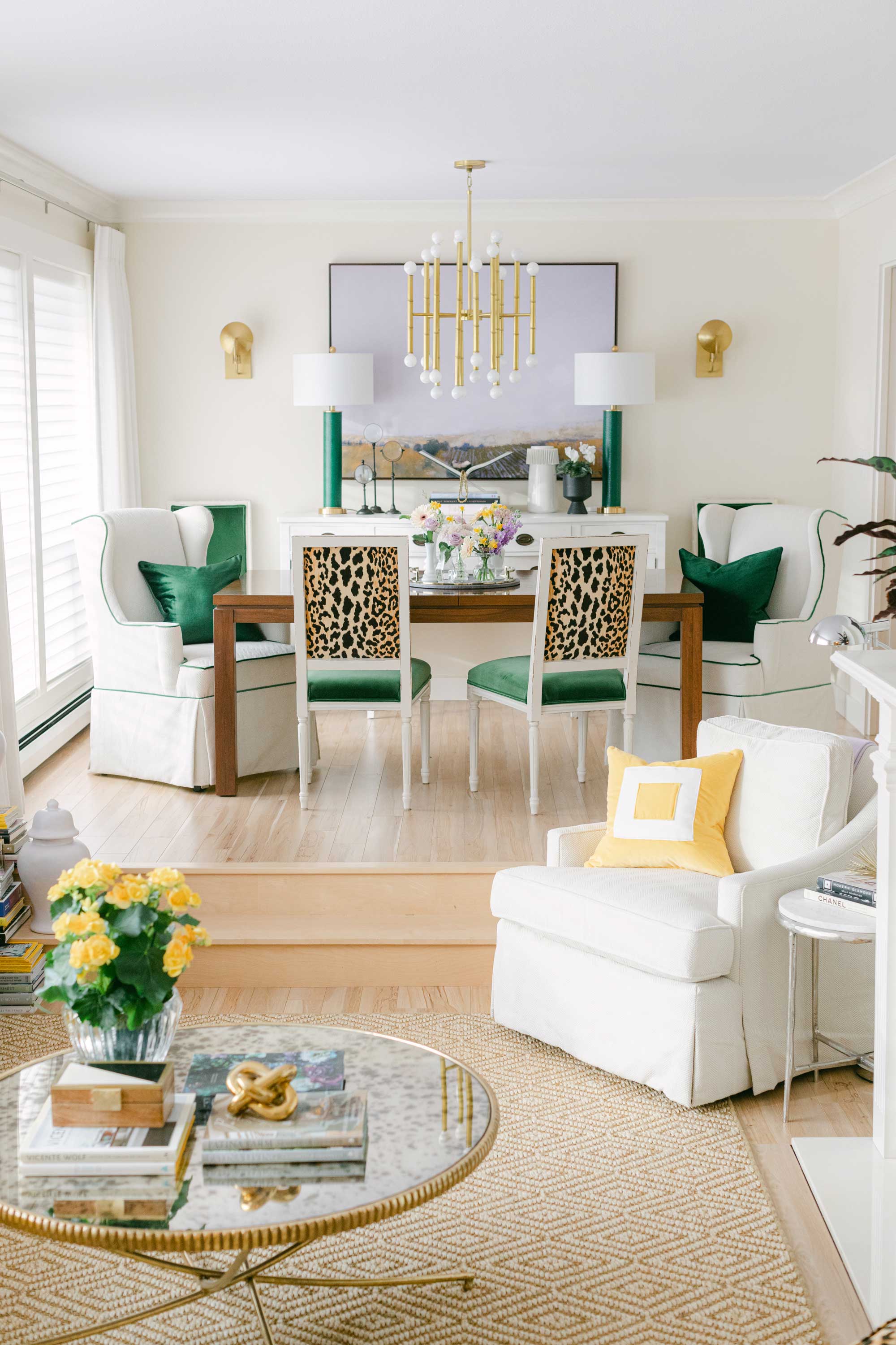
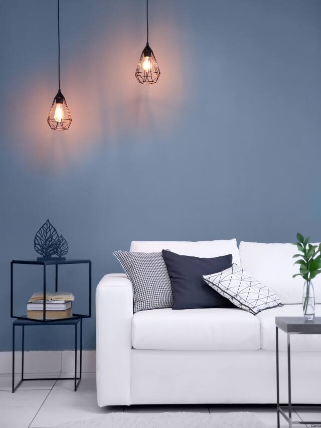
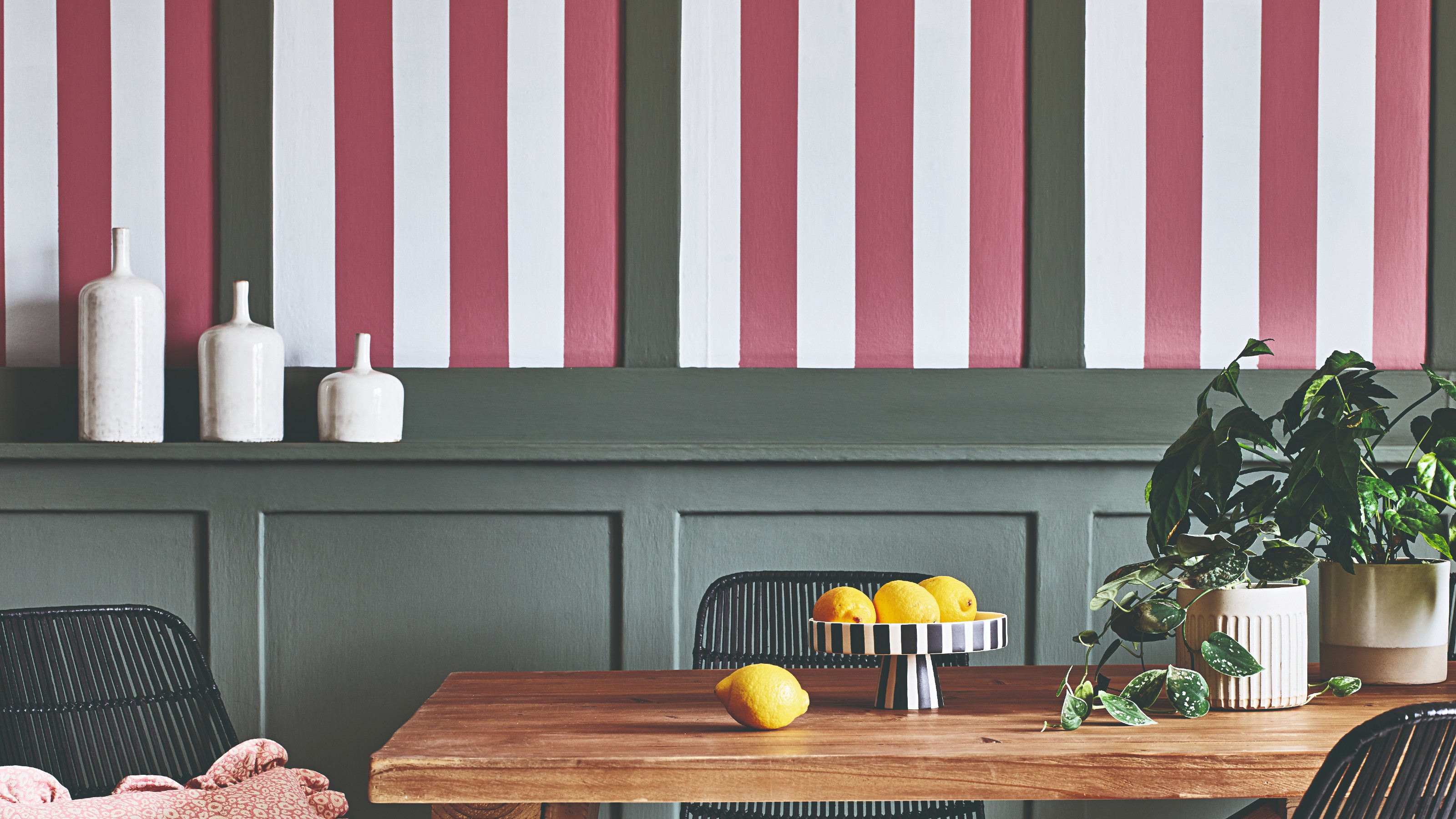
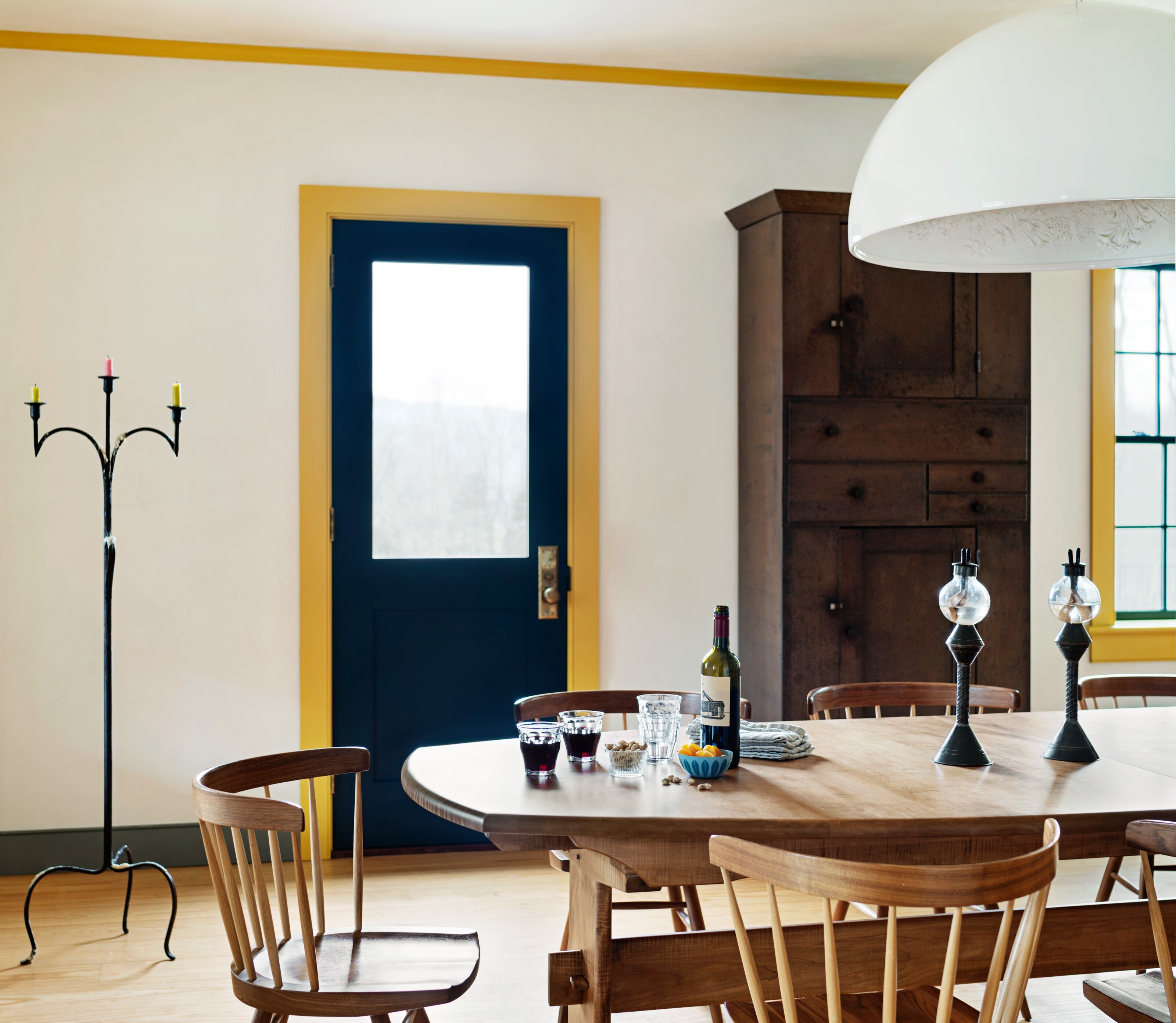
Styling with contrasting colours is crucial for making colour drenching impactful without being overwhelming. Helen Shaw notes that the all-encompassing paint scheme serves as a perfect backdrop for furnishings and accessories to stand out, provided contrasting colours are used to create natural breaks in the room. For example, a bright yellow scheme could be balanced with soft pink accessories or green furniture for a more natural feel. Alternatively, an accent colour from existing furniture or accessories can be chosen as the drenching hue to personalize the home.
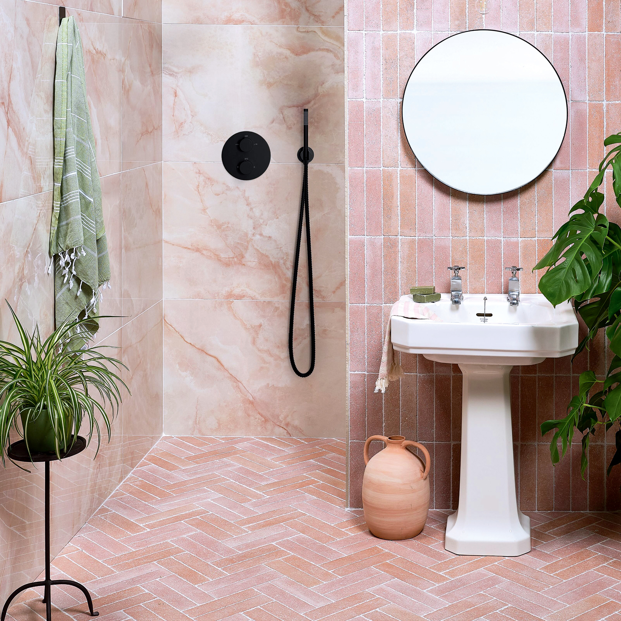
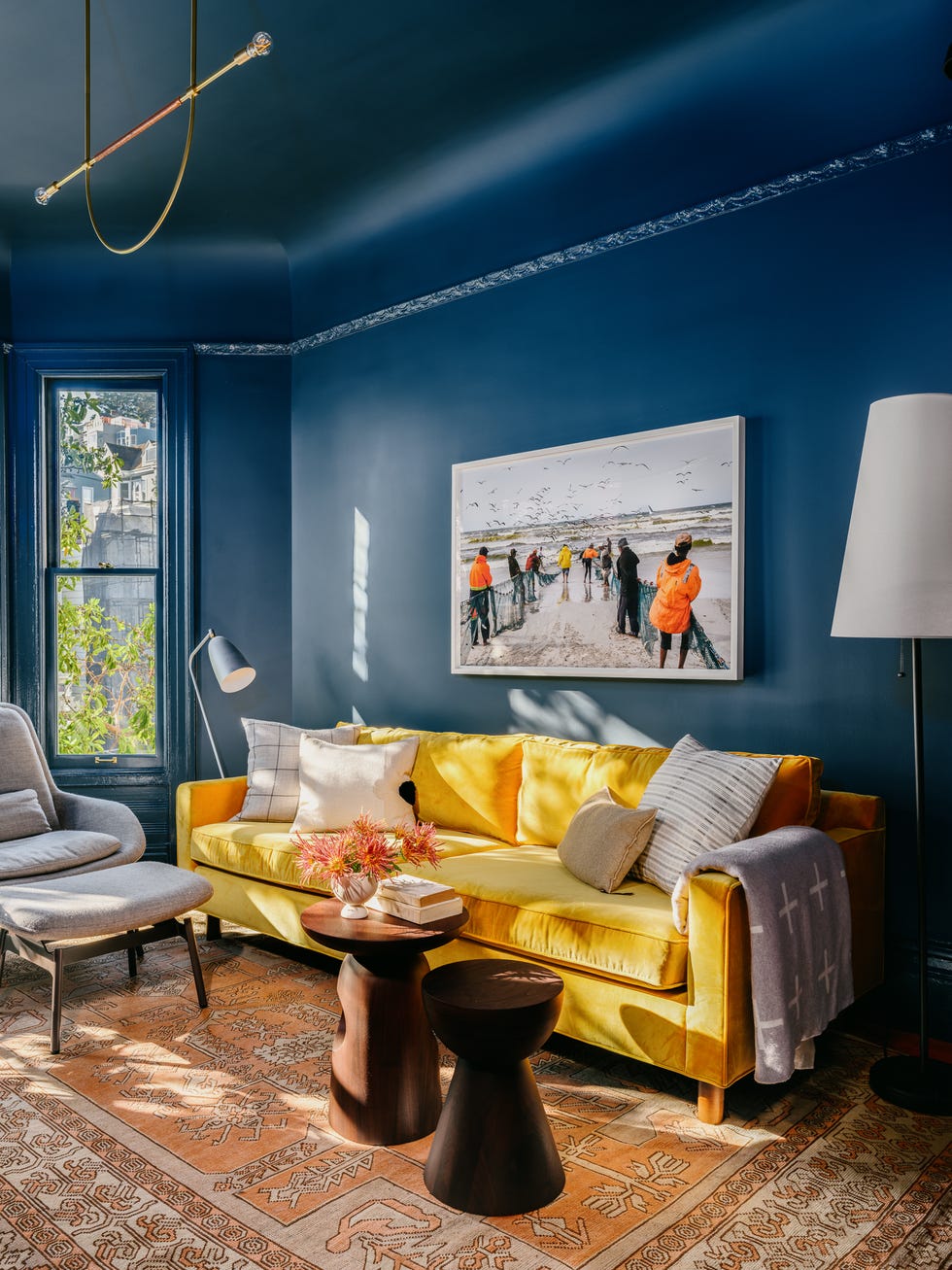
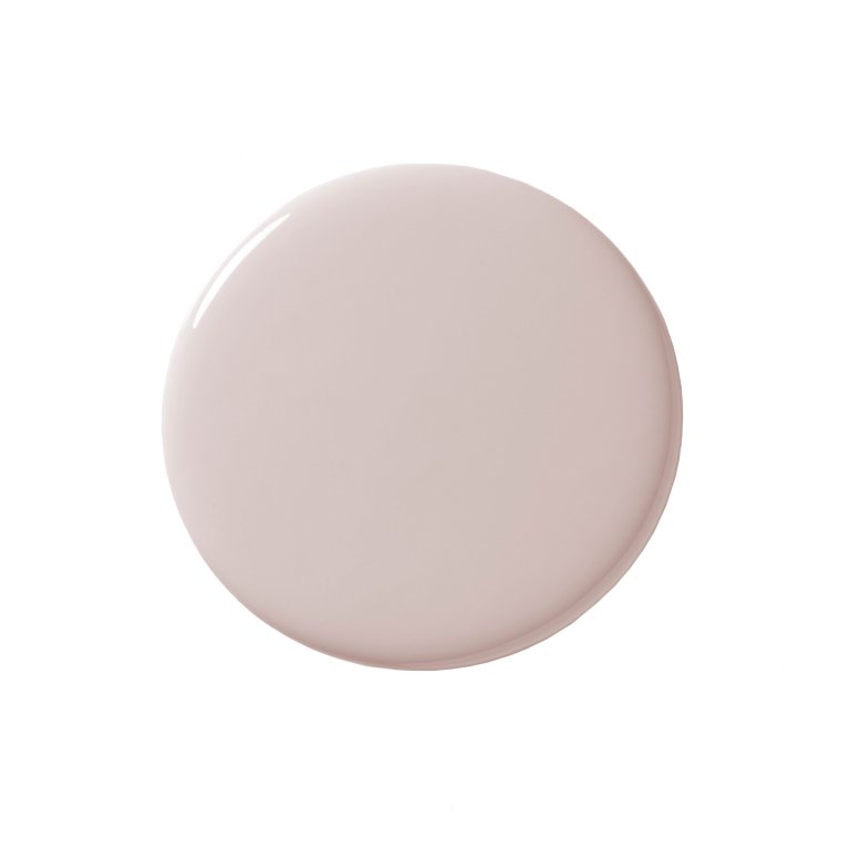
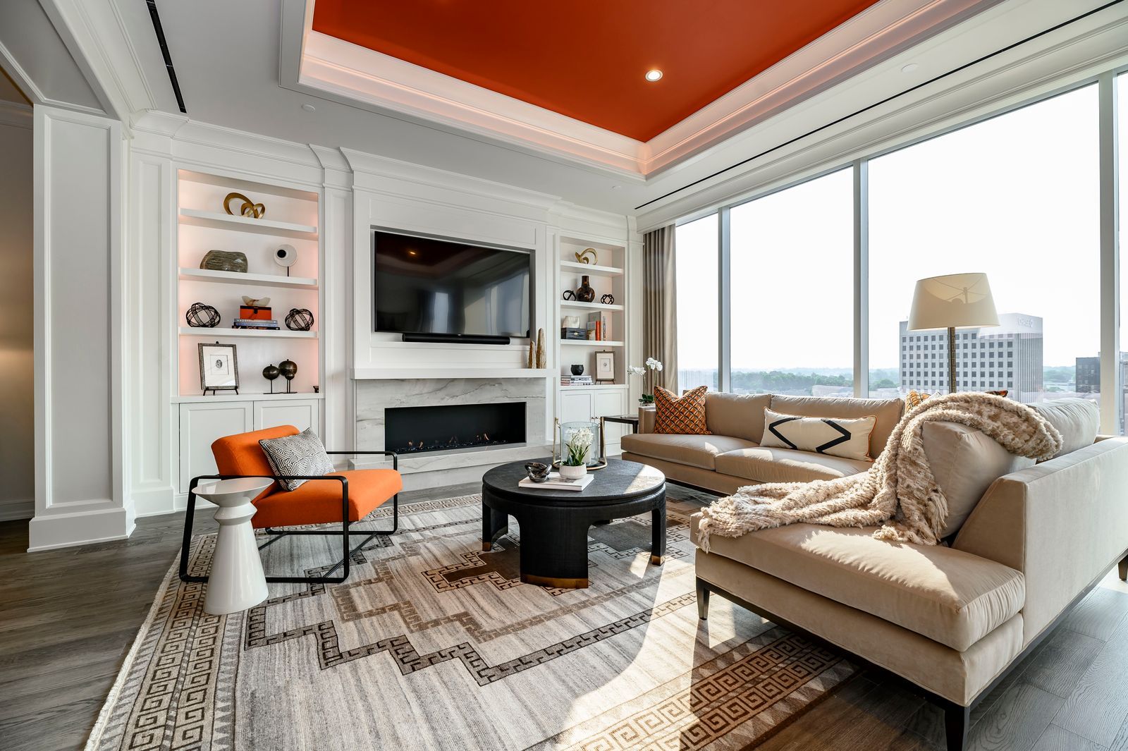
Finally, extending colour drenching to the ceiling, often referred to as the "fifth wall," creates the ultimate cocooning effect. Amthal Karim, head of Furniture And Choice, recommends painting ceilings in bold colours, particularly in living rooms with classic features, to emphasize architectural details. Soft pinks on ceilings can add warmth, while darker shades are suitable for larger rooms. Flora Hogg advises patience when painting all five walls, ensuring each coat is touch-dry before applying the next.
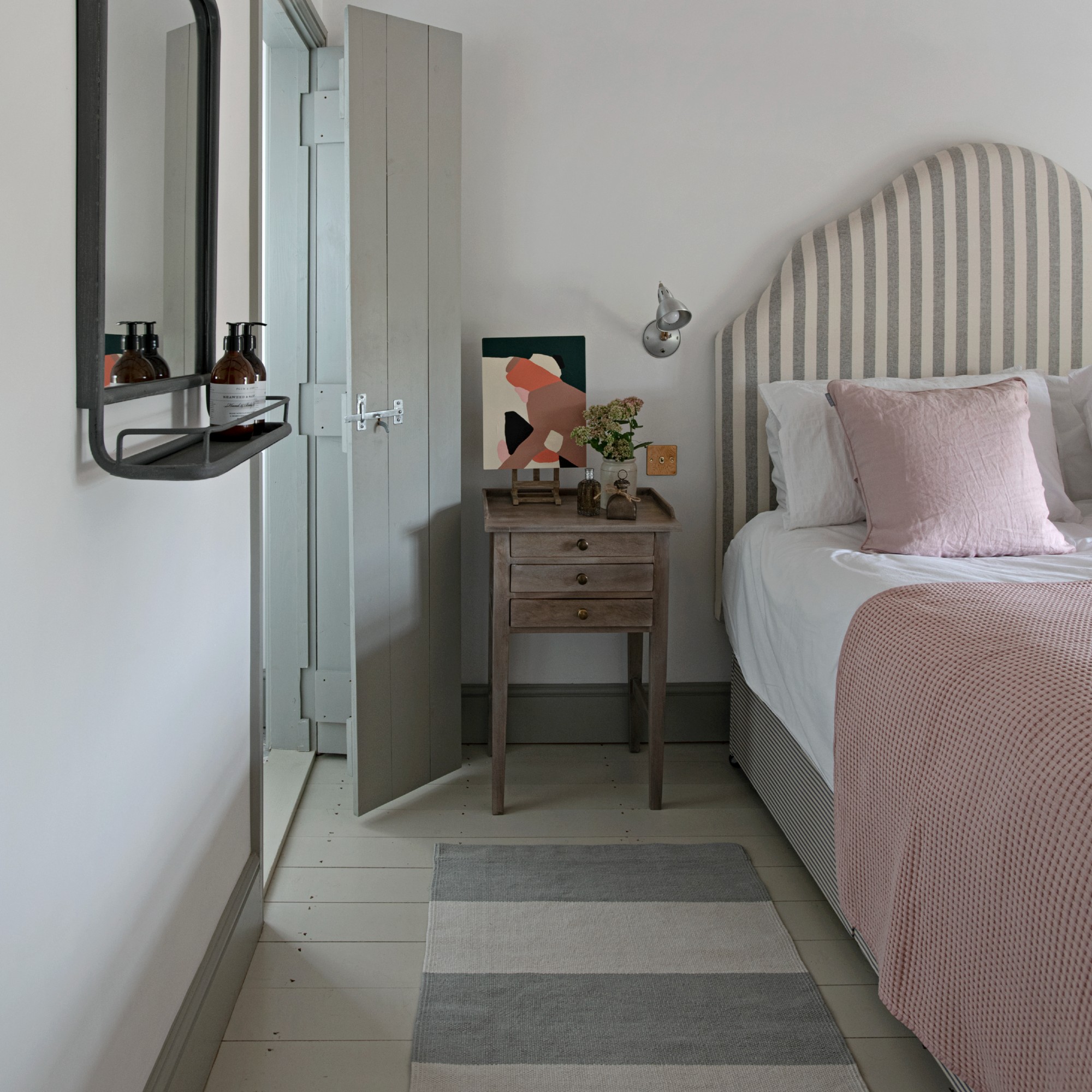
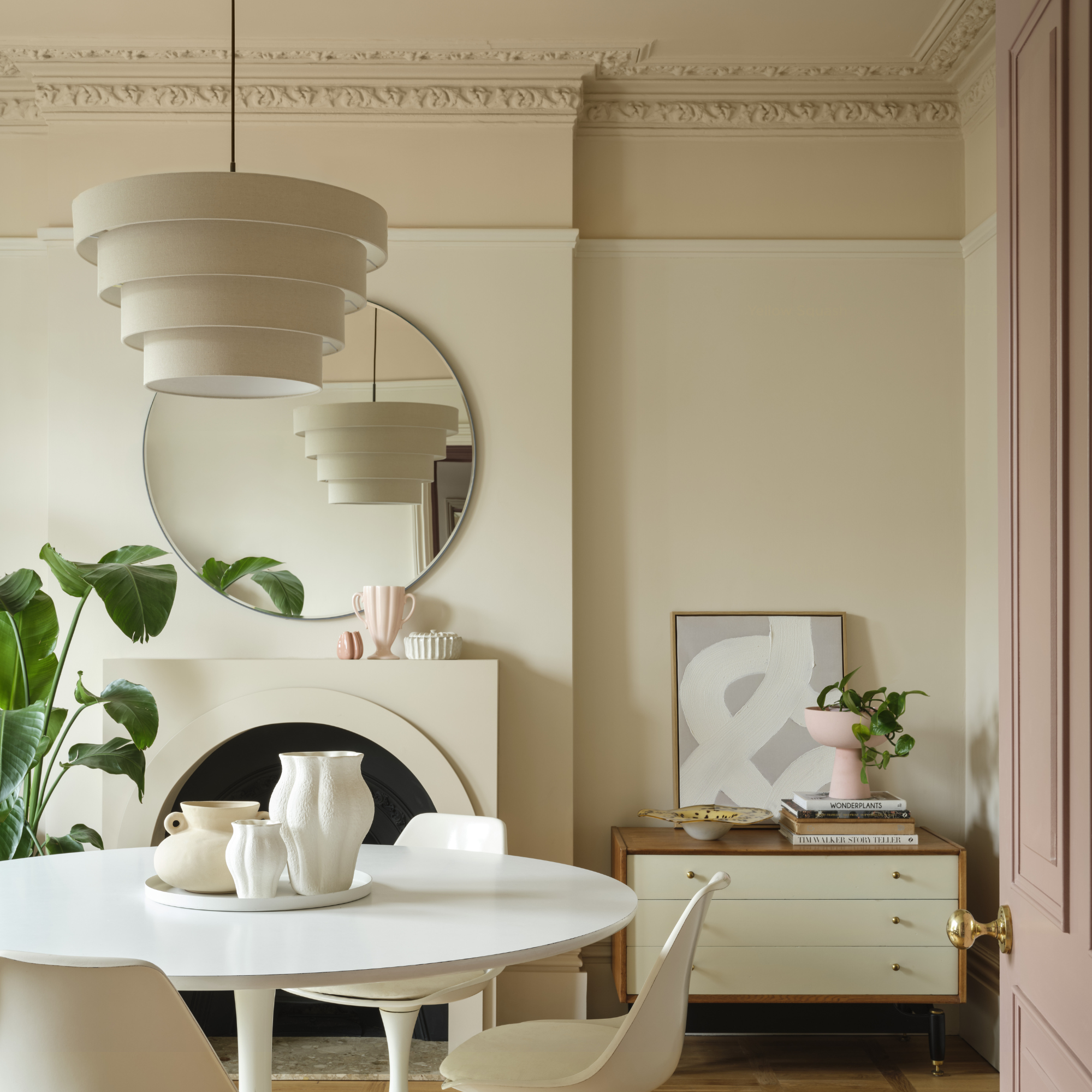
Regarding making a room feel bigger, strategic colour selection is key. Light or mid-tone colours can create the illusion of space, especially in small or awkwardly shaped rooms, by blurring the lines between walls and ceilings. Colour drenching remains a prominent interior paint colour trend for 2025, with a shift towards softer, more natural shades. Helen Shaw points to Benjamin Moore’s Colour of the Year, Cinnamon Slate, as an example of a quietly colourful hue that maintains softness while making a statement. Bailey Williams agrees, highlighting earthy tones like rich green, warm brown, and soft terracotta for their ability to enhance well-being and create serene home environments.
#ColourDrenching #InteriorDesignTrends #HomeDecor #PaintColors #SmallSpaceDesign #ArchitecturalFeatures #MonochromaticScheme #HomePersonality #ColourDrenching #InteriorDesignTrends #HomeDecor #PaintColors #SmallSpaceDesign #ArchitecturalFeatures #MonochromaticScheme #HomePersonality
0 Kommentare insgesamt
 Noch keine Kommentare
Das könnte Ihnen auch gefallen
6 great ways to use colour drenching in your home
Is colour drenching really a radical new way to decorate, or is it just lazy decorating?
9 rooms that prove color drenching makes small spaces look bigger

10 Color Drenching Ideas That Highlight the Beauty of This Paint Trend
Colour drenching is the biggest trend in bathrooms - here are 6 ways to make it work in your home
Stripe drenching is the hot new twist on colour drenching
Colour drenching: the interior design trend everyone’s talking about
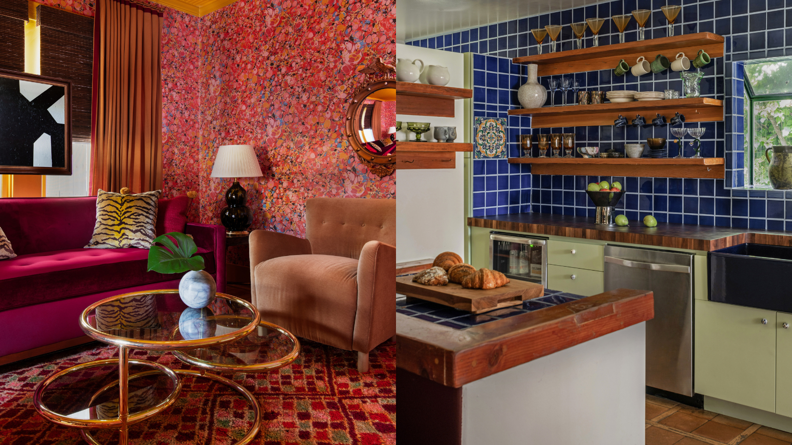
9 'good weird' paint colours approved by designers

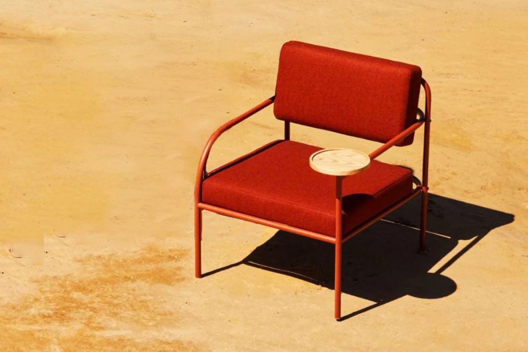
Incorporate Color Drenching Into Your Home Design

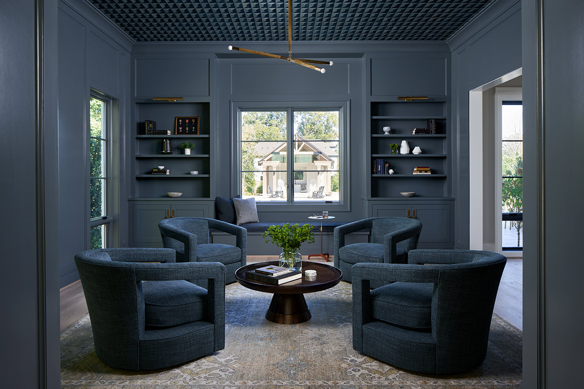
How to Incorporate Color Drenching in Your Home Design
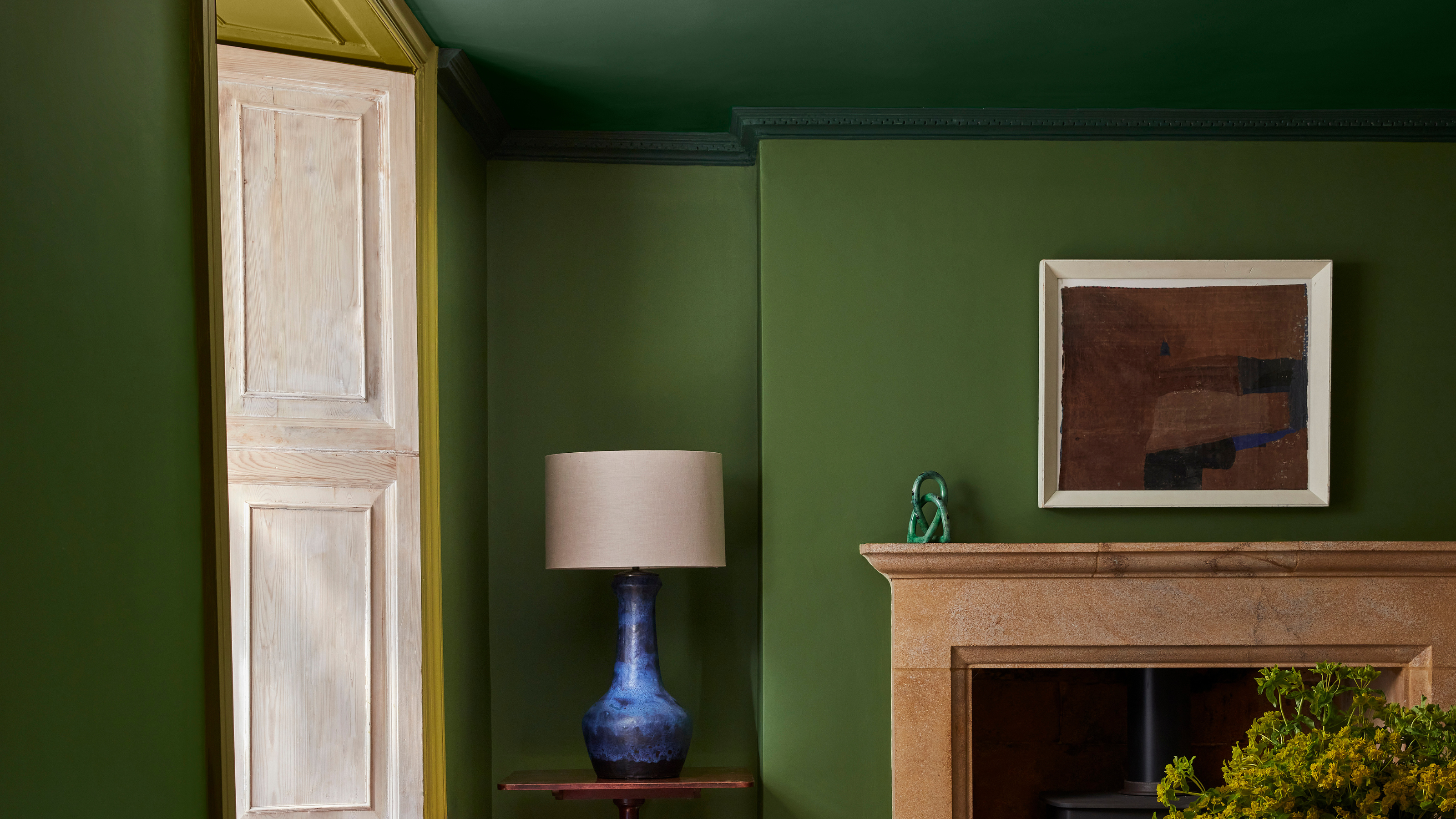
'Colour capping' is the new paint trick design experts are using to make a room feel bigger – how to make it work in your home
How to use paint to change the size and shape of your room

Color Drenching Is the Bold Paint Trend Taking Over—Here’s How to Nail It
The Color Drenching Paint Trend Isn't Going Anywhere

'It's the best way to make a home joyful' - this paint trend is the perfect idea to introduce color thoughtfully
7 colour tricks to transform your mood and living room design

How to transform your rooms with colour drenching
'It's so effective at making your home work harder' – the latest paint trend endorsed by colour gurus
130 New Paint Colors Just Dropped, Including an Ultra-Fast-Drying Exterior Finish

Color Drenching Might Be Everywhere, But My Mom’s Been Doing It Since the ’90s