1/12
Designers Weigh In on the 7 Biggest Paint Color Trends of Fall 2022
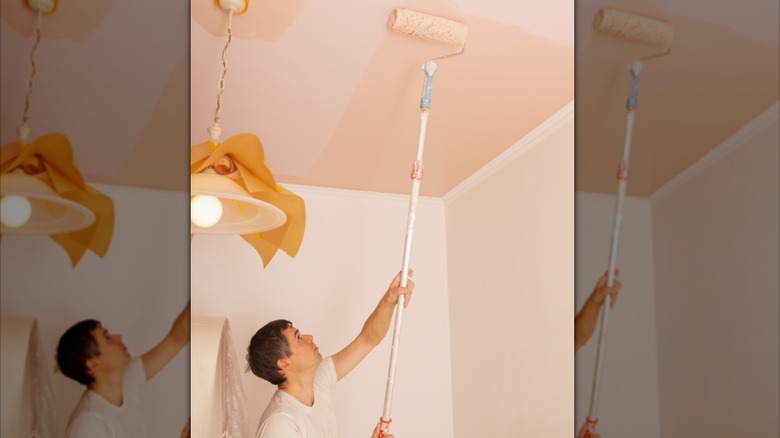
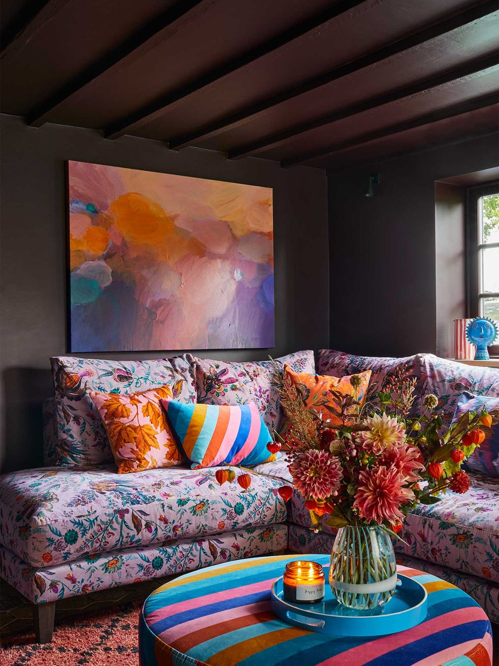
As the seasons transition from summer to fall, interior design enthusiasts often seek inspiration for refreshing their living spaces. This article delves into the leading paint color trends for Fall 2022, offering insights from prominent interior designers such as Arvin Olano, Jenn Feldman, Andi Morse, and Stefani Stein. These experts highlight the transformative power of paint in influencing mood and ambiance, emphasizing its accessibility as a decadent yet entirely achievable design element. The article presents seven distinct color trends, each with designer commentary and specific recommendations for application within a home.
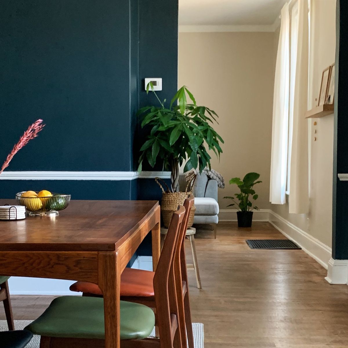
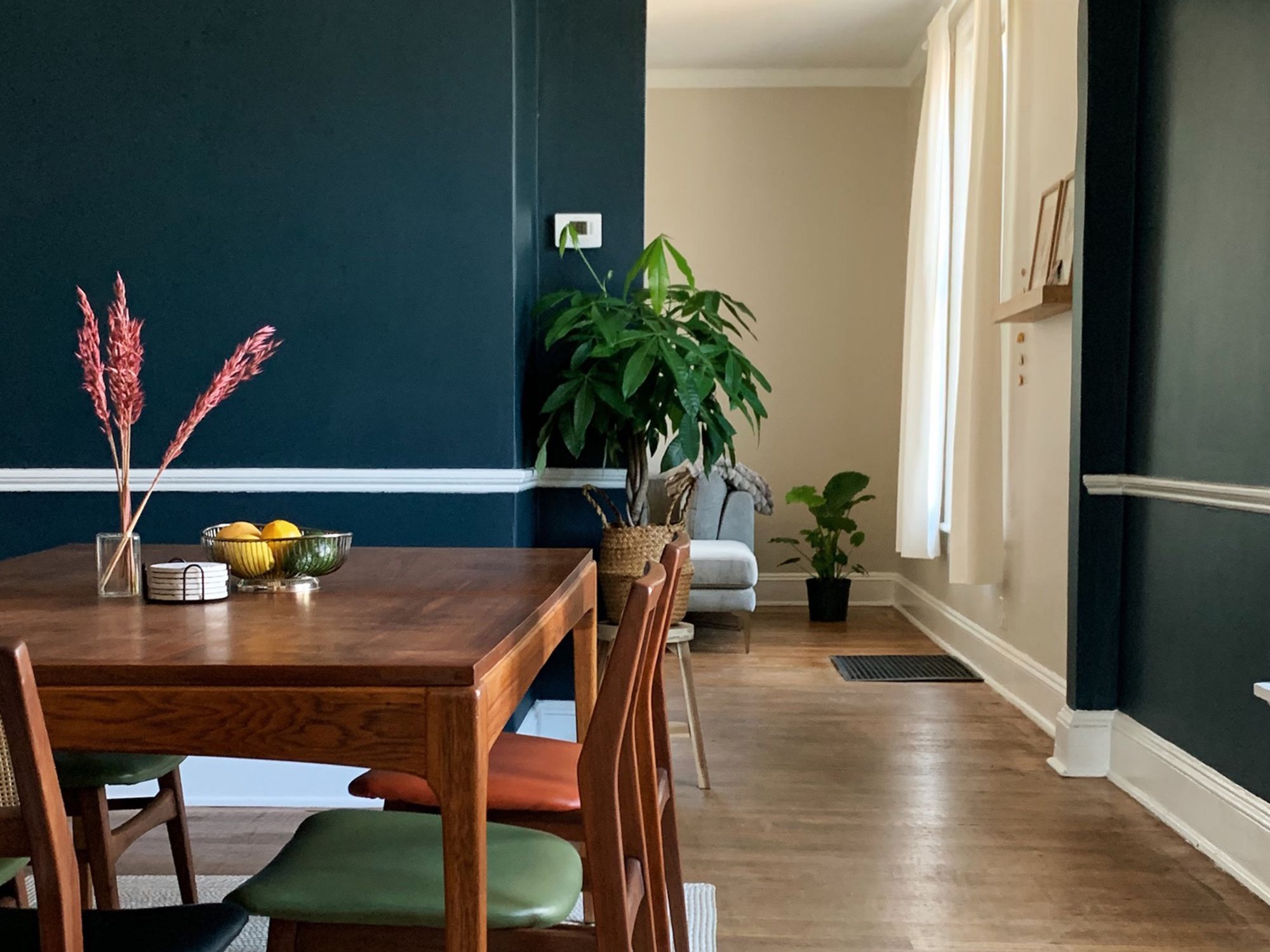
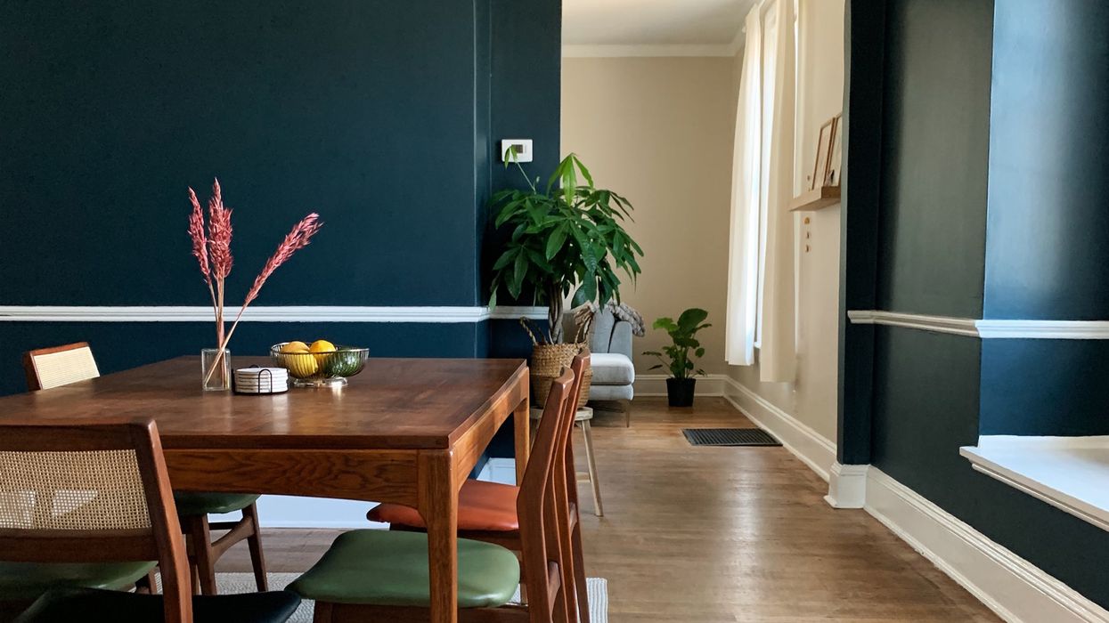
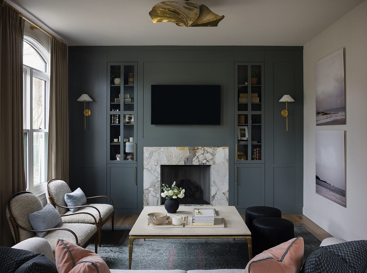
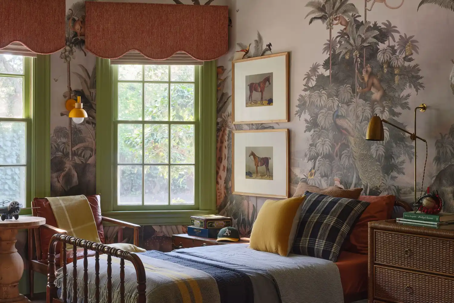
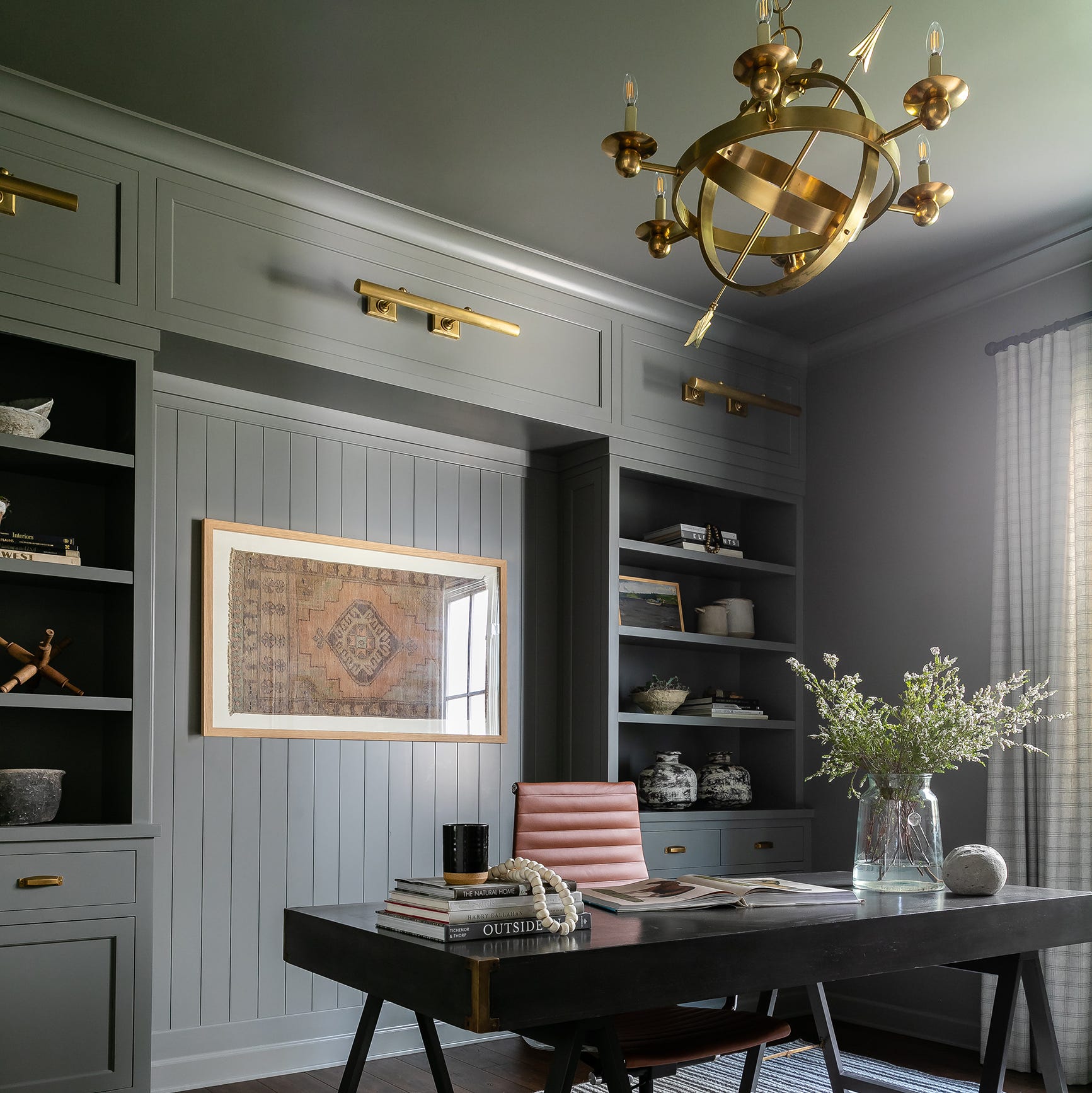
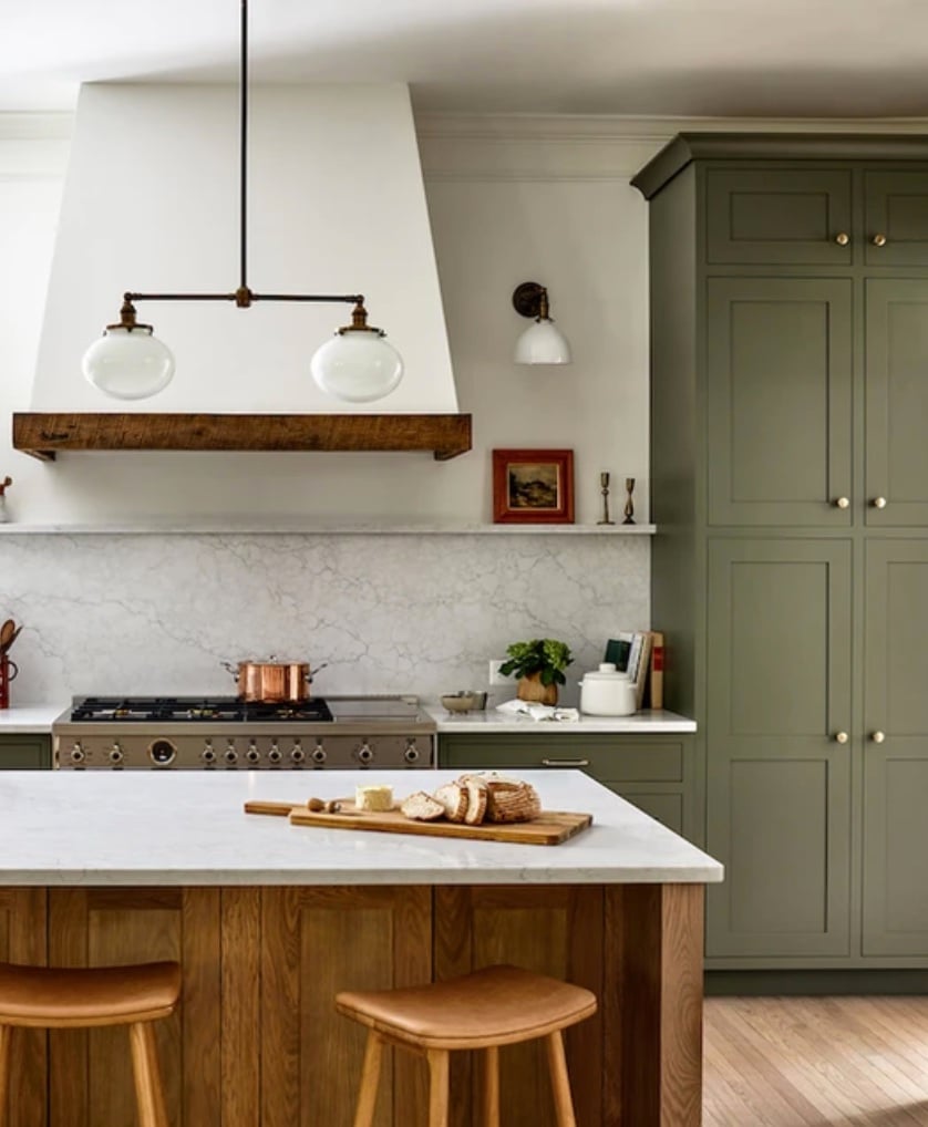
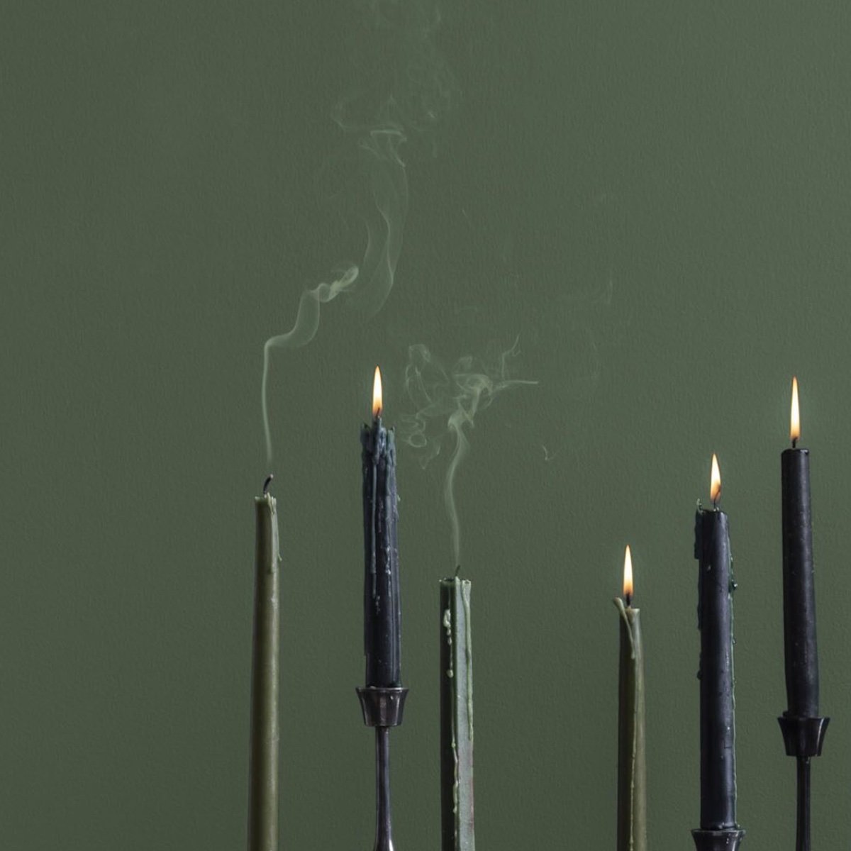
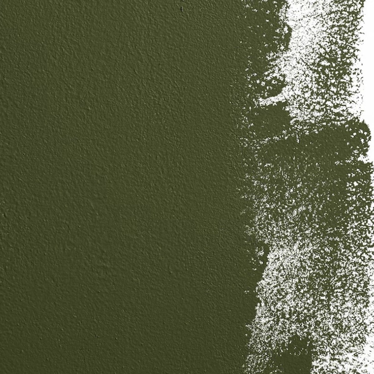
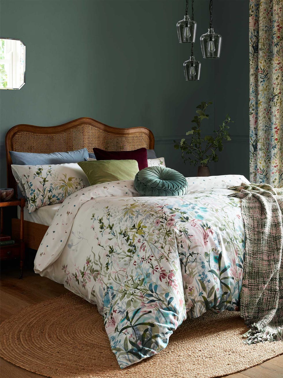
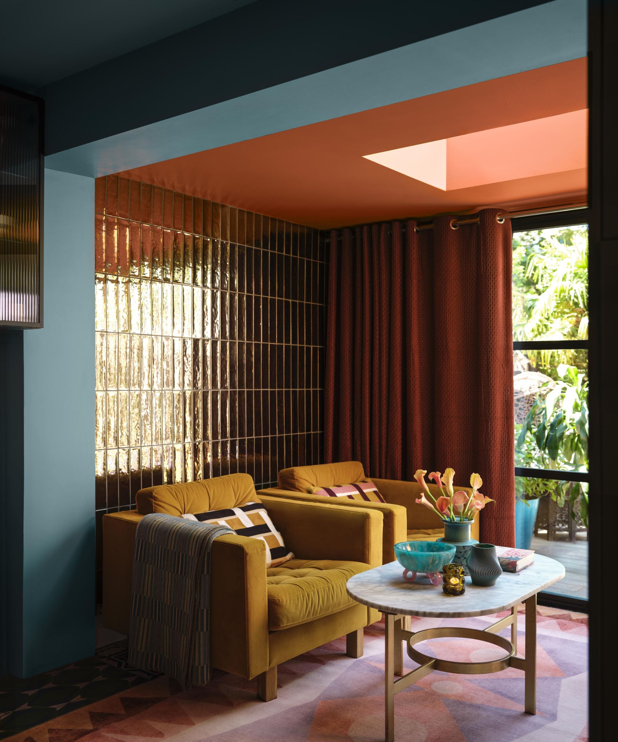
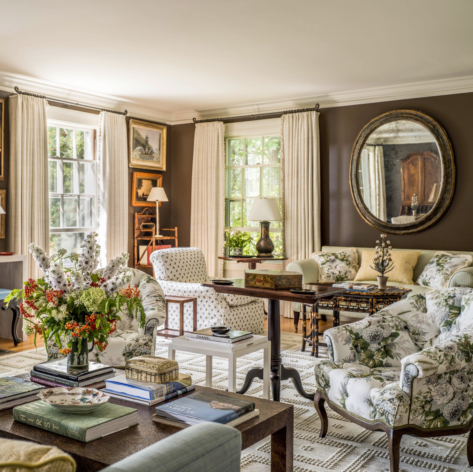
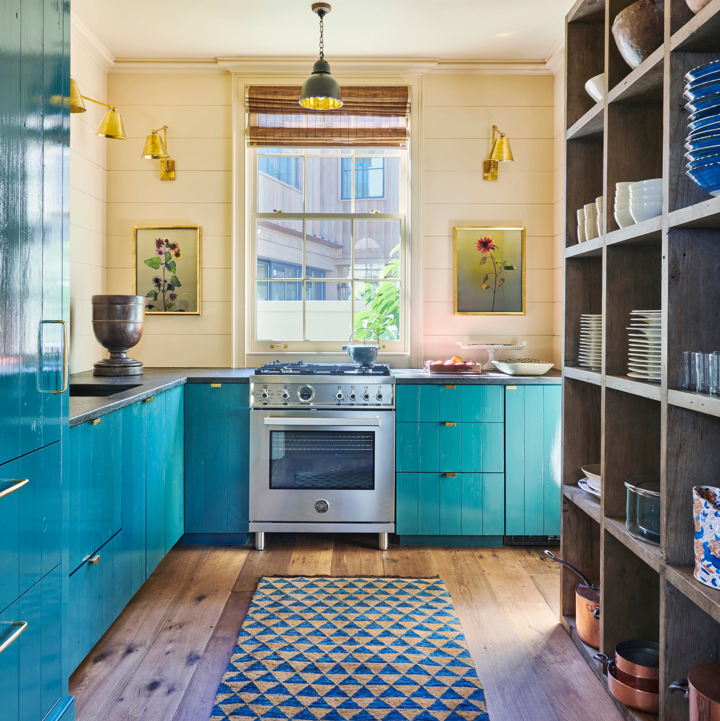
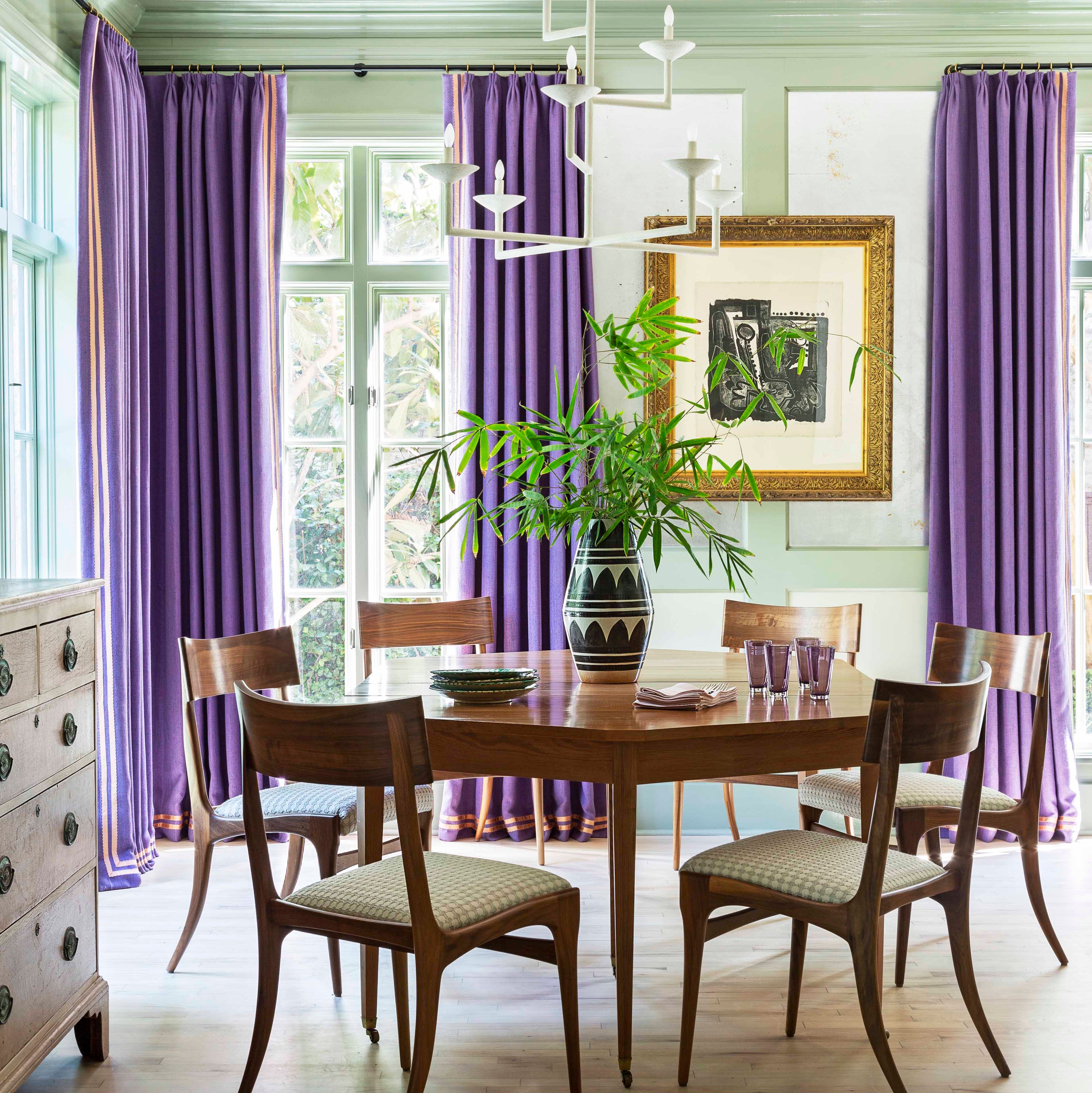
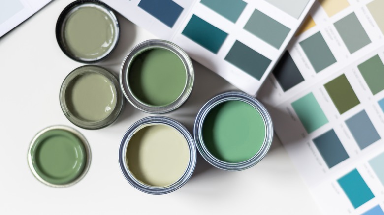
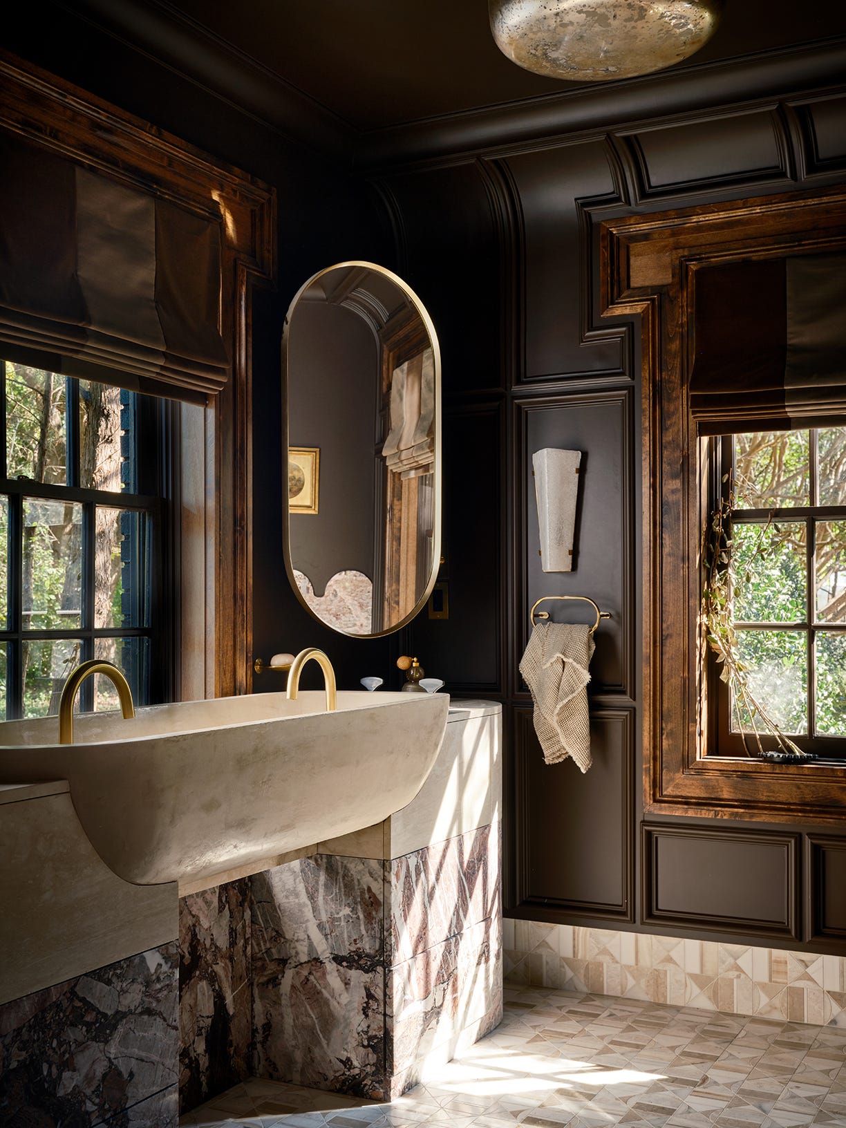
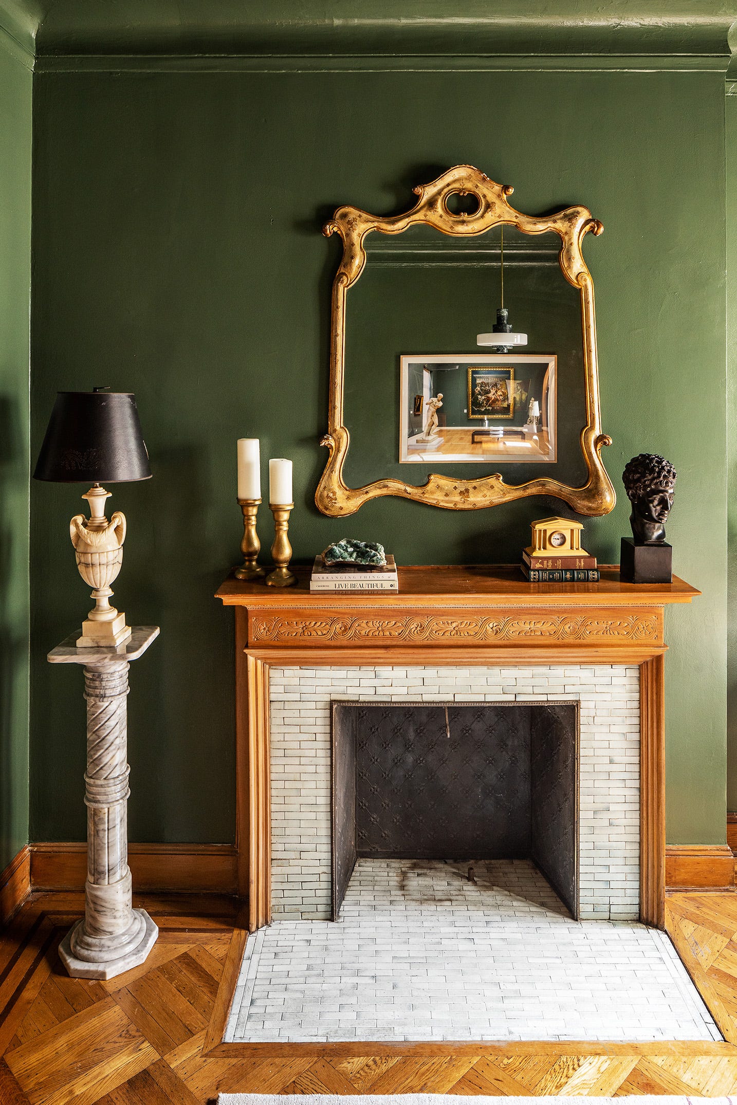
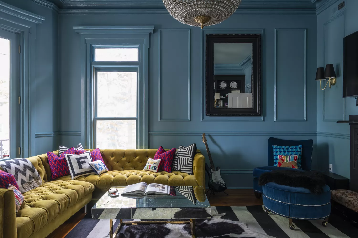
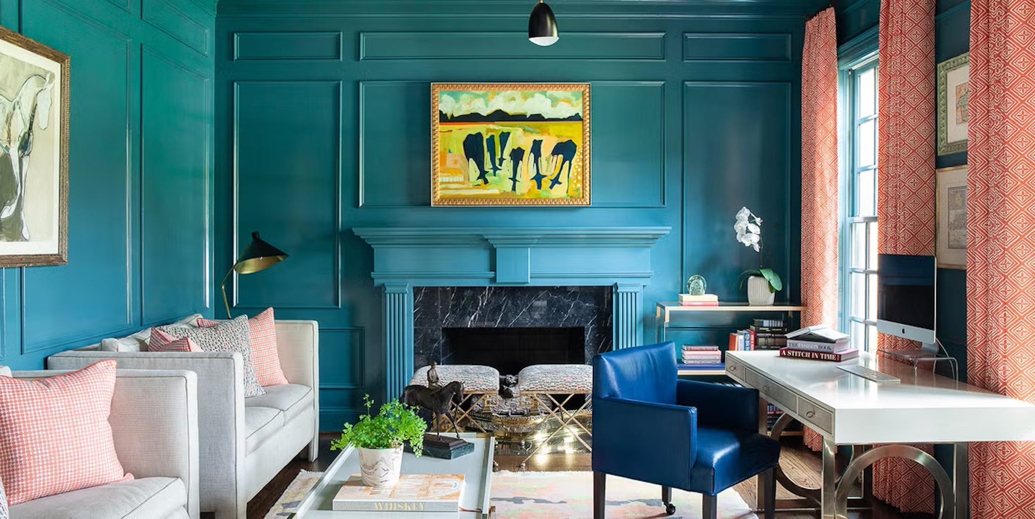
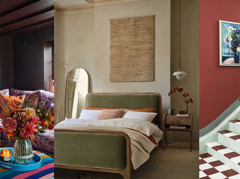
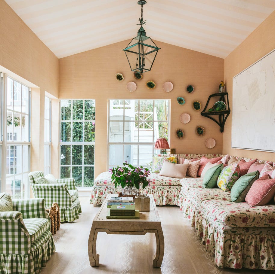
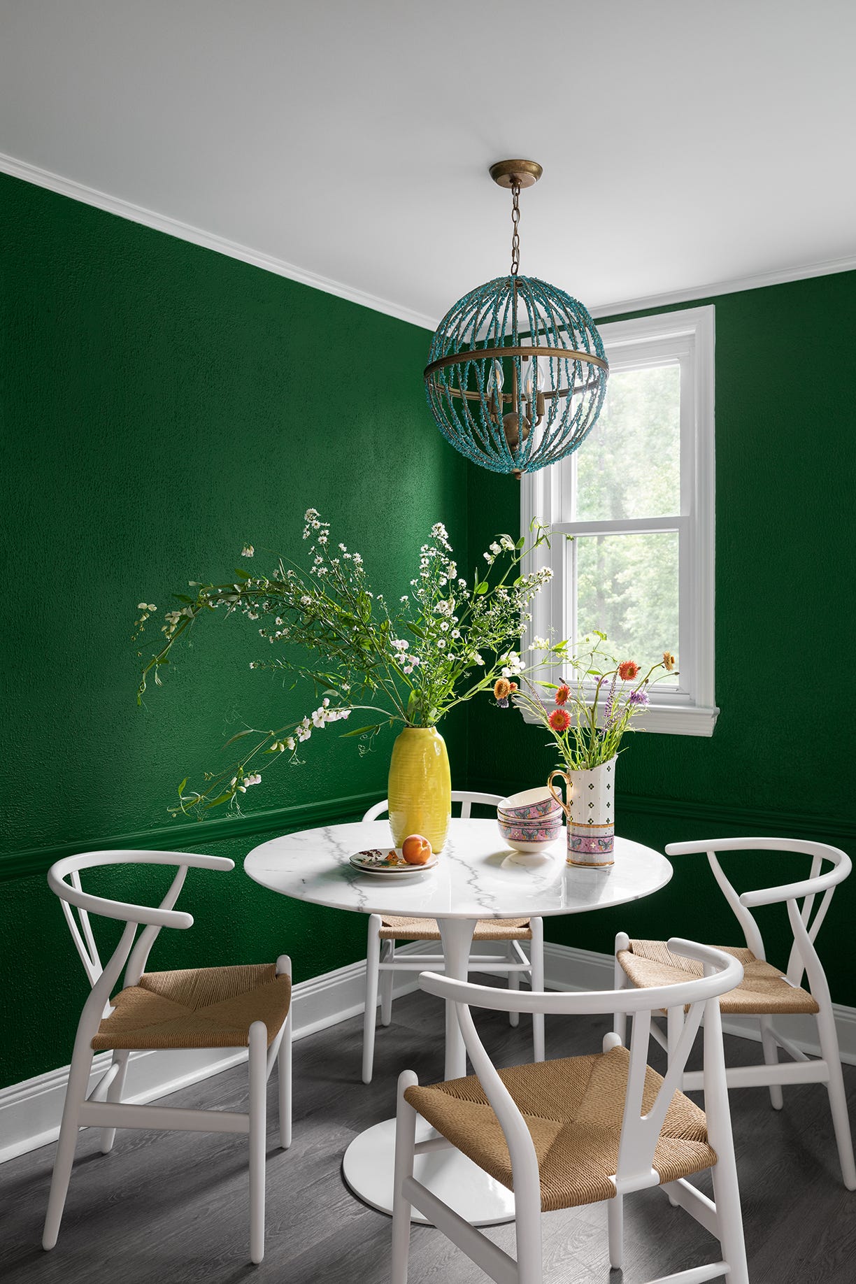
The first trend discussed is 'Mixed Greens,' characterized by richer and deeper pigments that create a sense of intimacy, akin to being wrapped in a cashmere blanket. Designers suggest these bold, deep greens for family rooms, powder rooms, reading nooks, and living rooms, with Benjamin Moore's Lafayette Green cited as an example. Following this, 'Warm Beiges' are presented as a comforting neutral that provides a sophisticated backdrop for modern furnishings and other prominent fall colors like aubergine and earthy pinks. Backdrop Palo Santo is recommended for offices or living rooms, praised for its moody, comforting, and ethereal qualities.
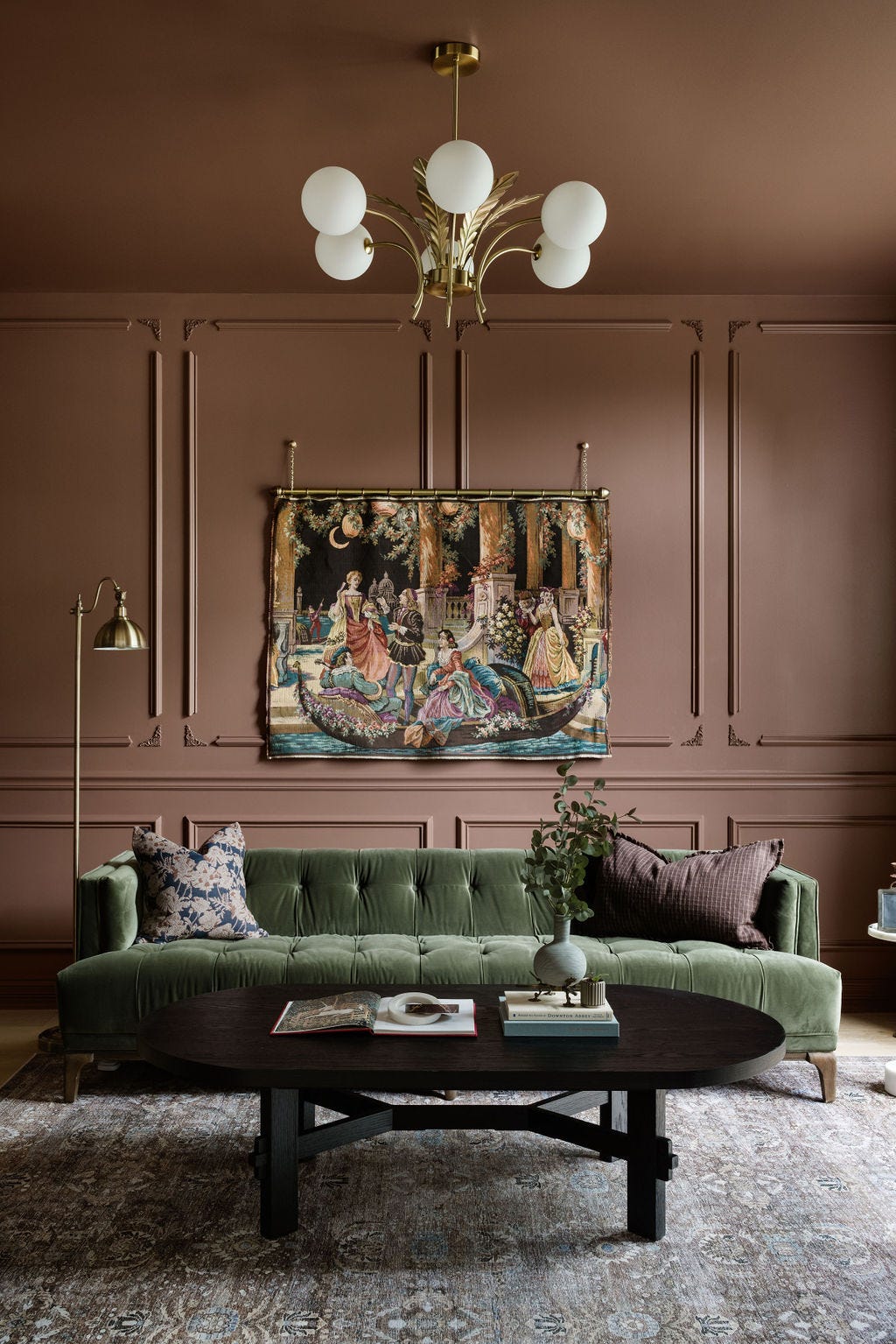
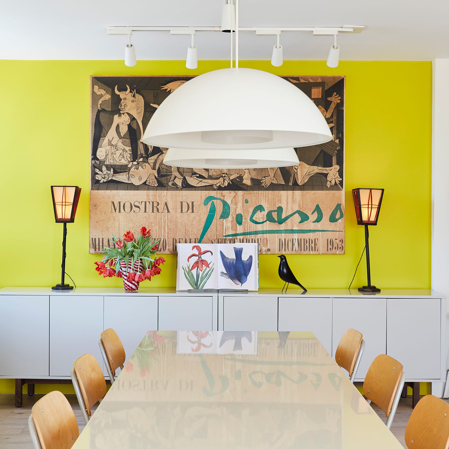
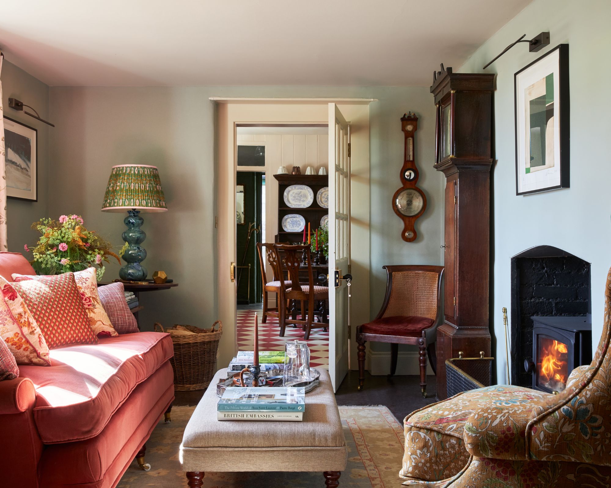
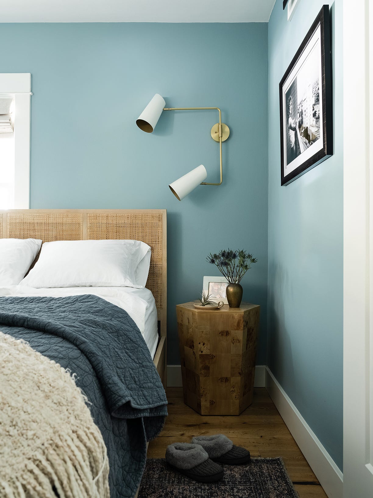
'Rich Taupes' emerge as another significant trend, offering a balance of neutrality and boldness. These colors are described as ethereal and are suggested for bedrooms, kitchens, or living areas, with Portola Paints Rustica Roman Clay highlighted for its ability to inspire daydreaming. Next, 'Ochre' is identified as an elevated and elegant alternative to traditional yellows, striking a balance between color and neutrality. This shade, reminiscent of a late summer sunset or golden milk, is suitable for living and dining rooms or crown molding, as exemplified by Portola Paints Joshua Tree.
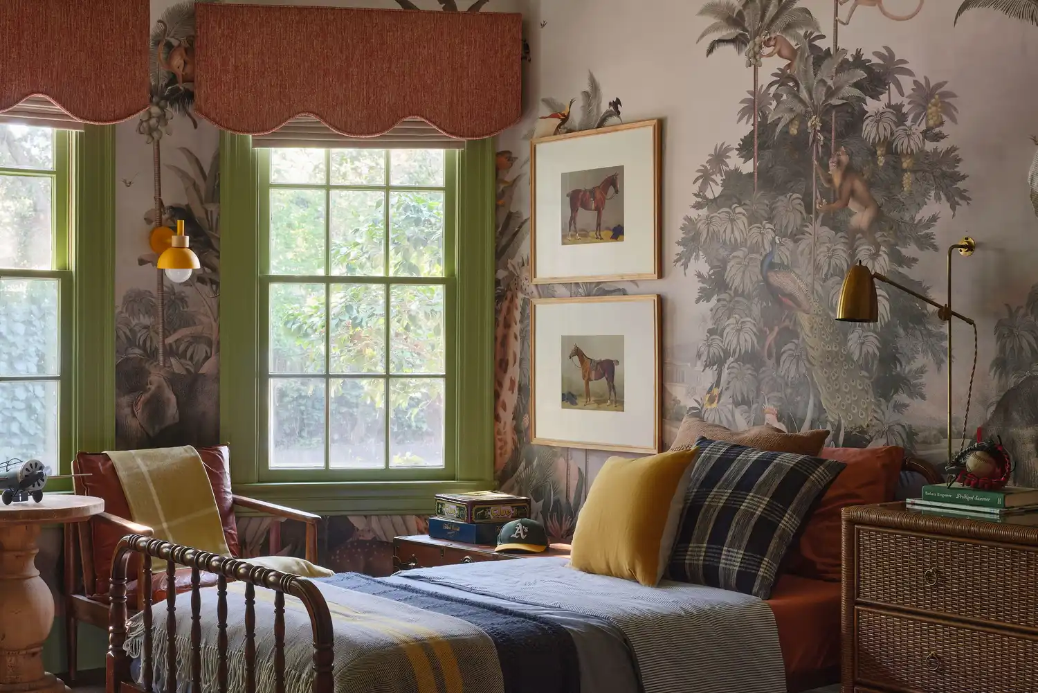
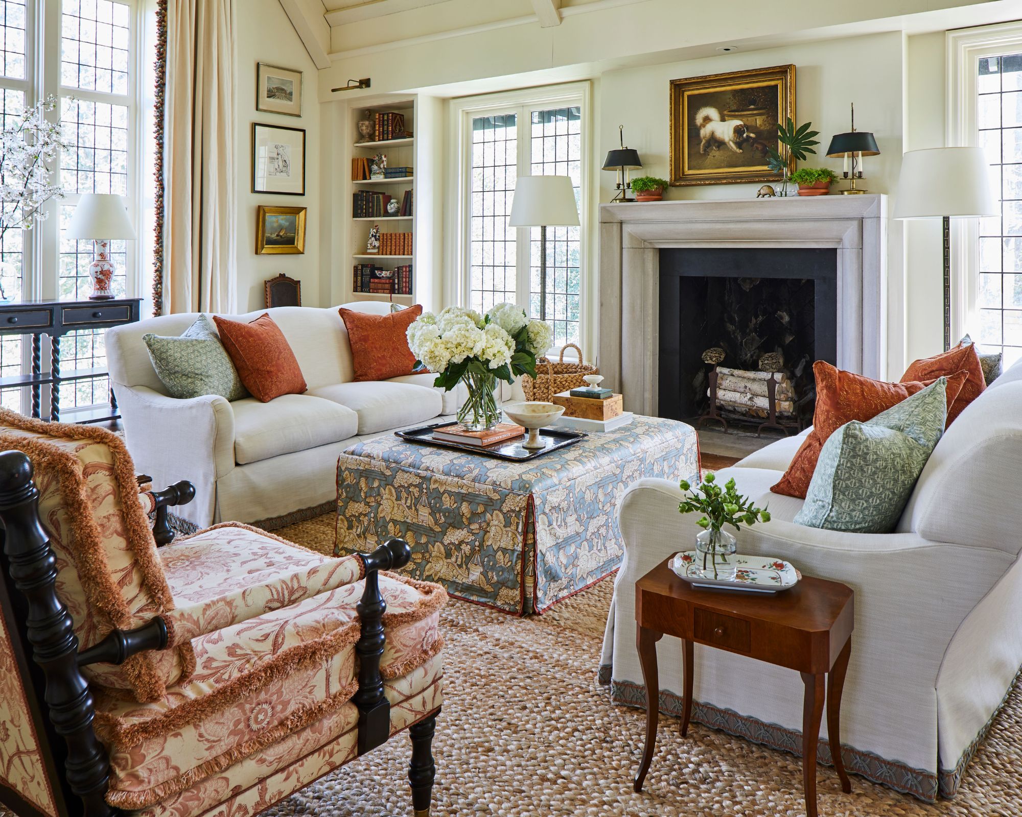
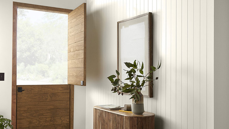
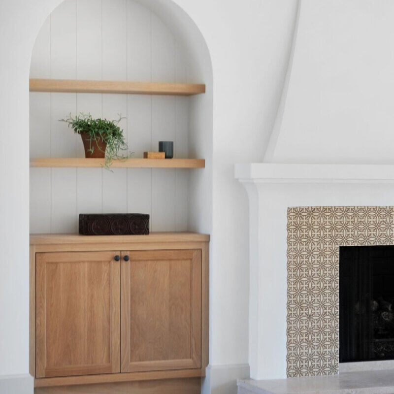
'Whites' are affirmed as a timeless and versatile choice, especially when paired with the rich hues prevalent in fall trends. This classic non-color, ranging from cool to warm, serves as an excellent complementary shade for any room, including bedrooms, living rooms, offices, and as a trim. Sydney Harbor Old Church White is recommended for its earthy richness. 'Earthy Toned Oranges' are suggested for accentuating spaces, either as an accent wall or trim, and are noted to be trending in furnishings and clothing as well. Benjamin Moore Potter's Clay is featured for its sunbaked and radiant qualities, ideal for kitchens or accent walls.
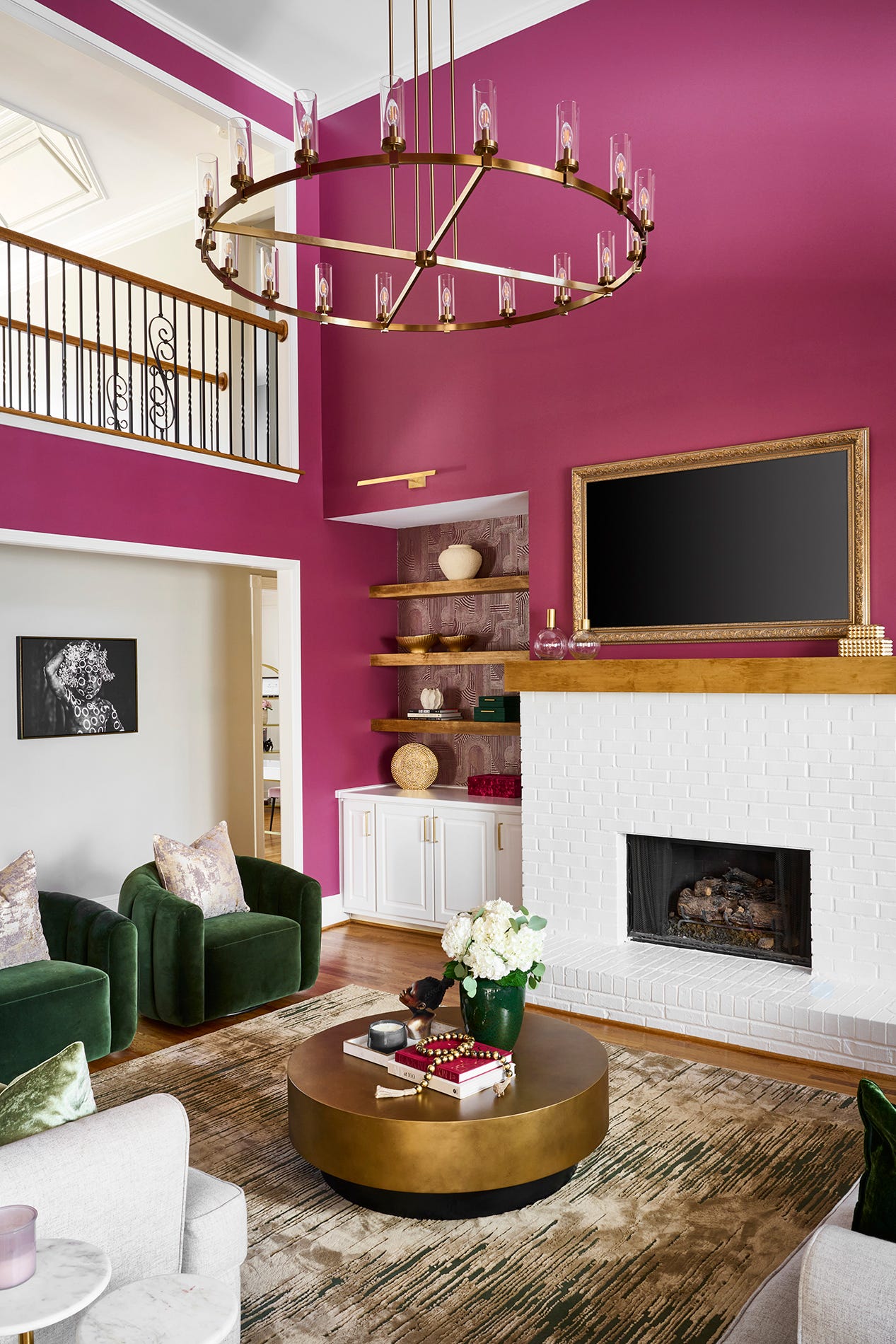
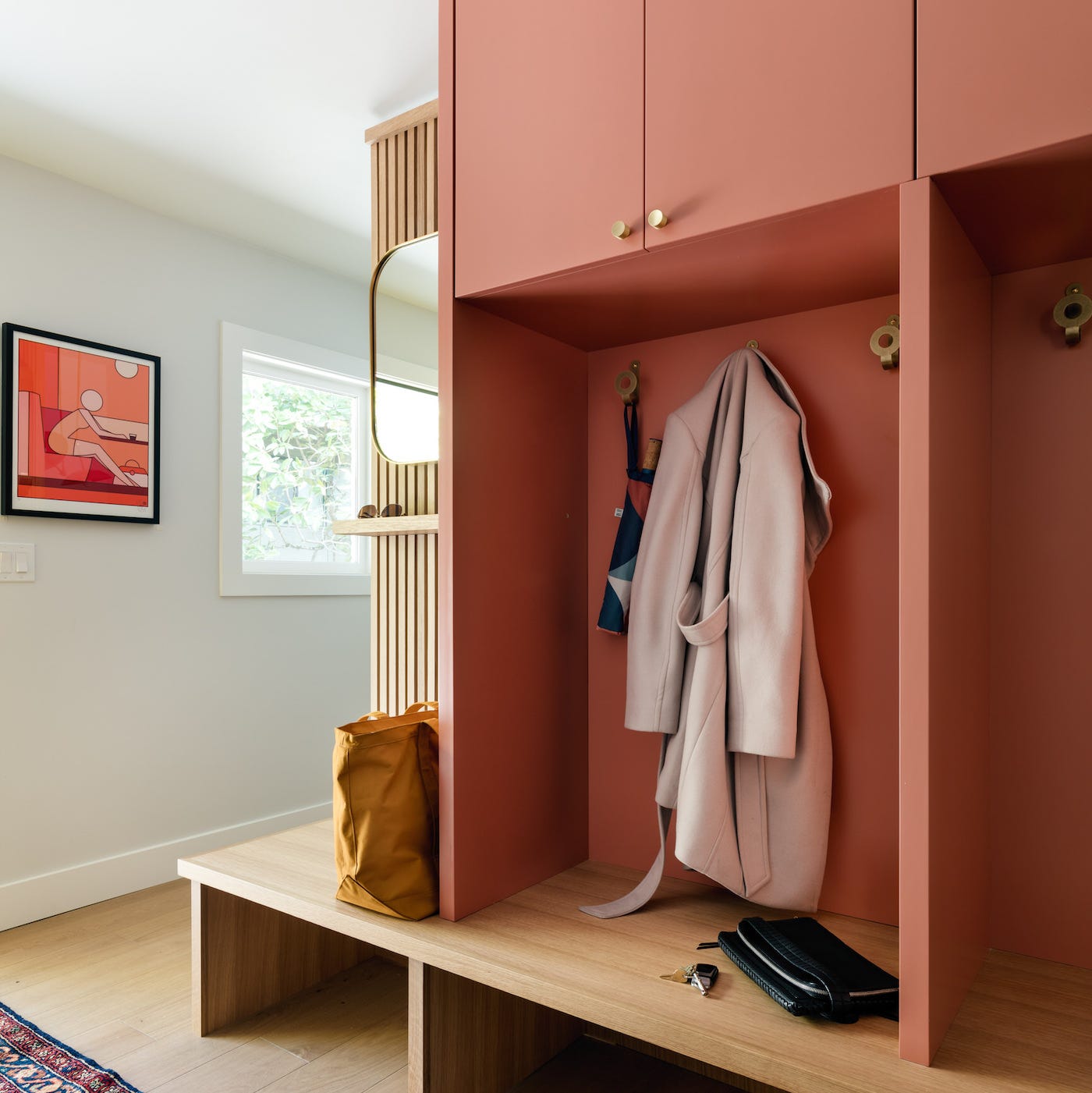
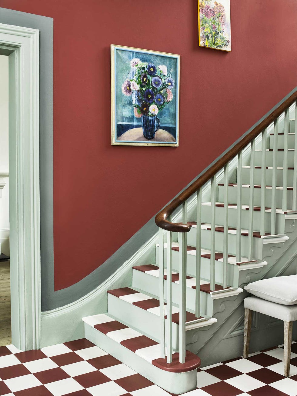
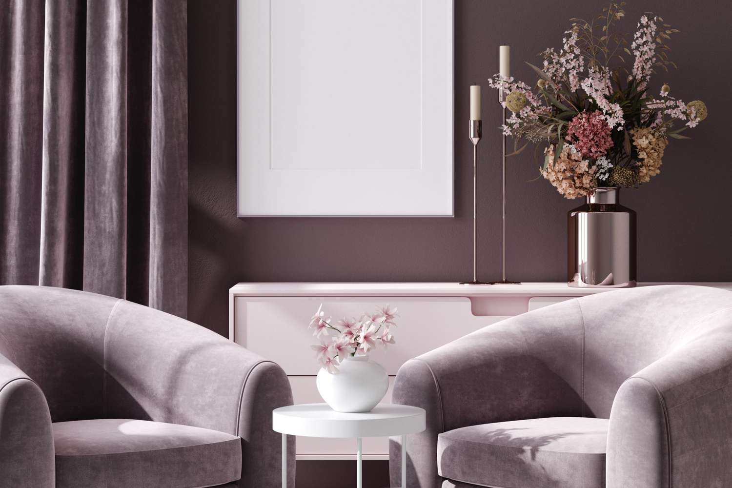
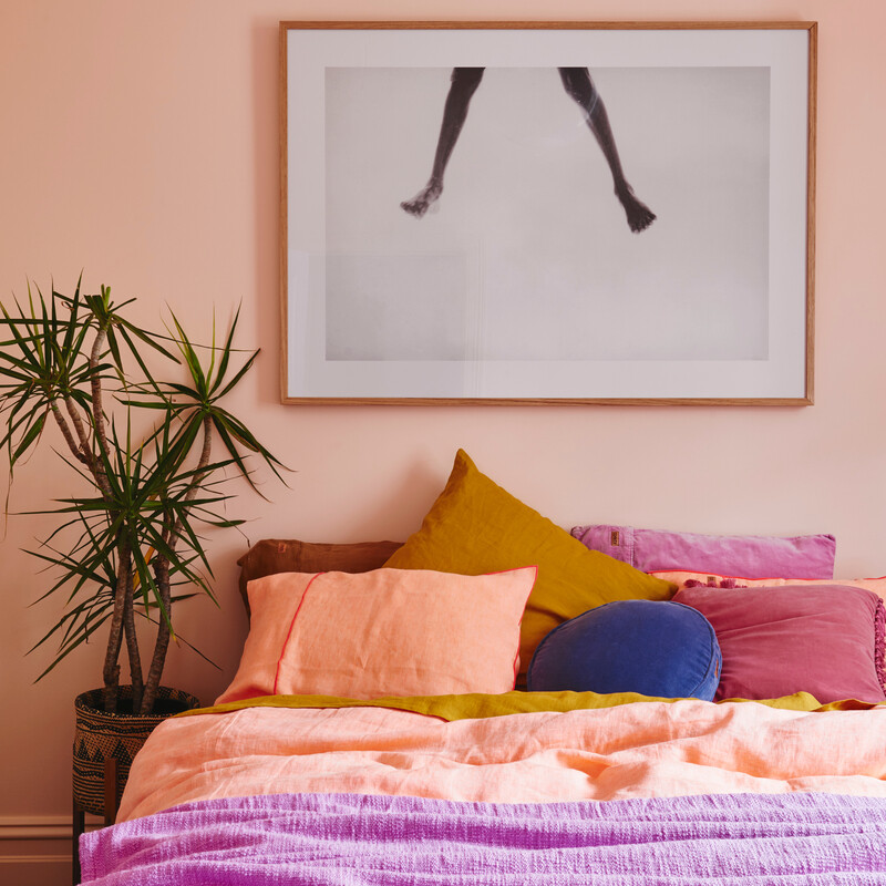
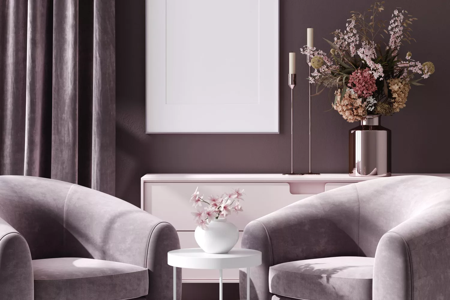
Finally, 'Shades of Pink' are highlighted for their versatility, described as timeless, feminine, classic, and gender-neutral. Designers anticipate warm pink hues to be particularly popular, suggesting them for bedrooms, home offices, or dining areas. Benjamin Moore Genuine Pink is chosen as a classic and clean option that pairs well with various other colors. The article concludes by reinforcing that paint colors offer a simple yet impactful way to refresh and transform home interiors for the autumn season, focusing on warmth, richness, and earthy tones.
#PaintColorTrends #FallDecor #InteriorDesign #HomeDecor #DesignersRecommendations #ColorPalettes #HomeRenovation #PaintColorTrends #FallDecor #InteriorDesign #HomeDecor #DesignersRecommendations #ColorPalettes #HomeRenovation
0 Kommentare insgesamt
 Noch keine Kommentare
Das könnte Ihnen auch gefallen
Fall’s Most Stylish Paint Color Trends Have Us Swooning
Design Pros Have Spoken: Here Are the Only Paint Color Trends That Matter in 2023


4 Interior Designers Share the Biggest Paint Color Trends Right Now (and What’s Out!)

9 Trending Paint Colors You'll See Everywhere in 2025, According to Designers
Design Pros Have Spoken: Here Are the Only Paint Color Trends That Matter in 2022
The Paint Color Trends of 2023 Are in—And They’re Gorgeous
5 Paint Colors That Are Out for 2025, According to Interior Designers

This Chic Color Pairing Is Cooler Than Beige and Black and Set to Dominate Fall Outfits

6 Paint Color Duos Designers Can't Get Enough of This Fall

The Latest Color Trend You'll Be Seeing Everywhere In Fall 2025

The #1 Paint Color Trend of 2025, According to Designers

The most timeless paint colors according to designers

7 Fall Paint Color Trends Designers Want You to Use This Year

Colour experts share their top paint trends for 2024

7 Color Trends That Will Be Huge in 2024, According to Color Experts

12 Trending Paint Colors for 2024, According to Design Experts
These Paint Colors Will Dominate Our Homes in 2022

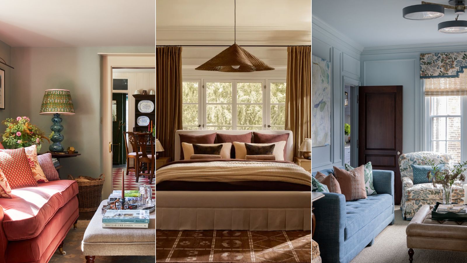
What are the best color combinations for fall? 7 cozy-season-ready suggestions from designers
What To Expect For 2023 Paint Color Trends

This Serene Paint Trend Is Set To Take Over In 2022