1/11
What Color Kitchen Cabinets Actually Go Well With Wooden Countertops? Designers Share Their Perfect Pairings
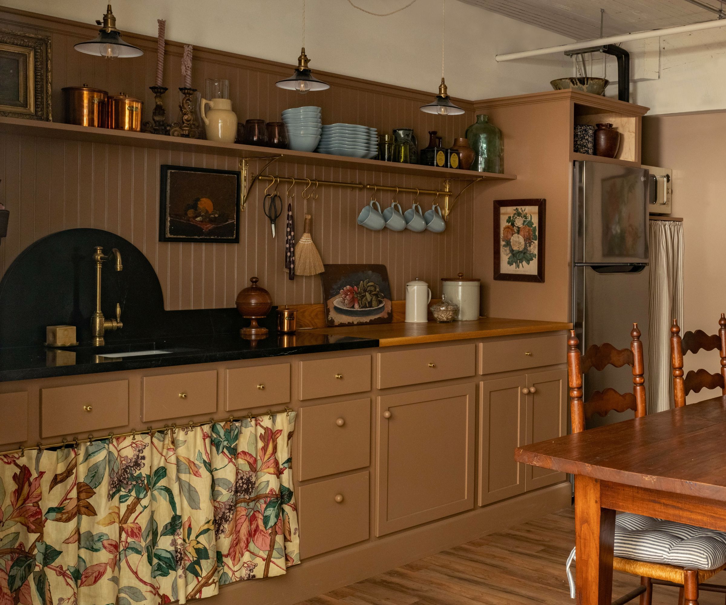
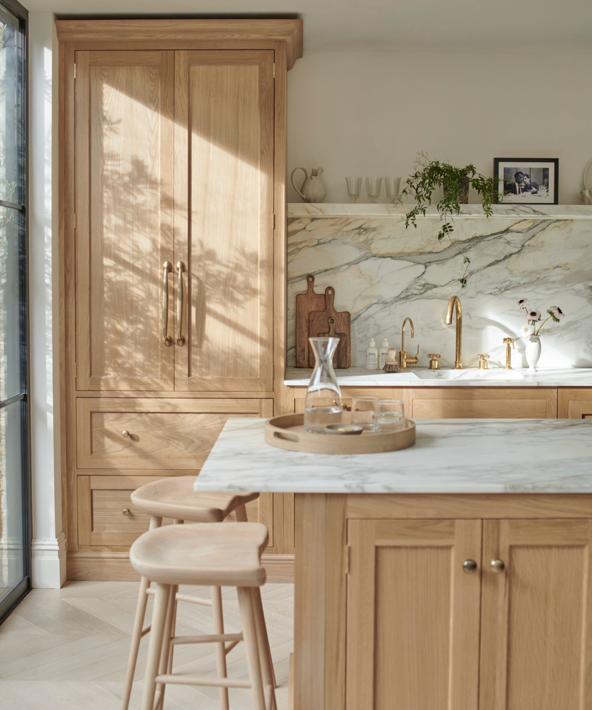
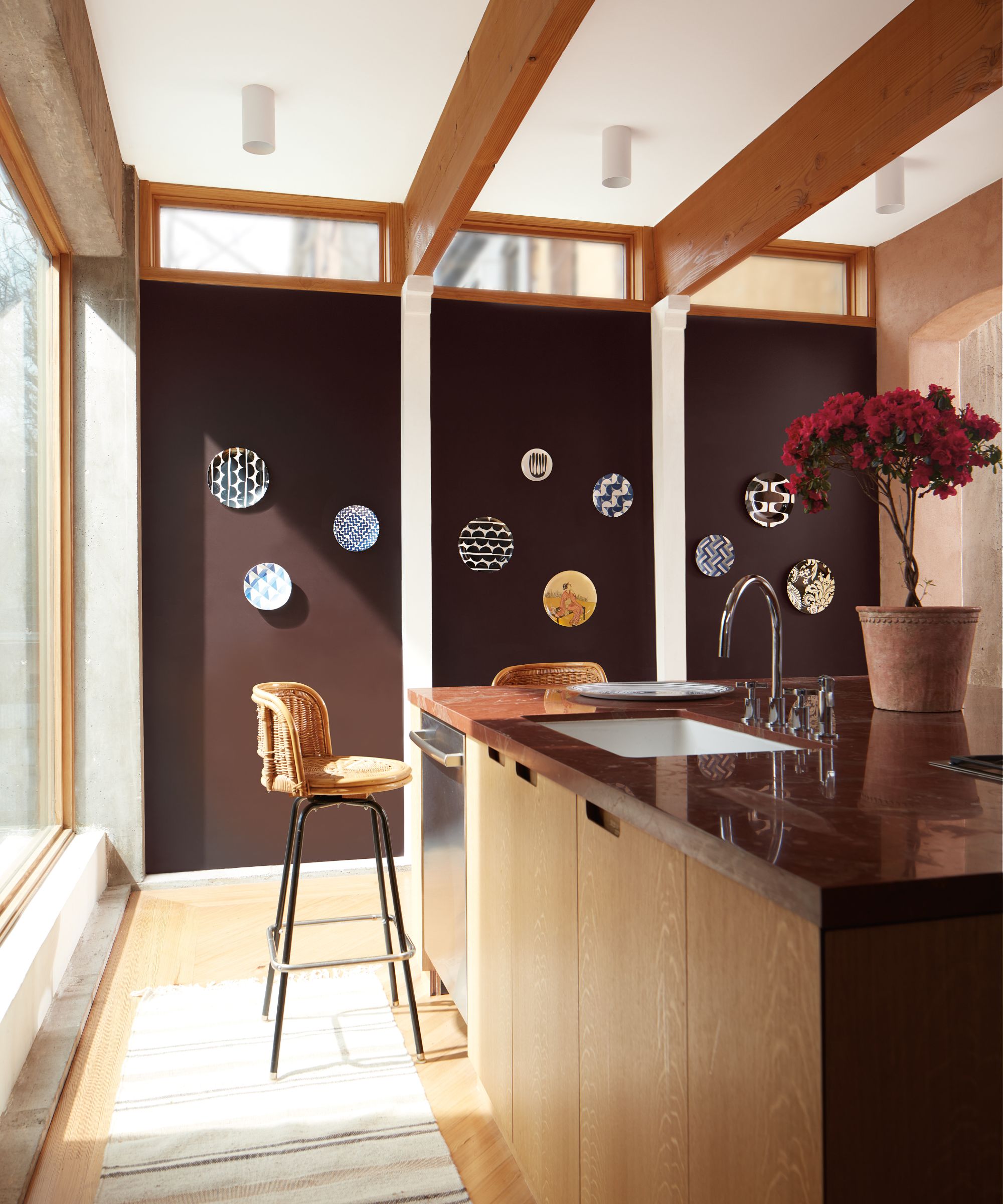
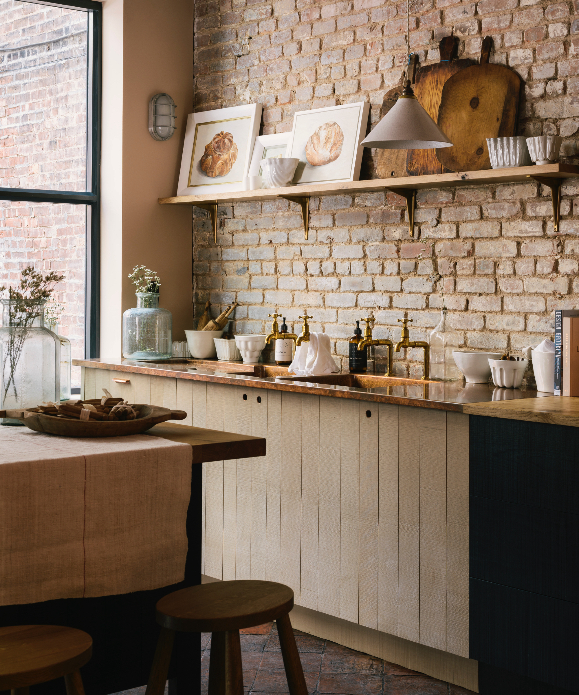
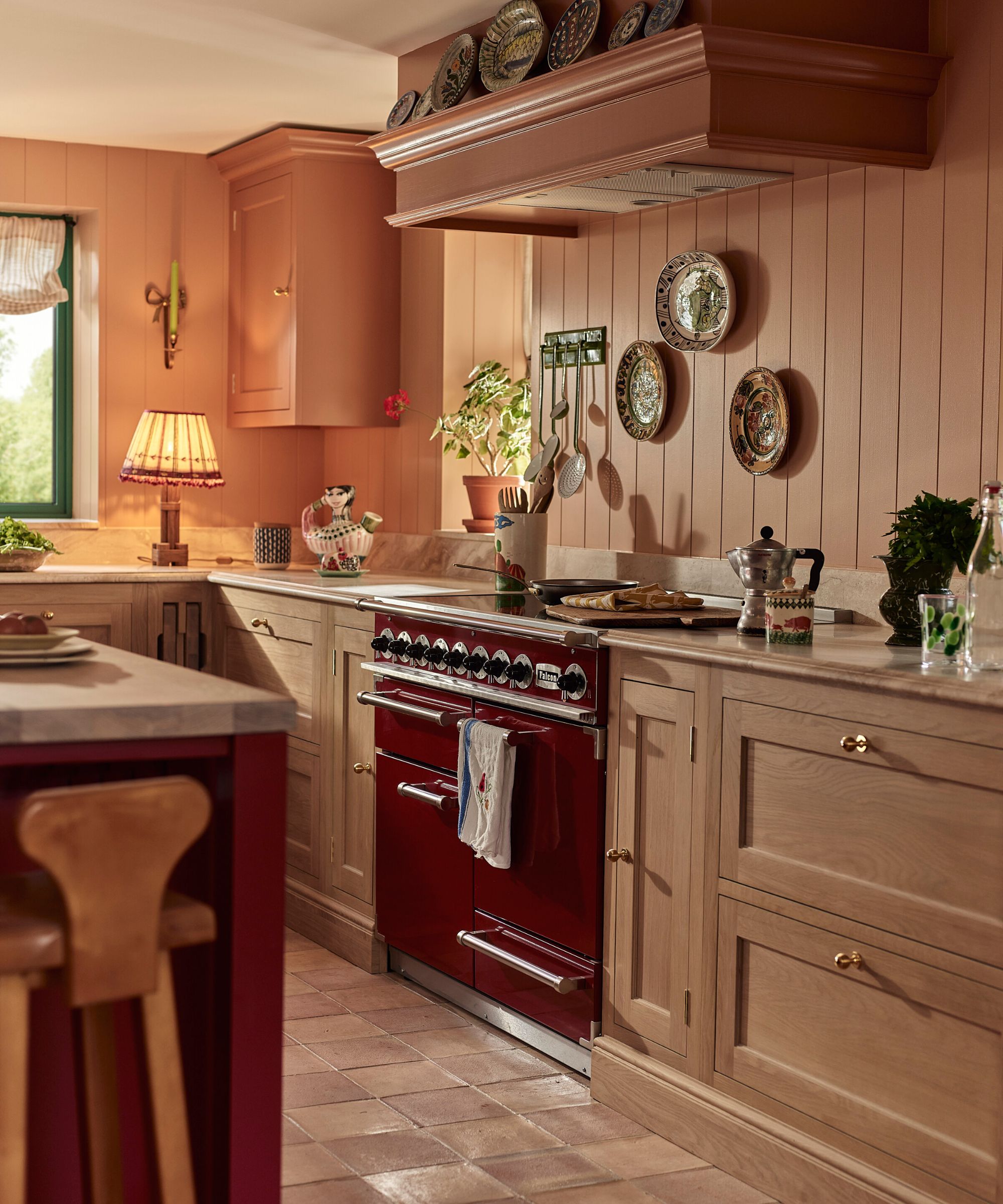
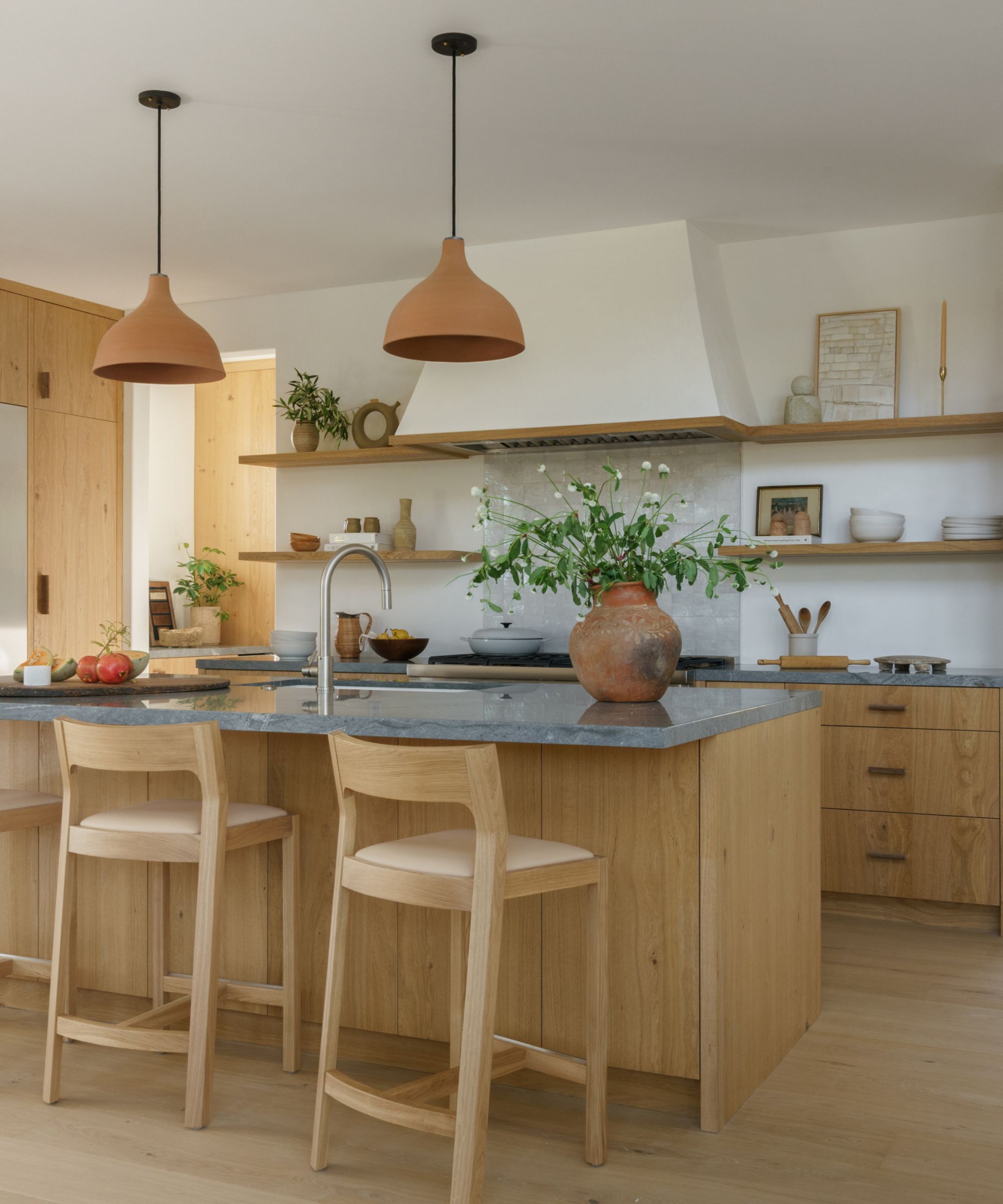
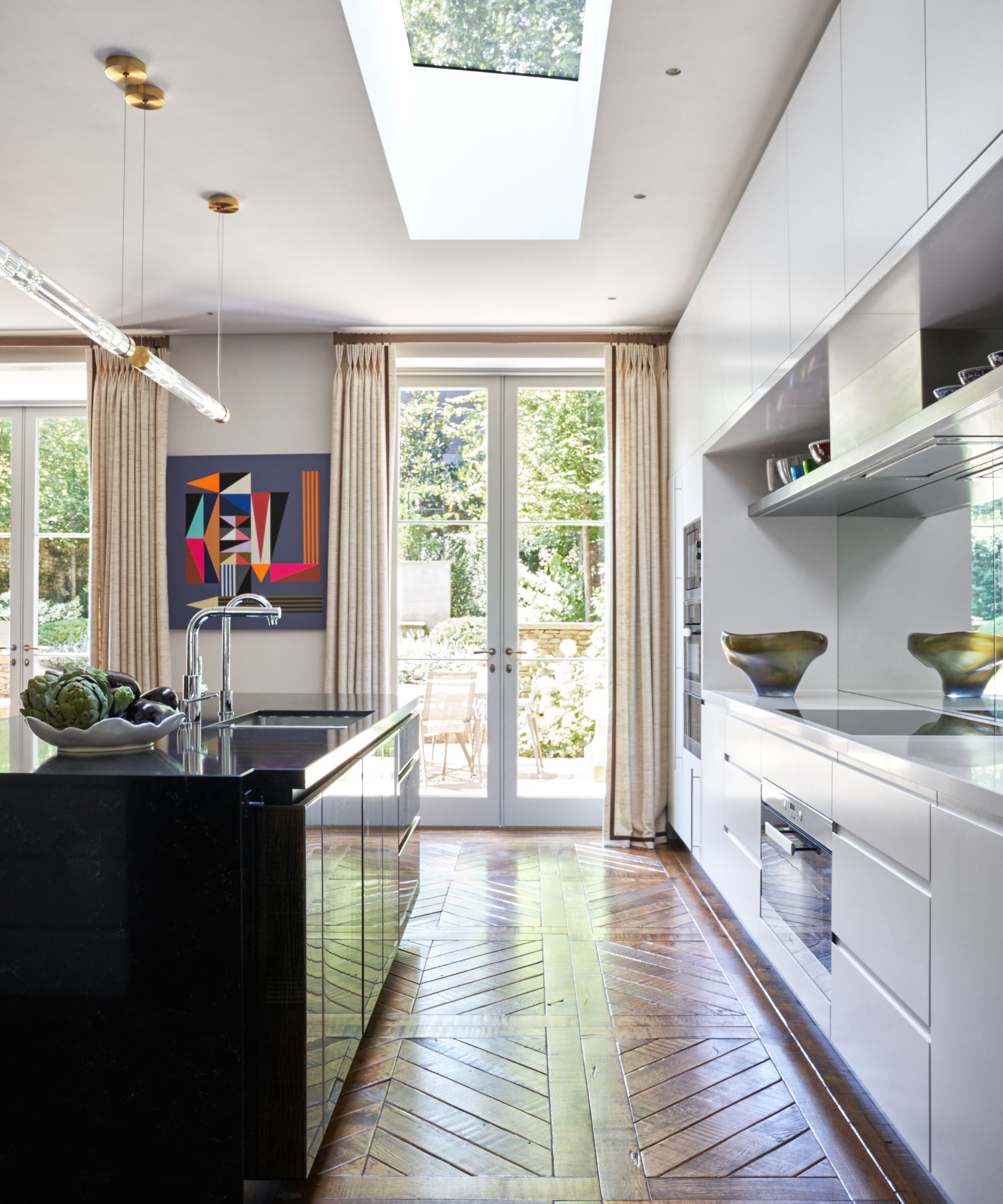
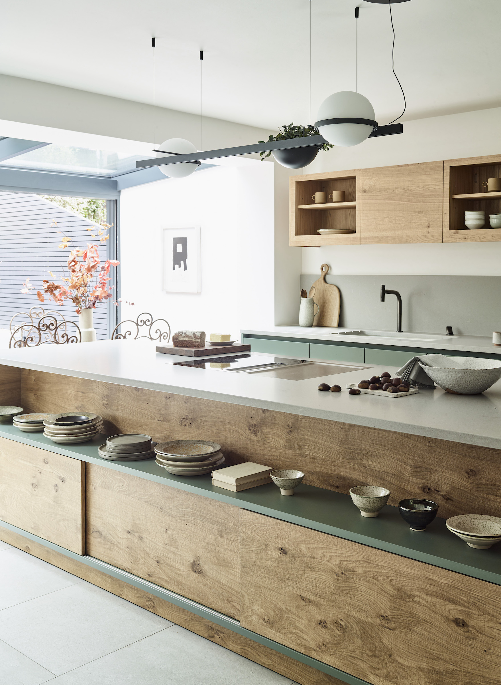
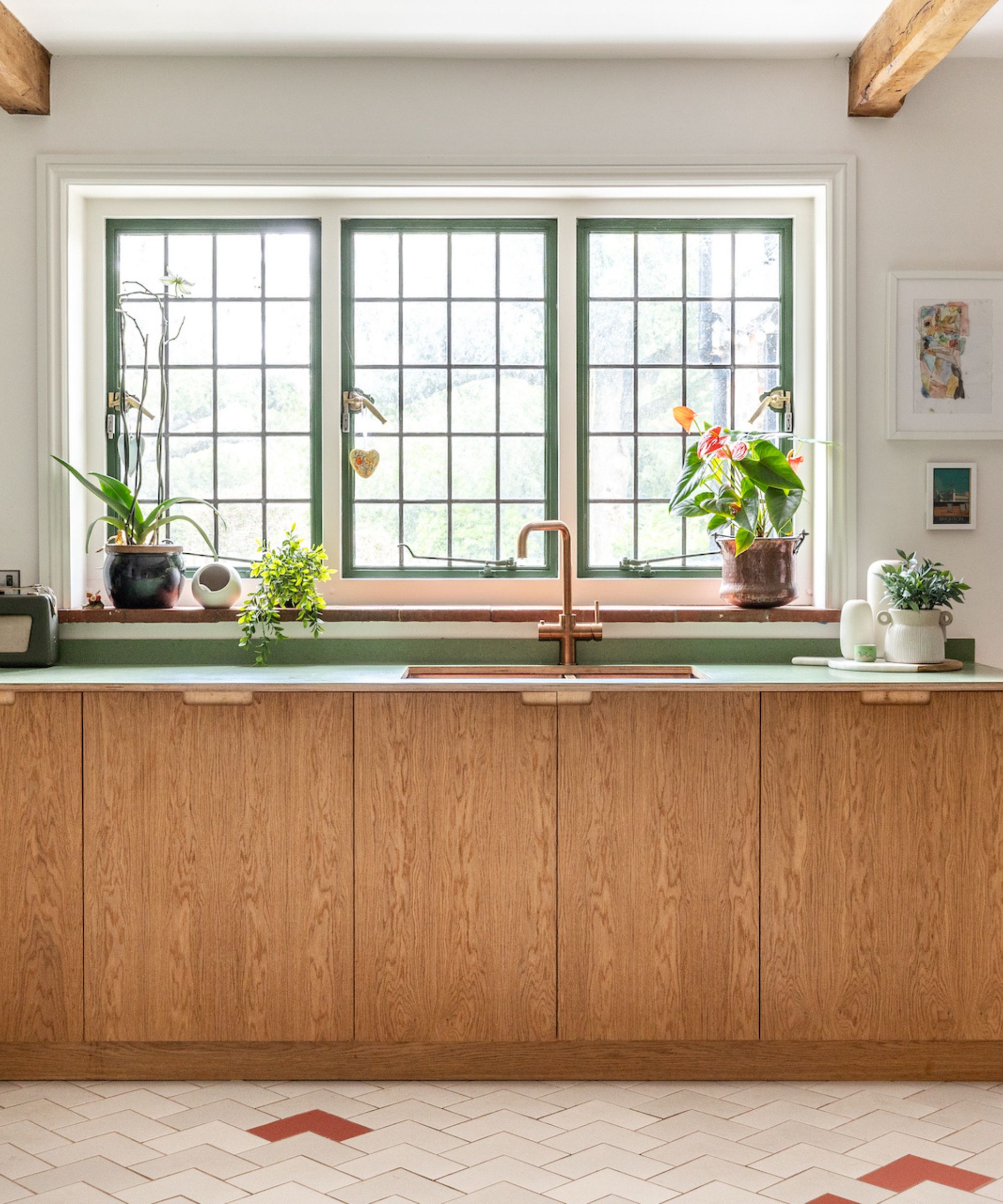
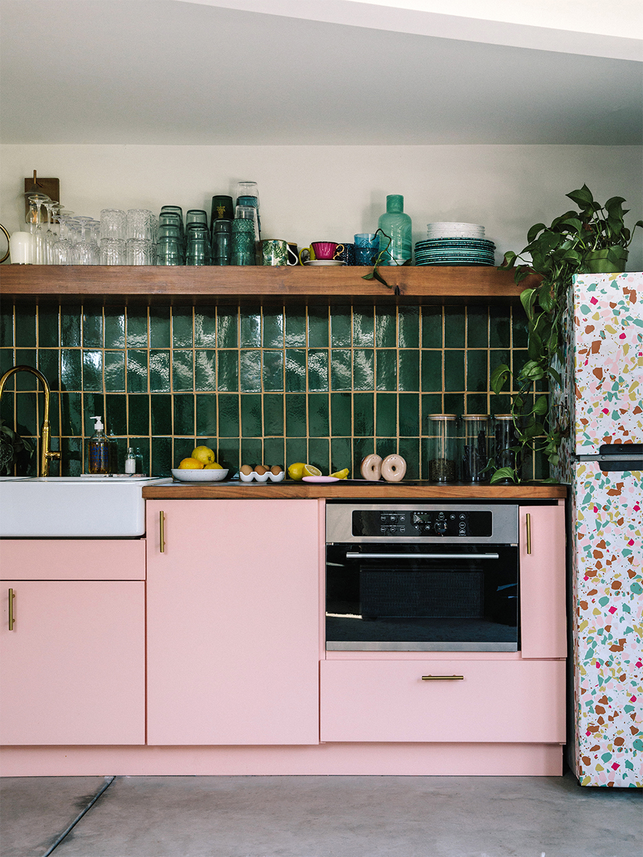
Wooden countertops are a timeless and versatile choice for kitchens, offering natural warmth and texture. While they are considered neutral, pairing them with the right cabinet colors can enhance their beauty and define the kitchen's aesthetic. Kitchen design experts, such as Richard Davonport from Davonport and Liane Burrett from Roundhouse, emphasize the importance of selecting cabinet colors that either contrast with the wood or complement its natural tones, drawing inspiration from nature.
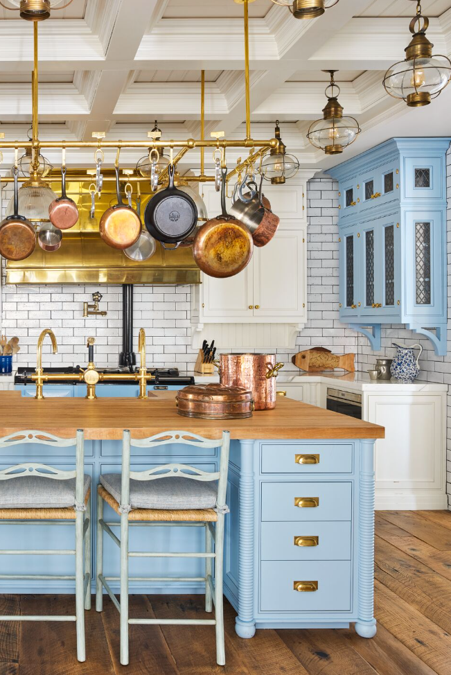
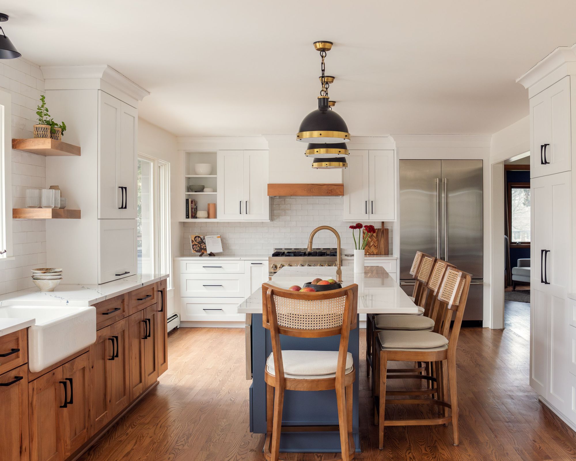
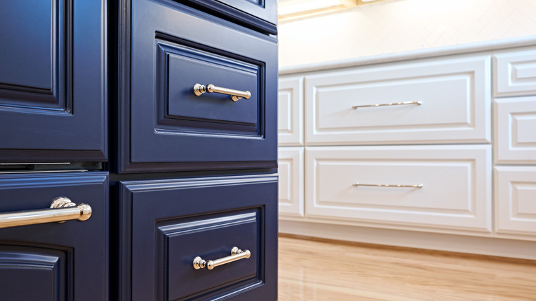
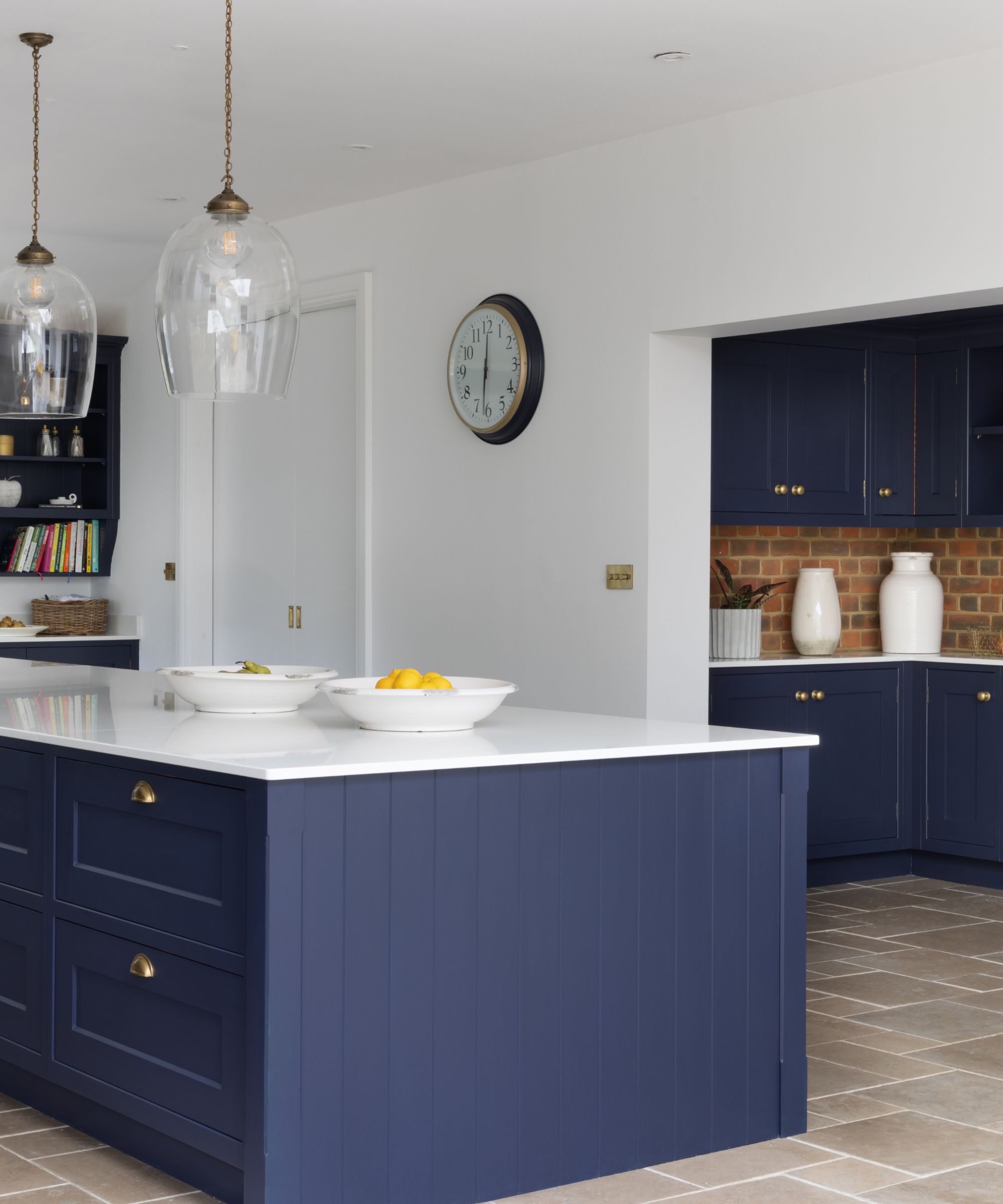
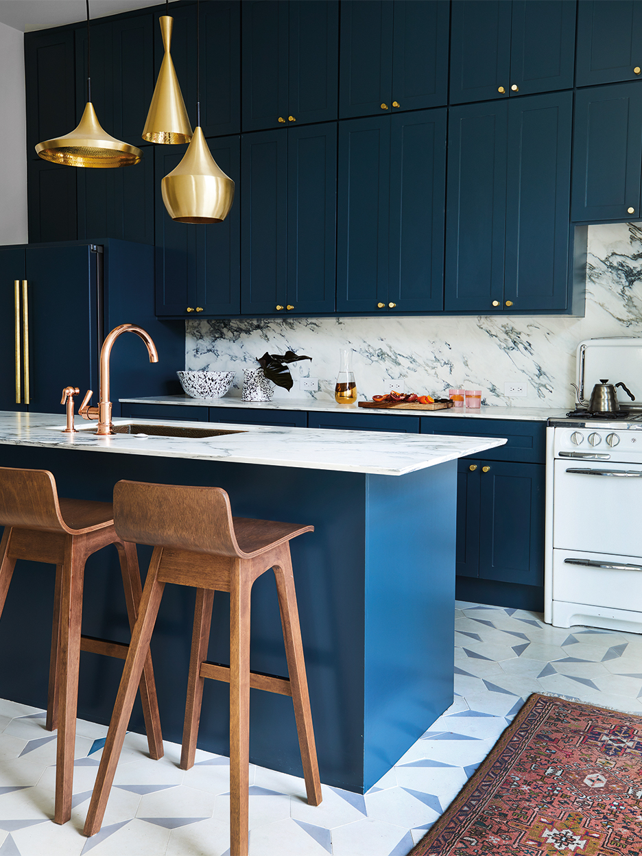
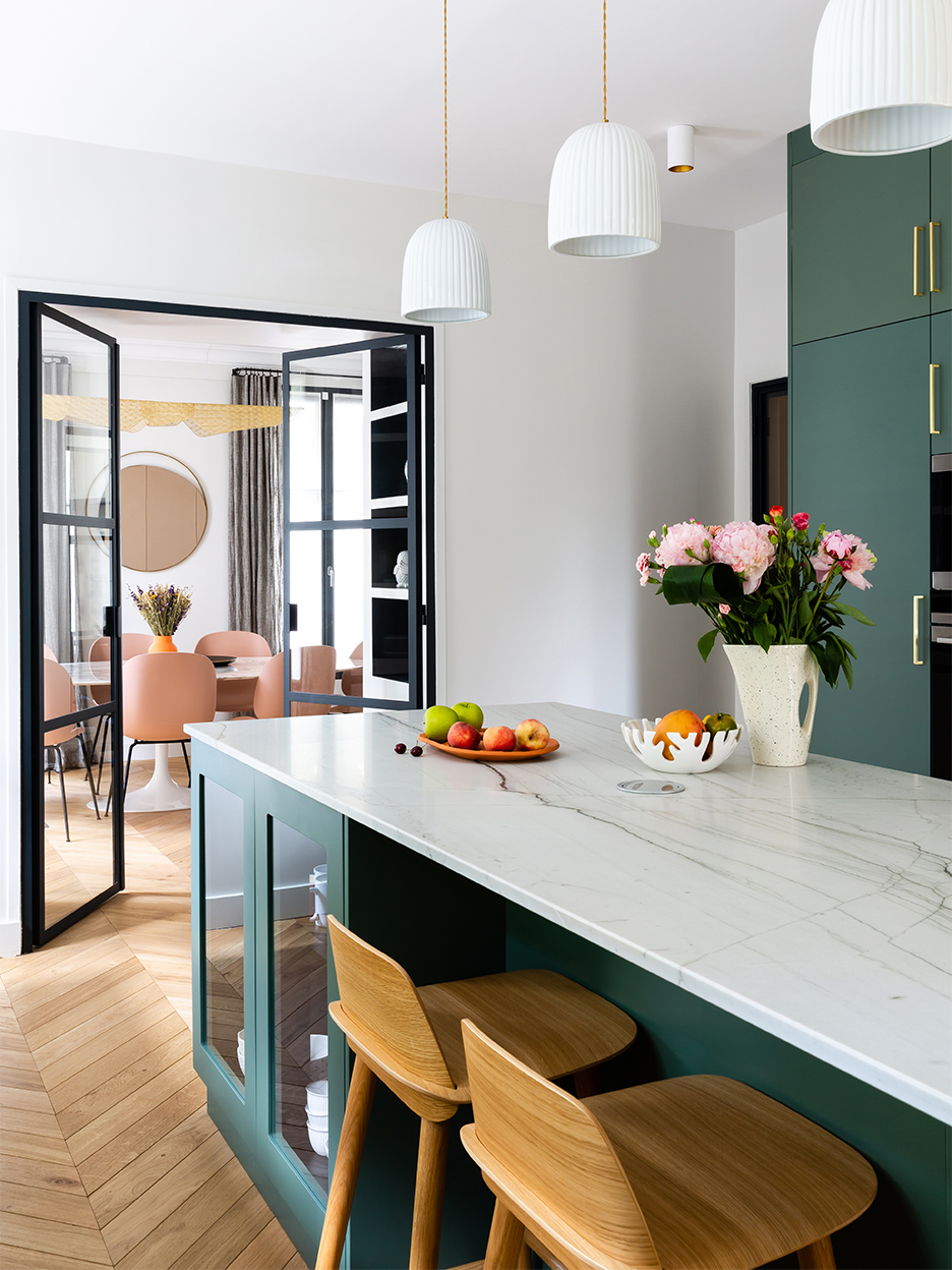
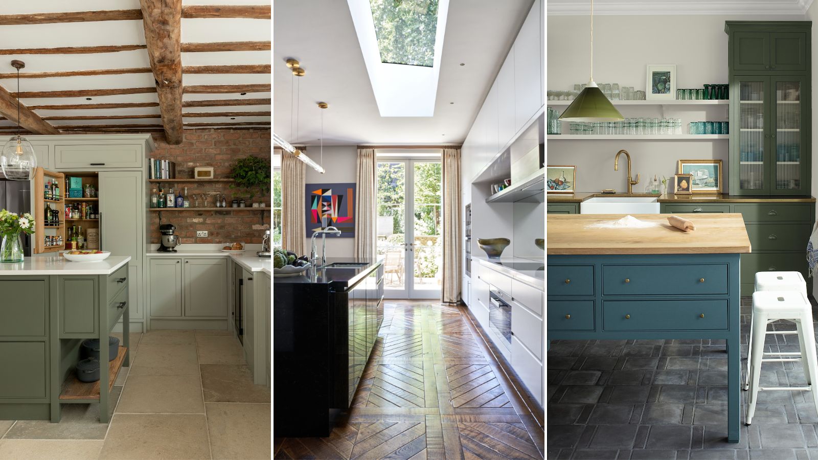
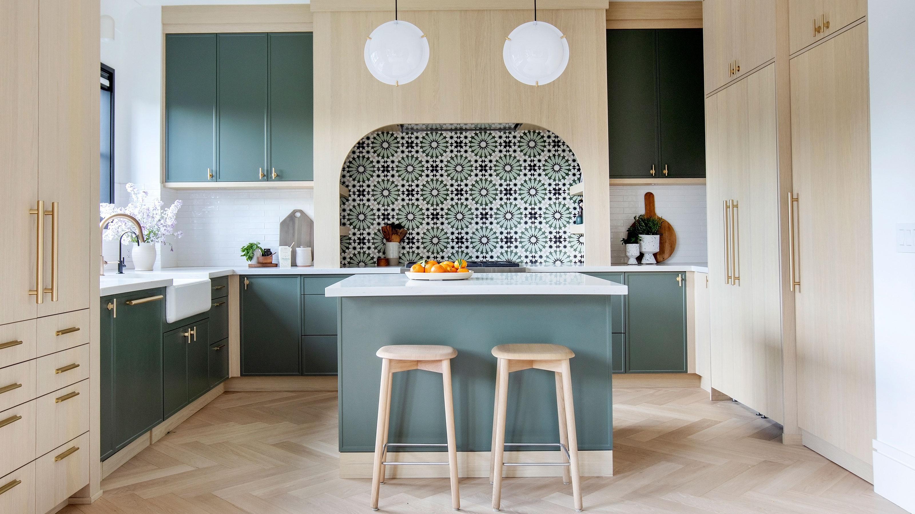
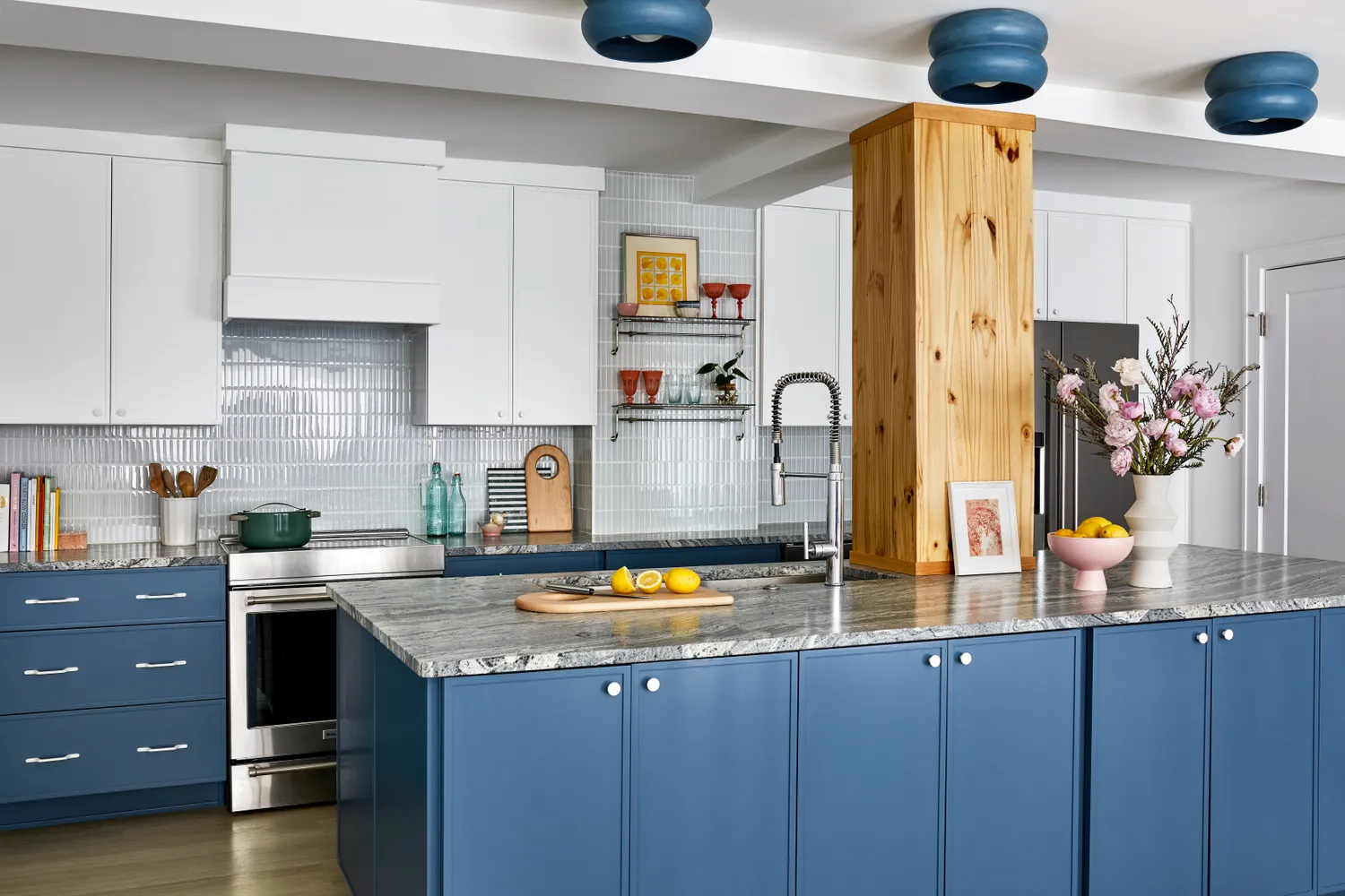
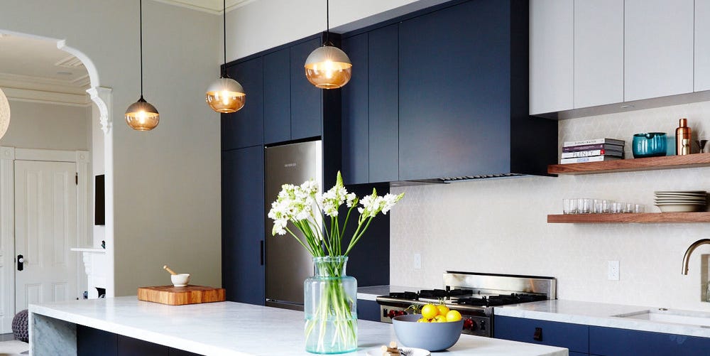
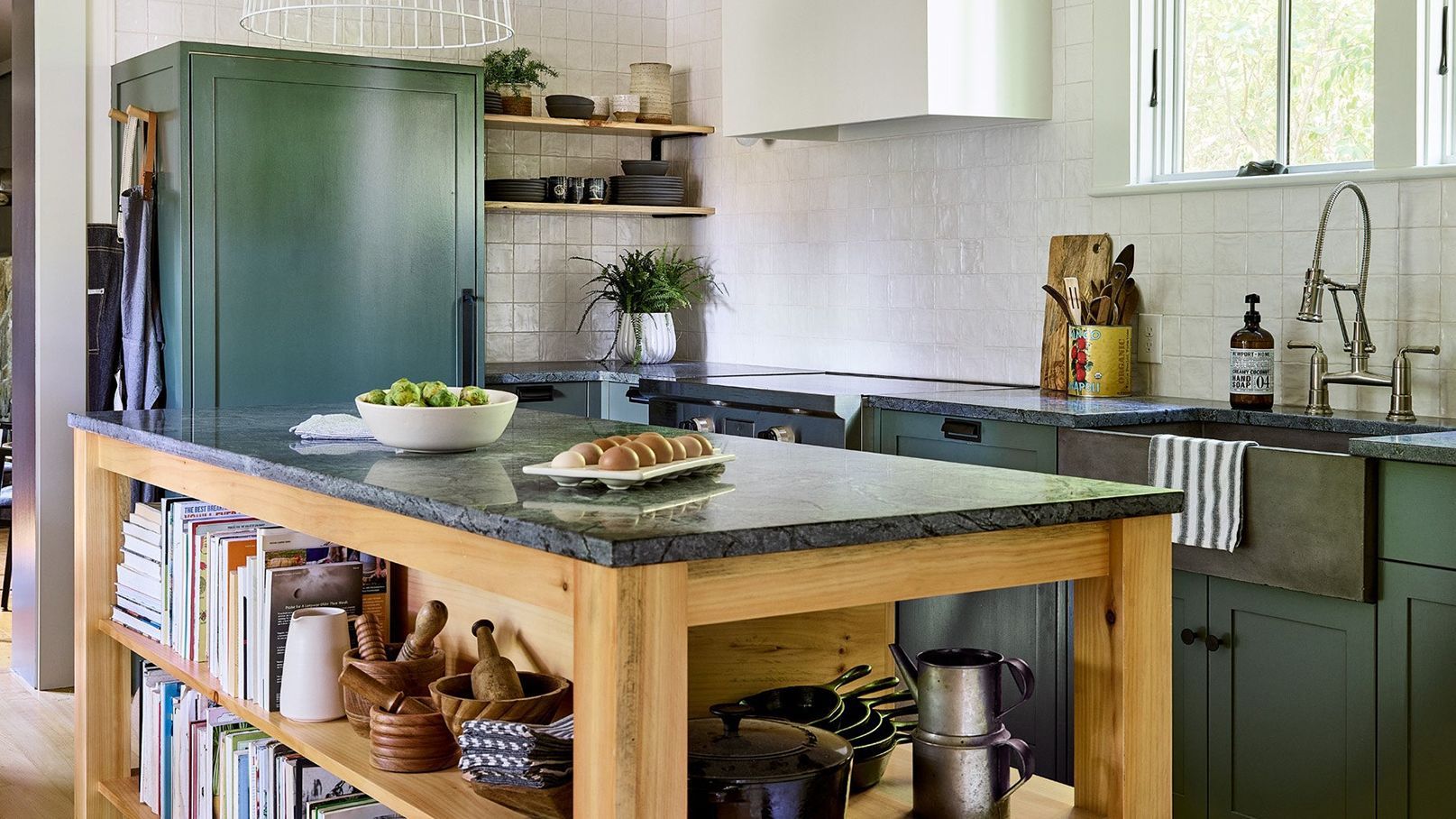
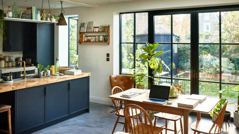
Deep, inky blues and rich greens are highly recommended as they create a striking contrast against the wood grain, making the countertop a focal point. These shades lend a moody yet contemporary feel, ensuring the wood's organic beauty stands out. Benjamin Moore's Midnight Navy is cited as an example of an enchanting blue with purple undertones that pairs well with wooden countertops. Richard Davonport highlights that these colors are timeless and allow the wood to become a central design element.
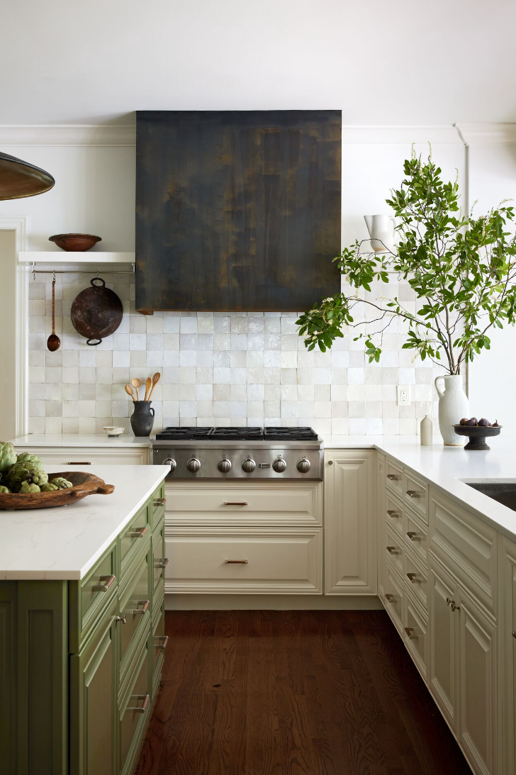
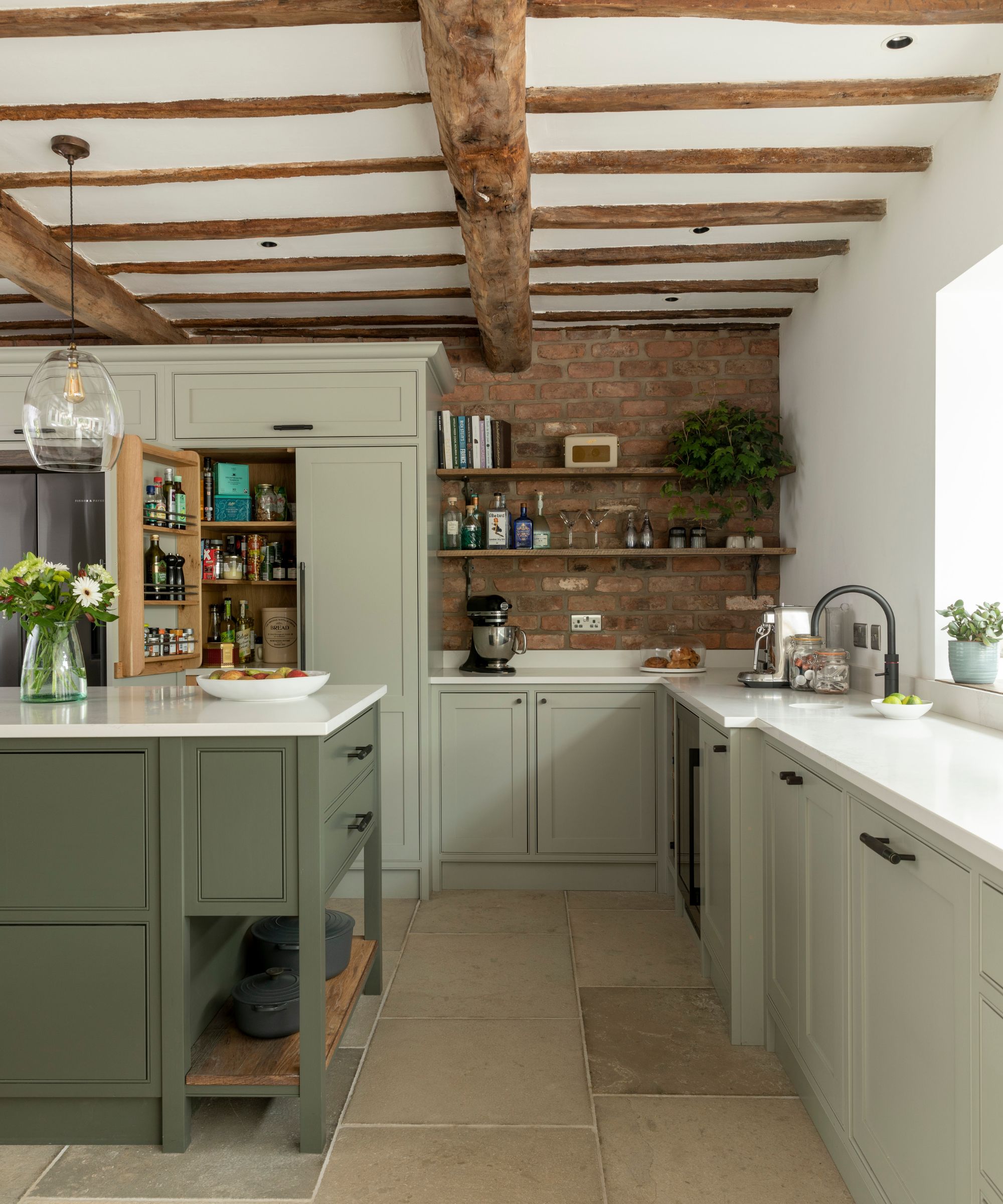
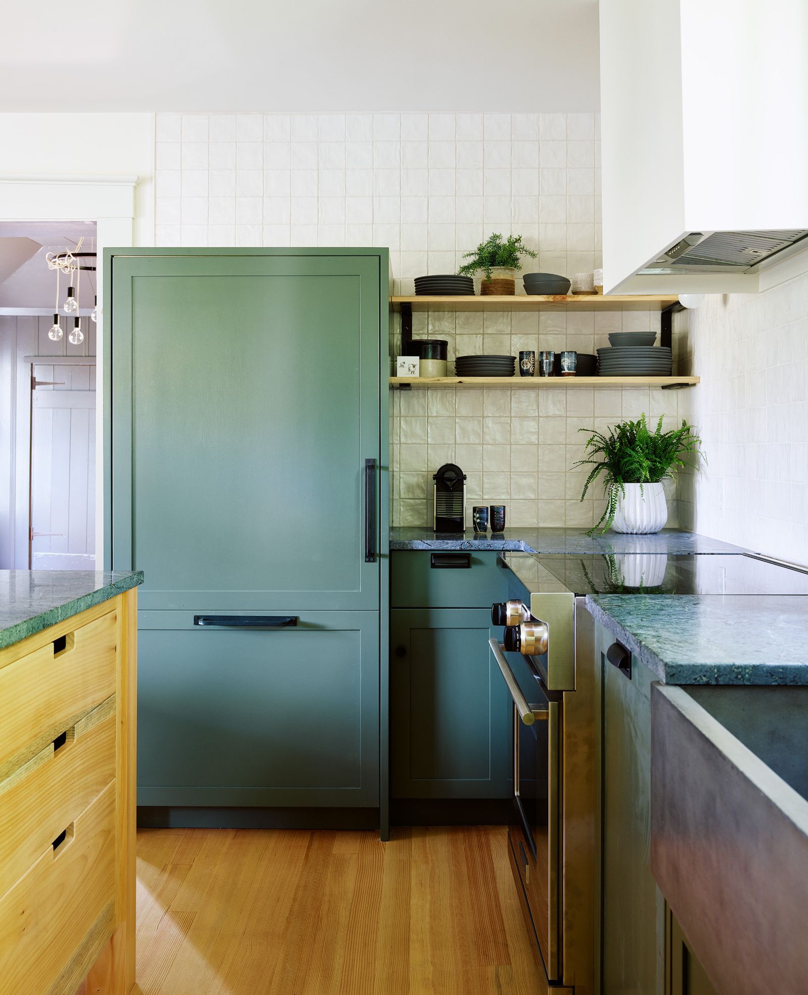
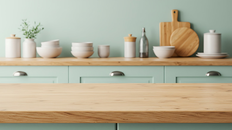
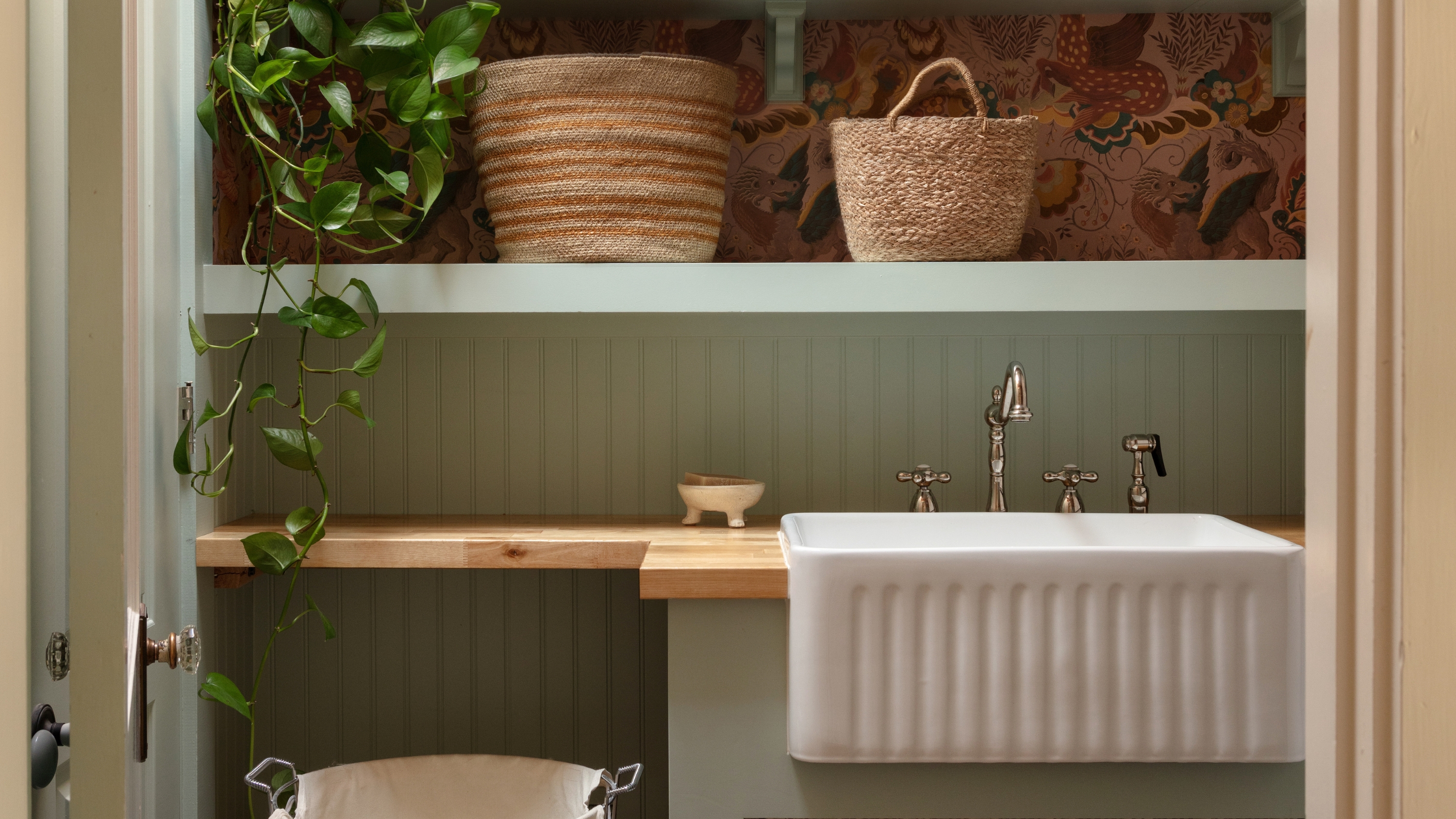
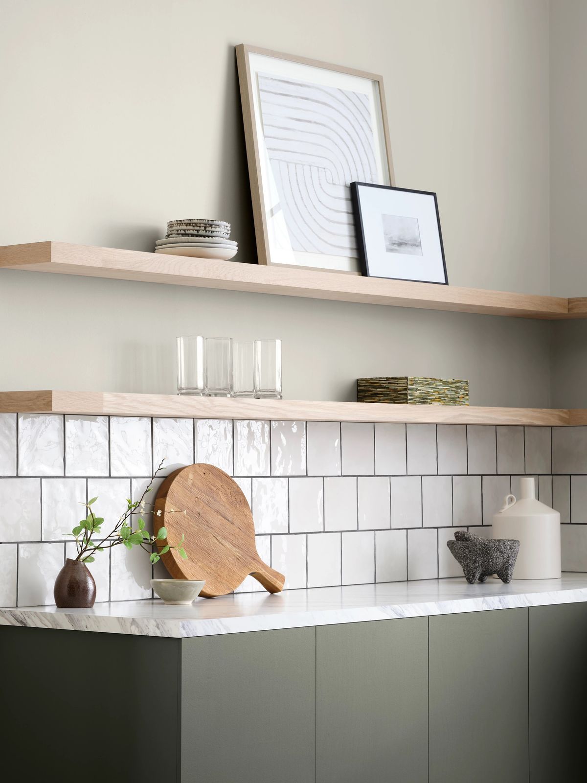
Sage green is another standout choice for cabinets with wooden countertops, having been a dominant interior design trend for its soft, muted tone. Liane Burrett explains that sage green balances warmth and freshness, complementing natural wood without competition, thereby creating a calm, organic, and modern ambiance. Its natural presence in the environment makes it a harmonious pairing with wood and other natural materials like stone flooring. Benjamin Moore's Sage Wisdom, a pale green with a grey tinge, is suggested for achieving this effect.
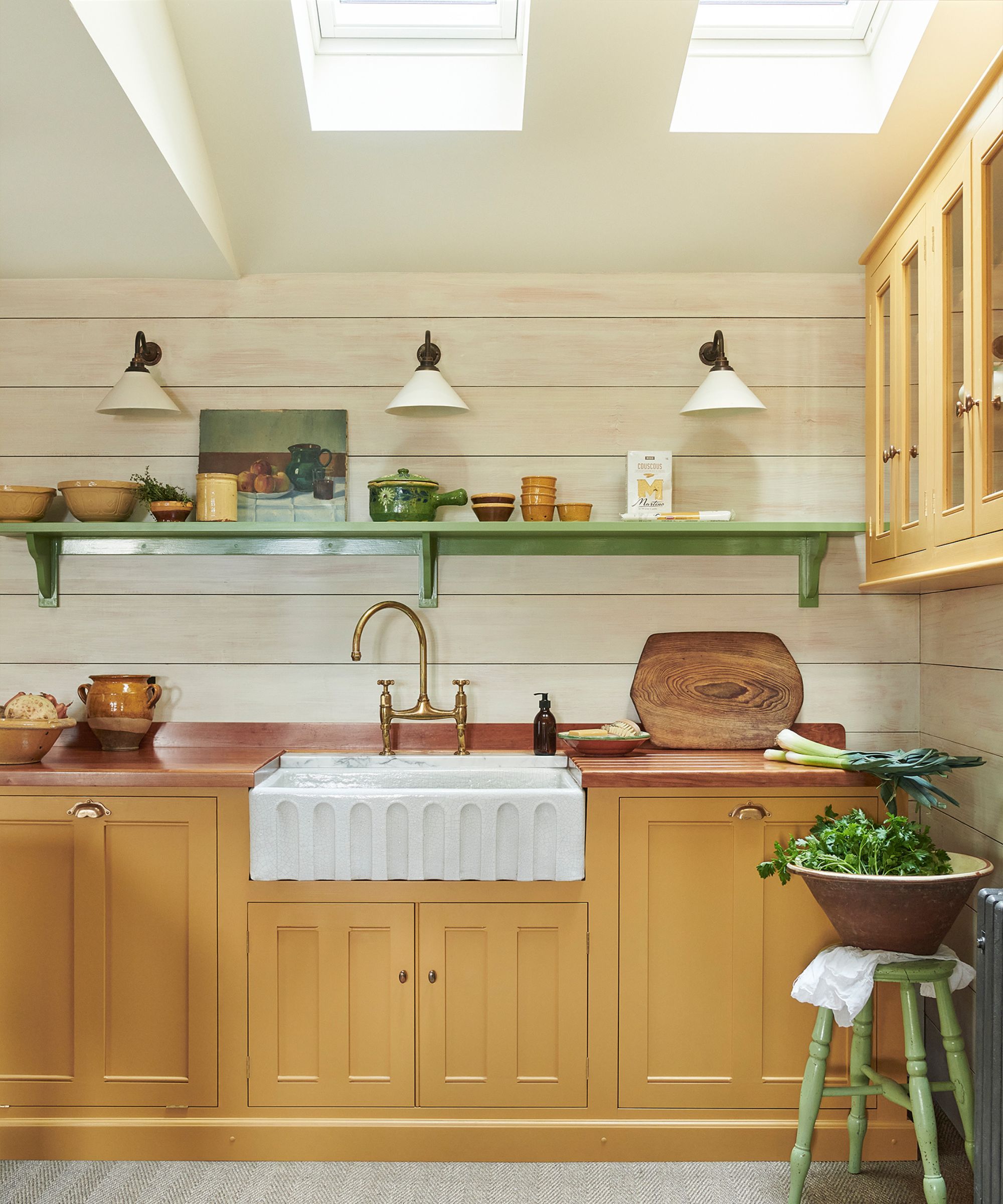
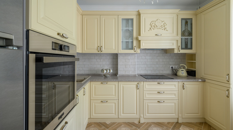
Creamy yellow, particularly butter yellow, is gaining popularity and is expected to remain a relevant trend. Helen Parker from deVOL suggests committing to a full kitchen in butter yellow to make a statement, noting its historical use by Victorians with dark wooden worktops for an authentic feel. The combination of sunny yellow and warm wood creates a balanced and inviting space that feels both classic and trendy. Lick's Yellow 07: Supreme, a warm muted butter yellow, is an example provided.
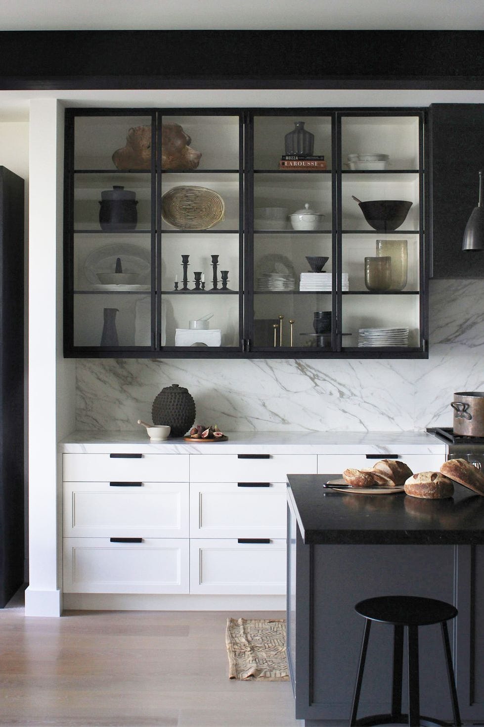
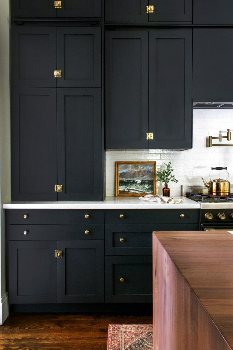
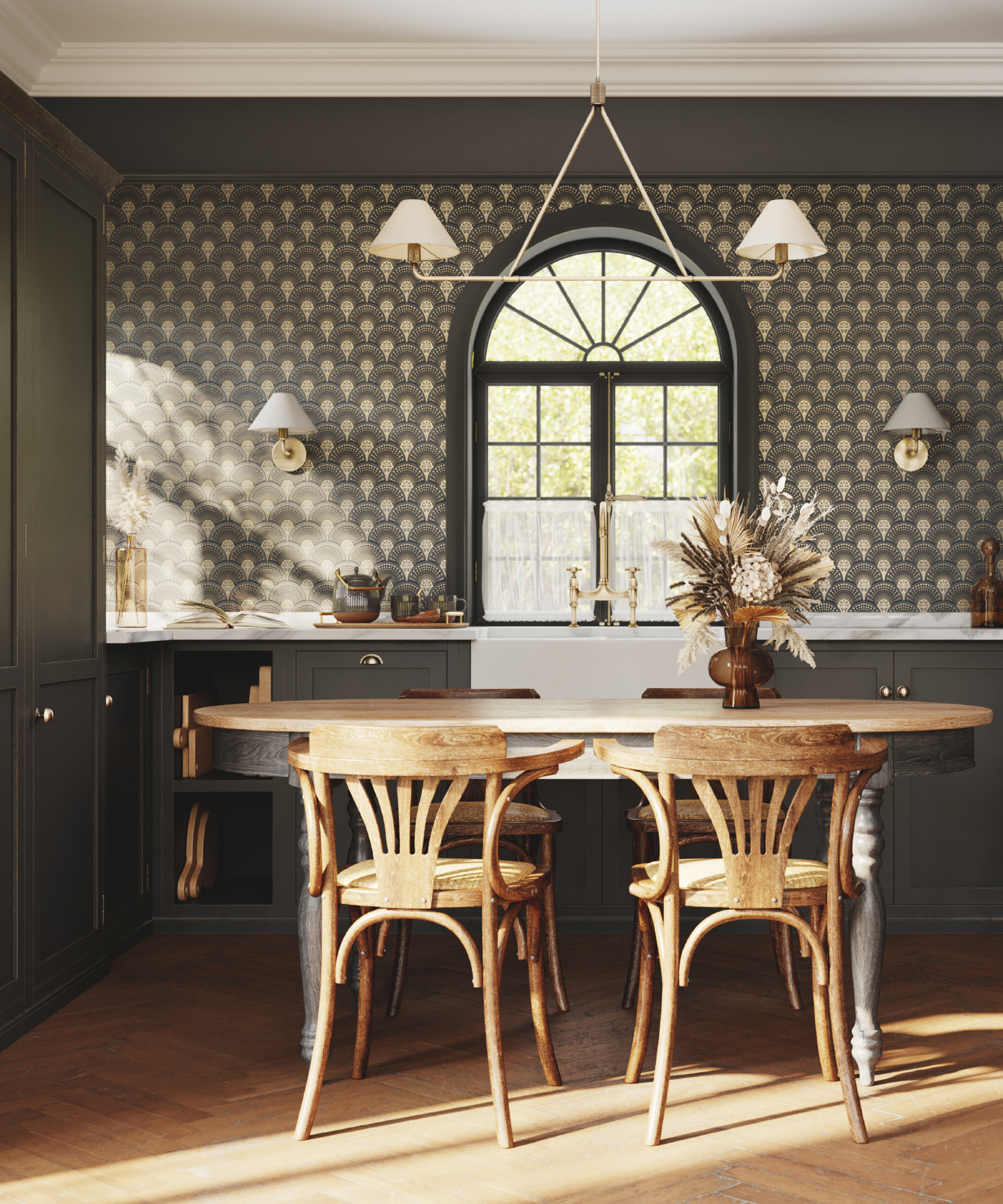
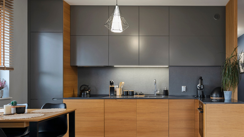
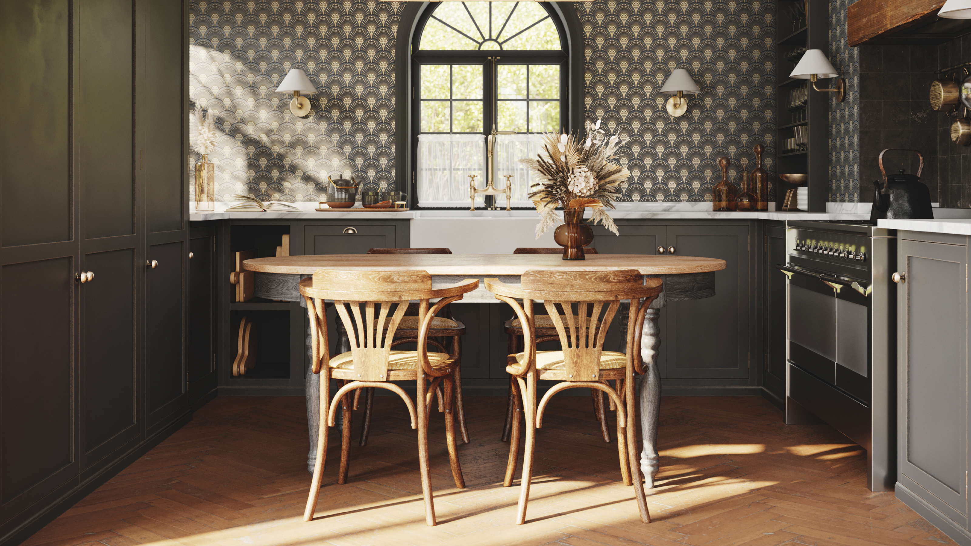
Soft black tones, such as deep charcoal or dusty black, also work effectively with wooden countertops. Liane Burrett points out that these rich, matte dark shades provide a striking contrast that allows the butcher block to shine without overwhelming the space. This pairing achieves a sleek, contemporary look while remaining inviting and organic. Little Greene's Obsidian Green, a shade where green meets black, offers a comforting depth with earthy undertones.
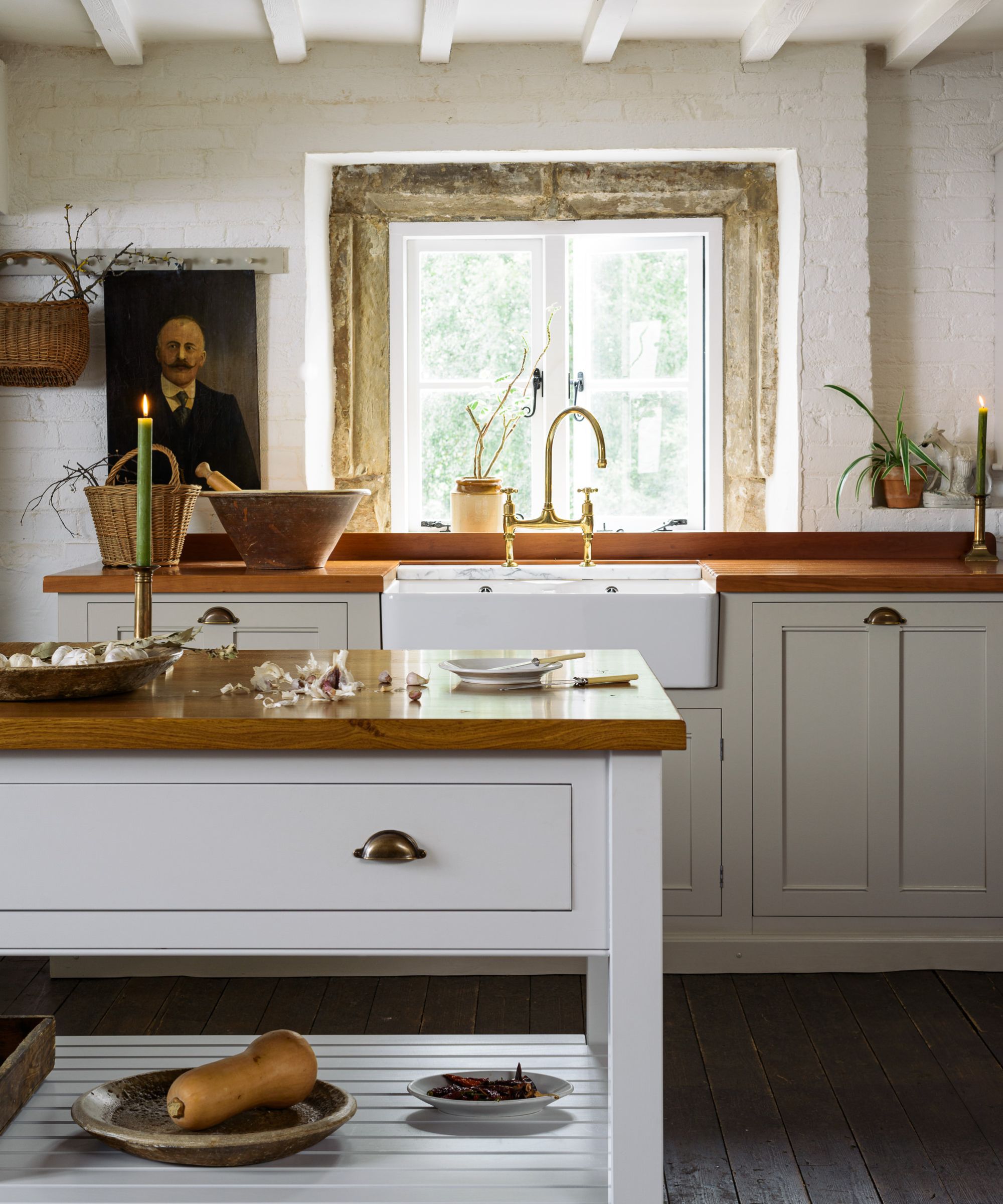
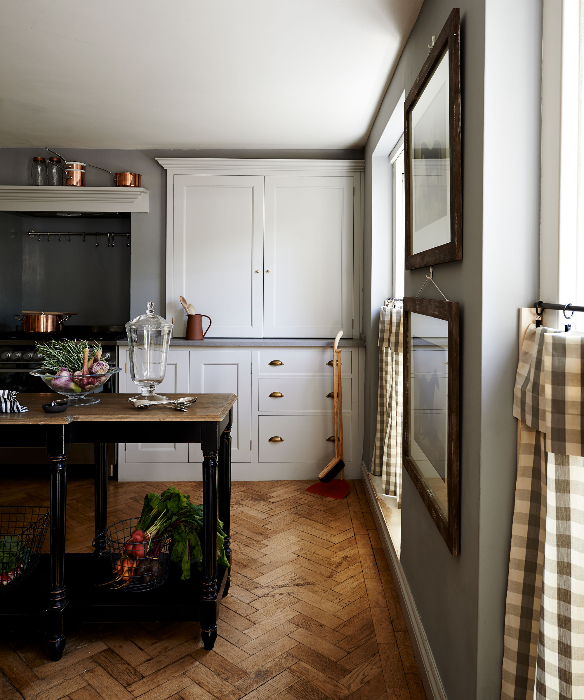
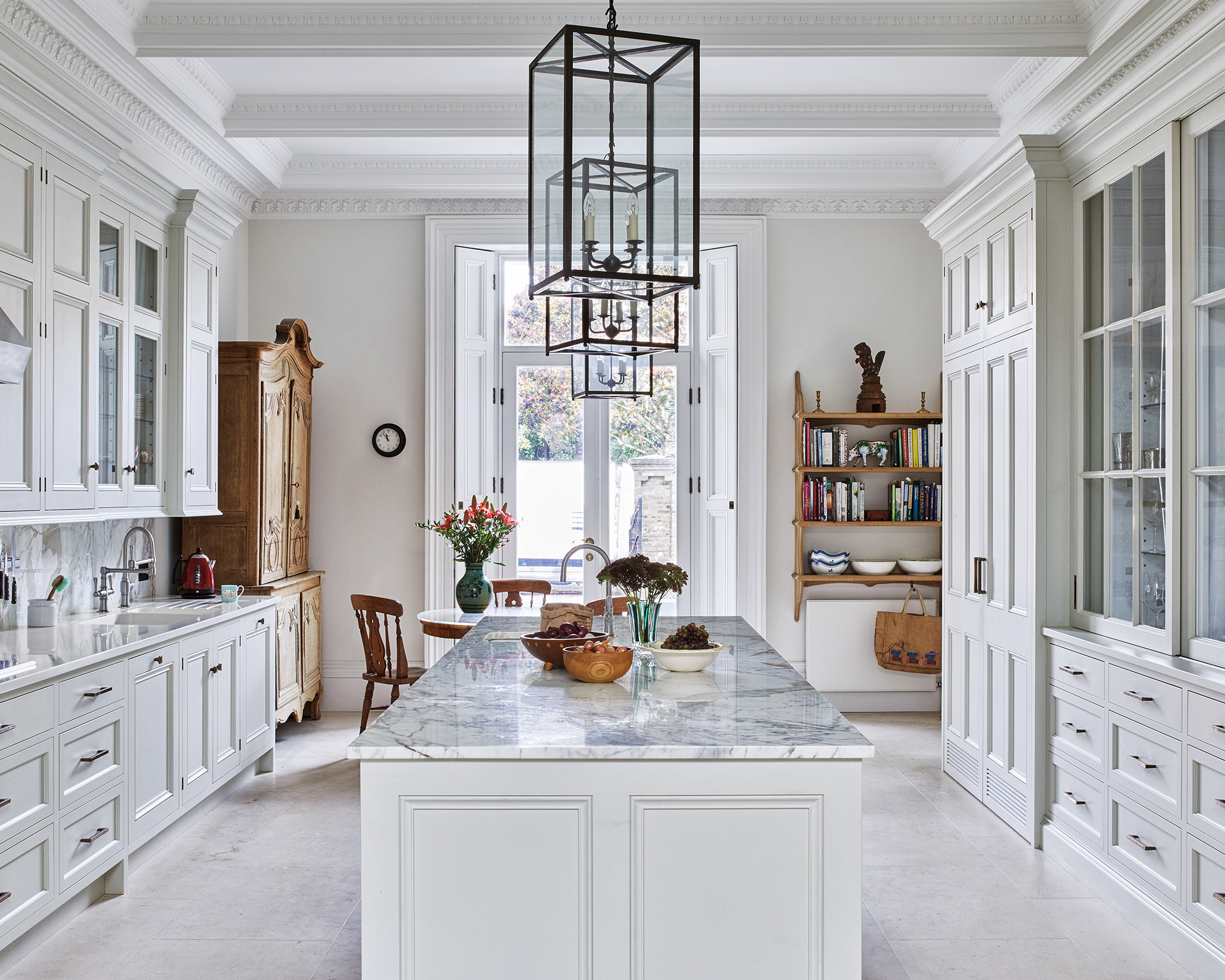
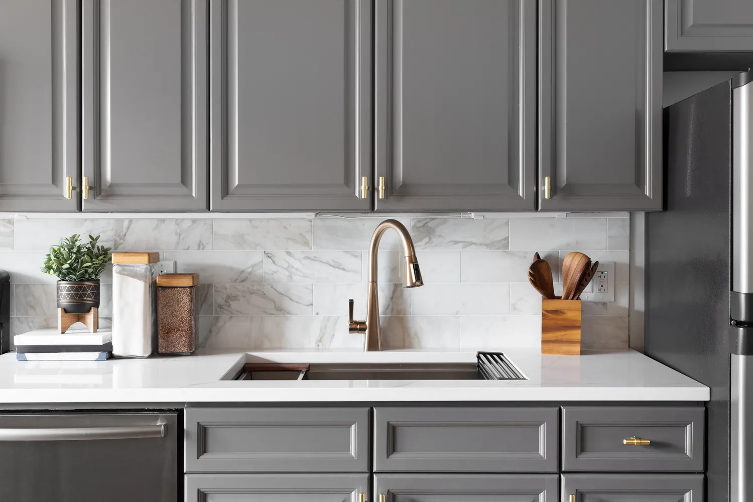
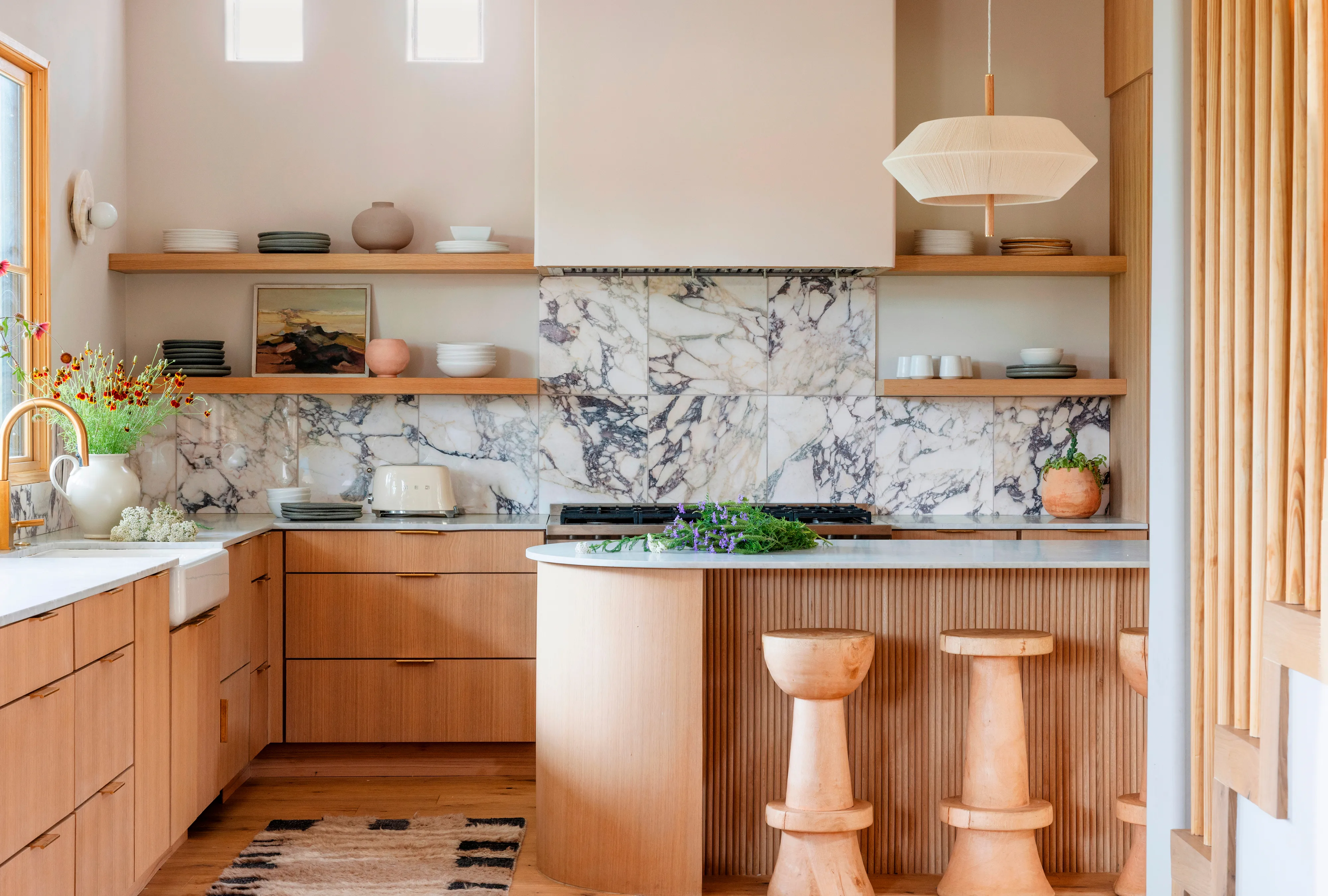
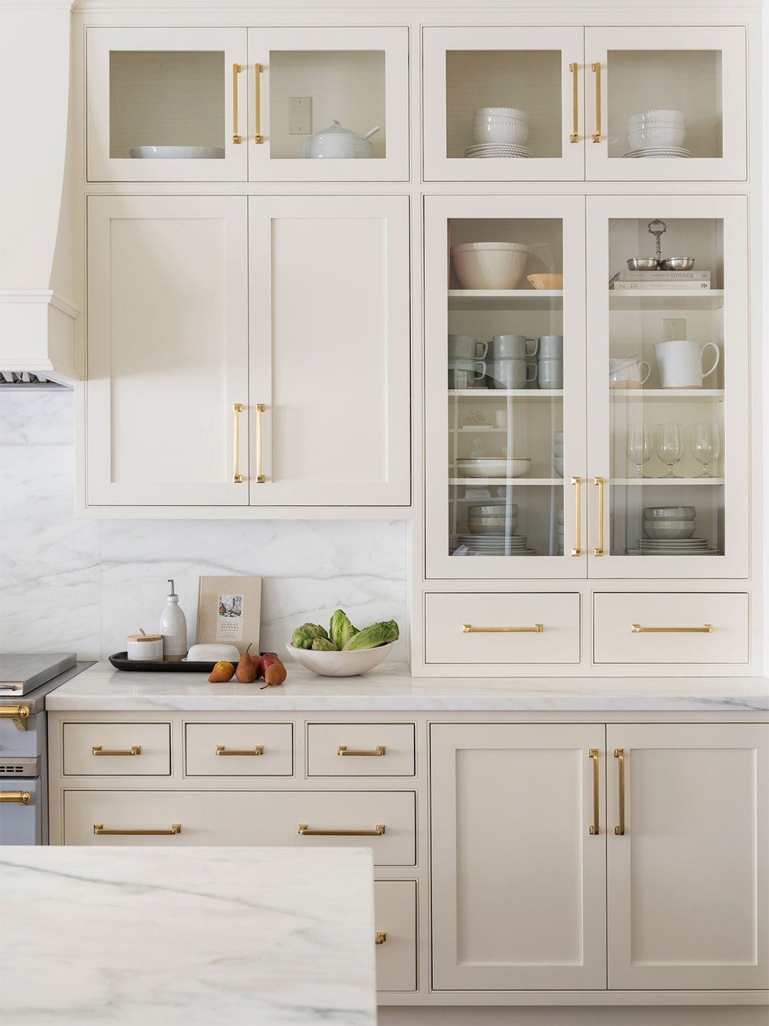
Pale neutrals, including soft greys and off-whites, are ideal for those seeking a fresher and airier aesthetic. These colors prevent the kitchen from appearing sterile, especially when combined with wood, bringing character to the space. Richard Davonport explains that this combination feels refreshing and classic, particularly in homes with beautiful period architecture. Benjamin Moore's Sweet Cream, a rich creamy color with hints of soft yellow, is recommended for this approach.
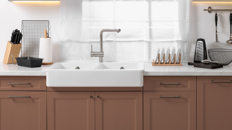
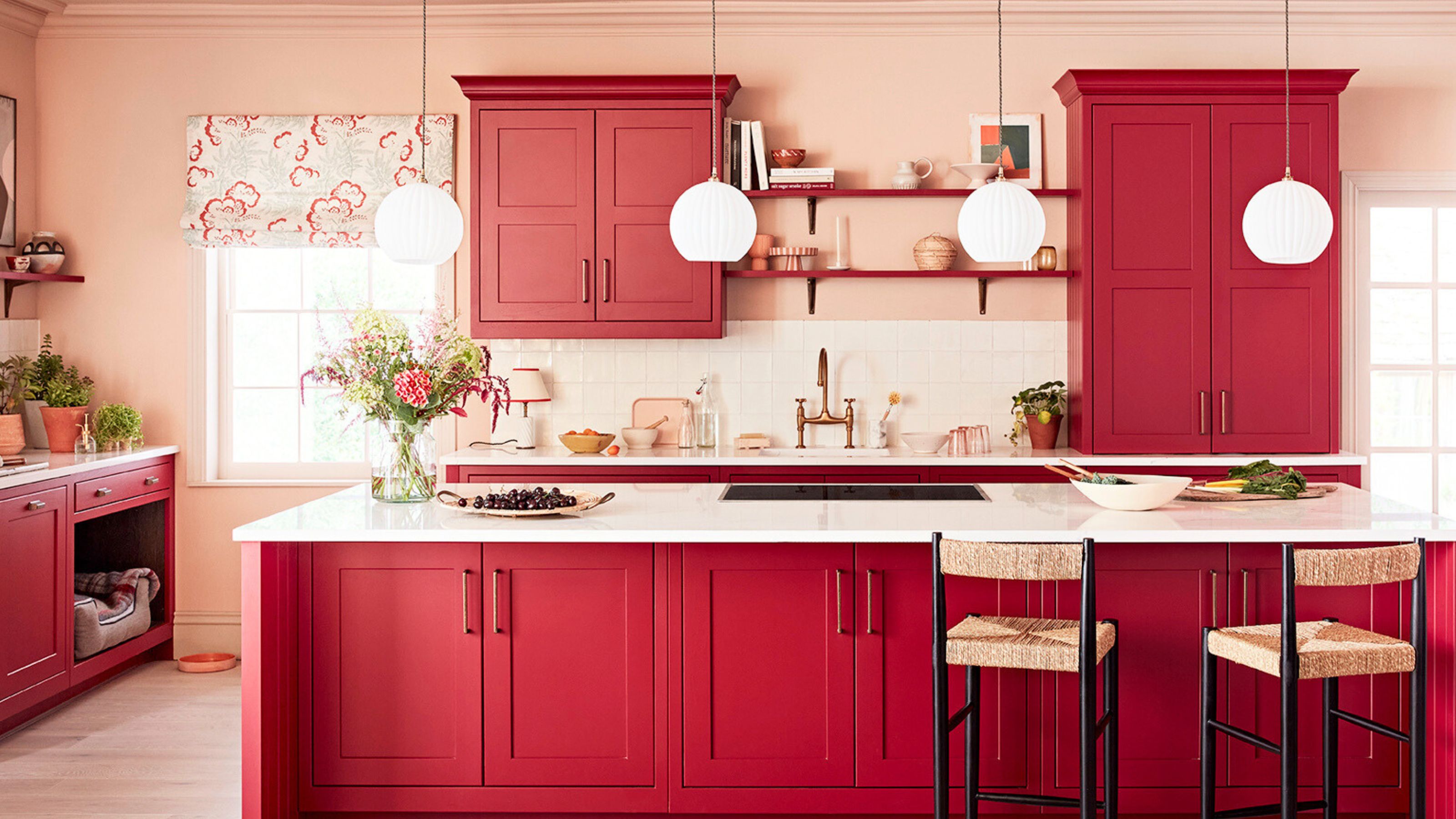
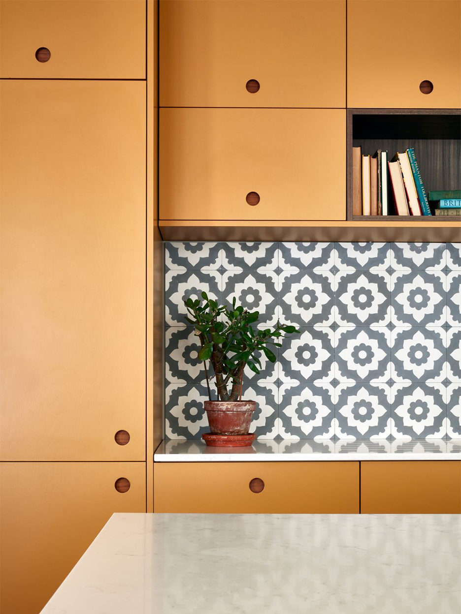
Conversely, designers advise avoiding cabinet colors that closely match the tone of the wood, such as orange-based shades or yellowy creams. These can clash with the natural variations of the wood, making the kitchen feel heavy or dated. Similarly, red-yellow toned cabinetry should be avoided as it can create visual clutter and conflict with the wood's warmth. Instead, understanding the undertones of both the wood and the chosen paint color is crucial for creating a cohesive and appealing kitchen design.
#KitchenDesign #CabinetColors #WoodenCountertops #InteriorDesign #ColorPairings #KitchenInspiration #HomeDecor #DesignTips #NaturalMaterials #KitchenDesign #CabinetColors #WoodenCountertops #InteriorDesign #ColorPairings #KitchenInspiration #HomeDecor #DesignTips #NaturalMaterials
0 comment in total
 No comments yet
You may also like
These are the 5 best colors to pair with a wooden kitchen countertop, according to interior designers
5 fail-safe kitchen cabinet color combinations that always work

18 Gorgeous Kitchen Cabinet Paint Colors, According To Kitchen Designers

7 Outdated Cabinet Colors Designers Are Leaving Behind In 2026
The best colors to pair with oak kitchen cabinets, according to interior designers
Designers weigh in on the best wooden kitchen cabinets for every style of kitchen
Coloured wood cabinets - 5 Jun 2025 - Livingetc Magazine

5 outdated kitchen cabinet color trends to avoid if you don't want your kitchen to look unfashionable, say designers
What kitchen countertop should you pair with wood cabinets? 3 combinations designers always return to
We Asked Designers for Their Favorite Kitchen Cabinet Paint Colors—and Not One Picked White

8 colors you should never paint kitchen cabinets according to the experts

7 outdated kitchen cabinet colors designers say you should wave goodbye to, plus what to try instead

The Best Wall Colors to Make Your Kitchen’s Wood Cabinets Pop, According to Designers

Our 87 Favorite Kitchen Cabinet Colors, All Gathered in One Place
10 Trendy Kitchen Cabinet Colors You Should Try In 2025
5 Designers Weigh In on the Best Brands of Paint for Kitchen Cabinets

14 Kitchen Cabinet Colors You Can Easily Mix and Match

Kitchen cabinets and countertops: 13 combos that look good together

HGTV Stars' Go-To Kitchen Cabinet Colors To Try In Your Home

Designers Share the Best Hardware Color for White Kitchen Cabinets