The Delightfully Esoteric World of British Paint Companies
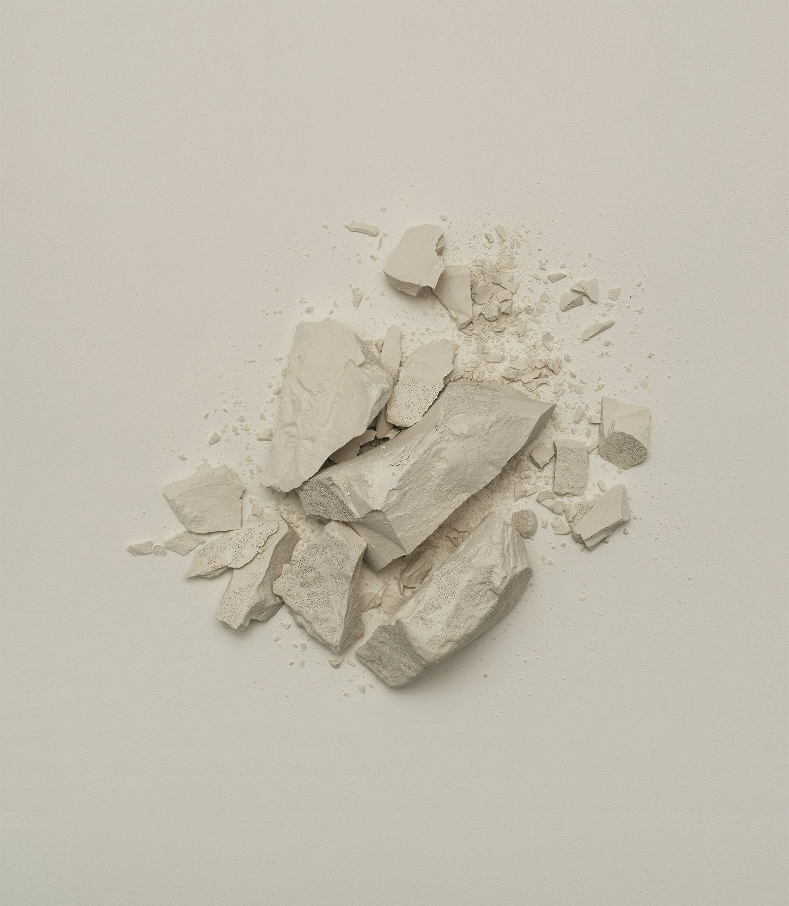
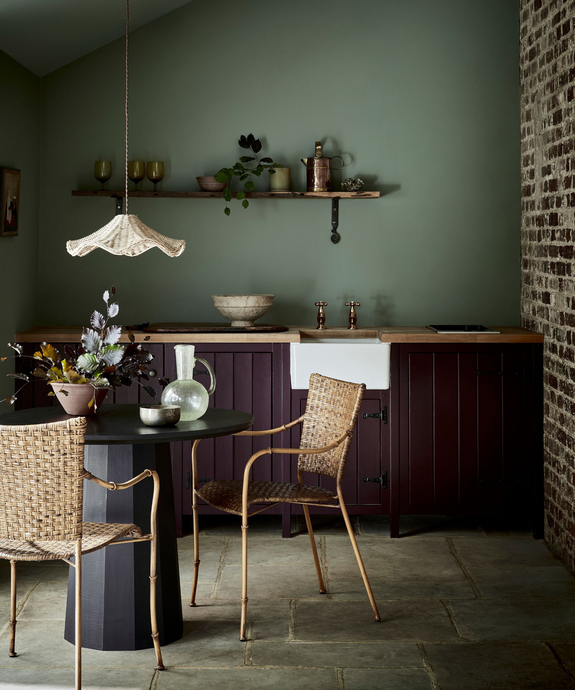
The article delves into the evolving world of interior paint colors, emphasizing how choices, particularly in a climate like England's, are influenced by a blend of art and science. It highlights that the global search for desirable shades is expanding beyond traditional preferences. The piece introduces Tamara Lancaster, design director at Ben Pentreath Ltd., who shares insights into the preferences of renowned architect Ben Pentreath. Pentreath's unconventional favorite color, described as “freshly laid cowpat,” showcases a move towards earthy, natural tones. This specific shade, a sludgy, greeny brown, evokes imagery of the English countryside, suggesting a desire for colors that connect inhabitants with nature and elicit a sense of comfort and familiarity associated with outdoor experiences like soggy walks and the scent of rain.
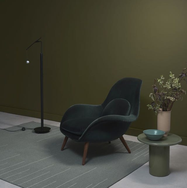
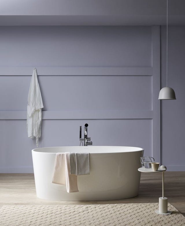
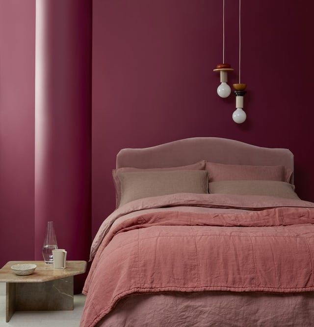
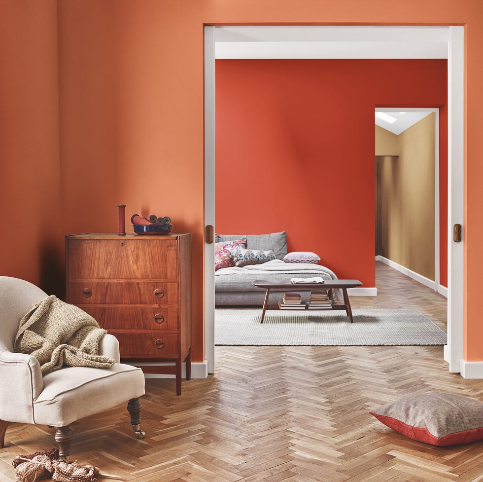
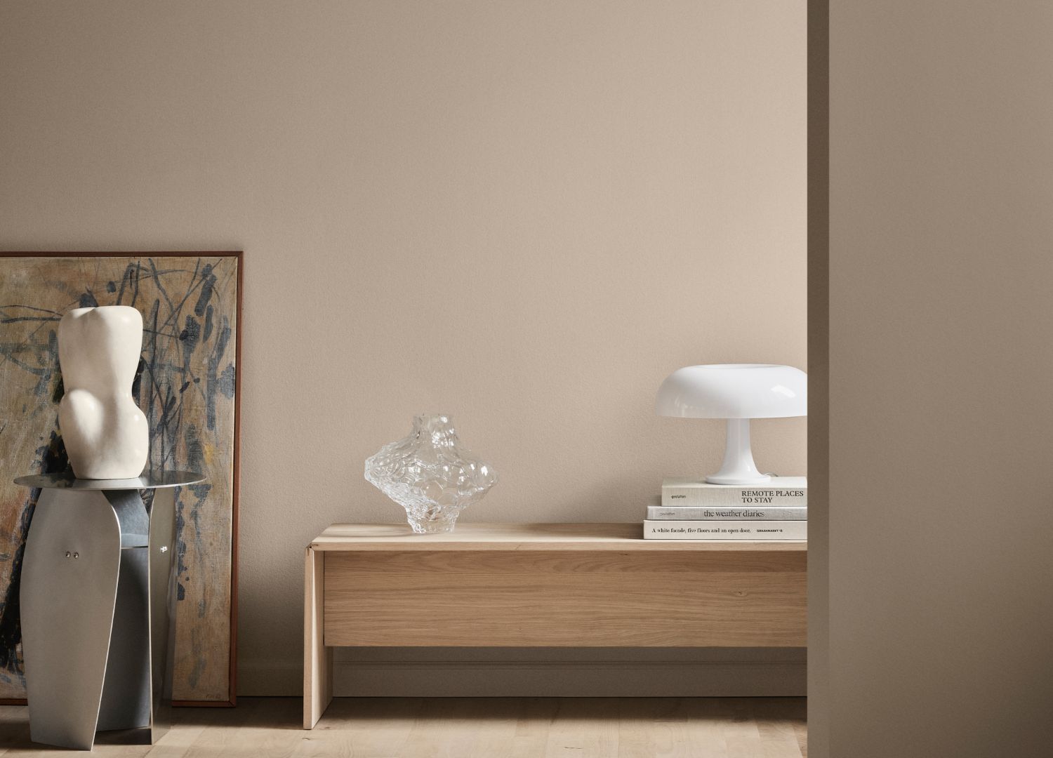
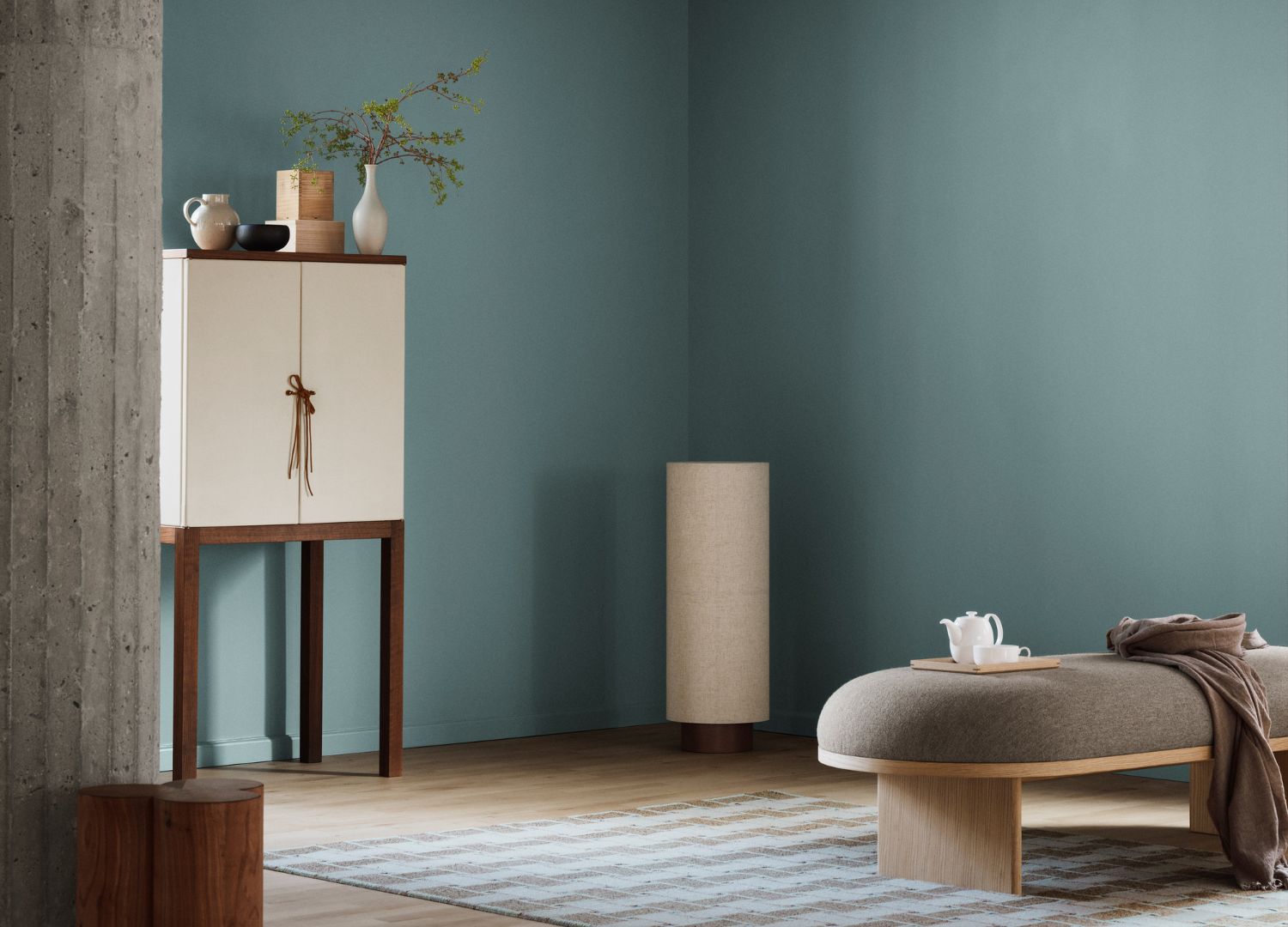
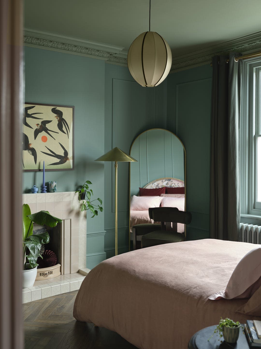
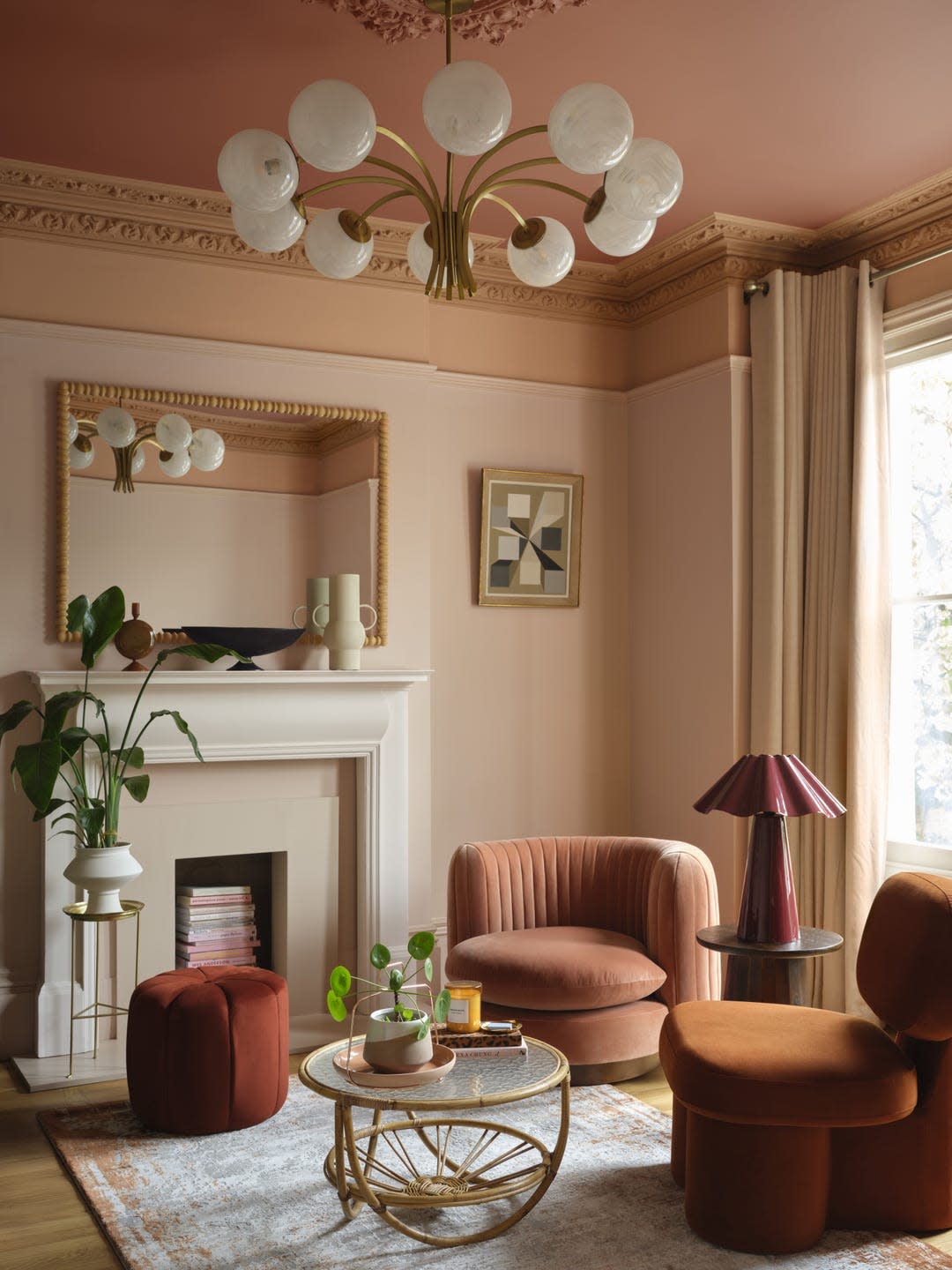
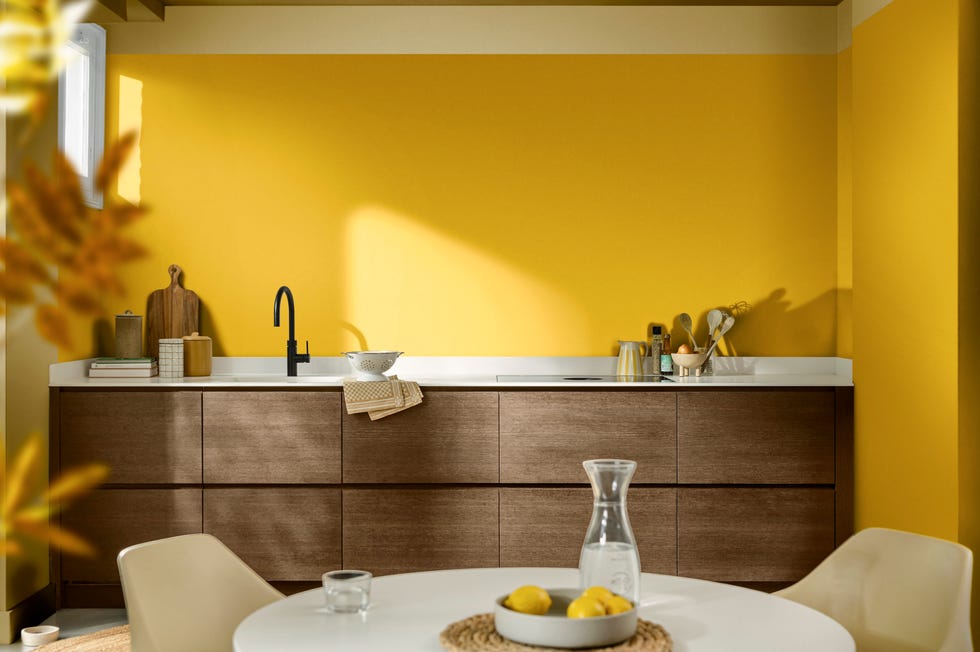
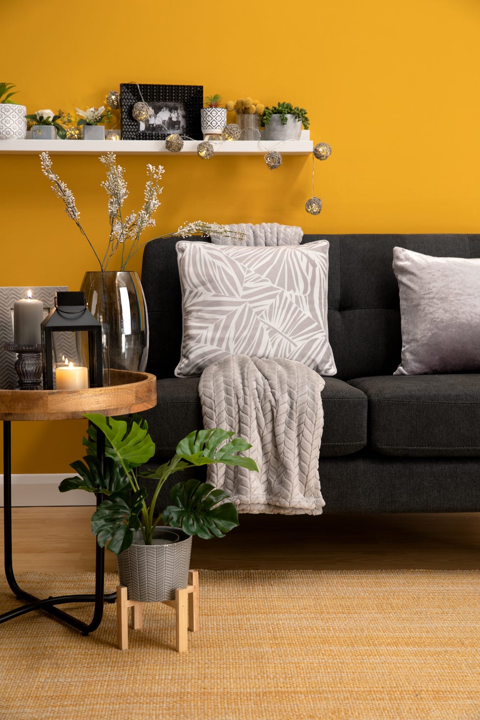
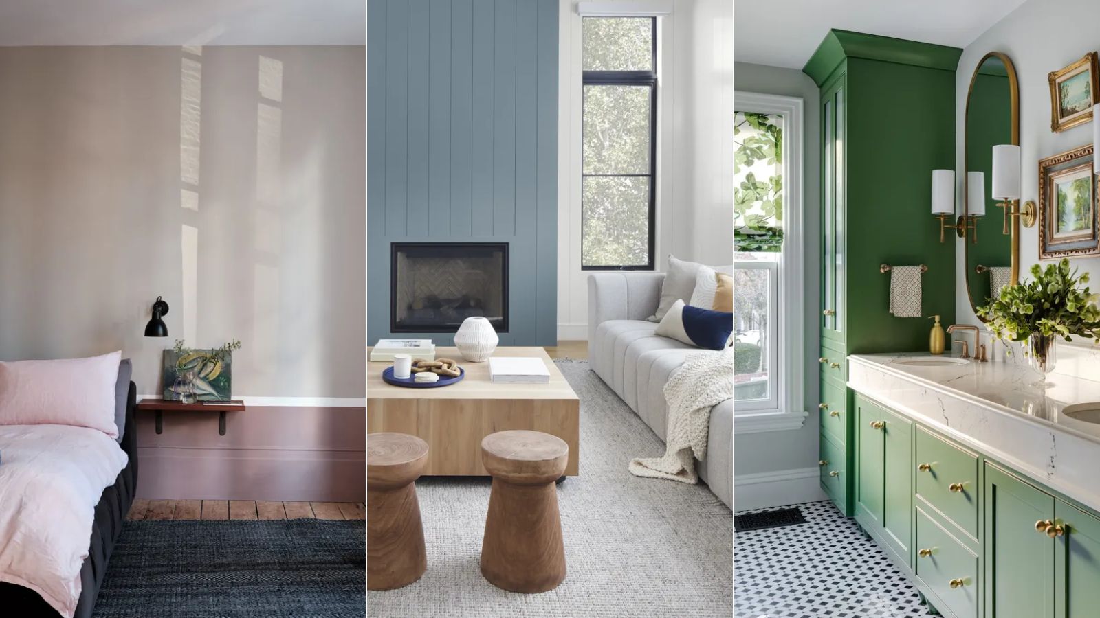
In the realm of interior design, the selection of paint colors transcends mere aesthetics; it deeply impacts the ambiance and emotional resonance of a space. The article points out that while the immediate focus is on individual preferences like Pentreath’s, these choices often reflect broader trends and cultural shifts in how people perceive their living environments. The emphasis on “warmth” in the title and the use of a shade like Edward Bulmer’s Red Ochre in an accompanying illustration further underscore a leaning towards colors that promote coziness and a sense of enclosure, especially relevant in regions characterized by gray weather.
Historically, paint colors have been cyclical, influenced by everything from economic conditions to prevailing artistic movements. The current trend, as implied, seems to favor authenticity and a connection to natural elements, moving away from more artificial or stark palettes. This shift suggests a growing appreciation for the subtle complexities of natural hues, which can provide a calming and grounding effect. The act of choosing paint is presented not just as a decorative decision but as an intentional act of shaping one’s environment to reflect personal values and evoke specific sensory experiences.
The article also touches upon the professional aspect of color selection, with designers like Lancaster interpreting and translating client preferences into tangible schemes. This process involves not only understanding aesthetic desires but also considering how colors interact with light, space, and existing furnishings to create a harmonious whole. The global search for new and impactful shades indicates that this nuanced approach to color is not confined to one region but is a universal endeavor among those seeking to define and enrich their living spaces.
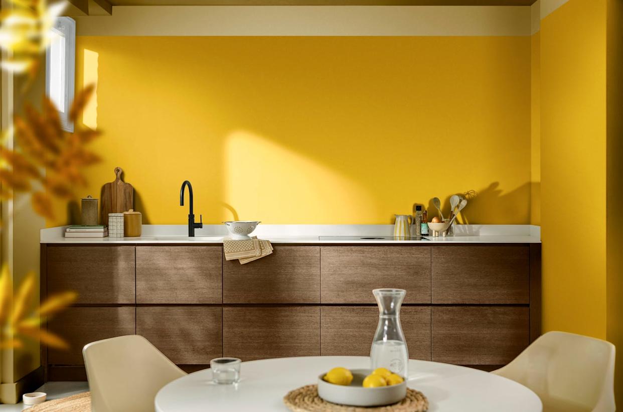
Ultimately, the discussion on paint colors extends beyond superficial trends to a deeper exploration of how environments are crafted to foster well-being and personal expression. The selections, whether a muted, earthy brown or a vibrant, warm ochre, are deliberate choices aimed at transforming a house into a home, reflecting the owner's personality and providing a sanctuary against the external world, particularly in climates where indoor warmth and comfort are highly valued. The article thus highlights the intricate relationship between color, comfort, and the human experience within a designed space.
#InteriorDesign #PaintColors #HomeDecor #ArchitecturalDesign #EnglishCountryside #NaturalHues #ColorPsychology #BenPentreath #EdwardBulmer #InteriorDesign #PaintColors #HomeDecor #ArchitecturalDesign #EnglishCountryside #NaturalHues #ColorPsychology #BenPentreath #EdwardBulmer
0 comment in total
 No comments yet
You may also like
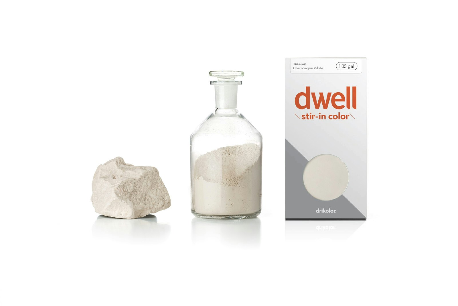
Learn About a Color Company That Creates Modern Interior Paint

The 15 Best Paint Brands

15 Best Oil Paint Brands


BBH's Stylish Ad for Dulux Paint Imagines a World Where Color Is Prohibited
Discover the beautiful new collection of shades created by ELLE Decoration with Crown Paints

13 of the Best Paint Brands for Luxurious-Looking Interiors, as Rated by Professional Painters and Serial Redecorators

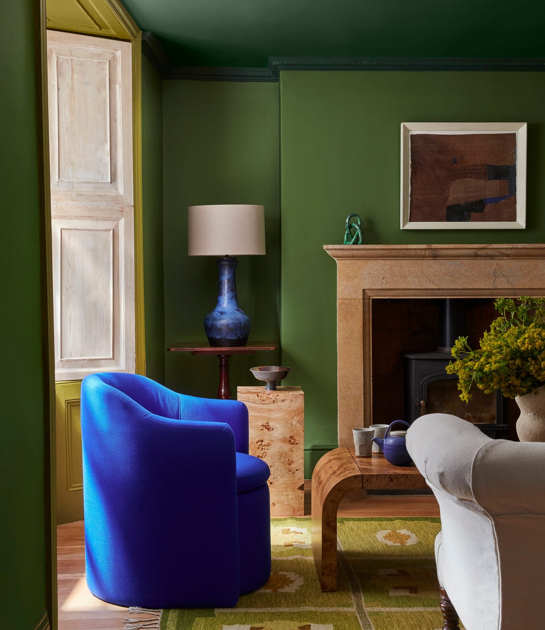
Porter’s Paints Capsule Collection works its magic at Victorian country home
This British Paint Trend Is Set to Take Over 2026

The colourful story behind the Danish paint giant’s state-of-the-art coatings
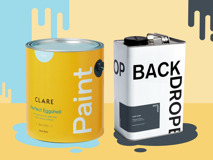
Backdrop vs. Clare — how the two home paint startups compare
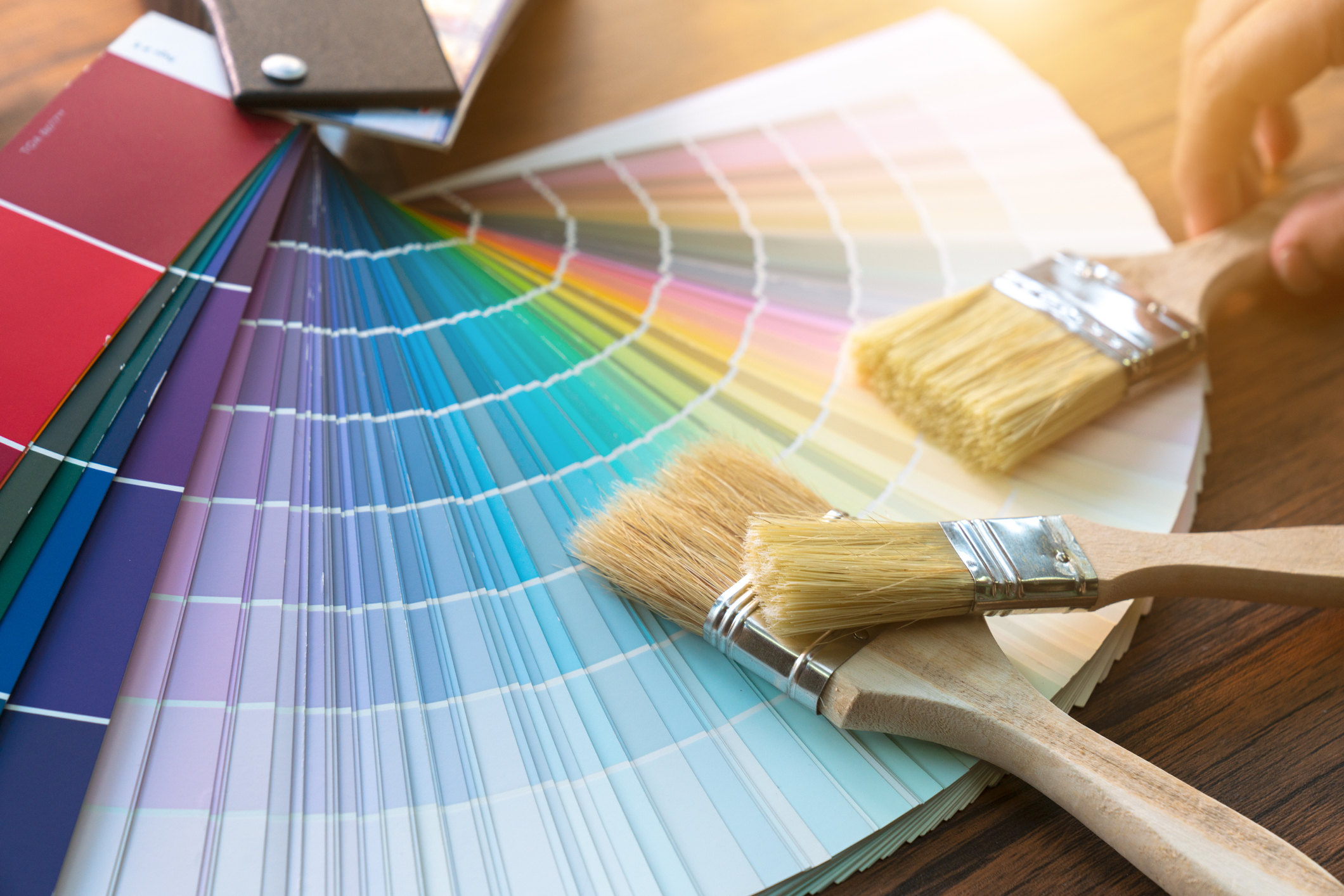
Britain's best interior designers on the paint colours you just can't go wrong with
Where are the best places to buy paint? 6 go-to paint brands used and loved by interior designers

The Best Luxury Paint Brands
Where to buy paint online
5 Best Places to Buy Paint Online for Your Next DIY Project

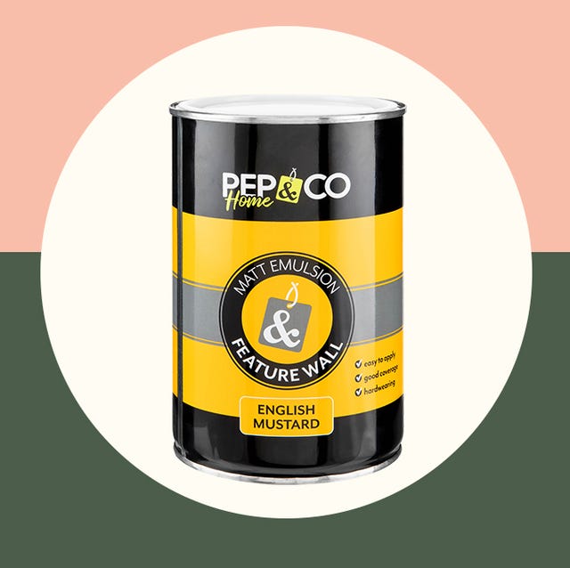
Poundland's PEP&CO Home launches new range of interior paint for just £3

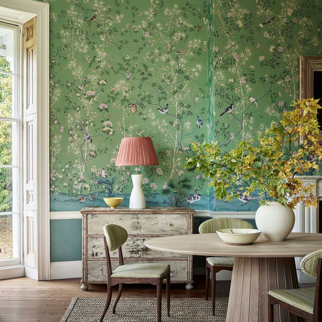
This British Wallpaper Brand Just Changed the Game for Lovers of Hand-Painted Chinoiserie

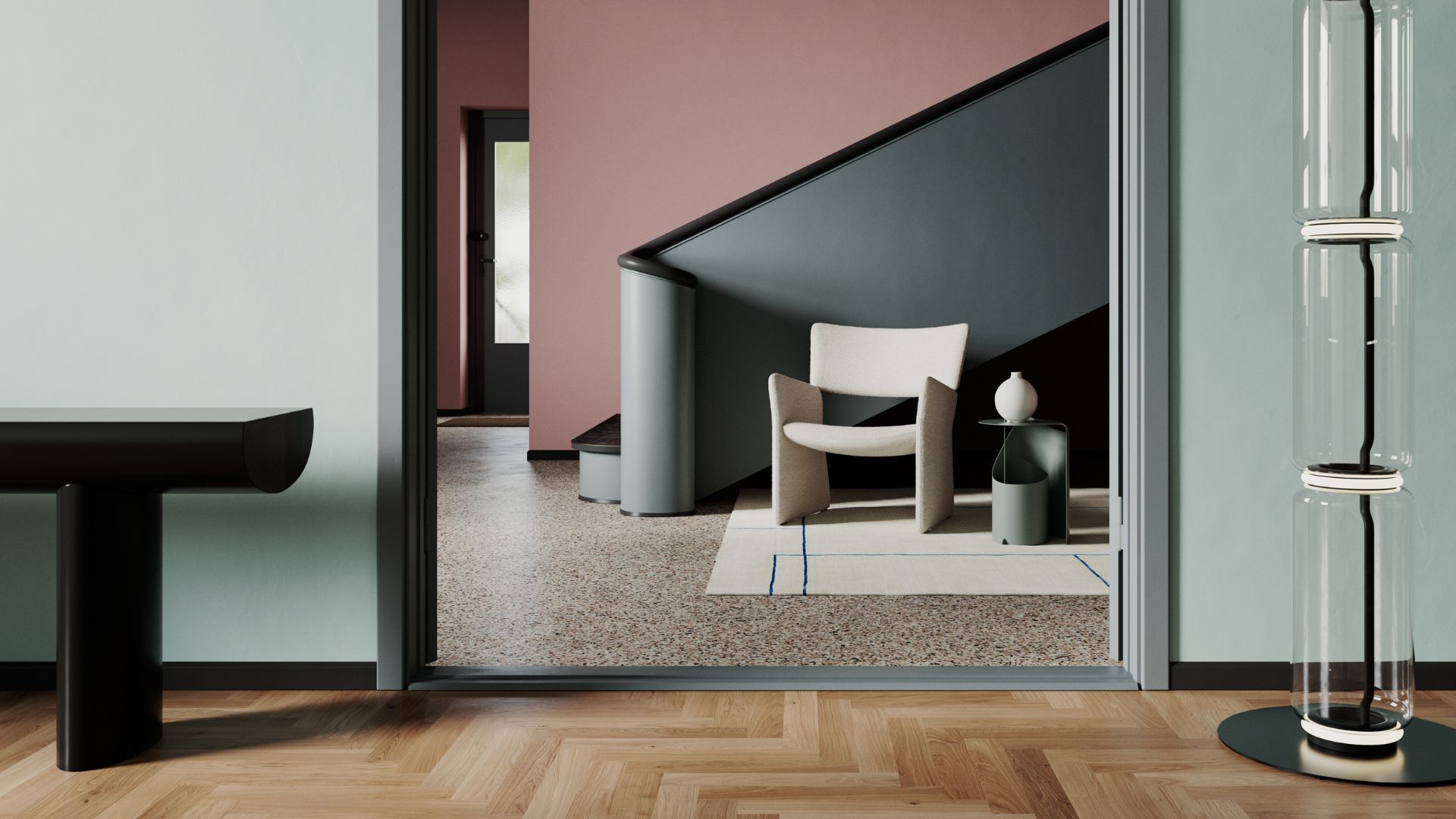
Notes: how to transform the paint industry with a brilliant idea

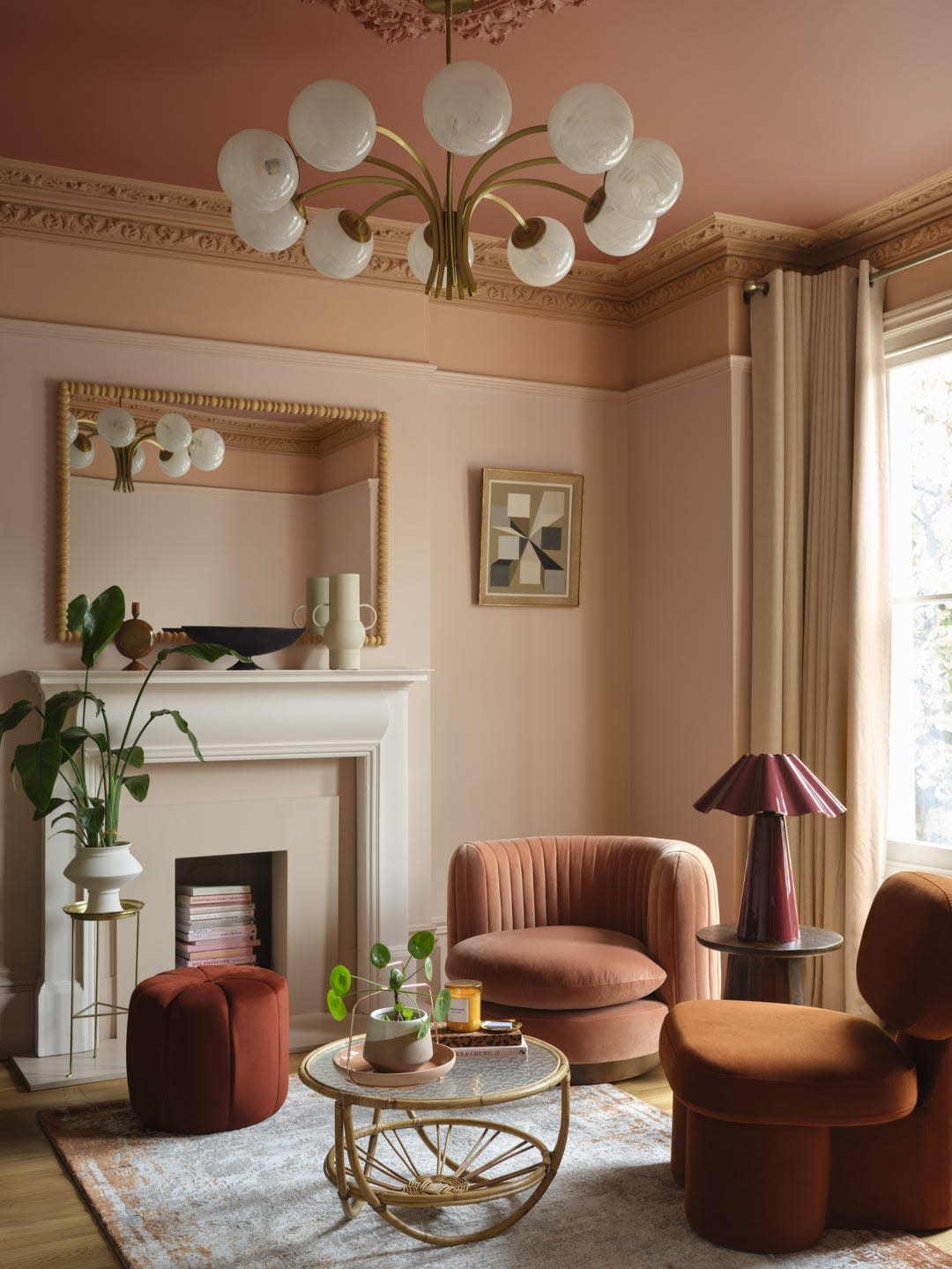
This British Paint Trend Is Set to Take Over 2026

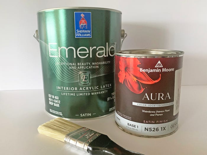
Benjamin Moore vs. Sherwin-Williams: Painting pros explain the differences and why both make great paint