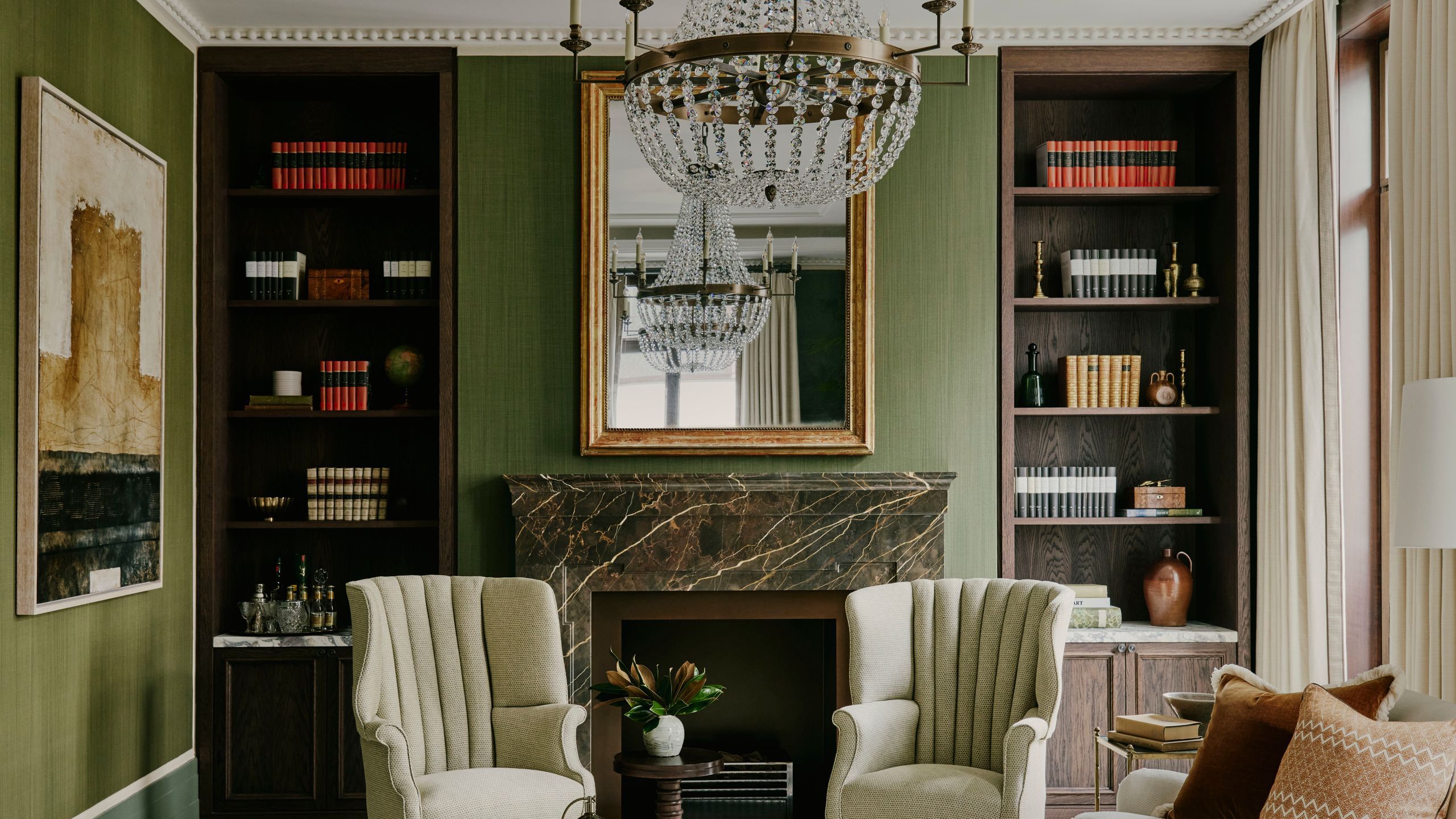
1/7
Styling Shelves: Your Expert (Five-Point) Guide
Styling shelves is a nuanced art that transcends simple organization, transforming ordinary storage into visually captivating displays that reflect personal style and enhance a space's ambiance. This guide, featuring insights from design specialists like Kit Kemp and Ottalie Stride, outlines five key principles to master the impressive art of shelf styling.
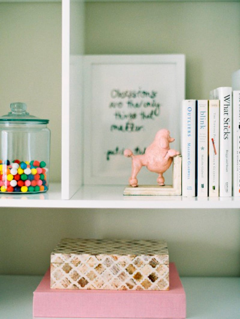
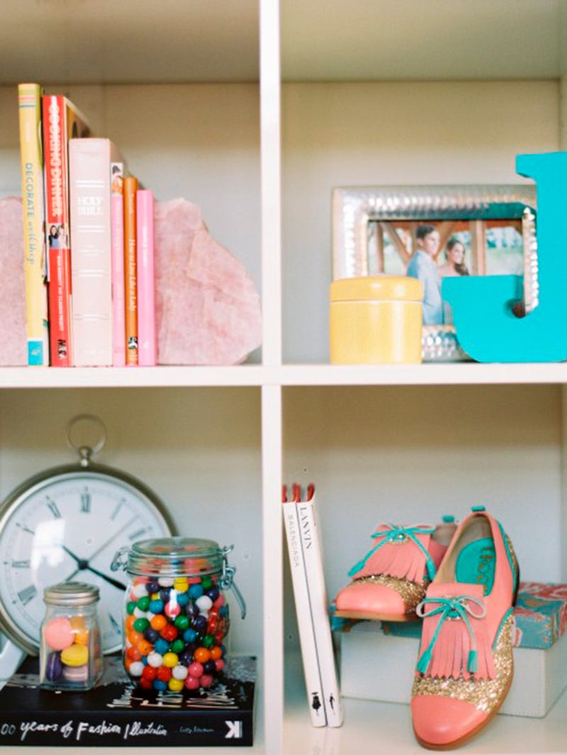
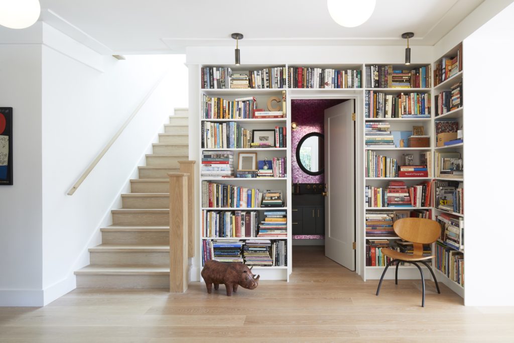
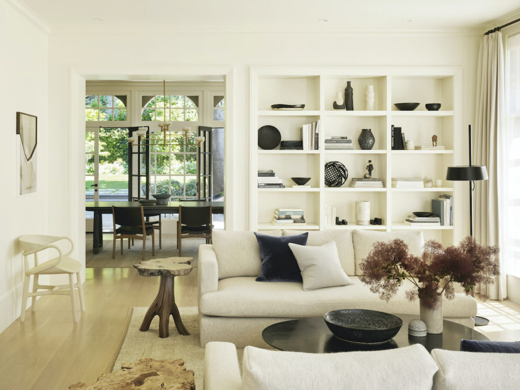
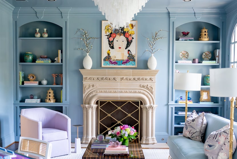
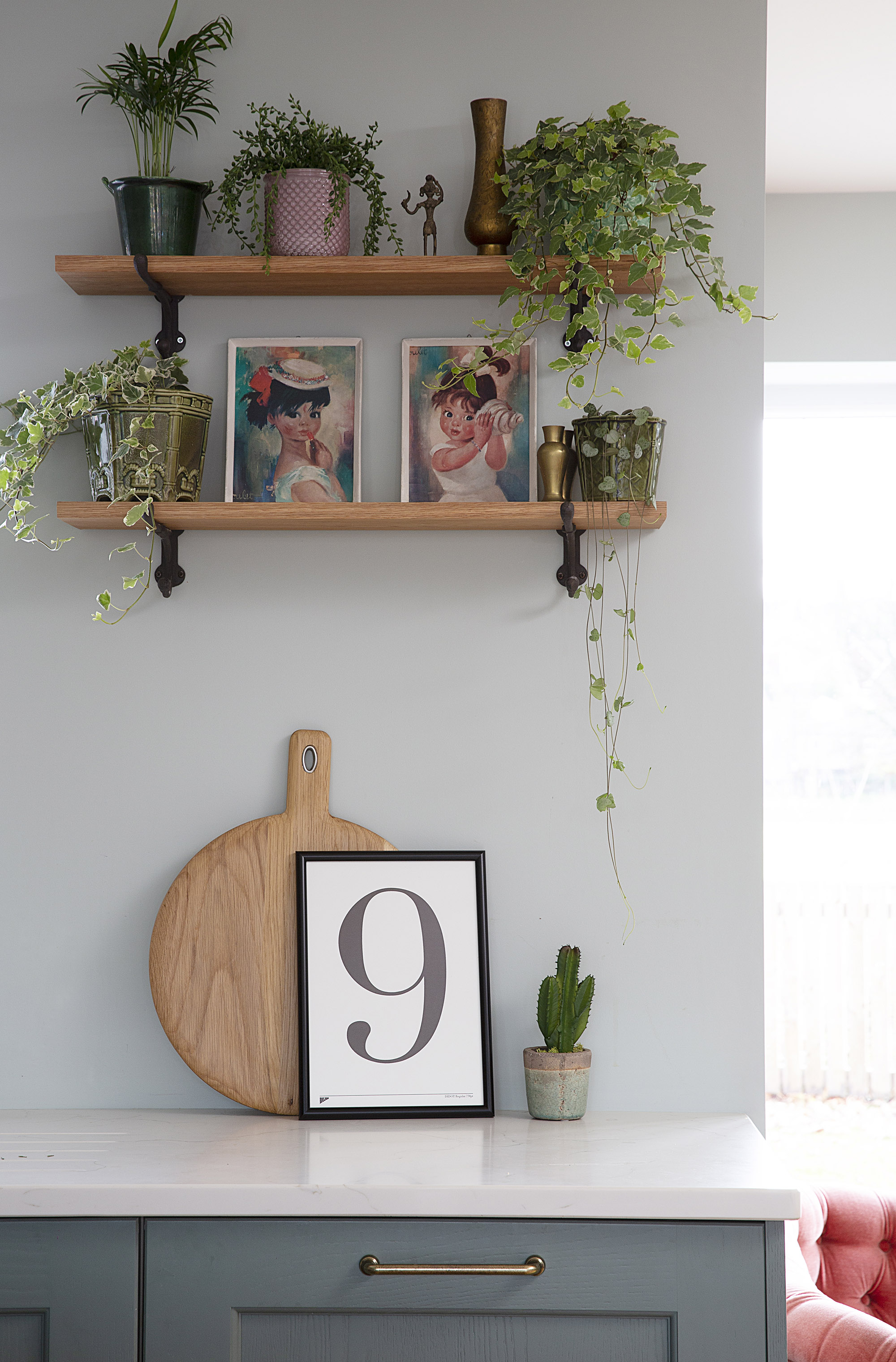
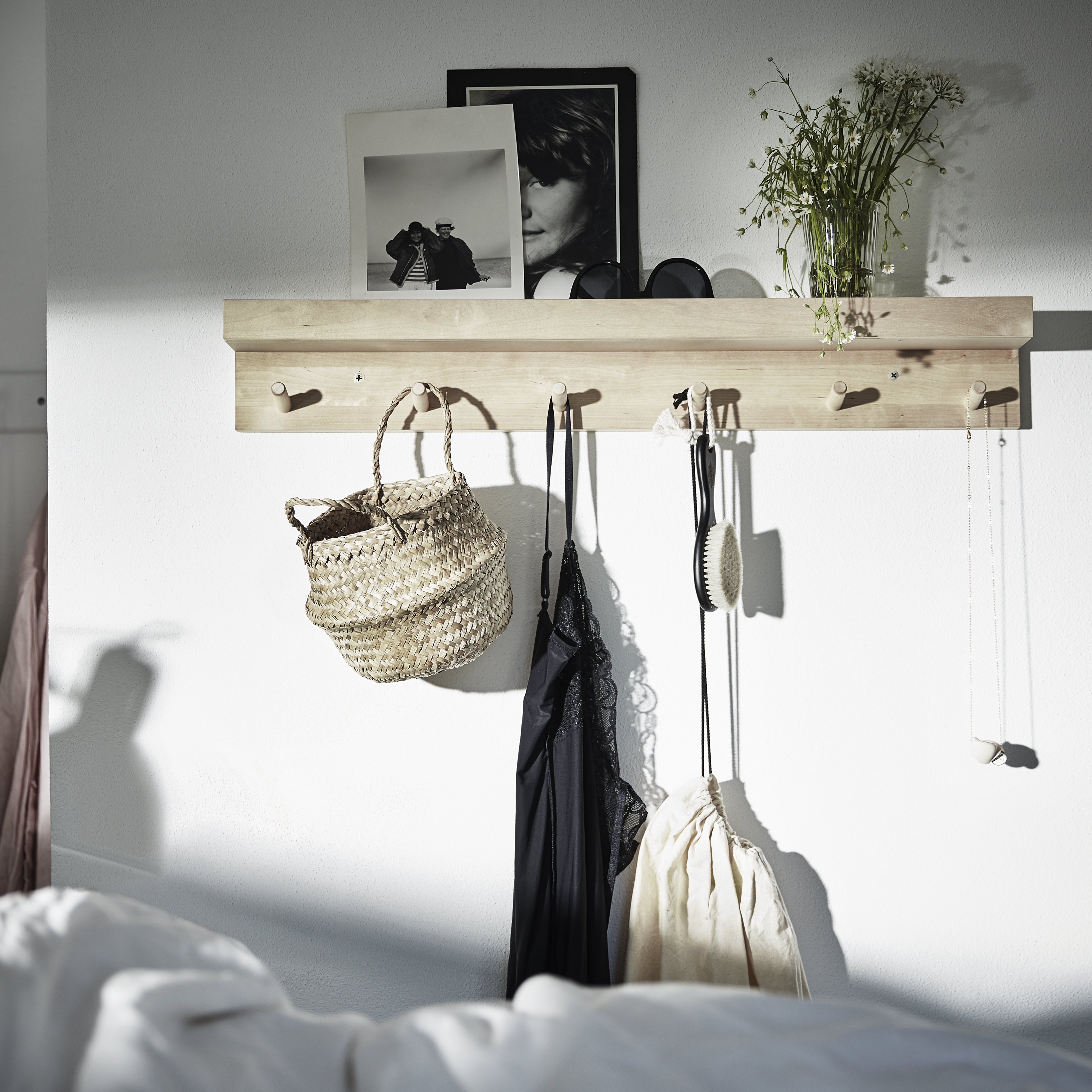
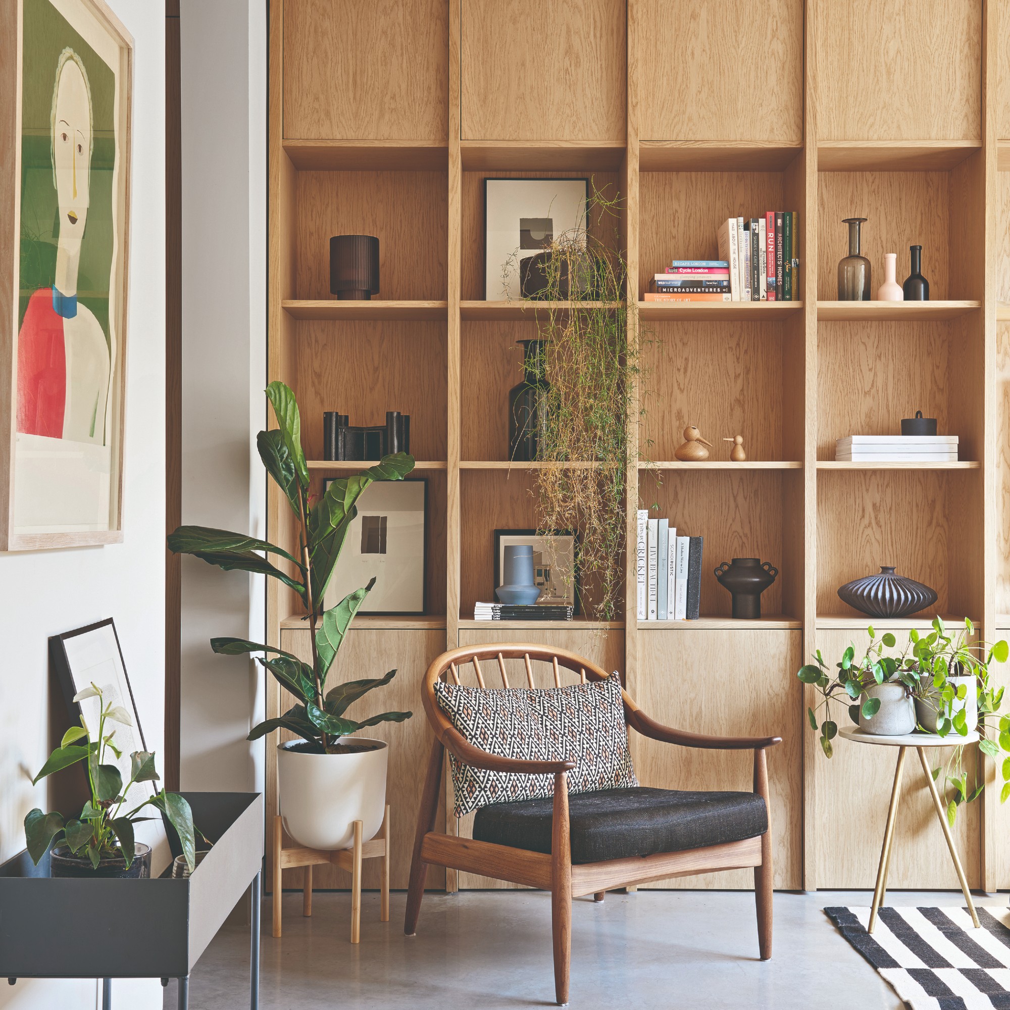
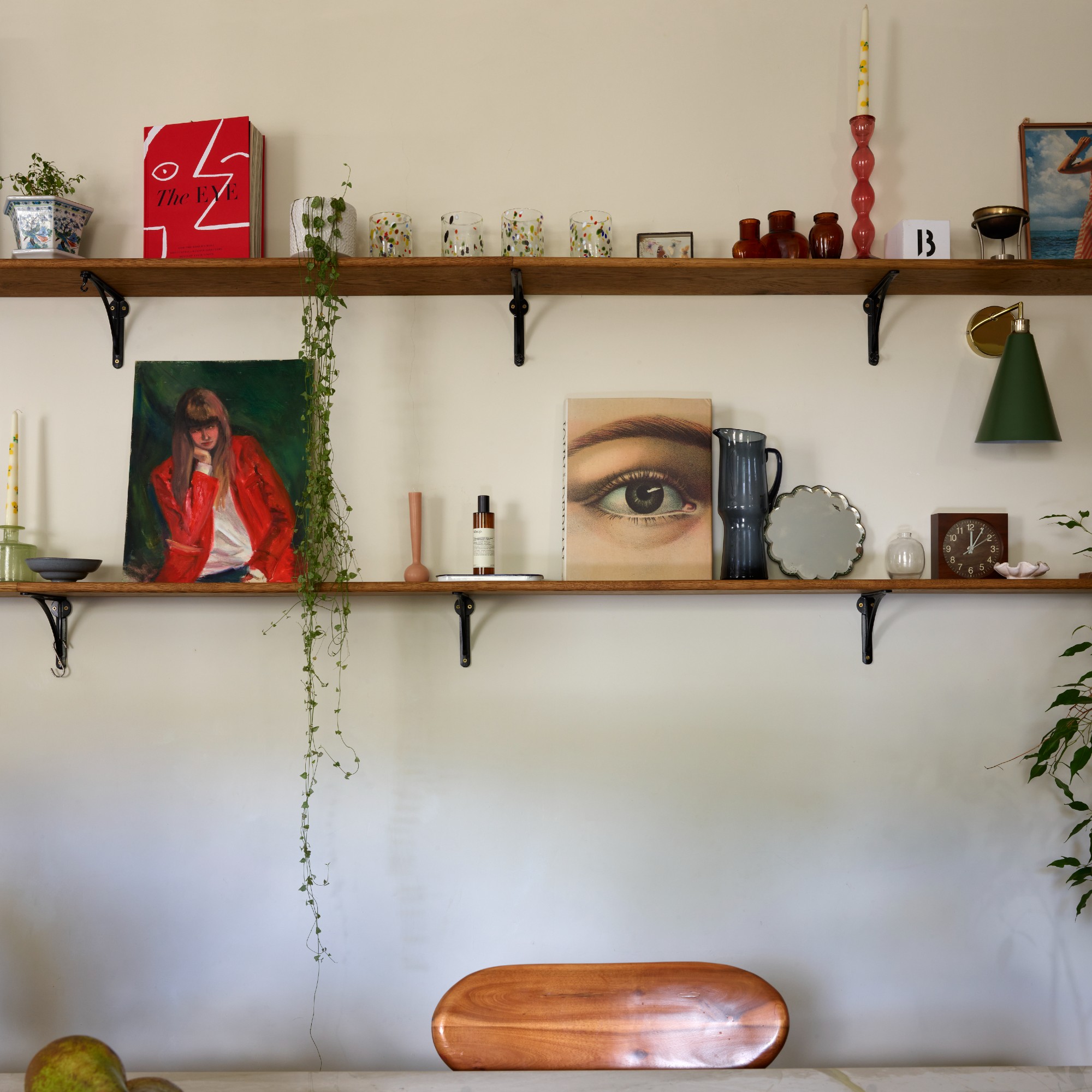
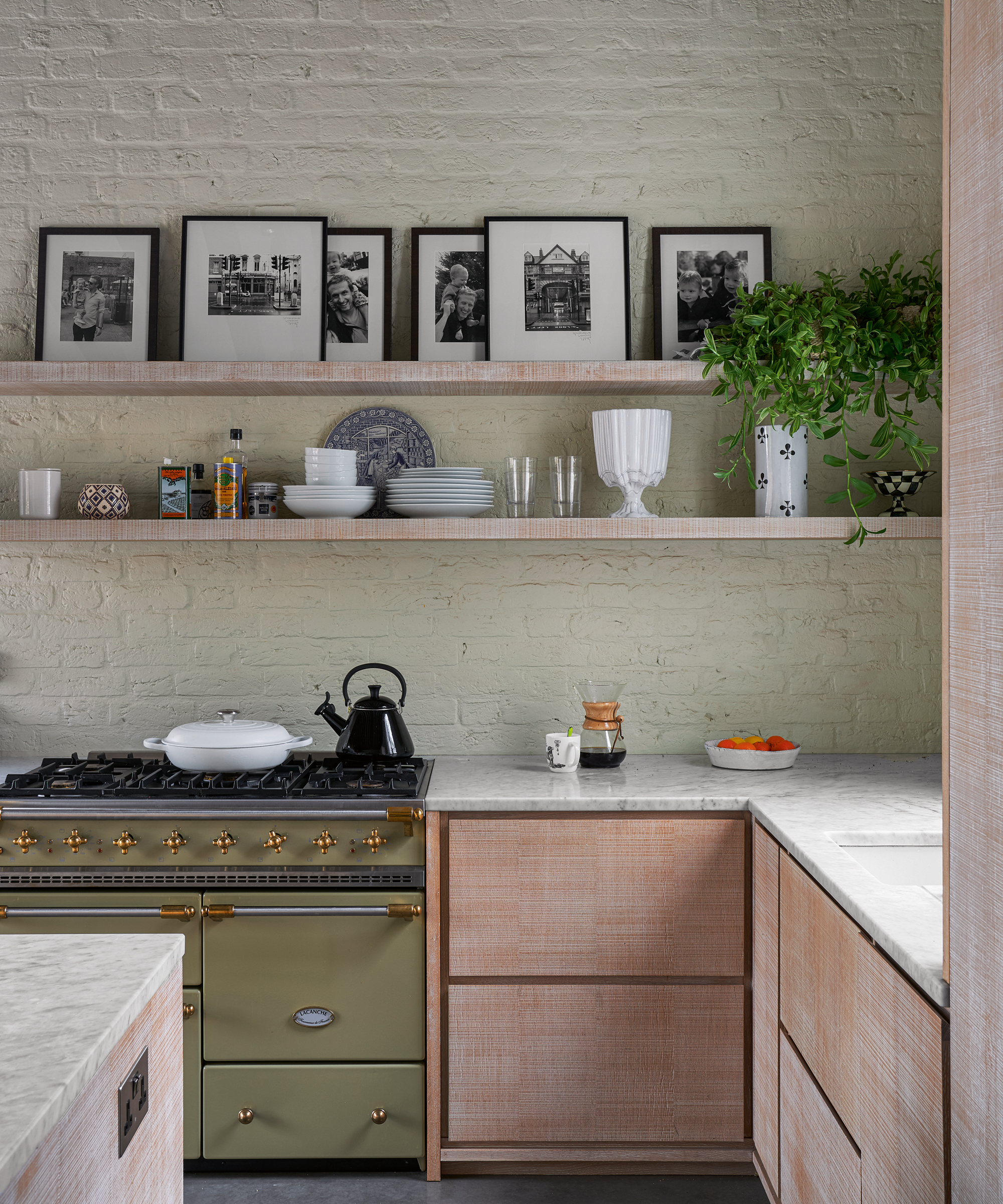
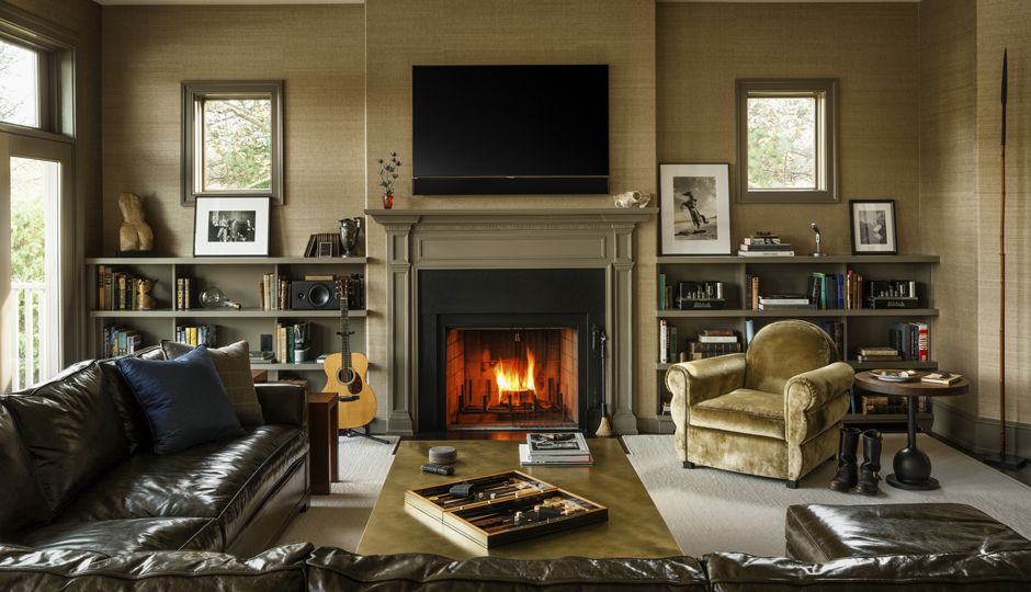
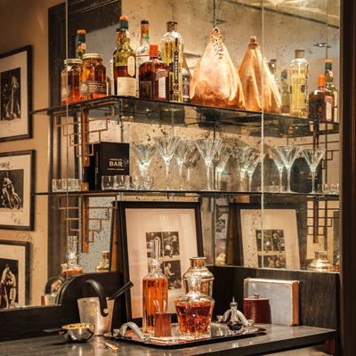
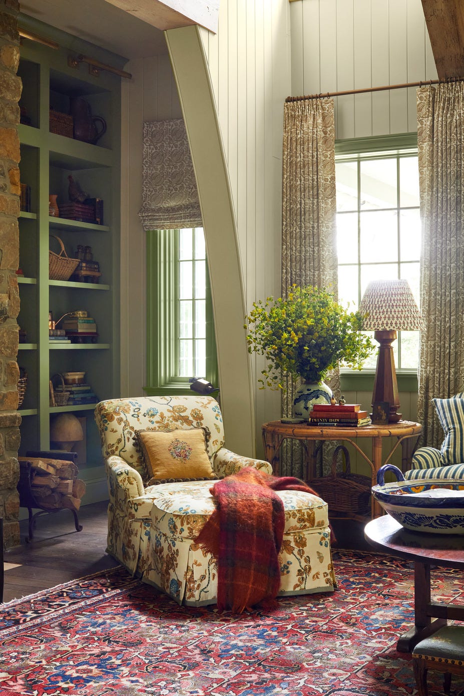
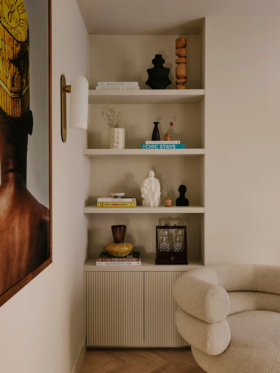
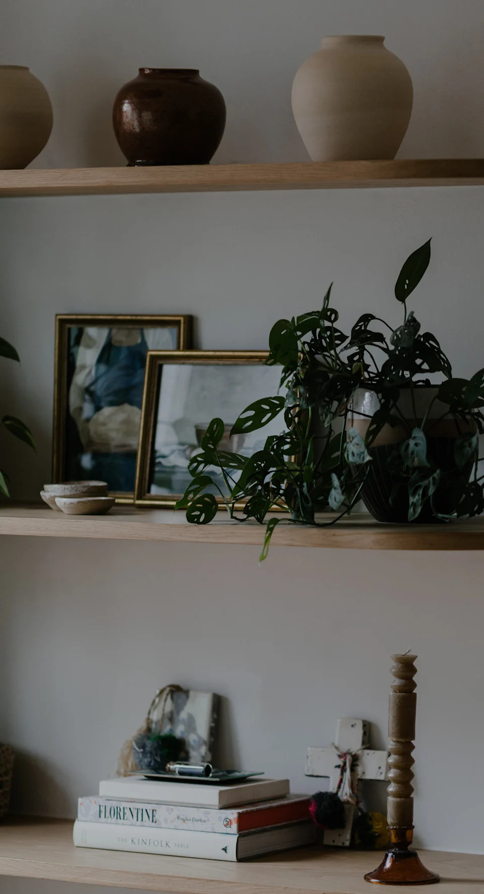
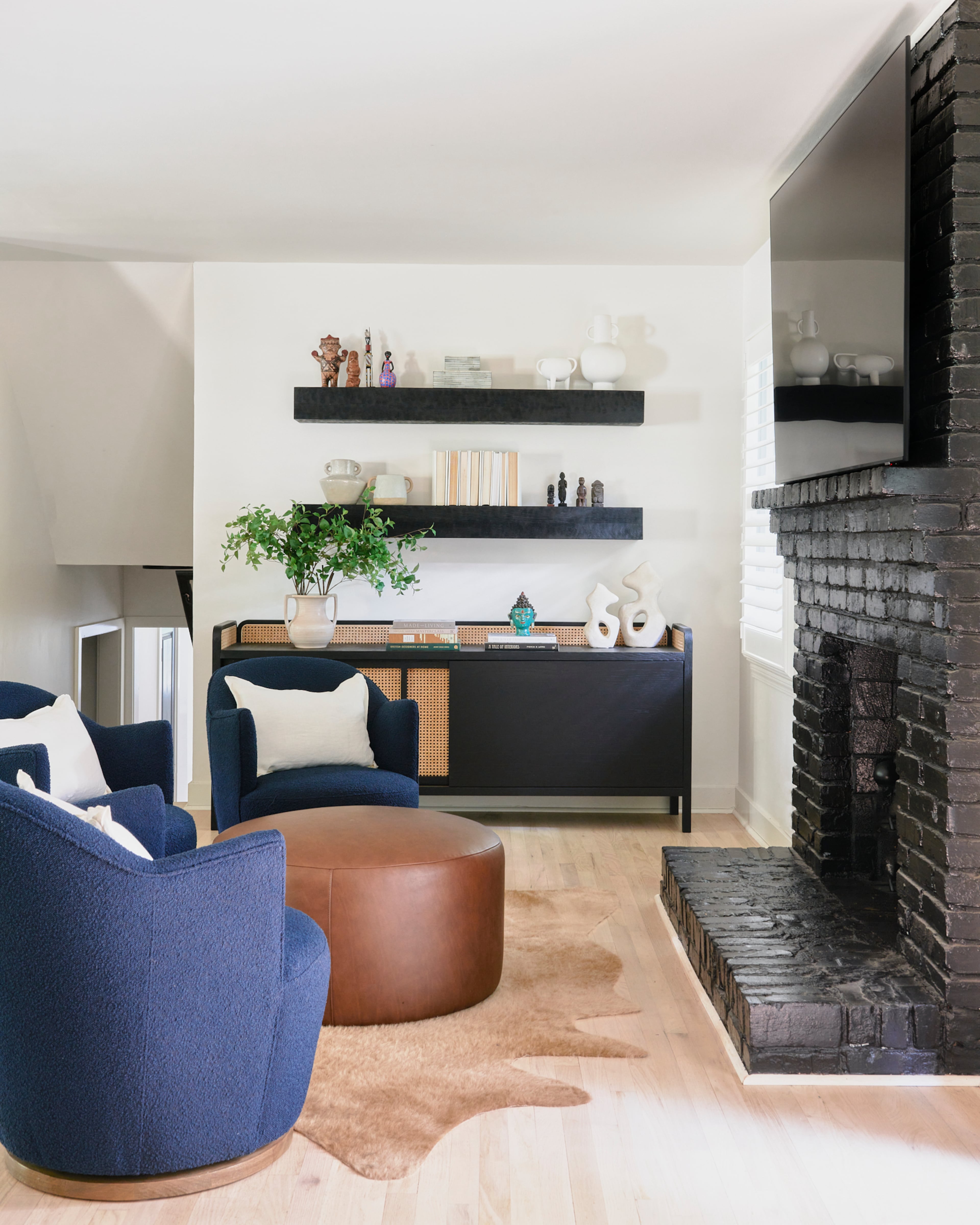
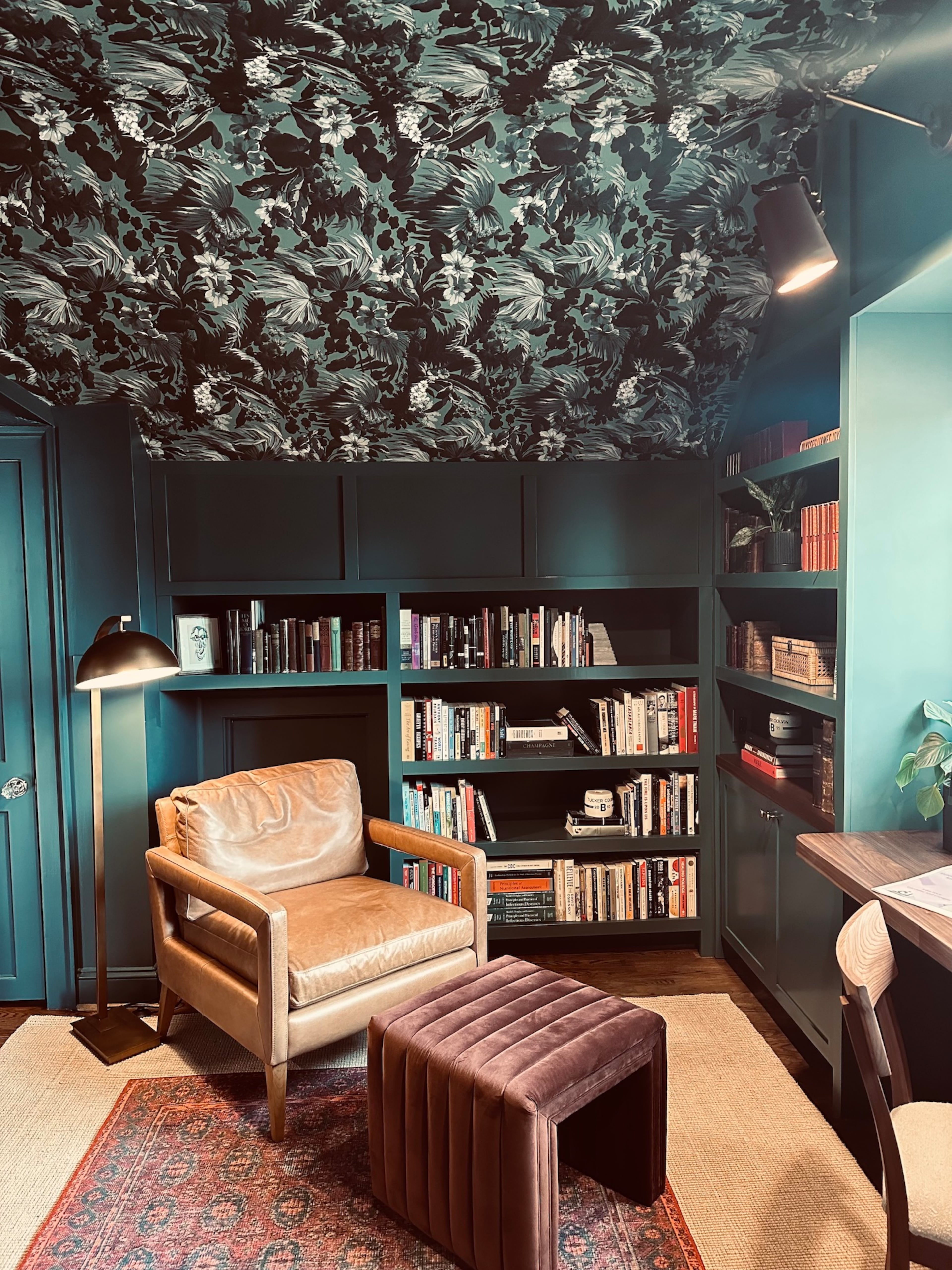
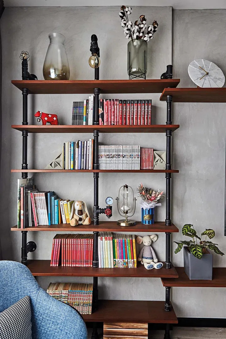
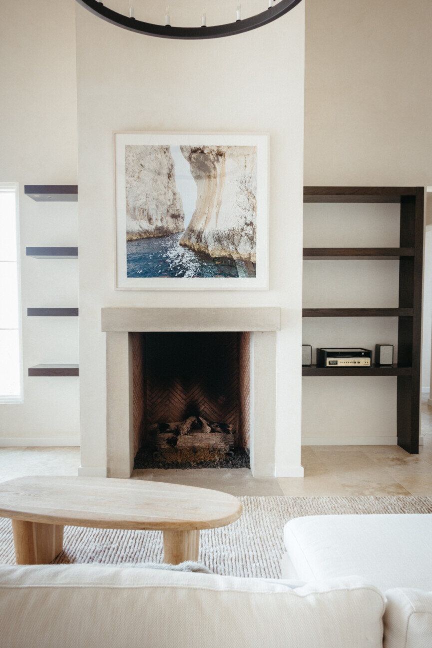
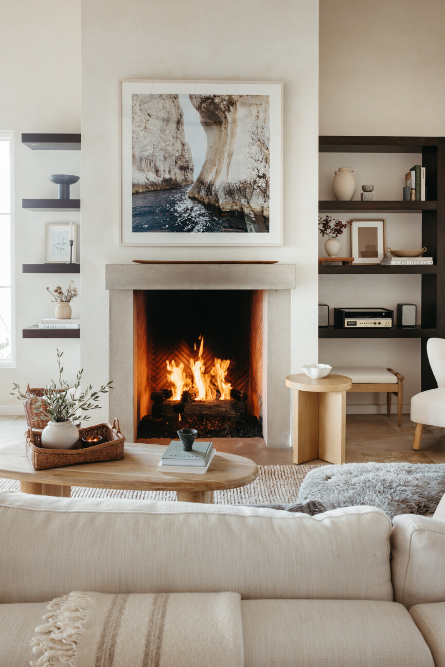
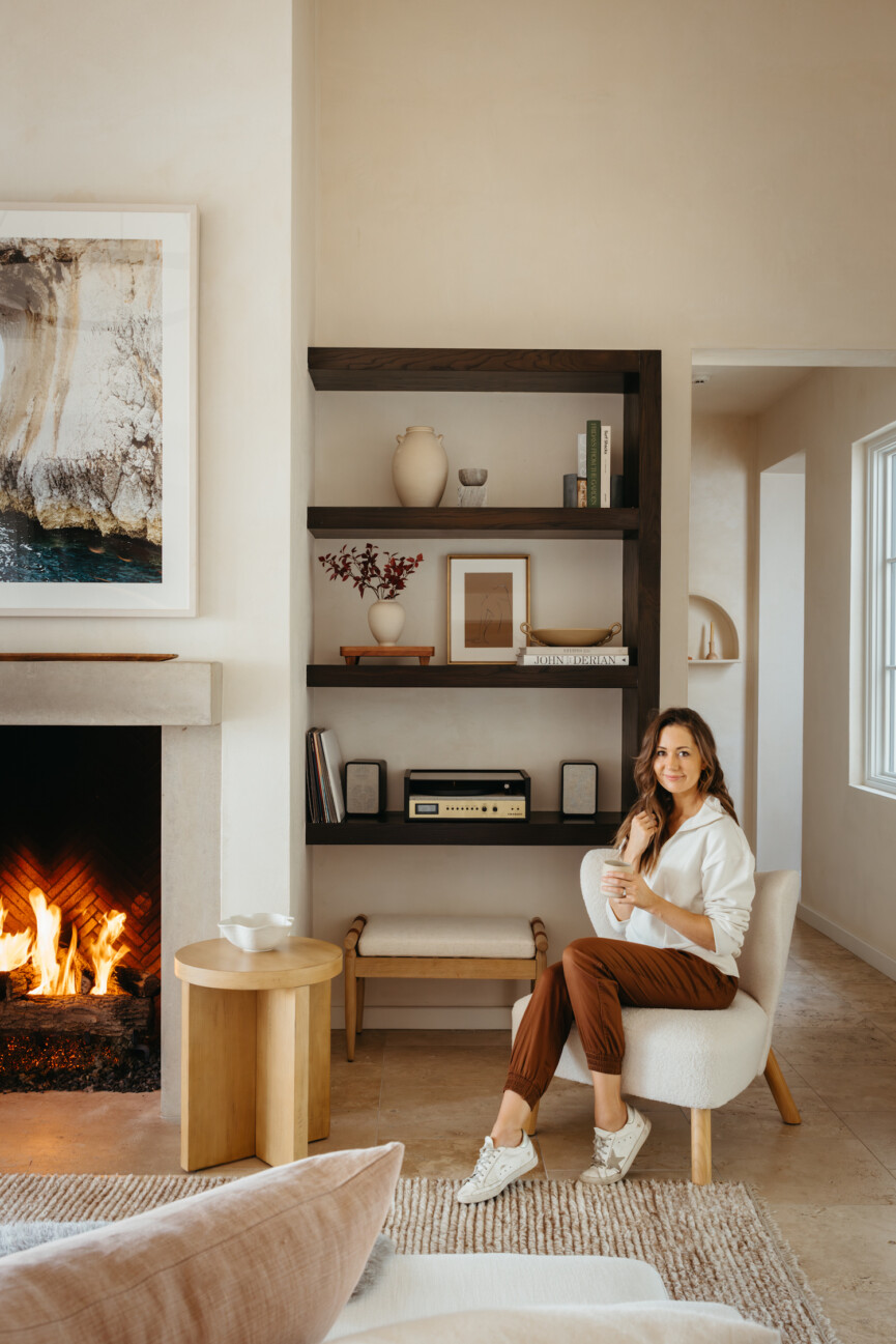
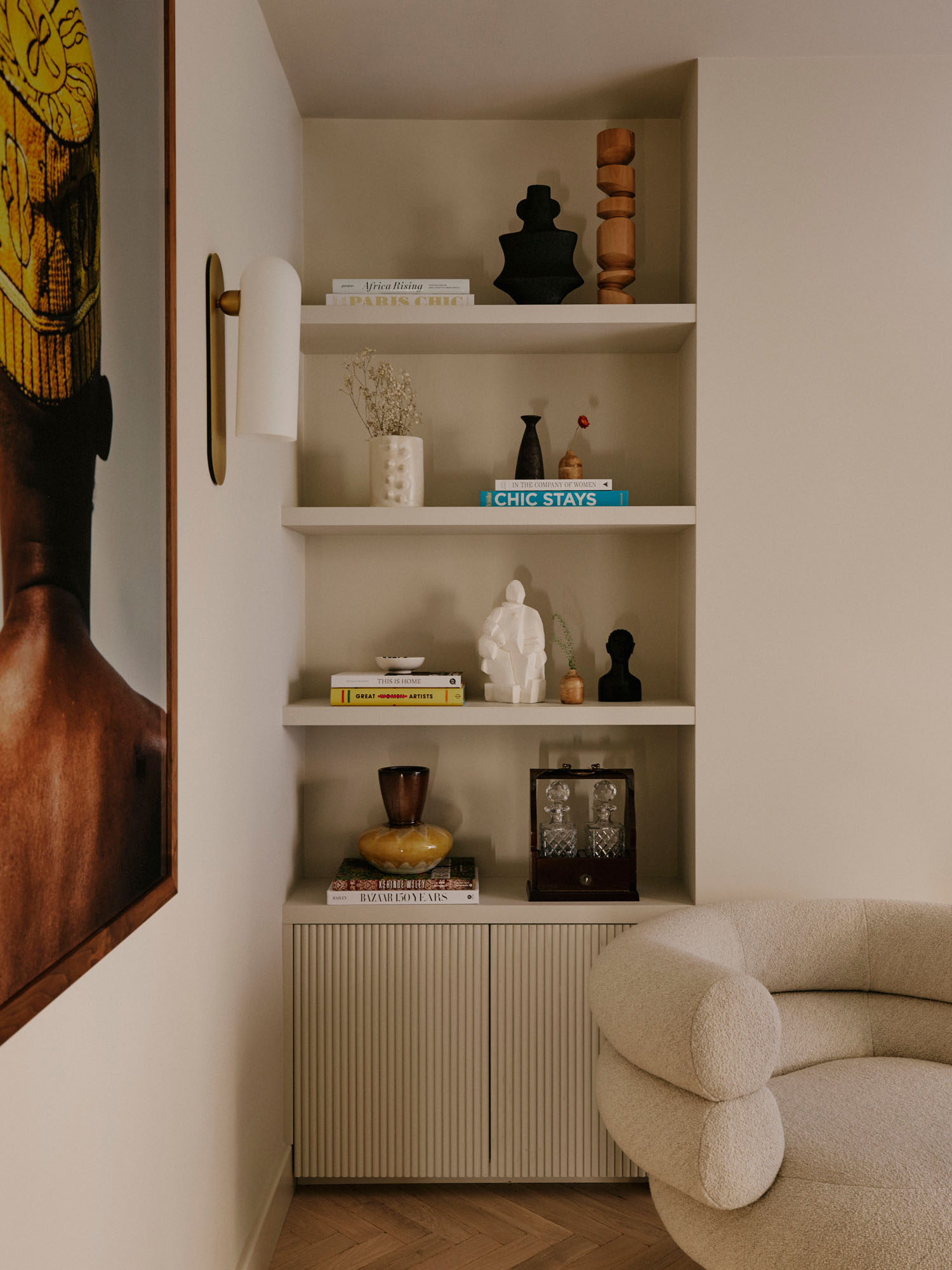
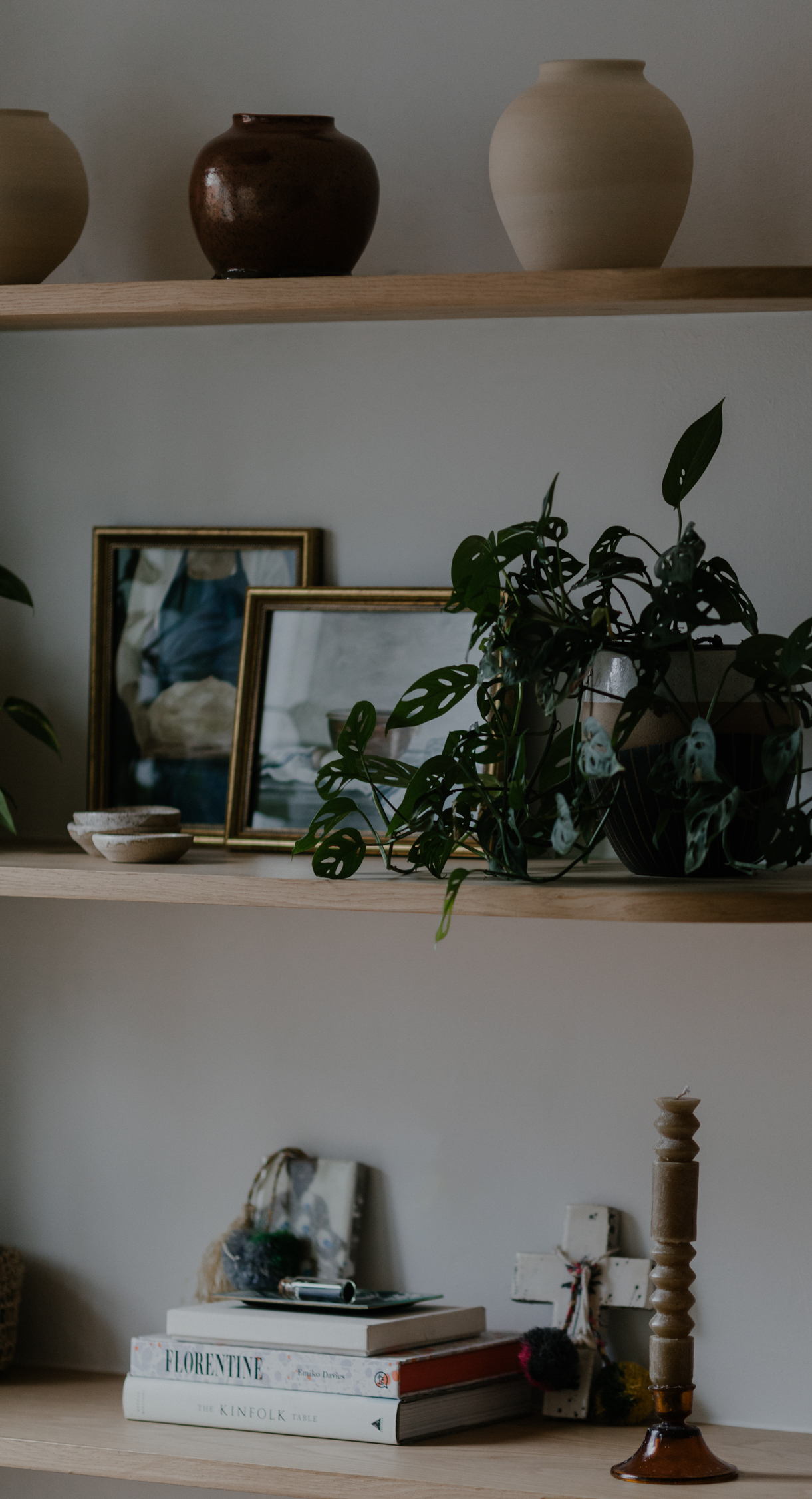
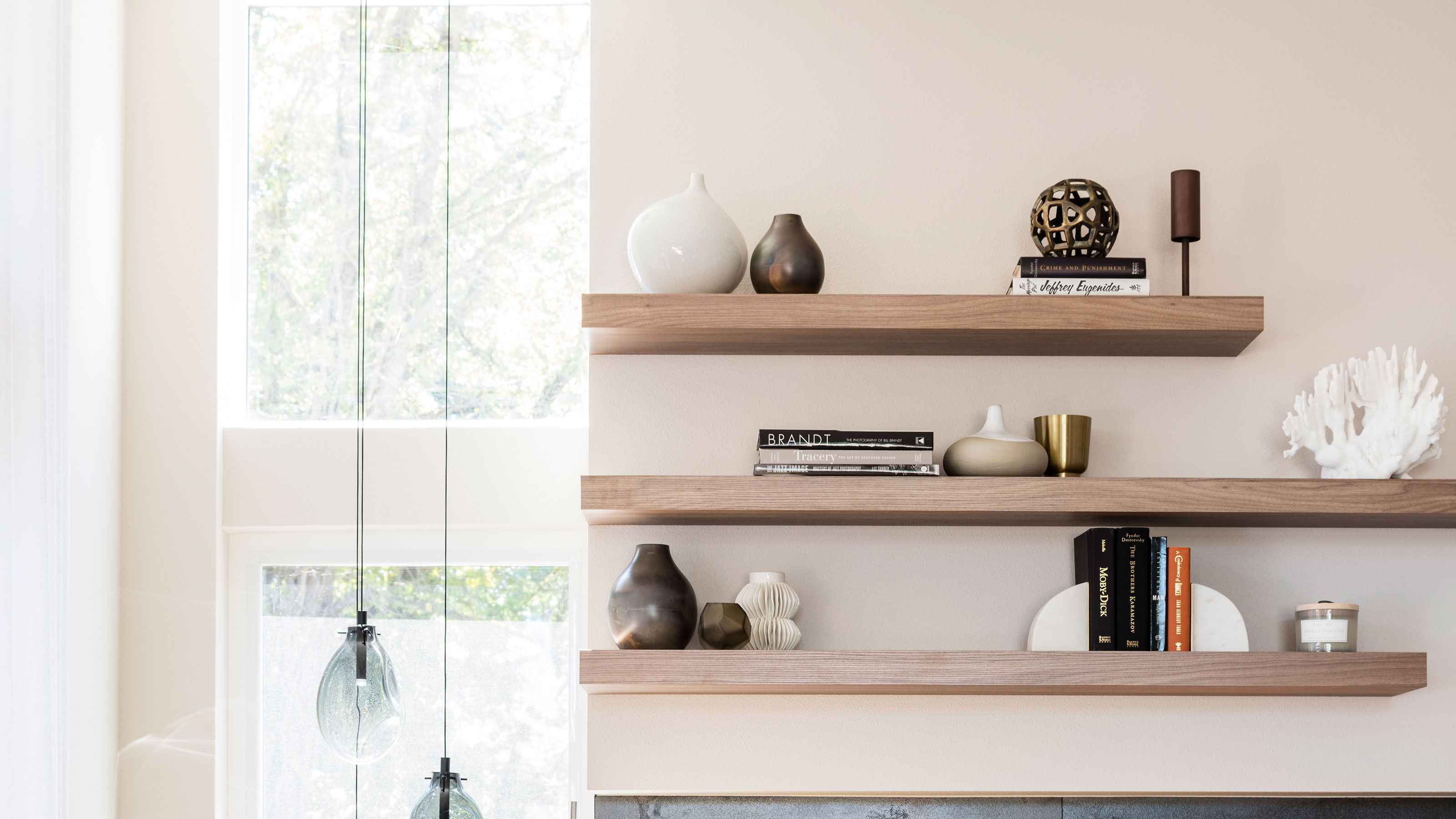
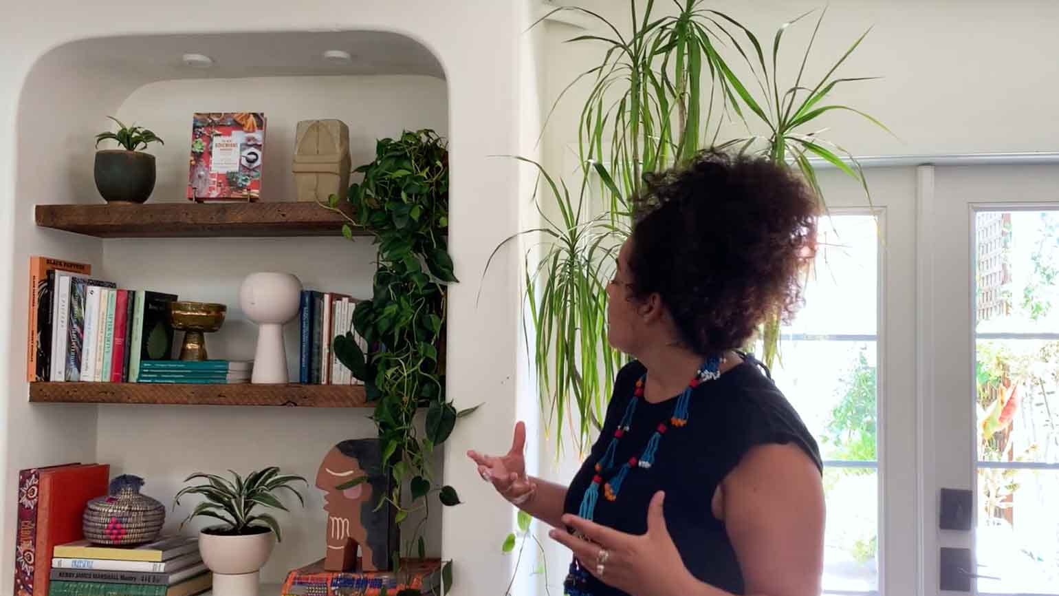
Firstly, it is essential to incorporate a diverse range of items beyond just books. Shelves offer an opportunity to showcase personal trinkets, mementoes, art, and character. Kit Kemp suggests experimenting with book positioning, angling some for visual interest, stacking others for stability, and letting some stand upright. She also encourages unconventional approaches, such as hanging art along the edges or placing a table in front of the shelves, to create intrigue and ignite creativity. Ottalie Stride emphasizes adding layers of curated items, like antique marble sculptures as bookends or trailing houseplants, to break up the linear appearance of joinery and prevent a heavy, one-dimensional look.
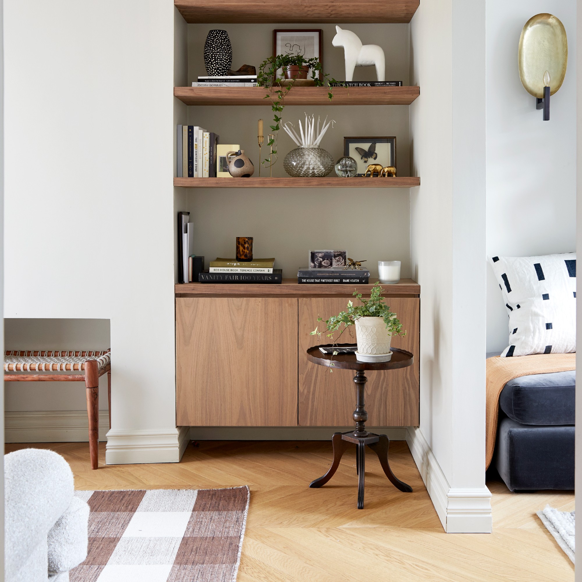
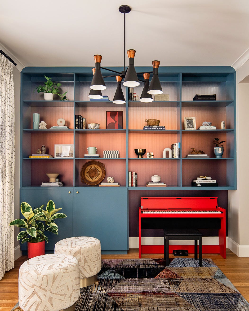
Secondly, achieving balance and symmetry is crucial for a cohesive and appealing display. This involves distributing visual weight by grouping similar items or using pairs of objects for uniformity. While symmetry offers a sense of order, incorporating asymmetry can create a more dynamic look. Repeating objects on different shelves also contributes to a balanced aesthetic. When arranging items, taller and larger pieces are generally best placed at the ends of shelves to avoid overwhelming the center.
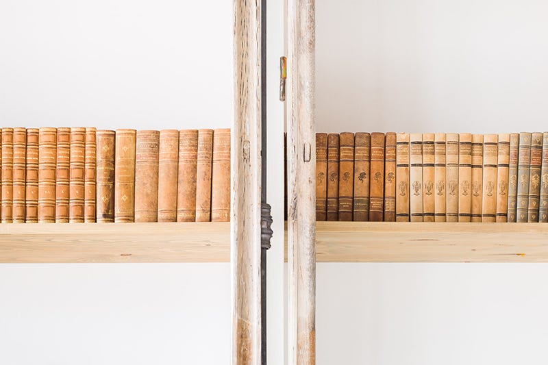
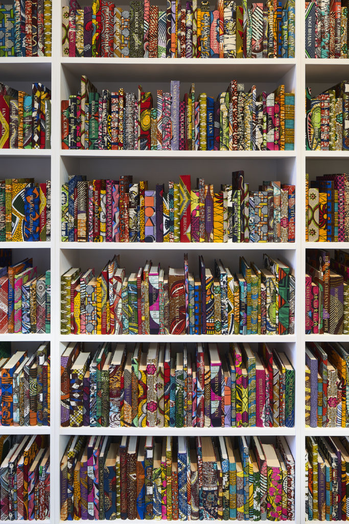
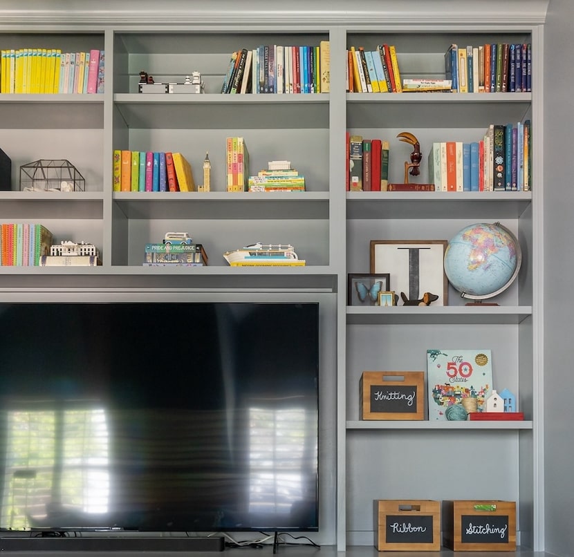
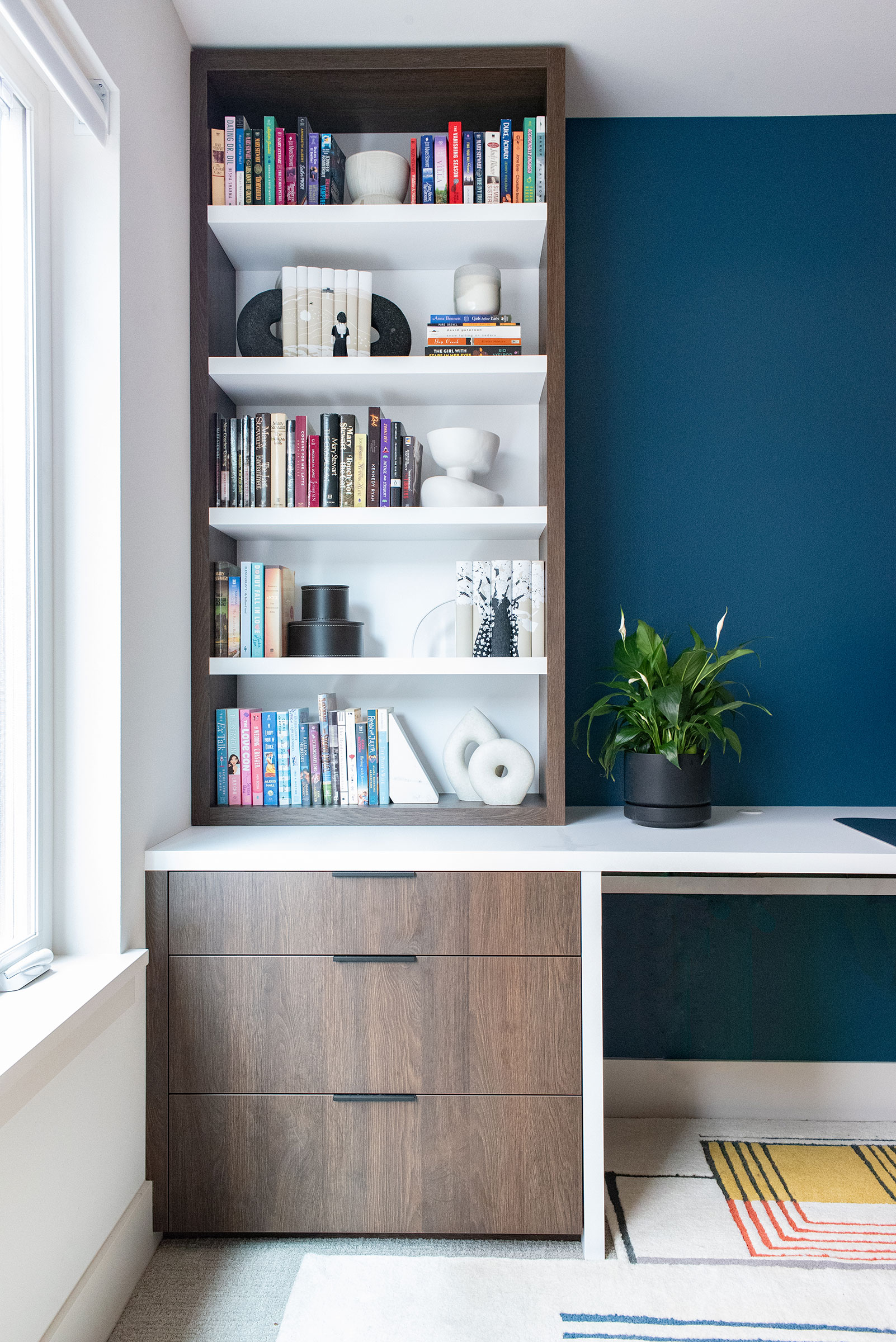
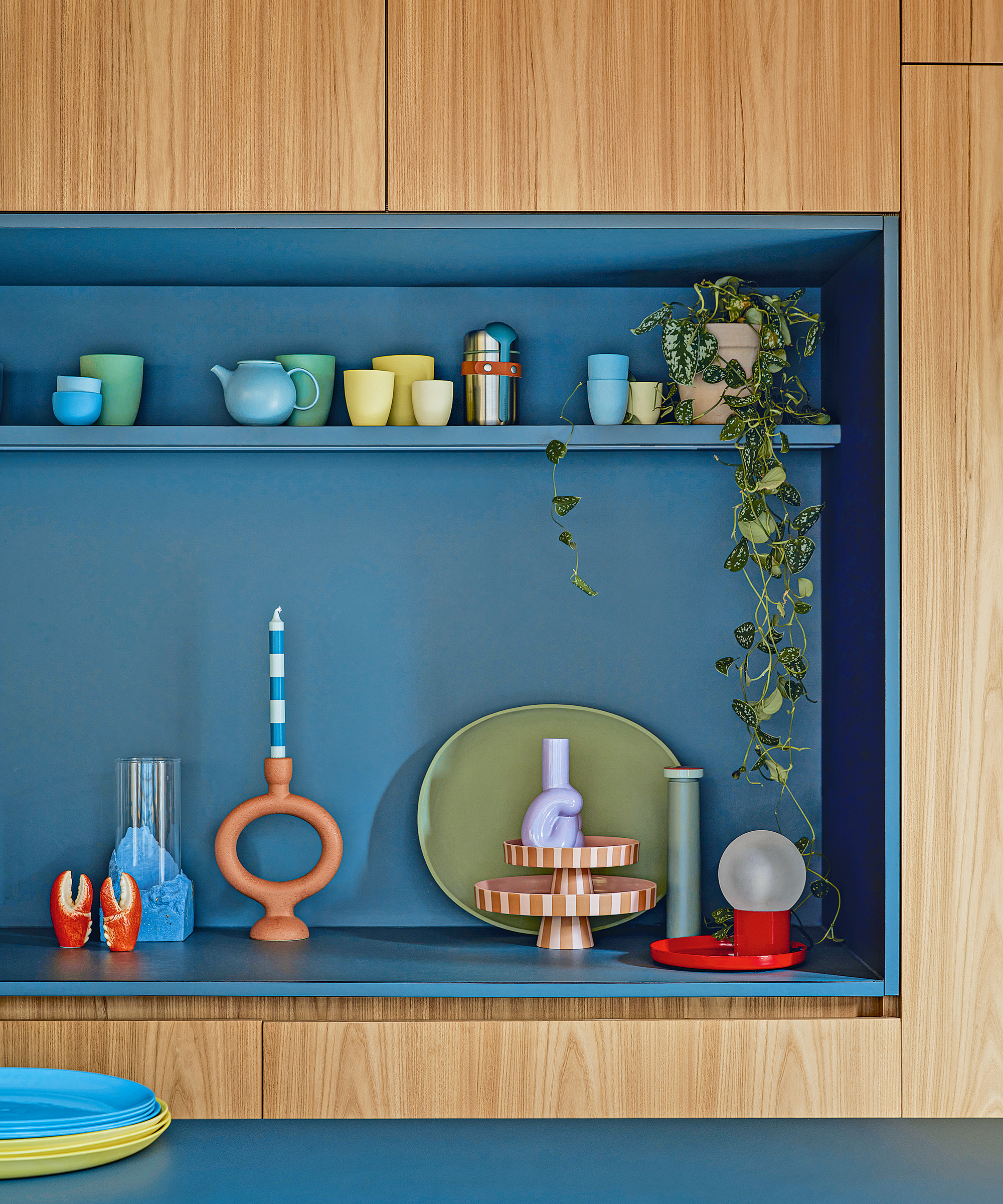
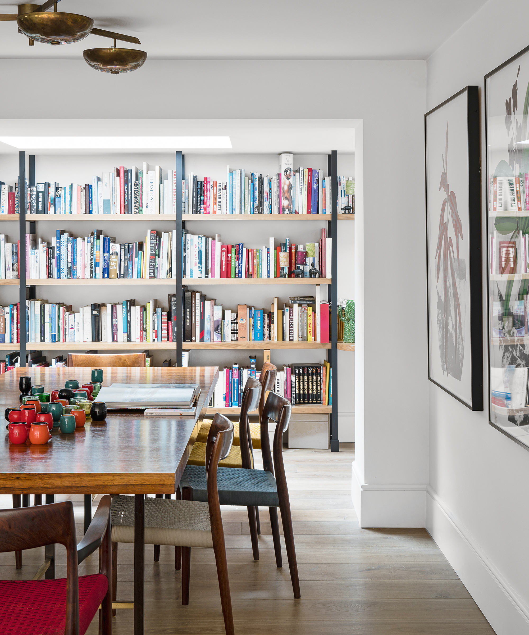
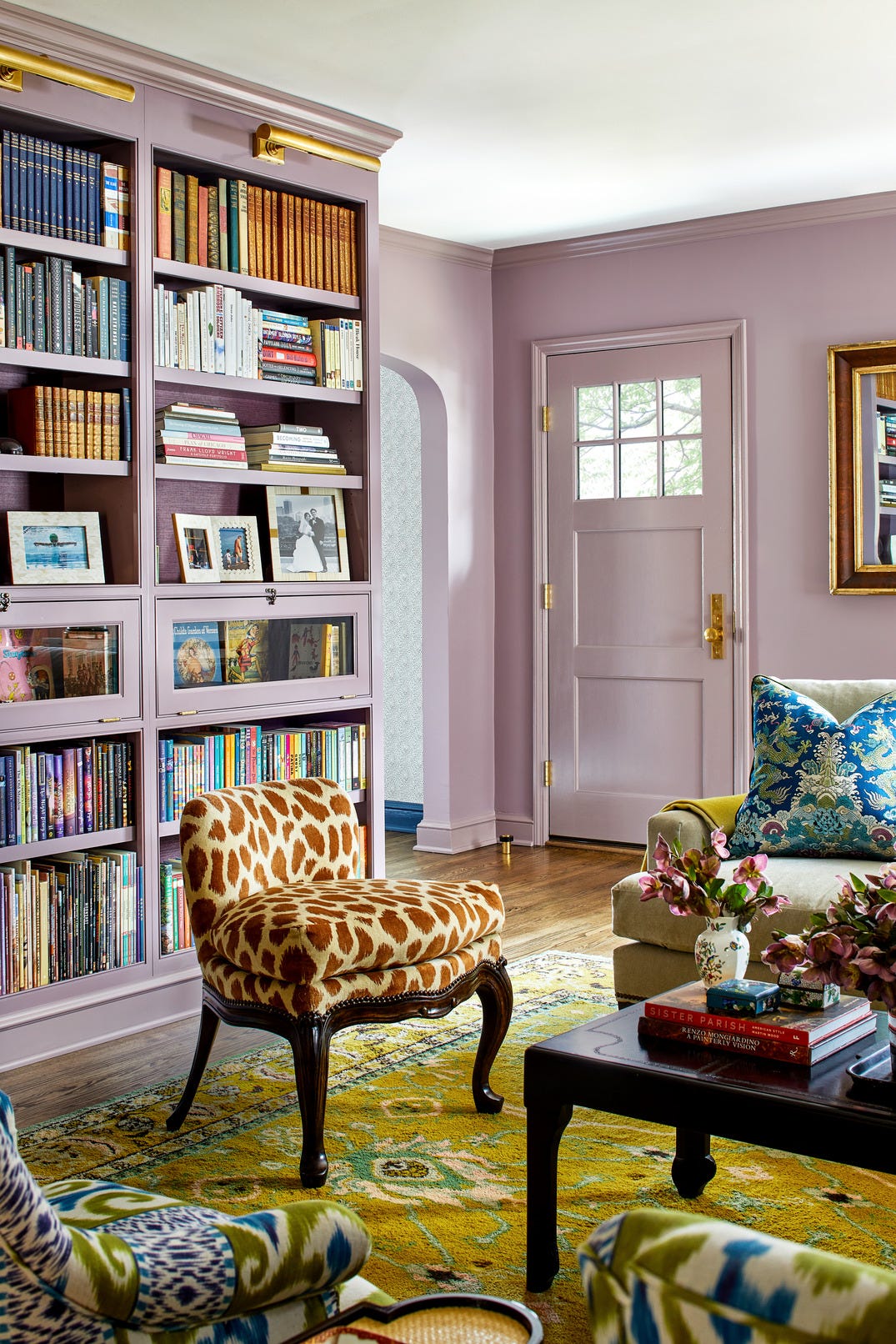
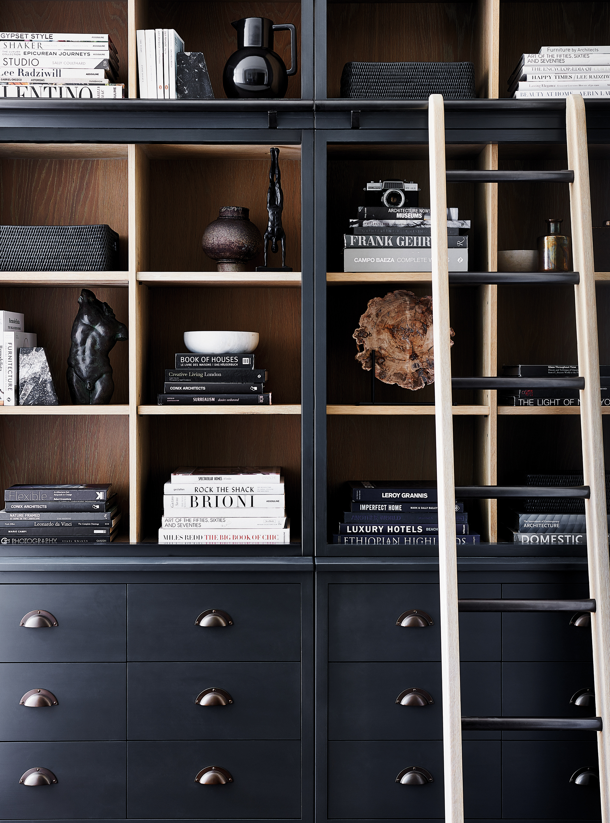
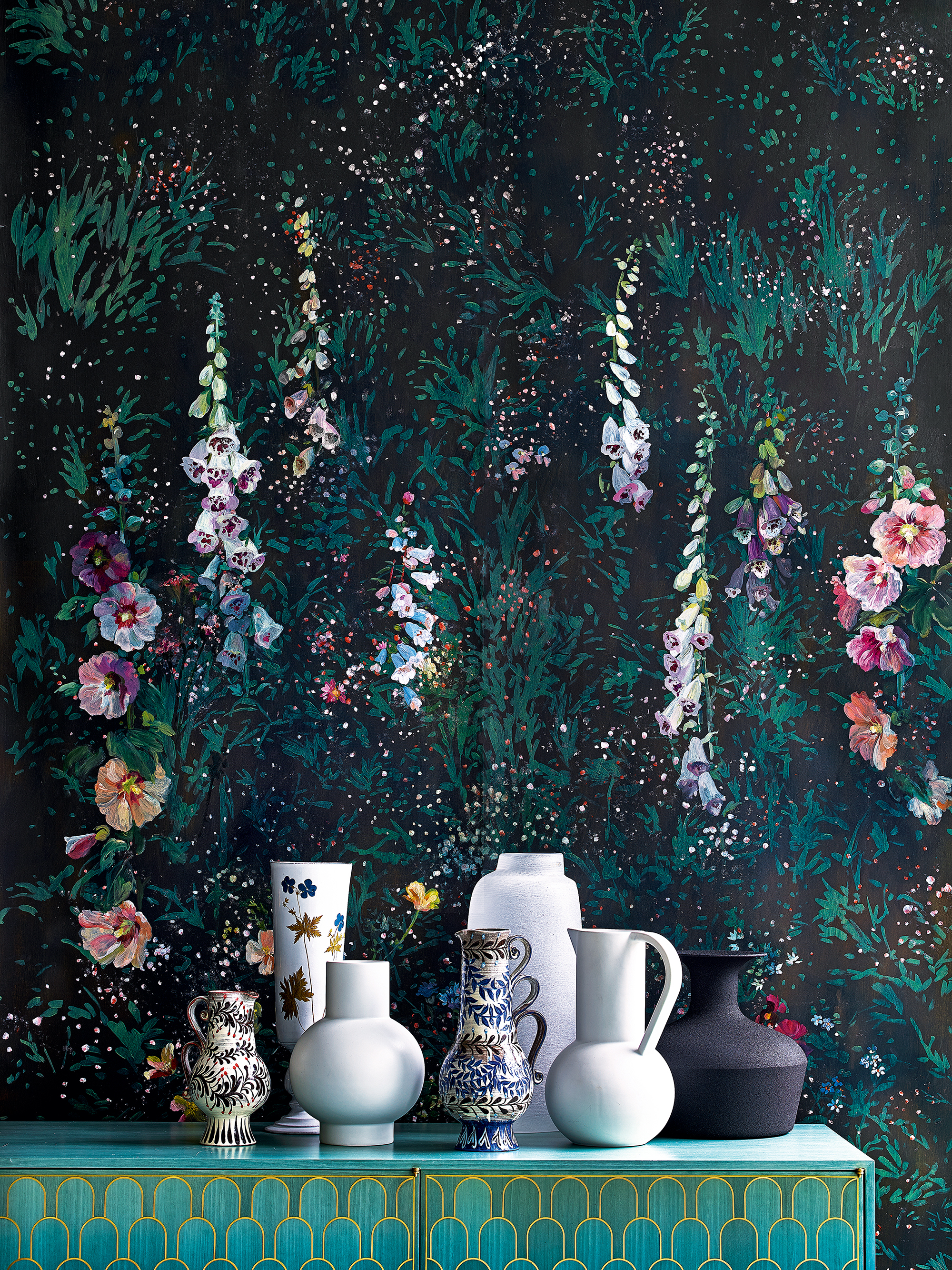
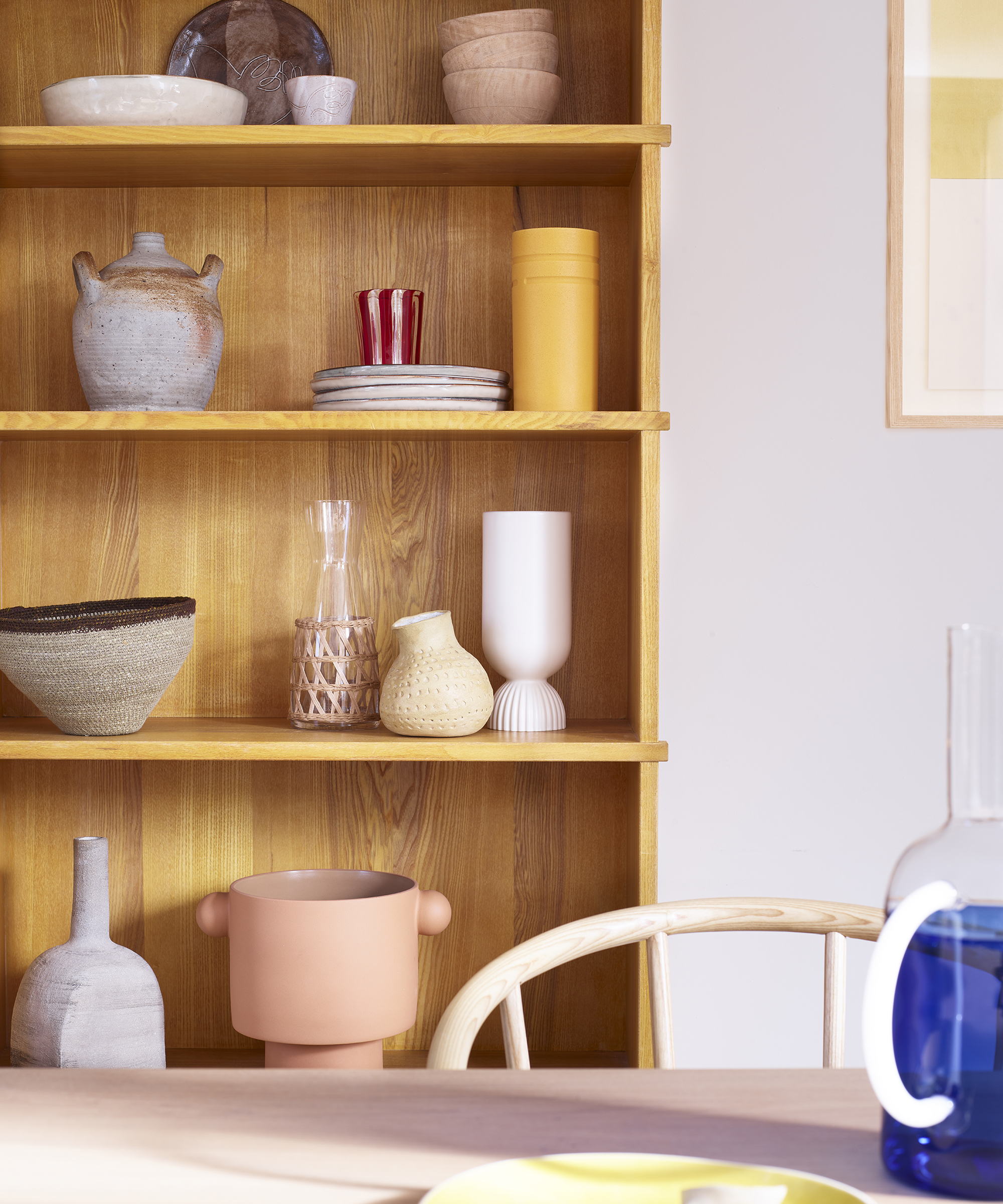
Thirdly, selecting a limited color palette can instantly elevate the styled appearance of shelves. Ideally, sticking to no more than three colors ensures variety while maintaining cohesion. Drawing inspiration from the room's existing color scheme, designers can mix in neutrals like white, grey, or cream, and strategically add one or two contrasting colors to enliven the display. Spreading the chosen colors across different shelves, rather than clustering them, prevents monotony. For those with extensive book collections, organizing books by the color of their spines can create a striking visual effect.
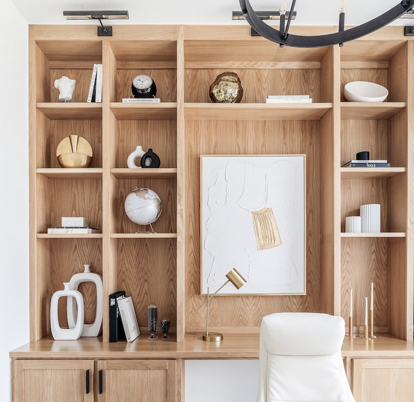
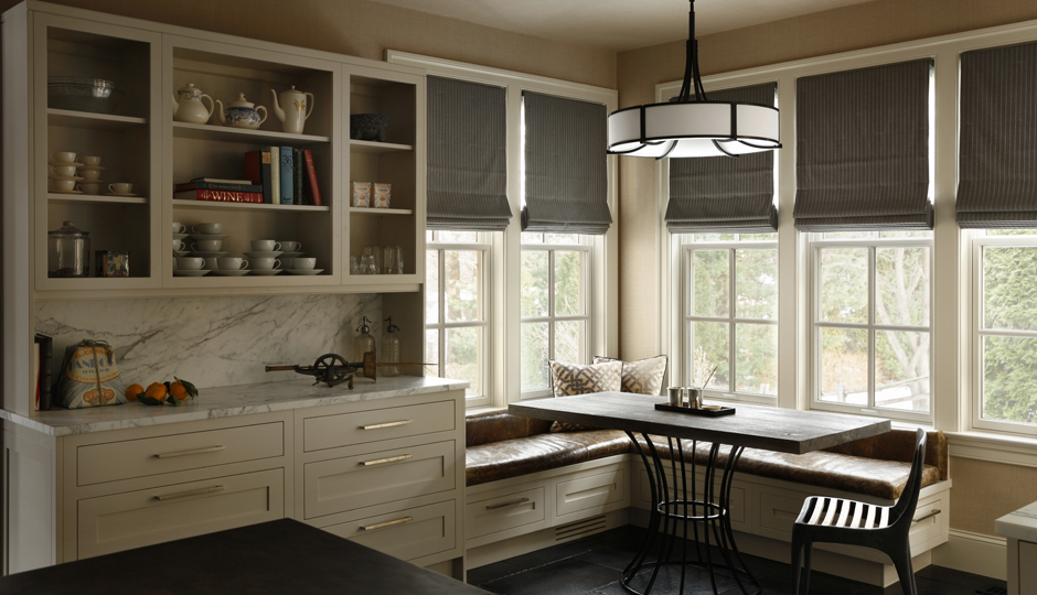
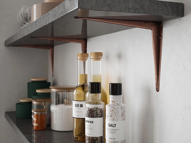
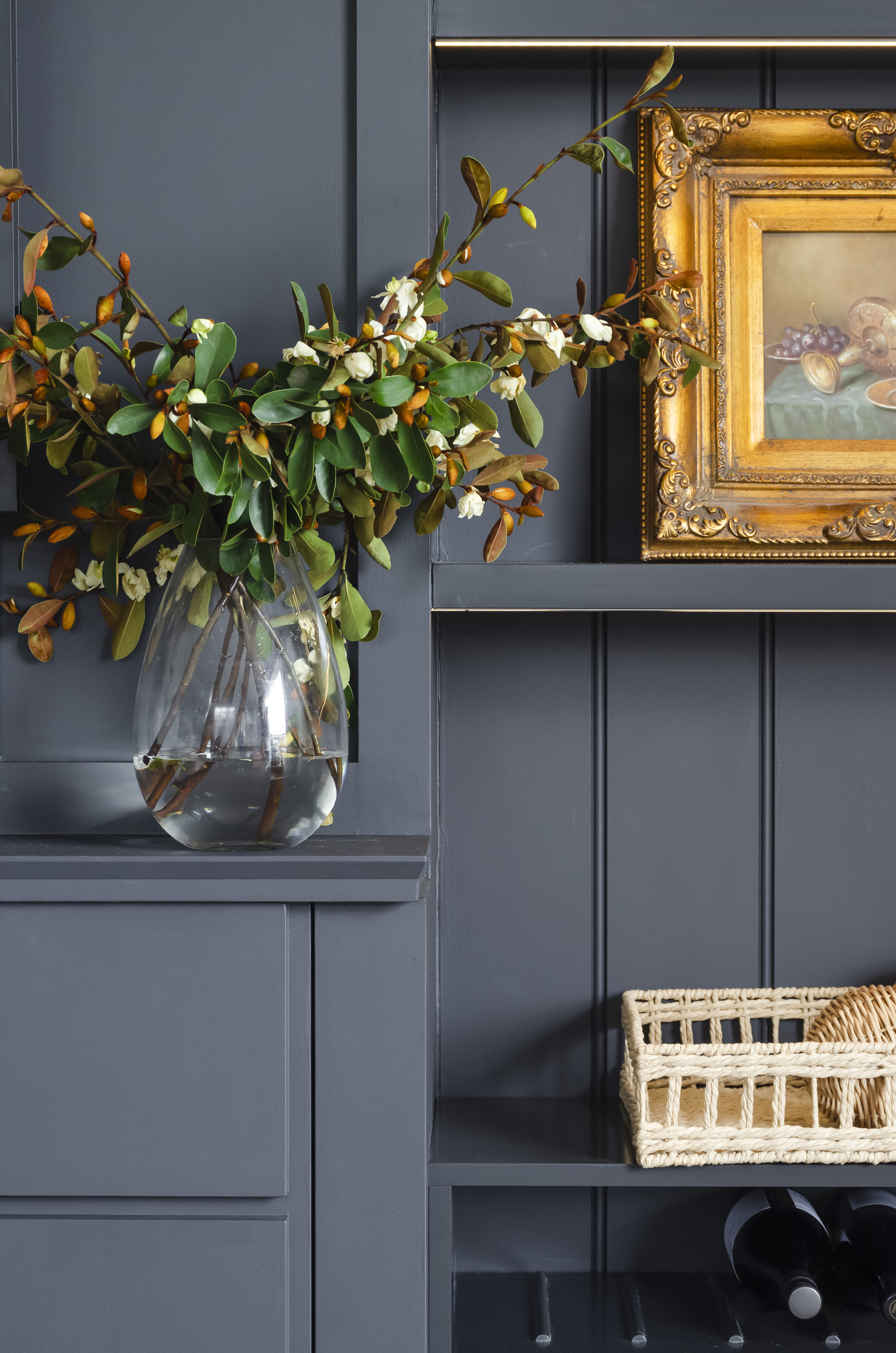
Fourthly, mixing textures and materials adds depth and dimension to shelves. Combining smooth surfaces with coarser finishes and incorporating diverse materials such as wood, metal, glass, and ceramics creates visual contrast and prevents the display from appearing flat. Interior designer Noor Charchafchi highlights that texture experimentation can extend to the shelves themselves, with options like liquid metal, paint finishes, leather detailing, and veneers offering a broad material design playground beyond traditional timber.
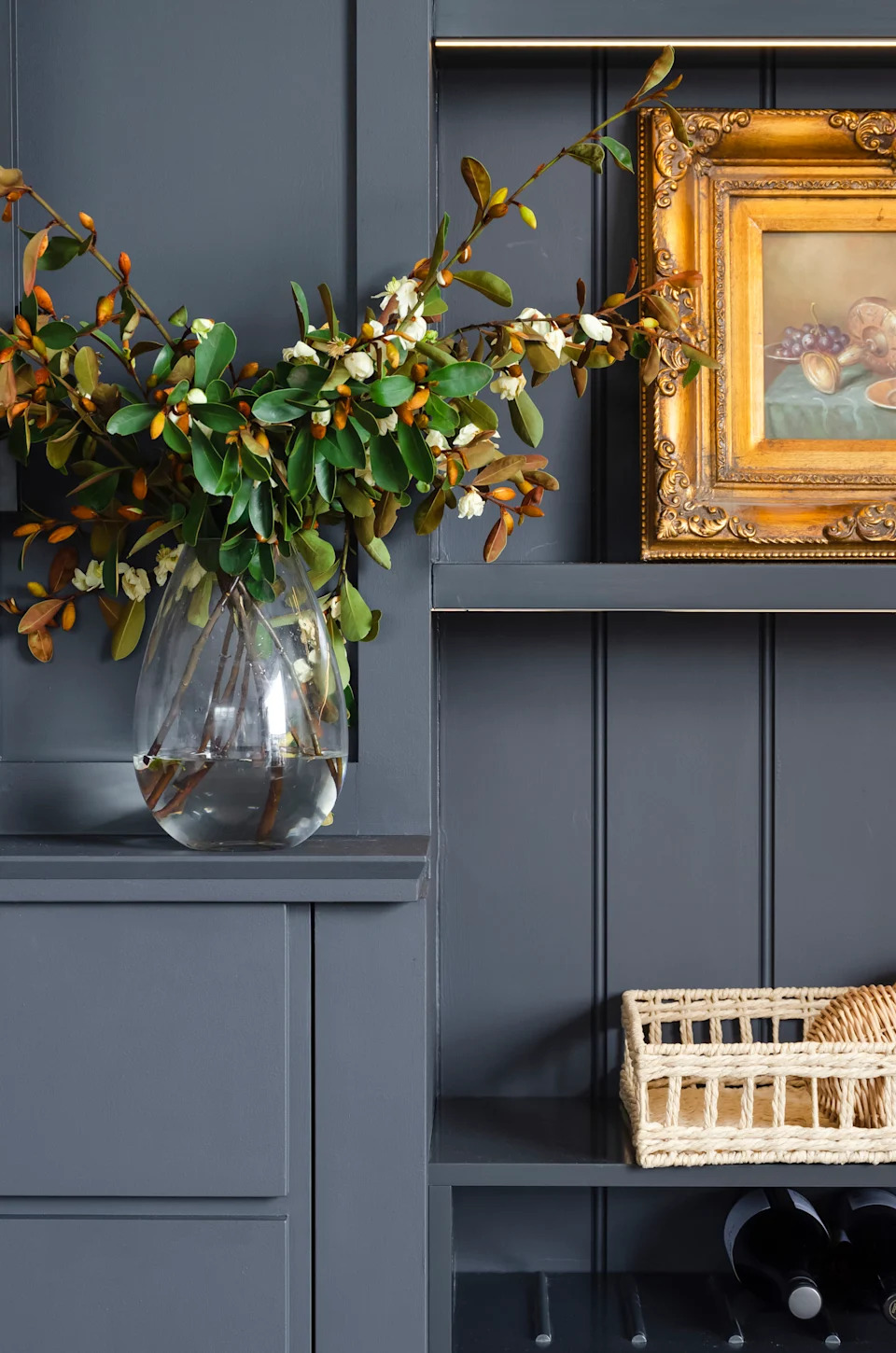
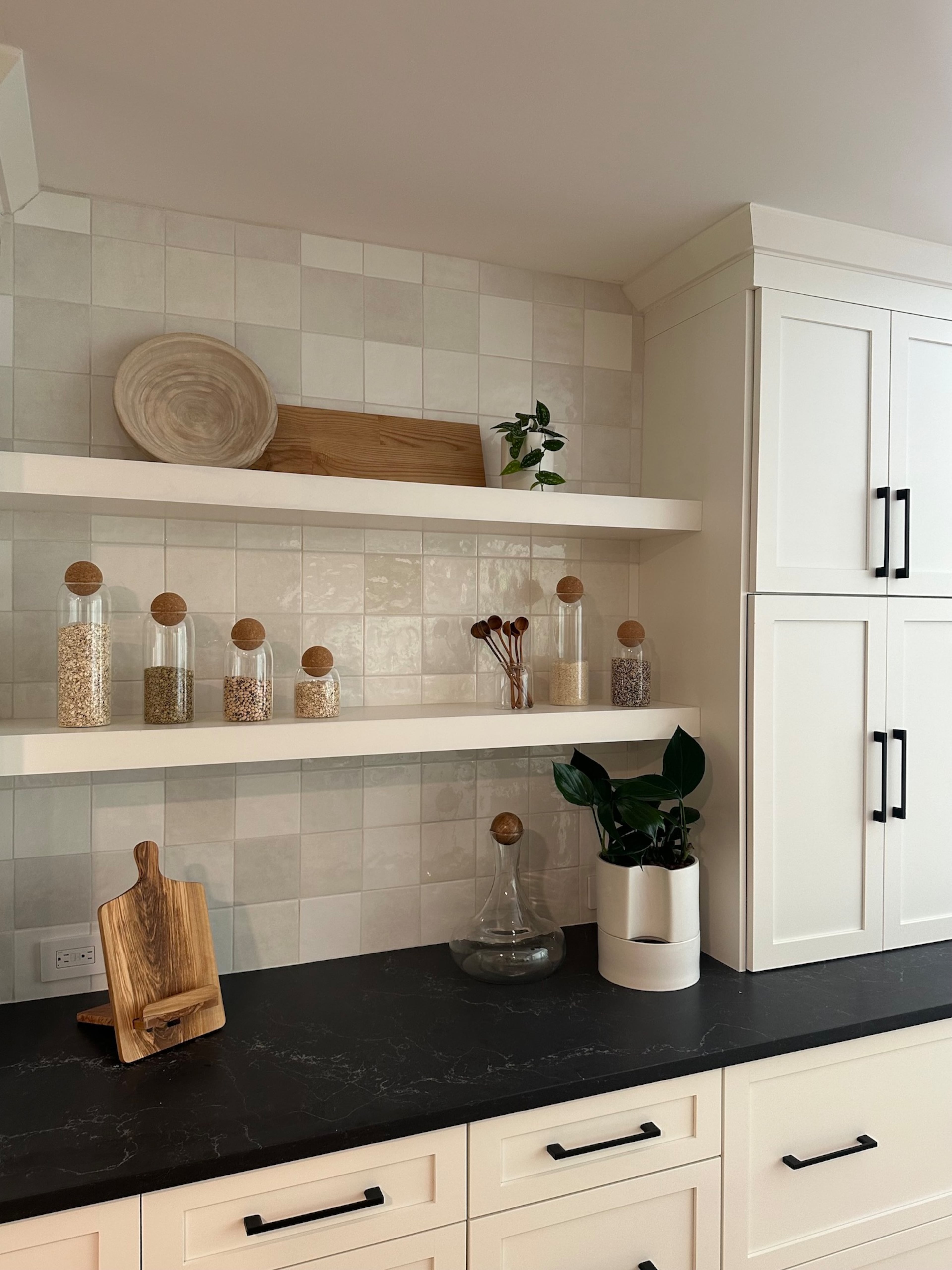
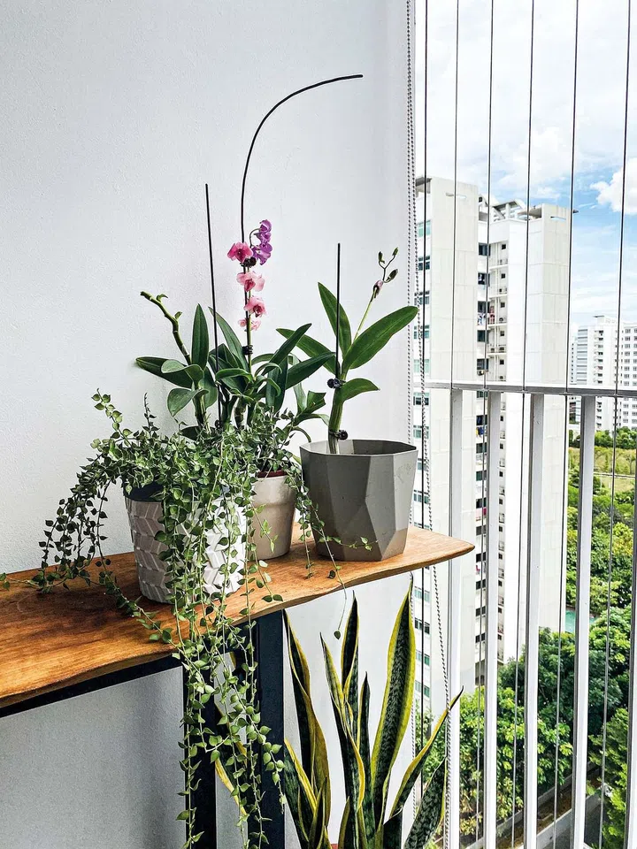
Finally, introducing greenery and utilizing negative space are vital for a fresh and uncluttered look. Plants and flowers bring an element of nature, softening the overall aesthetic. Simultaneously, leaving intentional negative space between objects allows each item to stand out and prevents overcrowding. Kasia Kronberger of Studio Bosko advises against over-editing, suggesting that while a single item on a shelf might look forlorn, leaving a compartment empty can be effective, allowing homeowners to add meaningful pieces over time and fostering creativity in the display.
#shelfStyling #homeDecor #interiorDesign #decorativeAccessories #designTips #visualBalance #colorPalette #textureMixing #greeneryInDecor #shelfStyling #homeDecor #interiorDesign #decorativeAccessories #designTips #visualBalance #colorPalette #textureMixing #greeneryInDecor
0 comment in total
 No comments yet
You may also like
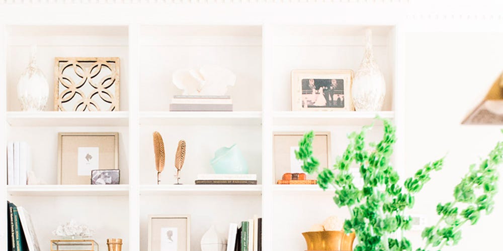
How to style your shelves

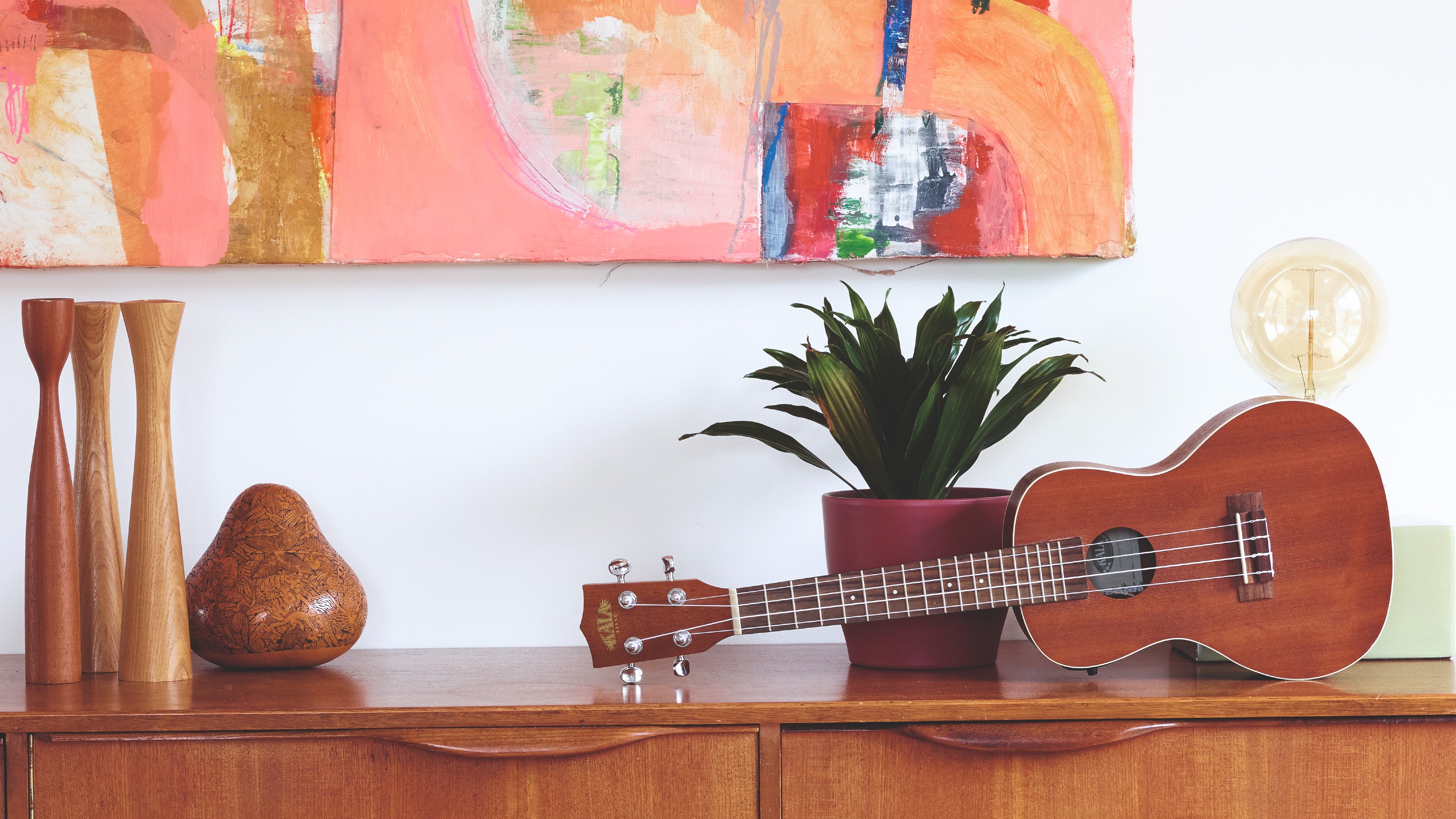
The 3-5-7 styling rule is how to make your shelves look good
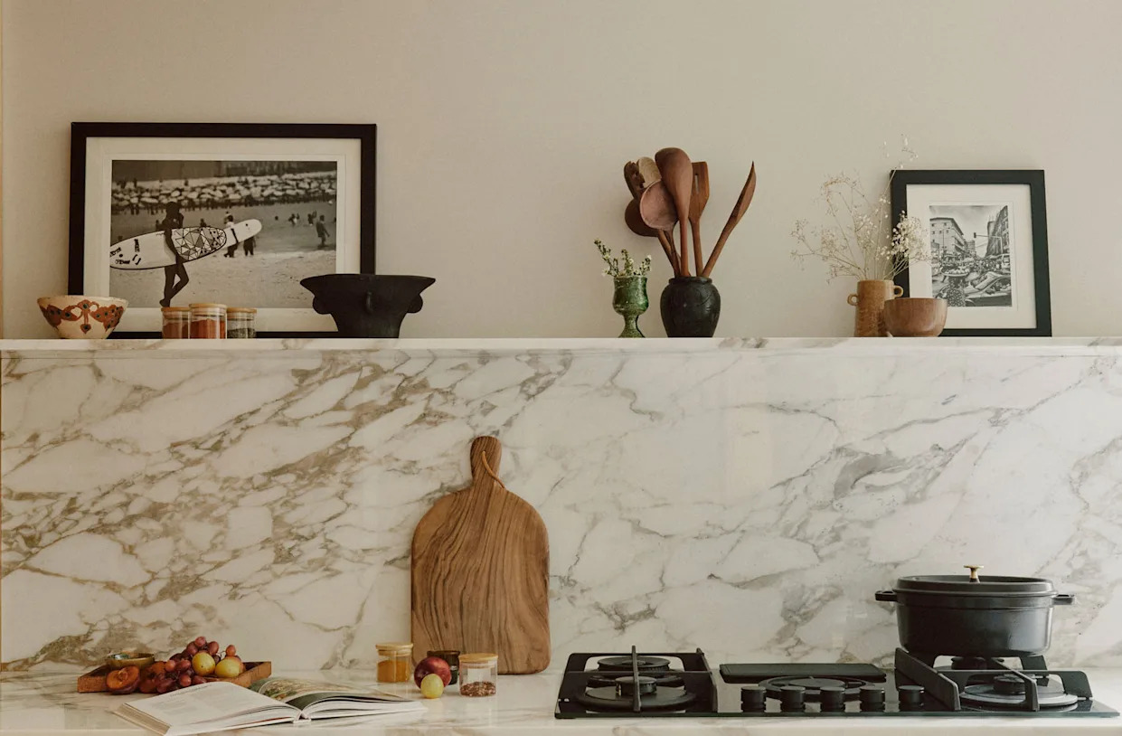
5 shelf styling trends for 2024 designers are using now to create rooms full of personality

Ina Garten’s 5 Shelf Styling Rules You’ll Want to Copy Immediately

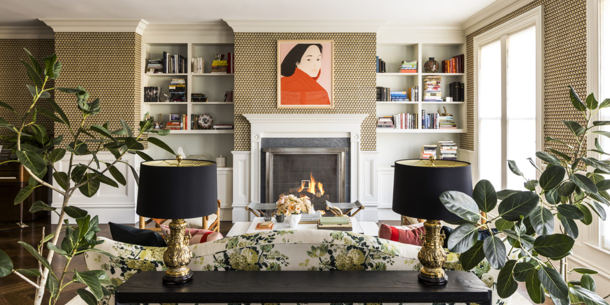
A Book Lover’s Guide to Styling Your Shelves
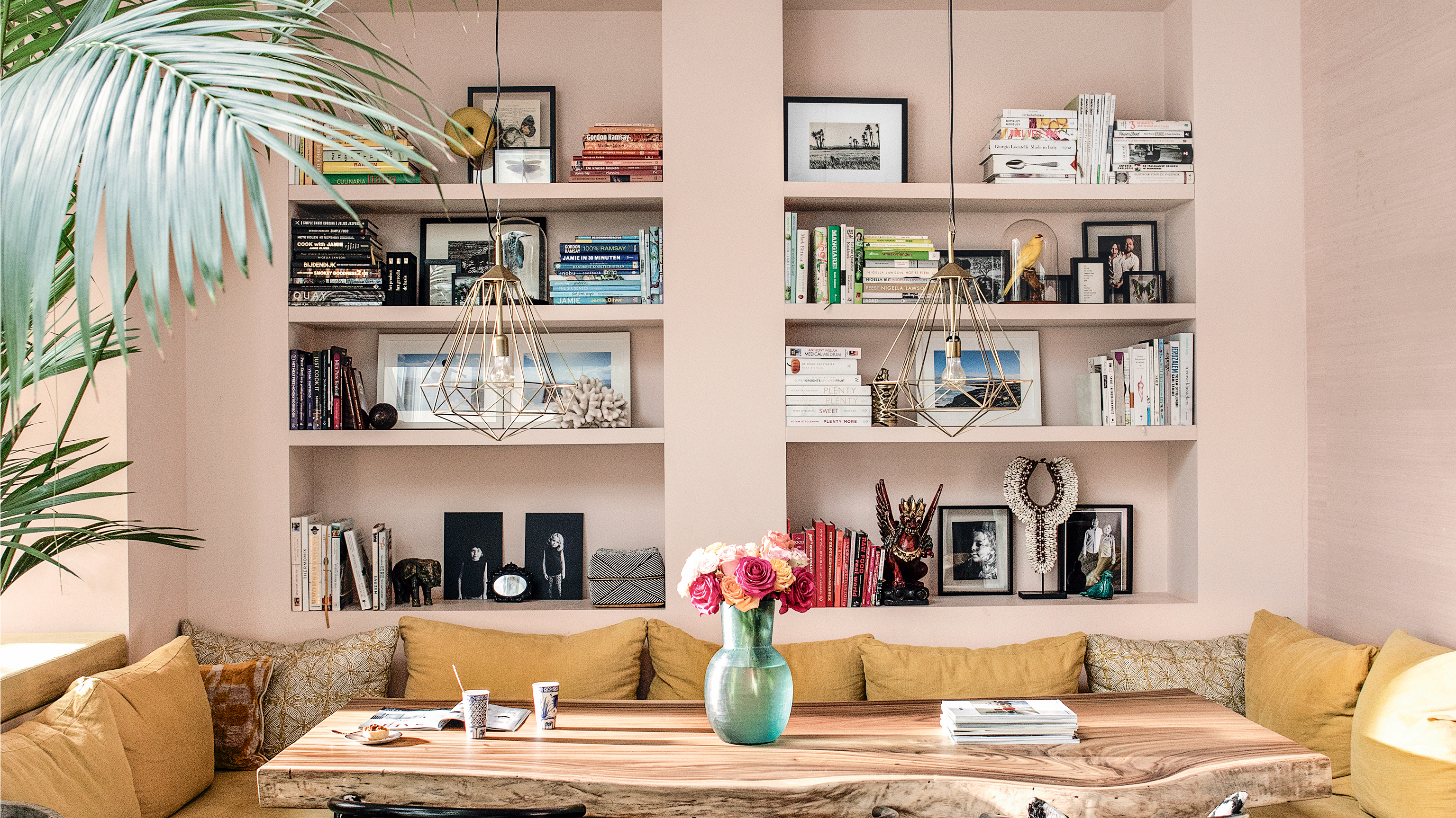
Shelving ideas – how to add personality, style and storage to any room

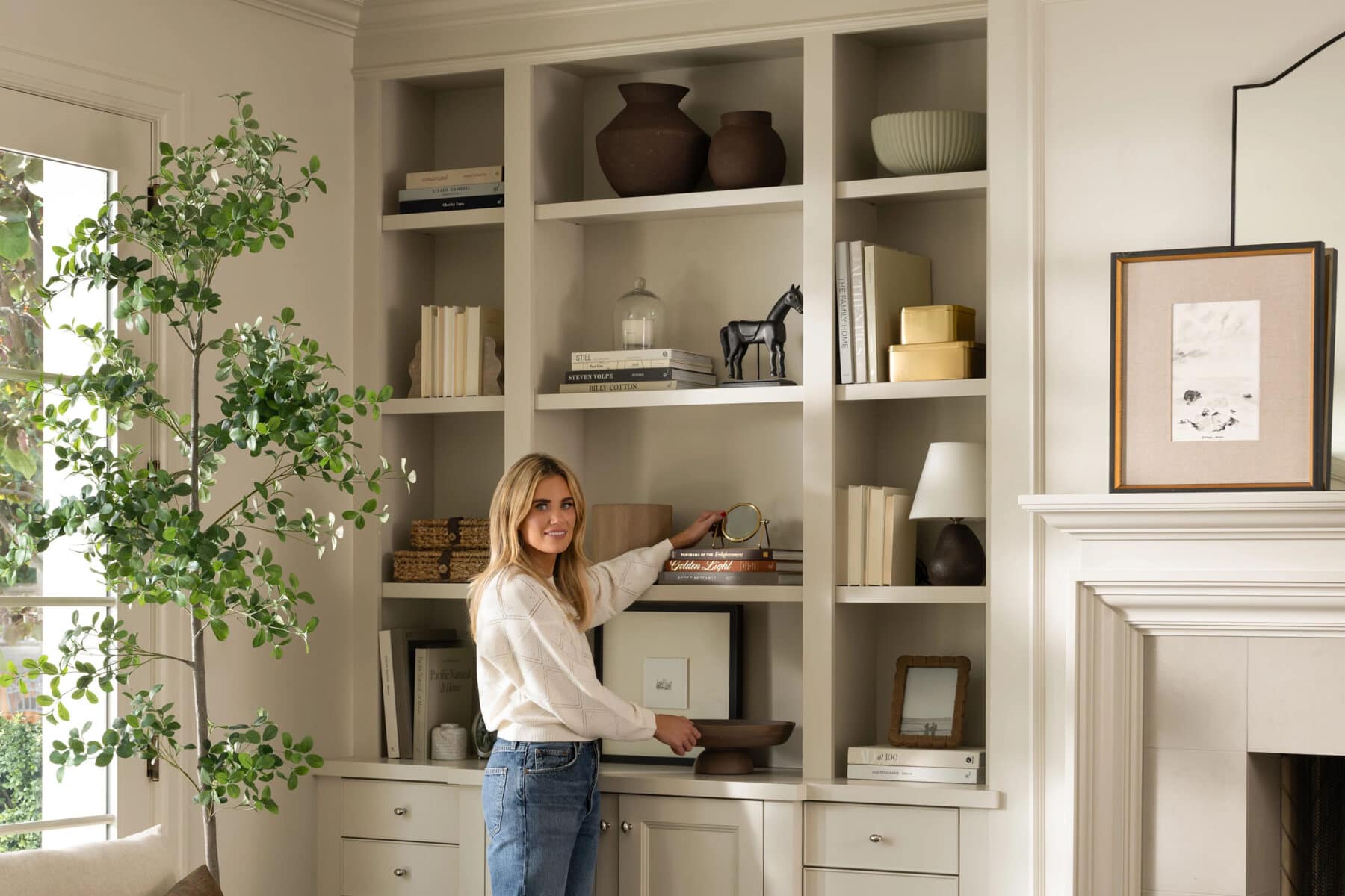
Restyling Your Shelves With Shea
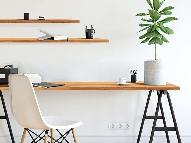
Shelves & Shelf Brackets

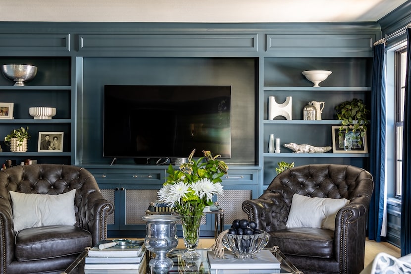
Master the art of styling bookshelves with these tips from design experts

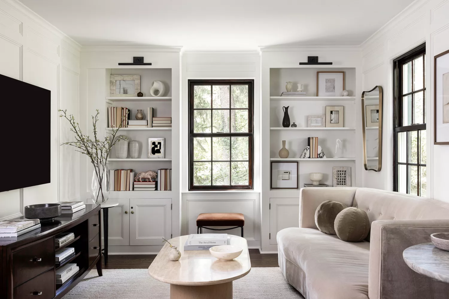
How to Style Your Bookshelves, According to Interior Designers and Stagers
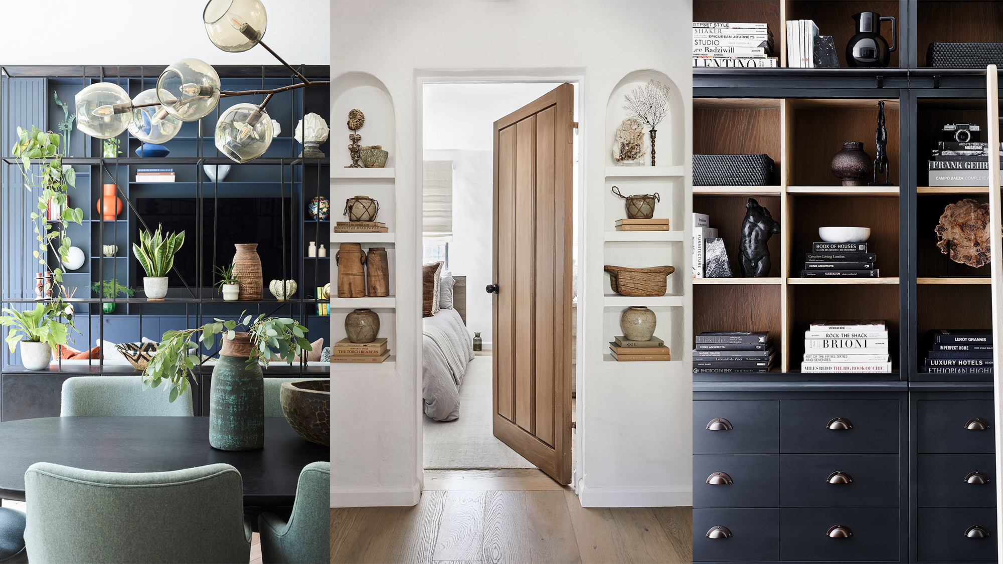
Decorating shelves – 13 ideas for beautiful arrangements

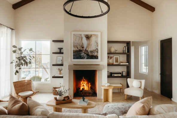
My Best Bookshelf Styling Tips Ever—Just in Time for Fall

The Art Of Shelf Styling
7 Pro Tips for Creating Magazine-Worthy Open Shelves
Experts suggest ways to make your shelfie shine
5 shelf styling trends for 2024 designers are using now to create rooms full of personality

I asked an interior designer how to style shelves, and I learned 4 awesome tips

How To Style Your Bookshelves Perfectly, According to Designers

Putting up shelves? Here's what you need to know first
50 Bookshelf Decor Ideas to Keep Your Growing Collection Organized and Stylish