1/7
Patterns Are the New Neutrals: 6 Designer Tips for Decorating With "Timeless" Prints in 2026
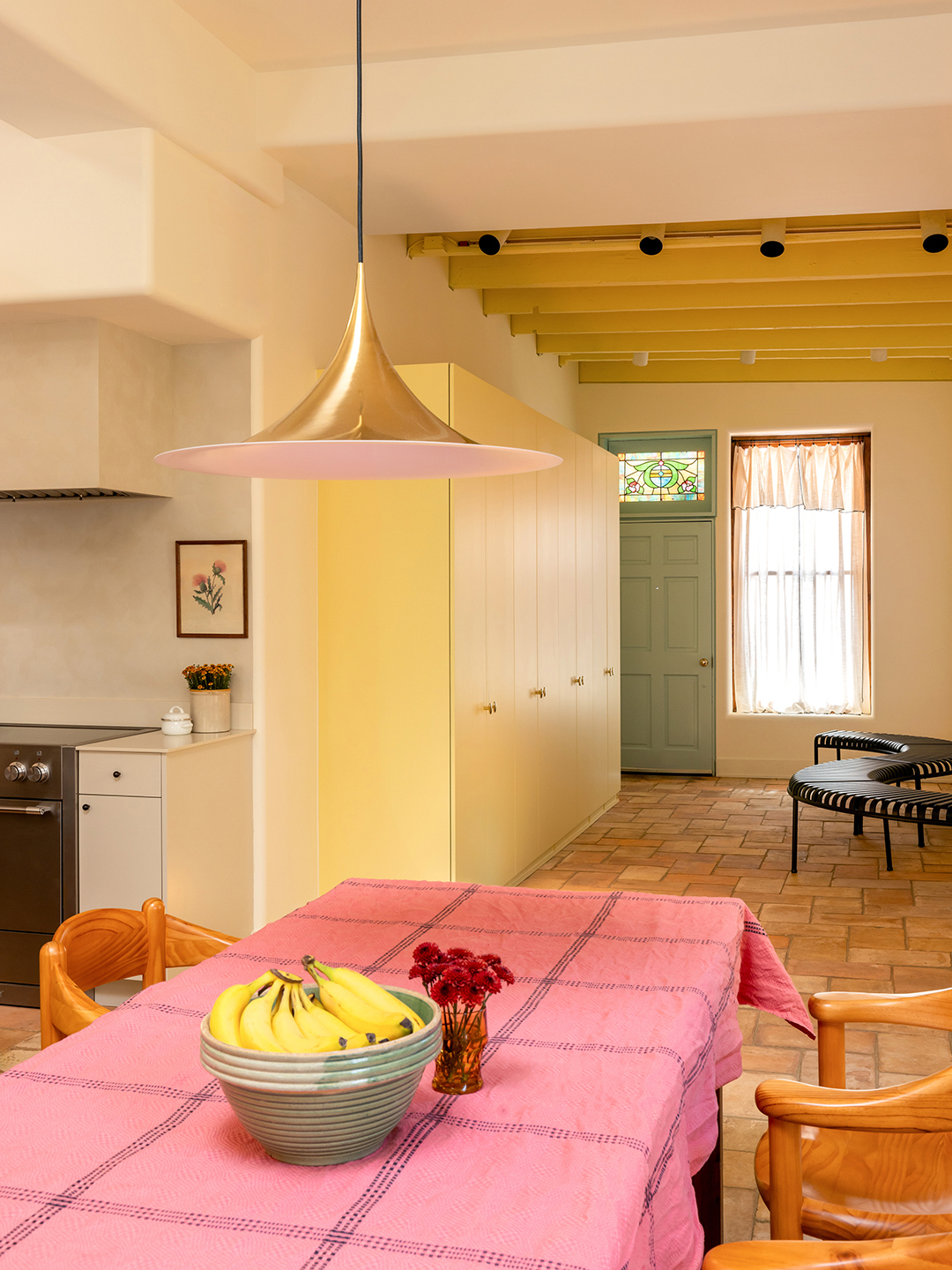
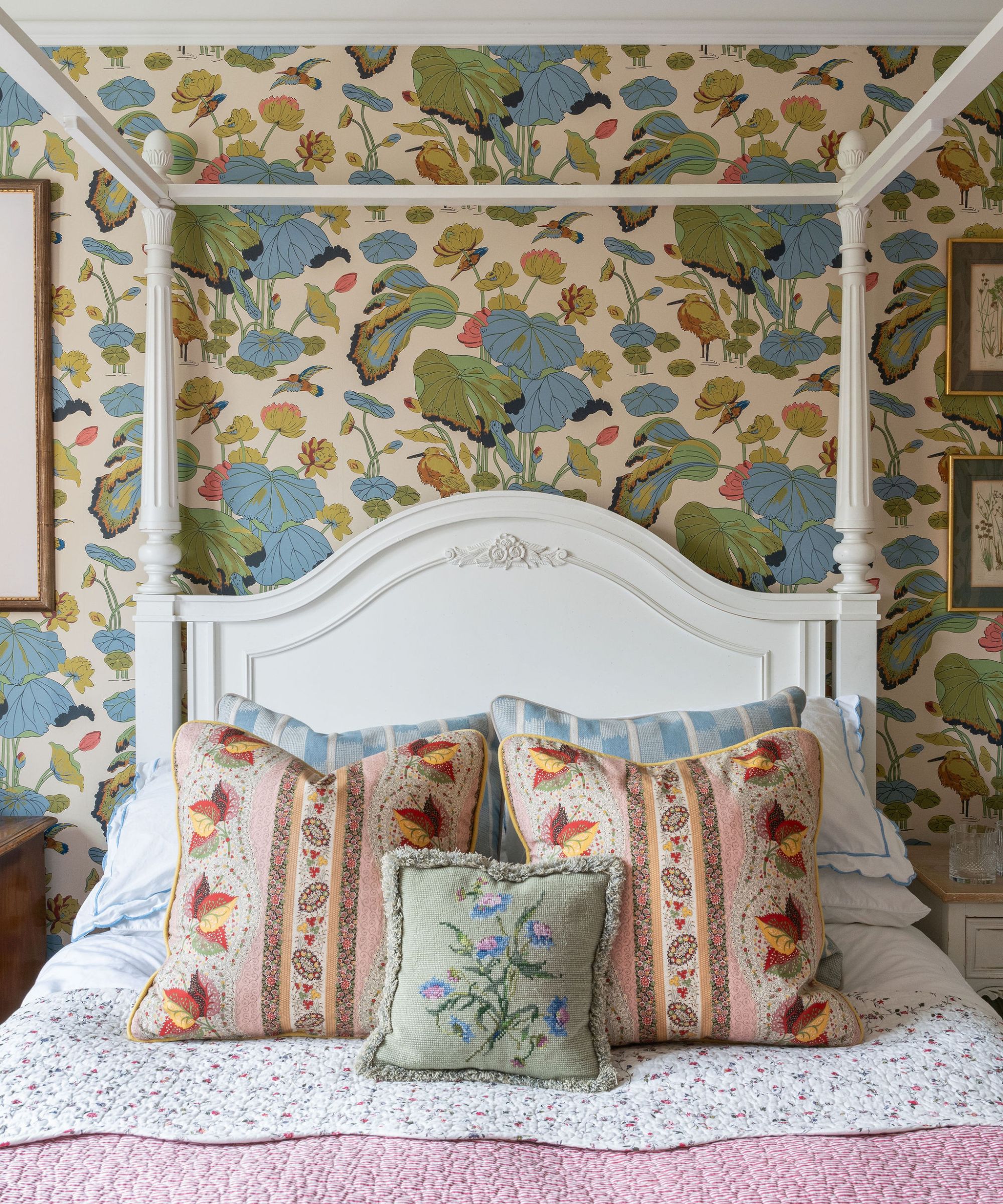
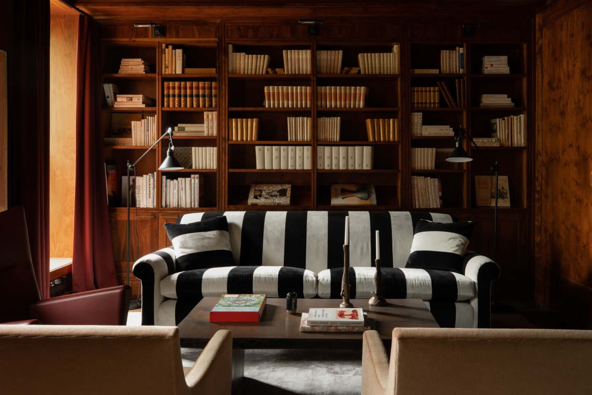
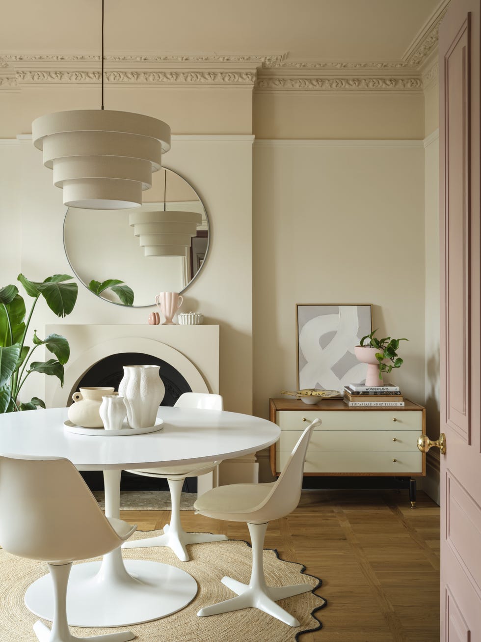
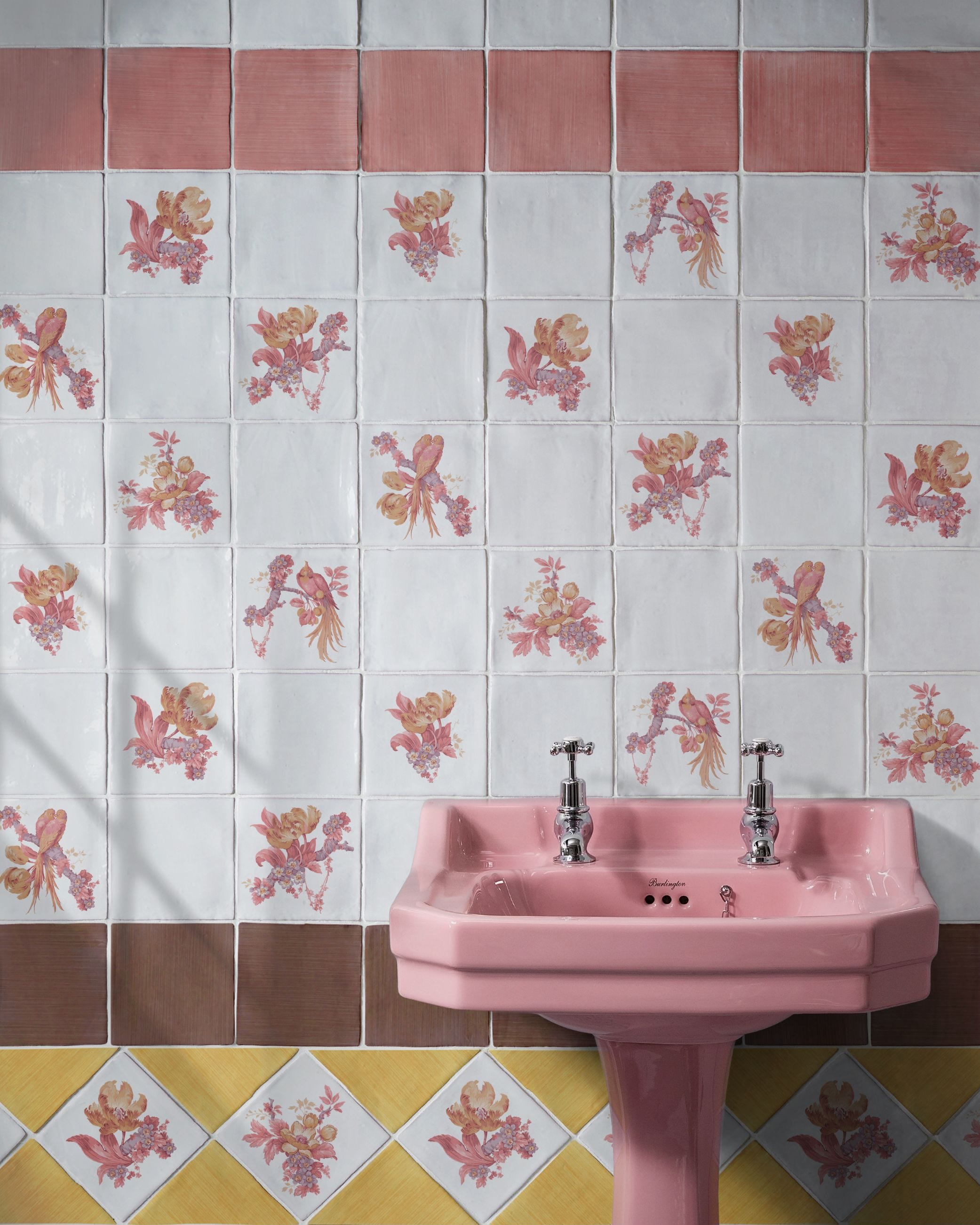
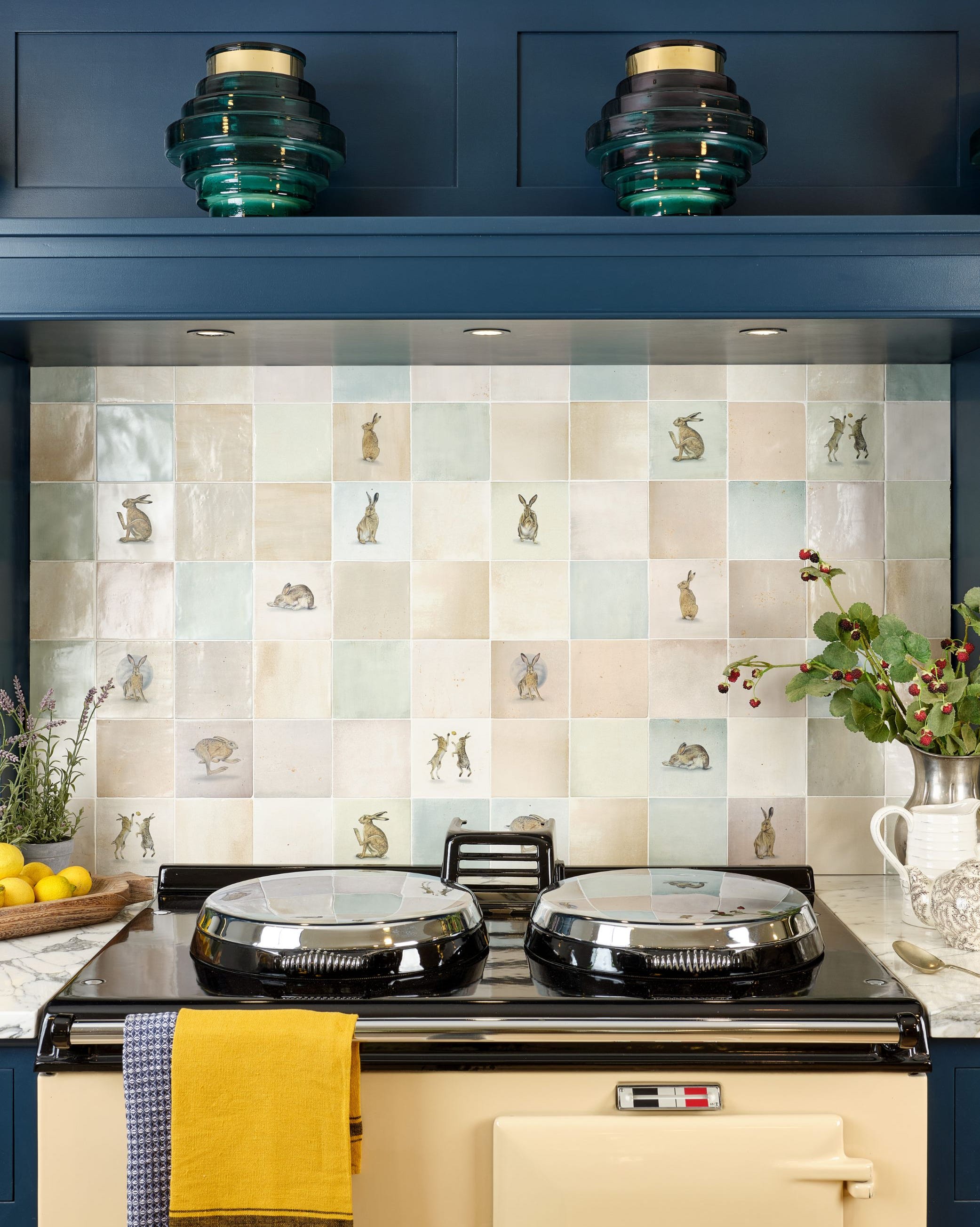
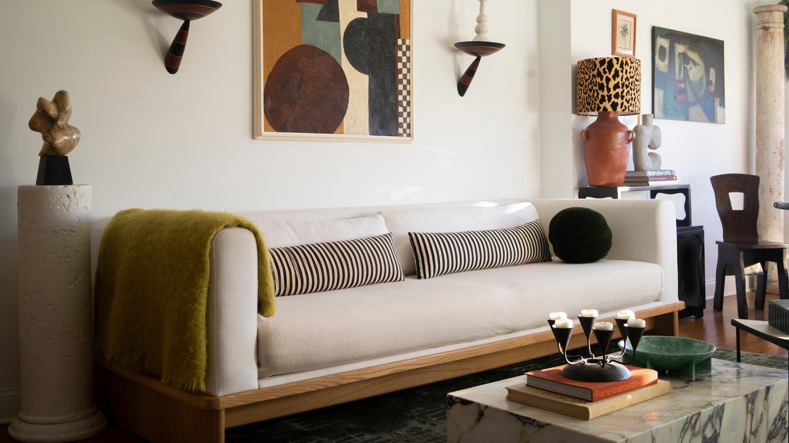
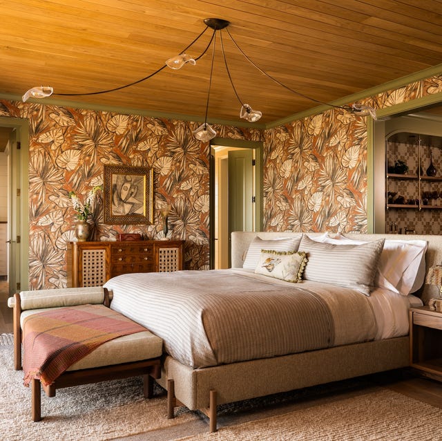
As interior design trends shift away from monochromatic color schemes like millennial gray and all-neutral palettes, designers are reintroducing patterns into homes, not as bold statements, but as subtle neutrals. This modern approach to pattern use adds depth and nuance to a space without overwhelming it, providing a versatile foundation for expressive art or furniture. Interior designer Greg Natale emphasizes that pattern is a powerful tool for transforming a room from merely decorated to deeply composed, requiring skill in knowing when to amplify or soften it for balance. He notes that patterns acting as neutrals—understated in color and contrast but rich in tactility—bring visual interest and cohesion.
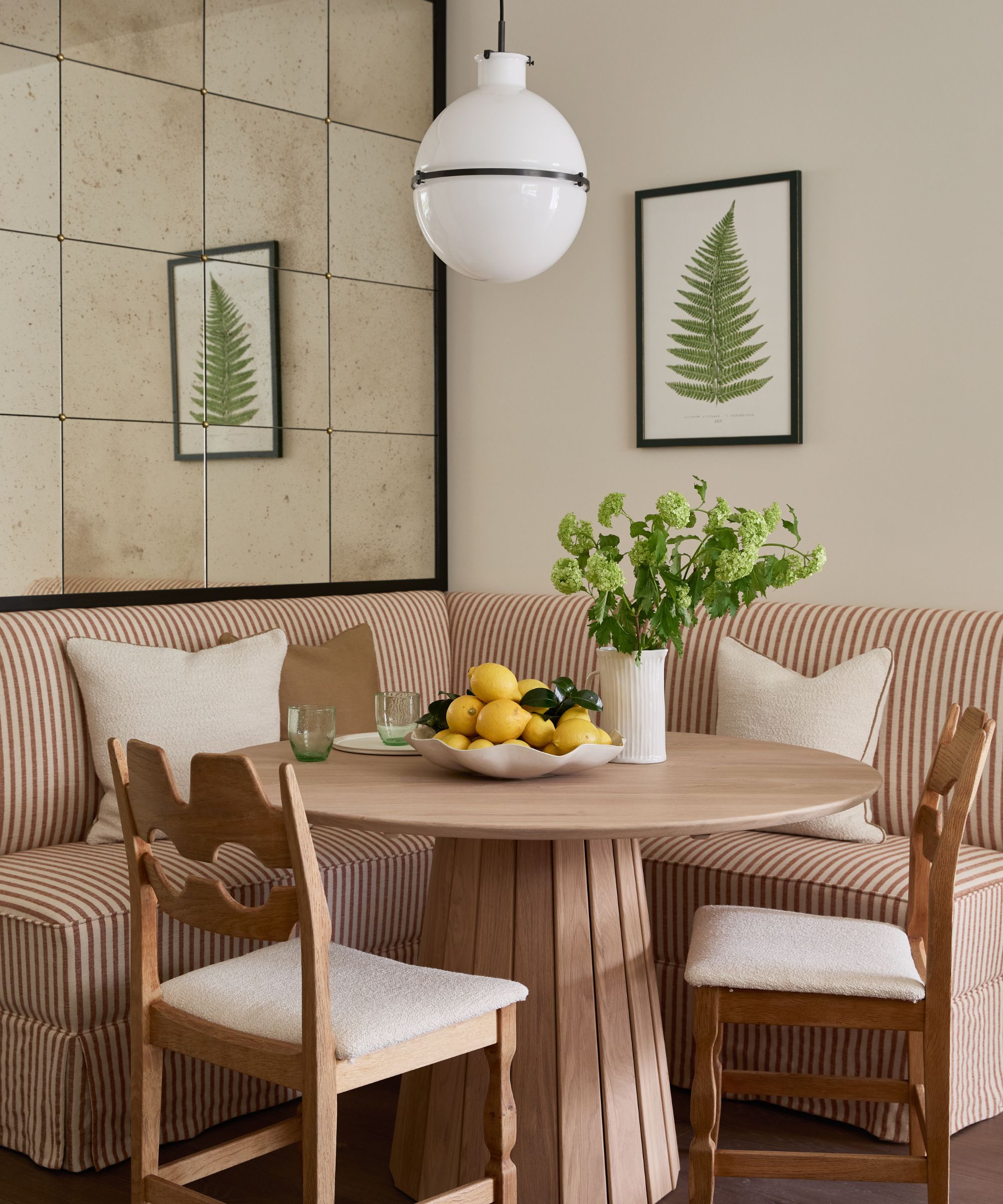
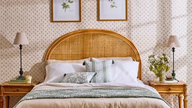
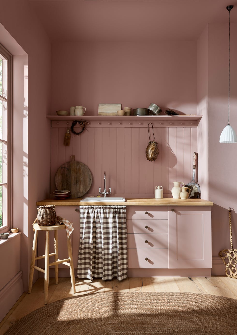
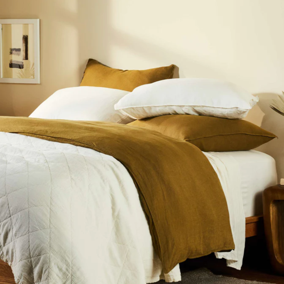
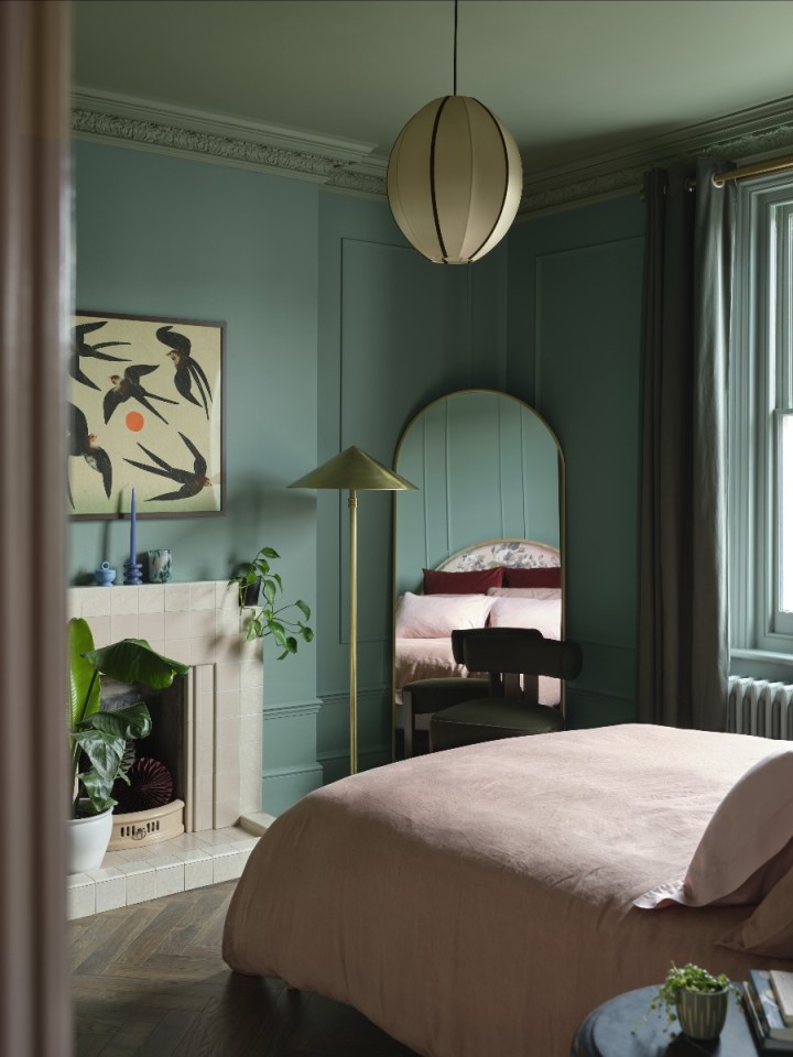
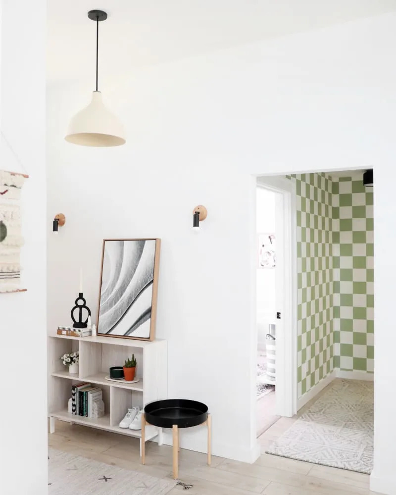
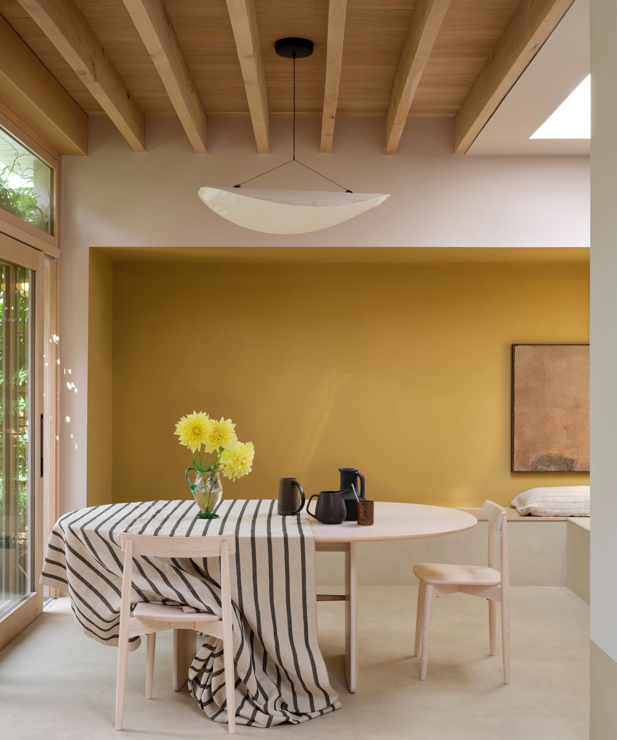
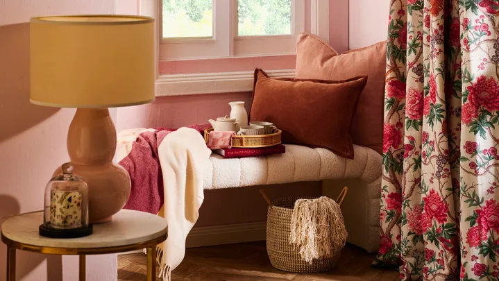
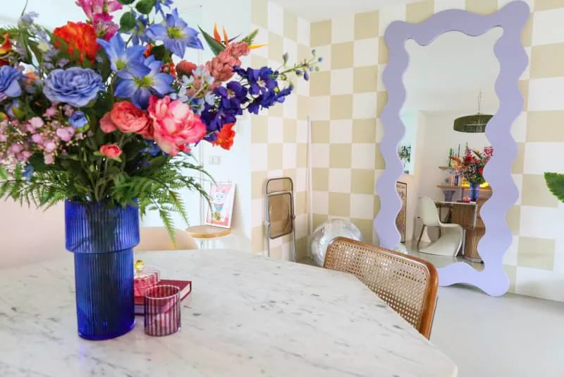
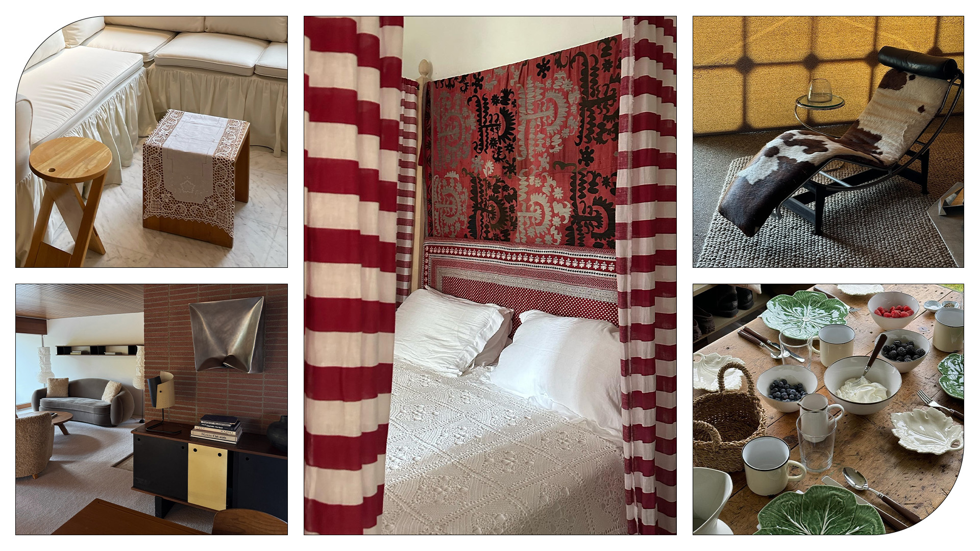
To effectively integrate patterns as neutrals, designers offer several key tips. First, understanding the spectrum of pattern "loudness" is crucial. Amber Guyton, principal designer at Blessed Little Bungalow, explains that patterns can range from subtle, tiny-scale repeats, tone-on-tone prints, and natural textures to bold, oversized motifs and contrasting colors. The ability to vary the volume of patterns allows for both subtlety and maximalism within a single space, creating a cohesive rather than chaotic feel. When starting out, especially for those intimidated by patterns, working with monochromatic color schemes is recommended. Guyton suggests choosing prints that resemble texture rather than competing colors, such as gingham, small checks, or subtle stripes in the same color family as walls or upholstery. These add depth without becoming a dominant focal point.
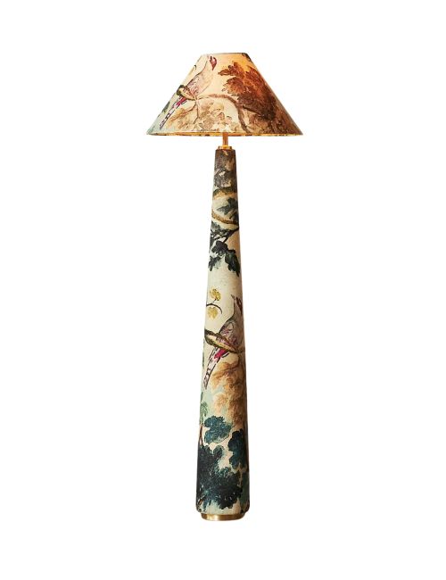
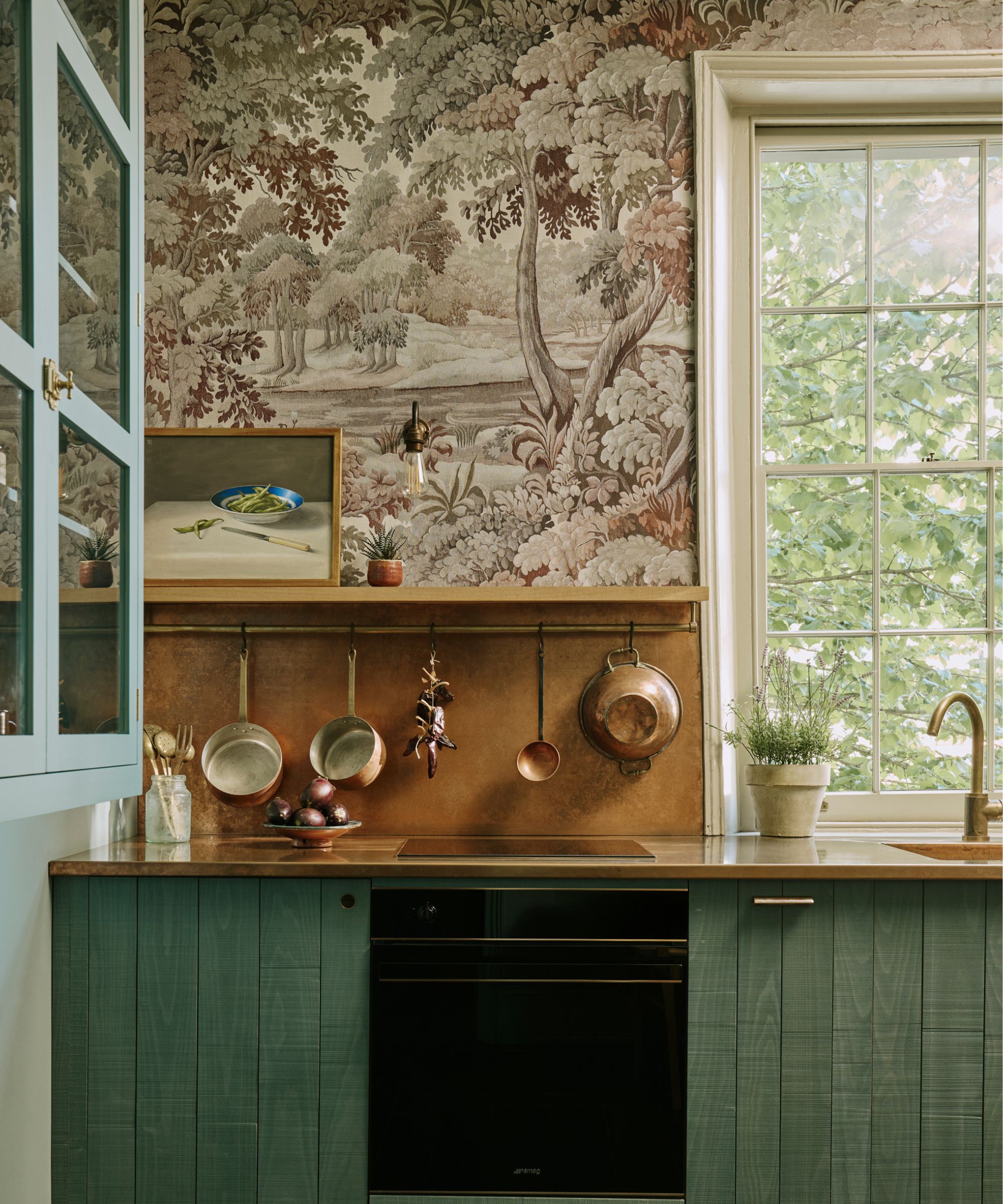
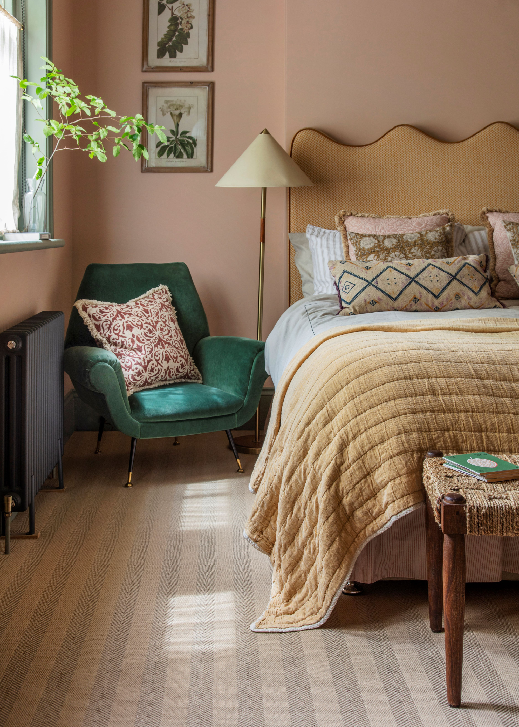
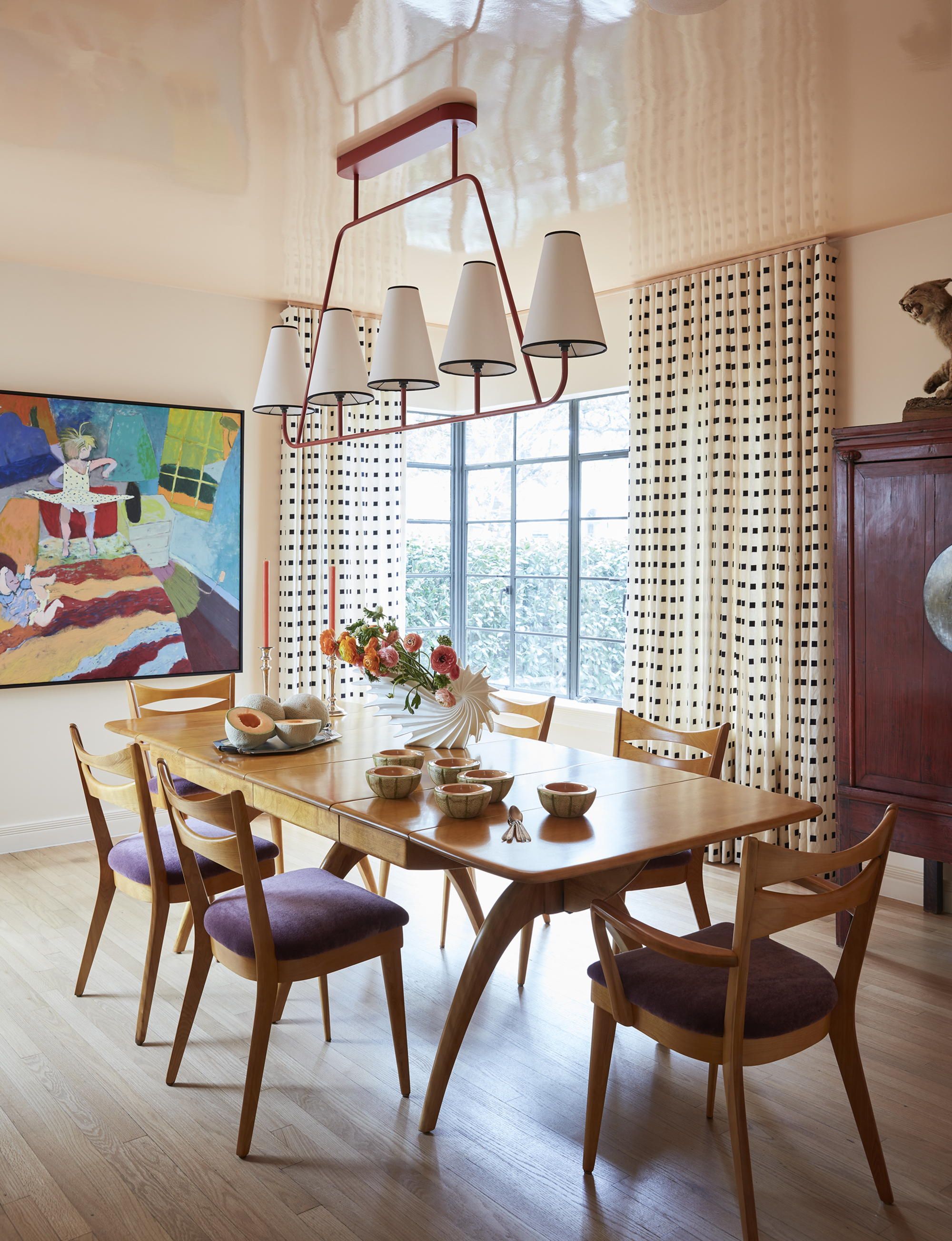
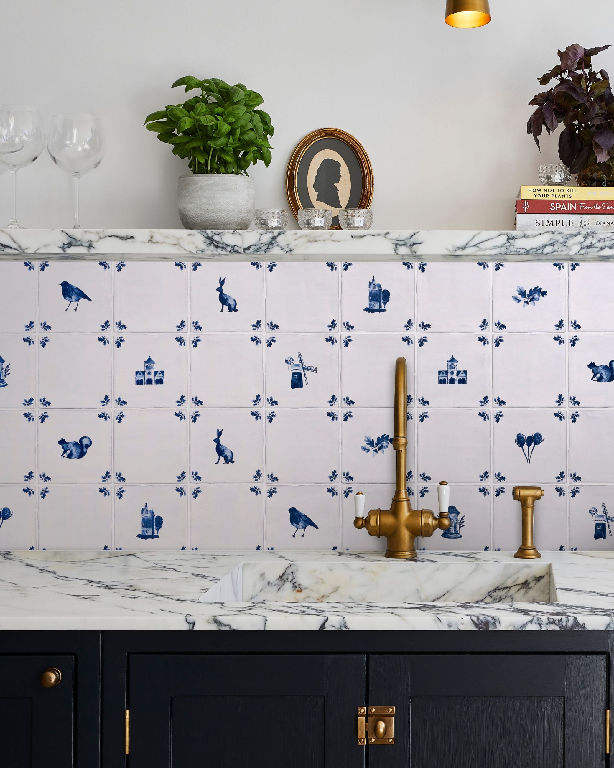
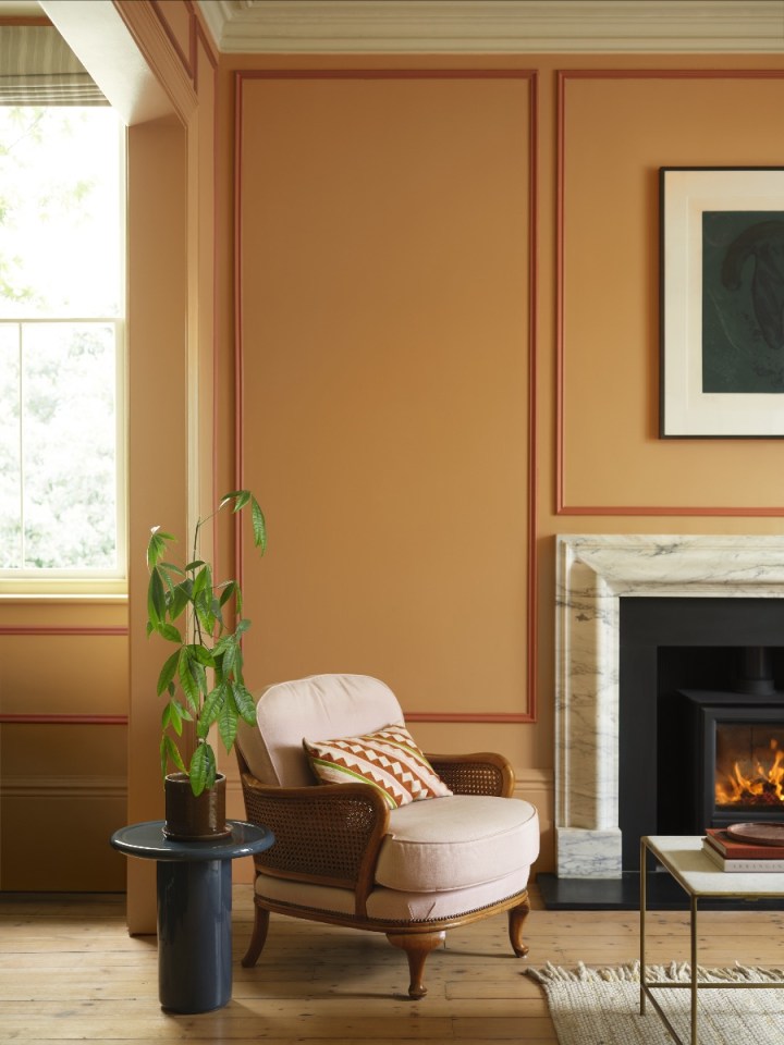
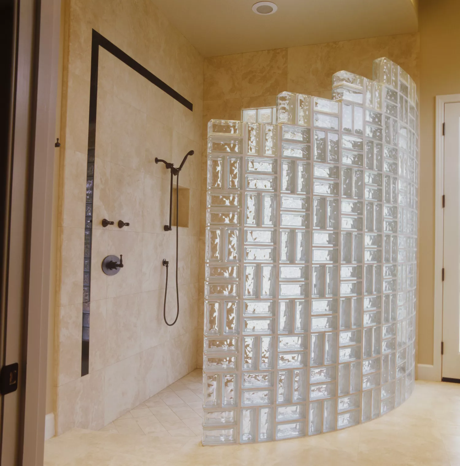
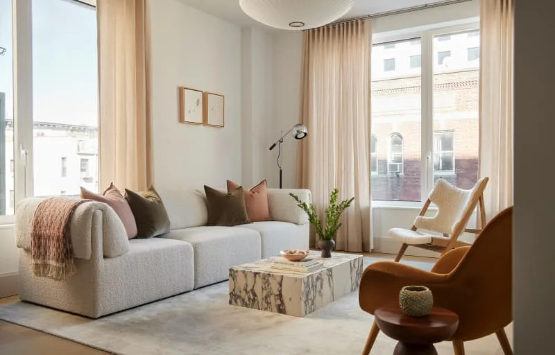
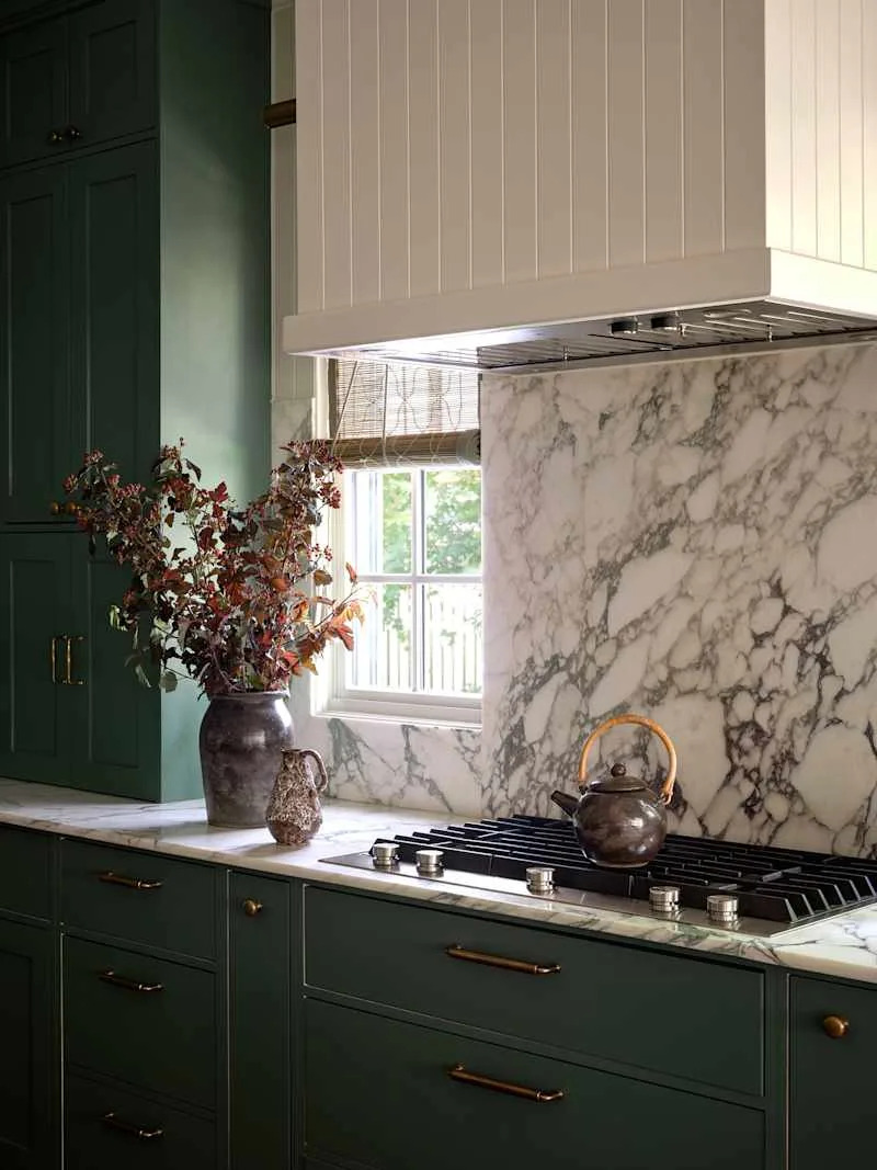
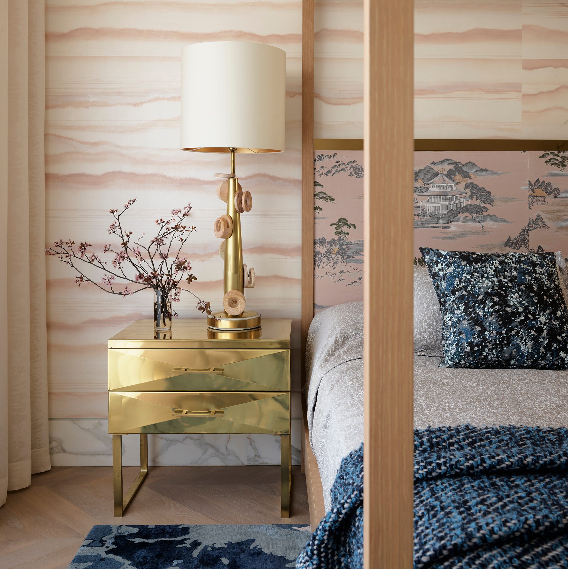
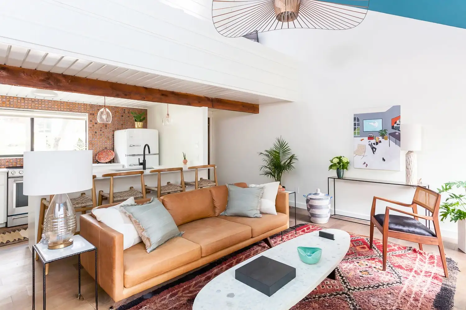
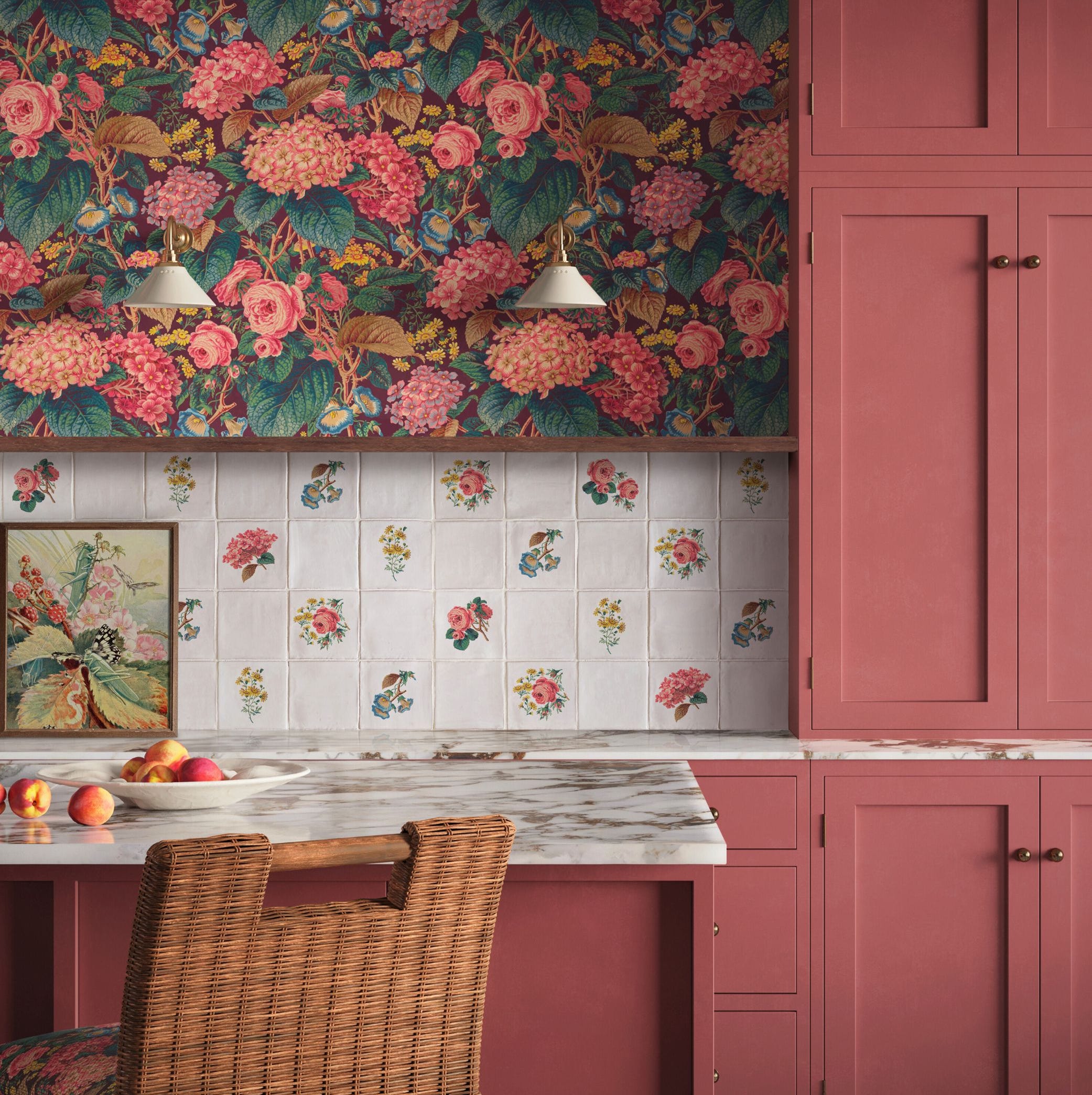
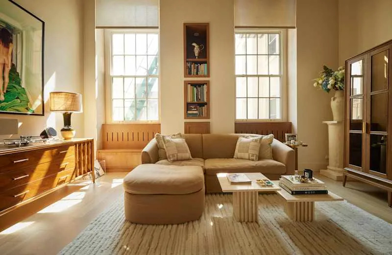
Another effective strategy is to use earthy textiles and natural materials as neutral patterns. Natale highlights that organic textures found in stone, timber, textiles, plaster, grasscloth, or silk wallpaper inherently contain quiet, irregular patterning that reads as texture. These materials evoke craftsmanship and sophistication, especially when chosen in natural tones. Even underfoot materials like travertine, terrazzo, and marble can contribute to this effect. Embracing small-scale prints is also vital. Micro patterns such as tiny florals, dots, or tight geometrics offer subtle detail up close while blending into the background from a distance. These are ideal for drapery, bedding, accent chairs, lampshades, or powder rooms, allowing for low-commitment experimentation before larger applications.
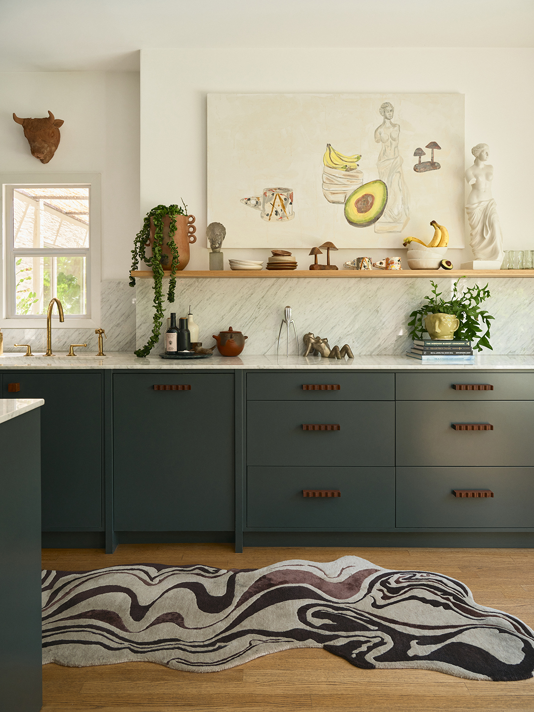
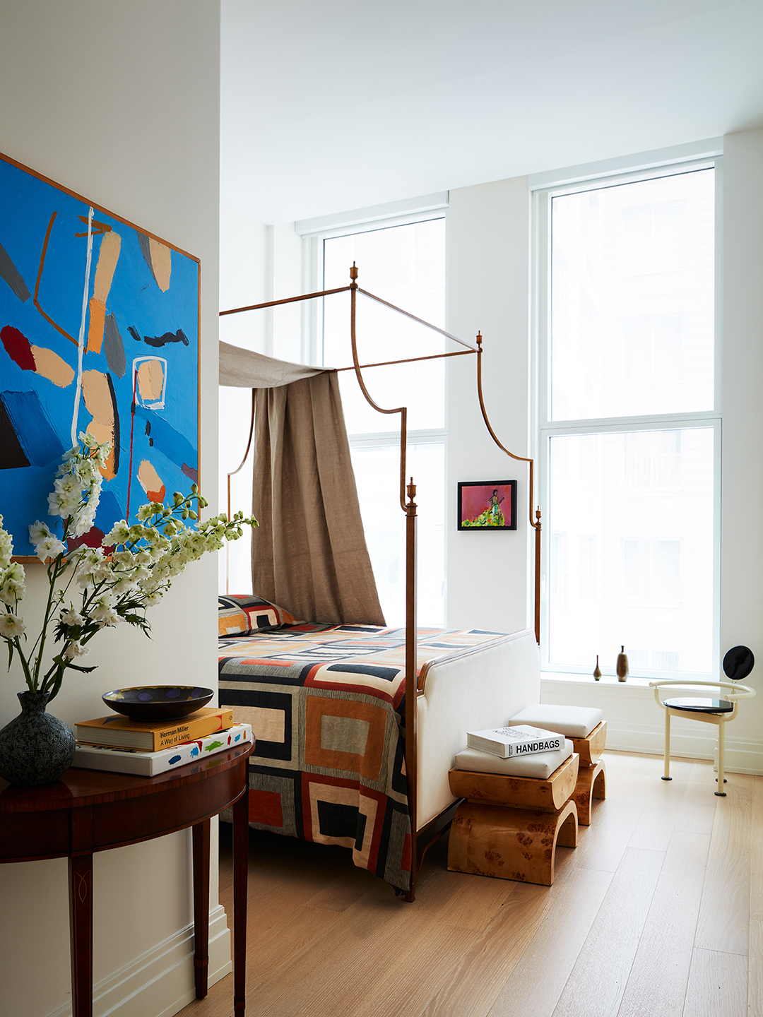
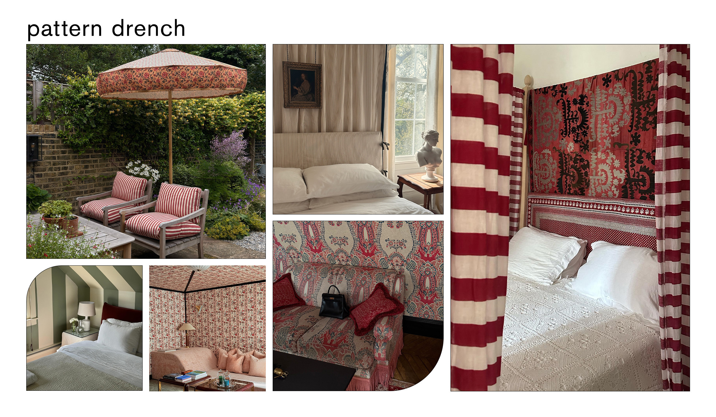
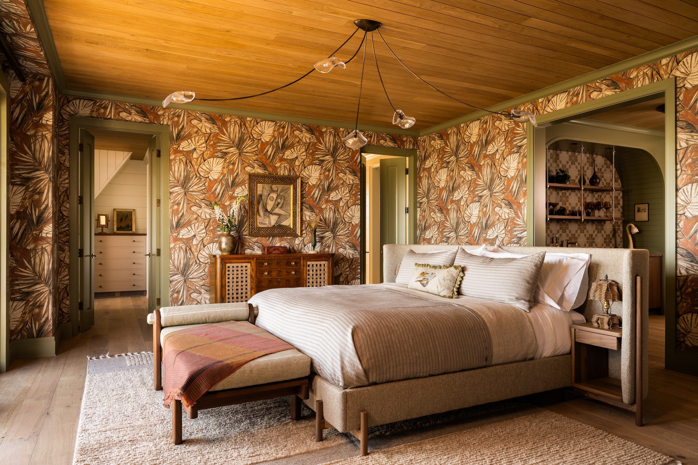
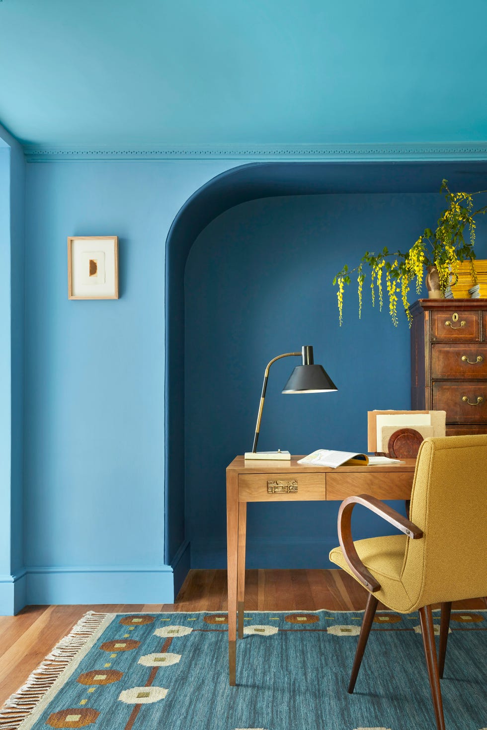
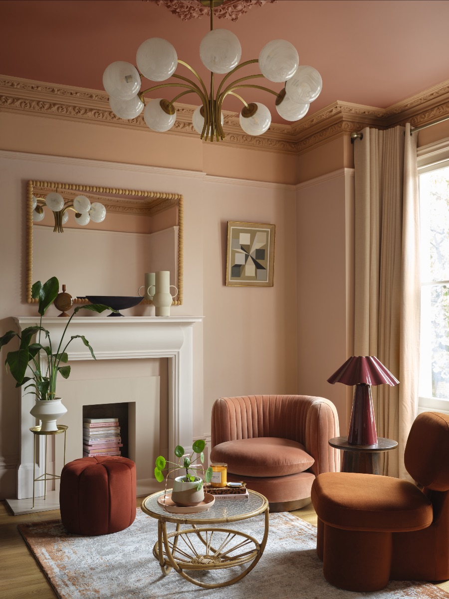
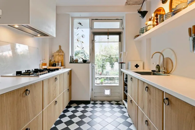
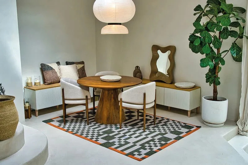
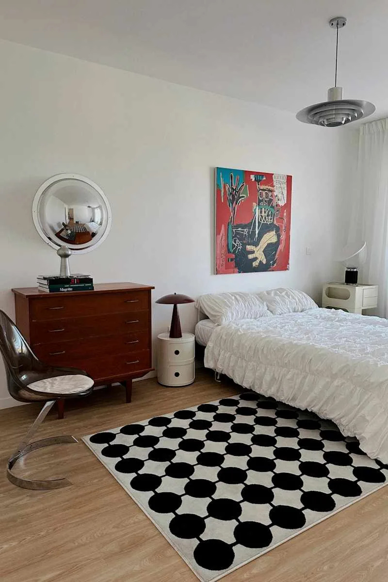
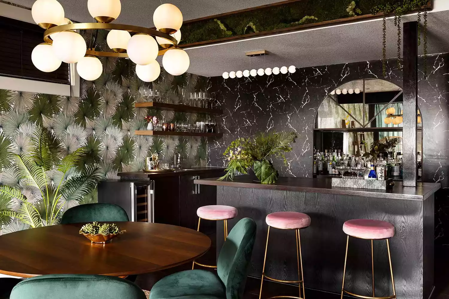
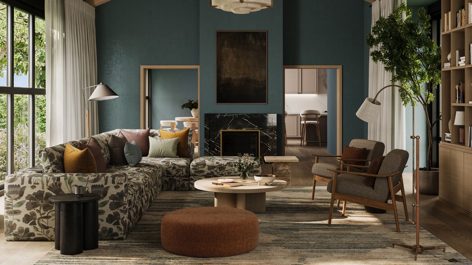
Incorporating pattern throughout the room, by repeating the same pattern in different elements like ceilings, lampshades, or decorative pillows, makes the design feel intentional and cohesive. Interior designer Jasmin Reese advises mixing patterns, ensuring their colors relate and scales balance each other, which contributes to a collected and lived-in atmosphere. Finally, a neutral, tonal rug with a gentle pattern is an excellent way to introduce visual interest and ground a room. Natale considers rugs a favorite tool for anchoring a space with pattern in a controlled, understated manner, helping to tie the entire room together. By following these designer tips, individuals can use patterns as sophisticated neutrals to create visually rich, timeless, and balanced interior spaces.
#InteriorDesign #PatternedNeutrals #HomeDecor #DesignTips #MonochromaticDesign #TextilePatterns #SmallScalePrints #DecoratingIdeas #ModernHome #InteriorDesign #PatternedNeutrals #HomeDecor #DesignTips #MonochromaticDesign #TextilePatterns #SmallScalePrints #DecoratingIdeas #ModernHome
0 comment in total
 No comments yet
You may also like
The Decorating Trends Designers Are Leaving Behind in 2026

Designers' Reveal the Biggest Pattern Trends for 2025, and It's Shaping Up to Be a Bold Return to the Classics

Designers Predict This Will Be The Biggest Paint Trend Of 2026

Old Is New Again: Designers Say These 6 Retro Design Trends Are Defining 2025 Style

This Centuries-Old Pattern Is the Next Big Design Trend for 2026 – Here Are 24 Pieces That Prove It

The decorating trends everyone will be talking about in 2026

6 Sustainable Home Decor Trends You're Going to See Everywhere in 2025, Designers Say
This Classic Pattern Isn't Going Away — Here's How to Style It in 2024

These are the biggest pattern trends designers are using in 2025 and beyond
Designers Swear These 6 Decor Trends Will Age Well—Without Feeling Dated

Pattern Splicing: The Bold Tile Trend About to Be Everywhere in 2026
5 Styles That Will Dominate Home Decor in 2026, According to Experts
6 Prints Designers Say Will Be Popular In 2025
6 Trends Defining Home Décor in 2025

Interior Designers Say These Decor Trends Will Be Everywhere in 2024
According to Designers, These Are The Outdated Color Trends for 2026
Designers Say These Vintage Lighting Trends Will Be Everywhere in 2026

Designers Are Calling It: These Interior Design Trends Will Be Everywhere in 2026
Interior designers reveal the home decor trend that will take over 2026 & why it's time to bin off accent walls

Don't Redecorate Yet: Designers Predict These 6 Trends Will Make a Comeback in 2025