1/21
Paint Your Kitchen Dark Purple—This Moody Ontario Hotel Is Daring You to Try It
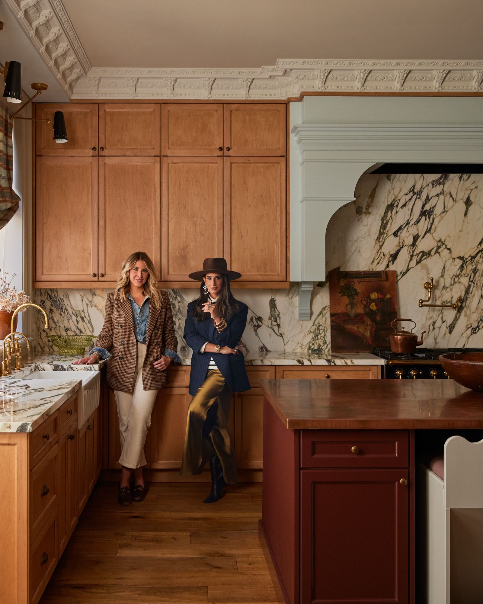
Hotel Julie, a new nine-room hotel in Stratford, Ontario, showcases a unique approach to hospitality design, where each suite is conceived to function as a self-contained apartment. Property developers Jake Tayler and Paula McFarlane enlisted Autumn Hachey of You Should Stay Here and Jillian Smith-Moher of Twenty-Two Twelve to bring their vision to life. The collaborative design process, documented in a 10-episode CTV Life series, focused on creating distinct, bold personalities for each space, moving away from conventional, uniform hotel aesthetics.
One innovative design solution is found in Flat 4, a smaller suite where a traditional door between the bedroom and lounge was not feasible. The designers incorporated an oversized keyhole-shaped opening, custom-made by Hemme, adorned with velvet curtains. This feature not only serves a functional purpose but also adds significant visual impact, paying homage to Stratford's rich theater history.
In Suite 6, the designers challenged conventional material application by extending diamond checkerboard travertine and marble tile from the floor to the upper half of the walls in the kitchen, creating a wallpaper-like effect. To manage costs without compromising aesthetic, they specifically chose a cross-cut travertine, a less popular but equally effective style, which blended seamlessly with the burl wood furniture used elsewhere in the suite.
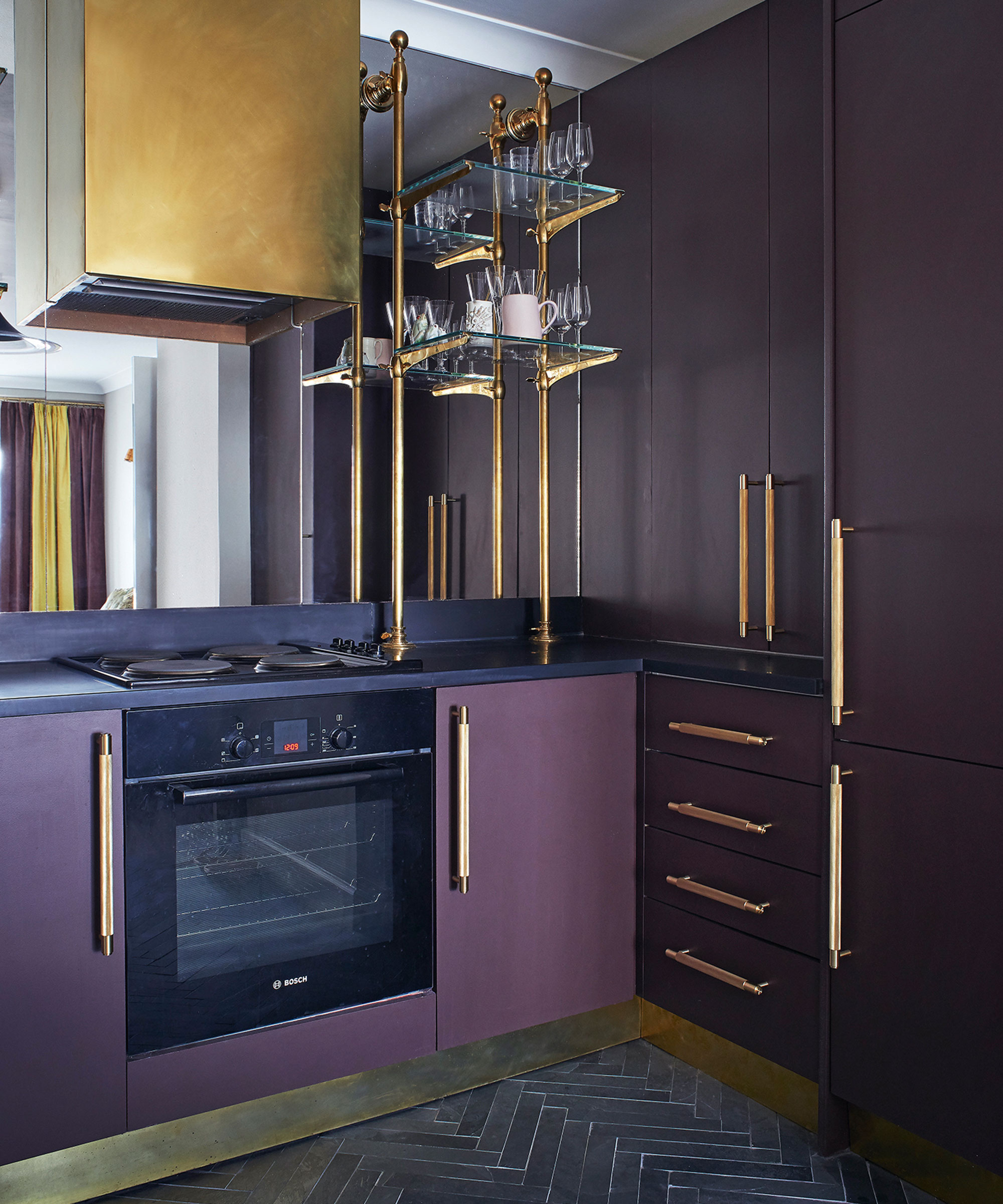
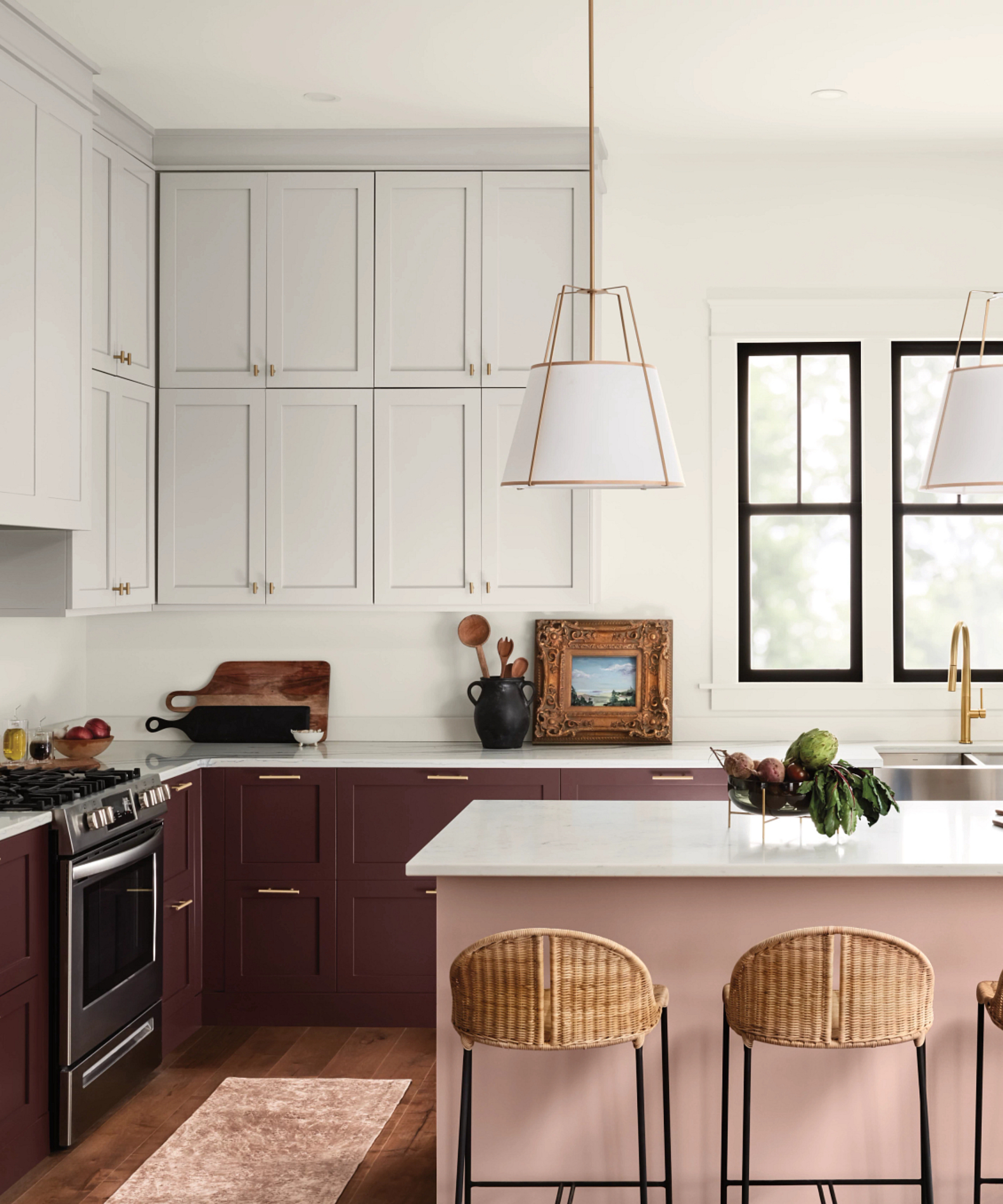
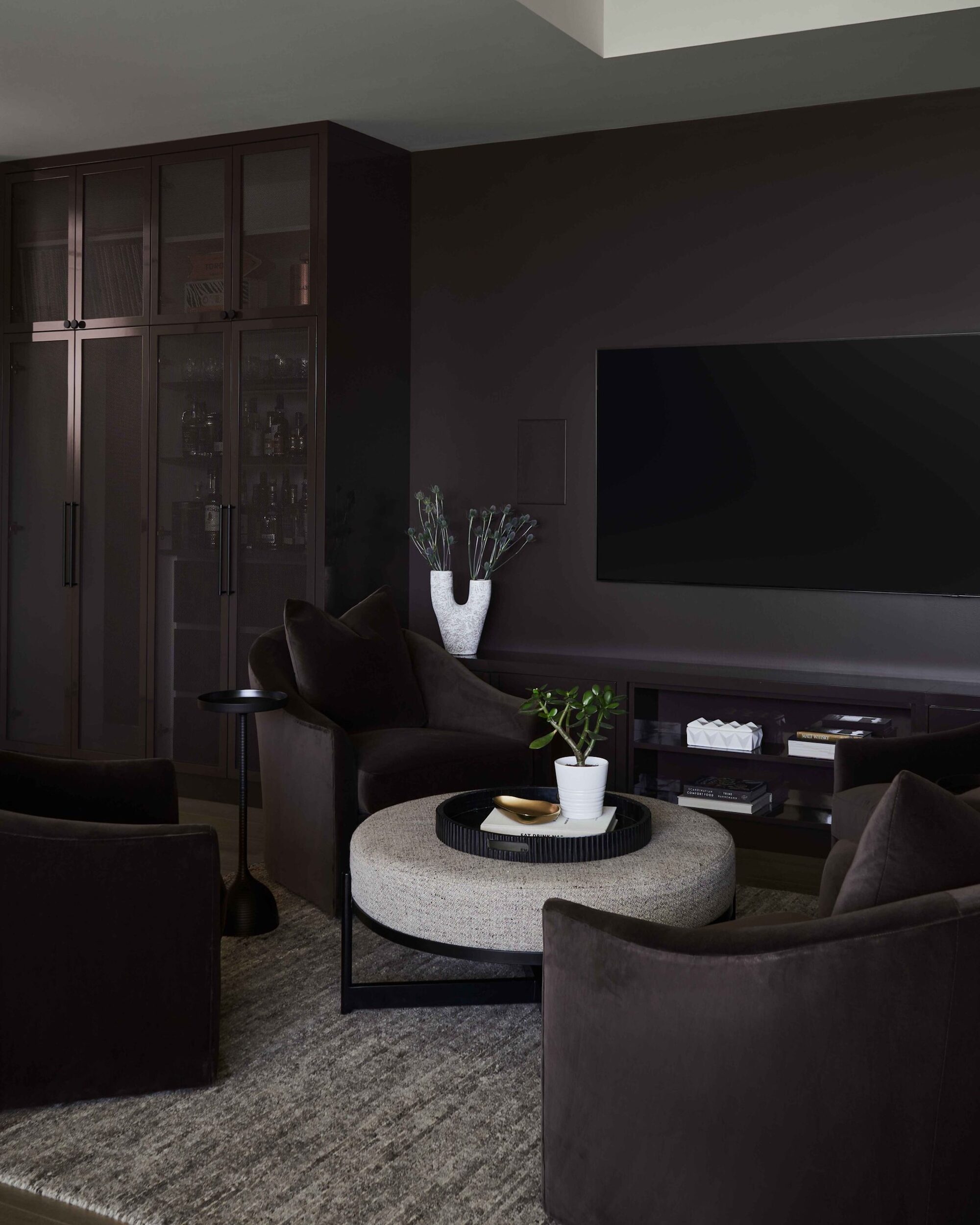
Flat 3 presented a design challenge with its deep violet and dark chocolate color palette for a galley kitchen. To counteract the potential for a dark and dismal feel, a round peephole was carved into one of the walls, introducing an unexpected source of light and visual interest into the enclosed space.
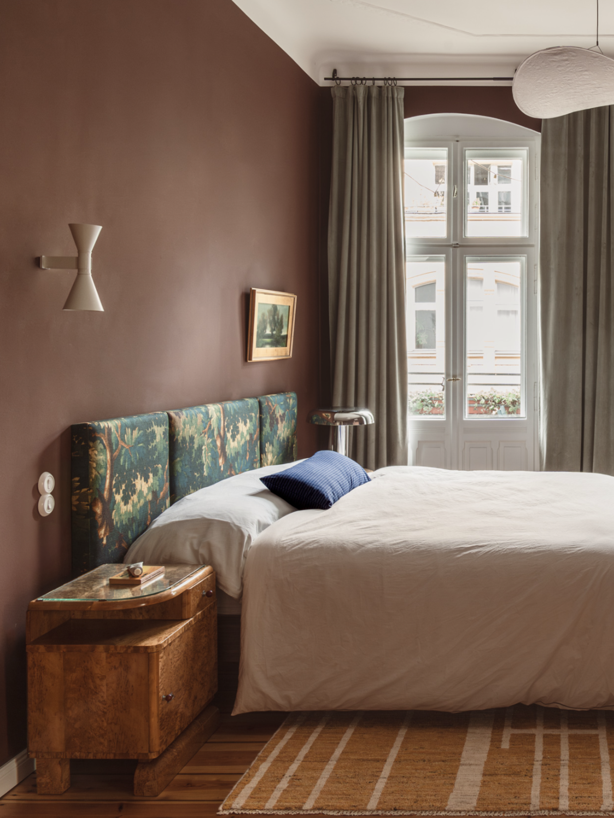
The design duo also masterfully integrated a striking burgundy and blue color combination in Flat 7, a scheme that designer Smith-Moher realized mirrored elements in her own home. The choice of Rosa Levanto stone, a more budget-friendly alternative to Calacatta Viola, was instrumental in achieving this luxurious look without overspending. Calacatta Viola was used sparingly for accents.
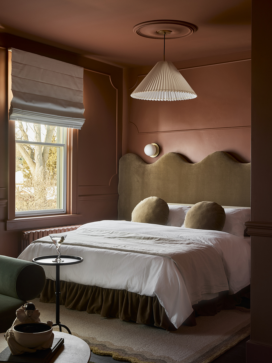
Furniture selection emphasized customization and creative repurposing. Many pieces were reupholstered, such as a vintage sofa covered in House of Hackney’s Artemis Moss velvet, and bespoke wavy headboards were crafted by Kara Shuster from And Once We Were. A notable example of this ingenuity is the transformation of a CB2 outdoor dining table for Suite 4; its original top was replaced with a green marble slab, initially intended for a coffee table, which significantly elevated the table's appearance and the overall aesthetic of the suite. The article concludes by listing the specific Benjamin Moore paint colors used throughout Hotel Julie, offering readers practical inspiration from the hotel's diverse palette.
#HotelDesign #InteriorDesign #KitchenDesign #PaintColors #HomeRenovation #CreativeSolutions #BoutiqueHotel #DesignInspiration #HotelDesign #InteriorDesign #KitchenDesign #PaintColors #HomeRenovation #CreativeSolutions #BoutiqueHotel #DesignInspiration
0 comment in total
 No comments yet
You may also like
10 purple kitchen ideas that will add flair to your space

8 of the best dark paint colours for your home and how to use them

5 Gorgeous Paint Colors To Elevate Your Kitchen Cabinets In 2025

Experts Rank the 10 Worst Paint Colors for Your Kitchen
Tour an “Ironically Traditional” Toronto Home That Uses 35 Different Paint Colors

The best colours to paint a kitchen according to paint pros - pick the perfect shade for large, small, dark and light spaces
The Best Dark Kitchen Cabinet Colors for a Moody Space

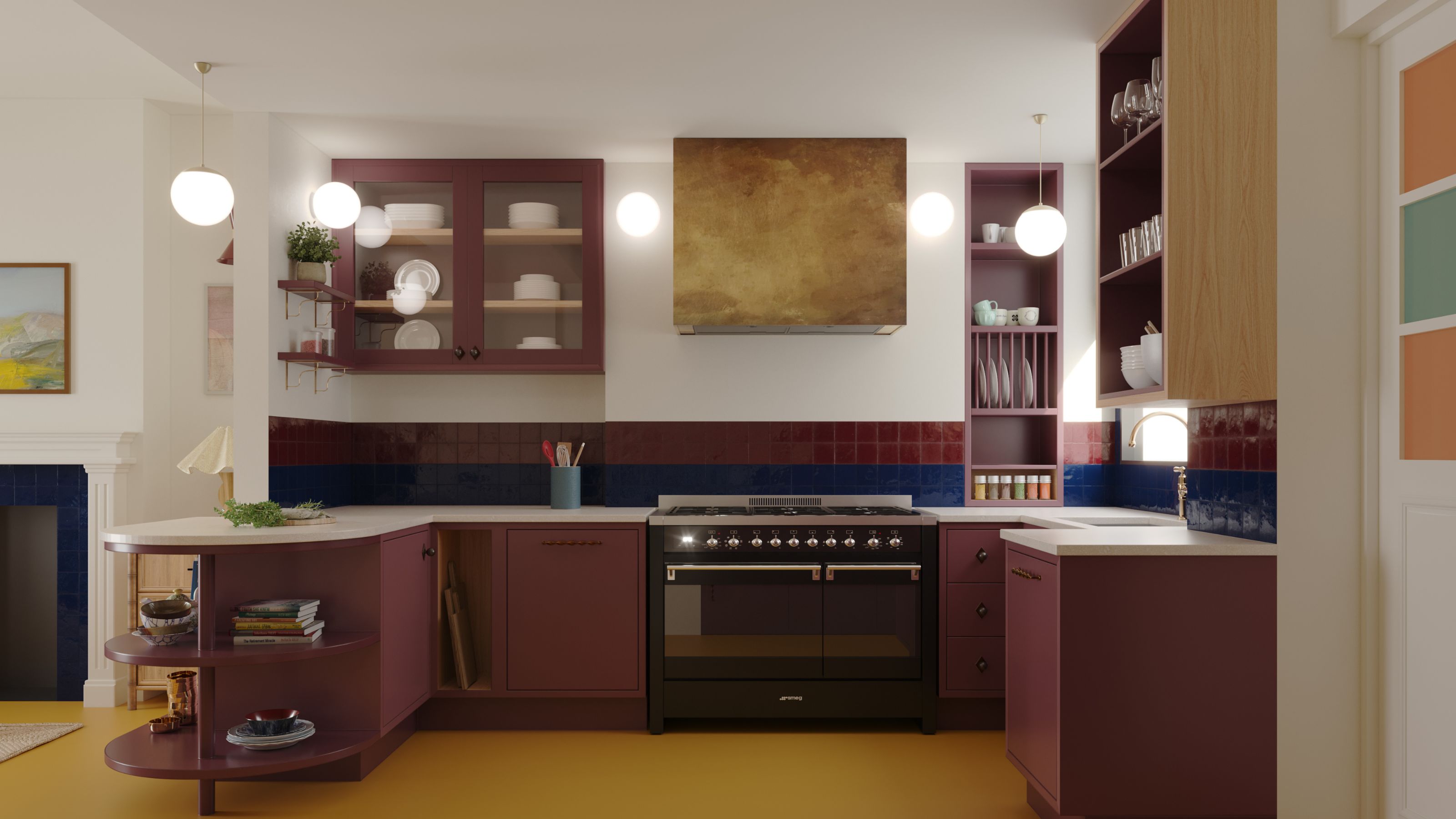
Rainbow colours have transformed a tired kitchen into a vibrant space
29 Best Paint Colors for a Kitchen You’ll Never Want to Leave

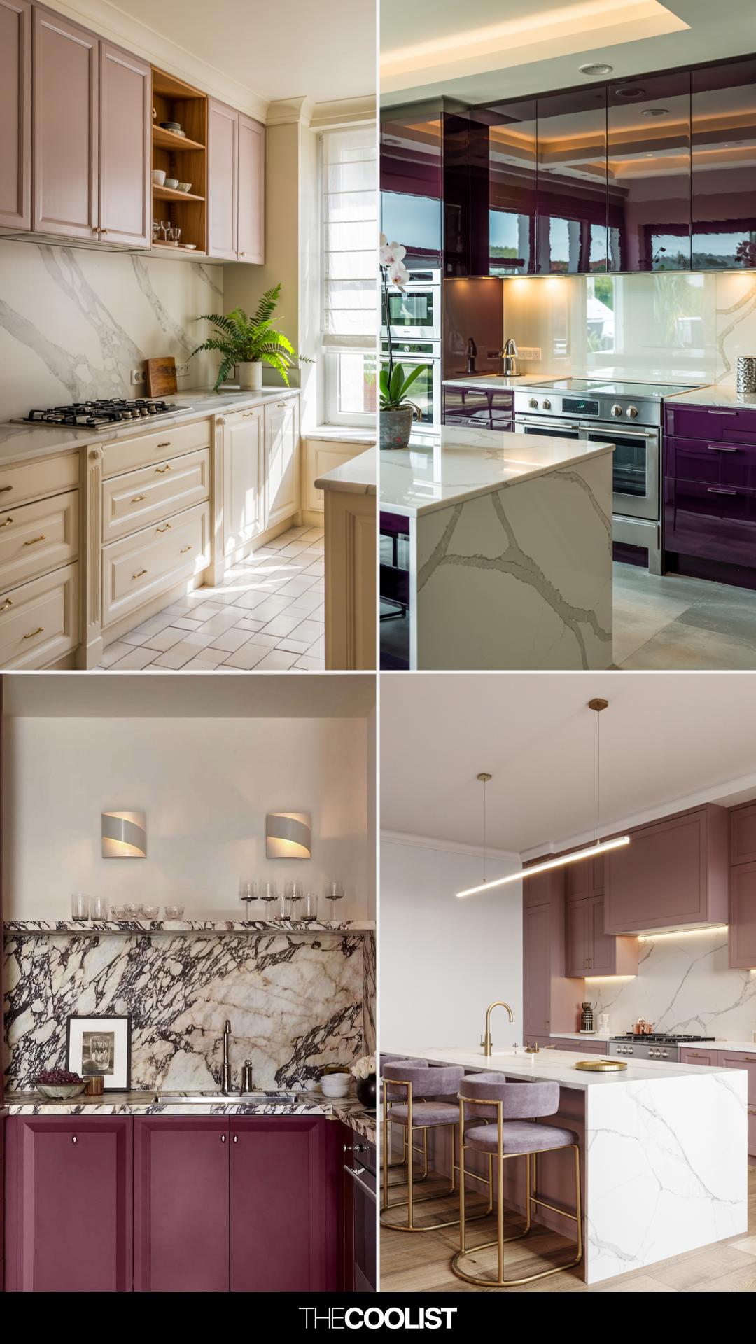
21 Purple Kitchen Ideas That Feel Artful, Not Over-the-Top

This Is the Best Paint for Dark Rooms — 6 Shades Interior Designers Swear By for Light-Limited Spaces

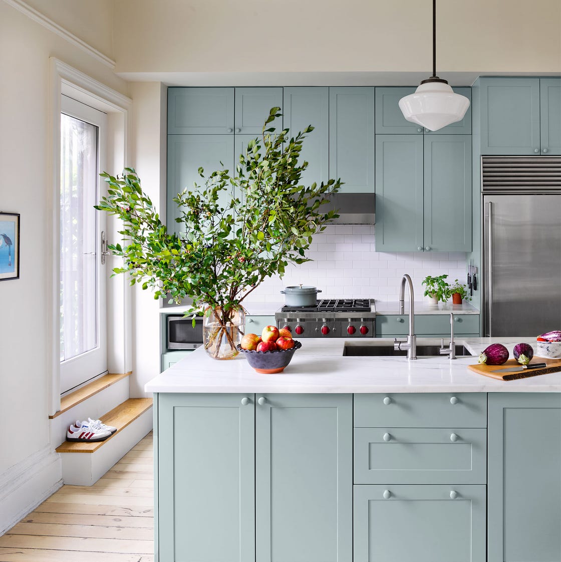
20 Kitchen Paint Colors to Try in 2024

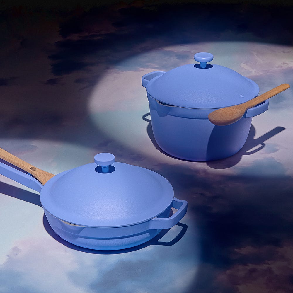
Our Place’s New Aura Colorway Will Grace Your Kitchen Like a Periwinkle Dream

The Kitchen Colors Designers Call “Forever Favorites”

Timeless Paint Colors HGTV Stars Love Using In Kitchens
5 Reasons You Shouldn't Paint Your Kitchen Walls White — And the Alternatives You Need to Try
We didn't expect this color to have a revival in 2025 – but these 7 purple kitchens prove it's back for good
6 Dark Paint Colors That Designers Use to Bring Glamour
Dark kitchen ideas – 10 designs to make you rethink white units
7 Paint Colors That Make Your Kitchen Look Smaller, According to Interior Designers