1/6
How to choose curtain colors for any room – experts reveal 7 trade secrets
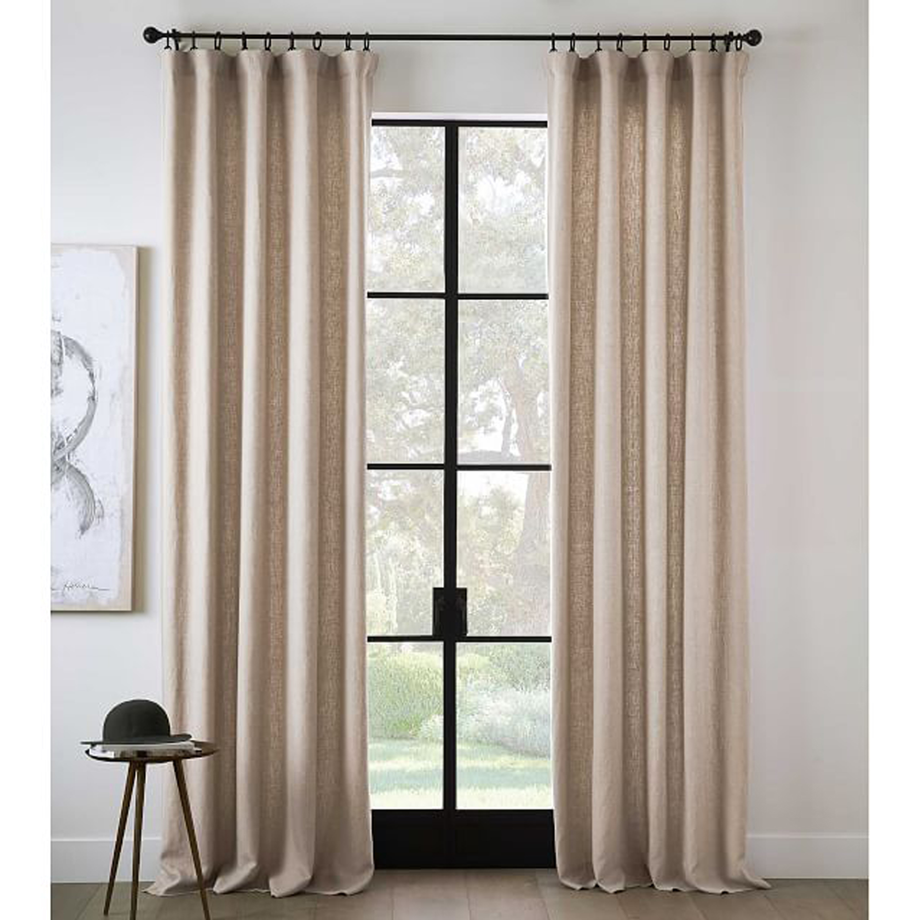
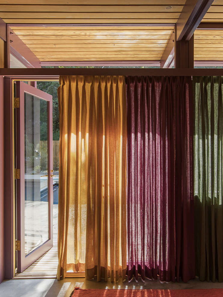
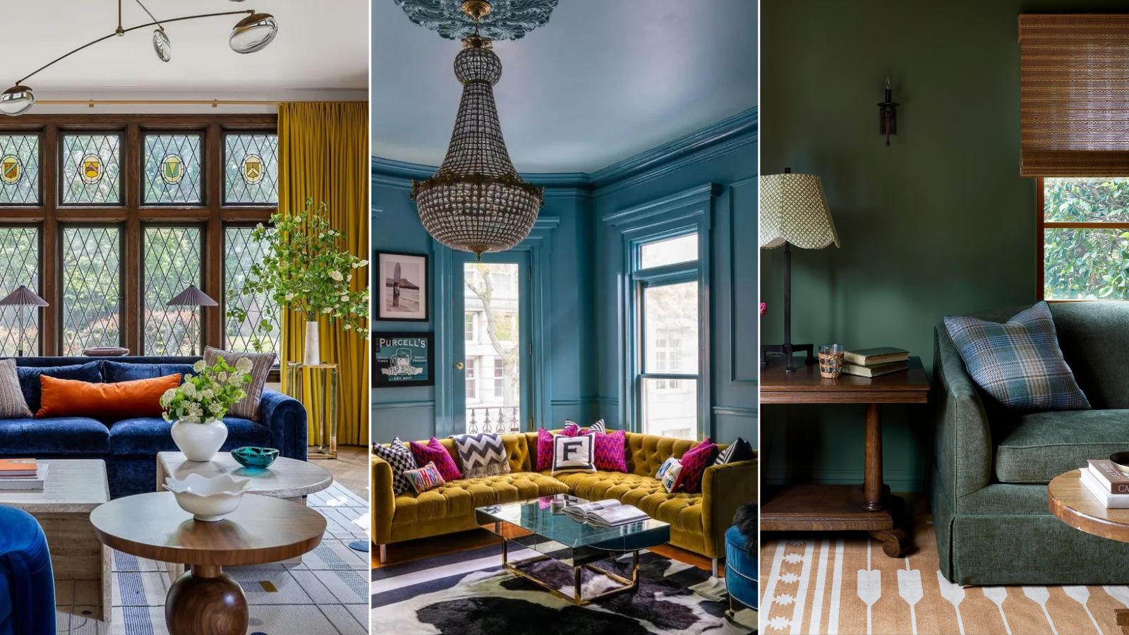
Choosing the right curtain colors is a crucial aspect of interior design that significantly impacts a room's aesthetic and mood. The decision extends beyond mere coordination, influencing light filtration and complementing the overall color palette of the home. Experts emphasize considering various factors to ensure a smooth selection process, including the desired mood, the interplay with natural light, wall colors, and whether the curtains will serve as an inspiring focal point for the entire scheme.
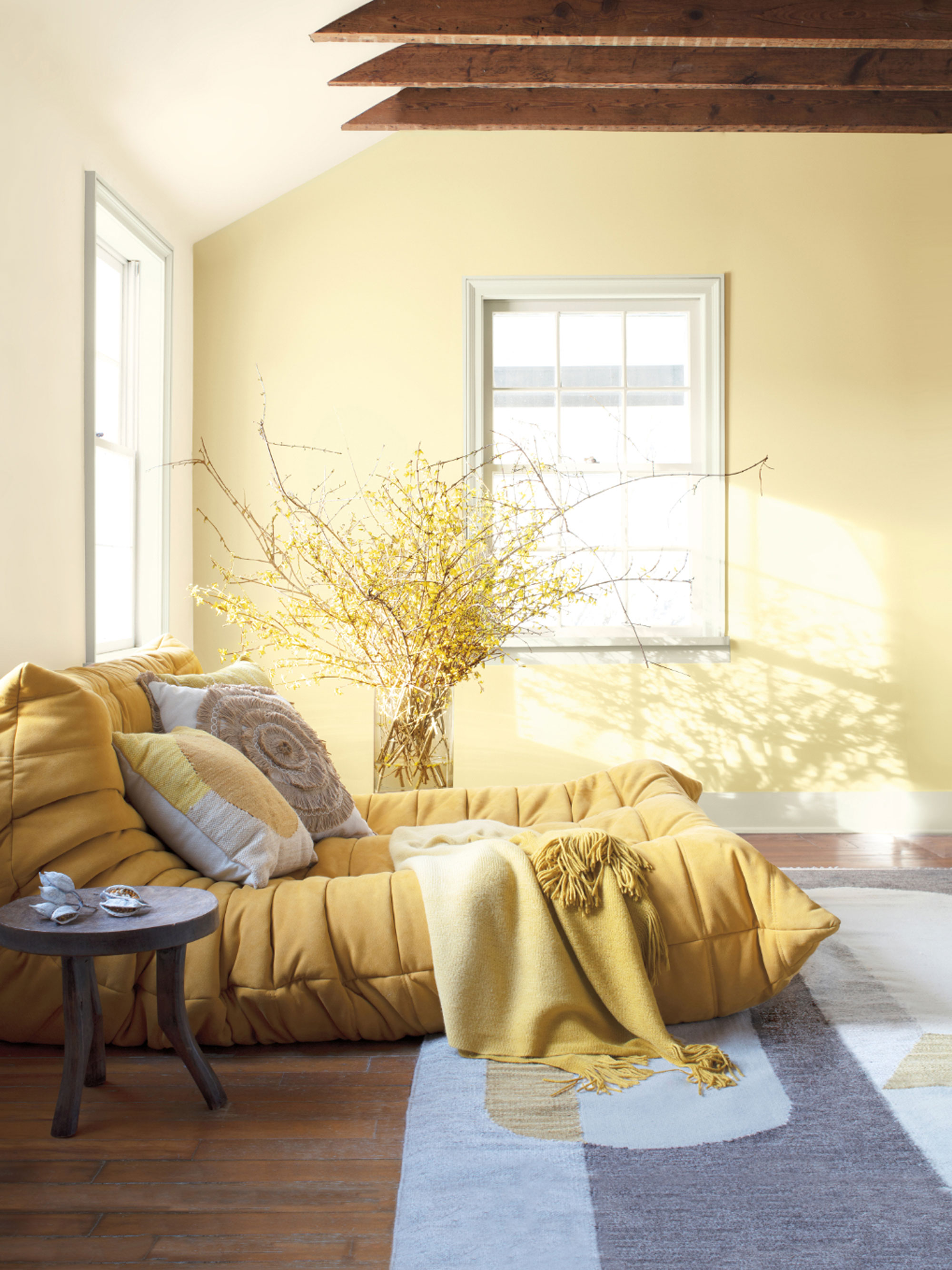

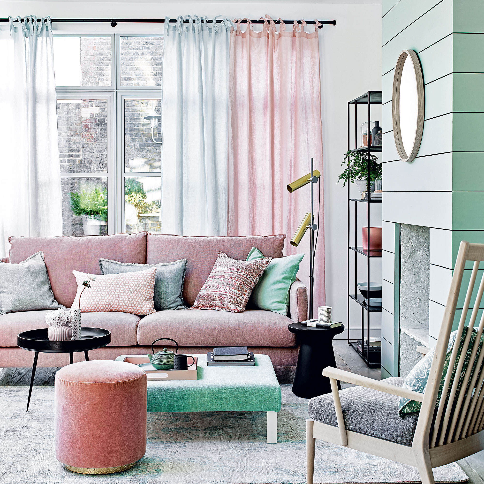
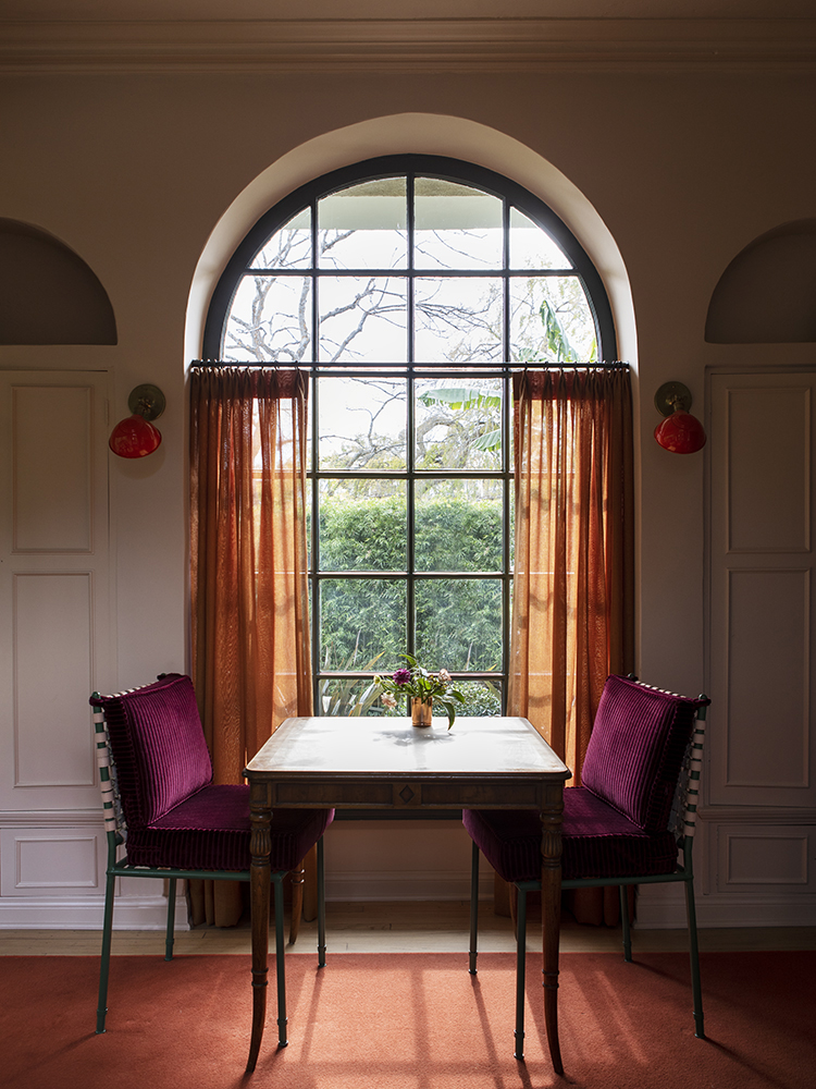
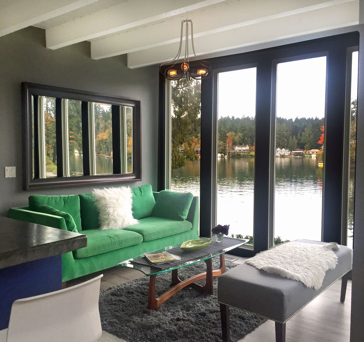
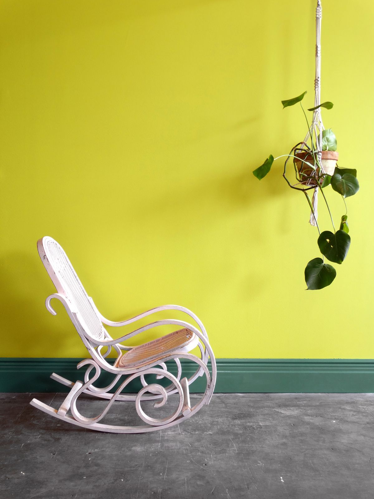
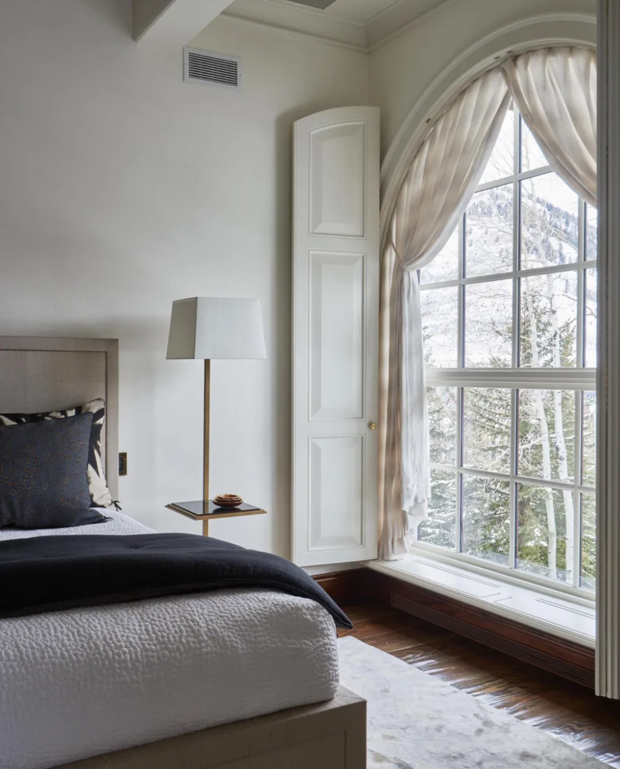
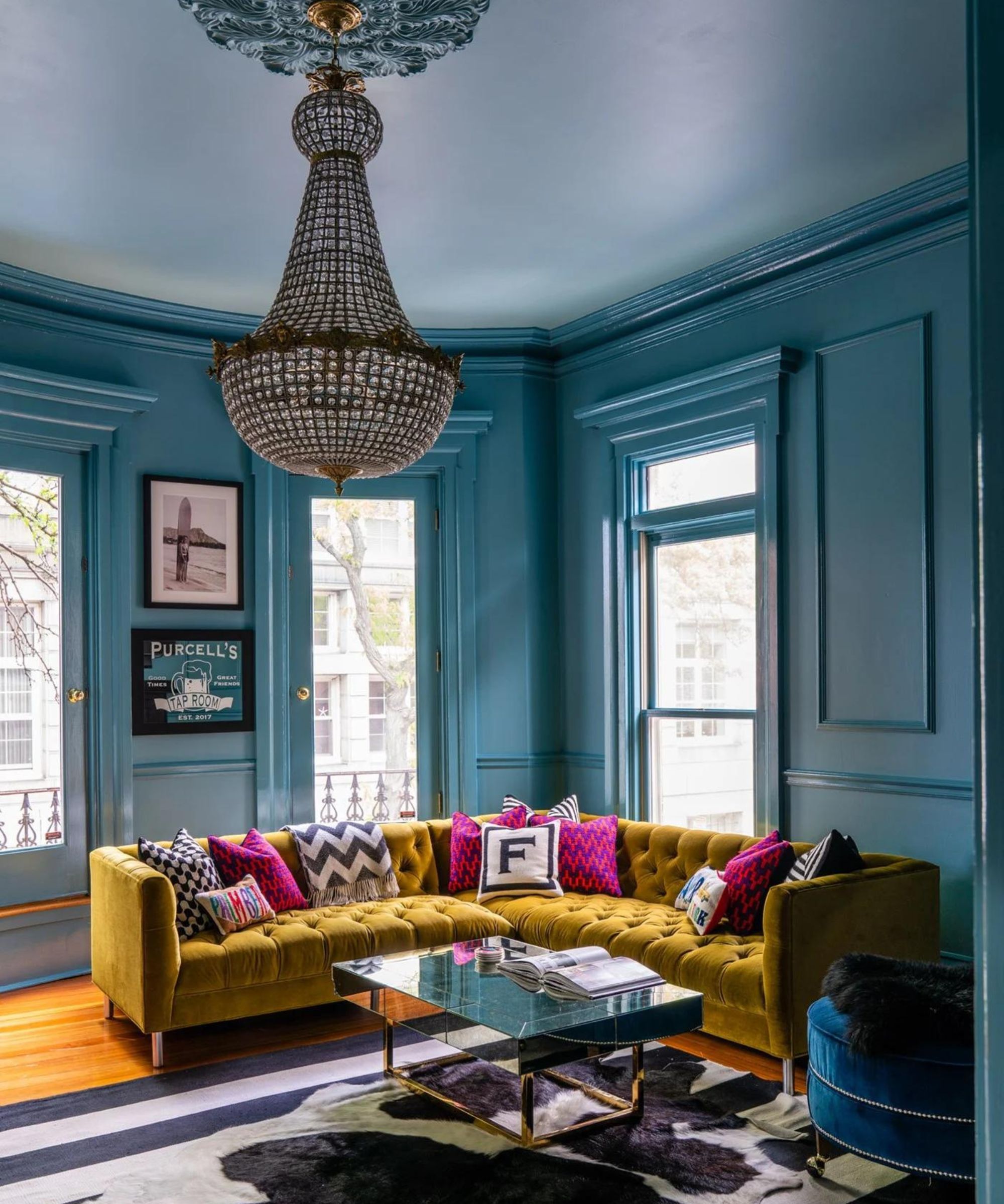
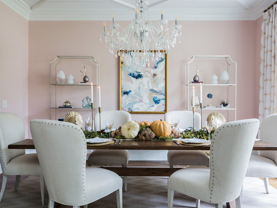
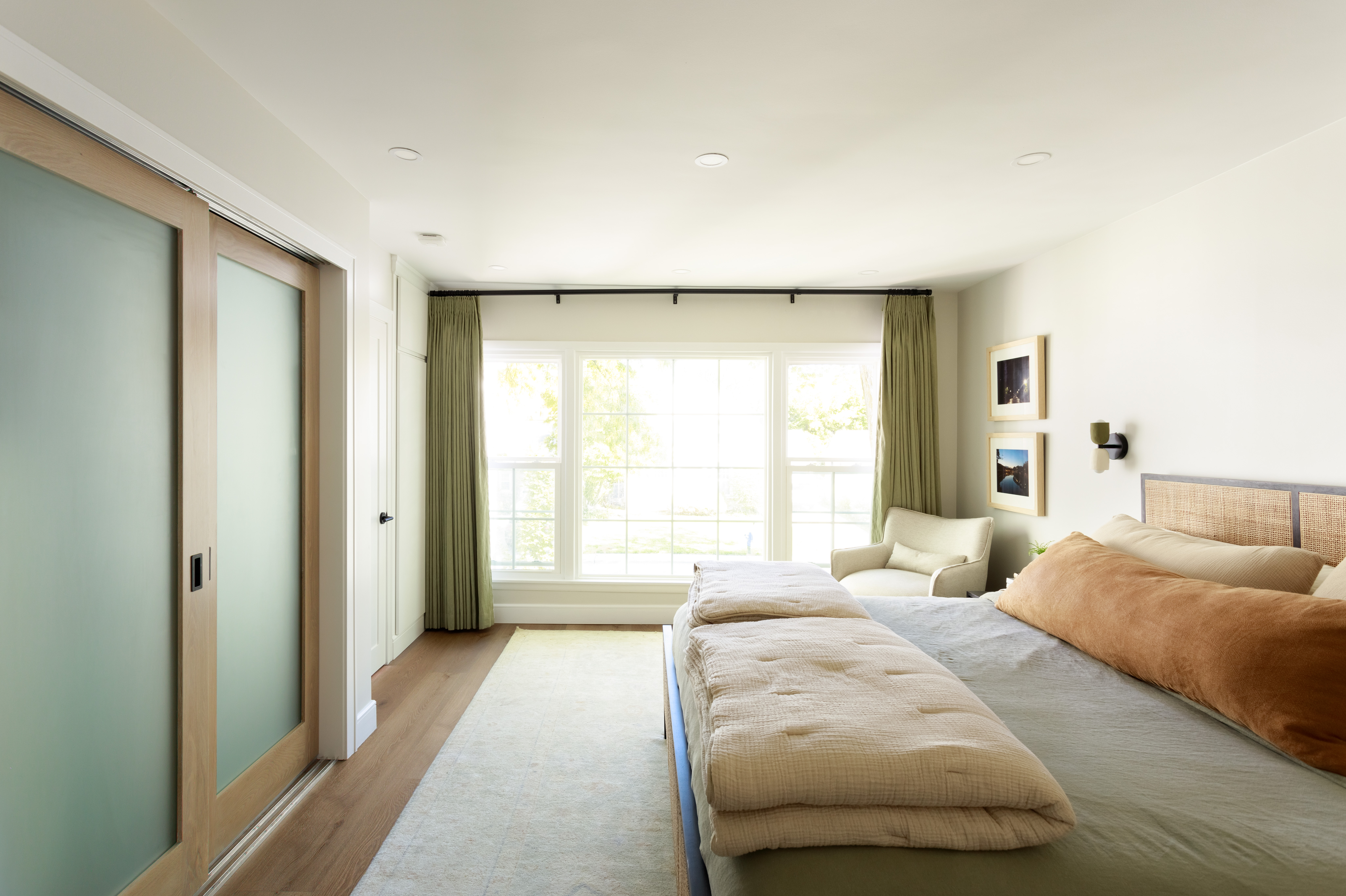
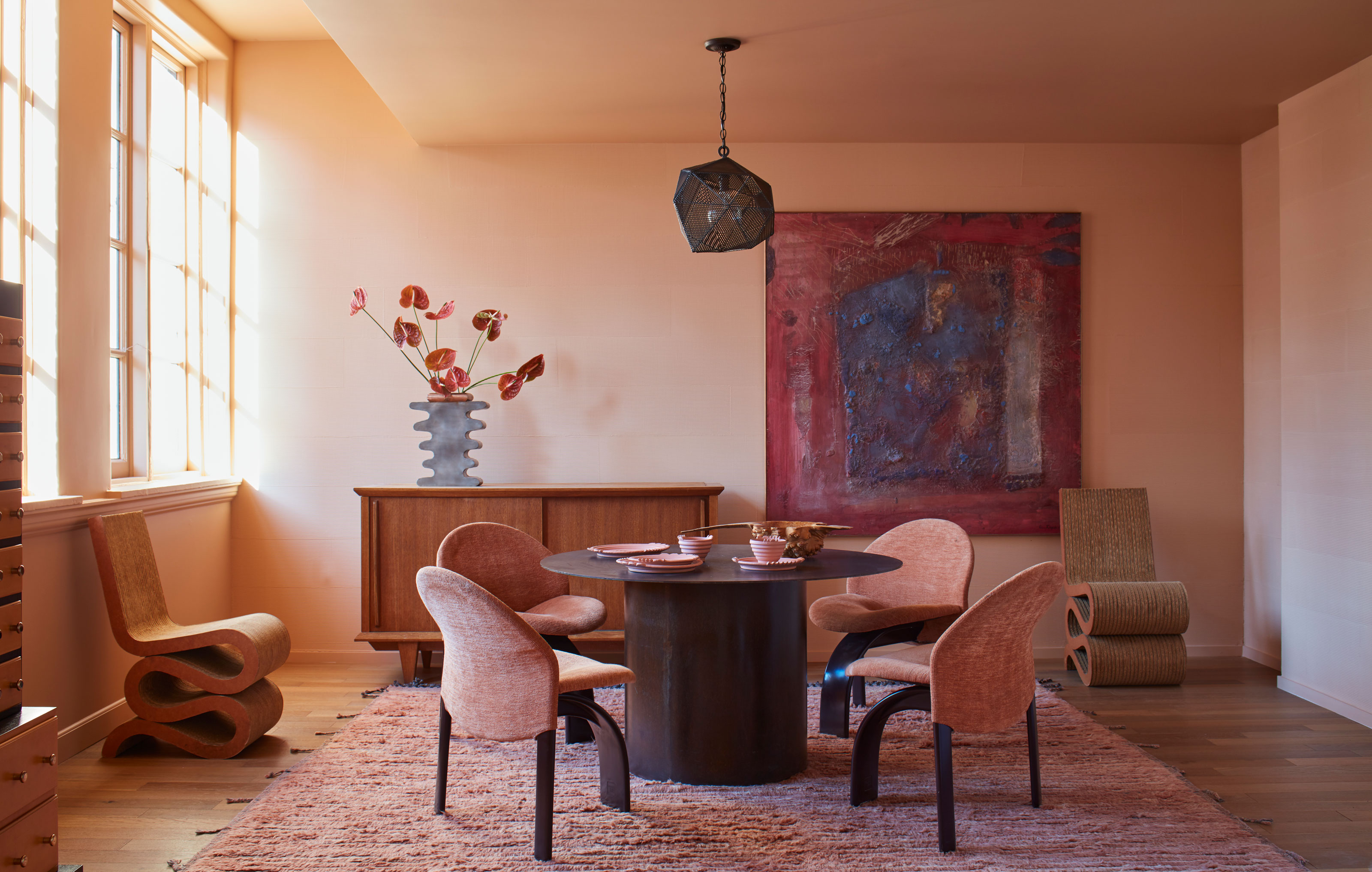
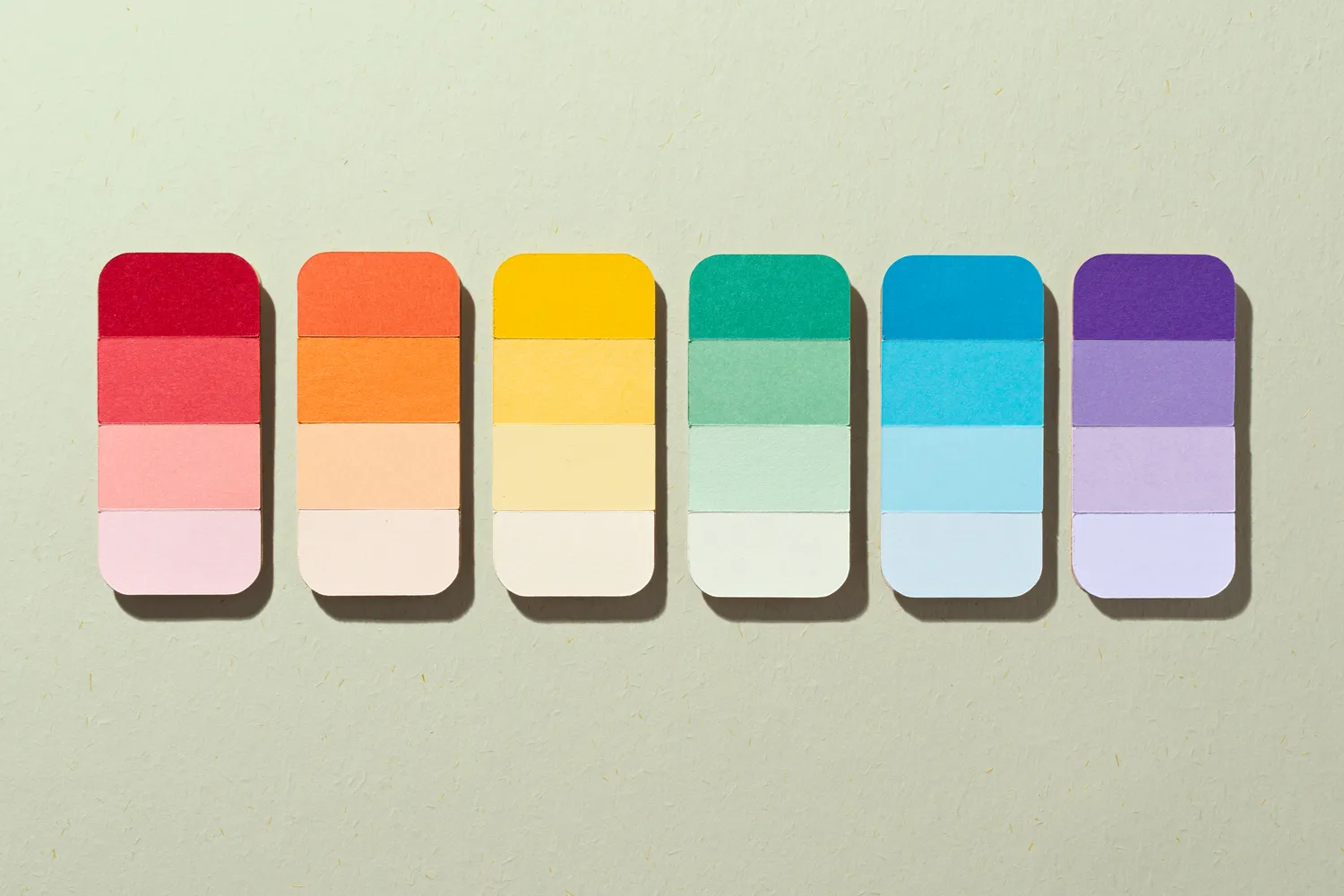
When determining the mood of a room, color psychology plays a vital role. Warm colors like red, orange, and yellow are excellent for entertaining spaces, stimulating energy and appetite, making them ideal for dining rooms. Conversely, cool colors such as green, blue, and purple promote calmness, suiting bedrooms. Lighter shades tend to be more soothing, while darker ones can be more stimulating, allowing for a range of dramatic or tranquil effects depending on the preference.
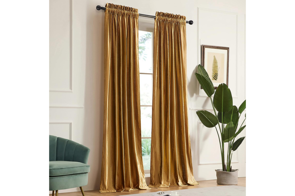
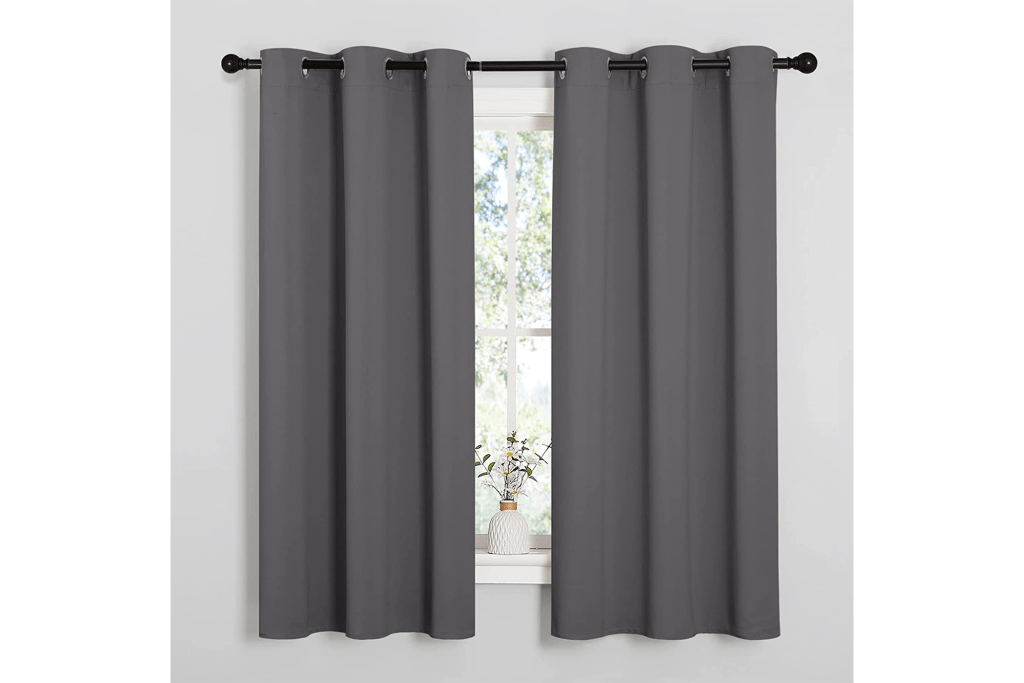
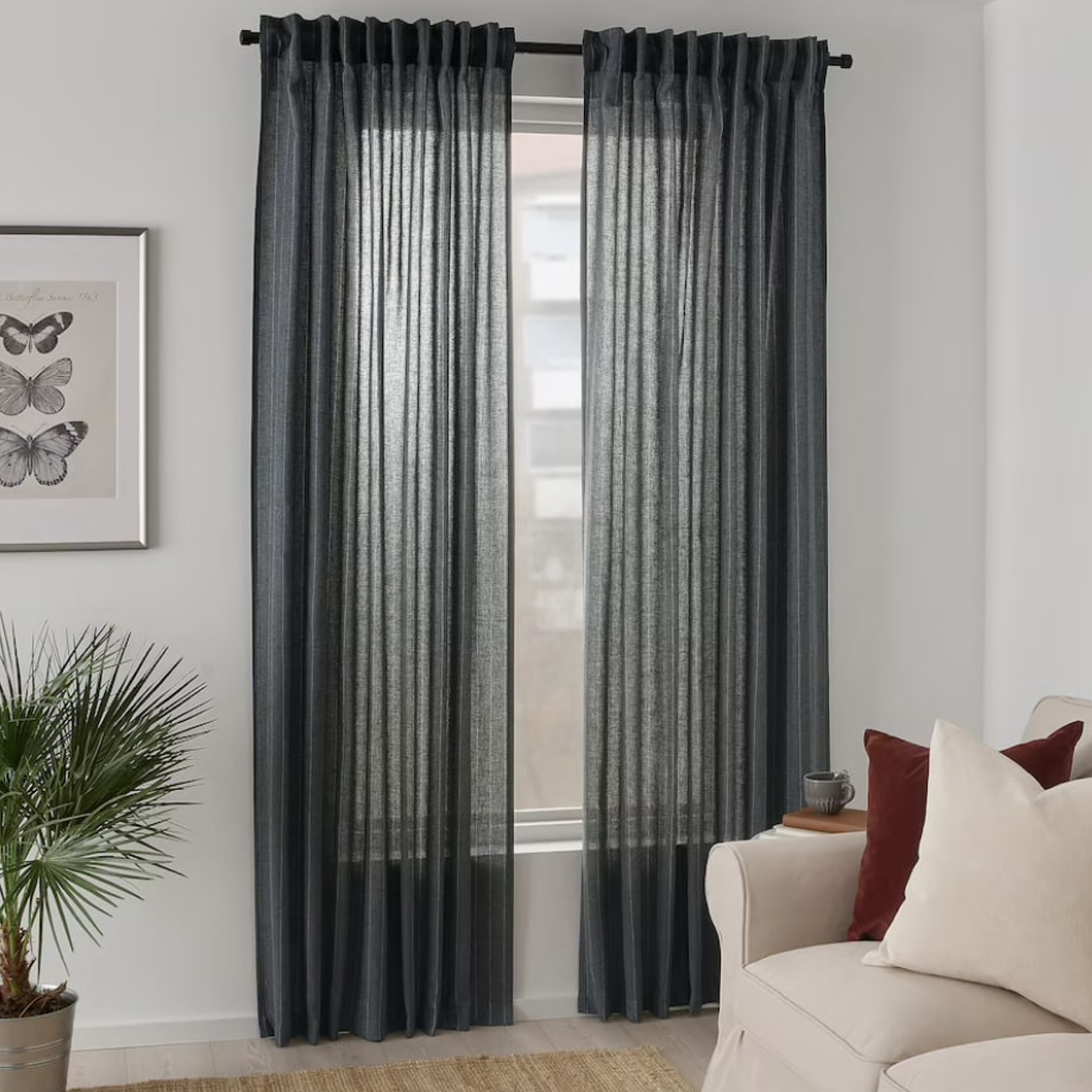
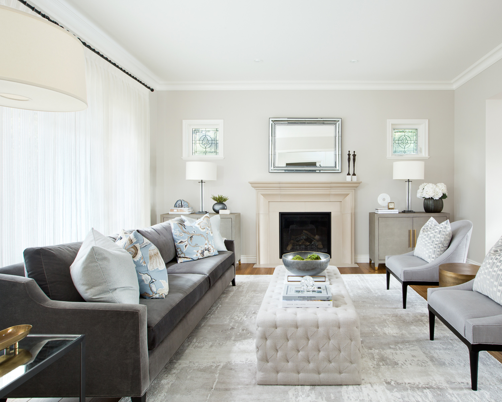
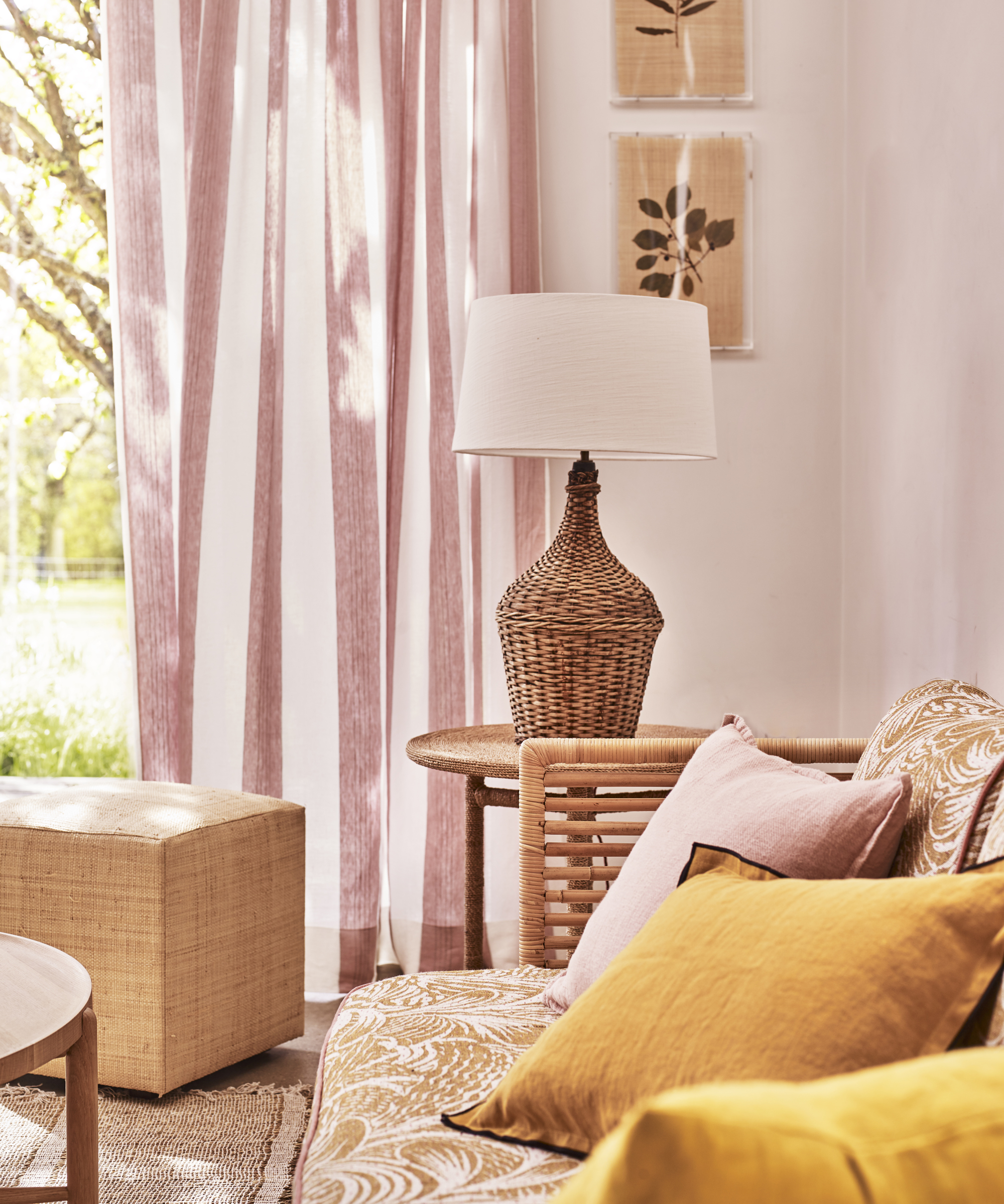
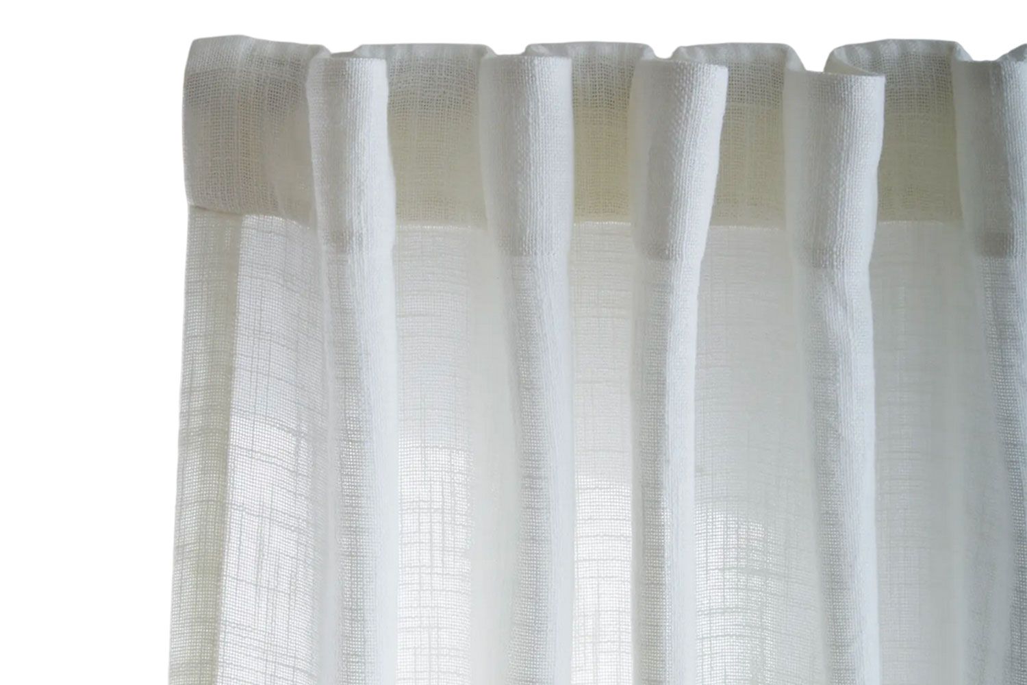
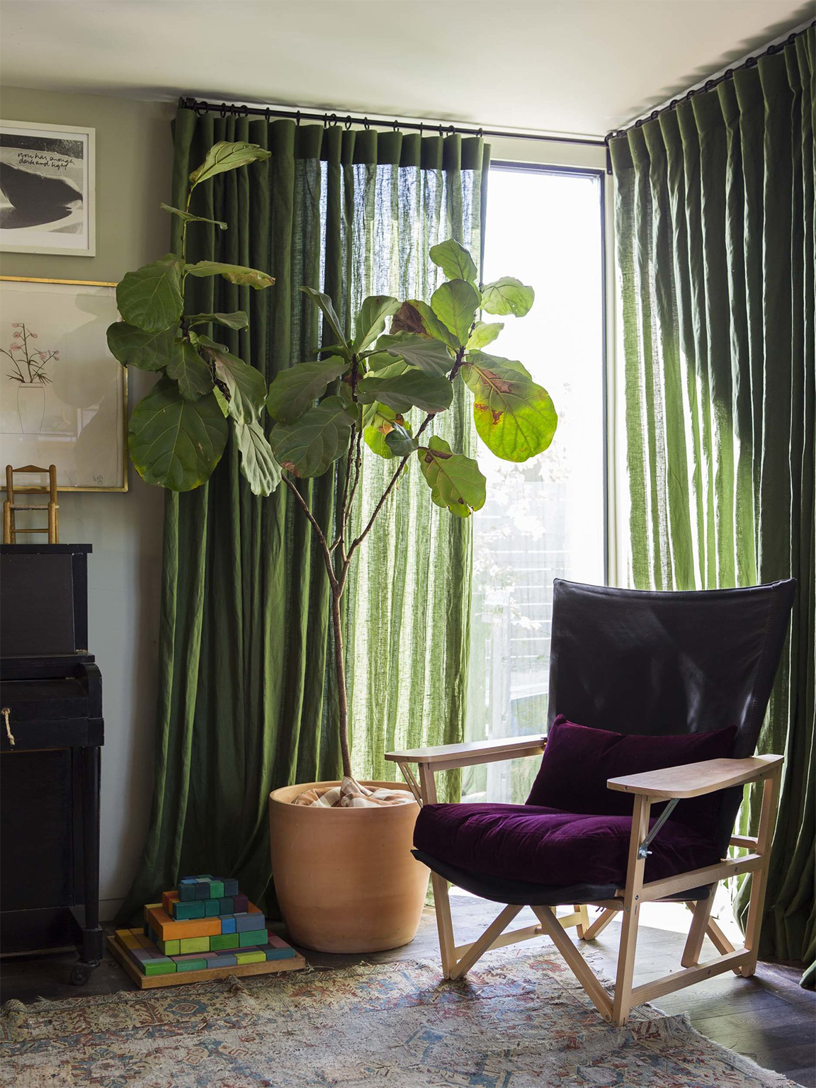
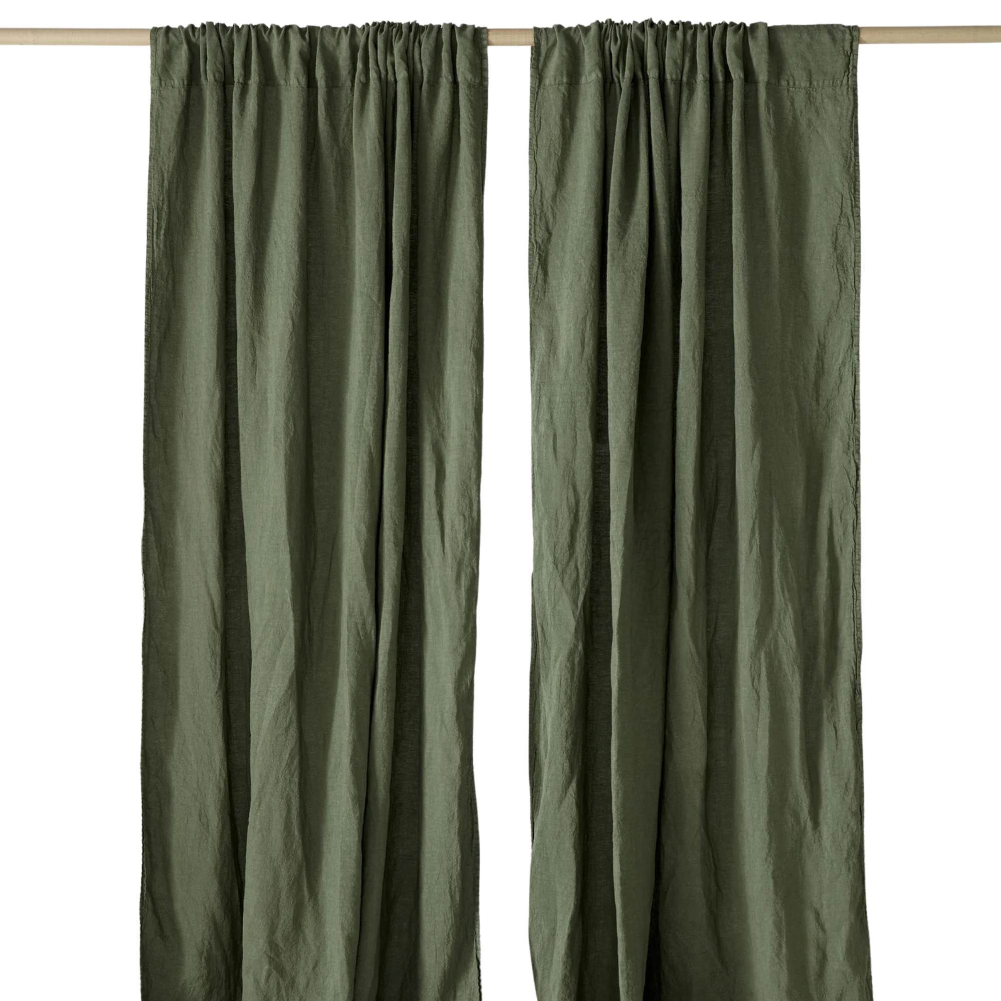
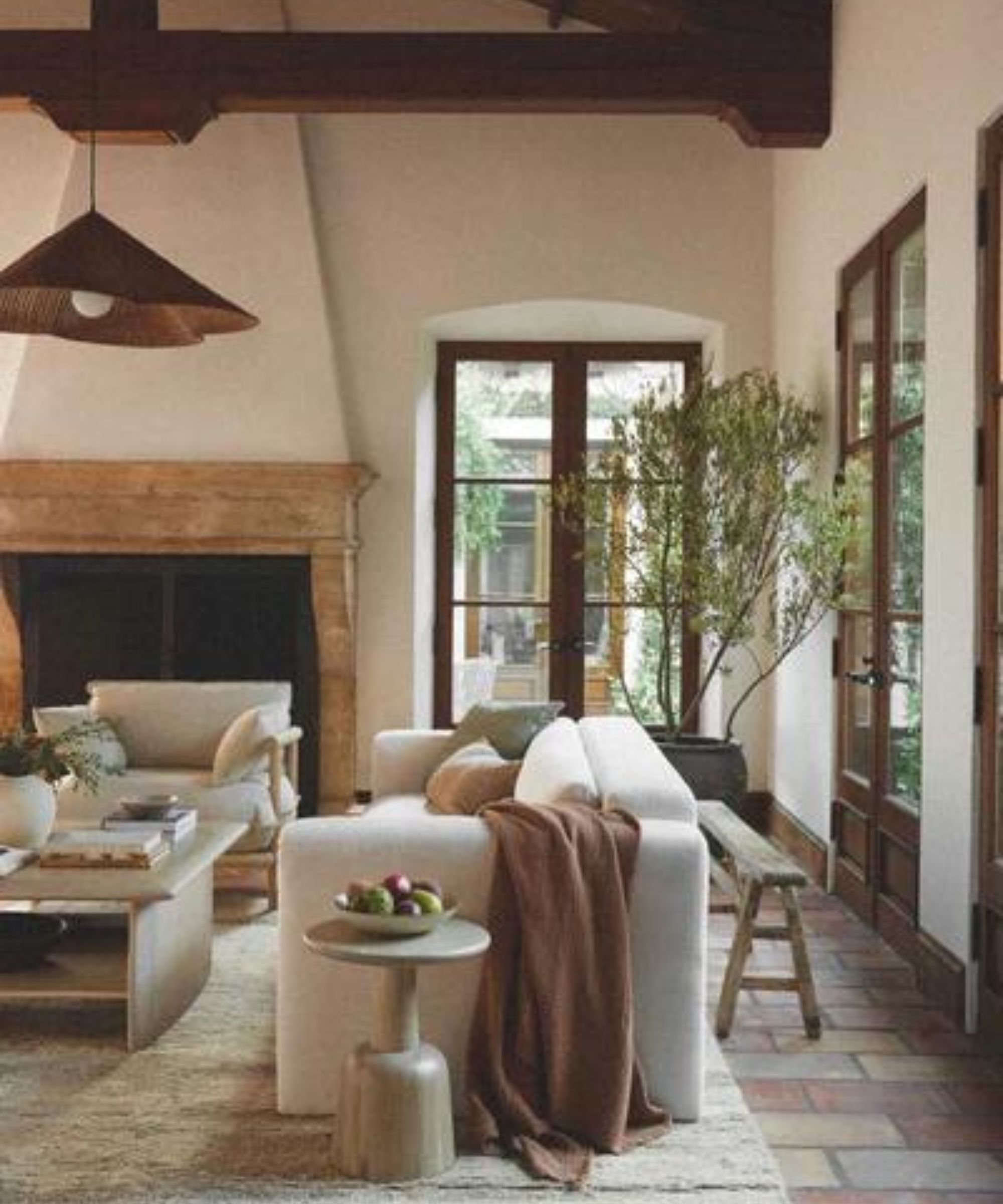
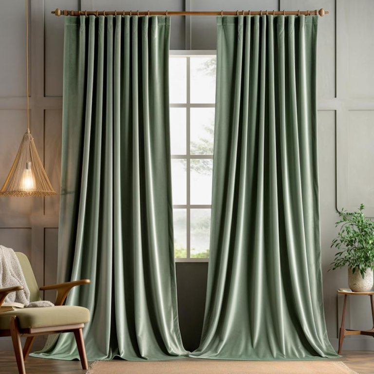
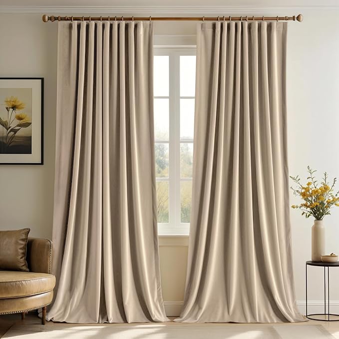
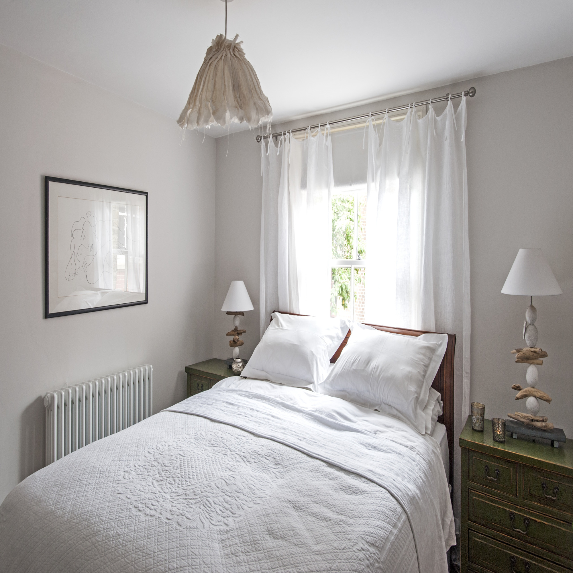
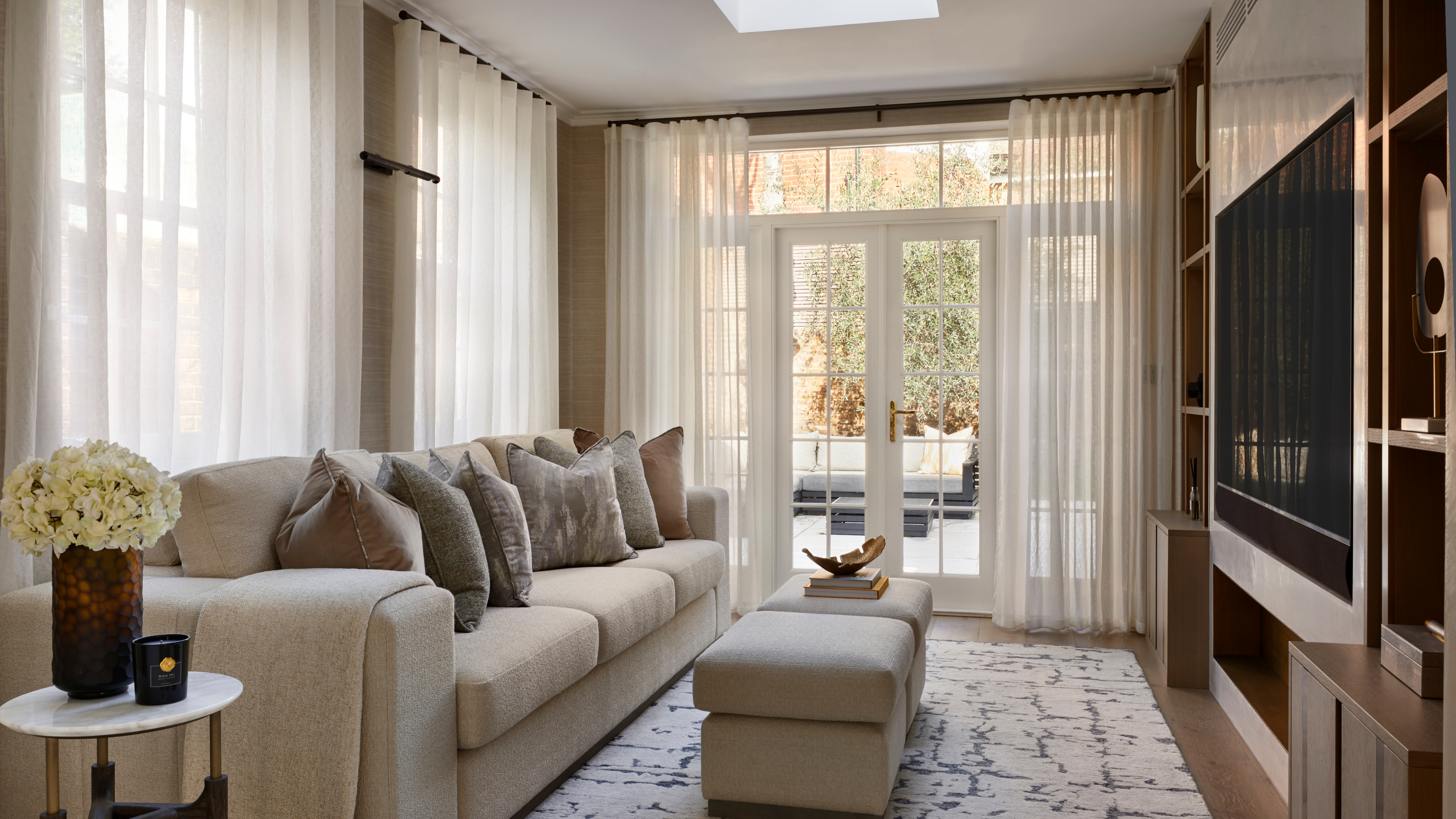
The color of curtains directly affects the amount and quality of light entering a room. Even when fully open, curtains reflect light, influencing the room's hue. Yellow curtains, for instance, cast a warmer light than green ones, while dark colors like black or navy absorb more light, making a room appear dimmer. The fabric's sheen also plays a part, with lustrous materials reflecting more tinted light than matte ones like velvet.
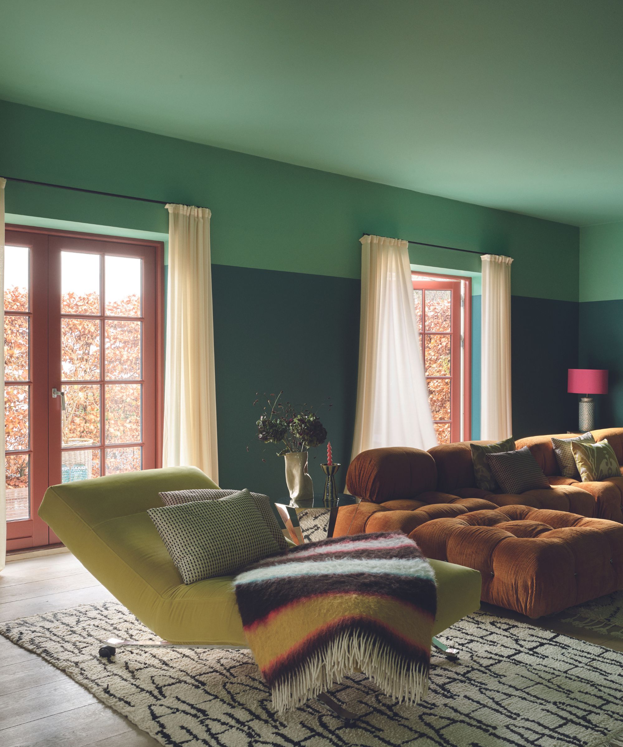
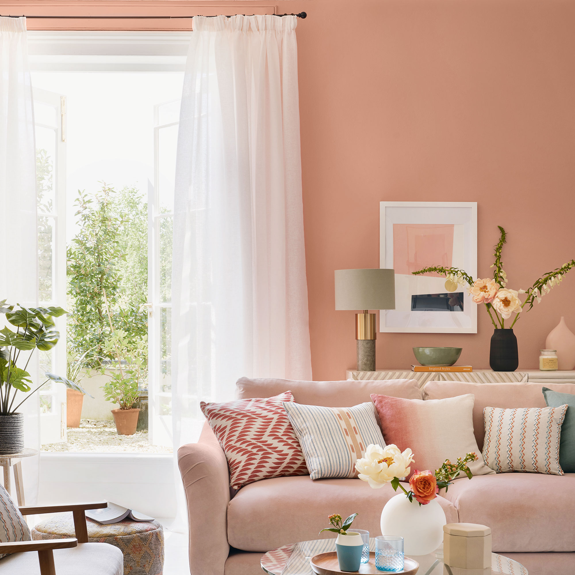
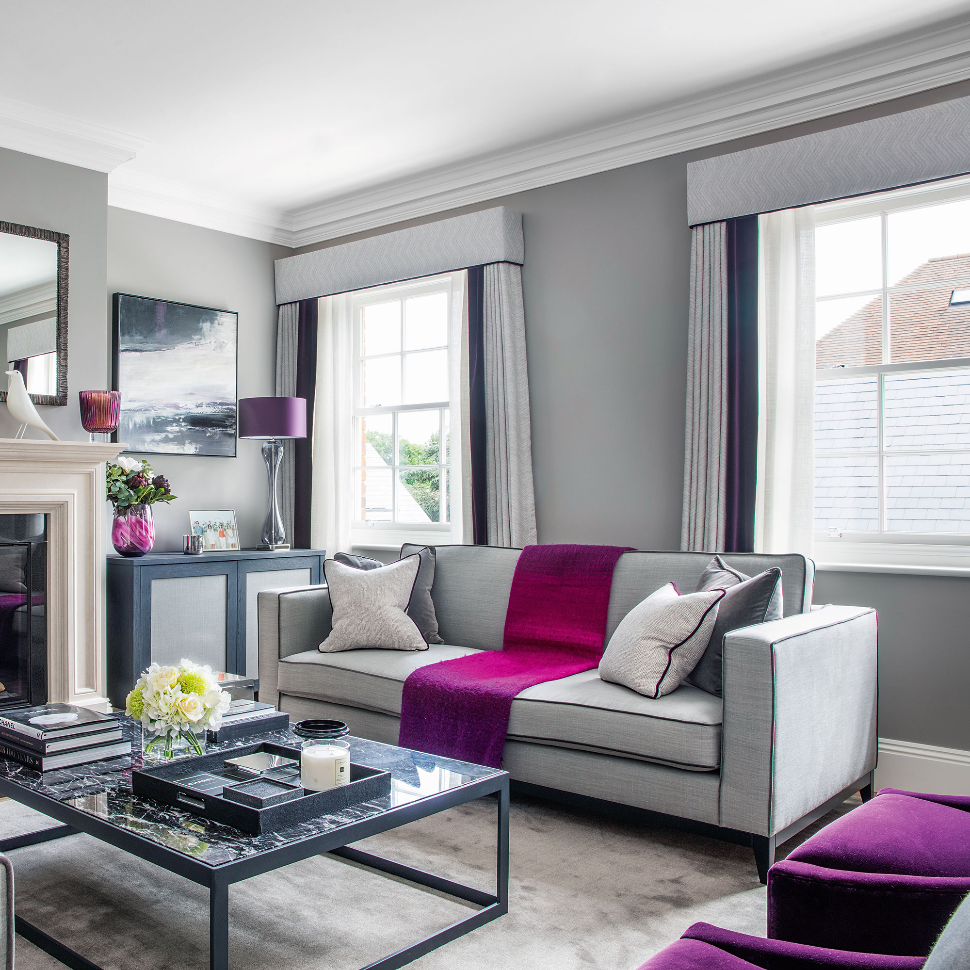
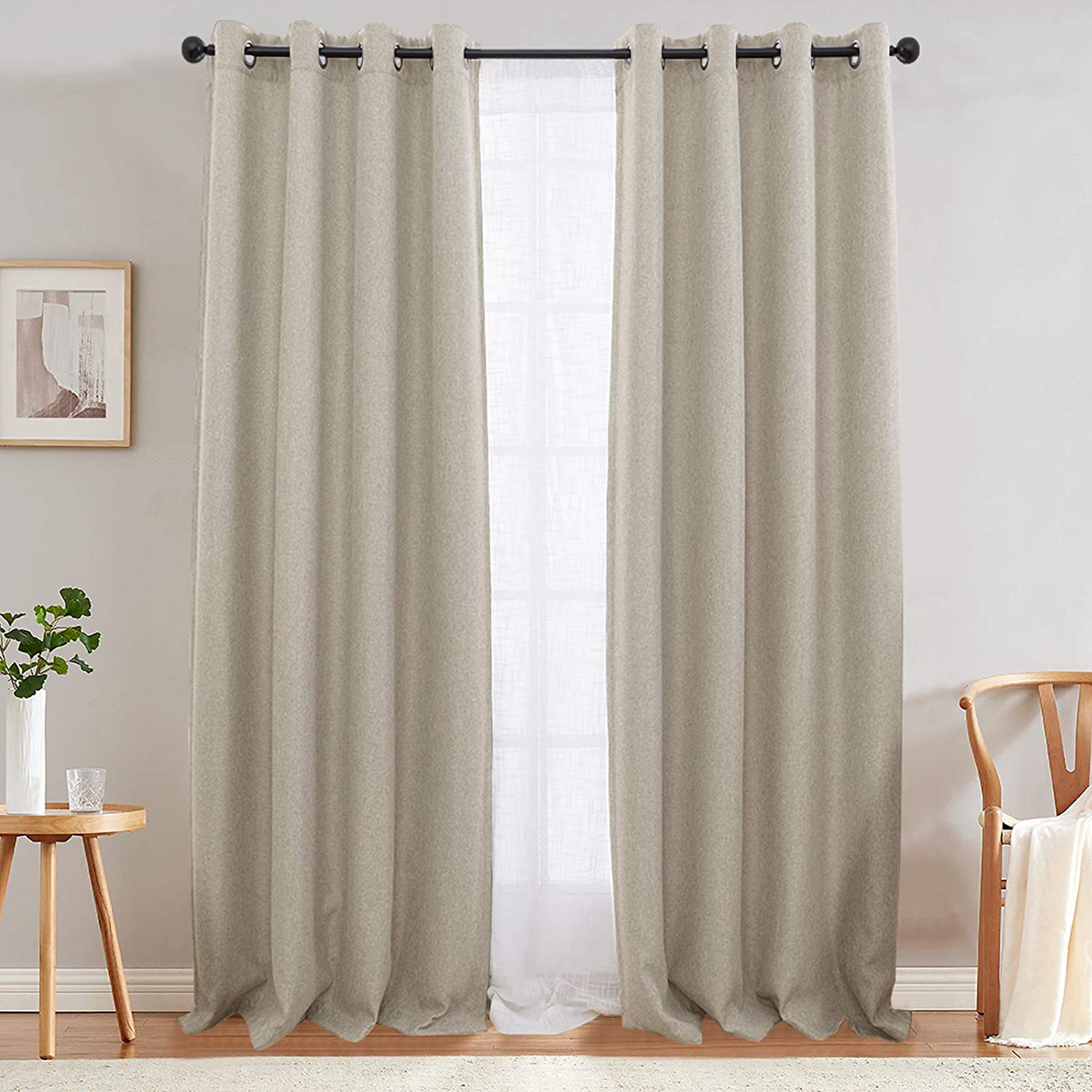
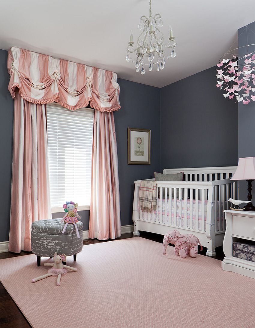
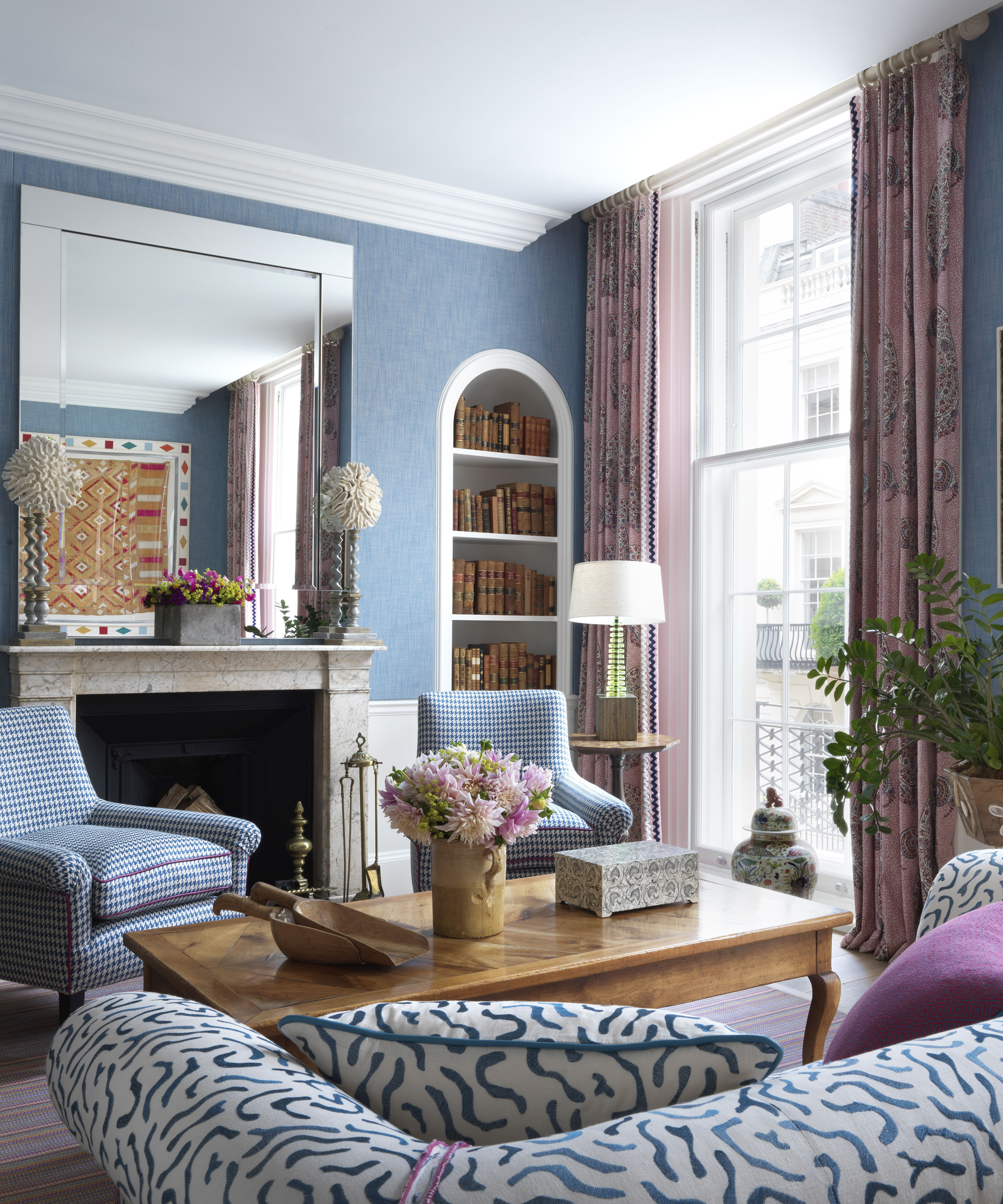
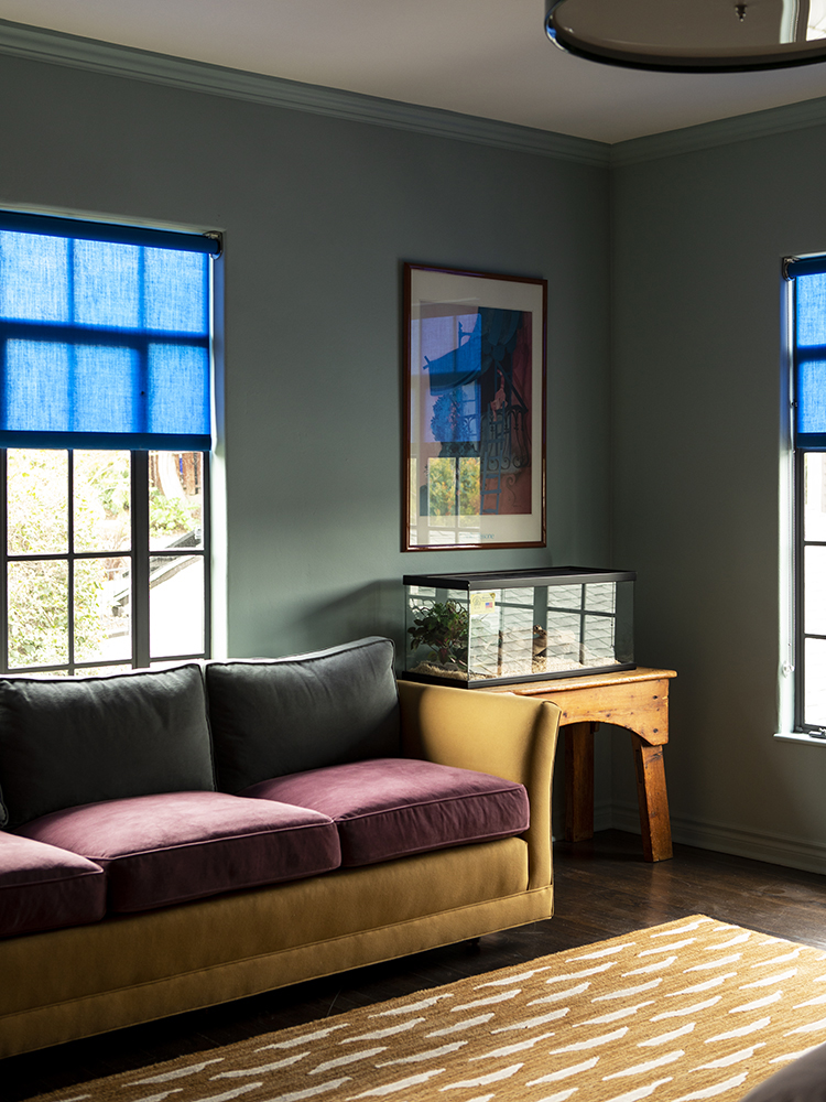
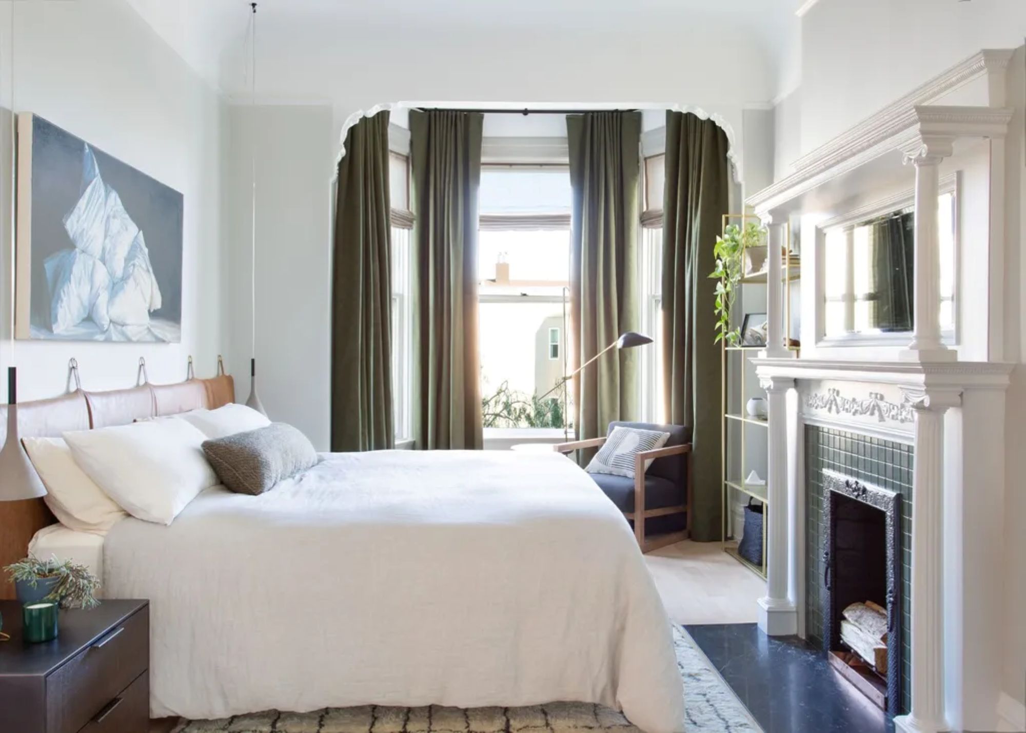
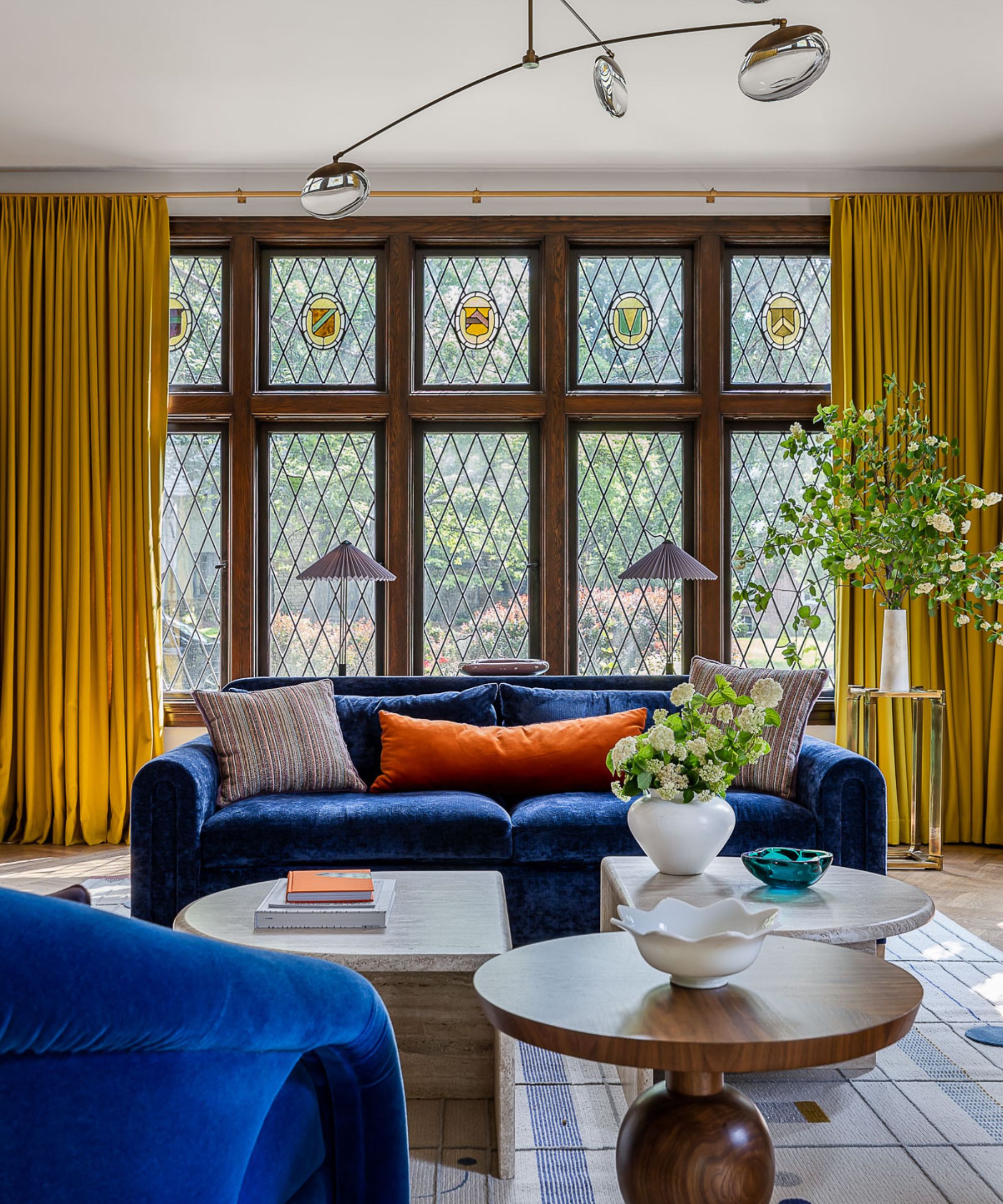
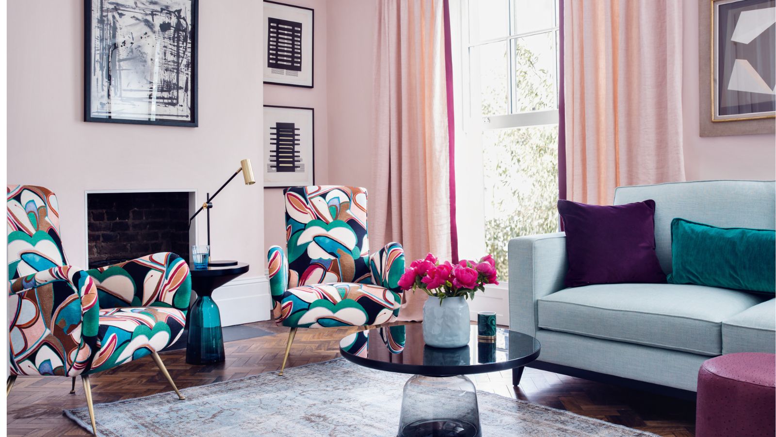
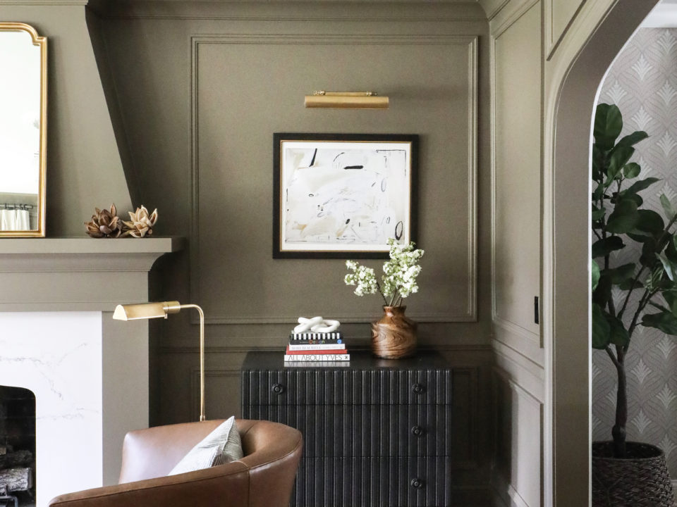
Integrating curtain colors with existing wall colors is another key consideration. A stark contrast between wall and curtain colors will make the curtains stand out, drawing the eye to the interruption of color. Alternatively, if a specific curtain fabric is the inspiration for the room, it should take center stage, with other color choices, perhaps guided by a color wheel, built around it.
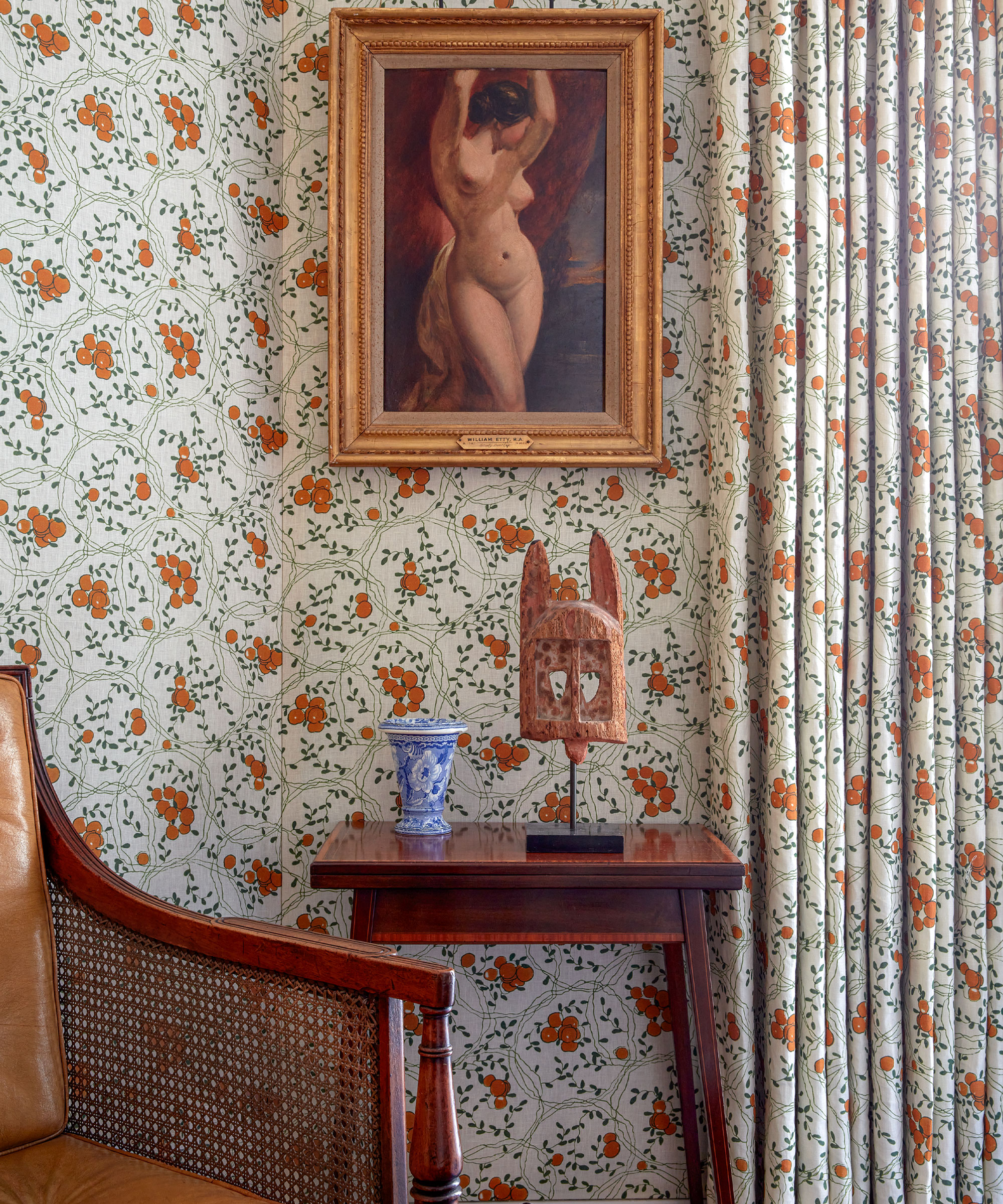
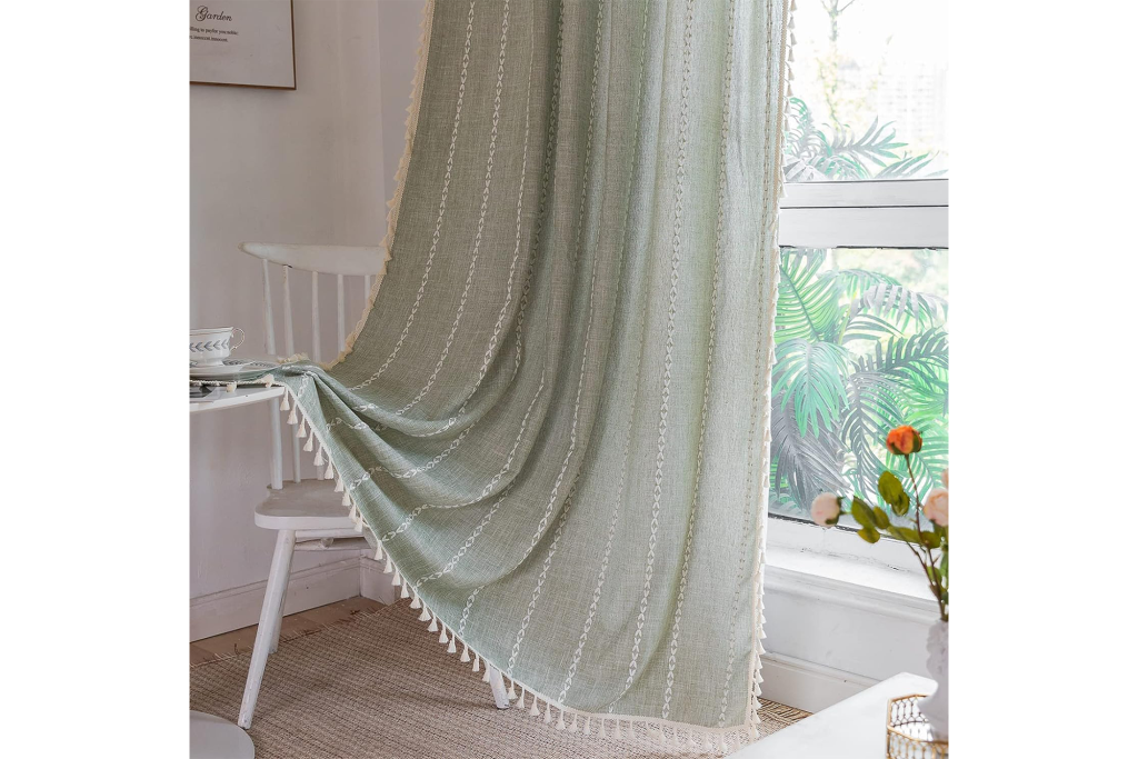
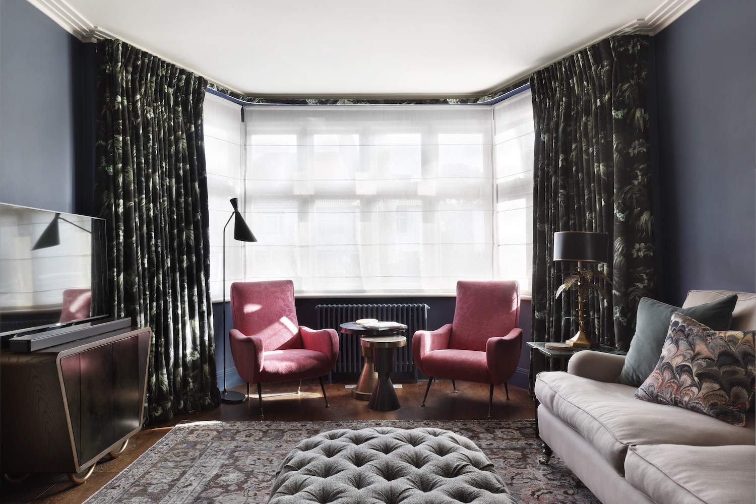
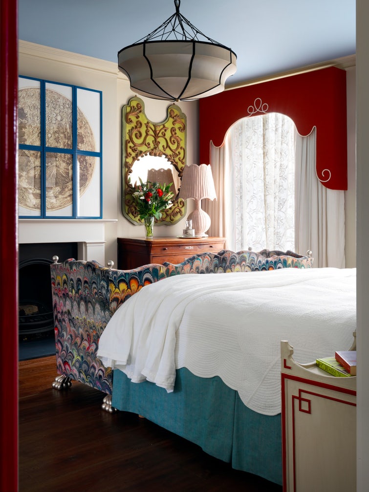
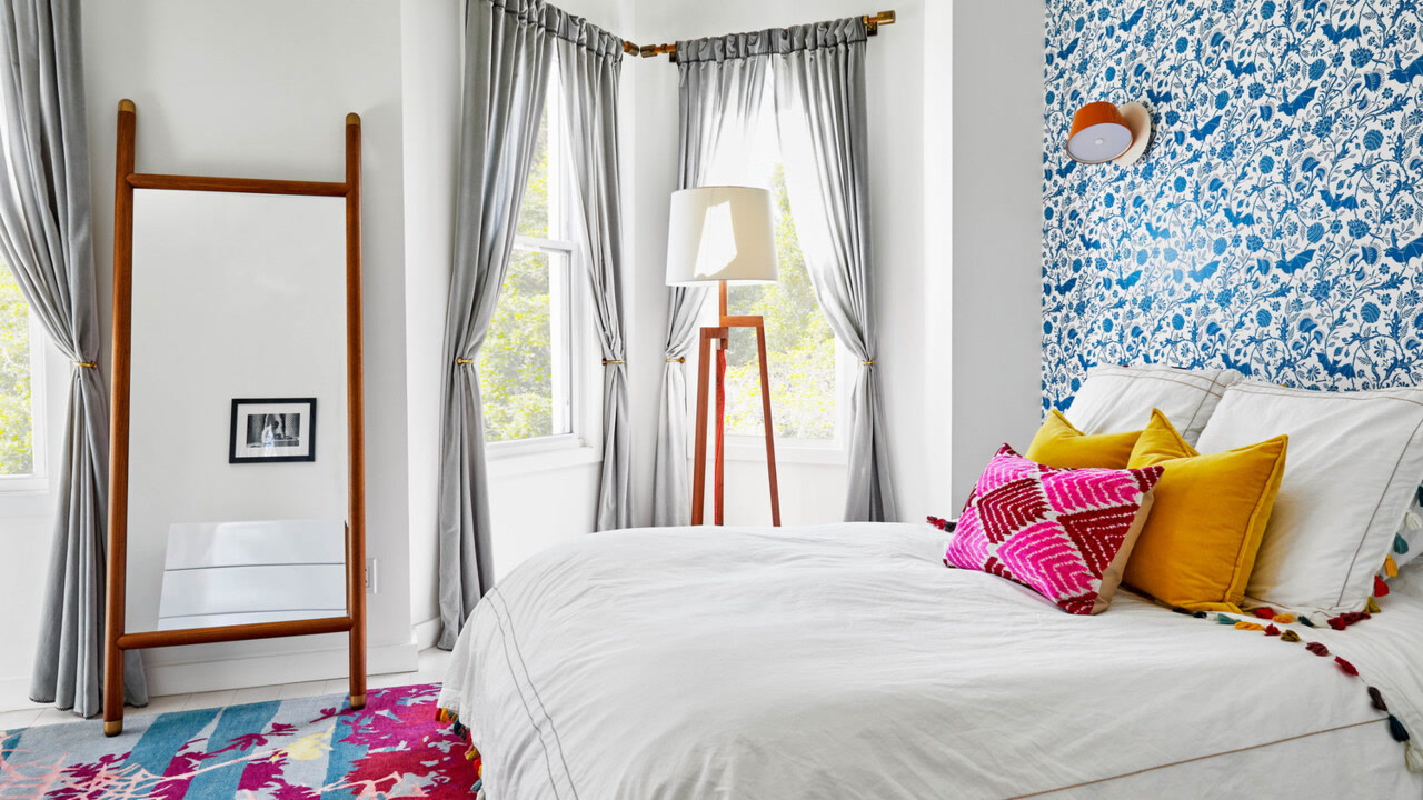
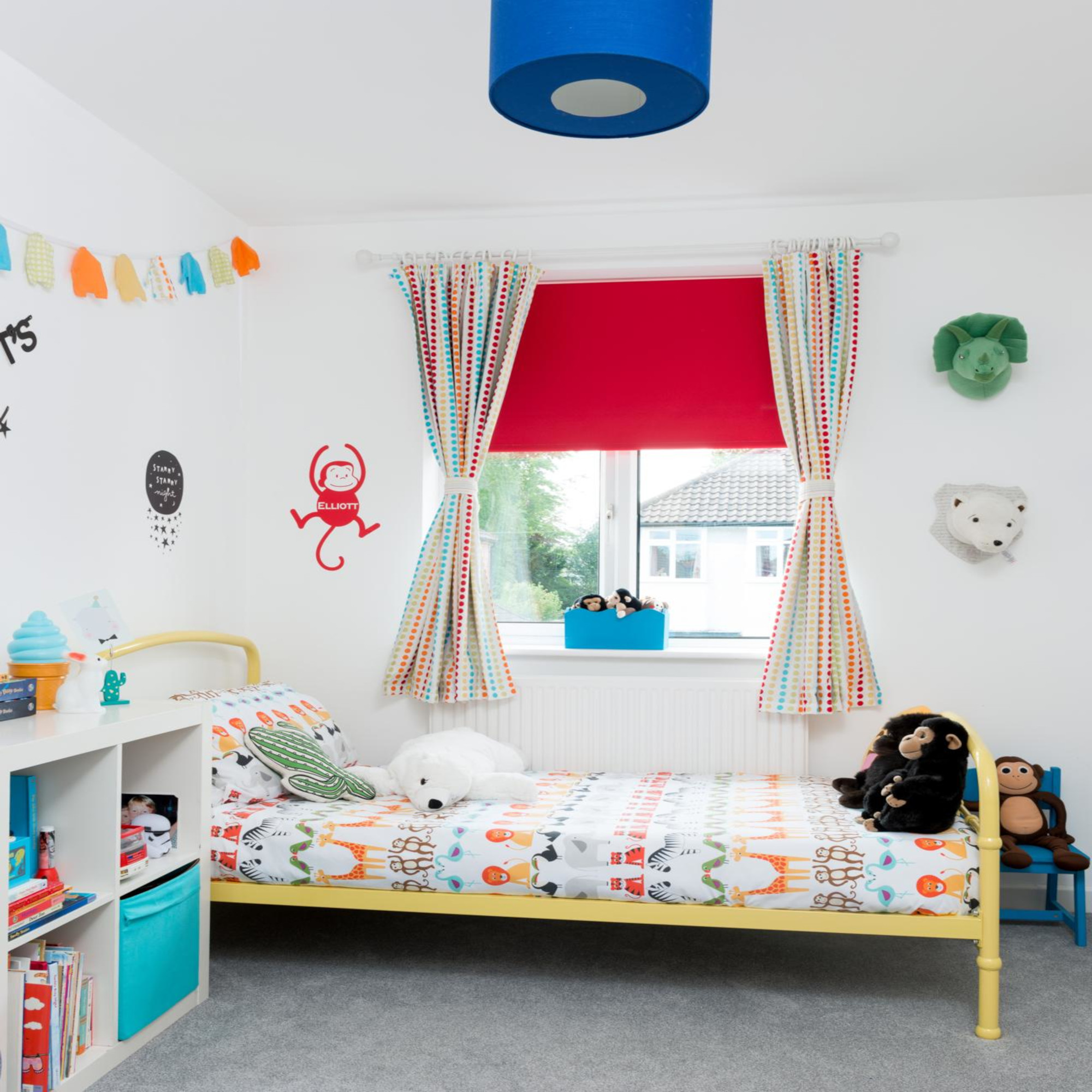
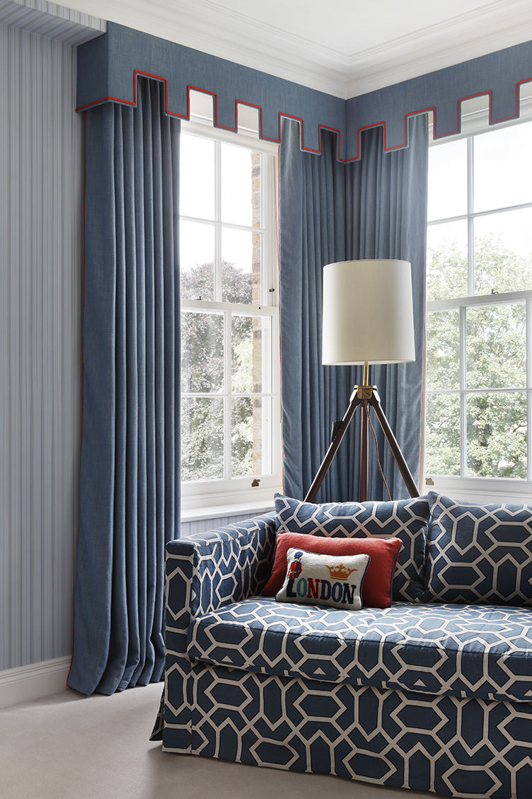
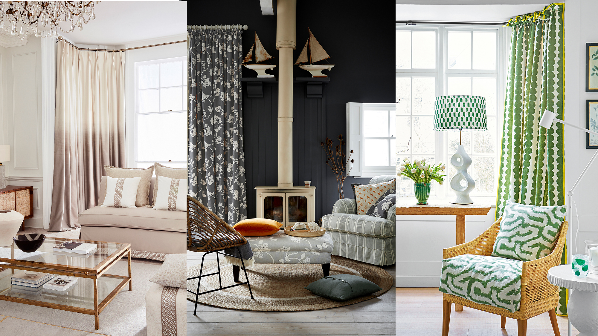
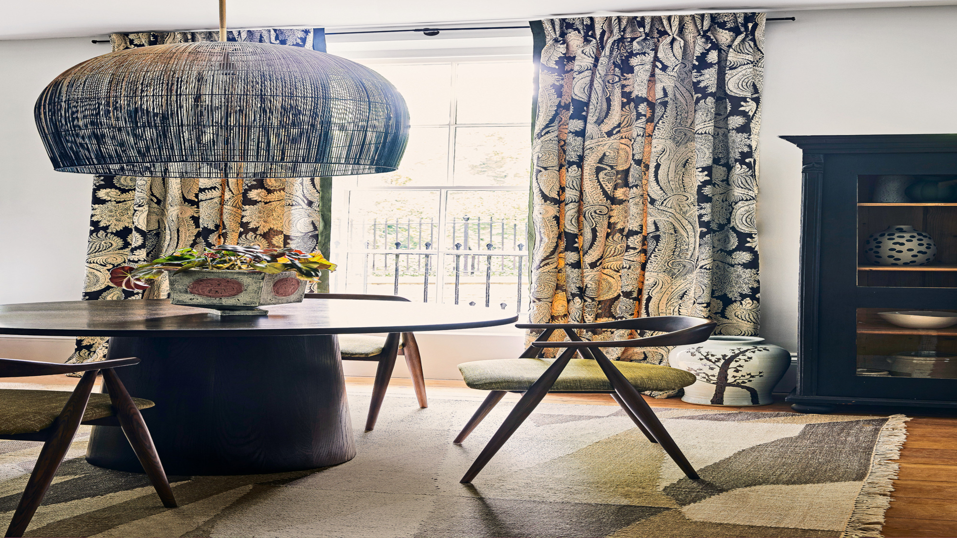
Deciding between patterned and plain curtains offers further design possibilities. Solid shades can be bold or neutral, while patterns introduce color through motifs or accent shades, allowing for creative mixing of prints. Multicolored patterns can serve as an eye-catching focal point in an otherwise neutral room, elevating the space. Details like leading edges or trims can also introduce subtle pops of color.
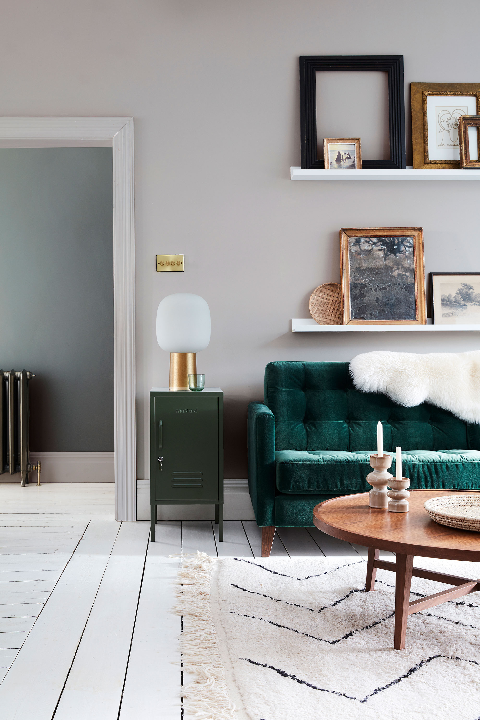
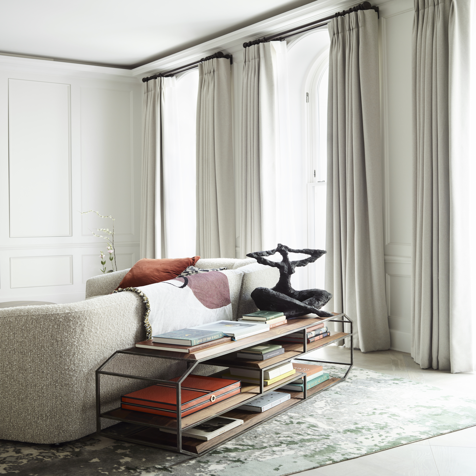
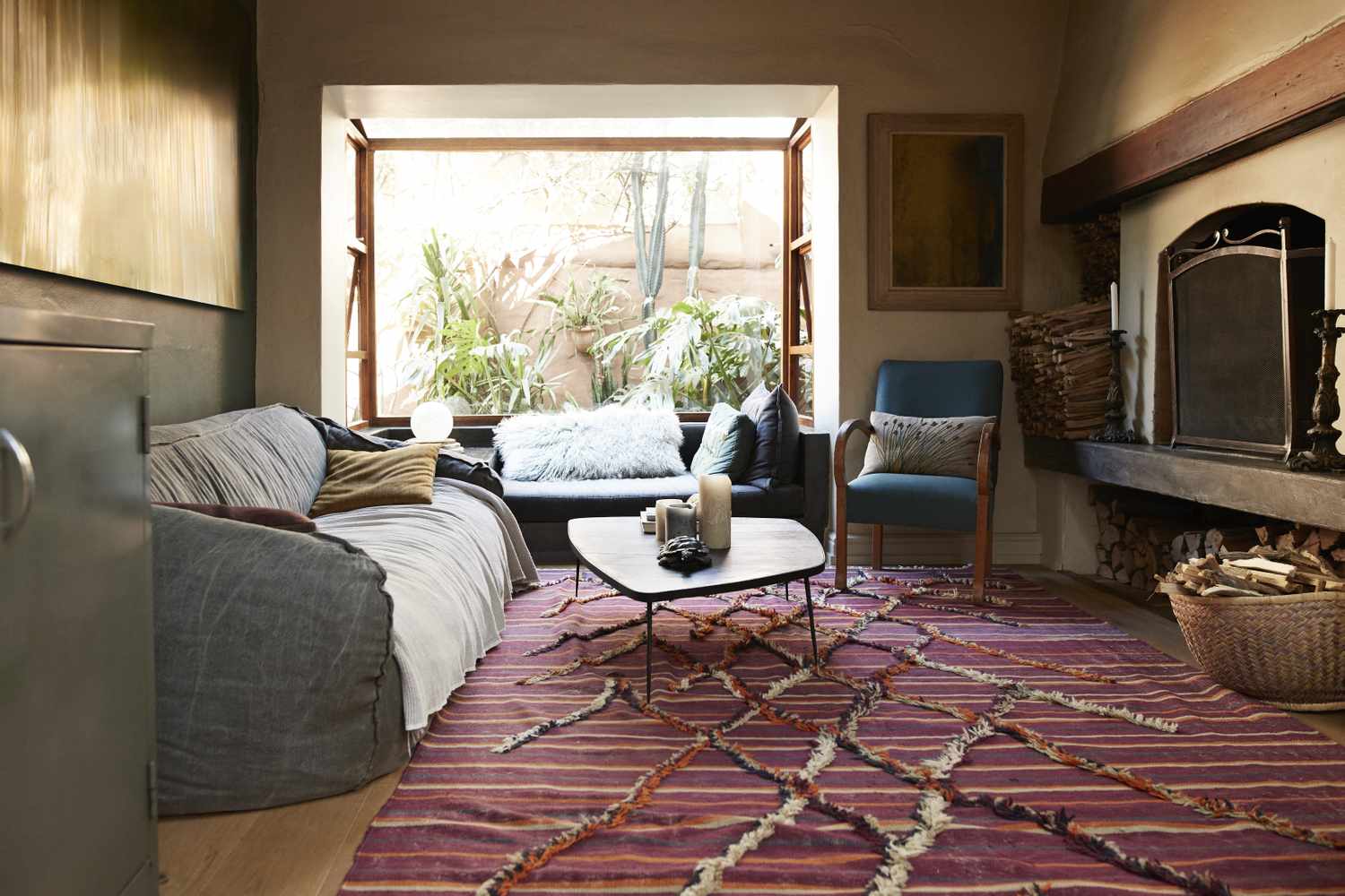
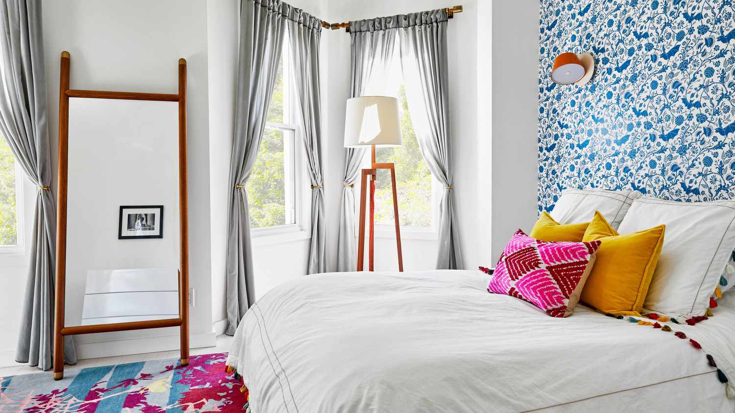
Curtains can also be coordinated with area rugs to create an ideal balance between vertical and horizontal elements. Many designers consider area rugs as a starting point for their schemes due to their dominant surface area. The golden ratio, which suggests decorating with three colors—60% dominant, 30% secondary, and 10% tertiary—can be applied to ensure a harmonious overall effect when selecting curtain colors alongside other elements.
The number of windows in a room influences curtain color choice due to how colors visually advance or recede. Warm colors make windows appear closer, potentially making a room with many windows feel smaller, while cool colors make them seem further away, creating a sense of spaciousness. Ultimately, the choice between light or dark curtains depends on whether they are meant to be a subtle backdrop or a focal point. There is no rule requiring the same curtain color throughout a home; instead, curtains should complement each room's style and functional needs, contributing to a cohesive yet interesting interior aesthetic.
#CurtainColors #InteriorDesign #HomeDecor #WindowTreatments #ColorPsychology #RoomAmbience #FabricChoice #PatternMixing #HomeStyling #CurtainColors #InteriorDesign #HomeDecor #WindowTreatments #ColorPsychology #RoomAmbience #FabricChoice #PatternMixing #HomeStyling
0 comment in total
 No comments yet
You may also like
Do curtains need to match? Interior designers share whether it's best to clash or compliment
The Best Places to Buy Curtains, Whether You Want to Go Custom or Off the Rack

This Simple Curtain Trick Is an Instant Mood Booster

The Designer Trick for Choosing the Right Living Room Rug Color

Paint color ideas for every room – experts explain the best choices for different spaces

13 curtain ideas and styles to help you pick the best drapes for your room
Real Simple Home Designers Share Their Secrets for Picking the Perfect Wall Color
How to Pick the Best Paint Colors for Every Space in Your Home

The 7 best places to buy curtains, with interior designer tips
How to Choose the Best Curtains for Your Bedroom
How to choose the best paint color for any room in your house
The $50 Amazon Curtains This Designer Has Purchased in Nearly Every Color

How to Choose Curtains for Your Home the Right Way

Living room curtain ideas – 17 tips for stylish drapery
5 Curtain Colors Designers Say Are Officially Out of Style in 2025 Projects, and What They're Replacing Them With
The curtain ideas to add instant style to your space
Living room curtain ideas to dress windows to perfection - whatever your style
The Best Curtains for Every Style and Light Level, Tested by BHG

How do you choose the best couch color? 7 tips from designers to find to perfect shade
19 Bedroom Curtain Ideas to Elevate Your Space