1/7
Love farmhouse style? These are 6 colors that always work with this timeless rustic look (and no they aren't all cream)
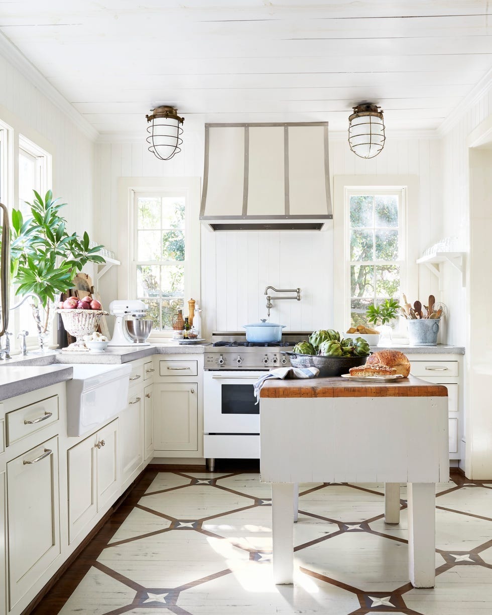
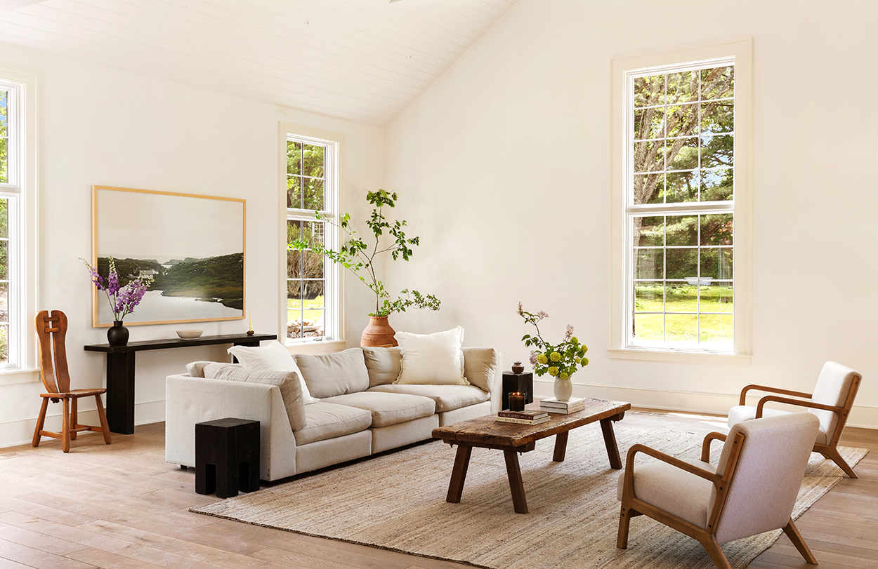
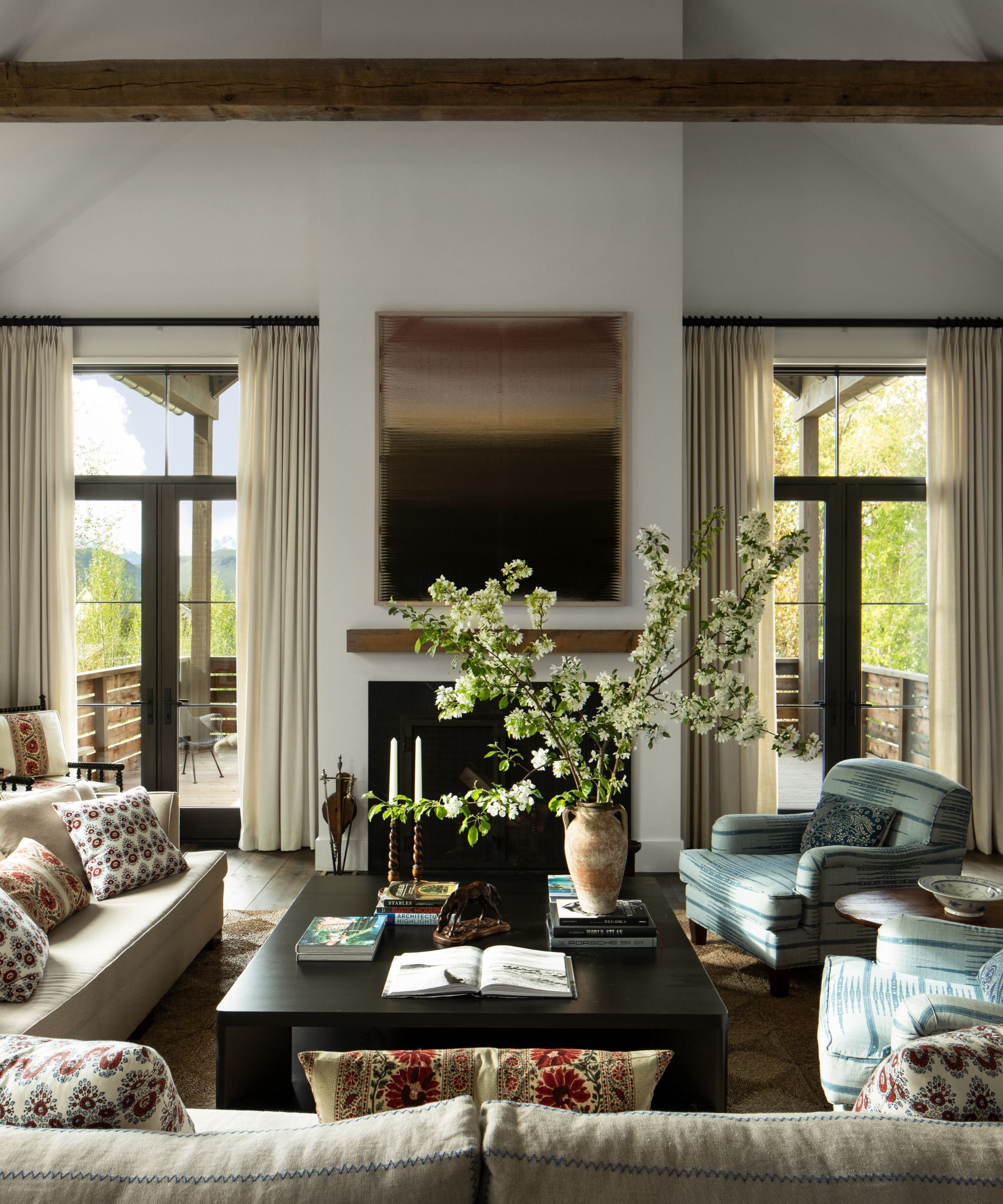
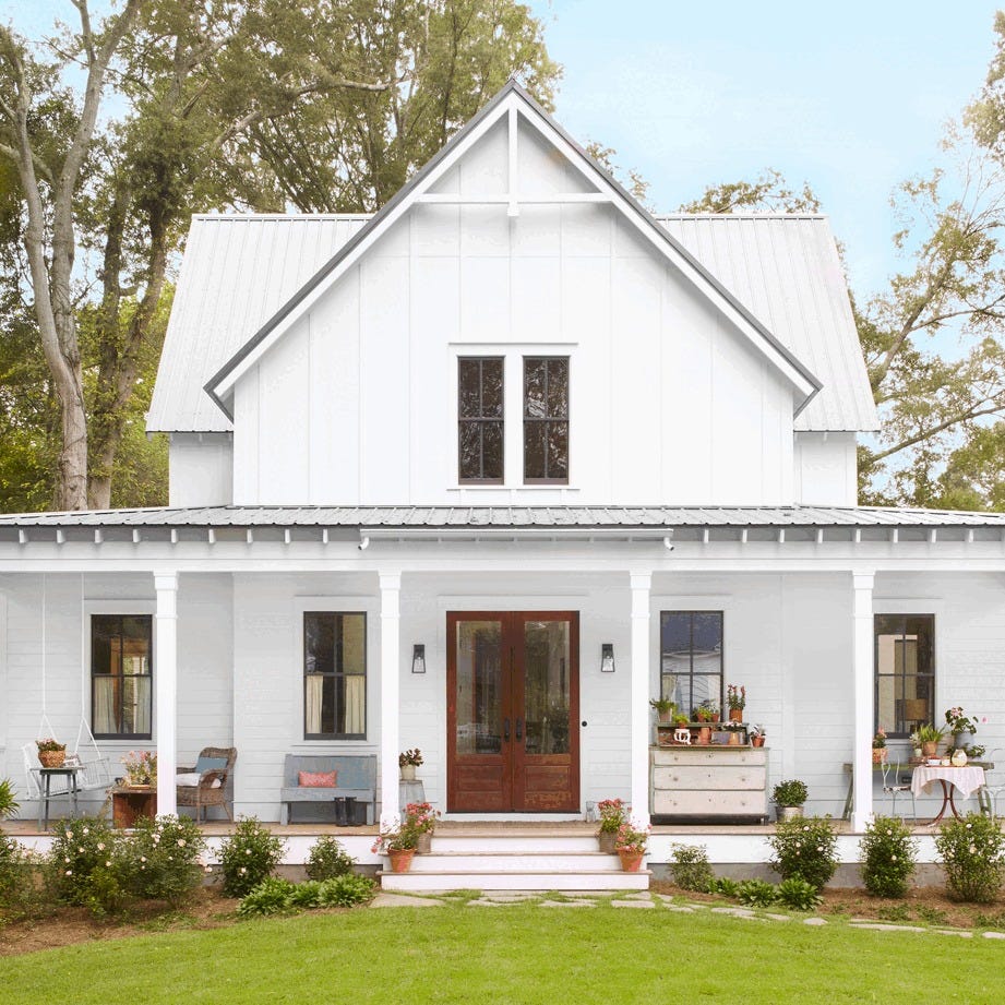
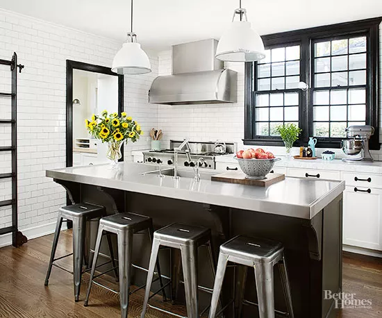
Farmhouse design continues to be a popular interior style in the U.S., celebrated for its liveable, welcoming atmosphere, natural textures, and functional simplicity. While traditionally associated with creams, whites, and beiges, this style can effectively incorporate a broader spectrum of colors inspired by nature to add personality without sacrificing its rustic charm. Interior design experts emphasize that integrating color into farmhouse aesthetics is not only possible but can enhance the overall appeal, moving beyond predictable neutral palettes.
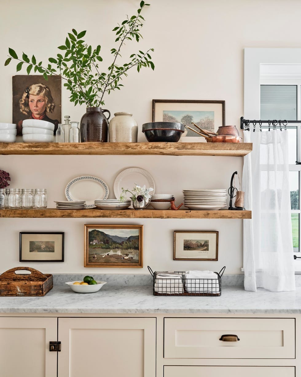
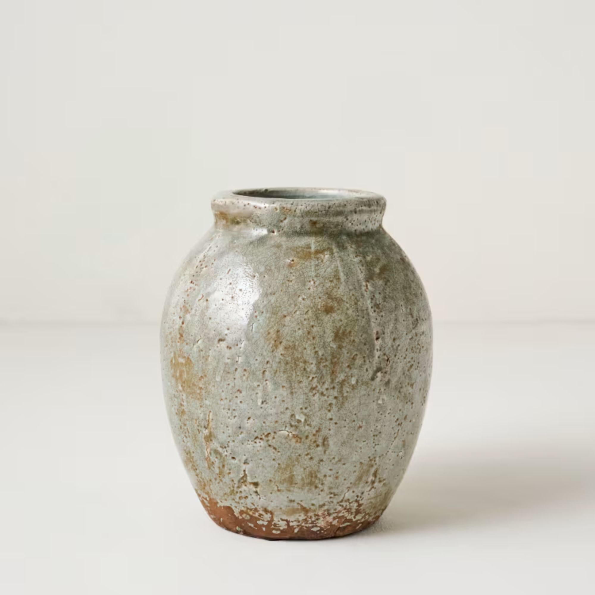
Key to successfully introducing color into a farmhouse interior is focusing on shades with earthy, muted undertones. Laeticia Laurent of Laure Nell Interiors highlights the importance of texture, suggesting matte or chalky finishes for walls to create softness, and incorporating natural materials like wood, linen, and stone for depth. The goal is to achieve a balance that feels refined yet approachable, and lived-in yet curated, irrespective of whether the home is in a rural or urban setting.
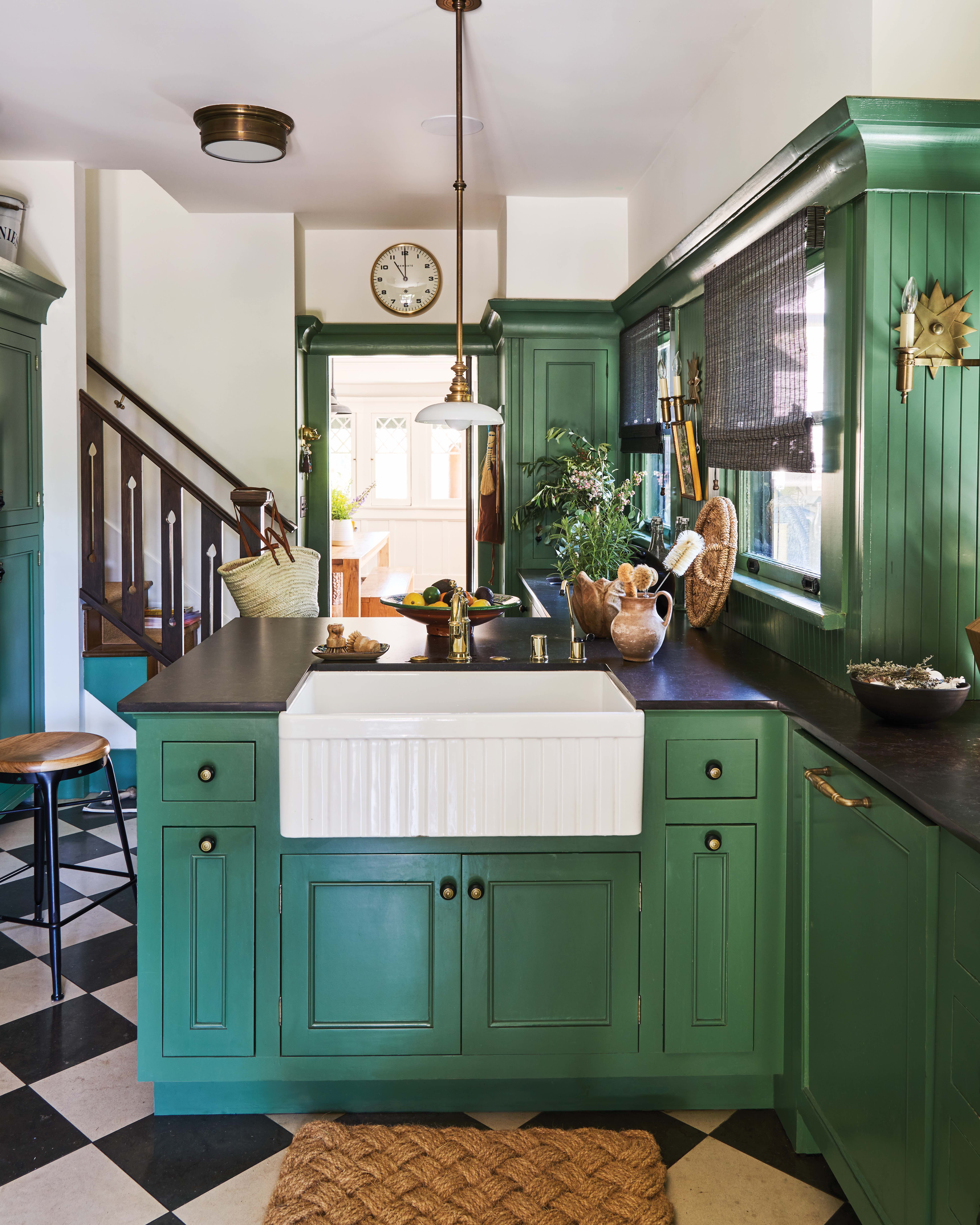
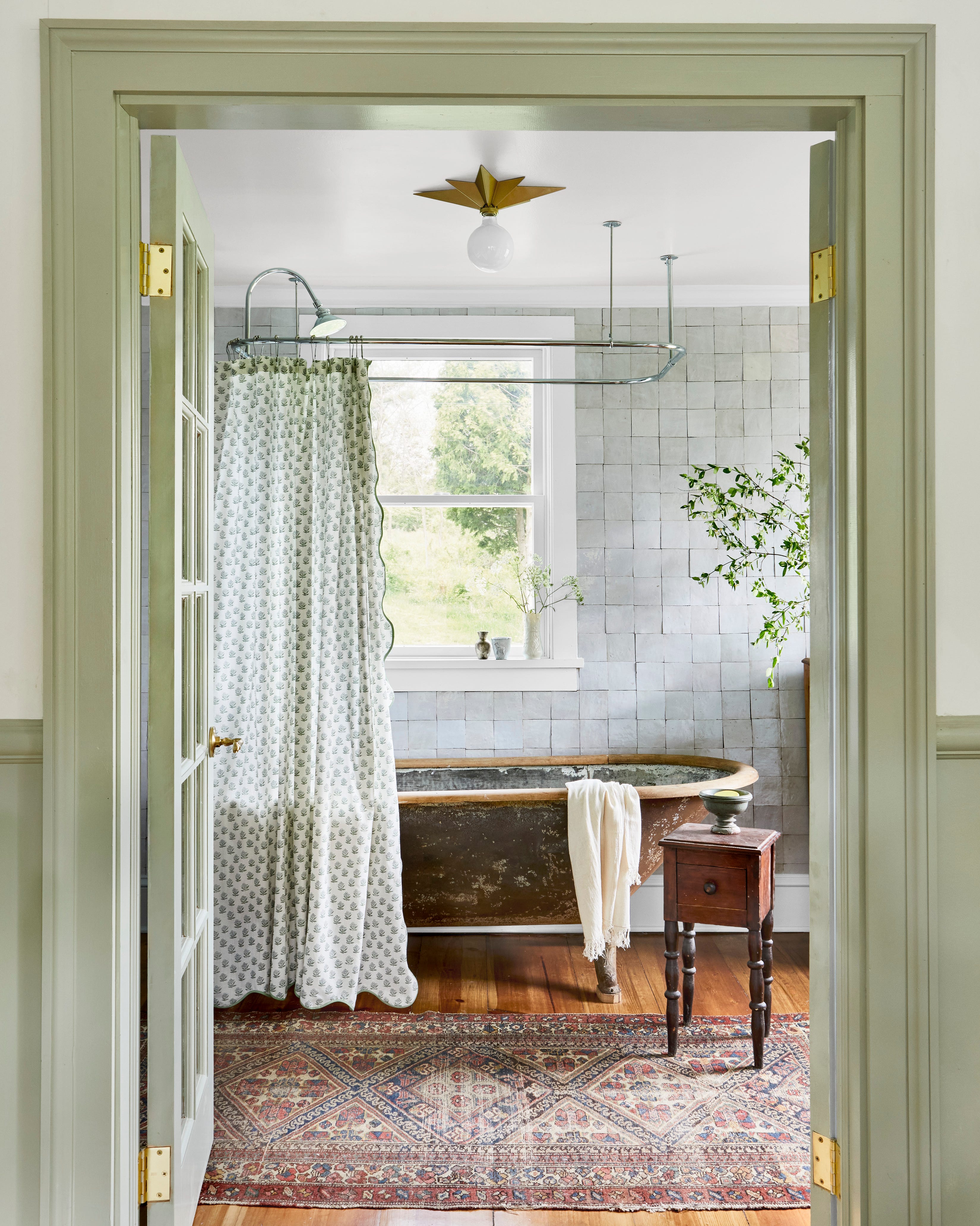
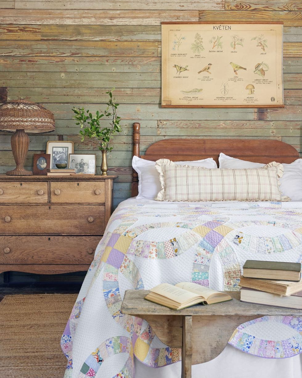
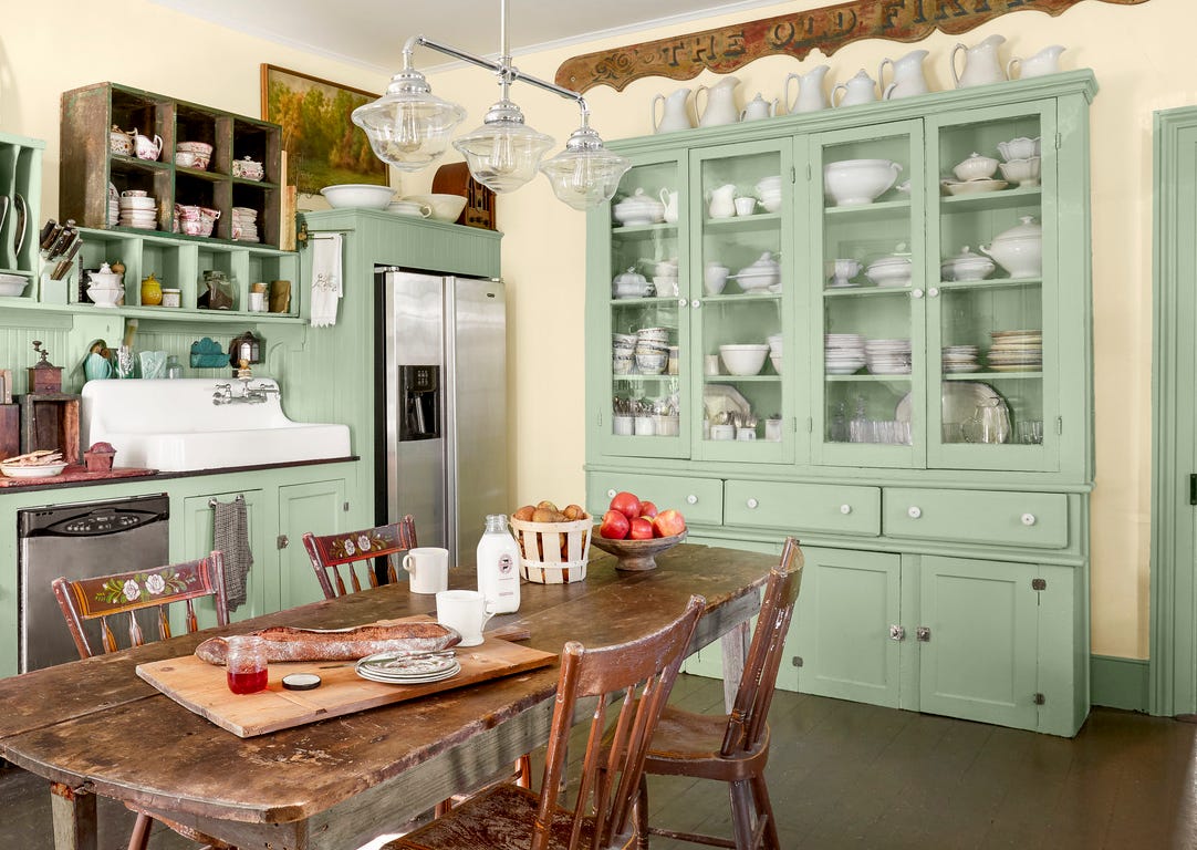
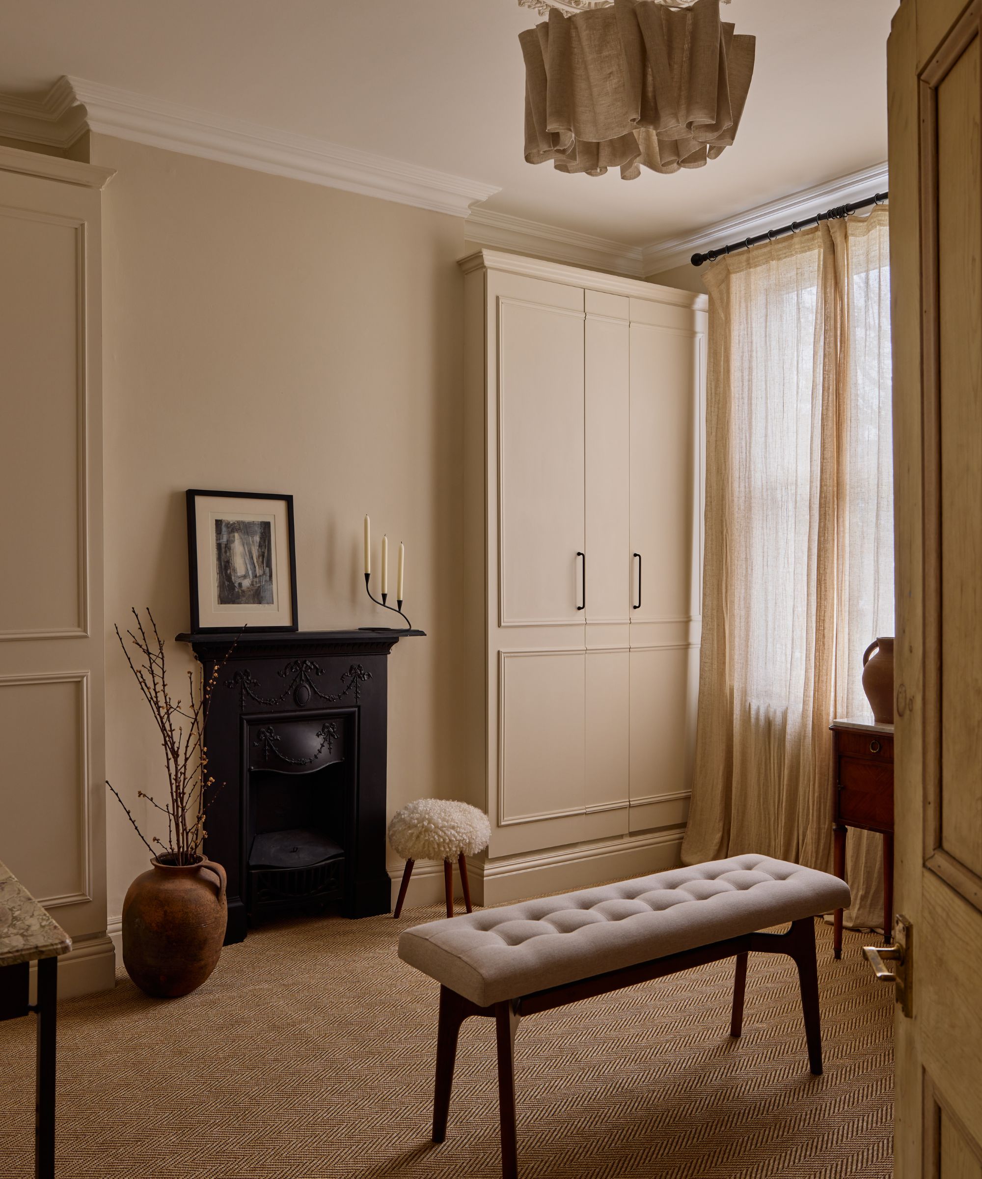
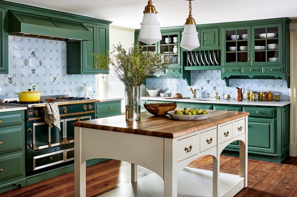
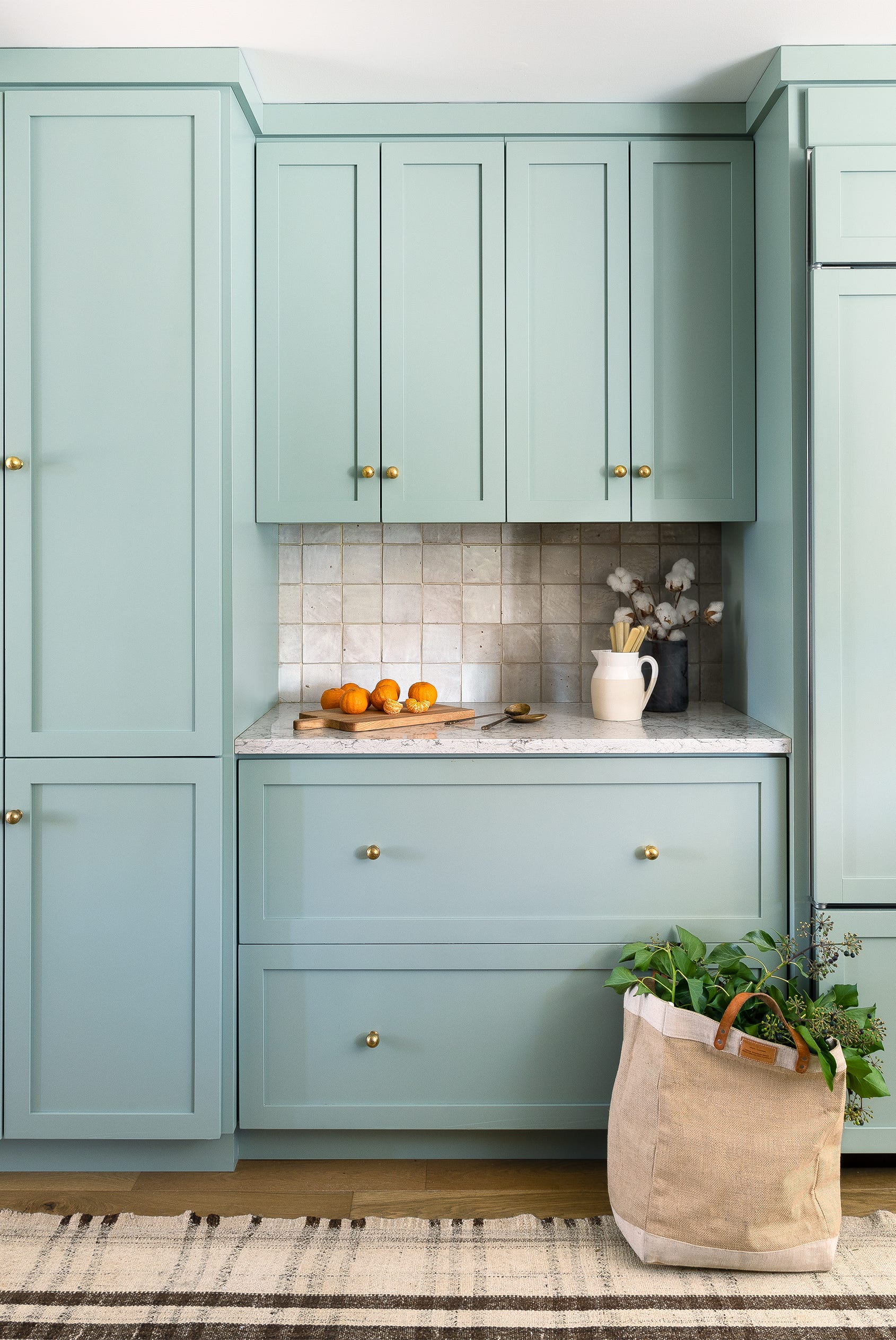
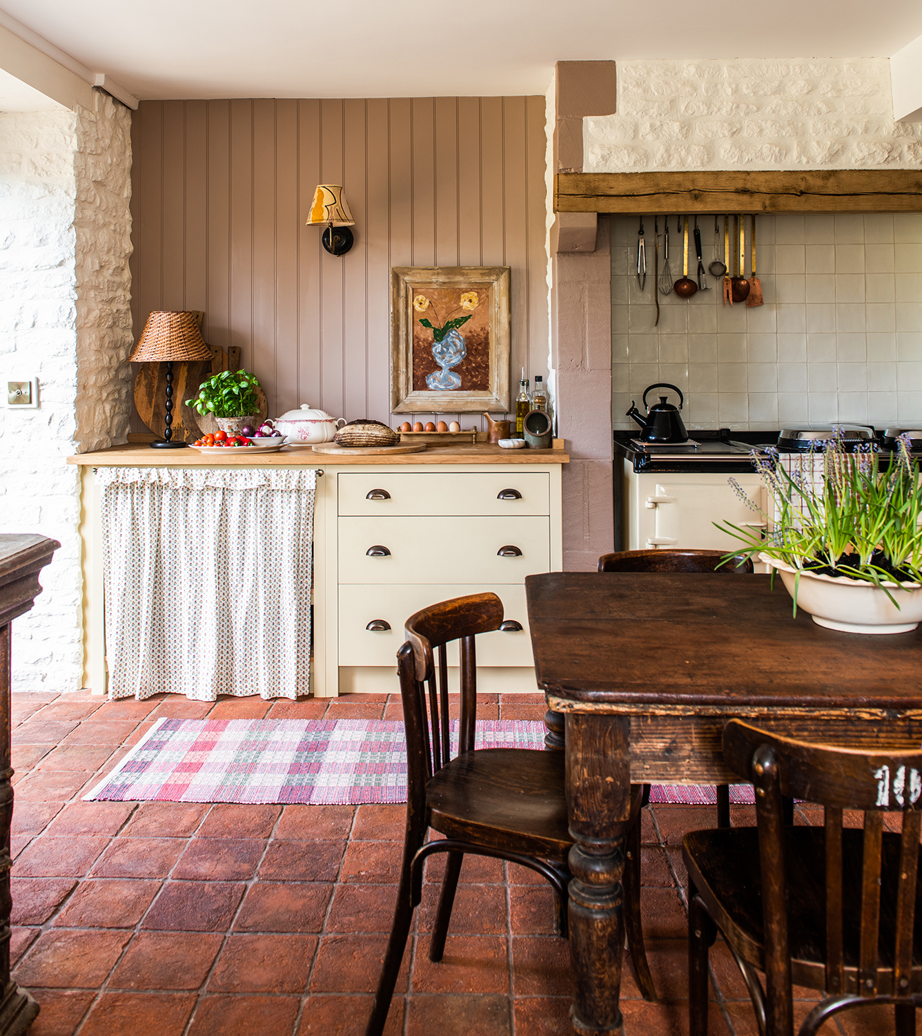
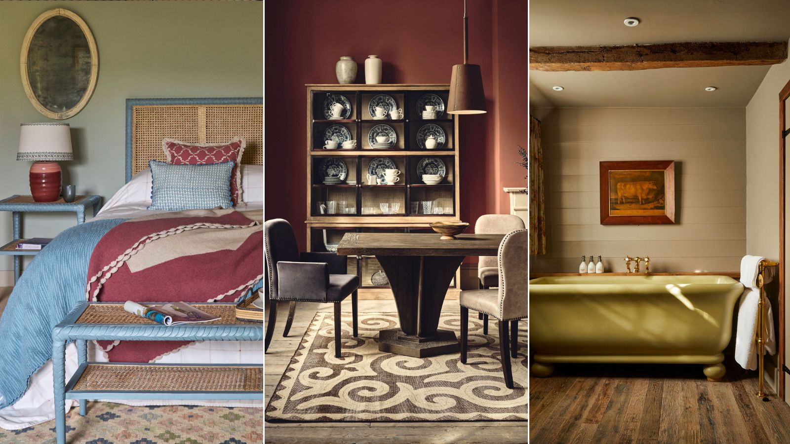
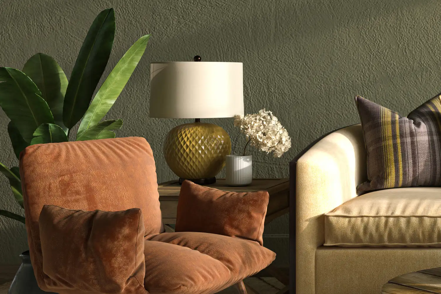
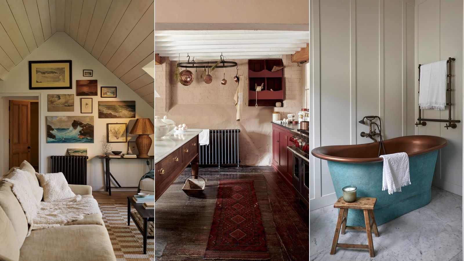
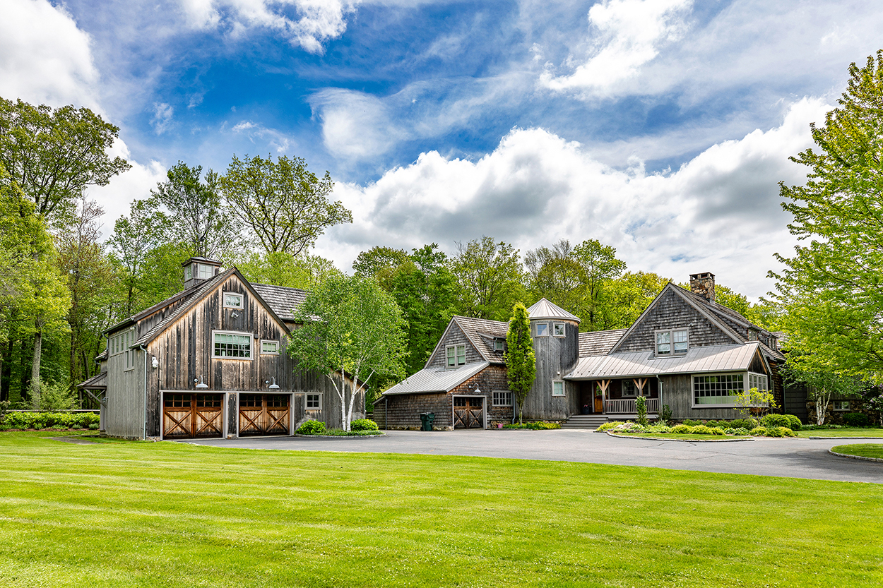
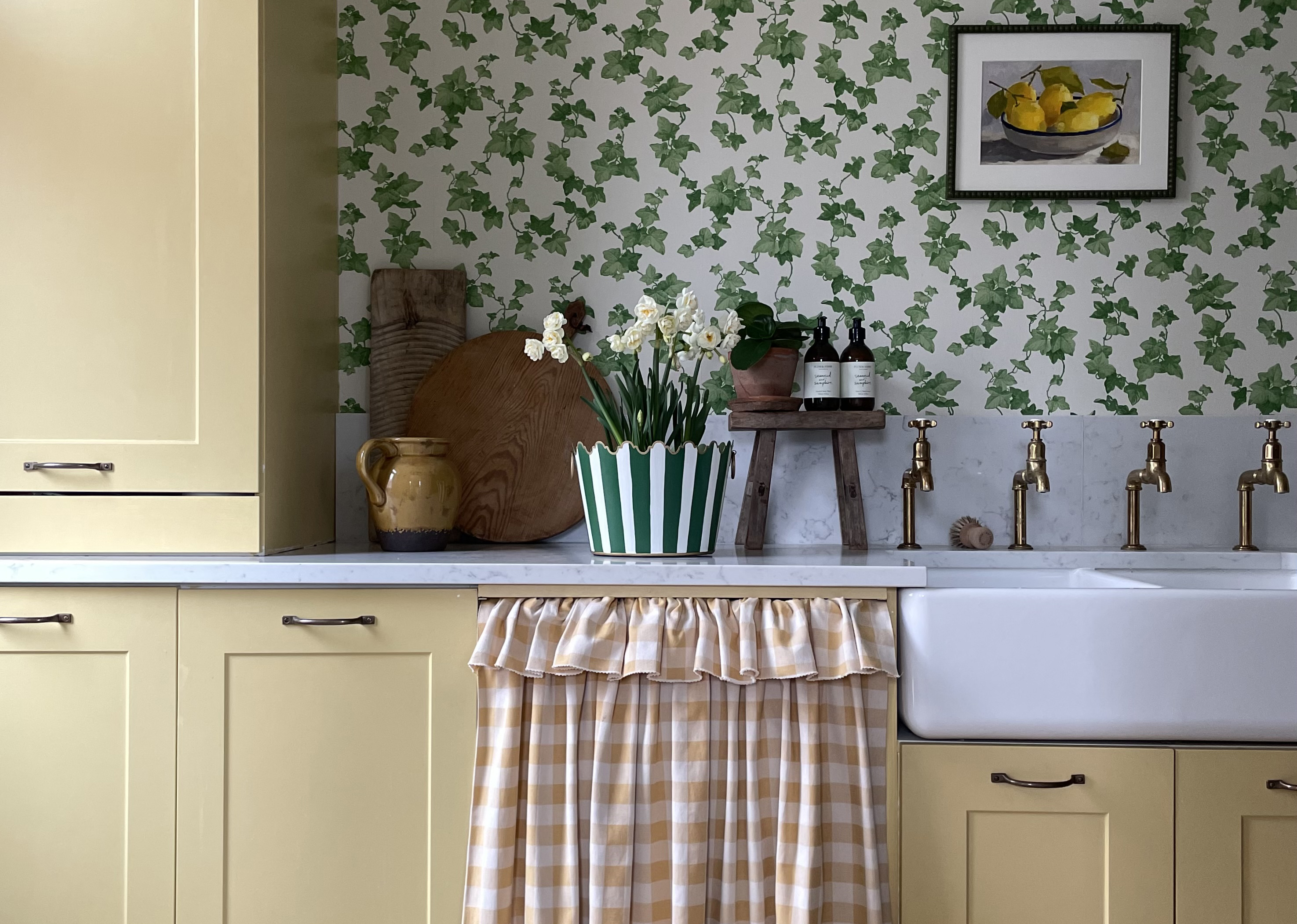
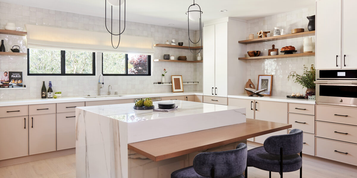
Six specific colors are identified as ideal for complementing farmhouse interiors. Ochre, a rich, golden yellow with earthy undertones, offers warmth and livability, especially effective in smaller spaces or farmhouse kitchens alongside terracotta and dark woods. Light brown, once considered a mundane color, has evolved into a design favorite, echoing the natural beauty of wood, leather, and stone. It serves as an essential neutral that grounds a space and pairs well with other farmhouse hues, particularly effective in areas like bathrooms when used on wood paneling.
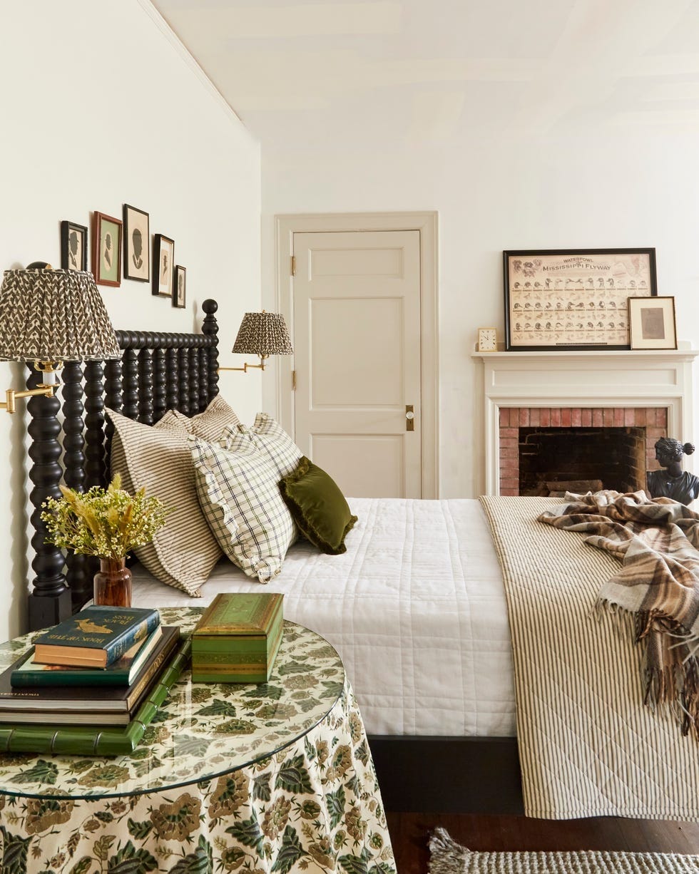
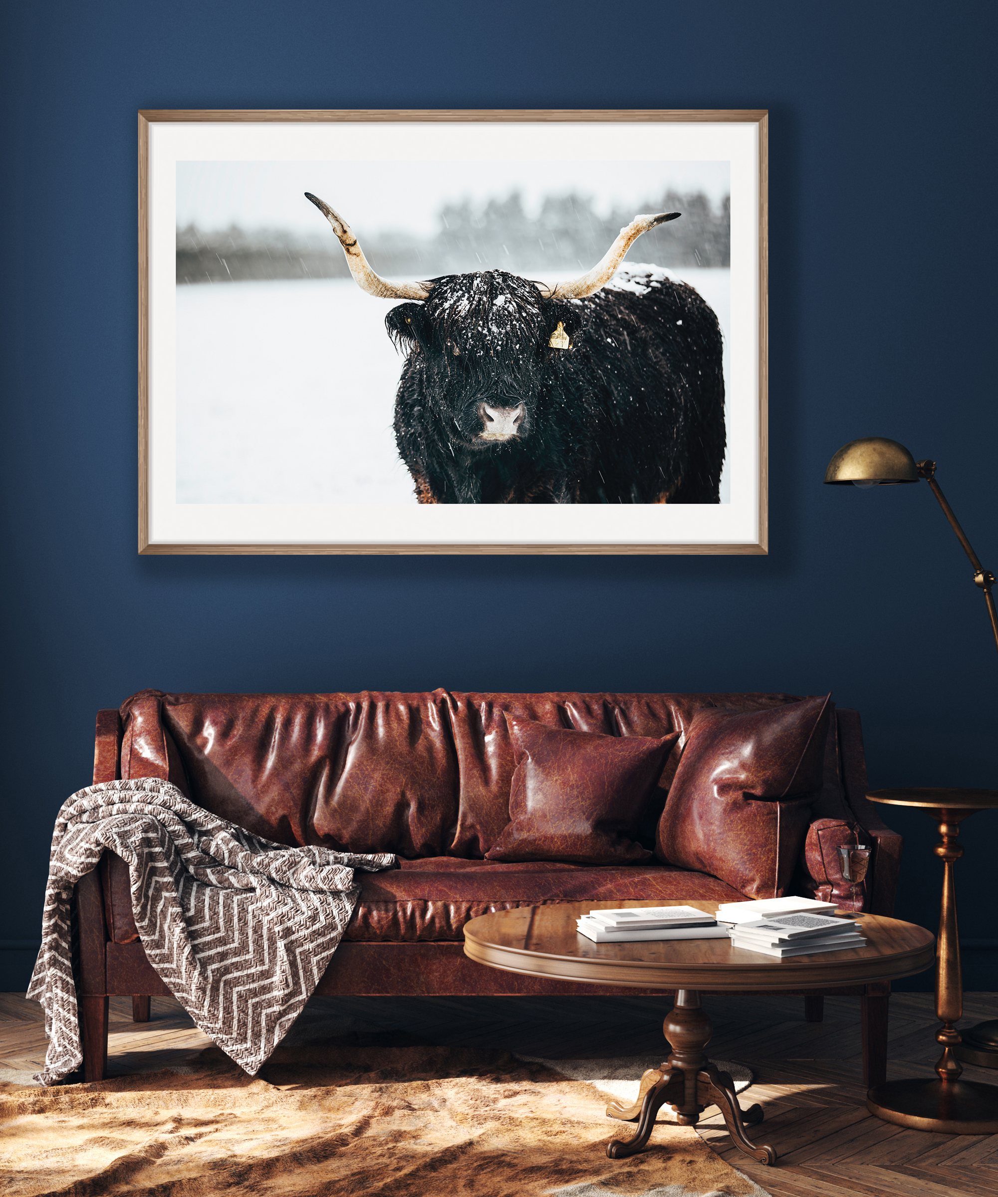
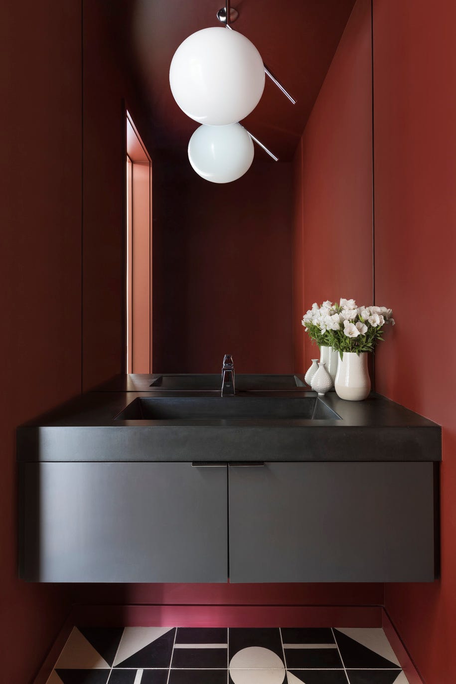
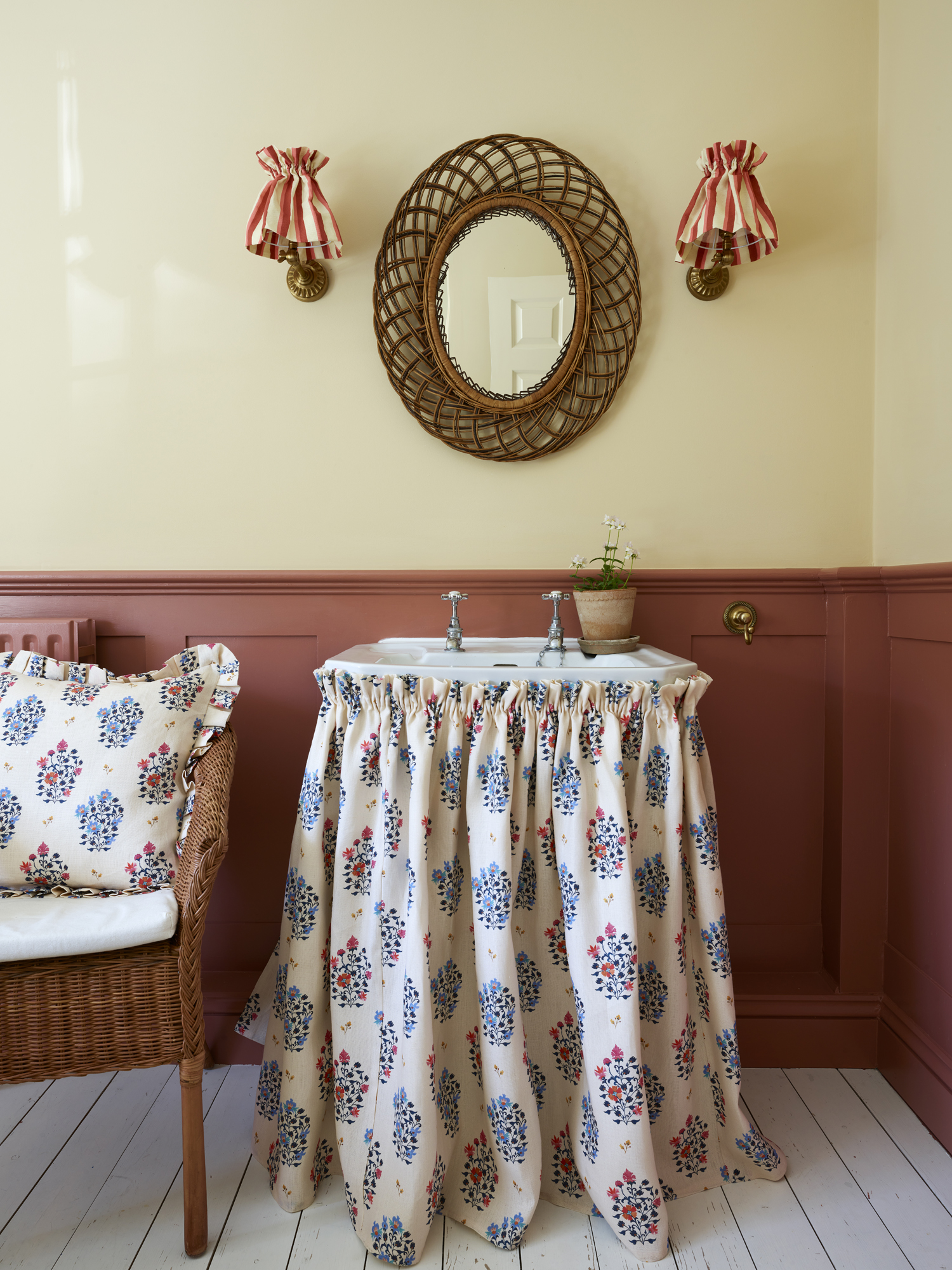
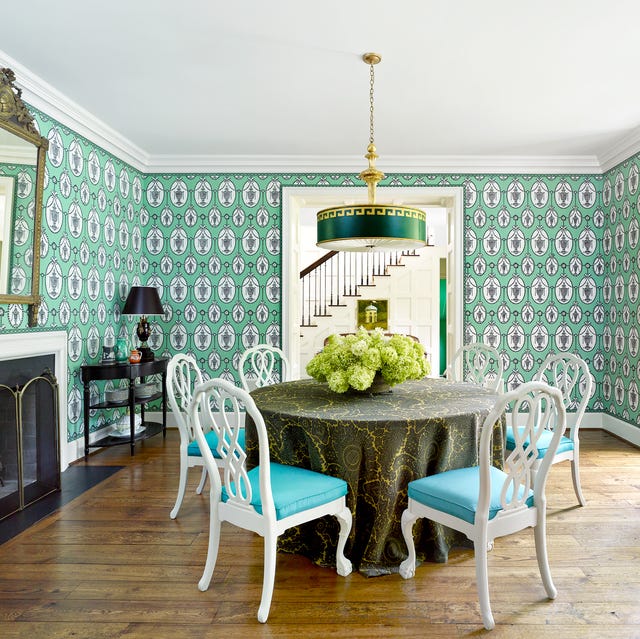
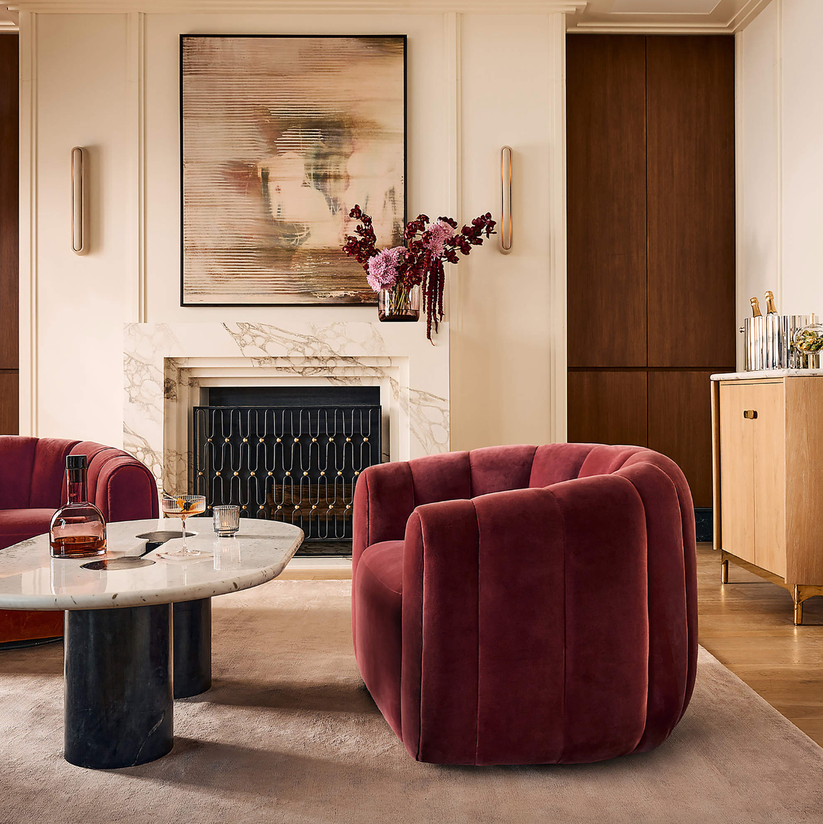
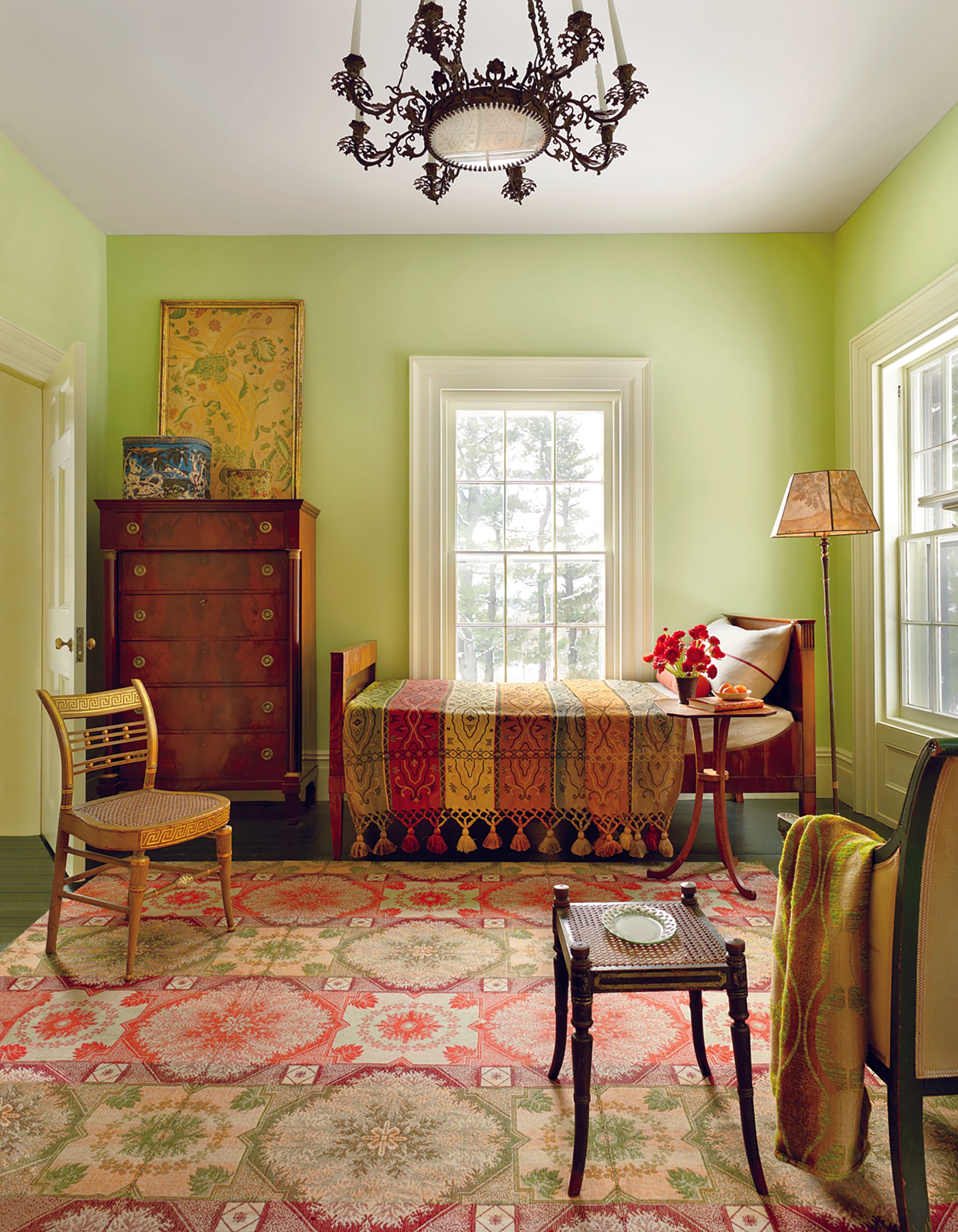
Burgundy brings a touch of drama to the serene farmhouse palette. Its rich depth can ground a space, making it perfect for dining rooms where ample light can prevent it from feeling too heavy. When paired with dark wood and aged fabrics, it creates an intimate atmosphere. For those hesitant to use it extensively, burgundy works well as an accent color against warm creams.
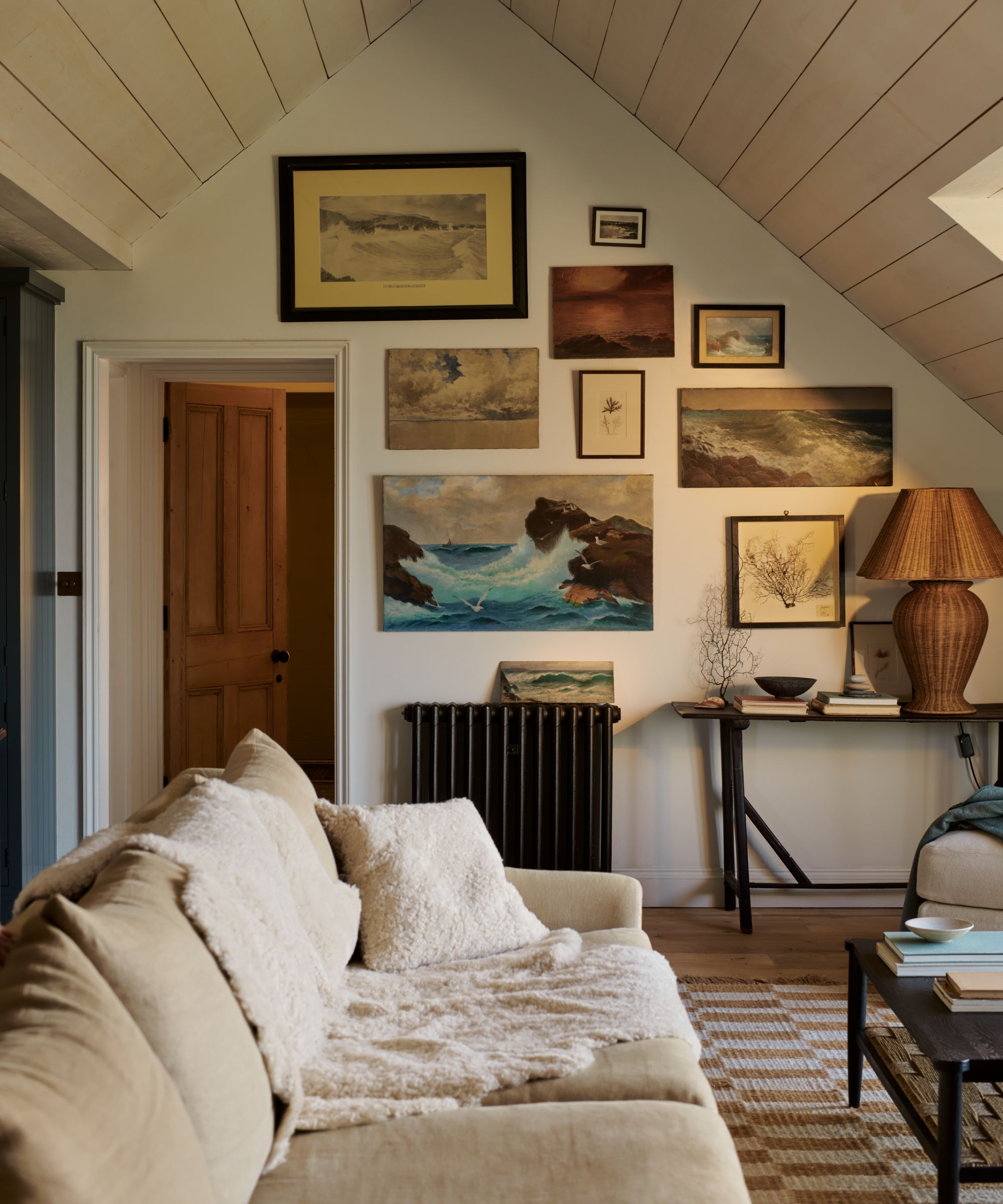
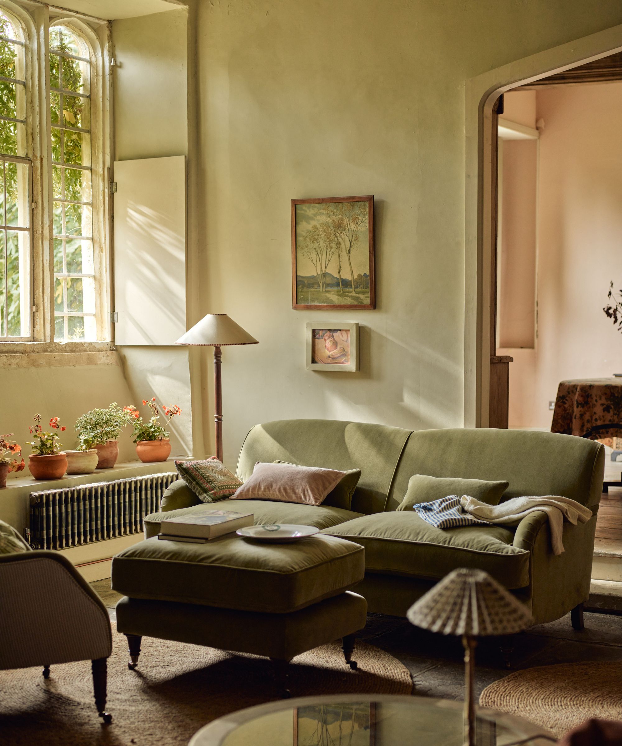
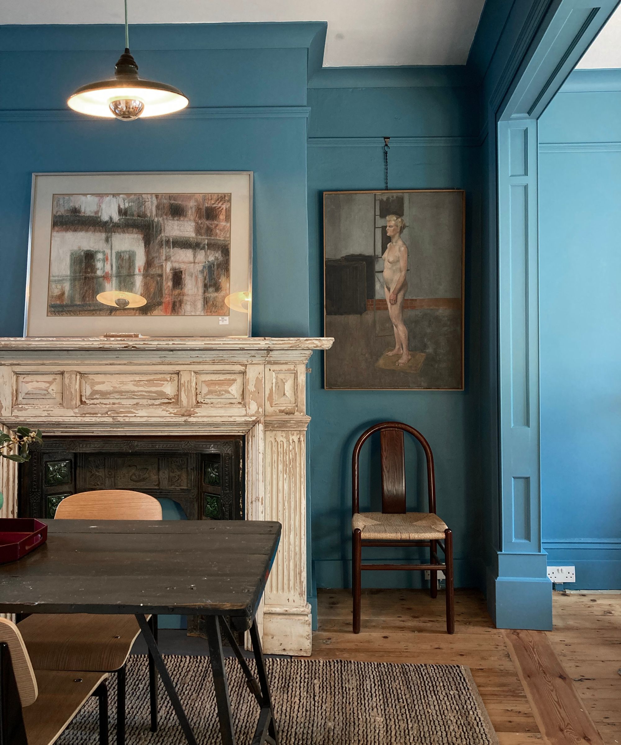
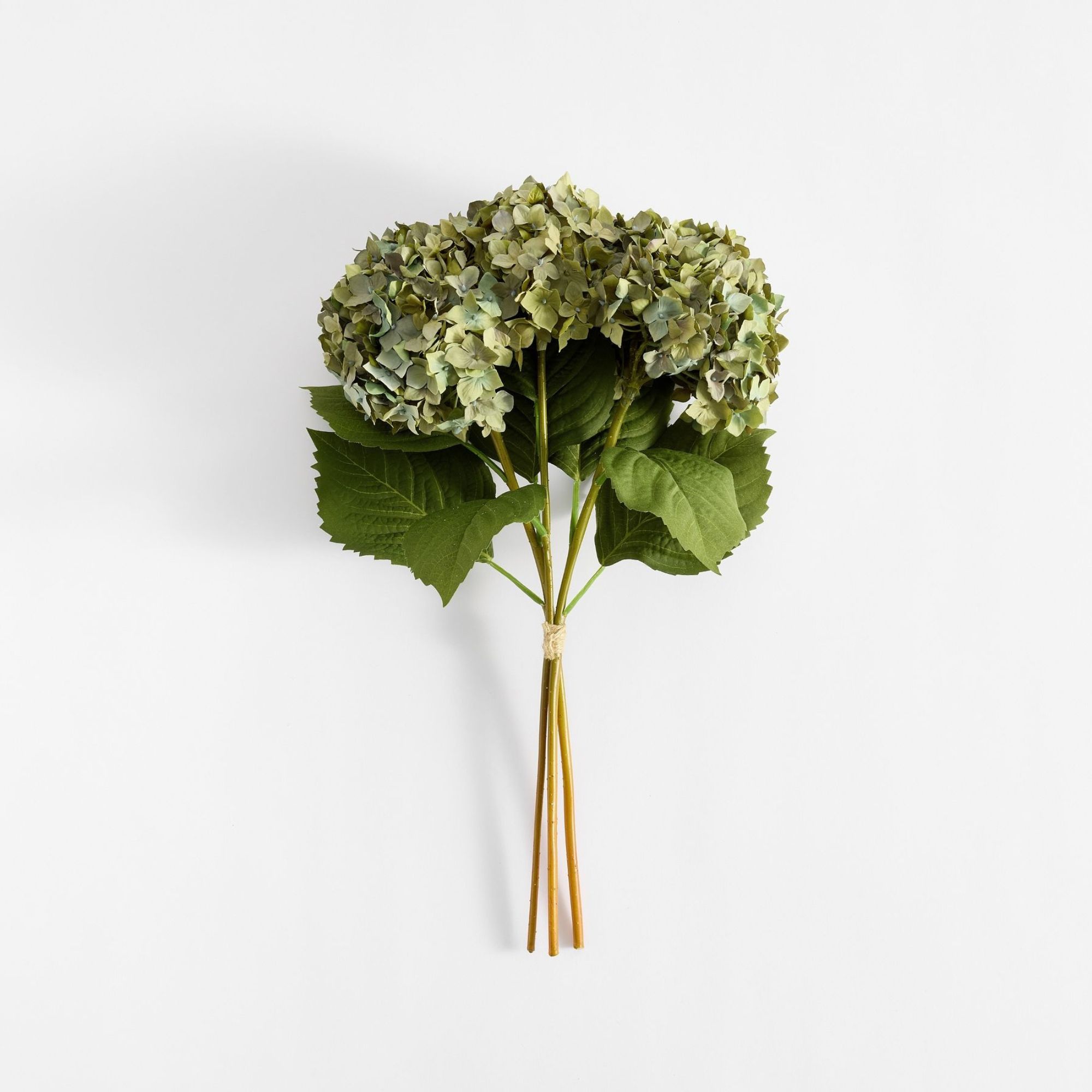
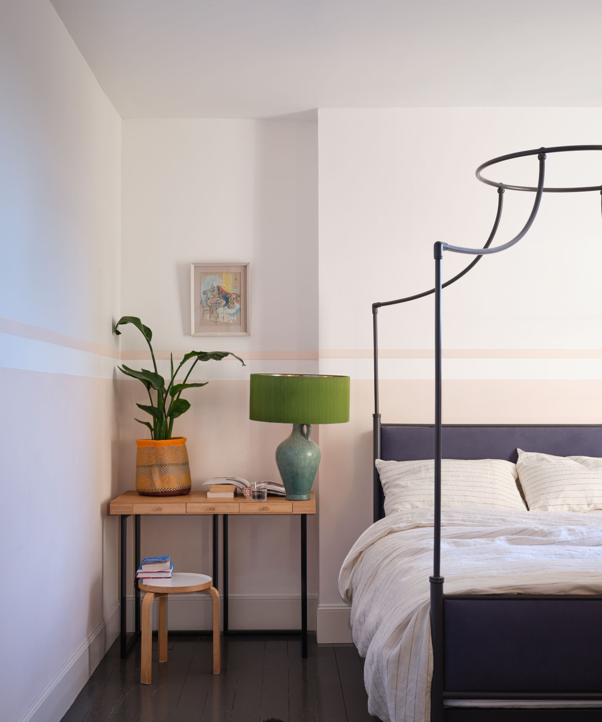
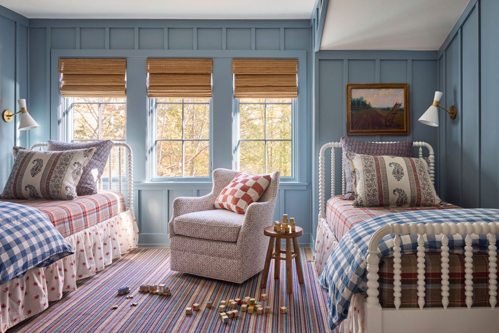
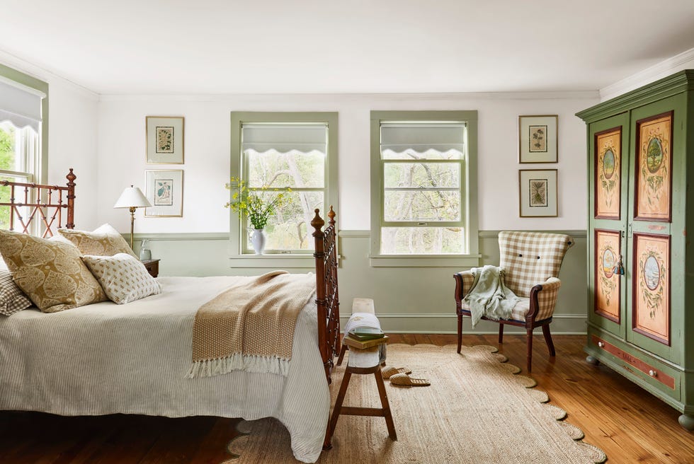
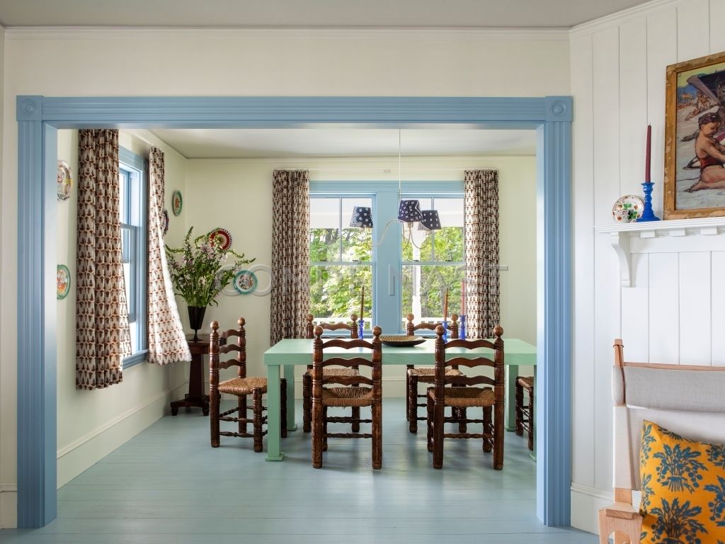
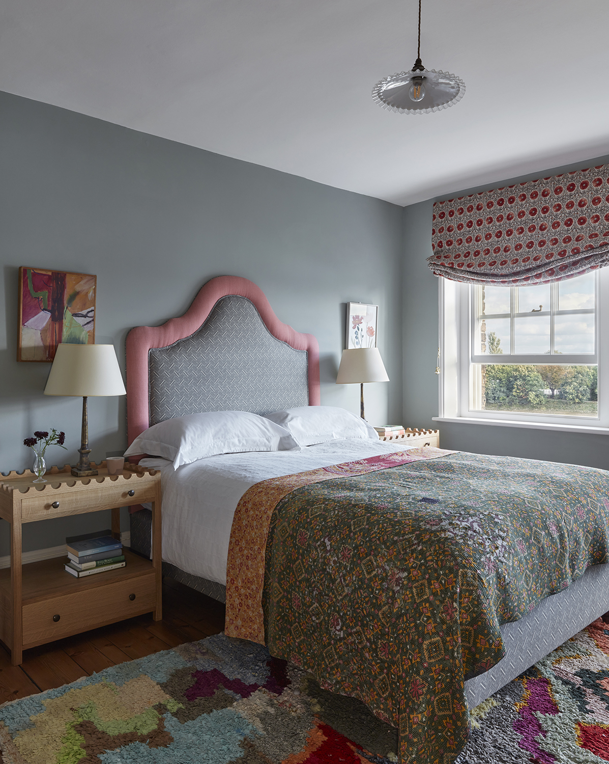
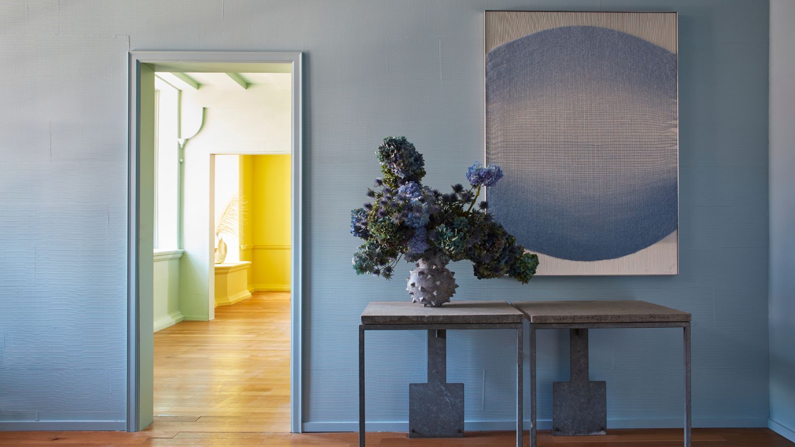
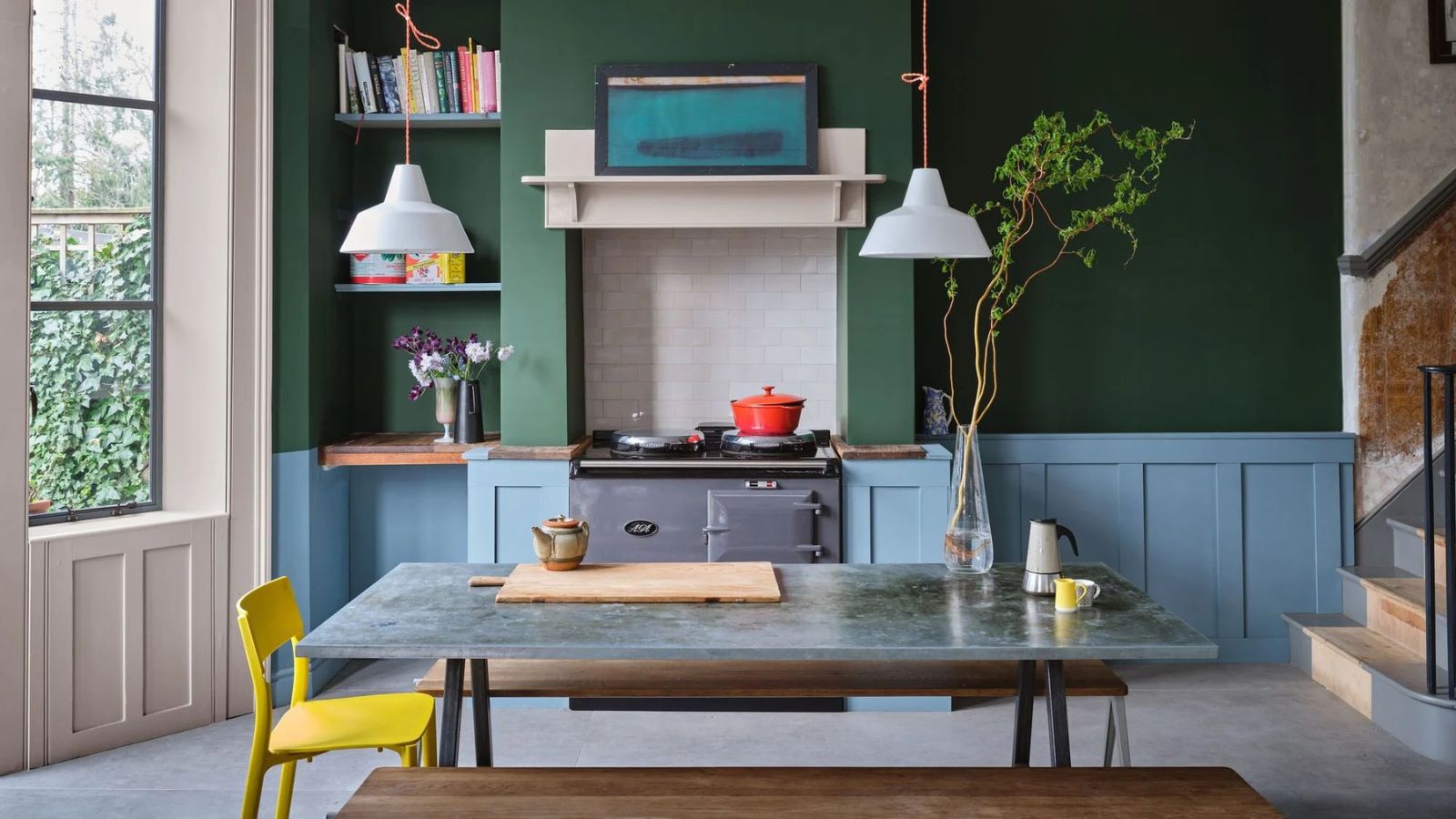
Sky blue offers a fresh, uplifting alternative, drawing inspiration directly from the outdoors. Shades with subtle gray undertones are recommended to maintain the relaxed charm of farmhouse design, avoiding brighter hues that might clash. It pairs well with wood elements, natural flagstone, and aged materials, making it suitable for hallways or as a complementary accent. Sage green is another versatile and beloved shade, known for its soothing and restorative qualities. Its muted tone, akin to light blue with gray undertones, is ideal for bedrooms, promoting a peaceful environment. It harmonizes effortlessly with natural elements such as rattan, sisal carpets, and wood.
Finally, gray, often perceived as a lack of color, is presented as a versatile option for exploring tonal layering. Warmer grays with beige undertones are preferred to complement existing warm woods and soft tones, in contrast to cooler, steel-like grays that suit industrial designs. Gray is suitable for cabinetry, shiplap walls, or painted furniture, offering a timeless and livable neutral foundation that can be enhanced with darker slate accents for added dimension.
#FarmhouseDesign #InteriorColorPalette #RusticInteriors #HomeDecor #ColorSelection #DesignTips #Ochre #SageGreen #Burgundy #FarmhouseDesign #InteriorColorPalette #RusticInteriors #HomeDecor #ColorSelection #DesignTips #Ochre #SageGreen #Burgundy
0 comment in total
You may also like
The 25 Best Farmhouse Paint Colors for Timeless Style
Farmhouse spring decor ideas – 6 inspiring ways to marry this rustic style with the fresh new season

What Colors Will Rule 2027 (and Beyond)? Experts Make Their Predictions

6 Earthy Paint Colors That'll Make Any Room Feel Cozy and Relaxed

What colors work best with rustic decor? These 5 shades are all you need to perfect a rustic color palette
How to Decorate the Cottage of Your Dreams
6 Tips for Creating a Cozy, Charming Farmhouse Look
The Versatile Color That'll Cheer You and Your Home Up All Year Long

6 rustic homes in modern farmhouse style

6 Gorgeous Home Color Trends That Aren't Just Neutrals

6 calming and cozy paint colors from Farrow & Ball
These Colors Will Be Everywhere in Interior Design in 2026
25 Farmhouse Paint Colors That Will Always Be In Style
23 farmhouse decor ideas that hug your home in cozy authenticity

The 6 must-have colors to bring into your home this June
Cottagecore color palettes - 9 restful decor schemes with the perfect amount of modern design flair

The 6 Paint Colors for Your Kitchen That Will Never Go out of Style
This Farmhouse Is Decorated With Every Color of the Rainbow
6 Farmhouse-Style Trends Designers Secretly Wish We’d Retire
Classic Color Schemes That Never Go Out of Style