1/4
Snarkitecture and Gufram unveil bubblegum pink furniture
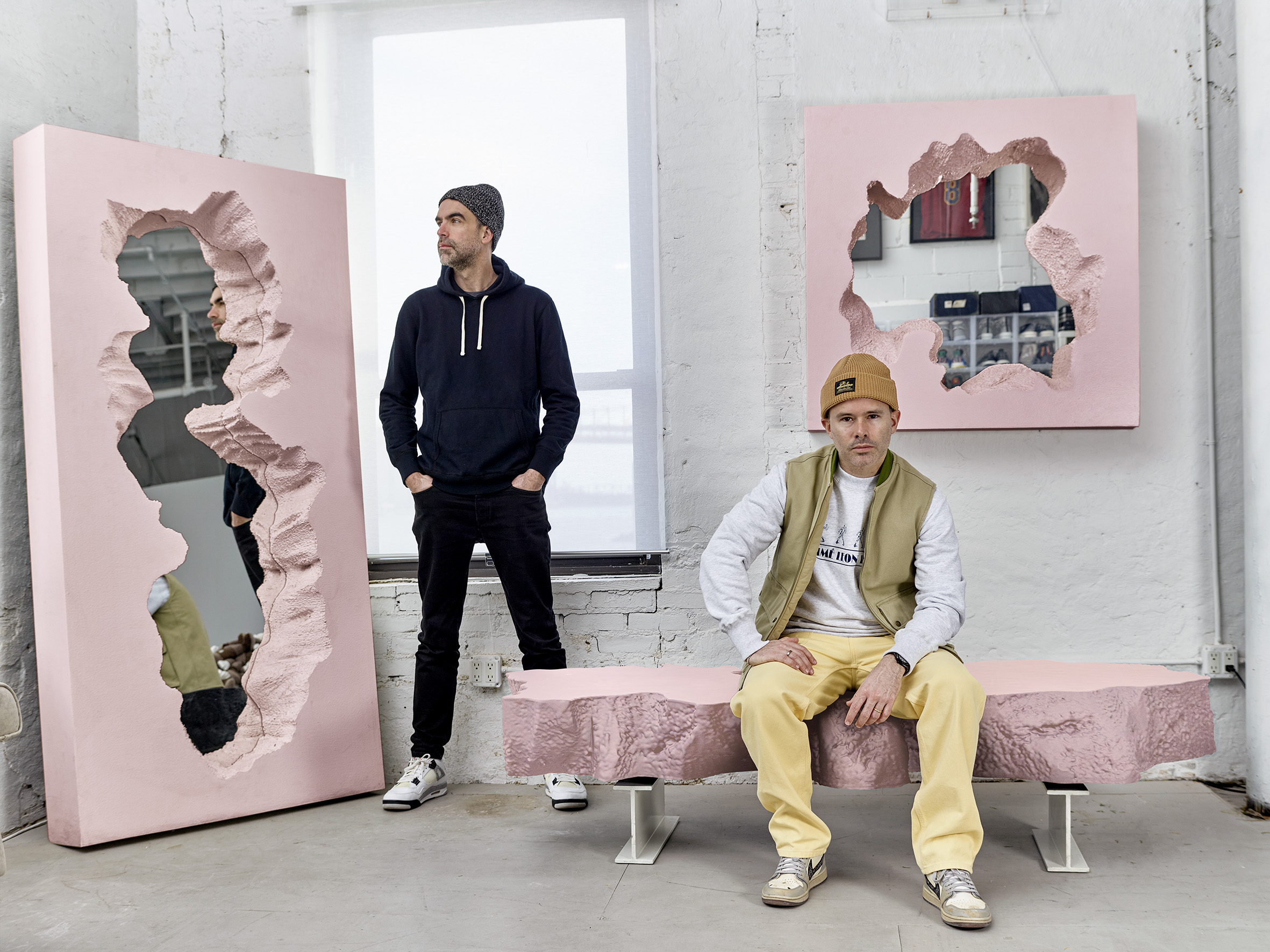
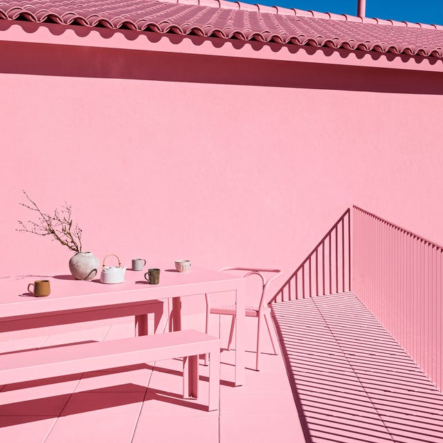
In 2017, Snarkitecture and Gufram collaborated on the 'Broken' series, which featured mirrors and a bench with frames that appeared stone-like but were actually made of polyurethane and coated in concrete-looking Guflac paint. This innovative use of materials created an ambiguous mix of hard appearance and unexpected softness in their initial collection. Now, the Italian radical design brand Gufram and the experimental New York architecture and design studio Snarkitecture have revisited this collection, introducing a new edition of furniture in a pastel pink shade.
The inspiration for this new color came from classic bubblegum, chosen to add a fresh layer of playfulness to the 'Broken' series. This specific shade of pink was meticulously developed over the last year in close collaboration with the Gufram team. The newly colored 'Broken' bench by Snarkitecture for Gufram and the 'Broken' mirror are central to this updated collection.
This pink furniture collection was specifically created for a special display at K11 Musea in Hong Kong. K11 Musea, inaugurated in 2019 by Adrian Cheng, serves as both a retail and art venue. For its annual 'Art Karnival' event, Gufram exclusively presented an immersive, all-pink showcase to debut this new color palette for their collaboration with Snarkitecture. The event provided a unique platform to highlight the playful and innovative nature of the revisited collection.
Accompanying the full-sized pink furniture pieces, a collection of 'Guframini' was also launched in the same bubblegum pink shade. These 'Guframini' are miniature versions of some of Gufram’s most iconic radical design classics, including the 'Bocca' sofa and the 'Cactus' coat stand. These miniature versions were exclusively created for the K11 Musea event, further expanding the pink theme across their product range.
Charley Vezza, Gufram’s global creative orchestrator, explained the choice of pink. He noted that Gufram had never previously released a product in this color. For the 'Broken' series, pink was a significant departure from Snarkitecture's usual black and white palette, signifying a deliberate and well-considered color choice. The decision to use pink was a simple yet bold one, encapsulated by the question, 'Pink… why not?' The collaboration highlights Gufram's legacy of radical design and Snarkitecture's experimental approach, demonstrating how a change in color can recontextualize and inject new life into an established collection.
#Snarkitecture #Gufram #FurnitureDesign #PinkFurniture #RadicalDesign #ProductCollaboration #DesignExhibition #K11Musea #InteriorDesign #Snarkitecture #Gufram #FurnitureDesign #PinkFurniture #RadicalDesign #ProductCollaboration #DesignExhibition #K11Musea #InteriorDesign
0 comment in total
You may also like
Dusen Dusen’s Throw Pillow Drop, a Roasted Tomato Rug, and the Most Genius Grilling Set

RH’s latest sourcebook, new looks from Cambria, Pindler, Clé Tile and more
A sophisticated yet youthful art deco-style home by Greg Natale

Home design: Add some pink
Trend Spotting at High Point
Gelato-Inspired Tiles, a New Sixpenny Sofa, and Heather Taylor Home Starting at $12

8 Furniture Trends That Will Be Everywhere in 2026, According to Designers

We’re Calling It: These Are the Best Online Home Decor Brands Around

Products

The Best Smile-Inducing New Furniture and Home Accessories

MATCHESFASHION launches designer homewares studio

Made.com Is Back & Better Than Ever

The Pioneer Woman Just Dropped a Stunning New Furniture Collection That Includes Seating, Tables, & More

Technicolour textiles by Peter Saville for Kvadrat among new products on Dezeen Showroom

Modern Home Decor Takes Centerstage at a New York Pop-Up from Maiden Home
15 Rising Stars of Product Design
The best debuts at High Point Market this fall
25 Pink Room Ideas to Satisfy Your Barbiecore Dreams

Dims. Collabs With Wade and Leta on the Maximalist New Eclectic Lounge + Ottoman
designer hanne willmann details the expanded freifrau nana collection