Home design: Add some pink
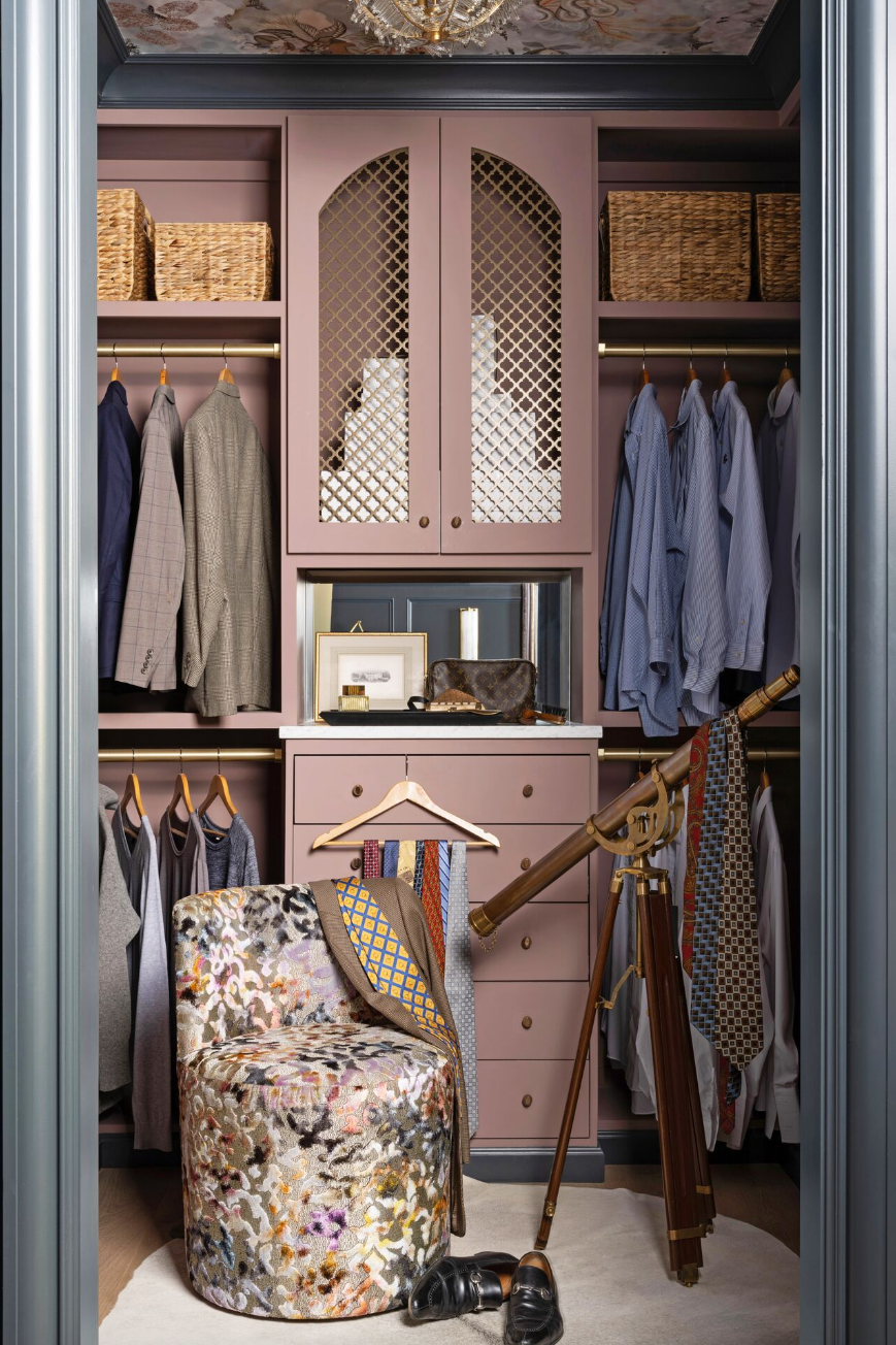
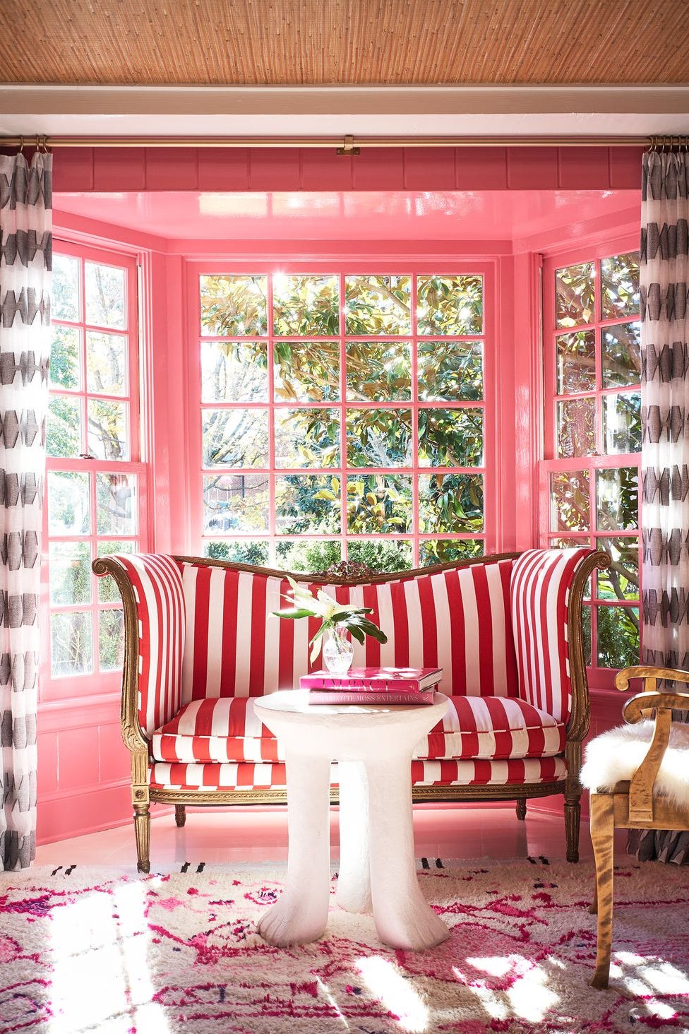
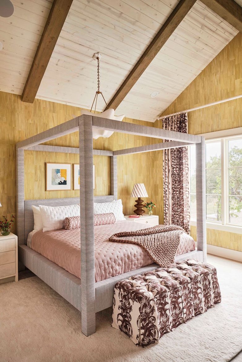
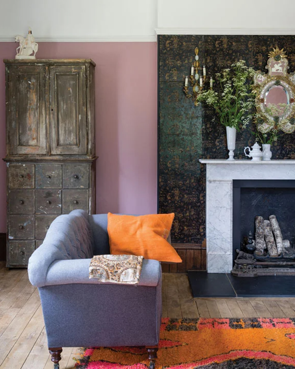
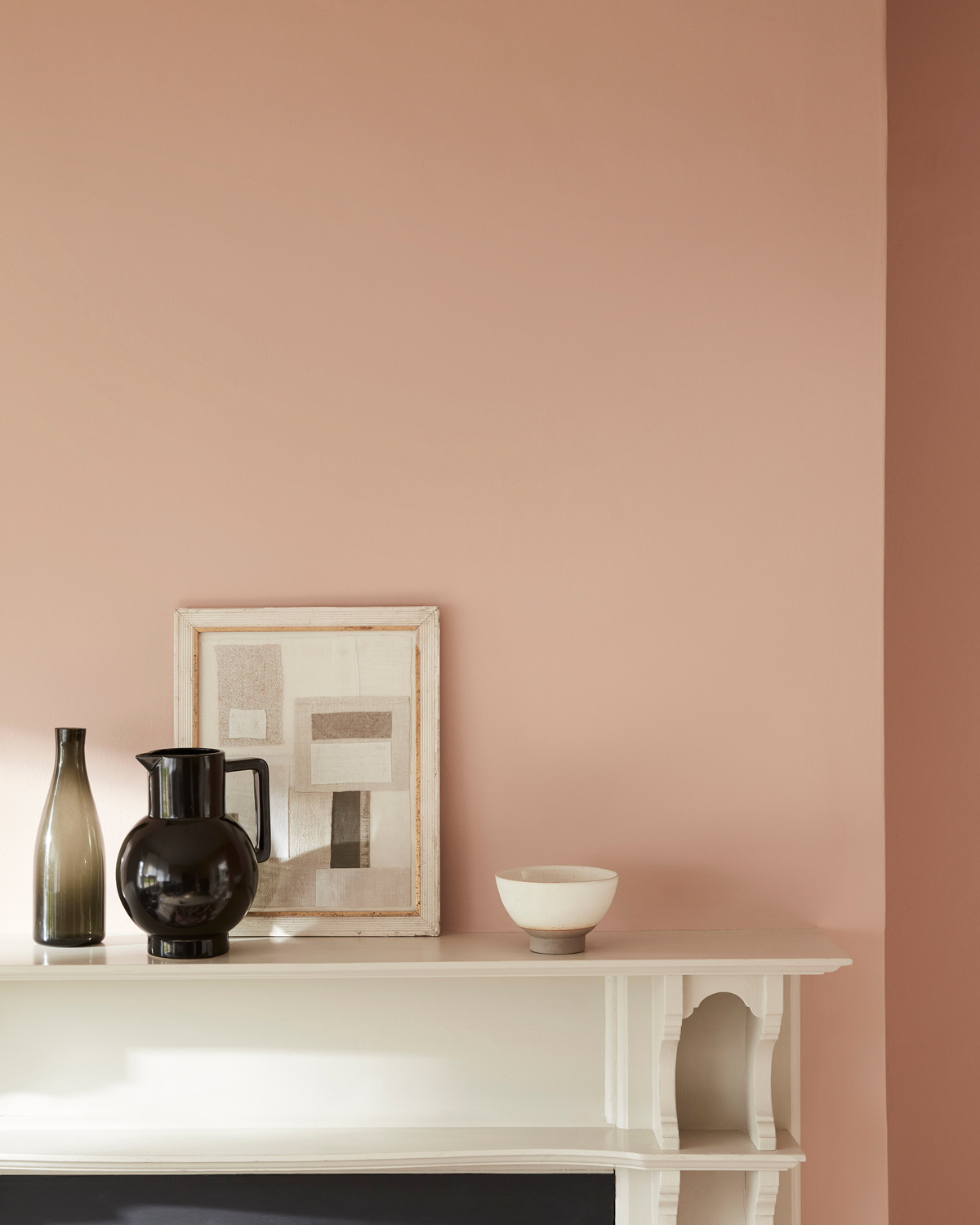
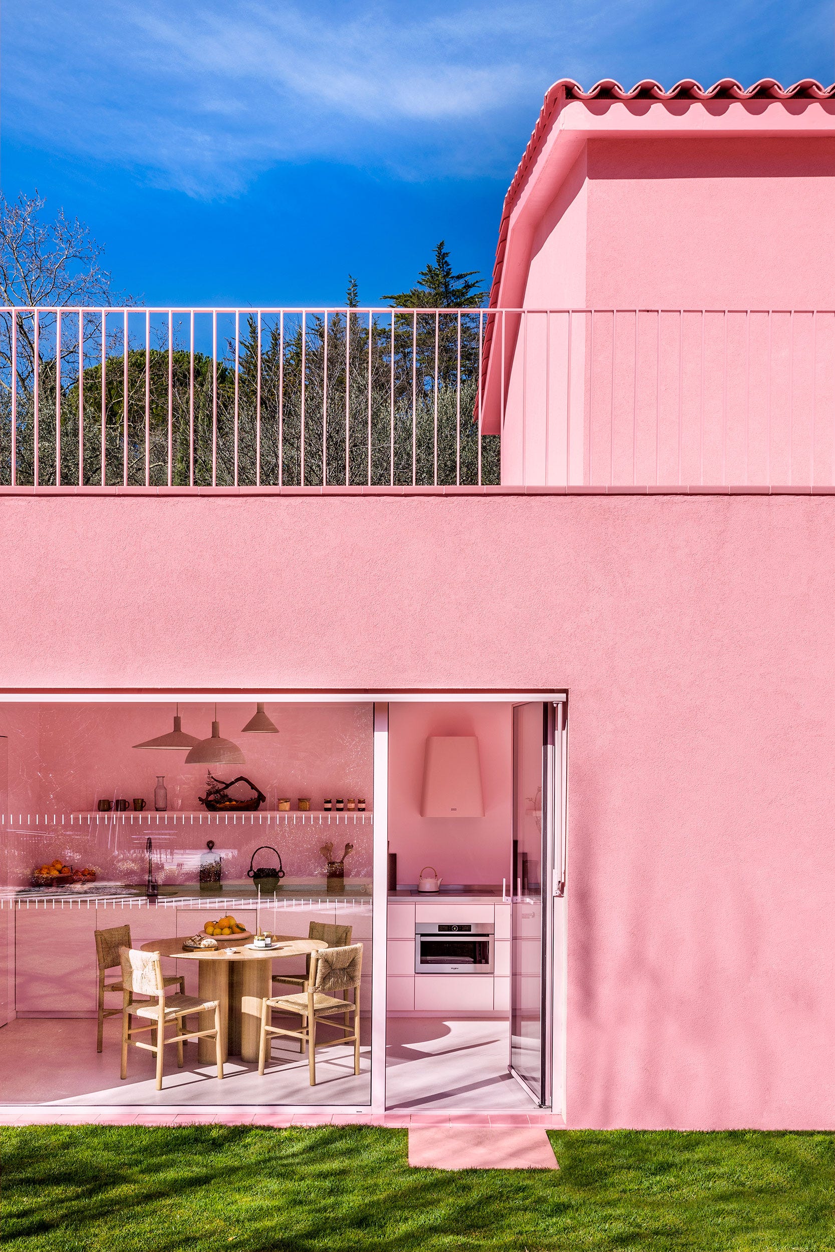
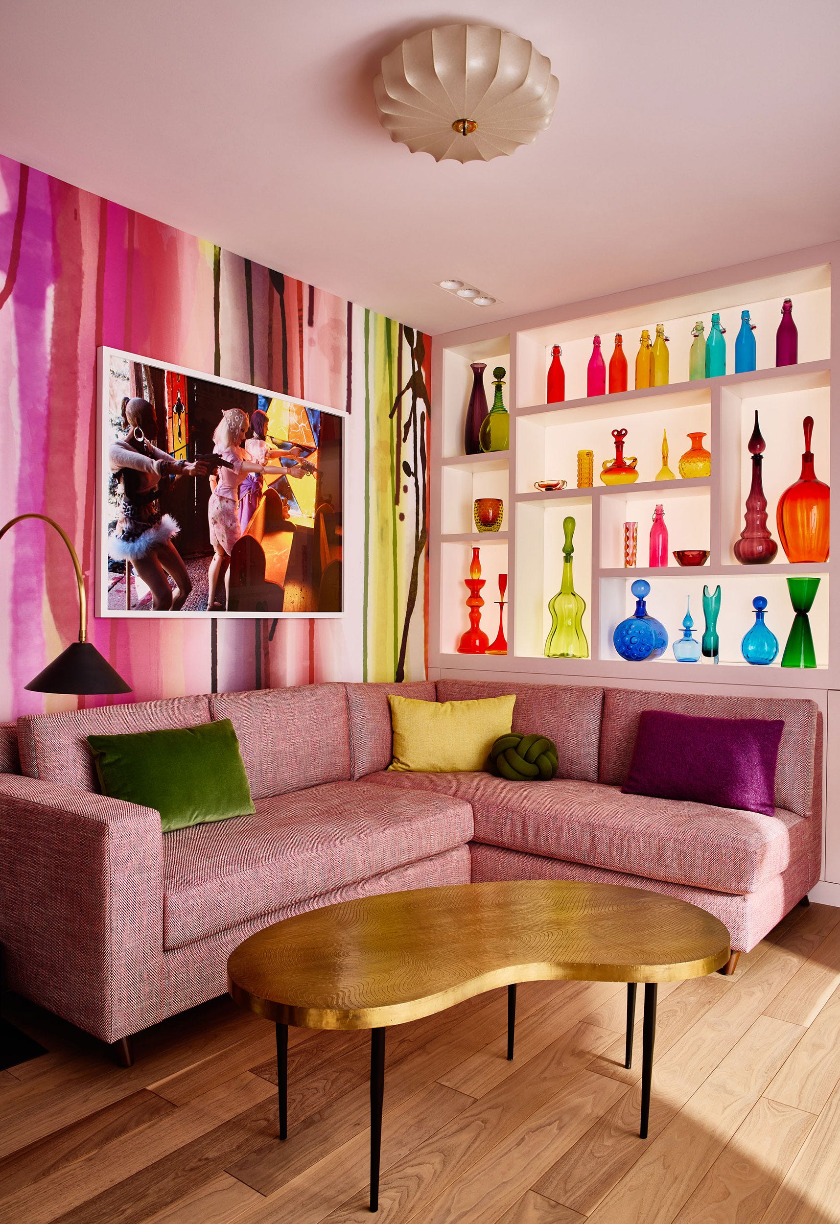
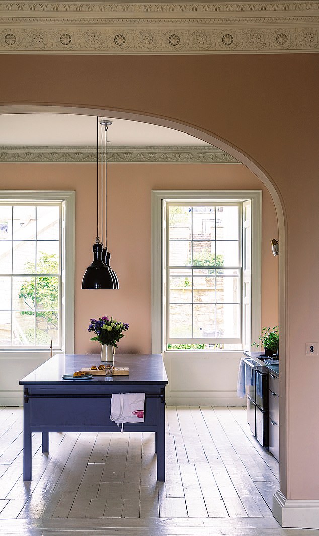
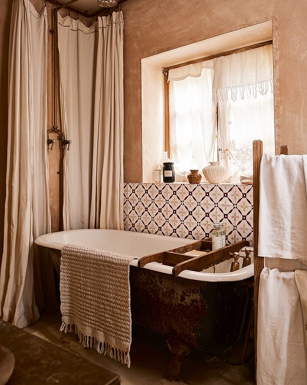
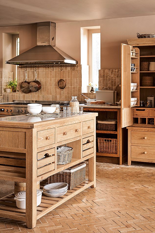
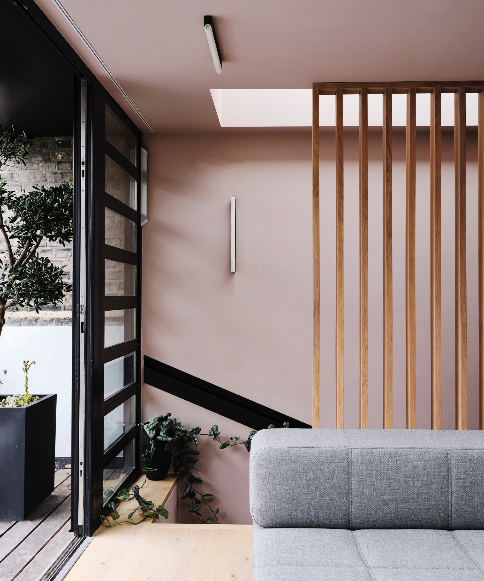
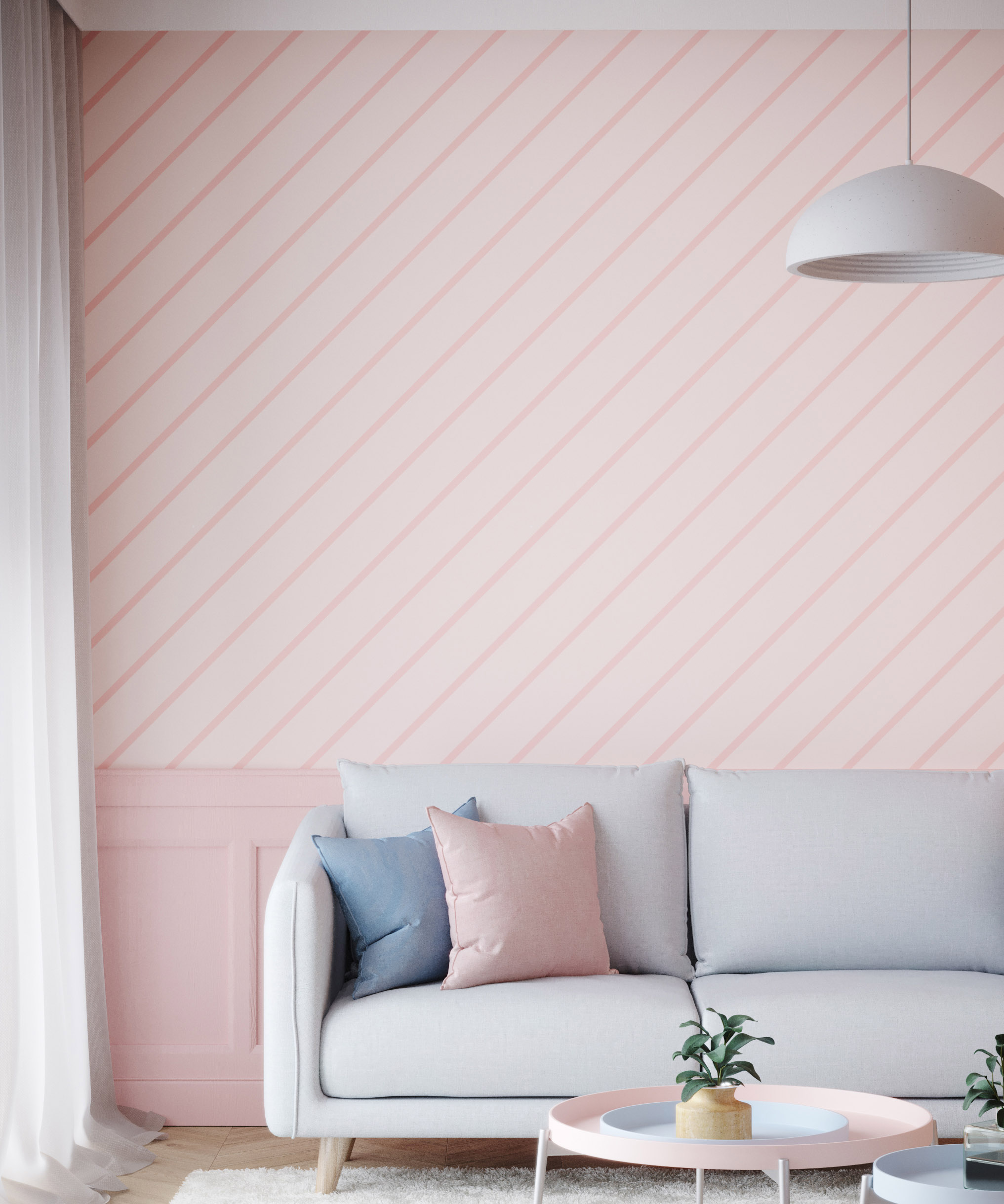
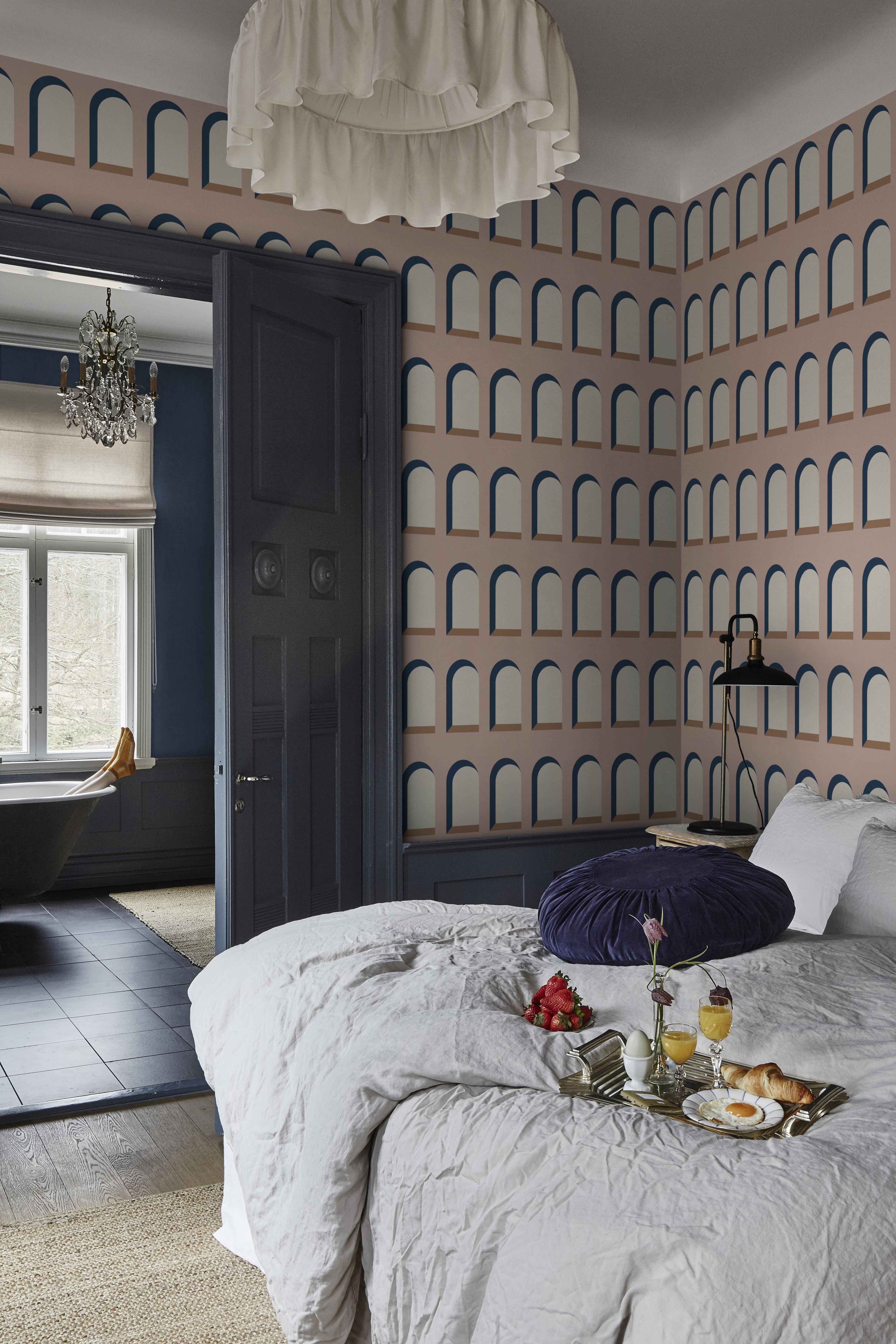
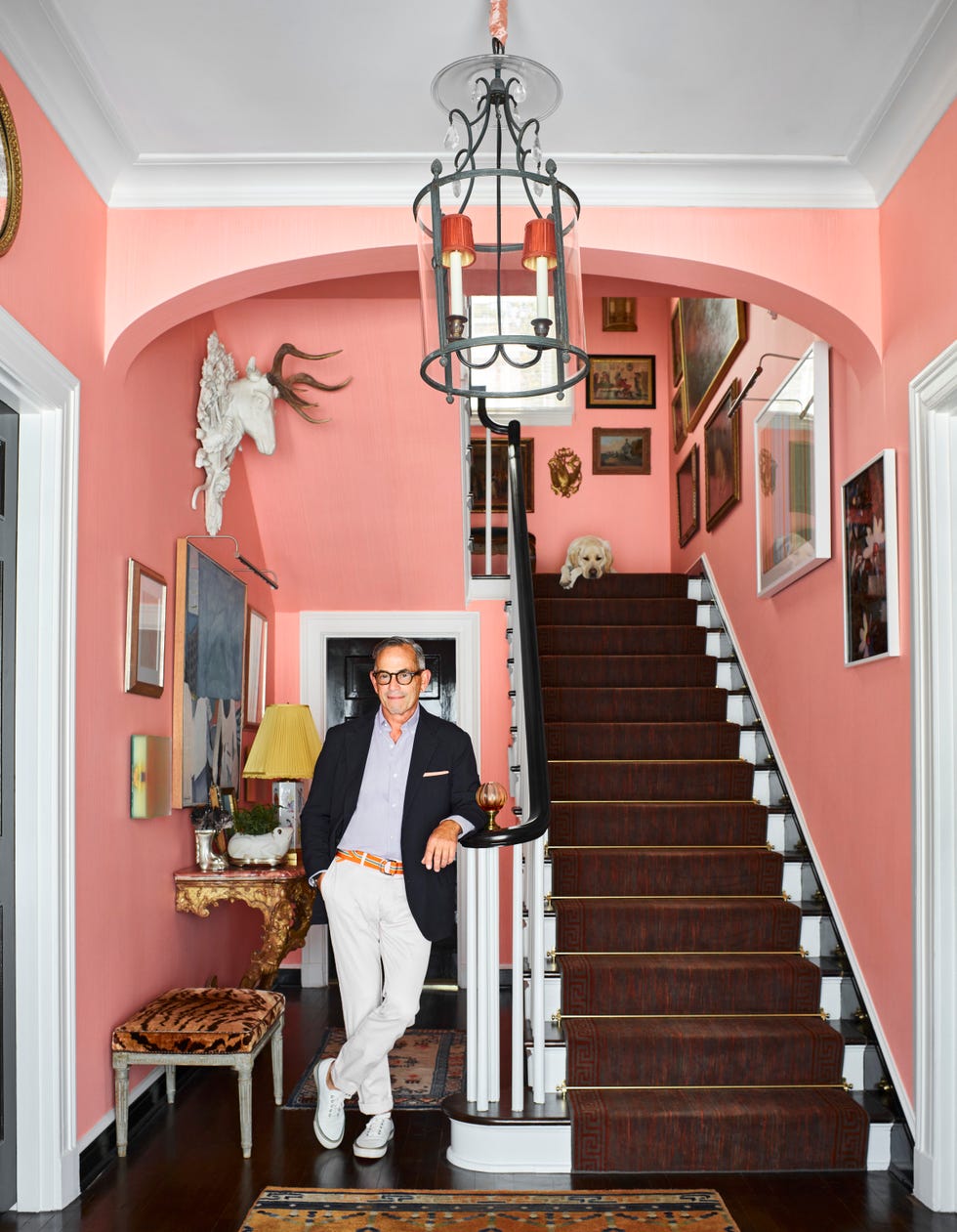
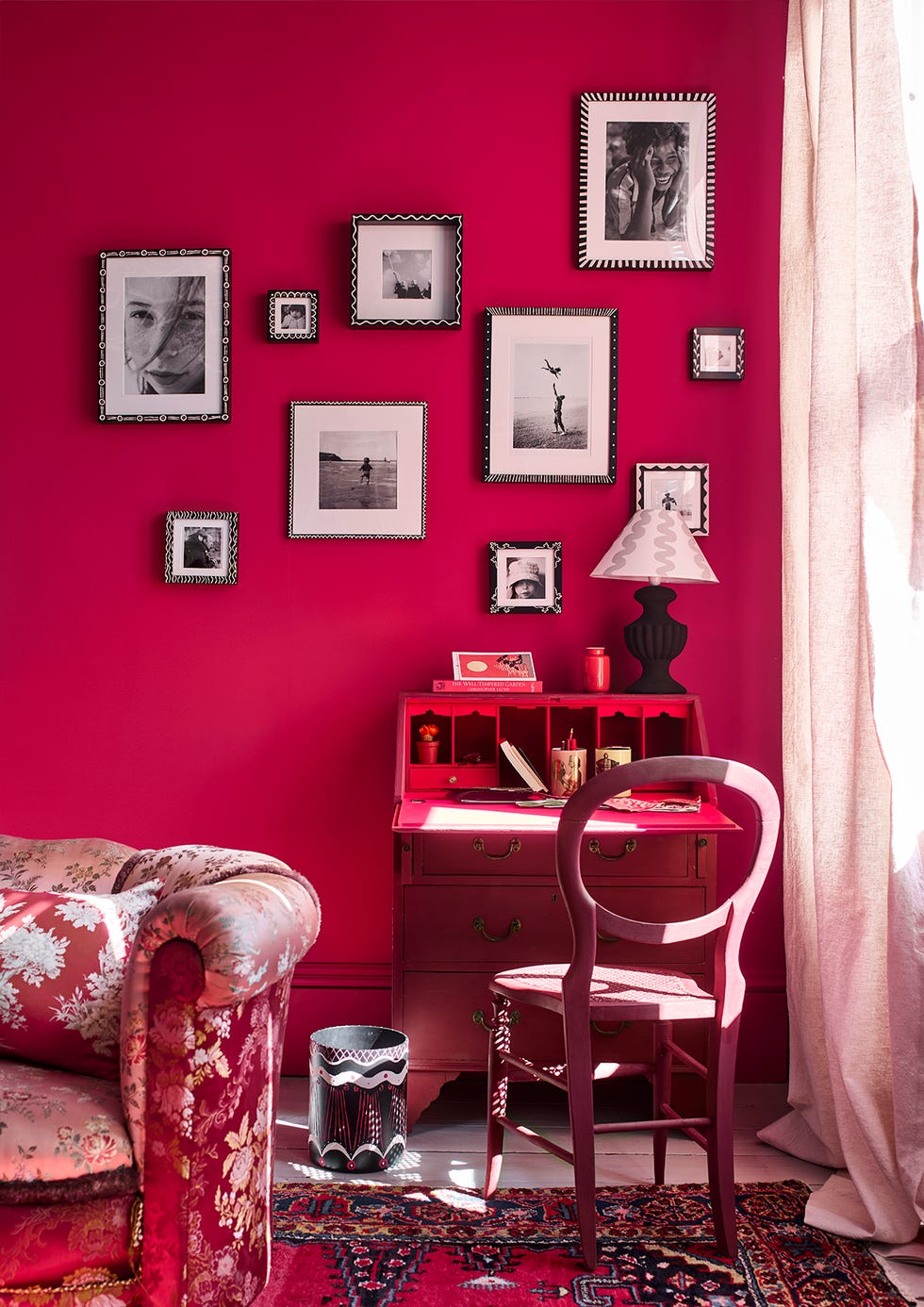
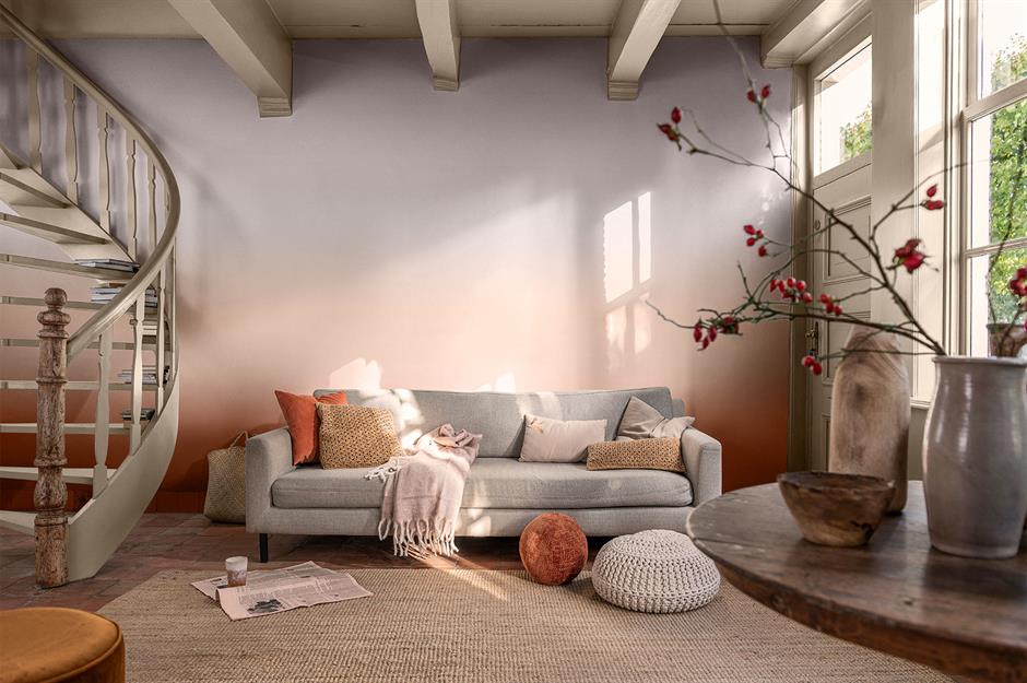
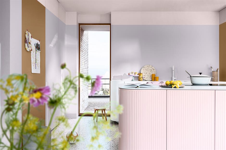
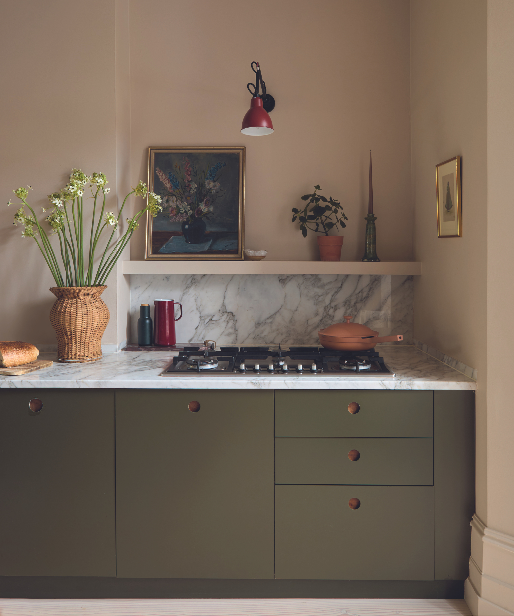
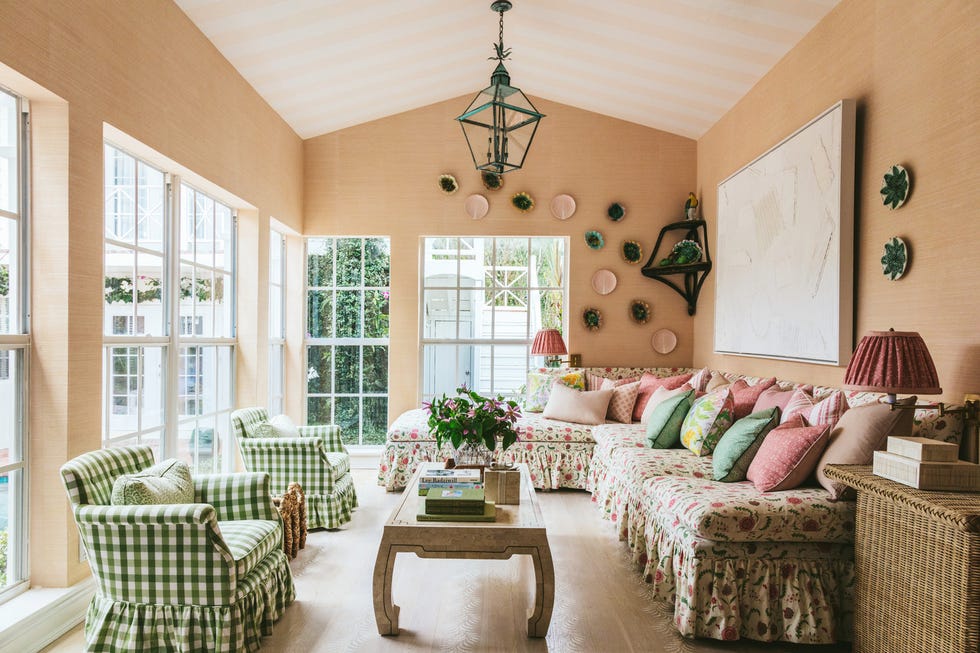
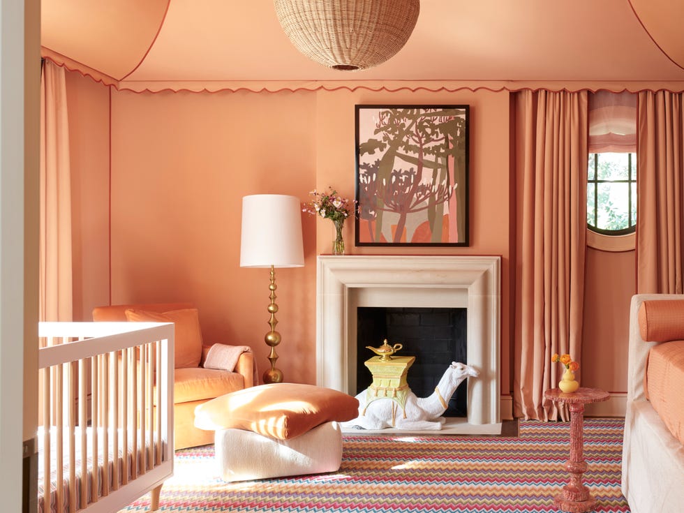
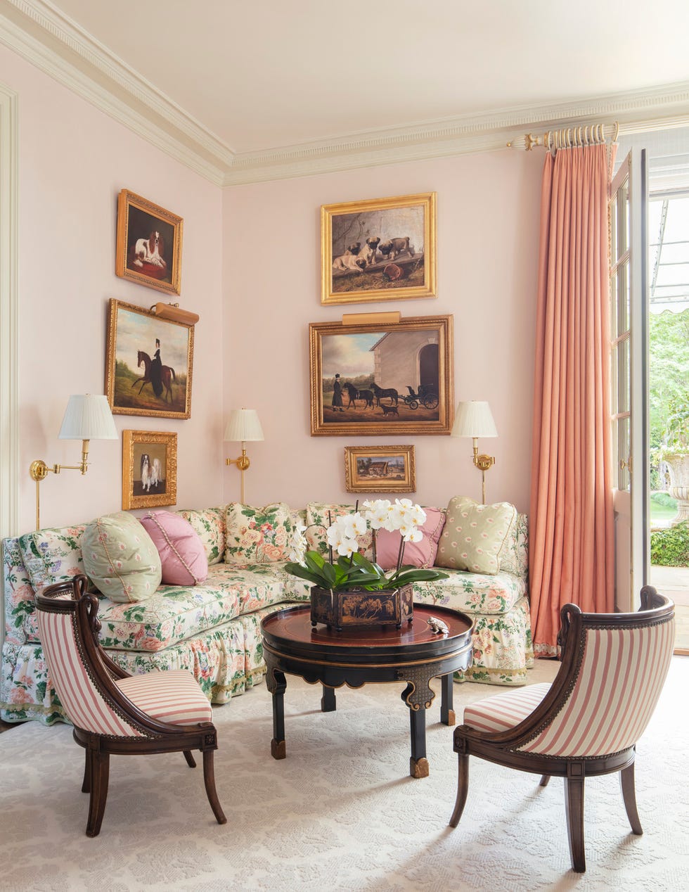
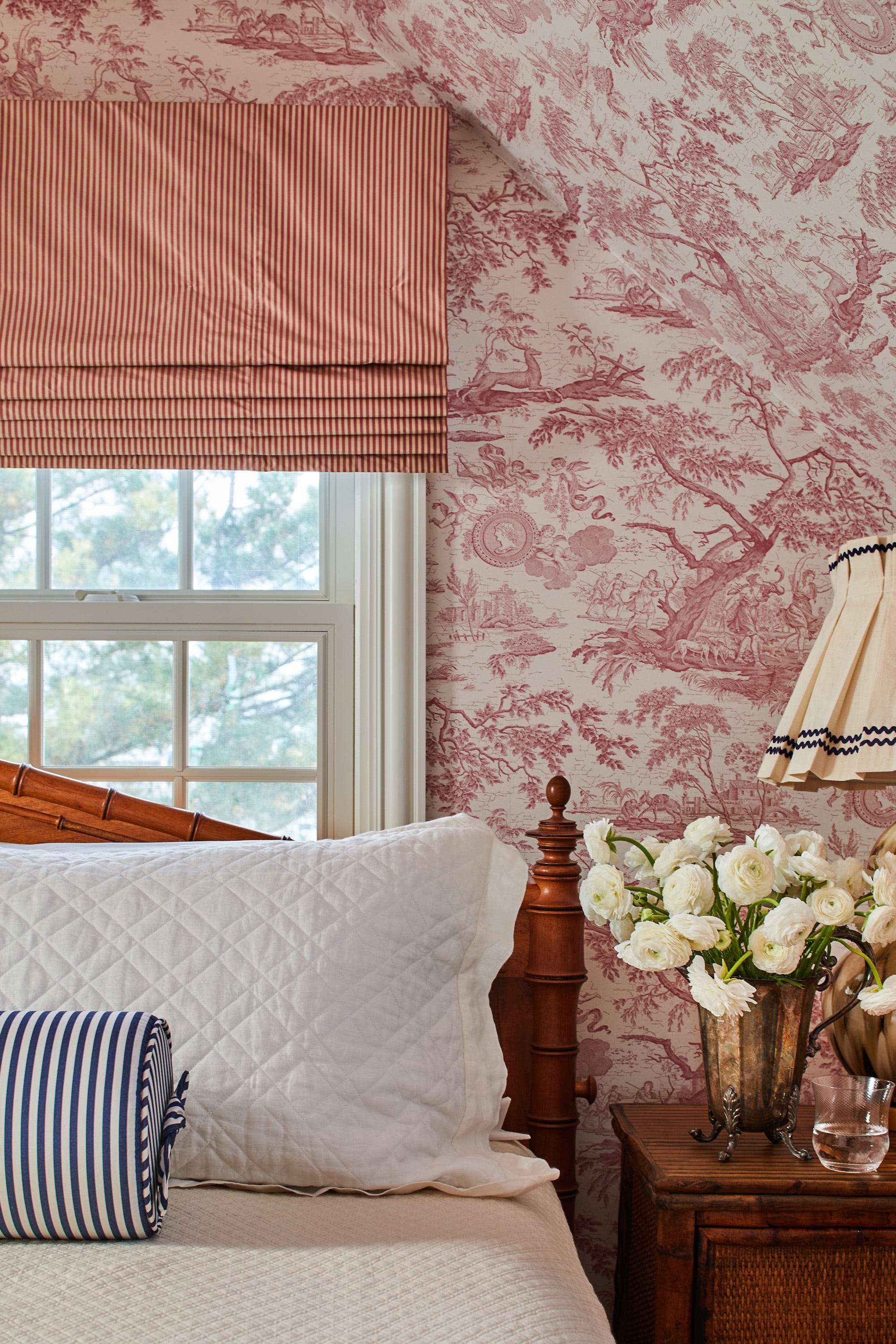
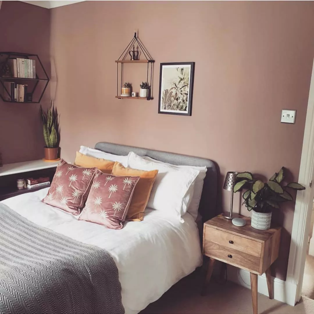
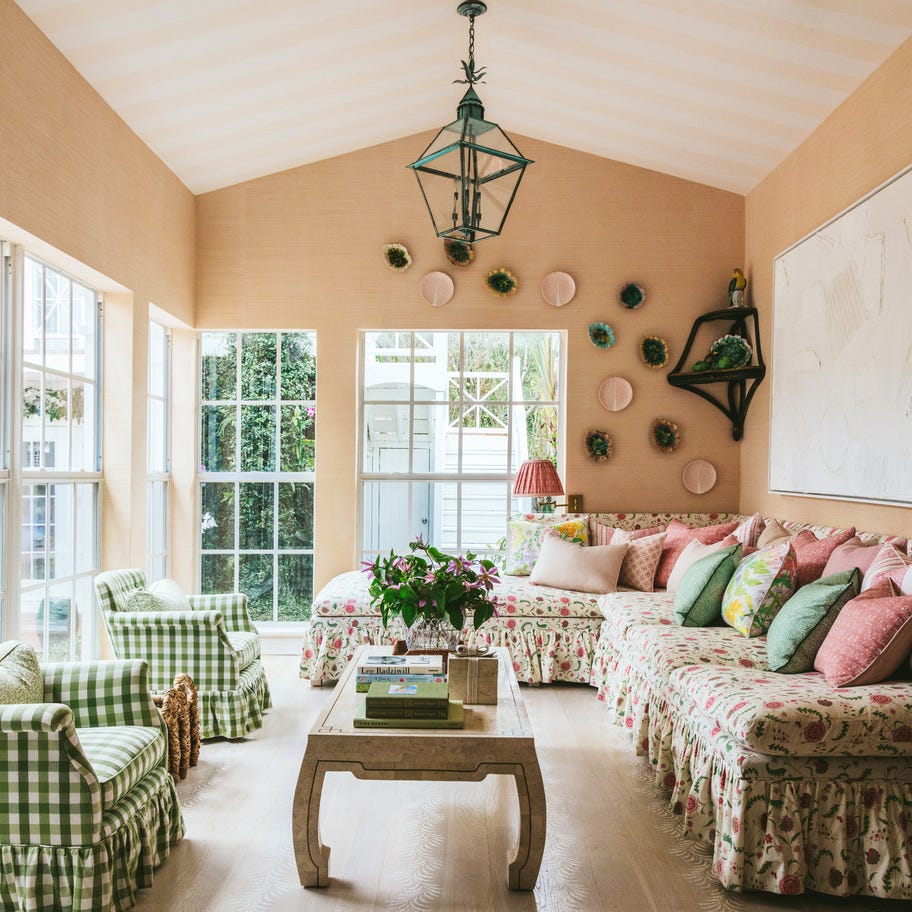
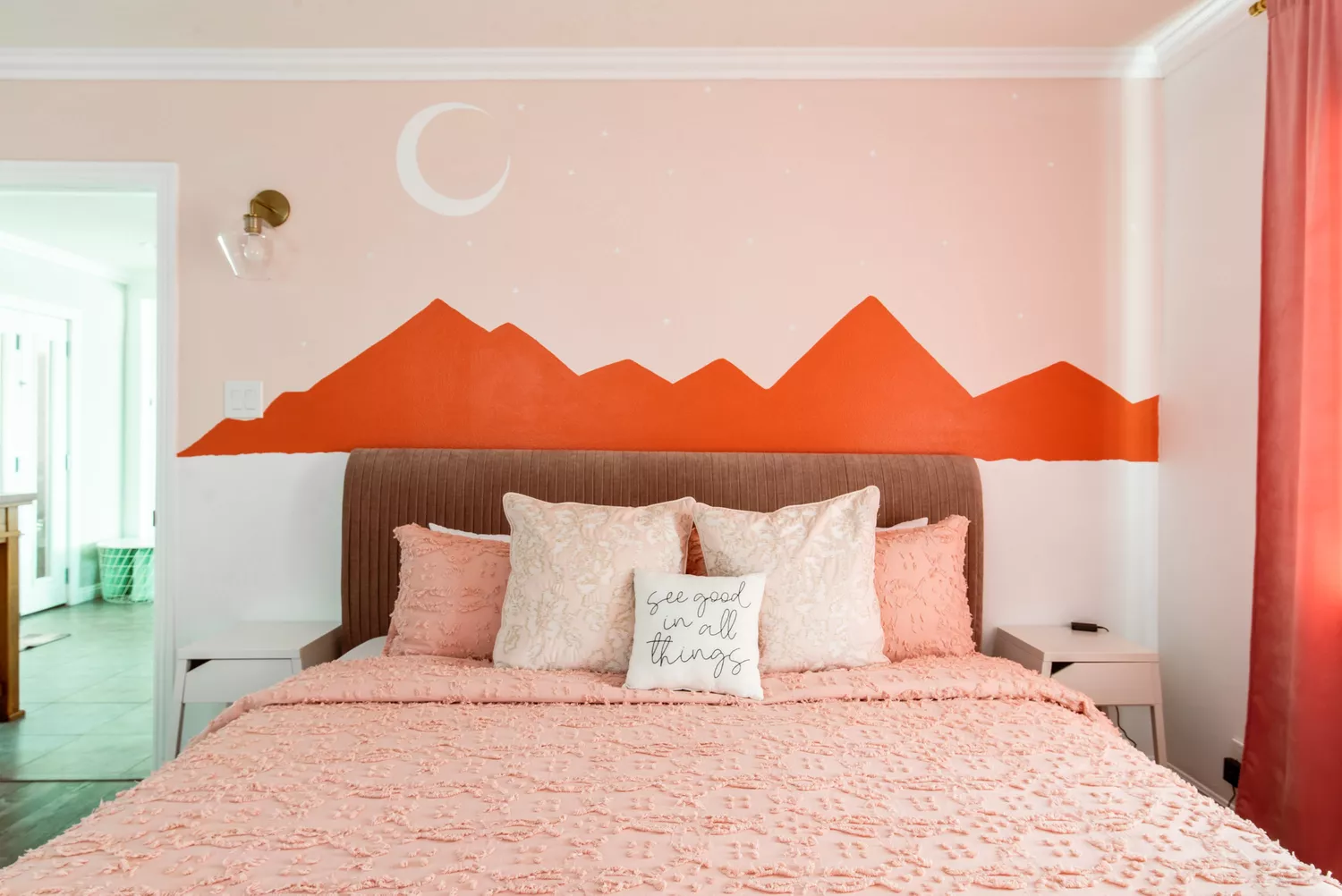
The article explores the re-emergence of pink as a sophisticated and versatile color in home design, moving beyond its traditional association with baby girls' rooms. While often dismissed in home decor, shades of pink have historically cycled through various decades, frequently paired with colors like gray, chocolate, navy, and preppy jade green. For the past three years, pink has been noticeably re-emerging in European design, particularly in its beige-y blush variant, appearing in upholstery, cabinetry, and housewares like whisks and salad utensil sets.
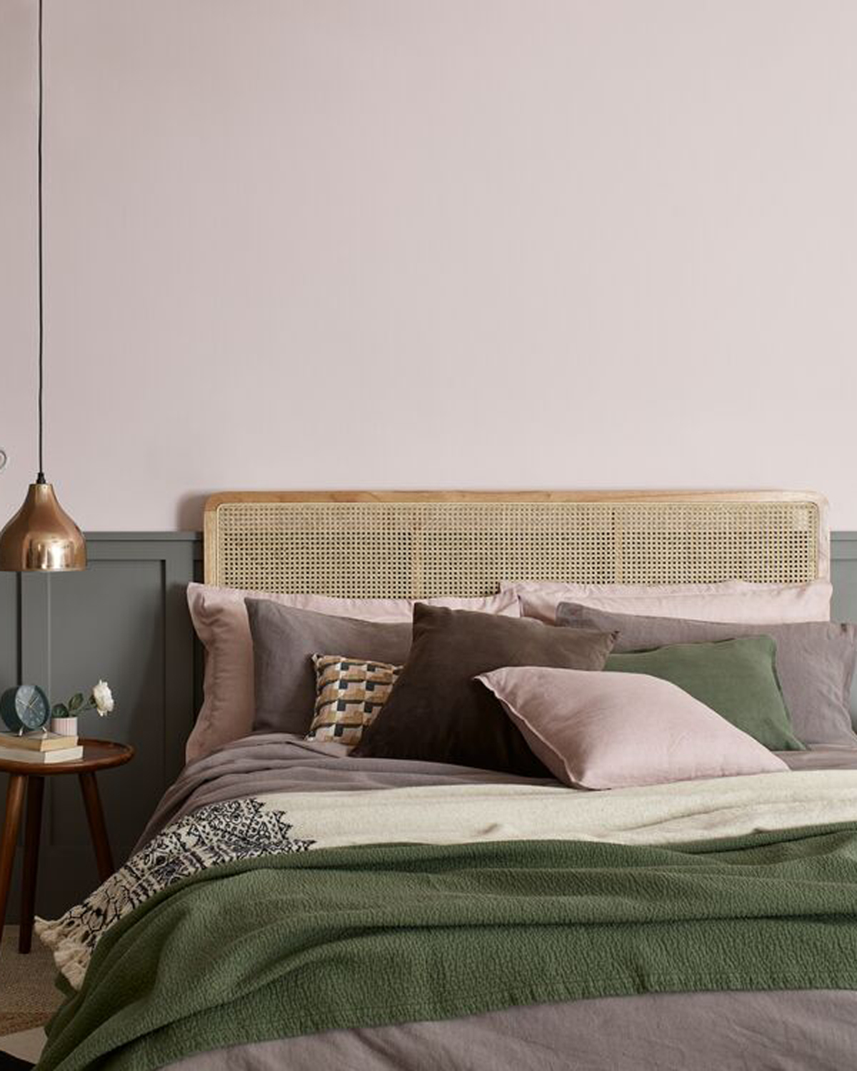
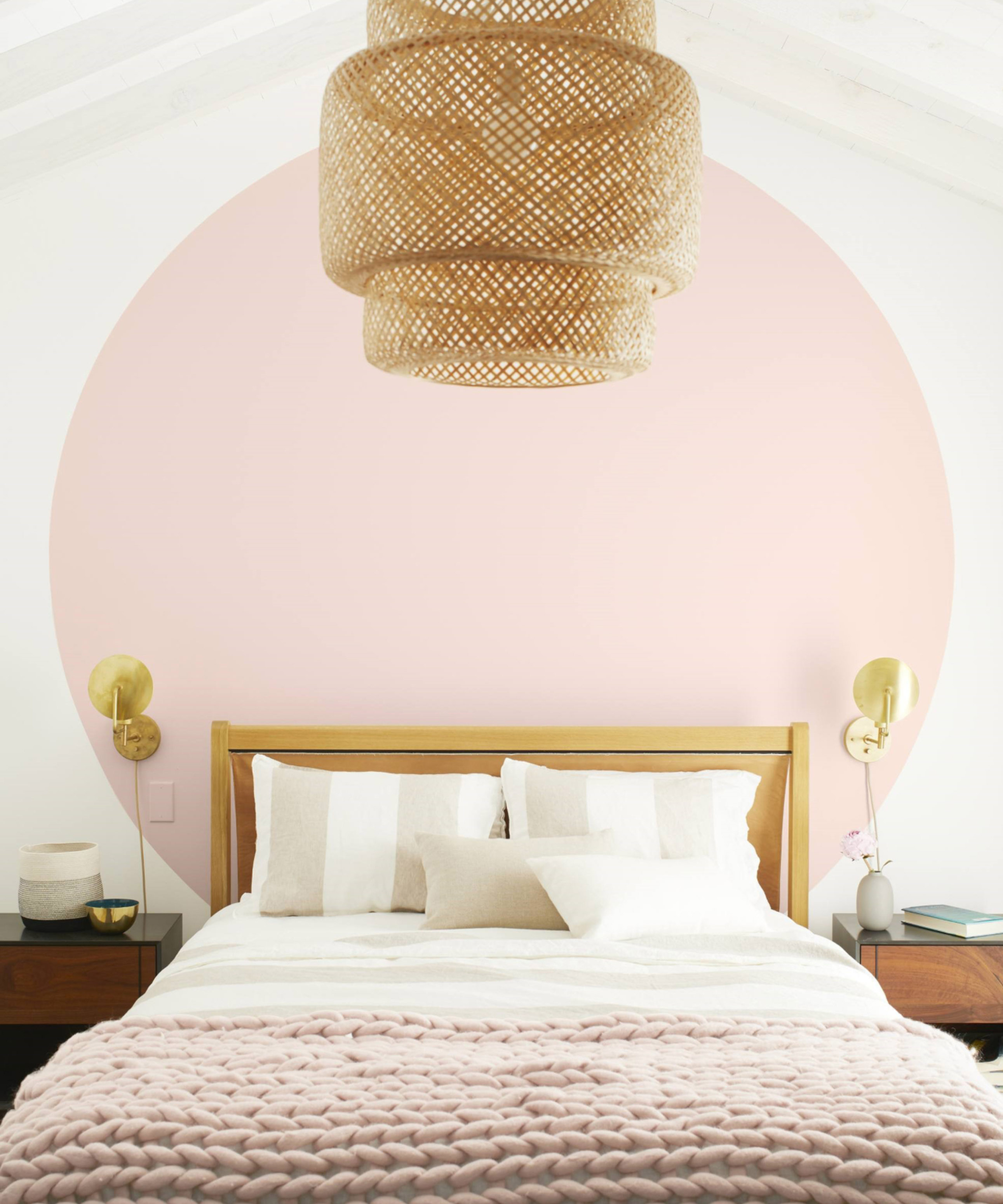
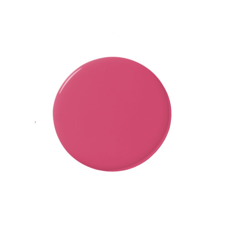
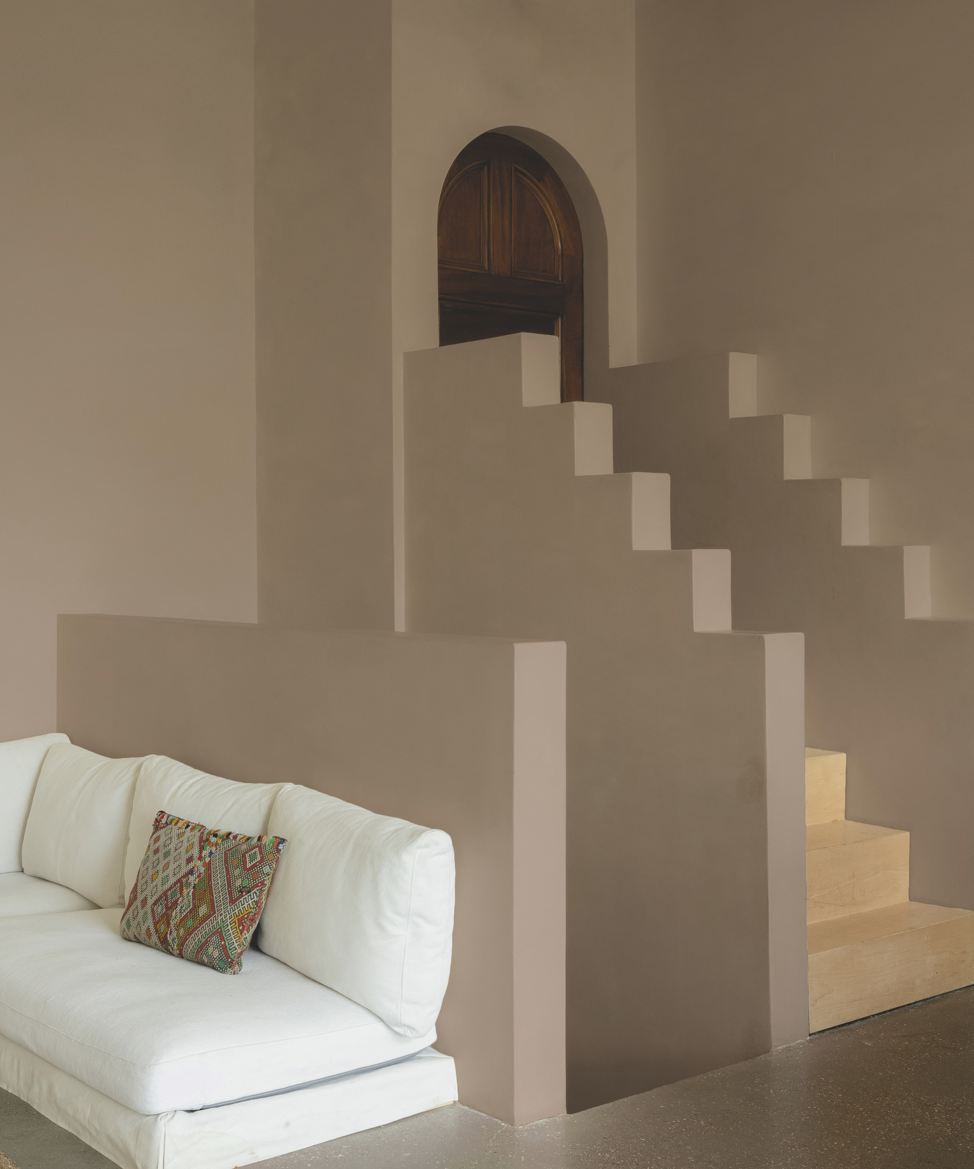
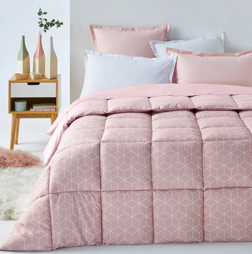
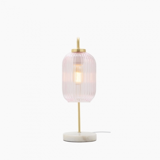
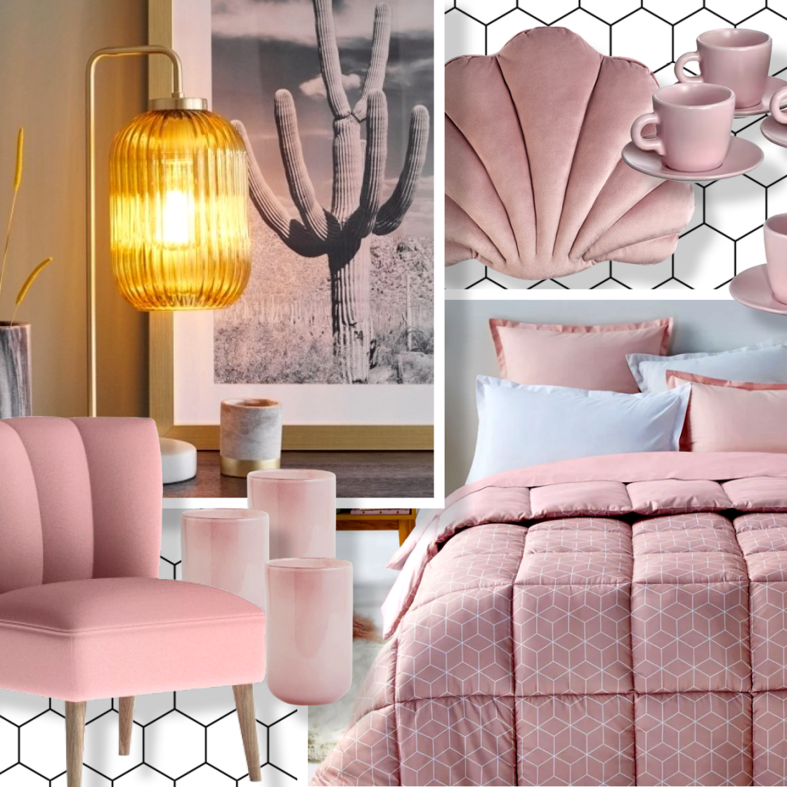
Variant shades such as petal, carnation, and deeper rose are increasingly integrated into fabrics and cabinetry. Additionally, attractive mixable metals like rosy copper and pink-toned glass or quartz are featuring in lighting, tabletop items, and accessories. Ann Haagenson, divisional merchandise manager for Anthropologie, notes that while pink has taken time to transition into living rooms and master bedrooms, blush or 'biche' (fawn in French) is considered a highly flattering color for the home. She explains that it enhances the appearance of people and objects, and is a neutral color, second only to cream, making it easy to incorporate into new designs or existing decor. Anthropologie itself offers bedding, lighting, and votive holders in this color.
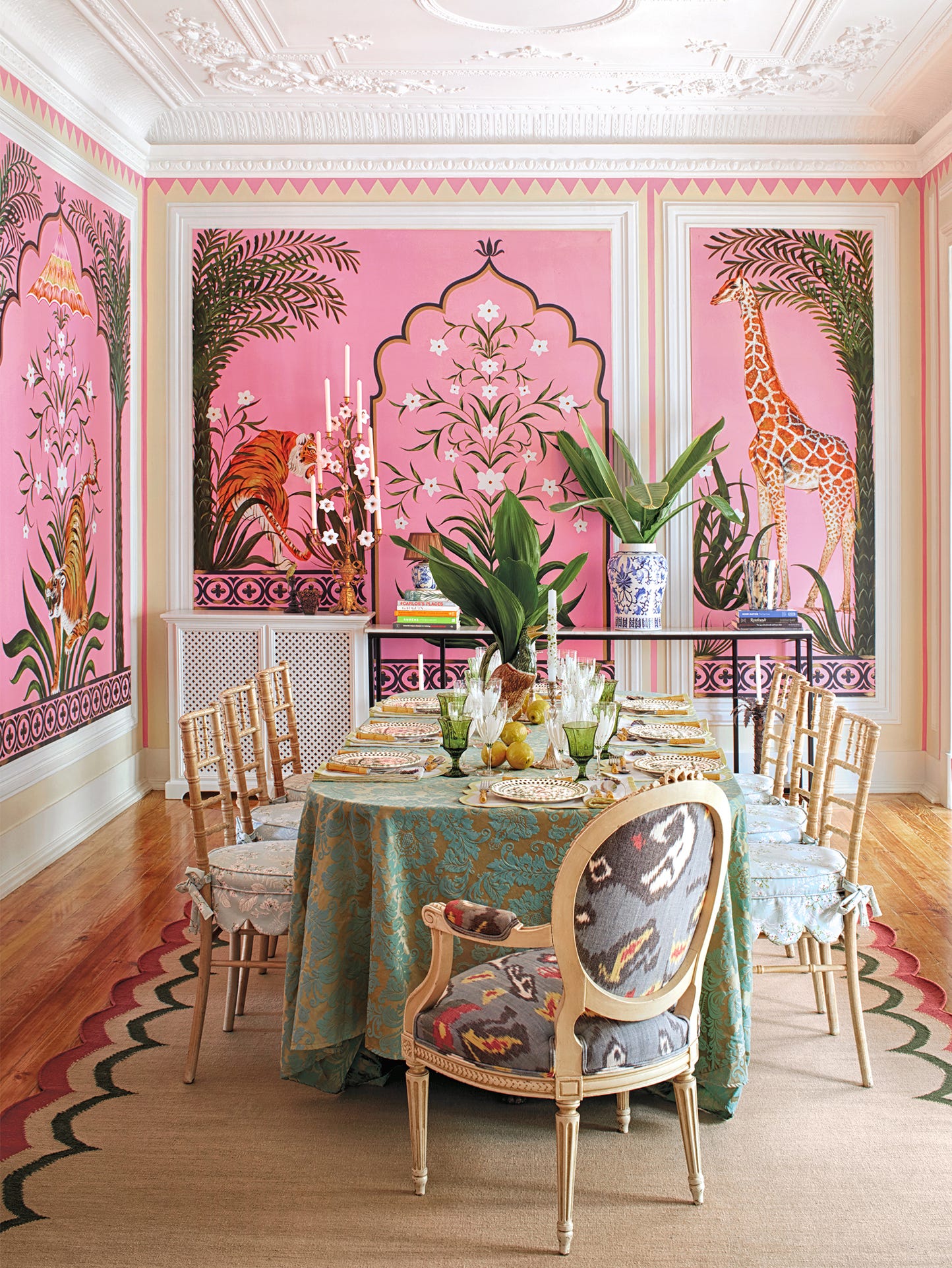
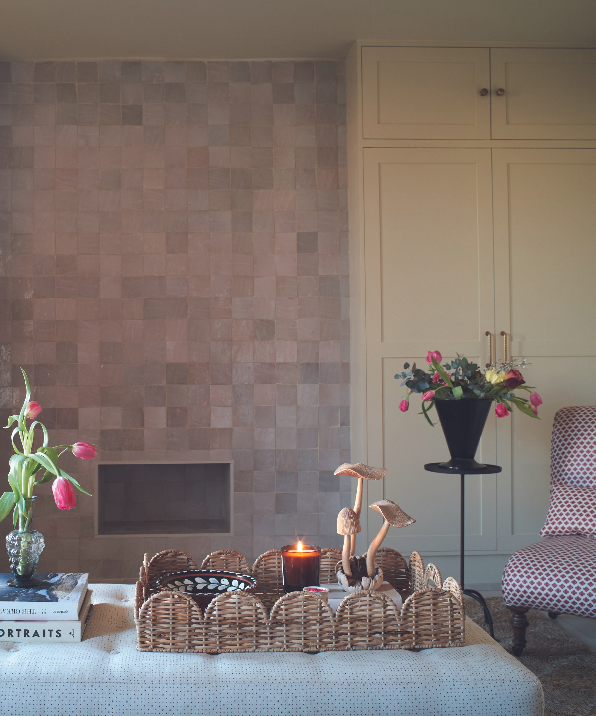
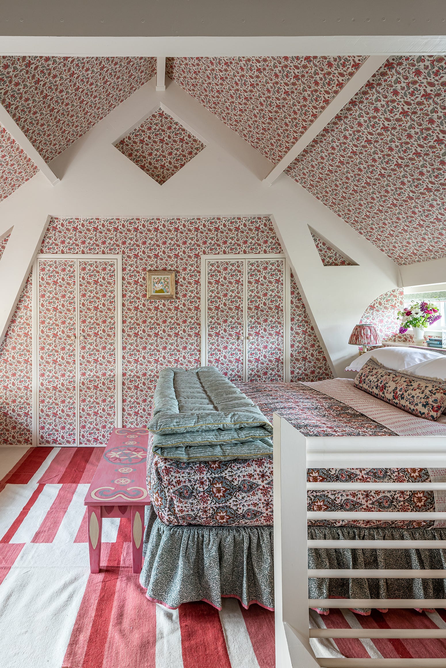
Stacey Senior, marketing director for fabric/wallpaper manufacturer Thibaut, emphasizes that blush pink/quartz can impart a refined, sophisticated, and pretty mood to a room, complementing brassy gold and sharp white tones. Integrating pink can be done easily with accessories like throw pillows or picture frames, or on a larger scale with pink wallpaper or rugs. The addition of gilt can give pink a luxurious quality, as seen in Thibaut's Marlow damask pattern from its Serenade collection, which offers an elegant wallcovering that feels fresh, especially when paired with blooms and raw quartz or coral decor accessories.
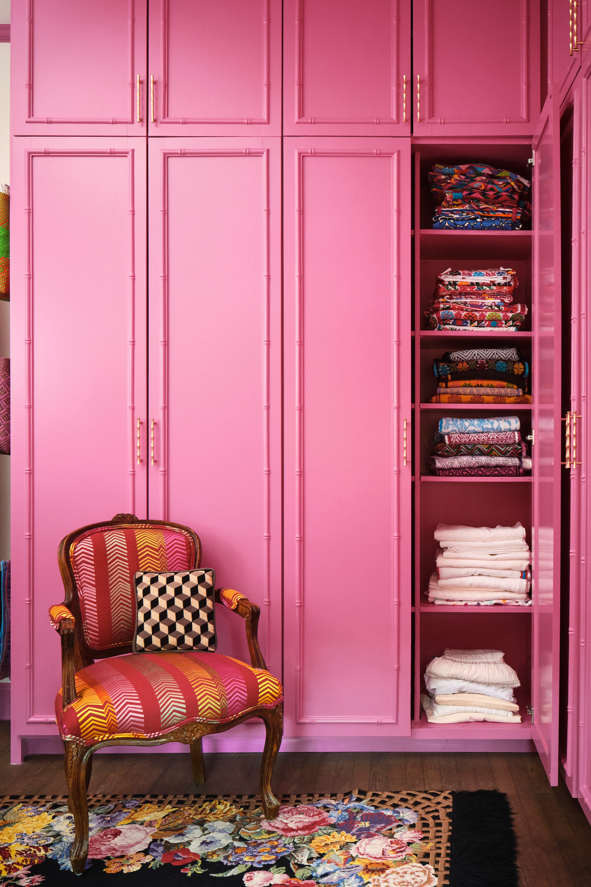
Designers at Koket, a New York-based furniture company, chose a rose quartz shade for their Besame chair, describing the hue as calming and welcoming for its ability to create a relaxing and lighthearted ambiance. Designer Tobi Fairley uses pink in her Ellison table for Woodbridge, featuring a gold leaf border, and praises blush as a 'barely-there pastel' with a taupe tone, often mixing it with navy or citron to balance its sweetness. Fairley has also applied blush leather to sleek chairs and benches for CR Laine.
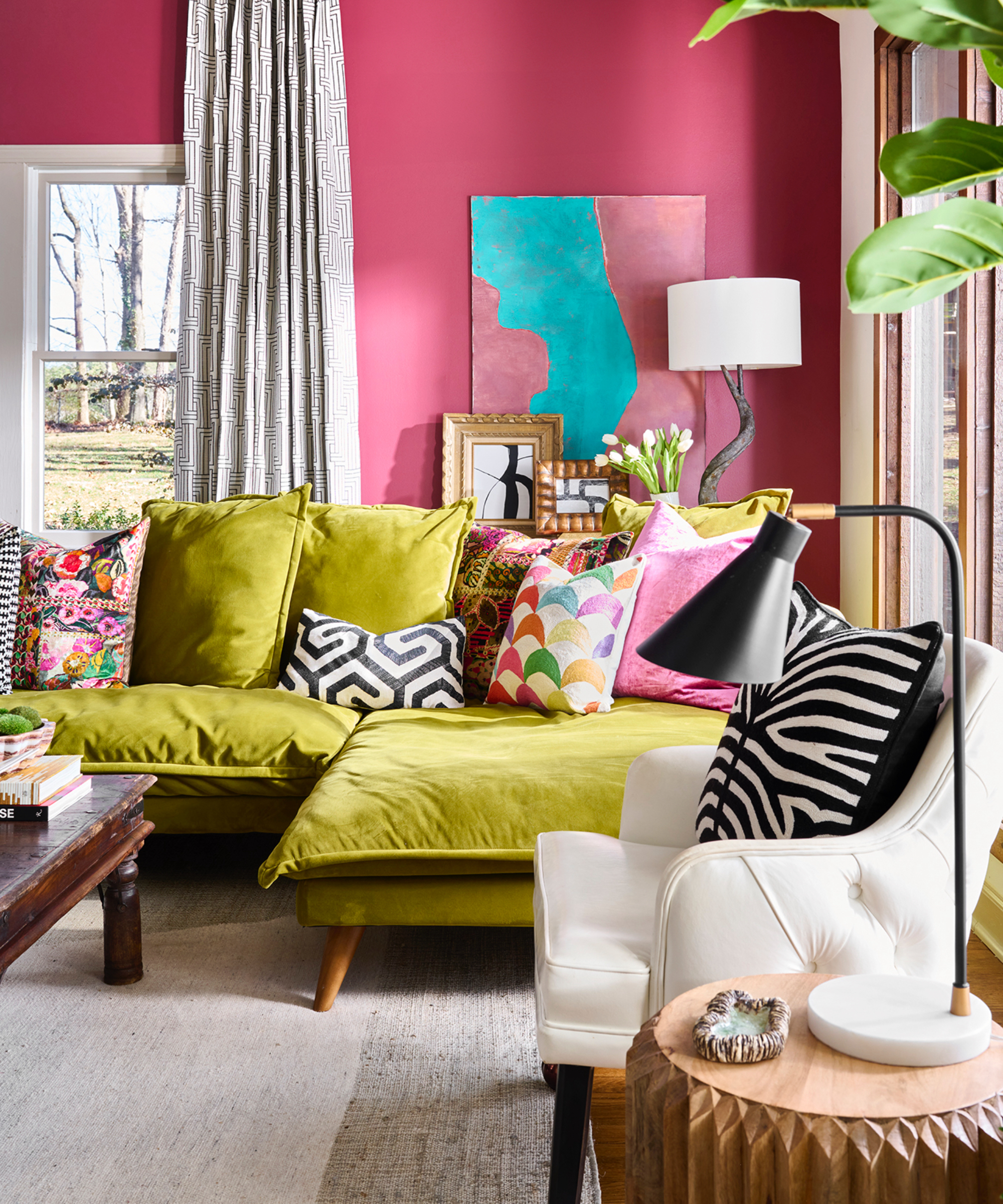
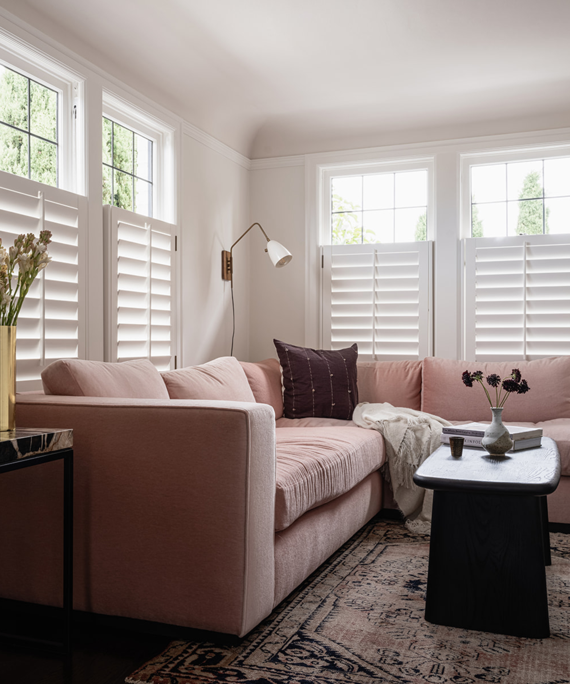
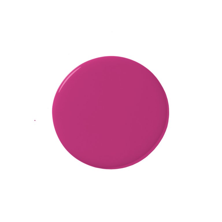
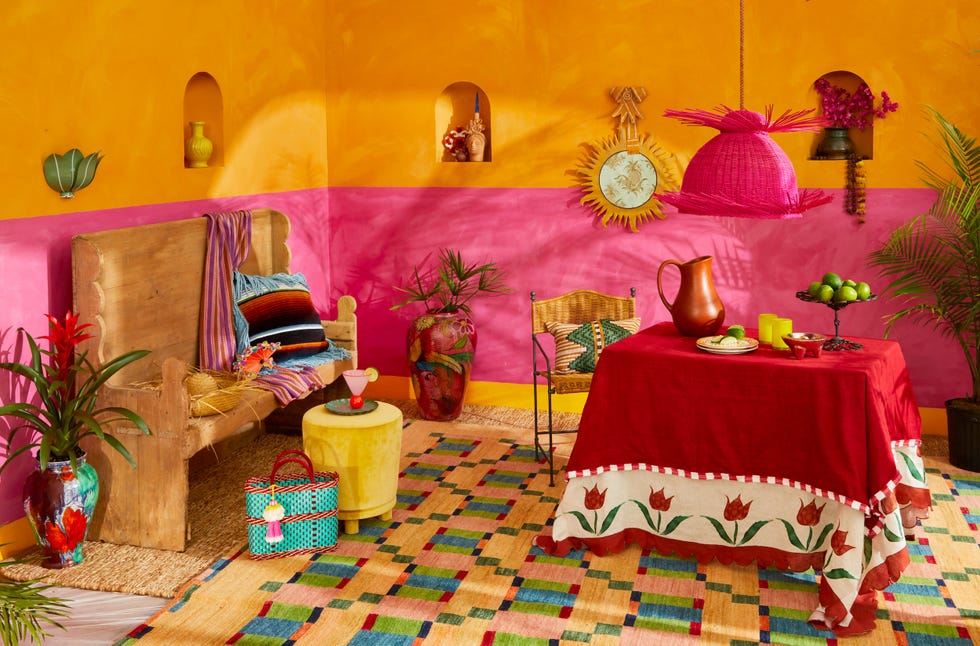
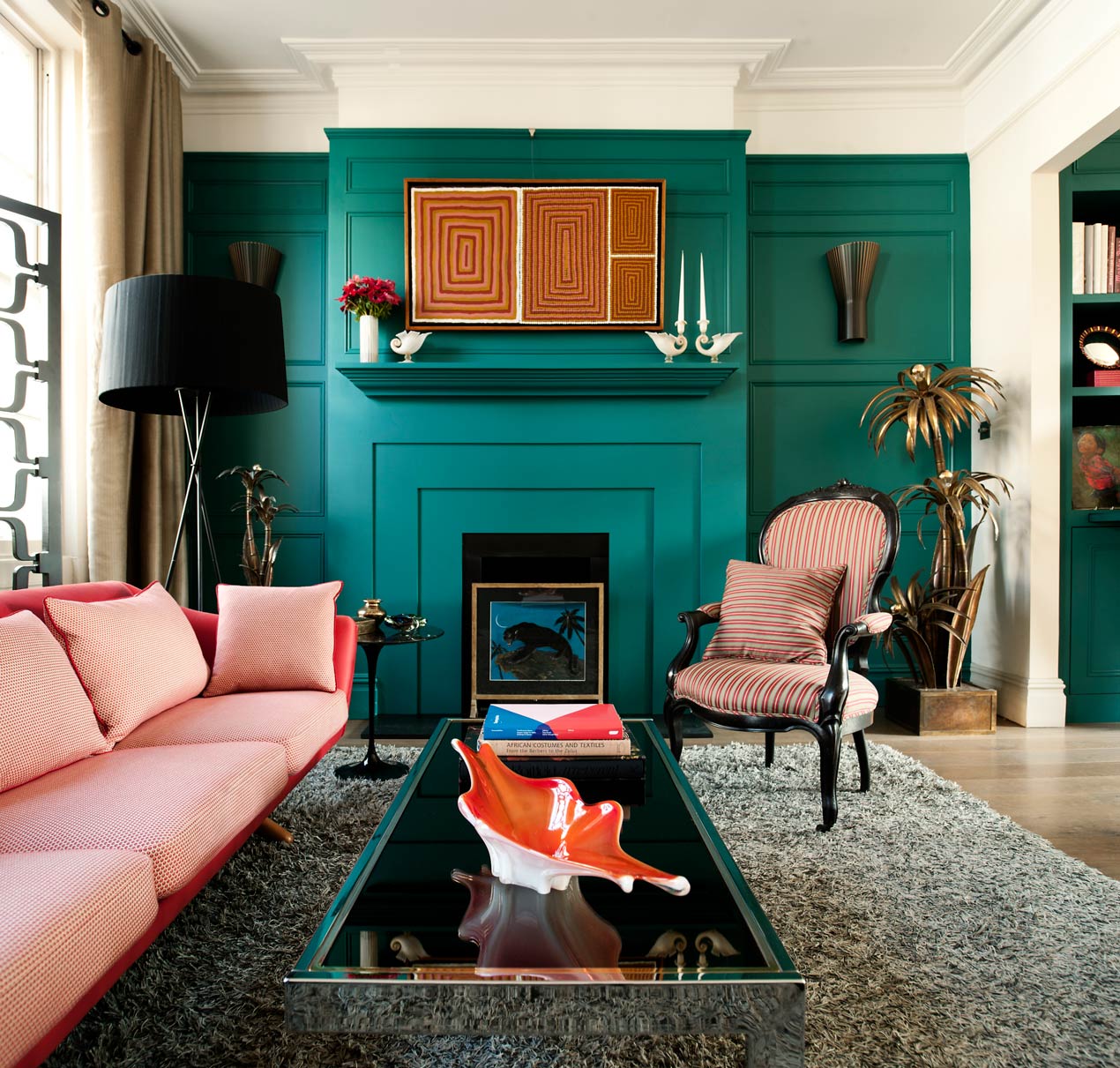
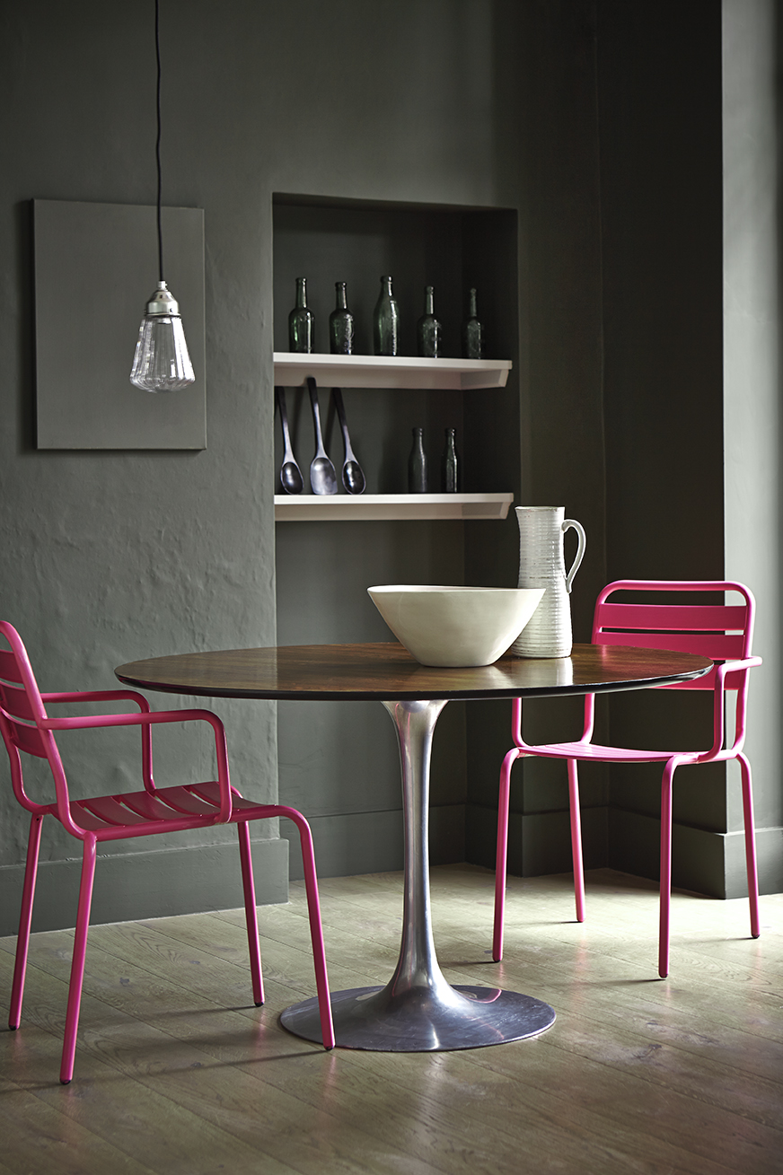
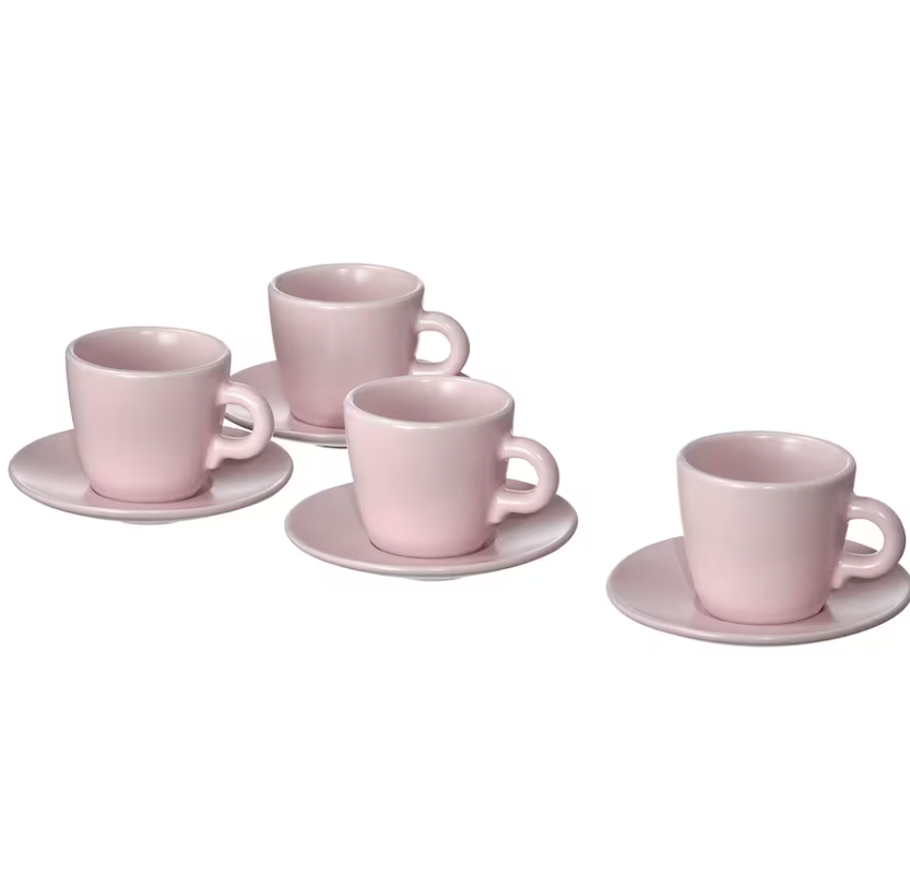
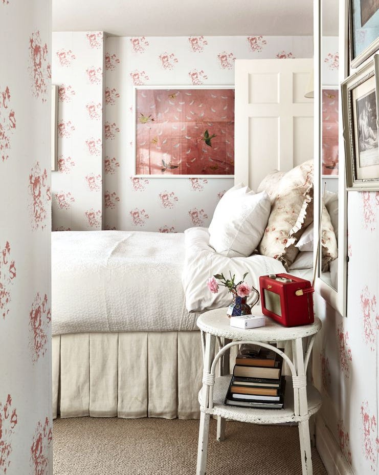
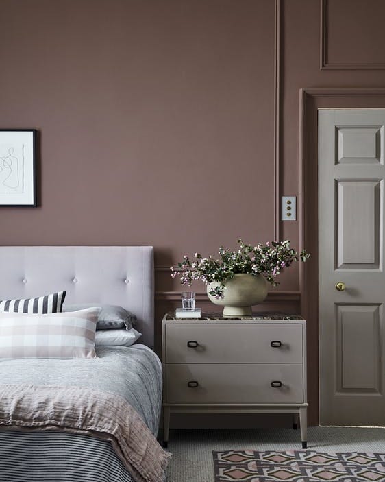
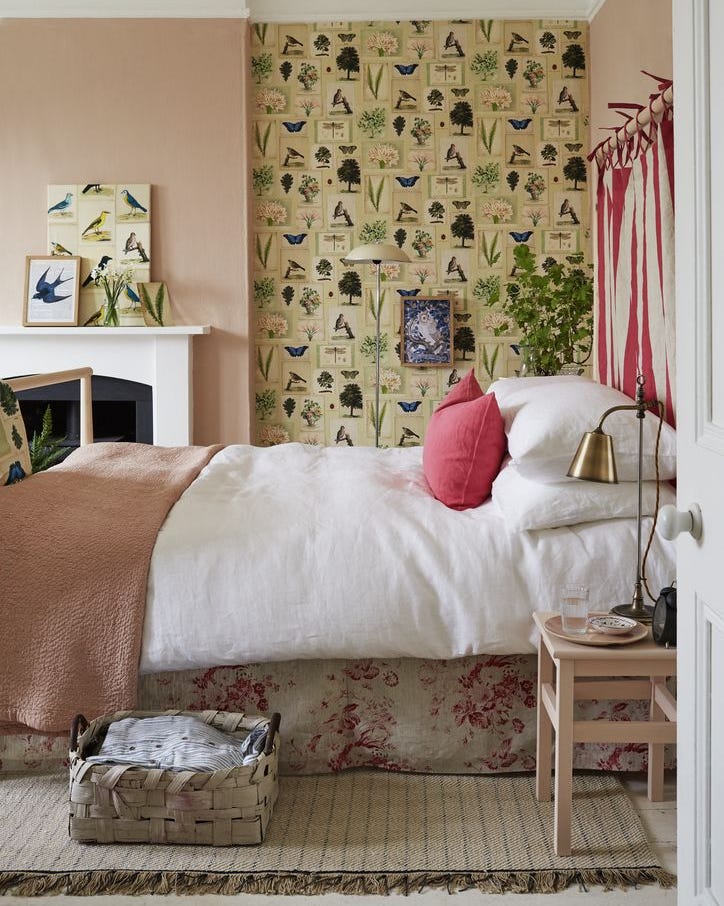
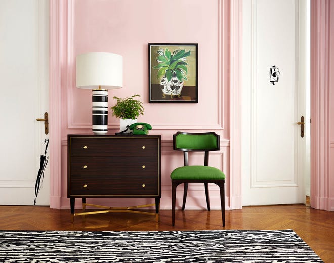
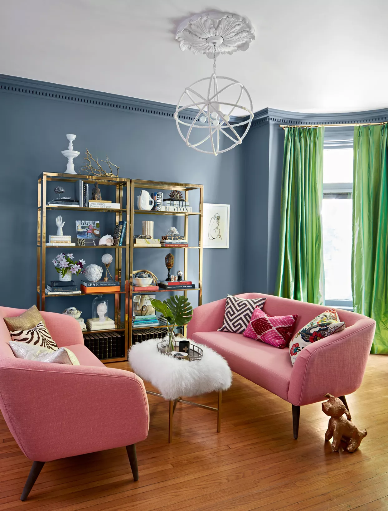
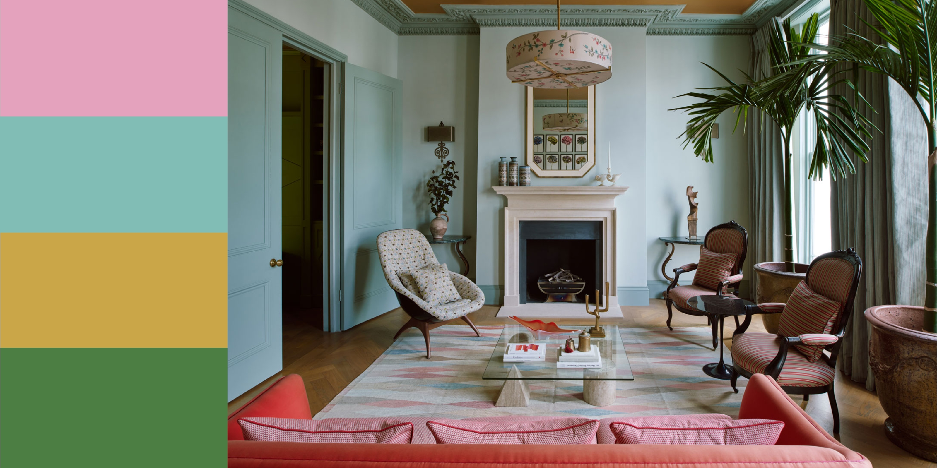
Both Fairley and the Kate Spade brand advocate pairing pink with bright, almost Kelly green. Haagenson suggests that a taupe-y pink combines well with warmer neutrals like camel, nubuck, and orange, while cooler pinks are best paired with magenta, gray, and navy. She provides practical tips for integrating pink into home decor: accessorizing with small-scale linen pillows for sofas or beds, incorporating vintage blush pink/stripe dinnerware on tabletops, and making a bold statement with large-scale pieces like an upholstered sofa in blush pink leather, which can be both soft and hard, and a captivating centerpiece for guests.
#HomeDesign #InteriorDecor #ColorTrends #BlushPink #DesignTips #FurnitureDesign #TextileDesign #HomeAccessories #HomeDesign #InteriorDecor #ColorTrends #BlushPink #DesignTips #FurnitureDesign #TextileDesign #HomeAccessories
0 comment in total
 No comments yet
You may also like
14 Chic Pink Color Combinations Designers Swear By

8 pink living room ideas – liven up your space with this joyful color

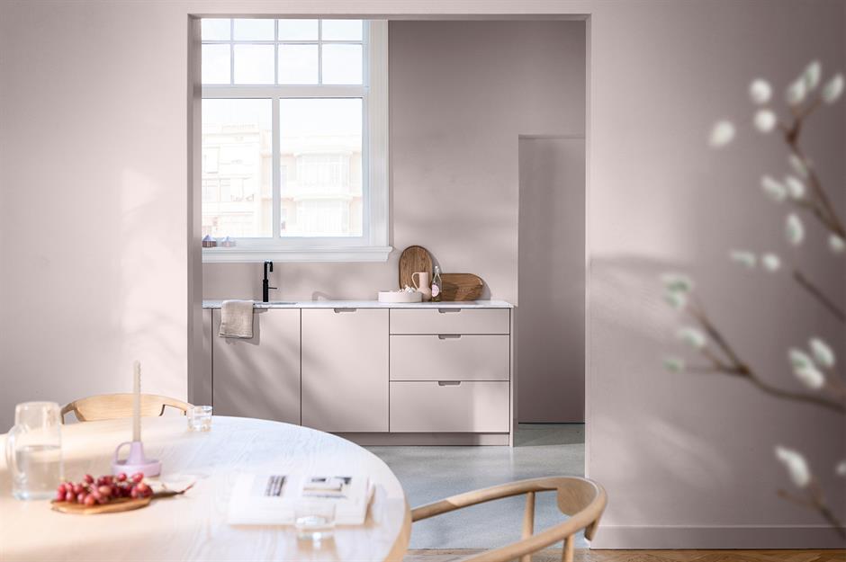
Pretty in pink: decorating ideas for this year's hottest colour | loveproperty.com
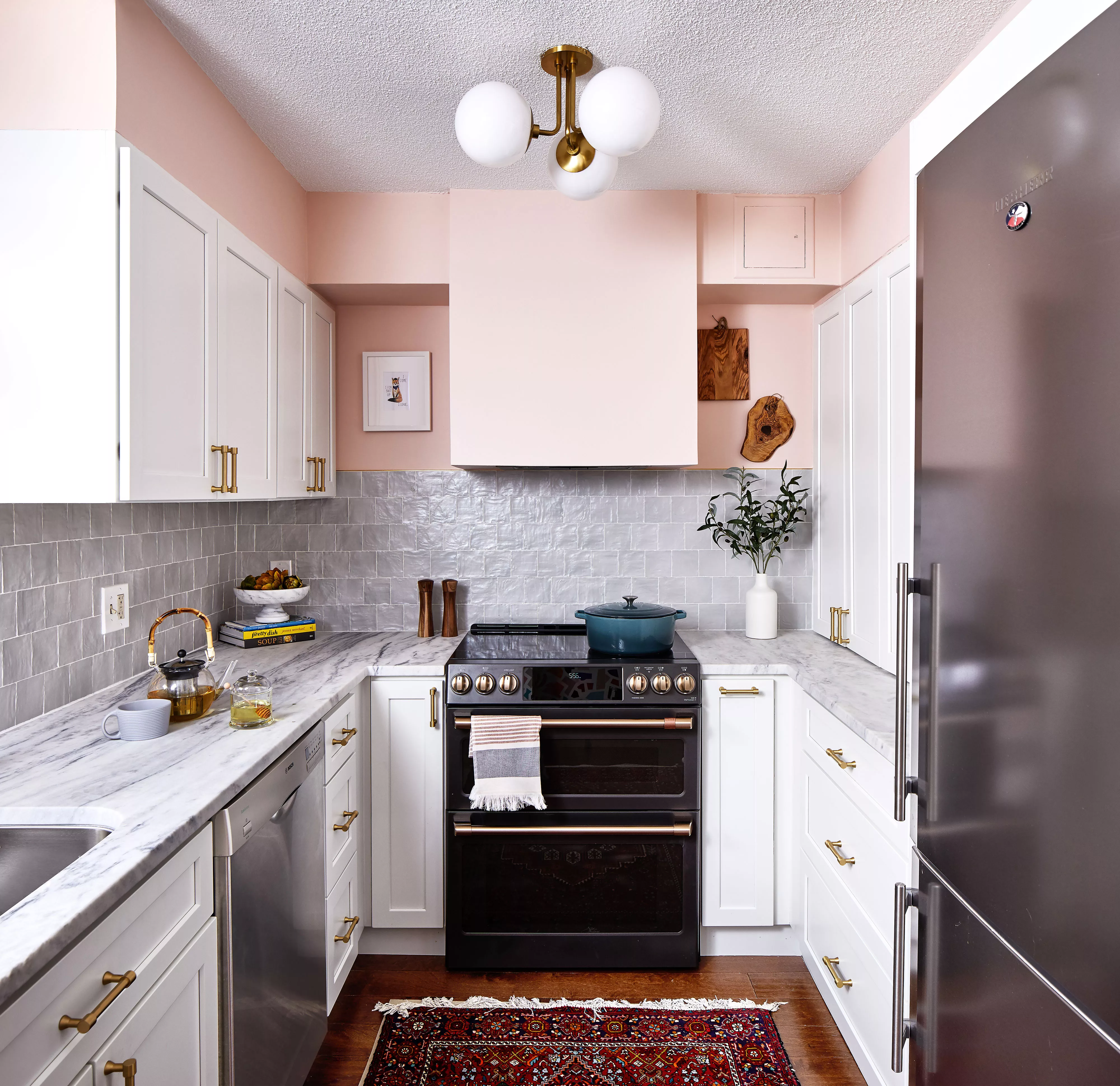
Pink Kitchens Are Trending, but Not Because of Barbie—Here’s How to Get the Look

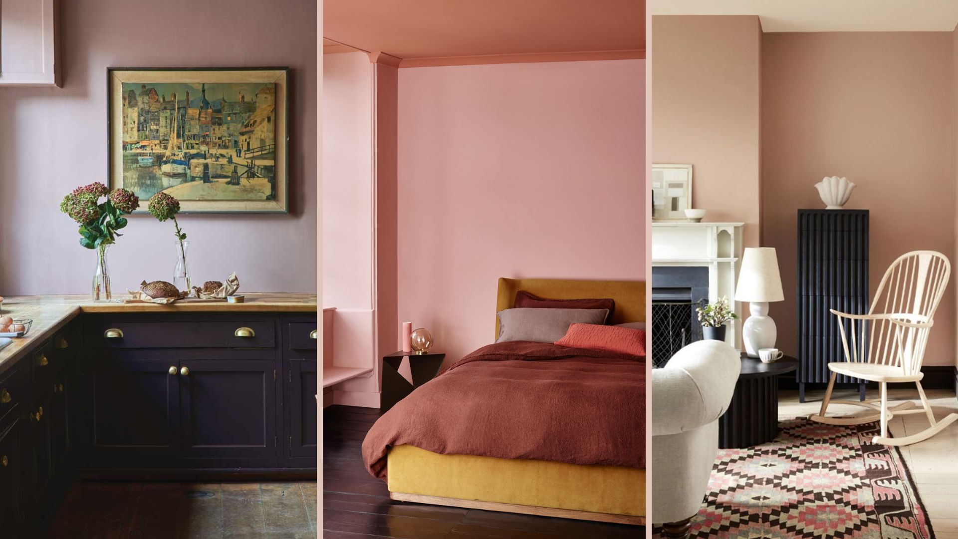
18 sophisticated pink paint colors recommended by interior designers

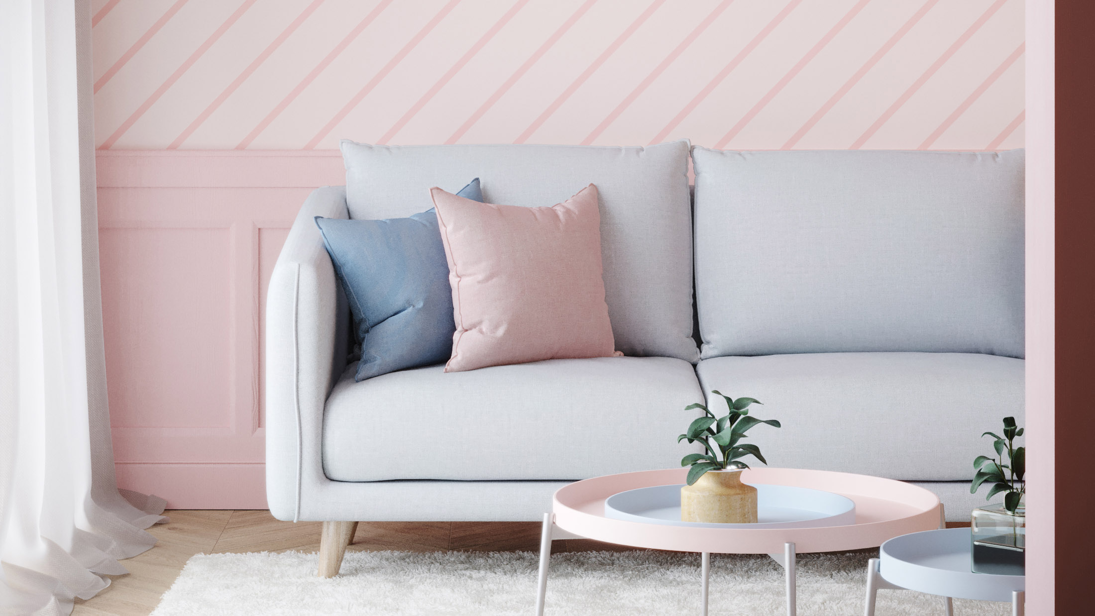
Pink room decor ideas: 28 ways to use this sweet shade
What Color Goes with Pink? 16 Pretty Pairings to Try
15 Pink Bedroom Ideas That Prove This Hue Is the New Neutral
25 Pink Room Ideas to Satisfy Your Barbiecore Dreams

12 Colors That Go With Pink: Classic and Modern Ideas

11 Colors That Go With Pink That Work in Homes Now

Give your home the rose-tinted treatment with these 9 blush accessories
Pink Room Decor Ideas: 39 Ways to Use the Shade Throughout Your Home
After This Design Trend Took Off, These Paint Colors Became 40% More Popular

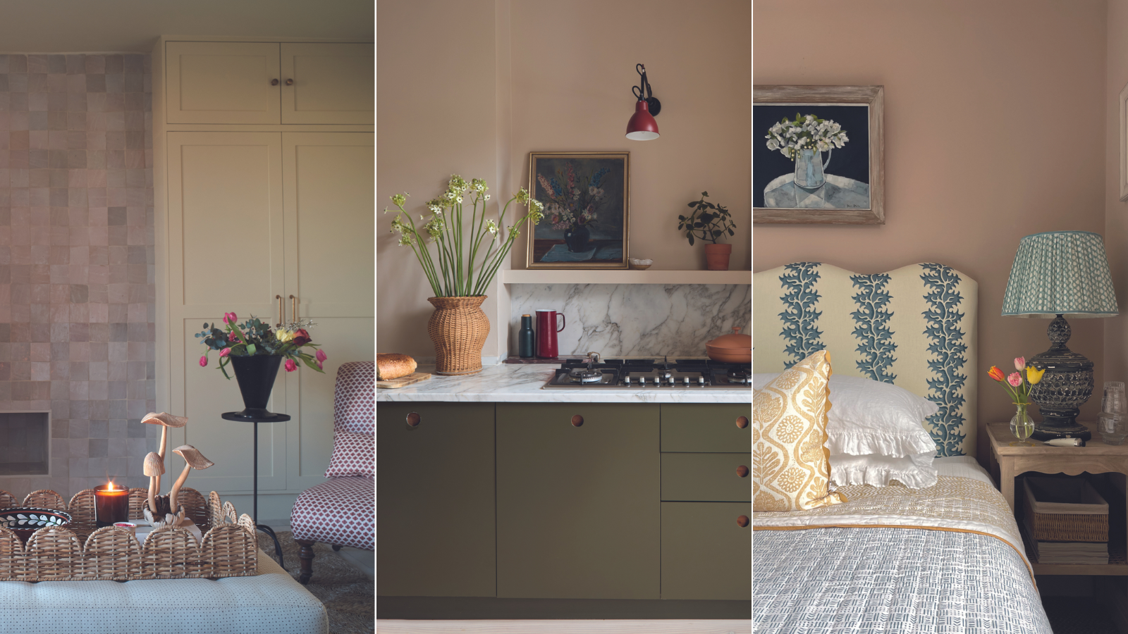
How to decorate with plaster pink tones – 5 ways to bring this timeless yet trendy hue into your home

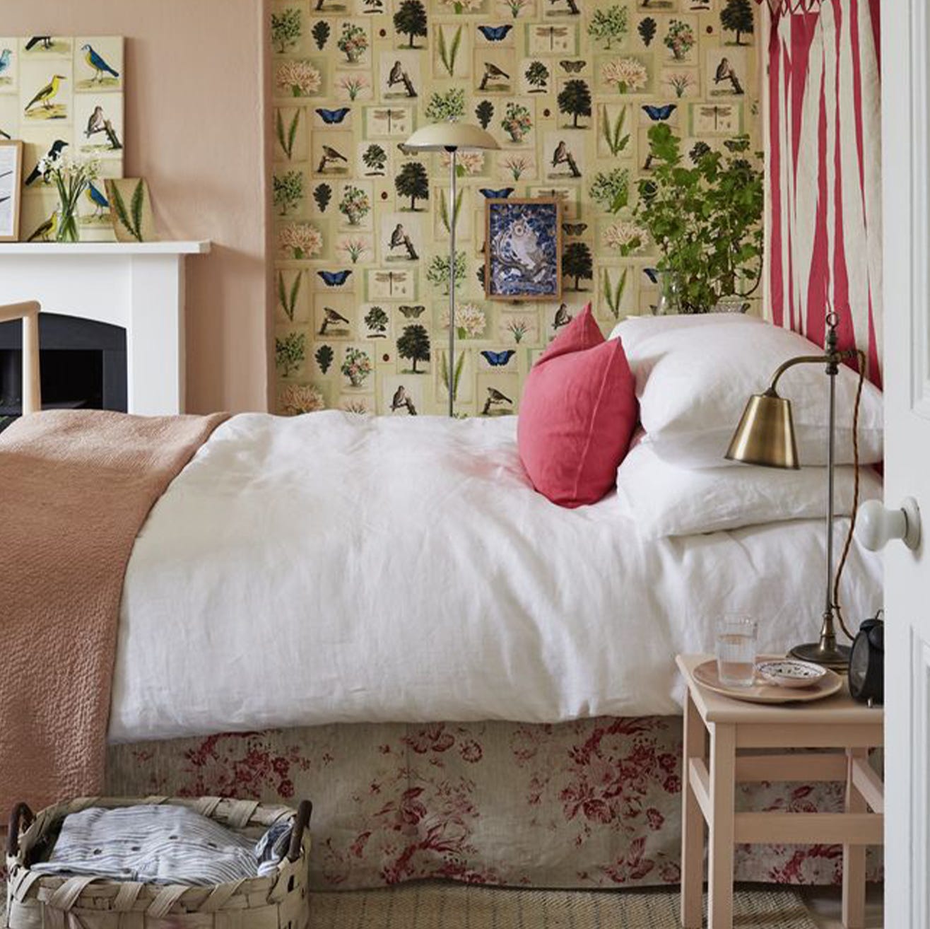
13 fabulous bedrooms that will make you rethink pink
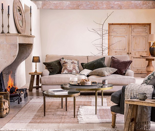
INTERIORS: The joy of plaster pink
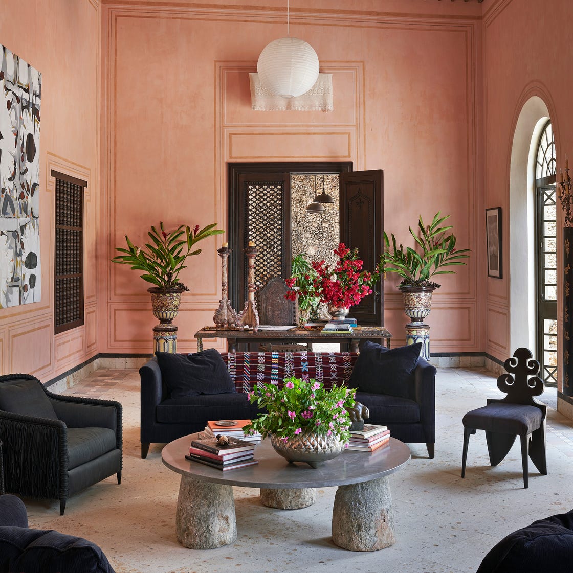
The *Right* Way to Decorate with Pink, According to Design Experts

You Should Seriously Consider Painting Your Ceiling Pink—Here's Why
Think Pink: 36 Beautiful Pink Bedrooms That Will Work With Any Style